Article

Mobile Data Visualisation Interface Design for Industrial Automation and Control: A User-Centred Usability Study

1
Department of Industrial Management, Asia Eastern University of Science and Technology, New Taipei City 220303, Taiwan
2
Department of Industrial Management, National Taiwan University of Science and Technology, Taipei 106335, Taiwan
*
Author to whom correspondence should be addressed.
Appl. Sci. 2025, 15(19), 10832; https://doi.org/10.3390/app151910832
Submission received: 6 September 2025 / Revised: 2 October 2025 / Accepted: 3 October 2025 / Published: 9 October 2025
(This article belongs to the Special Issue Enhancing User Experience in Automation and Control Systems)

Abstract

With the increasing integration of mobile technologies into manufacturing automation environments, the effective visualisation of data on small-screen devices has emerged as an important consideration. This study investigates the usability and readability of common visualisation types (bar charts, line charts, and tables) on mobile devices, comparing different interface designs and interaction methods. Using a within-subject experimental design with 11 participants, we evaluated two primary approaches for handling large visualisations on mobile screens: segmented (cutting) displays versus continuous (dragging) displays. Results indicate that segmented displays generally improve task completion time and reduce mental workload for bar charts and tables. In contrast, line charts exhibit more complex patterns that depend on the size of the data. These findings provide practical guidelines for designing responsive data visualisations optimised for mobile interfaces.

1. Introduction

Mobile devices have transformed both daily life and professional environments, particularly with the emergence of the Internet of Things (IoT) and Industry 4.0. IoT integrates pervasive networks, device miniaturisation, mobile communication, and new ecosystems [1,2,3], eliminating temporal and geographical barriers to information access. In this data-intensive era, mobile devices serve as crucial intermediaries between machines and humans, enabling seamless information flow and decision-making.
Data visualisation has emerged as an essential solution for presenting complex information effectively [4,5], which is both an opportunity and a significant challenge [6,7]. Increasingly, IoT applications employ User-Centred Design (UCD) principles with integrated data visualisation to enable intuitive data control and viewing [8,9]. This is particularly critical in industrial contexts, where Enterprise Resource Planning (ERP) and Business Intelligence (BI) systems depend on effective visualisation to support organisational decision-making. The convergence of Internet of Things (IoT) technologies and mobile devices now permits real-time data access, remote operational control, and rapid response to emergent situations, contributing to enhanced automation on the shop floor. Manufacturing and quality data can now be transmitted instantly to responsible managers, who can retrieve information and issue operational commands through their smartphones.
However, as information volumes increase, system usability faces significant challenges [10,11,12]. Simultaneously, technological innovation transforms working environments [13]. Users no longer work exclusively on desktop systems; instead, mobility has become a fundamental requirement for modern work environments. Consequently, browsing increasingly complex information on progressively smaller interfaces represents a necessary research focus.
In 2010, Marcotte introduced Responsive Web Design (RWD) as a development approach enabling web interfaces to adapt dynamically to various screen sizes [14]. The framework comprises three core components: flexible grid layouts, flexible images and media, and CSS media queries [15]. This methodology allows seamless content presentation across devices ranging from smartphones to desktop computers without requiring separate versions [16].
Previous studies revealed that compared to desktop screen sizes, executing reading tasks on mobile devices with smaller screens reduces task performance. Users spend longer times searching for content on small screens [17,18,19,20]. When users make decisions or acquire specific information on smaller devices, performance is lower than on larger screen devices [21,22,23]. Additionally, testing the readability and usability of graphs and charts on mobile devices remains a relatively new research area.

1.1. Motivation

This study addresses the challenge of displaying visualisations commonly used in ERP and BI systems on mobile devices. Visualisation charts offer intuitive and effective methods for presenting information, particularly when working with large datasets. Generally, statistical graphs are presented horizontally, especially when they have time series attributes. However, mobile devices are typically viewed in portrait orientation (held vertically). Simultaneously, increasing data volumes create interesting challenges regarding chart readability when entire graphical charts exceed display screen dimensions.
We focus on common data presentation formats (bar charts, line charts, and tables). The research aims to identify challenges encountered when presenting large charts with big data on small display screens. Interface layout creates users’ first impressions, and design quality directly affects individual user experiences. Therefore, this study aims to identify interaction modes and interface layouts that provide superior user experiences when interacting with bar charts, line charts, and tables.
Since data integration in ERP and BI system operations occurs primarily in work contexts, discussing mental workload during tasks is important. Based on each chart type and associated reading tasks, this study treats each Chart as independent and examines them individually.

1.2. Objective

The primary objective of this study is to investigate the impact of interface design and various interactions on people’s experiences and performance when using three common data formats: bar charts, line charts, and tables. We look at both what people say about their experience and how well they actually perform tasks. The goal is to determine whether people’s opinions align with their actual performance, and to develop design recommendations for guidelines on designing large charts for mobile devices in the future.
This study makes novel contributions by systematically comparing segmented (cutting) versus continuous (dragging) displays for mobile data visualisation in industrial ERP/BI contexts, revealing that bar charts and tables consistently benefit from segmentation (cutting or fixed columns). In contrast, line charts exhibit dataset-dependent behaviours, with cutting being effective for small datasets and dragging being preferable for large ones. By integrating objective task times with subjective usability (SUS) and workload (NASA-TLX) assessments, the research offers a holistic evaluation rarely seen in mobile chart studies. It extends the visual momentum and workload theory to explain differences in user performance. It proposes practical design guidelines—segmentation for bar charts and small line charts, dragging for large line charts, and fixed columns for tables—thereby filling a gap in responsive visualisation research and providing actionable insights for mobile interface design in industrial automation.

1.3. Structure of This Study

Section 1 of this study provides the research background, motivation, and the necessity of industrial automation and summarises the innovative contributions of this work. Section 2 examines the key components of information visualisation on mobile devices, human visual perception, and methods for evaluating user experience, including approaches for assessing the usability and mental workload of mobile interfaces. Section 3 describes in detail the experimental design, procedures, equipment used, and the participants involved. Section 4 reports the experimental results along with the corresponding statistical analyses. Section 5 presents an in-depth discussion and the implications of statistical inferences based on the findings of Section 4. Finally, Section 6 offers a concise summary of the study’s conclusions and suggests potential directions for future research.

2. Related Work

2.1. Data Visualisation

The established definition of visualisation is “the use of computer-supported, interactive, visual representations of data to amplify cognition,” where cognition refers to mental action or the acquisition and use of knowledge [24]. Visualisation can deliver vast amounts of data or information from different perspectives [25]. The visual system releases cognitive abilities by shifting some processing to the visual system. Visualisation can establish graphical information that conveys complex ideas clearly, accurately, and effectively [26,27,28,29].
Visualisation serves as a powerful tool in various cognitive processes, including descriptive, analytical, and exploratory. Descriptive visualisation is used when phenomena represented in data are known, but a precise explanation of the data is needed. Analytical visualisation addresses situations where users know what they seek in data, and visualisation helps determine it through decision-making processes [30,31]. Exploratory visualisation applies when users do not know what they seek and aim for broad discovery within data [32,33].
Previously, various data visualisation technologies have been developed to represent and analyse massive information volumes. Data visualisation systematically organises information attributes and variables [34]. Visualisation should provide sufficient information and meet user needs. Usability issues become critical for visualisation—specifically, how to make it easy to use and efficient. Understanding basic perceptual cognitive tasks is fundamental in information visualisation engineering, based on human perception capabilities. Visual perception, knowledge, and cognitive aspects facilitate effective visualisation design [35,36,37,38].

2.1.1. Table

Tables provide simple and easily understood techniques for expressing data. They use structured formats organised by related rows and columns [34]. Tables show relationships between data and their attributes through row and column arrangements. They play essential roles in research and data analysis.

2.1.2. Chart

Charts represent another important type of data visualisation. Bar charts and line charts are primary and commonly used visualisation types. Bar charts typically represent discrete data, rather than continuous data, in visual presentations of categorical data. Horizontal dimensions can represent value attributes or time series data. This study utilises time series demonstrations. Vertical bar length represents values. Bar charts can describe single data series or multiple data series, where related data points are grouped [34].
Line charts, also known as line graphs, display data points connected by straight line segments. They are similar to scatter plots and can be considered extensions of scatter plots. Line charts visualise data trends over time, showing changes in data behaviour as time passes [39].
As the graph size changes, the transmission in graphs is influenced. Graph aspect ratios determine readability quality. Chart geometry is judged within the first few seconds [40]. Previous research has shown that the slope of a graph affects accuracy judgments when reading charts. Cleveland and McGill [40] proposed the “banking to 45°” theory, which states that when the average angle of positive slopes is at 45°, the most accurate comparative slope judgments result [41]. Based on this theory, Beattie and Jones [42] investigated charts used in financial reports. They concluded that judgmental accuracy of physical slopes is maximised at 45°, supported by statistical graphics research, which indicates that sub-optimal graph slopes may lead to biassed judgments of corporate financial performance.

2.2. Responsive Data Visualisation

With the recent growth of mobile devices, mobile visualisation has become a fascinating field of study; however, mobile limitations should be considered [34,43]. Chittaro [44] discussed presenting visual information on mobile devices, providing suggestions for designers developing mobile visualisation, including mapping, selection, presentation, interactivity, human factors, and evaluation.
In RWD, to support design patterns, components such as charts, graphics, and web visualisations should be flexible enough to adapt to display device characteristics. These components must have responsive capabilities [45]. Scalable data visualisations can fit available screens while maintaining a basic appearance [46]. Furthermore, responsive data visualisation can be divided into three parts: responsive layout, responsive display density, and responsive interaction.
Responsive layout means visualisation can change representation at specific breakpoints and scale freely between breakpoints. Responsive display density considers display density—for example, showing fewer but more important data points for lower-resolution displays. Responsive interaction means that visualisation can support user interaction through touch, mouse, keyboard, and other input methods [45].
Some related works have studied making visualisation responsive. Some discussed making visualisation scalable [47,48]. Another discussed aspect of responsive charts included data density reduction [49,50]. Responsive bar chart examples were provided by Nagle [51]. However, few people have researched the usability of responsive data visualisation, especially on mobile devices. Though input or graph sizes can fit desired display screens, maintaining equivalent usability and readability represents the next challenge for responsive data visualisation.

2.3. Graphical Perception

Graphical perception is the visual decoding of information encoded in graphs [40]. When discussing visual decoding, it is essential to understand the visual perception models operating in the human brain. Visual perception is a crucial component of information processing, encompassing sensory memory, short-term memory (also referred to as working memory), and long-term memory [52]. Research has provided definitions for information extraction using simple charts, such as bar or line charts [53]. These studies suggested processing stages. Cleveland and McGill [54] developed an elementary perceptual task theory that explains how people extract quantitative information from charts. The study also conducted experiments supporting their theory [40,41,55].
Visual momentum theory examines how users integrate data across separate and successive displays [56], which means the display screen data is less than the potential data that should be displayed, relating to proper information integration. Good visual momentum depends on how easily users can comprehend information during transitions to other display screens. Greater visual momentum helps users perceive continuity across screens; however, poor visual momentum confuses users [56]. In our experiment, huge data visualisation depicted on small display screens also concerns visual momentum.

2.4. User Interface Design Evaluation

User interface design (UI) addresses user-interface relationships, focusing on maximising usability and user experience. Usability is a user-centred design concept, well-defined as whether a product enables users to accomplish desired tasks or goals with efficiency, effectiveness, and satisfaction [57].
Nielsen [58] proposed five dimensions that systems or websites possessing excellent usability should meet: learnability, efficiency, memorability, low error rate, and satisfaction. Therefore, interfaces lacking usability may significantly reduce business execution efficiency or increase system operation learning time. Hackos and Redish [59] also mentioned the importance of evaluating product interface or prototype usability.
Mental workload is an additional important usability element. Previous studies have shown that usability enhancements are associated with reduced workload. Research has indicated the interactions between human mental workload and usability, aiming to describe mental workload constructs in web design [60,61].
From this, we understand that the focus is on making systems conform to users’ habits and needs, allowing for user-interface interactions without creating pressure and frustration, while enabling users to maximise efficiency and productivity with the least effort. In our experiment, this study utilised the System Usability Scale (SUS) and the NASA Task Load Index (NASA-TLX) as subjective assessment questionnaires for usability. SUS provides a “quick and dirty”, reliable tool for measuring usability, and NASA-TLX provides mental workload measurement tools.

2.4.1. System Usability Scale (SUS)

Brooke [62] proposed SUS, which has been widely used in the rapid testing of system interfaces, desktop programmes, and web interfaces. SUS is recognised as the fastest, simplest, and most effective subjective questionnaire.
SUS contains ten statements scored from 0 (strongly disagree) to 5 (strongly agree), with total scores after calculation ranging from 0 to 100. SUS provides indicators for availability and customer satisfaction. Bangor et al. [63] collected SUS data for approximately the past decade and found alpha reliability reached 0.911. Test results confidently support SUS as a tool for easily and efficiently collecting subjective assessments and system or product usability.
Additionally, Bangor [63,64] suggested verifying SUS results by adding adjective rating scales modified from subjective quality statements. This scale contains only one statement and provides qualitative scales that can support and better explain final SUS scores.

2.4.2. NASA-Task Load Index (NASA-TLX)

National Aeronautics and Space Administration Task Load Index, referred to as NASA-TLX, is a subjective measurement method proposed by Hart and Staveland [65]. This scale’s primary purpose is to evaluate workload within and between tasks by participants themselves. NASA-TLX comprises six work-related factors: Mental Demand, Physical Demand, Temporal Demand, Performance, Effort, and Frustration Level [65].
Workload evaluation is calculated as the sum of six indicators, each multiplied by its corresponding weight. Higher total scores indicate greater mental loads. Each indicator’s weight is determined by participants selecting relatively important items through comparison methods, based on task performance, and by adding the total number of times each indicator is checked. After standardisation, indicator weights become item weights.

3. Materials and Methods

3.1. Participants

This study employed a within-subjects design, in which the same group of participants conducted multiple experiments of different types. A within-subject design was chosen due to the requirements for fewer participants and more efficient processes compared with the between-subject design, which is frequently applied in usability studies. It also controls individual differences among participants.
A total of 11 individuals (five males and six females) participated in this study. All participants had an average age of 24.1 years (s = 1.18 years). None had eye diseases, and all had normal or corrected vision. The average weekly mobile device usage was 24.6 h (SD = 7.72 h). Due to individual performance differences, experiments took approximately 90 to 120 min to complete.

3.2. Apparatus and Questionnaires

We designed two chart types presented with different views and interactions. All experimental charts were developed using Xcode 9.3, an integrated development environment for iOS. Experimental devices were 5.5-inch iPhone 6s (designed by Apple Inc., Cupertino, CA, USA; assembled by Foxconn, Zhengzhou, Henan, China). In this study, we evaluated subjective interface assessments using two questionnaires: a usability rating using the System Usability Scale (SUS) and a mental workload measurement using the NASA-TLX Index.
SUS consists of 10 items, with total scores computed as follows:
(1) Items 1, 3, 5, 7, 9 belong to positive items. Subtract one from each item’s score to obtain the final positive item scores. (2) Items 2, 4, 6, 8, 10 belong to the negative items. Subtract each item’s score from 5 to obtain the final negative item scores. (3) Multiply all items by 2.5 to obtain the final overall scores. For the design concept and details of the SUS questionnaire, please refer to Brooke’s original work [62].
Additionally, Bangor [63,64] suggested that it is helpful to verify the result of SUS by adding an adjective rating scale, which was modified from a subjective quality statement [66]. This scale consists of only one statement and aims to provide a qualitative scale that can support and better explain the result of the SUS score.
NASA-TLX comprises six indicators. Overall scores are calculated as the sum of six indicators, each multiplied by its corresponding weight. Calculation steps are as follows:
(1) Grade six indicators according to just-completed task processes. (2) Set each indicator’s weight by comparing the two indicators’ importance to obtain each indicator’s weight. (3) Multiply all indicators by their weights to achieve overall scores.

3.3. Experiment Design

Testing interfaces for charts were developed based on several dashboard charts commonly used in ERP systems. This study also referred to Sanchez and Branaghan’s [23] suggestion that reducing scrolling on mobile devices may increase performance. We separated our experiment into three parts: Bar chart, Line chart, and Table. Experiments for these three charts were independent due to the differences in reading purposes for each Chart. Additionally, we designed experimental factors for charts and tables separately to discuss different issues.
For charts, we employed a 2 × 2 factorial experiment design. We aimed to assess chart readability on mobile devices and determine whether different interface designs impact chart readability. Thus, this study utilised a factorial experiment design. We controlled two factors: data size and segmentation (using a segmented method for each Chart). Table 1 illustrates the experimental factor design for charts and tables. Each factor had two levels.
Data size was defined as the data range that this study aims to transfer into charts. We divided it into two levels based on the time series length, which affects the final chart size. One size was 30 units; another was 12 units. These units referenced standard management reports. For management, commonly used charts are often organised by days or months. Consequently, we use days and months as time benchmarks for our experiment to define the length of the y-axis.
The segmented method definition was how we handle chart sizes bigger than display screens. We also had two levels. One method was reading charts by directly dragging the display screens. Another method was cutting huge charts into small parts, with all parts showing simultaneously.
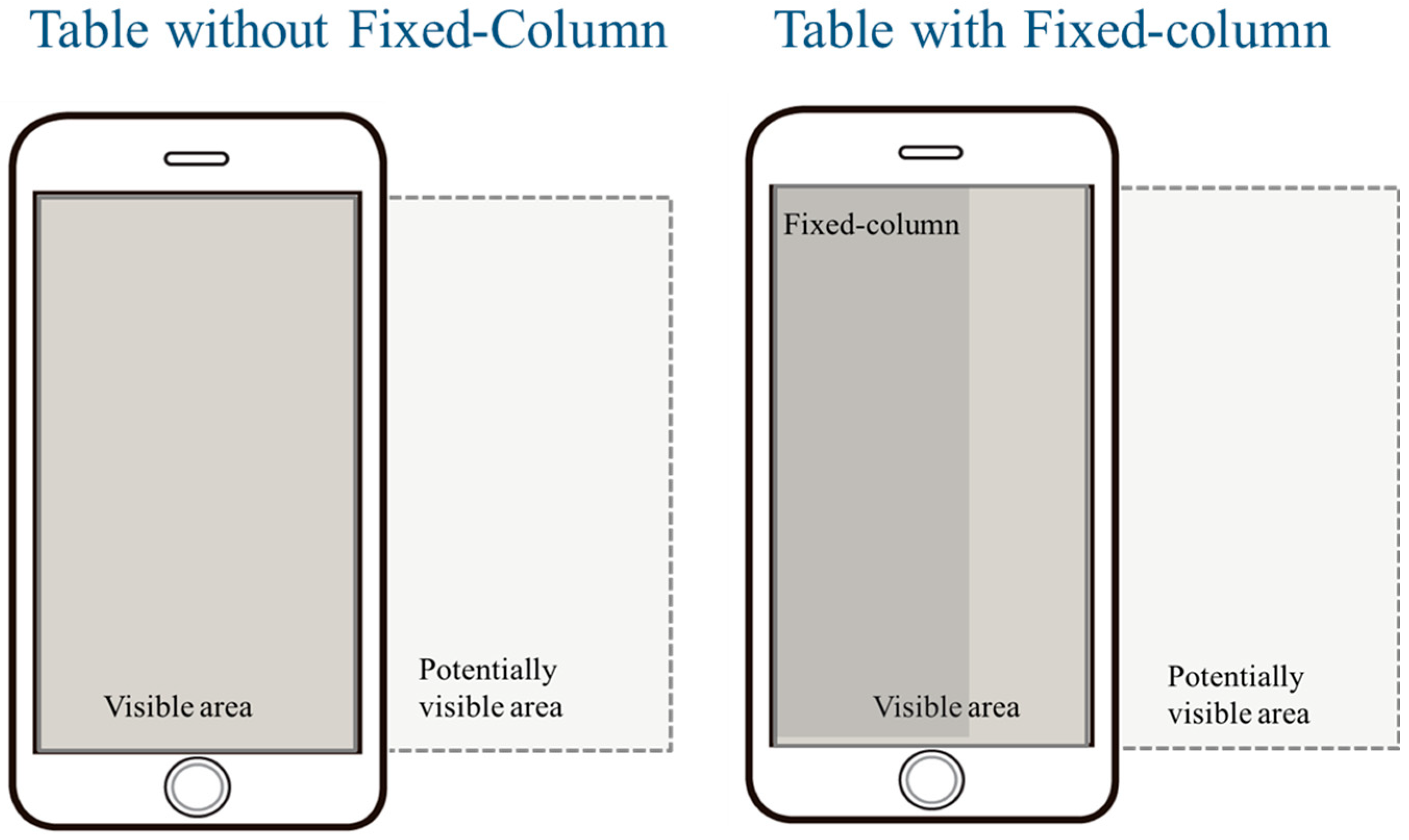
For tables, we employed another 2 × 2 factorial design. We aimed to understand the usability of tables on mobile devices. We defined tables with segmentation as fixed column tables, as fixed columns are functions that can cut tables and make important parts stand out for easy viewing. We attempted to verify whether fixed column functions enhance the usability of tables. Thus, this study utilised a factorial experiment design. We controlled two factors: data size and the presence of fixed columns. Each factor had two levels. Data size was defined as above. The fixed column definition was whether the first table column was fixed or not.
Furthermore, the dependent variables in this study were task time, subjective evaluation of workload, and system usability. The following provides definitions for three dependent variables:
Task time: During experiments, participants receive tasks. When tasks are executed, timing begins. After task completion, completion times are obtained (measured in seconds).
Usability evaluation: After the experiment’s completion, participants complete the System Usability Scale (SUS) based on the interfaces they have just operated, allowing for subjective usability assessments.
Workload evaluation: After completing the experiment, participants complete NASA-TLX scales based on the interfaces they have just operated, to perform subjective workload assessments.
All dependent variables are analysed by RM ANOVA, with effect size in partial eta square (pes) and magnitude reported for significant factors.

3.4. Experiment Procedure

Tasks were divided into three groups: bar chart, line chart, and Table. The experimental interface schema for charts was presented in Figure 1. Figure 2 shows experimental interface diagrams for tables. Please refer to Appendix A for the actual designs of the various combinations. Each participant completed the three types of tasks in a randomised order. Within each task type, the four factor combinations were also presented in a fully randomised manner. The tasks required participants to answer questions based on the chart data displayed on a mobile screen. In the bar chart and line chart experiments, there were eight questions, whereas in the table experiment, there were four questions. Please refer to Appendix B for the details of each task.
Since practical applications of each Chart and Table differed, task content also differed. Participants started with the first chart type. Questions for the same data size were identical regardless of segmentation type. At the beginning of the experiment, participants were asked to locate the necessary data. After completing one item, experimenters asked participants to look for the following data. The experimental processes for these three charts and tables all followed the same procedure. The procedure flowchart is demonstrated in Figure 3.

4. Results

In this section, we analysed data collected from our experiment, as introduced in Section 3. We had three chart types. Experiments for each Chart employed a 2 × 2 factorial experiment design approach using two-way Analysis of Variance (ANOVA) to test each dataset. These three chart types were analysed independently. Task completion time is first presented in Section 4.1. In Section 4.2, we discuss subjective assessments of usability using SUS. Mental workload, as evaluated by the NASA-TLX, is discussed in Section 4.3.

4.1. Task Completion Time

4.1.1. Bar Chart

Table 2 summarises the statistical analysis of task completion time in bar chart experiments. As Figure 4 shows, regardless of data size, the completion time for cutting a bar chart is shorter than that for dragging.
ANOVA results showed both data size and segmentation significantly affected task completion time (F1,10 = 63.302, p < 0.001, pse = 0.864, magnitude = large; F1,10 = 23.872, p < 0.001, pse = 0.71, magnitude = large), demonstrating that using cutting charts requires less time and performing tasks with small sizes also requires less time.

4.1.2. Line Chart

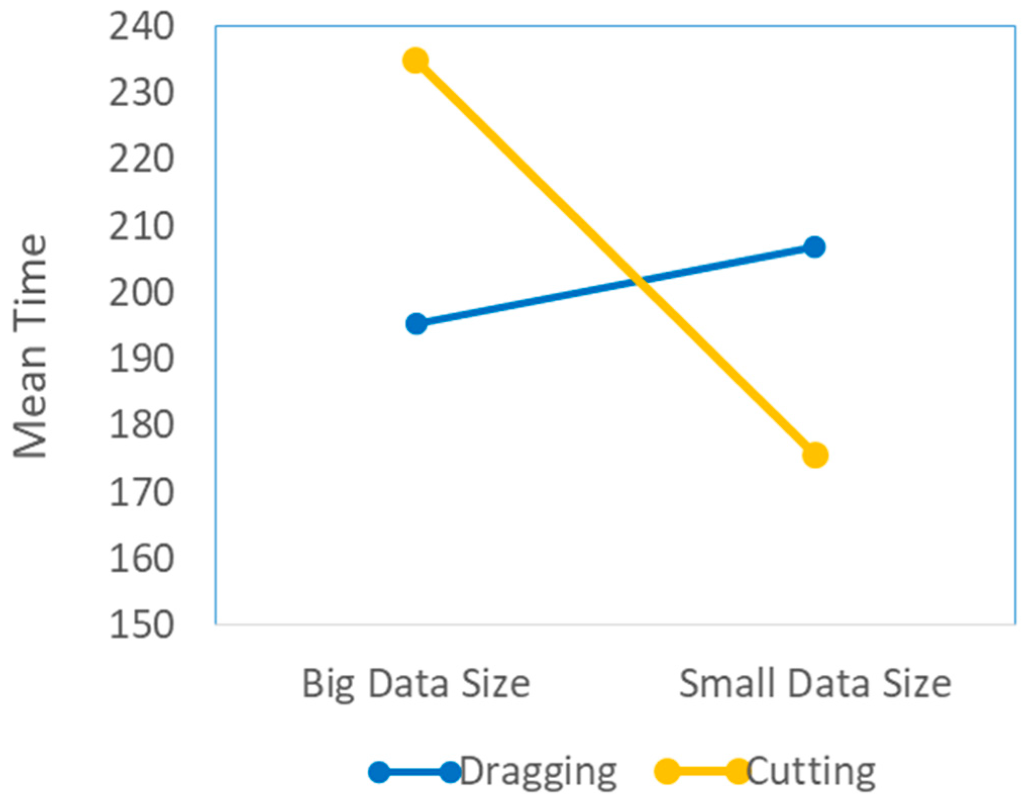
Table 3 presents the statistical analysis of the line chart experiments. As depicted in Figure 5, when the data size is large, the time is shorter using dragging. However, with a small data size, the time is shorter using cutting.
ANOVA results in Line Chart experiments showed significant effects on data size (F1,10 = 5.862, p < 0.05, pse = 0.370, magnitude = large) and no significant effects on segmentation. However, a statistically significant interaction was found between these two factors (F1,10 = 15.349, p < 0.01, pse = 0.606, magnitude = large), indicating that simultaneous consideration of different data sizes and segmentation resulted in significant differences in completion time. Using drag charts with big data sizes required less time. However, using cutting charts with small data sizes required less time, as demonstrated in Figure 5.

4.1.3. Table

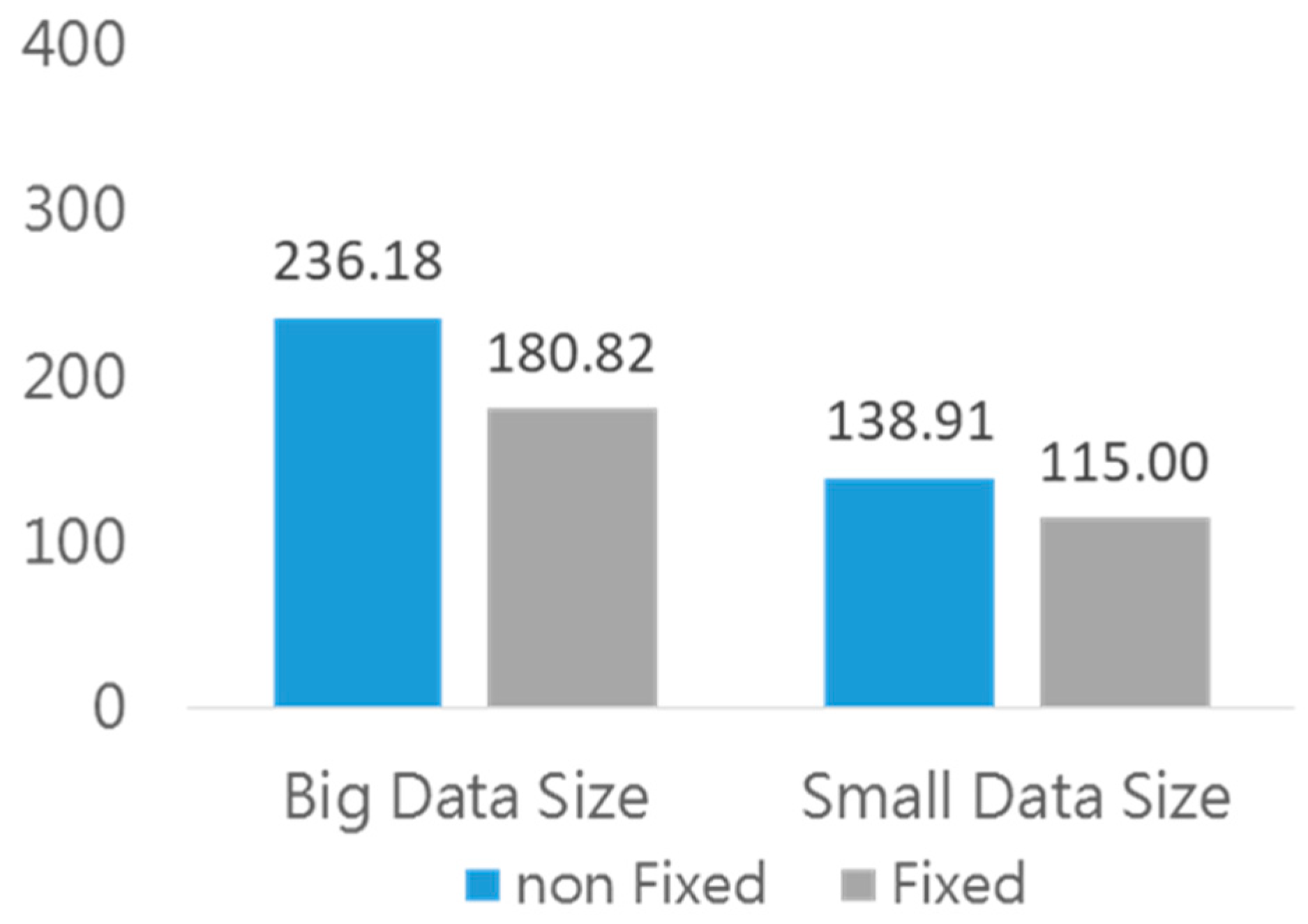
As Table 4 shows, a statistical analysis of the table experiments is presented. Regardless of data size or fixed function, both led to shorter task completion times. The results are clearly observable in Figure 6.
ANOVA results revealed significant differences in task completion time for data size and fixed column (F1,10 = 98.70, p < 0.001, pse = 0.908, magnitude = large; F1,10 = 90.43, p < 0.001, pse = 0.900, magnitude = large), indicating that using fixed column tables and performing tasks in small tables requires less time.

4.2. Usability Subjective Assessment

The results of the usability and mental workload assessments are analysed in Section 4.2.1 and Section 4.2.2. First, we examined the reliability of these two questionnaires. We used Cronbach’s alpha to test reliability [67]. A commonly accepted Cronbach’s alpha value for explaining reliability is more than 0.7 [68]. The results shown in Table 5 indicate that the reliability values of both questionnaires exceed 0.7, indicating that the outcomes from these questionnaires are reliable. Therefore, we can proceed to the analysis of variance.

4.2.1. Bar Chart

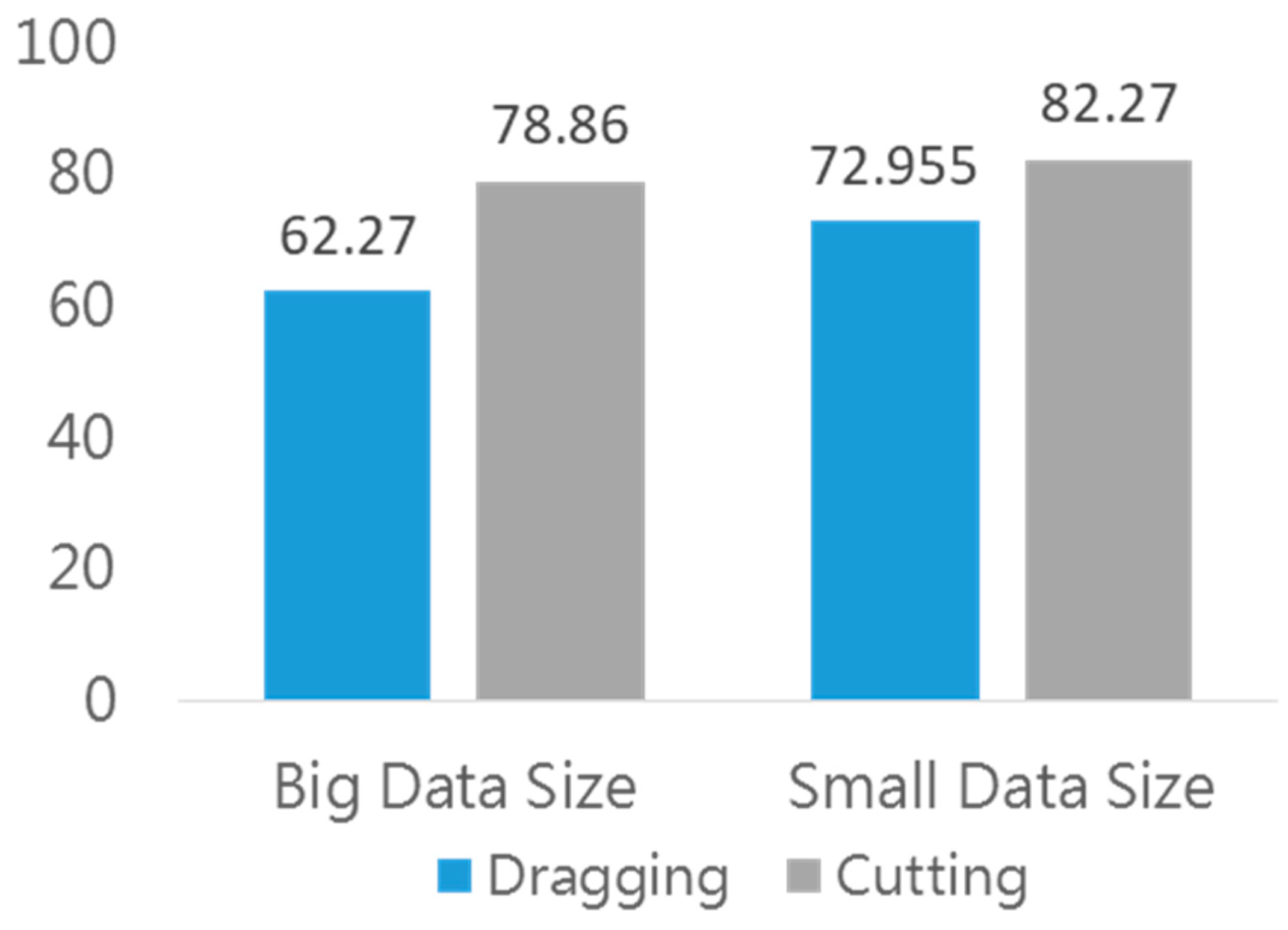
Table 6 summarises the statistical results of SUS in the Bar chart experiments. Regardless of data size, cutting-type charts received better usability scores as depicted in Figure 7.
ANOVA results illustrated that segmentation factors had a significant effect on SUS (F1,10 = 6.412, p < 0.05, pse = 0.391, magnitude = large), indicating that participants preferred charts with cutting views for both data sizes.

4.2.2. Line Chart

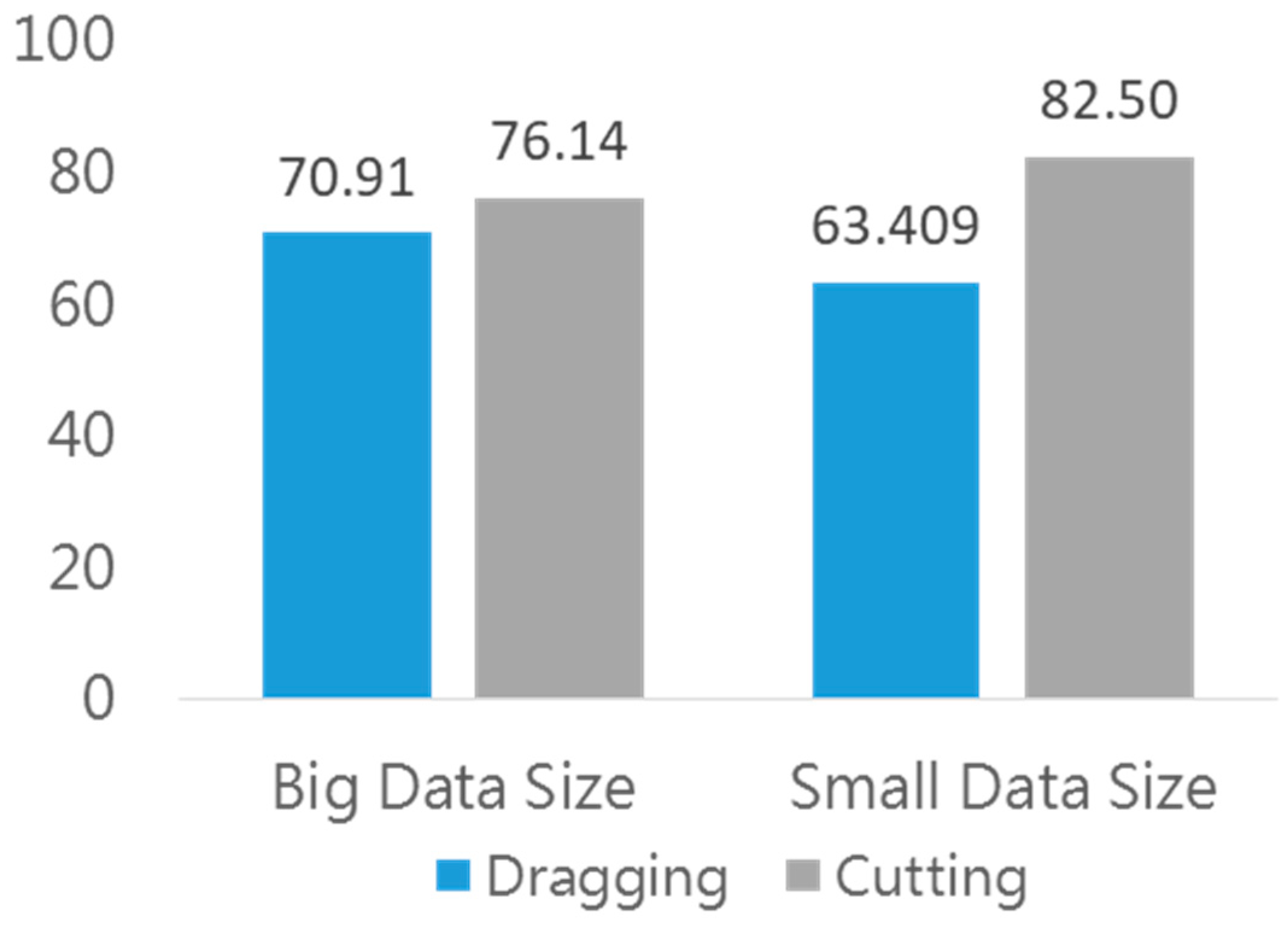
Table 7 reveals the statistical analysis of SUS in Line chart experiments. As Figure 8 illustrates, cutting-type charts perform better in subjective usability assessments across both data sizes.
ANOVA results in line chart experiments indicated that neither data size nor segmentation had a significant effect on subjective assessments.

4.2.3. Table

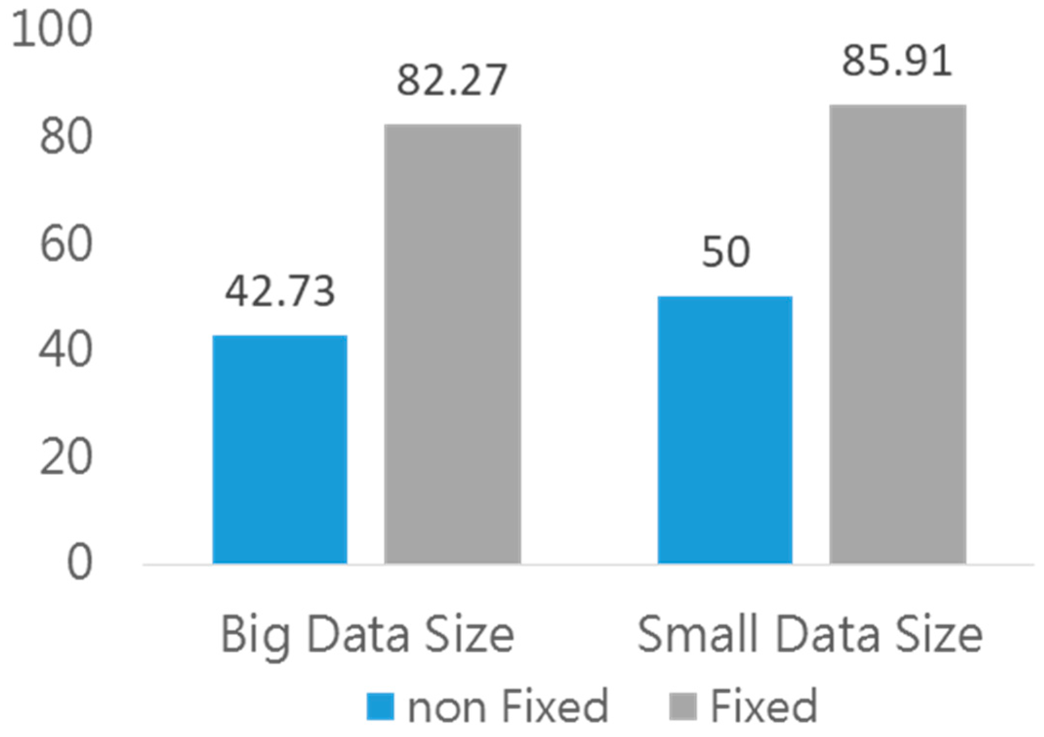
Table 8 summarises the statistical analysis. Tables with fixed columns are more suitable for both small and large data sizes, as Figure 9 illustrates.
After ANOVA, results showed that fixed columns significantly influenced subjective SUS assessments (F1,10 = 36.112, p < 0.001, pse = 0.783, magnitude = large). Clearly, using fixed-column tables yielded better usability.

4.2.4. Adjective Rating Scale

The statistical results of the Adjective Rating Scale, an assisted questionnaire, are presented in Table 9. The correlation between adjective ratings and SUS scores was r = 0.815. The regression line slope drawn for SUS scores versus adjective rating values was 11.71. This result indicated high interdependence between SUS and adjective rating scales. We can explain SUS results through this scale.

4.3. NASA-TLX

4.3.1. Bar Chart

Shown in Table 10 and Figure 10, the statistical analysis of the Bar charts illustrates that the workload is higher with dragging charts than with cutting charts, regardless of the data size. ANOVA results revealed significant differences in the workload for data size and fixed column (F1,10 = 7.725, p < 0.05, pse = 0.436, magnitude = large; F1,10 = 10.099, p < 0.001, pse = 0.502, magnitude = large). We could see that using a cutting chart led to less workload in both sizes.

4.3.2. Line Chart

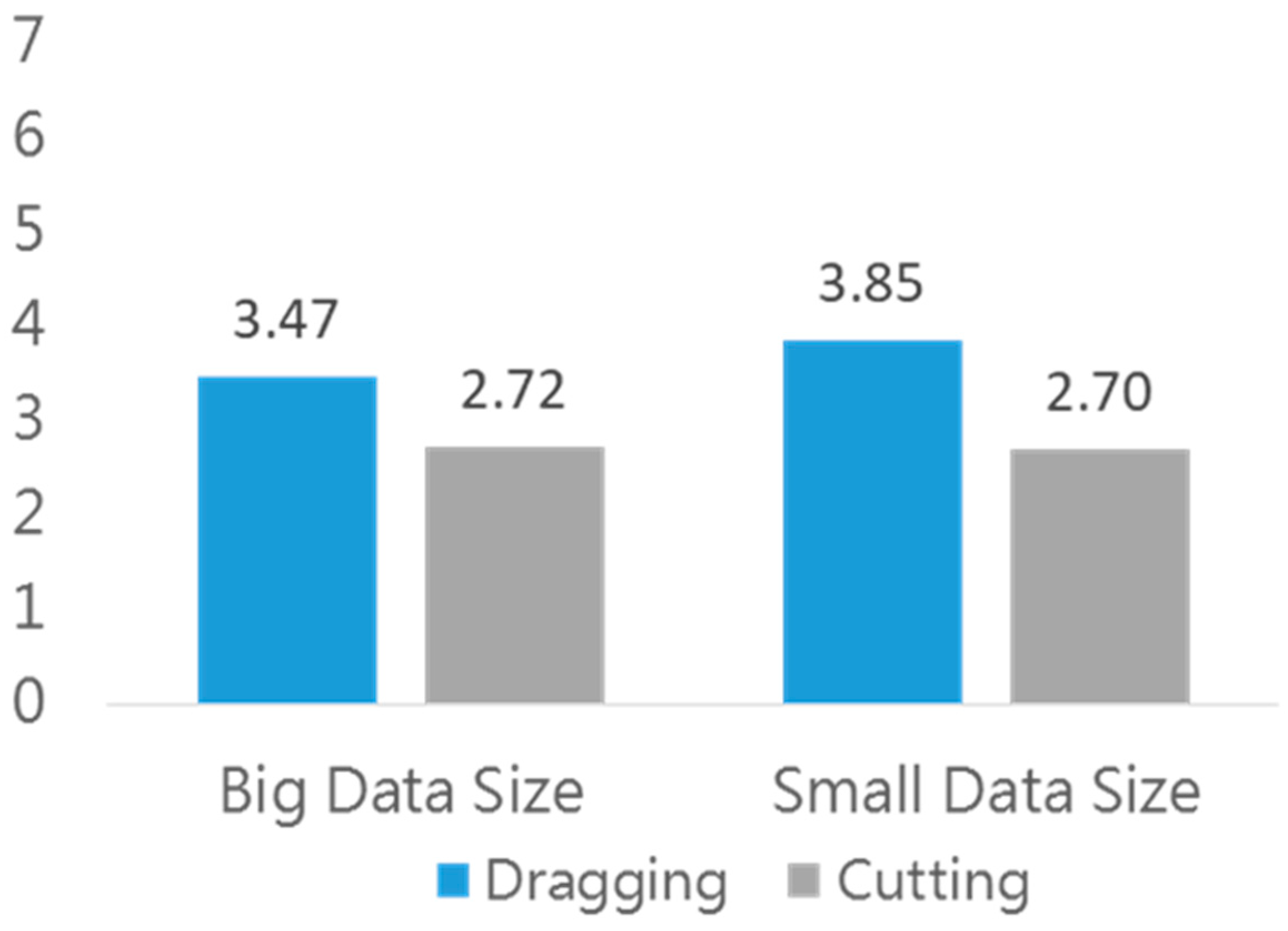
As Table 11 and Figure 11 present, for both data sizes, using cutting charts results in a lower workload.
From the ANOVA test results, we can see that chart segmentation has a significant effect on workload (F1,10 = 7.432, p < 0.05, pse = 0.426, magnitude = large). Using cutting line charts causes less workload.

4.3.3. Table

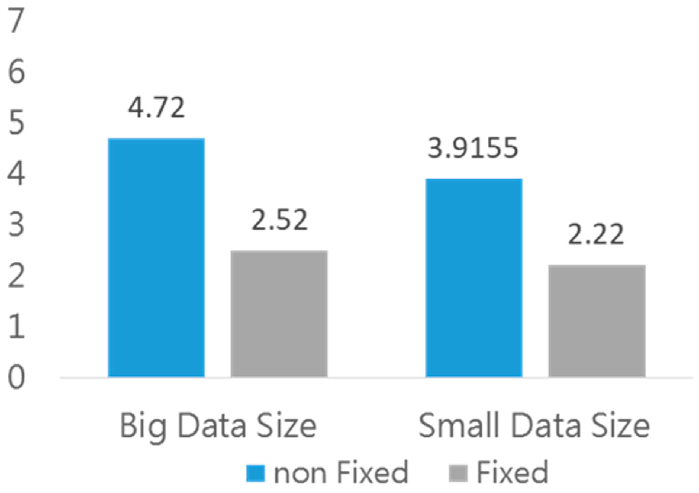
As depicted in Table 12 and Figure 12, regardless of data size, fixed-column tables receive a lower workload.
As ANOVA demonstrated, fixed column tables had a significant effect on workload (F1,10 = 24.414, p < 0.001, pse = 0.709, magnitude = large). This means that fixed columns allow participants to finish tasks with a lower workload.

5. Discussion

Although this study included only 11 participants, the effect sizes measured by partial eta square were all greater than 0.17 for the significant factors, indicating a large magnitude. This result suggests that, despite the limited sample size, the reliability of statistical inference and generalizability remains robust.
RWD was designed to provide convenience to maintainers while allowing users of different-sized devices to have better experiences. However, the discussion on how to better present charts that exceed the actual screen sizes on mobile devices is warranted. This study has examined graphical visualisation on mobile devices. Table 13 summarises the implications from Section 4.

5.1. The Effect of Segmentation on Performance

In this study, we evaluate each Chart’s performance through an objective assessment of task completion time. In bar charts, as expected, regardless of data size, the average time for reading charts with cutting was lower than for reading charts with dragging. Previous research has suggested that reducing scrolling on mobile devices enhances reading text performance [23]; similarly, our research observed similar effects on chart reading.
The interaction effect observed in line charts—where cutting performs better for small data sizes but dragging performs better for large data sizes—reflects a fundamental tension within visual momentum principles. According to visual momentum theory, momentum depends on the user’s ability to maintain continuity and context when transitioning between displays or display segments. For small line charts, cutting supports high visual momentum because the limited data volume enables users to mentally reconstruct the continuous trend from segmented parts. This approach allows simultaneous viewing of all segments, facilitating global analysis and helping users identify patterns and relationships.
In contrast, for large line charts, cutting reduces visual momentum by fragmenting the continuous narrative that line charts are designed to convey. Visual momentum theory emphasises the need to preserve “impetus or continuity across successive views,” and line charts rely on trend interpretation rather than discrete value searching. When large datasets are divided into segments, users must perform additional cognitive work to reconnect broken trend lines, creating what the theory describes as “discontinuous display transitions,” which increase mental workload. The dragging approach, although requiring sequential navigation, better preserves the continuous flow of information and aligns with users’ natural tendency to interpret trends as coherent visual narratives.
Based on these results, we speculated that the differences led to the differences in the chart reading tasks. According to bar chart design principles, the reading purpose is to search, and we only need to identify the absolute values of specific information in the data [69]. In particular, as the amount of information increased in large bar charts, the working memory occupied by searching tasks also increased. Therefore, reading bar charts with cutting can reduce the workload caused by simultaneously dragging charts while searching.
However, the line chart’s reading purposes differed from bar charts. Due to the characteristics of line charts, when reading them, emphasis is placed on trend interpretation [70,71]. Consequently, it was not simply a searching task. Charts with cutting accomplished by problems that users had to connect broken trend parts in line charts by themselves. Since there is not much data in small line charts, charts with cutting can also bring better efficiency. Once data amounts increase to large line charts, the benefits of cutting charts are not as good as those of dragging charts.
Simultaneously, we observed participants’ behaviour while dragging charts without cutting. In bar charts, we found that scrolling numbers (Mean = 21.66) are highly correlated with task completion time (r = 0.679, p < 0.01), indicating that more scrolling is associated with longer user task completion times. However, there is no significant correlation in line charts. This result may suggest that line chart task time is not necessarily caused by dragging charts, but rather by other tasks that allow participants to spend more time, such as trying to interpret chart trends.
Additionally, fixed column table efficiency was as expected. Fixed column tables were much better than non-fixed tables. In fixed-column situations, users can keep the first column visible while scrolling through screens. Such a situation helps users fill in some necessary information and reduces the number of scrolling windows.

5.2. The Effect of Segmentation on Usability

Subjective usability assessments collected using the SUS strongly indicated that participants had a preference for charts with cutting and fixed-column tables. Though the three charts and tables have different orientations, preferences are the same overall. Given that charts with cutting allow participants to see all information simultaneously, they can quickly grasp specific target search locations. Therefore, it can provide a better user experience. Relatively speaking, the amount of data that can be presented on charts with dragging is limited and not conducive to search. In tables, fixed columns can help participants search data more quickly.
We summarised our adjective rating scale and acceptable SUS scores [64] to facilitate discussion of the results. Scores above 74.34 mean “Good” in our collected adjective rating scale. The suggested acceptable score is 70 or above. In our study, charts with cutting and tables with fixed columns are all acceptable and classified into good or better levels.

5.3. The Effect of Segmentation on Mental Workload

In this section, we discuss mental workload results from NASA-TLX. Overall, the results indicated that participants experienced lower mental workload when viewing charts with cutting and fixed column tables. Additionally, we found some topics for discussion. Among all our experimental charts, the big data bar charts with dragging had a higher workload than the others.
Due to the bar charts in our experiment being grouped, the visual information density is more intensive than that of line charts. There was already much information in the big data bar charts. Furthermore, visible regions are limited by screen width, so participants had to search for more information by dragging the screen. Therefore, we speculated that dragging, which is the second task, affected searching performance, the master task. That is the reason for the higher mental workload caused by short-term memory overload.
Apart from this, we found that the mental workload in big data bar charts with cutting is higher than in other charts that do not use cutting. To verify this, we analysed NASA-TLX weight indicators. We found that participants’ “physical demand” weights for charts with cutting were slightly higher than those for charts with dragging, which suggests that most participants perceived more physical pressure when implementing experiments with charts that required dragging. Simultaneously, from interviews, we found that some participants felt that carrying out search tasks on bar charts with cutting would burden the eyes. Therefore, although charts with cutting can reduce mental workload most of the time, when the amount of data and information is too large, we suggest not displaying charts on small screens.

6. Conclusions

As industrial paradigms and work practices continue to evolve, mobile devices are becoming an integral component of contemporary professional environments. The use of applications that facilitate the visualisation of manufacturing and quality data and that allow the remote issuance of instructions via smartphones has already been shown to increase the degree of automation within manufacturing systems. We have begun to value mobile device usability while working. Charts are among the most important tools used by various industries to communicate data. Nevertheless, due to discrepancies between chart displays and common mobile device behaviour, we would like to know if we could enhance user experience and readability through different interface designs and interactions when transiting large charts from larger screens to mobile devices.
Therefore, we conducted this study to examine the readability and usability of charts and tables when using mobile devices. We summarise our research and significant findings in this section, and we hope this study can provide suggestions and directions for future mobile device interface design. The conclusions of this study are as follows:
Segmentation using cutting can enhance chart usability and readability on mobile devices, thereby reducing task time. However, chart reading purposes relatively compromise the ease of use of the cutting chart. Fixed column tables have absolute ease of use advantages.
Simultaneously, segmentation, cutting, and fixed columns reduce workload while reading charts and tables on mobile devices.
In our research, we were subject to some limitations. First, to maintain experiment quality, all participants conducted their experiments in laboratory settings. If applied to real work situations, there may be inaccuracies. Second, due to time and resource constraints, this study focuses on task time assessment, which is sufficient for its purpose. Additionally, due to technical issues, the charts designed for this study are not interactive, which may limit chart possibilities on mobile devices. Future research should explore integrating our segmentation findings with advanced visualisation techniques—particularly focus + context methods such as fisheye distortion and semantic zooming—which may help address the complex patterns observed in line charts, where the optimal display method varied by data size.
We can consider further objective data, such as eye-tracking aids, later; we believe we can obtain more valuable findings to support our research. We can also add touchscreen features to consider interactive graphics usage on mobile devices. This study provides solutions for bar charts, line charts, and tables on mobile devices. This framework can be extended in the future to construct more complete chart design guidelines for mobile devices.

Author Contributions

Conceptualization, C.-F.C., I.-C.L. and C.J.L.; methodology, C.-F.C. and I.-C.L.; software, I.-C.L.; validation, C.-F.C. and C.J.L.; formal analysis, I.-C.L.; investigation, C.-F.C., I.-C.L. and C.J.L.; resources, C.J.L.; data curation, I.-C.L.; writing—original draft preparation, C.-F.C. and I.-C.L.; writing—review and editing, C.-F.C. and C.J.L.; visualisation, C.-F.C. and I.-C.L.; supervision, C.J.L.; project administration, C.J.L. All authors have read and agreed to the published version of the manuscript.

Funding

This research received no external funding.

Institutional Review Board Statement

The study was conducted according to the Declaration of Helsinki guidelines and approved by the Ethics Committee of National Taiwan University.

Informed Consent Statement

Informed consent was obtained from all subjects involved in the study.

Data Availability Statement

Dataset available on request from the authors.

Conflicts of Interest

The authors declare no conflicts of interest.

Appendix A. The Diagram of Experimental Interfaces
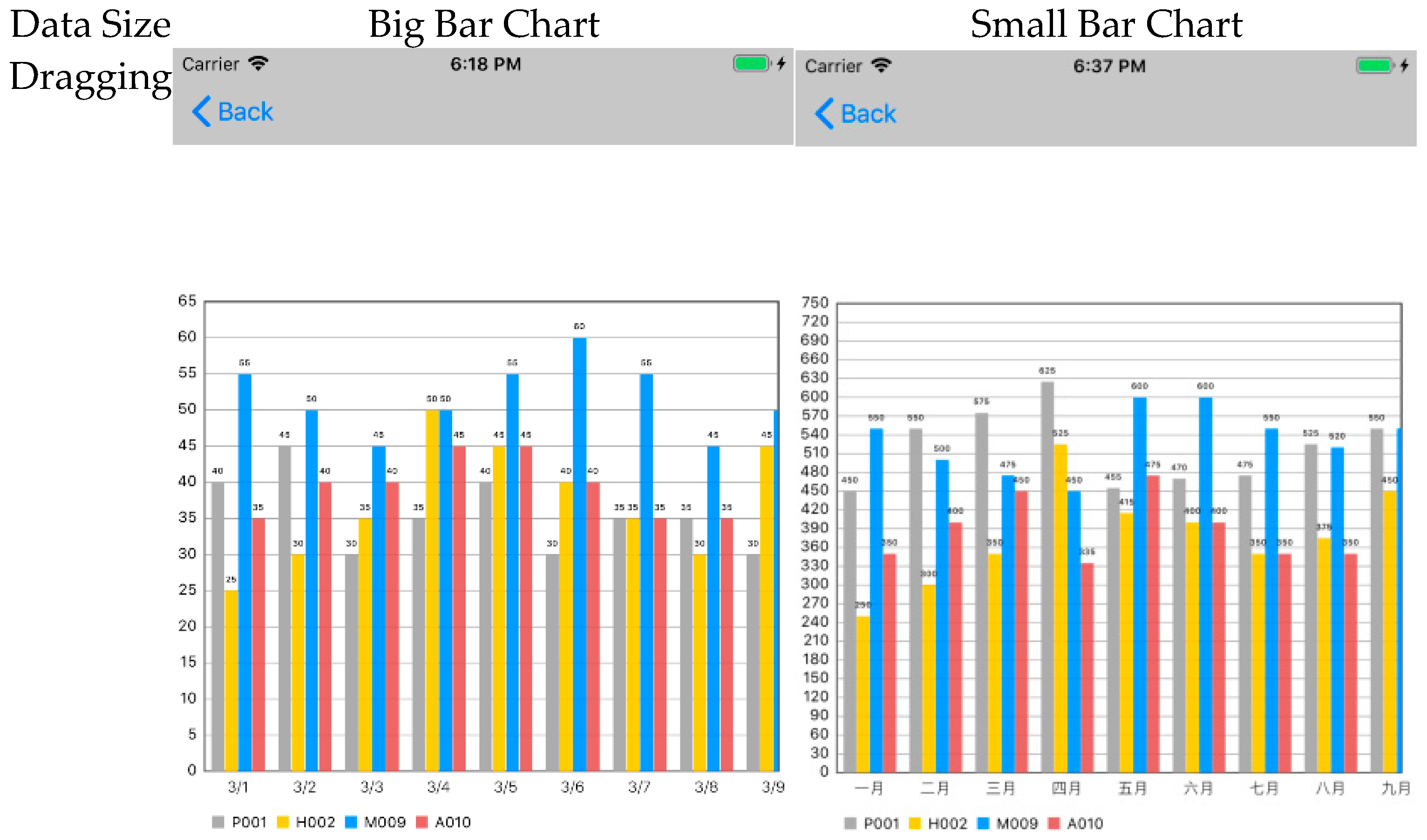
Figure A1. Bar Chart. The data in the small bar chart is shown on a monthly basis.
Applsci 15 10832 g0a1aApplsci 15 10832 g0a1b
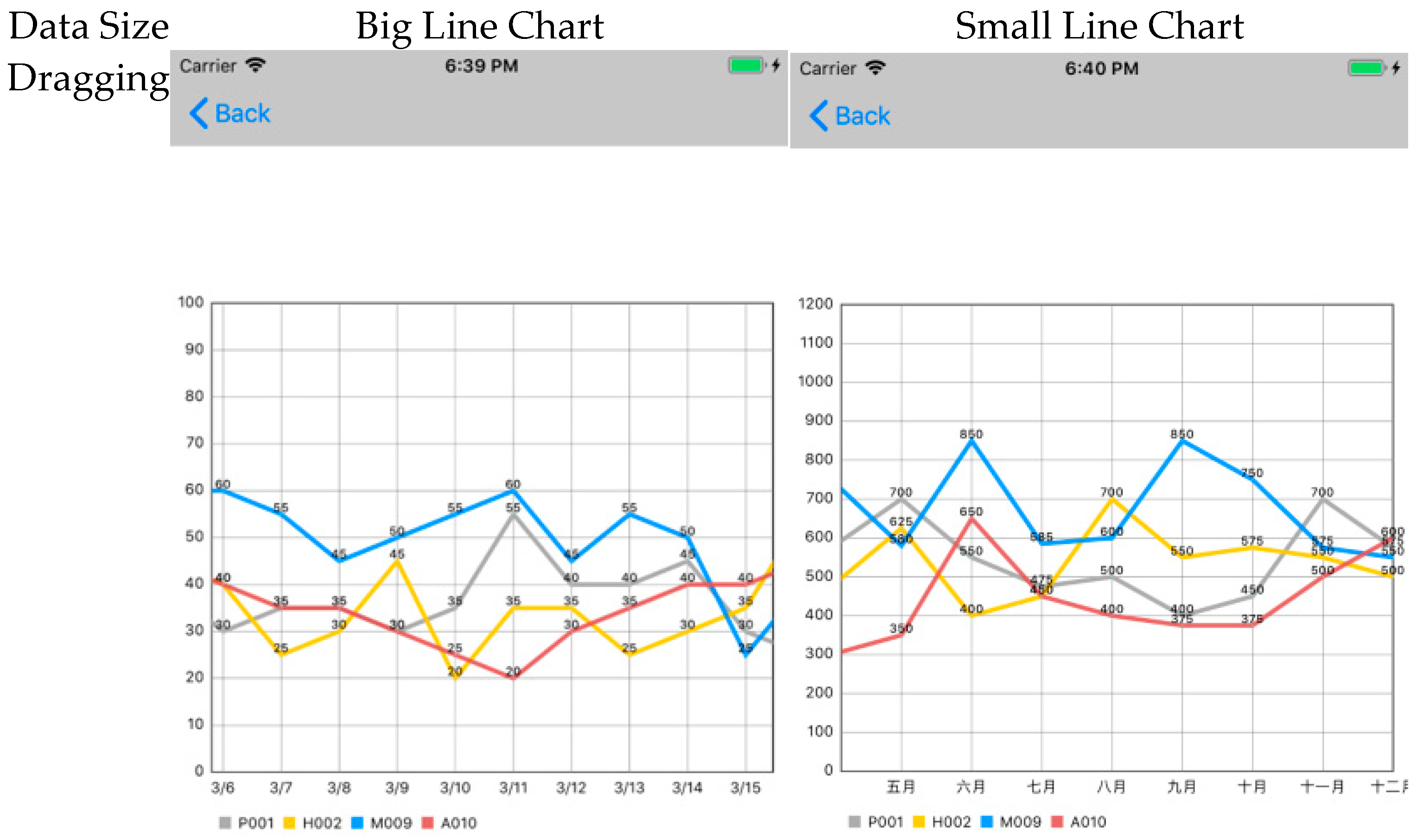
Figure A2. Line Chart. The data in the small line chart is shown on a monthly basis.
Applsci 15 10832 g0a2aApplsci 15 10832 g0a2b
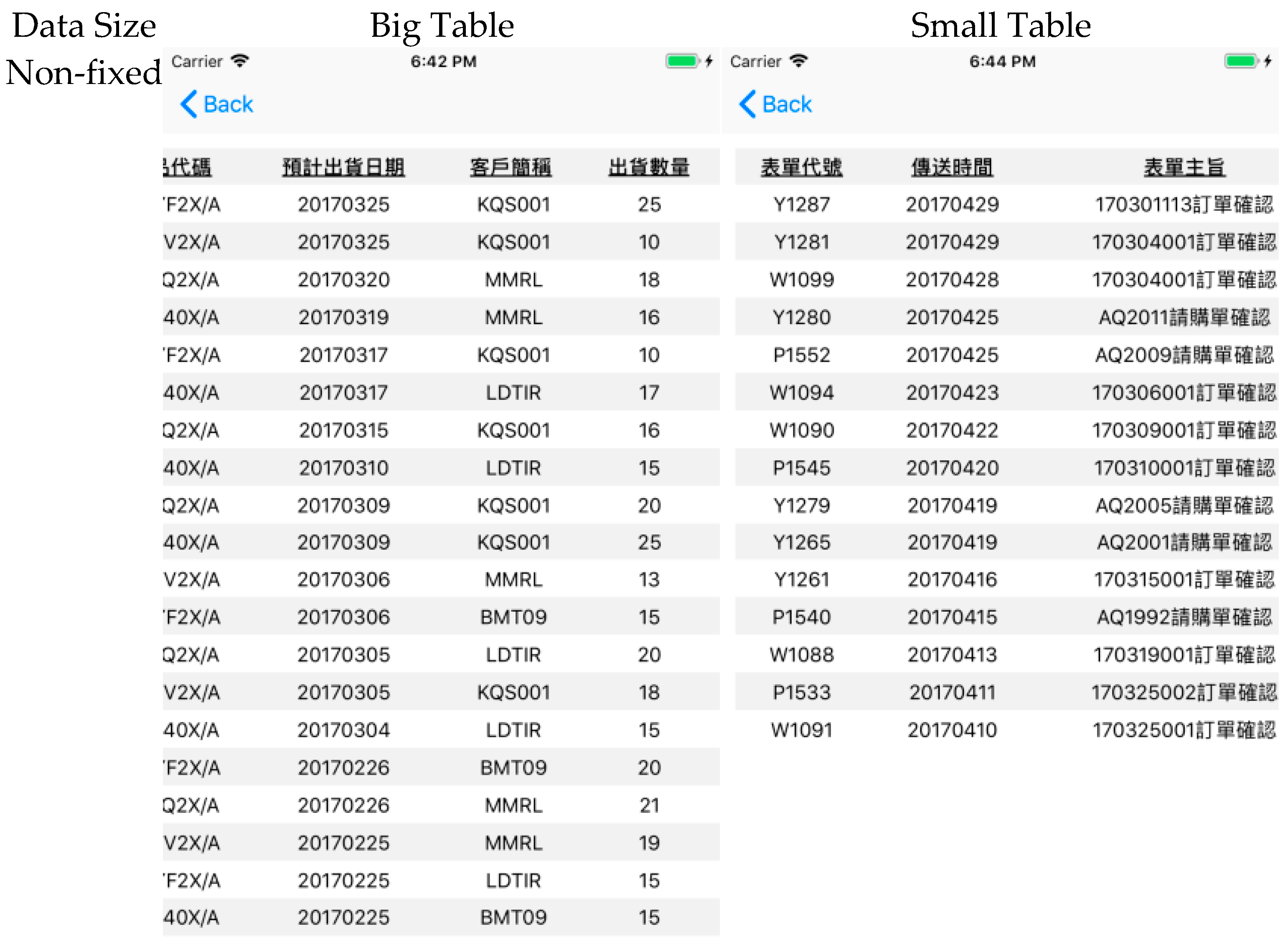
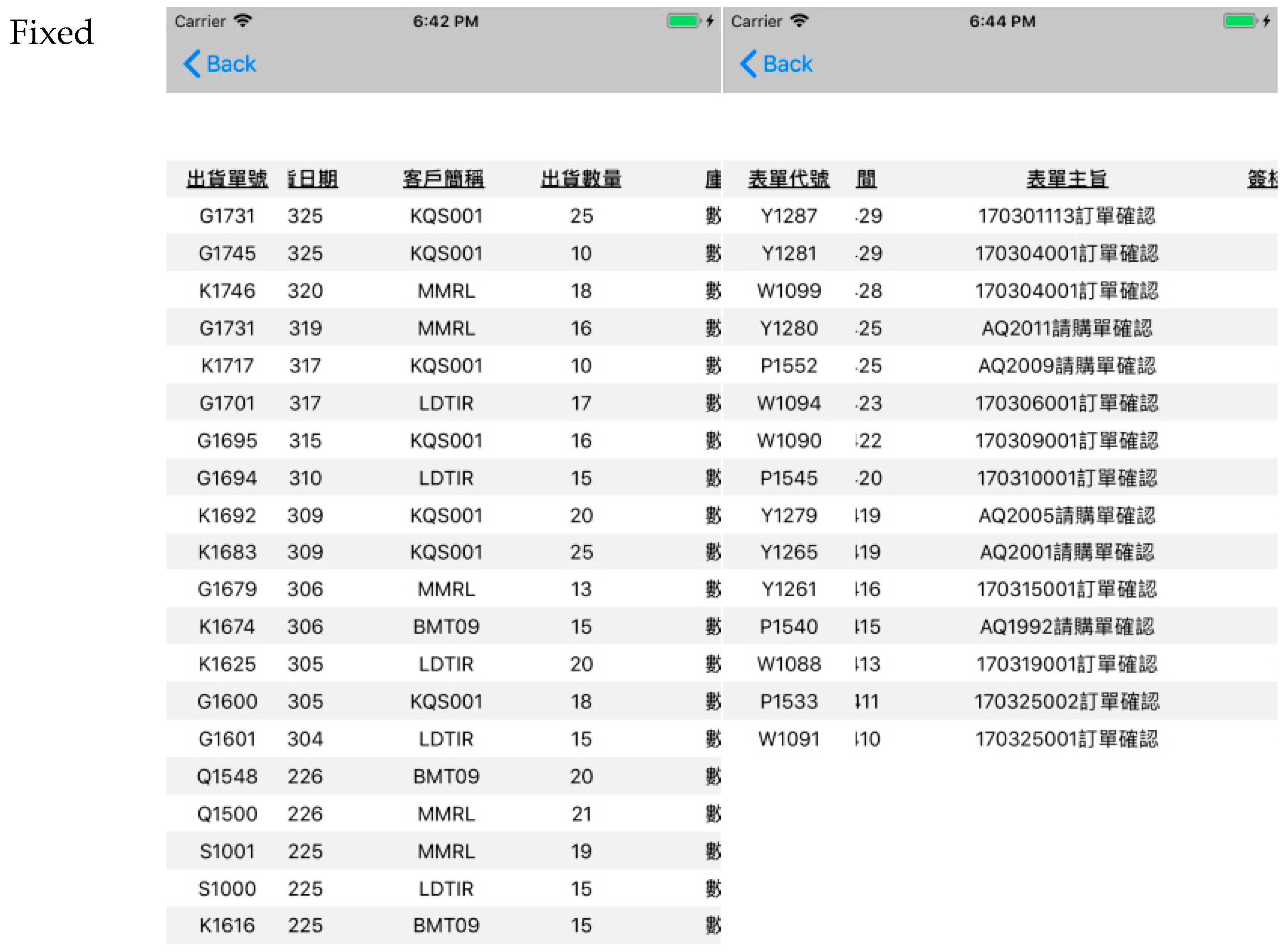
Figure A3. Table. The names of the fields on the Big Table are Shipping No., Shipping Date, Customer Code, and Shipping Quantity. The names of the fields on the Small Table are the code of the form, the creation time of the form, and the objective of the form.
Applsci 15 10832 g0a3aApplsci 15 10832 g0a3b

Appendix B. The Tasks of Experiment

  • Bar chart with big data size (30 units)
    (1)
    Among the daily inventory levels, which products have inventory below 30? Please record the products and their corresponding dates.
    (2)
    Please identify on which days product H002 had the lowest sales volume for that day.
    (3)
    Please sort the production volume on 3/11 from highest to lowest.
    (4)
    Please write down which products had inventory levels equal to 60 on which days.
    (5)
    Please identify which days had 2 products with daily production volume exceeding 20 (not including 20), and write down the products as well.
    (6)
    What was the product with the highest inventory on 3/18?
    (7)
    Please observe the daily sales volume from 3/5–20 and identify which dates had two or more products with sales volume less than 20 (not including 20), and which products.
    (8)
    Please write down the sales volume of all products on 3/20.
  • Bar chart with small data size (12 units)
    (1)
    In which months was the monthly inventory of product M009 below 500?
    (2)
    In which months were the monthly production volumes of both P001 and A010 below 300?
    (3)
    What was the inventory level of each product in December?
    (4)
    Which products had monthly sales exceeding 900, and in which months?
    (5)
    In which months were actual sales lower than forecasted sales?
    (6)
    What was the ranking of product production volume in September? Please list from highest to lowest.
    (7)
    Which months had two or more products with sales volume below 500? Write down the months and products.
    (8)
    What was the difference between actual sales and forecasted sales in November?
  • Line chart with big data size (30 units)
    (1)
    In the historical annual sales volume, what were all the changes from 1995 to 2000? Rising, falling, or unchanged.
    (2)
    Please write down the sales changes for M009 from 3/25–27. Rising, falling, or unchanged.
    (3)
    Please write down which products had declining production volume from 3/26–27.
    (4)
    Please write down the date ranges when A010’s inventory increased continuously for two or more days.
    (5)
    Please observe between 3/5–20, the date ranges when both P001 and A010’s production volumes increased.
    (6)
    Between which two years did the historical annual sales volume have the largest decline?
    (7)
    Please write down the sales volume changes for all products from 3/21–22. Rising, falling, or unchanged.
    (8)
    Which product had the largest inventory decrease from 3/14–15?
  • Line chart with small data size (12 units)
    (1)
    What were the month ranges when product P001’s inventory decreased?
    (2)
    Observing the same-period sales volume, what were the month ranges when 2016 increased and 2017 decreased?
    (3)
    Which products had increased sales volume from August to September?
    (4)
    What were the changes in the same-period sales volume from July to August, respectively?
    (5)
    What were the month ranges when both M009 and A010’s monthly sales volumes declined?
    (6)
    Which products had decreased inventory from October to November?
    (7)
    In which months did each of the four products have the largest increase in sales volume?
    (8)
    For the same-period sales volume change from September to October, which year had a larger magnitude of change? Please write down the amount of increase or decrease.
  • Table with big data size (30 units)
    (1)
    Which orders were shipped on 3/17? Please record the shipping numbers and status.
    (2)
    In order management, which orders were placed on 4/22? Write down the order numbers and amounts.
    (3)
    Referring to shipping management, which orders currently have insufficient inventory and are still being prepared? Please write down the shipping numbers.
    (4)
    In order management, which orders have amounts greater than 5000? Please record the order numbers and corresponding product quantities.
  • Table with small data size (12 units)
    (1)
    Which products have an inventory quantity below 10? Please write down the product codes.
    (2)
    Which products have an inventory cost higher than 1300? Please record the product codes and corresponding inventory quantities.
    (3)
    In the current inventory status, which products have an average cost greater than 100? Please write down the product codes.
    (4)
    Which forms have not yet been approved? Please write down the form numbers.

References

  1. Chataut, R.; Phoummalayvane, A.; Akl, R. Unleashing the Power of IoT: A Comprehensive Review of IoT Applications and Future Prospects in Healthcare, Agriculture, Smart Homes, Smart Cities, and Industry 4.0. Sensors 2023, 23, 7194. [Google Scholar] [CrossRef] [PubMed]
  2. Chen, S.; Xu, H.; Liu, D.; Hu, B.; Wang, H. A Vision of IoT: Applications, Challenges, and Opportunities With China Perspective. IEEE Internet Things J. 2014, 1, 349–359. [Google Scholar] [CrossRef]
  3. Gubbi, J.; Buyya, R.; Marusic, S.; Palaniswami, M. Internet of Things (IoT): A vision, architectural elements, and future directions. Future Gener. Comput. Syst. 2013, 29, 1645–1660. [Google Scholar] [CrossRef]
  4. Bach, B.; Keck, M.; Rajabiyazdi, F.; Losev, T.; Meirelles, I.; Dykes, J.; Laramee, R.S.; AlKadi, M.; Stoiber, C.; Huron, S.; et al. Challenges and Opportunities in Data Visualization Education: A Call to Action. IEEE Trans. Vis. Comput. Graph. 2024, 30, 649–660. [Google Scholar] [CrossRef]
  5. Philip Chen, C.L.; Zhang, C.-Y. Data-intensive applications, challenges, techniques and technologies: A survey on Big Data. Inf. Sci. 2014, 275, 314–347. [Google Scholar] [CrossRef]
  6. Shakeel, H.M.; Iram, S.; Al-Aqrabi, H.; Alsboui, T.; Hill, R. A Comprehensive State-of-the-Art Survey on Data Visualization Tools: Research Developments, Challenges and Future Domain Specific Visualization Framework. IEEE Access 2022, 10, 96581–96601. [Google Scholar] [CrossRef]
  7. Keim, D.; Qu, H.; Ma, K.L. Big-Data Visualization. IEEE Comput. Graph. Appl. 2013, 33, 20–21. [Google Scholar] [CrossRef] [PubMed]
  8. Arman, A.; Bellini, P.; Bologna, D.; Nesi, P.; Pantaleo, G.; Paolucci, M. Automating IoT Data Ingestion Enabling Visual Representation. Sensors 2021, 21, 8429. [Google Scholar] [CrossRef]
  9. Lee, I.; Lee, K. The Internet of Things (IoT): Applications, investments, and challenges for enterprises. Bus. Horiz. 2015, 58, 431–440. [Google Scholar] [CrossRef]
  10. Theodorakopoulos, L.; Theodoropoulou, A.; Stamatiou, Y. A State-of-the-Art Review in Big Data Management Engineering: Real-Life Case Studies, Challenges, and Future Research Directions. Eng 2024, 5, 1266–1297. [Google Scholar] [CrossRef]
  11. Mittelstädt, V.; Brauner, P.; Blum, M.; Ziefle, M. On the Visual Design of ERP Systems The—Role of Information Complexity, Presentation and Human Factors. Procedia Manuf. 2015, 3, 448–455. [Google Scholar] [CrossRef]
  12. Ziefle, M.; Brauner, P.; Speicher, F. Effects of data presentation and perceptual speed on speed and accuracy in table reading for inventory control. Occup. Ergon. 2015, 12, 119–129. [Google Scholar] [CrossRef]
  13. Vărzaru, A.A.; Bocean, C.G. Digital Transformation and Innovation: The Influence of Digital Technologies on Turnover from Innovation Activities and Types of Innovation. Systems 2024, 12, 359. [Google Scholar] [CrossRef]
  14. Marcotte, E. Responsive Web Design. 2010. Available online: https://alistapart.com/article/responsive-web-design/ (accessed on 8 August 2025).
  15. Marcotte, E. Responsive Web Design; A Book Apart: New York, NY, USA, 2011; ISBN 978-1-937557-18-8. [Google Scholar]
  16. Schade, A. Responsive Web Design (RWD) and User Experience. 2014. Available online: https://www.nngroup.com/articles/responsive-web-design-definition/ (accessed on 8 August 2025).
  17. Tensmeyer, C.; Bylinski, Z.; Cai, T.; Miller, D.; Nenkova, A.; Niklaus, A.; Wallace, S. Web Table Formatting Affects Readability on Mobile Devices. In Proceedings of the ACM Web Conference 2023, Austin, TX, USA, 30 April–4 May 2023; pp. 1334–1344. [Google Scholar]
  18. Jones, M.; Buchanan, G.; Thimbleby, H. Improving web search on small screen devices. Interact. Comput. 2003, 15, 479–495. [Google Scholar] [CrossRef]
  19. Marcial, L.; Hemminger, B. Scrolling and pagination for within document searching: The impact of screen size and interaction style. Proc. Am. Soc. Inf. Sci. Technol. 2011, 48, 1–4. [Google Scholar] [CrossRef]
  20. Okur, N.; Saricam, C. Digital Markets and E-Commerce Applications in Fashion Retailing. In Changing Textile and Apparel Consumption in Transformative Era of Sustainability and Digitalization; Saricam, C., Okur, N., Eds.; Springer Nature: Cham, Switzerland, 2025; pp. 71–111. [Google Scholar]
  21. Naylor, J.S.; Sanchez, C.A. Smartphone Display Size Influences Attitudes Toward Information Consumed on Small Devices. Soc. Sci. Comput. Rev. 2017, 36, 251–260. [Google Scholar] [CrossRef]
  22. Bao, P.; Pierce, J.; Whittaker, S.; Zhai, S. Smart phone use by non-mobile business users. In Proceedings of the 13th International Conference on Human Computer Interaction with Mobile Devices and Services, Stockholm, Sweden, 30 August–2 September 2011; pp. 445–454. [Google Scholar]
  23. Sanchez, C.A.; Branaghan, R.J. Turning to learn: Screen orientation and reasoning with small devices. Comput. Hum. Behav. 2011, 27, 793–797. [Google Scholar] [CrossRef]
  24. Card, S.K.; Mackinlay, J.; Shneiderman, B. Readings in Information Visualization: Using Vision to Think; Morgan Kaufmann: San Francisco, CA, USA, 1999. [Google Scholar]
  25. Kowalski, G.J.; Maybury, M.T. Information Storage and Retrieval Systems: Theory and Implementation; Springer: Berlin/Heidelberg, Germany, 2002. [Google Scholar]
  26. Firat, E.E.; Joshi, A.; Laramee, R.S. Interactive visualization literacy: The state-of-the-art. Inf. Vis. 2022, 21, 285–310. [Google Scholar] [CrossRef]
  27. Tufte, E.R. Visual Explanations: Images and Quantities, Evidence and Narrative; Graphics Press: Cheshire, CT, USA, 1997. [Google Scholar]
  28. Ware, C. Information Visualization: Perception for Design; Morgan Kaufmann: San Francisco, CA, USA, 2019. [Google Scholar]
  29. Shao, H.; Martinez-Maldonado, R.; Echeverria, V.; Yan, L.; Gasevic, D. Data Storytelling in Data Visualisation: Does it Enhance the Efficiency and Effectiveness of Information Retrieval and Insights Comprehension? In Proceedings of the CHI Conference on Human Factors in Computing Systems, Honolulu, HI, USA, 11–16 May 2024; pp. 1–21. [Google Scholar]
  30. Eberhard, K. The effects of visualization on judgment and decision-making: A systematic literature review. Manag. Rev. Q. 2021, 73, 167–214. [Google Scholar] [CrossRef]
  31. Alharbi, F.; Kashyap, G.S. Empowering Network Security through Advanced Analysis of Malware Samples: Leveraging System Metrics and Network Log Data for Informed Decision-Making. Int. J. Networked Distrib. Comput. 2024, 12, 250–264. [Google Scholar] [CrossRef]
  32. Butler, D.M.; Almond, J.C.; Bergeron, R.D.; Brodlie, K.W.; Haber, R.B. Visualization reference models. In Proceedings of the 4th conference on Visualization’93, San Jose, CA, USA, 25–29 October 1993; pp. 337–342. [Google Scholar]
  33. Huang, Z.; Yuan, L. Enhancing learning and exploratory search with concept semantics in online healthcare knowledge management systems: An interactive knowledge visualization approach. Expert. Syst. Appl. 2024, 237, 121558. [Google Scholar] [CrossRef]
  34. Khan, M.; Khan, S.S. Data and information visualization methods, and interactive mechanisms: A survey. Int. J. Comput. Appl. 2011, 34, 1–14. [Google Scholar]
  35. Ratwani, R.M.; Trafton, J.G.; Boehm-Davis, D.A. Thinking graphically: Connecting vision and cognition during graph comprehension. J. Exp. Psychol. Appl. 2008, 14, 36. [Google Scholar] [CrossRef] [PubMed]
  36. Zhu, J.; Zhang, J.; Zhu, Q.; Li, W.; Wu, J.; Guo, Y. A knowledge-guided visualization framework of disaster scenes for helping the public cognize risk information. Int. J. Geogr. Inf. Sci. 2024, 38, 626–653. [Google Scholar] [CrossRef]
  37. Li, W.; Zhu, J.; Zhu, Q.; Zhang, J.; Han, X.; Dehbi, Y. Visual attention-guided augmented representation of geographic scenes: A case of bridge stress visualization. Int. J. Geogr. Inf. Sci. 2024, 38, 527–549. [Google Scholar] [CrossRef]
  38. Liu, Z. Evaluating Digitalized Visualization Interfaces: Integrating Visual Design Elements and Analytic Hierarchy Process. Int. J. Hum. –Comput. Interact. 2024, 41, 5731–5760. [Google Scholar] [CrossRef]
  39. Salkind, N.J.; Frey, B.B. Statistics for People Who (Think They) Hate Statistics: Using Microsoft Excel; Sage Publications: Thousand Oaks, CA, USA, 2021. [Google Scholar]
  40. Cleveland, W.S.; McGill, R. Graphical Perception: The Visual Decoding of Quantitative Information on Graphical Displays of Data. J. R. Stat. Soc. Ser. A 1987, 150, 192–210. [Google Scholar] [CrossRef]
  41. Cleveland, W.S.; McGill, M.E.; McGill, R. The Shape Parameter of a Two-Variable Graph. J. Am. Stat. Assoc. 1988, 83, 289–300. [Google Scholar] [CrossRef]
  42. Beattie, V.; Jones, M.J. The Impact of Graph Slope on Rate of Change Judgments in Corporate Reports. Abacus 2002, 38, 177–199. [Google Scholar] [CrossRef]
  43. Polidoro, F.; Liu, Y.; Craig, P. Enhancing Mobile Visualisation Interactivity: Insights on a Mixed-fidelity Prototyping Approach. In Proceedings of the Extended Abstracts of the CHI Conference on Human Factors in Computing Systems, Honolulu, HI, USA, 11–16 May 2024; pp. 1–7. [Google Scholar]
  44. Chittaro, L. Visualizing information on mobile devices. Computer 2006, 39, 40–45. [Google Scholar] [CrossRef]
  45. Andrews, K.; Smrdel, A. Responsive Data Visualisation. In Proceedings of the EuroVis (Posters), Barcelona, Spain, 12–16 June 2017; pp. 113–115. [Google Scholar]
  46. Prakash, Y.; Khan, P.A.; Nayak, A.K.; Jayarathna, S.; Lee, H.N.; Ashok, V. Towards Enhancing Low Vision Usability of Data Charts on Smartphones. IEEE Trans. Vis. Comput. Graph. 2025, 31, 853–863. [Google Scholar] [CrossRef]
  47. Korner, C. Learning Responsive Data Visualization; Packt Publishing Ltd.: Birmingham, UK, 2016. [Google Scholar]
  48. Baigabulov, S.; Ipalakova, M.; Turzhanov, U. Virtual Reality Enabled Immersive Data Visualisation for Data Analysis. Procedia Comput. Sci. 2025, 265, 602–609. [Google Scholar] [CrossRef]
  49. Cook, M. Building Responsive Data Visualizations with D3.js; Packt Publishing: Birmingham, UK, 2015. [Google Scholar]
  50. Schottler, S.; Dykes, J.; Wood, J.; Hinrichs, U.; Bach, B. Constraint-Based Breakpoints for Responsive Visualization Design and Development. IEEE Trans. Vis. Comput. Graph. 2025, 31, 4593–4604. [Google Scholar] [CrossRef]
  51. Nagle, R. Responsive Charts with D3 and Backbone. Chicago Tribune News Apps Blog. 7 March 2014. Available online: https://newsapps.wordpress.com/2014/03/07/responsive-charts-with-d3-and-backbone/ (accessed on 8 August 2025).
  52. Lindsay, P.H.; Norman, D.A. Human Information Processing: An Introduction to Psychology; Academic Press: New York, NY, USA, 2013. [Google Scholar]
  53. Lohse, G.L. A Cognitive Model for Understanding Graphical Perception. Hum.–Comput. Interact. 1993, 8, 353–388. [Google Scholar] [CrossRef]
  54. Cleveland, W.S.; McGill, R. Graphical Perception: Theory, Experimentation, and Application to the Development of Graphical Methods. J. Am. Stat. Assoc. 1984, 79, 531–554. [Google Scholar] [CrossRef]
  55. Cleveland, W.S. A Model for Studying Display Methods of Statistical Graphics. J. Comput. Graph. Stat. 1993, 2, 323–343. [Google Scholar] [CrossRef]
  56. Woods, D.D. Visual momentum: A concept to improve the cognitive coupling of person and computer. Int. J. Man-Mach. Stud. 1984, 21, 229–244. [Google Scholar] [CrossRef]
  57. ISO 9241-11:1998; Ergonomic Requirements for Office Work with Visual Display Terminals (VDTs)—Part 11: Guidance on Usability. International Organization for Standardization: Geneva, Switzerland, 1998.
  58. Nielsen, J. Usability Engineering; Morgan Kaufmann: San Francisco, CA, USA, 1994. [Google Scholar]
  59. Hackos, J.T.; Redish, J.C. User and Task Analysis for Interface Design; John Wiley & Sons, Inc.: Hoboken, NJ, USA, 1998. [Google Scholar]
  60. Longo, L.; Rusconi, F.; Noce, L. The importance of human mental workload in web design. In Proceedings of the WEBIST 2012: 8th International Conference on Web Information Systems and Technologies, Porto, Portugal, 18–21 April 2012. [Google Scholar]
  61. Tracy, J.P.; Albers, M.J. Measuring Cognitive Load to Test the Usability of Web Sites. In Proceedings of the 53rd Annual Conference of the Society for Technical Communication (STC), Las Vegas, NV, USA, 7–10 May 2006; pp. 256–260. [Google Scholar]
  62. Brooke, J. SUS-A quick and dirty usability scale. Usability Eval. Ind. 1996, 189, 4–7. [Google Scholar]
  63. Bangor, A.; Kortum, P.T.; Miller, J.T. An Empirical Evaluation of the System Usability Scale. Int. J. Hum. -Comput. Interact. 2008, 24, 574–594. [Google Scholar] [CrossRef]
  64. Bangor, A.; Kortum, P.; Miller, J. Determining what individual SUS scores mean: Adding an adjective rating scale. J. Usability Stud. 2009, 4, 114–123. [Google Scholar]
  65. Hart, S.G.; Staveland, L.E. Development of NASA-TLX (Task Load Index): Results of Empirical and Theoretical Research. In Human Mental Workload; Hancock, P.A., Meshkati, N., Eds.; Advances in Psychology, Vol. 52; North-Holland: Amsterdam, The Netherlands, 1988; pp. 139–183. [Google Scholar] [CrossRef]
  66. Bangor, A.W. Display Technology and Ambient Illumination Influences on Visual Fatigue at VDT Workstations. Ph.D. Thesis, Virginia Polytechnic Institute and State University, Blacksburg, Virginia, 2000. [Google Scholar]
  67. Gliem, J.A.; Gliem, R.R. Calculating, Interpreting, and Reporting Cronbach’s Alpha Reliability Coefficient for Likert-Type Scales. In Proceedings of the 2003 Midwest Research-to-Practice Conference in Adult, Continuing, and Community Education, Columbus, OH, USA, 8–10 October 2003; pp. 82–88. [Google Scholar]
  68. Tavakol, M.; Dennick, R. Making sense of Cronbach’s alpha. Int. J. Med. Educ. 2011, 2, 53. [Google Scholar] [CrossRef] [PubMed]
  69. Jarvenpaa, S.L.; Dickson, G.W. Graphics and managerial decision making: Research-based guidelines. Commun. ACM 1988, 31, 764–774. [Google Scholar] [CrossRef]
  70. Melody Carswell, C.; Wickens, C.D. Information integration and the object display An interaction of task demands and display superiority. Ergonomics 1987, 30, 511–527. [Google Scholar] [CrossRef]
  71. Simcox, W.A. A Method for Pragmatic Communication in Graphic Displays. Hum. Factors 1984, 26, 483–487. [Google Scholar] [CrossRef]
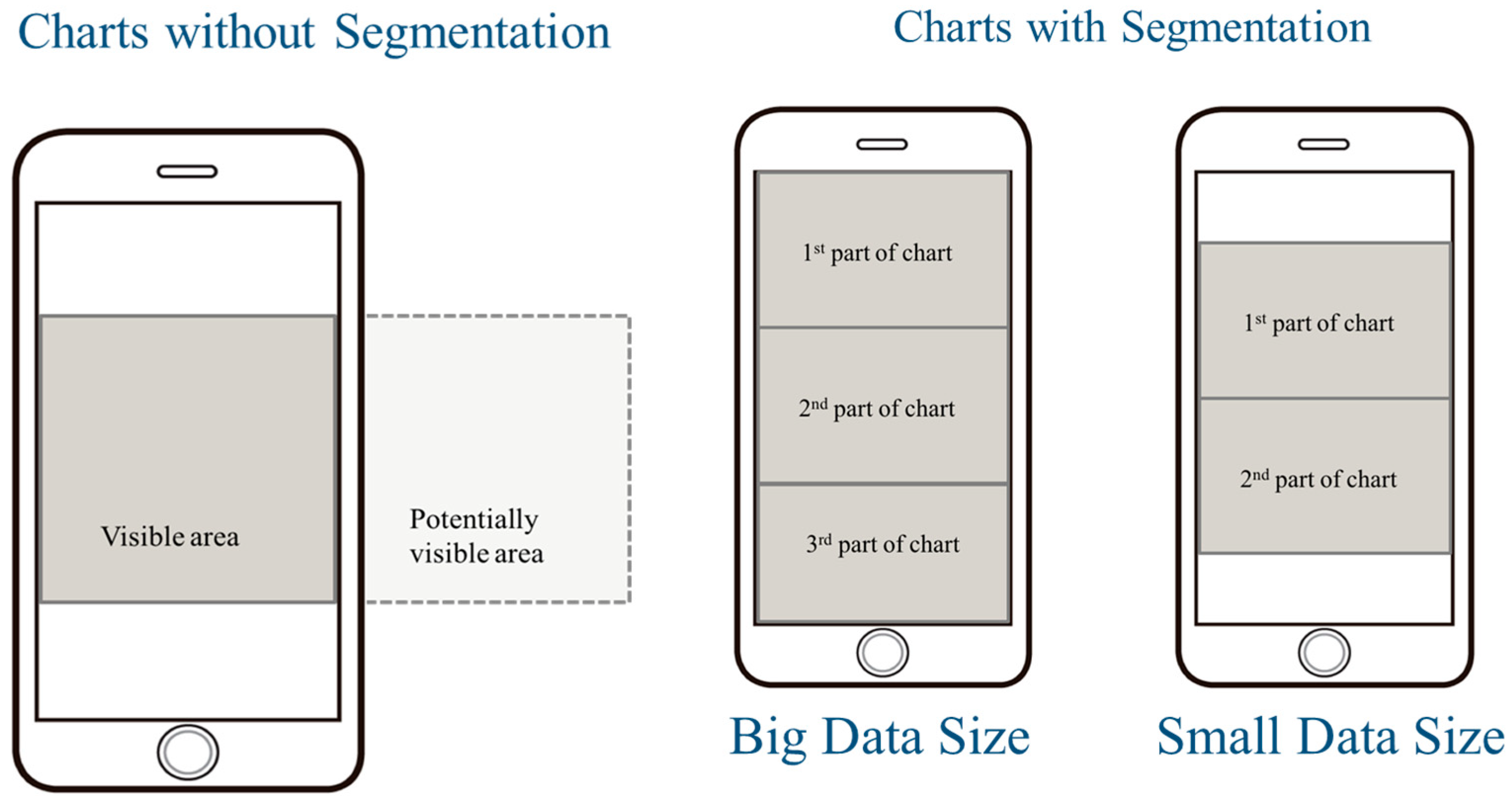
Figure 1. The schema of experimental interfaces of a Chart.
Applsci 15 10832 g001
Figure 2. The schema of experimental interfaces of a Table.
Applsci 15 10832 g002
Figure 3. The procedures of the experiment.
Applsci 15 10832 g003
Figure 4. Task completion time (seconds) in the Bar chart.
Applsci 15 10832 g004
Figure 5. Interaction effect in the Line Chart.
Applsci 15 10832 g005
Figure 6. Task completion time (seconds) in the Table.
Applsci 15 10832 g006
Figure 7. SUS scores in the Bar chart.
Applsci 15 10832 g007
Figure 8. SUS scores in the Line chart.
Applsci 15 10832 g008
Figure 9. SUS scores of the Table.
Applsci 15 10832 g009
Figure 10. NASA-TLX scores in the Bar chart.
Applsci 15 10832 g010
Figure 11. NASA-TLX scores in the Line chart.
Applsci 15 10832 g011
Figure 12. NASA-TLX scores in the Table.
Applsci 15 10832 g012
Table 1. The level settings of the applied factors in this study.
FactorChartTable
Data Size12 units/30 units12 units/30 units
SegmentationDragging/CuttingFixed column/Non-fixed column
Table 2. Task completion time (seconds) statistical analysis in the Bar chart.
Data SizeSegmentationnMeanStd. DeviationStd. Error
BigDragging11326.4578.7223.73
Cutting11257.9161.1418.43
SmallDragging11209.0042.6912.87
Cutting11189.5546.0613.89
Table 3. Task completion time (seconds) statistical analysis in the Line chart.
Data SizeSegmentationnMeanStd. DeviationStd. Error
BigDragging11195.1837.6111.34
Cutting11234.9152.0915.70
SmallDragging11206.9139.3911.88
Cutting11175.4627.488.28
Table 4. Task completion time (seconds) statistical analysis in the Table.
Data SizeSegmentationnMeanStd. DeviationStd. Error
BigDragging11236.1841.9612.65
Cutting11180.8237.2311.23
SmallDragging11139.9119.305.82
Cutting11115.0019.405.85
Table 5. The reliability values of the two subjective metrics applied in this study.
Subjective MetricsCronbach’s AlphaNumber of Items
Data Size0.92610
Segmentation0.8236
Table 6. SUS scores statistical analysis in the Bar Chart.
Data SizeSegmentationnMeanStd. DeviationStd. Error
BigDragging1162.2719.155.77
Cutting1178.8610.923.29
SmallDragging1172.9623.297.02
Cutting1182.279.382.83
Table 7. SUS scores statistical analysis in the Line Chart.
Data SizeSegmentationnMeanStd. DeviationStd. Error
BigDragging1170.9113.003.92
Cutting1176.1418.185.48
SmallDragging1163.4116.334.92
Cutting1182.512.943.90
Table 8. SUS scores statistical analysis in the Table.
Data SizeSegmentationnMeanStd. DeviationStd. Error
BigDragging1142.7318.725.65
Cutting1182.2718.225.49
SmallDragging1150.0017.995.43
Cutting1181.3625.637.73
Table 9. The statistical summarizations of the Adjective Rating Scale for the SUS in this study.
RatingCountMeanStd. Deviation
Best imaginable1694.847.77
Excellent2781.3915.04
Good3874.3411.79
OK2367.509.91
Poor1747.7917.11
Awful934.4419.83
Worst imaginable117.50NA
Table 10. NASA-TLX scores statistical analysis in the Bar Chart.
Data SizeSegmentationnMeanStd. DeviationStd. Error
BigDragging114.041.050.32
Cutting112.951.170.35
SmallDragging113.301.120.34
Cutting112.581.090.33
Table 11. NASA-TLX scores statistical analysis in the Line Chart.
Data SizeSegmentationnMeanStd. DeviationStd. Error
BigDragging113.471.130.34
Cutting112.721.060.32
SmallDragging113.851.240.37
Cutting112.700.790.24
Table 12. NASA-TLX scores statistical analysis in the Table.
Data SizeSegmentationnMeanStd. DeviationStd. Error
BigDragging114.721.230.37
Cutting112.521.140.34
SmallDragging113.921.070.32
Cutting112.220.970.29
Table 13. The summarisations of the implications from the results of this study.
Implications
The bar chart with cutting spends less time.
The line chart with cutting spends more time.
The table with a fixed column takes less time.
The bar chart with cutting has a higher subjective rating of usability.
The line chart with cutting has a higher subjective rating of usability.
The table with a fixed column has a higher subjective rating of usability.
The bar chart with cutting has a lower subjective mental workload.
The line chart with cutting has a lower subjective mental workload.
The table with a fixed column has a lower subjective mental workload.
Disclaimer/Publisher’s Note: The statements, opinions and data contained in all publications are solely those of the individual author(s) and contributor(s) and not of MDPI and/or the editor(s). MDPI and/or the editor(s) disclaim responsibility for any injury to people or property resulting from any ideas, methods, instructions or products referred to in the content.