
Visualization of a Multidimensional Point Cloud as a 3D Swarm of Avatars


Abstract
1. Introduction
2. Related Work
3. Methodology
3.1. Paradigm and Semantic Assignment of Variables
- Intuitive dimensions—readily interpreted by users—are mapped onto visual characteristics of avatars (e.g., face shape, expressions, color).
- Technical dimensions—more abstract or difficult to interpret—are projected into spatial coordinates in the observation space, possibly after dimensionality reduction (e.g., PCA).
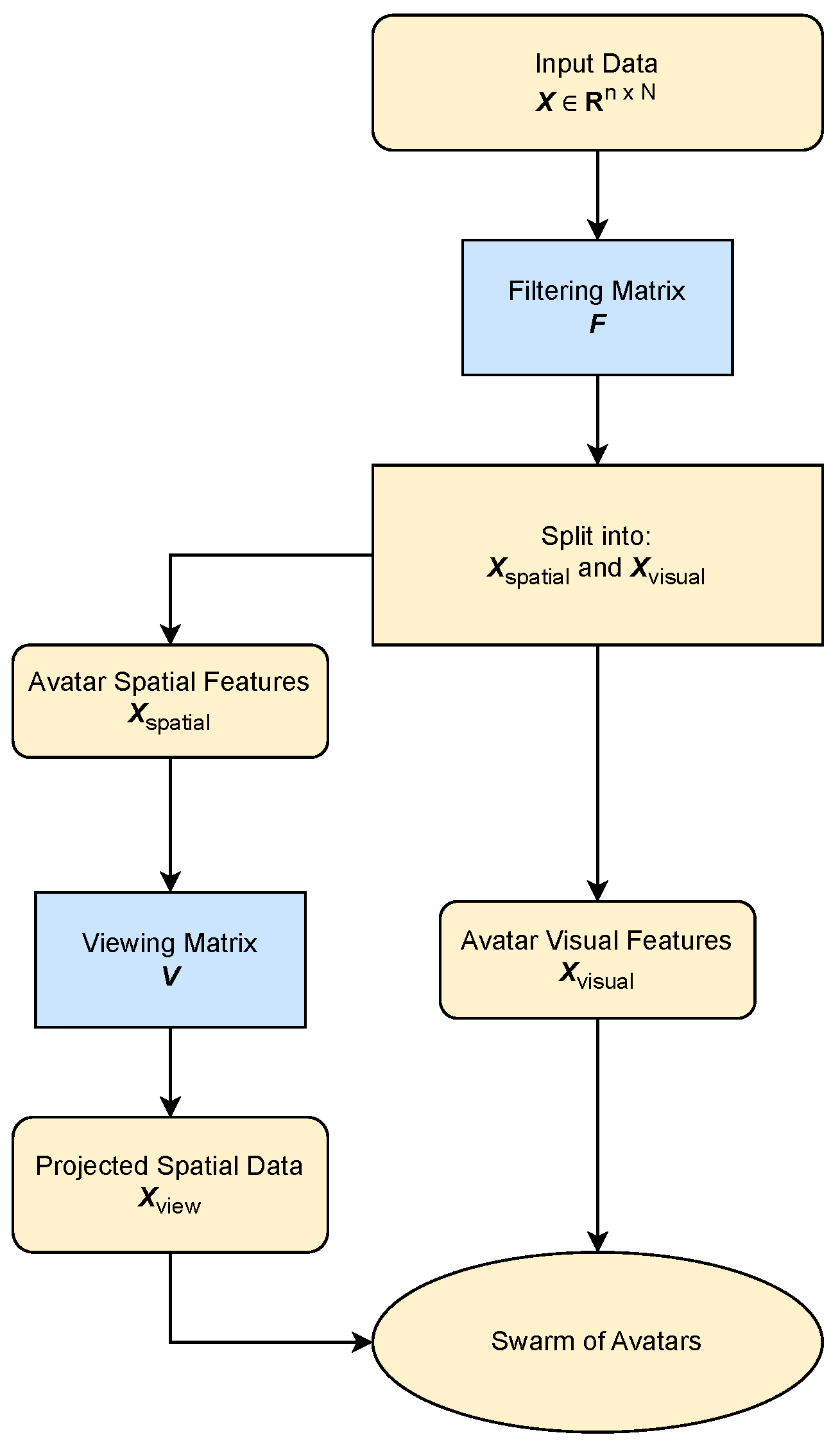
3.2. Implementation
- Eigen::MatrixXd X(n, N);
3.2.1. Assigning Dimensions to Categories
3.2.2. Filtering Matrix
- Eigen::MatrixXd F(k + m, n);
- F.setZero();
- First, for each of the spatial features and visual features selected by the user, one is set at the intersection of the row for that feature and the column of the original input dimension.
- Then, if there are still unused rows in F, and the user has selected anonymous features (), a PCA is performed on the input dimensions assigned to those anonymous features. The strongest components are selected, and their coefficient vectors are inserted into the remaining empty rows of F.
| Algorithm 1 Semantic filtering and data projection. |
| Input: data matrix X; assignment list (spatial, visual, anonymous, or ignored) Output: projected data
|
- The first k rows form the matrix , which contains spatial features.
- The following m rows form the matrix , which contains avatar visual features.
- Eigen::MatrixXd X_filtered(k + m, N);
- X_filtered = F ∗ X;
- Eigen::MatrixXd X_spatial = X_filtered.topRows(k);
- Eigen::MatrixXd X_visual = X_filtered.bottomRows(m);
3.2.3. View Matrix
- // Rotation only (k x k)
- Eigen::MatrixXd R = generateRotationMatrix(k, axis1, axis2, angle);
- // Create full (k+1 x k+1) view matrix with translation
- Eigen::MatrixXd V = Eigen::MatrixXd::Identity(k + 1, k + 1);
- V.topLeftCorner(k, k) = R;
- V.topRightCorner(k, 1) = translation_vector; // optional
- Eigen::MatrixXd X_hom(k + 1, N);
- X_hom.topRows(k) = X_spatial;
- X_hom.row(k) = Eigen::RowVectorXd::Ones(N);
- Eigen::MatrixXd X_view = V ∗ X_hom;
3.2.4. Slab-Based Filtering
- If filtering is performed in the original spatial coordinates (X_spatial), the normal vector can be taken as the last row of the rotation matrix, which defines the orientation of the view;
- If filtering is done after applying the rotation (X_view), the normal vector can be defined in canonical coordinates as , which corresponds to the last axis.
- Eigen::VectorXd slab_values = normal_vector.transpose() ∗ X_view;
- auto mask = slab_values.cwiseAbs().array() < slab_threshold;
- Eigen::MatrixXd X_visible = skip_masked(X_view, mask);
3.2.5. 3D Projection
4. Results
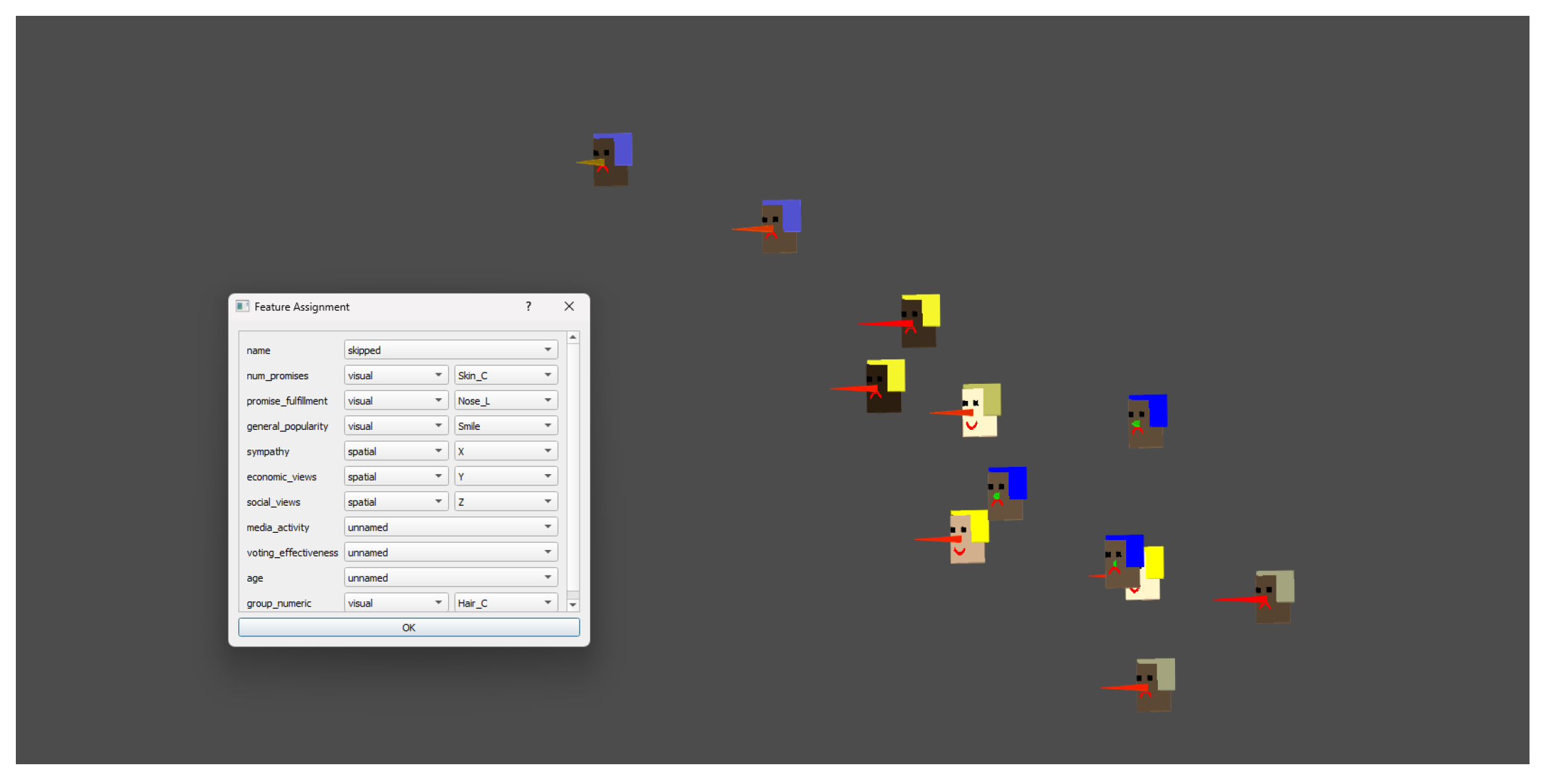
4.1. Small-Scale Illustration: Synthetic Politicians Dataset (N = 12)
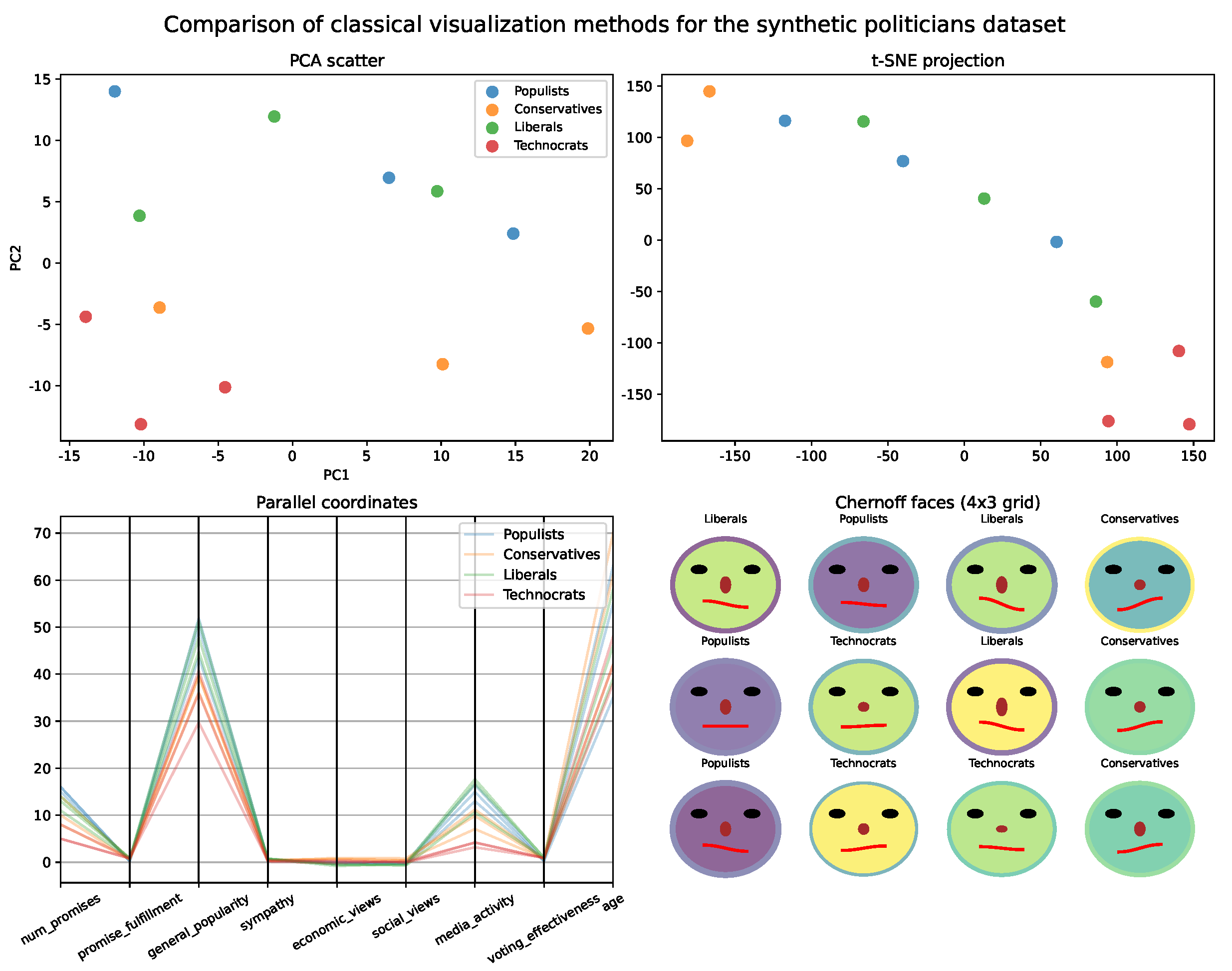
- Variable assignment:
- Avatar features: number of promises (skin color), promise fulfillment (nose length), general popularity (smile), group affiliation (hair color). Spatial coordinates: sympathy (X), economic views (Y), social views (Z). Anonymous/PCA: media activity, voting effectiveness, age.
- Interpretation and interactive exploration:
- The spatial avatar visualization enables immediate and intuitive comparison of both the position and the profile of each fictional politician. Clusters and polarization become visible in space, while characteristic features (such as promise fulfillment or popularity) are instantly “readable” from the avatar’s face. Group affiliation is recognized by hair color. Importantly, the tool supports interactive exploration, allowing users to rotate, zoom, and navigate the scene to examine clusters, compare individuals, and discover patterns from multiple perspectives. This interactivity facilitates flexible hypothesis testing and nuanced understanding—features not available in static PCA scatter plots.
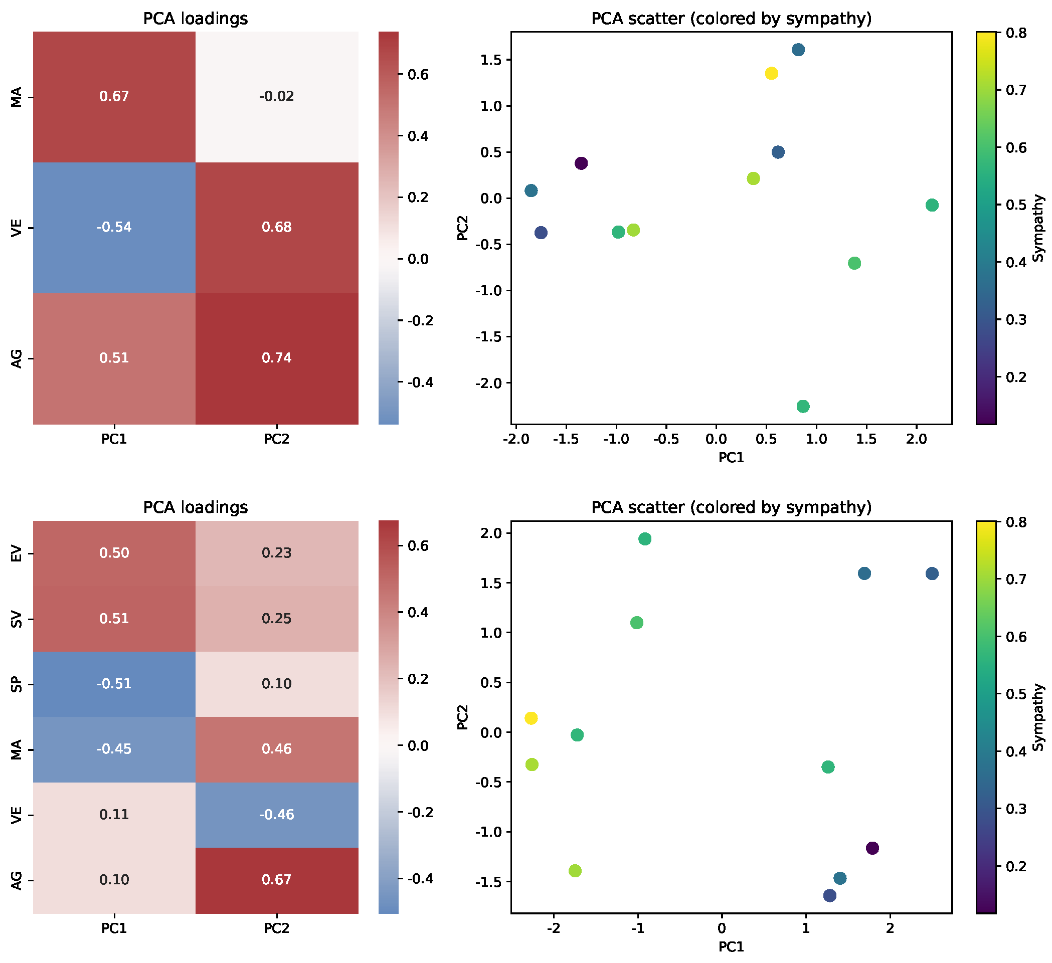
- PCA loadings and spatial interpretation:
- Principal Component Analysis was performed under two scenarios: (top) only on anonymous features (not mapped to avatars or spatial coordinates) and (bottom) on all features assigned to spatial coordinates or left anonymous (all except avatar features). Figure 7 presents heatmaps of PCA loadings and the corresponding scatter plots.
- Insights and sensitivity analysis:
- Changing the assignment of features (e.g., switching “fulfillment rate” from an avatar trait to a spatial coordinate or PCA) alters both the visual arrangement and interpretability of the visualization. Spatial avatars, thus, enable flexible, user-driven mapping, supporting either interpretability or structural discovery as needed.
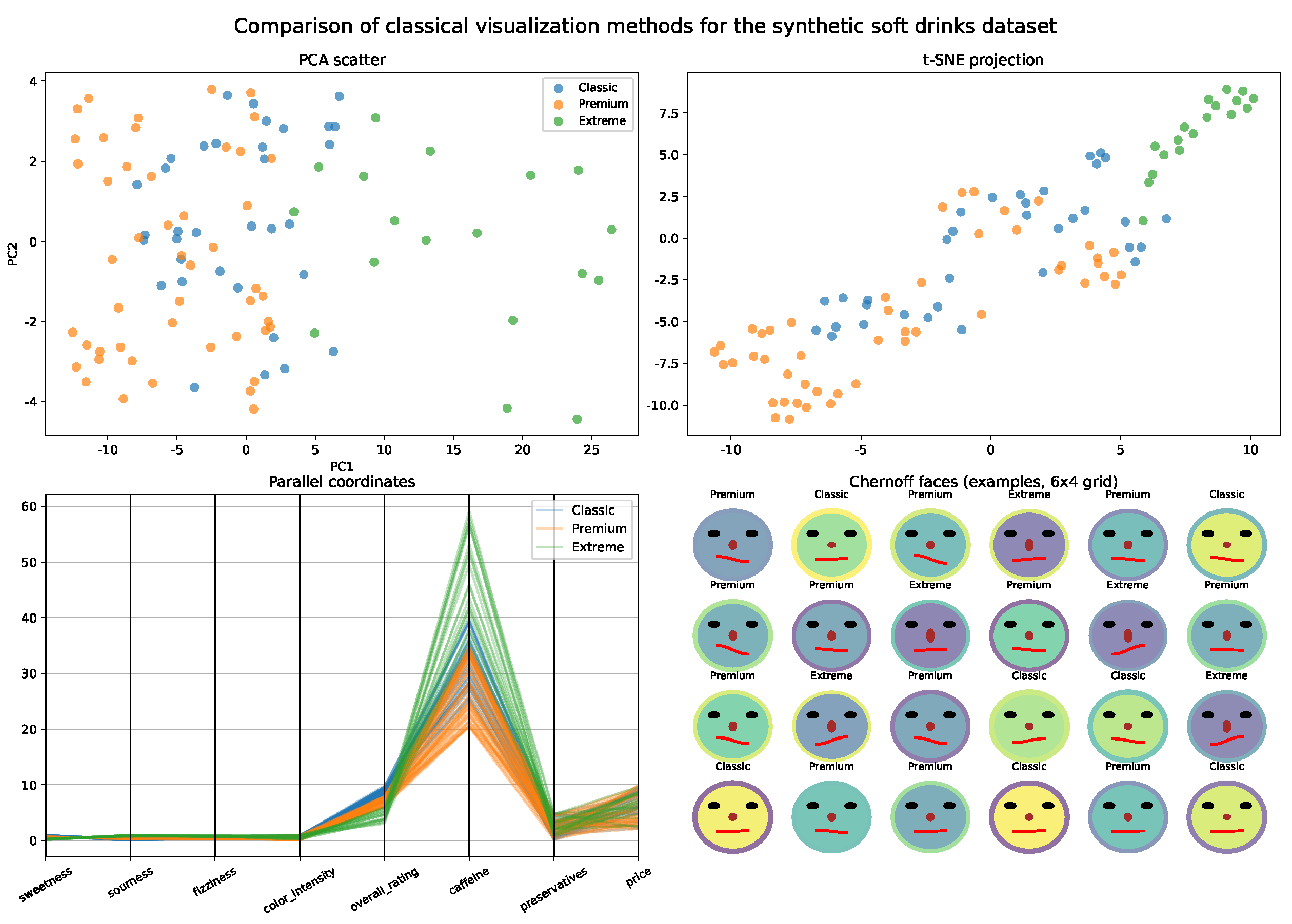
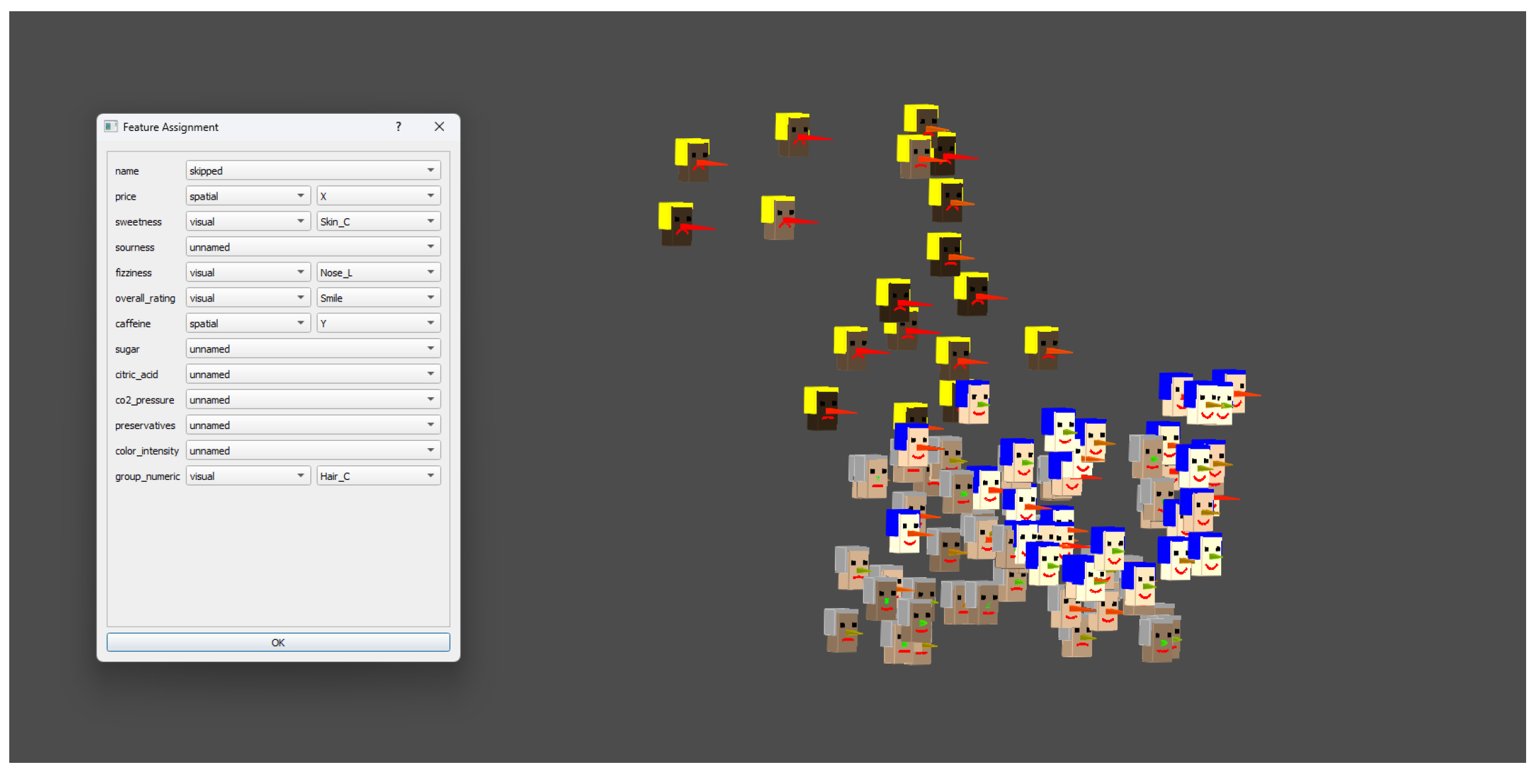
4.2. Medium-Scale Illustration: Synthetic Soft Drinks Dataset (N = 100)
- Variable assignment:
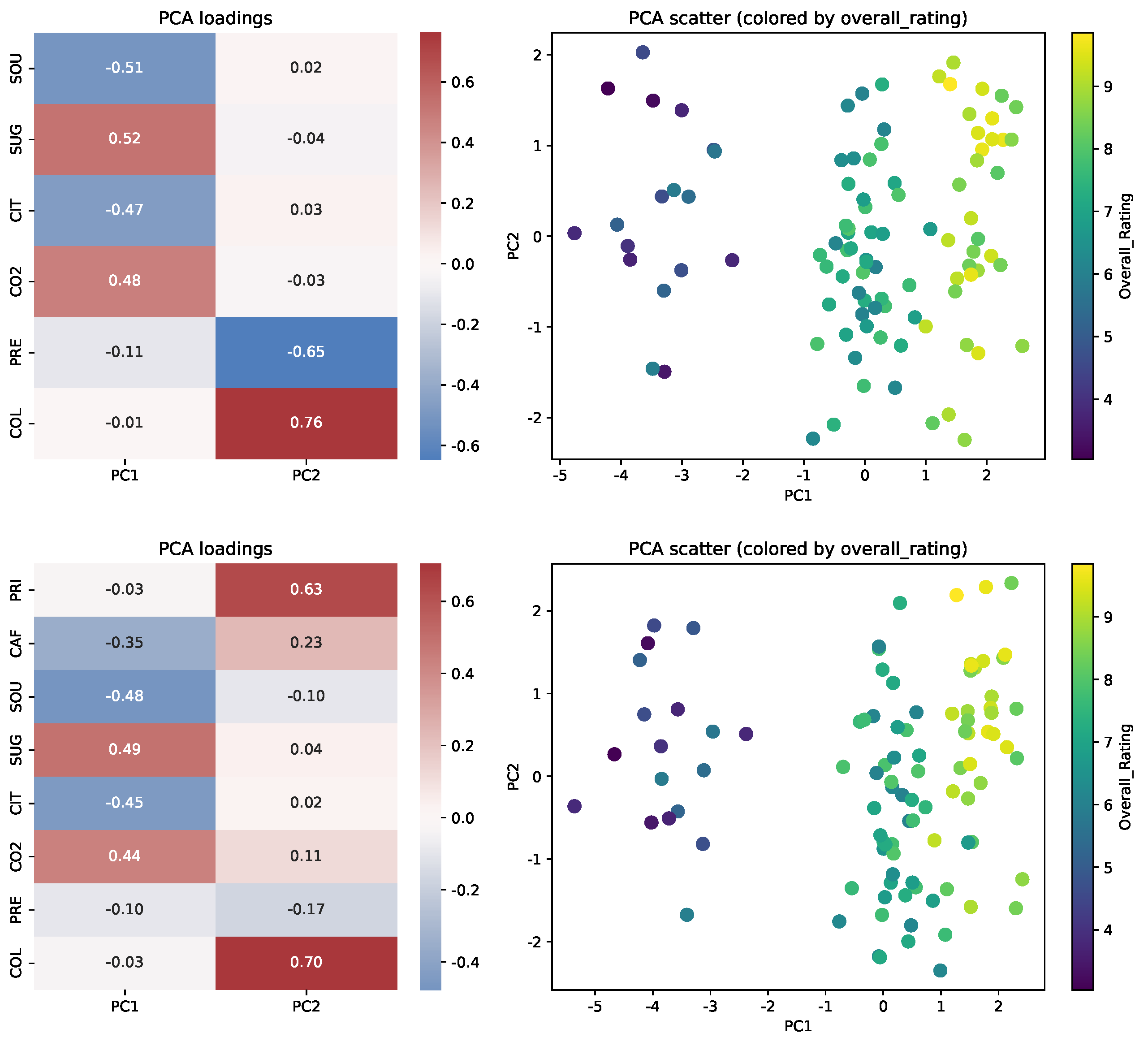
- Intuitive features (sweetness, fizziness, overall rating, color intensity) were mapped to avatar visual traits (e.g., smile, nose length, skin color, hair color). Technical features (price, caffeine) were used for spatial coordinates (X and Y axes). The remaining attributes—sourness, sugar, citric acid, CO2 pressure, preservatives, and color intensity—were included as anonymous variables for PCA-based analysis. This assignment is reflected in the Figure 9.
- PCA loadings and spatial interpretation:
- Principal component analysis was performed under two scenarios: (top) only on anonymous features (not mapped to avatars or spatial coordinates) and (bottom) on all features assigned to spatial coordinates or left anonymous. Figure 10 presents heatmaps of PCA loadings and corresponding scatter plots for both cases.
- Insights and sensitivity analysis:
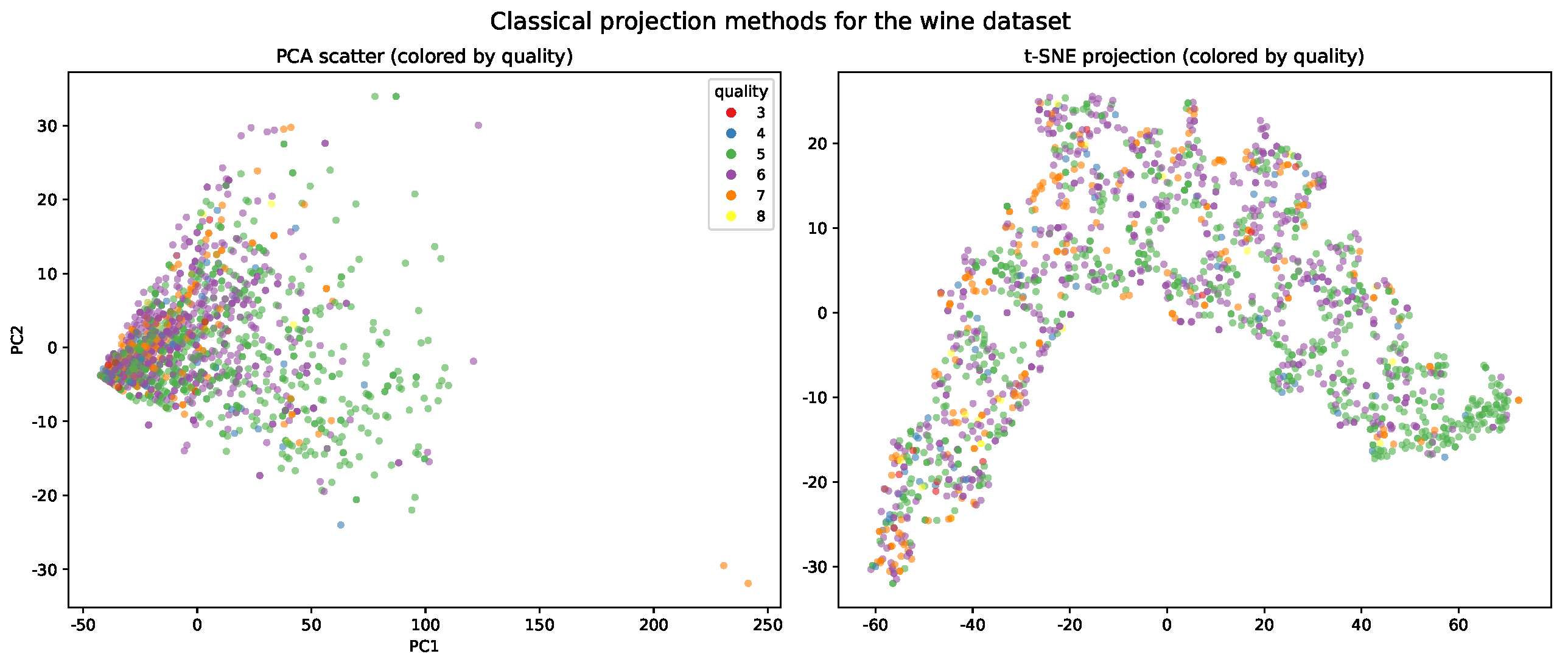
- This example demonstrates that, although dimensionality reduction techniques like PCA and t-SNE can recover the underlying group structure when relevant features dominate the variance, only the spatial avatar approach allows for the immediate interpretation of which specific sensory traits differentiate products, providing direct, profile-based insight. Switching a feature, such as “sweetness” or “fizziness”, from an avatar trait to an anonymous (PCA) feature alters the PCA scatter plot and principal component structure but at the expense of immediate interpretability in the avatar view. This flexibility allows users to prioritize either structural discovery or interpretability as needed.
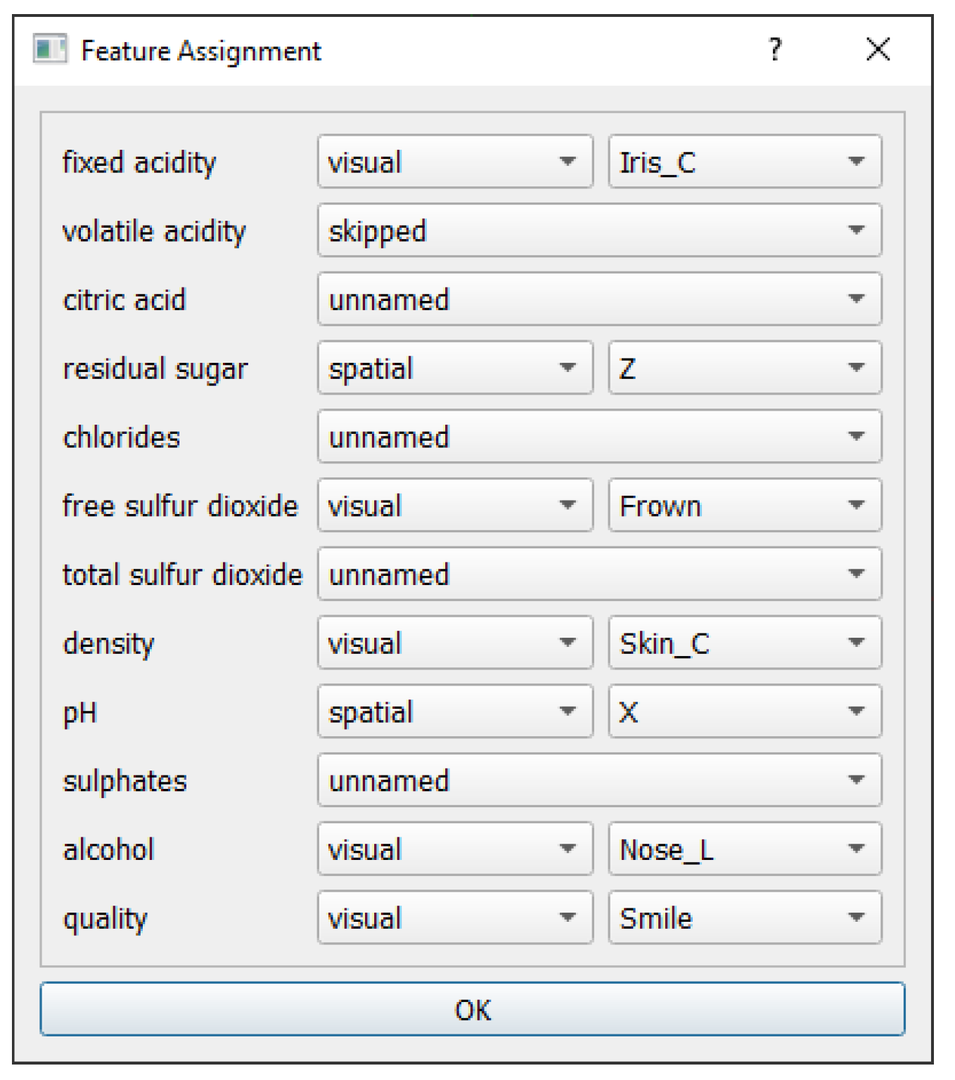
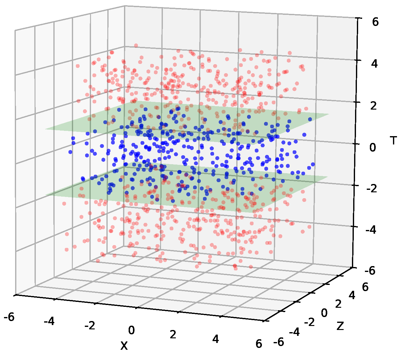
4.3. Large-Scale Real-World: Wine Dataset (N = 1599)
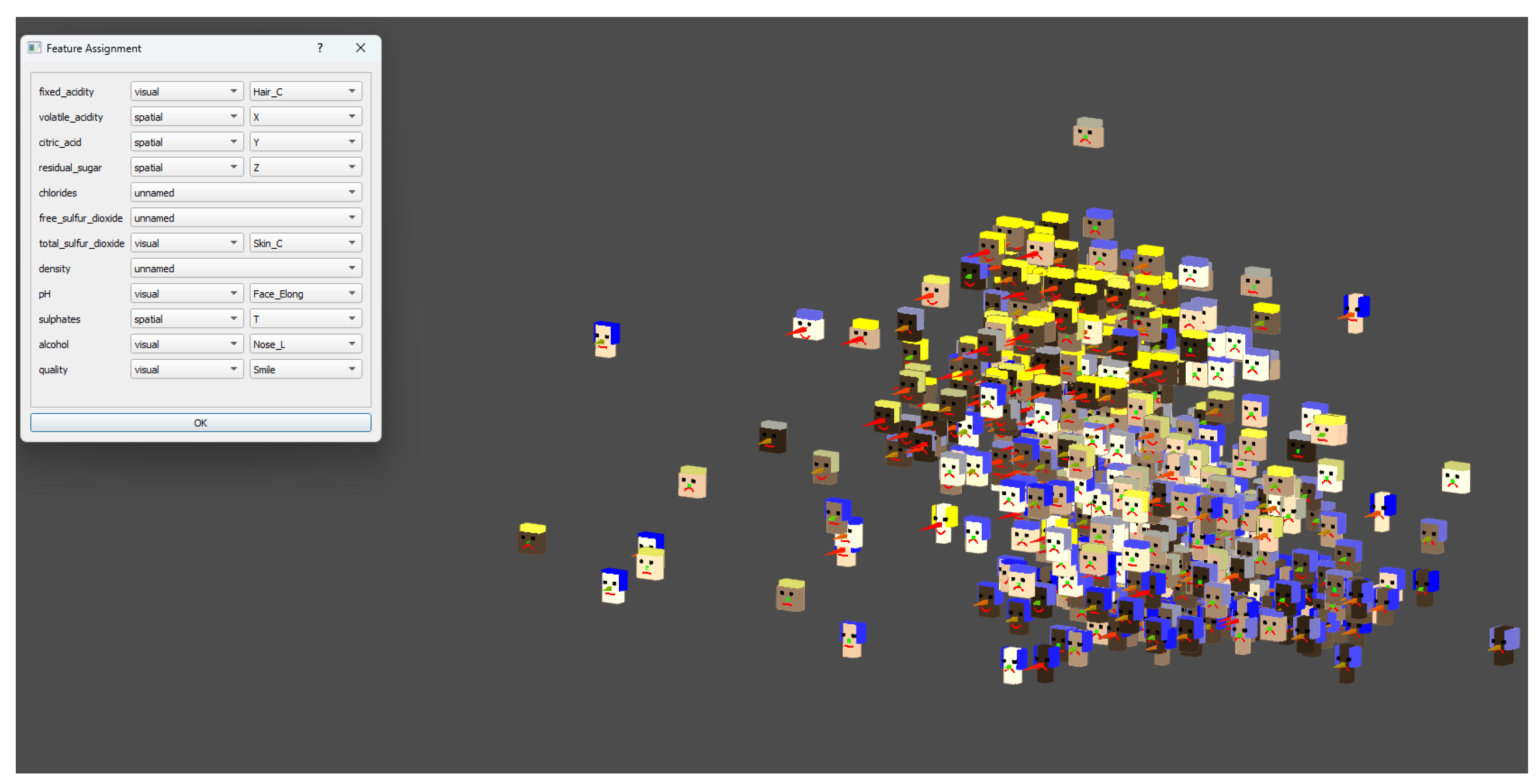
- Variable assignment:
- Quality, alcohol content, and residual sugar were assigned as avatar features (e.g., smile, face colour, nose length), as these are familiar and interpretable for non-experts (Figure 12). Four technical variables (volatile acidity, citric acid, residual sugar, sulfates) were assigned to spatial coordinates (X, Y, Z, T). All remaining technical features were omitted from the spatial mapping in this scenario.
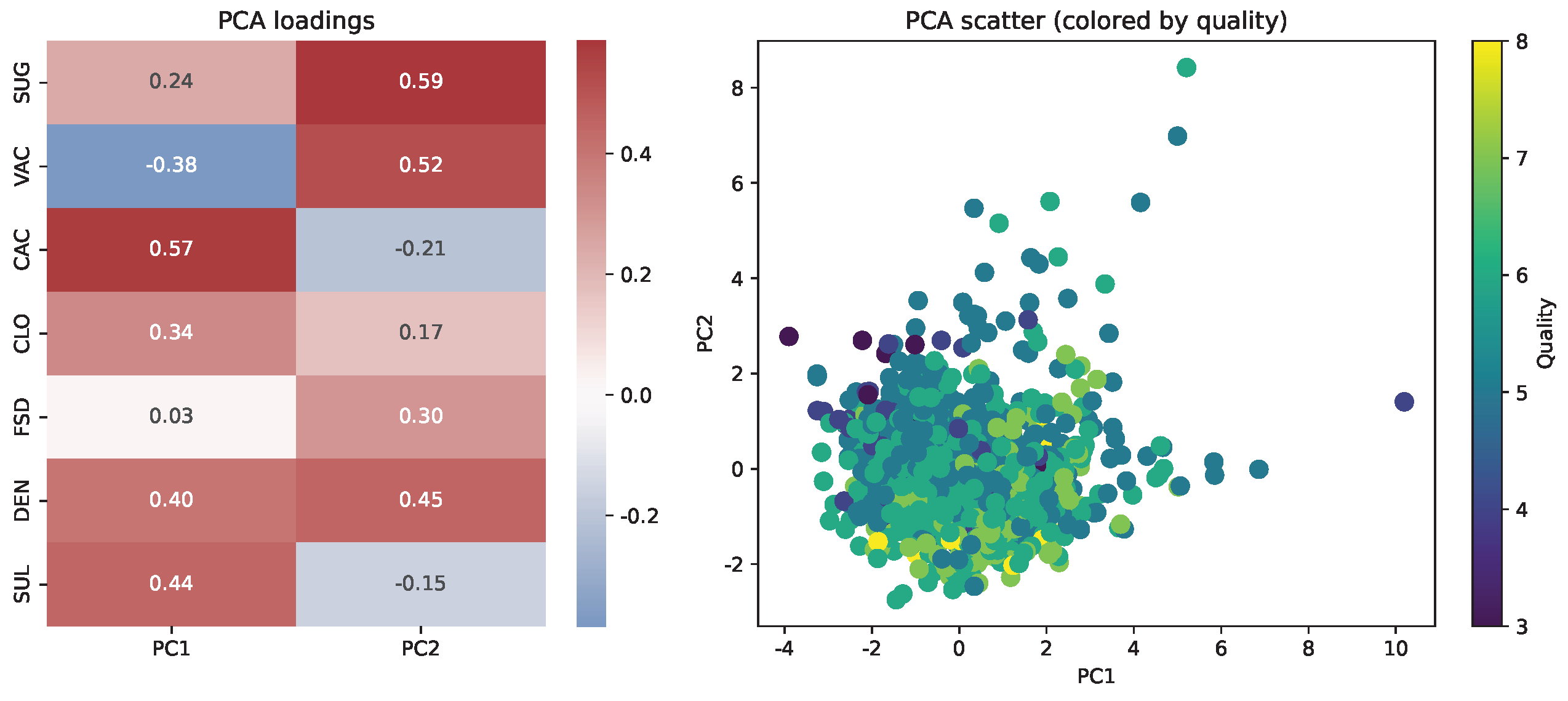
- PCA loadings and spatial interpretation:
- To enable direct visual access to consumer-facing attributes, the spatial avatar visualization assigns key features to spatial axes. For comparison, principal component analysis was performed on all remaining technical features. Figure 13 presents a heatmap of PCA loadings and a corresponding scatter plot with samples coloured by quality. In the PCA projection, the principal components reflect combinations of technical features, and the spatial arrangement does not reveal distinct clusters or gradients by quality.
- Insights and sensitivity analysis:
- Assigning “quality” or “alcohol” as a spatial or PCA feature, rather than as an avatar trait, would affect the composition of principal components but reduce the immediate interpretability of these key attributes—demonstrating the practical benefit of flexible, user-driven assignment in the proposed approach.
5. Discussion
5.1. Limitations
5.2. Advantages and Utility of Spatial Avatars
5.3. Future Work
6. Conclusions
Author Contributions
Funding
Institutional Review Board Statement
Informed Consent Statement
Data Availability Statement
Acknowledgments
Conflicts of Interest
List of Abbreviations
| PCA | Principal Component Analysis |
| PC | Principal Component |
| t-SNE | t-distributed Stochastic Neighbor Embedding |
| dpVision | Open-source Data Visualization Platform |
| GUI | Graphical User Interface |
| SO(2) | Special Orthogonal Group in 2D (if used in text) |
| SO(4) | Special Orthogonal Group in 4D (if used in text) |
| SVD | Singular Value Decomposition (if used in text) |
References
- Chernoff, H. The Use of Faces to Represent Points in K-Dimensional Space Graphically. J. Am. Stat. Assoc. 1973, 68, 361–368. [Google Scholar] [CrossRef]
- Lardelli, M. Beyond Chernoff Faces: Multivariate Visualization with Metaphoric 3D Glyphs. Available online: https://lardel.li/2017/07/beyond-chernoff-faces-multivariate-visualization-with-metaphoric-3d-glyphs.html (accessed on 18 May 2025).
- Pojda, D.; Żarski, M.; Tomaka, A.A.; Luchowski, L. dpVision: Environment for multimodal images. SoftwareX 2025, 30, 102093. [Google Scholar] [CrossRef]
- Pojda, D. dpVision (Data Processing for Vision); Zenodo Repository; CERN: Geneva, Switzerland, 2025. [Google Scholar] [CrossRef]
- Cortez, P.; Teixeira, J.; Cerdeira, A.; Almeida, F.; Matos, T.; Reis, J. Using Data Mining for Wine Quality Assessment. In Proceedings of the International Conference on Discovery Science, Porto, Portugal, 3–5 October 2009; pp. 66–79. [Google Scholar]
- Cortez, P.; Cerdeira, A.; Almeida, F.; Matos, T.; Reis, J. Wine Quality. UCI Machine Learning Repository. 2009. Available online: https://archive.ics.uci.edu/dataset/186/wine+quality (accessed on 18 May 2025).
- Jolliffe, I. Principal Component Analysis. In International Encyclopedia of Statistical Science; Springer: Berlin/Heidelberg, Germany, 2011; pp. 1094–1096. [Google Scholar] [CrossRef]
- van der Maaten, L.; Hinton, G. Visualizing Data using t-SNE. J. Mach. Learn. Res. 2008, 9, 2579–2605. [Google Scholar]
- McInnes, L.; Healy, J.; Saul, N.; Großberger, L. UMAP: Uniform Manifold Approximation and Projection. J. Open Source Softw. 2018, 3, 861. [Google Scholar] [CrossRef]
- d’Ocagne, M. Les coordonnées parallèles de points. Nouv. Ann. MathéMatiques J. Candidats Aux écoles Polytech. Norm. 1887, 6, 493–502. [Google Scholar]
- Inselberg, A. The plane with parallel coordinates. Vis. Comput. 1985, 1, 69–91. [Google Scholar] [CrossRef]
- Andrews, D.F. Plots of High-Dimensional Data. Biometrics 1972, 28, 125–136. [Google Scholar] [CrossRef]
- Cleveland, W.S. Visualizing Data; Hobart Press: Summit, NJ, USA, 1993. [Google Scholar]
- Buja, A.; Cook, D.; Asimov, D.; Hurley, C. 14—Computational Methods for High-Dimensional Rotations in Data Visualization. Data Mining and Data Visualization. In Handbook of Statistics; Rao, C., Wegman, E., Solka, J., Eds.; Elsevier: Amsterdam, The Netherlands, 2005; Volume 24, pp. 391–413. [Google Scholar] [CrossRef]
- Laa, U.; Cook, D.; Valencia, G. A Slice Tour for Finding Hollowness in High-Dimensional Data. J. Comput. Graph. Stat. 2020, 29, 681–687. [Google Scholar] [CrossRef]
- Pflughoeft, K.A.; Zahedi, F.M.; Chen, Y. Data avatars: A theory-guided design and assessment for multidimensional data visualization. Inf. Manag. 2024, 61, 103911. [Google Scholar] [CrossRef]


| Symbol | Meaning | Constraints |
|---|---|---|
| Input data parameters | ||
| N | Total number of data points | |
| n | Total number of data dimensions | |
| X | Original data matrix | |
| Implementation-dependent mapping | ||
| k | Number of navigable display dimensions | (typically 4) |
| m | Number of available avatar visual features | (currently 10) |
| User’s mapping | ||
| Number of human-meaningful dimensions mapped to space | ||
| Number of human-meaningful dimensions mapped to avatars | ||
| Number of anonymous dimensions | ||
| Projection matrices | ||
| F | Filtering matrix | |
| V | View matrix: for spatial rotation in k-dimensional space (), or full affine transformation with translation in homogeneous coordinates () | or |
| Derived datasets | ||
| Spatial projection of X | ||
| Avatar feature mapping of X | ||
| Spatial data after applying V | ||
| Category | Feature | Description |
|---|---|---|
| User-defined spatial features | ||
| spatial | X | X coordinate in 4D space |
| spatial | Y | Y coordinate in 4D space |
| spatial | Z | Z coordinate in 4D space |
| spatial | T | T coordinate in 4D space |
| User-defined avatar facial attributes | ||
| visual | Skin_C | avatar’s skin color |
| visual | Hair_C | avatar’s hair color |
| visual | Eye_S | distance between the avatar’s eyes |
| visual | Nose_L | avatar’s nose length |
| visual | Mouth_W | avatar’s mouth width |
| visual | Smile | degree of curvature of the avatar’s smile |
| visual | Frown | level of frowning expression |
| visual | Hair_L | avatar’s hair length |
| visual | Face_Elong | avatar’s face proportions |
| visual | Iris_C | avatar’s iris color |
| features not defined by the user | ||
| anonymous | used for principal component analysis (PCA) | |
| Features selected by the user to skip | ||
| skipped | excluded from further processing | |
Disclaimer/Publisher’s Note: The statements, opinions and data contained in all publications are solely those of the individual author(s) and contributor(s) and not of MDPI and/or the editor(s). MDPI and/or the editor(s) disclaim responsibility for any injury to people or property resulting from any ideas, methods, instructions or products referred to in the content. |
© 2025 by the authors. Licensee MDPI, Basel, Switzerland. This article is an open access article distributed under the terms and conditions of the Creative Commons Attribution (CC BY) license (https://creativecommons.org/licenses/by/4.0/).
Share and Cite
Luchowski, L.; Pojda, D. Visualization of a Multidimensional Point Cloud as a 3D Swarm of Avatars. Appl. Sci. 2025, 15, 7209. https://doi.org/10.3390/app15137209
Luchowski L, Pojda D. Visualization of a Multidimensional Point Cloud as a 3D Swarm of Avatars. Applied Sciences. 2025; 15(13):7209. https://doi.org/10.3390/app15137209
Chicago/Turabian StyleLuchowski, Leszek, and Dariusz Pojda. 2025. "Visualization of a Multidimensional Point Cloud as a 3D Swarm of Avatars" Applied Sciences 15, no. 13: 7209. https://doi.org/10.3390/app15137209
APA StyleLuchowski, L., & Pojda, D. (2025). Visualization of a Multidimensional Point Cloud as a 3D Swarm of Avatars. Applied Sciences, 15(13), 7209. https://doi.org/10.3390/app15137209