Article

Time Series Visualization and Forecasting from Australian Building and Construction Statistics

1
School of Computer Science, The University of Adelaide, Adelaide, SA 5005, Australia
2
School of Architecture & Built Environment, The University of Adelaide, Adelaide, SA 5005, Australia
*
Authors to whom correspondence should be addressed.
Appl. Sci. 2022, 12(5), 2420; https://doi.org/10.3390/app12052420
Submission received: 17 December 2021 / Revised: 7 February 2022 / Accepted: 15 February 2022 / Published: 25 February 2022
(This article belongs to the Special Issue Digital Engineering for a Sustainable Built Environment)

Abstract

:
The Australian Bureau of Statistics (ABS) regularly releases statistical information, for the whole of Australia, for public access. Building- and construction-related statistics are important to reflect the status of this pillar industry of Australia and help researchers, practitioners, and investors with decision-making. Due to complex retrieval hierarchy of ABS’s website and irregular update frequency, it is usually time-consuming to find relevant information. Moreover, browsing the raw data from ABS’s webpages could not provide the insights to the future. In this work, we applied techniques from computer science to help users in the building and construction domain to better explore the ABS statistics and forecast the future trends. Specifically, we built an integrated Web application that could help collect, sort, and visualize the ABS statistics in a user-friendly and customized way. Our Web application is publicly accessible. We further injected our insights into the Web application, based on the existing data by providing online forecasting on user’s interested information. To achieve this, we identified a series of related economic factors as features and adjusted a multi-variant, LSTM-based time series forecasting model by considering the most informative factors. We also compared our approach with the most widely used SARIMA-based forecasting model to show the effectiveness of the deep learning-based models. The forecast values are depicted at the end of the time series plots, selected by the users.

1. Introduction

The Australian Bureau of Statistics (ABS) regularly releases statistical information, for the whole of Australia, for public access (https://www.abs.gov.au/, accessed on 14 February 2022). The information includes statistics from, generally, six aspects: economy, labor, industry, people, health, and environment. Due to complex retrieval hierarchy, it is usually very time-consuming for researchers, practitioners, and investors to find relevant information to aid in their decision making. Though users may find a lot of information online, they are not necessarily informative, per their needs, or efficient. The ABS website does not provide a user-friendly navigation. We particularly examined the data structure and content for construction related statistics on ABS website. We find only very recent statistics (usually within the latest 6 months) for limited statistics provide a line chart to show the recent trend. Moreover, if users need to explore more data, they have to download the spreadsheets that contain data with longer periods. The naming of the downloaded spreadsheets’ are complex—they are named with numbers that are not informative to help identify requested data. Users need to open it and decide whether the data are useful for them. Since the data on the ABS website is mostly updated quarterly, this process needs to be done accordingly. This motivates us to build an integrated Web application that could help collect, sort, and visualize the ABS statistics in a user-friendly and customized way. The application will be helpful for people who are frequently viewing the ABS website. Businessman, investors, builders, and renters can all be benefited from this application. Property investors can get an overview of the price trend from the past to present, as well as the hot zones in Australia, in order to decide which place may be a potential investment location. For builders, they can compare the building and construction cost in each area to plan their budget wisely. A business person could learn the latest information about the construction and housing market.
In addition to allowing users explore the current data from ABS easily and efficiently, we believe forecasting the future will be an essential function to help the decision making. This is formed as a time series forecasting problem. Uni-variant models predict the future, based only on historical values in the time series. The seasonal auto-regressive integrated moving average (SARIMA) [1,2,3] model is one example that has been used to date, thanks to its good performance and ability to handle non-stationery time series. The SARIMA model is an extension of the ARIMA model, which has both non-seasonal and seasonal parts. The non-seasonal is the same as the ARIMA model. In recent years, deep learning-based models [4] have been seen to excel at most of the learning tasks. Long short-term memory (LSTM) [5] is a recurrent neural network model. It has strong ability to handle sequence data. Therefore, it is the most commonly adopted deep learning model for time series forecasting. Most of the existing works [5,6,7,8,9,10] feed the LSTM-based models with historical time series, that is, using historical time series as features to forecast the future values over the time or choose highly correlated feature for learning. In our work, we aim to explore building- and construction-related economic factors as features in our forecasting task to inject more relevant information into the learning process.
In this work, we address the aforementioned two main tasks, i.e., Web-based application, plus time series forecasting. Our Web application is built upon the building and construction section of ABS (https://www.abs.gov.au/statistics/industry/building-and-construction, accessed on 14 February 2022). For the building and construction industry, ABS provides statistics from five categories, namely building activity, building approvals, engineering construction, construction work done, and construction activity. The Web application has three main functionalities: data visualization, data exploration, and value forecasting. The data visualization function retrieves the latest data from the ABS website and depicts the values as line charts over time. The data exploration function enables users to select the charts they want to see and save favorite ones. When exploring the saved charts, different components in the data can also be customized. Value forecasting provides the forecast values by the LSTM-based model and depicts the new values to the end of the current charts as future trends. Our Web application is accessible via https://www.absstat.com, accessed on 14 February 2022.
Since the data sheets are updated quarterly, the backend of our Web application runs a scheduled auto-crawling script to regularly retrieve data from ABS. For additional features to help the learning model, we investigate different statistics from the economy section of ABS and identified the ones related to building and construction. Later, we fed the features into our LSTM-based, multi-variant, time series forecasting model. Our main contributions include:
  • We develop a Web application that collects, sorts, and visualizes building- and construction-related statistics from the website of Australian Bureau of Statistics. The application allows users to explore both the latest and historical data in an efficient and customized way.
  • We provide future value forecasting, based on deep learning-based models, and visualize the forecast value.
  • We adopt the building- and construction-related economic factors as features in our multi-variant time series prediction.
The rest of the article is organized as: Section 2 presents the most related works to our project; Section 3 explains the methodology used for data processing, forecasting model implementation, and Web application; Section 4 reports the settings of the experiments, illustrates the results of both of the two approaches, and discusses about the results obtained; Section 5 concludes our work.

2. Related Works

We visit some of the most relevant works, in terms of two aspects: interactive dashboard and time series forecasting.

2.1. Interactive Dashboard

An interactive dashboard is a data management tool that tracks, analyzes, monitors, and visually displays key business metrics, while allowing users to interact with data, enabling them to make well-informed and data-drive business decisions. A good interactive dashboard must be easy to use, i.e., users should be able to filter out needed information quickly, using the dashboard, without any training. Microsoft Power BI (https://powerbi.microsoft.com/en-au/, accessed on 14 February 2022) is an effective online data analysis and manipulating tool. It provides users with the ability to add their own data and visualize the data in no time. It also allows the users to interact with the data and manipulate tiles. The tiles allow users to drag and drop to reorder and make arrangements to different tiles. Each tile is a single dataset. If the dataset is properly designed, the tile can also show the categories of each data in the tile. BI also provides meaningful insights on the data to help users with data visualisations, built-in AI capabilities, and custom data connectors.
In our Web application, the dataset is stored on the cloud database, so it can be accessed from anywhere. Besides, our application has already categorized the data for the users, and it also provides search function with auto-complete feature, which makes it easier for user to check or find a chart in the database. Besides, the data in the database are displayed as charts on our application, so that users can visualise, and easily play with, the data. Therefore, the application is an automatic interactive dashboard, which does not require manually adding data sets. Furthermore, our application also provides forecasting, based on the trained model, instead of just displaying the data in the charts.

2.2. Time Series Forecasting

Time series forecasting or prediction [4,11] is an active research branch that lasts for long time due to the fact that in reality many data are obtained over time. Statistical methods have been proposed and used since 1970s. The Box–Jenkins-based methodologies [12] were the most popular ones at that time. Decomposition-based methods have the longest history and are still in use [1,2]. A time series data are composed of up to four components: trend (T), seasonally (S), cyclical (C), and noise (N) components. Decomposing the time series helps for analysing and understanding historical time series, but it is also proved useful when attempting a forecasting analysis. To decompose the time series data, the moving average (MA) will remove the seasonal effects from the time series. MA is a type of filter that takes a cycle of data and gets the average value of the numbers. MA includes two kinds: simple moving average (SMA) and weighted moving average (WMA). SMA puts equal weights on each number, while WMA puts different weights at different timestamps, determining different periods to make the trend more accurate. The length of a cycle needs to be decided manually. The size of a cycle can be either one month, two months, six months, etc. The longer the cycle is, the smoother the trend will be. The autoregressive integrated moving average (ARIMA) model only supports non-seasonal data by proposing an integrated MA. ARIMA shows good performance because of the small number of parameters required to build the model. However, the ARIMA model has the assumption of stationarity, which makes the method inflexible to use. The SARIMA model is an extension of the ARIMA model, which has both non-seasonal and seasonal parts. The non-seasonal is the same as the ARIMA model. The SARIMA model will be introduced in more detail in Section 4. The vector autoregressive moving average (VARMA) model is a generalization of ARIMA that can be applied on multivariate time series. However, it requires a stationary time series, so it could not be used for a seasonal time series.
With the development of machine learning methods, time series forecasting is formed as a regression task and many supervised learning models could be adjusted to forecast time series. Support vector machine (SVM), and its variants, were the popular models adopted [8]. In recent years, deep learning methods achieved superior results, and models that were designed for dealing with sequence data were adopted to time series forecasting. Long short-term memory (LSTM) is a type of recurrent neural network (RNN) that can memorize short-term values. It is well-adopted in the time series community [5,9,10,11,13,14]. In our work, we will follow this direction and apply LSTM on the time series forecasting with multiple variables.

3. Methodology

In this section, we first introduce how we process the ABS data in Section 3.1. Then, we describe our forecasting methods in Section 3.2. Finally, we introduce the functionalities of our Web application in Section 3.3.

3.1. Data Processing

In order to use the data from ABS’s website, our data processing includes two steps: (i) data collection and (ii) data preprocessing.

3.1.1. Data Collection

The building- and construction-related data, collected from the website of ABS, are in five categories, namely building activity, building approvals, engineering construction, construction work done, and construction activity. On the page of each category, downloadable data sheets that contain the whole historical data in the given category are provided. We develop Python scripts to convert the crawled source HTML into XML data. By observing the pattern of the HTML element descriptions, links can be extracted from the XML data. For example, the links on the building and construction page all have the class name called “field-group-link card”. The script extracts all elements with this class name, and then all the links are obtained. After obtaining the links, the script finds all the common class for the downloadable links and downloads the files into the Web server.

3.1.2. Data Preprocessing

ABS provides both state- and city-level statistics. For most of the city-level statistics, it only has capital city’s data and does not have data for the rest of the state. We consider this as incomplete data, as it only represents very limited cities. Instead, our project considers state-level data that either represents the statistics of the whole state or the whole of Australia. Identifying the data sheets we want can be done by parsing the title of the data sheets, which follows a naming convention that contains three parts: chart title, data type, and region. For example, a data sheet is named “Value of Building Work Done, By Sector, Original, Australia”, for which the chart title is “Value of Building Work Done By Sector”, the data type is “Original” and region is “Australia”, indicating it is Australia-wide data.
Each of the kept data sheets contains three types of data, i.e., original, seasonal, and trend time series. The original time series is raw time series data that has not been modified with any of the data analysis techniques. In our application, we only consider this unchanged type of data. The seasonal time series is the original data, with seasonal effects removed. We do not consider this type of data in our application. The trend time series shows general trends of the statistics. It is the data calculated by the data analysts from ABS. As it is significantly incomplete, we ignore this type of data.
The first nine rows of each data sheet describe the attributes of the columns. Among them are three rows, i.e, unit, series type, and frequency, which contain important information for our preprocessing. Unit is used to check whether the data are in the same unit, so that different data can be put on the chart after changing the unit. The unit is denoted with a “$” sign, trailed by “000”, which means the data are recorded in the thousands. Series Type is used for filtering out only the original data, and only the original data are kept in our application, as aforementioned. The series type is recorded as a string, so we only look for the string “original” to identify original time series data. Frequency ensures the time interval between each data point is identical. In our application, we need to make sure that the frequency is four, so that the data entries are recorded quarterly. Due to the data availability, some data sheets contain data that are dated back to 1983, while other data sheets provide more recent data only. Therefore, the number of data available for each section, under each category, varies. The longest time coverage is provided by total number of dwelling units of New South Wales data, which contains 457 row entries. Additionally, the shortest time coverage is provided by residential property price indexes data, which contains 78 row entries. We keep the full length for visualization, but keep consistent length when the statistics are considered features (i.e., the economic time series).

3.2. Time Series Forecasting

The data obtained from the ABS website are a set of time series data. In addition to visualizing them in the interactive tool (Section 3.3), we performed forecasting, based on the historical time series records from the processed ABS statistics. We explored both traditional non-deep learning-based method and deep learning method. Specifically, we model the problem as an multivariate time series forecasting problem that, given historical time series values and related features, we use to forecast the values of the future. Consider n time series variables { y 1 t , , y n t } . A multivariate time series is the ( n × 1 ) vector time series { Y t } , where the i-th row of { Y t } is { y i t } . That is, for any time, t, { Y t } = ( y 1 t , , y n t ) . Our task is to predict a specific { y i t } (i.e., the interested statistic value) for t+1, t+2, …, by given { Y t } .
The long short-term memory (LSTM) is a deep learning model that is commonly adopted in time series forecasting, due to its power of modelling sequence data, and time series is a typical type of time series data. LSTM is an artificial recurrent neural network (RNN) architecture used in the field of deep learning. Most of the current LSTM time series forecasting methods make forecasting based on only the time series itself, that is, using the historical values of the same time series to predict its next values. In our work, we tend to involve more relevant and informative information to aid the prediction. Specifically, we adopt the economic statistics from ABS and build a LSTM-based multivariate time series forecasting model.

3.2.1. Economic Features

We obtain the building- and construction-related economic features from the ABS website economy section (https://www.abs.gov.au/statistics#economy, accessed on 14 February 2022). The purpose is to integrate information from different aspects, in order to guide the model to perform forecasting. We only keep state- and Australia-wide data, as we did for the building and construction data, as discussed in Section 3.1.1. There are a few more restrictions to help ensure the granularity of the economic data are identical with the building and construction data:
  • The data needs to be recorded quarterly, and the timestamp for each data point needs to be identical;
  • The data sheet must include original data without any processing;
  • The data must be state- or Australia-wide data after any processing.
Besides that, we find many data sheets do not provide timestamps, so we could not align them with the building and construction time series. We ignore these data sheets directly. Similar to the building and construction data, the record’s history is not in the same time range, and some data sheet only include very recent data. For example, the data sheets that start from 2010 leave only 50 data points, which is insufficient for training our forecasting model. So, we omit these data sheets.
After manually filtering the data sheets, the remaining features include:
  • Residential property price indexes;
  • Wage price indexes;
  • State final demand;
  • Selected living cost indexes;
  • Producer price indexes.
The residential property price indexes show the housing price changes over time and include the median price for different types of properties, so that each type of property can be set as a single feature. This feature can be strongly correlated with the building and construction data. The wage price index represents the residents’ income changes over time. The other three features all show the change in the residents’ consumption level (of all residents). These selected features are all in the form of a time series, so that they could be used as variants in the multivariate time series forecasting.

3.2.2. Feature Selection

Our Web application allows users to customize the visualization. When users select the data they want to see, the forecast values will show with the historical values. We also allow users to select multiple data (i.e., multiple time series). These require that our forecasting is performed in real time. We could train the model periodically in advance to omit the real time training. However, the model still be input with many features. In order to reduce the size of the features, we explored two ways. One is to utilize the correlations between each time series, in order to only keep one of the highly-correlated ones. Data correlation is a way to determine how close two data traces are and whether one of them is dependent on the other, or whether one is closely associated with the other. When we choose time series as features (in our case, it is an economic time series) for the forecasting model, it is better to choose the features that are not correlated with the forecast ones [15]. This is because if the forecast or target time series has a strong positive or negative correlation with one or more time series features, the values are linearly predicted, which does not show correct forecast or prediction. There are a few ways to calculate the correlation between two time series. Pearson correlation coefficient is a popular one and can be denoted as follows:
r = i = 1 n ( x i x ¯ ) ( y i y ¯ ) i = 1 n ( x i x ¯ ) 2 i = 1 n ( y i y ¯ ) 2
where x i is one data point in the first data trace, and y i is the data point in another data trace. i is the timestamp where the two data points are at the same timestamp [16]. The Pearson correlation coefficient value r is between −1 to 1. If the coefficient is closer to 1 or −1, it indicates the two time series are strongly correlated. However, using correlation to decide which time series to be pruned is time consuming, as we need to exhaustively compare each pair of the time series features.
Another way is to use a dimension reduction algorithm, such as principle component analysis (PCA) [17]. Without the need to eliminate features, PCA is used to extract the most informative feature components, so it naturally eliminates the correlated and duplicate information. The general idea for PCA is to rotate the data into new coordinates that maximize the variance in the data. It keeps the information, as much as possible, in the first few components—if the number of the components are exactly the same as the original number of variables, then all the information is kept. Given p variables X 1 , X 2 , , X p , the first principal component, denoted as Y 1 , is a linear combination of the variables Y 1 = w 1 T X , where w 11 2 + w 12 2 + + w 1 p 2 = 1 . w 1 maximizes the most variance. Similarly, the second principal component is Y 2 = w 2 T X , and w 2 maximizes the second most variance. This continues until the total of p principal components have been calculated, the transformation of the original variables to the principal components is written as Y = XW , where W is calculated through singular value decomposition. The rows of W are the eigenvectors, which specify the coordinates of the principal components. As the most important information is obtained in the first few components, keeping them will not cause much information loss, so PCA is a commonly dimensional reduction algorithm. Additionally, it is more computationally efficient than checking the pair-wise correlation coefficient. Therefore, we chose PCA in our work. There are a couple advantages of using PCA for this project. (i) Our application requires us to have efficient real time forecasting, so we have a trade-off between accuracy and efficiency. Introducing more features will usually help achieve better accuracy. However, in our application, we want to keep as few features as possible, in order to reduce the computation time. PCA could meet our requirement for efficient computing, while keeping the most information for accurate forecasting. (ii) Since the ABS dataset is relatively small, using complex representation methods for capturing the data characteristics is not feasible in our project. PCA is a lightweight and efficient algorithm that is suitable for small scale datasets, so it is a good fit for our project requirements.
In our implementation, we obtained around 50 time series features from the above identified economic statistics. The features cover different fields, and they have various meanings and units for the data. Besides, different economic factors focus on various aspects, as they are not correlated with each other. PCA helps us to identify the most important aspects, among all features, without losing too many details of the data. Given the number of dimensions we want, PCA gives out the selected number of top features, which helps the model learn the most vital features during training. We applied PCA and aim to have less than five to be input as the features.

3.2.3. Prediction

LSTM-based forecasting is composed of four parts: (1) merging all features and target data and dropping empty data rows with empty cells; (2) splitting target data and features and reducing the feature dimension; (3) training the model; and (4) making forecasting.
The first step is to merge all the dataframe objects. A dataframe object is created when loading a data sheet. Therefore, the program first sets the timestamp as the index for each of the dataframe object, then the dataframe objects are joined, one-by-one, using the timestamp index. The reason for dropping rows with empty cells is that the LSTM model does not support missing data or none-type data. Besides, it is not possible to do data imputation because all the missing data are at the head of the data sheet. The missing data are simply not recorded at that time, some types of data only start being recorded after 2003. The current data imputation techniques, such as setting a constant number or using previous or later value to replace missing data, cannot be applied to our case. The reason is that these data are not recorded, any types of misleading information or make up data will dramatically affect the trend of correlation between the features and target data. Therefore, we drop all the rows/timestamps containing missing values.
Since the PCA is only applied to the features, after merging all the features and target dataset, they need to be split up into target dataframe object and the features dataframe object. Then PCA is applied to the feature dataframe object, and the wanted number of dimensions are extracted from the features to be prepared for training. Then, the extracted features are merged with the target data to drop out empty cells, as in the first step. After dropping out the data entries, around 70 data entries remain in the end.
The next step is to train the model using the data. Before putting data into the model, normalization is used to bring both the feature and target data in the same footing, without any upfront importance, so that it can reduce the effect that a feature with a higher value range may dominate, when calculating distances between data points. For example, the target data may have a big difference with the reduced dimension feature on numeric value. If one of them is greatly larger than the other one, then the whole model will be dominated by the one with the larger value. Therefore, normalization is a way that can reduce such effects, but keep the completeness of the data. We scale and translate each feature individually, such that it is in the given range on the training set, and the range is between zero and one. After scaling the data, it can be put into the LSTM model. A cell, input gate, output gate, and forget gate make up a typical LSTM unit. The three gates control the flow of information, into and out of the cell, and the cell remembers values across arbitrary time intervals. The following equations represent the components in the LSTM model:
i t = σ i ( W i x t + U i c t 1 + b i ) f t = σ f ( W f x t + U f c t 1 + b f ) o t = σ o ( W o x t + U o c t 1 + b o ) c t = f t * C t 1 + i t * σ c ( W c x t + b c ) h t = O t * σ h ( C t )
where t refers to the time, and x t is the input vector at time t, while h t is the output vector at time t, and c t stores the state of union. i t is the vector of input gate, f t is the vector of forgotten gate, and o t is the vector of output gate. W i , W f , W o , W c , U i , U f , U o are weights for x t and c t 1 , respectively, and b i , b f , b o , b c are the shift vectors. All of these weights and biases are learned through the training process. σ i , σ f , σ o , σ c , σ h are activation functions.
The last step is to make forecasting. The forecasting uses a fixed-length time windows for the forecasting, which means that it will learn from window size number of previous data points to output another window size number of forecasting data points. For example, the model can learn from the past five data points, in order to make prediction on the future one data point. The training process is basically shifting the time window from start to end, each with a step size of one. The window moves one data point at a time and keeps learning, until the past data point windows reaches the end of the data. Instead of training on all previous data points, only a limited number of inputs are trained each time. After the model training is completed, the transformed data that are brought back use the scalar again, and the forecasting data are returned with the correct format and unit.

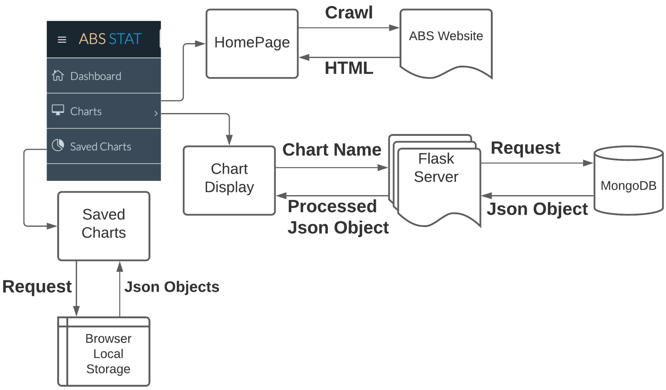
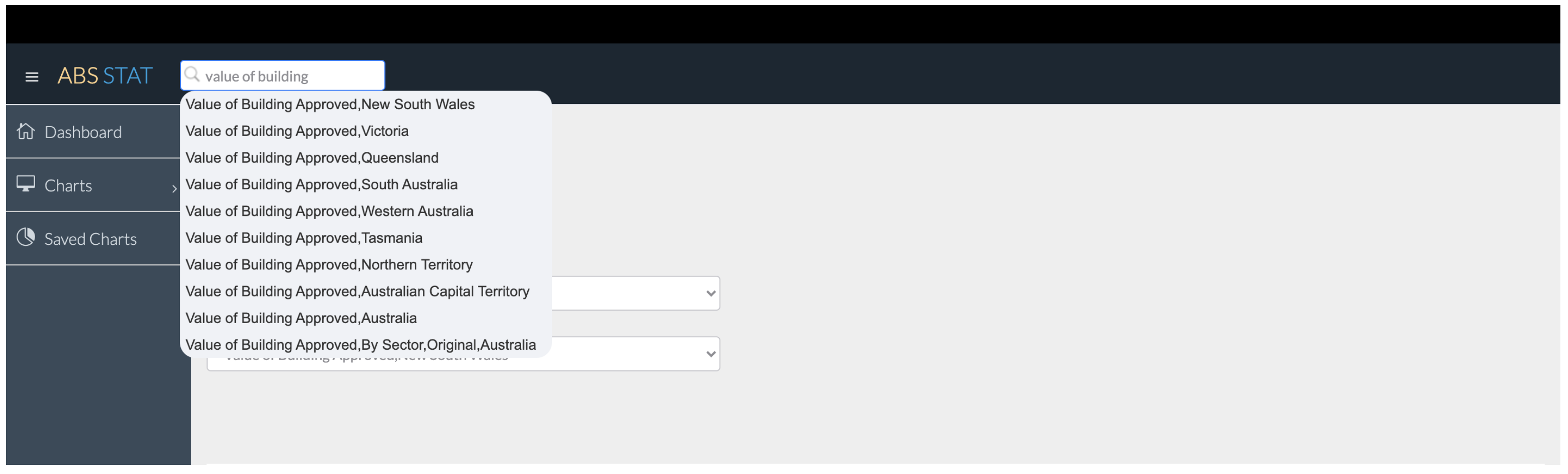
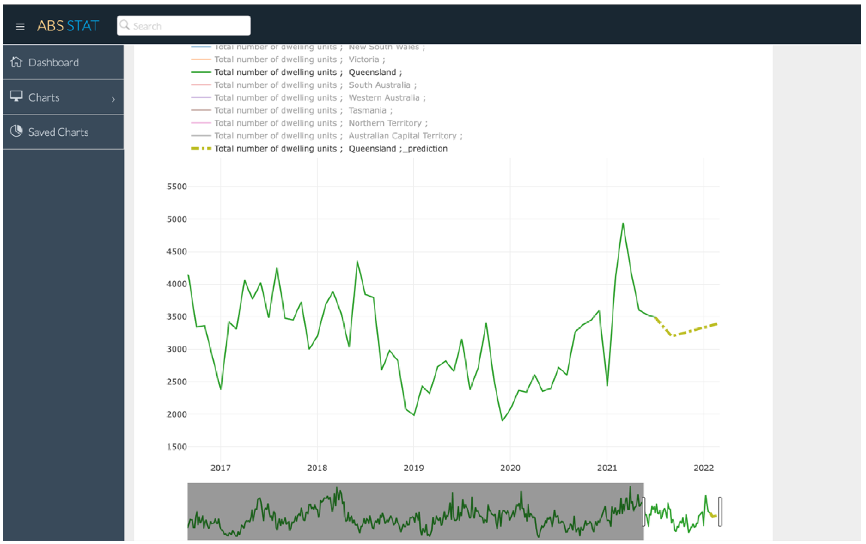
3.3. Web Application

We developed a Web application for users to explore the ABS building and construction statistics with ease. The Web application also includes our forecasting, based on the techniques described in previous section. The main framework of the application is shown in Figure 1. The main navigation is on the left of the page, and it directs the users to different pages of the Web application. The Web application has three pages, the homepage, which is a dashboard showing the latest news of each section on the building and construction page of ABS. The chart page displays the data stored in the database. Lastly, the saved chart page shows the saved charts of the user’s own preference.

3.3.1. Functionalities

As shown in Figure 1, the first feature of the Web application is to extract the latest information of on the ABS website, similar to the crawling of the data sheet files. The server requests the webpage of the ABS website, and the ABS website will return the HTML of the webpage. Then, the Web application also converts it into XML and retrieves the relevant information. Since sending the request and receiving the HTML takes milliseconds, the Web application retrieves the information every time a user directs to the dashboard.
The second tab, which is the most important feature, it is the data displaying of charts in the database, as well as the time series prediction. The chart display page is classified into five categories, matching up with the sections on the ABS website. After the user clicks on one of the categories, the Web application will first load a default chart, which is the first chart in the database. Then, the user can choose different charts using two different ways. The first approach is through the three-level navigation above the chart, as shown in Figure 2. The navigation falls into two main categories, which are “Number of” and “Value of”. Then the second level is the Australia-wide level, which shows all data chart types of the Australia region. The third level is the state level; this level shows the summary of each state or territory, and it also has the detailed charts for each state or territory, if there exists one on the ABS website. After the user chooses any one of them, the chart will show up on the webpage.
The second approach is using the auto-complete function, as shown in Figure 3. Users can enter the keyword in the search bar at the top of the webpage. After the user enters in the keyword of a chart, the chart title, containing the keyword, will show up under the search input. Apart from that, in case there are too many relevant charts in the database, only ten of them will be shown. Then, if the user clicks on any of the popup chart titles, the chart will be shown on the page.
The workflow of the chart display is when users selects any of the charts, the chart name will be passed to the backend server, which is the Flask server. Then, the server uses the chart name in the search query and executes the query to search for the chart in the MongoDB database. Then, the MongoDB database will return a result JSON object contains the data of the chart. However, due to the rule of the MongoDB, each record will have a field called “_id”, which is automatically generated (Section 3.3.2). The returned result needs to be processed; then, it can be used by the frontend. Therefore, after getting the result, the result is also loaded into a dataframe object. First of all, the “_id” column is removed. Since this is the time series data, the order is important, so the backend first sets the date, as the index and sorts the date in ascending order. After processing the result, it will be sent to the frontend. However, one more process needs to be performed, which is to convert the millisecond format date into readable timestamp on the frontend. Then, the data are passed into the Plotly.js API, and it can be displayed on the frontend.
The chart also provides some interactive features for the user to visualize the data. The screenshot of the chart display page is shown in Figure 4. Firstly, the legend for each line in the chart is shown above the chart, and users can select which lines to display on the chart. The time range picker allows users to select a different time window, so that user can zoom in to check the data. Besides, users can also shift the time window to see different data in this specific time range. When the user hover on the chart, the name of each attribute, and its corresponding value at the timestamp, will pop up on the chart, which makes it easier for users to compare. When the user double clicks on one of the legend titles, the prediction will show up after a few seconds. The Web application uses the LSTM-based prediction, and it generates a new model every time to display the prediction results. The prediction has been introduced in Section 3.2.
The last feature is the saved chart function, as shown in Figure 5. There is an heart icon on top of the chart; when user clicks on it, the chart will be stored in the browser’s local storage [18]. The local storage is on user’s own device, stored in the browser, so that users do not need to login or have an account to store their preferences. However, one drawback of this approach is that users will not be able to synchronize the saved chart on different devices. The saved charts will show up in the saved chart page, with the selected attributes stored.

3.3.2. Implementation

We developed the Web application using the Flask framework [19]. Flask is a Web development framework that is compatible with Python. The data storage uses the MongoDB (https://www.mongodb.com/, accessed on 14 February 2022), which uses the NoSQL schema. The reason for picking the MongoDB database is that it is a cloud database, which could help the data be accessed by anyone who visits our Web application. Furthermore, MongoDB uses NoSQL schema. The NoSQL schema is more flexible on data storage [20], as it is not required to fit in the pre-built data schema; instead, it only stores json objects. Since the dataframe object we use to store the data are also JSON-like and can be converted into JSON object, the NoSQL schema is suitable for this situation. After the data sheet is processed, the dataframe object is then converted into a JSON object and inserted into the MongoDB database. Data on the ABS website has a wide range of varieties, so that a flexible schema can loosen the restrictions on the data. Each dataframe object is stored as a collection in the database. The collection name is the normalised chart title, and each row in the dataframe object is stored as a single document in the collection. When a document is inserted into a collection, a field called “_id” is automatically generated. This field is a unique identifier that is used to identify different documents. Besides, the data are stored in milliseconds format, which is the data type in the MongoDB convention. After inserting all the charts, the Web application can access the data from anywhere through internet.

4. Experiments

We performed some evaluations on our forecasting function. We evaluated different settings of the model and our data. We also compared the LSTM-based methods with the traditional SARIMA-based forecasting [21,22,23]. In this section, we report our results.

4.1. Model Settings

Since the SARIMA model is one of the most widely used model for time series forecasting among all the models, we choose it as the baseline model. It is formed by adding seasonal terms in the ARIMA models and is written as
S A R I M A ( p , d , q ) ( P , D , Q , m )
where ( p , d , q ) and ( P , D , Q , m ) are the non-seasonal and seasonal part of the model, respectively. The parameter m is the number of periods per season. To evaluate the SARIMA model, Akaike information criterion (AIC) is used:
A I C ( p ) = n l n ( R S S / n ) + 2 K
where n is the number of data points and RSS is the residual sums of squares, K is the number of estimated parameters in the model. AIC is an estimator of out-of-sample prediction error, and a lower AIC score indicates a more predictive model. A lower AIC score means that the prediction data points have a lower distance with the ground truth data, compared with other parameter combination. Each parameter for both the non-seasonal and seasonal parts can be either zero or one. Therefore, there are in total 32 combinations; they are all tested out, and only the one with the lowest AIC score will be kept as the setup for the SARIMA model. The model with such a parameter setup will be used for the result comparison later. In our dataset, S A R I M A ( 1 , 1 , 1 ) ( 0 , 1 , 1 , 4 ) shows the lowest AIC value 7022.6870 .
The LSTM model is also well-adopted in the time series community. We used Keras implementation for the LSTM-based model. To keep track of the model quality during training, we used the MAE (mean absolute error) as the loss function. MAE is calculated as the average of the absolute difference between the actual and predicted values. The optimizer is an Adam optimizer, which adjusts the individual learning weights for each parameter. For both models, the dataset is split for training and test; 90% of the dataset is used for training and 10% of it is used for testing. There are also variable settings for the LSTM model, which will be talked about in Section 4.2.

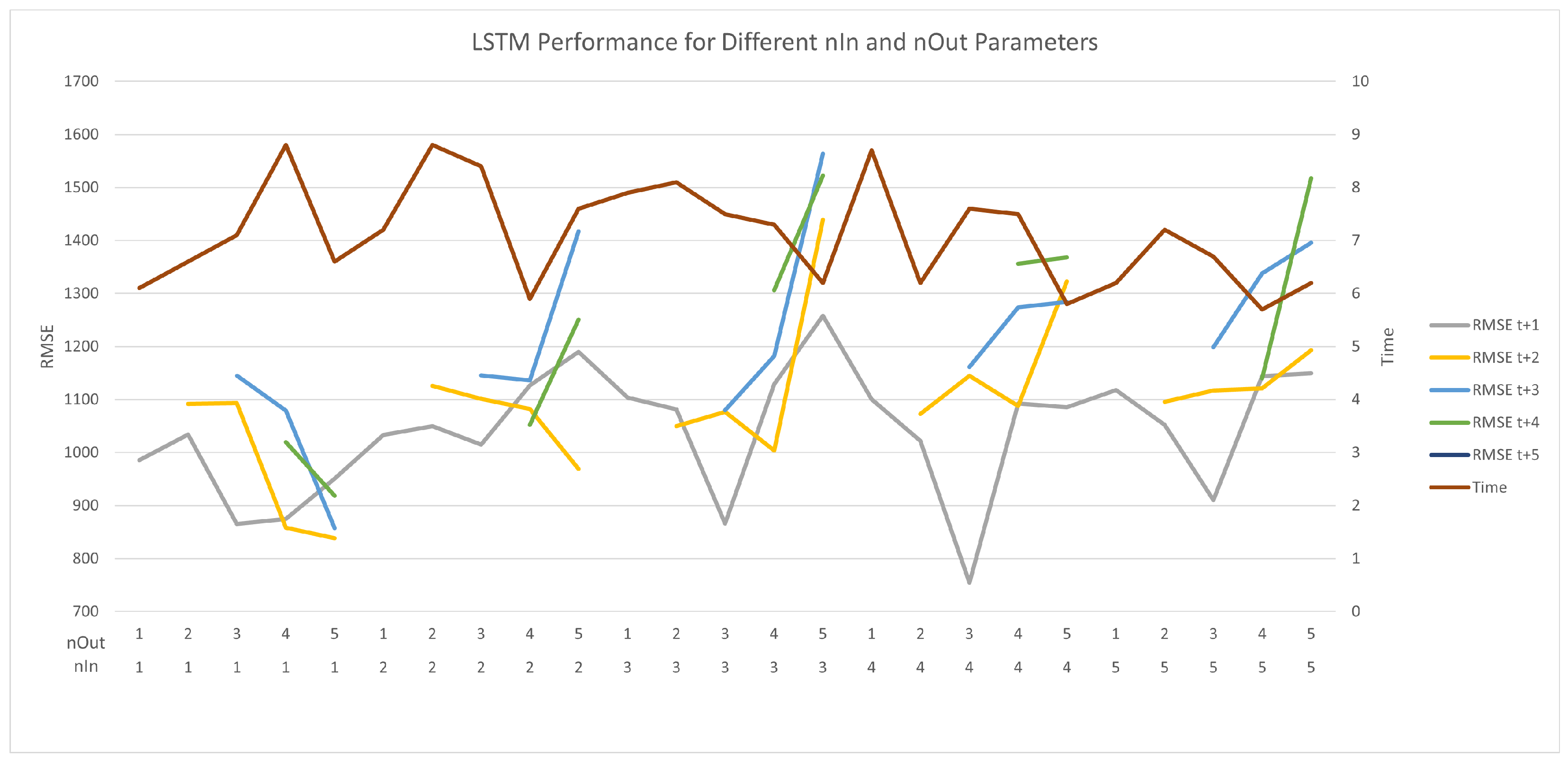
4.2. Lstm Model Performance

There are a few parameters that affect the performance of the LSTM model. In our evaluation, we examined the following ones for their change on the overall prediction performance:
  • The number of iterations, denoted as n E p o c h ;
  • PCA output dimension, denoted as d i m P C A ;
  • The length of input data points, denoted as n I n ;
  • The length of output data points, denoted as n O u t .
These parameters are associated with the performance of the LSTM model, so different combinations of these parameters will be tested in the following sections. The first one is the number of epoch that the model will be trained with. There is no need to test the epoch for every number of n I n , n O u t , or d i m P C A because the loss value will not be greatly affected by these numbers. Therefore, the number of epoch will be determined by a single test. For the other three parameters, they will be set in the range from one to five and tested separately. The test plan is to first find the best pair for n I n and n O u t ; then, this pair is used in the following tests, which are the experiments of d i m P C A . The experiments of d i m P C A will test all the dimension numbers, from one to five, to find the best one. The test results will be shown in the following sections.

4.2.1. Varying n E p o c h

Before training the model, we wanted to find the best number of epochs that the model should go through. This step is to ensure that the model can end up with the best model after the training. To find the best epoch number for training the model, we first set the maximum number of epoch to be 100 and let the model train for one hundred epochs. Then, we took the average training loss and validation loss of 10 experiments and found the point where both loss values are relatively low and the values of two points are close to each other. A low loss value on the validation ensures that the model has a good performance on the prediction. However, the distance between the training and validation loss should not be too far; otherwise, it may cause the overfitting or underfitting problem. In this case, when the number of epochs goes up, the training loss keeps going down, while the validation loss continues increasing. As the number of epoch goes up, the model gets into the overfitting problem because it fits the training data too well, but it perform bad on the validation data. Therefore, I look for the intersection point of the two loss value lines. As shown in Figure 6, the intersection point is at 20. At this point, the two lines are the closest to each other, and they both have a relatively low loss value, so that this point is the best setting for the number of epoch. Therefore, 20 is set as the number of epochs for the model training for all other experiments. Apart from the number of epoch, the number of neurons does not affect the model too much because the model does not have a large number of inputs, so the number of neurons is set to 30.

4.2.2. Varying n I n and n O u t

After deciding the number of epoch, the experiments took with the number of epoch set to 20. In this experiment, PCA dimension d i m P C A is set to one, which means that the features will be reduced to one dimension; only the most important common feature will be extracted and used in this experiment. n I n and n O u t are set in the range of one to five. The reason for setting the range is that the model will lose accuracy quickly if the n O u t is set to be too large, compared to the total number of data points; so, the upper range is set to be five. For example, if we let the model predict the next twenty years of data, with only 70 data points provided, which is meaningless, it is not possible to make precious forecasts. As for the n O u t , we also set the upper range of it to five because we used the window size approach. To make to window size identical for both n I n and n O u t , we set the range to be five for n I n , as well.
Both n I n and n O u t are in the range of one to five, so that there are, in total, 25 possibilities for the combination. We set the n I n as the outer loop and n O u t as the inner loop to go through all the combinations. To evaluate the results, the root mean square error (RMSE) value and time for computing the model were recorded. RMSE is used for assessing the accuracy of the model, which is the distance between the prediction and actual data points. Time is to visualize the trade-off between accuracy and performance, and it also checks if the model is practical to be put onto the Web application. If it takes a lot of time, without too much improvement on the accuracy, it may not be a good decision to pursue the highest accuracy. However, if the accuracy dramatically increases as the time goes up, it needs to be considered which one to pick to fit in the Web application, without losing too much accuracy.
Figure 7 illustrates the results. In Figure 7, there are two rows on the X axis. The upper row is the n O u t value, and the lower one is the n O u t value. The X axis shows all the combinations from one to five. From Figure 7, it can be seen that, when n I n is one and n O u t is two, this model gets the lowest RMSE, and it also manages to achieve a reasonable computing time. Besides, when n I n is one, with an increase of n O u t , the RMSE value surprising drops down, and the average RMSE value of the model is also the lowest, compared with the others. The drop down change is huge, as compared with the rest four value of n I n .
For n I n from two to five, the RMSE value goes up greatly when the n O u t increases, especially when n O u t is five, and the RMSE value gets to its highest value. Additionally, it can be found that the gradient goes up quickly when n O u t gets larger, which means that the model will lose accuracy rapidly when the number of future predicting points increases. From the RMSE+1 line, it can be found that it has the lowest average RMSE value, and it has several points that are far lower than the others. However, when n I n is one, the more future points it predicts, the lower RMSE it achieves at the end. Overall, the computing time increases with the increase of n O u t , but the time does not vary too much; time for all models drops in a reasonable and acceptable range.
Overall, the computation time for all the models are close, due to the reason that the d i m P C A is set to one; the biggest difference is less than three seconds. Therefore, we could chose the model with the highest accuracy, without sacrificing much time.

4.2.3. Varying d i m P C A s

We also computed time and RMSE values with different d i m P C A . In this experiment, we fixed the value of n I n and n O u t to be the most time-saving ones, so that they will not affect the computing time with various d i m P C A . Among the most time-saving ones, we chose the best performed n I n and n O u t combination from the last experiment. Therefore, both n I n and n O u t are fixed at one. The d i m P C A is set in the range of one to the number of features to test performance for different d i m P C A values. In this experiment, we used the state-wide features, which are seven features in total.
As shown in Figure 8, with the increase of dimensions, the RMSE first slightly drops down and then goes up again. The reason for this may be that the model loses the most important feature when the total number of features increases, and the model may be dominated by a least importance. Then, if the model gets on the wrong direction, the accuracy of model will definitely drop; therefore, the RMSE value gets higher. Though the RMSE value goes up at the end, it is still lower than the one with only one dimension provided. A model with more features can be better than only one feature provided.
However, what is unexpected is that, when the number of dimensions increases, the overall trend of time for training the model shows a slight decrease. As seen with the grey line, shown in Figure 8, when the total number of dimensions goes up, the computing time tends to go down. There may be a threshold for the lower bound of the computing time, which requires a larger number of d i m P C A to find the lower bound. The largest difference between the highest and lowest RMSE is around 200, and the largest time difference is less than two seconds. In general, the d i m P C A affects the accuracy more than its effects on the computation time, and the difference between the RMSE and time is not much. The effect of the d i m P C A is not as big as the n I n and n O u t pairs provided.

4.3. Sarima and LSTM Model Results Comparison

In this part, the prediction performance of the SARIMA and LSTM models are compared. A specific data column is chosen to compare their performance. The data column is “Total number of dwelling units; New South Wales” in the data sheet “Total Number of Dwelling Units Approved; States and Territories”. The reason for choosing this column is that it has one of the highest number of data points among all charts. This is because a column with more data can greatly improve the performance of the SARIMA model, which makes it fair for the comparison. The LSTM-based prediction uses the state features that have been used in the previous experiments, so that the performance can be guaranteed. This setup ensures both of the model gets its best performance.
Figure 9 shows the process of the model training. In the LSTM-based model experiment, we set n I n to one and five and n O u to five so that we could compare more data points with the original data. The reason for setting n I n to one and five is that we wanted to compare the performance of learning different numbers of past data points. The previous LSTM experiments did not compare the SARIMA model; so, this time, we used two edges of the LSTM-based prediction to compare with the SARIMA model.
In Figure 9, the blue line is the original time series data, and the red lines show the training process. Each red line includes six points; the first one is the current data point, and the next five points are the future prediction points. Each red line shows a single window move. The window keeps shifting one data point at a time to learn from the past and output the future prediction points.
The two LSTM models take different values for the parameter n I n . There is a big difference between the different n I n values. As shown in Figure 9a, there are a few spikes in the figure. Around each spike, there are always ups and downs, which fits the trend of the spikes. Therefore, the model learns from the recent changes in the original time series data trend and applies it to the prediction. When it comes to learning five data points from the past, the changes around the spikes are not as obvious as the last does, as shown in Figure 9b. The red line tends to be more flat and linear. It tends to become a line with the overall trend, instead of learning from the close data points.
Therefore, when the model only learns from the closest past data point, the model is able to quickly adapt to the recent changes, as shown in Figure 9a. On the other hand, when the model learns more data points from the past, it is more likely to predict the overall trend of the data, as shown in Figure 9b.
Lastly, it comes to the SARIMA model. The prediction result of this model is used as the baseline, in order to compare with the LSTM-based prediction. In Figure 10, there are also two lines. The blue line is also the original time series data, and the red line is the prediction result. In order to present the results better, we only showed the last six data points of the chart in this part. The prediction here applies the parameters we discussed in Section 4.1. The forecasting method we used here is a one-step ahead forest. The one-step ahead forest means that it uses all the previous data points from the current one to make prediction for the next data point. The SARIMA model learns all the data points from the past. The result of the prediction is similar to the LSTM model with larger inputs. The SARIMA model also predicts the overall trend of time series data, instead of rapid changes in recent time.

4.4. Discussion

Overall, the performance of the LSTM-based prediction greatly depends on the n I n parameter, as mentioned in Section 4.2.2. The effect of the prediction varies when the model learns different number of past data points. When the LSTM-based model learns more data points (i.e., in our implementation is five), the prediction tends to have a similar performance to the SARIMA-based prediction. The LSTM-based model predicts more accurate on the overall trend. Instead of predicting all seasonal changes and spikes in the time series data, it gives out a smooth trend line, without many twists on the line. The SARIMA model makes predictions on the seasonal and non-seasonal parts, and then integrates them together, while the LSTM-based prediction only learns from the past five data point, in order to learn the pattern that includes both the non-seasonal and seasonal parts. Therefore, they both end up with a prediction line that tends to become linear and smooth. There are not many spikes on the prediction line for both the SARIMA and LSTM-based models, with n I n = 5. They both achieve a good performance on the recent data prediction.
On the other hand, when the LSTM-based model learns less data points from the past, it is obvious that there are ups and downs around the spikes, which means that the LSTM-based model has learned from the recent changes. However, the difference between highest and lowest values is not as big as the original line. The reason for this may be that it is affected by other economic factors. The economic factors converge the changes of the prediction. Compared with the SARIMA model, both of LSTM-based predictions provide good results, and they both are slightly better than the SARIMA model by comparing the RMSE value, even though they predict the results in two different directions.
However, there are a few improvements can be made on this approach. The first thing is to gain more data, due the fact that some of the data on the ABS website starts recording in recent years, and this cause a big lack of data in training. Besides, since the missing data are all at the beginning, it is not possible to put dummy data in or just put zeros instead; these methods may dramatically affect the accuracy of the model, so there is no way to fill up these missing values. Since the LSTM model cannot take empty data records, the data range is limited by the feature that has the least among all features. If a better dataset can be found, and the other economic factors are recorded completely, the model will have a better performance.
In later implementations, more features can be added, and only the features with large number of data entries remain for training. Currently, the method uses the fix window size to train the model. Another approach that may improve the model is to train it on all the past data points; this may be helpful to learn both the history data trend and recent changes in the time series data.

5. Conclusions

In this work, we applied techniques from computer science to help users in the building and construction domain to better explore the ABS statistics and forecast the future trends. The Web application is publicly accessible, and the backend data are periodically updated. Users no longer have to explore all the data sheets from ABS to find their interested information. Moreover, we selected some economic time series, which are potentially related to the building and construction statistics, as features to forecast the future values of the user-selected statistics. We applied LSTM as the forecasting model and compared its performances with the traditional SARIMA-based model. The results show the effectiveness of the deep learning-based models. Our techniques could also be applied to other time series forecasting. Our future work is to extend the work into other domains and further improve the forecasting model.

Author Contributions

Conceptualization, W.E.Z. and R.C.; methodology, W.E.Z., R.C. and M.Z.; software, M.Z.; validation, M.Z. and W.E.Z.; formal analysis, W.E.Z., M.Z. and R.C.; investigation, W.E.Z., R.C. and M.Z.; resources, R.C. and J.Z.; data curation, M.Z.; writing—original draft preparation, M.Z. and W.E.Z.; writing—review and editing, W.E.Z., R.C. and J.Z.; visualization, M.Z.; supervision, W.E.Z. and R.C.; project administration, W.E.Z. All authors have read and agreed to the published version of the manuscript.

Funding

This research is funded by Seed Fund for Early Career Researchers, Faculty of Engineering, Computer & Mathematical Sciences, The University of Adelaide.

Institutional Review Board Statement

Not applicable.

Informed Consent Statement

Not applicable.

Data Availability Statement

All the data could be found from the website of Australian Bureau of Statistics.

Conflicts of Interest

The funders had no role in the design of the study; in the collection, analyses, or interpretation of data; in the writing of the manuscript, or in the decision to publish the results.

References

  1. Taylor, J. A Comparison of Univariate Time Series Methods for Forecasting Intraday Arrivals at a Call Center. Manag. Sci. 2007, 54, 253–265. [Google Scholar] [CrossRef] [Green Version]
  2. Mengjiao, Q.; Zhihang, L.; Zhenhong, D. Red tide time series forecasting by combining ARIMA and deep belief network. Knowl.-Based Syst. 2017, 125, 39–52. [Google Scholar]
  3. Mehrmolaei, S.; Keyvanpour, M. Time series forecasting using improved ARIMA. In Proceedings of the 6th conference on Artificial Intelligence and Robotics (IRANOPEN), Qazvin, Iran, 6–8 April 2016; pp. 92–97. [Google Scholar]
  4. Sezer, O.; Gudelek, U.; Ozbayoglu, M. Financial time series forecasting with deep learning: A systematic literature review: 2005–2019. Appl. Soft Comput. 2020, 90, 106–181. [Google Scholar] [CrossRef] [Green Version]
  5. Sagheer, A.; Kotb, M. Time series forecasting of petroleum production using deep LSTM recurrent networks. Neurocomputing 2019, 323, 203–213. [Google Scholar] [CrossRef]
  6. Elsworth, S.; Güttel, S. Time Series Forecasting Using LSTM Networks: A Symbolic Approach. 2020. Available online: http://xxx.lanl.gov/abs/2003.05672 (accessed on 14 February 2022).
  7. Gers, F.; Eck, D.; Schmidhuber, J. Applying LSTM to Time Series Predictable through Time-Window Approaches. In Proceedings of the International Conference Vienna on Artificial Neural Networks (ICANN 2001), Vienna, Austria, 21–25 August 2001; pp. 669–676. [Google Scholar]
  8. Jian, W.; Wei, P.J.; Zhao, L.; Yang, L. A New Multi-Scale Sliding Window LSTM Framework (MSSW-LSTM): A Case Study for GNSS Time-Series Prediction. Remote Sens. 2021, 13, 3328. [Google Scholar]
  9. Gers, F.; Schmidhuber, J. Learning Precise Timing with LSTM Recurrent Networks. J. Mach. Learn. Res. 2002, 3, 115–143. [Google Scholar]
  10. Kumar, J.; Goomer, R.; Singh, A.K. Long Short Term Memory Recurrent Neural Network (LSTM-RNN) Based Workload Forecasting Model For Cloud Datacenters. Procedia Comput. Sci. 2018, 125, 676–682. [Google Scholar] [CrossRef]
  11. Chniti, G.; Bakir, H.; Zaher, H. E-Commerce Time Series Forecasting Using LSTM Neural Network and Support Vector Regression. In Proceedings of the 2017 International Conference on Big Data and Internet of Things (BDIOT 2017), London, UK, 20–22 December 2017; pp. 80–84. [Google Scholar]
  12. Box GEP, J.G. Time Series Analysis: Forecasting and Control, 4th ed.; John Wiley & Sons: Hoboken, NJ, USA, 2008. [Google Scholar]
  13. Wang, J.; Du, Y.; Wang, J. LSTM based long-term energy consumption prediction with periodicity. Energy 2020, 197, 117197. [Google Scholar] [CrossRef]
  14. Chen, P.; Niu, A.; Liu, D.; Jiang, W.; Ma, B. Time Series Forecasting of Temperatures using SARIMA: An Example from Nanjing. IOP Conf. Ser. Mater. Sci. Eng. 2018, 394, 669–676. [Google Scholar] [CrossRef]
  15. Kuhn, M.; Johnson, K. Applied Predictive Modeling, 1st ed.; Springer: New York, NY, USA, 2013. [Google Scholar]
  16. Boslaugh, S. Statistics in a Nutshell, 2nd ed.; O’Reilly Media, Inc.: Sebastopol, CA, USA, 2012. [Google Scholar]
  17. Jolliffe, I.; Cadima, J. Principal component analysis: A review and recent developments. Philos. Trans. R. Soc. Math. Phys. Eng. Sci. 2016, 374, 20150202. [Google Scholar] [CrossRef] [PubMed]
  18. JAVASCRIPT.INFO LocalStorage, SessionStorage. 2015. Available online: https://javascript.info/localstorage (accessed on 14 February 2022).
  19. Grinberg, M. Flask Web Development: Developing Web Applications with Python, 2nd ed.; O’Reilly Media, Inc.: Sebastopol, CA, USA, 2018. [Google Scholar]
  20. Bierer, D. Learn MongoDB 4.x: A Guide to Understanding MongoDB Development and Administration for NoSQL Developers, 2nd ed.; Packt Publishing: Birmingham, UK, 2020. [Google Scholar]
  21. Siami-Namini, S.; Tavakoli, N.; Siami Namin, A. A Comparison of ARIMA and LSTM in Forecasting Time Series. In Proceedings of the 2018 17th IEEE International Conference on Machine Learning and Applications (ICMLA), Orlando, FL, USA, 17–20 December 2018; pp. 1394–1401. [Google Scholar]
  22. Yunpeng, L.; Di, H.; Junpeng, B.; Yong, Q. Multi-step Ahead Time Series Forecasting for Different Data Patterns Based on LSTM Recurrent Neural Network. In Proceedings of the 2017 14th Web Information Systems and Applications Conference (WISA), Liuzhou, China, 11–12 November 2017; pp. 305–310. [Google Scholar]
  23. Yamak, P.T.; Yujian, L.; Gadosey, P.K. A Comparison between ARIMA, LSTM, and GRU for Time Series Forecasting. In Proceedings of the 2019 2nd International Conference on Algorithms, Computing and Artificial Intelligence, Sanya, China, 20–22 December 2019; pp. 49–55. [Google Scholar]
Figure 1. Framework of the Web application.
Applsci 12 02420 g001
Figure 2. Three-level navigation.
Applsci 12 02420 g002
Figure 3. Auto-complete function.
Applsci 12 02420 g003
Figure 4. Screenshot of data visualisation page.
Applsci 12 02420 g004
Figure 5. Main navigation and saved icon.
Applsci 12 02420 g005
Figure 6. Loss value during training.
Applsci 12 02420 g006
Figure 7. LSTM model performance with different n I n and n O u t parameters.
Applsci 12 02420 g007
Figure 8. LSTM model performance with different PCA dimensions.
Applsci 12 02420 g008
Figure 9. LSTM-based prediction with different n I n .
Applsci 12 02420 g009
Figure 10. SARIMA-based prediction results.
Applsci 12 02420 g010
Publisher’s Note: MDPI stays neutral with regard to jurisdictional claims in published maps and institutional affiliations.

