1. Introduction
The diffusion of remote learning in the scenario of schools and university, boosted by the recent COVID-19 pandemic, offers new challenges to educators and web designers. The e-learning scenario requires the use of new methods to develop and deliver content [
1], as well as new strategies to collect and analyse students’ direct and indirect feedback. Students feedback is valuable for evaluation and analysis of students engagement and teachers’ evaluation of learning objects and resources [
2] based on their usage in a precise learning design (LD) process. The importance of designing the learning process stands in a user-centred representation of the pedagogical intention. Regrettably, these strategies do not take into account the patterns of students’ engagement, paramount for the learning process.
To analyse students’ engagement, we can take advantage of the opportunities that virtual learning environment (VLE) systems can offer to the traditional teaching and learning scenario. Using VLEs, we can monitor how students download, read or watch online learning resources, which is considerably complicated in the traditional approach.
In the face-to-face scenario of a traditional frontal lecture, teachers can understand the students’ engagement looking at their face, and monitor their activities by the evaluation survey often submitted at the end of the course, together with assessments and progression scores [
3]. The traditional face-to-face setting, in which educators glean immediate feedback by verbal and facial cues, as well as the ability to adjust teaching strategies immediately in response to that feedback, is a crucial advantage of in-person teaching. The immediate feedback formed a significant rationale for our study, the goal of which is to bring such decisive capability to the e-learning world. Concerning the relevant feedback of the in-person environment, that we can add to VLEs, we can for sure consider the students engagement in each single learning object. In VLEs, all the interactions and learning activities are recorded automatically in the platform logs, resulting in digital footprints for a large number of users [
3]. This continuous data gathering can provide relevant information to instructors to analyse the students’ engagement information in real-time. Using such a system, teachers can take immediate actions to align the course enactment to the underlying LD, adapting and modifying the course structure or content, e.g., providing additional learning material to the learning audience, promoting students’ interaction with the teacher or within study groups, and learning activities.
In general, educators use tools to support and inform the LD process, which does not rely only on the experience of the designer and the best practice of their colleagues. Appropriate analytics tools can support constant monitoring of the impact of the learning material, can help to revise and find flaws in the course learning objects, and test the attainment of pedagogical objectives. Analytics should be based on pre-existing aggregated data on students’ engagement, progression and achievement [
3].
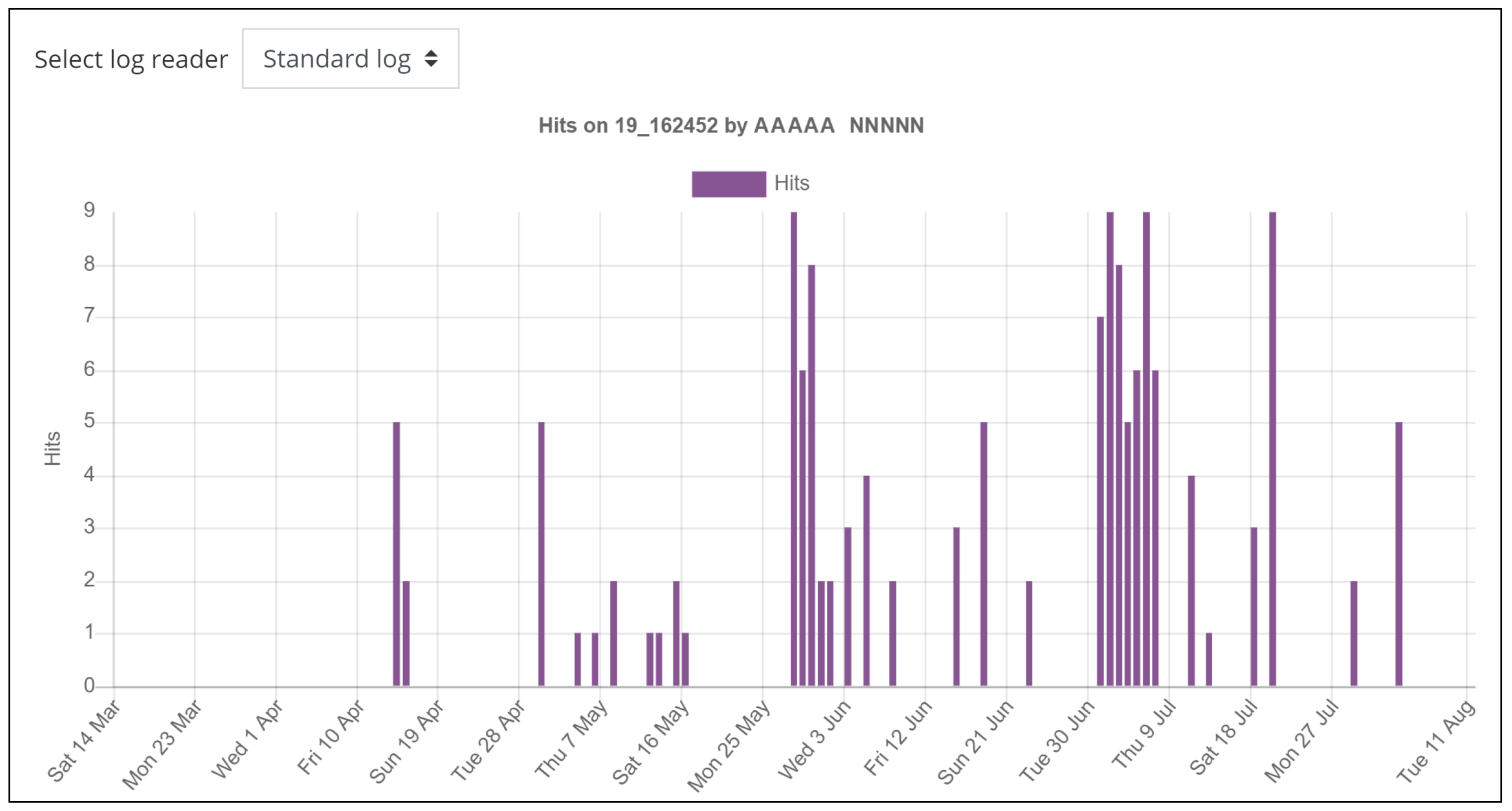
Most learning management systems (LMS) provide instructors with some form of information to track students’ accesses and online activities through system logs and basic visualisations. Usually, such information is provided in the form of numbers, tables, and, less often, graphs, but most of the log information is not visible at all in the user interface. The monitoring interfaces often looks like directed to the system manager, more than to the teacher, to whom is scarcely usable. From the instructor point of view, logs provide a large and useless amount of raw data, where only a few graphical outputs are provided in the form of bar charts and simple filters. Functionalities for exporting data in different formats are usually available. However, only instructors that possess advanced notions in the field of database query languages can fruitfully use them, while it remains difficult for those who do not have extensive previous Information Technology (IT) knowledge. As the population of instructors using e-learning systems is growing, especially in the actual boosting of remote learning due to the COVID-19 pandemic (using, e.g., e-learning, blended learning, and mixed lectures at the same time offered in-person and in e-learning to ensure social distancing), the number of educators with little or no IT background suddenly involved in e-learning is huge. Thus, there is a growing and urgent need of tools for continuous monitoring of learners which fulfills requirements of immediacy, effectiveness, and usability. Desirable properties of such tools are to be:
integrated in the standard LMS interfaces;
usable by every instructor, disregarding their knowledge of data analysis, data mining, or statistics;
informative and immediate, and to be continuously used as part of everyday instructor’s activity similarly to in-class feedback.
Learning analytics (LA) can help instructors to understand the realisation of their pedagogical intent by analysing the actions and behaviours of students, alone or in learning communities [
4]. Instructors should put particular care and caution in the analysis of the students’ actions because the access to activities and material does not automatically lead to students’ knowledge acquisition [
5].
All the tools and techniques that LA provides are useful to evaluate the effectiveness of the pedagogical process in the online context and to provide an in-depth insight into the development of the courses in the LD environment. Most of the current LA tools remain scarcely usable and unpractical [
2], while the data is presented in ways that provide difficult interpretation by non-experts [
3,
5], e.g., numbers, lists, and tables which require skills and time to be read and analysed. Thus, the current trend is to move the analytics information to a separate learning dashboard, leading to a separation between the daily instructors’ activities and the data analysis phase [
6]. Instructors have to learn a different interface and use a non-integrated tool to inform their LD process [
7,
8] (see [
9] for a deeper analysis of alternative solutions using logs). Another drawback of many LA approaches is that they only allow post-course analysis, as they are developed to be used after the course conclusion (i.e., to have a comparison on the same course on different academic years [
10]), without a real-time visualisation of the results. Furthermore, such visualisation often requires batch executions on the gathered data, only feasible with appropriate hardware. The current tools, lacking real-time features, fail to provide “as in-class” feedback to the instructor.
In the e-learning and blended learning environment typical of most of LMSs, most of the interactions with the learners take place offline. Interaction is the core of most of the activities, e.g., discussion forums, self-assessment tests, wiki, flipped lessons, and cooperative learning, while the necessary consumption of course material (e.g., slides, videos, documents) does not require deep interaction. The interaction through an online platform is unquestionably scarce of feedback, in contrast to the face-to-face interaction, where instructors can receive direct signals and in-class feedback from students [
3].
What lacks in the current LA scenario, and what we are willing to provide, is a tool that enables the educators to have continuous real-time monitoring of course development and help them to check if the students will correctly receive the LD they pursue [
11]. Our goal is to bring together the valuable features of the face-to-face approach that are implementable in the e-learning environment (e.g., immediate teacher self-evaluation, ability to adapt strategies quickly), while improving the readability and comprehensibility of the e-learning monitoring system, to improve overall teaching and learning. This strategy will allow instructors to understand how students interact with the course elements provided in the LMS and receive from like in-class feedback from the data analysis. Instructors can then make data-informed decisions about the course effectiveness and the learning objects impact within an in-place and easy-to-use tool, not requiring in-depth IT knowledge. We aim to help educators make decisions, connected to student-related factors and based on the timing of access to resources, to improve learning designs that comprise their teaching experiences. Such a goal is reached providing artificially intelligent (AI) reactive tools [
12], able to transform the visualisation of the course content dynamically (e.g., dimension and colour of icons of learning objects) [
13]. An approach based on AI can perform tasks commonly associated with intelligent beings and intellectual processes characteristic of human beings, such as identifying patterns, discovering meanings, generalising, or learning from past experiences. Despite continued progress in computer processing speed and memory capacity, there are still no programs that can match human flexibility on broader domains or in tasks that require much daily knowledge. However, AI can adapt tools to be automated, responsive, adaptive, flexible, and to improve usability features, such as visibility, readability, and comprehensibility [
14,
15]. The students’ engagement is thus represented by the learning objects usage. The same visual metaphors can be used on students avatars (e.g., dimension and colour of the avatars of the student or groups of students), to view the engagement of the single student or group with high affordance. In our implementation, we considered an essential requirement to be compliant with responsiveness for mobile devices [
16], in order to grant usability and accessibility. More than ever, the COVID-19 pandemic has highlighted the necessity to grant accessibility from smartphones, in particular in all the cases where remote learning of several students in the same house (e.g., siblings, students sharing the house, teachers who are also parents of students) would require an expensive and bulky amount of personal computers. In the second section, the current state of the art of visual interfaces for learner monitoring in LMS and their main drawbacks are discussed in order to motivate our approach and the use of the innovative approach of visual interface morphing [
17,
18]. In section three, we detail the definition of the three proposed types of visual interface morphing methodologies. Section four presents the implementation of the morphing metaphor as a Moodle theme, introduce the experiments settings and the evaluation criteria. Finally, we discuss the experimental results, we conclude, and depict some future line of research.
3. Metaphors for Course Analysis
We propose a definition, design, and experimentation of a visual code that can render in an intuitive and immediate metaphor the main quantitative parameters of the users’ activity. We embed the visual code into the LMS interface, thus integrating the course monitoring phase in the everyday course management process. In other words, while performing usual activities of content delivery and interaction, the instructor will have an in-place glance of the course usage, in term of student engagement, community interaction, and use of each learning object. The graphical view can be further fine-tuned or filtered to focus on specific parameters or visualisations using a simple and usable parameter selection.
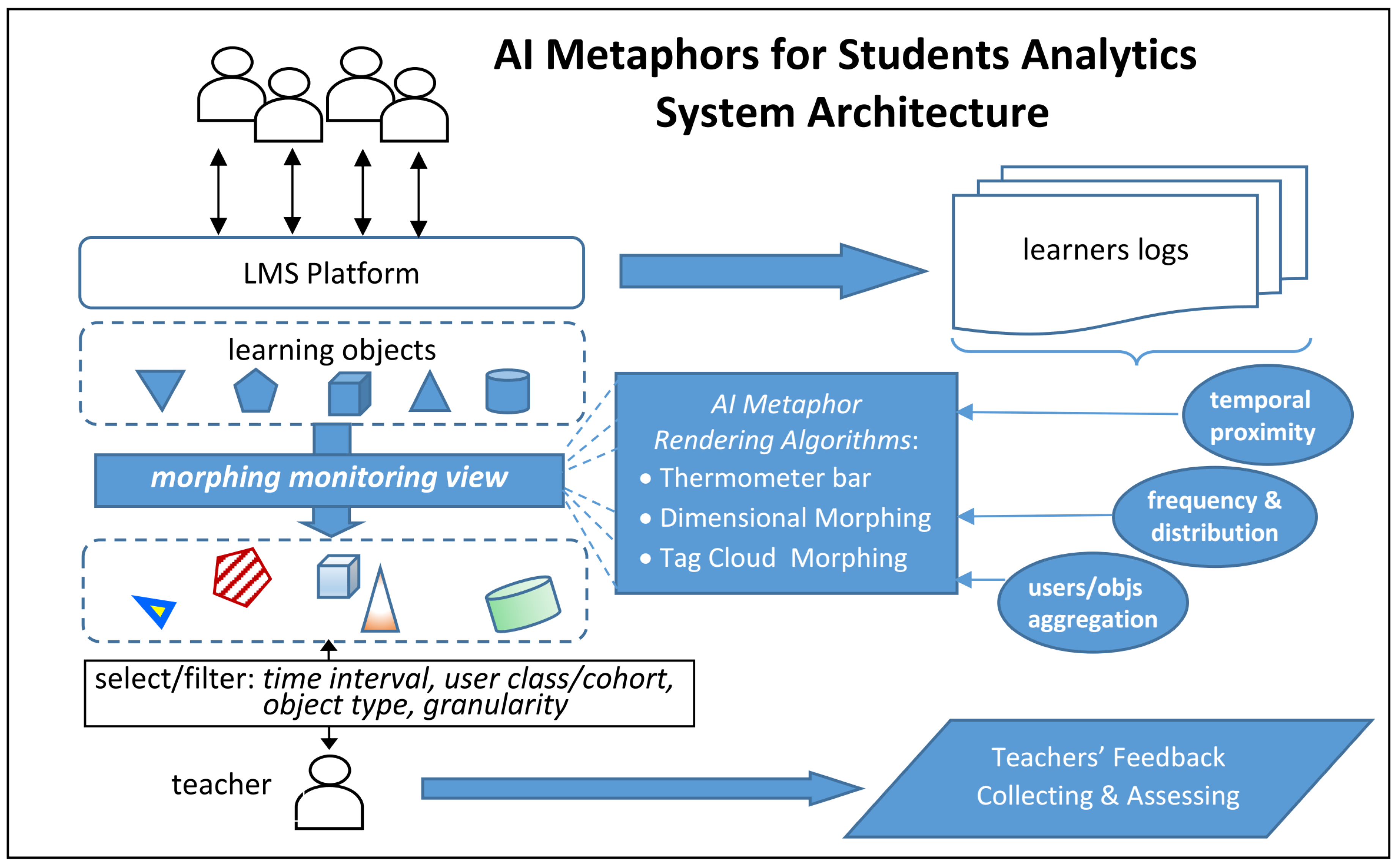
Figure 2 shows the architecture of system modules and their relation with teacher and students users for the learning management. Big and small arrows show the flow of data transformation and users interaction with the system. The students (upper human figures) and the educator (lower human figure) interact with the learning objects, dynamically changing their visual metaphor.
3.1. Visual Interface Morphing
We introduce a class of visual interfaces, the characteristic of which is to act on a learning management system’s interface to modify the appearance of the learning objects using visual metaphors. A visual metaphor is the visual representation of an object, e.g., person, group, learning object, or concept through a visual image that suggests a particular association between the object and its visualisation. A metaphor uses one or more visual features to compare, highlight, and in general, improve the visibility and understandability of the object properties in an intuitive way.
The general idea is to modify elements of the interface, e.g., dimension and colour of icons and text, to express some crucial dimension of the data, and to show them through an embedded real-time visualisation. This form of visualisation combines the completeness of information with the efficacy of representation, significantly improving the usability of the learning analytics and monitoring features of the e-learning platform.
The quantitative dimensions considered in this work are the following:
Quantity of usage of learning objects (views, number of updates, number of submissions, number of quizzes repetitions);
Temporal distribution of resource use;
Temporal proximity for a time reference—current date/time is usually considered as a reference.
Data can be further filtered/aggregated by:
Users, from a single user to groups (e.g., study groups) or classes of users (e.g., students from a particular country, within an age range, following a particular topic);
Time interval;
Action (e.g, read, write);
Learning object or module instance.
3.2. Learning Objects Quantitative Analysis
To measure the learning object (e.g., slides, documents, links) or the module instance (e.g., quiz, assignment, wiki) popularity and the user engagement, our system computes the usage of each learning object and module, tracking the users with their profile information, when needed for specific statistics and filters, under the privacy policy of the platform. The distinction between learning objects and modules is instrumental to a possible different implementation of resources and activities. We consider the frequency of access for each element present in the interface, which represents its usage—for instance, in the case of the analysis of the engagement in a forum discussion, the number of accesses to read or write posts. Similarly, regarding assignments, the number of submissions will be considered as a quantitative value, while, if the assignment is a quiz, also the single or multiple attempts will be a piece of relevant information. Such kind of quantities measures how much the users access the specific module instance, and, therefore, how popular the analysed element is among the users.
Given such elements (e.g., learning objects and module instances) in the course, our system will automatically extract the related data from the log system.
Definition Log record. Formally, a relevant activity event a for a learning object o is encoded by a log record , where t is the access time stamp, i.e., a is the event of accessing the learning object or module instance o at time t.
Definition Learning Object Usage. Given a set
of meaningful activities for a module instance or learning object
o and a time interval
, where
is the starting time and
is the ending time, the quantitative value of usage of
o in
T is defined by Equation (
1):
3.3. Temporal Proximity
The temporal information, needed to track improvement (or worsening, e.g., in case of procrastination) of students learning, is an expression of the chronological access history to the elements within a temporal interval of analysis. The reactivity of the AI approach allows to render the temporal process. Our system requires two time-related values associated with the learning object or module instance: the date of access, extracted by logs, and a reference date provided by the teacher to set the temporal landscape.
Temporal proximity is rendered visually with a metaphor using hot/cold colours, i.e., heat-maps, where a hot topic refers to resources more frequently and recently accessed, shown in warm colours starting from red (recently accessed) and gradually cooling down in time towards orange and yellow, i.e., in the red frequency of the colour spectrum. On the contrary, objects less recently (thus, frequently) accessed are rendered in cold colours, i.e., in the blue/magenta range of the colour spectrum of light. The resulting colour is proportional to the time difference between the object access date and the reference date set by the teacher (i.e., the analyser). The system shows the peculiar status of objects that did not underly relevant access by users using an ad hoc colour, thus providing to the teacher the meaningful information about the necessity to double-check the quality of the element, e.g., the content and presentation of a learning object, or the publicity of an evaluation module. The distinctive colour chosen to represent the null access to an object in a time interval of interest will be white or black, automatically chosen depending on the contrast with the actual background colour of the page, to guarantee usability and accessibility on the visual side.
While the intuition behind the hot/cold metaphor is very consistent, the actual definition allows many degrees of freedom, as expressed by the following definition.
Definition of Temporal Proximity. Given a reference interval
, a set of significant activity logs
for
of learning object
o, and given Equation (
2):
the temporal proximity of activities over
o,
is defined in Equation (
3):
where
is a procedure extracting an internal reference time from the set of logs of the object
o. The value of
is thus used as translation displacement on the colour temperature scale. In the current implementation
, i.e., the system extracts the most recent access to the object. The choice is consistent with the proposed intuition, corresponding to a “ the last takes it all” strategy. In general, we can consider other possible functions for
, as explained in-depth in the Conclusions section, which can introduce an inertial resistance to the colour change. A meaningful option is to consider
, i.e., to determine the colour temperature for time proximity by the average of the activity dates. An alternative is to consider the
or the
of the most recent quartile, e.g., the most recent 25% accesses, or another fixed threshold depending on the amount of users accessing the resource.
3.4. Aggregation Functions
The information acquired from logs can be aggregated under different strategies and at various granularity levels, to show different use cases depending on the instructor requirements and goals.
User Group Aggregation The relevant dimensions of the learning objects (e.g., usage and proximity temperature) can be considered by a group of users, of varying size, from activities of a single user to group projects for cohort dynamics analysis.
Time Interval Aggregation The teacher can set the time range to examine. The starting date and end date can include the full duration of a course, e.g., to detect general usage trends, or focus on a specific part, to have a more detailed view of a key instructional event (e.g., deadline of an assignment submission, assessment due date, some days before the exams). In general, teachers can select a time landscape of activities on which to focus the graphical view (e.g., last week, last month) and extract data for temporal analytics.
Learning Objects Aggregation The system analysis include the possible aggregations of actions performed by students on the learning objects or module instances (e.g., read, write, visualise, submit, posts). This kind of aggregation enables educators to further focus their analysis on a specific learning or evaluation elements or classes, e.g., activities versus resources.
5. Experimental Analysis and Results
We experimented and evaluated the implementation of the proposed monitor metaphors in a Moodle theme, named MonitorView, which will be published later with an open license. The theme format allowed us to create a customised visualisation of the elements without modifying the functionality of the LMS, in a modular way easy to install.
MonitorView is an extension of the Standard theme with the addition of the following functionalities to the course visualisation page:
Activation/deactivation of the monitoring features;
Selection panel for the monitor parameters;
Thermometer bar visualisation mode;
Dimensional morphing visualisation mode;
Tag cloud morphing visualisation mode.
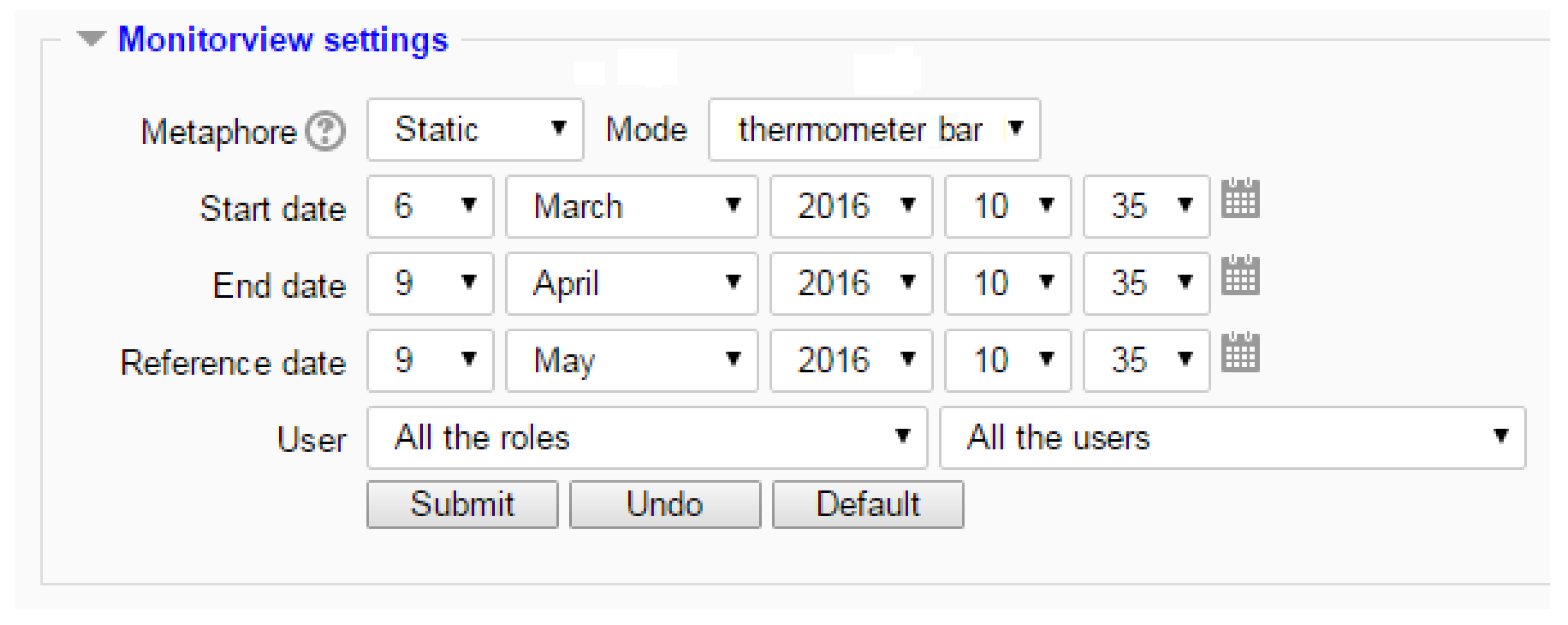
When turning on the monitor features, an additional section is displayed in the standard interface, above the current course learning objects (see
Figure 3). The MonitorView settings form enables the user to select and adjust the monitor parameters (e.g., time frame). The main settings are the Metaphor and Mode selections. In a dynamic visualisation, the metaphor is morphed in real-time (i.e., having the start date of the object creation and the end date of the timestamp). The dynamic visualisation is updated at the page load only, to avoid flickering or other usability issues of a continuous refresh. The static metaphor allows the educator to select a start and end date and visualise the morphed result. Using the two dropdown boxes, the user can choose to represent the information using the
Thermometer bar (“Thermometer bar”) or
Dimensional morphing (“Morphing”) metaphors.
Picking up the date and time, the user can select the time window to analyse, fixing the reference date for the temporal proximity data analysis.
The last parameter is the selection of users’ aggregation. By default, the parameter is set to show all the users, i.e., all Moodle user roles. The selection can be fine-tuned choosing a specific user role or a single user or group of users.
The result of this parameters set is the in-place morphing of the course page. The colours to represent the temporal proximity to the reference date of the learning objects, as introduced in
Section 3.3, are graded on a discrete scale shown in
Figure 4. The least accessed objects are rendered in dark blue and hot topics are in pure red. The dark grey colour is used to highlight the learning objects with no accesses.
The experiments have been held in the University of Perugia, embedding the MonitorView theme in the academic e-learning platform, called UniStudium, developed as a component of a more complex AI-based system, aiming at modeling user behavior in e-learning systems for detecting and analysing user reaction to interfaces and semantic aspects [
27,
28,
29]. The experiments involved 12 courses of different bachelor degrees, in blended learning, with their 12 leading instructors. The courses included from 90 to 120 students each (mostly in age range 18–25). All the instructors involved in the experimental phase had already used the Moodle platform for at least one year, to avoid a bias introduced by the teachers’ learning curve. After the collection of the learning objects’ access information in an anonymised form, the access logs of instructors and students have been analysed to investigate the potential of the three metaphors. Collected data spans a time frame of three different exam terms. Example visualisations are shown in Figures 6–9 from the “Intelligent and Mobile Technology” course of the Computer Science bachelor’s degree program.
5.1. Evaluation Criteria
The experiments have been assessed quantitatively by a comparative analysis of instructors’ access logs. Considering the same instructor and the same course, the baseline for comparison of the usage of the proposed interface is the usage of log referring to objects (i.e., learning objects and modules instances) before the introduction of visual monitoring metaphor. The log information is thus compared before and after the metaphor introduction, i.e., with and without the metaphor. In this way, since the original method of monitoring data analytics was used before and along with the three modifications, the original method can be thought of as a type of control for the study. The instructors used all the tools at least once a week for an initial period of two weeks, after which they were free to choose and switch among any of the three metaphors (i.e.,
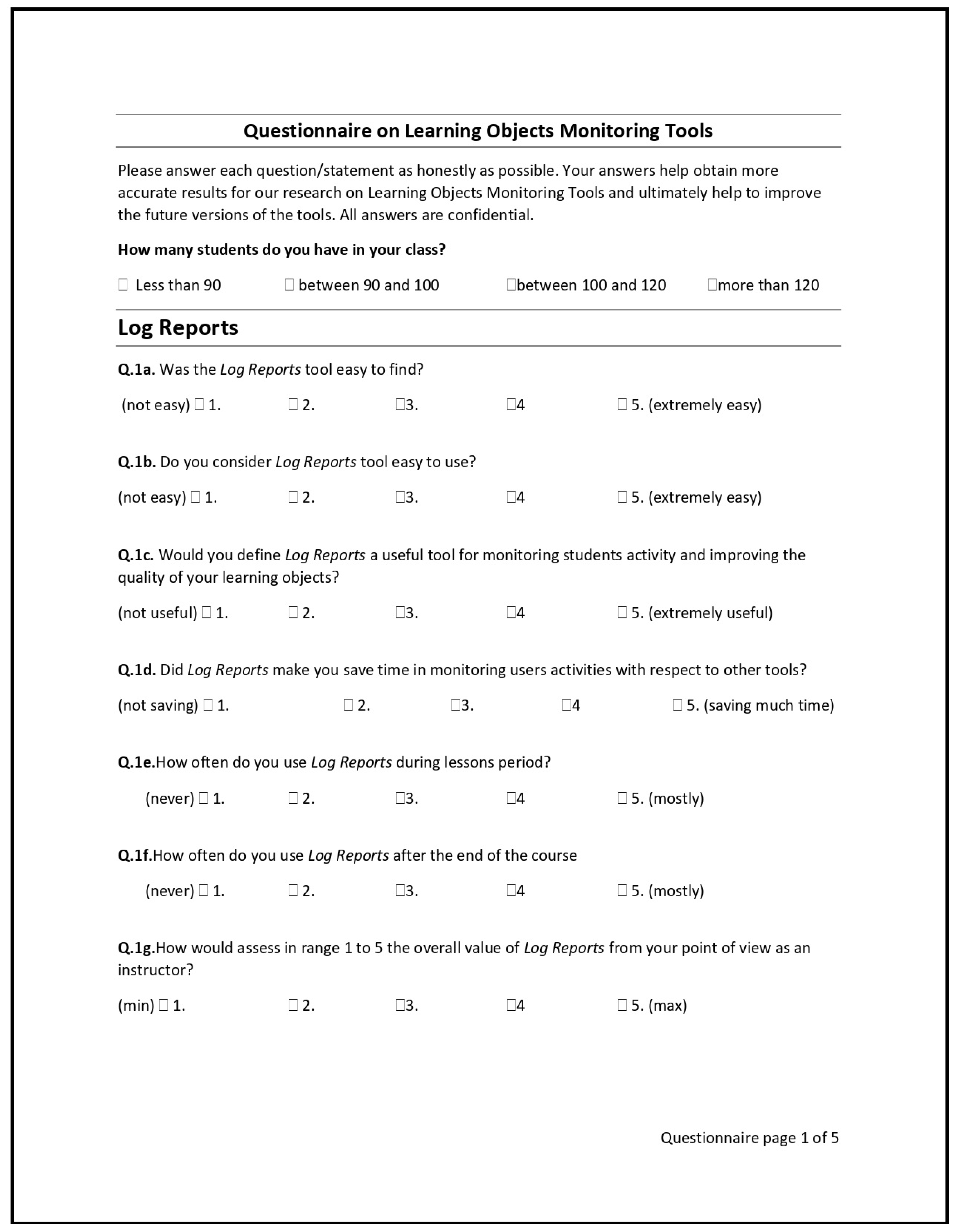
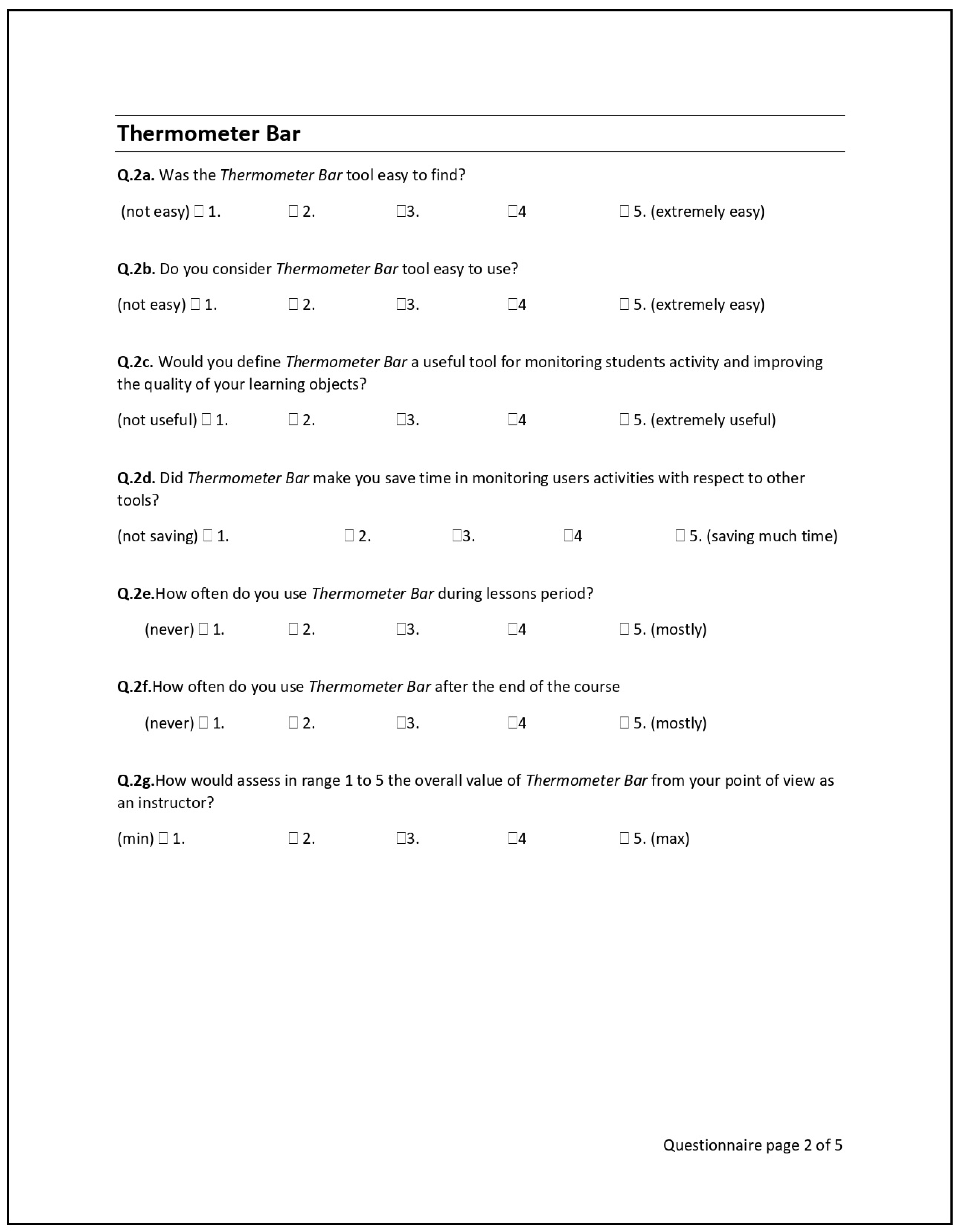
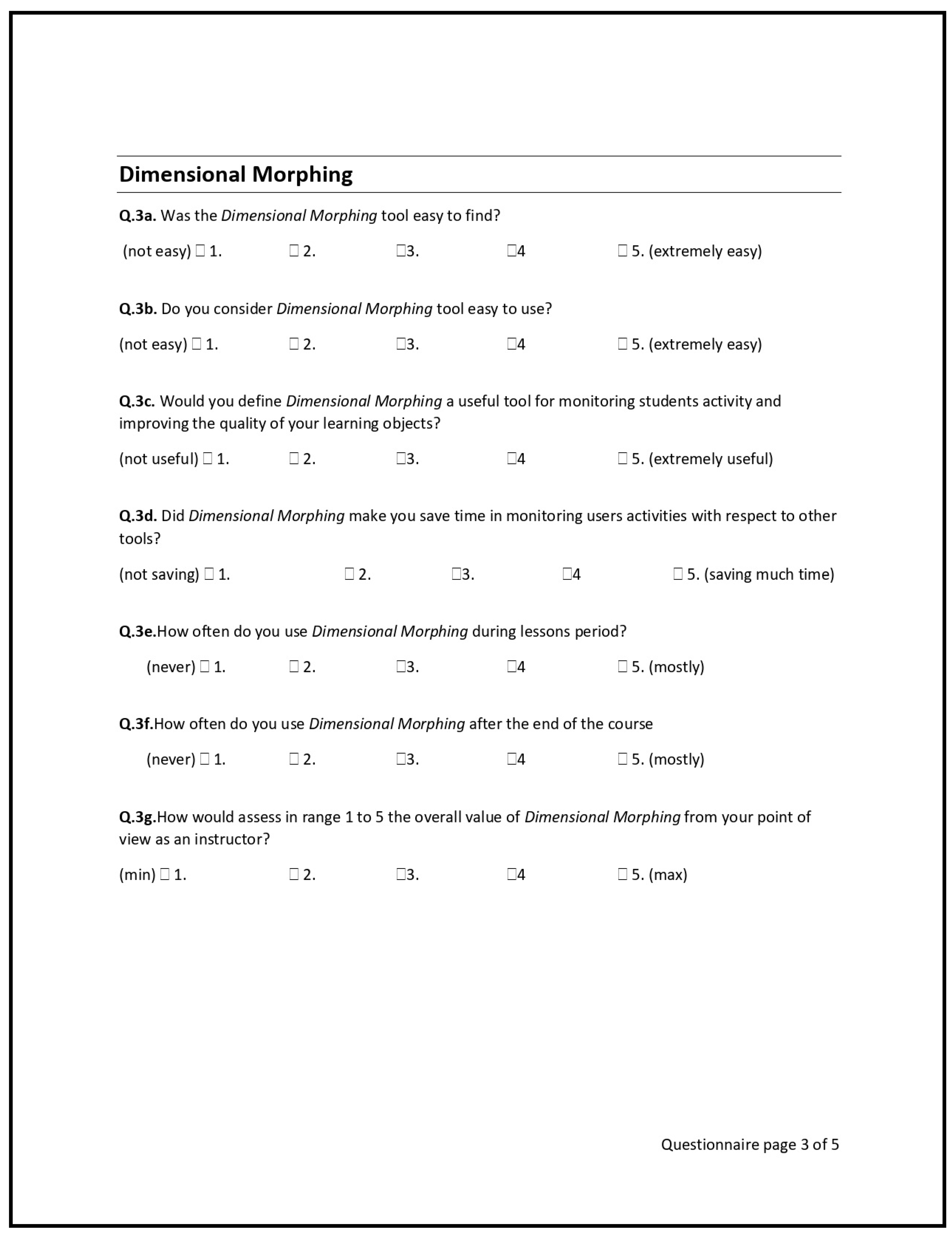
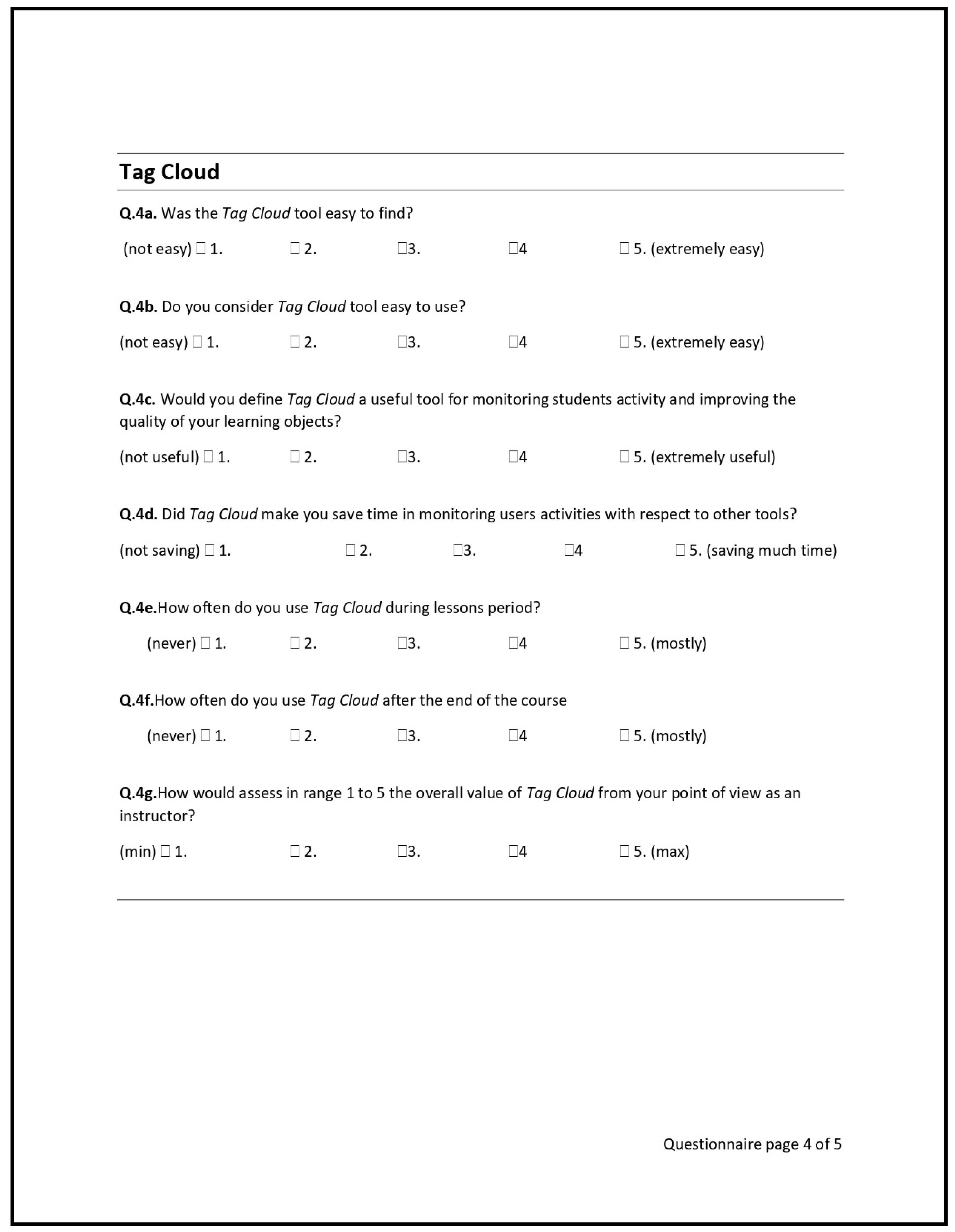
Thermometer bar, Dimensional morphing, Tag cloud) or the traditional log reports. The objective data are sufficient for assessing an adequate evaluation of the tool. We decided to ask some questions to educators to understand eventual issues of the visual metaphors better, aiming at future enhancements. At the end of the experimental phase, the instructors were asked to fill a questionnaire for a qualitative evaluation of their experience (included in
Appendix A). The screened parameters included the general usability assessment of the interfaces, their usefulness regarding the course management, the impact on the teaching strategy, the comparison to traditional methods of user monitoring. For each morphing metaphor, we proposed questions about how much the visualisation usability is perceived (e.g., easy to activate, easy to use, usable as a monitoring tool) and about the frequency of use (e.g., how often it has been used and in which phase of the course it has been used most, if during or after the lectures). Finally, an overall evaluation of the tool has been proposed. Users could answer in qualitative evaluation using a Likert scale [
30] with five items (i.e., 1 to 5, where 1 is low and 5 is high). The final evaluation is thus composed both of subjective data from the teachers’ questionnaire, and objective data from users logs. To ensure the quality and accuracy of the answers, the questions are redundant and are used as a check to identify contradictions, such as a positive assessment of usability and usefulness along with a negative overall assessment. Consistency has then been verified with the usage logs of the metaphor declared as preferred. The results show that the educators’ responses were consistent.
Figure 3 shows an example of usage, with the aggregation parameters selection panel. In this real case studied, the time window spans over one month. The
End date parameter is particularly important for that course. The second assignment was given to the students one week before the submission deadline. The temporal proximity was set one month after the end date to have a better colour distribution on the topics labels. In this use case, the instructor was looking at the usage status of learning objects to identify the resource material that students were reviewing to complete the assignment.
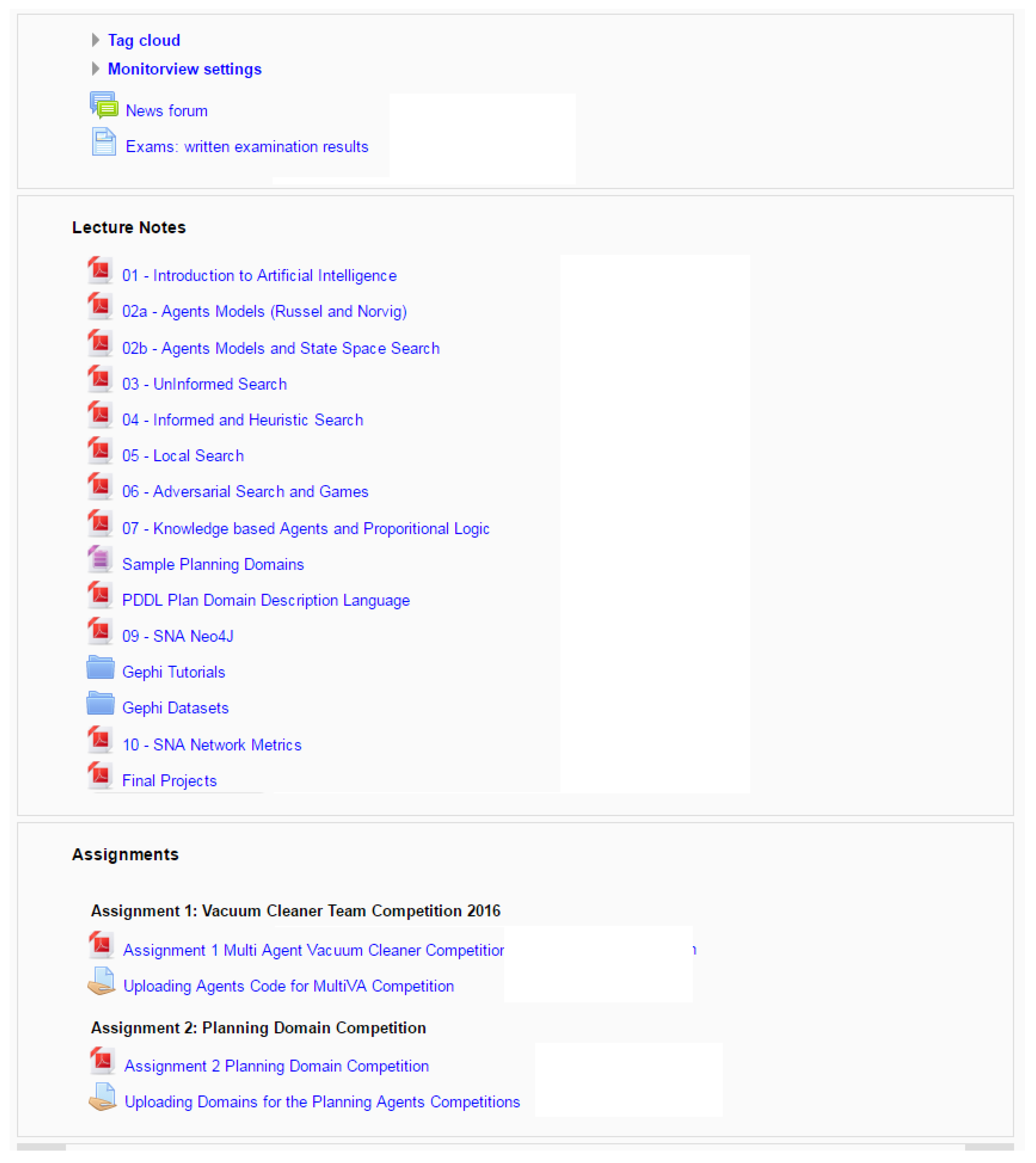
The standard course view without any morphing is shown in
Figure 5.
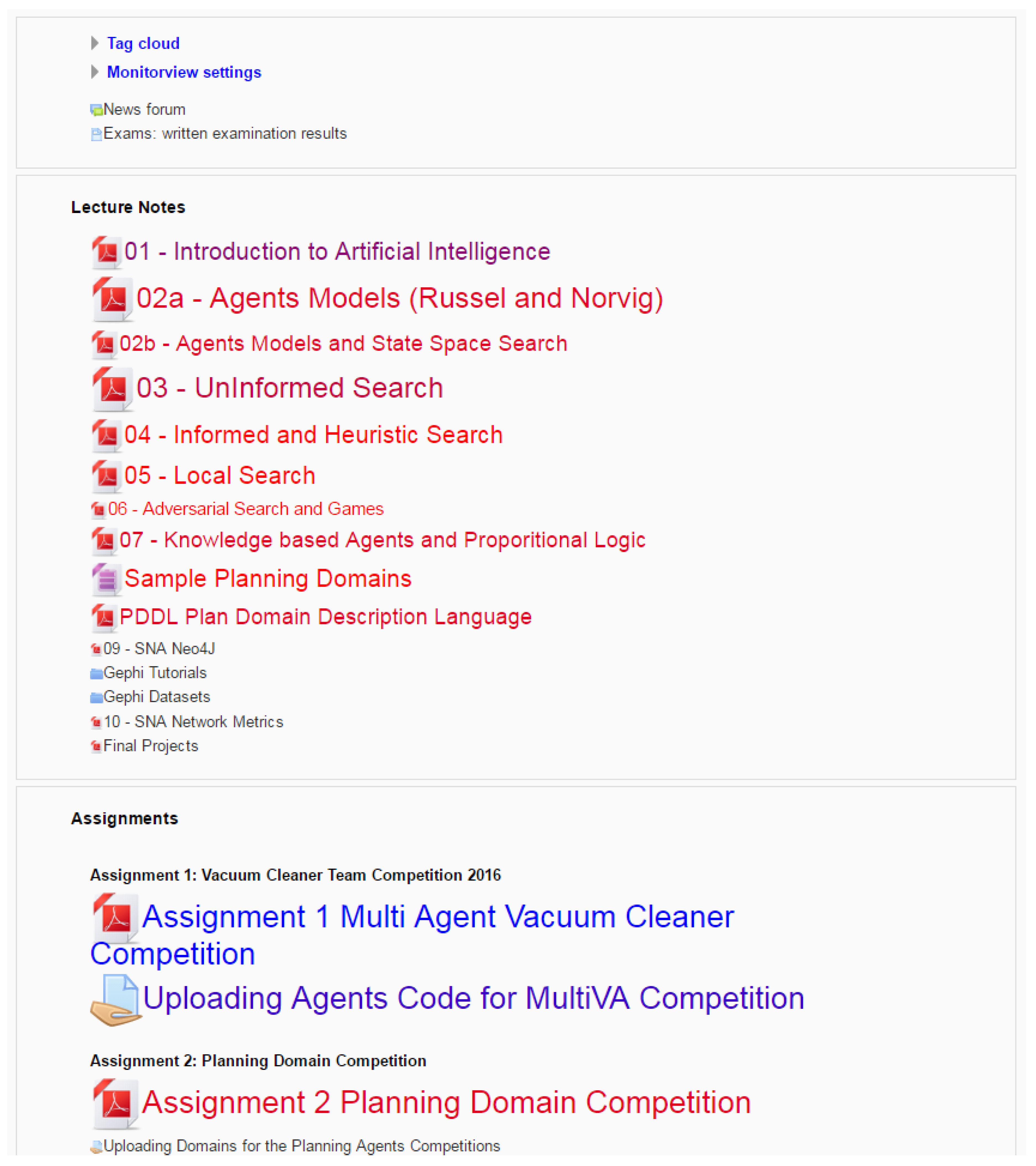
Figure 6 shows the visualisation of the course page according to the
dimensional morphing metaphor with its time interval and the aggregation parameters shown in
Figure 3. The icons and labels are stretched and coloured, considering the learning object popularity and the access temporal distribution. In
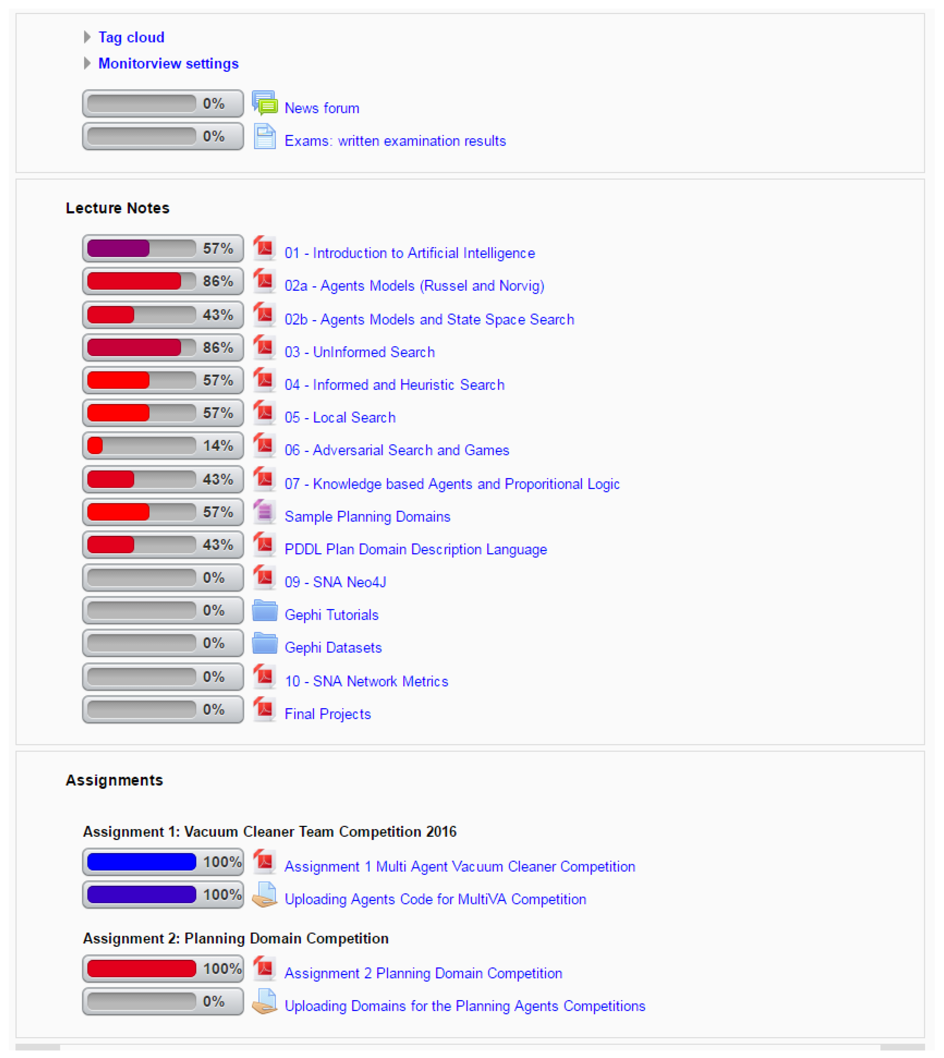
Figure 7 the same data are shown in the
Bar mode following the
Thermometer Bar metaphor. A
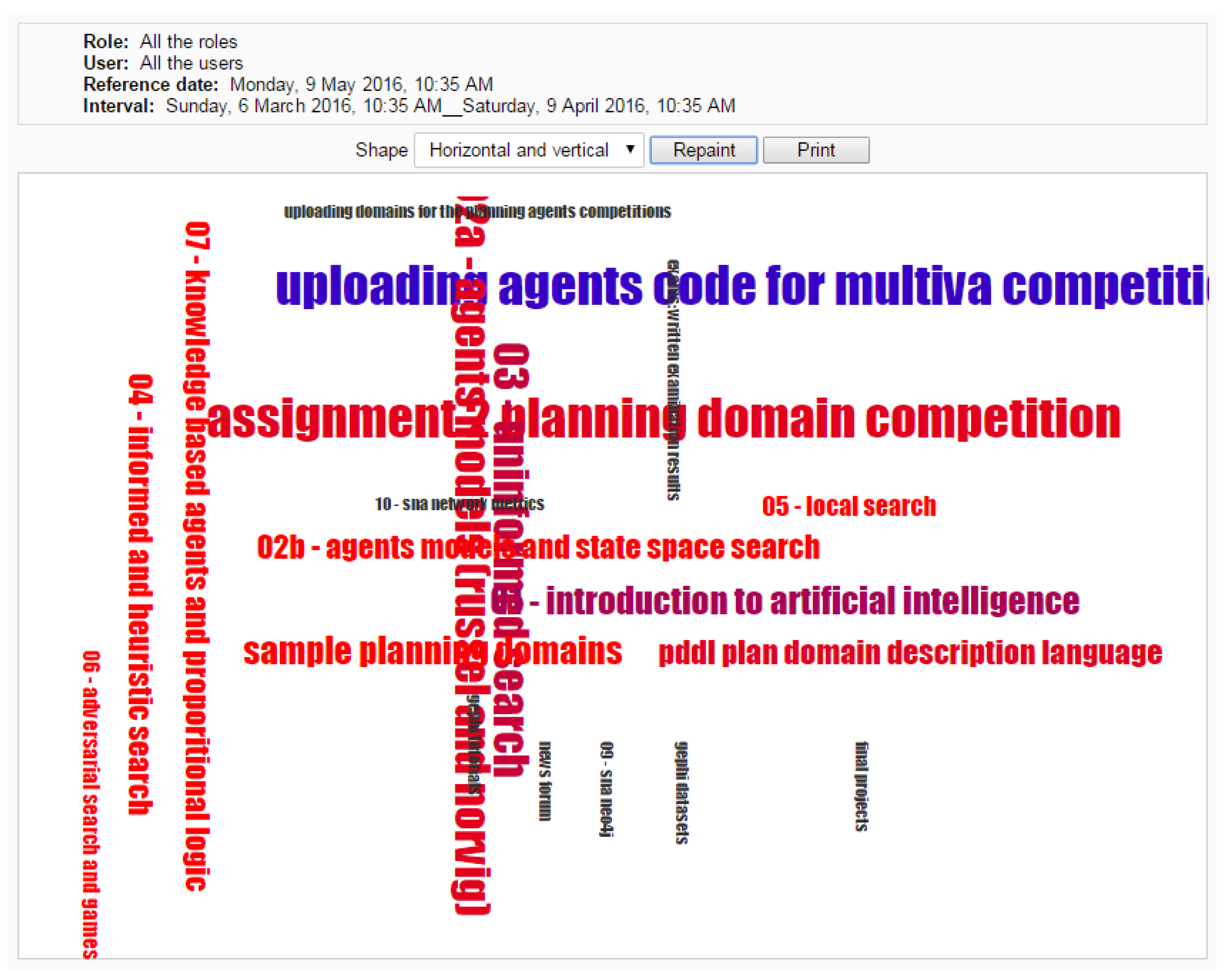
Tag cloud is shown in
Figure 8 and
Figure 9, where the information and page layout is morphed to obtain two different styles of the
Tag cloud. In the first, the labels of learning objects are adapted in
Wordle style [
31]; in the second, an algorithm mixed the labels in horizontal and vertical style. In addition to these two styles, the instructor can choose to arrange all the tags horizontally.
5.2. Experimental Results
Table 1 shows the instructor logs monitored during the experimental phase and compared to the previous year. Only five over twelve instructors were using the Moodle log report utility in the previous year. From the quantitative assessments based on instructor logs, reported in
Table 1, is apparent that all the three proposed metaphors outperformed the log report utility. The latter was still maintained only by a single user, while four out of five teachers that previously used the log report definitively moved to one of the three new metaphors. None of the seven users new to the log monitoring task adopted the log reports. Among metaphors, the
Morphing metaphor is strongly prevailing among the three, at the end of the courses.
The motivation of the successful usability performance of dimensional morphing can be found in its approach, based on the transformation of the existing interface, where the learning curve is very short for the instructor, who previously designed the visual organisation of the standard course. Interacting and viewing the platform interface in everyday work has the effect of showing at the same time the monitoring information overlaid to the interface. The act of using the monitoring interface takes place in a transparent, user-friendly and natural modality, as resulting from the teachers’ feedback. A somehow unexpected result is that the performance of the Tag cloud metaphor is better than the Thermometer bar. Although the Thermometer bar view mode is well organised and easy to read, it did not have a strong visual appeal and impact on teachers. Interviews with the users showed that while tags are randomly distributed, the relevant elements immediately drew the attention of the Tag cloud observer. On the contrary, in the Thermometer bar a slightly harder effort is often required to compare by eye the length of the thermometer sliders.
Table 2 shows a summary of the most significant results from the user qualitative evaluation questionnaires, where the report values are averaged. The qualitative assessment ranges from 1 to 5 (5 being better than 1), where the users can express non mutually exclusive evaluations. The best two metaphors entries report the total number of votes obtained, where each user could express two votes.
As an overall result, the instructors agree, with only one notable exception, that the MonitorView tool provided them with the ability to obtain valuable indirect feedback on the learning objects provided to the students during the course, allowing them to timely adjust the taught lessons approach. The learning design process is often viewed as a monolithic approach that requires long-term planning of resources and activities. While this baseline remains true, the use of the proposed tool has profoundly influenced the instructors’ ability to continuously refine the strategy implicit in the learning project they are pursuing and implementing, basing decisions on visual information of student engagement. The qualitative assessment for impact, quality and contribution to the course management confirms the quantitative evaluation: Dimensional morphing is prevailing over the other metaphors and Thermometer bar, and Tag cloud views are comparable regarding the use, with the latter slightly ahead.
It is worth noticing that some strategies for using the interface provided in the MonitorView tool have emerged from the experimental evaluation as reported in instructors interviews. The most frequent use cases in which MonitorView tool is used have been:
At the end of the course, to detect the least used learning objects to improve their quality and to have a better discussion in their presentation to the students.
During the lessons and after the end of the course, to detect the most used elements because this can be a signal of the complexity of the taught concepts for the students.
During the course, to discover the most used material close in time to the assignments/exams or other in-class events, when they are perceived as more useful by students.
Alternative solutions using logs, based Moodle plugins (e.g., Gizmo, SmartKlass), web servers (e.g., Intelliboard), and client applications (e.g., Excel) [
7,
8,
9] are not directly comparable with our work because they have not been tested in the same environment and statistical data are not available in the same context. However, it is possible to discuss some differences. External solutions to visualise data in real time, even where the extraction process requires little effort, separate the phases of use and analysis. Our proposal provides an integrated page that includes both course data and feedback at the same time (i.e., the modified course interface can be used and is not a visualisation of a learning analysis graph). The use of the course with immediate feedback on the visualisation of the resources of each learning object is the most innovative added value of this work, providing the same feedback as the face-to-face setting. No other alternative solution to real-time monitoring of student engagement provides an integrated approach.
5.3. Limitations
As noticeable from the images of MonitorView in
Figure 6 and
Figure 7, the visual impact is different for the different visualisation metaphors. Data gathered in the experiments show that, although every student accessed the first assignment’s material and the project for the second assignment, not everyone accessed the other course resources. The interpretation and impact of this information on course learning design and strategy can vary depending on the context in which the instructor operates. For instance, a straightforward strategy is that material that has not been accessed is not attractive, too complicated or too easy to understand, thus useless if not reviewed. An alternative interpretation of the data takes into account the characteristics of the courses, i.e., the blended teaching mode, where students can share the course material through other channels, such as Facebook pages or exchanging handouts.
Another noticeable event is that students that accessed the system reviewed part of the older lessons, leaving some of the recent course learning objects almost untouched. The latter is particularly relevant for the learning object named PDDL Language slides of the Computer Science course. The educator should investigate the event because the slides were included in the second assignment project, but the students did not access the material. The access to older material can be related to a general course review made by some of the students; this event can be analysed in-depth, looking at the single student behaviour instead of the aggregated data.
The feedback provided from the instructors also suggests that there is space for a great improvement of the Tag cloud metaphor by retaining some bounds to the original structure, either by introducing a visual connection to original elements or by visually animating the morphing interface, i.e., the transformation from the standard interface to the Tag cloud.
