1. Introduction
Colors are present in every visual environment, and color perception accompanies visual perception wherever it occurs. Colors create sensory impressions in the eye and may produce different effects on individuals. In other words, as a result of a physical interaction, people encounter a subjective and emotional experience. In the visual environment, multiple colors are often present at once. Sometimes these colors appear together by chance, while at other times they are purposefully combined through intentional design concerns. In both cases, the presence of various colors within the same visual field produces psychological effects comparable to those of a single color. When the visual environment consists of a single color, individuals tend to describe their interaction with that color through concepts such as liking or disliking it, and preferring or not preferring it. However, when multiple colors are present, in addition to liking and preference, the degree of harmony among the colors also becomes a relevant consideration. Within this framework, for designers working with color, the combinations they employ in two- or three-dimensional spaces carry substantial weight in determining the affective responses that such environments may elicit in the viewer. Color Contrast Arrangements constitute one of the systems developed for use in color design. The arrangements were formulated by Prof. Dr. Şazi Sirel based on Albert Munsell’s work and the Munsell color system. They were defined through the proportioning of hue, value, and chroma contrasts. This physical approach was first applied by Albert Munsell on the Munsell color solid, where these relationships were defined as “paths.” Building upon this approach, Sirel later defined the Color Contrast Arrangements as an extension of these paths. Accordingly, the Color Contrast Arrangements in question were constructed on the basis of a physical approach, and the process did not entail a study of their meanings or impacts [
1,
2]. However, people experience their environments both physically and psychologically, and as a result of the sensations they collect, they are affected by their surroundings on affective, cognitive, and behavioral levels. In this experiential process, the colors perceived visually in the environment also play a role. For this reason, it is important to understand how the Color Contrast Arrangements—developed for use in color design—are perceived by people and what psychological effects they produce. The present study aims to investigate the affective responses of Color Contrast Arrangements in order to examine how they are perceived by individuals and what psychological responses they elicit. A review of the literature reveals that the affective responses of color are most commonly explored through the concepts of harmony, preference, and liking. Accordingly, within the scope of this study, the affective equivalences of the color arrangements were likewise examined in terms of harmony, preference, and liking.
Morgan asserts that sensation forms the basis of perception, which in turn shapes our experience of the world [
3]. In studies, processes such as defining, interpreting, evaluating, liking, and preferring colors are considered in relation to the affective responses produced by color.
The literature contains numerous studies that present definitions and propositions concerning the concepts of harmony, preference, and liking, as well as evaluations of these propositions by various researchers. Some scholars have defined and assessed these concepts as interrelated, while other studies have evocated that harmony, preference, and liking may diverge from one another. One of the earliest researchers to offer propositions regarding the notion of color harmony was Newton. The first scientist to develop the color wheel, Newton, stated in his seventeenth-century studies that colors selected at equal intervals appear harmonious, thereby formulating the first theory of color harmony [
4]. Goethe suggested colors situated on the color wheel that are complementary, adjacent, and those intersected by a triangle or a square would all yield harmonious combinations, though he asserted that the most harmonious combinations are always those involving contrasting colors [
5]. Munsell, on the other hand, associated color harmony with the concept of “balance,” and to achieve harmony among colors, he identified specific relational paths within the color solid of his own system. He defined three typical trajectories and proposed that all other combinations could be derived from these or their intersections. The first trajectory runs vertically along the value path, with only value changing. The second path progresses laterally around the hue circle, allowing for hue (or hue/value/chroma) variation. The third sequence moves radially inward toward the neutral gray path, with hue and chroma changing markedly while value remains relatively stable. The systematic sequences associated with these trajectories are as follows: a uniform value sequence along the vertical path; a uniform arrangement of value and chroma using adjacent hues along the horizontal direction; and a saturation-based sequence composed of complementary hues and neutrals along the radial direction toward the neutral gray path. These sequences were analyzed by Sirel under the categories of value contrast, hue contrast, and chroma contrast, respectively. In this regard, Munsell is understood to have characterized single-component contrast arrangements as harmonious [
1,
2].
Alexander’s discussion of color properties in relation to inner light emphasizes the role of hue, value (lightness), chroma (grayness), and their relative proportions in shaping perceptual experience. According to Alexander, visual coherence and perceptual quality emerge not only from individual colors themselves, but also from the proportional and relational balance established among colors within a composition. He argues that successful compositions generally depend on clear hierarchies between dominant and secondary colors rather than on equal distributions of multiple colors. In this context, contrasts, proportional relationships, and transitions between colors contribute to perceptual qualities such as harmony, calmness, coherence, and visual vitality. Alexander also emphasizes the perceptual importance of value contrast, noting that strong relationships between light and dark play a central role in generating perceptual clarity and visual depth. Furthermore, he suggests that colors may strengthen one another perceptually through their relational interaction within a composition. Although this perspective is primarily phenomenological and qualitative in nature, it highlights the importance of relational color properties, which can be conceptually associated with the Color Contrast Arrangements examined in the present study. In particular, the present research similarly focuses on relationships among hue, value, and chroma, together with their proportional organization within a composition. However, unlike Alexander’s theoretical and experiential framework, the present study adopts an experimental methodology aimed at evaluating measurable perceptual responses under controlled conditions [
6].
Moon and Spencer developed a mathematical model for color harmony. They argued that harmony could occur when the contrast between two colors is distinct; however, if the contrast range is not as pronounced—in hue, value, or chroma—the resulting color combinations would appear visually unappealing and therefore not harmonious [
7,
8]. In this regard, they coupled the concept of harmony with the degree of contrast among color components. Judd and Wyszecki defined color harmony as a pleasing effect produced by two or more colors coexisting together and as unity within perceived variety, further noting that the concepts of color harmony and color preference are closely interrelated [
7,
9]. Hogg, Goodman, and others conducted a study using a semantic differential scale to evaluate color samples within an interior space model, engaging two distinct participant groups—architects and non-architects. Hogg, Goodman, and others conducted a study in which color samples were evaluated within an interior space model using a semantic differential scale by two groups of participants—architects and non-architects. The five factors employed in the semantic differential scale were identified as “dynamism,” “spatial quality,” “emotional tone,” “complexity,” and “evaluation.” The findings indicated that participants’ judgments correlated color parameters with specific perceptual responses: dynamism with chroma, spatial quality with value, and emotional tone with hue [
10]. Polzella and Montgomery also conducted research on color harmony. A group of 21 participants evaluated 144 color pairs on a seven-point scale ranging from “1—harmonizing” to “7—clashing.” Another group of 35 participants assessed individual colors using a semantic differential scale consisting of twelve adjective pairs: “blatant–muted,” “hot–cold,” “pleasant–unpleasant,” “hard–soft,” “active–passive,” “lush–austere,” “strong–weak,” “exciting–calming,” “obvious–subtle,” “sharp–dull,” “vibrant–still,” and “usual–unusual.” The results of the study revealed that hue and value components, as well as the attribute of pleasantness, were significant factors influencing judgments of color harmony [
11].
Antal Nemcsics, through the theories he developed on color harmony, formulated his own color system known as the “Coloroid Color System.” He conceptualized the color solid in the form of a cylinder. According to Nemcsics, colors with constant hue and chroma but arithmetically or geometrically changing value; colors with constant hue and value but varying chroma; and colors with fixed hue while the other components change arithmetically or geometrically—all of these combinations, as well as any selected pair of hue sets drawn from such arrangements—would appear harmonious when used together [
12,
13]. Burchett examined the concept of color harmony by analyzing twelve books in the literature written on color, identifying the authors’ definitions and terminologies concerning color harmony. He subsequently categorized these definitions according to attributes such as area, interaction, configuration, arrangement, composition, similarity, attitude, and tone. When examining the relationships among these categories, tone, arrangement, and interaction emerged as the most prominent attributes. Burchett observed that the interaction attribute affected the meanings of all other attributes except tone and arrangement. Therefore, he argued that the concept of color harmony is primarily associated with tone, followed by arrangement and interaction, and subsequently with the remaining attributes [
14]. Chen, Wang and colleagues introduce a quantitative research framework based on multi-source data to accurately and effectively assess the relationship between street landscape colors and residents’ emotional perceptions. The findings of their study suggest that increasing color complexity and decreasing harmony can effectively enhance positive perception scores while mitigating negative perception scores. The study further reports that color harmony is significantly and negatively correlated with complexity; positively correlated with negative emotional perceptions (such as boredom and depression); and negatively correlated with dimensions of positive perception [
15].
Ou, Luo, and others conducted a three-phase study concerning color emotion and color preference. In their research, they used 109 color pairs to design a test composed of 11 affective scales (warm–cool, heavy–light, modern–classical, dirty–clean, active–passive, hard–soft, harmonious–disharmonious, tense–relaxed, fresh–stale, masculine–feminine, like–dislike). In the first phase of the study, they asserted that color preference was related to “dirty–clean,” “heavy–light,” and “tense–relaxed” parameters of the color emotion. In the second stage, based on the color emotion factors defined in the first phase—color activity, color weight, and color temperature—they developed a formula for predicting color preference. In the third stage, by incorporating visual color appearances, they calculated preference values between a reference color and a test color. In this way, the researchers sought to construct a model of color preference to guide color combination design. The results indicated that color preference in combinations could not be solely calculated through color emotion, since in emotional evaluation, colors are considered independently, whereas preference involves an assessment of relational dynamics between colors. Furthermore, the study also examined the relationship between color harmony and color preference, revealing that the two may be independent of one another. For harmony, the “harmonious–disharmonious” parameter was used, and for preference, the “liked–disliked” parameter was assessed [
16].
Ou and Luo developed a model for color harmony to be used in two-color combinations, based on a quantitative formula. The study involved a psychophysical experiment using the CIELAB color space and 1431 color pairs. These color pairs were displayed to participants on a monitor against a medium-gray background in a darkened room. Participants were asked to rate the color pairs on a ten-point scale ranging from “extremely harmonious” to “extremely disharmonious.” In addition to the concept of color harmony, the study also examined color pleasantness and color order. The authors identified three key factors influencing color harmony—differences in chroma, the effect of lightness, and the effect of hue—and constructed a model accordingly [
17]. Ou, Chong, and others using the model developed for two-color combinations in the earlier study by Ou and Luo extended it for application to three-color combinations. While the model produced reliable results for similar hues, it proved inadequate for other combinations, prompting the development of distinct formulas for monochromatic and trichromatic arrangements [
17,
18]. Schloss and Palmer investigated the relationship between preference, harmony, and similarity in color combinations. They proposed three parameters for evaluating color pairs: esthetic preference, perceived harmony, and the preference for the relationship between the background and the target color. Color pair preference was defined as the observer’s overall liking of a given pair, whereas harmony was characterized independently of liking, as the degree of unity perceived between the colors in the combination. They further argued that as hue similarity increases, both preference and harmony ratings also tend to increase [
19].
Numerous studies in the literature have examined color harmony, color liking, and color preference, as well as the relationships among these concepts within environments where color perception occurs. Building upon these approaches, the present study investigates the affective responses of the Color Contrast Arrangements developed by Şazi Sirel through his interpretation of Munsell’s work, within the framework of harmony, preference, and liking. Based on the survey findings, it is anticipated that different arrangements may evoke different affective responses, and that the levels of harmony, preference, and liking associated with a particular arrangement may not always coincide.
- b.
Color Contrast Arrangements and Principles of Color Design
In order for an object or a form to be distinguished from another, there must be a difference—a contrast—between the light rays that reach the eye. In the absence of luminance or color differences within the field of vision, visual perception becomes ineffective and meaningless. To achieve a certain level of visual impact, the light rays reaching the eye must exhibit discernible quantitative and qualitative differences; in other words, there must be a state of contrast. There are three contrast elements present in the sensory stimuli that affect the visual field, each corresponding to a distinct form of visual sensation. These three contrast elements are given in
Table 1. The presence of even a single contrast element within the visual field is sufficient to produce a visual effect.
However, contrasts may also be formed in pairs or triplets. Accordingly, based on the number of contrast elements they contain, they can be classified into two groups: simple and complex contrasts. Simple contrasts are composed of a single contrast element, whereas complex contrasts consist of twofold or threefold combinations. In addition, Sirel notes that no definitive rules can be provided regarding the meanings and effects produced by contrasts, or their associations, and that such determinations can only be made through assessments based on scientific experimentation [
2].
Simple (single) contrasts contain contrast of a single element and are named based on the element that exhibits contrast:
Hue contrast.
Value contrast.
Chroma contrast.
Dual contrasts contain contrasts of two elements:
Value and chroma contrast (hue remains unchanged).
Hue and chroma contrast (value remains unchanged).
Hue and value contrast (chroma remains unchanged).
Color Contrast Arrangements are likewise formed by combining their constituent contrasts in a manner where similarities or majorities predominate. Single contrasts are named after the element that contains the contrast, whereas dual contrasts are designated based on the element that remains unchanged. Triple contrasts, on the other hand, are arrangements in which all three elements vary. These arrangements are exemplified using the Munsell Color System and presented in
Table 2. In the Munsell system, a color is represented with symbols such as 5-7/4 or 45-6/7, corresponding to “hue (H)-value (V)/chroma (C)”.
2. Methodology and Material
In this study, in order to measure the affective responses of the “Color Contrast Arrangements”, a two-phase survey was conducted using the Likert scale and the semantic differential scale—both commonly employed attitude measurement tools for capturing individuals’ affective responses. In the first survey, participants were asked to evaluate the Color Contrast Arrangements in terms of their perceived harmony, preference, and liking, and to provide three adjectives describing each arrangement. In the second survey, adjective pairs were formed using the most frequently mentioned adjectives from the first survey, and the affective responses of the arrangements were assessed through a semantic differential scale based on these adjective pairs. The steps of the study can be outlined as follows:
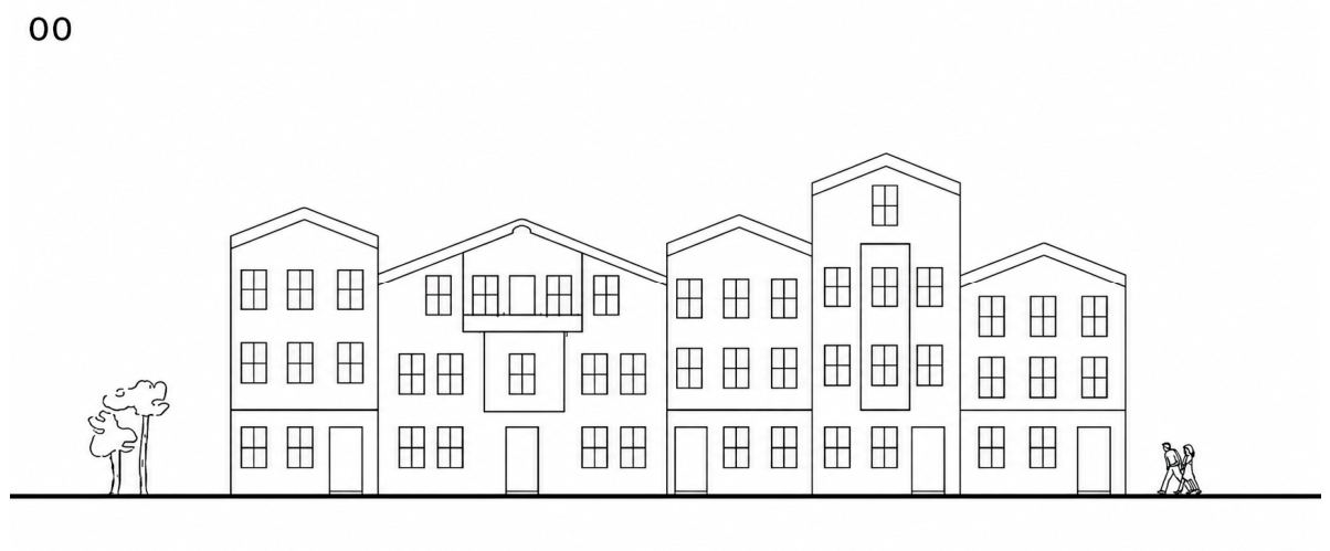
A simplified street silhouette, composed of building forms inspired by traditional Istanbul residential architecture, was generated to provide a controlled visual basis for evaluating the Color Contrast Arrangements.
Designing a total of twelve Color Contrast Arrangements—two for each of the six arrangements—using warm and cool color palettes.
Coloring the buildings in the street silhouette based on the principles of color design and using the developed color arrangements.
Preparing survey questions using the rendered street silhouette visuals to measure the perceived harmony, preference, and liking of the Color Contrast Arrangements through a Likert scale, and to collect open-ended adjectives that describe each arrangement.
Identifying the levels of perceived harmony, preference, and liking for each color arrangement, as well as the most frequently mentioned adjectives, based on the first survey.
The associations of these adjectives with the concepts of harmony, preference, and liking were evaluated in order to construct adjective pairs for the second survey, which uses a semantic differential scale.
Analyzing the results of the second survey and comparing them with those from the first survey.
In the survey study, it was decided to use building façades, as they possess both two-dimensional and three-dimensional characteristics and are frequently encountered in everyday life, thereby assumed to be easier for participants to evaluate. Accordingly, a street silhouette composed of five buildings representative of traditional Istanbul domestic architecture was created (
Figure 1). The street silhouette used in this study—a simplified and abstracted street silhouette composed of façade elements—was designed to reduce the influence of other visual factors and to focus on the effect of color contrast arrangements on perceptual responses. Architectural details such as material textures, ornamental elements, contextual distractions, and other environmental features were intentionally excluded to create a more controlled visual setting. This approach makes it easier to understand how color parameters alone influence users’ evaluations, including harmony, preference, and liking. By reducing these additional variables, the study aimed to ensure that the observed differences in perception could be more directly linked to the color contrast conditions rather than to variations in form, detail, or context.
To colorize the visuals, the RGB equivalents of the colors selected from the Munsell Color System—denoted by the sequence “hue (H)–value (V)/chroma (C)”—were obtained using the Munsell Conversion Software 2023 Full Version, and the visuals were then colored using Adobe Photoshop CS6. To prevent potential simultaneous contrast effects between the façade colors and the background, a mid-value gray (N-5/0) was used as the background color in the visuals. For elements such as trees and human figures in the street silhouette, light gray (N-7/0) was applied, whereas dark gray (N-3/0) was used for the ground line.
The visuals were colorized with two distinct color groups created for each Color Contrast Arrangement—namely, hue contrast, value contrast, and chroma contrast from the single-color contrast arrangements, and equivalent hue contrast, equivalent value contrast, and equivalent chroma contrast from the double-color contrast arrangements. In one of the two color groups designated for each contrast arrangement, warm colors were emphasized, while in the other, cool colors were emphasized. The building façades in the visuals were colorized by selecting colors in accordance with established principles of color design, resulting in a total of twelve Color Contrast Arrangements, each composed of three different colors. The selection of the three colors in each arrangement specifically considered hue, value, chroma, contrast, and area proportion. According to established principles of color design, people’s attention is naturally drawn to warm hues (i.e., red and orange), high-value (light) colors, and high-chroma (less grayish) tones. Therefore, for the element to be emphasized, a warm hue with high value and high chroma is preferable. As the contrast between the color arrangements of adjacent surfaces increases, so does their visual salience. Accordingly, a strong contrast between the color of the emphasized element and the colors of the surrounding surfaces is desirable. Furthermore, when the emphasized element occupies a smaller area within the overall composition, its visual impact becomes stronger and more striking. Therefore, it is preferable for the emphasized element to occupy a relatively small proportion of the total area (0.2–0.4) [
6,
20,
21,
22,
23].
A total of twelve color arrangements—each composed of three colors—were applied to the building façades depicted in the street silhouette visual, in accordance with the principles of color design. These arrangements included two examples each from the single-color contrast arrangements (hue contrast, value contrast, and chroma contrast) and the double-color contrast arrangements (equivalent hue contrast, equivalent value contrast, and equivalent chroma contrast). Once an appropriate single or double Color Contrast Arrangement was selected according to the design objective, the building façade with the largest surface area among the five façades was designated as the “element to be emphasized.” The colors of the emphasized element and its surrounding components, together with their contrast groups and surface area proportions, were then determined. As the number of colors used in a composition increases, the clarity of the design’s main theme diminishes. Therefore, limiting the number of colors to a relatively small range (approximately 3–5) enhances the coherence of the color arrangement and facilitates the perception of the intended visual effect [
24,
25]. Taking into account the surface areas they occupy, the colors for the emphasized element and its surrounding components were determined, along with the contrast group to which they belonged. To ensure that the effects of the Color Contrast Arrangements could be perceived more distinctly, the number of colors used in each visual was limited to three. From each arrangement, the color designated for the element to be emphasized was applied once, while the remaining two colors were each applied twice across the five façades. In the visual, for the building façades to be emphasized, colors that exhibit a high level of contrast with those used for coloring other façades were selected. The twelve color arrangements used in the visuals and their characteristics are presented in
Table 3.
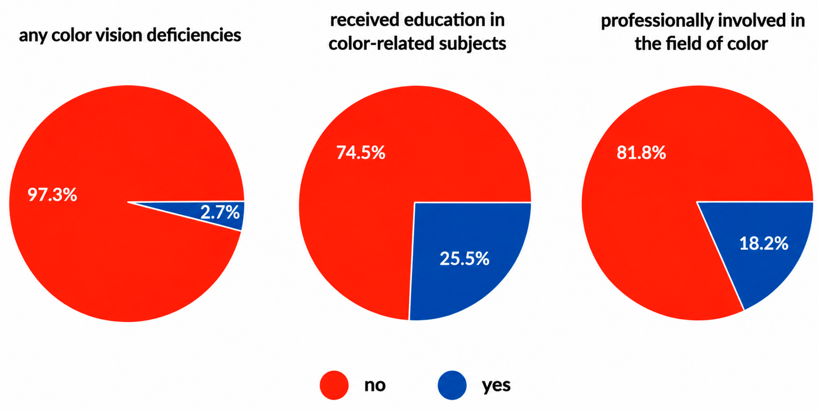
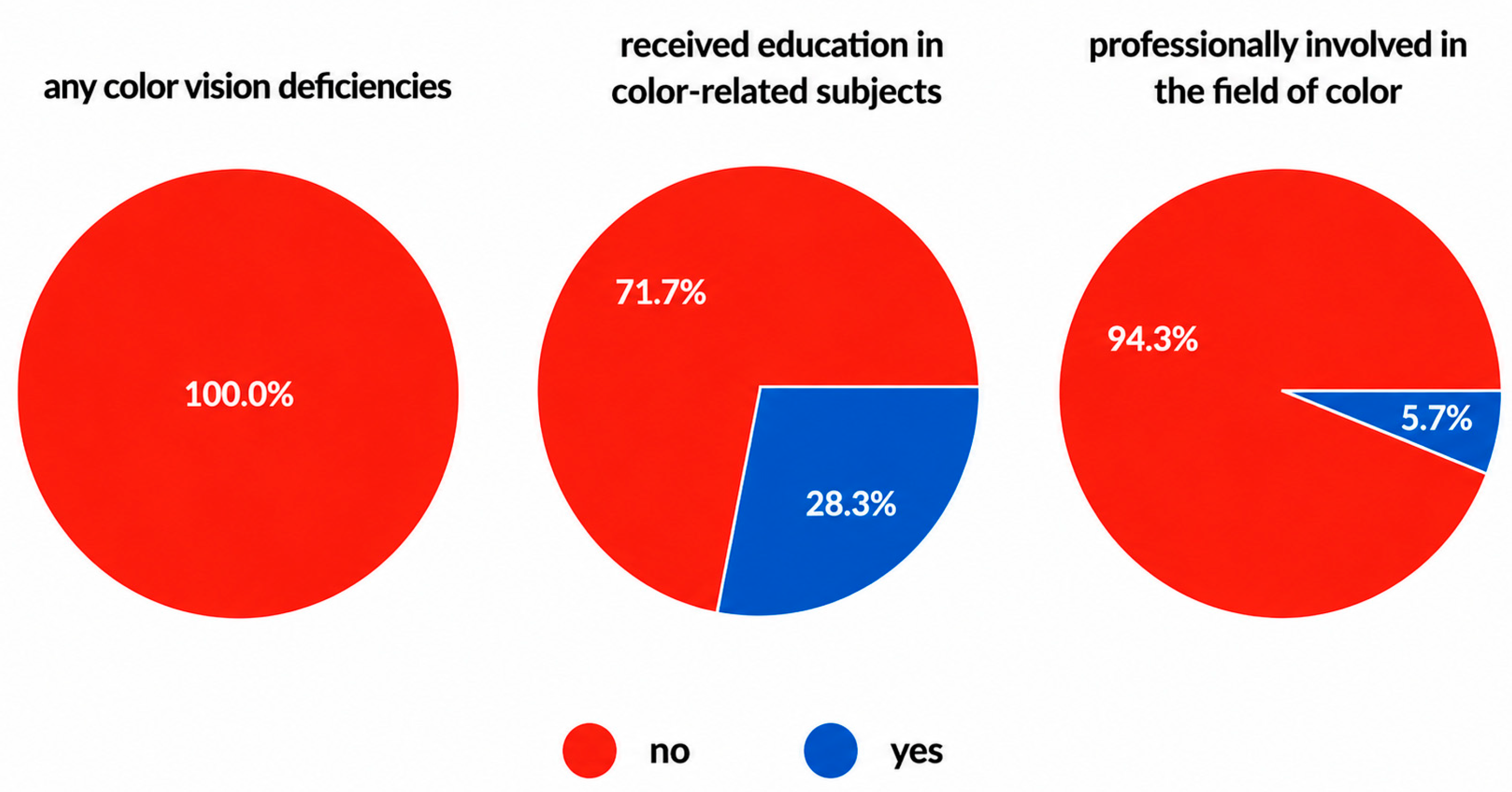
The visual materials were used in two consecutive surveys designed to determine the levels of harmony, preference, and liking of the color arrangements, as well as to evaluate these arrangements through pairs of descriptive adjectives. The surveys were administered to different participant groups with diverse cultural and educational backgrounds, recruited randomly via social media, email, and messaging applications. In the surveys, participants viewed a series of street-silhouette visuals in which the Color Contrast Arrangements were applied to façade compositions. The visuals were presented sequentially, and participants evaluated each image in terms of harmony, preference, and liking before proceeding to the next visual.
Artificial intelligence tools were not used in the design of the study, data collection, statistical analyses, or interpretation of the results. ChatGPT (OpenAI, GPT-5.5) was used only during the preparation of the manuscript to assist with language editing, improving the clarity and organization of the text, and supporting the conceptual development of affective design map of color contrast arrangements.
5. Results
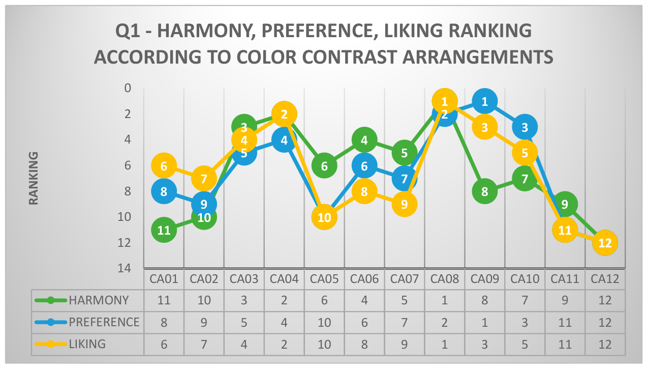
The results of the first survey, in which the Color Contrast Arrangements were rated in terms of harmony, preference, and liking, are compared in the graph presented in
Figure 4.
Based on the responses related to the concepts of harmony, preference, and liking, it is observed that the arrangements most commonly perceived as harmonious are, in general, those based on value contrast. These are followed by the arrangements based on chroma contrast. On the other hand, equivalent chroma and hue contrast arrangements are identified as the least harmonious. This indicates that the most harmonious arrangements are those that do not involve hue contrast—in other words, that hue contrast disrupts the perception of harmony.
According to the survey results, the most preferred arrangement among the color schemes was the equivalent value arrangement, in which hue contrast was emphasized. This was followed by the equivalent hue arrangement where value contrast was emphasized and the equivalent value arrangement where chroma contrast was emphasized. No meaningful pattern was found in the ranking of color arrangements based on preference in terms of the types of contrast. However, it was generally observed that cool color schemes were preferred more than warm ones.
The most liked color arrangements were the equivalent hues and value contrast arrangements, both of which involve value contrast. For the remaining color arrangements, no meaningful distribution according to contrast types was observed in their ranking based on liking. As illustrated in
Figure 4, the rankings of color arrangements based on preference and liking exhibit a clear parallelism, whereas the rankings based on harmony diverge slightly from these two concepts.
An analysis of the color arrangement rankings for the concepts of harmony, preference, and liking from the first survey (
Tables S1–S3;
Figure 4) reveals the following observations:
The equivalent hue arrangement where value contrast is dominant (CA08) ranks highest across all three categories: first in harmony, second in preference, and first in liking,
The value contrast arrangement composed with cool colors (CA04) generally occupies top positions, ranking second in harmony, fourth in preference, and second in liking.
The equivalent chroma arrangement where hue contrast is dominant (CA12) ranks lowest in all three categories—twelfth in harmony, twelfth in preference, and twelfth in liking,
Both the hue contrast arrangement where warm colors were emphasized (CA01) as well as the equivalent chroma arrangement where value contrast was emphasized (CA11) are generally found in the lower ranks across all three concepts—ninth in harmony, eleventh in preference, and eleventh in liking.
The equivalent value arrangement where hue contrast was emphasized (CA09) ranks low in harmony but occupies top positions in both preference and liking.
These overall findings—with the exception of CA09—indicate that the most preferred and most liked arrangements are generally also perceived as the most harmonious, whereas the least preferred and least liked arrangements are typically regarded as the least harmonious. In contrast, the arrangements positioned in the middle rankings exhibit varying positions across the three concepts.
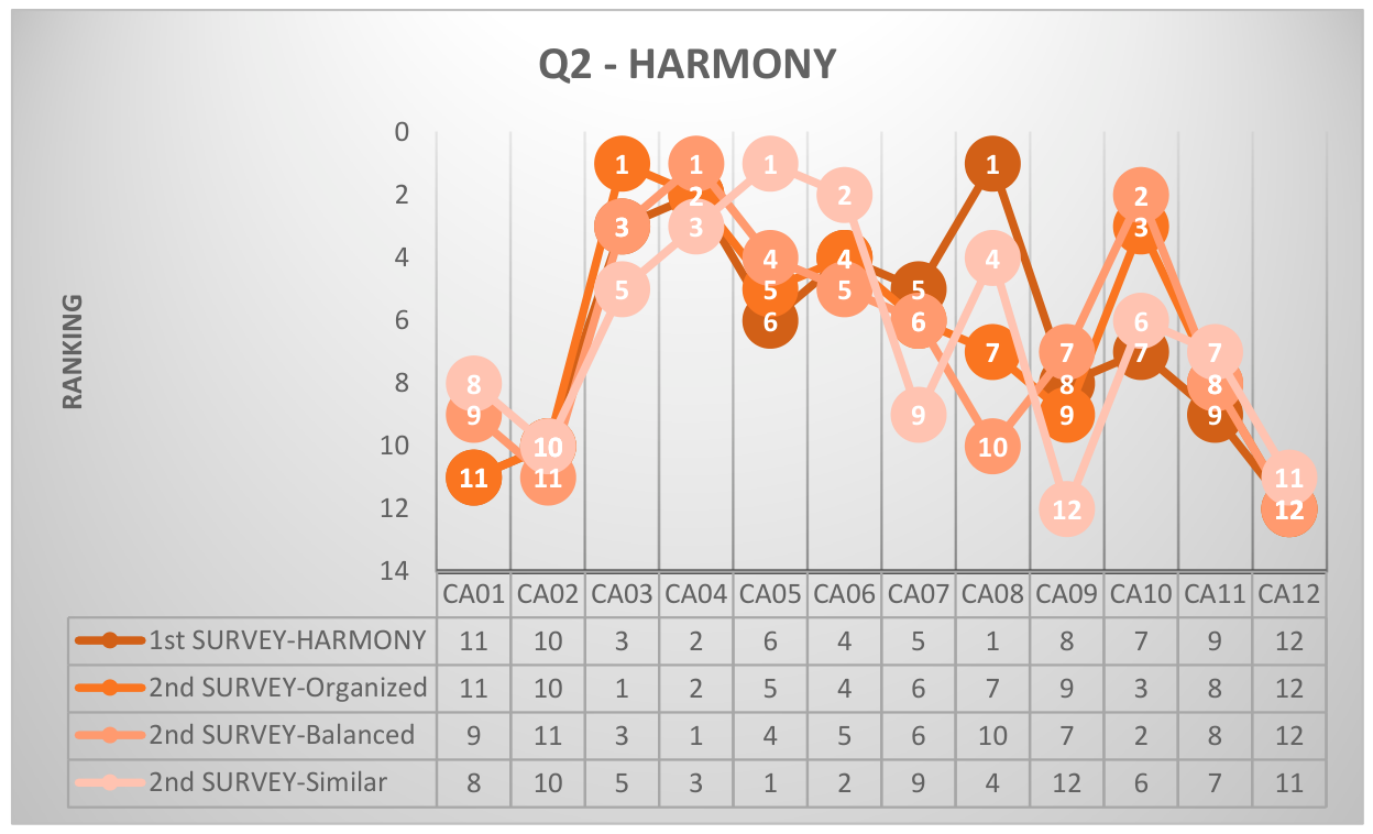
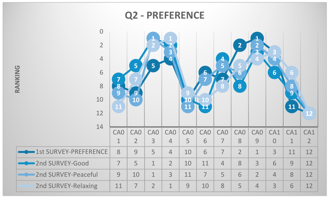
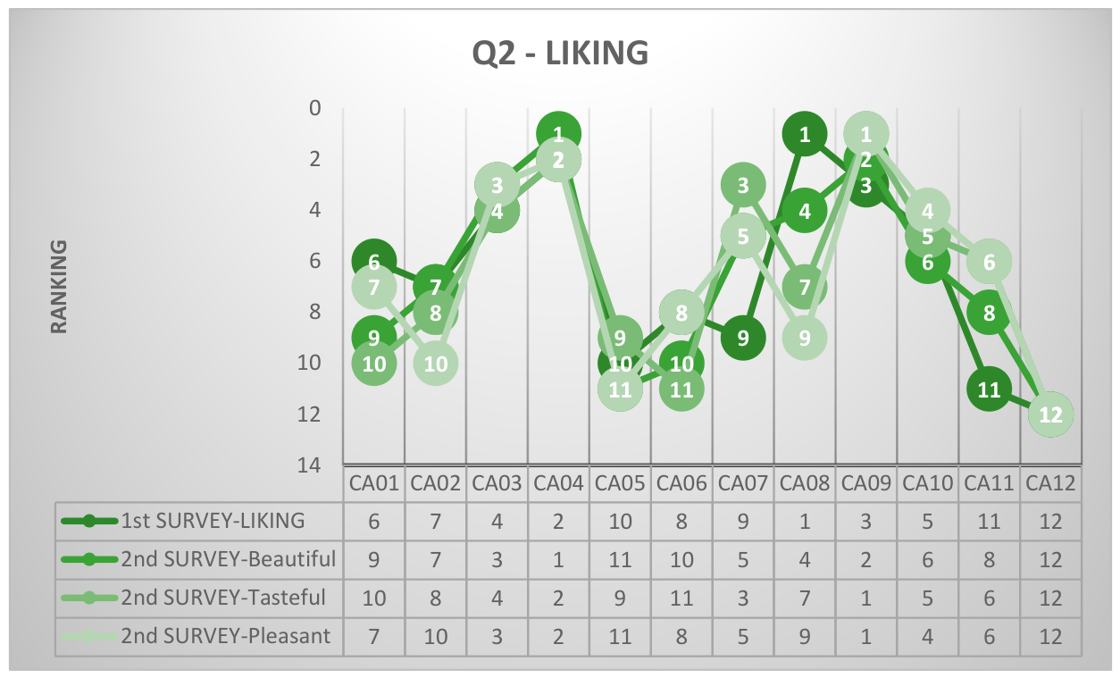
Figure 5,
Figure 6 and
Figure 7 present the comparative graphs of the ranking scores for harmony, preference, and liking from the first and second surveys.
Table 4 displays Color arrangements that may promote harmony, preference, and liking in color design.
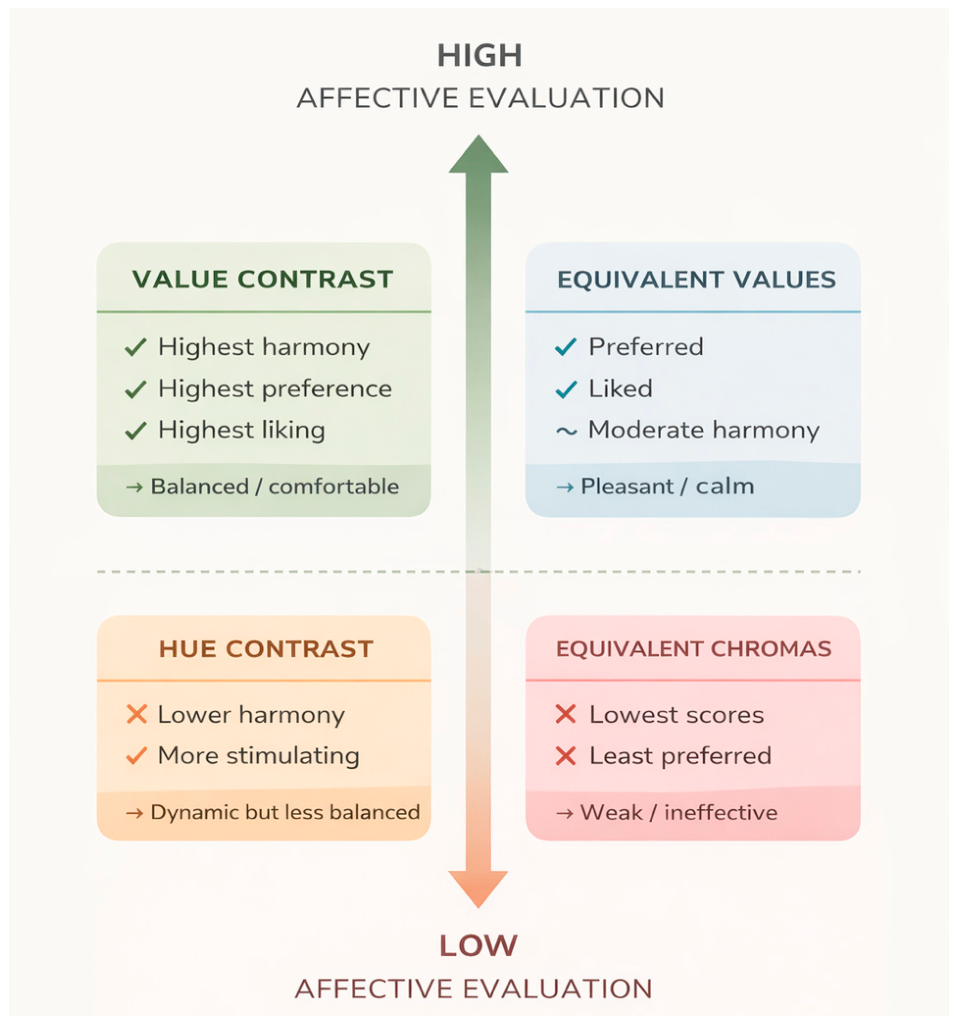
Figure 8 presents a conceptual summary of the affective evaluations associated with different Color Contrast Arrangement categories based on the findings of the study.
To further investigate the relationships among the affective evaluation dimensions identified in the study, Spearman rank correlation analyses were performed. These analyses aimed to determine whether Color Contrast Arrangements that received high rankings in one evaluation dimension (e.g., harmony) also tended to receive high rankings in other evaluation dimensions (e.g., preference and liking) or in the semantic dimensions derived from the adjective-pair assessments. The unit of analysis was the ranking scores assigned to the twelve Color Contrast Arrangements rather than individual participant responses. Spearman’s rank correlation coefficient was considered appropriate because the analyses were based on ranked data and focused on the relative ordering of the arrangements. All statistical analyses were conducted using R Studio (Version 4.5.3), and the resulting correlation coefficients (ρ) and corresponding
p-values are presented in
Table 5,
Table 6,
Table 7,
Table 8 and
Table 9.
Spearman rank correlation analyses based on the rankings of the twelve Color Contrast Arrangements revealed positive relationships among the concepts of harmony, preference, and liking.
A moderately strong and statistically significant correlation was found between harmony and preference (ρ = 0.608, p = 0.036), indicating that color arrangements perceived as more harmonious also tended to be more preferred.
A moderately strong and statistically significant correlation was also observed between harmony and liking (ρ = 0.594, p = 0.042), suggesting that more harmonious arrangements were generally evaluated more favorably.
The strongest relationship was identified between preference and liking (ρ = 0.895, p < 0.001). This very high correlation indicates that the color arrangements preferred by participants were also those they most strongly liked.
Overall, the findings suggest that preference and liking represent closely related evaluative constructs, whereas harmony, although positively associated with both, appears to function as a relatively distinct dimension of esthetic evaluation.
The Spearman correlation analysis revealed positive and statistically significant associations between the harmony rankings and the three semantic differential dimensions.
The findings indicate the following:
A strong positive correlation was found between harmony and organized (ρ = 0.790, p = 0.0022). Color arrangements that were ranked highly in terms of harmony also tended to be ranked highly in terms of perceived organization.
A moderate positive correlation was observed between harmony and balanced (ρ = 0.580, p = 0.0479). Although statistically significant, this relationship was weaker than the others and approached the conventional significance threshold.
A moderately strong positive correlation was identified between harmony and similar (ρ = 0.685, p = 0.0139). This suggests that color arrangements perceived as more harmonious also tended to be perceived as more similar.
Overall, the results suggest that participants most strongly associated the concept of color harmony with organization, followed by similarity and, to a lesser extent, balance. These findings provide further support for the conceptual relationship between harmony and the semantic dimensions derived from the adjective pair evaluations.
The Spearman correlation analysis revealed positive associations between the preference rankings and the three semantic differential dimensions.
The findings indicate the following:
A strong positive and statistically significant correlation was found between preference and peaceful (ρ = 0.818, p = 0.0011). Color arrangements that were more preferred also tended to be perceived as more peaceful.
A moderately strong and statistically significant correlation was observed between preference and relaxing (ρ = 0.678, p = 0.0153), suggesting that preferred color arrangements were also perceived as more relaxing.
A moderate positive association was identified between preference and good (ρ = 0.566, p = 0.0548). However, this relationship did not reach statistical significance at the conventional 0.05 level.
Overall, the results suggest that participants most strongly associated color preference with peacefulness, followed by relaxation, whereas the association between preference and the general evaluation dimension of good was comparatively weaker and not statistically significant.
The Spearman correlation analysis revealed positive associations between the liking rankings and the three semantic differential dimensions.
The findings indicate the following:
A strong positive and statistically significant correlation was found between Liking and Beautiful (ρ = 0.818, p = 0.0011). Color arrangements that were more liked also tended to be perceived as more beautiful.
A moderate positive association was observed between Liking and Pleasant (ρ = 0.573, p = 0.0513). However, this relationship did not reach statistical significance at the conventional 0.05 level.
A moderate positive association was also found between Liking and Tasteful (ρ = 0.552, p = 0.0625), although this relationship was likewise not statistically significant.
Overall, the results suggest that participants most strongly associated color liking with beauty, whereas the relationships between liking and the dimensions of pleasantness and tastefulness were comparatively weaker and did not achieve statistical significance.
Finally, to examine the conceptual relationships among the semantic dimensions associated with harmony, preference, and liking, the adjective groups representing each concept were aggregated and compared using Spearman rank correlation analysis.
The results indicate that the adjective group representing harmony was not significantly associated with the adjective groups representing preference or liking.
A moderate positive relationship was observed between the harmony and preference adjective groups, although it did not reach statistical significance (ρ = 0.446, p = 0.146).
The relationship between the harmony and liking adjective groups was weaker and also non-significant (ρ = 0.343, p = 0.275).
In contrast, a very strong and statistically significant correlation was found between the adjective groups representing preference and liking (ρ = 0.953, p < 0.001).
These findings suggest that participants evaluated color arrangements through highly similar semantic dimensions when expressing preference and liking, whereas harmony appears to represent a more distinct evaluative construct. In other words, color harmony may be perceived relatively independently from the emotional and affective dimensions underlying preference and liking. This pattern was also consistent with the findings obtained in the first phase of the study. While harmony showed only moderate associations with preference and liking, the strongest relationships were consistently observed between preference and liking in both surveys. Furthermore, the adjective pairs derived from participants’ responses in the second survey produced a similar structure, with the preference-related and liking-related adjective groups exhibiting a very strong positive correlation. Together, these findings support the conceptual consistency between the two phases of the study and reinforce the close relationship between preference and liking relative to harmony.
6. Discussion and Conclusions
In the evaluation of findings obtained from this study, which investigates the affective responses of color contrast arrangements in relation to the concepts of harmony, preference, and liking, it was observed that the color arrangements ranked at the top or bottom for the concept of harmony and for the adjectives “organized”, “balanced”, and “similar” largely overlapped. However, when examining the adjectives organized and balanced, which displayed a strong correlation with the concept of “harmony”, it was found that the number of arrangements perceived as harmonious across all categories was smaller than the number of those perceived as disharmonious. In other words, participants more clearly identified the arrangements they found disharmonious. In this regard, considering the strong correlation between the adjectives organized and balanced and the concept of harmony, the single-color value contrast arrangements were found to be the most harmonious, whereas all arrangements involving hue contrast and the equivalent chroma arrangement featuring value contrast were deemed disharmonious. This finding supports Munsell’s characterization of single-component contrast arrangements as harmonious [
1]. Upon examining the correlations, it was also determined that the rankings of color arrangements for the concept of preference significantly overlapped with those for the adjectives good and peaceful. In this context, the value contrast arrangement composed of cool colors and the equivalent values contrast arrangement where hue contrast was emphasized were the arrangements most preferred by the participants. Conversely, the least preferred arrangements included the hue contrast arrangement where warm colors were emphasized, the chroma contrast arrangement composed of warm colors, the equivalent chroma arrangement where value contrast was dominant, and the equivalent chroma arrangement where hue contrast was dominant. Unlike the assessments related to harmony, the evaluations concerning the concept of preference revealed no distinct trends based on specific contrast types. When examining the correlations related to “liking”, it was observed that the rankings associated with the concept of liking most closely aligned with those for the adjective pleasant. Nonetheless, there was also a notably high correlation between liking and the adjectives beautiful and tasteful. In line with this strong correlation of those adjectives in mention with the concept of liking, the most liked arrangements were those based on value contrast composed of both cool and warm colors. This indicates that contrast in value among colors enhances the degree of liking. On the other hand, the least liked arrangements were the chroma contrast arrangement composed of warm colors and the equivalent chroma arrangement where hue contrast was dominant.
When the results of the first (Q1) and second (Q2) surveys are compared, it is observed that the findings are largely consistent. However, the equivalent hue arrangement where value contrast was dominant (CA08)—which occupied the highest positions for harmony, preference, and liking in the first survey—did not yield similarly consistent rankings for concepts and adjectives in the correlation analyses of the second survey made with adjective pairs. Overall, the single-color contrast arrangements based on value contrast (CA03, CA04) were consistently evaluated positively across all three concepts. This finding directly corresponds with Alexander’s argument that, in monochromatic environments, the perceptual importance of contrast—particularly the relationship between light and dark—is especially evident [
6]. In contrast, the least favorable arrangements included the hue contrast arrangement composed of warm colors (CA01), the chroma contrast arrangement composed of warm colors (CA05), the equivalent chroma arrangement with warm colors where value contrast was dominant (CA11), and the equivalent chroma arrangement with warm colors (CA12) where hue contrast was dominant. Once again, an overall comparison of all arrangements reveals that those incorporating cooler hues were generally perceived more positively than those based on warmer hues. Deviating from this general tendency, the equivalent value arrangement where hue contrast was dominant (CA09) was rated low in terms of harmony, while it ranked high in terms of preference and liking. The rankings of the remaining arrangements in the mid-range were more variable.
As evidenced by the results examined in detail, there is a clear relationship between harmony and the concepts of preference and liking, in a manner that supports the interpretations found in the literature. However, it is also evident that the relationship between preference and liking is stronger than either concept’s connection to harmony. Upon examining the dual correlations among the three concepts as discussed in the previous section, the strongest correlation was found between color preference and color liking, while the weakest was between color harmony and color liking. The positive relationship identified between harmony and preference supports the interpretation of Judd and Wyszecki, who noted that the concepts of color harmony and color preference are closely interrelated [
7,
9]. At the same time, the findings also partially correspond with the study conducted by Ou, Luo, and colleagues, who suggested that color harmony and color preference may diverge under certain conditions [
16]. Although harmony, preference, and liking were all found to be positively associated, the correlation analyses revealed notable differences in the strength of these relationships. In particular, preference and liking exhibited a substantially stronger association than either concept did with harmony. These findings suggest that, while the three concepts are related, they represent distinct yet overlapping dimensions of color evaluation rather than entirely identical perceptual constructs.
Although the surveys were administered to different participant groups with diverse cultural and educational backgrounds the results obtained from this study are coherent. They demonstrate that different color arrangements, even when composed of similar colors, evoke distinct affective responses in individuals—proving that not only the colors themselves but also the types, number, and magnitude of contrasts between the colors used together can elicit various affective effects. Moreover, countless different meanings, appearances, and effects may be generated depending on whether contrasts are single, double, or triple, and through their type, magnitude, distribution, and formation. Therefore, conducting further studies with larger participant groups and a wider range of color arrangements would contribute to a more nuanced understanding of the meanings and effects of Color Contrast Arrangements. Comparing the findings of this study with those obtained from different color combinations would also support the validation of the results. In line with the limited scope of this study, the surveys were conducted online, and participants evaluated the color contrast arrangements using their own display devices. Future research may help make the findings more testable by carrying out evaluations in controlled environments using standardized display conditions or, alternatively, immersive technologies such as virtual reality (VR). Furthermore, the methodological approach adopted in this study can be extended beyond the specific façade context to different environments, such as interior spaces, wall surfaces, paintings, or other architecturally related visual fields, thereby broadening the applicability of the research.