Article

EPCDescriptor: A Multi-Attribute Visual Network Modeling of Housing Energy Performance

by
Hafiz Muhammad Shakeel
1,*,
Shamaila Iram
1,*,
Hafiz Muhammad Athar Farid
1,
Richard Hill
1 and
Hassam ur Rehman
2
1
Department of Computer Science, University of Huddersfield, Queensgate, Huddersfield HD1 3DH, UK
2
VTT Technical Research Centre of Finland Ltd., P.O. Box 1000, FI-02044 Espoo, Finland
*
Authors to whom correspondence should be addressed.
Buildings 2025, 15(16), 2929; https://doi.org/10.3390/buildings15162929
Submission received: 16 July 2025 / Revised: 31 July 2025 / Accepted: 13 August 2025 / Published: 18 August 2025
(This article belongs to the Collection Sustainable Buildings in the Built Environment)

Abstract

Conventional methods of studying houses’ Energy Performance Certificates (EPCs) typically fail to investigate the impact of interrelated contextual elements instead fixating exclusively on the specific attributes of individual houses. This study presents a new method that combines network graph analytics (NGA) with interactive visual analytics to investigate hidden linkages at the individual house level. Our proposed platform collects and analyses data related to housing attributes, creates a network based on the links between these attributes, and employs sophisticated graph algorithms to provide visual representations. Users have the ability to dynamically choose postcodes, metrics, and attributes, which, in turn, generate layouts of networks that provide valuable insights. The visualisation utilises colour gradients and node metrics to improve the comprehensibility of energy performance areas. The platform enables homeowners and stakeholders to comprehend the interrelationships between aspects such as neighbouring housing features, and house infrastructure. The results prove the efficacy of the strategy by giving a collection of case studies that encompass various Energy Performance Certificates (EPCs) ranging from A to G. Each case study demonstrates the evolution of network architectures and visual assessments, showcasing the energy performance linked to certain EPC ratings. The platform offers a user-friendly interface for stakeholders to investigate and understand attribute relationships.

1. Introduction

In the modern context of sustainable lifestyles, the quest for having improved energy efficiency in residential properties has gained an outstanding significance [1]. In this undertaking, Energy Performance Certificate (EPC) tests are paramount [2], as they describe standardised measurements to measure and communicate the energy efficiency of a specific dwelling. However, the traditional methods which are used to calculate the EPC do not always comprehensively reflect the numerous and interconnected environmental facts that affect the energy efficiency of a dwelling [3,4]. This limitation does not only limit the accuracy of energy efficiency assessments [5] but it also acts as a barrier to progress in personalised therapies aimed to be tailored to the unique properties of individual property objects [6]. The new method introduced in this paper is a combination of network graph analysis (NGA) and visual analytics that allows understanding the different factors influencing energy efficiency not only in individual households but also leads to an in-depth comprehension of the problem. The standard EPC calculations rely primarily on indicators, a limited and standardised image of energy performance of a property [7]. These actions are often insufficient to describe this intricate interplay of factors, which cumulatively affect the energy efficiency landscape [8].
To address these challenges, the way energy efficiency analysis processes are conducted has to be radically changed. NGA is a significant and transformative change to find the unknown linkages and relations among data. Instead of using the fixed measures, NGA also adopts a broader scope by developing a dynamic network of interconnected aspects of contexts. It is accompanied by visual analytics, which is necessary to convert complex data into visual material that is convenient to interpret and interact with. This synthesis permits the stakeholders to investigate the developing interrelations among variables in different contexts that increase the interpretability of the data.
Recent work has demonstrated the power of embedding explicit network structures into machine learning and visual analytics pipelines to improve interpretability and performance [9]. Li et al. [10] propose the Feature Analysis Network (FAN), which fuses a Bayesian network output layer with standard deep encoders to yield up improvements in interpretability while maintaining original accuracy. Building on this, Gao et al. [11] employ FAN-inspired graph structures to optimise intricate heat-sink fin geometries, achieving superior thermal dissipation in lightweight designs. On the theoretical side, Bick and Krishnan [12] formalise higher-order networks via simplicial complexes, enabling the modeling of multi-way attribute interactions beyond pairwise edges. In the domain of energy-efficient neural architectures, Kundu et al. [13] introduce Spike-Thrift, an attention-guided compression pipeline that attains weight reduction and compute energy savings on spiking neural networks. Earlier, Han et al. [14] showed that a three-phase pruning, quantization, and Huffman coding strategy, Deep Compression, can reduce model sizes by energy efficiency gains. Complementing these, La Rosa et al. [15] systematically review visual analytics tools for explainable AI, categorizing them into exploration, verification, and knowledge generation loops. Large-scale biological applications leverage network visual analytics platforms such as OmicsAnalyst [16] and OmicsNet 2.0 [17], which provide 2D/3D layout flexibility and reproducible workflows for multi-omics integration. Finally, Sharma and Gupta [18] developed a multi-view, highly coordinated framework that employs spatiotemporal visualisation methods, network analytics, and anomaly detection to investigate the correlation between regional instability and global trade networks.
Feature visual analytics research is significantly advanced by studies that leverage interactive visualization and machine learning to enhance data interpretation and decision-making. For instance, research on interactive visual analytics systems demonstrates their capability to integrate user feedback into feature selection processes, improving model performance and interpretability [19]. Similarly, frameworks combining visual analytics with machine learning emphasize real-time data exploration, enabling users to identify critical features through intuitive interfaces [20]. Another study highlights the use of visual analytics in high-dimensional data analysis, where interactive tools help uncover patterns and anomalies, supporting feature engineering [21]. Additionally, scalable visual analytics platforms facilitate the exploration of large datasets, allowing users to dynamically refine feature sets for predictive modeling [22,23]. Furthermore, techniques for visualizing complex data structures, such as graphs, enhance feature discovery by providing clear representations of relationships [24,25]. Collectively, these works underscore the pivotal role of visual analytics in enabling users to interactively explore, select, and refine features, thereby bridging the gap between raw data and actionable insights.
Visual analytics can be readily applied using the node–link diagrams (NLDs) because they are familiar and effective to display intricate exchanges [26]. Nodes in the node–link diagrams (NLDs) are used to represent individual variables and links to show the relationship between these variables [27,28]. The visual model is beyond the limitations of traditional representations, presenting an intuitive and dynamic interface in the exploration of the complex interconnections within data on energy efficiency. Among the key attributes of NLDs that make the EPC computations significantly advanced are intuitive representation, dynamic interaction, the identification of cluster, and the visualisation of time that offer a superb level of visual information and complexities.
The proposed integrated framework, which combines NGA, visual analytics, and node–link diagrams, offers substantial advancements in the field of energy efficiency analysis at the households level. In this study, we provided the following contributions:
  • Introduced a dynamic graph visualisation technique that converts individual dwelling attributes directly into a network framework.
  • Proposed a systematic approach for analysing the structural features of houses, emphasising their impact on Energy Performance Certificate (EPC) ratings.
  • Introduced a user-focused assessment system that measures the clarity and effectiveness of the interactive graph visualisation.
  • Presented comprehensive case studies that demonstrate the implementation of the suggested technique across various EPC grades (A-G).
In the next sections of this article, we explore detailed methodology, case studies, results and findings, demonstrating how the proposed framework can transform the field of energy efficiency analysis for individual houses. Through the use of NGA, visual analytics, and node–link diagrams, we foresee a future in which energy efficiency evaluations are both precise and easily attainable, leading to a more sustainable and resilient built environment.
This study is structured into eight major sections: Section 1 concerns an introduction to how energy efficiency analysis techniques for houses need to undergo a radical change. Section 2 describes network-informed visual analytics to figure out how different house attributes contribute to and affect the energy performance of houses at the network level. Section 3 explains the role of visual design and colour encoding for network preferences, while Section 4 discusses the findings of our research on turning individual housing attributes into a network structures to improve attribute performance interpretation. Section 5 presents case studies of home networks associated with various EPC ratings. Section 6 evaluates the usefulness of the proposed network-informed visualisation method in assessing the interconnected contextual factors in the energy efficiency of residential buildings. Section 7 explains the study’s significance, scalability, and limitations, as well as future work. Section 8 concludes the findings of this proposed framework.

2. Proposed Framework

The framework presented in Figure 1 represents a method based on network-informed visual analytics that is proposed to review the influence of the different attributes of a house on the energy efficiency of a single-family home. It is a hybrid approach capitalising on the advantages of graph theory, a statistical analysis, and visualisation to present a complete picture of the complexity of the relation between various properties [29]. To analyse the requirements of node–link diagrams’ interpretation, we conducted an expert analysis and interviewed users. There were three experts (P1–3) with more than five years of experience in the area of house energy performance assessment involved. From graph visualisation, three experts (P4–6) were involved. We also conducted an interview with a group of ten non-experts (P7–16), five (P7–11) of whom are knowledgeable in terms of house performance energy evaluation but lacking in their graph-drawing visualisation and five (P12–16) of whom are knowledgeable in terms of visualisation but lacking in the assessment of buildings in terms of their energy efficiency. We obtained 30 diagrams of node links and showed them to our participants. The specialists offered a brief description of the underpinning knowledge of the energy performance certificate colours’ scores, as well as the node-link diagram, and they shared suggestions as to how these can be made conceivable. The people who are novices in the field helped us understand the knowledge attainment of node–link diagrams by the first-timers through a different perspective. We looked at what criterion can be suggested to improve node–link diagrams and achieve a network structural improvement, and we provided an overview of the proposed resolution that we were offering them after taking into account their suggestions.

2.1. Graph Design Requirement Analysis

Our study yielded four needs [V1–4] for visual information extraction and three requirements [S1–3] for structural visual information.

2.1.1. Extracting Visual Information

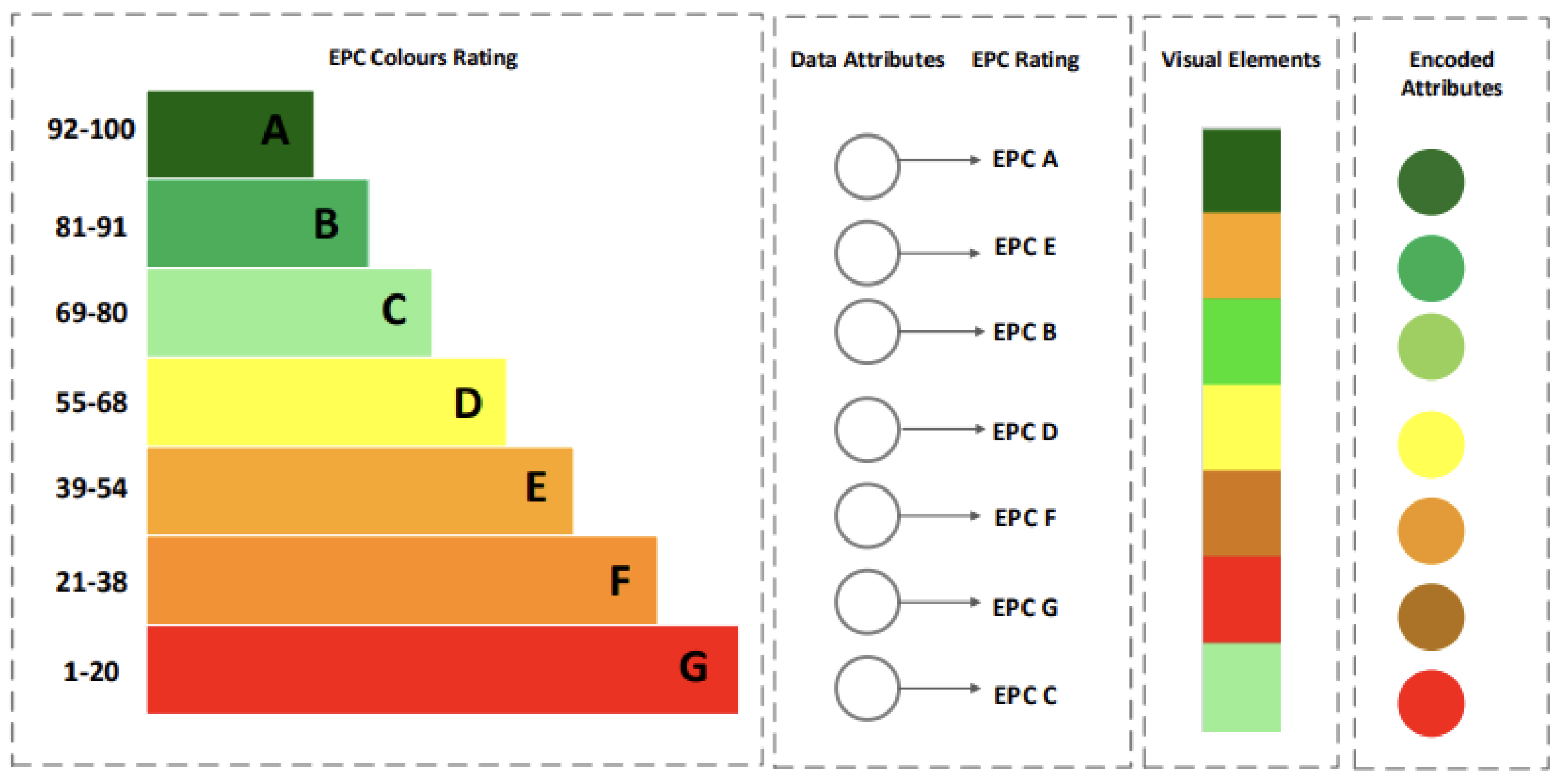
V1: Searching node conditions: A meticulously designed energy performance colour-grading scheme was adopted from previous work [30,31] to gain a visual comprehension of node and node-link features within the Energy Performance Certificate (EPC) context. This colour scheme guarantees that different attribute ranges have unique and easily identifiable colours, as per their actual performance, which are in line with the EPC grading system. The solution has a dynamic colouring functionality, which allows for the immediate visualisation of modifications in attribute values. Users may customise colour thresholds for various EPC circumstances, providing a personalised visual experience. In order to improve user guidance, tooltips have been included to provide comprehensive EPC information for each node. Furthermore, a detailed explanation is included, can be seen in Figure 2, clarifying the relationship between colours and certain EPC rules and making it easier to understand the visual depiction of the data.
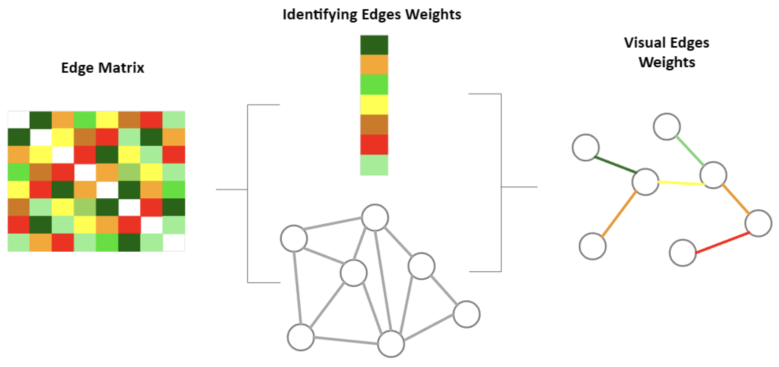
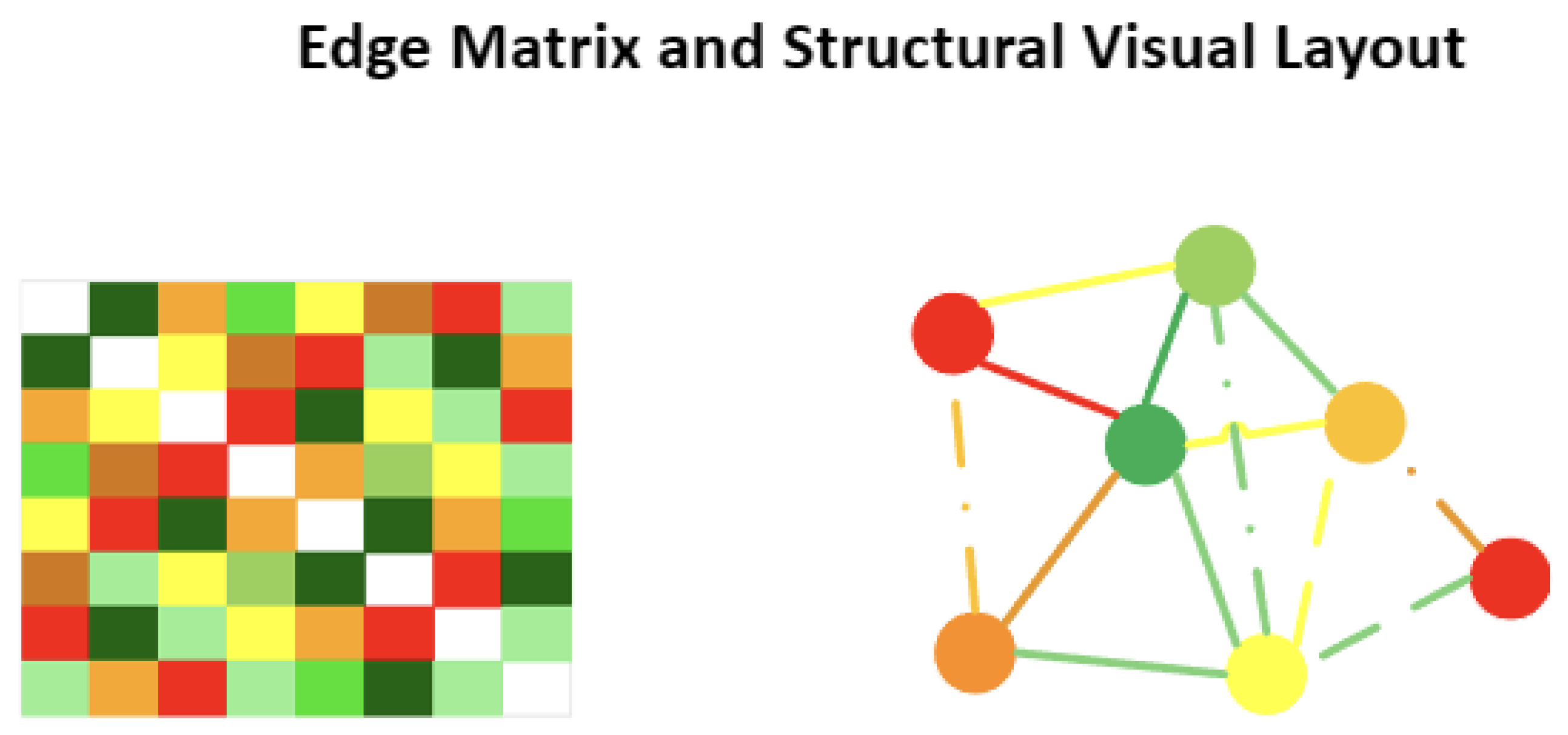
V2: searching node–link conditions: Users and stakeholders need accurate explanations of the values given to edges, particularly where the attribution of relationships between different housing attributes is concerned. It would be beneficial to introduce the dynamic edge visualisation colours encoded in Figure 3 in order to boost the user experience. These characteristics would enable users to compare changes in connection weights over time or on the basis of specific criteria. Moreover, the possibility of changing thresholds would benefit stakeholders because stakeholders can set limits to weights of edges and prioritize valuable interactions in the network. Such enhancements illustrate an even more intuitive and accessible exploration of the complex relations within the house attribute network.
V3: visual encoding: The spectrum of efficiency can be marked with a colour gradient, using green as a high level of efficiency and red as an area to work on, as is explained in Figure 2. The thickness of the links is used as a graphical representation of the strength of connections between nodes, possibly representing the degree of dependence or influence that each element can have upon the other in the energy performance network. Together, such visual images give people a moving map with which it is easy to navigate and comprehend the intricacies of energy efficiency in an instant. It is demonstrated in Figure 3. Such techniques as the use of reasonable node colours and the thickness of node links regulated under the principles of EPCs make a visualization easier to interpret by a user. Visual aids can also prove useful to users so that they can have an idea of the relevance of these visual depictions. Furthermore, the possibility of analysing various attributes’ performance scenarios through the variation of variables, the selection of specific measurements, and a focus on the specific aspects of choice promotes flexibility and allows users to personalise their experience based on their particular needs.
V4: structural layout: To make the empowerment of stakeholders in the field of network analysis possible, there has to be a possibility of customising algorithms so that the calculation of the EPC rules and the optimisation of the network topologies according to their performances in the house attributes can be made. The recommendation given to us by the experts is that, instead of explaining the details to people about the algorithm itself, we should only give access to information and arrange the layout in such a way so as not to overload the users of such information. This will enable them to access deeper meanings and reach more informed decisions in the complex sub-discipline of network analysis.

2.1.2. Structural Visual Information

S1: construction of attributes network: Generating an attribute network with EPC data includes the transformation of the attributes into nodes with structural analysis criteria, building connections. Each of the attributes is converted to an individual node in the network, and the connections among them are established based on the stipulated rules, which are acquired during the performances. These rules include the measures of centrality, which are degree or betweenness, and they highlight the significance of this or that feature within the whole structure of the network. An attribute network graphically shows the relationship between different features of EPC data in terms of connectivity and dependency, which allows for defining the essential elements and their impact on the whole system.
S2: structural relationship rules: In this study, we proposed the proportional rule to calculate weights for determining the links between various numerical columns in the dataset, specifically for Energy Performance Certificate (EPC) ratings. The selection of a proportional rule is contingent upon the stakeholders’ comprehension of the EPC rating system and their objectives for evaluating the correlations among numerical columns in the dataset. It is recommended to engage stakeholders in conversations in order to collect their specialised knowledge and preferences for establishing proportionate guidelines that are in line with the particular context of energy performance analysis.
S3: structural mapping house and network: The structural network information represents the links and interdependencies across various attributes, offering a comprehensive understanding of the overall structure of energy performance metrics in the dataset. The house structural network information demonstrates the interconnections between several factors associated with energy performance in house. The minimal spanning tree, and proportional rules, provide a means of comprehend ing the essential features that contribute to the overall structural makeup of the network. The provided data possibly will be subjected to in-depth analysis and visualisation to obtain a better understanding of the many connections and interdependencies present in the energy performance dataset.

2.2. Abstraction of EPCDescriptor

The EPCDescriptor adheres to an extraction and visualisation flowchart, as follows.

2.2.1. Visual Information Extraction Module

In order to finish V1–4, we developed and executed an information extraction and visualisation modules in Figure 1 that utilises houses’ input data.
M1: searching node conditions: The V1 module features a dynamic colouring capability that enables instant viewing of changes in attribute values. Users have the ability to adjust hue thresholds for different EPC situations, allowing for a customised visual experience. To enhance user guidance, tooltips have been incorporated to offer full EPC information for each node.
M2: searching node–link conditions: In order to execute V2, the module examines the link conditions. The algorithm uses the original graph data as an input and determines appropriate conditions between linked node pairs to accurately portray the meanings of the links.
M3: visual encoding: A gradient of colours spanning from green to red in M3 is used to depict the spectrum of efficiency, where green represents high efficiency and red represents areas that require improvement. The thickness of links visually represents the strength of connections between nodes, perhaps representing the interdependence or influence that one element has on another within the energy performance network.
M4: structural layout: This part of the module checks V4 to see whether the relationship is based on attributes or topology. It finds the layout type using the proportional rule to calculate weights for determining the links between numerical attributes.

2.2.2. Visual Structural Generation Module

Based on S1–3, we introduced a module for generating EPCs structures, shown in Figure 1, in order to articulate the data we acquired. The process follows a systematic approach (S1): Transforming EPC data into an attribute network requires transforming attributes into nodes and building connections according to structural analysis standards. The established rules derived from performances dictate the connections between every attribute, which are turned into individual nodes in the network. S2 suggested the proportional rule to determine weights for linking numerical columns in the dataset. S3 showed attribute linkages and interdependencies, providing a complete picture of the dataset’s energy performance measures.

3. Visual Information Extraction

In this section, we describe how the proposed technique utilises network graph analytics, interactive visualisation, and user-friendly interfaces to enable researchers, analysts, and stakeholders to gain a thorough knowledge of the complex interactions within housing attribute networks. The system prioritises adaptability, expandability, and comprehensibility to facilitate a broad spectrum of research inquiries and examinations.

3.1. Input Data Description of EPCDescriptor

The dataset is collected from Department for Levelling Up, Housing & Communities, United Kingdom [32]. The dataset includes 36,540 houses in the Table 1 and a wide range of characteristics, including architectural elements like houses archetype, age construction, and floor size, as well as energy and environmental-related measurements such as energy consumption, environment impact, CO2 emissions, and rating. In this study, we explored numerical attributes. The selection of attributes was meticulously made based on their direct correlation to the energy efficiency of house. Table 2 shows the measurement scale of each attribute. This selection guarantees a concentrated examination of the aspects that influence energy usage and environmental effect.

3.1.1. Handling Missing Values and Inconsistencies

The collected data included 49,959 houses from the York area. We removed the data for houses for which there were missing values and discrepancies present in the dataset. To ensure compliance with network-based analysis, non-numeric data was translated into a numeric format due to the varied characteristics of attributes. Attributes that had negative values were adjusted to ensure that they remained positive. After handling, we extracted 36,534 house data, which is presented in Table 1.

3.1.2. Attributes Scaling

We used a min–max algorithm to scale numerical properties. A fair and equal comparison [33], with a standard range of 0 to 1, was achieved by using scaling, which prevents attributes with greater magnitudes from dominating the study. All numerical properties were brought to a similar scale by applying techniques like min–max scaling [34].
The following min–max attribute scaling formula is given:
X scaled = X X min X max X min
where the following applies:
  • Xscaled is the scaled value of the attribute.
  • X is the original value of the attribute.
  • Xmin is the minimum value of the attribute in the dataset.
  • Xmax is the maximum value of the attribute in the dataset.
All scaled attribute values must be between 0 and 1 since this formula guarantees that.

3.2. M1: Searching Node Conditions

This subsection explores our methodology for illustrating how distinct node colours within the interactive graph visualisation symbolise the significance or contribution of individual housing attributes to the network’s overall structure. More precisely, it comprises the three primary stages delineated below:

3.2.1. Searching Attribute Conditions

We initially established possible search and colours conditions for every pair of nodes.
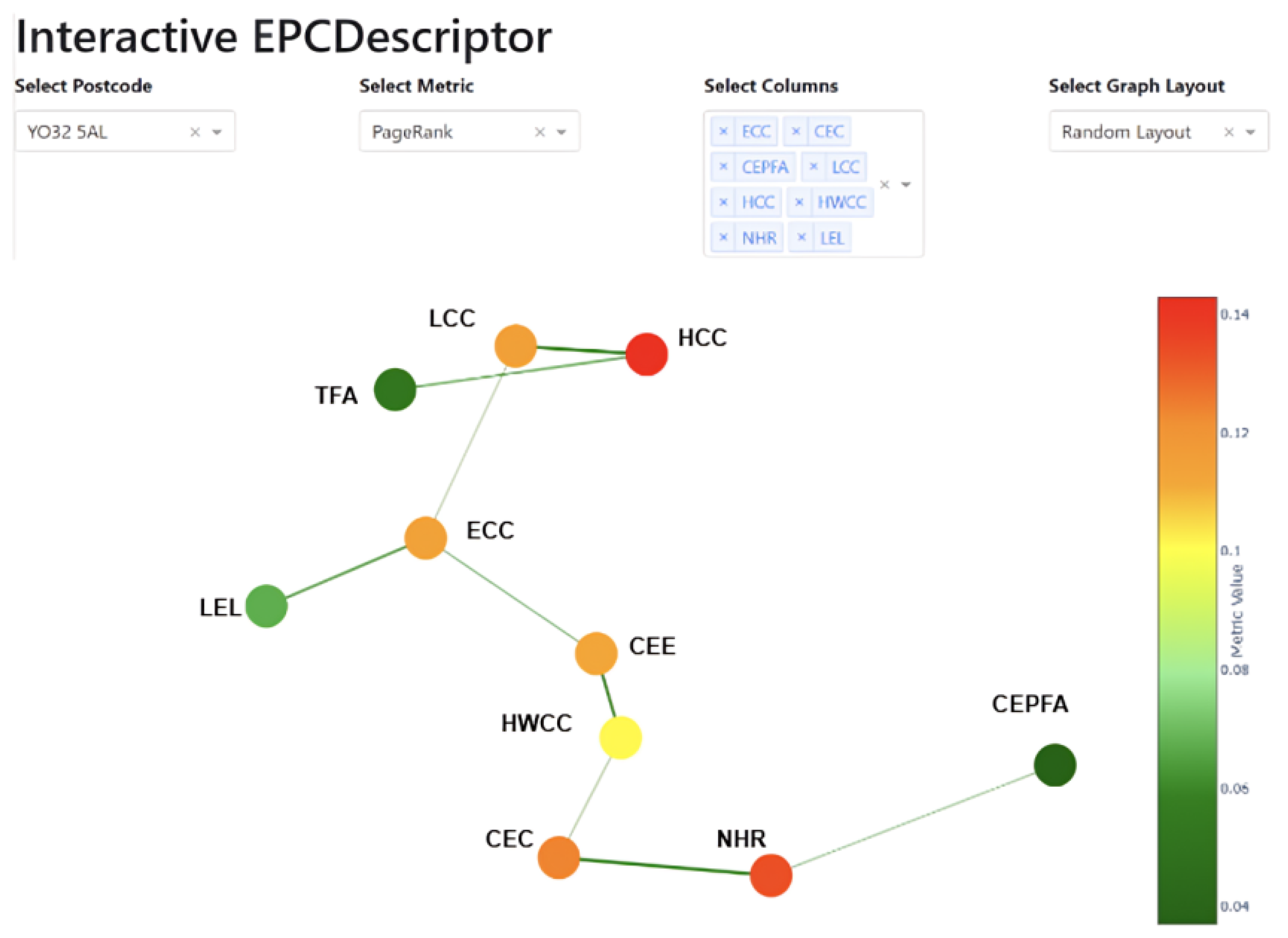
C1: node colour: A colour is allocated to each node, shown in Figure 2, which corresponds to a housing attribute, in accordance with its numerical value. From a predetermined EPC colour scale, which is a gradient spanning from dark green to dark red, the colour is selected.
C2: EPC colourbar: A colourbar, Figure 2, is incorporated into the visualisation to serve as a guide for deciphering the colours of the nodes. The visualisation displays the spectrum of centrality values associated with distinct colours in the customised colour scale.
C3: colour scale: The colour scales, custom or gradient, specified spans from a deep green hue for high values to a deep red hue for low values, encompassing a variety of intermediate hues. This scale was employed to correlate EPC proportional rules values with appropriate node colours.
C4: node interpretation: Nodes that are darker in colour represent attributes that have significant dependencies in the network, whereas nodes that are lighter in colour represent attributes with fewer significant relationships.

3.2.2. Attributes Filtering Conditions

The data is refined by applying a filter that is contingent upon the chosen postcode, yielding a subset of residences that possess the specified postcode.

3.2.3. Interactive Sorting Conditions

When a user selects a certain postcode and metric, the graph visualisation adjusts dynamically to display only the appropriate dataset, effectively representing the network structure purely based on the specified parameters. In this sophisticated framework, nodes representing attributes are prominently coloured based on their metric values, providing a clear visual representation of their individual contributions to the overall network structure within the chosen postcode. This customised graph not only simplifies the presentation of pertinent data but also improves the user’s comprehension of the intricate connections and effects of variables in the chosen geographic region.

3.3. M2: Searching Node-Link Conditions

In this subsection, the structure of node–link searching, selecting, and filtering methods is explained with the help of colour weights, which contribute greatly to exploring of the network structure and understanding it. Having become acquainted with these components, we can now analyse how they interact.

3.3.1. Node–Link Structure Conditions

In this dynamic network, a complex type of connection develops, and the structure comprises nodes and links. The nodes refer to some attribute, whereas the edges correspond with the associations formed with the help of proportional rules. The network is architecturally dynamic to meet with the user choice of its postcode, metrics, columns, and target nodes. The network can be customised to fit to the needs of its users, thus providing a personalised, contextually appropriate representation of relationships within the data.

3.3.2. Node–Link Filtering Conditions

This has a certain filtering capability, which enables the user to selectively scan and analyse network topology of node–link regions. Using the node–link filtering condition of chosen postcode, the visualisation becomes so targeted that it offers a full and clear view of the specific geographical area of a planned area with a unique colour, as demonstrated in Figure 3. This aspect enhances the ability of the user to view intricacies of the node–link interconnections of a particular spot, and it is possible to obtain a better and narrower study of the data.

3.3.3. Rule-Based Node-Link Weight Calculation

Our technique lies in the finding of the edge weights between nodes. Our study offers a different perspective on the issue of quantification of relationships within numerical data. The proportionate rule-based edge weights are suggested as a multifunctional and understandable framework of an exploratory data analysis at the single house level that can be used in numerous spheres.
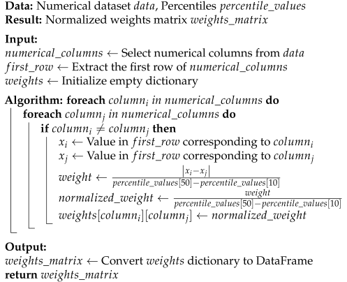
The edge weights in our network are computed via a two-step proportional rule. First, for each pair of distinct numeric attributes, i and j, we extract their values in the reference row,  x i  and  x j , and compute the raw distance,  | x i x j | . This distance is then scaled by the inter-percentile range between the 10th and 50th percentiles,  p 50 p 10 , yielding the intermediate weight.
w i j = | x i x j | p 50 p 10 .
To confine all weights to the unit interval, we normalize a second time by the same percentile span, producing
w ^ i j = w i j p 50 p 10 .
each edge weight reflects the proportional difference between attributes relative to a robust measure of data spread, attenuating the influence of outliers. The Algorithm 1 output is a fully normalized weight matrix, which can be directly converted into a DataFrame for graph construction and visual encoding.
Algorithm 1: Proportional Rule-Based Edge Weight Calculation
Buildings 15 02929 i001

3.3.4. Node-Link Weights and Colour Conditions

The colours serve as interpreters of connections, conveying the importance through their intensity. The colours in Figure 3 enhance the structural dynamics of the network, creating a narrative of interrelated attributes. Using this technique of colours, we can see the intensity of connections and uncover insights that could be missed from a limited perspective. This allows us to understand and navigate the network’s intricacy more clearly.

3.4. M3: Visual Encoding Conditions

Visual encoding operates at both the attribute (node) and link (edge) levels. Visual characteristics like colour magnitude and arrangement are employed to depict distinct facets of the network configuration. Now, let us analyse the implementation of visual encoding:

3.4.1. Attribute (Node) Level Visual Encoding

This network visualisation assigns different colours to nodes based on a selected metric. The intensity of the colour corresponds to the values of the measure. A customised colour scale is used to accurately assign these metric values to a range of colours, helping stakeholders quickly identify nodes with greater or lower metric values. While the code does not explicitly specify the sizes of nodes, they can be utilised to transmit further information if needed. The following are the network metrics and their working for our proposed framework;
1. Degree centrality (DC): In network topology, DC is defined [35] as the number of connections to a node. We call nodes that have a high DC central. Differently coloured high-DC nodes represent nodes that play a major function in linking attributes. By using this above-defined colour scheme, we can highlight the network’s most important properties, as per its contribution.
Application: Nodes’ selected colours reflect the metrics that measure them. A dark green to a bright red gradient constitutes an example; the deeper the green, the greater the metric value. Therefore, the mathematical expression is as follows;
D C ( v ) = Number of edges connected to node v Total number of nodes 1
2. Betweenness centrality (BC): BC measures [36] how far a node is from other nodes via the shortest pathways. Nodes with a high BC value connect other areas of the network. To make them stand out, nodes with a high BC are given different colours, as per their values. By doing so, stakeholders can better pinpoint the attributes that are vital in bridging various similar performances of attributes.
Application: By including visual colouring along BC, the home attribute network becomes more interpretable, which, in turn, allows for a more effective examination of attribute linkages and how they affect energy performance. Hence, the following is the mathematical expression:
B C ( v ) = s v t σ s t ( v ) σ s t
σ s t  represents the overall count of the shortest routes from the starting node, s, to the target node, t, whereas  σ s t ( v )  denotes the number of those paths that proceed via the intermediate node, v.
3. PageRank: By analysing the strength and number of links between nodes in a network, PageRank calculates [37] a numerical weight and colour binding for each node. Certain colours are allocated to nodes with greater PageRank ratings to emphasise their importance in the network as a whole. As a result, it is easier to spot characteristics that are major building blocks of the network as a whole.
Application: This colour representation helps stakeholders rapidly identify attributes that most affect network structure. These measurements and visual colouring make the home attribute network easier to grasp, enabling a better study of attribute correlations and energy performance. Therefore, the formula is as follows:
P R ( v ) = ( 1 d ) + d × u B v P R ( u ) OutDegree ( u )
where  B v  represents the set of nodes that are connected to node v, OutDegree(u) denotes the number of outgoing edges from node u, and d is a damping factor typically assigned a value of 0.85.

3.4.2. Link (Edge) Level Visual Encoding

Within the domain of edge colour mapping, the primary focus is on visually representing the connections between different qualities. In this context, the colours represent the importance or significance of the connections, providing a range to distinguish strong connections from weaker ones. Using a customised colormap (epc_cmap) enhances the visualisation by providing a subtle range of colours to highlight the variation in connection weights. Although the code does not directly regulate edge thickness, it has the potential to adjust and reflect the weight of edges, thus adding an extra layer of visual understanding to the strength of connections. This careful coordination of colour and varying thickness creates a detailed visual story, converting complex data connections into a clear and understandable presentation.

3.4.3. Data Binding

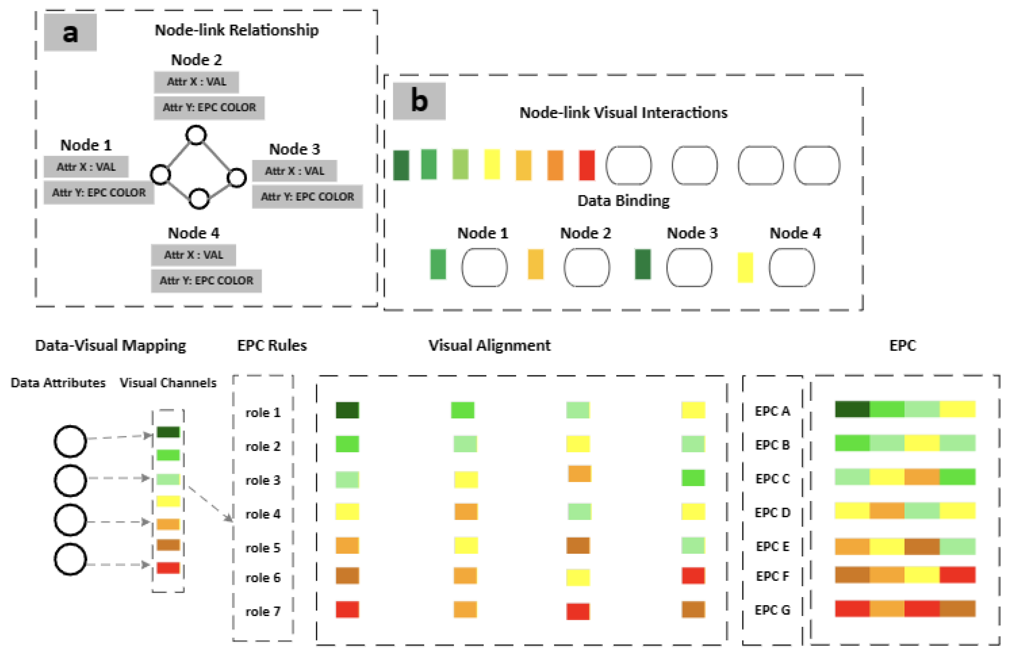
The metrics, the characteristics of nodes, and the weights of edges are dynamically connected to visual aspects, ensuring a precise representation of the data, as can be seen in Figure 4. The interactive data binding feature enhances adaptability by enabling real-time updates in the visualisation based on user actions, such as dropdown selections. This enables stakeholders to thoroughly examine different aspects of the network structure, such as filtering down to certain postcodes, analysing various metrics, focusing on specific attributes, or examining target nodes. The integration of interactive and dynamic data binding not only improves the precision of the visualisation but also adds a user-friendly and investigative aspect to the research.

3.4.4. Structural Level Visual Encoding

Colour mapping is a good way of getting to know how complex a network can be. It enables the stakeholders to identify the nodes containing high metric values within a short time, giving insight into the significant features of the network. The visual perception of using edge colour and thickness to signify the strength of the links further reinforces the inference since the links could be easily identified as strong or weak links. This, in addition to making the structure of the network be understood, also enhances the readability of the relationship between the various properties. The interactive exploration, which is enabled via data binding and user interactions, improves the experience, as it enables a far more detailed exploration into how different features and their interrelation play a role in the evolving network environment.

3.5. M4: Structural Layout Conditions

Nodes are attributes, whereas the connections represent the associations between the attributes. Such is the manifestation in Figure 5 depicting how the structural conditions of the network work at the attribute (node) and link (edge) levels, with a certain focus placed over the area of a placement of nodes and the general composition of the network.

3.5.1. Structural Node Position

Nodes’ layout in network visualisation is key, and it is determined by particular layout algorithms, which areas follows: spring_layout, random_layout, circular_layout, and shell_layout [36]. When we compute these algorithms, we calculate node placements to optimise some stated criteria, which may include minimising the number of node–link crossings or occurring a uniform node distribution. The geographical arrangement of the nodes in our method tells us something about the total geographical representation of the network, which provides good insights regarding the relationships and similarities between characteristics. It can be used to show the proximity of nodes in the visualisation which could reflect a stronger connection or similarity, depending on which layout method is chosen, giving a visually informative picture of the structure and patterns hidden about the network. The following are the mathematical expression of specified layouts;
1. Spring layout. According to Hooke’s Law [38], the force between two nodes, i and j, in a spring arrangement is as follows:
F i j = k · ( d i j L i j )
2. Circular layout. The polar coordinates are used to position the nodes in a circular layout:
( θ i , r ) where θ i = 2 π i N
3. Random layout. The polar coordinates are used to position nodes in a random layout:
( θ i , r k ) where θ i = 2 π i N , N is the number of nodes

3.5.2. Structural Edge Positions and Connections

In the intricate webs of data connections, the concept of edge connections is fundamental in conducting a structural analysis. The defined algorithm above constructs a network based on the defined proportional calculations to gauge the connection between characteristics. The weight, which is a numerical depiction of the structural state, is crucial to the comprehension of the intricate chains of data dependency. The code also establishes a minimal tree that contains the most crucial connections with the minimum cumulative weight by using the above proportional technique. This tree is a simplified model, which would display the most significant relationships in the network and which would give an overview of the most significant structural conditions. In the process, the code becomes transparent to illustrate the simplest version of what really holds the network together with a given amount of efficiency and precision.

3.5.3. Structural Layouts

The pattern of nodes, in being organized together in a very close occurrence, shows the indication of an occurrence of a strong structural condition or shared traits. The minimal proportional tree is a powerful instrument to show the basic essence of these connections. It offers a graphical interpretation with a visual understanding, which erases less critical interactions. Through this approach, one is able to understand the overall network structure through highlighting key relationships. The element of interactive exploring allows the user to view in detail the complexities of the network, thus making it sophisticated. With the capacity to select some of the postcodes, metrics, columns, and target nodes, the users can change the layout dynamically. This enables them to experience a glimpse of their own peculiar structural situations, which are personalised to satisfy them. The participatory approach enhances the transparency of visualisation, as well as the richness of understanding, allowing them to look at more specific details of numerous interactions in the network.

4. Visual Structural Information Generation

In this section, we elaborate the results of our work about transforming individual levels of housing features into network representation and about encoding different colours to enhance the interpretation of attribute performance. The approach aims to provide an effective, basic understanding of the house Energy Performance Certificate (EPC) ratings.

4.1. House Network Construction and Layout

The network is constructed by linking each attribute of single houses with a node in the network. The connections between attributes are depicted as edges, and the overall arrangement is enhanced by the use of three layout algorithms, such as spring_layout, random_layout, and circular_layout.

4.2. Attribute Performance Colour Coding

To emphasise and distinguish between attribute performances in the network, distinct colour encodings are used. Attribute performance is represented as a bespoke colour gradient that changes from dark red to dark green. The colour scale is used as a visual aid to quickly identify elements with varying degrees of energy efficiency and environmental effects for stakeholders.

4.3. Visualisation and Interpretation of Networks

The spatially organised and colour-coded attributes of the resulting network provide an intuitive and straightforward depiction of attribute performances. The placement of nodes is determined by the spatial proximity of associated attributes, which facilitates the detection of structural patterns and connections.

4.4. Interactive Visual Investigation

The visualization’s interactive functionalities empower users to dynamically explore the network. Aspects such as target nodes, metrics, and postcodes can be customised by stakeholders to correspond with their particular interests. By engaging in interactive investigation, the interpretability of the network is improved, and a more individualised comprehension of attribute performances is facilitated.

4.5. Evaluation of Overall Performance for EPC Ratings

The investigation concludes with the network furnishing a comprehensive perspective on the performances of attributes, which culminates in the computation of overall EPC ratings for residential properties [39]. The utilisation of colour encodings enables stakeholders to differentiate the combined influence of specific attributes on a property’s environmental impact and energy efficiency.

5. Case Studies

Our method offers stakeholders informative visual representations of home networks associated with various EPC ratings, as demonstrated in these case studies. The integration of network structure and colour encodings provides a detailed comprehension of attribute performances, enabling stakeholders to make well-informed decisions for enhancing energy efficiency and minimising environmental impacts [40]. Table 3 presents the core quantitative attributes for each of the four EPC case studies (A, B, C, and E). By comparing metrics such as energy ratings, CO2 emissions, the glazed area, and low-energy lighting proportions, readers gain an immediate overview of the underlying data driving the subsequent network visualisations. These measurements form the foundation for understanding how individual attributes contribute to each property’s overall energy performance.

5.1. Case 1: EPC A-Outstanding Energy Performance

This case study delves deep into the house network architecture of A-rated houses, illuminating the intricate interplay of network conditions, visual inspection, layout styles, and interactions that lead to the presentation of outstanding energy efficiency.

5.1.1. Node-Link Conditions

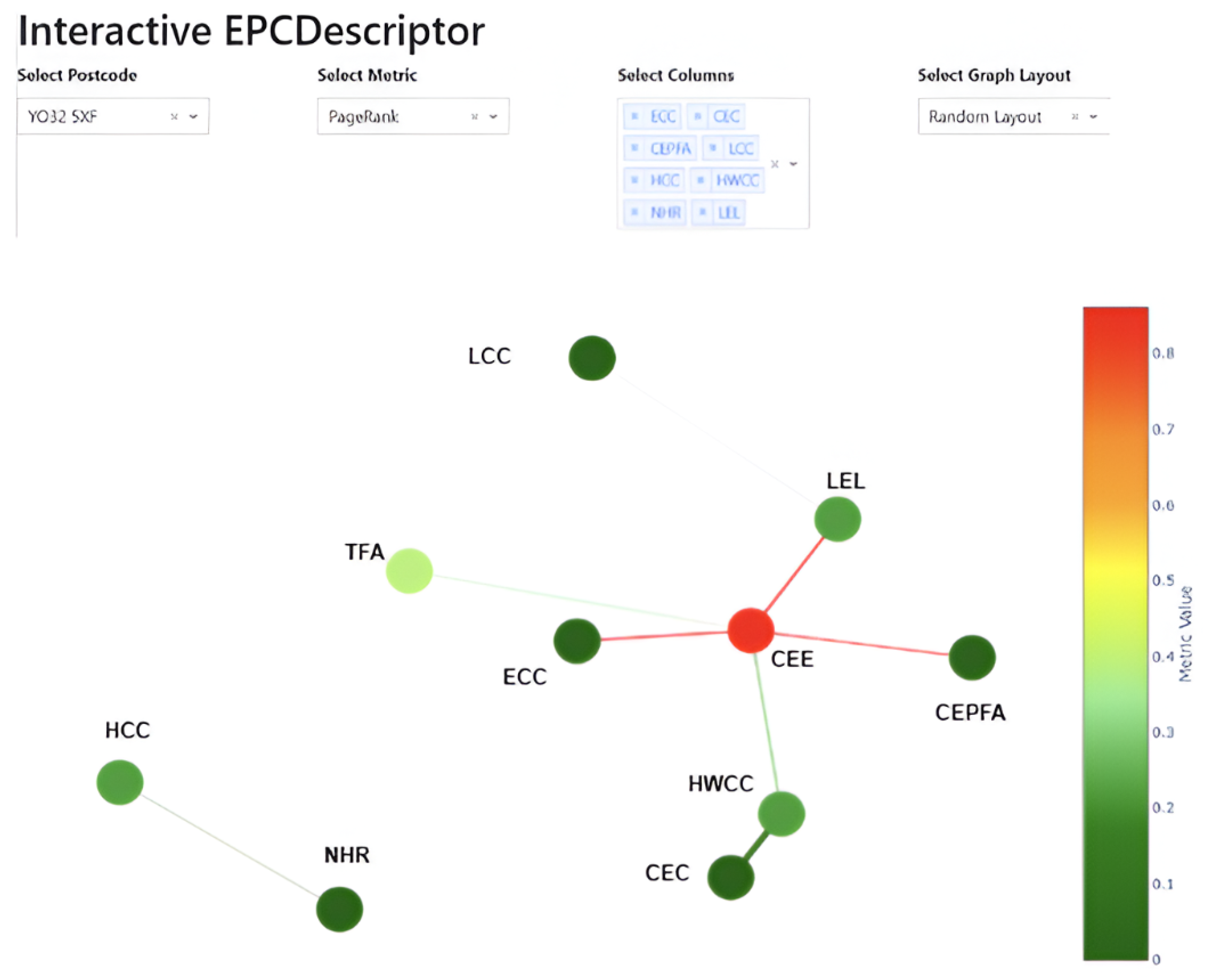
The significant positive correlations in the linkages for EPC A in Figure 6 indicate the attributes that lead to its high energy efficiency as a whole. There were no deleterious effects on energy performance since there were no unfavourable linkages.

5.1.2. Visual Encoding Conditions

EPC colour encodings are selectively applied to nodes and edges indicating attributes; for example, dark green denotes excellent energy efficiency. That way, everyone with a stake in the matter may see clearly which factors contributed most to the EPC A grade as a whole.

5.1.3. Structural Layout Conditions

To highlight the high degree of association between these attributes, an optimised arrangement is used here. Stakeholders can see how the features that contribute to outstanding energy performance are linked to the layout’s node positioning that minimises overlapping.

5.1.4. Interactive Visual Interaction

Nodes allow users to get comprehensive information about certain qualities through interaction. Hovering over connections also shows how strong the relationships are. Stakeholders may explore the network in greater depth and acquire a more sophisticated knowledge of the interactions among qualities with this interactive aspect.

5.2. Case 1: EPC B-Above Average Energy Performance

This network structure of EPC B-rated houses is intricately built to effectively communicate the subtle details of energy performance that surpass the average level. The insightful visual analysis is influenced by several crucial elements, such as link conditions, the visual layout style, and interactive attributes.

5.2.1. Node–Link Conditions

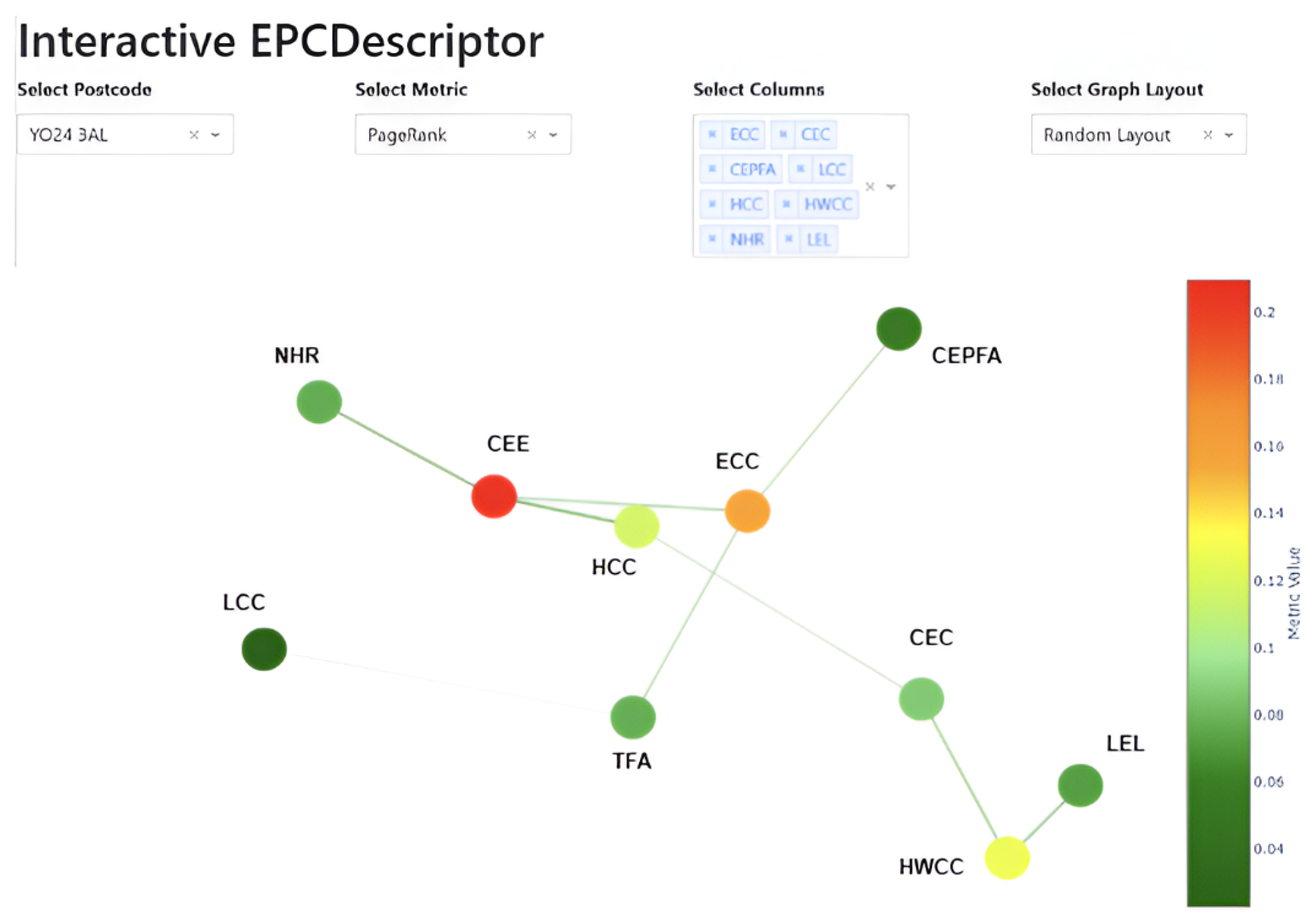
The network’s connection requirements for EPC B-rated households prioritise energy performance that is superior to the average. Connections (edges) among nodes (attributes) symbolise associations, with different weights indicating the extent of a link. In this instance, the correlations demonstrate positive associations, but they are not as prominent as in EPC A. The allocation of weight plays a role in comprehending the interconnection between attributes.

5.2.2. Visual Encoding Conditions

Nodes representing distinct features are strategically positioned in Figure 7 to optimise clarity and highlight their interconnections. The visual encoding employs a colour spectrum that moves towards lighter greens, representing impressive energy efficiency and a modest environmental effect. This selection assists stakeholders in promptly identifying the factors that contribute considerably to the above-average energy performance of EPC B.

5.2.3. Structural Layout Conditions

The selected layout type for EPC B networks prioritises the optimisation of node placement to enhance clarity and comprehension. Although not as densely arranged as in EPC A, the design guarantees that the positive connections between qualities are clearly seen. The choice of layout type enhances the overall coherence of the network, making it easier for stakeholders to understand how attributes are interconnected.

5.2.4. Interactive Visual Interaction

Interactivity is integrated to augment stakeholder involvement. Users can navigate the network by engaging with nodes and links, which will unveil further details about specific features and their interconnections. By hovering on nodes, users can view detailed information, and stakeholders have the ability to zoom in or out and move around to examine specific areas of interest. This interactive component enhances the visual analysis by introducing a dynamic aspect. It enables stakeholders to explore the network structure and attribute correlations of EPC B-rated houses in greater detail.

5.3. Case 2: EPC C-Moderate Energy Performance

This case study allows a detailed investigation of attribute performances, which adds to knowledge of EPC C’s moderate energy performance. Careful consideration was given to the network architecture in order to achieve a balance between environmental effect and energy efficiency in the context of properties rated C by the Energy Performance Certificate (EPC). In order to provide stakeholders a thorough grasp of EPC C’s moderate energy performance.

5.3.1. Node-Link Conditions

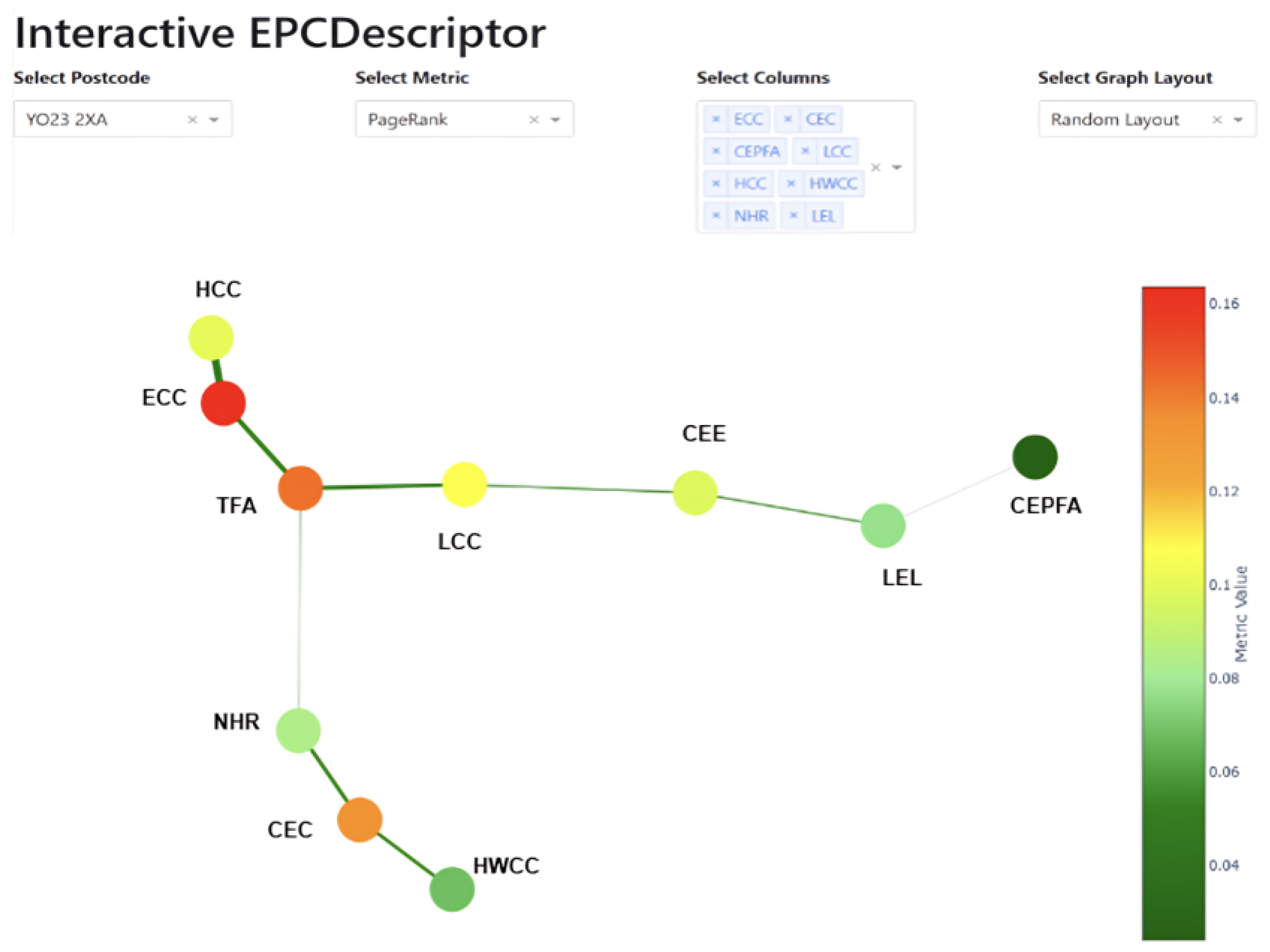
The connection conditions in the network in the Figure 8 are indicative of the associations between characteristics. Within EPC C, the linkages are formed to represent moderate correlations, hence avoiding very positive or negative associations. This guarantees a widely spread and interconnected network that corresponds to the modest energy efficiency associated with EPC C.

5.3.2. Visual Encoding Conditions

The visual analysis concentrates on colour encodings that range from yellow to bright green. The colour yellow represents attributes that have a modest level of energy efficiency, whereas light green suggests an acceptable level of environmental impact. The colour spectrum visually displays a range of factors that contribute to the balanced energy performance of EPC C-rated homes, enabling stakeholders to easily recognise them.

5.3.3. Structural Layout Conditions

The selected layout type for EPC C is specifically designed to promote a uniformly dispersed network. Nodes representing attributes are intentionally placed to demonstrate modest correlations without forming clusters or being isolated. The use of this layout style improves the understanding of the network structure, helping stakeholders grasp the interconnections between features that contribute to moderate energy performance.

5.3.4. Interactive Visual Interaction

Interactive components are incorporated to enable stakeholders to actively investigate the network in a dynamic manner. Users have the ability to hover over nodes in order to see attribute information, click on links to discover particular connections, and modify interactive settings to personalise their exploration. By utilising this interactive feature, stakeholders are able to thoroughly explore the interconnection of features and acquire valuable insights into the elements that influence the moderate energy performance of EPC C-rated houses.

5.4. Case 3: EPC E-Insufficient Energy Performance

The EPC E case study offers stakeholders a comprehensive set of tools to comprehend and tackle inefficient energy performance. By utilising these characteristics, those involved may discern, plan, and execute actions with efficacy, finally striving towards attaining enhanced energy efficiency in residences with an EPC rating of E.

5.4.1. Node-Link Conditions

Within the network in the Figure 9 of EPC E-rated houses, the connectivity circumstances suggest that the energy performance is not ideal. The edges linking nodes (attributes) highlight regions that require significant enhancement in energy efficiency. The link weights, shown by the intensity of the orange colour, highlight the robustness of the connection between related characteristics. Links that are darker indicate traits that have the highest potential for improvement.

5.4.2. Visual Encoding Conditions

The visual analysis of the network aims to capture stakeholders’ attention towards key regions that contribute to energy performance that is below ideal. Attributes are shown as nodes, and their positions are intentionally set to emphasise the necessity for enhancement. The colour encodings, shifting towards deeper shades of orange, efficiently convey the extent of energy inefficiency in various characteristics. Stakeholders have the ability to visually recognise and give priority to specific areas for action.

5.4.3. Structural Layout Conditions

The chosen layout type for this example is intended to emphasise the need for change with a sense of urgency. The nodes are organised in a manner that clearly highlights the interconnection between qualities that contribute to unsatisfactory energy performance. The design emphasises lucidity and ease of use, allowing stakeholders to swiftly comprehend the organisation of the network and identify crucial areas that want attention. In this situation, it is essential to have a layout type that highlights attribute connections and prospective enhancements.

5.4.4. Interactive Visual Interaction

Interactive elements improve stakeholders’ capacity to investigate the dynamics of the network. Users have the ability to engage with nodes, move their cursor over linkages, and get comprehensive understanding of attribute performances. Choosing a node yields further data, but engaging with links unveils the intensity of connections. By comprehending both the qualities and intricate connections that contribute to inadequate energy efficiency, this interactive method enables stakeholders to develop improvement solutions.

6. Evaluation Study

6.1. Objective

The study sought to evaluate the usefulness of the proposed network-informed visualisation method in assessing the interconnected contextual factors in the energy efficiency of residential buildings. The examination encompassed experts in the field of energy performance, as well as persons with diverse degrees of proficiency in data visualisation.

6.2. Participants

6.2.1. Specialists (P1–P3):

Three experienced individuals with a combined competence of over five years in evaluating the energy efficiency of residential properties. Expertise in assessing the energy efficiency of residential buildings. Involved in the analysis of the suggested data-based visualisation method.

6.2.2. Visualisation Experts (P4–P6):

For the purpose of conducting a thorough evaluation, we enlisted the assistance of three experts in the discipline of data visualisation.

6.2.3. Users (P7–P16):

Experienced Users (P7–P11): individuals with a certain level of understanding in evaluating the energy performance of houses. Insufficient expertise in generating graph visualisations.
General Users (P12–P16): possess a solid understanding of visualisation methods. Insufficient expertise in evaluating the energy efficiency of buildings.
All participants were invited via targeted emails and offered a nominal honorarium. Each user first performed a short tutorial on a conventional EPC table interface (the UK GOV online EPC viewer) as a baseline. They then completed identical interpretation tasks using our network-based platform. Task order was counterbalanced to mitigate learning effects. We recorded accuracy, completion time, and subjective ratings for both interfaces.

6.3. Tasks

Participants examined the interconnected contextual factors in energy performance characteristics depicted in the graph-based visualisation. The participants were given several EPC situations and tasked with interpreting and comprehending the connections between relevant qualities.

6.4. Action to Take

Introduction Phase: A concise three-minute overview of the objectives, study materials, and assignments.
Practice Phase: A brief five-minute session where participants can freely navigate the graph-based visualisation using a mouse.
Task Phase: Participants engaged in formal tasks, dedicating around one hour to examine and analyse three EPC situations utilising the graph-based visualisation. Responsibilities included responding to inquiries concerning energy performance characteristics.
Evaluation Phase: Participants were instructed to assess the visualization’s legibility, visual appeal, and usefulness using a Likert scale. In addition, they were prompted to offer recommendations for enhancement.

6.5. Results

6.5.1. Clarity

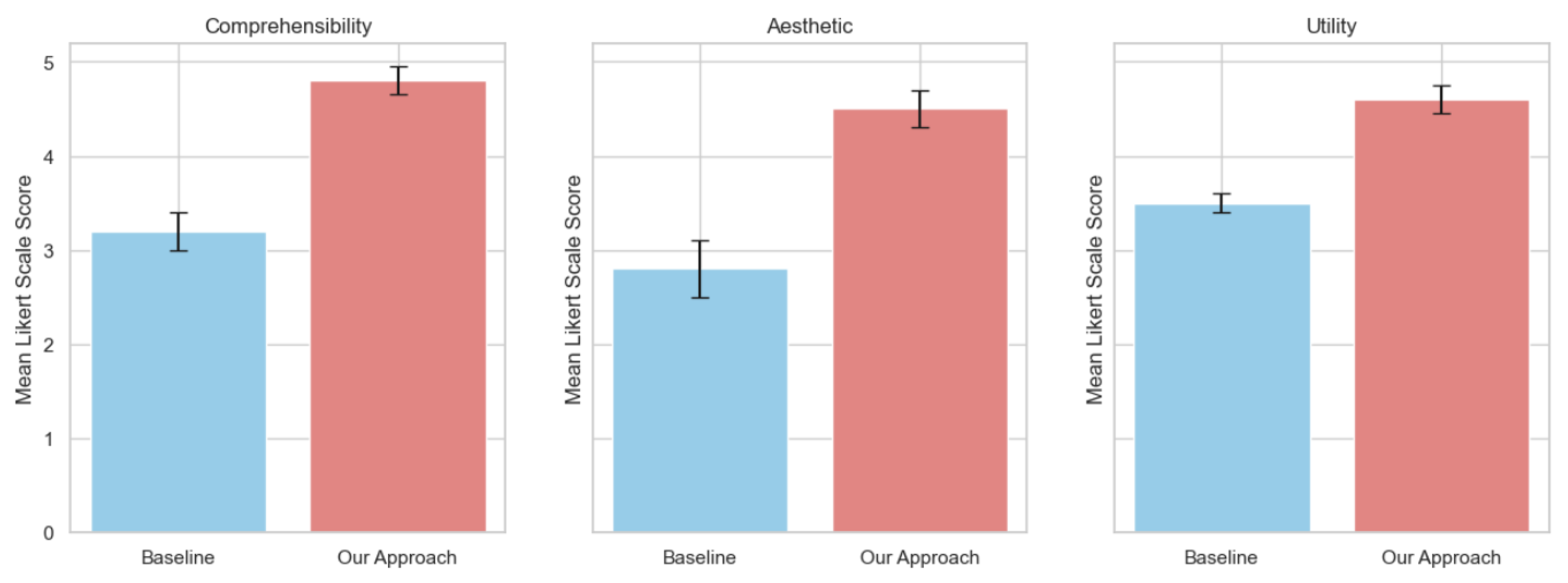
The results, in Figure 10, showed a mean scale of Likert scoring of 4.8 (±0.4) for the node–link visualisation strategy. Results showed significant improvements (p < 0.05) over the baseline legend technique, with a mean value of 3.2 (±0.3). Our solution makes node–link diagrams for energy performance certificate characteristics more understandable for numerical attributes.
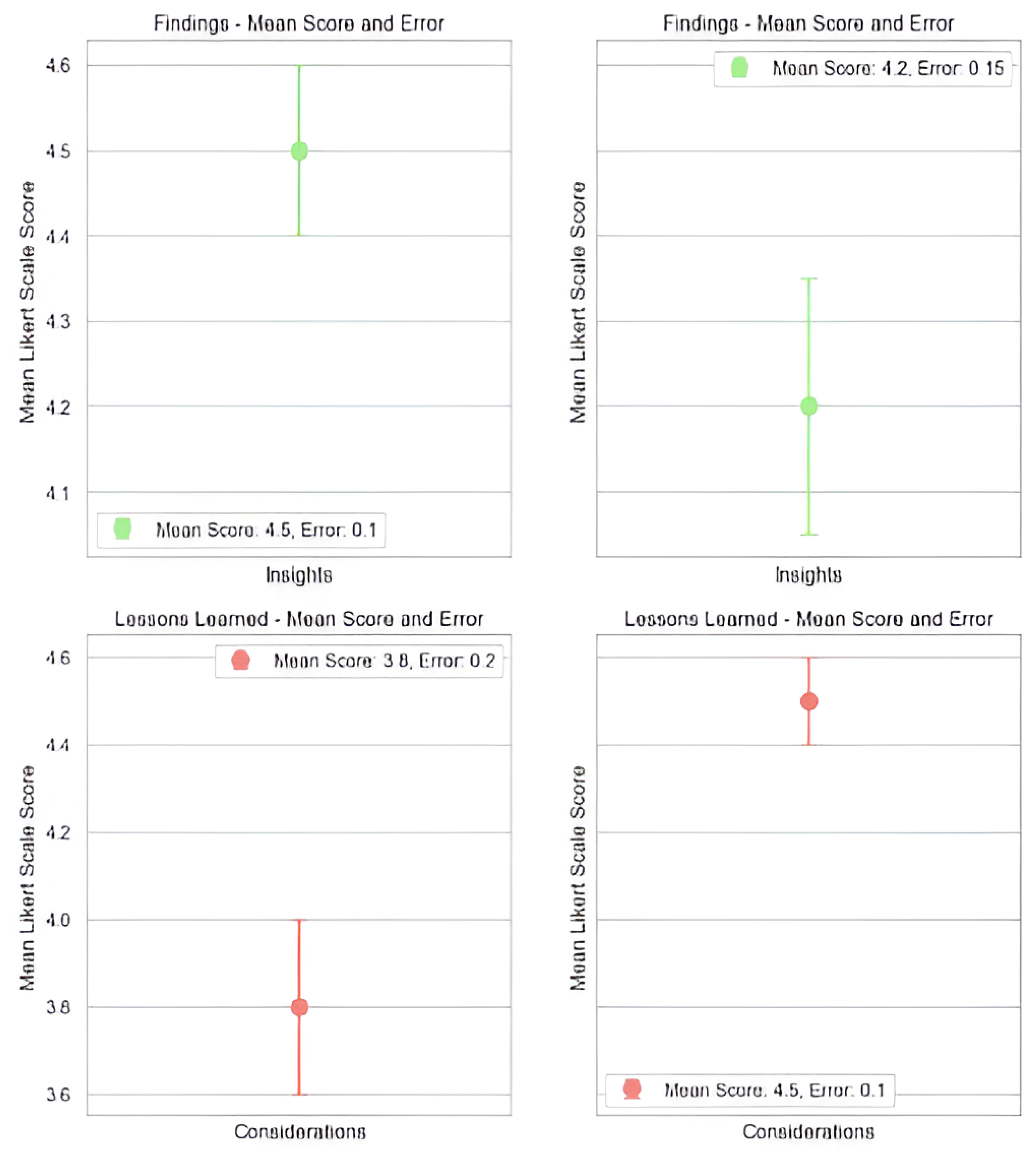
Finding 1: Our node–link method outperforms the legend method in comprehensibility. Overall, participants understood attribute linkages and energy performance ratings better. This shows, in Figure 11, that visualising characteristics as a network improves energy performance certificate understanding and interpretation.
Lesson Learned 1: The feedback highlighted the significance of enhancing user interactions to provide a more intuitive study of the graph.

6.5.2. Aesthetic

User ratings and input determined aesthetics. The node–link visualisations got favourable feedback, scoring an average aesthetic value of 4.5 (±0.3) on the Likert scale. Users liked the colour encoding and layout, which made attribute relationships seem well. This suggests that our method increases data comprehensibility and aesthetics.
Finding 2: User comments stressed data visualisation aesthetics. Colour gradients, node location, and layout made the depiction appealing. Aesthetic appeal was found to affect user engagement and visualisation satisfaction.
Lesson Learned 2: to boost user involvement and interpretation, aesthetic strengthens are vital.

6.5.3. Practicality

Our visualisation approach was evaluated according to its ability to help users discover attribute effects and comprehend energy performance. At a mean Likert scale score of 4.6 (±0.2), as can be seen in Figure 10, participants indicated good utility scores. Our method is suitable for obtaining important insights from energy performance certificate data.
Finding 3: Our method helped users discover energy performance factors. Interactive elements like node searching and filtering were useful for retrieving specific information. This shows our visualisation method’s real-world applicability.
Lesson Learned 3: A more flexible approach with additional uses can be achieved by tailoring utility features to user needs.

7. Discussion

7.1. Significance

The platform that has been built utilises the interactive graph visualisation code. This platform has important implications for comprehending and evaluating the energy efficiency of houses. It does so by employing a novel network-centric approach. By transforming individual characteristics of houses into interconnected systems, stakeholders may obtain a comprehensive and easily understandable view of the connections between many aspects that impact energy efficiency. The importance rests in its capacity to condense intricate attribute relationships into readily understandable visual representations. This platform enables stakeholders, such as homeowners, energy analysts, and policymakers, to make well-informed choices on energy-efficient house upgrades. Moreover, the application’s adaptability enables it to be used with a wide range of datasets, making it a versatile tool for tackling different energy performance scenarios.

7.2. Scalability

An important factor to examine is the platform’s capacity to scale with datasets of different sizes and levels of complexity. Although the current implementation shows efficacy with the given dataset, it is necessary to conduct further analysis to see how well the platform can handle larger datasets or datasets with extra properties. Efficiently improving algorithms and data processing pipelines will be essential for preserving the platform’s promptness and guaranteeing a smooth user experience as the size expands.

7.3. Limitation

Although the platform adopts an innovative approach, it faces intrinsic limitations that deserve recognition. The precision and dependability of the visualisations are greatly influenced by the calibre of the input data. The network structure’s integrity and the derived insights may be compromised due to incomplete or erroneous data. To overcome these restrictions, it will be important to tackle data quality concerns and establish strong data validation methods. Furthermore, the software now emphasises attribute connections inside particular residences. Incorporating neighbourhood-level interactions and external elements into the investigation would enhance our understanding of the overall energy landscape.

7.4. Future Work

The platform provides opportunities for innovative future endeavours in several domains. Possible improvements to the interactive features might involve the incorporation of real-time updates and dynamic adjustments, enabling stakeholders to immediately view the effects of attribute modifications on the network structure. In addition, by integrating machine learning algorithms for predictive analysis, the platform’s capabilities may be enhanced, allowing stakeholders to anticipate the possible effects of energy-efficient initiatives. In addition, involving subject specialists, architects, and urban planners in the platform’s development might provide useful insights. By incorporating specialised information from a specific field, the platform has the potential to develop into a collaborative tool that assists in making informed decisions for sustainable urban development.

8. Conclusions

In this research study, we aimed to transform particular attributes of houses into a networked representation, offering a new and easy-to-understand method for analysing energy efficiency. A complete framework is developed by integrating sophisticated techniques, node-link architectures, and visual analytics. This framework enables a better understanding of the intricate interactions between various qualities. The proposed technique uses network science to reveal the interconnected network of variables that together contribute to the energy efficiency of dwellings. By converting these characteristics into a visual depiction, stakeholders obtain an unparalleled understanding of the underlying structural dynamics that determine energy performance. The results of our study highlight the importance of visual encoding in converting complex attribute interactions into a format that is easy to understand and can be acted upon. The nodes and linkages are colour-coded and include interactive capabilities, which enable stakeholders to recognise trends, identify significant attributes, and make well-informed decisions. We have showcased the versatility of our technique by conducting case studies on various energy performance scenarios, spanning from EPC A to EPC G. Each case study has offered detailed insight into the network topologies, graphically emphasising the strengths and subtleties associated with different EPC ratings.

Author Contributions

Conceptualization, H.M.S. and S.I.; methodology, H.M.S. and S.I.; software, H.M.S., H.M.A.F. and H.u.R.; validation, H.M.S., S.I. and R.H.; formal analysis, H.M.S., S.I. and R.H.; investigation, H.M.S.; resources, H.M.S. and H.M.A.F.; data curation, H.M.S., H.M.A.F. and H.u.R.; writing—original draft preparation, H.M.S., S.I., R.H. and H.u.R.; writing—review and editing, H.M.S., S.I., R.H. and H.u.R.; visualization, H.M.S., H.M.A.F. and H.u.R.; supervision, S.I. and R.H.; project administration, S.I. and R.H.; funding acquisition, H.u.R. All authors have read and agreed to the published version of the manuscript.

Funding

Hassam ur Rehman was funded by the Research Council of Finland under the project name “Energy Resilience in Buildings in Extreme Cold Weather Conditions in Finland 2022–2025 (FinERB) [Grant number: 348060]”, and “Addressing the Challenges of Achieving Energy Resilience in Buildings During Power Outages in Finland: A Human-Centric Approach Integrating Technical, Social and Economic Dimensions 2025–2029 (REBUILD-Fin) [Decision number: 367935]”. The funders played no role in the design of the study, in the collection, analysis, or interpretation of data, in the writing of the manuscript, or in the decision to publish the results.

Institutional Review Board Statement

The study was conducted with ethical approval from the University of Huddersfield.

Data Availability Statement

The dataset is publicly available online [32].

Acknowledgments

The authors acknowledge IEA EBC Annex 93 Energy Resilience of the Buildings in Remote Cold Regions.

Conflicts of Interest

Author Hassam ur Rehman is employed by the VTT Technical Research Centre of Finland Ltd. All the authors declare no conflicts of interest.

References

  1. Jenkins, D.; Semple, S.; Patidar, S.; McCallum, P. Changing the approach to energy compliance in residential buildings–re-imagining EPCs. Energy Build. 2021, 249, 111239. [Google Scholar] [CrossRef]
  2. Crawley, J.; Biddulph, P.; Northrop, P.J.; Wingfield, J.; Oreszczyn, T.; Elwell, C. Quantifying the measurement error on England and Wales EPC ratings. Energies 2019, 12, 3523. [Google Scholar] [CrossRef]
  3. Pasichnyi, O.; Wallin, J.; Levihn, F.; Shahrokni, H.; Kordas, O. Energy performance certificates—New opportunities for data-enabled urban energy policy instruments? Energy Policy 2019, 127, 486–499. [Google Scholar] [CrossRef]
  4. Li, Y.; Kubicki, S.; Guerriero, A.; Rezgui, Y. Review of building energy performance certification schemes towards future improvement. Renew. Sustain. Energy Rev. 2019, 113, 109244. [Google Scholar] [CrossRef]
  5. Shakeel, H.M.; Iram, S.; Hill, R.; Athar Farid, H.M.; Sheikh-Akbari, A.; Saleem, F. A Machine Learning-Based Intelligent Framework for Predicting Energy Efficiency in Next-Generation Residential Buildings. Buildings 2025, 15, 1275. [Google Scholar] [CrossRef]
  6. Nield, S. Net Zero Homes: Time for a Reset, The English Story. 2023. Available online: https://diposit.ub.edu/dspace/bitstream/2445/203173/1/6.%20WP%20Sarah%20Nield_2023_6.pdf (accessed on 16 August 2025).
  7. Ahern, C.; Norton, B. Energy Performance Certification: Misassessment due to assuming default heat losses. Energy Build. 2020, 224, 110229. [Google Scholar] [CrossRef]
  8. Webborn, E.; McKenna, E.; Elam, S.; Anderson, B.; Cooper, A.; Oreszczyn, T. Increasing response rates and improving research design: Learnings from the Smart Energy Research Lab in the United Kingdom. Energy Res. Soc. Sci. 2022, 83, 102312. [Google Scholar] [CrossRef]
  9. Shakeel, H.M.; Iram, S.; Hill, R.; Farid, H.M.A.; Brown, P.; Rehman, H.U. An XAI-Driven Diagnostic Framework to Investigate the Predictive Power of Building Features to Enhance EPC Ratings in Detached Houses. Energy Build. 2025, 344, 116022. [Google Scholar] [CrossRef]
  10. Li, X.; Gao, X.; Wang, Q.; Wang, C.; Li, B.; Wan, K. Feature Analysis Network: An Interpretable Idea in Deep Learning. Cogn. Comput. 2024, 16, 803–826. [Google Scholar] [CrossRef]
  11. Luo, T.; Zhu, C.; Li, B.; Shen, X.; Zhu, G. Feature analysis aided design of lightweight heat sink from network structures. iScience 2025, 28, 111630. [Google Scholar] [CrossRef]
  12. Bick, C.; Gross, E.; Harrington, H.A.; Schaub, M.T. What are higher-order networks? SIAM Rev. 2023, 65, 686–731. [Google Scholar] [CrossRef]
  13. Kundu, S.; Datta, G.; Pedram, M.; Beerel, P.A. Spike-thrift: Towards energy-efficient deep spiking neural networks by limiting spiking activity via attention-guided compression. In Proceedings of the IEEE/CVF Winter Conference on Applications of Computer Vision, Virtual, 5–9 January 2021; pp. 3953–3962. [Google Scholar]
  14. Han, S.; Mao, H.; Dally, W.J. Deep compression: Compressing deep neural networks with pruning, trained quantization and huffman coding. arXiv 2015, arXiv:1510.00149. [Google Scholar] [CrossRef]
  15. La Rosa, B.; Blasilli, G.; Bourqui, R.; Auber, D.; Santucci, G.; Capobianco, R.; Bertini, E.; Giot, R.; Angelini, M. State of the art of visual analytics for explainable deep learning. In Proceedings of the Computer Graphics Forum; Wiley Online Library: Hoboken, NJ, USA, 2023; Volume 42, pp. 319–355. [Google Scholar] [CrossRef]
  16. Zhou, G.; Ewald, J.; Xia, J. OmicsAnalyst: A comprehensive web-based platform for visual analytics of multi-omics data. Nucleic Acids Res. 2021, 49, W476–W482. [Google Scholar] [CrossRef]
  17. Zhou, G.; Pang, Z.; Lu, Y.; Ewald, J.; Xia, J. OmicsNet 2.0: A web-based platform for multi-omics integration and network visual analytics. Nucleic Acids Res. 2022, 50, W527–W533. [Google Scholar] [CrossRef] [PubMed]
  18. Wang, H.; Lu, Y.; Shutters, S.T.; Steptoe, M.; Wang, F.; Landis, S.; Maciejewski, R. A visual analytics framework for spatiotemporal trade network analysis. IEEE Trans. Vis. Comput. Graph. 2018, 25, 331–341. [Google Scholar] [CrossRef]
  19. Wang, J.; Gou, L.; Shen, H.; Yang, H. DQNViz: A Visual Analytics Approach to Understand Deep Q-Networks. IEEE Trans. Vis. Comput. Graph. 2020, 26, 288–298. [Google Scholar] [CrossRef]
  20. Sacha, D.; Kraus, M.; Keim, D.A.; Chen, M. VIS4ML: An Ontology for Visual Analytics Assisted Machine Learning. Data Knowl. Eng. 2017, 108, 1–20. [Google Scholar] [CrossRef]
  21. Shakeel, H.M.; Iram, S.; Al-Aqrabi, H.; Alsboui, T.; Hill, R. A comprehensive state-of-the-art survey on data visualization tools: Research developments, challenges and future domain specific visualization framework. IEEE Access 2022, 10, 96581–96601. [Google Scholar] [CrossRef]
  22. Raman, R.; Buddhi, D.; Lakhera, G.; Gupta, Z.; Joshi, A.; Saini, D. An investigation on the role of artificial intelligence in scalable visual data analytics. In Proceedings of the 2023 International Conference on Artificial Intelligence and Smart Communication (AISC), Greater Noida, India, 27–29 January 2023; pp. 666–670. [Google Scholar] [CrossRef]
  23. Jiao, P. Research on electronic decision system for effective data visualization and analysis process. Comput. Electr. Eng. 2022, 98, 107737. [Google Scholar] [CrossRef]
  24. Park, H.; Bellamy, M.A.; Basole, R.C. Visual analytics for supply network management: System design and evaluation. Decis. Support Syst. 2016, 91, 89–102. [Google Scholar] [CrossRef]
  25. Saqhib, M.N.; Lakshmikanth, S. Augmenting relay node selection for improved energy efficiency in non-hierarchical IoT-oriented wireless sensor networks using Q-learning and fuzzy logic. Comput. Electr. Eng. 2025, 123, 110068. [Google Scholar] [CrossRef]
  26. Pan, J.; Yan, Z.; Zhou, Z.; Zhao, X.; Cheng, S.; Han, D.; Chen, J.; Xu, M.; Chen, W. GraphDescriptor: Augmenting Node-Link Diagrams With Textual Descriptions. In Proceedings of the 2023 IEEE 16th Pacific Visualization Symposium (PacificVis), Seoul, Republic of Korea, 18–21 April 2023; pp. 177–186. [Google Scholar] [CrossRef]
  27. Liu, X.; Li, X.; Fiumara, G.; De Meo, P. Link prediction approach combined graph neural network with capsule network. Expert Syst. Appl. 2023, 212, 118737. [Google Scholar] [CrossRef]
  28. Pister, A.; Prieur, C.; Fekete, J.D. ComBiNet: Visual Query and Comparison of Bipartite Multivariate Dynamic Social Networks. In Proceedings of the Computer Graphics Forum; Wiley Online Library: Hoboken, NJ, USA, 2023; Volume 42, pp. 290–304. [Google Scholar] [CrossRef]
  29. Fuerst, F.; McAllister, P.; Nanda, A.; Wyatt, P. Energy performance ratings and house prices in Wales: An empirical study. Energy Policy 2016, 92, 20–33. [Google Scholar] [CrossRef]
  30. Shakeel, H.M.; Farid, H.M.A.; Iram, S.; Hill, R.; Simic, V. Multi-stage decision support system for evaluating visual energy performance certificate platforms. Sustain. Energy Grids Netw. 2025, 43, 101767. [Google Scholar] [CrossRef]
  31. Lomas, K.; Beizaee, A.; Allinson, D.; Haines, V.; Beckhelling, J.; Loveday, D.; Porritt, S.; Mallaband, B.; Morton, A. A domestic operational rating for UK homes: Concept, formulation and application. Energy Build. 2019, 201, 90–117. [Google Scholar] [CrossRef]
  32. Department for Levelling Up, Housing & Communities. Energy Performance of Buildings Data: England and Wales. 2023. Available online: https://epc.opendatacommunities.org/ (accessed on 14 November 2023).
  33. Iram, S.; Fernando, T.; Bassanino, M. Exploring Cross-Domain Data Dependencies for Smart Homes to Improve Energy Efficiency. In Proceedings of the Companion Proceedings of the 10th International Conference on Utility and Cloud Computing, New York, NY, USA, 5–8 December 2017; UCC’17 Companion. pp. 221–226. [Google Scholar] [CrossRef]
  34. Patro, S.; Sahu, K.K. Normalization: A preprocessing stage. arXiv 2015, arXiv:1503.06462. [Google Scholar] [CrossRef]
  35. Maharani, W.; Gozali, A.A. Degree centrality and eigenvector centrality in twitter. In Proceedings of the 2014 8th International Conference on tElecommunication Systems Services and Applications (TSSA), Kuta, Indonesia, 23–24 October 2014; pp. 1–5. [Google Scholar] [CrossRef]
  36. Brandes, U. A faster algorithm for betweenness centrality. J. Math. Sociol. 2001, 25, 163–177. [Google Scholar] [CrossRef]
  37. Sarma, A.D.; Gollapudi, S.; Panigrahy, R. Estimating pagerank on graph streams. J. ACM 2011, 58, 1–19. [Google Scholar] [CrossRef]
  38. Kobourov, S.G. Spring embedders and force directed graph drawing algorithms. arXiv 2012, arXiv:1201.3011. [Google Scholar] [CrossRef]
  39. Iram, S.; Fernando, T.; Hill, R. Connecting to Smart Cities: Analyzing Energy Times Series to Visualize Monthly Electricity Peak Load in Residential Buildings. In Proceedings of the Future Technologies Conference (FTC) 2018; Arai, K., Bhatia, R., Kapoor, S., Eds.; Springer: Cham, Switzerland, 2019; pp. 333–342. [Google Scholar] [CrossRef]
  40. Anđelković, A.S.; Kljajić, M.; Macura, D.; Munćan, V.; Mujan, I.; Tomić, M.; Vlaović, Ž.; Stepanov, B. Building energy performance certificate—A relevant indicator of actual energy consumption and savings? Energies 2021, 14, 3455. [Google Scholar] [CrossRef]
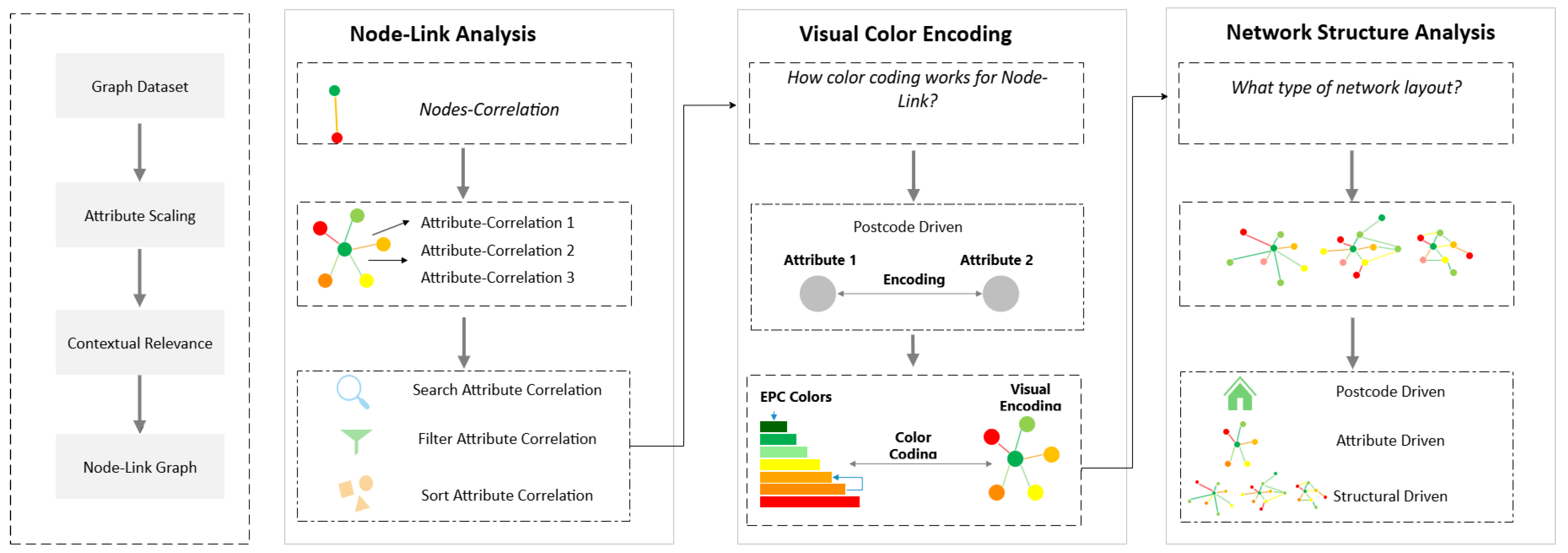
Figure 1. EPCDescriptor framework.
Buildings 15 02929 g001
Figure 2. Nodes’ visual colour mapping.
Buildings 15 02929 g002
Figure 3. Node–link visual weights’ mapping.
Buildings 15 02929 g003
Figure 4. (a) Node–link relationship, (b) node–link visual interactions, mapping, and data binding.
Buildings 15 02929 g004
Figure 5. Basic data visualization steps.
Buildings 15 02929 g005
Figure 6. EPC_A.
Figure 6. EPC_A.
Buildings 15 02929 g006
Figure 7. EPC_B.
Figure 7. EPC_B.
Buildings 15 02929 g007
Figure 8. EPC_C.
Figure 8. EPC_C.
Buildings 15 02929 g008
Figure 9. EPC_E.
Figure 9. EPC_E.
Buildings 15 02929 g009
Figure 10. Scales Results.
Buildings 15 02929 g010
Figure 11. Findings and lessons learned results.
Buildings 15 02929 g011
Table 1. EPC housing data.
Total Houses (Before Cleaning)Total Houses (After Cleaning)EPC RatingNumber of Houses (As per EPC)Numerical AttributesAcronym
49,95936,540A20Energy Consumption CurrentECC
B458CO2 Emissions CurrentCEC
C11,099CO2 Emissions Curr Per Floor AreaCEPFA
D19,482Lighting Cost CurrentLCC
E4599Heating Cost CurrentHCC
F732Hot Water Cost CurrentHWCC
G150Total Floor AreaTFA
Number Habitable RoomsNAR
Number Heated RoomsNHR
Low Energy LightingLEL
Table 2. Attributes’ measurement.
Numerical AttributesUnit
Energy Consumption CurrentKilowatt-hours (kWh)
CO2 Emissions CurrentKilograms of carbon dioxide (kg CO2)
CO2 Emissions Curr Per Floor AreaKilograms of carbon dioxide per square meter (kg CO2/m2)
Lighting Cost CurrentCurrency per unit time
Heating Cost CurrentCurrency per unit time
Hot Water Cost CurrentCurrency per unit time
Total Floor AreaSquare meters (m2)
Number Habitable RoomsCount
Number Heated RoomsCount
Low Energy LightingCount
Table 3. Key attribute measurements for case studies (EPC A, B, C, E).
AttributeEPC AEPC BEPC CEPC E
ENERGY_CONSUMPTION_CURRENT (kWh/m2·yr)977305504
CURRENT_ENERGY_EFFICIENCY (%)95846943
CO2_EMISSIONS_CURRENT (kgCO2/yr)0.31.22.55.9
TOTAL_FLOOR_AREA (m2)1341684870
LOW_ENERGY_LIGHTING (% rooms)1001006060
Disclaimer/Publisher’s Note: The statements, opinions and data contained in all publications are solely those of the individual author(s) and contributor(s) and not of MDPI and/or the editor(s). MDPI and/or the editor(s) disclaim responsibility for any injury to people or property resulting from any ideas, methods, instructions or products referred to in the content.