Article

Strategic Web-Based Data Dashboards as Monitoring Tools for Promoting Organizational Innovation

by
Siddharth Banerjee
1,*,
Clare E. Fullerton
2,
Sankalp S. Gaharwar
3 and
Edward J. Jaselskis
4
1
Department of Civil Engineering, California State Polytechnic University, Pomona, CA 91768, USA
2
Jacobs, Jacksonville, FL 32207, USA
3
Lexis Nexis, Raleigh, NC 27606, USA
4
Department of Civil, Construction and Environmental Engineering, North Carolina State University, Raleigh, NC 27606, USA
*
Author to whom correspondence should be addressed.
Buildings 2025, 15(13), 2204; https://doi.org/10.3390/buildings15132204
Submission received: 16 April 2025 / Revised: 3 June 2025 / Accepted: 20 June 2025 / Published: 24 June 2025
(This article belongs to the Special Issue The Power of Knowledge in Enhancing Construction Project Delivery)

Abstract

Knowledge extraction and sharing is one of the biggest challenges organizations face to ensure successful and long-lasting knowledge repositories. The North Carolina Department of Transportation (NCDOT) commissioned a web-based knowledge management program called Communicate Lessons, Exchange Advice, Record (CLEAR) for end-users to promote employee-generated innovation and to institutionalize organizational knowledge. Reusing knowledge from an improperly managed database is problematic and potentially causes substantial financial loss and reduced productivity for an organization. Poorly managed databases can hinder effective knowledge dissemination across the organization. Data-driven dashboards offer a promising solution by facilitating evidence-driven decision-making through increased information access to disseminate, understand and interpret datasets. This paper describes an effort to create data visualizations in Tableau for CLEAR’s gatekeeper to monitor content within the knowledge repository. Through the three web-based strategic dashboards relating to lessons learned and best practices, innovation culture index, and website analytics, the information displays will aid in disseminating useful information to facilitate decision-making and execute appropriate time-critical interventions. Particular emphasis is placed on utility-related issues, as data from the NCDOT indicate that approximately 90% of projects involving utility claims experienced one or two such incidents. These claims contributed to an average increase in project costs of approximately 2.4% and schedule delays averaging 70 days. The data dashboards provide key insights into all 14 NCDOT divisions, supporting the gatekeeper in effectively managing the CLEAR program, especially relating to project performance, cost savings, and schedule improvements. The chronological analysis of the CLEAR program trends demonstrates sustained progress, validating the effectiveness of the dashboard framework. Ultimately, these data dashboards will promote organizational innovation in the long run by encouraging end-user participation in the CLEAR program.

1. Introduction

In a data-driven world, dashboards are vital for transforming complex data into real-time insights across sectors such as transportation, healthcare, education, and banking. These dashboards help various stakeholders support evidence-based decision-making, performance monitoring, and transparency. Data dashboards are also highly effective in communicating key information in real time, compared to traditional methods such as printed materials, press briefings, or call centers. The latter often requires substantial time, personnel, and financial resources to disseminate the same amount of information to a broader public. For public agencies operating under budget constraints and increasing demand for efficient public service, dashboards offer a scalable and efficient solution. They enable agencies to provide consistent, transparent updates to the public without the delays or inconsistencies associated with manual communication processes. For instance, during the recent COVID-19 pandemic, which disrupted routine life worldwide, countries such as the United States [1], the United Kingdom [2], and Australia [3] widely adopted public health dashboards. These dashboards were used to communicate critical information, including infection rates, hospital capacity, and vaccination progress, directly to both first responders and the general public. As public agencies and private organizations increasingly rely on real-time data to guide decisions and coordinate action, the ability to capture, retain and reuse institutional knowledge becomes essential. This is pivotal for sustained organizational learning and for deriving knowledge from data, rather than relying on data alone. At the same time, knowledge management has become a strategic priority in various sectors, enabling organizations to institutionalize knowledge and foster innovation.
Transportation construction projects are dynamic in nature and typically are not identical. Project teams comprise multiple members, including the owner and funding agencies, architects, and engineers, as well as contractors and their subcontractors. Even with the advent of big data and artificial intelligence to aid the analysis of construction data, the growing size and complexity of construction projects continue to present data analysis challenges. Personnel face the added challenge of completing complex projects under uncertainty, within shorter timeframes, while maintaining cost, quality, and end-user satisfaction [4]. As such, traditional tools and techniques that were developed for simple projects have been rendered ineffective for complex projects [5]. Thus, the ability to collect real-time information about projects to deliver time-critical interventions is necessary [6]. Moreover, many organizations, including US state departments of transportation (DOTs), are facing personnel turnover, which has exacerbated stressful situations related to complex construction projects and warrants additional measures at the organizational level to document knowledge gained by project personnel. Furthermore, due to such organizational turnover, project teams can change composition during ongoing projects, which can lead to instability and ultimately to project failure [7,8]. Organizations have begun to realize that knowledge, in addition to other resources such as labor, land, and capital, is an invaluable asset and is crucial for delivering high-quality end products.
The knowledge gained by project personnel can be classified as explicit, meaning that it can be properly explained and documented using formal systematic language, or tacit, which is deeply rooted in action and cannot be easily documented using formal systematic language [9]. The three stages of the knowledge management process are knowledge acquisition, knowledge sharing, and knowledge use. The proper implementation of these stages has been found to lead to enhanced organizational innovation, which in turn helps the organization remain competitive [10]. However, organizations are finding it increasingly difficult to extract and reuse suitable tacit knowledge, although recent research has suggested ways to overcome such limitations [11,12]. Another concern is that employees may limit their knowledge sharing for fear of diminishing their power or the perception thereof. A strong organizational culture and appropriate steps towards innovation are necessary to motivate and encourage employees to share knowledge [13].
Lessons learned databases are an effective tool for storing and retrieving knowledge gleaned from project personnel [14,15]. Lessons learned are composed of the learning gained from the process of performing the project. A typical lessons learned process comprises three steps—collection, analysis, and implementation [14,15,16]. The Construction Industry Institute (CII) recognizes lessons learned as one of its 17 best practices for organizations to deliver high-quality projects by facilitating the continuous improvement of processes and procedures. In the United States, many public entities have existing lessons-learned resources in place for knowledge repositing such as the National Aerospace and Space Agency (NASA), the US Army, and the US Department of Transportation. In addition, many private US organizations such as Ford, General Electric, Amazon, and Pratt & Whitney are known to have benefited from operational knowledge repositories in place to maintain market competitiveness and promote organizational innovation [17]. In a broader context, lessons learned databases are pivotal for managing knowledge repositories, which is an innate aspect of epistemological information systems.
Vaghefi et al. [18] identified the critical factors that act as enablers and barriers to organizational knowledge transfer using a multilevel temporal process view at various stages and between various interconnected personnel sharing knowledge. One of the key findings from their study is that people, or end-users of these information systems, play a critical role in ensuring the longevity and success of such systems [18]. Additionally, a favorable organizational culture facilitating knowledge transfer and reusing knowledge on future projects leads to improved work practices and progressive organizational changes [19]. Such organizational changes are necessary to yield internal organizational innovation, which enables organizations to adapt to changing market conditions to achieve a competitive advantage [18,19]. Therefore, it is imperative to ensure end-users continue to use the knowledge repositories and apply such knowledge to future projects, while there is favorable support from the upper management for business continuity of the knowledge repositories. These aspects of project and organizational characteristics as well as user characteristics ultimately influence the success of information systems. Figure 1 shows the relationships between the determinants of information system success including the various interrelated factors within these determinants to build robust systems towards knowledge management [20].
While technology is a vital aspect that organizations must consider when building efficient knowledge repositories, most research has overlooked the importance of addressing ‘Use’ and ‘User Satisfaction’. Additionally, if the end-users do not find much value from using the knowledge repositories or if the systems are too complex to use, they will gradually start neglecting these repositories [12,21]. In other words, if organizations fail to address these vital aspects relating to the end-users, it could lead to the end-users abandoning the use of the knowledge repositories, nullifying the entire effort to install such repositories in the first place. Hence, the end-users’ interests, motivations, and needs to continue using the knowledge repositories is in the best interest of organizations. Thus, there is a need to provide effective mechanisms to monitor the end-user trends and their perusal of knowledge from such repositories to be applied to future projects. This research addresses a critical gap by exploring the use of real-time data dashboards to sustain knowledge repositories. In this regard, the research question this paper aims to answer is as follows:
RQ: How can the upper management within organizations ensure proactive participation of the end-users and continuous high-quality input within the knowledge repositories which ultimately leads to enhanced organizational innovation?
Business intelligence tools, such as dashboards, provide effective visualizations for tracking resource usage within information systems and monitoring trends in organizational benefits. This, in turn, supports internal innovation and the institutionalization of knowledge. This paper presents a novel method for building Tableau-based dashboards to monitor the operational status of the NCDOT’s newly developed CLEAR knowledge repository program. To the authors’ knowledge and based on the search results from leading research literature accessing databases such as Compendex and EBCSO, no past research has been conducted to generate insights from knowledge repositories to ensure their business continuity. The development of such dashboards is therefore a useful and worthy contribution to the body of work in the realm of knowledge management. In addition, these data dashboards are anticipated to foster enhanced knowledge sharing among end-users and encourage internal organizational innovation. The structure of this paper is as follows: first, we provide a background about the research effort and the concept of data dashboards. Then, we describe previous work on related topics such as knowledge management and its applications in the construction industry using a brief literature review. After that, we present the methodology used for the development of the data visualizations, describe each of the developed data dashboards, and finally conclude with the importance of this work and its implications in the field of robust organizational knowledge management to improve workflow processes.

1.1. Background

The North Carolina Department of Transportation (NCDOT) commissioned its web-based internal-only knowledge repository program named Communicate Lessons, Exchange Advice, Record (CLEAR). The Value Management Office (VMO) of the NCDOT commissioned CLEAR in Fall 2019. North Carolina State University (NCSU) researchers designed CLEAR to promote cross-unit communication and knowledge sharing within the NCDOT, thus leading to organizational enhancements through an easy-to-use technical platform. The NCDOT’s VMO is the gatekeeper of CLEAR and is responsible for ensuring the high quality and timely evaluation of submissions. Additionally, the gatekeeper is the champion of the CLEAR program and is tasked with increased responsibility to ensure the proper functioning of CLEAR’s workflow processes.
The NCSU team developed the CLEAR program using a Design for Six Sigma approach within a Microsoft SharePoint portal, with Microsoft Access as the backend database [22]. The NCDOT personnel/end-users can use this internal-only database to enter useful information gained in their day-to-day work using one or more of three forms to submit the following: (1) a lesson learned, (2) a best practice or idea, and/or (3) a solution. End-users can use the first two submission forms to input work experiences gained during construction projects and the third form to solicit solutions from other users for any current obstacle(s) faced [23]. Figure 2 shows the purpose and various stages of a CLEAR submission before it becomes institutionalized knowledge.

1.2. Data Dashboards

The term ‘dashboard’ dates back to 1846 when it was first used to describe the board or leather apron on the front of a vehicle that kept mud from splashing into the interior [24]. It was not until 1990 that the Oxford dictionary coined the term ‘dashboard’ to refer to a screen that displays a graphical summary of meaningful and pertinent information for the benefit of managers to make appropriate time-critical interventions. Dashboards are now used across various sectors, including banking, finance, construction, law enforcement, real estate, stock markets, energy use, and healthcare. Often, dashboards consist of widgets that represent the organization’s key performance indicators (KPIs), also referred to as project metrics. The constant monitoring of these metrics is vital, as any delay in decision-making could cause huge losses, either financially or in terms of reputation. Dashboards are intended not only to provide insights about data by making information visually appealing, but also to provide a comprehensive and holistic picture to enable precise decision-making. With the advent of big data and the large volumes of data generated every second, dashboards must be designed to provide a big picture of real-time activities and historical trends. They should also process large data volumes swiftly while accurately meeting the end-user’s needs [25]. The purpose of dashboards is not limited to providing visual insights from existing data and displaying information about a particular system. Dashboards also are intended to generate insights in such a way that the system can become (more) efficient, sustainable, or profitable. A few commercial tools that currently are available for creating data dashboards are Tableau, Microsoft Power BI, Microsoft Excel, ArcGIS, and Smartsheets. Table 1 lists a few purposes of effective dashboards along with their role within an organization [26].

2. Literature Review

2.1. Current Status of Organizational Knowledge Management

Knowledge management primarily deals with the storage and retrieval of past knowledge to be applied to future projects to minimize repeat mistakes. Previous research has shown that knowledge plays a vital role in retaining an organization’s market competency while at the same time promoting continuous innovation and success [9,27]. Thus, most organizations have now realized the importance of having effective and functional knowledge repositories to reduce rework on projects and improve construction workflow processes. Knowledge primarily resides in two forms within each individual tasked with job responsibilities: explicit and tacit. Explicit knowledge is easy to share and document using formal language. In contrast, tacit knowledge is difficult to transfer and document, as it is context-specific and subjective, based on years of experience [9].
The latest technological advances in the realm of knowledge management can be harnessed to make use of the wisdom from tacit knowledge [28]. Lessons learned databases are an effective tool towards knowledge management. The Project Management Institute [29] defines lessons learned as the learning gained from the process of performing the project. The creation and development of lessons learned databases require extensive planning, tailored to the organization’s needs and technological capabilities. Accurate information capture depends on using appropriate database fields. Additionally, significant capital is needed for storing and maintaining data on servers. Most importantly, human efforts are crucial to ensuring the database remains functional and meets the designated needs of end-users [30]. Therefore, it is crucial to address the end-users’ needs when creating these knowledge repositories. Failing to do so risks making the repository obsolete, rendering the initial efforts futile [14].

2.2. Types of Dashboards Based on Organizational Needs

Understanding the different types of dashboards is key to maximizing returns, even though the ultimate goal is to generate comprehensive and relevant insights from the data [31]. In general, the currently available data dashboards fall broadly into one of the following categories based on the organization’s needs: strategic, operational, or tactical/analytical [32].
As the name suggests, strategic dashboards are designed to align the long-term strategies of the organization with critical success factors or metrics. This type of dashboard is effective in analyzing and benchmarking trend-based information and comparing the organization’s performance to its stated goals over a period of time. Primarily high-level in nature, this type of dashboard is best suited for upper management to monitor the organization’s ability to fulfill the stated goals by keeping track of the success metrics or key performance indicators (KPIs). An example is a chief financial officer’s dashboard to monitor employee retention and recruitment numbers in order to understand employee turnover and make appropriate interventions, as needed, for strategic planning.
Operational dashboards are suited for junior staff to monitor short-term operational activities in an organization. Real-time information is crucial for situations where constant monitoring of the dashboard for anomalies and reporting them is vital to the organization. An example is a construction supplier’s dashboard that is used to track products that are returned as faulty or damaged. An operational dashboard can help the supplier make appropriate interventions at the supply chain level, if necessary, and make changes to decrease the number of defective products.
Tactical or analytical dashboards display comprehensive information about a particular organizational process, event, or detail. They use multiple large datasets to extract and display insights in real time, which allows subject-matter experts to analyze root causes and helps in making sound decisions and appropriate interventions. Tactical dashboards are best suited for use by middle-level management team members. An example is a construction project manager’s dashboard that displays the actual budget and schedule compared to the planned budget and schedule as the KPIs as well as the upcoming tasks on the critical path for the next week or month.

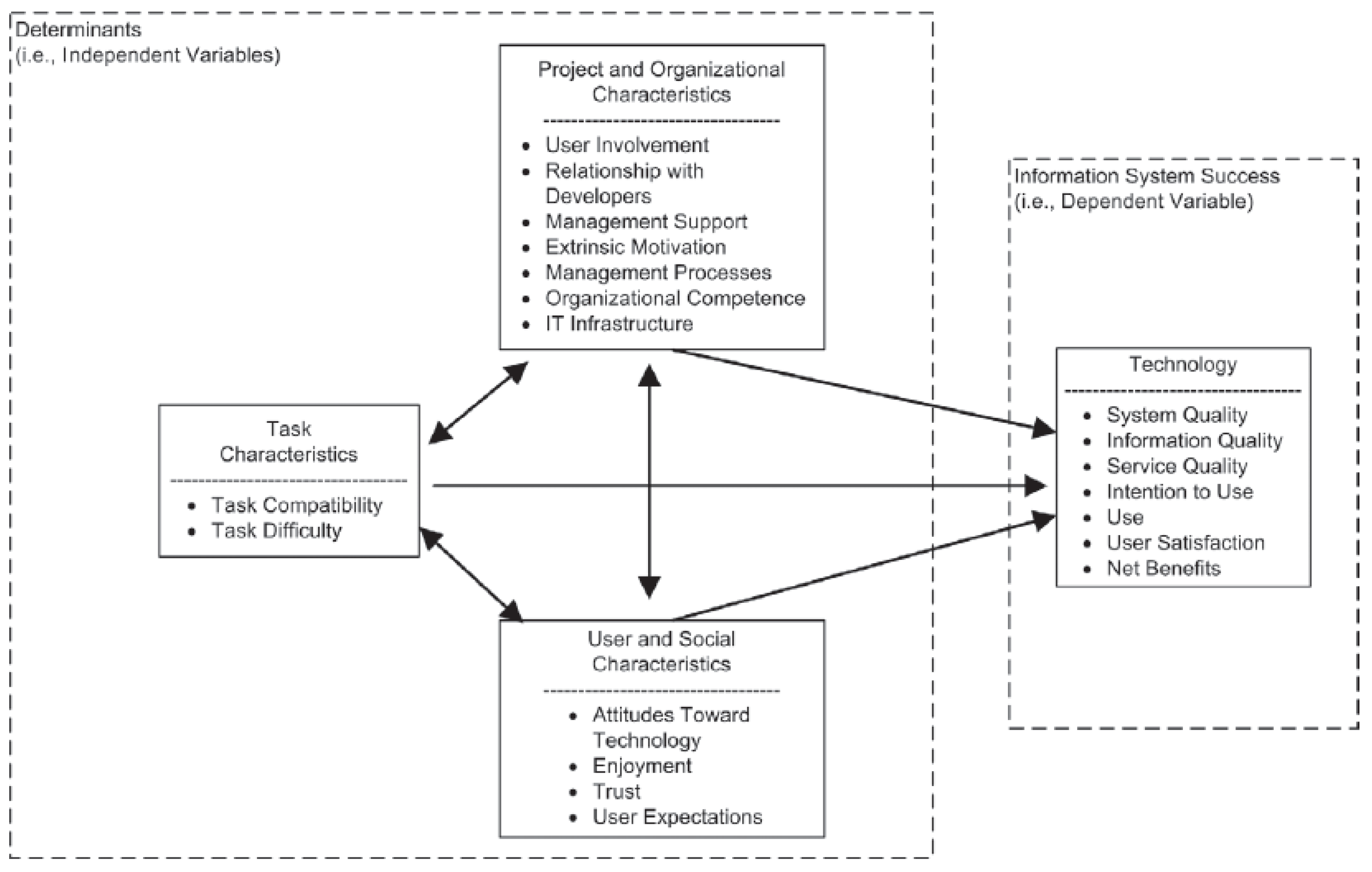
2.3. Dashboard Applications and Knowledge Gaps in the Realm of Knowledge Repositories

Web-based data dashboards are an excellent source of data visualization from a business continuity perspective. While they can be used to present visually appealing facets of the data, the underlying need to use dashboards lies in affording the ability to make necessary time-sensitive interventions to alter the existing course of business actions. For instance, as mentioned in the previous section, web-based dashboards are currently being used in various walks of life such as healthcare, education, and business analytics. Additionally, from an organizational perspective, strategic dashboards have also been developed for decision-making in Agile software development primarily for product quality assessment visualization [33].
Project teams, especially in non-repetitive work such as the construction industry, are inherently dynamic in nature and some project teams also witness team turnover during the course of the project. Moreover, there could be some external factors beyond the control of the team such as COVID-19, exacerbating the already complex project conditions, which can lead to unfavorable project outcomes [34]. Therefore, it is imperative that there is adequate and periodical communication between various project teams to monitor the project progress and to ensure the project is progressing as planned. To date, knowledge dissemination on construction projects have been carried out using Building Information Modeling [35,36], knowledge maps [37,38], and web-based ontologies [39,40,41]. While these mechanisms are effective towards knowledge dissemination in project teams during the tenure of construction, there is a need to provide proactive means to visualize data within knowledge repositories to monitor the repository’s progress, thereby ensuring its longevity long after projects are completed, and to apply past knowledge to future projects. Moreover, it is also important to keep the end-users engaged with the knowledge repositories to allow for high-quality inputs, and failure to do so can lead to the repositories being rendered obsolete [21]. In this regard, there is currently no extant literature on creating strategic dashboards for knowledge repository systems; strategic dashboards are effective tools to visualize pertinent data from available datasets based on the organizational needs. This research fills this knowledge gap by describing an effort to create strategic dashboards for the NCDOT’s CLEAR program and can act as a template for future research in this direction. Moreover, this research can also be beneficial for future researchers intending to develop meaningful data visualizations for knowledge repositories in other walks of life such as healthcare, education, banking, among others.

2.4. Previous Work Regarding Dashboards at Other Organizations and Departments of Transportation

The use of data dashboards is widespread among organizations, both public and private, with the right mindset; these organizations aim to stay competitive, tap into historical trends and make informed decisions [42]. Designing the right dashboard based on the end-user’s needs is of paramount importance. In addition, the ability to record and store data demands that the database be secure and in place for the dashboard to retrieve data from it. Depending on the needs and sophistication required, dashboards can be implemented either at an organizational level or at specific agency levels. One of the first dashboards to be implemented at the organizational level was an information technology (IT) dashboard used by the U.S. Office of Management and Budget. This IT dashboard has been used extensively to streamline IT investments in federal agencies [43]. Agency-specific federal dashboards include the Medicare Inpatient Hospital dashboard and the Medicare Prescription Drug Benefit dashboard. Both dashboards are operated by the Centers for Medicare and Medicaid Services and are used to monitor statistics that relate to claims and drug costs, respectively. The federal government also operates dashboards that are directed towards maintaining and disseminating transparent federal financial data through its websites, such as USAspending.gov and Recovery.gov. While the former was launched by the Federal Funding Accountability and Transparency Act in 2007, the latter was mandated by the American Recovery and Reinvestment Act of 2009. These dashboards are publicly available to track the funds being spent by the federal government to achieve enhanced financial transparency and thereby build trust among citizens.
Most US DOTs also have started using data dashboards to monitor key project metrics. For instance, the Bureau of Transportation Statistics, which is part of the US DOT, operates a real-time updated database called the National Transportation Atlas Database (NTAD). The NTAD consists of nationwide geographic databases of transportation facilities, transportation networks, and associated infrastructure [44] and is used at state, regional, and local levels within a geographic information system (GIS). In fact, to make data accessible to the public, the US DOT annually releases a Pocket Guide to Transportation app [45] that can be downloaded via Apple’s App Store [46] or Google’s Play Store [47]. This app contains real-time information about freight, air, pavement, and bridge conditions across all U.S. states, to name a few examples. Additionally, as the information is displayed in real time, the public can benefit from accessing such timely information to make informed decisions.
A few other US state DOTs that operate real-time data dashboards include Arkansas, California, Michigan, Montana, North Carolina, Oklahoma, Puerto Rico, and Utah DOTs. Most state DOTs use ArcGIS to create, update, and maintain their dashboards in real time to provide information about projects, agency structures, and GIS layers. For example, the Arkansas Crash Analytics Tool [48] visualizes and maps crash analytics data to identify, evaluate, and improve safety conditions at potential crash sites and address dangerous roadway conditions. This tool is open access to the public and enables users to find crash data easily in real time without typing a computer query. The Michigan DOT (MDOT) [49] currently operates two dashboards designed in ArcGIS to display bridge conditions across the state and the lifetime of permits for billboards on the MDOT’s right-of-way as well as a project management dashboard that tracks the MDOT’s dashboard usage. Although the first two dashboards are open access to the public, the third is internal-only and is used to monitor the usage of the other two dashboards. Similarly, the Montana, Oklahoma, and Puerto Rico DOTs have dashboards that were created and are operated and maintained using ArcGIS to track relevant aspects of transportation. All these dashboards are agency-operated, mostly by the respective DOT’s GIS division. In addition, the California DOT, Caltrans, developed a dashboard that is specific to short-term operational performance measures and is aimed at improving detector health [50]. Similarly, the Utah DOT [51] developed a web-based dashboard using PowerBI that displays organization-wide innovation and potential dollar amounts to be saved through these innovations.
The current research describes an effort to create real-time web-based data dashboards using Tableau to monitor the status of the NCDOT’s knowledge management program, CLEAR. These dashboards will help the NCDOT’s Value Management Office (VMO), the gatekeeper of CLEAR, to monitor and take appropriate steps towards end-user engagement and to encourage the units and divisions across the NCDOT to fully utilize CLEAR, thereby leading to organizational innovation. Appendix A explains the next steps for submissions within the CLEAR portal focusing on utilities claims. It also details how CLEAR can help achieve organizational innovation through improved technical workflow documents such as contract language and specifications manuals.

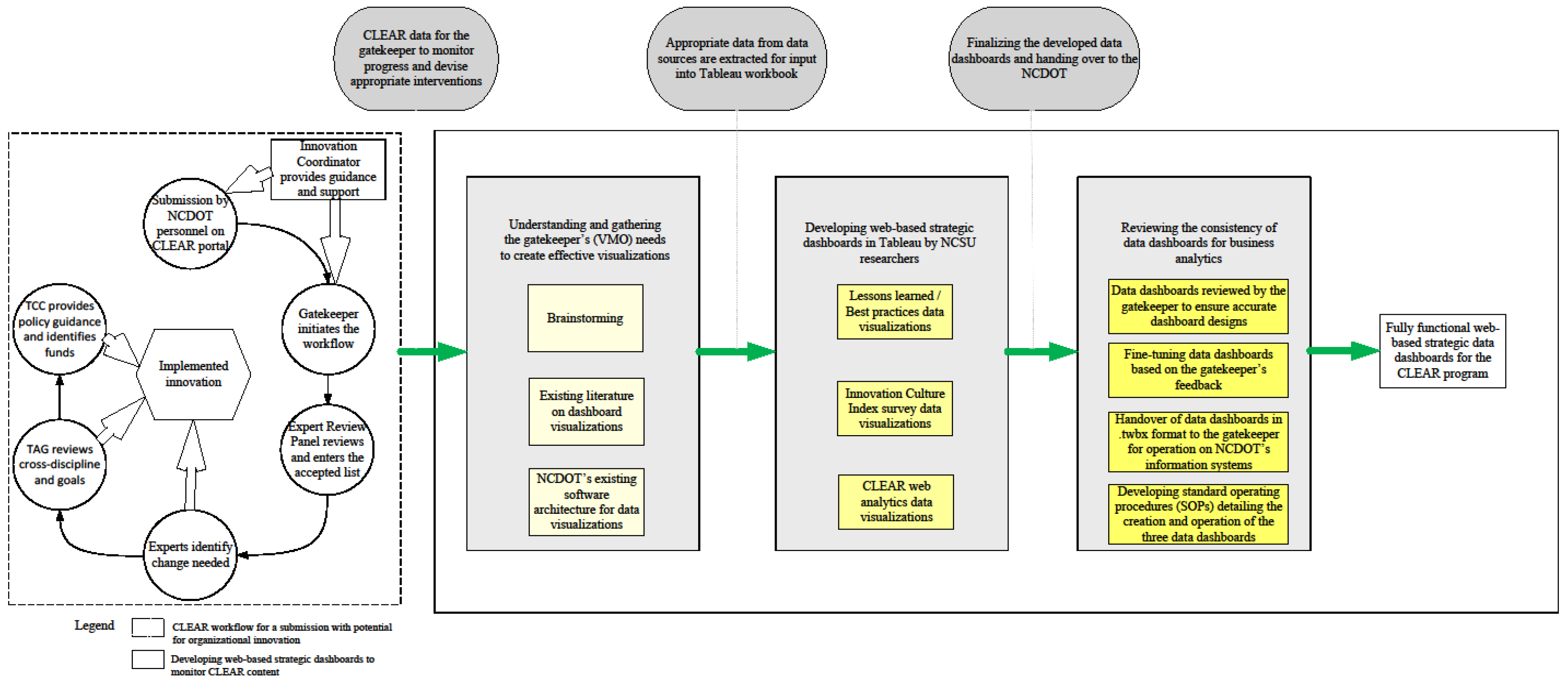
3. Materials and Methods

The North Carolina Department of Transportation (NCDOT) commissioned its new knowledge repository called Communicate Lessons, Exchange Advice, Record (CLEAR) in the fall of 2019. This system allows authorized NCDOT end-users to store and retrieve knowledge within the CLEAR database. CLEAR was developed under the aegis of the NCDOT’s Value Management Office (VMO). However, as the gatekeeper, the VMO felt the need for a data dashboard to monitor the progress and quality of the content being entered in CLEAR capable of displaying dynamic visualizations from real-time data. Since the success of CLEAR relies heavily on the buy-in from its end-users, the VMO decided to create the dashboard. They engaged the NCSU researchers, who had been involved in the development of CLEAR from its inception.
Figure 3 describes the research methodology adopted for developing the web-based strategic data dashboards for the CLEAR program. The left side of the figure illustrates the workflow for a CLEAR submission towards the path of implemented innovation [23]. The data stored within the CLEAR repository is a valuable resource for enabling effective visual representations of the end-user trends of using the CLEAR program as a part of their routine work. This is critical to monitor from an organizational perspective and ties in with the research question of this article. The NCSU research team gathered dashboard requirements from the VMO to understand their needs, enabling time-critical interventions to ensure CLEAR’s progress and effectively monitor end-user trends. This was achieved iteratively by brainstorming dashboard designs, reviewing the literature on creating effective visualizations for decision-making, and understanding NCDOT’s software architecture to host the final dashboard files. Possible options for creating the dashboard included Tableau, Power BI, and R Shiny. However, R Shiny would require significant coding knowledge to create and maintain the dashboard in the long term. Based on the NCDOT’s software capabilities and after consulting with the NC Department of Information Technology (NC DIT), the researchers selected Tableau as the preferred tool. Based on the needs statement, the research team also developed a list of visualizations along with the data sources required to generate the visualizations. The NCSU research team determined that three dashboards were needed. The dashboards are described as follows, with the data source provided in parentheses:
  • Information about lessons learned and best practices entered in CLEAR (extracted from Sharepoint in. xlsx format);
  • Innovation Culture Index information for the NCDOT personnel (Innovation Culture Index survey data);
  • Website analytics to monitor the usage of CLEAR webpages by the end-users (provided by the NC DIT).
In compliance with the NCSU’s IRB guidelines, no personally identifiable information was collected or stored for this study, ensuring participant anonymity. While the gatekeeper has access to identifiable entries submitted via the internal-only CLEAR portal, this access supports necessary follow-up and potential adjustments to standard workflow processes. The controlled, internal nature of the CLEAR portal justifies the limited identifiability by balancing privacy considerations with the practical need for continuous improvement. The NCSU research team developed the three data dashboards using Tableau Desktop, which provided free annual licenses for the NCSU students, allowing installation on up to two systems per user. The team shared its progress regularly in monthly meetings with VMO personnel to obtain necessary feedback and fine-tune the dashboards based on the VMO’s suggestions. Finally, the research team handed over all the Tableau Workbook files in twb format to the VMO. This included all the data sources that powered the visualizations to ensure they functioned seamlessly. The next section provides details about the three dashboards as well as their importance to the NCDOT.

4. Results

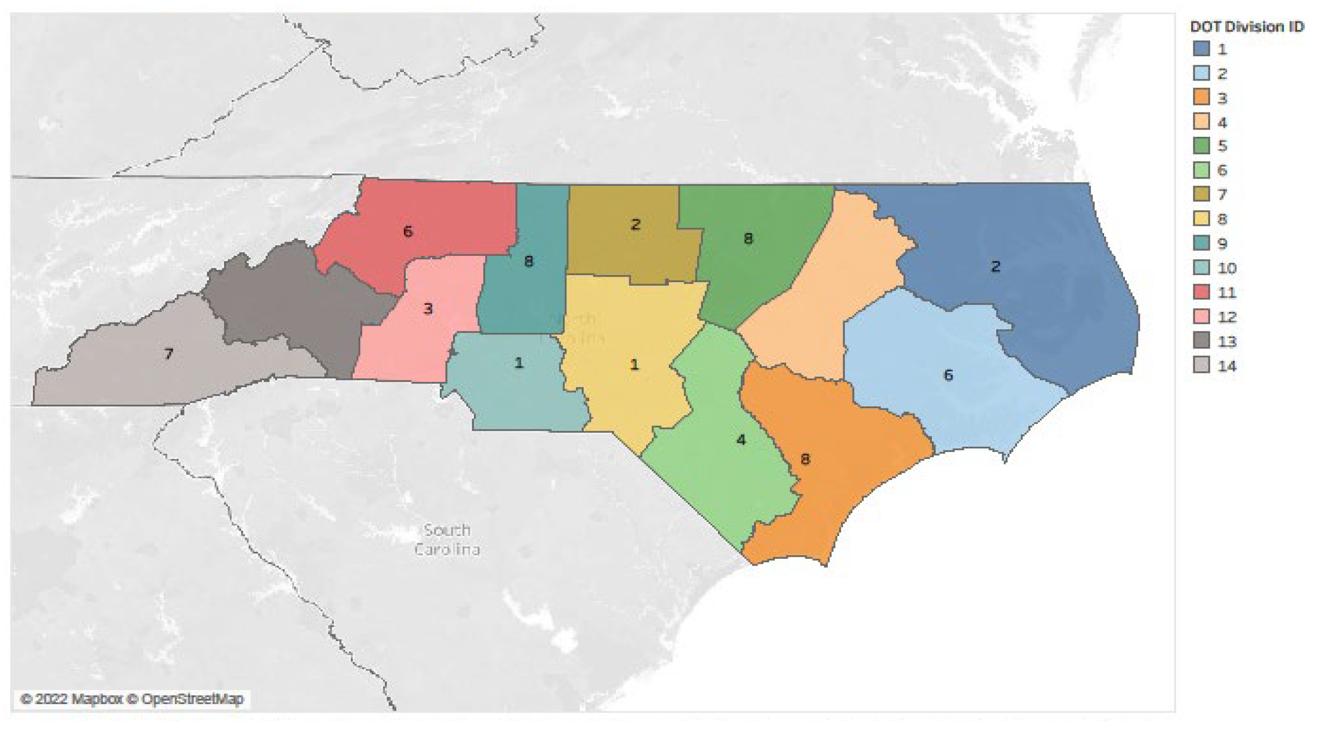
4.1. Data Dashboards for the CLEAR Program

This paper describes an effort to develop three data dashboards specifically for the NCDOT’s Value Management Unit to monitor key components to help ensure the success of the CLEAR program. These dashboards focus on three primary areas critical for CLEAR’s ongoing success. These areas include the following: lessons learned and best practices entered within the CLEAR database; the NCDOT’s organizational culture and end-users’ motivation towards innovation; and website analytics to track end-user usage trends of the CLEAR program. Since all the data within the CLEAR database reside in a Microsoft Access back-end, the gatekeeper can pull this information directly into Microsoft Excel format, which can then be imported into Tableau after necessary data cleaning. Additionally, this functionality provides the gatekeeper with an option to dynamically update the visualizations in real time based on the periodic updates within the CLEAR database.

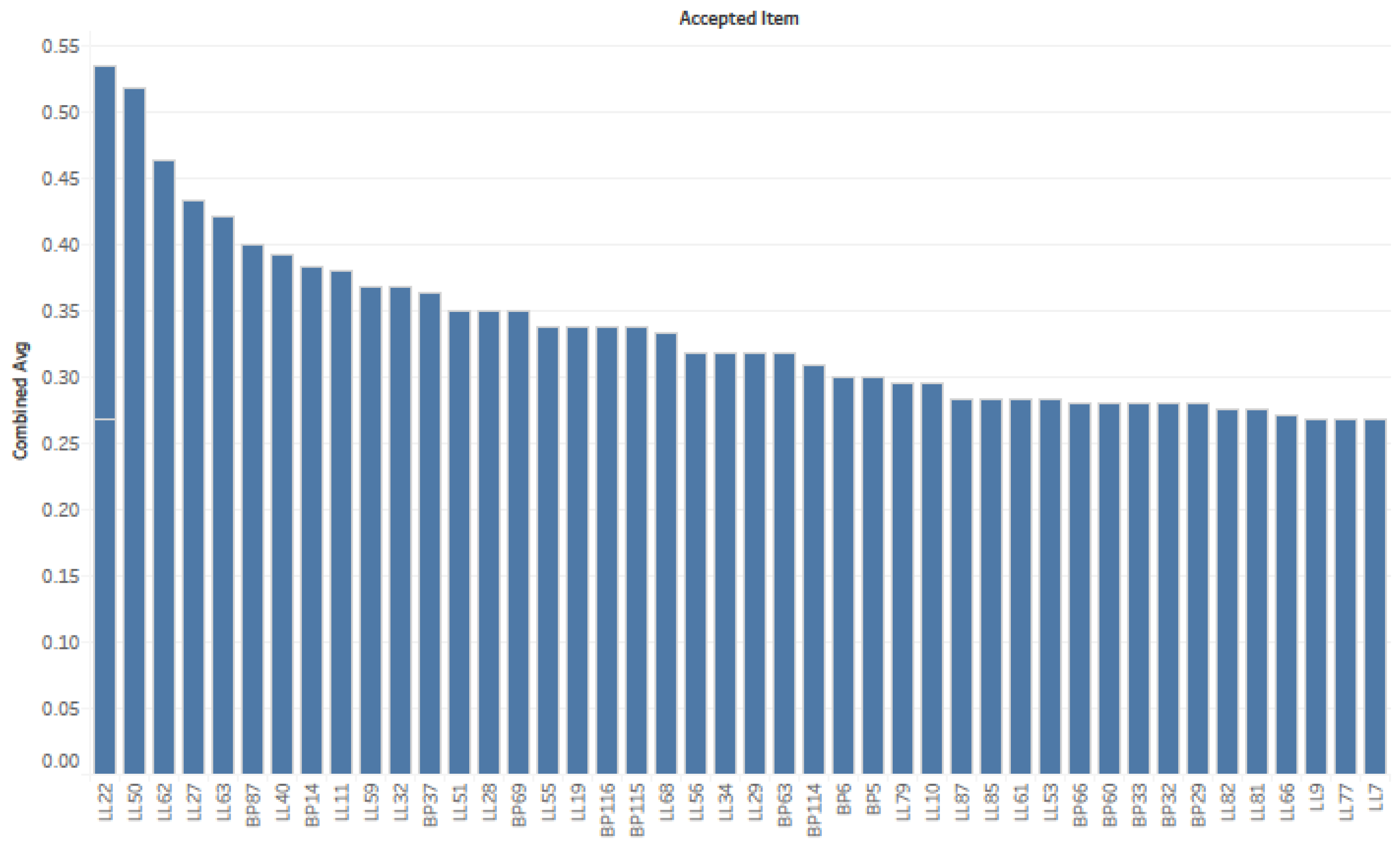
4.1.1. Lessons Learned/Best Practices Dashboard

In this section, we describe the visualizations pertaining to the lessons learned/best practices information obtained from the CLEAR database. The text data were extracted using SharePoint and stored in Microsoft Excel format.
Figure 4 shows the number of lessons learned submissions received within the CLEAR database from all the 14 NCDOT divisions. The gatekeeper can toggle to visualize either the lessons learned or best practices data separately, or a combined dataset containing both. An open-source JSON file containing the NCDOT division boundaries was added to the Tableau data source to represent the boundary separations between any two NCDOT divisions. Map charts are an excellent source to visualize when geographic content in the data is important [52]. Through this map chart, the gatekeeper can keep track of the number of submissions received from each of the 14 NCDOT divisions in its entirety or based on a specific date range. This will enable the gatekeeper to identify the high- and low-performing divisions to design appropriate training sessions for those divisions with a low number of entries. Figure 4 reveals there are two divisions of the 14 that are yet to record a single entry as these two divisions do not have a number displayed.
Figure 5 shows the ‘Benefit Ratings’ for the lessons learned and best practices within CLEAR. This visualization ranks the entries based on the relative benefit to the NCDOT and according to fulfilling certain criteria as follows. To calculate the return-on-investment for a research product, the NCDOT Office of Research and Innovation has set forth four categories and multiple subcategories, as presented in Table 2. The NCSU research team used a binary rating system to allow the gatekeeper to rank each entry with a 1 or 0 based on whether the entry is related to the subcategory. For instance, as shown in Table 2, the hypothetical entry relates to time savings but not to accuracy/decision within the Operations and Maintenance/Business Operations category. Therefore, the entry was assigned values of 1 and 0 for time savings and accuracy/decision, respectively. Thus, for this hypothetical example, the CLEAR entry would have received an overall rating of 6/15 = 0.40 in the ‘Combined Avg’ section of the dashboard and a rating of 2/3 = 0.67 for the Operations and Maintenance/Business Operations category, with 2/4 = 0.50 for the Safety category, 1/3 = 0.33 for the Monetary category, and 1/5 = 0.2 for the Knowledge Gained category.
In addition to the visualization shown in Figure 5, the gatekeeper is also able to view the impact of the submissions based on each of the four categories. This enables the gatekeeper to note the most impactful entries at a macro- as well as a micro-level detail. This information could prove to be useful when devising appropriate interventions for any sub-discipline (such as utilities or right-of-way) based on consistent high impact ratings. A notable intervention could be amending the existing NCDOT specifications manuals based on a greater number of consistently high-ranked impactful submissions within the CLEAR database over a period of time.
Figure 6 shows the status of CLEAR entries at each stage of the innovation implementation path. The various stages for each CLEAR entry are (in order) Review, Vet, Evaluate, and Implement. The gatekeeper can monitor the status of each entry and its relative position in terms of achieving acceptance as a CLEAR submission and its implementation as an internal innovation. The ultimate goal of this knowledge repository is its implementation as an internal innovation. These visualizations will help the gatekeeper to track the entries in CLEAR and take necessary steps to encourage unit/division personnel to submit their lessons and best practices, thereby yielding more high-quality entries.

4.1.2. Innovation Culture Index Data Dashboard

The ultimate goal of CLEAR is to promote and encourage internal organizational innovation within the NCDOT. In addition to a favorable upper management support and organizational culture, end-user motivations and inclination towards contributing to the knowledge systems play an important role in the success of organizational knowledge repositories [10,12,14]. Monitoring the trends associated with these end-user motivations can help in gauging the personnel’s perceptions of innovation culture and knowledge sharing over a period of time [53]. To this end, the NCSU research team developed a short anonymous survey for the NCDOT personnel to gauge their current levels of perception towards the culture of innovation and knowledge sharing. The survey contained 22 questions, most of which used a Likert scale with ratings from 1 (low) to 5 (high). The questions were designed to gauge the end-user’s perceptions towards innovation, incentivization, and knowledge sharing among team members and with other team members. Using the set of visualizations developed using this survey data, the gatekeeper can keep track of the mean values of the Likert-scale-based questions to identify the top three and the bottom three ranked questions with the highest and lowest mean responses, respectively. The gatekeeper can then devise appropriate strategies such as training exercises and innovation challenges to enhance the personnel’s motivation towards bringing about internal organizational innovation through CLEAR.
From the survey data results, a total of 292 valid responses were received in entirety. The NCSU research team then developed dashboard visualizations for the Likert-scale-based questions, mostly for single questions, with the mean values of the responses indicated by a line on the visuals. However, for enhanced visual capabilities and aggregating the results from similar questions, the team also prepared comprehensive and interactive visuals in Tableau [54], as shown in Figure 7. In addition to reducing the total overall numbers of visualization, the visuals in Figure 7 help the gatekeeper to focus specifically on a particular set of questions and derive appropriate insights from such comprehensive visuals. In the particular example of Figure 7, the gatekeeper visualizes the number of respondents based on questions 18, 19, and 20, which relate to working in and managing teams and the amount of time spent in the field and office.
Note that, owing to privacy and ethical issues, as outlined by the Institutional Review Board at NCSU, the entire dashboard cannot be presented here, but the reader is encouraged to contact the gatekeeper for more information if desired.

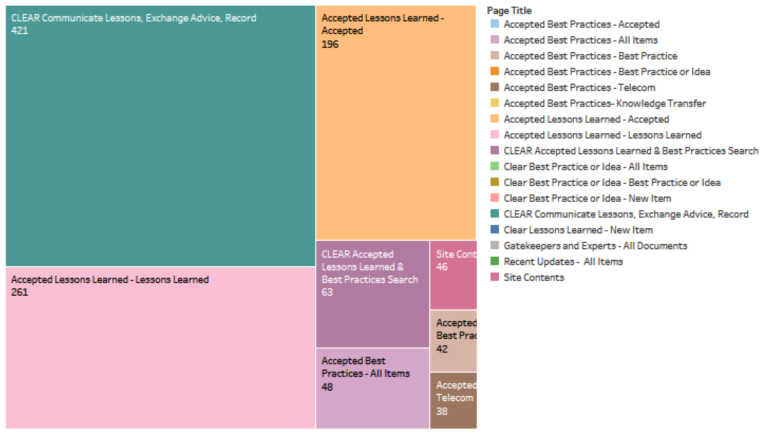
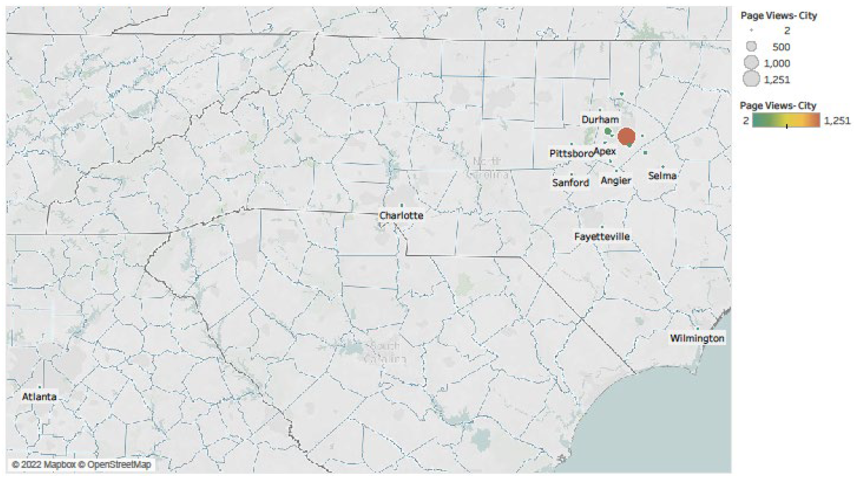
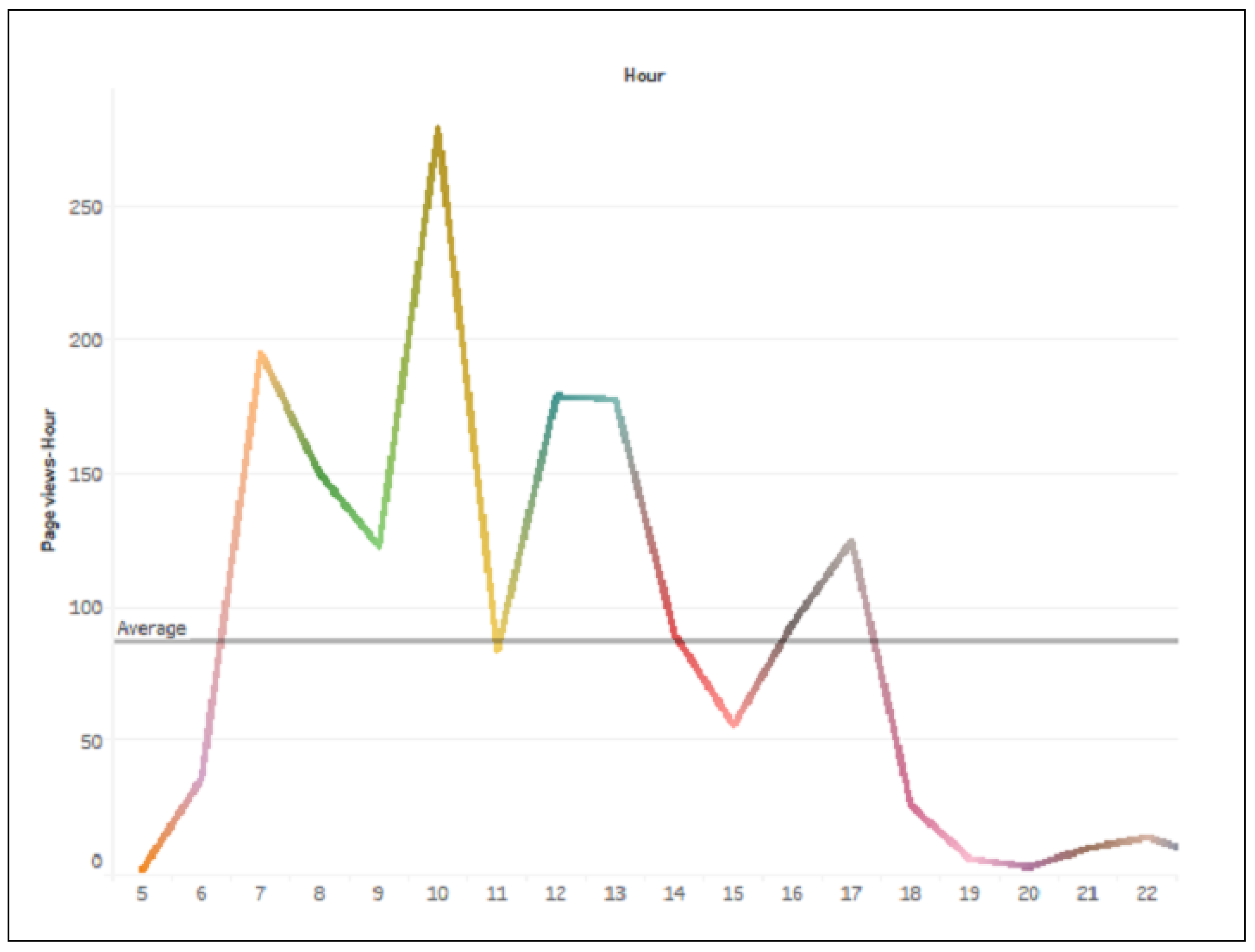
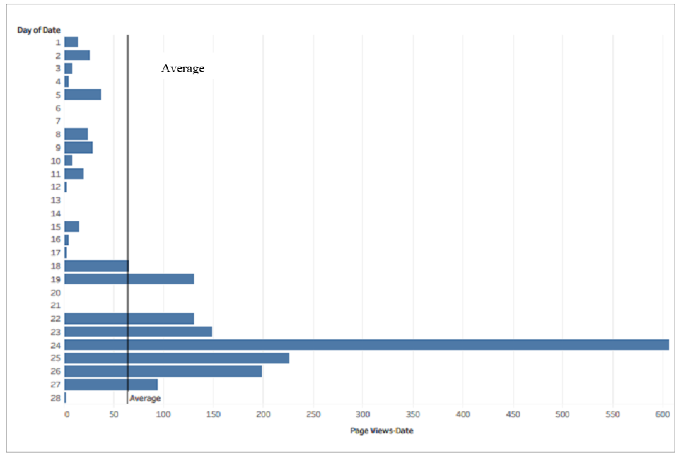
4.1.3. Website Analytics Dashboard

CLEAR is a web-based knowledge repository which enables the NCDOT to monitor the spatial and temporal aspects of the end-user website traffic. Monthly data pertaining to CLEAR website usage were obtained from the North Carolina Department of Information Technology. The data, in a portable document format (pdf), included the number of visits to various CLEAR pages, time of the day, and location of access. The data were then converted into Microsoft Excel format before loading them into Tableau. Various data dashboard visualizations were created using website traffic data to display the end-user activity of CLEAR webpages, enabling the gatekeeper to apply any necessary interventions. For instance, Figure 8 shows a Treemap visualization [55], which is appropriate to show the relative sizes of CLEAR website pages visited by using rectangular boxes proportional in size. This size difference can make it easy for the gatekeeper to identify webpages relating to a topic or keyword being frequently searched by the end-users.
A deeper analysis can reveal trending topics over time, reflecting end-users’ evolving appetite for specific knowledge areas. These insights can guide organizational changes, such as revisions to specifications manuals. Figure 9 displays the locations from which end-users have most accessed the CLEAR portal. The size of the circle is directly proportional to the number of hits from a location. As can be seen, Raleigh witnessed the maximum number of end-users accessing content from CLEAR. Figure 10 shows the mean hourly usage of the CLEAR website data. As shown, the maximum website traffic is recorded between 9 AM and 10 AM. Thus, this window would be an appropriate time for the gatekeeper to upload any relevant files for end-users to access to maximize viewership. Conversely, 3 PM has the lowest traffic during regular work hours, which makes it a good time for the gatekeeper to perform any necessary cleaning or modifications to the CLEAR database. Figure 11 shows the webpages that are most frequently visited based on the day of the month (e.g., 24 February has the highest number of viewers in February). This series of dashboard visualizations mentioned above allows the gatekeeper to understand end-user trends from a spatial-temporal perspective. It also helps identify units and divisions with the low participation, enabling targeted outreach to increase the input of quality content for CLEAR.

4.2. Training Materials

Amid ongoing personnel turnover at NCDOT, documenting the full process of creating and implementing the three data dashboards is both necessary and a valuable organizational practice. Even the Value Management Office (VMO), which is also the gatekeeper, has witnessed personnel turnover in the past couple of years. Therefore, to ensure business continuity relating to the dashboard operations, the NCSU research team prepared a Microsoft Word document of Standard Operating Procedures that lists the various steps for the gatekeeper to load data files and create visualizations in Tableau. This document serves as a valuable training resource for gatekeeper personnel, including Tableau newcomers, offering a clear step-by-step guide that supports ease-of-use, thereby saving time and costs. Thus, this document acts as a reference for extracting insights from the Tableau visualizations.

5. Discussion

Most organizations are currently facing turnover, and the ongoing COVID-19 pandemic has exacerbated this issue. Additionally, more than 40% of the current construction workforce in the US will be retirement eligible within the next decade. This highlights the challenge of maintaining a high-quality construction workforce to ensure project success [56]. Team personnel gain valuable knowledge in the form of experience over their years of professional lives, and this knowledge is wasted if not documented properly. While knowledge repositories have been useful initially in providing means to store and document data, the extant literature shows that most such repositories have become obsolete due to forsaking by the end-users. Therefore, it is imperative to monitor the progress and status of content within knowledge repositories.
Knowledge is a vital strategic resource, and repositories serve as effective tools for storing and retrieving past insights to inform and improve future project execution. However, end-users, in addition to the upper management support, play a critical role in ensuring that these knowledge repositories operate at their full and intended potential [12,21].
This paper presents a novel research direction using strategic dashboards to visualize and monitor knowledge repositories, ensuring their progress and long-term success. Most of the extant literature regarding the use of such robust visualization tools for construction projects focuses on improving communication among units by visualizing project control data using Building Information Modeling (BIM) [57,58,59,60]. Moreover, knowledge dissemination on construction projects has also been carried out using other techniques such as knowledge maps [37,38] and web-based ontologies [39,40,41]. While these techniques offer effective solutions towards project or organizational knowledge dissemination, they lead to complexities in terms of end-users being competent in fully reaping benefits from such techniques. Moreover, not everyone within the team may be skilled in using these techniques, especially if it is not within the purview of their routine work. This increases the risk of the techniques being abandoned or sidelined, which ultimately jeopardizes the effective knowledge dissemination process.
The contribution of this paper is twofold. First, the strategic data dashboards help monitor the status and quality of the content being input and used from knowledge repositories. The data used in these dashboards are predominantly in textual format. Previous research explored the use of data visualizations to draw insights from data in text format in the context of improving learning outcomes in the field of learning analytics [61] and program evaluation [62]. While the usage of the data dashboards used in the current research is novel in the realm of knowledge repositories and knowledge sharing, it lends credibility to previous research performed in the area of knowledge management that emphasizes the need of continuous end-user participation and strong organizational culture for implementing successful information systems [12,20]. Moreover, this research also reaffirms the effect of having robust knowledge management systems to achieve and enhance internal organizational innovation, which ultimately leads to improved workflow processes and helps maintain market competitiveness by institutionalizing knowledge [4,19,63].
Second, this paper presents three data dashboards to display data pertaining to three critical barriers to the success of epistemological information systems. These barriers relate to the following: (1) end-user involvement, (2) end-user motivation and intention towards innovation, and (3) end-user usage for the successful implementation of knowledge repositories [20]. The three data dashboards relate to the lessons learned and best practices, innovation culture index, and website analytics, respectively. It is anticipated that developing these data dashboards will address concerns relating to the continued usage of the repository.
While the dashboards from this research support strategic decision-making processes for the NCDOT in the long run, it is envisioned that these dashboards will help bring about organizational innovation, thereby making NCDOT more competitive compared to other public agencies in the US. Moreover, these dashboards can help the knowledge repositories maintain their robustness and fulfill their intended purpose of disseminating knowledge over the foreseeable future by mitigating uncertainties arising out of technology or workforce capabilities. From a workforce development standpoint, dashboards have been successfully used to support decision-making in the areas of software development [33,64] and monitoring student learning performance [65,66,67]. Data dashboards have been used to disseminate knowledge in specific construction management-related aspects such as safety and hazard recognition [68], construction planning [69], and construction performance assessments [70]. This research addresses a major gap in the extant literature by paving the way to create strategic dashboards for knowledge repositories to ensure their durability and reliability. Finally, this research paves the way for using effective data visualizations in a few other critical areas of daily life, such as supporting knowledge sharing between clinical departments in hospitals or enabling real-time horizon scanning of constantly evolving clinical guidelines. In the educational setting, such knowledge visualizations can be used to monitor student learning insights to improve student learning outcomes and devise effective learning strategies. In the financial sector, these knowledge-powered visualizations can help in monitoring regulatory updates, market trend analysis, and client risk profile management. These cross-disciplinary approaches demonstrate the potential of effectively using data visualizations for knowledge repositories to ensure their long-term success.

5.1. Current Trends in the CLEAR Program

As discussed in the previous sections, the long-term sustainability of knowledge repositories is vital to their effectiveness. This study demonstrates the critical role of data dashboards in ensuring the sustained success of the CLEAR program by analyzing longitudinal trends throughout its operational period. Table 3 presents the number of approved CLEAR entries from the first quarter of 2021 (commencement of data recording) through the second quarter of 2025 (current quarter). The data reveal that the CLEAR program has maintained consistent contribution rates over this four-year period, indicating sustained user engagement and facilitating the integration of institutional knowledge into daily operational practices. Notably, this consistency persisted despite significant organizational turnover within both the NCDOT and the Value Management Unit, demonstrating the robust design and effectiveness of the data dashboard framework in maintaining program continuity.
Furthermore, the utility claims case study presented in Appendix A illustrates how the CLEAR program effectively disseminates critical knowledge addressing major utility-related challenges encountered in the NCDOT projects. The demonstrated success of the NCDOT’s CLEAR program provides a replicable framework for other state departments of transportation, federal agencies, and international organizations seeking to implement proactive knowledge management systems. These data dashboards offer real-time performance monitoring capabilities that enable timely interventions, when necessary, thereby ensuring the long-term viability of knowledge repositories. This enhanced accessibility ultimately empowers stakeholders to leverage institutional knowledge with confidence and effectiveness, thereby spurring organizational innovation.

5.2. Limitations and Future Scope

The data dashboards described in this paper were developed for CLEAR’s gatekeeper. In other words, these dashboards were developed for a sole but important stakeholder of the CLEAR program at a macro level. Future efforts should focus on understanding the needs of developing dashboard sets for another important group of CLEAR stakeholders—the end-users. This future effort of developing data visualizations for the end-users must involve a bigger effort in capturing the needs of the end-users for effectively designing the end-user dashboards. This will ensure that the end-users are able to view and monitor the progress of the repository in real time as well as staying motivated to contribute to the long-term success of the knowledge repository. By making the end-users aware of the progress within the CLEAR repository, this can generate motivation to contribute an increased number of high-quality content at a micro or an individual level [71]. Additionally, the data dashboards designs presented in this paper were continuously evaluated by the NCSU research team in consultation with the NCDOT Value Management Office (VMO). The VMO is a small group of about 3–4 team members, and this led to the continuous validation of the dashboards without the need for a separate questionnaire; the latter would induce bias in the responses. However, a formal and more rigorous validation should be adopted for future dashboards developed specifically for the end-users.

6. Conclusions

Organizations have started realizing the importance of effective knowledge management repositories to store and retrieve knowledge from past projects to be applied to future projects. Technology plays a vital role in ensuring that such knowledge repositories are being used effectively by end-users to maximize the potential of knowledge management. Moreover, it is important that the end-users can fully utilize the knowledge repositories to apply past knowledge to future projects. This leads to closed communication loops among all project lifecycle units such as design, construction, and maintenance. Within the North Carolina Department of Transportation (NCDOT), previously, no formal mechanism existed for end-users to share lessons learned and best practices from their routine work, leading to numerous claims and supplemental agreements. The Communicate Lessons, Exchange Advice, Record (CLEAR) knowledge repository is aimed at addressing the issue of lacking communication by allowing end-users to store and retrieve knowledge. Furthermore, the research team also found that previous knowledge repositories went defunct due to the want of end-users to embrace such repositories, thereby rendering the entire effort of designing and developing the knowledge repositories as a waste of time and resources. Therefore, it is important that the gatekeeper can maintain track of the practicalities within the CLEAR program to execute appropriate interventions for ensuring high-quality inputs.
Data dashboards are effective data visualization tools for displaying actionable data to support necessary timely interventions. In this paper, we present web-based strategic dashboards for the gatekeeper of North Carolina Department of Transportation’s new knowledge repository named Communicate Lessons, Exchange Advice, Record (CLEAR). Within the CLEAR repository, end-users can enter knowledge gained on projects and also search for relevant content within the repository to be used on future projects to avoid repeat mistakes. A key area of concern within the NCDOT involves utility-related claims, which are also a persistent challenge for many other state Departments of Transportation (DOTs) across the United States. Further analysis has shown that a significant portion of these issues stem from recurring errors caused by improper or incomplete communication. Within the NCDOT, approximately 90% of the monitored projects had at least one utility-related claim, resulting in average cost increases of around 2.4% and schedule delays of approximately 70 days. While the CLEAR program facilitates closed feedback loops and improves communication across units, its effectiveness depends on active engagement from end-users. Their ongoing participation is essential to warrant the continuous input of high-quality content, thereby ensuring CLEAR’s long-term success.
The underlying motivation of using strategic dashboards in this novel effort is to ensure CLEAR’s longevity by enabling the gatekeeper to take proactive measures in maintaining favorable end-user attitudes as a part of end-users’ routine work. The gatekeeper will be able to keep track of the CLEAR program using three strategic web dashboards from three data sources: (1) lessons learned and best practices data from the CLEAR database, (2) end-user motivations towards organizational innovation from the Innovation Culture Index (ICI) survey data, and (3) spatial-temporal aspects of end-users’ webpage analytics displaying trends of usage of content within the CLEAR program. Moreover, the data dashboard provides key insights into all 14 NCDOT divisions, supporting the gatekeeper in effectively managing the CLEAR program. These visualizations are meant to aid the gatekeeper in devising appropriate strategies to ensure the continuous input of high-quality knowledge and to develop necessary training materials to keep the end-users engaged with the CLEAR program. This study demonstrates the effectiveness of data dashboards through the analysis of consistent approval trends for CLEAR entries throughout the program’s operational lifespan. These findings provide a replicable framework for organizations seeking to implement similar dashboard systems to ensure the long-term sustainability of their knowledge repositories. These data dashboards are intended to serve as a standard guide for developing and sustaining robust knowledge repositories in the future by making use of effective data visualizations.

Author Contributions

Conceptualization, S.B., C.E.F. and S.S.G.; data curation, S.S.G.; formal analysis, S.B. and S.S.G.; methodology, S.B., S.S.G. and E.J.J.; resources, C.E.F.; supervision, C.E.F. and E.J.J.; visualization, S.B. and S.S.G.; writing—original draft, S.B.; writing—review and editing, C.E.F. and E.J.J. All authors have read and agreed to the published version of the manuscript.

Funding

This research received no external funding.

Institutional Review Board Statement

Not applicable.

Data Availability Statement

Restrictions apply to the availability of these data. Data were obtained from the North Carolina Department of Transportation (NCDOT) and may be available from the corresponding author with the permission of the NCDOT.

Acknowledgments

The authors would like to thank Arnav Jhala, and Colin Potts, for their inputs to improve the quality of this article. The authors would also like to thank Alyson W. Tamer at the NCDOT’s Value Management Unit for her support and motivation. We express our thanks to Abdullah F. Alsharef, for performing the data analysis on the NCDOT claims data, which helped to tie-in the information with CLEAR. The authors are also grateful to the anonymous reviewers of this manuscript for their constructive feedback on improving the article’s quality. Finally, the article would not have been possible without the participation of the NCDOT end-users, and the authors are thankful for their participation in the CLEAR program.

Conflicts of Interest

Clare E. Fullerton was employed by Jacobs, and Sankalp S. Gaharwar was employed by Lexis Nexis. The remaining author declare that the research was conducted in the absence of any commercial or financial relationships that could be construed as a potential conflict of interest.

Appendix A

This appendix presents an example of a lessons learned experience to show how the North Carolina Department of Transportation (NCDOT) CLEAR (Communicate Lessons, Exchange Advice, Record) database can be used to improve the NCDOT knowledge base and lead to innovation by addressing a specific problem pertaining to utilities claims.
  • How did we identify this issue?
During the lessons learned data-gathering phase for the CLEAR database, the NCSU research team realized significant project concerns that relate to, for example, utilities not being moved within the agreed-upon timeframe. Unknown utilities often were discovered during construction, and other unexpected utilities conflicts led to claims and supplementary agreements that ultimately increased project costs and schedules.
  • What are some next steps to investigate an issue?
The NCDOT Value Management Office determined that next steps were needed to investigate this ongoing issue and requested further research to understand the actual cost and schedule impacts and to identify the root cause(s). The North Carolina State University (NCSU) research team performed a careful analysis of utilities claims data from 1996 through 2018. The NCSU team also carried out a literature review to understand how other state DOTs mitigate potential utilities issues on their projects. The team also solicited feedback from the current NCDOT personnel about ways that utilities-related issues are handled on a day-day basis. The data analysis revealed the following observations:
  • Approximately 90% of projects with utilities claims had one or two utilities-related claims.
  • Each division had at least 30 utility-related claims during the study period.
  • Smaller projects (up to $5 million) were most affected by utilities claims; roughly three out of four projects were affected by utilities claims.
  • Claims that pertain to utilities conflicts accounted for about 57% of all utilities-related schedule delays.
  • For the projects affected by utilities claims, project costs increased by about 2.4%, with schedule delays increased by 70 days on average.
Based on the literature review and discussions with the NCDOT personnel, the NCSU research team identified the following key mitigation strategies:
  • Communicating early and frequently with utilities providers in order to have a shared sense of responsibility (with the NCDOT) in relocating utilities.
  • Holding constructability reviews with utilities owners to minimize plan changes.
  • Exploring the possibility of imposing liquidated damages on utilities companies to ensure that they do not default on agreed-upon dates for utilities relocation.
  • Performing comprehensive subsurface investigations on all projects to avoid encountering buried utilities.
  • What can be done to implement this experience into a lesson learned or to make positive changes in the NCDOT?
The NCSU research team provided this information to the NCDOT utilities group for further action. This sharing of knowledge may lead to revising contract language that pertains to utilities providers and specifications to detect underlying utilities by ensuring that proper subsurface investigations are performed on all projects, thus turning the lessons learned into lessons remembered. These changes will allow the NCDOT to be more efficient and effective in their workflow processes and mitigate utilities-related claims in future projects. In this instance, the recommendation is for the NCDOT to consider establishing a Strategic Implementation Team to review the data and best practices from other states and pilot some new initiatives to work on this ongoing issue.

References

  1. Johns Hopkins. Coronavirus Resource Center. Available online: https://coronavirus.jhu.edu/ (accessed on 17 May 2025).
  2. UK Health Security Agency. How UKHSA’s COVID-19 Dashboard Worked During the Pandemic. 16 December 2021. Available online: https://ukhsa.blog.gov.uk/2021/12/16/what-does-covid-19-look-like-in-your-area/ (accessed on 17 May 2025).
  3. Field, E.; Dyda, A.; Hewett, M.; Weng, H.; Shi, J.; Curtis, S.; Law, C.; McHugh, L.; Sheel, M.; Moore, J.; et al. Development of the COVID-19 Real-Time Information System for Preparedness and Epidemic Response (CRISPER), Australia. Front. Public Health 2021, 9, 753493. [Google Scholar] [CrossRef] [PubMed]
  4. Laufer, A.; Denker, G.R.; Shenhar, A.J. Simultaneous management: The key to excellence in capital projects. Int. J. Proj. Manag. 1996, 14, 189–199. [Google Scholar] [CrossRef]
  5. Cristóbal, J.R.S.; Carral, L.; Diaz, E.; Fraguela, J.A.; Iglesias, G. Complexity and Project Management: A General Overview. Complexity 2018, 2018, 1–10. [Google Scholar] [CrossRef]
  6. Russell, J.S.; Jaselskis, E.J.; Lawrence, S.P. Continuous Assessment of Project Performance. J. Constr. Eng. Manag. 1997, 123, 64–71. [Google Scholar] [CrossRef]
  7. Parker, S.K.; Skitmore, R.M. Project Management Turnover: Causes and Effects on Project Performance. Int. J. Proj. Manag. 2005, 23, 205–214. [Google Scholar] [CrossRef]
  8. Wong, W.L.P.; Radcliffe, D.F. The Tacit Nature of Design Knowledge. Technol. Anal. Strateg. Manag. 2000, 12, 493–512. [Google Scholar] [CrossRef]
  9. Nonaka, I.; Takeuchi, H. The Knowledge-Creating Company: How Japanese Companies Create the Dynamics of Innovation; University of Illinois at Urbana-Champaign’s Academy for Entrepreneurial Leadership Historical Research Reference in Entrepreneurship; University of Illinois at Urbana-Champaign: Urbana-Champaign, IL, USA, 1995. [Google Scholar]
  10. Obeidat, B.Y.; Al-Suradi, M.M.; Masa’deh, R.E.; Tarhini, A. The Impact of Knowledge Management on Innovation: An Empirical Study on Jordanian Consultancy Firms. Manag. Res. Rev. 2016, 39, 1214–1238. [Google Scholar] [CrossRef]
  11. Smith, M.K. Michael Polanyi and Tacit Knowledge. 2003. Available online: https://infed.org/mobi/michael-polanyi-and-tacit-knowledge/ (accessed on 10 April 2021).
  12. Rezaei, F.; Khalilzadeh, M.; Soleimani, P. Factors Affecting Knowledge Management and Its Effect on Organizational Performance: Mediating the Role of Human Capital. Adv. Hum.-Comput. Interact. 2021, 2021, 8857572. [Google Scholar] [CrossRef]
  13. Singh, P.K. Knowledge Strategy, Sharing Behavior and Performance. Manag. Res. Rev. 2018, 41, 395–411. [Google Scholar] [CrossRef]
  14. Banerjee, S.; Alsharef, A.; Jaselskis, E.J.; Piratla, K.R. Review of Current Practices for Implementing Organization-Wide Knowledge Repositories. In Proceedings of the Construction Research Congress 2022, Arlington, VA, USA, 9–12 March 2022. [Google Scholar]
  15. Rowe, S.F. Applying lessons learned. In Proceedings of the PMI® Global Congress 2008—EMEA, St. Julian’s, Malta, 19 May 2008. [Google Scholar]
  16. Dülgerler, M.; Negri, M. Lessons (Really) Learned? How to Retain Project Knowledge and Avoid Recurring Nightmares: Knowledge Management and Lessons Learned. In Proceedings of the PMI® Global Congress 2016—EMEA, Barcelona, Spain, 9–11 May 2016. [Google Scholar]
  17. Wills, B. 5 Companies Examples with A+ Knowledge Management Skills. ProProfs. 20 December 2021. Available online: https://www.proprofskb.com/blog/top-companies-knowledge-management-skills/ (accessed on 1 July 2022).
  18. Vaghefi, I.; Lapointe, L.; Shahbaznezhad, H. A multilevel process view of organizational knowledge transfer: Enablers versus barriers. J. Manag. Anal. 2018, 5, 1–17. [Google Scholar] [CrossRef]
  19. Zahra, S.A.; George, G. Absorptive Capacity: A Review, Reconceptualization, and Extension. Acad. Manag. Rev. 2002, 27, 185–203. [Google Scholar] [CrossRef]
  20. Petter, S.; DeLone, W.; McLean, E.R. Information Systems Success: The Quest for the Independent Variables. J. Manag. Inf. Syst. 2013, 29, 7–62. [Google Scholar] [CrossRef]
  21. Ganopol, A.; Oglietti, M.; Ambrosino, A.; Patt, F.; Scott, A.; Hong, L.; Feldman, G. Lessons Learned: An Effective Approach to Avoid Repeating the Same Old Mistakes. J. Aerosp. Inf. Syst. 2017, 14, 483–492. [Google Scholar] [CrossRef]
  22. Banerjee, S.; Jaselskis, E.J.; Alsharef, A.F. Design For Six Sigma (DFSS) Approach for Creating CLEAR Lessons Learned Database. Period. Polytech. Archit. 2020, 51, 75–82. [Google Scholar] [CrossRef]
  23. Fullerton, C.E.; Tamer, A.W.; Banerjee, S.; Alsharef, A.; Jaselskis, E.J. Development of North Carolina Department of Transportation’s CLEAR Program for Enhanced Project Performance. Transp. Res. Rec. 2021, 2675, 222–234. [Google Scholar] [CrossRef]
  24. Mattern, S. Mission Control: A History of the Urban Dashboard. March 2015. Available online: https://placesjournal.org/article/mission-control-a-history-of-the-urban-dashboard/?cn-reloaded=1 (accessed on 19 June 2021).
  25. Nettleton, D. Incorporating Various Sources of Data and Information. In Commercial Data Mining; Nettleton, D., Ed.; Morgan Kaufmann: San Francisco, CA, USA, 2014; pp. 17–47. [Google Scholar]
  26. Tableau. Your Methodology to Becoming a Data-Driven Organization. 2021. Available online: https://www.tableau.com/learn/blueprint (accessed on 20 June 2021).
  27. Drucker, P.F. Knowledge-worker productivity: The biggest challenge. Calif. Manag. Rev. 1999, 41, 79–94. [Google Scholar] [CrossRef]
  28. Anumba, C.; Egbu, C.; Carrillo, P. Knowledge Management in Construction; Blackwell: Oxford, UK, 2005. [Google Scholar]
  29. Project Management Institute. A Guide to the Project Management Body of Knowledge (PMBOK Guide); Project Management Institute: Newton Square, PA, USA, 2017. [Google Scholar]
  30. El Khatib, M.; Al Jaberi, A.; Al Mahri, A. Benchmarking Projects’ “Lessons Learned” through Knowledge Management Systems: Case of an Oil Company. iBusiness 2021, 13, 1–17. [Google Scholar] [CrossRef]
  31. Bani-Hani, I.; Chowdhury, S.; Kurti, A. The Triadic Relationship of Sense-Making, Analytics, and Institutional Influences. Informatics 2022, 9, 3. [Google Scholar] [CrossRef]
  32. Durcevic, S. Make Sure You Know the Difference Between Strategic, Analytical, Operational and Tactical Dashboards. 22 July 2020. Available online: https://www.datapine.com/blog/strategic-operational-analytical-tactical-dashboards/ (accessed on 27 July 2021).
  33. López, L.; Manzano, M.; Gómez, C.; Oriol, M.; Farré, C.; Franch, X.; Martínez-Fernández, S.; Vollmer, A.M. QaSD: A Quality-aware Strategic Dashboard for supporting decision makers in Agile Software Development. Sci. Comput. Program. 2021, 202, 102568. [Google Scholar] [CrossRef]
  34. Alsharef, A.; Banerjee, S.; Uddin, S.M.J.; Albert, A.; Jaselskis, E. Early impacts of the COVID-19 pandemic on the united states construction industry. Int. J. Environ. Res. Public Health 2021, 18, 1559. [Google Scholar] [CrossRef]
  35. Kivits, R.A.; Furneaux, C. BIM: Enabling Sustainability and Asset Management through Knowledge Management. Sci. World J. 2013, 2013, 983721. [Google Scholar] [CrossRef] [PubMed]
  36. Taylor, J.E.; Levitt, R. Innovation Alignment and Project Network Dynamics: An Integrative Model for Change. Proj. Manag. J. 2007, 38, 22–35. [Google Scholar] [CrossRef]
  37. Lin, Y.-C.; Wang, L.-C.; Tserng, H.P. Enhancing knowledge exchange through web map-based knowledge management system in construction: Lessons learned in Taiwan. Autom. Constr. 2006, 15, 693–705. [Google Scholar] [CrossRef]
  38. Tserng, H.P.; Yin, S.Y.-L.; Lee, M.-H. The Use of Knowledge Map Model in Construction Industry. J. Civ. Eng. Manag. 2010, 16, 332–344. [Google Scholar] [CrossRef]
  39. Pauwels, P.; Terkaj, W. EXPRESS to OWL for construction industry: Towards a recommendable and usable ifcOWL ontology. Autom. Constr. 2016, 63, 100–133. [Google Scholar] [CrossRef]
  40. Xu, S.; Liu, K.; Tang, L.C.M.; Li, W. A framework for integrating syntax, semantics and pragmatics for computer-aided professional practice: With application of costing in construction industry. Comput. Ind. 2016, 83, 28–45. [Google Scholar] [CrossRef]
  41. Usman, Z.S.; Tah, J.H.M.; Abanda, F.H.; Nche, C. Integration of an ontology with IFC for efficient knowledge discovery in the construction domain. In eWork and eBusiness in Architecture, Engineering and Construction: Proceedings of the 12th European Conference on Product and Process Modelling (ECPPM 2018), Copenhagen, Denmark, 12–14 September 2018; CRC Press: Oxford, UK, 2018. [Google Scholar]
  42. Pauwels, K.; Ambler, T.; Clark, B.H.; LaPointe, P.; Reibstein, D.; Skiera, B.; Wieranga, B.; Wiesel, T. Dashboards as a service: Why, what, how, and what research is needed? J. Serv. Res. 2009, 12, 175–189. [Google Scholar] [CrossRef]
  43. Ganapati, S. Use of Dashboards in Government; IBM Center for The Business of Government: Washington, DC, USA, 2011. [Google Scholar]
  44. BTS. National Transportation Atlas Database. 29 April 2021. Available online: https://www.bts.gov/ntad (accessed on 28 June 2021).
  45. BTS. Pocket Guide to Transportation 2021. 1 January 2021. Available online: https://rosap.ntl.bts.gov/view/dot/54286 (accessed on 18 July 2021).
  46. Apple. App Store—Apple. Available online: https://www.apple.com/app-store/ (accessed on 23 March 2022).
  47. Google. Google Play. Available online: https://play.google.com/store?hl=en_US&gl=US (accessed on 23 March 2022).
  48. ARDOT. ACAT (Arkansas Crash Analytics Tool). 2021. Available online: https://gis.ardot.gov/portal/apps/dashboards/3ae35f942fa340888abd27f26d405558 (accessed on 23 May 2025).
  49. MDOT. Billboard Viewer. 2021. Available online: https://www.arcgis.com/home/item.html?id=f91a3d3bc8084ab1bed471a0f2078570 (accessed on 23 May 2025).
  50. Hranac, R.; Petty, K. Dashboards for Transportation Operations: Detector Health Case Study. Transp. Res. Rec. 2007, 1993, 36–42. [Google Scholar] [CrossRef]
  51. UDOT. Innovation Program Dashboard. 29 July 2021. Available online: https://app.powerbigov.us/view?r=eyJrIjoiNzVkMTRlMzctMTk0My00MDUzLWI5ZDItZDVlNzE5MzIyNGVlIiwidCI6ImFkZjY2ZWIyLWZjY2YtNDE3My1iZjQ0LTNmNzY3MzBhYTg5ZSJ9 (accessed on 29 July 2021).
  52. DOMO. Using Maps as a Data Visualization Tool. DOMO. Available online: https://www.domo.com/charts/map-charts (accessed on 3 July 2022).
  53. Henard, D.H. CLEAR Technology Transfer and Metric Building; North Carolina Department of Transportation: Raleigh, NC, USA, 2020. [Google Scholar]
  54. Tableau. Survey Analysis. Tableau. Available online: https://www.tableau.com/solutions/survey-analysis (accessed on 25 February 2021).
  55. Laubheimer, P. Treemaps: Data Visualization of Complex Hierarchies. Nielsen Norman Group. 29 September 2019. Available online: https://www.nngroup.com/articles/treemaps/ (accessed on 4 July 2022).
  56. Sheffield, L. Construction Grows, But Baby Boomers Retiring Leaves Gap. ADP. 2019. Available online: https://www.adp.com/spark/articles/2019/02/construction-grows-but-baby-boomers-retiring-leaves-gap.aspx (accessed on 12 May 2022).
  57. Ho, S.-P.; Tserng, H.-P.; Jan, S.-H. Enhancing Knowledge Sharing Management Using BIM Technology in Construction. Sci. World J. 2013, 2013, 170498. [Google Scholar] [CrossRef]
  58. Mehrbod, S.; Staub-French, S.; Mahyar, N.; Tory, M. Characterizing Interactions with BIM tools and Artifacts in Building Design Coordination Meetings. Autom. Constr. 2019, 98, 195–213. [Google Scholar] [CrossRef]
  59. Li, X.; Shen, G.Q.; Wu, P.; Yue, T. Integrating Building Information Modeling and Prefabrication Housing Production. Autom. Constr. 2019, 100, 46–60. [Google Scholar] [CrossRef]
  60. Lin, J.J.; Golparvar-Fard, M. Construction Progress Monitoring Using Cyber-Physical Systems. In Cyber-Physical Systems in the Built Environment; Springer: Champaign, IL, USA, 2020; pp. 63–87. [Google Scholar]
  61. Ahn, J.; Campos, F.; Hays, M.; DiGiacomo, D. Designing in Context: Reaching Beyond Usability in Learning Analytics Dashboard Design. J. Learn. Anal. 2019, 6, 70–85. [Google Scholar] [CrossRef]
  62. Alborhamy, Y. How Do Data Dashboards Affect Evaluation Use in A Knowledge Network? Ph.D. Thesis, University of Ottawa, Ottawa, ON, Canada, 2020. [Google Scholar]
  63. Argote, L.; McEvily, B.; Reagans, R. Introduction to the Special Issue on Managing Knowledge in Organizations: Creating, Retaining, and Transferring Knowledge. Manag. Sci. 2003, 49, v–viii. [Google Scholar] [CrossRef]
  64. Jakobsen, M.R.; Fernandez, R.; Czerwinski, M.; Inkpen, K.; Kulyk, O.; Robertson, G.G. WIPDash: Work Item and People Dashboard for Software Development Teams. In Human-Computer Interaction—INTERACT 2009; Springer: Berlin, Germany, 2009; Volume 5727, pp. 791–804. [Google Scholar]
  65. Xhakaj, F.; Aleven, V.; McLaren, B.M. Effects of a Teacher Dashboard for an Intelligent Tutoring System on Teacher Knowledge, Lesson Planning, Lessons and Student Learning. In Data Driven Approaches in Digital Education; Lavoué, É., Drachsler, H., Verbert, K., Broisin, J., Pérez-Sanagustín, M., Eds.; Springer: Cham, Switzerland, 2017; pp. 315–329. [Google Scholar]
  66. Dawkins, R. Content Strategy: A Lesson from the Industry for University Learning Analytics. In Proceedings of the 33rd International Conference of Innovation, Practice and Research in the Use of Educational Technologies in Tertiary Education, Adelaide, Australia, 28–30 November 2016. [Google Scholar]
  67. Briggs, A.; Cafaro, F. End-User Needs of Fragmented Databases in Higher Education Data Analysis and Decision Making. Informatics 2021, 8, 42. [Google Scholar] [CrossRef]
  68. Machfudiyanto, R.; Rachmawati, T.; Laksono, N.; Soltani, M.; Park, C. Development of Construction Safety Dashboard Based on Four-Dimensional Building Information Modeling for Fall Prevention: Case Study of Stadium Roof Works. Buildings 2024, 14, 2882. [Google Scholar] [CrossRef]
  69. Hamzeh, F.; Ezzeddine, A.; Shehab, L.; Khalife, S.; El-Samad, G.; Emdanat, S. Early Warning Dashboard for Advanced Construction Planning Metrics. In Proceedings of the Construction Research Congress 2020, Tempe, AZ, USA, 8–10 March 2020. [Google Scholar]
  70. Al-Sulaiti, A.; Mansour, M.; Al-Yafei, H.; Aseel, S.; Kucukvar, M.; Onat, N. Using Data Analytics and Visualization Dashboard for Engineering, Procurement, and Construction Project’s Performance Assessment. In Proceedings of the 2021 IEEE 8th International Conference on Industrial Engineering and Applications (ICIEA), Chengdu, China, 1–4 August 2021. [Google Scholar]
  71. Pappas, L.; Whitman, L. Riding the Technology Wave: Effective Dashboard Data Visualization. In Human Interface and the Management of Informatio; Smith, M.J., Salvendy, G., Eds.; Springer: Berlin, Germany, 2011; Volume 6771, pp. 249–258. [Google Scholar]
Figure 1. Determinants of information systems success [20]. Reproduced with permission from Stacie Petter, William DeLone, and Ephraim R. McLean, Journal of Management Information Systems; published by Taylor and Francis (2014).
Buildings 15 02204 g001
Figure 2. Various steps involved in CLEAR before a submission becomes institutionalized knowledge.
Buildings 15 02204 g002
Figure 3. Research methodology adopted to create data dashboards for the CLEAR program.
Buildings 15 02204 g003
Figure 4. Division-wise display of the number of lessons learned entries.
Buildings 15 02204 g004
Figure 5. Ranked average benefit ratings for lessons learned and best practices.
Buildings 15 02204 g005
Figure 6. Implemented path status.
Buildings 15 02204 g006
Figure 7. Typical job responsibility data obtained from the Innovation Culture Index survey.
Buildings 15 02204 g007
Figure 8. Web-page views sorted in descending order.
Buildings 15 02204 g008
Figure 9. Geolocation information of CLEAR webpages visited.
Buildings 15 02204 g009
Figure 10. Hourly page view trends.
Buildings 15 02204 g010
Figure 11. Date-wise trends of CLEAR webpages visited for the month of February.
Buildings 15 02204 g011
Table 1. Purposes of effective dashboards and their organizational roles. Adapted from [26].
PurposeOrganizational Role
Strategy and teamsAligning towards an organizational vision for data analytics and the ability to achieve such vision
GovernanceStriking the right balance between security and data access
AgilityDeploying a secure and stable environment that is relatively unaffected by changing business needs
ProficiencyTraining personnel to better understand data for decision-making
CommunityAchieving continuous improvement and enhancement from data-driven insights
Table 2. Hypothetical CLEAR entry ratings based on return-on-investment.
CategorySubcategoryTotal PossibleImpact Contribution of a Hypothetical CLEAR Entry
Operations and Maintenance/Business OperationsEfficiency/Production (doing more with less)11
Accuracy/Decision10
Time savings11
SafetyMitigated/Reduced incidences10
Reduction in fatalities10
Mitigated/Differed exposure11
Mitigated/Reduced risk11
MonetarySavings11
Increased revenue10
Improved/Optimized value (more benefit for less money)10
Knowledge GainedPolicy change10
Defensible/Position credibility10
Inform best practice11
Improved technical standards/methodology10
Better understanding of a product/problem10
Total 156
Table 3. Number of approved CLEAR entries in a chronological format.
Quarter/Year20212022202320242025
Q11224803528
Q2204442128 *
Q358671728
Q42654528
Yearly total22612410611256
Total entries624
* Current quarter.
Disclaimer/Publisher’s Note: The statements, opinions and data contained in all publications are solely those of the individual author(s) and contributor(s) and not of MDPI and/or the editor(s). MDPI and/or the editor(s) disclaim responsibility for any injury to people or property resulting from any ideas, methods, instructions or products referred to in the content.

