A Study on the Visual Comfort of Urban Building Colors under Overcast and Rainy Weather

Abstract

1. Introduction
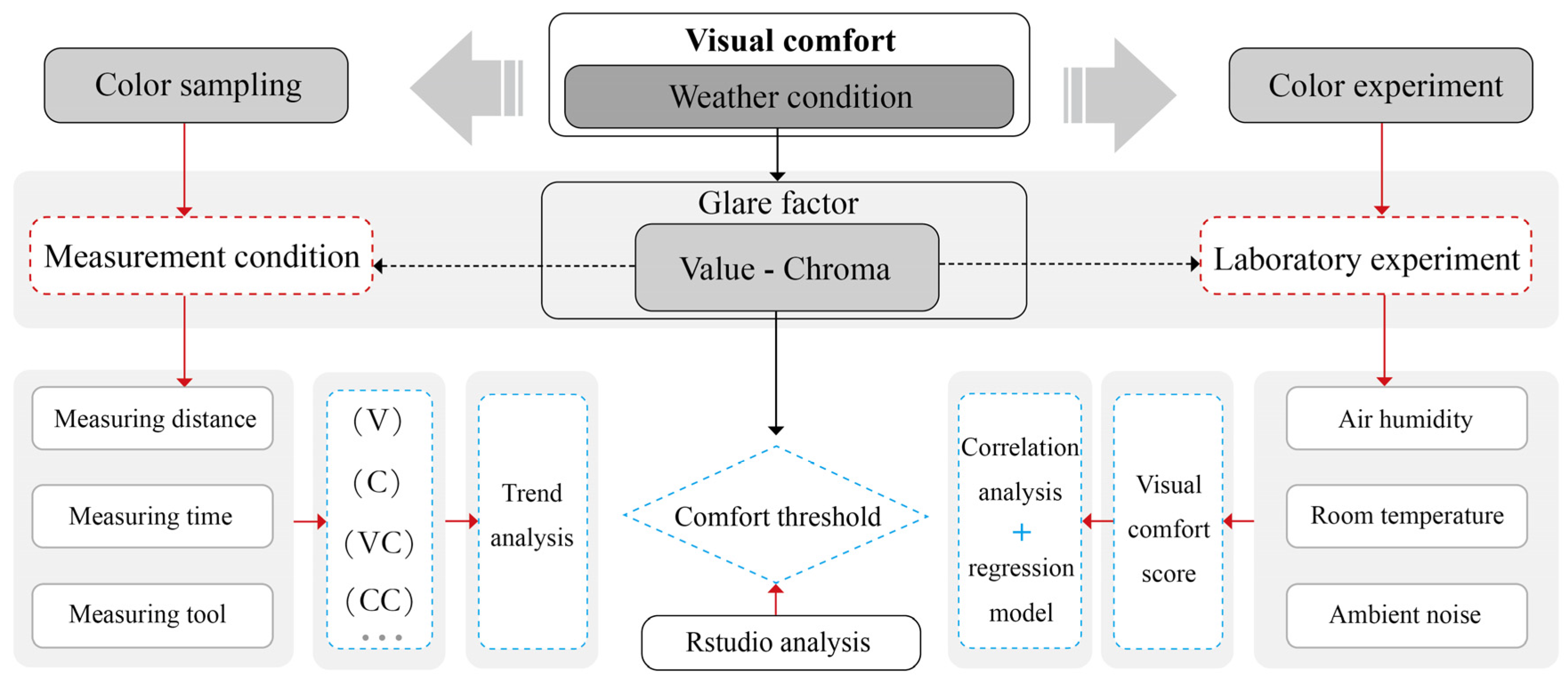
2. Data and Methods
2.1. Research Design
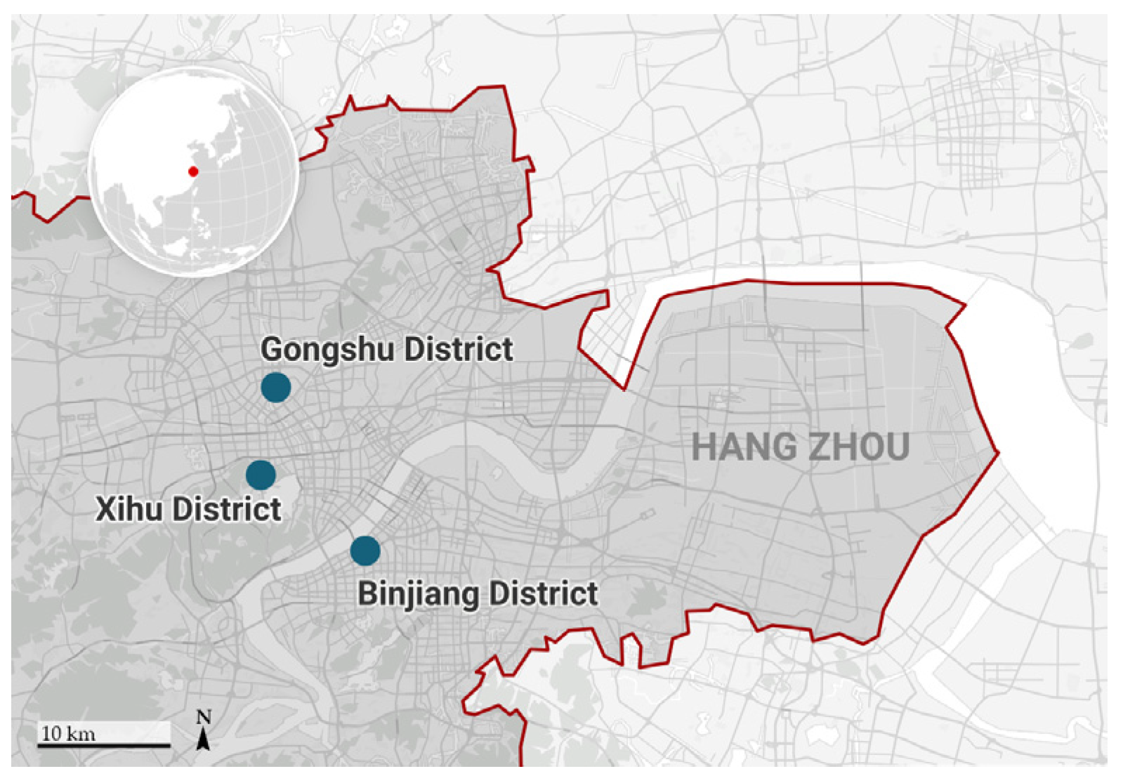
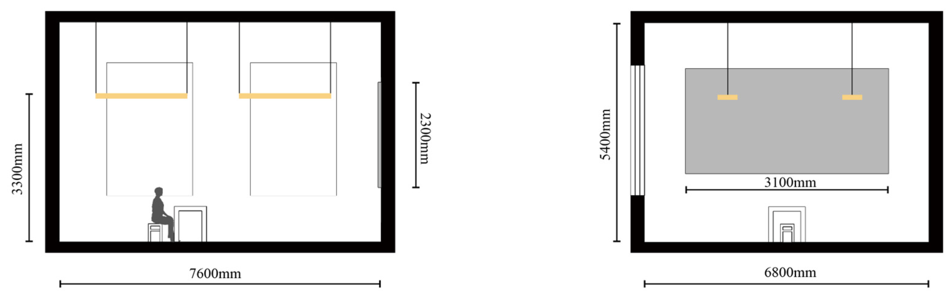
2.2. Study Area
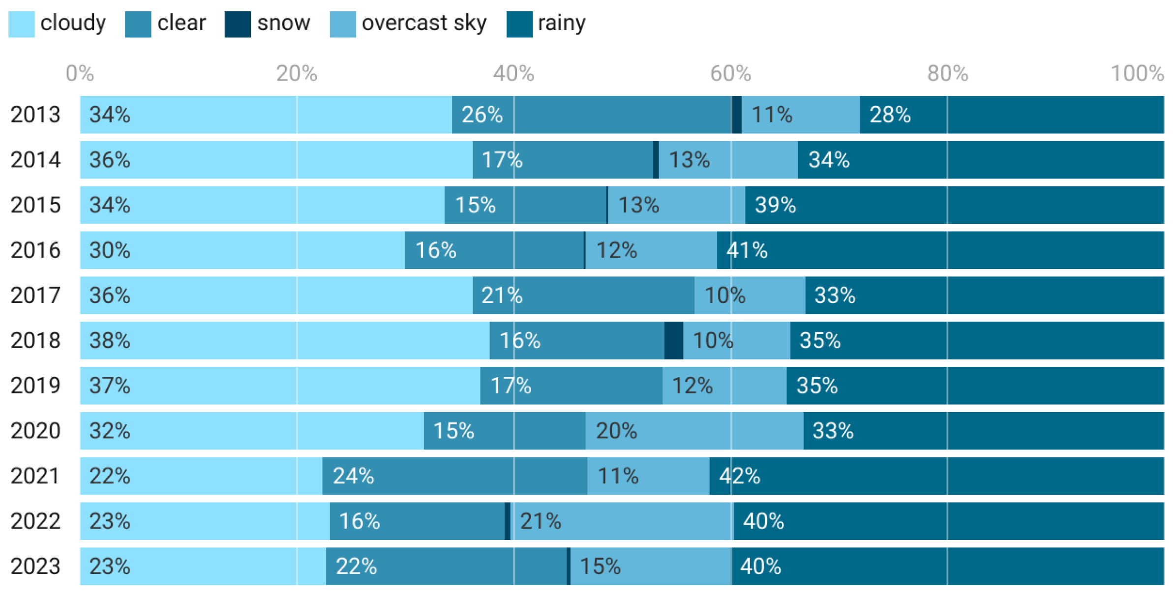
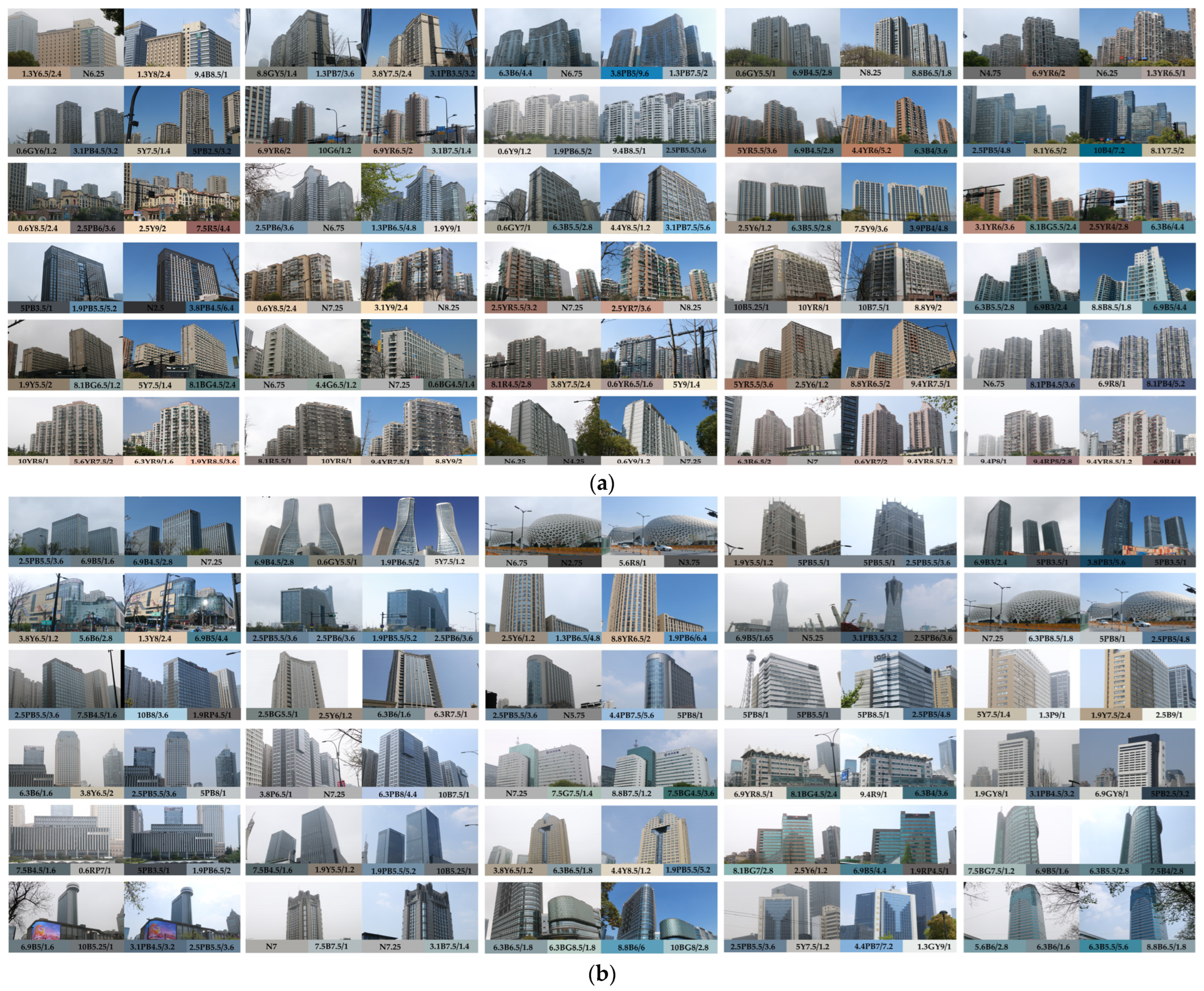
2.3. Data Acquisition and Processing
2.4. Experimental Conditions and Procedures
2.5. Questionnaire Design and Participants
2.6. Data Analysis Methods
3. Results
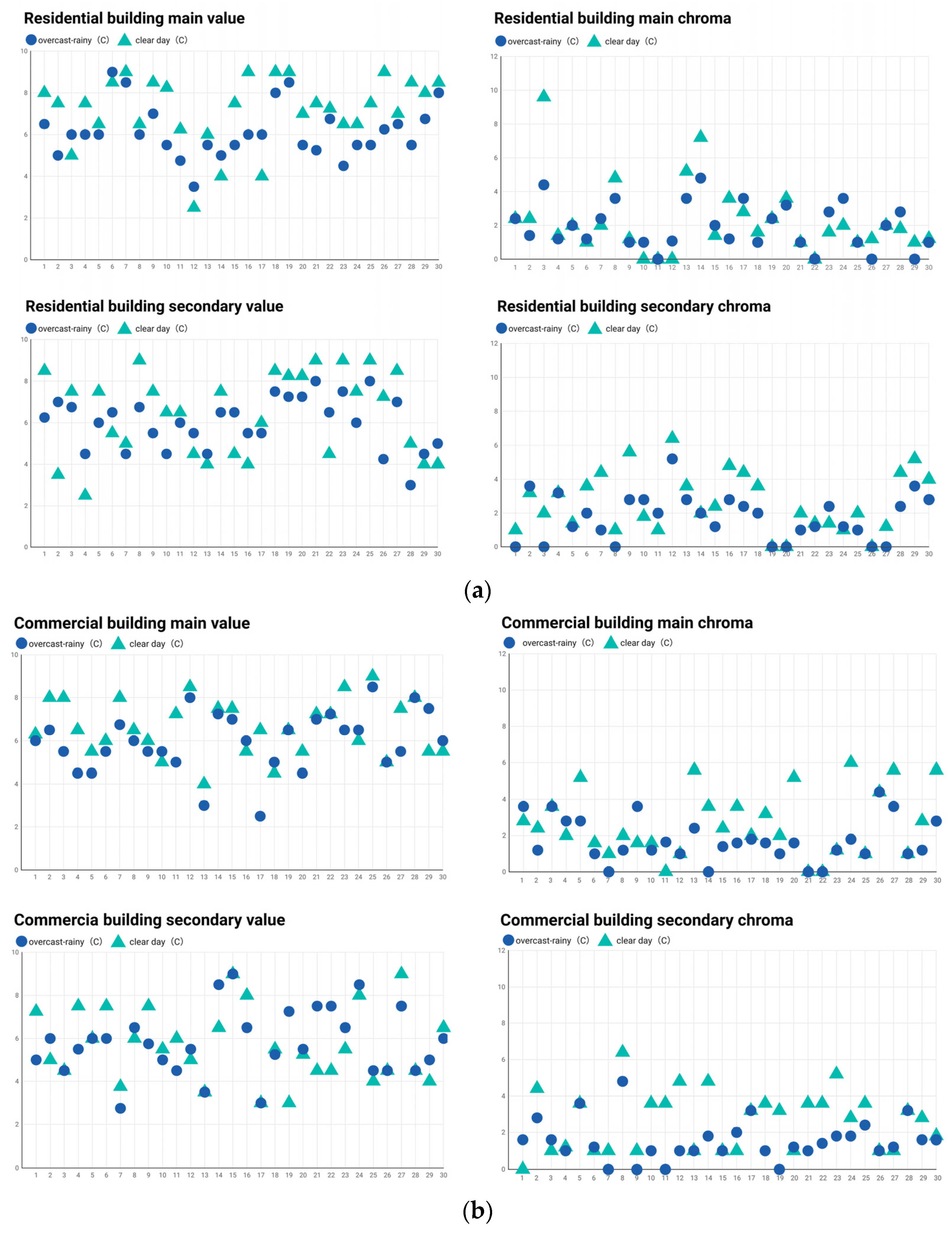
3.1. Trend Analysis of Value and Chroma of Architectural Colors
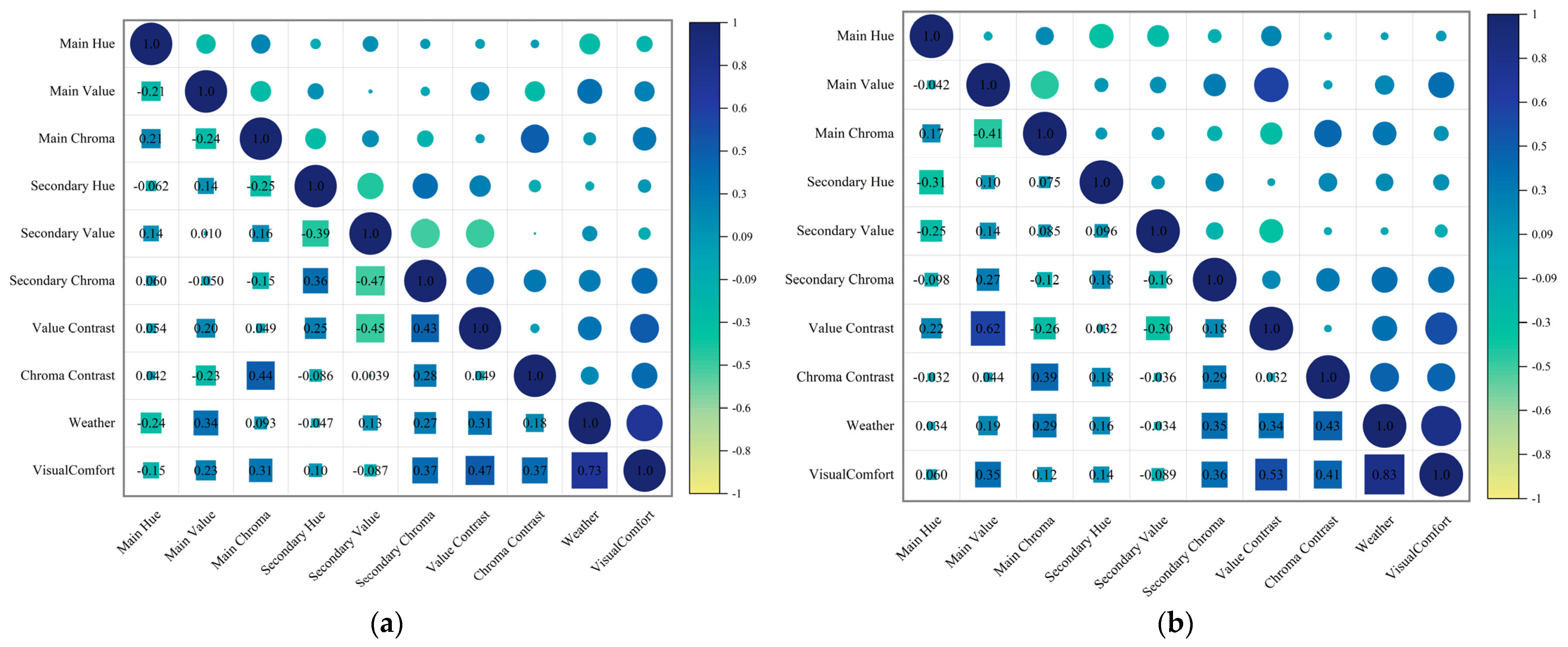
3.2. Correlation Analysis between Color Attributes and Architectural Visual Comfort
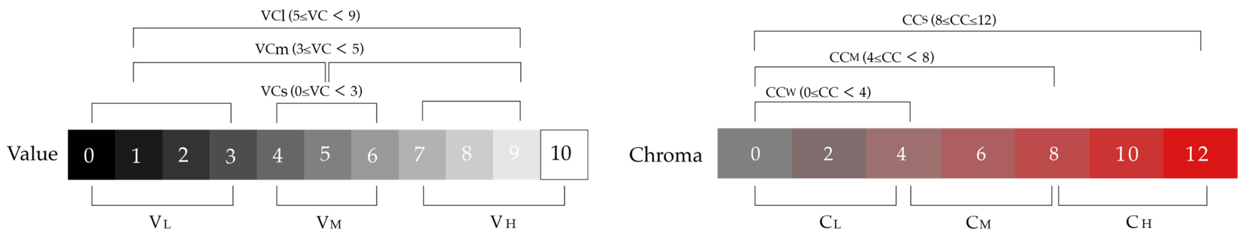
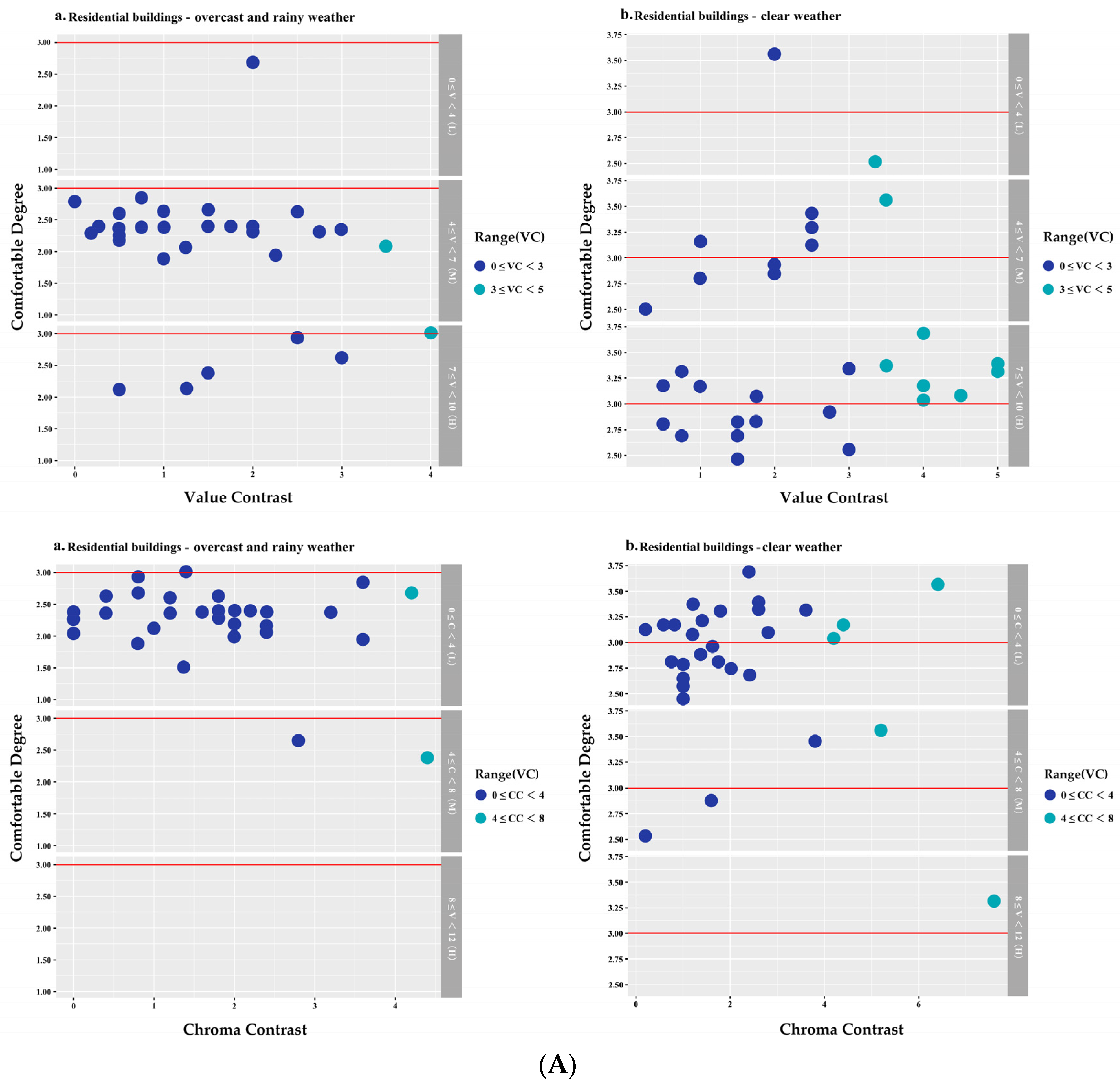
3.3. Visual Comfort Recognition Thresholds of VC, CC
4. Discussion
4.1. Effects of Luminance Contrast (VC) and Chromaticity Contrast (CC) on Visual Comfort
4.2. Strategies for Enhancing the Visual Comfort of Architectural Colors in Overcast Rainy Weather
- Participant rating data indicate that architectural colors with high value levels (7 ≤ V < 10), mid-range value contrast (3 ≤ VC < 5), medium to low chroma (3 ≤ C ≤ 6), and low chroma contrast (0 ≤ CC < 4) generally had a positive effect on visual comfort. Therefore, in urban color planning, appropriate color samples can be selected based on the color values of the Chinese Architectural Color Card. Avoiding colors with low value and high chroma can help alleviate visual stress among residents during prolonged overcast and rainy weather.
- Based on the distribution of thresholds and considering the value contrast that affects both types of buildings, commercial buildings exhibited slightly lower visual comfort than residential buildings under both overcast rainy and clear weather conditions. This discrepancy may arise from fundamental variations in material selection and facade design between the two architectural types. Previous research has indicated that visual comfort tends to deteriorate with increased reflectivity, and the use of natural materials with low reflectivity can reduce glare in buildings [1]. This phenomenon is especially pronounced in urban commercial buildings, where facade materials typically have high reflectance properties, such as glass and stainless steel. These materials are known for their substantial glare capabilities, which can negatively impact visual comfort and degrade the overall quality of the visual environment. Furthermore, the functional demands and operational characteristics of commercial architecture often necessitate enhanced transparency and visual allure, thereby driving the prevalence of high-reflectance materials in these settings. Consequently, it is imperative for architects and designers to rigorously assess the optical properties and visual implications of building materials during the design process. By doing so, they can significantly improve the visual comfort of the structures, aligning with both aesthetic values and functional efficacy.
- The results of the regression analysis indicate that the primary factors affecting the visual comfort of the two types of buildings differed, revealing that commercial buildings are less influenced by chroma contrast compared to residential buildings. Overall, under changing weather conditions, both residential and commercial buildings are influenced by value contrast. Thus, in the design and planning process of architectural colors, architects and designers can consider prioritizing the enhancement of value contrast. It must also be emphasized that, although the results of this study indicate that hue was not the primary factor determining color visual comfort, numerous studies have found that hue significantly affects emotions. Therefore, in the process of making design decisions, we must not overlook the potential psychological impact of hue on individuals.
4.3. Limitations
5. Conclusions
Author Contributions
Funding
Data Availability Statement
Conflicts of Interest
References
- Achsani, R.A.; Wonorahardjo, S. Studies on Visual Environment Phenomena of Urban Areas: A Systematic Review. IOP Conf. Ser. Earth Environ. Sci. 2020, 532, 012016. [Google Scholar] [CrossRef]
- Hashemi Kashani, S.M.; Pazhouhanfar, M. Role of Physical Attributes of Preferred Building Facades on Perceived Visual Complexity: A Discrete Choice Experiment. Environ. Dev. Sustain. 2023, 26, 13515–13534. [Google Scholar] [CrossRef]
- Mousapour, B. Assessment of Biophilic Design’s Impact on Citizens’ Residential Satisfaction to Enhance pro-Environmental Behavior. Archit. Eng. Des. Manag. 2023, 1–15. [Google Scholar] [CrossRef]
- Wang, Z.; Sun, H.; Li, J. Research on Architectural Color and Visual Comfort in Historic Landscape Areas. Buildings 2023, 13, 1004. [Google Scholar] [CrossRef]
- Gjerde, M. Visual Evaluation of Urban Streetscapes: How Do Public Preferences Reconcile with Those Held by Experts? Urban Des. Int. 2011, 16, 153–161. [Google Scholar] [CrossRef]
- Oleksiichenko, N.; Gatalska, N.; Mavko, M. The Colour-Forming Components of Park Landscape and the Factors that Influence the Human Perception of the Landscape Colouring. Theor. Empir. Res. Urban Manag. 2018, 13, 38–52. [Google Scholar]
- Kurt, S.; Osueke, K.K. The Effects of Color on the Moods of College Students. SAGE Open 2014, 4, 215824401452542. [Google Scholar] [CrossRef]
- Bekele, Z.G. The Level of Building Color Harmonization Prospect in Addis Ababa; Diss. Addis Ababa Science and Technology University: Addis Ababa, Ethiopia, 2021. [Google Scholar]
- Liu, J.; Wang, Q. Study on Building Materials and Building Color Attribute Changes in Cold Regional for Weather Factors and Distance. AMR 2014, 1014, 263–266. [Google Scholar] [CrossRef]
- Badami, A.A. Management of the Image of the City in Urban Planning: Experimental Methodologies in the Colour Plan of the Egadi Islands. Urban Des. Int. 2022, 1–16. [Google Scholar] [CrossRef]
- Jaglarz, A. Perception of Color in Architecture and Urban Space. Buildings 2023, 13, 2000. [Google Scholar] [CrossRef]
- Cai, X.; Lu, J.J.; Xing, Y.; Jiang, C.; Lu, W. Analyzing Driving Risks of Roadway Traffic under Adverse Weather Conditions: In Case of Rain Day. Procedia Soc. Behav. Sci. 2013, 96, 2563–2571. [Google Scholar] [CrossRef]
- Mei, Y.; Xu, L.; Li, Z. Study on Emotional Perception of Hangzhou West Lake Scenic Area in Spring under the Influence of Meteorological Environment. Int. J. Environ. Res. Public Health 2023, 20, 1905. [Google Scholar] [CrossRef] [PubMed]
- Kompier, M.E.; Smolders, K.C.H.J.; De Kort, Y.A.W. Abrupt Light Transitions in Illuminance and Correlated Colour Temperature Result in Different Temporal Dynamics and Interindividual Variability for Sensation, Comfort and Alertness. PLoS ONE 2021, 16, e0243259. [Google Scholar] [CrossRef] [PubMed]
- Seixas, S.; Hoeffel, J.; Renk, M.; Asmus, G.; Lima, F. Weather Variability and Climate Change Impacts on the Mental Health of a Seaside Community. JSRR 2016, 11, 1–17. [Google Scholar] [CrossRef] [PubMed]
- Cooper, R.; Burton, E.; Cooper, C. Wellbeing: A Complete Reference Guide, Wellbeing and the Environment; John Wiley & Sons: Hoboken, NJ, USA, 2014; ISBN 978-1-118-60837-1. [Google Scholar]
- Manav, B. Color-Emotion Associations, Designing Color Schemes for Urban Environment-Architectural Settings. Color Res. Appl. 2017, 42, 631–640. [Google Scholar] [CrossRef]
- St-Jean, P.; Clark, O.G.; Jemtrud, M. A Review of the Effects of Architectural Stimuli on Human Psychology and Physiology. Build. Environ. 2022, 219, 109182. [Google Scholar] [CrossRef]
- BS-EN12665, Light; Lighting-Basic Terms and Criteria for Specifying Lighting Requirements. British-Adopted European Standard: London, UK, 2018; p. 6.
- Jakubiec, J.A.; Reinhart, C.F. A Concept for Predicting Occupants’ Long-Term Visual Comfort within Daylit Spaces. LEUKOS 2016, 12, 185–202. [Google Scholar] [CrossRef]
- Cameron, J.A. Assessing Work-Related Body-Part Discomfort: Current Strategies and a Behaviorally Oriented Assessment Tool. Int. J. Ind. Ergon. 1996, 18, 389–398. [Google Scholar] [CrossRef]
- Fabi, V.; Andersen, R.; Corgnati, S. Accounting for the Uncertainty Related to Building Occupants with Regards to Visual Comfort: A Literature Survey on Drivers and Models. Buildings 2016, 6, 5. [Google Scholar] [CrossRef]
- Conraud-Bianchi, J. A Methodology for the Optimization of Building Energy, Thermal, and Visual Performance; Library and Archives Canada = Bibliothèque et Archives Canada: Ottawa, ON, Canade, 2009; ISBN 978-0-494-45703-0. [Google Scholar]
- Pooya, L.; Polat, H. Optimization of Visual Comfort: Building Openings. J. Build. Eng. 2023, 72, 106598. [Google Scholar]
- Giarma, C.; Tsikaloudaki, K.; Aravantinos, D. Daylighting and Visual Comfort in Buildings’ Environmental Performance Assessment Tools: A Critical Review. Procedia Environ. Sci. 2017, 38, 522–529. [Google Scholar] [CrossRef]
- Shafavi, N.S.; Tahsildoost, M.; Zomorodian, Z.S. Investigation of Illuminance-Based Metrics in Predicting Occupants’ Visual Comfort (Case Study: Architecture Design Studios). Sol. Energy 2020, 197, 111–125. [Google Scholar] [CrossRef]
- Davoodi, A.; Johansson, P.; Aries, M. The Use of Lighting Simulation in the Evidence-Based Design Process: A Case Study Approach Using Visual Comfort Analysis in Offices. Build. Simul. 2020, 13, 141–153. [Google Scholar] [CrossRef]
- Van Den Wymelenberg, K.; Inanici, M. A Critical Investigation of Common Lighting Design Metrics for Predicting Human Visual Comfort in Offices with Daylight. LEUKOS 2014, 10, 145–164. [Google Scholar] [CrossRef]
- Bian, Y.; Luo, T. Investigation of Visual Comfort Metrics from Subjective Responses in China: A Study in Offices with Daylight. Build. Environ. 2017, 123, 661–671. [Google Scholar] [CrossRef]
- Tabadkani, A.; Valinejad Shoubi, M.; Soflaei, F.; Banihashemi, S. Integrated Parametric Design of Adaptive Facades for User’s Visual Comfort. Autom. Constr. 2019, 106, 102857. [Google Scholar] [CrossRef]
- Rossi, F.; Anderini, E.; Castellani, B.; Nicolini, A.; Morini, E. Integrated Improvement of Occupants’ Comfort in Urban Areas during Outdoor Events. Build. Environ. 2015, 93, 285–292. [Google Scholar] [CrossRef]
- Yang, M. Investigating Seasonal Color Change in the Environment by Color Analysis and Information Visualization. Color Res. Appl. 2020, 45, 503–511. [Google Scholar] [CrossRef]
- Ping, A.; Zixuan, Z.; Baolin, M.; Ao, G. Architectural Color of Streets in Cultural Quintessence Area of Dongjiaomin Lane in Beijing City. J. Landsc. Res. 2022, 14, 43–48. [Google Scholar]
- Lenclos, J.P.; Lenclos, D.; Rivière, G.H. Couleurs de la France: Géographie de la Couleur; le Moniteur: Port-au-Prince, Haiti, 1990. [Google Scholar]
- Nguyen, L.; Teller, J. Color in the Urban Environment: A User-oriented Protocol for Chromatic Characterization and the Development of a Parametric Typology. Color Res. Appl. 2017, 42, 131–142. [Google Scholar] [CrossRef]
- Liu, Y.; Kang, J.; Zhang, Y.; Wang, D.; Mao, L. Visual Comfort Is Affected by Urban Colorscape Tones in Hazy Weather. Front. Archit. Res. 2016, 5, 453–465. [Google Scholar] [CrossRef]
- Nguyen, L.; Embrechts, J.-J.; Teller, J. Colour in the City: A Chromatic Typology for the Quantitative Analysis of Spatial Coherence. Landsc. Res. 2020, 45, 44–62. [Google Scholar] [CrossRef]
- Suk, J.Y. Luminance and Vertical Eye Illuminance Thresholds for Occupants’ Visual Comfort in Daylit Office Environments. Build. Environ. 2019, 148, 107–115. [Google Scholar] [CrossRef]
- GB/T 18922-2008; China Architectural Color Card. Chinese National Standard for Architectural Color Cards. China National Standards: Beijing, China, 2008.
- Yan, L.; Li, Q.; Zhang, Y.; Zhu, C. Computer Vision Quantization Research on the Architectural Color of Avenida de Almeida Ribeiro in Macau Based on the Human Eye Perspective. Front. Comput. Neurosci. 2022, 16, 951718. [Google Scholar] [CrossRef] [PubMed]
- Noguchi, H.; Sakaguchi, T. Effect of Illuminance and Color Temperature on Lowering of Physiological Activity. Appl. Hum. Sci. 1999, 18, 117–123. [Google Scholar] [CrossRef] [PubMed]
- Ural, S.E.; Yilmazer, S. The Architectural Colour Design Process: An Evaluation of Sequential Media via Semantic Ratings. Color Res. Appl. 2010, 35, 343–351. [Google Scholar] [CrossRef]
- Tian, T.; Wang, X.; Bai, Y. The Research of Architectural Color Evaluation Based on Image Processing. In Proceedings of the 2011 Fourth International Symposium on Computational Intelligence and Design, Hangzhou, China, 28–30 October 2011; IEEE: Hangzhou, China, 2011; pp. 290–293. [Google Scholar]
- Pierson, C.; Wienold, J.; Bodart, M. Discomfort Glare Perception in Daylighting: Influencing Factors. Energy Procedia 2017, 122, 331–336. [Google Scholar] [CrossRef]
- Hawkins, L.H. The Influence of Air Ions, Temperature and Humidity on Subjective Wellbeing and Comfort. J. Environ. Psychol. 1981, 1, 279–292. [Google Scholar] [CrossRef]
- Hossein Askari, A.; Dola, K.B.; Soltani, S. An Evaluation of the Elements and Characteristics of Historical Building Façades in the Context of Malaysia. Urban Des. Int. 2014, 19, 113–124. [Google Scholar] [CrossRef]
- Pazhouhanfar, M.; Kamal, M. Effect of Predictors of Visual Preference as Characteristics of Urban Natural Landscapes in Increasing Perceived Restorative Potential. Urban For. Urban Green. 2014, 13, 145–151. [Google Scholar] [CrossRef]
- Park, J.G. Color Perception in Pediatric Patient Room Design: Healthy Children vs. Pediatric Patients. HERD 2009, 2, 6–28. [Google Scholar] [CrossRef]
- Bakdash, J.Z.; Marusich, L.R. Corrigendum: Repeated Measures Correlation. Front. Psychol. 2019, 10, 1201. [Google Scholar] [CrossRef] [PubMed]
- Rautkylä, E.; Puolakka, M.; Tetri, E.; Halonen, L. Effects of Correlated Colour Temperature and Timing of Light Exposure on Daytime Alertness in Lecture Environments. J. Light Vis. Environ. 2010, 34, 59–68. [Google Scholar] [CrossRef]
- Yoon, G.H.; Kim, J.T. The Effects of Illuminance and Correlated Color Temperature on Visual Comfort of Occupants’ Behavior. KIEAE J. 2014, 14, 23–30. [Google Scholar] [CrossRef]
- Yang, W.; Moon, H.J. Cross-Modal Effects of Illuminance and Room Temperature on Indoor Environmental Perception. Build. Environ. 2018, 146, 280–288. [Google Scholar] [CrossRef]
- Besenecker, U.C.; Krueger, T. Luminous Color in Architecture: Exploring Methodologies for Design-Relevant Research. ENQ 2015, 12, 35–46. [Google Scholar] [CrossRef]
- Bellia, L.; Fragliasso, F.; Stefanizzi, E. Daylit Offices: A Comparison between Measured Parameters Assessing Light Quality and Users’ Opinions. Build. Environ. 2017, 113, 92–106. [Google Scholar] [CrossRef]
- Wang, X.; Chen, Z.; Ma, D.; Zhou, T.; Chen, J.; Jiang, X. Relationship between Visual and Thermal Comfort and Electrodermal Activity in Campus Blue–Green Spaces: A Case Study of Guangzhou, China. Sustainability 2023, 15, 11742. [Google Scholar] [CrossRef]
- Mirabi, E.; Nazanin, N. Urban Facade Geometry on Outdoor Comfort Conditions: A Review. Indones. J. Urban Environ. Technol. 2020, 4, 45–59. [Google Scholar] [CrossRef]
- Hopkinson, R.G. Architectural Physics: Lighting; British Information Services: New York, NY, USA, 1963. [Google Scholar]


| Unstandardized Coefficient | Standardization Coefficient | t | p | Collinear Statistics | |||
|---|---|---|---|---|---|---|---|
| B | Standard Error | Beta | VIF | ||||
| R2 = 0.639 | (Constant) | 2.147 | 0.078 | 27.620 | 0.000 | ||
| Weather | 0.535 | 0.074 | 0.603 | 7.212 | 0.000 | 1.142 | |
| VC | 0.093 | 0.029 | 0.266 | 3.233 | 0.002 | 1.108 | |
| CC | 0.073 | 0.023 | 0.250 | 3.140 | 0.003 | 1.033 | |
| Unstandardized Coefficient | Standardization Coefficient | t | p | Collinear Statistics | |||
|---|---|---|---|---|---|---|---|
| B | Standard Error | Beta | VIF | ||||
| R2 = 0.758 | (Constant) | 2.339 | 0.053 | 43.822 | 0.000 | ||
| Weather | 0.714 | 0.066 | 0.738 | 10.838 | 0.000 | 1.129 | |
| VC | 0.108 | 0.026 | 0.283 | 4.157 | 0.000 | 1.129 | |
Disclaimer/Publisher’s Note: The statements, opinions and data contained in all publications are solely those of the individual author(s) and contributor(s) and not of MDPI and/or the editor(s). MDPI and/or the editor(s) disclaim responsibility for any injury to people or property resulting from any ideas, methods, instructions or products referred to in the content. |
© 2024 by the authors. Licensee MDPI, Basel, Switzerland. This article is an open access article distributed under the terms and conditions of the Creative Commons Attribution (CC BY) license (https://creativecommons.org/licenses/by/4.0/).
Share and Cite
Li, Y.; Xu, B.; Liu, Y. A Study on the Visual Comfort of Urban Building Colors under Overcast and Rainy Weather. Buildings 2024, 14, 1552. https://doi.org/10.3390/buildings14061552
Li Y, Xu B, Liu Y. A Study on the Visual Comfort of Urban Building Colors under Overcast and Rainy Weather. Buildings. 2024; 14(6):1552. https://doi.org/10.3390/buildings14061552
Chicago/Turabian StyleLi, Yihe, Binqing Xu, and Yang Liu. 2024. "A Study on the Visual Comfort of Urban Building Colors under Overcast and Rainy Weather" Buildings 14, no. 6: 1552. https://doi.org/10.3390/buildings14061552
APA StyleLi, Y., Xu, B., & Liu, Y. (2024). A Study on the Visual Comfort of Urban Building Colors under Overcast and Rainy Weather. Buildings, 14(6), 1552. https://doi.org/10.3390/buildings14061552