Figure 1.
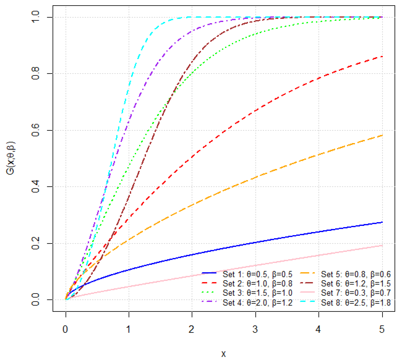
CDF of the THLGPL distribution for various parameter combinations. The curves demonstrate how jointly influence the distribution’s growth pattern and tail characteristics.
Figure 1.
CDF of the THLGPL distribution for various parameter combinations. The curves demonstrate how jointly influence the distribution’s growth pattern and tail characteristics.
Figure 2.
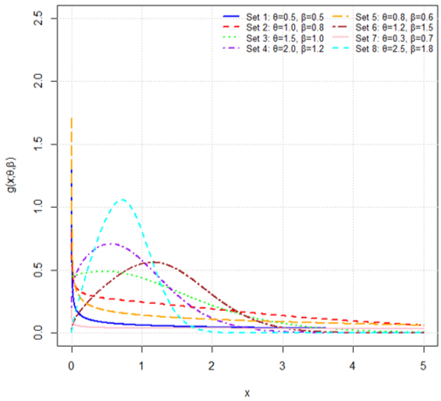
Plots of the PDF for several parameter combinations. The figure illustrates how different values of and affect the peak, spread, and tail behavior of the density.
Figure 2.
Plots of the PDF for several parameter combinations. The figure illustrates how different values of and affect the peak, spread, and tail behavior of the density.
Figure 3.
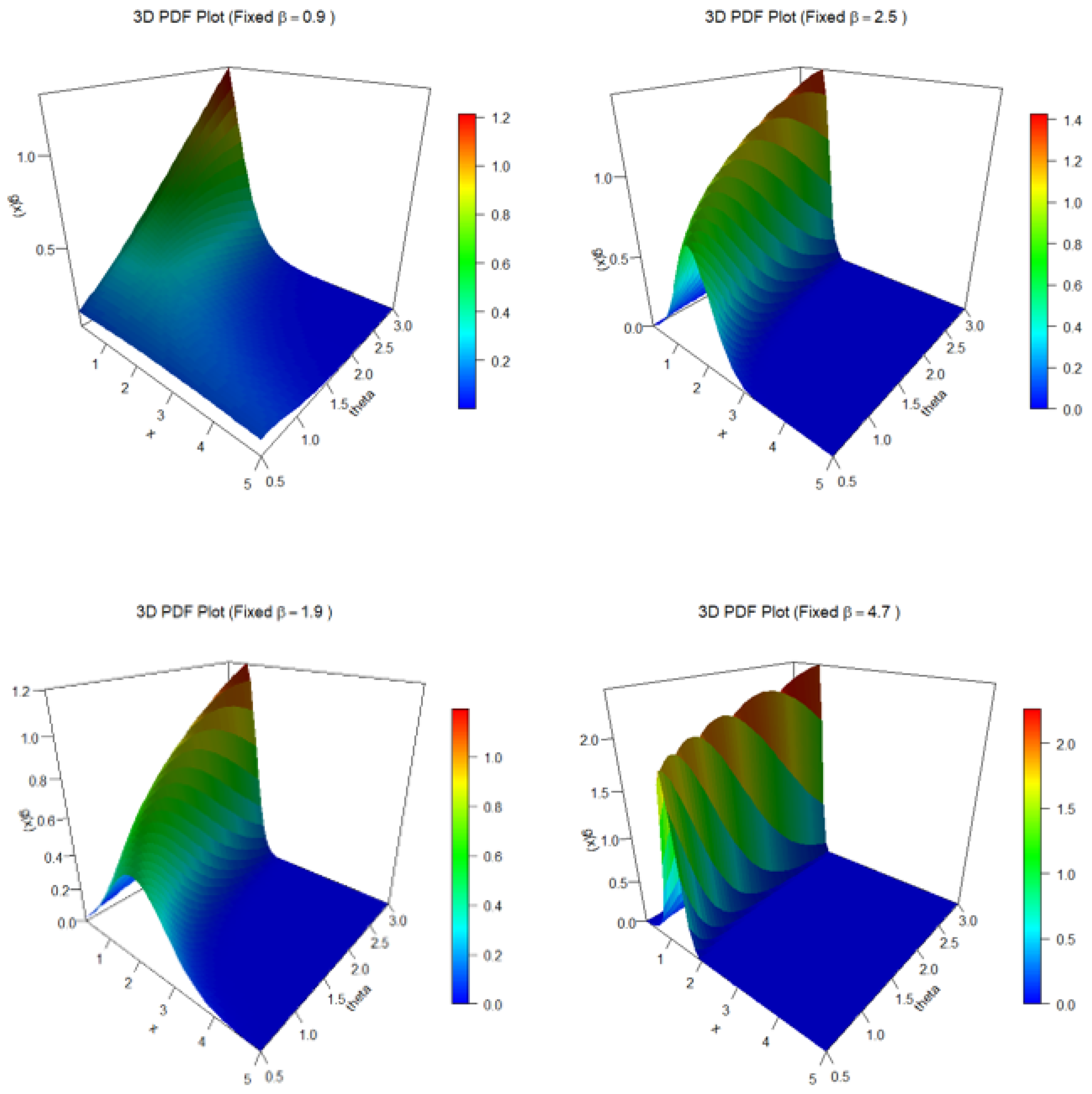
Three-dimensional PDF surfaces of the THLGPL distribution for various fixed values of . Each panel illustrates how the probability density changes with respect to and x, showing distinct curvature and tail behavior as increases.
Figure 3.
Three-dimensional PDF surfaces of the THLGPL distribution for various fixed values of . Each panel illustrates how the probability density changes with respect to and x, showing distinct curvature and tail behavior as increases.
Figure 4.
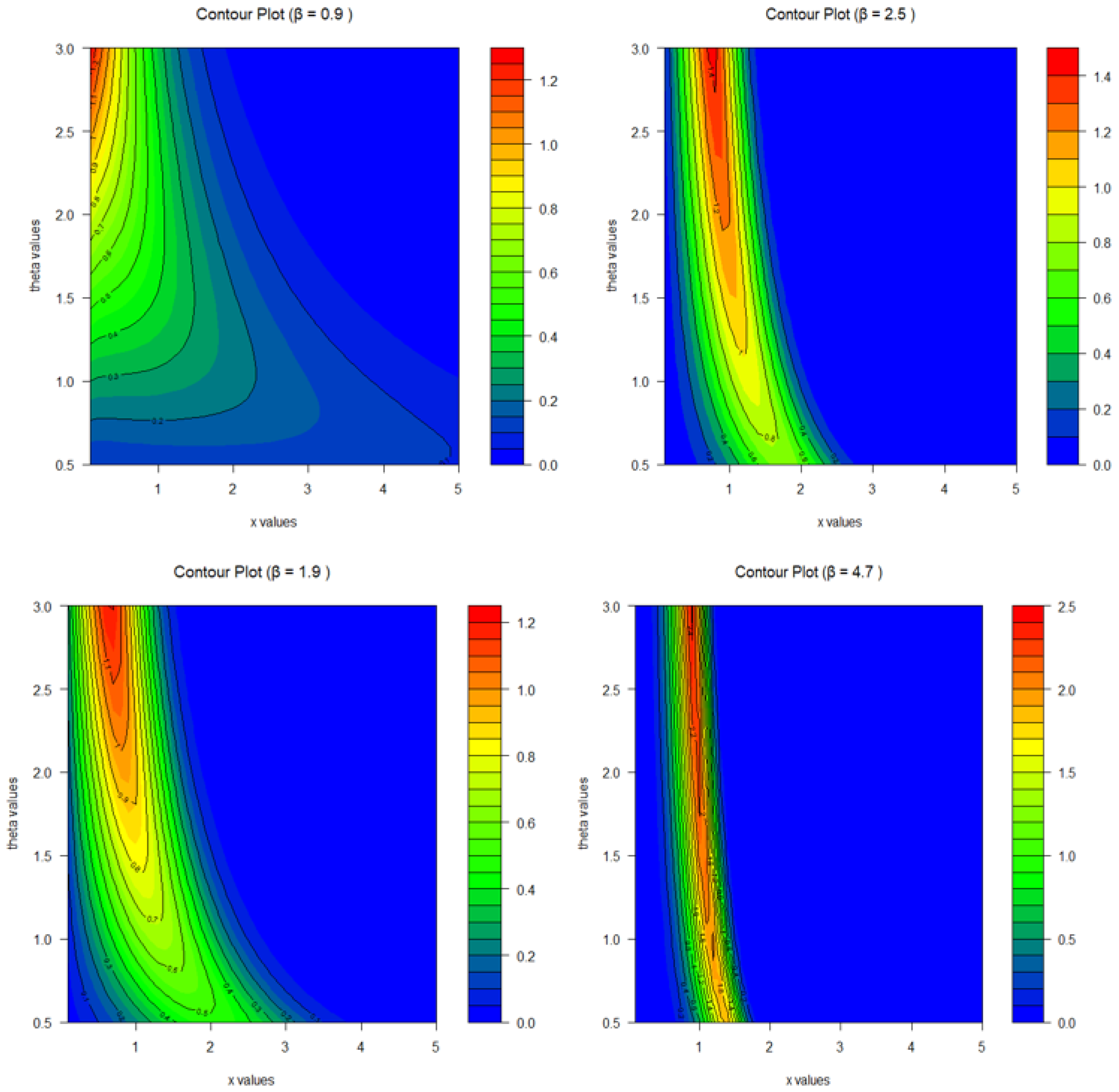
Contour plots of the THLGPL PDF for several fixed values of . The contour lines illustrate how the joint behavior of and x affects the shape and concentration of the density.
Figure 4.
Contour plots of the THLGPL PDF for several fixed values of . The contour lines illustrate how the joint behavior of and x affects the shape and concentration of the density.
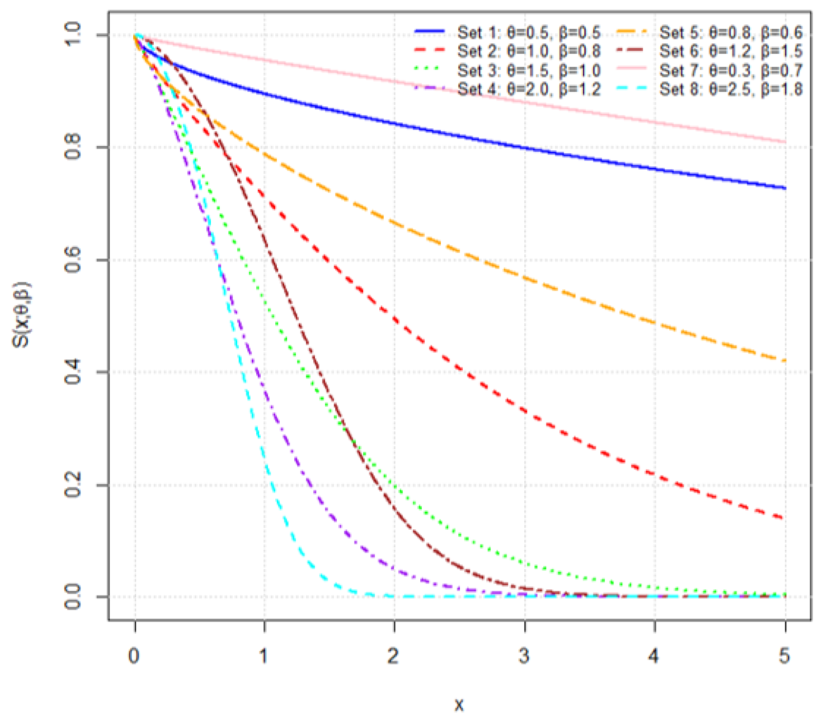
Figure 5.
Plots of the survival function for various parameter combinations.
Figure 5.
Plots of the survival function for various parameter combinations.
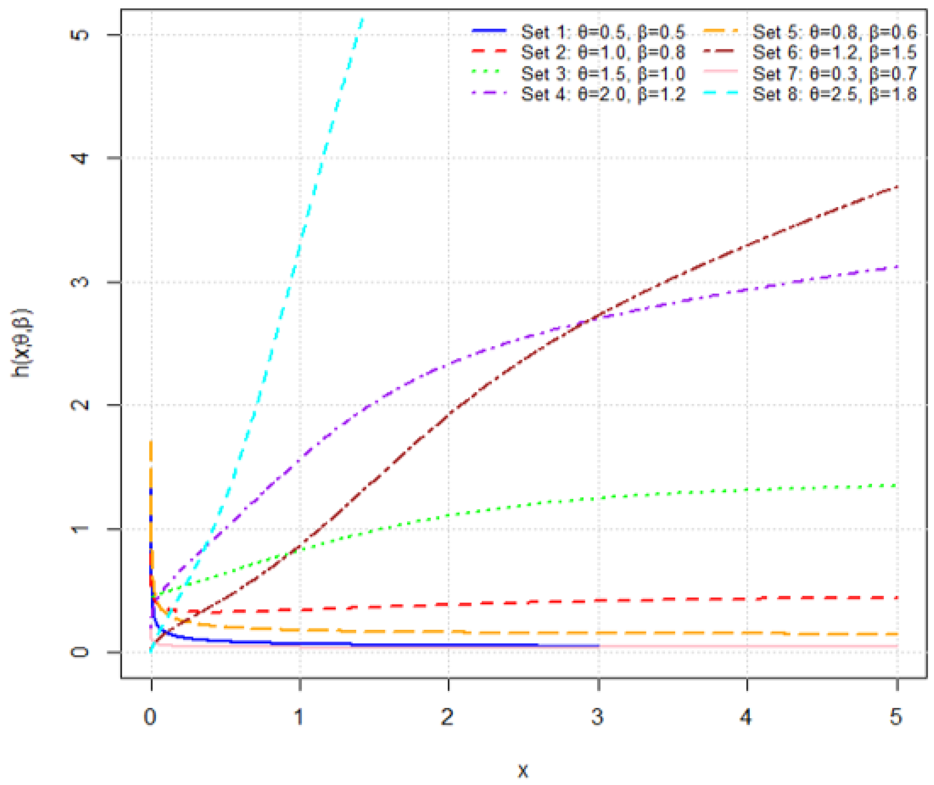
Figure 6.
Plots of the hazard rate function for various parameter combinations.
Figure 6.
Plots of the hazard rate function for various parameter combinations.
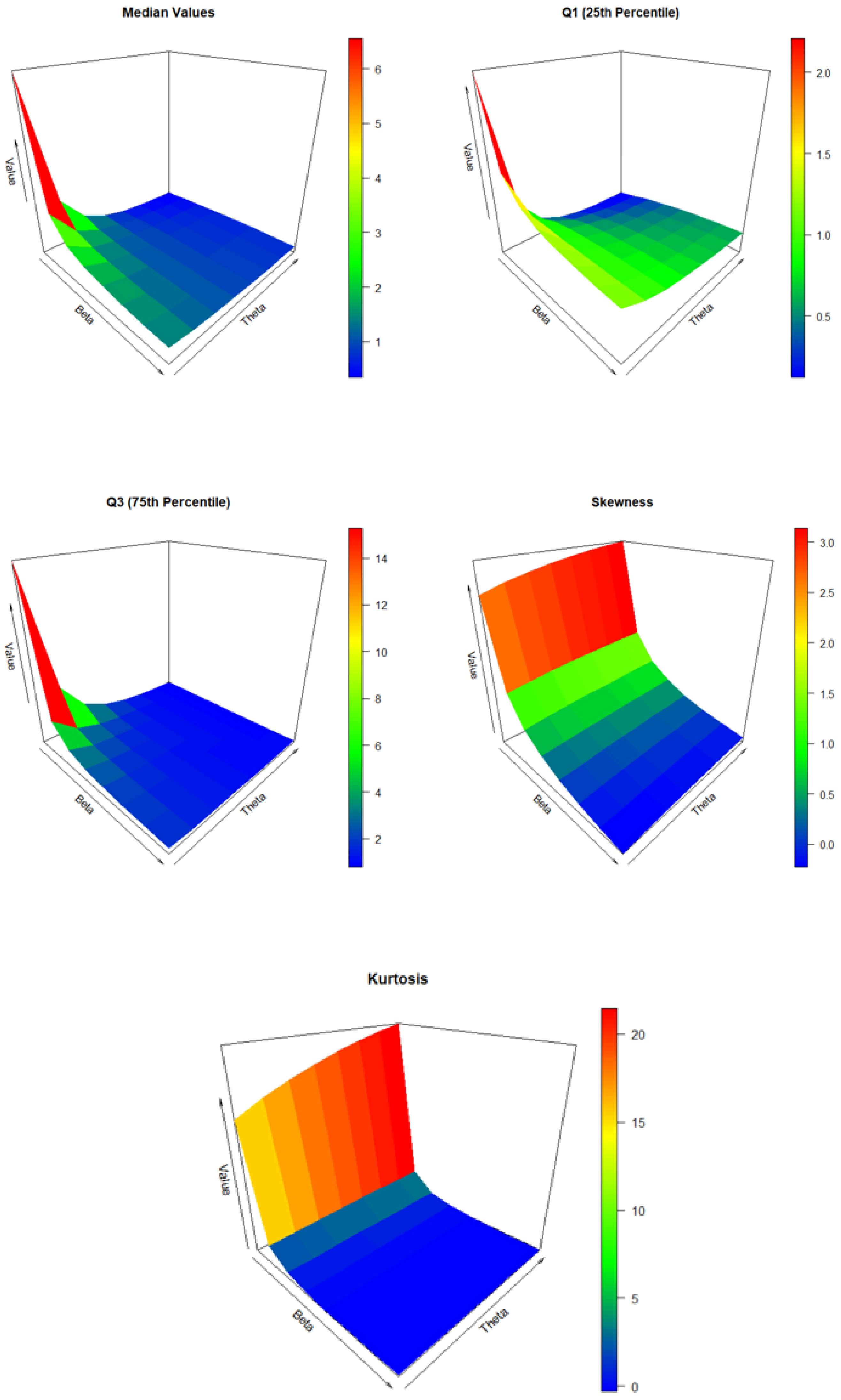
Figure 7.
Plots of the median, , , Bowley’s skewness , and kurtosis across selected .
Figure 7.
Plots of the median, , , Bowley’s skewness , and kurtosis across selected .
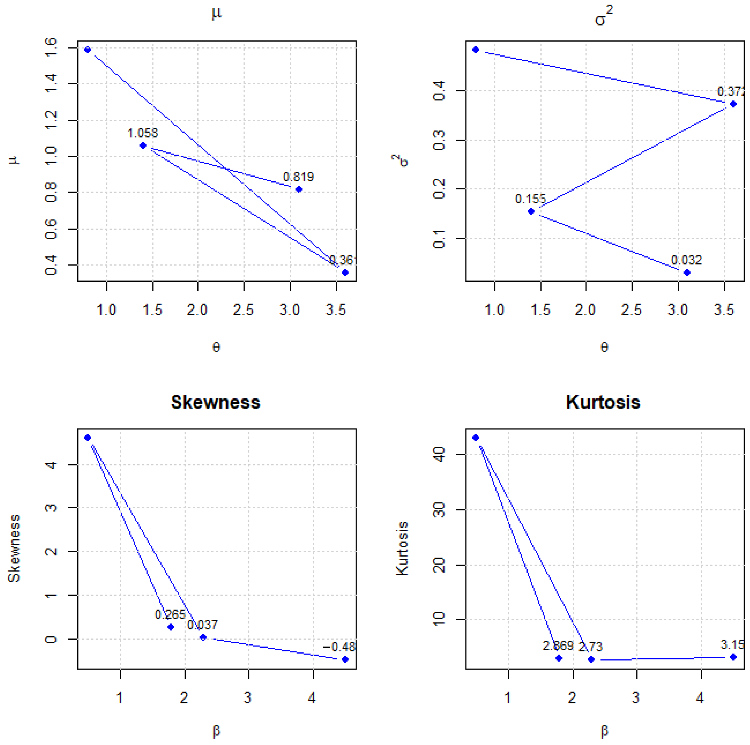
Figure 8.
Plots of the first four moments (, , skewness, kurtosis) of the THLGPL distribution for selected parameter combinations . The figure illustrates how central tendency, dispersion, and shape characteristics vary with changes in and .
Figure 8.
Plots of the first four moments (, , skewness, kurtosis) of the THLGPL distribution for selected parameter combinations . The figure illustrates how central tendency, dispersion, and shape characteristics vary with changes in and .
Figure 9.
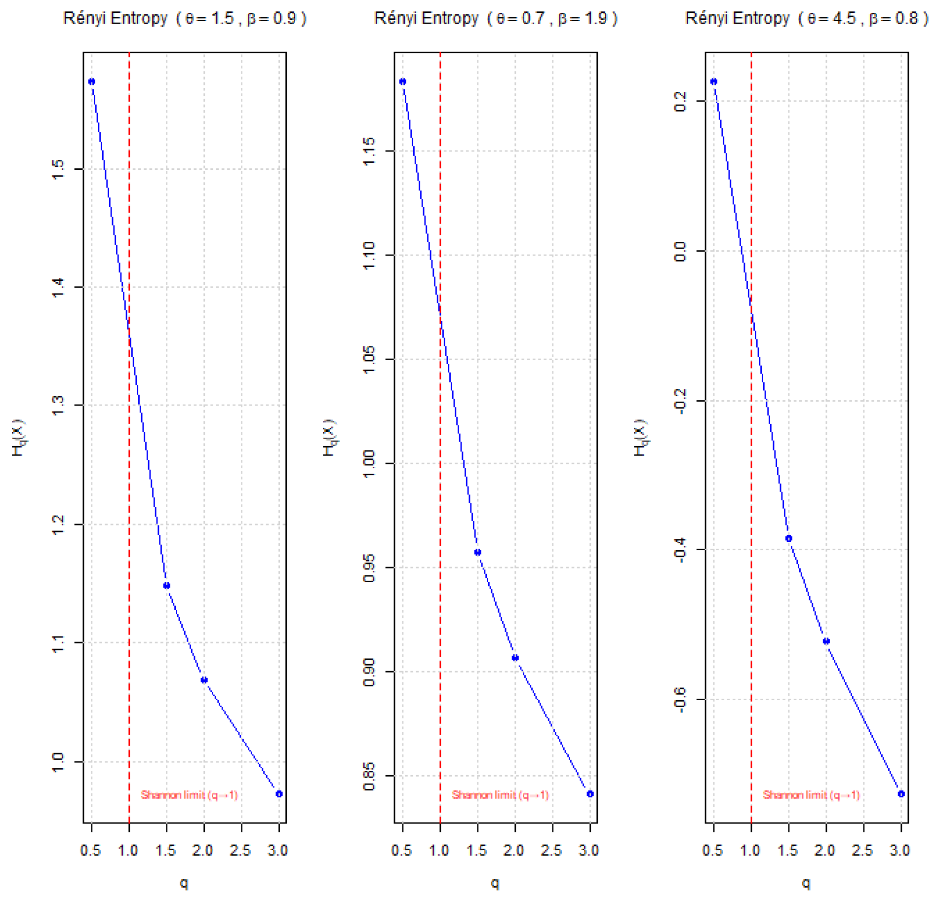
Plots of the Rényi entropy for the THLGPL distribution under different parameter combinations . The vertical red dashed line denotes the Shannon entropy limit at .
Figure 9.
Plots of the Rényi entropy for the THLGPL distribution under different parameter combinations . The vertical red dashed line denotes the Shannon entropy limit at .
Figure 10.
Mean estimates of and using MLE for .
Figure 10.
Mean estimates of and using MLE for .
Figure 11.
Mean estimates of and using Bayesian inference for .
Figure 11.
Mean estimates of and using Bayesian inference for .
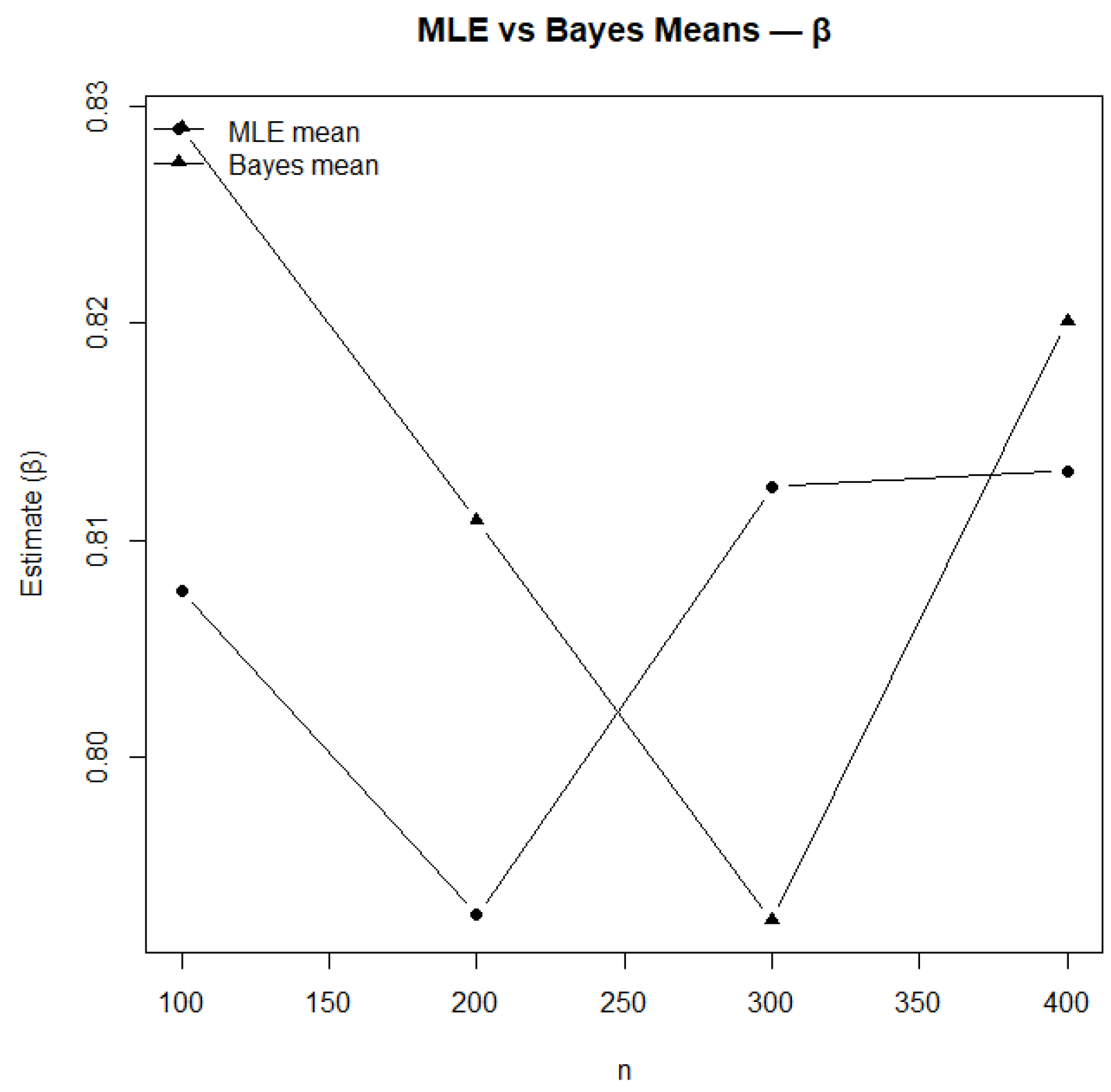
Figure 12.
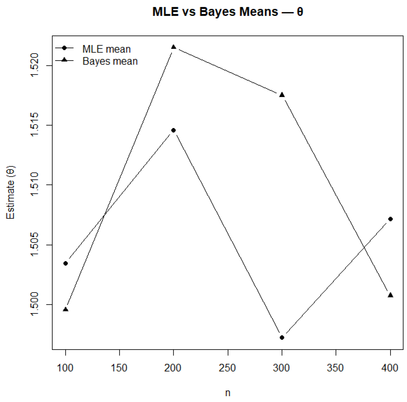
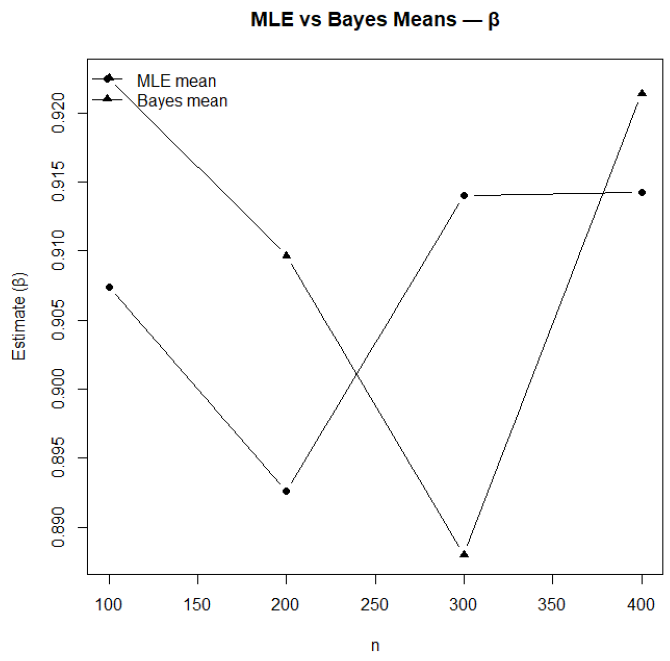
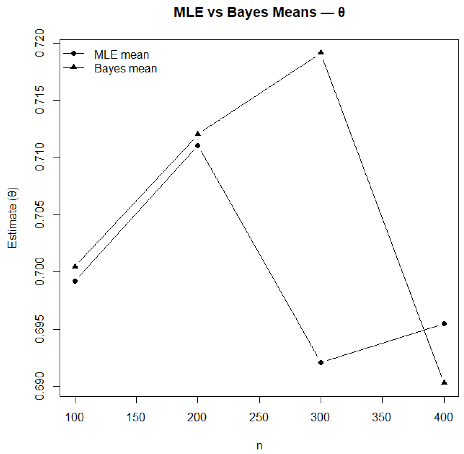
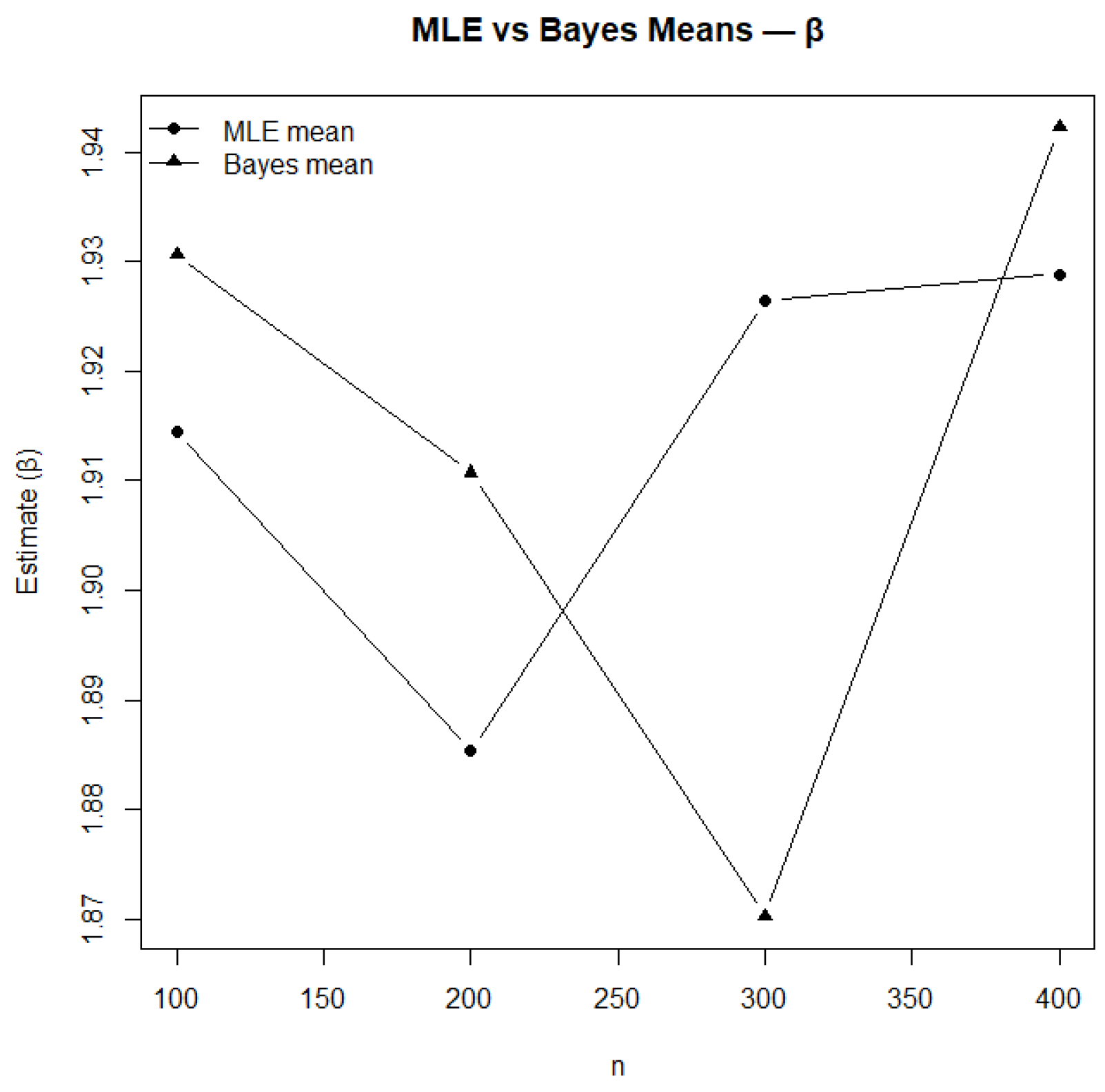
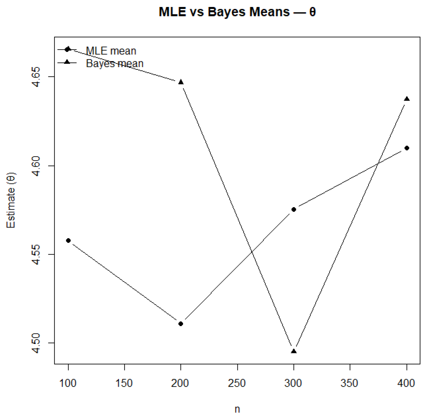
Comparison of MLE and Bayesian mean estimates for .
Figure 12.
Comparison of MLE and Bayesian mean estimates for .
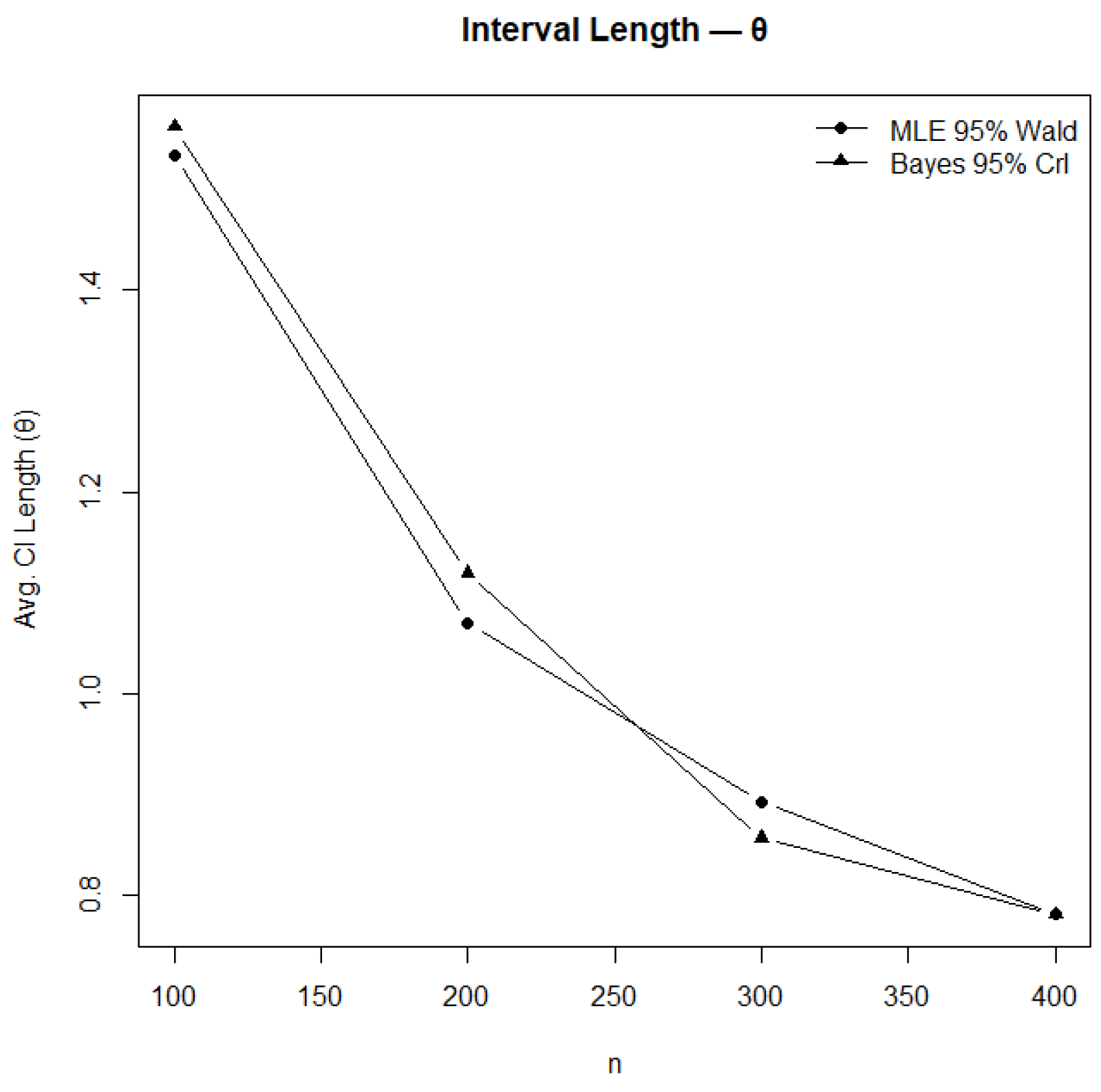
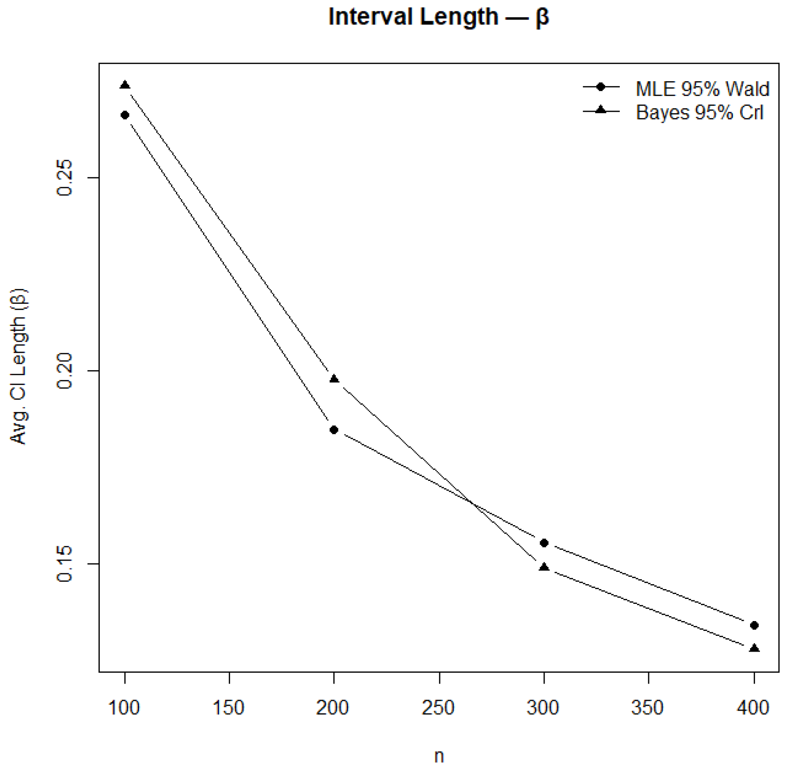
Figure 13.
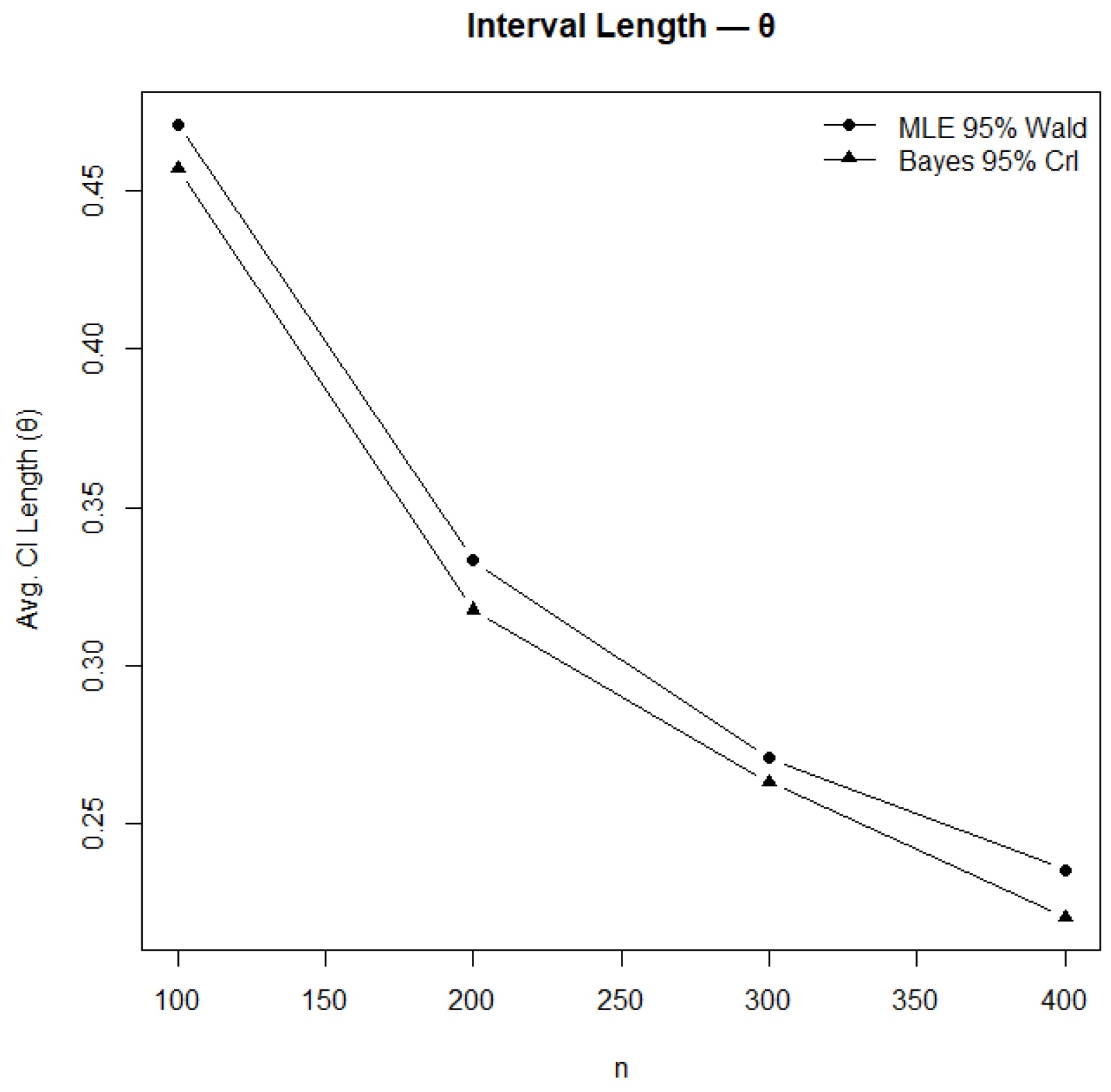
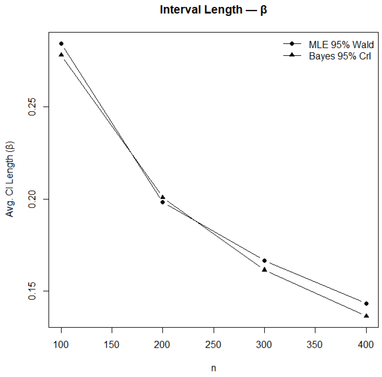
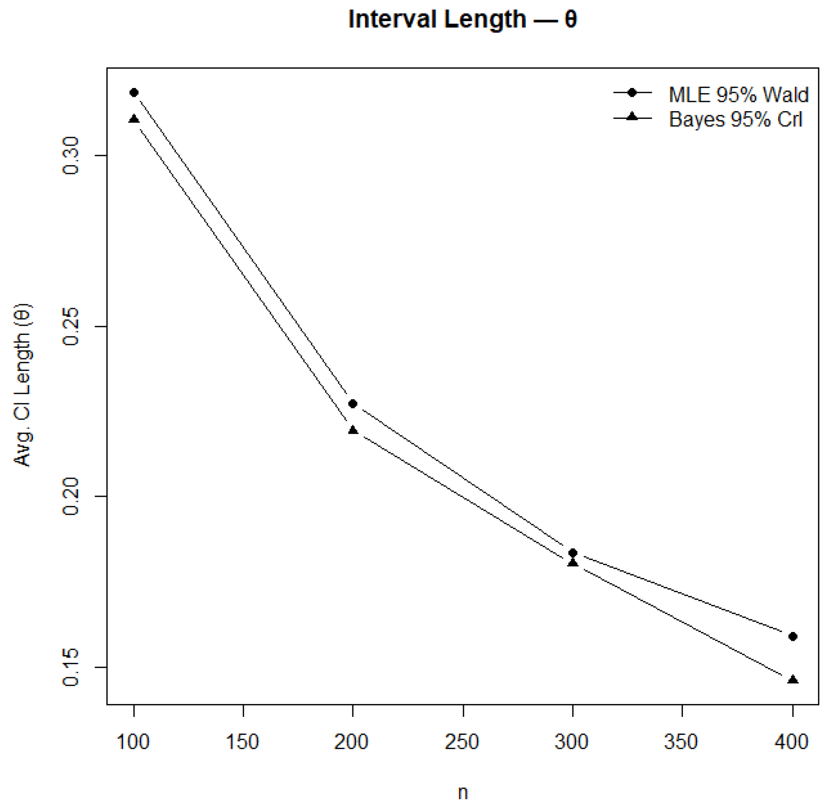
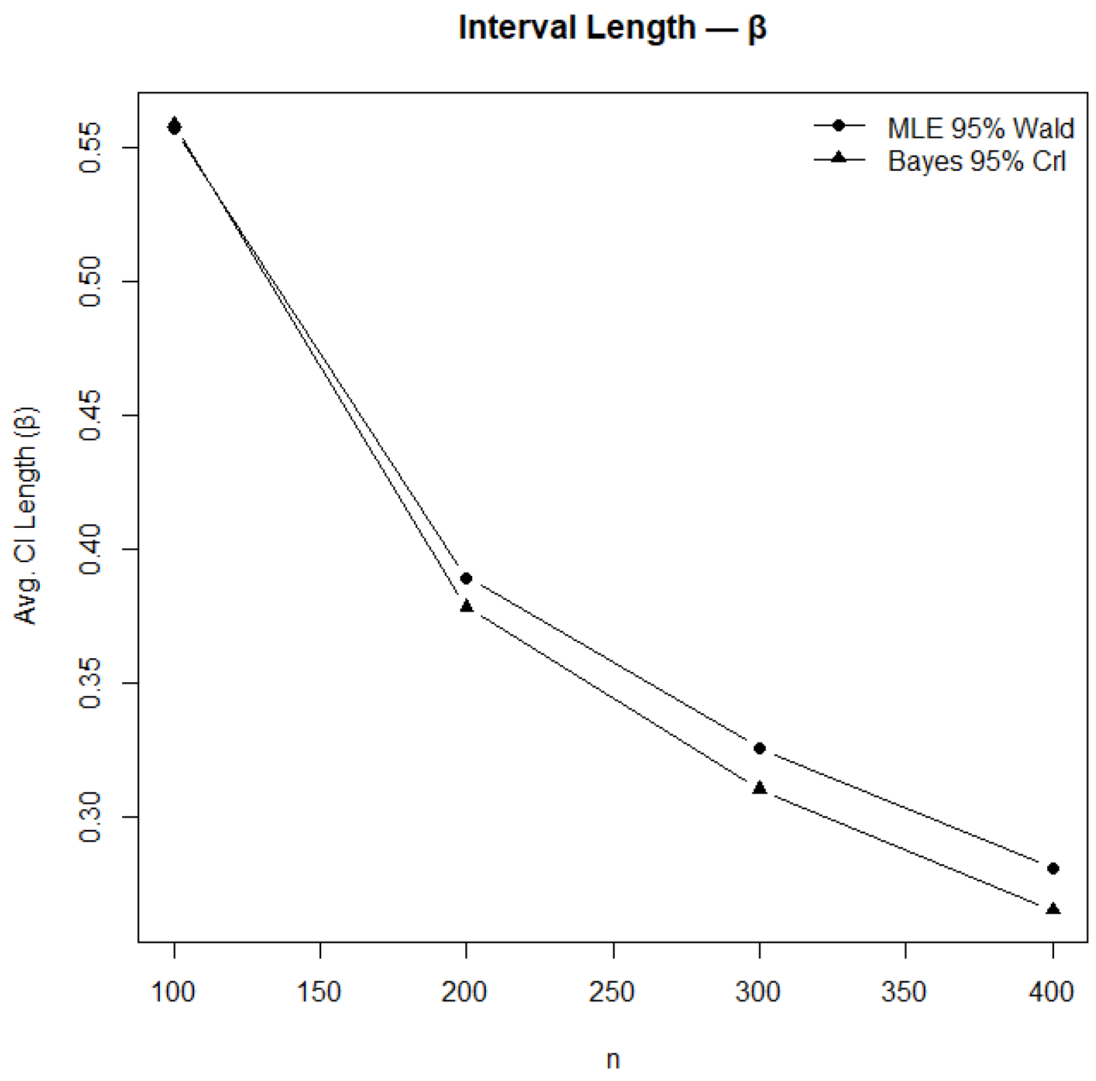
Comparison of confidence and credible interval lengths for .
Figure 13.
Comparison of confidence and credible interval lengths for .
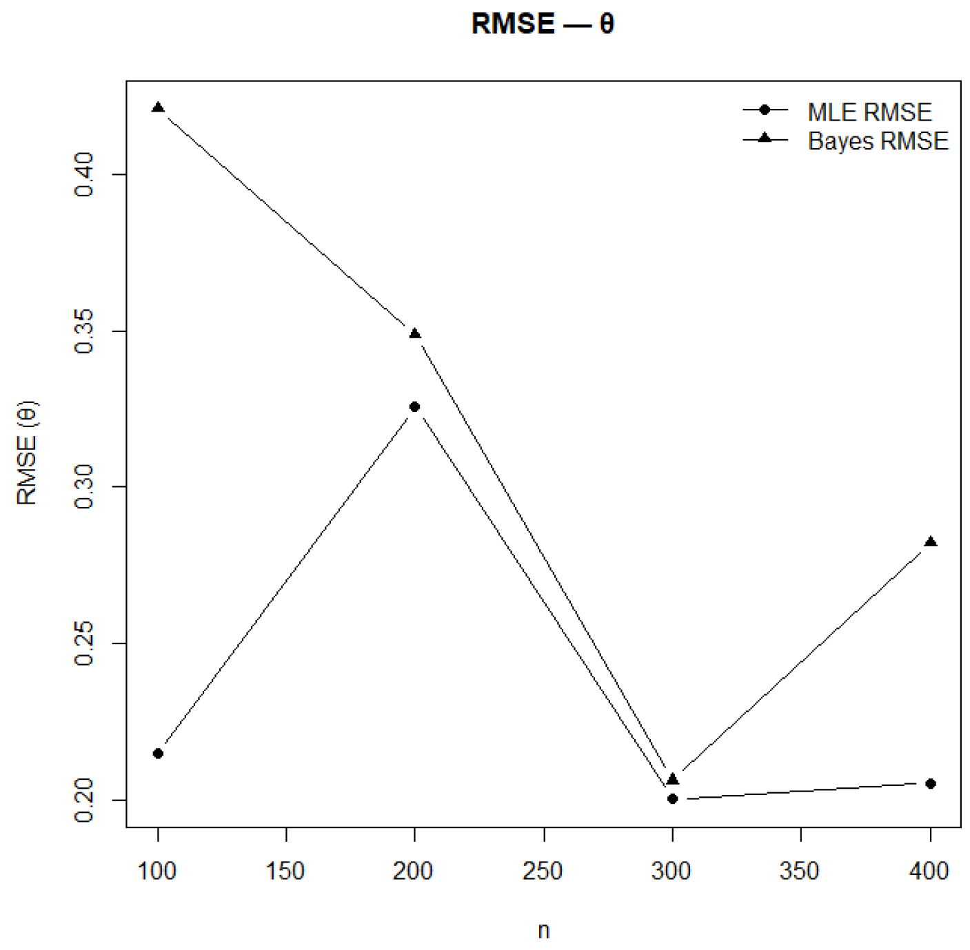
Figure 14.
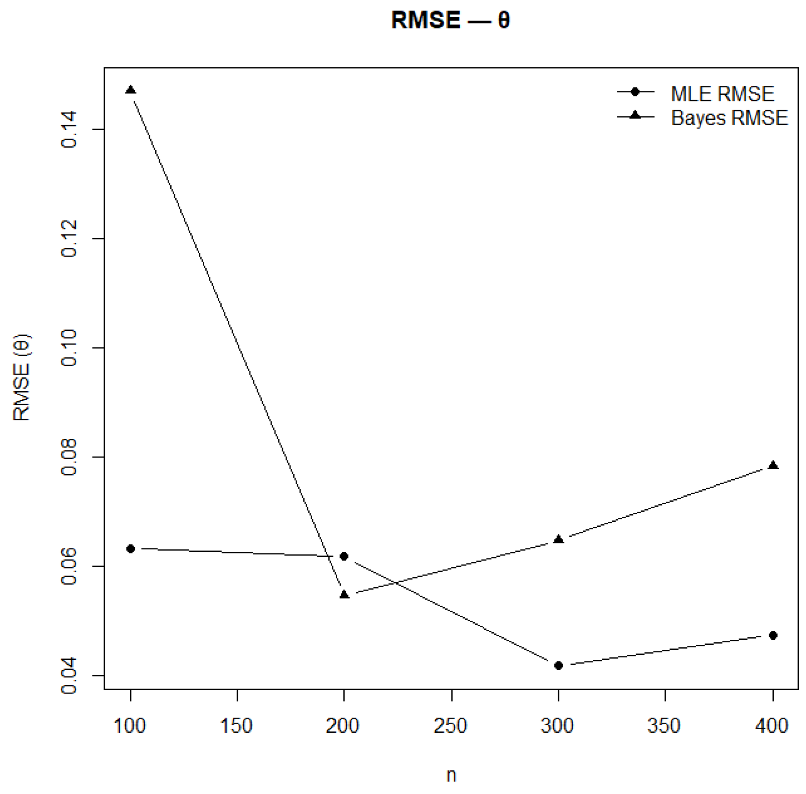
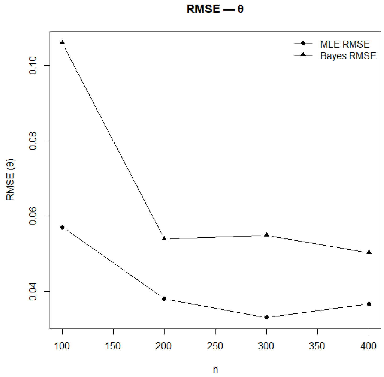
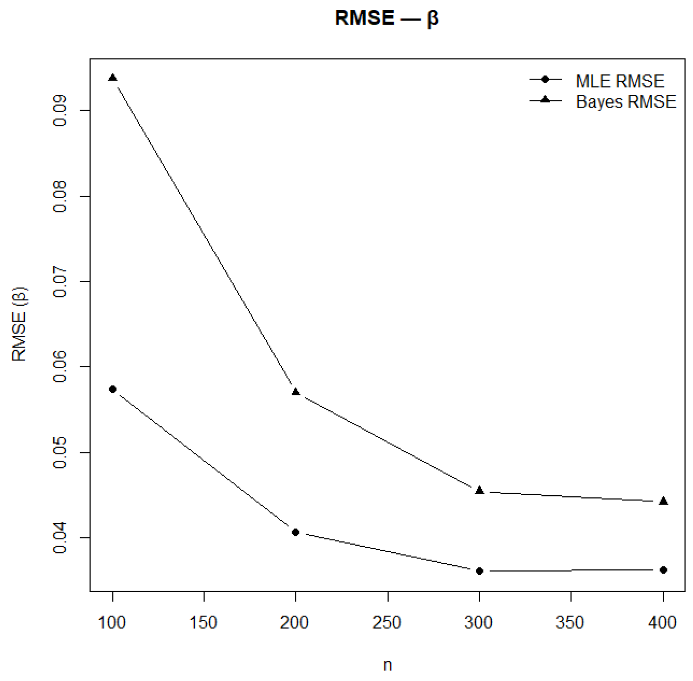
RMSE of estimates under MLE and Bayesian methods for .
Figure 14.
RMSE of estimates under MLE and Bayesian methods for .
Figure 15.
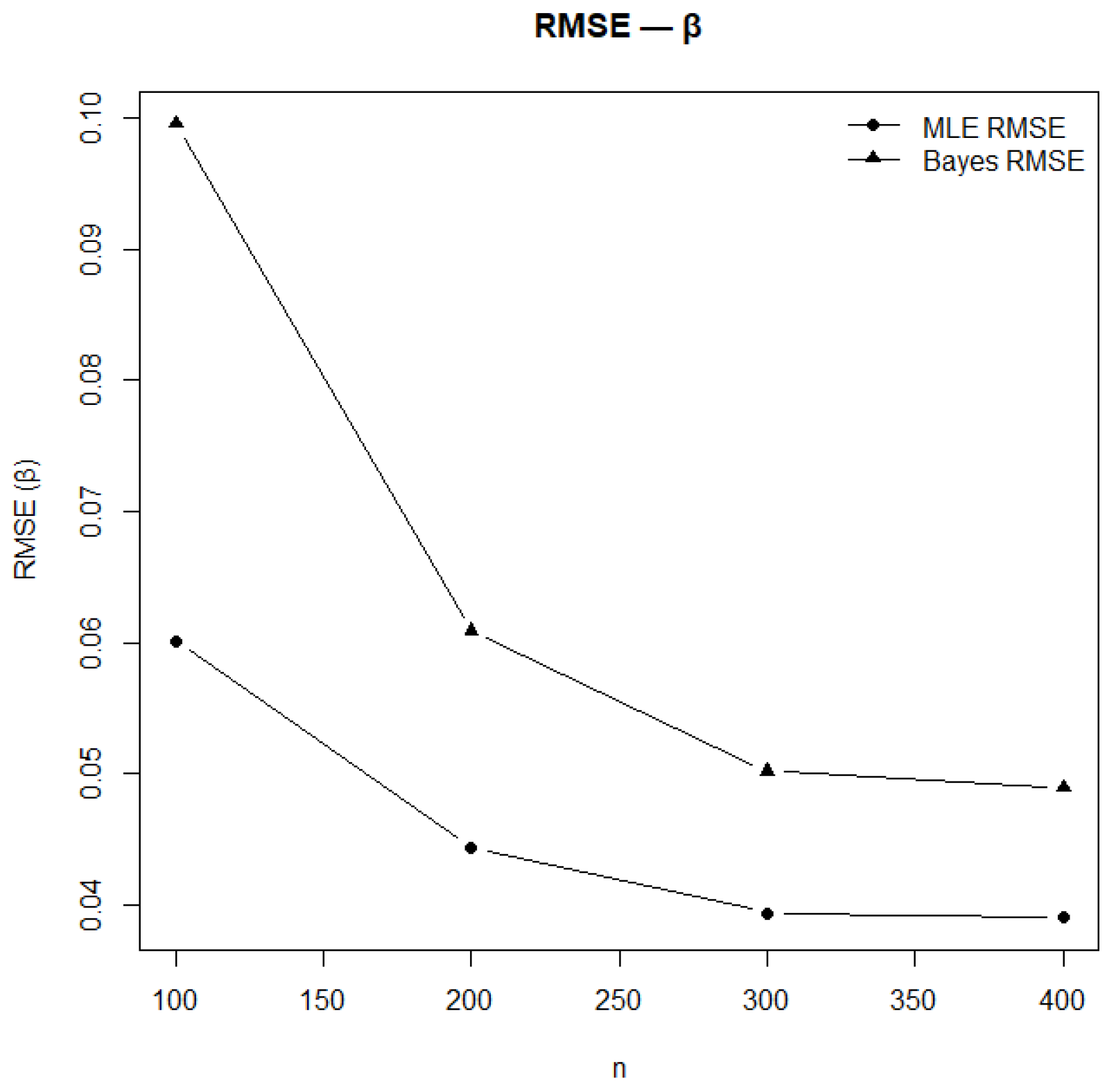
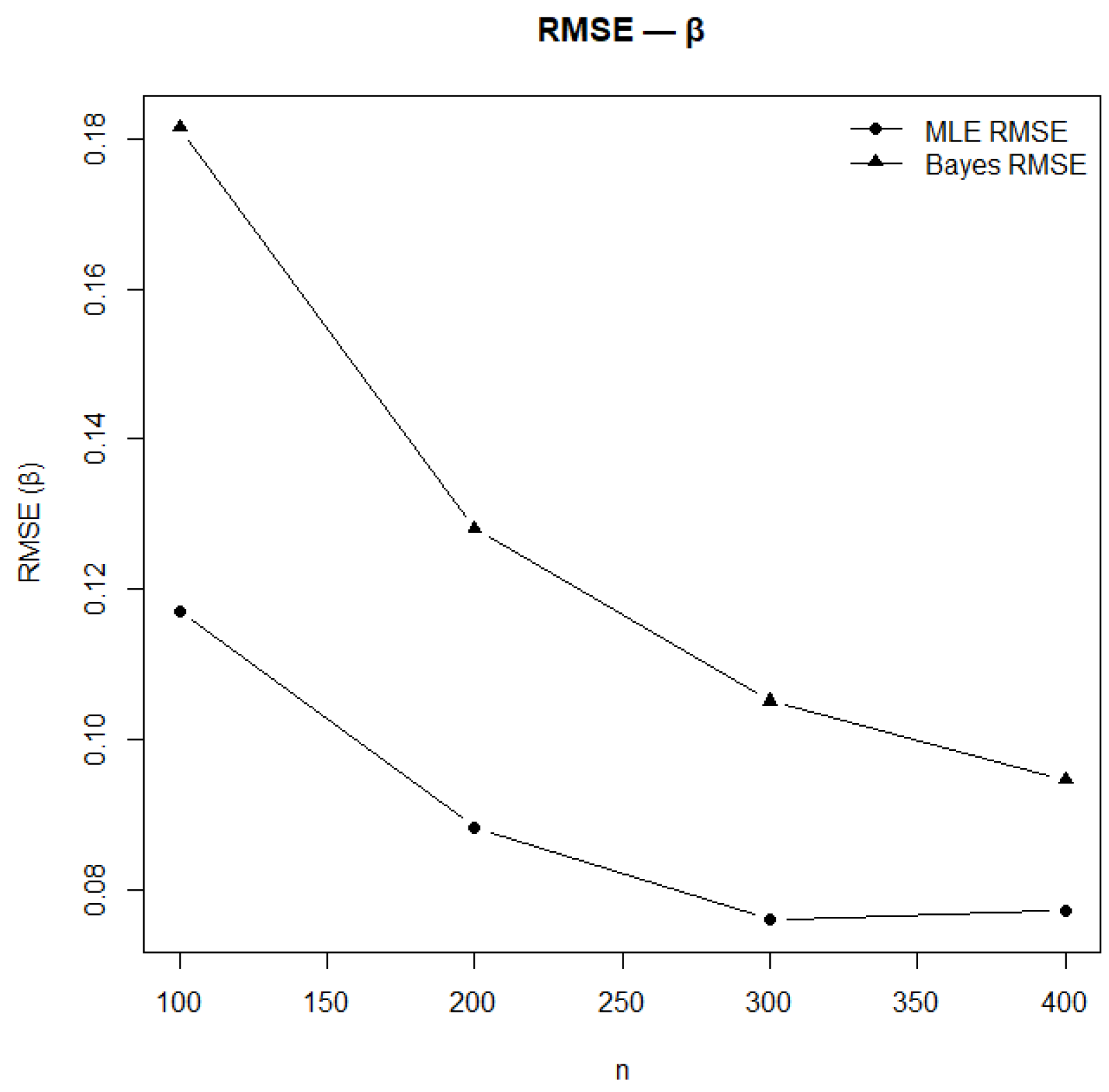
RMSE of estimates under MLE and Bayesian methods for .
Figure 15.
RMSE of estimates under MLE and Bayesian methods for .
Figure 16.
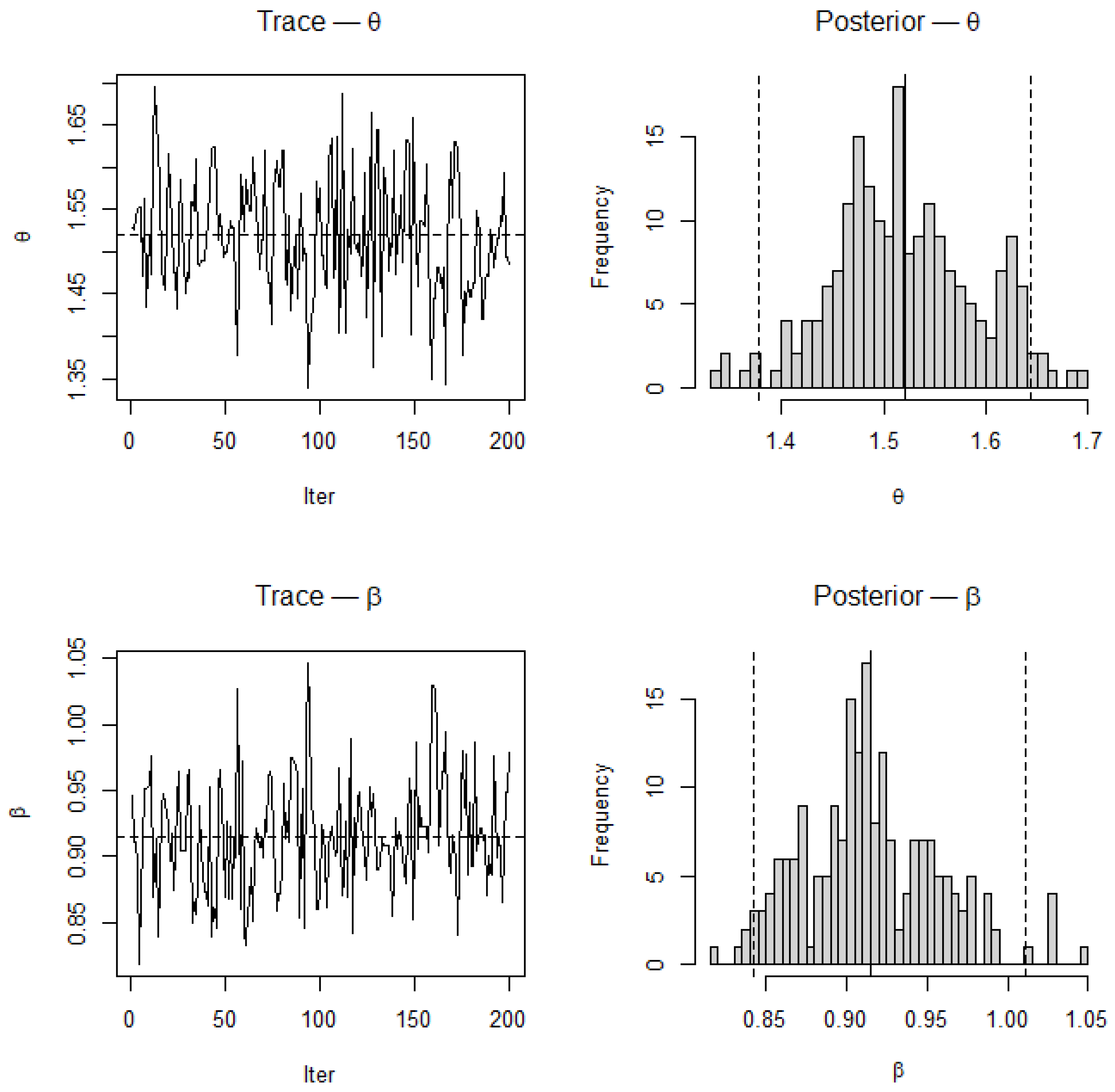
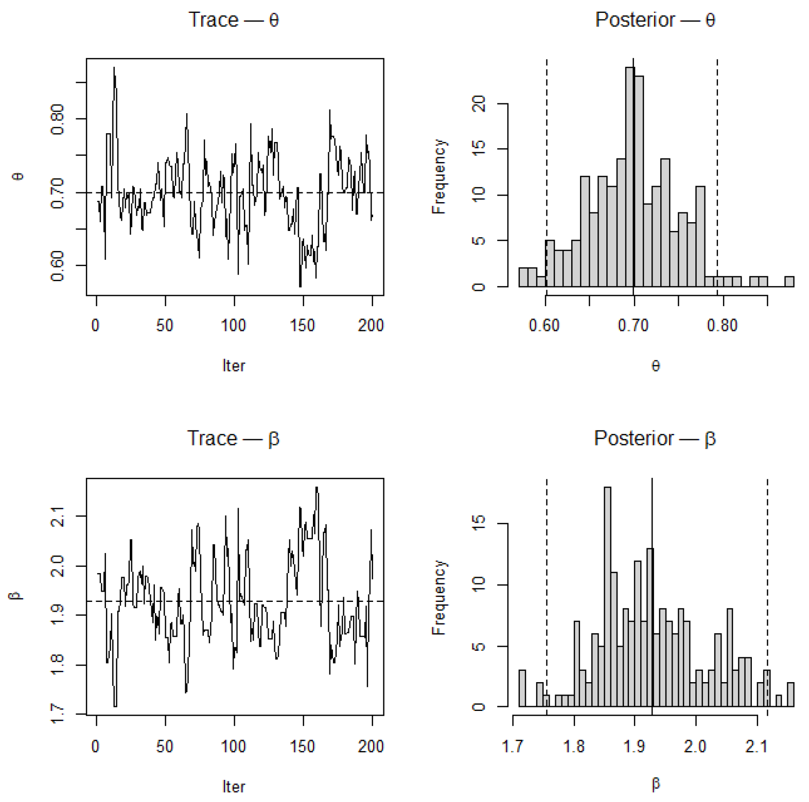
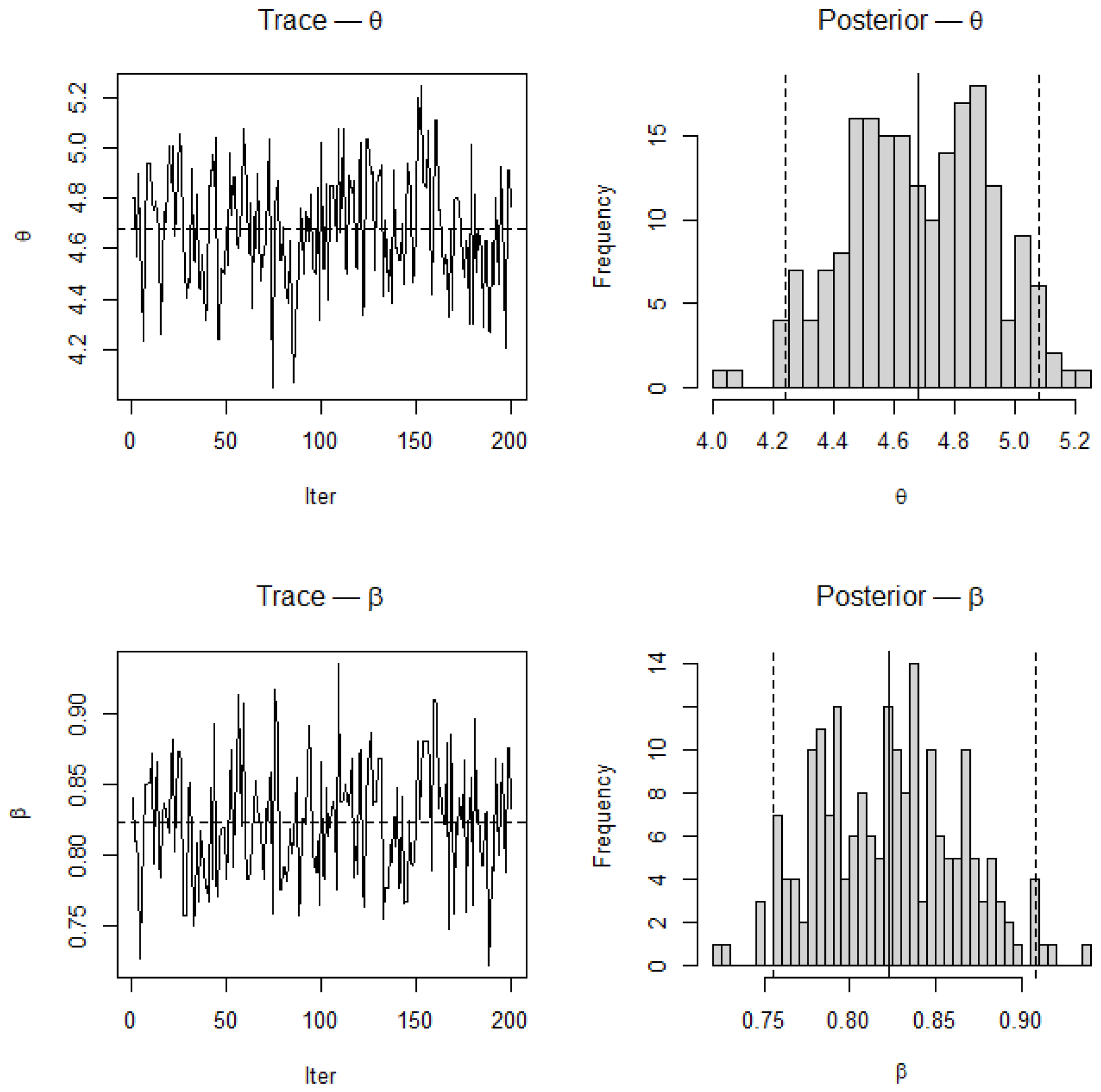
Trace and posterior density plots for and based on MCMC samples for . Dashed vertical lines represent posterior means and true parameter values used for simulation. Trace plots display good mixing and stationarity, while the posterior densities are unimodal and symmetric, confirming MCMC convergence and parameter stability.
Figure 17.
Mean estimates of and using MLE for .
Figure 17.
Mean estimates of and using MLE for .
Figure 18.
Mean estimates of and using Bayesian inference for .
Figure 18.
Mean estimates of and using Bayesian inference for .
Figure 19.
Comparison of mean estimates from MLE and Bayesian inference for .
Figure 19.
Comparison of mean estimates from MLE and Bayesian inference for .
Figure 20.
Comparison of confidence and credible interval lengths between MLE and Bayesian inference for .
Figure 20.
Comparison of confidence and credible interval lengths between MLE and Bayesian inference for .
Figure 21.
RMSE values of estimates under MLE and Bayesian methods for .
Figure 21.
RMSE values of estimates under MLE and Bayesian methods for .
Figure 22.
RMSE values of estimates under MLE and Bayesian methods for .
Figure 22.
RMSE values of estimates under MLE and Bayesian methods for .
Figure 23.
Trace plots and posterior density plots for and based on MCMC samples for . Trace plots exhibit good mixing and stationarity, while posterior densities are unimodal and symmetric, confirming convergence and stability of the Bayesian estimation.
Figure 23.
Trace plots and posterior density plots for and based on MCMC samples for . Trace plots exhibit good mixing and stationarity, while posterior densities are unimodal and symmetric, confirming convergence and stability of the Bayesian estimation.
Figure 24.
Mean estimates of and obtained using MLE for .
Figure 24.
Mean estimates of and obtained using MLE for .
Figure 25.
Mean estimates of and obtained using Bayesian inference for .
Figure 25.
Mean estimates of and obtained using Bayesian inference for .
Figure 26.
Comparison of mean estimates between MLE and Bayesian inference for .
Figure 26.
Comparison of mean estimates between MLE and Bayesian inference for .
Figure 27.
Comparison of interval lengths obtained by MLE and Bayesian inference for .
Figure 27.
Comparison of interval lengths obtained by MLE and Bayesian inference for .
Figure 28.
RMSE values of estimates under MLE and Bayesian methods for .
Figure 28.
RMSE values of estimates under MLE and Bayesian methods for .
Figure 29.
RMSE values of estimates under MLE and Bayesian methods for .
Figure 29.
RMSE values of estimates under MLE and Bayesian methods for .
Figure 30.
Trace and posterior density plots for and based on MCMC samples for .
Figure 30.
Trace and posterior density plots for and based on MCMC samples for .
Figure 31.
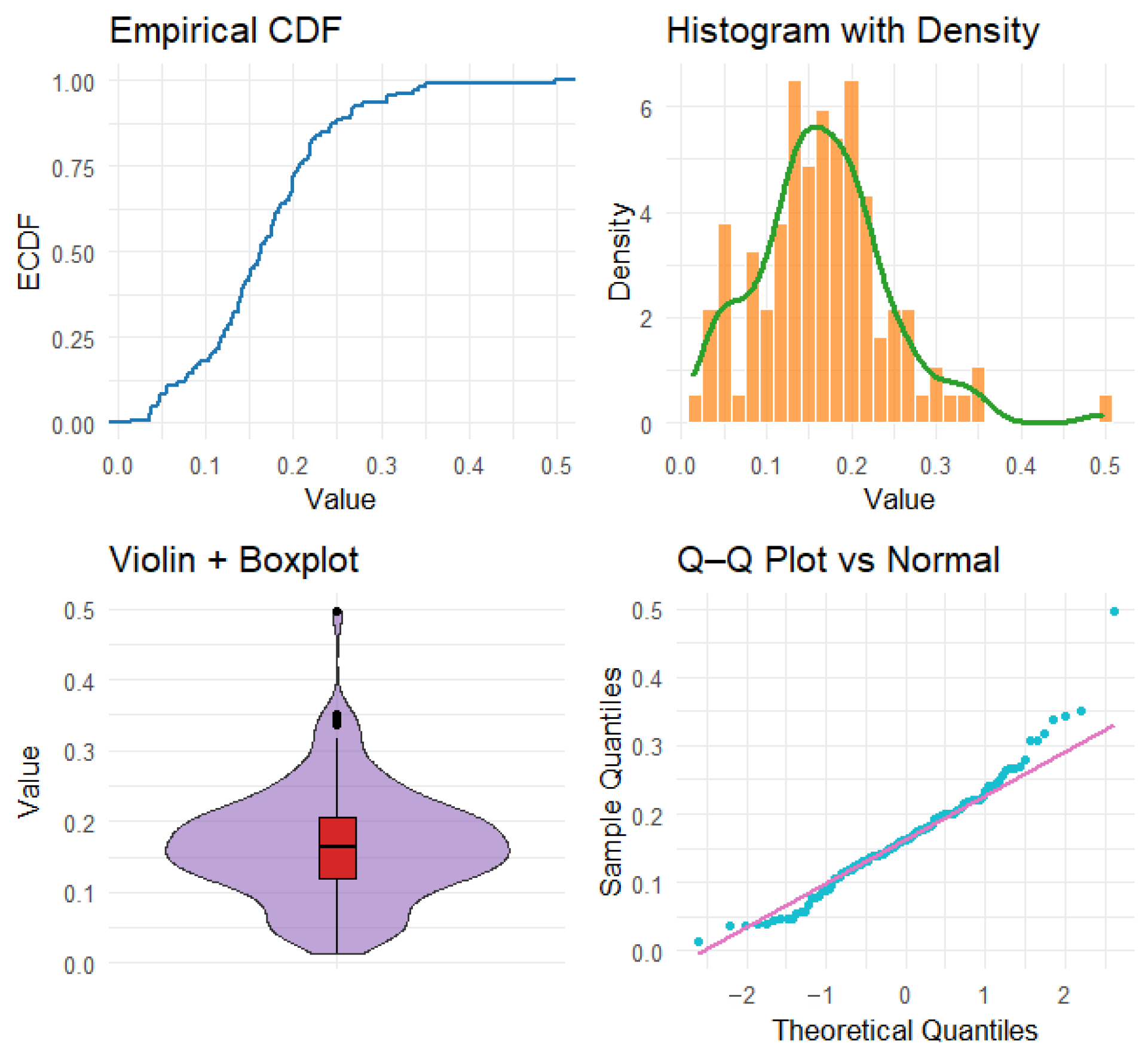
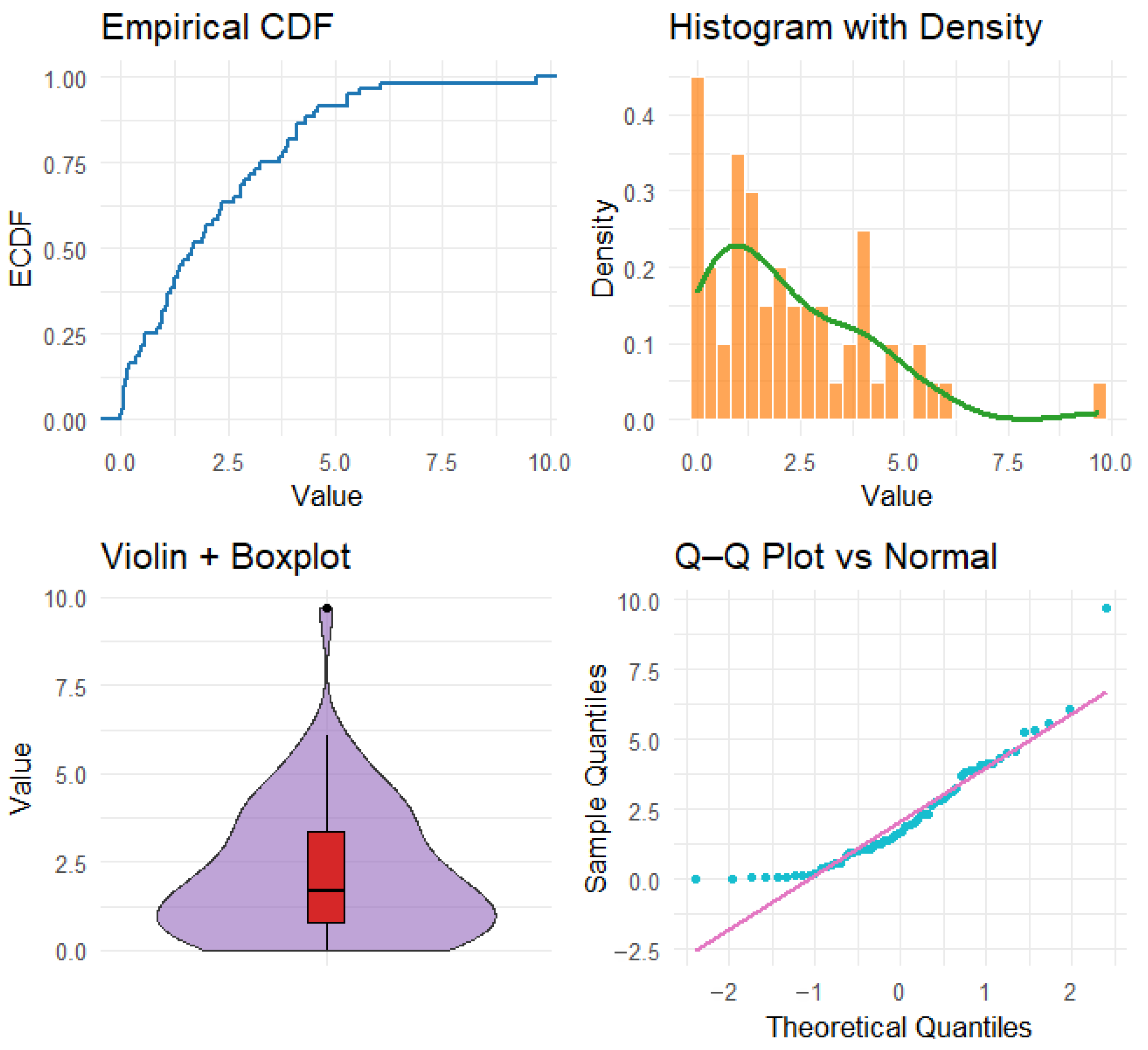
Exploratory plots for the COVID-19 mortality data, including: the empirical cumulative distribution function (blue), histogram with overlaid kernel density estimate (red), violin and boxplot representation (green), and the Q–Q plot against the normal distribution (black).
Figure 31.
Exploratory plots for the COVID-19 mortality data, including: the empirical cumulative distribution function (blue), histogram with overlaid kernel density estimate (red), violin and boxplot representation (green), and the Q–Q plot against the normal distribution (black).
Figure 32.
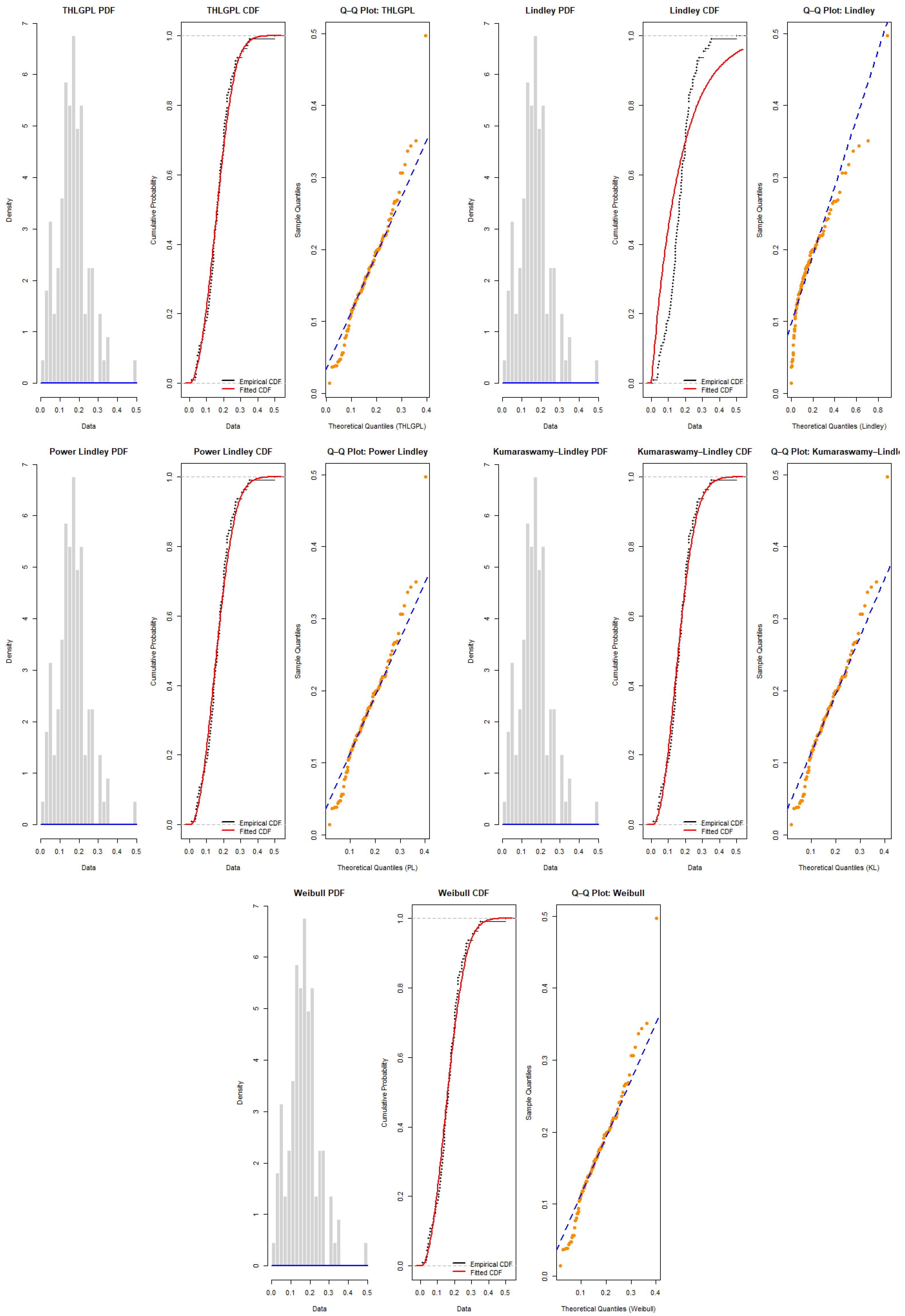
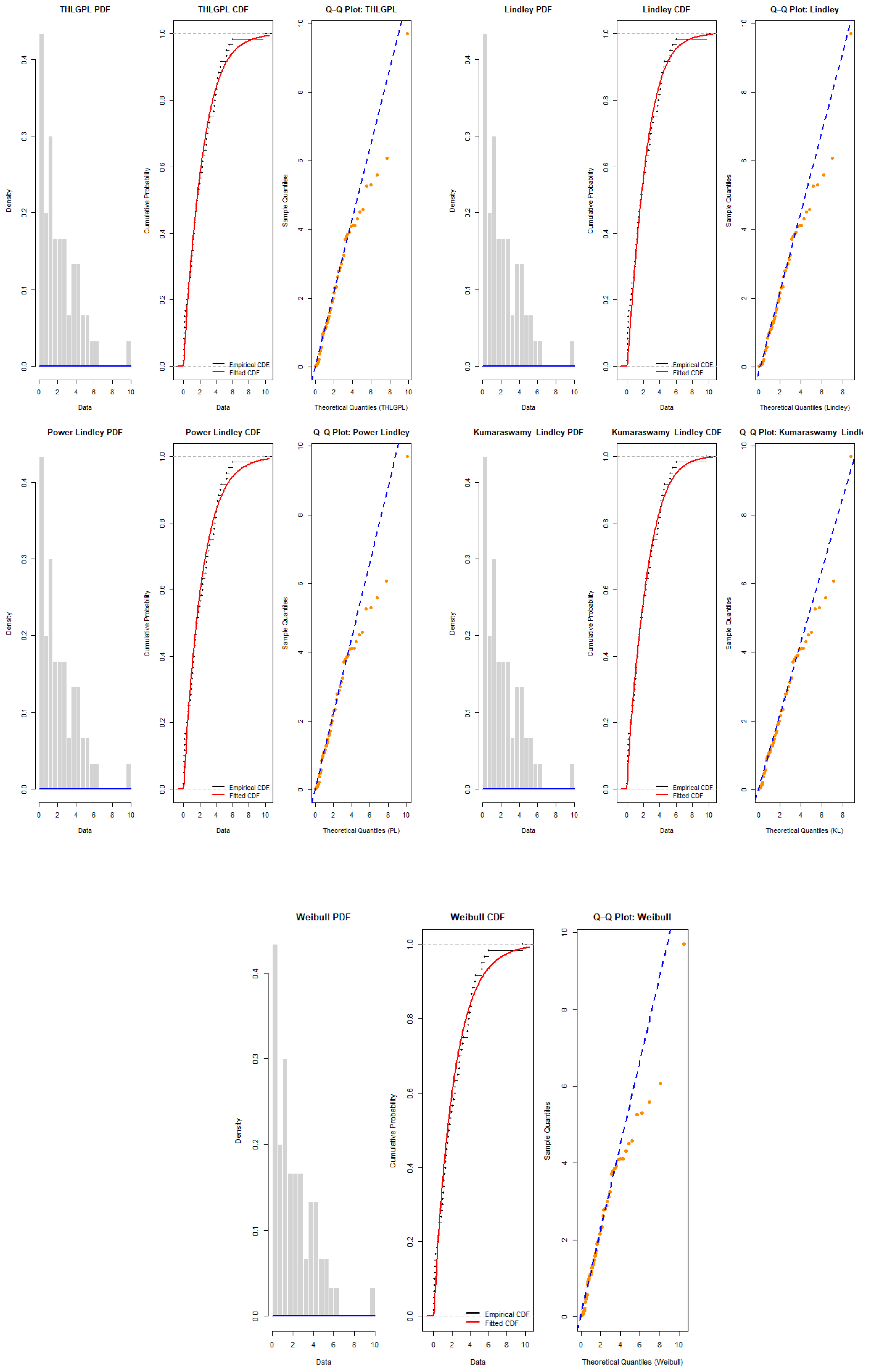
Fitted Lindley distributions for COVID-19 mortality data. The blue curves represent the empirical distribution, while the orange curves represent the fitted Lindley model. The grey dashed lines indicate the empirical quantiles used for comparison across the PDF and CDF subplots.
Figure 32.
Fitted Lindley distributions for COVID-19 mortality data. The blue curves represent the empirical distribution, while the orange curves represent the fitted Lindley model. The grey dashed lines indicate the empirical quantiles used for comparison across the PDF and CDF subplots.
Figure 33.
Exploratory plots for the electrical appliance failure data, including: empirical cumulative distribution function (blue), histogram with overlaid kernel density estimate (red), violin and boxplot representation (green), and Q–Q plot against the normal distribution (black).
Figure 33.
Exploratory plots for the electrical appliance failure data, including: empirical cumulative distribution function (blue), histogram with overlaid kernel density estimate (red), violin and boxplot representation (green), and Q–Q plot against the normal distribution (black).
Figure 34.
Fitted THLGPL distribution for the electrical appliance failure data. The blue curves represent the empirical distribution, while the orange curves represent the fitted Lindley model. The grey dashed lines indicate the empirical quantiles used for comparison across the PDF and CDF subplots.
Figure 35.
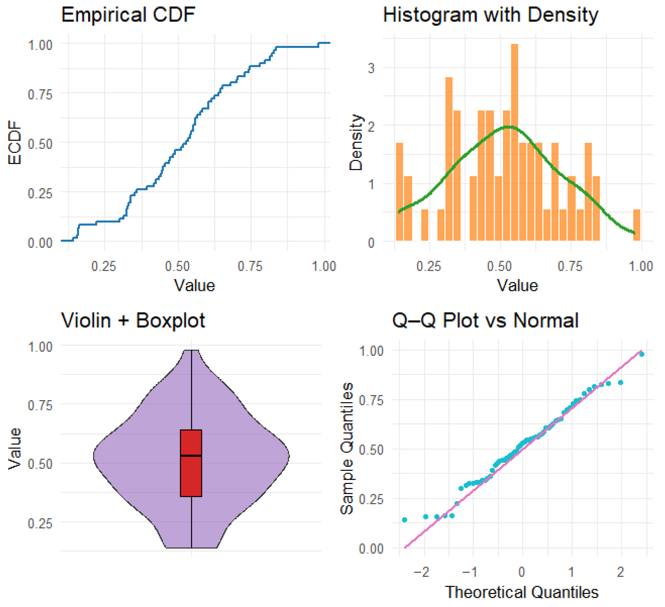
Exploratory plots for the trade share data, including: empirical cumulative distribution function (blue), histogram with overlaid kernel density estimate (red), violin and boxplot representation (green), and Q–Q plot points against the normal distribution (black).
Figure 35.
Exploratory plots for the trade share data, including: empirical cumulative distribution function (blue), histogram with overlaid kernel density estimate (red), violin and boxplot representation (green), and Q–Q plot points against the normal distribution (black).
Figure 36.
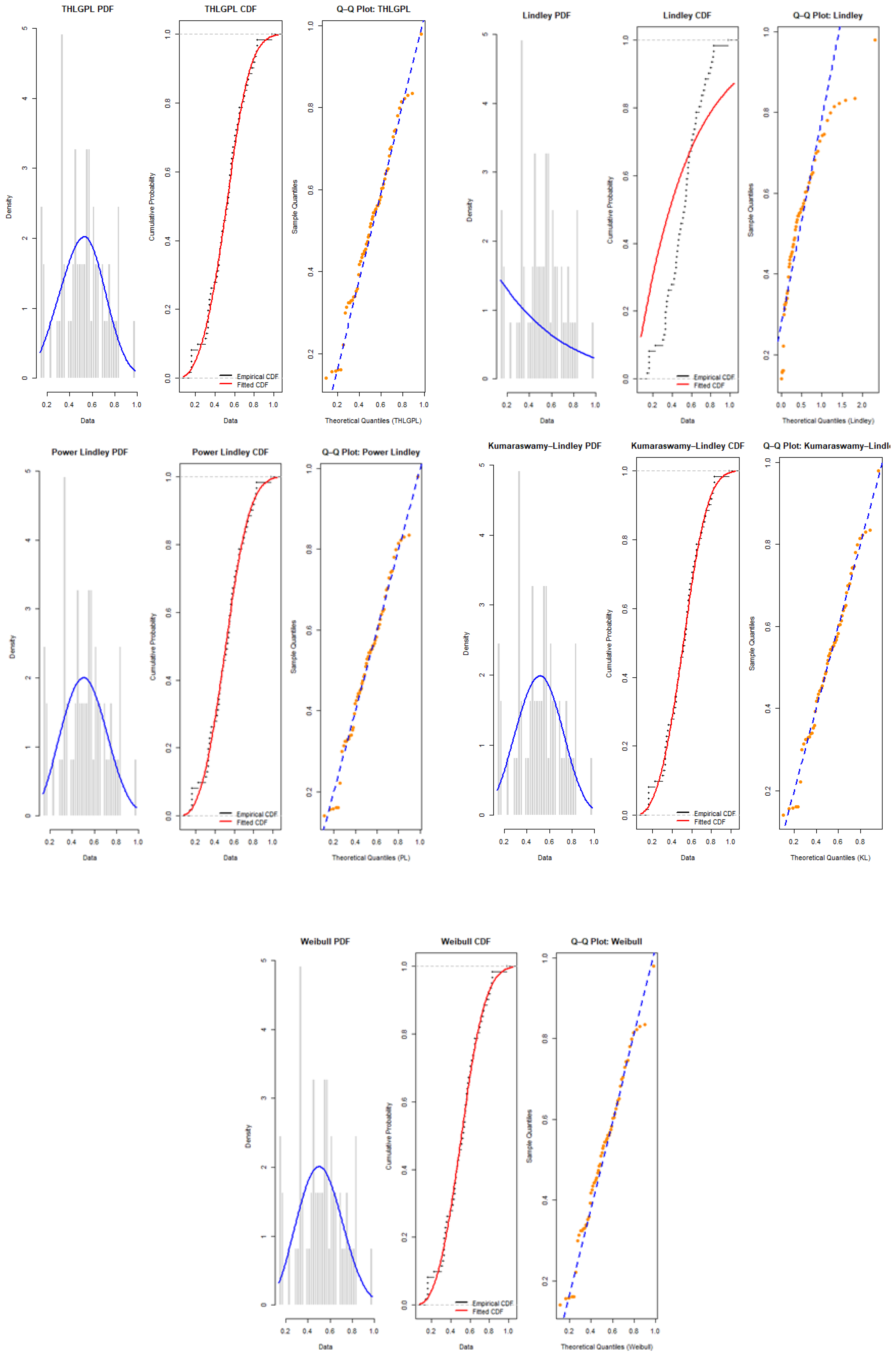
Fitted Lindley distributions for the trade share data. The blue curves represent the empirical distribution, while the orange curves represent the fitted Lindley model. The grey dashed lines indicate the empirical quantiles used for comparison across the PDF and CDF subplots.
Figure 36.
Fitted Lindley distributions for the trade share data. The blue curves represent the empirical distribution, while the orange curves represent the fitted Lindley model. The grey dashed lines indicate the empirical quantiles used for comparison across the PDF and CDF subplots.
Table 1.
Selected Lindley-type models and typical limitations.
Table 1.
Selected Lindley-type models and typical limitations.
| Model | Skewness | Tail | Limitation |
|---|
| Lindley | Moderate | Light | Poor heavy-tail fit |
| Power Lindley (PL) | Adjustable | Heavier | Limited hazard flexibility |
| Half-Logistic Lindley (HLL) | Adjustable | Moderate | Complex form; partial flexibility |
| THLGPL (proposed) | Adjustable | Robust | Joint heavy-tail and hazard versatility |
Table 11.
Descriptive statistics for COVID-19 mortality data.
Table 11.
Descriptive statistics for COVID-19 mortality data.
| Min | | Median | Mean | | Max | | | Skew. | Kurt. |
|---|
| 0.0138 | 0.12005 | 0.1628 | 0.166793 | 0.20635 | 0.4972 | 0.078755 | 0.006202 | 0.783397 | 2.045369 |
Table 12.
Goodness-of-fit statistics and parameter estimates for different distributions (COVID-19 mortality data).
Table 12.
Goodness-of-fit statistics and parameter estimates for different distributions (COVID-19 mortality data).
| | THLGPL | Lindley | Power Lindley | Kumaraswamy–Lindley | Weibull |
|---|
| 1.911877 (0.143887) | – | 2.221702 (0.159832) | 33.239373 (75.992599) | 2.222337 (0.159565) |
| 37.068725 (8.173267) | 6.767343 (0.576615) | 41.951075 (10.438794) | 2.121992 (2.182595) | 0.187983 (0.008449) |
| – | – | – | 2.475025 (0.470176) | – |
| KS Statistic | 0.064421 | 0.280617 | 0.068346 | 0.067509 | 0.068349 |
| KS p-value | 0.746318 | 0.000000 | 0.677613 | 0.692441 | 0.677560 |
| AD Statistic | 0.577168 | 14.307276 | 0.720610 | 0.724820 | 0.720500 |
| AD p-value | 0.669464 | 0.000005 | 0.541523 | 0.538119 | 0.541613 |
| logL | 129.159138 | 88.533855 | 128.550781 | 128.831171 | 128.556554 |
| AIC | −254.318276 | −175.067709 | −253.101562 | −251.662342 | −253.113107 |
| BIC | −248.899216 | −172.358179 | −247.682501 | −243.533751 | −247.694047 |
| CAIC | −246.899216 | −171.358179 | −245.682501 | −240.533751 | −245.694047 |
| HQIC | −252.119923 | −173.968533 | −250.903209 | −248.364813 | −250.914755 |
Table 13.
Comparison of MLE and Bayesian estimates for the THLGPL distribution (COVID-19 mortality data).
Table 13.
Comparison of MLE and Bayesian estimates for the THLGPL distribution (COVID-19 mortality data).
| | MLE Estimation | Bayesian Estimation |
|---|
| 37.068725 (SE = 8.173267) | 35.011518 (SE = 8.173267) |
| 1.911877 (SE = 0.143887) | 1.871007 (SE = 0.133270) |
Table 15.
Goodness-of-fit statistics and parameter estimates for the electrical appliance failure data.
Table 15.
Goodness-of-fit statistics and parameter estimates for the electrical appliance failure data.
| | THLGPL | Lindley | Power Lindley | Kumaraswamy–Lindley | Weibull |
|---|
| 0.790306 (0.083030) | – | 0.888322 (0.089060) | 13206.357591 (82.9081) | 1.000871 (0.106627) |
| 1.133466 (0.135617) | 0.720972 (0.068908) | 0.804201 (0.103117) | 0.000538 (0.789654) | 2.193694 (0.296099) |
| – | – | – | 0.707202 (0.587964) | – |
| KS Statistic | 0.073886 | 0.101782 | 0.076680 | 0.961472 | 0.077701 |
| KS p-value | 0.874577 | 0.529708 | 0.845486 | 0.966736 | 0.834248 |
| AD Statistic | 0.501755 | 1.022717 | 0.646735 | 0.830110 | 0.792389 |
| AD p-value | 0.744338 | 0.345245 | 0.604265 | 0.913610 | 0.485999 |
| logL | −104.297424 | −107.297424 | −106.549844 | −105.227348 | −107.115282 |
| AIC | 212.594848 | 216.594847 | 217.099688 | 216.454696 | 218.230565 |
| BIC | 216.849117 | 218.689192 | 221.288377 | 222.737729 | 222.419254 |
| CAIC | 218.849117 | 219.689192 | 223.288377 | 225.737729 | 219.868992 |
| HQIC | 214.265181 | 217.414061 | 218.738115 | 218.912336 | 224.419254 |
Table 16.
Comparison of MLE and Bayesian estimates for the THLGPL distribution (the electrical appliance failure data).
Table 16.
Comparison of MLE and Bayesian estimates for the THLGPL distribution (the electrical appliance failure data).
| | MLE Estimation | Bayesian Estimation |
|---|
| 1.133466 (SE = 0.135617) | 1.140753 (SE = 0.136993) |
| 0.790306 (SE = 0.083030) | 0.789864 (SE = 0.083699) |
Table 17.
Descriptive statistics for the trade share data.
Table 17.
Descriptive statistics for the trade share data.
| Min | | Median | Mean | | Max | | | Skew. | Kurt. |
|---|
| 0.1405 | 0.3589 | 0.5278 | 0.514157 | 0.6395 | 0.9794 | 0.037454 | 0.193529 | 0.006283 | |
Table 18.
Goodness-of-fit statistics and estimated parameters for the trade share data.
Table 18.
Goodness-of-fit statistics and estimated parameters for the trade share data.
| | THLGPL | Lindley | Power Lindley | Kumaraswamy–Lindley | Weibull |
|---|
| 2.502610 (0.270945) | – | 2.916096 (0.303181) | 687327995.150202 | 2.950000 (0.300557) |
| | | | | (54062763732.561981) | |
| 6.554546 (0.902979) | 2.500538 (0.262310) | 5.752369 (0.923360) | 0.018538 (0.305836) | 0.576356 (0.026286) |
| – | – | – | 2.455136 (0.299165) | – |
| KS Statistic | 0.052614 | 0.327479 | – | 0.054460 | 0.059085 |
| KS p-value | 0.992665 | 0.000003 | – | 0.989103 | 0.975005 |
| AD Statistic | 0.250411 | 9.787833 | – | 0.262991 | 0.312175 |
| AD p-value | 0.970098 | 0.000020 | – | 0.963000 | 0.928467 |
| logL | 14.820416 | −18.233801 | 14.682059 | 14.821036 | 14.636675 |
| AIC | −25.640832 | 38.467602 | −25.364119 | −23.642073 | −25.273349 |
| BIC | −21.419084 | 40.578476 | −21.142371 | −17.309451 | −21.051601 |
| CAIC | −19.419084 | 41.578476 | −19.142371 | −14.309451 | −19.051601 |
| HQIC | −23.986289 | 39.294873 | −23.709576 | −21.160259 | −23.618807 |
Table 19.
Comparison of MLE and Bayesian estimates for the THLGPL distribution for the trade share data.
Table 19.
Comparison of MLE and Bayesian estimates for the THLGPL distribution for the trade share data.
| | MLE Estimation | Bayesian Estimation |
|---|
| 6.554546 (SE = 0.902979) | 6.610546 (SE = 0.911016) |
| 2.502610 (SE = 0.270945) | 2.508973 (SE = 0.258576) |
