Figure 1.
Labeled LiDAR point cloud of a scene with power lines where each color represents a different class. The point cloud was obtained by an ALS platform and exhibits a mean density of 27 points per square meter. The precision of LiDAR data is evidenced by their ability to capture the geometric structure of the scene.
Figure 2.
Overview of the LiDAR semantic segmentation pipeline: Each LiDAR tile undergoes a multi-step process, beginning with partitioning into subtiles and normalization of heights. Then, a supervised point-based neural network is trained using efficient strategies for point cloud segmentation. During inference, the method employs sampling techniques that consider point classification uncertainty, resulting in a robust point classification.
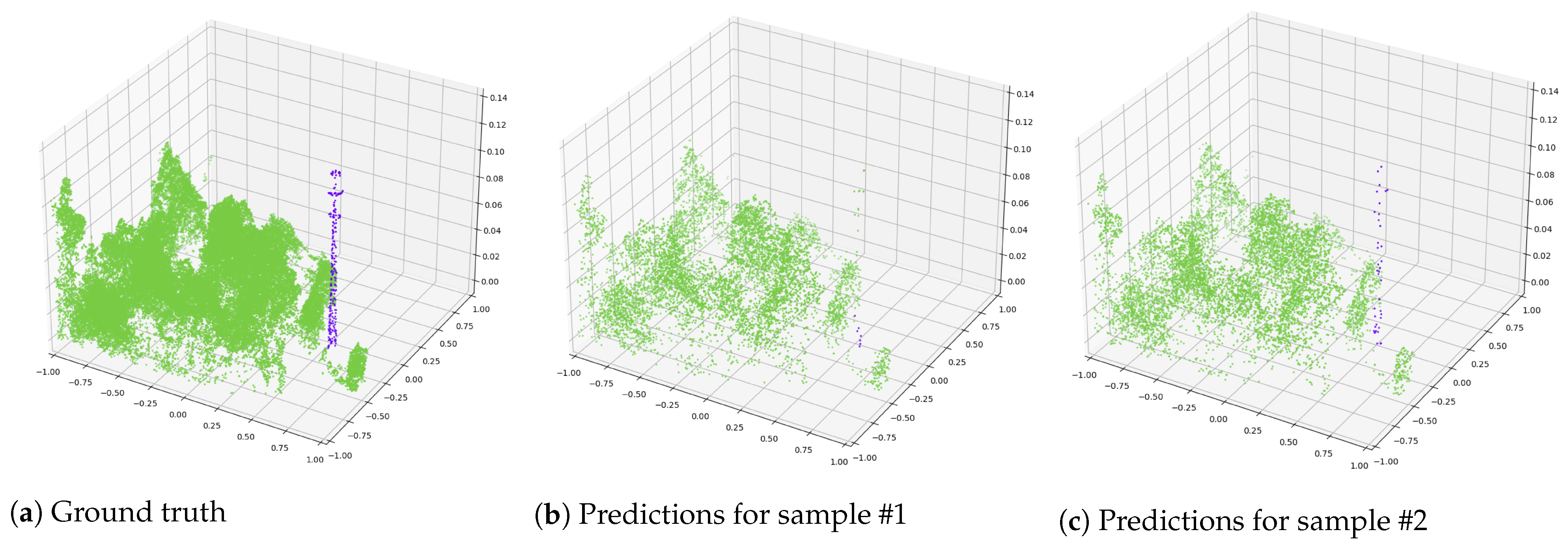
Figure 3.
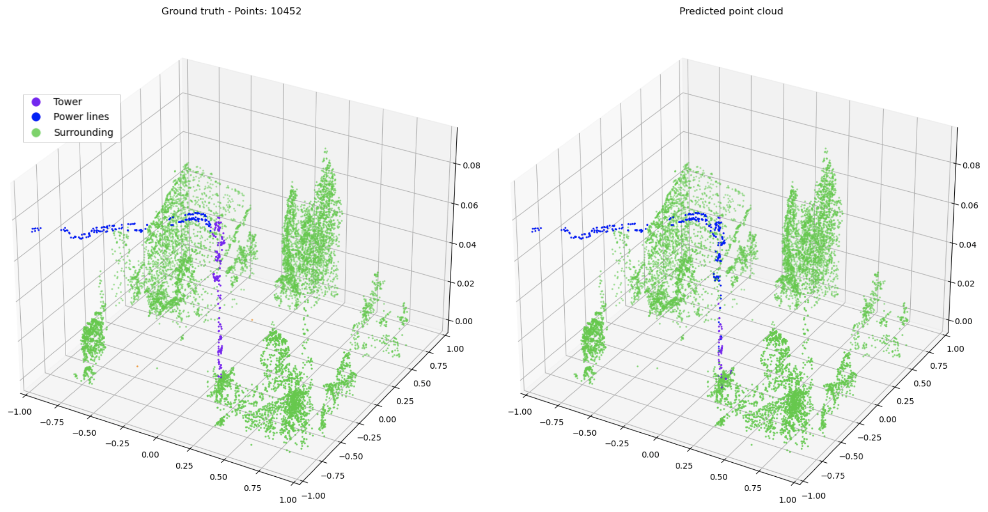
Full ground truth point cloud with 59,694 points and predictions for two different random samples of 8000 points. Green points represent the surrounding category, and purple points represent towers. Predictions vary due to different sampled points. In (b), some points are misclassified as vegetation, while (c) accurately classifies both categories.
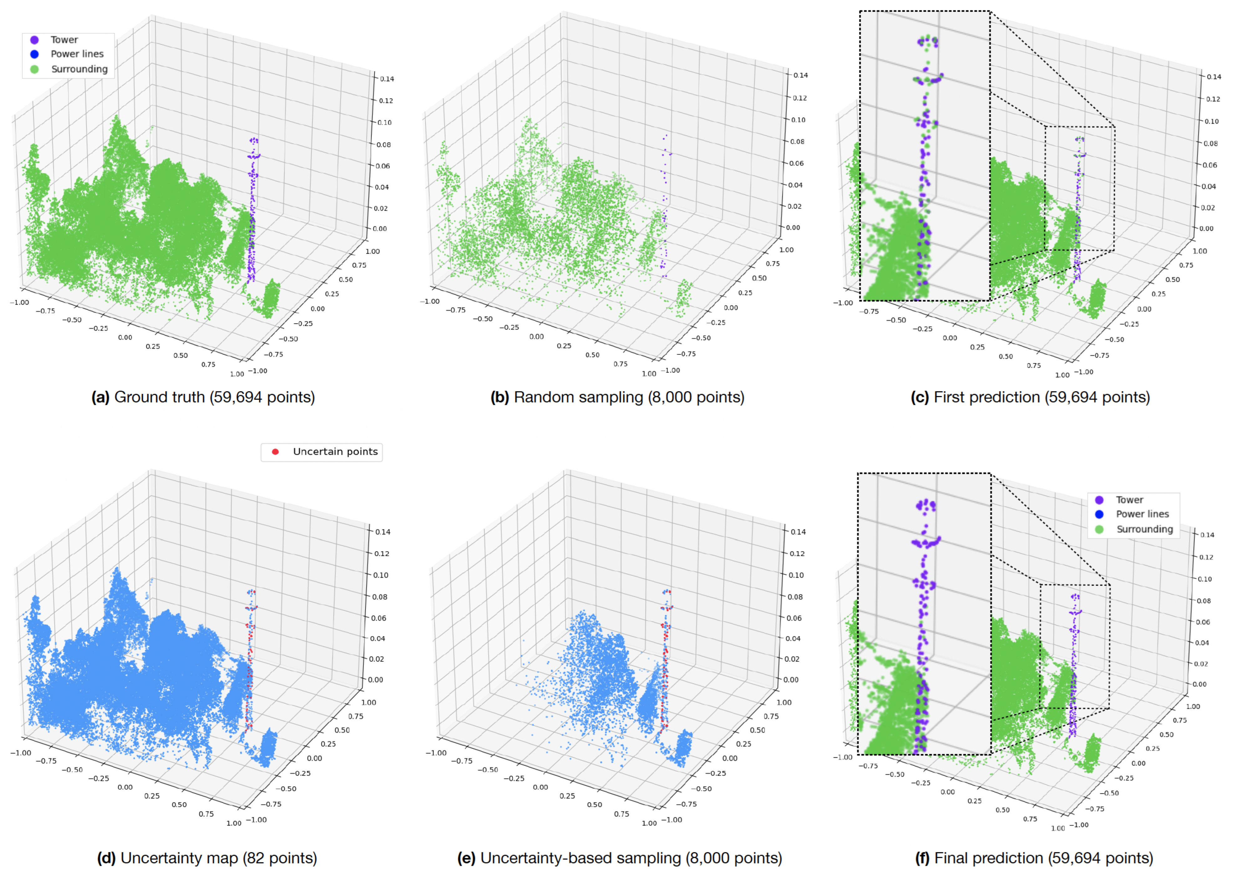
Figure 4.
Inference process illustrated from left to right, utilizing uncertainty-based sampling. (a) The complete labeled point cloud is initially presented. (b) The point cloud is transformed into 8000-point samples. (c) Predictions from all samples are obtained and merged. (d) Examination for uncertain points is conducted, identifying points with different predictions marked in red. (e) The point cloud is resampled using uncertainty-based sampling. (f) Final predictions.
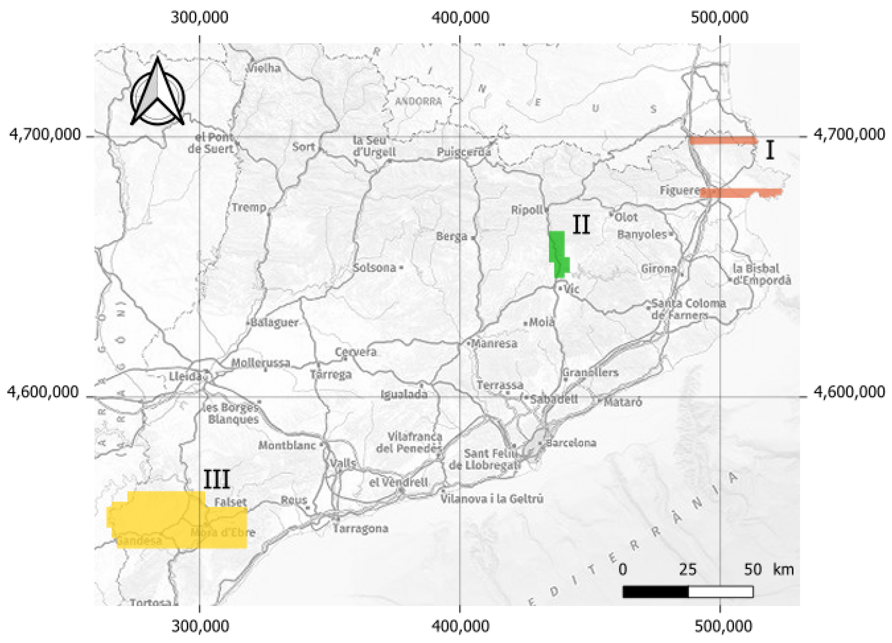
Figure 5.
Scanned areas of Catalonia. Alt Empordà (I), Ribera del Ter (II), and Terra Alta (III). The reference system of the indicated coordinates is ETRS89 and it is projected in UTM zone 31N.
Figure 5.
Scanned areas of Catalonia. Alt Empordà (I), Ribera del Ter (II), and Terra Alta (III). The reference system of the indicated coordinates is ETRS89 and it is projected in UTM zone 31N.
Figure 6.
A variety of m subtile instances displaying different classes within the dataset. This selection provides a glimpse into the rich diversity of object sizes and shapes present in the dataset.
Figure 6.
A variety of m subtile instances displaying different classes within the dataset. This selection provides a glimpse into the rich diversity of object sizes and shapes present in the dataset.
Figure 7.
Descriptive histograms depicting the distributions of classes in (a) and the number of points in (b) within m overlapping subtiles.
Figure 7.
Descriptive histograms depicting the distributions of classes in (a) and the number of points in (b) within m overlapping subtiles.
Figure 8.
The same point cloud is visualized through: (a) RGB representation, and (b) NDVI colorization. In the latter (b), points are only colorized if they surpass the threshold of 0.2.
Figure 8.
The same point cloud is visualized through: (a) RGB representation, and (b) NDVI colorization. In the latter (b), points are only colorized if they surpass the threshold of 0.2.
Figure 9.
Isometric view of the out-of-domain data, comprising four tiles of LiDAR data.
Figure 9.
Isometric view of the out-of-domain data, comprising four tiles of LiDAR data.
Figure 10.
Comparison of normalized confusion matrices obtained by performing inference on all points against 8000-point samplings across the three regions.
Figure 10.
Comparison of normalized confusion matrices obtained by performing inference on all points against 8000-point samplings across the three regions.
Figure 11.
Left: Ground truth|Right: Predictions. Errors arise when all points are fed into the network, causing confusion between objects and surrounding, especially in areas with high point density.
Figure 11.
Left: Ground truth|Right: Predictions. Errors arise when all points are fed into the network, causing confusion between objects and surrounding, especially in areas with high point density.
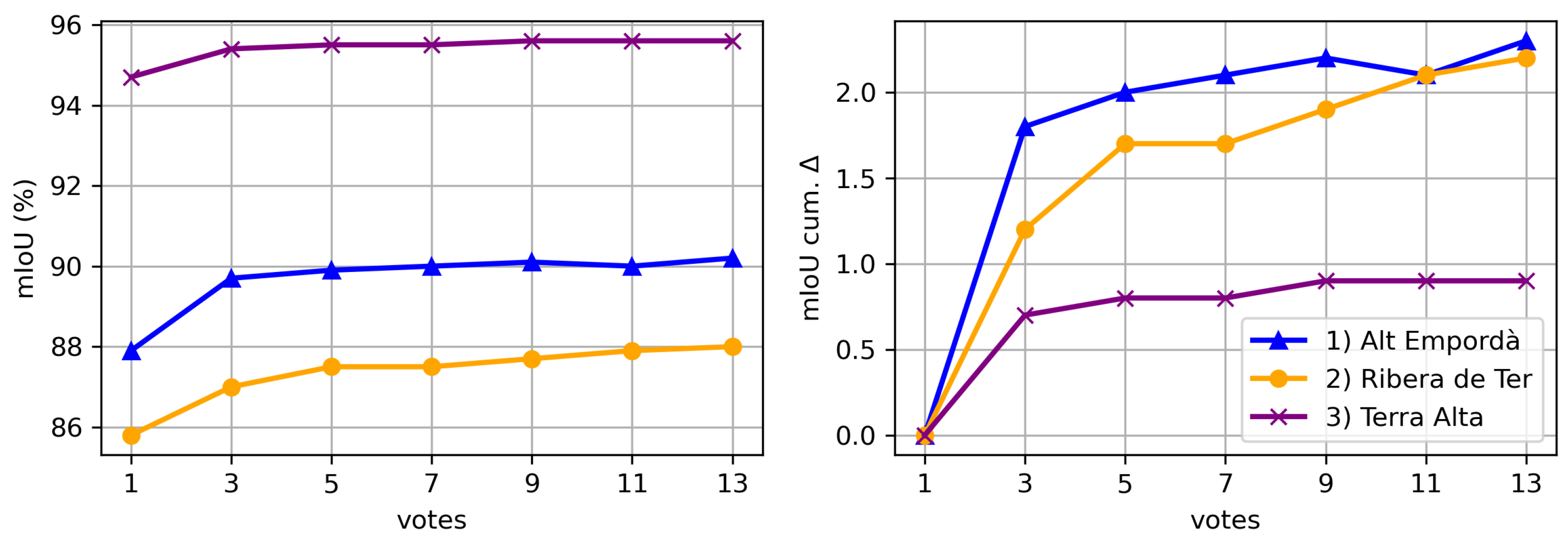
Figure 12.
mIoU (%) and cumulative mIoU gain per number of votes for each dataset. The “votes” axis represents the number of votes considered, ranging from 1 to 13. The mIoU value signifies the mean Intersection over Union across all classes for each dataset, while the cumulative mIoU indicates the incremental increase in mIoU per dataset with the addition of votes.
Figure 13.
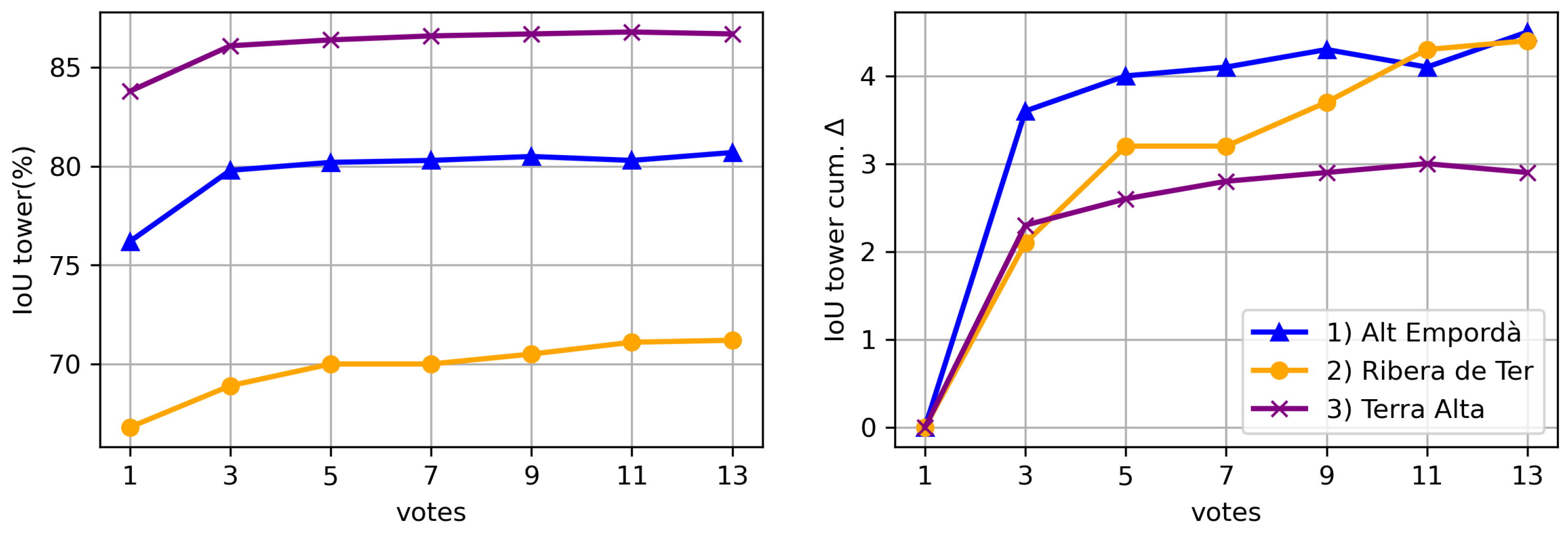
IoU tower (%) and cumulative IoU tower gain per number of votes for each dataset.
Figure 13.
IoU tower (%) and cumulative IoU tower gain per number of votes for each dataset.
Figure 14.
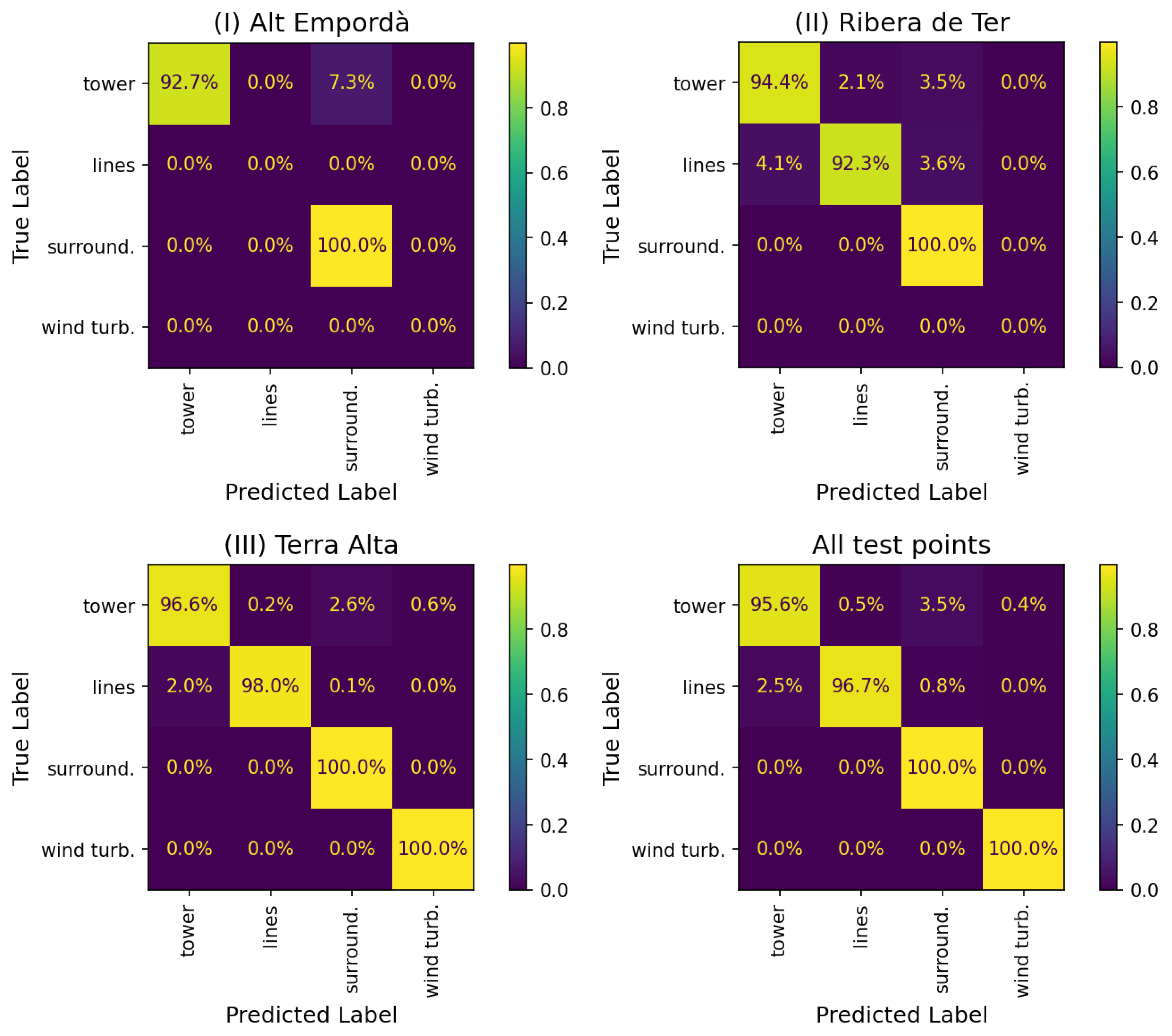
Normalized confusion matrices using PN++ with uncertainty-based inference for each test dataset and across all test points.
Figure 14.
Normalized confusion matrices using PN++ with uncertainty-based inference for each test dataset and across all test points.
Figure 15.
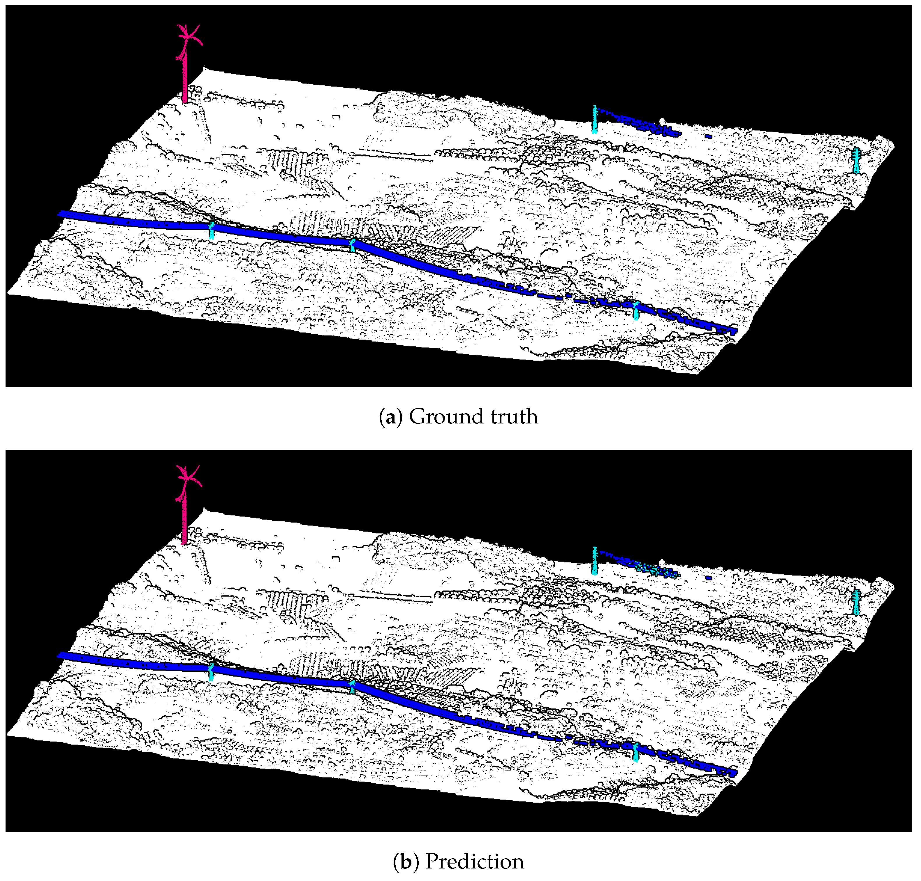
Ground truth and predicted labels for a scene from Terra Alta dataset. Different colors identify different classes.
Figure 15.
Ground truth and predicted labels for a scene from Terra Alta dataset. Different colors identify different classes.
Figure 16.
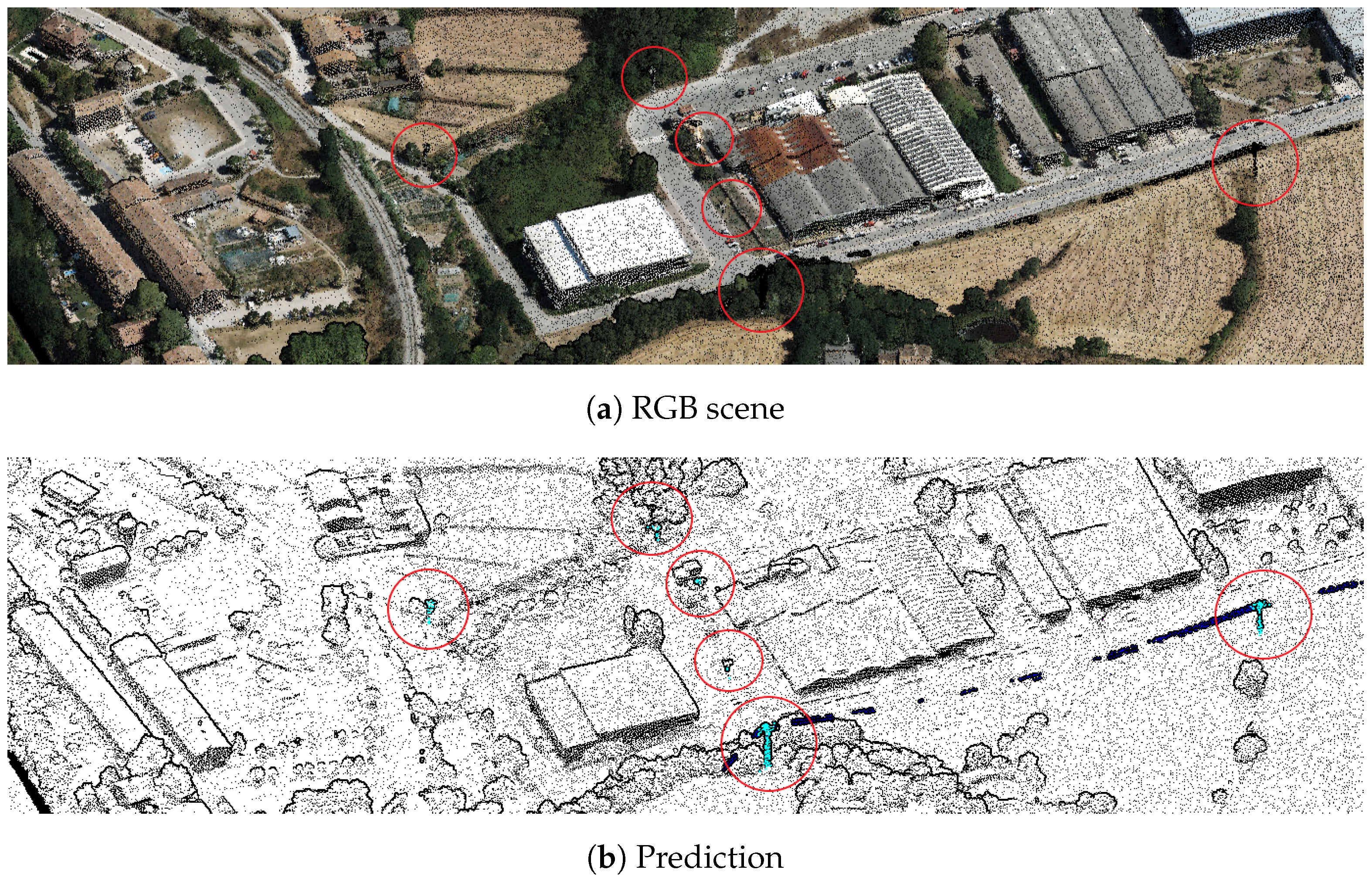
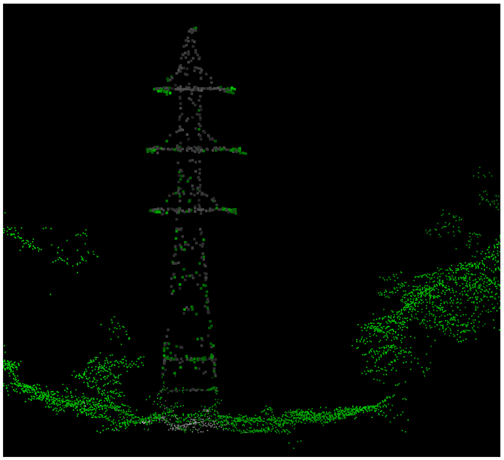
Point cloud scene from Ribera de Ter dataset, colorized by RGB, along with its corresponding semantic segmentation predictions. Towers classified by the model are highlighted and marked with a red circle for easy identification.
Figure 16.
Point cloud scene from Ribera de Ter dataset, colorized by RGB, along with its corresponding semantic segmentation predictions. Towers classified by the model are highlighted and marked with a red circle for easy identification.
Figure 17.
Ground truth (left) and model predictions (right), illustrating the challenge in distinguishing between towers and power lines due to shared structural characteristics and close spatial proximity. Note that the cables are not straight because z is normalized to height above ground.
Figure 17.
Ground truth (left) and model predictions (right), illustrating the challenge in distinguishing between towers and power lines due to shared structural characteristics and close spatial proximity. Note that the cables are not straight because z is normalized to height above ground.
Figure 18.
Detection of a false positive resembling a pole within the tower class.
Figure 18.
Detection of a false positive resembling a pole within the tower class.
Figure 19.
Illustration of a transmission tower that remains incompletely classified due to high NDVI values on misclassified points.
Figure 19.
Illustration of a transmission tower that remains incompletely classified due to high NDVI values on misclassified points.
Figure 20.
Visualization of a point cloud colorized by NDVI, highlighting points that exceed the threshold of 0.2 in green. The transmission tower surrounded by vegetation exhibits low NDVI values, which are consistent with non-vegetative structures, contrasted with elevated NDVI values on the tower’s cross-arms, likely due to the color assignment process.
Figure 21.
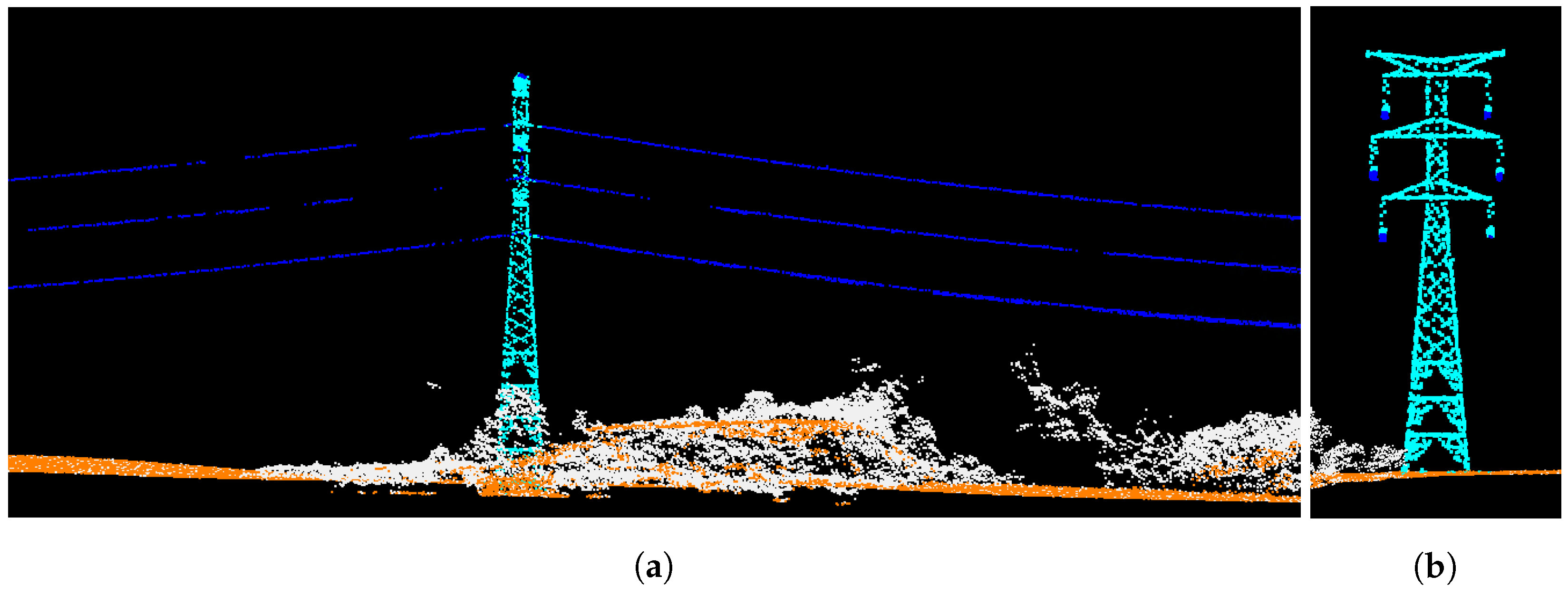
Longitudinal (a) and transversal (b) profiles of a point cloud with a power line from OOD data, displaying predicted labels with different colors.
Figure 21.
Longitudinal (a) and transversal (b) profiles of a point cloud with a power line from OOD data, displaying predicted labels with different colors.
Table 1.
Descriptive summary table of state-of-the-art methods for point cloud segmentation. The second column outlines the characteristics of the input data each method is designed to handle. The third column highlights the methods’ adaptability to varying point cloud sizes. The fourth column delves into the improved strategies incorporated by each method. Note that not all the strategies are included in the table, only the most relevant. The last column quantifies the network sizes in terms of parameters, providing insights into the model’s complexity.
| Method | Input Data | Varying Size Point Clouds | Applied Strategies | Net. Size (Params.) |
|---|
| PointNet++ [6] | tiles of 1024–4096 pts. | ∼103 pts. | rotation, translation, jittering | 0.97 M |
| KPConv [11] | subsampled spheres of 1–3 m. | – pts. | color dropout, scaling, flip, adding (x,y,z) | 14.9 M |
| RandLa-Net [12] | entire scene | – pts. oversampling small pc. | jittering, weighted loss | 1.24 M |
| PointTransformer [13] | entire scene | – pts. | chromatic jitter, flip, shift, color dropout | 4.9 M |
Table 2.
Mapped areas.
| | (I) Alt Empordà | (II) Ribera Ter | (III) Terra Alta |
|---|
| Mean density of last and only returns | 10 pts/m2 | 8 pts/m2 | 11 pts/m2 |
| Mean density of points | 13 pts/m2 | 16 pts/m2 | 27 pts/m2 |
| Area | 67 km2 | 60 km2 | 120 km2 |
| Date of flight | April 2021 | July 2021 | May 2021 |
Table 3.
Number of points per category and its relative percentage.
Table 3.
Number of points per category and its relative percentage.
| | Tower | Power Lines | Wind Turbine | Ground | Surrounding | Total |
|---|
| Points | 369.26 K | 583.35 K | 45.91 K | 1.34 B | 1.68 B | 3.02 B |
| % | 0.012 | 0.018 | 0.001 | 44.535 | 55.434 | 100% |
Table 4.
Number of tiles ( Km) and subtiles ( m) per dataset.
Table 4.
Number of tiles ( Km) and subtiles ( m) per dataset.
| | (I) Alt Empordà | (II) Ribera Ter | (III) Terra Alta |
|---|
| Total num. of tiles | 67 | 84 | 120 |
| Num. of training tiles | 59 | 72 | 110 |
| Num. of testing tiles | 8 | 12 | 10 |
| Num. training subtiles | 15,923 | 17,612 | 41,193 |
| Num. testing subtiles | 1088 | 1335 | 1484 |
Table 5.
Out-of-domain data properties.
Table 5.
Out-of-domain data properties.
| | OOD Area Properties |
|---|
| Mean density of last returns | 10 pts/m2 |
| Mean density of points | 15 pts/m2 |
| Area | 4 km2 |
| Date of flight | July 2021 |
Table 6.
Number of points per class in the test set.
Table 6.
Number of points per class in the test set.
| | Ground | Tower | Power Lines | Wind Turbine | Surrounding |
|---|
| (I) Alt Emp. | 1214.4 K | 4.5 K | 0 | 0 | 19.9 M |
| (II) Veg. Rib. | 619.4 K | 5.2 K | 7.6 K | 0 | 53.2 M |
| (III) Terra Alta | 479.4 K | 20.0 K | 26.7 K | 8.2 K | 36.9 M |
| Total points | 2,313,351 | 29,816 | 34,413 | 8194 | 110,207,798 |
Table 7.
Additive study of sequentially applying training strategies for semantic segmentation. The metric used is IoU (%) per category across datasets and the backbone architecture is PointNet++. Global mIoU (%) is mIoU using all test points. is the increment of the performance from the best obtained result after adding a strategy. Baseline without any specific strategy yields initial IoU percentages; subsequent strategies showcase their impact.
| Training Strategies | Tower | Power Lines | Wind Turbine | Surround. | Global mIoU | |
|---|
| Baseline | 56.77 | 77.23 | 0.0 | 99.98 | 58.50 | |
|
Cosine decay | 57.82 | 83.15 | 0.0 | 99.99 | 60.24 | +1.7 |
|
Rotation | 58.62 | 82.74 | 0.0 | 99.99 | 60.34 | +0.1 |
|
Resampling | 77.85 | 94.09 | 96.54 | 99.99 | 92.12 | +31.8 |
| Label smoothing | 77.65 | 93.37 | 99.09 | 99.99 | 92.52 | +0.4 |
| AdamW | 77.74 | 93.66 | 91.60 | 99.99 | 90.75 | −2.1 |
|
Color dropout | 78.57 | 93.76 | 95.76 | 99.99 | 92.02 | +1.27 |
|
Weighted loss | 79.31 | 94.85 | 97.97 | 99.99 | 93.03 | +1.01 |
Table 8.
Additive study of sequentially applying training strategies for semantic segmentation. The metric used is mIoU (%) per dataset using PointNet++ as backbone architecture.
Table 8.
Additive study of sequentially applying training strategies for semantic segmentation. The metric used is mIoU (%) per dataset using PointNet++ as backbone architecture.
| Training Strategies | (I) Alt Empordà | (II) Ribera de Ter | (III) Terra Alta |
|---|
| Baseline | 70.98 | 72.02 | 60.61 |
|
Cosine decay | 76.13 | 73.83 | 62.24 |
|
Rotation | 79.79 | 73.11 | 62.15 |
|
Resampling | 84.56 | 85.55 | 94.14 |
| Label smoothing | 83.69 | 84.10 | 94.43 |
| AdamW | 88.76 | 83.41 | 92.25 |
|
Color dropout | 88.01 | 84.41 | 93.56 |
|
Weighted loss | 87.74 | 86.45 | 94.41 |
Table 9.
mIoU (%) results of different inference strategies implemented on the optimal trained network, which employs PointNet++ as a backbone. The best results are marked in bold.
Table 9.
mIoU (%) results of different inference strategies implemented on the optimal trained network, which employs PointNet++ as a backbone. The best results are marked in bold.
| Inference Strategies | (I) Alt Empordà | (II) Ribera de Ter | (III) Terra Alta |
|---|
| All points | 51.6 | 37.9 | 46.0 |
| Samples of 8 K pts. | 87.9 | 85.8 | 94.7 |
| Samples of 16 K pts. | 87.1 | 85.7 | 93.6 |
Table 10.
Quantitative comparison of mIoU (%) and execution time (minutes) obtained by different amount of votes versus using uncertainty-based sampling. All models are tested with sampled point clouds of 8 K points.
Table 10.
Quantitative comparison of mIoU (%) and execution time (minutes) obtained by different amount of votes versus using uncertainty-based sampling. All models are tested with sampled point clouds of 8 K points.
| Infer. Strategy | (I) Alt Emp. | (II) Rib. Ter | (III) T. Alta | Global mIoU | Time (min) |
|---|
| Smpl. 1v | 87.9 | 85.8 | 94.7 | 93.2 | 36 |
| Smpl. 13v | 90.2 | 88.0 | 95.6 | 94.3 | 455 |
| Smpl. uncertain. | 89.9 | 88.1 | 95.4 | 94.2 | 42 |
Table 11.
Comparison of IoU (%) per category and global mIoU (%) between KPConv and PN++ using different inference strategies.
Table 11.
Comparison of IoU (%) per category and global mIoU (%) between KPConv and PN++ using different inference strategies.
| Network | Inference Strategy | Tower | Power Lines | Wind Turbine | Surround. | Global mIoU |
|---|
| KPConv | spheres | 41.33 | 74.76 | 74.76 | 99.41 | 72.56 |
| PN++ | all points | 11.86 | 1.14 | 70.09 | 97.07 | 45.04 |
| PN++ | 8 K samples | 79.74 | 95.31 | 97.92 | 99.99 | 93.24 |
| PN++ | uncertain. | 82.66 | 95.97 | 98.33 | 99.99 | 94.24 |
Table 12.
IoU scores (%) per category using uncertainty-based inference strategy and computation time in minutes per squared kilometer.
Table 12.
IoU scores (%) per category using uncertainty-based inference strategy and computation time in minutes per squared kilometer.
| Dataset | Tower | Power Lines | Wind Turbine | Surrounding | mIoU | Time (min/km2) |
|---|
| (I) Alt Empordà | 79.89 | - | - | 99.99 | 89.94 | 1.39 |
| (II) Ribera de Ter | 74.41 | 89.98 | - | 99.99 | 88.13 | 1.47 |
| (III) Terra Alta | 85.71 | 97.72 | 98.33 | 99.99 | 95.43 | 1.63 |
Table 13.
Iou scores (%) per category obtained using the uncertainty-based inference strategy on OOD data, along with the computation time in minutes per square kilometer.
Table 13.
Iou scores (%) per category obtained using the uncertainty-based inference strategy on OOD data, along with the computation time in minutes per square kilometer.
| Tower | Power Lines | Wind Turbine | Surrounding | mIoU | Time (min/km2) |
|---|
| 89.48 | 97.55 | - | 95.96 | 94.33 | 2.13 |


