1. Introduction
Tropical cyclones (TCs), also known as hurricanes or typhoons, are powerful and highly destructive storms that originate over warm tropical waters. Between 1970 and 2019, more than 1900 disasters have been attributed to TCs, which killed nearly 780,000 people and caused over USD 1400 billion in economic losses [
1]. Costing about USD 26 billion annually in global damages [
2], their impact is expected to increase to USD 60 billion annually by 2100 [
3].
The proportion of intense TCs (Saffir–Simpson scale categories 4–5 with one-minute maximum sustained winds >209 km/h) and peak wind speeds of the most intense TCs are projected to increase at the global scale with the increasing impact of global warming (high confidence) [
4]. The potential for more destructive TC events will require updating and enhancement of existing risk reduction strategies. The Sendai Framework for Disaster Risk Reduction provides a structure for reducing disaster damages and increasing resilience to hazards including TCs [
5]. One mechanism they encourage in Goals 18 and 24 is the distribution of multi-hazard risk information such as risk assessments.
Risk assessments combine hazard information with human activity, infrastructure, and natural resources to determine the possible impacts of hazardous events [
6,
7] and make informed choices for risk management in the most exposed and vulnerable regions [
8]. Disaster risk is defined as the probability of harmful consequences, or significant losses, resulting from interactions between a hazard, and the local exposure and vulnerability to that hazard [
9,
10].
As Local Government Areas (LGAs) are one of the smallest government decision-making bodies with available census data, information is sought to be provided on this scale. Risk assessments are a foundation for early warning systems to raise alerts for potential impacts, and to provide evidence for the prioritisation of funds and resources to areas in advance of any hazardous events. While the climate continues to change alongside evolving human activity, risk assessments must, likewise, be regularly updated to stay accurate and useful as a tool for disaster risk reduction [
11].
The four main hazards caused by TCs are destructive winds, storm surges, flooding due to heavy rainfall, and landslides [
12]. Strong winds from TCs can damage and destroy buildings, uproot trees and power lines, as well as create flying debris which can cause further damage. Storm surges caused by TCs can deliver large waves and an elevated sea level to destroy buildings and life along the coast as well as erode beaches and dunes. Floods from sustained TC rainfall can damage crops and property, as well as isolate buildings and communities that can be cut off by dangerous floodwaters. Landslides, as a result of sustained TC rainfall, can lead to destruction of infrastructure and loss of life and natural resources for regions on or below the slope. TCs and other natural hazards are becoming increasingly recognised as multi-hazardous in nature [
13], with efforts being put into building more comprehensive multi-hazard risk information. These hazards impact regions differently and their effects can compound to cause even greater damage [
14].
While TCs can cause damage through different hazards, such as winds, storm surges, flooding, or landslides, the communication of TC intensity and categorisation currently places emphasis on wind speed [
15]. This is partially due to the availability of wind measuring technology and the relative ease in quantifying wind. Publicly available warnings and forecasts focus on wind speeds, ultimately portraying the message that wind is the hazard to be most wary of. The literature, however, suggests the TC-induced impacts of storm surges and flooding contribute to the most human lives lost and infrastructure damage [
2,
16]. Although some studies have included multi-hazard aspects of TCs [
17] presenting different hazard models for TC-induced storm surges, wind, and flooding, these studies do not complete the story of combining hazards with exposure and vulnerability to map risk. Similarly, within the literature, there are many examples of standalone exposure or vulnerability index assessments for TCs [
18,
19,
20]. This gap indicates a compelling area of research in which to develop a multi-hazard TC risk assessment that can differentiate the extent and severity of TC-induced hazards.
This study addresses this gap and strengthens TC risk information for the Australian region. Multi-hazard risk is assessed and visualised through maps which show LGA categorisation, alongside hazard, exposure, and vulnerability layers. As a risk assessment’s usefulness relies on how they are tailored for specific users or applications, the method proposed in this study serves as a proof of concept that can be altered in future iterations for tailored use.
2. Data and Methods
The study area is first described in
Section 2.1. In
Section 2.2, the method and definitions are introduced.
Section 2.3 describes the data selected as indicators allocated to hazard, exposure, and vulnerability indices. Then, the mapping process is detailed in
Section 2.4, followed by the index calculation process in
Section 2.5.
2.1. Study Area
Australia is a country with a 34,000 km long coastline and many of its northern states are commonly impacted by TCs. An average of 12 TCs form in the Australian region annually with high interannual variability ranging from 19 TCs in 1983/84 to 3 TCs in 2015-16, for records examined from 1970-71 to 2019-20 TC seasons [
21], with 5 making landfall on average [
22]. In the last few decades, several severe TC events have destroyed infrastructure and caused billions of dollars in losses, including TC Larry (2006), TC Yasi (2011), and TC Debbie (2017).
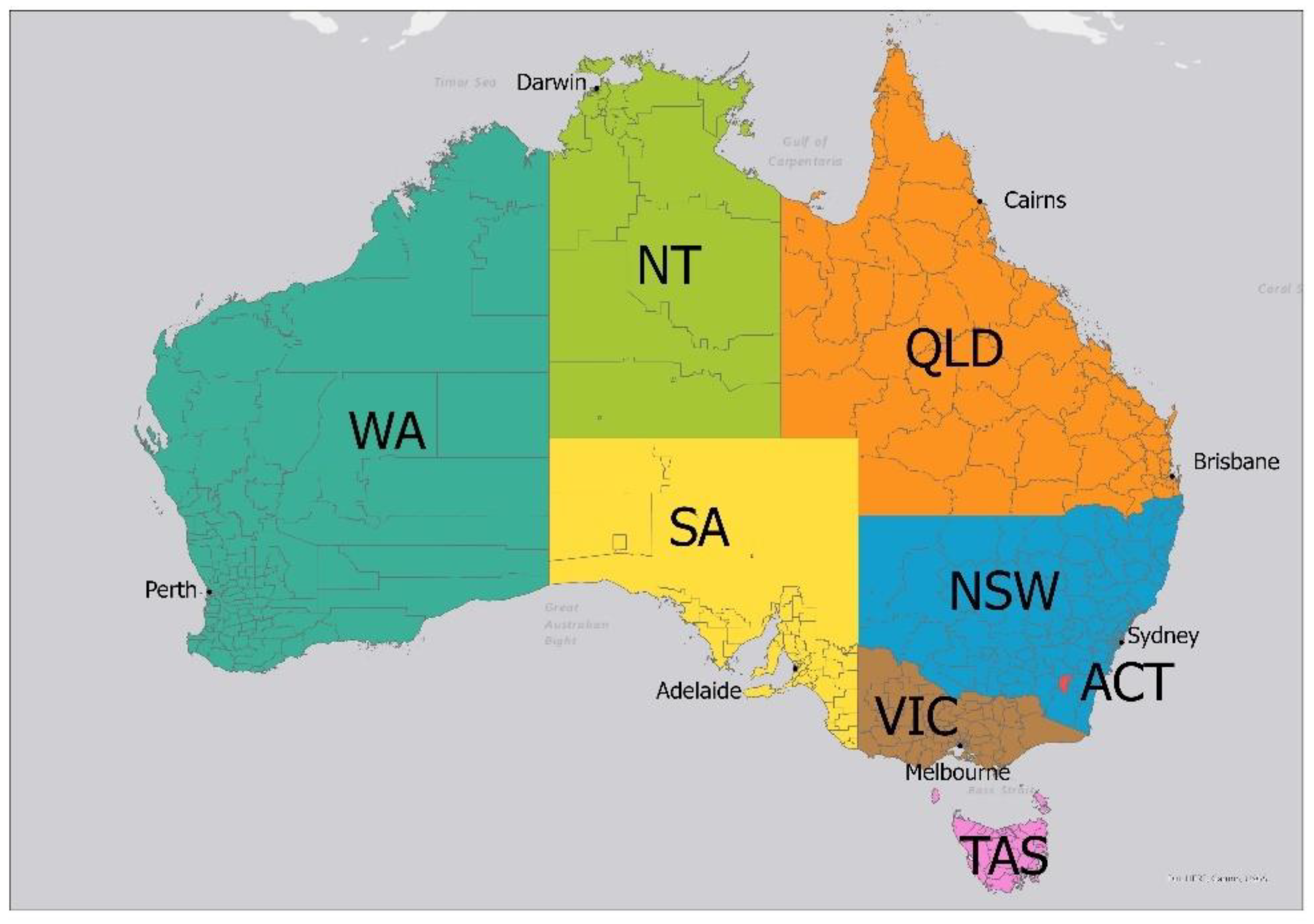
Figure 1 shows the boundaries of each state and territory as well as the outline of Local Government Area (LGA) divisions within.
Table 1 summarises key traits of each state such as their total area, real gross state product (GSP), and population. From
Table 1, it can be seen that New South Wales (NSW) and Victoria (VIC) are the states with the highest GSP (monetary measure of state output), as well as the highest populations. For TC-related impacts, however, we are most concerned with the northern states that are expected to be more commonly impacted by TC events as they are closest to the tropical oceans that TCs form over. Queensland (QLD) and Western Australia (WA), therefore, stand out as the next most important states with next highest GSP and populations. Important to note, however, is the size of QLD and WA states and the much higher average area per LGA, meaning that GSP contribution and populations are likely to be much more spread out.
2.2. Selection of Indicators
The selection of indicators is explained and the data used are listed in
Table 2.
Hazard
The main identified hazards of TCs include storm surges, winds, landslides, and floods. The 100-year return period was chosen to represent the current long-term probability of these hazards occurring. Of note is that these probabilities may change in the future with studies predicting increased storm surge levels (high confidence) and increased TC-related precipitation (medium–high confidence) due to climate change [
23].
Storm surge data were acquired from GAR Atlas’ risk and data platform, which mapped TC storm surge height as point data along the Australian coastline roughly every 1 km. TC wind data were sourced from [
24] as high-resolution raster data over Australia and its northern waters. Flood data were sourced from [
25] as high-resolution raster data representing riverine flooding only. Thus, non-null values tended to only appear near riverine systems and catchments. Similarly, landslide data from [
26] were in the raster format with mostly null values apart from specific locations with significant landslide hazard.
Storm surge and wind spatial mean values were calculated over each LGA. For flood and landslide hazards, the original datasets did not consider solely TC-induced floods/landslides. Thus, the flood and landslide hazards were weighted towards TC-prone regions by multiplying values by the TC wind raster dataset. Weighted flood and landslide values were then summed over LGAs as there were many null values. Greater-than-zero values exist only around water catchments and rivers for floods, and around mountain regions for landslides. Thus, LGAs with higher flood and landslide values have more of these prone environments in total rather than a higher areal proportion.
Exposure
Exposure indicators of population, hospitals, substations, and power lines were chosen to represent physical assets of human life, as well as systems and infrastructure that are important in the case of emergency disaster events (hospitals, power). Failure to maintain the function of lifeline infrastructures such as hospitals and power can lead to exacerbated negative impacts [
27]. These chosen indicators aim to spatially describe which LGA regions have more exposed assets relative to the rest of the country. Electrical substations provide power as critical infrastructure and are strategically placed to meet demand. Similar reasoning influenced the choice of public hospitals and powerlines.
While population density data of each LGA were found in tabular form from the Australian Bureau of Statistics (ABS), the remaining exposure indicators’ raw format was as point or line shapefiles displayable in ArcGIS Pro. Thus, geoprocessing tools such as spatial join were used to count the number of public hospitals in each LGA. Using absolute measurements can be inappropriate when considering regions of different sizes [
28]; thus, these counts were then divided by LGA area to give a density value similar to that of population density.
Vulnerability
Vulnerability indicators were chosen to represent those regions most susceptible to high impact from a TC event occurring in the vicinity. Measures of socioeconomic status are commonly used to describe vulnerability to natural hazard events [
29,
30] and the Index of Relative Socioeconomic Disadvantage (IRSD) has been used in earlier studies for the Australian region [
31]. It summarises variables about the social and economic conditions of households. The more disadvantaged a region is socioeconomically, the more likely it will be more impacted by TCs, due to factors such as lower income, having families with only one parent, or having a higher percentage of people that have English as a second language. The ‘no-vehicle homes’ indicator was derived by calculating the percentage of homes with no vehicles, and the ‘vulnerable age groups’ indicator was constructed by calculating the percentage of an LGA’s population made up of the <15 and >65 age groups combined. The ‘no-vehicle homes’ indicator is considered relevant to TCs as it provides information on LGAs that are more susceptible to loss of human life in evacuation situations. Although this risk assessment highly values human life and safety, historically within Australia, TCs have caused very few fatalities in recent decades, and an indicator describing the vulnerability of infrastructure would be preferred. An alternative to the ‘no-vehicle homes’ vulnerability indicator could be the proportion of houses that are not constructed to modern wind loading standards. While this potentially useful indicator was not included in this study due to limited data availability, this could be a topic for future work.
Vulnerability indicators are ideally directly linked to their relevant exposed counterparts; however, these human- and society-centred vulnerability indicators were chosen to generally relate to the selected exposure indicators which can be estimated as populations and the built environments they are surrounded by. Direct infrastructural vulnerability indicators, such as building code standards, were of interest as they provide information on buildings’ susceptibility to wind damages; however, due to limited data and the multi-hazard approach of this study, a more general approach was taken.
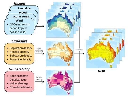
2.3. Method Outline
To calculate the multi-hazard risk of TCs to Australia, hazard, exposure, and vulnerability datasets were chosen and sourced. This data was then combined to LGA map shapefiles in ArcGIS Pro. In this study, indicators are defined as quantifiable variables representing a selected characteristic [
32] or contributor to risk. They translate concepts/statuses into a quantitative form to simplify the information, making it more accessible to non-specialists [
33]. These indicators are then commonly aggregated into an index, which summarises information into a single value [
32]. To calculate exposure and vulnerability indices from multiple indicators, equal weighting was used for exposure, while Pareto front-ranking was used for vulnerability. Combined with hazard values for each LGA, exposure and vulnerability indices were used to calculate risk using Equation (1):
2.4. Mapping Process
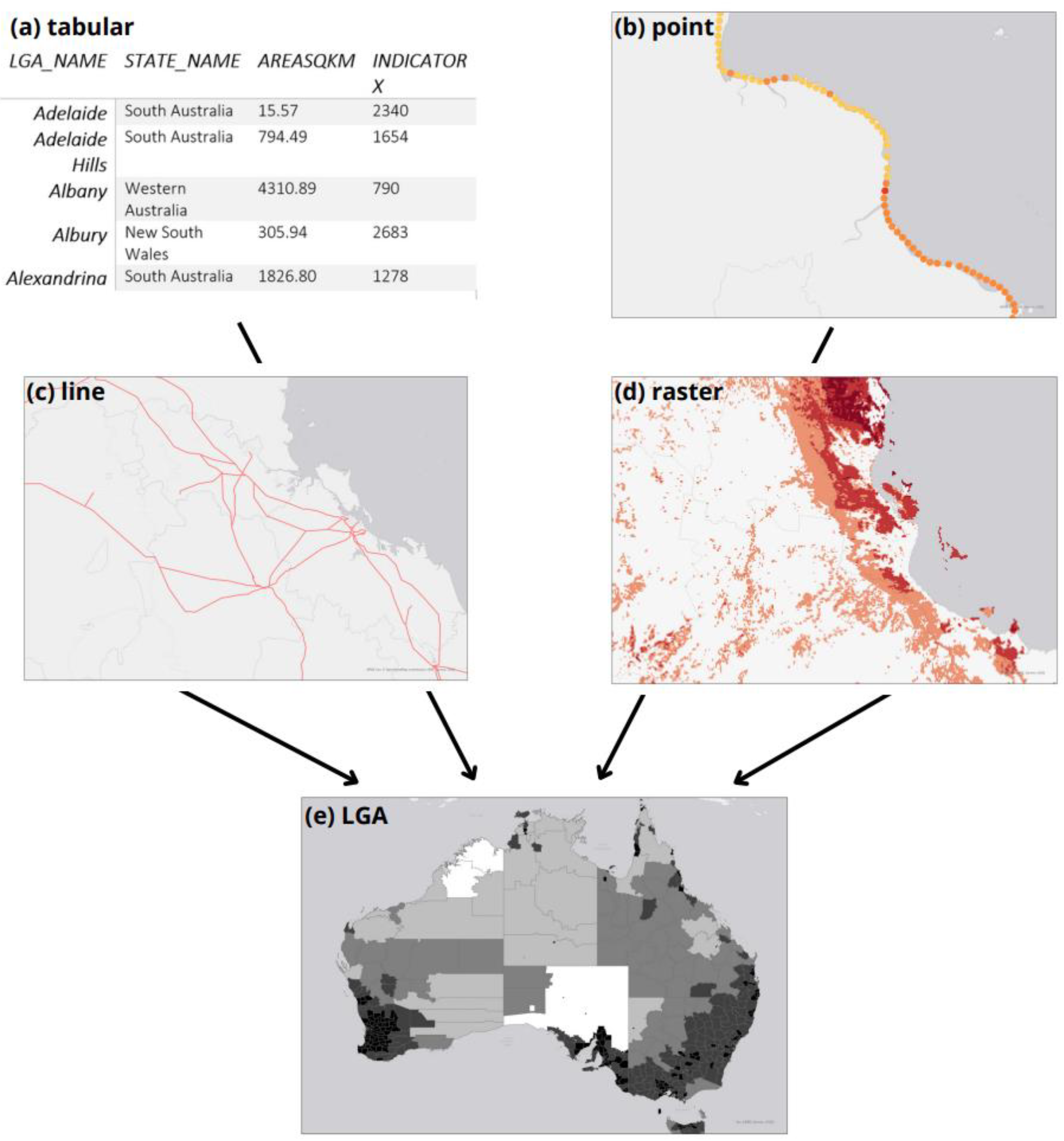
First, acquired indicator data were transformed and converted into the LGA resolution. As raw data came in tabular (a), point (b), and raster (c) formats, different methods for each format were used to summarise information when converted to LGA polygons (d) as depicted in
Figure 2. Tabular data from the ABS came at an LGA resolution, so data only needed to be linked to an LGA polygon shapefile in ArcGIS Pro. For storm surge point data which spanned across the coastline every 1 km, the average 100-year surge height value was taken, whereas for exposure point data such as hospitals and substations, the count or number of points in each LGA was taken. For the wind raster data which had no null values and gradually changed in value inland, the mean windspeed value was taken per LGA, while with flood and landslide data, the sum of non-null values was taken per LGA.
Once in a comparable data format, indicator data values were normalised into a 0 to 1 range with decile normalisation against the whole country using Python scripts. Different normalisation methods were tested, such as linear normalisation and natural breaks; however, decile normalisation was found to best remove the skewing effects of outliers, and is a method commonly used in several ABS indices.
In this study, indicators are defined as the low-level base variables that were selected as relevant in determining whether a region is more or less hazardous, exposed, or vulnerable. For example, population density is used as an indicator of exposure. An index is defined as the resultant value after combining relevant indicator values.
Figure 3 depicts the different tiers or stages of the risk assessment, starting at tier (3) with the indicators. These variables differ in value spatially across Australian LGAs, and were chosen to be representative of TC hazard, exposure, or vulnerability. Three to four indicators were chosen to give a more robust index without diluting the sensitivity of each indicator. From tier (3) to tier (2), or from indicators to indices, different methods were used depending on the index. For exposure, equal weighting was used, while Pareto ranking was used for vulnerability, which is further explained in
Section 2.5. Rather than combining the four different hazard indicators into one hazard index, four hazard indices were produced and passed through the calculation separately, meaning when hazard, exposure, and vulnerability indices were multiplied using Equation (1) to calculate risk (tier (2) to tier (1)), four hazard-specific risk layers were produced—TC-induced wind risk, flood risk, storm surge risk, and landslide risk. A quantile classification with five classes (ten for hazard) was used for map symbology.
2.5. Index Calculation
First, for processing raw indicator data, decile and natural breaks transformations were explored.
Decile ranking in this context compares the values of each LGA to the LGAs in the rest of the country. A value of 0.9 would indicate that the LGA has a value larger than 90% of LGAs in Australia, and every 0.1 interval would hold 10% of LGAs. In this way, all indicators can effectively have an impact on resultant indices and risk maps even with the presence of outliers, which take decile values on either end of the spectrum without causing any skew. Decile ranking is used in indices such as Socio-Economic Indexes for Areas (SEIFA), from which IRSD is a part of, to give relative meaning to the raw scores.
Natural breaks can similarly address the limitations of 0 to 1 normalisation by using optimisation to categorise values and minimise the amount of variance within each category. The number of categories can be increased automatically until a threshold of variance is met (96% in our case, as 97% required more than 20 categories). The breaks or classes chosen depends on and is unique to every distribution or set of data. Additionally, the number of classes is not fixed, which can result in fewer unique values and less value variation between LGAs, which is less informative.
Based on these considerations, decile ranking was chosen as the method of processing raw indicator data. Natural breaks, however, were used in the presentation of final index and risk maps, as is the standard in geographical mapping for choropleth maps [
34], providing a quick overview and differentiating clusters of values to easily recognise trends.
Second, index calculations were performed. Equal weighting is commonly used to create index values from a set of indicators, and is used either for simplicity or because there is no supporting evidence to suggest how different indicators should be weighted [
28]. In the context of natural hazard risk assessment, past studies have suggested that a weighted framework could improve results, but would require more research—such as gathering expert opinions and conducting detailed sensitivity analyses—to weigh chosen indicators [
20]. One of the limitations of equal weighting is that very high values in one indicator are averaged with other indicators in the index, resulting in a potentially lower value that does not capture the extreme aspect of that LGA. This is particularly a problem for the vulnerability index because a region only needs to be extremely vulnerable in one factor to be considerably more at risk [
28].
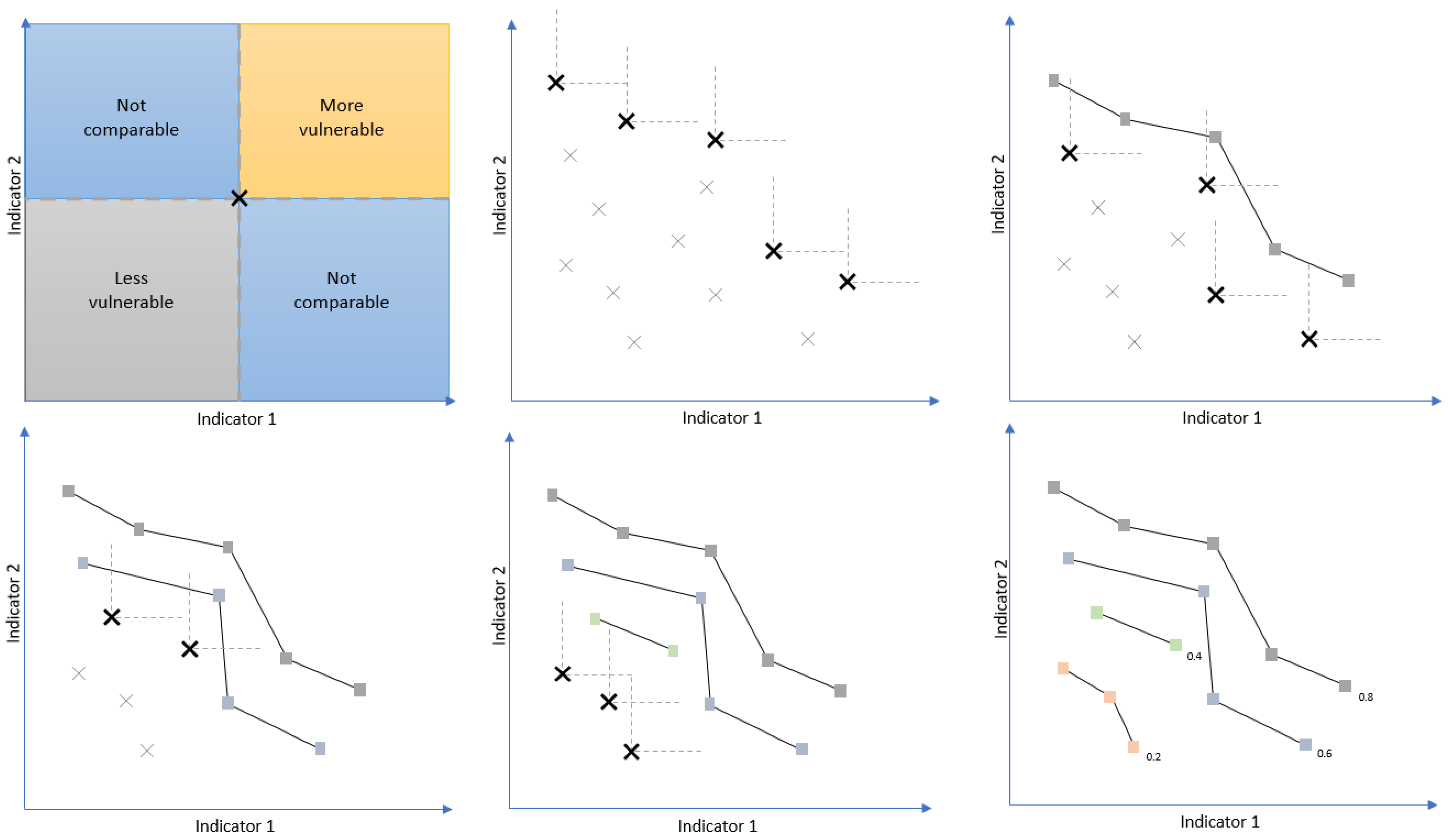
Pareto ranking, also known as Pareto front optimisation or multi-objective optimisation, was investigated to address some of the limitations of the equal weighting method. Pareto ranking can be used to construct an effective vulnerability index without weighting individual indicators [
35,
36]. It involves finding the values along the Pareto front, which are values considered to be non-dominated in all indicator axes, and ranking these fronts in order. The process is depicted in
Figure 4, which shows a step-by-step process of identifying non-dominated data points.
The first graph in
Figure 4 depicts how a non-dominated point is determined. For the example data point, if there are no values above and to the right of it (in the ‘more vulnerable’ quadrant), the example data point would be non-dominated. Any values below and left would be ‘less vulnerable’, while values in the remaining quadrants are ‘not comparable’, because one data point is not, for example, higher in both indicators. With an example data set with two indicators, values are plotted along axes representing each component/indicator. Each data point in this study would represent an Australian LGA. Then, the first non-dominated front would be identified as the set of points that do not have any LGAs with both a higher value in indicator 1 and indicator 2. In the second graph, these LGAs have been identified (bolded), with the perpendicular dotted lines showing that there are no other LGAs more vulnerable than them. This first front would be ranked highest and set aside, with the same methodology being repeatedly used to identify subsequent fronts using the remaining data. In the case of the example in
Figure 4, with four distinct fronts or classes, an index value would be given at even intervals (e.g., 0.2, 0.4, 0.6, and 0.8) with LGAs sharing the same index value as other LGAs in their front.
The Pareto ranking method, therefore, can identify LGAs as highly vulnerable due to one or two indicator values even if its other indicator values are lower. Although vulnerability benefits from Pareto ranking as the maximum magnitude across all indicators is the defining factor, the exposure index benefits from taking into account all indicators cumulatively, assuming the selected indicators are relevant. Thus, Pareto ranking was used to calculate the vulnerability index in this study, while equal weighting was chosen for the exposure index.
3. Results and Discussion
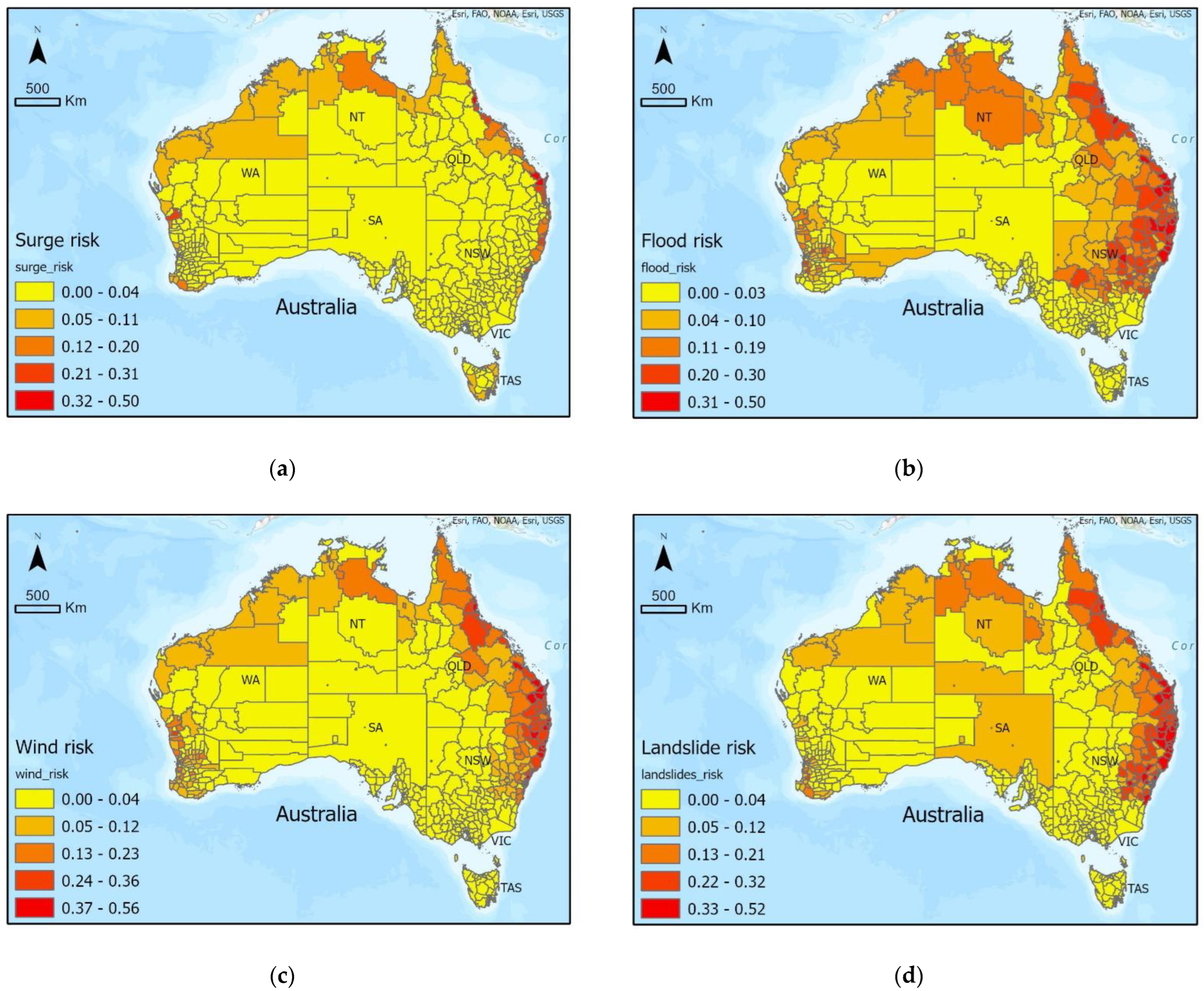
3.1. TC Hazards
TC hazard maps were created from datasets of chosen hazards of storm surges, flooding, wind, and landslides as shown in
Figure 5. Ten quantile classes (decile) were used to present these TC hazard maps to represent values and display any trends more precisely.
Surge heights are seen to be highest along a long portion of north-western WA, surrounding Darwin, and at a few locations along QLD’s eastern coastline, having 100-year return period surge heights greater than 2 m and up to a maximum of 4.55 m. Surge hazard is otherwise lower around other parts of the country’s northern shoreline and has values of 0 in LGAs not bordering the coastline. Flood hazard is shown to have the highest values across northern WA, NT, and most of QLD, with significant values reaching into NSW. Wind hazard is more consistent, with TC wind speeds highest in coastal LGAs, with hazard decreasing towards the centre of Australia and further south. Landslide hazard is highest in northern WA and NT along with high values throughout eastern QLD and north-eastern NSW.
While it would be expected that the multiple hazards associated with TCs follow the general location where TCs more commonly make landfall, there are clear differences between the hazard maps in
Figure 5. This shows how the physical characteristics of each LGA can change the intensity with which different TC hazards impact different regions. For example, flood and landslide hazards have the potential to affect more inland regions while storm surges are only relevant for coastal LGAs, and wind more uniformly decreases south and inland. These results emphasise the importance of considering the multi-hazard nature of TCs and mapping their differing extents.
The storm surge hazard map shows greater-than-zero values only for coastal LGAs; however, a few LGAs may raise concern. The first is East Pilbara, the large LGA in WA with very high surge values. Although most of the LGA is quite far inland and would not be affected by potential storm surges, the LGA does border the coastline in its northwest corner. Due to input surge datasets having the format of point data dotted every few kilometres along Australia’s coastline and chosen methods averaging intersecting surge point data to each LGA polygon, East Pilbara was mapped with very high surge hazard. For a similar reason of input hazard data only dotting the mainland, some island LGAs were left without a surge value and, thus, were mapped with the lowest hazard—for example, Tiwi Islands north of Darwin and Mornington Island in north-western QLD. Considering their location and the hazard values of neighbouring LGAs, these island LGAs in the country’s north potentially have medium to very high hazard values rather than none at all. These cases pose the question of the chosen LGA resolution in this study, with higher resolutions being preferred especially for hazard indicators. The method in this study, however, applies the same rules and calculations for all LGAs, which allows for a low-resource and quick rendition of relative hazard.
Wind hazard trends are to be expected and are consistent with TC genesis and development where TCs start to lose intensity after landfall, having had their energy source of warm ocean water cut off. Additionally, as they move away from the tropics, TCs’ storm structure weakens and they transition into extra-tropical systems with less organised convection and lower wind speeds, although they are still capable of continuing to bring heavy precipitation if the conditions allow. This could partly explain why storm surges and wind, which rely on high wind speeds, affect less regions strongly south of QLD than flood and landslide hazards, which rely on heavy and sustained precipitation.
An important consideration when evaluating flood and landslide hazards is that a cumulative method was used to calculate hazard values from input datasets. Rather than taking averages over each LGA, as was done for storm surges and wind, flood and landslide input datasets were high-resolution raster maps with many null values. Using an averaging methodology would have described an LGA’s hazard in proportion to its area, meaning larger LGAs with many flood-prone regions could still have a low flood hazard value. Instead, values were summed, meaning that greater-than-zero hazard values meant a region had some hazard-prone regions, and high hazard values meant that they had more regions prone to flooding/landslides regardless of the LGA’s size. While this does mean larger LGAs have the potential to reach higher hazard values, this method represents all possible hazards and, therefore, risk, rather than underestimating it due to averaging methods.
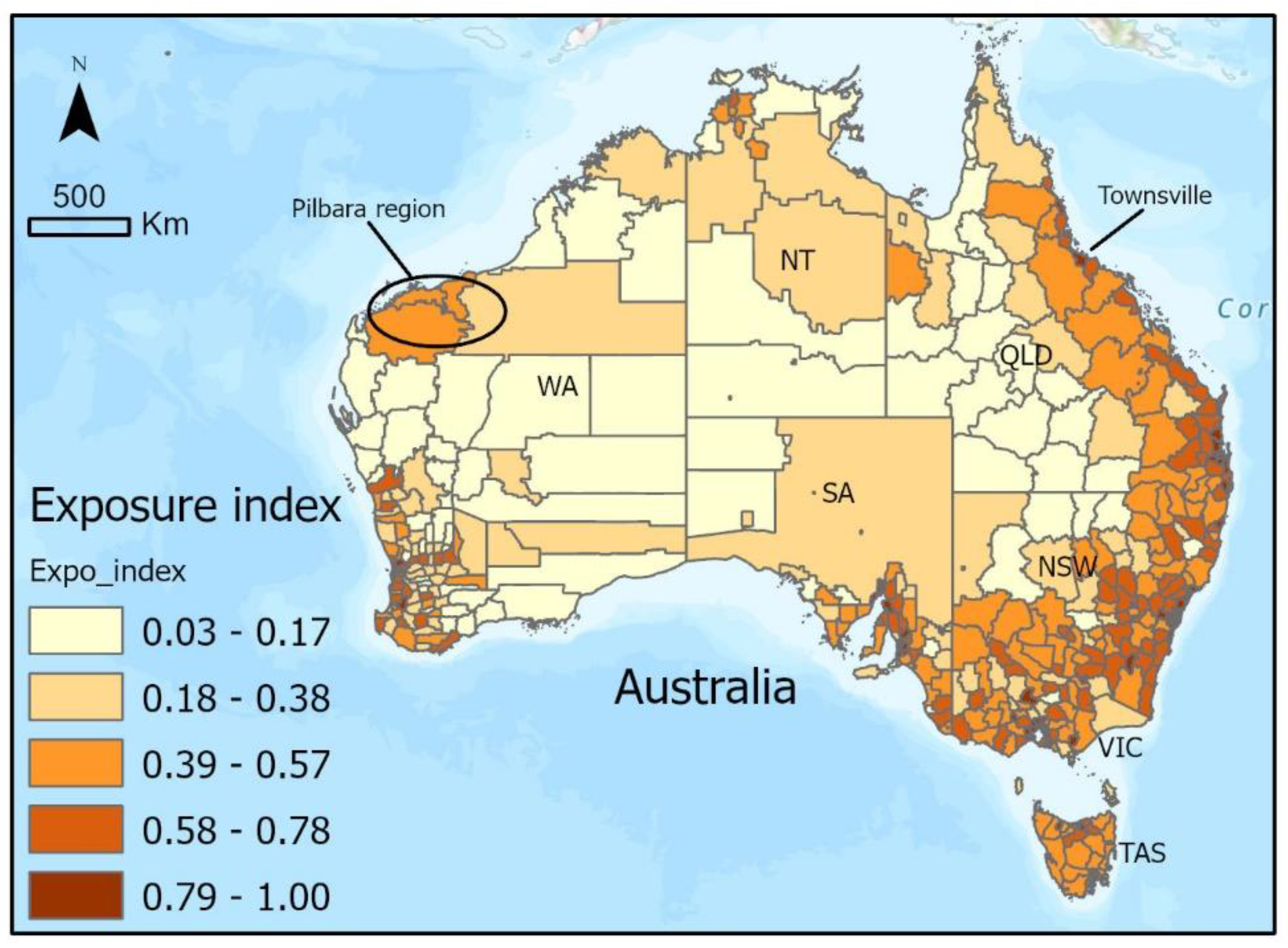
3.2. Exposure
The exposure index was created from equally weighting the four indicators: population density, hospital density, electrical substation density, and powerline length density. In
Figure 6, it can be seen that population density is highest along the eastern coast and surrounding major cities as labelled in
Figure 1. Population density is particularly high throughout most of VIC and NSW. The hospital density indicator shows very similar patterns, although there are fewer LGAs with the lowest exposure classification. Substation and powerline indicators both have similar patterns to each other, with the highest exposure along south-western WA, southern SA, most of VIC, and eastern NSW and QLD. The calculated exposure index in
Figure 7 maintains the clear trends of highest exposure along the country’s eastern coast, and around major cities. Exceptions include moderate to high exposure values around the Pilbara region in north-western WA (Karratha, Ashburton, Port Hedland, East Pilbara LGAs) and around Townsville further up the QLD coastline.
Exposure maps largely reflect the disproportionate percentage of Australia’s population that lives on the coast [
37] and near major coastal cities. As infrastructure such as public hospitals and substations are positioned to meet demand, it is also understandable why similar patterns are found amongst chosen indicators.
Aside from these highly populated and built-up coastal regions near major cities, relatively higher exposure index values were identified around the Pilbara and Townsville regions. The mining industry’s presence in regional Australia is most obvious within the Pilbara region of north-western WA, with many fly-in–fly-out workers operating within these regions, which makes a significant contribution to the economy. Although none of the chosen indicators were mining industry-related, the population and infrastructure indicators were able to detect significant exposure in those areas related to the mining sector. The high exposure of Townsville can be explained by a high population, making it the largest settlement in North QLD, along with moderate infrastructure indicator values. The city is a popular tourist destination, being adjacent to the Great Barrier Reef and national parks, while also hosting large metal refineries.
From the exposure maps, we can see that the number of assets possibly lost in a TC event is highest along the country’s eastern coastline as well as surrounding major cities. Thus, we would expect the highest risk in these regions if vulnerability and hazard are also high.
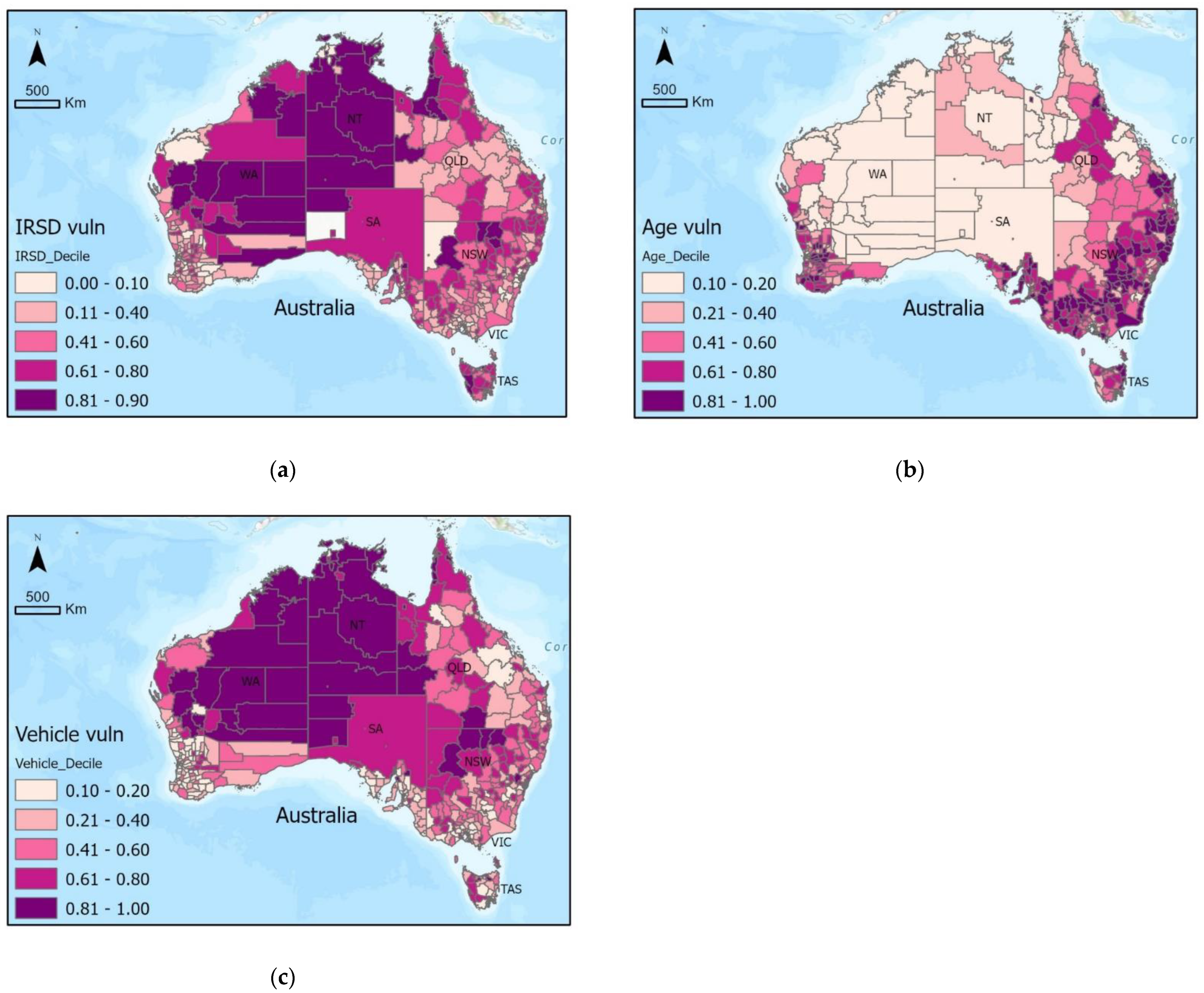
3.3. Vulnerability
The vulnerability index was created by Pareto ranking the three indicators: IRSD, vulnerable age groups, and no-vehicle homes.
Figure 8 shows that IRSD vulnerability is extremely high across most of central and western Australia, with the highest class values across almost all of NT. Otherwise, vulnerability is considerably lower in the LGAs surrounding the major cities in each state. Conversely, the vulnerable age indicator shows the lowest values across central and western Australia. Although inner cities also show low vulnerable age values, the highest values are found in outer suburban LGAs. For no-vehicle homes, central and north-western Australia have the highest vulnerability values, with lower values near and surrounding major cities. The calculated vulnerability index in
Figure 9 shows low to medium vulnerability values in LGAs surrounding cities, with higher-vulnerability regions across NT, northern QLD, and northern NSW to northern VIC.
IRSD patterns show lower vulnerability in major cities, as they are most developed and relatively affluent. High vulnerable age group values outside of and surrounding major cities can be explained by the >65 age group retiring and relocating out of urban areas [
38]. Of the 16 IRSD input variables, ‘NOCAR’ was described as the percentage of occupied private dwellings with no car. Although it is not certain whether this variable is the same as the no-vehicle homes indicator used in this study from the Number of Motor Vehicles census record, some overlap is to be expected. This means regions with high no-vehicle home vulnerability values are likely to have their vulnerability index overestimated. The fact that NOCAR is only one of 16 variables in the IRSD also suggests that similarities between the two indicators may be from correlation in other variables instead.
Compared to the exposure index, the transition from patterns in the indicator maps to the vulnerability index is not as clear, as Pareto ranking is used instead of equal weighting. Pareto ranking was used to address situations where a high value in one indicator would be overlooked after being equally weighted with indicators with medium to low values. Instead, it ranks LGAs on the higher end if a single indicator’s value causes it to be non-dominated much earlier. However, our analysis showed that having one indicator with the highest classification value does not guarantee a high vulnerability index value. In fact, having two indicators with the highest classification values does not guarantee a high value either, as can be seen across central and northern WA. This is partly because within each coloured class, there is a range of values, and only the highest values are picked out by Pareto ranking as non-dominated. This suggests that the second highest class of values in the vulnerability index (second darkest purple) are also important and possibly underestimated.
This idea of there being a great deal of competition at the higher value range within indicators is highlighted by the case of the Maralinga Tjarutja LGA in western SA, which is in the highest vulnerability index class. The LGA does not have a recorded IRSD value from the ABS, meaning the region is not competing for a non-dominated spot on the IRSD axes. This allows the LGA to receive a very high vulnerability index score from only a very high vulnerability value in the no-vehicle home indicator alone.
Overall, the vulnerability index shows higher vulnerability and, thus, predicts higher risk throughout NSW, northern QLD, and northern NT.
3.4. TC Multi-Hazard Risk
Risk maps were created by multiplying each hazard with the exposure and vulnerability indices. This produced the four hazard-specific risk maps in
Figure 10, from which a total TC risk map was created by equally weighting them as seen in
Figure 11. A natural breaks symbology was used for these risk maps to group similar values and maximise variance between groups for a visually informative map.
Storm surge risk is considerable along the northern, western, and eastern coasts, with the highest values between Brisbane and Cairns in QLD. Flood risk can be seen to be highest across both NSW and QLD, with medium values along the top of NT and WA. Risk to wind is uncommon at distances greater than 500 km inland and south of NSW, with the highest wind risk found along with the eastern parts of NSW and QLD. Landslide risk also shows the highest risk in eastern NSW and QLD, with medium risk across northern NT. The combined TC risk map displays some of these more prominent patterns from each hazard-specific risk map. For example, eastern NSW and QLD have the highest risk, followed by medium risk across northern WA and NT. The risk of TCs is very low in inland areas of SA, as well as in VIC and TAS.
As patterns seen in risk maps can be partially explained by similar patterns found in constituent layers, it is important to compare them to hazard, exposure, and vulnerability layers. While an overall TC risk map is useful for such discussions, hazard-specific risks are important to consider and compare at a local level, for example, when LGA councils are planning disaster management strategies or communicating warnings to residents for an incoming TC.
Of note is that although TCs generally form over tropical warm waters and affect regions near the tropics, they intensify away from the equator, reaching maximum intensity approximately 17–18°S of the equator [
21], which partially explains why risk is not highest in all northernmost LGAs. Another contributing factor to medium risk values in the country’s north is due to there being relatively fewer assets exposed compared to the rest of the country, as shown by the exposure index in
Figure 6. Continuing to move further south, away from the tropics, TCs weaken as sea surface temperatures get colder in extra-tropical regions. Hence, a substantial reduction in risk is observed in VIC and TAS. Similarly, TCs weaken over land which is why risk is also very low for central Australian LGAs. The lower risk in these states is supported by historical records of TC tracks from 1970-present [
39].
The risk maps in
Figure 10 and
Figure 11 attempt to compare the relative risk of each LGA in Australia by summarising values of relevant hazard, exposure, and vulnerability indicators. Thus, we can investigate the risk in a certain region, and trace it back to its components’ trends, which should show a similar story. The highest-risk regions identified along the eastern half of NSW and QLD in all risk maps (exclusively along the coast for storm surge risk) represent the dense distribution of populations and infrastructure along Australia’s eastern states as seen in exposure maps in
Figure 5 and
Figure 6. Accompanied by very high flood and landslide values, with wind and storm surge risk weakening in the southern half of NSW, the eastern strip of Australia stands out as having the highest risk. The influence of vulnerability has a less noticeable trend as it does not uniformly compound in all regions with high hazard and exposure, but can be seen to increase risk particularly in north-central NT, northern QLD, and northern NSW.
This holistic approach to assessing risk is helpful in understanding the possible impacts if a TC was to occur and affect any region in the country. Results have shown that this methodology is effective in visually describing and identifying regions with high risk component values, and hopes to provide relevant risk information to assist disaster management and resilience decision makers.
3.5. Limitations of TC Risk Assessment
One of the limitations of this TC risk assessment of Australian LGAs is that indicators were selected partially because of data availability and, hence, may not represent all aspects of hazard, exposure, or vulnerability. For example, within the vulnerability index, indicators that informed a region’s preparedness to natural disaster events were not available. While some LGA councils may have informative documents or evacuation plans, it is difficult to determine how well-understood they are by residents, and the data are not standardised in a format that can be compared against LGAs across the country. Additionally, in some cases, lower-resolution global hazard datasets were used because they were available, while higher-resolution, Australia-specific datasets are yet to been created or were inaccessible. With exposure and vulnerability indicators limited to the LGA resolution, this also causes inaccuracies for hazards such as storm surges that may only affect communities close to the coast.
Being a risk assessment, subjective indicator choices were made which can shift how results could be interpreted [
8,
40]. For example, chosen exposure indicators identified regions where many lives were exposed alongside the physical lifeline infrastructure that contributes to health and utilities (hospitals, powerlines). These indicators, however, do not accurately address potential financial losses if businesses and industries were not able to function due to TC damage. As a result, discussion of risk map implications would need to stay human-centric. While just adding more indicators could be identified as a possible solution, the nature of risk and index calculations mean that adding more indicators reduces the importance of each individual indicator, resulting in a potentially less informative final risk map.
Another limitation is that while each indicator map had patterns identified, the discussion was based on an incomplete understanding of Australian LGAs. Ideally, formal validation of each indicator with local knowledge from people who reside in or manage each LGA would ensure that each contributing input to final risk maps was accurately represented. This would be particularly important for TC hazard data as exposure and vulnerability indicators from the ABS are typically well-validated and iterated upon every census. Engagement with indigenous people would also be an essential aspect of validation so that cultural assets and indigenous knowledge are included in the maps.
Finally, the developed methodology could be generally useful to estimate and reduce risks related to tropical cyclones or other natural hazards, and the methodology could be combined with remote sensing knowledge. For example, destructive winds are known to be one of the key hazards associated with tropical cyclones and must be included in risk assessment. However, in situ wind observations are mostly available over land. On the other hand, tropical cyclones form and develop over warm tropical oceans where in situ observations are extremely limited. From the 1970s, when visible and infra-red images from meteorological satellite became operationally available for meteorological services, substantial progress has been achieved in using remote sensing data for estimating tropical cyclone winds [
21]. Recently, data from the CYclone Global Navigation Satellite System (CYGNSS) became available for estimating tropical cyclone winds [
41]. As such, applying the developed methodology replacing the 100-year return period of wind with near-surface ocean wind remote sensing data could be valuable for future tropical cyclone risk assessments. Additionally, remote sensing datasets would come at a much higher resolution than the LGA level, an example being Eberenz et al. (2021) [
42], which has used remotely sensed night light intensity to estimate exposure, which would address some limitations attached to dataset resolution.


