Article

A Sequential Autoencoder for Teleconnection Analysis

1
Graduate School of Geography, Clark University, Worcester, MA 01610, USA
2
Clark Labs, Clark University, Worcester, MA 01610, USA
*
Author to whom correspondence should be addressed.
Remote Sens. 2020, 12(5), 851; https://doi.org/10.3390/rs12050851
Submission received: 31 January 2020 / Revised: 3 March 2020 / Accepted: 4 March 2020 / Published: 6 March 2020

Abstract

:
Many aspects of the earth system are known to have preferred patterns of variability, variously known in the atmospheric sciences as modes or teleconnections. Approaches to discovering these patterns have included principal components analysis and empirical orthogonal teleconnection (EOT) analysis. The latter is very effective but is computationally intensive. Here, we present a sequential autoencoder for teleconnection analysis (SATA). Like EOT, it discovers teleconnections sequentially, with subsequent analyses being based on residual series. However, unlike EOT, SATA uses a basic linear autoencoder as the primary tool for analysis. An autoencoder is an unsupervised neural network that learns an efficient neural representation of input data. With SATA, the input is an image time series and the neural representation is a unidimensional time series. SATA then locates the 0.5% of locations with the strongest correlation with the neural representation and averages their temporal vectors to characterize the teleconnection. Evaluation of the procedure showed that it is several orders of magnitude faster than other approaches to EOT, produces teleconnection patterns that are more strongly correlated to well-known teleconnections, and is particularly effective in finding teleconnections with multiple centers of action (such as dipoles).

Graphical Abstract

1. Introduction

With the advent of systematic earth observation from satellites, a remarkable archive of remotely sensed image times series has been developed with a diverse set of variables, including atmospheric and ocean temperature, precipitation, vegetation and ocean productivity, and the like. From analysis of these time series, it has become apparent the many phenomena exhibit preferred patterns of variability [1]. In the atmospheric and ocean sciences, these are commonly known as teleconnections—patterns of variability that show degrees of synchrony over large distances in space [2]. Another common description is to refer to them as climate modes—major patterns of variability in the climate system [3].
A variety of techniques have been used or developed to discover these patterns in earth observation image series, including principal components analysis (PCA), also known as empirical orthogonal function (EOF) analysis, and empirical orthogonal teleconnections (EOTs). In this paper, we introduce a new procedure based on a sequential autoencoder that is related to, but different from, these two former procedures. The technique will be shown to be exceptionally fast and powerful in its ability to extract meaningful teleconnection patterns.
One of the most common tools in the search for such patterns has been principal components analysis (PCA) [4] (pp. 53–54). At its core, PCA is a dimensionality reduction technique that seeks to describe a multivariate data set with a reduced number of features, called components, such that those components are independent and can describe the bulk of the variability in the original data [5]. While it is remarkably successful in achieving this reduction, interpretability is constrained by the fact that the components are bi-orthogonal [5] (p. 291), [4] (p. 54)—orthogonal in both space and time in the context of image time series. It has been noted by many (e.g., [6] (p. 296); [5] (p. 270)), that this strict orthogonality can sometimes make these components very difficult to interpret, and unlikely to relate to physical processes. A common solution has been to relax this bi-orthogonality in favor of obliquely rotated components that achieve some form of simple structure [5] (pp. 270–279). However, this approach has been criticized as being somewhat subjective (in terms of the number of components to rotate and the specific algorithm to use [4] (pp. 53–78), and capable of splitting patterns between components [6] (p. 306).
As an alternative to rotation, [7] introduced an iterative regression-based procedure that produces components that are independent in time, but not in space. EOT seeks to find the single location in space (a pixel), whose values over time (a vector) can best describe the time vectors for all other pixels over the area analyzed (e.g., the entire earth). In [7], it determines this based on explained variance using regression (essentially an unstandardized analysis). It then takes the vector at that location, and uses it to create a residual series of images where that vector is subtracted from the vector of every location. For example, if the data analyzed were monthly sea surface temperature (SST) anomalies over a period of many years, the technique would invariably find a point in the central Pacific where the pattern of ENSO (El Niño/Southern Oscillation) anomalies would dominate. This would be the first EOT (a one-dimensional vector over time). The procedure then removes this ENSO vector from the temporal vectors associated with every pixel in the image. The series is now free of ENSO. At this point, it repeats the process to find the second EOT, and so on. In the end, the EOTs extracted are orthogonal in time, but not necessarily orthogonal in space. Thus, they are similar to an oblique rotation in comparison to PCA [4] (p. 66).
In the original formulation, EOT was unstandardized (based on covariance) and uncentered (without subtracting the mean). [8] introduced a variant of EOT in the Earth Trends Modeler (a software program for remotely sensed image time series analysis within the TerrSet modeling suite) with options for centered and standardized (based on correlation) EOT as well. Generally, it has been the experience of the second author here that the centered and standardized options work best and readily find meaningful teleconnections (e.g., [9], [10]). As indicated by [4] (p. 66), the advantage of EOTs is that they yield a natural rotation without the need for subjective decisions.
Comparing EOTs to PCA, one of the striking characteristics is that EOTs are regional in character, whereas PCA is global (in the context of a global image time series). Despite the fact that when it searches for an EOT, it looks for a location that can best describe the temporal vector at all locations globally, it then characterizes the EOT by the vector at the single location found. Further, it is this local vector which is subtracted to produce the residual series before calculating the next EOT. In the implementation of the Earth Trends Modeler, after the requested EOTs have all been calculated, it then creates partial correlation images to characterize the loadings—the correlations between the EOTs and the original image series analyzed. These images typically exhibit patterns which are quite regional in character.
PCA/EOF and EOT are both seeking latent structure—deep structural patterns that have high explanatory value in describing the variability of the image series over space and time. In recent years, a parallel interest in latent structure has arisen in the field of artificial intelligence, in the context of autoencoders.
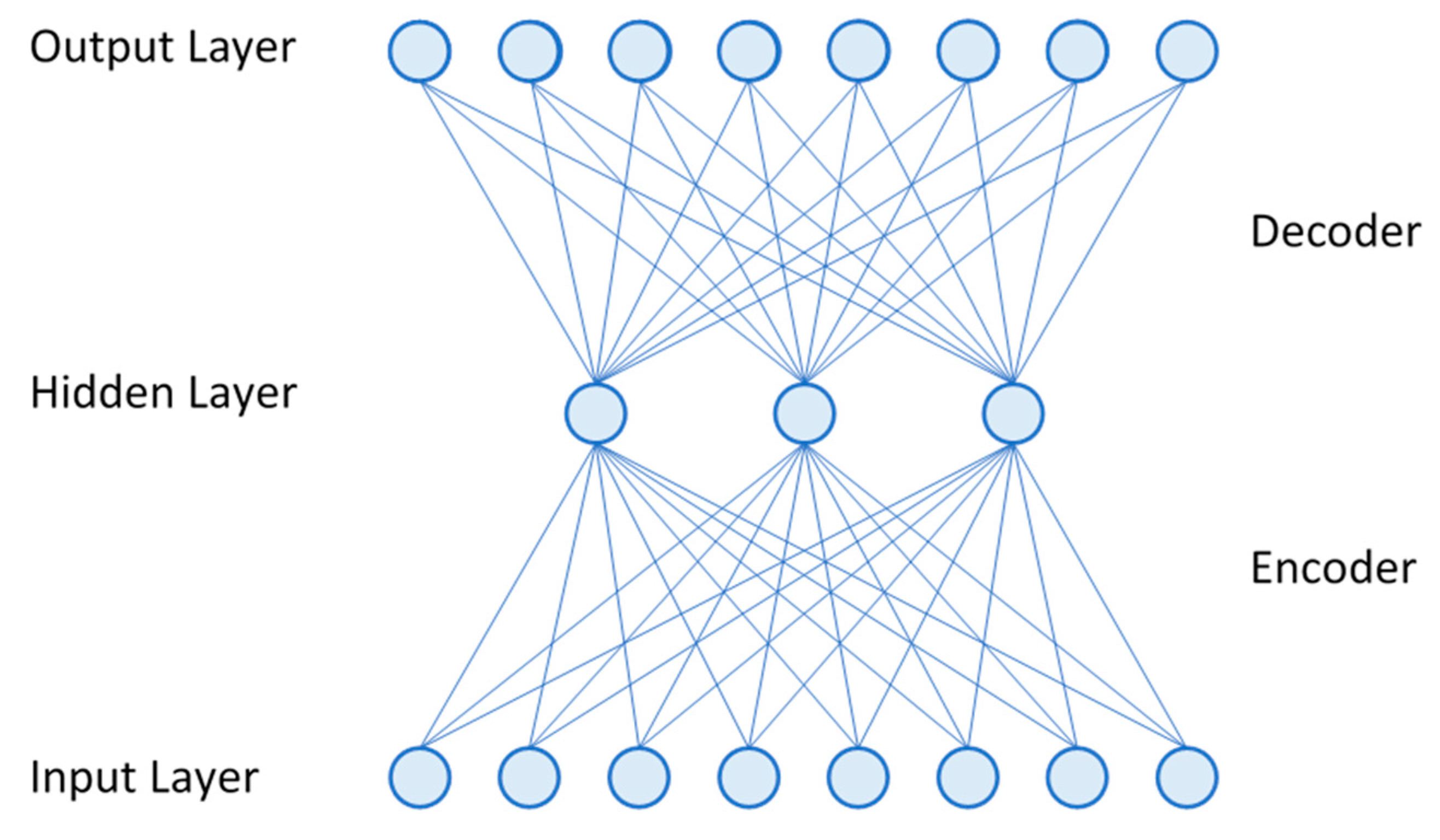
An autoencoder [11], in its simplest form, is an artificial neural network with one hidden layer where the output layer is meant to be as faithful a reproduction as possible of the input layer (Figure 1). Interpreting this in the context of image times series (where a series of images for some variable such as sea surface temperature has been captured over time), the input layer nodes may each (for example) represent a one-dimensional time series (a vector) at a single pixel in space. The output nodes are also temporal vectors at each pixel, and are meant to be the closest possible match to the input nodes, given the structure of the network. When the number of hidden layer nodes is less than the number of input and output nodes, the hidden layer needs to determine a latent structure that can best reproduce the original inputs with a reduced dimensionality. In a basic autoencoder, each node in the hidden and output layers performs a weighted linear combination of its inputs, which may subsequently be modified by a non-linear activation function. Thus, each connection in Figure 1 represents a weight, and each node in the hidden and output layers represents a weighted linear combination (a dot product), optionally followed by a non-linear activation. It is frequently stated that when a linear activation is used (i.e., the activation step is left out), the autoencoder behaves similarly, but not identical to, a principal component analysis [12].
As is typical of neural networks, the architecture of the autoencoder is exposed to multiple training examples with expected output values, and weights are progressively altered through backpropagation [11,13]. Eventually, the network converges on a set of connection weights that maximize the correspondence between the inputs and the outputs (which, in this case, are similar to the inputs, albeit generated only from the limited number of hidden nodes). Note also that the architecture is flexible. The interpretation offered here where the nodes represent temporal vectors corresponds with what is known as S-mode analysis [14]. It is equally possible to consider the nodes as vectors over space for a single time step, which would be the equivalent of T-mode analysis [14].
Autoencoders have been known since the 1980s [11] and have commonly been used for unsupervised feature learning. In this case, the hidden layer nodes represent important features of the inputs. For example, if the inputs are faces, the hidden layer nodes may represent important aspects of faces, in general. These discovered features can then be used in classification tasks, such as face recognition. Other applications include noise removal [11], dimensionality reduction [15] and image compression [16]. In each if these cases, the reduced number of nodes of the hidden layer serve to reject noise and capture the essence of the image with a lower and more efficient dimensionality. Another application is a generative variational autoencoder [17] that can use the learned latent structure to generate new plausible instances. For example, based on a sample of faces, such an architecture might generate new plausible faces based on the latent structure of the faces analyzed. This, however, uses a somewhat different architecture that is not the focus of this research.
Latent structure lies at the heart of an autoencoder – the capture of essential information with a limited number of dimensions. Thus, they are similar in intent to PCA and EOT. To explore their potential use in the analysis of teleconnections, [18] explored varying architectures of a basic linear autoencoder to examine the nature of the latent structure encoded from an analysis of global monthly sea surface temperature anomalies from 1982 to 2017. What she found was that as the number of hidden nodes increased, the latent structure became distributed across the nodes in a manner that no longer made sense geographically or temporally (despite being able to produce an output that was a good reproduction of the input series). However, if she created an autoencoder with a single node, similar to the logic of [19], the result was identical to the first S-mode PCA of the series. She then showed that by applying the autoencoder sequentially, fitting the single node to produce the component, then removing that component by creating a residual series (just as is done with EOT), she could produce a full sequence of PCAs identical to a PCA solved by eigendecomposition. In this paper, we therefore extend this work to consider an autoencoder as the basis for a similar analysis to EOT. EOT is a brute force technique that can take many days to solve a typical application. A faster alternative would be a welcome contribution.

2. Methods and Materials

2.1. Methodology

Figure 2 illustrates the structure of the sequential autoencoder for teleconnection analysis (SATA). The blue circles and connections represent the autoencoder, just as in Figure 1, except that there is only a single hidden layer node. The pink rounded rectangles represent geospatial software modules and the green rectangles represent images, as will be explained below.
With this architecture, the single hidden layer node (which is again a temporal vector) is given the task of finding a latent structure than can allow it to reproduce, with the aid of the decoder weights, the input series as the output series with as little error as possible. It does this by initializing a set of weights, one for each connection in the diagram, with random values with a mean of 0 and a normal distribution with a standard deviation of 0.05. The hidden layer node then multiplies each node that is connected to it in the input layer by its corresponding weight and then sums the results, yielding the hidden layer vector. Each output node then does the same, although, in this case, the output node is assigned the value of the hidden node vector multiplied by the weight of its single connection to the output node. Expressed mathematically, given an image series S as a matrix with T time steps and P pixels:
S = ( s t p ) T × P
the encoder yields a hidden layer vector h:
h = ( h t ) T
through the dot product using encoder weights w e :
h t =   w e ·   s t ,
and the decoder yields an output image series O:
O = ( o t p ) T × P
Through the dot product using decoder weights w d :
o t , =   w d     h t
The output layer of the autoencoder, at each time step, is thus an image which is a function of the decoder weights and the scalar value of the hidden node vector at that time step, which is, in turn, a function of the input image values and the encoder weights.
The autoencoder model thus contains three components that are learned through training—the encoder weights, the hidden layer vector, and the decoder weights. The training data set is the entire image series. The same series is also used as the validation data set—i.e., it is being trained to reproduce the input as closely as possible using these three components. The loss metric that is used is mean squared difference (error) between the input and the output, averaged over all pixels and time steps. Based on a standard neural network learning procedure, it uses backpropagation (using the Adam optimizer [20]) to modify the weights after each batch of 32 images has been introduced. In this study, 500 epochs (complete iterations through the data) were run to allow the weights to converge on a final solution with minimal loss.
In the sequential autoencoder proposed by [18], the first node solved is the equivalent of the first S-mode Principal Component of the image series. However, this is not the first SATA component. A correlation analysis is then run to create a loading image (an image that shows the correlation of each pixel, over time, with the hidden node vector) as well as an r2 image. The temporal vector of the pixel with the highest r2 could then be used as the first SATA component. However, we have found that a more representative component is achieved by creating the average temporal vector of a group of the pixels with the highest loading. In this study, we have chosen to average the highest 0.5%. This mean vector is then the first SATA component.
In creating the mean vector SATA component, it is necessary to ensure that all vectors are in the same phase. For example, some of the vectors may be positively correlated with the autoencoder hidden node weights and some may be negatively correlated. The loading image is then used to resolve phase issues. Based on the dominant phase (positive or negative), as determined by the loading image and the top 0.5% of vectors, vectors which are out of phase are inverted, such that all vectors that are averaged are consistent with the dominant phase.
After the first SATA component is found, linear regression is used to create a residual series where the temporal pattern of this first SATA component is removed. The process then iterates by using the residual series as the next input layer. At the end, the computed SATA components are submitted to a partial correlation analysis in order to produce the final loading images. Summarizing, the algorithm proceeds as follows:
  • Set the original image series as the Input_Image_Series
  • Run the autoencoder on Input_Image_Series and get the hidden layer vector h
  • Correlate h with each pixel vector (over time) in the input series → R_Image
  • Square the values in the R_ImageR2_Image
  • Find the 0.5% of pixels in R2_Image with the highest R2.
    • Extract their temporal vectors → Top_R2_Array
    • Determine the dominant phase (sign) of the Top_R2_Array (positive or negative) using R_Image
    • Multiply all temporal vectors in Top_R2_Array inconsistent with the dominant phase by -1 → Phase_Adjusted_Top_R2_Array
  • Compute the mean of Phase_Adjusted_Top_R2_ArraySATA_Component vector
  • Using pixel-wise regression over time, create a residual series from SATA_Component → Residual_Image_Series
  • Replace the Input_Image_Series with the Residual_Image_Series
  • Go to 2 until all components have been produced, else continue.
  • Using the original image series, compute Partial R images as loadings for each SATA_Component
The implementation was written in Python using the Keras [21] front end and TensorFlow [22] back end Neural Network/Deep Learning libraries to implement the autoencoder component and Python calls through the Windows COM interface [23] to access the TerrSet [24] Correlate, Toprank and Profile modules. The Correlate module is a multipurpose image time series analysis module that takes an image series and a temporal vector as inputs, and can produce a variety of image outputs, including correlation images, r2 images, slope and intercept images and residual series. It was used for each of the steps marked as CORRELATE and REGRESS in Figure 2. In the CORRELATE step, it yields a single image where each pixel specifies the correlation between the input vector (the hidden layer vector) and the input image series pixels over time. In the REGRESS step, it outputs a residual series after the effects of the input vector (the SATA Component) have been removed. The Toprank module ranks the pixels in an image and outputs a binary image indicating the pixels with a rank higher than a specified threshold or percentage of the image pixels. It was used to compute the RANK operation in Figure 2. The Profile module takes an image series as input along with an image specifying the pixels to be profiled. There is an option to output the mean profile, where the mean is sensitive to phase (sign). It was used for the PROFILE step in Figure 2. The source code is available at https://github.com/HJiena/A-Sequential-Autoencoder-for-Teleconnection-Analysis. The final partial correlation analysis was then performed in the Earth Trends Modeler in TerrSet [24].

2.2. Data

To illustrate the potential of the SATA approach, United States National Oceanic and Atmospheric Administration (NOAA) Optimally Interpolated monthly sea surface temperature imagery at a 1 degree resolution were acquired for the period from 1982 to 2017 [25]. The images were subsequently converted to anomalies by subtracting the long term mean for each month over the 1982-2017 period. To ensure a standardized analysis so that each pixel had equal weight, the results were then converted to standardized anomalies over time. The data were finally projected to a Mollweide projection to ensure that each pixel had an equal area weight in the analysis.

2.3. Evaluation

To evaluate the results of the SATA approach, an analysis was run to compute the first 10 SATA components (abbreviated as SCs). The number 10 was chosen arbitrarily as being adequate to demonstrate the procedure. For interpretation, tabulated indices for a series of climate teleconnections (Table 1 and Figure 3) were then collected and compared to the SCs by means of correlation analysis. These climate indices are simplified temporal statements of patterns over space and time with well-established expressions of surface climate that may extend over great distances [1]. For example, the Oceanic Niño Index expresses a climate pattern (the El Niño/Southern Oscillation) that extends over the entire tropical Pacific with profound impacts over the extra-tropics as well. Details about these indices can be found in Appendix A. Lagged correlations were assessed within a +/- 12-month window. A positive lag indicates that the comparison index needs to be moved forward in time to get the associated correlation. This means that the pattern found in the comparison index is happening before the pattern described by the component. Lagged correlations occur primarily as a result of differences in the geographic locations used to measure these highly dynamic phenomena.
For further evaluation, an EOT analysis [7] was run and compared to the results of the SATA, using the implementation of EOT in the Earth Trends Modeler software [8]. The EOT was run as a centered and standardized analysis to be comparable with the SATA.
A key concern with cross-correlations of time series data is non-stationarity, which affects significance testing [31]. This includes non-stationarity in the mean (i.e., trend), heteroscedasticity and serial correlation (autocorrelation). A solution is to transform the data to achieve stationarity before significance testing—a process known as prewhitening [31]. There are a number of techniques that can be used to prewhiten time series before cross-correlation. One of the simplest is first differencing where the series is replaced by the differences between adjacent samples. Commonly, first differencing is sufficient to achieve stationarity as verified by an Auto-Correlation Function (ACF) [32]. This was true for all cases, except when comparing SATA Component 1 and EOT Component 1 with the Oceanic Nino Index, where Second Differencing was required (difference of the differences).
In cases where it is desirable to maintain the secular (long-term) trend in the data, an alternative prewhitening approach that is popular in the atmospheric sciences is the trend-preserving prewhitening approach of [33]. In this study, the only pattern where trend preservation was considered to be desirable was that with comparisons to the Global Mean Sea Surface Temperature Anomaly (intended as an index to global warming). Thus, trend-preserving prewhitening was used in that case. These prewhitened derivatives of the SATA and EOT components and the climate indices were then used to assess the significance of the correlations.

3. Results

Figure 4, Figure 5, Figure 6, Figure 7, Figure 8, Figure 9, Figure 10, Figure 11, Figure 12 and Figure 13 show the first 10 SATA components (SCs) produced along with their loading images (maps of the degree of correlation between the time series at each pixel and the SC vector). Comparable figures for the EOT analysis can be found in Supporting Materials Figures S1-S10. For the SATA and EOT components, the X axis is time and the Y axis is the component score measured in the same units as the data analyzed (degrees Celsius in this case). Table 2 shows the association between the SCs (numbered in column a) and EOTs (numbered in column c) and the climate indices listed in Table 1 along with the lag of maximum correlation (in column b for the SATA components and column d for the EOT components). Finally, column e indicates the cross-correlation between corresponding SATA and EOT components. All correlations with a prewhitened significance of p < 0.05 or stronger are tabulated, with those more significant than p < 0.01 and p < 0.001 being noted with asterisks.
For the first three SCs and EOTs, the two methods produce very similar results. After this, they diverge, although SC8 and EOT4, SC9 and EOT7, and SC10 and EOT10 are clearly corresponding patterns.
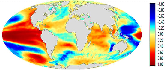
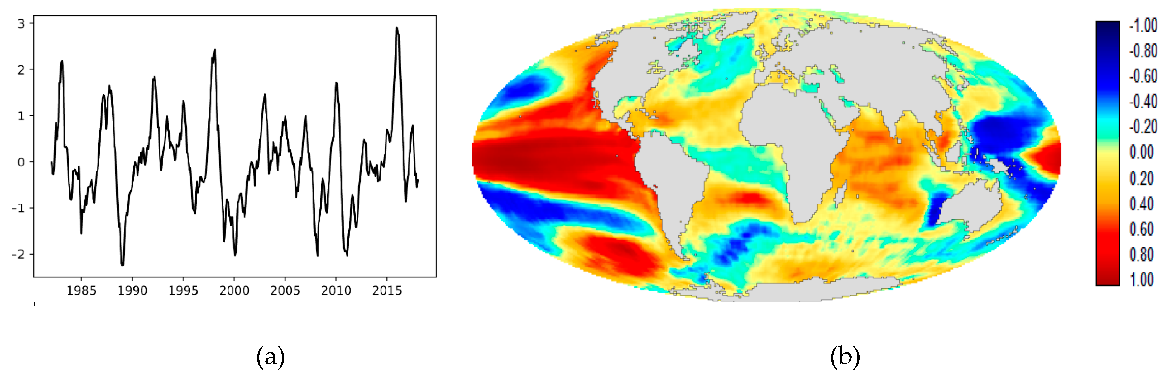
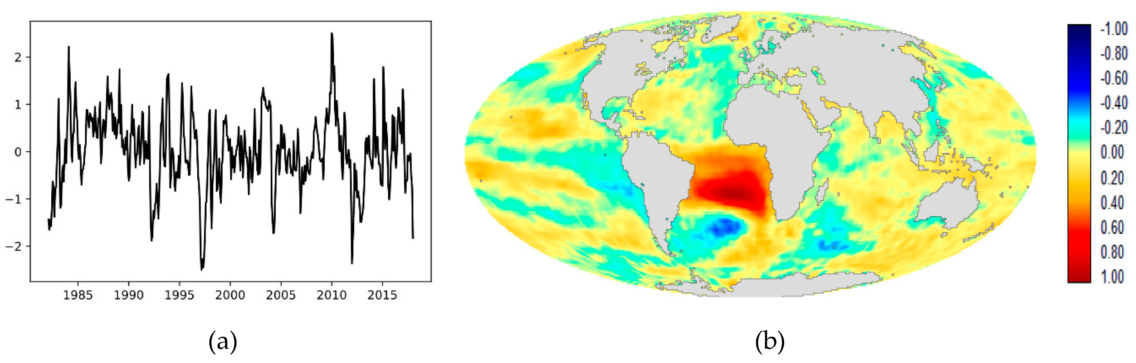
SC1 (Figure 4) clearly describes the El Niño/Southern Oscillation (ENSO) phenomenon [34]. The correlation with the Oceanic Niño Index (ONI), as seen in Table 2, is very high—0.96 at lag +1. The lag relationship indicates that it found a pattern that peaks, in the case of El Niño, 1 month after that indicated by the ONI index. SC1 is also correlated with the IOD at 0.35 at lag +1, indicating that the IOD index precedes the component by 1 month. This is interesting given the evidence provided by [35] that the Indian Ocean Dipole has a role to play in the development of Super El Niños. Note that SC1 is very similar to EOT1 (Figure S1), r=0.97, although the correlations with the ONI and IOD indices are higher with SC1.
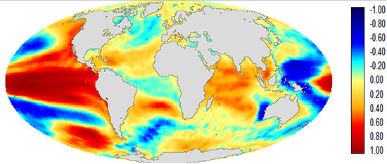
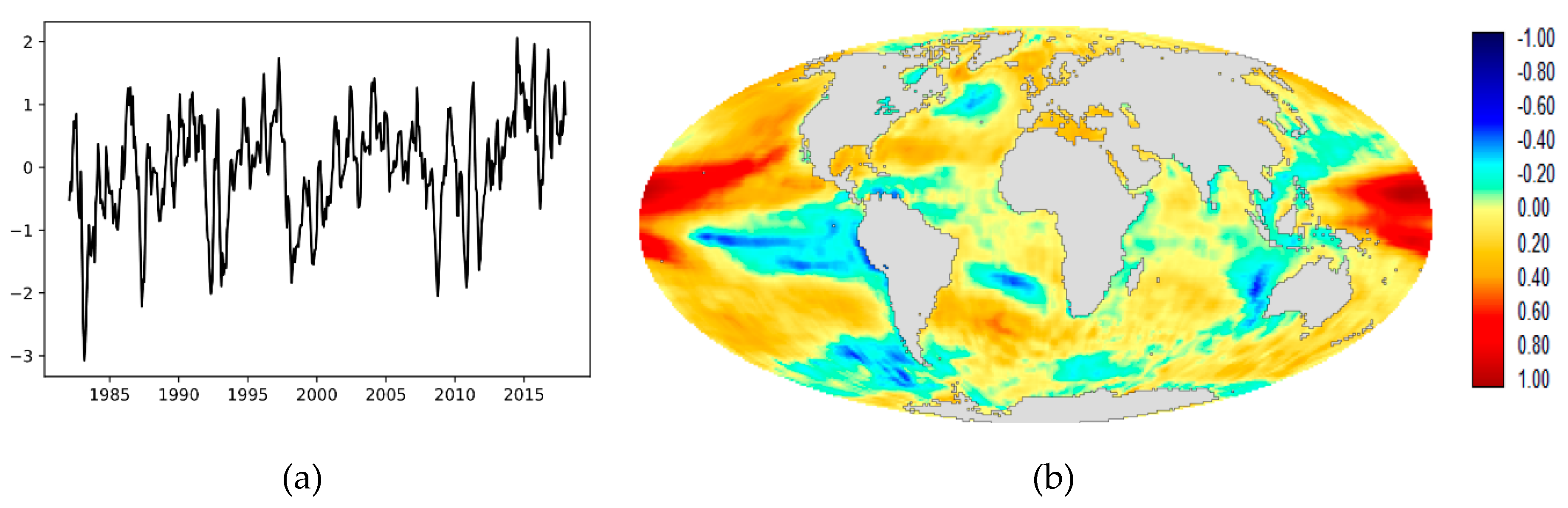
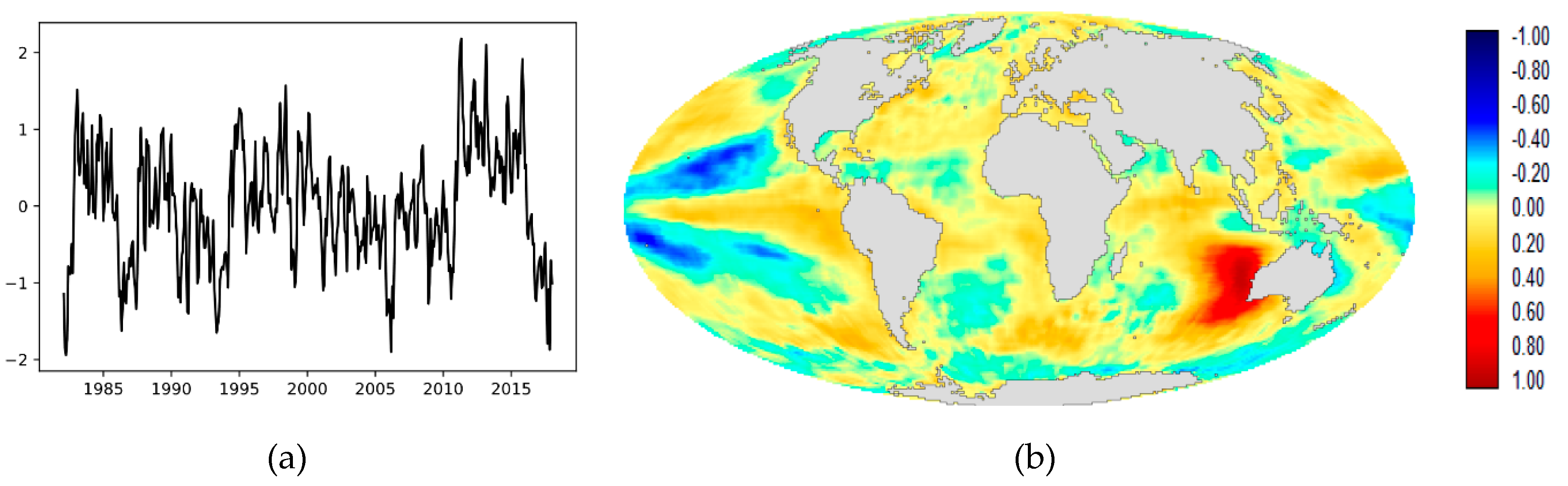
SC2 (Figure 5) correlates highly (0.84) with the Atlantic Multidecadal Oscillation [32], [33] and with Global Mean Sea Surface Temperature Anomaly (0.72). The latter association (tested with trend-preserving prewhitening) is logical given the time frame analyzed (1982-2017) which spans the half cycle of the AMO from a trough in the mid-1970s to a peak in the 2000s [34]. Looking at the loading image, it is clear that the areas of positive association with the component cover large parts of the globe, and not just the Atlantic. Thus, an element of global ocean warming seems plausible. SC2 is also correlated with the Atlantic Meridional Mode (AMM) at 0.67. Note that these correlations with the AMO and the AMM are significant at the p < 0.001 level, even though the first difference prewhitening removed the secular trend. EOT2 (Figure S2), which is cross-correlated with SC2 at 0.80, is visually quite similar. However, there was no significant correlation between EOT2 and the AMO and AMM. The only significant correlation was with Global Mean Sea Surface Temperature Anomaly (using trend-preserving prewhitening).
SC3 (Figure 6) and EOT3 (Figure S3) are cross-correlated at 0.69 and appear to be similar and related to the ENSO Modoki phenomenon [35]. ENSO Modoki is a central Pacific Ocean warming that is distinct from canonical ENSO events which have stronger patterns in the eastern Pacific. The correlation with the EMI for SC3 is 0.50 at lag -4, and for EOT it is 0.46. The MII index [36] shows an even stronger relationship, with a correlation of 0.72 with SC3, but no significant relationship with EOT3. [37] postulated that there are two types of ENSO Modoki event, and developed the MII index [36] to help distinguish between them. The EMI considers only SST anomalies, while the MII index is derived from a multivariate EOF analysis that considers the normalized EMI, the Niño4 index and 850 hPa relative vorticity anomalies averaged over the Philippine Sea in the autumn months (September, October, and November—SON). Type I events originate in the central Pacific, while Type II events originate in the subtropical northeastern Pacific. The correlations would suggest that SC3 captures a Modoki Type II pattern.
SC4 (Figure 7) is also related to ENSO Modoki. SC4 is clearly a La Niña Modoki event, with correlations of −0.31 and −0.40 with the EMI and MII indices. Most striking, however, is its association with the Philippine Sea which is known to exhibit positive anomalies during a La Niña Modoki event [38]. To investigate the possibility that SC4 is representative of a Modoki Type I, the EMI index was averaged over the autumn months (SON) to develop an annual index comparable to the MII index. MII was then subtracted from this autumn EMI to get an index to Modoki Type I. The correlation of SC4 with this index was 0.35 (p < 0.001 when prewhitened), lending some support for the possibility that SC4 represents Modoki Type I.
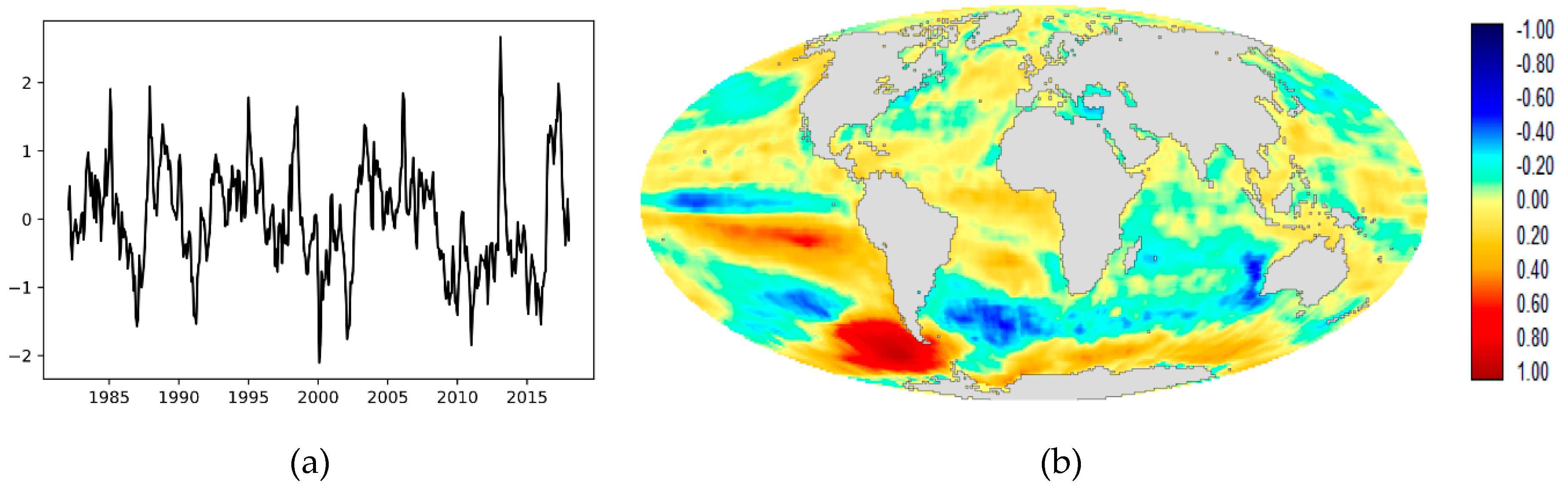
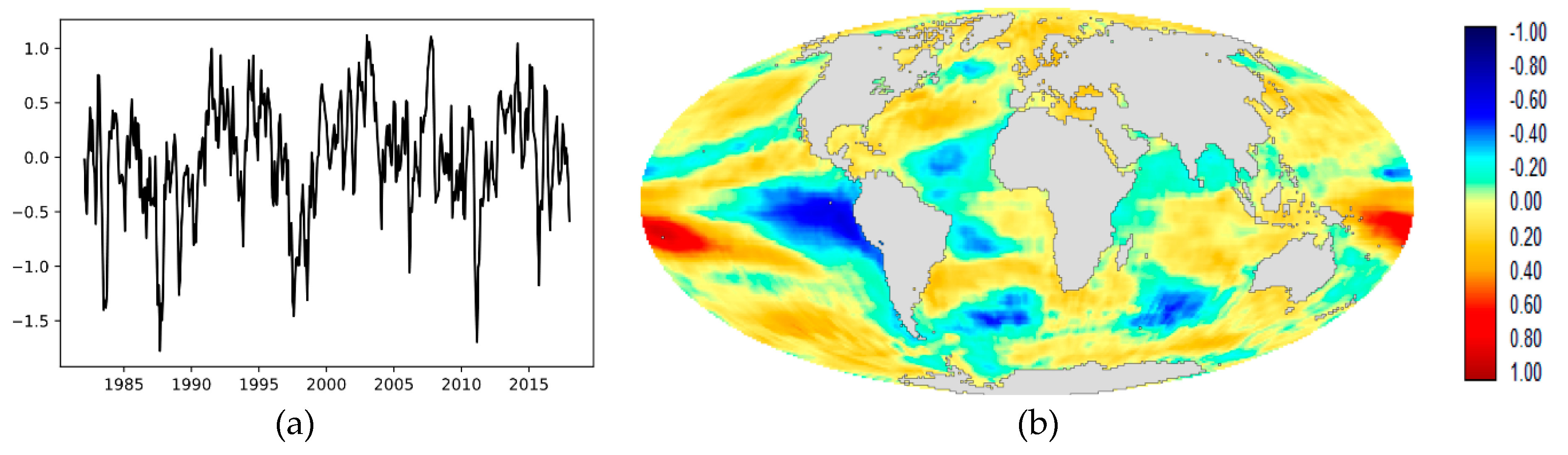
SC5 (Figure 8) is a very distinctive pattern involving the southeastern Pacific and southwest Atlantic oceans that is related to the Antarctic Dipole [39], [40]. The pattern correlates with the Antarctic Dipole Index (ADI) at −0.43. [40] indicated a positive lag relationship between ENSO and the Antarctic Dipole. This is confirmed here using the ONI, with a significant correlation of 0.26 (p < 0.001) at lag +5. Note that this pattern was not found in the EOT analysis.
SC6 (Figure 9) presents a distinctive dipole in the south Atlantic Ocean. Its correlation with the South Atlantic Ocean Dipole (SAOD) [41] is 0.42. However, the positive pole appears slightly south of the northeast pole defined by [41] and the negative pole is centered to the southern end of their southwest pole. Again, this pattern was not found in the EOT analysis.
SC7 (Figure 10) is also in the southern oceans and again has no counterpart in the EOT analysis. It correlates with the Subtropical Indian Ocean Dipole (SIOD) [42] at −0.46. The pattern mapped corresponds with the negative phase of the SIOD. The index is specified as the difference between SST anomalies in the Indian Ocean southeast of Madagascar (seen in light blue) and the area in the eastern subtropical Indian Ocean just off the west coast of Australia. However, the dominant focus of this SC is warming off Australia, and the primary focus is slightly more easterly than the area measured for the dipole index. [43] also noted a discrepancy between definitions of the SIOD poles and an evident dipole in cases of extremely wet and extremely dry years in southwest Western Australia. The pattern here seems to match best their discussion of extremely dry years. The relationship in the Pacific is unknown to the authors, although it can be noted that the correlations with the ONI (Lag -10) and EMI indices are −0.27 and −0.18, respectively.
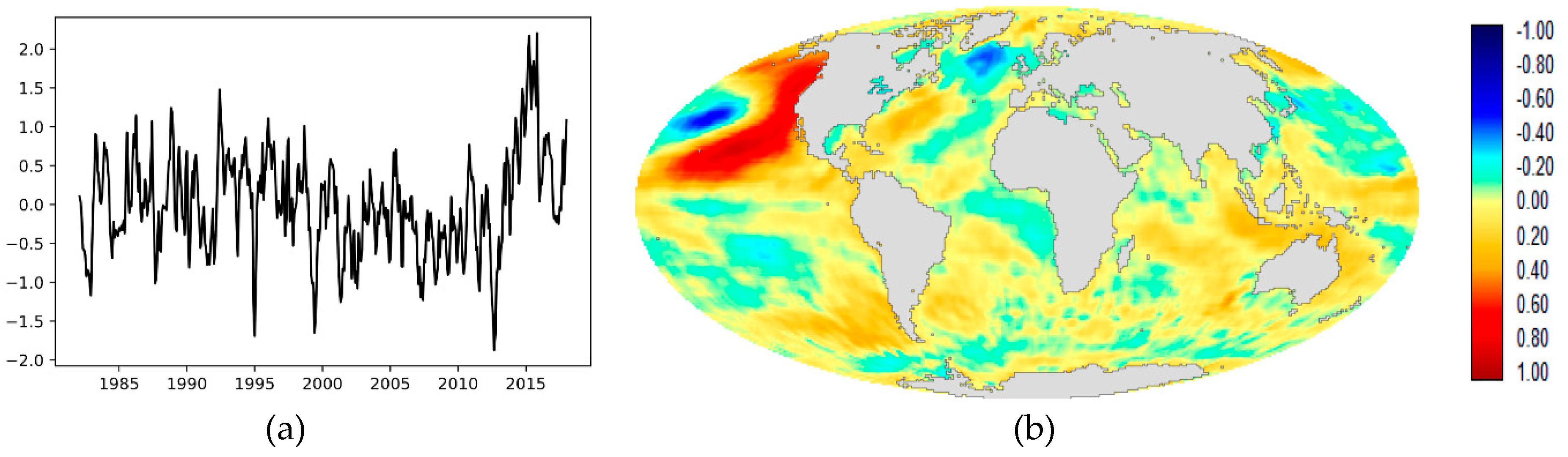
SC8 (Figure 11) and EOT4 (Figure S4) are similar. The former is correlated with the EMI at 0.40 and the latter at −0.41, while the correlation between them is −0.37. The identity of the pattern is unclear. It would appear to involve variability of the Pacific Cold Tongue (a region of cold water extending westward from South America along the equator [44], [45]) that is unrelated to ENSO, and which is related to ENSO Modoki. It is possible that it is an evolutionary relationship. SC8 is related to SC3 at lag +6 with a correlation of 0.26 (p < 0.01 prewhitened). This suggests that SC8 may be an earlier stage in the development towards SC3. However, this requires further research.
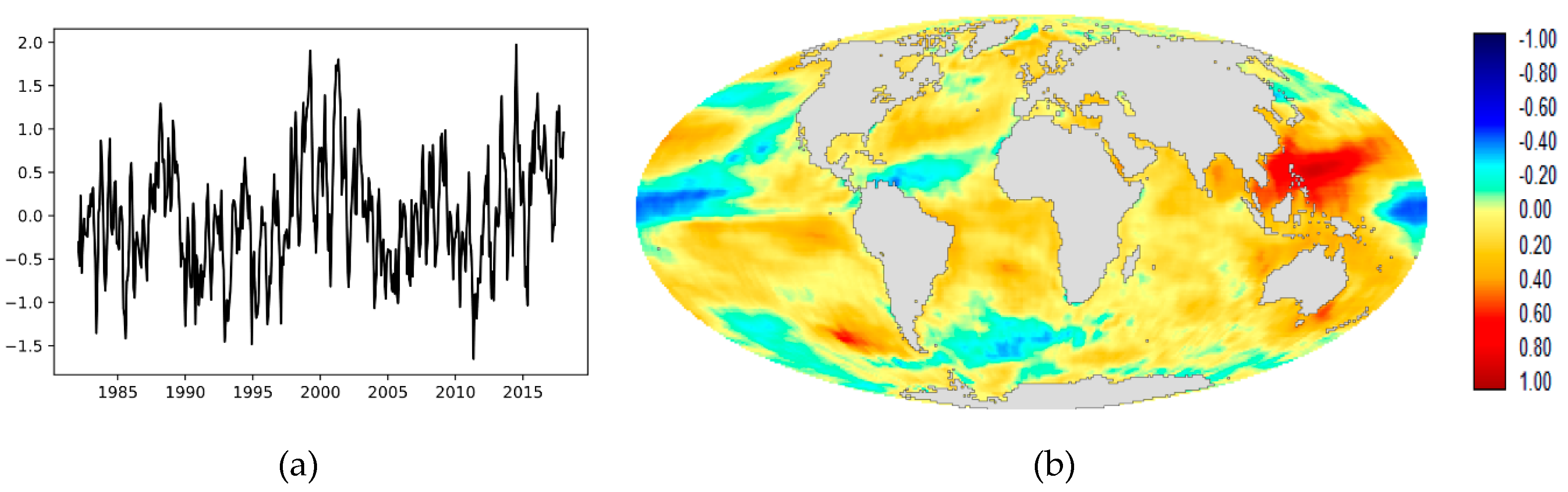
SC9 (Figure 12) is distinctive and is clearly the same pattern as that found in EOT7 (Figure S7), with a cross-correlation of 0.57. SC9 and EOT7 correlate with the PDO at 0.46 and 0.41, respectively. It is also interesting to note that SC9 and EOT7 correlate with the Pacific Meridional Mode (PMM) at 0.53 and 0.50, respectively.
SC10 (Figure 13) is a very distinctive pattern in the southeast Pacific that is unknown to the authors at this time. However, it is apparently the same pattern as is found by EOT10 (Figure S10). SC10 and EOT10 are correlated at 0.62. However, SATA sees this as a clear dipole, which is not so evident with EOT.
Note that while the SATA found four components that had no counterpart in the EOT analysis, it is also the case that there were four EOT components that had no counterpart in the SATA output. These were EOTs 5 (Figure S5), 6 (Figure S6), 8 (Figure S8) and 9 (Figure S9). EOT 5 is associated with tropical Pacific dynamics and is correlated both with ENSO Modoki and with ENSO. However, it is not significantly correlated with any of the SATA components. EOTs 6 and 9 did not correlate with any of the climate indices and are not patterns recognized by the authors. EOT 8, however, did correlate with the Atlantic Meridional Mode (AMM) at 0.63, as will be discussed further below.
In summary, the SATA analysis found nine components that it could significantly correlate with known climate indices. 
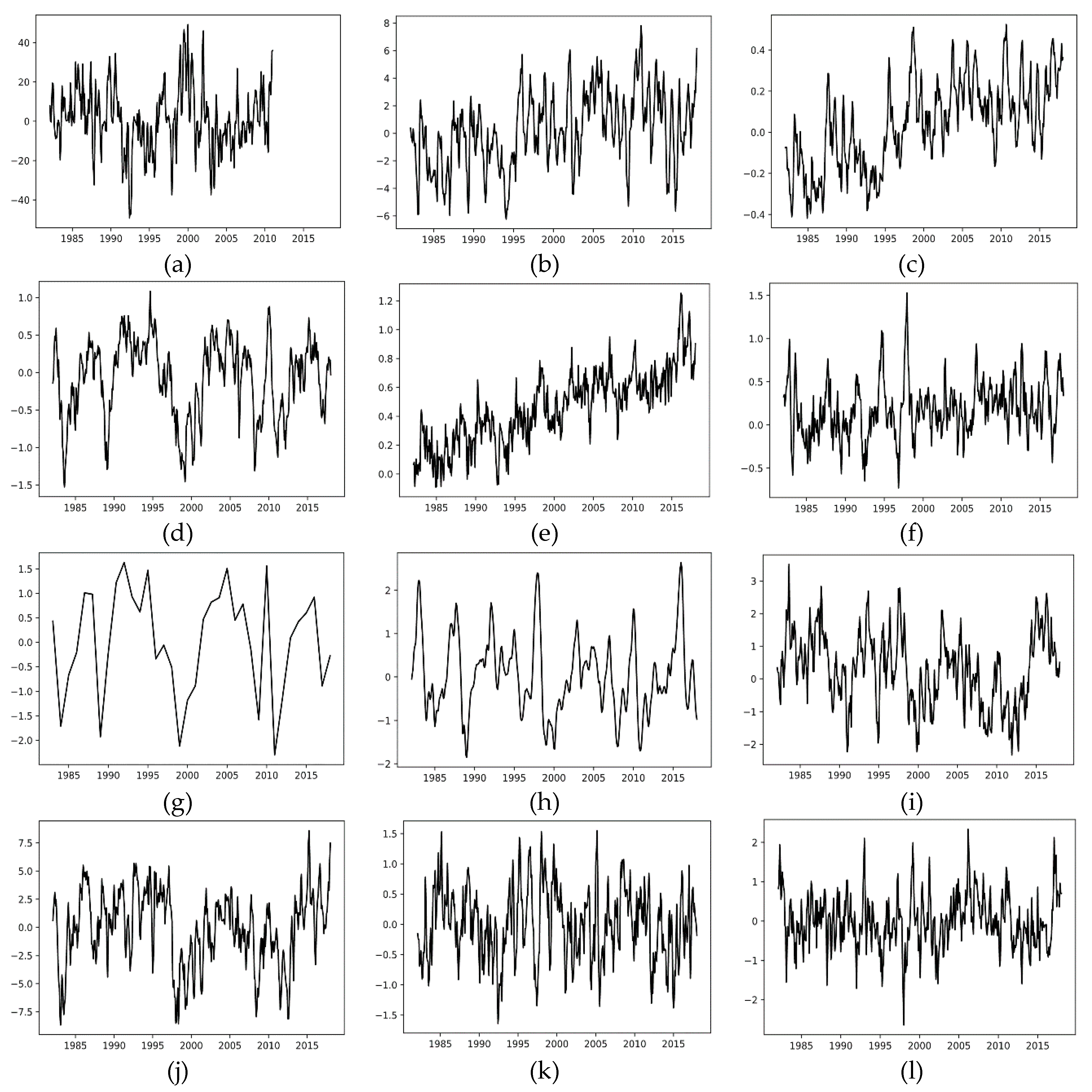
Figures S11–S19 show temporal plots between these SATA components and their most closely associated climate index.

4. Discussion

Looking at the SATA components and their relationship with established climate indices, it is evident that the technique is highly successful in finding teleconnection patterns, and it can do so very deep into the data. For example, SATA Component 9 nicely captures the Pacific Meridional Mode, eight residuals deep into the data. Like EOT, the components are independent in time (because the analysis is based on successive residuals) but not necessarily in space. Thus, they are similar in character to oblique rotations of PCA.
Comparing SATA with EOT, there are frequent correspondences between the two techniques. However, there are also differences. The SATA correlations with known teleconnection indices are generally, and noticeably, higher than those for EOT. We tested the effect of using only a single pixel as opposed to the mean vector of the top 0.5%, for the first three components, and found that the correlations matched exactly those of EOT with that change. Thus, the additional explanatory power would appear to come from the regularizing effect of capturing the mean vector of the top 0.5%. We see this as an important feature, as using a single pixel tends to overfit.
Another distinct advantage of the SATA approach is that it is better able to capture teleconnections with multiple centers of action. This is clearly evident in SC10. Both EOT and SATA found this pattern. However, SATA characterized the pattern clearly as a dipole, which was not as strongly evident with EOT. To confirm its character, the SATA component was correlated with monthly anomalies in 500 hPa geopotential heights from the NCEP/NCAR Reanalysis I data [46]. The result is indicated in Supporting Materials Figure S20, where the index provided by SC10 shows a clear and matching dipole structure in the geopotential height data. Thus, we conclude that it really is a dipole. This is clearly an advantage of the SATA approach. EOT characterizes a pattern from a single location. Thus, in a case with multiple centers of action, it will favor one of the poles. Examining the 180 pixels chosen as the top 0.5% of vectors for SC10, 47% came from the negative pole and 53% came from the positive pole. Thus, the SATA vector developed was fairly evenly representative of the two poles.
Comparing the ability of the two techniques to discover known teleconnections, SATA found four teleconnections not detected by EOT within the first 10—the Atlantic Multidecadal Oscillation (AMO), the Antarctic Dipole (ADI), the South Atlantic Ocean Dipole (SAOD) and the Subtropical Indian Ocean Dipole (SIOD). The omission of the AMO in the EOT results is interesting. EOT2 correlates with the AMO at 0.71 and with the Atlantic Meridional Mode at 0.50 at Lag -1. However, after prewhitening with first differencing, which removed the substantial secular trend, neither is significant (p>0.1). Thus, the apparent correlation without prewhitening appears to only be related to the secular trend. However, SATA Component 2 is significantly correlated to both after the trend is removed by prewhitening. As was noted above, the EOT component is based on a single location, while the SATA component is based on an average of the top 0.5% of pixels. It would appear that the larger sample and broader geographic distribution provided a better characterization of the AMO and AMM that stood up to significance testing in the first difference prewhitened series.
While SATA found four teleconnections not found by EOT, EOT found one that was not found by SATA among the first 10—the Atlantic Meridional Mode (AMM), as a separate teleconnection distinct from the AMO. It is interesting to note that there are perspectives that the AMM and the AMO are both part of a single phenomenon, as well as those that see them as distinct [47]. In this analysis, EOT sees a separate component related to the AMM (EOT8), while SATA, at least within the first 10 SCs, only finds the one associated with both the AMO and AMM in SC2. This is interesting because EOT8 is again based on a single pixel vector, which it found in the tropical Atlantic. Of the 180 pixel vectors (top 0.5%) selected to characterize SC2, most also came from the tropical Atlantic, but 14% of them came from the North Atlantic Sub-Polar Gyre, supporting the concept of a very broad geographic pattern.
Another difference between SATA and EOT is the issue of efficiency. EOT is a brute force technique that is computationally intensive and quite time consuming. On the contrary, SATA is surprisingly fast in comparison. In a test on identical hardware (see Appendix B for details), our implementation of SATA in Python using the TensorFlow and TerrSet libraries ran two orders of magnitude faster than EOT in R [48] and three orders of magnitude faster than the implementation in the Earth Trends Modeler [8], which is currently a single-threaded application. Part of this derives from the remarkable speed with which the backpropagation by gradient descent in TensorFlow converges on a solution, and part derives from the efficiency of calculating the many dot products involved using a GPU.
This research was developed through an exploration of the potential of autoencoders for image times series analysis. Note, however, that in the implementation described here, where the activation function is linear, the autoencoder could be replaced with an S-mode [14] PCA to extract the first component as a substitute for the autoencoder hidden node in each iteration. Since a linear autoencoder with one hidden layer spans the same subspace as PCA [11,12], a PCA with one component is, in fact, a basic linear autoencoder, as demonstrated by [18]. Only the mathematical procedure for the solution is different. However, as indicated by [12], a neural network-based autoencoder is better able to deal with high dimensional data. S-mode PCA of image time series, where each pixel is a separate variable over time, is extremely high dimensional. A neural network autoencoder derives weights by iterative adjustment, requires no matrix inversion, and has been demonstrated here to be very efficient. Indeed, Deep Learning frameworks, such as the TensorFlow library used in this implementation are routinely applied to problems with many billions of weights to be solved [22].
This ability to handle high dimensional data would also allow a simple implementation of an Extended SATA (ESATA), similar in spirit to an Extended PCA [5]. With an Extended SATA, multiple image series would be analyzed simultaneously for the presence of common patterns by simple concatenation over space of the series data. Again, the ability to find patterns with multiple centers of actions would be a distinct advantage. There is an implementation of Extended EOT (EEOT) in the Earth Trends Modeler [8]. However, it is computationally intensive, and as with regular EOT, EEOT derives its pattern from a single pixel in just one of the series. With suitable adjustment of the threshold, ESATA could easily accommodate multiple centers of action across the series. Note also that the various series analyzed can be of different resolutions and even different locations in space, as long as all series analyzed share the same temporal resolution and duration.
Finally, it is evident that the SATA patterns, like EOT, are very regional in character. Both techniques search for patterns globally, but then characterize them locally (although for SATA, the characterization does not need to be derived from a contiguous group of pixels, but may involve multiple centers of action). This regional character raises the question about how to measure the relative importance of the components. With PCA/EOF, this is indicated by the percent variance explained. With regional patterns such as these, however, this does not seem appropriate. For example, with SATA Component 9, most of the Earth’s ocean surface shows no appreciable relationship with the pattern over time. However, in the North Pacific, the relationship is strong. A global measure of percent variance explained would be so diluted that it would make the component seem inconsequential. Perhaps a better indicator would be to measure the surface area over which the explanatory value (the square of the loading) exceeds a threshold, such as 50% variance explained. The area can then be compared to other components.
Planned future research includes the Extended SATA mentioned above as well as an investigation of SATA in T-mode. The current implementation is S-mode where the variables differ in their spatial location (i.e., each pixel represents a different series over time). In T-mode, the variables differ in time. Thus, each time step represents a different image. As demonstrated by [14], S-mode and T-mode can potentially yield very different insights about the data. Also to be explored is the potential of using non-linear activations in the autoencoder architecture.

5. Conclusions

In this paper, we have presented a procedure for empirically discovering teleconnections, recurring patterns of variability in space and time, in image time series of earth observation data. The technique developed is similar in spirit to empirical orthogonal teleconnection (EOT) analysis, but uses a deep learning procedure known as an autoencoder as the primary engine of analysis. Similar to EOT, teleconnections are found sequentially, with subsequent searches based on residuals from the prior analysis. However, unlike EOT, the characterization of the pattern is not based on a single location (pixel), but rather, on an upper percentage of locations which are characterized with accommodation to phase. What results is a process that is highly efficient (by several orders of magnitude) and highly capable of finding teleconnection patterns, especially in cases where multiple centers of action are involved (such as dipoles). More specifically, when EOT and SATA were each used to determine 10 components, SATA found nine well-established teleconnections, four of which (the Atlantic Multidecadal Oscillation, the Antarctic Dipole, the South Atlantic Ocean Dipole and the Subtropical Indian Ocean Dipole) that were not found by EOT. In addition, the associations between the SATA components and existing climate indices were stronger than for EOT because of a strong characterization over multiple locations.

Supplementary Materials

The following are available online at https://www.mdpi.com/2072-4292/12/5/851/s1, Figure S1: (a) EOT Component 1, (b) EOT Component 1 loading image, Figure S2: (a) EOT Component 2, (b) EOT Component 2 loading image, Figure S3: (a) EOT Component 3, (b) EOT Component 3 loading image, Figure S4: (a) EOT Component 4, (b) EOT Component 4 loading image, Figure S5: (a) EOT Component 5, (b) EOT Component 5 loading image, Figure S6: (a) EOT Component 6, (b) EOT Component 6 loading image, Figure S7: (a) EOT Component 7, (b) EOT Component 7 loading image, Figure S8: (a) EOT Component 8, (b) EOT Component 8 loading image, Figure S9: (a) EOT Component 9, (b) EOT Component 9 loading image, Figure S10: (a) EOT Component 10, (b) EOT Component 10 loading image, Figure S11. Comparison of the component score for SC1 (red) with the Oceanic Nino Index (black), Figure S12. Comparison of the component score for SC2 (red) with the Atlantic Multidecadal Oscillation (black), Figure S13. Comparison of the component score for SC3 (red) with the Modoki II Index (black). Note that the Modoki II index is one value per year for the September, October, and November (SON) autumn period. SON averages for SC3 are plotted for comparison, Figure S14. Comparison of the component score for SC4 (red) with the Modoki II Index (black). Note that the Modoki II index is one value per year for the September, October, and November (SON) autumn period. SON averages for SC4 are plotted for comparison, Figure S15. Comparison of the component score for SC5 (red) with the Antarctic Dipole Index (black). Note that the Antarctic Dipole Index only extends from 1982 to 2010, Figure S16. Comparison of the component score for SC6 (red) with the South Atlantic Ocean Dipole (black), Figure S17. Comparison of the component score for SC7 (red) with the Subtropical Indian Ocean Dipole (black), Figure S18. Comparison of the component score for SC8 (red) with the ENSO Modoki Index (black), Figure S19. Comparison of the component score for SC9 (red) with the Pacific Meridional Mode (black), Figure S20: Correlation between SATA Component 10 and monthly anomalies in 500 hPa geopotential heights from 1982 to 2017.

Author Contributions

Conceptualization, J.H. and J.R.E.; methodology, J.H. and J.R.E.; software, J.H.; validation methodology, J.R.E; analysis, J.H. and J.R.E.; writing—original draft preparation, J.R.E; writing—review and editing, J.H. and J.R.E.; visualization, J.H. and J.R.E; supervision, J.R.E. All authors have read and agreed to the published version of the manuscript.

Funding

This research received no external funding.

Conflicts of Interest

The authors declare no conflict of interest.

Appendix A

The climate indices used for the interpretation of the SATA and EOT components mostly came from tables published on the Internet. This was the case with the Atlantic Meridional Mode index [27], the Atlantic Multidecadal Oscillation index [27], the ENSO Modoki Index [28], the Indian Ocean Dipole [29], the Oceanic Niño Index [27], the Pacific Decadal Oscillation [27] and the Pacific Meridional Mode [31]. Two of the indices were provided by individuals who had developed the indices and published their procedures: the Antarctic Dipole Index [26] and the Modoki II index [30]. Note that the Antarctic Dipole Index (ADI) only extends from 1982 to 2010. Correlations with the ADI are limited to this time frame. Also note that the Modoki II index is an annual series that expresses average conditions in the autumn months of September, October and November (SON). Indices and components that are compared to Modoki II are averaged for SON to create comparable series.
The remaining three indices were derived from the sea surface temperature anomaly data analyzed in this paper. The Global Mean Sea Surface Temperature Anomaly index was produced by averaging the temperature anomalies across all sea surface pixels for each month from January 1982 to December 2017. The South Atlantic Ocean Dipole index was developed using the methodology described by [41] whereby the difference is calculated between the mean SST anomaly in a northeast pole (10°E–20°W, 0°S–15°S) and a southwest pole (10°W–40°W, 25°S–40°S). Finally, the Subtropical Indian Ocean Dipole was calculated in a similar way using the definition of [42], whereby the difference was calculated between the mean SST anomalies in a western pole (55°E–65°E, 37°S–27°S) and an eastern pole (90°E–100°E, 28°S–18°S).

Appendix B

To evaluate the computational efficiency of the SATA approach, a comparison was made with the implementations of Empirical Orthogonal Teleconnections in R [48] and EOT in the Earth Trends Modeler [8]. For SATA, 500 epochs (complete passes through the data) were used to solve for the weights. All three software implementations were run on a Windows 10 64-bit workstation with an Intel Xeon E-2176 2.70 GHz CPU with six cores and 32 GB of RAM, NVIDIA Quadro P2000 GPU, and a Serial ATA 6 Gb/s hard drive. Timings were based on the times of subsequent components after the first had been computed in order to exclude variables such as the time to load necessary libraries and operating system caching of data. Table A1 shows the computational times required, on average, for each EOT. In addition, the speed relative to EOT in ETM (a single threaded application, and the oldest of the group) is tabulated. From this it can be seen that SATA is two orders of magnitude faster than EOT in R and three orders of magnitude faster that EOT in the Earth Trends Modeler.
Table A1. A comparison of the computational efficiency of the SATA approach compared to two available implementations of empirical orthogonal teleconnections. Values are the average time (to the nearest second) to process each SATA component or EOT.
ImplementationMean Time Per ComponentSpeed Relative to EOT in ETM
SATA76 seconds1143
EOT in R2036 seconds43
EOT in ETM86,881 seconds1

References

  1. Trenberth, K.E.; Jones, P.D.; Ambenje, P.; Bojariu, R.; Easterling, D.; Klein Tank, A.; Parker, D.; Rahimzadeh, F.; Renwick, J.A.; Rusticucci, M.; et al. Observations. Surface and Atmospheric Climate Change. Chapter 3. In Climate Change 2007: The Physical Science Basis; Cambridge University Press: New York, NY, USA, 2007; ISBN 978-0-521-70596-7. [Google Scholar]
  2. Wallace, J.M.; Gutzler, D.S. Teleconnections in the Geopotential Height Field during the Northern Hemisphere Winter. Mon. Weather Rev. 1981, 109, 784–812. [Google Scholar] [CrossRef]
  3. de Viron, O.; Dickey, J.O.; Ghil, M. Global modes of climate variability. Geophys. Res. Lett. 2013, 40, 1832–1837. [Google Scholar] [CrossRef]
  4. Van den Dool, H.M. Empirical Methods in Short-Term Climate Prediction; Oxford University Press: Oxford, UK; New York, NY, USA, 2007; ISBN 978-0-19-920278-2. [Google Scholar]
  5. Jolliffe, I.T. Principal Component Analysis, 2nd ed.; Springer Series in Statistics; Springer-Verlag: New York, NY, USA, 2002; ISBN 978-0-387-95442-4. [Google Scholar]
  6. von Storch, H.; Zwiers, F.W. Statistical Analysis in Climate Research. Available online: /core/books/statistical-analysis-in-climate-research/9125090F106D2845485E4BACD79B9695 (accessed on 3 December 2019).
  7. van den Dool, H.M.; Saha, S.; Johansson, Å. Empirical Orthogonal Teleconnections. J. Clim. 2000, 13, 1421–1435. [Google Scholar] [CrossRef]
  8. Eastman, J.R. IDRISI, The Taiga Edition; Clark Labs: Worcester, MA, USA, 2009. [Google Scholar]
  9. Simonti, A.L.; Eastman, J.R. 2005 Caribbean mass coral bleaching event: A sea surface temperature empirical orthogonal teleconnection analysis. J. Geophys. Res. Oceans 2010, 115. [Google Scholar] [CrossRef] [Green Version]
  10. Lanckriet, S.; Frankl, A.; Adgo, E.; Termonia, P.; Nyssen, J. Droughts related to quasi-global oscillations: A diagnostic teleconnection analysis in North Ethiopia. Int. J. Climatol. 2014, 35, 1534–1542. [Google Scholar] [CrossRef]
  11. Goodfellow, I.; Bengio, Y.; Courville, A. Chapter 14, Autoencoders. In Deep Learning; MIT Press: Cambridge, MA, USA, 2016. [Google Scholar]
  12. Plaut, E. From Principal Subspaces to Principal Components with Linear Autoencoders. arXiv 2018, arXiv:1804.10253v3. [Google Scholar]
  13. Dong, G.; Liao, G.; Liu, H.; Kuang, G. A Review of the Autoencoder and Its Variants: A Comparative Perspective from Target Recognition in Synthetic-Aperture Radar Images. IEEE Geosci. Remote Sens. Mag. 2018, 6, 44–68. [Google Scholar] [CrossRef]
  14. Machado-Machado, E.A.; Neeti, N.; Eastman, J.R.; Chen, H. Implications of space-time orientation for Principal Components Analysis of Earth observation image time series. Earth Sci. Inform. 2011, 4, 117–124. [Google Scholar] [CrossRef]
  15. Wang, Y.; Yao, H.; Zhao, S. Auto-encoder based dimensionality reduction. Neurocomputing 2016, 184, 232–242. [Google Scholar] [CrossRef]
  16. Theis, L.; Shi, W.; Cunningham, A.; Huszár, F. Lossy Image Compression with Compressive Autoencoders. arXiv 2017, arXiv:1703.00395v1. [Google Scholar]
  17. Doersch, C. Tutorial on Variational Autoencoders. arXiv 2016, arXiv:1606.05908v2. [Google Scholar]
  18. He, J. Application of Autoencoders for Latent Pattern Analysis in Image Time Series; MS, in progress; Clark University: Worcester, MA, USA, 2020. [Google Scholar]
  19. Ladjal, S.; Newson, A.; Pham, C.-H. A PCA-like Autoencoder. arXiv 2019, arXiv:1904.01277v1. [Google Scholar]
  20. Kingma, D.P.; Ba, J. Adam: A Method for Stochastic Optimization. arXiv 2017, arXiv:1412.6980v9. [Google Scholar]
  21. Keras Documentation. Available online: https://keras.io/ (accessed on 1 January 2020).
  22. Abadi, M.; Agarwal, A.; Barham, P.; Brevdo, E.; Chen, Z.; Citro, C.; Corrado, G.S.; Davis, A.; Dean, J.; Devin, M.; et al. TensorFlow: Large-Scale Machine Learning on Heterogeneous Distributed Systems. arXiv 2016, arXiv:1603.04467v2. [Google Scholar]
  23. Microsoft Using COM in Your Windows app-Win32 apps. Available online: https://docs.microsoft.com/en-us/windows/win32/learnwin32/module-2--using-com-in-your-windows-program (accessed on 1 January 2020).
  24. Eastman, J.R. TerrSet Geospatial Monitoring and Modeling System; Clark Labs: Worcester, MA, USA, 2014. [Google Scholar]
  25. ESRL: PSD: NOAA Optimum Interpolation (OI) Sea Surface Temperature (SST) V2. Available online: https://www.esrl.noaa.gov/psd/data/gridded/data.noaa.oisst.v2.html (accessed on 23 August 2019).
  26. Yuan, Xiaojun. Personal Communication, 2019.
  27. ESRL: PSD: Climate Indices: Monthly Atmospheric and Ocean Time Series. Available online: https://www.esrl.noaa.gov/psd/data/climateindices/list/ (accessed on 7 September 2019).
  28. El Nino Modoki. Available online: http://www.jamstec.go.jp/frsgc/research/d1/iod/modoki_home.html.en (accessed on 11 October 2019).
  29. GCOS-AOPC/OOPC Working Group on Surface Pressure Climate Timeseries. Available online: https://www.esrl.noaa.gov/psd/gcos_wgsp/Timeseries/ (accessed on 1 January 2020).
  30. Wang, Xin. Personal Communication, 2019.
  31. Current AMM/PMM Data. Available online: http://www.aos.wisc.edu/~dvimont/MModes/Data.html (accessed on 14 November 2019).
  32. Schlesinger, M.E.; Ramankutty, N. An oscillation in the global climate system of period 65–70 years. Nature 1994, 367, 723–726. [Google Scholar] [CrossRef]
  33. Kerr, R.A. A North Atlantic Climate Pacemaker for the Centuries. Science 2000, 288, 1984–1985. [Google Scholar] [CrossRef] [Green Version]
  34. Trenberth, K.E.; Shea, D.J. Atlantic hurricanes and natural variability in 2005. Geophys. Res. Lett. 2006, 33. [Google Scholar] [CrossRef] [Green Version]
  35. Ashok, K.; Behera, S.K.; Rao, S.A.; Weng, H.; Yamagata, T. El Niño Modoki and its possible teleconnection. J. Geophys. Res. Oceans 2007, 112. [Google Scholar] [CrossRef]
  36. Wang, X.; Tan, W.; Wang, C. A new index for identifying different types of El Niño Modoki events. Clim. Dyn. 2018, 50, 2753–2765. [Google Scholar] [CrossRef]
  37. Wang, C.; Wang, X. Classifying El Niño Modoki I and II by Different Impacts on Rainfall in Southern China and Typhoon Tracks. J. Clim. 2012, 26, 1322–1338. [Google Scholar] [CrossRef]
  38. Yuan, Y.; Yan, H. Different types of La Niña events and different responses of the tropical atmosphere. Chin. Sci. Bull. 2013, 58, 406–415. [Google Scholar] [CrossRef] [Green Version]
  39. Yuan, X.; Martinson, D.G. Antarctic Sea Ice Extent Variability and Its Global Connectivity. J. Clim. 2000, 13, 1697–1717. [Google Scholar] [CrossRef]
  40. Yuan, X.; Martinson, D.G. The Antarctic dipole and its predictability. Geophys. Res. Lett. 2001, 28, 3609–3612. [Google Scholar] [CrossRef] [Green Version]
  41. Nnamchi, H.C.; Li, J.; Anyadike, R.N.C. Does a dipole mode really exist in the South Atlantic Ocean? J. Geophys. Res. Atmos. 2011, 116. [Google Scholar] [CrossRef] [Green Version]
  42. Behera, S.K.; Yamagata, T. Subtropical SST dipole events in the southern Indian Ocean. Geophys. Res. Lett. 2001, 28, 327–330. [Google Scholar] [CrossRef]
  43. England, M.H.; Ummenhofer, C.C.; Santoso, A. Interannual Rainfall Extremes over Southwest Western Australia Linked to Indian Ocean Climate Variability. J. Clim. 2006, 19, 1948–1969. [Google Scholar] [CrossRef] [Green Version]
  44. Jin, F.-F. Tropical Ocean-Atmosphere Interaction, the Pacific Cold Tongue, and the El Niño-Southern Oscillation. Science 1996, 274, 76–78. [Google Scholar] [CrossRef] [Green Version]
  45. Liu, J.; Tian, J.; Liu, Z.; Herbert, T.D.; Fedorov, A.V.; Lyle, M. Eastern equatorial Pacific cold tongue evolution since the late Miocene linked to extratropical climate. Sci. Adv. 2019, 5, eaau6060. [Google Scholar] [CrossRef] [Green Version]
  46. ESRL: PSD: Datasets-NCEP/NCAR Reanalysis: Pressure. Available online: https://www.esrl.noaa.gov/psd/data/gridded/data.ncep.reanalysis.pressure.html (accessed on 27 November 2019).
  47. Grossmann, I.; Klotzbach, P.J. A review of North Atlantic modes of natural variability and their driving mechanisms. J. Geophys. Res. Atmos. 2009, 114. [Google Scholar] [CrossRef] [Green Version]
  48. Appelhans, T.; Detsch, F.; Nauss, T. Remote: Empirical Orthogonal Teleconnections in R. J. Stat. Softw. 2015, 65, 1–19. [Google Scholar] [CrossRef] [Green Version]
Figure 1. The structure of a basic autoencoder. Each input and output layer node represents (for example) a vector of values over a time series at a single pixel. Each hidden layer node also represents a temporal vector, but more generally, and not for a specific pixel (i.e., a latent pattern of variability). Each connection represents a weight that is initially assigned at random, and is solved by the network such that the output layer is as close a match as possible to the input layer, given the constraint of using only the latent patterns in the hidden layer as input. The encoder develops the hidden layer, while the decoder develops the output.
Remotesensing 12 00851 g001
Figure 2. The structure of a sequential autoencoder for teleconnection analysis (SATA). The blue circles and connections represent the autoencoder, although with only a single hidden layer node, representing a latent pattern over time (a temporal vector). The pink rounded rectangles represent geospatial software modules and the green rectangles represent images. Correlation between the hidden layer vector and the input series leads to a loading (correlation) image expressing the similarity of each pixel, over time, with the hidden layer vector. Ranking of the squared loading image values determines the 0.5% of pixels with the highest r2, whose temporal profiles are then averaged (with accommodation of the correlation sign) to produce a mean temporal vector (the red circle), which is the SATA Component. Regression analysis is then used to create a residual series from this component, which acts as input to the next phase.
Remotesensing 12 00851 g002
Figure 3. The climate indices used for comparison with the SATA components. In each case, the x axis is time and the y axis is the index score. (a) Antarctic Dipole Index (ADI), (b) Atlantic Meridional Mode (AMM), (c) Atlantic Multidecadal Oscillation (AMO), (d) ENSO Modoki Index (EMI), (e) Global Mean Sea Surface Temperature Anomaly (GMSSTA), (f) Indian Ocean Dipole (IOD), (g) Modoki II Index (MII), (h) Oceanic Niño Index (ONI), (i) Pacific Decadal Oscillation (PDO), (j) Pacific Meridional Mode (PMM), (k) South Atlantic Ocean Dipole (SAOD), (l) Subtropical Indian Ocean Dipole (SIOD).
Remotesensing 12 00851 g003
Figure 4. (a) SATA Component 1; (b) SATA Component 1 loading image.
Remotesensing 12 00851 g004
Figure 5. (a) SATA Component 2; (b) SATA Component 2 loading image.
Remotesensing 12 00851 g005
Figure 6. (a) SATA Component 3; (b) SATA Component 3 loading image.
Remotesensing 12 00851 g006
Figure 7. (a) SATA Component 4; (b) SATA Component 4 loading image.
Remotesensing 12 00851 g007
Figure 8. (a) SATA Component 5; (b) SATA Component 5 loading image.
Remotesensing 12 00851 g008
Figure 9. (a) SATA Component 6; (b) SATA Component 6 loading image.
Remotesensing 12 00851 g009
Figure 10. (a) SATA Component 7; (b) SATA Component 7 loading image.
Remotesensing 12 00851 g010
Figure 11. (a) SATA Component 8; (b) SATA Component 8 loading image.
Remotesensing 12 00851 g011
Figure 12. (a) SATA Component 9; (b) SATA Component 9 loading image.
Remotesensing 12 00851 g012
Figure 13. (a) SATA Component 10; (b) SATA Component 10 loading image.
Remotesensing 12 00851 g013
Table 1. Climate indices used in the interpretation of the SATA results.
AbbreviationFull NameSource
ADIAntarctic Dipole Index[26]
AMMAtlantic Meridional Mode[27]
AMOAtlantic Multidecadal Oscillation[27]
EMIENSO Modoki Index[28]
GMSSTAGlobal Mean SST AnomalyDerived1
IODIndian Ocean Dipole[29]
MIIModoki II Index[30]
ONIOceanic Niño Index[27]
PDOPacific Decadal Oscillation[27]
PMMPacific Meridional Mode[31]
SAODSouth Atlantic Ocean DipoleDerived1
SIODSubtropical Indian Ocean DipoleDerived1
1 Derived from [25]. Details in Appendix A.
Table 2. Cross-correlations between the SATA components (identified by number in column a) and climate indices (tabulated and identified by abbreviation in column b), and cross-correlations between the EOT components (identified by number in column c) and climate indices (tabulated and identified by abbreviation in column d). Cross-correlations between corresponding SATA and EOT components (identified by number in columns a and c respectively) are tabulated in column e. All correlations are significant at the p < 0.05 level or higher. Those significant at the p < 0.01 level are noted with an asterisk and those significant at the p < 0.001 level are designated with a double asterisk.
SATACorresponding EOTSATA-EOT
Cross-Correlation
abcde
1ONI Lag +1
IOD Lag +1
0.96**
0.35**
1ONI Lag +1
IOD Lag +1
0.92**
0.34**
0.97**
2AMO
AMM
GMSSTA
0.84**
0.67**
0.72**
2GMSSTA0.66**0.80**
3EMI Lag -4
MII
0.50*
0.72**
3EMI0.460.69**
4EMI
MII
−0.31**
−0.40
----
5ADI
ONI Lag +5
−0.43*
0.26**
----
6SAOD0.42**----
7SIOD
ONI Lag -10
EMI
−0.46**
−0.27*
−0.18**
----
8EMI0.40**4EMI−0.41**−0.37
9PDO
PMM
0.46**
0.53**
7PDOP
MM
0.41**
0.50**
0.57**
10--10--0.62**
---5EMI
MII
ONI Lag -1
0.40**
0.41*
0.33**
-
6--
---8AMM0.63**-
---9---

