1. Introduction
As urbanization accelerates and traffic volumes increase, transportation problems in cities are worsening, such as traffic congestion, air pollution, increase in energy consumption and CO
2 emission. To handle these problems, policymakers focus on expanding the public transit network and optimizing the bus route to meet the traveler’s demand and supply by inducing a modal shift [
1]. Bus stops serve as the initial nodes in the bus transit system, where factors such as spatial allocation, location, and design significantly impact passenger satisfaction [
2]. A primary concern for bus users is the waiting time experienced at bus stops, an issue that is exacerbated at high-ridership locations due to passenger concentration patterns [
3]. While infrastructural enhancements such as expanded waiting areas, real-time traffic information, and improved signage have been implemented, a more comprehensive analysis of passenger behavior and bus operations is necessary to address this fundamental issue effectively [
4]. Identifying bus stops and routes where excessive waiting times occur is therefore essential.
Beyond passenger convenience, optimizing bus stop efficiency is critical for the sustainable development of the transit system. The Seoul Metropolitan Government has introduced service modifications, such as short-turn buses in 2017 and late-night bus services in 2013, to address congestion at specific times and locations. These initiatives have been well received, with congestion decreasing by 39.5% and 95% of surveyed passengers reporting reduced travel discomfort. However, these interventions have been reactive, targeting locations with evident congestion rather than proactively identifying imbalances between supply and demand.
This study introduces a novel performance measure to identify bus stops exhibiting demand–supply imbalances. By leveraging smartcard data and public transportation system information, we analyze passenger transfer behavior and bus stop utilization. The imbalance between demand and supply is quantified through CDF-based analysis, enabling the identification of stops with excessive demand. The proposed methodology contributes to optimizing transit service planning by offering a data-driven framework for evaluating and addressing inefficiencies in bus stop operations.
This study compromises the following sections:
Section 2 reviews the previous studies for extracting the research contributions;
Section 3 illustrates the methodology for estimating the performance measure of the imbalance of demand and supply;
Section 4 describes the study area and smartcard data; the case study is conducted with the policy implications in
Section 5; and
Section 6 concludes the research.
2. Literature Review
Previous research has primarily focused on high-ridership bus stops to improve service levels [
5,
6]. However, this ridership-based approach fails to account for the total demand at a stop, which encompasses all passengers intending to board, including those unable to do so due to capacity limitations [
7]. Since actual ridership represents a subset of total demand, strategies that do not consider this discrepancy may result in inefficient service adjustments [
8]. Passenger waiting time, traditionally assumed to be half of the bus headway under constant dispatch intervals, has been incorporated into various operational models. The real-world conditions introduce variability in headways and vehicle capacities, necessitating more sophisticated estimation techniques [
9].
Advanced methodologies incorporating ridership data have been developed to refine waiting time estimates [
10]. Smartcard data, for example, has been utilized to assess in-vehicle congestion and its impact on waiting times. In cases where buses reach full capacity and depart before accommodating all waiting passengers, the affected individuals experience prolonged waiting times until the next available vehicle [
11]. While some models incorporate congestion factors as weighting variables, existing approaches remain constrained by assumptions rather than empirical demand estimation [
12]. Consequently, accurately determining passenger waiting time requires an assessment based on demand rather than observed ridership.
Several studies have explored optimization strategies for public transport operations, with a focus on minimizing passenger waiting times, by adjusting the bus routes to improve passenger satisfaction and relieve their discomfort [
13,
14,
15]. For instance, optimal bus dispatch intervals have been calculated to reduce total system costs, which include both passenger-related costs and operational expenses. Additionally, real-time data-driven scheduling models have been developed to enhance efficiency by considering stop departures, arrival times, and vehicle circulation [
16,
17]. Despite these advancements, existing models do not sufficiently capture stop-specific demand fluctuations, highlighting the need for refined performance measures.
A range of performance metrics has been proposed to evaluate various operational characteristics in public transportation [
18,
19]. These include buffer time reliability measures and failure probability assessments, which quantify service consistency [
20]. Additionally, studies employing cumulative distribution functions (CDFs) have introduced methodologies for performance evaluation [
21]. For example, uncertainty importance measures based on distance metrics between CDFs have been established, while other approaches integrate CDFs with probability density functions to conduct sensitivity analyses [
22]. Passenger travel time reliability has also been examined through multimodal performance evaluations, utilizing buffer time and statistical distribution attributes [
23,
24].
Despite the consideration of passenger waiting times in transit planning, existing methodologies have largely relied on simplified assumptions and empirical approximations. To enhance operational efficiency and align bus service provision with actual usage patterns, a more rigorous engineering-based approach to estimating waiting times and assessing bus stop performance is required. The advent of automated fare collection (AFC) systems has facilitated access to extensive smartcard data, enabling a detailed analyses of individual travel behaviors, including waiting times. This study’s contributions are twofold: (1) developing the performance measures of imbalance using statistical approach and (2) exploring the practical analysis for the imbalance of demand and supply on a public transit network.
3. Methodology
This section outlines the methodology employed in this study. First, the approach to estimating waiting time is presented. Out-of-vehicle travel time (OVTT) is then calculated and decomposed into its components: walking and waiting time. Next, the method for identifying bus stations with imbalanced demand and supply is introduced. Finally, a performance measure for assessing imbalance is proposed using the CDF. Public transportation trips consist of both in-vehicle travel time (IVTT) and OVTT, whereas private automobile trips involve only IVTT. A typical public transportation journey includes multiple stages: departing from the origin, walking to a station, riding the subway, walking to a bus stop, waiting for the bus, boarding the bus, and finally, walking to the destination. Throughout this process, passengers experience alternating periods of IVTT and OVTT. In particular, OVTT during bus transfers comprises both walking and waiting times, which are critical factors in evaluating the efficiency and convenience of public transportation.
3.1. Estimating the Waiting Time
Waiting time occurs when transferring to an intra-city bus, unlike when using a private vehicle. Therefore, when transferring to a bus, OVTT is calculated as the sum of walking and waiting time [
25]. Since the value of time (VoT) for OVTT is 1.2 to 1.6 times higher than that for IVTT, a higher proportion of OVTT relative to total travel time reduces the overall convenience of a given route [
26]. Typically, bus waiting time is modeled as a uniform distribution, assuming that passengers arrive randomly at the stop and that buses operate with a constant headway. Under these conditions, the expected waiting time is equal to half the headway [
27]. However, in practice, bus dispatch intervals are not perfectly uniform, necessitating the inclusion of a term accounting for the variance in headway distribution [
28] (Equation (1)).
where
is the average waiting time of the passengers,
is a mean of the bus headway, and
is a variance of the bus headway.
OVTT consists of walking time and waiting time when a passenger transfers from a previous mode to a bus. Since the time required to reach the bus stop varies depending on the location of the previous station, the distribution function of waiting time can be derived by aggregating individual waiting times based on actual data.
Previous studies have faced limitations in estimating waiting time due to its occurrence outside the vehicle. By leveraging transfer pairs from smartcard trip chain data, individual waiting times can be obtained. Passenger behavior varies depending on the transfer direction, such as from a subway to a bus or from a bus to a subway. This variation is linked to the characteristics of the automated fare collection (AFC) system implemented in public transportation. In buses, the card reader is installed inside the vehicle, whereas in subways, it is located outside the platform. As a result, the transfer time from a subway to a bus comprises both the walking time from the subway station to the bus stop and the waiting time at the stop. Conversely, when transferring from a bus to a subway, passengers tag their cards before waiting for the train. Thus, in this case, OVTT consists only of walking time.
Figure 1 illustrates the probability density distribution of OVTT for both transfer cases. The first case, represented by a solid line, corresponds to OVTT when transferring from a subway to a bus. The second case, represented by a dotted line, corresponds to OVTT when transferring from a bus to a subway at the same station but in the opposite direction. The second case exhibits a lower mean and variance than the first, as it does not include waiting time in OVTT.
Figure 1b presents a magnified view of
Figure 1a, highlighting the method for extracting waiting time from OVTT. The red line represents the derived waiting time. Waiting time at the stop is obtained by subtracting the OVTT component (equivalent to pure walking time) of a bus-to-subway transfer from the OVTT of a subway-to-bus transfer. Since walking time follows a distribution rather than being a fixed value, the waiting time is calculated by subtracting the minimum value observed in the distribution from the OVTT values to minimize errors. However, certain cases may arise, such as passengers running from the subway station to the bus stop and boarding just before departure, leading to OVTT values lower than the minimum walking time. In such instances, waiting time is set to zero. Therefore, when the minimum walking time corresponds to the intersection point of the x-axis and the dotted line, waiting time can be represented by the red line in
Figure 1b and expressed using Equation (2).
where
is the minimum walking time, and
is the out-of-vehicle travel time.
3.2. Identifying Unbalanced Bus Stops
Bus lines and stops requiring operational improvements can be identified as locations where imbalances in demand and supply occur [
29]. Such imbalances are particularly evident during peak periods when passenger concentrations are high. To identify stops with disparities in demand and supply, the operation hours are divided into two periods based on passenger concentration at each stop. The High Ridership Period (HRP) refers to the top three hours with the highest passenger concentration, while the Non-High Ridership Period (NHRP) encompasses all hours outside of the HRP during operational hours. The classification of the HRP and NHRP is specific to each bus stop and route.
The distribution of waiting time during the HRP and NHRP can be used as a proxy to evaluate the balance between demand and supply. Waiting time reflects both operational efficiency and passenger usage patterns. This distribution is estimated based on the characteristics of OVTT for passengers transferring to buses, derived from smartcard data. However, due to the nature of the data, the waiting time for passengers using the bus as their first mode of transportation is not directly available.
Once the waiting time distribution is separated into the HRP and NHRP, the operational status of the bus station can be categorized into three states [
30]:
Balanced State: If the waiting time distributions for the HRP and NHRP are similar, demand and supply are in balance, indicating appropriate bus operations.
Demand Exceeds Supply in HRP: If waiting time is longer during the HRP than in the NHRP, this suggests that demand exceeds supply during peak periods, highlighting the need for increased service frequency.
Excess Supply in HRP or Insufficient Supply in NHRP: If waiting time is longer during the NHRP than HRP, this indicates either over-supply during the HRP or insufficient service during NHRP.
The cumulative distribution function (CDF) is used to classify these categories. The CDF represents the probability that a random variable,
, takes a value less than or equal to
[
31,
32]. To determine the position of a specific time within the distribution, the probability density must be converted into cumulative probability. The CDF is expressed as
, and the independent variable is
.
While many studies have employed histograms or probability density functions for analysis, the CDF offers distinct advantages for defining the state of a system. One key advantage is the ability to standardize the results. The CDF y-axis is consistently scaled from 0% to 100%, enabling the standardization of the x-axis regardless of frequency. This feature ensures that the interpretation of results is not arbitrary. Additionally, since the number of trips varies across bus stops, probability density cannot be directly compared between stops. With the CDF’s consistent y-axis, it becomes possible to compare the characteristics of multiple distributions, regardless of the maximum x-axis value or the number of observations. In this study, the CDF was utilized to compare the waiting time distributions for the HRP and NHRP (Equation (3)).
where
is the value of waiting time, and
is the CDF of
.
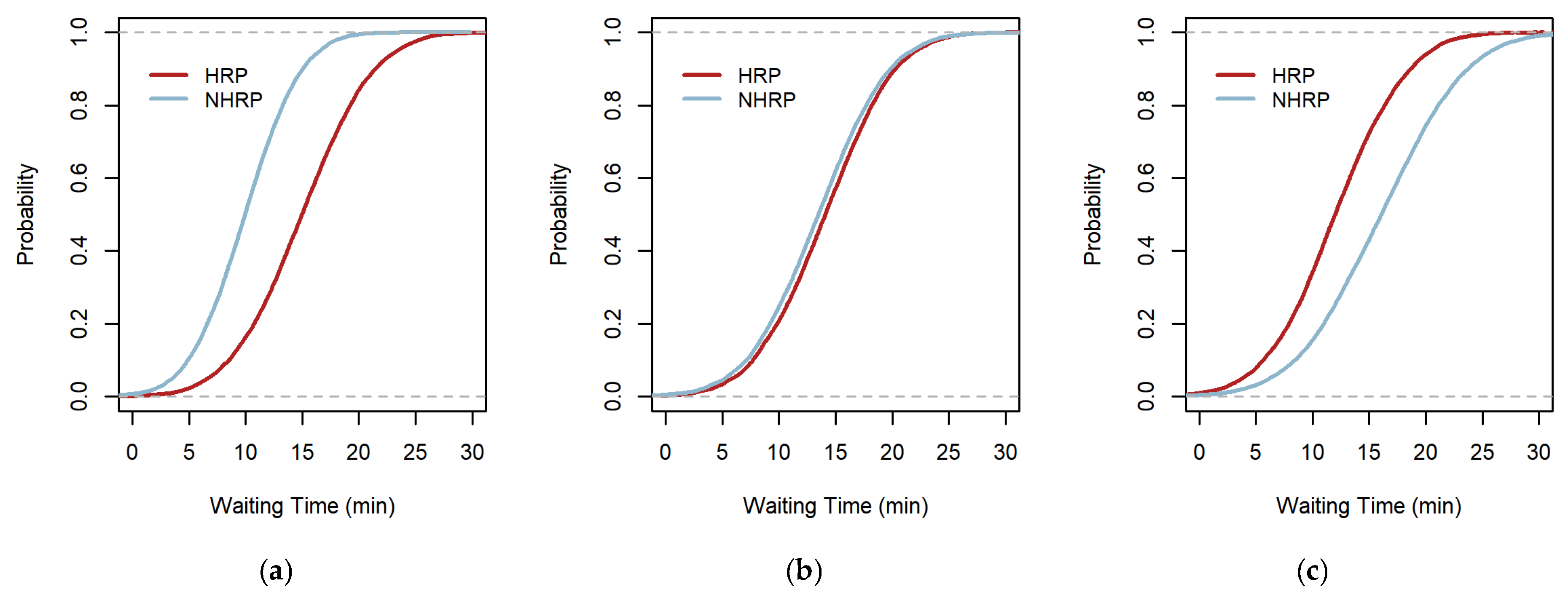
This study categorizes each scenario by interpreting the CDFs for the two time zones (
Figure 2). When two CDFs are plotted simultaneously, if one graph is positioned below the other, it indicates that the average value of the distribution below is larger than that of the distribution above. The relative positions of the two graphs, as well as whether they intersect, are determined by the mean and variance of each distribution. In
Figure 2a, the cumulative distribution for the HRP lies below that for the NHRP, indicating that the average waiting time during the HRP is longer than during the NHRP. This suggests that waiting times are longer during peak periods when passengers are concentrated. The two cumulative distributions follow a similar pattern, indicating that waiting times are approximately equal, regardless of whether passenger concentration is high. This suggests that the bus stop in question maintains a balance between supply and demand, as seen in in
Figure 2b.
Figure 2c indicates that the cumulative distribution for the NHRP lies below that for the HRP, meaning that the bus supply is insufficient during non-peak times when passenger demand is lower.
3.3. Meaning of Imbalance of Demand and Supply (IDS)
When evaluating the operation status of public transportation, various performance measures are used, depending on the characteristics being assessed. In particular, when evaluating bus operations in urban areas, assessments typically focus on passenger satisfaction, accessibility, reliability, sustainability, and other factors [
33,
34]. While most performance measures concentrate on the level of service experienced by passengers, additional measures are needed to comprehensively evaluate the operating conditions.
The performance measure used to assess whether demand and supply are imbalanced, particularly to identify bus stops with excessive demand, is described by Equations (5)–(7) and
Figure 3. The core concept behind this performance measure is rooted in the nature of the CDF. Since the data are discrete, the CDF used is actually an empirical CDF rather than a theoretical one. The imbalance of demand and supply (IDS) is defined as the product of the absolute value of the maximum vertical distance
and the value of
, which represents the definite integral between two CDFs for the HRP and NHRP.
The term
is derived by calculating the difference in the average waiting times for HRP and NHRP. The maximum vertical distance (
Figure 3a) is calculated between the CDFs of NHRP and HRP, denoted as
and
, respectively.
When the two CDFs resemble the pattern shown in
Figure 2a, both
and
are non-negative. To preserve the sign of the product of these values, the absolute value of
is used. If the IDS measure is non-negative, this indicates that the bus stops have excessive demand relative to supply. A value near zero suggests that the bus stop operates in balance, with supply matching demand. Conversely, if the IDS measure is negative, it indicates that fewer buses are arranged during the NHRP. Additionally, the greater the absolute value of the IDS measure, the more severe the imbalance in bus stop operations.
where
is the established performance measure,
is the demand perspective term of
,
is the supply perspective term of
,
is the maximum vertical distance between
and
,
is the CDF of the NHRP,
is the CDF of the HRP,
is the waiting time, and
and
represent the average waiting time during the NHRP and HRP.
4. Data Description
4.1. Description of Study Area
The bus network in Seoul consists of 361 intra-city bus lines and 6038 bus platforms. Information regarding the intra-city bus network is obtained from smartcard data, public transit station data, and bus line information. The total number of bus stops across all lines, based on the frequency of buses serving each stop, is 36,762. To identify stations with excessive demand, smartcard data, along with additional data from 17 May 2017 and 18 May 2017, were utilized. A summary of the network and the data used is provided in
Table 1.
4.2. Description of Smartcard Data
This study utilized trip chain data, which were processed by linking card IDs to represent an individual’s entire trip sequence. Raw smartcard data do not provide a complete view of a passenger’s journey, so trip chain data were created by connecting trips based on the unique card ID used by the individual. To gain a comprehensive understanding of passenger usage patterns, it is essential to analyze the entire trip rather than isolated segments. By chaining the trips together, personal origin/destination (O/D) pairs, which were not identifiable in the raw data, can be revealed. Additionally, this allows for the observation of transfer behaviors, such as the modes used and transfer times. A detailed description of the trip chain from the smartcard raw data set is provided in
Table 2. For the analysis in this study, data from columns 7 to 16, 25 to 34, and 37 to 46 were used from the total of 48 available columns, containing the information of boarding and alighting stations with public transit line and vehicle.
The Seoul Metropolitan Government implemented the AFC system in 2004, where fares are collected by tagging a smartcard [
35]. The smartcard data capture individual trip information, totaling approximately 12 million to 15 million trips per day. With the exception of cash payments for bus fares, all trips are recorded in the database, accounting for about 99% of daily transit trips [
36], not including the passengers paying with cash. For the smartcard trip chain data from 17 May 2017 and 18 May 2017, a total of 30,861,002 trips were recorded. Among these, 3,091,307 were transfer trips, involving 114,560 bus stops over the two days. Given that this study focuses on 36,762 bus stops across Seoul, the total number of transfer trips was counted as 2,036,419 trips.
5. Case Study
5.1. Result
The results indicate that the 36,762 bus stops in Seoul have an average demand of 166 passengers per day. A significant number of bus stops see more than 5000 passengers, indicating that passenger concentration occurs at specific stops. In this case study, IDS measures were applied to bus stops with sufficient transfer demand, specifically those with more than 450 passengers. As a result, the performance measure was calculated for 1785 bus stops that met this threshold.
The distribution of IDS performance measure values is shown in
Figure 4. This distribution is spread symmetrically around zero, with more cases falling on the negative side than the non-negative side. As detailed in the Methodology Section, the operation status of bus stops can be categorized into three types. The numerical criteria for dividing these categories are set at ±0.16. Considering that the average waiting time difference between passengers in the HRP and NHRP is 2.5 min in Seoul, and the maximum vertical distance between the two CDFs is 0.064 when using the Kolmogorov–Smirnov test (with a sample size of 450 and a significance level of 0.05) [
37], the boundary value of 0.16 is derived by multiplying 2.5 min by 0.064.
The operational status of each bus stop, categorized based on the IDS performance measure, is illustrated in
Figure 5 using a map of Seoul. The interpretation of the IDS values is as follows:
Excessive Demand (
Figure 5b): If the IDS value is higher than 0.16, the bus stop experiences excessive demand during the High Ridership Period (HRP), indicating that more buses are needed to meet passenger demand.
Balanced Operation (
Figure 5c): If the IDS value is between −0.16 and 0.16, the bus stop operates in a balanced state, with demand and supply relatively well matched.
Insufficient Supply (
Figure 5d): If the IDS value is lower than −0.16, this indicates that the supply of buses is insufficient during the Non-High Ridership Period (NHRP), and more buses should be scheduled during this time.
In
Figure 5, the total number of colored dots is 1785, representing the bus stops with a demand of more than 450 passengers per day. The small gray dots beneath the colored dots represent bus stops that have fewer than 450 passengers per day and were not included in the performance measure calculation.
5.2. Comparison of Attributes
The results of the analysis show that the
value of 1785 bus stops was estimated to be −0.07 on average (
Table 3). In total, 113 bus stops were found to have excessive demand with a 0.31 average
value on average. The average number of passengers per day was counted to be 2228 trips, and the standard deviation of those was measured to be 1969 passengers per day. The average waiting time and standard deviation of waiting time were estimated to be 6.66 and 6.38, respectively. Moreover, 1318 bus stops were identified to be balanced stops with a −0.01 average
value. The average number of passengers per day was counted to be 1296 trips, and the standard deviation of those was measured to be 918 passengers per day. The average waiting time and standard deviation of waiting time were estimated to be 4.98 and 5.20. In total, 354 bus stops were identified as having less supply during the NHRP with a −0.39 average
value. The average number of passengers per day was counted to be 815 trips, and the standard deviation of those was measured to be 473 passengers per day. The waiting time and standard deviation of waiting time on average were estimated to be 5.07 and 5.29. These results show that the number of each category is counted at a reasonable level. Bus stops in category 2 were tallied the most, meaning that demand and supply at most Seoul bus stops are balanced. Significantly, the average number of passengers using the bus stops in category 1 is much more than the others. A large number of passengers means that there are a definite HRP and excessive demand, which raises the possibility that the balance of supply and demand is broken. On the other hand, the reason why the balance has been broken in category 3 is that the boundary between the HRP and NHRP is not clear or the demand is small. In terms of average waiting time, it is evident that passengers using bus stops in category 1 with excessive demand experienced longer waiting times.
5.3. Evaluating the Performance Measures
The maximum vertical distance means the maximum difference between the distribution’s position in the HRP and NHRP for a certain waiting time. This can be either early or late, depending on if the passenger waits for the same amount of time. Thus, the greater the value of , the greater the difference in probabilities of boarding the bus, and the worse the passenger convenience is. This means that the imbalance from the passengers’ perspective is getting worse. In contrast, the greater the value of , the larger the difference between the mean of waiting time during the HRP and the mean of waiting time during the NHRP. This is an imbalance in the operator’s view.
Consider other cases in which the two graphs of cumulative distributions during the HRP and NHRP intersect, other than those depicted in
Figure 2. If the two graphs have the same mean and different variances, the difference in the mean is zero, but a vertical difference occurs as the CDFs intersect. In this case, the station is balanced in terms of operation but unbalanced in terms of passengers. Stops with such a large value of
and those with a large value of
may differ. However, given the economics, it is important to improve the stations where both prices are large in the first place. By multiplying the values of
and
, it is possible to select bus stops that need improvement, taking into account the importance of the imbalance of the demand and the supply. In addition, considering the operator-side and user-side weights, each metric can be multiplied by weights to determine whether one should select bus stops that need improvement depending on the situation.
Table 4 shows the top 10 bus stops with excessive demand when considering only
, considering only
, and considering both.
Table 4 shows the number of bus stops by categories considering only
, considering only
, and considering both. Considering only the passenger perspectives, it is indicated that only about 12% of bus stops are balanced. On the other hand, about 98 percent of bus stops are balanced if only the aspects of operations are taken into account. Considering both aspects of the passenger and operator, the proportion of balanced stops is 74 percent, and economic and efficient improvement policies can be implemented considering both passenger convenience and operator costs. This also has the advantage of it being easy to prioritize improvements by maximizing the performance measures of severe stops in both aspects.
5.4. Policy Implications
In order to address the issue of excessive demand at bus stops, using calculated performance measures to assess and improve bus operations is a valuable approach [
38]. By focusing on bus lines with the highest number of bus stops in category 1, you can identify those routes that are underperforming and demand more attention. The method described involves extracting data for category 1 bus stops and linking them to the corresponding bus line numbers. In
Figure 6, after mapping the bus lines with the greatest number of category 1 bus stops (like lines 272, 130, 153, and 320), you can analyze their distribution and evaluate areas with excessive demand. However, as noted, the data were transferred from subway stations, which may result in some challenges, such as the underrepresentation of bus stops in less central areas. This can lead to certain bus lines appearing less imbalanced in terms of demand than they truly are. Despite this limitation, applying performance measures to the system can help highlight areas where more resources or adjustments are needed. The key takeaway is that improving the efficiency of bus operation systems requires a nuanced approach that accounts for demand at specific stops, the route coverage, and performance metrics to establish the Mobility-as-a-Service system in urban area [
39]. By continually refining these data, it is possible to target areas for improvement and enhance the overall operation.
The formation of urban areas varies the travel patterns by passenger demand, and the supply is limited by budget and network topology. The analysis reveals the comparative imbalances to identify the vulnerable spots using empirical data. Comparatively vulnerable areas in the urban area will inevitably be generated. However, it is necessary to enhance the equity in the public transit network for sustainable urban development from the transport policy. Even though there are many balanced bus stops in the network, policymakers should monitor the vulnerable areas to provide a sustainable transport environment.
6. Conclusions
This study highlights the importance of continuous monitoring and improvement efforts in the development of intra-city bus systems, as well as in enhancing passenger satisfaction. Given that passengers’ trip patterns change over time, it is essential to continuously assess whether the demand and supply at bus stops are balanced. This study was motivated by the challenge that there are bus stops where passengers experience significantly long waiting times due to excessive demand, but both operators and users are unable to identify these problematic stops.
In this study, CDFs are utilized as performance measures to evaluate the imbalance between demand and supply at bus stops. The CDF is plotted with waiting time on the x-axis. The performance measures are based on two attributes: the maximum vertical distance between the CDF of the HRP and the CDF of the NHRP and the definite integrals of the differences between the two CDFs. The maximum vertical distance represents the difference in boarding probability for the same waiting time across different time zones, while the definite integrals represent the difference in the average waiting time across time zones. These two attributes are used to develop a performance measure for evaluating bus stop conditions. This case study demonstrates that the IDS (indicator of demand–supply imbalance) values of 1785 bus stops can be used to evaluate the current operational status of Seoul’s bus system. Based on a reference IDS value of ±0.16, the operational states of the bus stops are classified into three categories: bus stops with excessive demand (Category 1), bus stops in a balanced state (Category 2), and bus stops with insufficient supply in NHRP (Category 3). The results show that approximately 74% of bus stops are in a balanced state, while about 6% of bus stops experience excessive demand, indicating the need for improvements in the HRP. Furthermore, by calculating the IDS value as the product of and the absolute value of , the bus stops with issues in both operational and passenger aspects can be prioritized for improvement. The performance measure developed in this study can serve multiple purposes. It can provide a basis for setting service level standards for public transportation, and it can also be used as a tool to manage bus operations effectively, offering a comprehensive view of the operational status of all bus lines and bus stops under Seoul’s quasi-public operating system.
For future research, it is essential to explore strategies to convert unbalanced bus stops into balanced ones. The potential approach is adjusting the dispatch interval for specific situations such as time periods, different weather conditions, and special events, allowing operators to address excessive demand at bus stops more effectively, and it would be better to compare the imbalance after the route adjustment using recent smartcard data. Moreover, understanding whether the imbalance is due to excessive demand or insufficient supply is crucial. While this study established a performance measure to identify bus stops with excessive demand or supply deficiencies and assessed the current operational conditions of bus stops, the defined “balanced state” may not be the optimal state. It would be interesting to interpolate the data from bus stops to the number of bus passengers by incorporating the occupancy information of the bus stops. For further research, it is applicable to extend the more macro-level considerations of route planning and adjusting strategies among the bus routes. Also, when assessing dynamic traffic conditions, more complex time series analysis or machine learning models may be required to better capture real-time changes.


