Article

Sustainable Urban Healthcare Accessibility: Voronoi Screening and Travel-Time Coverage in Bangkok

1
Faculty of Social Sciences, Kasetsart University, Bangkok 10900, Thailand
2
Department of Information & Communication Technologies, School of Engineering and Technology, Asian Institute of Technology, Pathum Thani 12120, Thailand
3
International Academy of Aviation Industry, King Mongkut’s Institute of Technology Ladkrabang, Bangkok 10520, Thailand
4
National Astronomical Research Institute of Thailand, Private Individual, Chiang Mai 50180, Thailand
5
State Key Laboratory of Remote Sensing and Digital Earth, Aerospace Information Research Institute, Chinese Academy of Sciences, Beijing 100094, China
6
Department of Environmental Technology and Management, Faculty of Environment, Kasetsart University, Bangkok 10900, Thailand
*
Author to whom correspondence should be addressed.
Sustainability 2025, 17(24), 11241; https://doi.org/10.3390/su172411241
Submission received: 29 September 2025 / Revised: 5 December 2025 / Accepted: 11 December 2025 / Published: 15 December 2025
(This article belongs to the Section Health, Well-Being and Sustainability)

Abstract

This study presents an integrated and reproducible framework for within-tier screening of potential healthcare accessibility in Bangkok. Facilities in three service tiers (primary 294 units, regular 75, referral 29) are analyzed using point-pattern diagnostics, Voronoi geometric partitions, population-weighted allocation from subdistrict controls, and cumulative network travel-time isochrones. Spatial diagnostics indicate clustering among primary care units, a near-random configuration for regular units, and modest dispersion for referral hospitals, summarized by observed-to-expected nearest-neighbor ratios of approximately 0.77, 1.05, and 1.19, respectively. Voronoi partitions translate these distributions into geometric units that enlarge with increasing inter-facility spacing, while population-weighted assignments reveal higher population-per-partition-area burdens in the outer east and southwest. Isochrone maps (5–60 min rings) show central corridors with short travel times and peripheral areas where potential access declines. Interpreted against statutory planning intent, the maps indicate broad consistency of siting with high-intensity zones, alongside residual gaps at residential fringes. Framed as repeatable indicators of access and coverage, the workflow contributes to measuring and monitoring urban health sustainability under universal health coverage and routine planning cycles. The framework yields transparent indicators that support monitoring, priority setting, and incremental adjustments within each tier. Limitations include planar proximity assumptions, uniform areal weighting, single-mode modeled travel times without temporal variation, and the absence of capacity measures, motivating future work on capacity-weighted partitions, minimal dasymetric refinements, and time-dependent multimodal scenarios.

1. Introduction

1.1. Global Context

Rapid urbanization is reshaping the distribution of health opportunities and risks, placing spatial accessibility at the center of efforts to strengthen universal health coverage. The global urban population is projected to rise from 54% in 2015 to 66% by 2050, with the fastest growth concentrated in low- and middle-income countries where pressure on local health systems is most acute [1]. Spatial accessibility is increasingly recognized not only as a determinant of service reach but also as a reproducible screening lens for identifying populations that may face disproportionate travel effort. Recent global travel-time evidence shows that revealed trips to care often exceed potential travel times by factors of two to five, with poorer accessibility associated with lower life expectancy and higher infant mortality [2]. Pandemic-era changes further exposed modal disparities: access improved for car users but worsened for public transport users and pedestrians [2]. Conceptually, accessibility reflects the opportunity to use appropriate services proportional to need, shaped by financial, organizational, social, and spatial constraints [3]. Despite its relevance, many cities still lack systematic indicators that can diagnose spatial imbalance and support targeted, within-tier screening rather than normative equity claims [4,5].

1.2. Bangkok and Thailand Context

Bangkok operates within Thailand’s universal coverage framework, yet empirical evidence indicates that informal workers continued to face barriers to care during the COVID-19 period, reflecting practical and rights-related constraints rather than spatially verified disparities [6]. Transport structure further conditions access. Studies of the Bangkok Metropolitan Region demonstrate supply–demand imbalances and distributional inequities in public transport, while behavioral assessments highlight short tolerated walking distances to transit, underscoring significant first- and last-mile challenges [7,8,9]. Urban health studies for Bangkok consistently employ standard spatial statistics such as Moran’s I and Getis–Ord Gi* to detect clusters of health-related vulnerabilities and interpret them within the city’s hierarchical settlement pattern, yet these emerging findings remain indicative and warrant replication with operational facility and population layers [8]. More targeted mapping of time-sensitive emergency care demonstrates uneven coverage across the metropolis, with suburban districts requiring longer travel times and exhibiting larger service zones, motivating coordinated expansion of primary care capacity and improved alignment with planning zones [10].

1.3. Point-Pattern and Density Diagnostics for Healthcare Facilities

Point-pattern diagnostics such as Average Nearest Neighbor (ANN) and Kernel Density Estimation (KDE) are widely used to examine how facilities are arranged prior to any accessibility modeling. Large metropolitan analyses routinely report clustered or multicenter distributions and relate these patterns to differences in accessibility across urban cores and peripheries, as shown in recent studies of Chongqing and other major cities [11]. Density-based approaches convert discrete supply and demand points into continuous surfaces, enabling interpretable ratios such as population per facility or per health worker, which can reveal mismatches otherwise obscured by administrative boundaries [12]. Some studies additionally examine gridded population data using KDE to stabilize demand signals, as demonstrated in Nanjing where a reproducible 1 × 1 km grid parameterization supported screening-oriented diagnostics [13]. These methods highlight scale sensitivity and spatial non-stationarity, cautioning against citywide averages and reinforcing the need for local, within-tier screening of potential imbalance [14].

1.4. Voronoi Structures for Healthcare Screening

Voronoi diagrams provide a transparent geometry for identifying nearest-facility partitions that are not restricted by administrative boundaries. Their use in healthcare geography ranges from hospital catchment delineation to capacity-weighted variants that reflect service workloads, as demonstrated in applications for Rio de Janeiro and other metropolitan regions [15]. Recent work combining Voronoi polygons with simple coverage metrics has shown that underserved territories can be flagged when polygon boundaries are read together with distance thresholds, as illustrated in analyses of pharmacies across Muscat [16]. Voronoi geometry has also been combined with network routing algorithms for emergency response, indicating compatibility between nearest-facility logic and travel time models [17]. In Bangkok, Voronoi-based assessments of service locations have identified clustering patterns and revealed districts with limited reach, showing that transparent geometric partitions can support screening in settings with heterogeneous demand [18]. Beyond allocation, Voronoi graphs have been applied to detect irregular clusters through scan statistics and Monte Carlo testing, indicating that Voronoi geometry can encode neighborhood structure for spatial diagnostics [19]. For the present study, Voronoi cells are used explicitly as geometric scaffolds for screening rather than operational service boundaries.

1.5. Areal Interpolation and Population Allocation

Areal interpolation refers to procedures for transferring population counts from administrative source units to target geometries that support analysis. Existing classifications group unconstrained methods such as simple area weighting, pycnophylactic smoothing, area-to-point techniques and kriging variants, and constrained methods that introduce ancillary evidence such as dasymetric, street-weighted, statistical and point-informed interpolation [20]. New urban datasets including points of interest, parcels, social sensing data and volunteered geographic information provide additional constraints, although their completeness and representativeness require careful evaluation [20]. Parcel-informed approaches have achieved accuracy gains in urban cores. For example, neighborhood estimates in San Francisco were produced by disaggregating census data to 7361 blocks and allocating counts to 216,269 parcels before re-aggregation to neighborhoods. This method outperformed area weighting and residential-proportion baselines, especially for count variables and for subgroups that exhibit spatial clustering [21].
Population allocation can also reflect functional urban structure. A grid Voronoi dasymetric framework developed for mobile-phone user data aggregated residents to one-kilometer grids, created grid Voronoi polygons to stabilize heterogeneous base station footprints, and modeled population using building use categories. Mobile counts were rescaled to census totals to correct operator market share. This produced a reproducible demand surface aligned with urban morphology [22].

1.6. Burden Screening Indicators and Underserved Thresholding

Population burden within each facility partition is summarized through two demand-aware indicators designed for screening. The first indicator measures persons per facility after allocating subdistrict population to Voronoi partitions, providing a direct expression of potential service load. The second indicator normalizes population by polygon area to support stable visualization and comparison across tiers that differ in catchment size. We refer to this area-normalized variant as beneficiary density per service partition or BDSP. Percentile thresholds are applied within each tier to identify locations with elevated burden and to estimate the proportion of residents affected. These indicators function as reproducible screening tools that highlight potential imbalances without imputing capacity, clinical need, or vulnerability, and they are not interpreted as normative equity metrics. Evidence from the Bangkok metropolitan transport system illustrates the value of percentile-based burden metrics: grid-level analyses identify mismatches between supply and demand and motivate the use of Lorenz and Gini diagnostics for interpreting concentration patterns and prioritizing low-supply, high-demand cells [7]. On a global scale, the divergence between revealed and potential accessibility is correlated with life expectancy and infant mortality, supporting high percentile cutoffs for identifying residents who face disproportionate travel effort [2]. Local research on travel-related satisfaction in Bangkok indicates that higher accessibility is associated with higher well-being, although mean satisfaction remains relatively low, underscoring the need to interpret burden indicators together with contextual information [8]. International assessments reveal that spatial flags benefit from complementary inequality metrics so that local patterns are understood in relation to broader system-level concentration [23]. Multidomain studies further show that socioeconomic and environmental determinants of health vary across neighborhoods, which supports limited contextual overlays when interpreting underserved locations [24]. Within this framework, screening involves calculating persons per facility and BDSP for each tier, applying within-tier percentile thresholds to burden and travel time where applicable, summarizing population shares above each threshold, and interpreting results with one or two contextual overlays such as statutory zoning [2,7,16]. Because subdistrict totals are allocated uniformly across partitions, values in non-residential tracts can be inflated or deflated; hence, all inferences remain coarse and tier internal.

1.7. Network and Isochrone Accessibility

Travel time measures quantify the practical effort required to reach care and support decisions related to siting and service expansion. District variations in dialysis access in Israel, where median patient travel distances ranged from 3.4 to 10.9 km and utilization differed across centers, demonstrate how travel distances and loads inform resource planning [25]. Accessibility also varies by time of day and mode. In Lisbon, the proportion of residential buildings within ten minutes of a pharmacy reached more than eighty percent for walking and public transport during evening hours but fell sharply in the early morning, indicating that transit supply and opening hours strongly shape accessibility [26]. Demographic needs also influence network design. A fifteen minute city assessment for older adults in Shanghai found systematically lower accessibility in suburban locations, emphasizing the need for group specific considerations [27]. Analyses across multiple Chinese megacities have shown longer travel times in suburban areas and reduced nighttime access whenever transit schedules and facility operating hours are considered. These findings support the adoption of multimodal and multithreshold evaluations such as fifteen, thirty and forty five minute bands [28].
Floating catchment approaches formalize travel time aware access. A national study in Panama applied the two step floating catchment area method and an enhanced variant, and used Getis Ord Gi and Local Moran statistics to identify significant hot and cold spots. The study reported higher coverage for public facilities and provided a reproducible template for equity mapping under incomplete data [29]. A variable demand model for Beijing incorporated higher demand and lower mobility among older adults and concluded that improved transit connectivity and resource allocation in peripheral districts would increase inclusive access [30].
To synthesize the methodological context discussed in the preceding sections, Table 1 summarizes key studies that have applied Voronoi diagrams, spatial diagnostics, and accessibility metrics in urban health planning. This overview highlights how authors typically approach facility catchment delineation and screening, establishing the precedent for the integrated framework adopted in this study.

1.8. Aims and Objectives

This study develops a reproducible framework for screening potential imbalances in healthcare accessibility across Bangkok. The first objective is to diagnose tier-specific facility arrangements by applying Average Nearest Neighbor analysis and Kernel Density Estimation to characterize clustering and dispersion relative to service roles. The second objective is to delineate nearest-facility partitions using Voronoi tessellation, allocate subdistrict population to polygons using area-weighted interpolation, and compute within-tier percentile-based burden indicators, including persons per facility and the area-normalized BDSP, to flag locations with elevated potential service load. The third objective is to generate cumulative five-minute driving isochrones up to sixty minutes to summarize potential travel-time coverage. The final objective is to examine the alignment of burden flags and travel-time envelopes with statutory land-use zoning as contextual overlays, interpreted as planning intent rather than evidence of present-day operational alignment. These steps yield indicators that support screening, prioritization, and routine monitoring under data-limited conditions.
In the remainder of this article, Section 2 details the study area, data, and methodology, including the end-to-end analytical workflow and parameterization. Section 3 reports the empirical results for within-tier accessibility screening and travel time patterns. Section 4 discusses the implications, limitations, and the interpretive scope of the indicators used. Section 5 concludes the study and outlines directions for future research and policy experimentation.

2. Materials and Methods

This section presents the analytical workflow used to screen within-tier accessibility. We first describe the data sources and pre-processing, then summarize the end-to-end pipeline from demand allocation and facility representation to kernel density estimation, planar Voronoi partitioning, artificial neural network–based surface smoothing where applicable, and cumulative isochrone analysis. All non-default parameters are itemized in Appendix A to ensure reproducibility, and Figure 1 provides a visual overview of the sequence of operations.

2.1. Data Sources and Spatial Units

2.1.1. NHSO Healthcare Facility Points

Geocoded healthcare facility points for 2024 were obtained from the National Health Security Office, which administers Thailand’s universal coverage scheme in Bangkok. Facilities are classified into three service tiers aligned with distinct operational roles. Primary care units function as the first point of contact for basic screening, health promotion, and routine treatment. Regular service units operate as secondary-level facilities providing intermediate medical services and limited inpatient care. General referral hospitals serve as tertiary centers equipped for specialized treatments, complex procedures, and high-volume patient management. The registry contains 294 primary care units (73.87%), 75 regular service units (18.84%), and 29 referral hospitals (7.29%). Each record includes the facility name, assigned service tier, and geographic coordinates. Coordinates and tier labels were cross-checked against the official 2024 register to confirm positional accuracy and administrative consistency within the Bangkok boundary. These tiers are used exclusively as within-tier strata for screening rather than for cross-tier comparisons. Facility points subsequently serve as seeds for planar Voronoi partitions and as origins for network-based travel time computation. Nondefault parameter choices are consolidated in Appendix A, and detailed procedures appear in Section 2.3.

2.1.2. Administrative Boundaries and Population Statistics

Administrative boundaries at the subdistrict level (khwaeng) were obtained from the Bangkok Metropolitan Administration and served as the fundamental spatial unit for demographic integration. Population counts for 2024 were sourced from the Department of Provincial Administration. The population table was joined to its corresponding subdistrict polygons after a one-to-one key check and attribute completeness verification. Polygon areas were recalculated within the projected coordinate system UTM Zone 47N (EPSG:32647) to ensure metric accuracy for proportional allocation procedures and for the computation of population coverage statistics. Topological checks confirmed polygon closure, the absence of gaps or overlaps, and consistency between attribute and geometry. Because subdistrict totals are uniformly allocated across partitions in later steps, values in non-residential tracts may be inflated or deflated; consequently, we refrain from fine-grained, parcel-level inferences and use these allocations only for within-tier screening.

2.1.3. Urban Land Use and Planning Zones

A digital land-use and statutory planning dataset for plan year 2020 was obtained from the Bangkok Urban Planning and Development Office. The dataset delineates residential, commercial, industrial, warehouse, rural and agricultural conservation, rural and agricultural, and government and institutional zone categories. This planning layer was used to examine the relationship between facility locations, their Voronoi partitions, and the intended functional structure of the city through point-in-polygon summaries and areal overlays. Zone counts and area proportions were compiled separately for each service tier to support subsequent screening of siting patterns. All interpretations of this layer are explicitly framed as comparisons to statutory planning intent rather than evidence of present-day operational alignment.

2.2. Data Pre-Processing

All datasets were standardized prior to analysis to ensure spatial consistency and reproducibility. Population counts for 2024 were joined to subdistrict polygons after confirming a one-to-one key match and verifying attribute completeness. Polygon areas were recalculated in UTM Zone 47N (EPSG:32647) so that subsequent proportional allocations operated on metric units, thereby reducing distortion in area-based computations. Healthcare facility points were screened for attribute accuracy, duplicate entries, and spatial validity, and tier labels were cross-checked with the official 2024 register to ensure unique tier assignment prior to point-pattern diagnostics and partition delineation. Polygon layers, including subdistrict boundaries and the Bangkok administrative extent, were examined for topological integrity, boundary closure, and the absence of gaps or overlaps. The Bangkok boundary was retained as the analysis mask for distance-based procedures so that nearest neighbor statistics, kernel density estimation, Voronoi tessellation, and network-based isochrone generation were restricted to the intended study extent and did not inherit unintended edge effects. These steps established a consistent geospatial database for computing nearest neighbor ratios, within-tier kernel density surfaces, planar Voronoi partitions, area-weighted population allocation, and travel time coverage.

2.3. Methodological Framework

Spatial analyses were conducted in ArcGIS Pro 3.4.0 and QGIS 3.22 to characterize facility patterns, delineate proximity-based geometric partitions, allocate population to those partitions, and summarize potential travel-time coverage. The workflow comprised Average Nearest Neighbor (ANN) analysis and Kernel Density Estimation (KDE) for pattern diagnostics, Voronoi tessellation for nearest-facility partitions, area-weighted allocation of subdistrict population to polygons, and the generation of network-based isochrones. Isochrones were created in QGIS 3.22 via the OpenRouteService plugin using the driving-car profile and cumulative thresholds from five to sixty minutes; default smoothing was retained. All analyses were performed in UTM Zone 47N (EPSG:32647), and the Bangkok administrative boundary served as an analysis mask to minimize edge effects and maintain a consistent spatial domain. Voronoi cells are used in this study as geometric scaffolds for screening rather than operational service boundaries, and all percentile-based readings are interpreted strictly within tiers to avoid cross-tier comparisons. Parameter choices that deviate from software defaults are consolidated in Appendix A.
Parameter selection followed a principle of parsimony and interpretability. Bandwidths and grid sizes were anchored to commonly reported ranges for metropolitan screening studies, then tuned to the native scale of facility spacing and census geography. To assess robustness, we performed a focused sensitivity check by varying the key parameter across three values that bracket the chosen setting. Results show that core spatial patterns and tier-specific rankings are stable across the range, and the adopted value provides the best compromise between spatial smoothness and local detail without altering qualitative conclusions.

2.3.1. Average Nearest Neighbor by Service Tier

The spatial pattern of healthcare facilities was examined separately for each tier using the Average Nearest Neighbor tool in ArcGIS Pro 3.4.0. Analyses employed Euclidean distance within the Bangkok boundary to control for edge effects. For each tier, the tool computed the observed mean nearest-neighbor distance, the expected mean under complete spatial randomness based on planar intensity, the nearest-neighbor ratio, and the corresponding z score and p value. Facility points were screened for duplicates, positional validity, and tier labels to ensure that each record represented a unique facility. The analysis mask was applied so that observed and expected distances were derived under the same areal constraint. Numerical outputs were exported to preserve observed and expected means, ratios, z scores, and p values. Given multiple tier-wise comparisons, p values are interpreted within a familywise framework; adjusted inferences follow a conservative stepwise control, and borderline results are treated as exploratory and contextual rather than confirmatory. These diagnostics provide a consistent basis for discussing clustering or dispersion within tiers while acknowledging that intensity gradients and boundary constraints can influence test outcomes.

2.3.2. Kernel Density Estimation by Service Tier

Spatial concentration of facilities was evaluated using KDE in ArcGIS Pro 3.4.0. Separate density surfaces were generated for the primary, regular, and referral tiers. A quadratic kernel was used with an automatically estimated search radius for each tier and an output cell size inherited from the project environment. Because the search radius is estimated independently by tier, the resulting surfaces differ in scale and are intended for visualizing within-tier concentration rather than for cross-tier comparison. Facility records were validated to confirm unique identifiers and correct tier assignments. KDE outputs were examined for edge artefacts and null regions, particularly near low-intensity areas and administrative boundaries. Surfaces were symbolized using a consistent classification scheme to aid interpretation while preserving the tier-specific nature of parameter selection.

2.3.3. Voronoi Geometric Partitions Construction

Nearest-facility geometric partitions were created using the Create Thiessen Polygons tool in ArcGIS Pro 3.4.0. Voronoi polygons were generated separately for the primary, regular, and referral tiers and clipped to the Bangkok Metropolitan Administration boundary to confine partitions to the study extent and prevent unbounded polygons at the perimeter. One polygon was retained for each facility by preserving the unique facility identifier throughout processing. Topological checks after clipping confirmed polygon closure and the absence of overlaps. The resulting planar Voronoi polygons provide a transparent, reproducible partitioning under a Euclidean nearest-facility assumption and serve as base units for population allocation, zoning overlays, and burden screening. Consistent with the study’s aims, Voronoi cells are interpreted solely as geometric scaffolds for screening; travel-time effects are addressed separately through network isochrones, and all rankings and percentiles are read strictly within tiers.

2.3.4. Population Weighted Allocation to Voronoi Polygons

Subdistrict population counts for 2024 from the Department of Provincial Administration were allocated to Voronoi catchments using area weighted areal interpolation. Voronoi polygons were intersected with subdistrict boundaries to create fragments that inherited identifiers for both units. For each fragment i belonging to subdistrict s and catchment v , the allocation proportion was calculated as
p i = A r e a i A r e a s
and the fragment population was computed as
P o p i = p i × P o p s   .
Partition totals were obtained by summation across fragments belonging to v ,
P o p v = i v P o p i ,
and written back to the Voronoi layer using the unique facility identifier. Quality control procedures ensured one-to-one joins, non-negative allocations, and conservation of subdistrict totals within rounding tolerance. Because subdistrict totals are uniformly distributed across partitions, values in non-residential tracts may be inflated or deflated; accordingly, all downstream rankings are interpreted as coarse screening signals within tiers, and no parcel-level inferences are drawn.

2.3.5. Zoning Overlay and Facility Siting Alignment

Alignment between healthcare facilities and the statutory city plan for 2020 was examined using a two-stage overlay. First, facility points were joined to planning zones to derive per-zone facility counts by tier. Second, Voronoi partitions were intersected with the same planning layer to calculate the proportion of each partition that fell within zone categories. Implementation used Spatial Join for point-in-polygon tabulation and Intersect followed by Dissolve and Summary Statistics for partition-level proportions. Zone areas were computed using Calculate Geometry Attributes. Outputs were compiled separately for the three tiers and aggregated for cross-tier synthesis. All interpretations are framed explicitly against statutory planning intent rather than evidence of present-day operational alignment.

2.3.6. Burden Screening Maps Based on Voronoi Partitions

Population burden for each facility was derived from its Voronoi partition using a density normalized indicator. For a partition v , the indicator was
B D S P v = P o p v A r e a v   ,
where P o p v is the allocated population and Area ( v ) is the partition area. The indicator represents persons per square meter and is reported per square kilometer for readability. We refer to this area-normalized burden indicator as the beneficiary density per service partition (BDSP). Values were classified using a within-tier percentile scheme that partitioned the empirical distribution of B D S P ( v ) into quintiles from zero to one hundred percent (0–20, 20–40, 40–60, 60–80, 80–100). Mapping was performed separately for primary care units, regular service units, and general referral hospitals. Lower percentile classes indicate comparatively low population burden, whereas higher percentile classes flag partitions with greater potential demand pressure. Because population was allocated uniformly within subdistricts, BDSP in non-residential tracts can be inflated or deflated; maps are therefore used strictly for within-tier screening and not for drawing normative equity conclusions.

2.3.7. Network Based Isochrone Accessibility

Travel-time accessibility was analyzed using concentric isochrone surfaces at five- to sixty-minute thresholds for each tier. Isochrones were generated in QGIS 3.22 via the OpenRouteService plugin using the driving-car profile with time as the impedance. Per-facility isochrones were produced for each threshold with dissolve set to off; outputs were reprojected to EPSG:32647, dissolved by minute city-wide, converted to non-overlapping rings by successive differences, and trimmed by 100 m to reduce small slivers and boundary artefacts. Population coverage at each threshold was quantified by proportional overlay with subdistrict population totals. Travel speeds are model based rather than observed, and temporal variability is not represented; results are therefore read as screening coverage rather than operational performance.

3. Results

3.1. Spatial Distribution and Population Context

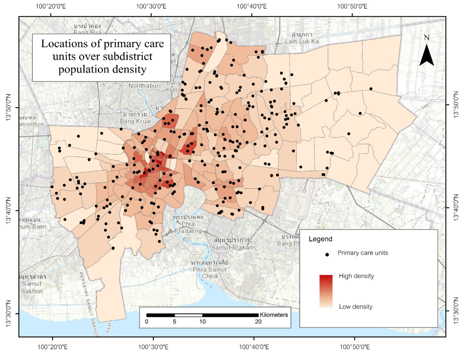
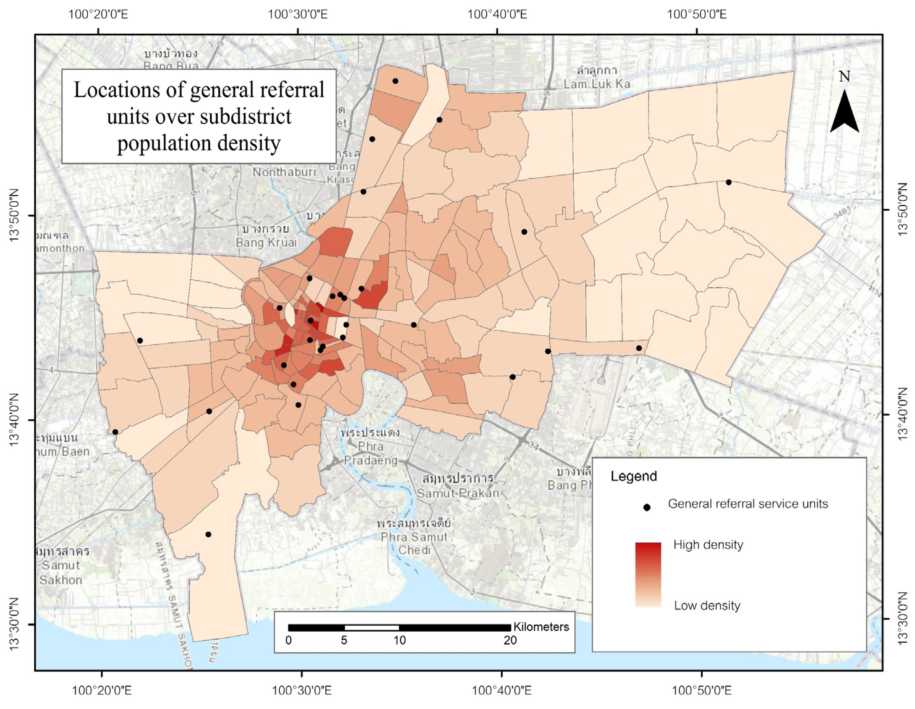
Figure 2, Figure 3 and Figure 4 map the locations of primary care units, regular service units, and general referral hospitals over subdistrict population density for 2024, providing a concise baseline that situates the subsequent diagnostics and partition- and iscochrone-based analyses. Primary care units are numerous across all quadrants, with the highest point intensity in the compact inner city and adjoining corridors where population density is greatest, while outer eastern and southwestern subdistricts show fewer facilities dispersed over larger, lower-density tracts yet still aligned with major transport corridors. Regular service units are fewer and more widely spaced, concentrating in an inner-to-middle urban belt that overlaps subdistricts of medium to high population density, with large peripheral subdistricts in the east and southwest containing few or no units. General referral hospitals are sparse at metropolitan scale, predominantly located in or near the compact high-density core, with a smaller set extending northward, westward, and southeastward; long inter-facility distances characterize the far eastern periphery. Taken together, the maps reveal a tier gradient in facility presence that broadly mirrors the residential structure of Bangkok and provides context for within-tier screening rather than cross-tier comparison. All maps use subdistrict population for 2024 from the Department of Provincial Administration in EPSG:32647.

3.2. Facility Pattern and Density Diagnostics

Average Nearest Neighbor statistics and Kernel Density Estimation were applied separately to each service tier using Euclidean distances within the Bangkok boundary for ANN and a quadratic kernel for KDE. The search radius for KDE was estimated automatically for each tier, the project-wide output cell size was 3.545 m, and all processing used EPSG 32647. Because bandwidth is tier specific, intensity magnitudes are not interpreted across tiers. Given multiple tier-wise comparisons, ANN p values are read within a familywise framework, and borderline findings are treated as exploratory.
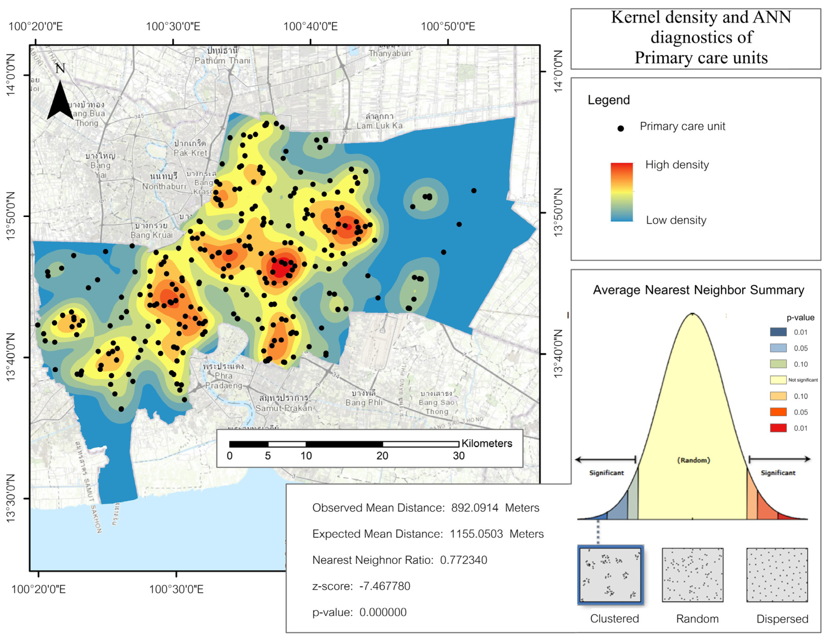
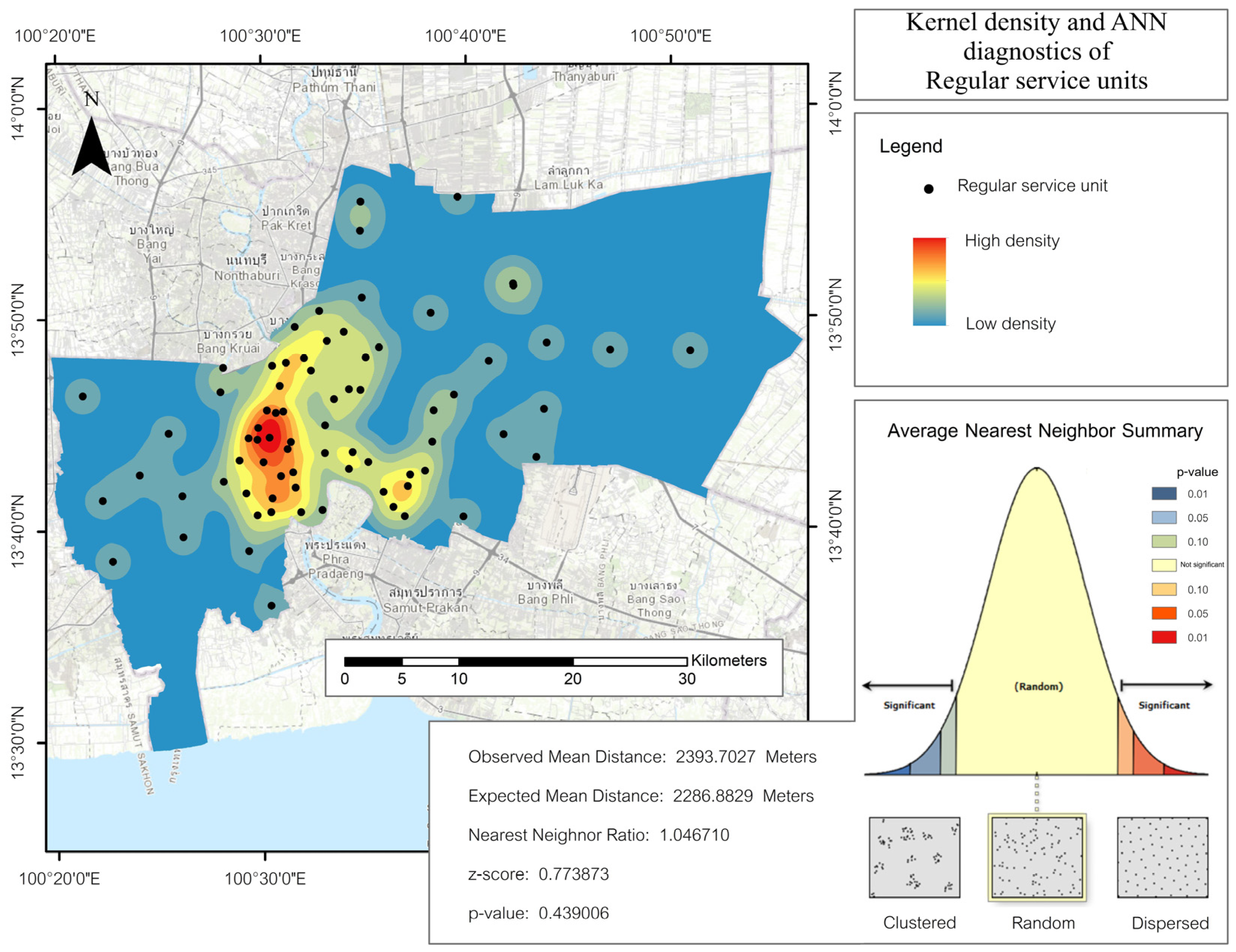
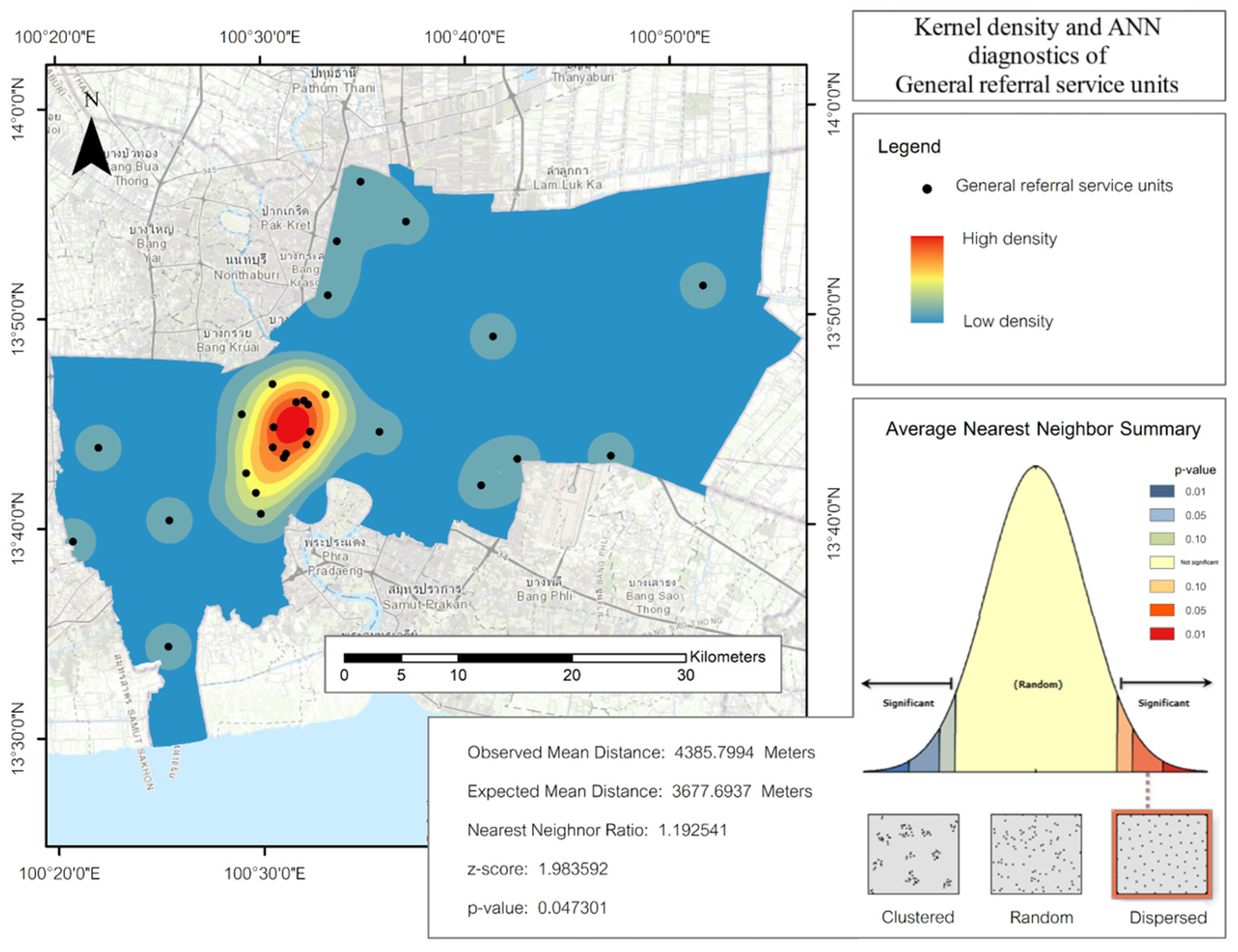
For primary care units (Figure 5), the density surface shows multiple high-intensity clusters spanning the inner city and the adjacent west-bank corridor, with continuous medium densities across the central belt and substantially lower densities toward the far eastern and southwestern periphery. The ANN result indicates clustering, with an observed mean nearest-neighbor distance of approximately 892 m compared with an expected mean of about 1155 m, yielding a ratio near 0.77 and a strongly negative test statistic consistent with aggregation within this tier. For regular service units (Figure 6), the density surface exhibits a dominant hotspot in the inner-to-middle urban belt with weaker satellites along the west bank and the lower Chao Phraya corridor and extensive low-density areas on the fringe, particularly in the east and southwest. The ANN result shows no departure from spatial randomness at conventional levels, with an observed mean of about 2394 m and an expected mean of about 2287 m, producing a ratio near 1.05 and a small positive test statistic. For general referral hospitals (Figure 7), the density surface highlights one concentrated hotspot in the compact inner core and low background densities elsewhere, reflecting the small number of facilities and their wide spacing. The ANN output suggests a modest tendency toward dispersion relative to randomness, with an observed mean of about 4386 m and an expected mean of about 3678 m, producing a ratio near 1.19; given familywise interpretation and the proximity of the p value to conventional thresholds, this indication is treated as exploratory rather than confirmatory. Together, the diagnostics indicate clustering for primary care units, no detectable departure from randomness for regular units, and a weak exploratory tendency toward dispersion for referral hospitals, providing a consistent basis for the catchment delineations in Section 3.3 and subsequent within-tier burden screening.

3.3. Voronoi Geometric Partitions

Voronoi polygons were used to delineate nearest-facility geometric partitions under a planar distance assumption. Each polygon represents the set of locations closer to its generating facility than to any other facility, and the union of polygons forms a contiguous partition of the study area after clipping to the Bangkok boundary. We interpret these polygons strictly as screening geometry rather than operational catchments. Polygon size varies inversely with local facility spacing and thus provides an interpretable proxy for spatial reach before population allocation.
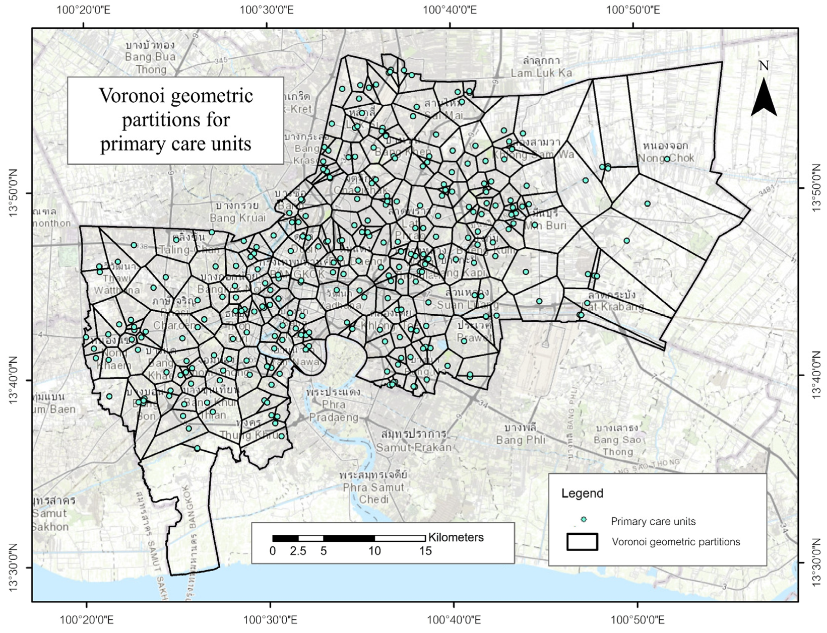
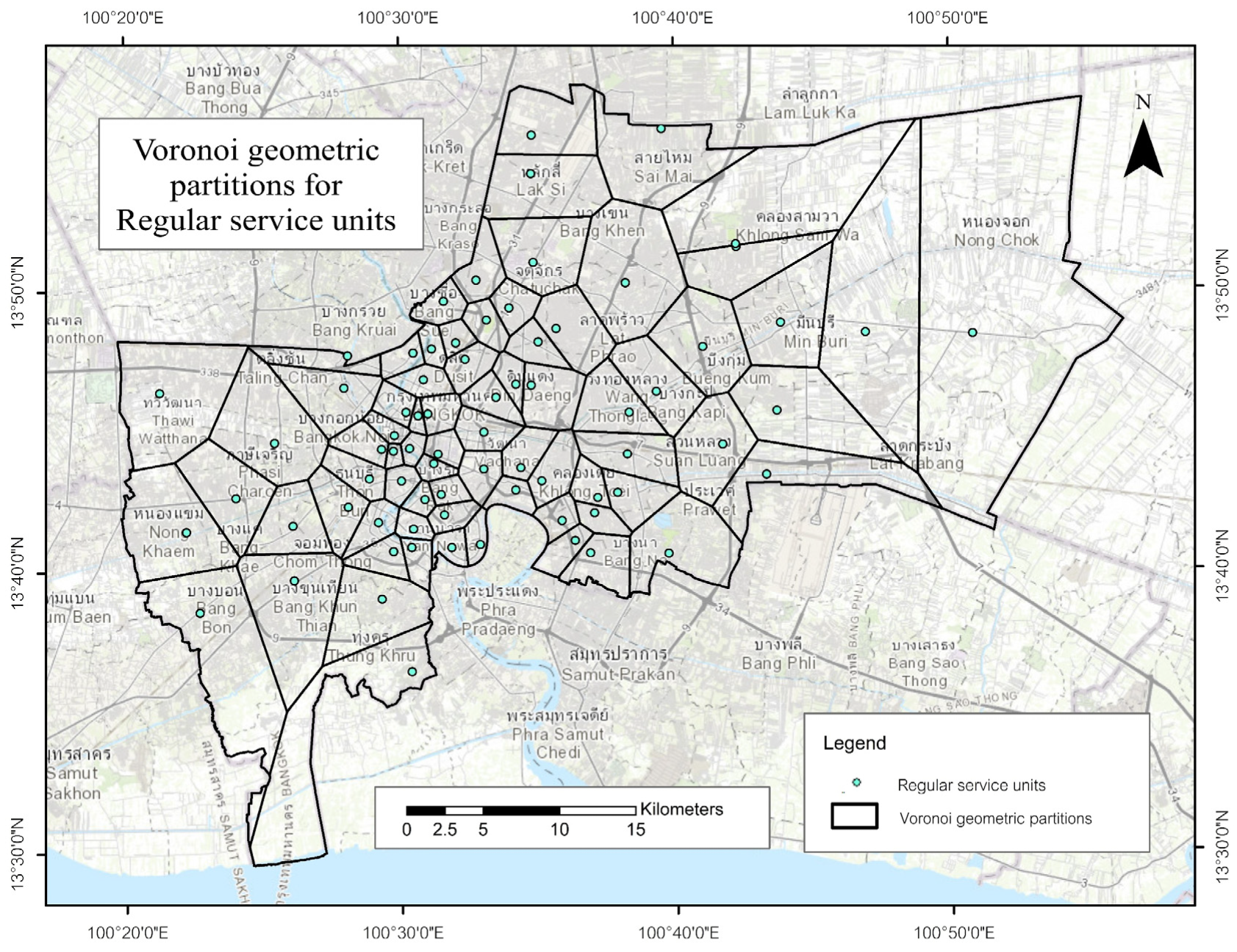
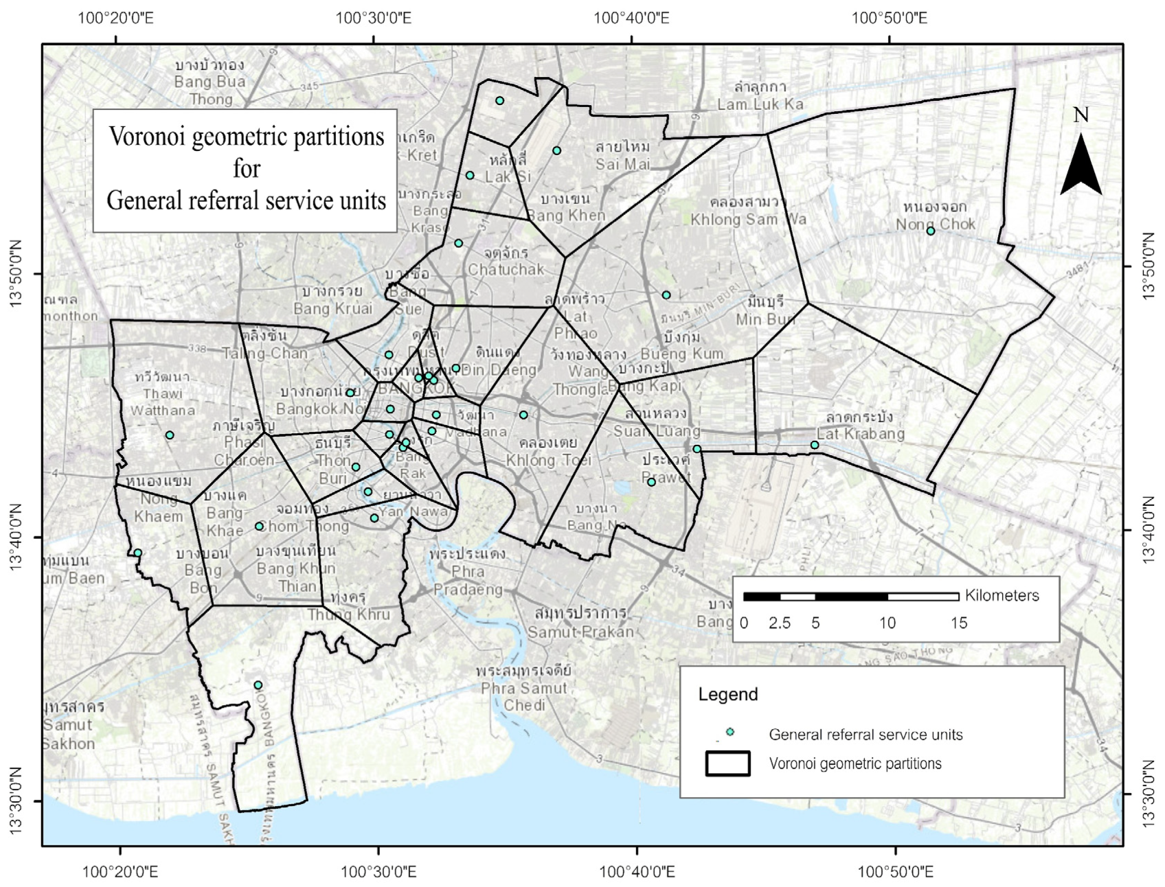
For primary care units (Figure 8), the tessellation yields a fine-grained mosaic concentrated in the inner city and along the west bank of the Chao Phraya River, with polygon size increasing toward the eastern and southwestern periphery where facilities are more widely spaced. For regular service units (Figure 9), polygons are broader overall, forming an inner-to-middle belt with very large cells on the eastern fringe where inter-facility distances are greatest. For general referral hospitals (Figure 10), the small number of facilities produces very large polygons radiating from the compact inner core and spanning peripheral subdistricts consistent with city-scale spacing. Together, the three tessellations show a clear tier-specific gradient in geometric coverage and provide the partitioning basis for population allocation and burden analysis in Section 3.4.

3.4. Population Assigned to Voronoi Partitions

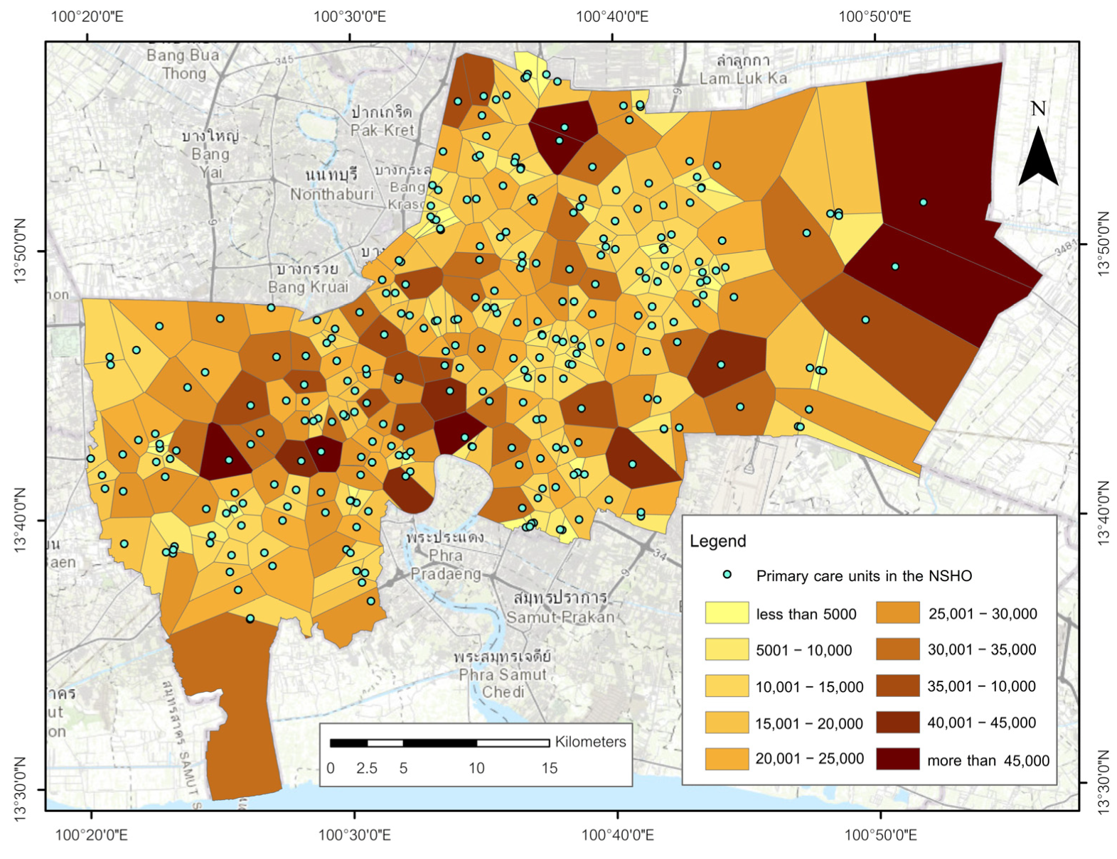
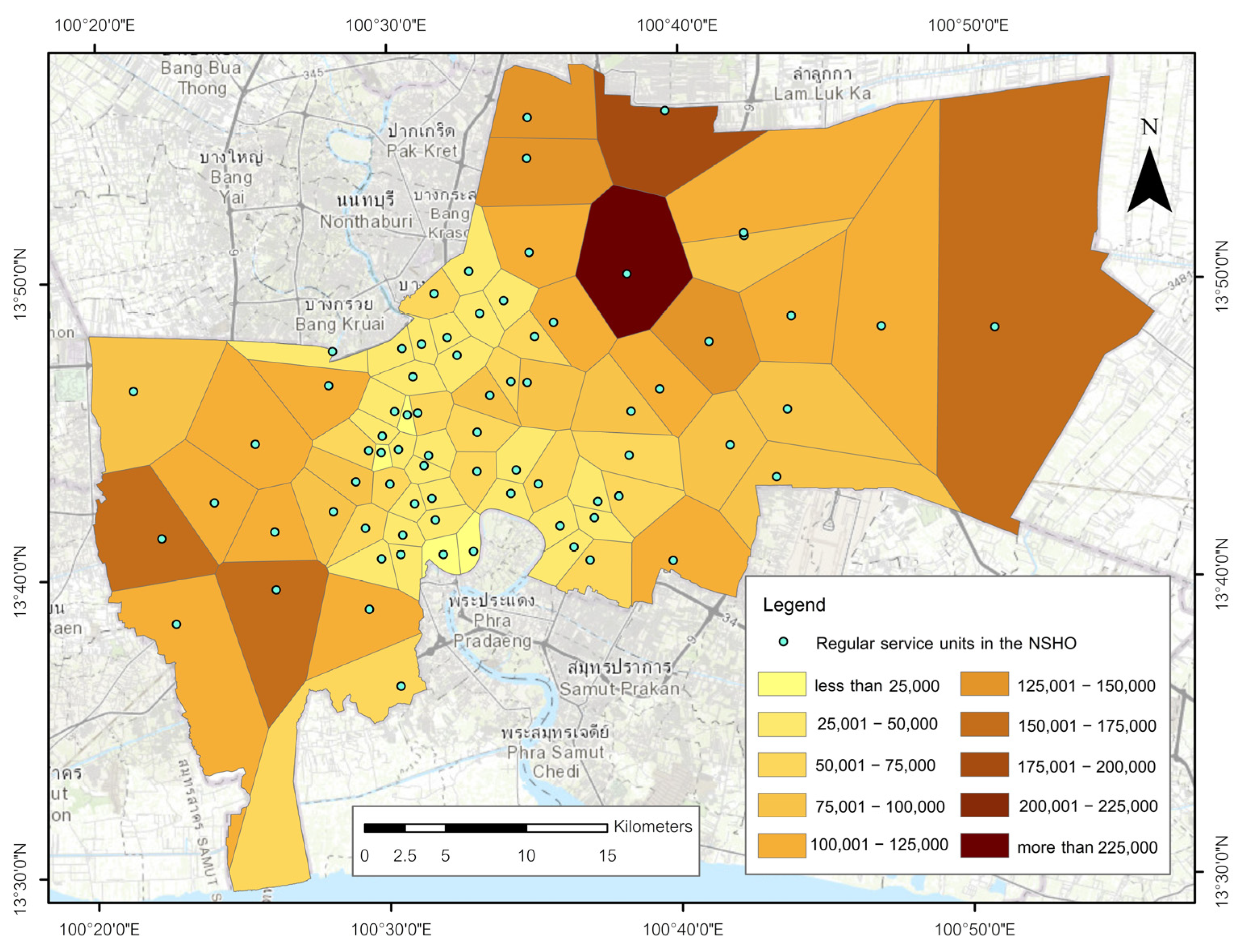
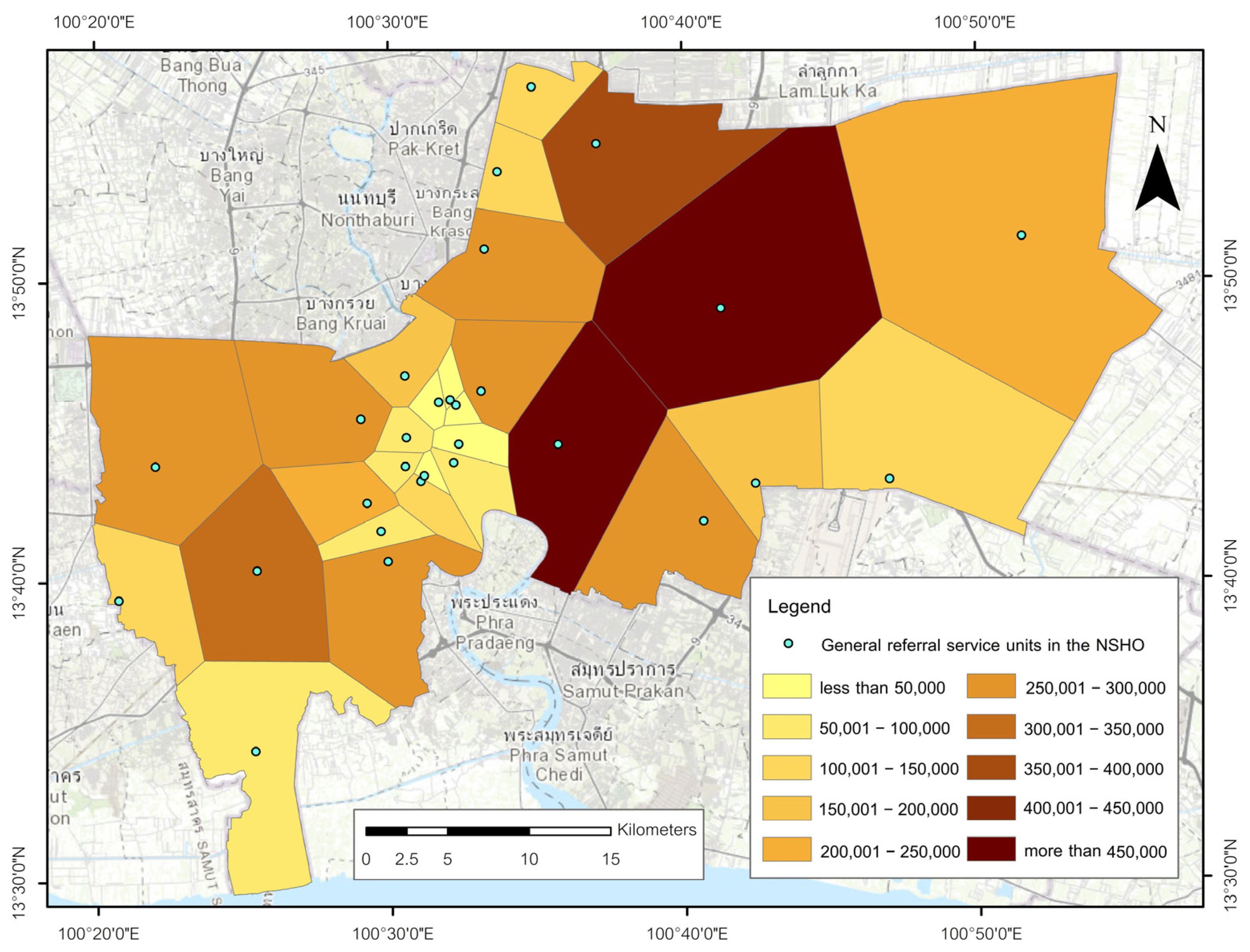
Figure 11, Figure 12 and Figure 13 map population totals assigned to partitions using area-weighted interpolation from subdistrict controls, providing a screening view of potential load per nearest-facility polygon. Because allocation is uniform within subdistricts, values in non-residential tracts may be inflated or deflated; results are therefore read at coarse resolution and strictly within tiers.
For primary care units (Figure 11), assigned populations are lowest in the inner city where polygons are small and facilities are closely spaced, and increase toward the eastern and southwestern periphery as polygons span multiple subdistricts. For regular service units (Figure 12), totals span a wider range, with moderate values across the inner-to-middle belt and substantially larger values in extensive peripheral polygons. For general referral hospitals (Figure 13), allocations reflect city-scale spacing, with relatively low totals near the compact core and very large totals in elongated peripheral polygons. Across tiers, the gradient in assigned load mirrors the geometric patterns in Section 3.3: smaller inner-urban polygons carry lower totals, whereas large fringe polygons accumulate higher totals. These allocations provide the demand basis for the burden indicator mapped in Section 3.8.

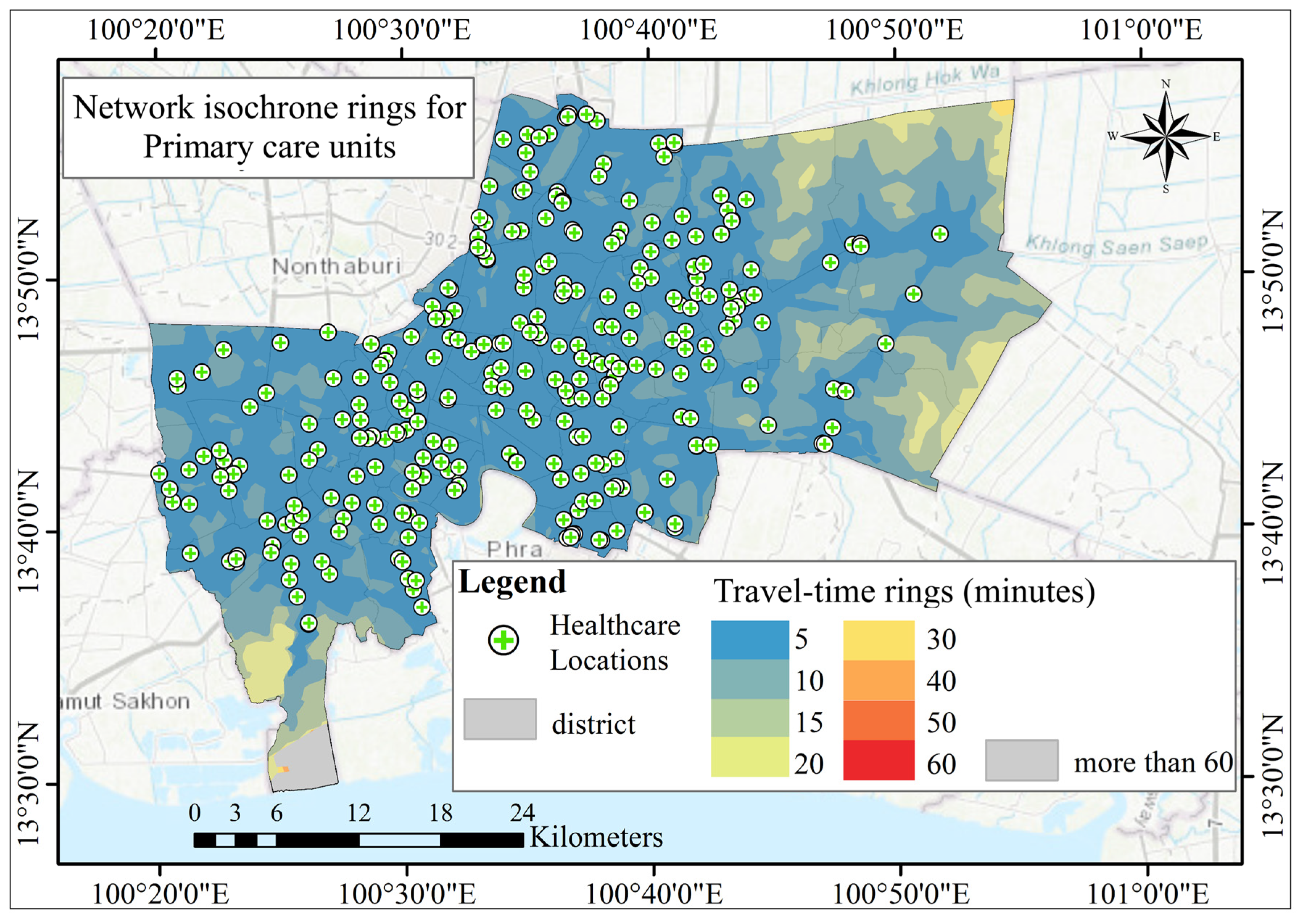
3.5. Travel-Time Accessibility Based on Isochrone Analysis

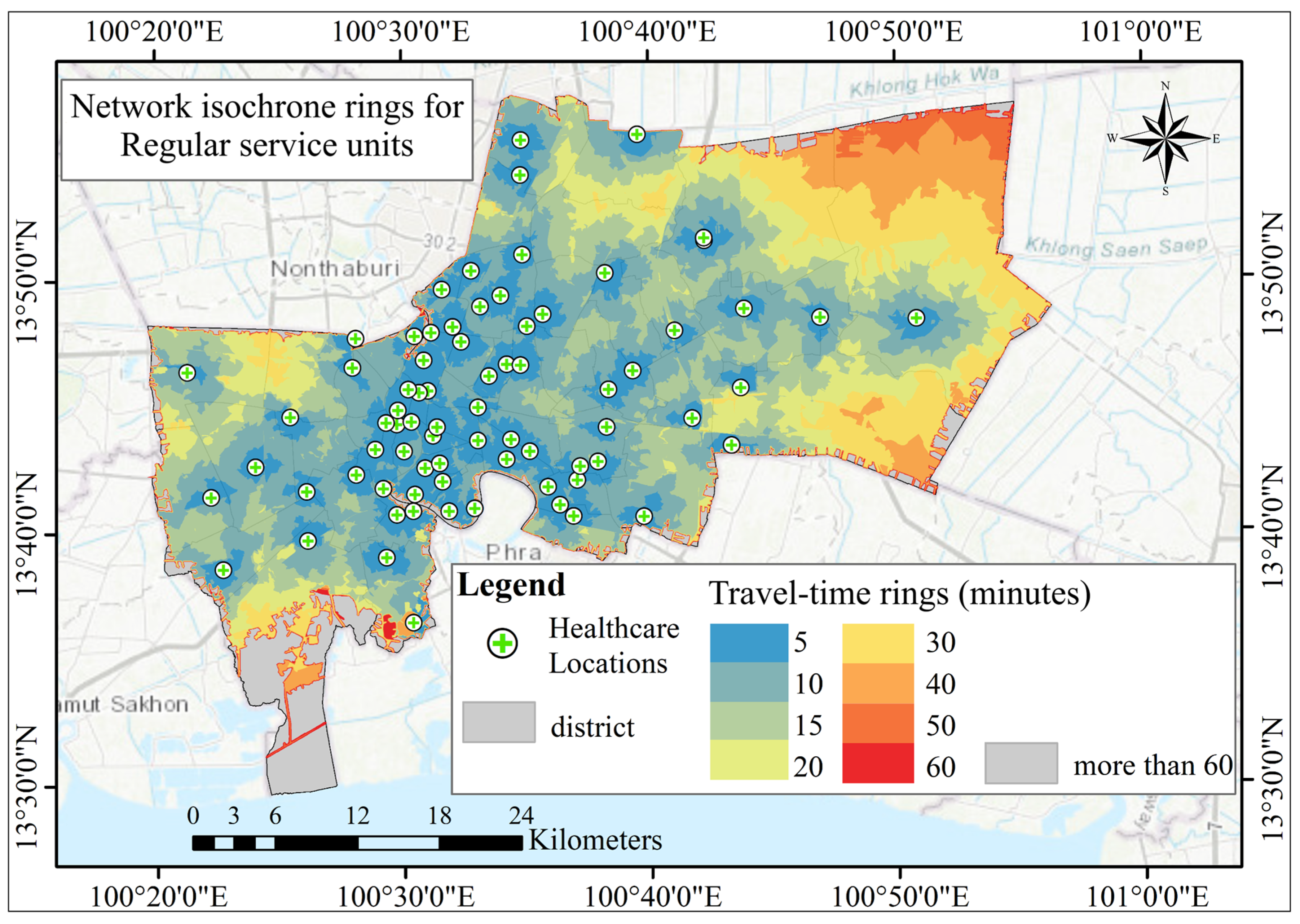
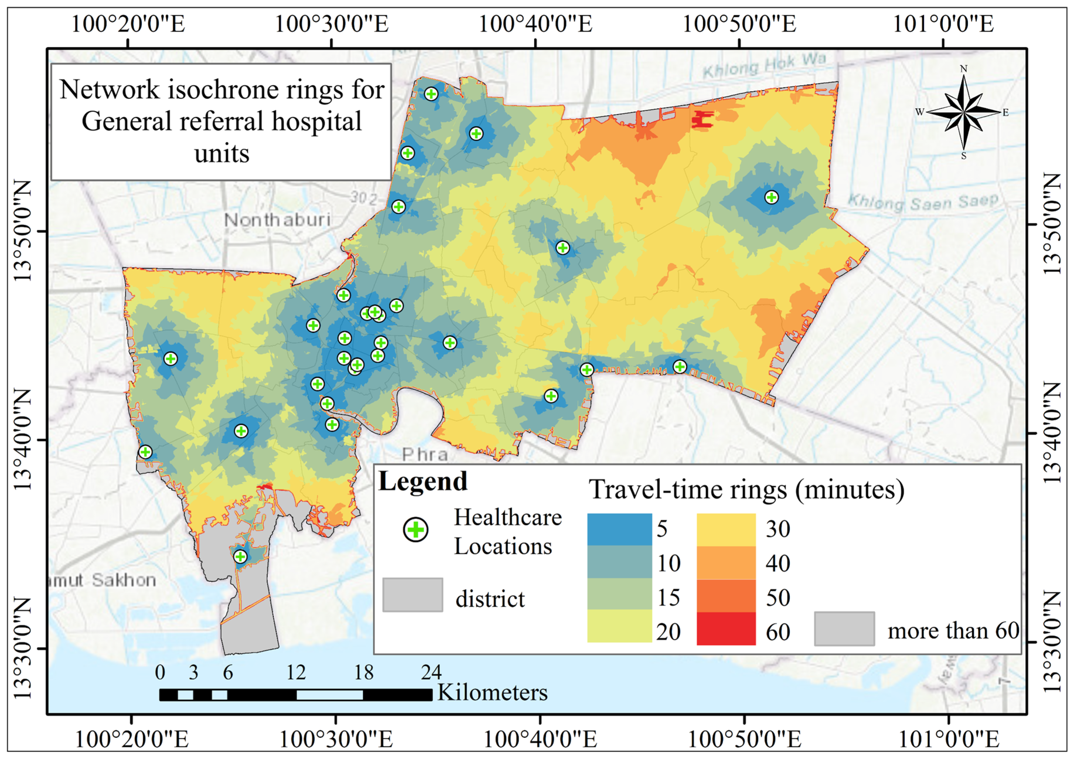
Figure 14, Figure 15 and Figure 16 summarize network-based travel time for each tier using cumulative isochrone rings at 5–60 min under a driving-car assumption. The maps provide a tier-specific view of potential coverage intended for within-tier screening rather than cross-tier magnitude comparison, given differences in facility counts, spatial distributions, and model assumptions. For primary care units (Figure 14), bands up to twenty minutes cover most inner and middle urban subdistricts as a largely continuous surface; longer bands concentrate along the metropolitan fringe, especially in the far east and southwest where facilities are more widely spaced. For regular service units (Figure 15), short bands cluster tightly around the inner core, while 20–40 min rings expand across the middle and outer city; the broadest 40–60 min envelopes occur on the eastern and southwestern periphery. For general referral hospitals (Figure 16), short bands remain confined to the compact central cluster and the adjacent west-bank corridor, with much of the outer urban area falling within 30–60 min, reflecting city-scale spacing. These patterns establish the temporal context for statutory zoning overlays in Section 3.6 and for within-tier burden screening in Section 3.8.

3.6. Zoning Alignment

The statutory planning map delineates high-, medium-, and low-density residential areas, commercial corridors concentrated in the inner subdistricts, institutional precincts around the historic core, and extensive rural and agricultural zones across the eastern periphery. Within this planning-intent frame, primary care units are widely distributed across the built-up area and most prevalent along medium- and high-density residential belts on both sides of the Chao Phraya River, with presence tapering toward rural and agricultural designations. Regular service units exhibit a more selective pattern, concentrating within the inner residential–commercial matrix and appearing less frequently in low-density suburbs and rural zones. General referral hospitals are few and predominantly situated within institutional or adjacent high-density urban zones in the historic and river-adjacent core, with limited representation elsewhere. These observations provide a land-use context for interpreting the geometric partitions in Section 3.7; they are not evidence of present-day operational alignment.

3.7. Service-Area Footprints Versus Planning Intent

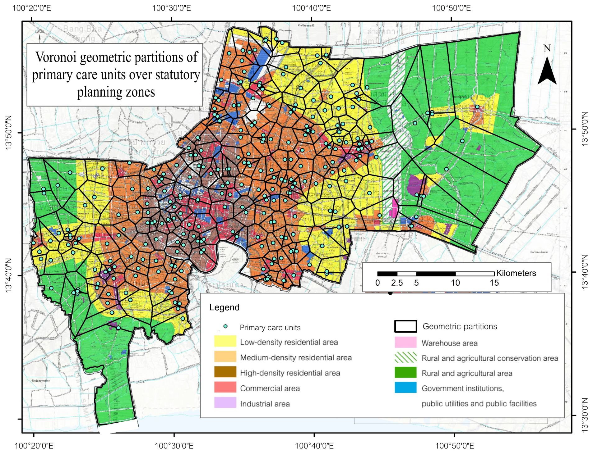
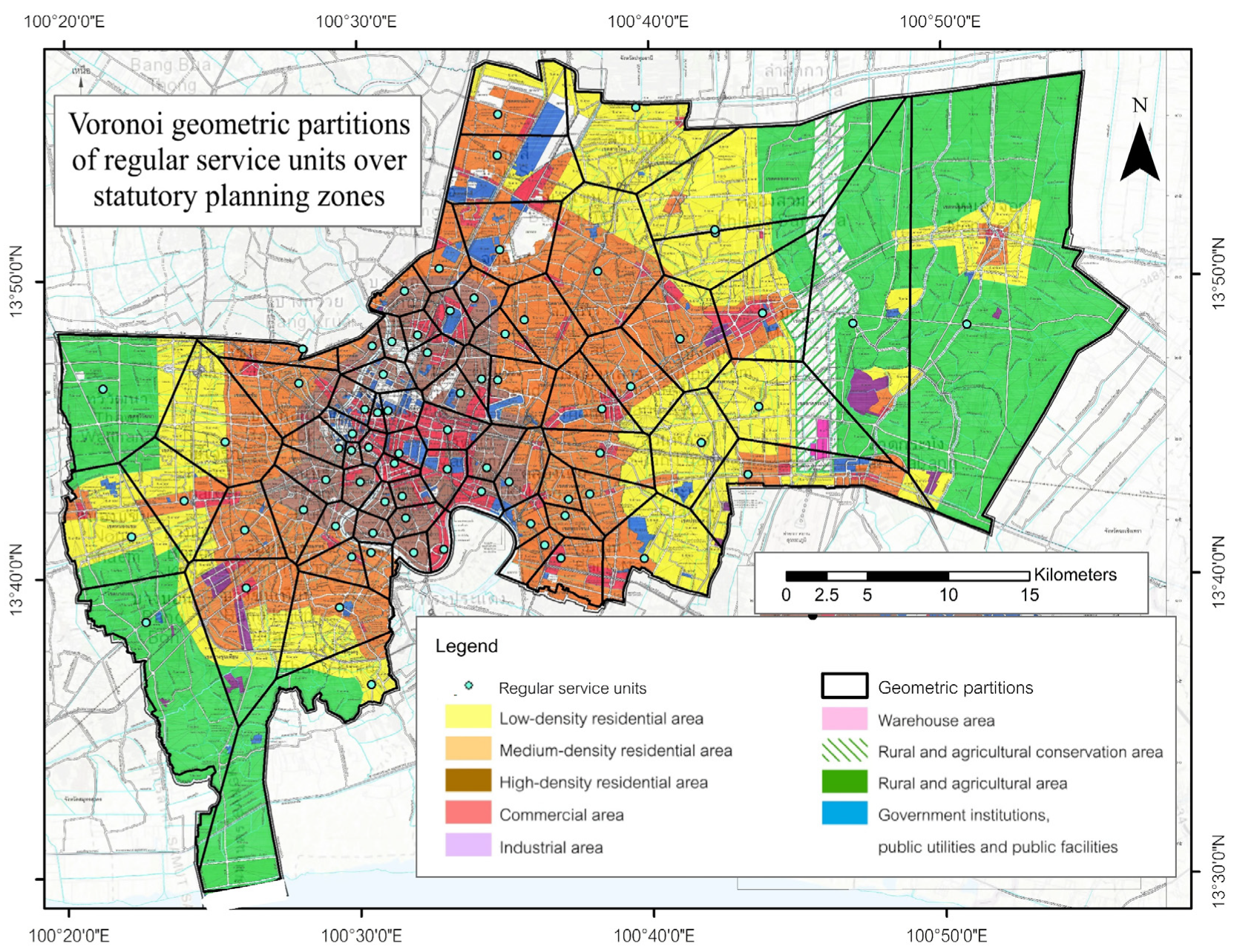
Figure 17, Figure 18 and Figure 19 overlay Voronoi geometric partitions on the 2020 statutory planning map to illustrate how nearest-facility geometry intersects Bangkok’s planned land-use mosaic. For primary care units (Figure 17), partitions form a dense, fine-grained tiling across the inner and middle built-up areas, with polygon size increasing in low-density residential and rural zones (especially in the far east), consistent with wider inter-facility spacing. For regular service units (Figure 18), partitions concentrate within the inner residential and commercial fabric and expand rapidly toward the periphery; mid-sized polygons dominate the central subdistricts, while large polygons appear across low-density suburbs and rural and agricultural designations. For general referral hospitals (Figure 19), the small number of facilities produces extensive polygons anchored in institutional and high-density zones near the core, with peripheral polygons spanning multiple land uses in the east and in the southwest. These overlays provide a geometric, within-tier screening perspective against planning intent; they are not operational catchments and do not validate present-day service reach.

3.8. Burden Screening Based on Voronoi Partitions

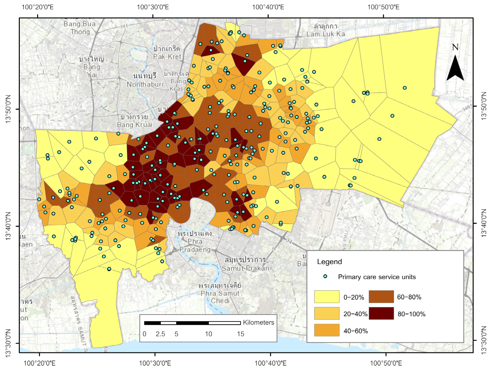
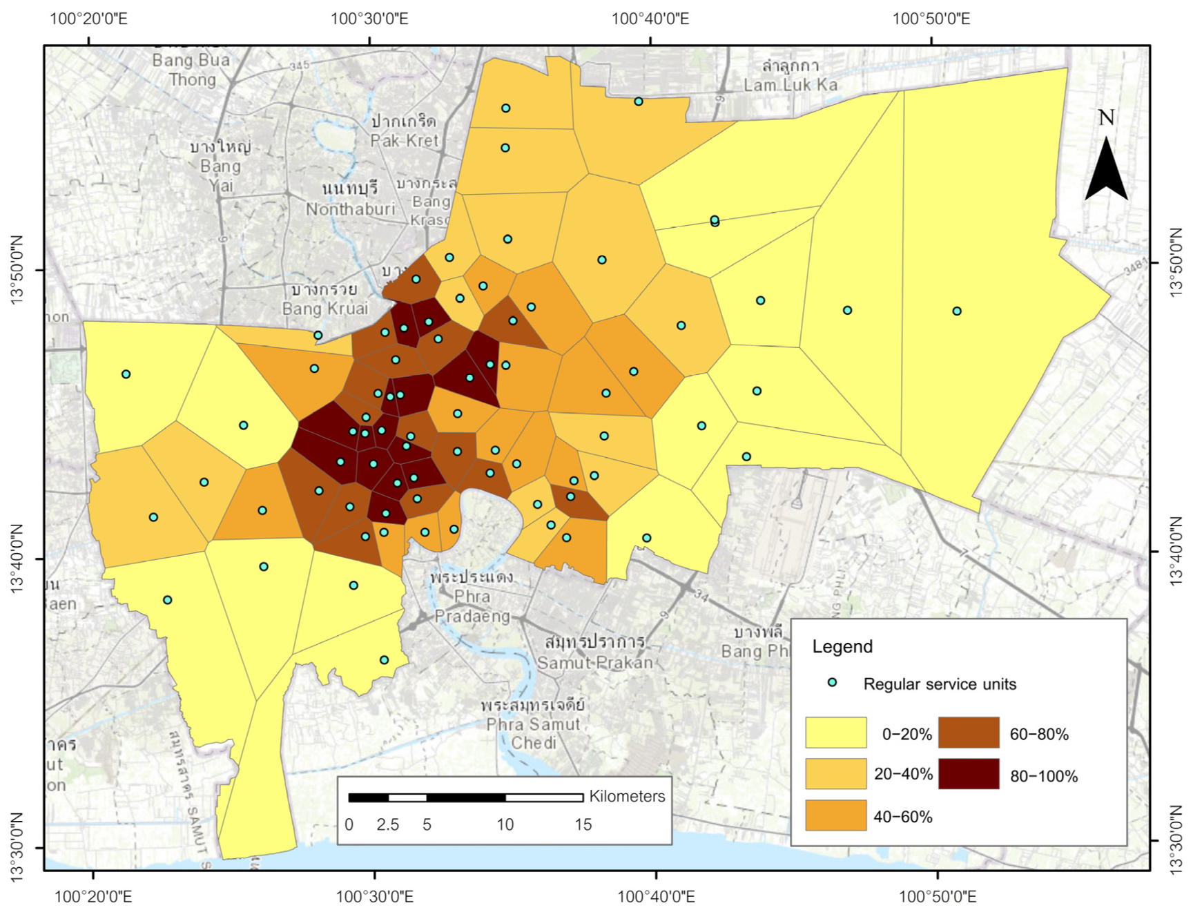
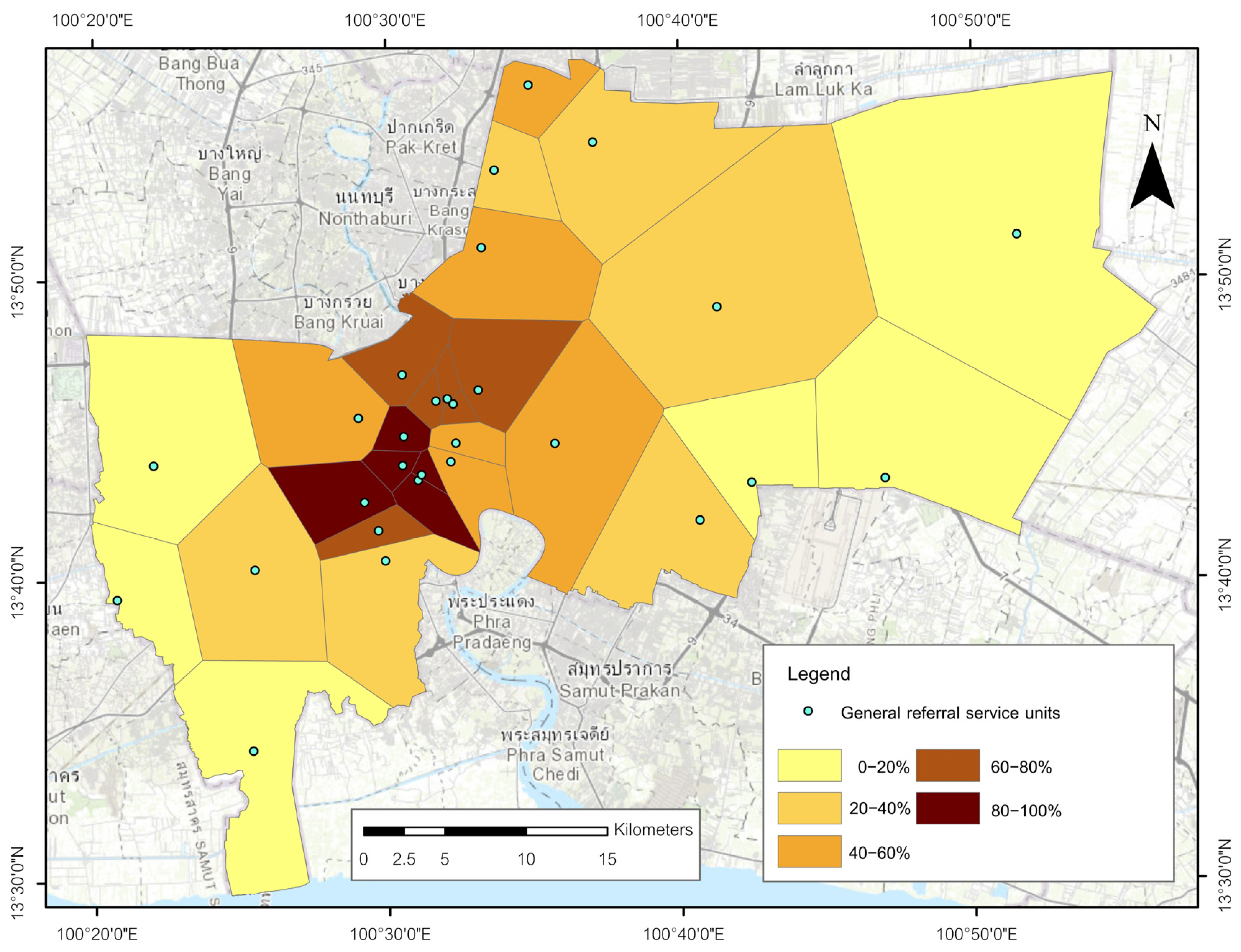
Figure 20, Figure 21 and Figure 22 present the area-normalized burden indicator B D S P ( v ) (population per partition area), defined as the allocated population divided by the partition area. Values are reported per square kilometer for readability. Within each service tier, the empirical distribution of B D S P ( v ) is partitioned into five percentile classes (0–20, 20–40, 40–60, 60–80, and 80–100 percent). Because allocations use uniform area-weighted interpolation from subdistrict totals, maps are read as within-tier screening of relative demand per unit service area rather than precise local estimates in zones with substantial non-residential land.
For primary care units (Figure 20), the lowest percentile classes concentrate in compact inner-city partitions where polygons are small and facilities are densely spaced, while higher percentile classes appear in larger partitions toward the metropolitan fringe. For regular service units (Figure 21), mid-percentile classes dominate much of the inner-to-middle belt, and higher classes occur in extensive peripheral polygons that span multiple subdistricts. For general referral hospitals (Figure 22), the range of B D S P ( v ) values reflect the small number and wide spacing of hospitals, with lower classes in centrally located partitions and upper classes in large peripheral polygons. To anchor interpretation with simple numerics, one exemplar per tier is provided, reported only per square kilometer: primary tier example, area 1.6408 km2 and an allocated population of 19,124 persons yields B D S P ( v ) = 0.011655 persons m−2, equivalent to 11,655 persons km−2. For the regular tier, Health Center 13 Maitriwanit has a Voronoi area of 2.7880 km2 and an allocated population of 38,369 persons, yielding B D S P ( v ) = 0.013762 persons m−2, equivalent to 13,762 persons km−2. For the referral tier, Taksin Hospital has a Voronoi area of 5.5272 km2 and an allocated population of 66,216 persons, yielding B D S P ( v ) = 0.011980 persons m−2, equivalent to 11,980 persons km−2.

4. Discussion

4.1. Synthesis of Spatial Structure, Partitions, and Travel-Time Access

The tier-specific diagnostics reveal a metropolitan gradient that reflects the prevailing residential structure of Bangkok and provides the conceptual basis for interpreting the partition and accessibility outputs. The spatial pattern tests demonstrate statistically significant clustering of primary care units in the inner subdistricts, a configuration for regular service units that does not deviate from spatial randomness, and modest dispersion of referral hospitals. These tendencies correspond to the 2024 population distribution, which is heavily concentrated in central subdistricts and decreases toward the periphery.
The Voronoi partitioning converts these point configurations into nearest-facility geometric partitions that reflect the inverse of local facility density. Compact polygons are dominant within the inner subdistricts for primary care units, whereas regular and referral service tiers exhibit progressively larger polygons that extend into eastern and southwestern fringe areas. Overlays with the statutory 2020 planning map are interpreted against planning intent and indicate broad consistency with designated land-use patterns, with primary care units concentrated within medium- and high-density residential belts, regular units situated within the inner residential and commercial matrix, and referral hospitals predominantly located within institutional precincts.
The network-based isochrones provide a complementary perspective by incorporating travel time. Shorter travel-time bands characterize the inner and middle subdistricts for primary care, intermediate bands arise for regular units in transition belts, and longer bands occur for referral hospitals in peripheral zones. These contrasts are interpreted qualitatively because the tiers differ in their spatial densities, functional roles, and geographic coverage. Within tiers, the combined interpretation of polygon size and travel-time extent highlights locations where potential coverage becomes limited.
These findings represent potential rather than realized accessibility. Voronoi polygons and isochrone surfaces do not incorporate congestion, modal diversity, or temporal variation. International evidence indicates that revealed travel times may exceed potential times considerably and that longer access times are associated with adverse health outcomes [2]. Bangkok-specific research on first- and last-mile constraints supports using potential-access measures as transparent screening indicators that can later be complemented by multimodal or time-sensitive analyses [9]. Within this analytical scope, the integrated workflow that combines spatial pattern diagnostics, Voronoi partition delineation, population allocation, burden estimation, and cumulative isochrone coverage provides a reproducible structure aligned with calls for spatially explicit and policy-relevant indicators in urban health planning under universal coverage frameworks [1,4,8,22].

4.2. Interpreting Facility Pattern Diagnostics

The diagnostic stage establishes a descriptive baseline for understanding the spatial configuration of healthcare services before population allocation and network analyses are introduced. The Average Nearest Neighbor test identifies marked clustering among primary care units, an arrangement consistent with spatial randomness among regular units, and modest dispersion among referral hospitals. These outputs are interpreted strictly as indicators of spatial patterning, while numerical details and significance levels remain in Section 3.2. Kernel density estimation complements this interpretation by identifying contiguous high-density clusters and peripheral areas of sparse provision within each tier. Because the kernel bandwidth is estimated independently for each tier, resulting density magnitudes are not intended for cross-tier comparison. The surfaces are therefore interpreted within tiers to clarify where spatial concentration occurs. This sequencing maintains clear conceptual boundaries within the analytical workflow. Spatial pattern diagnostics characterize the physical arrangement of facilities. Voronoi polygons convert these arrangements into nearest-facility geometric partitions without imposing network impedance. Population assignment provides counts that subsequently support the construction of the burden indicator BDSP. Cumulative isochrones introduce travel time as an additional construct rather than a replacement for spatial proximity. This separation reflects established methodological practice in urban health geography, where clustering diagnostics are used to contextualize service distribution before accessibility metrics are applied [5,11]. It also allows descriptive indicators to remain analytically distinct from access metrics, preserving interpretability and preventing the conflation of pattern concentration with service performance. This structured interpretation justifies the analytical pipeline adopted in the study. The descriptive spatial diagnostics provide the baseline against which partition sizes are interpreted, population weighting provides consistent facility-level demand estimates, and isochrones supply the temporal dimension necessary for identifying areas where travel-time accessibility becomes limited. The resulting sequence supports a transparent, interpretable framework suited to municipal screening and aligns with guidance that emphasizes operational indicators for public-sector planning [4].

4.3. Voronoi Geometric Partitions as a Transparent Nearest-Facility Framework

The Voronoi tessellation provides a transparent representation of nearest-facility reach that does not rely on administrative boundaries or network impedance. Each polygon defines the area for which a given facility is the closest option in planar distance. Interpreted within the discussion rather than as an additional result, the tessellation offers a reproducible geometric basis for population assignment, subsequent burden estimation, and spatial overlays presented in Section 3.3 and Section 3.4. The one-to-one correspondence between facilities and polygons ensures that disparities in spacing appear directly as differences in polygon size, which aligns with the metropolitan gradient observed in the pattern diagnostics. The literature supports the use of Voronoi structures in health geography where transparency and replicability are essential. Weighted Voronoi variants have been used to incorporate facility capacity, such as annual hospital admissions in Rio de Janeiro, and these methods can refine polygon boundaries when defensible capacity data become available [15]. Similar applications in pharmacy and emergency care demonstrate that Voronoi structures can be combined with distance or time thresholds to identify underserved areas and to guide incremental expansion [16,17]. Within this study, three interpretive points arise. First, the unweighted tessellation reflects local facility density and is consistent with the descriptive spatial diagnostics, which makes it suitable as input geometry for the burden indicator BDSP. Second, planar proximity is treated cautiously where physical barriers or bridge-dependent crossings may limit access; cumulative isochrones in Section 3.5 therefore serve as a complementary lens. Third, should capacity or utilization data become available in future work, a weighted repartition would enable a closer representation of service potential while preserving interpretability. In this context, the Voronoi space functions as a non-redundant link between spatial pattern analysis, population allocation, and screening.

4.4. Population Assignment and Its Interpretive Boundaries

Population assignment follows proportional areal weighting from subdistrict polygons to Voronoi partitions as specified in Section 2.3.4. The approach preserves population totals and provides a reproducible count of residents associated with each facility under a uniform-within-subdistrict assumption. In discussion terms, the outputs serve as screening-level demand indicators that support facility-level comparison and underpin the construction of the burden indicator in Section 3.8. The assigned totals signal relative load within each tier and provide a consistent basis for identifying where partitions encompass larger population shares, particularly in peripheral subdistricts where polygons expand over multiple subdistricts. This approach aligns with established practice in spatial interpolation, which recommends transferring counts rather than ratios because counts are more stable under areal redistribution [20,21]. Limitations are acknowledged. Uniform allocation can misrepresent local densities in subdistricts that contain substantial non-residential land, and the resulting counts should therefore be interpreted as indicative rather than as precise micro-estimates. These constraints justify treating the burden indicator BDSP as a within-tier screening device. Where ancillary layers such as residential masks, building-use data, or mobile-phone aggregates become available, dasymetric refinements or grid-based Voronoi approaches can reduce spatial heterogeneity while maintaining transparency and conservation properties [22]. We did not implement residential or industrial masking; instead, we explicitly narrowed fine-grained inferences and use the assigned counts solely as within-tier screening signals.

4.5. Burden Indicator BDSP: Definition, Interpretation, and Policy Utility

The burden indicator BDSP is defined as the population assigned to a facility’s Voronoi partition divided by the corresponding partition area. The indicator is interpreted strictly as a within-tier measure of relative beneficiary density and is classified into percentile groups for screening purposes. This design avoids direct cross-tier comparisons and is consistent with the study’s emphasis on identifying spatial gradients in potential access rather than evaluating throughput or service quality. The sequence of allocating population counts prior to forming burden ratios follows established guidance in areal interpolation because counts are less susceptible to localized heterogeneity than precomputed quotients [20]. High-percentile BDSP values signal facilities whose partitions contain comparatively higher population per unit area, while lower percentiles reflect extensive polygons with fewer residents per unit area. These contrasts support targeted prioritization. Facilities in upper-percentile groups may warrant additional capacity, outreach, or coordination with nearby facilities, whereas lower-percentile locations may indicate sufficient spatial dispersion but require complementary examination through travel-time analysis. The interpretive framework is consistent with recommendations for municipal indicator systems that emphasize transparency, comparability within clearly defined groups, and suitability for routine public reporting [4].

4.6. Travel-Time Accessibility and Cumulative Isochrone Interpretation

The cumulative isochrone surfaces introduced in Section 3.5 provide a network-based perspective on potential accessibility under a driving-car assumption. Interpreted within tiers, these surfaces reveal spatial gradients that complement the burden indicator. Shorter travel times dominate the inner and middle subdistricts for primary care, intermediate bands characterize regular service units in transition belts, and longer bands remain extensive for general referral hospitals in peripheral urban areas. These patterns identify where potential accessibility decreases and where longer travel ranges are likely to produce delays in reaching care. Isochrones are suitable for threshold-based reporting that policy makers can readily interpret. The approach is consistent with evidence that suburban populations frequently fall outside the commonly referenced fifteen-minute range and therefore require broader thresholds that reflect local circumstances [28]. Methodologically, isochrones align with the floating catchment family of accessibility models that have been applied to public–private comparisons in Panama and to group-specific analyses in Beijing that incorporate older adults and multimodal mobility constraints [29,30]. When synthesized with BDSP, isochrones highlight locations where partitions have both higher relative density and longer travel times. Such locations become priority candidates for intervention, particularly in peripheral subdistricts. The combined interpretation remains within the scope of potential access, and the study recognizes that revealed access varies with time of day, mode, service schedules, and congestion. These considerations justify treating the presented isochrone surfaces as screening constructs that may be refined with temporal or multimodal data when available.

4.7. Zoning Alignment and Service-Footprint Context

The overlay of facility locations and Voronoi geometric partitions with Bangkok’s statutory planning zones provides a contextual benchmark for interpreting the spatial structure of provision. The 2020 plan organizes the metropolis into a hierarchical system of high-, medium-, and low-density residential zones, commercial corridors in the inner subdistricts, institutional precincts around the historic core, and extensive rural and agricultural designations in the eastern periphery. Reading the facility tiers within this framework reveals patterns that correspond closely to the settlement structure. Primary care units and their partitions align most consistently with medium- and high-density residential areas on both sides of the Chao Phraya River. Regular service units show a more selective alignment with mixed residential and commercial zones in the inner and middle subdistricts, while their partitions expand rapidly in suburban and peri-urban areas where residential density declines. General referral hospitals are concentrated in institutional and high-density urban zones near the historic core, and their large outer polygons indicate city-scale spacing of tertiary services. Alignment is descriptive and does not imply sufficiency. The residential and commercial zones that contain higher facility densities also include locations where BDSP reaches upper percentile ranks, and several peripheral zones exhibit enlarged polygons and longer travel times without corresponding increases in facility presence. When interpreted with BDSP and isochrone patterns, the overlays reinforce a spatial gradient in potential access and highlight where statutory designations, expected demand, and service footprints diverge. These observations are consistent with international guidance encouraging cities to monitor alignment between urban form and access using spatially explicit indicators that remain credible at the metropolitan scale [1,4].

4.8. Integrated Identification of Spatial Gaps Across Service Tiers

Synthesizing spatial diagnostics, population assignments, burden indicators, and network travel-time patterns reveals a consistent set of geographic disparities across Bangkok. These disparities follow the metropolitan gradient established by the settlement structure and are most pronounced in the outer eastern and southwestern subdistricts. In these areas, Voronoi polygons increase substantially in size, population assignments rise due to the aggregation of several subdistricts, and isochrone bands extend toward upper travel-time thresholds. The combined signals indicate that residents in these locations are served by facilities spaced at greater distances and associated with longer potential travel times, particularly at the primary care tier. Transition subdistricts in the inner to middle arc display intermediate signs of thinning service coverage. Regular service units tend to be spaced farther apart than primary care facilities, and their partitions expand earlier as the urban fabric becomes less dense. These areas also exhibit earlier transitions from short to intermediate isochrone bands. Although these subdistricts remain closer to major transport corridors, the interaction between moderate population loads and expanding travel-time rings suggests that selected infill placements could improve spatial balance within this tier. For referral hospitals, spatial gaps appear primarily at the metropolitan periphery. The concentration of tertiary care within the historic core produces large, elongated polygons in peripheral subdistricts, and network travel times to these locations frequently exceed the lower threshold ranges. Given the scarcity and specialization of tertiary facilities, dispersion is not necessarily an appropriate response. Instead, the combined evidence supports improving pre-hospital routing, referral pathways, and transport connections from peripheral subdistricts to the established hospital cluster, consistent with practice in other metropolitan systems where tertiary services remain centralized. The integrated evidence stream reinforces the utility of combining planar proximity geometry, population allocation, percentile-ranked BDSP, and cumulative isochrone surfaces. This approach is consistent with screening practices that identify underserved areas and guide staged expansion within and across service tiers [16]. It also corresponds with frameworks that integrate partition geometry with network routing for time-critical care [17]. In Bangkok, the synthesis indicates that immediate priorities lie in outer subdistricts where large partitions and longer travel times converge, and in transition subdistricts where regular service units exhibit widening spatial intervals.

5. Conclusions

This study demonstrates that an integrated sequence combining point pattern diagnostics, Voronoi geometric partitions, population weighted allocation, and cumulative network isochrones provides a coherent and reproducible framework for within tier screening of metropolitan healthcare accessibility in Bangkok. Results reveal a consistent gradient in which smaller partitions, lower population per partition area burdens, and shorter travel time rings concentrate in inner subdistricts, whereas larger partitions, higher population per partition area burdens, and longer travel times characterize outer eastern and southwestern areas. These contrasts indicate that potential access varies systematically within tiers and tends to decline as the urban fabric becomes less dense. Within this framework, the area normalized burden measure, defined as population assigned to a facility’s partition divided by its area, functions as an interpretable screening signal for locating potential demand pressure. When read together with time-based coverage, it highlights places where extensive partitions coincide with longer travel times and supports prioritization for incremental improvements. The comparison with the 2020 statutory planning map is interpreted against planning intent and suggests broad consistency of siting logic, while persistent disparities at residential fringes indicate a need for targeted adjustments rather than wholesale redesign. Network travel time surfaces complement planar proximity by revealing corridors with short travel and peripheral zones with systematically longer access. These insights can inform practical actions such as targeted augmentation of primary care, strengthening of referral pathways, or improvements in transport connectivity, subject to local constraints and policy feasibility. Framed within sustainability science and practice, the workflow operationalizes transparent and repeatable indicators of spatial accessibility and service coverage that can be routinely measured and monitored across planning cycles. By linking accessibility diagnostics with universal health coverage objectives and explicit coverage targets, the framework supports evidence informed alignment of facility provision with urban form and demographic demand. These indicators support ongoing tracking, evaluation, and incremental adjustments under common data constraints, thereby reinforcing sustainability assessment and governance.
Building on these findings, two complementary avenues merit attention to enhance real world utility. The first is risk reduction design. The combined beneficiary density per service partition screening surface and travel time maps identify cells where concentrated potential demand coincides with long time to care. These locations provide tractable starting points for targeted interventions such as modest capacity upgrades at proximate facilities, minor reconfiguration of services within the same tier, or micro-scale infrastructure measures that shorten first mile travel. Extending the analysis to multi period and multimodal scenarios would capture peak time variability and inter tier referral dynamics and would help anticipate displacement effects. The second avenue is a structured cost frame to support preliminary policy screening. Rather than reporting a single figure, an order of magnitude breakdown should distinguish infrastructure adjustments, facility level capacity increments, referral network coordination, and data or information system investments. Expressing costs as ranges tied to specific intervention menus avoids false precision, aligns with the screening purpose of the indicators, and enables transparent comparison with the spatial benefits suggested by the maps. Embedding these cost ranges within a simple scenario matrix would help decision makers evaluate tradeoffs between accessibility gains, fiscal effort, and implementation feasibility while preserving the reproducibility and interpretive scope established in this study.

Author Contributions

Conceptualization, S.B. and N.P. (Nathapat Punturasan); methodology, S.B. and N.P. (Nathapat Punturasan); software, N.P. (Nathapat Punturasan); validation, S.B., P.K., P.T., C.C., N.P. (Ngamlamai Piolueang), T.S. and M.X.; formal analysis, S.B. and N.P. (Nathapat Punturasan); investigation, S.B., P.K., P.T., C.C., N.P. (Ngamlamai Piolueang), T.S. and M.X.; resources, C.C., N.P. (Ngamlamai Piolueang), T.S. and M.X.; data curation, N.P. (Nathapat Punturasan); writing—original draft preparation, S.B. and N.P.; writing—review and editing, S.B.; visualization, S.B. and N.P. (Nathapat Punturasan); supervision, P.K., P.T., C.C., N.P. (Ngamlamai Piolueang), T.S. and M.X.; project administration, S.B.; funding acquisition, S.B., N.P. (Ngamlamai Piolueang) and T.S. All authors have read and agreed to the published version of the manuscript.

Funding

This research was funded by the Faculty of Social Sciences, Kasetsart University under the SDGs: Sustainable Development Goals Development Program (Fiscal Year 2024–2025).

Institutional Review Board Statement

Not applicable.

Informed Consent Statement

Not applicable.

Data Availability Statement

The data presented in this study are available on request from the corresponding author.

Acknowledgments

The authors are grateful to the anonymous reviewers for their constructive comments and thoughtful suggestions, which substantially improved the clarity and rigor of this manuscript. The authors also thank the administrative and technical staff who facilitated data preparation and cartographic production.

Conflicts of Interest

The authors declare no conflicts of interest.

Abbreviations

The following abbreviations are used in this manuscript:
ANNAverage nearest neighbor
BDSPBeneficiary Density per Service Partition
BMABangkok Metropolitan Administration
EPSGEuropean Petroleum Survey Group code
GISGeographic information system
KDEKernel density estimation
NHSONational Health Security Office (Thailand)
ORSOpenRouteService
OSMOpenStreetMap
QGISQuantum GIS
UTMUniversal Transverse Mercator

Appendix A

This appendix lists only parameters that materially affect reproducibility. Non-default settings are stated explicitly; software defaults are reported where applicable.
Table A1. The components, parameters, and value used in this study.
ComponentParameterValue Used
A. Software, data, and spatial domain
ArcGIS ProVersion3.4.0
QGISVersion3.22 (ORS Tools)
CRSProjectedUTM Zone 47N (EPSG:32647)
Study extentAnalysis maskBangkok administrative boundary
Facilities (year 2024)Counts by tierPrimary 294; Regular 75; Referral 29 (NHSO register)
B. Pattern diagnostics and partitions
ANN (per tier)Distance metric; inferenceEuclidean; familywise interpretation of p-values (no recomputation)
KDE (per tier)Kernel; bandwidth; cell sizeQuadratic; automatic (per tier); 3.545 m
VoronoiTool; clipping; topologyCreate Thiessen Polygons; clipped to BMA boundary; closure/no overlaps; one polygon per facility
Population allocationRule; QC; limitationArea-weighted within subdistrict; conservation and non-negative checks; screening-only for non-residential tracts
C. Zoning overlay and interpretation
Point overlayCounts per zone by tierSpatial Join
Area overlayPartition shares by zoneIntersect > Dissolve > Summary Statistics; areas via Calculate Geometry Attributes
InterpretationPlanning contextRead against statutory planning intent only (not present-day operational alignment)
D. Burden indicator and mapping
IndicatorDefinition; unitssee Section 2.3.6; reported per km2
ClassificationPercentiles (per tier)0–20, 20–40, 40–60, 60–80, 80–100; within-tier only
E. Network isochrones for Primary tier (on QGIS 3.22/ORS plugin)
Engine & modeORS Tools (server-side)driving-car; time impedance
Ranges (minutes)Cumulative bands5, 10, 15, 20, 30, 40, 50, 60
Location typeOrigin semanticsstart (away from facility)
DissolveDuring ORS requestOFF (retain per-facility features)
Smoothing factorPolygon generalizationNot set (default)
Output & reprojectionFormats; CRSGeoJSON/Shapefile; reproject to EPSG:32647
City-wide ringsWorkflowFix geometries > Dissolve by minute > Split by minute > Difference (60−50, …, 10−5; 5 direct) > Merge
Edge clean-upTrimBuffer 100 m on each ring
Speeds & caveatModel basisServer-side model speeds; no temporal variability (screening coverage)
F. Network isochrones for Regular & Referral tiers (on ArcGIS Pro 3.4.0)
Engine & networkService AreaIntegrated BMA/OTP network; time impedance; cumulative 5–60 min breaks
DirectionFlowAway From Facility
U-turnsSettingAllowed
RestrictionsTravel rulesOneway = Prohibited; Turn = Prohibited
Invalid locationsHandlingIgnore Invalid Locations = Enabled
Polygon typeGeneralizationGeneralized
Edge clean-upTrim100 m
Multiple facilitiesOverlap; typeOverlapping; Rings (do not include area of smaller breaks)
Note. Voronoi cells are used as geometric scaffolds for screening rather than operational service boundaries; all percentile-based readings are interpreted strictly within tiers. All non-default or study-choice parameters above are also referenced in figure captions for transparency. The 100 m trim threshold was applied as a cartographic generalization parameter. This value was selected through visual inspection to effectively eliminate topological artifacts (slivers) arising from network discontinuities while preserving the geometric integrity of the primary service envelopes.

References

  1. World Health Organization (WHO); UN-Habitat. Global Report on Urban Health: Equitable, Healthier Cities for Sustainable Development; World Health Organization: Geneva, Switzerland, 2016; ISBN 978-92-4-156527-1. [Google Scholar]
  2. Gligorić, K.; Kamath, C.; Weiss, D.J.; Bavadekar, S.; Liu, Y.; Shekel, T.; Schulman, K.; Gabrilovich, E. Revealed versus Potential Spatial Accessibility of Healthcare and Changing Patterns during the COVID-19 Pandemic. Comm. Med. 2023, 3, 157. [Google Scholar] [CrossRef]
  3. Núñez, A.; Sreeganga, S.D.; Ramaprasad, A. Access to Healthcare during COVID-19. Int. J. Environ. Res. Public Health 2021, 18, 2980. [Google Scholar] [CrossRef]
  4. Giles-Corti, B.; Vernez Moudon, A.; Lowe, M.; Cerin, E.; Boeing, G.; Frumkin, H.; Salvo, D.; Foster, S.; Kleeman, A.; Bekessy, S.; et al. What Next? Expanding Our View of City Planning and Global Health, and Implementing and Monitoring Evidence-Informed Policy. Lancet Glob. Health 2022, 10, e919–e926. [Google Scholar] [CrossRef]
  5. Favarão Leão, A.L.; Gierbolini-Rivera, R.D.; Franco Silva, M.; Shaw, C.; O’Connor, Á.; Salvo, D.; Reis, R.S. Spatial Indicators of Inequity in Urban Health Research: A Scoping Review. Discov. Public Health 2025, 22, 27. [Google Scholar] [CrossRef]
  6. Phoglad, S. Understanding Accessibility to Medical and Healthcare Services for Informal Workers in Bangkok During the COVID-19 Outbreak. J. Popul. Soc. Stud. (JPSS) 2021, 30, 18–35. [Google Scholar] [CrossRef]
  7. Peungnumsai, A.; Miyazaki, H.; Witayangkurn, A.; Kim, S.M. A Grid-Based Spatial Analysis for Detecting Supply-Demand Gaps of Public Transports: A Case Study of the Bangkok Metropolitan Region. Sustainability 2020, 12, 10382. [Google Scholar] [CrossRef]
  8. Iamtrakul, P.; Chayphong, S.; Kantavat, P.; Hayashi, Y. Identification of Key Determinants on Quality-of-Life Related Transportation: A Spatial Statistical Modeling Approach Based on Transport Accessibility and Subjective Well-Being. Eng. Sci. 2024, 30, 1134. [Google Scholar] [CrossRef]
  9. Pueboobpaphan, R.; Pueboobpaphan, S.; Sukhotra, S. Acceptable Walking Distance to Transit Stations in Bangkok, Thailand: Application of a Stated Preference Technique. J. Transp. Geogr. 2022, 99, 103296. [Google Scholar] [CrossRef]
  10. Sreemongkol, K.; Lohatepanont, M.; Cheewinsiriwat, P.; Bunlikitkul, T.O.; Supasaovapak, J. GIS Mapping Evaluation of Stroke Service Areas in Bangkok Using Emergency Medical Services. ISPRS Int. J. Geo-Inf. 2021, 10, 651. [Google Scholar] [CrossRef]
  11. Liu, Y.; Gu, H.; Shi, Y. Spatial Accessibility Analysis of Medical Facilities Based on Public Transportation Networks. Int. J. Environ. Res. Public Health 2022, 19, 16224. [Google Scholar] [CrossRef]
  12. Spencer, J.; Angeles, G. Kernel Density Estimation as a Technique for Assessing Availability of Health Services in Nicaragua. Health Serv. Outcomes Res. Method 2007, 7, 145–157. [Google Scholar] [CrossRef]
  13. Qian, T.; Chen, J.; Li, A.; Wang, J.; Shen, D. Evaluating Spatial Accessibility to General Hospitals with Navigation and Social Media Location Data: A Case Study in Nanjing. Int. J. Environ. Res. Public Health 2020, 17, 2752. [Google Scholar] [CrossRef]
  14. de Mello-Sampayo, F. Spatial Interaction Model for Healthcare Accessibility: What Scale Has to Do with It. Sustainability 2020, 12, 4324. [Google Scholar] [CrossRef]
  15. Rezende, F.A.V.S.; Varnier-Almeida, R.M.; Nobre, F.F. Defining Catchment Areas for Public Hospitals in the Municipality of Rio de Janeiro through Weighted Voronoi Diagrams. Cad. Saúde Pública 2000, 16, 467–475. [Google Scholar] [CrossRef]
  16. Al-Naabi, S.; Al Nasiri, N.; Al-Awadhi, T.; Abdullah, M.; Abulibdeh, A. An Equity-Based Spatial Analytics Framework for Evaluating Pharmacy Accessibility Using Geographical Information Systems. Healthc. Anal. 2025, 7, 100401. [Google Scholar] [CrossRef]
  17. Alamri, A. A Smart Spatial Routing and Accessibility Analysis System for EMS Using Catchment Areas of Voronoi Spatial Model and Time-Based Dijkstra’s Routing Algorithm. Int. J. Environ. Res. Public Health 2023, 20, 1808. [Google Scholar] [CrossRef]
  18. Boonprong, S.; Punturasan, N.; Varnakovida, P.; Prechathamwong, W. Towards Sustainable Urban Mobility: Voronoi-Based Spatial Analysis of EV Charging Stations in Bangkok. Sustainability 2024, 16, 4729. [Google Scholar] [CrossRef]
  19. Duczmal, L.H.; Moreira, G.J.P.; Burgarelli, D.; Takahashi, R.H.C.; Magalhães, F.C.O.; Bodevan, E.C. Voronoi Distance-Based Prospective Space-Time Scans for Point Data Sets: A Dengue Fever Cluster Analysis in a Southeast Brazilian Town. Int. J. Health Geogr. 2011, 10, 29. [Google Scholar] [CrossRef]
  20. Comber, A.; Zeng, W. Spatial Interpolation Using Areal Features: A Review of Methods and Opportunities Using New Forms of Data with Coded Illustrations. Geogr. Compass 2019, 13, e12465. [Google Scholar] [CrossRef]
  21. Liu, X.; Martinez, A. Areal Interpolation Using Parcel and Census Data in Highly Developed Urban Environments. ISPRS Int. J. Geo-Inf. 2019, 8, 302. [Google Scholar] [CrossRef]
  22. Peng, Z.; Wang, R.; Liu, L.; Wu, H. Fine-Scale Dasymetric Population Mapping with Mobile Phone and Building Use Data Based on Grid Voronoi Method. ISPRS Int. J. Geo-Inf. 2020, 9, 344. [Google Scholar] [CrossRef]
  23. Wan, S.; Chen, Y.; Xiao, Y.; Zhao, Q.; Li, M.; Wu, S. Spatial Analysis and Evaluation of Medical Resource Allocation in China Based on Geographic Big Data. BMC Health Serv. Res. 2021, 21, 1084. [Google Scholar] [CrossRef]
  24. Ortwein, A.; Redecker, A.P.; Moos, N. Health-Related Disparities in the Metropolitan Region Ruhr: Large-Scale Spatial Model of Local Asthma Prevalence, Accessibility of Health Facilities, and Socioeconomic and Environmental Factors. PFG 2022, 90, 473–490. [Google Scholar] [CrossRef]
  25. Schroeder, H.; Namimi-Halevi, C.; Luxenburg, O.; Grinbaum Arizon, A.; Tagar, Z.; Bromberg, M.; Eisenberg, V.H. Optimizing Nation-Wide Locations of Dialysis Centers: A Geographic Information System-Based Approach to Improve Healthcare Accessibility and Availability. Isr. J. Health Policy Res. 2025, 14, 40. [Google Scholar] [CrossRef]
  26. Viana, C.M.; Encalada-Abarca, L.; Rocha, J.; Vale, D.S. Identifying Pharmacy Gaps: A Spatiotemporal Study of Multimodal Accessibility throughout the Day. Int. J. Health Geogr. 2025, 24, 11. [Google Scholar] [CrossRef]
  27. Deng, Z.; Lee, J.; Gim, T.-H.T. 15-Minute City for All? Rethinking the 15-Minute City for Urban Older Populations. Appl. Geogr. 2025, 184, 103747. [Google Scholar] [CrossRef]
  28. Wang, J.; Kwan, M.-P.; Liu, D.; Liu, Y.; Wang, Y. 15-Minute City beyond the Urban Core: Lessons from the Urban-Suburban Disparity in PCR Accessibility within the X-Minute Framework. Transp. Res. Part A Policy Pract. 2025, 198, 104546. [Google Scholar] [CrossRef]
  29. Pérez-Fernández, O.; Michel, G.R. Spatial Accessibility to Healthcare Facilities: GIS-Based Public-Private Comparative Analysis Using Floating Catchment Methods. ISPRS Int. J. Geo-Inf. 2025, 14, 253. [Google Scholar] [CrossRef]
  30. Tao, Z.; Cheng, Y. Modelling the Spatial Accessibility of the Elderly to Healthcare Services in Beijing, China. Environ. Plan. B Urban Anal. City Sci. 2019, 46, 1132–1147. [Google Scholar] [CrossRef]
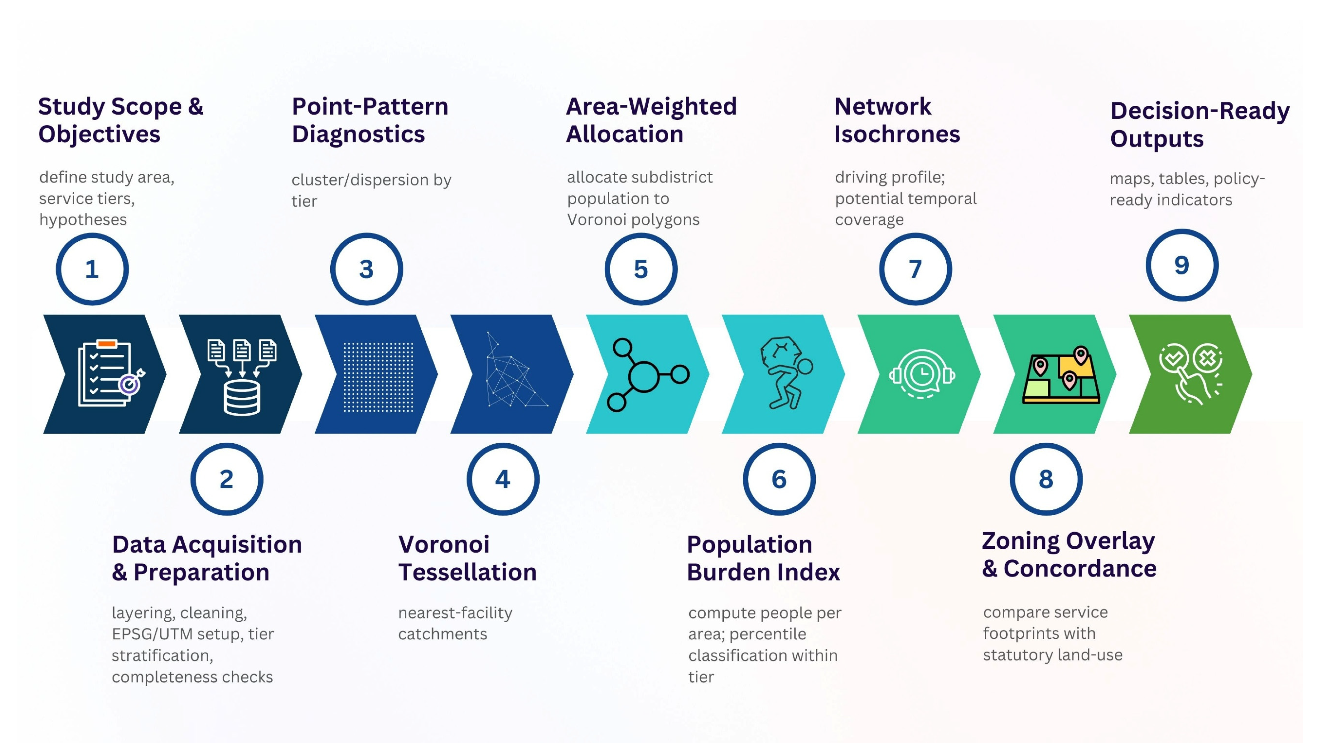
Figure 1. The research flowchart.
Sustainability 17 11241 g001
Figure 2. Locations of primary care units over subdistrict population density in Bangkok, 2024. The figure provides descriptive context for within-tier screening; no cross-tier comparison is drawn.
Sustainability 17 11241 g002
Figure 3. Locations of regular service units over subdistrict population density in Bangkok, 2024. The figure provides descriptive context for within-tier screening; no cross-tier comparison is drawn.
Sustainability 17 11241 g003
Figure 4. Locations of general referral hospitals over subdistrict population density in Bangkok, 2024. The figure provides descriptive context for within-tier screening; no cross-tier comparison is drawn.
Sustainability 17 11241 g004
Figure 5. Spatial pattern of primary care units with kernel density surface and Average Nearest Neighbor statistics.
Sustainability 17 11241 g005
Figure 6. Spatial pattern of regular service units with kernel density surface and Average Nearest Neighbor statistics.
Sustainability 17 11241 g006
Figure 7. Spatial pattern of general referral hospitals with kernel density surface and Average Nearest Neighbor statistics.
Sustainability 17 11241 g007
Figure 8. Voronoi geometric partitions for primary care units. Polygons are geometric scaffolds for within-tier screening and are not operational service boundaries.
Sustainability 17 11241 g008
Figure 9. Voronoi geometric partitions for regular service units. Polygons are geometric scaffolds for within-tier screening and are not operational service boundaries.
Sustainability 17 11241 g009
Figure 10. Voronoi geometric partitions for general referral hospitals. Polygons are geometric scaffolds for within-tier screening and are not operational service boundaries.
Sustainability 17 11241 g010
Figure 11. Allocated population per Voronoi partition for primary care units in 2024. Colors represent the classified range of total residents allocated to each partition. Interpretation is strictly within the primary tier. Because population totals are uniformly distributed within subdistricts, allocations over non-residential tracts serve as screening indicators rather than precise operational estimates.
Sustainability 17 11241 g011
Figure 12. Allocated population per Voronoi partition for regular service units in 2024. Colors represent the classified range of total residents allocated to each partition. Interpretation is strictly within the primary tier. Because population totals are uniformly distributed within subdistricts, allocations over non-residential tracts serve as screening indicators rather than precise operational estimates.
Sustainability 17 11241 g012
Figure 13. Allocated population per Voronoi partition for general referral hospitals in 2024. Colors represent the classified range of total residents allocated to each partition. Interpretation is strictly within the primary tier. Because population totals are uniformly distributed within subdistricts, allocations over non-residential tracts serve as screening indicators rather than precise operational estimates.
Sustainability 17 11241 g013
Figure 14. Network isochrone rings (5–60 min) for primary care units. Projection: EPSG:32647. Request: ORS Tools (QGIS 3.22), profile = driving-car, dimension = time, ranges = 5, 10, 15, 20, 30, 40, 50, 60 min, dissolve = off, smoothing = 80; city-wide rings constructed downstream and trimmed by 100 m. Model speeds; no temporal variation; within-tier screening only.
Sustainability 17 11241 g014
Figure 15. Network isochrone rings (5–60 min) for regular service units. Projection: EPSG:32647. ArcGIS Pro Service Area on integrated BMA/OTP network; Away From Facility; U-turns allowed; Oneway/Turn = prohibited; polygon type = generalized; overlap = rings; trim = 100 m. Model speeds; within-tier screening only.
Sustainability 17 11241 g015
Figure 16. Network isochrone rings (5–60 min) for general referral hospitals. Parameters as in Figure 15. Projection: EPSG:32647. Model speeds; within-tier screening only.
Sustainability 17 11241 g016
Figure 17. Voronoi geometric partitions of primary care units over statutory planning zones (plan year 2020).
Sustainability 17 11241 g017
Figure 18. Voronoi geometric partitions of regular service units over statutory planning zones (plan year 2020).
Sustainability 17 11241 g018
Figure 19. Voronoi geometric partitions of general referral hospitals over statutory planning zones (plan year 2020).
Sustainability 17 11241 g019
Figure 20. Burden density percentiles for primary care units based on population per Voronoi area.
Sustainability 17 11241 g020
Figure 21. Burden density percentiles for regular service units based on population per Voronoi area.
Sustainability 17 11241 g021
Figure 22. Burden density percentiles for general referral hospitals based on population per Voronoi area.
Sustainability 17 11241 g022
Table 1. Summary of selected studies applying spatial diagnostics, Voronoi partitions, and accessibility measures in urban service planning.
Author(s) Study AreaMethodologies AppliedKey Findings & Relevance to Screening
Rezende et al. (2000) [15]Rio de Janeiro, BrazilWeighted Voronoi DiagramsDemonstrated that Voronoi polygons can be weighted by hospital capacity (admissions) to define operational catchments, refining the standard geometric approach.
Spencer & Angeles (2007) [12]NicaraguaKernel Density Estimation (KDE)Established KDE as a method for converting discrete supply/demand points into continuous surfaces to visualize access ratios.
Tao & Cheng (2019) [30]Beijing, China2-Step Floating Catchment Area (2SFCA)Integrated travel time with supply-demand ratios for elderly healthcare, highlighting the importance of group-specific access screening.
Peng et al. (2020) [22]China (Mobile Data)Grid Voronoi & Dasymetric MappingUsed a grid-based Voronoi method to stabilize population distribution from mobile phone data, addressing spatial heterogeneity.
Qian et al. (2020) [13]Nanjing, ChinaKDE & Grid-based AccessibilityApplied grids to stabilize demand signals, supporting the use of reproducible geometric units for screening diagnostics.
Liu et al. (2022) [11]Chongqing, ChinaANN, KDE, Accessibility ModelsUsed Average Nearest Neighbor (ANN) and clustering diagnostics to link facility arrangements with core-periphery accessibility differences.
Alamri (2023) [17](General Framework)Voronoi & Network RoutingCombined Voronoi catchments with Dijkstra’s algorithm, validating the compatibility of Voronoi geometry with network-based travel time modeling.
Boonprong et al. (2024) [18]Bangkok, ThailandVoronoi Spatial AnalysisApplied Voronoi partitions to diagnose EV charging station distribution in Bangkok, confirming the method’s utility for local infrastructure screening.
Al-Naabi et al. (2025) [16]Muscat, OmanVoronoi & Buffer AnalysisCombined Voronoi polygons with distance thresholds to flag underserved pharmacy locations, serving as a direct template for geometric screening.
Pérez-Fernández & Michel (2025) [29]PanamaFloating Catchment & Spatial StatisticsUsed Getis-Ord Gi* and floating catchments to identify hot/cold spots of access, reinforcing the need for reproducible statistical indicators.
Disclaimer/Publisher’s Note: The statements, opinions and data contained in all publications are solely those of the individual author(s) and contributor(s) and not of MDPI and/or the editor(s). MDPI and/or the editor(s) disclaim responsibility for any injury to people or property resulting from any ideas, methods, instructions or products referred to in the content.