1. Introduction
In recent years, the concept of the 15-Minute City has gained widespread traction as a framework for sustainable urban transformation. Popularised by Moreno et al. [
1], it envisions urban environments where essential services and amenities are accessible within a 15-min walk or bike ride, thereby promoting proximity, local vibrancy, and environmental efficiency. Despite its appeal, operationalising this concept in spatial analyses and decision-support systems (DSS) remains methodologically challenging. As Pezzica et al. [
2] highlight, persistent uncertainties affect both the selection of urban functions to include and the spatial granularity of the analytical units—such as whether isochrones should be generated from grid-based centroids or user-specific origins.
An equally critical, yet comparatively underexplored, issue concerns the quality, completeness, and internal consistency of the spatial datasets on which proximity models depend. The robustness of urban accessibility assessments is directly contingent upon the reliability of these underlying datasets. Pezzica et al. [
2], for example, adopted OpenStreetMap (OSM) as their primary data source, applying both strict and broad amenity classifications, but noted persistent sensitivities to tagging inconsistencies. Similarly, Mara et al. [
3] documented the misrepresentation of commercial activities in Versilia, prompting a manual survey to validate correlations with centrality measures. While such ground-truthing offers valuable accuracy, it is impractical for multiscale planning frameworks. Complementary platform audits also indicate that online maps provide uneven and selective coverage of on-the-ground businesses. In a field-validated study of smaller US cities, Quinn and Condon [
4] show that Latino-oriented local businesses are less frequently included across popular platforms than national chains and that coverage is lower in high-Latino areas; they also note residual “defunct” venues and visibility effects linked to platform ranking. These findings suggest that platform logics and contributor ecologies can condition which amenities are even eligible to be counted—introducing distributional bias upstream of any proximity model. Taken together with tagging sensitivities in OSM [
2] and local misclassification issues [
3], this makes the integrity of digital spatial data—and, at minimum, a nuanced understanding of their structures, provenance, and limitations—a foundational concern not only for proximity-based models, but for evidence-based urban analytics more broadly. Yet, the systematic implications of dataset choice, extraction protocols, and inherent variability remain insufficiently examined.
Among the most widely used spatial data infrastructures in urban research are OpenStreetMap and Google Maps [
5]. Both provide extensive geographic coverage, frequent updates, and machine-readable formats, making them central to accessibility modelling, mobility analysis, land-use characterisation, and urban form assessment. However, few studies have directly compared these datasets [
6,
7,
8,
9], and even fewer have examined how divergences in data structure, categorisation logic, or retrieval protocols shape modelling outcomes—particularly in proximity-based frameworks such as the 15-min city. Key questions remain unresolved: Are these sources functionally interchangeable? Do their discrepancies manifest uniformly across different urban morphologies and socio-spatial contexts? Is one demonstrably more complete, reliable, or fit-for-purpose than the other?
This paper addresses these questions through a comparative evaluation of OSM and Google Maps, focusing on their capacity to represent urban amenities central to the 15-min city framework. The aim is to assess the extent to which spatial data source selection influences both the analysis and operationalisation of urban proximity in planning practice. Three analytical dimensions guide the study:
Data volume and spatial consistency across multiple geographical scales;
Semantic divergence in the categorisation and retrieval of core urban functions;
Impacts on applied urban modelling, with specific reference to 15-min accessibility potential.
The empirical analysis spans four diverse urban contexts: northern Versilia (Italy), Gothenburg (Sweden), Nice (France), and Vienna (Austria). Through buffer-based sampling, semantic harmonisation, and functional classification, the study demonstrates how alternative datasets generate systematically different representations of local accessibility—in both the volume of amenities identified and the granularity of typological detail.
The remainder of the paper is organised as follows.
Section 2 reviews the two platforms, outlining their core characteristics and comparability issues.
Section 3 introduces the case study contexts.
Section 4 presents the methodological framework.
Section 5 reports empirical results across the three analytical dimensions, while
Section 6 discusses implications for data-driven spatial modelling, evidence-based planning, and proximity-oriented urban policy.
This contribution advances research on sustainable, resilient, and equitable urban development by interrogating the data infrastructures that underpin proximity-based planning and decision-support systems. Sustainable outcomes depend not only on persuasive concepts such as the 15-min city, but on reliable, transparent, and reproducible measurements of accessibility and functional mix. By showing that the choice between OpenStreetMap and Google Maps is not a neutral technical step—but an epistemological decision that reshapes counts, spatial distributions, and amenity typologies across distinct European contexts—this study foregrounds the governance of digital data as a first-order issue for urban analytics. In particular, we demonstrate how scale sensitivity and retrieval logics (
Section 5.2), semantic misalignment (
Section 5.3), and downstream modelling effects within 15-min isochrones (
Section 5.4) can bias assessments toward dense cores and commercially salient venues, risking misallocation of resources and under-servicing of peripheral areas. Situating accessibility indicators within this critical lens strengthens their validity for SDG-oriented monitoring and for evidence-based planning that pursues both environmental benefits (e.g., reduced travel demand) and social justice (e.g., fair provision of daily services).
5. Results and Discussion
5.1. Dataset Comparison at the Urban Scale: Quantity and Spatial Distribution
The first analytical step evaluates aggregate differences between OpenStreetMap and Google Maps at the urban scale, examining the outcomes when all selected macro-categories are extracted in bulk across extended urban areas.
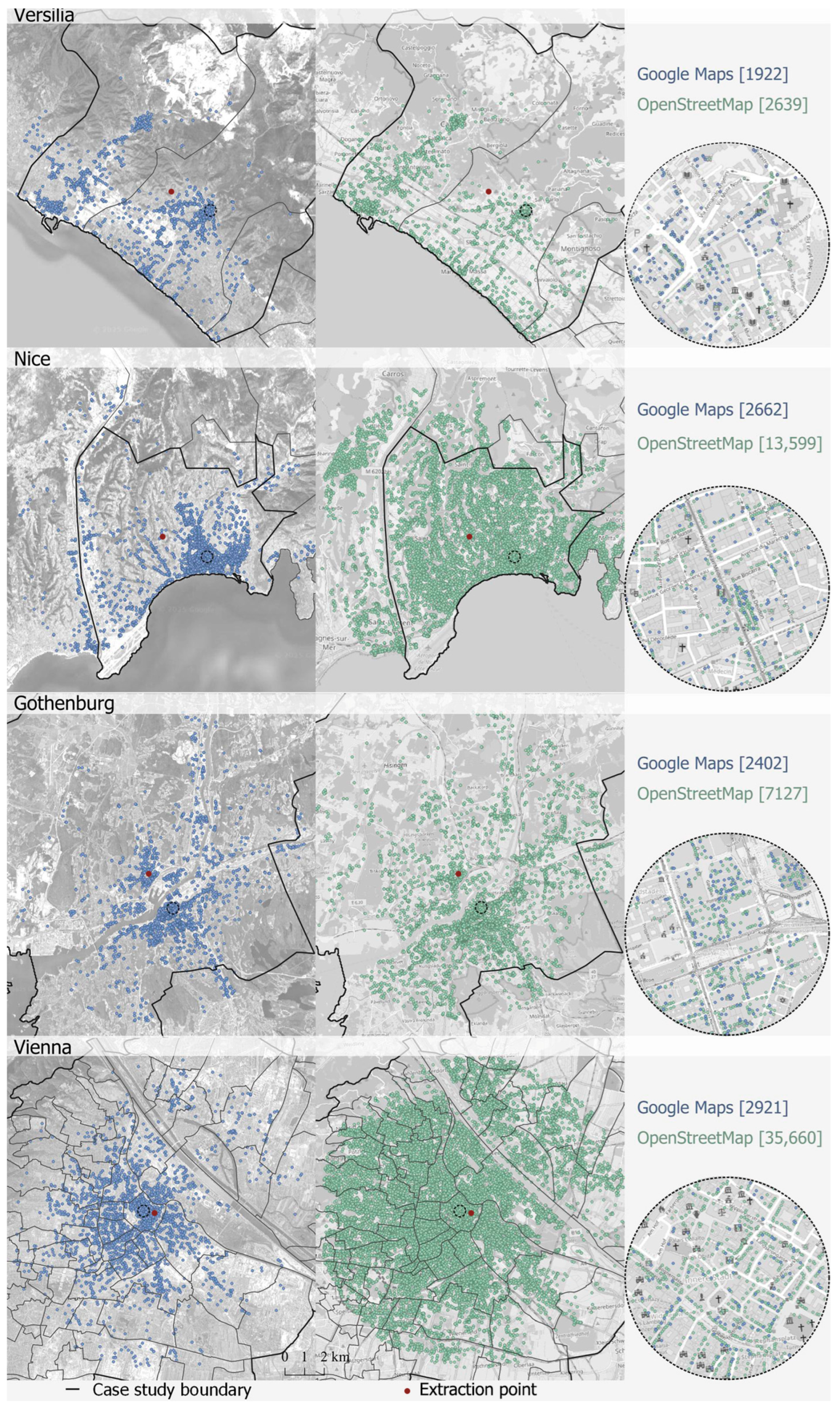
Across all four case studies, OSM systematically returns a greater number of features than GM (
Table 2,
Figure 2). The largest discrepancies occur in Nice and Vienna, where OSM produces more than twice the number of entries returned by GM. Gothenburg exhibits a smaller yet substantial gap, while in Versilia the two datasets yield comparable totals.
Importantly, differences are not confined to counts. Even in point-of-interest–dense areas, the spatial distribution of amenities differs markedly between platforms, suggesting divergent underlying logics for place inclusion, placement, and representation.
To quantify these differences, the Symmetric Mean Absolute Percentage Error (
SMAPE) was applied (Equation (1)) to the total values of the two datasets, in order to measure their relative deviation. Lower
SMAPE values indicate closer numerical agreement, while higher values signify substantial divergence in extracted quantities.
The
SMAPE values (
Table 2) confirm strong divergence in Nice (135%) and Vienna (170%), moderate differences in Gothenburg (99%), and relatively close alignment in Versilia (31%). While these patterns are not generalisable given the limited case set, some interpretative insights emerge. Both Nice and Vienna are among the most populous and densely inhabited cities in their respective countries, and both attract substantial tourist inflows [
31]. These conditions may foster more active OSM mapping communities—although the underlying drivers remain to be fully investigated—thereby increasing data richness through crowdsourced contributions.
However, closer inspection reveals that a substantial share of OSM features in these cities are private swimming pools—7075 of 13,599 in Nice and 4970 of 35,660 in Vienna—often located within residential properties. This highlights a fundamental operational difference: in such cases, the OSM dataset includes physically verifiable locations—such as swimming pools but also pitches and other facilities –, regardless of public accessibility or commercial relevance, whereas GM primarily contains recognised points of interest—places with public-facing functions or visibility within its service ecosystem.
This distinction has methodological consequences. Bulk extractions from global spatial datasets can yield substantially different results not because of geographic coverage gaps, but due to differences in inclusion criteria. In this case, swimming pools provide a striking example, though likely not an isolated one, as similar patterns may well be observed in other categories. A close and systematic examination of individual types of urban amenities, together with the associated data cleaning, lies beyond the scope of this paper, which is instead concerned with highlighting discrepancies between datasets. For this reason, we chose not to alter the original dataset. Hence, without accounting for platform-specific data logic, analyses risk misinterpretation. The next subsections explore additional factors—such as extraction radius and classification frameworks—that may further explain and amplify these discrepancies.
5.2. Dataset Comparison at the Urban Scale: Sensitivity to Spatial Extent and Distance from the Extraction Point
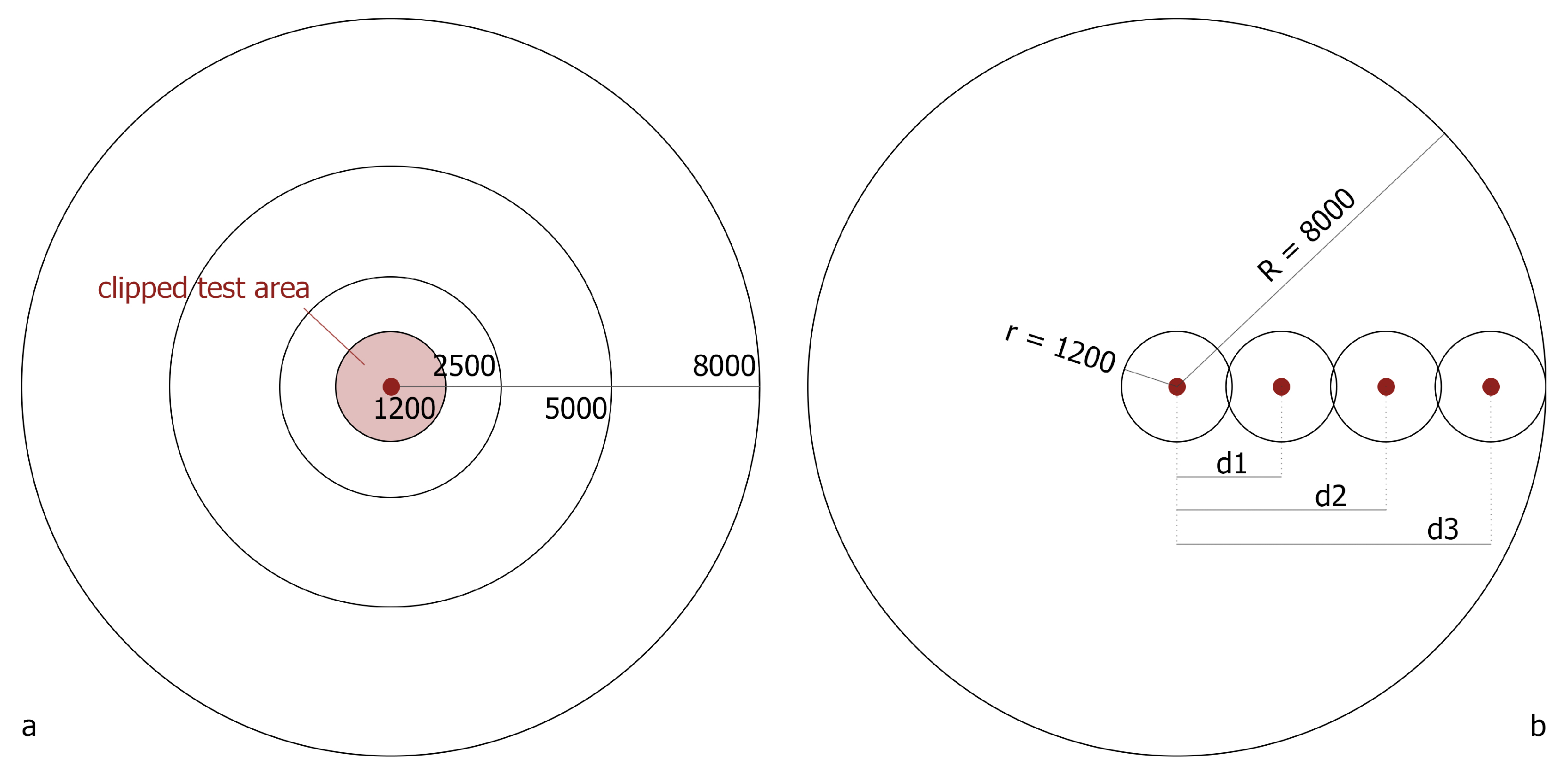
To assess how spatial extent influences dataset completeness, amenities were extracted from Google Maps and OSM across concentric buffers of 8000, 5000, 2500, and 1200 m from the original extraction points. While
SMAPE quantifies the discrepancy between the two datasets, it does not indicate which is richer. To capture the direction of the discrepancy, the non-standard
SMAPE (
nsSMAPE, Equation (2)) is introduced. It omits the absolute value in the numerator, allowing the sign of the value to indicate whether the Google dataset is richer (negative values) or poorer (positive values) than the OSM dataset.
Overall trends show
SMAPE decreasing with smaller radii (
Table 3), suggesting stronger cross-platform alignment at finer scales. This trend is most consistent in Vienna, while Nice and Gothenburg show a slight
SMAPE increase at 1200 m, though still lower than at 5000 m. Versilia diverges from this pattern: at smaller radii, GM consistently returns more amenities, yielding negative
nsSMAPE values. Similar GM dominance at small extents is also seen in Gothenburg, whereas OSM retains higher counts at all scales in Nice and Vienna. High
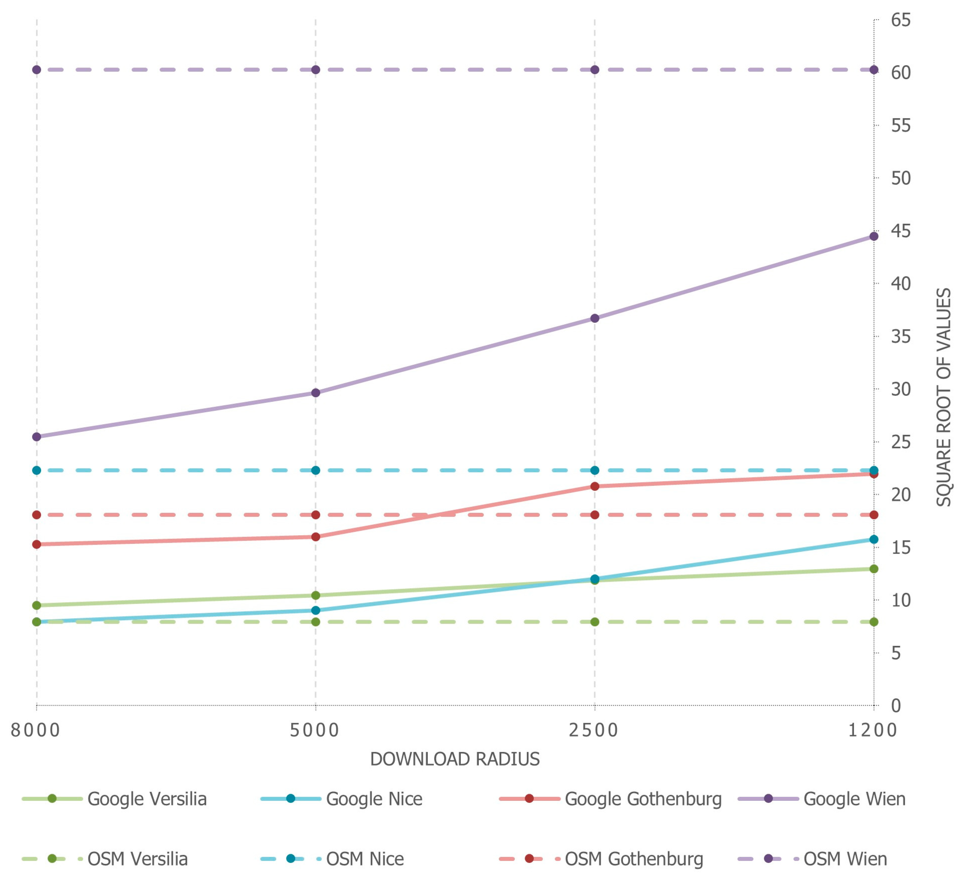
SMAPE values in Vienna and Nice reflect OSM’s dense coverage in these high-population, high-tourism contexts—again suggesting potential links between population density, civic engagement, and VGI dataset richness. Further confirmation of this trend is provided by the different location of the data extraction point across the four cases: situated in dense central areas in Gothenburg and Vienna, and in more peripheral, less dense areas in Versilia and Nice. To standardise spatial coverage across scales, each case’s datasets were clipped to the smallest (1200 m) radius. OSM counts remained stable regardless of original download radius, while GM counts increased as the radius decreased (
Figure 3). Within these clipped areas OSM consistently exceeds Google Maps in Vienna and Nice, while Google Maps exhibits greater density in Gothenburg and Versilia at smaller radii. This indicates a key architectural difference:
OSM’s data retrieval is radius-independent, whereas GM’s is scale-sensitive, likely due to internal ranking and zoom-level constraints (
Figure 4).
5.2.1. Distance from the Extraction Point
We first show that downloaded place counts vary with the size of the extraction area, reflecting Google Maps’ retrieval process and ranking mechanisms (which prioritize POIs based on user interaction) [
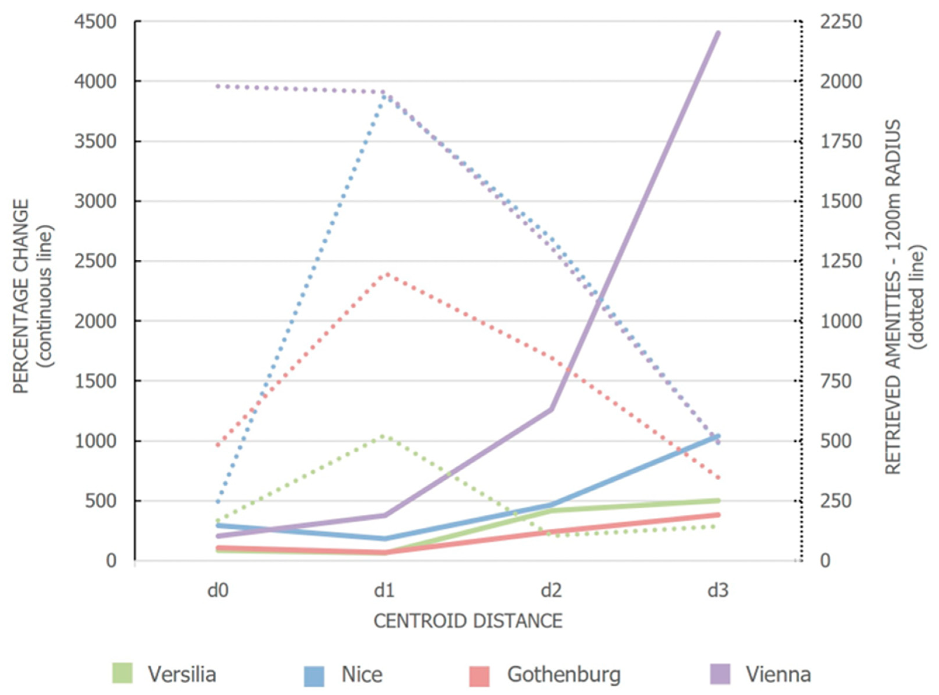
14]. We then test whether the distance between the extraction point, and POIs further affects the completeness of the Google Maps dataset (
Figure 5). The
Percentage Change metric (Equation (3)) measures deviation between these datasets for each location, by quantifying how the density of POIs retrieved at each local 1200-m buffer compares to that of the corresponding area in the 8000-mdataset. High positive values indicate that smaller-radius queries yield more amenities than the same location’s clipped section from the larger-radius download.
Results consistently show that local downloads at 1200 m—regardless of the extraction point’s specific location—produce richer datasets than the corresponding clipped sections of the 8000-m download, thereby confirming the trend identified in the previous section.
However, the Percentage Change is not strictly increasing with distance from the centre, suggesting that no monotonic relationship exists between centroid distance and data completeness. Notably, in 9 out of 12 cases, the metric increases from dn to dn+1, indicating a general trend of growing divergence with increasing distance from the barycentre. This pattern, however, is not observed in Versilia, Nice, and Gothenburg, where the Percentage Change at distance d1 exceeds that recorded at d0, deviating from the expected progression.
A closer examination reveals a possible explanation for this potential outlier. In Versilia, Nice and Gothenburg, the
d1 extraction buffers intersect areas with a higher presence of POIs compared to those at
d0, resulting in richer 1200-m downloads (
Figure 5). Conversely, in Vienna, both
d0 and
d1 fall within uniformly dense urban areas, leading to more consistent retrievals across distances.
As highlighted in Anselmi et al. [
32], a key limitation in Google’s data retrieval mechanism lies in its cap of approximately 60 POIs per
PlaceType per request. Consequently, in high-density zones where specific categories surpass this threshold, the downloaded dataset underrepresents the actual amenity landscape available within Google’s full database. This limitation likely contributes to the non-monotonic behaviour of the Percentage Change function observed in Nice, Gothenburg, and Versilia—where the number of POIs retrieved at
d1 surpass those at
d0.
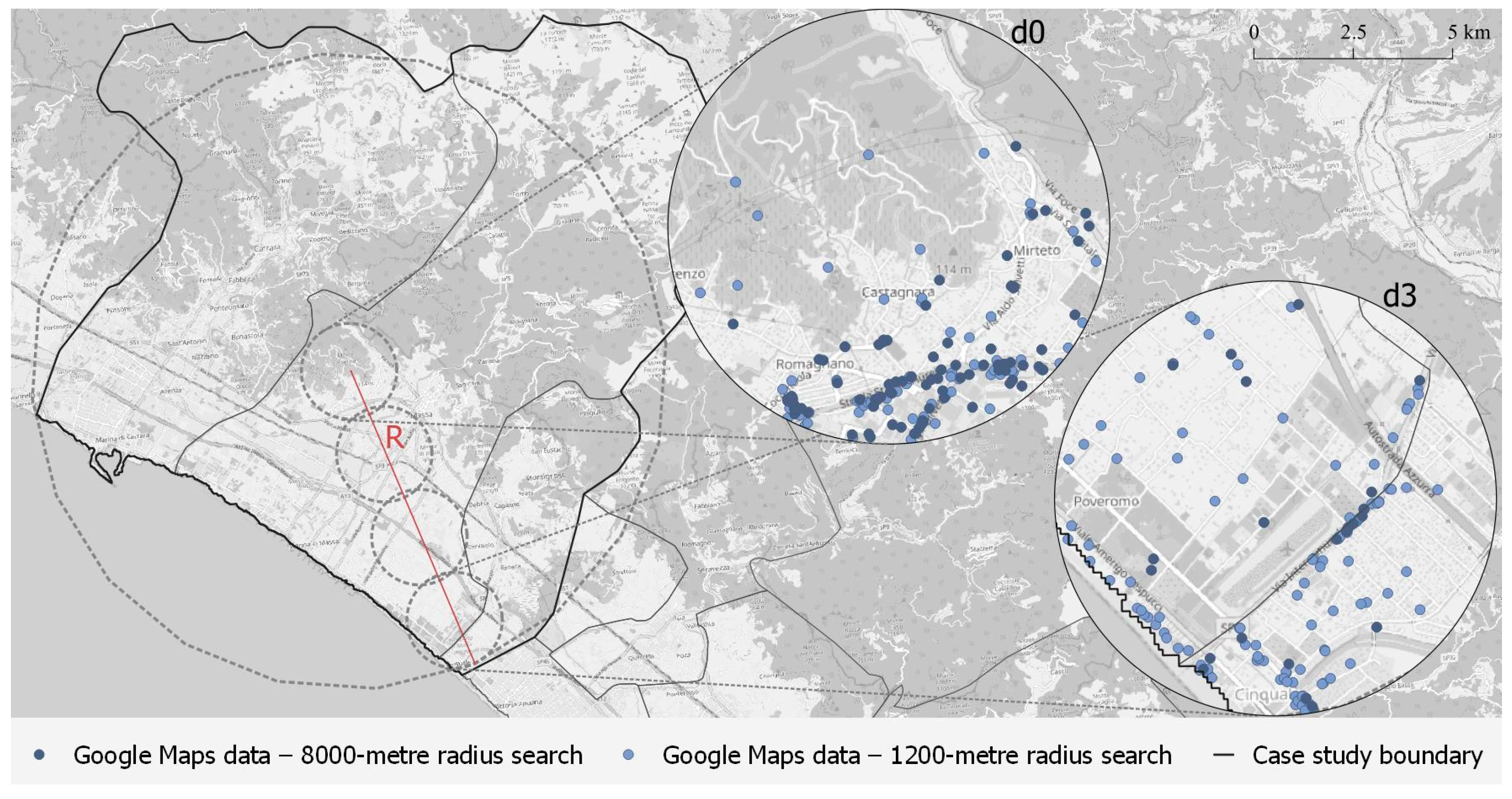
To illustrate this phenomenon,
Figure 6 presents the case of Versilia: while the
d0-centred areas show comparable POI counts among the 1200 m- and the 8000 m clipped- extraction, the peripheral
d3-centred area demonstrates a stark discrepancy, with the 8000 m clipped download capturing significantly fewer amenities than the localized 1200-m extraction. These patterns imply that Google Maps retrievals lose spatial consistency as the distance from the query centre increases, particularly when large-scale urban extents are involved. Alongside the ranking algorithm, which reflects user interaction with the platform, the spatial positioning of POIs relative to the requester—that is, the extraction point—emerges as a key element in the logic governing the retrieval of places in Google Maps.
5.2.2. Implications
Overall, these findings highlight a critical limitation in using Google Maps for urban-scale bulk downloads: broader-radius queries introduce distortions, especially at the periphery, due to algorithmic biases and ranking filters. In contrast, downloads with a smaller radius yield more accurate and spatially consistent datasets, although they may still be affected by additional category-related distortions, as highlighted by Anselmi et al. [
32]. OpenStreetMap, by comparison, shows no sensitivity to either radial extent or distance from centroid, confirming its internal consistency and suitability for uniform spatial sampling.
5.3. Semantic Divergence and the Representation of Key Urban Functions
This stage of the analysis examines how semantic categorisation influences the representation of urban amenities in OSM and Google Maps. A marker-based approach was used to assess the consistency, completeness, and spatial overlap of specific place types, focusing on how classification frameworks shape coverage and reliability. Three urban amenities—selected for their everyday relevance and relatively straightforward cross-platform mapping—were analysed: pharmacies (OSM value = pharmacy, GM place type = pharmacy), bookstores (OSM value = books, GM place type = book_store), and bars (OSM value = bar, GM place type = bar). Given the findings from
Section 5.2, the comparison was conducted within a 1200 m radius, where GM data had previously shown greater completeness.
5.3.1. Quantitative Trends
nsSMAPE values for these markers are often negative, indicating that OSM generally underrepresents these functions compared to Google Maps—contrary to aggregate patterns at larger scales. However, no consistent spatial trend emerges across the cities.
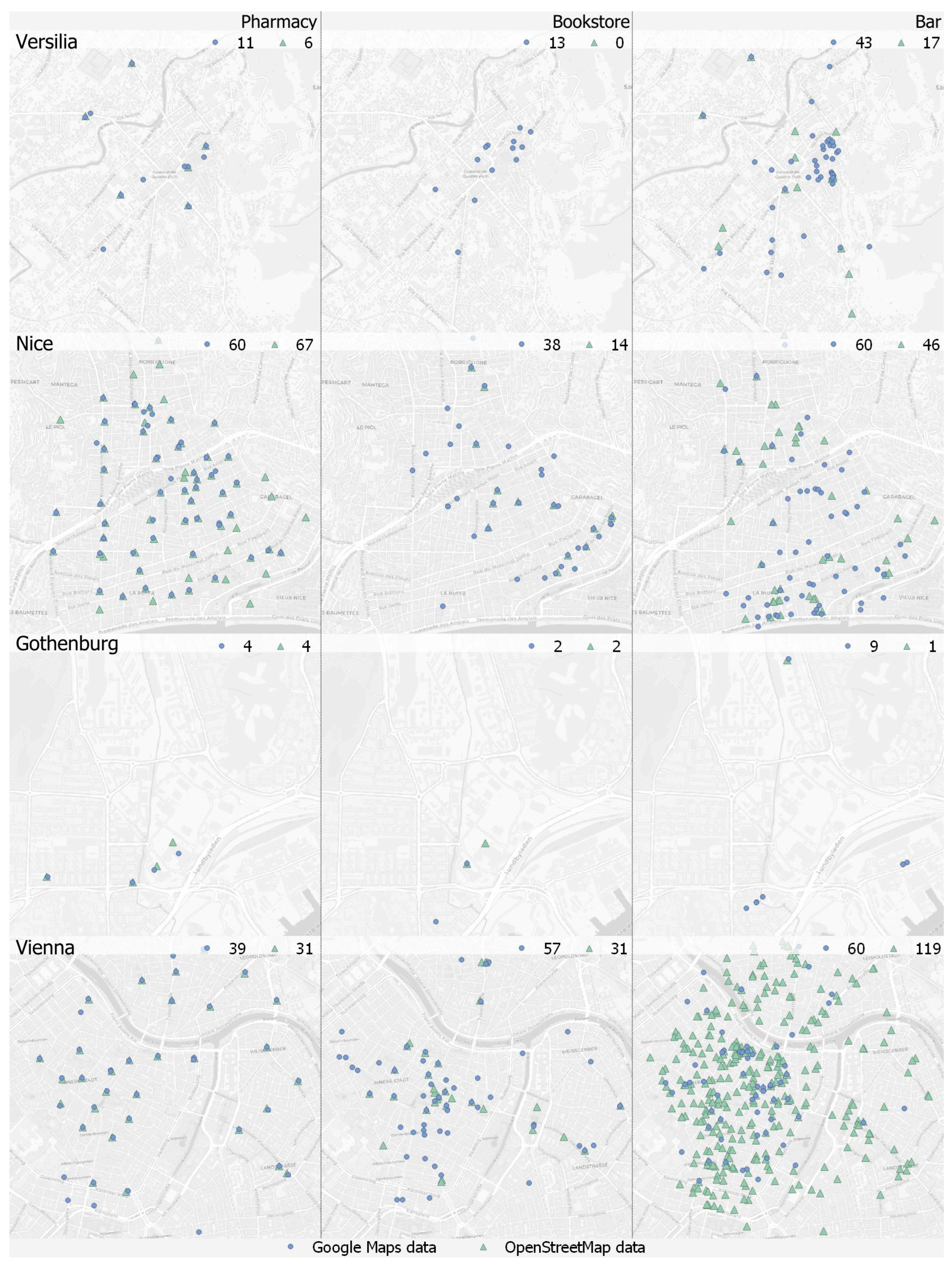
Figure 7 illustrates that the datasets are not simple subsets of each other: in most cases, there is substantial spatial divergence between the two sources, even when amenity counts are similar. Exceptions include bookstores in Nice, pharmacies in Versilia and Vienna, and bars in Gothenburg—though the latter displays notably sparse coverage. In contrast, spatial mismatch is evident in most other cases, including pharmacies and bookstores in Gothenburg, where the absolute counts are equal, but locations differ.
Among all cases, Versilia exhibits the highest average SMAPE values, driven by a significant underrepresentation in OSM across all three categories.
5.3.2. Semantic Complexity
Although the three selected markers—pharmacies, bookstores, and bars—may appear semantically unambiguous, closer inspection of the categorisation systems used by OpenStreetMap (OSM Map Features) and Google Maps (Google Maps Platform) reveals notable divergences. While both platforms provide taxonomies, these are neither mutually aligned nor internally consistent. As a result, one-to-one correspondence between categories is often unattainable in practice, despite superficial semantic similarities.
This complexity stems from several factors. As noted by Biljecki et al. [
33], variations in language, cultural context, and socio-spatial interpretations shape how amenities are perceived and tagged. For instance, the category “bar” may encompass vastly different establishments across countries and platforms—ranging from cafés to nightclubs—leading to inconsistencies in visibility, classification, and retrieval.
Table 4 details the entries associated with each selected marker across the platforms. Bookstores exhibit consistent, unique tag associations in both databases. Pharmacies show moderate variation, with some extended forms (“pharmacy+”) leading to higher counts—particularly in Vienna, where the broader interpretation results in a near doubling of retrieved data. Bars, however, reveal significant semantic divergence. Their classification encompasses a wide array of related place types, leading to inflated results: in some cities, retrieved bar data are three to four times higher when using extended tagging schemes (
Table 5). The case of Gothenburg is especially illustrative. While bookstores and pharmacies display minimal variation across platforms and classification schemes, bars exhibit high
SMAPE values and substantial numerical discrepancies. Under an extended categorisation, bar-related entries are nine times higher in Google Maps and up to seventeen times higher in OSM.
5.3.3. Internal Classification Ambiguities
From a technical standpoint, the internal classification within each downloaded entry introduces an additional layer of complexity. OSM allows at most two tags per key for a single item, but the same element can appear under multiple keys depending on the recorded attributes. Google Maps, similarly, includes multiple labels per location, derived from both PrimaryTypes and additional descriptors. While this increases retrieval flexibility, it also introduces ambiguity: a single feature may fall under several categories without a clear indication of its primary function. For applications requiring fine-grained typologies, such ambiguity complicates the consistent use of these databases in discrete functional models.
Despite this possibility, it was observed that such ambiguity is relatively limited in OSM. In contrast, for GM, the place types associated with each retrieved feature are never unique. This could arguably be seen as a strength of Google Maps, as the broader categorization may support the identification of all relevant amenities linked to a given location. However, in this study, to ensure a rigorous and non-discretionary procedure, only the first label listed in Table A from the Google Maps Platform was used to assign the corresponding macro-category.
5.3.4. Technical Constraints
A further limitation of Google Maps also emerges. Close inspection of the data revealed that in 3 out of 12 cases, the number of registered activities was exactly 60 units. This reflects the limitation discussed in
Section 5.2, and is likely to have also affected the extraction of categories in their extended forms (e.g., pharmacy+ and bar+ in Nice, and bar+ in Vienna). Without this technical constraint, one could reasonably expect—consistent with the overall trend—that the number of activities retrieved from Google would exceed those retrieved from OSM.
5.3.5. Implications
These findings underscore the importance of understanding data semantics and classification granularity when selecting datasets for urban modelling purposes. Seemingly comparable categories may yield non-overlapping spatial realities, which could lead to misleading conclusions if not critically assessed in advance. Moreover, semantic alignment between platforms does not guarantee spatial consistency or completeness. Therefore, for fine-grained urban modelling dataset selection must consider not only coverage and density, but also the semantic architecture of the source.
5.4. The Impact of Data on Urban Modelling: The 15-Minute City
The preceding analyses reveal substantial divergences between GM and OSM across multiple dimensions: data volume, spatial distribution, semantic categorisation, and sensitivity to scale and proximity. While both platforms are widely used in urban research due to their coverage, regular updates, and relative accessibility, the differences observed are methodologically significant. As shown, the choice of dataset can materially influence modelling outputs, particularly in frameworks that rely on precise locational accuracy and comprehensive coverage.
The 15-min city model—taken here as an applied test case for proximity-based planning—offers a clear illustration of this effect. In accessibility assessments, the spatial distribution and typological classification of amenities directly shape perceptions of urban vibrancy and liveability [
34]. Divergences in service representation between platforms can therefore produce markedly different readings of suburban accessibility and functional diversity.
5.4.1. Analytical Approach
A supply-based approach was adopted to discuss the impact of databases on proximity-based assessment in selected suburban areas in four case studies—Versilia, Nice, Gothenburg, and Vienna—by evaluating the presence of amenities (listed in
Table 1) within 15-min walking catchments. Rather than relying on a user-based or grid-centroid method—whose arbitrariness has been shown to influence results [
2]—this study examines a predefined suburban area in each city independently of base grid or origin assumptions. The areas have been chosen in the first peri-central rings contiguous to the historic cores, characterized by lower residential density and building coverage than the core areas while still exhibiting a functional mix and good accessibility, according to the guidelines of the DUT Emc2 project. Amenities were extracted using a 1200 m buffer—the standard walking distance approximation for a 15-min city [
30] and, as established in
Section 5.2, the most reliable radius for balanced dataset retrieval.
Table 6 summarises the number of amenities (as defined in
Table 1) retrieved within each isochrone. In Versilia and Nice, Google Maps consistently reports a higher number of amenities. Gothenburg shows comparable values across platforms, with a low
SMAPE score. Vienna, conversely, displays a predominance of OSM data. These contrasting patterns are visualised in
Figure 8, which highlights the particularly divergent cases of Versilia and Vienna: the former showing OSM underrepresentation, the latter revealing an exceptionally high level of OSM data density.
5.4.2. Interpretation and Limitations
These results do not imply that one platform offers a more accurate reflection of on-the-ground reality. The observed discrepancies underscore the need for caution when interpreting accessibility scores derived from open data sources. Despite the effort required and the subjective variables it entails, without field validation it remains impossible to determine the reliability of either dataset [
35]. Future work should incorporate empirical ground-truthing—or alternative validation strategies—to calibrate digital datasets for proximity-based modelling. Without this step, outputs risk overestimating or underestimating accessibility, depending on platform biases.
5.4.3. Typological Composition
Using the Papadopoulos et al. [
16] classification framework (
Section 2), the analysis also compared the functional mix of amenities in each isochrone. The contrast between Versilia and Vienna is instructive. In Versilia, OSM returns a sparse dataset, limiting the capacity to detect a diverse mix of urban functions. In Vienna, by contrast, OSM presents a rich dataset, yet this abundance introduces its own challenge: several retrieved amenities—such as recreational facilities (e.g., private swimming pools)—fall outside the intended scope of analysis. While these features reflect real and functionally relevant spaces, their inclusion highlights the need for careful control over category filtering when assessing accessibility or functional diversity.
These variations substantially influence the interpretation of an area’s functional character. As shown in
Table 7, in Versilia all considered categories are well represented in Google Maps, with a marked prevalence of retail and trade activities—an aspect that does not emerge from OpenStreetMap. In Vienna, the strong presence of sport facilities—driven primarily by the inclusion of private swimming pools (specifically, 485 out of 518 sport-related entries)—suggests a distinct sporting vocation for the area. In contrast, Google Maps indicates a predominance of commercial activities and health services. A further layer of complexity arises from entries assigned to ambiguous or residual categories such as “other” or “generic”. These encompass activities either not explicitly requested or lacking precise semantic attribution, rendering them unclassifiable within the adopted framework. Their presence not only complicates comparison between datasets but also underscores the risk of overestimating functional richness due to poorly defined or inconsistently applied tags.s5.4.4. Implications for ModellingsUltimately, the reliability of proximity-based urban models—whether for the 15-min city or similar frameworks—depends on three intertwined conditions:
Data completeness—ensuring full coverage of relevant amenities;
Semantic clarity—avoiding misclassification or over-generalisation;
Functional relevance—excluding features outside the intended analytical scope.
As this analysis shows, data quality issues can manifest as absence (underrepresentation), excess (overrepresentation of marginal features), or ambiguity (poorly defined categories). Each can distort modelling outputs if left unchecked. Automated top-down extractions must therefore be complemented by critical pre-processing—including tag review, category filtering, and validation against independent sources—before integration into decision-support systems.
5.5. Data Gaps and Biases in Digital Mapping
The analyses and the results developed within this research—an initial step toward assessing the practical reliability of big data for urban-planning applications—quantitatively corroborate patterns reported in prior work: digital mapping datasets embed systematic gaps and biases driven by mapping procedures, internal visibility mechanisms and by the economic–social salience of mapped places [
36].
OpenStreetMap and Google Maps represent two structurally distinct models of geographic data production, each characterised by specific omissions and biases. OSM, sustained by volunteer contributions and an anti-commercial ethos, provides free and openly accessible data, but its soundness is questionable, and its completeness is highly uneven, with coverage being potentially underrepresented in peripheral and disadvantaged zones [
37]. Participation is markedly skewed—the familiar 90–9–1 pattern [
38], and contributors tend to maintain a consistent geographic focus over time, reinforcing existing inequalities [
37,
39,
40,
41].
By contrast, Google Maps is a proprietary platform built on closed datasets, third-party sources, and machine-learning models. It provides extensive consumer-facing services but operates under commercial constraints. Platform governance strongly shapes data visibility and the mechanisms for access and download: ranking algorithms, Business Profile verification, user reviews, and API result caps privilege prominent or commercially active venues, while community spaces, low-visibility facilities, recently opened activities or specific types of amenities are harder to retrieve, especially in competitive urban contexts [
4,
14,
41].
Beyond these intrinsic limitations, competitive dynamics between the two platforms further accentuate asymmetries: the expansion of Google Maps has been linked to a reduction in overall OSM contributions, as many potential new users turn to Google Maps instead [
42]. At the same time, a smaller group of established contributors intensifies their efforts, motivated by ideological commitment to the open-source ethos and, to some extent, by community interaction [
43]. These social, spatial, and temporal filters determine which amenities become analytically visible and, in turn, cascade into 15-min accessibility outcomes.
6. Conclusions and Further Developments
This study critically examined how differences between two of the most widely used spatial datasets—OpenStreetMap (OSM) and Google Maps (GM)—shape the modelling of urban phenomena, with a specific focus on accessibility analyses within the 15-min city framework. By systematically comparing the two platforms across four European cities—Versilia, Gothenburg, Nice, and Vienna—this research demonstrates that dataset choice is far from a neutral technical step. Instead, it has a measurable and often substantial influence on both the quantitative assessment of service proximity and the qualitative interpretation of functional urban identity.
The findings point to three major areas of divergence between the datasets. First, data volume and spatial consistency vary substantially by platform and location. Google Maps tends to yield higher place counts exclusively at finer spatial scales, reflecting its sensitivity to the representation level. OSM, while more consistent in its tagging structure, tends to underrepresent certain functions—especially in peripheral or less densely mapped areas—and includes elements that may have low relevance for urban planning purposes, highlighting the need for careful evaluation of data characteristics and contextual significance.
Second, semantic categorisation plays a critical role. Even for apparently straightforward amenities such as pharmacies, bookstores, and bars, substantial inconsistencies were observed in how categories are defined, structured, and retrieved across the two platforms. These semantic mismatches complicate both data integration and model comparability, especially in contexts requiring fine-grained functional distinctions.
Third, and most crucially, these differences cascade into the modelling process itself. Using the 15-min isochrone as a lens, the study revealed that accessibility scores and spatial interpretations of urban vibrancy vary not only in magnitude but also in meaning depending on the data source used. This is particularly relevant in decision-support systems and planning workflows, where data-driven insights are translated into spatial strategies.
In practice, much applied work relies on a single platform—typically OSM or Google Places—often with minimal justification and without cross-source sensitivity checks. Taken together, these findings show why that choice is not neutral. On the contrary, they reflect distinct epistemological models of the urban: one rooted in participatory, volunteer-based mapping; the other governed by commercial logic and algorithmic visibility. Each has its own strengths and limitations. While it remains unclear which of the two more accurately reflects real-world conditions, it is likely that both diverge, in different ways, from the urban reality they aim to represent—a question that is currently being explored in ongoing research.
Specific findings that could drive the use of these datasets or stimulate further research are
Functional non-equivalence. OSM and GM differ fundamentally in structure, category logic, and extraction protocols, with direct consequences for modelling outputs;
Scale sensitivity. OSM retrievals are insensitive to search radius or centroid distance; GM retrievals vary with spatial extent, losing consistency over larger urban areas;
Semantic misalignment. No one-to-one category correspondence exists; even overlapping primary tags rarely match spatially or quantitatively, complicating DSS integration.
For planners, spatial analysts, and policymakers, the implications are clear: data selection must be treated as an explicit modelling decision, not a neutral technical step. Proximity-based frameworks like the 15-min city depend on more than conceptual clarity—they rely on data infrastructures that are themselves uneven, contingent, and often opaque. A thorough analysis of the operating mechanisms of the selected database, the pre-filtering of features according to research objectives, and the adoption of smaller search radius are strongly recommended.
Situated within the broader agenda of sustainable urban transitions and evidence-based planning, our findings have three implications. First, environmental efficacy: credible proximity metrics are prerequisites for demand-side measures that reduce car dependence and emissions; our cross-platform tests identify when and why such metrics may over- or under-estimate reachable amenities (
Section 5.1 and
Section 5.2). Second, social equity: platform biases—underrepresentation of peripheral amenities in OSM and ranking/visibility filters in Google Maps—translate into unequal analytical visibility of everyday services, with consequences for spatial justice and targeted investment (
Section 5.3 and
Section 5.4). Third, governance and reproducibility: transparent protocols, hybrid sourcing, and cross-platform semantic harmonisation operationalise open, auditable evidence for planning, aligning with the journal’s emphasis on robust methods for policy-relevant sustainability research. By treating spatial data selection as an explicitly theory-laden modelling choice, the study provides practitioners with concrete levers—radius design, semantic controls, and validation checkpoints—to improve DSS reliability and, ultimately, the robustness and fairness of proximity-based interventions.
Future research should pursue several key directions. First, the integration of ground-truth datasets is needed to benchmark the representational accuracy of both platforms and to assess how data quality correlates with urban form, city function, or specific amenity types. Second, there is a pressing need to develop a harmonised and extensible categorisation schema capable of bridging semantic mismatches and enabling robust cross-platform comparisons. Third, hybrid approaches that leverage the complementary strengths of both OSM and Google Maps should be explored, alongside the development of validation protocols tailored to distinct urban contexts. Lastly, more fine-grained, intra-urban analyses should be prioritised, moving beyond citywide generalisations to account for the heterogeneity of urban space and to support more context-sensitive modelling of accessibility and proximity. By foregrounding the epistemic and technical implications of data choice, this study positions spatial data selection as a critical, theory-laden decision in urban analytics—one that directly shapes the narratives, priorities, and policy interventions derived from data-driven models.
