Article

Sustainable Color Development Strategies for Ancient Chinese Historical Commercial Areas: A Case Study of Suzhou’s Xueshi Street–Wuzounfang Street

1
School of Art, Heilongjiang University, Harbin 150080, China
2
Social Science Division, Heilongjiang University, Harbin 150080, China
3
Fine Art College, Harbin Normal University, Harbin 150025, China
4
Gold Mantis School of Architecture, SooChow University, Suzhou 215006, China
*
Authors to whom correspondence should be addressed.
Sustainability 2025, 17(11), 4756; https://doi.org/10.3390/su17114756
Submission received: 5 February 2025 / Revised: 13 May 2025 / Accepted: 19 May 2025 / Published: 22 May 2025
(This article belongs to the Special Issue Sustainable Conservation of Urban and Cultural Heritage)

Abstract

:
This study focuses on the issue of visual sustainability of colors in commercial historical districts, taking the historical area of Xueshi Street–Wuzoufang Street in Suzhou, China as a case study. It explores how to balance modern commercial development with the protection of historical culture. Due to the impact of commercialization and the introduction of various immature protection policies, historical districts often face the dilemma of coexisting “color conflict” and “color poverty”. Traditional color protection methods are either overly subjective or excessively quantitative, making it difficult to balance scientific rigor and adaptability. Therefore, this study provides a detailed literature review, compares and selects current quantitative color research methods, and proposes a comprehensive color analysis framework based on ViT (Vision Transformer), the CIEDE2000 color difference model, and K-means clustering (V-C-K framework). Using this framework, we conducted an in-depth analysis of the color-harmony situation in the studied area, aiming to accurately identify color issues in the district and provide optimization strategies. The experimental results show that the commercial colors of the Xueshi Street–Wuzoufang Street historical district exhibit a clear phenomenon of polarization: some areas have colors that are overly bright, leading to visual conflict, while others have colors that are too dull, lacking vitality and energy; furthermore, some areas display a mix of both conditions. Based on this situation, we then compared the extracted negative colors to the prohibited colors in the mainstream Munsell color system’s urban-color management guidelines. We found that colors with “high lightness and high saturation”, which are strictly limited by traditional color criteria, are not necessarily disharmonious, while “low lightness and low saturation” colors that are not restricted may not guarantee harmony either and could exacerbate the area’s “dilapidated feeling”. In other words, traditional color-protection standards often emphasize the safety of “low saturation and low lightness” colors unilaterally, ignoring that they can also cause dullness and discordance in certain environments. Under the Δ E (color difference value) threshold framework, color recognition is relatively more sensitive, balancing the inclusivity of “vibrant” colors and the caution against “dull” colors. Based on the above experimental results, this study proposes the following recommendations: (1) use the Δ E 00 threshold to control the commercial colors in the district, ensuring that the colors align with the historical atmosphere while possessing commercial vitality; (2) in protection practices, comprehensively utilize the ViT, CIEDE2000, and K-means quantitative methods (i.e., the V-C-K framework) to reduce subjective errors; (3) based on the above quantitative framework, while referencing the reasonable parts of existing protection guidelines, combine cooperative collaboration, cultural group color preference surveys, policy incentives, and continuous monitoring and feedback to construct an operable plan for the entire “recognition–analysis–control” process.

1. Introduction

As the core carrier of urban cultural context, the protection and renewal of historical districts pose significant challenges in the process of modernization. Particularly under the impact of commercialization, the authenticity and visual harmony of historical districts are often compromised by the intrusion of disordered commercial elements. Achieving the sustainable development of cultural heritage amid modernization has become a critical issue in the global field of historical district protection [1]. On the one hand, overly flamboyant commercial colors may erode the historical atmosphere of the district, causing visual fragmentation and cultural memory loss; on the other hand, rigid protection strategies can lead to a decline in the vibrancy of the district, resulting in a “protective decline”. This contradiction is especially prominent in China, where the commercialization of traditional districts often lacks systematic control, leading to a dual trap of “color conflict” and “color poverty”. Therefore, there is an urgent need to explore scientific paths that consider both the continuation of historical values and the activation of commercial functions.
At present, international academic research on the colors of historical districts has shifted from early, experience-driven qualitative descriptions to computer-assisted quantitative analyses, gradually enhancing accuracy and practicality through the integration of intelligent technologies [2]. However, existing research and practices still have significant limitations. First, traditional color card comparisons and visual assessment methods are constrained by subjective errors and inefficiency, making it difficult to respond to the dynamic changes of complex streetscapes. Second, current quantitative technologies often focus on single aspects, such as color extraction or color difference calculation, and have yet to establish a comprehensive technical framework covering “recognition–analysis–control”. In other words, cutting-edge computer-aided quantitative analysis methods remain in the research stage, and a scientific framework has yet to be established to apply these quantitative research outcomes to subsequent color-management practices, thereby achieving systematic and sustainable development of colors in historic districts [3]. Third, the polarization phenomenon of “over-subjectivity” and “over-quantification” is prevalent in protection practices, where the former leads to execution disputes due to vague descriptions, while the latter suppresses commercial diversity due to mechanical management, reflecting a disconnection between technical logic and cultural adaptability [4]. These issues point to a core contradiction: the color sustainability of historical districts needs to simultaneously meet the demands for scientifically precise quantitative support and flexible dynamic governance, while existing theories and methods have not effectively bridged this gap.
The ancient city of Suzhou, China is representative of Jiangnan water town culture. It features distinctive Hui-style aesthetics with its small bridges and flowing water, white walls, and black tiles. Jiangnan water town culture refers to the traditional lifestyle, spatial pattern, and aesthetic values formed in the river-laced southern regions of the Yangtze River Delta, characterized by the harmonious integration of waterways, architecture, and daily life. In terms of visual expression, this culture often presents a restrained and elegant color palette dominated by neutral tones—such as whitewashed walls, dark gray roof tiles, and natural wood finishes—that emphasize simplicity, harmony, and subtle contrast with the surrounding environment. The texture of its alleys and the colors of its architecture embody profound regional genes. As one of the first cities listed as a “National Historical and Cultural City”, Suzhou has long been at the forefront of historical district protection. However, at present, there are no specific color management norms in place, leading to considerable uncertainty in protection and commercial development practices. Initially, Suzhou implemented relatively strict “one-size-fits-all” controls on commercial elements, using standardized designs to limit commercial features (e.g., uniform shop signs) to maintain the overall integrity of the traditional appearance. However, with the rapid development of the urban economy and the gradual relaxation of relevant policies, a wide variety of commercial elements has begun to flood the district, resulting in a visually diverse, yet relatively chaotic, landscape. This binary-opposition phenomenon reflects the real dilemmas caused by a lack of color norms and fluctuating controls, exposing the systemic insufficiency of color planning and the inadequacy of technical tools in current district updates [5].
Despite the growing attention paid to color harmony in historical districts, few studies have explicitly addressed the conflict between aesthetic sustainability and commercial modernization within the same analytical framework. Most previous research has either emphasized qualitative cultural interpretation or has focused on fragmented quantitative modeling. However, as commercial revitalization increasingly intersects with heritage preservation, especially in rapidly evolving urban contexts like China, a more integrated and adaptive approach is urgently needed. This study addresses this gap by offering a multi-level, cross-disciplinary framework combining intelligent algorithms, perceptual color models, and spatial clustering methods.
In response to the above challenges, this study took Xueshi Street–Wuzoufang Street in Suzhou as the empirical object, attempting to break through the discreteness and partiality of traditional color-analysis methods. It constructed a comprehensive color-quantification system based on Vision Transformer (ViT), the CIEDE2000 color-difference model, and K-Means dynamic clustering (V-C-K). Through deep learning, this study achieves high-precision semantic segmentation of commercial elements and historical buildings, quantifying the visual conflict between old and new colors using color difference formulas and utilizing optimized clustering algorithms to reveal the current state of the district’s colors. Based on this, this study sought to address the following questions:
  • What is the current state of color disharmony in the commercial colors of the Xueshi Street–Wuzoufang Street historical district?;
  • What issues are reflected in the existing color disharmony? Is there a difference between this situation and mainstream protection methods?;
  • What implications do the research results have for future policy formulation and historical district protection practices in Suzhou?
Ultimately, this study aimed to provide rational suggestions and paradigm references for the sustainable development of colors in China’s historical districts.

2. Research Overview

The sustainable color governance of historical districts involves both methodological innovation and context-sensitive strategy formulation. Accordingly, the literature review in this study is structured around two complementary dimensions: the quantitative methods for color analysis and the empirical studies on color-protection practices in historical environments. This dual focus reflects the interdisciplinary nature of the research, which integrates computational design tools with urban-heritage planning.
On the one hand, the review of quantitative methods provides a technical foundation for the methodology adopted in this study, tracing the evolution from manual color-evaluation systems to intelligent segmentation and clustering algorithms. On the other hand, the case study literature offers insights into how different cities have addressed visual sustainability challenges, revealing both practical innovations and governance dilemmas.
Combining these two bodies of research, this study aims to bridge the gap between algorithmic precision and urban-planning relevance, thus contributing to the theoretical advancement and practical applicability of color-based heritage renewal strategies.

2.1. Color Quantification Research in Historical Districts

At present, research on color quantification in historical districts can be primarily divided into three categories: experience-driven methods, computer-aided methods, and intelligent integration methods. Experience-driven methods mainly include manual color-card comparison and visual color annotation, which were more common in early studies. Manual color-card comparison typically relies on standard color cards, such as Munsell and GB/T15608, for manual matching; however, this method tends to have significant errors, high subjectivity, and is difficult to control [6]. Visual color annotation methods depend on cultural experiences to describe colors, using terms like “off-white” and “grayish-blue”, but these terms have a high rate of controversy [7]. Computer-aided methods generally include HSV + K-means clustering and CIELAB color-difference calculations. Compared to RGB, HSV aligns better with human visual perception, reducing the influence of brightness on color recognition. However, when combined with clustering algorithms, the main color identification error remains high (approximately Δ E 5.2 ), with misclassification rates exceeding 30% in areas of high saturation [8]. CIELAB color-difference calculations employ linear evaluation methods, but relative errors in the blue region remain substantial (approximately Δ E 3.6 ) [9]. Intelligent integration methods have made significant advancements in recent years, mainly including SegNet semantic segmentation, CIEDE2000 + dynamic clustering, and multi-level fusion analysis. SegNet semantic segmentation is designed to be lightweight, suitable for mobile and real-time processing, and supports multi-level feature extraction to meet the complex segmentation needs of street scenes. However, its segmentation accuracy for small-scale targets (e.g., signage) is insufficient ( I o U < 50 % ), whereas ViT (Vision Transformer) semantic segmentation shows a clear advantage in accuracy under the same conditions ( I o U > 89 % ) [10]. The CIEDE2000 color-difference formula, combined with perceptual optimization ( Δ E 00 e r r o r 1.5 ) and K-means clustering, achieved a recognition rate of 93% in conflict areas, enhancing the harmony of post-regulation colors by 41% [11]. Multi-level fusion analysis integrates HSV, CIELAB, and POI data to construct spatial models, enabling relatively precise predictions of harmony ( R M S E 0.83 ) [12] and significantly enhancing commercial diversity (+29%) [13].
Overall, color-quantification research is transitioning from traditional experience-based methods to intelligent integration technologies, gradually achieving automation, precision, and multi-dimensional optimization. Nevertheless, the vast majority of researchers still utilize the Munsell color system and manual color-card comparison in conjunction with preference studies (traditional statistical methods). Some researchers have begun employing HSV or CIELAB color space combined with K-means clustering for more accurate quantification studies. However, only a few researchers have started to integrate CIEDE2000 and K-means clustering for color studies of historical buildings, achieving some research progress. To date, there are no known precedents for applying ViT technology to color studies in historical districts (Table 1).

2.2. Research on Color-Protection Practices in Historical Districts

The practice of heritage conservation has also undergone an iteration from “experience-driven” management to “scientific control”. In the early stages, the management of traditional hues and material authenticity relied heavily on expert experience and manual restoration. For instance, Bermuda has prohibited the use of modern paints (such as latex paint), while Venice implements regulations for natural tones and the original colors of stones [25,26].
As technology became more involved, the Munsell color system emerged as a mainstream tool. Cities such as Kyoto, Tokyo, and Osaka rely on the Munsell color system in conjunction with Japan’s JIS color standards to control color through indicators such as hue zoning, color area ratios, and material reflectance [27,28,29]. In recent years, intelligent technologies have further propelled dynamic closed-loop management. For example, Nanjing has employed digital twin technology (CityColor3D) to simulate long-term color evolution, integrating a model to compensate for humid and hot environments [30]. Busan optimizes regional color schemes using a “main color–auxiliary color–emphasis color” proportion control and HSV encoding analysis [31]. These practices indicate that color management is shifting from “static restoration” to a smart system encompassing “data collection–dynamic adjustment–continuous monitoring”.
Regarding quantification techniques for color standards, global heritage color management commonly relies on chromatic models and environmental adaptation technologies. The Munsell color system serves as a core tool in Eastern cities; for example, Kyoto implements graded controls for advertising materials based on “R/YR/Y color system chroma thresholds” [27], while Tokyo uses the Munsell hue wheel to delineate the dominant hues in historical districts [28]. In contrast, European cities tend to focus more on CIELAB and NCS (Natural Color System). For instance, Florence uses a spectrophotometer (X-Rite SP64) to measure historical cross-section color spectra, adhering to a restoration standard of Δ E 2.0 [32]. Barcelona converts traditional colors into industrial standard color cards using ACC coding.
Regarding dynamic management mechanisms for color, current practices emphasize multi-entity collaboration and data-driven decision-making. For instance, Kyoto has established a tri-party collaboration chain among government, experts, and merchants, implementing measures such as “traditional-friendly certification”, subsidies for historical building restoration, and daily fines for violations of advertising regulations to achieve a “planning–incentive–supervision” closed loop [27]. Osaka’s JIS-certified laboratories and Charleston’s community hearing system [29,33] provide models for balancing conservation and development (Table 2).

2.3. Synthesis Conclusion and Research Hypothesis

2.3.1. Synthesis Conclusion

Based on the quantitative technology research detailed in Section 2.1, accurate quantitative research on the colors of historical districts involves multiple steps, among which the three most important steps are semantic segmentation, color difference calculation, and dominant color extraction. ViT semantic segmentation, the CIEDE2000 ( Δ E 00 ) color difference model based on the CIELAB color space, and K-means clustering have been proven to be quantitative techniques with relatively high accuracy in their respective fields.
Among them, ViT (Vision Transformer) was initially used for image classification tasks, but its powerful global modeling ability allows it to perform well in semantic segmentation tasks as well. Moreover, its application in color research of historical districts has significant advantages compared to traditional semantic segmentation technologies. Traditional methods, such as DeepLab V3+ and SegNet, are based on convolutional neural networks (CNNs), relying on local receptive fields, making it difficult to capture the complex global color relationships of historical districts. ViT, through its self-attention mechanism, models long-distance dependencies and can accurately extract the color features of building groups. At the same time, ViT has more advantages in cross-scale feature fusion compared to CNN semantic segmentation, enabling it to maintain high-precision color analysis under factors such as color gradients, lighting effects, and weathering marks. In addition, ViT, combined with large-scale pre-trained models, can more stably adapt to the color characteristics of buildings from different historical periods and styles, providing a more accurate scientific basis for the color restoration, protection, and planning of historical districts [10,11,34]. The CIEDE2000 ( Δ E 00 ) color difference formula, based on the CIELAB color space, was designed based on visual uniformity compared to HSV; it can more accurately reflect the human eye’s perception of color and precisely measure the color changes on different building surfaces. Compared to the previous Δ E a b and Δ E 94 color-difference formulas of CIELAB, Δ E 00 improves the measurement accuracy in non-uniform color spaces through additional corrections to lightness, chroma, and hue, making the color-difference calculation more consistent with actual visual perception. In addition, the adaptability of this formula in special color areas allows it to accurately assess subtle color differences, reduce restoration errors, and enhance visual coordination [9,35]. K-means clustering technology has obvious advantages in dominant color extraction compared to traditional techniques, as it can automatically identify the main colors in an image and remove subtle color interference. Compared to using HSV, the clustering results of K-means with the LAB color space are more accurate and stable [36].
Based on the case studies presented in Section 2.2, in current color protection practices for historical heritage, most cities rely on visual assessment [25,33] or Munsell-color-chart comparison [27,28,29,30]. Although deep-learning semantic segmentation and the CIEDE2000 color difference model have proven efficient in complex street scenes, these technologies have not been incorporated into mainstream guidelines. For example, although Kyoto restricts advertising colors through the Munsell rule of Δ C 3 , it does not utilize deep-learning technology to identify color conflicts in dynamic signboards [27]. Overall, the current color-protection practices of historical heritage are far behind the development of color-quantification technology, and most are still in the initial quantification stage. The quantification and management standards are relatively mechanical and have not introduced cutting-edge deep-learning technology and the most advanced color-difference formulas.
In addition, the case studies also found that many regions often fall into a “two-level dilemma” in color protection: either “overly subjective” or “overly quantitative”. Many regions rely on “subjective descriptions” for color control, which can easily lead to misunderstandings. For example, Bermuda relies on empirical descriptions such as “soft pastel colors” or the visual effect of “natural traces of time” in color management, without setting corresponding quantitative numerical ranges such as Munsell or CIELAB [25]. The town of Seaside stipulates in its town regulations that buildings should be in “soft seaside tones” (such as “cream white” and “light blue”), but does not define chroma or lightness ranges, and relies on the subjective judgment of the planning commission during approval. This subjective judgment often leads to stringent review procedures. For example, the Charleston Omni Hotel project underwent seven years of architectural review, mainly supervised by the local historical preservation association, to meet the final development standards [37]. Although this highlights the important role of zoned management and approval processes in protecting culture and the environment, it also sparked controversy over development restrictions. In contrast, if management relies too much on “quantitative indicators”, it will also greatly suppress development vitality. For example, Kyoto City forcibly limits the “red–yellow chroma threshold” through the Munsell system [27], causing the “vermilion noren” of traditional teahouses to be forced to reduce to C = 6 (original chroma C = 10 / 5 R ), which was evaluated by tourists as “the teahouse street losing its visual focus”. Tokyo, based on hue-sector control (only YR-series hues are allowed in historical districts) [28], requires Akihabara anime-themed stores to prohibit the use of highly saturated ACG-style color schemes, directly affecting the contraction of subculture commercial entities.

2.3.2. Research and Concept

This study’s core objective was to provide systematic technical support and sustainable development insights for the color protection and renewal of historical districts in China, promoting the sustainable inheritance and revitalization of cultural heritage in the contemporary urban process [11].
First, it attempted to integrate image semantic segmentation (ViT), color difference model (CIEDE2000), and K-means clustering technology to construct a full-process framework for color quantification of historical districts, using ViT high-precision semantic segmentation technology to separate historical districts and commercial elements [38]; relying on the CIEDE2000 model to quantify color differences and accurately identify discordant colors in space [39]; and finally extracting discordant colors through K-means clustering to reveal the color status of traditional districts (this quantification method is referred to as V-C-K hereinafter). This multi-dimensional technology integration model aims to break through the data discreteness and subjective deviation of traditional methods and to provide a scientific paradigm for color-gene extraction, defect repair, and dynamic evolution research in historical districts [40,41].
Second, this study also explored new paths for sustainable color development in Suzhou through experimental results, and compared the current situation of color-protection practices in other countries to provide more flexible and refined protection suggestions [42,43].

3. Research Scope and Analysis Methods
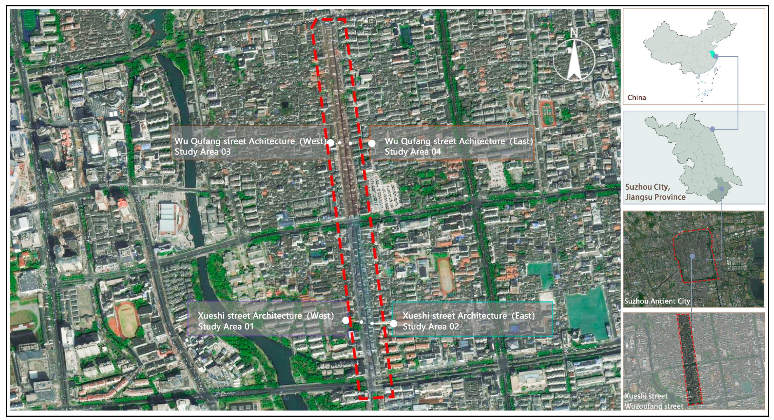
3.1. Research Area

Xueshi Street–Wuzoufang Street is located in the southeast of the ancient city of Suzhou, China, close to the famous Panmen Scenic Area. The length of the street is 729 m, and the original width is 5~9 m, and in 1966 its southern section (232 m) was changed to asphalt pavement. In 1982, its northern section was changed to a pillow-shaped small ashlar herringbone pavement. It is a street with a long history and a profound cultural heritage. The name of Xueshi Street originated from the residence of Wang Ao, a Grand Scholar (University Graduate) in the Ming Dynasty, and was named after his settlement there. As an influential official and scholar, Wang Ao’s spirit and academic style have been passed down in this area, and Xueshi Street has thus incorporated the ideals and pursuits of ancient scholars, becoming an important symbol of Suzhou’s traditional culture and cultural context (Figure 1).
From a geographical point of view, Xueshi Street is a highly representative style axis outside the south gate of the ancient city of Suzhou. It faces Baihuazhou in the east, starts from Xumennei Street in the south, crosses Daoqian Street and Ganjiang West Road to the north, and extends to Jingde Road, connecting with Wuqufang. As it is located along the first river west, the banks were originally full of exquisite and elegant Suzhou-style traditional residences, with white walls, black tiles, small bridges, and flowing water, capturing the typical Jiangnan water-town style. The connection between Xueshi Street and Wu Zoufang not only spatially connects many historical landmarks and water-lane styles but also carries culturally diverse regional memories and commercial development imprints.
Due to its combination of historical continuity and transitional tension, the Xueshi Street–Wuzoufang Street area serves as a microcosm of the typical transformation scenarios seen in many commercial historical districts across China. On the one hand, its well-preserved Jiangnan water town morphology grants it a high degree of spatial and stylistic representativeness. On the other hand, the recent influx of modern commercial functions has introduced significant visual conflicts and color disharmony, reflecting the widespread dual challenge of “cultural preservation versus commercial development” faced by historical districts today. Therefore, this area not only possesses the typological characteristics suitable for conducting research on color sustainability, but also provides a methodological reference and practical insight for the visual governance and strategic planning of similar historic districts.
Wu Zoufang also has a long history. It is said that it was named after the settlement of the Wu and Zou surnames, and it was once prosperous in handicrafts and commercial trade in ancient times. Today, with the development of urbanization and tourism in Suzhou, Xueshi Street–Wuzoufang Street has gradually presented a diverse landscape combining traditional heritage and modern commercial vitality. There are relatively well-preserved old houses and historical buildings, as well as the continuous influx of emerging shops and modern catering brands, making the block increasingly diversified in terms of business formats and spatial forms. However, such changes have also brought many challenges to the style of the block: traditional buildings and new shops have varying degrees of differences and even conflicts in terms of color, materials, and appearance, and the balance and coordination between protection and renewal need to be explored (Figure 2).
This study took Xueshi Street–Wuzoufang Street in Suzhou as the research object, aiming to analyze the current color status of the historical block through a combination of quantitative technology and field research, so as to provide more scientific and feasible guidance for the future color management, protection, and utilization of the block [44,45].

3.2. Overview of the Research Methods
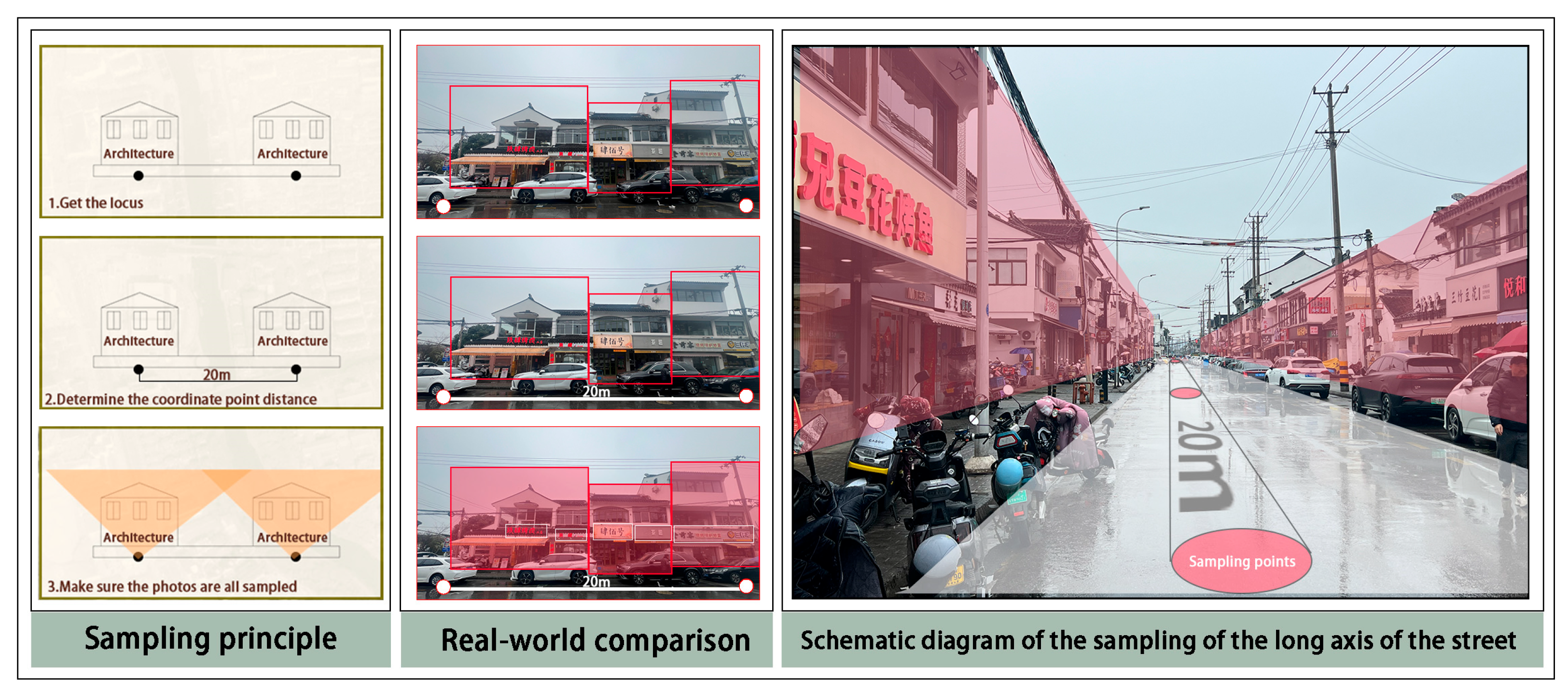
This study took the color of the historical buildings in the block as the carrier of the traditional color style of the block, and the store signs, door heads, and other commercial additions attached to the historical street as the expression medium of the color of commercial elements. In the process of obtaining street-scene samples of historical districts, street-scene photo data of Xueshi Street in Suzhou were collected to obtain the original street-scene samples required for subsequent research. The main purpose of this data collection was to obtain visual samples that accurately reflected the historical and cultural characteristics of the block [46].
Computer-vision and image-processing technology were used throughout the entire experiment. Through performing semantic segmentation on the samples, accurate identification and classification of various visual elements in the street scene images were achieved. Specifically, this process included developing a method that used open-source datasets to perform accurate semantic segmentation and color correction of images to ensure that each visual element could be accurately identified and categorized. Subsequently, various color-clustering techniques were applied to various types of samples to classify and analyze the differences between various colors, thereby providing technical support for research conclusions. Integrating these sample acquisition and computer vision technologies, we were able to more accurately and comprehensively understand the commercial street-color visual characteristics in the ancient city and provide a basis for further exploration of the protection and improvement of cultural heritage in the urban environment; see Figure 3 for the specific steps and processes [46].

3.3. Data Sources

The process of obtaining street-view photo samples relied on platforms such as Open Street Map (https://openmaptiles.org/languages/zh/#0.85/0/0, accessed on 15 February 2025), ArcGIS, and Baidu API (https://cloud.baidu.com/doc/API/index.html, accessed on 15 February 2025), as well as other tools, to achieve a wide and accurate collection of existing street-view photo samples. This method provided more efficient and accurate batch data collection for historical-district-sample collection work with a large sample demand [47]. The specific steps involved first obtaining the road data of Shiquan Street in Suzhou through the Open Street Map platform and directly matching the ArcGIS 10.6 geographic information system with its own WGS84 coordinate system without coordinate correction. After importing the road line data into the ArcGIS 10.6 platform, we divided the road into line segments, set a street view sampling point every 20 m, and adjusted it according to the actual situation. Finally, 202 effective coordinate points were determined as the basis for subsequent sample extraction (Figure 4).
Next, we used a Python 3.10 script to crawl Baidu street view photos and batch obtain street-view photo samples of Suzhou Xueshi according to the 202 effective coordinate points, and we obtained a total of 356 street view photos. To more clearly identify the building information in the street-view photos and use it for subsequent semantic segmentation, the shooting angle of all street-view photos was uniformly set to an upward view of 20°, and two sets of photos were obtained from the left and right sides of the road (that is, 90° and 270°) (Figure 5). After screening and eliminating invalid samples, a total of 196 valid street-view photo samples were obtained. Among them, some samples could not complete data processing because they were not updated. Therefore, some missing nodes were taken with a handheld camera to make the samples of the core experiment more complete. The street-view photo samples were divided into four standard sections, namely, the west and east sections of Xueshi Street (01 Research and 02 Research of the research section), and the west and east sections of Wuqufang (03 Research and 04 Research of the research section) (Figure 1).

3.4. Various Research Methods

3.4.1. Semantic Segmentation Method of Commercial Elements

In the processing stage of the latest street-scene photo samples of the research object, it was first necessary to use street-scene photos to perform semantic segmentation on the research object, namely, buildings (excluding commercial elements) and commercial signs. In previous studies, there were few semantic segmentation methods for accurately segmenting commercial elements, and the segmentation accuracy was mostly low. Non-target elements often mistakenly entered the segmentation area, resulting in inaccurate research results. Therefore, it was necessary to develop a semantic segmentation method for identifying commercial elements attached to buildings [48,49].
In this study, the ViT (Vision Transformer) model proposed by Dosovitskiy et al. was introduced, and the mask2former model was used based on the ViT model to achieve the goal of semantic segmentation (Figure 6). ViT can divide the image into fixed-size blocks (for example, 16 × 16 pixels). Each block is expanded into a one-dimensional vector, and position encoding is added to form an input sequence. These input sequences are processed through a multi-layer transformer encoder. Each encoder layer includes a multi-head self-attention mechanism and a feedforward neural network, and enhances the model’s expressive ability and stability through layer normalization and residual connections. The datasets used in this study strictly followed their official splits. Specifically, the ADE20k dataset contained 20,210 training, 2000 validation, and 3352 testing images. For the Mapillary Vistas dataset, we adopted a stratified random split (7:2:1 ratio), resulting in 17,850 training, 5100 validation, and 2550 testing samples. Random seeds (e.g., seed = 42) were fixed to ensure reproducibility. All data augmentation (e.g., resizing and normalization) was applied only to the training set, while the validation and testing sets retained raw resolutions for unbiased evaluation.

3.4.2. Color Evaluation Method Based on CIELAB

In previous studies, most of the measurements of color harmony were simply calculations of the Euclidean distance in the hsv color space. However, this method has a certain degree of subjectivity and error. In this part of the study, we innovatively cited the standard (CIEDE2000) promulgated by the International Commission on Illumination (CIE) in 2000 to calculate the color difference between two points and converted all the color particles required for the research into the CIELAB color space. The CIEDE2000 color-difference formula (commonly known as Δ E ) is an advanced color-difference evaluation method that considers multiple visual factors to provide color-difference measurements that are more in line with human color perception. This formula is relatively complex and includes adjustments to brightness, color saturation, hue differences, and hue compression.
The calculation formula is as follows:
In the first step, assume that the distance between two color particles C 1 and C 2 is measured. Each color particle is represented by L * , a * , and b * in the CIELAB color space. Then, the color saturation C * and hue angle h of each color particle need to be calculated:
C 1 = a 1 2 + b 1 2
C 2 = a 2 2 + b 2 2
h 1 = a tan 2 b 1 , a 1
h 2 = a tan 2 b 2 , a 2
The second step is to calculate the average color saturation and hue angle of the samples.
The third step is to calculate the components of the color difference. Among them, the brightness difference is Δ L , the color saturation difference is Δ c , and the hue difference is Δ H .
In particular, the calculation formula for Δ H is
Δ H = 2 C 1 C 2 sin Δ h 2
The fourth step is to calculate the correction items of each value, where S L is the correction item for brightness, S C is the correction item for color saturation, S H is the correction item for hue, and RT is the correction item for hue rotation, which is used for compression and stretching of hue areas.
The fifth step is to calculate the color difference value Δ E , and the calculation formula is
Δ E = Δ L k L S L 2 + Δ C k C S C 2 + Δ H k H S H 2 + R T Δ C k C S C Δ H k H S H
k L , k C , and k H are usually 1, unless there is a need to adjust them for a specific application scenario.
This study referred to the CIEDE2000 standard and combined it with the site’s own conditions to develop a distance standard for Δ E , which was used in the subsequent experiments. Among them, Δ E < 6.5 is extremely harmonious, 6.5 Δ E 13 is relatively harmonious, 13 Δ E 25 is relatively disharmonious, and 25 Δ E is extremely disharmonious (Table 3) [43].

3.4.3. Commercial Element Color Evaluation and Analysis Method

In this section, a method for measuring the distance from the central color to each target color particle is constructed as a criterion for evaluating the color of commercial elements. First, before the experiment, the building and commercial element colors were filtered to eliminate other colors that mistakenly entered the segmentation area. Subsequently, each store sign was pixelated, and the building colors of each street segment were clustered using the K-means clustering method. Usually, the number of colors that the human eye can perceive is 4–8. Therefore, the clustering value was 8, generating 8 building central color particles as the evaluation standard, that is, the color center point. First, an initial center point C 1 was selected from the pixel set. Next, the distance between all other pixels and C 1 was calculated, and the pixel farthest from C 1 was selected as the next center point C 2 . This process was repeated until K center points were reached. Subsequently, the distance between each pixel and these K cluster centers was calculated, and each pixel was assigned to the category represented by the nearest cluster center. Once all of the pixels had been assigned, the initial clustering result was obtained. Then, the mean of the pixels in each category was calculated to obtain new cluster centers. The above steps were repeated to continuously update the cluster centers until the iteration stop condition was met. Finally, K cluster centers were obtained, representing the main K colors in the image.
The calculation formula is
d = H i H j 2 + S i S j 2 + V i V j 2
Second, the ΔE distance value from each color center point to each store sign was calculated using the CIE2000 standard formula. These values were then incorporated into the standard to analyze the distance between the colors of the commercial elements and the central building colors in each standard section, thereby determining whether their colors were harmonious or disharmonious.

3.4.4. Negative Commercial Element Color-Extraction Method
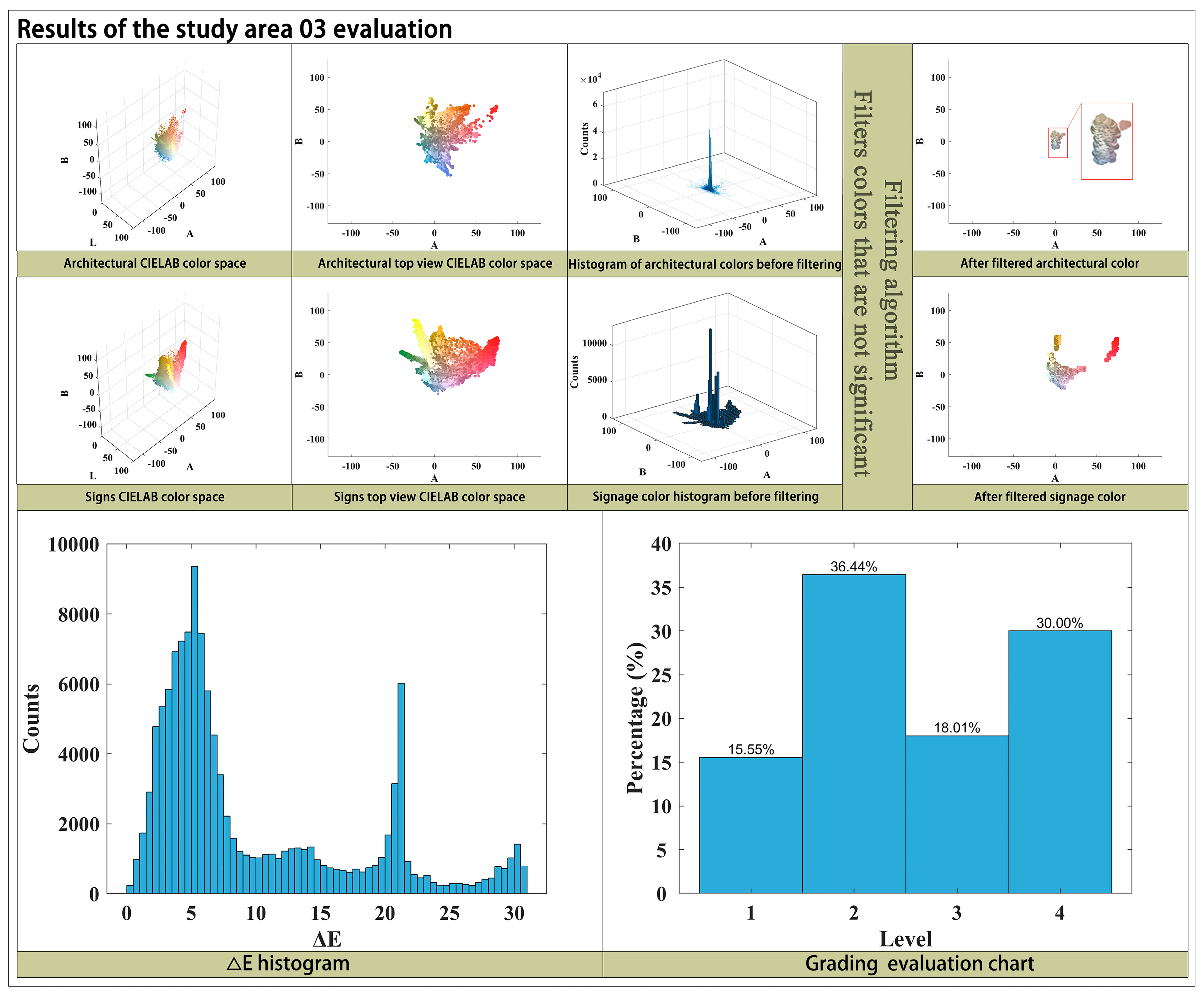
In this section, color particles with Δ E 13 in each standard section are considered disharmonious commercial element colors. This is because, when Δ E 13 , the color difference between the commercial element color and the historical building color is usually significant. The color difference is visually perceptible to the naked eye and can be identified as different hues. Furthermore, their spatial relationship with the central color in the CIELAB color space is also discrete. Therefore, color particles with Δ E 13 are outlier color particles, which we refer to as negative color particles. These color particles disrupt the overall color atmosphere of the historical district and are detrimental to the maintenance of the historical district’s character.
Considering the large number and dispersion of color particles, which are difficult to clearly display, the K-means clustering method was used to cluster the negative color particles in each standard section. The number of clusters was set to “8” (referencing the related method for evaluating commercial element colors in the previous section). Each standard section identified eight representative negative colors, reflecting the central color points. Based on these central color point particles, their use within Xueshi Street–Wuzoufang Street is not recommended.

4. Results

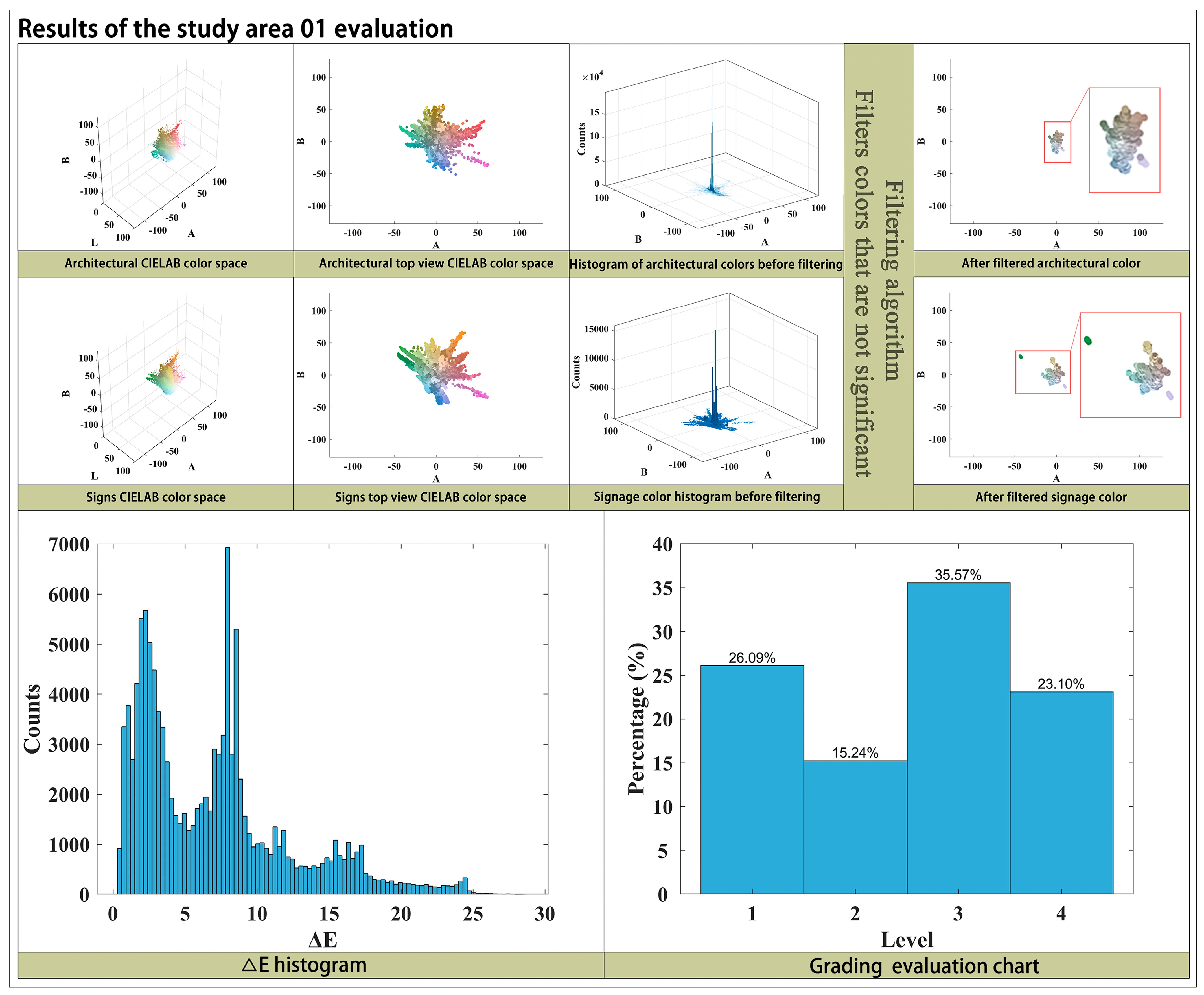
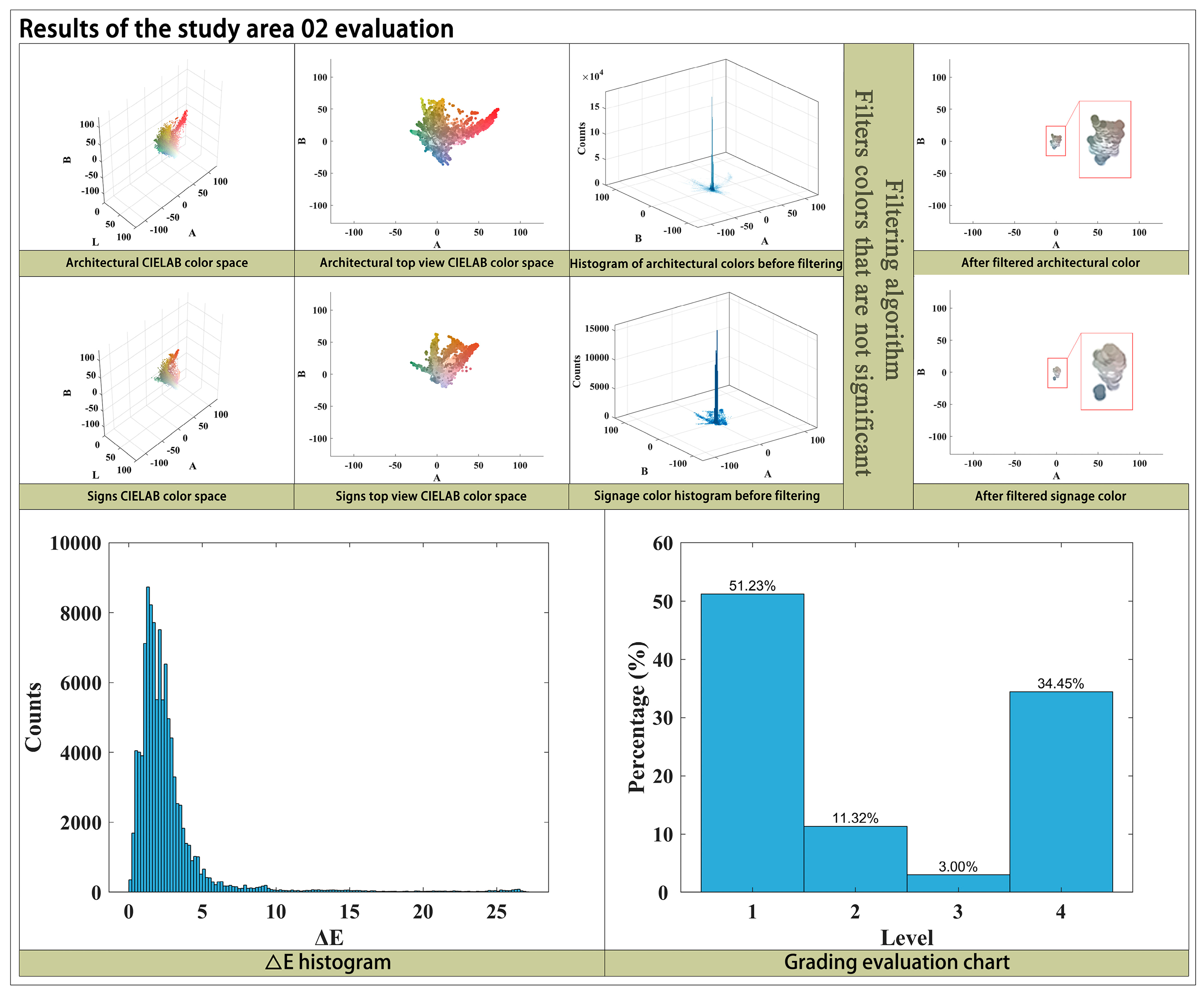
4.1. Evaluation of the Commercial Color Harmony in the District

As can be seen in Figure 7, Figure 8, Figure 9 and Figure 10, in the store signs on the west side of Xueshi Street (01 Research), extremely harmonious commercial element colors accounted for 26.09% of the total colors, relatively harmonious colors accounted for 15.24%, less harmonious colors accounted for 35.57%, and extremely disharmonious colors accounted for 23.10%. According to the experimental results, color particles with Δ E > 13 accounted for more than half, proving that the colors of commercial store signs in 01 Research are relatively disharmonious. In the store signs on the east side of Xueshi Street (02 Research), extremely harmonious commercial element colors accounted for 51.23% of the total colors, relatively harmonious colors accounted for 11.32%, less harmonious colors accounted for 3.00%, and extremely disharmonious colors accounted for 34.45%. According to the experimental results, color particles with Δ E > 13 did not account for more than half, proving that the colors of commercial store signs in 02 Research are relatively harmonious, but the high polarization between harmonious and disharmonious color particles has caused a visual separation phenomenon. In the store signs on the west side of Wu Zoufang (03 Research), extremely harmonious commercial element colors accounted for 15.55% of the total colors, relatively harmonious colors accounted for 36.44%, less harmonious colors accounted for 18.01%, and extremely disharmonious colors accounted for 30%. According to the experimental results, color particles with Δ E > 13 accounted for nearly half, proving that the color harmony of commercial store signs in 03 Research is moderate, and the number of relatively harmonious and extremely disharmonious colors is similar, proving that there are major problems with the colors of commercial store signs in this section. In the store signs on the east side of Wu Zoufang (04 Research), extremely harmonious commercial element colors accounted for 25.21% of the total colors, relatively harmonious colors accounted for 46.20%, less harmonious colors accounted for 14.76%, and extremely disharmonious colors accounted for 13.83%. According to the experimental results, color particles with Δ E > 13 accounted for less than 40%, proving that the color harmony of commercial store signs in 04 Research is relatively high.

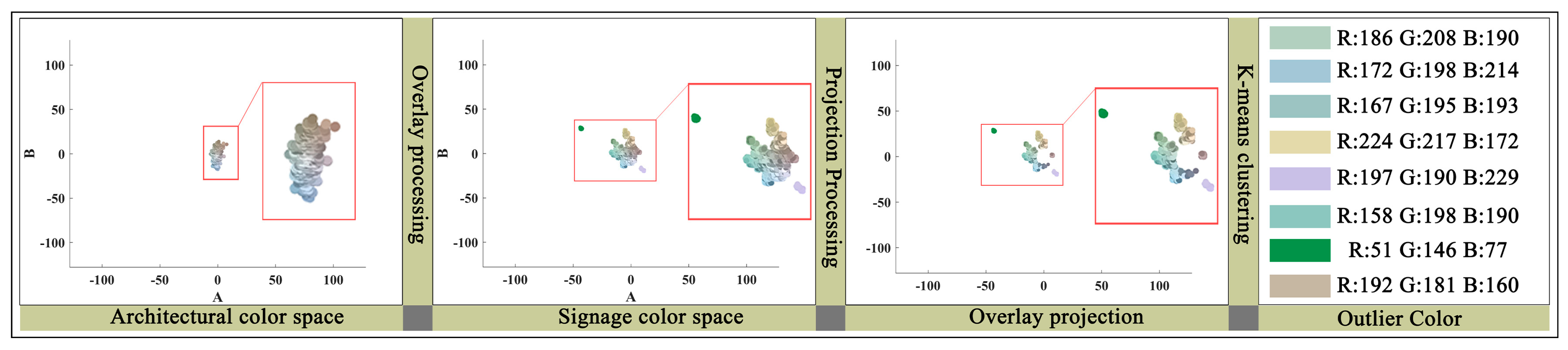
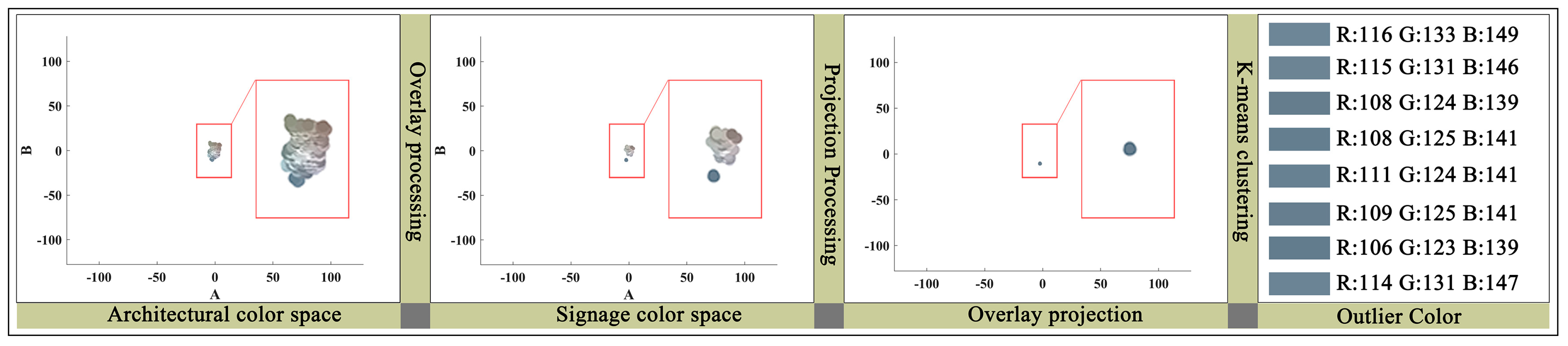
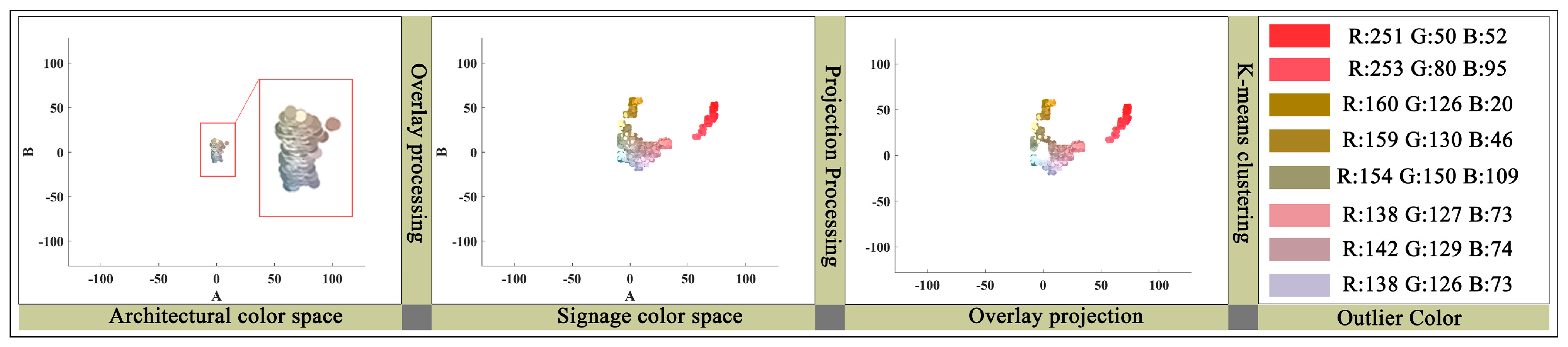
4.2. Extraction of Negative Central Colors of Commercial Elements in the District

To further identify the disharmonious colors of commercial elements that negatively affect the overall visual quality of the historic district, this study applied a projection overlay method. This technique removed background architectural color particles that were mistakenly included within commercial signage. Colors with a Δ E value greater than 13 were defined as “negative colors”. These color groups were then analyzed using the K-means clustering algorithm across the four research sections to determine the central hues of discordant colors. The final clustered results offer a practical reference for developing targeted color rectification guidelines, helping to reduce visual clutter and preserve harmony within the district.
As can be seen in Figure 11, Figure 12, Figure 13, Figure 14 and Figure 15, in 01 Research, the RGB numbers of the eight types of negative central colors were 120.131.147, 116.127.140, 129.127.144, 125.125.125, 139.128.71, 138.127.73, 142.129.74, and 138.126.73. The hue was divided into two categories. In 02 Research, the RGB numbers of the eight types of negative central colors were 251.50.52, 153.80.95, 160.126.20, 159.130.46, 154.150.109, 138.127.73, 142.129.74, and 138.126.73. The hue was divided into four categories. In 03 Research, the RGB numbers of the eight types of negative central colors were 116.133.149, 115.131.146, 108.124.139, 108.125.141, 111.124.141, 109.125.141, 106.123.139, and 114.131.147. The hue comprised only one category. In 04 Research, the RGB numbers of the eight types of negative central colors were 186.208.190, 172.198.214, 167.195.193, 224.217.172, 197.190.229, 158.198.190, 51.146.77, and 192.181.160. The hue was divided into four categories.

4.3. Analysis of the Experimental Results

4.3.1. Comprehensive Analysis of the Color Disharmony in Each Research Section

The color harmony of the commercial store signs in the 01 Research district showed a relatively obvious imbalance. According to the research data, the proportion of extremely harmonious colors was 26.09%, the proportion of relatively harmonious colors was 15.24%, and the sum of less harmonious and extremely disharmonious colors reached 58.67%. This shows that in the commercial store sign system of 01 Research, more than half of the color particles fell within the range of “ Δ E > 13 ”, showing obvious disharmony. The eight types of negative central colors extracted were mainly concentrated in two categories: bluish-gray (120.131.147, 116.127.140, 129.127.144, and 125.125.125) and yellowish-brown (139.128.71, 138.127.73, 142.129.74, and 138.126.73). The former was expressed as gray tones with blue or cyan, common in some metal-textured or modern-style signs; the latter was inclined primarily to dark yellow, earth brown, or gray–green tones. The saturation of these colors was generally low, and the overall presentation was dull and lacked vitality. In the environment of a commercial district, the excessive use of cold tones easily weakened the attractiveness of the space, making the district appear depressing and unfriendly. Low-saturation yellowish-brown can easily appear old, which may give people the impression that the district is dilapidated and lacks maintenance. When the two are combined, it can aggravate the dullness of the district, which is not conducive to creating a vibrant commercial atmosphere.
There are multiple reasons for this disharmonious effect. First, some businesses in the district have continued to use the original colors of the early “unified” store signs. Second, the choice of materials for store signs by businesses lacks uniform planning, such as the frequent use of metal-textured store signs, which are inconsistent with the district’s simple and natural atmosphere. Finally, this disharmony is also related to the overall aging and fading of the district, that is, the lack of maintenance. In response to the above problems, 01 Research should focus on improving the color saturation of store signs, reducing the proportion of low-saturation cold tones, and introducing appropriate warm-color elements to enhance the visual appeal of the district.
Compared to 01 Research, the overall color harmony of 02 Research is more extreme, forming a more obvious polarization phenomenon. According to the statistical results, the proportion of extremely harmonious commercial element colors was as high as 51.23%, the proportion of relatively harmonious commercial element colors was 11.32%, and the proportions of less harmonious and extremely disharmonious colors were 3.00% and 34.45%, respectively. Although the sum of “disharmonious” colors did not exceed half, the proportion of “extremely disharmonious” colors being 34.45% still produced a strong visual impact, forming a sharp contrast with more than half of the “extremely harmonious” colors on the other end. That is to say, in 02 Research, some signs achieved a high degree of integration with the environment, but there was also a large number of designs with extremely prominent colors and contradictory styles with the surrounding area, resulting in a huge visual separation of the overall street.
In the clustering results of disharmonious sign colors, the primary colors included high-saturation bright reds and magenta (251.50.52 and 153.80.95) and lower-saturation yellow–greens and brown tones (160.126.20, 159.130.46, 138.127.73, etc.). The high-brightness reds and magentas mainly come from overly vibrant LED lights on store signs, banners, or the signature colors of certain brands. This is often because businesses want to attract attention and project a “high-end” or “fashionable” store image. In contrast, the lower-saturation colors such as yellow–green and brown suggest that some businesses have chosen tones that seem “low-key” but clash with the traditional environment. As a result, these colors fail to achieve a harmonious transition with the gray walls and black tiles of the district and struggle to create a comfortable visual focus on the sign-lined street, thus being categorized as “disharmonious”. This bipolar distribution of colors indicates that 02 Research has not yet found a balance between commercial promotion and the preservation of its character. Addressing this situation requires a “refined” approach to color coordination.
In 03 Research, extremely harmonious colors accounted for 15.55%, relatively harmonious colors accounted for 36.44%, and the total of disharmonious colors reached 48.01% (with extremely disharmonious colors comprising a significant 30%). This result implies that on the west side of Wu Zoufang, almost half of the store sign colors were incompatible with their surroundings, resulting in widespread visual disharmony. In the color-cluster analysis, the eight negative colors in 03 Research were almost entirely concentrated in the cool color range of blue–gray or gray–blue, with disharmonious colors exhibiting a “unified cold gray-blue” tendency, such as 116.133.149 and 108.124.139. The color atmosphere was similar to 01 Research, yet with a subtle difference. Here, the proportions of “relatively harmonious” and “extremely disharmonious” were closely matched, creating a scenario where “some signs were acceptable, while others were extremely jarring”.
The reason for this situation is often that the types of businesses in the district are quite similar, leading merchants to favor the same kinds of materials or color schemes, such as cold-colored metal panels or blue–gray inkjet-printed fabrics. However, in the traditional ancient city environment, blue–gray may not seamlessly integrate with the warm-gray base tones found in wood, stone, and gray tiles. Without careful control of lightness and saturation, blue–gray can appear modern and industrial, feeling particularly “cold” and lacking the original warmth and humanistic depth of the ancient street. Furthermore, the extensive use of similar cold gray tones can lead to a sense of “dullness” or “antiquity”. Although the hue is singular, the sharp contrast with the environmental base tone (leaning toward warm gray or dark brown) can create an equally noticeable sense of disharmony. This widespread use of cool grays is akin to overlaying a layer of industrialization or modernization onto the ancient streets, lacking a transition or connection with the surrounding historical environment. To address these issues, it is necessary to provide professional guidance to merchants, enabling them to make targeted adjustments or replacements based on the district’s cultural heritage and overall color palette, allowing those excessively cool blue–gray signs to achieve harmony with the ancient city elements in terms of hue, lightness, material, and other aspects.
Compared to the three research sections mentioned previously, 04 Research demonstrated relatively superior performance in the color harmony of commercial store signs. The data indicated that extremely harmonious commercial element colors reached 25.21%, and relatively harmonious colors were as high as 46.20%, totaling over 70%. Conversely, the combined percentage of less harmonious and extremely disharmonious colors was only around 28.59%, lower than the other research sections. This suggests that, on the east side of Wu Zoufang, the overall color appearance of store signs was better matched to the ancient city’s structure, or that there were fewer instances of highly disruptive “chaotic” situations, resulting in a more unified and comfortable streetscape.
However, nearly 30% of the color elements were still classified as “disharmonious”. From a K-means clustering perspective, the negative colors in 04 Research exhibited a diverse range of hues, such as pale blue–green (186.208.190 and 167.195.193), light warm yellow (224.217.172), light purple (197.190.229), and gray–beige (192.181.160), as well as green with a slightly higher brightness or saturation (51.146.77). These colors are not necessarily “ugly” as accents in themselves, but in the context of the ancient city district, care should be taken to avoid large-scale use or to ensure a smooth transition with the main colors of the buildings.
Overall, the commercial element color harmony in the Xueshi Street–Wu Zoufang Street historical district exhibited a distinct polarization, with some areas displaying overly jarring colors that created strong visual conflicts, while others were characterized by monotonous, dull colors that rendered the district lacking in vitality and appeal. The store sign colors in 01 Research and 03 Research were mainly low-saturation gray–blue and yellowish-brown, which, although generally consistent, made the district appear old and oppressive due to the overly cold tones and lack of bright color accents, making it difficult to stimulate a commercial atmosphere. In contrast, the color problem in 02 Research lay in the excessive use of high-saturation bright red and magenta, causing some store signs to be out of sync with the environment, creating a strong sense of visual fragmentation and disrupting the overall harmony of the district. 03 Research suffered from the large-scale use of cold gray, which, despite its hue consistency, created an unnatural visual abruptness due to its modern blue–gray tone clashing with the warm color base of the historical district. In comparison, 04 Research had the highest color harmony; although some negative colors, such as low-saturation blue–green and light yellow, still existed, the overall visual pollution was not severe due to proper proportion control.
Therefore, in future color updates and management of the district, it is necessary to balance vitality and harmony while standardizing commercial colors, ensuring that the district can maintain its historical character while providing a comfortable visual experience. This includes emphasizing gradient control of lightness and saturation, strengthening supervision and maintenance of sign aging and fading, and controlling the color range of low-lightness and low-chroma colors (e.g., local traditional colors, including gray, ochre, cyan, and dark blue) to ensure that they do not deviate from the scope of traditional cultural elements.

4.3.2. Comparative Analysis of Negative Colors Extracted via V-C-K with Prohibited Colors in Mainstream Color Guidelines (Based on the Munsell System)

To better understand the relationship between disharmonious colors calculated using ViT, CIEDE2000, and K-means clustering and prohibited colors in current color protection practices, this section of the study further converts the extracted disharmonious colors into hue, value, and chroma in the Munsell system using MATLAB R2018s (Table 4).
Comparing the conversion results with existing color management guidelines based on the Munsell system (Kyoto, Tokyo, Osaka, Nanjing, etc.) reveals the following.
In 01 Research and 03 Research, many colors with low value and chroma appeared. For example, 125.125.125 in 01 Research converted to N4.7 (almost neutral gray), with a value of only approximately 4.7 and a chroma of less than 0.5; 108.124.139 in 03 Research converted to 10B 4.7/2.3, with a value of approximately 4.7 and a chroma of approximately 2.3. According to the current color-guideline thinking, similar low-chroma, low-value, or neutral gray colors are often regarded as safe colors, relatively less likely to cause a strong visual impact. However, the experimental results show that the ΔE00 values of the above colors were still greater than 13, which are judged as “disharmonious colors”, indicating a large deviation between them and the historical primary colors of the block. This means that even in the gray/low-chroma range, which is considered “low conflict, easy to integrate into the environment” in most city guidelines, it may still cause visual separation or abruptness in actual perception due to a mismatch with surrounding materials, traditional facades, and other elements.
This suggests that low-chroma or neutral gray does not necessarily visually blend with the environment. The specific hue (color phase), material texture, and influence of ambient light on the color presentation of local historical buildings must be considered. Simply “reducing chroma or value” to avoid conflict may instead lead to excessive deviation from the atmosphere of the historical scene, enhance psychological negativity and depression, and become another form of visual discomfort.
Similarly, “high value” or “high chroma” is not necessarily disharmonious. Urban color-management regulations, such as the Tokyo Color Guidelines, typically stipulate a general Munsell value and chroma range (e.g., value between 5.0 and 8.0 and chroma not exceeding 4.0 or 6.0) [28] to ensure that the building facade maintains a relatively soft visual appearance in the urban environment. However, in fact, during the experiment, it was found that harmonious colors with Δ E < 13 , such as RGB value 255.228.196 (similar to the original color of reed pulp freshly brushed on the white walls of the ancient town of Nanxun), have a value of 8.5 and a chroma of 5. However, the Nanjing color-control guidelines explicitly stipulate that “when the value is 8.0, chroma 5–6 is prohibited” within this hue range [30]. Nanjing and Suzhou, located in the same province in China, are adjacent to each other, and their ancient city colors are very similar. Whether in Nanjing or Suzhou, many buildings have walls or bricks with 5Y or 10YR hues, as well as high-value and chroma colors. Therefore, this mechanical restriction on high-value, high-chroma colors is likely to result in “wrongful killing”, similar to what was mentioned in the previous summary: Kyoto City’s forced limitation of the “red and yellow chroma threshold” through the Munsell system [27] led to criticism that “the teahouse street lost its visual focus”.
Furthermore, the contrast results also show that the color range obtained by controlling the Δ E threshold through the V-C-K method had obvious advantages compared to the prohibited colors obtained through the Munsell system parameters, which were mainly reflected in two aspects: on the one hand, it was more inclusive, for example, including high-value, high-chroma colors with visual impact and vitality, and on the other hand, it was also more vigilant, that is, it could identify low-value, low-chroma disharmonious colors. Therefore, compared to the traditional color control methods, the authors recommend the research method (V-C-K) in this paper to restrict the colors of the block by controlling the value of Δ E 00 . This can avoid the dual traps of “excessive conflict” and “excessive dullness” at the same time.

5. Discussion

In the Introduction, this study proposed three specific research questions. As the research progressed, the answers to these questions gradually became clearer.
For the first question (What is the current state of color disharmony in the commercial colors of the Xueshi Street–Wuzoufang Street historical district?), the results revealed a clear phenomenon of “polarization” in the district: on the one hand, certain areas exhibited overly prominent commercial colors with high saturation and strong contrast, leading to visual conflicts; on the other hand, other areas were dominated by low-saturation, low-brightness tones, resulting in a dull and lifeless visual atmosphere. Although the manifestations of disharmony varied across different sections, the common issue was a general lack of color coordination.
For the second question (What issues are reflected in the existing color disharmony? Is there a difference between this situation and mainstream protection methods?), this study found that the color disharmony reflected a dichotomy in traditional protection approaches—namely, the coexistence of ”overly subjective” and “overly rigid quantitative” strategies. Mainstream color guidelines often mechanically restrict high-brightness, high-saturation colors, while overlooking the negative visual effects that low-brightness, low-saturation colors can also bring. Through comparison with mainstream methods, such as the Munsell color system, this study demonstrated that the color categories identified using the ΔE threshold are more precise and flexible, with higher sensitivity in detecting disharmonious colors.
However, achieving sustainable development of historic district colors cannot rely solely on quantitative analysis, nor should it be reduced to a unilateral emphasis on authenticity preservation. Especially in the context of irreversible commercialization and the growing recognition of cultural heritage as a driver of commercial vitality (a trend particularly evident in China), the relationship between preservation and development becomes increasingly nuanced and complex. Therefore, it is essential to explore a dynamic balance that accommodates both protection needs and commercial interests. To truly realize sustainable color development in historic districts, it is necessary to go beyond current quantitative methods that focus on isolated processes (such as color extraction or color difference calculation), and instead build a comprehensive, systematic framework encompassing the full cycle of “recognition–analysis–control”.
Thus, in response to the third question (What implications do the research results have for future policy formulation and historical district protection practices in Suzhou?), this research first proposed a more adaptive and precise color-management framework (V-C-K) through preliminary theoretical exploration. By applying this framework, it identified the current state of color harmony in the Xueshi Street–Wuzoufang Street district and summarized the core problems. Based on these findings, the following discussion sections further elaborate on the manifestations, underlying causes, and improvement strategies of these issues, aiming to address the third question by constructing a complete “recognition–analysis–control” closed-loop model for the systematic and sustainable management of historic district colors.

5.1. Reflections Based on the Current Situation

5.1.1. The Dual Trap of “Excessive Conflict” and “Excessive Dullness”

According to the experimental results in 04 Research, the manifestations of disharmonious colors include not only “high saturation or strong contrast” but also “excessive low-saturation, cold tones, or dull yellow tones, leading to a lack of layers or attractiveness” [50]. From a commercial perspective, excessively “vibrant and high-contrast” store signs in a block can create a chaotic impact and lead to visual fatigue and environmental degradation in daily use [51]. However, if low saturation, gray tones, or cold colors are used indiscriminately, the block can easily appear particularly gloomy and dull, losing its eye-catching power and vitality, especially at night or in rainy weather, making it difficult to realize its commercial potential [33,34]. These phenomena were clearly reflected in the experiments, as outlined below.
(1)
Conflict Caused by High Contrast
In some research sections (such as 02 and 04), disharmonious colors often manifested as clashes of bright red, magenta, blue–green, or tan. High-saturation red (e.g., RGB 251,50,52) and magenta (153.80.95) mixed with gray and brown can stimulate visual attention in the short term. However, when such impactful colors persist for a long time or are too large in area or number, they create excessive competition within the overall block, making the street lack coordination and a sense of order [52]. Similar phenomena are common in the colorful advertisements or neon lights of small restaurants and retail stores, whose immediate eye-catching effect may sacrifice the long-term cultural atmosphere and aesthetic sustainability [53];
(2)
Dullness Caused by Low Value and Chroma
In other research sections (such as 01 and 03), the colors were observed to be excessively gray or cold, whether blue–gray or tan, exhibiting characteristics close to medium value and low chroma. This problem caused excessive “oppression” or “monotony”. These blocks may seem relatively “unified” on the surface, but if they lack sufficient bright accents and contrast, they will cause the commercial street to lose its focal points and vibrant energy. For young people or foreign tourists, the overall space may not be attractive enough, which is not conducive to merchants attracting investment and sustaining operations, and it is difficult to form diversified needs that match modern lifestyles.
Although the two situations are completely different in terms of color performance, from the perspective of combining historical block protection and commercial vitality, they are both extremes that are not conducive to the sustainable development of the block. The former is prone to forming the appearance of “excessive commercialization”, while the latter is prone to falling into the predicament of “conservatism and dimness”. For historical blocks, only by seeking a balance between historical charm and contemporary commercial needs can the block radiate lasting vitality [54].

5.1.2. Authenticity and Vitality: Color Strategy from “Trade-Off” to “Mutual Promotion”

The sustainable development of historical blocks should not be simply around the binary opposition of “limiting commercial colors” or “preserving traditional buildings” but requires more systematic thinking: using color management to highlight historical characteristics and leaving enough creative space for commercial operations, achieving the goal of “mutual promotion” rather than “trade-off” [55]. Combining the experimental results, we can explore the following perspectives.
(1)
Protective Goals
At the color level, “protecting history” not only means maintaining low saturation and low contrast, but also includes the continuation of traditional colors, material textures, and historical traces. Certain blue–gray or tan colors are typical of ancient city building materials, representing the tiles, gray walls, and wooden beams and columns of Jiangnan water towns. These colors themselves have regional genes, but, if used on a large scale and monotonously, they cause the commercial atmosphere to shrink. Therefore, “protective goals” require more refined control, such as retaining or moderately strengthening the original color tone of traditional materials, making them the “main color” of the block’s visual; at the same time, through color-layering-management, opening a portion of the quota to commercial accent colors to balance the overall atmosphere and local characteristics [8]. This point is reflected in the Nanjing City Color Control Guidelines, which provide reference main colors and reference auxiliary colors, and accent colors are selected from the former two. The color guides of Kyoto, Tokyo, and Osaka achieve layered management by stipulating the area ratio of colors with different chroma and value colors;
(2)
Commercial Vitality Goals
From a commercial point of view, merchants often seek to quickly attract attention, and high saturation or contrast colors have significant marketing effects. However, excessive use can create visual pollution, leading to long-term image damage. A better strategy is to distinguish between main and auxiliary colors: in the overall facade or large-area background of the historical block, low-to-medium saturation colors that coordinate with the main colors of the block as the base can be used; in local small-area areas, such as logos, store names, and signboard borders, high-saturation or bright colors can be added as accents to form local focal points. This can not only meet the needs of commercial expression but can also maintain the overall “sense of harmony” of the block.

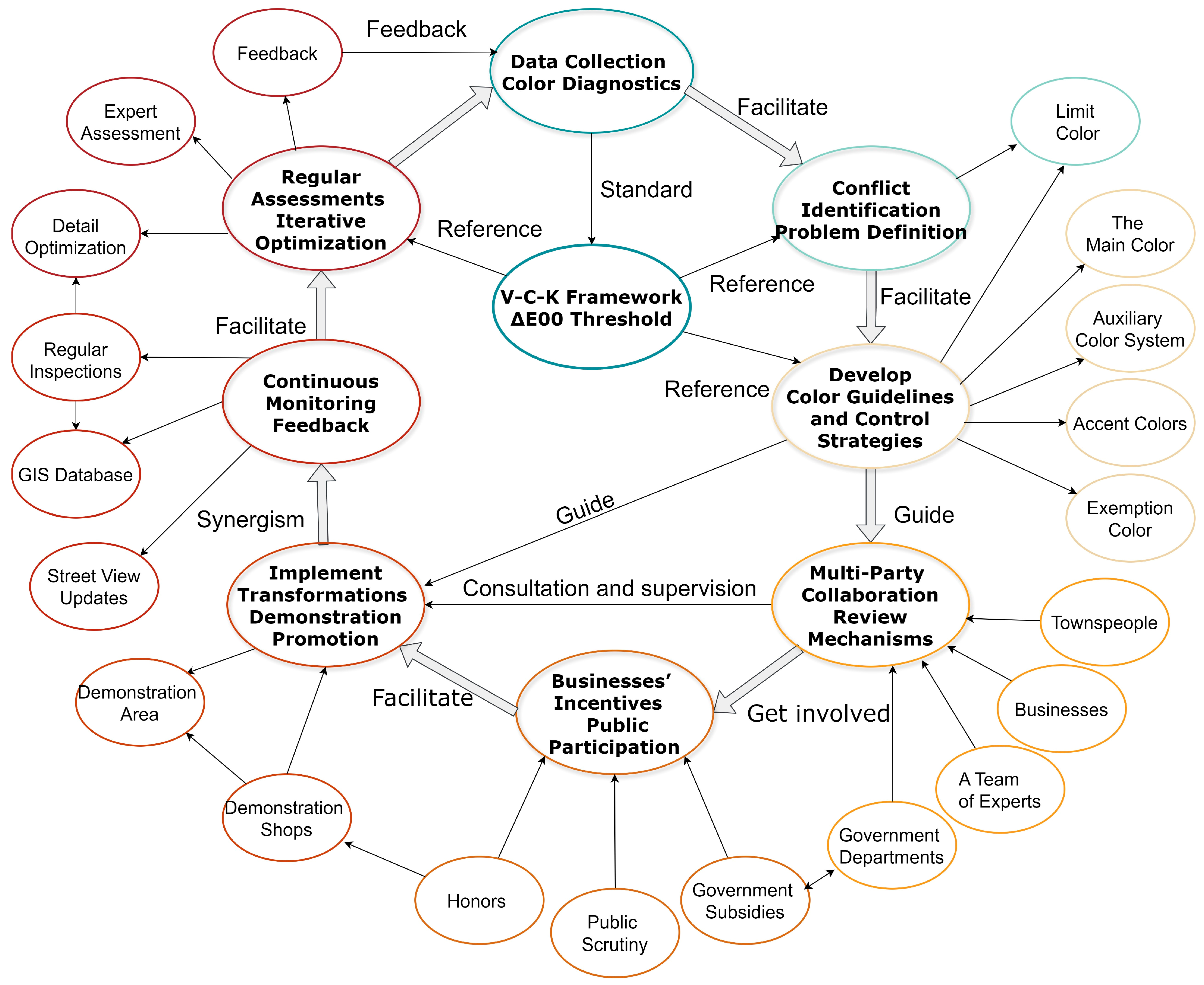
5.2. Recommendations for Sustainable Color Development in Historical Blocks

The previous experimental results concluded that the color range obtained by controlling the ΔE threshold has two distinct advantages compared to the prohibited colors obtained by controlling the Munsell system color parameters: first, it has a higher tolerance for value and chroma colors, and second, it can sensitively identify disharmonious colors with low value and low chroma [54].
Furthermore, the previous case study found that sustainable development of color in historical blocks, in addition to rigid indicator restrictions, multi-party collaboration, incentive mechanisms, and continuous feedback mechanisms, also play an important role [56]. Therefore, the following recommendations are provided for the sustainable development of color in historical blocks.

5.2.1. Develop a Color Handbook at the Block Level: Use the ΔE00 Threshold to Control Block Colors

Based on the two extreme problems mentioned above and the distribution patterns of a large number of negative colors that appeared in the experiment, this paper suggests that the color quantification method (V-C-K) proposed in this study can be used to determine a main color system, auxiliary color system, and accent color system suitable for use in the commercial environment of historical blocks by delineating the Δ E 00 threshold. The following is a further discussion of the core ideas:
(1)
Main Color System ( Δ E < 6.5 )
These colors usually have little difference from the original color tone of the building, and are highly matched with the main style of the historical block. They can be used in large-area facades and overall signboard backgrounds to maintain the continuity and identification of the street. For example, certain gray–white, gray–brown, or cyan–gray colors are typical traditional architectural tones in Jiangnan, which not only form a harmonious unity with the gray tiles and white walls but also help highlight the unique water town characteristics of “Suzhou-style streets and alleys”;
(2)
Auxiliary Color System ( 6.5 Δ E < 13 )
These colors have a moderate difference from the main color of the block, which has a certain degree of recognizability and does not cause excessive conflict with historical buildings. They can be used in small- and medium-sized areas, such as partial decoration of the door head, the text area of the billboard, and the background board of the merchant’s brand color. These colors range from medium–low to medium–high saturation, and the purpose is to provide the commercial attributes with a relatively prominent expression while maintaining overall visual coordination within an acceptable range;
(3)
Accent Colors ( Δ E 13 or slightly higher, usually not suitable for large areas)
When the color difference is close to or exceeds 13, the human eye can clearly distinguish between the two colors. If used in a large area, it will likely destroy the overall harmony. However, if it is controlled in a small area (such as merchant logos, art installations, decorative lines, and light box bright edges), it can achieve the effect of “highlighting the brand and quickly attracting attention” without conflicting with the main tone of the block. Therefore, these relatively bright or high-contrast colors should be positioned at the “accent” level, and their usage ratio and scope should be strictly limited according to the overall planning of the block.
This three-tier system can not only meet the needs of merchants for popularity and publicity effects but also limits “high-conflict” elements to a relatively controllable scale; at the same time, it avoids making the overall color tone of the block overly dull, ensuring a balance between historical style and commercial attributes.
In addition, special business formats that need to use bright colors ( Δ E value is significantly greater than 13) are subject to a separate review to limit the scope of their usage to ensure that they do not form a large area of color conflict in public spaces and that possible violations are discovered and corrected in a timely manner through a sound supervision mechanism;
(4)
Exempt Colors
In the experimental results of the 02 Research section, some colors with high value and chroma appeared, such as the color with an RGB value of 251.50.52 corresponding to the Munsell notation of 5R 5.5/14.2. The value was approximately 5.2, and the chroma was as high as 16.8 after converting the Munsell color parameters, meaning that it was an extremely bright red color series. This color is often regarded as a high-saturation color series that “needs to be strictly controlled or restricted” in the current guidelines. However, not all high-saturation colors are generally negative in the specific local environment. If they happen to echo the existing cultural atmosphere of the block, they may instead achieve a harmony with the characteristics of the times or region. Just like the bright red in 02 Research, in traditional Chinese and even East Asian culture, it has always had a special symbolic meaning. Red not only represents joy, auspiciousness, and prosperity, but it also symbolizes power, dignity, and passionate emotions. For example, the beams, columns, doors, and windows of palaces and temples are often painted red to show solemnity and sacredness; in important celebrations such as the Spring Festival and weddings, people use red lanterns, Spring Festival couplets, paper-cuts, and other decorations to express joy and blessings. In addition, there are vermilion torii gates of Japanese shrines and red lacquered wooden structures of Korean palaces. These elements not only carry cultural memories, but also visually constitute a unique urban landscape.
Specifically, the determination of exempt colors should comprehensively consider cultural background, public acceptance, preference survey, spatial scale, temporal characteristics, and digital analysis to avoid “one-size-fits-all” color restrictions. First, it is necessary to investigate the local cultural traditions and historical background, and sort out highly saturated colors with symbolic meaning, such as the vermilion of ancient Chinese buildings and the vermilion lacquer of Japanese buildings. Second, public acceptance should be assessed through questionnaires, visual comparison experiments, etc., and the application range should be optimized in combination with preference surveys. In addition, the influence of high-chroma colors should be restricted by spatial scale and building materials, and reasonable application guidelines need to be formulated. For example, time exemptions can be set during festivals, such as red decorations during the Spring Festival to enhance the atmosphere, and in daily situations, it is only allowed to be used as the color of lights at night, with its usage area and scope limited. Finally, GIS color analysis, AI visual simulation, and other tools should be used to accurately predict color adaptability and provide support for scientific decision-making.

5.2.2. Multi-Party Participation and Consensus Building

The compilation and implementation of color guidelines requires professional research by researchers and designers and multi-party collaboration among government departments, merchants, and the public. At the government level, the block color guidelines can be elevated to local regulations or management methods to ensure an operational legal basis for updating projects or commercial format investment promotion, and the quality of implementation can be controlled through expert review. At the merchant level, it is necessary to enhance the sense of identity with the cultural value and the color harmony of the block, training, and exchange meetings, etc., can be used to enable merchants to understand the impact of their business activities on the block environment and guide them to pay attention to visual integration and balance while pursuing brand communication. At the public level, new media and community participation mechanisms can be used to allow citizens and tourists to express their opinions in the early planning and decision-making stages, increase social participation through online voting or opinion collection, and also hold exhibitions or briefings in the block to popularize the importance of color management.

5.2.3. Incentive Measures for Merchants and Operators

In addition to control and restrictions, appropriate incentive measures can also promote the implementation of sustainable color strategies. For example, encouraging merchants to adopt store signs that comply with the block color guidelines or transform and prompt uncoordinated signs through economic means such as financial or tax incentives, which can enhance the quality of the overall style while increasing the burden on merchants; through urban media or tourism promotion, showcase those excellent stores that combine cultural characteristics and distinctive-clothing storefront harmony to the depression, form a demonstration effect, and attract more merchants to carry out image transformation. Through competitions and honors, annual signs are set up, such as “Best Color Harmony Business” or “Historical Block Image Ambassador”, to stimulate more creativity and resources in the creation of a harmonious business image, and create a good commercial and cultural atmosphere for the block.

5.2.4. Long-Term Maintenance and Feedback Mechanism

Given the rapid pace of business format updates and the short turnover cycle of stores in the block’s commercial sector, a one-time centralized rectification cannot guarantee the long-term maintenance of color harmony. Therefore, a long-term maintenance and feedback mechanism needs to be established. The first is information-based management, that is, using GIS and database technology to number and record store signs and plaques in the block and regularly update and record their colors, locations, and operator information. The second is community supervision and public feedback. This involves encouraging local residents and tourists to report non-compliant issues, such as newly installed signs and colors, through online reporting or offline complaint channels, so that regulatory authorities can intervene and correct them in a timely manner. The last is a periodic review, which comprises conducting a comprehensive review of block store signs and building facades every certain number of years (such as two to three years), and adjusting the details of the guidelines in a timely manner in combination with updated CIE color standards or new social aesthetic trends.
It is particularly important to emphasize that, in addition to controlling the colors of newly added elements, color changes due to material aging should also be incorporated into the monitoring system. Specifically, this involves introducing spectral data representing the natural aging of historical building materials (such as whitewashed walls, blue bricks, and tiles) under varying timeframes and climatic conditions during the model training stage. Through regression analysis of these data, a “material–time–color” relationship model can be developed to predict future trends in color evolution. When actual monitored data deviate beyond the predicted color threshold, the system will provide suggestions for localized repairs or updates. Additionally, the historical material database should be continuously expanded and updated, enabling the algorithm to adapt to the aging characteristics of different materials, thereby improving the long-term adaptability of color assessment.
Based on the above, this study proposes a “Sustainable Color Development Strategy for Historical Blocks” framework (Figure 15), which divides color management into several mutually supporting and cyclical links. First, it is necessary to start with data collection and color diagnosis and to use CIEDE2000 indicators to determine the differences and conflicts between the architectural and commercial colors of the block. Subsequently, disharmonious elements and conditions of material aging are identified and evaluated to clarify key areas requiring rectification; on this basis, color guidelines and control strategies should be compiled, and the main color system of historical buildings, the commercially available color system, and prohibited colors should be stipulate. Then, it is necessary to set up approval and inspection mechanisms to ensure the implementation is effective. The government, expert teams, merchants, and the public need to participate together to achieve a comprehensive governance from “restriction” to “incentive”. Merchants should be encouraged to take into account brand recognition and historical style through economic subsidies, honorary titles, and other methods; the public helps to standardize management through complaint and supervision channels. At the implementation level, local or overall renovations are carried out for store signs, door heads, etc., that do not comply with the guidelines, and demonstration areas and demonstration stores are created to provide visual references. Continuous monitoring is carried out based on the GIS database and street view updates, which can promptly correct newly emerging disharmonious colors; at the same time, periodic evaluation and iterative optimization help to revise the guidelines according to changes in commercial forms, the application of new technologies, and public opinions, and they gradually form a scientific and effective, dynamically cyclical block color management model, so that historical style and commercial vitality can achieve long-term coexistence and benign interaction.

5.3. Research Limitations and Future Research Suggestions

This research attempted to address a complex proposition—namely, the exploration of sustainable color development paths for historical blocks—and sought a dynamic balance between authenticity and commercial vitality. However, due to the broad scope of this issue and the many influencing factors, it was difficult to exhaustively cover all of the relevant content in one study. Therefore, this research still has limitations in the following aspects, and more in-depth discussions need to be carried out in the future.
(1)
Quantitative Research Methods Need to Be Combined with Richer Technical Means
This study initially realized the semantic segmentation and harmony evaluation of commercial colors in historical blocks through the collection of street-view photos and color-quantification analysis. However, the street-view collection process is easily affected by climate, lighting, and shooting angles, making it difficult to fully ensure data consistency. Future research may consider using emerging technologies such as hyperspectral imaging, UAV oblique photography, or LiDAR under multiple time periods and weather conditions to further reduce the interference of the external environment on color data. At the same time, dynamic monitoring and multi-source data fusion should be carried out for scenes with rainy days and night lighting to improve the accuracy and stability of color collection and analysis;
(2)
The evaluation dimension at the level of subjective perception remains to be improved
This study primarily adopted quantitative models such as color-difference calculation (CIEDE2000), semantic segmentation (ViT), and clustering analysis (K-means) to identify and classify color disharmony in commercial historical blocks, emphasizing the computability and objectivity of visual conflict. However, research in environmental psychology and neuroaesthetics suggests that human perception of color is influenced not only by measurable parameters, but also by subjective factors such as emotional response, cultural memory, and spatial context. For example, cool or low-saturation colors may evoke feelings of dullness or depression, while highly saturated and bright colors may cause visual fatigue or overstimulation. These psychological reactions are often closely related to building functions, cultural background, and street atmosphere—dimensions that current quantitative models struggle to accurately capture.
Therefore, future research may incorporate human-centered cognitive evaluation mechanisms on the basis of algorithmic modeling, building a multi-dimensional perceptual supplement pathway. This could include: ① structured questionnaires to assess users’ subjective perceptions of “visual comfort” and “color-induced tension”; ② in-depth interviews to explore emotional associations and cultural memory linked to typical colors and street imagery; and ③ immersive VR simulation experiments to collect real-time perceptual feedback under different color interventions.
By constructing an integrated mechanism of “model-driven analysis + perceptual feedback”, color governance can shift from purely indicator-based control to coordinated optimization between technology and psychology, offering both theoretical and practical pathways for shaping color environments in historical districts that align with cultural aesthetics and visual well-being;
(3)
The Measurement Angle of Historical Authenticity is Relatively Single
This study started from the dimension of “color” and took street-view photos and building facades as the research objects to explore the “visual” presentation of historical blocks, but the discussion on the deeper cultural memory, material texture, and traditional craft inheritance of historical blocks was relatively limited. If we only rely on the appearance color, we may ignore the unique cultural value of traditional crafts (such as lime-based coatings and mineral pigments), and we cannot fully reflect the dynamic evolution of the overall style of the block. Follow-up can integrate the literature’s textual research, historical cross-sectional sampling, material science testing, and other methods to measure the comprehensive embodiment of “authenticity” in color and material levels with richer indicators.

6. Conclusions

This study focused on the sustainable development pathway of commercial colors in historical districts. Given the inherent complexity of “sustainability”, the sustainable governance of color in such contexts cannot rely solely on quantitative analysis. Instead, a systematic and cyclic approach to effective management is equally essential. Therefore, this research attempted to address this complexity by exploring two integrated dimensions: technical modeling and governance strategies.
At the technical level, this study established the V-C-K framework—integrating Vision Transformer (ViT), the CIEDE2000 (ΔE00) color difference model, and K-means clustering—as a comprehensive method for identifying, analyzing, and regulating color disharmony in historical streetscapes. ViT enables precise semantic segmentation of commercial signage and historical facades in complex environments, ΔE00 offers a perceptually optimized metric for color-conflict evaluation, and K-means supports dynamic clustering of dominant and discordant colors. The synergy of these tools ensures both precision and scalability in color quantification, offering a replicable methodology for urban heritage studies.
At the empirical level, this study cross-examined its findings against color governance practices in cities such as Kyoto, Tokyo, Osaka, and Nanjing. The comparative analysis revealed the limitations of traditional Munsell-based or JIS systems, especially in managing low-chroma grays or high-saturation signage. In contrast, ΔE00 demonstrated greater sensitivity to perceptual differences and proved more effective in avoiding both visual disorder and aesthetic fatigue.
At the management level, this study introduced a multi-tiered color regulation model involving primary, secondary, and accent colors. This enables the preservation of overall visual harmony while retaining flexibility for commercial expression. Notably, this research proposed a “visual exemption mechanism” that allows context-specific use of high-saturation colors in limited spatial ranges without disrupting heritage continuity.
From a strategic perspective, this research argued for a shift from isolated color control toward systemic governance, incorporating stakeholder participation, VR-based feedback, and iterative policy adjustment. It emphasized the need for a governance framework that merges the rigor of quantitative analysis with the responsiveness of cultural and perceptual adaptation.
In summary, this research contributes
① A novel V-C-K methodological framework that bridges intelligent image processing with perceptual evaluation;
② A set of empirical insights that challenge conventional regulatory standards and validate the ΔE00 index as a sustainable color control metric;
③ A policy toolset that combines elasticity and enforceability;
④ A forward-looking governance paradigm that balances heritage protection with economic vitality.
Through advancing both analytical depth and practical relevance, this study provides a replicable model for ensuring the visual sustainability of historical commercial districts, both in China and internationally.

Author Contributions

Conceptualization, L.F.; Methodology, G.Y.; Software, M.M.; Investigation, G.Y. and J.S.; Writing—original draft, L.F. and M.M.; Writing—review & editing, L.F.; Visualization, M.M. and J.S.; Funding acquisition, L.F. All authors have read and agreed to the published version of the manuscript.

Funding

This research was funded by the Heilongjiang Social Philosophy and Social Science Research Planning Project, “Research on the Protection and Renewal of Historical and Cultural Blocks along the Middle East Railway in Heilongjiang Province” (21YSC235); and the Basic Scientific Research Fund Project for Colleges and Universities in Heilongjiang Province, “Research on the Construction Path of Interactive Space Based on Virtual Reality Technology” (2024-KYYWF-0022).

Institutional Review Board Statement

Not applicable.

Informed Consent Statement

Not applicable.

Data Availability Statement

Data are contained within the article.

Acknowledgments

We thank all members of the research team for their efforts in this study.

Conflicts of Interest

The authors declare no competing interests.

References

  1. Zhang, Y.; Wang, L. Research on the Protection and Renewal of Historical Blocks from the Perspective of Cultural Heritage Sustainability. Sustainability 2020, 12, 6234. [Google Scholar] [CrossRef]
  2. Liu, X.; Li, Y. Quantitative Analysis of Historical Block Color Based on Computer Vision Technology. Remote Sens. 2021, 13, 1937. [Google Scholar] [CrossRef]
  3. Chen, S.; Zhao, X. The Dilemma and Solution of Historical Block Protection in the Context of Commercialization. Heritage 2019, 2, 1247–1260. [Google Scholar]
  4. Wang, H.; Wu, Y. A New Method for Color Management in Historical Block Renovation: Combining Quantitative Analysis and Cultural Adaptation. Buildings 2022, 12, 923. [Google Scholar] [CrossRef]
  5. Li, J.; Zhang, H. Research on the Color Characteristics and Protection Strategies of Suzhou Ancient City Based on Big Data Analysis. Sensors 2023, 23, 1447. [Google Scholar] [CrossRef]
  6. Schmähling, F.; Wübbeler, G.; Krüger, U.; Ruggaber, B.; Schmidt, F.; Taubert, R.D.; Sperling, A.; Elster, C. Uncertainty evaluation and propagation for spectral measurements. Color Res. Appl. 2018, 43, 6–16. [Google Scholar] [CrossRef]
  7. Wen, Y.; Himeno, Y.; Chung, J. Potential conflicts between individual preferences and city color planning: A case study of Busan, South Korea. J. Asian Archit. Build. Eng. 2023, 22, 3649–3664. [Google Scholar] [CrossRef]
  8. Tian, T.; Wang, X.; Bai, Y. The Research of Architectural Color Evaluation Based on Image Processing. In Proceedings of the 2011 Fourth International Symposium on Computational Intelligence and Design, Hangzhou, China, 28–30 October 2011; IEEE: Hangzhou, China, 2011; pp. 290–293. [Google Scholar] [CrossRef]
  9. Sharma, G.; Wu, W.; Dalal, E.N. The CIEDE2000 color-difference formula: Implementation notes, supplementary test data, and mathematical observations. Color Res. Appl. 2005, 30, 21–30. [Google Scholar] [CrossRef]
  10. Khan, A.; Rauf, Z.; Sohail, A.; Khan, A.R.; Asif, H.; Asif, A.; Farooq, U. A survey of the vision transformers and their CNN-transformer based variants. Artif. Intell. Rev. 2023, 56, 2917–2970. [Google Scholar] [CrossRef]
  11. Miao, M.; Feng, L.; Wu, Y.; Zhu, R.; Xu, D. Color Authenticity for the Sustainable Development of Historical Areas: A Case Study of Shiquan. Sustainability 2024, 16, 2417. [Google Scholar] [CrossRef]
  12. Szabó, F.; Bodrogi, P.; Schanda, J. Experimental modeling of colour harmony. Color Res. Appl. 2010, 35, 34–49. [Google Scholar] [CrossRef]
  13. Zhong, T.; Ye, C.; Wang, Z.; Tang, G.; Zhang, W.; Ye, Y. City-Scale Mapping of Urban Façade Color Using Street-View Imagery. Remote Sens. 2021, 13, 1591. [Google Scholar] [CrossRef]
  14. Garcia-Codoñer, A.; Llopis Verdú, J.; Torres Barchino, A.; Villaplana Guillén, R.; Serra Lluch, J. Colour as a Structural Variable of Historical Urban Form. Color Res. Appl. 2009, 34, 253–265. [Google Scholar] [CrossRef]
  15. Lu, X.; Qin, H.; Wang, Z. Urban Color Characteristics of Cold City Harbin; Atlantis Press: Amsterdam, The Netherlands, 2016; p. 72. [Google Scholar]
  16. Zhuang, Y. The Color Planning Method of Shanghai New City Based on Big Data and Artificial Intelligence. Wirel. Commun. Mob. Comput. 2022, 2022, 1–6. [Google Scholar] [CrossRef]
  17. Elliot, A.J.; Maier, M.A. Color Psychology: Effects of Perceiving Color on Psychological Functioning in Humans. Annu. Rev. Psychol. 2014, 65, 95–120. [Google Scholar] [CrossRef]
  18. Nguyen, L.; Embrechts, J.-J.; Teller, J. Colour in the City: A Chromatic Typology for the Quantitative Analysis of Spatial Coherence. Landsc. Res. 2020, 45, 44–62. [Google Scholar] [CrossRef]
  19. Ding, M. Quantitative Contrast of Urban Agglomeration Colors Based on Image Clustering Algorithm: Case Study of the Xia-Zhang-Quan Metropolitan Area. Front. Archit. Res. 2021, 10, 692–700. [Google Scholar] [CrossRef]
  20. Bittermann, M.S.; Ciftcioglu, O. Visual perception with color for architectural aesthetics. In Proceedings of the IEEE Congress on Evolutionary Computation (CEC), Vancouver, BC, Canada, 24–29 July 2016; IEEE: Vancouver, BC, Canada, 2016; pp. 3909–3916. [Google Scholar] [CrossRef]
  21. Xu, Y.; Tong, H.; Liu, J.; Su, Y.; Li, M. An Assessment of the Urban Streetscape Using Multiscale Data and Semantic Segmentation in Jinan Old City, China. Buildings 2024, 14, 2687. [Google Scholar] [CrossRef]
  22. Gou, A.; Shi, B.; Wang, J.; Wang, H. Color preference and contributing factors of urban architecture based on the selection of color samples—Case study: Shanghai. Color Res. Appl. 2022, 47, 454–474. [Google Scholar] [CrossRef]
  23. Hu, K.; Xu, Z.; Wang, X.; Wang, Y.; Li, H.; Zhang, Y. Research on Street Color Environment Perception Based on CEP-KASS Framework. Buildings 2023, 13, 2649. [Google Scholar] [CrossRef]
  24. Zhou, X.; Cen, Q.; Qiu, H. Effects of urban waterfront park landscape elements on visual behavior and public preference: Evidence from eye-tracking experiments. Urban For. Urban Green. 2023, 82, 127889. [Google Scholar] [CrossRef]
  25. Department of Planning Government of Bermuda. The Traditional Building Guide: Advice for Preserving Bermuda’s Architectural Heritage; Department of Planning, Bermuda National Trust: Hamilton, Bermuda, 2002.
  26. De Martin, M.; Battaggia, S.; Ferronato, E.P.; Buzzo, C.; Bressan, A. Regolamento Edilizio di Venezia. 2019. Available online: https://www.comune.venezia.it/sites/comune.venezia.it/files/page/files/reg_edilizio_dal_15-02-2020.pdf (accessed on 19 February 2025).
  27. Kyoto City: Kyoto Landscape Guidelines. Available online: https://www.city.kyoto.lg.jp/tokei/page/0000281294.html (accessed on 15 February 2025).
  28. Tokyo Metropolitan Landscape Color Guidelines. Available online: https://www.toshiseibi.metro.tokyo.lg.jp/documents/d/toshiseibi/pdf_kenchiku_keikan_tokyo_color_guideline_01 (accessed on 15 February 2025).
  29. Osaka Prefecture Landscape Color Guidelines. Available online: https://www.pref.osaka.lg.jp/documents/21154/view_colour_guide_line.pdf (accessed on 19 February 2025).
  30. Nanjing City Color Control Guidelines. Available online: https://ghj.nanjing.gov.cn/ghbz/cssj/201802/P020181025424069659103.pdf (accessed on 19 February 2025).
  31. Busan Metropolitan City Urban Color Plan. Available online: https://www.busan.go.kr/depart/ahguideline (accessed on 19 February 2025).
  32. Francini, C. Florence Historic Center Management Plan. Available online: https://www.firenzepatrimoniomondiale.it/il-piano-di-gestione-2021-2022-e-piani-di-gestione-precedenti/ (accessed on 19 February 2025).
  33. Charleston Historical Preservation Plan and Guidelines. Available online: https://www.charleston-sc.gov/DocumentCenter/View/36078/City-of-Charleston-BAR-General-Guidelines-Booklet-2024?bidId= (accessed on 19 February 2025).
  34. Morsy, N.; Holiel, A.A. Color difference for shade determination with visual and instrumental methods: A systematic review and meta-analysis. Syst. Rev. 2023, 12, 95. [Google Scholar] [CrossRef] [PubMed]
  35. Luo, M.R.; Cui, G.; Rigg, B. The development of the CIE 2000 colour-difference formula: CIEDE2000. Color Res. Appl. 2001, 26, 340–350. [Google Scholar] [CrossRef]
  36. Lee, H.; Jung, J. Clustering-Based Plane Segmentation Neural Network for Urban Scene Modeling. Sensors 2021, 21, 8382. [Google Scholar] [CrossRef]
  37. Board of Architectural Review (BAR-L & BAR-S)|Charleston, SC—Official Website. Available online: https://www.charleston-sc.gov/293/Board-of-Architectural-Review-BAR-L-BAR- (accessed on 19 February 2025).
  38. Meiling, L.; Gongyan, L.; Shaoyun, X.; Yuexing, H.; Shu, Z. Decoupling foreground and background with Siamese ViT networks for weakly-supervised semantic segmentation. Neurocomputing 2024, 610, 128540. [Google Scholar] [CrossRef]
  39. Pereira, A.; Carvalho, P.; Coelho, G.; Côrte-Real, L. Efficient CIEDE2000-Based Color Similarity Decision for Computer Vision. IEEE Trans. Circuits Syst. Video Technol. 2020, 30, 2141–2154. [Google Scholar] [CrossRef]
  40. Mao, Z.; Rao, X.; Qi, F. Evaluation Research on Energy-Saving Retrofitting of Roofs of Traditional Wood-Structured Dwellings Based on the Continuation of Historical Features: A Case Study of Guangdu Village No. 280 Dwelling in Zhejiang. Sustainability 2024, 16, 2236. [Google Scholar] [CrossRef]
  41. Şahin Körmeçli, P. Accessibility of Urban Tourism in Historical Areas: Analysis of UNESCO World Heritage Sites in Safranbolu. Sustainability 2024, 16, 2485. [Google Scholar] [CrossRef]
  42. Mehrdad, C.; Hassan, S. A strategic development model for regeneration of urban historical cores: A case study of the historical fabric of Hamedan City. Land Use Policy 2022, 114, 105993. [Google Scholar] [CrossRef]
  43. Hong, X.; Ji, X.; Wu, Z. Architectural colour planning strategy and planning implementation evaluation of historical and cultural cities based on different urban zones in Xuzhou (China). Color Res. Appl. 2022, 47, 424–453. [Google Scholar] [CrossRef]
  44. Odetti, J.V. The study of color as a component of urban cultural construction: A theoretical reflection and methodological proposal. Color Res. Appl. 2023, 48, 453–467. [Google Scholar] [CrossRef]
  45. Yu, B. Understanding new colors in urban environments: Deciphering colors as semiotic resources. Color Res. Appl. 2023, 48, 567–577. [Google Scholar] [CrossRef]
  46. Wang, Y.; Xiu, C. Spatial Quality Evaluation of Historical Blocks Based on Street View Image Data: A Case Study of the Fangcheng District. Buildings 2023, 13, 1612. [Google Scholar] [CrossRef]
  47. Kang, B.; Lee, S.; Zou, S. Developing Sidewalk Inventory Data Using Street View Images. Sensors 2021, 21, 3300. [Google Scholar] [CrossRef]
  48. Yang, R.; Deng, X.; Shi, H.; Wang, Z.; He, H.; Xu, J.; Xiao, Y. A novel approach for assessing color harmony of historical buildings via street view image. Front. Archit. Res. 2024, 13, 764–775. [Google Scholar] [CrossRef]
  49. Justus, A.M. Coloristics comparative analysis of the historical centers’ architecture of the cities in the south of the Tyumen region. Architecture, Construction. Transport 2021, 2, 6–16. [Google Scholar]
  50. Zhang, J.; Fukuda, T.; Yabuki, N. A Large-Scale Measurement and Quantitative Analysis Method of Façade Color in the Urban Street Using Deep Learning. In Proceedings of the 2020 DigitalFUTURES; Yuan, P.F., Yao, J., Yan, C., Wang, X., Leach, N., Eds.; CDRF 2020; Springer: Singapore, 2021. [Google Scholar] [CrossRef]
  51. Sun, L.; Tan, W.; Ren, Y.; Ji, X.; Wang, Z.; Li, P. Research on Visual Comfort of Underground Commercial Streets’ Pavement in China on the Basis of Virtual Simulation. Int. J. Pattern Recognit. Artif. Intell. 2020, 34, 2050005. [Google Scholar] [CrossRef]
  52. Wang, M.; Vermeulen, F. Life between Buildings from a Street View Image: What Do Big Data Analytics Reveal about Neighbourhood Organisational Vitality? Urban Stud. 2020, 1–22. [Google Scholar] [CrossRef]
  53. Ou, L.-C.; Luo, M.R.; Woodcock, A.; Wright, A.B. A Study of Colour Emotion and Colour Preference. Part I: Colour Emotions for Single Colours. Color Res. Appl. 2004, 29, 232–240. [Google Scholar] [CrossRef]
  54. Chen, N.; Xu, X.; Tan, M.; Wang, X. A Spatial Analysis of Urban Color Harmony in Five Global Metropolises. J. Resour. Ecol. 2022, 13, 238–246. [Google Scholar] [CrossRef]
  55. Liu, Y.; Kang, J. Visual Comfort Analysis of Urban Building Color Attributes in Haze Weather. J. Harbin Inst. Technol. 2018, 50, 167–173. [Google Scholar] [CrossRef]
  56. Caivano, J.L. Research on Color in Architecture and Environmental Design: Brief History, Current Developments, and Possible Future. Color Res. Appl. 2006, 31, 350–363. [Google Scholar] [CrossRef]
Figure 1. Research study area.
Sustainability 17 04756 g001
Figure 2. Current status of the research area.
Sustainability 17 04756 g002
Figure 3. Overall research process.
Sustainability 17 04756 g003
Figure 4. Sampling process.
Sustainability 17 04756 g004
Figure 5. Sampling perspective analysis.
Sustainability 17 04756 g005
Figure 6. Vision Transformer semantic segmentation model.
Sustainability 17 04756 g006
Figure 7. 01 Research section color-harmony evaluation results.
Sustainability 17 04756 g007
Figure 8. 02 Research section color-harmony evaluation results.
Sustainability 17 04756 g008
Figure 9. 03 Research section color-harmony evaluation results.
Sustainability 17 04756 g009
Figure 10. 04 Research section color harmony evaluation results.
Sustainability 17 04756 g010
Figure 11. 01 Research study results of negative color.
Sustainability 17 04756 g011
Figure 12. 02 Research study results of negative color.
Sustainability 17 04756 g012
Figure 13. 03 Research study results of negative color.
Sustainability 17 04756 g013
Figure 14. 04 Research-study results of negative color.
Sustainability 17 04756 g014
Figure 15. Establishing a long-term color management mechanism for historical blocks.
Sustainability 17 04756 g015
Table 1. Current status of color quantification research in historical districts.
ClassificationQuantification Method NameTechnical Features and Empirical EvaluationRelated Studies Utilizing This Method
Experience-drivenManual color card comparisonMethod features: Manual color matching using standard color cards such as Munsell and GB/T15608. Empirical evaluation: Actual measurement error converted to Δ E 8 (time consumption per building ≥ 3 h), subjective error rate approximately 35%.(Garcia-Codoner et al., 2009 [14]): Analysis method for color structure in historical districts. (Lu et al., 2017 [15]): Adaptation modeling of color cards in cold cities. (Zhuang, 2022 [16]): Verification of color card coverage.
Visual color annotationMethod features: Non-standardized classification relying on cultural experience descriptions (e.g., “off-white” and “grayish-blue”) [17]. Empirical results: High controversy rate in color descriptions (≥40%) [7].(Elliot & Maier, 2014 [17]): Study on the relationships between color, emotion, and culture. (Wen et al., 2023 [7]): Case study on public preference and planning practice conflicts.
Computer-aidedHSV + K-meansMethod features: Layered optimization in HSV color space + K-means unsupervised clustering. Empirical evaluation: Main color recognition error converted to Δ E 5.2 .(Tian et al., 2011): Method for reducing color redundancy in facades [8]. (Nguyen et al., 2020 [18]): Analysis of color entropy in HSV models. (Ding, 2021 [19]): Comparison of the main colors in the Xiamen–Zhangzhou–Quanzhou urban cluster.
CIELAB color difference calculationMethod features: Simplified evaluation method based on linear color difference formula Δ E a b [12]. Empirical evaluation: Hue difference error in the blue region converted to Δ E 3.6 .(Bittermann et al., 2016): Fuzzy inference network [20].
Intelligent integrationSegNet semantic segmentationMethod features: Lightweight segmentation (model parameters < 50 MB), suitable for mobile deployment [21]. Empirical evaluation: Insufficient recognition of small targets [22].(Xu et al., 2024): Urban streetscape assessment in Jinan’s old city [21]. (Hu et al., 2023): Capture and analysis of visual elements and color data from Baidu street view images (BSVI) [23].
CIEDE2000 + K-means clusteringMethod features: CIE perceptual optimization color difference formula + K-means clustering for main color tones [9]. Empirical evaluation: Recognition rate of conflict areas of 93%, with a 41% increase in color harmony post-regulation [11].(Hu et al., 2023): CEP-KASS environmental comfort assessment model [23]. (Miao et al., 2024): Fine management strategies for historical districts [11].
Multi-level fusion analysisMethod features: Layered modeling using HSV/CIELAB + POI data fusion [13]. Empirical evaluation: Harmony prediction accuracy R M S E 0.83 , significant increase in commercial diversity index [13].(Zhou et al., 2023): Constructing a “main–auxiliary–accessory” hierarchical model logic [24]. (Zhang et al., 2021): Framework for analyzing color–function synergy [13].
Table 2. Case studies of color protection practices in historical districts.
ClassificationCore Protection PrinciplesMain Management MethodsTechnical Tools/StandardsManagement MechanismTechnical Limitations and Optimization Directions
Kyoto (Japan)Maintain traditional black, gray, and brown tones, prohibit high-saturation colors; harmonize the colors of new and old buildingsGraded control (historical districts, roadside areas, etc.); hue–chroma threshold limits for advertising; dynamic threshold adjustment (view distance-based control)Munsell color system; JIS StandardsTripartite collaboration (government–experts–businesses); certification subsidies + finesHigh craft costs; rigidity leading to decreased recognizability → increase exemption clauses, traditional material subsidy fund
Osaka (Japan)Hue circle control based on JIS standards; prohibit high chroma (C > 5) and extreme colors (pure black, high-purity primary colors)Hue gradient control (main hues in YR–RYB range); material–color value binding (wood corresponds to 5Y4/3.5, glass curtain wall to 2.5G5/1); physical color board JIS certification testingJIS Z8721 Chromaticity System; Munsell system; Material Spectral AnalysisJIS certification laboratory testing; custom paints with historical color valuesRigid hue range (excludes trendy colors); high execution costs for small projects → relax hue limits for creative zones; reduce testing costs
Venice (Italy)Prioritize natural tones, integrate with the environmental landscape; differentiate between public and private buildingsProhibit modern bright colors; use lime mortar and mineral pigments; building type-specific color schemesHistorical color spectrum restoration; spectrophotometerStrict approval processes; regional color schemes (cool tones by the water, warm tones inland)Insufficient material aging simulation; reliance on subjective restoration → strengthen dynamic monitoring and adaptive adjustments
Busan (South Korea)Main color–auxiliary color–emphasis color ratio (7:2:1); match geographical areas (waterfront, inland, mountains)Color area ratio control; HSV encoding analysis; high brightness for waterfront, low brightness for inlandMunsell system; CIELab Color Space; Standardized Color Card (KSA0011)GIS dynamic map monitoring; citizen participation in surveys and optimizationData collection affected by weather; poor adaptability of static planning → introduce a dynamic color database
BermudaTraditional lime paints and naturally weathered tones; prohibit latex paintMaterial restrictions (lime-based paints); standardized restoration processes; preserve original wood colorsHistorical color spectrum restoration (ochre, verdigris); spectrophotometerDevelopment Control Committee approval; mandatory rectification of violationsLow paint durability; high manual maintenance costs → develop environmentally friendly and durable alternative materials
Nanjing (China)“Wutong Su Cai” (Sycamore Plain Color) as the main tone; zoned control (along rivers, historical areas, etc.)Digital twin simulation of long-term evolution; humid and hot environment compensation model; material reflectance controlCityColor3D Platform; Munsell system + Adaptive Climate ModelDynamic adjustments for five types of zoning; glass curtain wall reflection monitoringHigh pollution weather model missing; traditional craft standards difficult to meet → improve climate compensation algorithms
Tokyo (Japan)Hue circle zoning and grading (historical areas YR system, business areas B/PB system); vertical color gradation for high-rise buildingsCircular color spectrum mapping + GIS verification; dynamic color buffering of electronic screens (increased chroma at night)Munsell system; NCS Natural Color System; AI Color Difference Early WarningDrone patrol inspections + “Color Bank” points systemLack of supervision in small micro-spaces; innovation suppression → relax hue limits in creative zones; increase exemption policies
Charleston (USA)Prohibit speculative restoration; ensure visual compatibility with adjacent buildings; preserve the original color of natural materialsSection microanalysis; spectral matching; accelerated aging tests for new materialsNCS/Munsell system; spectrophotometerBuilding rating and grading review; community hearing systemVague definitions lead to disputes; poor economic efficiency → clarify color difference thresholds; provide subsidies for traditional crafts
Florence (Italy)Historical layered restoration (priority to 19th-century color spectrum); imitation mineral paints ΔE ≤ 2.0Section sampling + microscopic observation; VirtualChroma lighting simulation; trial of acrylic resin paintsSpectrophotometer (X-Rite SP6); CIEDE2000 Color Difference FormulaThree-level review + public hearingsSampling damages structure; subjective restoration → promote non-destructive testing technologies
Table 3. Color-scoring criteria.
Standard RangeEvaluation LevelInterpretation
Δ E < 6.5 InterpretationOrdinary people cannot see the difference with the naked eye. It can be determined that they are harmonious colors of the same kind. They can be used as the embodiment of harmonious colors in the evaluation part and as the main color in the recommended color part.
6.5 Δ E 13 More harmoniousAlthough the colors are different, the tones are the same. It can be used as a more harmonious color range when evaluating, and it is recommended to use it as a secondary color when matching colors.
13 Δ E 25 Less harmoniousIt can be identified as different tones, which can be directly distinguished by the naked eye. It can be classified as a relatively discordant color range in evaluation.
25 Δ E Extremely discordantIt represents another color, and there is no correlation between colors.
Table 4. Value and chroma of negative colors extracted via V-C-K (based on the Munsell system).
Research SectionRGB ValueValueChroma
01 Research120.131.1475.12.2
116.127.1404.82.1
129.127.1445.42.8
125.125.1254.7<0.5
139.128.716.05.3
138.127.735.75.5
142.129.746.36.1
138.126.735.95.7
02 Research251.50.525.216.8
153.80.954.512.1
160.126.205.613.4
159.130.465.811.2
154.150.1097.47.8
138.127.735.56.4
142.129.746.06.7
138.126.735.76.0
03 Research116.133.1495.43.1
115.131.1465.33.0
108.124.1394.82.6
108.125.1414.92.7
111.124.1415.02.8
109.125.1414.92.7
106.123.1394.72.5
114.131.1475.33.0
04 Research186.208.1907.64.7
172.198.2147.46.0
167.195.1937.04.3
224.217.1728.34.1
197.190.2297.79.3
158.198.1907.35.4
51.146.775.210.8
192.181.1607.23.8
Disclaimer/Publisher’s Note: The statements, opinions and data contained in all publications are solely those of the individual author(s) and contributor(s) and not of MDPI and/or the editor(s). MDPI and/or the editor(s) disclaim responsibility for any injury to people or property resulting from any ideas, methods, instructions or products referred to in the content.

