Article

Visualization and Interpretation of Life Cycle Sustainability Assessment—Existing Tools and Future Development

by
Jana Gerta Backes
*,
Leonie Sophie Steinberg
,
Alexandra Weniger
and
Marzia Traverso
Institute of Sustainability in Civil Engineering, RWTH Aachen University, Mies-van-der-Rohe-Str. 1, 52074 Aachen, Germany
*
Author to whom correspondence should be addressed.
Sustainability 2023, 15(13), 10658; https://doi.org/10.3390/su151310658
Submission received: 31 May 2023 / Revised: 29 June 2023 / Accepted: 4 July 2023 / Published: 6 July 2023

Abstract

:
The aim of this study is the evaluation of Life Cycle Sustainability Assessment (LCSA) visualizations, which have been gaining increasing relevance in recent years. Despite this, the final interpretation and visualization of LCSA are not yet sufficiently established. Three of the existing LCSA visualization tools, Life Cycle Sustainability Triangle (LCST), Life Cycle Sustainability Dashboard (LCSD), and Sustainability Crowns, are compared and discussed along previously established target criteria. Subsequently, a “new” visualization tool (LCSA-Wheel) is developed based on analysis results and tested within a case study. It became clear that the LCST and Sustainability Crowns are mainly used to help weigh the sustainability dimensions. Nevertheless, the Sustainability Crowns meet most of the defined target criteria and thus serve as a model for the development of a visualization approach. The LCSD maps a wealth of information but is more difficult to understand without a deeper dive into the topic. The proposed LCSA-Wheel adopts a clear structure and provides information needed to understand the visualization. Although further developments are still necessary for general applicability, there is a justified assumption, shown with the help of a case study, that the LCSA-Wheel will gain acceptance in science and practice and thus drive the use of the LCSA.

1. Introduction

The issue of sustainability is becoming increasingly important in all areas of human life, especially due to the ongoing climate change. The earth and its atmosphere are warming up, environmental disasters are occurring more frequently, and species extinction in the animal world is increasing—these and many other consequences of climate change are urging people to live more sustainably and considerately. Two aspects of sustainability that, along with environmental sustainability, came into general awareness later and are still partly neglected are economic and social sustainability [1,2,3]. All three aspects are considered in the Life Cycle Sustainability Assessment (LCSA) framework—also to evaluate the overall sustainability with a view to climate change. LCSA assesses product performance in terms of environmental, economic, and social sustainability [4,5,6]; is gaining importance in academia and also in industry and is being increasingly used and developed [7]. Examples of recent applications of the LCSA framework in construction are the studies by Raymond et al., Balasbaneh and Marsono, and Touceda et al. [8,9,10].
However, some challenges, such as standardization and unification, interpretation, and visualization still need to be addressed for the daily practice of LCSA. Furthermore, to achieve a wider application of the LCSA framework in product and process development, i.e., especially in practice, the introduction of simplified tools and aids for interpretation and visualization is needed [2,7]. Valdivia et al. described in their research paper about the principles for the application of life cycle sustainability assessment, that one of the major issues with LCSA is an inconsistent application and a lack of transparency with the underlying data and assumptions made. To ensure this, the authors elaborated 10 principles for conducting an LCSA study, which also includes a transparent communication of the three pillars of sustainability [3]. The aim of this publication is to address the interpretation and especially the visualization of the LCSA. Assessment and visualization tools already introduced by other authors are presented. They are methodically compared and critically discussed based on developed target criteria. Finally, based on the established target criteria and the elaborated strengths and weaknesses of the existing visualization approaches, a further proposal for a visual, flexible-adaptable tool for the interpretation and presentation of LCSA results is elaborated. The created tool is critically discussed and necessary further developments are presented. The target audience of this publication is LCSA users and experts, but also laypersons and people generally interested in sustainability (assessment) and visualization should be addressed—regardless of the sector.

2. State-of-the-Art in LCSA Visualization

Kloepffer introduced the first of two main formulations for the LCSA [5,6,11]. In terms of content, due to general acceptance, it is based on the three-pillar model, which was already introduced in 1987 by the German Oeko-Institut [6,12]. This states that in order to achieve or evaluate sustainability, the environmental, economic, and social aspects must be aligned and reviewed [4,5,6]. Based on this, Kloepffer [6] and Finkbeiner [5] developed the following formal equation for the sustainability assessment of an entire life cycle (1):
L C S A = L C A + L C C + S-LCA
LCSA = Life Cycle Sustainability Assessment
LCA = (Environmental) Life Cycle Assessment
LCC = Life Cycle Costing
S-LCA = Social Life Cycle Assessment.
In this framework, the LCA is defined as a standardized environmental life cycle assessment. The LCC is anchored as a life cycle costing assessment similar to LCA, while the S-LCA is the social life cycle assessment.
The second main formulation of LCSA by Guinee et al. defines LCSA as a transdisciplinary integration framework of models rather than a single model [1,11]. The framework is also based on the three sustainability dimensions but expands the focus from predominantly product-related content to sectoral and whole economy levels [1].
The LCSA has been used increasingly since 2008/2010. With growing interest on the part of experts and laymen, the topic of LCSA interpretation and visualization is also increasingly coming into focus. At this point, there are already five approaches to LCSA visualization and interpretation, which are presented in the following. In the further course of the publication, we focus on the first three presented visualization tools (Life Cycle Sustainability Dashboard, Sustainability Crowns, and Life Cycle Sustainability Triangle) as groundwork for future development. This selection was made according to their relevance and application to other research papers.

2.1. Life Cycle Sustainability Dashboard

The Life Cycle Sustainability Dashboard (LCSD) is a mathematical and graphical application to present the results of LCSA by an overall index and visualized by a dashboard with color scales, initially developed in 1998 as a Dashboard of Sustainability (DoS). The tool is designed to trace the influences of three sustainable pillars which match the environmental, economic, and social dimensions examined in LCSA. It is a tool that uses the main indicators used in LCSA and specific aggregation for the synthetic representation of the different sustainable development dimensions [4,13,14,15,16].
The first version of DoS aimed to evaluate and compare the status and progress of all nations regarding their performances in sustainability [4]. The dashboard was a possibility to share the results in an easily comprehensible way with the public and media. Already the DoS had the function to influence the public debate, support decision-makers, and help to rethink the strategies of governments, agencies, or development banks [13]. The application has been modified to assess complex data not only for countries and communities anymore but to extend it for districts and cities on the one hand and the other hand to apply it also for products, services, and organizations [15,17].
The LCSD is a possibility to put the results of LCSA into a visualization that helps to understand the complexity of the high amount of diversity and indicators and to break the barrier between LCSA experts and non-experts who are both involved in a decision-making process [18]. To simplify this visualization process, it is indispensable to improve the communicability of the data which LCSD does through its visual presentation. The visualization makes it easier to interpret the results, provides a comprehensible picture of the aspects compared in LCSA, and ejects the positive and negative impacts of the assessment [13,17].
The visualization is designed as a dashboard. This dashboard possesses two essential characteristics that make the tool stand out: First, the possibility of comparison between multiple aspects in their economic, environmental, and social dimensions. The indicators are possible to consider separately for each dimension but also aggregated by an overall index. Second, the graphical illustration of the assessment and the comparison of the results are presented by a chromatic scale and a ranking score [4].
It is optional to create an individual dashboard in which the topics and the indicators are free to choose and customize. Consequently, the set of indicators used for an LCSA is easily implemented in the LCSD macro. The tool can be used only for comparing more scenarios. If it is wished to compare more scenarios, one needs to define at least one reference scenario and compare the questioned one against it [5]. If the tool is used for comparison, there are different levels on which the different products or scenarios are compared with each other. These include the indicator level, the topic level, and the aggregated Sustainability Performance Index. The worst performance is assigned a value of 0 while the best performance is assigned a value of 1000. Performances in between are calculated by linear interpolation [4,18]. The ranking score is not only applicable to the indicators but again to all levels. The overall sustainability performance index is calculated by taking the arithmetic mean of all topic scores [18]. This index is called the overall policy performance index (PPI) [15].
As an additional feature of LCSD a weighing of the indicators is possible. This feature is an important tool to demonstrate a realistic evaluation scheme as weighting happens unconsciously in every decision-making process. However, it is a critical tool as it can lead to propagandistic and therefore falsified results [4]; further, weighting is discussed in the LCSA context [3].
The most important part of communicability and an understanding of the contributions of the overall performances is the visualization of the results. In LCSD a chromatic scale and a colored ranking score fulfill this task [18,19]. The performances of each indicator are transposed into colors. The medium performance of an indicator is expressed by the color yellow. Every performance in between is similar to the interpolation of the values scaled in shadings between the colors of the extremes (green and red) [17,18].
The color scale and the familiar image of a dashboard with a needle showing the overall result is the main advantage of this visualization tool. Further positive aspects of the LCSD are the two options of illustration, the visual presentation on one hand but also the availability of a detailed numerical database on the other hand [18]. The results of the LCSD can give a summarized picture of complex data and can identify trends that facilitate any decision-making process. The ranking score and the color scale enable all stakeholders involved to interpret and understand the results easier as the dashboard can picture a solution or an approach toward more sustainable choices.

2.2. Sustainability Crowns

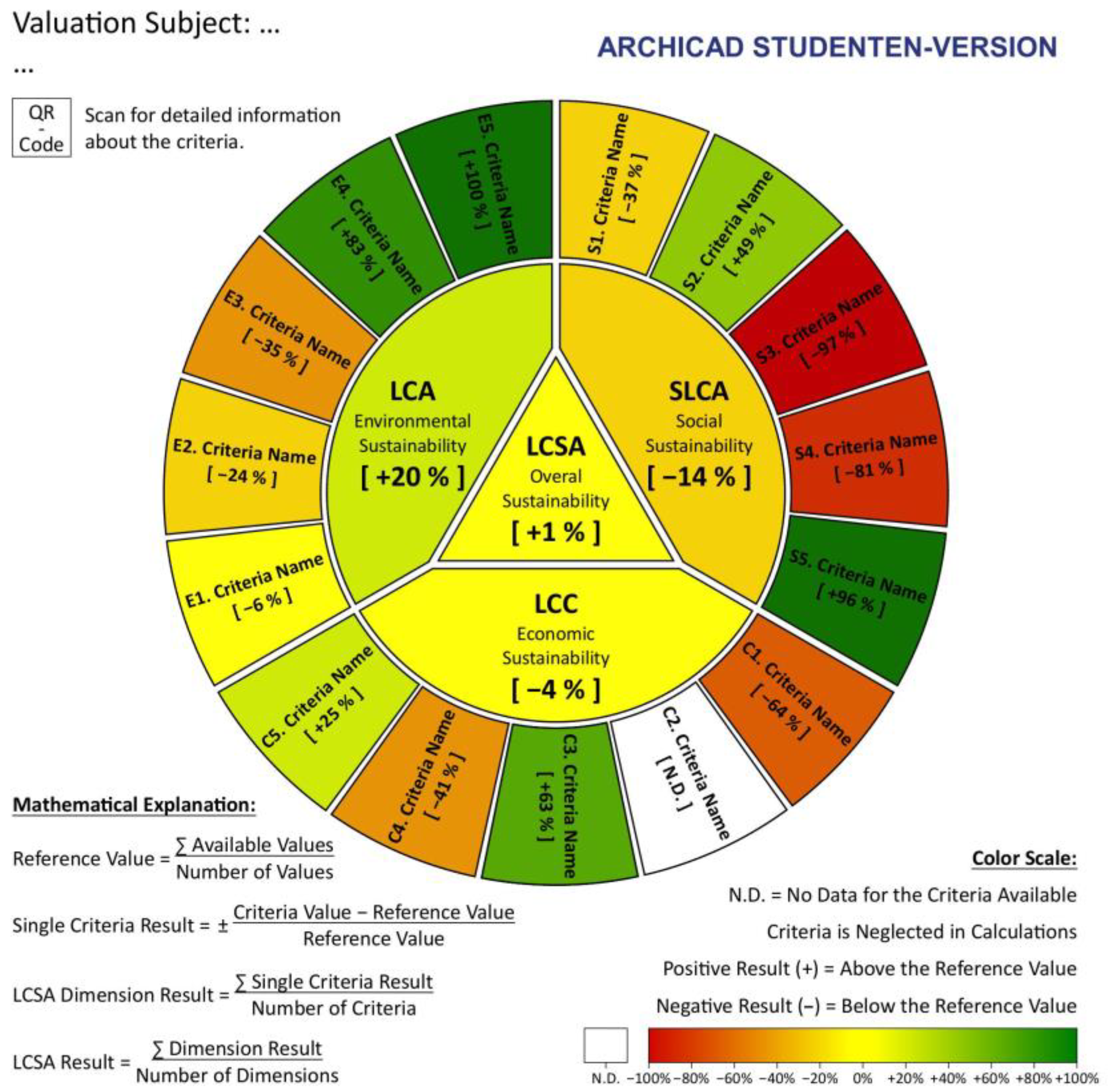
The Sustainability Crowns by Corona and San Miguel [20] form a circle that presents one alternative that is taken into consideration for the decision-making process. Compared to the LCSD, the Sustainability Crowns do not provide any weighting of the indicators or the dimensions. The inventors avoided including weighting intentionally as it depends on subjective values, and it could lead to an information leak. For the same reasons, they are cautious about aggregation, which is why, in contrast to the LCSD, no overall score per alternative is presented or calculated. Thus, the performance of an indicator is assessed according to the average of that indicator’s performance within the alternative values. The percentage deviation to the average value then indicates the color shown in the circle (Figure 1). According to Corona and San Miguel, the Sustainability Crowns are more flexible than the LCSD because they offer more options for listing different criteria. A lack of further literature as well as broad applications are noticeable for the Sustainability Crowns.

2.3. Triangles

The shape of a triangle is an intuitive choice for the visualization of three categories, as there are always three corners that can represent each of the categories, such as the sustainability dimensions. However, there are different realizations of a triangle as a visualization tool. With time, various models have emerged that are either partially based on each other, such as the ‘posterior triangle’ on the Life Cycle Sustainability Triangle (LCST) [21], or were developed independently from each other.

2.3.1. Life Cycle Sustainability Triangle
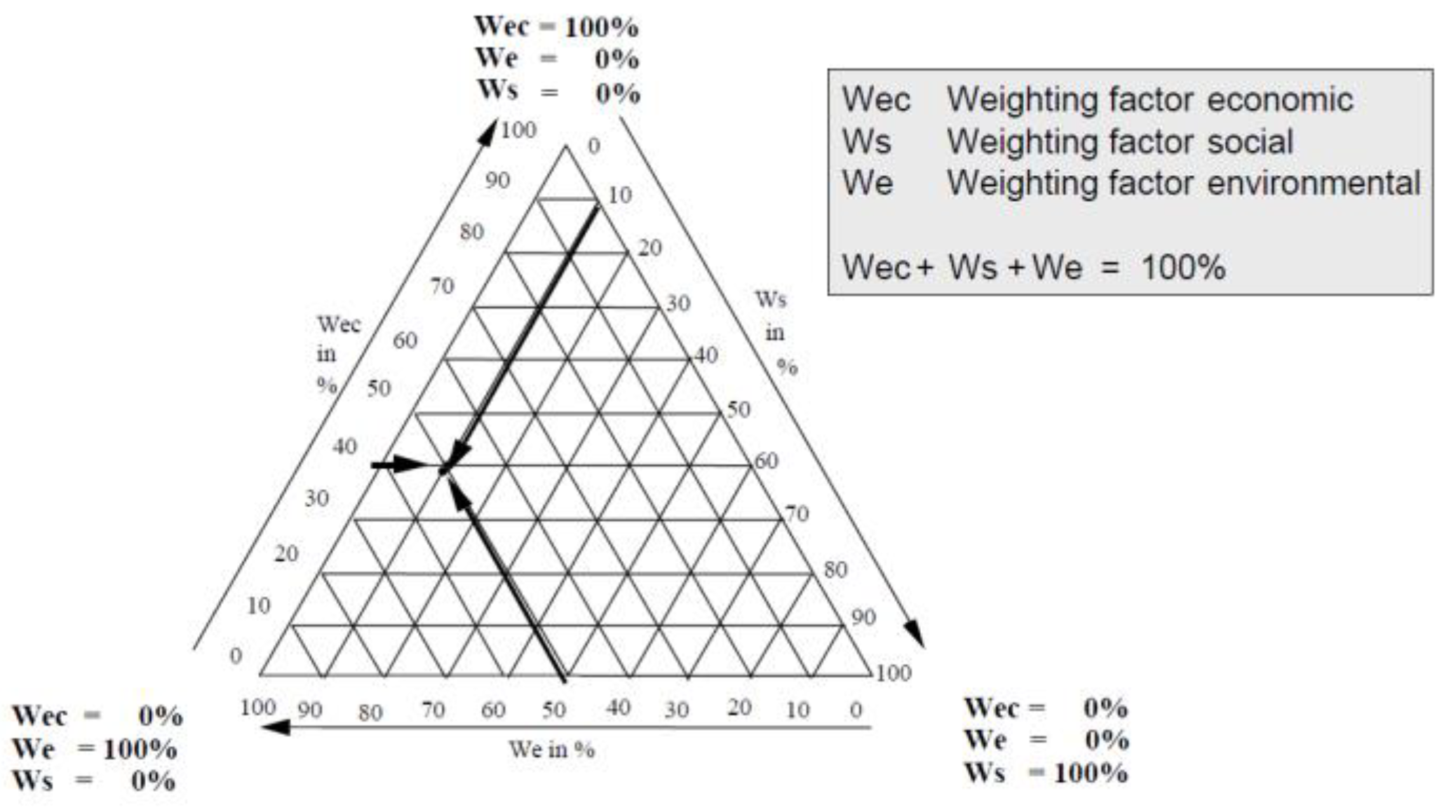
The LCST has its origin in the ‘Mixing Triangle’ which was first named and designed by Hofstetter et al. [22], and further developed by Finkbeiner et al. [5] for the application in conjunction with LCSA. Hofstetter et al. initially intended to design a triangle that considers three safeguard subjects regarding environmental impacts. However, the inventors also mention that the triangle can be applied to any three different parameters. Within the LCST it is possible to create a ranking of alternatives and to figure out the different strengths within the alternatives regarding the three dimensions. The visualization tool aims to illustrate the results of LCSA for all possible weighting sets to have an overview of the performances of the alternatives regarding the sustainability dimensions [22].
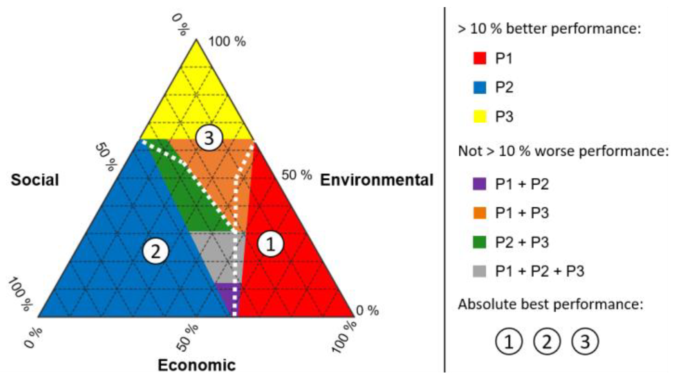
The choice of the corner for each dimension is not relevant if there is a clear assignment and gradation of the sides of the triangle. A corner indicates that the requirements of one of the dimensions are met completely, while the requirements of the other two dimensions are not fulfilled at all [5,22]. Each side of the triangle is divided into ten sections as the weighting factors of one dimension run in steps of ten. Therefore, the overall triangle is separated into many small triangles. Every corner of one single small triangle represents one possible weighting set of the three dimensions (Figure 2). For the evaluation, the performance values calculated with LCSA are normalized in one dimension for each alternative and then multiplied by the chosen weighting factors. Afterward, they are added up to one index which is called eco-index (EI), and calculated as follows (2):
EI = WE × PE + WEc × PEc + WS × PS
P: performance value of one alternative for each dimension (E = environmental, Ec = economic, S = Social)
W: the weighting factors of one reference point in the triangle which always need to be positive and add up to 100% (E = environmental, Ec = economic, S = Social).
Figure 2. LCST according to Finkbeiner et al. [5].
Sustainability 15 10658 g002

2.3.2. A Posterior Triangle/PS(S)M

The posterior triangle is based on the LCST and was designed by Müller and Hiete [21] for companies, and provides an overview of the performances of all alternatives for every possible weighting of the three dimensions of sustainability. This model is intended to ensure that no a priori weighting or aggregation takes place. The significance and meaningfulness of the individual weighting combinations are determined by the decision maker. Such as in LCST, the posterior triangle mainly represents the superior alternative.
A requirement for the application of the triangle is data from a full LCSA which has to be normalized and aggregated into the three sustainability dimensions. Both aggregated sustainability data and ready-to-use database data are suitable for implementation for the visualization. The preparatory work until the final visualization is considered to be very time-consuming, and both labor and data-intensive—as often in LCSA. Advanced knowledge in the field of sustainability assessment is required, while basic programming skills are sufficient. The normalization and aggregation can be realized in Microsoft Excel in which the LCSA data can be imported easily. The visualization steps have been performed with MATLAB, but also programming languages such as Python can be used as alternatives. It is recommended that the decision-makers make use of the Distance-to-Target (DtT) normalization which is applied for each sustainability dimension. DtT normalization aims to align the assessed performance with a desired target. For the normalization of the indicators of each sustainability dimension, an external weighting is used to make sure that the middle of the triangle represents an equilibrium of all three dimensions, so no rank reversal issue emerges. In the end, it is a compensatory approach as the aggregated sustainability score portrays the weighted sum of all sustainability dimensions’ performances.
Similar to the LCST, the evaluation approach offers an overview of all possible weighting combinations of all three sustainability dimensions. In contrast to the LCST, however, a posterior triangle works with colors. According to Müller and Hiete [21] the posterior triangle is not applicable for more alternatives than three: which is why they created an additional visualization method that has an unlimited capacity of alternatives that can be assessed—the product selection map (PSM).
The posterior triangle underlines the influence of different weighting combinations, as it avoids the “winner-takes-all” approach. Stakeholders can consider different sustainability performances and gain a deeper understanding of the results through different visualization options. Decision makers can take management relevant criteria into account and a posterior weighting enables multi-objective decision-making. In general, subjectivity is a much-discussed factor that cannot be avoided in evaluation approaches as a basis for decision-making processes. As soon as aggregation and weighting are involved, subjectivity automatically plays a role in the assessment. This uncertainty needs further research but was not addressed in the study of Müller and Hiete [21] (Figure 3).

2.3.3. Three-Sided Triangle

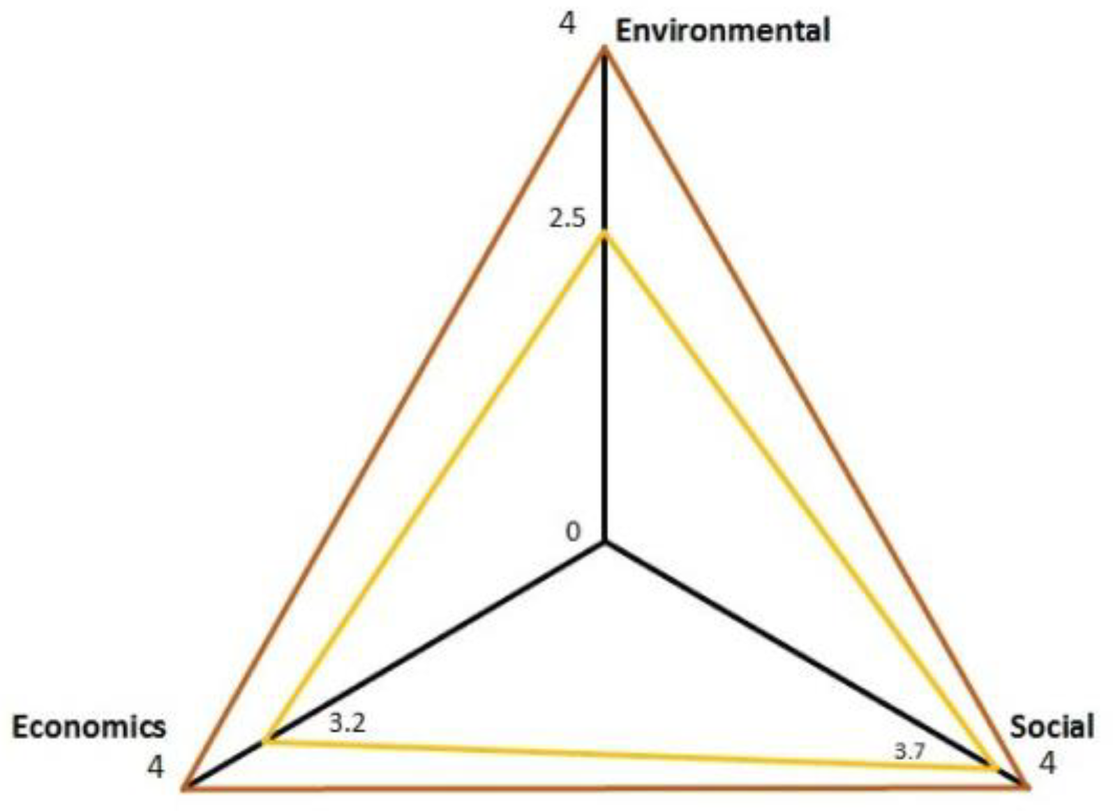
Another visualization approach using the shape of a triangle has been developed independently in two different papers—both use the same concept of visualization. While Omran et al. [23] follow the LCSA results and use the three sustainability dimensions as the three corners of the triangle (see Figure 4), Penn and Fields [24] invoke the triple bottom line created by John Elkington which include the factors people, profit, and planet. These are easily transferable to the three sustainability dimensions. Instead of profit, Penn and Fields [24] use the alternative term price which does not make a difference to the evaluation.
The three-sided triangle is intended to illustrate the relative balance between the sustainability dimensions and thus to identify the trend of the sustainability performance over time by regularly repeating this graphical assessment [23,24]. It is an effective approach to compare the broad picture of different alternatives and to identify the imbalances within the sustainability dimensions. For Penn and Fields [24] the visualization is primarily a tool useful to introduce the sustainability concept and the triple bottom line to students. For a more in-depth evaluation of LCSA or sustainability in general, studies and approaches from other sources need to be used and adopted [24]. Omran et al. use the triangular illustration for examining the sustainability of crude palm oil production in their study [23].

2.3.4. Integrative Triangle

The integrative triangle is an approach by Hauff and Kleine [25] to visualize the relationships between the three pillars of sustainability. The triangle itself is divided into several sections that describe the relationship between the fields of action and the indicators. While the dimensions can still be considered separately from each other, the areas inside the triangle serve to clarify the interrelationships of the dimensions and provide a multidimensional perspective. The more distant a field in the triangle is from the dimension’s corner, the less connection there is to the dimension. The triangular field that lies directly at the corner of one dimension is exclusively classified into this respective dimension. A more distant field from a corner is still classified as mainly economic, social, or environmental, but already has influencing factors from other dimensions. The fields that touch both dimensions’ triangles in one corner are equally linked to both dimensions [25].

3. Analysis of Existing Tools

In the following section, the focus is placed on three different forms of visualizations already presented: LCSD, LCST—as these are the most often named and cited ones in the LCSA-field. They are compared methodically, examined for strengths and weaknesses, and critically discussed.

3.1. Methodology

The methodological comparison procedure of the three named visualization tools is presented in the following. To ensure objectivity, the comparison of the existing visualization tools is carried out based on defined comparison criteria. For this purpose, general goals for the creation of a good visualization are first introduced in the following chapter. Subsequently, specific target criteria are developed on this basis, which should be fulfilled for the successful presentation of LCSA data.

Goals for the Creation of a Targeted Visualization

Schumann and Mueller [26] defined three generally applicable goals for creating a good visualization [26]. From all criteria reviewed within the existing literature, their approach was the most suitable for applicability within Life Cycle Sustainability Assessment. According to Schumann and Mueller, the visualization of data should fulfill the following goals: expressivity, effectiveness, and appropriateness. Expressivity is fulfilled when only the information contained in the data set is represented in the visualization. A visualization can thus be described as expressive if it depicts the considered data set in an unaltered way. The expressivity criterion can be fulfilled for a set of facts by different types of visualizations, which does not imply that these are effective. The effectiveness of a visualization tells how well the chosen form of representation reflects the data set. If the viewer can intuitively understand the information of a data set from a graphical representation, the effectiveness criterion according to Schumann and Mueller is fulfilled. The fulfillment of expressivity and effectiveness, in turn, do not indicate the appropriateness of a visualization. The appropriateness criterion is used to weigh the effort and costs involved in creating a graphical representation concerning its usefulness. Visualization can be expressive and effective but provides too little benefit to its effort. Thus, the visualization would not be appropriate [26]. Since this publication focuses on the graphical representation of LCSA, the three goals of a good visualization according to Schumann and Mueller are suitable as comparison criteria for the analysis of the already introduced visualization tools. In the following, the target criteria of expressivity, effectiveness, and appropriateness are explicitly adapted, elaborated, and explained for the LCSA framework and the presented tools.
Expressivity
Three criteria of expressivity should be met in the presentation of the LCSA:
(1) Mapping of an overall result for the LCSA.
Since visualization should establish itself as an application and interpretation approach in science and practice, a simple readability of the overall result of the LCSA is indispensable. This facilitates the use of the tool both for non-experts who, for example, want to compare two products based on the visualization when making a purchase decision, and for experts. In case a user prioritizes the result of a certain criterion or one of the sustainability dimensions in his/her weighting, the mapping of the LCSA result can be considered as additional information.
(2) Including and mapping the three pillars of LCSA.
The visualization should include and map the three pillars of the LCSA (LCA, LCC, and S-LCA). The three-dimensional view is necessary to consider the different priorities of all users. Particularly when looking at large organizations and companies, the relevance of mapping all three dimensions becomes clear. For example, a company to which profit is the highest priority would likely make decisions based on the best LCC score. An environmental organization, on the other hand, would possibly focus on the LCA outcome, while another organization would decide according to the S-LCA score.
(3) Information/reference to the basis of assessment.
Another essential aspect of the completeness of the visualization is a transparent presentation of the basis of the assessment. The results of the three pillars are determined based on the evaluation results of the associated criteria. To ensure the transparency of the results, these criteria and their evaluation results should be presented in some form. A detailed legend or a link to a database can be suitable for this purpose.
Effectiveness
The LCSA is a scientific framework that, supported by a suitable visualization, should be quickly understood and applied in practice by both experts and non-experts. Therefore, ensuring effectiveness is of particular relevance.
(1) Use of a color scale including a corresponding legend.
The use of a color scale including a corresponding legend facilitates the understanding of the visualization for the user. These can be used to classify results at first glance and thus serve to make the presentation comprehensible and to raise the interest of different users.
(2) Illustration of results.
Furthermore, the reporting of numerical results, both for LCSA itself as well as the sustainability dimensions and their evaluation criteria, is urgently needed in addition to the use of a color scale. The numerical results, even though it is one of the most challenging aspects, should be given either in relative (in comparison with reference/other scenarios) or absolute numerical values with an associated calculation explanation. For LCA a reference scenario or best-case scenario would present all values as zero; for S-LCA for example, a best-case scenario is more difficult to name.
(3) Quantity of the listed information to a suitable extent.
The quantity of the listed data is difficult to define as an objective evaluation criterion—which in general is an often-discussed topic in LCSA. Nevertheless, this is an important prerequisite for a good visualization: On the one hand, the presentation should not scare the user with a flood of information, and on the other hand, all important information should be included and easy to find and read.
Appropriateness
Even though LCSA is a framework that has gained relevance and attention in recent years, the effort and cost of visualizing LCSA results must be in proportion to the benefits. To ensure a high benefit of the visualization tool, the following criteria should be met.
(1) Global applicability of the visualization and its associated database.
The visualization and its associated database should be globally applicable, as data in LCSA often is expensive (paid software and database) or confidential (primary industry data) aspects. A necessary condition to achieve the goal of global applicability is the use of a standardized language.
(2) Simple adaptability for new developments.
The growing interest and the increasing number of publications in the subject area of the LCSA suggest a constant change, and a further development of the LCSA. New findings in the field of the LCSA must not lead to the fact that the visualization cannot be used at all or only by new development. Therefore, the flexible adaptability of the visualization tool is a necessary criterion. Adaptability could also imply the possibility to add new indicators to the LCSA visualization tool.
(3) Comprehensibility of the visualization.
The comprehensibility of visualization is difficult to formulate as an objectively assessable criterion. Nevertheless, the form of presentation used should be easy to understand and use, even for users who are not familiar with the subject matter. This ties into the issue of a common language/understanding, that still needs to be improved for LCSA [2,27].

3.2. Results

The results of the comparison are summarized in Table 1. The top column lists the three named visualization tools, with Sustainability Crowns abbreviated as ‘Crowns’. The left columns list the nine comparison criteria.

3.2.1. LCSD

The LCSD is a flexible assessment tool for LCSA, as the accompanying software allows the user to personalize the visualization. Nevertheless, there are different types of criticism regarding the LCSD: Some critical points are not directly related to LCSD but rather to LCSA and the database, which is relevant for all of the named visualization tools (and future-developed ones). The choice of indicators, for example, can cause a certain subjectivity due to LCSA. Especially the choice of social indicators is a challenge with regard to their reliability and comprehension [15,28]. Another aspect arising from LCSA is the independent consideration of the different sustainability dimensions. The LCSD can offer solutions and identify the most sustainable option. Presenting unambiguous results is not always risk-free, as factors and indicators are often strongly interlinked. Adjusting one factor can lead to a ‘backfire’ effect, meaning that the adjustments can negatively affect another factor [29].
With the LCSD a form of presentation that fulfills the first two target criteria is enabled. The respective criteria for the evaluation of the three pillars of sustainability are listed in the lower area of the visualization. As the LCSD is an Excel macro and programmed for older Excel versions, the software is not available anymore (it would be possible to use the macro in an older Excel version). However, no explanation or reference to how the assessments were made is given in the visualization. Therefore, the third target criterion is only partially fulfilled (Table 1).
Within the visualization tool LCSD a color scale is used to illustrate the evaluation results. This so-called ‘traffic light scale’ was deliberately chosen by the authors because it is established in many areas and is therefore intuitively understandable. A legend for the color scale can also be shown. It is significant that the legend does not assign numerical values to the colors, but descriptions from ‘excellent’ to ‘critical’, which is why the fifth criterion is only partially met. A numerical result is displayed for the selected category in the upper area of the visualization. The dashboard is built to create a ranking between different products (worst has a value of zero, best a value of 1000). These are numbered in whole numerical values from first to last place. The flexibility of the visualization provides a large amount of information, which is not easy to grasp without access to the Excel macro due to continuing software actualization and stagnant macro. Therefore, the criterion of the appropriate quantity of information is only partially fulfilled (Table 1).
Due to the fact that the software for the LCSD is accessible free of charge (currently not available) [4], the assessment tool seems to be globally usable. Furthermore, the English language is used, which indicates the global applicability of the visualization. Therefore, the seventh criterion is assessed as fully met. The visualization appears to be adaptable and robust to changes and new findings in the field of LCSA due to the software and its flexible structure. The exact functionality of the visualization is not intuitively comprehensible without using the software and thus creating a barrier based on software reason is existent. The visualization itself does not offer a direct explanation of the calculated values and rankings without Excel, which is why the criterion of comprehensibility is rated as not obviously fulfilled (Table 1).

3.2.2. Crowns

The Sustainability Crowns do not represent an overall result of the LCSA, nor do they represent the results of the three sustainability dimensions. Thus, the Sustainability Crowns do not meet the first two evaluation criteria. According to Corona and San Miguel [20], the visualization should primarily support the user in weighing and combining the three pillars. The results are given concerning the arithmetic means of all alternatives for the respective criterion. However, a breakdown of how the respective result values are obtained is not shown. Therefore, the Sustainability Crowns only partially fulfill the criterion by providing a reference to the basis of assessment (Table 1).
A color scale based on the traffic light system is also used to illustrate the evaluation results of the criteria. In addition to the actual visualization, a legend is also presented that assigns each of the eleven colors used to an associated percentage range of results. The fourth target criterion is thus completely fulfilled. For the LCSA and the individual columns, neither numerical nor color results are presented. Furthermore, there are no numerical results assigned to the evaluation criteria in addition to the color coding. Therefore, the fifth criterion is not fulfilled. The Sustainability Crowns provide a quick overview of the results of the criteria used to evaluate the three pillars of sustainability. Corona and San Miguel [20] justify the omission of the results for the individual pillars by stating that their visualization approach is only intended to serve the user’s weighting decision.
Due to the easy-to-understand structure of the figure and the use of the English language, the Sustainability Crowns seem to be globally applicable. Thus, the target criterion of the appropriate quantity of the listed data for the Sustainability Crowns is fulfilled. The representation form as a circle leaves room for flexible adjustments, both the criteria and the sustainability dimensions. Changes and innovations in the area of the LCSA should not require a new development of the Sustainability Crowns, which is why the criterion of adaptability is also fulfilled. The Sustainability Crowns have a clear structure, name the individual pillars, and use a common presentation of results in the form of percentage deviation from the average value, whereby the ninth criterion is also fulfilled (Table 1).

3.2.3. LCST

The visualization of the LCST helps the user to weigh the three sustainability dimensions. For example, if a user adjusts the given weighting set to his personal preferences, he/she can compare it with the weighting sets of products. However, no overall result of the LCSA can be obtained from the visualization itself. The pillars of sustainability are symbolized by the respective corners of the Triangle, but only the weightings of these and no evaluation results are presented. For this reason, the second criterion is not met (Table 1). An explanation of the evaluation criteria is not necessary, as the triangle is only used for weighting and not for evaluation. Furthermore, Müller and Hiete [21] criticize that the LCST cannot evaluate different scenarios in the visualization, and thus the LCST is not adaptable to external adjustable circumstances that are to be compared.
From a graphical point of view, the LCST represents a black-and-white illustration in which the weightings can be drawn in by the user in color. However, there is no anchored color scale corresponding to the criterion to illustrate the results. As explained before, only percentage weightings are given in the LCST. Since the fifth objective criterion (Table 1) aims at illustrating numerical evaluation results, the criterion is not fulfilled by the LCST. The LCST is only used to visualize the weighting of the sustainability dimensions. Therefore, the visualization fulfills the criterion of the quantity of information.
This visualization tool is an adaptation of the weighting triangle for the representation of chemical mixtures, which speaks for global and interdisciplinary applicability. In addition, the use of the English language suggests a worldwide comprehensibility of the visualization tool. Any three parameters can be selected. However, a change in the number of parameters would pose a problem, since this would require new development and naming of the visualization. Thus, under the condition of exactly three parameters, the LCST applies to arbitrary weighting problems, which is why the eighth criterion is partially fulfilled (Table 1). Furthermore, the user is provided with explanations for the abbreviations of the weighting factors.

3.3. Discussion

Considering all the information obtained, the LCSD is a very comprehensive visualization tool for LCSA. It fulfills most of the established comparison criteria for good visualization of LCSA (Table 1). The given flexibility of the visualization, which can be individually adapted by each user on the basis of the free Excel-macro, offers a great advantage. However, this flexibility also complicates the intuitive understanding when using the visualization without the help of a previous explanation of the ranking system. Due to the different output forms of the visualization for every application, the comprehensibility of the representation by third parties suffers. Another weakness of the visualization is the lack of a legend that assigns concrete numerical values to the colors instead of literal descriptions. This reduces the usefulness of the visualization, for example, for the precise comparison of the sustainability rating of products. A reference to the assessment basis of the individual criteria, in addition to the associated software, would also be useful for transparency reasons. With the help of the software, good comprehensibility may be ensured, but in a best-case scenario, the visualization should also be intuitively applicable and understandable independently of the software. Overall, although the LCSD provides much information and is the first known visualization approach specifically for LCSA results, the dashboard itself without the Excel macro support lacks a clearly structured design, which makes the application of the visualization very difficult.
The Crowns represent the latest published visualization approach for LCSA. It can be observed that Corona and San Miguel [20] have already recognized some weaknesses of the previous visualizations and have taken them into account in their approach. Similar to the LCSD, the Crowns also use a traffic light scale to visualize the assessment results. The associated legend provides the user with a percentage range of scores relative to the average score for that category. This is a good basis for purchase decisions by consumers who have to decide between several products on the market. However, the Sustainability Crowns do not map overall results for LCSA nor for the individual columns. Corona and San Miguel justify this in their publication by stating that the Sustainability Crowns should only be used as an aid for weighting in decision-making processes. Nevertheless, an overall assessment is an essential component for the use of visualization in practice. The value should be easily accessible and not discourage users with additional effort. The possibility of personal prioritization of different criteria by the user is not limited by the listing of additional results and should therefore be executed.
Compared to that, the LCST allows the user a simple classification of the weighting of the three sustainability dimensions. Additionally, the possibility of personal weighting is given and users can, for example, compare alternatives according to different weightings. Since the visualization of the LCST only shows the weighting sets and does not include any ratings, a comparison with the LCSD or the Crowns is rather difficult. According to the authors, the Crowns are also intended to serve only the weighting decision, but unlike the LCST, they map the evaluation criteria and their results. The LCST is rather unsuitable as an objectively usable interpretation approach in practice since the calculations for the sustainability assessment are only made after the visualization has been used to aid weighting and are thus dependent on these subjective weightings. Therefore, this visualization is mainly recommended as an additional decision-supporting tool.
In conclusion, it can be stated that the LCST and the Crowns represent easily comprehensible visualizations for the weighting of the pillars of sustainability, whereby the Crowns are convincing due to their clear structure. Only the LCSD transparently discloses the underlying LCSA results—with the help of the Excel macro. The flexible customizability of the dashboard is a key strength of the dashboard, but at the same time leads to a high degree of complexity, which makes it more flexible and by this partly more difficult to decide on and use in practice. Further development of an LCSA visualization tool that combines both the level of information and straightforward usability for users should provide a basis for decision-making for science and practice in the future.

4. Theoretical Future Development—Visualization Tool: LCSA-Wheel

Named weaknesses from existing visualization tools are subsequently revised and optimized in the following presented (initially theoretical) visualization approach for LCSA—named the LCSA-Wheel. The goal is to develop an instrument that can be used as a standardized application and interpretation approach in science and practice—used by experts and non-experts.
The target criteria as named in the previous chapter (Table 1) are adopted and serve the development. Thus, for the visualization, a form of presentation has to be found, which provides the user with the results of the LCSA, as well as the results of the three pillars at first glance. The evaluation criteria used and the corresponding results of these should be depicted. Besides the pure drawing, the transparent presentation of the origin of the results of the evaluation criteria is a crucial part of the visualization. This must either be directly readable or be retrievable by interested users without additional effort. The scope of the listed information must not leave any information gaps, but at the same time, should not scare off the user with a flood of information. A color scale with a corresponding legend should be used for visual clarification of the results. However, to be able to compare products in practice based on the LCSA-Wheel, for example, it is also necessary to display numerical results. To justify the effort and costs involved in creating a new interpretation approach of the LCSA, the global applicability of the visualization should be aimed. This can be achieved for both the visualization and the data basis by using a globally established language. The data basis is, therefore, to be covered in the future preferably by a freely accessible internet page, which at this place exceeds the scope of a visualization tool. Nevertheless, in general, it is a very important aspect to be discussed for the future of LCSA—partly already existing e.g., OpenLCA. Another target criterion for visualization is flexible adaptability. The visualization as such must therefore be flexibly expandable to different numbers of evaluation criteria or new dimensions of sustainability and apply to all sectors. A decisive factor for the implementation of visualization in practice is an easily understandable presentation. This must not be too extensive, but at the same time, it must contain all the necessary information. Through the preceding analysis and discussion, it has become apparent that the Sustainability Crowns fulfill most of the established target criteria for the visualization of the LCSA (Table 1). Therefore, the basic shape of the Sustainability Crowns visualization as a circle with surrounding criteria was deliberately adopted and adjusted. The visualization—named ‘LCSA-Wheel’—was further elaborated after firsthand sketches with the free student version of the CAD program “ArchiCAD”.

4.1. LCSA-Wheel

Figure 5 shows the ‘LCSA-Wheel’. The naming is based on the one hand on the wheel-like appearance of the visualization and on the other hand on the symbolic character of the wheel, which literally keeps on turning, but has not been and does not have to be reinvented. This also applies to the developments in the field of LCSA and interpretation/visualization.
The proposed visualization consists of the LCSA-Wheel, which presents the results of the sustainability assessment under consideration, as well as a frame that serves to provide further information and explanations to the LCSA-Wheel:
In the upper left corner, the assessed object, and any special features of it are indicated. Located below lies a QR code for further information, which leads the user to a stored website if desired (until now: theoretical development).
The mathematical calculations on which the results shown are based are listed in the lower-left corner of the image. The LCSA-Wheel always represents a questioned sustainability performance of a product or service in relation to a reference value/more reference values. This reference value can be another product or service the questioned one should be compared with, it can be a literature value, an official benchmark, or a value given by a database. Important is, that the reference value is clearly named and described and the respective source of information is provided. The mathematical calculations are explained in the following: First, the reference value is defined for each evaluation criterion by dividing the sum of all available reference values for a criterion by the number of these. For comparison purposes, literature values of scenario values can be used as reference values—if the functional unit, system boundaries, and full assessment are fully comparable. For LCA and LCC, the authors expect it to be easier to find reference values or even values. For S-LCA this might be a more complex and challenging task. Nevertheless, also the S-LCA values should be comparable, otherwise, the visualization in colors is not possible within the proposed LCSA-Wheel.
R e f e r e n c e V a l u e = A v a i l a b l e V a l u e s N u m b e r o f V a l u e s
In the second step, the single criteria result of the object to be evaluated is calculated in the form of the deviation from the average criteria result. For this purpose, the defined reference value result is subtracted from the criteria value, and the resulting difference is divided by the reference value (only if a comparison is needed/wanted). For this second calculation, there needs to be a differentiation between LCA and LCC vs. S-LCA. The reason for this is, that a positive value as single criteria result would for LCA and LCC mean that the product or service questioned has a higher value than the reference value, which for both, emissions and costs, is seen as a negative aspect (see Equation (4). For S-LCA, the result is to be considered exactly the opposite. So, the signs for the respective columns have to be varied as follows: for LCA and LCC minus is needed, for S-LCA the plus stays see also the following case study for improved understanding).
S i n g l e C r i t e r i a R e s u l t = ± C r i t e r i a V a l u e R e f e r e n c e V a l u e R e f e r e n c e V a l u e
Next, an average result is calculated for each sustainability dimension using the arithmetic mean (LCSA Dimension Result). This is useful to gain an overview of how the assessed product performs within the sustainability dimensions considering different criteria. It provides users the opportunity to make decisions according to an overall sustainability performance within a particular dimension. For this purpose, all single criteria results of the respective dimension are added up and then divided by the number of criteria.
L C S A D i m e n s i o n R e s u l t = S i n g l e C r i t e r i a R e s u l t N u m b e r o f C r i t e r i a
Finally, the LCSA result is also obtained by adding up the dimension results and then dividing by the number of these results (LCSA Result).
L C S A R e s u l t = D i m e n s i o n R e s u l t N u m b e r o f D i m e n s i o n s
The decimal numbers produced in the previously presented Equations (3)–(6) are displayed in the LCSA Wheel as integer percentages.
The lower right corner of the figure contains a legend of the used color scale. To enable intuitive comprehensibility, the use of the traffic light scale was chosen, just as for the LCSD and the Sustainability Crowns. The legend explains to the user the meaning of the colors used: white = no data available for the criterion under consideration, green = positive result that is better than the average result, and red = negative result that is worse than the average result. In addition, it is explained that a criterion for which no data is available is accordingly neglected in further calculations. Again, the color code is only needed/of relevance if the comparison is made (e.g., GWP/climate change values of different comparable assessments/scenarios).
The LCSA-Wheel represents the overall LCSA result, as well as the explanation ‘LCSA Overall Sustainability’ in the triangular box in the center of the circle. The LCSA result is shown as an integer percentage. For visual support, the color of the field corresponds to the result according to the assignment of the color scale. The results of the individual columns are shown adjacent to the three sides of the triangle. The results are presented in the same way as the LCSA result, using the color coding of the fields and percentage result values. The evaluation criteria including the respective results are again attached to the columns of sustainability at the edge of the circle. The designation of the criteria consists in each case of a letter, a consecutive number, and the name of the criterion. The letter E is assigned to the criteria of the LCA. Thus, the first clockwise criterion of the LCA dimension has the name E1, the second clockwise criterion E2, and so on. The LCC criteria are designated by the letter C and the S-LCA criteria are designated by the letter S and numbered sequentially in the same way as the LCA criteria. The results are presented similar to those of the LCSA and the three sustainability dimensions both by color and by percentage result.

Meeting the Target Criteria

The results of the LCSA and the individual columns are visible in the center of the LCSA panel in separate fields, thus fulfilling the first two target criteria (Table 1). To fulfill the third target criterion ‘information or at least a reference to the basis of assessment’ the evaluation criteria, including their obtained results, are mapped on the outer margin of the LCSA-Wheel. To ensure transparency of the origin of the evaluation criteria, a legend for the mathematical formulas used is integrated. Starting with the results for the individual criteria up to the overall result of the LCSA, this lists each calculation step in chronological order. To determine the criteria results, the respective value of the object under consideration is set to the average value of all available alternatives. In a globalized world, it is considered logical to include all available options in the evaluation of the criteria. Furthermore, to ensure transparency of information about the underlying data and evaluation criteria, compared scenarios or literature data should be shown and explained with the help of the QR code.
For the simultaneous fulfillment of the third criterion ‘information or at least a reference to the basis of assessment’ and the sixth criterion ‘quantity of the listed information to suitable extend’ it is decided to create two different output versions of the visualization: The first output or print version corresponds to Figure 1 presented earlier and is defined as the simple version. The second print version is presented in Supplementary Materials (Figure S1). This output version supplements the previously described standard version with a table containing additional information on the evaluation criteria. For each listed criterion, the total value of the considered object and the best-achieved value of all alternatives including the corresponding unit are shown. Additionally, the source is mentioned for traceability and transparency of the data, whereby, target criteria three and six are considered to be fulfilled.
The target criteria four ‘use of a color scale including corresponding legend’ and five ‘information of numerical results (relative or absolute)’ are completely fulfilled, since each result is always illustrated both in color and numerically. In addition to that, both formats are explained by a corresponding legend.
To fulfill the seventh criterion ‘global applicability of the visualization and its associated data basis’, the programming of a webpage for the underlying database could be useful, but may be difficult to implement due to known data and maintenance issues. The webpage should be globally usable and free of charge for all people. The maintenance of the database used must be ensured by qualified personnel, which can represent a challenge. What needs to be discussed at this point are the basic data, such as those offered by GaBi or Ecoinvent—which, however, are not free of charge and not freely accessible. Another requirement for global applicability is the language used. Since the English language is the most widespread and widely spoken, this is to be used on the webpage. For initial use of the LCSA-Wheel an Excel Sheet, resulting in the visualization of Figure 5 might be a part-time solution. In the long run, it does not represent a smart solution, which is why we propose the named webpage.
The fulfillment of the eighth target criterion, ‘simple adaptability for new developments’, is demonstrated by the illustration of two variants of the visualization described below. One of the variants is shown in Supplementary Materials Figure S2, which introduces a possible new dimension to the LCSA-Wheel. The introduction of one or even more new dimensions requires the adaptation of the fields but can be executed without redevelopment due to the flexible circular shape of the visualization. Supplementary Materials Figure S3 shows a second variant that represents the LCSA-Wheel with different numbers of evaluation criteria. As an example, six criteria for S-LCA, four criteria for LCC, and ten criteria for LCA were created. If an even larger number of criteria is required for an evaluation, these can also be added with little effort. The decisive factor here is that the criteria are named separately for each dimension using the letters introduced, thus preventing confusion. Thereby, if a new evaluation criterion is added for a dimension, a new criteria field is inserted clockwise at the last position of the dimension. This ensures the comparability of the visualization since the numbering of existing criteria is not changed by the insertion of new criteria.
The ninth target criterion, ‘comprehensibility of the visualization’, is difficult to evaluate objectively. Nevertheless, it was aimed to keep the structure of the visualization as simple as possible, with all necessary descriptions and explanations, to ensure the fulfillment of this target criterion. In addition, the LCSA and the individual columns were supplemented by short explanations of terms and a QR code so that users without prior knowledge of the field could also use the visualization.

4.2. Practical Example of Carbon Reinforced Concrete

To prove the applicability of the LCSA-Wheel and provide a short example, an implementation of LCSA results for carbon reinforced concrete based on previous studies [30,31] is conducted in the following. The system boundary is defined as cradle-to-gate, and the functional unit is defined as a double wall made of carbon reinforced concrete—based on and as a continuation of a previous LCA.
LCA: The values considered for the LCSA-Wheel case study are all taken from the former published LCA. The values are obtained from primary and secondary data and the LCA was performed with the help of the software solution GaBi ts. Table 2 shows the environmental performance for the defined functional unit of a double wall within the system boundaries of cradle-to-gate for one possible fiber and concrete combination. Within the actual study, only three environmental midpoint indicators are represented: Global Warming Potential (GWP), Abiotic Depletion Potential fossil (ADPf), and Acidification Potential (AP). The authors just chose three different midpoint indicators to give an example of how the LCSA-Wheel could finally look like and how the calculations are to be used in practice—especially focusing on the signs.
For example, in the LCA results for a double wall combining fiber F1 and concrete C1, the calculations for single criteria results are as follows:
S i n g l e   C r i t e r i a   R e s u l t   G W P = 754 729 729 = 0.0342 = 3.34 %
S i n g l e   C r i t e r i a   R e s u l t   A D P = 6775 6380 6380 = 0.0619 = 6.19 %
S i n g l e   C r i t e r i a   R e s u l t   A P = 1.05 0.966 0.966 = 0.0870 = 8.70 %
This results in the following LCSA dimension result for the LCA of Carbon Reinforced Concrete based on the three criteria GWP, ADP, and AP:
L C S A   D i m e n s i o n   R e s u l t   L C A = 3.34 6.19 8.70 3 = 6.08 %
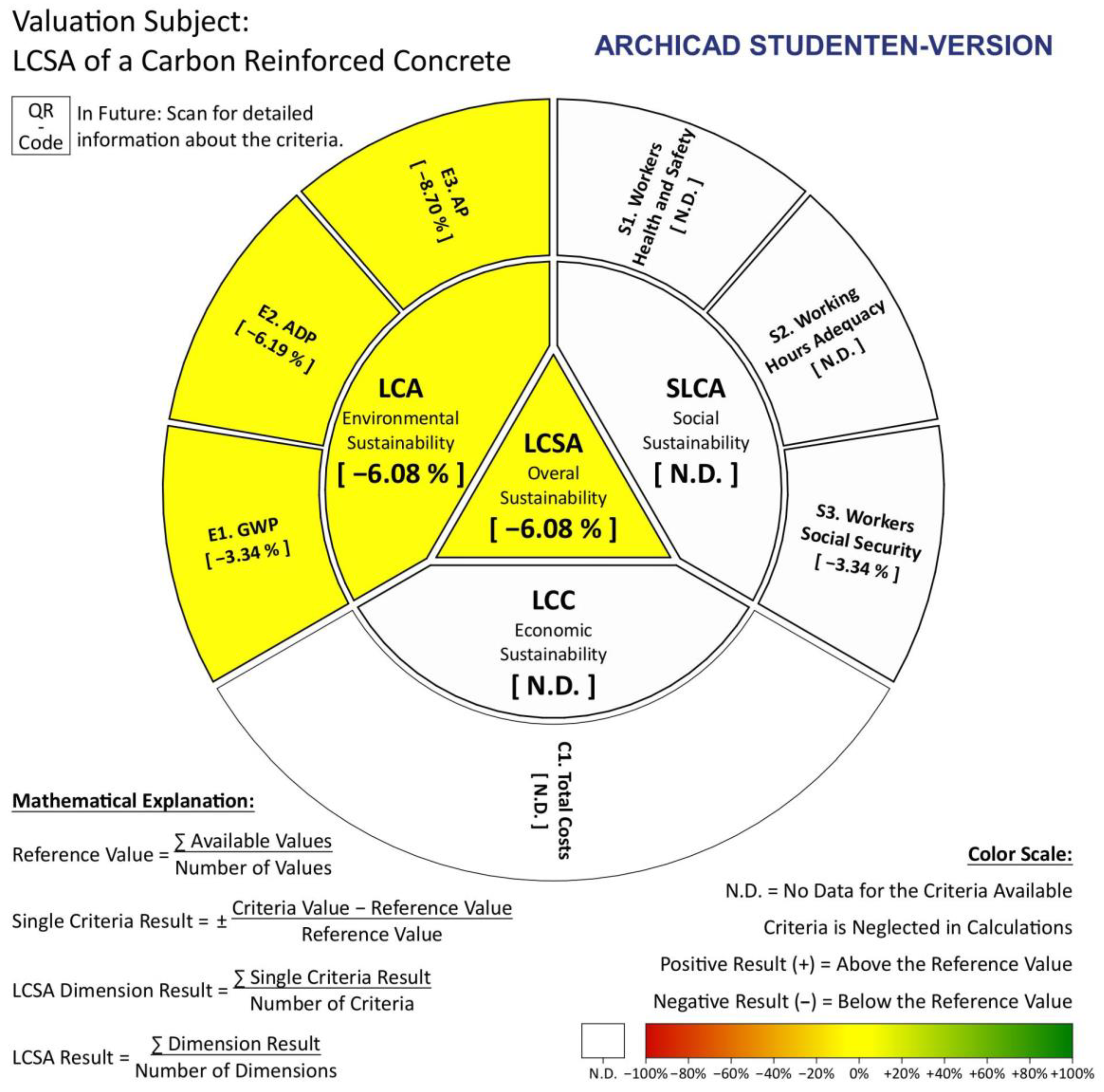
These results can be illustrated with the LCSA-Wheel (Figure 6) and thereby show precisely the results obtained from the Life Cycle Assessment. All relevant information that is necessary to understand and possibly compare the results, such as the criteria considered and the comparative products to which the results are related, in future should be found on the visualization itself and the data stored behind the QR-code (currently an Excel sheet which definitely needs to be improved in future for common use).
In our specific case, the color is presented in yellow, which means, that the questioned double wall (combined of F1 and C1) is more or less equally good or bad as the reference value, which is also visible in Table 2—for only two values one could still consider the table, comparing more than just two values, the LCSA-Wheel becomes even more important for a fast and easy comparison.
LCC: For LCC, actually there is no reference value for the questioned double wall available, which is why no color and number relative number can be presented. A total cost for the double wall could have been assumed, but just this absolute value will not allow us to use the LCSA-Wheel wisely. Especially for LCC, but also for S-LCA, it might be important to cooperate with the industry, as this would provide a full value chain and is often considered confidential costs. At this point it becomes clear for whom the LCSA-Wheel approach can be of greatest importance: industry or business, which wants to compare a variety of its own products with known manufacturing routes and costs.
S-LCA: Since currently quantified values for the S-LCA of carbon reinforced concrete are missing and there are also no quantitative reference values at this point, there are no numbers given in the practical example of the LCSA-Wheel (white color: no data), but the as mainly identified relevant indicators are presented in the visualization—named as workers health and safety, working hours adequacy and workers social security (see Figure 6).
LCSA: As in this case study we only were able to provide absolute values and reference values for LCA, the LCSA Results (overall sustainability) equals the LCSA Dimension Result.

4.3. Discussion & Limitation

The LCSA-Wheel was specifically designed for the visualization of LCSA results. All established target criteria to enable a good visualization of LCSA results are fulfilled, which shows that the LCSA-Wheel is a clear further development and improvement of the assessed three existing visualization tools. With regard to the LCSD, a clear and fixed structure is used, as well as additional explanations of terms. This creates a more user-friendly visualization that allows direct applicability for both non-specialist and expert users. Compared to the LCST, it can be stated that the LCSA-Wheel does not offer the possibility to introduce individual weightings. The evaluation criteria are equally weighted to calculate the sustainability dimensions. Similarly, the three sustainability dimensions are each equally weighted by one-third to determine the overall LCSA score, which is consistent with the approach of the LCSA [5,6]. This can be noted as a criticism of the visualization approach but has been deliberately implemented in this way with a view to the comparability of the visualization. For this approach, support is provided by a limit conjoint analysis conducted by Tarne et al. [32]. The analysis of the conducted survey of 54 decision-makers of a German automotive company showed that the three sustainability dimensions are weighted almost equally. On average, the economic dimension was weighted at 33.5%, the ecological dimension at 35.2%, and the social dimension at 31.2% [32]. As this corresponds to an approximately equal distribution, our approach of not including a weighting option in the visualization is supported by the study. Due to the improvements made over previously introduced visualization approaches, the LCSA-Wheel has the potential to become a standardized application and interpretation approach in science and practice. A limitation at this point is the lack of testing of the visualization tool by non-specialist and expert users and the differing calculations for LCA and LCC versus S-LCA (negative/positive single criteria result). This should be strived for in the next step for further optimization of the LCSA-Wheel—which additionally requires more practical implementation and thus programming in addition to the current theoretical approach. Furthermore, the data basis is an issue that still needs to be addressed: preferably open access data is used, which can mean, for example, coupling to OpenLCA. At the same time, the data basis in paid software solutions/databases such as GaBi or Ecoinvent is much larger and verified by third parties. Another—but more expensive—approach could therefore be for software providers to include visualization in their packages in the future. Special attention must be paid to the calculation so that the signs are not mistakenly reversed in the second calculation. At this point, however, the case study should have provided the reader with a full understanding. Particularly during the implementation of the case study, it became clear that data regarding LCC and S-LCA are relevant, otherwise, the visualization only makes limited sense. Cooperation with or explicit alignment of the LCSA wheel for the industry could be a solution at this point. This cooperation could also ensure an optimized application since data from software solutions have been transferred to Excel up to now and there is still no improved application. This must be changed in the future and improved in terms of user-friendliness.

5. Conclusions

The aim of this publication was the elaboration and presentation of already existing LCSA interpretation and visualization tools, as well as the further theoretical development of a visualization tool for Life Cycle Sustainability Assessment results, which can establish itself in science and practice as a standardized application and interpretation approach. First, all existing approaches were described and three focused approaches (Life Cycle Sustainability Dashboard, Life Cycle Sustainability Triangle, and Sustainability Crowns) were methodically compared. The comparison showed the following key results:
  • The Life Cycle Sustainability Triangle is rather unsuitable as an objectively usable interpretation approach in practice since the calculations for the sustainability assessment are made only after the visualization has been used to aid weighting and are thus dependent on subjective weightings. It is therefore recommended as an additional tool for decision support.
  • The Life Cycle Sustainability Dashboard is a very comprehensive visualization tool for LCSA results. It provides the user with some information, but it lacks a fixed and structured structure, which makes the application of the visualization very difficult.
  • The Sustainability Crowns are only intended to help the user weigh the sustainability dimensions and therefore do not map overall results. Nevertheless, the Sustainability Crowns fulfill most of the established target criteria and have an intuitively understandable structure.
The Sustainability Crowns served as a model for the development of the more advanced (so far theoretical) visualization approach: the LCSA-Wheel. This approach is suitable for illustration and discussion of LCSA results in both science and practice. It can be described with the following key characteristics:
  • A circular illustration was supplemented by a frame that provides the user with further information, such as mathematical explanations of the calculations. Furthermore, the overall results were vividly added to the center of the LCSA-Wheel, as these form the core of the visualization.
  • It can be chosen from multiple print versions: The first includes the LCSA-Wheel with a QR code, which can be used to access the stored data basis in the form of a website. The second print version supplements the LCSA-Wheel with a table that lists information about the evaluation criteria used.
  • Flexible application is possible by adjusting the number of evaluation criteria and the sustainability dimensions.
An essential component of the visualization tool, besides pure visualization, is the associated data basis in the form of a website. In the next step, the website has to be programmed and created according to the specifications and contents. Furthermore, the contained data (preferably open access, for example, linked to OpenLCA) must be permanently maintained and updated. This incurs costs for the employment of expert personnel. Another decisive factor for the implementation of sustainability assessment in science and practice is the final standardization of the LCC and the S-LCA. The lack of standardization to date makes it difficult to collect data for the two sustainability dimensions, and the comparability of collected data cannot be guaranteed without standardization. In order to finally establish the LCSA framework in science and practice, these two pillars of sustainability need to be standardized in a timely manner within a similar framework to the LCA. Looking back on the work presented, it can be concluded that the LCSA holds great potential for the future, regardless of the industry, and that the LCSA Wheel developed can complement the LCSA framework as a suitable visualization tool when making use of a webpage/QR code and working in general on the named data challenge.

Supplementary Materials

The following supporting information can be downloaded at: https://www.mdpi.com/article/10.3390/su151310658/s1. Figure S1. Future Development LCSA-Visualization: LCSA-Wheel—detailed version; Figure S2. Future Development LCSA-Visualization: LCSA-Wheel—additional dimension; Figure S3. Future Development LCSA-Visualization: LCSA-Wheel—additional criteria.

Author Contributions

Conceptualization, J.G.B.; methodology, L.S.S. and J.G.B.; software, L.S.S.; validation, J.G.B., A.W., M.T. and L.S.S.; formal analysis, L.S.S., J.G.B. and A.W.; investigation, L.S.S., J.G.B. and A.W.; resources, L.S.S. and J.G.B.; data curation, L.S.S., J.G.B. and A.W.; writing—original draft preparation, L.S.S. and J.G.B.; writing—review & editing, L.S.S., J.G.B., A.W. and M.T.; visualization, L.S.S.; supervision, J.G.B. and M.T.; project administration, J.G.B.; funding acquisition, J.G.B. and M.T. All authors have read and agreed to the published version of the manuscript.

Funding

This research was funded by the German Research Foundation (DFG), as part of the Sonderforschungsbereich/Transregio 280 (SFB/TRR 280) ‘Konstruktionsstrategien für materialminimierte Carbonbetonstrukturen’/‘Design Strategies for Material-Minimized CRC Structures’ (Subproject E01, project number 417002380). The financial support by the German Research Foundation (DFG) is gratefully acknowledged.

Informed Consent Statement

Not applicable.

Data Availability Statement

The data presented in this study are available in this study and its Supplementary Materials.

Conflicts of Interest

The authors have no conflict of interest to declare.

References

  1. Guinée, J.B.; Heijungs, R.; Huppes, G.; Zamagni, A.; Masoni, P.; Buonamici, R.; Ekvall, T.; Rydberg, T. Life cycle assessment: Past, present, and future. Environ. Sci. Technol. 2011, 45, 90–96. [Google Scholar] [CrossRef]
  2. Backes, J.G.; Traverso, M. Application of Life Cycle Sustainability Assessment in the Construction Sector: A Systematic Literature Review. Processes 2021, 9, 1248. [Google Scholar] [CrossRef]
  3. Valdivia, S.; Backes, J.G.; Traverso, M.; Sonnemann, G.; Cucurachi, S.; Guinée, J.B.; Schaubroeck, T.; Finkbeiner, M.; Leroy-Parmentier, N.; Ugaya, C.; et al. Principles for the application of life cycle sustainability assessment. Int. J. Life Cycle Assess. 2021, 26, 1900–1905. [Google Scholar] [CrossRef]
  4. Traverso, M.; Finkbeiner, M.; Jørgensen, A.; Schneider, L. Life Cycle Sustainability Dashboard. J. Ind. Ecol. 2012, 16, 680–688. [Google Scholar] [CrossRef]
  5. Finkbeiner, M.; Schau, E.M.; Lehmann, A.; Traverso, M. Towards life cycle sustainability assessment. Sustainability 2010, 2, 3309–3322. [Google Scholar] [CrossRef] [Green Version]
  6. Kloepffer, W. Life cycle sustainability assessment of products. Int. J. Life Cycle Assess. 2008, 13, 89–95. [Google Scholar] [CrossRef]
  7. Zanni, S.; Awere, E.; Bonoli, A. Life Cycle Sustainability Assessment: An Ongoing Journey; Elsevier Inc.: Amsterdam, The Netherlands, 2020. [Google Scholar] [CrossRef]
  8. Balasbaneh, A.T.; Yeoh, D.; Juki, M.I.; Gohari, A.; Abidin, A.R.Z.; Marsono, A.K.B. Applying three pillar indicator assessments on alternative floor systems: Life cycle study. Int. J. Life Cycle Assess. 2021, 26, 1439–1455. [Google Scholar] [CrossRef]
  9. Raymond, A.J.; Kendall, A.; DeJong, J.T.; Kavazanjian, E.; Woolley, M.A.; Martin, K.K. Life Cycle Sustainability Assessment of Fugitive Dust Control Methods. J. Constr. Eng. Manag. 2021, 147, 04020181. [Google Scholar] [CrossRef]
  10. Touceda, M.I.; Neila, F.J.; Degrez, M. Modeling socioeconomic pathways to assess sustainability: A tailored development for housing retrofit. Int. J. Life Cycle Assess. 2018, 23, 710–725. [Google Scholar] [CrossRef]
  11. Fauzi, R.T.; Lavoie, P.; Sorelli, L.; Heidari, M.D.; Amor, B. Exploring the current challenges and opportunities of Life Cycle Sustainability Assessment. Sustainability 2019, 11, 636. [Google Scholar] [CrossRef] [Green Version]
  12. Brühl, W.; Ebinger, F.; Ewen, C. Hoechst nachhaltig. Okol. Wirtsch. Fachz. 1997, 12, 7–10. [Google Scholar] [CrossRef]
  13. Hardi, P.; Semple, P. The dashboard of sustainability: From a metaphor to an operational set of indices. In Proceedings of the Fifth International Conference on Social Science Methodology, Cologe, Germany, 3–6 October 2000; Volume 1. [Google Scholar]
  14. Dong, Y.H.; Ng, S.T. A modeling framework to evaluate sustainability of building construction based on LCSA. Int. J. Life Cycle Assess. 2016, 21, 555–568. [Google Scholar] [CrossRef]
  15. Scipioni, A.; Mazzi, A.; Mason, M.; Manzardo, A. The Dashboard of Sustainability to measure the local urban sustainable development: The case study of Padua Municipality. Ecol. Indic. 2009, 9, 364–380. [Google Scholar] [CrossRef]
  16. Mori, K.; Christodoulou, A. Review of sustainability indices and indicators: Towards a new City Sustainability Index (CSI). Environ. Impact Assess. Rev. 2012, 32, 94–106. [Google Scholar] [CrossRef]
  17. Camana, D.; Manzardo, A.; Fedele, A.; Toniolo, S. Methods in Sustainability Science: Assessment, Prioritization, Improvement, Design and Optimization; Ren, J., Ed.; Elsevier Inc.: Amsterdam, The Netherlands, 2021; pp. 135–152. [Google Scholar] [CrossRef]
  18. Traverso, M.; Asdrubali, F.; Francia, A.; Finkbeiner, M. Towards life cycle sustainability assessment: An implementation to photovoltaic modules. Int. J. Life Cycle Assess. 2012, 17, 1068–1079. [Google Scholar] [CrossRef]
  19. Benedict, B.A. Understanding Full Life-cycle Sustainability Impacts of Energy Alternatives. Energy Procedia 2017, 107, 309–313. [Google Scholar] [CrossRef]
  20. Corona, B.; San Miguel, G. Life cycle sustainability analysis applied to an innovative configuration of concentrated solar power. Int. J. Life Cycle Assess. 2019, 24, 1444–1460. [Google Scholar] [CrossRef] [Green Version]
  21. Müller, D.P.; Hiete, M. Visualization supported corporate decision making for life cycle sustainability assessment—Illustrated using a case study for selecting a sustainable packaging system for self-leveling compounds. J. Clean. Prod. 2021, 313, 127768. [Google Scholar] [CrossRef]
  22. Hofstetter, P.; Braunschweig, A.; Mettier, T.; Müller-Wenk, R.; Tietje, O. The mixing triangle: Correlation and graphical decision support for LCA-based comparisons. J. Ind. Ecol. 1999, 3, 97–115. [Google Scholar] [CrossRef]
  23. Omran, N.; Sharaai, A.H.; Hashim, A.H. Visualization of the sustainability level of crude palm oil production: A life cycle approach. Sustainability 2021, 13, 1607. [Google Scholar] [CrossRef]
  24. Penn, M.R.; Fields, K.M. A new framework for teaching the triple bottom line: The sustainability triangle and the sustainability index. In Proceedings of the 2017 ASEE Annual Conference & Exposition, Columbus, OH, USA, 25–28 June 2017. [Google Scholar] [CrossRef]
  25. Von Hauff, M.; Kleine, A. Methodological approach for the systematisation of the areas of action and the indicators of a sustainability strategy: The integrative sustainability triangle. Int. J. Environ. Sustain. Dev. 2006, 5, 372–394. [Google Scholar] [CrossRef]
  26. Schumann, H.; Müller, W. Visulaisierung—Grundlagen und allgemeine Methoden; Springer: Berlin/Heidelberg, Germany, 1999. [Google Scholar] [CrossRef]
  27. Backes, J.G.; Traverso, M. Life Cycle Sustainability Assessment—A Survey Based Potential Future Development for Implementation and Interpretation. Sustainibility 2021, 13, 13688. [Google Scholar] [CrossRef]
  28. Capitano, C.; Traverso, M.; Rizzo, G. Life Cycle Sustainability Assessment: An implementation to marble products. In Proceedings of the Life Cycle Management Conference LCM, Stuttgart, Germany, 1–8 September 2011. [Google Scholar]
  29. Zortea, R.B.; Maciel, V.G.; Passuello, A. Sustainability assessment of soybean production in Southern Brazil: A life cycle approach. Sustain. Prod. Consum. 2018, 13, 102–112. [Google Scholar] [CrossRef]
  30. Backes, J.G.; Traverso, M.; Horvath, A. Environmental assessment of a disruptive innovation: Comparative cradle-to-gate life cycle assessments of carbon-reinforced concrete building component. Int. J. Life Cycle Assess. 2022, 28, 16–37. [Google Scholar] [CrossRef]
  31. Backes, J.G.; Marzia, B. Social Life Cycle Assessment in the Construction Industry: Systematic Literature Review and Identification of Relevant Social Indicators for Carbon Reinforced Concrete; Springer: Berlin/Heidelberg, Germany, 2023. [Google Scholar] [CrossRef]
  32. Tarne, P.; Lehmann, A.; Finkbeiner, M. Introducing weights to life cycle sustainability assessment—How do decision-makers weight sustainability dimensions? Int. J. Life Cycle Assess. 2019, 24, 530–542. [Google Scholar] [CrossRef]
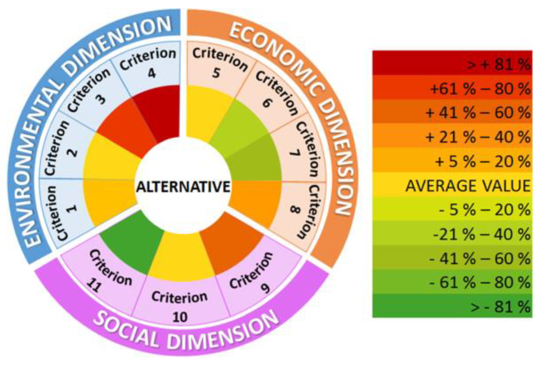
Figure 1. Sustainability Crowns by Corona & San Miguel [20].
Sustainability 15 10658 g001
Figure 3. A posteriori triangle according to Müller & Hiete [21].
Sustainability 15 10658 g003
Figure 4. Three-sided triangle according to Omran et al. [23].
Sustainability 15 10658 g004
Figure 5. Future Development LCSA-Visualization: LCSA-Wheel.
Sustainability 15 10658 g005
Figure 6. LCSA-Wheel for Carbon Reinforced Concrete.
Sustainability 15 10658 g006
Table 1. Fulfillment of the comparison criteria by the existing visualization approaches (legend: + = criterion is completely fulfilled; ± = criterion is partially fulfilled; − = criterion is not fulfilled)—reasoned (subjective) rating.
VisualizationLCSTLCSDCrowns
1ExpressivityMapping of an overall result for the LCSA+
2Mapping the three pillars of the LCSA+±
3Information or at least a reference to the basis of assessment±±
4EffectivenessUse of a color scale including a corresponding legend++
5Illustration of numerical results (relative or absolute)±±
6Quantity of the listed information to suitable extent+±+
7AppropriatenessGlobal applicability of the visualization and its associated data basis+++
8Simple adaptability for new developments±++
9Comprehensibility of the visualization++
Table 2. LCA results for Carbon Reinforced Concrete assessing different fiber options [30].
Concrete 1 = CEM I 42.5; 700 kg Only Portland Cement, Less Quartz Sand
GWP 100 Years
[kg CO2 eq.]
ADP Fossil [MJ]AP [kg SO2 eq.]
Fiber 1 = Given impregnation; conventional energy use75467751.05
Reference Value72963800.97
Disclaimer/Publisher’s Note: The statements, opinions and data contained in all publications are solely those of the individual author(s) and contributor(s) and not of MDPI and/or the editor(s). MDPI and/or the editor(s) disclaim responsibility for any injury to people or property resulting from any ideas, methods, instructions or products referred to in the content.