
Dashboard as a Platform for Community Engagement in a City Development—A Review of Techniques, Tools and Methods

 ,
,  , , and
Abstract
:1. Introduction
1.1. City Concepts and Community Functioning
1.2. Communication with Citizens Using Modern Technologies
1.3. The Importance of Open Data
- Transparency—government data are financed from public funds, which consist of revenues from citizens, businesses and institutions; thus, at least these stakeholders should have access to them. In addition, these data can be used to evaluate the activities of the government, which is essential for a well-functioning democratic society.
- Creating new data and websites based on OGD of high value for society and the economy—governments are producers of data from many fields that are of vital importance for the society and the economy. These data can be used, for example, by companies to generate data of commercial value, which translates into economic growth. In this context, OGD contribute to the development of the information society.
- Participatory governance—due to access to OGD, citizens can actively participate in decision-making processes at the local and/or central government level. In addition, newly created portals presenting data (dashboards) make the inhabitants more aware of the facts about their surroundings, better informed and capable of making evidence-based decisions.
1.4. Main Objectives of the Research
- to identify groups of presented features, indicators, and methods of their publication to communicate with inhabitants;
- to compare and evaluate the functionality of implemented solutions and tools by analyzing their key technical issues.
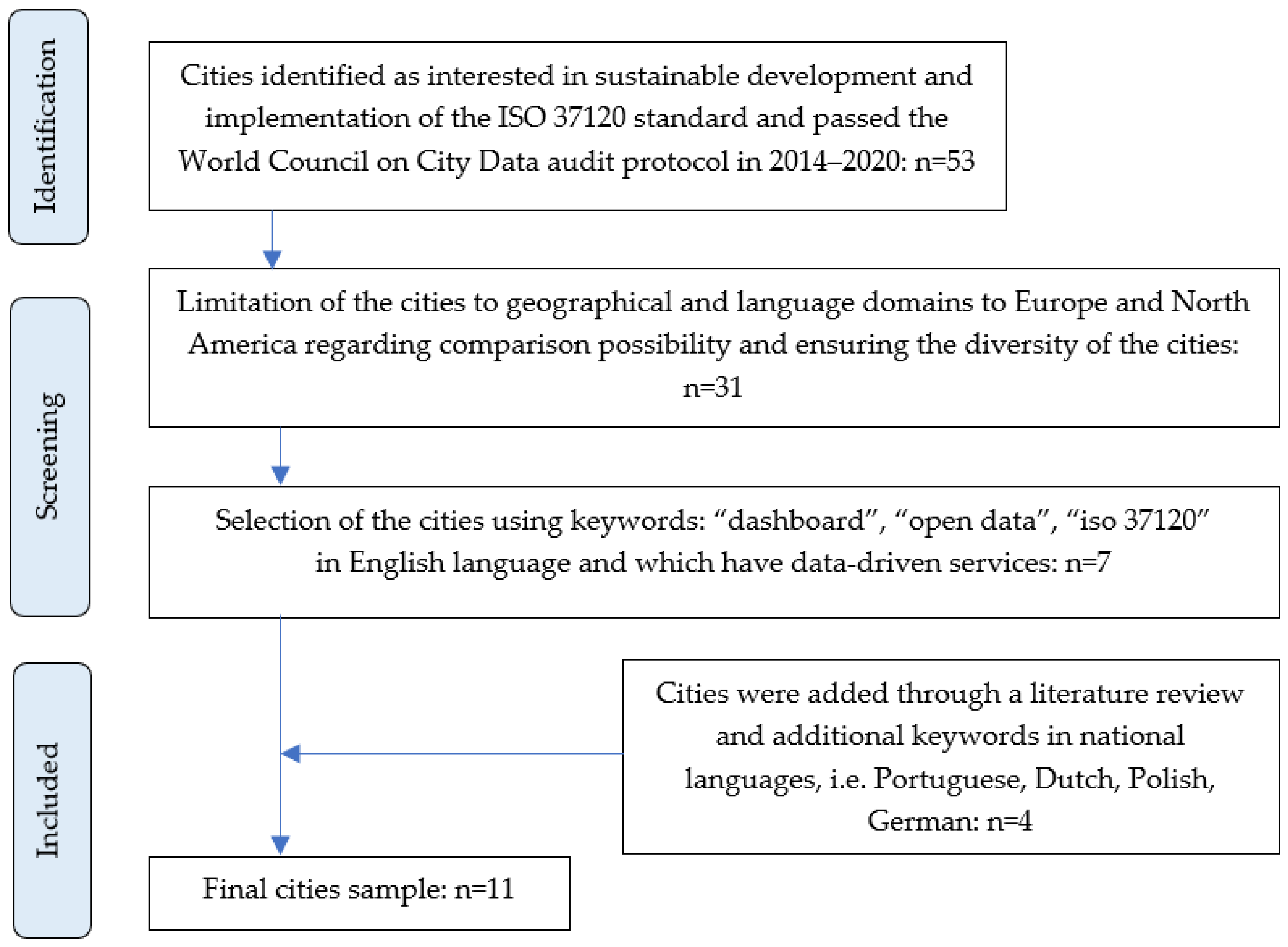
2. Materials and Methods
- four large cities or national capitals: New York (USA), Toronto (Canada), Dublin (Ireland) and London (United Kingdom);
- five industrial and scientific centers of importance at the regional and national scale: Munich (Germany) and Eindhoven (the Netherlands), Gdańsk (Poland), Boston (USA) and Edmonton (Canada);
- two smaller cities: Madison (USA), Brampton (Canada);
- one tourist town: Cascais (Portugal).
- the number of indicators and thematic groups;
- the methods of presentation;
- the number and types of datasets;
- the formats for sharing of the data and indicators;
- the levels of spatial aggregation: neighborhood, district, other;
- the quality of data and indicators (updating cycle, level of thematic detail);
- the types of analytical tools made available, whether they are intuitive to use;
- the methods of visualization and whether they are easy to interpret.
3. General Overview of the Dashboards
3.1. Type of Web-GIS Technology and Building Own Applications
- ESRI
- ArcGIS Dashboards [37]—enables users to publish data using intuitive and interactive visualizations in the form of dashboards that combine maps, charts, tables, etc. The application allows the users to adjust the content and layout of dashboards to their own needs.
- ArcGIS Story Maps [38]—a tool that allows users to create story maps using a form of narrative that combines text, interactive maps, and other multimedia content (photos, videos). The technology is used in the city of Dublin.
- SWING
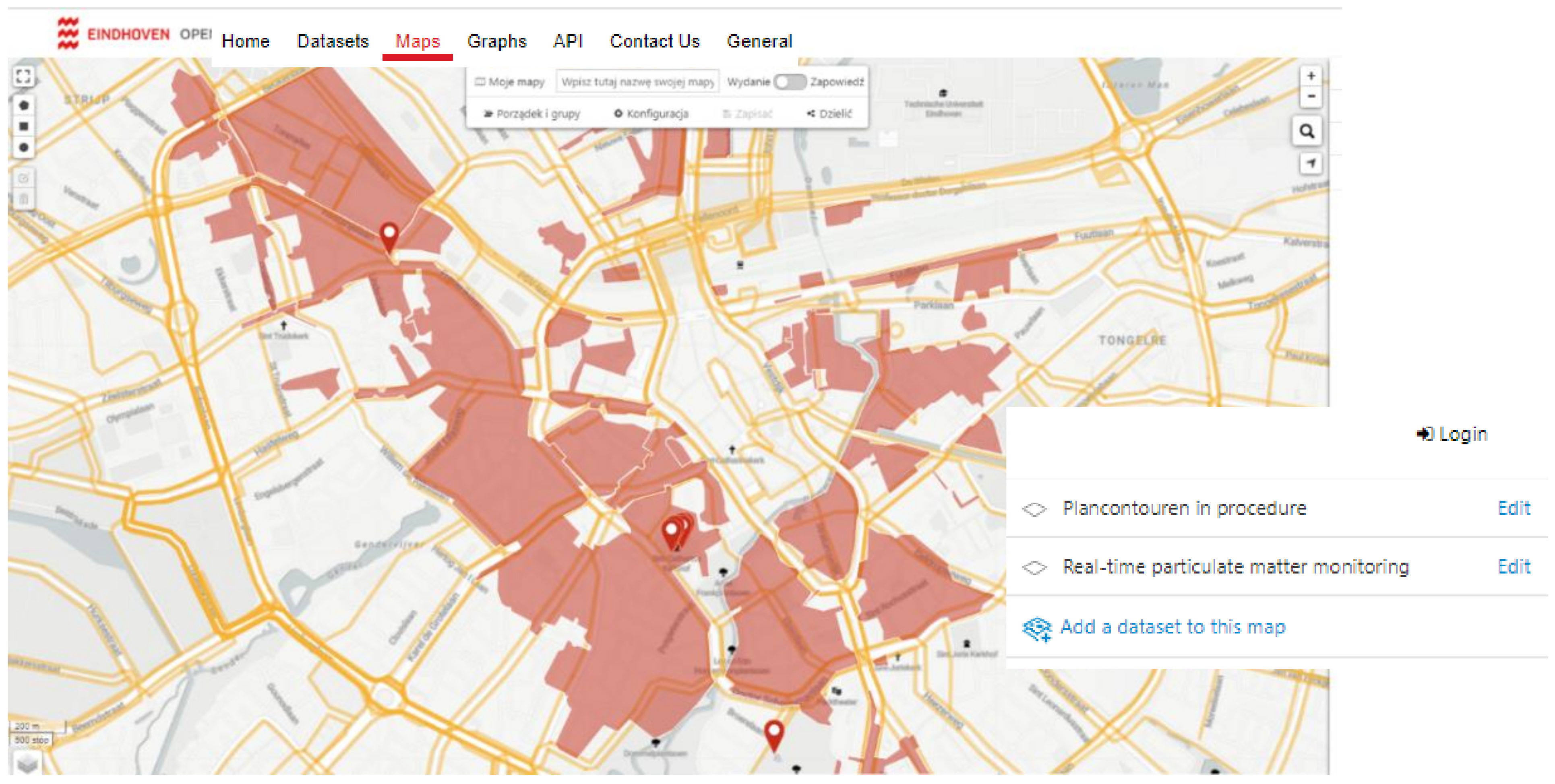
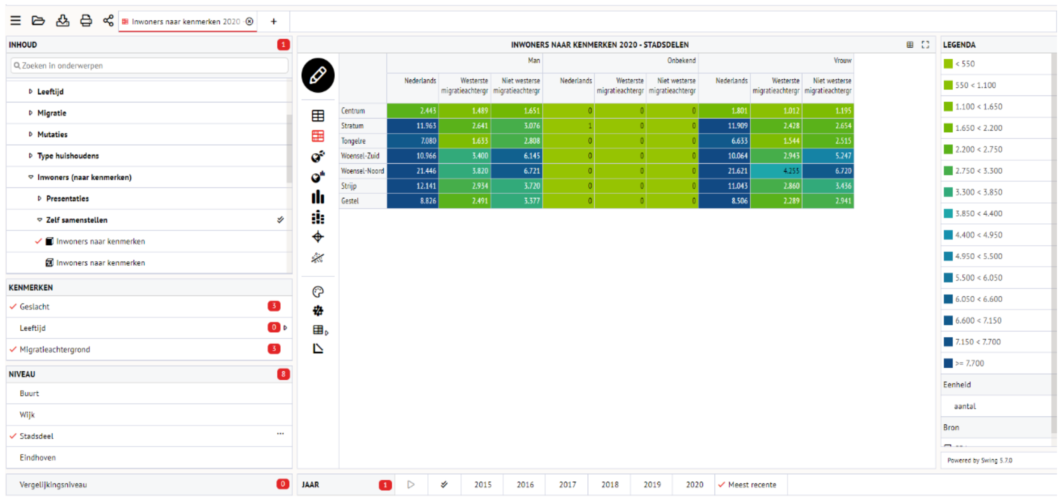
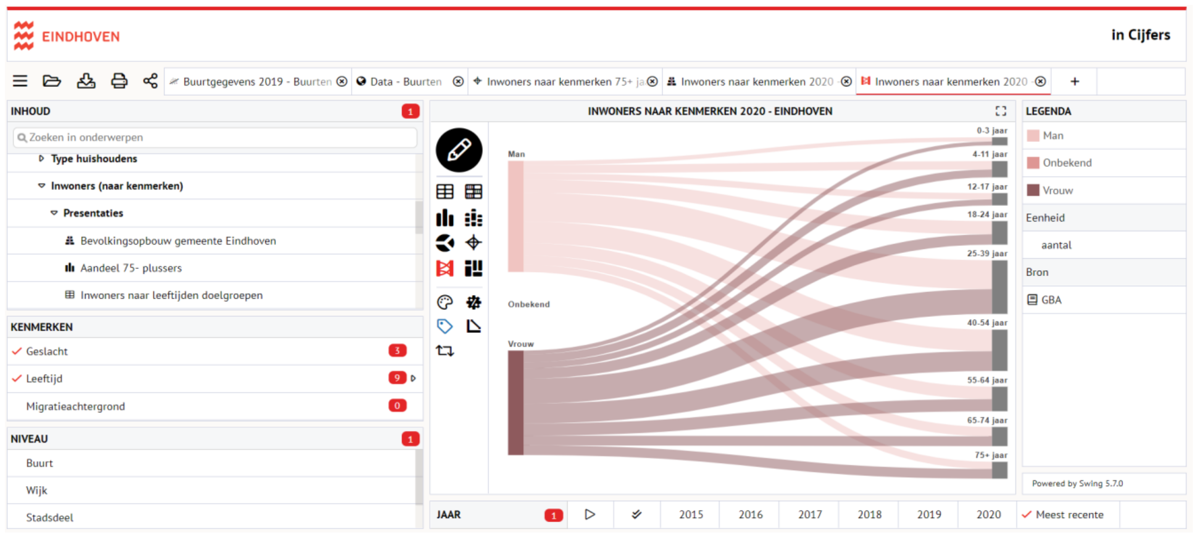
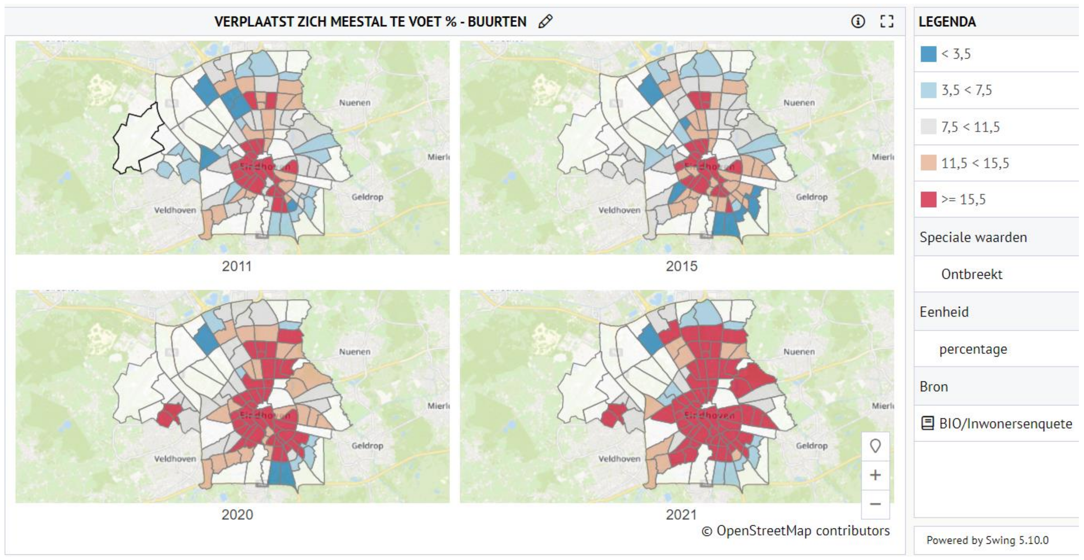
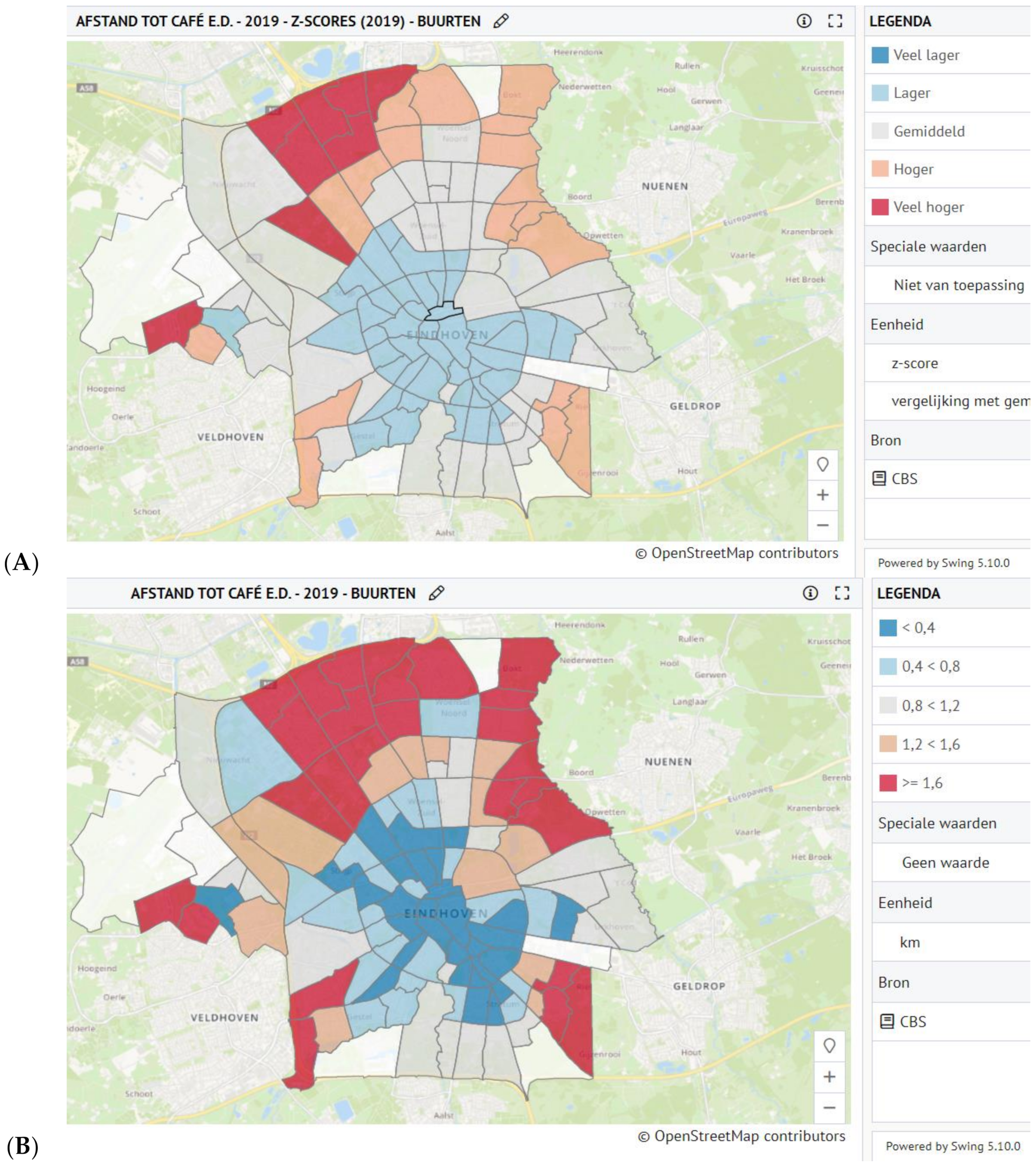
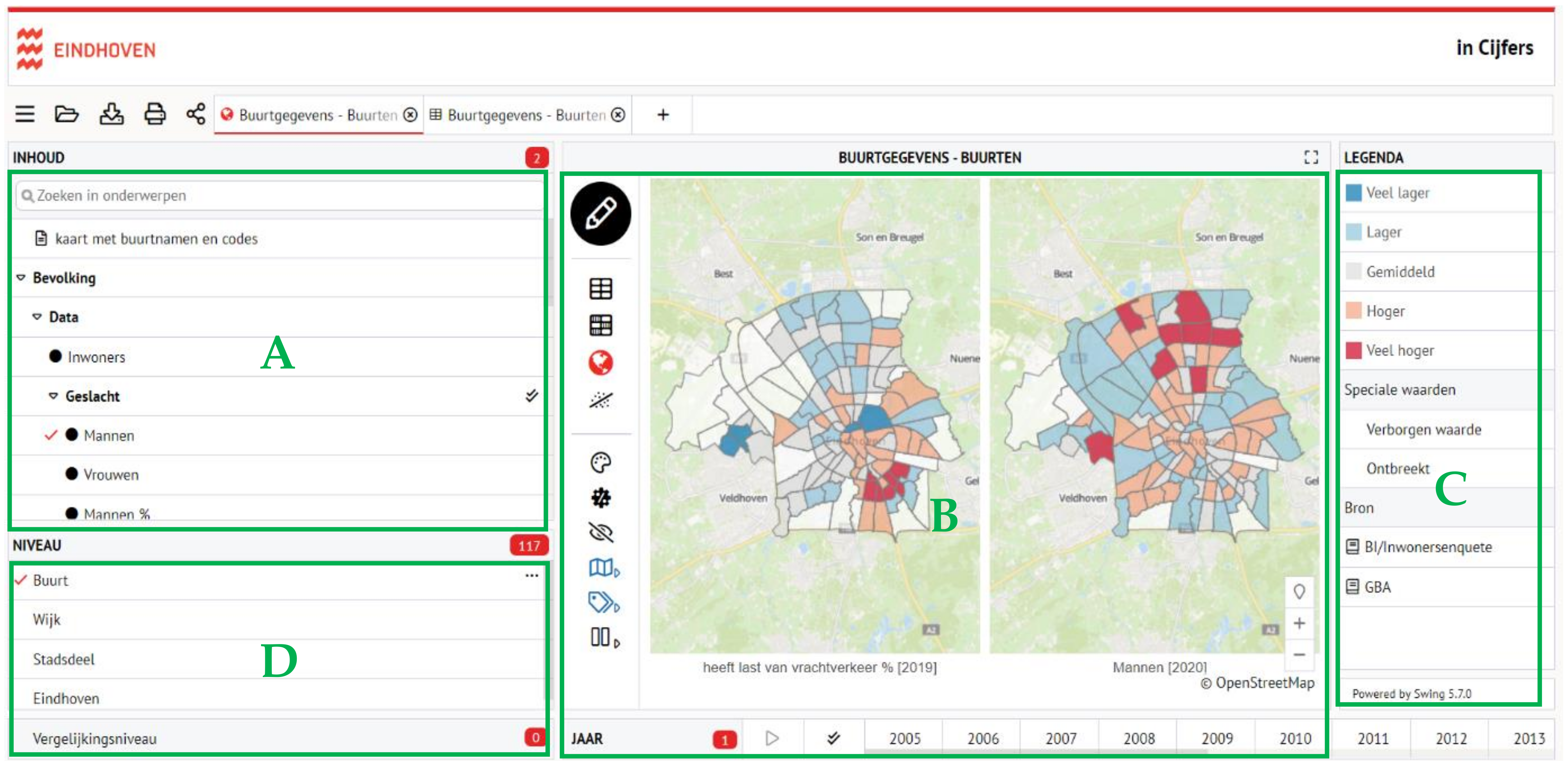
- Swing Mosaic, Viewer, Studio [39]—software and tools for managing, analyzing, presenting and sharing of statistical and geographical information used by public institutions in Europe. The technology offers such functions as user authorization, data security, reports generation, different language versions, and making web services. It is also possible to edit the existing themes or build a new one for which assumptions, parameters, units, formulas, aggregation type, data type and thematic groups need to be defined. The technology is used in the city of Eindhoven.
- Tableau
- Tableau Public [40]—a free platform for sharing and viewing data online. The platform allows users to create visualizations containing interactive charts, maps and dashboards, and to combine data in different formats and share results online. The solution is designed to present public data, as the results are available for all Internet users to see.
- Tableau Desktop, Online, Prep [41]—commercial software for professional use that has all the functionalities of the free version, but allows users to store data that should not be made available online while observing the rules of data security, and it enables managing user access.
3.2. Methods of Visualization
3.2.1. Complex and Extensive Panels
3.2.2. Graphics Showing the Status of Monitored Indicators
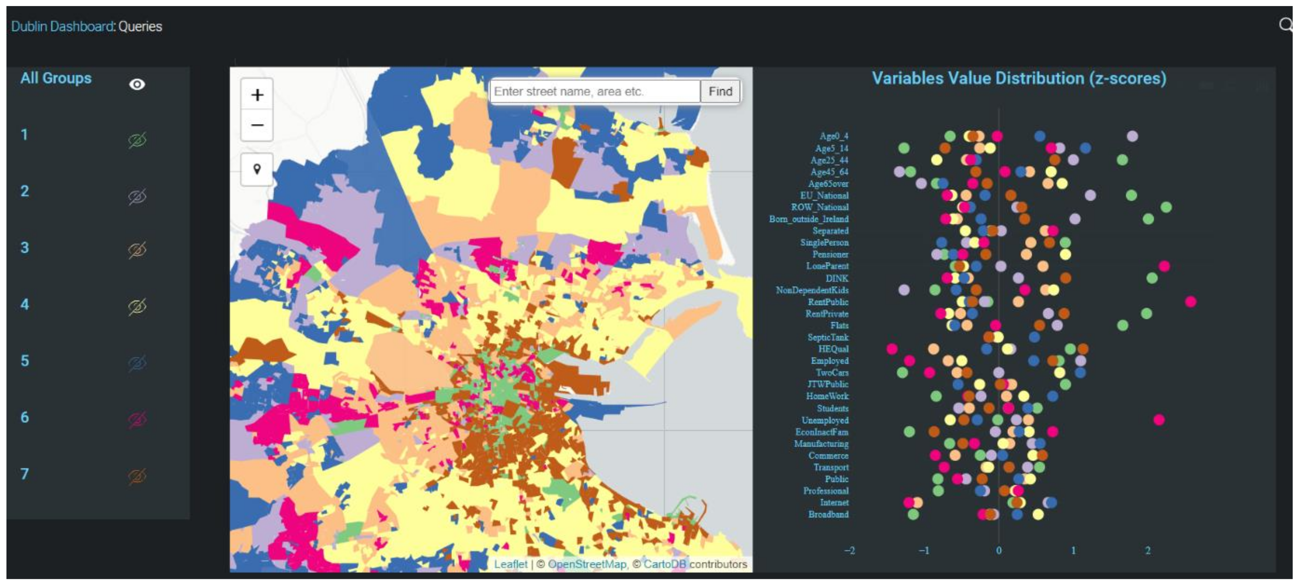
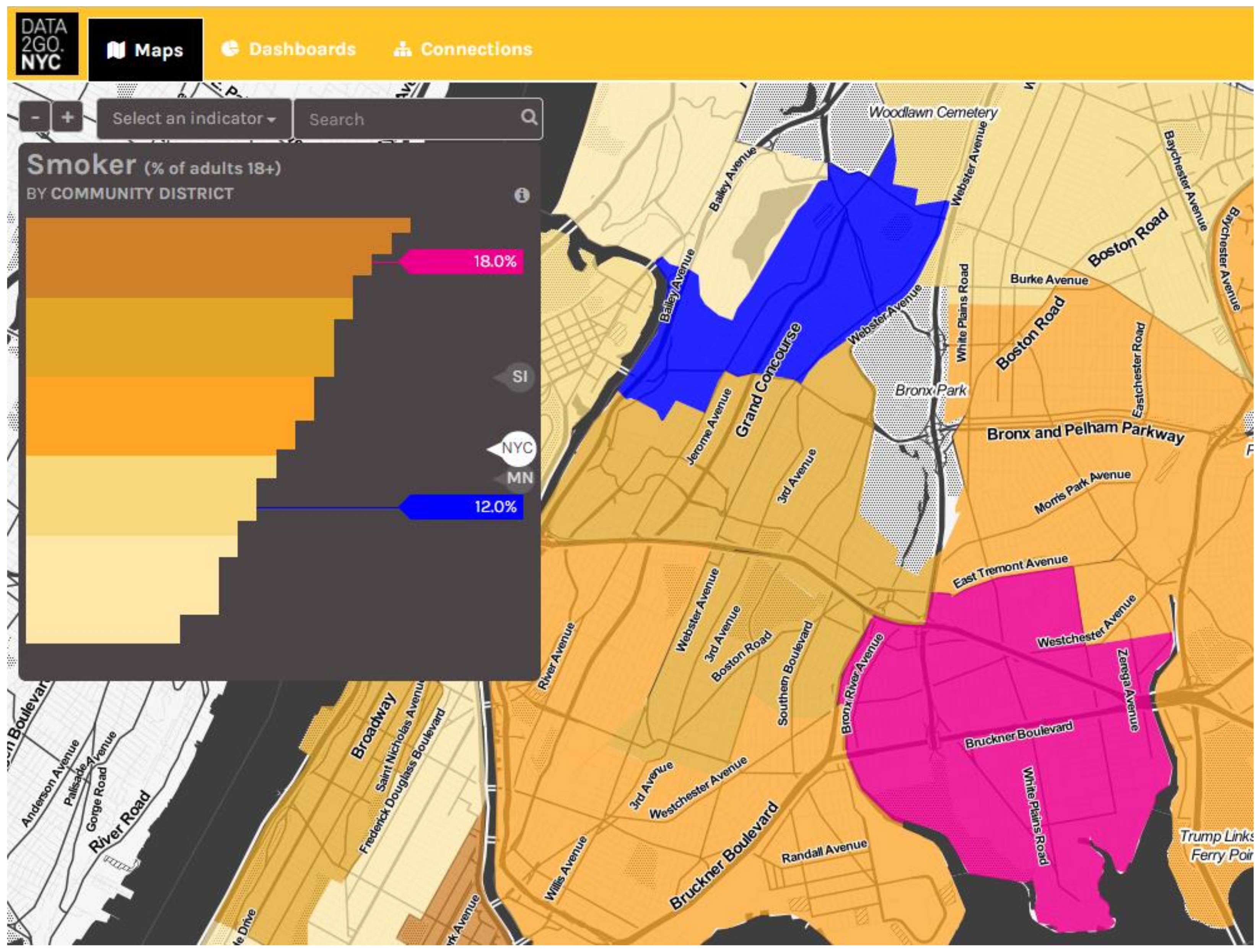
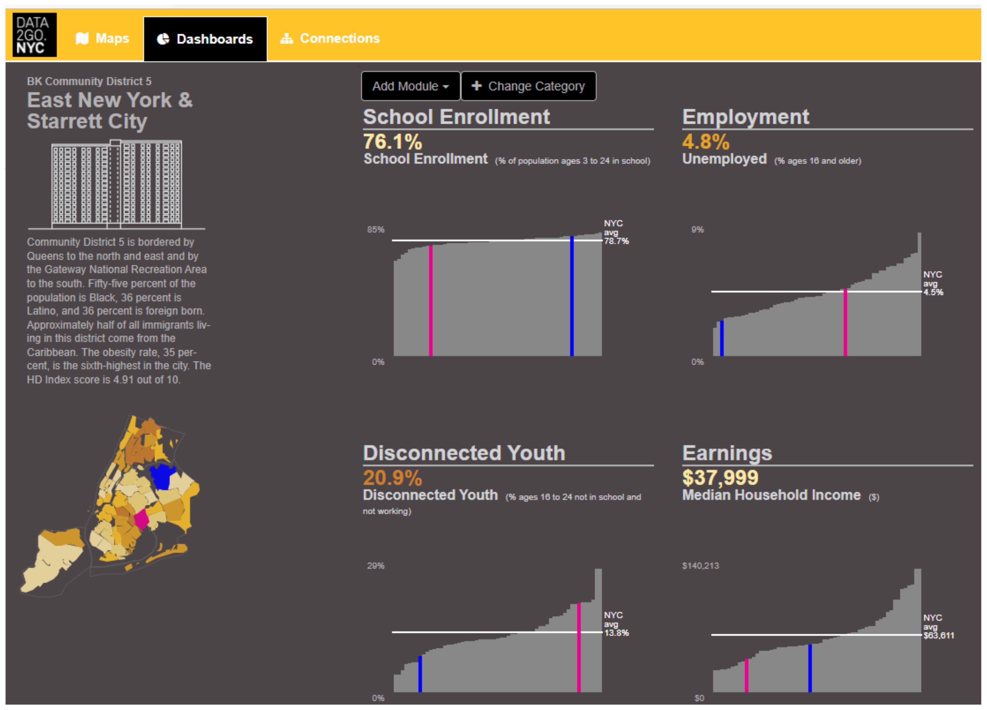
3.2.3. Dynamic, Interactive Charts and Choropleth Maps
3.3. Data Analysis Tools
3.3.1. Selection of Features by Characteristics
- business type (although only three categories of objects are available to choose from accommodation and food services, manufacturing and retail);
- company name (it is possible to search by full name or part of it);
- content of the description of the company’s activity;
- company size (based on the number of employees or gross floor area (GFA)—the square footage of the building out into the external walls).
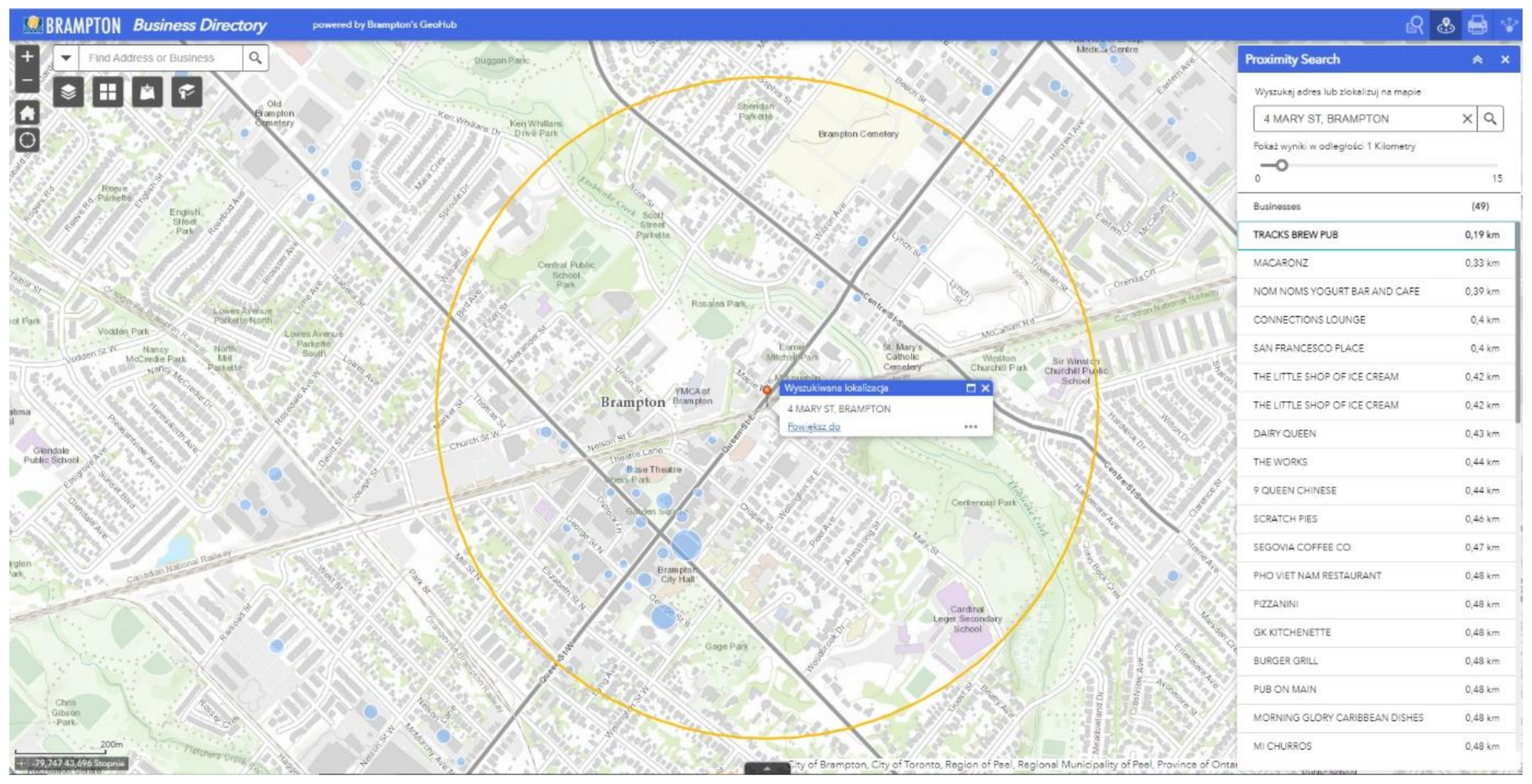
3.3.2. Searching for Objects in a Designated Vicinity
3.3.3. Comparison and Correlation of Indicators’ Values
3.3.4. Creating Own Metrics
3.4. Updating Issue
4. Results
4.1. Manners of Presentation and Number of Indicators
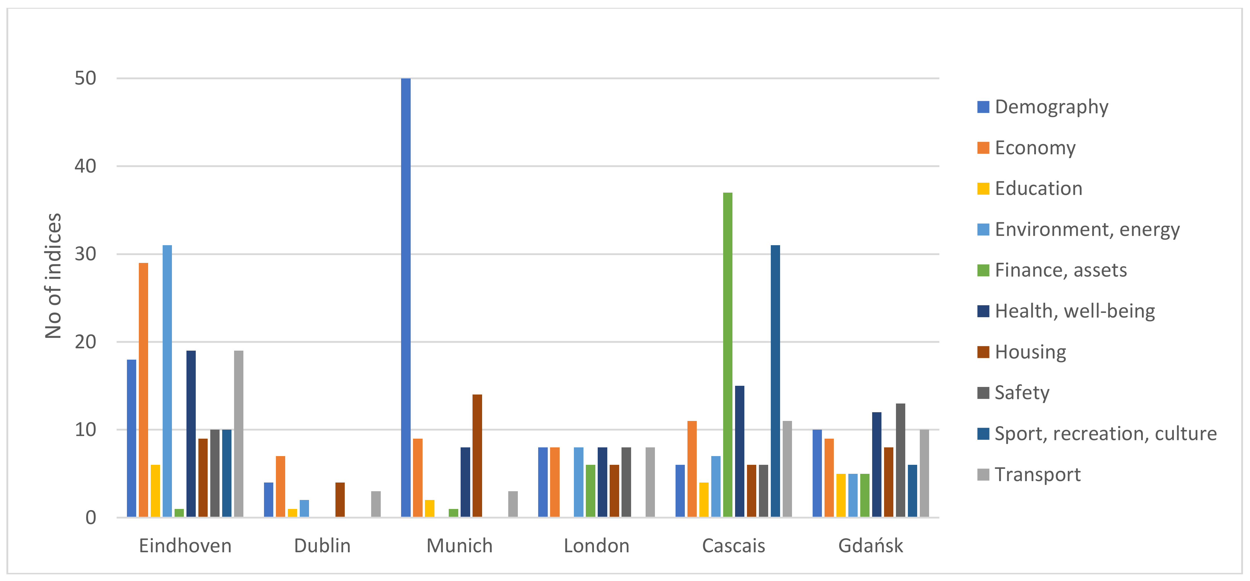
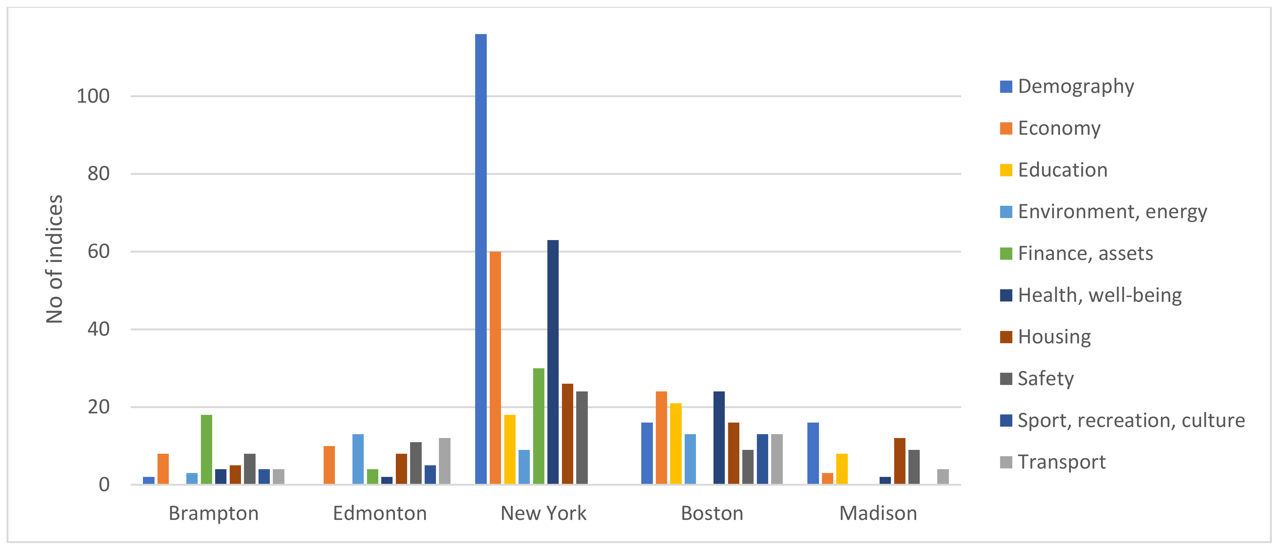
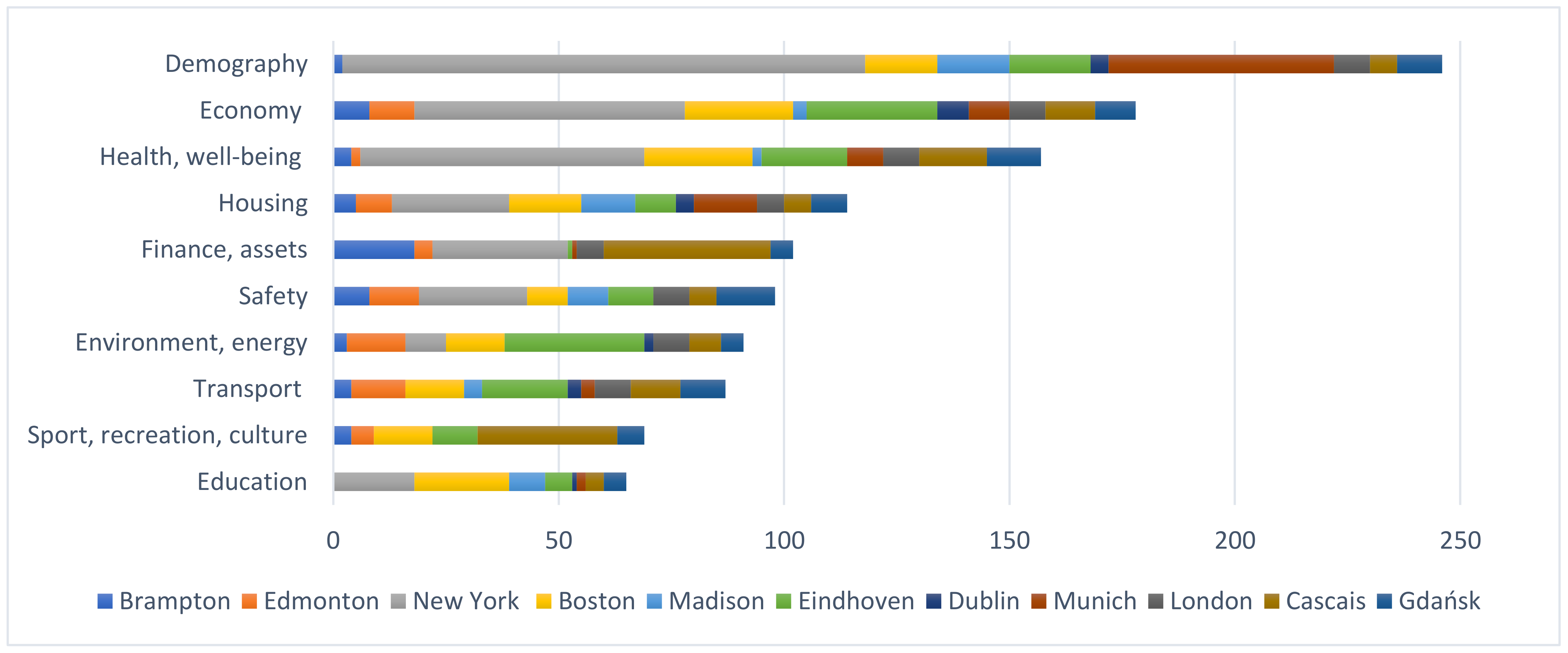
4.2. Thematic Groups of Indicators
4.3. Impacts of the COVID-19 Pandemic
4.4. Key Findings
5. Discussion
5.1. Complexity of Data, Visualization and Geospatial Analysis
- the number of indicators presented (, e.g., New York);
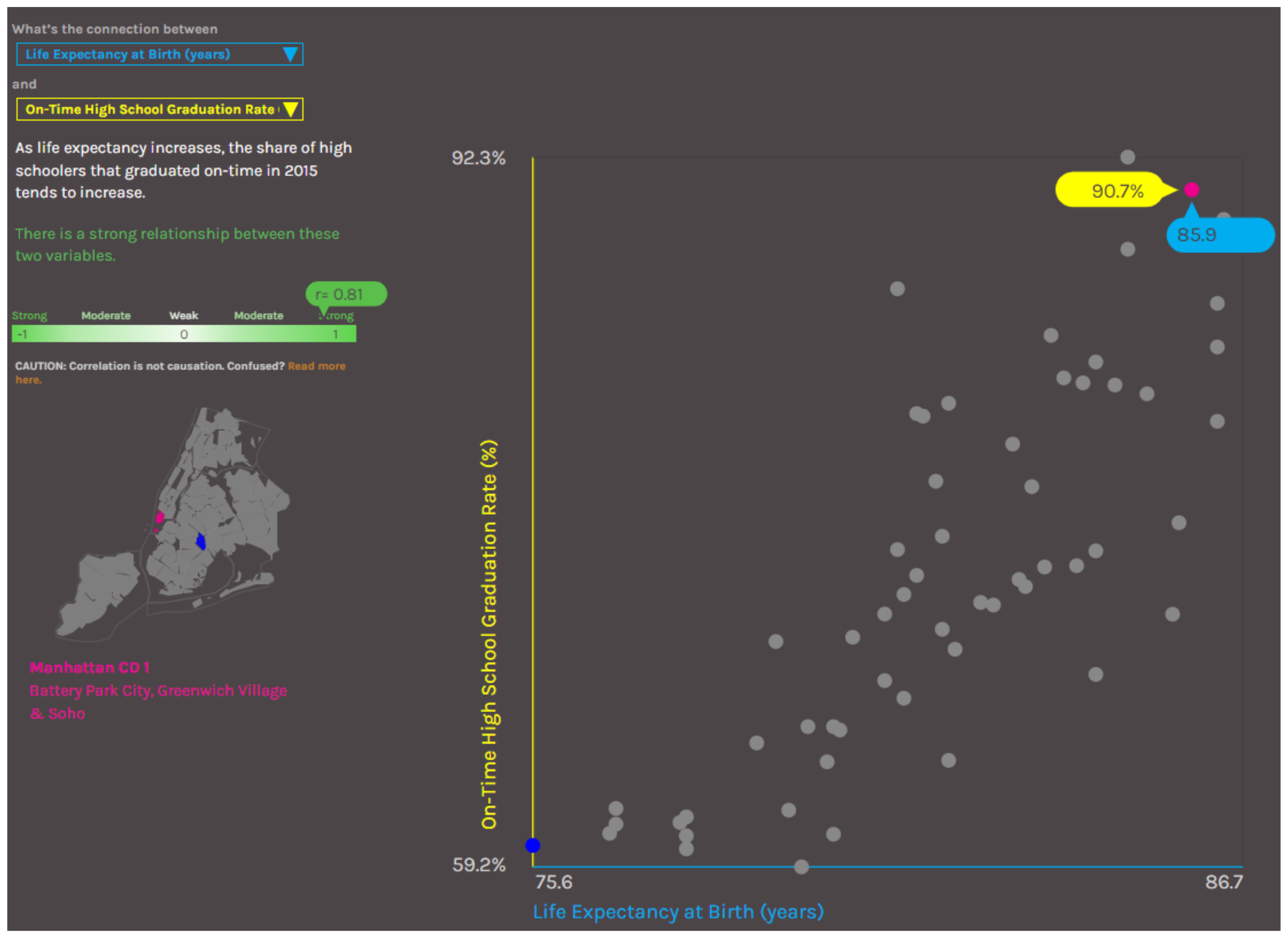
- metrics and techniques (tools) used to present a given characteristic, e.g., z-score graphs, analysis of correlations between features (e.g., New York, Madison);
- data management options (data filtering, changing the level of aggregation of the data or benchmark, e.g., Eindhoven, New York);
- the possibility of adapting visualizations to the users’ own needs (presentation of the same indicator by means of graphs, a choropleth map or heat maps);
- the possibility of downloading datasets that have been used to analyze and prepare own presentations, e.g., in the form of popular formats.
- ensuring the quality, reliability and up-to-dateness of data;
- implementation of data standards and data harmonization;
- archiving and processing different large datasets;
- establishing metadata at the proper detail level, including data origin.
- building of effective models and processes;
- creation of new analytics based on big data;
- geostatistical modeling, generating forecasts and simulations;
- instructions and manuals to operate advanced tools.
- creating clear presentations adapted to the user’s perception;
- creating optimal visualizations for various devices and platforms;
- developing 3D modeling and other alternative presentations;
- compliance with user experience and ability to interpret data.
5.2. Recommendations
- building civic awareness and sense of participation;
- increasing the interest of residents in urban policies;
- informing residents about changes and development of the city;
- influencing the behavior of residents by drawing their attention to problems that they have impact on, e.g., the level of pollution;
- showing how the activities of the city authorities translate into the quality of life of the residents.
- simple use—limited number of indicators (up to 5–6 in a category), ready-made visualizations that are interactive and easy to interpret (example: Dublin, Cascais);
- complex use—ultimately presenting all available indicators with the possibility of their conversion and adjustment of their visualization to users’ needs (example: Eindhoven, Munich).
6. Conclusions
Author Contributions
Funding
Institutional Review Board Statement
Informed Consent Statement
Data Availability Statement
Acknowledgments
Conflicts of Interest
Appendix A

| City (Country) | Dashboard | Short Description | Statistics for the Period April–June 2021 | Total Visits in May 2022 | |
|---|---|---|---|---|---|
| Total Visits | Average Number of Monthly Visits | ||||
| New York (USA) | DATA2GO.NYC https://www.data2go.nyc | The dashboard collects data on a wide range of issues crucial to the quality of life of all New Yorkers. The set of DATA2GO.NYC indicators was intended to be as broad as possible in order to best analyse the level of well-being of the city’s residents. | 7736 | <5000 | <5000 |
| OurHome.NYC https://ourhome.nyc | The dashboard presents the relationship between life expectancy and quality of life in social housing developments in NYC. | n.d. | n.d. | n.d. | |
| DATA2GOHEALTH.NYC https://data2gohealth.nyc | The dashboard provides comprehensive health information in the context of the full spectrum of health determinants that have a key impact on the health of the population. | <5000 | <5000 | <5000 | |
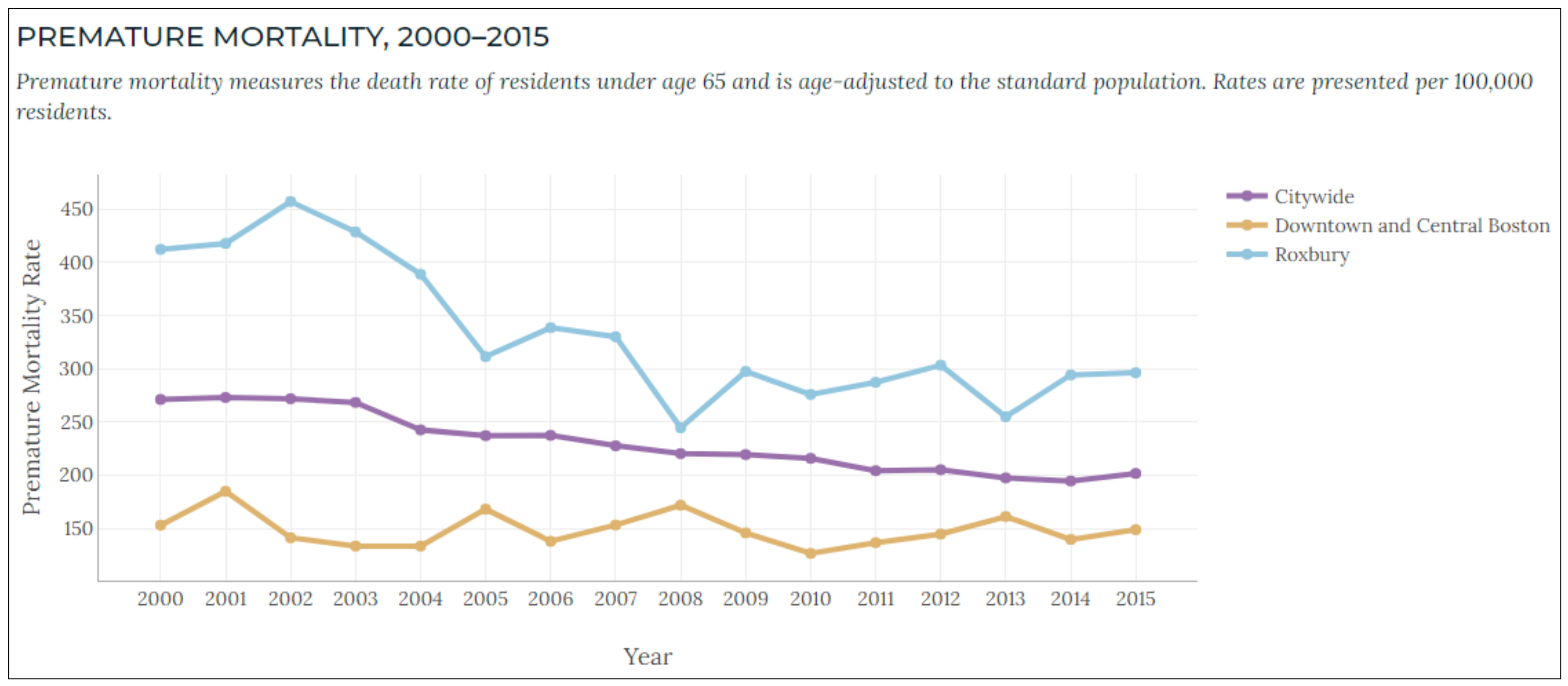
| Boston (USA) | Imagine Boston https://www.boston.gov/departments/mayors-office/imagine-boston-2030 | The Imagine Boston dashboard is a tool for tracking the city’s overall progress towards its goals. | n.d. | n.d. | n.d. |
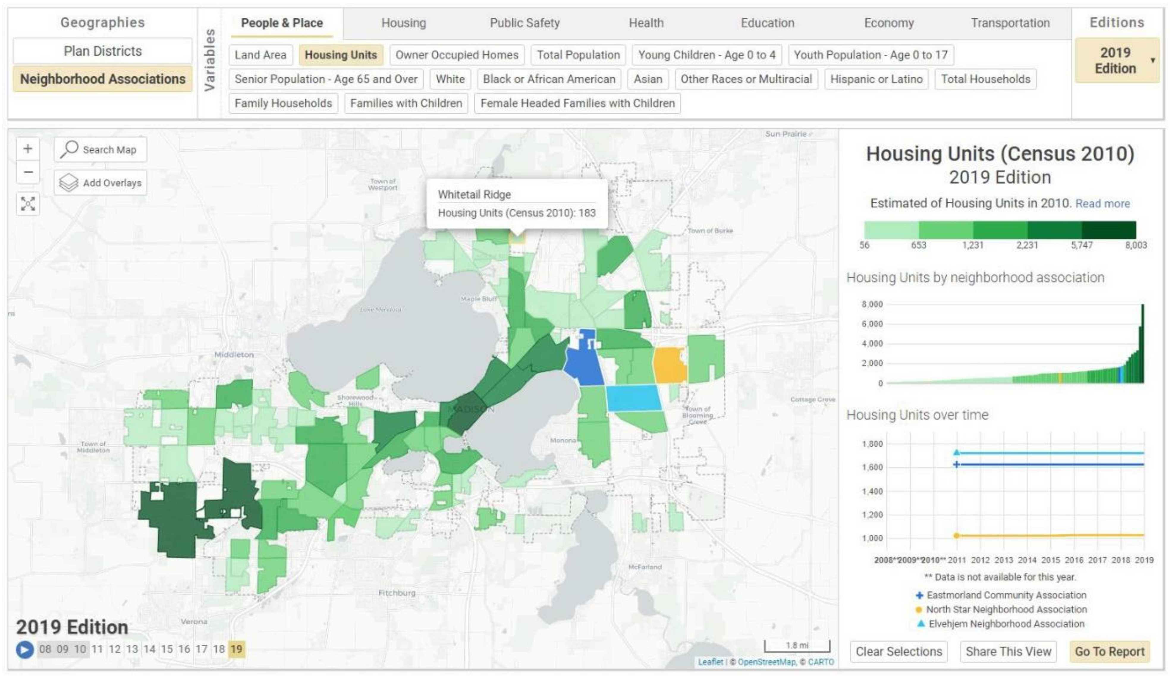
| Madison (USA) | Neighborhood Indicators Project https://madison.apl.wisc.edu/ | A dashboard allowing the monitoring of individual parts of the city based on a number of indicators showing the inhabitants’ standard of living. | <5000 | <5000 | <5000 |
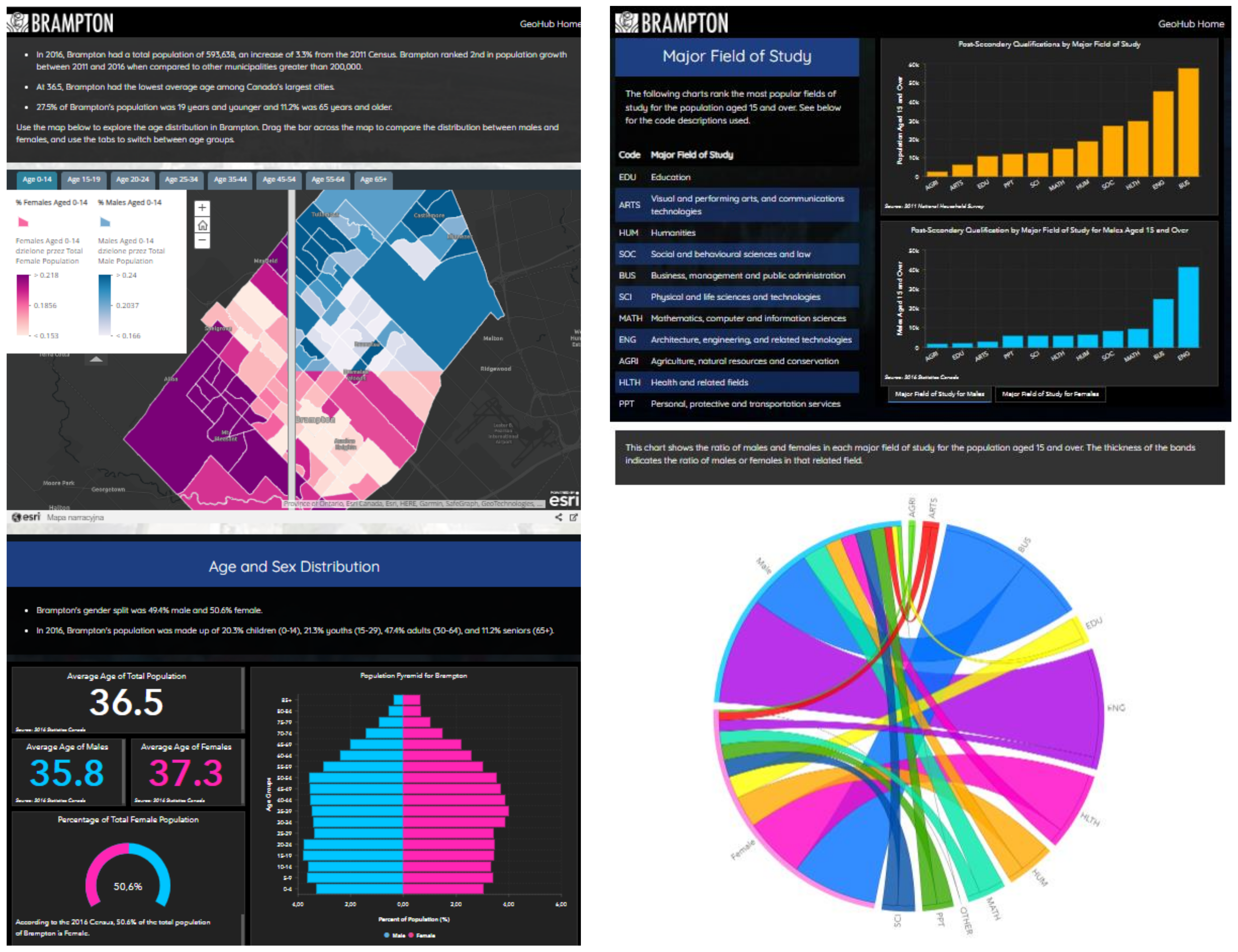
| Brampton (CA) | Brampton GeoHub https://geohub.brampton.ca/ | A platform for sharing and analysing data describing various aspects of city functioning. Within GeoHUB, a number of tools have been made available to support the reception (interpretation and analysis) of these data. | 21,657 | 7219 | 7200 |
| Brampton’s Census Profile https://www12.statcan.gc.ca | The dashboard presents data from the 2016 census. The data was compiled by Statistics Canada. | n.d. | n.d. | n.d. | |
| Edmonton (CA) | Edmonton’s Citizen Dashboard https://dashboard.edmonton.ca/live | The dashboard provides performance data on selected services provided by the City of Edmonton. | 29,654 | 9885 | 9200 |
| Eindhoven (NL) | https://eindhoven.incijfers.nl/jive/ | Main city panel with indicators “Eindhoven in Cijfers” | 9449 | <5000 | <5000 |
| https://www.eindhoven.nl/corona-dashboard | Indicators and forecasts in the context of COVID-19 restrictions | 8407 | <5000 | <5000 | |
| https://data.eindhoven.nl/pages/home/ | Open data dashboard | n.d. | n.d. | n.d. | |
| Dublin (IE) | https://www.dublindashboard.ie (closed in January 2022) | Dublin Dashborad—a dashboard run as a joint project between Dublin City Council, Maynooth University and other supporting organisations. | <5000 | <5000 | n.d. |
| https://data.smartdublin.ie/dataset | Dublin Local Authorities dashboard with open data sets | 19,764 | 6588 | 10,600 | |
| Munich (DE) | https://www.mstatistik-muenchen.de/indikatorenatlas/atlas.html | “Indikatorenatlas Munchen”—Atlas of indicators for Munich | 5202 | <5000 | 6000 |
| London (UK) | https://data.london.gov.uk/ | London Datastore—a platform for publishing indicators and making data available | 530,084 | 176,695 | 129,900 |
| https://data.london.gov.uk/london-area-profiles/ | London Area Profile—a tool for presenting and mining local data about communities in and around London. | n.d. | n.d. | n.d. | |
| Cascais (PT) | https://data.cascais.pt/ | Cascais Data—a dashboard with data on the quality of life in the city | 20,866 | 6955 | 5300 |
| Gdańsk (PL) | https://www.gdansk.pl/gdanskwliczbach | Gdansk in numbers—dashboard with data of life quality in the city | n.d. | n.d. | n.d. |
| https://www.gdansk.pl/otwarte-dane | Open data in Gdansk—service with data sets about the city | n.d. | n.d. | n.d. | |
Appendix B
| City | Eindhoven | Dublin | Munich | London | Cascais | Gdańsk | Brampton | Edmonton | New York | Boston | Madison |
|---|---|---|---|---|---|---|---|---|---|---|---|
| Demographics | 18 | 4 | 50 | 8 | 6 | 10 | 2 | 0 | 116 | 16 | 16 |
| Economy | 29 | 7 | 9 | 8 | 11 | 9 | 8 | 10 | 60 | 24 | 3 |
| Health and well-being | 19 | - | 8 | 8 | 15 | 12 | 4 | 2 | 63 | 24 | 2 |
| Transport | 19 | 3 | 3 | 8 | 11 | 10 | 4 | 12 | 0 | 13 | 4 |
| Environment, Energy | 31 | 2 | - | 8 | 7 | 5 | 3 | 13 | 9 | 13 | 0 |
| Finance, Assets | 1 | - | 1 | 6 | 37 | 5 | 18 | 4 | 30 | 0 | 0 |
| Housing | 9 | 4 | 14 | 6 | 6 | 8 | 5 | 8 | 26 | 16 | 12 |
| Sport, recreation, culture | 10 | - | - | - | 31 | 6 | 4 | 5 | 0 | 13 | 0 |
| Safety | 10 | - | - | 8 | 6 | 13 | 8 | 11 | 24 | 9 | 9 |
| Education | 6 | 1 | 2 | - | 4 | 5 | 0 | 0 | 18 | 21 | 8 |
| Total | 152 | 21 | 87 | 60 | 134 | 83 | 56 | 65 | 346 | 149 | 54 |
References
- Barton, H. City of Well-Being: A Radical Guide to Planning; Routledge: Milton Park, UK, 2016. [Google Scholar]
- Sim, D. Miasto Życzliwe. Jak Kształtować Miasto z Troską o Wszystkich; Wysoki Zamek: Kraków, Poland, 2020. [Google Scholar]
- Hall, P. Cities of Tomorrow: An Intellectual History of Urban Planning and Design Since 1880; Wiley-Blackwell: Hoboken, NJ, USA, 2014. [Google Scholar]
- Gehl, J. Miasta Dla Ludzi. Wydawnictwo RAM: Kraków, Poland, 2014. [Google Scholar]
- Caprotti, F. Eco-Urbanism and the Eco-City, or, Denying the Right to the City? Antipode 2014, 46, 1285–1303. [Google Scholar] [CrossRef]
- Brzeziński, A. Czym Może Być Zrównoważony Transport Miejski. [W:] Miasto Idealne—Miasto Zrównoważone. In Planowanie Przestrzenne Terenów Zurbanizowanych i Jego Wpływ Na Ograniczenie Skutków Zmian Klimatu; Kalinowska, A., Ed.; Uniwersytet Warszawski, Uniwersyteckie Centrum Badań nad Środowiskiem Przyrodniczym i Zrównoważonym Rozwojem: Warszawa, Poland, 2015. [Google Scholar]
- Witek, J. Jakość Życia Jako Punkt Odniesienia Do Kształtowania Koncepcji Rozwoju Miasta. Handel Wewnętrzny 2016, 364, 324–334. [Google Scholar]
- Montgomery, C. Miasto Szczęśliwe: Jak Zmienić Nasze Życie, Zmieniając Nasze Miasta; Wysoki Zamek: Kraków, Poland, 2015. [Google Scholar]
- Simon, D. Rethinking Sustainable Cities: Accessible, Green and Fair; Policy Press: Bristol, UK, 2016. [Google Scholar]
- Lynch, K. A Theory of Good City Form; MIT Press: Cambridge, MA, USA, 1981. [Google Scholar]
- Jacobs, A.; Appleyard, D. Toward an Urban Design Manifesto. J. Am. Plan. Assoc. 1987, 53, 112–120. [Google Scholar] [CrossRef]
- Dantzig, G.B.; Saaty, T.L. Compact City; Freeman: San Francisco, CA, USA, 1973. [Google Scholar]
- Moreno, C.; Allam, Z.; Chabaud, D.; Gall, C.; Pratlong, F. Introducing the “15-Minute City”: Sustainability, Resilience and Place Identity in Future Post-Pandemic Cities. Smart Cities 2021, 4, 93–111. [Google Scholar] [CrossRef]
- Talen, E. Pedestrian Access as a Measure of Urban Quality. Plan. Pract. Res. 2002, 17, 257–278. [Google Scholar] [CrossRef]
- Talen, E. Charter of the New Urbanism; McGraw Hill Education: New York, NY, USA, 2013. [Google Scholar]
- Katz, P. The New Urbanism: Toward an Architecture of Community; McGraw-Hill: New York, NY, USA, 1994. [Google Scholar]
- Hunter Lovins, L.; Cohen Hill, B. Climate Capitalism Capitalism in the Age of Climate Change; Hill and Wang: New York, NY, USA, 2011. [Google Scholar]
- Makieła, Z.J.; Stuss, M.M.; Mucha-Kuś, K.; Kinelski, G.; Budziński, M.; Michałek, J. Smart City 4.0: Sustainable Urban Development in the Metropolis GZM. Sustainability 2022, 14, 3516. [Google Scholar] [CrossRef]
- Human Smart City. Available online: https://www.popt.gov.pl/strony/wiadomosci/human-smart-city-przewodnik-dla-samorzadow/ (accessed on 27 May 2022).
- Dameri, R.P. Urban Smart Dashboard. Measuring Smart City Performance. Prog. IS 2017, 67–84. [Google Scholar] [CrossRef]
- ISO 37120:2018; Sustainable Cities and Communities—Indicators for City Services and Quality of Life. ISO: Geneva, Switzerland, 2018. Available online: https://www.iso.org/standard/68498.html (accessed on 30 May 2022).
- ISO 37122:2019; Sustainable Cities and Communities—Indicators for Smart Cities. ISO: Geneva, Switzerland, 2019. Available online: https://www.iso.org/standard/69050.html (accessed on 27 May 2022).
- Mattern, S. Mission Control: A History of the Urban Dashboard. Places J. 2015. [Google Scholar] [CrossRef]
- Lwin, K.K.; Sekimoto, Y.; Takeuchi, W.; Zettsu, K. City Geospatial Dashboard: IoT and Big Data Analytics for Geospatial Solutions Provider in Disaster Management. In Proceedings of the 2019 International Conference on Information and Communication Technologies for Disaster Management (ICT-DM), Paris, France, 18–20 December 2019. [Google Scholar] [CrossRef]
- Simonofski, A.; Asensio, E.S.; De Smedt, J.; Snoeck, M. Hearing the Voice of Citizens in Smart City Design: The CitiVoice Framework. Bus. Inf. Syst. Eng. 2019, 61, 665–678. [Google Scholar] [CrossRef]
- Kitchin, R.; McArdle, G. Urban Data and City Dashboards: Six Key Issues. Available online: https://mural.maynoothuniversity.ie/7422/1/urban (accessed on 9 May 2022). [CrossRef]
- McArdle, G.; Kitchin, R. The dublin dashboard: Design and development of a real-time analytical urban dashboard. In Proceedings of the First International Conference on Smart Data and Smart Cities; ISPRS Annals Photogrammetry, Remote Sensing and Spatial Information Sciences, Split, Croatia, 7–9 September 2016. [Google Scholar] [CrossRef]
- Batty, M. The New Science of Cities; MIT Press: Cambridge, MA, USA, 2013. [Google Scholar]
- Kitchin, R.; Lauriault, T.P.; McArdle, G. Knowing and Governing Cities through Urban Indicators, City Benchmarking and Real-Time Dashboards. Reg. Stud. Reg. Sci. 2015, 2, 6–28. [Google Scholar] [CrossRef]
- Balletto, G.; Borruso, G.; Donato, C. City Dashboards and the Achilles’ Heel of Smart Cities: Putting Governance in Action and in Space. In International Conference on Computational Science and Its Applications; Springer: Cham, Switzerland, 2018; Volume 10962. [Google Scholar] [CrossRef]
- Matheus, R.; Janssen, M.; Maheshwari, D. Data Science Empowering the Public: Data-Driven Dashboards for Transparent and Accountable Decision-Making in Smart Cities. Gov. Inf. Q. 2020, 37, 101284. [Google Scholar] [CrossRef]
- European Parliament and Council. Directive 2003/98/EC of 17 November 2003 on the Re-Use of Public Sector Information. Off. J. Eur. Union 2003, 245. [Google Scholar]
- Attard, J.; Orlandi, F.; Scerri, S.; Auer, S. A Systematic Review of Open Government Data Initiatives. Gov. Inf. Q. 2015, 32, 399–418. [Google Scholar] [CrossRef]
- European Parliament and Council. Directive (EU) 2019/1024 of the European Parliament and of the Council of 20 June 2019, on Open Data and the Re-Use of Public Sector Information; EU: Brussels, Belgium, 2019. [Google Scholar]
- Martin, S.; Foulonneau, M.; Turki, S. 1–5 Stars: Metadata on the Openness Level of Open Data Sets in Europe. In Research Conference on Metadata and Semantic Research; Springer: Cham, Switzerland, 2013; pp. 234–245. [Google Scholar]
- INSPIRE Directive, European Parliament and of the Council of the European Union. Directive 2007/2/EC of the European Parliament and of the Council of 14 March 2007 Establishing an Infrastructure for Spatial Information in the European Community (INSPIRE). Publ. Off. J. 2007, 108, 1–14. Available online: https://eur-lex.europa.eu/eli/dir/2007/2/oj (accessed on 14 May 2022).
- ArcGIS Dashboards|Data Dashboards: Operational, Strategic, Tactical, Informational. Available online: https://www.esri.com/en-us/arcgis/products/arcgis-dashboards/overview (accessed on 28 May 2022).
- ArcGIS StoryMaps. Available online: https://storymaps.arcgis.com/ (accessed on 28 May 2022).
- Home—Swing.eu. Available online: https://swing.eu/ (accessed on 28 May 2022).
- Free Data Visualization Software|Tableau Public. Available online: https://public.tableau.com/s/ (accessed on 28 May 2022).
- Tableau Prep|Combine, Shape, and Clean Your Data. Available online: https://www.tableau.com/products/prep (accessed on 28 May 2022).
- Snap4City Project. Available online: http://www.snap4city.org/ (accessed on 28 May 2022).
- Snap4City Documantation. Available online: http://www.snap4city.org/dashboardSmartCity/management/iframeApp.php?linkUrl=https://www.snap4city.org/drupal&linkId=snap4cityPortalLink&pageTitle=www.snap4city.org&fromSubmenu=false (accessed on 28 May 2022).
- Eindhoven in Cijfers. Available online: https://eindhoven.incijfers.nl/jive (accessed on 27 May 2022).
- Dublin Dashboard. Available online: https://www.dublindashboard.ie/ (accessed on 28 December 2021). (Closed in January 2022).
- Walsh, B.Y.; Brunsdon, C.; Charlton, M. Dublin Geodemographics. NCG, MU SSI, Maynooth University. Available online: https://rpubs.com/burcinwalsh/620510 (accessed on 28 December 2021).
- Edmonton—Open Performance Portal|City of Edmonton Citizen Dashboard. Available online: https://dashboard.edmonton.ca/ (accessed on 27 May 2022).
- Imagine Boston 2030|Boston.gov. Available online: https://www.boston.gov/civic-engagement/imagine-boston-2030 (accessed on 28 May 2022).
- Madison Neighborhood Indicators Project. Available online: https://madison.apl.wisc.edu/ (accessed on 28 May 2022).
- Home|Open Knowledge Foundation. Available online: https://www.okfn.org/ (accessed on 30 May 2022).
- Census of Population. Available online: https://www12.statcan.gc.ca/census-recensement/index-eng.cfm (accessed on 28 May 2022).
- SingStat Website—Households—Visualising Data. Available online: https://www.singstat.gov.sg/find-data/search-by-theme/households/households/visualising-data (accessed on 23 August 2022).
- Singapore Department of Statistics (DOS)|SingStat Table Builder. Available online: https://tablebuilder.singstat.gov.sg/ (accessed on 23 August 2022).
- Dashboards|Smart City. Available online: https://www.smartcity.gov.hk/dashboards.html (accessed on 23 August 2022).
- Real-time data in Hong Kong—Hong Kong City Dashboard. Available online: https://www.arcgis.com/apps/dashboards/6ffd9aa62b854581a23ca464b3c7395f (accessed on 23 August 2022).
- City Dashboard|DATA.GOV.HK. Available online: https://data.gov.hk/en/city-dashboard (accessed on 23 August 2022).
- Business Directory. Available online: https://brampton.maps.arcgis.com/apps/webappviewer/index.html?id=3d7354f336cf4589a18b94816cdbfae4 (accessed on 28 May 2022).
- PlanningViewer. Available online: https://maps1.brampton.ca/PlanningViewer/ (accessed on 28 May 2022).
- MyBrampton. Available online: https://maps1.brampton.ca/mybrampton/ (accessed on 28 May 2022).
- Parks and Rec Locator. Available online: https://brampton.maps.arcgis.com/apps/webappviewer/index.html?id=feaabfd5b51a4c4582f223f1bff9ec64 (accessed on 28 May 2022).
- DATA2GO.NYC. Available online: https://data2go.nyc/map/ (accessed on 28 May 2022).
- London Datastore—Greater London Authority. Available online: https://data.london.gov.uk/ (accessed on 27 May 2022).
- Gdańsk w Liczbach. Available online: https://www.gdansk.pl/gdanskwliczbach (accessed on 27 May 2022).
- Cheng, Y.; Liu, H.; Wang, S.; Cui, X.; Li, Q. Global Action on SDGs: Policy Review and Outlook in a Post-Pandemic Era. Sustainability 2021, 13, 6461. [Google Scholar] [CrossRef]
- Corona Dashboard|onderzoek.eindhoven.nl. Available online: https://onderzoek.eindhoven.nl/publicatie/corona-dashboard?origin=/onderzoek-en-informatieproducten (accessed on 28 May 2022).
- Fast-Track Cities. Available online: https://www.fast-trackcities.org/dashboards (accessed on 23 August 2022).
- e-Resilience Monitoring Dashboard|ESCAP. Available online: https://www.unescap.org/projects/e-resilience (accessed on 23 August 2022).
- Raport Zakażeń Koronawirusem (SARS-CoV-2)—Koronawirus: Informacje I zalecenia—Portal Gov.pl. Available online: https://www.gov.pl/web/koronawirus/wykaz-zarazen-koronawirusem-sars-cov-2 (accessed on 23 August 2022).
- Han, Q.; Nesi, P.; Pantaleo, G.; Paoli, I. Smart City Dashboards: Design, Development, and Evaluation. In Proceedings of the 2020 IEEE International Conference on Human-Machine Systems, ICHMS 2020, Rome, Italy, 7–9 September 2020. [Google Scholar] [CrossRef]
- Brampton’s GeoHub. Available online: https://geohub.brampton.ca/ (accessed on 27 May 2022).
- Jing, C.; Du, M.; Li, S.; Liu, S. Geospatial Dashboards for Monitoring Smart City Performance. Sustainability 2019, 11, 5648. [Google Scholar] [CrossRef]
- Farmanbar, M.; Rong, C. Triangulum City Dashboard: An Interactive Data Analytic Platform for Visualizing Smart City Performance. Processes 2020, 8, 250. [Google Scholar] [CrossRef]
- Liu, H.; Fang, C.; Gao, Q. Evaluating the Real-Time Impact of COVID-19 on Cities: China as a Case Study. Complexity 2020, 2020, 8855521. [Google Scholar] [CrossRef]


| Country | City | City Area (km2) | Population (k) | Population Density (Persons/km2) |
|---|---|---|---|---|
| Netherland | Eindhoven | 89 | 234 | 2537 |
| Ireland | Dublin | 115 | 593 | 5157 |
| Germany | Munich | 310 | 1500 | 4500 |
| United Kingdom | London | 1572 | 8982 | 5714 |
| Portugal | Cascais | 99 | 206 | 2084 |
| Canada | Brampton | 267 | 594 | 2229 |
| Canada | Edmonton | 684 | 1000 | 1462 |
| USA | New York | 790 | 8330 | 10,544 |
| USA | Boston | 232 | 5532 | 5531 |
| USA | Madison | 260 | 232 | 892 |
| Poland | Gdansk | 296 | 471 | 1788 |
| Characteristic | The Most Common Approaches |
|---|---|
| Spatial reference | Area—to units of administrative division (most often city districts), but also designated neighborhoods or census units. Point—most often address points or sensor locations. |
| Interactivity | Most of the maps are interactive in terms of linking to charts, the possibility of indicating objects and identifying attributes. In Eindhoven, it is possible to change the method of visualization. |
| Cartographic visualization | Simple circular, continuous chart—the size of the circle represents quantitative data, usually the number of objects or phenomena. Accumulating points—depending on the scale—location signatures or a chart map representing the number of objects. Point or area signatures—indicated locations. For qualitative data—the chorochromatic method, a few cases of more complex carto-diagram maps. |
| Charts, diagrams | A wide range of different methods for visualizing quantitative data. Most often, bar and line charts, structural, pie and ring or segment charts, often used block charts. Track changes over time. In some dashboards, the possibility of own data layout, displaying more than one selected indicator, interactively related, the possibility of visual comparison and analysis, e.g., correlation charts. |
| Methods of presenting value | Simple Most often, these are selected indicators (visualization of statistical data, events or objects), i.e., facts. For European cities, there are summary indicators and rankings. The analysis is left to the user. |
| Complex With regard to the units of the city’s administrative division (districts), a choropleth map is also displayed for the accessibility of the stops within a 15-min walk (e.g., Madison). In no case were the indices referenced to the regular grid or pixels of the raster or interpolated. |
| City ISO 37120 | No. of Indices | Forms of Presentation | Distinctive Features | Disadvantages | Advantages |
|---|---|---|---|---|---|
| Dublin (Ireland) | 21 | Interactive charts and maps and “stories”, queries—complex analyzes | Leading theme: History of housing; Indicators from city sensors | Limited number of indicators for the whole city only | Simple, clear charts; Indicators in a long-term perspective |
| Madison (USA) | 54 | Dashboard, choropleth map and charts | Analytically and descriptively developed (explanation of indicator importance); Comparison of indicators for the city and selected units. | Colors and not a modern layout. | Convenient portal for specialists and residents; Possibility to download data and generate reports |
| Brampton (Canada) 2019-P-0136 | 56 | Dashboard and stories—many topics supported by indicators; Many tools with different forms of presentation | Narration and graphics presenting the level of indicators monitoring in relation to the defined target | Limited number of indicators for the whole city only. | Readability and simplicity of presentation; Explanation of the meaning of individual indicators |
| London (Great Britain) 2015-P-0022 | 60 | Interactive charts; | A extensive portal; Links to thematic portals | Quality of presentation varied across portals. | Balanced number of indicators; Open Data References |
| Edmonton (Canada) 2019-P-0135 | 65 | Dashboard; Graphics showing the level of monitoring of indicators in relation to the defined goal; Charts | For residents; Links to projects and activities related to a given goal | No demographic data available; City-wide indicators; Old fashioned layout. | Clear and communicative graphics; |
| Gdańsk (Poland) 2017 (2020) | 83 | Interactive charts, tables, infographics | “Facts and Figures”; Easy access to data tables | No indicator definitions, limited visualization tools | Category: ISO 37120; Quality of life research; Trend analysis |
| Munich (Germany) | 87 | Dashboard, choropleth map, interactive charts | Leading theme: demography | Some themes are missing | Tools for changing the presentation |
| Cascais (Portugal) | 134 | Graphics | Leading topic: participatory budget, sport and recreation | No tools to select indicators | Simple, clear visualizations |
| Boston (USA) 2019-P-0115 | 149 | Cartograms, Charts | Tracking the overall progress in achieving the goals set in the city’s development strategy | The quality of the presentation; Few indicators and little diversification | Balanced number of indicators; Links to projects and activities related to the goals |
| Eindhoven (Netherland) 2016-P-0044 | 152 | Navigation panel (choropleth map, charts, lists); Infographics, including thematic (COVID) | Tools for changing the presentation; “Neighborhood monitor”—synthetic evaluation in four categories and comparison of districts | For specialists | A large and balanced number of indicators; Additional panel “Eindhoven Prosperity Monitor” and a comparison site for 10 cities in the Netherlands |
| New York (USA) | 346 | Dashboard, choropleth map, interactive charts; Flexible presentation and the ability to compose your own dashboards | Leading theme: health; A large number of indicators and a cross-sectional approach to indicators; Analysis of the correlation between indicators | For specialists | Division into thematic portals on the quality of life, social housing and health; Modern layout |
| Complexity Level | Simple | Complex |
|---|---|---|
| User | Resident | Specialist |
| Number of indices | Limited (c.a. 80) | Expanded |
| Themes | Selected for the needs of the residents (c.a. 8–10) | No limits |
| Measures and techniques for presentation | Simple, not requiring additional knowledge | Built-in analytical, filtering and aggregation mechanisms |
| Customizable visualization | Limited tools | Advanced Tools |
| Methods of presentation | Prepared visualizations, interactive charts. | Complex techniques of cartographic and comparative presentation |
| Data sharing formats | Ready calculations, charts, images, reports, or tables | Source datasets, application source codes |
| Additional priorities | Clear visualization and support in interpretation | metadata of datasets and tool access to data |
| Good example | Cascais, Gdańsk | Eindhoven, New York |
Publisher’s Note: MDPI stays neutral with regard to jurisdictional claims in published maps and institutional affiliations. |
© 2022 by the authors. Licensee MDPI, Basel, Switzerland. This article is an open access article distributed under the terms and conditions of the Creative Commons Attribution (CC BY) license (https://creativecommons.org/licenses/by/4.0/).
Share and Cite
Pluto-Kossakowska, J.; Fijałkowska, A.; Denis, M.; Jaroszewicz, J.; Krzysztofowicz, S. Dashboard as a Platform for Community Engagement in a City Development—A Review of Techniques, Tools and Methods. Sustainability 2022, 14, 10809. https://doi.org/10.3390/su141710809
Pluto-Kossakowska J, Fijałkowska A, Denis M, Jaroszewicz J, Krzysztofowicz S. Dashboard as a Platform for Community Engagement in a City Development—A Review of Techniques, Tools and Methods. Sustainability. 2022; 14(17):10809. https://doi.org/10.3390/su141710809
Chicago/Turabian StylePluto-Kossakowska, Joanna, Anna Fijałkowska, Małgorzata Denis, Joanna Jaroszewicz, and Sylwia Krzysztofowicz. 2022. "Dashboard as a Platform for Community Engagement in a City Development—A Review of Techniques, Tools and Methods" Sustainability 14, no. 17: 10809. https://doi.org/10.3390/su141710809
APA StylePluto-Kossakowska, J., Fijałkowska, A., Denis, M., Jaroszewicz, J., & Krzysztofowicz, S. (2022). Dashboard as a Platform for Community Engagement in a City Development—A Review of Techniques, Tools and Methods. Sustainability, 14(17), 10809. https://doi.org/10.3390/su141710809