1. Introduction
When comparing the foreword of 2015′s World Malaria Report to 2018′s, the reader may notice a certain shift in the undertone from enthusiastic towards alarmed. While 2015′s World Health Organization (WHO) General Director Dr. Margaret Chan speaks of a dramatic decline in the malaria burden, the achievement of the Millennium Development Goals, extraordinary achievements, impressive gains and effective prevention and treatment tools [
1], 2018′s General Director Dr. Tedros Adhanom Ghebreyesus warns of a decline of the global malaria response, the loss of precious gains, reported increases in malaria cases, inadequate levels of investment in malaria control, and insufficient levels of access to and uptake of lifesaving malaria tools and interventions [
2]. These words indicate that despite the large scale effort put into gaining control over malaria, achievements are not naturally of a long-lasting nature and instead require a high maintenance effort. The stagnation and upsurge in malaria on a global scale are closely related to developments in sub-Saharan Africa, where approximately 92% of malaria cases and 93% of malaria-attributable deaths in 2017 were recorded [
2]. Though the malaria incidence rate in the African region was reduced between 2010 and 2017, since 2015, the rate of change has been stagnating [
2], and some areas are even experiencing a resurgence [
3]. These variations are a result of changing environmental, socioeconomic, behavioral or biological conditions that are embedded in a complex web of interrelations and feedback, including macro- [
4,
5,
6] and micro- [
7] climatic changes and variability, deforestation and population growth [
3], human entry into formerly uninhabited land [
8], the reduction of malaria control activities [
9], human migration [
10] and drug resistance [
11].
1.1. Risk and Vulnerability Assessments
To maintain valuable achievements through informed decision-making, the structure of the malaria risk system with its vulnerability components and its interrelations must be unraveled. Carrying out comprehensive malaria risk and vulnerability assessments plays an integrative role in disclosing such interconnections. However, in an increasingly complex world, the expectations towards risk assessments grow beyond its recent capabilities. The majority of the published articles and models on the assessment of malaria vulnerability and risk in East Africa are based on empirical observations and indicators. These contributions are aimed at the description of a process rather than its explanation [
12]. The application of such models is limited to conditions that are identical to the conditions that applied when the empirical observations were made [
13] and ignore significant effects associated with dynamic feedback.
In [
14], a vulnerability framework was developed to guide the assessment of social vulnerability to water-related vector-borne diseases in East Africa. The authors focused on conditions that make societies particularly vulnerable to malaria. The objective of their spatially-explicit assessment was the identification of homogenous spatial regions of risk, applying the geons approach. Geons are based on a regionalization technique used to represent and analyze latent spatial phenomena by reallocating space from arbitrary units, like administrative boundaries, to more homogenous units of minimized inner variance [
15,
16]. Based on the vulnerability framework developed in [
14,
17], the levels of social vulnerability to malaria in Rwanda were analyzed by integrating a set of weighted vulnerability indicators, also applying the geons approach, to identify regions of homogenous malaria vulnerability. This reallocation of spatial entities into regions of homogenous social vulnerability levels overcomes the limitations tied to using administrative boundaries for modeling trans-boundary phenomena. A year earlier, [
18] had applied an integrated composite indicator approach for assessing social vulnerability to malaria in Rwanda, independent of the spatial distribution of malaria, based on a purely statistical approach. They found their results to be salient for public health policy- and decision-makers in malaria control but suggested that future research should be focused on spatially explicit vulnerability and risk assessments.
The key challenges in modeling social vulnerability, be it to malaria or any other hazard, encompass the availability of (reliable) data [
19] and the identification of all relevant system elements and their interrelations, due to their inherent complexities and range of subjects [
20,
21]. Further complications arise from the lack of consistent quantification strategies [
22]—especially with regard to factors of non-monetary value [
23], the deep uncertainty about future developments among almost all dimensions [
24,
25] and the inability to verify results [
26].
1.2. Objective of This Article
Contrary to the objective of process description, the herein-presented paper aims at the qualitative analysis of the malaria system structures. The study in [
27] used a system approach to conduct an integrated risk and vulnerability assessment of malaria in East Africa. They assessed the interplay of biophysical (especially climate change-related) and socioeconomic factors to construct a causal loop model and, ultimately, a Bayesian Belief Network (BBN) model, based on results from a cross-impact multiplication method (CIMM) exercise with experts from the field. They found that their integrated assessment framework can be implemented using BBN and can be applied at the community level using a mixture of qualitative, quantitative and stakeholder engagement methods. However, they note the importance of acknowledging that climate change impacts vary in their spatial manifestations and that adaptation responses must therefore be tailored towards the spatially varying vulnerability profiles.
With increasing manifestations of climate change impacts, operational risk assessments become increasingly important. Therefore, tools and methods are needed to better understand, systemize and prioritize the factors that drive risk. An existing analytical tool are so-called impact chains [
28,
29,
30], which are used in the context of climate risk assessments. Their structure represents the main cause–effect chains that lead to a specific climate risk, including climate signals and intermediate impacts, which interact with the vulnerability of exposed elements. To date, impact chains have been developed based on expert judgement, by a combination of literature-based preparatory work and subsequent refinement in participatory workshops with stakeholders and experts. To date, no modeling approach exists that can model the risk along the impact chains in a more interconnected and dynamic manner. To refine this approach in future assessments, statistical methods that can feed into qualitative discussions through quantitative insights into available (spatial) data and their inner dynamics are required.
Overall, this paper aims to extend the static assessment approach of the solely expert-based impact chain model, by integrating system dynamics aspects, which enable the identification of structures and “patterns” within the social malaria vulnerability system. The investigation of structural discrepancies across space is carried out through the aggregation of geons into clusters of similar systemic structures. This aspiration is implemented through the utilization of hierarchical clustering algorithms in combination with correlation-based distance measures. This combination is used in the field of gene expression analysis for its strength to cluster multivariate, noisy data into groups of similar “expression patterns” or profiles. Furthermore, the geon approach is enhanced by identifying a typology that enables the presentation of their structural characteristics. This is done in a mixed-methods approach, by combining statistical methods with spatial analysis and expert judgments.
2. Materials and Methods
2.1. Study Region
The five nations under investigation—Tanzania, Rwanda, Kenya, Burundi and Uganda—together form the East African Community (as of when the study was conducted), an organization which has the supra-national capability to implement scientific findings across their national borders [
31]. This capability is especially valuable, as malaria also does not halt at national borders. The greater share of its inhabitants populate the East African Highlands, covering Rwanda, Burundi, almost all of Uganda and parts of Kenya.
With their high altitudes and moderate temperatures being too low for stable mosquito vector and parasite survival, the highlands have functioned as a natural shelter against diseases of the lowland, such as malaria, for the last several centuries [
8,
32]. However, from the 1950s onwards, a progressive rise in incidence has been reported. The highland communities have little to no immunity to malaria, as immunity only develops under continuous exposure. Additionally, the dominant parasite species in this area,
Plasmodium falciparum, carries the most lethal form of malaria, which has resulted in a substantial increase in morbidity and mortality due to the disease [
8]. In great contrast to the densely populated highlands and some coastal regions stand the sparsely populated dry plains of northern Kenya and the greatest parts of Tanzania [
33]. Common to all five nations are their recent independences from colonial pasts. The transitions culminated in wars and conflicts in Burundi, Rwanda and Uganda, which, in turn, triggered major migration movements that affected all five countries. Additionally, they share relatively high fertility rates, a high proportion of the population that will soon enter reproductive age and—especially in the densely populated highland nation—an increasing population pressure that will likely intensify the already persistent problems of shortages of arable land, natural resources, food, employment, healthcare, housing, education and basic services [
33].
As the study area covers almost 2 million km2—and considering the great variability in the population density, development status and accessibility—there is reason to assume that not only the conditions but also system structures vary across space. Identifying the relevant elements of a risk system and their interrelations is, while usually tied to uncertainties, vital to support informed decision-making. The investigation of such structural discrepancies forms the content of this article.
2.2. Conceptual Framework
This work builds on the (climate) risk and vulnerability assessment framework developed by [
14] during the course of the HEALTHY FUTURES (HF) project, which focused “on the future distribution and spread of infectious diseases, and in particular the negative health impacts of changes in transmission and outbreaks of vector-borne diseases as a result of climate change” [
31]. The objective of [
14] was to derive a set of integrated geons [
15,
16]—regions that share the same risk-index—based on a selection of vulnerability indicators and a hazard-related indicator: the Entomological Inoculation Rate (EIR). The EIR is a measure of the intensity of malaria parasite transmission, defined as the “product of the vector biting rate times the proportion of mosquitoes infected with sporozoite-stage malaria parasites” [
34].
Their understanding of risk is therefore in line with the definition given in the Intergovernmental Panel on Climate Change: Fifth Assessment Report (IPCC AR5) [
35], which describes risk as characterized by hazard, exposure and vulnerability. The authors focused on conditions that make societies particularly vulnerable to malaria to calculate the distribution of malaria risk across space. The vulnerability dimension was divided into the four domains of (i) generic susceptibility, (ii) biological susceptibility, (iii) the capacity to cope and (iv) the capacity to anticipate. While (i) and (ii) are “factors pre-disposing a community to disease burden” [
36], (iii) and (iv) describe (a lack of) resilience through the ability to anticipate risk or to recover from backlashes [
36,
37]. These distinctions, which were introduced by [
38] and modified by [
37] to guide risk and vulnerability assessments in the context of vector-borne diseases, are made in order to facilitate the prioritization of targeted interventions with the aim of reducing susceptibility and strengthening resilience.
Table 1 shows their selection of vulnerability indicators. A detailed justification concerning the choice of indicators, the data sources and their limitations and the conducted spatial analyses can be found in [
14].
Their results are picked up here in an attempt to identify statistical cross-connections among the vulnerability indicators.
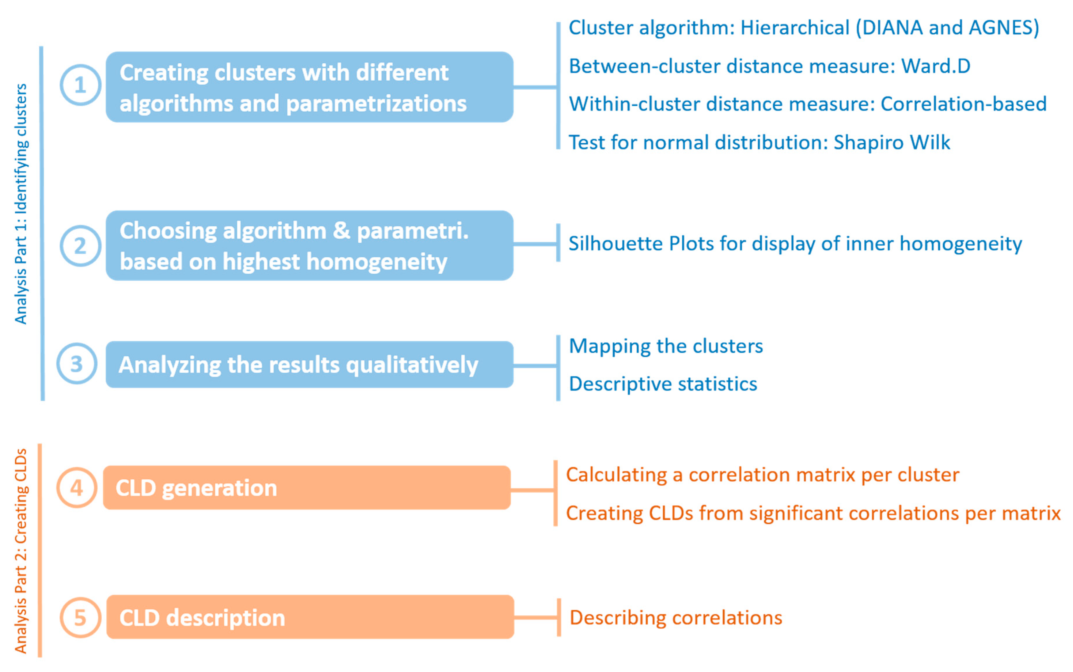
3. Analysis and Results
The analysis aims at identifying clusters of relatively homogenous vulnerability structures among the geons dataset inherited from [
14] (Analysis Part 1). Once the clusters are identified, they are mapped and analyzed based on their descriptive statistics. In
Analysis Part 2, their inner structures—in terms of significant correlations between vulnerability indicators—are displayed as Causal Loop Diagrams (CLDs). Both the establishment of homogenous clusters (Analysis Part 1) and the disclosure of their inner structures (
Analysis Part 2) utilize correlation: as a distance measure in the cluster analysis and as a filter for possible causal relationships between indicators in the CLDs.
Significant correlations between indicators per cluster are calculated and handed over to a function, which automatically generates CLDs on the basis of said correlations.
By calculating correlation alone, however, neither the existence of causal relations nor their direction can be determined with certainty. To clearly draw knowledge from the CLDs, it is therefore indispensable to interpret them qualitatively in terms of causality and direction. However, since this article is focused on the data analysis that lays the foundation for a qualitative analysis, the in-depth interpretation is not part of this exercise.
Figure 1 shows the analysis steps that are performed in the following sections.
To make the single steps of the analysis transparent and reproducible, a script was developed using the programming language R, which is widely used for statistical computing. The essential packages are
factoextra [
39] and
causalloop [
40]. A list of abbreviations can be found in
Appendix A at the end of this document (
Table A1).
3.1. Analysis Part 1: Identifying Clusters
3.1.1. The Application of Hierarchical Clustering Algorithms and Correlation-Based Distance Measures
The choice of clustering algorithms is vast. The authors of [
41] give an overview of the 26 most commonly used ones. However, those in [
42] point out the fact that it is not the choice of clustering algorithm but the parameter
distance measure that is more decisive for the resulting clusters. The two hierarchical clustering algorithms
Divisive Analysis (DIANA) and
Agglomerative Nesting (AGNES) were chosen for this analysis, as they can be parametrized to use correlation-based distance measures. The practice of using correlation as a distance measure in cluster generation is borrowed from the field of Bioinformatics, where it is used in gene expression data analysis [
43] in order to detect groups of genes that manifest similar expression patterns [
44]. Additionally, it is known for being able to handle noise in multivariate clusters [
42]. This article does not deal with genes; however, each analyzed geon has 13 attributes with specific value constellations, which can be considered an “expression pattern”. The aspiration to cluster geons with similar expression patterns placed the focus on hierarchical clustering algorithms. Whether DIANA or AGNES and which correlation coefficient is best suited for the used data is explored in the following sections.
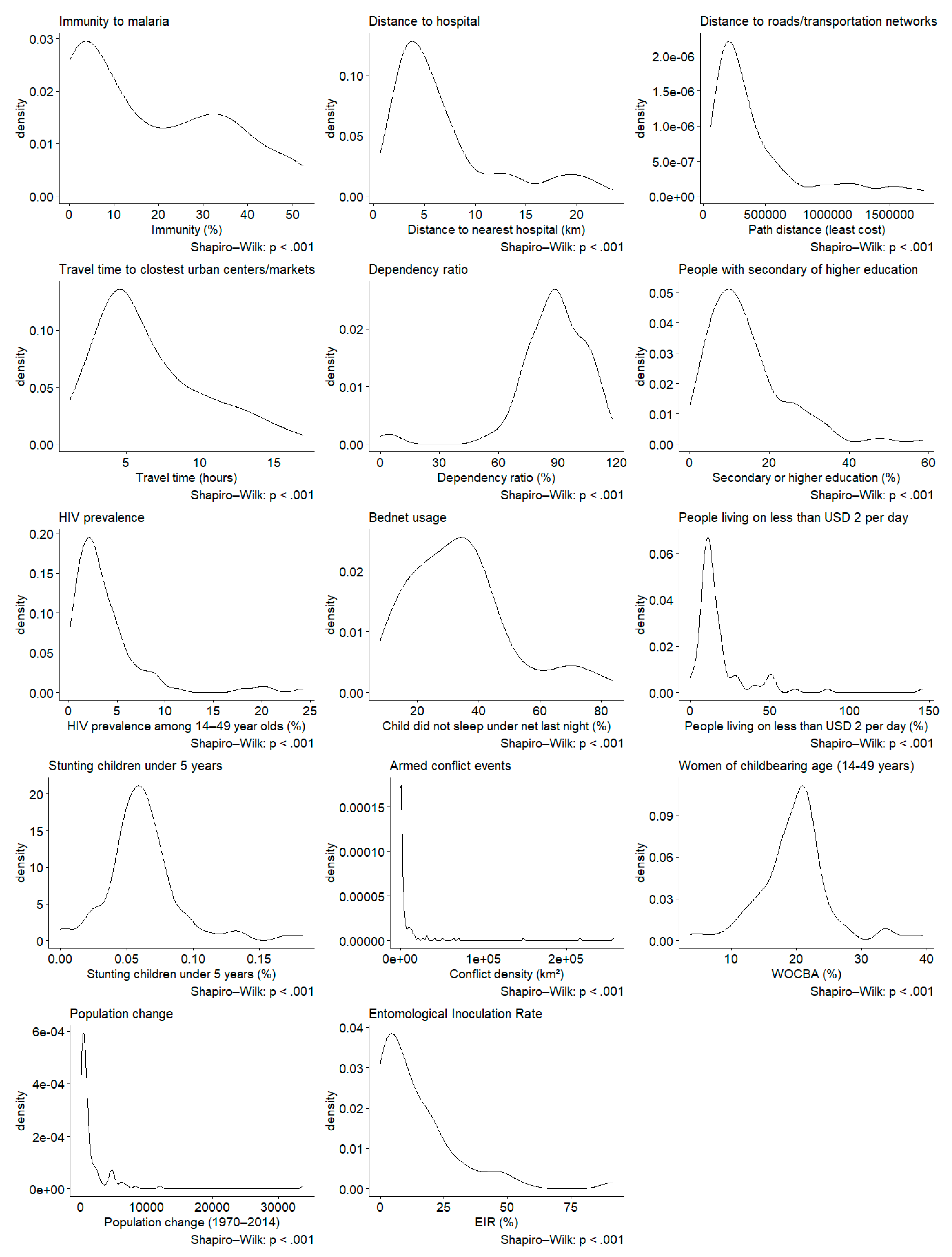
3.1.2. Testing the Data for Normal Distribution
As correlation is at the center of this analysis, the choice of correlation coefficient is worth considering. One of the most commonly used is the Pearson Correlation coefficient, valued, e.g., for its high statistical efficacy [
45]. However, its results are only reliable when none of the assumptions underlying a general linear model are violated. This makes it only suitable for roughly normally distributed data with few outliers. Spearman’s
ρ and Kendall’s τ are non-parametric estimators measuring monotonicity relationships, which makes them more robust. While slightly less statistically efficient, they make a good compromise as they can yield interpretable results for non-normally distributed data [
46]. Therefore, the analysis begins with the standardization of the data and the testing of them for a normal distribution using Density Plots and Shapiro–Wilk tests, shown in
Figure 2. With all the Shapiro–Wilk test values being well below the threshold (
p < 0.05), none of the indicators is normally distributed. The Pearson Correlation coefficient was therefore discarded in favor of Spearman’s
ρ and Kendall’s τ.
The Density Plots are displayed in addition to give the reader an impression of the data distribution. The intention behind this is to facilitate the understanding of the data analysis carried out in the following sections.
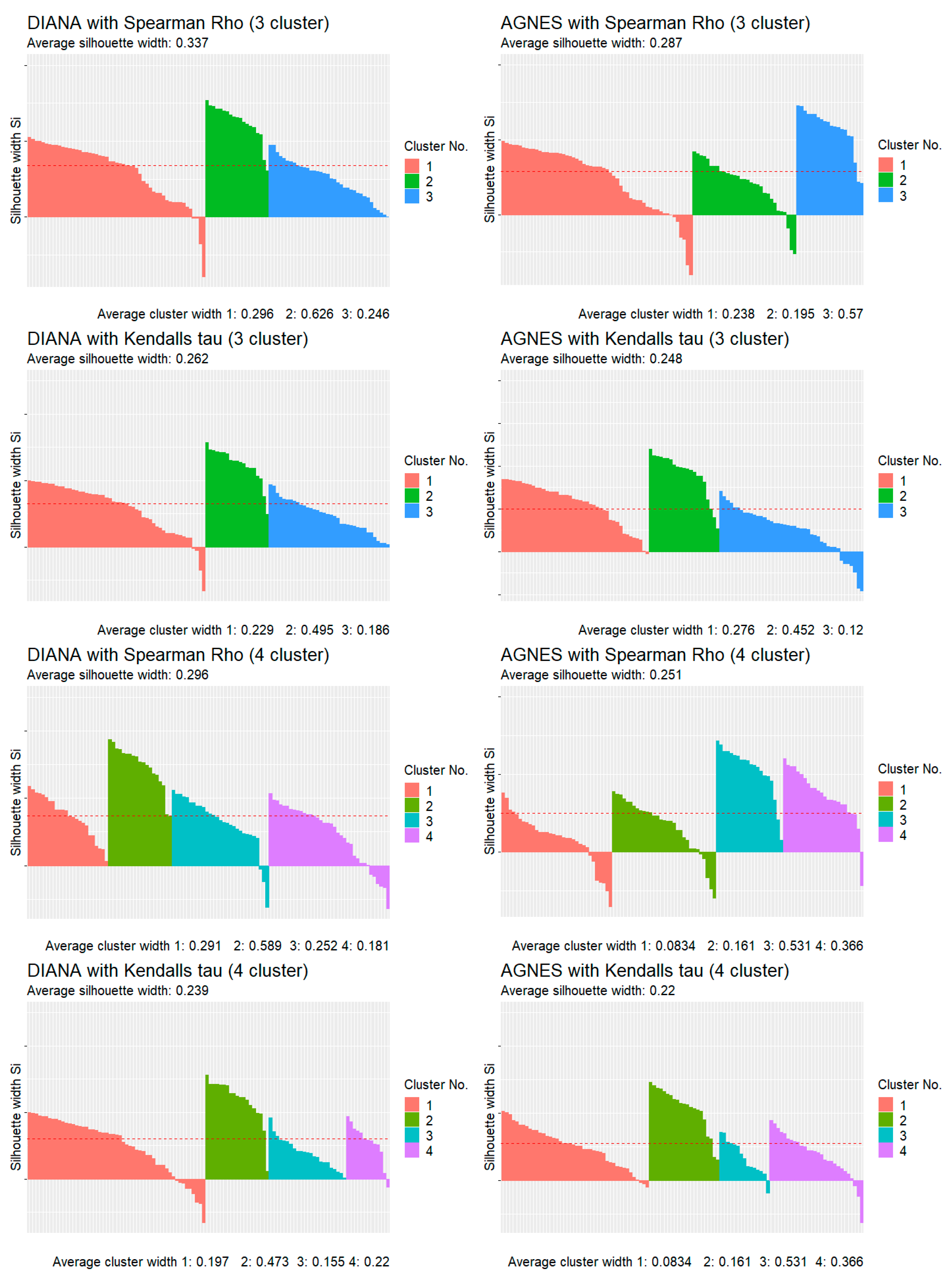
3.1.3. AGNES vs. DIANA: Testing Different Parametrizations for the Most Homogenous Results
To test whether AGNES or DIANA and which parametrization yields the most homogenous clusters, the data were clustered using the eclust function from the package factoextra in the combinations AGNES vs. DIANA, with three vs. four clusters and Spearman’s ρ vs. Kendall’s τ as the within-cluster distance measure. Usually, Scree Plots are used to determine the optimal number of clusters by calculating and visualizing the decline of within-cluster sum of squares per each additional cluster. While the used R package factoextra offers the option the generate Scree Plots in general, the function is not implemented to handle correlation-based distance measures. As a substitute, Scree Plots for the Kmeans algorithm in combination with the Euclidean distance as the distance measure were tested, which showed a discernible decrease in the within-cluster sum of squares decline at about three or four clusters. It was therefore assumed that these results would be transferable to AGNES and DIANA in combination with correlation-based distances. Hence, three and four clusters were tested in parallel.
The parameter
between-cluster distance, or linkage criterion, was set to Ward.D (Ward’s method), a widely used method [
47,
48], which, however, had no impact on the cluster generation. The method groups the geons based on the reduction of the sum of squared distances of each geon from the average geon in a cluster [
49].
Figure 3 and
Figure 4 show Silhouette Plots, plots designed to help validate cluster quality [
26,
50]. The longer the bars, the higher the cluster score—a measure to describe how well a geon fits into its cluster (cohesion) and how strongly it differs from the other clusters (separation). Respectively, the higher the average cluster width and the corresponding average silhouette width, the higher the cluster cohesion and the greater the separation.
The superiority of correlation-based distance measures for multivariate data over the Euclidean distance is mentioned in [
41]. This observation can be made here as well (see
Figure 3)—the average silhouette and cluster width are considerably higher when using DIANA and Spearman’s
ρ than with Kmeans with Euclidean Distance.
The plots in
Figure 4 indicate that the combination
DIANA/3 clusters/Spearman’s ρ yields the most homogenous clusters, constituting the only combination scoring over 30. The highest average silhouette width scores no higher than 33; however, each geon has a profile of 13 variables. In addition,
Figure 4 confirms that it is not the algorithm but the selected distance parameter that is decisive for the homogeneity scores. Both DIANA and AGNES score more highly in combination with Spearman’s
ρ—at three and four clusters—than in combination with Kendall’s τ.
3.2. Analysis Part 1: Results
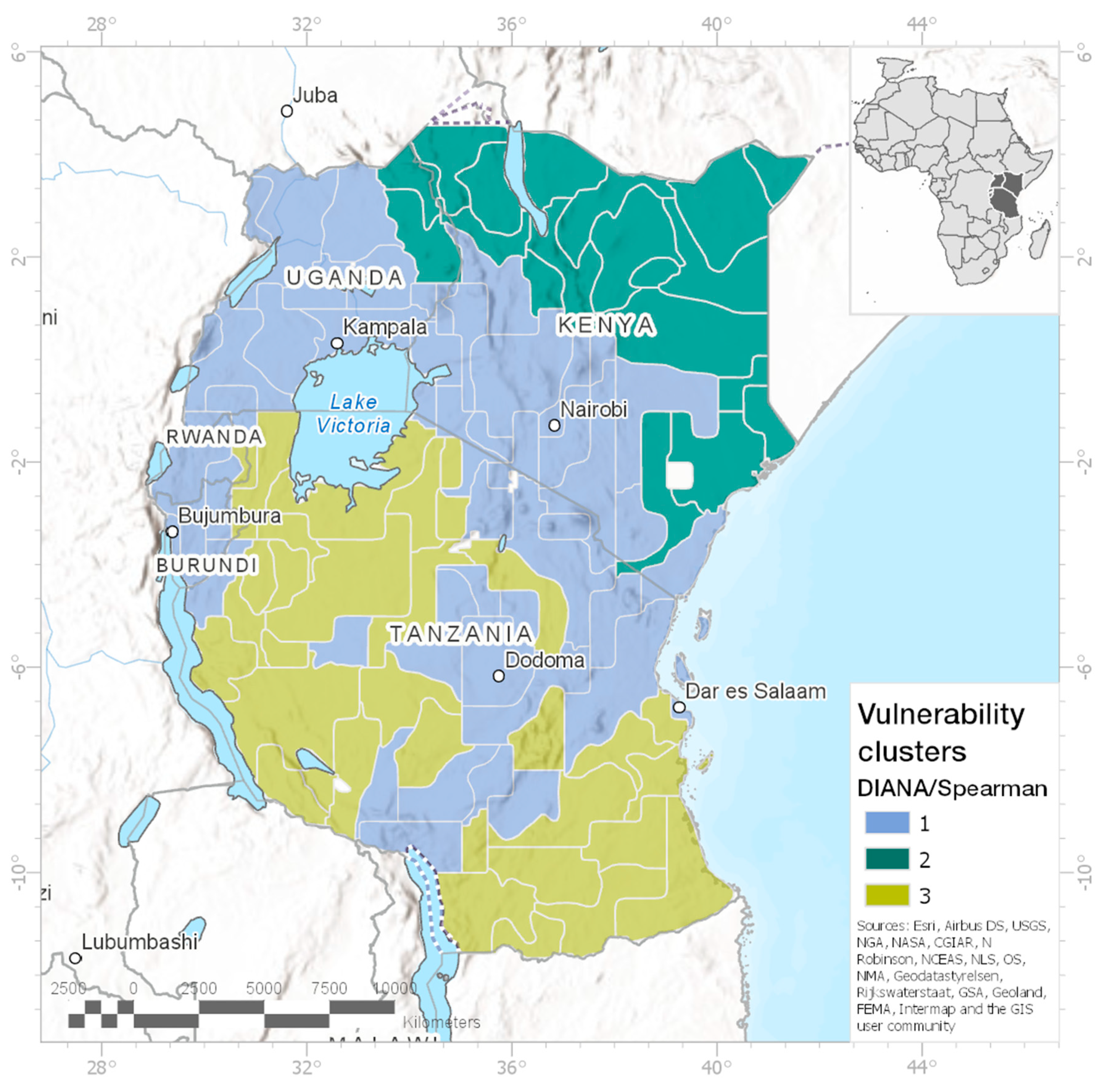
Three clusters derived by DIANA in combination with Spearman’s ρ yielded the most homogenous results. This combination is therefore chosen as the basis for the structural results analysis. From here onwards, when speaking of the clusters, this particular combination is referred to.
3.2.1. Mapping the Clusters
When visualizing the results on a map (see
Figure 5), something interesting can be observed: although spatial connectivity and proximity had no influence on the clustering process, the clusters are, with few exceptions, adjacent polygons. Waldo Tobler’s First Law of Geography states that everything is related to everything else but that near things are more related than distant things [
51]. Likewise, the mapped clustering results indicate relevant effects of spatial proximity on the system’s structural similarity. A more detailed description follows in
Section 3.4, in which the spatial distribution of the clusters is discussed in connection with the CLDs.
3.2.2. Descriptive Statistics
As shown in
Table 2, Cluster #1 is characterized by high accessibility (distance to roads, urban centers and closest hospital) and high population change, more specifically population
growth, which indicates an urban context. This is plausible, since all the densely populated area is covered by this cluster. Consequently, it differs from the other regions by its high conflict density, while on the other hand, the percentage of persons with secondary or higher education is the highest by a clear margin. The share of people living on less than USD 2 per day is slightly higher than in Cluster #2, while still being on the lower end of the spectrum. The EIR is the lowest here, while the immunity ratio is relatively high. However, the use of bednets is not widespread. The dependency ratio is the highest, accompanied by the highest values of human immunodeficiency virus (HIV) prevalence and number of stunted children. The women of childbearing age (WOCBA) ratio differs between Cluster #2 and #3.
Cluster #2 had the lowest population change/growth and is characterized by poor accessibility, which indicates a rural context, while still suffering a relatively high conflict density. The high EIR stands in contrast to the low immunity, which could indicate that the disease has only recently entered this region. Moreover, the use of bednets is not yet widespread. The rate of people with secondary or higher education is slightly lower than in Cluster #3, while the share of people living on less than USD 2 per day and HIV prevalence are the lowest here. The WOCBA ratio is the highest here, while the dependency ratio and the number of stunted children are comparably low.
Cluster #3 has slightly better accessibility values than Cluster #2 but is, concerning infrastructure, still rather poorly equipped. The conflict density is by far the lowest in this cluster, while the poverty ratio exceeds the ratios in Cluster #1 and #2 by a large margin. The EIR and education rates are similar to those in Cluster #2, being high in the former and low in the latter case. However, in contrast to Cluster #2, immunity here is widespread, accompanied by a low rate of bednet usage. The dependency ratio, HIV, population change and number of stunted children under the age of 5 fall somewhere in the middle between Cluster #1 and #2. The WOCBA ratio is significantly lower in this cluster than in the other two.
In summary, Cluster #1 points to an urban context, whereas Cluster #2 and #3 both indicate rural structures. However, Cluster #2 has experienced very little population change, and absolute poverty is significantly lower than in Cluster #3. It is nevertheless plagued with a relatively high conflict density. In Cluster #3, the high-ranking values of absolute poverty and immunity stand out.
3.3. Analysis Part 2: Deriving CLDs form Significant Correlations
Causality is defined as the relationship between cause and effect or the principle that everything has a cause [
52]. CLDs are a visual tool that helps to depict causal flows within a system, usually based on qualitative research. Here, the CLDs are automatically generated based on significant correlations found in three clusters. Hence, the links shown in the CLDs are not necessarily of a causal nature but rather occur alongside, instead of reinforcing or balancing, each other. In those cases where a causal relationship can be assumed, it is equally complex to determine its direction. For example, the relationship between poverty and malaria prevalence is generally understood as causal to some extent [
53,
54]. However, it is difficult to assess which causes which or whether they share a mutual relationship, reinforcing each other [
55].
In the next step, correlation matrices are calculated, which form the basis for the CLD generation. As the data do not fulfill all the criteria necessary to reliably use Pearson’s Correlation coefficient, and since Spearman’s
ρ has already successfully served as a distance measure in the clustering process, it will also be utilized here. The
corrplot function is used to calculate Spearman’s
ρ correlations between the 13 vulnerability indicators and the hazard indicator EIR, for each of the three clusters. In preparation for the CLDs, only correlations with a significance level of 95% or greater are kept. In addition, the variable’s correlations with itself are removed from the dataframe. The package
causalloop [
40] is utilized to automatically generate CLDs from significant (
p < 0.05) Spearman’s
ρ correlations.
The function needs the input parameters from, to, weight and polarity to generate a CLD. From and to describe a vulnerability indicator pair, the weight parameter describes the correlation strength and polarity describes the information regarding whether a relationship is of a positive or negative nature. Red arrows indicate a negative relationship, while green arrows indicate a positive one. Positive in this context means that the variables change in the same direction (an increase/decrease in variable A observed simultaneously with an increase/decrease in variable B); negative means that if variable A increases, variable B decreases, and vice versa. The width of the arrows represents the strength of the relationship (r value).
Considering the complexity and the number of identified links, relations and feedback loops, an in-depth interpretation, including their modification towards removing non-causal relations and defining the direction of the causal flow, is not part of this exercise. Doing this would require a local understanding of the actual systemic connections within the clusters, based on extensive literature research, expert judgment and qualitative narratives. The here-presented method is rather concerned with the methods and tools available for getting to this point. The next section will, therefore, just describe the clusters and their respective CLDs.
3.4. Analysis Part 2: Results
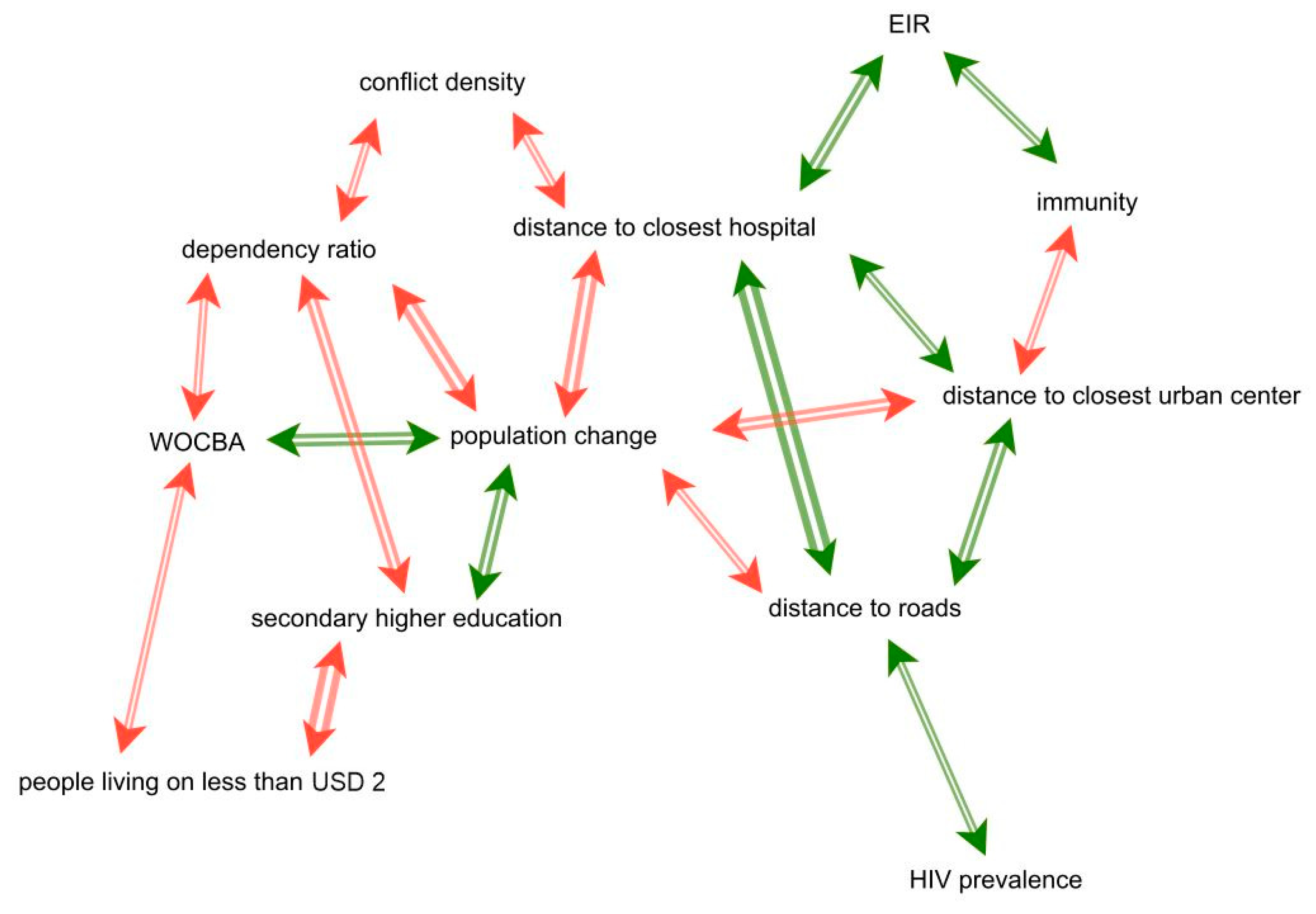
3.4.1. Cluster 1: The Urban Cluster
Cluster #1 (
Figure 6): The urban cluster covers all of Burundi, Rwanda and Uganda, the mountainous areas of Kenya including Nairobi, stretches along the border between Kenya and Tanzania up to the Indian Ocean, and includes Zanzibar and Pemba island as well as Tanzania’s capital Dar es Salaam and some parts of interior Tanzania. This makes it the cluster with the most inhabitants by far. The central element of this CLD is the population change indicator. The three accessibility indicators (the distances to the closest hospital, to the closest urban center, and to roads) are negatively correlated to population change, showing that the change, or rather growth (population growth was recorded in every geon), between 1970 and 2010 happened in close proximity to infrastructure and urban centers. The share of people with secondary or higher education is positively correlated with population change. It remains open as to whether this is due to well-educated people who migrated to urban areas or whether the higher density of educational institutions is decisive in leading to a more educated population. The number of WOCBA is also positively correlated with population change. This corresponds to findings from [
56], according to which women between 20 and 30 years were found to be the largest group of internal migrants within Uganda, Kenya and Tanzania. This trend could possibly be transferable to Rwanda and Burundi. High shares of both WOCBA and educated people are found where the share of people living on less than USD 2 per day is low. This could point to the factor that poverty increases with increasing distance to city centers (e.g., people living in informal settlements along the urban outskirts) [
57].
Of special interest for us was the link between the hazard indicator EIR and its correlations with the vulnerability system, which could probably enhance the understanding of its entry points into the vulnerability system. In Cluster #1, the EIR is positively correlated with the immunity indicator, which is plausible, as immunity develops under continuous exposure [
58]. However, immunity is negatively correlated to the distance to urban centers, while the EIR is positively correlated to the distance to the next hospital. Assuming that hospital density decreases with increasing distance to urban centers, these correlations would logically contradict each other. However, under the assumption that the higher level of education, better building materials and better access to resources limit the spread of malaria, the link between immunity and urban centers seems to be the more reasonable one.
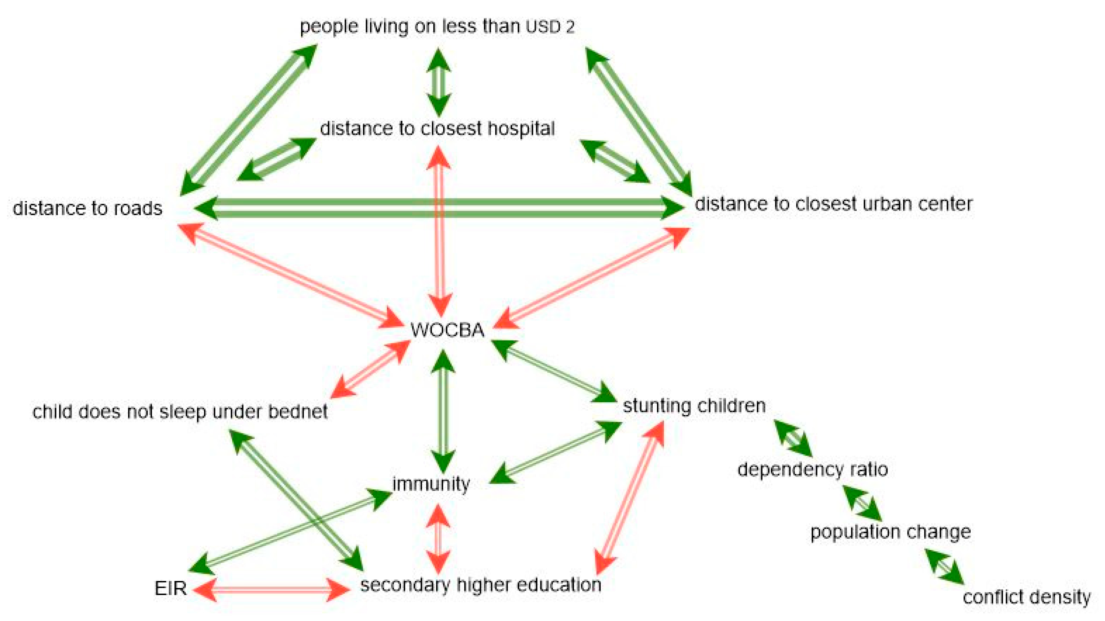
3.4.2. Cluster 2: The Rural Cluster
Cluster #2 (
Figure 7): The rural cluster covers northern Kenya and the northern part of Kenya’s coastline. It was labeled the rural cluster, since the average distances to urban centers, roads and hospitals are generally high and the population density is low in comparison with those in the two other clusters. The CLD exhibits some unexpected relationships. This can probably be traced back to the relatively small sample of 26 geons—however, this cluster had the highest average cluster width, which technically indicates a high homogeneity of the cluster. The first contradictory link here is the positive correlation between the EIR and education. Other studies rather found the opposite to be the case [
59,
60]. The same applies to the positive correlation between poverty and education—usually, better education would lead to less poverty or vice versa. However, the higher the education level, the fewer the children that do not sleep under bednets, which corresponds to findings from the literature [
59]. The negative correlation between low bednet usage and the EIR indicates that, despite very low overall bednet usage, children living in areas with high EIRs are more likely to sleep under bednets than children in areas where the EIR is lower.
Similar to in Cluster #1, population change tended to happen in close proximity to urban centers and infrastructure and is accompanied by an increased conflict density. An interesting link, which would require further research, is that triangle immunity forms with population change and conflict density. The missing correlation between immunity and the EIR could be caused by inflows of non-immune migrants or by a lack of reliability of the data.
3.4.3. Cluster 3: The Rural–Urban Gap
Cluster #3 (
Figure 8): The urban–rural gap cluster covers those parts of Tanzania that are not part of the urban cluster. This is the southern part of the country including the coastline (except for the region north of and including Dar es Salaam and the islands) and the western, landward-directed part between Lake Tanganyika and Lake Victoria. With a sample size of 42 geons, it constitutes the biggest cluster. The cluster size leads to the lowest homogeneity values among the three clusters.
The three accessibility indicators are all strongly positively correlated to poverty, meaning that poverty significantly increases with increasing distance to urban centers and infrastructure. This steep gradient was the reason for the name urban–rural gap. Furthermore, the accessibility indicators are all negatively correlated to WOCBA. This again coincides with findings from [
56], where women between the ages of 20 and 30 were the most mobile group among internal migrants in Tanzania. Being the most mobile gender and age group, WOCBA can therefore be considered the most likely to try to escape rural poverty.
Cluster #3 is the only cluster that reveals a clear and logic entry point of the hazard into the vulnerability system, and that is the negative correlation between the EIR and education and its validation in form of the positive correlation between the EIR and immunity and the negative correlation between immunity and education.
4. Discussion
The intended use of the herein-presented workflow is to give insight into statistical relationships between indicator data throughout space by clustering spatial entities with similar “expression patterns” and displaying their internal relationships as CLDs.
The differing internal structures among the obtained CLDs suggest that the relationships between the variables vary across space and can therefore not be represented in a single CLD. In other words, causal structures that constitute the malaria system are heterogeneous in space. This has important implications for the construction of models of social vulnerability to malaria. There is a need for a new type of structurally disaggregated model that is capable of representing spatially heterogeneous causal structures.
For instance, vulnerability in Cluster #1 is governed by urban structures and population change, whereas vulnerability in Cluster #2 revealed some rather contradictory correlations that require further investigation, and Cluster #3 shows education as the main entry point of malaria into the vulnerability system.
4.1. Limitations and Uncertainties
The expectation was to discover more correlations where an underlying causal relationship could be assumed, especially hoping to find feedback loops and statistically significant and probable causal links between the vulnerability systems and the hazard indicator EIR, to identify the entry point of the hazard into the vulnerability systems. However, we were also aware that not all the relevant elements of the vulnerability system are covered by the indicator data—such as housing and access to treatment [
17], drug resistance and vector control activities [
27], and access to transportation [
61]—or even more intangible factors like personal beliefs, behaviors and social networks. Additionally, in some instances, only proxy data were available, e.g., the stunting of children under the age of 5 indicator, which functioned as a proxy for malnutrition in young children [
14]. However, the relationship between malaria and malnutrition is not fully understood, ranging from malnutrition as increasing susceptibility [
62,
63] to decreasing [
64,
65] susceptibility to no clear link [
66]. Another factor that has potentially impaired the results is the limited reliability of the data. The assessed nations lack reliable census data. Therefore, all the used datasets were either modeled, interpolated or otherwise modified in order to be able to work with what is available. While this approach is valid in this case of a general lack of “ground-truth” data, the results should be considered to show a general tendency rather than an exact reflection of reality.
Finally, the ecological determinants of malaria persistence were not covered in this exercise. The EIR indicator and the immunity indicator, accordingly, are the only indicators that indirectly reflect the ecological and climatic dimensions, clearly making the 13 vulnerability indicators the dominant factors in the clustering process. This ultimately led to big parts of Uganda, Burundi and Rwanda forming a cluster due to their similar vulnerability structures, while
Plasmodium falciparum endemicity in large parts of Uganda is over 40%, while being below 5% in most of Burundi and Rwanda [
67]. It is therefore not surprising that the entry point of malaria into the vulnerability system of this cluster could not clearly be worked out, as it only plays a significant role in parts of the cluster.
4.2. Validation
According to [
26], an intrinsic shortcoming of vulnerability assessments is that vulnerability cannot be validated, since it is a potential state. They therefore highlight the importance of the validity of the process. Process validity can be established by keeping the choices and sources regarding the conceptual framework, data, indicators, sub-indices and aggregation functions as transparent as possible [
68]. By keeping the processes transparent, criticisms of the distortion of complex realities through indicators to reflect preconceived ideas can be countered. The R script that was programmed for this exercise was therefore made publicly available on Github [
69] to ensure process transparency and reproducibility, as well as the opportunity for reuse and improvement by the community.
5. Conclusions
In this work, a spatial geon dataset (n = 108) covering a total of five East African Nations, where each spatial region is composed of an expression pattern of 14 variables—13 vulnerability indicators and one hazard indicator—has been analyzed and clustered into groups of geons, which share a similar systemic structure. The clusters were mapped, and descriptive statistics in tabular form gave an insight into the distribution of values. The clustered data were then handed over to a function that calculated Spearman’s correlations between the 14 respective variables. Those correlations that were significant (p < 0.05) were in turn handed over to another function that generated CLDs from them. The differing structures of the CLDs indicate that the assumption that one CLD alone cannot sufficiently capture the diverse relationships among the variables throughout the study region is justified. The CLDs revealed correlations, which were briefly described and interpreted.
As the demand for risk assessments increases, be it in climate change adaptation, disaster risk reduction or the public health domain, existing methods have to be elaborated to be fit to capture the realities of ever-increasing complexity. This article therefore attempted to utilize existing tools from different domains by combining elements from traditional risk analysis with elements from spatial analysis and system dynamics (and gene expression analysis). Additionally, the aim was to further enhance the impact chain approach, applied in climate risk assessments, by exploring statistical and spatial methods.
The herein-developed workflow can easily be implemented into the data exploration phase of a risk and vulnerability assessment, independent of the research subject. The CLDs can be viewed as an interim result, constituting a link between quantitative and qualitative phases, where possible causalities and feedback mechanisms in the system might be illuminated. Furthermore, the CLDs—supported by Silhouette Plots, maps, descriptive statistics and correlation matrices—could also be used as a basis for discussions in participatory settings.
Author Contributions
Conceptualization and methodology, L.M., C.N. and S.K.; software, formal analysis and writing—original draft preparation, L.M.; writing—review and editing, L.M., S.K. and C.N.; visualization, L.M.; supervision, S.K. and C.N.; All authors have read and agreed to the published version of the manuscript.
Funding
This research received no external funding.
Conflicts of Interest
The authors declare no conflicts of interest.
Appendix A
Table A1.
List of abbreviations.
Table A1.
List of abbreviations.
| Abbreviation | Full Name |
|---|
| CLD | Causal Loop Diagram |
| WHO | World Health Organization |
| BBN | Bayesian Belief Network |
| CIMM | Cross-Impact Multiplication Method |
| EIR | Entomological Inoculation Rate |
| IPCC AR5 | Intergovernmental Panel on Climate Change: Fifth Assessment Report |
| HF | HEALTHY FUTURES |
| DIANA | Divisive Analysis |
| AGNES | Agglomerative Nesting |
| HIV | Human immunodeficiency virus |
| WOCBA | Women of childbearing age |
References
- World Health Organization. World Malaria Report 2015; World Health Organization: Geneva, Switzerland, 2016. [Google Scholar]
- World Health Organisation. World Malaria Report 2018; WHO: Geneva, Switzerland, 2018. [Google Scholar]
- Himeidan, Y.E.-S.; Kweka, E. Malaria in East African highlands during the past 30 years: Impact of environmental changes. Front. Physiol. 2012, 3, 315. [Google Scholar] [CrossRef] [PubMed]
- Pascual, M.; Ahumada, J.A.; Chaves, L.F.; Rodó, X.; Bouma, M. Malaria resurgence in the East. African highlands: Temperature trends revisited. Proc. Natl. Acad. Sci. USA 2006, 103, 5829–5834. [Google Scholar]
- Hashizume, M.; Terao, T.; Minakawa, N. The Indian Ocean. Dipole and malaria risk in the highlands of western Kenya. Proc. Natl. Acad. Sci. USA 2009, 106, 1857–1862. [Google Scholar] [CrossRef] [PubMed]
- Chaves, L.F.; Satake, A.; Hashizume, M.; Minakawa, N. Indian Ocean dipole and rainfall drive a Moran effect in East Africa malaria transmission. J. Infect. Dis. 2012, 205, 1885–1891. [Google Scholar] [CrossRef]
- Hamilton, A. The climate of the East. Usambaras. In Forest Conservation in the East Usambaras; IUCN: Cambridge, UK, 1989; pp. 97–102. [Google Scholar]
- Lindsay, S.; Martens, W. Malaria in the African Highlands: Past, Present and Future. Bull. WHO 1998, 76, 33. [Google Scholar] [PubMed]
- Mouchet, J. Origin of malaria epidemics on the plateaus of Madagascar and the mountains of east and south Africa. Bull. Soc. Pathol. Exot. 1990 1998, 91, 64–66. [Google Scholar]
- Martens, P.; Hall, L. Malaria on the move: Human population movement and malaria transmission. Emerg. Infect. Dis. 2000, 6, 103. [Google Scholar] [CrossRef]
- Parry, M.; Parry, M.L.; Canziani, O.; Palutikof, J.; Van der Linden, P.; Hanson, C. Climate Change 2007-Impacts, Adaptation And Vulnerability: Working Group II Contribution to the Fourth Assessment Report of the IPCC; Cambridge University Press: Cambridge, UK, 2007; Volume 4. [Google Scholar]
- Béguin, A.; Hales, S.; Rocklöv, J.; Åström, C.; Louis, V.R.; Sauerborn, R. The opposing effects of climate change and socio-economic development on the global distribution of malaria. Glob. Environ. Chang. 2011, 21, 1209–1214. [Google Scholar] [CrossRef]
- Bossel, H. Systems and Models: Complexity, Dynamics, Evolution, Sustainability; BoD–Books on Demand: Norderstedt, Germany, 2007. [Google Scholar]
- Kienberger, S.; Hagenlocher, M. Spatial-explicit modeling of social vulnerability to malaria in East. Africa. Int. J. Health Geogr. 2014, 13, 29. [Google Scholar] [CrossRef]
- Lang, S.; Zeil, P.; Kienberger, S.; Tiede, D. Geons-policy-relevant geo-objects for monitoring high-level indicators. In GI_Forum; Wichmannn: Heidelberg, Germany, 2008. [Google Scholar]
- Lang, S.; Kienberger, S.; Tiede, D.; Hagenlocher, M.; Pernkopf, L. Geons–domain-specific regionalization of space. Cartogr. Geogr. Inf. Sci. 2014, 41, 214–226. [Google Scholar] [CrossRef]
- Bizimana, J.P.; Kienberger, S.; Hagenlocher, M.; Twarabamenye, E. Modelling homogeneous regions of social vulnerability to malaria in Rwanda. Geosp. Health 2016, 11, 129–146. [Google Scholar] [CrossRef]
- Bizimana, J.-P.; Twarabamenye, E.; Kienberger, S. Assessing the social vulnerability to malaria in Rwanda. Malar. J. 2015, 14, 2. [Google Scholar] [CrossRef]
- Kienberger, S.; Borderon, M.; Bollin, C.; Jell, B. Climate change vulnerability assessment in Mauritania: Reflections on data quality, spatial scales, aggregation and visualizations. GI Forum J. 2016, 1, 167–175. [Google Scholar] [CrossRef][Green Version]
- Greiving, S.; Zebisch, M.; Schneiderbauer, S.; Fleischhauer, M.; Lindner, C.; Lückenkötter, J.; Buth, M.; Kahlenborn, W.; Schauser, I. A consensus based vulnerability assessment to climate change in Germany. Int. J. Clim. Chang. Strateg. Manag. 2015, 7, 306–326. [Google Scholar] [CrossRef]
- Olabisi, L.S.; Liverpool-Tasie, S.; Rivers, L.; Ligmann-Zielinska, A.; Du, J.; Denny, R.; Marquart-Pyatt, S.; Sidibé, A. Using participatory modeling processes to identify sources of climate risk in West Africa. Environ. Syst. Decis. 2018, 38, 23–32. [Google Scholar] [CrossRef]
- Steininger, K.W.; Bednar-Friedl, B.; Formayer, H.; König, M. Consistent economic cross-sectoral climate change impact scenario analysis: Method and application to Austria. Clim. Serv. 2016, 1, 39–52. [Google Scholar] [CrossRef]
- Thacker, S.; Kelly, S.; Pant, R.; Hall, J.W. Evaluating the benefits of adaptation of critical infrastructures to hydrometeorological risks. Risk Anal. 2018, 38, 134–150. [Google Scholar] [CrossRef]
- Rome, E.; Bogen, M.; Lückerath, D.; Ullrich, O.; Worst, R.; Streberová, E.; Dumonteil, M.; Mendizabal, M.; Abajo, B.; Feliu, E.; et al. Risk-based analysis of the vulnerability of urban infrastructure to the consequences of climate change. Crit. Infrastruct. Secur. Resil. 2019, 55–75. [Google Scholar] [CrossRef]
- Schwarze, R. On the State of Assessing the Risks and Opportunities of Climate Change in Europe and the Added Value of COIN. Econ. Eval. Clim. Chang. Impacts 2015, 29–42. [Google Scholar] [CrossRef]
- Vincent, K.; Cull, T. Using indicators to assess climate change vulnerabilities: Are there lessons to learn for emerging loss and damage debates? Geogr. Compass 2014, 8, 1–12. [Google Scholar] [CrossRef]
- Onyango, E.A.; Sahin, O.; Awiti, A.; Chu, C.; Mackey, B. An integrated risk and vulnerability assessment framework for climate change and malaria transmission in East Africa. Malar. J. 2016, 15, 551. [Google Scholar] [CrossRef] [PubMed]
- Fritzsche, K.; Schneiderbauer, S.; Bubeck, P.; Kienberger, S.; Buth, M.; Zebisch, M.; Kahlenborn, W. The Vulnerability Sourcebook: Concept and Guidelines for Standardised Vulnerability Assessments; Giz: Bonn, Germany, 2014. [Google Scholar]
- Buth, M.; Kahlenborn, W.; Greiving, S.; Fleischhauer, M.; Zebisch, M.; Schneiderbauer, S.; Schauser, I. Leitfaden für Klimawirkungs-und Vulnerabilitätsanalysen; Umweltbundesamt: Dessau-Roßlau, Germany, 2017. [Google Scholar]
- EURAC. Risk Supplement to the Vulnerability Sourcebook. In Guidance on How to Apply the Vulnerability Sourcebook’s Approach with the New IPCC AR5 Concept of Climate Risk; Giz: Bonn, Germany, 2017. [Google Scholar]
- Healthy Futures. FAQ and Feedback 2011. Available online: http://www.healthyfutures.eu/index988a.html?option=com_k2&view=item&layout=item&id=133&Itemid=265&lang=en (accessed on 21 June 2019).
- Matson, A. The history of malaria in Nandi. East Afr. Med. J. 1957, 34, 431–441. [Google Scholar] [PubMed]
- Central Intelligence Agency. The World Factbook 2016-17. Available online: https://www.cia.gov/library/publications/the-world-factbook/index.html (accessed on 5 May 2019).
- Beier, J.C.; Killeen, G.F.; Githure, J.I. Entomologic inoculation rates and Plasmodium falciparum malaria prevalence in Africa. Am. J. Trop. Med. Hyg. 1999, 61, 109–113. [Google Scholar] [CrossRef]
- Intergovernmental Panel on Climate Change. Working Group II. Climate Change 2014: Impacts, Adaptation, and Vulnerability; IPCC Working Group II: Geneva, Switzerland, 2014. [Google Scholar]
- Hagenlocher, M.; Kienberger, S.; Lang, S.; Blaschkeet, T. Implications of spatial scales and reporting units for the spatial modelling of vulnerability to vector-borne diseases. GI Forum 2014 2014, 197–206. [Google Scholar]
- Hagenlocher, M.; Delmelle, M.; Casas, E.I.; Kienberger, S. Assessing socioeconomic vulnerability to dengue fever in Cali, Colombia: Statistical vs expert-based modeling. Int. J. Health Geogr. 2013, 12, 36. [Google Scholar] [CrossRef]
- Birkmann, J.; Cardona, O.D.; Carreño, M.L.; Barbat, A.H.; Pelling, M.; Schneiderbauer, S.; Kienberger, S.; Keiler, M.; Alexander, D.; Zeil, P.; et al. Framing vulnerability, risk and societal responses: The MOVE framework. Nat. Hazards 2013, 67, 193–211. [Google Scholar] [CrossRef]
- Kassambara, A.M.; Mundt, F. Factoextra: Extract and Visualize the Results of Multivariate Data Analyses. Available online: https://cran.r-project.org/web/packages/factoextra/index.html (accessed on 1 August 2019).
- Dalton, J. Causalloop—Tools for Dynamically Creating Causal Loop Diagrams. Available online: https://rdrr.io/github/jarrod-dalton/causalloop/ (accessed on 14 June 2019).
- Xu, D.; Tian, Y. A comprehensive survey of clustering algorithms. Ann. Data Sci. 2015, 2, 165–193. [Google Scholar] [CrossRef]
- Egri, A.; Horváth, I.; Kovács, F.; Molontay, R.; Varga, K. Cross-correlation based clustering and dimension reduction of multivariate time series. In Proceedings of the IEEE 21st International Conference on Intelligent Engineering Systems (INES), Larnaca, Cyprus, 20–23 October 2017. [Google Scholar]
- Datta, S.; Datta, S. Comparisons and validation of statistical clustering techniques for microarray gene expression data. Bioinformatics 2003, 19, 459–466. [Google Scholar] [CrossRef]
- Ben-Dor, A.; Shamir, R.; Yakhini, Z. Clustering gene expression patterns. J. Comput. Biol. 1999, 6, 281–297. [Google Scholar] [CrossRef]
- Croux, C.; Dehon, C. Influence functions of the Spearman and Kendall correlation measures. Stat. Methods Appl. 2010, 19, 497–515. [Google Scholar] [CrossRef]
- Hauke, J.; Kossowski, T. Comparison of values of Pearson’s and Spearman’s correlation coefficients on the same sets of data. Quaest. Geogr. 2011, 30, 87–93. [Google Scholar] [CrossRef]
- Murtagh, F.; Legendre, P. Ward’s hierarchical agglomerative clustering method: Which algorithms implement Ward’s criterion? J. Classif. 2014, 31, 274–295. [Google Scholar] [CrossRef]
- Ward, J.H., Jr. Hierarchical grouping to optimize an objective function. J. Am. Stat. Assoc. 1963, 58, 236–244. [Google Scholar] [CrossRef]
- Bock, T. What is Hierarchical Clustering. Available online: https://www.displayr.com/what-is-hierarchical-clustering/ (accessed on 20 July 2019).
- Rousseeuw, P.J. Silhouettes: A graphical aid to the interpretation and validation of cluster analysis. J. Comput. Appl. Math. 1987, 20, 53–65. [Google Scholar] [CrossRef]
- Tobler, W.R. A computer movie simulating urban growth in the Detroit region. Econ. Geogr. 1970, 46, 234–240. [Google Scholar] [CrossRef]
- Oxford University Press. Causality. Available online: https://www.lexico.com/en/definition/causality (accessed on 20 July 2019).
- De Castro, M.C.; Fisher, M.G. Is malaria illness among young children a cause or a consequence of low socioeconomic status? Evidence from the United Republic of Tanzania. Malar. J. 2012, 11, 161. [Google Scholar] [CrossRef]
- Worrall, E.; Basu, S.; Hanson, K. Is malaria a disease of poverty? A review of the literature. Trop. Med. Int. Health 2005, 10, 1047–1059. [Google Scholar] [CrossRef]
- Gallup, J.L.; Sachs, J.D. The economic burden of Malaria. Am. J. Trop. Med. Hyg. 2001, 64, 85–96. [Google Scholar] [CrossRef]
- Pindolia, D.K.; Garcia, A.J.; Huang, Z.; Smith, D.L.; Alegana, V.A.; Noor, A.M.; Snow, R.W.; Tatem, A.J. The demographics of human and malaria movement and migration patterns in East Africa. Malar. J. 2013, 12, 397. [Google Scholar] [CrossRef]
- United Nations Human Settlements Programme. State of the World’s Cities 2010/2011: Bridging the Urban Divide; Earthscan: London, UK, 2010. [Google Scholar]
- Doolan, D.L.; Dobaño, C.; Baird, J.K. Acquired immunity to malaria. Clin. Microbiol. Rev. 2009, 22, 13–36. [Google Scholar] [CrossRef]
- Njama, D.; Dorsey, G.; Guwatudde, D.; Kigonya, K.; Greenhouse, B.; Musisi, S.; Kamyaet, M.R. Urban malaria: Primary caregivers’ knowledge, attitudes, practices and predictors of malaria incidence in a cohort of Ugandan children. Trop. Med. Int. Health 2003, 8, 685–692. [Google Scholar] [CrossRef]
- Legesse, Y.; Tegegn, A.; Belachew, T.; Tushune, K. Knowledge, attitude and practice about malaria transmission and its preventive measures among households in urban areas of Assosa Zone, Western Ethiopia. Ethiop. J. Health Dev. 2007, 21, 157–165. [Google Scholar] [CrossRef]
- Hagenlocher, M.; Castro, M.C. Mapping malaria risk and vulnerability in the United Republic of Tanzania: A spatial explicit model. Popul. Health Metr. 2015, 13, 2. [Google Scholar] [CrossRef]
- Bates, I.; Fenton, C.; Gruber, J.; Lalloo, D.; Lara, A.M.; Squire, S.B.; Theobald, S.; Thomson, R.; Tolhurst, R. Vulnerability to malaria, tuberculosis, and HIV/AIDS infection and disease. Part 1: Determinants operating at individual and household level. Lancet Infect. Dis. 2004, 4, 267–277. [Google Scholar] [CrossRef]
- Willett, W.; Ware, J. Nutritional and socio-demographic risk indicators of malaria in children under five: A cross-sectional study in a Sudanese rural community. J. Trop. Med. Hyg. 1987, 90, 69–78. [Google Scholar]
- Ahmad, S.; Moonis, R.; Shahab, T.; Khan, H.M.; Jilani, T. Effect of nutritional status on total parasite count in malaria. Indian J. Pediatr. 1985, 52, 285–287. [Google Scholar] [CrossRef]
- Hendrickse, R.; Hasan, A.H.; Olumide, L.O.; Akinkunmi, A. Malaria in early childhood: An investigation of five hundred seriously ill children in whom a “clinical” diagnosis of malaria was made on admission to the children’s emergency room at University College Hospital, Ibadan. Ann. Trop. Med. Parasitol. 1971, 65, 1–20. [Google Scholar] [CrossRef]
- Protopopoff, N.; Van Bortel, W.; Speybroeck, N.; Van Geertruyden, J.P.; Baza, D.; D’Alessandro, U.; Coosemans, M. Ranking malaria risk factors to guide malaria control efforts in African highlands. PLoS ONE 2009, 4, e8022. [Google Scholar] [CrossRef]
- Gething, P.W.; Patil, A.P.; Smith, D.L.; Guerra, C.A.; Elyazar, I.R.F.; Johnston, G.L.; Tatem, A.J.; Hay, S.I. A new world malaria map: Plasmodium falciparum endemicity in 2010. Malar. J. 2011, 10, 378. [Google Scholar] [CrossRef]
- Hammond, A.; Adriaanse, A.; Rodenburg, E.; Bryant, D.; Woodward, R. Environmental Indicators: A Systematic Approach to Measuring and Reporting on Environmental Policy Performance in the Context of Sustainable Development; World Resources Institute: Washington, DC, USA, 1995; Volume 36. [Google Scholar]
- Menk, L. Mapping Vulnerability Systems. 2019. Available online: https://github.com/Menkli/Mapping_vulnerability_systems (accessed on 30 April 2020).
© 2020 by the authors. Licensee MDPI, Basel, Switzerland. This article is an open access article distributed under the terms and conditions of the Creative Commons Attribution (CC BY) license (http://creativecommons.org/licenses/by/4.0/).


