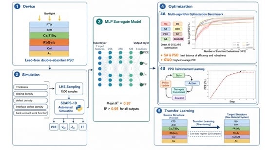
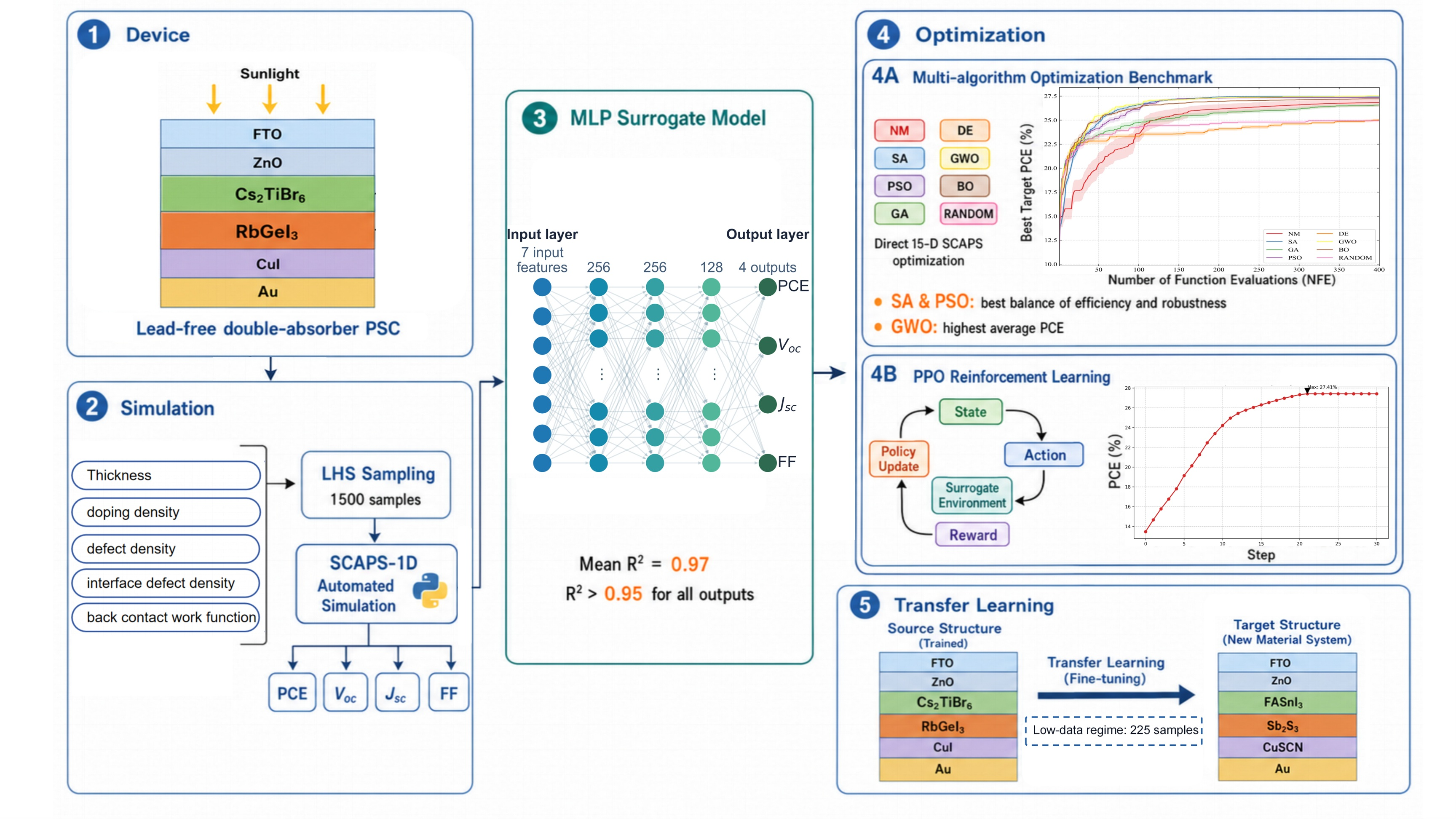
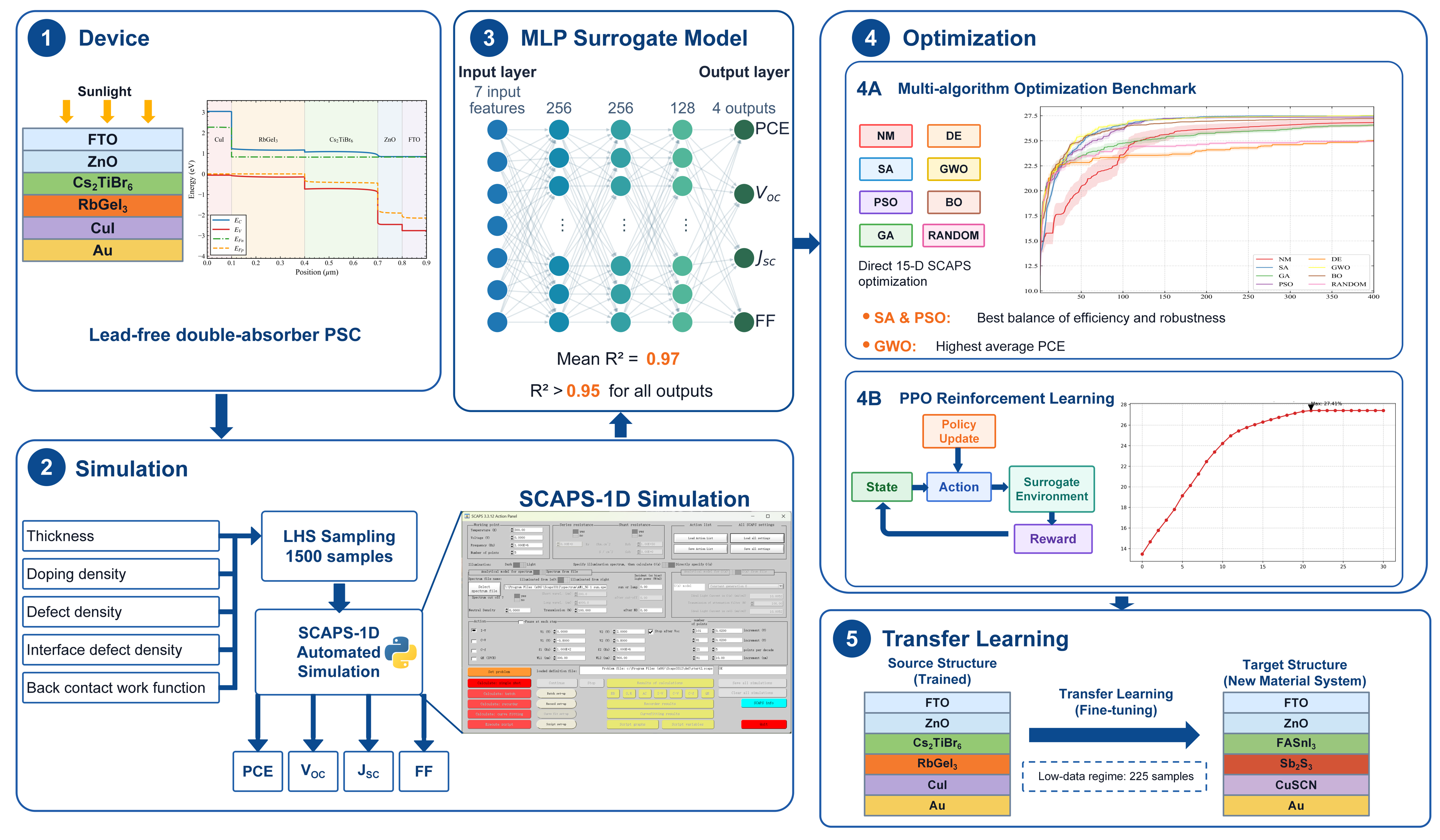
Figure 1.
Overall workflow of the proposed automated optimization framework.
Figure 1.
Overall workflow of the proposed automated optimization framework.
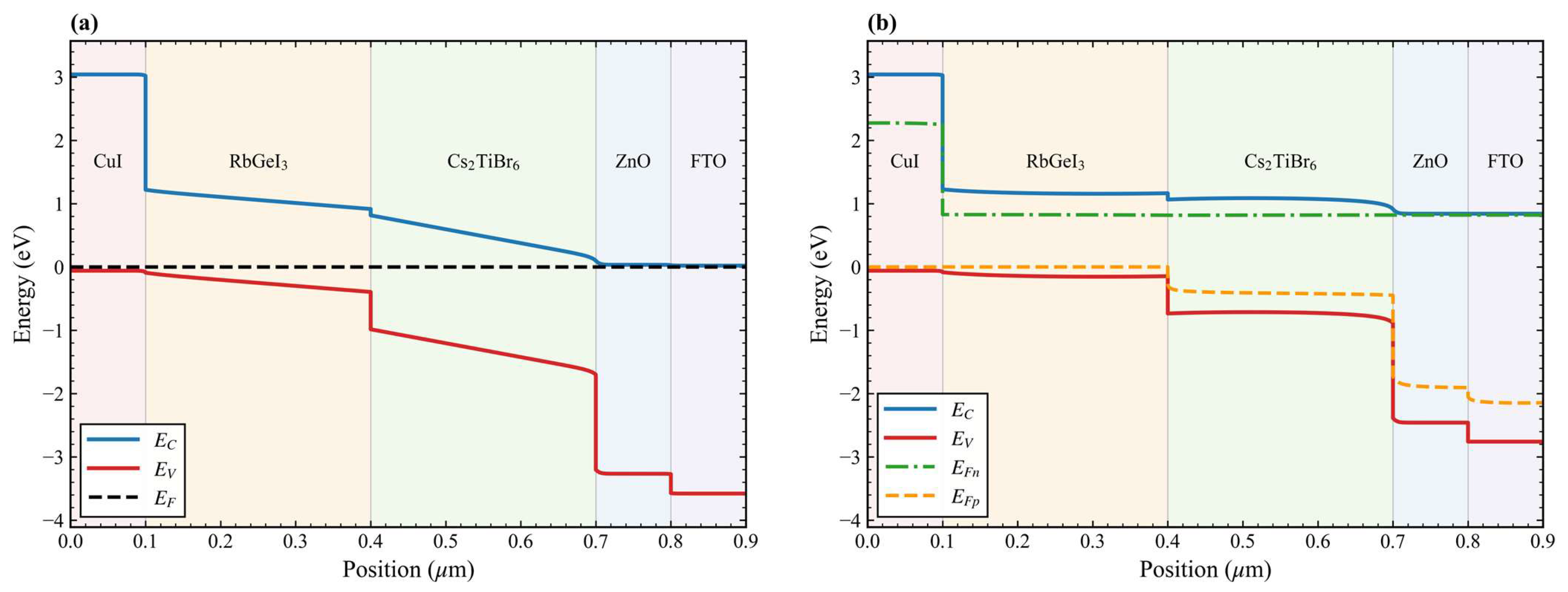
Figure 2.
(a) Thermal-equilibrium band diagram. (b) Band diagram under light and open-circuit conditions.
Figure 2.
(a) Thermal-equilibrium band diagram. (b) Band diagram under light and open-circuit conditions.
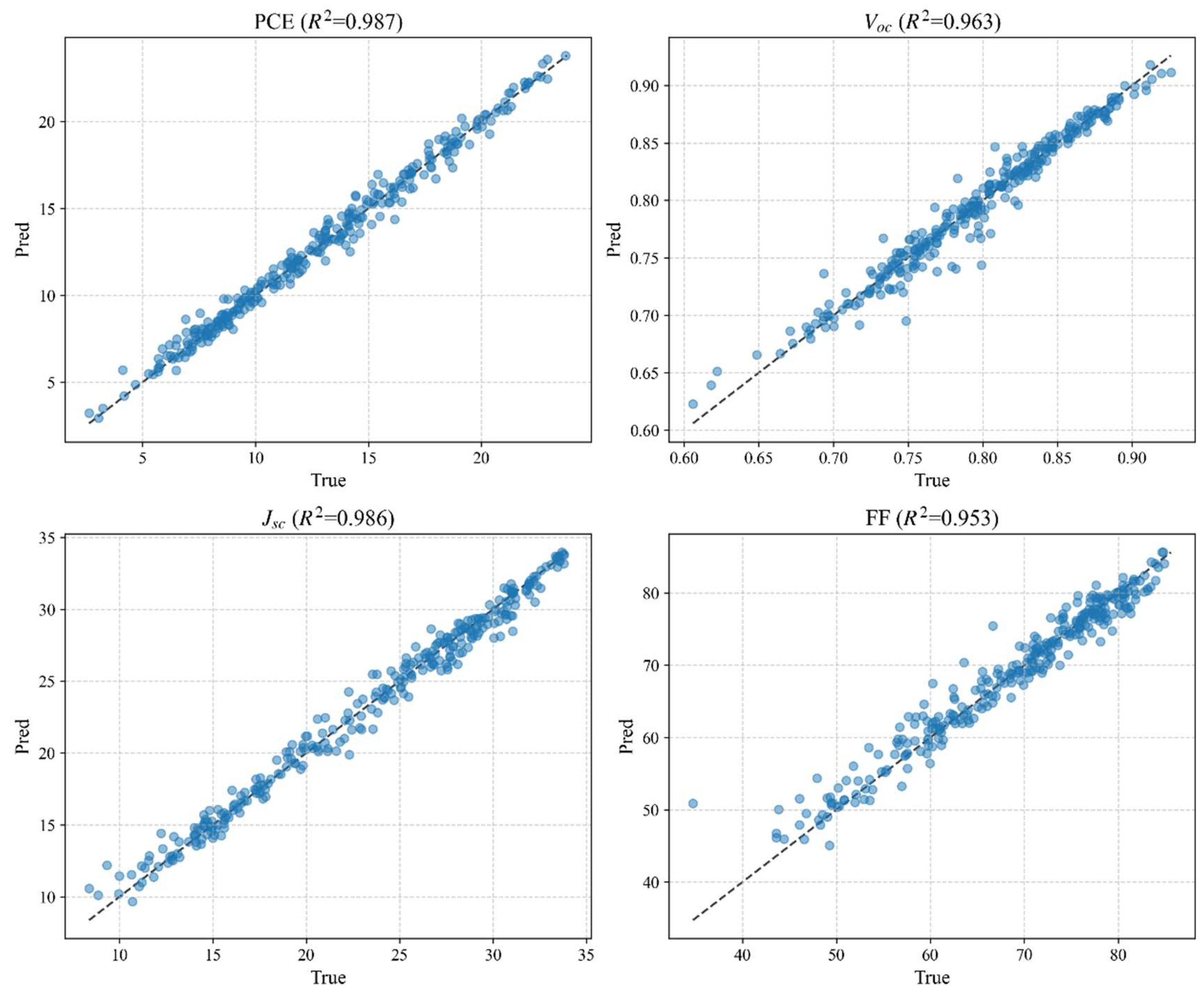
Figure 3.
Scatter plots of the model’s predictions for PCE, VOC, JSC, and FF on the test set.
Figure 3.
Scatter plots of the model’s predictions for PCE, VOC, JSC, and FF on the test set.
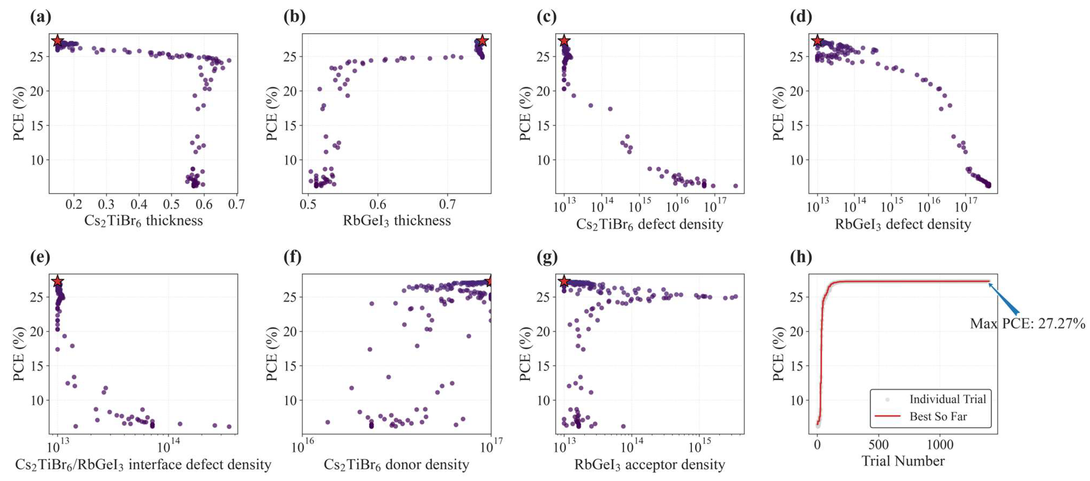
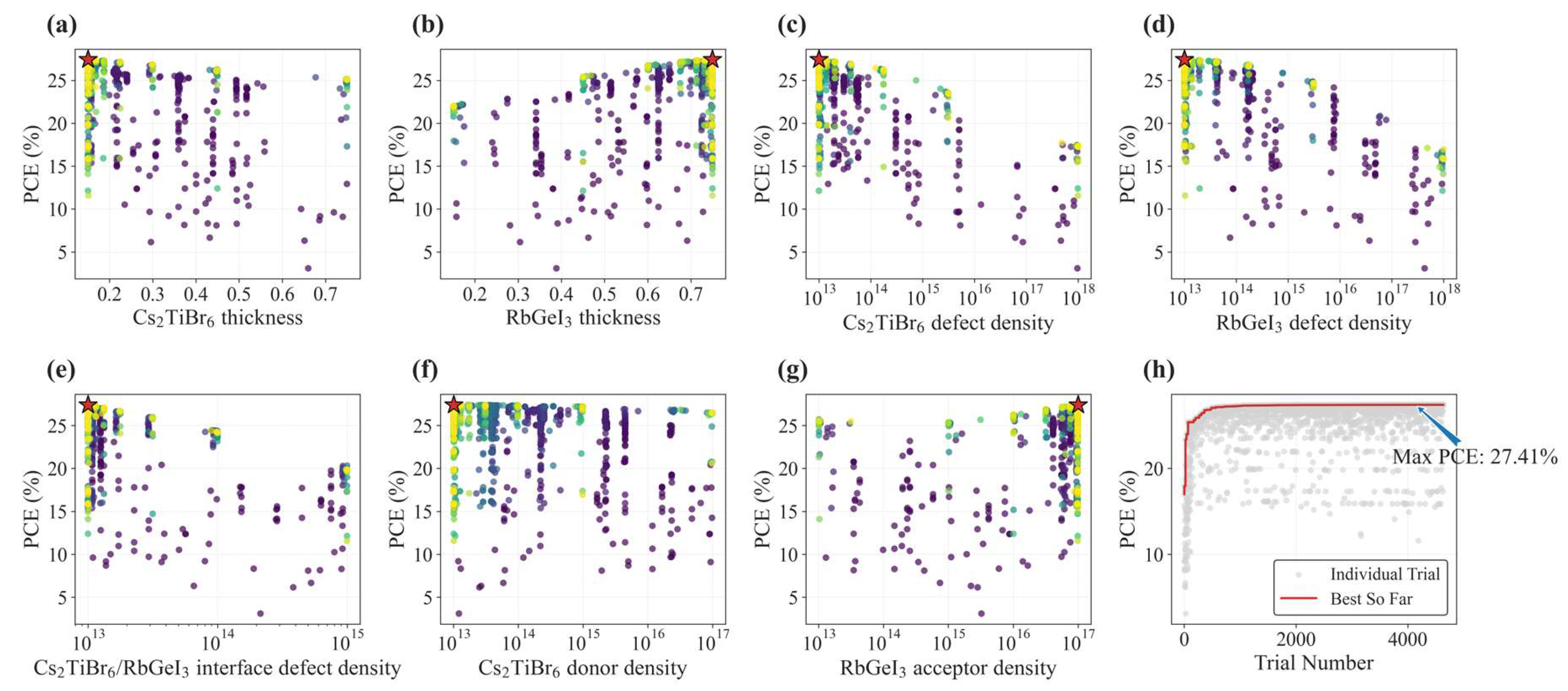
Figure 4.
(a–g) Scatter plots of optimization parameters and (h) optimization history curve for the NM algorithm. In (a–g), the point color indicates the trial order, with lighter colors representing later trials, and the red stars mark the optimal solution. In (h), the gray dots represent individual trials, and the red line represents the best-so-far PCE.
Figure 4.
(a–g) Scatter plots of optimization parameters and (h) optimization history curve for the NM algorithm. In (a–g), the point color indicates the trial order, with lighter colors representing later trials, and the red stars mark the optimal solution. In (h), the gray dots represent individual trials, and the red line represents the best-so-far PCE.
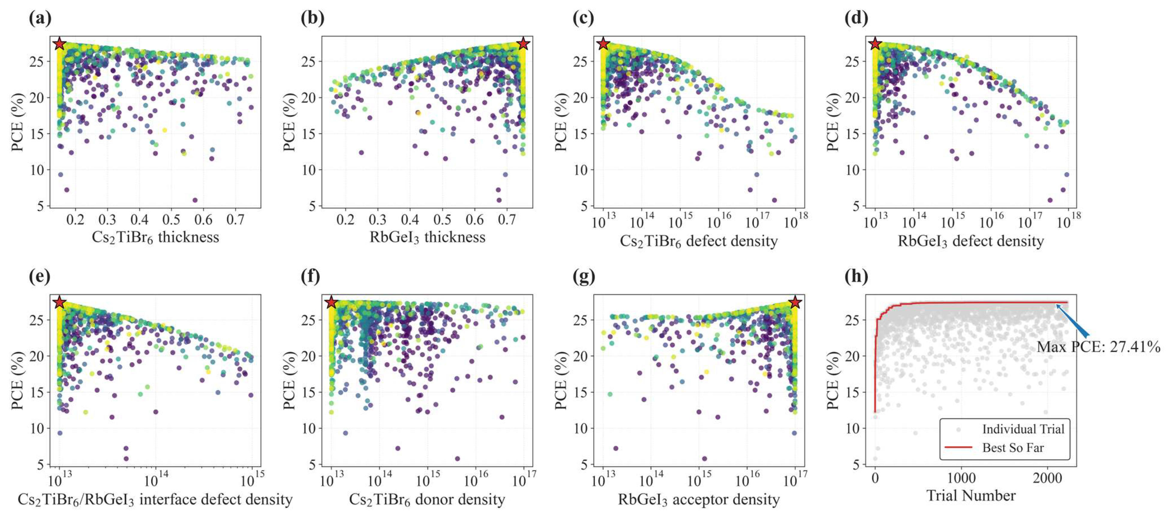
Figure 5.
(a–g) Scatter plots of optimization parameters and (h) optimization history curve for the SA. In (a–g), the point color indicates the trial order, with lighter colors representing later trials, and the red stars mark the optimal solution. In (h), the gray dots represent individual trials, and the red line represents the best-so-far PCE.
Figure 5.
(a–g) Scatter plots of optimization parameters and (h) optimization history curve for the SA. In (a–g), the point color indicates the trial order, with lighter colors representing later trials, and the red stars mark the optimal solution. In (h), the gray dots represent individual trials, and the red line represents the best-so-far PCE.
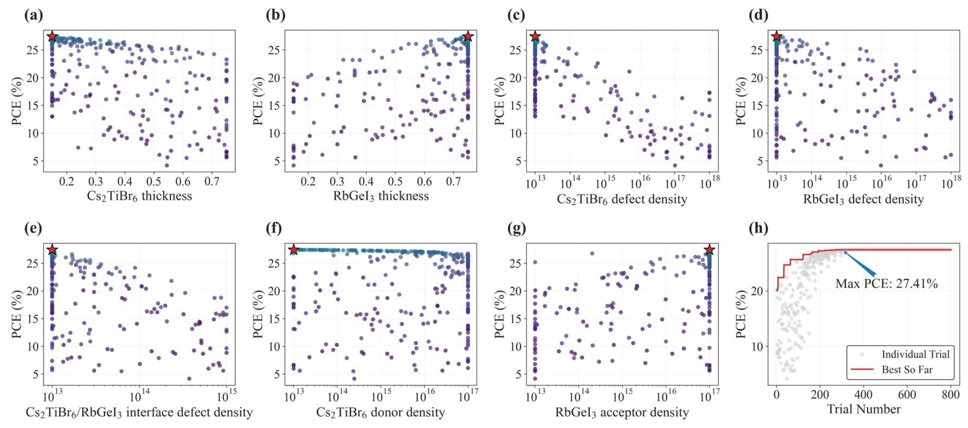
Figure 6.
(a–g) Scatter plots of optimization parameters and (h) optimization history curve for the PSO algorithm. In (a–g), the point color indicates the trial order, with lighter colors representing later trials, and the red stars mark the optimal solution. In (h), the gray dots represent individual trials, and the red line represents the best-so-far PCE.
Figure 6.
(a–g) Scatter plots of optimization parameters and (h) optimization history curve for the PSO algorithm. In (a–g), the point color indicates the trial order, with lighter colors representing later trials, and the red stars mark the optimal solution. In (h), the gray dots represent individual trials, and the red line represents the best-so-far PCE.
Figure 7.
(a–g) Scatter plots of optimization parameters and (h) optimization history curve for the GA. In (a–g), the point color indicates the trial order, with lighter colors representing later trials, and the red stars mark the optimal solution. In (h), the gray dots represent individual trials, and the red line represents the best-so-far PCE.
Figure 7.
(a–g) Scatter plots of optimization parameters and (h) optimization history curve for the GA. In (a–g), the point color indicates the trial order, with lighter colors representing later trials, and the red stars mark the optimal solution. In (h), the gray dots represent individual trials, and the red line represents the best-so-far PCE.
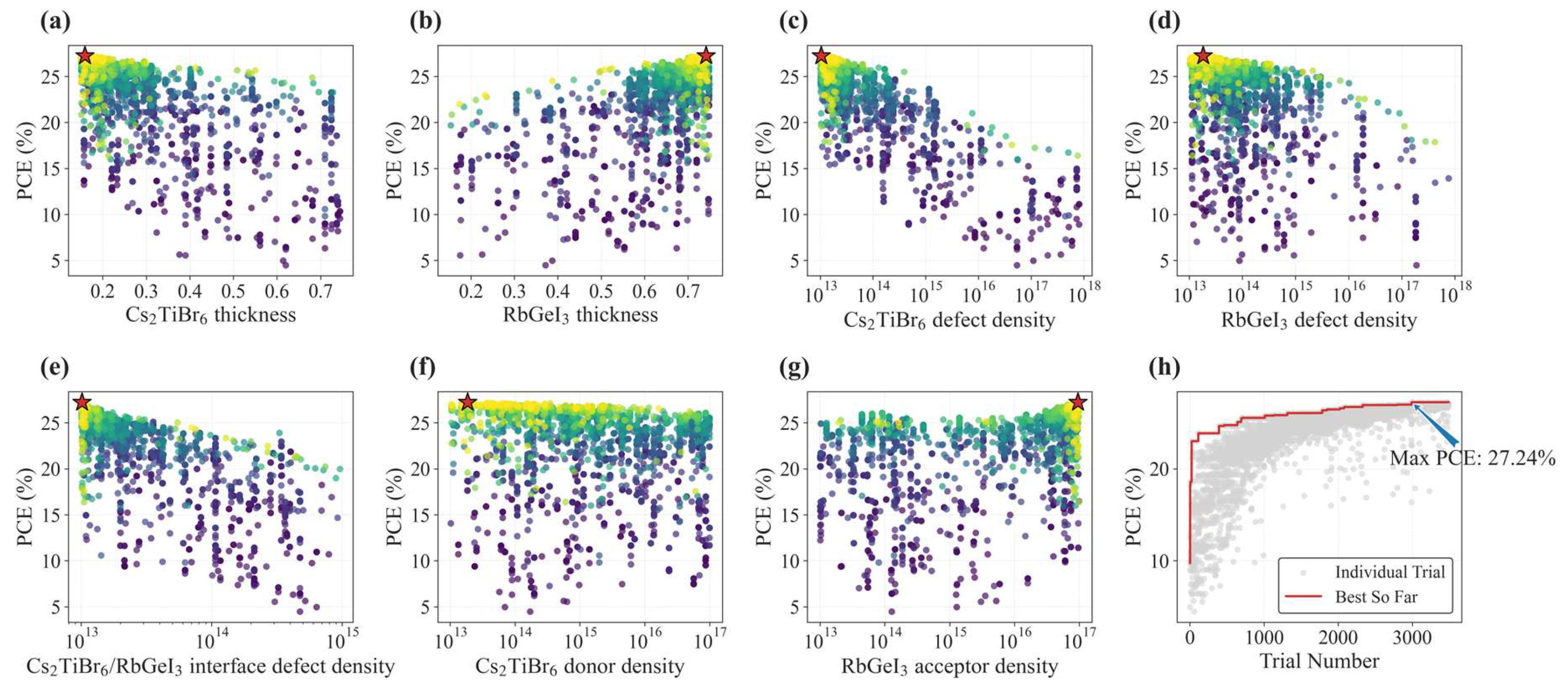
Figure 8.
(a–g) Scatter plots of optimization parameters and (h) optimization history curve for the DE algorithm. In (a–g), the point color indicates the trial order, with lighter colors representing later trials, and the red stars mark the optimal solution. In (h), the gray dots represent individual trials, and the red line represents the best-so-far PCE.
Figure 8.
(a–g) Scatter plots of optimization parameters and (h) optimization history curve for the DE algorithm. In (a–g), the point color indicates the trial order, with lighter colors representing later trials, and the red stars mark the optimal solution. In (h), the gray dots represent individual trials, and the red line represents the best-so-far PCE.
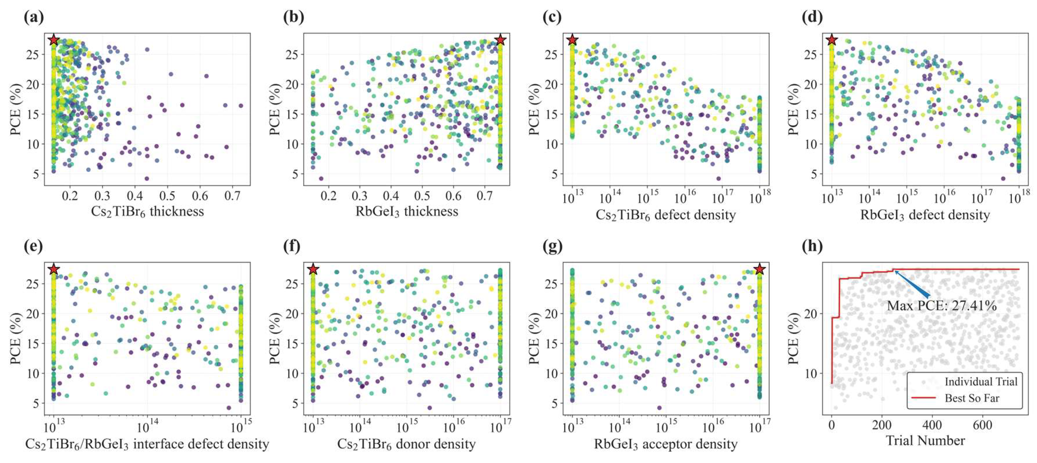
Figure 9.
(a–g) Scatter plots of optimization parameters and (h) optimization history curve for the GWO algorithm. In (a–g), the point color indicates the trial order, with lighter colors representing later trials, and the red stars mark the optimal solution. In (h), the gray dots represent individual trials, and the red line represents the best-so-far PCE.
Figure 9.
(a–g) Scatter plots of optimization parameters and (h) optimization history curve for the GWO algorithm. In (a–g), the point color indicates the trial order, with lighter colors representing later trials, and the red stars mark the optimal solution. In (h), the gray dots represent individual trials, and the red line represents the best-so-far PCE.
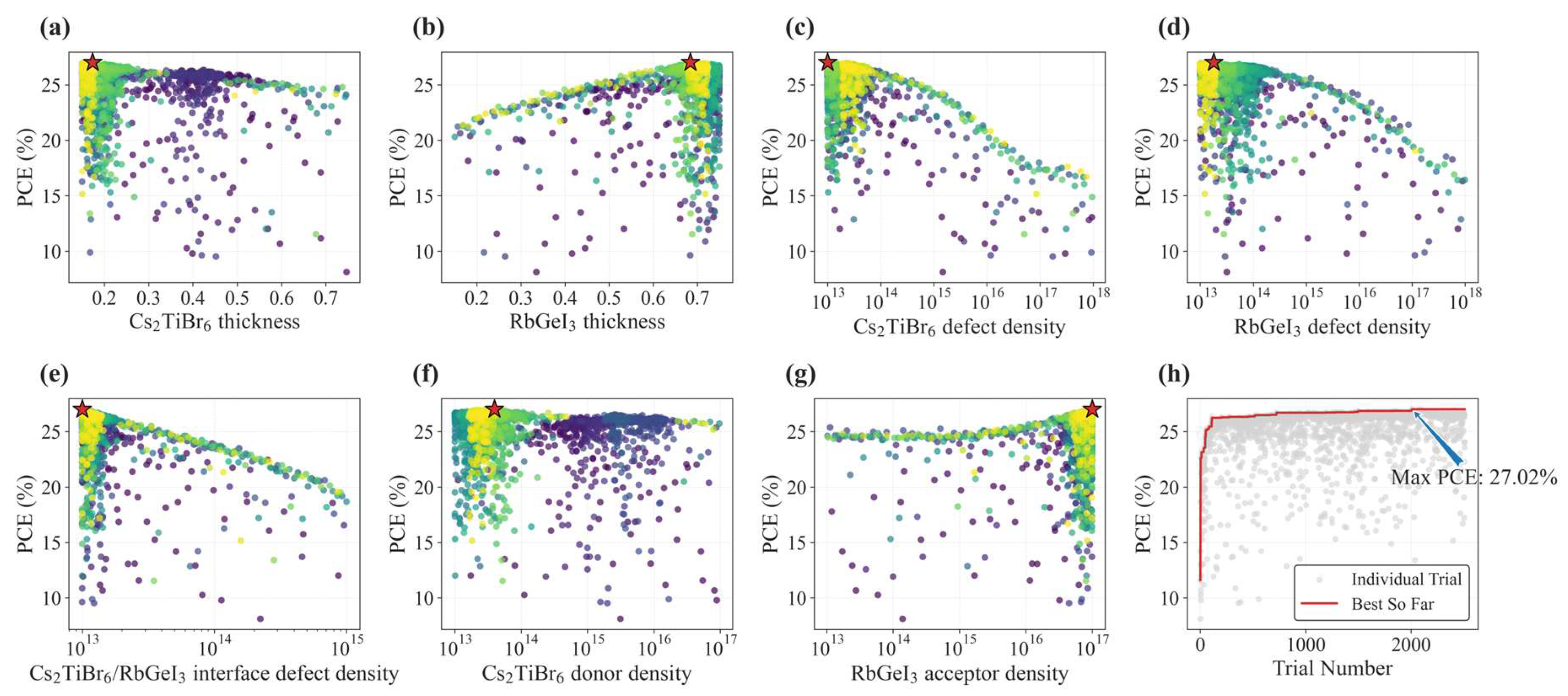
Figure 10.
(a–g) Scatter plots of optimization parameters and (h) optimization history curve for the BO algorithm. In (a–g), the point color indicates the trial order, with lighter colors representing later trials, and the red stars mark the optimal solution. In (h), the gray dots represent individual trials, and the red line represents the best-so-far PCE.
Figure 10.
(a–g) Scatter plots of optimization parameters and (h) optimization history curve for the BO algorithm. In (a–g), the point color indicates the trial order, with lighter colors representing later trials, and the red stars mark the optimal solution. In (h), the gray dots represent individual trials, and the red line represents the best-so-far PCE.
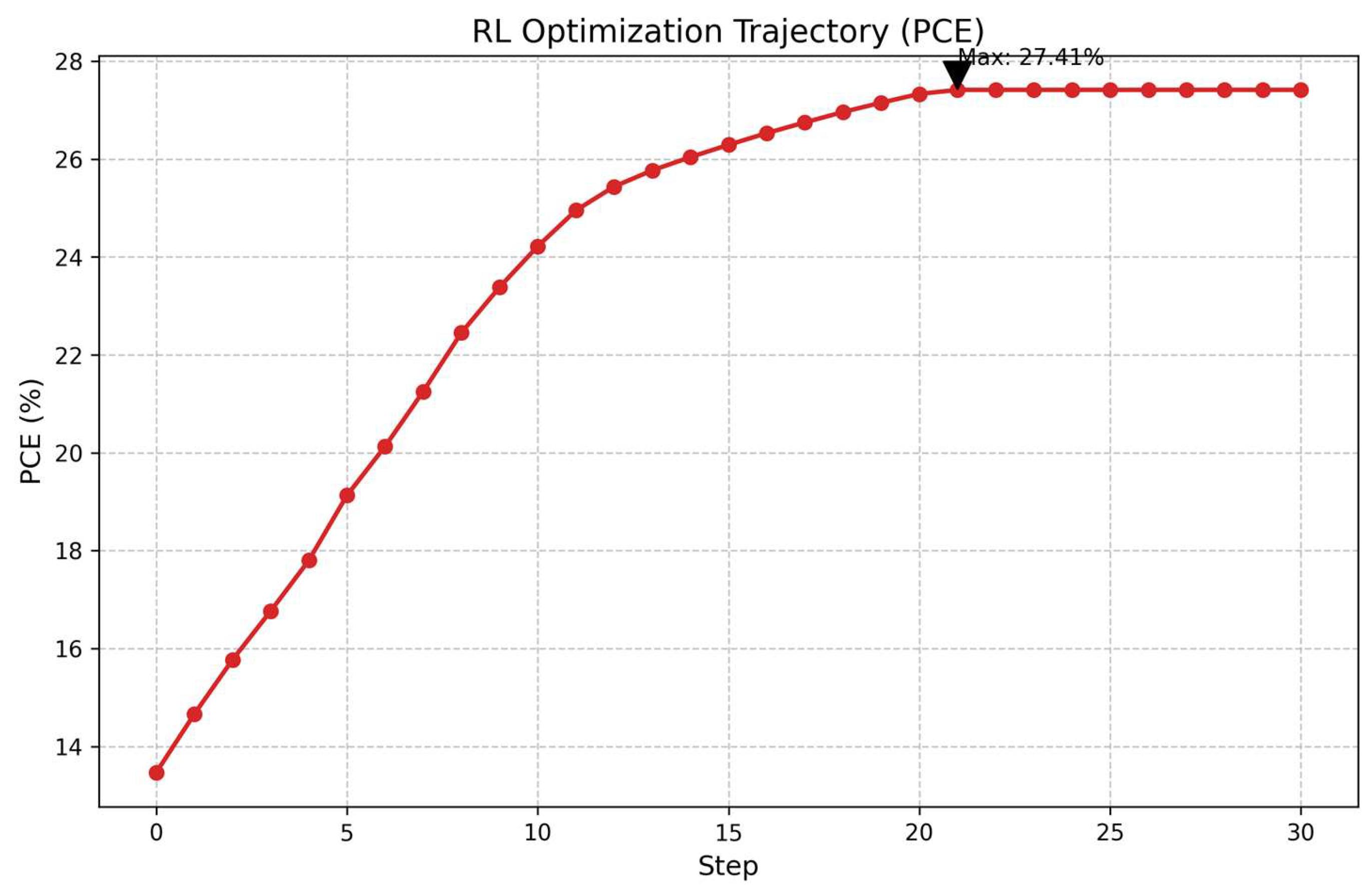
Figure 11.
Optimization history of the RL agent.
Figure 11.
Optimization history of the RL agent.
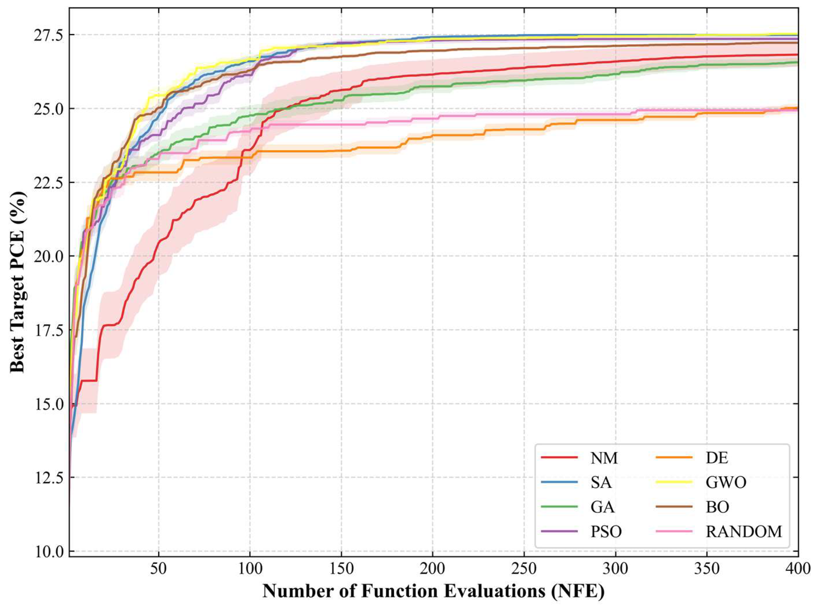
Figure 12.
Average convergence curves of PCE optimized by different optimization algorithms over 15 independent runs. The solid lines represent the average best-so-far PCE, and the shaded regions represent 20% of the corresponding standard deviation.
Figure 12.
Average convergence curves of PCE optimized by different optimization algorithms over 15 independent runs. The solid lines represent the average best-so-far PCE, and the shaded regions represent 20% of the corresponding standard deviation.
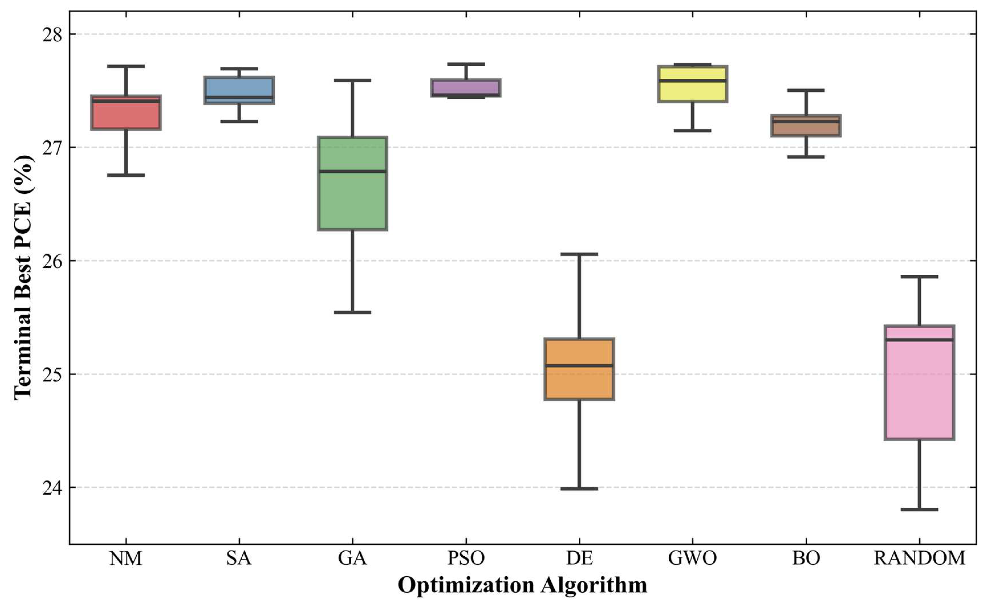
Figure 13.
Box plots of the best PCE achieved by different optimization algorithms across 15 independent optimizations.
Figure 13.
Box plots of the best PCE achieved by different optimization algorithms across 15 independent optimizations.
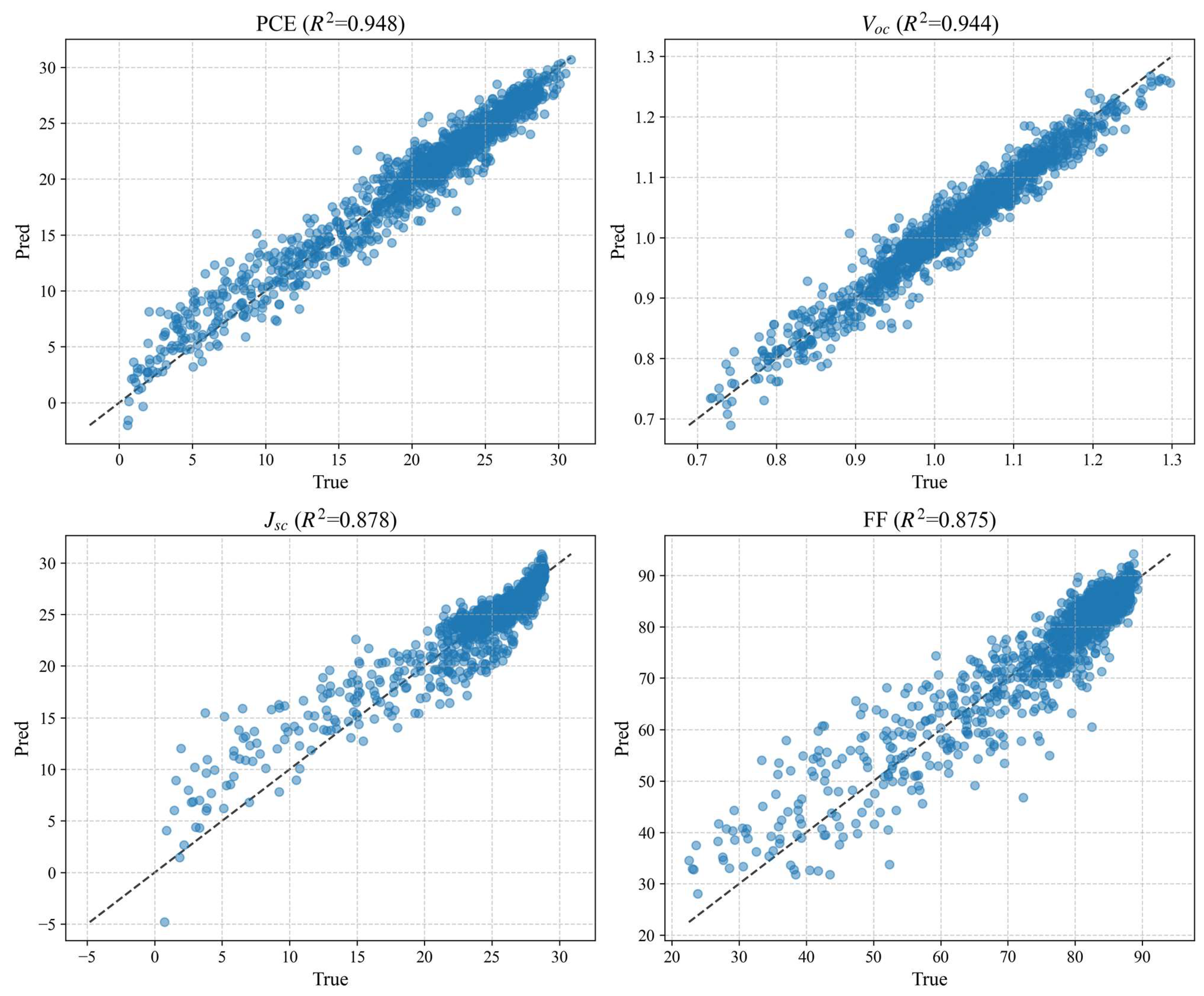
Figure 14.
Performance of the model trained directly using target domain data.
Figure 14.
Performance of the model trained directly using target domain data.
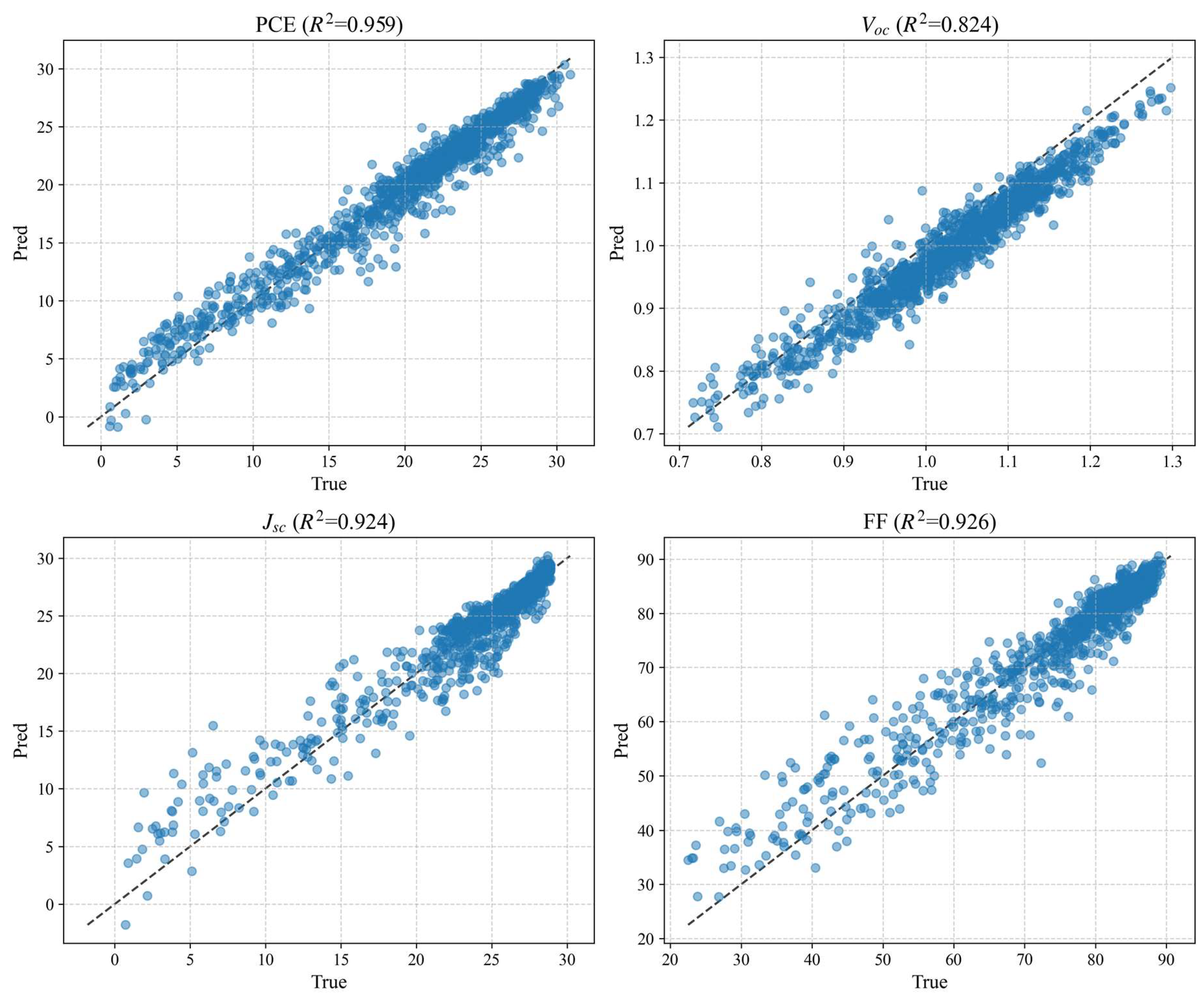
Figure 15.
Performance of the model trained using transfer learning.
Figure 15.
Performance of the model trained using transfer learning.
Table 1.
Input parameters used in SCAPS-1D simulations.
Table 1.
Input parameters used in SCAPS-1D simulations.
| Material | FTO | ZnO | Cs2TiBr6 | RbGeI3 | CuI |
|---|
| Thickness (μm) | 0.1 | 0.1 | 0.3 | 0.3 | 0.1 |
| Band gap (eV) | 3.6 | 3.3 | 1.8 | 1.31 | 3.1 |
| Electron affinity (eV) | 4 | 4 | 4 | 3.9 | 2.1 |
| Relative dielectric permittivity | 9 | 9 | 10 | 23.01 | 6.5 |
| Conduction band minimum (eV, vs. vacuum) | −4 | −4 | −4 | −3.9 | −2.1 |
| Valence band maximum (eV, vs. vacuum) | −7.6 | −7.3 | −5.8 | −5.21 | −5.2 |
| CB effective DOS (cm−3) | 2.2 × 10¹⁸ | 2.2 × 10¹⁸ | 6 × 10¹⁹ | 1.8 × 10¹⁸ | 2.8 × 10¹⁹ |
| VB effective DOS (cm−3) | 1.8 × 10¹⁹ | 1.8 × 10¹⁹ | 2.14 × 10¹⁹ | 1 × 10¹⁸ | 1.0 × 10¹⁹ |
| Electron mobility (cm2/Vs) | 100 | 100 | 0.236 | 28.6 | 100 |
| Hole mobility (cm2/Vs) | 25 | 25 | 0.171 | 27.3 | 43.9 |
| Donor density ND (cm−3) | 1 × 10¹⁸ | 1 × 10¹⁸ | 1 × 10¹³ | 0 | 0 |
| Acceptor density NA (cm−3) | 0 | 0 | 0 | 1 × 10¹³ | 1 × 10¹⁸ |
| Defect type | Neutral | Neutral | Neutral | Neutral | Neutral |
| Defect density Nt (cm−3) | 1 × 10¹⁴ | 1 × 10¹⁵ | 1 × 10¹⁵ | 1 × 10¹⁵ | 1 × 10¹⁵ |
| References | [37] | [38] | [39] | [40] | [41] |
Table 2.
Sampling ranges of input parameters.
Table 2.
Sampling ranges of input parameters.
| Parameters | Data Range |
|---|
| Cs2TiBr6 thickness (μm) | 0.15~0.8 |
| RbGeI3 thickness (μm) | 0.15~0.8 |
| Cs2TiBr6 defect density (cm−3) | 1013~1018 |
| RbGeI3 defect density (cm−3) | 1013~1018 |
| Cs2TiBr6/RbGeI3 interface defect density (cm−2) | 1013~1015 |
| Cs2TiBr6 donor density (cm−3) | 1013~1017 |
| RbGeI3 acceptor density (cm−3) | 1013~1017 |
Table 3.
Original dataset.
Table 3.
Original dataset.
| Type | Parameters | Data Number |
|---|
| 1 | 2 | 3 | … | 1500 |
|---|
| Independent variable | Cs2TiBr6 thickness (μm) | 0.424 | 0.210 | 0.439 | … | 0.463 |
| RbGeI3 thickness (μm) | 0.431 | 0.439 | 0.576 | … | 0.799 |
| Cs2TiBr6 defect density (cm−3) | 6.314 × 10¹⁶ | 3.273 × 10¹⁵ | 3.926 × 10¹⁵ | … | 9.590 × 10¹⁴ |
| RbGeI3 defect density (cm−3) | 1.432 × 10¹³ | 1.006 × 10¹³ | 9.622 × 10¹⁵ | … | 1.121 × 10¹⁴ |
| Cs2TiBr6/RbGeI3 interface defect density (cm−2) | 7.642 × 10¹⁴ | 5.263 × 10¹³ | 8.253 × 10¹³ | … | 1.481 × 10¹³ |
| Cs2TiBr6 donor density (cm−3) | 9.269 × 10¹⁶ | 3.788 × 10¹⁴ | 6.569 × 10¹⁵ | … | 1.813 × 10¹⁵ |
| RbGeI3 acceptor density (cm−3) | 9.361 × 10¹⁵ | 5.535 × 10¹⁵ | 5.465 × 10¹⁶ | … | 3.804 × 10¹⁴ |
| Dependent variable | PCE (%) | 10.17 | 19.20 | 14.02 | … | 17.67 |
| VOC (V) | 0.76 | 0.83 | 0.84 | … | 0.89 |
| JSC (mA/cm2) | 16.51 | 31.35 | 27.69 | … | 31.94 |
| FF (%) | 81.51 | 73.88 | 60.53 | … | 62.43 |
Table 4.
Optimization results of different methods on the surrogate model.
Table 4.
Optimization results of different methods on the surrogate model.
| Methods | NM | SA | PSO | GA | DE | GWO | BO | RL |
|---|
| NFE | 1400 | 2225 | 801 | 4638 | 3490 | 744 | 2509 | 100,000 |
| Max PCE (%) | 27.27 | 27.41 | 27.41 | 27.41 | 27.24 | 27.41 | 27.02 | 27.41 |
Table 5.
Input parameters and their value ranges during optimization using the SCAPS-1D automated framework.
Table 5.
Input parameters and their value ranges during optimization using the SCAPS-1D automated framework.
| Input Parameters | Data Range |
|---|
| Cs2TiBr6 thickness (μm) | 0.15~0.75 |
| RbGeI3 thickness (μm) | 0.15~0.75 |
| Cs2TiBr6 defect density (cm−3) | 1013~1018 |
| RbGeI3 defect density (cm−3) | 1013~1018 |
| Cs2TiBr6/RbGeI3 interface defect density (cm−2) | 1013~1015 |
| Cs2TiBr6 donor density (cm−3) | 1013~1017 |
| RbGeI3 acceptor density (cm−3) | 1013~1017 |
| ZnO thickness (μm) | 0.03~0.17 |
| CuI thickness (μm) | 0.03~0.17 |
| ZnO donor density (cm−3) | 1015~1020 |
| CuI acceptor density (cm−3) | 1015~1020 |
| RbGeI3/CuI interface defect density (cm−2) | 1013~1015 |
| ZnO/Cs2TiBr6 interface defect density (cm−2) | 1013~1015 |
| FTO/ZnO interface defect density (cm−2) | 1013~1015 |
| Back contact work function (eV) | 4.8~5.2 |
Table 6.
Average NFE required for different optimization algorithms to reach 98% of the optimal efficiency.
Table 6.
Average NFE required for different optimization algorithms to reach 98% of the optimal efficiency.
| Algorithm | Target PCE (%) | Success Rate | Avg NFE (Successful Runs) | NFE Std |
|---|
| NM | 27.1754 | 11/15 | 226.5 | 88.7 |
| SA | 15/15 | 138.2 | 46.9 |
| GA | 3/15 | 271.3 | 95.5 |
| PSO | 13/15 | 110.7 | 31.6 |
| DE | 0/15 | - | - |
| GWO | 14/15 | 160.9 | 116.9 |
| BO | 9/15 | 230.2 | 80.6 |
| RANDOM | 0/15 | - | - |
Table 7.
Output-specific prediction metrics of direct training and transfer learning on the target-domain independent test set.
Table 7.
Output-specific prediction metrics of direct training and transfer learning on the target-domain independent test set.
| Model | Output | R2 | RMSE | MAE | NRMSE (%) |
|---|
| Direct training | PCE (%) | 0.948 | 1.571 | 1.196 | 5.18 |
| Direct training | VOC (V) | 0.944 | 0.0247 | 0.0189 | 4.24 |
| Direct training | JSC (mA/cm2) | 0.878 | 1.8 | 1.138 | 6.38 |
| Direct training | FF (%) | 0.875 | 4.726 | 3.236 | 7.07 |
| Transfer learning | PCE (%) | 0.959 | 1.399 | 1.014 | 4.62 |
| Transfer learning | VOC (V) | 0.824 | 0.0435 | 0.0382 | 7.49 |
| Transfer learning | JSC (mA/cm2) | 0.924 | 1.419 | 0.877 | 5.03 |
| Transfer learning | FF (%) | 0.926 | 3.638 | 2.365 | 5.44 |