Article

High-Resolution Siting of Utility-Scale Solar and Wind: Bridging Pixel-Level Costs and Regional Planning

School of Engineering, College of Systems and Society, Australian National University, Canberra, ACT 2601, Australia
*
Author to whom correspondence should be addressed.
Energies 2025, 18(16), 4361; https://doi.org/10.3390/en18164361
Submission received: 6 July 2025 / Revised: 11 August 2025 / Accepted: 13 August 2025 / Published: 15 August 2025
(This article belongs to the Section B: Energy and Environment)

Abstract

Achieving net zero relies on siting large-scale solar and wind where they are cheapest and most socially acceptable. We present a transferable, evidence-based siting framework and apply it to Australia. The landscape is divided into millions of 250 m pixels, each assigned an indicative cost based on resource quality, distance-weighted connection costs, and land use exclusions. Two bounding generation mix scenarios (high solar vs. high wind) stack the cheapest pixels until a fully electrified demand of 20 MWh per capita per year is met. Results are aggregated to all 547 Local Government Areas (LGAs) and 150 federal electorates and expressed as capital inflow, construction job-years, long-term jobs, and land-lease income. We find Class A solar (<50 AUD/MWh) is abundant nationwide except in Tasmania, while high-quality wind is concentrated in Victoria, Tasmania, and coastal Western Australia. Just 15% of LGAs, mainly within 100 km of the existing 275–500 kV transmission backbone, can host over half of least-cost capacity. A single top-ranked LGA such as Toowoomba (Queensland) could attract around AUD 33 billion in investment and sustain over 50,000 construction job-years. Mapping ten candidate high-voltage transmission corridors shows how new lines shift opportunities to under-served councils. The results bridge the gap between state-level renewable energy zones and fine-scale site suitability maps, with policy recommendations proposed. Because the workflow relies mainly on globally available datasets, it can be replicated in other countries to raise public awareness, align policy with community support, and accelerate clean-energy buildouts while maximising regional benefit.

1. Introduction

1.1. Global Context and Policy Motivation

Utility-scale solar photovoltaics (PV) and onshore wind are being deployed much faster than other electricity generation technologies worldwide [1]. The International Energy Agency (IEA) projects that renewables will rise from 30% of global electricity in 2023 to 46% by 2030, with solar and wind accounting for almost all of that growth [2]. This surge is driven not only by their falling levelised costs of energy (LCOE) which outperforms all other generation technologies, but also by rapid and continued electrification of transport, space-heating, and industrial process heat, which brings new demand that will be met by solar and wind.
Australia sits at the forefront of this transition, with the world’s highest per-capita installed PV capacity [3] and detailed national decarbonisation strategies aimed at replacing retiring coal generation with renewables firmed by storage over the next two decades [4]. To achieve this, the Australian Energy Market Operator (AEMO)’s 2024 Integrated System Plan (ISP) projects that the “Optimal Development Path” will require close to 10,000 km of new and upgraded transmission by 2050, and roughly 127 GW of utility-scale wind and solar (“Step Change” scenario) [4]. Whether in Australia or elsewhere, this expansion largely depends on identifying least-cost sites at subnational scales where projects can secure social licence and timely grid connections.
To coordinate large-scale deployments, state governments in Australia have begun to develop renewable energy zones (REZs) that concentrate generation in areas with strong resources, grid capacity, and community support. For example, the state of New South Wales (NSW) now has five legislated REZs, with construction ramping up in one of them in mid-2025 [5]. Victoria has also released the draft Victoria Transmission Plan for consultation, in which seven REZs are identified and proposed, along with seven transmission update programmes [6].
However, the success or failure of most large-scale solar and wind projects depends substantially on decisions made at the local government level. Local Government Areas (LGAs) control development applications, road upgrades, rates concessions, and, importantly, early community engagement. Community support or opposition occurs at the LGA level. Case studies show that councils can accelerate community-owned projects and smooth planning pathways, but they can also delay or block proposals if information is poor or perceived benefits are unclear [7]. Developers likewise report that navigating diverse planning schemes, setback rules, and social and environmental requirements across hundreds of LGAs can increase project lead-times and investment risks [8,9,10].
A transparent, evidence-based assessment of renewable energy opportunities at the LGA scale could mitigate these hurdles. An objective evaluation of the renewable energy capacity that could be hosted by each LGA, along with associated capital inflow and jobs created, while highlighting the potential competition between LGAs, could incentivise high-ranking councils to engage early with communities and to streamline approval processes in order to capture the economic benefits on offer. This in turn allows developers to approach councils with clear expectations and lower social licence risk, therefore reducing both project lead-times and costs. Such information is, however, largely absent from the public domain.

1.2. Literature Review: From MCDA to Cost-Based Mapping

Energy planners worldwide have developed various methods and tools to identify high-quality locations for large-scale solar and wind projects. These approaches typically combine resource mapping, Geographic Information System (GIS)-based land filtering, cost assessment, and stakeholder input to rank or zone areas for development. For example, prior to the release of the first ISP, AEMO and DNV GL developed a multi-criteria scoring model to rank every 5 km × 5 km grid cells based on solar and wind resource, land cover, terrain complexity, protected areas, proximity to transmission, infrastructure and access, and population density, in order to support the identification of REZs [11]. Such a GIS-based Multi-Criteria Decision Analysis (MCDA) framework is very common in the literature. A 2020 review found 85 papers using this approach for renewable energy site selection from 2001 to 2018 [12], with possibly many more in recent years (e.g., [13,14,15,16]).
However, a core critique of MCDA-based siting is that the results depend heavily on subjective choices, including which criteria to include and how to weight them. Butschek et al. found that when 25 experts were each asked to weight criteria for siting wind farms, large variations in expert opinions were observed [17]. Such subjectivity can embed bias and erode credibility with regulators and investors, especially when weighting rationales are untransparent.
In recent years, cost-based mapping, such as calculating the levelised cost of electricity (LCOE) at each location, has become increasingly common. Unlike MCDA, this provides an evidence-based comparable benchmark that not only compares one site to another but also offers economic justifications. For example, the National Renewable Energy Laboratory (NREL)’s reV model estimates LCOE for a site based on its meteorological and geospatial attributes [18]. This model was also used by NREL to identify interregional renewable energy zones (IREZs), which are characterised by contiguous clusters of sites with low LCOE and sufficient “prime resource” [19]. In their planning study for Eastern and Southern Africa, the International Renewable Energy Agency (IRENA) also ranked solar and wind zones by a combination of LCOE, distance to load centre, and capacity value ratio to estimate economically viable generation potentials in each area [20]. Similarly, Cheng et al. [21] developed renewable energy heatmaps for Australia, South Korea, and Indonesia, which overlay resource quality, land use constraints, and distance-weighted transmission costs to assign an indicative cost to every 250 m × 250 m pixel. At the subnational scale, Tsiaras et al. (2025) developed a GIS-based, cost-optimised siting framework for an isolated Mediterranean community, demonstrating that high-resolution cost mapping is equally applicable to autonomous micro-grids [22]. At the national system-planning level, Rubino et al. (2025) compared four spatial siting strategies for Switzerland and found broadly similar weather-resilience across strategies, with the cost-optimal approach showing consistent but modest advantages [23]. Beyond MCDA and pure cost-based mapping, recent Australian work has applied clustering and genetic-algorithm optimisation to delineate site clusters and quantify solar/wind energy potential and costs across rural regions [24].
Even with recent advances in resilience-oriented siting and data-driven clustering, no study has yet combined high-resolution cost-based siting with subnational socio-economic valuation to produce decision-ready profiles for local authorities and communities, a research gap we aim to address in this study.

1.3. Research Gap and Hypothesis

Existing cost-based frameworks stop at the pixel or REZ scale. They do not translate least-cost pixels into regional supply curves, nor do they quantify how much generation, investment, and employment each local jurisdiction could host under a least-cost buildout. We hypothesise that a high-resolution, cost-based raster combined with demand allocation can identify a small subset of LGAs capable of hosting the bulk of cost-optimal capacity while maximising local socio-economic benefit.
Accordingly, we aim to address three research questions:
-
RQ1: Where are the best locations for utility-scale solar and wind in Australia, at both pixel and regional scales?
-
RQ2: What generation, capital inflow, jobs, and land-lease payments accrue to each region (LGA and federal electorate) under a least-cost build?
-
RQ3: How do existing and candidate transmission corridors redistribute opportunity?
Answering these questions would allow development of a reproducible workflow that other countries can replicate wherever fine-resolution solar, wind, and land cover data exist.

1.4. Research Activities

In this study, we use Australia as a case study and extend the cost-based mapping approach by using it to develop regional supply curves and match them with target demand to develop regional-level renewable opportunity profiles, including the expected renewable generation hosted as well as the socio-economic value created.
Guided by the questions above, we design a four-stage workflow (Figure 1): rasterisation, cost-classification, demand allocation, and regional aggregation. The analysis first rasterises the continent into 123 million pixels, each 250 m per side (representing 6.25 ha), then classifies each pixel into one of five cost classes, and allocates demand targets by filling cheapest classes first. The scaled outputs are then aggregated to LGAs and to federal electorates to produce decision-ready maps of renewable deployment potential. All urban and protected areas are excluded (discussed in more detail in Section 2.2).
This offers a direct view of which local government jurisdictions stand to gain most from large-scale solar and wind under least-cost deployment pathways, first in Australia and, by extension, in any country with comparable data. It complements the existing work conducted by AEMO in its ISP [4] or by NREL in its IREZ study [19] by creating a missing link between spatial energy planning and regional policy and economic development. Rather than focusing on REZs, we create LGA- and electorate-level information which directly informs the stakeholders at the front end of the renewable transition.
Additionally, we use this framework to evaluate candidate new transmission corridors and their impact on the surrounding regions, which has not been explored before.

1.5. Contributions and Paper Structure

Through the research activities introduced in Section 1.4, this study addresses the research gap identified in Section 1.3 and answers the three research questions. First, we develop a generalisable 250 m resolution pixel-to-region workflow that converts pixel-level costs into state supply curves, identifying the best locations for utility-scale solar and wind in Australia (RQ1). Second, we translate technical heatmaps into decision-ready socio-economic profiles for LGA and federal electorates, the scales at which permits, corridors, and benefit-sharing are negotiated (RQ2). Third, we model additional high-voltage transmission corridors to assess how regional opportunities are redistributed in different network scenarios (RQ3). Additionally, we distil policy implications that tie these results back to strategic infrastructure and financing decisions. These contributions collectively support the key novelty of this study: a reproducible pixel-to-region pipeline that links high-resolution costs to regional planning outcomes.
The highlights of this paper are summarized below:
  • Pixel-level renewable cost analysis with results aggregated to subnational levels.
  • Targeting future electricity demand to show how benefits distribute across regions.
  • Proximity to transmission strongly shapes opportunity.
  • Globally available input datasets to allow applicability to other regions.
The remainder of the paper is organised as follows: Section 2 details the data sources, cost model, and demand allocation algorithm. Section 3 presents the state supply curves, national maps, and LGA/electorate rankings. Section 4 discusses implications of the results, limitations, and future work, with Section 4.3 offering targeted policy recommendations. Section 5 concludes.

2. Methods

Figure 1 summarises the end-to-end workflow and its connection to our research questions and results: (i) rasterisation of inputs at 250 m, pixel-level LCOE estimation and cost-class assignment, and demand allocation to form state supply curves (RQ1; Section 2.3 and Section 2.4; Section 3.1); (ii) aggregation to LGAs and federal electorates with socio-economic valuation to produce decision-ready regional profiles (RQ2; Section 2.5 and Section 2.6; Section 3.2); and (iii) candidate transmission-corridor overlays to test redistribution of opportunity (RQ3; Section 2.7; Section 3.3). Each step is detailed in the subsections below. All processing was performed in Python 3.12 and ArcGIS Pro 3.4.0.

2.1. Scenario Definition and Copper Plate Backbone

We model a fully decarbonised energy future in which all stationary electricity and all end-uses currently met by fossil fuels, including land transport, heating, and industry, are electrified. Current Australian electricity consumption averages around 10 MWh per capita per year [25]. Doubling that figure to 20 MWh per capita per year captures the additional demand from electric vehicles, heat pumps, and electro-furnaces [26]. Existing hydro- and bioenergy are treated as fixed supplements, but solar PV and wind must supply more than 95% of the electricity demand. Because the optimum technology split is uncertain and strongly influences land use and grid flows, we analyse two bounding mixes:
  • High solar: 67% PV and 33% wind;
  • High wind: 67% wind and 33% PV.
The high-solar scenario relies largely on daytime generation and would require land footprints with good solar irradiation and low seasonality in the inland north and west, whereas the high-wind case shifts build toward coastal and elevated terrain with stronger nighttime output, reducing daily and seasonal storage needs but increasing reliance on areas with tighter visual-amenity constraints. Australia’s future energy mix will be shaped by federal and state policies, including AEMO’s ISP [4]. The high-solar and high-wind scenarios used here should therefore be viewed as bounding cases rather than forecasts. The actual mix will depend on future policy, market signals, and technological developments.
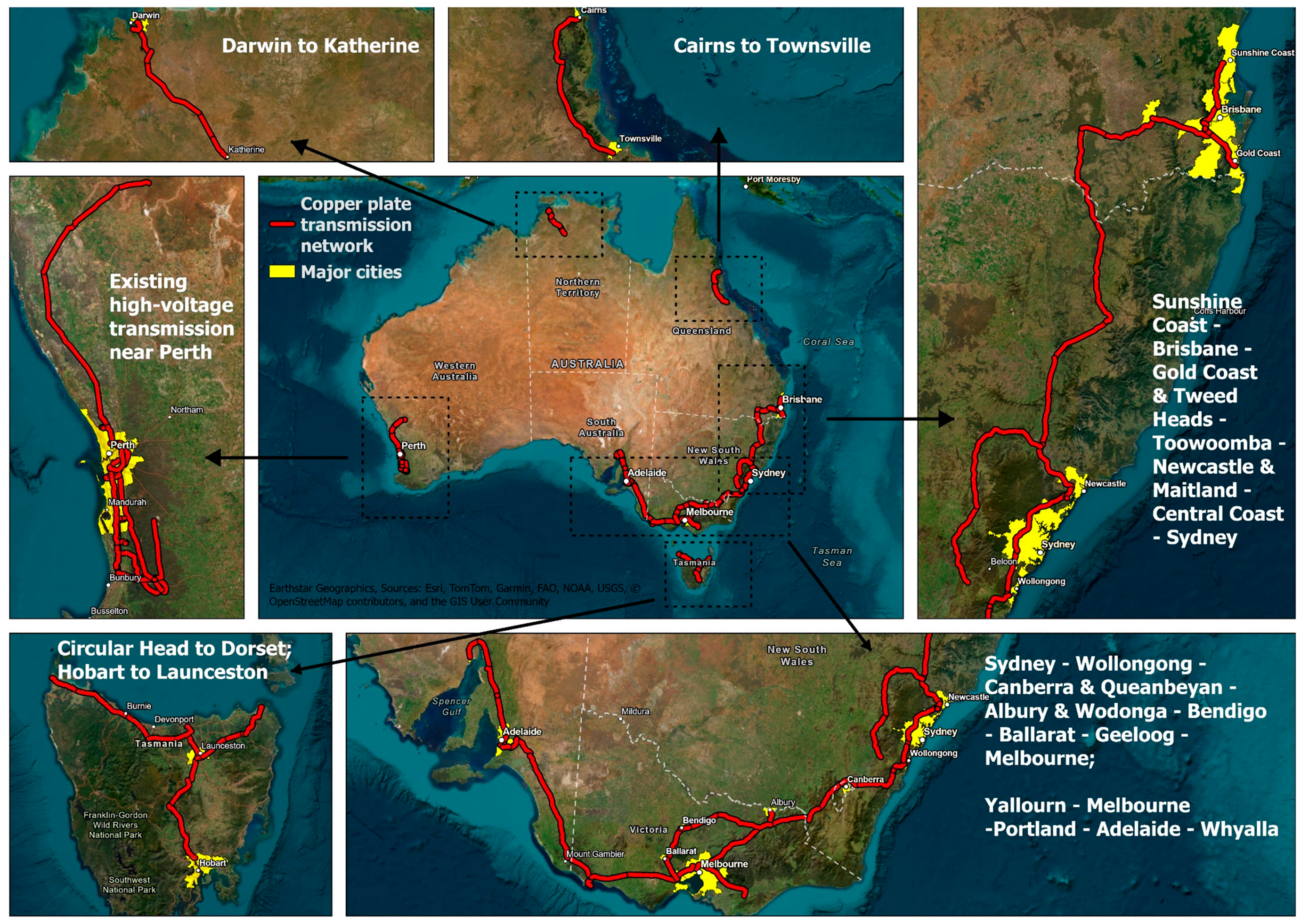
In this study, we treat the 275–500 kV network that links Australia’s major load centres (e.g., Brisbane, Sydney, Melbourne, Adelaide, Perth, and others) as a “copper plate” with unlimited capacity. This backbone, as shown in Figure 2, represents the minimum viable grid that is almost certain to be reinforced as renewable deployment grows. For example, the Sydney Ring (part of the copper plate backbone) is currently being extended with projects such as the Hunter Transmission Project north of Sydney [27] and the Sydney Southern Ring [28]. Other existing high-voltage corridors and planned transmission upgrades are not included in the backbone so as not to overestimate opportunities along lines that may remain constrained.
Connection cost is approximated by two distance-based terms. First, we calculate the Euclidean distance from each pixel to the backbone. Second, we calculate the distance to the nearest major load centre (yellow areas in Figure 2) to represent direct proximity to load. The connection spur-line distance is determined by the smaller of the two, which then translates into an indicative connection cost. This means that resource-rich regions close to this backbone or major load centres are correctly prioritised. Differences in connection policies, tariff structures, or queue priorities are not modelled and are identified as limitations in Section 4.2.

2.2. Input Spatial Data and Exclusion Layers

The modelling workflow stacks high-resolution resource layers with constraint and infrastructure datasets, all of which projected to GDA94/Australian Albers (EPSG 3577) (although EPSG:3577 is an equal area projection, calculating geodesic rather than planar distance in ArcGIS Pro ensures that distance calculations are also accurate) prior to analysis.
For the solar resource, we take the PVOUT layer (annual specific yield, kWh/kWp) from the Global Solar Atlas [29] (1 km resolution) and multiply all values by 1.20. This factor is applied to reflect the output boost from single-axis tracking. Empirical studies show that single-axis tracking increases annual output by about 10–30% compared with fixed systems, with the exact tracking performance varying with latitude and design [30,31]. A midpoint of 20% is used here with the recognition that this could overestimate generation at high latitudes or underestimate it in the tropics.
The scaled PVOUT raster is then bilinearly resampled to the working 250 m grid. Utility-scale wind potential is represented by the Class II Capacity-Factor layer (250 m) from the Global Wind Atlas [32].
To avoid siting on incompatible land, we apply an exclusion mask comprising several layers: (i) protected areas from ProtectedPlanet.net (January 2025 snapshot, comprising national parks, International Union for Conservation of Nature categories I–VI reserves, Ramsar wetlands, United Nations Educational Scientific and Cultural Organization Biosphere Reserve, and world heritage sites) [33], where any overlapping 250 m pixel is removed; (ii) the urban footprint from the NASA Global Human Built-up and Settlement Extent (HBASE) raster (10 m) [34], which excludes any pixel intersecting built-up land; and (iii) slope and native forest, derived from the 30 m Shuttle Radar Topography Mission (SRTM) Digital Elevation Model (DEM) [35] and Department of Agriculture, Fisheries and Forestry “Forests of Australia 2023” layer [36], where pixels are excluded if more than 50% of their area has a slope > 15° or native forest cover. Prime agricultural land, threatened-species habitat, and indigenous cultural sites are not currently excluded due to a lack of nationally consistent data. These omissions are discussed in Section 4.2.
LGA and electorate boundaries and significant urban area polygons come from the Australia Bureau of Statistics (ABS) Digital Boundary Files [37]. Existing transmission routes from Geoscience Australia [38] are used to construct the copper plate backbone between the significant urban areas, as described in Section 2.1. The Euclidean distance from each cell to the copper plate and the load centres (whichever is nearest) is calculated as discussed in Section 2.1. LGA polygons serve as the aggregation zones in Section 2.5.
The resulting spatial data stack comprises the following: (i) adjusted PVOUT, (ii) Class II wind capacity factor, (iii) composite exclusion mask, and (iv) Euclidean distance to the notional high-voltage backbone or load centres. These layers feed directly into the pixel-level cost model.
Five of our eight input layers are global datasets that exist for every country: solar resource, wind resource, protected areas, urban areas, and terrain slope. Administrative boundaries and transmission networks are available for most countries through national statistical offices or open-data portals. The only layer that may be missing in some regions is native forest extent, but this can be substituted with any land cover or vegetation dataset, which is almost always available. Therefore, the workflow presented here can be readily adapted to other countries with minimal barriers.

2.3. Pixel-Level LCOE Calculation and Classification

For every 250 m × 250 m cell that survives the exclusion filters, we compute an indicative levelised cost of electricity (LCOE, in AUD/MWh):
LCOE   = Transmission   CAPEX   ×   Distance PV ( Discount   rate ,   lifetime ) + Renewable   CAPEX PV ( Discount   rate ,   lifetime ) + Renewable   OPEX + Transmission   OPEX × Distance 1 × 8760 × Capacity   Factor × 1 Transmission   loss × Distance
where
  • Transmission CAPEX: capital expenditures of the transmission line (AUD/MW-km);
  • Transmission OPEX: operating expenses of the transmission line (AUD/MW-km p.a.);
  • Renewable CAPEX: capital expenditures of the solar/wind farm (AUD/MW);
  • Renewable OPEX: operating expenses of the solar/wind farm (AUD/MW p.a.);
  • Distance: distance from the pixel to the high-voltage transmission network (km);
  • Capacity factor: capacity factor of the solar/wind farm (% based on [29,32], varies pixel by pixel);
  • Transmission loss: transmission loss of the transmission line (3% per 100 km according to [39,40]);
  • PV (discount rate, lifetime): present value factor with a given discount rate and lifetime.
Table 1 contains the cost assumptions that are used for the calculation.
To streamline subsequent allocation, LCOE values are discretised into five cost classes (A–E) with AUD 10/MWh increments (A < 50; B 50–60; … E > 80). This class structure allows the development of both the state-level supply curves (Section 3.1) and the tier-filling algorithm described next (Section 2.4).
The goal of this analysis is to compare regions rather than present absolute values of cost. This means that different assumptions about the capital cost of wind and solar farms have a modest impact on results.

2.4. Demand Allocation and State Supply Curves

The objective of this step is to distribute each state’s share of national demand across the ranked cost classes, ensuring that the cumulative annual generation from solar and wind exactly meets the pre-defined targets for the two technology-mix scenarios.
National demand is set to 20 MWh per capita per year (Section 2.1). A different target would change the magnitude of the results, but not the rank-ordering of regions. Using the population data (P) from ABS (September 2024) [43], each state s is assigned a target (T):
T s = 20 × P s   T W h y r
which is then split into solar and wind components according to the scenario mix (67:33 or 33:67). Targets for the Northern Territory exclude wind due to relatively low resource quality. We assume that interchange of electricity between states is small compared with generation within each state (i.e., high self-sufficiency for each state), which is desirable from a resilience perspective.
For every state and for each technology (solar, wind) the following procedure is executed:
  • Rank-order all non-excluded pixels i by ascending LCOE classes (A → E).
  • Accumulate potential generation for cost class k :
G k = i i k 8760   C F i   η   A i
where i k is the set of all pixels i with cost class k ;   A i = 0.0625   k m 2 is the area of a 250 m pixel; and η is the technology-specific land use factor. For solar PV, η = 150   M W / k m 2 based on [44]. For wind, η = 7.2   M W / k m 2 , assuming a typical Vestas V162–6.8 MW turbine [45]. C F i is the annual capacity factor at pixel i .
3.
Check sufficiency:
If j k G j T s , class k is the terminal tier.
Otherwise, include the full output of class k and continue to class k   +   1 .
4.
Down-scale terminal tier:
Let G f u l l be the full output of the terminal class. Apply a uniform scaling factor
α = T s j < k G j G f u l l   0 < α 1
to every pixel in that class so that the post-scaled sum equals T s .
5.
Repeat the entire process for the other technology and for the other solar and wind generation mix scenario.
The resulting scenario-specific generation rasters feed into the LGA and electorate aggregation in Section 2.5.
Essentially, this amounts to filling up the required generation starting with the best pixels (Class A) and proceeding to Class B and C if there are insufficient Class A pixels. It reflects the likelihood that developers will preferentially go to the best sites.

2.5. Aggregation to LGAs and Electorates

The pixel-scaled generation rasters from Section 2.4 are converted into decision-relevant statistics by summing them within the boundaries of Australia’s LGAs and federal electorates.
The 250 m rasters are intersected with the LGA and electorate boundaries. We use a raster-to-polygon zonal-statistics tool implemented in ArcGIS Pro, returning the total annual generation (TWh per year) attributable to each LGA and electorate under both technology-mix scenarios.
To aid visual comparison, each region’s combined solar + wind output is assigned to one of six bands:
  • <1 TWh;
  • 1–5 TWh;
  • 5–10 TWh;
  • 10–15 TWh;
  • 15–20 TWh;
  • >20 TWh.
Outputs include a master CSV that lists, for every LGA and scenario, the combined annual generation (TWh) and marginal LCOE class of the last pixel included, as well as high-resolution maps for each scenario, colour-coding the LGAs based on the generation band it belongs to. A similar master CSV and high-resolution maps are also produced for electorates following the same process.
Top “hotspot” LGAs and electorates for each state are extracted for the socio-economic valuation in Section 2.6.

2.6. Socio-Economic Metrics

To translate technical generation potential into metrics that matter for councils and regional planners, we estimate capital investment, construction-phase labour demand, permanent operations jobs, and host-land payments for every LGA and electorate in each scenario. All monetary values are expressed in AUD 2025.
For each LGA and electorate, the scenario-scaled annual generation E ( T W h / y r ) is converted to an equivalent installed capacity C m ( M W ) for each technology m (solar or wind):
C m   =   E × β m × 10 6 / ( 8760 × C F m )
where β m is the contribution from technology m under the current scenario (either 67% or 33%) and C F m is the mean capacity factor of the pixels inside the region.
Installed M W are multiplied by overnight capital-cost assumptions shown in Table 1. Resulting CAPEX flows are summed across technologies to yield a headline investment figure for each region and scenario.
Labour multipliers are adopted from the study conducted by University of Technology Sydney for the Clean Energy Council [46]:
  • Construction job-years.
    PV: 2.28 job-years MW−1;
    Wind: 2.84 job-years MW−1.
  • Permanent O&M jobs.
    PV: 0.11 jobs MW−1;
    Wind: 0.22 jobs MW−1.
These values were derived from industry surveys and project case studies in Australia. We note that local benefits could be over- or under-estimated depending on the local supply chain and workforce. Therefore, results should be interpreted as indicative rather than exact.
Construction labour is assumed to spread linearly over a 20-year build programme to approximate average annual site employment based on the expected rollout of renewable projects towards 2050 targeting net zero emissions in Australia. At the end of 20–30 years, systems would be rebuilt or refurbished, and so many of the construction jobs could become semi-permanent.
Host-land payments vary widely by region and developer. We apply an average flat rate of AUD 6000 per MW p.a. for wind and AUD 2000 per MW p.a. for solar PV (based on information from the Clean Energy Council [47]) to all installed capacity to show the order of magnitude of long-term income streams for farmers and other landholders.
For every LGA and electorate, the model outputs the following:
  • Installed PV capacity (MW);
  • Installed wind capacity (MW);
  • Total CAPEX (billion AUD);
  • Construction job-years (and average annual jobs);
  • Permanent O&M jobs;
  • Annual host-land payments (million AUD).

2.7. Transmission Corridor Sensitivity Analysis

To explore how additional transmission affects least-cost siting, we model ten candidate high-voltage AC (HVAC) routes proposed in [41] (two each for New South Wales, Victoria, Queensland, South Australia, and Western Australia) by adding them to the minimum viable backbone described in Section 2.1 and then repeating the analysis. This approach acts as a sensitivity analysis to test how new lines redistribute opportunity. The other three states and mainland territories (Australian Capital Territory, Northern Territory, and Tasmania) are not included due to either relatively low population or physical isolation with other states.
It is worth noting that the state demand target is unchanged; therefore, the addition of new HVAC corridors will only affect how the targeted generation is distributed among the regions.
This analysis is performed for LGAs only to demonstrate the approach but is easily transferrable to other administrative divisions.
Section 3 presents the supply curves, maps, and LGA/electorate rankings generated from this workflow.

3. Results

Section 3 proceeds in the order of the research questions. Section 3.1 (RQ1) identifies least-cost pixels and forms state supply curves from pixel-level cost classes. Section 3.2 (RQ2) translates the technical outputs into LGA/electorate profiles of generation, capital inflow, jobs and lease payments. Section 3.3 (RQ3) overlays candidate HVAC corridors to quantify how new transmission redistributes regional opportunity.

3.1. Least-Cost Pixels and State Supply Curves (RQ1)

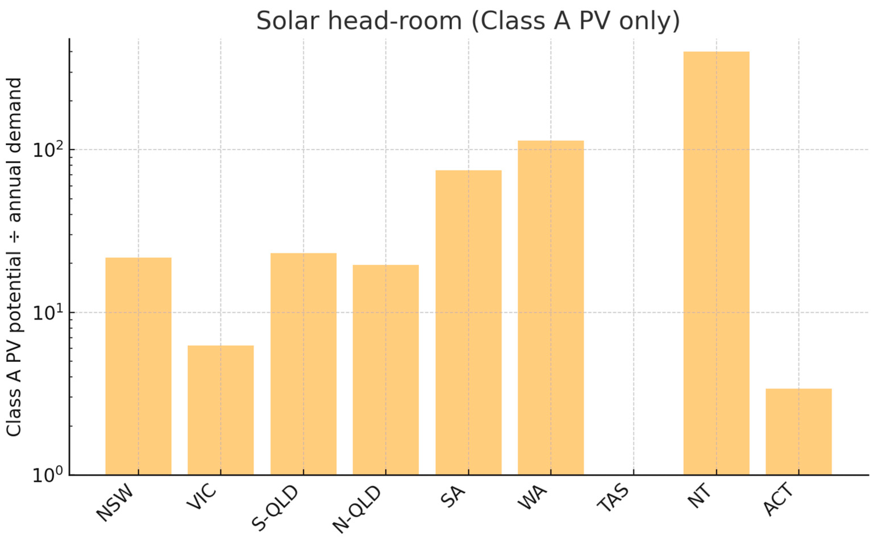
The least-cost screening produces two dominant patterns. First, Class A solar (<50 AUD/MWh) is super-abundant in every mainland state. As shown in Figure 3, at a future demand of 20 MWh per capita per year, New South Wales could meet its entire 170 TWh annual requirement twenty-two times over (3693 TWh/year of Class A PV potential), Western Australia more than one hundred times (6840 TWh vs. 60 TWh demand), and even the least-sunny mainland state, Victoria, six times (872 TWh vs. 140 TWh). Tasmania is the only jurisdiction that must dip into Class B PV because the cool, cloudy climate, coupled with higher latitude, yields no Class A solar pixels at all.
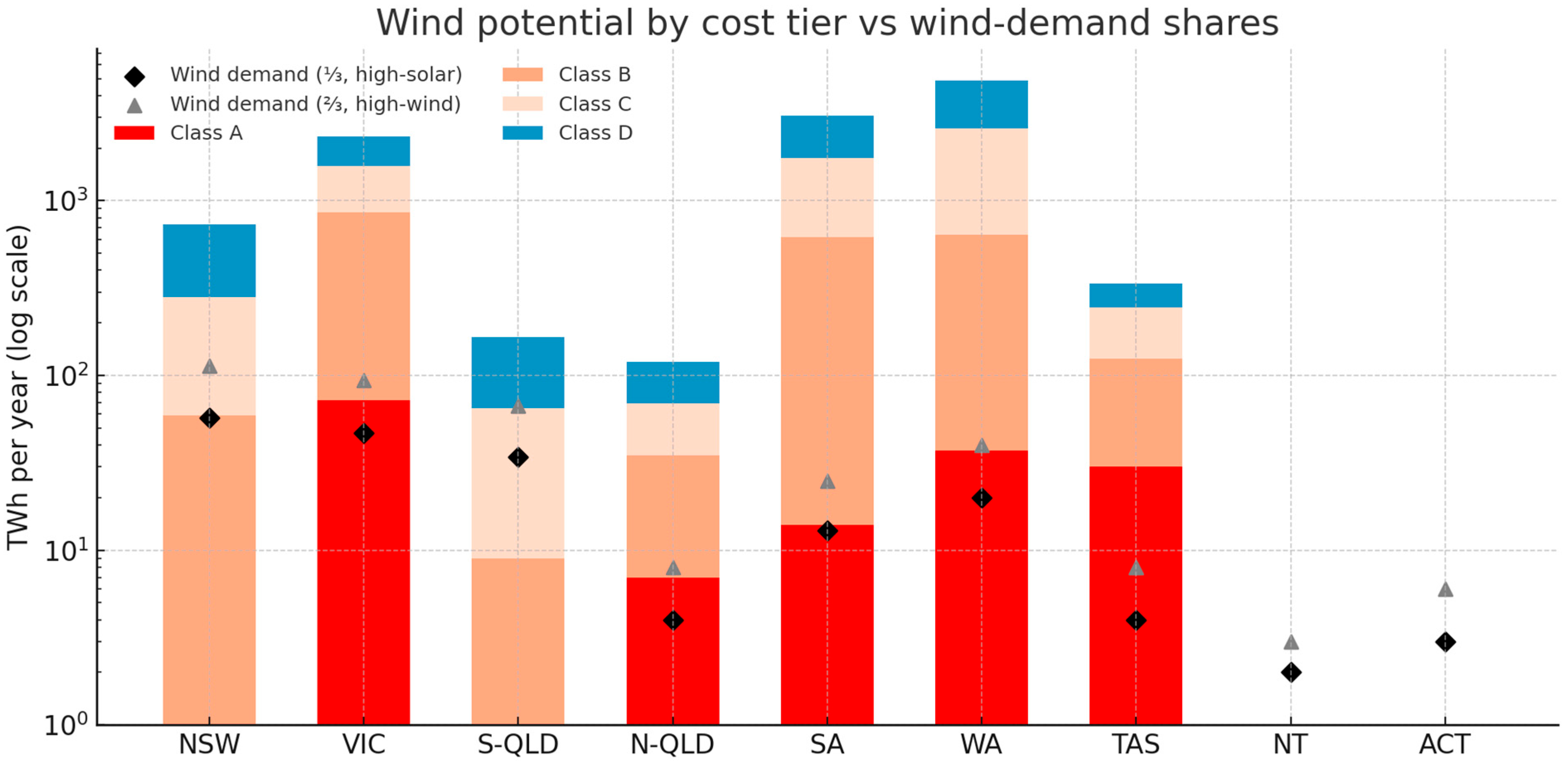
Wind availability shows a different pattern. Class A wind (<50 AUD/MWh) is concentrated in Victoria (72 TWh), Tasmania (30 TWh), and, to a lesser extent, Western Australia (37 TWh). It is virtually absent in South Queensland and New South Wales. Consequently, some states require higher-cost tiers as the required wind share rises (Figure 4):
  • High-solar mix: All states except NSW and South Queensland satisfy their one-third wind obligation from Class A alone. NSW and South Queensland require Classes B and C. (NT is an exception, which is entirely supplied by solar PV. ACT is analysed together with NSW but presented separately in the plots.)
  • High-wind mix: The cost ladder extends further. South Queensland must draw on Class D; North Queensland, South Australia, Western Australia, and Victoria reach into Class B; NSW remains at Classes A–C; and Tasmania continues to rely solely on Class A.
Because solar never moves beyond Class A (except Class B in Tasmania) under either scenario, spur-line distance, rather than resource quality, determines PV site selection. Wind deployment, by contrast, is strongly cost-class-limited. The absence of high-class wind in south Queensland and inland NSW forces a shift toward costlier sites as the national mix tilts toward wind. It also highlights the potential opportunity for offshore wind in these states, provided deep cost reductions from today’s level occur. States with Class A wind (Victoria, Tasmania, Western Australia), on the other hand, hold a comparative advantage. Tasmania offers a unique profile in particular as the only jurisdiction requiring higher-cost solar yet possessing exclusively low-cost wind, which highlights its potential role as a renewable energy exporter to the mainland grid, especially with its large firming capacity (hydro).
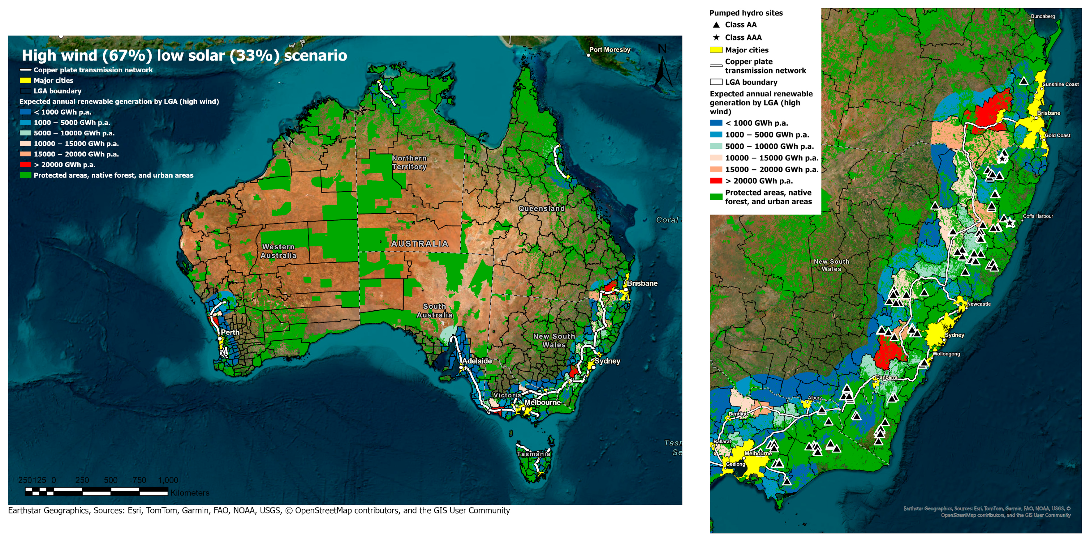
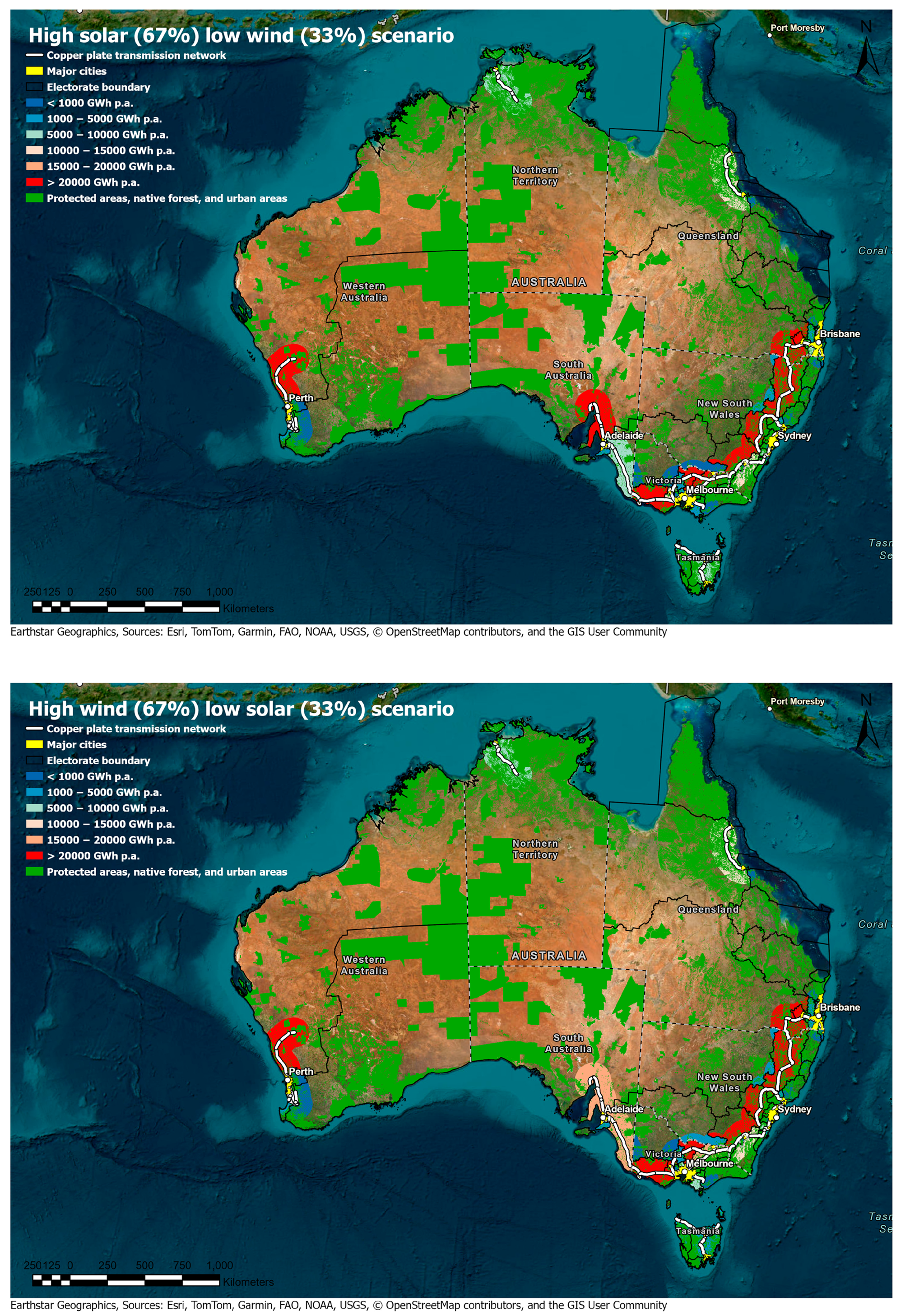
Figure 5 shows the LGA-level build profile for the high-solar (67% PV) scenario; Figure 6 shows the corresponding pattern for the high-wind (67% wind) mix. Both maps use a six-band colour ramp (<1 TWh/yr to >20 TWh/yr, the redder the better; green represents incompatible land defined by the exclusion mask) to allow direct visual comparison. Only areas < 100 km to the transmission backbone or the load centres are coloured, as all participating pixels are within this range. Zoomed-in maps around the east coast are provided for additional details, while zoomed-in maps around other regions are available in the Supplementary Materials.
In both scenarios, the majority of >10 TWh/yr LGAs are close to the existing high-voltage corridor from Brisbane through Sydney and Melbourne to Adelaide, plus the South-West Interconnected System around Perth. This confirms that spur-line distance, rather than pure resource quality, dominates the ranking because Class A solar is ubiquitous. Further away from these corridors, the interior of Queensland, the Northern Territory, and central Western Australia have no build, not because of poor quality resources, but because of excessive costs to connect to load centres.
Zooming in on the east coast highlights Brisbane–Toowoomba–Darling Downs as one of the hotspots. Under the high-solar scenario, the Toowoomba LGA alone exceeds 50 TWh/yr, driven by Class A PV that can connect to Brisbane within 80 km. The high-wind-scenario map shows slightly reduced intensity because South Queensland must include Class D wind, raising average costs. The New England tablelands, including Inverell, Armidale, and Tamworth LGAs, are attractive in both scenarios, benefiting from moderate-quality wind and excellent solar plus proximity to the Tamworth–Hunter transmission backbone.
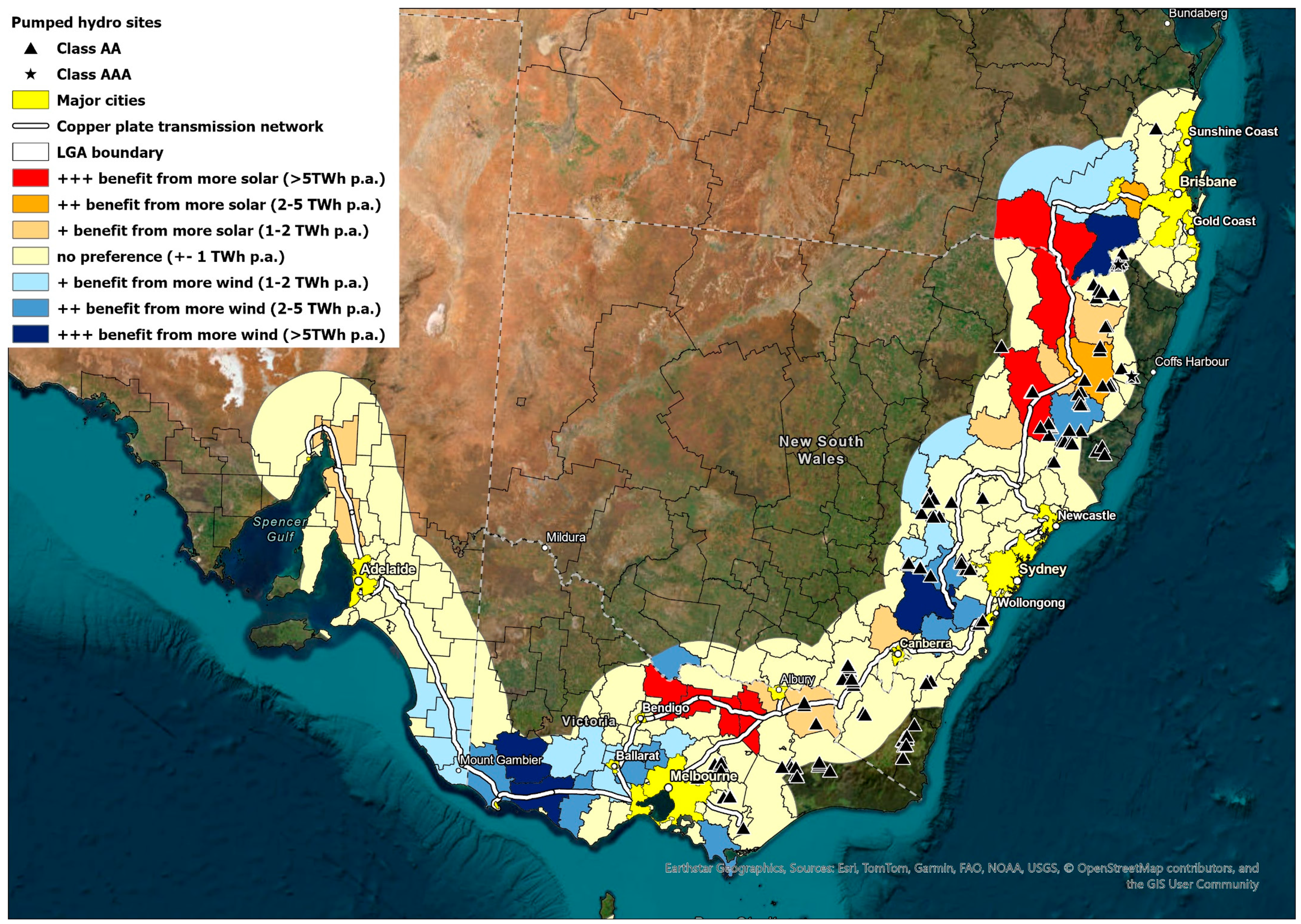
Overlaying premium (class AA and AAA) pumped hydro sites from the ANU Global Pumped Hydro Atlas [48] (black triangles and stars) shows substantial co-location with premium LGAs, highlighting the synergy between renewable generation potential, access to high-power transmission, and low-cost storage.
For additional context, Figure 7 plots the difference between scenarios, with red hues indicating LGAs whose share increases when the mix is tilted toward solar, and blue hues when it is tilted toward wind.
The difference map reinforces three points. First, the Queensland–NSW inland spine favours extra solar. From Toowoomba south through Goondiwindi, Inverell, and Tamworth, the map is bright red. These LGAs host vast Class A PV but only Class B/C wind and gain ≥5 TWh/yr when the mix tilts toward the 67%-solar case. Secondly, the Victorian Goldfields and Murray corridor also lean towards solar. Campaspe, Greater Shepparton, Benalla, and Wangaratta form a second red patch, mirroring their strong PV headroom and moderate wind resource. In contrast, coastal SA, south-west Victoria, as well as the areas between Canberra and Wollongong, swing to wind. Moyne, Southern Grampians, and the Limestone Coast show deep blue, picking up ≥5 TWh/yr in the high-wind scenario, driven by Class A/B wind off the Roaring Forties.
Overall, only a few dozen inland LGAs (>5 TWh swing) are truly sensitive to the national mix. The majority are neutral, confirming that backbone proximity rather than the solar–wind split is the primary driver of LGA siting.
Table 2 lists the top three LGAs in each state under each scenario (full table covering all LGAs available in Supplementary Materials).
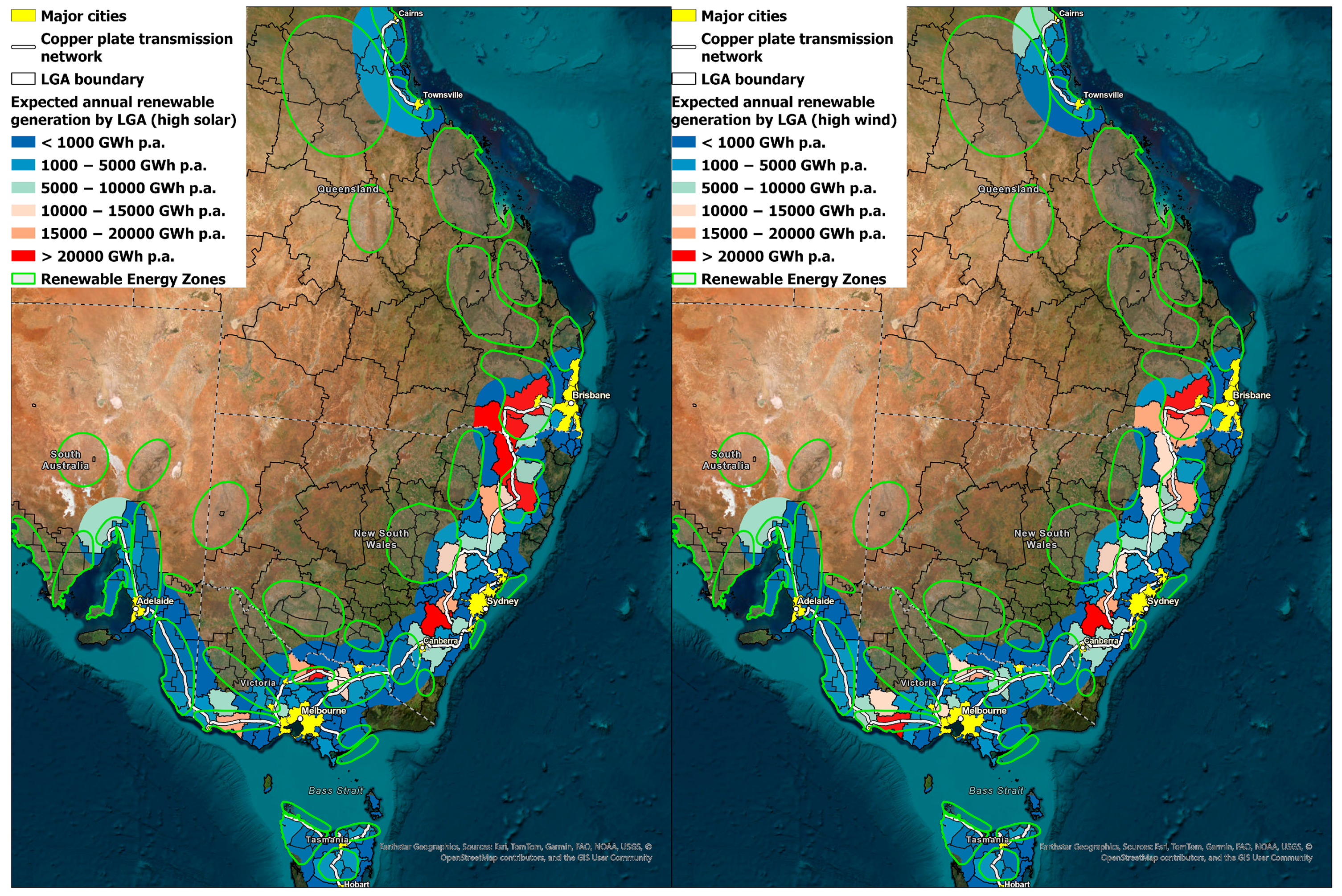
Figure 8 overlays our least-cost LGA build in both scenarios on the REZ envelopes proposed by the Australian Energy Market Operator. Central-West Orana and New England (NSW), Western Victoria, and the SA Mid-North all coincide with contiguous belts of ≥5 TWh/yr LGAs (light blue to red shading). This confirms that existing REZ selection has successfully captured the cheapest, backbone-adjacent resource blocks.
An interesting observation is that many REZ envelopes extend well beyond the existing backbone, whereas our top-ranked LGAs lie mostly within 100 km of it. This is because REZs were designed in 2020–22 to capture very large, lightly settled land parcels where multi-GW projects could share a single new 330–500 kV transmission line. The economies of scale offset today’s extra distance to load centres. Planned high-voltage transmission upgrades (HumeLink, VNI West, CopperString 2.0, etc.) will shorten those distances, lowering connection costs and unlocking the abundant high-quality solar and wind resources in the western REZs. In short, our LGA cluster shows what is cheapest now, while the more distant REZs are the next least-cost tranche if and when their dedicated lines are online.
Within the broad REZ polygons, the LGA patterns are highly heterogeneous. For example, in the New England REZ, Inverell and Armidale exceed 15 TWh/yr, whereas adjacent LGAs remain below 5 TWh/yr. Such gradients suggest that staging lines and connection points could be prioritised around the highest-yield councils to accelerate early capacity without over-building spur lines. This also justifies the significance of this work, which complements the REZ-level planning by providing guidance on detailed, implementation-focused buildouts.
Our model assumes no high-capacity reinforcement between Townsville and Brisbane. Other work suggests that new high-power transmission to Brisbane would be best directed westwards rather than northwards [49]. Consequently, REZs between these two load centres are not captured in our analysis despite good resources. A committed upgrade with sufficient capacity would likely lift several northern LGAs into the 5–10 TWh band and strengthen the business case for these regions.

3.2. Regional Socio-Economic Opportunity Profiles (RQ2)

Using each LGA’s mean PV and wind capacity factors, Table 3 converts generation into capital cost, jobs, and lease income for top LGAs in each state. Values are shown for the scenario in which the LGA performs best.
Utility-scale renewables translate directly into substantial regional financial dividends. An LGA such as Toowoomba can attract around AUD 33 billion in generation capital alone, while Upper Lachlan and Inverell each exceed AUD 20 billion. Projects of that scale sustain more than 30,000 construction job-years, which is equivalent to 1500–2700 full-time positions spread across the two-decade buildout, and channel AUD 50 million or more every year in lease payments to local landholders. Even mid-sized regional shires like Mount Remarkable, Grant, and Tasmania’s Central Highlands see multi-billion-dollar pipelines, create hundreds of permanent operations jobs, and deliver millions in long-term hosting income.
The mix of technologies, and therefore the profile of local benefits, varies by geography. Inland grain-belt councils such as Inverell, Goondiwindi, and Greater Shepparton are heavily solar-driven, so most of their lease revenue flows from PV arrays and jobs on civil works and electrical trades. Coastal and high-latitude LGAs like Moyne, Dandaragan, and Circular Head switch to wind-dominant portfolios, bringing higher O&M job density and a need for turbine-installation and port-logistics skills.
While LGAs are the statutory consenting authority, federal Members of Parliament (MPs) shape transmission funding, revenue-support schemes, and regional development policy. To align our results with this political lens, we re-aggregated the 250 m heatmap rasters to the 150 federal electoral divisions, using the same method as in Section 2.4 and Section 2.5. The key outputs for each electorate are annual generation, capital investment, construction and permanent O&M jobs, and host-land payments. Figure 9 maps the results for the high-solar and high-wind scenarios.
Table 4 lists the top five electorates and their annual generation, capital investments, and job creation in the high-solar scenario. These five divisions collectively account for approximately 45% of the modelled annual generation and 50% of the projected AUD 381 billion in capital expenditure. Expanding the list to the top 20 seats captures 94% of total investment, demonstrating that the economic opportunity is strongly concentrated in a limited number of electorates situated along the existing 275–500 kV transmission backbone. Note that the majority of this capital would be private investment (other than government support and investment from publicly owned transmission companies).
In New England alone, the lowest-cost build could host roughly AUD 60 billion in new generating plant, 4000 construction job-years, and 5000 ongoing operations jobs. Representatives in other high-potential electorates (e.g., Indi, Mayo, coastal portions of Durack) may find comparable figures useful when advocating for projects such as CopperString 2.0, HumeLink, and VNI West. Publishing electorate-specific data along with the LGA-level information would therefore provide federal and state legislators with quantitative evidence on local employment, lease income, and capital inflows associated with renewable deployment, thereby supporting more informed decisions on Australia’s decarbonisation pathway.
Complete electorate data is available in the Supplementary Materials.

3.3. Impact of New High-Voltage Corridors (RQ3)

The sensitivity analysis presented in this section builds on the minimum viable backbone by adding candidate HVAC corridors. Comparing the baseline and expanded network scenarios shows how new lines reduce spur-line distances and shift least-cost capacity toward remote LGAs. Figure 10 shows the impact of two HVAC lines, one from Walgett—Lighting Ridge to Tamworth (Route 205) and another connecting inland regions (Bourke, NSW & Paroo, QLD) to west of Brisbane (Route 157). In both cases, every LGA along the new corridors sees increased capacity under both high-solar and high-wind scenarios. For Route 205, Warren gains 21 TWh in the high-solar scenario and 14 TWh in the high-wind scenario, while Gilgandra gains 11 TWh and 17 TWh, respectively. Both LGAs had negligible generation potential in the absence of this new HVAC corridor. In contrast, certain LGAs that were previously top-ranking due to their close proximity to the “copper plate” take a slight cut due to the competition from the LGAs that are close to the new transmission line, because the total state demand stays the same. For example, Inverell, Armidale, and Tamworth, which were some of the best LGAs in the baseline case, see a significant decline of 40–60% in both scenarios, as shown in Table 5 below.
For Route 157, Bourke adds 45 TWh in the high-solar scenario and 30 TWh in the high-wind scenario, followed by Balonne at 36 TWh and 32 TWh. Toowoomba experiences the largest decline, with its output falling by 57% (28 TWh) under high solar and 43% (23 TWh) under high wind, again driven by competition from LGAs closer to the new line.
A total of 10 candidate HVAC routes are modelled in this study. Maps for other HVAC lines along with detailed LGA statistics are available in the Supplementary Materials.
In general, the top-ranking LGAs identified in the baseline scenarios comprise the logical first stage under today’s network, while the transmission extension work determines the second stage once major backbone upgrades are committed. Revealing such information publicly could incentivise councils that are affected by new transmission corridors to express a more positive attitude towards these transmission projects, in recognition of the large economic benefit that they could bring.
Taken together, the three strands of results demonstrate the study’s novelty and scientific contributions. A reproducible pixel-to-region workflow converts least-cost pixels into state supply curves (RQ1), produces decision-ready regional profiles that quantify socio-economic outcomes (RQ2), and reveals how candidate corridors shift the spatial distribution of opportunity (RQ3). Their interconnection is essential: network topology reshapes the feasible low-cost envelope, which in turn alters regional rankings and co-benefits.

4. Discussion

Australia’s decarbonisation timetable is now set by hard-dated federal and state targets, principally 82% renewables in the National Electricity Market (NEM) by 2030 and the current Nationally Determined Contribution (NDC) target of net zero by 2050 (noting that new NDCs due in 2025 and every five years afterwards are required by the Paris Agreement to strengthen ambition [50]). Besides Australia, 107 countries have pledged for net zero either in law, in a policy document, or in an announcement by government officials [51]. Although achieving net zero emissions is a complex challenge that involves efforts from multiple sectors (e.g., supply chains, soft costs and skills, financing), solar and wind will likely play a dominant role in this transition. Translating those macro goals into solar and wind projects on the ground will be decided by policymakers and energy planners at both federal and regional levels. Our cost-class heat mapping therefore offers not just a technical ranking for Australia, but a generic spatial decision-supporting tool that other jurisdictions can adopt with local datasets to identify the councils or counties capable of accommodating the next tranche of large-scale solar and wind at the lowest marginal cost and with the greatest regional benefit. The following discussion explains what that means for each stakeholder, outlines how the dataset could be deployed in practice, and identifies the study’s key limitations together with directions for future research.

4.1. Implications of This Study

This section interprets the key findings in light of our five methodological contributions, including the generalizable workflow, the LGA and electorate scorecards, socio-economic valuation, sensitivity to new transmission corridors, and policy implications.
At the federal level, Australia’s Capacity Investment Scheme (CIS) will underwrite revenue for 23 GW of variable renewables and 9 GW of firming capacity through competitive tenders over the rest of the decade [52]. CIS tender guidelines already explicitly weight community and First Nations engagement as one of the key merit criteria [53]. Results of this study could complement CIS design by providing an objective assessment of the quality of local resource and local impact. A project located in a top-class LGA (as identified by the model) would likely require less support than equivalent projects in poor-resource or grid-constrained areas. As a result, tender reference prices or support levels could be varied by location, offering higher revenues to projects in resource-rich but remote LGAs that commit to supporting new transmission or storage (although the deployment of transmission and associated funding remain largely a state responsibility). However, for well-connected LGAs, the lower grant from the Federal Government will not come at the expense of the local community, as the local benefit is largely paid by the cost savings of the projects themselves. In general, the information developed in this study could be helpful to guide CIS and other federal support schemes to design appropriate subsidies for different regions and assess the bids on the basis of locational values.
The AEMO’s 2024 ISP recognises social licence as a core risk to timely project delivery [4]. Our analysis ranks councils and electorates instead of large (30,000 km2) REZ polygons and will allow planners and developers to triage communities, with early stakeholder engagement carried out towards councils that are identified as being the most critical to the least-cost buildout. For example, top-ranking LGAs identified by this study could be prioritised for community consultations and regulatory approvals. These processes have been in motion for several years in Australia but will be crucial for grid planning in other nations where the renewable energy rollout is just beginning.
At the state level, most NEM states are planning REZs. For example, Victoria’s grid planner (VicGrid) is developing the 2025 Victorian Transmission Plan and has already published guidelines on areas under consideration for future REZs [54]. Tasmania has released draft REZ legislation in 2024 for public consultation, with a first REZ expected to be declared via that law [55]. AEMO’s ISP identified 43 shortlisted REZs across the NEM [4]. Our analysis confirms that most of the prime resources are already captured by announced or proposed REZs but also flags a few high-yield LGAs that lie outside current boundaries, such as Goondiwindi, Inverell, Tamworth, Upper Lachlan, and Oberon. State planners could use our LGA data in the next round of REZ updates, potentially expanding REZ borders to include these areas, or sequencing the connection of new projects within an REZ so that projects in the lowest-cost councils are allowed to connect first.
Many state-level schemes already tie connection rights to community benefits. For example, NSW’s Central-West Orana REZ Access Scheme requires successful projects to sign a Project Development Agreement that obligates them to develop a community engagement plan and an Industry and Aboriginal Participation Plan to show commitment to improving regional economic development [56]. An access fee will also be charged to contribute to community benefit sharing and employment initiatives. Publishing comparative job and lease-income estimates, as we present in Section 3, could inform those negotiations. Councils and EnergyCo could use the LGA-level projections as empirical baselines when setting targets for local jobs or payments. Similarly, local governments could incorporate our findings into their land use zoning and infrastructure planning. For example, with the aid of pixel-level cost maps, areas with low indicative cost and minimal conflict with other land uses could be prioritised for renewable energy development. Associated road upgrades that are usually required for such deployment can also be coordinated in advance. Housing needs, and impacts upon the community, can be ascertained using the job numbers expected from development.
Developers can also use these results to inform site selection and how they engage with local communities. In addition to the existing pixel-level cost maps (which guide micro-siting), the LGA-level rankings provide a broader perspective, as a project located in a top-ranked LGA (good resource, low connection cost, strong socio-economic metrics) will generally be more competitive, requiring less subsidy and facing less local opposition. Developers should note, however, that our analysis does not include existing or consented capacity. Therefore, they would need to overlay our suitability maps with known project pipelines to judge local competition. In practice, a site in a high-suitability LGA is more likely to gain advantage in upcoming auctions or tenders, whereas a site in an oversupplied or higher-cost LGA may see eroded returns.
Throughout the industry, there is a push for best-practice community engagement. For example, the Clean Energy Council’s voluntary Best-Practice Charter commits companies to early, respectful engagement with local communities (including Traditional Owners) and to share project benefits with host regions [57]. The public information produced in this study would support these commitments by reducing knowledge asymmetry and putting all parties on equal footing. Instead of relying on developers’ marketing or ad hoc estimates, residents and stakeholders could see transparent, comparative data on how many jobs, incomes, and potential local revenues a project might bring to their council. This study’s outputs therefore encourage equal and evidence-based negotiations, in line with the industry’s drive toward “renewables done right”.

4.2. Limitations and Future Work

This study deliberately sacrifices some engineering detail to offer a consistent, fast-updating national view. Key limitations and suggested future work include the following:
  • Our assumption of an unconstrained “copper plate” refers specifically to the minimum viable backbone connecting major load centres. Excluding many existing lines and most planned transmission upgrades reduces the risk of overestimating opportunities in regions that may remain capacity-constrained. The impact of these additional transmission corridors is explored in the sensitivity analysis described in Section 2.7 and Section 3.3. Nonetheless, congestion in the backbone is still possible. Future work could incorporate detailed power flow modelling and staged transmission upgrades for a more detailed assessment.
  • Connection cost is approximated based on the Euclidean distance from each pixel to the nearest “copper plate” backbone or load centre. Impacts of terrain or connection policies on the connection cost are out of the scope of this study and should be explored in future work.
  • Our resource allocation matches annual energy demand rather than balancing generation and load hour-by-hour. This approach is common in preliminary resource assessments but does not reflect the hourly correlation between supply and demand or the need for storage and firming capacity. Incorporating storage, demand response, and hourly dispatch optimisation into our framework is therefore an important avenue for future work.
  • Our exclusion mask filters out protected areas, urban areas, steep land, and native forest but does not remove prime agricultural land, threatened-species habitat, or indigenous cultural heritage because nationally consistent, high-resolution data were unavailable. Consequently, some areas with high agricultural value or sensitive biodiversity may be picked up in the model for renewable deployment. Future iterations should incorporate these additional layers to improve the exclusion mask to reduce the risk of selecting these environmentally sensitive or highly productive farmland for development.
  • While designed with the motivation to improve public awareness, our model does not incorporate community acceptance, indigenous land rights, or local planning overlays into the site ranking framework. These factors often determine whether projects proceed and must be addressed through engagement and consent processes beyond the scope of this study.
  • Offshore wind resources off Gippsland, the Hunter, and WA’s south-west could materially change the relative attractiveness of coastal LGAs.
  • The AUD 10/MWh bands help communication and reflect uncertainty in the value of input parameters but mask marginal differences within a class. More granular cost curves would be required for precise tariff modelling.
Table 6 summarises the scope of this study and highlights potential areas for future research:
Future research could also focus on developing a cloud-based, continuously updated dashboard that reflects the latest GenCost assumptions, demand forecasts, and network commitments, therefore enabling planners to test policy and investment scenarios in real time while maintaining transparency for all stakeholders. That said, there are many uncertainties that will tend to mask higher resolution modelling.

4.3. Policy Recommendations for Australia

Australia’s REZ framework can be fast-tracked by splitting councils into two streams. A “dual-track” rollout would prioritise LGAs that combine Class A/B solar/wind resource, strong community support, and close proximity to the major transmission corridor or load centres. These “fast-start” zones could deliver many GWs of cheap renewables within a few years, while other areas (with weaker resource or transmission constraints) prepare community benefit schemes on a slower track. Such a two-stream approach mirrors earlier proposals for the concept of staged REZ development [58] (although the Energy Security Board who drafted the proposal was abolished in 2023) and would give network planners a clear signal about which regions to connect first.
To maintain social licence, the Commonwealth (e.g., Clean Energy Regulator and the Australian Bureau of Statistics) could report annually on each LGA’s approved megawatts, capital spend, construction job-years, permanent O&M jobs, and land-lease payments, to provide transparent information on how much benefit flows to each community. Developers already publish similar data for individual projects (e.g., New England Solar [59] and ACCIONA Energía [60]), but the information is scattered and presented in inconsistent formats. Consolidating it on a single national platform would further improve public awareness of the fact that renewable projects would give communities a transparent view of how much investment flows into their region, create an evidence-based benchmark for future tenders and benefit-sharing negotiations, and let policymakers track whether regional development goals are being met. The Clean Energy Regulator’s Corporate Emissions Reduction Transparency (CERT) reports [61] provide a precedent for sharing company-reported climate and emissions data. In partnership with the Australian Bureau of Statistics, it is well placed to extend that experience to renewable-project benefits.
Because spur-line distance is the dominant cost driver, particularly for solar farms, federal or state capital contributions for new 132–330 kV links could be contingent on host councils improving permitting processes, as historically delays in approvals dominate project lead-times [10]. The findings of this project suggest that new transmission corridors would largely reshape the benefit-sharing picture across LGAs, with those along the new corridor capturing large gains. However, there is only a limited number of new transmission lines to be built, and tying such grid expansion funding to streamlined approvals will reward jurisdictions that help to lower excessive connection costs.
Finally, governments could establish a Strategic Land Stewardship Fund financed through the AUD 20 billion Rewiring the Nation fund [62] to help councils manage Class A/B parcels that overlap prime agriculture, cultural heritage sites, or biodiversity hotspots. Grants could pay for ecological surveys, indigenous engagement, and coexistence pilots (e.g., agrivoltaics), complementing the Clean Energy Council’s Best-Practice Charter [57] for early engagement to avoid later bottlenecks in valuable areas, while minimising environmental or social impacts on the local community.

5. Conclusions

This paper presents the first nationwide, regional-scale atlas that links pixel-level techno-economics to policy-ready metrics for Australia’s renewable buildout. By merging 250 m solar and wind rasters with distance-weighted spur-line costs and land use constraints, and allocating a fully electrified demand of 20 MWh per capita per year, the method identifies where large-scale PV and onshore wind are cheapest and how the benefits distribute across all 547 Local Government Areas and 150 federal electorates. Results show that Class A solar (<50 AUD/MWh) is available in every mainland state except Tasmania, but Class A wind is largely confined to Victoria, Tasmania, and coastal WA. About 15% of LGAs capture more than half of cost-optimal generation, many of which are along the existing Brisbane–Sydney–Melbourne–Adelaide transmission backbone and within the South-West Interconnected System in WA. A single top-tier LGA such as Toowoomba could attract AUD 33 billion in investment and more than 50,000 construction job-years. In remote areas, proximity to high-voltage lines outweighs marginal resource gains, and modelling of ten candidate transmission corridors shows how new lines can radically redistribute benefits. At the electorate level, the top five seats capture 45% of potential generation and half of total capital investment, with New England clearly standing out from the others.
Based on these findings, we create LGA and electorate “scorecards” of annual renewable generation, capital, jobs, and lease income. The information is expected to provide local communities, planner, and developers with a transparent, evidence-based view of the local opportunities associated with the inevitable deployment of renewables in the next two decades. We recommend a dual-track deployment scheme that prioritises low-cost, high-readiness LGAs while preparing others for later stages, a public dashboard that tracks progress and benefits at the LGA scale, location-tuned incentives that coordinate generation and new transmission, and a Strategic Land Stewardship Fund to manage overlaps with prime agriculture, biodiversity, and cultural heritage.
Because the workflow relies only on globally available datasets (solar and wind atlases, land cover maps, and basic cost assumptions), it can be replicated in other jurisdictions to streamline subnational planning and accelerate socially acceptable renewable energy buildouts worldwide.

Supplementary Materials

The following supporting information can be downloaded at https://www.mdpi.com/article/10.3390/en18164361/s1, “Maps”: High-resolution images of the maps presented in this paper, plus additional sensitivity analysis results, in JPG/PNG format; “Statistics”: Detailed spreadsheets covering the results for each LGA and federal electorate.

Author Contributions

Conceptualization, A.B.; Methodology, A.B. and C.C.; Validation, C.C. and T.W.; Formal analysis, C.C.; Investigation, C.C. and T.W.; Resources, C.C.; Data curation, A.N.; Writing—original draft, C.C.; Writing—review & editing, A.N., T.W., A.B. and K.C.; Visualization, C.C.; Supervision, A.B. and K.C. All authors have read and agreed to the published version of the manuscript.

Funding

This research received no external funding.

Institutional Review Board Statement

Not applicable.

Informed Consent Statement

Not applicable.

Data Availability Statement

GIS data generated from this analysis is available at https://www.dropbox.com/work/Cheng%20Cheng/2015%20ARENA%20R%26D2%20STORES/ANU%20publications/2504%20Top%20LGAs/GIS%20files (accessed on 16 April 2025). Online interactive maps are available at https://re100.anu.edu.au/#share=g-4ae9a8f048a6dabfdb51fd4bca9d1ce7 (accessed on 16 April 2025). High-resolution maps and detailed statistics are available in the Supplementary Materials.

Conflicts of Interest

The authors declare no conflict of interest.

References

  1. Rüther, R.; Blakers, A. The Fastest Energy Change in History Continues. PV Magazine. Available online: https://www.pv-magazine.com/2025/01/13/the-fastest-energy-change-in-history-continues/ (accessed on 12 May 2025).
  2. IEA. Global Overview–Renewables 2024–Analysis. Available online: https://www.iea.org/reports/renewables-2024/global-overview (accessed on 12 May 2025).
  3. IRENA. Renewable Capacity Statistics 2025. International Renewable Energy Agency, Abu Dhabi. March 2025. Available online: https://www.irena.org/Publications/2025/Mar/Renewable-capacity-statistics-2025 (accessed on 24 June 2025).
  4. AEMO. 2024 Integrated System Plan. June 2024. Available online: https://aemo.com.au/energy-systems/major-publications/integrated-system-plan-isp/2024-integrated-system-plan-isp (accessed on 16 April 2025).
  5. EnergyCo. Construction Ramping Up in Central-West Orana Renewable Energy Zone. Available online: https://www.energyco.nsw.gov.au/news/construction-ramping-central-west-orana-renewable-energy-zone (accessed on 24 June 2025).
  6. Developing the 2025 Victorian Transmission Plan. Engage Victoria. Available online: https://engage.vic.gov.au/victransmissionplan (accessed on 25 June 2025).
  7. Mey, F.; Diesendorf, M.; MacGill, I. Can local government play a greater role for community renewable energy? A case study from Australia. Energy Res. Soc. Sci. 2016, 21, 33–43. [Google Scholar] [CrossRef]
  8. Climate Change. Authority Sector Pathways Review. Available online: https://www.climatechangeauthority.gov.au/sector-pathways-review (accessed on 25 June 2025).
  9. Monaghan, T. Phantom Dwellings in Australia: A Growing Barrier for Renewable Energy Projects. Australian Energy Council. Available online: https://www.energycouncil.com.au/analysis/phantom-dwellings-in-australia-a-growing-barrier-for-renewable-energy-projects/ (accessed on 25 June 2025).
  10. Clapin, L.; Longden, T. Waiting to generate: An analysis of onshore wind and solar PV project development lead-times in Australia. Energy Econ. 2024, 131, 107337. [Google Scholar] [CrossRef]
  11. DNV GL. Multi-Criteria Scoring for Identification of Renewable Energy Zones. April 2018. Available online: https://www.aemo.com.au/-/media/Files/Electricity/NEM/Planning_and_Forecasting/ISP/2018/Multi-Criteria-Scoring-for-Identification-of-REZs.pdf (accessed on 25 June 2025).
  12. Shao, M.; Han, Z.; Sun, J.; Xiao, C.; Zhang, S.; Zhao, Y. A review of multi-criteria decision making applications for renewable energy site selection. Renew. Energy 2020, 157, 377–403. [Google Scholar] [CrossRef]
  13. Demir, A.; Dinçer, A.E.; Çiftçi, C.; Gülçimen, S.; Uzal, N.; Yılmaz, K. Wind farm site selection using GIS-based multicriteria analysis with Life cycle assessment integration. Earth Sci. Inf. 2024, 17, 1591–1608. [Google Scholar] [CrossRef]
  14. Villacreses, G.; Jijón, D.; Nicolalde, J.F.; Martínez-Gómez, J.; Betancourt, F. Multicriteria Decision Analysis of Suitable Location for Wind and Photovoltaic Power Plants on the Galápagos Islands. Energies 2023, 16, 29. [Google Scholar] [CrossRef]
  15. Sun, L.; Jiang, Y.; Guo, Q.; Ji, L.; Xie, Y.; Qiao, Q.; Huang, G.; Xiao, K. A GIS-based multi-criteria decision making method for the potential assessment and suitable sites selection of PV and CSP plants. Resour. Conserv. Recycl. 2021, 168, 105306. [Google Scholar] [CrossRef]
  16. Nassar, A.K.; Al-Dulaimi, O.; Fakhruldeen, H.F.; Sapaev, I.B.; Jabbar, F.I.; Dawood, I.I.; Khalaf, D.H.; Algburi, S. Multi-criteria GIS-based approach for optimal site selection of solar and wind energy. Unconv. Resour. 2025, 7, 100192. [Google Scholar] [CrossRef]
  17. Butschek, F.; Peters, J.L.; Remmers, T.; Murphy, J.; Wheeler, A.J. Geospatial dimensions of the renewable energy transition—The importance of prioritisation. Environ. Innov. Soc. Transit. 2023, 47, 100713. [Google Scholar] [CrossRef]
  18. NREL. reV: The Renewable Energy Potential Model. Available online: https://www.nrel.gov/gis/renewable-energy-potential (accessed on 25 June 2025).
  19. David, J.H.; Jianyu, G.; Sundar, S.; Pham, A.; O’Neill, B.; Buchanan, H.; Heimiller, D.; Weimar, M.; Wilson, K. Interregional Renewable Energy Zones. NREL. March 2024. Available online: https://docs.nrel.gov/docs/fy24osti/88228.pdf (accessed on 15 June 2025).
  20. IRENA. Planning and Prospects for Renewable Power: Eastern and Southern Africa; International Renewable Energy Agency: Abu Dhabi, United Arab Emirates, 2021. [Google Scholar]
  21. Cheng, C.; Silalahi, D.F.; Roberts, L.; Nadolny, A.; Weber, T.; Blakers, A.; Catchpole, K. Heatmaps to Guide Siting of Solar and Wind Farms. Energies 2025, 18, 891. [Google Scholar] [CrossRef]
  22. Tsiaras, E.; Andreosatou, Z.; Kouveli, A.; Tampekis, S.; Coutelieris, F.A. Off-Grid Methodology for Sustainable Electricity in Medium-Sized Settlements: The Case of Nisyros Island. Clean Technol. 2025, 7, 16. [Google Scholar] [CrossRef]
  23. Rubino, G.; Killenberger, C.; Sasse, J.-P.; Wang, Z.; Wen, X.; Zielonka, N.; Trutnevyte, E. Spatial strategies for siting variable renewable energy sources to ensure weather resilience in Switzerland. Renew. Energy 2025, 249, 123237. [Google Scholar] [CrossRef]
  24. Rahimi, I.; Li, M.; Choon, J.; Pamuspusan, D.; Huang, Y.; He, B.; Cai, A.; Nikoo, M.R.; Gandomi, A.H. Optimizing renewable energy site selection in rural Australia: Clustering algorithms and energy potential analysis. Energy Convers. Manag. X 2025, 25, 100855. [Google Scholar] [CrossRef]
  25. Australia-Countries & Regions. IEA. Available online: https://www.iea.org/countries/australia/electricity (accessed on 16 May 2025).
  26. Lu, B.; Blakers, A.; Stocks, M.; Cheng, C.; Nadolny, A. A zero-carbon, reliable and affordable energy future in Australia. Energy 2021, 220, 119678. [Google Scholar] [CrossRef]
  27. Hunter Transmission Project. Available online: https://www.energyco.nsw.gov.au/projects/hunter-transmission-project (accessed on 30 July 2025).
  28. Sydney Southern Ring. Available online: https://infrastructurepipeline.org/project/sydney-southern-ring (accessed on 30 July 2025).
  29. Solargis. Global Solar Atlas. Available online: https://globalsolaratlas.info/map (accessed on 12 February 2025).
  30. Lazaroiu, G.C.; Longo, M.; Roscia, M.; Pagano, M. Comparative analysis of fixed and sun tracking low power PV systems considering energy consumption. Energy Convers. Manag. 2015, 92, 143–148. [Google Scholar] [CrossRef]
  31. Li, Z.; Liu, X.; Tang, R. Optical performance of inclined south-north single-axis tracked solar panels. Energy 2010, 35, 2511–2516. [Google Scholar] [CrossRef]
  32. DTU. Wind Energy Global Wind Atlas. Available online: https://globalwindatlas.info (accessed on 16 May 2025).
  33. UNEP-WCMC; IUCN. Protected Planet: The World Database on Protected Areas (WDPA) and World Database on Other Effective Area-based Conservation Measures (WD-OECM). Protected Planet. Available online: https://www.protectedplanet.net/en/about (accessed on 16 May 2025).
  34. SEDAC. Global Human Built-up and Settlement Extent (HBASE) Dataset from Landsat-Catalog. Available online: https://catalog.data.gov/dataset/global-human-built-up-and-settlement-extent-hbase-dataset-from-landsat (accessed on 16 May 2025).
  35. Earth Resources Observation and Science (EROS) Center. USGS EROS Archive-Digital Elevation-Shuttle Radar Topography Mission (SRTM) 1 Arc-Second Global | U.S. Geological Survey. Available online: https://www.usgs.gov/centers/eros/science/usgs-eros-archive-digital-elevation-shuttle-radar-topography-mission-srtm-1 (accessed on 17 May 2025).
  36. DAFF. Forests of Australia (2023). Available online: https://www.agriculture.gov.au/abares/forestsaustralia/forest-data-maps-and-tools/spatial-data/forest-cover (accessed on 16 May 2025).
  37. Australian Bureau of Statistics. Digital Boundary Files. Available online: https://www.abs.gov.au/statistics/standards/australian-statistical-geography-standard-asgs-edition-3/jul2021-jun2026/access-and-downloads/digital-boundary-files (accessed on 17 May 2025).
  38. Geoscience Australia. Geoscience Australia Portal Electricity Transmission Substations. Available online: https://portal.ga.gov.au/metadata/physical-infrastructure/electricity/electricity-transmission-substations/96cd077a-745e-442e-ad8a-9f3d6ad05c7e (accessed on 17 May 2025).
  39. May, T.; Yeap, Y.M.; Ukil, A. Comparative evaluation of power loss in HVAC and HVDC transmission systems. In Proceedings of the 2016 IEEE Region 10 Conference (TENCON), Singapore, 22–25 November 2016; pp. 637–641. [Google Scholar] [CrossRef]
  40. Negra, N.B.; Todorovic, J.; Ackermann, T. Loss evaluation of HVAC and HVDC transmission solutions for large offshore wind farms. Electr. Power Syst. Res. 2006, 76, 916–927. [Google Scholar] [CrossRef]
  41. AEMO. Transmission Cost Database. Available online: https://aemo.com.au/energy-systems/major-publications/integrated-system-plan-isp/2024-integrated-system-plan-isp/current-inputs-assumptions-and-scenarios/transmission-cost-database (accessed on 21 May 2025).
  42. Graham, P.; Hayward, J.; Foster, J. GenCost 2024-25 Consultation Draft. CSIRO. 2024. Available online: https://www.csiro.au/-/media/Energy/GenCost/GenCost2024-25ConsultDraft_20241205.pdf (accessed on 16 April 2025).
  43. Australian Bureau of Statistics. National, State and Territory Population, September 2024. Available online: https://www.abs.gov.au/statistics/people/population/national-state-and-territory-population/latest-release (accessed on 21 May 2025).
  44. 5B. 5B Maverick. Available online: https://5b.co/en/5b-maverick (accessed on 14 March 2025).
  45. Vestas Wind Systems A/S. Vestas Introduces the V162-6.8 MW, Expanding the EnVentus Platform’s Power Output and Market Applicability. Available online: https://www.vestas.com/en/media/company-news/2021/vestas-introduces-the-v162-6-8-mw--expanding-the-envent-c3458514 (accessed on 21 May 2025).
  46. Rutovitz, J.; Briggs, C.; Dominish, E.; Nagrath, K. Renewable Energy Employment in Australia: Methodology. University of Technology Sydney, 2020. Available online: https://www.uts.edu.au/globalassets/sites/default/files/2020-06/RE-Employment-methodology-FINAL.pdf (accessed on 22 May 2025).
  47. Clean Energy Council and Farmers for Climate Action. Billions in the Bush: Renewable Energy for Regional Prosperity. Available online: https://cleanenergycouncil.org.au/news-resources/billions-in-the-bush-landholder-benefits (accessed on 21 May 2025).
  48. ANU RE100 Group. Pumped Hydro Energy Storage Atlases. Available online: https://re100.eng.anu.edu.au/pumped_hydro_atlas/ (accessed on 22 May 2025).
  49. Cheng, C.; Blakers, A.; Catchpole, K.; Nadolny, A.; Weber, T.; Thawley, H. An integrated framework for systematically identifying optimal high-voltage transmission routes in renewable energy systems. Res. Sq. 2025. [Google Scholar] [CrossRef]
  50. United Nations. All About the NDCs. Available online: https://www.un.org/en/climatechange/all-about-ndcs (accessed on 27 June 2025).
  51. United Nations. For a Livable Climate: Net-Zero Commitments Must be Backed by Credible Action. Available online: https://www.un.org/en/climatechange/net-zero-coalition (accessed on 27 June 2025).
  52. DCCEEW. Capacity Investment Scheme. Available online: https://www.dcceew.gov.au/energy/renewable/capacity-investment-scheme#transcript (accessed on 27 June 2025).
  53. AEMO. CIS Tender 4 NEM Generation. Available online: https://aemoservices.com.au/tenders/cis-tender-4-nem-generation (accessed on 27 June 2025).
  54. VicGrid. The Victorian Transmission Plan. Available online: https://www.energy.vic.gov.au/renewable-energy/vicgrid/the-victorian-transmission-plan (accessed on 22 May 2025).
  55. Tasmanian Government. Renewable Energy Zones. Available online: https://www.renewableenergyzones.tas.gov.au/ (accessed on 27 June 2025).
  56. EnergyCo. Central-West Orana Renewable Energy Zone Access Rights Application Process Guidelines. Available online: https://www.energyco.nsw.gov.au/sites/default/files/2024-04/cwo-rez-guidelines-final-access-rights-application-process.pdf (accessed on 27 June 2025).
  57. Clean Energy Council. Best Practice Charter. Available online: https://cleanenergycouncil.org.au/advocacy/best-practice-charter (accessed on 27 June 2025).
  58. Energy Security Board. Energy Security Board Interim Framework for Renewable Energy Zones. June 2021. Available online: https://www.energy.gov.au/sites/default/files/2021-10/ESB%20Interim%20Framework%20for%20Renewable%20Energy%20Zones%20-%20Final%20Recommendations.pdf (accessed on 15 June 2025).
  59. ACEN Australia. New England Solar Stage 1. Available online: https://acenrenewables.com.au/project/new-england-solar/ (accessed on 27 June 2025).
  60. Community Benefits. ACCIONA Energía Community. Available online: https://community.acciona.com.au/community-benefits (accessed on 27 June 2025).
  61. Clean Energy Regulator. Corporate Emissions Reduction Transparency Report. Available online: https://cer.gov.au/markets/reports-and-data/corporate-emissions-reduction-transparency-report (accessed on 27 June 2025).
  62. CEFC. Rewiring the Nation Fund. Available online: https://www.cefc.com.au/where-we-invest/investment-focus-areas/rewiring-the-nation-fund/ (accessed on 27 June 2025).
Figure 1. End-to-end workflow and connection to research questions. Global and national datasets are rasterised and classified into pixel-level cost tiers, and then stacked to meet state demand to form state supply curves (RQ1; Section 2.3 and Section 2.4; Section 3.1). Outputs are aggregated to LGAs and federal electorates and combined with employment, capital inflow, and lease-payment factors to produce regional socio-economic profiles (RQ2; Section 2.5 and Section 2.6; Section 3.2). A transmission sensitivity analysis overlays candidate transmission corridors to assess redistribution of opportunity under different network scenarios (RQ3; Section 2.7; Section 3.3). Outcomes of the work (maps and scorecards) inform policy and planning decisions.
Energies 18 04361 g001
Figure 2. Copper plate grid backbone.
Energies 18 04361 g002
Figure 3. Availability of Class A solar PV compared to total demand by state. (Note that we assume small interstate energy transfers in this study, which would improve energy reliability and resilience. We also assume no high-capacity link between the Cairns–Townsville section and the Brisbane grid, forcing North and South Queensland to be analysed separately.) (Note the logarithmic scale.)
Energies 18 04361 g003
Figure 4. Wind potential by cost class vs. wind demand in both scenarios.
Energies 18 04361 g004
Figure 5. Annual renewable deployment by LGA in the high-solar scenario.
Energies 18 04361 g005
Figure 6. Annual renewable deployment by LGA in the high-wind scenario.
Energies 18 04361 g006
Figure 7. Difference between the high-solar and high-wind scenarios expressed as ΔG (TWh/yr) for each LGA. Red tones indicate LGAs that gain generation potential when the mix is tilted toward solar; blue tones indicate gains under the high-wind scenario.
Energies 18 04361 g007
Figure 8. Top LGAs vs. REZs.
Energies 18 04361 g008
Figure 9. Annual renewable deployment by electorate in the high-solar (top) and high-wind (bottom) scenarios. Redder is better.
Energies 18 04361 g009
Figure 10. Annual renewable deployment in NSW by LGA with new HVAC transmission lines. For left to right, and then top to bottom, the maps represent (a) baseline high-solar scenario; (b) high-solar scenario with Route 205; (c) high-solar scenario with Route 157; (df) high-wind equivalents. The colour scale represents annual generation (TWh/yr) in each LGA. Key takeaway: new transmission corridors can dramatically increase opportunities for LGAs along the route while slightly reducing the share of nearby councils in order to meet fixed state demand.
Energies 18 04361 g010
Table 1. Cost assumptions.
CAPEX OPEXLifetimeSource
TransmissionAUD 4879/MW-km1% of CAPEX p.a.30 yearsAEMO Transmission Cost Database [41]
Solar PVAUD 1141/kWAUD 12/kW p.a.30 yearsDraft GenCost 2024-25 [42]
Wind onshoreAUD 2491/kWAUD 28/kW p.a.25 yearsDraft GenCost 2024-25 [42]
Discount rate5.99%Draft GenCost 2024-25 [42]
Table 2. Top 3 LGA per state under each scenario.
State/TerritoryLGA (Rank)High-Solar Generation (TWh/yr; % Demand (Percentages Are the Share of Each State/Territory’s 20 MWh per Capita per Year Demand Target))High-Wind Generation (TWh/yr; % Demand)
New South WalesInverell (1)26 (14.8%)
Upper Lachlan (2)23 (12.6%)32 (17.9%)
Armidale (3)22 (12.4%)18 (10.1%)
Oberon (—)17 (9.5%)
Average (all LGAs) (The mean annual generation from all LGAs in that state/territory)2.6 TWh2.6 TWh
VictoriaGreater Shepparton (1)36 (25.4%)18 (12.8%)
Campaspe (2)19 (13.9%)
Moyne (3)16 (11.3%)28 (20.1%)
Southern Grampians (—)12 (8.5%)
Average (all LGAs)3.6 TWh2.7 TWh
Queensland (Queensland is reported with South Queensland and North Queensland LGAs treated together. The three highest totals all lie in the southern zone)Toowoomba (1)50 (45%)52 (46%)
Goondiwindi (2)28 (24.9%)19 (17.3%)
Southern Downs (3)10 (8.8%)18 (16%)
Average (all LGAs)3.9 TWh3.0 TWh
South AustraliaUnincorp. SA (1)6 (16.5%)6 (14.8%)
Mount Remarkable (2)4 (11.7%)
Wakefield (3)4 (10.8%)
Grant (—)5 (12.8%)
Wattle Range (—)4 (10.0%)
Average (all LGAs)1.1 TWh0.8 TWh
Western AustraliaDandaragan (1)17 (28.6%)22 (36.1%)
Coorow (2)8 (13.3%)11 (18.9%)
Three Springs (3)5 (9.2%)
Carnamah (—)5 (8.2%)
Average (all LGAs)1.7 TWh0.8 TWh
TasmaniaCentral Highlands (1)2 (21.1%)3 (23.1%)
Circular Head (2)2 (19.1%)4 (33.6%)
Dorset (3)1 (12.1%)1 (9.4%)
Average (all LGAs)0.4 TWh0.4 TWh
Northern TerritoryVictoria Daly (1)2 (34%)
Unincorp. NT (2)1 (18.9%)
Roper Gulf (3)1 (18.7%)
Average (all LGAs)0.5 TWh
Australian Capital TerritoryUnincorp. ACT (1)1.1 (100%)0.6 (100%)
Average (all LGAs)1.1 TWh0.6 TWh
Table 3. Investments and jobs created for top LGAs.
StateScenarioLGAPopulationCAPEX (bn AUD)Construction Job-Years (k)Avg Annual JobsO&M JobsLease Income (m AUD/yr)
New South WalesHigh solarInverell18,08020.532.11600192044
High windUpper Lachlan887523.632.41620215053
QueenslandHigh solarToowoomba184,37733.054.52720312069
High solarGoondiwindi10,49518.229.81490176038
VictoriaHigh solarGreater Shepparton69,87424.138.91950225050
High windMoyne17,71718.125.01250165041
South AustraliaHigh solarMount Remarkable28732.54.22102405
High windGrant91403.14.32152807
Western AustraliaHigh windDandaragan392113.819.1950126031
High windCoorow11257.210.653068016
TasmaniaHigh solarCentral Highlands25881.42.351201303
High windCircular Head83152.53.431702306
Northern TerritoryHigh solarVictoria Daly33071.01.6884952
Table 4. Top five federal electorates (high-solar scenario).
RankElectorate (State)Generation PotentialIndicative InvestmentJobs
1New England (NSW)99 TWh/yrAUD 59 billion CAPEX4200 construction job-years, 5200 ongoing O&M jobs
2Maranoa (Qld)66 TWhAUD 45 bn3200/4000
3Durack (WA)53 TWhAUD 37 bn2600/3200
4Nicholls (Vic)56 TWhAUD 29 bn2000/2600
5Wannon (Vic)54 TWhAUD 29 bn2000/2600
Table 5. Change in generation potential for selected LGAs with new HVAC lines.
LGABaseline (High Solar)Baseline (High Wind)With HVAC 205 (High Solar)With HVAC 205 (High Wind)With HVAC 157 (High Solar)With HVAC 157 (High Wind)
Inverell26 TWh14 TWh11 TWh6 TWh16 TWh8 TWh
Armidale22 TWh18 TWh10 TWh10 TWh14 TWh13 TWh
Tamworth19 TWh11 TWh8 TWh5 TWh12 TWh7 TWh
Warren0 TWh0 TWh21 TWh14 TWh0 TWh0 TWh
Gilgandra0 TWh0.04 TWh11 TWh17 TWh0 TWh0.03 TWh
Bourke0 TWh0 TWh0 TWh11 TWh45 TWh30 TWh
Balonne0 TWh0 TWh0 TWh0 TWh36 TWh32 TWh
Toowoomba50 TWh52 TWh50 TWh52 TWh22 TWh29 TWh
Table 6. Scope of layers included and excluded.
Included in the AnalysisNot Included (to Be Explored in Future Work)
  • Solar resource;
  • Wind resource;
  • Copper plate transmission backbone and candidate HVAC lines;
  • Load centres;
  • Protected areas;
  • Urban footprint;
  • Native forest;
  • Slope;
  • Socio-economic benefits.
  • Primary agricultural land and potential for agrivoltaics;
  • Threatened-species habitats;
  • Indigenous cultural heritage sites;
  • Local planning overlays (visual amenity, noise buffers);
  • Offshore wind resource;
  • Transmission capacity constraints;
  • Hourly balancing of supply and demand.
Disclaimer/Publisher’s Note: The statements, opinions and data contained in all publications are solely those of the individual author(s) and contributor(s) and not of MDPI and/or the editor(s). MDPI and/or the editor(s) disclaim responsibility for any injury to people or property resulting from any ideas, methods, instructions or products referred to in the content.