1. Introduction
With rising concerns of climate change, the adoption of electric vehicles (EVs) has become more popular. However, these vehicles have a limited lifespan, and their batteries tend to degrade over time. Once these batteries reach approximately 80% of their original capacity, they may become unsuitable for continued use in EVs. To prevent these batteries from ending up in landfills, they can either be recycled or potentially repurposed for other applications, giving them a ‘second life’. These batteries are typically known as second-life batteries (SLBs), and their potential for reuse largely depends on the accurate estimation of how much energy they can still store [
1].
There are several different published methods for determining the state of health (SOH) of SLBs. Typically, battery testing methods are split into three types of methods: empirical-based, model-based, and data-driven methods. However, many of these methods struggle to consistently demonstrate repeatability across various studies and conditions [
2]. A main reason for this is the variety of different Li-ion battery chemistries in use, with each one requiring specific parameterizations, making it difficult to establish a singular approach for determining the SOH. Other studies have investigated the possibility of estimating the remaining useful life (RUL) and capacity of batteries, but currently, the most accurate way of precisely calculating the ‘true’ battery capacity is to run a capacity test [
3].
A technique being investigated for determining the battery SOH is the data-driven, incremental capacity (IC) or differential voltage (DV) curve analysis. This technique converts the battery’s charging and discharging data into distinct peaks and dips, which are easier to observe and analyze [
4]. The technique’s popularity comes from its claimed ability to provide detailed insights into the battery’s SOH by identifying specific health features (HFs) on the IC-DV curves that correlate with its capacity [
5].
The measurements that can be observed in time are those of current and voltage. All other measurements pertaining to the system are indirect or derived measurements. There is no one-to-one correspondence between the states of the generated curve and the states of the measured system (because of the peaks and troughs). This means that the measurement system is not a representational one (for which a unique model is calculable) but is instead an operational one. This means that unless all of the operations needed to generate the curve are clearly defined, there is no likelihood of repeatability [
6,
7]. A large issue with this technique is that there is no standardized approach for optimally generating these curves, leading to variability in the methodologies being employed and little chance of replicability. Therefore, the contributions made in this paper are as follows:
A thorough review of the different published methodologies on IC-DV curves is conducted.
A standardized operational methodology for generating IC-DV curves is suggested.
This IC-DV operational curve generation methodology is used on publicly available datasets to gauge the effectiveness of the standardized methodology.
To achieve these objectives, the structure of this paper is organized as follows:
Section 2 provides a comprehensive literature review on the existing IC-DV curve generation techniques.
Section 3 focuses on establishing the criteria and methodology needed to standardize the IC operational curve generation process.
Section 4 displays the results obtained from the different testing requirements and then discusses their effectiveness.
Section 5 then proposes a recommended procedure for generating IC curves, and the conclusions are presented in
Section 6.
2. Literature Review
The focus of this literature review is on IC-DV analysis (IC-DVA), which may be a useful tool for battery diagnostics. This review will cover the fundamental principles, various calculation and derivation methods, data collection methods, and characterization tests that are typically used. Finally, the IC-DV curves will be investigated for their use in SOH estimation. The aim of this study is to identify the various approaches being utilized in the literature, highlighting their strengths and limitations and helping to propose a standardized approach for calculating and generating these IC-DV curves.
IC-DVAs are typically used for studying lithium-ion battery aging mechanisms. An IC analysis involves plotting the derivative of the battery’s charge against the voltage (dQ/dV), revealing supposed changes in the battery’s capacity. On the other hand, a DV analysis plots the derivative of the battery voltage against the capacity (dV/dQ), providing a supposed insight into the internal changes in batteries over their lifetimes [
8]. As a battery undergoes charge and discharge cycles, specific voltage plateaus occur due to the intercalation and deintercalation of lithium ions in the electrode materials. Using an IC-DVA helps transform actual voltage data obtained from charging and discharging batteries into clearly identifiable peaks and valleys on IC and DV curves [
5].
By analyzing these peaks and valleys, researchers may gain access to a non-invasive yet comprehensive insight into the battery’s health and age. Studies have also shown that these peaks’ heights can be related to battery aging and capacity loss. Shifts in peak positions suggest changes in electrochemical reactions and increased internal resistance, whilst reductions in peak heights and areas reflect the loss of active material and decreased capacity. An increased internal resistance typically also broadens and shifts these peaks. Refs. [
9,
10,
11] explored various degradation modes in batteries by using an IC analysis to monitor changes in peak heights and positions, claiming these features as key indicators of battery health. The total area under the IC curve also claims to correlate with the overall capacity; as the battery degrades, this area diminishes, indicating a reduction in the available capacity [
12]. Ref. [
13] extracted specific features, such as the peak positions and heights, under different charging currents and battery conditions to establish a relationship between the IC curve characteristics and the actual battery capacity.
An ICA can also use the peak height and area under the curve to estimate the SOH by comparing these features to their initial values. For example, the SOH can be calculated as a percentage of the initial peak height or area, reflecting the battery’s remaining capacity. Furthermore, an IC-DVA has been claimed to help distinguish between different types of degradation, such as the loss of lithium inventory (LLI)—which is the irreversible loss of lithium ions—and the loss of active material (LAM)—which is the degradation of electrode materials [
4,
14,
15,
16]. This study does not intend to focus on the aging mechanisms behind the IC-DVA, but instead, it will focus on the process of generating IC-DV curves for analysis. Focusing on determining which methods and filters provide the clearest IC-DV curves will then allow for optimal battery SOH estimation in future work by extracting clearer and more accurate key features from these curves. The following section will provide more clarity on the different ways an IC-DVA has been conducted, leading to the development of a standardized methodology.
2.1. Calculation and Derivation Methodologies
Table 1 below provides a summary of the different calculation and derivation methodologies along with the corresponding filters being used in the literature. This sub-section will first describe the different methodologies, whilst the next sub-section will go on to describe the types of filtering being used.
IC-DVAs are typically derived from battery charging and discharging data using constant current (CC) and voltage values. The raw voltage data are typically gathered in discrete samples, which can lead to noisy voltage curves [
24]. A DVA is less commonly utilized for SOH estimation or degradation identification.
There are different methods available for calculating the IC-DV which vary in complexity across studies. Examples of these methods include numerical derivations, polynomial model fitting, machine learning, differential equation-based models, and time-series analysis [
27]. Refs. [
4,
5,
8,
15,
20,
22,
23,
33] predominantly used standard numerical derivatives to calculate the IC, as shown in Equations (1) and (2) below, where Q, I, V, and t are the charge, current, terminal voltage, and charging time, respectively. Q
i and Q
i+1 are the charges at consecutive data points, i, and i + 1, whilst V
i and V
i+1 are the corresponding voltages at those same points.
DV is the inverse of IC and is thus calculated as the derivative of the voltage with respect to charge. Refs. [
4,
35,
39] deployed numerical derivation for the DVA using Equation (3) below.
In reality, Q is not directly measured but needs to be derived. Some studies expand the IC equation further, such as references [
5,
25], by integrating the current over time by generally following Equations (2) and (3).
In short, the numerical derivation method collects discrete data points of the charge capacity (Q) and voltage (V) at various points in time during a battery’s cycling process. The IC curve is calculated by determining the differential change in Q with respect to V for each pair of adjacent data points. Curve fitting may be used to refine the data to help in the case of noisy measurements.
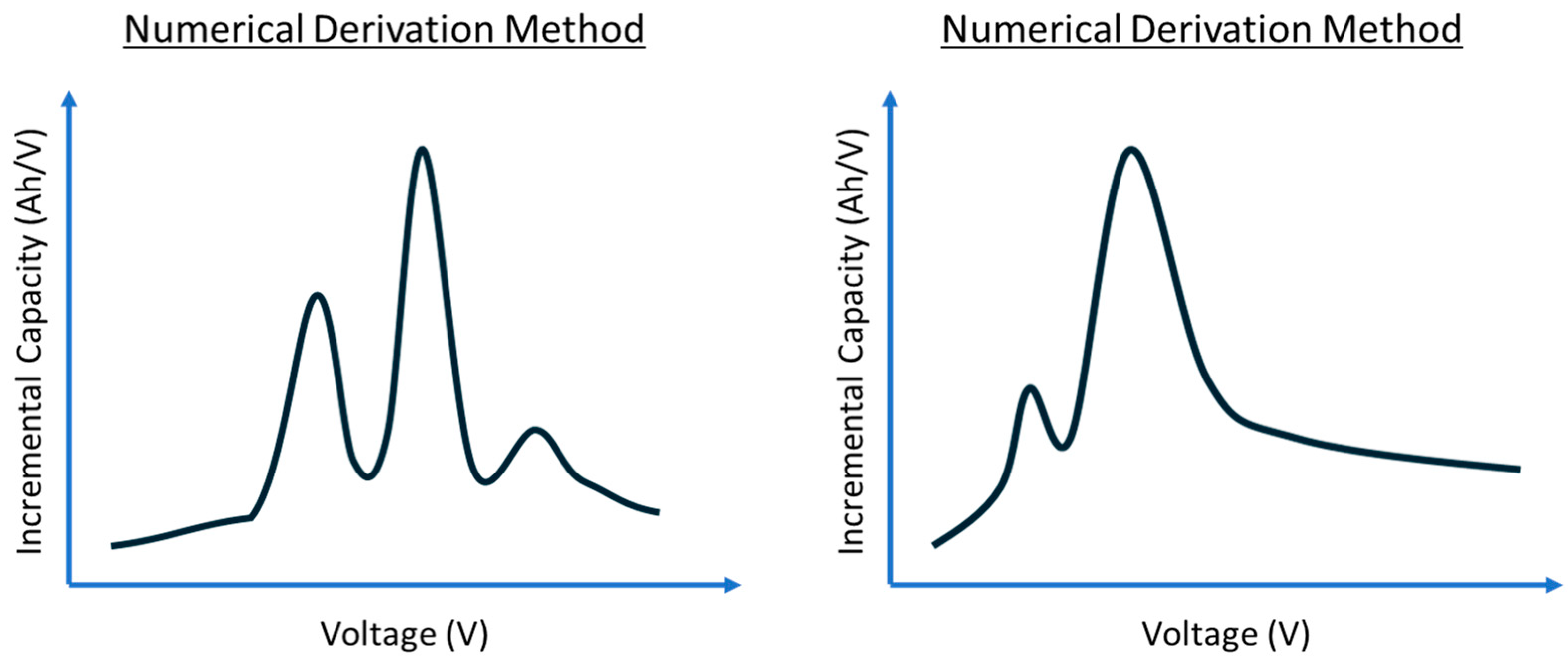
Figure 1 below shows a representational sketch of the results from Refs. [
17,
20] with two examples of IC curves being generated from the numerical derivation method. Both curves use the same calculation method; however, the curves generated are dissimilar in the number of peaks and troughs, along with the values of the axis. The reasonings for this will be explained in the following sections.
Some studies use numerical derivation as a baseline for adopting new methodologies. Ref. [
32] calculated the IC curve by first employing a parametric open-circuit voltage (OCV) model to describe the relationship between the battery voltage and the state of charge (SOC). From this, the differential capacity is then calculated using numerical derivation to transform the voltage–SOC data into an IC curve. Additionally, reference [
33] used the numerical derivative in conjunction with a specialized algorithm such as support vector regression to conduct an ICA on partial charging data.
Another observable parameter that can be captured in the measurement system is temperature. Not all authors use this in their analysis. By using temperature as the main parameter of interest, reference [
18] used a numerical derivative with the battery surface temperature to calculate differential temperature (DT) curves. In this study, a DT analysis was used as a comparison to the ICA with similar outcomes. The equation defined for this calculation is represented by Equation (5) below, where K, L, and T are defined as the Kalman gain, sampling intervals, and battery surface temperature, respectively. T(k) is the temperature measurement at the current time step ‘k’. T(k − L) is the temperature measurement of the battery surface, ‘L’ time steps before the current time step ‘k’.
Ref. [
27] discusses three methods: polynomial curve fitting, point counting, and a neural network model. Polynomial curve fitting uses the numerical derivative with a fitting function to calculate the IC. This equation from the study can be described below, where n, Q, and V are the polynomial order number, capacity, and voltage. A 16th-order polynomial is stated to be selected in this study to create a balance between overfitting and underfitting.
The point counting method takes the entire voltage range of the battery’s charge or discharge curve and divides it into several smaller voltage intervals, referred to as dV. The numerical derivative of the capacity with respect to the voltage is then calculated within these intervals. Refs. [
8,
9,
15,
16,
21,
22,
23,
24,
26] utilized this approach to generate their IC-DV curves. These calculations typically require entire cycles of data where the battery charging capacity and voltage should be known to calculate the IC [
25].
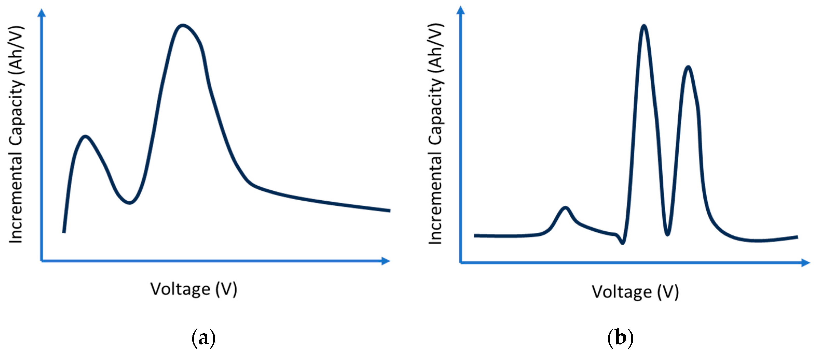
Figure 2 below shows a sketch of a comparison from reference [
27], which compared the difference between an IC curve derived from the polynomial curve fitting method (16th-order polynomial) and point counting method (where dV intervals of 1, 5, and 10 mV were explored).
Refs. [
36,
37] used the point counting approach slightly differently by using depth-of-discharge (DOD) intervals instead of dV intervals. Ref. [
36] used 0.5% DOD intervals, leading to approximately 200 points of data available for each derivative calculation. This was carried out to calculate the DV curves. Furthermore, [
39] used the point counting method with manual adjustments of intervals of 20, 40, 60, and 80 data points to calculate the IC to achieve an online SOH estimation. Ref. [
31] used SOC intervals instead. Additionally, the point counting method was used with interpolation to gain additional data points for the OCV curves. For this study, instead of calculating the IC or DV, we use differential capacity and differential voltage (DC/DV) for the analysis. Lastly, for point counting, reference [
38] generated IC-DV curves by examining the relationship between the charge, Q, and the pseudo-open circuit voltage, pOCV, where the pOCV is the terminal voltage as calculated under unstable conditions. The point counting method is not used, but instead, we use the gradient function of Q relative to pOCV for the IC curve and pOCV relative to Q for the DV curve. Equations (7) and (8) explain this below.
Recent advancements have seen machine learning (ML) approaches becoming more popular. Ref. [
27] highlighted an approach where neural network models are employed for IC curve generation. The proposed methodology was compared against the point counting and polynomial curve fitting method and was claimed to approximate the numerical derivative whilst keeping a smooth curve. Ref. [
34] transformed the voltage-capacity discharge curve to calculate the IC. This was published as fitting the raw data to a spline function and linearly interpolating it before applying machine learning tools to both predict and classify the cells by cycle life.
Ref. [
27] used the point counting method for calculations. However, in their study, they also attempted using the genetic algorithm to reconstruct the IC curves online, but ultimately struggled with this approach due to the computational power required. This underscores a significant challenge in using ML in this field. Despite its advanced capabilities, ML requires substantial computational resources, especially for tasks like real-time data processing. Furthermore, ML requires extensive and high-quality training data, which can be difficult to come across considering the different types of batteries and operational conditions. This suggests a need to generate a less computationally intensive IC-DVA methodology which can be deployed on any type of charge–discharge curve.
2.2. Filtering Methodologies
To use the IC-DV curves for analysis, there needs to be a clear visual understanding of the peaks and trends generated from the IC-DV calculations. To achieve this, there is a requirement for the IC-DV curves to be clear and smooth (to an extent) to make it easier to interpret the data and to avoid inaccurate diagnostics and prognostics. Many of the studies referenced above used a diverse range of filtering techniques to different effects. Deciding on the most optimal filtering technique is difficult as the choice of filtering can lead to over or under-fitting which can disturb the important features of the IC-DV curve.
A common technique being used in the above studies is using selected dV intervals during the point counting calculation method. The dV interval works as a filter by determining the resolution of the data it analyses. The dV interval segments the voltage range of the battery’s charge or discharge curves into smaller intervals. Then, it averages the data between each interval and uses them to calculate the IC-DV, essentially reducing the total number of points being used. Overall, this works as a sort of pre-processing method and ultimately smooths the curve.
As stated above, references [
4,
16,
22,
27] all used a dV interval of 5 mV as their threshold point. Reference [
23] has the smallest dV interval of 4 mV, whilst [
8] uses a range of 5 mV to 25 mV throughout the study. Reference [
24] used a dV interval of 10 mV, whilst [
26] used a dV interval of 20 mV. Reference [
26] trialed the use of both a Gaussian filter (GF) and moving average (MA) window before deciding through trial and error that a dV interval of 20 mV was the most optimal. Refs. [
9,
21,
31] also used dV intervals to proceed with the point counting calculation method, but they did not state the dV intervals used.
Similarly, [
25] trialed the use of two different filters—the MA and GF. Ultimately, the study chose the GF as it allowed for easier identification of the peak points from the IC curve. The GF is particularly effective in reducing high-frequency noise whilst preserving the edges of signals. In this case, the GF smooths the data by averaging each data point with its neighbors depending on the weighting determined by the Gaussian function. As the distance from the central point increases, the weight decreases following the Gaussian distribution curve. The Gaussian function is generally represented as shown in Equation (9), where G(x), x, and σ are the Gaussian function, distance from the mean, and the standard deviation, respectively [
40].
On the other hand, the MA filter is a simpler method of smoothing the data by averaging a set number of data points. The filter takes a specified number of sequential data points, determined as the window size, calculates their average, and assigns this value to the central point of the window. The process is then repeated as the window moves across the dataset. The MA function is typically represented as shown in Equation (10), where MA
t, N, and x
i+j are the moving average at time, t (output signal), the fixed window size, and the initial input sample signals [
25,
40].
Ref. [
39] first used the MA to smooth the battery voltage and capacity data and then employed empirical mode decomposition before the numerical derivative was applied. Ref. [
32] first adopted the use of third-order polynomial curve fitting on the raw data curve before it used a moving average window to smooth the final data. Similarly, Ref. [
27] also adopted polynomial curve fitting and compared it against the point counting method, numerical derivation method, and its own neural network model.
Both references [
36,
37] opted to use the Microsoft Excel forecast function for filtering the discharge data. This filter works by interpolating the cell capacity and voltage at evenly spaced %DOD intervals. This helped to average out the noise whilst accentuating the peaks. Following the initial filtering, it also uses a moving average of window size of 5 to further smooth the curve. Ref. [
5] used the filtfilt() filter from MATLAB due to its simplicity and ability to offer comparable smoothing effects. The filtlfilt() filter performs zero-phase digital filtering by processing the data both forwards and backwards to eliminate phase distortion. The syntax requires either the filter coefficients ‘b’ and ‘a’ or ‘sos’ and ‘g’ or a digital filter object (‘d’) to define the filter’s characteristics [
41]. The function first filters the input data forward, adjusts the initial conditions to minimize transients, and then filters it in reverse, effectively squaring the filter’s magnitude response and doubling the filter order. The filter implements the algorithm proposed in Ref. [
42]. This paper did not focus on the filtering methodologies and thus did not mention the filter characteristics used.
Additionally, Ref. [
18] employed a Kalman filter to obtain smoothed differential temperature curves. The Kalman filter is a recursive algorithm used to estimate the state of a linear dynamic system from a series of noisy measurements. It is complex and combines a prediction step, which estimates the current state based on previous steps, and an update step, which adjusts these predictions based on new measurements [
40].
Finally, Ref. [
17] used the Savitzky–Golay filter based on the local polynomial least square fitting method in the time domain. The Savitzky–Golay filter is designed to preserve important signal features, such as the relative maxima, minima, and width, which are often smoothed out by other types of filters such as the moving average. It works by fitting successive subsets of adjacent data points with a low-degree polynomial by the method of linear least squares. The equation is generally described as shown in Equation (11), where x
i+j, m, and c
j, are the data points in the window, the half-width of the window, and the convolution coefficients that correspond to the polynomial coefficients.
2.3. Comparison of Curve Shape and Features
IC-DV curves can generally be characterized as a series of peaks and valleys that are claimed to correspond to the electrochemical reactions occurring within a battery cell during charging and discharging cycles. These electrochemical reactions relate to the loss of active material (LAM), loss of lithium inventory (LLI), and conductivity loss (CL) [
15,
22]. These different peaks and valleys extracted from the filtered curves at each aging stage are generally extracted as health features (HFs) in the literature to be used in a comparison of evolving trends. A fresh battery often shows sharp and well-defined HFs, suggesting efficient electrochemical reactions. As the cell ages, these HFs are reported to change in amplitude, position, and magnitude [
5,
14,
38].
IC curves typically have a distinct bell or peak-like shape. The height and area of the peaks are related to the amount of charge a battery can hold. In comparison, DV curves generally exhibit inverse characteristics compared to IC curves. Whilst IC curves focus on peaks, DV curves tend to have troughs corresponding to the peaks of the IC curves. A comparison of how the IC and DV plots compare to each other can be seen in
Figure 3 below.
The impact of different filtering methods on the IC-DV curve can also be impactful on the number of health features evident. Not only that, but the magnitude of the constant current (CC) being used can make a difference on how smooth or sharp the curve is. Refs. [
25,
26] both showed the impact of the choice of filtering, comparing a noisy, unfiltered IC curve to the Gaussian and MA filters.
Figure 4 below shows the results from reference [
25] for the Gaussian and moving average filters.
Furthermore, Ref. [
31] compared what impact different C-rated CCs have on IC curve features by using CC ratings of 1A, 2A, and 4A. As the C-rating increased, the number of observed peaks decreased. Furthermore, reference [
34] utilized C-rates of 4C, 6C, and 8C and found that as the C-rate increased, the magnitude of the valleys became shallower.
Figure 5 below shows a representation of the results from reference [
34], where C-rates of 4C, 6C, and 8C are used.
The number of peaks or troughs being generated from the IC-DV curves also depends on the battery type or chemistry being used. For example, Refs. [
17,
26] both used the point counting method to calculate the IC curves. However, Ref. [
17] generated a curve which has two distinct peaks, whilst reference [
26]’s curve had two dominant peaks. Most references do not have the exact same IC-DV curves, but in general, a trend can be seen with the general shape of the curve along with the different number of peaks.
Figure 6 below sketches the general shapes and numbers of peaks from the different studies reviewed in this literature review.
For a better understanding of the number of health features identified in the literature,
Table 2 below summarizes the number of peaks and troughs found in the IC-DV curves from the literature.
The next section summarizes the battery types that are used in these tests. The HF above (number of peaks) was checked against the battery chemistry, and the number of reported HF is not consistent with the battery chemistry. Lithium iron phosphate batteries have between two and five HFs in common, whilst lithium nickel manganese cobalt batteries also have between two and five HFs in common.
2.4. Characterization Tests and Data Collection
There is a wide range of different batteries being used in the literature for IC-DVA. Generally, the batteries being used in these studies are fresh batteries and are cycled until their end of life (EOL). This allows researchers to provide a comprehensive review of the battery’s lifecycle by comparing the position of the IC-DV curves across every cycle. This method, as seen in references [
4,
5,
14,
15,
30,
31,
38], involves subjecting the batteries to repeated charge–discharge cycles under controlled conditions until a decline in performance is observed. Typically, two parameters which are monitored to determine this performance are capacity and internal resistance. Examples of this include Ref. [
14], which used a low current discharge experiment combined with a CC charge and discharge regime. Another example is Ref. [
5], which employed an aging test to simulate plug-in hybrid electric vehicle operating profiles to determine how the usage patterns impact battery life.
In addition to cycling tests, reference performance tests (RPTs) are conducted at regular intervals as part of these studies. These tests, as demonstrated in Refs. [
21,
28,
36,
37,
39], involve standardized procedures to assess parameters such as capacity, internal resistance, and efficiency at various stages of the battery’s life. For example, Ref. [
30] used hybrid pulse power characterization (HPPC) with a capacity test every 30 cycles to monitor the internal resistance and capacity. Similarly, Ref. [
27] also conducted HPPC and capacity test every 90 cycles.
Furthermore, studies have used several battery types including cylindrical [
14,
15,
24], prismatic [
8,
27,
30], and pouch cells [
18,
36,
39]. These different cell types also mean that their chemistries, capacities, and voltage ranges are likely different as well. The capacities of the batteries studied vary widely, ranging from as low as 0.4 Ah in Ref. [
37] to 60 Ah in Ref. [
4]. There are also a few different chemistries, including lithium iron phosphate (LiFePO4), lithium nickel manganese (NMC), and other varieties. The most typical voltage range found in the literature sits somewhere between 2.5 and 4 V, but the exact ranges can vary from study to study.
Table 3 summarizes the different types of batteries found in the literature.
Table 4 also looks at the number of batteries being tested on in studies on IC-DVA.
There is a wide range of different methods of calculating IC-DV curves, with different filtering, on different battery chemistries with different capacities and different packaging. Each publication appears to tweak the parameters to generate a curve that looks about right for their dataset.
There is no consistency of methodology and no easy way of ensuring repeatability or easy comparison with previous data. If this technique is to be useful, a standard method needs to be applied to all datasets.
3. Methodology
3.1. Data Processing Framework
The analysis was conducted using a script written in Python using the Jupyter Notebook (Version: 7.0.8) environment due to its ease of data manipulation and visualization. The script was designed to generate incremental capacity curves from battery cycle datasets. The script used several libraries for data processing, as shown below:
Pandas (Version: 2.2.2): A package for data manipulation and data analysis.
NumPy (Version: 1.26.4): Used for handling arrays and matrices.
Matplotlib (Version: 3.8.4): Used for plotting and handling visualizations.
Scipy (Version: 1.13.1): Used to apply the Gaussian filter and Savitzky–Golay filter and interpolate the data.
Sklearn (Version: 1.4.2): A package that provides the clustering for the K-means methodology.
The script used an input and output directory to streamline the workflow. The input directory held the designated CSV files which contained the battery cycling data, and the output directory was used to save processed data and IC plots if needed. The script first reads the CSV files using Pandas’ function and then segregates the data into charging and discharging subsets based on the current direction. Depending on the dataset available, the column variables for time, current, and charge can be used to calculate the cumulative charge (Ah), which is necessary for incremental capacity calculations. The column variables must be defined in the script as different datasets may have different column names. Any calculations made are saved in a new column to be utilized for IC curve generation. For the curves generated in the following section, only the IC curve has been looked into being generated and utilized the positive charging data from the datasets used in this study.
3.2. Calculation and Filtering Methodologies
The Methodology Section of this study focuses on evaluating different calculation methods and filtering techniques for generating IC-DV curves. From the literature presented above, the chosen approaches aim to establish a reliable and repeatable process that reduces variability in the generation of these curves.
In this research, five different calculation methods were investigated based on the literature review. Numerical derivation stands out as a commonly used technique, offering a direct way to determine the differential change in battery capacity against voltage using discrete data points. To carry this out, the script sorts the data by voltage and then calculates the difference in charge (dQ) divided by the difference in voltage (dV).
Point counting is the second method explored, and it involves grouping the voltage domain into smaller intervals before differentiating. To carry this out, the script iteratively goes through the voltage data and notes when there is a change in voltage denoted by the chosen ‘dV interval’. In this case, the ‘dV interval’ can be used as a sort of pre-processing step on the data to filter out voltage fluctuations. All of the data between the first data point and the following point where the ‘dV interval’ change has been noted are grouped into one voltage group, and then this process is carried out until the end of the dataset. The mean of all of the voltage points and the last value of the cumulative charge (Ah) value found in each voltage group is calculated and is then used to calculate the derivative (dQ/dV).
The central difference method looks to provide a balance between raw details and over-smoothing. The script applies this method to calculate the derivative of the charge with respect to voltage using the formula below, where Q is the charge, V is the voltage, and ΔV is the voltage increment between data points. This method takes the average of the slops on either side of a data point, which helps smooth out the curve by minimizing the noise that can affect forward or backward calculation methods.
The fourth and fifth methods utilize the numerical derivation method, but instead of using the raw data, they attempt to try different ways of pre-processing the data first. The first combination involves interpolating the data and then using the numerical derivation method. The interpolation is carried out on the voltage data to create a continuous function, which allows for the calculation of derivatives at any chosen voltage point. This creates uniform voltage increments across the entire voltage range.
The fifth method instead employs a K-means clustering algorithm to segment the voltage data into clusters prior to calculating the derivative. This way, the script identifies groups of data points that are statistically similar and then calculates the mean charge within each cluster before differentiating. This approach looks to minimize the impact of anomalies.
The literature review identified the moving average (MA) and Gaussian (GS), Kalman (KN), and Savitzky–Golay (SG) filters as the most employed techniques for refining data in preparation for the IC-DV curve analysis. Many references also employ the dV interval as a form of pre-filtering, so this will also be investigated through the point counting method in this study. These filters are selected for investigation for their effectiveness in various research contexts whilst also being able to refine the data and keep the main health features of the IC-DV curves.
Using the Jupyter Notebook to implement this script offers flexibility and interactivity when trying to determine which calculation and filtering method is most effective. The parameter choices for the filters will be investigated through trial and error to determine the effect it makes on the smoothing of the IC curve. The parameters being investigated are the window size for the moving average filter, the combination of the polynomial order and window length for the Savitzky–Golay filter, the sigma value for the Gaussian filter, and the dV interval size for the point counting method.
3.3. Data Collection
This research leverages three distinct datasets to assess the effectiveness of each IC curve calculation method and the impact of different filtering techniques for curve generation. Each dataset provides a different battery type and different cycle descriptions. The first dataset is the Oxford battery degradation dataset [
45]. This dataset was obtained through long-term testing until the EOL of eight Kokam Li-ion pouch cells, each with a capacity of 740 mAh. These cells underwent characterization tests after every 100 drive cycles based on the Urban Artemis driving profile. The parameters measured during these cycles included the time, voltage, charge, and temperature. The tests were conducted in a Binder thermal chamber at a consistent temperature of 40 °C. Parameters measured included cycle numbers, timestamps, charge (mAh), and temperature (°C).
The second dataset utilized in this study was the battery lifecycle dataset from Nature [
34]. This dataset consisted of a total of 124 lithium-ion phosphate (LFP) cells manufactured by A123 systems (APR18650M1A) and cycled on a 48-channel Arbin LBT potentiostat with a forced convection temperature chamber set to 30 °C until reaching their EOL. The cells underwent fast-charging protocols that adjusted the charging current based on the SOC, aiming to enhance the charging efficiency and longevity of the batteries. Each cell had a nominal capacity of 1.1 Ah and a nominal voltage of 3.3 V. Parameters measured included detailed logs of cycle numbers, time (minutes), voltage (V), current (A), temperature (°C), and charge (Ah).
The final dataset was a personal dataset cycled on a tested Chroma 17011 battery tester. The batteries being cycled included second-life 66 Ah Li-ion prismatic cells [
2], which were subjected to the same testing as use case 6 in reference [
46]. This involved simulating the process of using the battery in a day-ahead market participation scenario which agrees on auction prices 24 h in advance for one-hour periods. The battery is managed to absorb energy when prices are lower than a set lower limit and release energy when prices are higher than a set upper limit. The data were collected from September 2021 to July 2023. The Chroma battery tester sampled the data approximately every 3 s. The parameters measured were time (ms), voltage (V), current (A), capacity (Ah), temperature (°C), cell 1 voltage (V), and cell 2 voltage (V). The summary of each dataset can be found in
Table 5 below.
Each dataset was found available in CSV files and was processed using the Python script in the Jupyter Notebook to determine the differences and correlations between the different methodologies and datasets.
4. Results and Discussion
4.1. Overview and Challenges
This section presents the results from the application of the five calculation methodologies and three different filtering techniques to generate IC curves for Li-ion batteries. The issues found when generating these curves are also highlighted and discussed, and the output results are examined to determine which process should be adhered to for generating incremental capacity curves.
Each calculation methodology was tested for its ability to produce clear, interpretable IC curves that reliably reflect the behaviors of the batteries. Upon experimenting with different datasets for generating these curves, a key challenge found was related to the type of data available. Using an example dataset from the ‘NASA Battery Dataset’ [
47], the set of batteries underwent repeated charge and discharge cycles and used constant–current (CC) and constant–voltage (CV) for their cycling. When attempting to plot the IC curves using only the charging portion of the cycle data, it was noted that the results introduced a lot of noise, leading to less significant health features, as shown in
Figure 7a below.
Upon further investigation, it was noted that this issue was arising due to most of the charging regime being performed under CV conditions. When focusing on only the CC portion of the charging, the noise visible in the curve was reduced drastically, but due to the limited number of data points available, it was not possible to generate a full IC curve, as shown in
Figure 7b below. This shows the need for the datasets being used for ICA to have a large number of datapoints that have undergone CC charging or discharging periods to generate meaningful IC curves.
Furthermore, further complications arose from the variations in data quality and parameter measurements across different datasets. In the case of the Oxford and Nature battery datasets, direct measurements of charge (Ah) were available, which made calculating dQ/dV straightforward. However, in the case of the NASA dataset where the charge (Ah) was not directly measured, the charge had to be derived from the current and time measurements. When manually calculating the charge, potential errors arose due to measurement noise in the current and time data, variations in the sampling rate and resolution, and integration inaccuracies. These fluctuations and calculation errors can distort the calculated charge, affecting the accuracy of the dQ/dV calculations. Consequently, this can lead to less reliable analysis and interpretation of the battery’s performance. In the case where these parameters need to be calculated, there is a clear need to have clear descriptions of how the parameters were measured and what sampling intervals were used to be able to reduce calculation errors.
4.2. Oxford Dataset Results
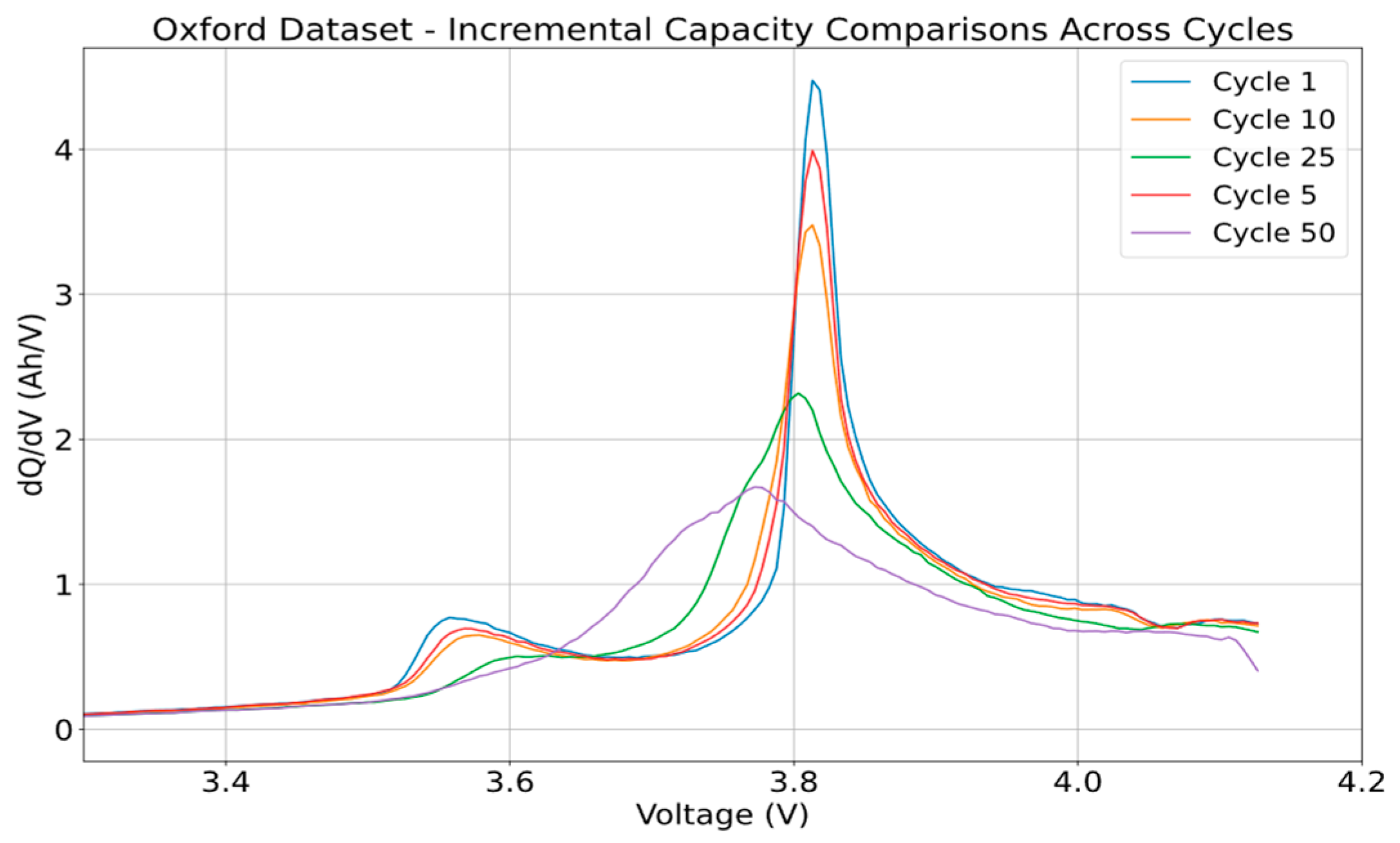
The Oxford dataset gave a clear look at how five different ways of generating IC curves can be carried out. The dataset provided multiple cycles of repeated charging and discharging of eight different cells. For this research, cell 6 and cycles 1, 5, 10, 25, and 50 were investigated with the different calculation methodologies and filters.
Figure 8 below shows the curve generated using the point counting method and shows how the curve’s shape changes as the cycles increase.
Figure 9a below shows a comparison of all five calculation methodologies on one plot. As can be seen on the plot, the numerical derivation method results in a plot with significant noise. This method exhibits the highest variability and noise with a variance of 34.39 and a standard deviation of 5.86. Furthermore, this method also shows a wide range in values, with a maximum value of 56.61 and a minimum of −25.73, further emphasizing the noise and variability. This noise and variance arise from the method’s high sensitivity to minute fluctuations in the data. As it is calculating the derivative by examining the change in charge with respect to the change in voltage for every data point, it turns even the slightest variations in the voltage data, which could have occurred from measurement inaccuracies, noise, or battery responses, into pronounced peaks and dips in the resulting curve. This means that the resulting plot can become very noisy, and thus, heavy smoothing of the data is required to provide meaningful IC curves.
Figure 9b compares the methods again but removes the numerical derivation comparison to highlight the differences between the other methodologies.
In contrast, the point counting method demonstrates a much lower variance value of 0.54 and a standard deviation of 0.73. The peak produced is clear and prominent, with a maximum peak height of 5.43, which is much lower than the maximum value obtained using the numerical derivation method. In terms of the percentage differences, the point counting method produced values that are, on average, 53.82% higher than those of the numerical derivation method. This could also be backed by the fact that the numerical derivation method produces both negative and positive values, causing the average value to be lower than that of the point counting method.
By averaging the data within discrete voltage intervals before calculating the derivative, the point counting method effectively smoothens the IC curve. This smoothing process reduces the effect of random data fluctuations, providing a clearer and more coherent view of the battery’s characteristics. However, the selection of the ‘dV interval’ in the point counting method plays an important role in the quality and interpretability of the IC curve.
Figure 10 below shows how different ‘dV intervals’ lead to curves with varying degrees of smoothing and detail.
As seen in the figure, the smaller ‘dV interval’ of 1 mV introduces a lot of noise with plenty of jagged spikes in the curve. This makes it much more challenging to discern clear trends in the data. However, on the other hand, too large of a ‘dV interval’, such as 10 mV, reduces the peak height of the curve too much, essentially over-smoothing the curve. Therefore, the choice of the ‘dV interval’ must be made appropriately to find a balance between over-smoothing and under-smoothing the battery’s characteristics. In this case, a dV interval of 5 mV is determined to be suitable for smoothing out the noise without compromising the integrity of significant health features in the curve.
The central difference method provides a less smoothed curve than the point counting method with more visible fluctuations in the data, although these fluctuations do not have a large impact on the overall trend in the data. In fact, it demonstrates a low variance of 0.55 and a standard deviation of 0.74, helping it produce clean and consistent curves. However, the peak height is lower than that of the point counting method, with a value of 5.16, which could be a significant difference for determining the SOH or degradation of the battery. The percentage difference analysis also showed an average difference of 66.19% compared to the numerical derivation method, confirming the cleaner and higher values generated using this method.
The interpolation + numerical derivation and the K-means + numerical derivation methods, as observed in the plot, present very similar IC curves. Both methods pre-process the data before the numerical derivation is performed, which significantly enhances the legibility of the curves compared to the raw numerical derivation method. In a direct comparison between the pre-processing steps, both the interpolation step and the K-means step seem to have a negligible impact on the final output IC curve being generated. This is backed by both methods having the same performance with variance and standard deviation values of 0.46 and 0.47, respectively. This highlights the need to pre-process the raw data before applying any derivations to the data to remove the noise and any data anomalies. The peak analysis shows a maximum height of 5.16, producing the same peak value as the central difference method. However, the percentage difference analysis shows an average difference of −213.51% compared to the numerical derivation method, indicating similar behavior when yielding a lower value.
The choice of filtering for post-processing the IC curve has a significant impact on the interpretability of the IC curves.
Figure 11 below compares the different methods of filtering and the effect they are on the IC curve from the Oxford dataset. The calculation methodology used for generating this plot was the point counting methodology.
All of the filters effectively reduced the amount of noise found from the curve. The original data produced variance and standard deviation values of 0.50 and 0.70, respectively. The Gaussian filter provided the most significant reduction with a variance of 0.39 and a standard deviation of 0.62. The Savitzky–Golay filter resulted in a variance of 0.43 and a standard deviation of 0.66, whilst the moving average filter showed a variance of 0.41 and a standard deviation of 0.64.
The percentage difference analysis showed that the Savitzky–Golay filter had the smallest mean percentage difference from the original data at −1.94%, suggesting it preserves the original signal characteristics better. In contrast, the Gaussian filter had a mean percentage difference of −3.68% and the moving average filter had a difference of −9.16%. The standard deviations of the percentage differences were the highest for the moving average filter at 48.35% and the lowest for the Savitzky–Golay filter at 18.75%.
Regarding the peak heights, the original data had a maximum peak height of 6.38. The Savitzky–Golay filter kept the highest peak height of 4.02, indicating that it retains significant features of the original peaks whilst smoothing the data. The Gaussian filter resulted in the lowest filtered peak height of 3.46, and the moving average filter resulted in a maximum peak height of 3.73, showing effective smoothing.
The moving average filter is a straightforward approach to smoothing by averaging neighboring points. However, this method can provide a less smooth approach, showing sharper edges on the curve and potentially flattening out the peaks, which could hide some important features. Overall, the Savitzky–Golay filter appears to be the most desirable method for this dataset due to its ability to balance noise reduction and signal preservation. It maintains a small percentage difference from the original data whilst reducing variance and standard deviation and retains the highest peak height.
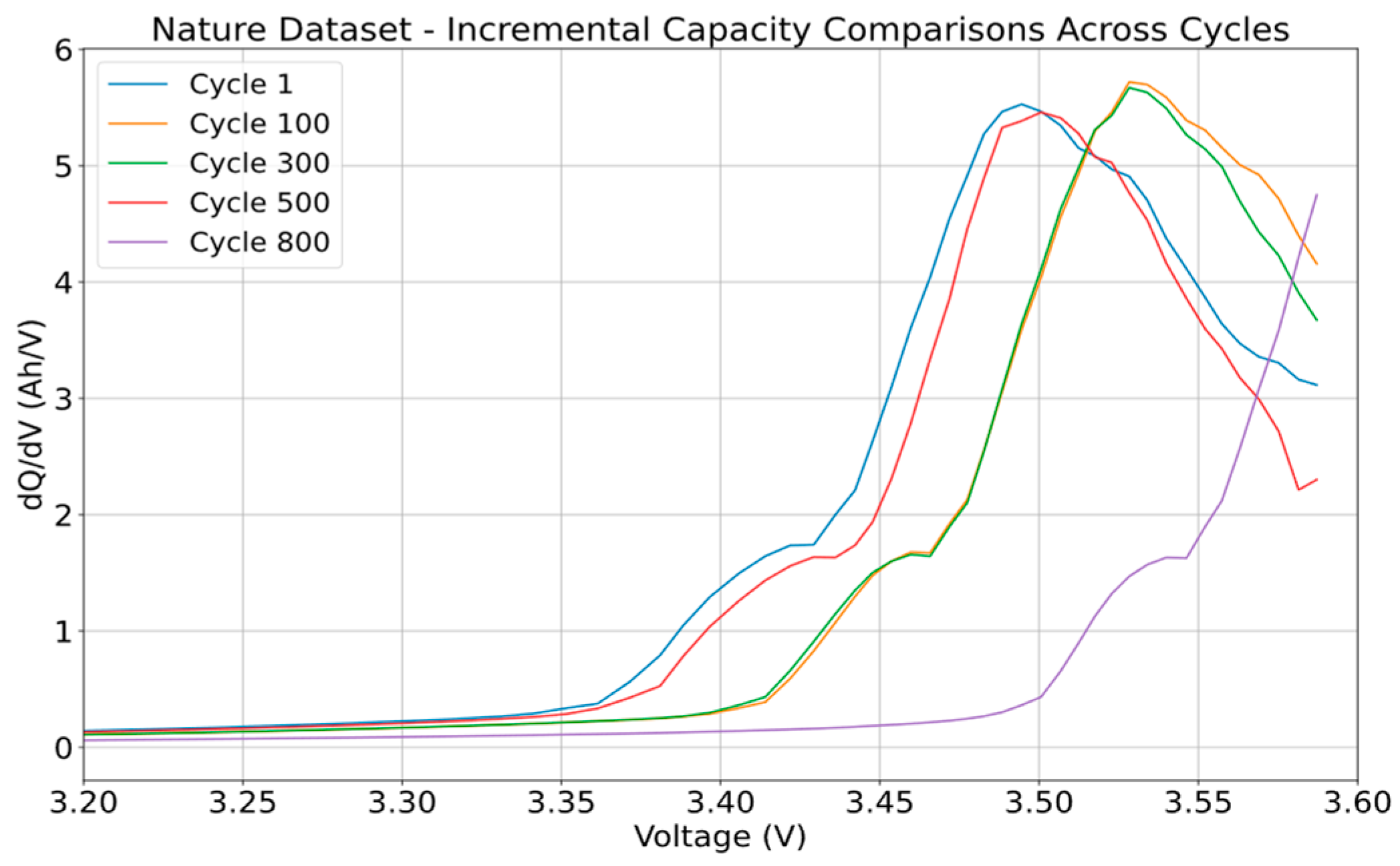
4.3. Nature Dataset Results
The Nature dataset consists of 124 commercial Li-ion cells cycles to failure under fast-charging conditions. In this research, a random cell was chosen from the batch, labeled ‘Batch 1—12 May 2017’. This cell was for channel 6, and cycles 1, 300, 500, and 800 are displayed in
Figure 12, using the point counting method to show how the curve shifts as the cycles increase. The dataset followed a cycling process of 4C-charge, followed by 1C-charge and 4C-discharge. For this testing process, the script only utilized 4C-charge for generating the IC curves.
Cycle 100 of channel 6 was also chosen to investigate the differences between the calculation methodologies and filtering methodologies made on the IC curve.
Figure 13 shows a comparison of the five calculation methodologies.
Looking at the curve generated through the numerical derivation method for the Nature battery dataset, the resulting curve showcases a pronounced peak that likely responds to the SOC or specific reactions within the battery. However, this method shows substantial variability produced in the peak, with a variance of 5.24 and a standard deviation of 2.29, suggesting that the method has high sensitivity to variations in the raw data. This noise makes it harder to accurately pinpoint the location of the peak, thus possibly reducing the understanding of the battery’s health and operational characteristics. This method also shows a wide range in values, with a maximum of 6.35 and a minimum of 0.00034, further emphasizing the noise and variability. For the numerical derivation method to be utilized, it needs a filtering process to help clarify the peak’s features.
The point counting method exhibits better peak definition with a lower variance of 3.20 and a standard deviation of 1.79. However, before and after the peak, the curve exhibits a series of visible spikes which could show an issue with how the data are being handled. These spikes can indicate that the point counting method requires further smoothing for it be a suitable methodology that can achieve a balance between detail retention and noise reduction. The peak height analysis reveals that this method captures significant features with a maximum peak of 5.96. In terms of percentage differences, the point counting method values are, on average, 2.97% higher than those of the numerical derivation method.
Figure 14 below shows the differences between the choice of ‘dV interval’ with the ranges of 1 mV, 5 mV, and 10 mV.
As shown, the choice of the ‘dV interval’ is a key decision in the point counting method and can significantly influence the IC curve’s clarity and accuracy. Using an interval of 1 mV retains a high level of detail but includes too much noise. The literature typically uses a 5 mV interval for this method, but in this case, even a 5 mV interval still introduces noise, with only the 10 mV interval leading to a smooth IC curve.
Figure 13 also shows the IC curve generated through the central difference method. This method demonstrates a low variance of 4.22 and a standard deviation of 2.05. Visually, the IC curve generated shows a ‘step’-like characteristic, deviating from the expected smooth curve. This stepped appearance implies that this method has a very high sensitivity to noise in the raw data, which results in overly magnifying small fluctuations. The peak height analysis showed the curve to have the highest height of 6.70; however, this peak seems to be more of an outlier in comparison to the other methods. The percentage difference analysis shows an average difference of 68.09% compared to the numerical derivation method. Overall, this suggests that the central difference method in the application to this dataset might not be the best at effectively generating IC curves if the goal is to offer a clear and continuous understanding of the battery’s operation health.
The IC curves generated by both the interpolated + numerical derivation method and the K-means + numerical derivation method show a notable similarity in their profiles. This suggests that the preprocessing step, whether it be interpolation or K-means clustering, is effective in conditioning the data for the numerical derivation process. When generating the output IC curve, the curve for both methods follow each other in the same manner and do not exhibit significant noise or fluctuations, showing that a preprocessing step helps to create a more accurate representation of the battery’s health.
The interpolated + numerical derivation method has a variance of 1.80, a standard deviation of 1.34, and a maximum peak height of 5.67. In comparison, the K-means + numerical derivation method displays similar values of a variance of 1.83, a standard deviation of 1.35, and a peak height of 5.67. The percentage differences for the largest values calculated compared to the numerical derivation method for the point counting, interpolated + numerical derivation, K-means + numerical derivation, and central difference methods produced results of 06.53%, −11.96%, −11.96%, and 5.26%, respectively.
From the analysis of the five different methodologies, it is seen that apart from the preprocessing + numerical derivation combination, the other methodologies require further processing with filtering to reduce the noise displayed in the curve.
Figure 15 below shows the results of applying the Savitzky–Golay filter to all five calculation methods and compares them against each other.
As seen from the filtering, it is evident that once the Savitzky–Golay filter is applied as a post-processing step, the numerical derivation, point counting, and numerical derivative combination methodologies produce similar outputs. However, the central difference method remains an exception. Even after the application of the filter, the curve retains its distinct ‘stepped’ nature. Although the peaks are less jagged, the method still appears to accentuate minor variations in the data, possibly not giving a true representation of the battery’s condition, showing incompatibility with this dataset compared to the other methods. Furthermore, the point counting method also seems to have a slightly extended trajectory, suggesting that it retains more data points, which gives more information about the battery. This could be advantageous for analyzing the battery’s condition using IC curves.
Figure 16 below further investigates the choice of filtering by comparing the Savitzky–Golay, Gaussian, and moving average filters.
The variance and standard deviation of the original data were 3.09 and 1.76, respectively. Among the filters, the Gaussian filter showed the lowest variance of 3.00 and a standard deviation of 1.73, indicating the smoothest data. The Savitzky–Golay filter closely followed the original data with a variance of 3.09 and a standard deviation of 1.76. The moving average filter had a slightly higher variance of 3.15 and a standard deviation of 1.77.
The percentage differences further highlighted these effects. The Savitzky–Golay filter had the smallest mean percentage difference compared to the original data at −1.27%, while the moving average filter had the largest mean percentage difference at −24.95%. This indicates that the moving average filter significantly altered the data, whilst the Savitzky–Golay filter made minimal changes.
Examining the peak heights, the original data showed varied peaks, with the highest peak of 5.55, although the figure shows a noisy spike just under 6. The Savitzky–Golay filter preserved multiple peaks but slightly reduced their heights, with a filtered peak height maximum of 5.72. The Gaussian filter showed fewer peaks with a maximum height of 5.52, indicating more aggressive smoothing. Similarly, the moving average filter resulted in fewer but higher peaks, with a maximum height of 5.68. This suggests that the Savitzky–Golay filter provided a balanced approach, maintaining the integrity of the data while reducing noise.
4.4. Loughborough Dataset Results
The Loughborough dataset used in this analysis consisted of data collected from September 2021 to July 2023. The dataset consisted of a single prismatic SLB. Four recorded datasets were taken at different times within this period. The cycling process followed the day-ahead market participation scenario found in reference [
46]. For this study, the charging sections of the datasets were utilized to generate the IC curves.
Figure 17 below shows the curve generated for the four recorded datasets using the point counting method and shows how the curve’s shape changes over time.
For further investigation, the first dataset from September 2021 was selected to examine the impact of different calculation and filtering methodologies on the IC curve. Cycle 3 from this dataset was chosen due to cycle 1 and cycle 2 not having sufficient data points for generating IC curves. Cycle 1 contained 756 data points, cycle 2 contained 440 data points, and cycle 3 contained 1201 data points for the charging period.
Figure 18 compares the IC curves from cycle 1 and cycle 3. In these figures, it is evident that cycle 1, with insufficient data points, lacks distinct features and appears simplified. In contrast, the curve from cycle 3, with over 1000 data points, shows more detailed and distinct features, highlighting the importance of having an adequate number of data points for accurate IC generation.
Furthermore, when using the CV-only data for IC curve generation, significant issues appeared with the K-means method. The primary problem with this is that the input data are too sparse, resulting in only one data point being available while attempting to form multiple clusters. This insufficiency in data points is due to the voltage difference being minimal between data points due, with many data points having identical voltages, preventing the formation of distinct clusters. This analysis reveals that using CV data alone is inadequate for generating reliable IC curves. Moreover, when combining CC-CV data, the resulting graph results in unexpected noise, resulting in illegible curves. This can be seen in
Figure 19 below, where the resulting spike from the CV-charging phase causes the
y-axis to scale to over 2500 (Ah/V).
Figure 20a shows a comparison of the five calculation methodologies on the September 2021, cycle 3 dataset.
Figure 20b also compares the methods again but removes the numerical derivation comparison to provide a clearer view of the remaining methodologies.
Looking at the curves generated, the numerical derivation method exhibits substantial variability and noise, with a variance of 3721.66 and a standard deviation of 61.00. These metrics indicate a significant level of noise, as confirmed by the visual noise on the curve, particularly at higher voltage levels, rendering the curve almost unreadable. This method also shows a wide range in values with a maximum of 476.00 and a minimum of 1.18, further emphasizing the variability.
The point counting method retains the most data, as evidenced by the curve extending further down after the peak. It demonstrates a smoother and consistent curve, capturing the essential features, but it still has noise, indicating the need for further post-processing filtering. The variance for this is much lower at 410.20 and has a standard deviation of 20.25 compared to the numerical derivation method, suggesting a cleaner and more consistent curve. Visually, a clear and prominent peak is shown with a maximum peak height of 92.06. In terms of percentage differences, the point counting method values are, on average, 30.10% higher than those of the numerical derivation method.
Figure 21 below shows the differences between the choice of ‘dV interval’ with the ranges of 1 mV, 5 mV, and 10 mV.
As shown, the choice of the ‘dV interval’ is important for the point counting method, influencing the clarity and smoothness of the curve generated. Using a 1 mV interval introduces too much noise, and increasing it to 10 mV does not significantly reduce the noise. Therefore, a 5 mV interval, as commonly used in the literature, is still recommended.
The IC curve generated using the central difference method continues to produce a step-like nature in the curve, deviating from the expected smooth curve. This step-like appearance, along with significant noise, suggests that this method fails to capture the smooth transitions and peaks accurately, reducing its effectiveness for producing clear IC curves. This method demonstrates a moderate variance of 365.83 and a standard deviation of 19.13. The peak height analysis shows a maximum height of 78.47, and the percentage difference analysis shows an average difference of 57.03% compared to the numerical derivation method.
Figure 20b also shows the IC curve generated by both the interpolated + numerical derivation method and the K-means + numerical derivation method. Both curves are visually very similar, supporting the theory that preprocessing is important, though the specific preprocessing technique may not significantly impact the results. However, both methods also introduce considerable noise, as indicated by the rapid spikes between the first and second peak. The interpolated + numerical derivation method performs slightly better with a variance of 292.11 and a standard deviation of 17.09 compared to a variance of 304.47 and a standard deviation of 17.44 for the K-means + numerical derivation method. The peak height for both methods were 84.39 and 92.27, respectively. Both methods also showed similar large average percentage differences of −327.80% and −321.28%, respectively, indicating similar behavior in yielding lower values compared to the numerical derivation method.
From the analysis of the five different methodologies, it is seen that all five methodologies require further processing with filtering to reduce the noise in the curve generated. However, due to the excessive noise from the numerical derivative,
Figure 22 below shows the results of applying the Savitzky–Golay filter to the remaining four for comparison.
As seen from the filtering, the central difference method deviates the most from the other methodologies. The step-like nature is still evident and produces higher peaks than normal. The point counting method continues to retain the most data; however, the point counting and numerical derivation combination methodologies produce similar outputs.
Figure 23 below further investigates the choice of filtering by comparing the Savitzky–Golay, Gaussian, and moving average filters.
In the analysis of the different filtering methods, the original data show a variance of 343.21 and a standard deviation of 18.53. The Savitzky–Golay filter slightly reduces the variance to 339.77 and the standard deviation to 18.43, indicating a minor smoothing effect. The Gaussian filter exhibits a similar smoothing effect with a variance of 339.64 and a standard deviation of 18.43. Conversely, the moving average filter increases the variance to 369.76 and the standard deviation to 19.23, suggesting that it introduces more noise compared to the other filters.
When comparing the percentage differences, the Savitzky–Golay filter demonstrates a mean percentage of −1.09% with a standard deviation of 11.15%, while the Gaussian filter shows a mean percentage difference of −1.43% and a standard deviation of 11.80%. The moving average filter has a higher mean percentage difference of −5.66% and a standard deviation of 14.30%, reinforcing that it alters the data more significantly.
The peak height analysis reveals that the original first peak height reaches a maximum of 48.52, although a noise spike can be seen reaching over 50 Ah/V. The Savitzky–Golay filter smooths these peaks, producing filtered peak heights up to 50.77. The Gaussian filter, which focuses on more significant smoothing, has filtered peak heights of up to 47.28. The moving average filter also smooths the data but retains more of the original peak characteristics with filtered peaks of up to 47.78.
While all filters smooth the data to some extent, the Savitzky–Golay and Gaussian filters provide a balanced approach by reducing the variance and standard deviation with a minimal impact on the data’s integrity. The moving average filter, although it retains more peak characteristics, introduces additional noise, making it less desirable for this dataset. Therefore, the Savitzky–Golay and Gaussian filters are more effective for the Loughborough dataset.
4.5. Impact of Methodology on State of Health
In this section, the analysis focuses on how the different methodologies for generating IC curves affect the estimation of the SOH using the results from the Nature dataset. Specifically, the IC curve is utilized to estimate the SOH by calculating the area under the curve and the maximum location of the peak. These two features are extracted to create the IC curve metrics of the SOH—the area under the curve (AUC)%, SOH (peak)%, weighted SOH%, and the combined SOH%—which help determine the differences between methodologies. The 1st and 1000th cycles of channel 6 of the Nature dataset are used to display these differences, where the 1st cycle can be used as a reference point to where the battery is new, and the 1000th cycle is closer to the battery’s end of first life, showing higher degradation.
The SOH (AUC) is calculated by deriving the area under the cure of the IC plot. The AUC provides an integrated measure of the battery’s performance over a range of voltages. The AUC is calculated using the trapezoidal rule, using the ‘numpy.trapz’ function in Python, and approximates the area under a curve by dividing it into trapezoids and summing their areas. As a battery ages, the AUC is expected to decrease due to the loss of active material and increased internal resistance, making it a common IC feature for SOH estimation [
13,
48].
The SOH (peak) is derived from the maximum peak height of the IC curve. The peak height is identified by detecting the highest point on the dQ/dV curve. In this analysis, this is achieved using the ‘scipy.signal.find_peaks’ function, which locates all local maxima in the data. The highest peak is then selected for comparison against the reference first-cycle IC data. As the battery degrades, it is expected that the peak height diminishes, reflecting capacity fade and increased impedance [
36,
37]. The weighted SOH combines the SOH (AUC) and SOH (peak) data using a weighted average, providing a more balanced assessment of the SOH estimation by averaging both metrics.
Table 6 below summarizes the impact each calculation methodology has on the SOH estimation.
The calculated SOH varies between 63.7% and 79.8% depending on the method of analysis and SOH metric chosen. This is quite widespread for the same dataset. This variation means that it is difficult to draw good conclusions at this time. This is due to insufficient rigor in measurement consistency, especially around the relationship between IC curve features and SOH results. It is necessary to revisit previously published work and apply a common methodology prior to drawing more robust conclusions.
5. Recommended Operational Procedure
This section looks to recommend a standard operational methodology for generating incremental capacity curves based on the analysis conducted in the previous section. The calculation and filtering methods chosen for this are the point counting method and Savitzky–Golay filter. The recommended procedures, ranging from data collection to plotting, are listed below.
Data Collection:
To generate IC-DV curves, comprehensive battery data need to be collected throughout cycling. Preferably, the battery testing equipment should measure and log the charge (Ah) parameter directly to avoid any follow-through errors from deriving a charge through the current and time. Time should be captured as the interval between consecutive data points to calculate the accumulated charge at each interval.
A high-resolution dataset, with data recorded every second, is ideally preferred as it allows for a more detailed processing phase, where voltage intervals can be precisely controlled to optimize IC curve generation.
Table 7 below covers the essential parameters to be recorded during the testing process.
Data Segregation and Processing:
The data should be separated into two subsets—charging data and discharging data. The charging data are identified by a positive current flow, and the discharging data are identified by a negative current flow. The incremental capacity curve should be calculated from the charging data subset.
During this phase, the necessary variables for calculating dQ/dV (incremental capacity) are processed. If the testing equipment does not provide direct measurements of the charge (Ah), it must be calculated from the time and current measurements using Equation (2) shown in
Section 2.
This calculation is performed incrementally across the dataset and then cumulatively summed to calculate the accumulative charge values for each point, ensuring a precise representation of the charge over the course of battery cycling.
Data Grouping:
For the point counting method, the charging data must be grouped based on the voltage increments (dV intervals). This is achieved by iteratively grouping subsequent data points that fall within the chosen ‘dV interval’.
To achieve this, the process begins by setting the initial voltage as a reference point. When moving through the dataset, each data point is examined to determine whether the difference between the current voltage and the starting voltage exceeds the predefined ‘dV interval’. If it does, then the data between the reference point and the current data point are grouped into a new voltage group. The next group will start from this point and continue until another data point exceeds the set ‘dV interval’ again, which then initiates the next group.
Once this process is complete and all of the data are grouped, the average voltage of each group is calculated to represent the group’s voltage, and the last cumulative charge value at the end of the group is recorded. This essentially calculates the average voltage and endpoint charge for each group. These grouped data points simplify the dataset by reducing the number of data points, hence the need for a higher-resolution dataset to be recorded at the start.
Incremental Capacity Curve Calculations:
The next step is to compute the incremental capacity, denoted as dQ/dV. To begin, the difference in the cumulative charge (dQ) and voltage (dV) between successive data groups is taken. Any missing values resulting from the differentiation are filled with zeros to maintain data continuity.
The ratio of these differences is the incremental capacity, dQ/dV. To ensure accuracy in this calculation, any instances where the change in voltage (dV) is zero are addressed by replacing the zeros with NaN values (not a number). This replacement prevents any mathematical errors during division, such as division by zero, which could invalidate the results. These NaN values are then removed from the dataset as a cleaning step to ensure that only valid and reliable data points are considered in the final analysis.
Curve Smoothing:
The recommended post-processing filter is the Savitzky–Golay filter, which has proven most effective in retaining the true signal whilst minimizing noise. A window length of 9 and polynomial order of 3 were identified according to literature and through the testing as suitable parameters for this filtering.
Visual Representation:
Finally, the data are ready to be plotted with dQ/dV (Ah/V) on the y-axis against voltage (V) on the x-axis. This visual representation forms the IC curve, which serves as a diagnostic tool revealing peaks and valleys which relate to battery health and condition.
6. Conclusions
In this paper, an in-depth review of the existing literature was conducted to lay the groundwork for understanding the methodologies employed in the generation of incremental capacity–differential voltage curves. This review covered different computational strategies for calculating and deriving these curves as well as looking at different approaches to filtering the data. Furthermore, the different types of health features (peaks and valleys) in IC-DV curves, types of batteries being tested, and the way batteries were being tested and measured were identified to understand how the IC-DV curve results were being influenced by these factors.
Building upon the foundation set by the literature review, the Methodology Section was structured to implement and evaluate the effectiveness of various calculation and filtering methodologies identified in the literature review to determine a standardized operational methodology for generating IC curves. This analysis was conducted on three distinct datasets—the Oxford, Nature, and Loughborough battery datasets—to showcase the effectiveness of the methodologies for different battery characteristics. The findings show that the point counting method and the Savitzky–Golay filter are the most effective in providing a balance between reducing noise and retaining key curve features.
This investigation led to the development of a recommended operation procedure for generating incremental capacity curves across various battery types and conditions. This procedure defines detailed guidelines for data acquisition, including optimal recording frequencies and the necessary parameters to be measured for ICA. A methodology for data segregation, preprocessing, analysis, and filtering is recommended to ensure that the IC curves being generated are both accurate and representative of the battery’s health and condition.
Future work will focus on implementing this methodology for generating IC curves with battery datasets currently being recorded at Loughborough University. This will provide an opportunity to explore the potential of using these IC curves to classify the state of health of batteries, specifically aiming at their suitability for second-life repurposing.


