Article

PV System Performance Evaluation by Clustering Production Data to Normal and Non-Normal Operation

by
Odysseas Tsafarakis
1,*,
Kostas Sinapis
2 and
Wilfried G. J. H. M. Van Sark
1
1
Copernicus Institute, Utrecht University, Heidelberglaan 2, 3584 CS Utrecht, The Netherlands
2
Solar Energy Application Centre, High Tech Campus 21, 5656AE Eindhoven, The Netherlands
*
Author to whom correspondence should be addressed.
Energies 2018, 11(4), 977; https://doi.org/10.3390/en11040977
Submission received: 30 January 2018 / Revised: 4 April 2018 / Accepted: 8 April 2018 / Published: 18 April 2018
(This article belongs to the Special Issue PV System Design and Performance)

Abstract

:
The most common method for assessment of a photovoltaic (PV) system performance is by comparing its energy production to reference data (irradiance or neighboring PV system). Ideally, at normal operation, the compared sets of data tend to show a linear relationship. Deviations from this linearity are mainly due to malfunctions occurring in the PV system or data input anomalies: a significant number of measurements (named as outliers) may not fulfill this, and complicate a proper performance evaluation. In this paper a new data analysis method is introduced which allows to automatically distinguish the measurements that fit to a near-linear relationship from those which do not (outliers). Although it can be applied to any scatter-plot, where the sets of data tend to be linear, it is specifically used here for two different purposes in PV system monitoring: (1) to detect and exclude any data input anomalies; and (2) to detect and separate measurements where the PV system is functioning properly from the measurements characteristic for malfunctioning. Finally, the data analysis method is applied in four different cases, either with precise reference data (pyranometer and neighboring PV system) or with scattered reference data (in plane irradiance obtained from application of solar models on satellite observations).

1. Introduction

With the continued increase in photovoltaic (PV) installations throughout the world, their proper functioning is becoming more and more important. Clearly, at high solar irradiation the generated amount of energy is high, while this depends on the actual condition of the PV system including proper system design and operational issues leading to energy loss. Any operational problems must be detected fast to limit the associated energy loss. Consequently, monitoring of PV systems is an important topic, both for scientists and owners/investors of residential and medium to large-scale size systems since it can give insights in the operation of systems and their performance, while it also allows detecting any malfunctions that may occur. The most common performance assessment of a studied PV system is the comparison of its energy production with a reference source. In this paper two reference sources are studied: Global Tilted Irradiance (GTI) and energy production of a neighboring PV system.

1.1. Importance of Reference Data in PV Monitoring

In large PV systems monitoring is performed by using hardware such as pyranometers, small scale meteorological stations, data loggers and other intelligent monitoring devices. As a result, a variety of data-sets (for instance tilted irradiance, air/module temperature and wind speed) are available apart from the operational data of the PV system, i.e., power, voltage, current etc. Unfortunately, these systems are quite expensive and this type of monitoring is affordable only for large scale installations. On the other hand, small PV systems on rooftops, which constitute approximately 70% of the PV systems in the Netherlands [1], are monitored either through the inverter or a simple power measuring data-logger. The only available data are the ones extracted from the PV system itself (always power and depending on the data-logger, current, voltage etc.).
The most common performance assessment of a studied PV system is the comparison of its energy production with a reference source, such as the tilted irradiance, or plane-of-array irradiance. As mentioned above, in case of small-scale installations pyranometers are rare, hence in this paper next to Global Tilted Irradiance (GTI), the energy production of a neighboring PV system is studied as potential reference data.
The GTI can be obtained from different sources, usually using a pyranometer mounted on the PV system. Since it is the most accurate (standard pyranometers have the highest accuracy of ~2.5% [2]) it has been used in a variety of studies for PV systems performance characterization and/or fault detection [3,4,5,6,7].
Another method to obtain the GTI is the use of data from local meteorological stations or satellite data. These data are usually the global horizontal irradiance (GHI) and sometimes the diffuse horizontal irradiance (DHI). There is a large variety of models, like the Perez [8], the HDKR (Hay, Davies, Klucher, Reindl) [9,10] or the Olmo model [11], which can calculate the GTI of a PV system from its GHI and DHI. This method is less accurate compared to the pyranometer, and includes plenty of data input anomalies, due to geospatial reasons and inaccuracies of the solar models. However, despite the fact of low data accuracy, this method is the only GTI data source for residential PV systems and has been used in various studies [12,13,14,15,16].
The data from a neighboring PV system could be obtained from a single panel in case of a system with micro-inverters or power optimizers, from the PV system of a neighboring rooftop, in case of a residential PV system and from another inverter, in case of a large solar park. It is not such a popular method for performance evaluation, however it has been used in a few older studies about monitoring of residential PV systems [17] in large scale. Recently, a new method was introduced for automatic fault detection by monitoring identical sets (sister arrays) connected to the same inverter of PV system [18].
The relationship of both reference sources with the power of a studied PV system tends to be linear, albeit using different equations. However, in many cases deviations are observed from the expected linear relationships, thus leading to erroneous performance evaluations. In this paper, a method is introduced that allows to automatically detect those measurements that fit in the correct relationship between the power output of a PV system and the reference source data. As an outcome, the proposed method will cluster the measurements in two groups:
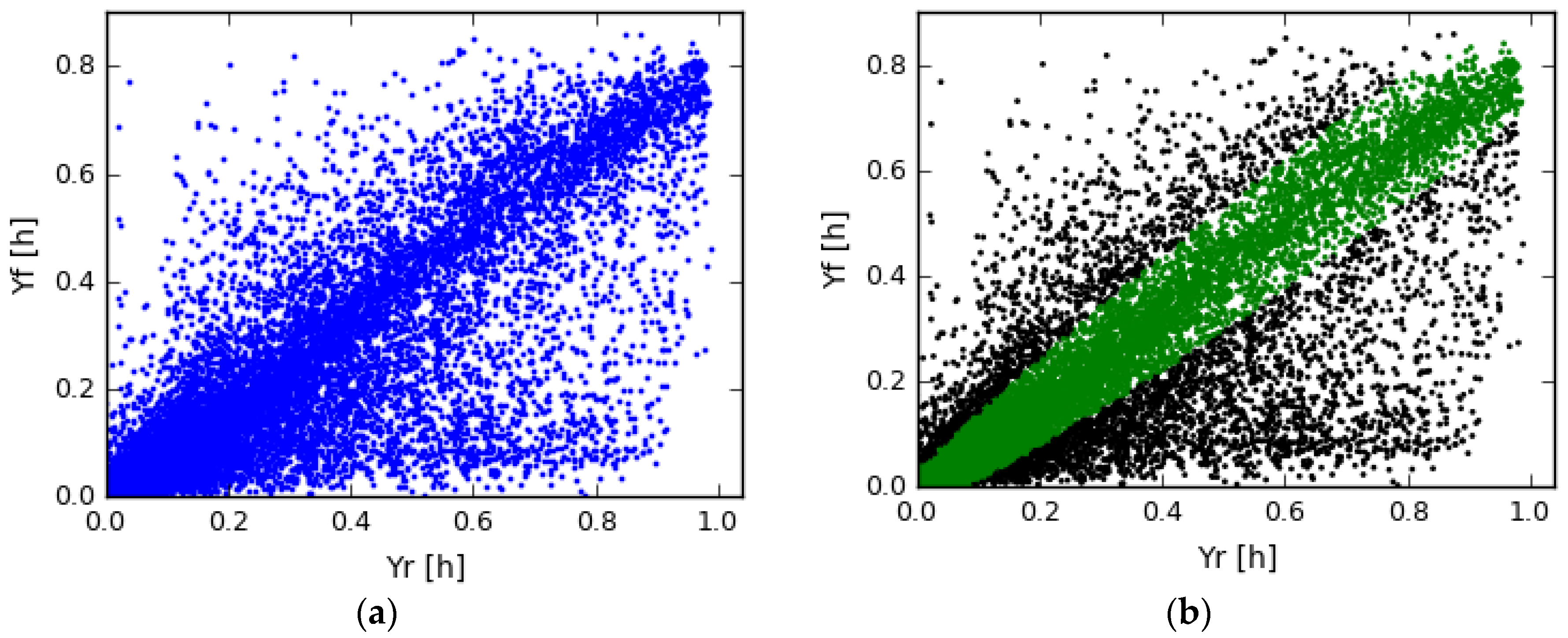
  • The inliers, the measurements that fit the linear regression model and which will be used for the real performance evaluation of a PV system.
  • The outliers, the measurements that do not fit the linear regression model and after further study could be used for the detection of any occurred malfunctions.

1.2. Performance Evaluation

1.2.1. Performance Ratio

The Performance Ratio (PR) [19] is a broadly used indicator for the performance characterization of PV system. It has been used in studies regarding the performance analysis of PV systems [12,13,14,20], comparison of different type of PV systems [12] but also in studies regarding malfunction detection [6,21]. It is a dimensionless indicator, the ratio of the system’s yield (Yf) to the system’s reference Yield (YR).
P R = Y f Y R ,
where
Y f = E A C P p e a k   [ W h r W ] ,
Y R = G T I 1000   [ W h r m 2 W m 2 ] ,
in which EAC is the generated amount of energy and P p e a k the installed capacity. A system with PR higher than 70% is considered to performing well and above 80% as excellent [2,12].
In the scatterplot Yf vs. YR, the indicators tend to follow a linear relationship (LR) and the slope of this linear regression is the Performance Ratio. In previous studies, changes in the slope of the LR is an indicator for the existence of malfunction [7]. Then again, the relationship between Yf and YR is not strictly linear due to the fact that the efficiency of solar panels decreases as its temperature increases which affects the linear relationship. With this in mind, in this paper the typical linear regression function (Y = a + bX) is not calculated and in fact never used. Having said that, the term linear relationship is used for better understanding, in order to describe the near-linear relationship of Yf and YR.

1.2.2. Comparison of Neighboring PV Systems

In the case of data from a neighboring PV system, the process is more straightforward. If the systems have the same capacity (for instance, same parts of solar parks, commercial PV systems on same rooftops or PV system with micro-inverters/power optimizer) the power outputs of the systems can be directly compared. If the compared systems have different capacities, their system yields (Yf) are compared, since Yf is actually the normalized production. In both cases (same or different capacity) their relationship is expected to be linear with a linear regression line with a constant slope which defines the characteristic relationship of the compared PV systems. If the slope is almost equal to 1 then they have the same performance. If it is different than 1 then one of the systems is performing better. Any unexpected change in the slope denotes that the performance of the one of the PV systems is reducing.

1.3. Research Purpose and Paper Organization

The purpose of this paper is to introduce an algorithm, which will study a malfunctioning PV system (referred as studied PV from now on) by comparing its production with reference data (referred as reference data), from the sources mentioned above and calculate the expected energy loss due to these measurements.
This paper introduces a cluster analysis algorithm, applicable to any scatter plot where the data to be analyzed show a near-linear relation. The aim of the algorithm is to automatically detect and distinguish measurements that are following the linear relationship from the ones which are not. As an outcome, the proposed algorithm will cluster the measurements in two groups: inliers and outliers, as mentioned above. The introduced algorithm is applied on PV system power data, in particular to compare “System Power with Reference Power” and it is used for two different purposes:
  • To detect and exclude any data input anomalies during the monitoring process, especially in case of residential PV systems where GTI is obtained by satellite observations and solar models.
  • To detect and separate measurements where the PV system is functioning properly from the measurements that show that the PV system is malfunctioning or shaded. Measurements showing proper functioning can then be used for the performance analysis while the rest can be further studied for malfunction characterization.
The aim of this algorithm is to be used in larger researches regarding monitoring of large numbers of residential PV systems. Hence only power output is used, which is the most common data provided by residential PV systems. Other PV system measurements (voltage or current) can be used for malfunction characterization, especially on outliers of purpose 2.
This paper is organized as follows. Section 2 discusses the reasons why measurements could not follow the linear relationship, for every case of reference data, and distinct them to data input anomalies and PV system failures. Section 3 provides the description of the proposed algorithm. In Section 4, the algorithm is applied in four different cases and the results are discussed. Finally, Section 5 summarizes the main findings of the paper.

2. Data Outliers in Performance Evaluation

For a variety of reasons measurements of system and reference yield do not follow a linear relationship and as a consequence the calculation of the performance evaluation may be erroneous. In this section the reasons of the existence of outliers for each type of reference data are described; they are presented in Table 1.

2.1. Irradiance Data from Pyranometers

In this case, the GTI irradiance measurements are accurate within 2.5% [2], as the pyranometers are installed at the same tilt angle as the module. The majority of erroneous performance evaluations then is due to an existence of a malfunction in the system. Provided that the malfunction causes a constant energy loss in the system (e.g., detached string, broken panel/inverter) the production is reduced, usually significantly, which is clear from the determined PR value.
Then again, in the event that a malfunction causes a changing energy loss, the PV system could operate either normally or not, depending usually on the level of the irradiance. Such malfunctions are partial shading [7,21,22] (which could lead to the creation of hot-spots [23]), losses due to maximum power point tracking (MPPT) errors in the inverter [21], grounding fault [24] and overheated modules [6]. In these cases, the majority of the measurements will follow a linear regression, while some measurements will not. However, the reduction of the PR value will not be significant and malfunctions can even remain undetected if the “Yf vs. YR” plot of the systems is not studied at high time resolution (minutes).

2.2. Irradiance Data from Other Sources

As mentioned above, other sources of GHI data could be from local meteorological stations or satellites and subsequent processing to GTI data using solar models. In this case, the data would have more “noise”, mainly due to the distance between the studied PV system and the measuring device as well as due to the uncertainty of the used solar models.
An increased uncertainty in GHI can be due to the fact that most of the meteorological stations are located outside of the cities, and could be easily some km away from the studied PV system. Thus the larger the distance between the station and the PV system, the higher the possibility that a cloud that effects the PV system can remain undetected by the station and vice versa. In case of satellite data, satellites such as MeteoSat 10 [25], are providing solar irradiance data of spatial grids (3 × 3 km in case of MeteoSat) that are to coarse to capture the effects of small clouds that reduce irradiance locally. Moreover, the irradiance of each grid is not measured constantly but once every 15 min. Thus any major changes within these 15 min, for instance one moving cloud on a sunny day, can remain undetected thus yielding incorrect reference data.
An increased uncertainty in GTI can be caused through its calculation procedures in the used solar model(s). For GTI calculations, the measured GHI firstly is separated to its components, DHI and to DNI (direct normal irradiance). Secondly, the impact of each component on the tilted surface is calculated and the sum of the impacts is the GTI. Comparisons of solar models at different locations prove the accuracy of these models, however they note the possibility of faults, while it is also clear that the calculation accuracy of GTI is strongly based on the accuracy of the inputs, DHI and DNI [26,27,28]. However, as DHI measurements are not common other models have to be used for the separation of GHI, the GHI separation models. The most used separation models are DIRINT [29], DISC [30] and Erbs [31]. Recently a more modern approach was introduced [32], where it was also stated that such models are empirical and local and yield an extra possibility of error in the calculation of GTI, and thus in erroneous assessment of performances. In Figure 1 the system yield of a commercial rooftop PV system is compared with the reference yield, obtained by satellite observations and the use of the HDKR Model [9,10]. It is obvious that the strong majority of the measurements are following a linear relationship. However, a large number of measurements are clearly outside the linear trend giving the impression to an observer that the system produces high values of electricity under very low radiation and vice versa.

2.3. Neighboring PV Systems Used as Reference

2.3.1. Shade in One of the Systems

In case of neighboring systems, both systems, the reference one and the studied one, can be affected by partial shading, which will create more noise in the scatterplot. Moreover, if the distance of the systems is large, any local, small clouds can affect the linearity of the measurement. However, this effect will be smaller in case of nearby systems and it is absent in case of systems on the same rooftop.

2.3.2. Difference in Energy Production

Furthermore, due to different reasons (wiring, panel and inverter brand, age) one of the compared systems may produce less energy, in a non-linear way. Such an example is presented in Figure 2, where two different panels (same micro inverter, same capacity, different ages and wired panels) are compared. Except for the shadow, between 14:00 and 15:30, where panel one (blue line) is generating much less energy, the production curve of panel one is lower than the curve of panel two (green curve) and this difference is getting larger at higher energies. In this case, clustering of the inliers and the outliers can give two different values of energy loss (with respect to the panel which is used as reference) to the owner: (a) due to shade and (b) due to the system. In that case the owner can decide if it is economically profitable to replace the panel or remove the shade, or both. Furthermore, in case of no replacement, it will be very useful to know the production relationship of the monitored PV systems, in order to detect future malfunctions.

3. Methodology

3.1. Data Preparation

The proposed method is operating with two different sets of data. One is the power output (either DC or AC) of the studied PV system (referred to as studied PV from now on) and the other the reference data. The reference data could be the tilted irradiance measurements or the power output (either DC or AC) of a neighboring PV system, with same tilt and orientation (referred to as reference data).
Both studied PV and reference data should be preprocessed into a specific form before the algorithm can be applied, in order to create a linear relationship in the scatterplot “studied PV vs. reference data”. The process depends on the type of reference data and it is presented in Table 2.
For all the cases of data, the difference (error ε) between the studied PV and the reference is calculated, since its role is pivotal for the later steps of the process.
ε = Y f Y R ,   if   reference   data   is   GTI or ε = P s t u d i e d P r e f ,   if   reference   data   is   PV   system   with   same   capacity or ε = Y f , s t u d i e d Y f , r e f ,   if   reference   data   is   PV   system   with   different   capacity

3.2. Scope of the Algorithm

The scope of the algorithm is to define the maximum and lower thresholds of the error, where the measurements within these thresholds will be characterized as inliers, thus the measurements that fit to the linear regression curve. These are measurements where the studied PV system is operating normally. The measurements outside these thresholds will be characterized as outliers, thus the moments where the PV system is malfunctioning.
As we assume that a high density of measurement points in the “Studied PV vs. Reference data” plot must be around the linear regression line, the thresholds must be set such that the density of measurements points is decreasing.

3.3. Description of the Algorithm

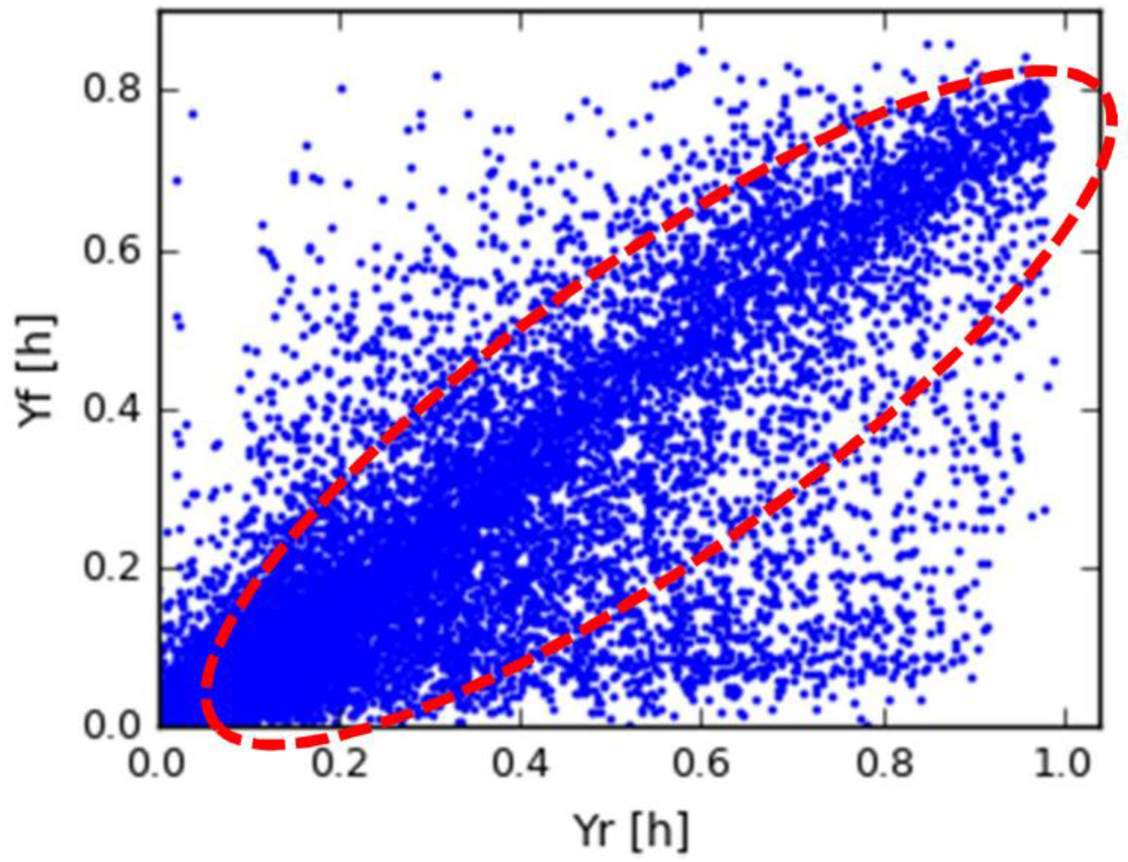
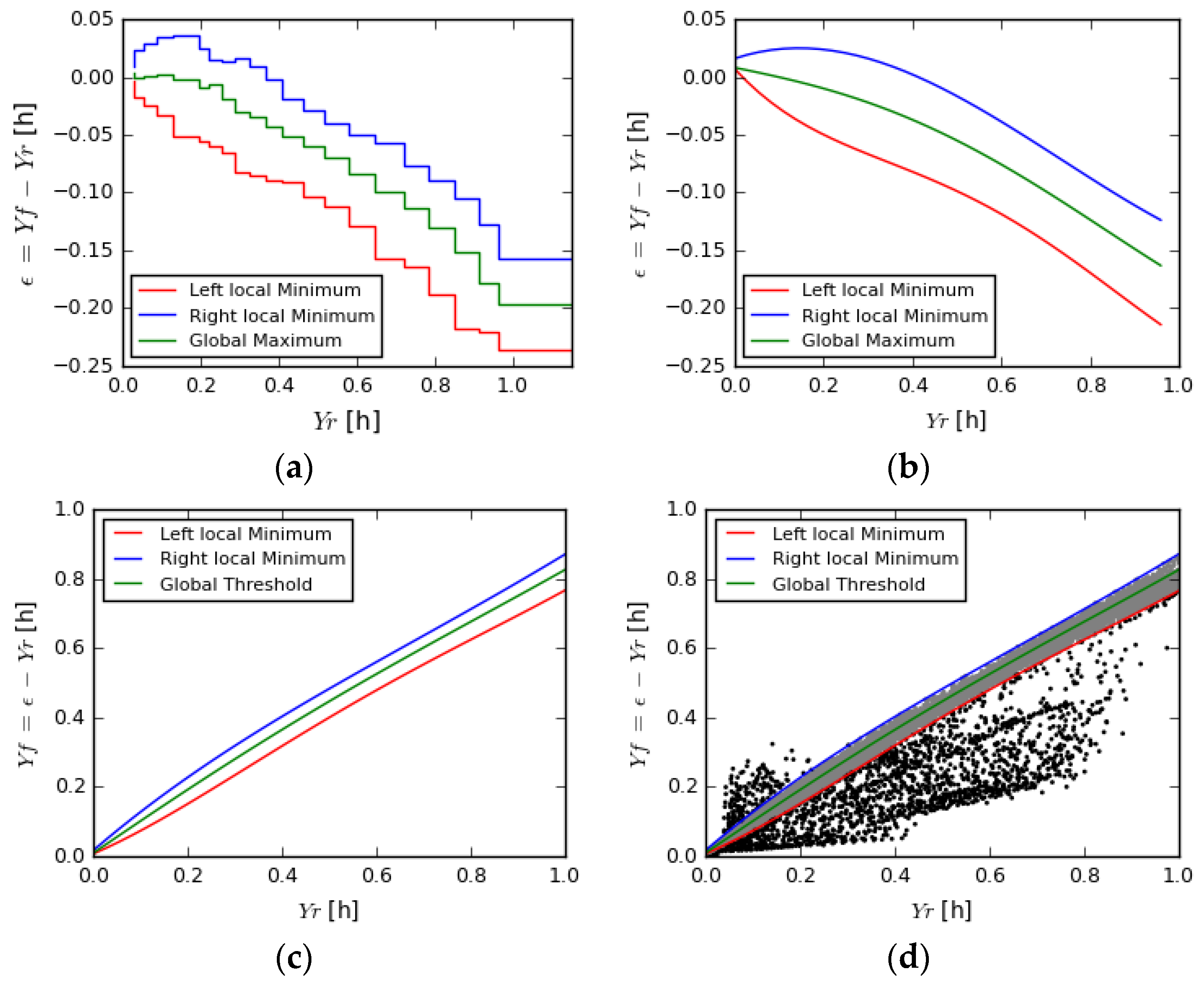
3.3.1. First Step—Inliers Determination Using Ran.Sa.C.

In the first step, the iterative method Ran.Sa.C. (Random Sample Consensus) [33] is applied on the scatterplot “Studied PV vs. Reference data”, which clusters the measurements in two groups, the inliers (the ones that following a linearity, i.e., normal operation) and outliers.
If the data are limited, such as data for only a few days with hourly resolution, no further processing is needed. The inliers from Ran.Sa.C. are used directly for the calculation of the PR and the outliers are further studied in order to determine the cause of energy loss and its total impact on the energy production of the system.
However, if the sample is large, such as data for long periods at minutely time resolution, extra processing may be needed, since Ran.Sa.C. could be misloaded and measurements could have been denoted as inliers while they do not exactly fit in the linear relationship. In this case, Ran.Sa.C. is used as a first cleaning of measurements to identify clear outliers.

3.3.2. Second Step—Data Clustering and Polynomial Regression

From this step the focus of the analysis is on the calculated error between the studied PV and the reference (calculated with Equation (4)). Furthermore, the analysis involves only the inliers as calculated in step 1.
The inliers from step 1 are clustered into groups, based on the actual value of the reference data. Typically fifteen groups are used to cover the range of the reference data. For each group, a histogram of the errors is calculated. Subsequently, a polynomial linear regression is performed:
f = p o l y ( ε )
where f is the frequency and ε the value of the error.
In the plot of Figure 3 the histogram of one group is presented, as an example, together with the estimated polynomial linear regression between the errors and their frequency (red points).

3.3.3. Third Step—Determine the Thresholds of Each Group

Based on the assumption described in Section 3.2, the algorithm is focusing on the maximum (depicted by a red arrow in Figure 3) of poly(ε), the εmax. As thresholds the two local minimums on the left and right (εleft and εright) of the global maximum (blue arrows on Figure 3) are used. If poly(εl/r) < 0 then as threshold is set the ε where poly(ε) = 0, with ε in (εleft, εmax) or ε in (εmax, εright).
The logic behind this is that as the polynomial curve is moving away (left or right) from the maximum, the frequency of the errors will rapidly reduce, thus poly(ε) will also rapidly reduce and will form a local minimum. If the reduction is high, the poly(ε) will take values lower than zero. That means that the frequency of the errors dramatically changes, as well the density of the measurements in the initial “Studied PV vs. Reference data” scatterplot.

3.3.4. Fourth Step—Normalization and Connection of All Limits

During this step the relationship of each defined threshold (εleft, εright) and the global maximum (εmax) of all power groups versus the reference power is studied, see Figure 4.
The clustering of the sample in groups during step 2, based on reference power, is random and it depends on the sample size. Furthermore, since one value of ε will represent a group, with reference power from Pn to Pn+1 then the plots of εmax, εleft and εright versus reference will be stair plots, as it is clear from Figure 4a. In order to use these data in practice, polynomial fits are made, to obtain continuous functions for each error. An example is presented in Figure 4b.
The polynomial fits of the εleft and εright versus reference data ( ε l e f t P o l y ( r e f ) and ε r i g h t P o l y ( r e f ) ) is the most important output of the algorithm since they define the relationship between the studied and the reference data, for any value of the reference data. That is to say, for any measurement of a studied sample, the application of its reference data using ε l e f t P o l y ( r e f ) and ε r i g h t P o l y ( r e f ) defines the maximum and the lower allowed value of its error, in order to be characterized as inlier or outlier. Furthermore, polynomials from historical data, can be applied to new measurements and characterize them as inliers and outliers.
The polynomial fit of εmax versus the reference ( ε m a x P o l y ( r e f ) ) provides the information about the most frequent value of the error, for the respective value of the reference data.
Provided that the relationship of the error ε and Yf, YR is for any single measurement defined as ε = Y f Y R (Equation (4)), for any single measurement the εmax, εleft and εright are calculated by the application of the reference data on the respective polynomial fits, ε m a x P o l y ( r e f ) , ε l e f t P o l y ( r e f ) and ε r i g h t P o l y ( r e f ) . Thus:
ε i P o l y ( Y R ) = Y f , i Y R ,   for   i   in   [ max ,   left ,   right ]
Rewriting Equation (6) with respect to Yf:
Y f , m a x ( Y R ) = ε m a x P o l y ( Y R ) Y R Y f , l e f t ( Y R ) = ε l e f t P o l y ( Y R ) Y R Y f , r i g h t ( Y R ) = ε r i g h t P o l y ( Y R ) Y R
in which Y f ,   l e f t ( Y R ) , Y f ,   r i g h t ( Y R ) are the polynomial functions that return the thresholds for which Yf is inlier, for any respective value of YR. In case that the Yf is constantly lower than the YR (case of PV system vs. solar radiation data) then the right threshold represents the maximum value of Yf and the left the minimum in order to be characterized as inlier. On the other hand, Y f ,   m a x ( Y R ) is the polynomial which returns the most frequent value of Yf for any respective value of YR. In Figure 4c, the Equation (7) is plotted. Any measurement of the scatterplot between green and blue lines is characterized as inlier, while outside as outlier, with the majority of the measurements to be on the red line.

3.3.5. Fifth Step—Pplication of the Limits to the Data

Finally, the polynomial regressions of the thresholds, calculated during step four are applied to the data. Thus, for every measurement, the thresholds are calculated, based on its reference value and if the error (Yf can be used as well) is within these thresholds the measurement is defined as inlier, otherwise as outlier.
For better understanding an example is presented in Figure 4b, where the blue and red lines are the thresholds of Yf, based on the Equations (6) and (7). Every measurement inside these lines is characterized as inlier (gray), while outside as outlier (black).

3.4. Calculation of Energy Loss

After the clustering in inliers and outliers, the amount of lost energy due to the outliers can be calculated. In this paper, energy loss is defined as the energy that each outlier would have produced if it would follow the normal relationship between the studied data and the reference (which is defined by the polynomial fits calculated in Section 3.3.4). The calculation is applied only if it is known to the users that the outliers are due to a malfunction on the system, thus if the proposed algorithm is used for the second purpose, as described in Section 1.3.
If E h y p   S t u d i e d is the hypothetical energy production of the studied PV, for a single outlier, in case that it was inlier and E s t u d i e d   P V the produced energy, then for a single outlier:
E l o s s = E h y p   S t u d i e d E s t u d i e d   P V
And for all outliers:
n = 1 N E l o s s i = n = 1 N ( E h y p   s t u d i e d i E s t u d i e d   P V i )
where i the number of outliers.
In this paper, for the hypothetical energy production three scenarios are chosen:
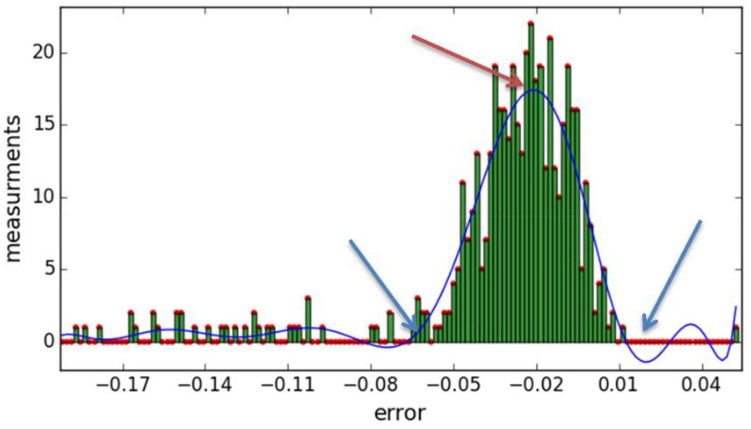
  • Error is equal to the higher frequent error (global maximums), thus the most probable value
  • Error of outliers is slightly higher (105%) than the smaller threshold (εleft)
  • Error is slightly lower (95%) than the higher threshold (εright)
From the first scenario the most probable energy loss is calculated, since it is assumed that all the outliers would have the same error ε with the most frequent one. From the second and third scenarios the lower and the higher possible energy losses are calculated respectively, under the assumption that all outliers would have the same lower or higher Yf values in order to be characterized as inliers.

4. Application of the Method—Examples

The proposed method is applied in different examples and their scatterplots are presented below. The first three examples are from data from the experimental facility of SEAC (Solar Energy Application Center, Eindhoven, The Netherlands). The facility contains three PV systems, with identical panel structure (six panels in two rows, one front, one back, same tilt and orientation) and different inverter technology [22,34]. The system can be seen in Figure 5. The system on the right-hand side consist of 6 micro inverters (265 W each), the system in the middle consist of a series connection of the panels and a standard string inverter of 1.5 kW. Finally, the system on the left consist of 6 power optimizers connected in parallel (boost DC/DC) and a central inverter of 1.5 kW especially made for the power optimizer system. In front of each system a pole is placed (same dimension for every system) in order to create an artificial shadow on the front rows of each system during the day which is equal for all systems. Furthermore, two pyranometers are available for the measurement of the tilted irradiance. The initial purpose of the system was to study the performance of different inverter technologies (string inverter, power optimizer and micro inverter) under shading conditions [22,34].
For these cases it is known that the strong majority of the outliers in the data is caused by shadow, since the reference data are measured through the most accurate methods (pyranometer and neighboring PV system) as defined in Section 2.1 and Section 2.3. Thus the algorithm will applied for purpose 2 as defined in Section 1.3. Moreover, the energy loss can be calculated since it is known that the outliers are due to a malfunction (shadow).
The percentage of lost energy compared to the actual production is presented, according to:
E l o s s ( % ) =   E l o s s E p r o d u c e d ×   100 %
where Eloss is the energy loss as calculated from Equation (9).
For each of the first two examples, the studied PV system is compared to the same reference data, two cases are used and two different plots are presented: the shaded system/panel versus (a) GTI obtained by an in-plane pyranometer, and (b) the average production of the 3 panels with power optimizers, in the back row of the system, which are shaded partially during late afternoon, different hours than the shaded panels. In the third example, two different panels with same micro-inverters are compared and monitored each other.
In the fourth example, a PV system from a house in the Netherlands is compared with the tilted irradiance, obtained by the application of the HDKR solar model [9,10,29] on satellite data from MeteoSat. The system consists of a 2.5 kWp inverter and has panel capacity of 2.45 kWp. This example is different than the other three, since the reference data will contain a large amount of input anomalies and any presence of shadow is unknown. Thus the algorithm will be used for purpose 1 of Section 1.3 and energy loss cannot be calculated, since it is not known if the outliers are due to data input anomalies (thus any energy loss calculation is pointless since there are false measurements) or for any other reason, for instance shadow.

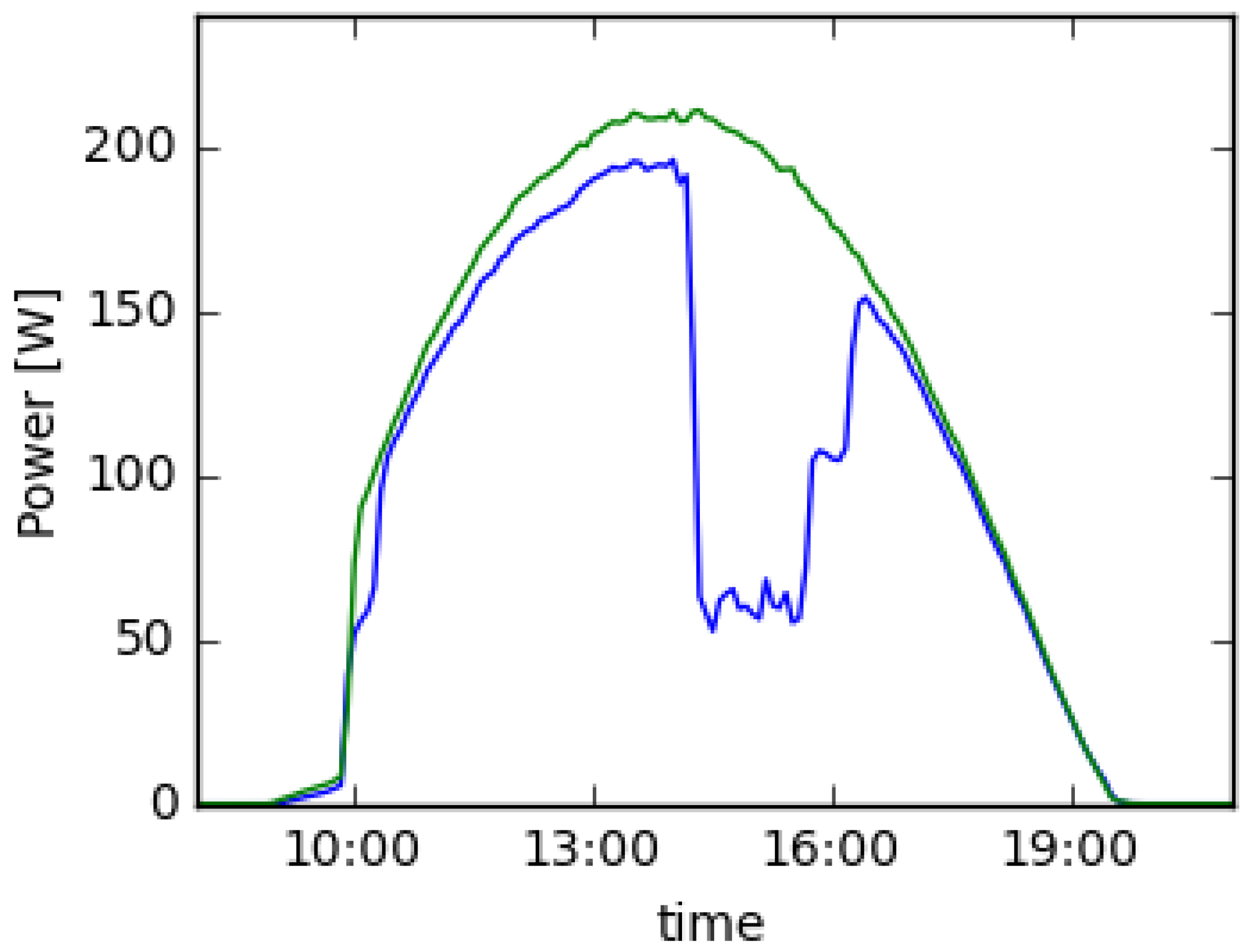
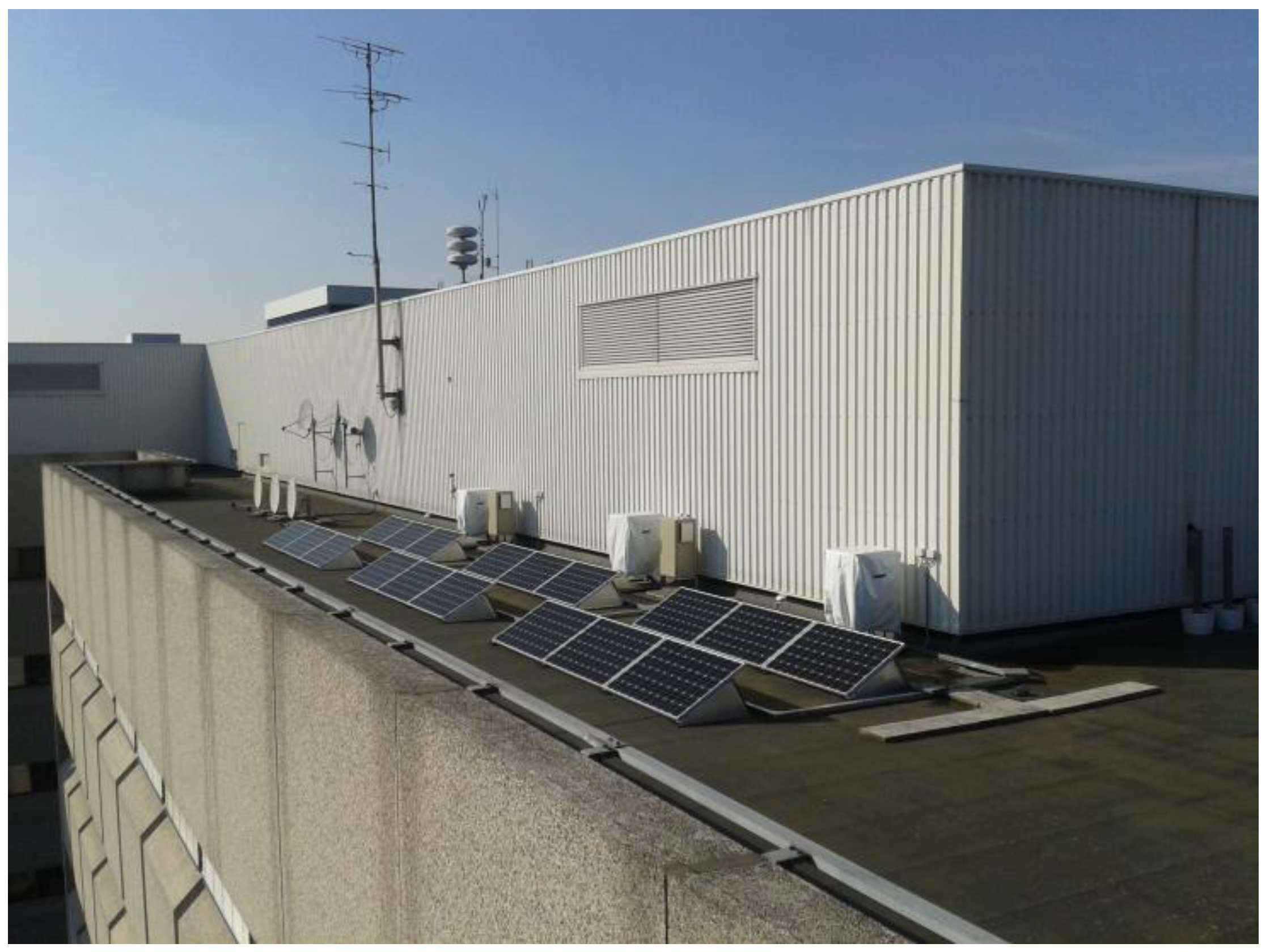
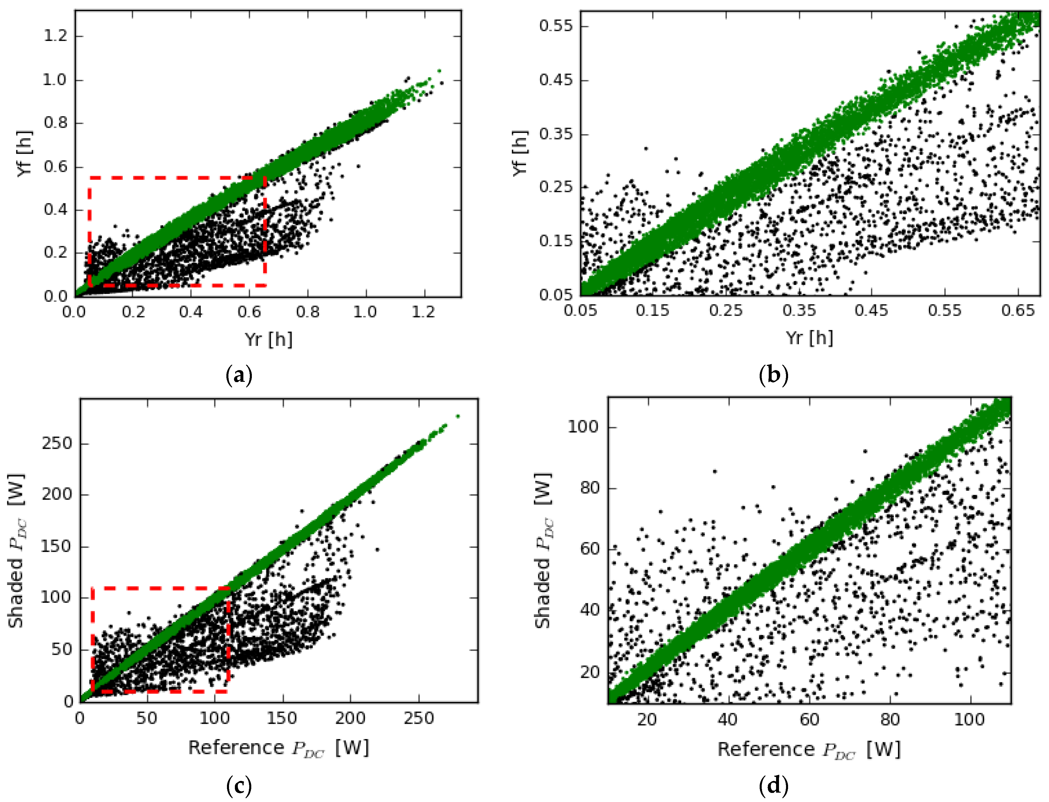
4.1. Shaded Panel with Power Optimizer

In the first example the algorithm is applied to the DC power output of a panel with power optimizer. Figure 5a,c shows the scatterplots “Yf vs. YR” and “PDC_shaded vs. PDC_reference”, respectively, while at the right plots, Figure 5b,d show a zoom (red box in Figure 5a,c) for more details. The time resolution is 5 min and the studied period is 116 days, from beginning of July 2015 until end of October. The panel is shaded for a part of the day (approximately from 10:30 am to 12:20 pm).
In the scatterplots b and d of the Figure 6, it is obvious how the algorithm is detecting as inliers the areas with the higher density of measurements. Due to the large number of the measurements, this is not obvious in the scatterplots of the whole sample, where the inliers and outliers seem to have the same density. However, in the zoomed areas, in plots b,d differences in density are clearer.
Differences in the classification of inliers and outliers between the two cases are observed since the reference data are different. In case of the pyranometer as reference data (Figure 6a,b), the threshold of the inliers is broader for higher values of irradiance, due to the accuracy of the pyranometer and the reduction of the efficiency of the panels in higher temperatures. However, these differences are very small, since for the studied period, 95% of the measurements have the same classification (both inliers or outliers) and only 3% different in the two cases of the reference data.
As mentioned at the end of Section 1.2.1, the plot of “Yf vs. YR” is not strongly linear, especially at higher values of energy due to the reduction of the efficiency of the panels at higher temperatures. Thus the use of the fitted linear regression equation (Yf = a +bYR) is not so accurate, as the use of the polynomial fits (Section 3.3.4), where the two polynomials (left and right in Figure 4) will define the upper and lower threshold for the inliers and the third (global maximum in Figure 4) the most possible position of the inliers. By contrast, in the “PDC_shaded vs. PDC_reference” the relationship is very strongly linear, because both panels have the same efficiency reduction at higher temperatures. In this case the polynomial fits are almost a straight line and the fitted linear regression equation could be used as well, in order to describe the performance relationship between the compared panels.
The performance ratio (PRDC in this case) is calculated, according to Section 1.1 and Equation (1). As reference data the pyranometer is used (Figure 6c). The PRDC of the panel, with the use of all data is 81.7% while using only the inliers (green markers in Figure 6c) the PRDC is 86.8%. That means that the real performance of the panel is 86.8%, however due to presence of the shadow (external reason, not malfunction inside the system) it drops to 81.7%.
The energy loss due to the shadow is calculated using Equations (9) and (10) presented in Table 3, for each of the scenarios and for both cases of the pyranometer and neighboring panels as reference data. Clearly, the panel produces less energy due to the shadow (outliers) and depending the reference data, the calculated energy loss is slightly different. As mentioned above, these differences are due to the accuracy of the pyranometer, and the fact that in case of the pyranometer as reference data the threshold of the inliers is broader for higher values of irradiance, explains the larger difference between the scenarios.

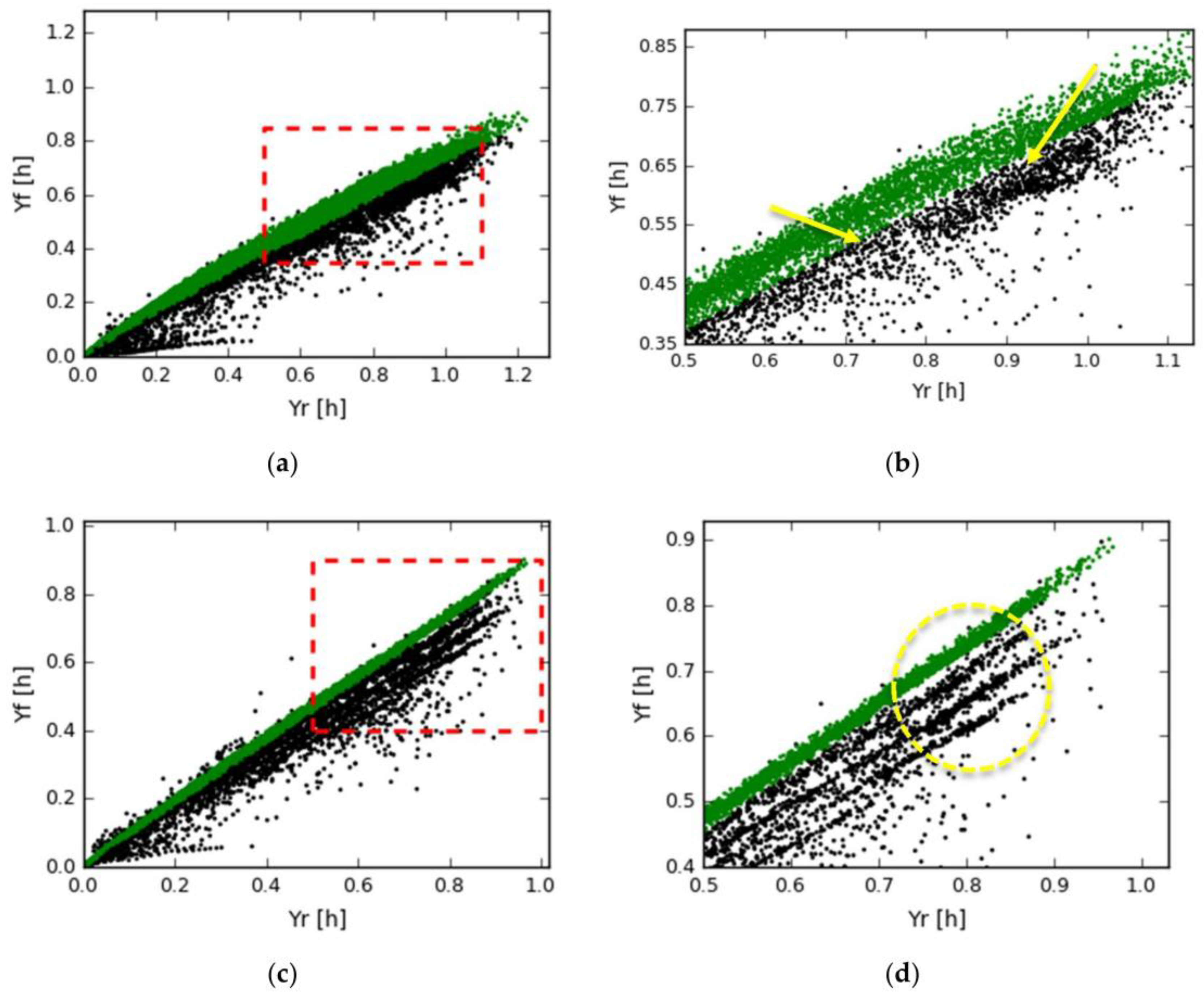
4.2. PV System with String Inverter

In this case the algorithm is applied to the PV system with string inverter, where three panels in the front row are heavily shaded during most of the day. The data resolution is 5 min and the studied period is 133 days, from beginning of July until end of October. In Figure 7, the results of applying the algorithm are presented. Figure 7a,c show the complete data sample, while Figure 6b,d show a smaller portion for better understanding.
The results from the study of this system show that the duration of the shadow is clearly different. While the panel in Section 4.1 was shaded only a part of the day, this system is shaded during most of the day. Furthermore, the shaded panels are shaded one at a time and only a few moments two panels are shaded at the same time. Due to this fact, the values of the errors are much smaller and the measurements with high error are rare.
In Figure 7a the clustering threshold of the algorithm is almost impossible to be discerned. In the more detailed observation (Figure 7b) the threshold is clearer, since the density of the green marks is reduced (where the yellow arrows are pointing), and the marks after the reduction are clustered as outliers (black colored). A thin white line between the arrow heads can be seen, reflecting absent data points, which in fact shows where the algorithm separates the inliers from the outliers.
However, in Figure 7c,d, where the average power of the neighboring panels is used as reference data, the results are more clear and detailed. Furthermore, three distinct different lines of outliers can be observed (highlighted by the yellow circle). This demonstrates that the use of neighboring panels for performance evaluations can show much more detail and can be more accurate than the use of a pyranometer as reference data.
These differences can be explained by the accuracy of the pyranometer and the reduction of the panels efficiency at higher temperatures. Similar to example 1, for higher irradiances, where the temperature is higher as well, the efficiency of the panels is reducing. Thus the scatterplot of the energy production versus the solar irradiance shows more scatter for higher irradiances and the relationship is not strongly linear. Thus a polynomial fit is more accurate to describe the relationship of the Yf versus the YR. By contrast, the relationship with the neighboring panel is considerably stronger linear, since its efficiency is reducing at higher temperatures as well.

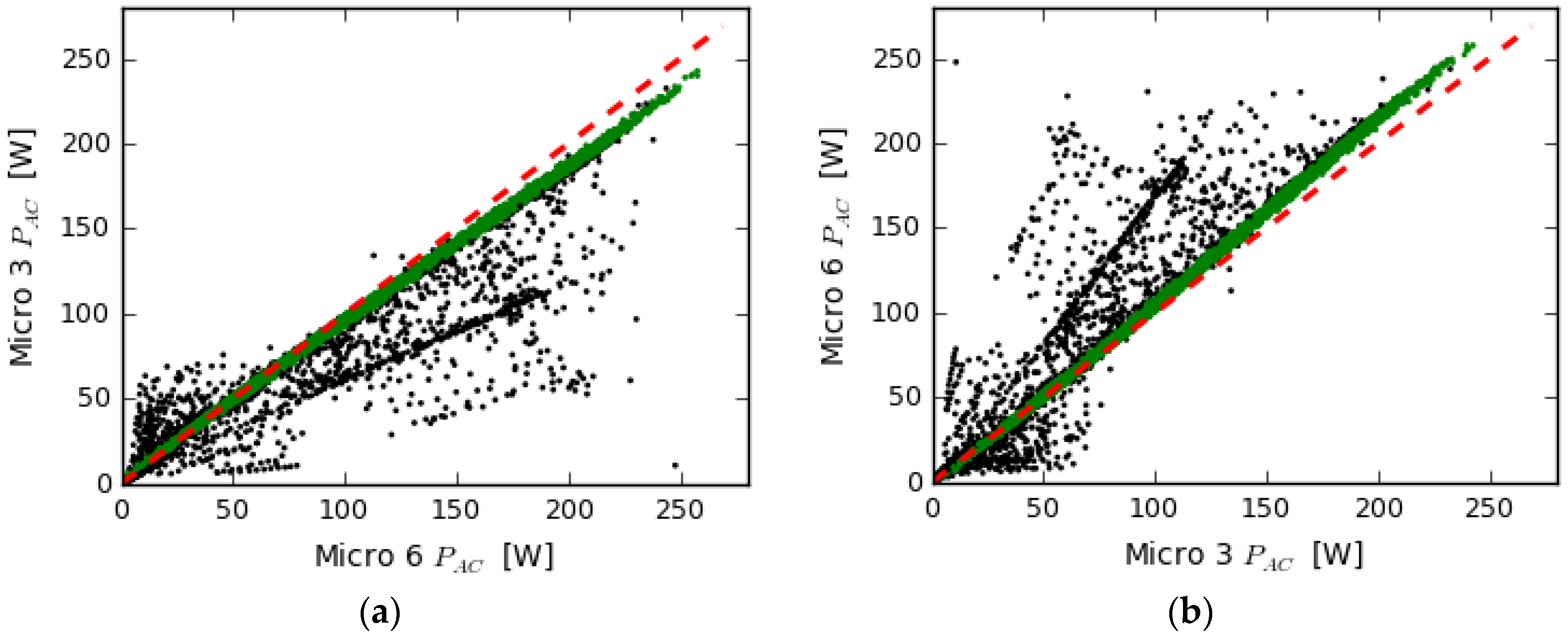
4.3. Systems with Same Capacity, Different Production and Different Shadows

In this example, two different panels with same micro inverters are monitored. Panel with micro inverter 3 (Micro 3 from now on) is shaded by the placed pole, while the other panel (Micro 6 from now on) is shaded by the corner of the rooftop in the late afternoon. Each panel is used as reference for the other, thus the algorithm runs two times, one for each panel as studied and one as reference. The results are presented in Figure 8.
The differences between the figures-cases are negligible since 96% of the measurements have the same classification in both cases. The major difference is in the angle of the linear regression lines of the two plots, where in plot (a) is lower than (b), thus system 6 is functioning better than system 3. It is clear in the plots that the system 3 is shaded much more than system 6. Thus in this example 3 values for energy loss can be calculated:
  • Energy loss of system 3 due to shadow
  • Energy loss of system 6 due to shadow
  • Energy loss of system 3 due to the older panel
Values 1 and 2 are calculated through Equation (5), similarly to examples 1 and 2. System 6 is producing due to the shadow (percentwise according to Equation (6)) from 0.2 to 0.4% less energy and system 3 from 2.5 to 3.5%. As mentioned above, system 3 is affected much more by shade than system 6. Energy loss of system 6 is negligible since it is affected by shadow by the very end of the day.
Furthermore, system 3 has an older and less efficient panel. In order to calculate this energy loss, only the inliers are used as the panel is not disturbed by other reasons (shade in this case). Thus, system 3 is producing 95.6% less energy than system 6, due to age difference between the panels, since both micro inverters and the wirings are the same and no other differences have been observed in DC to AC conversion during the operation of the system [22,34].

4.4. System of a Regular House in The Netherlands, Monitored with MeteoSat Data

In the last example a PV system with system capacity 2.45 kW and inverter capacity 2.5 kW is compared with solar radiation, determined from images taken with the satellite MeteoSat 10 [25]. The measurements of MeteoSat 10 consist of 15 min time resolution data of GHI and DHI and these are converted to GTI with the use of the HDKR solar model [9,10] see Figure 9a. The results of applying the proposed method are presented in Figure 9b.
In this example, 75% of all measurements are classified as inliers (green markers in Figure 9b) and 25% as outliers. About 1/3 of the outliers are above the linear regression line. These are mostly due to spatial measuring faults. About 2/3 of the outliers are below the line, and these are due to the presence of a local shadow in addition to spatial measuring faults.
The Performance Ratio of this system from the total sample of measurement is determined to be 71.3%. By taking into account only the inliers the real PR is 79.4%.
Clearly in this example the proposed algorithm is used for purpose 1, as explained in Section 1.3, thus in order to filter irradiance data with large input anomalies and make them suitable for accurate performance analysis for residential systems where the only available data is the power output.
The two-thirds of the outliers which are below the line could be better studied and malfunction detection techniques could be applied in order to determine if there are malfunctions or irradiance data input anomalies. For instance, if DC power is available as well, a DC to AC conversion study on the outliers could detect a malfunction on the inverter. A study on voltage (if it is available) can detect the presence of shadow [22]. If further data on the DC side are available, fault detection and classification methods that have been proposed by Akram and Lotfifard [35] or in [24], a study which also describes detection of ground faults.

5. Conclusions

In conclusion, this paper describes the development of a new method of cluster analysis and its application for the analysis of PV performance. The method itself can be applied to any pair of data sets which tend to fit to a linear relationship, and allows to distinguish the data between those which are following the linear relationship and those which are not.
The application of the developed algorithm for monitoring and performance evaluation of PV systems is based on the fact that the produced power of a PV system, with the application of the correct formulas) tends to be linear with irradiance in the plane of array (GTI). As the fit is not strongly linear the proposed method aims to replace this linear fit with three polynomial fits. Two are providing the lower and higher value of production (as system yield, Yf) in order for the measurement to be characterized as inlier or outlier, for any value of the irradiance (as reference yield, YR). The third polynomial is providing the position of the majority of the inliers in the scatterplot of the compared data.
The proposed algorithm is used for two different purposes in the field of PV monitoring. For each monitored PV system, the purpose depends strongly on the available reference data and any additional information about the system (known shadow or malfunction). Presuming that the monitored PV system is a residential one, on a rooftop, and the only available reference data is tilted irradiance obtained by satellite or local weather station data after application of solar models, then the method is applied in order to detect and exclude data input anomalies (purpose 1). If the reference data is obtained by a tilted pyranometer or from a neighboring PV system then the method is applied in order to detect any malfunction that causes changing energy loss (shadow in the given examples) and will calculate the energy loss due to the malfunction as well (purpose 2). Furthermore, in that case the performance of the PV system, the “real PR”, for the moments that the system is not malfunctioning is calculated. Thus, if the PR is between 0.8 and 0.7 the system is performing well but it can be improved and if the PR is lower than 70% then it is suffering from a constant energy loss malfunction. On the other hand, if the number of the outliers is increasing then a new shadow or another changing energy loss malfunction may be affecting the system.
Unfortunately the case of the neighboring PV systems is rare, except for systems with micro inverters and power optimizers. Its linear relationship with the studied PV is much stronger and detailed compared to pyranometer measurements as reference data, as the pyranometer accuracy is limited to ~2.5% and calibration is needed, ideally every two years according to surveys [36] and pyranometer manufacturers [37,38].
As a suggestion, the outliers could be further studied for the detection and classification of any malfunctions. For instance, the hourly occurrence of outliers should be studied and used for detection of any shadow created by any obstacle around the studied PV system. Other possible studies are depending on the case and the available data.
As a final suggestion, the proposed method can be used for validation of any model that simulates PV performance. The simulated and measured data should follow a strong linear relationship (similar to the comparison of two PV systems, see Figure 6c, Figure 7c and Figure 8) and the algorithm can detect from the measurements if the system is malfunctioning or if the model may have any weaknesses at specific moments. Especially in case of building integrated PV (BIPV), where the calculation of the tilted irradiance is more complicated due to the existence of different surfaces around the building, the combination of the proposed algorithm with energy performance models, such as proposed in [39] could lead to monitoring and identification of outliers.

Acknowledgments

The authors gratefully acknowledge fruitful discussions with Panagiotis Moraitis (UU) Chris Tzikas (ECN), Tom Lemmens (Eneco), Jasper Müller (Eneco) and Fonger Ypma (Eneco). This work is partly financially supported by the Netherlands Enterprise Agency (RVO) within the framework of the Dutch Topsector Energy (project Automatic Malfunction Detection for Improvement of solar PV yield, AMDIS).

Author Contributions

Odysseas Tsafarakis conceived and designed the method, performed the validation, and analyzed the data; Odysseas Tsafarakis, Kostas Sinapis and Wilfried G. J. H. M. van Sark discussed results and wrote the paper; Wilfried G. J. H. M. van Sark conceived the project.

Conflicts of Interest

The authors declare no conflict of interest. The funding organization had no role in the design of the study; in the collection, analyses, or interpretation of data; in the writing of the manuscript, and in the decision to publish the results”.

References

  1. Centraal Bureau voor de Statistiek (CBS). Bijgeplaatst Vermogen Zonnestroom Bijgesteld. Available online: https://www.cbs.nl/nl-nl/achtergrond/2015/51/bijgeplaatst-vermogen-zonnestroom-bijgesteld (accessed on 17 December 2015).
  2. Reich, N.H.; Mueller, B.; Armbruster, A.; Van Sark, W.G.J.H.M.; Kiefer, K.; Reise, C. Performance ratio revisited: Is PR > 90% realistic ? Prog. Photovolt. 2012, 20, 717–726. [Google Scholar] [CrossRef]
  3. Silvestre, S.; Chouder, A.; Karatepe, E. Automatic fault detection in grid connected PV systems. Sol. Energy 2013, 94, 119–127. [Google Scholar] [CrossRef]
  4. Firth, S.K.; Lomas, K.J.; Rees, S.J. A simple model of PV system performance and its use in fault detection. Sol. Energy 2010, 84, 624–635. [Google Scholar] [CrossRef] [Green Version]
  5. Platon, R.; Martel, J.; Woodruff, N.; Chau, T.Y. Online Fault Detection in PV Systems. IEEE Trans. Sustain. Energy 2015, 6, 1200–1207. [Google Scholar] [CrossRef]
  6. Eke, R.; Senturk, A. Monitoring the performance of single and triple junction amorphous silicon modules in two building integrated photovoltaic (BIPV) installations. Appl. Energy 2013, 109, 154–162. [Google Scholar] [CrossRef]
  7. Woyte, A.; Richter, M.; Moser, D.; Green, M.; Mau, S.; Beyer, H.G. Analytical Monitoring of Grid-Connected Photovoltaic Systems; NET Ltd.: St. Ursen, Switzerland, 2014; Volume 13. [Google Scholar]
  8. Perez, R.; Seals, R.; Ineichen, P.; Stewart, R.; Menicucci, D. A new simplified version of the Perez diffuse irradiance model for tilted surfaces. Sol. Energy 1987, 39, 221–231. [Google Scholar] [CrossRef]
  9. Hay, J.E. Calculating solar radiation for inclined surfaces: Practical approaches. Renew. Energy 1993, 3, 373–380. [Google Scholar] [CrossRef]
  10. Davies, J.A.; McKay, D.C. Evaluation of selected models for estimating solar radiation on horizontal surfaces. Sol. Energy 1989, 43, 153–168. [Google Scholar] [CrossRef]
  11. Olmo, F.J.; Vida, J.; Foyo, I.; Castro-Diez, Y.; Alados-Arboledas, L. Prediction of global irradiance on inclined surfaces from horizontal global irradiance. Energy 1999, 24, 689–704. [Google Scholar] [CrossRef]
  12. Tsafarakis, O.; Moraitis, P.; Kausika, B.B.; Van Der Velde, H.; Hart’T, S.; de Vries, A.; de Rijk, P.; De Jong, M.M.; Van Leeuwen, H.P.; van Sark, W. Three years experience in a Dutch public awareness campaign on photovoltaic system performance. IET Renew. Power Gener. 2017, 11, 1229–1233. [Google Scholar] [CrossRef]
  13. Leloux, J.; Narvarte, L.; Pereira, A.D.; Leader, W.P.; Madrid, R.; SENES, C.; de Navarra, P. Analysis of the State of the Art of PV Systems in Europe; Universidad Politécnica de Madrid: Madrid, Spain, 2015. [Google Scholar]
  14. Taylor, J.; Leloux, J.; Everard, A.M.; Briggs, J.; Buckley, A.; Solar, S.; Building, H.; Road, H.; Sheffield, S. Monitoring Thousands of Distributed PV Systems in the UK: Energy Production and Performance; Universidad Politécnica de Madrid: Madrid, Spain, 2011. [Google Scholar]
  15. Leloux, J.; Narvarte, L.; Trebosc, D. Review of the performance of residential PV systems in France. Renew. Sustain. Energy Rev. 2012, 16, 1369–1376. [Google Scholar] [CrossRef] [Green Version]
  16. Leloux, J.; Narvarte, L.; Trebosc, D. Review of the performance of residential PV systems in Belgium. Renew. Sustain. Energy Rev. 2012, 16, 178–184. [Google Scholar] [CrossRef] [Green Version]
  17. Leloux, J.; Taylor, J.; Moretón Villagrá, R.; Narvarte Fernández, L.; Trebosc, D.; Desportes, A. Monitoring 30,000 PV Systems in Europe: Performance, Faults, and State of the Art. In Proceedings of the 31st European PV Solar Energy Conference and Exhibition, Hamburg, Germany, 14–18 September 2015; Volume 153, pp. 1574–1582. [Google Scholar]
  18. Mallor, F.; León, T.; de Boeck, L.; van Gulck, S.; Meulders, M.; Van Der Meerssche, B. A method for detecting malfunctions in PV solar panels based on electricity production monitoring. In Proceedings of the 31st European PV Solar Energy Conference and Exhibition, Hamburg, Germany, 14–18 September 2015; Volume 153, pp. 51–63. [Google Scholar]
  19. IEC 61724. Photovoltaic System Performance Monitoring—Guidelines for Measurement, Data Exchange and Analysis, 10th ed.; International Electrotechnical Commission: Geneva, Switzerland, 1998. [Google Scholar]
  20. Van Sark, W.; Hart, S.; de Jong, M.; de Rijk, P.; Moraitis, P.; Kausika, B.B.; van der Velde, H. “Counting the Sun”—A Dutch Public Awareness Campaign on Pv Performance. In Proceedings of the 29th European Photovoltaic Solar Energy Conference and Exhibition, Amsterdam, The Netherlands, 22–26 September 2014; Volume 2014, pp. 3545–3548. [Google Scholar]
  21. Tsafarakis, O.; van Sark, W.G.J.H.M. Development of a data analysis methodology to assess PV system performance. In Proceedings of the 29th European Photovoltaic Solar Energy Conference, Amsterdam, The Netherlands, 22–26 September 2014; pp. 2908–2910. [Google Scholar]
  22. Sinapis, K.; Tzikas, C.; Litjens, G.; Van Den Donker, M.; Folkerts, W.; Van Sark, W.G.J.H.M.; Smets, A. A comprehensive study on partial shading response of c-Si modules and yield modeling of string inverter and module level power electronics. Sol. Energy 2016, 135, 731–741. [Google Scholar] [CrossRef]
  23. Alam, M.; Johnson, J. PV faults: Overview, modeling, prevention and detection techniques. In Proceedings of the 2013 IEEE 14th Workshop on Control and Modeling for Power Electronics (COMPEL), Salt Lake City, UT, USA, 23–26 June 2013; pp. 2–9. [Google Scholar]
  24. Alam, M.K.; Khan, F.; Member, S.; Johnson, J.; Flicker, J. A Comprehensive Review of Catastrophic Faults in PV Arrays: Types, Detection, and Mitigation Techniques. IEEE J. Photovolt. 2015, 5, 982–997. [Google Scholar] [CrossRef]
  25. Eumetsat. Meteosat Second Generation (MSG) Provides Images of the Full Earth Disc, and Data for Weather Forecasts. Available online: https://www.eumetsat.int/website/home/Satellites/CurrentSatellites/Meteosat/index.html (accessed on 16 April 2018).
  26. Cucumo, M.; De Rosa, A.; Ferraro, V.; Kaliakatsos, D.; Marinelli, V. Experimental testing of models for the estimation of hourly solar radiation on vertical surfaces at Arcavacata di Rende. Sol. Energy 2007, 81, 692–695. [Google Scholar] [CrossRef]
  27. Gueymard, C.A. Direct and indirect uncertainties in the prediction of tilted irradiance for solar engineering applications. Sol. Energy 2009, 83, 432–444. [Google Scholar] [CrossRef]
  28. Yang, D.; Dong, Z.; Nobre, A.; Khoo, Y.S.; Jirutitijaroen, P.; Walsh, W.M. Evaluation of transposition and decomposition models for converting global solar irradiance from tilted surface to horizontal in tropical regions. Sol. Energy 2013, 97, 369–387. [Google Scholar] [CrossRef]
  29. Ineichen, P.; Perez, R.R.; Seal, R.D.; Maxwell, E.L.; Zalenka, A. Dynamic global-to-direct irradiance conversion models. ASHRAE Trans. 1992, 98, 354–369. [Google Scholar]
  30. Maxwell, E.L. A Quasi-Physical Model for Converting Hourly Global Horizontal to Direct Normal Insolation; Solar Energy Research Institute: Golden, CO, USA, 1987. [Google Scholar]
  31. Erbs, D.G.; Klein, S.A.; Duffle, J.A. Estimation of the diffuse radiation fraction for hourly, daily and monthly-average global radiation. Sol. Energy 1982, 28, 293–302. [Google Scholar] [CrossRef]
  32. Aler, R.; Galván, I.M.; Ruiz-arias, J.A.; Gueymard, C.A. Improving the separation of direct and diffuse solar radiation components using machine learning by gradient boosting. Sol. Energy 2017, 150, 558–569. [Google Scholar] [CrossRef]
  33. Fischler, M.A.; Bolles, R.C. Random Sample Consensus: A Paradigm for Model Fitting with Applicatlons to Image Analysis and Automated Cartography. Commun. ACM 1981, 24, 381–395. [Google Scholar] [CrossRef]
  34. Sinapis, K.; Litjens, G.; Van Den Donker, M.; Folkerts, W.; Van Sark, W. Outdoor characterization and comparison of string and MLPE under clear and partially shaded conditions. Energy Sci. Eng. 2015, 15, 510–519. [Google Scholar] [CrossRef]
  35. Akram, M.N.; Lotfifard, S. Modeling and Health Monitoring of DC Side of Photovoltaic Array. IEEE Trans. Sustain. Energy 2015, 6, 1245–1253. [Google Scholar] [CrossRef]
  36. Chohfi, R.E. Calibration and Installation of a Pyranometer; Department of Geography, University of California: Los Angeles, CA, USA, 2017. [Google Scholar]
  37. Clive, L. Kipp & Zonen Pyranometer & Pyrheliometer Calibration Frequency. Kipp & Zonen Website. Available online: http://www.kippzonen.com/Download/553/Kipp-Zonen-Pyranometer-Pyrheliometer-Calibration-Frequency?ShowInfo=true (accessed on 16 April 2018).
  38. Gengenbach, M. What Is the Calibration Frequency of a Pyranometer? Gengenbach Messtechnik Website. Available online: http://www.rg-messtechnik.de/faq-pyranometer.php (accessed on 16 April 2018).
  39. Costanzo, V.; Yao, R.; Essah, E.; Shao, L.; Shahrestani, M.; Oliveira, A.C.; Araz, M.; Hepbasli, A.; Biyik, E. A method of strategic evaluation of energy performance of Building Integrated Photovoltaic in the urban context. J. Clean. Prod. 2018, 184, 82–91. [Google Scholar] [CrossRef]
Figure 1. Scatterplot of system yield Yf versus reference yield YR of a commercial rooftop PV system of 2.45 kWp capacity. The reference yield is calculated from GHI, DHI and the HDKR solar model [9,10]. The oval red shape emphasizes the fact that a strong majority of the measurements follow a linear trend, hence the higher density of measurement points inside that area.
Energies 11 00977 g001
Figure 2. Comparison of Pac output of two panels with the same micro inverter, same capacity, but different brand. Except for the shadow, the production curve of panel one is lower than the curve of panel two (green curve) and this difference is getting bigger for higher power outputs.
Energies 11 00977 g002
Figure 3. Example of a histogram of one group of measurements, with YR from 0.4 to 0.5. Green bars and red dots represent the data, and the blue line the polynomial fit.
Energies 11 00977 g003
Figure 4. (a) The defined thresholds, after step 3, where for each power group a single ε value is defined and (b) after step 4, where a polynomial regression is applied to obtain a continuous function. Step 4 is applied separately to each threshold: left and right as defined in step 3 in red and blue, and the maximum in red. In (c), polynomial fits of (b) are solved with respect to Yf and plotted vs. YR, in order to point out that any measurement of the plot inside blue and red line is characterized as inlier and in (d) all the measurements are plotted. Within blue and red they are inliers (grey) and outside of them, outliers (black).
Energies 11 00977 g004
Figure 5. The experimental facility of SEAC.
Energies 11 00977 g005
Figure 6. Example of the application of the algorithm for monitoring a panel with power optimizer (Shaded PDC). Two different types of data are used: GTI measured by an in-plane pyranometer (a,b) and the average production of the 3 panels with power optimizers (c,d). In plots (b,d) the marked red square of plots (a,c) is presented.
Energies 11 00977 g006
Figure 7. Example of the application of the algorithm for monitoring a PV system with string inverter (Yf). Two different types of data are used, the GTI measured by an on-plane pyranometer (a,b) and the average production of the 3 panels with power optimizers (c,d). In plots (b,d) the marked square of plots (a,c) is presented, for more detailed observation and better understanding of the plots. Yellow arrows in plot b are pointing to the area where the density of marks is changing and the algorithm sets a threshold between the inliers and outliers. The yellow cycle in plot d points to the detail of the secondary linear behaviors, which are caused when a panel (different for each line) is shaded.
Energies 11 00977 g007
Figure 8. Two different panels with micro inverters are compared to each other. The one is heavily shaded and less productive (micro 3) than the other, which is less shaded and newer, thus more efficient (micro 6). The red line corresponds to identical performance of the two systems (45°) and, is shown for better comparison of the performances. (a) PAC of system micro 3 versus micro 6; (b) PAC of system micro 6 versus micro 3.
Energies 11 00977 g008
Figure 9. (a) System Yield of a residential PV system versus the reference yield obtained by satellite data and solar models; (b) The plot after the application of the algorithm, where it is clustered to inliers (green) and outliers (black).
Energies 11 00977 g009
Table 1. The reasons of outliers per reference data (ranked by the most possible). The second and the third reference data are used for the monitoring of residential PV systems on rooftops, in case of the Netherlands, where different objects might create shadow. To that end, for these reference data, faults due to surroundings are assumed to be the most common reason of outliers rather than malfunctions of the system. In contrast, pyranometers are used at large scale installations where surrounding objects are quite rare.
Reference DataReason of Outliers (Shorted by the Most Frequent)
Direct measured GTI
(Pyranometer, ref. cell)
  • Malfunction on the system (string fault, MPPT error, etc.)
  • Faults due to surrounding area (shadow, snow, reflections)
Indirect measured GTI
(Satellite/local weather stations + solar models)
  • Geospatial reasons
  • Faults due to surrounding area (shadow, snow, reflections)
  • Malfunction on the system
Neighbouring PV systems
  • Faults due to surrounding area (shadow, snow, reflections)
  • Malfunction on the system (string fault, MPPT error etc.)
Table 2. The mandatory preprocessing of each data set. Yf and YR are calculated from Equations (2) and (3). Depending on the available reference data, the data are processed and used as shown in the table.
Reference DataGTINeighboring PV System
Data Same CapacityDifferent Capacity
Studied PVYfPstudied (DC or AC)Yf,studied
Reference dataYRPref (DC or AC)Yf,ref
Table 3. The energy loss due to the shadow, for each reference data and for each scenario. According to the scenario, that the error of each outlier should be equal to the most frequent error, the panel is producing 6.7% or 6.1% (depending on the reference data taken for comparison) less energy.
Reference DataError
LeftMost FrequentRight
Pyranometer4.9%6.7%8.1%
Neighboring PV5.4%6.1%6.8%

