On Sense Making and the Generation of Knowledge in Visual Analytics


Abstract
1. Introduction
1.1. Overview
1.2. Related Work on Sense Making and Knowledge Generation Process
1.3. Omitted Areas of Investigation
2. Methodology
2.1. Overview of VA Systems and Data Exploration Environments
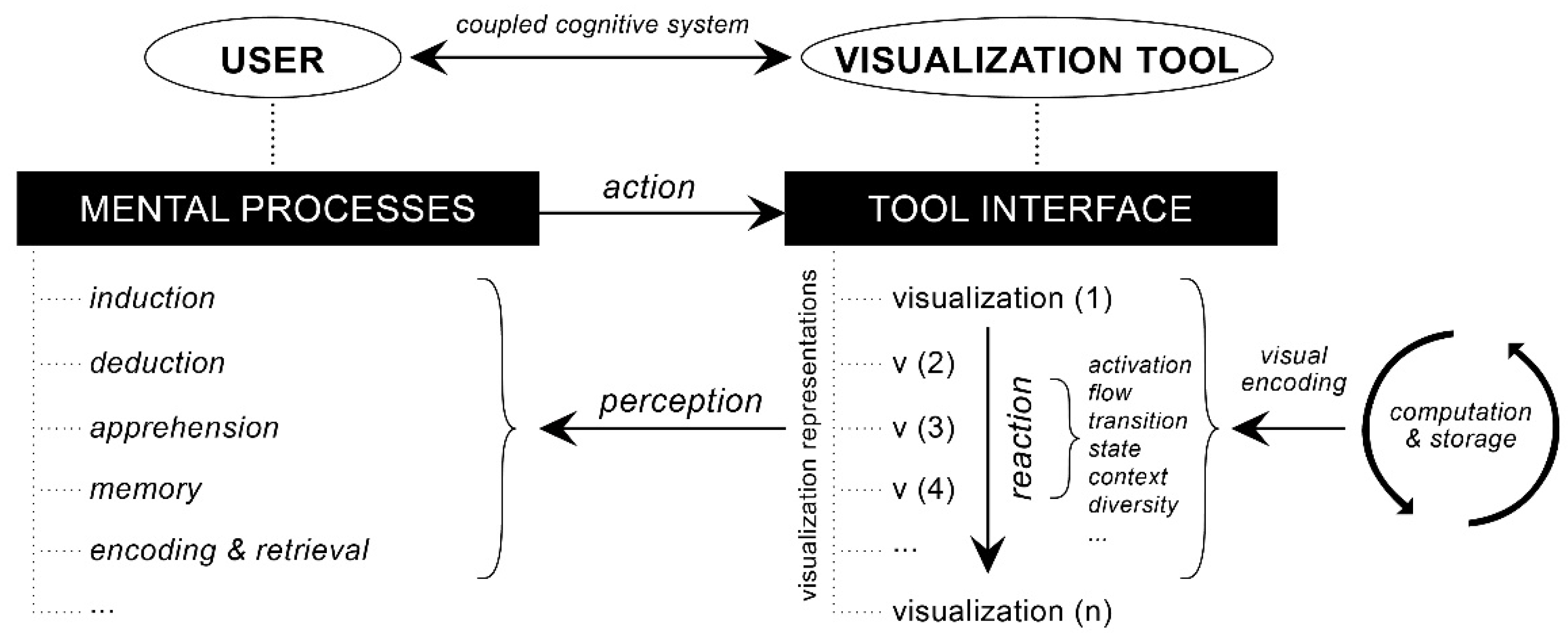
2.2. Approach to Conceptualization of Mental Models
2.3. Envisioned Explorative Tasks
3. Results
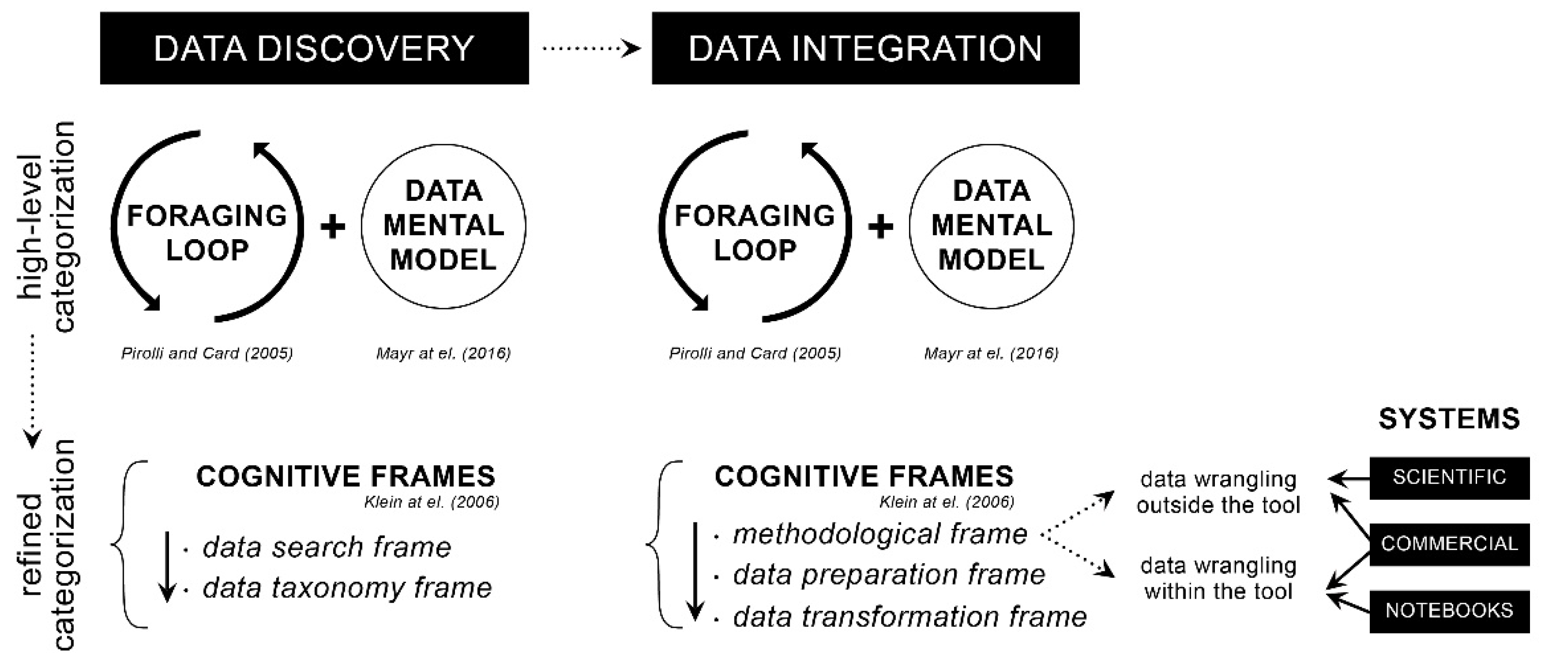
3.1. Data Discovery
3.2. Data Integration
3.3. Data Profiling
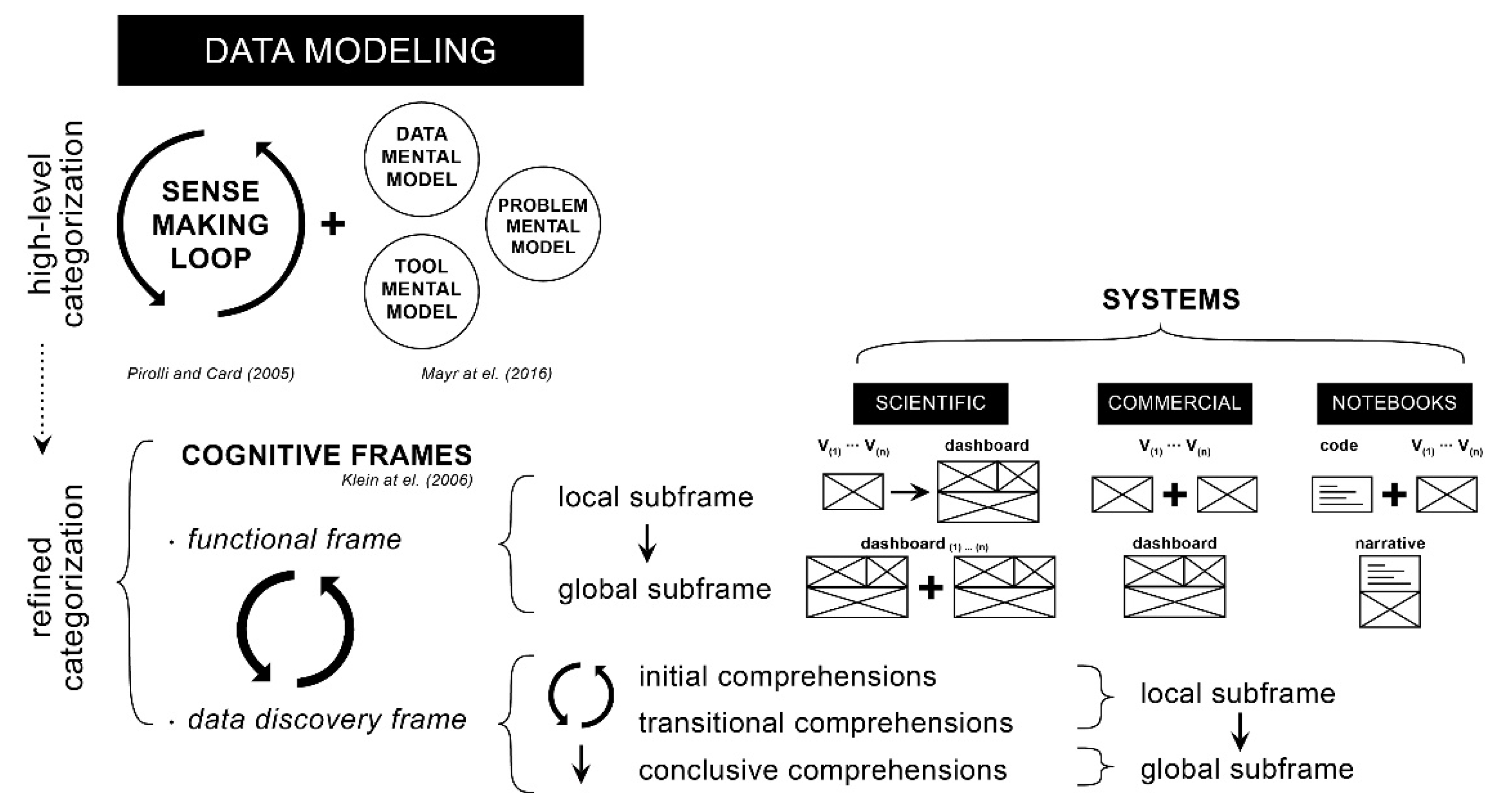
3.4. Data Modeling
3.5. Data Reporting
4. Discussion
5. Conclusions
Author Contributions
Funding
Institutional Review Board Statement
Informed Consent Statement
Data Availability Statement
Acknowledgments
Conflicts of Interest
References
- Anouncia, S.M.; Gohel, H.A.; Subbiah, V. Data Visualization: Trends and Challenges toward Multidisciplinary Perception, 1st ed.; Springer: Singapore, 2020; p. 179. [Google Scholar]
- Qin, X.; Luo, Y.; Tang, N.; Li, G. Making data visualization more efficient and effective: A survey. VLDB J. 2020, 29, 93–117. [Google Scholar] [CrossRef]
- Ware, C. Information Visualization: Perception for Design; Morgan Kaufmann: San Francisco, CA, USA, 2000. [Google Scholar]
- Patterson, R.E.; Blaha, L.M.; Grinstein, G.G.; Liggett, K.K.; Kaveney, D.E.; Sheldon, K.C.; Havig, P.R.; Moore, J.A. A human cognition framework for information visualization. Comput. Graph. 2014, 42, 42–58. [Google Scholar] [CrossRef]
- Potter, M.C.; Wyble, B.; Hagmann, C.E.; McCourt, E.S. Detecting meaning in RSVP at 13 ms per picture. Atten. Percept. Psychophys. 2014, 76, 270–279. [Google Scholar] [CrossRef] [PubMed]
- Few, S. Data Visualization for Human Perception. In The Encyclopedia of Human-Computer Interaction, 2nd ed.; Soegaard, M., Dam, R.F., Eds.; Interaction Design Foundation: Aarhus, Denmark, 2014. [Google Scholar]
- Tran, P.V.; Truong, L.X. Approaching human vision perception to designing visual graph in data visualization. Concurr. Comput. Pract. Exp. 2021, 33, e5722. [Google Scholar] [CrossRef]
- Fisher, B.; Green, T.M.; Arias-Hernández, R. Visual analytics as a translational cognitive science. Top. Cogn. Sci. 2011, 3, 609–625. [Google Scholar] [CrossRef] [PubMed]
- Green, T.M.; Ribarsky, W.; Fisher, B. Building and Applying a Human Cognition Model for Visual Analytics. Inf. Vis. 2009, 8, 1–13. [Google Scholar] [CrossRef]
- Sedig, K.; Parsons, P. Interaction Design for Complex Cognitive Activities with Visual Representations: A Pattern-Based Approach. AIS Trans. Hum. Comput. Interact. 2013, 5, 84–133. [Google Scholar] [CrossRef]
- Ward, M.; Grinstein, G.; Keim, D. Interactive Data Visualization: Foundations, Techniques, and Applications, 2nd ed.; A.K Peters, Ltd./CRC Press: Natick, MA, USA, 2015. [Google Scholar]
- Elmqvist, N.; Vande Moere, A.; Jetter, H.-C.; Cernea, D.; Reiterer, H.; Jankun-Kelly, T.J. Fluid interaction for information visualization. Inf. Vis. 2011, 10, 327–340. [Google Scholar] [CrossRef]
- Pike, W.A.; Stasko, J.T.; Chang, R.; O’Connell, T. The Science of Interaction. Inf. Vis. 2009, 8, 263–274. [Google Scholar] [CrossRef]
- Keim, D.; Kohlhammer, J.; Ellis, G.; Mansmann, F. Mastering the Information Age: Solving Problems with Visual Analytics; 436 Eurographics Association: Goslar, Germany, 2010; ISBN 978-3-905673-77-7. [Google Scholar]
- Cui, W. Visual Analytics: A Comprehensive Overview. IEEE Access 2019, 7, 81555–81573. [Google Scholar] [CrossRef]
- Keim, D.; Andrienko, G.; Fekete, J.-D.; Görg, C.; Kohlhammer, J.; Melançon, G. Visual Analytics: Definition, Process, and Challenges. In Information Visualization-Human-Centered Issues and Perspectives, 1st ed.; Kerren, A., Stasko, J.T., Fekete, J.-D., North, C., Eds.; Springer: Berlin/Heidelberg, Germany, 2008; pp. 154–175. [Google Scholar]
- Keim, D.A.; Mansmann, F.; Schneidewind, J.; Thomas, J.; Ziegler, H. Visual Analytics: Scope and Challenges. In Visual Data Mining; Simoff, S.J., Böhlen, M.H., Mazeika, A., Eds.; Springer: Berlin/Heidelberg, Germany, 2008; pp. 76–90. [Google Scholar]
- Sedig, K.; Parsons, P.; Dittmer, M.; Haworth, R. Human-Centered Interactivity of Visualization Tools: Micro- and Macro-level Considerations. In Handbook of Human Centric Visualization; Huang, W., Ed.; Springer: New York, NY, USA, 2014; pp. 717–743. [Google Scholar]
- Parsons, P.; Sedig, K. Adjustable Properties of Visual Representations: Improving the Quality of Human-Information Interaction. J. Assoc. Inf. Sci. Technol. 2014, 65, 455–482. [Google Scholar] [CrossRef]
- Skarbez, R.; Polys, N.F.; Ogle, J.T.; North, C.; Bowman, D.A. Immersive Analytics: Theory and Research Agenda. Front. Robot. AI 2019, 6, 82. [Google Scholar] [CrossRef] [PubMed]
- Funke, J. Complex problem solving: A case for complex cognition? Cogn. Process. 2010, 11, 133–142. [Google Scholar] [CrossRef]
- Liu, Z.; Stasko, J.T. Mental Models, Visual Reasoning and Interaction in Information Visualization: A Top-down Perspective. IEEE Trans. Vis. Comput. Graph. 2010, 16, 999–1008. [Google Scholar] [CrossRef]
- Sedig, K.; Parsons, P.; Liang, H.-N.; Morey, J. Supporting Sensemaking of Complex Objects with Visualizations: Visibility and Complementarity of Interactions. Informatics 2016, 3, 20. [Google Scholar] [CrossRef]
- Kirsh, D. Interaction, External Representation and Sense Making. In Proceedings of the 31st Annual Conference of the Cognitive Science Society, Amsterdam, The Netherlands, 29 July–1 August 2009; pp. 1103–1108. [Google Scholar]
- Scaife, M.; Rogers, Y. External cognition: How do graphical representations work? Int. J. Hum. Comput. Stud. 1996, 45, 185–213. [Google Scholar] [CrossRef]
- Hutchins, E. Cognition, Distributed. In International Encyclopedia of the Social & Behavioral Sciences; Elsevier Science: Amsterdam, The Netherlands, 2001; pp. 2068–2072. [Google Scholar]
- Wilkinson, L. Statistics and Computing: The Grammar of Graphics, 2nd ed.; Springer: New York, NY, USA, 2005. [Google Scholar]
- Downes, E.J.; McMillan, S.J. Defining Interactivity: A Qualitative Identification of Key Dimensions. New Media Soc. 2000, 2, 157–179. [Google Scholar] [CrossRef]
- Spence, J.W.; Tsai, R.J. On human cognition and the design of information systems. Inf. Manag. 1997, 32, 65–73. [Google Scholar] [CrossRef]
- Nazemi, K.; Stab, C.; Kuijper, A. A Reference Model for Adaptive Visualization Systems. In Human-Computer Interaction. Design and Development Approaches; HCI 2011; Lecture Notes in Computer Science 6761; Jacko, J.A., Ed.; Springer: Berlin/Heidelberg, Germany, 2011. [Google Scholar] [CrossRef]
- Tan, D.; Nijholt, A. (Eds.) Brain-Computer Interfaces and Human-Computer Interaction. In Brain-Computer Interfaces; Human-Computer Interaction Series; Springer: London, UK, 2010. [Google Scholar] [CrossRef]
- Nardi, B.A.; Zarmer, C.L. Beyond models and metaphors: Visual formalisms in user interface design. J. Vis. Lang. Comput. 1993, 4, 5–33. [Google Scholar] [CrossRef]
- Mayr, E.; Schreder, G.; Smuc, M.; Windhager, F. Looking at the Representations in our Mind. Measuring Mental Models of Information Visualizations. In Proceedings of the BELIV ′16: Sixth Workshop on Beyond Time and Errors on Novel Evaluation Methods for Visualization, Baltimore, MD, USA, 24 October 2016. [Google Scholar]
- Weick, K.E. Sensemaking in Organizations; SAGE Publications, Inc.: New York, NY, USA, 1995; Volume 3, p. 248. [Google Scholar]
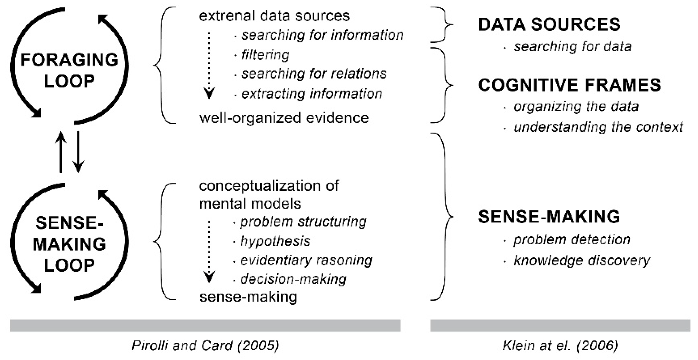
- Pirolli, P.; Card, S. The Sensemaking Process and Leverage Points for Analyst Technology as Identified through Cognitive Task Analysis. In Proceedings of the International Conference on Intelligence Analysis, Atlanta, GA, USA, 2–4 May 2005. [Google Scholar]
- Klein, G.; Phillips, J.K.; Rall, E.L.; Peluso, D.A. A data-frame theory of sensemaking. In Expertise Out of Context: Proceedings of the 6th International Conference on Naturalistic Decision Making, London, UK, 23–26 June 2006; Lawrence Erlbaum Associates Publishers: Mahwah, NJ, USA, 2006. [Google Scholar]
- Knauff, M.; Wolf, A.G. Complex cognition: The science of human reasoning, problem-solving, and decision-making. Cogn. Process. 2010, 11, 99–102. [Google Scholar] [CrossRef]
- Schmid, U.; Ragni, M.; Gonzalez, C.; Funke, J. The challenge of complexity for cognitive systems. Cogn. Syst. Res. 2011, 12, 211–218. [Google Scholar] [CrossRef]
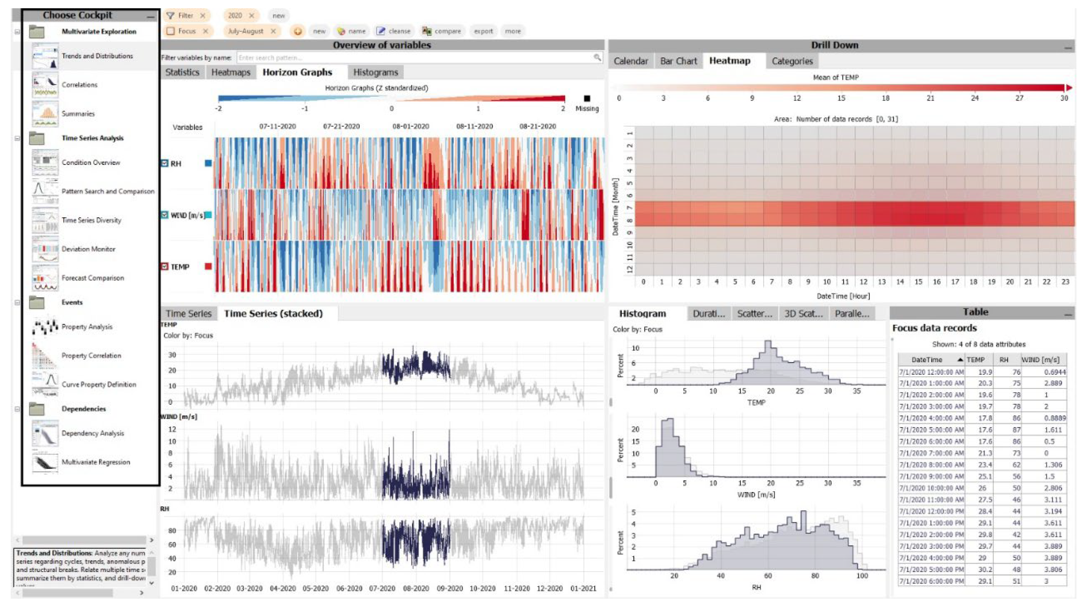
- Vuckovic, M.; Schmidt, J. Visual Analytics Approach to Comprehensive Meteorological Time-Series Analysis. Data 2020, 5, 94. [Google Scholar] [CrossRef]
- Vuckovic, M.; Schmidt, J.; Ortner, T.; Cornel, D. Combining 2D and 3D Visualization with Visual Analytics in the Environmental Domain. Information 2022, 13, 7. [Google Scholar] [CrossRef]
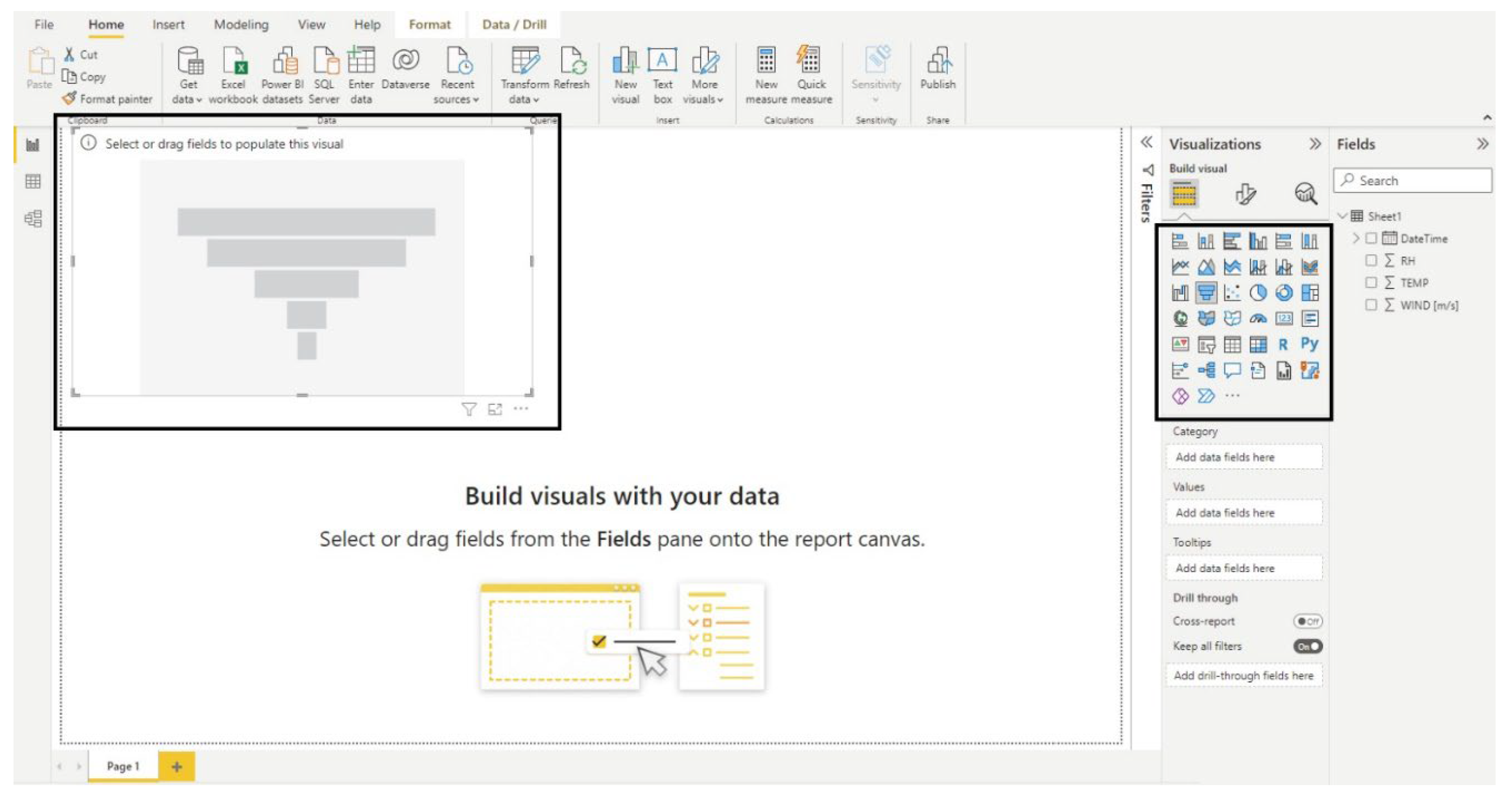
- Microsoft Power BI. 2022. Available online: https://powerbi.microsoft.com/en-au/ (accessed on 3 May 2022).
- Jypiter Nootebook. 2022. Available online: https://jupyter.org/ (accessed on 3 May 2022).
- Güss, C.D. What Is Going Through Your Mind? Thinking Aloud as a Method in Cross-Cultural Psychology. Front. Psychol. 2018, 9, 1292. [Google Scholar] [CrossRef]
- Ericsson, K.A. Protocol Analysis and Expert Thought: Concurrent Verbalizations of Thinking during Experts’ Performance on Representative Tasks. In The Cambridge Handbook of Expertise and Expert Performance; Ericsson, K., Charness, N., Feltovich, P., Hoffman, R., Eds.; Cambridge University Press: Cambridge, UK, 2006. [Google Scholar] [CrossRef]
- Vuckovic, M.; Schmidt, J. Visual Analytics for Climate Change Detection in Meteorological Time-Series. Forecasting 2021, 3, 276–289. [Google Scholar] [CrossRef]
- Kandel, S.; Paepcke, A.; Hellerstein, J.M.; Heer, J. Enterprise Data Analysis and Visualization: An Interview Study. IEEE Trans. Vis. Comput. Graph. 2012, 18, 2917–2926. [Google Scholar] [CrossRef] [PubMed]
- Microsoft Excel. 2022. Available online: https://www.microsoft.com/en-ww/microsoft-365/excel (accessed on 3 May 2022).
- Kandel, S.; Paepcke, A.; Hellerstein, J.M.; Heer, J. Wrangler: Interactive visual specification of data transformation scripts. In Proceedings of the SIGCHI Conference on Human Factors in Computing Systems, CHI ′11, Vancouver, CO, Canada, 7–12 May 2011. [Google Scholar]
- Rock, I.; Palmer, S. The Legacy of Gestalt Psychology. Sci. Am. 1990, 263, 84–91. [Google Scholar] [CrossRef] [PubMed]
- Wertheimer, M. A Gestalt Perspective on the Psychology of Thinking. In Towards a Theory of Thinking On Thinking; Glatzeder, B., Goel, V., Müller, A., Eds.; Springer: Berlin/Heidelberg, Germany, 2010. [Google Scholar] [CrossRef]
- Sedig, K.; Liang, H.-N. Interactivity of visual mathematical representations: Factors affecting learning and cognitive processes. J. Interact. Learn. Res. 2006, 17, 179–212. [Google Scholar]
- Sanchez-Mora, M.C. Towards a taxonomy for public communication of science activities. J. Sci. Commun. 2016, 15, Y01. [Google Scholar] [CrossRef]


Publisher’s Note: MDPI stays neutral with regard to jurisdictional claims in published maps and institutional affiliations. |
© 2022 by the authors. Licensee MDPI, Basel, Switzerland. This article is an open access article distributed under the terms and conditions of the Creative Commons Attribution (CC BY) license (https://creativecommons.org/licenses/by/4.0/).
Share and Cite
Vuckovic, M.; Schmidt, J. On Sense Making and the Generation of Knowledge in Visual Analytics. Analytics 2022, 1, 98-116. https://doi.org/10.3390/analytics1020008
Vuckovic M, Schmidt J. On Sense Making and the Generation of Knowledge in Visual Analytics. Analytics. 2022; 1(2):98-116. https://doi.org/10.3390/analytics1020008
Chicago/Turabian StyleVuckovic, Milena, and Johanna Schmidt. 2022. "On Sense Making and the Generation of Knowledge in Visual Analytics" Analytics 1, no. 2: 98-116. https://doi.org/10.3390/analytics1020008
APA StyleVuckovic, M., & Schmidt, J. (2022). On Sense Making and the Generation of Knowledge in Visual Analytics. Analytics, 1(2), 98-116. https://doi.org/10.3390/analytics1020008