Article

Feature Selection Based on Three-Dimensional Correlation Graphs

Faculty of Natural Sciences, Matej Bel University, 974 01 Banská Bystrica, Slovakia
*
Author to whom correspondence should be addressed.
These authors contributed equally to this work.
AppliedMath 2025, 5(3), 91; https://doi.org/10.3390/appliedmath5030091
Submission received: 15 May 2025 / Revised: 4 July 2025 / Accepted: 14 July 2025 / Published: 17 July 2025

Abstract

The process of feature selection is a critical component of any decision-making system incorporating machine or deep learning models applied to multidimensional data. Feature selection on input data can be performed using a variety of techniques, such as correlation-based methods, wrapper-based methods, or embedded methods. However, many conventionally used approaches do not support backwards interpretability of the selected features, making their application in real-world scenarios impractical and difficult to implement. This work addresses that limitation by proposing a novel correlation-based strategy for feature selection in regression tasks, based on a three-dimensional visualization of correlation analysis results—referred to as three-dimensional correlation graphs. The main objective of this study is the design, implementation, and experimental evaluation of this graphical model through a case study using a multidimensional dataset with 28 attributes. The experiments assess the clarity of the visualizations and their impact on regression model performance, demonstrating that the approach reduces dimensionality while maintaining or improving predictive accuracy, enhances interpretability by uncovering hidden relationships, and achieves better or comparable results to conventional feature selection methods.

1. Introduction

Human perception naturally allows information to be observed in one to three dimensions, which is a significant limitation in many areas of science and research. When studying large datasets, which often contain several tens or hundreds of attributes, the high dimensionality poses a problem from the perspective of various typical analytical tasks such as data visualization or training of machine learning models [1].
For the purposes of dealing with high data dimensionality, a large number of methods, techniques, and approaches, which can be divided between the so-called dimensionality reduction and feature selection approaches, have been proposed and implemented [2].
Dimensionality reduction refers to the process of reducing the number of attributes in a dataset from input I N attributes to output O U T attributes, while I N > O U T > 0 through linear or non-linear transformations of the data in the considered space [3]. Typical techniques of dimensionality reduction are methods such as Principal Component Analysis [3], map methods such as Isomaps or uMaps [4], or t-distributed Stochastic Neighbour Embedding [5].
Similarly, the feature selection reduces the number of attributes present in the dataset, but without their transformation or combination—these approaches select the portion of attributes with the highest potential and usability and neglect irrelevant or redundant attributes [6]. The feature selection methods can be categorized using various criteria, while one of the most common ones is the categorization based on evaluation criteria, which divides these approaches into filter-based methods [7] and wrapper-based methods [8]. When compared to the dimensionality reduction approaches, feature selection allows for backwards readability of results and, therefore, can be utilized in the process of gaining knowledge from data analysis processes.
High-dimensional datasets often force analysts to choose between these two sets of techniques, leaving indirect relationships between attributes undiscovered. While correlation-based filters preserve backwards readability by selecting attributes with strong direct associations, they rarely expose the indirect dependencies that can signal synergistic effects or causalities hidden in data. This motivates the need for dimensionality reduction and feature selection methods that focus on interpretability by directly mapping selected features back to the original dataset, simultaneously highlighting both direct and indirect relationships in the studied data, and aligning with human perceptual strengths by presenting correlations in one to three-dimensional space.
It is the latter of the two mentioned types of methods that is of interest for the presented study—specifically, the correlation-based approach to feature selection, which is represented in a large number of algorithms and falls under filter-based approaches to the task [2]. This study presents a novel feature selection model based on graphical models visualized in three-dimensional spaces, used in the context of correlation analysis, while [9]
G = ( V , E ) , E V 2
where G is a graph consisting of a set of vertices V, which represent individual attributes of a studied dataset, and a set of weighted edges E connecting these vertices, representing the existence and value of correlation between the connected attributes.
Therefore, the objective of the work can be specified as the design and implementation of a graphical visualization model for the examination of direct and indirect correlation between individual attributes of a dataset, identification of crucial parts of the dataset bearing strong prediction potential, and use of this visualization in the feature selection process. After its implementation, the proposed model is evaluated on the selected real-world dataset from the area of energetics with the focus on the quality of the proposed visualization and feature selection for the purposes of regression tasks. Finally, the proposed method is compared with other solutions to the problem, and its advantages and disadvantages are determined.
Besides the introduction of the work, this study consists of three main sections. In Section 2, the correlation analysis, correlation coefficients, and correlation matrices are introduced as a basis for the design of the three-dimensional graphical visualization model. This section of the work also contains the description of the proposed model itself and definitions of the critical computations needed for its implementation. Section 3 describes the case study of the proposed model on the benchmarking dataset and offers its evaluation from various points of view. Lastly, Section 4 concludes the work and offers possible future work directions in the studied area.

2. Correlation Analysis and Three-Dimensional Structure Visualization

The primary objective of correlation analysis is to identify the predictive potential stored in a dataset for its subsequent exploration and analysis through statistical methods or machine learning models. The predictive potential of a dataset is examined through the correlation coefficients (denoted by c o r r ( A , B ) for a general correlation coefficient measured between attributes A and B), which provide a quantitative measure of the strength and direction of the relationships between each pair of attributes [10].
A plethora of metrics have been proposed to measure this predictive potential between pairs of attributes. However, values of all of these metrics are constrained to the interval < 1 , 1 > , where
  • c o r r ( A , B ) = 1 points to the strong correlation of values of the attributes A and B;
  • c o r r ( A , B ) = 0 is non-correlation of the values of A and B;
  • c o r r ( A , B ) = 1 denotes the strong anticorrelation of the values of the studied attributes.
Naturally, the relationship between the two attributes grows stronger the further from 0 the coefficient’s value is. However, since the values of c o r r ( A , B ) = 1 or 1 are not common in real-world data, set acceptability borders are utilized for filtering of interesting and uninteresting relationships in data. One of the such frequently used borders is | c o r r ( A , B ) | 0.8 , sometimes relaxed to the value of 0.7 [11].
The considered interval and the abovementioned acceptability border are used when working with both basic types of correlation measures—correlation coefficients focused on the measurement of the strength and direction of linear and non-linear monotone relationships. The first of these correlation coefficient types is represented by the Pearson correlation coefficient (r) [12]:
r ( A , B ) = i = 1 n ( A i μ ( A ) ) ( B i μ ( B ) ) i = 1 n ( A i μ ( A ) ) 2 i = 1 n ( B i μ ( B ) ) 2
where A and B denote the attributes among which the relationship is studied, μ denotes average value of given attribute, and n denotes the number of measurements of the studied attributes.
Correlation coefficients with the same objective for the non-linear monotone relationships present in data are computed via ranking methods such as Spearman rank correlation coefficient ( ρ ) [13]:
ρ ( A , B ) = 1 6 d i 2 n ( n 2 1 )
where d denotes the difference between the ranks of measurements for the considered attributes A and B.
Since the Spearman correlation coefficient is sensitive to the repeating values (and rankings) of attributes, the Kendall rank correlation coefficient ( τ ) can be utilized as an alternative in the following way [14]:
τ ( A , B ) = n c n d n ( n 1 ) 2
where n c denotes the number of concordant pairs of rankings and n d denotes the number of discordant pairs of rankings.
As mentioned above, the correlation coefficients measure the strength and direction of relationships between a pair of selected attributes from a dataset. Yet, since it is common that datasets contain tens or even hundreds of attributes among which the correlation needs to be measured, the correlation matrix ( C ) is used for the summarization of the results of correlation analysis. For a dataset of n quantitative attributes, C is of size n × n , while individual elements of the matrix bear the value of the correlation coefficient measured between attributes, which index the given element, and therefore [9]
A 1 A 2 A 3 A n A 1 c o r r ( A 1 , A 1 ) c o r r ( A 1 , A 2 ) c o r r ( A 1 , A 3 ) c o r r ( A 1 , A n ) A 2 c o r r ( A 2 , A 1 ) c o r r ( A 2 , A 2 ) c o r r ( A 2 , A 3 ) c o r r ( A 2 , A n ) A 3 c o r r ( A 3 , A 1 ) c o r r ( A 3 , A 2 ) c o r r ( A 3 , A 3 ) c o r r ( A 3 , A n ) A n c o r r ( A n , A 1 ) c o r r ( A n , A 2 ) c o r r ( A n , A 3 ) c o r r ( A n , A n )
In datasets containing a large number of attributes, this matrix is often hard to read and use, which motivates various filtering and masking approaches to reduce the amount of information presented in a correlation matrix. Most commonly the so-called σ -mask, computed as [9]
σ ( C ) = ( m a x ( | C | ) + μ ( | C | ) 2 )
is being used as a filter for correlation coefficient values in the correlation matrix as follows:
| c o r r ( C i . j ) | = c o r r ( C i , j ) , i f | c o r r ( C i , j ) | σ , 0 , o t h e r w i s e . i , j { 1 , 2 , . . . , n }
In this way, the significant correlation coefficient values are maintained in the C , while other values are pushed to 0. After the extensive testing of this approach to the masking, its slight variation, including a user-defined mask strictness parameter ( α < 0 , 0.3 > ), was introduced [15]:
σ ( C ) = ( m a x ( | C | ) + μ ( | C | ) 2 ) + α
while applying the same filtering method as presented in the previous masking case. For the purposes of the research presented in this study, the variant of σ -masking including the α parameter is used.

Three-Dimensional Visualization of Correlation Graphs

In the context of correlation analysis, several visualization models were proposed and are frequently used in data analysis processes. The standard heatmap visualization of a correlation matrix, where individual elements of the correlation matrix grid are colored based on the value of the measured correlation coefficient, is the most utilized of the visualizations for the purposes of identification of prediction potential and summarization of correlation analysis results. The other set of visualization methods is based on graphical models labeled as correlation structures. These visualization approaches focus on both of the previous problems—identification of prediction potential and summarization of correlation analysis results—but also use their structure for the determination of pseudo-transitivity of prediction potential in the dataset or feature selection, which is of interest in the presented study [9].
This work focuses on the design of a novel correlation structure for the purposes of feature selection problems based on three-dimensional visualization of correlation graphs. As stated in Equation (1), such a correlation graph consists of the following:
  • A set of vertices V, where each vertex represents one of the attributes of the analyzed dataset.
  • A set of edges E denoting the existence of an interesting correlation between a pair of attributes (vertices) interconnected by any of the edges.
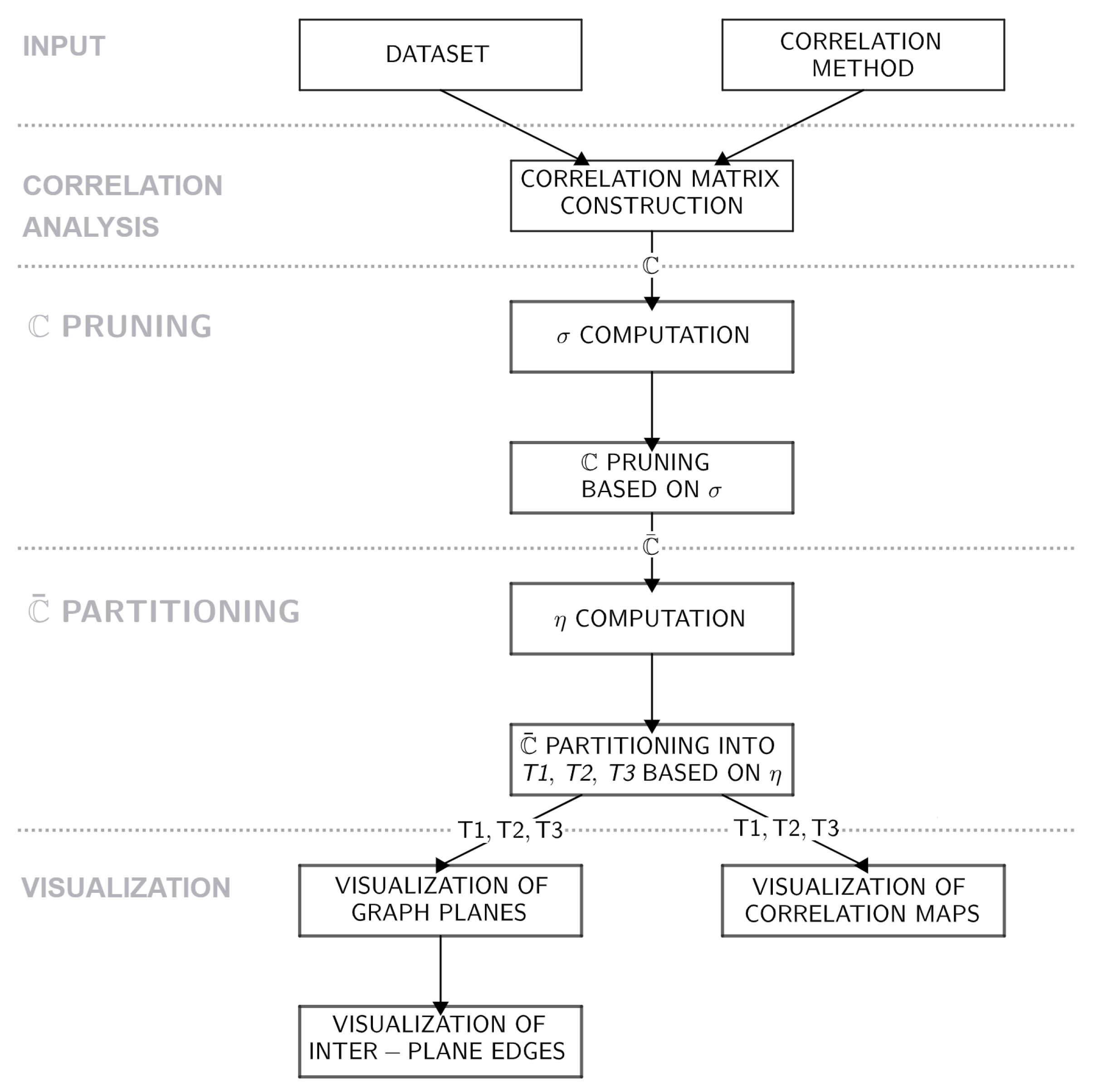
In the proposed visualization approach, the global structure of the correlation graph is firmly set as a graph consisting of three components, referred to as tertiles, visualized on separate planes interconnected via edges representing the strongest correlation coefficient values between neighboring tertiles. Naturally, the structure of the graph tertiles themselves is variant based on the studied dataset.
The process of construction of this visualization can be summarized into the following steps (see Algorithm 1 and Figure 1):
  • Construction of correlation matrix C . The first step of the proposed method consists of the construction of a correlation matrix based on the user-defined correlation coefficient type—Pearson, Spearman, or Kendall correlation.
  • Pruning of C . After its construction, the correlation matrix is pruned using the σ -masking approach specified in Equations (7) and (8). As a part of this step, some of the attributes, which do not share any correlation coefficient values, where c o r r ( A , B ) σ , are dropped from the C ; hence, the pruning produces so-called pruned correlation matrix C ¯ , which represents the first step of the feature selection process performed in the proposed model.
  • Partitioning of C ¯ into tertiles. The constructed C ¯ is then examined row-wise, while for each of its rows a (attributes of the dataset remaining in the C ¯ ), the overall correlation strength η a is computed as
    η a = i C ¯ i , a
    Based on this aggregation metric, the attributes of the dataset are ranked and sorted into three partitions—tertiles. The first tertile ( 1 T ) consists of the attributes which reached the η value in the bottom third of the interval, the second tertile ( 2 T ) contains attributes in the middle third of these values, and the third tertile ( 3 T ) denotes the portion of attributes which reach values in the highest third of the η interval. Subsequently, each of the tertiles is described by its own partial correlation matrix C ¯ p where p { 1 T , 2 T , 3 T } .
  • Visualization of three-dimensional correlation graph. The partial correlation matrices C ¯ p constructed in the previous step of the method are used as the adjacency matrices for the graph visualization. The correlation graph for each of the tertiles is visualized in a separate plane of the considered three-dimensional space, and these graph components are interconnected via the strongest correlations between 1 T and 2 T and 2 T and 3 T identified in C ¯ . The schema of this visualization is presented in the upper portion of Figure 2.
  • Visualization of additional elements. As the last step of the proposed visualization, the partial heatmaps of the dataset are visualized in the bottom part of the resulting model (see Figure 2). Even though the edges of the correlation graph could be weighted using correlation coefficient values, such a presentation of information would clutter the visualization itself and make it less effective. Therefore, the partial heatmaps for tertiles were added as an element for additional examination of relationships between the data.
After the construction of the visualization itself, an analyst is able to examine relationships in the dataset closely and select features present in tertiles relevant to the attribute of their interest. The three-dimensional visualization was selected for these purposes for its inherently interactive experience, allowing users to explore the visualized model from multiple perspectives. Moreover, it enables more effective partitioning of complex datasets into distinct, visually discernible sections—specifically tertiles.
Algorithm 1 Pseudocode for the proposed visualization approach
Require: Dataset D with n attributes, correlation method
  1:
C CorrMatrix ( D , m e t h o d )
  2:
σ ( max ( | C | ) + μ ( | C | ) ) / 2 + α
  3:
C ¯ i , j C i , j , | C i , j | σ , 0 , otherwise
  4:
Remove any all-zero rows/columns from C ¯
  5:
for each attribute a C ¯  do
  6:
       η a i C ¯ i , a
  7:
end for
  8:
Partition attributes of C ¯   1 T : η a t t r < 0 , 1 T ( η ) > 2 T : η a t t r ( 1 T ( η ) , 2 T ( η ) > 3 T : η a t t r ( 2 T ( η ) , 3 T ( η ) >
  9:
C ¯ p submatrix of C ¯ for each partition p { 1 T , 2 T , 3 T }
10:
for each p do
11:
      Use C ¯ p as an adjacency matrix for the partition
12:
      Visualize attributes of p in plane
13:
end for
14:
Create inter-plane edge based on the max ( c o r r ( a t t r a , a t t r b ) ) , a t t r a 1 T , a t t r b 2 T
15:
Create inter-plane edge based on the max ( c o r r ( a t t r c , a t t r d ) ) , a t t r c 2 T , a t t r d 3 T
16:
3 d G r a p h Three-dimensional correlation graph with inter-connected planes
17:
M a p s Visualize C p in the form of heatmap
18:
Construct visualization from 3 d G r a p h and M a p s

3. Evaluation of the Proposed Feature Selection Approach

Based on the design of the feature selection strategy described in the previous section of the work, the approach has been implemented in the P y t h o n 3.10 programming language utilizing the p a n d a s 2.2 . 3 , n u m p y 1.26 . 4 , m a t p l o t l i b 3.9 . 4 , m p l _ t o o l k i t s 3.9 . 4 , and s e a b o r n 0.13 . 2 packages.
For the purposes of evaluation of the proposed method, the following experimental setup is used in conjunction with the feature selection strategy based on the three-dimensional correlation graphs:
  • Dataset: As noted, the evaluation of the feature selection strategy is conducted on the case study of a selected multidimensional dataset. For these purposes, the Appliance Energy dataset [16], focused on energy use of appliances in a low-energy building, is utilized. This dataset consists of 28 attributes describing the temperature, humidity, and usage of lights in individual rooms of the studied building and relevant environmental attributes such as the wind speed, visibility, or the dew point measured outside the building. The values of these attributes are recorded over a set of 19,735 measurements.
  • Evaluated criteria: The behavior of the proposed visualization model in the feature selection process is evaluated from two distinct points of view—firstly, the quality of visualization itself is examined utilizing the Qualitative Result Inspection and Visual Data Analysis and Reasoning approaches [17] for the evaluation of visual models; secondly, the influence of the feature selection based on the proposed approach on the quality of regression models is evaluated using three standard regression model quality metrics—Root Mean-Squared Error (RMSE) [18], Mean Absolute Error (MAE) [18], and Symmetric Mean Absolute Percentage Error (SMAPE) [19]. For an attribute A, these metrics are computed as follows:
    R M S E ( A ) = i = 1 n ( p r e d i c t e d ( A i ) a c t u a l ( A i ) ) 2 n
    M A E ( A ) = i = 1 n | p r e d i c t e d ( A i ) a c t u a l ( A i ) | n
    S M A P E ( A ) = i = 1 n | p r e d i c t e d ( A i ) a c t u a l ( A i ) | ( | a c t u a l ( A i ) | + | p r e d i c t e d ( A i ) | ) / 2 n × 100
    where p r e d i c t e d ( A i ) denotes the i-th value of the attribute A predicted by the selected regression algorithm, while a c t u a l ( A i ) is the actual i-th value of the attribute, and n denotes the number of measured entities for the attribute A.
  • Regressor: Hence, for the regression analysis and its subsequent evaluation, a regression model is needed. In the study, the Support Vector Regressor (SVR), which constructs a hyperplane in a high-dimensional feature space to estimate continuous attribute values while focusing on keeping the most training data within a specified margin of tolerance (marked as ϵ ) and penalizing predictions that fall outside this margin is used [20]. This model is utilized for its computational advantages, mainly its efficiency and low training times, its ability to work with outliers, and its flexibility. In this work, the hyperparameters of the regressor are set up as follows [20]:
    K e r n e l = R B F . In the case of the system utilized in this study, the Radial Basis Function (RBF)-type kernel was used for its ability to model non-linear relationships between the input and the output attributes.
    C = 1 . The penalty value C is used in order to control the equilibrium between achieving a low training error and a low testing error, therefore achieving the balance between underfitting and overfitting of the model.
    ϵ = 0.1 . The width of the margin defines a margin of tolerance where no penalty is given for incorrectly estimated values.

3.1. Three-Dimensional Correlation Graph Visualization

In concordance with the Visual Data Analysis and Reasoning criteria defined in [17], Figure 3 presents the visualization of the selected Appliance Energy dataset using the proposed visual analysis method. As seen in the figure, the main output of the approach for the dataset consists of two main parts. The first part of the visualization, presented in the upper section of the figure, consists of a three-dimensional correlation graph divided into planes (or tertiles) labeled T 1 T 3 —one for each data partition as specified in the previous section of the text. This part of the visualization is fully interactive and, therefore, allows analysts to scale the visualization via zooming functionality and turn the graph around all three axes. The second section of the visualization consists of one correlation map for each of the tertiles, presenting specific correlation coefficient values measured between the attributes included in the given tertile.
For the purposes of the case study presented in Figure 3, the visualization is constructed on the basis of the Pearson correlation coefficient with the masking computed as σ = 0.65 . This correlation matrix mask with the mask strictness α = 0 pruned out 6 out of 28 attributes of the dataset. Comparatively, Figure 4, Figure 5 and Figure 6 contain the same visualization based on Pearson correlation coefficient. However, with the application of α = 0.1 resulting in σ = 0.75 for the first case, α = 0.2 and, hence, σ = 0.85 in the second visualization, and finally α = 0.3 , resulting in σ = 0.95 . With the increase in the user-defined α value, the model prunes out several more attributes of the dataset—as can be seen in the visualizations. With the use of α = 0.1 , one attribute was pruned out of the correlation graph, while α = 0.2 caused pruning of four more attributes, and α = 0.3 drastically cut the attribute set down to four attributes (Figure 7).
The Qualitative Result Inspection [17] of visualization techniques sets several properties of visual models which are relevant for the overall evaluation of the visualization quality. In regard to the presented method, there are three such properties which need to be studied—image quality, visual encoding, and system behavior.
Firstly, the properties of image quality and visual encoding describe whether the visualization technique under study is readable for the purposes it was designed for. In the case of the proposed three-dimensional correlation graph visualization the main purpose is the examination of direct and indirect correlation between individual attributes of a dataset, identification of crucial parts of the dataset bearing strong prediction potential, and using this visualization in the feature selection process. In the proposed approach, the mentioned crucial parts of the dataset are identified with the use of two methods—the σ -masking process and the splitting of the pruned correlation graph into tertiles. This way, the analysts are not only able to identify significant relationships in a dataset, but the visualization allows them to naturally identify inter-connected attribute clusters (the tertiles). Detailed study of the correlation coefficient values and relationships in and between these clusters can be conducted via the interactivity elements of the visualization (scaling and rotation of the three-dimensional correlation graph) and with the use of correlation maps for the identified tertiles.
Hence, the proposed visualization method can be utilized in the process of feature selection in such a way that the regression model uses only the attributes of the pruned dataset (attributes present in the visualized graph) for its learning and estimation process. In more extreme feature selection scenarios, only individual tertiles or their parts can utilized as input features for regressors.
The third relevant property of the system is the so-called walkthrough approach, which focuses on the description of the visual system’s behavior. In the work, we focus on two aspects of the behavior related to the overall user experience when working with the proposed methods. The first of these system aspects is the number of needed inputs for the software implementation of the model. Naturally, the higher the number of input parameters, the higher the flexibility of the visualization. However, this flexibility based on a tuning of several parameter values brings the disadvantage of high time costs for users. Since the proposed visualization model requires minimal tuning, the only three required inputs for the method are the data of interest, the correlation coefficient method (set to Pearson correlation as the default), and the value of correlation mask strictness α (set to α = 0 as the default).
The other important behavioral aspect relevant for this evaluation is computational complexity and the real computation time needed for the construction of the proposed visualization. Based on the implementation, the computational complexity of the approach is estimated as follows:
  • O ( # a 2 n ) for the Pearson correlation coefficient.
  • O ( # a 2 n + # a n log n ) for the Spearman rank correlation coefficient due to added ranking of values in all studied attributes.
  • O ( # a 2 n 2 ) for the Kendall rank correlation due to added combinatorics behind the computation of concordance and discordance for the coefficient.
where # a denotes the number of quantitative attributes in the studied dataset and n is the number of measurements of the attributes in this dataset.
These time complexities are reflected in the computational time itself, which was measured for 10 independent runs of the program on the studied dataset. For the Pearson and Spearman correlation coefficients, the approximate time of the visualization was ≈1.9 s, while the Kendall correlation coefficient method added ≈0.7 s to this time, making the presented method easy to use in practical times.

3.2. Feature Selection with the Use of Three-Dimensional Correlation Graphs

Since the method of three-dimensional correlation graph visualization was proposed for the purposes of feature selection, in this section of the work, the model is applied to the specified problem. The main objective of this evaluation is to lower the dimensionality of the studied dataset via feature selection while not losing any interpretative information (which is common in dimensionality reduction approaches utilizing linear or non-linear transformations [8,21]) and maintain the usability of the data in regression problems.
Table 1 presents the comparison of the basic regression analysis quality metrics and computational time (in seconds) for various subsets and regression analysis situations in the Applied Energy dataset measured on the specified Support Vector Regressor. In the comparison, five subsets of the original attribute set of Applied Energy data are considered.
  • All attributes of the dataset for the base comparison of regression quality.
  • All attributes present in the correlation graph where σ = 0.65 (Figure 3).
  • All attributes of the dataset except the attributes of the third tertile ( T 3 ).
  • All attributes of the dataset except the attributes of the second tertile ( T 2 ).
  • All attributes of the dataset except the attributes of the first tertile ( T 1 ).
Each of the subsets was used as an input for the regression model, while four different output attributes were specified—one from the third tertile of the correlation graph ( T _ o u t ), one from the second tertile ( R H _ 8 ), one from the third one ( r v 1 ), and one attribute, which did not pass the σ -masking procedure. In this way, the influence of the proposed feature selection on various types of attributes can be studied.
Naturally, in all of the measurements using individual attribute subsets, the specified output attribute was not used as a part of the input.
As seen in the regression quality results, the use of the features selected from the correlation graph yields lower R M S E , M A E , and S M A P E values for some of the attributes (e.g., T _ o u t or r v 1 ) compared to using all attributes, with only marginal increases in error for R H _ 8 and A p p l i a n c e s . Sequentially dropping individual tertiles shows that removing tertiles T 3 or T 2 modestly degrades performance, whereas excluding T 1 causes a dramatic spike—most notably a significant increase for the r v 1 attribute—demonstrating the critical importance of those attributes.
When evaluating the quality of the use of the proposed approach in the feature selection task, one notices the fact that, when dividing attributes into tertiles, the method highlights interesting relationships between attributes, even visualizing a form of pseudo-transitivity. The results in Table 1 further show that for replaceable features—those with a high η value that participate in many strong relationships within the dataset—the loss of their partner attributes from the tertile planes has a far less pronounced impact than it does for features lacking such robust relationships (e.g., the r v 1 and exclusion of T 1 tertile).
Examining the computational time results, we observe that using the full set of attributes consistently incurs the highest training times (25–27 s), reflecting the cost of fitting SVR on all available attributes. In contrast, the subset of attributes extracted from the correlation graph achieves a dramatic reduction in runtime−training of the regressor remains below 21 s for all of the output attributes, demonstrating a significant speedup compared to the model based on the full set of attributes. Removing individual tertiles yields various results—for example, omitting T 3 or T 2 reduces the attribute count just enough to reduce the computational time by a few seconds, while excluding T 1 produces similar results to the full dataset, which is caused mainly by the size of the tertile (only four attributes), hence offering little dimensional relief. Thus, the proposed selection not only maintains or improves prediction quality but also delivers substantial gains in computational efficiency when the most redundant attribute groups are pruned.
Overall, we can conclude that this attribute selection strategy is effective—it reduces the dimensionality of the input data, identifies the dataset’s most essential components, and does not degrade the performance of regression models built on these data. In this way, the proposed feature subset achieves compactness and higher interpretability without sacrificing predictive strength.

3.3. Comparative Analysis of the Feature Selection Approaches

The last of the evaluatory components of the work is a comparative analysis of conventional feature selection approaches and the proposed correlation graph-based method. For this study, the following feature selection techniques are considered:
  • Variance threshold selection—the filter, which prunes out the features with low variability of the data. Such attributes are hard to use effectively in the context of predictive analysis and therefore cause noise or are rarely relevant for the decision-making process itself [22].
  • Correlation filter selection—this method computes the pairwise correlation matrix for all attributes of a dataset and then drops one attribute from each highly correlated pair. By eliminating this redundancy, the method focuses on the retention of one representative of each tightly linked subgroup of attributes [22].
  • Feature agglomeration selection—a clustering-based technique that treats each feature as an object and performs hierarchical agglomerative clustering on them. Each cluster is then aggregated to form a new aggregated attribute [23].
In Table 2, the regression errors and the number of selected attributes for each of the considered approaches are presented.
The results of the comparative analysis point to several interesting facts and highlight a number of advantages and disadvantages of the proposed feature selection approach based on correlation graph visualization.
In the context of regression model quality, one can see an overall lowering of regression errors. For the output attribute of T _ o u t , the proposed graph-based subset reduces R M S E from 1.7406 (variance threshold), 2.0564 (correlation filter), and 1.8495 (feature agglomeration) down to 0.1674—an order-of-magnitude improvement. M A E and S M A P E follow the same pattern, with the proposed method achieving 0.0959 M A E and 3.84% S M A P E versus 1.3 M A E and 32.95% S M A P E for the conventional feature selection methods. Similarly, in the case of the output attribute of r v 1 , our R M S E of 0.8562 significantly undercuts the 3.6498–4.1104 range of the other methods, and M A E and S M A P E drop by 75%. Even for R H _ 8 and Appliances—where the unsupervised methods were relatively closer—our approach either matches or slightly betters the best of the three.
When considering the time of computation of the regression model using attributes selected by the compared methods, one can see significant difference between the proposed method (with average time of 18.34 s) and conventional methods (with average time of 13.86 s), while the cause of this difference is likely the number of attributes maintained in the dataset after the feature selection process.

4. Conclusions

Since the correlation analysis is one of the most frequently used statistical measures for the purposes of feature selection, in this study, the focus was put on the novel approach to its utilization in the task based on three-dimensional correlation graph visualization. The proposed method consists of interactive three-dimensional correlation graphs partitioned into tertiles, allowing analysts to explore inter-attribute relationships and identify clusters of correlated features.
The results reached on the Appliance Energy dataset demonstrate that the proposed visualization-driven feature selection method effectively reduces data dimensionality without significantly compromising, and in some cases improving, regression quality. In particular, features selected via the correlation graph yielded comparable or lower R M S E , M A E , and S M A P E values for the used regressor in most cases, while effectively lowering the number of attributes used in the problem. Furthermore, removing the first tertile of the correlation graph led to a dramatic performance drop in some of the regression tasks, indicating its importance in preserving predictive quality. The method also enhances interpretability, reveals hidden relationships such as pseudotransitivity, and remains computationally efficient with minimal user input.
When compared to other conventional feature selection approaches, such as variance threshold, correlation filter, or feature agglomeration, the advantages and disadvantages of the proposed model can be identified. The results of the conducted comparative analysis point to significant improvement in the qualitative performance of the utilized regressor when using the proposed feature selection method. In some of the studied cases, the use of the proposed approach allowed for a tenfold improvement in the decision-making quality. On the other hand, the computational time of the used regressor when utilizing the proposed visualization-based feature selection method proved to be comparatively higher than the cases using conventional methods, with an average gain of five seconds needed for the computation.
While working on the proposed feature selection visualization, several potential directions for future work arose, some of which include the following:
  • Dynamic data partitioning—in the presented version of the feature selection visualization, the considered space described via correlation matrix is partitioned into three parts—tertiles. Since this approach is somewhat restricting, a dynamic approach based on cluster analysis or other data partitioning methods is of high interest.
  • Utilization of virtual reality tools in visualization—since the process of visualization of any type of analytical model involving three-dimensional space is challenging on the standard computing means, the use of virtual reality tools in the problem is highly needed. The future work in this area can focus on such utilization of virtual reality environments for the design and implementation of three-dimensional correlation graph visualization complemented by various interactive features available in virtual reality tools.
  • Visualization of correlation graphs with embedded regressors—as shown in the evaluation of the proposed model, the feature selection based on correlation analysis is conducted in the context of regression analysis. This motivates the need for regressors embedded in the visualized graphs themselves, which would be used for the initial evaluation of feature selection quality and offer additional information about the model.
  • Integration with feature embedding methods—while the proposed method is based on correlation analysis for interpretable and visually guided feature selection, its integration with a feature embedding techniques such as autoencoders, t S N E , or U M A P can be examined. Combining these methods may enhance the ability to capture non-linear relationships and high-dimensional structures, potentially leading to more robust and informative feature selection processes.

Author Contributions

Conceptualization, A.D. and A.S.; methodology, A.D.; software, A.S. and A.D.; validation, A.D.; formal analysis, A.D.; writing—original draft preparation, A.D.; writing—review and editing, A.D.; visualization, A.S. and A.D. All authors have read and agreed to the published version of the manuscript.

Funding

The research presented in this work was supported by the University Grant Agency of Matej Bel University in Banská Bystrica project number UGA-14-PDS-2025.

Data Availability Statement

Code for the presented visualization method focused on three-dimensional correlation graphs is available at https://github.com/AdamDudasUMB/3DcorrVis (accessed on 15 May 2025) Data used in the presented case study are freely available at https://archive.ics.uci.edu/dataset/374/appliances+energy+prediction (accessed on 20 April 2025) In the case of other queries, please contact the authors via adam.dudas@umb.sk.

Conflicts of Interest

The authors declare no conflicts of interest.

Abbreviations

The following abbreviations are used in this manuscript:
GGraph
ESet of edges
VSet of vertices
rPearson correlation coefficient
ρ Spearman rank correlation coefficient
τ Kendall rank correlation coefficient
C Correlation matrix
σ Pruning border (or mask)
α Pruning mask strictness parameter
C ¯ Pruned C
η Overall correlation strength of an attribute
RMSERoot Mean-Squared Error
MAEMean Absolute Error
SMAPESymmetric Mean Absolute Percentage Error
SVRSupport Vector Regression
RBFRadial Basis Function
T1First tertile
T2Second tertile
T3Third tertile

References

  1. Lamsaf, A.; Carrilho, R.; Neves, J.C.; Proença, H. Causality, Machine Learning, and Feature Selection: A Survey. Sensors 2025, 25, 2373. [Google Scholar] [CrossRef] [PubMed]
  2. Theng, D.; Bhoyar, K.K. Feature selection techniques for machine learning: A survey of more than two decades of research. Knowl. Inf. Syst. 2024, 66, 1575–1637. [Google Scholar] [CrossRef]
  3. Qiang, Q.; Zhang, B.; Zhang, C.J.; Nie, F. Adaptive bigraph-based multi-view unsupervised dimensionality reduction. Neural Netw. 2025, 188, 107424. [Google Scholar] [CrossRef] [PubMed]
  4. Zhang, J.; Yang, X.; Zhu, W.; Wu, D.; Wan, J.; Xia, N. A Combined Model WAPI Indoor Localization Method Based on UMAP. Int. J. Commun. Syst. 2025, 38, e70034. [Google Scholar] [CrossRef]
  5. Allaoui, M.; Belhaouari, S.B.; Hedjam, R.; Bouanane, K.; Kherfi, M.L. t-SNE-PSO: Optimizing t-SNE using particle swarm optimization. Expert Syst. Appl. 2025, 269, 126398. [Google Scholar] [CrossRef]
  6. Duan, Z.; Li, T.; Ling, Z.; Wu, X.; Yang, J.; Jia, Z. Fair streaming feature selection. Neurocomputing 2025, 624, 129394. [Google Scholar] [CrossRef]
  7. Chen, H.; Zhang, W.; Yan, D.; Huang, L.; Yu, C. Efficient correlation information mixer for visual object tracking. Knowl.-Based Syst. 2024, 285, 111368. [Google Scholar] [CrossRef]
  8. Jia, W.; Sun, M.; Lian, J.; Hou, S. Feature dimensionality reduction: A review. Complex Intell. Syst. 2022, 8, 2663–2693. [Google Scholar] [CrossRef]
  9. Dudáš, A. Graphical representation of data prediction potential: Correlation graphs and correlation chains. Vis. Comput. 2024, 40, 6969–6982. [Google Scholar] [CrossRef]
  10. Cao, H.; Li, Y. Research on Correlation Analysis for Multidimensional Time Series Based on the Evolution Synchronization of Network Topology. Mathematics 2024, 12, 204. [Google Scholar] [CrossRef]
  11. Iantovics, L.B. Avoiding Mistakes in Bivariate Linear Regression and Correlation Analysis, in Rigorous Research. Acta Polytech. Hung. 2024, 21, 33–52. [Google Scholar] [CrossRef]
  12. Alessandrini, M.; Falaschetti, L.; Biagetti, G.; Crippa, P.; Luzzi, S.; Turchetti, C. A Deep Learning Model for Correlation Analysis between Electroencephalography Signal and Speech Stimuli. Sensors 2023, 23, 8039. [Google Scholar] [CrossRef] [PubMed]
  13. Sunil, K.; Chong, I. Correlation Analysis to Identify the Effective Data in Machine Learning: Prediction of Depressive Disorder and Emotion States. Int. J. Environ. Res. Public Health 2018, 15, 2907. [Google Scholar]
  14. Connor, R.; Dearle, A.; Claydon, B.; Vadicamo, L. Correlations of Cross-Entropy Loss in Machine Learning. Entropy 2024, 26, 491. [Google Scholar] [CrossRef] [PubMed]
  15. Dudáš, A.; Michalíková, A.; Jašek, R. Fuzzy Masks for Correlation Matrix Pruning. IEEE Access 2025, 13, 35387–35400. [Google Scholar] [CrossRef]
  16. Candanedo, L.; Feldheim, V.; Deramaix, D. Data driven prediction models of energy use of appliances in a low-energy house. Energy Build. 2017, 140, 81–97. [Google Scholar] [CrossRef]
  17. Isenberg, T.; Isenberg, P.; Chen, J.; Sedlmair, M.; Möller, T. A Systematic Review on the Practice of Evaluating Visualization. IEEE Trans. Vis. Comput. Graph. 2013, 19, 2818–2827. [Google Scholar] [CrossRef] [PubMed]
  18. Kenyi, M.G.S.; Yamamoto, K. A hybrid SARIMA-Prophet model for predicting historical streamflow time-series of the Sobat River in South Sudan. Discov. Appl. Sci. 2024, 6, 457. [Google Scholar] [CrossRef]
  19. Khan, S.; Muhammad, Y.; Jadoon, I.; Awan, S.E.; Raja, M.A.Z. Leveraging LSTM-SMI and ARIMA architecture for robust wind power plant forecasting. Appl. Soft Comput. 2025, 170, 112765. [Google Scholar] [CrossRef]
  20. Zhang, H.; Sheng, Y.H. v-SVR with Imprecise Observations. Int. J. Uncertain. Fuzziness -Knowl.-Based Syst. 2025, 33, 235–252. [Google Scholar] [CrossRef]
  21. Velliangiri, S.; Alagumuthukrishnan, S.J.P.C. S A Review of Dimensionality Reduction Techniques for Efficient Computation. Procedia Comput. Sci. 2019, 165, 104–111. [Google Scholar] [CrossRef]
  22. Kamalov, F.; Sulieman, H.; Alzaatreh, A.; Emarly, M.; Chamlal, H.; Safaraliev, M. Mathematical Methods in Feature Selection: A Review. Mathematics 2024, 13, 996. [Google Scholar] [CrossRef]
  23. Zhou, P.; Wang, Q.; Zhang, Y.; Ling, Z.; Zhao, S.; Wu, X. Online Stable Streaming Feature Selection via Feature Aggregation. ACM Trans. Knowl. Discov. Data 2025, 19, 65. [Google Scholar] [CrossRef]
Figure 1. Flowchart of the proposed visualization approach.
Appliedmath 05 00091 g001
Figure 2. Schema of the proposed three-dimensional correlation graph visualization complemented with partial correlation maps for individual data partitions.
Appliedmath 05 00091 g002
Figure 3. Three-dimensional correlation graph visualization for the Appliance Energy dataset composed of three-dimensional correlation graph (top) and correlation maps for the identified tertiles (bottom) for σ = 0.65 , α = 0 .
Appliedmath 05 00091 g003
Figure 4. Three-dimensional correlation graph visualization for the Appliance Energy dataset composed of three-dimensional correlation graph and correlation maps for the identified tertiles for σ = 0.65 , α = 0.1 .
Appliedmath 05 00091 g004
Figure 5. Three-dimensional correlation graph visualization for the Appliance Energy dataset composed of three-dimensional correlation graph and correlation maps for the identified tertiles for σ = 0.65 , α = 0.2 .
Appliedmath 05 00091 g005
Figure 6. Three-dimensional correlation graph visualization for the Appliance Energy dataset composed of three-dimensional correlation graph and correlation maps for the identified tertiles for σ = 0.65 , α = 0.3 .
Appliedmath 05 00091 g006
Figure 7. The influence of α -value on the number of attributes in the studied dataset.
Appliedmath 05 00091 g007
Table 1. Comparison of regression error metrics for the S V R regressor with and without the use of the proposed feature selection model.
InputOutputRMSEMAESMAPETime
All attributesT_out0.22710.12374.7825.08
RH_81.12570.80351.9025.28
rv11.4910.86069.7026.59
Appliances98.661242.296133.8527.32
Attributes of correlation graphT_out0.16740.09593.8410.89
RH81.23170.8982.1219.47
rv10.85620.49296.7015.45
Appliances99.676543.108434.8320.90
All attributes except T3 of
correlation graph
T_out0.32090.14875.6420.08
RH_81.48341.07722.5319.99
rv11.44690.80698.8121.56
Appliances101.641244.099735.5724.03
All attributes except T2 of
correlation graph
T_out0.27870.13155.2121.77
RH_81.9111.42823.3622.68
rv11.42320.78418.8820.83
Appliances102.171944.408335.8319.98
All attributes except T1 of
correlation graph
T_out0.66370.452212.5623.37
RH_81.14190.80751.9023.64
rv114.483612.531657.7225.02
Appliances100.87443.00134.1427.07
Table 2. Comparison of regression error metrics for S V R regressor using the considered conventional methods.
MethodOutputNumber of
Attributes
RMSEMAESMAPETime
Variance
Threshold
Selector
T_out271.74061.326732.9515.84
RH_8273.53842.04064.7915.95
rv1274.11043.515726.1316.30
Appliances27104.948947.887940.6317.46
Correlation
Filter
T_out162.05641.395336.4013.19
RH_8163.15842.53875.9312.83
rv1163.71753.166924.4613.02
Appliances15104.968147.939240.7113.02
Feature
Agglomeration
T_out151.84951.432234.3311.64
RH_8152.93312.34885.4911.89
rv1153.64983.106624.1612.11
Appliances15104.967447.914940.6713.04
Disclaimer/Publisher’s Note: The statements, opinions and data contained in all publications are solely those of the individual author(s) and contributor(s) and not of MDPI and/or the editor(s). MDPI and/or the editor(s) disclaim responsibility for any injury to people or property resulting from any ideas, methods, instructions or products referred to in the content.

