1. Introduction: The Need for Interpolators
Practically-gathered time series data often contain missingness: observations are not known due to a variety of real-world causes, including instrument failure, contamination, data storage losses, or even climate and weather (e.g., for Earth-bound stellar observatories). Many of the best estimation algorithms for time series characteristics assume contiguous samples with no missingness. This contrast is the impetus behind the creation of a number of interpolation (or imputation) methods for time series data [
1,
2,
3,
4,
5], and the previous development of a test-bench for evaluation of such methods [
6].
Recently completed work on a new R package interpTools [
7,
8] provides an additional means of simulating particularly-structured artificial time series, imposing missing observations according to a user-specified gap structure, and repairing the incomplete series via chosen interpolation algorithms, with generous support for evaluating interpolators’ statistical performance, and for generating data visualizations. In this paper we discuss the framework developed, and present some results comparing the Hybrid Wiener Interpolator (HWI) [
1] to a number of other standard algorithms.
A significant practical challenge when determining the effectiveness of a given interpolator on a particular time series is that the true value of a missing data point at a given index of a stochastic time-ordered process is generally unknown. Performance metrics, such as those described by [
2], typically assume the form:
where
C is some function of the deviation between the interpolated data point,
, and the true data point,
. Without knowing
or at least its probabilistic structure, exactly, it is impossible to determine such a measure of accuracy.
The statistical performance of interpolators depends greatly on the structural nuances of the dataset chosen. Some algorithms are better-suited for time series with high numbers of embedded periodicities, whereas others are more suitable for low-frequency data. Interpolators’ performance may also depend on any particular pattern of missing values present in the data, e.g., cubic splines fail exponentially as the gap width increases [
8]. Other methods, such as the HWI [
1], are more resilient to longer sequences of consecutive missing observations. As such, there are trade-offs to any chosen interpolator, and careful consideration of the research objectives and parameters of the study should be the first step in the selection of an interpolator in any practical setting.
2. Framework for Interpolation Using interpTools
The interpTools package allows a user to simulate a ‘mock’ time series containing similar features to a real-world dataset of interest, such that the original data points are known, and performance metrics of the form
can be calculated, following the application of a specified pattern of gaps and a particular interpolation algorithm (
Figure 1). Using simulated data enables the user to benchmark performance and make an informed choice regarding which interpolator would be most suitable for use on similar time series outside of the laboratory setting.
The default package model simulates time series
based on the classic additive model for time series:
where
is the mean function,
is the trend function, and
is the noise function. The following section provides a brief description of each component, along with its set of defining parameters. The package also supports arbitrary user-generated series for extension beyond this particular model: in particular, it is simple to generate multiplicative models if that is more relevant to the interests of the user (the reason the additive model was used in the development of this algorithm and package is that many astrophysics time series datasets are more accurately modeled using additive structure, with limited or no seasonality to speak of, and the second author has an interest in data of this type).
The mean component,
is comprised of a constant, non-varying mean element (a ‘grand mean’),
, and a varying polynomial trend element,
:
where
and
c is a randomly sampled integer in the range
. The polynomial coefficients
and are sampled in this way to facilitate the desirable property that the coefficients ‘scale down’ (i.e.,
) as
. The parameter
is chosen by the user and represents the degree of the polynomial. This could be re-expressed without the
by allowing the summation to run from
, but structurally the code implementation assumes a static non-time-varying mean and time-varying polynomial mean.
The trend component,
is considered to be a finite linear combination of sinusoids. The interptools package simulates the trend component according to the construction:
where
(to allow for variation in relative Signal-to-Noise for individual periodic components, with the normal distribution ensuring extremely high-coefficient sinusoids will be rare) and
with
defining the period of the
sinusoid. The default is to sample
unique values for each
(using the fundamental Fourier frequency, and bounded by Nyquist). This is user-controllable, and is intended to allow the user a degree of influence over the relative signal-to-noise in the simulations, where “signal” is considered as overall periodic components, and “noise” is the background. Many scientific datasets have dozens to thousands of such periodic signals present (e.g., astrophysics, helioseismology, seismology, oceanography), and they are the object of interest in such fields and analyses, so control of this parameter is of importance for generalizability of the algorithm and package.
The noise component,
is assumed to be an
stochastic process:
with variance
, where
is the autoregressive (AR) order,
is the moving-average (MA) order, and
is a white noise process.
Each of these components can be generated independently, or simultaneously. Metadata regarding information about the features of each component, such as the polynomial equation of , or the exact frequencies contained in , are saved to memory in list objects of class simList. We reiterate here that this is simply the default structure for simulation, and the user is able to specify their own model of interest, and generate their own synthetic time series for testing with ease.
2.1. Imposing a Gap Structure
Once the artificial data (
K time series) has been generated, the user can remove observations according to a gap structure defined by parameters
p, the proportion of data missing, and
g, the gap width, where each observation (except the endpoints) has the same Bernoulli probability of missingness,
. These inputs are vectorized such that the user can test any number of different (
) combinations, where
P and
G represent the total number of options for the removal percentage and gap width, respectively. The number of unique gap structures to randomly generate under a particular (
) parameterization is specified with
K, which gives the user control over the number of iterations: higher
K means more replicates, which tends to give more stable estimates, as with most statistics (for the analyses shown here,
, which empirically gave stable results on repeated runs and random seeds). An example is shown in
Figure 2.
The result is K ‘gappy’ series, each with a total of missing observations, appearing structurally as randomly-spaced non-overlapping holes of width g, where a ‘hole’ is defined as a sequence of adjacent missing observations. Note that since holes may be placed adjacent to one another, this quantity describes the number of holes visible, at most. Classic Missing Completely At Random (MCAR) can be simulated by setting the gap length to 1.
2.2. Performing Interpolation
Once a set of gap-imposed data has been generated, the user may test interpolation algorithms on those data using parInterpolate(), which executes in parallel for efficiency. The package provides a number of built-in interpolation algorithms, though a user may also choose to provide any developed algorithm for flexibility and extension (e.g., [
3,
5]). The output is a highly nested list with every combination of (
) having a list of
K interpolated time series, each of length
N, where
m represents the particular interpolation method used, and each
for
approximates the original time series.
2.3. Evaluating Statistical Performance
A definition of statistical performance at any time index will be given by some function of the deviation,
C (Equation (
1)). Generally speaking,
C quantifies how well the interpolated series,
, captures the essence of the original series. The package contains 18 such performance metrics, and it is also possible for the user to define their own custom performance statistics. For every
pair, statistical performance can be calculated via the function performance(), with resulting output a list of class pf and dimension
, where
M represents the total number of algorithms tested, and
P and
G are the total number of different proportion missing and gap width parameterizations applied, respectively. The terminal node of any
branch in this nested list is a vector of all the performance criteria for a particular combination of experimental conditions. Consider that for any
branch, there are a set of
K values for each criterion. Thus, each performance metric has a sampling distribution containing
K elements. The performance matrices can be condensed by aggregating sample statistics over
K to reduce dimensionality, via the function aggregate_pf().
The Hybrid Wiener Interpolator (HWI) [
1] is a novel iterative interpolation algorithm based on estimation of sub-components of a time series using robust frequency-domain spectral methods. The essence of the algorithm is the estimation of periodic components and time-varying mean elements using multitaper methods [
9], enveloping an embedded Wiener covariance interpolation step [
10] for the approximately stationary noise background. This pair-wise estimation proceeds iteratively until converged, in approximately an Estimation-Maximization model.
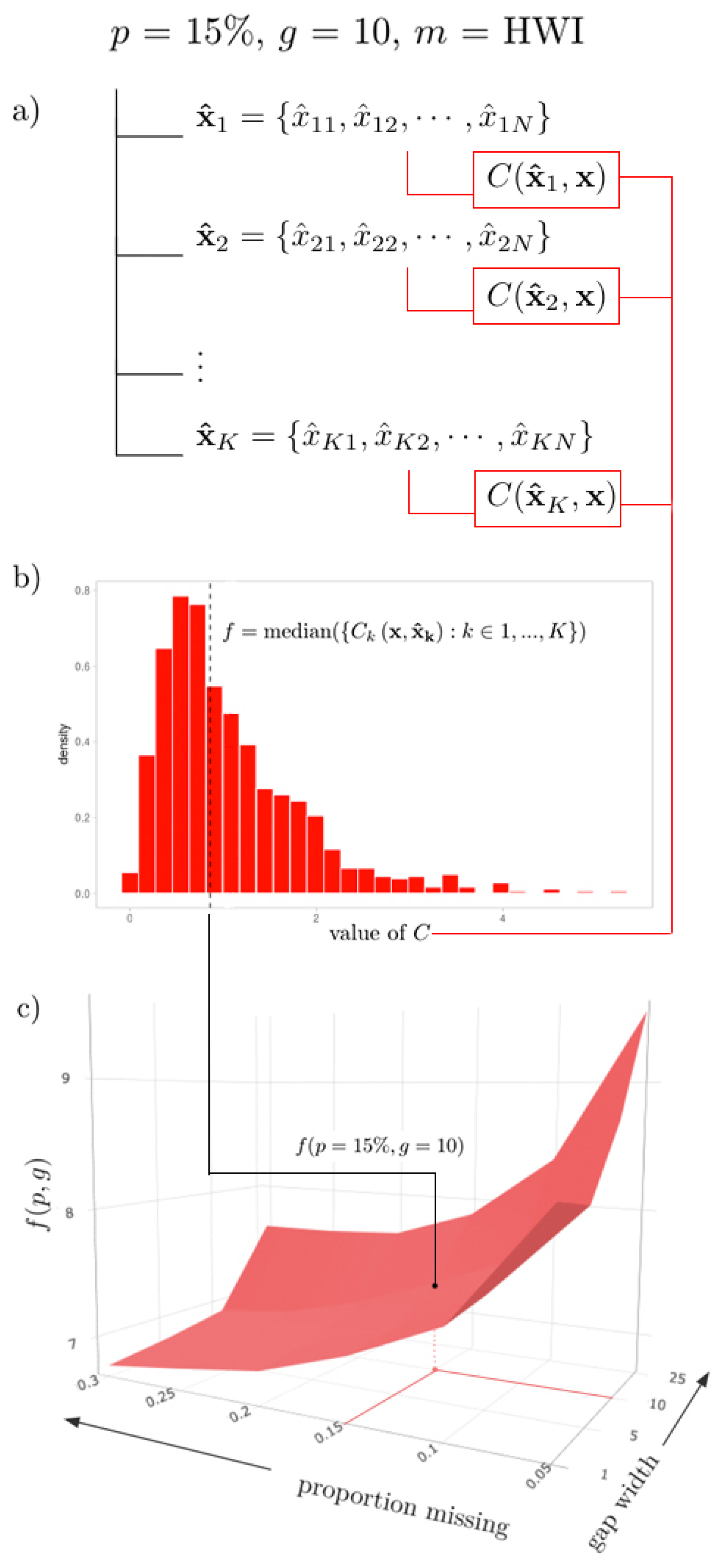
As a visual example, imagine a path through such an above list, where
,
, and
HWI, such that we end with a collection
(
Figure 3a). Imagine applying some performance metric formula, say,
MSE, to each
pair, such that we have a collection of
K values. The sampling distribution of
is shown in
Figure 3b. Then, a sample statistic
f (e.g., the sample median) can be calculated for this distribution, such that
(
Figure 3b). This value represents the aggregated (median) performance of the HWI for a gap structure of (
,
), denoted by the value
(indicated in
Figure 3c).
3. Data Visualization
3.1. 3D Surfaces
Considering the full set of possible gap combinations , for as a discrete mesh in , mapping these aggregated statistics traces out a surface in , where the height of the surface at a point represents an interpolator’s aggregated performance when subjected to a specific proportion of data missing and gap width. Visualizing performance as a surface helps the user to understand the behavior of an interpolator in light of changes to gap structure. Extreme points on the surface represent gap structures at which performance is exemplified: either optimal, or worst-case. For cross-comparison across interpolation methods, multiple performance surfaces can be graphically layered on top of one another, where the ‘best’ interpolator for a particular gap structure will be at an extremum of the surfaces at the corresponding coordinate point.
This visualization is generated by the plotSurface() function, where the user can specify any number of algorithms, the sample statistic to be represented by
, and a performance metric of choice. It is also possible to select an algorithm to highlight via the argument highlight, as well as the colour palette. As the implementation is dynamic, the user can also interact with the surface plot widget by manipulating the camera perspective, adjusting the zoom, and hovering over data points for more precise numerical information. A static export of such a surface is shown in
Figure 3c.
3.2. Heatmaps
For more static (and printable) representations of the 3D surface plot, heatmaps are a nice equivalent. Using heatmapGrid(), a three-dimensional surface can be collapsed into a heatmap through conversion of the third dimension to colour, to which the value of the metric is proportional. The function multiHeatmap() function enables the user to arrange multiple heatmaps into a grid to facilitate cross-comparison between multiple criteria or methods. Demonstration examples are provided in
Figure 4.
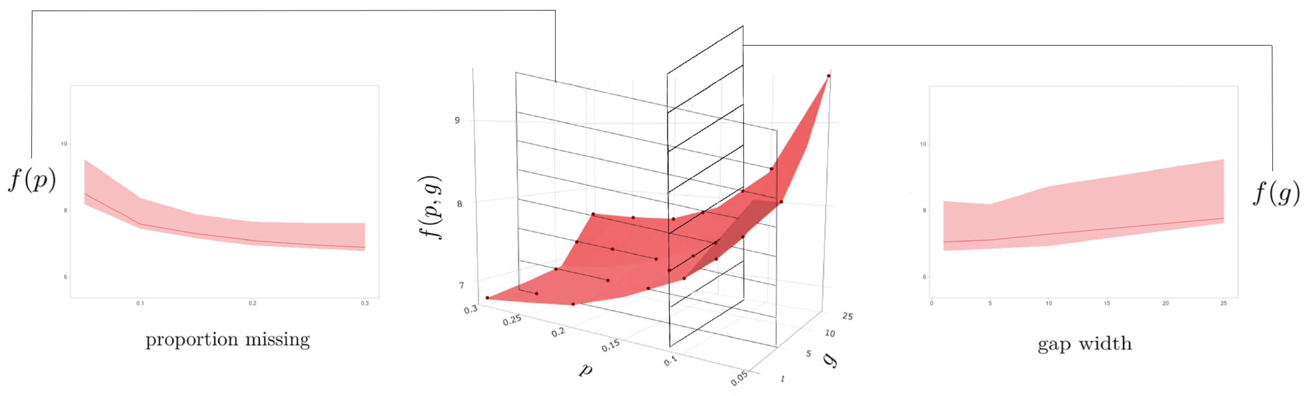
3.3. Collapsed Cross-Section Plots
Changing the perspective angle on a given surface plot can offer further insights on the relationship between interpolator performance and the gap pattern parameters. Imagine rotating such a surface such that it is viewed perpendicular to either the or plane: this allows a user to examine performance with respect to changes in one variable across all values of the other. The sampling distribution can be visualized as a ribbon, where the upper and lower bounds are the largest and smallest values observed across the set of sample statistics contained in the collapsed variable (the highest and lowest points on the corresponding surface plot), and the central line is the median value of this set. The user can generate these collapsed cross-section plots using the plotCS() function.
When cross_section = ‘p’, the
g-axis is collapsed, and the resulting plot is a cross-section of ‘proportion missing’ (
Figure 5, left). Here, we can see how the performance of an algorithm on a particular dataset changes as the total number of missing observations increases (
). When cross_section = ‘g’, the
p-axis is collapsed, and the resulting plot is a cross-section of gap width (
Figure 5, right): we can observe how the overall performance of an algorithm on a particular dataset changes as the width of the gaps increases (
). The widths of the ribbons may indicate the sensitivity of an algorithm to a particular gap parameter, where ‘thicker’ ribbons indicate a greater disparity between the best and worst interpolations, and ‘thinner’ ribbons correspond to algorithms that seem to perform similarly regardless of the value of the defining axis.
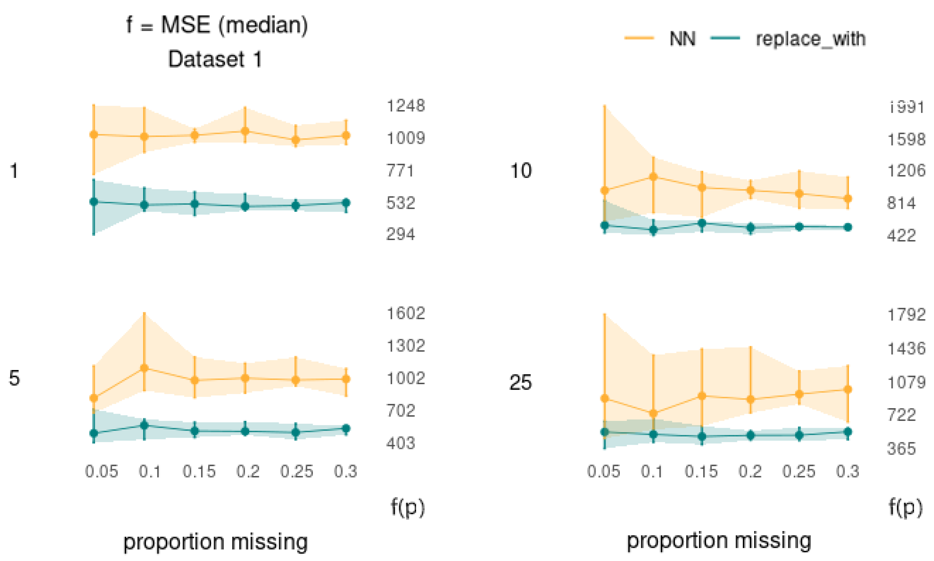
3.4. Uncollapsed Cross-Section Plots
The collapsed cross section plots can be further deconstructed using plotCS_un() such that the performance can be assessed with respect to changes in one variable (p or g) across each individual value of the other.
Interpretable as ‘slices’ of the surface plot generated by plotSurface(), these ‘uncollapsed’ cross-section plots will give insight as to whether there are specific combinations of (
) for which the performance of a particular method is particularly sensitive. Each ribbon represents the distribution of a metric across the
K simulations, where the upper and lower bounds represent the (e.g., 2.5% and 97.5%) quantiles, respectively, and the interior line is formed by the set of sample statistics from corresponding points on the parent surface plot. An advantage of viewing the data in this way is that it allows us to view the error bars at each (
) coordinate point without creating an over-crowded and hard-to-read surface plot visualization. An example is shown in
Figure 6.
4. Analysis of the HWI for Test Cases
The motivation behind the development of interpTools was to test the HWI [
1], originally developed to correct missingness in structured astrophysical data. The objective of the research was to audit its statistical performance on various classes of time series following the application of different gap structure parameterizations, and to complete a full comparative analysis against more classically-used interpolation algorithms. The following will present some results from that study demonstrating the robustness of the HWI as well as showcasing the utility of the interpTools package.
The analysis was conducted on an (arbitrary) five artificial time series () of length , where the mean component was a cubic polynomial function () and was fixed . The periodic trend component was set to vary, where the number of embedded sinusoids, , increased by a factor of ten with each new dataset () so as to scale the effective “signal” presence against the “noise” presence. Recall from above that many real-world astrophysical time series have thousands of periodic components present. All five time series were generated against a background of ARMA(0,0) white noise.
The inclusion of a time-varying mean component allowed for the simulation of a particular form of nonstationarity; a property that, in most other conventional interpolation algorithms, would first need to be corrected through estimation and removal of underlying monotonic trends. Often in practice, this correction is either overlooked, or done using crude techniques (such as differencing) that do not preserve the integrity of the data, and are prone to increasing statistical error [
8]. One of the major advantages of the HWI is that it can be applied to certain classes of nonstationary data, such that no prior manipulations are necessary [
1]. Gap structures were applied with combinations of missingness proportions (
p) up to 30% and gap widths (
g) up to 25 observations wide, of which each
parametrization contained
replicates. In addition to the HWI, other interpolation algorithms were explored: the Kalman filter (KAF), Exponential Weighted Moving Average (EWMA), and cubic splines, with further discussion of other approaches detailed in the appendices of [
8].
In assessing the performance metrics, it was clear that in this case the HWI led to significantly more accurate estimation of the missing values, was the most consistent in its estimation, and the most stable when subjected to increasing missingness and data complexity [
8]. The HWI maintained its rank, even when compared to the more robust KAF and EWMA algorithms. The cubic splines performed comparably at modest gap structures, but quite poorly when
p and
g were large, showing particular sensitivity to gap width.
Figure 7 provides a summary of the statistical performance of each algorithm (excluding the cubic splines) on the fifth dataset, according to the Normalized Root Mean Squared Deviation (NRMSD) metric (optimal when minimized), which was median-aggregated across the 1000 replicates. The corresponding surface values for the HWI are shown in
Table 1.
Note that this should not be considered to be a complete or robust examination of the performance of the HWI against other algorithms. Further analysis was done in [
8], but as with many computational algorithms, demonstration of improvements can only be done in limited test cases due to resources. The HWI provides a number of theoretical advantages over other classic algorithms, especially in highly structured time series with large numbers of readily-detected periodic components, which was why it was developed, and these results seem to reinforce that the design was effective for series of this type. The algorithm is being used “in the wild” by several national science agencies for imputation of scientific data sets, with good results.
5. Conclusions
The R package interpTools provides a robust set of computational tools for scientists and researchers alike to evaluate interpolator performance on artificially-generated time series data in the presence of various gap structure patterns. Investigating these relationships in the safety of a lab setting with synthetic data allows researchers to benchmark performance and make informed decisions about which interpolation algorithm will be most suitable for a real-world dataset with comparable features. The package also provides a number of data visualization tools that allow a user to distill the resulting copious amounts of performance data into sophisticated, customizable, and interactive graphics.
Through use of this package, we have demonstrated that the Hybrid Wiener Interpolator demonstrates robust performance in the presence of large numbers and lengths of gaps for a selected set of periodic signals against background noise (a relatively broad class of time series often encountered in physical science applications). It is our hope is that by using the framework presented in this paper, interested users will be able to better understand the relationships between interpolators and time series, and minimize the harmful implications of making erroneous inferences from poorly-repaired gappy time series data. The framework also allows for comparison of novel algorithms to accepted standard approaches, novel metrics, and novel time series structural inputs, allowing for a very general support in the development of targeted methods.


