
Exploring the Connection Between Design and Materials Through the Digitalization of Modular Solutions †


Abstract
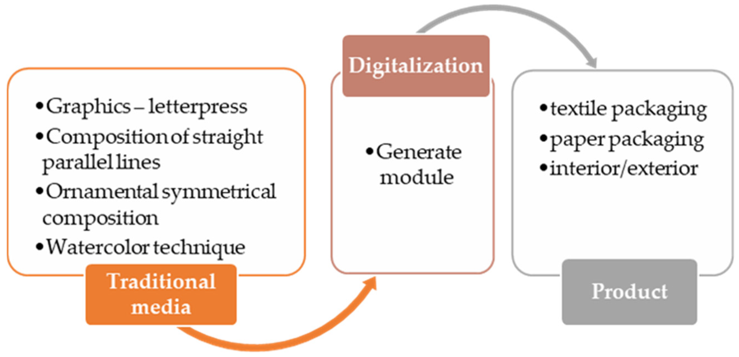
1. Purpose of the Research
- -
- Through analysis and research of the modular principle, as a means of transforming each image into a structural unit for unlimited repeatability, principal relations of alternation are determined—translation, rotation, etc.;
- -
- Visualization of the image through the synthesis of forms and ways of composing images through a certain modular order were achieved;
- -
- The study shows a methodically derived approach for generating digital images based on the results from various areas of fine and decorative fine art;
- -
- The main works used are the student works from the educational process in basic disciplines in the engineering design field—color theory and art techniques—as well as original works resulting from the watercolor painting technique.
- There are various ways to generate images for the needs of product design intended for different areas of industry;
- The analyzed approach, in which the young scientist skillfully combines manual drawing and pictorial techniques, subsequently results in a successful means of generating and implementing new possibilities and ideas;
- Through a comparative analysis, illustrated in tabular form, it is investigated and observed how a schoolwork made with mechanical methods in the classes of color theory and art techniques, through subsequent digitalization, can become a model for infinite variants of images, applicable in the design of products with a planar nature;
- Attempts have been made to apply the same images to objects with different three-dimensional geometric products.
2. Introduction
3. Overview
3.1. Purpose of the Experiment
- -
- New images have and can perform a completely different function in different areas of design, depending on their needs and applicability in the object world.
- -
- The work that we take as a model and with which we will operate is called the main work. Many transformations will be made based on three main criteria related to drawing—composition, color and modular network.
3.2. Materials and Methods
- (a)
- The first one is related to clarifying the methods, means and approach to the practice of the creative artistic process. Here, all the steps through which a creative act goes are analyzed.In art, talent is the main driving force, but only as an initial stimulus for creativity. With the right methodology and step-by-step tools, every artist, regardless of his/her skills and abilities, achieves the best results he/she is capable of. We thoroughly explain this initial process in a report and a conference presentation [9,10].
- (b)
- The results are related to the second part of the study, namely the topic of the present work. Here, based on the already finished works from the first part and the above-stated goals and objectives, observations are made related to the manipulation of the works in order to acquire a different vision, meaning and essence.
3.3. Participants in the Experiment
- -
- Three third-year students majoring in engineering design at the Faculty of Mechanical Engineering, Technical University, Sofia: Nikol Traykova, Gergana Pavlova, and Iliyana Vasileva;
- -
- The lecturers, who are also the supervisors of the disciplines and the research project: Assoc. Prof. PhD. Mihaela Gadzheva-Nedelcheva and Asst. Prof. PhD. Eng. Ivelina Daulova.
- -
- Graphics—letterpress, color and black-and-white solutions;
- -
- Composition of straight parallel lines—decorative image, tempera paints;
- -
- Ornamental symmetrical composition in all directions—tempera paints;
- -
- A work of painting—watercolor technique.
4. Developments: Methodology and Analysis of Results
4.1. Works Resulting from Exquisite Graphics
- -
- The specific base used for intaglio printing in this case is different from standard linoleum—a fibrous structure in one direction, which does not allow the integrity of the material to be violated in all directions.
- -
- The artworks are composed of numerous small images measuring between 10 and 20 cm. Each image is independent on its own and does not constitute part of a complete composition; instead, it suggests a general composition at the discretion of the author.
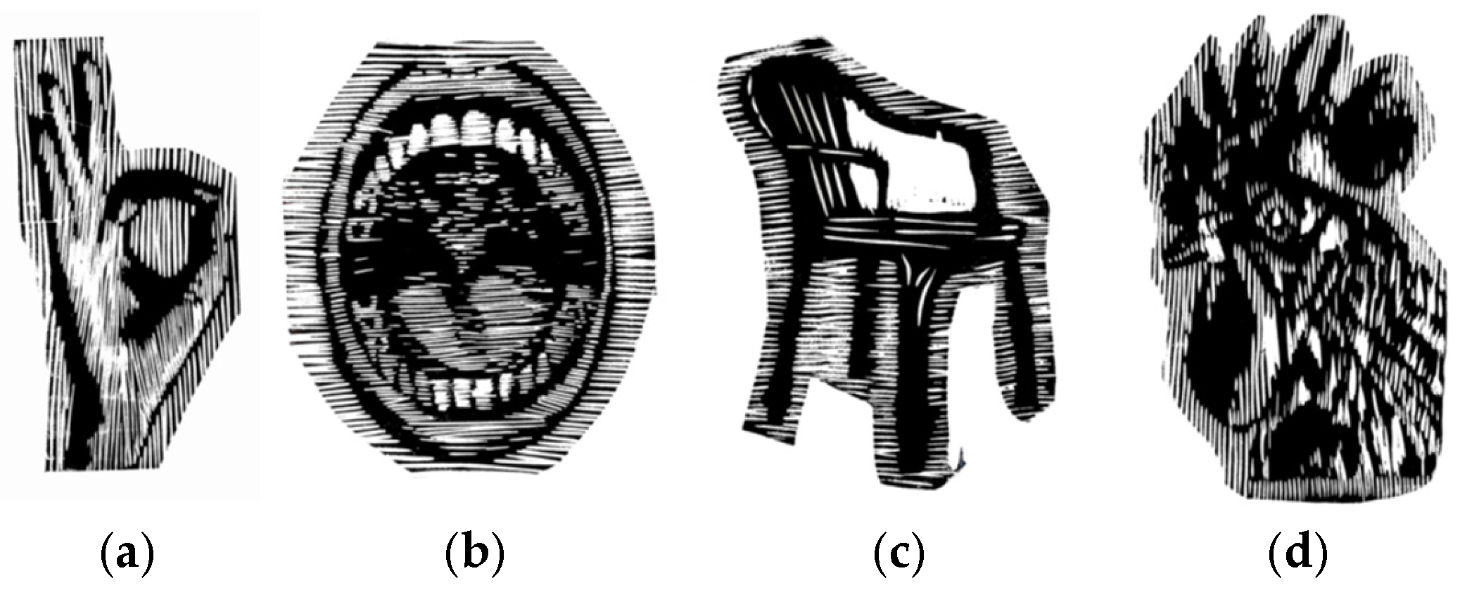
- The creative process begins with drawing searches through sketches with different materials, in this case with black-graphite material. Objects from nature are always used as the basis for the images. In this case, a chair (Figure 1c), a hand with a certain gesture (Figure 1a), a mouth in a specific action (Figure 1b) and a rooster’s head (Figure 1d) are used;
- From the many searches, the boundaries and specific nature of the images are clarified and defined through the technique of quick sketching. After completing this initial conceptual stage, a selection is made from the images obtained. For this purpose, those that most closely approximate the sought-after idea are chosen;
- On the selected images in the conceptual phase, a subsequent drawing technique is applied, based on the principle of drawing. Here, specifics are clarified through more thorough and precise detailing. The images acquire clarity and accuracy. Since graphics are a fine art whose visual language is the balance between black and white, it is required that the drawing be transformed into a project;
- The project is that part of the work where the elements in black are precisely and specifically defined, i.e., those that will be printed, and the elements in white indicate those that will be removed/cut out. In graphic printing, we obtain an image opposite to the one we generate in the project. For this, the image on the base must be transformed into a mirror image. For more decorative and clear projects, the exact edges and contours of the image from the project are a sufficient condition to work directly on the base by simply transferring the mirror image from the project;
- For complex and light-shaded images, work on the base is performed using a mirror.
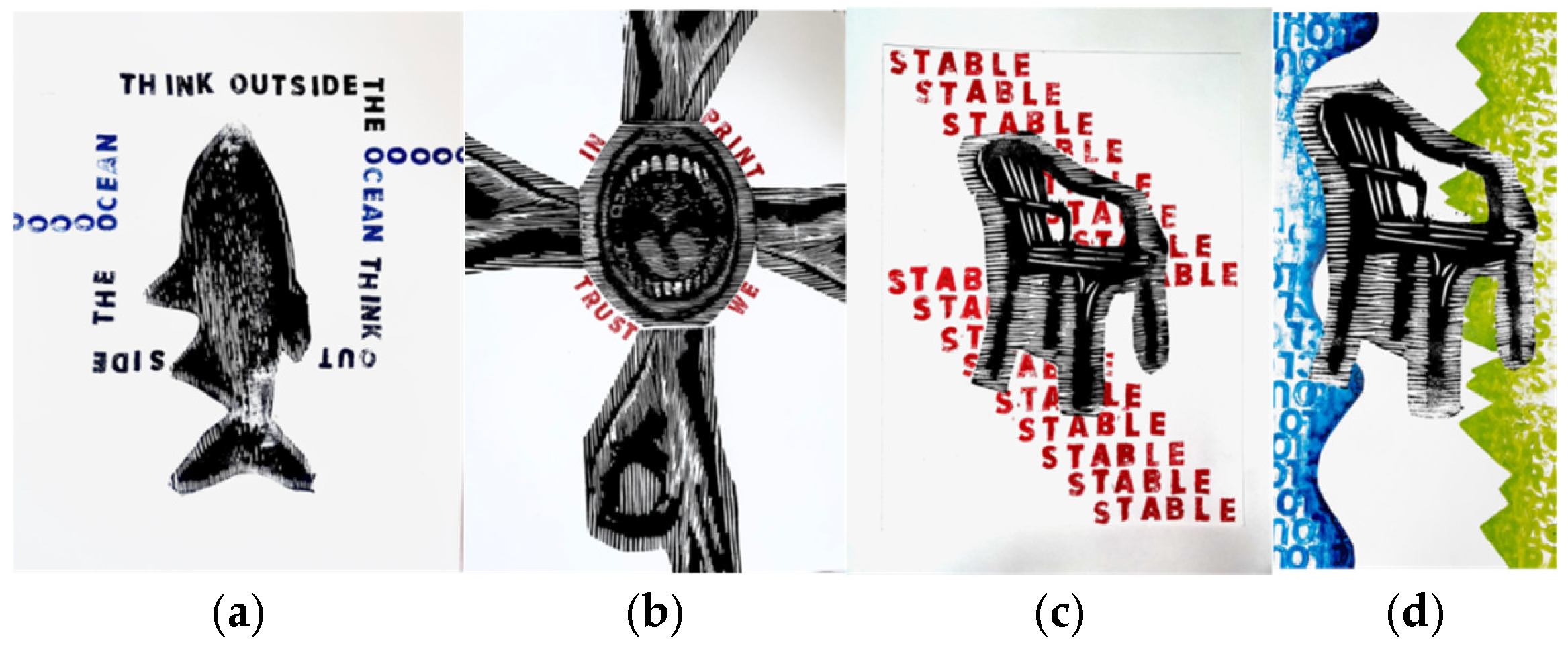
- In the work of letterpress printing, which we take as a model, the author of the presented project uses images, which are a result of letterpress printing, but for the arrangement and production of complete compositions, the principle of reprints/monotype is applied. The whole project has a basic idea, but there are no clear compositional parameters in advance. This also results in the diversity of the results, which are always unique and do not fulfill the idea of reproducing the work;
- Here, the author establishes a modular principle for constructing each individual work, i.e., from individual elements, based on an idea in compositional searches, a completed independent work of fine art is obtained (Figure 2 a,b);
- Each subsequent work is different from the previous one, which is also not typical of printed graphics, where circulation is the main meaning;
- The bold creative approach when combining the individual elements inevitably leads to surprising results. In her article about composition in graphic design, Assoc. Prof. Ilieva highlights the importance of elements and their relationships to an idea, theme, design, plot, and basic means of expression, such as size and proportions, format, figures and shapes, color and contrast, compositional center, balance, rhythm, etc. [11], which we can clearly see in the design compositional solutions of student Gergana Pavlova. The intervention of color also brings a completely different sound and allows for the optical mixing of color nuances when overlapping parts of elements in a composition (Figure 2c,d). Color, in this case, is not a goal but an occasion to experimentally verify a given effect—the same images of objects presented in color acquire a different effect and even form;
- For the needs of the experiment in the project, the author uses each element separately and begins to experiment by combining the given element with itself according to the network models and the possibilities for modular transformation already discussed above (Figure 3);
- The author experiments with both individual “pieces” and already found and established compositions, which can be claimed to be works of fine art—especially, fine art graphics—created using the principles of letterpress printing;
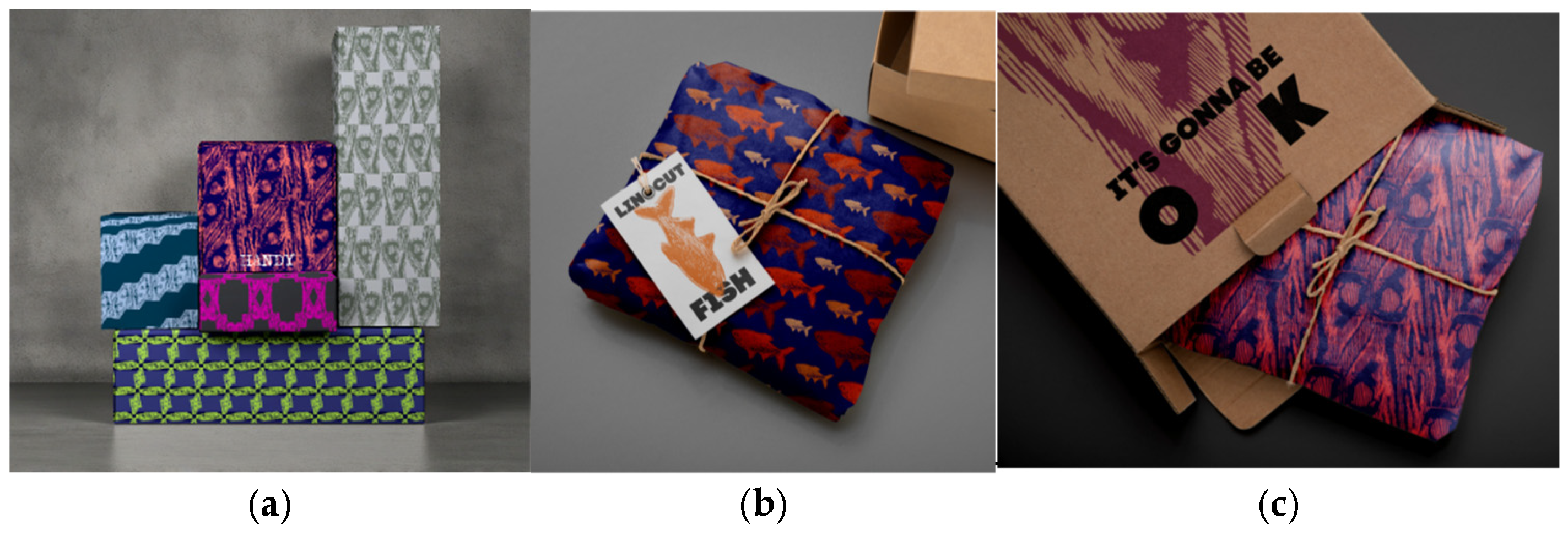
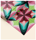
- The same motifs are used by the author as modules, which she transforms into images on wrapping paper (Figure 4). A volume is added to the flat motif on which the images are tested.
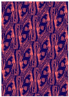
4.2. A Work of Straight Parallel Lines with Contrasting Color Tones—Executed with the Art Tempera Technique
- A project on color science executed in a 35/50 format with tempera paints (Figure 5). The condition for creating a composition is the use of only straight parallel lines that are arranged in only two directions to create a work of art. The linear composition is only an occasion and basis for solving a subsequent specific color problem. The stages for obtaining these images are purposefully outlined in the above-cited scientific works. Here, only certain characteristics related to the implementation of a specific task aimed at solving a specific problem are generally outlined;
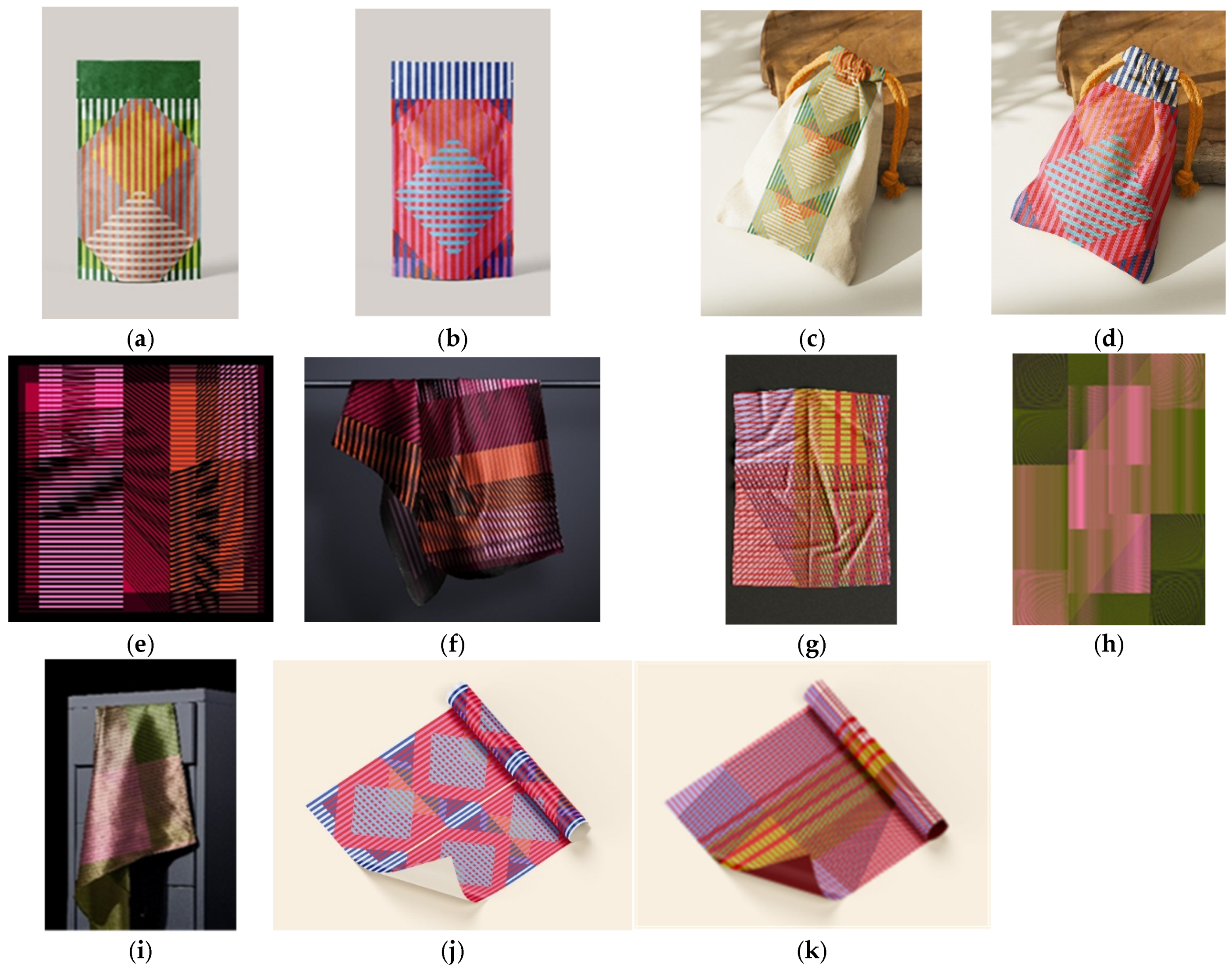
- The examples of the experiments presented here are a small part of the endless applications of modular solutions. The author presents different principles of alternation and combination of the basic module—objects of different shape, material, size, color and function (Figure 6);
- The demonstration clearly proves how, in practice, through the modular system and through digitalization of the work, the shaping results are unlimited.
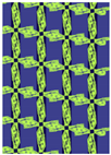
4.3. Square Ornament—Symmetrical in All Directions
- For the experiment, one motif was taken, with which various combinations were applied depending on the size of the module; the number of motifs used; and the texture of materials on which it was applied. Since the motif, located in a square, is symmetrical in all directions, the linear compositions are limited; however, in terms of the sizes and sections of individual segments, as well as color combinations (Figure 8), the resulting images that can be generated are infinite.
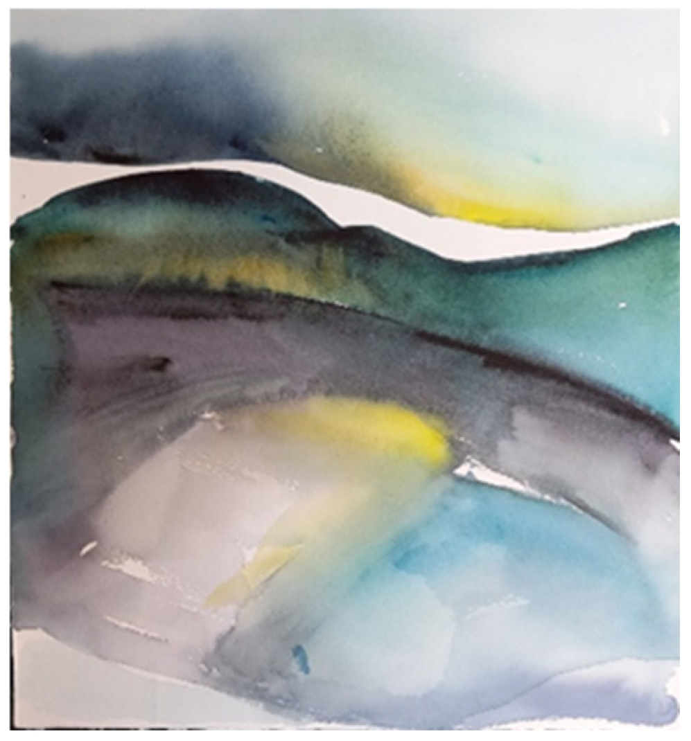
4.4. Works of Fine Art Executed in the Watercolor Technique
4.5. Duration of the Experiment
4.6. Technological Process
4.7. Comparative Analysis of the Results
4.8. Conclusions from the Comparative Analyses
- There are various ways to generate images for the needs of product design intended for different areas of industry.
- An approach is analyzed in which the engineering designer skillfully combines manual drawing and imaging techniques and subsequently achieves a successful means of generating opportunities and ideas.
- Through a comparative analysis illustrated in tabular form, it is investigated and observed how a student’s work made by hand with the help of mechanical methods in color science and art techniques classes can, through subsequent digitalization, become a model for multiple image variants applicable in the design of products made of different materials.
- It is investigated whether the same images are equally applicable to mold designs with different three-dimensional products.
- The report provides a methodical modular principle of thinking and action, justified by the applied results of the proposed experiment.
- The results of visual creative activities can become a means and an occasion for generating design—images applicable in various areas of plastic form.
- Manual mechanical work is an indispensable source of unique creative achievements, which through digital means can be transformed into a unique source of creative opportunities.
5. Conclusions
Author Contributions
Funding
Institutional Review Board Statement
Informed Consent Statement
Data Availability Statement
Acknowledgments
Conflicts of Interest
References
- Zheleva-Martins, D.; Tasheva, S. Composition Theory, Online ed.; University of Forestry: Sofia, Bulgaria, 2014; ISBN 978-619-7226-01-0. [Google Scholar]
- Zheleva-Martins, D. Composition as Manipulation. In Architectural Readings’2007–2008; Academic Publishing House “Prof. Marin Drinov”: Sofia, Bulgaria, 2011; pp. 129–145. [Google Scholar]
- Zheleva-Martins, D. The Theory of Composition and the Contemporary Scientific Context. Architecture Magazine, 12 January 2007; 100–103. [Google Scholar]
- Zheleva-Martins, D. Color and Composition—An Unexpected Aspect. In Color and Education 2006; Group Color Bulgaria and National Academy of Arts: Sofia, Bulgaria, 2007; pp. 25–31. [Google Scholar]
- Zheleva-Martins, D. INSIGHT—The Path to the Idea. In II Biennale of Bulgarian Design; “Colour” Group: Sofia, Bulgaria, 2011; ISBN 978-954-92092-6-6. [Google Scholar]
- Viana, B.; Zheleva-Martins, D. New Direction and trends in Design. Available online: https://www.academia.edu/27150916 (accessed on 6 April 2025). (In Bulgarian).
- Angelova, D. Methods for Stimulating the Creative Process and Their Application in the Design Education. In Proceedings of the First International Conference “Education, Science, Innovations”, Pernik, Bulgaria, 9–10 June 2011; pp. 98–106. [Google Scholar]
- Mihova, M. A look at teaching. In Pedagogy and Methodology; St. Cyril and St. Methodius University: Veliko Tarnovo, Bulgaria, 2005; pp. 23–34. [Google Scholar]
- Gadzheva-Nedelcheva, M.; Daulova, I. Methodology of the Creative Process in Design Education. In Proceedings of the Third Elara Conference 2024, “Technologies and Techniques to Support Sustainable Education in the Academic Sphere Pedagogy 5.0—Creativity, Entrepreneurship, Flexibility and Thinking Outside the Box”, TU-Sofia, Sofia, Bulgaria, 12–14 December 2024. [Google Scholar]
- Gadzheva-Nedelcheva, M.; Daulova, I. Results of the Activity for a Project under R&DS “ Research and Analysis of Drawing Form Categories in Synthesis with Pictorial Techniques as an Approach to Generate Concepts and Ideas for the Needs of Graphic, Interior and Product Design”, “D etc.—Contemporary technologies in design, architecture, art and culture”; R&DS: Sofia, Bulgaria, 2024. [Google Scholar]
- Ilieva, S. About composition in graphic design—Basic types, principles and rules. Not knowing them is modern or unprofessional. In Spring Scientific Readings 2014—AMTII; Paisiy Hilendarski: Plovdiv, Bulgaria, 2013; pp. 42–47. [Google Scholar]
- Combinatorics. Available online: https://store.fmi.uni-sofia.bg/fmi/algebra/Resources/combinatorics.pdf (accessed on 5 April 2025).


| Works | Traditional Media | Digital Media |
|---|---|---|
| 3.1 |  | 
 |
| 3.2 |  | 

 |
| 3.3 | 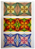 | 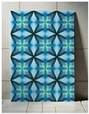
 |
| 3.4 | 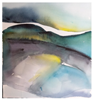 | 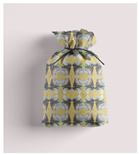
 |
| Comparison Criteria | Works Resulting from Exquisite Graphics | A Work of Straight Parallel Lines with Contrasting Color Tones | Square Ornament—Symmetrical In All Directions | Works of Fine Art Executed in the Watercolor Technique | Summarizing Similarities and Differences |
|---|---|---|---|---|---|
| Performance technique and means of expression | A line in one direction is used as an expressive means, which does not directly follow the form shaping but is plastic and variable along its length. The result is reminiscent of the “Moiré” defect. The element demonstrates uncertainty in space and understatement without priority for a compositional center. Dimensions are about 10/10 cm. | Composition 35/50 consisting only of straight parallel lines located in only two directions, with the line breaks only along the second direction. There is compositional organization. | Tempera painting technique. Symmetrical modular composition in a square. The expressive means are spots of different sizes and shapes in a contrasting color range. | The spot does not follow the conventional form of mountains, sky, water, etc. The arrangement of the objects does not imply a compositional center because of the plastic expression, which has the same dynamics in all objects, regardless of their spatial arrangement. | There is a difference without signs of similarity in the individual works in the techniques of execution and in the visual means of expression—line, spot, shape, volume, texture—as well as in the emotional and psychological impact. |
| Color characteristic | Inking with black printing ink and printing from a graphic printing press. Black and white balance. | Two contrasting colors. Color shades close to the spectral purity of the tone. | Complex color tones, the result of mixing warm and cool colors. | Minimal number of color tones used. A sense of a complex color palette. | Different color palette: 1. Achromatic range. 2. Contrasting range of blue and red. 3. Pastel range from mixing two contrasting tones. 4. Complex cold range. |
| Spatial perception | A difficult-to-read image with the “moire” effect. | A sense of convexity of volumetric spatial forms despite the minimalist decorative nature of the image. | Sense of concave and convex, of light and shadow, and large-scale perception. | The same dynamics in all parts of the aerial perspective—there is no gradation of planes and no specificity of objects. It is perceived spatially. | A sense of space and volume is created in all images, despite differences in shaping. |
| Optical illusion | The means of expression used do not specify a position in terms of place, environment or volume, but only in terms of form. | The composition of straight parallel lines does not imply a visual illusion of volume, but the final result does give the impression of bending. | A sense of large-scale volume. | An implied sense of space, depth, change in light and shadow, aerial perspective. | All works create an illusion of volume and space, despite the differences in the above criteria. |
| Works | Works Resulting from Exquisite Graphics. | A Work of Straight Parallel Lines with Contrasting Color Tones. | Square Ornament—Symmetrical in All Directions. | Works of Fine Art Executed in the Watercolor Technique. | |
|---|---|---|---|---|---|
| Criteria | |||||
| Composition—degree of transformation | The original works are highly transformed when outputting modules in terms of rotations and color values. | The original work is fairly transformed in terms of rotations to derive a modulus and highly transformed in terms of color values. | The original work is slightly transformed in terms of rotation and highly transformed in terms of color values when outputting the module. | The original work is very highly transformed in terms of rotation and slightly transformed in terms of color values when outputting the module. | |
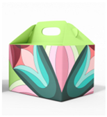
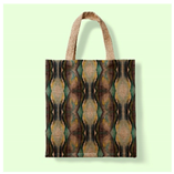
| Functionality | Due to the variety of experiments, some perform better as a pattern on a given packaging and material compared to others. Highly rotated modules in terms of size and orientation lose the character of the original image and turn into an abstraction that confuses the user’s perception. | Modular solutions fully meet the characteristics of the product type. The compositional organization of the module is tailored to the shape and function of the packaging. | Modular solutions function equally well as a packaging pattern and a wallpaper pattern. Due to the lack of rotations, the main element retains its integrity and remains easily recognizable as an ornament by the consumer, which contributes to its positive perception. | Modular solutions work on both small and large scales due to the inherent abstractness of the original image. No matter how transformed, the patterns will be well received by the consumer’s attention. | |
| Applicability | Generated patterns with highly transformed modules would work better for interior design, where the details of the graphic elements would be clearly visible due to the scale and would be better perceived by the user. Moderately or weakly transformed module solutions would work equally well for compact packaging products and as wallpapers. | Modular solutions are more suitable for compact packaging products than for interiors/exteriors. The design is characterized by a busy compositional and color character, which would not work well on a large scale. | The realized patterns are equally applicable for both packaging and interior/exterior decorations—they are distinguished by harmonious colors and visually attractive shapes. | The generated patterns would be more applicable to packaging products than to interior/exterior solutions due to the complexity and abstraction of the individual modules. | |
Disclaimer/Publisher’s Note: The statements, opinions and data contained in all publications are solely those of the individual author(s) and contributor(s) and not of MDPI and/or the editor(s). MDPI and/or the editor(s) disclaim responsibility for any injury to people or property resulting from any ideas, methods, instructions or products referred to in the content. |
© 2025 by the authors. Licensee MDPI, Basel, Switzerland. This article is an open access article distributed under the terms and conditions of the Creative Commons Attribution (CC BY) license (https://creativecommons.org/licenses/by/4.0/).
Share and Cite
Gadzheva-Nedelcheva, M.; Daulova, I. Exploring the Connection Between Design and Materials Through the Digitalization of Modular Solutions. Eng. Proc. 2025, 100, 10. https://doi.org/10.3390/engproc2025100010
Gadzheva-Nedelcheva M, Daulova I. Exploring the Connection Between Design and Materials Through the Digitalization of Modular Solutions. Engineering Proceedings. 2025; 100(1):10. https://doi.org/10.3390/engproc2025100010
Chicago/Turabian StyleGadzheva-Nedelcheva, Mihaela, and Ivelina Daulova. 2025. "Exploring the Connection Between Design and Materials Through the Digitalization of Modular Solutions" Engineering Proceedings 100, no. 1: 10. https://doi.org/10.3390/engproc2025100010
APA StyleGadzheva-Nedelcheva, M., & Daulova, I. (2025). Exploring the Connection Between Design and Materials Through the Digitalization of Modular Solutions. Engineering Proceedings, 100(1), 10. https://doi.org/10.3390/engproc2025100010