2. Methodology
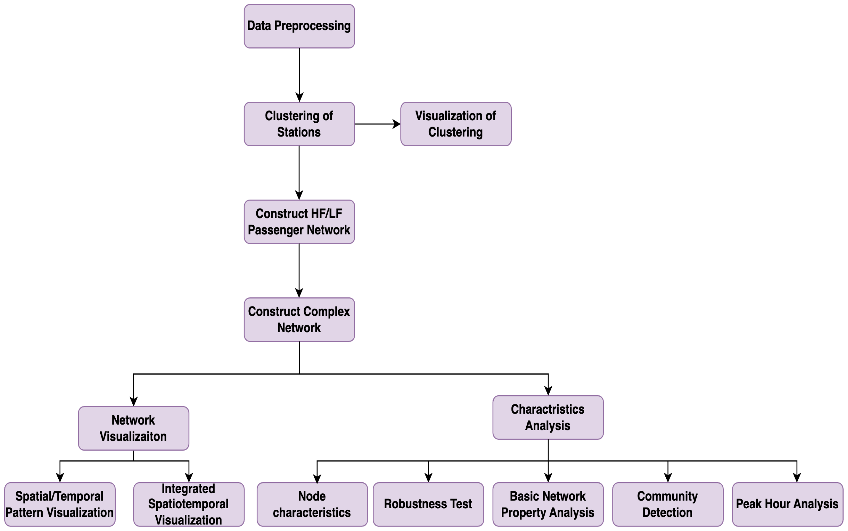
To analyze the structural and behavioral differences between HF and LF passenger groups, we design a six-step methodological framework as shown in
Figure 1. Each step contributes a specific function in transforming raw smart-card records into meaningful insights for network assessment and planning.
Step 1: Data Preprocessing. The goal of this step is to construct reliable and continuous travel chains from raw smart-card data. We extract detailed records covering both subway and bus modes, remove incomplete or duplicate entries, and ensure that each passenger’s travel chain is temporally and spatially coherent. This ensures high data integrity for subsequent frequency classification and network construction.
Step 2: Station Clustering. Given the spatial complexity of Beijing’s transit system—comprising over 53,000 unique stations—we apply the K-means clustering algorithm to group stations based on geographic coordinates (latitude and longitude). This process reduces network dimensionality and facilitates tractable analysis by transforming the raw stop-level data into 537 representative cluster nodes, preserving key spatial patterns while improving model scalability.
Step 3: Travel Frequency Classification. In this step, we categorize passengers into HF and LF groups based on their total number of valid trips during the observation period. This classification enables the construction of differentiated network models and supports targeted analysis of how rider behavior impacts system load, robustness, and congestion.
Step 4: Complex Network Model Construction. We construct two directed, weighted graphs—one for HF travelers and another for LF travelers—based on their observed trips between clustered station nodes. These networks encode temporal and spatial travel behaviors into a topological structure, with edges representing directed passenger flows and weights reflecting trip volumes.
Step 5: Network Visualization. To aid interpretation, we generate visual representations of the HF and LF networks. These diagrams reveal traffic distribution, highlight major transfer corridors, and illustrate inter-community flow differences. Visualization provides an intuitive understanding of mobility patterns and network usage disparities across traveler types.
Step 6: Network Characteristics Analysis. This step offers a multifaceted examination of network structure and dynamics:
- -
6.1 Node Characteristics: We analyze node-level metrics including degree, betweenness centrality, and closeness centrality to identify key transit hubs and their functional importance in network connectivity and load distribution.
- -
6.2 Robustness Test: We simulate node removal scenarios—both random and targeted—to evaluate each network’s vulnerability to disruption and identify critical weak points in the HF and LF networks.
- -
6.3 Basic Network Properties: We assess global properties such as degree distribution, average path length, clustering coefficient, and global efficiency to understand structural cohesion and operational potential.
- -
6.4 Community Detection: Using the Louvain algorithm, we identify modular substructures and analyze inter- and intra-community flow, which reflect the spatial organization of rider activity.
- -
6.5 Peak Hour Analysis: We isolate travel data during peak periods to evaluate how congestion affects network performance and passenger flow distribution, offering insights into time-sensitive vulnerabilities.
This step-by-step framework supports a scalable, behavior-sensitive approach to analyzing transit network dynamics, forming the foundation for policy recommendations and future optimization modeling.
3. Research Data Pre-Processing
3.1. Introduction to Public Transportation Data
The primary sources of public transport big data, including smart-card data and station data from buses and subways, are often distributed across different systems with varied data formats. Given the diversity of these data sources and the inconsistency in formats, data preprocessing becomes crucial in ensuring the effectiveness of the research.
In related work by Ma Yiqing [
34], smart IC card data emerges as a critical source, offering detailed insights into passenger interactions within the transport system. A deep dive into these details enables a nuanced understanding of passenger travel behaviors. For instance,
Table 1 provides a thorough explanation of each field in the IC card dataset. In focusing on the primary objectives of this study, data elements that do not directly impact the research outcomes, such as expenditure amount, remaining balance, and transaction type, are excluded from the data extraction process. This selective approach to data handling sharpens the research focus and enhances the efficiency and accuracy of data processing.
3.2. Research Data
In this study, the data structure is meticulously designed to comprehensively capture and represent the travel characteristics of passengers within the transit system. As illustrated in
Table 2, the data structure meticulously logs the travel activities of passengers. This includes an encrypted passenger identifier, the bus or subway line number, the sequence number and name of the boarding station on that specific line, and the precise time of card swiping, enriching the temporal dimension of the passengers’ travel patterns.
For passengers engaging in transfers, the structure goes further to document the exact time of the transfer and details of the subsequent travel chain. This includes the sequence number of the transfer station and the time of transfer, thereby compiling a complete record of the passenger’s travel route.
It is crucial to acknowledge the immense volume of data handled in this analysis—approximately 18 million rows of passenger travel records daily over a span of 14 days, culminating in about 20 million rows of data in total. Among these records, subway-related trips (including both subway-only and combined bus-subway journeys) account for approximately 65%, while bus-related trips account for about 35%. Notably, around 20% of all travel chains involve both bus and subway segments, reflecting the high prevalence of multi-modal commuting behavior in Beijing’s transit system. These blended journeys not only highlight the integrated nature of the network but also introduce additional complexity in modeling and analysis. As such, careful preprocessing and segmentation are essential to ensure analytical accuracy and relevance.
As presented in
Table 3 and
Table 4, the longitude and latitude of the stations provide essential spatial information for analyzing the geographical structure of the transit network. Rather than focusing solely on the precise location of individual stations, these coordinates are primarily used to calculate inter-station distances, which form the basis for exploring network characteristics such as connectivity, clustering coefficients, and shortest paths.
Moreover, the availability of geographical coordinate data facilitates the creation of visual representations. Using MATLAB R2024a or similar visualization tools, station flow diagrams can be developed to illustrate the usage of individual stations and the movement patterns of passengers between different stations across the city. These visualizations offer valuable insights into spatial and temporal travel behaviors, aiding in identifying key transit hubs and optimizing the overall transportation network.
3.3. Passenger Data Preprocessing Methodology
The raw smart-card dataset contained over 26 million records and required systematic preprocessing to ensure analytical reliability. The following automated filtering procedures were applied:
Duplicate Record Removal: Records were classified as duplicates if they had identical card ID, boarding time (to the minute), route ID, and boarding/alighting stations. These entries were removed using a hash-based deduplication process implemented in Python 3.10.
Anomaly Detection and Filtering: Entries with abnormal durations (e.g., <1 min or >240 min), trips exceeding 50 km in inferred distance, or illogical time order (boarding after alighting) were removed. Thresholds were empirically determined based on percentile distributions across the full dataset.
Incomplete Travel Chain Identification: A trip was considered incomplete if any of the key fields (e.g., alighting station, route ID) were missing or inconsistent. These were filtered using rule-based logic scripts. Approximately 20% of records were excluded under this step.
These procedures reduced noise and inconsistency, resulting in a clean dataset of 20 million valid trips. This curated dataset forms the foundation for network construction, clustering, and robustness evaluation.
3.4. Station Clusters
Due to the complexity of passenger and site information, direct visualization often yields suboptimal results. To address this challenge, a clustering algorithm is applied to process site information, enabling the extraction of more meaningful patterns. The motivation for employing K-means clustering in this study lies in its ability to reduce data complexity and enhance computational and analytical efficiency. By aggregating a large number of individual sites into a smaller number of representative cluster nodes, the analysis not only becomes more manageable but also facilitates the identification and understanding of key nodes and connections within the urban transportation network.
In this study, the K-means clustering algorithm is employed due to its widespread use and effectiveness. The algorithm operates by dividing the dataset into K clusters, minimizing the sum of distances from each data point to its nearest centroid. The process begins with the random selection of K data points as initial centroids. Through iterative refinement, each data point is assigned to the nearest centroid cluster, followed by an update of the centroid positions based on the newly assigned clusters. This iterative process continues until convergence conditions are met, either when centroid updates no longer significantly change the clusters or when a preset number of iterations is reached. This approach ensures a systematic reduction of complexity while retaining critical insights into the network’s structure and dynamics.
To determine a suitable number of clusters, we conducted an Elbow Method analysis by calculating the within-cluster sum of squares (WCSS) across a range of K values. The resulting curve showed a distinct inflection point near , suggesting this as an appropriate choice that balances model simplicity with clustering quality. This selection also aligns with practical considerations, as it approximates the number of administrative subdistricts in Beijing and maintains sufficient spatial granularity for subsequent analysis.
In this study, a mixed clustering approach was applied to 53,700 subway and bus stations, ultimately grouping them into 537 nodes. This method effectively simplifies the network model while preserving critical traffic flow information, making it feasible to conduct more focused and efficient network analysis and optimization. By reducing the complexity of the data, this clustering process ensures that the essential structural and operational characteristics of the transportation network are retained.
The results of the clustering process highlight the key nodes in the network, as partially shown in
Table 5, with the detailed stations belonging to the first cluster center presented in
Table 6. It is important to note that bus and subway stations were clustered together in this analysis. Despite their differences, this mixed clustering approach does not compromise the accuracy or effectiveness of the clustering results, demonstrating its robustness and suitability for analyzing integrated urban transportation networks.
During the clustering process, the new centroid of each node is determined by calculating the mean of all sites belonging to the cluster. This includes averaging the longitude and latitude of the sites and summing their respective traffic flows. Consequently, the position of each node represents the geometric center of all sites within the cluster, while the node’s traffic reflects the cumulative flow of these sites. Additionally, the inter-station traffic data is standardized using a maximum-minimum normalization approach after clustering.
This approach ensures that the longitude, latitude, and flow data of each node not only capture the spatial distribution of traffic but also provide insights into the degree of traffic aggregation within the network. By combining spatial and flow characteristics, this method enhances the understanding of network dynamics and facilitates the analysis of inter-node interactions. The clustering results, including inter-node flow data, are summarized in
Table 7.
This study undertakes a comprehensive preprocessing of intelligent IC card data for buses and subways, urban road network data, and the location information of bus and subway stations in Beijing for March 2018. The preprocessing steps include removing duplicate records, correcting incomplete travel chains, and excluding records with obvious defects, thereby ensuring the quality and accuracy of the data for subsequent analysis. Additionally, the structure of the dataset is carefully outlined, encompassing fields such as passenger ID, transportation mode or route, station number and name, travel time, and subsequent travel chain details. These fields provide essential information for analyzing passenger travel patterns.
3.5. Section Summary
The dataset comprises approximately 1,800,000 daily records spanning 14 days, totaling nearly 200,000,000 records, offering a robust basis for this research. Latitude and longitude information for 288 subway stations and 53,443 bus stations in Beijing is collected and processed, providing a physical spatial foundation for analyzing inter-station traffic and complex network characteristics. This spatial data also enables the visualization of traffic flows. To further simplify the network model, the K-means clustering algorithm is employed to cluster 53,700 subway and bus stations into 537 nodes. This method effectively reduces data complexity while preserving critical traffic flow information, facilitating detailed network analysis and optimization.
The preprocessing efforts establish a strong data foundation, supporting the analysis of high- and low-frequency travel modes, complex network characteristics, and the formulation of service optimization strategies in subsequent analyses.
4. Network Construction
4.1. High and Low Frequency Passenger Networks
This study successfully constructs a daily travel chain information database for bus passengers through in-depth mining and analysis of big data from the public transportation system. The database utilizes a unified storage format, organizing the data based on passengers’ IC card numbers, thereby forming a structured and extensive database of bus travel chain information. Within this system, it becomes straightforward to retrieve the complete travel trajectory of any passenger on a specific date and perform detailed analyses of the spatiotemporal distribution characteristics of transit travel.
In addition to the creation of this extensive bus travel chain database, the study also emphasizes the development of high and low-frequency passenger networks. By distinguishing passengers based on their travel frequency, two distinct sub-networks are formed: one for high-frequency passengers who use public transportation regularly, and another for low-frequency passengers who infrequently rely on the bus system. This differentiation facilitates a more detailed examination of passenger travel behaviors and provides targeted data to support the precise planning and optimization of the bus network. The aim of constructing these high and low-frequency passenger networks is to better understand the travel patterns and needs of different passenger groups. This insight is crucial for developing more efficient, personalized operational strategies, enhancing service quality, and contributing to the sustainable development of urban public transportation systems.
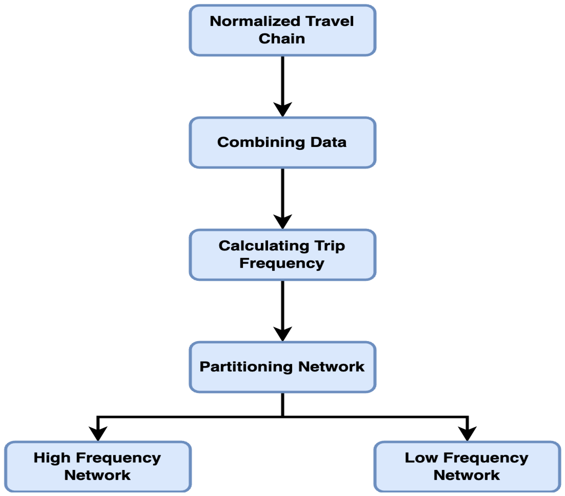
Each step was designed to improve the accuracy and effectiveness of the data analysis, ensuring a robust and reliable dataset for subsequent analysis. These steps are comprehensively illustrated in
Figure 2, which provides a visual representation of the detailed process.
Step 1—Standardization of Travel Chains: The bus data includes multiple fields for each passenger’s travel information, such as travel mode, route number, station number, station name, and card swiping time. To simplify the analysis, these fields were integrated into standardized travel chain units by grouping every five fields together, following the passenger ID. This process not only simplified the data structure but also ensured the completeness and clarity of each travel chain. The standardized travel chains are shown in
Table 8.
Step 2—Merging Data: All passenger data within a week was merged and reorganized based on the passenger ID. This consolidation was essential for enabling more efficient data processing in the subsequent analysis.
Step 3—Determining Travel Frequency: The core of this step involved calculating each passenger’s travel frequency within the week. By counting the number of times each passenger ID appears in the dataset per day, the study accurately determined the travel frequency for each passenger over the course of the week.
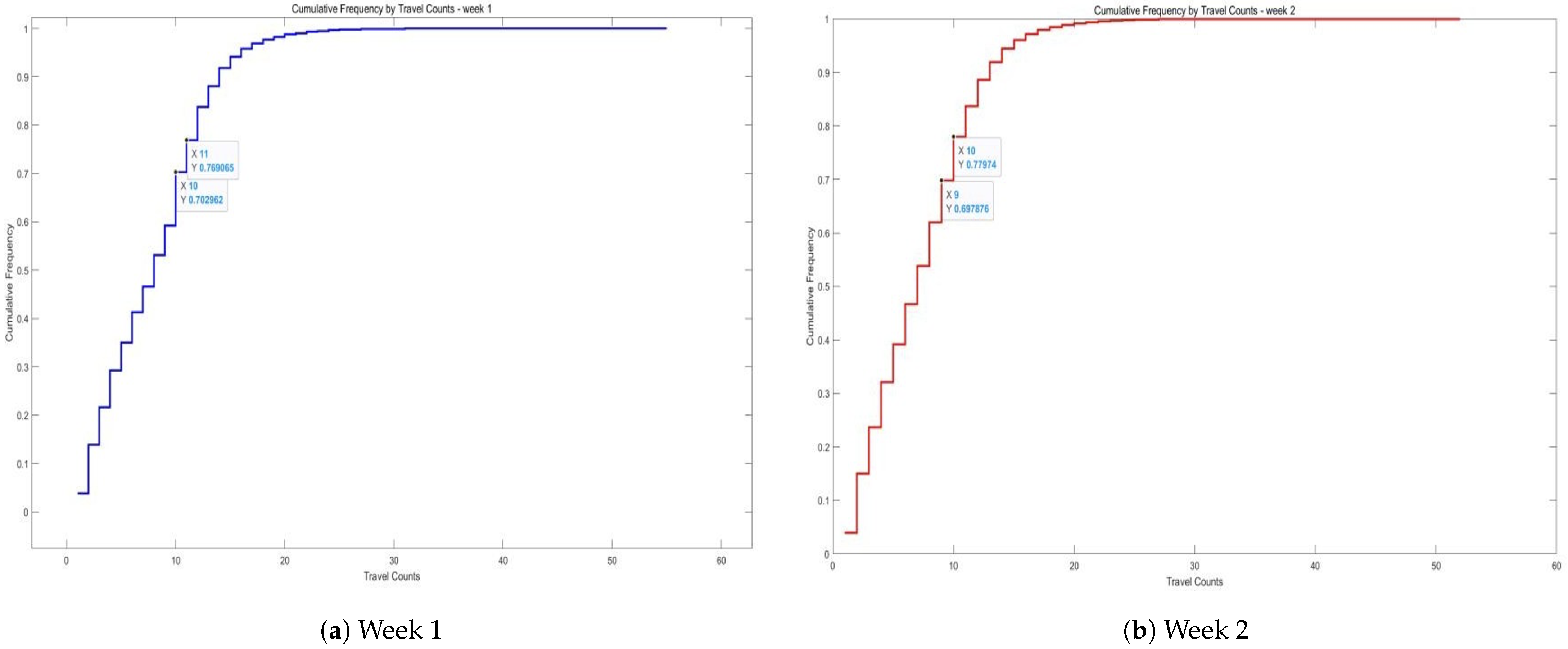
Step 4—Determining the Division Threshold: Through a comprehensive analysis of travel data, the distribution characteristics of travel frequencies were assessed. The study tallied the number of trips and cumulative frequencies over a two-week period, observing the disparity in travel frequencies between high- and low-frequency passengers.
Figure 3 illustrates these findings, where the X-axis represents the number of trips (i.e., individual travel counts per passenger), and the Y-axis represents the cumulative proportion of passengers—that is, the proportion of all users whose travel frequency is less than or equal to the corresponding value on the X-axis. This cumulative distribution helps to reveal the skewness in passenger travel behavior and serves as the basis for selecting a threshold to distinguish between high- and low-frequency travelers.
Step 5—Dividing High and Low Frequency Passenger Networks: In the absence of a clear natural boundary in cumulative travel frequencies, a threshold of approximately 25% was selected. Passengers with the highest 25% of travel frequencies were classified as high-frequency passengers, while the rest were categorized as low-frequency passengers. Passengers traveling 11 or more times in the first week and 10 or more times in the second week were designated as high-frequency, while all others were classified as low-frequency. The resulting high- and low-frequency passenger networks are presented in
Table 9 and
Table 10.
In the constructed networks, the first week data show that high-frequency passengers had a total of 3,607,960 records, while low-frequency passengers accounted for 9,538,509 records. In the second week, the high-frequency network contained 3,481,020 records, and the low-frequency network had 840,793 records. These comprehensive datasets provide a foundation for analyzing passenger travel behavior and lay the groundwork for further exploration of complex network characteristics.
4.2. Complex Network Construction
In public transport systems, complex networks serve as a powerful tool for studying passenger flows, the connections between stations, and the overall efficiency and robustness of the transport system. In the construction of a complex network for public transport, this study treats stations as nodes, while the travel paths of passengers form the edges connecting these nodes.
The role of the complex network in this study is twofold: It aids in network structure analysis and in examining travel differences between high and low-frequency passengers. By constructing a complex network with stations as nodes, this paper provides an in-depth analysis of the public transportation system’s structural characteristics, including the importance of stations (as measured by node degree or intermediary centrality), community structure (based on modularity optimization), and the overall connectivity of the network.
These analyses are critical for identifying key nodes and weak links within the network, offering a scientific foundation for public transport planning and optimization. Furthermore, the construction of complex networks allows for the exploration of travel behavior differences between high and low-frequency passengers at a macroscopic level. By comparing various network types within the high and low-frequency passenger networks, this study aims to reveal differences in spatial distribution and temporal usage patterns between these two groups.
In this study, the researchers take a series of steps to construct complex networks, with the primary objective of analyzing the travel differences between high and low-frequency passengers within the public transportation system, as illustrated in
Figure 4.
Step 1—Node Identification: All bus and subway stations are treated as nodes within the network. To ensure the accuracy and effectiveness of the network analysis, each station is assigned a unique identifier. In this study, the station names themselves are used directly as identifiers for the nodes.
Step 2—Edge Construction: Edges between nodes represent observed passenger flows between pairs of stations. For any two stations with recorded trips, a directed edge is created. The weight of each edge corresponds to the total number of passenger trips between the two stations during the analysis period, thereby reflecting the intensity of passenger movement.
Step 3—Normalization of Flow: Given the varying numbers of passengers in the high and low-frequency networks, max–min normalization is applied to ensure the comparability of station-to-station flow across networks. This technique scales all flow values to a unified range between 0 and 1, preserving the relative position of each value within the maximum and minimum flow values. The specific method for this normalization is presented in Formula (1).
This step eliminates discrepancies caused by differing passenger numbers in the high and low-frequency networks, enabling a fair comparison of flow differences across networks of different scales. It allows for a focus on the network structure itself, such as the distribution patterns of flow, the identification of key connecting stations, and the overall efficiency and robustness of the network. In the first week, the maximum observed flow was between Si Hui Hub Station and itself, with a value of 37,180, while the minimum non-zero flow was between Yanxi Station and Hongyan Station, with a value of 2. The results of the normalized edges and inter-station flows are shown in
Table 11 and
Table 12.
Step 4—Network Hierarchization: The network is subdivided into two sub-networks based on the travel frequency of passengers: high-frequency and low-frequency. This division allows for a more precise analysis and comparison of the travel patterns of different passenger groups, revealing their impact on the structure and fluidity of the public transportation network.
Step 5—Temporal Dynamics: To account for passenger flow during different time periods, such as peak morning and evening hours or off-peak times, multiple network layers are created to reflect the changing travel demand over time. This temporal dimension allows the network to not only illustrate spatial passenger flow patterns but also capture the effects of temporal variations on these patterns.
4.3. Visualization of Complex Networks
4.3.1. Spatial Pattern Visualization
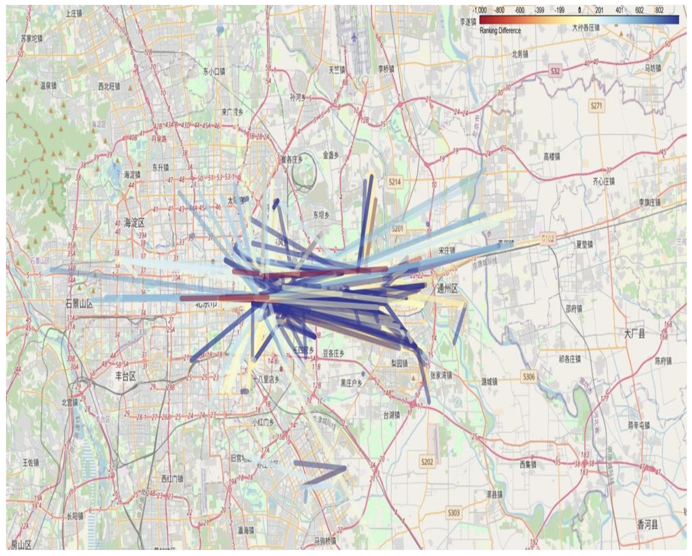
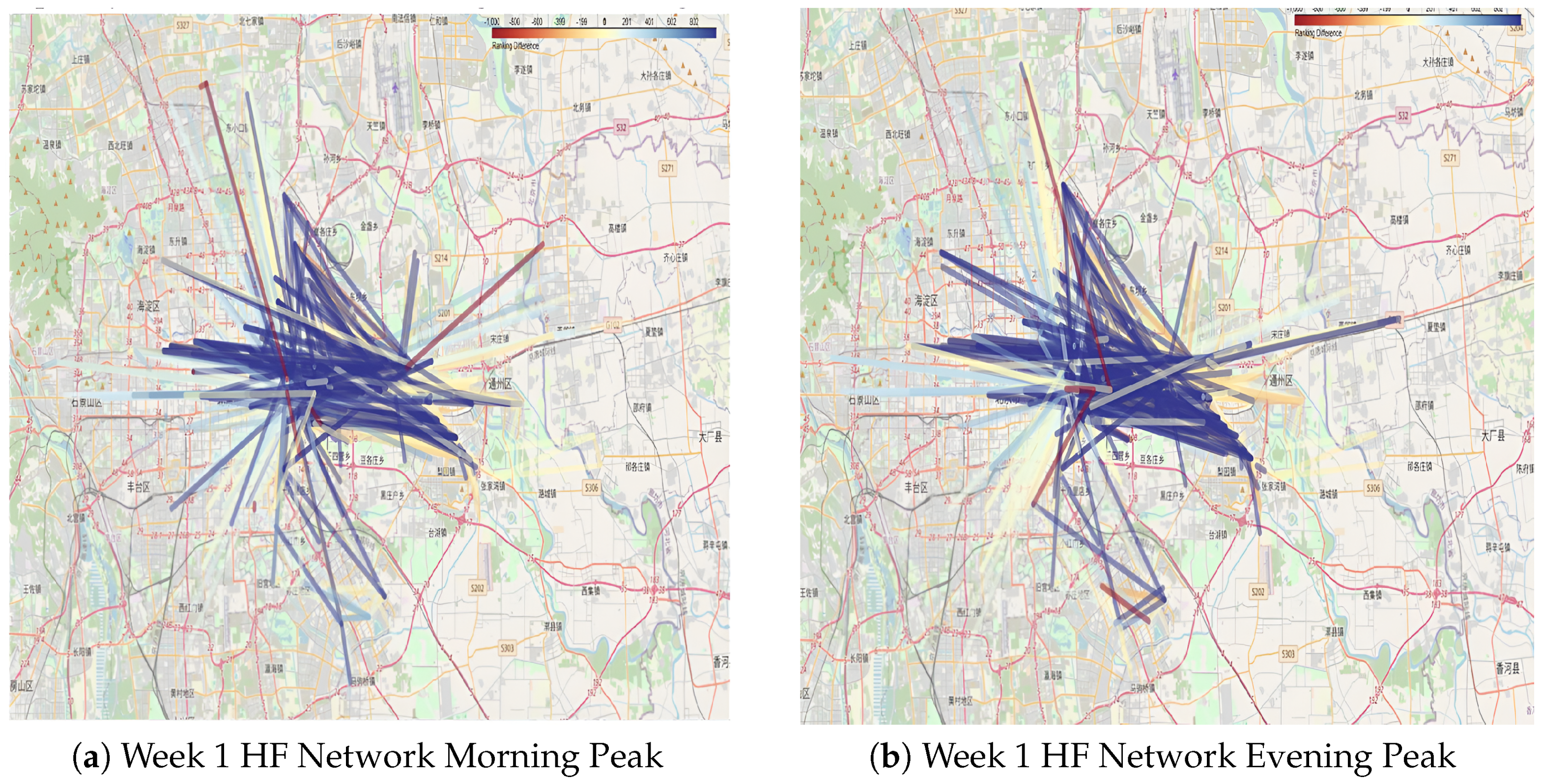
To gain a deeper understanding of the travel preferences of high- and low-frequency passengers and their impact on the transportation network, the top 1000 OD (origin-destination) pairs for each passenger group were ranked and compared. The rankings for these OD pairs were calculated separately for high-frequency and low-frequency passenger networks during peak and off-peak periods. Subsequently, the ranking differences were determined by subtracting the low-frequency ranking from the high-frequency ranking. For example, if a route ranks first in the high-frequency network but 1000th in the low-frequency network, the difference is –999. If an OD pair is absent in the low-frequency network, its ranking difference is assigned a value of –1000.
This approach provides a detailed perspective on how certain routes are predominantly used by specific user groups and are less significant for others. These differences can be attributed to passenger travel purposes or habits. For instance, high-frequency passengers might favor efficient or convenient routes for commuting, while low-frequency passengers may rely on different routes for occasional or leisure travel.
4.3.2. Temporal Flow Visualization
In this study, as illustrated in
Table 14, the travel records of each passenger are marked by identifying their initial card-swiping event as the starting point to construct their travel chain dataset for specific time slots. For example, the passenger with the ID “78aa216c934e339e650f119ced699979” performed their first card swipe at several distinct times on 1 March 2018, each corresponding to a different travel chain. The initial card-swiping event serves as a precise timestamp for each travel chain, enabling the systematic compilation of all passengers’ first card-swiping events within each defined time slot.
This compilation forms a robust dataset that captures the flow of passengers during specific time periods. Such data provides the foundation for further analysis, enabling a detailed examination of travel patterns and identifying peak period flows. This approach is essential for understanding temporal dynamics in the public transportation system and offers valuable insights for optimizing service schedules and resource allocation.
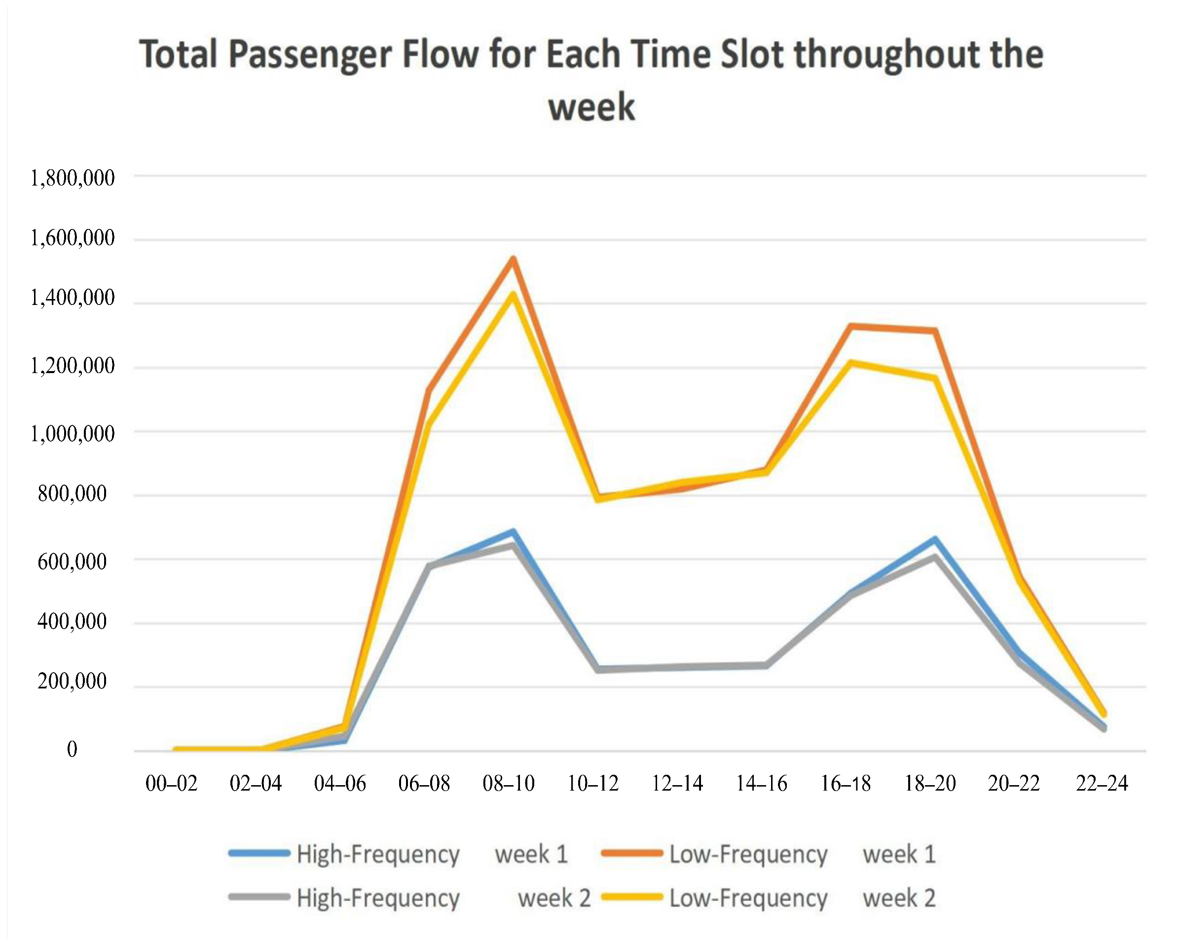
The described method allows for recording the total number of card swipes within each time slot, providing a detailed view of passenger activity during specific periods. By further aggregating the number of swipes across all days of the week for each time slot, the total passenger flow for each time slot throughout the entire week can be determined. This aggregation provides a comprehensive dataset for analyzing weekly travel patterns and identifying peak usage periods. The summarized results are presented in
Table 15.
As illustrated in
Figure 7 the passenger flow distribution reveals two distinct peaks in the daily travel cycle: the morning peak (06:00–08:00) and the evening peak (18:00–20:00). During these periods, passenger flow increases significantly, highlighting the concentrated travel demand. This periodic fluctuation provides a clear basis for defining the morning and evening peak periods.
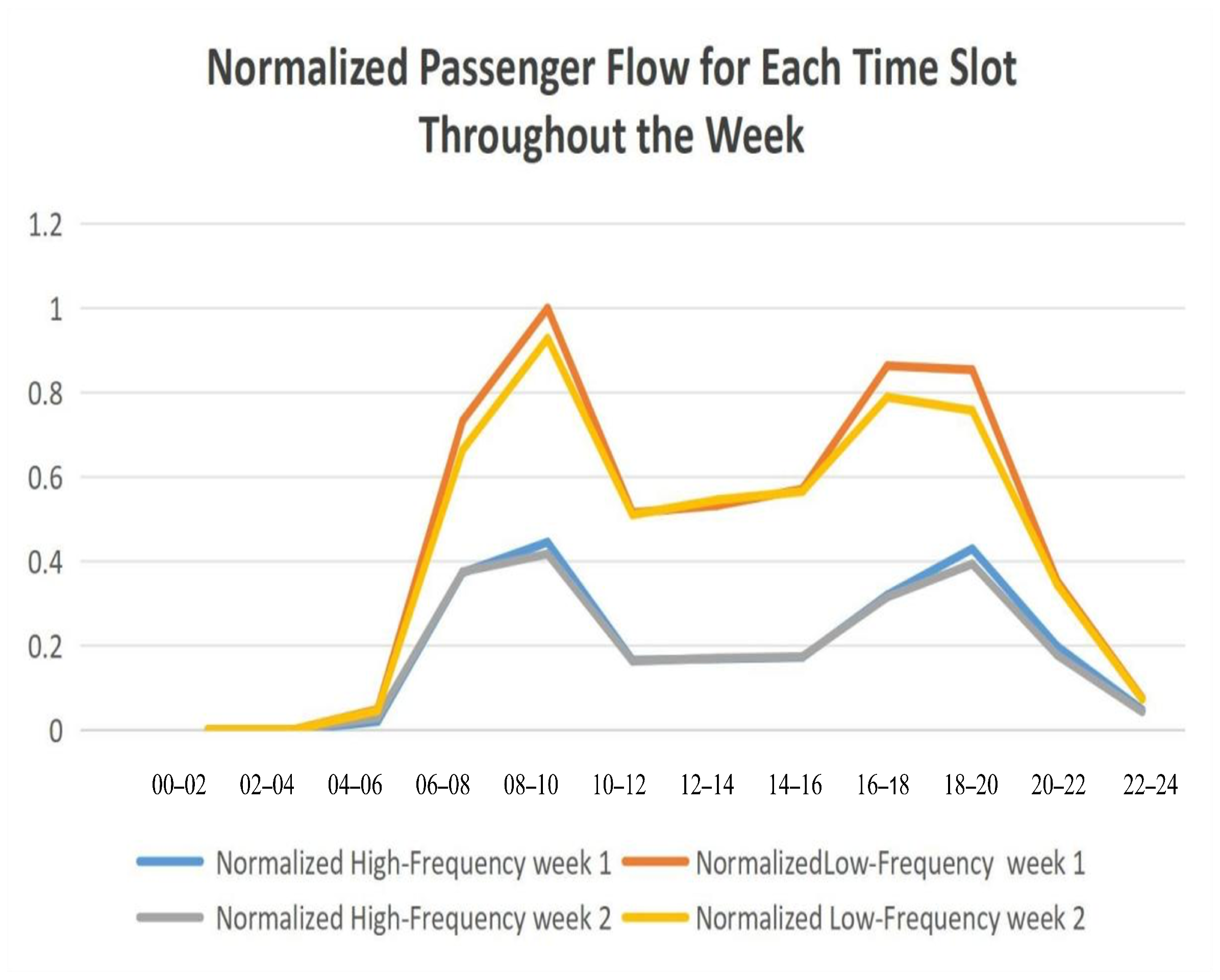
Given the differences in the size of high- and low-frequency passenger groups, it is essential to standardize the passenger flow data to ensure accurate comparisons. The standardized data, presented in
Table 16, reflects the distribution characteristics of passenger flow in the two networks more effectively, enabling a detailed examination of travel behaviors and patterns between high- and low-frequency passenger groups. This standardized approach allows for a clearer understanding of the unique dynamics within each network.
Analyzing
Figure 8 yields several important insights into the travel behaviors of high- and low-frequency passengers:
(1)
Figure 8 highlights that the orange and yellow curves, representing low-frequency passengers, consistently show a higher flow ratio compared to the high-frequency passenger curves, indicated by the blue and gray lines. This pattern correlates with the overall distribution of passenger numbers, where low-frequency passengers outnumber high-frequency passengers by approximately three to one. However, the flow ratio for low-frequency passengers is only about twice as much, suggesting a relatively higher usage intensity by high-frequency passengers.
(2) Across different times of the day, the travel trends of high- and low-frequency passengers exhibit similar patterns, particularly during the morning peak (8:00–10:00) and evening peak (18:00–20:00), where both groups reach maximum flow levels. However, a significant divergence is observed during the evening peak period, where the flow of low-frequency passengers stabilizes or slightly declines, while high-frequency passenger flow increases. This distinction may reflect the specific activities or work routines of high-frequency passengers, such as extended work hours or evening commutes.
(3) Over the course of the day, the flow difference between high- and low-frequency passengers gradually widens, peaking during the morning and evening rush hours (8:00–10:00). This widening gap could indicate a higher dependency on public transportation among high-frequency passengers during these critical periods. However, during nighttime hours, the flow difference between the two groups becomes almost negligible, suggesting that under conditions of lower overall travel demand, travel frequency plays a less significant role in shaping flow patterns. This observation underscores the importance of optimizing nighttime public transportation services, with a focus on addressing the specific travel needs of both passenger groups.
These findings provide a nuanced understanding of passenger behavior and can guide transportation planners in optimizing services for different passenger segments, particularly during peak and off-peak periods.
4.3.3. Integrated Spatiotemporal Visualization
Following the time analysis in the previous section, it is evident that the travel peaks occur between 8:00–10:00 AM and 18:00–20:00 PM. Based on these peak times, this section provides a spatiotemporal visual analysis of the station flow during these periods. The station flow data for the morning and evening peaks are shown in
Table 17 and
Table 18.
Approximately 130,000 data points from the morning and evening peaks of the high-frequency passenger network and around 190,000 inter-station traffic data points from the low-frequency network during the same periods were collected. Using the same visualization approach outlined in
Section 3.3, maps depicting the morning and evening peak hours for both high- and low-frequency passenger networks were created. The visualization focuses on the 1000 busiest routes, with line color contrasts and thickness emphasizing the frequency of travel. These results are illustrated in
Figure 9 and
Figure 10. To enhance clarity and support detailed examination, interactive versions of these visualizations have been made available at:
https://github.com/lilieason/Transit-Network-Visual/tree/lilieason-patch-peakhour (accessed on 3 August 2025).
4.3.4. Cluster Visualization
This study constructs a daily travel chain network for bus passengers, representing stations as nodes and passenger travel chains as edges. Using a unified storage format, the structured database allows easy retrieval of travel trajectories and detailed analysis of the spatial and temporal characteristics of bus trips.
High- and low-frequency passenger networks are also developed by distinguishing station usage frequencies. The high-frequency network highlights frequently used connections, while the low-frequency network captures less utilized links. This approach enables a detailed exploration of travel behavior and supports the precise optimization of the bus network.
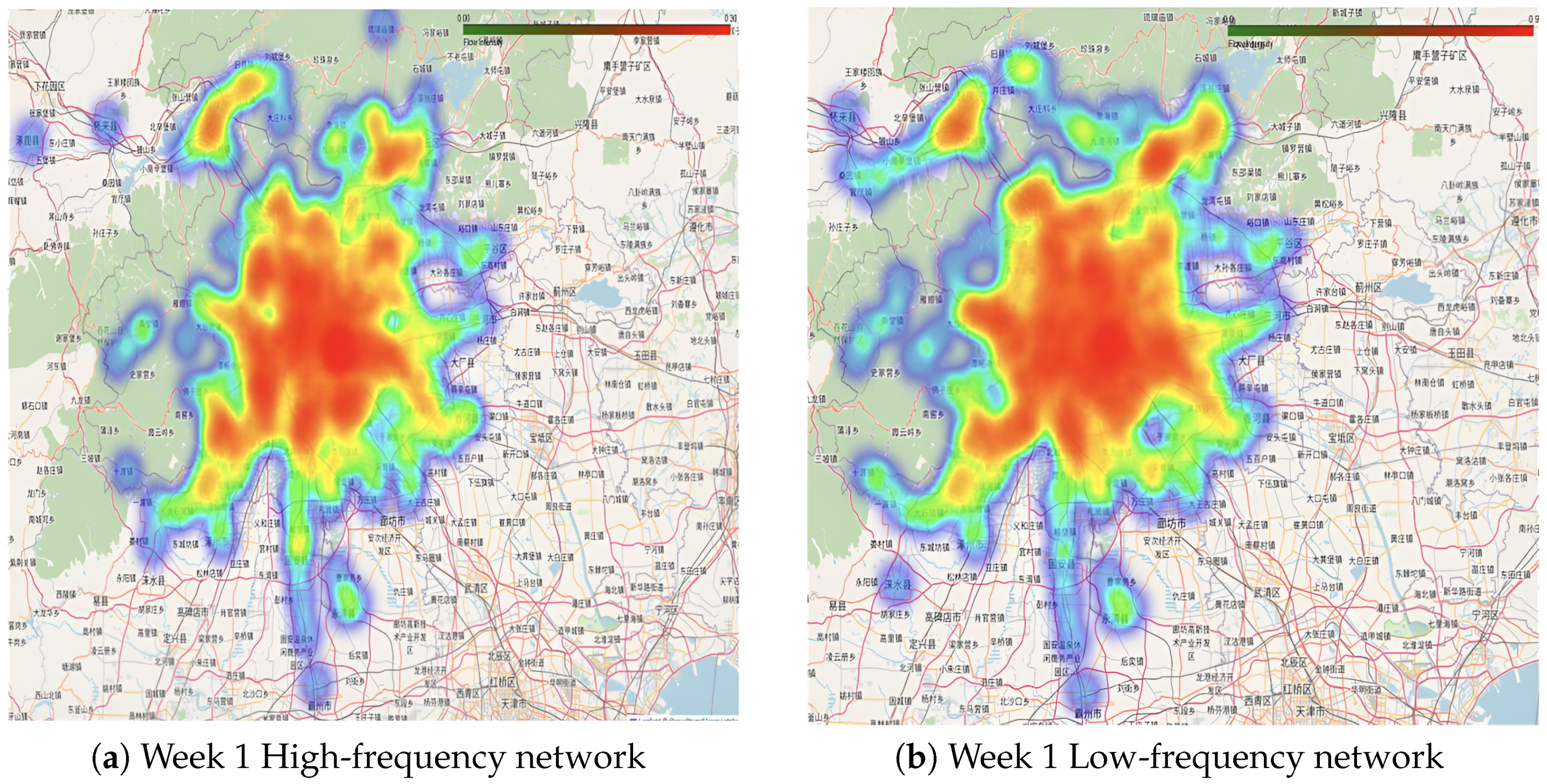
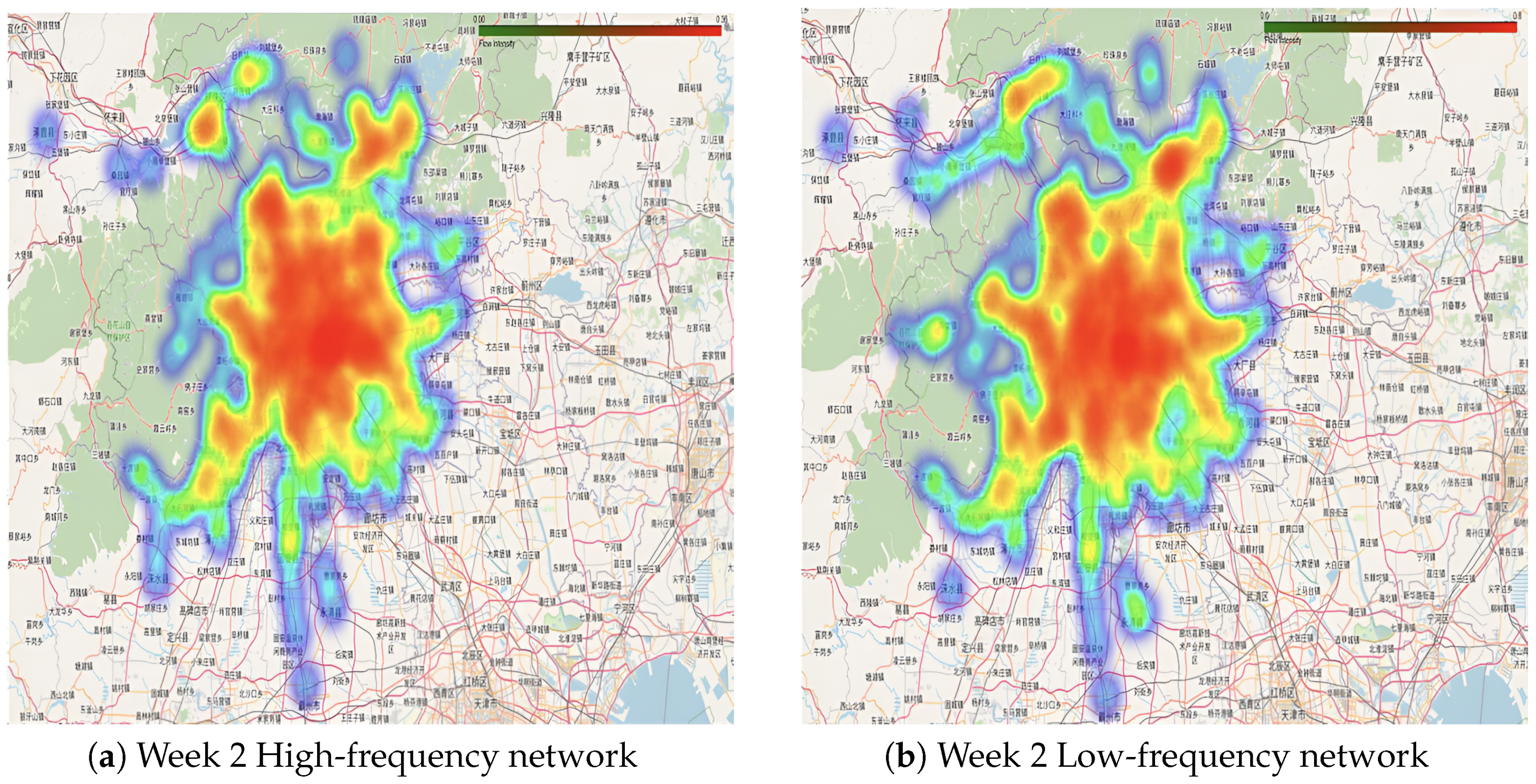
Visualization extends beyond graphical representation, incorporating analysis to reveal differences between high- and low-frequency networks. By comparing standardized flow maps across time periods, peaks, valleys, and distinct activity patterns of passenger groups are observed, offering insights for better network planning, as shown in
Figure 11 and
Figure 12. To support more detailed exploration of these temporal and spatial dynamics, interactive heatmap visualizations are available at:
https://github.com/lilieason/Transit-Network-Visual/tree/lilieason-patch-heatingmap (accessed on 3 August 2025).
5. Complex Network Characteristics Analysis
5.1. Node Analysis
A comprehensive analysis of node degree, Betweenness centrality, and closeness centrality provides a deep understanding of the structural characteristics and operational status of the transportation network. This approach helps identify key nodes, referred to as central stations, which are marked by high node degree, high Betweenness centrality, and high closeness centrality. These central nodes hold strategic significance within the network, serving as critical hubs for connectivity and flow management.
The node degree correlation indices of the network are presented in
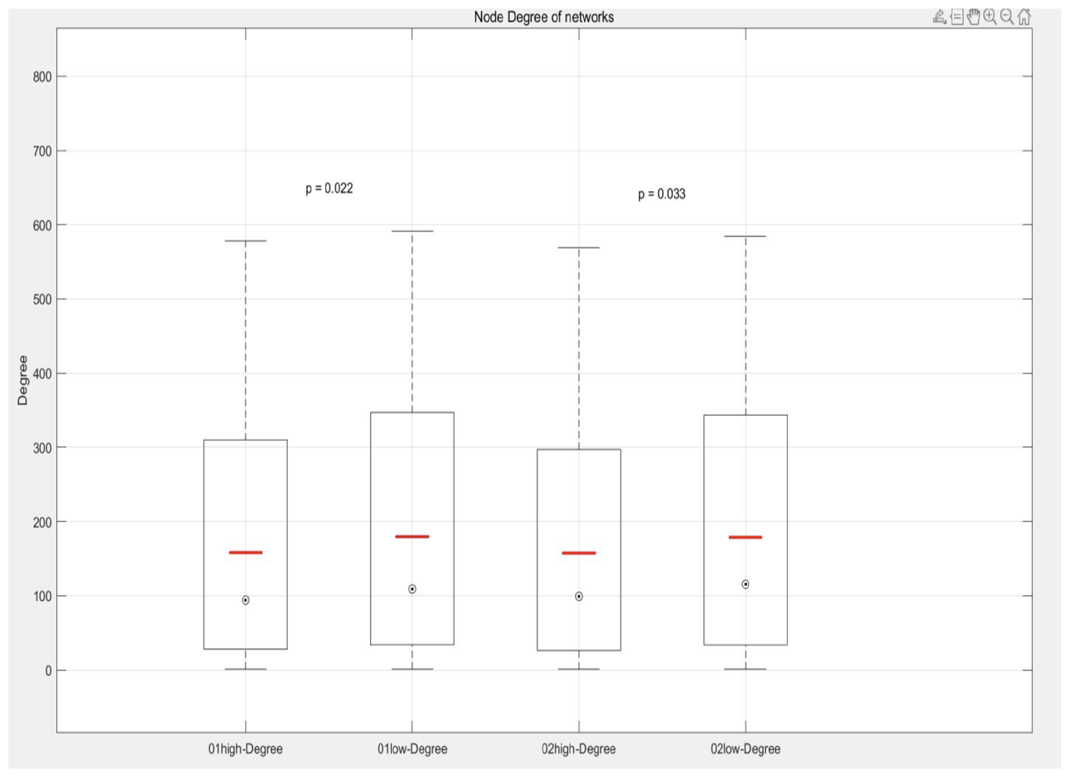
Table 19. In each box plot, the bottom and top of the box represent the first quartile (Q1) and the third quartile (Q3), respectively, while the line within the box indicates the median. Points outside the box extend to the minimum and maximum of the data distribution or are located beyond 1.5 times the interquartile range, which are considered potential outliers and may represent special cases or anomalies.
An average line, depicted in red, is included to provide an additional measure of central tendency. To evaluate whether statistically significant differences exist among the same index groups across different network states, the Mann-Whitney U test is conducted. The p-value results from this test are used to determine whether the “no difference” hypothesis can be rejected, with a p-value less than 0.05 indicating significant differences.
When comparing the node degree distribution of the high-frequency passenger complex network over two time periods, the results reveal significant statistical differences. The p-value for group 01 is 0.022, and the p-value for group 02 is 0.033, both of which are below the traditional significance threshold of 0.05. This indicates that there are statistically significant differences in the node degree distribution between the high-frequency and low-frequency networks across the two periods.
As shown in
Figure 13, the median node degree is generally lower in the high-frequency network than in the low-frequency network. This finding suggests that the sites in low-frequency networks are typically connected to a larger number of other sites, forming a more active network of traffic nodes. This characteristic reflects the central role of certain stations in the low-frequency network, such as major transportation hubs or commercial centers, which exhibit higher node degrees due to serving a larger volume of passengers or connecting more lines.
In contrast, the lower median node degree in high-frequency networks may indicate that the stations primarily used by high-frequency passengers tend to occupy more peripheral or marginal positions in the overall station network. This distinction underscores the differing roles and spatial characteristics of stations in high- and low-frequency passenger networks.
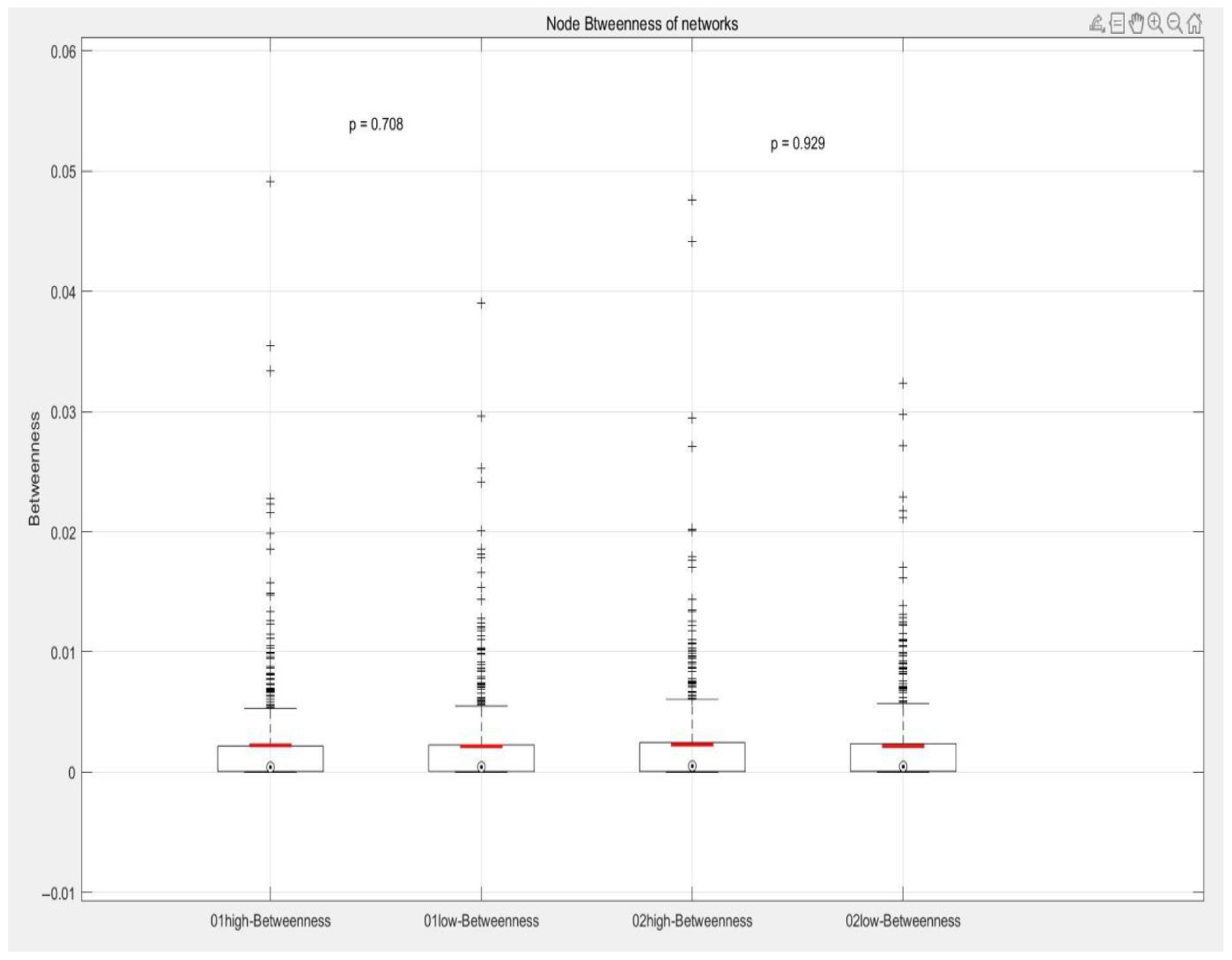
When comparing the betweenness centrality distribution of high-frequency and low-frequency passenger networks across the two periods, the observed p-values are 0.708 and 0.929, respectively. Since these values are significantly above the standard significance threshold of 0.05, it can be concluded that there is no statistically significant difference in Betweenness centrality between the two networks. This indicates that the importance of stations as passenger traffic transfer points remains relatively consistent in both high-frequency and low-frequency networks.
As shown in
Figure 14, the medians of all groups are similar, and while outliers are present, they do not influence the overall comparison between the groups. These outliers likely correspond to specific stations with particularly significant or unusual transit roles within the network. Although the Betweenness centrality of such stations may be critical to their respective networks, their influence does not result in significant differences in the overall distribution of Betweenness centrality.
This analysis suggests that while certain stations may have unique transit roles during specific periods, these roles do not create substantial distinctions between high- and low-frequency networks from a network-wide perspective. This consistency implies that the transit functions and network structure of the stations remain stable, even under varying passenger flows. Furthermore, it highlights the robustness of the network design, where stations can effectively maintain their connection and transfer functions regardless of fluctuations in passenger activity.
As shown in
Figure 15, groups 01 and 02 demonstrate a statistically significant difference in closeness centrality. The
p-value for group 01 is 0.015, and for group 02 it is 0.035, both of which are below the conventional significance threshold of 0.05. This indicates substantial differences in the closeness centrality of nodes between the two time periods.
Analysis of these differences reveals that the closeness centrality of sites in the low-frequency network is generally higher compared to the high-frequency network. This likely reflects the strategic positioning of sites within the low-frequency network, enabling passengers to reach other stations more quickly. However, given the smaller number of high-frequency passengers, the difference in closeness centrality between the two networks is not pronounced. This suggests that stations in the high-frequency network also provide efficient connectivity, particularly for frequent travelers, such as commuters, who may prioritize time savings and rely on these stations.
Additionally, the upper and lower bounds of closeness centrality in the high-frequency network are higher than those in the low-frequency network. This finding indicates that it is easier to reach other stations within the high-frequency network, further emphasizing its efficiency in catering to passengers with frequent travel needs.
In the low-frequency network, the lower limit of closeness centrality is lower, while the average and median are higher. This suggests that the low-frequency network includes stations located in more remote areas or slightly away from the main routes of the urban transportation network.
Comprehensive analysis of the three node indicators reveals key insights. The significant differences in node degree indicate that some stations bear higher traffic in the low-frequency network, playing a critical role in passengers’ daily travel. Conversely, in the high-frequency network, traffic is more evenly distributed across stations, with passenger flow less concentrated at specific sites. Although the geographical positions of stations remain constant, their importance within the network shifts with passenger traffic patterns.
The analysis of Betweenness centrality shows that the strategic role of stations as passenger flow transit points remains consistent between high- and low-frequency networks. This consistency suggests that, despite variations in overall traffic volume, passenger flow paths and routes between stations are relatively stable.
Differences in closeness centrality highlight the higher accessibility of sites in the high-frequency network, reflecting improved connectivity and efficiency under conditions of high passenger traffic. This allows passengers, particularly frequent travelers, to reach destinations more quickly.
For improving the high-frequency network, given the smaller number of passengers but higher closeness centrality at some nodes, priority should be given to increasing the transportation capacity at these central stations or enhancing their transfer efficiency. Additionally, to address the concentration of high-degree nodes, constructing new routes or increasing the capacity of existing ones could help distribute traffic more evenly and enhance the network’s overall robustness and capacity.
In the low-frequency network, for nodes with lower traffic, increasing direct connections to high-demand nodes could improve their accessibility and appeal. This would enhance the utilization and efficiency of these underused parts of the network, contributing to a more balanced and effective transportation system.
5.2. Robustness Test
According to the summary of the indicators in the above section, the top 10 nodes with the highest comprehensive scores in the network are selected as the central nodes. The comprehensive score is calculated by summing the Z-score normalized values of node degree, Betweenness centrality, and closeness centrality for each node. This selection criteria ensures a holistic evaluation of the nodes’ performance across these three metrics, identifying the most prominent and strategically significant nodes in the network.
The Z-score (Z value) is a standard statistic used to measure the deviation of a data point from the sample mean, expressed in units of the sample standard deviation. Z-score normalization ensures that all indicators are on the same scale, allowing for a fair comparison and aggregation of metrics. The formula for the Z-score is:
where
X represents the value of the original data point,
is the mean of the sample, and
is the standard deviation of the sample. The
Z-score calculations standardize the data, eliminating dimensional differences between variables. This standardization facilitates comparisons and enables a comprehensive assessment of the variables, ensuring each metric contributes equally to the overall score.
Using this method, the central nodes of the network were identified, and the results are summarized in
Table 20. This table highlights the nodes with the highest comprehensive scores, reflecting their significant roles within the network based on their node degree, betweenness centrality, and closeness centrality.
To explore the robustness of high-frequency and low-frequency passenger traffic networks, this study employs four key indicators: global clustering coefficient, strongly connected components, average path length, and network efficiency. Leveraging optimization techniques, including neural network-based modeling for decision-making, maintenance strategies in networked systems, and adaptive learning algorithms for decentralized architectures, has been shown to enhance network resilience and efficiency [
35,
36,
37]. By identifying central nodes, as described before, a comparative analysis is conducted by examining the changes in these indicators before and after the removal of central nodes. This approach reveals the robustness of high- and low-frequency passenger complex networks when critical nodes fail, providing insights into the networks’ ability to maintain connectivity and functionality under such disruptions.
Table 21 and
Table 22 present the network features before and after the removal of central sites.
For the high-frequency networks, a slight decrease in the global clustering coefficient was observed after the removal of central nodes. For instance, in the first week, the clustering coefficient dropped from 0.001157316 to 0.000963703. This change indicates that the overall network structure remained relatively stable, though the removal of central nodes slightly affected local connectivity. However, network efficiency showed a significant decrease in both high-frequency networks, underscoring the importance of central nodes in maintaining overall communication efficiency.
Low-frequency networks exhibited different robustness characteristics. Interestingly, the clustering coefficient increased slightly after the removal of central nodes, such as in the 01low network, where it rose from 0.000870484 to 0.000941457. This may reflect better connectivity in other parts of the network or the presence of more alternative paths in low-frequency networks. Nonetheless, similar to high-frequency networks, the average path length in low-frequency networks increased, and network efficiency decreased, emphasizing that central nodes are also critical for the performance of low-frequency networks.
Overall, both high- and low-frequency networks showed structural changes after the removal of central nodes. The decline in the clustering coefficient and the significant reduction in network efficiency for high-frequency networks highlight their dependency on central nodes. The efficiency drop of 5% and the clustering coefficient reduction of 0.1% may be attributed to the concentrated traffic flow and limited route diversity in high-frequency passenger movements. Conversely, the increased clustering coefficient in low-frequency networks suggests that other parts of the network retain structural integrity, even with central node removal. However, the increase in average path length and the decrease in network efficiency across both network types reinforce the critical role of central nodes in ensuring efficient network operation.
5.3. Basic Property Analysis of Complex Networks
5.3.1. Cluster Coefficient
The agglomeration coefficient measures the extent to which a site’s adjacent nodes are interconnected. Specifically, it represents the likelihood that if a site A has direct connections with both sites B and C, there is also a direct connection between B and C. This metric reflects the clustering tendency in the network, capturing the local tightness and formation of small group structures.
The global agglomeration coefficient, in contrast, measures the actual proportion of all possible triangular relationships across the entire network. It provides an overall assessment of the network’s clustering tendency, extending the concept of the local agglomeration coefficient to the entire system. This metric reveals how closely nodes are interconnected on a network-wide scale.
In this study, the weighted global agglomeration coefficient is calculated using nx.average_clustering(G, weight = ‘traffic’), which accounts for the traffic flow between nodes as a weight. High values of the global agglomeration coefficient indicate the presence of many closely connected groups of nodes, suggesting an effective network design capable of dispersing and managing high traffic efficiently.
For
Table 23, the observed global agglomeration coefficients for high-frequency networks are 0.001157316 and 0.000778501, showing higher values compared to the low-frequency networks, which are 0.000870484 and 0.00089554, respectively. This suggests that high-frequency networks exhibit more closed loops and three-node connections among their nodes. The characteristics of this network structure may be influenced by the daily commuting behavior of high-frequency passengers, who tend to utilize various routes to meet their diverse travel needs.
In contrast, the low-frequency networks display lower and relatively consistent agglomeration coefficients, indicating fewer direct connections between nodes. This simpler and more concentrated network structure likely reflects a tendency among low-frequency passengers to use major traffic routes or direct paths to reach primary destinations, rather than relying on complex networks requiring multipath selections as seen with high-frequency passengers.
The higher agglomeration coefficient observed in high-frequency networks highlights their complex and highly interconnected structure. This complexity is likely due to daily commuters needing to access multiple destinations within the city, such as workplaces, schools, or shopping centers, resulting in more extensive and variable route choices. This structural difference underscores the varying network design requirements for catering to the distinct travel behaviors of high- and low-frequency passengers.
5.3.2. Strongly Connected Component
By analyzing strongly connected components, this study identifies potential weak links or performance bottlenecks, enabling the proposal of improvement measures to optimize network design, enhance risk management, and improve service capability.
On a technical level, the identification of strongly connected components is achieved using a graph traversal algorithm. Specifically, the number of strongly connected components in this study is determined by the strongly_connected_components function provided by the network analysis library. This function employs depth-first search (DFS) to systematically explore the network. Each time an unvisited node is encountered during the DFS traversal, a new strongly connected component is identified and explored. This process continues until all nodes in the graph have been fully analyzed, providing a comprehensive understanding of the network’s connectivity and structural integrity.
A strongly connected component analysis of high- and low-frequency passenger traffic networks reveals variations in network connectivity across different periods and their behavioral implications. Based on the results in
Table 24, several conclusions can be drawn.
The comparison of strongly connected components between high- and low-frequency networks highlights notable differences. In the first week, the high-frequency network had significantly more strongly connected components than the low-frequency network (11 vs. 7). In the second week, this difference was smaller but still present (14 vs. 12). These distinctions likely reflect differences in passenger travel behavior. High-frequency networks primarily represent the travel patterns of daily commuters, characterized by more dispersed paths and nodes in the urban transportation network. In contrast, low-frequency networks correspond to non-daily or traveler behaviors, with relatively concentrated travel paths along primary or specific routes.
The higher number of strongly connected components in the high-frequency network suggests that commuters utilize a wider range of paths and connections, contributing to a more dispersed network structure. Conversely, the smaller number of strongly connected components in the low-frequency network indicates a tendency for travelers to use concentrated and predictable routes. These findings align with previous analyses, further emphasizing the differing network dynamics driven by the behaviors of high- and low-frequency passenger groups.
5.4. Average Path Length
The average shortest path length represents the average “cost” of transferring information between nodes or completing a journey within a directed graph. In the context of high- and low-frequency passenger complex networks studied in this paper, this metric provides insights into the average direct accessibility of passengers within the network.
The method employed in this study calculates the average shortest path length for all node pairs within the largest strongly connected component of the directed graph. This calculation is performed using the average_shortest_path_length function from the NetworkX library. The process leverages the depth-first search (DFS) algorithm for weighted graphs, incorporating “normalized traffic” as edge weights. Here, the weight of each edge reflects the relative traffic flow between two sites.
By using these weights in the calculation, the shortest path length is measured based on the cumulative traffic values along the path. Consequently, the resulting average shortest path length reflects not only the spatial characteristics of the network but also the average flow efficiency of passengers within it, providing a comprehensive view of the network’s performance. The formula is expressed as follows:
where,
represents the number of nodes in the largest strongly connected component being analyzed, and
denotes the shortest path length from node
u to node
v. The path length is calculated using the weights assigned to the edges, where the weights correspond to standardized traffic values. This means that the shortest path length is a weighted measure reflecting the relative traffic flow between nodes, rather than the actual physical distance or travel time. This approach provides a more nuanced understanding of the network’s accessibility and flow efficiency.
From the data in
Table 25, the high-frequency network (01high and 02high) and the low-frequency network (01low and 02low) exhibit notable differences in average shortest path length. Specifically, the high-frequency network, particularly 01high, has a longer average shortest path length. This suggests that the travel paths of daily commuters are more complex compared to low-frequency travelers.
In high-frequency networks, commuters often require more transfers and links, reflecting the need to navigate between various locations such as workplaces, residences, and urban services. This complexity may arise from the larger distances between key destinations or the network’s design, which aims to offer broader coverage and more transfer options to accommodate diverse commuting needs.
However, a longer average shortest path length may also highlight potential inefficiencies in the network. For commuters, extended paths can result in increased travel time and higher costs, potentially influencing their travel behavior and even their choices of residence and workplace. This underscores the importance of optimizing network design to balance accessibility with efficiency for frequent travelers.
As observed from
Table 26, the low-frequency network in the first week exhibits the highest network efficiency, indicating that travelers in this network generally experience lower “traffic costs” to reach their destinations. This aligns with the shorter average shortest path length observed in the 01low network, suggesting that low-frequency networks provide more direct and efficient travel routes for their users.
In contrast, high-frequency networks, particularly in the first week, demonstrate relatively lower efficiency. This reflects the higher flow costs associated with daily commuters who often traverse multiple nodes and connections to complete their journeys. The high-frequency networks serve a broader range of areas to accommodate passengers traveling between work, educational institutions, and other urban locations, which are frequently farther apart. Consequently, while high-frequency passenger routes are more complex and involve more transfers, this complexity also highlights the transportation network’s capacity to serve a diverse range of destinations.
The lower efficiency in high-frequency networks suggests potential opportunities for network optimization, especially during peak hours when commuter demand is highest. Reduced path efficiency during these times can exacerbate congestion and delays, increasing travel costs and potentially affecting commuters’ travel choices and overall quality of life.
Additionally, the global agglomeration coefficient of the high-frequency network (0.0009679085) is slightly higher than that of the low-frequency network (0.0008830120), and the high-frequency network also features a greater number of strongly connected components. These characteristics indicate that the high-frequency network structure is relatively loose, with weaker site connections, while the low-frequency network exhibits a more compact structure with stronger inter-site connections. This disparity can be attributed to the more complex and diverse travel patterns in high-frequency networks, which include more sites and routes, resulting in a more intricate network topology. The increased indirect connectivity and redundant paths in high-frequency networks lead to a 16% increase in average path length and a corresponding 5% decrease in network efficiency.
The Louvain Community Detection Algorithm is a hierarchical clustering approach based on modularity optimization, designed to uncover highly modular community structures within a network. Modularity measures the quality of network segmentation, where a highly modular segmentation contains numerous internal edges (connections within a community) and fewer external edges (connections between communities).
This information allows traffic planners to allocate resources more effectively, such as enhancing transport capacity in busier communities or introducing customized services in low-frequency areas. By reducing redundant connections between communities and strengthening services within each community, transportation systems can improve efficiency, minimize congestion, and enhance passenger satisfaction. Additionally, community detection provides a foundation for planning new routes and services. Identified communities that diverge from the existing transportation network may indicate opportunities for potential new lines or services tailored to meet emerging passenger demands.
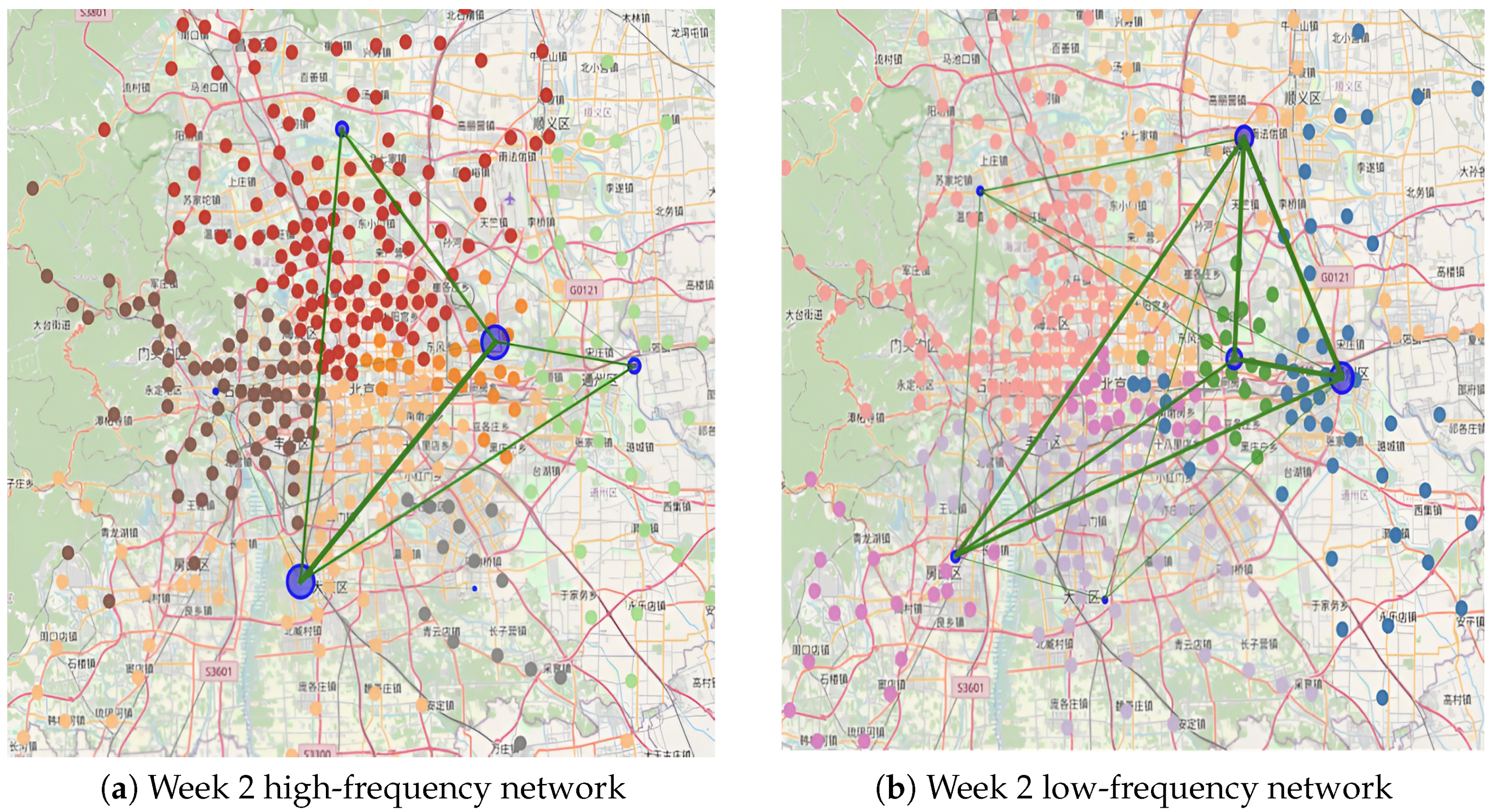
After performing visual community detection, over 500 cluster sites were grouped into multiple communities, each represented by a distinct color. The flow between communities is visualized using green lines connecting the center points of the communities, with the thickness of the lines corresponding to the flow size. Similarly, the flow within each community is depicted by the size of the circle at the community’s center point. These visualizations effectively illustrate the distribution of inter-community and intra-community flows. The results of this analysis are presented in
Figure 16 and
Figure 17. To facilitate a more detailed exploration of the modular structure and community interactions, interactive versions of these community detection visualizations are available at:
https://github.com/lilieason/Transit-Network-Visual/tree/lilieason-patch-community (accessed on 3 August 2025), and have also been included in the
Appendix A.
In the visualization map of the high- and low-frequency passenger networks during the first week, the distribution and connections between central nodes appear similar. However, in the second week, the high-frequency passenger network exhibits larger communities with more stations within each community, whereas the low-frequency passenger network has a greater number of communities with more distinct divisions and closer internal connections.
To further analyze the complex networks following community detection, three indicators are used to characterize the networks. The size represents the number of nodes within a community, offering insight into the scale of individual communities. The average degree is the mean number of edges per node in the network, providing a macroscopic measure of network connectivity. A high average degree indicates that nodes are typically connected to many other nodes, suggesting robust propagation or efficient information exchange within the network.
Modularity, a key metric for evaluating the quality of network community structures, measures the degree of node clustering within communities. High modularity indicates a pronounced community structure, where nodes are more likely to connect with others in the same community rather than external ones. In urban traffic networks, areas with high modularity often correspond to regions with concentrated internal traffic flows, which can serve as indicators of high-traffic zones or regions requiring targeted transportation strategies. The modularity in a network is usually defined by the following formula proposed by Newman [
38]:
where,
represents the adjacency matrix of the network,
and
denote the degrees of nodes
i and
j, respectively, and
m is the total number of edges in the network. The summation is taken over all node pairs
. The function
is an indicator function that equals 1 if nodes
i and
j belong to the same community (i.e.,
), and 0 otherwise.
The network community metrics presented in
Table 27, derived from the community structures identified using the Louvain algorithm, highlight the characteristic differences between the high- and low-frequency passenger networks during the first and second weeks. These metrics offer valuable insights into the behavioral patterns of high- and low-frequency passengers, reflecting how their travel preferences and interactions shape the community structures within the urban transportation network.
For high-frequency networks, the larger community sizes likely represent major routes used for daily commuting, while the higher average degree of communities (42) indicates frequent passenger exchanges between stations. This suggests that high-frequency passengers tend to use diverse paths, reflecting a more varied travel pattern. The relatively low modularity (0.40) implies that these communities are not isolated clusters but are situated at critical intersections within the transportation network, allowing for greater flexibility in passenger flow across different communities.
In low-frequency passenger networks, the higher modularity (0.44) indicates more distinct community divisions. This strong internal connectivity may result from the occasional clustering of passengers for specific activities, such as weekend leisure or holiday events, leading to concentrated flows in certain areas. Larger community sizes may correspond to hotspots like tourist attractions or significant service points, which draw centralized traffic.
Urban planners can use these findings to tailor traffic planning strategies to the needs of different passenger groups. For high-frequency passengers, enhancing network connectivity and capacity is crucial, as their travel needs focus on daily, cross-district commuting with diverse paths. Improving network reliability and alleviating congestion in large high-frequency communities will directly enhance travel efficiency. This could involve allocating more public transport resources and increasing service frequency in key areas of high-frequency networks.
For low-frequency passengers, particularly within large communities, ensuring high-quality transportation services is vital to improve their travel experience. Strategies might include optimizing direct services to popular destinations and providing sufficient network capacity to accommodate sudden spikes in demand.
Overall, the mean and modularity indicators in high-frequency networks underscore the importance of inter-community mobility and flexibility in traffic planning, while the same metrics in low-frequency networks highlight the need to focus on destination-centric traffic and intra-community travel demands. This dual approach is critical for designing peak and off-peak transportation strategies that enhance both the efficiency of urban transportation systems and passenger satisfaction.
5.5. Analysis of Network Characteristics During Peak Hours
By integrating the cluster site information obtained earlier with the traffic data from the morning and evening peak periods, detailed traffic patterns at the stations are derived. This combined analysis, as shown in
Table 28 and
Table 29, offers valuable insights into station-level traffic dynamics during peak hours. The results highlight the spatial and temporal distribution of passenger flows across different clustered stations, enabling a deeper understanding of network activity and passenger behavior during critical time periods.
Table 30 and
Table 31 illustrate the basic characteristics of the high- and low-frequency passenger networks, derived using consistent data analysis methods. These tables provide a detailed comparison of the structural and functional features of the networks, offering insights into their connectivity and passenger flow dynamics.
Among the network characteristics during peak periods, the average agglomeration coefficient for both high-frequency and low-frequency networks in the morning and evening peaks is significantly reduced compared to the overall period, with a decrease of 99%, particularly in high-frequency networks. This suggests that during peak hours, the travel network becomes more streamlined, reflecting passengers’ need for direct routes, particularly among high-frequency commuters returning home from work.
Regarding the shortest path, the shortest path during peak times increases by approximately 10%. The high-frequency network exhibits a longer average path length, reflecting more inter-node connections during morning rush hours, while low-frequency passengers experience shorter and simpler travel routes. During the evening peak, however, the average path length becomes relatively short for both networks, indicating less detour and more direct travel paths.
Network efficiency analysis shows a 6% decrease in network efficiency for both high-frequency and low-frequency networks during the morning peak, while evening peaks exhibit relatively low efficiency for both. This decline likely results from commuters returning home, with complex paths and congestion reducing the overall efficiency of the transportation network.
High-frequency networks show a median node degree of 95 and an average of 158, with a heavy reliance on central nodes. Removing these nodes reduces network efficiency by 5% and the agglomeration coefficient by 0.1%. In contrast, low-frequency networks, with a median node degree of 110 and an average of 118, are more robust, maintaining structural integrity even after central node removal.
The global agglomeration coefficient is slightly higher in high-frequency networks (0.0009679085) than in low-frequency ones (0.0008830120). High-frequency networks exhibit more dispersed and complex travel patterns, leading to longer paths (16% increase) and reduced efficiency (5% decrease). Low-frequency networks, by comparison, have tighter structures and stronger inter-site connections, reflecting concentrated travel behavior.
5.6. Summary
Community analysis shows high-frequency networks have lower modularity (0.40) and higher inter-community mobility, while low-frequency networks exhibit higher modularity (0.44), often forming around specific activities or destinations.
Peak periods further emphasize network challenges, with a 99% drop in the agglomeration coefficient, a 10% increase in path length, and a 70% decline in efficiency. High-frequency networks experience greater congestion, with 30% longer paths and 6% lower efficiency during evening peaks compared to low-frequency networks.
Recommendations include enhancing central node capacity and decentralizing traffic in high-frequency networks, while improving accessibility and direct connections in low-frequency networks to boost utilization and efficiency.
7. Conclusions
This study presents a comprehensive framework for analyzing urban public transportation networks through the lens of passenger travel frequency, utilizing over 20 million smart card records from Beijing’s multimodal transit system. By constructing and comparing complex networks for high-frequency (HF) and low-frequency (LF) travelers, we uncover critical differences in spatial patterns, structural characteristics, and network resilience.
High-frequency passengers are predominantly concentrated in central urban areas and exhibit strong temporal clustering during morning and evening peaks. In contrast, low-frequency passengers demonstrate more dispersed spatial coverage and temporally flexible travel behaviors, reflecting distinct usage patterns. From a network topology perspective, HF networks display higher median (95) and average (158) node degrees, suggesting dense connectivity. However, they also exhibit reduced robustness, including a 0.5% drop in efficiency and a 0.1% decrease in clustering coefficient, compared to LF networks. The latter, while more fragmented, maintain greater structural stability and stronger intracommunity cohesion.
Community detection using the Louvain algorithm reveals further divergence. HF networks exhibit lower modularity (0.40) but higher average node degrees (42), resulting in tightly interlinked but fragile clusters. Conversely, LF networks demonstrate higher modularity (0.44) and lower average degrees (40), forming more distinct, stable communities often aligned with specific trip purposes or destinations. These structural characteristics have direct implications for network performance during peak periods. Under peak-hour conditions, the system experiences a 70% decline in efficiency and a 99% drop in clustering coefficient. The average path length increases by 10%, with HF networks specifically experiencing 30% longer paths and 6% lower efficiency than LF networks—highlighting their higher congestion sensitivity.
Building on these findings, we propose differentiated policy strategies. For HF networks, it is essential to reinforce network robustness through added redundancy, decentralize high-load hubs, and improve transfer environments. For LF networks, improving intra-community accessibility and ensuring equitable service to dispersed destinations can enhance overall system inclusivity. These targeted interventions support resilience, operational efficiency, and fairness in urban transit planning.
This research contributes to the field in several ways. First, it introduces frequency-based passenger segmentation into large-scale public transportation analysis, revealing how behavioral heterogeneity shapes network load and structural vulnerability. Second, it integrates smart card and AVL data into a scalable analytical framework that bridges micro-level behavior with macro-level topology. Third, it lays the foundation for future optimization studies by identifying critical nodes, fragile links, and flow imbalances—key targets for constraint-aware network enhancement.
Future research could further refine passenger classification through unsupervised learning or statistical modeling, explore the sensitivity of network properties under different frequency thresholds, and simulate long-term planning scenarios involving demand shifts, infrastructure expansion, or the transition to electric mobility. Incorporating weighted station importance—e.g., prioritizing transfer hubs or capacity nodes—may also yield more nuanced insights into network flow patterns and planning priorities.
In summary, this study offers both theoretical and practical advances in understanding how different user groups shape the structure, efficiency, and vulnerability of large-scale urban transit systems. The proposed framework not only enhances our diagnostic capabilities but also informs forward-looking strategies to design more adaptive, inclusive, and resilient transportation infrastructures.
