Article

The Impact of Color Blindness on Player Engagement and Emotional Experiences: A Multimodal Study in a Game-Based Environment

by
Merve Tillem
1 and
Ahmet Gün
2,*
1
Department of Game and Interaction Technologies, Graduate School, Istanbul Technical University, 34467 Maslak, Türkiye
2
Faculty of Architecture, Istanbul Technical University, 34367 Şişli, Türkiye
*
Author to whom correspondence should be addressed.
Multimodal Technol. Interact. 2025, 9(6), 62; https://doi.org/10.3390/mti9060062
Submission received: 17 April 2025 / Revised: 8 June 2025 / Accepted: 10 June 2025 / Published: 13 June 2025

Abstract

Color blindness can create challenges in recognizing visual cues, potentially affecting players’ performance, emotional involvement, and overall gaming experience. This study examines the impact of color blindness on player engagement and emotional experiences in digital games. The research aims to analyze how color-blind individuals engage with and emotionally respond to games, offering insights into more inclusive and accessible game design. An experiment-based study was conducted using a between-group design with a total of 13 participants, including 5 color-blind and 8 non-color-blind participants (aged 18–30). The sample was carefully selected to ensure participants had similar levels of digital gaming experience and familiarity with digital games, reducing potential biases related to skill or prior exposure. A custom-designed game, “Color Quest,” was developed to assess engagement and emotional responses. Emotional responses were measured through Emotion AI analysis, video recordings, and self-reported feedback forms. Participants were also asked to rate their engagement and emotional experience on a 1 to 5 scale, with additional qualitative feedback collected for deeper insights. The results indicate that color-blind players generally reported lower engagement levels compared to non-color-blind players. Although quantitative data did not reveal a direct correlation between color blindness and visual experience, self-reported feedback suggests that color-related design choices negatively impact emotional involvement and player immersion. Furthermore, in the survey responses from participants, color-blind individuals rated their experiences lower compared to individuals with normal vision. Participants emphasized that certain visual elements created difficulties in gameplay, and alternative sensory cues, such as audio feedback, helped mitigate these challenges. This study presents an experimental evaluation of color blindness in gaming, emphasizing how sensory adaptation strategies can support player engagement and emotional experience. This study contributes to game accessibility research by highlighting the importance of perceptual diversity and inclusive sensory design in enhancing player engagement for color-blind individuals.

1. Introduction

The way our brains process colors and visual stimuli in the environment plays a crucial role in shaping perception, behavior, and emotional responses. Research shows that emotional arousal enhances visual processing and memory, underlining the strong connection between color perception and cognitive–emotional functioning [1]. However, this process is not consistent across all individuals. Color vision deficiency (CVD), commonly known as color blindness (CB), affects how individuals perceive and interpret visual information. In digital game environments, where color is often used as a primary channel to convey feedback, status, or navigational cues, this can lead to significant accessibility challenges for color-blind players [2,3]. Predominantly affecting males, CB results in a limited ability to distinguish specific color ranges, often leading to visual misunderstandings. This can significantly impact experiences in color-dependent interfaces, such as digital games, where color is frequently used to convey critical information—e.g., identifying enemies, allies, or interactive targets [2,3]. For individuals with CB, such design choices can reduce playability, cause confusion, and ultimately diminish engagement and enjoyment [3,4,5].
In competitive or multiplayer games, players with color blindness (CB) often face disadvantages that can affect both performance and overall engagement. Difficulties in interpreting color-coded elements—such as team indicators, status effects, or interactive objects—can hinder real-time decision-making and reduce the effectiveness of communication and collaboration in cooperative modes [5]. These limitations not only lead to gameplay challenges but may also result in emotional responses such as frustration or exclusion. While color is commonly used for functional purposes in games, such as navigation or team identification, it also plays a role in shaping the overall visual experience and artistic coherence of game environments [3,6]. When color-blind players perceive gameplay as more difficult or confusing due to inaccessible visual elements, this can negatively affect their engagement and overall enjoyment, potentially weakening emotional connection to the game [4,5]. The visual barriers created by color-dependent game mechanics can prevent full participation by color-blind players [3]. These multifaceted challenges underline the importance of examining the intersection of color blindness and digital gaming experiences.
Although accessibility in digital games has received growing attention, the intersection between color blindness (CB) and digital gaming remains underexplored. A review of the existing literature reveals four dominant research strands: (1) the development of assistive technologies aimed at improving accessibility for color-blind individuals in digital environments [3,7], (2) the formulation of design guidelines to enhance accessibility [3,8], (3) diagnostic or alternative detection tools for CB [9], and (4) performance-based assessments of user interaction [10]. However, studies that holistically examine the gaming experience—particularly in terms of emotional and physical responses to CB-related visual limitations—are notably absent. Furthermore, while most research situates games as objects requiring increased accessibility [2,3,5,11], some have also explored their potential as platforms for screening or evaluating users with visual impairments [9]. A number of recent studies consider the role of games in addressing accessibility challenges through inclusive design strategies [3,8]. Yet, substantial gaps remain in understanding how CB specifically affects users’ affective engagement with game visuals. For instance, no research has systematically compared the emotional experiences of color-blind players with those of individuals with typical color vision when interacting with game environments.
To address the gaps identified in the literature, this study aims to explore how color blindness shapes player engagement and the emotional experiences of individuals within digital gaming environments. Thus, the research investigates the emotional responses and the types of bonds that individuals with color blindness establish with digital games. A custom-designed game environment is developed to evaluate these dynamics through a controlled group study. The study is guided by the following research questions:
  • How does color blindness influence the emotional experience of players in digital games?
  • To what extent and in what ways does color blindness affect player engagement compared to individuals with normal vision?
To explore these questions, we developed a custom-designed game environment tailored to evaluate color blindness in the context of digital gameplay. The experiment involved a controlled group study with participants divided into two groups: individuals with typical color vision and individuals with color blindness. Emotional responses during gameplay were captured using facial expression analysis (e.g., happiness, neutrality), while in-game performance metrics (e.g., completion time, errors) provided behavioral data. To complement these findings, participants also completed a post-play feedback form capturing qualitative reflections. This multi-method design was intended to offer a holistic perspective on how color blindness affects emotional engagement and player interaction within game environments.
Based on this rationale, we hypothesize that color-blind individuals experience significant disadvantages in digital games compared to individuals with normal vision, both in terms of emotional experience and game engagement.
Since color-blind individuals cannot perceive colors in the same way as people with normal vision, their engagement and overall experience with games may be diminished. This visual discrepancy possibly weakens their connection to the gaming world, potentially reducing enjoyment and competitiveness. Thus, the hypothesis of this study is to examine the argument as follows:
“Color-blind individuals face significant disadvantages in the context of digital games compared to those with normal vision in terms of (1) engaging with the game world and (2) emotional experience.”
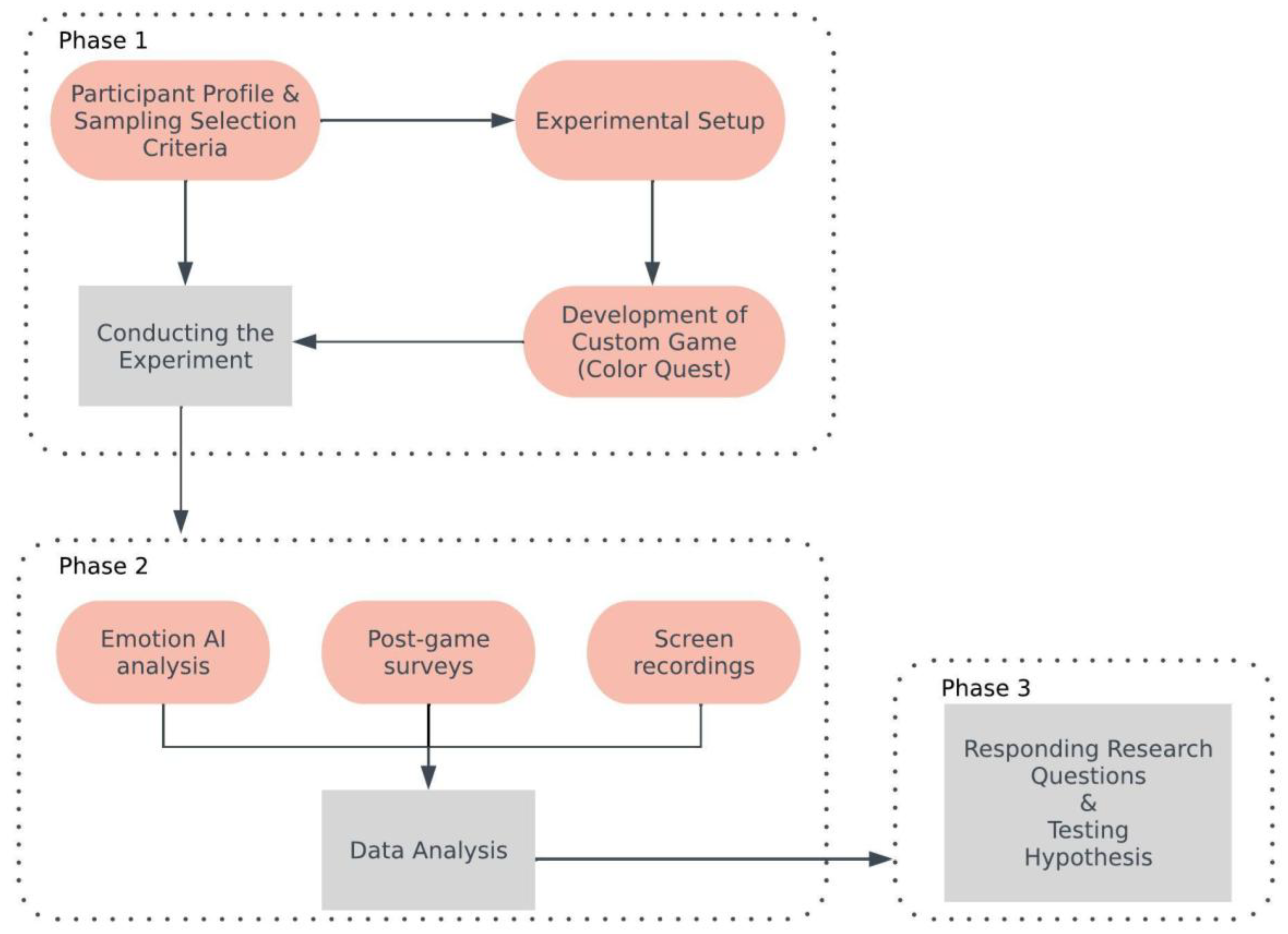
A group experiment was conducted to address the research questions and test the proposed hypothesis. In this experiment, participants included individuals with typical color vision and those with color blindness. Their emotional responses during gameplay were examined through facial expression analysis. In addition to emotional data, player performance was assessed using predefined in-game metrics. To complement the quantitative findings, a post-play feedback form was used to collect participants’ verbal reflections. This multi-method approach aimed to provide a holistic understanding of how color blindness influenced emotional engagement and interaction within digital game environments.
The following section outlines the research methodology, followed by the presentation and discussion of empirical results. The final section reflects on the overall findings and proposes directions for future research.

2. Methodology

This study employed a multi-phase research design to investigate how color blindness influences emotional experiences and player engagement in digital games (Figure 1). The methodological framework was structured in three sequential stages:
(1) Conducting the experiment, which involved the recruitment of participants and the development of a custom digital game environment (“Color Quest”) designed to isolate the influence of color vision on emotional and behavioral responses;
(2) A mixed-method data analysis, combining Emotion AI, structured surveys, and gameplay screen recordings to examine player emotions, attention levels, and in-game behaviors such as error frequency, completion time, and island preference.
This integrative methodology enabled both quantitative and qualitative insights, and allowed for triangulation across emotional, attentional, and behavioral dimensions—offering a robust understanding of how color vision shapes gameplay engagement and affective response.
The following subsections detail each methodological stage.

2.1. Conducting the Experiment

To address this gap, an experimental study was conducted to evaluate the impact of color blindness on player engagement and emotional experiences in digital games. The study involved thirteen participants: five with color blindness (CB), forming the experimental group, and eight with normal vision (NV), forming the control group.

2.1.1. Participant Profile and Sampling Strategy

Participants were selected using a snowball sampling method due to the difficulty of accessing individuals with specific types of color vision deficiency who also met the selection criteria. In this specific case, initial participants were identified through professional and academic networks, and they were then asked to refer other individuals with similar characteristics. The sample size remained limited, but care was taken to ensure group comparability. All participants were adults aged 18–30, with at least undergraduate-level education and moderate digital literacy. Selection criteria included shared characteristics such as familiarity with digital technologies, comparable gaming experience, and similar weekly gameplay habits. Participants’ gaming preferences—such as frequently played genres and preferred platforms—were reviewed to ensure consistency between the groups and to reduce the influence of external variables.

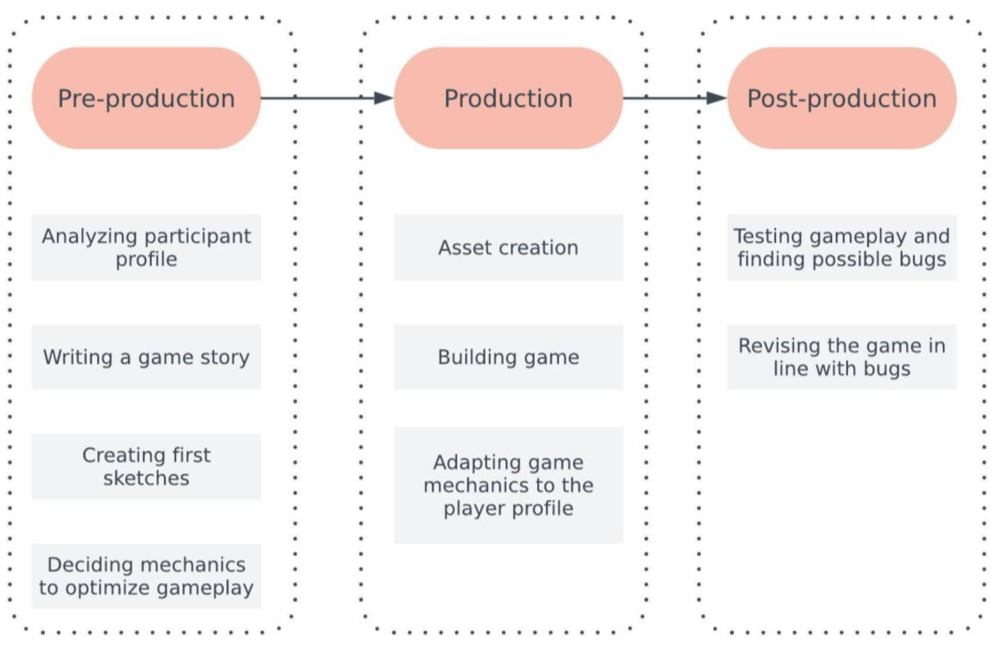
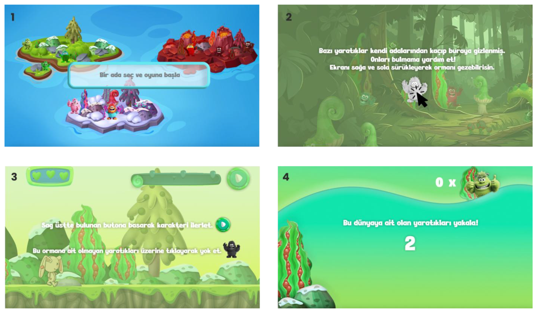
2.1.2. Experimental Setup: Designing the Game-Based Environment

To further minimize potential bias and strengthen data reliability, a custom-designed game was developed with simplified and repetitive mechanics. This structure aimed to reduce the impact of prior gaming skills and isolate the role of color perception in shaping emotional and behavioral responses during gameplay.
To assess the visual game experiences of color-blind individuals, a digital game titled Color Quest was developed for this study. The game was developed using a proprietary in-house tool specifically designed for creating interactive digital experiences. Due to confidentiality and licensing constraints, the specific name of the tool cannot be disclosed. However, it supports the development of 2D, HTML-based, and browser-accessible games, and was selected for its efficiency, platform-independence, and adaptability, which were essential for the study’s experimental goals. This environment allowed for rapid prototyping, the precise control of visual variables, and consistent deployment across devices, which were all crucial for ensuring experimental integrity and accessibility. The main objective was to isolate the impact of color vision on gameplay performance, emotional engagement, and user interaction, while controlling for all other variables.
The game design process followed a structured, three-stage development model that aligned with the study’s goal of analyzing how color perception affects player experience. In the first stage, the target participant profile was defined. Since the study specifically focused on individuals with color vision deficiency (CVD)—commonly referred to as color blindness—the game was designed with this demographic in mind. CVD is significantly more prevalent among males, and therefore all participants were male. To ensure that the emotional and behavioral responses were due to differences in color perception rather than gaming proficiency, participants were required to have prior experience with digital games. This criterion helped control for potential confounding factors such as unfamiliarity with interfaces or mechanics, which might otherwise affect engagement and emotional reactions.
In the second stage, core game mechanics were designed to align with the needs of this specific participant group. Because the aim of the study was to examine visual and emotional reactions—particularly in relation to color—the game employed simple, intuitive, and accessible mechanics to minimize cognitive load and distractions. These mechanics were selected from casual gaming paradigms familiar to a broad range of players and included elements such as “tap to collect,” “runner,” and “hidden object” tasks.
In Color Quest, players progress through three types of levels that share consistent core mechanics while varying in visual and interactional rhythm. The levels are structured around simple response-based interactions designed to minimize skill-based variability and foreground color recognition.
  • Find Level: Players explore a static forest scene populated by monsters. The goal is to identify and tap on “foreign” monsters whose colors do not match the dominant color scheme of the island. This level emphasizes visual discrimination and perceptual focus in a low-pressure setting.
  • Runner Level: Players control forward movement using a tap-to-walk mechanic while colored monsters appear along the path. Players must tap and remove those incongruent with the island’s designated color, encouraging reflexive recognition and decision-making under mild time pressure.
  • Catching Objects Level: Monsters appear and disappear dynamically from the screen. Players must only tap those that match the level’s intended color profile, requiring focused attention and fast visual judgment.
Notably, the monsters in the game do not function as traditional combat enemies, but rather as color-coded visual stimuli designed to test perceptual and emotional responses in different tempo and layout conditions. This structure ensures that challenges remain consistent in gameplay logic but vary in sensory presentation, allowing researchers to isolate the role of color perception in engagement and performance.
Rather than adopting a specific genre like side-scroller, FPS, or RPG, the game was developed as a web-based, mobile-inspired experience using HTML technologies. This neutral and minimal design allowed color-related variables to emerge more distinctly without interference from genre conventions or complex control schemes.
In the final stage, the prototype underwent a pilot testing phase, which was conducted by the game developer. This initial internal playtesting stage focused on identifying technical bugs, visual inconsistencies, and usability issues before participants were recruited. The developer was selected for this task due to their comprehensive understanding of the game’s objectives and mechanics, ensuring efficient iteration and refinement. This phase ensured that the final experimental version was stable, coherent, and aligned with the study’s perceptual and emotional goals.
Based on these findings, necessary revisions were made to ensure a smooth and consistent gameplay experience for all participants (Figure 2).
To ensure that the effects observed in this study stemmed primarily from color perception rather than differences in player skill or gameplay familiarity, Color Quest was carefully structured around a standardized and repetitive format. The game was built on three islands, each designed to evoke distinct emotional responses through carefully selected color palettes and visual cues. These color choices were not based on personal preference but were informed by a substantial body of the empirical literature on color psychology. Studies have consistently shown that red is associated with excitement, arousal, urgency, and, in some contexts, anger or danger [12,13]. Green is linked to relaxation, comfort, and nature, though some variations like green-yellow can elicit unpleasant feelings such as disgust [14]. Purple, frequently used alongside pink in the Joyful Prism island, is often tied to positive affect, creativity, and dignity, though cultural and linguistic variability exists in its interpretation [15,16]. These associations were deliberately incorporated into the game’s visual environment to investigate how players with and without color vision deficiency emotionally engaged with color-coded cues under controlled conditions. The “Scary Shadow” island featured deep reds and dark tones to elicit feelings of tension and fear; the “Joyful Prism” island used vibrant pink and purple hues to communicate excitement and playfulness; and the “Calming Spectrum” island employed soft greens to induce a sense of relaxation and tranquility (Figure 3).
This emotional design strategy aligns with previous research showing that chromatic intensity, brightness, and saturation can significantly shape players’ emotional perception during gameplay [17]. While the islands varied thematically, the game mechanics remained consistent—each included three levels (puzzle, runner, and object-catching), and standardized visual elements and object types were used to ensure comparability. Character design was also unified across islands to support clarity and accessibility for all players.
The game mechanics were deliberately simplified to reduce the influence of prior gaming experience. To improve accessibility, visual assistive features such as shape-based cues, contrast enhancements, and patterned overlays were integrated. The color palette followed accessibility guidelines to support various types of color vision deficiency while maintaining visual appeal. Figure 4 illustrates representative screenshots from the game interface and levels, highlighting core UI elements and layout consistency across gameplay types.
To incorporate player agency, optional paths and flexible progression routes were included. This allowed players to explore islands in varying sequences, offering valuable data on color-based preferences and visual decision-making. The storyline centers around a toy rabbit left behind after its owner grows older. Seeking purpose, the rabbit journeys through three magical islands to find and return misplaced creatures. In the final act, the rabbit reunites them with their original homes.
To strengthen emotional engagement, narrative elements were reinforced with real-time feedback mechanisms, including animations and sound effects. These features aimed to deepen immersion and create an emotionally rich gaming experience. A one-minute video demonstration of Color Quest gameplay is provided as a Supplementary Video to visually present the game environment, level transitions, and mechanics introduced in this section (see Video 1) [18].

2.2. Data Analysis

A mixed-method data analysis strategy was adopted to examine how color blindness affects players’ emotional experiences and engagement in digital games. This approach combined three complementary sources of data:
(1) Emotion AI analysis of facial expressions captured during gameplay;
(2) Post-game surveys designed to collect both quantitative and qualitative reflections on player experiences;
(3) Screen recordings used to extract behavioral engagement metrics such as task completion time, error frequency, and level selection order.
This multimodal design enabled a comprehensive evaluation of how color-blind and non-color-blind players interact with visual game content—both affectively and behaviorally—across varied gameplay conditions. The reliability of the AI-driven emotion detection was supported by previous validation studies, and the internal consistency of the custom survey was informally checked during the pilot phase.
The study’s limitations include a small sample size and the context-specific nature of the game prototype, which may constrain the generalizability of the results; however, these constraints are typical for exploratory experimental designs targeting underrepresented user groups.

2.2.1. Emotion AI Analysis

Participants’ facial expressions were recorded during gameplay and analyzed using MorphCast Emotion AI, a browser-based tool that detects real-time emotional states by processing facial landmarks through machine learning algorithms. The system classifies expressions based on Ekman’s theory of basic emotions [19], identifying six core emotions—anger, disgust, fear, happiness, sadness, and surprise—as well as neutral states. Each level-specific video was trimmed and uploaded to the system, allowing second-by-second tracking of emotional changes and engagement. The exported data (CSV format) was organized and visualized using Power BI Desktop (Version number: v: 2.127.1080.0). These graphs form the empirical basis for the findings presented in the next section.
MorphCast has recently been employed in several peer-reviewed studies across educational [20], ethical AI [21,22], and user behavior domains [23,24]. These studies support its practical usability in both experimental and in-the-wild settings. Moreover, MorphCast’s emotion classification architecture has been shown to align with established frameworks such as Ekman’s discrete model [25], providing methodological consistency with prior validated facial emotion recognition (FER) systems.

2.2.2. Survey

After playing the game, participants were asked to complete a structured feedback form designed to capture a range of experiential data. Emotional responses to each level were assessed using a 1–5 Likert scale across ten predefined emotions such as happiness, nervousness, and fear. In addition to these quantitative items, the form included open-ended sections in which participants were encouraged to describe specific episodes or moments from the game using keywords or short sentences. Finally, participants were asked to reflect on the overall role of color and visual elements in shaping their gameplay experience, including how significant these aspects were to their sense of engagement.
The survey used in this study was not derived from a previously validated instrument but was instead developed specifically for this research. Given the exploratory nature of the study and the absence of a standardized survey that combines emotional experience, color perception, and player engagement in the context of color blindness, a tailored questionnaire was constructed to address these dimensions.
The structure of the survey was informed by the experimental design and objectives of the study. Emotion items were selected based on both the MorphCast emotion categories and emotional descriptors commonly used in game experience research (e.g., happiness, surprise, nervousness, disgust). In line with MorphCast’s emotion classification model—which is grounded in Ekman’s (1999) theory of basic emotions—the selected items ensured consistency between biometric and self-reported data [19]. Although the survey instrument was custom-developed for this study, it was shaped by established emotion taxonomies and insights drawn from prior empirical work in visual perception and game engagement. Items were presented using a 5-point Likert scale across three game levels, and participants were also invited to provide open-ended reflections on their emotional responses and the role of color and visual design.
To ensure statistical validity and improve the interpretability of the findings, the analysis of the survey data incorporated descriptive statistics, including standard deviation (SD) and standard error of the mean (SEM), where applicable. These statistical indicators were used in the visualization of emotional self-report results to represent variability across participant responses.
While the instrument was not pre-validated, its internal consistency was informally assessed during a pilot run to ensure clarity and relevance. The full survey, including demographic and experiential items, is provided in Supplementary Materials for transparency and reproducibility (Supplementary Materials).

2.2.3. Screen Recording

To support the analysis of player engagement, this subsection incorporates behavioral data extracted from gameplay screen recordings. The metrics include the following:
Task Completion Time: How long participants took to complete each game level;
Error Frequency: The number of incorrect interactions (e.g., misclicks or failed attempts);
Level Preference Patterns: The sequence in which players chose to explore the three game islands.
These indicators were not collected to evaluate performance per se, as performance assessment was not the central focus of this study. Rather, they were included to enrich the understanding of player engagement, particularly in terms of how players interacted with game elements under varying visual conditions. For example, prolonged completion times or elevated error counts may suggest hesitation or visual uncertainty, while consistent level selection patterns may reflect player preference or perceptual ease. Thus, these behavioral metrics offer a complementary perspective to the player engagement measures presented in earlier sections.

3. Results

To ensure that the empirical findings are directly aligned with the research questions, this section presents the results in a manner that reflects both the emotional- and engagement-related dimensions of gameplay. Each data stream—emotion recognition, self-reported surveys, and behavioral metrics—is interpreted through the lens of color vision status, offering complementary insights into how color blindness may influence players’ gaming experiences. This section presents the empirical findings of the study and discusses their implications with respect to the research questions. Using a multi-method approach, the analysis integrates facial emotion recognition data (Emotion AI), structured post-game survey responses, and behavioral performance metrics obtained from screen recordings. Results are organized thematically around two primary dimensions: emotional experience and player engagement, both of which are examined through the lens of color vision differences between color-blind (CB) and normal-vision (NV) players.

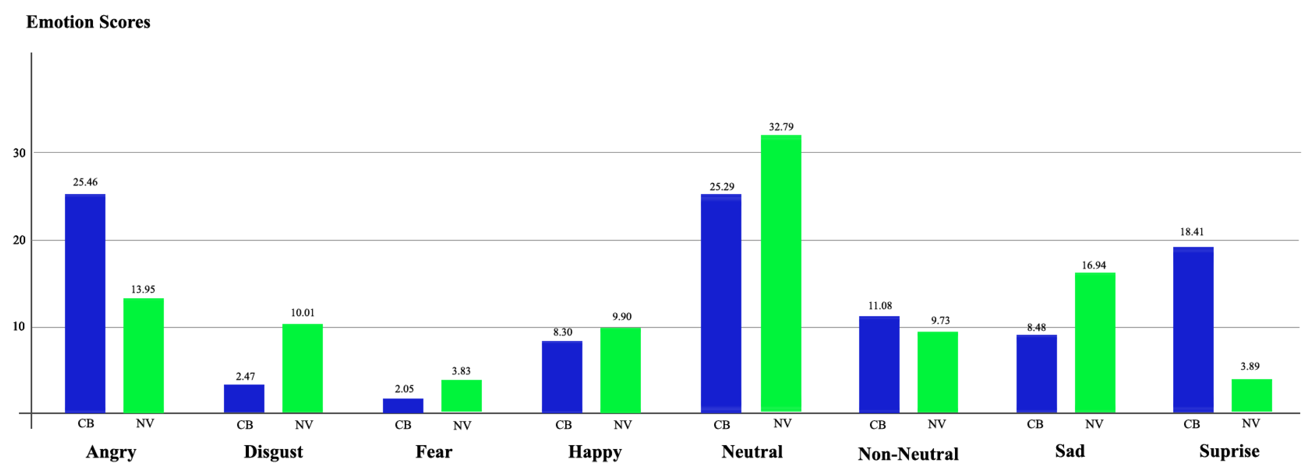
3.1. Facial Emotion Recognition Results

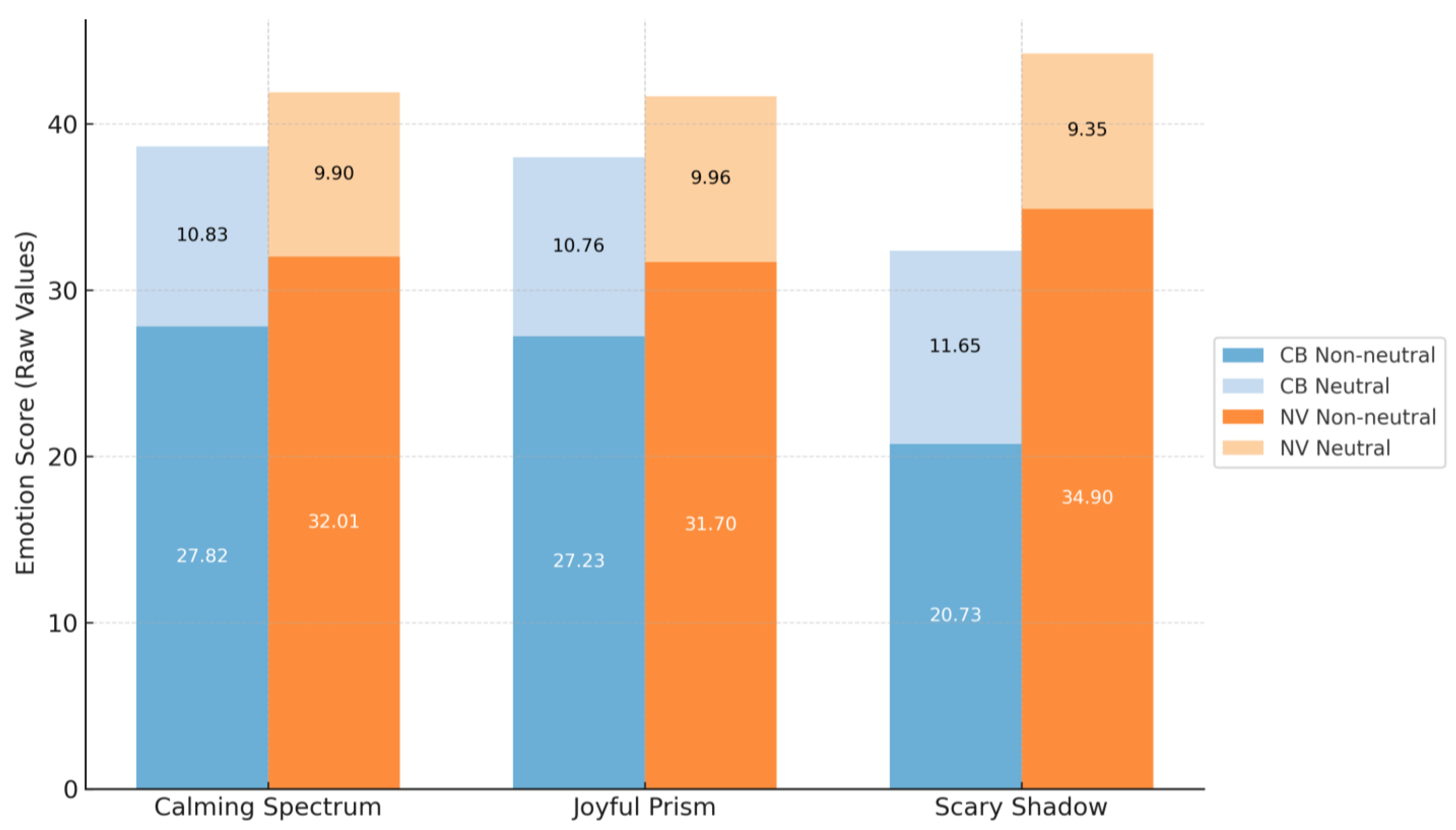
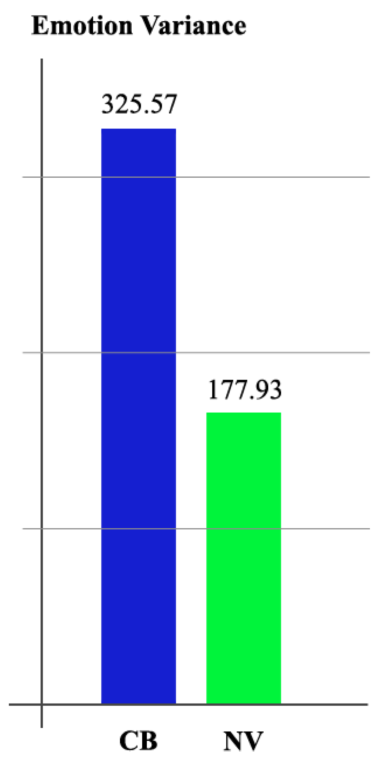
3.1.1. Emotion Distribution

Player emotion responses were analyzed using data obtained from the MorphCast Emotion AI application. Six core emotions were measured—anger, disgust, fear, happiness, sadness, and surprise—along with a neutral state, on a scale from 0 to 100. Bar charts were generated to present aggregated emotion scores across all game levels for both color-blind (CB) and normal-vision (NV) participants (Figure 5). The results show that CB participants exhibited higher scores in anger and surprise, as well as a greater overall intensity in non-neutral emotional states. Conversely, NV participants showed higher responses in the disgust, fear, happiness, sadness, and neutral categories. These findings indicate that CB and NV players demonstrate distinct affective response patterns, particularly in the balance between neutral and emotionally charged reactions.
To further assess emotional engagement, the ratio of non-neutral responses to neutral states was calculated (Figure 6). In all three levels, CB players consistently demonstrated higher non-neutral response rates than NV players. This indicates that color-blind individuals, despite their visual limitations, engaged emotionally with the game content to a greater extent than their counterparts with normal vision.
Variance analysis was also conducted to evaluate the consistency of emotional responses (Figure 7). The CB group showed higher variance across all emotions, suggesting a wider range of emotional reactions during gameplay. In contrast, NV players exhibited more consistent and predictable responses. These findings imply that color-blind players may experience gameplay in a more emotionally dynamic way, possibly due to increased sensitivity to non-visual elements or compensatory cognitive mechanisms.
To evaluate whether emotional responses differed significantly between color-blind (CB) and normal-vision (NV) participants, an independent samples t-test was conducted. The test yielded a t-value of 0.013 and a p-value of 0.9897, which are well above the conventional significance threshold of 0.05. These results indicate that there is no statistically significant difference in emotional response distributions between the two groups (Table 1).
Although CB players showed slightly higher non-neutral response ratios and greater emotional variance in descriptive analyses, these differences were not statistically supported. In other words, the average emotional intensity levels and emotional reaction types remained comparable between CB and NV players across all game scenarios.

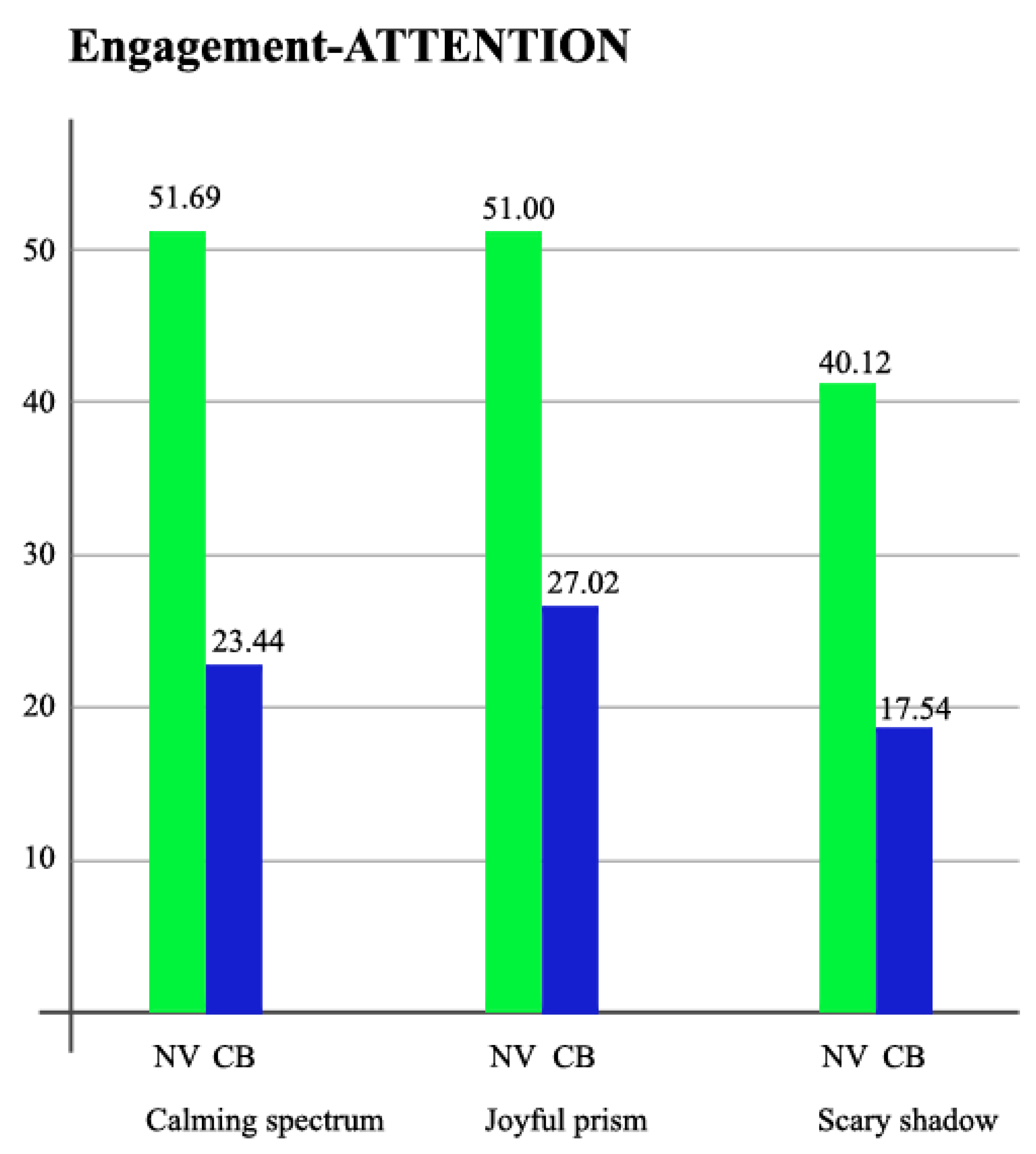
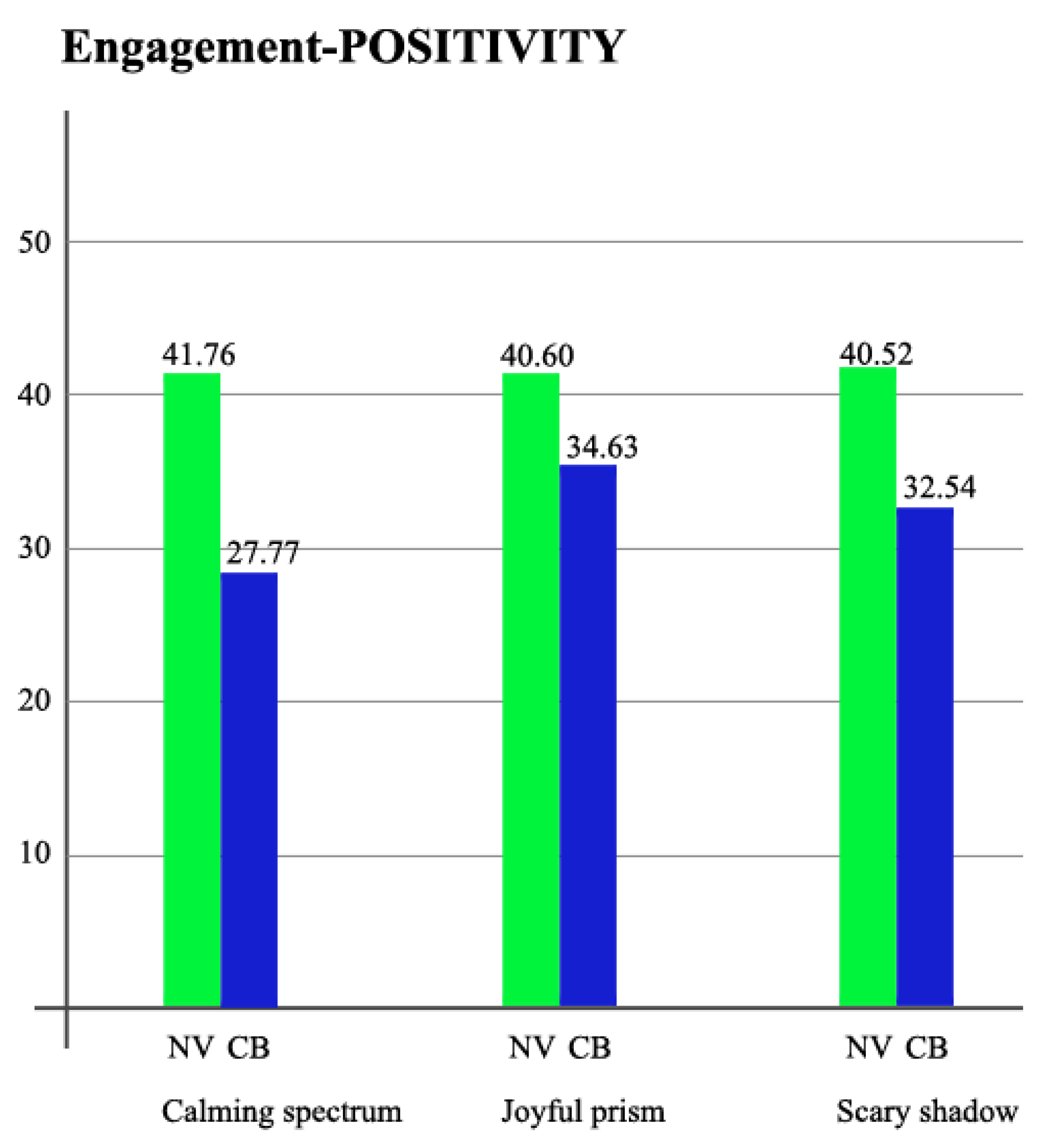
3.1.2. Engagement over Time
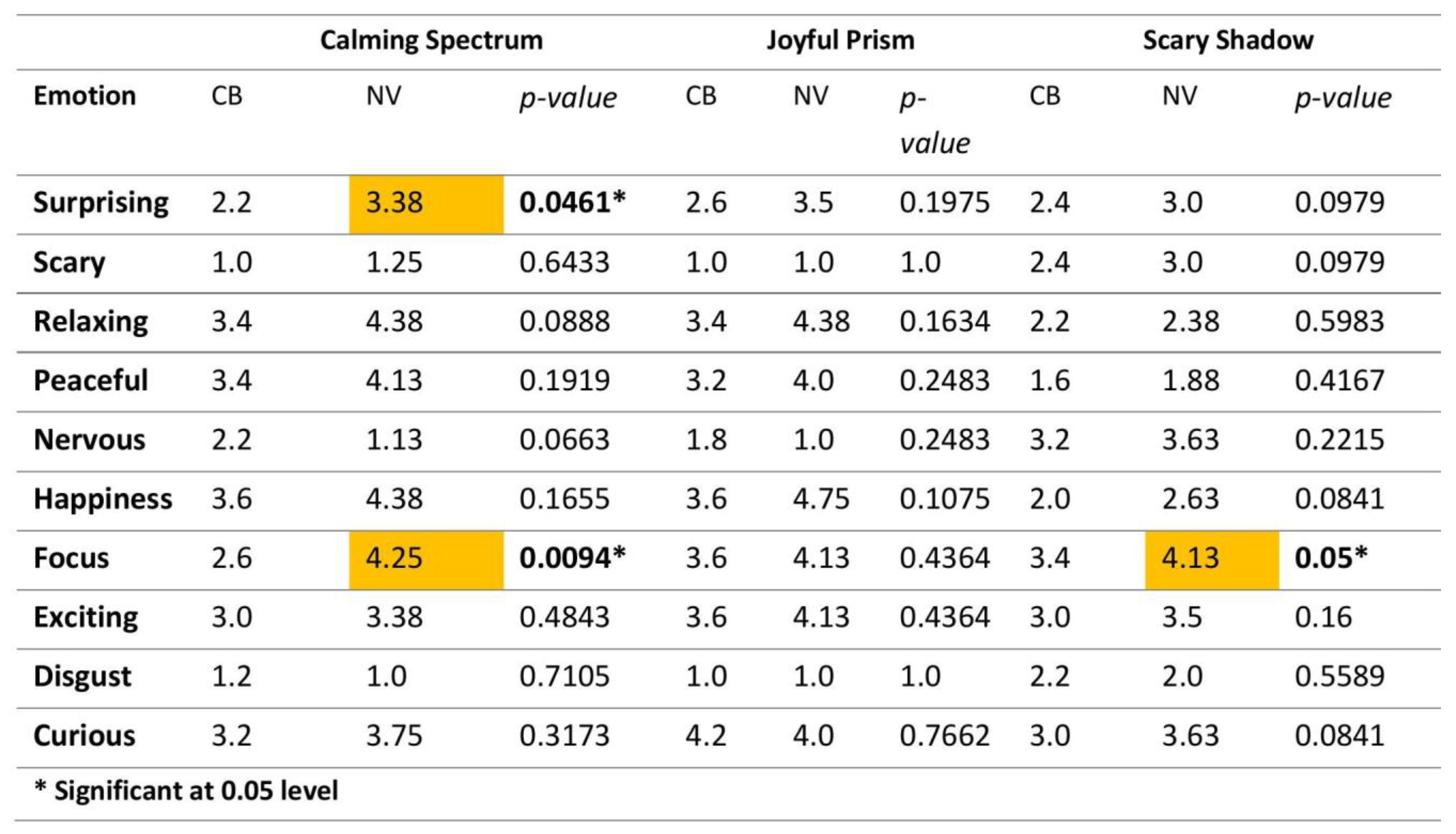
Player engagement over time was analyzed based on two key Emotion AI metrics: Attention and Positivity. Attention indicates the level of player focus on the game content, while Positivity tracks the degree of positive emotional response. These metrics were continuously recorded throughout gameplay to evaluate how players responded to different environments. Due to inconsistent data collection and differences in gameplay duration across participants, no time-based group-level visualization was included. Instead, Figure 8 and Figure 9 present average values for Attention and Positivity, providing a more reliable basis for cross-group comparison.
For the Attention metric, NV (normal-vision) participants consistently scored higher across all game sections. This suggests that the visual design elements—particularly the use of vibrant and high-contrast colors—were more effective in maintaining focus for players with full color perception. The enhanced visual clarity and richness of the color palette likely helped sustain NV players’ engagement.
However, a notable exception was observed in the Joyful Prism section, where CB (color-blind) participants achieved their highest Attention scores (Figure 8). This section features dominant pink and purple tones, which are typically more distinguishable for individuals with color vision deficiencies. This indicates that certain color choices can significantly improve visual accessibility and attention levels for color-blind players, reinforcing the need to consider perceptual diversity in color schemes.
Regarding the Positivity metric, both groups responded strongly to joyful and immersive content, but the patterns varied (Figure 9). NV participants showed their highest Positivity in Calming Spectrum, as expected, which aligns with the level’s serene and visually balanced atmosphere. Meanwhile, CB participants exhibited peak Positivity in Joyful Prism, possibly due to the section’s use of colors such as pink and purple, which are generally easier for color-blind individuals to distinguish.
Together, these findings emphasize the importance of perceptually inclusive design. By optimizing color schemes and narrative intensity for different user groups, developers can foster more sustained and emotionally resonant engagement across diverse player profiles.

3.2. Survey Results

To complement the Emotion AI findings, participants were asked to evaluate their gameplay experiences through structured survey responses. Each game section was rated separately on a 1–5 Likert scale, and average scores were calculated by player type. Players with normal vision (NV) reported higher levels of emotional intensity overall, with an average rating of 3.02 out of 5. In contrast, color-blind (CB) participants provided more neutral ratings, indicating lower emotional engagement (2.64 out of 5) with the game content. These findings are consistent with previous attention metrics, emphasizing how visual design directly impacts emotional experiences and engagement. Section-specific scores followed the same trends. NV participants consistently gave higher ratings across Calming Spectrum, Joyful Prism, and Scary Shadow levels, supporting the view that color access plays a significant role in shaping emotional responses and maintaining engagement.
To contextualize the statistical and visual findings presented in the subsequent tables and figures, it is important to clarify the structure and intention behind the self-reported data analysis. While one line of analysis (shown in Table 2) aggregates players’ emotional responses to yield an overall engagement score for each game section, the other (presented in Figure 10) disaggregates these responses into distinct emotion categories such as happiness, fear, or anger. This dual approach enables a comprehensive understanding of how color blindness may shape both general and specific emotional experiences.
To assess whether the observed differences between groups were statistically significant, independent samples t-tests were conducted for each game section as well as for the overall mean scores (Table 2). Although the NV group consistently reported higher emotional engagement scores than the CB group across all game sections, none of the differences reached statistical significance. For instance, the Calming Spectrum and Joyful Prism sections showed mean differences of −0.52 and −0.39, respectively, with corresponding p-values of 0.480 and 0.639. Similarly, the Scary Shadow section revealed a mean difference of −0.24, which was also not statistically significant (p = 0.635). The overall mean difference of −0.38 followed the same pattern (p = 0.576), suggesting that the observed variations may reflect general trends rather than robust group-level effects. In summary, the t-test results indicate that the observed score differences between color-blind and normal-vision groups are not statistically strong enough to confirm a real difference at the group level.
While Table 2 presents the aggregated emotional engagement scores across game sections, Figure 10 disaggregates the same data into specific emotion categories. This approach allows for a dual-level interpretation: holistic engagement patterns are summarized in Table 2, whereas nuanced emotional responses (e.g., anger, happiness, fear) are detailed in Figure 10. Understanding both levels is essential for evaluating the emotional inclusivity of game experiences for players with color vision deficiency.
Participants also rated ten core emotions after each game section. In Calming Spectrum, CB players reported higher levels of disgust and nervousness than NV participants (Figure 10), suggesting that the intended calming effect may not have translated effectively for color-blind players. In Joyful Prism, CB participants experienced heightened curiosity and nervousness, possibly due to visually stimulating but perceptually ambiguous color use. In Scary Shadow, CB participants again showed higher disgust, which may reflect emotional discomfort stemming from difficulties in interpreting high-contrast visual scenes.
Although most of the emotion-specific self-report differences between CB and NV participants did not reach statistical significance, several patterns emerged consistently across game sections. CB players tended to report lower emotional intensities on dimensions such as happiness, peacefulness, and curiosity, especially in Calming Spectrum and Joyful Prism. This recurring pattern suggests a possible dampening effect of limited color perception on emotional engagement, even when p-values did not fall below the 0.05 threshold.
Moreover, the emergence of statistically significant differences in specific areas—such as surprise and focus in Calming Spectrum, and focus in Scary Shadow—indicates that emotional perception may be selectively disrupted under particular color and contrast conditions. These findings support the notion of a perceptual–emotional disconnect experienced by CB participants, where visual limitations may alter the intended emotional cues embedded in game environments.
One contributing factor may be the relatively high within-group variability, as evidenced by standard deviations exceeding 1.0 in several conditions, which likely reduced statistical power in a small sample. Nevertheless, the directional consistency of group differences across multiple emotions and game contexts reinforces the relevance of color accessibility as a critical design parameter. Future research should involve larger, more diverse samples to validate these findings and further investigate how color perception influences emotional experiences in digital gameplay.
A categorical analysis of satisfaction levels also revealed clear differences between the groups. Among participants with normal vision (NV), 50% described themselves as “very engaged,” 25% selected “connected,” and the remaining 25% reported a “neutral” experience. In contrast, 60% of color-blind (CB) participants indicated neutral satisfaction. Notably, none of the CB participants selected “very engaged,” and only one participant (20%) described their experience as “engaged.” These results suggest that color-blind players may encounter difficulties in emotionally engaging with the game, likely due to challenges in interpreting color-dependent visual elements.
Overall, these results underscore how emotional experiences and engagement are shaped not just by narrative or mechanics, but also by how visual elements are perceived. Inclusive game design must consider the emotional impact of visual accessibility to ensure a consistent and engaging experience for all player types.

3.3. Screen Recording: Player Engagement-Oriented Performance Indicators

To complement the findings regarding player engagement, this section analyzes behavioral indicators that reflect players’ level of engagement during gameplay. These include task completion time, error frequency, and level preference patterns. While not direct measures of emotional experience, these metrics provide insight into how players interact with and respond to game mechanics over time.

3.3.1. Completion Time and Number of Mistakes

Completion time was examined as a behavioral marker of sustained engagement and task fluency. Participants with normal vision (NV) completed the game more quickly on average (M = 81.13 s, SD = 7.29) than color-blind (CB) participants (M = 94.27 s, SD = 14.69) (Figure 11a). This difference was statistically significant, with t (18.38) = 3.23 and p = 0.0046, suggesting that NV players more efficiently processed visual cues and navigated tasks with greater fluency. Although completion time alone does not fully define engagement, significantly longer durations for CB participants may indicate increased cognitive load and attentional fragmentation, particularly for players facing visual accessibility challenges.
Mistake frequency was analyzed as another engagement-related metric. On average, CB participants made more errors (M = 9.4, SD = 1.5) compared to NV participants (M = 7.6, SD = 1.2) (Figure 11b). While this difference did not reach conventional levels of statistical significance, with t (7.18) = 2.27 and p = 0.057, it suggests a potential trend toward decreased interaction fluency and increased cognitive strain for color-blind players. While mistakes do not necessarily indicate lower engagement, they may point to elevated cognitive effort and decreased task confidence—factors that can detract from an immersive gameplay experience.

3.3.2. Round Preference

To assess voluntary engagement behavior, players were allowed to choose the order in which they played the three levels. A comparison of round-by-round choices revealed distinct trends between CB and NV groups (Figure 12). In the first round, NV players predominantly selected Calming Spectrum (62.5%), suggesting a clear initial preference for visually accessible and emotionally neutral environments. CB players’ preferences were more evenly distributed, indicating less certainty or immediate visual comfort in their initial selection.
In the second round, both groups shifted toward Scary Shadow, though this was more pronounced among CB players (60%), possibly reflecting delayed curiosity or increased attentional engagement. By the third round, both groups gravitated toward Joyful Prism, with CB participants showing the highest preference (60%). This progression suggests that while NV players exhibited more stable engagement from the outset, CB players’ involvement developed more gradually, influenced by their visual interaction with the environment.
Together, these behavioral indicators reinforce prior findings and emphasize that visual accessibility plays a critical role in shaping how players engage with digital game environments. Performance-based data adds depth to the understanding of player engagement, revealing not only what players feel—but also how they act.

4. Discussion

Color perception plays a fundamental role in shaping how individuals cognitively and emotionally process visual environments, including digital games. As discussed in the prior literature [12,16,19], color is not merely an esthetic element but a psychological and communicative tool that affects emotional engagement, arousal, and attention. Building upon this theoretical foundation, the current study examined how color vision deficiencies may affect these mechanisms.
This section discusses the key findings of the study in relation to the research questions set out in the introduction section: (1) How does color blindness influence the emotional experience of players in digital games? (2) To what extent and in what ways does color blindness affect player engagement compared to individuals with normal vision? Drawing on multimodal data—including Emotion AI, survey results, and screen-based behavioral metrics—our findings provide a holistic view of how color perception differences impact emotional and attentional processes in gameplay.

4.1. Emotional Experience

The emotional experience of players with color blindness (CB) diverged in nuanced ways from that of players with normal vision (NV). Emotion AI results indicated that CB participants exhibited more frequent non-neutral expressions and greater emotional variance across game levels. Descriptively, they displayed heightened expressions of emotions such as anger and surprise. In contrast, NV participants showed more consistent emotional patterns, often dominated by sadness and disgust.
However, this expressive intensity contrasts with the self-reported emotional data. Survey responses revealed that NV players rated their emotional experience more intensely across all levels, with a statistically significant difference in average scores (see Table 2). CB participants reported a more neutral affect and lower emotional resonance. This divergence suggests that although CB players may externally express strong emotions—captured by facial recognition tools—they may internally perceive these emotions as less intense or may find it harder to cognitively register them due to ambiguous or less informative visual cues.
This apparent contradiction highlights an important methodological insight: emotional experience in gaming is multi-layered. Facial expressions captured through AI reflect immediate, perhaps subconscious, affective responses, whereas self-reported emotions represent reflective, conscious assessments. For color-blind players, perceptual ambiguity may weaken the link between emotional reaction and emotional awareness, leading to the underreporting of what is nonetheless behaviorally visible.
A closer look at emotion type distributions (Figure 5) shows that CB players exhibited more frequent expressions of anger and surprise. While these reactions might initially be interpreted as heightened emotional engagement, it is also possible that they reflect negative affective responses—such as confusion, frustration, or perceptual discomfort—triggered by difficulty in interpreting color-dependent visual cues. This interpretation aligns with the accessibility literature that emphasizes the emotional toll of perceptual exclusion. For instance, surprise and anger in this context may not indicate increased enjoyment, but rather a disruption of emotional flow due to design elements that are not fully perceptible to color-blind players. In contrast, NV participants showed stronger expressions of disgust and sadness, particularly in high-contrast and narrative-heavy levels such as Calming Spectrum and Scary Shadow.
Furthermore, the restructured data visualization (Figure 10) revealed statistically significant group differences in specific emotional dimensions—most notably in the focus and surprise scores within the Calming Spectrum level. Color-blind participants reported significantly lower levels of focus compared to their normal-vision counterparts (p = 0.0094), suggesting that perceptual ambiguity may impair sustained attention in visually calming but contrast-dependent environments. A similar trend was observed in surprise scores (p = 0.0461), where CB players again reported lower ratings. This may indicate a diminished sensitivity to emotionally salient moments when color is a primary cue for narrative or esthetic shifts. These findings support the broader interpretation that emotional disengagement in color-blind participants may stem not merely from subjective detachment, but from disrupted perceptual–affective signaling triggered by inaccessible visual information.

4.2. Player Engagement

Player engagement patterns across the two groups revealed important differences shaped by perceptual accessibility. NV participants consistently demonstrated higher Attention scores across all levels, suggesting that full-spectrum color perception supports more stable and sustained visual focus. This advantage was echoed in self-reported engagement ratings, where NV players more frequently described themselves as “very engaged” or “connected” to the game environment. In contrast, CB players showed their highest engagement in the Joyful Prism level—a game section featuring pink and purple tones that are generally more distinguishable for individuals with red–green color blindness. This finding highlights the significant role that perceptual compatibility plays in supporting attentional and emotional investment. When visual elements align with players’ perceptual profiles, engagement improves—even for users typically disadvantaged by color-based design.
However, survey results revealed that CB participants overall reported lower emotional and attentional involvement. These differences were further supported by behavioral metrics: CB players took longer to complete tasks, made more errors, and displayed greater variability in level selection. While these results may indicate lower fluency or immersion, they might also reflect compensatory cognitive strategies. CB participants may require more time and cautious exploration to decode ambiguous visual cues, suggesting that the gameplay experience is more cognitively taxing for them.
Survey responses further supported these insights: while 50% of NV participants reported feeling “very engaged,” only 20% of CB players described their experience as “engaged,” with the majority indicating a neutral level of involvement. These differences underscore how limitations in color perception may reduce the sense of immersion or connectedness players feel during gameplay.
In summary, the results reveal that color blindness subtly, but significantly, influences how players experience and engage with digital games. While not all emotional or behavioral differences reached statistical significance, the converging evidence from multiple data sources emphasizes the importance of perceptually inclusive design. Notably, the differences observed in attention, completion time, and error rates suggest that engagement is not solely a psychological trait, but also a response shaped by how accessible and legible the game environment is to different perceptual profiles. For game developers and design researchers, these findings underscore the need to move beyond static accessibility settings and toward more dynamically adaptive environments that account for emotional and perceptual diversity—not only to ensure playability, but also to foster equitable forms of player immersion.

4.3. Implications for Inclusive Design and Future Research

This study contributes to ongoing discussions in game accessibility by integrating emotional metrics (via Emotion AI) into the evaluation of visual perception in gameplay. By combining biometric, behavioral, and self-reported data, the findings offer a multidimensional perspective on how color blindness influences not only what players see, but also how they feel and act in digital environments.
The results suggest that emotional and attentional engagement are shaped not only by game mechanics or narrative content, but also by the perceptual legibility of visual elements. In particular, color schemes that are not optimized for individuals with color vision deficiencies may lead to emotional detachment, increased cognitive load, and reduced fluency in gameplay. These dynamics highlight the importance of considering perceptual diversity as a core component of inclusive design strategies.
Rather than relying solely on static accessibility settings or post hoc visual filters, future game development should consider adaptive visual systems that respond to players’ perceptual needs. Such systems could dynamically adjust color palettes, contrast levels, or feedback cues in real time, allowing a broader range of users to maintain immersion and affective engagement.
Future research may also benefit from a deeper investigation into the affective dimensions of accessibility—particularly through the use of multimodal data collection methods that combine facial expression analysis with physiological measures and real-time user feedback. Interdisciplinary collaboration between game designers, psychologists, and accessibility experts will be essential to build emotionally and perceptually inclusive gaming experiences.

4.4. Limitations and Future Directions

While this study offers valuable insights into how color blindness shapes emotional experience and player engagement in digital games, several limitations must be acknowledged.
First, the relatively small sample size and limited diversity among participants constrain the generalizability of the findings. Although the study provides exploratory evidence of perceptual and emotional differences, future research should involve larger and more demographically varied groups, including participants with different types and severities of color vision deficiencies.
Second, the use of facial expression analysis (Emotion AI) provides a useful but surface-level approximation of emotional states. As observed in the divergence between biometric and self-reported data, facial expressions may not always reflect conscious emotional experiences. Future studies should consider combining facial recognition with other physiological measures (e.g., heart rate, skin conductance) or real-time subjective feedback to triangulate affective responses more reliably.
Third, the game environment used in this study, though custom-designed for control and consistency, does not fully replicate the complexity, pace, and narrative richness of commercial games. Real-world validation in more immersive, fast-paced, or socially interactive gaming contexts is needed to assess whether the observed dynamics hold true beyond the experimental setting.
Additionally, future work should seek to contextualize emotion types more precisely, especially when interpreting reactions such as anger or surprise, which may reflect perceptual mismatch rather than engagement.

5. Conclusions

This study investigated how color blindness affected player engagement and emotional experience in digital games by comparing the responses of color-blind (CB) and normal-vision (NV) players through a multi-method approach that integrated facial expression analysis, behavioral performance metrics, and self-reported survey data. Rather than evaluating accessibility solely through usability or visual function, the research examined the affective consequences of perceptual differences.
The findings revealed that CB players exhibited distinct emotional expressions and behavioral patterns compared to players with typical vision, including greater emotional variance, lower attentional engagement, and increased task completion times. These results suggest that visual accessibility limitations not only impact what players can see but also how they emotionally connect with and navigate through game environments.
By incorporating emotional metrics into accessibility evaluation, this study contributes a novel perspective to the field—positioning emotion as a critical yet underexplored component of inclusive design. The use of multimodal data illuminates how perceptual mismatch can manifest as emotional detachment or cognitive strain, providing actionable insights for both researchers and designers.
This work advances accessibility discourse by highlighting the need for dynamically adaptive visual systems that accommodate perceptual diversity while sustaining affective engagement. Future research may build upon this framework to explore real-time personalization, broaden the scope to other forms of visual or cognitive impairments, and deepen our understanding of how inclusivity and emotional experience intersect in digital gameplay.

Supplementary Materials

The following supporting information can be downloaded at: https://www.mdpi.com/article/10.3390/mti9060062/s1, Pdf Files: Survey Questions.

Author Contributions

Conceptualization, M.T. and A.G.; methodology, M.T. and A.G.; validation, M.T. and A.G.; formal analysis, M.T. and A.G.; investigation, M.T. and A.G.; resources, M.T. and A.G.; data curation, M.T. and A.G.; writing—original draft preparation, M.T. and A.G.; writing—review and editing, M.T. and A.G.; visualization, M.T.; supervision, A.G. All authors have read and agreed to the published version of the manuscript.

Funding

This research received no external funding.

Institutional Review Board Statement

This study was conducted in accordance with the Declaration of Helsinki and was approved by the Scientific Research and Publication Ethics Committee for Social and Human Sciences of Istanbul Technical University (Approval No. 520, dated 30 April 2024). Prior to participation, all participants signed an informed consent form after being fully informed about the nature and purpose of the study.

Informed Consent Statement

Informed consent was obtained from all subjects involved in this study.

Data Availability Statement

The data supporting the findings of this study was generated by the authors during the experimental process. Due to privacy and ethical restrictions, including facial video recordings and behavioral data, the datasets are not publicly available.

Acknowledgments

The authors would like to thank all participants who generously volunteered their time and contributed to the experimental sessions of this study. Their engagement and feedback were invaluable in the development and analysis of the research. This paper is based on findings from the M.Sc. thesis titled “Assessing the Influence of Color Blindness on Player Engagement and Emotional Experience in Digital Games”, conducted by Merve Tillem under the supervision of Ahmet Gün at the Department of Game and Interaction Technologies, Graduate School, Istanbul Technical University, with their kind permission.

Conflicts of Interest

The authors declare no conflicts of interest.

References

  1. Chai, M.T.; Amin, H.U.; Izhar, L.I.; Saad, M.N.M.; Abdul Rahman, M.; Malik, A.S.; Tang, T.B. Exploring EEG effective connectivity network in estimating influence of color on emotion and memory. Front. Neuroinformatics 2019, 13, 66. [Google Scholar] [CrossRef] [PubMed]
  2. Pinheiro, M.; Viana, W.; de Gois Ribeiro Darin, T. Why should red and green never be seen? Exploring color blindness simulations as tools to create chromatically accessible games. Proc. ACM Hum.-Comput. Interact. 2023, 7, 165–196. [Google Scholar] [CrossRef]
  3. Molina-López, J.; Medina-Medina, N. Design proto-patterns to improve the interaction in video games of people with color blindness. In Proceedings of the XX International Conference on Human Computer Interaction, Donostia Gipuzkoa, Spain, 25–28 June 2019; Association for Computing Machinery: New York, NY, USA, 2019. [Google Scholar] [CrossRef]
  4. Napoli, D.; Chiasson, S. Exploring the Impact of Colour-Blindness on Computer Game Performance. In Proceedings of the Extended Abstracts of the 2018 CHI Conference on Human Factors in Computing Systems, Montreal, QC, Canada, 21–26 April 2018; Association for Computing Machinery: New York, NY, USA, 2018. [Google Scholar] [CrossRef]
  5. Kerac, J.; Keresteš, N.M.; Dedijer, S. An overview of the user experience in online video game players with colour vision deficiency. In Proceedings of the 11th International Symposium on Graphic Engineering and Design, Novi Sad, Serbia, 3–5 November 2022; pp. 281–291. [Google Scholar] [CrossRef]
  6. Yu, D. See a Different World: Interactive Storytelling for Children to Raise Awareness of Color Blindness. Master’s Thesis, Rochester Institute of Technology, Rochester, NY, USA, 2015. [Google Scholar]
  7. Baalsrud Hauge, J.; Judd, N.; Stefan, I.A.; Stefan, A. Perspectives on accessibility in digital games. In Entertainment Computing–ICEC 2018: 17th IFIP TC 14 International Conference, Held at the 24th IFIP World Computer Congress, WCC 2018, Poznan, Poland, 17–20 September 2018, Proceedings; Springer International Publishing: Heidelberg/Berlin, Germany, 2018; pp. 402–406. [Google Scholar]
  8. Plothe, T. The Whose View of Hue?: Disability adaptability for color blindness in the digital game Hue. GAME Games Art Media Entertain. 2018, 1, 41–51. [Google Scholar]
  9. Nguyen, L.C.; Do, E.Y.L.; Chia, A.; Wang, Y.; Duh, H.B.L. DoDo game, a color vision deficiency screening test for young children. In Proceedings of the SIGCHI Conference on Human Factors in Computing Systems, Toronto, ON, Canada, 26 April–1 May 2014; Association for Computing Machinery: New York, NY, USA, 2014; pp. 2289–2292. [Google Scholar]
  10. Paiva, I.M.; Siqueira, S.; Ferreira, S.B.L. The Windows 10’s Color Filter Feature as an Aid for Color Blind People in the Use of Websites. In Proceedings of the XX Brazilian Symposium on Human Factors in Computing Systems, Virtual, 18–22 October 2021; Association for Computing Machinery: New York, NY, USA, 2021; pp. 1–11. [Google Scholar]
  11. Pinheiro, M.; Viana, W.; Andrade, R.; Darin, T. Flying colors: Using color blindness simulations in the development of accessible mobile games. In Proceedings of the XX Brazilian Symposium on Human Factors in Computing Systems, Virtual, 18–22 October 2021; Association for Computing Machinery: New York, NY, USA, 2021. [Google Scholar] [CrossRef]
  12. Elliot, A.J.; Maier, M.A. Color psychology: Effects of perceiving color on psychological functioning in humans. Annu. Rev. Psychol. 2014, 65, 95–120. [Google Scholar] [CrossRef] [PubMed]
  13. Valdez, P.; Mehrabian, A. Effects of color on emotions. J. Exp. Psychol. Gen. 1994, 123, 394–409. [Google Scholar] [CrossRef] [PubMed]
  14. Kaya, N.; Epps, H. Relationship between color and emotion: A study of college students. Coll. Stud. J. 2004, 38, 396. [Google Scholar]
  15. Uusküla, M.; Mohr, C.; Epicoco, D.; Jonauskaite, D. Is Purple Lost in Translation? The Affective Meaning of Purple, Violet, and Lilac Cognates in 16 Languages and 30 Populations. J. Psycholinguist. Res. 2022, 52, 853–868. [Google Scholar] [PubMed]
  16. Jonauskaitė, D.; Camenzind, L.; Párraga, C.; Diouf, C.; Ducommun, M.; Müller, L.; Norberg, M.; Mohr, C. Colour-emotion associations in individuals with red-green colour blindness. PeerJ 2021, 9, e11180. [Google Scholar] [CrossRef] [PubMed]
  17. Geslin, E.; Jégou, L.; Beaudoin, D. How color properties can be used to elicit emotions in video games. Int. J. Comput. Games Technol. 2016, 2016, 182768. [Google Scholar] [CrossRef]
  18. Supplemental Video 1: Color Quest–One-Minute Gameplay Demonstration Video Showing Level Transitions, Core Mechanics, and Visual Environment. Available online: https://youtu.be/TfZYzSpX97w (accessed on 4 June 2025).
  19. Ekman, P. Basic emotions. In Handbook of Cognition and Emotion; Dalgleish, T., Power, M., Eds.; John Wiley & Sons: Hoboken, NJ, USA, 1999; pp. 45–60. Available online: https://www.paulekman.com/wp-content/uploads/2013/07/Basic-Emotions.pdf (accessed on 15 May 2025).
  20. Howell, N.; Hartsoe, W.F.; Amin, J.; Naman, V. Reflective Design for Informal Participatory Algorithm Auditing: A Case Study with Emotion AI. In Proceedings of the 13th Nordic Conference on Human-Computer Interaction, Uppsala Sweden, 13–16 October 2024; Georgia Institute of Technology; Association for Computing Machinery: New York, NY, USA, 2024. [Google Scholar]
  21. Glazunova, O.; Savytska, I.; Korolchuk, V.; Voloshyna, T. Information and Communication Technologies in Education, Research, and Industrial Applications. In Managing Student Engagement During the Educational Process Using the MorphCast AI Tool, Proceedings of 19th International Conference, ICTERI 2024, Lviv, Ukraine, 23–27 September 2024; Springer: Berlin/Heidelberg, Germany, 2024; CCIS; Volume 2359, pp. 133–145. [Google Scholar]
  22. Zignego, M.I.; Bertirotti, A.; Gemelli, P.A.; Pagani, L. Neurodesign: A Game-Changer in Educational Contexts. In Proceedings of the 7th International Conference for Design Education Researchers, London, UK, 29 November–1 December 2023. [Google Scholar]
  23. Avolicino, S.; Di Gregorio, M.; Palomba, F.; Romano, M.; Sebillo, M.; Vitiello, G. HCI International 2022-Late Breaking Papers. Design, User Experience and Interaction. In AI-Based Emotion Recognition to Study Users’ Perception of Dark Patterns, Proceedings of the 24th International Conference on Human-Computer Interaction, HCII 2022, Virtual Event, June 26–July 1 2022; Springer: Berlin/Heidelberg, Germany, 2022. [Google Scholar]
  24. Huang, X.; Romano, D.M. Coral Morph: An Artistic Shape-Changing Textile Installation for Mindful Emotion Regulation in the Wild. Int. J. Hum.–Comput. Interact. 2023, 41, 1173–1189. [Google Scholar] [CrossRef]
  25. Ekman, P. An argument for basic emotions. Cogn. Emot. 1992, 6, 169–200. [Google Scholar] [CrossRef]
Figure 1. Phases of the research process.
Mti 09 00062 g001
Figure 2. Game design process.
Mti 09 00062 g002
Figure 3. Visual representations of the island designs in Color Quest: Calming Spectrum (top-left), Scary Shadow (top-right), Joyful Prism (bottom).
Mti 09 00062 g003
Figure 4. Representative screenshots from Color Quest: (1) main menu for island selection; (2) “Find” level with scrollable forest scene and visual instructions; (3) “Runner” level showing health indicator and movement control; (4) “Collect” level with score counter and target-matching prompt. Numeric overlays correspond to key UI elements visible in each panel.
Mti 09 00062 g004
Figure 5. Aggregated emotion scores across all game levels, comparing Color-blind (CB) and normal-vision (NV) participants. The figure includes seven emotion categories and a combined non-neutral average.
Mti 09 00062 g005
Figure 6. The distribution of neutral vs. non-neutral emotion ratio by player type.
Mti 09 00062 g006
Figure 7. Emotion variance analysis (except neutral).
Mti 09 00062 g007
Figure 8. Average engagement scores (Attention).
Mti 09 00062 g008
Figure 9. Average engagement scores (Positivity).
Mti 09 00062 g009
Figure 10. Emotion-specific self-report scores across three game sections (Calming Spectrum, Joyful Prism, and Scary Shadow), comparing color-blind (CB) and normal-vision (NV) participants. Scores are based on a 5-point Likert scale (1 = Very Low, 5 = Very High). Statistically significant differences (p < 0.05) are highlighted in orange.
Mti 09 00062 g010
Figure 11. (a) Average game completion time by player group. CB participants completed the game significantly more slowly than NV participants: p = 0.0046. (b) Total number of mistakes by player group CB participants made more mistakes on average, though the difference did not reach statistical significance (p = 0.057).
Mti 09 00062 g011
Figure 12. Players’ level choices.
Mti 09 00062 g012
Table 1. T-test results for emotion distribution (CB-NV).
StatisticValuedfSig.2 (Two-Tailed)Mean Difference
t-test0.01292452464.114364880.989728143−0.040535714
Table 2. T-test results for survey results (CB-NV).
Game SectionMean (CB)SD (CB)Mean (NV)SD (NV)Mean DifferenceStandard Error (SE)t-Valuep-Value
Calming Spectrum2.580.9213.101.412−0.520.716−0.7300.480358
Joyful Prism2.801.1513.191.542−0.390.805−0.4830.638486
Scary Shadow2.540.5822.780.978−0.240.488−0.4880.635127
Overall Mean2.640.8903.021.299−0.380.665−0.5760.576407
Disclaimer/Publisher’s Note: The statements, opinions and data contained in all publications are solely those of the individual author(s) and contributor(s) and not of MDPI and/or the editor(s). MDPI and/or the editor(s) disclaim responsibility for any injury to people or property resulting from any ideas, methods, instructions or products referred to in the content.

