Article

Can Skeuomorphic Design Provide a Better Online Banking User Experience for Older Adults?

by
Aaron Ellis
1,2,† and
Mark T. Marshall
2,*,†
1
Plusnet, Sheffield S1 2GU, UK
2
Department of Computing, Sheffield Hallam University, Sheffield S1 2NU, UK
*
Author to whom correspondence should be addressed.
These authors contributed equally to this work.
Multimodal Technol. Interact. 2019, 3(3), 63; https://doi.org/10.3390/mti3030063
Submission received: 18 July 2019 / Revised: 11 September 2019 / Accepted: 13 September 2019 / Published: 17 September 2019
(This article belongs to the Special Issue Interactive Assistive Technology)

Abstract

:
With the prevalence of digital technologies and internet connectivity, combined with the reduction in footfall on high streets, banks have taken steps to move most of their customer base online. This has left many older adults behind, trying to keep up with the changes and having to learn to use sometimes complex online banking interfaces. In this work we investigate whether skeuomorphic design can create a more usable online banking system for older adults, compared to the more commonplace flat design. This work took a user-centered approach, beginning with interviews with older adults that were conducted to gather data to be used in the production of prototype user interfaces. Two prototypes were then created: a flat user interface and a skeuomorphic one. We evaluated these interfaces with 15 older adults, gathering a combination of data, including data from the System Usability Scale, observations, and interviews. Results of the experiments showed that our older users preferred the flat prototype to the skeuomorphic one, but raised some potentially useful guidelines for the design of future skeuomorphic user interfaces for older adults. A validation experiment with 17 younger adults (aged 20–25) also showed that the skeuomorphic interface was more usable for older adults than younger ones.

1. Introduction

With the modern world’s growing dependency on technology, huge areas of economies across the world have been taken over by technology. This relationship between economies and technologies has sometimes conflicted with the lifestyle and cultures of the general population. From the few Luddites in the 19th century fighting for the right to work in the English textile industry, we have now come to a place where the founder of Microsoft is suggesting a higher taxation on robotic workers than human workers in order to keep people in work. Demand for the improvement in services has led to the drive of automation within economies around the world. In the last few decades automation has grown exponentially in our everyday lives, from self-checkout machines, to automated car park machines and examples as far as technologically aided referees in professional sports.
There have also been major changes in the technologies that we use every day and the forms of devices that we interact with. Whereas in the 1990s there were many devices with a single specific function, such as CD players, radios, televisions, and phones, now all this functionality can be combined into a single, small device such as a smartphone or tablet. This has led to major changes in how digitally connected people are and in how they access a wide variety of services, from news, to shopping, to weather forecasts, to banking.
This rapid change in technology has however alienated particular communities. Online banking is one area where this is a major issue. In the UK, Royal Bank of Scotland (RBS) launched its online banking service in June 1997 and since then there has been a drastic shift in how banks expect their customers to interact with them [1]. This growth in online banking has seen a corresponding decrease in in-person banking. Coupled with this, since the global financial crisis of 2008, banks have been trying to cut back on expenses such as staff, branches, and office headquarters. Together these factors have resulted in a remarkable number of high-street bank branches closing down [2].
Take the UK, for example: according to data from the British Bankers’ Association and the Office for National Statistics, the number of bank or building society branches in the UK has fallen from 21,643 in 1986 to 11,065 in 2018—a reduction of 49% [3]. Further to this, several banks and building societies have announced further branch closures in the coming years. This has led to people having to travel further to reach to their nearest branch to fulfil their banking needs, placing a particular strain on those for whom travel is difficult, such as the elderly. Meanwhile, the number of users of online banking is growing very quickly [4] and it is estimated that most customers use an online banking application at least once a week, with a third of users accessing online banking every day [5]. Given this decline in physical access to banking facilities and the growth in online banking there is a necessity that online banking interfaces should be usable by as many customers as possible.
The design of user interfaces is crucial for several reasons, from overall usability and customer satisfaction, to error prevention and, particularly for online banking, to the security of customers’ data. With technology changing from online banking on bank websites to apps on mobile devices, there is reason to believe that older adults may struggle to use the newest online banking applications. This can then discourage older adults from using online banking, and require them to bank in-person, potentially resulting in them having to travel to distant branches, costing fuel, using time, creating a greater carbon footprint, and putting more pressure on potentially already overloaded branches. It has been suggested that online banking service providers should consider segregating the market and “provide differential services for niche users” [6]. Given that older users are a very different user group than those who most commonly use online banking, one possibility would be to segregate such users and to provide a different user interface and experience to them than to most other users.
The focus of our research then is to investigate this possibility and to look at alternative user interfaces for online banking that can improve the experience for older adults, with a specific focus on the potential offered by skeuomorphic interfaces. We begin by looking at existing work within the area of interface metaphors and skeuomorphism, as well as interfaces for older adults. This is followed by a discussion of the design and implementation of two prototype user interfaces for online banking: one based on existing flat design online banking systems and one based on skeuomorphic metaphors. Finally, we present two usability experiments to evaluate these prototypes and discuss what the results mean for the use of skeuomorphic metaphors for online banking for older adults.

2. Previous Work

In this section, we look at existing work that touches on the areas of research covered in this paper. In particular, we focus on the use of interface metaphors and skeuomorphism in the creation of user interfaces and work that deals with user interfaces for older adults.

2.1. Interface Metaphors and Skeuomorphism

In the last three decades mainstream technology in computing has used Graphical User Interfaces (GUIs) as the sole interaction between the users and computers. It has shaped the way we think about communication with computers that we interact with. These GUIs provide a representational interaction that stems from metaphors that we use in our daily lives. Several questions arise in how these metaphors communicate with the user, with this work revolving around the question of how interface metaphors can allow the user to intuitively judge how to interact with the system.
There are a variety of different types of user interface metaphors, but in this work we are particularly interested in the use of skeuomorphs. As defined by Basalla, a skeuomorph is:
“an element of design or structure that serves little or no purpose in an artifact fashioned from new material but was essential to the object made from the original material.”
[7]
As with many UI metaphors skeuomorphs allow users to leverage their existing knowledge of physical artifacts to interact with digital artifacts. However, rather than simply hinting at existing physical objects, skeuomorphs mimic the look, feel and (where possible) behavior of the physical object they are representing. A simple example of this would be a volume control in an audio player that is represented by a rotary control that can be rotated in order to increase or decrease the volume—in the same way as a physical volume control on (for example) a car stereo. This should create a further level of familiarity for users interacting with the system.
For example, Do It (Tomorrow) (rhttp://tomorrow.do) (see Figure 1) is a task management application that is used to organize daily tasks for the current day and the following day that mimics not only the overall design of a day planner, but also includes other aspects of a working desk. Many of these are functionally unnecessary, but help the application to present an disorganized atmosphere furthering the point of the application, which is to organize the day-to-day basis tasks [8].
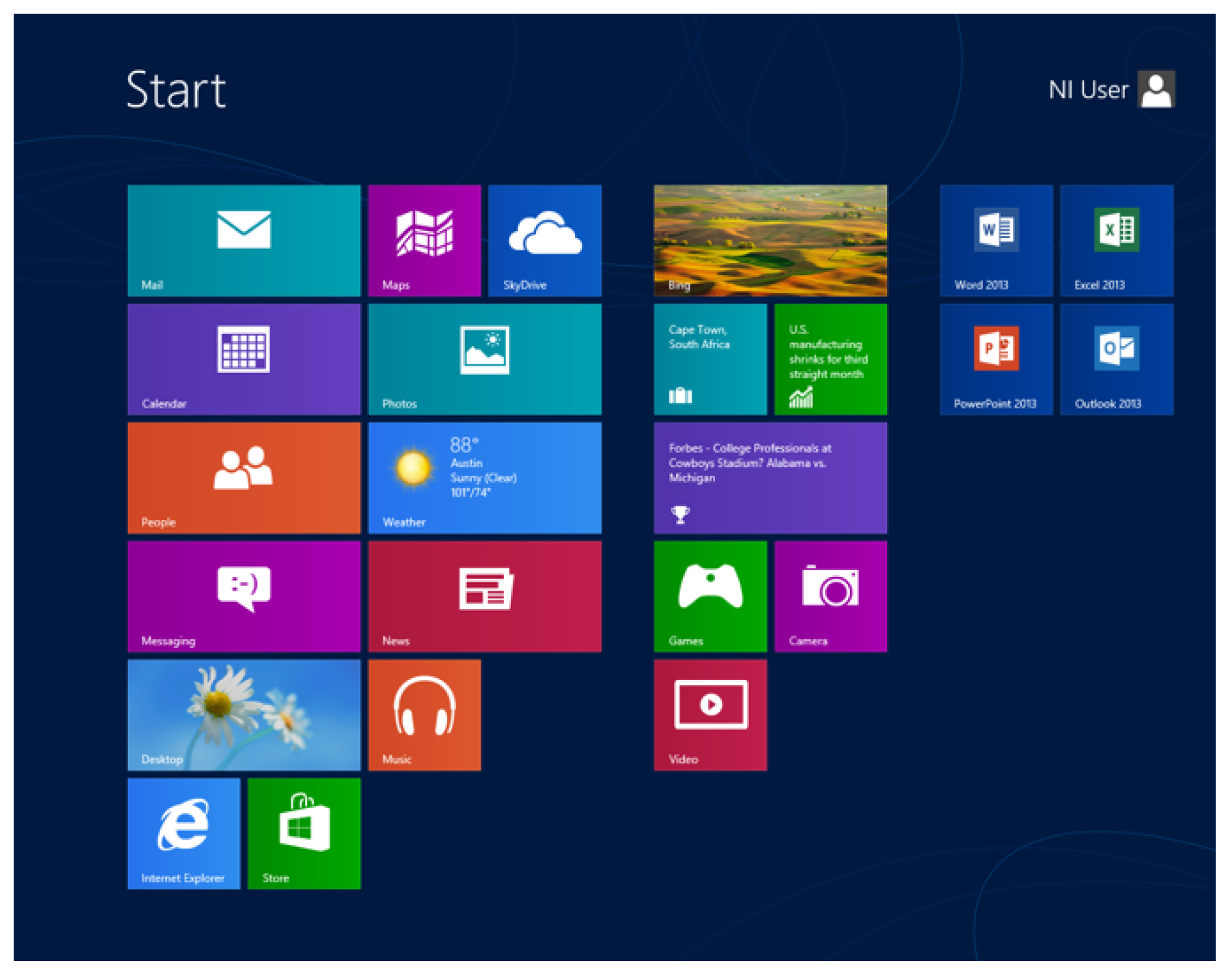
However, a more common approach to user interface design is the use of flat design, which does not attempt to replicate the style of any existing objects. Instead, interfaces consist of buttons or boxes with text or icons to illustrate their functionality. There is no real correspondence to the physical world. An example of such a user interface is that of Microsoft’s Windows 8, as shown in Figure 2. Such interfaces have become particularly common both online and on mobile device user interfaces.

2.2. Familiarity, Domain Transfer Distance and Intuitive Interaction

The concept of intuitive interaction is to design systems that are “immediately usable, even without any prior experience or instructions, by almost each and every person” [9]. An intuitive interaction then should allow users to interact with the system without requiring training. As the basis of such interaction is the use of knowledge gained through prior experience, one possibility is that intuitive interaction can be enabled by the provision of features of interaction that the user has experienced before [10], i.e., that interfaces should provide interactions, metaphors, and/or experiences that are familiar to users.
Familiarity can be thought of as a “thorough knowledge of, or an intimacy with something” [11] that can be based on experience and understanding of the behavior or function of the particular object [12]. However, it can also be extended to mean a passing acquaintance with something—such as when we attempt to familiarize ourselves or become familiar with (for example) exits from a building, safety instructions, or the instructions in a game or experiment.
In post-WIMP human-computer interaction, familiarity is often used in the design of new user interfaces, by including aspects that users are already familiar with and extending or augmenting them, such as providing graspable physical devices to interact with [13,14], recognizing common hand gestures [15], or providing virtual versions of physical controls [16]. This can allow users to more easily understand the new interface, by referencing aspects they are already familiar with [17]. In effect, skeuomorphic interfaces attempt to leverage this familiarity in the metaphors they present. Such interfaces are designed specifically to evoke familiar physical objects so that users will know how to interact with them.
Familiarity can also vary on a generational basis. Things which are familiar to younger users who have been continually exposed to technology may not be familiar to older users. For example, for many younger people internet shopping has become the default, while for older people this is not the case [11], and the experience of internet shopping is very different from that of high-street shopping and leads to familiarity with completely different means of browsing, comparing, choosing, and paying for items. In general, when interacting with technology, it has been found that younger people demonstrate higher levels of familiarity when compared to older users [18], both with products they own and with those they do not.
There have been several studies looking at the use of familiarity in the design of interfaces, including specifically for older users. These have included work on such a broad range of interfaces as touch-based interfaces [19], sending text messages on mobile phones [20], and wellness games [21]. These studies have each shown the potential for exploiting familiarity in user interface designs for older users.
One issue is how we determine familiarity. For example, Lawry et al. measured familiarity using a combination of interviews, observations and a retrospective coding [18]. This showed a negative relationship between age and familiarity with regards to interactions with technological products-older users showed less familiarity with products, even those they already owned. When asked to describe the process of performing a task on a familiar device, younger users would more often group actions together than older users, an indication of experience and familiarity with these tasks. Similarly, younger users had higher familiarity when actually performing the tasks, more often displaying “instances of very fluid and effective performance”.
Blackler et al., on the other hand, used a familiarity questionnaire to calculate a technology familiarity score for their participants [22]. This questionnaire included questions both about frequency of use of specific devices and about the depth of use, for example the number of features being used and whether the participant makes use of the user manual or not. Such a method and measure could be useful for the choice of metaphors being used in a new user interface, allowing designers to measure familiarity with specific physical interactions and objects to determine whether they might form suitable metaphors for a new user interface.
Domain transfer distance is the distance between the application domain and the source domain for the transfer of prior knowledge [9]. When a user attempts to interact with a new device or system, they often make use of previously acquired knowledge to do so. This knowledge could come from experiences of similar devices or interactions (as might be the case when a skeuomorphic interface is used) or simply from their general experience of interacting with the world. Diefenback and Ullrich state that distance between the source domain and the application domain may affect the application of this knowledge and thus the overall interaction.
Minimizing this domain transfer distance and increasing familiarity can be achieved by designing user interfaces to match the prior knowledge of the intended users. For older users this is often achieved by mimicking technology and interactions that were available during their formative years, although this can lead to interfaces that are not inclusive, but rather are designed only for one specific group [23]. While this may not be desirable from an inclusivity standpoint, it has already been suggested that for online banking in particular that banks should provide different interfaces for specialist groups of users, of which older users could be considered one [6].

2.3. Interfaces for Older Adults

The style of user interfaces has changed several times over the course of the history of computing technologies. Even in recent years there have been several changes from desktop applications, to web applications, to mobile apps. These changes can require users to learn new interactions, something that can be easier for some users than others and can be a particular challenge for older users. This has led many comparative studies between older adults, typically classed as older than 65 years of age, and younger generations [24,25,26,27,28,29].
An example of this is a study that tested the search performance of older adults and younger users on a library database system and found that older adults had less efficient searches, had more errors and found the experience more challenging when recovering from errors. However, it also concluded that the older adults did not perform as well due to the design of public information systems, not computing inexperience. This is one example to show that older adults are hindered in their capacity as the result of the design of UIs rather than their own computing ability [27]. This supports the argument that the use of software by older adults is not hindered by their ability but rather the designers producing software that is unintuitive for them.
Another study looked at the use of completely novel, gesture-based interfaces. In this case, the study observed and analyzed the difference in the choice of gestures for specific metaphor concepts in a gesture-based user interface between younger and older generations [26]. Of particular interest in this study was the focus on the choice of metaphors used in the interface. Even though the technologies used should have been more familiar to the younger than older users, they concluded that there were no differences in respect to the kinds of gestures selected by each age group for specific abstract metaphors. This would seem to indicate that there is a relationship between specific aspects of metaphors and our physical experiences of the world that can be adopted to create usable interfaces for any age group.
Other studies have stated that there is a state of low confidence within older adults in their capability with computing [30], as they underestimate their ability to sue technology. It is possible that the correct choice of metaphor might increase the level of confidence felt by older users. Metaphors that reference familiar objects could inspire confidence, as users would already have some experience of interacting with the objects that inspire the metaphor, rather than being exposed to something completely new and alien. This idea has been supported by other studies into aspects such as decision making and individual belief, where it has been concluded that there is a connection between lack of self-belief and an inability to complete tasks or fulfil requirements [31,32]. Indeed, in a study of how older people discuss their experiences with technology, Turner et al. found regular use of terms that indicated issues such as alienation, anxiety and the feeling of being too old [33]. Such terms illustrate the discomfort that older users can feel when interacting with technology, something which we hope could be reduced through the use of familiar skeuomorphic metaphors.
There is also evidence that some of the issues with the usability of software for older adults is down to the lack of knowledge of how to design for them as a user group. Czaja and Lee concluded that there were not enough sufficient guidelines on how to design for older adults and recommended that older adults be part of the design and test process in developing software and UIs [24]. They go on to say that many studies that they have investigated have involved trivial trials and primitive experimental controls, stating that there needs to be more systematic and thorough research into the issues regarding ageing and technology.
Some studies have looked at the design of smartphone applications for older adults. Smartphone applications often make use of a combination of flat design and gesture-based interaction, which can be difficult for older adults to understand and use. For example, one study presented an android game to older adults to find which aspects of mobile interface older adults find difficult to use [34]. The report found that older adults require a back and home button to allow a more straightforward navigation, as well as generous spacing of text and icons to allow for potential poorer vision. The authors also found that the sliding interaction often used on flat user interfaces on mobile devices was poorly understood by older adults and recommended it not be used. These findings indicate that there are aspects of modern UI design that are particularly unsuited to older adults.
Finally, there has been some research into the use of skeuomorphism for user interfaces for older adults. A 2018 study found that older adult that had not been exposed to flat design would have more of a positive experience with skeuomorphism as the intuitiveness of the supported affordance would make the interface easier to understand [35]. This would be the case if older adults have not had much exposure to previous computer and mobile interaction. Older adults have also been found to express a preference for skeuomorphism in app icons, rather than the more commonly used flat design [36].

3. System Design

To examine the usefulness of skeuomorphic metaphors for online banking, we performed a user-centered design process to determine exactly how older users currently use online banking and how the experience might be improved for them. This process involved several processes, including initial interviews, the creation of mock-ups of potential designs and finally the creation of two UI prototypes: a flat design and a skeuomorphic design. In this section, we detail this design process and the resulting prototypes.

3.1. Preliminary Interviews

The preliminary interviews were designed to establish a baseline with regards to older users use of online banking, their use of physical banking and how we might improve their online banking experience. The interviews were semi-structured, making use of a mixture of open and closed questions to gather facts and opinions. Nine question were devised. These nine questions would help with general knowledge of the relationship between older adults and online banking. There were no intentional questions aiming at opinions on potential skeuomorphic solutions as this is not the purpose of the interviews.
Five participants were recruited via a church group. These participants were all born before 1953, so each was over 65 years of age. The literature review has stated about the potential challenges that can be faced about the individuality of older adults as they age—that is, that specific older users or groups of older users may have different requirements that other older user groups [24,25,26,27,28,29]. As such, these interviews are vital to allow us to establish the experience and needs of our specific group of older users [37].
Our participants come from a variety of backgrounds and careers. These include careers such as teachers, engineers and childminders, in both the public and private sectors. This provides a wide breadth of information from very different people from different schools of thought. If there is commonality in problems faced when using online banking this presents more of an impression that there is a general problem. The participants were not given any incentives and all participants voluntarily chose to take part in the research. All interviews took place in either in the participant’s home or in a community space where participants felt comfortable.
Initial questions focused on the participants current banking practice, including which banks they already bank with. This would allow us to see if the participants all used similar banks and would allow us to focus out flat design on sites they are already familiar with. Four out of the five participants banked at Halifax, two out of the same five also banked at Barclays and one out of five banked at Lloyds. As such our flat design prototypes were based around Halifax’s online banking experience.
This next significant piece of information was to determine what technology the participants used when online banking. Four out of five of the participants use a desktop or laptop computer as their main basis for interacting with online banking. When asked if the participants would even consider using a mobile or tablet device, three out of five would decline to use that. This information allows another requirement to be fabricated, that is: both prototypes must be a web application that will be used by a desktop or laptop computer.
One problem that was commonly found was that when communicating tasks and activities that the user can perform banks described the activities with a lack of consistency. This is a common problem for older users and has been noted in studies of technology use by older adults [38,39]. The result is that our participants found moving between banking sites different and as such our prototypes should use terminology that the participants were familiar with from their own banks’ online services.
Another issue was the input of data such as sort codes and telephone numbers when transferring payments. Again, this was a matter of consistency, as different bank (and other) sites use different formats for the same data. A similar lack of consistency was found in how charges, transfers, and payments are represented on statements, with the descriptions not necessarily offering a clear indication of what a specific line on a statement is referring to. This has resulted in some participants spending a lot of time backtracking previous transactions on statements to determine when and where specific transactions had occurred.
Common activities described by our participants included the use of standing orders between current and savings accounts, checking personal balances, and monitoring withdrawals and deposits. All of which were used by all participants, indicating that our participants were quite engaged with the process of online banking. All participants had experience is transferring payments to accounts in other banks, whether their own, or belonging to other people and businesses. These activities were noted and were used to create the tasks that were then used in the evaluation phase of this research.
There were also some atypical uses, such as in one interview where online banking was described as being used to transfer funds from Pound Sterling to Euros. While such tasks were not included in our prototypes or evaluation process, this is an indication that older adults’ ability to use online banking is not just limited to daily management.
Praise of online banking was common among interviewees. Online banking was seen as more convenient for older adults then the alternative of going to physical branches. Again, this would seem to emphasize the importance of ensuring that online banking interfaces are suited to the requirements of older adults.
Interestingly, during the interviews comparisons to physical objects were generally made when describing the activities during online banking, illustrating some potential for skeuomorphic designs. For example, in one interview a comparison was made between the online view of transactions and physical paper statements, to communicate issues around reading and understanding transactions.
To conclude, requirements for the two prototypes can be drawn from the analysis of the interviews. Both prototypes must be available to use on desktop or laptop computers, as this is how our user group appear to access online banking. Both prototypes must allow users to perform common tasks, such as checking balances, transferring money, and locating specific transactions. While there are no specific requirements for the skeuomorphic interface design metaphors from these interviews, the flat design prototype should be designed to resemble the existing online banking systems that our users are familiar with. Both user interfaces should also offer simplified banking experiences, providing only those tasks that we want the users to perform. This will reduce the cognitive load of the user interfaces and provide a more even test.

3.2. Flat User Interface

From our preliminary interviews we had some requirements for the flat UI design. We found that most participants were using the Halifax bank’s online banking and that there was much praise in the simplicity of the interaction, as opposed to other online banking systems. As such, we based our flat UI design on Halifax’s online banking, although greatly simplified.
We had also identified some functional requirements. The system must allow users to have more than one account, they should be able to check transactions on an account and they should be able to transfer money to another account. These form the basic functionality of our prototype systems, as well as the tasks for the later user evaluation. They also represent the most common tasks that our participants perform.
Our flat UI prototype was implemented in JavaScript, HTML, and CSS, using the Bootstrap framework. There are three main pages, allowing the participants to perform the aforementioned tasks: a main menu, a transactions view, and a money transfer form.
The main menu page (see Figure 3) is composed of three sections the title, the advertisement, and the users accounts. The title constants the ‘Hallam Banking’ welcoming the user. The advertisements enhance the consumer environment, displaying offers and business slogans. Finally, finishing with the user’s accounts that will comprise of a current account and savings account, to be interacted with.
The view transaction page’s sole purpose is to display of the transactions for the selected account (see Figure 4). The table view is based on existing online banking implementations. The table also can highlight a row that the cursor is hovering over. This helps the user read the row and to decipher the presented information.
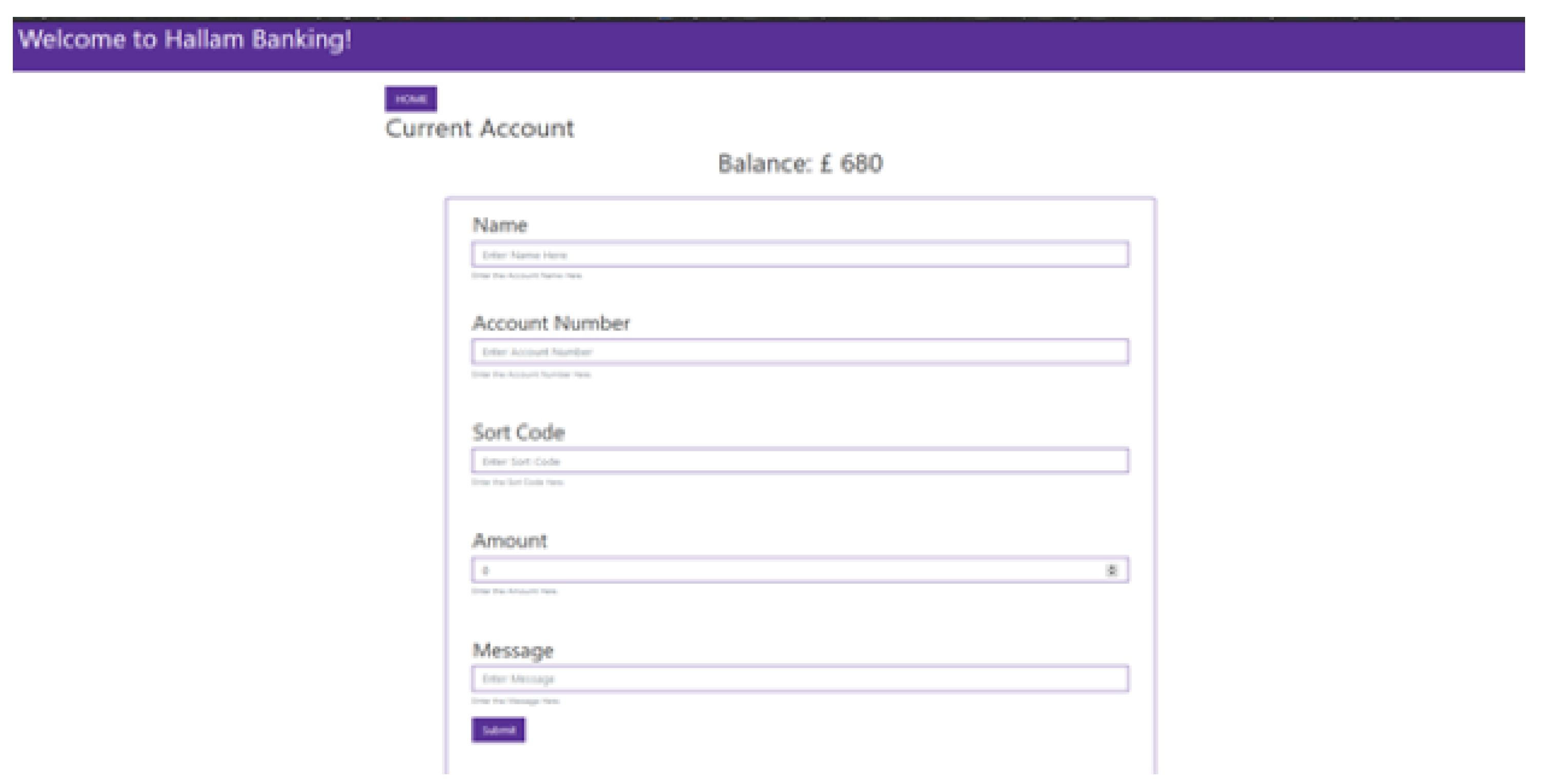
Finally, the transfer payment page (see Figure 5) contains all the necessary input boxes to gather the required information to transfer a payment from one account to another. This involves: the name, sort code, account number, amount of money, and a message that can accompany the transaction. A submit button is used for the transaction to proceed.

3.3. Skeuomorphic User Interface

The skeuomorphic UI was created using the same tools and technologies as the flat UI. The same functionality was also enabled—multiple accounts, checking transactions, and transferring money. Where this system differed from the flat UI was in the use of skeuomorphic metaphors. These metaphors emerged from our interview process when discussing with participants how they currently and previously had interacted with their bank accounts. In particular, we focused on those physical objects that were referenced by multiple participants, such as account books and cheque books.
On the main page, each account is represented by an account book, as shown in Figure 6.
Please note that this page is not a completely skeuomorphic UI, with some elements (the choice of service) being chosen in a flatter UI-like way. This decision was made in order to offer a gentler introduction to the skeuomorphic UI and also as our main interest was in the ability of users to read transactions from the account book and to transfer money.
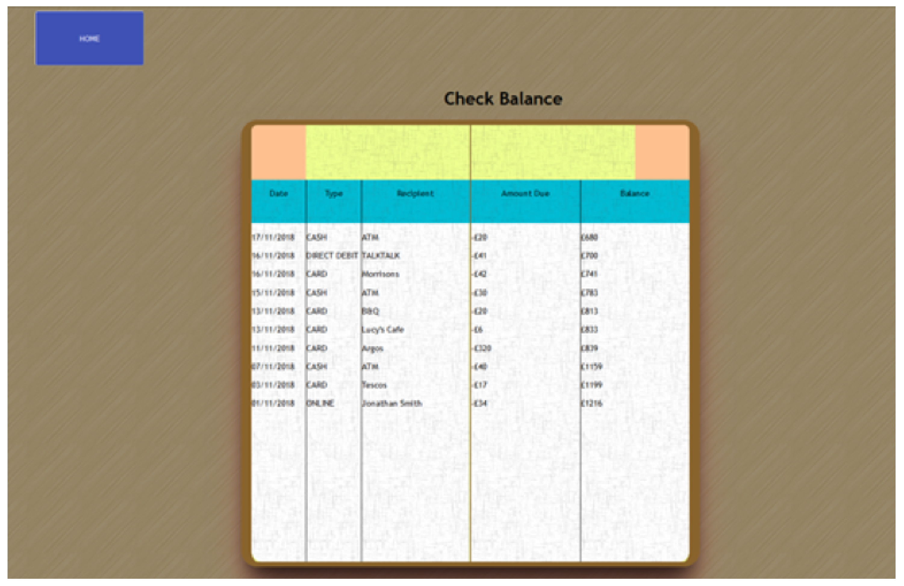
The transaction view page shows a close-up of the inside of the chosen account book, in a ledger-like format. Each transaction is a single line entry in the account book. See Figure 7 for further details.
The final page of the skeuomorphic design is the money transfer page. This page differs quite significantly from the flat design. In this case, the skeuomorphic element we have chosen is that of a cheque book. While a cheque book is something that younger users would not be familiar with it seems likely that older adults would have used one in the past, something which was confirmed by our interviewees. Figure 8 shows this page of the system.

4. Experimental Evaluation

Having created two prototypes-one using skeuomorphic design and one flat design—the next stage was to perform a usability evaluation of the two prototypes to determine whether the skeuomorphic design actually did provide a better experience for older users.

4.1. Procedure

A series of three tasks was created for participants to perform with each interface. These tasks were based on the most common uses of online banking as found during our initial interviews. The tasks were:
  • To check the balance of a specific account
  • To locate a specific transaction on a given date
  • To transfer money to another account
Participants were again recruited through a church group. In total 15 participants took part, all aged 65 years or older. Eight participants were female, 7 male. Two participants had received a university level education, the remaining 13 had a secondary school level education. Participants came from several different careers, as follows:
  • 2 secondary school teachers
  • 3 engineers
  • 4 homemakers
  • 1 childminder
  • 3 administrators
  • 1 truck driver
  • 1 pastor
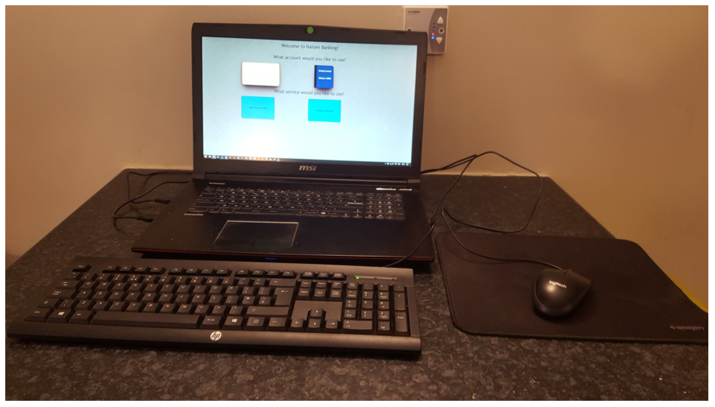
Participants performed each of the tasks with each interface prototype. To remove effects of ordering, 8 participants performed the tasks with the flat UI first, while the remaining 7 participants started with the skeuomorphic UI. As our initial interviews indicated that older users generally preferred to interact with online banking using a desktop computer (as opposed to a phone or tablet) our experimental setup provided them with a laptop with a separate keyboard and mouse, as shown in Figure 9. A facilitator was present at all times to observe their interaction with the prototypes and screen and audio recordings were also made for later analysis.
After completing all the activities, the participant would then complete a System Usability Scale Questionnaire (SUS) [40] and then have a post interview to give space for additional thoughts and feedback. This gives more qualitative feedback coinciding with the screen recordings and notes take during the activity process. The participant then proceeds to the next corresponding prototype. The testing of the prototype was carried out in 15 separated locations in a variety of meeting rooms and living rooms isolated from other individuals and distractions.

4.2. Results

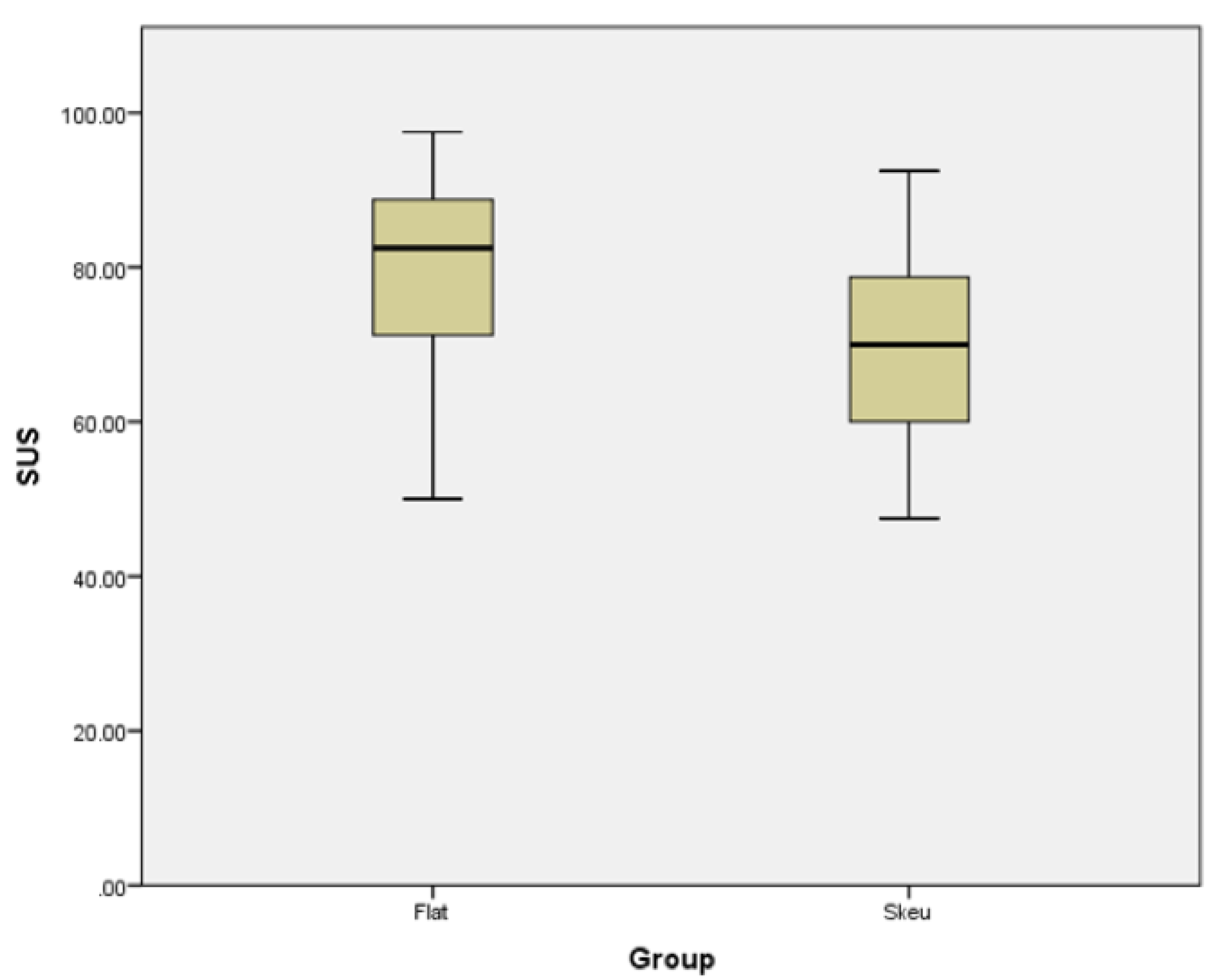
The System Usability Scale produces a single numeric indicator of usability for each system for each participant. For the flat UI (n = 15), the SUS scores had a mean of 79.0 (SD = 14.93), compared with the skeuomorphic UI (n = 15), for which the mean was 70.0 (SD = 13.98). These results are illustrated in Figure 10 and indicate a preference for the flat UI, rather than the skeuomorphic UI.
To determine if this preference was statistically significant, we performed a Student’s T-test. The results of this test indicate that there was a significant difference in the scores for flat design (M = 79.00, SD = 14.93) and skeuomorphic design (M = 70.00, SD = 13.98) conditions, with participants scoring the flat design significantly higher than the skeuomorphic design [t(14) = 4.42, p < 0.001]. These results suggest that the usability of the flat design, when used by older adults in reflection to online banking, is more effective than the skeuomorphic design-in contrast to what we would have expected based on the existing literature.

4.3. Discussion

Given that the result is not as expected based on existing literature, we looked in more detail at the audio and screen recordings of participants’ interactions with the systems. The aim was to determine if there were specific factors within our designs which caused these results. The first factor that stood out was that we had designed our flat UI to be close to an existing system with which many participants were familiar. Participants recognized this and emphasized how it made their interaction with the system easier:
P6: I’ve used this sort of stuff before, so I found this quite easy.
P7: I left more comfortable with this one as I found this more simple and straightforward.
This also resulted in a quicker interaction with the system, with the average completion time with the flat design of 5 min 34 s, compared to 5 min 51 s with the skeuomorphic design. The average SUS score for our flat design was 79, which is in line with studies of existing online banking interfaces, such as that reported by Mujinga et al, who showed an average SUS rating of 74 from older users (in this case 50 years and over) for their existing online banking system [41]. This would indicate that the usability of our flat UI is similar to that of existing flat UI-based online banking interfaces.
The choice of interface metaphor within the skeuomorphic interface also drew some comments from participants. This was particularly true of the chequebook metaphor for transferring money. This was chosen as a metaphor as it was expected (from comments and examples during the earlier interview process) that it would be familiar to older users. Indeed, 86% (13 out of 15) participants recognized the chequebook, but some also commented that while they had been familiar with them before, a long time had passed since the had last written one:
P2: I don’t get the point of a chequebook. I hardly write them nowadays.
P9: Before I finished working, we had to stop sending off cheques and just did everything over the computer, it’s a lot quicker than waiting for days.
This could indicate that the choice of metaphor may need to not only be relevant to the target users’ experiences, but also to be relatively fresh in their minds to be effective. Another possibility would be to make use of some form of familiarity measurement with members of the target user group (older users) before choosing the metaphors to be implemented. For example, several alternative methods of transferring money could be compared through the calculation of familiarity metrics for each, such as those used in [18,22].
We also noticed that participants wanted to interact with the chequebook in different ways. Some wanted to complete the stub first, whereas we had designed the system to automatically complete the stub based on the input to the main body of the cheque. Other participants began by writing the amount in words on the cheque, where we had assumed that they would start with the numeric amount. These findings would indicate that when using such a metaphor it may be necessary to observe users interacting with the physical object first, so as to determine the full range of ways in which this interaction may take place and to design the digital version to allow for all of these interactions.

5. Second Experiment: Younger Adults

Given the results of the experiment with older adults we decided to perform a second experiment, this time with younger adults. This experiment would act as a check on the first experiment. We would expect younger adults to also prefer the flat UI and indeed would expect the preference to be significantly stronger with this user group, due to their increased familiarity with flat interfaces and lack of experience with the metaphors used in the skeuomorphic design. In this way we can also verify that the skeuomorphic designs work better for older adults than younger ones.

5.1. Procedure

The experimental procedure was identical to the first experiment, using the same tasks, equipment, and instructions. Again, each participant evaluated each interface and scored the interfaces using an SUS. For this experiment a total of 17 participants were recruited, all aged between 20 and 25. Nine participants used the skeuomorphic interface first, the remaining 8 participants used the flat interface first.

5.2. Results

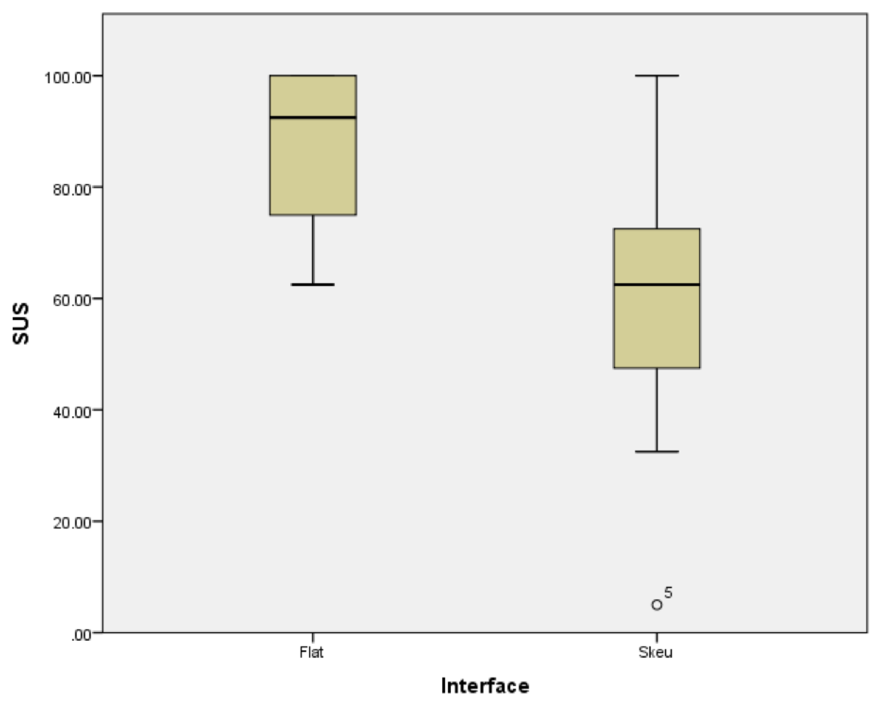
The SUS scores for the flat UI (n = 17) had a mean of 86.5 (SD = 13.67), compared with the skeuomorphic UI (n = 17), for which the mean was 60.0 (SD = 22.31). These results are illustrated in Figure 11 and indicate a preference for the flat UI, as would be expected for users in this age group.
Again, we performed Student’s T-test on the data to see if the difference was statistically significant. The results showed a significant difference in the ratings, with the flat design (M = 86.5, SD = 13.67) scoring significantly higher than the skeuomorphic UI (M = 60.0, SD = 22.31) [t(16) = 4.253, p < 0.001].

5.3. Discussion

These results are in line with what we would expect, with the younger user group strongly preferring the flat user interface. This interface was noted as being more familiar to them than the skeuomorphic interface:
P3: It looks like a game, not a serious application
P12: I don’t think I’ve ever actually had to write a cheque, so I don’t know what’s expected
Looking at the results across both experiments, we see that the overall highest SUS scores were given to the flat UI by the younger group, while the lowest SUS scores were given to the skeuomorphic UI, also by the younger group. This would be in line with expectations—younger users have little or no experience of the metaphors used in the skeuomorphic interface and thus it is the least usable for them. The older adults on the other hand gave closer scores to the two interfaces, as they have experience both of flat interfaces and of the metaphors used in the skeuomorphic interface.
There is also a further difference between these groups in that the younger group can be considered to be digital natives [42], which is that they have grown up using technology to interact with the world. For them, this is the normal way of doing things. In particular, they have years of exposure to flat user interfaces and so would be expected to find these particularly easy to use. This matches with the results we see here. We also found that this group gave the lowest overall SUS scores to the skeuomorphic interface, which again could be expected as this interface is a completely different style of interface to those they have grown up with. Their exposure to technology will have mostly been around flat interfaces, whether through web browser, or through touch-based apps on their smartphones or tablets.
On the other hand, our older users could be considered digital migrants, in that they did not grow up using such technologies and have only come to experience them in later years. In fact, some of our older participants did not use computers during their entire working lives and have only really begun using them in recent years. It was expected that for these users the skeuomorphic design would have the most benefit, as it would ease their entry into the use of the system, although this was not seen to be the case.
To look at this further, we asked the older participants to classify themselves as either experienced or non-experience in the use of online interfaces. We then performed an ANOVA looking at the SUS scores across both experience and interface type. The results showed an effect of experience on the ratings [F(1,13) = 5.74, p < 0.05]. Post-hoc testing using Tukey’s HSD showed that experienced users gave higher ratings to both systems, an indication that the level of exposure and familiarity with technology is an important factor in the usability of such systems.

6. Conclusions and Further Work

Overall, the results discussed in this work are important given the move towards the closure of physical banks and the migration of users online. While many banking users already make use of online banking to a large extent, this is not yet completely true of older users and can depend on several other factors. For example, in a 2019 survey of 1222 older users, it was found that 77% reported never using online banking [43]. If the current trend of bank closures continues, these users will have to begin to make use of online banking [3]. A focus on creating usable interfaces for these older users is then beneficial and skeuomorphic interfaces provide one potential method of doing so. This could also be important for regulatory and policy bodies, as it has been suggested that such bodies should encourage the use of online banking among all user groups for a variety of societal reasons [44].
Our results indicate that there is potential for the use of skeuomorphic interfaces for online banking for older users. However, designers need to take into account how their users interact with the physical, real-world versions of the objects which they are using to form the metaphors within their system. In our particular case it can be seen that different users write cheques in different ways and thus expect the user interface to allow them to interact in these same ways. Care needs to be taken to work with a broad variety of users from your potential user group to determine exactly what their expectations are.
While these results showed that older users preferred our flat interface to our skeuomorphic interface, users were still able to successfully complete all the tasks with the skeuomorphic interface, even though it was new to them. Indeed, there was less than 30 seconds difference in mean overall task performance across the two user interfaces. This would seem to indicate that the skeuomorphic UI was still very usable, given that the flat UI had been deliberately designed to offer an experience similar to the one they were already familiar with from their existing online banking systems.
It should also be noted that this result may be affected by the composition of our subject group, as all our participants had some experience of online banking. Indeed, when asked to categorize their use of online banking, 40% (6/15) classified themselves as ’experienced’ or ’very experienced’. This is quite a high percentage, particularly compared to the previously mentioned study by Schehl et al., which found that 77% of those older users they surveyed had never used online banking [43]. This existing experience of online banking systems and the resemblance between our flat design and existing banking interfaces may have had an effect on the results, resulting in the average SUS ratings for our flat UI being in line with other works that have asked users to rate their own banks’ online user interfaces [41]. We suggest that a further study with users with no experience of online banking might prove beneficial, particularly as these users may soon be forced into the use of online banking by factors outside their own control.
Observations of the users working with the skeuomorphic interface showed that the main issues were those of expectations: users expected to interact with every part of the interface in whatever order they wished. When this was not possible users exhibited some frustration, but all of them were still able to complete the tasks without requiring any intervention from the observer. There may also be issues with the quality of the skeuomorphic interface. The skeuomorphic interface was designed to present specific metaphors of physical objects and did so by providing reasonable graphical representations of them—“providing visual cues to the user for them to perceive as an affordance for action as they would with the real-world equivalent” [45]. Given that the aim is simply to provide these “cues”, it was felt that the somewhat visually simple interfaces created would suffice. This would seem to be backed up by the fact that our users did recognize the objects as representations of an account book and a cheque book. However, the possibility exists that higher-quality (more realistic) representations of these objects would improve these visual cues and potentially improve usability. This is something which we plan to look into in the future.
Given the results of the experiments in this work, we feel that there is evidence that skeuomorphic user interfaces are useful for older adults, so long as care is taken in their design and implementation. As a counterpoint, it is clear that such interfaces are much less usable for younger users who are not familiar with the metaphors being used. This raises a further potential issue with regards to the choice of metaphors—as time passes some metaphors may become less relevant. While our initial interviews suggested the cheque metaphor was a useful one for older users, some of our participants noted that they had not written a cheque in a long time and had perhaps forgotten what it was like. As time passes it is likely that this metaphor will make sense to fewer users and thus designers should be careful that the metaphors they use are still relevant and to evolve the metaphors used in such an interface as time passes. We feel that this is an area that could benefit from further research and plan to continue investigating how skeuomorphic metaphors need to change as demographics change.
Further to this, both interfaces evaluated in this work were deliberately simplified. This would have dramatically reduced the cognitive load required to operate them. Our aim was to provide a baseline system to examine the usability of each interface for specific tasks. However, in the longer term a follow up study could look at creating more complex systems with higher cognitive load and the effects of this on the usability of each user interface metaphor type.
In conclusion, this work indicates that there is some potential for the use of skeuomorphic metaphors in online banking for older users, particularly where these users are not already familiar with existing online banking interfaces, but that the designers of such systems should ensure that the metaphors chosen are familiar to their specific target users, that the interface allows the full variety of relevant interactions that are enabled by the physical object that forms the basis of the metaphor, and take into account that the chosen metaphors may need to be updated over time to allow for changing user experiences of physical banking interactions.

Author Contributions

Conceptualization, A.E. and M.T.M.; methodology, A.E. and M.T.M.; software, A.E.; validation, M.T.M.; formal analysis, M.T.M.; investigation, A.E. and M.T.M.; resources, A.E. and M.T.M.; data curation, A.E.; writing—original draft preparation, A.E.; writing—review and editing, M.T.M.

Funding

This research received no external funding.

Acknowledgments

The authors wish to thank Jake Habgood for his input to the project. We also wish to thank Sheffield Central Elim Pentecostal Church for the use of space to conduct interviews and evaluations and all the participants for taking part.

Conflicts of Interest

The authors declare no conflict of interest.

Abbreviations

The following abbreviations are used in this manuscript:
UIUser interface
SUSSystem Usability Scale

References

  1. Penrose, P. Who Launched the UK’s First Internet Bank? Available online: https://www.finextra.com/blogposting/237/who-launched-the-uks-first-internet-bank (accessed on 17 September 2019).
  2. Morris, S. UK Banks Are Smaller and Poorer a Decade after the 2007 Financial Crash. Independent 2017. Available online: https://www.independent.co.uk/news/business/news/uk-banks-financial-crash-northern-rock-mortgages-bank-of-england-funding-taxpayers-a7945991.html (accessed on 17 September 2019).
  3. Rhodes, C. Bank Branch and ATM Statistics; Technical Report CBP08570; House of Commons Library: London, UK, 2019. [Google Scholar]
  4. Tinnilä, M. Impact of future trends on banking services. J. Internet Bank. Commer. 2012, 17, 1. [Google Scholar]
  5. Edmonds, T. Bank Branch Closures; Technical Report 385; House of Commons Library: London, UK, 2018. [Google Scholar]
  6. Zhou, T.; Lu, Y.; Wang, B. Integrating TTF and UTAUT to explain mobile banking user adoption. Comput. Hum. Behav. 2010, 26, 760–767. [Google Scholar] [CrossRef]
  7. Basalla, G. The Evolution of Technology; Cambridge University Press: Cambridge, UK, 1988. [Google Scholar]
  8. Gross, S.; Bardzell, J.; Bardzell, S. Skeu the evolution. In Proceedings of the 8th International Conference on Tangible, Embedded and Embodied Interaction—TEI ’14, Munich, Germany, 16–19 February 2014. [Google Scholar] [CrossRef]
  9. Diefenbach, S.; Ullrich, D. An Experience Perspective on Intuitive Interaction: Central Components and the Special Effect of Domain Transfer Distance. Interact. Comput. 2015, 27, 210–234. [Google Scholar] [CrossRef]
  10. Blackler, A.L.; Popovic, V.; Mahar, D.P. Intuitive Use of Products. In Proceedings of the Design Research Society International Conference, Common Ground, London, UK, 5–7 September 2002; Design Research Society: London, UK, 2002; pp. 120–134. [Google Scholar]
  11. Turner, P. Being-with: A study of familiarity. Interact. Comput. 2008, 20, 447–454. [Google Scholar] [CrossRef]
  12. Gefen, D. E-commerce: The role of familiarity and trust. Omega 2000, 28, 725–737. [Google Scholar] [CrossRef]
  13. Bae, S.H.; Kobayash, T.; Kijima, R.; Kim, W.S. Tangible NURBS-curve Manipulation Techniques Using Graspable Handles on a Large Display. In Proceedings of the 17th Annual ACM Symposium on User Interface Software and Technology, UIST ’04, Santa Fe, NM, USA, 24–27 October 2004; ACM: New York, NY, USA, 2004; pp. 81–90. [Google Scholar] [CrossRef]
  14. Ullmer, B.; Ishii, H.; Jacob, R.J.K. Token+constraint systems for tangible interaction with digital information. ACM Trans. Comput. Hum. Interact. 2005, 12, 81–118. [Google Scholar] [CrossRef]
  15. Vogel, D.; Balakrishnan, R. Distant Freehand Pointing and Clicking on Very Large, High Resolution Displays. In Proceedings of the 18th Annual ACM Symposium on User Interface Software and Technology, UIST ’05, Seattle, WA, USA, 23–26 October 2005; ACM: New York, NY, USA, 2005; pp. 33–42. [Google Scholar] [CrossRef]
  16. Jackson, R.L.; Fagan, E. Collaboration and learning within immersive virtual reality. In Proceedings of the Third International Conference on Collaborative Virtual Environments—CVE ’00, San Francisco, CA, USA, 10–12 September 2000. [Google Scholar] [CrossRef]
  17. Jacob, R.J.; Girouard, A.; Hirshfield, L.M.; Horn, M.S.; Shaer, O.; Solovey, E.T.; Zigelbaum, J. Reality-based interaction. In Proceedings of the Twenty-Sixth Annual CHI Conference on Human Factors in Computing Systems—CHI ’08, Florence, Italy, 5–10 April 2008. [Google Scholar]
  18. Lawry, S.; Popovic, V.; Blackler, A.; Thompson, H. Age, familiarity, and intuitive use: An empirical investigation. Appl. Ergon. 2019, 74, 74–84. [Google Scholar] [CrossRef] [PubMed]
  19. Leonardi, C.; Albertini, A.; Pianesi, F.; Zancanaro, M. An Exploratory Study of a Touch-based Gestural Interface for Elderly. In Proceedings of the 6th Nordic Conference on Human-Computer Interaction: Extending Boundaries, NordiCHI ’10, Reykjavik, Iceland, 16–20 October 2010; ACM: New York, NY, USA, 2010; pp. 845–850. [Google Scholar] [CrossRef]
  20. Weilenmann, A. Learning to Text: An Interaction Analytic Study of How Seniors Learn to Enter Text on Mobile Phones. In Proceedings of the SIGCHI Conference on Human Factors in Computing Systems, CHI ’10, The Hague, The Netherlands, 1–6 April 2000; ACM: New York, NY, USA, 2010; pp. 1135–1144. [Google Scholar] [CrossRef]
  21. Pan, Z.; Miao, C.; Yu, H.; Leung, C.; Chin, J.J. The Effects of Familiarity Design on the Adoption of Wellness Games by the Elderly. In Proceedings of the 2015 IEEE/WIC/ACM International Conference on Web Intelligence and Intelligent Agent Technology (WI-IAT), Singapore, 6–9 December 2015. [Google Scholar] [CrossRef]
  22. Blackler, A.; Popovic, V.; Mahar, D. Investigating users’ intuitive interaction with complex artefacts. Appl. Ergon. 2010, 41, 72–92. [Google Scholar] [CrossRef]
  23. Hurtienne, J.; Klockner, K.; Diefenbach, S.; Nass, C.; Maier, A. Designing with Image Schemas: Resolving the Tension Between Innovation, Inclusion and Intuitive Use. Interact. Comput. 2015, 27, 235–255. [Google Scholar] [CrossRef] [Green Version]
  24. Czaja, S.J.; Lee, C.C. The impact of aging on access to technology. Univ. Access Inf. Soc. 2006, 5, 341–349. [Google Scholar] [CrossRef]
  25. Hawthorn, D. Interface design and engagement with older people. Behav. Inf. Technol. 2007, 26, 333–341. [Google Scholar] [CrossRef]
  26. Hurtienne, J.; Stößel, C.; Sturm, C.; Maus, A.; Rötting, M.; Langdon, P.; Clarkson, J. Physical gestures for abstract concepts: Inclusive design with primary metaphors. Interact. Comput. 2010, 22, 475–484. [Google Scholar] [CrossRef]
  27. Mead, S.E.; Sit, R.A.; Rogers, W.A.; Jamieson, B.A.; Rousseau, G.K. Influences of general computer experience and age on library database search performance. Behav. Inf. Technol. 2000, 19, 107–123. [Google Scholar] [CrossRef]
  28. Prior, S.; Arnott, J.; Dickinson, A. Interface metaphor design and instant messaging for older adults. In Proceedings of the Twenty-Sixth Annual CHI Conference Extended Abstracts on Human Factors in Computing Systems—CHI ’08, Florence, Italy, 5–10 April 2008. [Google Scholar] [CrossRef]
  29. Zajicek, M. Interface design for older adults. In Proceedings of the 2001 EC/NSF Workshop on Universal Accessibility of Ubiquitous Computing Providing for the Elderly—WUAUC ’01, Alcácer do Sal, Portugal, 22–25 May 2001. [Google Scholar] [CrossRef]
  30. Marquié, J.C.; Huet, N. Age differences in feeling-of-knowing and confidence judgments as a function of knowledge domain. Psychol. Aging 2000, 15, 451–461. [Google Scholar] [CrossRef] [PubMed]
  31. Janis, I.L.; Mann, L. Decision Making: A Psychological Analysis of Conflict, Choice, and Commitment; Free Press: New York, NY, USA, 1977. [Google Scholar]
  32. Pajares, F. Current directions in self-efficacy research. Adv. Motiv. Achiev. 1997, 10, 1–49. [Google Scholar]
  33. Turner, P.; Turner, S.; Walle, G.V.D. How older people account for their experiences with interactive technology. Behav. Inf. Technol. 2007, 26, 287–296. [Google Scholar] [CrossRef]
  34. de Barros, A.C.; Leitão, R.; Ribeiro, J. Design and Evaluation of a Mobile User Interface for Older Adults: Navigation, Interaction and Visual Design Recommendations. Procedia Comput. Sci. 2014, 27, 369–378. [Google Scholar] [CrossRef]
  35. Spiliotopoulos, K.; Rigou, M.; Sirmakessis, S. A Comparative Study of Skeuomorphic and Flat Design from a UX Perspective. Multimodal Technol. Interact. 2018, 2, 31. [Google Scholar] [CrossRef]
  36. Cho, M.; Kwon, S.; Na, N.; Suk, H.J.; Lee, K. The Elders Preference for Skeuomorphism as App Icon Style. In Proceedings of the 33rd Annual ACM Conference Extended Abstracts on Human Factors in Computing Systems—CHI EA ’15, Seoul, Korea, 18–23 April 2015. [Google Scholar] [CrossRef]
  37. Eisma, R.; Dickinson, A.; Goodman, J.; Syme, A.; Tiwari, L.; Newell, A.F. Early user involvement in the development of information technology-related products for older people. Univ. Access Inf. Soc. 2004, 3, 131–140. [Google Scholar] [CrossRef]
  38. Sayago, S.; Blat, J. About the Relevance of Accessibility Barriers in the Everyday Interactions of Older People with the Web. In Proceedings of the 2009 International Cross-Disciplinary Conference on Web Accessibililty (W4A), W4A ’09, Madrid, Spain, 20–21 April 2009; ACM: New York, NY, USA, 2009; pp. 104–113. [Google Scholar] [CrossRef]
  39. Chadwick-Dias, A.; Bergel, M.; Tullis, T.S. Senior Surfers 2.0: A Re-examination of the Older Web User and the Dynamic Web. In Lecture Notes in Computer Science; Springer: Berlin, Germany, 2007; pp. 868–876. [Google Scholar] [CrossRef]
  40. Brooke, J. SUS: A “quick and dirty” usability scale. In Usability Evaluation in Industry; Jordan, P.W., Thomas, B., McClelland, I.L., Weerdmeester, B., Eds.; Taylor & Francis: London, UK, 1996; pp. 189–194. [Google Scholar]
  41. Mujinga, M.; Eloff, M.M.; Kroeze, J.H. System usability scale evaluation of online banking services: A South African study. S. Afr. J. Sci. 2018, 114. [Google Scholar] [CrossRef] [Green Version]
  42. Prensky, M. Digital natives, digital immigrants part 1. Horizon 2001, 9, 1–6. [Google Scholar] [CrossRef]
  43. Schehl, B.; Leukel, J.; Sugumaran, V. Understanding differentiated internet use in older adults: A study of informational, social, and instrumental online activities. Comput. Hum. Behav. 2019, 97, 222–230. [Google Scholar] [CrossRef]
  44. Zaman, S.; Bhatti, H.; Khurshid, M.A. Consumer Acceptance of Online Banking: Application of Technology Acceptance Model. IBT J. Bus. Stud. (Jbs) 2018, 14, 50–64. [Google Scholar]
  45. Rose, P. Skeuomorphism as an Affordance: A Principle for Interaction and User Interface Design; University of Plymouth: Plymouth, UK, 2013. [Google Scholar]
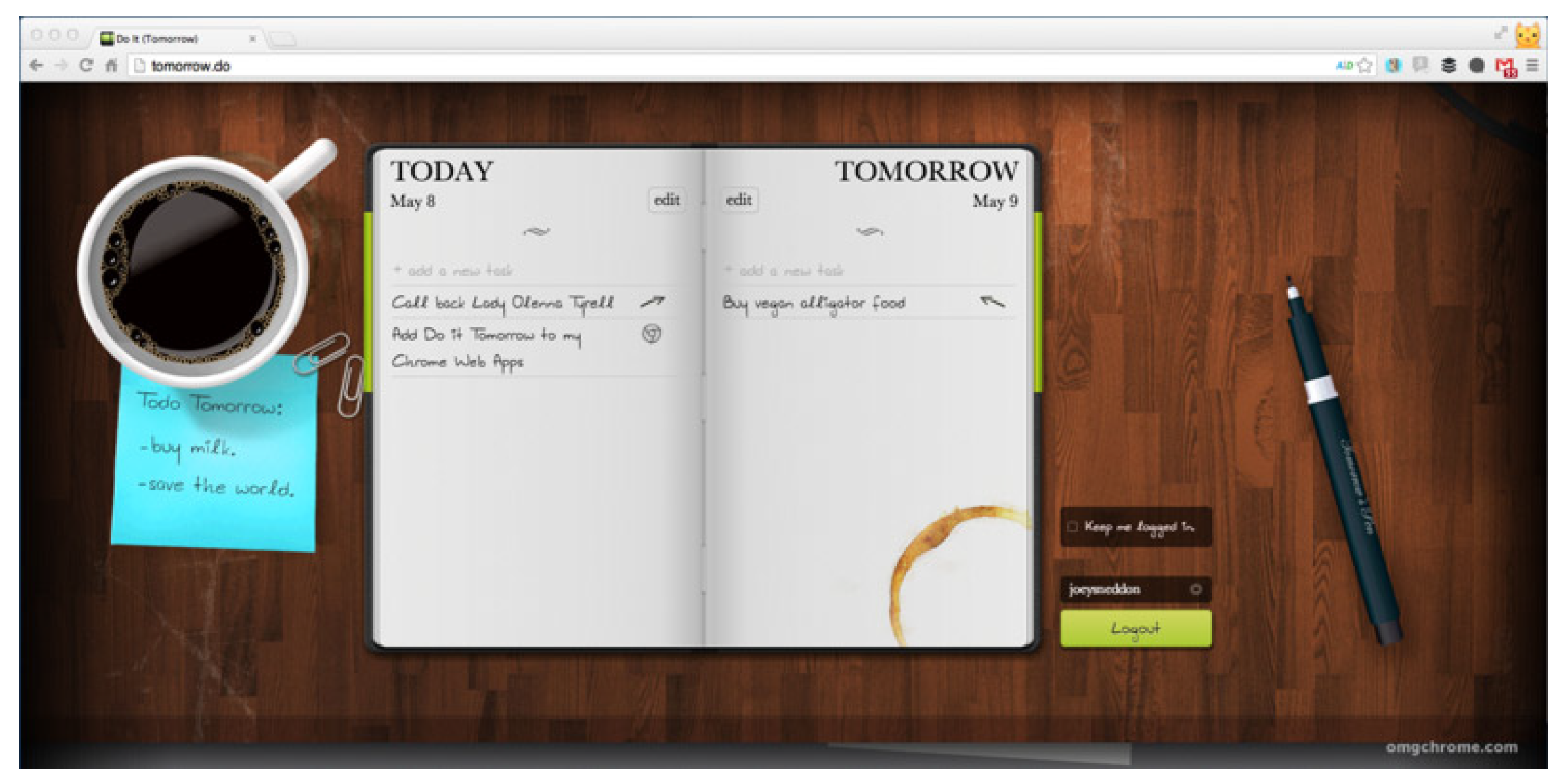
Figure 1. A screenshot of the application Do It (Tomorrow), which makes use of skeuomorphic metaphors to create a specific atmosphere as well as interaction.
Mti 03 00063 g001
Figure 2. A screenshot of the main user interface in Microsoft’s Windows 8, which makes use of flat design, where boxes, buttons and icons represent applications and functions, but there is no correlation to physical objects in the real world.
Mti 03 00063 g002
Figure 3. A screenshot of the main page of our flat UI.
Mti 03 00063 g003
Figure 4. A screenshot of the transaction view page of our flat UI.
Mti 03 00063 g004
Figure 5. A screenshot of the money transfer page of our flat UI.
Mti 03 00063 g005
Figure 6. A screenshot of the main page of our skeuomorphic UI.
Mti 03 00063 g006
Figure 7. A screenshot of the transaction view page of our skeuomorphic UI.
Mti 03 00063 g007
Figure 8. A screenshot of the money transfer page of our skeuomorphic UI.
Mti 03 00063 g008
Figure 9. Our experimental setup.
Mti 03 00063 g009
Figure 10. A summary of the results of the SUS questionnaires for each interface.
Mti 03 00063 g010
Figure 11. A summary of the results of the SUS questionnaires for each interface for the second experiment.
Mti 03 00063 g011