1. Introduction
Smartphones have become more than just a communication tool due to the integration of various applications that users install on their mobile phones [
1,
2]. However, user interaction with mobile applications inevitably involves the exchange of personal information [
1,
3]. Data protection laws such as the European General Data Protection Regulation (GDPR) [
4] mandate companies to inform users what data is gathered about them, what is stored, and how and by whom these data are being used. Modern smartphone operating systems, such as Android and iOS, incorporate Runtime Privacy Notices (RPNs), enabling users to control app access to personal data such as photos and contacts [
5]. However, due to several limitations, these notices fail to effectively explain to users data practices in a transparent manner, resulting in uninformed consent [
6,
7]. End-users consequently find this information difficult to understand, even though they have the right to clear and easily accessible explanations of how their data is collected, used, and shared [
8]. The runtime permission model presents several challenges, starting with the use of brief permission descriptions. These short prompts make it difficult for users to grasp which types of personal data are being accessed [
6].
To address this limitation, the concept of Contextual Privacy Policies (CPPs) has been developed, which increases privacy awareness among users by providing context-relevant privacy information [
9]. CPPs break down privacy policies into smaller, more digestible pieces, shown only within relevant contexts in mobile apps. To be relevant, contextual privacy notices should focus on unanticipated data practices, as the disclosure of personal information to third-party entities. [
9,
10]. Although CPPs are promising, creating accurate contextual notices for mobile applications presents unique challenges [
9]. Companies such as Appleor Facebookhave started implementing contextual privacy notices, but their effectiveness in improving user understanding of privacy information remains uncertain [
10].
To further enhance transparency in digital systems, it is crucial to develop innovative approaches that provide users with clear and comprehensible privacy information. This need aligns with the concept of explainability, which focuses on improving the user’s understanding of how a system operates [
11,
12]. Explanations can help users understand the system’s behavior, the reasoning behind certain decisions, and how internal processes work. This can improve users’ understanding of privacy aspects and support more informed decisions [
8]. While privacy and explainability aspects have been well studied individually, their integration remains underexplored. This gap is especially critical in domains where both are essential and must be addressed together [
13].
To address this gap, we began our research to find how we can design explainable privacy interfaces that enhance user understanding of app-specific data practices. To answer this, first, we examined the current level of user understanding regarding application-specific data practices, such as data collection, data usage, and third-party sharing, through a pre-study survey. This survey provided insights into user comprehension, highlighting that users exhibit incomplete and uneven comprehension, with third-party data sharing representing as the most significant knowledge gap.
Second, we investigate how users perceive current privacy explanations in the literature when they are integrated into smartphone applications. Our findings reveal that users perceive privacy explanations as effective for improving understanding of app-specific data practices. However, participants still perceived explanations of third-party data sharing as the least understood and emphasized the need for specific details on how their data is shared. They suggested presenting this information in a short, contextual manner that avoids overwhelming users, and combining visuals with text to make explanations quicker and easier to grasp.
Finally, building on these insights, we designed and evaluated two types of explainable privacy interfaces inspired from Explainable Artificial Intelligence (XAI) literature and integrated them into a smartphone application: one based on example-based explanation strategy and the other based on contrastive explanations. A comparative user study was conducted based on an explainability quality model [
8] to assess their impact on user understanding. Although we found no statistically significant differences between the two explanation types across comprehension, simplicity, cognitive load, and user experience, descriptive trends offered useful insights. Our work is particularly relevant to the design of explainable privacy interfaces in smartphone applications. While both example-based and contrastive explanations effectively supported user understanding of data sharing practices, descriptive trends suggested that example-based explanations were associated with somewhat higher mental model accuracy, whereas contrastive explanations appeared more supportive of decision-making. Thus, it is crucial to design privacy interfaces that apply layered explanations, progressive disclosure, and transparent third-party communication while managing cognitive load through visual support.
Contribution Statement
Our contribution to the HCI community ([
14], ch. 1.2) is
- 1.
Artifact or system and method: We developed interactive prototypes of two explainable privacy interfaces to systematically evaluate the effectiveness of different explanation strategies.
- 2.
Empirical study that tells us about how people use a system: We conducted an exploratory between-subjects study (N = 30) to examine the influence of the two types of explanations on user understanding of data sharing practices. Although not statistically significant, our results indicate a trend in which example-based explanations more effectively support users’ mental models, while contrastive explanations more effectively support decision-making.
4. Survey Design
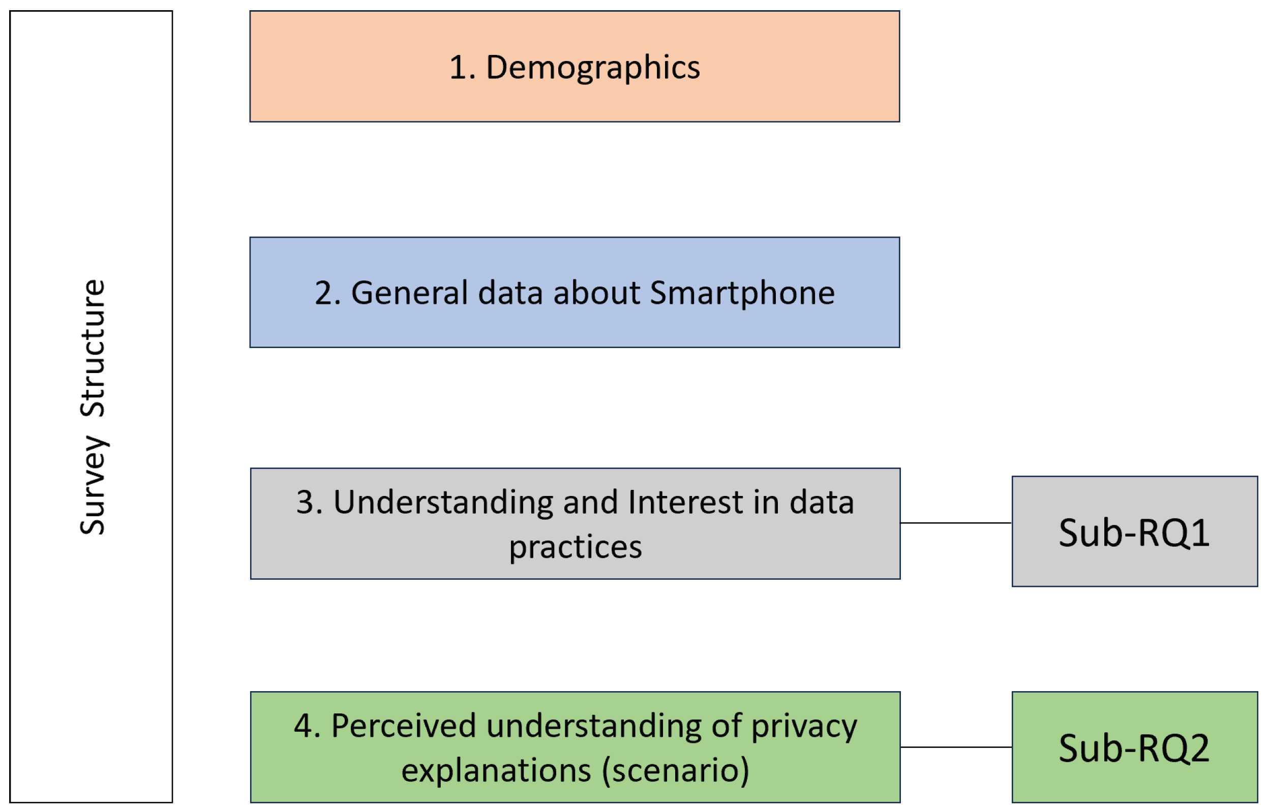
We ensured that the survey structure was directly aligned with its related sub-research questions (sub-RQ1 and sub-RQ2), ensuring that each section mapped to specific constructs of user understanding, interest, and perception regarding privacy explanations. It started with information on how participant data would be used and consisted of four sections with a total of 23 questions (see
Appendix A). The structure of the survey, along with the sections addressing the respective research questions, is illustrated in
Figure 1. In the pre-study, we operationalized “understanding” as participants’ perceived understanding of app-specific data practices. Perceived understanding reflects users’ self-reported familiarity and confidence with how apps collect, use, and share personal data. This approach follows prior privacy-explanation survey research, such as Brunotte et al. [
16], which relies on perception-based measures to identify users’ awareness gaps before and after exposure to explanations.
We conducted a pre-test with five participants to assess the survey’s quality. Two participants were PhD students from our university, and three candidates were master’s students from a non-technical department. Based on the pilot test, we made some corrections (e.g., the wording of the questions was improved to facilitate better understanding, and the order of questions was changed for improved flow).
4.1. Data Collection and Analysis
Data collection took place over a period of one month, starting in February 2025. Responses were collected via a web-based questionnaire created in LimeSurvey and hosted on the university server. The survey was distributed through multiple channels, including university mailing lists, LinkedIn, WhatsApp groups, and the personal network of the authors. In accordance with our university’s policy, no IRB approval was required for this study; however, it was conducted in full compliance with established ethical standards (Declaration of Helsinki [
35]): Participation was voluntary, participants could withdraw at any time, and provide comments or feedback. No physical or psychological harm occurred during the study. Inclusion criteria required owning a smartphone and having sufficient English proficiency. A quantitative analysis was conducted for Sections 1–3 using single-choice, multiple-choice, and 5-point Likert-scale items. The resulting data was organized and analyzed in Microsoft Excel.
We also analyzed open-ended responses by identifying recurring themes and calculating their frequency. These themes were first visualized using treemap diagrams to illustrate their relative prominence. To prioritize design focus, we then mapped the themes onto a 2 × 2 matrix with “Impact” on the Y-axis and “Frequency” on the X-axis [
36].
4.2. Results—Pre-Study Survey
4.2.1. Demographics
We received a total of 154 responses. However, out of the 154 responses, 54 respondents did not complete the full questionnaire and provided answers only to the initial demographic section. These partial responses were excluded, resulting in 100 valid and complete responses. Gender distribution was fairly balanced, comprising approximately 45% female and 54% male respondents, with one participant (1%) not specifying gender. A significant portion of the participants were students (68%). This indicates that the participant pool was predominantly composed of students, suggesting that the findings may largely reflect the perceptions and experiences of an academically engaged population.
4.2.2. General Data About Smartphone Usage
All participants in the final sample were smartphone owners, out of which 42% of respondents reported using Android devices, while 58% used iOS. Most participants (95%) reported regularly using social media applications, followed closely by banking and finance apps (66%) and streaming or entertainment apps (65%). The widespread adoption of these app categories highlights their central role in participants’ daily digital activities, underscoring the relevance of privacy and data handling practices within these commonly used domains.
4.2.3. Sub—RQ1: Understanding and Interest in Data Practices
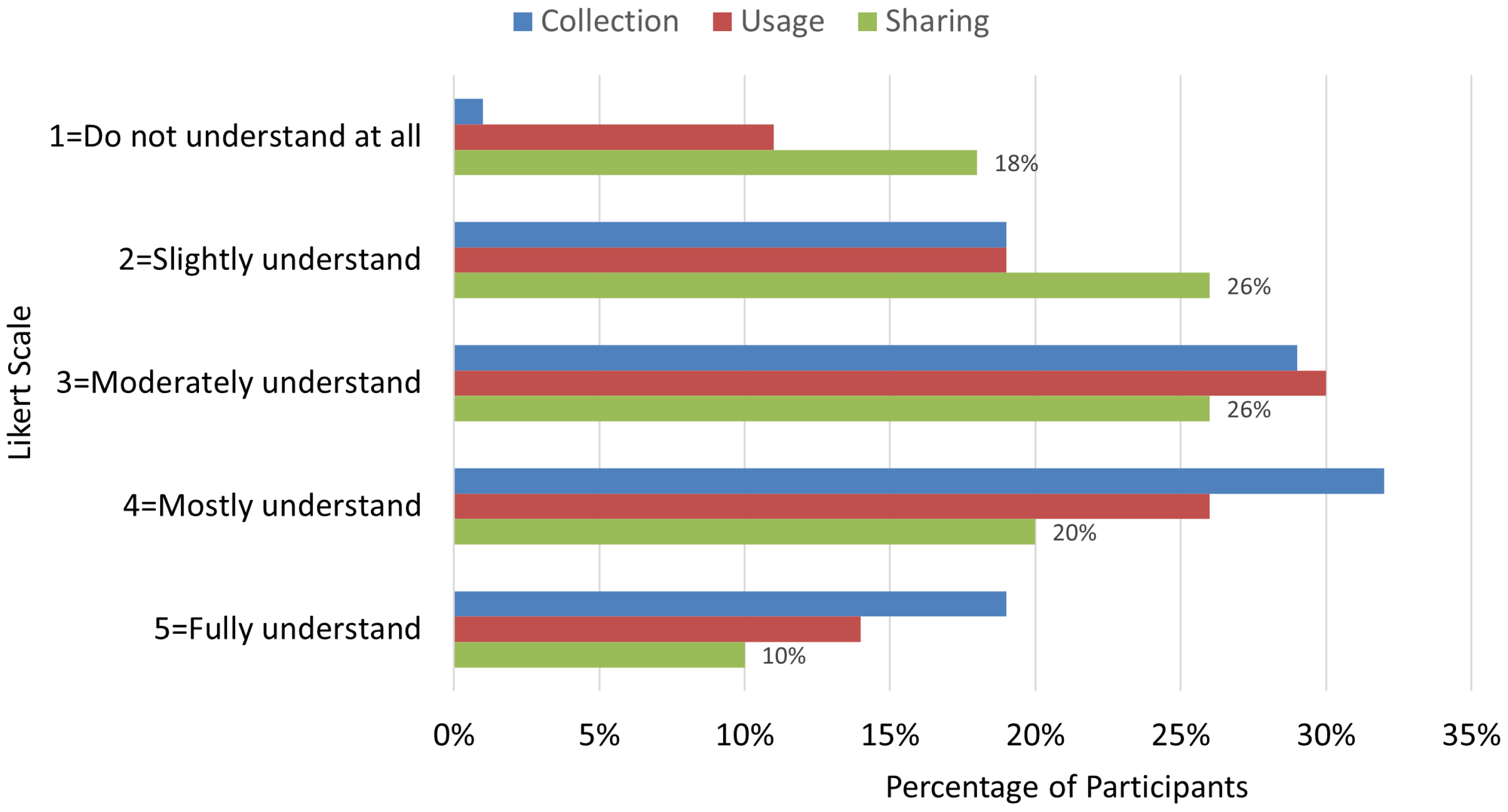
To assess participants’ current understanding of app-specific data practices, they were asked to self-report their understanding of these practices. Results indicate that the users have a limited general understanding of how applications handle data, particularly in relation to data sharing. As shown in
Figure 2, 44% of the participants selected “Do not understand at all” or “Slightly understand” for data sharing. Low self-reported understanding was also observed for data usage (30%) and data collection (20%). Confidence in understanding varies across categories, with 30% of respondents feeling “Mostly” or “Fully understand” with regard to data sharing, 40% for data usage, and 51% for data collection. This suggests that while some familiarity exists, user understanding is often incomplete or uncertain.
To analyze whether participants are interested in learning more about how their data is collected, used, and shared, we asked participants about their interest in learning more. In total, 76% indicated they are “Mostly” or “Fully interested” in further information about data sharing, 69% for data usage, and 67% for data collection. We included the self-reported understanding and interest measures to identify which data practices users understand least and in which they are most interested, thereby informing the focus of our design. The results show uneven comprehension, with data sharing emerging as the least understood practice. This is particularly relevant for our study, as the main user study investigates explanations for data sharing. This pattern aligns with prior work showing that users struggle to understand third-party data flows [
16]. The interest ratings complement these findings. This combination of low perceived understanding and high interest supports the need for clearer, more accessible explanations and validates our decision to focus the main study on data-sharing practices.
4.2.4. Sub—RQ2: Perceived Understanding of Current Privacy Explanation
Having established the baseline understanding and interest levels in Sub-RQ1, we now turn to Sub-RQ2 to examine whether users perceive privacy explanations as effective tools for addressing the knowledge gaps identified, what specific characteristics make these explanations most helpful in supporting user understanding of data practices, and finally, what improvements do users suggest to improve user understanding of data practices. The privacy explanation scenario was modified and adapted from the work of Brunotte et al. [
16].
Survey participants were presented with the following hypothetical scenario to assess their perceived understanding: “You have downloaded a new smartphone app called ‘CityExplorer’ that helps users discover hidden attractions, local restaurants, and personalized sightseeing routes. When you open ‘CityExplorer’ for the first time, it requests access to your Location without providing any explanation.”
In the first step, we asked the participants how important it is for them that the app tells them why it needs to use their location. A majority of users (63%) indicated that explanations are either “Very important” or “Fully important,” with only a small fraction (3%) rating them as “Not at all important” and 11% viewing them as “Slightly important.” This underlines strong user demand for clear privacy explanations within app interactions. This validates the finding of Brunotte et al. [
16], which indicates that users are highly interested in receiving privacy explanations.
In the second step, we provided a regular explanation regarding the use of their location data. In line with prior work showing that users often struggle to understand references to third-party services unless they already recognize the company names [
23], we intentionally used a deliberately vague label (“advertisers”) in the explanation. This design choice allowed us to examine whether participants could infer the implications of third-party data sharing even when specific entities were not named, reflecting realistic conditions in many current privacy notices.
Explanation: “Now, imagine the app provides the following explanations”:
Implications of allowing access: Enhances user experience by providing you with personalized recommendations.
Note: Location data may be shared with advertisers.
Implications of denying access: You get generic recommendations.
Note: Location data will not be shared with advertisers.
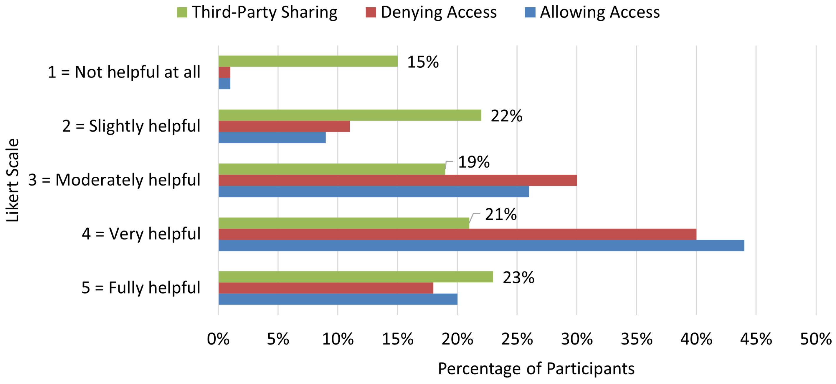
We then asked participants how helpful the provided explanations were for understanding the implications of allowing access, denying access, and third-party sharing (
Figure 3). For allowing access, 64% rated the explanation “Very” or “Fully helpful.” For denying access, 58% did so, and only 12% rated it “Not helpful at all” or “Slightly helpful.” In contrast, for third-party sharing, only 44% found the explanation “Very” or “Fully helpful,” while 37% rated it “Not helpful at all” or “Slightly helpful,” marking third-party sharing as the clearest pain point. This finding reinforces that without detailed descriptions about the third-party and sharing, participants do not find the privacy explanations very helpful for their understanding.
However, we acknowledge that the location–based scenario used in this survey may appear obvious, as recommending nearby places is a common and expected reason for location access. This simplicity, while beneficial for ensuring that all participants could easily follow the scenario, also introduces limitations. However, this design choice was intentional. Our Sub–RQ2 aimed to probe users’ perceptions of privacy explanations in a setting that reflects a realistic and frequently encountered permission request. Moreover, results from Sub–RQ1 showed that location sharing practices were the most poorly understood and most desired area for further explanation among participants, making location sharing a relevant and justified focus for examining how explanations shape perceived understanding. We discuss implications of this scenario choice further in (
Section 6.5).
Improvements Identified in the Explanation
Lastly, we asked participants to suggest improvements that would enhance understanding of data practices. To further explore the effect of explanation on user understanding of data practices, we asked participants open-text questions focusing on how the explanation affected their understanding or perception of the app’s use of their data.
To analyze the open-text responses, we conducted an inductive thematic analysis following Braun and Clarke’s [
37] flexible framework. The analysis proceeded through several iterative steps. First, all responses were read repeatedly to achieve familiarization and build an initial sense of participant concerns. We then generated initial codes directly from the data by marking segments of text that reflected meaningful observations or suggestions. These codes were inductively grouped into preliminary themes by clustering semantically similar ideas, and the emerging themes were refined by reviewing them against the full dataset to ensure that each theme accurately captured the underlying comments. Braun and Clarke [
37] note that frequency counts can be used descriptively; therefore, once the themes were finalized, we counted the number of participants who mentioned each theme to indicate its relative prominence in the dataset. We report frequency counts only to indicate how commonly a theme appeared across participant responses, not as statistical evidence. All coding and theme development were conducted by a single researcher. This procedure provided a systematic yet flexible approach for identifying user-centered patterns in the survey responses.
Thematic analysis surfaced five priorities: (1) greater transparency about what, why, and how data is shared (
N = 43), a participant stated: “List what exact location data is shared and with which advertisers.”; (2) visual aids to simplify complex flows (
N = 40), another participant stated: “Use step-by-step visuals or infographics instead of all text at once.”; (3) shorter, contextual copy with progressive disclosure (
N = 16); (4) legal/data assurances (
N = 6); and (5) limited personalization options (
N = 2). Overall, while our explanation, adapted from Brunotte et al. [
16], helped, participants indicated it needs clearer third-party specifics, stronger visual support, and tighter, contextual presentation.
4.3. Summary and Implications for Design
Taken together, the pre-study survey provided two main insights. First, participants showed uneven understanding of app data practices, with third-party sharing emerging as the primary gap. At the same time, users expressed strong interest in receiving clearer explanations about how their data is collected, used, and shared.
Second, while privacy explanations improved perceived understanding to some extent, they did not fully resolve uncertainty, particularly for complex practices like third-party sharing. Based on these findings, we derived design guidelines (
Table 1), prioritized via a
matrix of impact and frequency, which directly informed the prototype development in
Section 5.
5. Design of Explainable Privacy Interfaces
The following sections describe our design approach for the prototype development.
5.1. Dimensions of Privacy Notices
Using Schaub et al.’s [
23] design space for privacy notices, we outlined our design choices along its four key dimensions. Its core components include timing (when the notice is shown), channel (the method of delivery), modality (the forms of interaction used), and control (the way user choices are offered). These decisions formed the foundation for implementing the explanations in our prototypes.
Timing: Notices are most effective when aligned with user attention [
23]. Our design adopts a layered persistent notice that remains available while the data practice is active. This ensures contextual relevance and visibility without interrupting the flow of interaction.
Channel: We deliver notices through the primary channel (on-screen), keeping them immediate and contextually relevant. This choice reflects pre-study findings that emphasized transparency and just-in-time presentation.
Modality: A visual presentation with icons and concise text was selected, as it balances detail and simplicity, supporting user comprehension without introducing additional learning curves. This aligns with pre-study preferences for visual aids.
Control: Instead of blocking mechanisms (as in iOS/Android RPNs), we implemented a non-blocking explanatory layer. This complements the existing consent flows of the current privacy notices, allowing users to explore details at their own pace.
5.2. Prototype Development
Given the pre-study’s revelation that regular textual explanations, while somewhat helpful for basic implications, leave users with ongoing uncertainty about data practices (especially data sharing), there is a compelling need to explore verified methods from the literature to bolster understanding. To address this, we turned to XAI literature, which offers promising strategies for making complex systems more interpretable. As discussed in
Section 2.4, contrastive and example-based explanations have been shown to aid user comprehension in data-related contexts by providing comparative insights and relatable instances [
30,
31], potentially increasing transparency when integrated into privacy interfaces. The following sections detail how we integrated these explanation types in our interface screens.
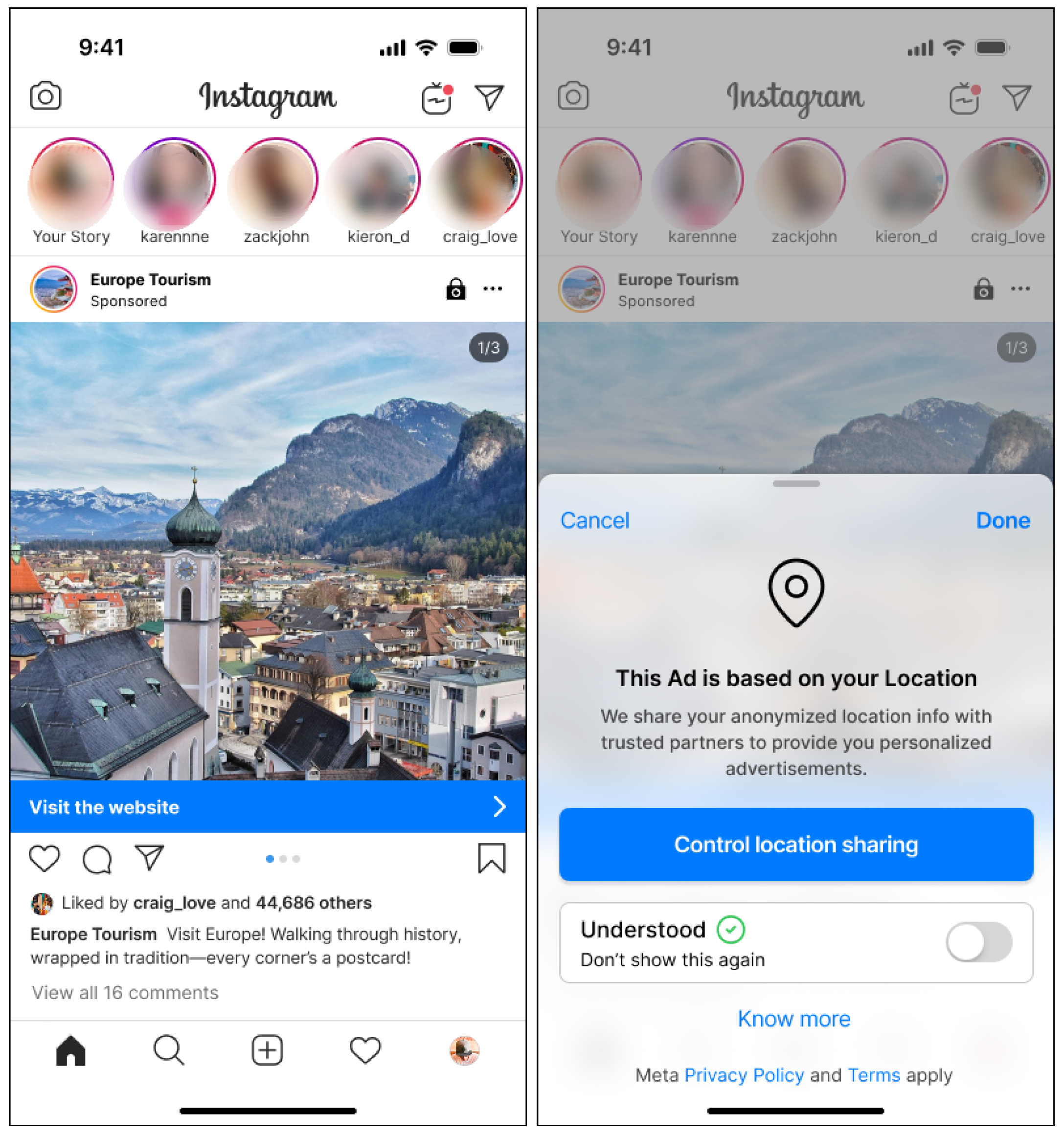
We embedded the privacy interface into Instagram (Android version, June 2025), a widely used social media app, ensuring familiarity for participants [
38,
39]. The content of our prototype screens was guided by a review of the official Instagram privacy policy (
https://privacycenter.instagram.com/, last access: 25 April 2026). We particularly focused on the section “How do we share information with third parties?” of the policy, as our pre-study results highlight that data-sharing practices are the least understood by participants. We created two versions for our prototype. Both conditions used the same prototype interface and interaction flow. The only difference between versions was the explanation screen, which presented either the contrastive or the example-based explanation, while all other screens and UI elements remained identical.
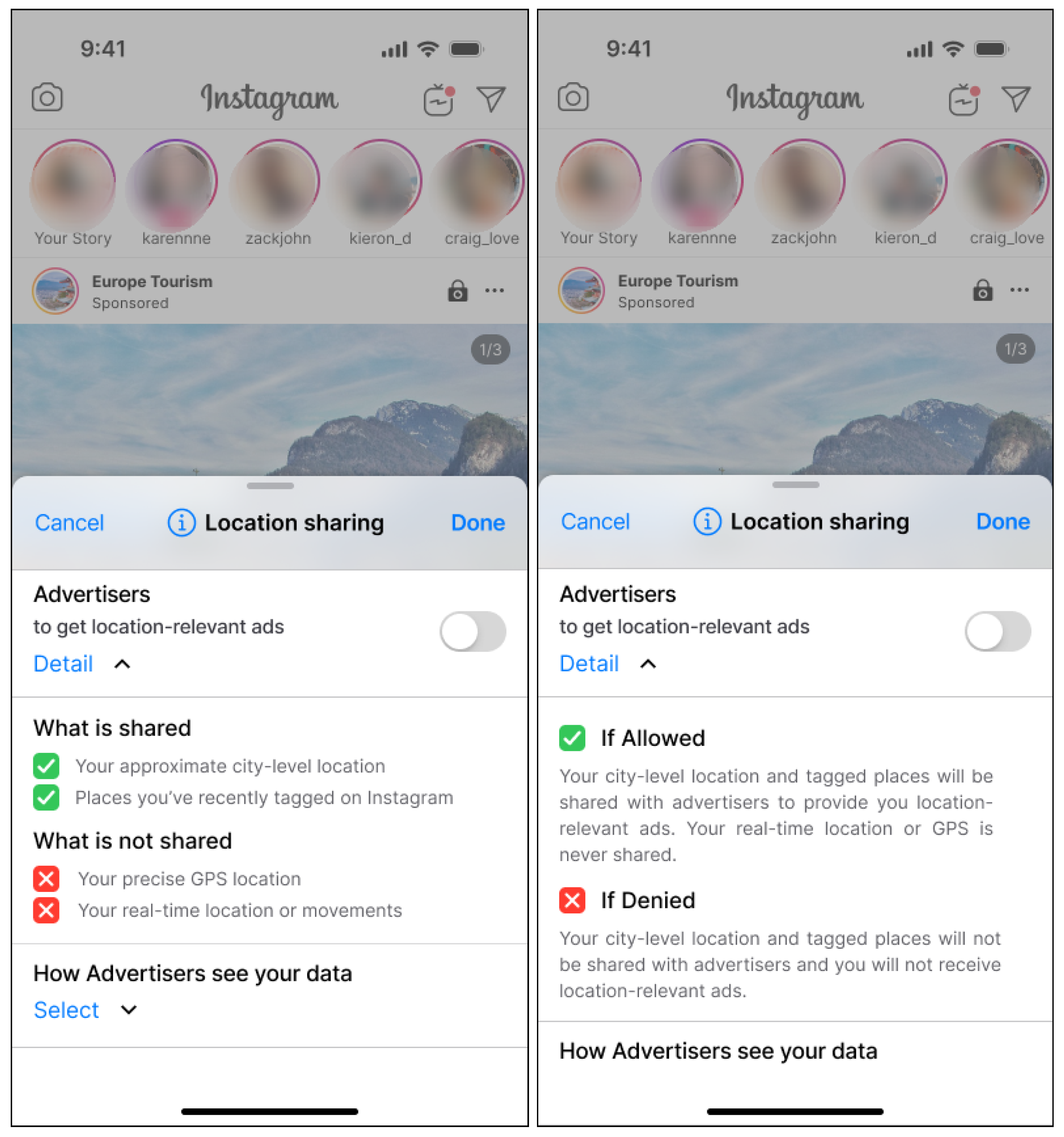
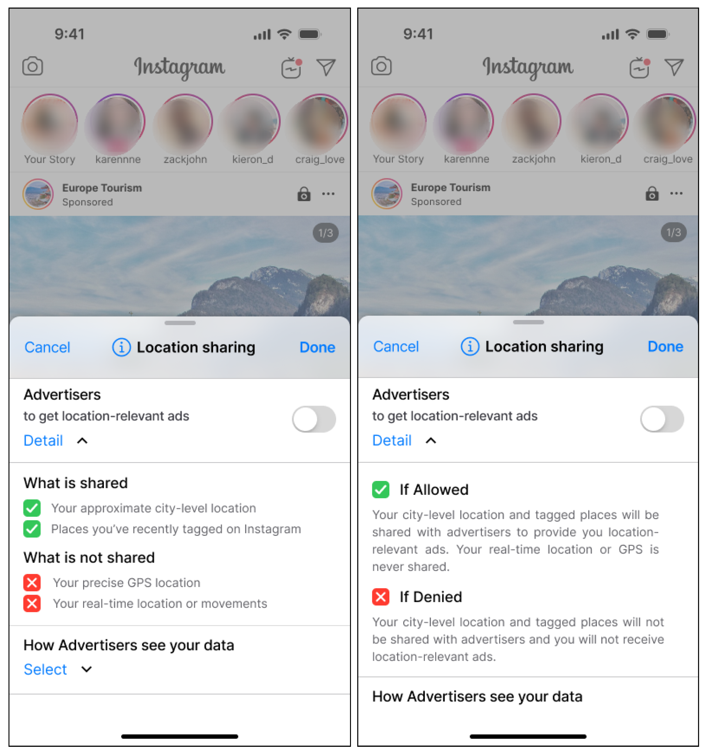
As shown in
Figure 4 (left image), Interface A is a contrastive explanation, which follows the principle that explanation are more understandable when they highlight not only what is shared, but also what is not shared by providing a direct point of comparison [
3,
30,
31]. Thus, the interface clearly distinguishes between items like “Your approximate city-level location” (what is shared), and “Your precise GPS location” (what is not shared). Which, directly reference the data categories specified in the Instagram’s privacy policy section about data-sharing practices.
Alternatively, as shown in
Figure 4 (right image), Interface B is an example-based explanation, which presents outcomes based on two specific user actions, labeled as “If Allowed” and “If Denied.” This aligns with the principle of example-based explanation from XAI, by providing clear, concrete scenarios [
3,
30,
31]. These scenarios illustrate what would happen if a user chooses to share or not share specific data. For instance, the interface presents outcomes such as: “If you share your location, personalized ads will be shown based on your nearby stores” vs. “If you don’t share, you will still see ads, but they won’t be location-based.“ This approach focuses on outcomes rather than data items, aligning with the example-based principle of conveying meaning through situational examples.
In both explanation versions, the icons used to denote “shared” and “not shared” (or “allowed” and “denied”) were intentionally designed as status indicators rather than representational icons depicting data types or stakeholders. This choice ensured visual consistency across the two formats and reduced the interpretive burden that more complex icons might introduce. Our aim was to emphasize the distinction between disclosure states. What data leaves the device versus what remains internal, without requiring users to infer additional symbolic meaning in the explanations.
For completeness and to improve clarity regarding the interaction flow, all prototype screens used in the study are provided in
Appendix C.
To evaluate our designs, we conducted a between-subject study. The goal was to investigate the impact of the two types of explanations on users’ understanding of data sharing practices. The following sections outline the study setup, measures, and results.
5.3. Quality Model
To effectively evaluate the explainability of our contrastive and example-based privacy interfaces, we drew upon established frameworks from the literature. In particular, we examined the research by Deters et al. [
8]. The authors highlight that to define requirements for explainable systems, it is necessary to first understand the elements that contribute to a system’s explainability. This includes considering various aspects, such as understandability and transparency. In the following section, we describe the quality model used in our study to formulate hypotheses and test the interfaces based on the criteria and aspects defined by the model.
5.4. Understandability
According to the Deters et al. [
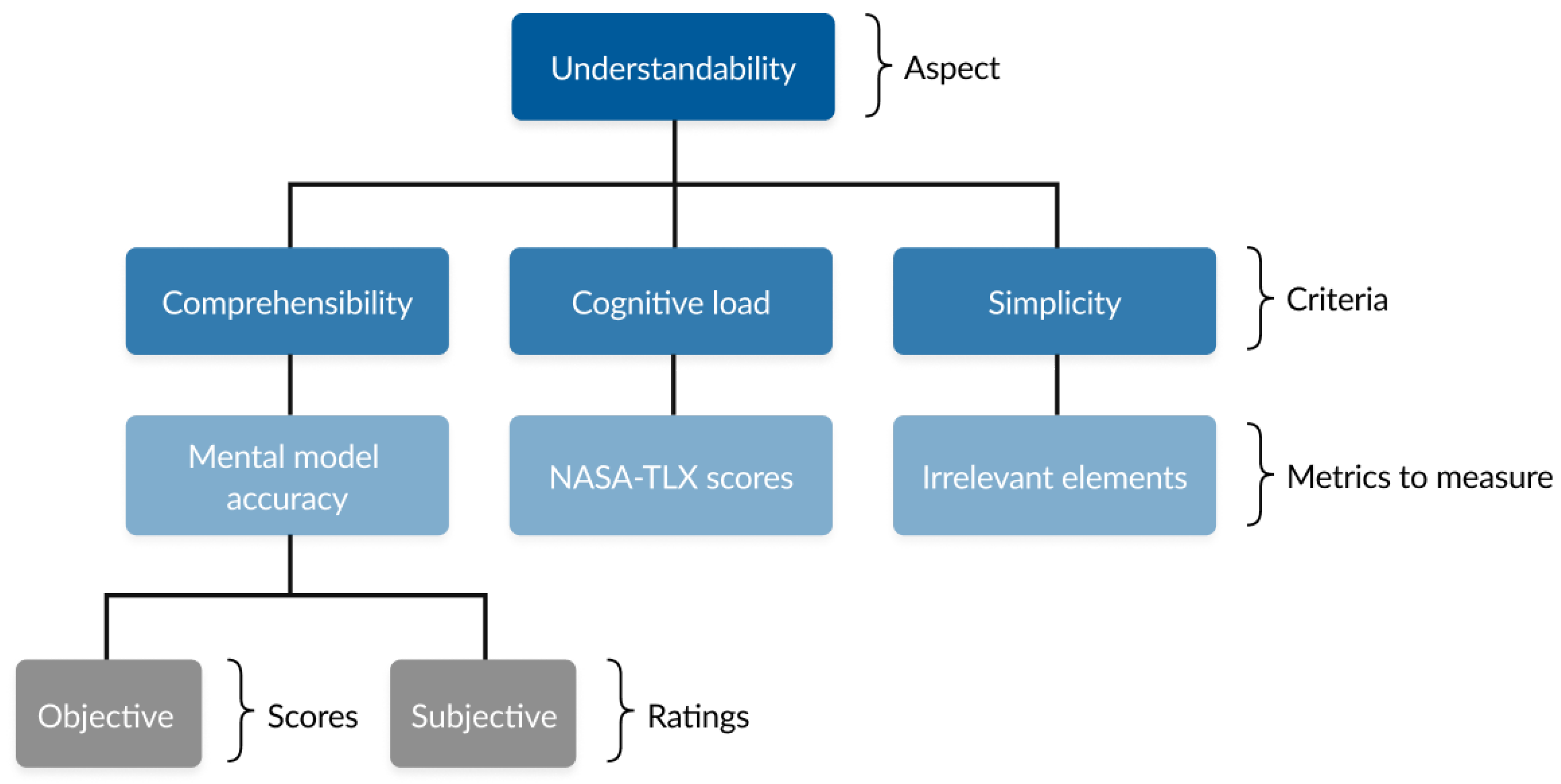
8] quality model, the first aspect of explainability is understandability. The major aim of understandability is that the addressee can easily understand explanations. Adapting the above quality model, we formulated our hypotheses by focusing on significant criteria under the understandability aspect, selecting measures that map to those criteria for comparing the Interface A (contrastive) and Interface B (example-based) interfaces. As shown in
Figure 5, we evaluated the explanations across three main criteria: (1) comprehensibility of presentation form, (2) cognitive load, and (3) simplicity, using the established metrics outlined in the model. Comprehension was assessed through mental model accuracy. We define mental model accuracy as the extent to which a user’s internal understanding of how a system operates corresponds to the system’s actual functioning. Prior work shows that mental models can be assessed by asking users to explain how they believe a system works and comparing these to the actual system behavior. Additionally, subjective understandability reflects how understandable a data practice feels to users [
8]. Cognitive load was measured with the NASA-TLX [
40]. Simplicity was examined using the identification of irrelevant items. In addition, we employed the UEQ-S [
41] to capture overall user experience.
Following are the formulated Hypotheses (H1–H4) based on the quality model to answer the Sub—RQ3: “How do different explainable privacy interfaces (example-based vs. contrastive) influence user understanding of app-specific data practices?”
: There is a significant difference in user comprehension between Interface A and Interface B, as measured by mental model accuracy.
: There is a significant difference in perceived simplicity between Interface A and Interface B, as measured by the identification of irrelevant elements in the explanation.
: There is a significant difference in perceived cognitive load between Interface A and Interface B, as measured by the NASA-TLX scale.
: There is a significant difference in user experience between Interface A and Interface B, as measured by the User Experience Questionnaire (UEQ-S).
5.5. Participant Criteria and Setting
Participants were required to own a smartphone and be familiar with Instagram application. We recruited a total of 30 participants (15 per condition) for our study. A formal a-priori power analysis was not conducted before data collection. The sample size (
N = 30) was chosen in line with common practice in HCI and UX research for between-subject designs. The sample size limits statistical power for detecting small effects, but is appropriate for identifying large usability differences [
42]. We position this work as an exploratory HCI/UX study rather than a confirmatory experiment. Small-sample exploratory studies of this kind are common and accepted in HCI and UX research, where in-depth sessions with a limited number of participants are routinely used to evaluate early-stage interface concepts [
43]. We therefore report our quantitative results as descriptive trends and use them to motivate larger, adequately powered studies. The study was conducted remotely via Microsoft Teams, participants were given prototype control through AnyDesk (June 2025 version). Sessions were moderated and participants were guided and provided with the tasks one after the other [
44]. Recruitment was done via social media and the university mailing list, and sessions were scheduled with Calendly (June 2025 version). Names and emails collected for booking were anonymized. Prior to participation, all individuals received study information and were required to provide informed consent. Only participants who consented were included in the study, and data collection was limited to information necessary for the research.
5.6. Experimental Design
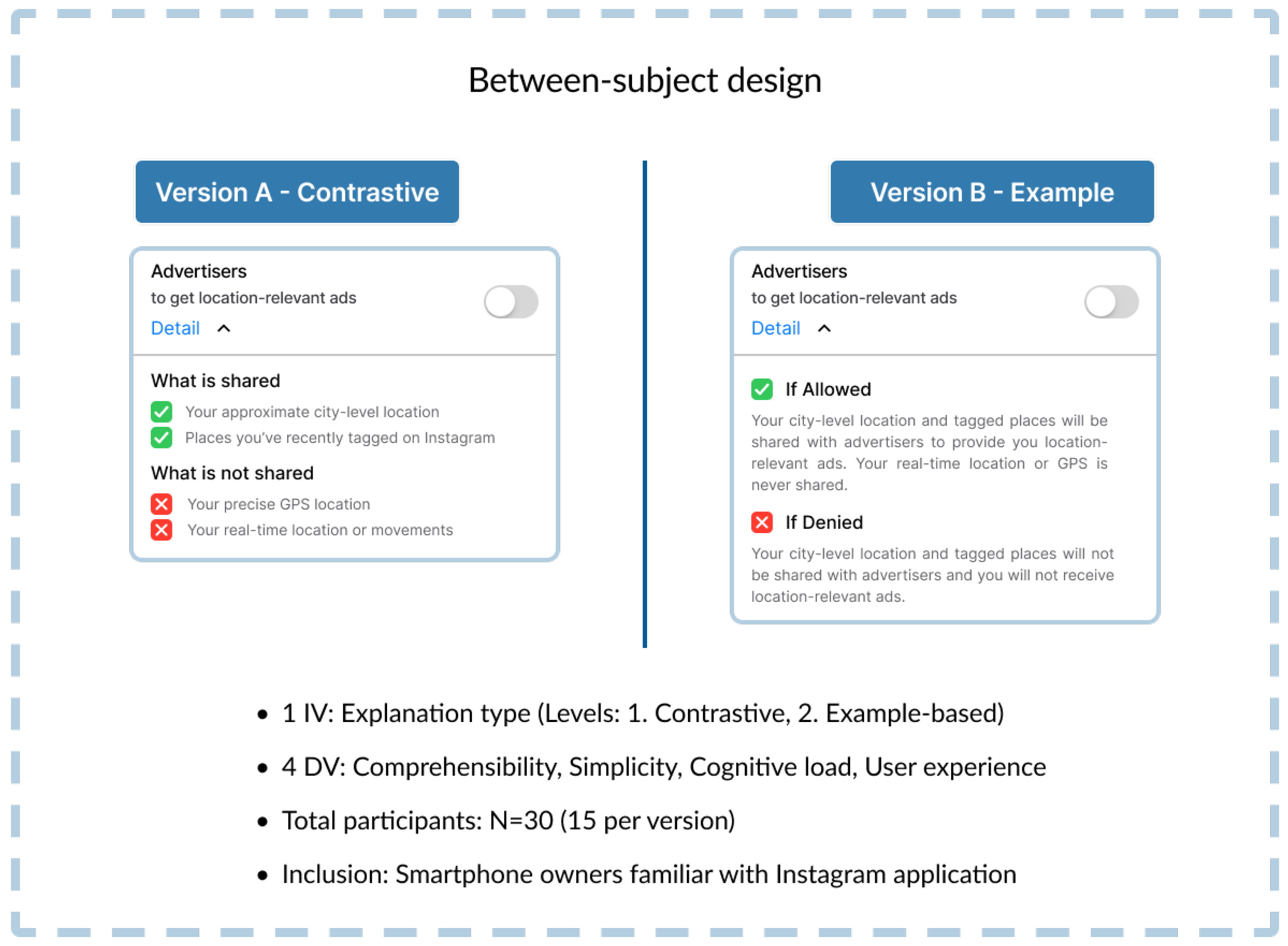
To ensure reliable outcomes, the experimental design integrated independent and dependent variables into a between-subject design [
45], which exposes each participant to only version (
Figure 6). This section details the independent and dependent variables examined, the recruitment, the tasks, and the data collection methods used.
5.7. Independent and Dependent Variables
The independent variable (IV) was the type of explanation, classified into two levels (L1: Contrastive explanation, L2: Example-based explanation).
The metrics used for the dependent variables (DVs) mentioned in
Table 2 were collected in an Excel sheet and through online questionnaires created with Google Forms. The main outcomes of interest, and the methods for measuring each, are outlined below. All the metrics were recorded after participants interacted with the assigned prototype. The data collection units are as follows:
In addition to the DV, the participants also rated the explanations based on the adapted elements of aspects related to understandability, namely, effectiveness, trust, and transparency [
8]. Participants were verbally asked to rate the explanations based on these aspects on a 7-level Likert scale. For completeness and transparency, the full list of user study questions has been included in
Appendix B.
5.8. Study Procedure
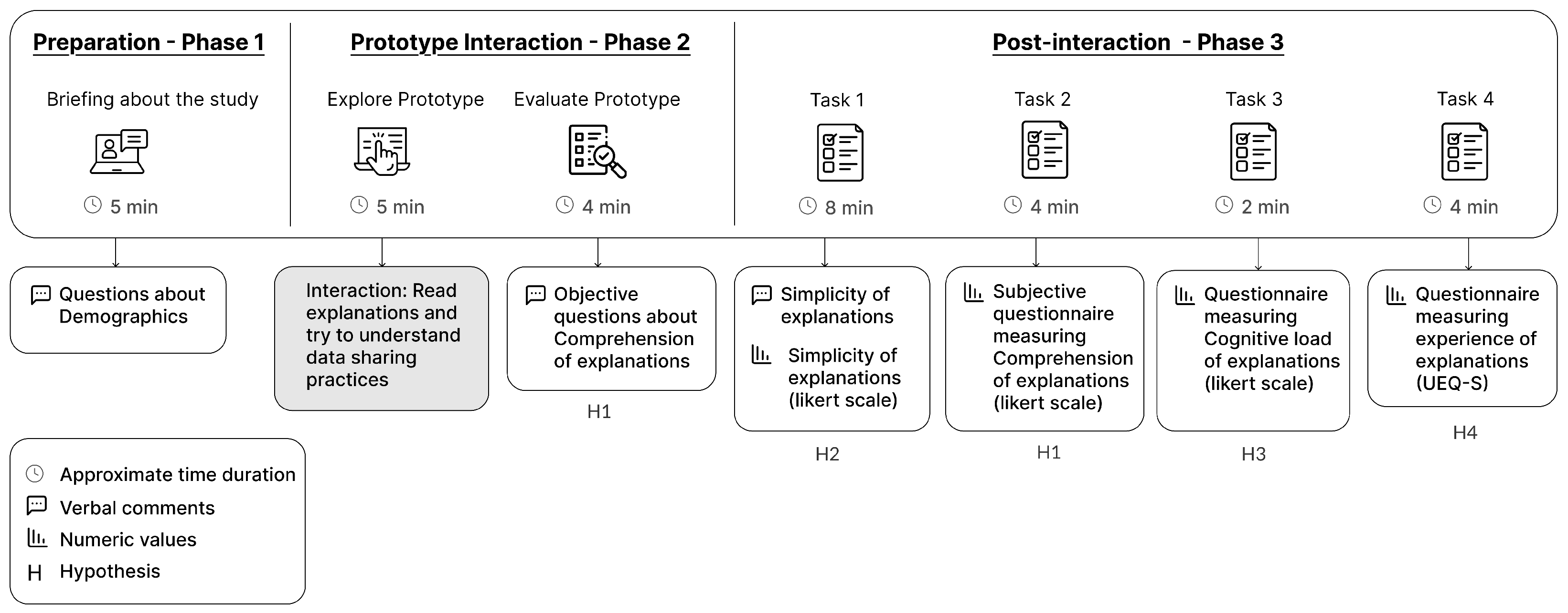
As shown in
Figure 7, the user study followed a sequential, three-phase procedure to ensure consistent data collection and minimize bias across participants. In the following, we will detail the procedure of the study.
5.8.1. Preparation
Participants were briefed on the study’s goal and provided with an overview of the tasks. Demographic questions were collected to describe the user sample.
Before showing the prototypes, all participants were shown a screenshot of how the existing Instagram location privacy notice appears on their device, to ensure that all participants had a similar shared baseline experience. This screenshot served only to give participants a common starting reference. It was not evaluated as a control or comparison condition, our analysis compares the two explanation formats with each other rather than against the existing notice.
5.8.2. Prototype Interaction
The prototype followed a single-user flow with the context of location data sharing explanations, embedded in the existing user interface of Instagram’s user feed, as detailed in
Section 5.2. During this interaction, participants were explicitly instructed to focus solely on comprehending the provided explanation in terms of what is happening with their data (e.g., how their location data is being shared). They were not asked to perform any task during the interaction, such as allowing or denying location permissions based on the understanding, to isolate the measurement of understanding and avoid confounding variables like decision fatigue or external influences on behavior. While the overall prototype included interface elements such as toggles and checkboxes to support a realistic interaction flow, these elements were non-functional in the prototype.
Immediately after interaction, we collected objective comprehension data by asking participants to answer open-ended questions about how the system works in terms of data sharing with advertisers. These questions were designed in accordance with the explanation provided to the participants in the interaction phase. It focuses on capturing the participant’s mental model accuracy and true understanding before any subjective impressions or biases from other questions could influence their responses.
To align with the quality model’s recommendations and our research focus, we selected additional measurement items pertaining to effectiveness, trust, and transparency. Given that our aim was to assess how explanations impact understanding of data practices, these aspects were the most directly relevant. According to the model [
8], effectiveness captures whether users feel empowered to make informed choices, trust reflects confidence in the privacy handling, and transparency ensures that the system provides enough information to the user to understand data practices, each of which is directly connected outcome of understandability in privacy interfaces. As these aspects were not the main focus of our study, we just took one item from each questionnaire to support our data. To evaluate these aspects, participants were required to rate these aspects of the explanations on a scale of 1–7 (1—Strongly disagree, and 7—Strongly agree).
5.8.3. Post-Interaction
This final phase measured all dependent variables as defined in
Section 5.7, with each task designed to focus on a specific metric to measure the dependent variables.
Participants then completed four tasks in order. In Task 1, they identified any irrelevant or unnecessary elements in the explanation interface and provided open-ended feedback for each screen; although this feedback was not formally analyzed using the quality model, it was reviewed qualitatively to inform the design recommendations discussed in
Section 6.4. In Task 2, participants filled out a nine-item Likert questionnaire (1–7), adapted from Deters et al. [
8], to measure subjective comprehension part of the DV (mental model accuracy). Task 3 involved completing a three-item NASA-TLX [
40]. Finally, in Task 4, participants completed the UEQ-S [
41], an eight-item semantic differential questionnaire. The entire question list of the main study is provided in
Appendix B.
5.9. Pilot Testing
A pilot test was conducted with four participants to validate the study design. The pilot confirmed an appropriate data distribution and produced no critical comments in the open feedback that would indicate problems with understandability. No issues were identified, so the procedure was retained for the main study.
5.10. Results—Exploratory Study
We recruited 30 participants (19 female, 11 male), aged 21–35 years (M = 27.0). Inclusion required smartphone ownership and regular Instagram use; individuals with professional experience in privacy research were excluded to avoid expert bias. All participants (
N = 30) were currently university students. Participants reported high familiarity with the Instagram application (M = 6.1 on a 7-point scale). The sample consisted of 18 iOS (60%) and 12 Android (40%) users. We asked participants to mention the country they have resided for the most of their life, through which we found that the participant pool was culturally diverse. Participants were predominantly from India (43%,
n = 13) and Germany (33%,
n = 10). Other nationalities represented included Turkey (7%,
n = 2), Bahrain (3%,
n = 1), Pakistan (3%,
n = 1), Bangladesh (3%,
n = 1), Sri Lanka (3%,
n = 1), and Indonesia (3%,
n = 1). All of the participants were currently based in Germany, ensuring uniform exposure to local digital infrastructure and GDPR regulations [
4].
5.10.1. Comprehensibility of Presentation Form
We tested the difference between the two versions using objective metrics and subjective scores. The objective metric involved rubric-scored responses to open-ended questions, while the subjective metric drew from Likert-scale items assessing perceived understanding. Followed by a Spearman’s rho correlation analysis to explore any relationship between them. This dual approach allowed for a comprehensive assessment, capturing both actual knowledge demonstrated through responses and self-reported perceptions of comprehension.
Objective Comprehension
We analyzed the responses for each participant using a scoring rubric that we created to structure participant responses, enabling rubric-based scoring (0–3 scale) that quantifies objective accuracy without relying on self-reported perceptions, which could introduce subjectivity. The scoring Rubric was designed for each question response. We assigned 1 point for accurate, complete responses aligned with the system’s actual mechanics (e.g., mentioning city-level or anonymized data without exact GPS); 0.5 points for partially correct but ambiguous answers (e.g., vague references to “areas” or “aggregation” without clarity); and 0 points for incorrect or absent understanding (e.g., assuming real-time tracking or individual identification). This granularity ensured the rubric reflected varying levels of insight, with a maximum total of 3 points per participant. While the rubric enabled structured and consistent evaluation, it was developed specifically for this study and may reflect some level of subjective interpretation by the author. Descriptive statistics (
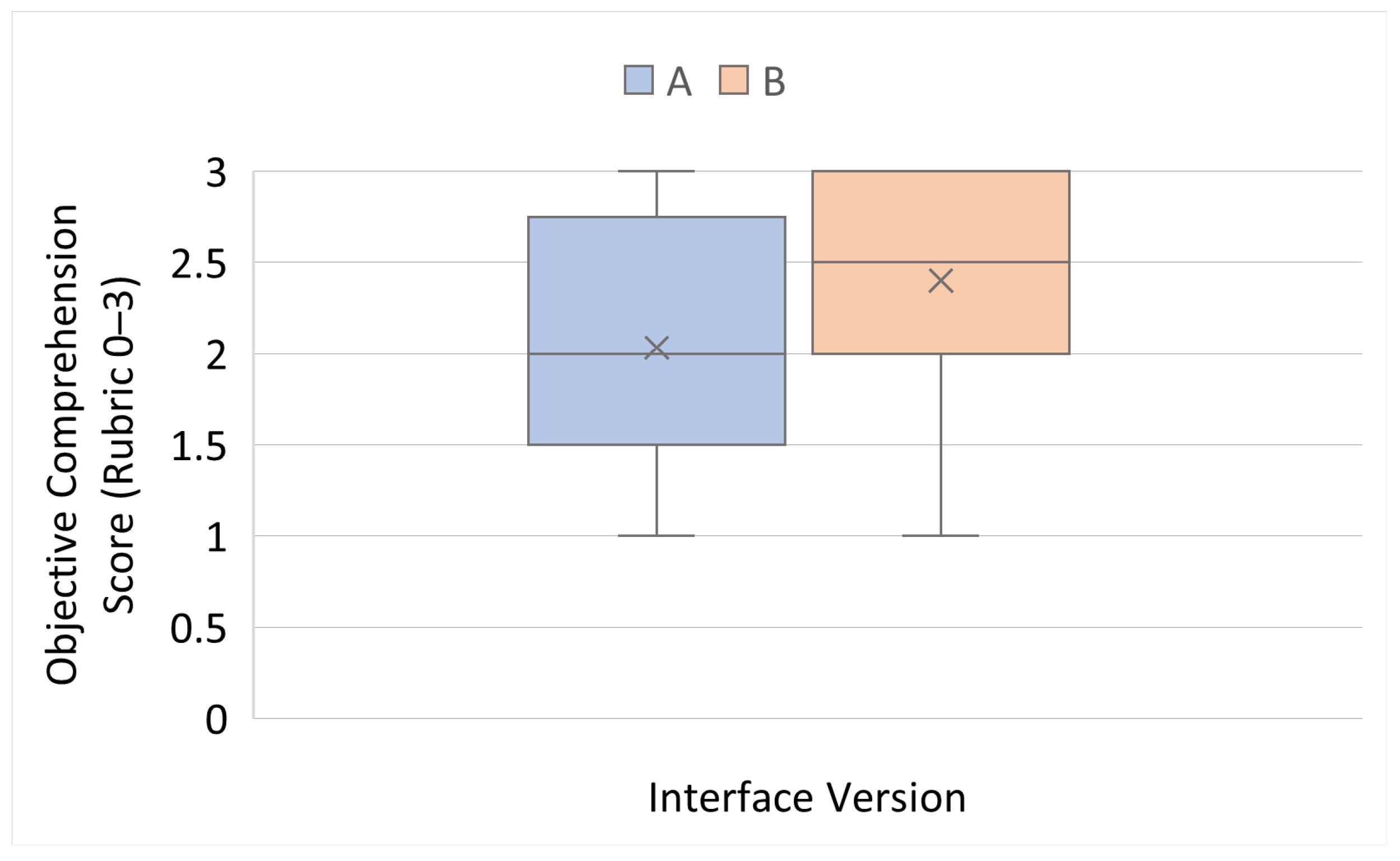
Table 3) indicated slightly better performance (in terms of objective comprehension) with example-based explanations (Interface B: M = 2.4, SD = 0.60,
Md = 2.5) than with contrastive explanations (Interface A: M = 2.03, SD = 0.74,
Md = 2.0). Box plot visualizations (
Figure 8) showed that Interface B not only yielded higher mean scores but also less variability, suggesting more consistent mental models. Given the ordinal nature of the rubric scores, we applied a Mann–Whitney U test to compare groups, as non-parametric methods are recommended for ordinal outcomes without assuming normality or equal intervals [
46]. A Mann–Whitney U test found no statistically significant difference between the two versions (
,
,
).
Subjective Comprehension
We measured subjective comprehension with a 9-item Likert questionnaire (7-point scale) adapted from the explainability quality model [
8]. Originally, the scale included 10 items (
Table 4). We adapted the items to fit our between-subjects design: one comparative item (1.5) was removed, and two items (1.4 confusing terms, 1.6 mental demand) were reverse-coded to align scoring so that higher values consistently indicated more positive perceptions. Composite comprehension scores were calculated as the mean of all items per participant.
Both interfaces achieved high perceived comprehension scores, well above the scale midpoint of 4 (
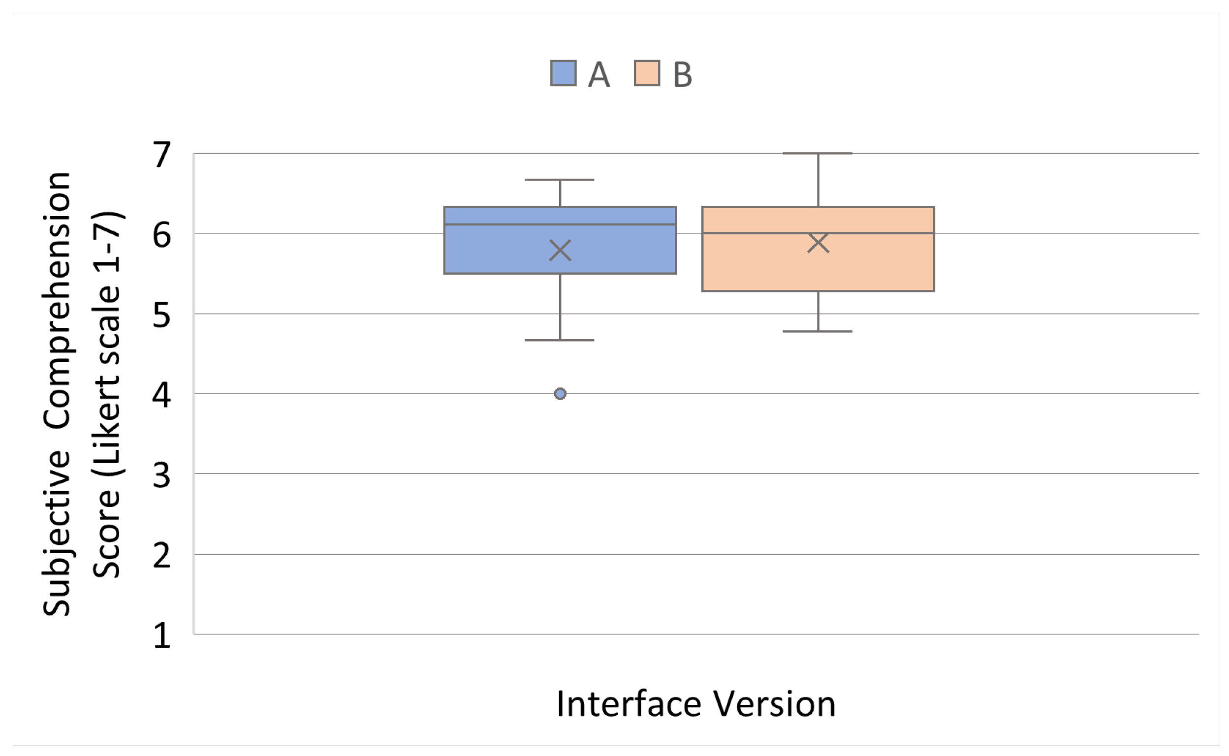
Table 5). Interface A (contrastive) scored M = 5.7 (
Md = 6.1, SD = 0.7), while Interface B (example-based) scored M = 5.8 (
Md = 6.0, SD = 0.7). Box plot inspection (
Figure 9) showed nearly identical distributions, with medians close together and similar variability. These patterns suggest that participants generally viewed both interfaces as easy to understand.
Given the evidence of non-normality as indicated by the Shapiro-Wilk test in Interface A (W = 0.8757, ), we applied a Mann–Whitney U test. The test showed no significant difference between groups (, , ). Together, the descriptive and inferential results indicate that both types of explanation were perceived as highly comprehensible. Because subjective scores were non-normal and compared with a Mann–Whitney U test, we describe central tendency using the median rather than the mean. By median, Interface A ( = 6.1) and Interface B ( = 6.0) were nearly identical, with Interface A marginally higher. As the difference was not statistically significant, we do not interpret a directional trend in subjective comprehension.
5.10.2. Correlation
In addition, to examine the relationship between objective performance and subjective perceptions of understanding, we conducted Spearman’s rank correlation analysis [
46]. We compared participants’ actual comprehension scores with their self-reported understanding to examine whether people can accurately judge their own comprehension. Prior research shows that people often overestimate or misjudge their understanding, creating a gap between perceived understanding and actual performance [
47].
For Interface A, the correlation between participants’ actual comprehension scores and their self-reported understanding was weakly positive (
), but this association did not reach statistical significance (
). Similarly, Interface B exhibited a weak negative correlation (
) that was also non-significant (
). These findings suggest that, regardless of interface design, participants’ confidence in their understanding did not reliably correspond to their demonstrated task performance. In other words, participants were generally unable to accurately assess their own comprehension, indicating a disconnect between perceived and actual understanding across both experimental conditions. This finding reflects the distinction between perceived and objective understanding within our overall study design. In the pre-study (c.f.,
Section 4), participants rated only their perceived understanding of Smartphone data practices, which captures familiarity and confidence rather than accuracy. In the main study, we measured both subjective comprehension (participants’ perceptions of how understandable the explanations were) and objective comprehension (their demonstrated mental-model accuracy). The weak and non-significant correlations show that these two forms of understanding do not align: participants often felt that they understood the explanations even when their mental-model representations were incomplete or incorrect.
5.10.3. Simplicity
Simplicity was measured by asking participants to identify whether any elements of the explanation were unnecessary for helping them understand the content. Participants provided a binary response (“Yes” or “No”), allowing us to calculate the proportion of users in each interface who perceived irrelevant elements in the explanation.
Most participants (80.0%,
N = 24) found no irrelevant elements, indicating that both interfaces were generally perceived as simple to understand. As shown in
Table 6, in Interface A (contrastive), 13.3% flagged unnecessary content, compared to 26.7% in Interface B (example-based). While more participants in Interface B reported the occurrence of irrelevant content for their understanding, the majority of participants in both groups did not.
Given the binary categorical nature of the dependent variable and the independent groups design, a Chi-square test of independence was selected [
46]. A chi-square test of independence confirmed no statistically significant difference (
,
).
While our primary measure of simplicity was the binary response indicating whether participants perceived any element as unnecessary, we also collected qualitative insights by asking participants to briefly explain why they considered a specific part of the explanation unnecessary. This allowed us to capture user feedback and identify areas for improving the explanation designs, in particular in terms of simplicity. To interpret the qualitative feedback on irrelevant or unnecessary elements that users pointed out on the screens, we conducted a close reading of the comments. A researcher reviewed all responses and noted recurring observations related to redundancy, clarity of wording, or information density. These observations were then summarized into interface-level patterns without applying a formal coding scheme, reflecting the small scale and targeted nature of the qualitative data. Among the minority who identified irrelevant elements, distinct patterns emerged. In Interface A, two participants (P17 and P25) felt the section describing “what is not shared” was redundant, as they already understood the explanation from the “what is shared” content alone. For Interface B, four participants (P04, P08, P14, P24) highlighted the “if denied” scenario as unnecessary, noting that the “allowed” example was sufficient for comprehension. One participant also described the example text as “heavy and wordy,” suggesting that two-scenario examples made the explanation feel denser.
Although no significant differences were found, qualitative feedback points to subtle design tensions: contrastive explanations may risk redundancy by emphasizing “what is not shared,” while example-based explanations may feel wordy when including both allowed and denied scenarios. Together, these findings suggest that tailoring explanations to highlight the most relevant information (what is shared or allowed) may improve simplicity without sacrificing informativeness.
In addition to feedback on the explanation screens, several participants expressed confusion about the lock icon used on Screen 1 to initiate the flow. Although this element was not evaluated as a dependent variable, it formed part of the interaction sequence, which resulted in spontaneous comments from participants. Several participants misunderstood icons such as the lock icon in screen 1 (cf.
Appendix C), which was used as a trigger in our case. In total, 60% of participants (18 out of 30 participants) raised concerns or confusion regarding the lock icon’s relevance. P05 stated “The lock icon looked like an shopping bag to me, and first I thought it was relevant for the advertisement and not privacy”. While a few participants noted its visibility or familiarity with privacy settings from other apps, many criticized its lack of clarity, contextual fit, and clickability. These findings reinforce the need for pairing icons with descriptive text to reduce ambiguity in privacy-related UI elements.
5.10.4. Cognitive Load
Cognitive load was measured using a subset of the NASA-TLX [
40]. In the analysis, only three sub-scales were selected: (1). Mental Demand (“How mentally demanding was it to understand the explanations?”), (2). Effort (“How hard did you have to work to fully understand the explanations?”), and (3). Frustration (“How frustrated did you feel while reading or interacting with the explanations?”), as they directly captured the cognitive and emotional strain relevant to processing privacy explanations in a non-physical task. The other sub-scales were excluded because Physical demand does not apply to a primarily screen-based interaction without motor/manual requirements; Temporal demand is irrelevant as there were no time pressures in the study protocol; and Performance focuses on self-evaluated success rather than comprehension. This targeted adaptation maintained the tool’s integrity while aligning with the research focus on mental load in explainable privacy interfaces. Participants rated each item on a 7-point Likert scale, and composite scores were calculated by averaging the three items.
Both interfaces were associated with low cognitive load, with means below the midpoint of 4. As shown in
Table 7 Interface A (contrastive) scored slightly higher (M = 2.80, SD = 1.52) than Interface B (example-based; M = 2.38, SD = 1.15). These results suggest that participants found both types of explanation manageable in terms of cognitive load, with a minor trend toward higher cognitive strain in the contrastive condition.
Assumptions of normality were met, allowing for parametric comparison. An independent-samples t-test revealed no significant difference between the two interfaces, , .
While descriptive trends indicated that contrastive explanations may impose slightly higher mental effort, the difference was not statistically significant.
5.10.5. User Experience
To complement the core measures of comprehensibility, simplicity, and cognitive load, we assessed overall user experience of both interface versions using the UEQ-S [
41].
Both interfaces performed strongly in terms of pragmatic quality but weaker in terms of hedonic quality (
Table 8). For Interface A, pragmatic quality averaged 1.85 (SD = 0.71, “excellent”), hedonic quality 0.83 (SD = 0.91, “below average”), and overall 1.34 (SD = 0.65, “good”). Interface B produced nearly identical results: pragmatic M = 1.87 (SD = 0.68), hedonic M = 0.83 (SD = 0.95), overall M = 1.35 (SD = 0.63). Benchmark comparisons classified pragmatic scores as excellent, hedonic as below average, and overall experience as good.
An independent samples t-test was conducted to compare the groups, as the normality assumptions and equal variances were met. Independent-samples t-tests confirmed no significant differences between interfaces for pragmatic (, ) or hedonic quality (, ). These results indicate no significant difference. These findings suggest that both explanation types were perceived as highly usable and supportive but lacking in excitement.
5.10.6. Additional Aspects Related to Understandability
As mentioned in
Section 5.6, our analysis targeted three additional key aspects from the quality model: Effectiveness, Trustability, and Transparency [
8]. Quantitative analysis revealed that Interface A (contrastive) consistently received higher average ratings than Interface B (example-based): Effectiveness (M
A = 6.0, M
B = 4.5); Trustability (M
A = 5.5, M
B = 4.5); Transparency (M
A = 6.5, M
B = 6.0).
These descriptive results suggest that the contrastive explanation interface (Interface A) more effectively communicated data-sharing practices to participants across all three items. However, these differences were not statistically tested and should therefore not be interpreted as evidence of superiority. Instead, they provide preliminary indications of how participants perceived the two explanation types, which we discuss as exploratory patterns.
6. Discussion
This chapter brings together the results to address the research questions introduced at the start of the paper. Its purpose is to examine whether the hypotheses can be supported or rejected based on the collected evidence. For this, insights from the literature review, the pre-study survey with 100 participants, and the user study (N = 30) are considered jointly. The discussion highlights the main conclusions drawn from these findings.
The central research question asked: How can explainable privacy interfaces be designed to enhance user understanding of app-specific data practices?
We address this through insights from the three sub-research questions, which together inform our final design recommendations.
6.1. Sub-RQ1: Users Struggle Most with Third-Party Sharing but Show High Interest
Our first research question asked: What is the current level of user understanding and interest regarding app-specific data practices (collection, usage, and third-party sharing)?
Consistent with prior work on privacy policies and runtime notices [
6,
7], our pre-study survey (
N = 100) revealed uneven comprehension. More than half of participants (51%) reported that they mostly or fully understood data collection, while fewer did so for data usage (40%) and especially for third-party sharing (30%). Conversely, 44% indicated that they did not understand or only slightly understood data sharing, compared to 30% for data usage and 20% for data collection. This highlights that sharing practices remain especially opaque, aligning with prior literature that points to hidden, legalistic, or fragmented disclosures [
3,
22,
23].
Despite these comprehension gaps, participants expressed a strong interest in learning more. Three-quarters (76%) reported being mostly or fully interested in further information about data sharing, with slightly lower but still high levels of interest in data usage (69%) and collection (67%). This pattern not only mirrors prior findings that users are concerned about hidden third-party flows [
9,
24], but also suggests a gap between current understanding and user desire for transparency. Our findings therefore support the view that future privacy interfaces should particularly target explanations of third-party sharing, as comprehension is lowest but interest is highest for third-party data sharing practices.
6.2. Sub-RQ2: Privacy Explanations Help, but Fall Short on Sharing
Our second research question asked: How do users perceive current privacy explanations, and what improvements do they suggest?
Consistent with prior work on privacy explanations [
16], our survey showed strong demand for explanations in app interactions. When asked how important it is that an app explains why it requests location access, 63% of participants rated this as “Very important” or “Fully important,” with only 3% indicating “Not at all important.” This confirms that users see explanations as a critical component of transparency.
When provided with an adapted privacy explanation, participants found it helpful for clarifying access permissions. For allowing access, 64% rated the explanation “Very” or “Fully helpful,” and for denying access, 58% did so. This aligns with findings of Brunotte et al. [
16], who emphasize that explanations enhance awareness and trust. However, third-party sharing remained problematic: only 44% rated the explanation as “Very” or “Fully helpful,” while 37% found it “Not helpful” or only “Slightly helpful.” This confirms that current formats still struggle to make third-party practices comprehensible.
Open-text responses reinforce these findings. Participants called for greater transparency about what data is shared, why, and with whom (
N = 43). Others emphasized the need for visual aids (
N = 40). Additional suggestions included shorter contextual copy with progressive disclosure (
N = 16), assurances of legal compliance (
N = 6), and limited personalization options (
N = 2). These themes resonate with prior work on contextual privacy policies [
9], but highlight that even when explanations are present, users still struggle most with third-party sharing.
Together, these results suggest that while explanations support comprehension of allow/deny decisions, they fall short for third-party practices. Addressing this gap will require designs that combine transparency, visual support, layers, and contextual delivery, as reflected in our derived design guidelines (
Table 1).
6.3. Sub-RQ3: Example-Based and Contrastive Explanations Show Complementary Strengths
Our third research question asked: How do different explainable privacy interfaces (example-based vs. contrastive) influence user understanding of app-specific data practices?
To address the gap identified by our RQ2, we explored whether more advanced explanation strategies could be applied. In the explainable AI literature, contrastive and example-based explanations are widely studied as two influential approaches for improving user understanding [
3,
30,
31]. Unlike regular textual explanations, these techniques emphasize either clarifying why not alternatives (contrastive) or illustrating outcomes through relatable cases (example-based) [
3]. Building on user feedback from RQ2, we designed and tested both types of explanations in our user study with 30 participants to investigate whether they can better support comprehension of app-specific data practices (RQ3).
Before interpreting these results, we reiterate that this is an exploratory study. With 30 participants (15 per condition), so the comparisons below should be read as descriptive trends that motivate future, larger-scale work rather than as confirmed differences between the two explanation types.
Across comprehension, simplicity, cognitive load, and user experience, inferential tests showed no statistically significant differences between explanation types. This suggests that both versions were comparably effective. However, descriptive trends of our study revealed complementary strengths.
Example-based explanations showed slightly higher objective comprehension scores, which aligns with Adadi and Berrada’s view that example-driven approaches support user understanding by grounding system behavior in concrete instances [
33]. Contrastive explanations received marginally higher ratings on the effectiveness, trustability, and transparency, consistent with Miller’s observation that human reasoning is often contrastive and oriented toward distinguishing why one outcome occurs rather than another [
32]. Such contrastive framing may help users form clearer boundaries about what data is and is not shared and may therefore feel more supportive in decision-oriented contexts, as reflected in the additional aspect’s effectiveness rating. These interpretations remain exploratory, since the study was not powered to detect small differences, but the findings suggest that example-based explanations may better support comprehension, while contrastive explanations may play a complementary role in decisions involving privacy-related choices.
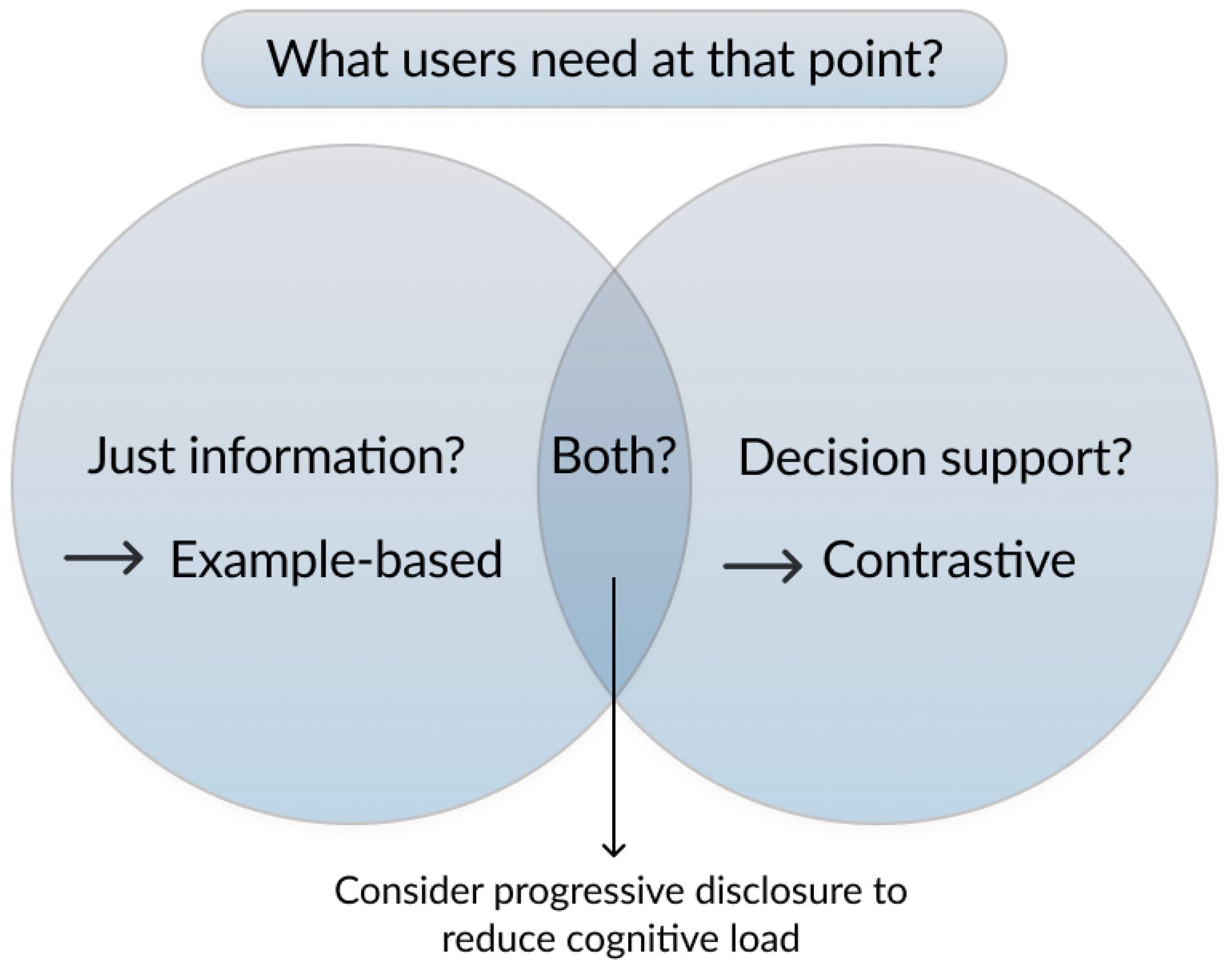
These insights suggest explanation design should be purpose-driven: example-based explanations should be prioritized when the goal is to provide information and comprehension, and contrastive explanations should be used when the goal is to aid user decisions (
Figure 10). In contexts where both are needed, progressive disclosure strategies may balance clarity and cognitive load.
In addition, we formulated four hypotheses (H1–H4) in Sub-RQ3 to examine differences between the two interface variants (Interface A: contrastive and Interface B: example-based) with respect to specific DVs (cf.
Table 2). Below, we summarize and discuss the results of this evaluation.
6.3.1. “There Is a Significant Difference in User Comprehension Between Interface A and Interface B, as Measured by
Mental Model Accuracy” (H1)
Descriptive statistics indicated slightly higher mental model accuracy for example-based explanations (M
B = 2.4) compared to contrastive (M
A = 2.03), with less variability suggesting more consistent comprehension. However, both objective comprehension scores (Mann–Whitney
,
,
) and subjective comprehension ratings (Mann–Whitney
,
,
) revealed no significant differences between the two versions. Therefore, H1 was not supported. This suggests that both explanation types facilitated a high level of understandability corroborating prior findings that layered, contextual privacy explanations enhance clarity [
9,
24]. Despite non-significant differences, example-based explanations may modestly improve mental model consistency by providing concrete counterfactuals [
33].
6.3.2. “There Is a Significant Difference in Perceived Simplicity Between Interface A and Interface B, as Measured by
the Identification of Irrelevant Elements in the Explanation” (H2)
Descriptive trends revealed that the majority (80%) of participants found no irrelevant elements in either explanation. A chi-square test on binary relevance responses confirmed no significant difference between conditions (, ). Therefore, H2 was not supported.
Consequently, both explanation styles demonstrate the capability to distill complex privacy concepts into accessible forms, making them suitable candidates for enhancing user understanding in app-specific data-sharing contexts. While qualitative feedback highlighted minor stylistic tensions: contrastive explanations risk redundancy (e.g., “what is not shared”), and while example-based explanations may feel wordy due to multiple scenarios, these did not detract from the overall clarity or simplicity perceived by most users. Therefore, such explanation approaches can be trusted to facilitate comprehension and engagement, provided designers continue to focus on maintaining simplicity, which is a crucial criterion in the understandability aspect of explanations [
8].
6.3.3. “There Is a Significant Difference in Perceived Cognitive Load Between Interface A and Interface B, as Measured by the NASA-TLX Scale” (H3)
Both interfaces imposed a low cognitive load (mean scores below the midpoint of 4), with contrastive explanations scoring slightly higher (M = 2.80) than example-based explanations (M = 2.38). However, results from an independent-samples t-test showed no significant difference (, ). Therefore, H3 was not supported. These findings indicate that cognitive demands are manageable for both explanation types, with minor trends suggesting contrastive explanations incur slightly higher mental effort, possibly due to processing “not shared” information as outlined above in the interpretation of H2 results.
6.3.4. “There Is a Significant Difference in User Experience Between Interface A and Interface B, as Measured by the
User Experience Questionnaire (UEQ-S)”(H4)
User experience scores indicated excellent pragmatic quality but below-average hedonic quality for both interfaces. An independent-samples
t-test showed no significant differences for pragmatic quality (
,
) or hedonic quality (
,
). Therefore, H4 was not supported. This suggests both explanation styles are usable and supportive, but lack engaging or enjoyable elements. This pattern aligns with prior research on engagement in privacy notices, which highlights that privacy notices often fail to capture sustained user interest or emotional engagement [
7]. In light of these findings, our results reinforce the need for privacy explanation interface designers to go beyond basic interaction methods: designers should consider incorporating features that enhance engagement, such as interactive elements like Swipe and Drag-and-Drop (DAD) actions [
7], to overcome the limitations of low hedonic quality and prevent user disengagement in privacy-relevant contexts.
6.4. Recommendations to App Designers
Drawing on the findings from our study and the broader privacy and explainability literature, we derive the following recommendations for the design of explainable privacy interfaces in smartphone applications to answer our central research question: How can explainable privacy interfaces be designed to enhance user understanding of app-specific data practices?
Recommendation 1: Use clear, labeled triggers. As discussed in
Section 5.10.3, qualitative feedback showed that icons alone were often insufficient for conveying privacy-related meaning, leading to misunderstandings of their function. Pairing icons with short, descriptive text reduces ambiguity and supports user recognition of privacy explanations. In practice, this confusion could be reduced by pairing the trigger icon with a short micro-text label (for example, ’Privacy details’), so its function is not left to interpretation. Animated affordances or a brief first-use tooltip could further signal that the element is interactive and privacy-related rather than decorative. Such lightweight cues address the misrecognition we observed. This is consistent with prior evidence that unclear or overly brief cues hinder user comprehension of data practices [
6,
7]. Designers should therefore rely on explicit labeling alongside visual cues to increase clarity.
Recommendation 2: Condense data granularity through progressive disclosure. As detailed in the qualitative findings in
Section 5.10.3 about simplicity of explanations, revealed that listing fine-grained details of data can impose a cognitive burden on participants, which can dilute the central message about data practices. Grouping such details under meaningful higher-level categories (e.g., presenting “location data” as a single conceptual unit rather than separating allowed/denied sub-components) can reduce perceived complexity. Progressive disclosure may further support this by allowing users to access additional detail only when needed. This aligns with calls in the literature to reduce information overload and ensure contextual relevance of notices [
9,
24]. Designers should therefore present privacy explanations in a contextual, step-by-step layered format (e.g., what the entities are, why sharing occurs, and how); these findings are in line with Brunotte et al. [
16]’s 2W1H principle for privacy explanations.
Recommendation 3: Do not rely solely on self-assessment for understanding. We found that participant confidence in understanding explanations did not always correlate with actual comprehension, echoing findings that users often misinterpret runtime privacy notices [
6]. Instead of depending on self-reports, privacy interfaces should embed lightweight feedback mechanisms, such as interactive comprehension checks, to ensure that information is not only accessed but also meaningfully understood.
Recommendation 4: Provide granular third-party sharing controls with tailored explanations. The most persistent comprehension gap concerned third-party data sharing, which participants identified as both confusing and critically important. This is in line with previous findings that third-party sharing represents a major knowledge gap where vague or absent explanations fail to inform users [
21,
23,
48]. In our study, participants appreciated the fine-grained, revocable controls that differentiated between categories of third parties to help them. This observation highlights the work by Schaub et al. [
23], who demonstrated that users frequently struggle to comprehend third-party descriptions in privacy notices when these are limited to company names or vague categories, such as “data reseller” or “government agency.” Hence, it is necessary to provide users with granular, explanatory controls that clarify not only who third parties are but also how and why their data is shared.
6.5. Limitations and Threats to Validity
This study has several limitations. To assess the sensitivity of the study, we conducted a post-hoc sensitivity analysis using G*Power (version 3.1). For
N = 30,
, and a desired power of
, the study was powered to detect only large effects (Cohen’s
). Smaller effects may therefore have remained undetected, and statistical power should be considered a limitation of the study. Moreover, the participant pool lacked demographic diversity, being largely young and digitally literate, which may obscure the privacy needs of older adults or less tech-savvy users. The study further considered only end-user perspectives, excluding developers whose technical and organizational constraints critically shape the feasibility of explainable privacy features; future work should integrate their insights through co-design or participatory approaches. Our evaluation focused on a single location-sharing scenario. While this reflects a common and relatable permission request, it limits the generalizability of the findings to other app contexts and data types. Future work should test multiple scenarios to determine whether the observed patterns hold across different privacy situations. Finally, our evaluation relied on the explainability quality model by Deters et al. [
8], which was developed primarily in other domains such as recommender systems, and its applicability to privacy contexts remains preliminary.
7. Conclusions
In this paper, we investigated how explainable privacy interfaces can enhance user understanding of app-specific data practices. A pre-study survey with 100 participants, followed by a comparative user study (N = 30), revealed that users experience the greatest difficulty in understanding third-party data sharing, despite showing strong interest in this area. Building on this, we extended prior knowledge by testing two explainability strategies, contrastive and example-based explanations, in the context of the understandability of privacy interface explanations. While we found no statistically significant differences across comprehension, simplicity, cognitive load, or user experience, descriptive results revealed complementary strengths. We position this work as exploratory research. Its findings derive from a small sample (N = 30, 15 per condition) without a conventional-notice baseline and did not reach statistical significance, so they should be interpreted as promising descriptive trends rather than confirmatory effects. Their value lies in identifying directions, such as matching explanation type to user goal, that motivate future work with larger, adequately powered, and baseline-controlled studies.
7.1. Contribution
Our findings contribute actionable implications for the design of explainable privacy interfaces: explanations should be layered, concise, contextual, and visual, with particular emphasis on transparency in third-party sharing. Designers should further align explanation styles with user goals and intended purpose, using example-based approaches for comprehension and contrastive ones for decision support. These insights can guide app developers in creating privacy explanations that move beyond regulatory compliance towards genuine user understanding of data practices.
7.2. Future Work
This work focused primarily on understandability as a quality aspect of explainable privacy interfaces. Future research should extend evaluation to the other aspects defined in the quality model by Deters et al. [
8]. Considering the dimensions in combination could reveal trade-offs or synergies, leading to a more holistic understanding of how explanations can affect user understanding of privacy. Another promising direction is the integration of explainable AI (XAI) features directly into privacy interfaces. While our prototypes employed static designs, adaptive explanation generation, user-tailored feedback, or intelligent privacy assistants could provide more dynamic support. Evaluating such AI-driven features in real application contexts would help assess their potential for delivering real-time, personalized, and trustworthy privacy explanations.