Author Contributions
Conceptualization, J.G. and T.C.; methodology, J.G.; software, J.G.; validation, J.G.; formal analysis, J.G.; investigation, J.G.; resources, T.C.; data curation, J.G.; writing—original draft preparation, J.G.; writing—review and editing, J.G., T.C., J.H. and Y.Z.; visualization, J.G.; supervision, T.C.; project administration, T.C. All authors have read and agreed to the published version of the manuscript.
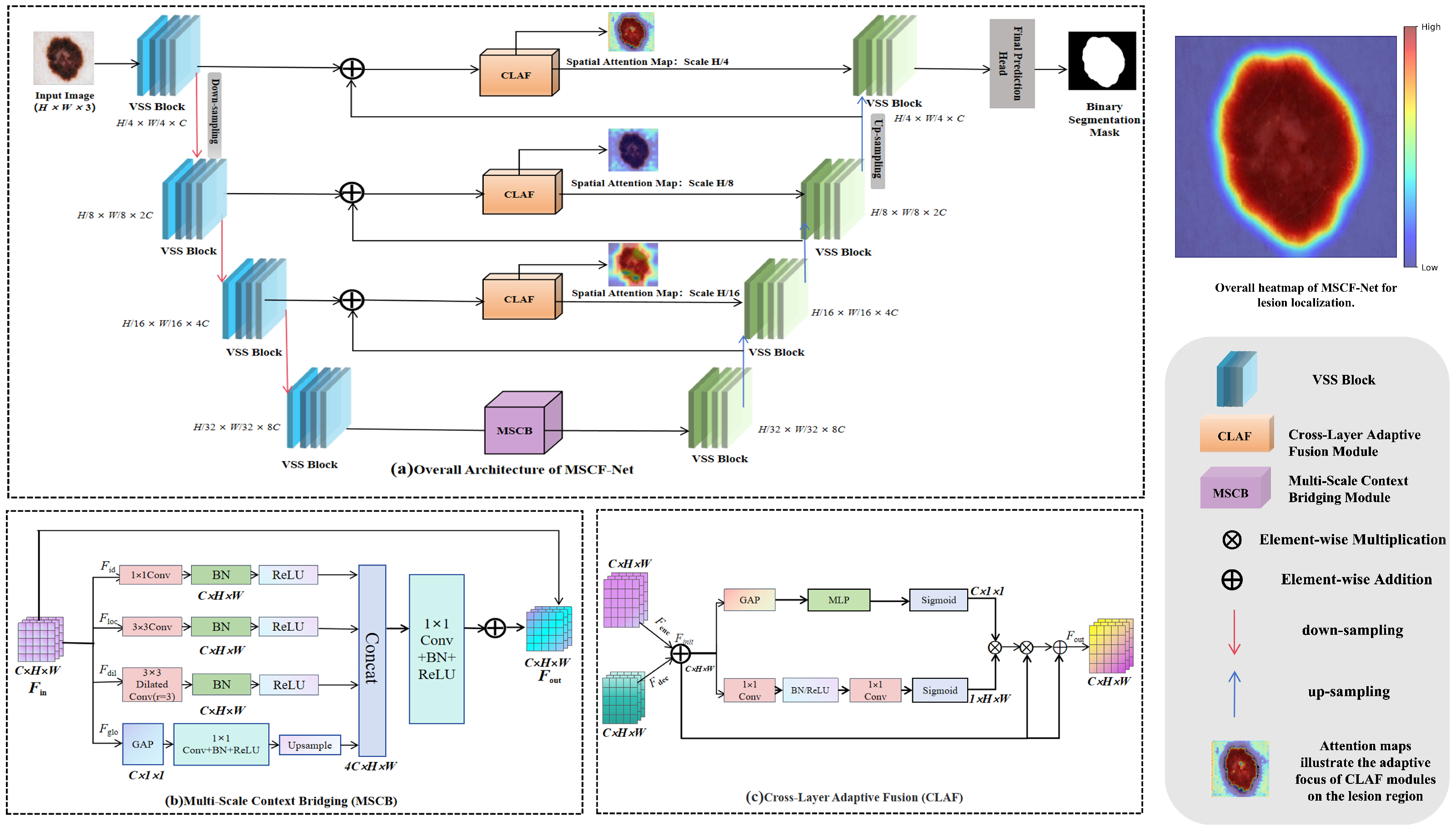
Figure 1.
Overall architecture of MSCF-Net. Panel (a) shows the symmetric U-shaped encoder–decoder built with VSS blocks. Panel (b) presents the Multi-Scale Context Bridging module inserted at the bottleneck. Panel (c) shows the Cross-Layer Adaptive Fusion module used to replace naive skip connections.
Figure 1.
Overall architecture of MSCF-Net. Panel (a) shows the symmetric U-shaped encoder–decoder built with VSS blocks. Panel (b) presents the Multi-Scale Context Bridging module inserted at the bottleneck. Panel (c) shows the Cross-Layer Adaptive Fusion module used to replace naive skip connections.
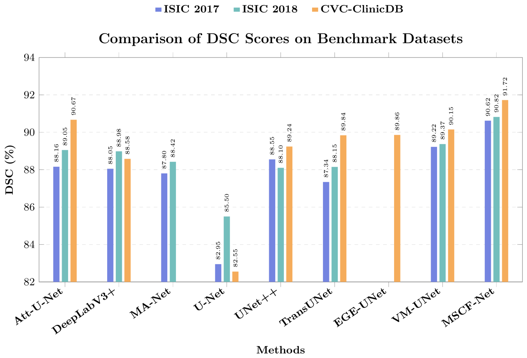
Figure 2.
DSC comparison across three benchmark datasets. Higher values indicate better agreement between predictions and ground truth. Blank positions denote methods without comparable reproduced results on the corresponding dataset.
Figure 2.
DSC comparison across three benchmark datasets. Higher values indicate better agreement between predictions and ground truth. Blank positions denote methods without comparable reproduced results on the corresponding dataset.
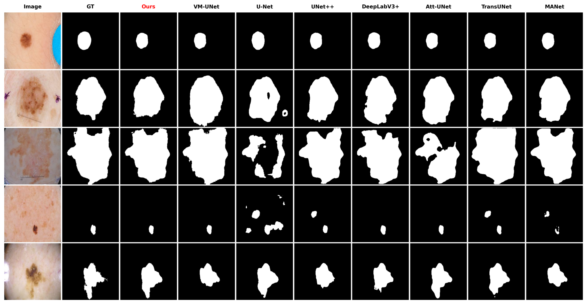
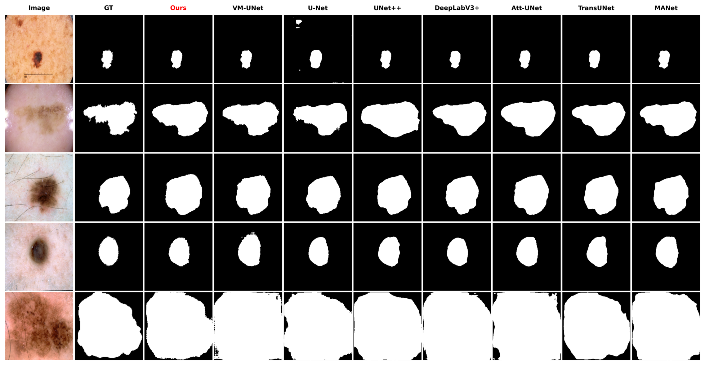
Figure 3.
Qualitative comparison on ISIC 2017. “GT” denotes the ground-truth mask and “Ours” denotes MSCF-Net.
Figure 3.
Qualitative comparison on ISIC 2017. “GT” denotes the ground-truth mask and “Ours” denotes MSCF-Net.
Figure 4.
Qualitative comparison on ISIC 2018. MSCF-Net produces masks that remain more complete under larger appearance variation.
Figure 4.
Qualitative comparison on ISIC 2018. MSCF-Net produces masks that remain more complete under larger appearance variation.
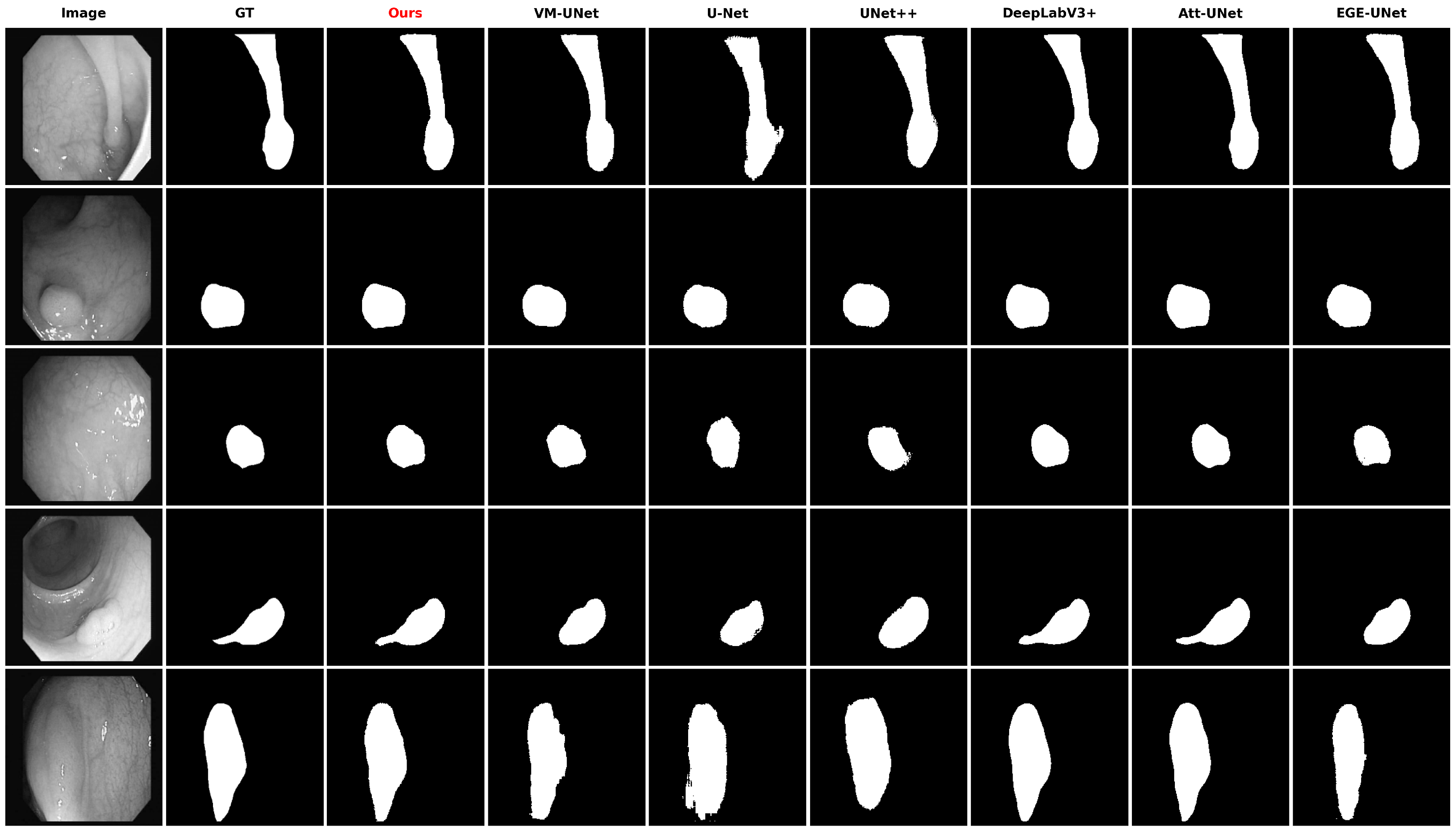
Figure 5.
Qualitative comparison on CVC-ClinicDB. MSCF-Net shows better tolerance to highlights, irregular boundaries, and small target structures.
Figure 5.
Qualitative comparison on CVC-ClinicDB. MSCF-Net shows better tolerance to highlights, irregular boundaries, and small target structures.
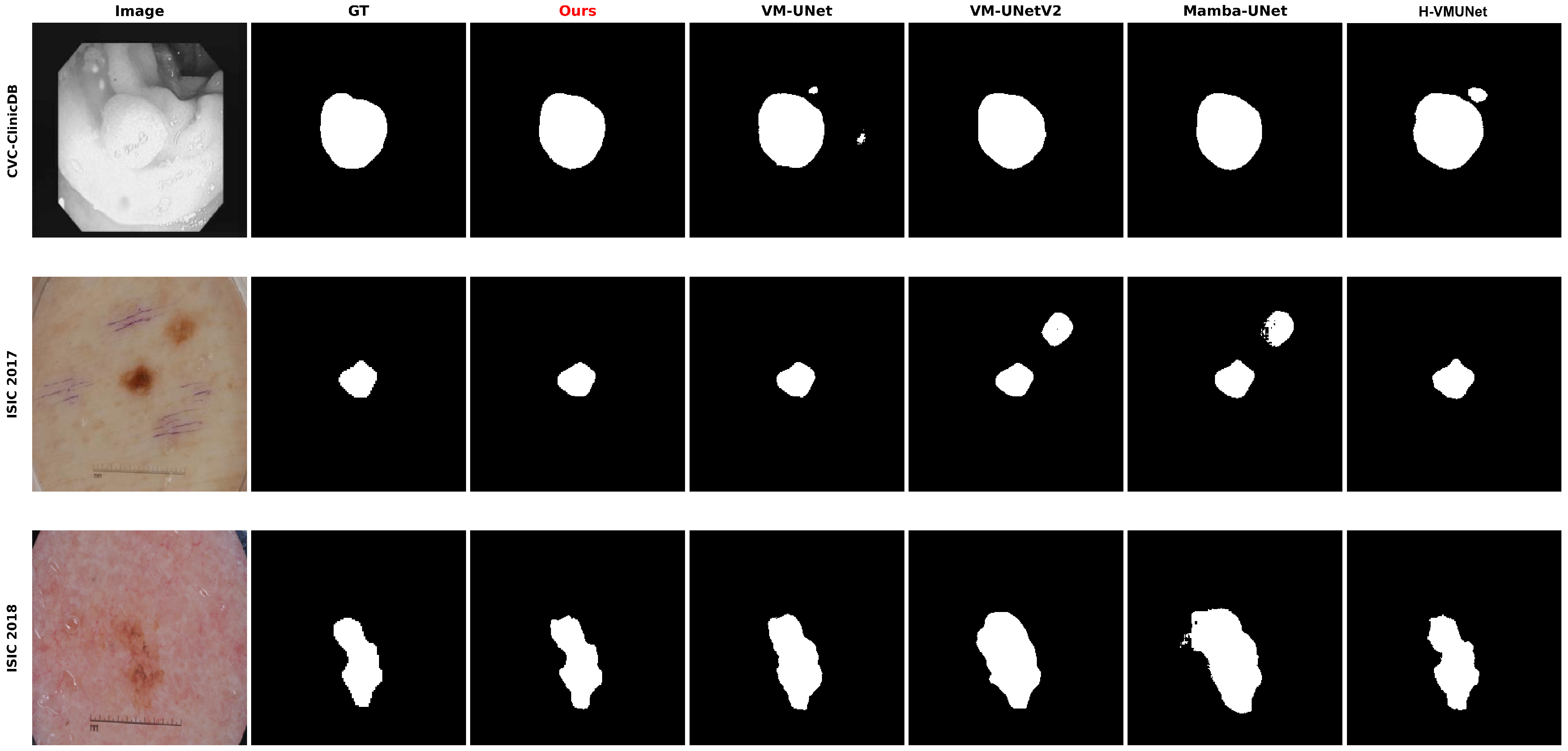
Figure 6.
Qualitative comparison with recent Mamba-family segmentation baselines on CVC-ClinicDB, ISIC 2017, and ISIC 2018. “Ours” denotes MSCF-Net.
Figure 6.
Qualitative comparison with recent Mamba-family segmentation baselines on CVC-ClinicDB, ISIC 2017, and ISIC 2018. “Ours” denotes MSCF-Net.
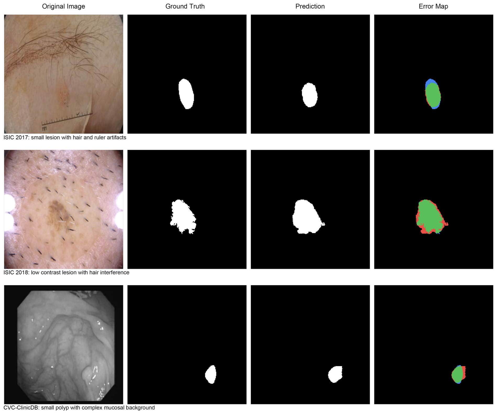
Figure 7.
Challenging and failure-prone cases of MSCF-Net. In the error maps, green denotes correctly predicted foreground (true positive), red denotes false-positive regions, and blue denotes false-negative regions. These examples show remaining difficulties under small targets, low contrast, hair interference, and complex endoscopic backgrounds.
Figure 7.
Challenging and failure-prone cases of MSCF-Net. In the error maps, green denotes correctly predicted foreground (true positive), red denotes false-positive regions, and blue denotes false-negative regions. These examples show remaining difficulties under small targets, low contrast, hair interference, and complex endoscopic backgrounds.
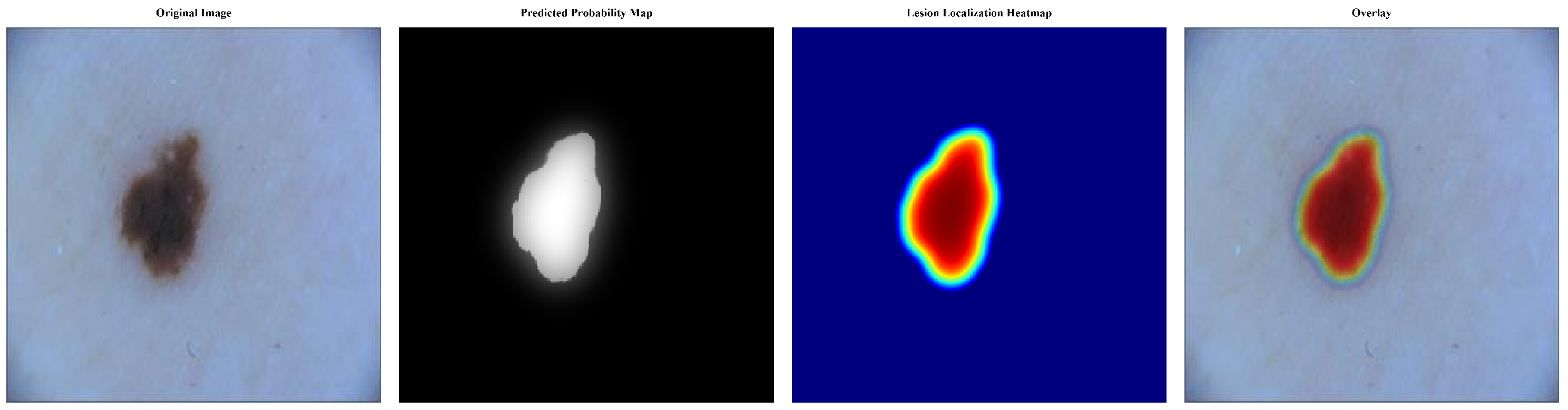
Figure 8.
Prediction-based lesion localization visualization of MSCF-Net. The heatmaps are generated from the final predicted probability maps using adaptive thresholding, morphological refinement, connected-component selection, and Gaussian smoothing. Blue denotes low response, whereas yellow and red denote progressively higher lesion confidence.
Figure 8.
Prediction-based lesion localization visualization of MSCF-Net. The heatmaps are generated from the final predicted probability maps using adaptive thresholding, morphological refinement, connected-component selection, and Gaussian smoothing. Blue denotes low response, whereas yellow and red denote progressively higher lesion confidence.
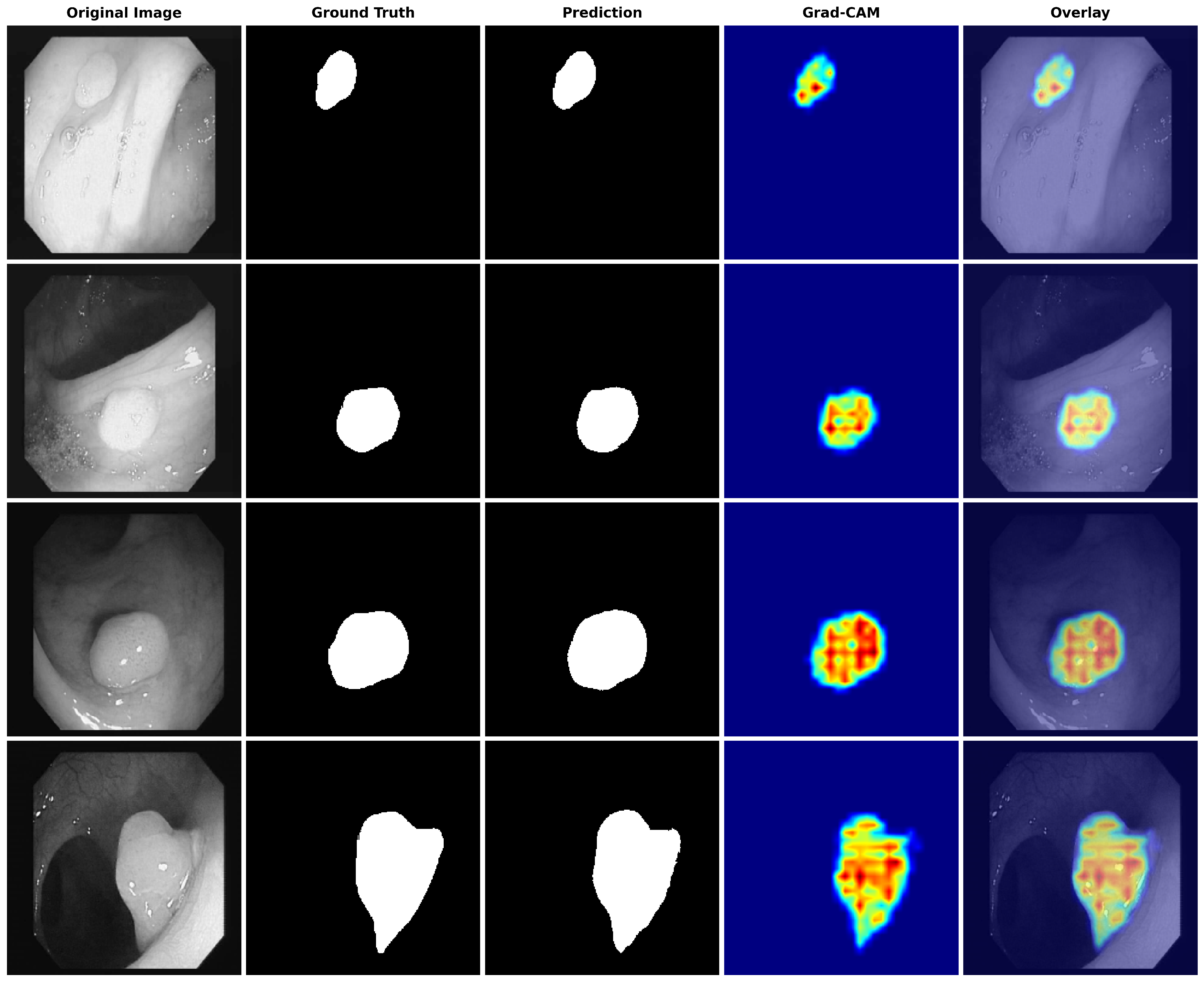
Figure 9.
Grad-CAM visualization of MSCF-Net on representative CVC-ClinicDB samples. Blue denotes low activation, whereas yellow and red denote progressively higher activation. The heatmaps and overlays indicate that high-response regions are mainly concentrated around polyp structures.
Figure 9.
Grad-CAM visualization of MSCF-Net on representative CVC-ClinicDB samples. Blue denotes low activation, whereas yellow and red denote progressively higher activation. The heatmaps and overlays indicate that high-response regions are mainly concentrated around polyp structures.
Table 1.
Quantitative comparison on ISIC 2017. An upward arrow (↑) indicates that a higher value is better. The best result in each column is shown in bold.
Table 1.
Quantitative comparison on ISIC 2017. An upward arrow (↑) indicates that a higher value is better. The best result in each column is shown in bold.
| Model | mIoU (%) ↑ | DSC (%) ↑ | Acc (%) ↑ | Spe (%) ↑ | Sen (%) ↑ |
|---|
| Att-U-Net | 78.83 | 88.16 | 95.75 | 98.14 | 86.76 |
| DeepLabV3+ | 78.65 | 88.05 | 95.53 | 97.23 | 89.13 |
| MA-Net | 78.25 | 87.80 | 95.61 | 98.25 | 85.68 |
| U-Net | 70.86 | 82.95 | 93.73 | 97.15 | 80.88 |
| UNet++ | 79.45 | 88.55 | 95.79 | 97.18 | 90.58 |
| TransUNet | 77.53 | 87.34 | 95.32 | 97.46 | 87.26 |
| VM-UNet | 80.54 | 89.22 | 96.03 | 98.11 | 88.21 |
| MSCF-Net (Ours) | 82.02 | 90.62 | 96.81 | 98.14 | 91.83 |
Table 2.
Quantitative comparison on ISIC 2018. An upward arrow (↑) indicates that a higher value is better. The best result in each column is shown in bold.
Table 2.
Quantitative comparison on ISIC 2018. An upward arrow (↑) indicates that a higher value is better. The best result in each column is shown in bold.
| Model | mIoU (%) ↑ | DSC (%) ↑ | Acc (%) ↑ | Spe (%) ↑ | Sen (%) ↑ |
|---|
| Att-U-Net | 80.26 | 89.05 | 94.51 | 95.34 | 91.89 |
| DeepLabV3+ | 80.15 | 88.98 | 94.59 | 96.08 | 89.89 |
| MA-Net | 79.25 | 88.42 | 94.27 | 95.59 | 90.10 |
| U-Net | 74.68 | 85.50 | 93.00 | 95.44 | 85.26 |
| UNet++ | 78.73 | 88.10 | 94.09 | 95.33 | 90.16 |
| TransUNet | 78.82 | 88.15 | 94.60 | 97.10 | 86.67 |
| VM-UNet | 80.78 | 89.37 | 94.75 | 96.06 | 90.60 |
| MSCF-Net (Ours) | 82.31 | 90.82 | 95.42 | 96.55 | 91.83 |
Table 3.
Quantitative comparison on CVC-ClinicDB. An upward arrow (↑) indicates that a higher value is better. The best result in each column is shown in bold.
Table 3.
Quantitative comparison on CVC-ClinicDB. An upward arrow (↑) indicates that a higher value is better. The best result in each column is shown in bold.
| Model | mIoU (%) ↑ | DSC (%) ↑ | Acc (%) ↑ | Spe (%) ↑ | Sen (%) ↑ |
|---|
| Att-U-Net | 82.93 | 90.67 | 98.13 | 99.65 | 85.87 |
| DeepLabV3+ | 79.50 | 88.58 | 97.45 | 99.27 | 82.75 |
| U-Net | 70.28 | 82.55 | 97.07 | 99.58 | 76.82 |
| UNet++ | 80.56 | 89.24 | 97.62 | 99.39 | 83.31 |
| TransUNet | 81.56 | 89.84 | 97.71 | 99.38 | 84.21 |
| EGE-UNet | 81.58 | 89.86 | 97.74 | 99.30 | 85.10 |
| VM-UNet | 82.07 | 90.15 | 97.85 | 99.16 | 87.28 |
| MSCF-Net (Ours) | 84.56 | 91.72 | 98.43 | 99.42 | 90.45 |
Table 4.
Comparison with recent Mamba-based segmentation baselines. Results are reported as mean ± standard deviation (%) over five repeated runs. An upward arrow (↑) indicates that a higher value is better. The best result in each column is shown in bold.
Table 4.
Comparison with recent Mamba-based segmentation baselines. Results are reported as mean ± standard deviation (%) over five repeated runs. An upward arrow (↑) indicates that a higher value is better. The best result in each column is shown in bold.
| CVC-ClinicDB |
|---|
| Model | mIoU ↑ | DSC ↑ | Acc ↑ | Spe ↑ | Sen ↑ |
| H-VMUNet | | | | | |
| Mamba-UNet | | | | | |
| VM-UNet | | | | | |
| VM-UNetV2 | | | | | |
| MSCF-Net (Ours) | | | | | |
| ISIC 2017 |
| Model | mIoU ↑ | DSC ↑ | Acc ↑ | Spe ↑ | Sen ↑ |
| H-VMUNet | | | | | |
| Mamba-UNet | | | | | |
| VM-UNet | | | | | |
| VM-UNetV2 | | | | | |
| MSCF-Net (Ours) | | | | | |
| ISIC 2018 |
| Model | mIoU ↑ | DSC ↑ | Acc ↑ | Spe ↑ | Sen ↑ |
| H-VMUNet | | | | | |
| Mamba-UNet | | | | | |
| VM-UNet | | | | | |
| VM-UNetV2 | | | | | |
| MSCF-Net (Ours) | | | | | |
Table 5.
Complexity and inference-speed comparison at an input size of . Params were counted from model parameters, GFLOPs were measured using THOP, and FPS was measured on an NVIDIA GeForce RTX 4090 with batch size 1. A downward arrow (↓) indicates that a lower value is better, and an upward arrow (↑) indicates that a higher value is better. The best value in each column is shown in bold.
Table 5.
Complexity and inference-speed comparison at an input size of . Params were counted from model parameters, GFLOPs were measured using THOP, and FPS was measured on an NVIDIA GeForce RTX 4090 with batch size 1. A downward arrow (↓) indicates that a lower value is better, and an upward arrow (↑) indicates that a higher value is better. The best value in each column is shown in bold.
| Model | Params (M) ↓ | GFLOPs (G) ↓ | FPS ↑ |
|---|
| Att-U-Net | 24.55 | 7.86 | 78.96 |
| DeepLabV3+ | 22.44 | 7.93 | 109.63 |
| MA-Net | 31.78 | 8.36 | 76.97 |
| U-Net | 7.70 | 41.71 | 279.17 |
| UNet++ | 26.08 | 18.45 | 85.74 |
| TransUNet | 17.19 | 38.46 | 198.15 |
| EGE-UNet | 1.04 | 7.03 | 253.80 |
| VM-UNet | 27.43 | 4.11 | 32.52 |
| VM-UNetV2 | 17.91 | 4.40 | 35.02 |
| Mamba-UNet | 15.48 | 4.60 | 51.56 |
| H-VMUNet | 8.97 | 0.74 | 8.45 |
| MSCF-Net (Ours) | 31.55 | 4.33 | 30.25 |
Table 6.
Ablation results for MSCB and CLAF. Numbers denote DSC (%) on the three datasets. A checkmark indicates that the corresponding module is used, and an upward arrow (↑) indicates that a higher value is better. The best result in each column is shown in bold.
Table 6.
Ablation results for MSCB and CLAF. Numbers denote DSC (%) on the three datasets. A checkmark indicates that the corresponding module is used, and an upward arrow (↑) indicates that a higher value is better. The best result in each column is shown in bold.
| MSCB | CLAF | CVC-ClinicDB DSC (%) ↑ | ISIC 2017 DSC (%) ↑ | ISIC 2018 DSC (%) ↑ |
|---|
| – | – | 90.15 | 89.22 | 89.37 |
| ✓ | – | 90.88 | 89.95 | 90.12 |
| – | ✓ | 90.65 | 89.78 | 89.92 |
| ✓ | ✓ | 91.72 | 90.62 | 90.82 |
Table 7.
Influence of MSCB placement and CLAF scope under the full model setting. Results are reported as DSC (%). An upward arrow (↑) indicates that a higher value is better. The best result in each column is shown in bold.
Table 7.
Influence of MSCB placement and CLAF scope under the full model setting. Results are reported as DSC (%). An upward arrow (↑) indicates that a higher value is better. The best result in each column is shown in bold.
| Configuration | CVC-ClinicDB DSC (%) ↑ | ISIC 2017 DSC (%) ↑ | ISIC 2018 DSC (%) ↑ |
|---|
| Baseline (VM-UNet) | 90.15 | 89.22 | 89.37 |
| MSCB at Early Stage + CLAF at All Skips | 90.72 | 89.85 | 89.98 |
| MSCB at Bottleneck + CLAF at Single Skip | 91.05 | 90.12 | 90.28 |
| MSCB at Bottleneck + CLAF at All Skips (Ours) | 91.72 | 90.62 | 90.82 |
Table 8.
Complexity and performance of different module variants on CVC-ClinicDB. A downward arrow (↓) indicates that a lower value is better, and an upward arrow (↑) indicates that a higher value is better. The best result in each column is shown in bold.
Table 8.
Complexity and performance of different module variants on CVC-ClinicDB. A downward arrow (↓) indicates that a lower value is better, and an upward arrow (↑) indicates that a higher value is better. The best result in each column is shown in bold.
| Model | Params (M) ↓ | GFLOPs (G) ↓ | CVC-ClinicDB DSC (%) ↑ |
|---|
| VM-UNet (Baseline) | 27.43 | 4.11 | 90.15 |
| +MSCB | 31.23 | 4.29 | 90.88 |
| +CLAF | 27.75 | 4.15 | 90.65 |
| MSCF-Net (Ours) | 31.55 | 4.33 | 91.72 |