Article

Exploring Casual COVID-19 Data Visualizations on Twitter: Topics and Challenges

by
Milka Trajkova
1,*,†,
A’aeshah Alhakamy
1,2,*,†,
Francesco Cafaro
1,*,†,
Sanika Vedak
1,
Rashmi Mallappa
1 and
Sreekanth R. Kankara
1
1
Department of Human-Centered Computing, School of Informatics and Computing, Indiana University-Purdue University Indianapolis, Indianapolis, IN 46202, USA
2
Department of Computer Science, School of Computers and Information Technology, University of Tabuk, Tabuk 47512, Saudi Arabia
*
Authors to whom correspondence should be addressed.
These authors contributed equally to this work.
Informatics 2020, 7(3), 35; https://doi.org/10.3390/informatics7030035
Submission received: 7 August 2020 / Revised: 2 September 2020 / Accepted: 10 September 2020 / Published: 15 September 2020
(This article belongs to the Special Issue Feature Papers in Big Data)

Abstract

:
Social networking sites such as Twitter have been a popular choice for people to express their opinions, report real-life events, and provide a perspective on what is happening around the world. In the outbreak of the COVID-19 pandemic, people have used Twitter to spontaneously share data visualizations from news outlets and government agencies and to post casual data visualizations that they individually crafted. We conducted a Twitter crawl of 5409 visualizations (from the period between 14 April 2020 and 9 May 2020) to capture what people are posting. Our study explores what people are posting, what they retweet the most, and the challenges that may arise when interpreting COVID-19 data visualization on Twitter. Our findings show that multiple factors, such as the source of the data, who created the chart (individual vs. organization), the type of visualization, and the variables on the chart influence the retweet count of the original post. We identify and discuss five challenges that arise when interpreting these casual data visualizations, and discuss recommendations that should be considered by Twitter users while designing COVID-19 data visualizations to facilitate data interpretation and to avoid the spread of misconceptions and confusion.

1. Introduction

In today’s world, people are bombarded with data every time they surf the Internet, read newspapers, or watch the news on TV. Thus, data exploration is no longer limited to the realm of research laboratories, in which scientists define experimental scenarios to validate hypotheses. Rather, the abundance of data readily available allows anyone to explore large sets of data and to identify patterns in data.
In particular, during the current wave of the COVID-19 pandemic, people have retweeted charts from news outlets and government organizations, and even spontaneously crafted hundreds of casual information visualizations [1] about COVID-19 (e.g., by creating their own Excel graphs) and posted them on Twitter (an example is shown in Figure 1). Being able to effectively design and interpret these data visualizations is particularly crucial at this moment because more and more people rely on their own data analyses to inform their personal and business decisions (for example, whether it is safe enough to go to the beach, to send children back to school, or to reopen the dining room of their restaurant to customers).
In this paper, we report the results of an exploratory study in which we collected 5409 data visualizations that people posted on Twitter about COVID-19 between 14 April 2020 and 9 May 2020 (among those, we coded and analyzed a randomly selected sample of 540 visualizations). The work in this paper is a novel exploration of the casual data visualizations [1,2] that people (including non-experts) post on social media, because of their keen interest in exploring COVID-19 data. Specifically, our contribution is threefold, as we report on: (1) what people are posting; (2) the topics that get re-tweeted the most; and (3) the challenges that may arise from these visualizations. We believe that reflecting on these casual data visualizations can be particularly helpful for navigating these uncharted times.

2. Related Work

2.1. Coronavirus on Twitter

Despite the novelty of SARS-CoV-2, there are already a few studies (either peer-reviewed or in pre-print) that focus on what people and organizations post about the coronavirus on Twitter. Chen et al. [3] described the process of assembling a repository of coronavirus-related tweets at the University of Southern California. The focus was on keywords, languages, and accounts to track. Way et al. referred to Twitter posts to explain the need for automatic translation of COVID-19 knowledge bases [4]—the idea here is that the virus spreads in countries that use different languages. Vicari and Murru [5] discussed examples of irony in the Twitter posts that people posted in Italy at the beginning of the pandemic. Karisani et al. [6] reported a machine learning model for automatically detecting the positive cases of COVID-19 from Twitter. Zarei et al. [7] crawled Instagram to characterize the direct information (e.g., hashtags, language, followers) that people were posting about. Lopez et al. [8] presented the initial stages of a work that used text analysis to categorize people’s perceptions of the public policies that have been enacted to contrast the coronavirus. Kouzy et al. [9] attempted to quantify the amount of medical “misinformation” in individual, organization, and personal tweets, and to identify the hashtags that seem to be connected with the highest amount of misinformation. Alshaabi et al. [10] described how to select 24 languages and 1-grams relevant to the time period on Twitter about the present COVID-19 pandemic, including visual comparison of time-series plots for "virus" with COVID-19 confirmed case and death numbers, while describing the datasets, figures, and visualizations shared online. Medford et al. [11] performed a sentiment analysis leveraging high-volume Twitter data to identify emotional valence and predominant emotions about the COVID-19 outbreak, and used a topic modeling approach to identify and explore discussion topics over time. Schild et al. [12] studied the emergence of xenophobic behavior on the web during the COVID-19 pandemic outbreak by collecting two large-scale datasets from Twitter and 4chan’s Politically Incorrect board (/pol/). Ferrera [13] also studied 43.3M COVID-19 tweets that provided evidence on the use of Twitter bots to promote political conspiracies in the United States, in contrast with public health concerns. Ordun et al. [14] presented five different techniques for distinctive assessment of topics, key terms and features, speed of information dissemination, and network behaviors for COVID-19 tweets. Finally, Jabin and Rahmanian [15] proposed to mine posts on Twitter to identify potential coronavirus outbreaks.

2.2. Interpreting Data Visualizations

Research on how people perceive and interpret data visualizations is not new. Back in 1987, Cleveland and McGill [16] conducted experiments to identify how visual elements, such as textures, colors, areas, and slope of the lines influence people’s understanding of the data on display—and concluded, for instance, that bar charts are more effective than pie charts for visualizing absolute values. Shah and Hoeffner [17] reflected on the fact that graphs are frequently used in textbooks to help students understand science, but people’s interpretations of a graph are influenced by at least three factors: the visual representation (e.g., the colors used, the size), the viewer’s general knowledge about charts, and her/his previous knowledge or expectations about the content in the chart. Ress et al. [18] investigated visual strategies that facilitate museum visitors’ comprehension of public history content that span across time and space. Szafir [19] discusses how color is frequently used to encode information, but if not used consistently, how it can generate misinterpretation of the data.
Existing literature on data visualization, however, cannot be easily used in lieu of the exploratory study that we report in this paper, for three major reasons. First is the disruptive novelty of the context (COVID-19), which may prevent people from relating the data on display to their prior knowledge or life experiences. Second is the peculiarities of COVID-19 metrics (e.g., the test “positivity rate”), where the fact that the general public was not that familiar with them before the pandemic may make it difficult to properly visualize and interpret them. Third is the novelty of the phenomenon (so many people analyzing similar data on Twitter and other social media), and the fact that the data visualizations that we analyzed included charts that were created by people who did not have academic or professional training in data visualization (non-experts). We discuss this latter point more in detail in the next subsection (casual data visualizations).

2.3. Casual Data Visualizations

In a different context (the design and evaluation of InfoVis tools), Pousman et al. noticed a similar phenomenon: non-expert users are increasingly creating visualizations to analyze data that are personally meaningful to them. Specifically, they defined casual data visualizations as “the use of computer-mediated tools to depict personally meaningful information in visual ways that support everyday users in both everyday work and non-work situations” [1]. In a later work, Sprague and Tory [2] used the term to more broadly refer to data visualizations (rather than the data visualization tools) created in “leisure and domestic activity contexts.”
InfoVis literature about social media, however, has yet to explore the casual visualizations that non-expert users post on Twitter. Specifically, InfoVis literature about social media has mostly focused on two major themes: visualizing nodes and links of the networks [20], or aggregating big data from users’ posts into novel visualizations. The former has been done, for example, to understand social circles [21] and privacy behaviours [22], or to empower users to break their social bubbles when seeking information [23]. Examples of the latter research theme include the use of SentenTrees of soccer data from Twitter [24], visualizing tweets of Hurricane Sandy [25], topic visualization of tweets [26], and the creation of new visual analytic tools based on existing Twitter data [27].
Differently from these examples, our work is an exploratory analysis of the casual visualizations that users spontaneously post and retweet on social media (i.e., Twitter).

3. Methodology

The overarching aim of this paper was to gain an understanding of the Twitter visualizations that individuals spontaneously create about COVID-19 and investigate the challenges that may arise when interpreting these posts. Although portions of our analysis are quantitative in nature, most of our work adopts qualitative methods—an approach not new to information visualization research (and advocated, for instance, in [28]). Specifically, we followed a bottom-up inductive approach, based on open-coding and grounded on the dataset that we collected from Twitter.

3.1. Data Collection

A team of five researchers selected combinations of keywords that included both: (1) COVID-19 (the name of the disease), or #SARS-CoV-2 (the name of the virus), or #coronavirus (a common, although more generic, way to refer to the disease); and (2) a keyword that makes a specific reference to a data visualization (#chart, or #visualization, or #graph). We created a JavaScript crawler to automatically collect Twitter posts during the time window from 14 April 2020 to 9 May 2020. For each post, the data collected from Twitter included: the username of the users whose post contained the selected keywords; the link to the post; the images in the post; the text of the post; the number of retweets; the number of likes; and, the number of followers. These data points were included in an Excel sheet.
We collected a total of 5409 posts, out of which we analyzed 540 randomly selected ones. We concluded the analysis when the four researchers who were analyzing the data unanimously agreed that we had reached theoretical saturation [29], that is, coding additional data points was not adding any new information to the analysis.

3.2. Research Questions

We analyzed the dataset to answer the following research questions:
(R.Q.1) 
What are people posting?
(R.Q.2) 
Which do people retweet more—visualizations that are created by individuals or organizations?
(R.Q.3) 
What are the topics that get retweeted the most? Specifically, what is the relationship between the variables in the data visualization and the number of retweets?
(R.Q.4) 
What challenges may arise from the interpretation of these casual data visualizations?

3.3. Data Analysis

The 5409 posts collected from Twitter were initially coded using an Excel sheet. We randomly selected 540 posts to perform an initial round of inductive coding [30].
These posts were cleaned and irrelevant visualizations were removed from the dataset to arrive at a number of 445 for qualitative analysis (first, second, and fourth round of coding). For the third round of coding, visualizations with undefined classes were eliminated from the data set to arrive at a number of 440. Outliers were visually removed upon visual inspection using a histogram to arrive at a number of 435 for statistical analysis. One researcher randomly selected 435 tweets to cross-validate labeling for inter-rater reliability.

Coding

We analyzed the Twitter posts that we collected by performing four rounds of inductive coding to categorize and structure them. This iterative process allowed us to assure that the number of posts that we selected was enough to reach theoretical saturation [31]. The first three rounds of coding were conducted to answer R.Q.1, R.Q.2, and R.Q.3 (what people were posting and what topics got re-tweeted the most); a fourth round of coding was then needed to answer R.Q.4 (interpretation challenges).
During the initial round of coding, four researchers identified five major descriptors that could be used to catalog the COVID-19 data visualization that we collected.
  • Visualization Generation specifies who created the visualization. Specifically, we noticed that some visualizations that people re-tweeted were originally created by organizations (e.g., news media, state agencies), while others were designed and created by individual Twitter users. This was identified through a process of visual inspection or by asking users.
  • Source of Data: We looked at how the raw data were obtained, and if they were taken from an online source (e.g., CDC, Johns Hopkins);
  • Type of Data: A broad descriptor that we used to initially classify the content of the data visualization;
  • Type of Visualization: Whether it was a line graph, bar graph, pie chart, table, scatter plot, flowchart, map, histogram, Venn diagram, or tree-map;
  • Title of the Visualization, which was directly taken out of the visualization.
A second round of coding was performed to break down the "Type of Data" category. In order to do so, we looked at the individual variables that were used in the visualizations. Variables were coded as either (a) variable 1 / x -axis; (b) variable 2 / x -axis; (c) variable 3; (d) variable 4, etc. We used a broad label 1 / x -axis (rather than just x-axis) because some visualizations (such as bar graphs, line graphs, and scatter plots) utilize an x-axis for labeling, while others (such as pie charts) do not have an x-axis. For variables identified as 3, 4, 5, and so forth, this indicated that the graph visualized multiple variables and dimensions (not just one x and one y axis). We then used an affinity diagram to group the variables. Because the current situation with COVID-19 prevented the research team to meet in person, we used an online collaboration tool (Trello) to create the affinity diagrams.
Out of all the variables identified, we focused on the variable 1 / x -axis, variable 2 / y -axis, and variable 3 (and disregarded variable 4, 5, 6, etc. because very few of the data visualizations in our dataset represented more than three variables). The variable groups that were identified through this iterative process were Demographics, Time, Cases, Death, Tests, Location/Geography, Economy, Organization, Vaccines, Recoveries, Infrastructure, Reasons, Environment, and Technology—see Figure 2a–c, for variables 1 / x , 2 / y , and 3, respectively.
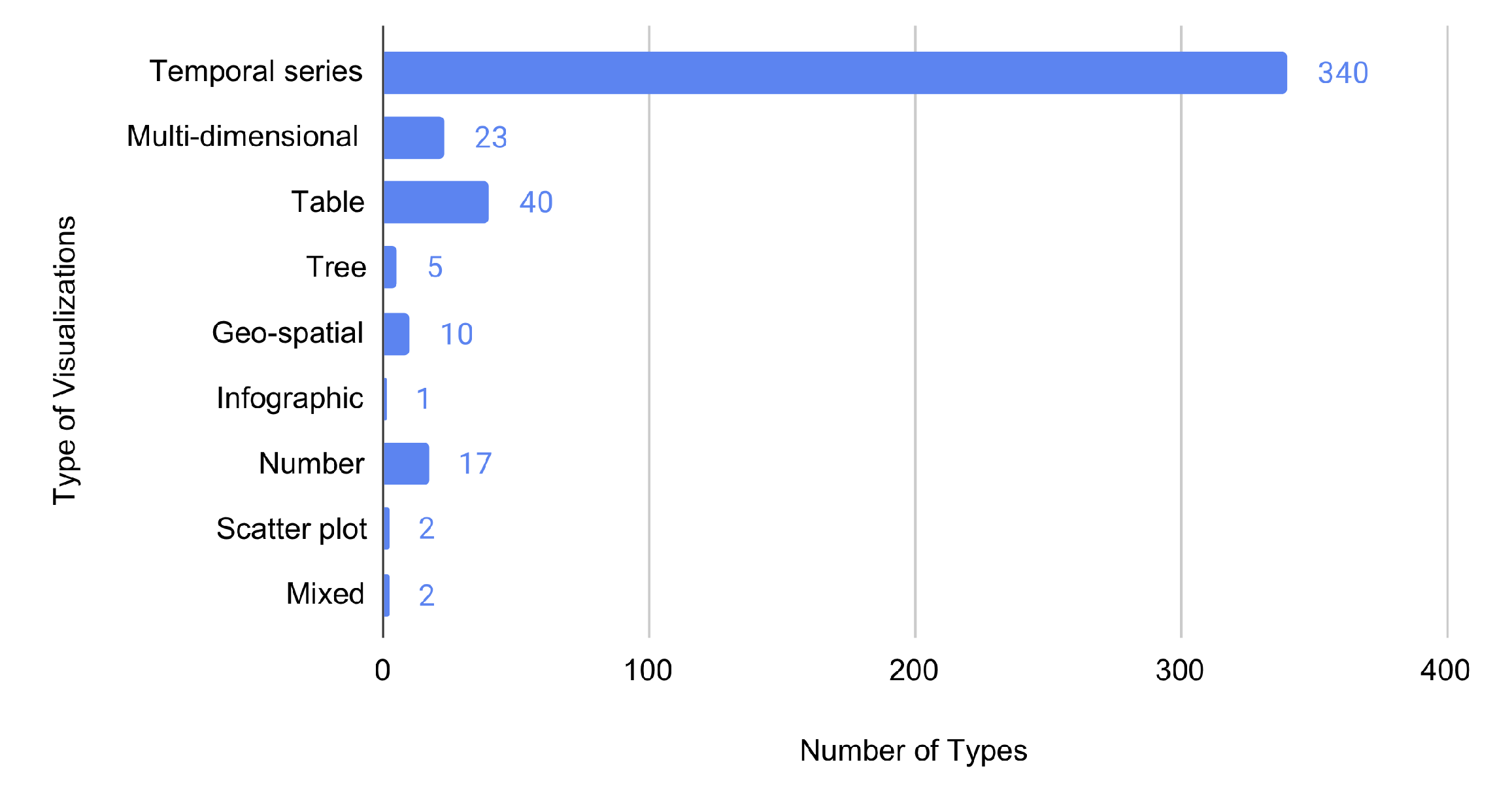
A third round of coding was conducted to further group the "Type of Visualization" and reduce the dimensionality of the dataset. Specifically, we utilized the Type-by-Task Taxonomy (TTT) of information visualizations proposed by Schneiderman [32]: temporal series, multi-dimensional, table, geo-spatial, and tree.
A fourth round of open coding was conducted to identify the challenges that may arise when interpreting these data visualizations. Each researcher independently coded a randomly selected portion of the dataset, looking at both the data visualization, and the text in the original tweet and in the users’ comments. Researchers then met to agree on the list of themes that they identified.

4. Results

This section reports the results for each of the research questions.

4.1. R.Q.1: What Are People Posting?

4.1.1. Individuals vs. Organizations

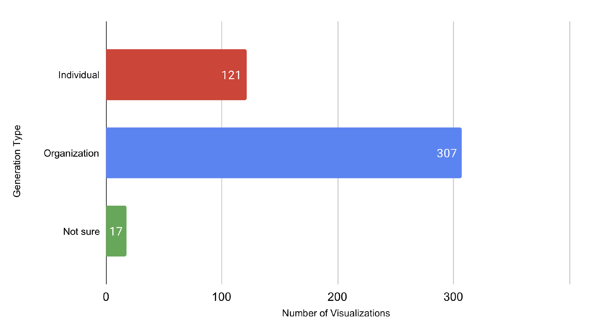
We noticed that Twitter users did not only tweet data visualizations that they originally created, but also that some were originally posted by organizations (e.g., government agencies and news outlets)—see Figure 3.

4.1.2. Type of Data Visualization

Figure 4 reports the type of data visualizations (among those in our dataset) that we grouped using the Type-by-Task Taxonomy (TTT) (rather than the labels generated from our open coding process). Schneiderman’s TTT [32] classifies seven data types to account for the growing disparity in the kind of visualizations that permeate the information visualization space. We discovered users posted "Temporal Series" types of visualizations the most ( N = 340 ). This entails that aspects in the visualization have a distinct start and end time. In the context of COVID-19, most visualizations were line graphs that displayed a time-related variable, such as date, days, month, week, and year.

4.1.3. Data Source

Figure 5 shows the source of the data in the visualizations (we want to clarify that here we do not refer to the source of the data visualization, but to the source of the raw data that were used to create the visualization). It is worth noting that 113 out of 445 visualizations ( 25.5 % ) did not specify the data source. This problem was not limited to charts created by individuals: out of those 113 visualizations without a source, 73 were made by individuals, and 24 by organizations. The data source that was cited the most was Johns Hopkins ( N = 74 , 16.7 % ) followed by CDC ( N = 33 , 7.4 % ) . For details, see Figure 5.

4.1.4. Categories of Data

Concerning the topics that were posted across variables 1 / x , 2 / y , and 3, the most prominent included trends over time ( 365 / 1014 ) , number of cases ( 256 / 1014 ) , and death counts ( 181 / 1014 ) —see Figure 6.

4.2. (R.Q.2): Do People Retweet More the Visualizations That Are Created by Individuals or Organizations?

As a follow-up question, we wanted to understand whether there was a relationship between the generation type (I = individual vs. organizations) and the number of retweets. Thus, a Kruskal-Wallis H test was run to determine whether there were differences in retweets between the generation type with two levels of categories: (1) individual, and (2) organization. Distributions of r e t w e e t scores were similar for all groups, as assessed by visual inspection of a boxplot. The median retweet count was statistically significantly different between the two levels of visualization generation, χ 2 ( 435 )   =   12.411 , p < 0.002 . Subsequently, pairwise comparisons were performed using Dunn’s (1964) procedure. A Bonferroni correction for multiple comparisons was made with statistical significance accepted at the p   =   0.025 level. A common way of expressing the central tendency of the groups when running a Kruskal-Wallis H test is by looking at the medians. This post hoc analysis revealed statistically significant differences in retweet scores between the individual ( M d n   =   0.00 ) and organization ( M d n   =   1.00 ) ( p   =   0.004 ) . This indicates that charts from organizations ( N   =   307 ) are retweeted more than those made by individuals ( N   =   121 ) , see Figure 3. For some of the tweets, we were not sure whether it was the organization or individual who posted ( N   =   17 ) , and we did not receive a response from users—so we excluded them from this analysis.

4.3. R.Q.3: What Is the Relationship between Variables 1 / x and 2 / y and the Number of Retweets?

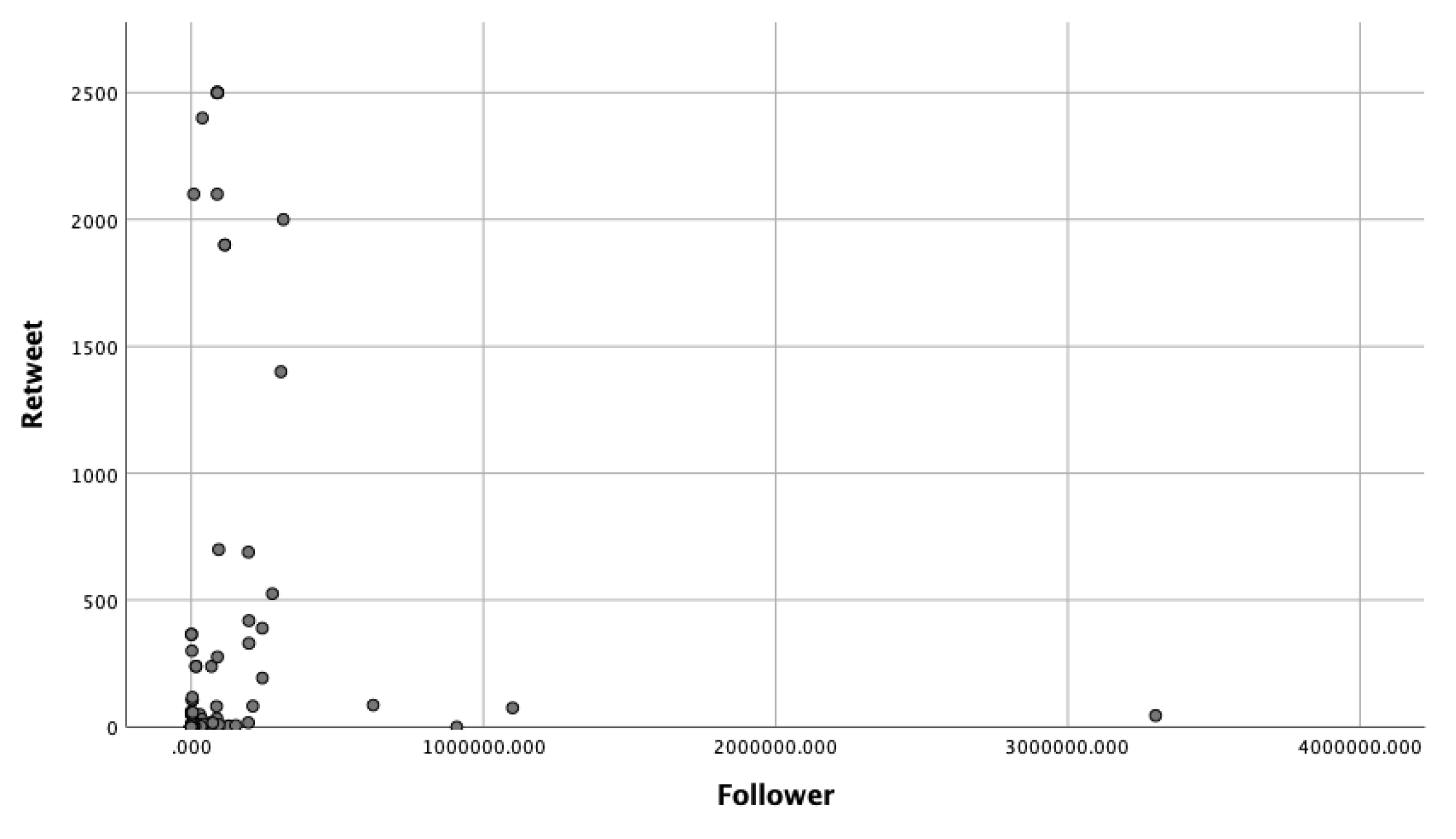
First of all, we want to clarify why we decided to focus on retweet count, rather than on the like count. We conducted a pre-processing analysis to figure out the relationship between retweet and like counts. Although we collected both retweet and like counts, a Spearman’s Rank-Order correlation was run to assess the relationship between a retweet and like count. Preliminary analysis showed the relationship to be monotonic, as assessed by visual inspection of a scatterplot. There was a statistically significant, strong, positive correlation between retweet count and like count, r s ( 421 )   =   0.757 , p < 0.001. This indicates that the retweet and like counts basically measure the same dependent variable (DV), meaning that we can choose to focus on only one DV. We chose to concentrate on retweet count due to the higher engagement nature of retweets as opposed to likes. Regarding the possible influence of the number of followers, the follower and retweet count had a strong correlation, r s ( 421 )   =   0.639 , p < 0.001. We want to state, however, that after an inspection of the scatter plot, a linear correlation could not be defined (this is fine with the Spearman’s Rank-Order coefficient)—see Figure 7 for more details.
A two-way ANOVA was conducted to examine the effects of variable 1 / x and variable 2 / y on retweets—see Figure 8 for more details. Variable 1 / x included the nine categories that the researchers identified using the affinity diagram in Figure 2a: (1) Cases, (2) Death, (3) Demographics, (4) Economy (5) Location/geography, (6) Organization, (7) Recoveries, (8) Tests, and (9) Time. Variable 2 / y included eleven categories: (1) Cases, (2) Cause, (3) Deaths, (4) Demographics, (5) Economy, (6) Environment, (7) Impact/Responses, (8) Infrastructure/Transportation, (9) Location/Geography, (10) Other diseases, (11) Recoveries, (12) Tests, and (13) Vaccine. Residual analysis was performed to test for the assumptions of the two-way ANOVA. Outliers were assessed by inspection of a boxplot, normality was assessed using Shapiro-Wilk’s normality test for each cell of the design, and homogeneity of variances was assessed by Levene’s test. There were multiple outliers, residuals were not normally distributed (p < 0.05), but there was homogeneity of variances (p > 0.05). There was a statistically significant interaction between variable 1 / x and variable 2 / y on retweets, F ( 5 , 171 )   =   3.31 , p   =   0.007 , partial ɳ 2 = 0.088 Because this result was statistically significant, we were able to continue the analysis, looking more in detail into variable 1 / x first, and then into variable 2 / y .
An analysis of the simple main effects for variable 1 / x was performed with statistical significance receiving a Bonferroni adjustment and being accepted at the p   =   0.0056 level ( 0.05 / 9 ) . There was a statistically significant difference in retweets for visualizations with variable 1 / x as location/geography, F ( 2 , 171 )   =   7.486 ,   p   =   0.001 .
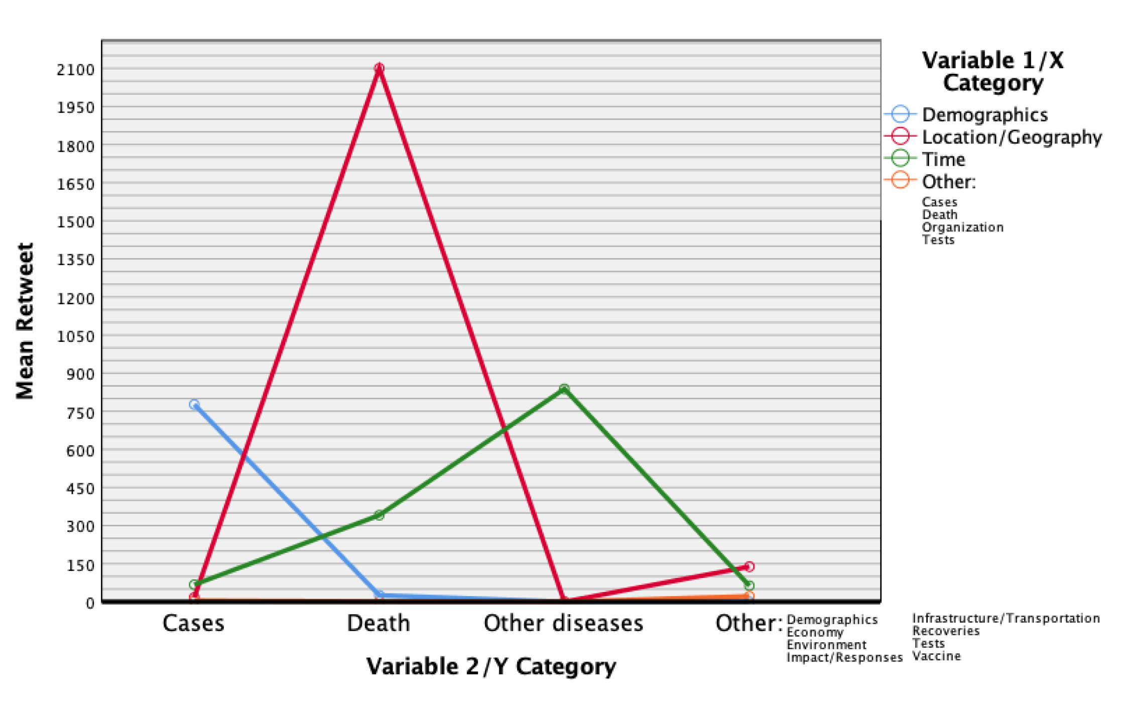
For visualizations with location/geography as variable 1 / x , deaths ( M   =   2100 ) were retweeted more than cases ( M   =   17.25 , S D   =   21.203 ) as variable 2 / y , p   =   0.001 . In other words, Twitter users retweeted the visualizations that showed death numbers at different locations more frequently than the charts that illustrated case numbers at different locations. Deaths ( M   =   2100 ) were also retweeted more than the economy ( M   =   138.50 , S D   =   194.454 ) ,   p   =   0.004 —see Figure 9 for more details.
An analysis of simple main effects for variable 2 / y was performed with statistical significance receiving a Bonferroni adjustment and being accepted at the p   =   0.0038 level ( 0.05 / 13 ) . There was a statistically significant difference in retweets for visualizations with variable 2 / y as death, F ( 2 , 171 )   =   4.718 ,   p   =   0.003 .
For visualizations with death as the variable 2 / y , location/geography (M = 2100) were retweeted more than demographics ( M   =   25.5 , S D   =   10.61 ) as variable 1 / x , p   =   0.004 . In other words, Twitter users retweeted the visualizations that showed death numbers at different locations more frequently than those that illustrated death numbers across different demographics. Location/geography ( M   =   2100 ) were also retweeted more than time ( M   =   341 , S D   =   670.73 ) ,   p   =   0.003 —see Figure 10 for more details.
In summary, the statistical analysis indicates that people were more engaged with visualizations when variable 1 / x was location/geography and variable 2 / y was deaths (rather than variable 2 / y as cases or economy). A possible explanation may be that COVID-19 was still in its initial months and people/organizations may have been more concerned with how deadly the virus was, as opposed to case number and its effect on the economy; also, people may focus more on the effect of the pandemic where they live or on the areas they need or plan to visit. Our analysis also indicates that when variable 2 / y was deaths, more people engaged with visualizations when location/geography was variable 1 / x (rather than demographics and time). This follows the previous explanation that people during this time might have been more interested in the number of deaths, rather than its demographic make-up (males vs. females, race, age, etc.) and the date/days of the spikes.

4.4. R.Q.4: What Challenges May Arise from These Casual Visualizations?

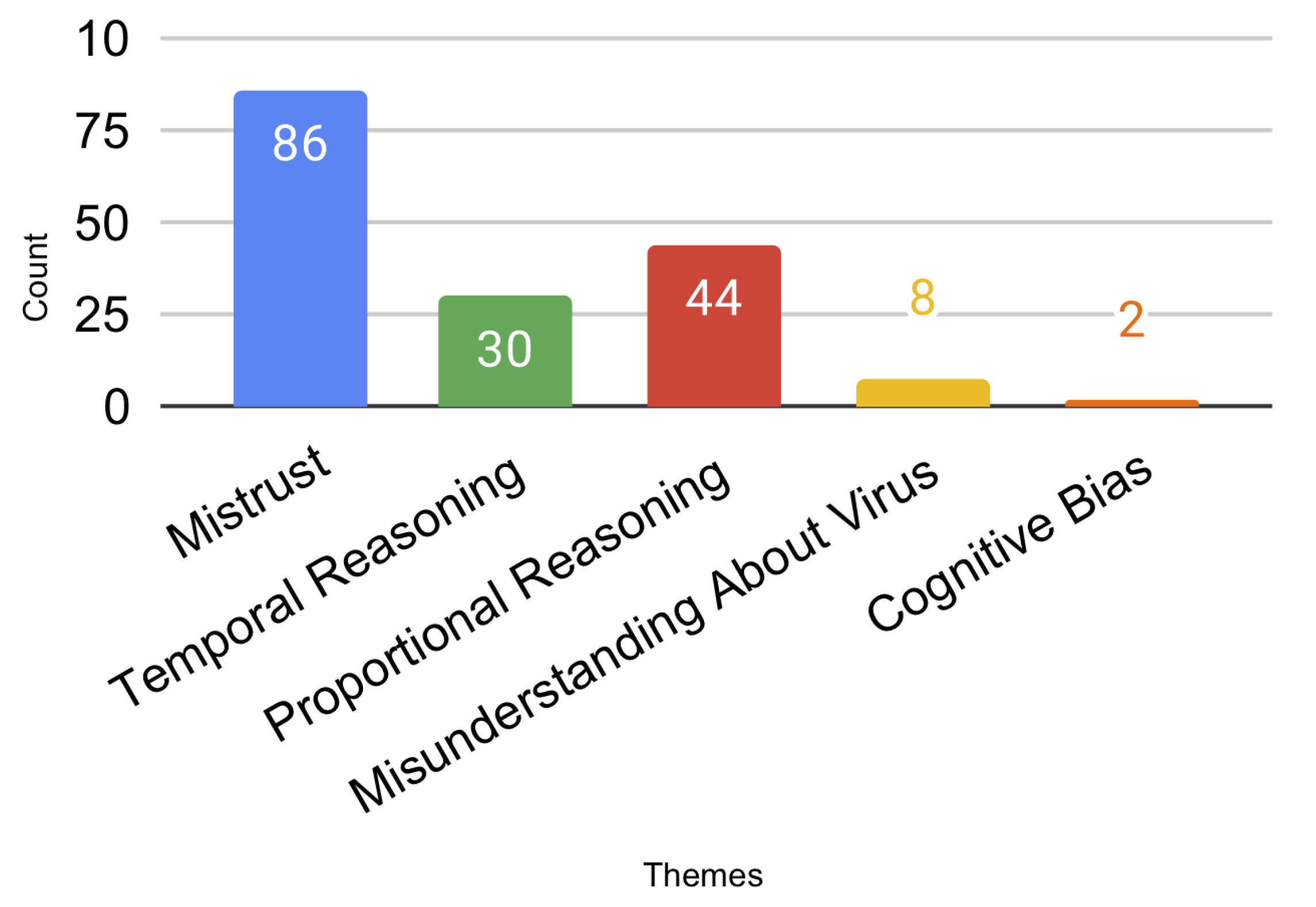
The researchers identified at least five challenges that arose when interpreting COVID-19 casual data visualizations on Twitter—see Figure 11. These challenges provide interesting insights on how to interpret COVID-19 data visualization, as well as on how to effectively design them.
  • Mistrust: We identified issues related to Mistrust in 86 posts (20% of the dataset). For example, we coded a post as Mistrust if the lack of data source led users to question the reliability of graph/visualization through the open-coding of the post replies.
  • Proportional Reasoning: Proportional Reasoning refers to the users’ ability to compare variables of the graph based on ratios or fractions. We identified potential challenges related to the ability of the visualization to facilitate Proportional Reasoning in 44 posts (11% of the dataset).
  • Temporal Reasoning: Temporal Reasoning refers to people’s ability to understand change over time. We identified 30 posts that raised issues related to Temporal Reasoning.
  • Misunderstanding about Virus: 2% of the issues (eight posts) showed a misunderstanding about the virus among people. For example, some users confused the coronavirus with SARS or the influenza virus.
  • Cognitive Bias: We identified 0.51% (two posts) of the posts that may lead users to misinterpret data because of their perception and prior experiences.

5. Discussion

In this section, we focus on the challenges that may arise when interpreting the casual data visualizations that people spontaneously posted on Twitter about COVID-19. We believe this can provide guidance for the design of such data visualizations; for this reason, we decided to focus this section on the 112 casual visualizations in our dataset that were created by individuals, and we do not explicitly discuss examples of charts made by organizations.

5.1. Mistrust

The issues of mistrust that we noticed in our data are consistent with what have been observed in social media literature. For example, a systematic review of health websites conducted by Eysenbach et al. [33] found the quality of health information on social media questionable in terms of accuracy, completeness, readability, and design. The graph or tweet degree of concordance (provided with the best evidence or with generally accepted medical source) define the Accuracy. Completeness is generally computed as a proportion of priori-defined elements covered by the tweet and graph, while Design covers subjective design features, such as the visual appeal of the graph and its method layout. Readability is also used to indicate how easy it is to decode the information in a tweet. In a different study, Sillence et al. [34] found two factors that led participants to quickly reject/mistrust information found online: Design, and Content. Design issues include an inappropriate name for the website (the title of the graph), complex/busy layout, lack of navigation (source) aids, boring design (especially use of color, small print, too much text, poor search facilities/indexes (source)). Content is related to a perception that the information is irrelevant, biased, or inappropriate.
In our analysis, we identified four major factors that can cause mistrust toward COVID-19 data visualizations: the lack of visibility of the data source (mostly, a design issue), perceived differences in reliability between individuals vs. organizations, not disclosing alternative interpretations of similar data visualizations, and not showing alternative visualizations of the same data—see Figure 12.

5.1.1. Visibility of the Data Source

In some cases, the mistrust was spawned by a specific design issue: the lack of visibility of the data source. Additionally, we noticed a Tweet that provided a screenshot with two similar graphs from two different people who reported different numbers of COVID-19 daily new cases, and could not make sense of the confusion by tweeting “Am I reading this wrong?”.
To limit these issues, people who are creating and posting data visualizations about COVID-19 on Twitter should include the data source in the chart itself: adding it in the text of the post is not enough, because people may overlook it, or because it can get lost when the chart is re-tweeted by a different person.

5.1.2. Organizations vs. Individuals

Another pattern we noticed is that people tend to question and mistrust the charts that were created by individuals more frequently than those re-tweeted from organizations. Our pool of 445 visualizations included 121 that were made by individuals and 307 by organizations (17—whose source was not clear—were excluded from this analysis). A one-way chi-square test of homogeneity revealed a statistically significant difference across these two groups of visualizations, χ 2 ( 2 )   =   1037 ,   p < 0.0005 . Specifically, we observed more issues of mistrust for individuals ( N   =   57 ) than for organizations ( N   =   26 ) . At first glance, this is not that surprising, as people tend to trust news outlets and government agencies. It does, however, suggest that people posting COVID-19 visualizations are not part of a social bubble that critically accepts any content posted by people in their social circle—on the contrary, they seem to question them frequently. Strategies that could be considered to increase trust when creating COVID-19 data visualizations are: (1) re-tweeting charts from a respectable organization first, in order to capture peoples’ interest and establish a personal reputation before crafting personalized ones; and (2) creating an external blog or website to have additional space to provide a consistent narrative using multiple data visualizations (which might build trust over time).

5.1.3. Alternative Interpretation of Similar Data Visualizations

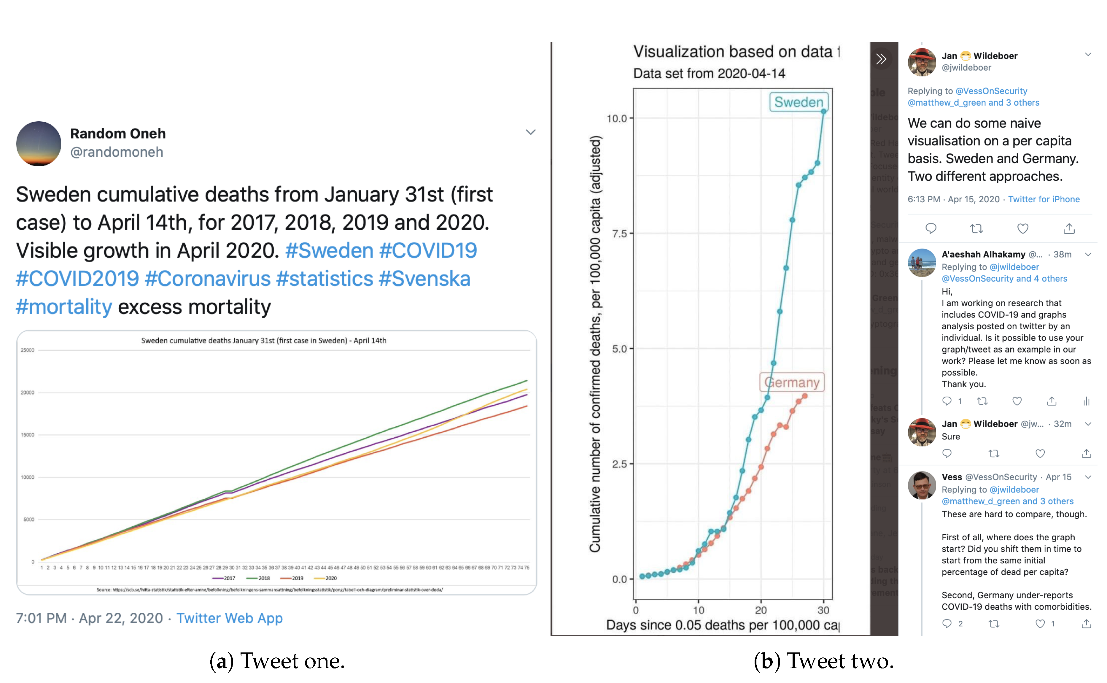
An additional source of mistrust arises when people notice that similar data visualizations can suggest different interpretations of the data. For example, two Twitter users complained that statistics can be manipulated to conform to underlying biases by posting two overshared graphs about mortality rates in Sweden that support opposite narratives—see Figure 13.
Similarly, there was a Twitter post criticizing a graph that states no one under the age of 40 has died of COVID-19 by presenting an opposite graph that shows a different story and asked, “This says the opposite! Which is correct?”.
Thus, people creating COVID-19 data visualizations should acknowledge limitations and alternative interpretations of their data visualization, in order to mitigate the perceived biases towards the storyline that they try to support through their data analysis.

5.2. Proportional Reasoning

Another source of complexity when reasoning with COVID-19 data comes from the combinatorial nature of those data. For example, the total number of cases is an aggregation of people who are currently infected, those who were infected and recovered, and people who died. In turn, the total number of people who are currently infected is a combination of people who are quarantined at home, those who are in hospital beds, those in intensive care units, and those using a ventilator. Thus, people creating COVID-19 data visualizations should disclose—to the best of their knowledge—the components of the data they visualize when they represent aggregated data.
Even more complicated, then, are the challenges related to proportional reasoning. Proportional reasoning refers to the ability to make comparisons between entities in multiplicative terms [35]. For example, if we know that the ratio between men and women at a factory is 2 to 1, we can determine that there are more men than women at that location. If, then, somebody tells us that the total number of workers is 90, we can infer from that proportion that 60 workers are men, and 30 are women. Because proportional reasoning is a complex type of reasoning [36], earlier studies on it focused on how it is learned during secondary education (e.g., [37]). More recently, researchers have investigated how younger children develop proportional reasoning, and proportional reasoning is now frequently seen as the capstone of the math thinking skills that children should acquire in K-12 education cycles [38]. What is sure, however, is that proportional reasoning is difficult to master, and challenging even for many adults [39]. Thus, visualizations that are designed to compare different COVID-19 data or locations should be crafted to facilitate proportional reasoning.

5.2.1. Part-Whole Relationship

For example, we may want to know the percentage of people who test positive to COVID-19 but do not exhibit symptoms. These types of inferences are dubbed by Lamon [38] as “Part-Part-Whole” relationships: the whole (in this example, the number of people who test positive) is described in terms of two or more parts [40] (e.g., in Indiana, 45% are asymptomatic and 65% actually get sick [41]).
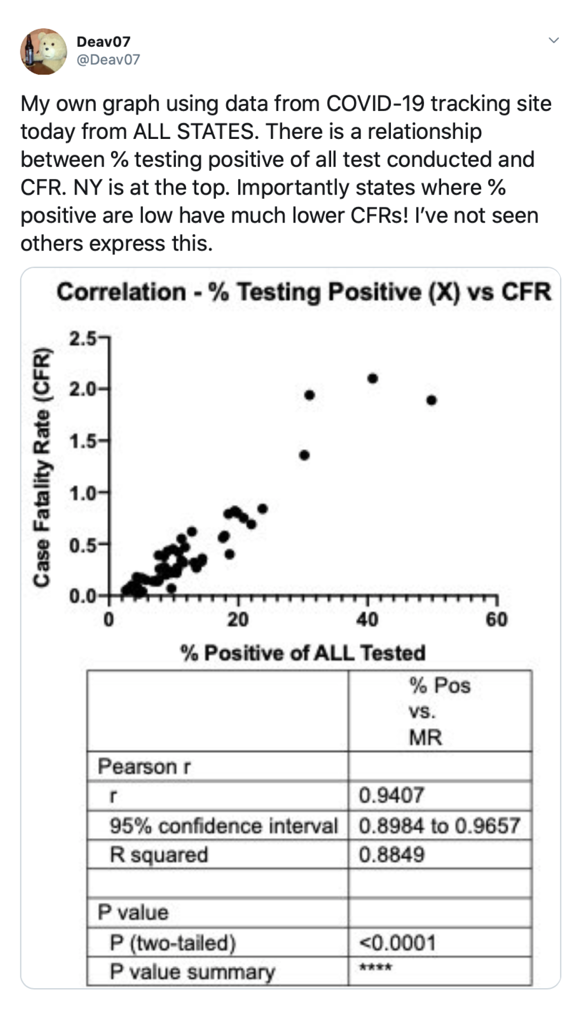
These visualizations should clearly state the components of the part-whole relationship (an example is illustrated in Figure 14), to avoid situations in which a part is confused for the whole.

5.2.2. Stretchers and Shrinkers

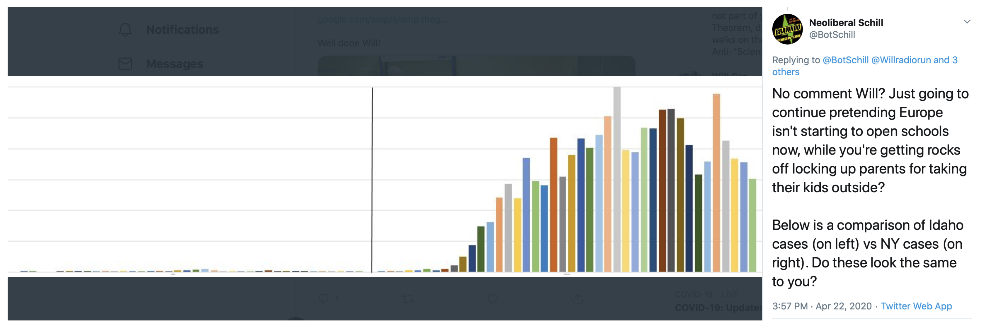
Another type of proportional reasoning deals with “Stretcher and Shrinker” problems [38], which look at how the ratio is preserved (or not) when a measure is scaled up or down. This should be considered, for example, when comparing different geographical areas (countries, states) with different populations. For example, charts may report an absolute number of infections (e.g., the number of cases in the U.S., Switzerland, Italy, Spain, Singapore). This metric is extremely valuable to understand where most cases are located (see an example in Figure 15), but does not provide much information to compare the density of cases (to answer questions such as: if children are at school with 1000 people, how many of them can potentially be infected?)
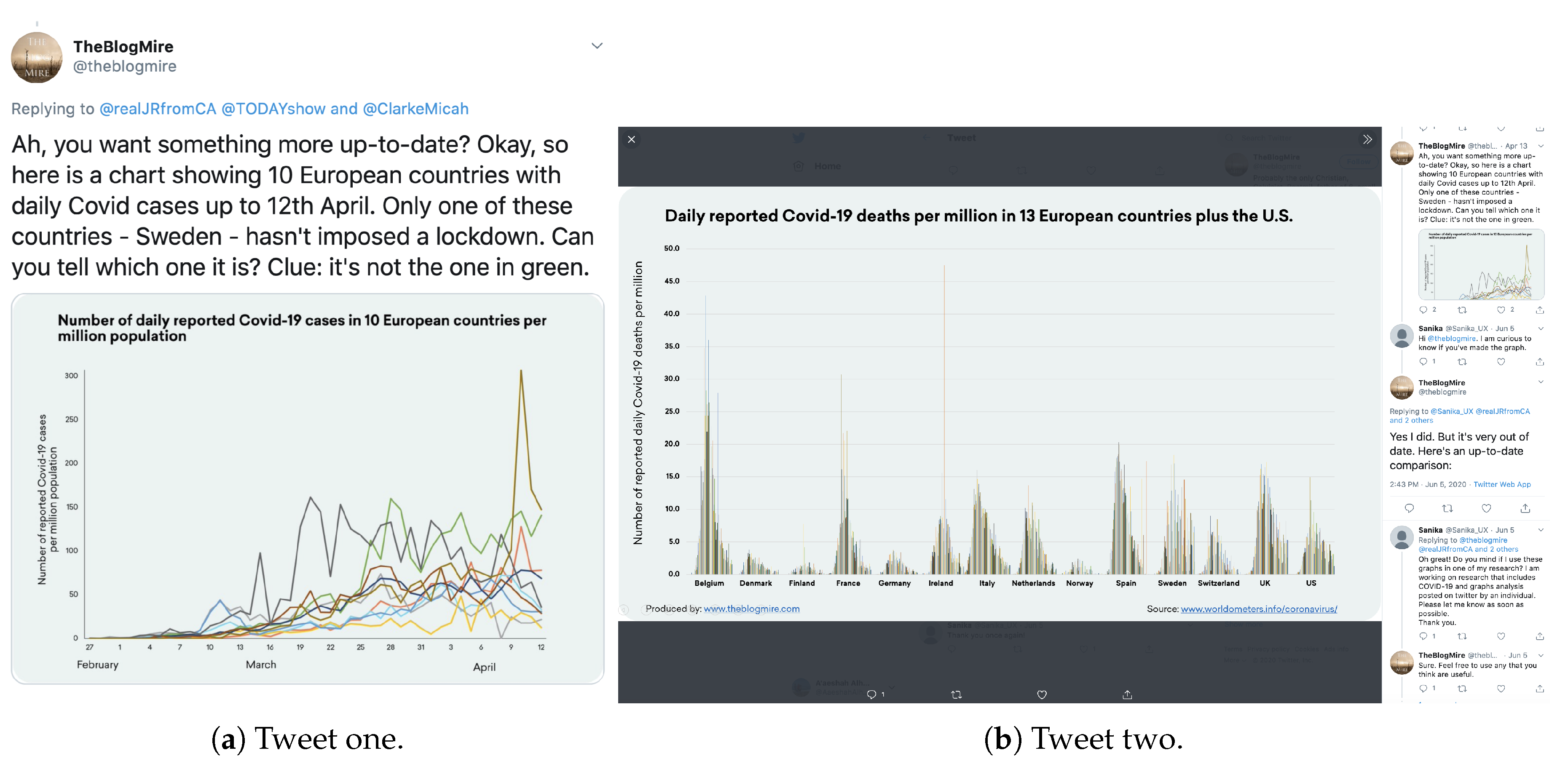
Dividing the number of cases by population may reveal a different story on where the highest concentrations of cases are. This strategy (dividing by a constant number of people) is used, for example, by @TheBlohMire in Figure 16.
In the latter case, using labels such as “1 case every 50 people” rather than simply reporting a percentage (e.g., “2%”) can facilitate this proportional reasoning, because they help the reader relate an infection rate to the actual number of people that they could encounter, for example, when walking on a busy street or taking public transit.

5.3. Temporal Reasoning

Temporal reasoning can also be problematic when designing and interpreting COVID-19 data visualizations.

5.3.1. Metrics that Always Increase

Misconceptions may occur when we visualize metrics that always increase, but whose components change (either increase or decrease) over time. For instance, when looking at the (many) charts that report the total number of cases since the beginning of the pandemic (an example is in Figure 1), we may lose track of the fact that a chart representing such a metric does not show the number of people who are currently sick (because some recovered).
Thus, people creating those charts could consider combining them with other visualizations that report data within a smaller, more recent time window (e.g., cases reported in the last 14 days).

5.3.2. Inaccurate Part-Whole Relationships with Data that Refer to Different Points in Time

Designers of COVID-19 data visualizations should carefully avoid metrics that inaccurately combine data that refer to different points in time: mixing data from the past and present can most likely lead to misleading visualizations. For example, we noticed a visualization that reported the percentage of people who died from the disease by dividing the number of deaths on a given day by the number of people who were known to be sick on that same day. This approach, however, is misleading, because the disease needs time to get people sick; thus, the people who died on a specific day are those who actually got sick one to three weeks before. At the beginning of the pandemic (or of a new pandemic cycle), forgetting about the time dimension may lead to inaccurately low death rates (we divided the number of deaths, which was still relatively low because it reflected people who got infected over the past few weeks, by another that had higher infections because it refers to now). In between pandemic cycles, this can also be misleading by portraying very high death rates while the number of daily cases is actually decreasing.
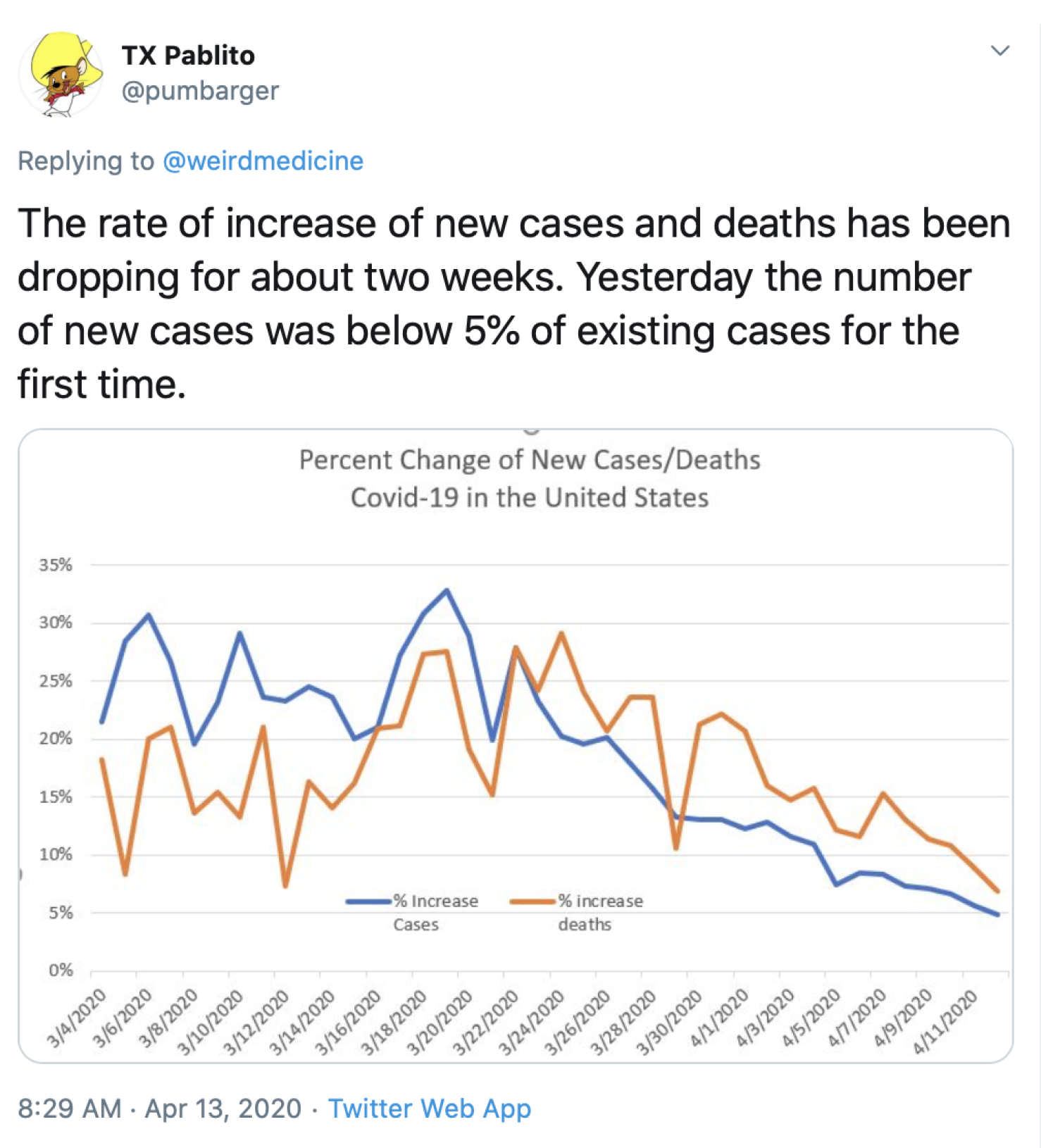
Additionally, to facilitate temporal reasoning, designers of COVID-19 data visualizations should consider reporting metrics that depend on different time intervals on different charts, rather than combining them on the same visualization. For example, Figure 17 properly represents new cases and deaths over time, but having these two metrics on the same axis may hide the different temporal dimensions that they refer to.

5.3.3. Out-of-Context Stretchers and Shrinkers

An additional source of confusion comes from reasoning with Stretchers and Shrinkers (i.e., metric that preserve a ratio) over time. This can be challenging even when using good metrics, such as the “percentage of positive tests”, which was used in one of the charts in our dataset. First, the percentage of tested people who test positive might be excessively high if only a very few people are tested (this metric fails to capture the more mild cases and the asymptomatic if testing is not widely available). Thus, in the initial stages, a decreasing trend in this metric does not mean that the situation is improving. Second, relative stability (or even a decrease) in this metric may hide an increase in the absolute number of infected people (some of which may need hospital beds): at different points in time, this metric will still report the same value if the number of people who tested positive increases (because more and more people contract the disease), and the total number of people who are tested also increase (because of a wider availability of testing and testing sites). This may mislead people to think that the situation is getting better, while it is not.
Thus, these charts should be presented in conjunction with visualizations that also illustrate the trend of each component of the metric (in this example, with a chart showing testing over time and other showing positive cases over time), to provide a more comprehensive overview of the current situation.

5.4. Cognitive Bias

Cognitive bias is defined by Haselton et al. [42] as a systematic pattern of deviation from normal or rational judgment influenced by other people or situations. In other words, people’s prior experiences can create their own “subjective social reality” when interpreting a phenomenon that they observe. In turn, the social reality constructed and adopted by individuals could dictate their behavior more than the objective phenomenon. This may lead to illogical interpretation, inaccurate judgment, perceptual distortion, or irrationality [43].
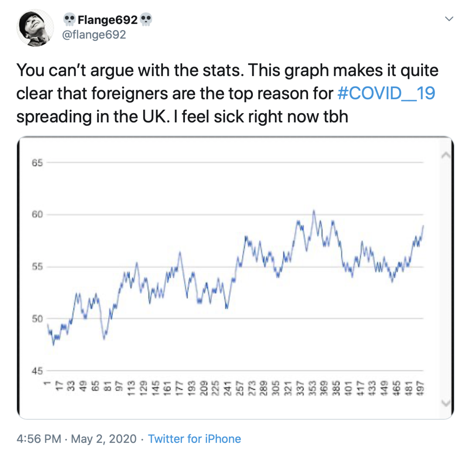
In the case of COVID-19 tweets, we observed instances of cognitive biases related to race, country, and immigration. For example, the Tweet in Figure 18 indicates foreigners as the top cause of viruses spreading in a certain country. Although it is true that the virus did not originate in the UK, the text of the Tweet could be interpreted as a cognitive bias against foreigners. Thus, designers of data visualizations that are crafted to support a political point should carefully separate the data from their interpretation of the results (e.g., by adding a clear, objective description of the represented data before they add their personal claims), to minimize the change of accidentally introducing cognitive bias in their own designs or, vice versa, triggering cognitive bias in the readers.

5.5. Misunderstanding about the Virus

We observed some misunderstandings about the virus in the COVID-19 data visualizations that we collected and from the users who commented on the tweet and attempted to provide feedback/ critique to the creator. For example, some individuals mistakenly thought that COVID-19, influenza, and the common cold fell under the same virus family; others thought that influenza could spread as quickly as COVID-19, or that the coronavirus was like the seasonal flu.

5.6. Additional Recurrent Themes

During the process of coding the dataset, we also noticed two recurrent themes that we want to briefly acknowledge in this discussion.

5.6.1. Predictions

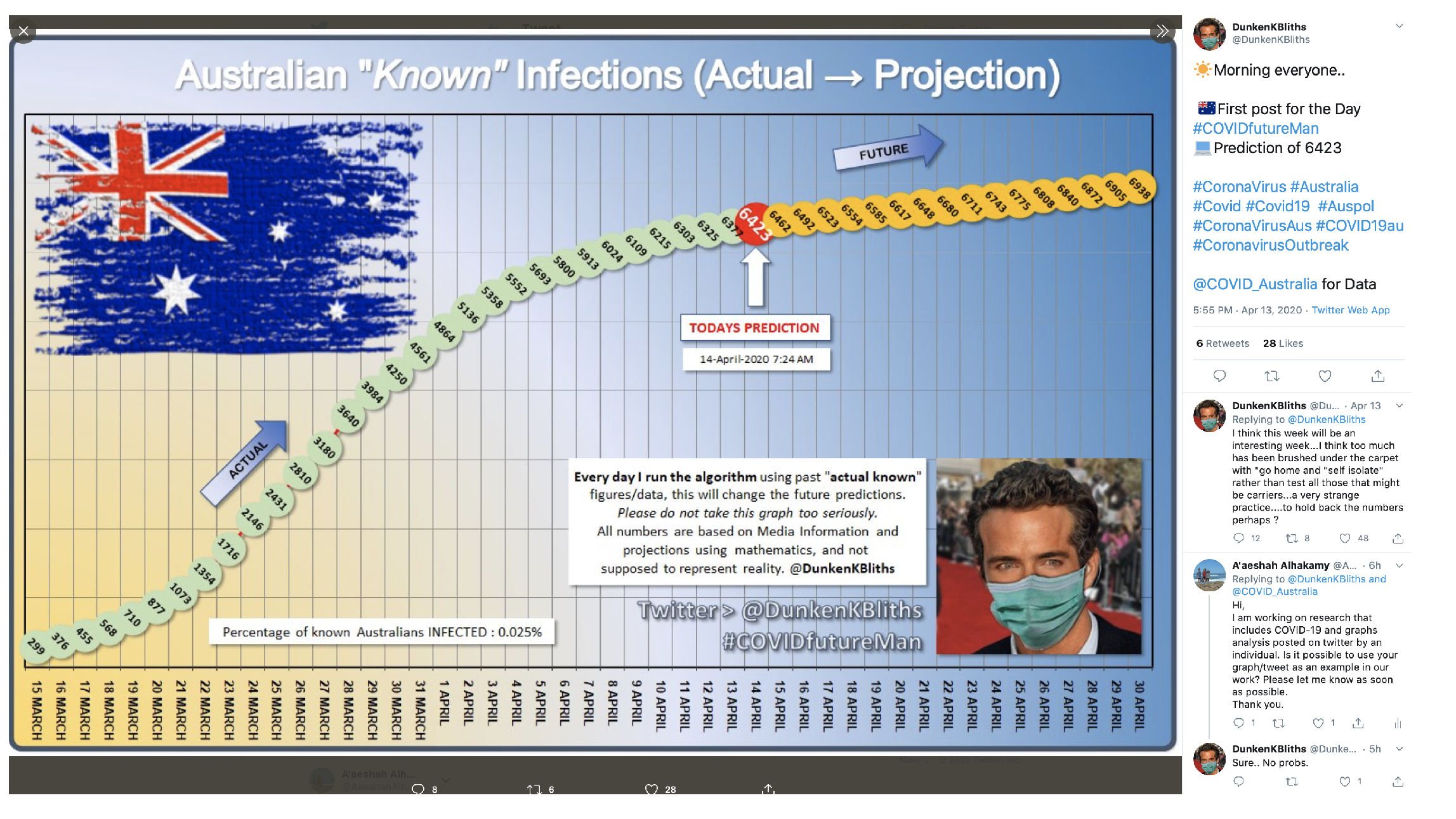
Social media has been used to track infectious diseases, such as influenza, and to address public health concerns. For example, Culotta [44] analyzed how Twitter activity in the most populous counties in the USA can be linked to health statistics. In our dataset, we noticed 18 posts (4% of the dataset) that included predictions about COVID-19. Some Twitter users attempted, for example, to estimate or predict the percentage of expected deaths (based on the daily number of new cases). People also ran predictive algorithms and mathematical projections (using past data/graphs from social media) to estimate future total cases—see an example in Figure 19. Another visualization used the maximum likelihood classification tree algorithm to predict hospitalization based on age, gender, race, obesity, diabetes. Others attempted to detect when countries have ”turned the corner” with a decline in the number of new cases—see Figure 20.
Posts making predictions, however, should clearly report the data source and the statistical or analytical model that they used—otherwise, they could be misleading.

5.6.2. Comparison with Past Epidemics/Pandemics

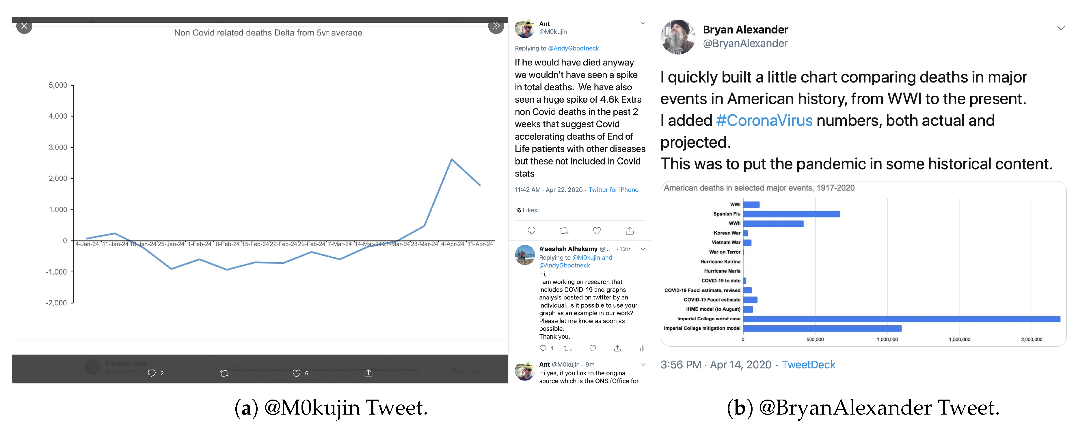
We identified 34 posts in which users compared COVID-19 with past epidemics or pandemics. We observed multiple posts that compared the current pandemic to the 1918 H1N1 influenza pandemic (Spanish flu). Others compared COVID-19 to past flu pandemics. On the opposite end, Figure 21a shows a graph that illustrates the excess current deaths versus the five-year average (to highlight the difference with the common flu). Other posts included visualizations that compared COVID-19 with other strains of the coronavirus (MERs, SARs, etc.) and commented that respiratory infections from viruses kept changing over time. For example, the chart in Figure 21b includes the death rate during most of the major events in American history (along with COVID-19 mortality numbers).
The challenge here is that some of these visualizations were, or could be used to suggest that COVID-19 is not that bad at all, because it is not as deadly as past pandemics. Thus, posts making a comparison with past pandemics should carefully disclose the historic context they refer to, in order to avoid situations in which they mislead people in thinking that COVID-19 is not that bad after all because it does not cause as many deaths as the bubonic plague.

6. Conclusions

This paper reports qualitative and quantitative findings from a Twitter crawl of 5409 posts during the period of the COVID-19 epidemic between 14 April 2020 to 9 May 2020. The aim of the paper was to gain an understanding of the casual data visualizations that were spontaneously retweeted from organizations or created by individuals. We (1) reported what people were posting, (2) discovered differences in the topics that received the most retweets, and (3) highlighted the challenges that arose when interpreting these casual data visualizations. Regardless of generation (organizations vs. individuals), visualizations that include temporal series, such as line graphs and bar graphs, are those that get most frequently retweeted. We found that when people were more engaged with graphs that included location/geography in the x-axis, more deaths were retweeted than cases, and the effect of the economy was set as the y-axis variable. On the other hand, when the y-axis was deaths, more people retweeted graphs that included location/geography than demographics, and time as the x-axis variable.
Our qualitative analysis uncovered five challenges related with COVID-19 casual data visualization on Twitter: (1) Mistrust; (2) temporal reasoning; (3) proportional reasoning; (4) misunderstanding about the virus; and (5) cognitive bias. These challenges are not limited to Twitter, but should be considered in a broader range of social media sites when navigating data about COVID-19. Additionally, they may provide guidelines for people creating and interpreting casual data visualizations in general. Finally, we believe our findings can facilitate news media and government agencies in better understanding the kind of information that people care the most about and the challenges citizens may face while interpreting visualizations related to this pandemic.

Author Contributions

Conceptualization, F.C., M.T., A.A., and S.R.K.; methodology, M.T., A.A., and F.C.; software, S.R.K., A.A., and M.T.; validation, M.T., A.A., F.C., S.V., and R.M.; formal analysis, M.T., A.A., S.V., R.M., and F.C.; investigation, M.T., A.A., S.V., R.M., and F.C.; resources, F.C.; writing—original draft preparation, M.T., A.A., F.C., and S.R.K.; writing—review and editing, M.T., A.A., F.C., S.V., and R.M.; visualization, M.T., A.A., F.C., S.V., and R.M.; supervision, F.C.; project administration, F.C.; funding acquisition, F.C. All authors have read and agreed to the published version of the manuscript.

Funding

This research received no external funding.

Acknowledgments

We would like to thank all the Twitter users who gave us permission to reproduce their tweets and graphs in this paper.

Conflicts of Interest

The authors declare no conflict of interest.

Abbreviations

The following abbreviations are used in this manuscript:
COVID-19coronavirus disease of 2019
CWWSthe ability to cope with workplace-related stress
MERsmiddle eastern respiratory syndrome
SARssevere acute respiratory syndrome

References

  1. Pousman, Z.; Stasko, J.; Mateas, M. Casual information visualization: Depictions of data in everyday life. IEEE Trans. Vis. Comput. Graph. 2007, 13, 1145–1152. [Google Scholar] [CrossRef] [PubMed] [Green Version]
  2. Sprague, D.; Tory, M. Exploring how and why people use visualizations in casual contexts: Modeling user goals and regulated motivations. Inf. Vis. 2012, 11, 106–123. [Google Scholar] [CrossRef]
  3. Chen, E.; Lerman, K.; Ferrara, E. Covid-19: The first public coronavirus twitter dataset. arXiv 2020, arXiv:2003.07372. [Google Scholar]
  4. Way, A.; Haque, R.; Xie, G.; Gaspari, F.; Popović, M.; Poncelas, A. Rapid Development of Competitive Translation Engines for Access to Multilingual COVID-19 Information. Informatics 2020, 7, 19. [Google Scholar] [CrossRef]
  5. Vicari, S.; Murru, M. One Platform, a Thousand Worlds: On Twitter Irony in the Early Response to the COVID-19 Pandemic in Italy. Soc. Med. Soc. 2020, 6. [Google Scholar] [CrossRef]
  6. Karisani, N.; Karisani, P. Mining Coronavirus (COVID-19) Posts in Social Media. arXiv 2020, arXiv:2004.06778. [Google Scholar]
  7. Zarei, K.; Farahbakhsh, R.; Crespi, N.; Tyson, G. A first Instagram dataset on COVID-19. arXiv 2020, arXiv:2004.12226. [Google Scholar]
  8. Lopez, C.E.; Vasu, M.; Gallemore, C. Understanding the perception of COVID-19 policies by mining a multilanguage Twitter dataset. arXiv 2020, arXiv:2003.10359. [Google Scholar]
  9. Kouzy, R.; Abi Jaoude, J.; Kraitem, A.; El Alam, M.B.; Karam, B.; Adib, E.; Zarka, J.; Traboulsi, C.; Akl, E.W.; Baddour, K. Coronavirus goes viral: Quantifying the COVID-19 misinformation epidemic on Twitter. Cureus 2020, 12, e7255. [Google Scholar] [CrossRef] [Green Version]
  10. Alshaabi, T.; Minot, J.R.; Arnold, M.V.; Adams, J.L.; Dewhurst, D.R.; Reagan, A.J.; Muhamad, R.; Danforth, C.M.; Dodds, P.S. How the world’s collective attention is being paid to a pandemic: COVID-19 related 1-gram time series for 24 languages on Twitter. arXiv 2020, arXiv:2003.12614. [Google Scholar]
  11. Medford, R.J.; Saleh, S.N.; Sumarsono, A.; Perl, T.M.; Lehmann, C.U. An “Infodemic”: Leveraging High-Volume Twitter Data to Understand Public Sentiment for the COVID-19 Outbreak. medRxiv 2020. [Google Scholar] [CrossRef] [Green Version]
  12. Schild, L.; Ling, C.; Blackburn, J.; Stringhini, G.; Zhang, Y.; Zannettou, S. “go eat a bat, chang!”: An early look on the emergence of sinophobic behavior on web communities in the face of covid-19. arXiv 2020, arXiv:2004.04046. [Google Scholar]
  13. Ferrara, E. What types of COVID-19 conspiracies are populated by Twitter bots? First Monday 2020. [Google Scholar] [CrossRef]
  14. Ordun, C.; Purushotham, S.; Raff, E. Exploratory analysis of covid-19 tweets using topic modeling, umap, and digraphs. arXiv 2020, arXiv:2005.03082. [Google Scholar]
  15. Jahanbin, K.; Rahmanian, V. Using Twitter and web news mining to predict COVID-19 outbreak. Asian Pac. J. Trop. Med. 2020, 13. [Google Scholar]
  16. Cleveland, W.S.; McGill, R. Graphical perception: The visual decoding of quantitative information on graphical displays of data. J. R. Stat. Soc. Ser. A (General) 1987, 150, 192–210. [Google Scholar] [CrossRef]
  17. Shah, P.; Hoeffner, J. Review of graph comprehension research: Implications for instruction. Educ. Psychol. Rev. 2002, 14, 47–69. [Google Scholar] [CrossRef] [Green Version]
  18. Ress, S.; Cafaro, F.; Bora, D.; Prasad, D.; Soundarajan, D. Mapping History: Orienting Museum Visitors across Time and Space. J. Comput. Cult. Herit. (JOCCH) 2018, 11, 1–25. [Google Scholar] [CrossRef]
  19. Szafir, D.A. Modeling color difference for visualization design. IEEE Trans. Vis. Comput. Graph. 2017, 24, 392–401. [Google Scholar] [CrossRef] [PubMed]
  20. Henry, N.; Fekete, J.D.; McGuffin, M.J. Nodetrix: A hybrid visualization of social networks. IEEE Trans. Vis. Comput. Graph. 2007, 13, 1302–1309. [Google Scholar] [CrossRef] [Green Version]
  21. Gao, B.; Berendt, B. Circles, posts and privacy in egocentric social networks: An exploratory visualization approach. In Proceedings of the 2013 IEEE/ACM International Conference on Advances in Social Networks Analysis and Mining, Niagara Falls, ON, Canada, 25–28 August 2013; pp. 792–796. [Google Scholar]
  22. Caine, K.; Kisselburgh, L.G.; Lareau, L. Audience visualization influences disclosures in online social networks. In Proceedings of the ACM CHI Conference on Human Factors in Computing Systems Extended Abstracts, Vancouver, BC, Canada, 7–12 May 2011; pp. 1663–1668. [Google Scholar]
  23. Nagulendra, S.; Vassileva, J. Understanding and controlling the filter bubble through interactive visualization: A user study. In Proceedings of the 25th ACM Conference on Hypertext and Social Media, Santiago, Chile, 1–4 September 2014; pp. 107–115. [Google Scholar]
  24. Hu, M.; Wongsuphasawat, K.; Stasko, J. Visualizing social media content with sententree. IEEE Trans. Vis. Comput. Graph. 2016, 23, 621–630. [Google Scholar] [CrossRef] [PubMed]
  25. Zhao, J.; Cao, N.; Wen, Z.; Song, Y.; Lin, Y.R.; Collins, C. # fluxflow: Visual analysis of anomalous information spreading on social media. IEEE Trans. Vis. Comput. Graph. 2014, 20, 1773–1782. [Google Scholar] [PubMed]
  26. Xu, P.; Wu, Y.; Wei, E.; Peng, T.Q.; Liu, S.; Zhu, J.J.; Qu, H. Visual analysis of topic competition on social media. IEEE Trans. Vis. Comput. Graph. 2013, 19, 2012–2021. [Google Scholar] [PubMed]
  27. Thom, D.; Krüger, R.; Ertl, T. Can Twitter save lives? A broad-scale study on visual social media analytics for public safety. IEEE Trans. Vis. Comput. Graph. 2015, 22, 1816–1829. [Google Scholar] [CrossRef] [PubMed]
  28. Isenberg, P.; Zuk, T.; Collins, C.; Carpendale, S. Grounded Evaluation of Information Visualizations. In Proceedings of the 2008 Workshop on BEyond Time and Errors: Novel EvaLuation Methods for Information Visualization (BELIV ’08), Florence, Italy, 5 April 2008; Association for Computing Machinery: New York, NY, USA, 2008. [Google Scholar] [CrossRef] [Green Version]
  29. Sandelowski, M. Sample size in qualitative research. Res. Nurs. Health 1995, 18, 179–183. [Google Scholar] [CrossRef] [PubMed]
  30. Corbin, J.M.; Strauss, A. Grounded theory research: Procedures, canons, and evaluative criteria. Qual. Sociol. 1990, 13, 3–21. [Google Scholar] [CrossRef]
  31. Saunders, B.; Sim, J.; Kingstone, T.; Baker, S.; Waterfield, J.; Bartlam, B.; Burroughs, H.; Jinks, C. Saturation in qualitative research: Exploring its conceptualization and operationalization. Qual. Quant. 2018, 52, 1893–1907. [Google Scholar] [CrossRef]
  32. Shneiderman, B. The eyes have it: A task by data type taxonomy for information visualizations. In Proceedings of the 1996 IEEE Symposium on Visual Languages, Boulder, CO, USA, 3–6 September 1996; pp. 336–343. [Google Scholar]
  33. Eysenbach, G.; Powell, J.; Kuss, O.; Sa, E.R. Empirical Studies Assessing the Quality of Health Information for Consumers on the World Wide WebA Systematic Review. JAMA 2002, 287, 2691–2700. [Google Scholar] [CrossRef]
  34. Sillence, E.; Briggs, P.; Fishwick, L.; Harris, P. Trust and Mistrust of Online Health Sites. In Proceedings of the SIGCHI Conference on Human Factors in Computing Systems (CHI ’04), Vienna, Austria, 24–29 April 2004; Association for Computing Machinery: New York, NY, USA, 2004; pp. 663–670. [Google Scholar] [CrossRef] [Green Version]
  35. Wright, V. Proportional reasoning: Some rational thoughts. In Proceedings of the 42nd Annual Conference of the Mathematical Association of Victoria: Celebrating Achievement, Melbourne, Australia, 1–2 December 2005; pp. 363–375. [Google Scholar]
  36. Inhelder, B.; Piaget, J. The Growth of Logical Thinking from Childhood to Adolescence: An Essay on the Construction of Formal Operational Structures; Routledge: London, UK, 1958; Volume 22. [Google Scholar]
  37. Karplus, R.; Karplus, E.; Formisano, M.; Paulsen, A.C. A survey of proportional reasoning and control of variables in seven countries. J. Res. Sci. Teach. 1977, 14, 411–417. [Google Scholar] [CrossRef]
  38. Lamon, S.J. Ratio and proportion: Connecting content and children’s thinking. J. Res. Math. Educ. 1993, 24, 41–61. [Google Scholar] [CrossRef]
  39. Tourniaire, F.; Pulos, S. Proportional reasoning: A review of the literature. Educ. Stud. Math. 1985, 16, 181–204. [Google Scholar] [CrossRef]
  40. Parish, L. Facilitating the Development of Proportional Reasoning through Teaching Ratio. In Proceedings of the 33rd Annual Conference of the Mathematics Education Research Group of Australasia, Freemantle, Australia, 3–7 July 2010; pp. 469–476. [Google Scholar]
  41. Oran, D.P.; Topol, E.J. Prevalence of Asymptomatic SARS-CoV-2 Infection: A Narrative Review. Ann. Intern. Med. 2020, 173, 362–367. [Google Scholar] [CrossRef] [PubMed]
  42. Haselton, M.G.; Nettle, D.; Murray, D.R. The Evolution of Cognitive Bias. In The Handbook of Evolutionary Psychology; Chapter 41; John Wiley & Sons: Hoboken, NJ, USA, 2015; pp. 1–20. [Google Scholar] [CrossRef]
  43. Greifeneder, R.; Bless, H.; Fiedler, K. Social Cognition: How Individuals Construct Social Reality; Psychology Press: Abingdon, UK, 2017. [Google Scholar]
  44. Culotta, A. Estimating County Health Statistics with Twitter. In Proceedings of the SIGCHI Conference on Human Factors in Computing Systems (CHI ’14), Toronto, ON, Canada, 26 April–1 May 2014; Association for Computing Machinery: New York, NY, USA, 2014; pp. 1335–1344. [Google Scholar] [CrossRef] [Green Version]
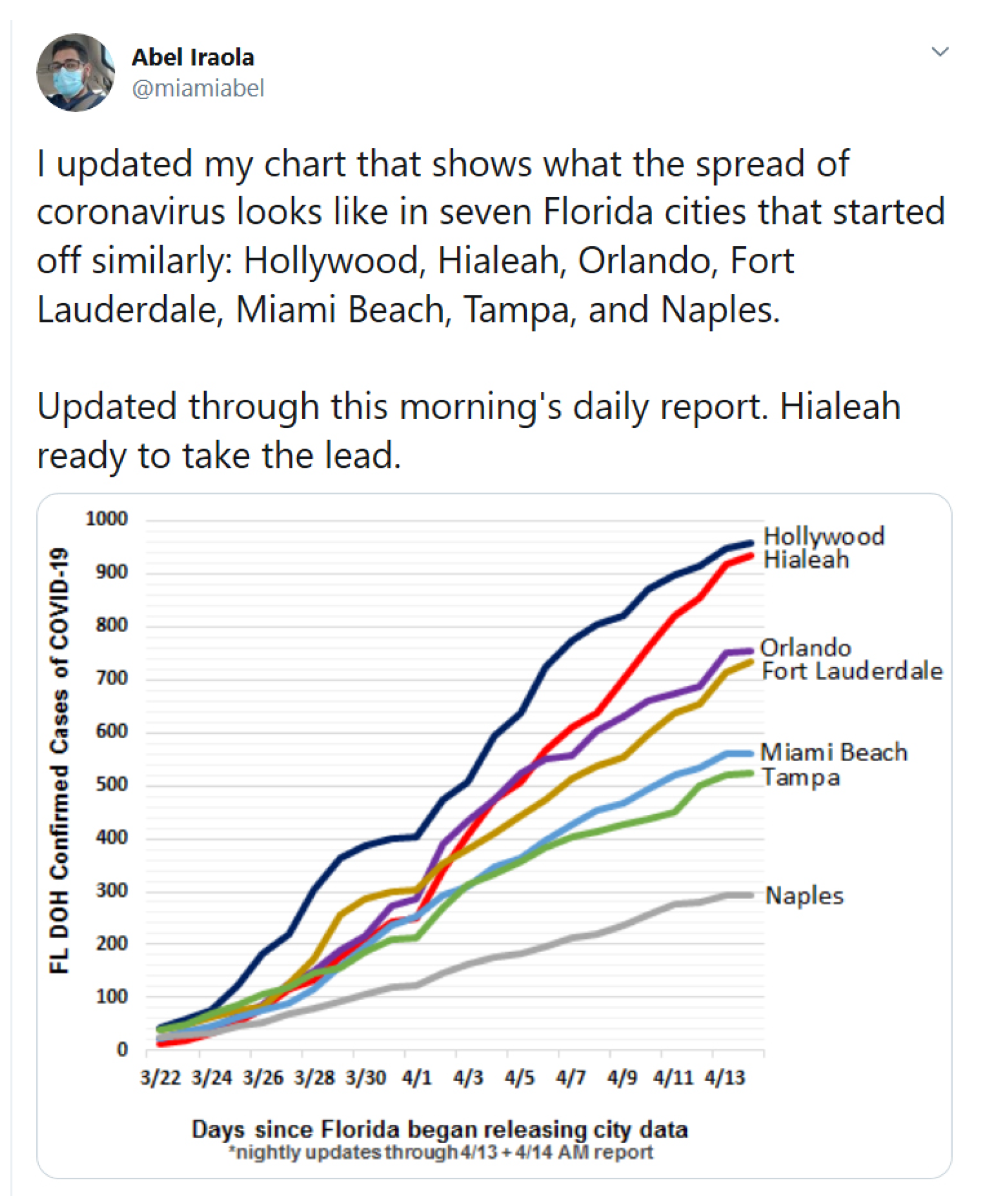
Figure 1. @Miamiabel tweet is an example of the casual data visualizations that Twitter users are spontaneously creating and posting about COVID-19.
Informatics 07 00035 g001
Figure 2. Affinity diagram that we used to group the many variables that were used in the data visualizations that we collected.
Informatics 07 00035 g002
Figure 3. Number of data visualizations generated by individuals and organizations.
Informatics 07 00035 g003
Figure 4. Type of COVID-19 data visualizations per type of visualization in Schneiderman’s Type-by-Task Taxonomy (TTT) [32].
Informatics 07 00035 g004
Figure 5. Source of the data represented in the visualization.
Informatics 07 00035 g005
Figure 6. Categories of data across variables 1 / x , 2 / y , and 3.
Informatics 07 00035 g006
Figure 7. Scatter-plot of the influence of follower count on retweets.
Informatics 07 00035 g007
Figure 8. Effect of variable 1 / x and variable 2 / y on number of retweets.
Informatics 07 00035 g008
Figure 9. Influence of variables 1 / x and 2 / y on retweets.
Informatics 07 00035 g009
Figure 10. Influence of variables 1 / x and 2 / y on retweets.
Informatics 07 00035 g010
Figure 11. Challenges for interpreting COVID-19 data visualizations.
Informatics 07 00035 g011
Figure 12. @DrSimonAshworth and @jamft tweets and graphs are examples of visualization that depict relevant data but may generate mistrust due to a lack of source or labels in the Figure.
Informatics 07 00035 g012
Figure 13. @jwildeboer and @RandomOneh tweets and graphs are an example of two visualizations that interpret similar data differently.
Informatics 07 00035 g013
Figure 14. @Deav07 tweet and graph, using the words “% testing positives” and “all tests” to clarify a part-whole relationship.
Informatics 07 00035 g014
Figure 15. @BotSchill tweet and graph highlights the absolute number of cases in two different regions.
Informatics 07 00035 g015
Figure 16. @TheBlogMire tweet and graph divide deaths by a constant number of people, a strategy that may facilitate proportional reasoning (in this case, comparing areas with different populations).
Informatics 07 00035 g016
Figure 17. @pumbarger tweets and graph properly illustrates two very important metrics (new cases and deaths) over time. Representing these two distinct metrics using distinct charts, however, might facilitate temporal reasoning.
Informatics 07 00035 g017
Figure 18. Tweet by @flange692 that connects COVID-19 with immigration. It could have included a more objective description of the data.
Informatics 07 00035 g018
Figure 19. Tweet by @DunkenKBliths and graph—a visualization of data-based predictions.
Informatics 07 00035 g019
Figure 20. Tweet by @wiredmedicie and graph using data models and visualizations to determine when a country is on the “right path” toward lowering the number of cases.
Informatics 07 00035 g020
Figure 21. Tweets by @M0kujin and @BryanAlexander are examples of comparisons with past epidemics/pandemics/historic events.
Informatics 07 00035 g021