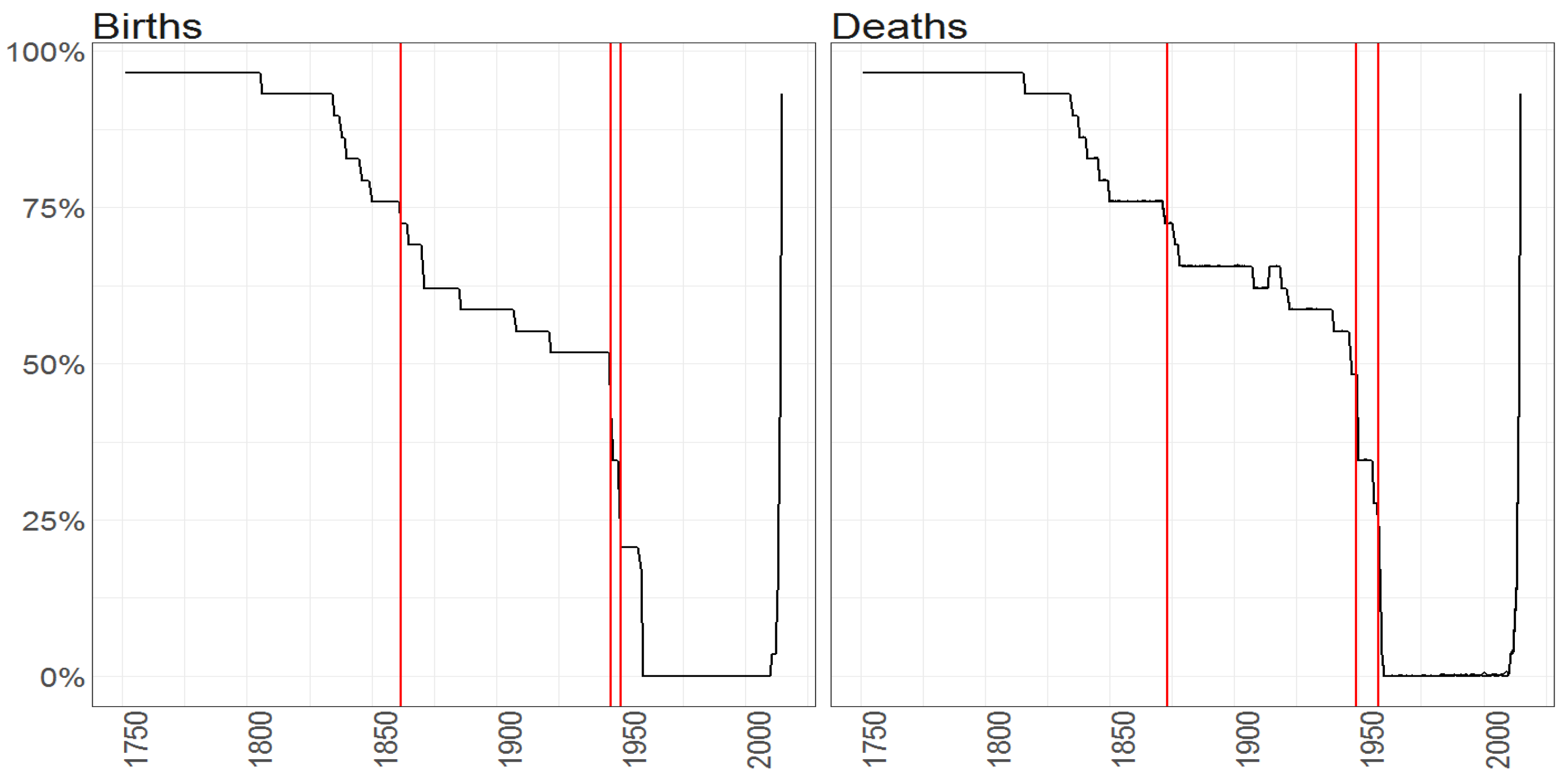
Figure 1.
The percentage of missing entries (y axis) per observation vector over time (x axis) for the Births counts (left plot) and Deaths counts (right plot) for female (blue line) and male (blacke line) population. Red vertical lines correspond to the starting points in time of samples when maximum of missing entries is equal to (from the left side on corresponding plots) 75%, 50% and 25%.
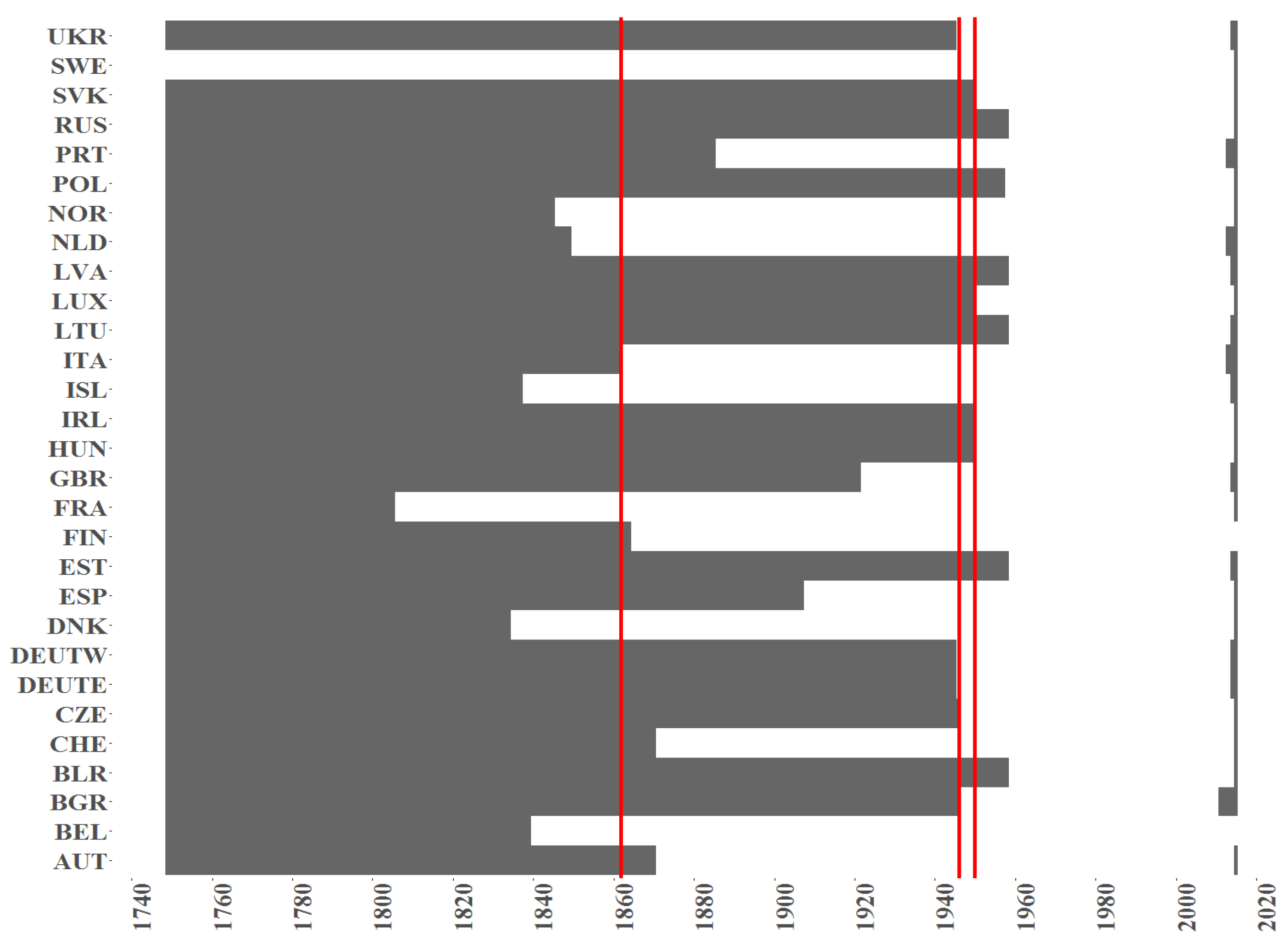
Figure 2.
The indicator of a missing value (black colour) per country (y axis) over time (x axis) for the Births counts for female population. Red vertical lines correspond to the starting points in time when samples with maximum of missing entries is equal to (from the left side on corresponding plots) 75%, 50% and 25%.
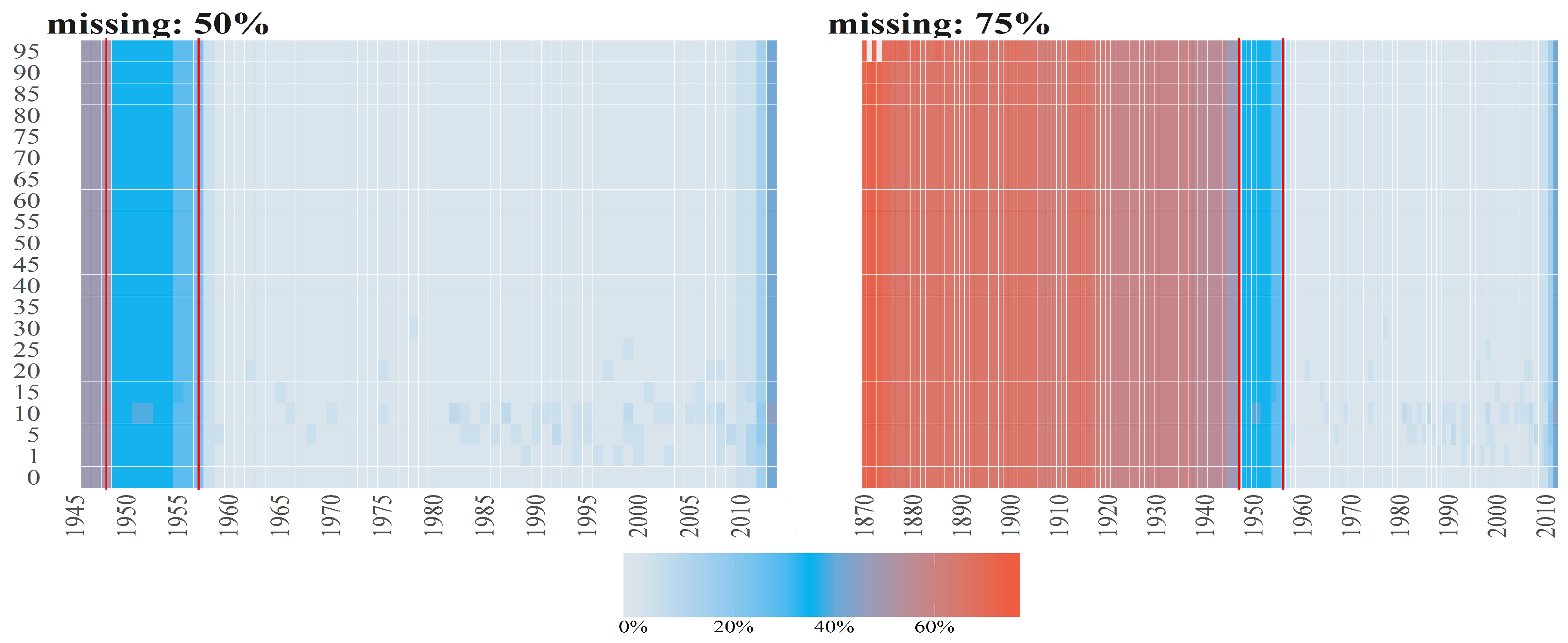
Figure 3.
Percentages of missing values (denoted by diffrent colours) per observation for Number of Deaths for Females per age groups (y axis) over time (x axis). The titles of the subplots indicate the case of missing values (50%, 75%). The percentage for a given country and given age group is computed dividing number of missing values by number of countries. Red vertical lines correspond to the starting points in time when the cases 50% and 25% start (from the left to right side on corresponding plots).
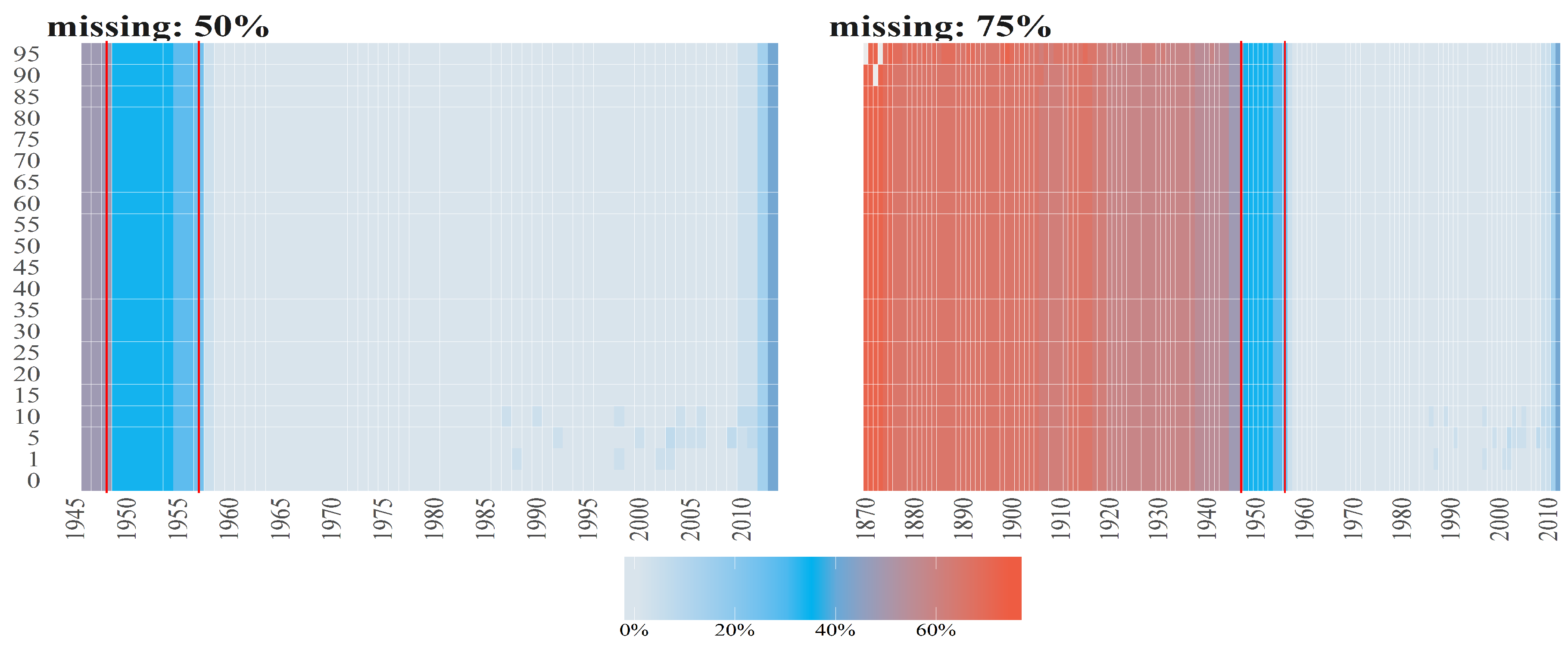
Figure 4.
Percentages of missing values (denoted by diffrent colours) per observation for Number of Deaths for Males per age groups (y axis) over time (x axis). The titles of the subplots indicate the case of missing values (50%, 75%). The percentage for a given country and given age group is computed dividing number of missing values by number of countries. Red vertical lines correspond to the starting points in time when the cases 50% and 25% starts (from the left to right side on corresponding plots).
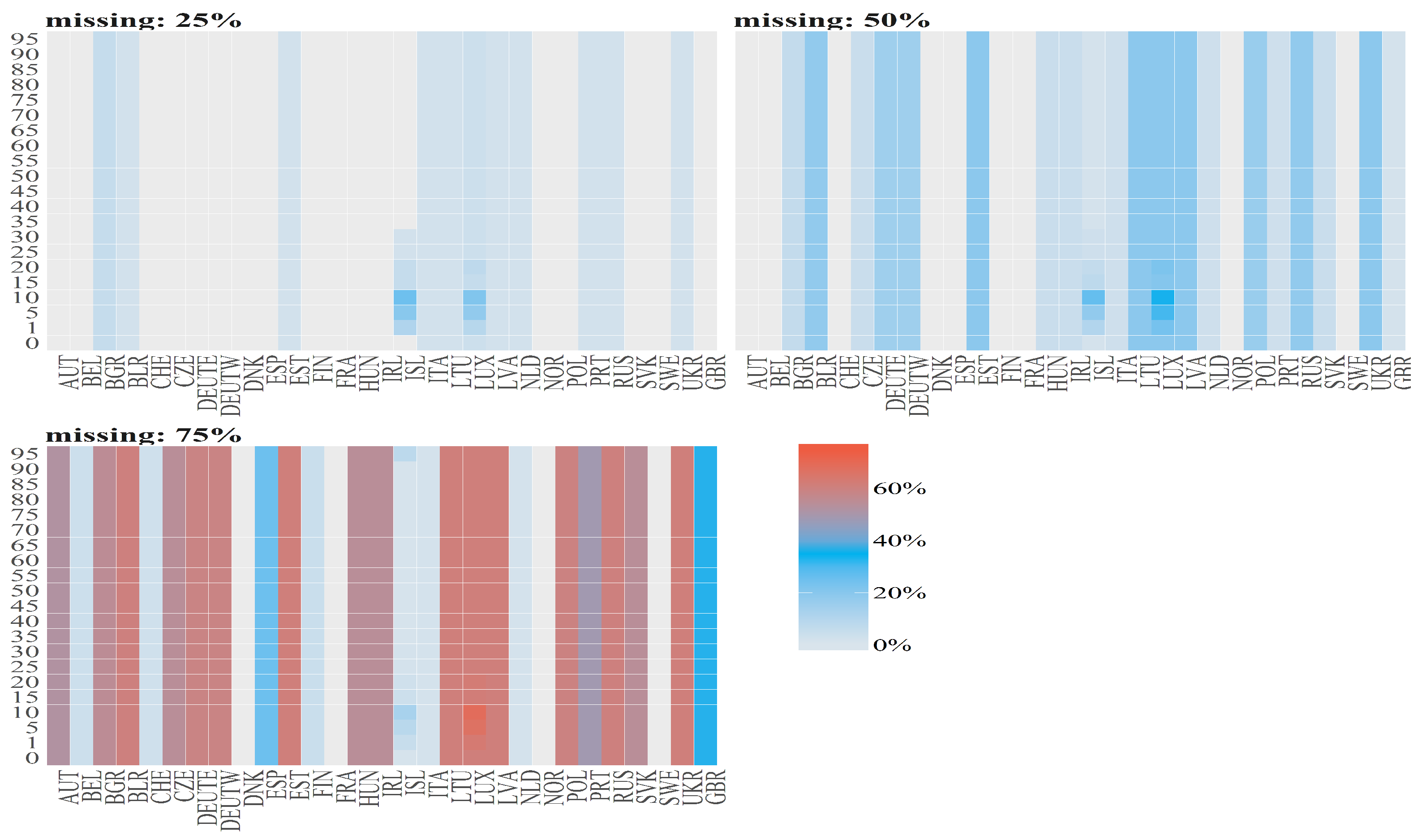
Figure 5.
Percentages of missing values (denoted by diffrent colours) for Number of Deaths for Females per country (x axis) and age group (y axis). The titles of the subplots indicate the case of missing values (25%, 50%, 75%). The percentage of missing values for a given country and an age group is calculated dividing number of missing values by length of subsample which is different for different cases.
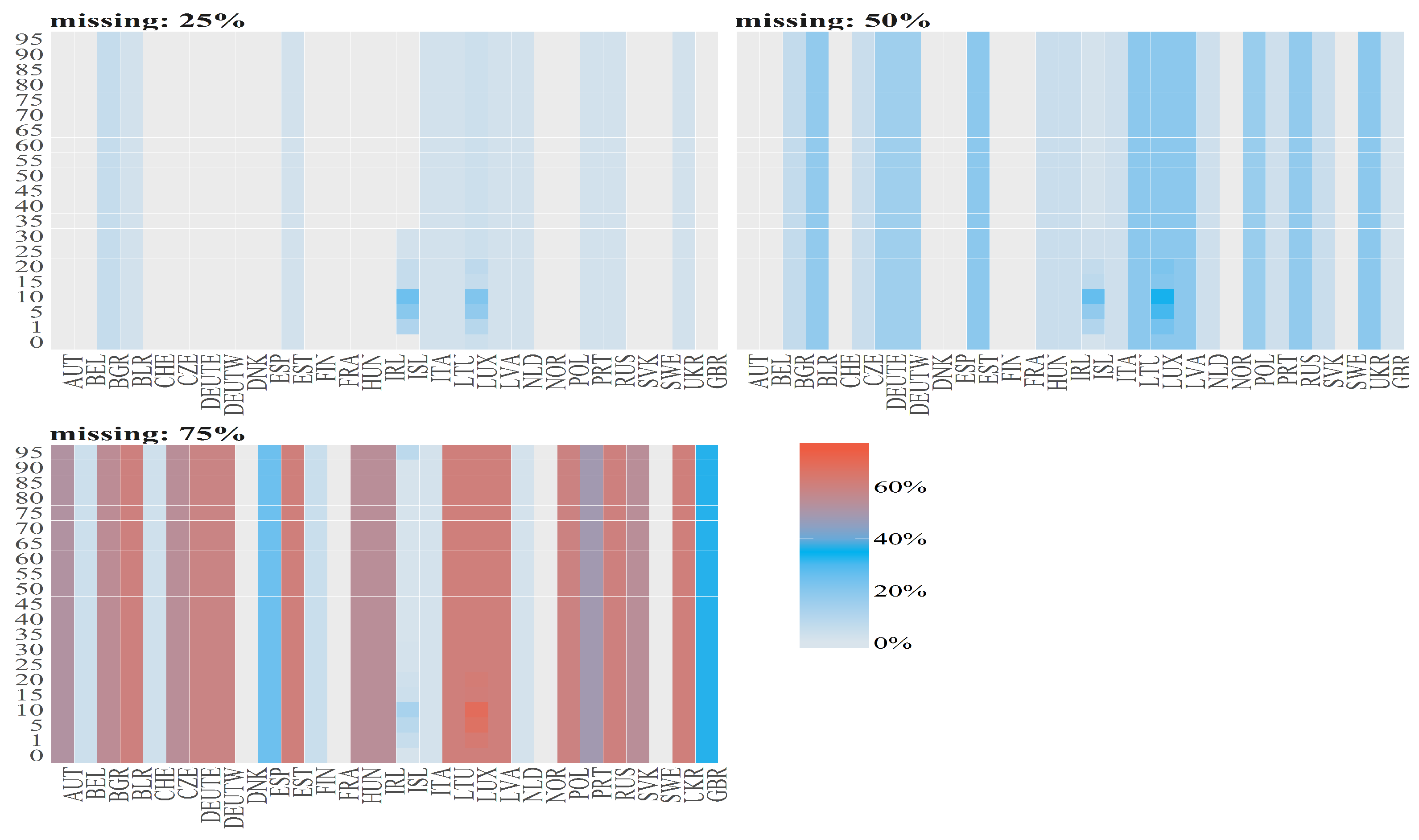
Figure 6.
Percentages of missing values (denoted by diffrent colours) for Number of Deaths for Males per country (x axis) and age group (y axis). The titles of the subplots indicate the case of missing values (25%, 50%, 75%). The percentage of missing values for a given country and an age group is calculated dividing number of missing values by length of subsample which is different for different cases.
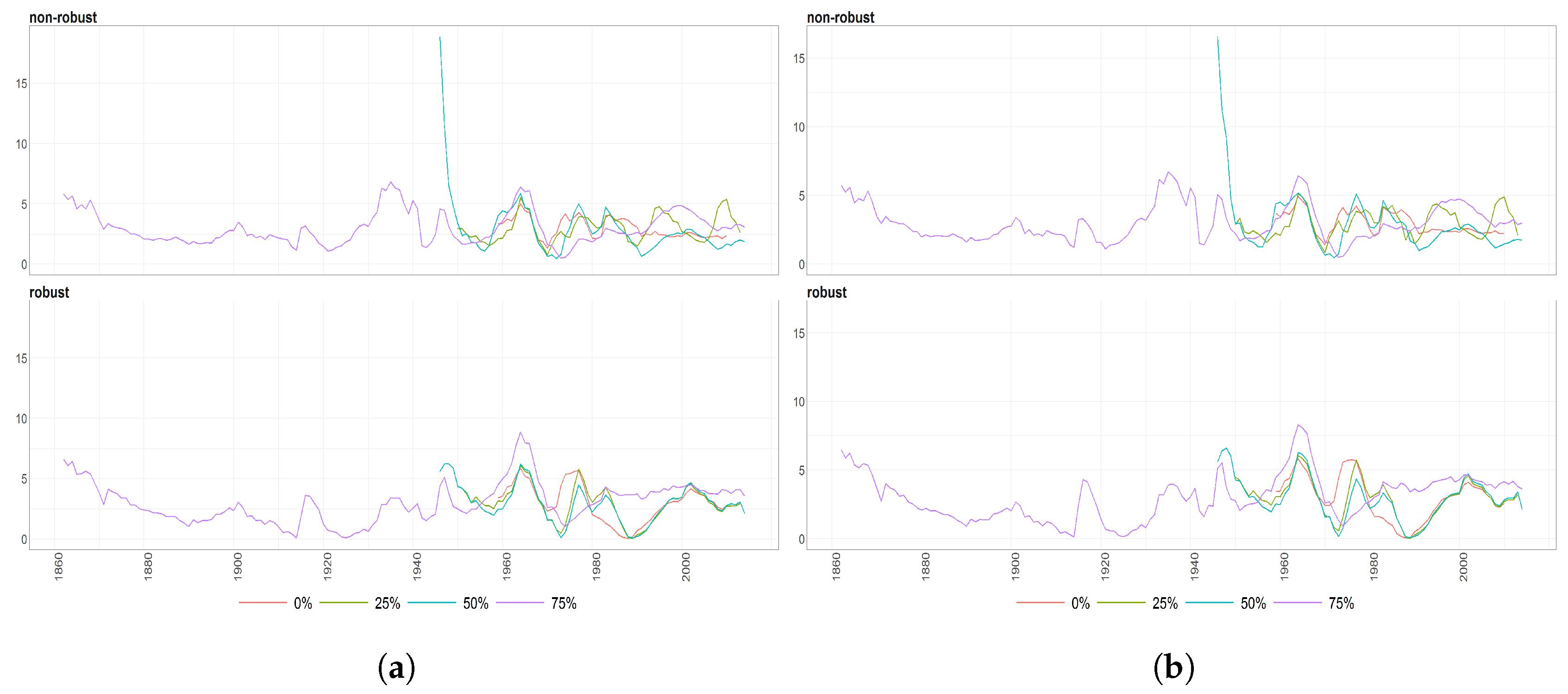
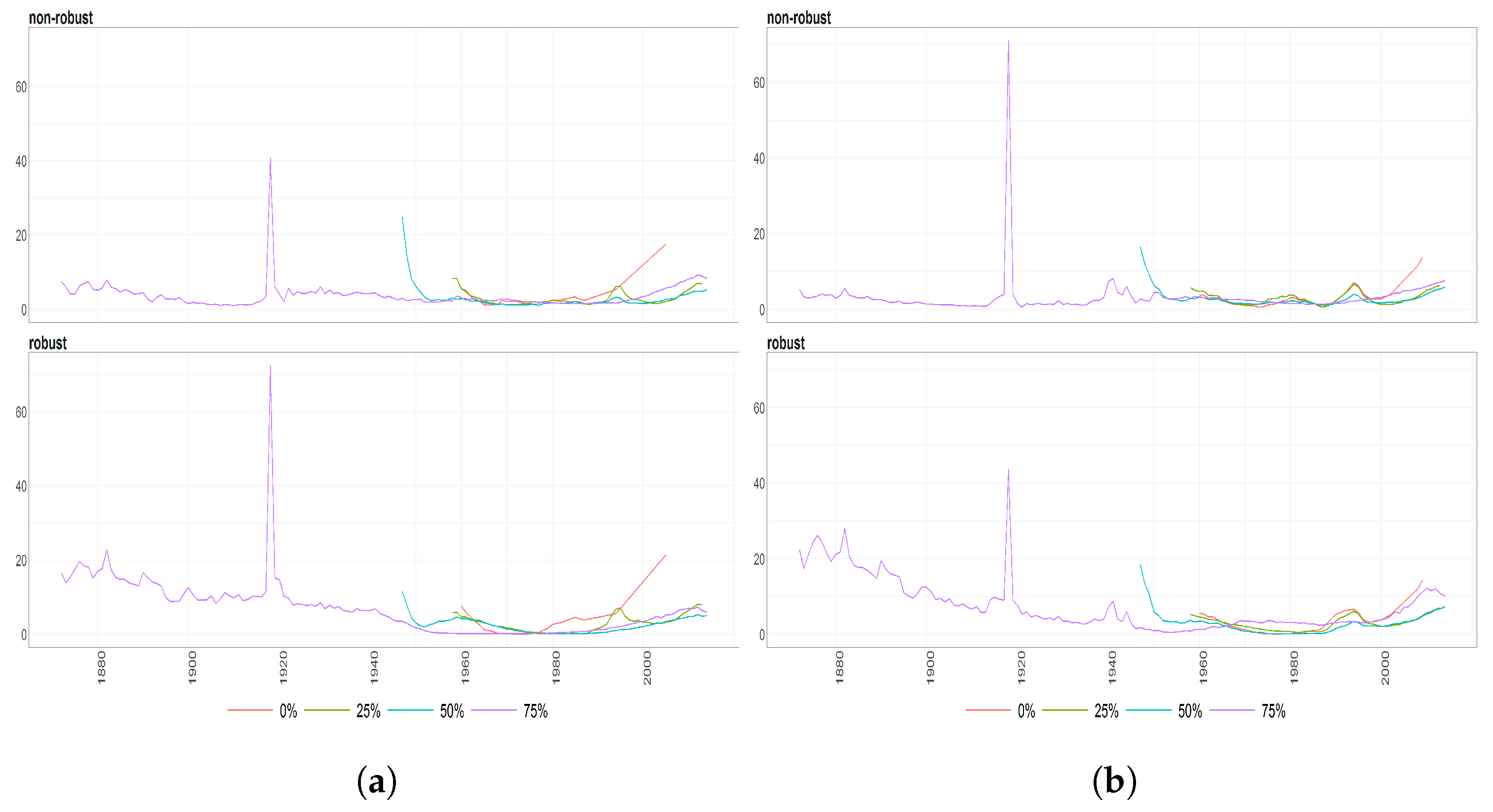
Figure 7.
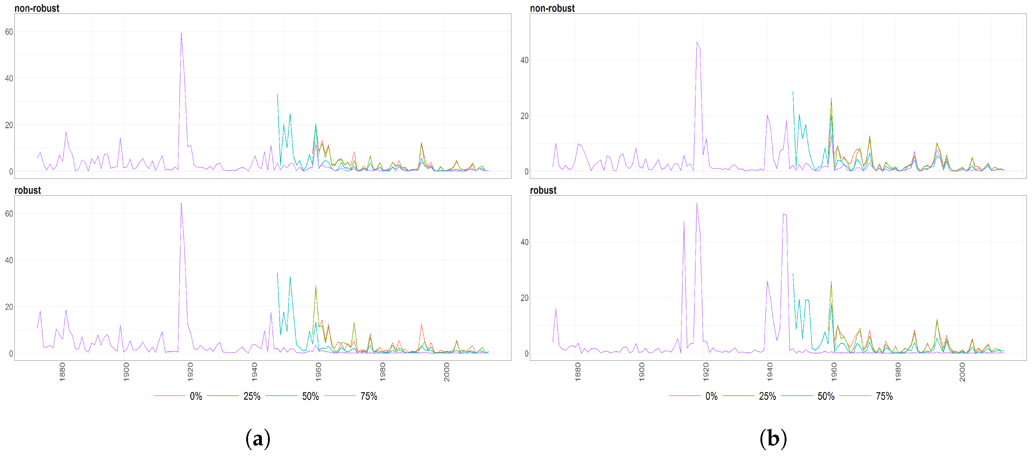
The Mahalanobias distances obtained using Probabilistic Principal Component Analysis (PPCA) for Females (a) and Males (b) Births over time (x axis). Different colours of lines correspond to the cases of different percentages of maximal missing values in a signle observation (light blue (75%), dark brown (50%), dark blue (25%), light brown (0%)). Every subfigure is divided into two subplots corresponding to robust estimation of standard divinations (upper plot) and sample one (bottom plot).
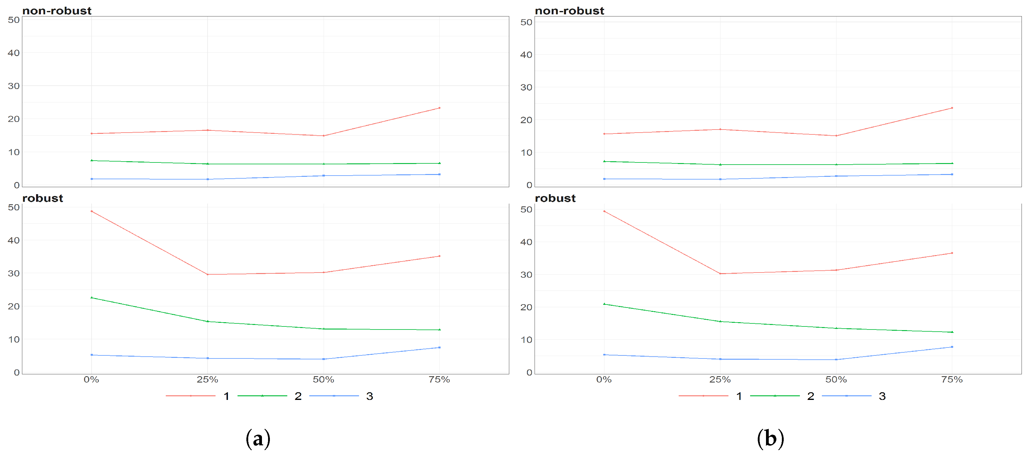
Figure 8.
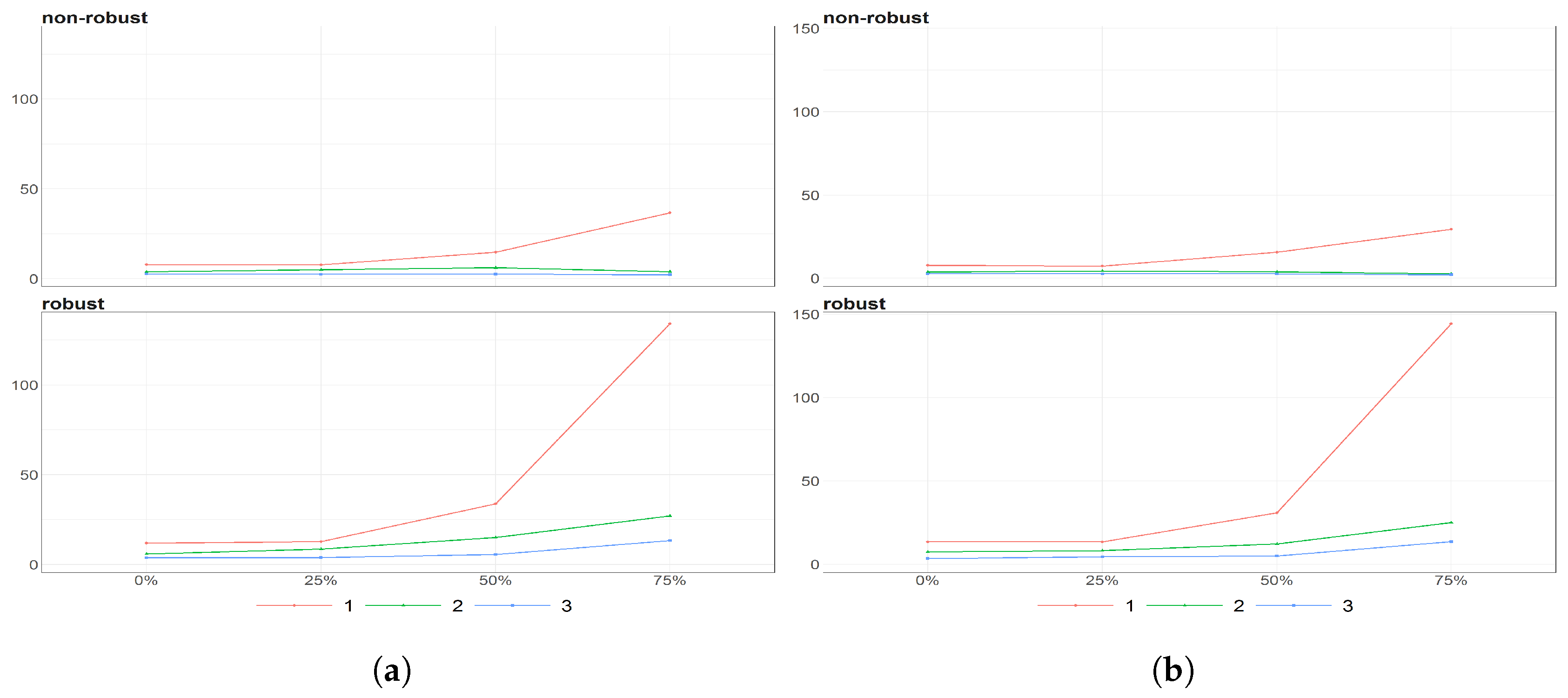
The eigenvalues obtained using PPCA for Females (a) and Males (b) population of Number of Birthsfor different percentages of maximal missing entries in rows (x axis). Colours of lines corresponds to different eigenvalues, first (light brown), second (dark blue) and third (dark brown) highest. Every subfigure is divided into two subplots corresponding to robust estimation of standard divinations (upper plot) and sample one (bottom plot).
Figure 9.
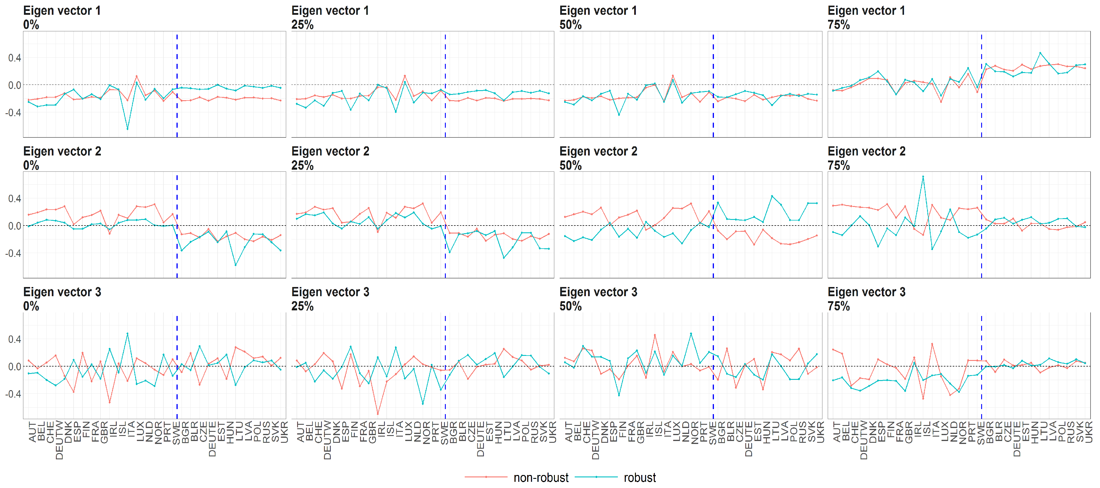
The eigenvectors (y axis) over the joint distribution of countries (x axis) obtained using PPCA for Females in Births. Every row of subfigure corresponds to a different eigenvector. Every column corresponds to different case of missing values (0%, 25%, 50% and 75%). The blue line corresponds to robust standardisation whereas red line to non-robust standardisation of data.
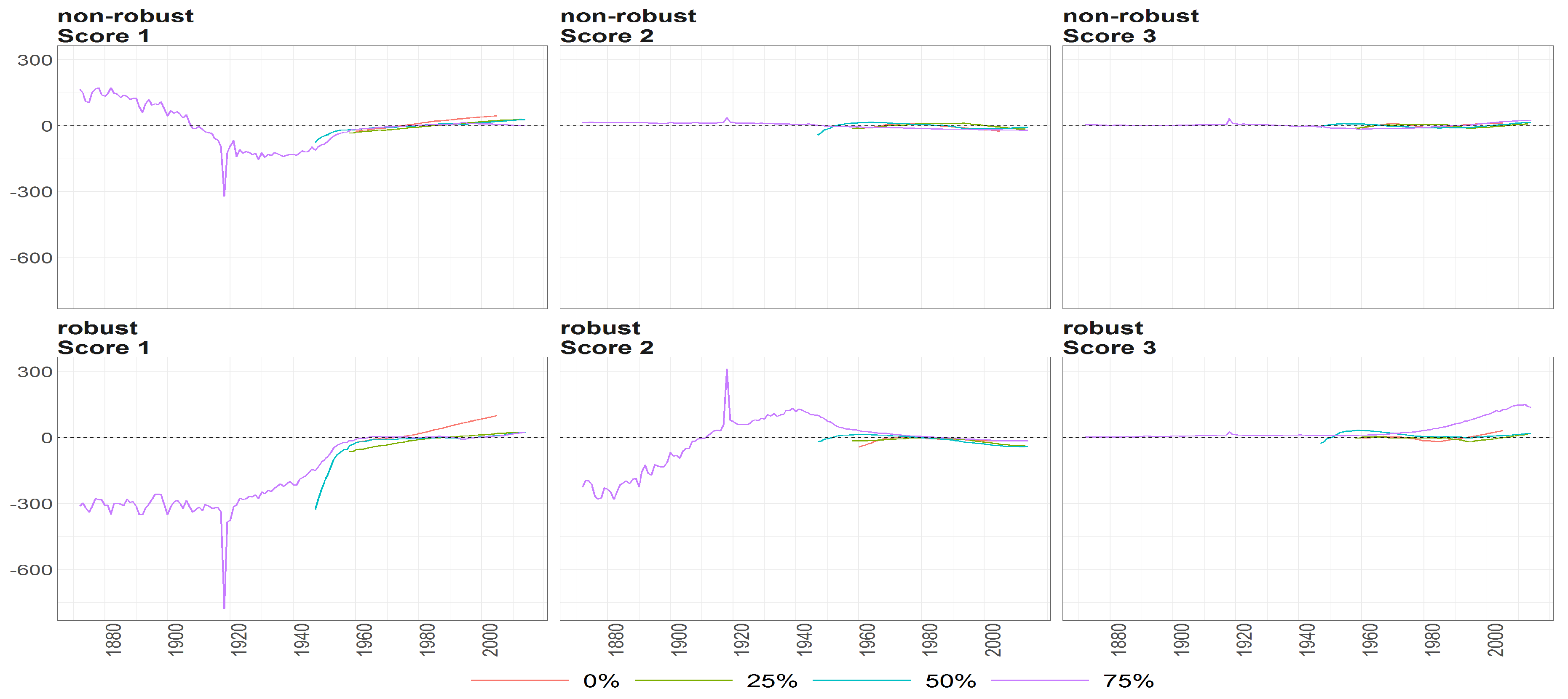
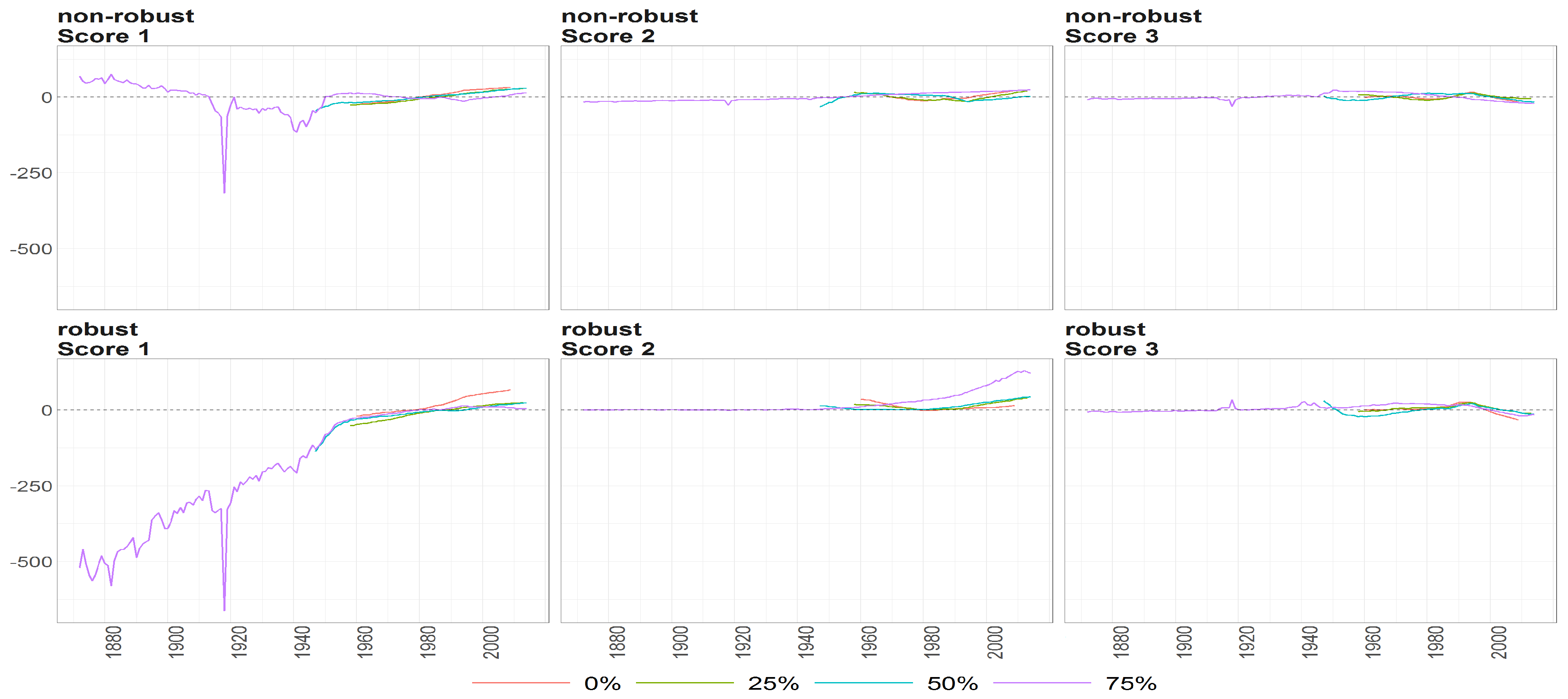
Figure 10.
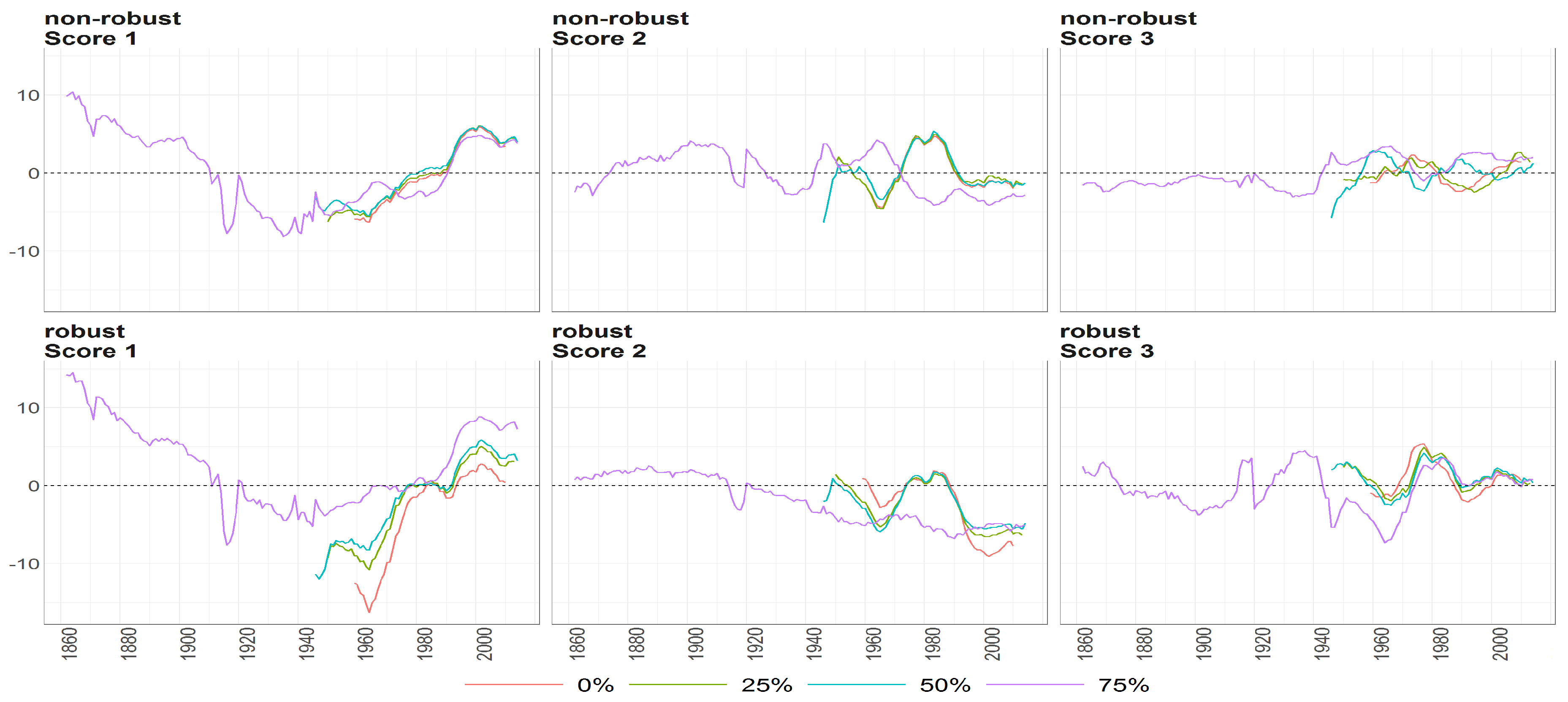
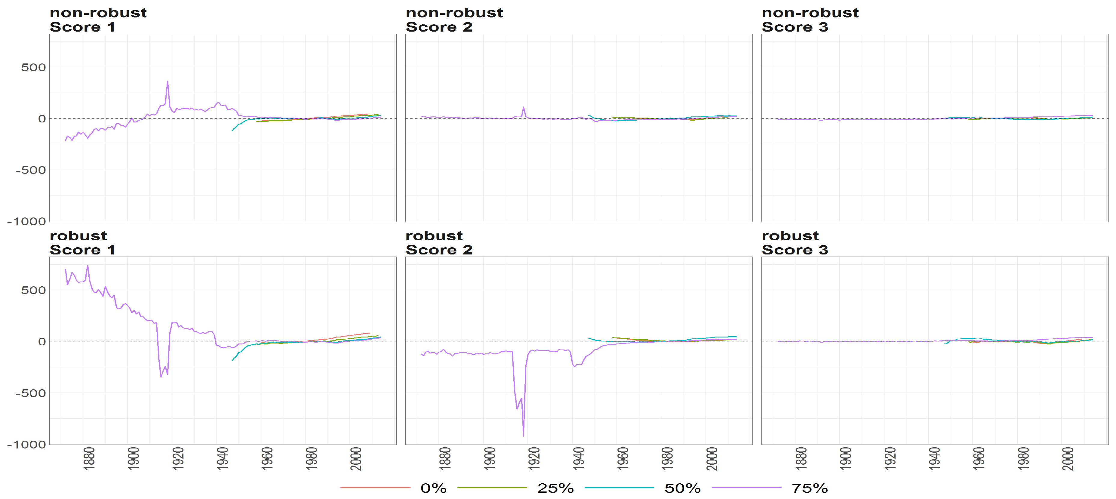
The scores (y axis) over time (x axis) obtained using PPCA for Females in Births. Colours of lines correspond to the scores calculated on subsample different cases of missing values (0%, 25%, 50% and 75%, refer to legend). The plots placed in the first row correspond to the results using non- robust standardization of entry data, where the second row correspond to robust standardisation. The plots scores, first, second and thirds are ordered by columns.
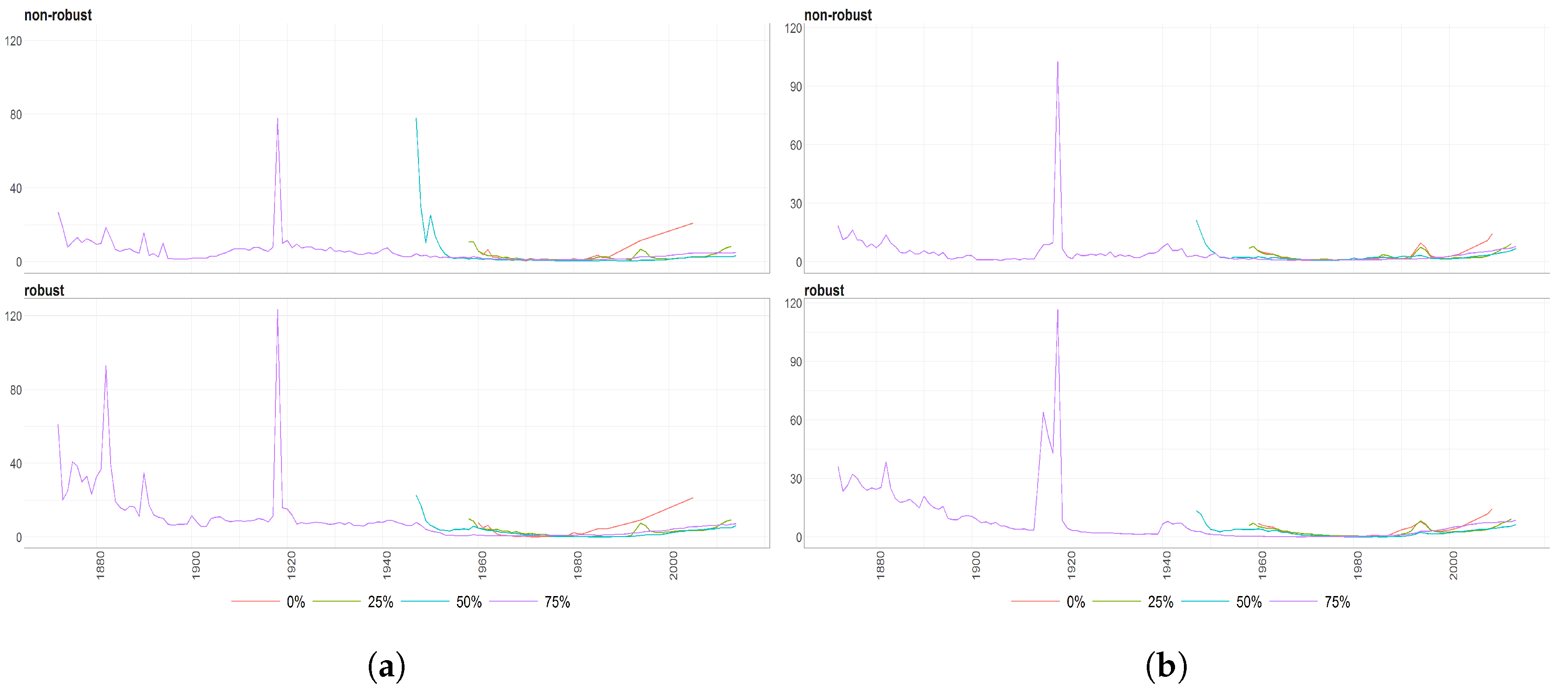
Figure 11.
The Mahalanobias distances obtained using PPCA for Females (a) and Males (b) of Life Expectancy at Birth over time (x axis). Different colours of lines correspond to the cases of different percentages of maximal missing entries in rows (light blue (75%), dark brown (50%), dark blue (25%), light brown (0%)). Every subfigure is divided into two subplots corresponding to the robust estimation of standard divinations (upper plot) and sample one (bottom plot).
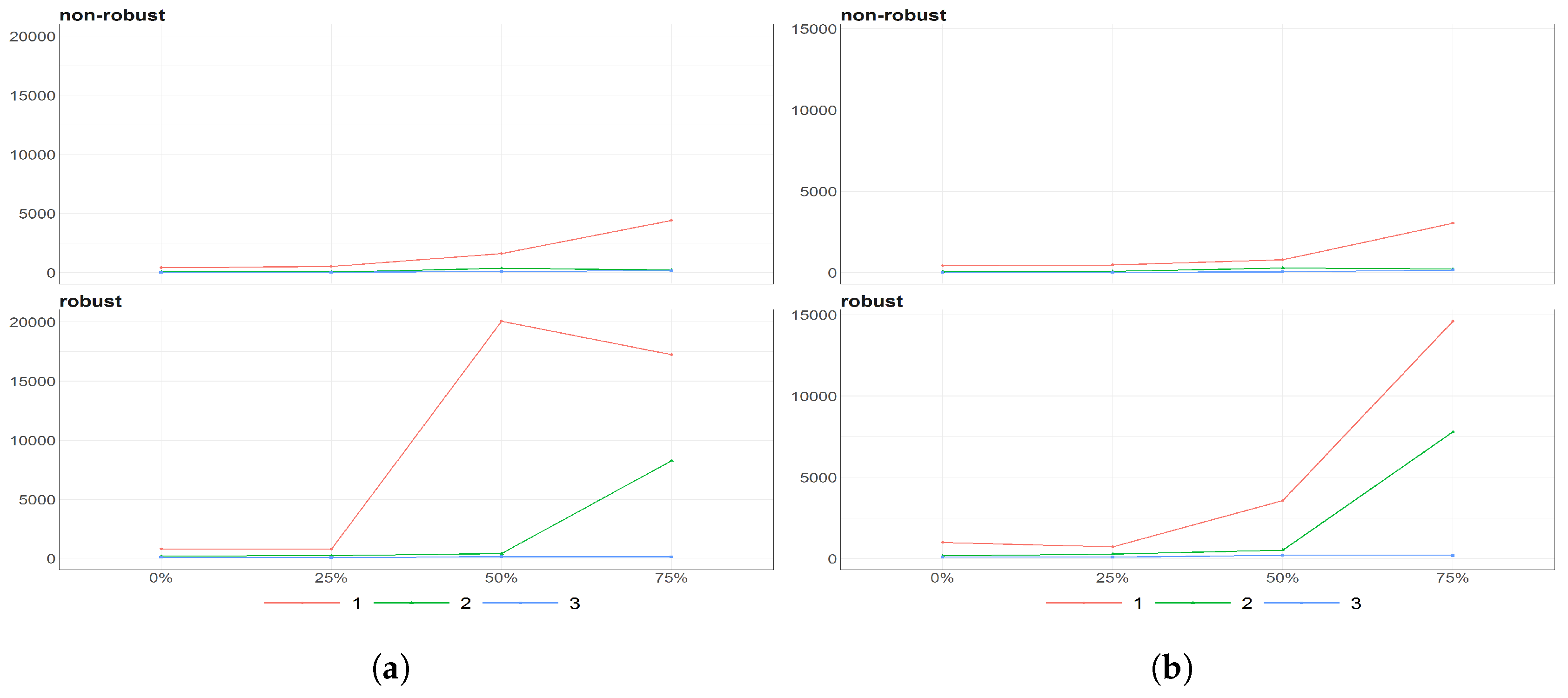
Figure 12.
The eigenvalues obtained using PPCA for Females (a) and Males (b) of Life Expectancy at Birth data for different percentages of maximal missing entries in rows (x axis). Colours of lines corresponds to different eigenvalues, first (light brown), second (dark blue) and third (dark brown) highest. Every subfigure is divided into two subplots corresponding to robust estimation of standard divinations (upper plot) and sample one (bottom plot).
Figure 13.
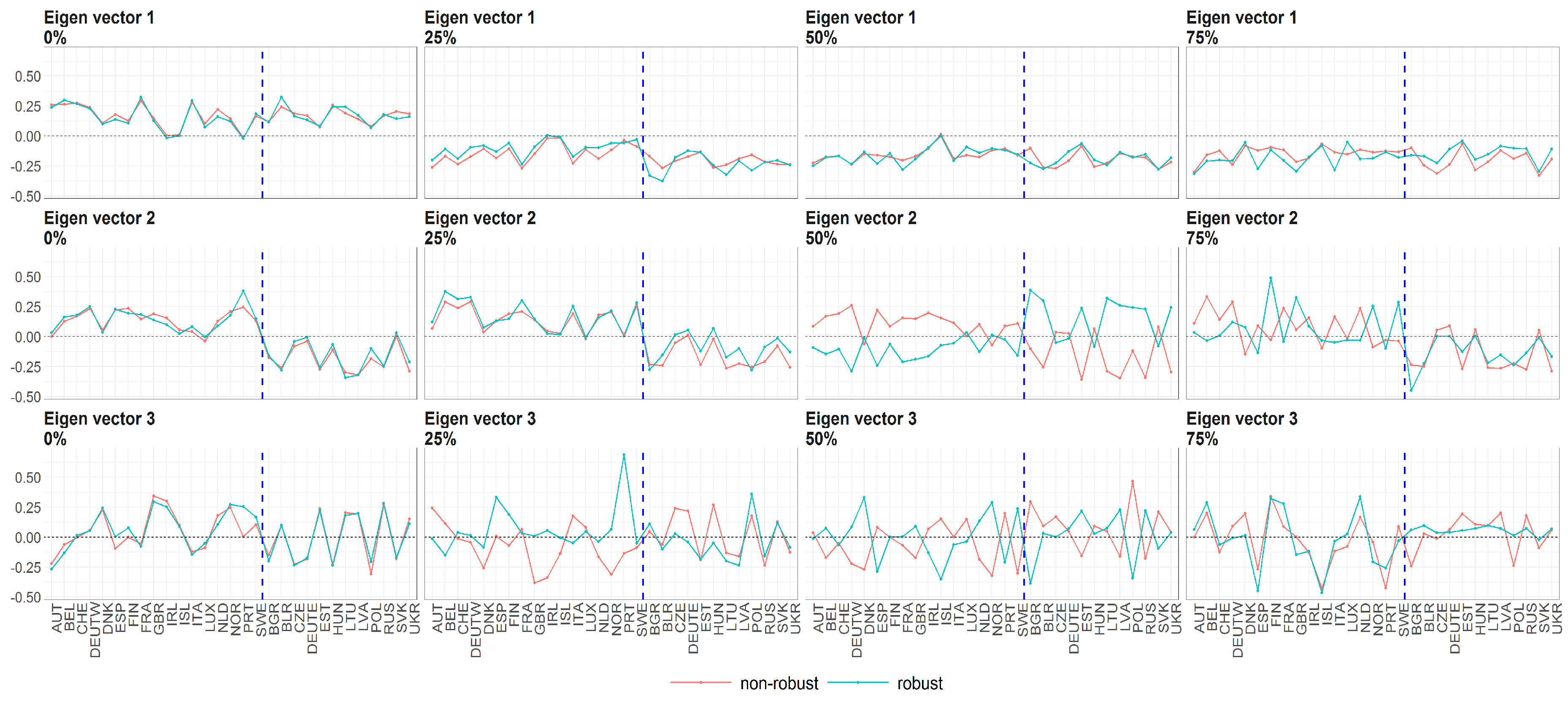
The eigenvectors (y axis) over the joint distribution of countries (x axis) obtained using PPCA for female population of Life Expectancy at Birth. Every row of subfigure corresponds to different eigenvector. Every column corresponds to different level of maximum missing values per observation (0%, 25%, 50% and 75%). The blue line corresponds to robust standardisation whereas red line to non-robust standardisation of data.
Figure 14.
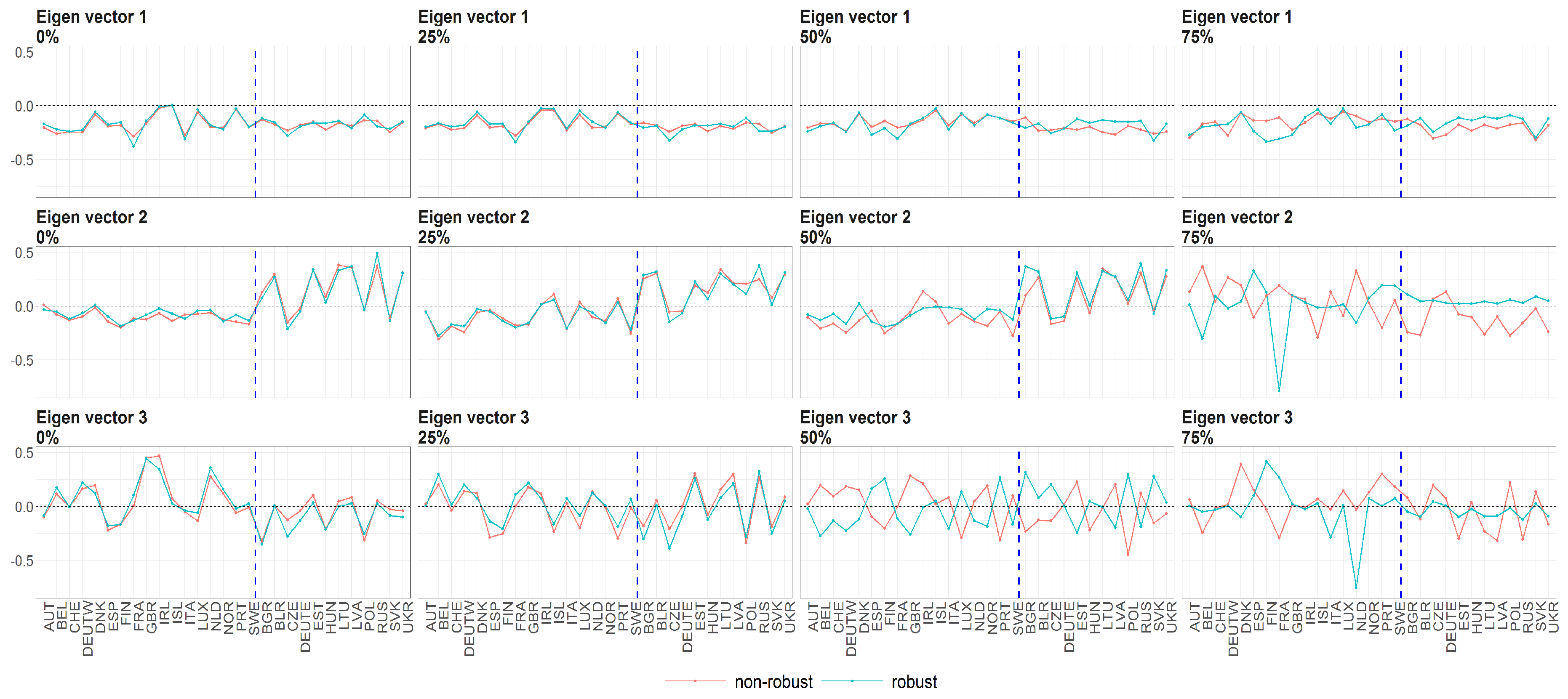
The eigenvectors (y axis) over the joint distribution of countries (x axis) obtained using PPCA for male population of Life Expectancy at Birth. Every row of subfigure corresponds to different eigenvector. Every column corresponds to different level of maximum missing values per observation (0%, 25%, 50% and 75%). The blue line corresponds to robust standardisation whereas red line to non-robust standardisation of data.
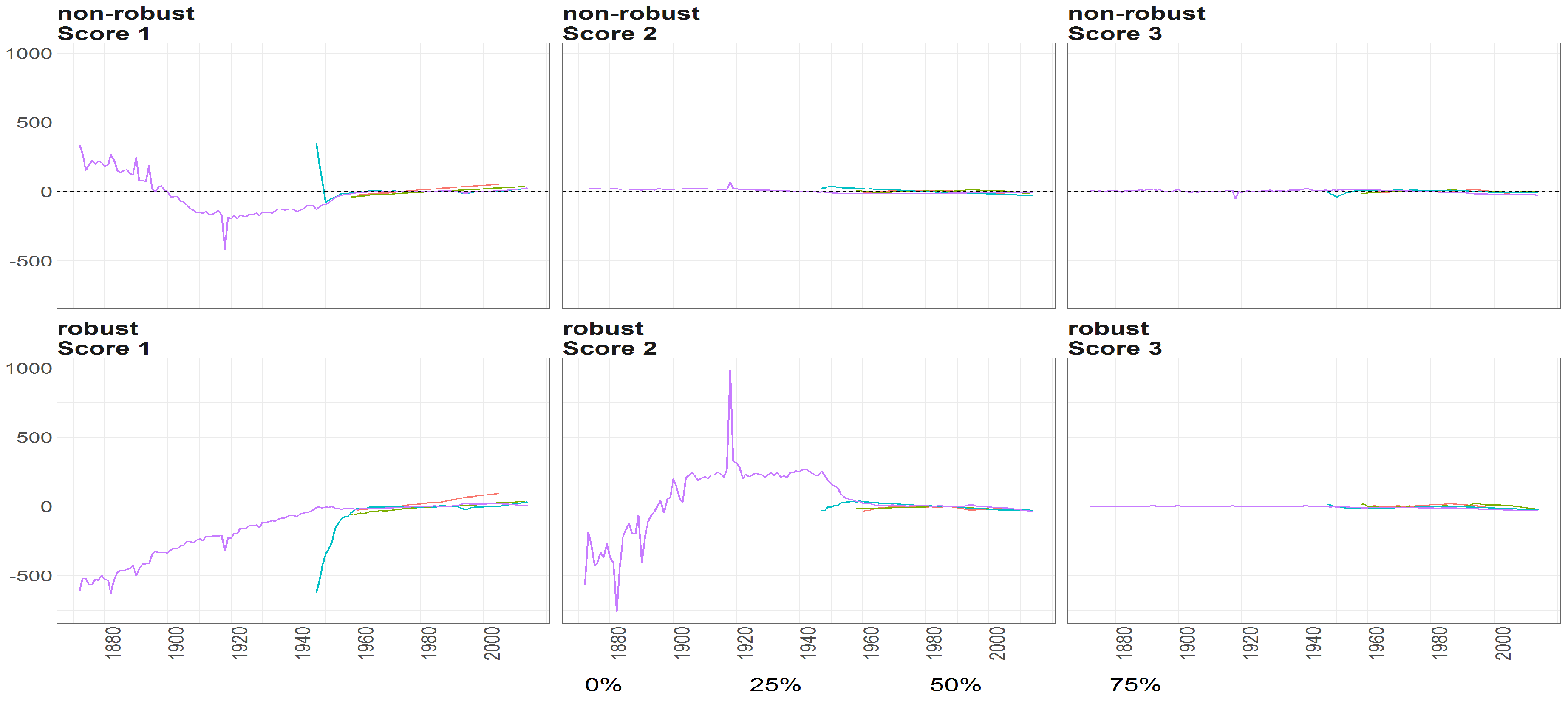
Figure 15.
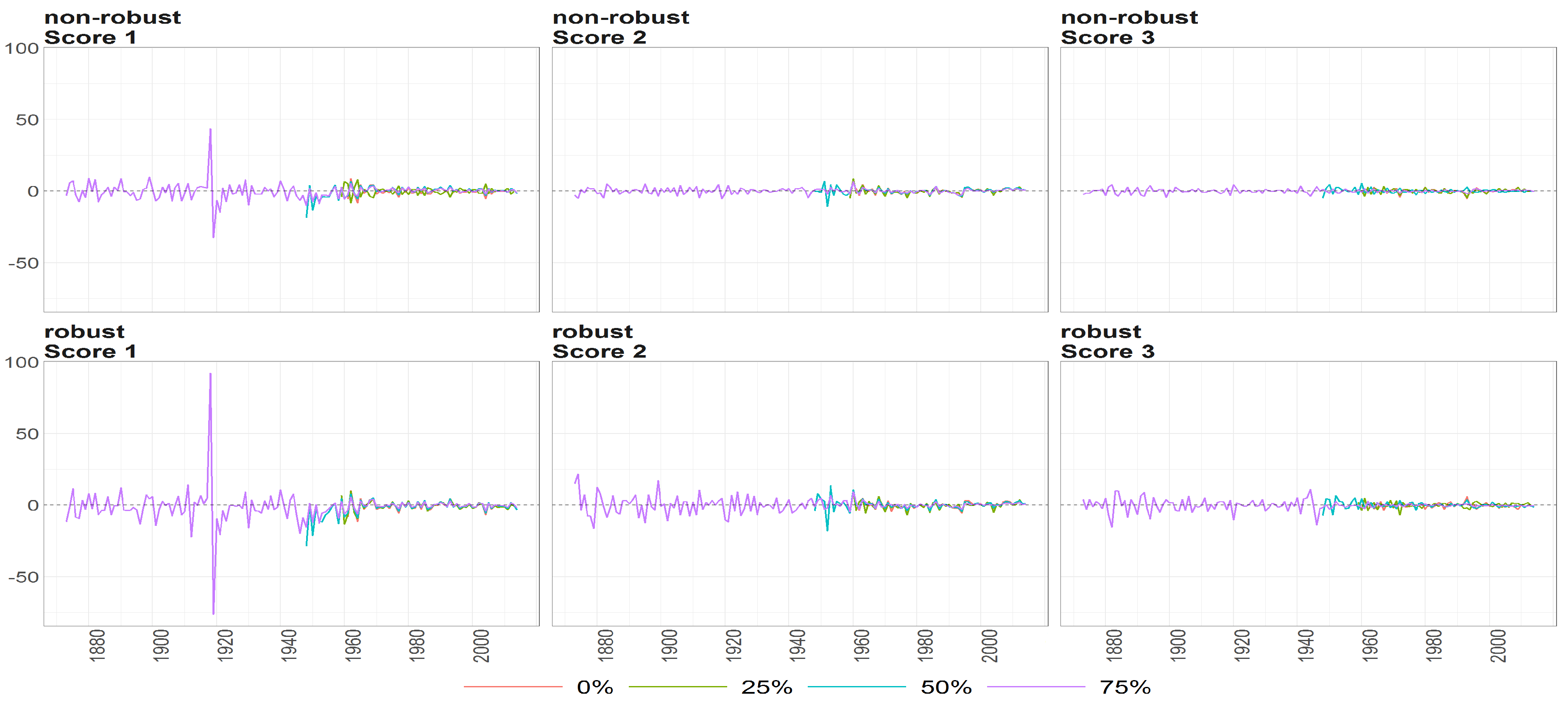
The scores (y axis) over time (x axis) obtained using PPCA for female population of Life Expectancy at Birth. Colours of lines correspond to the scores calculated on subsample where are different levels of maximum missing values per observation (0%, 25%, 50% and 75%, refer to legend). The plots placed in the first row correspond to the results using non- robust standardization of entry data, where the second row correspond to robust standardisation. The plots of scores are ordered by columns.
Figure 16.
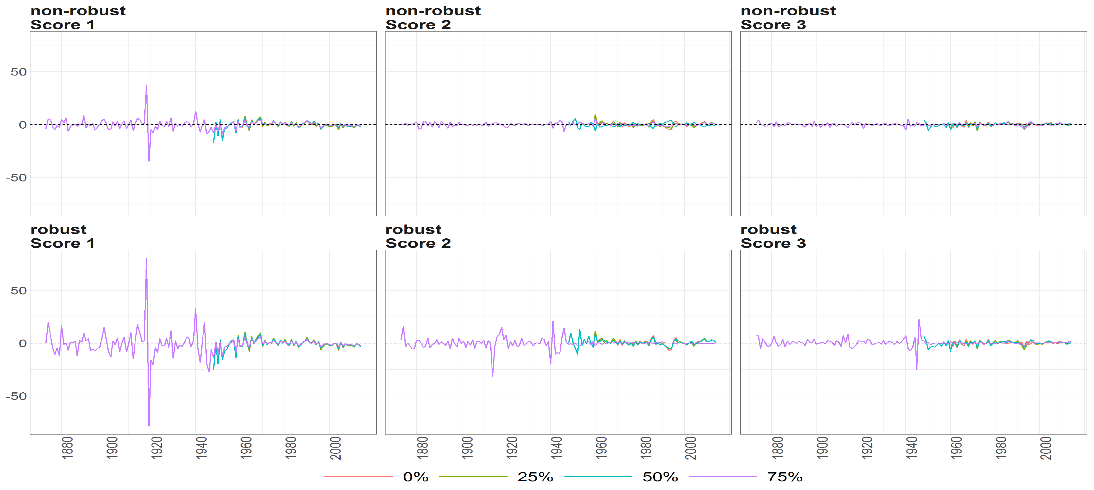
The scores (y axis) over the time (x axis) obtained using PPCA for Males of Life Expectancy at Birth. Colours of lines correspond to the scores calculated on subsample where are different levels of maximum missing values per observation (0%, 25%, 50% and 75%, refer to legend). The plots placed in the first row correspond to the results using non- robust standardization of entry data, where the second row correspond to robust standardisation. The plots of scores are ordered by columns.
Figure 17.
The Mahalanobias distances obtained using PPCA for Females (a) and Males (b) of Number of Death over time (x axis). Different colours of lines correspond to the cases of different percentages of maximal missing entries in rows (light blue (75%), dark brown (50%), dark blue (25%), light brown (0%)). Every subfigure is divided into two subplots corresponding to robust estimation of standard divinations (upper plot) and sample one (bottom plot).
Figure 18.
The eigenvalues of Deaths counts obtained using PPCA for Females (a) and Males (b) over diferent cases of missing entries (x axis). Colours of lines corresponds to different eigenvalues, first (light brown), second (dark blue) and third (dark brown) highest. Every subfigure is divided into two subplots corresponding to robust estimation of standard deviations (upper plot) and sample one (bottom plot).
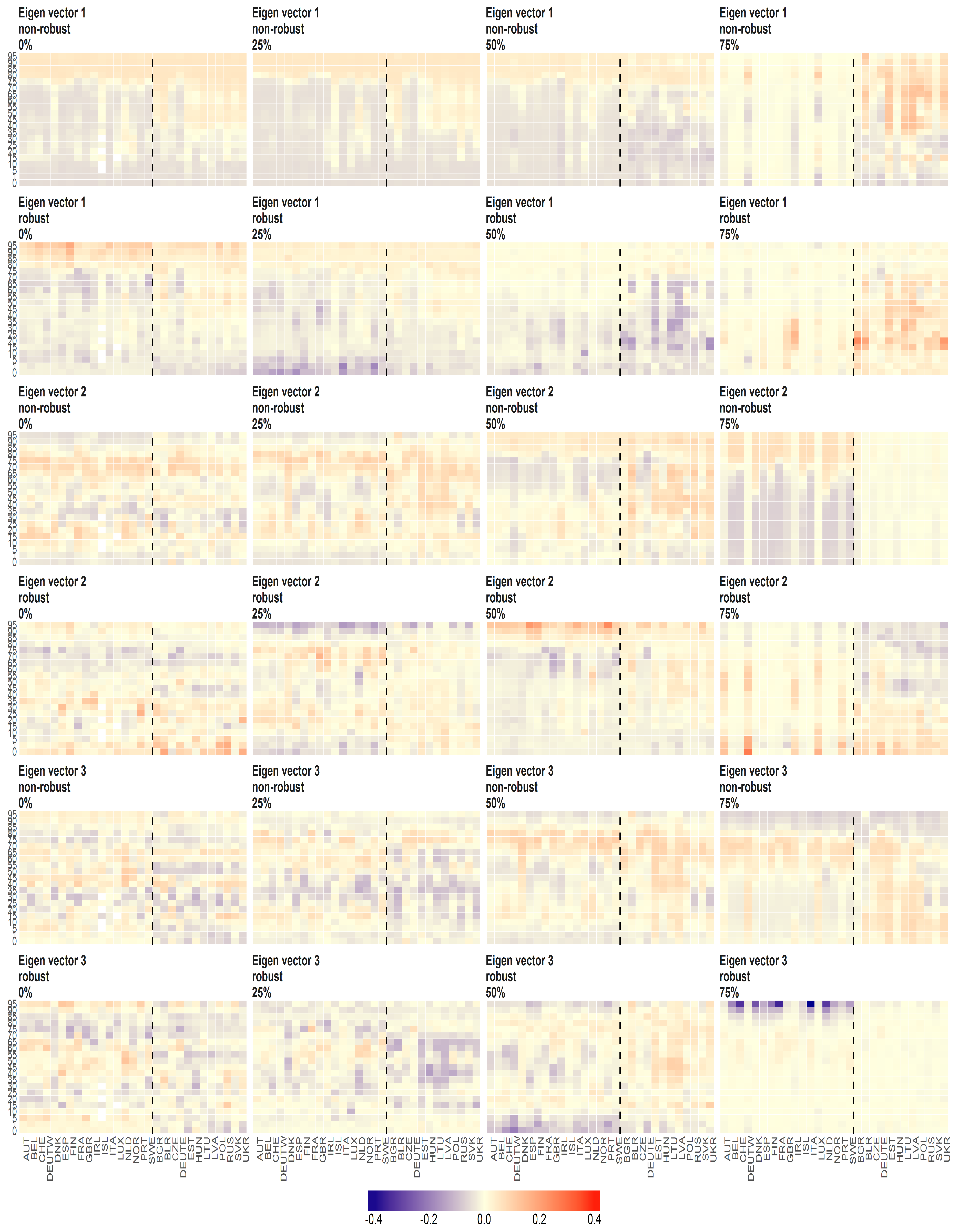
Figure 19.
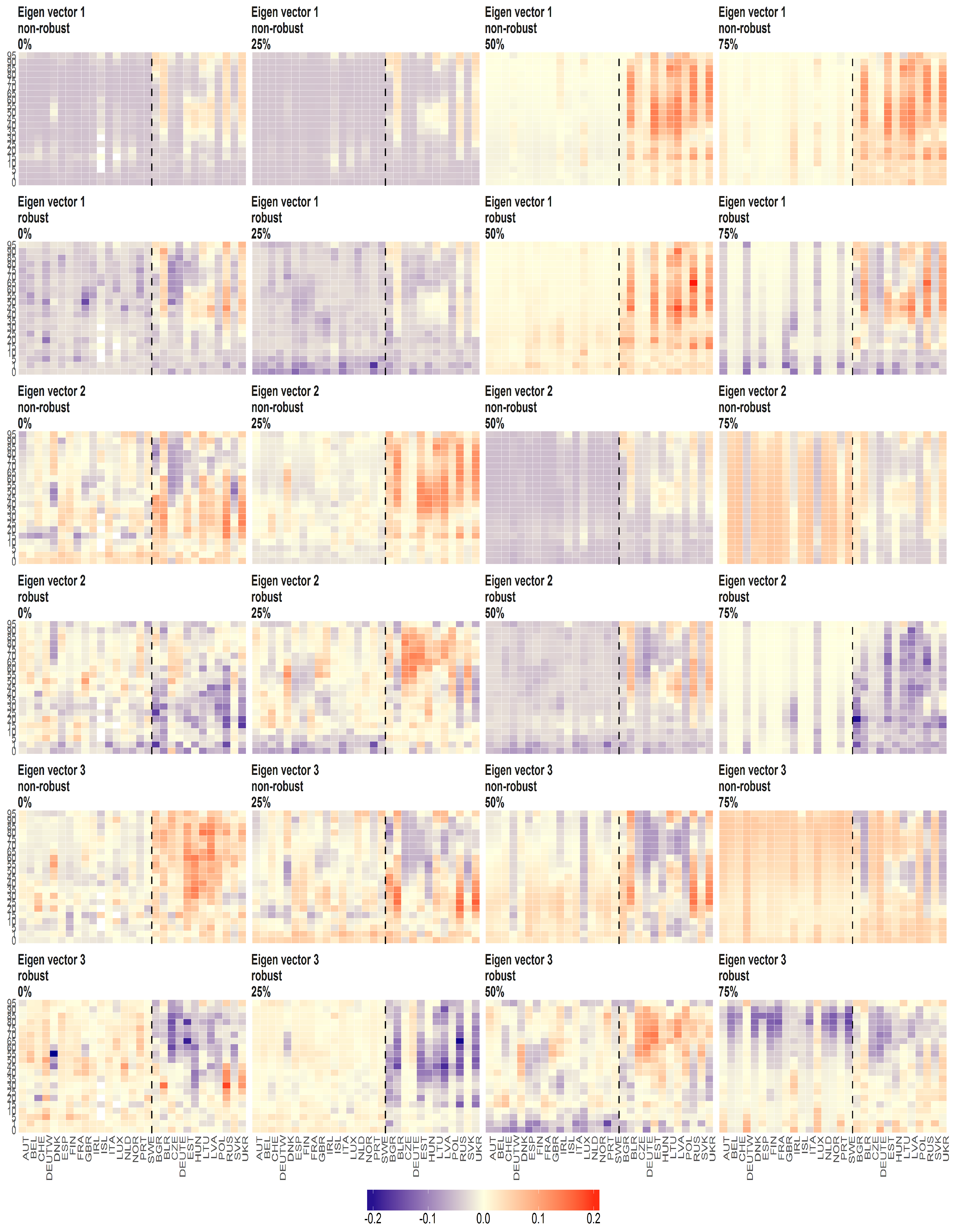
The eigenvectors of Death counts (y axis) over age groups (y axis) and countries (x axis) obtained using PPCA for Females. Every row of subfigure corresponds to different eigenvector. Every column corresponds to different level of maximum missing values per observation (0%, 25%, 50% and 75%). The blue line corresponds to robust standardisation whereas red line to non-robust standardisation of data.
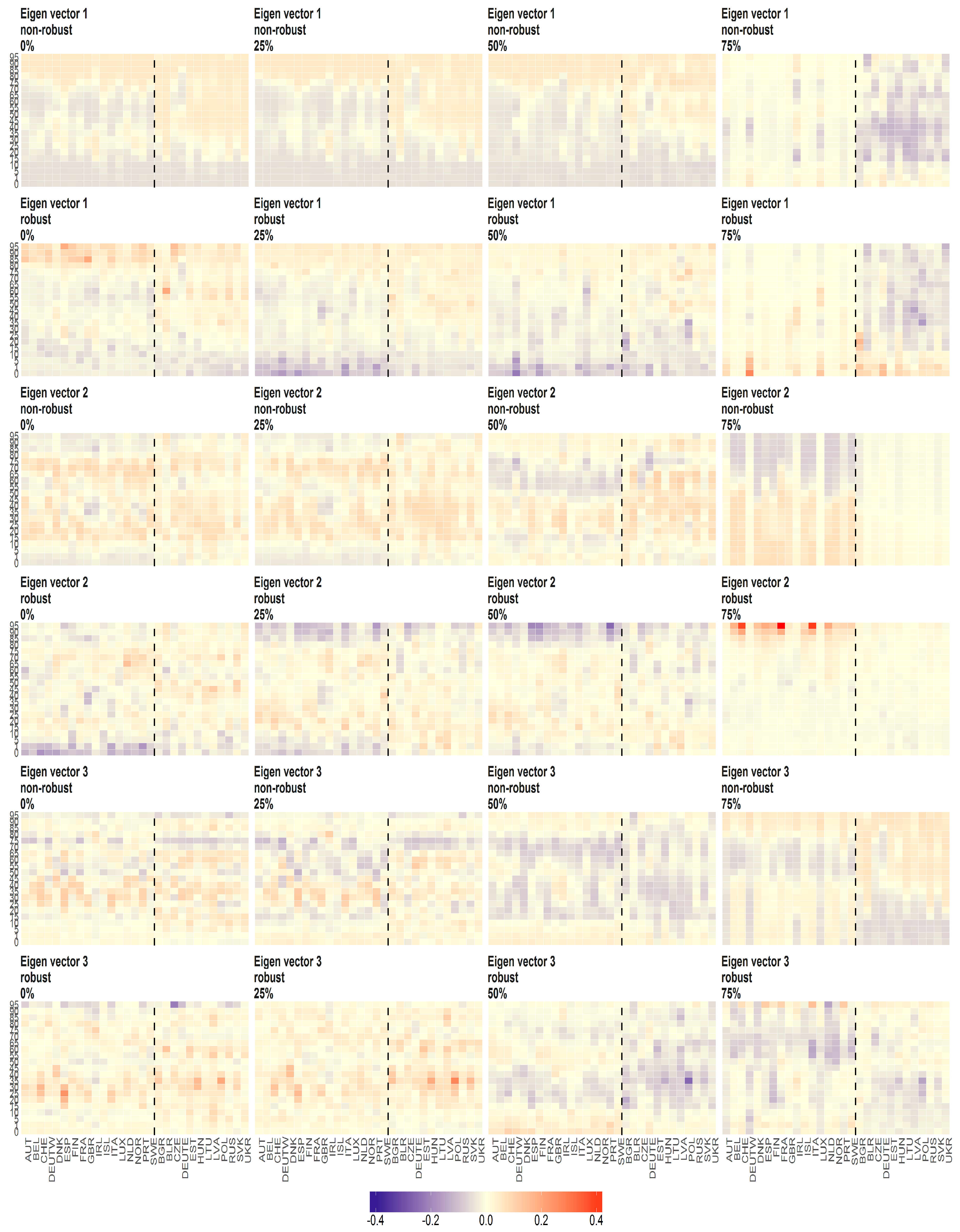
Figure 20.
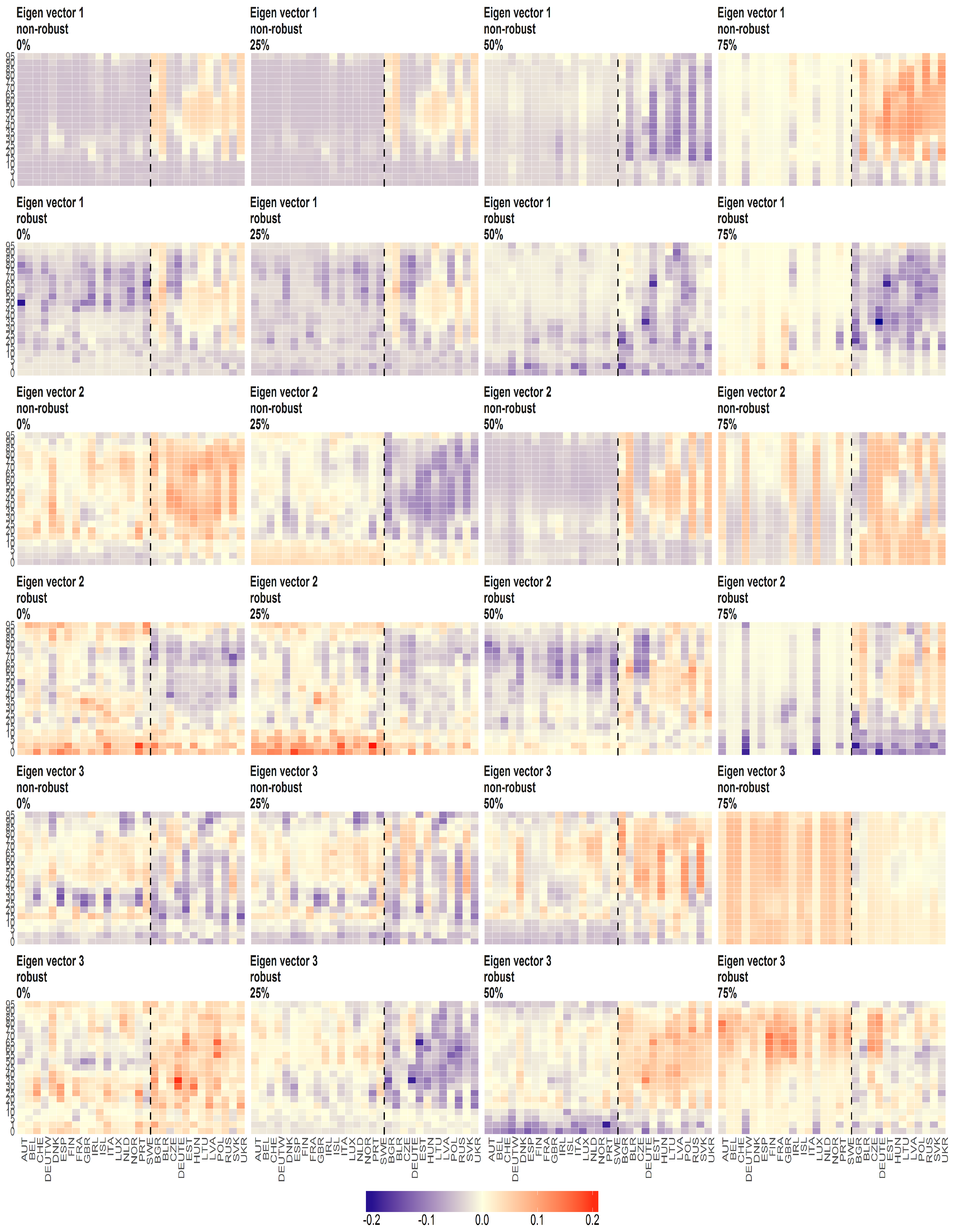
The eigenvectors of Death counts (y axis) over age groups (y axis) and countries (x axis) obtained using PPCA for Males . Every row of subfigure corresponds to different eigenvector. Every column corresponds to different level of maximum missing values per observation (0%, 25%, 50% and 75%). The blue line corresponds to robust standardisation whereas red line to non-robust standardisation of data.
Figure 21.
The scores (y axis) over time (x axis) obtained using PPCA for female population of Number of Deaths. Colours of lines correspond to the scores calculated on subsample where are different levels of maximum missing values per observation (0%, 25%, 50% and 75%, refer to legend). The plots placed in the first row correspond to the results using non- robust standardization of entry data, where the second row correspond to robust standardisation. The plots of scores are ordered by columns.
Figure 22.
The scores (y axis) over time (x axis) obtained using PPCA for male population of Number of Deaths. Colours of lines correspond to the scores calculated on subsample where are different levels of maximum missing values per observation (0%, 25%, 50% and 75%, refer to legend). The plots placed in the first row correspond to the results using non- robust standardization of entry data, where the second row correspond to robust standardisation. The plots of scores are ordered by columns.
Figure 23.
The Mahalanobias distances obtained using PPCA for female (a) and male (b) population of Death Rates over time (x axis). Different colours of lines correspond to the cases of different percentages of maximal missing entries in rows (light blue (75%), dark brown (50%), dark blue (25%), light brown (0%)). Every subfigure is divided into two subplots corresponding to robust estimation of standard divinations (upper plot) and sample one (bottom plot).
Figure 24.
The eigenvalues obtained using PPCA for female (a) and male (b) population of Death Rates for different percentages of maximal missing entries in rows (x axis). Colours of lines corresponds to different eigenvalues, first (light brown), second (dark blue) and third (dark brown) highest. Every subfigure is divided into two subplots corresponding to robust estimation of standard divinations (upper plot) and sample one (bottom plot).
Figure 25.
The scores (y axis) over time (x axis) obtained using PPCA for female population of Death Rates. Colours of lines correspond to the scores calculated on subsample where are different levels of maximum missing values per observation (0%, 25%, 50% and 75%, refer to legend). The plots placed in the first row correspond to the results using non- robust standardization of entry data, where the second row correspond to robust standardisation. The plots of scores are ordered by columns.
Figure 26.
The scores (y axis) over time (x axis) obtained using PPCA for male population of Death Rates. Colours of lines correspond to the scores calculated on subsample where are different levels of maximum missing values per observation (0%, 25%, 50% and 75%, refer to legend). The plots placed in the first row correspond to the results using non- robust standardization of entry data, where the second row correspond to robust standardisation. The plots of scores are ordered by columns.
Figure 27.
The eigenvectors (y axis) over the joint distribution of countries (x axis) obtained using PPCA for female population of Death Rates. Every row of subfigure corresponds to different eigenvector. Every column corresponds to different level of maximum missing values per observation (0%, 25%, 50% and 75%). The blue line corresponds to robust standardisation whereas red line to non-robust standardisation of data.
Figure 28.
The eigenvectors (y axis) over the joint distribution of countries (x axis) obtained using PPCA for male population of Death Rates. Every row of subfigure corresponds to different eigenvector. Every column corresponds to different level of maximum missing values per observation (0%, 25%, 50% and 75%). The blue line corresponds to robust standardisation whereas red line to non-robust standardisation of data.
Figure 29.
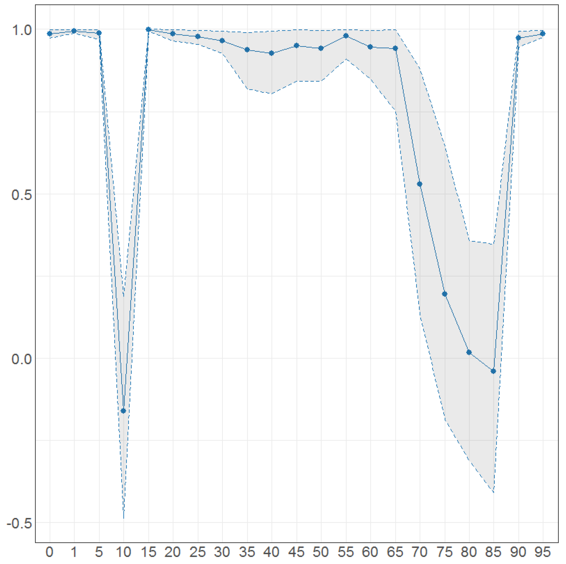
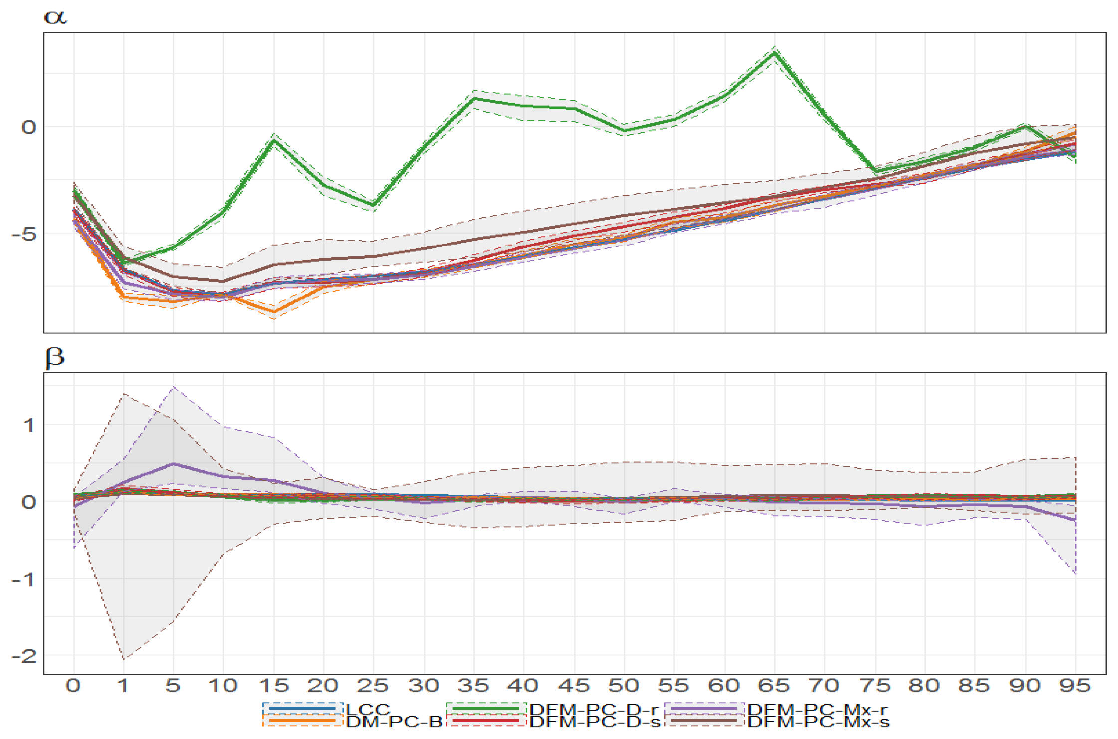
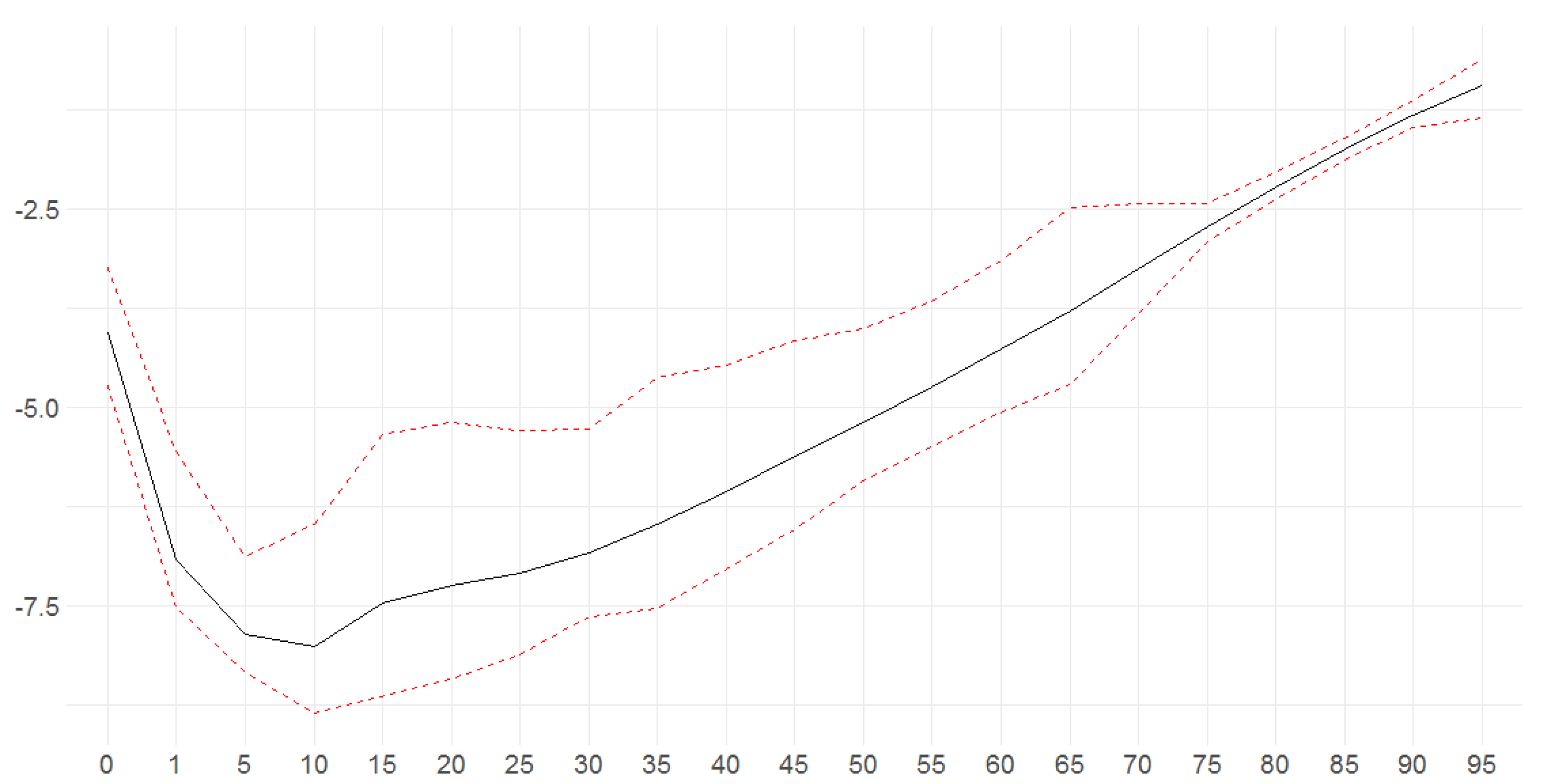
Bayesian posterior mean estimators with 95% posterior credible intervals for the estimation of the age-specific diagonal elements of the transition matrix (x axis ) under DFM-PC-B.
Figure 29.
Bayesian posterior mean estimators with 95% posterior credible intervals for the estimation of the age-specific diagonal elements of the transition matrix (x axis ) under DFM-PC-B.
Figure 30.
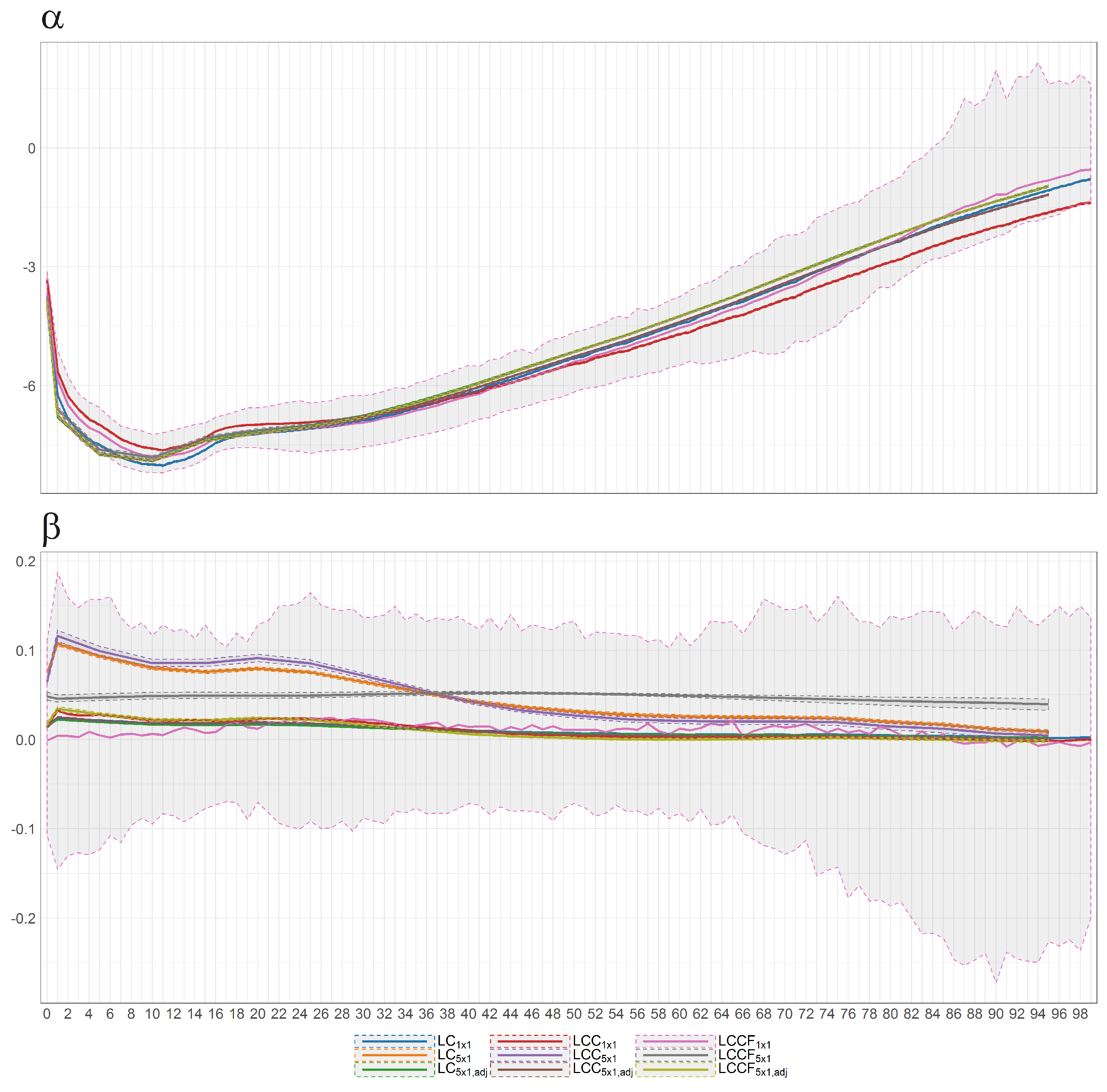
Bayesian posterior estimators with 95% posterior credible intervals for the estimation of and under different models (colours of lines) for British female mortality data (1922–2002).
Figure 30.
Bayesian posterior estimators with 95% posterior credible intervals for the estimation of and under different models (colours of lines) for British female mortality data (1922–2002).
Figure 31.
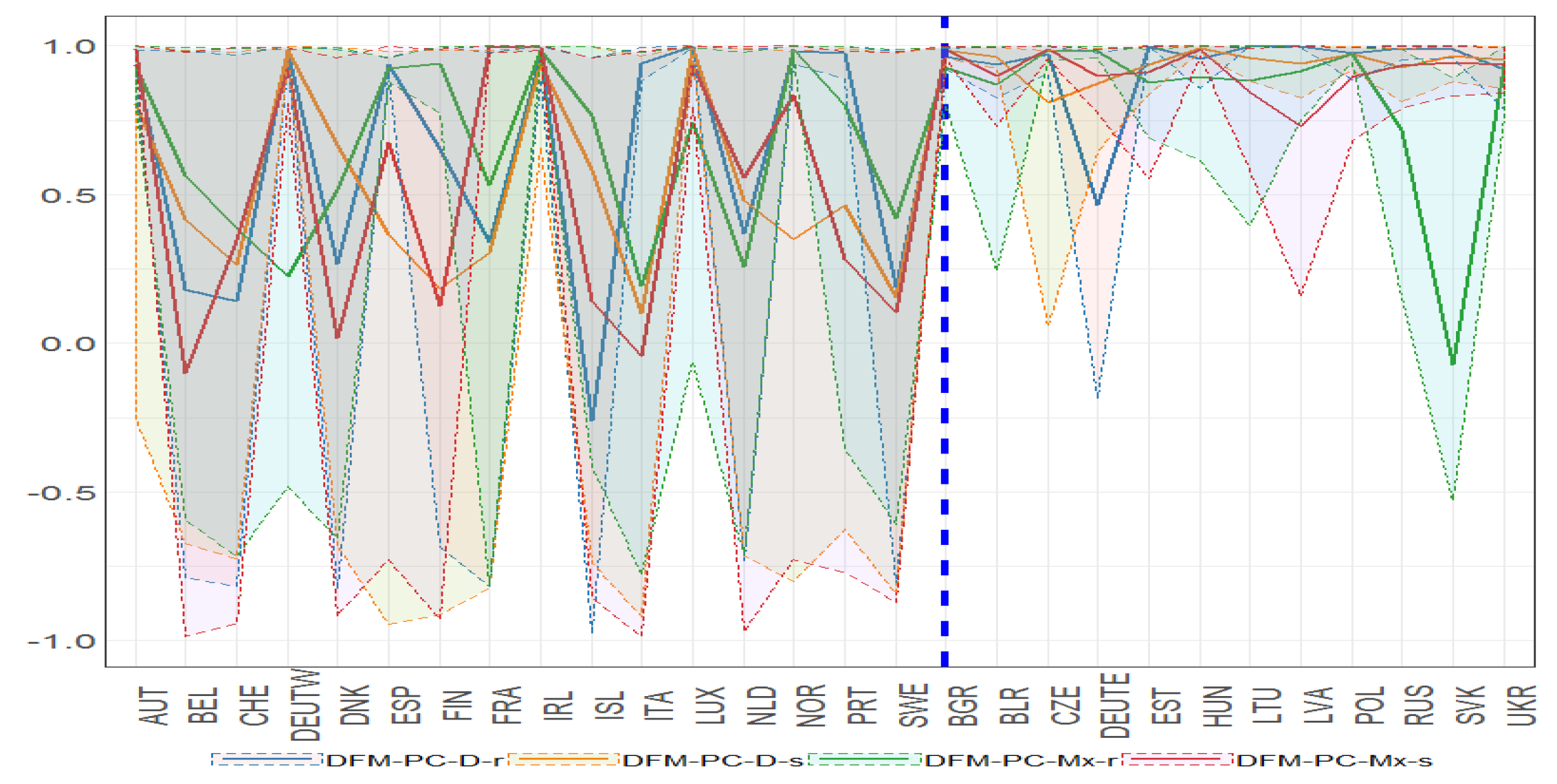
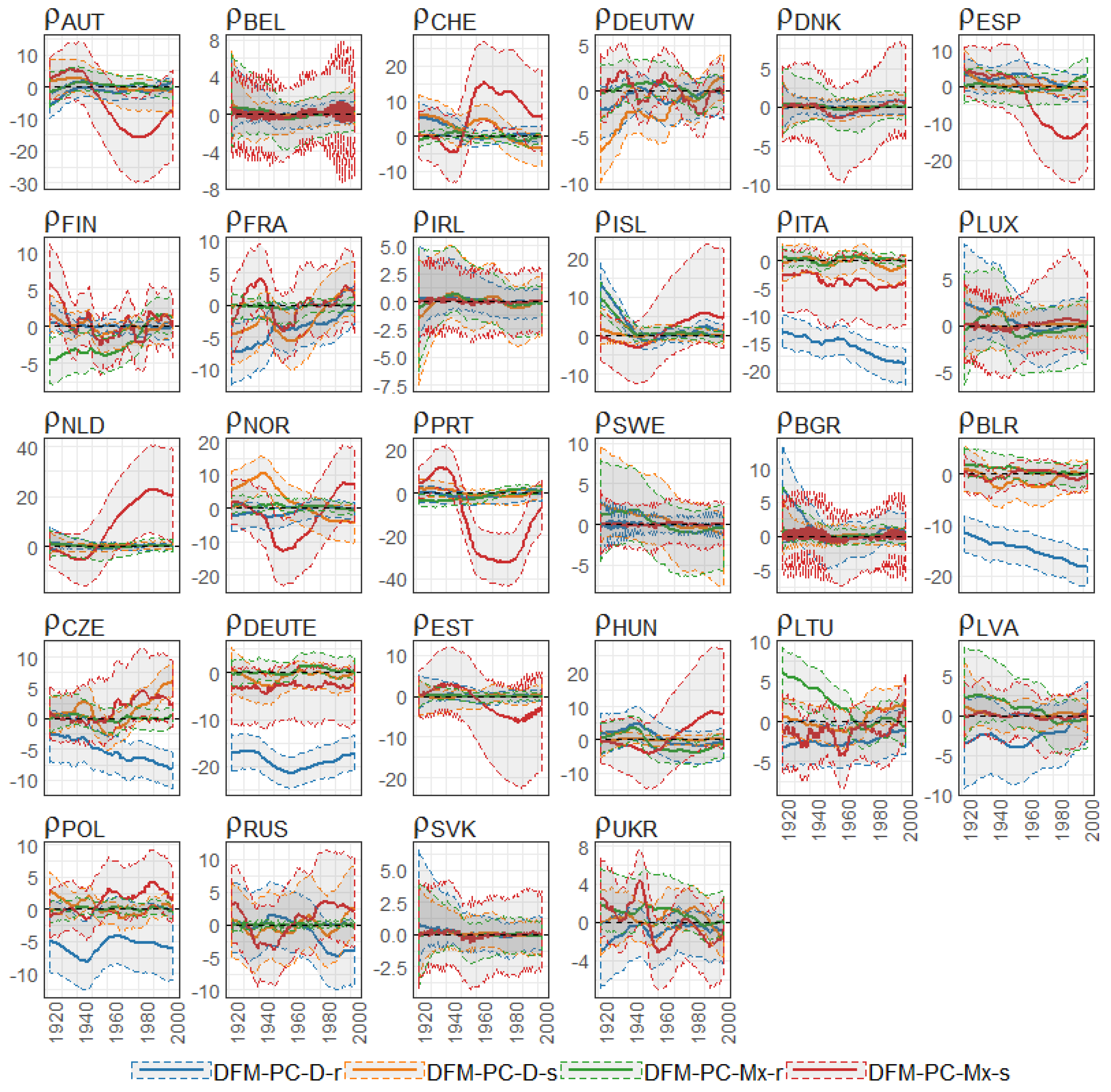
Bayesian posterior mean estimators with 95% posterior credible intervals for the estimation of the diagonal elements of the transition matrix (x axis ) under DFM-PC-D-r, DFM-PC-D-s, DFM-PC-Mx-r and DFM-PC-Mx-s models (colours of lines). The dashed blue line divides the set of countries into developed (on the left side) and developing (on the right hand side) European countries, respectively.
Figure 32.
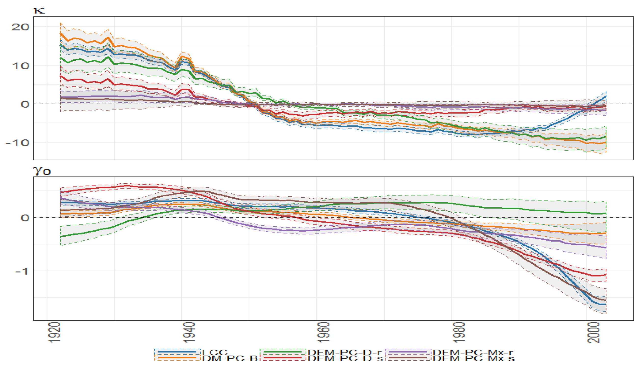
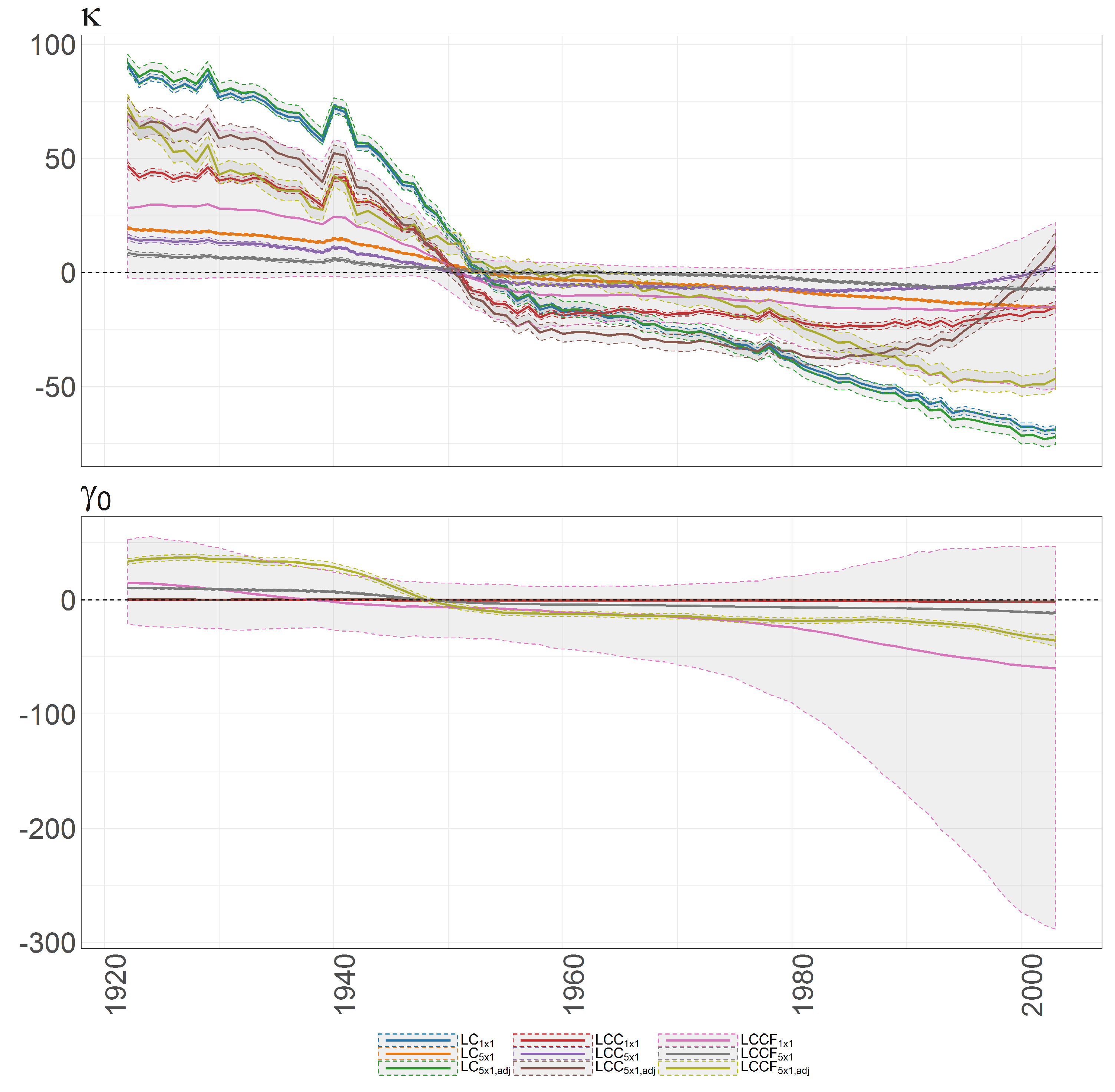
The Bayesian posterior mean estimates with 95% posterior credible intervals for (upper panel) and cohort effect state process (lower panel) under different models (colours of lines) for British female log death rates during 1922–2002.
Figure 32.
The Bayesian posterior mean estimates with 95% posterior credible intervals for (upper panel) and cohort effect state process (lower panel) under different models (colours of lines) for British female log death rates during 1922–2002.
Figure 33.
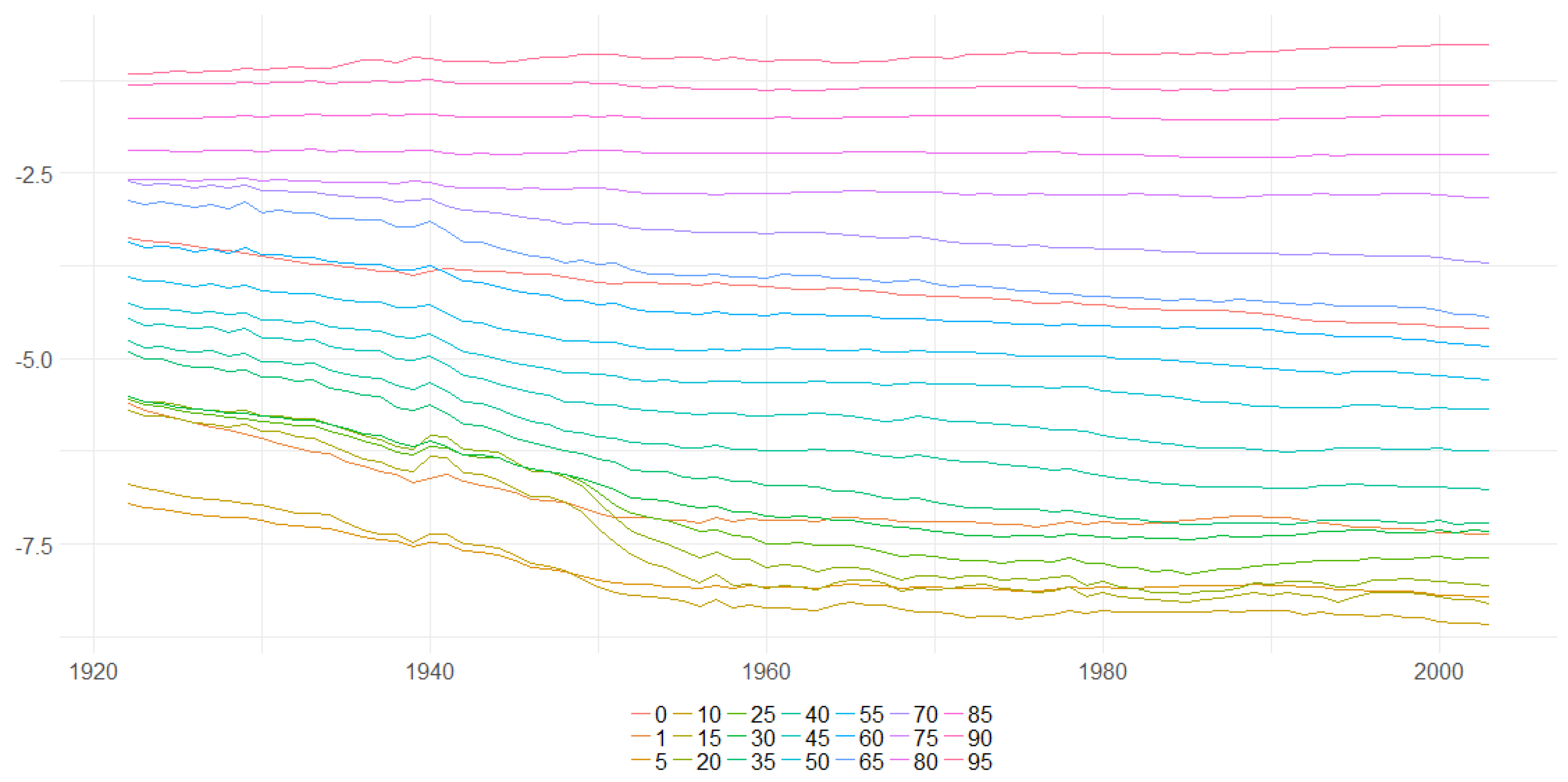
The Bayesian posterior mean estimates for across age groups (y axis) over time (x axis) under DFM-PC-B model for British female log death rates during 1922–2002.
Figure 33.
The Bayesian posterior mean estimates for across age groups (y axis) over time (x axis) under DFM-PC-B model for British female log death rates during 1922–2002.
Figure 34.
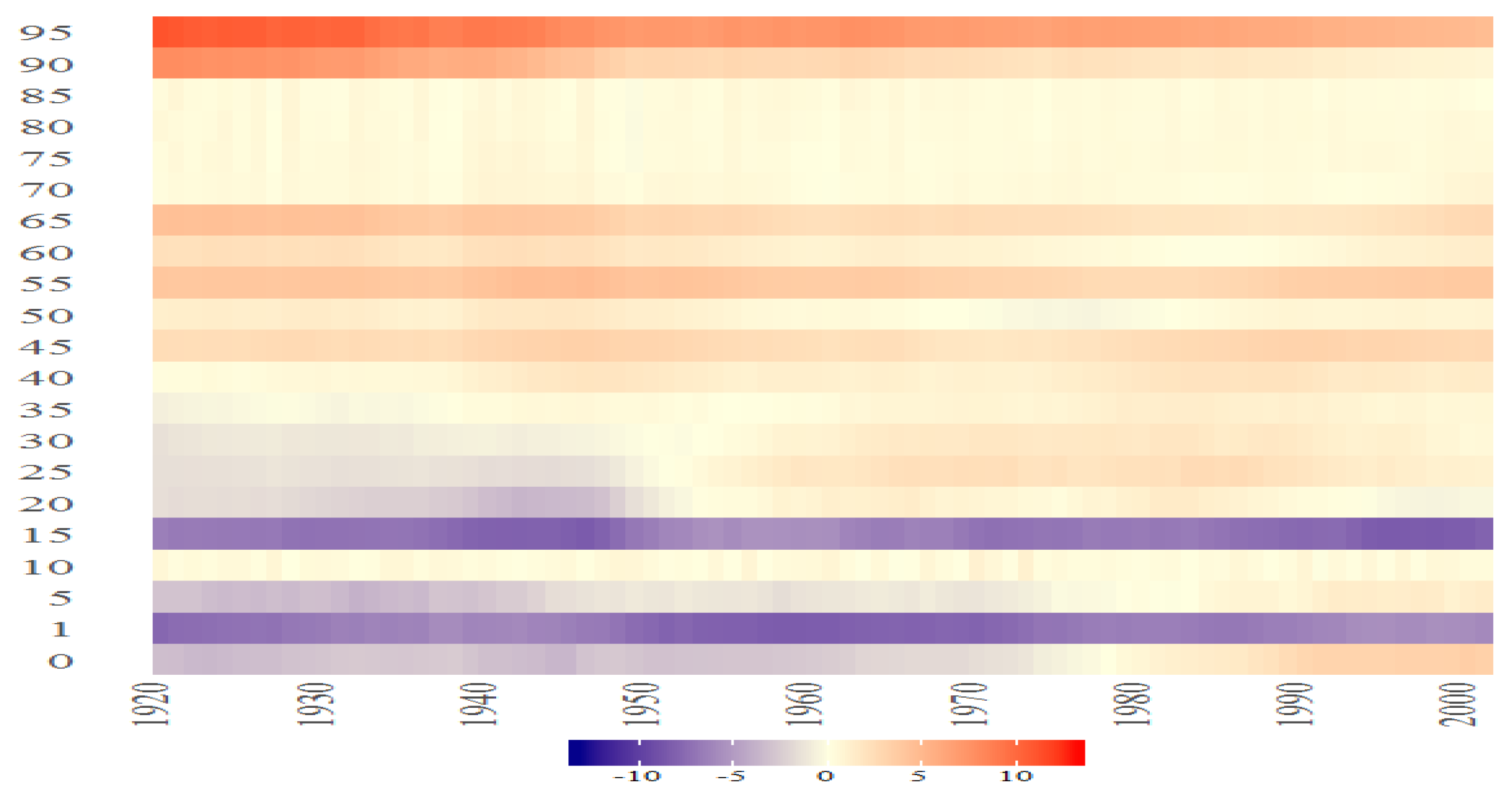
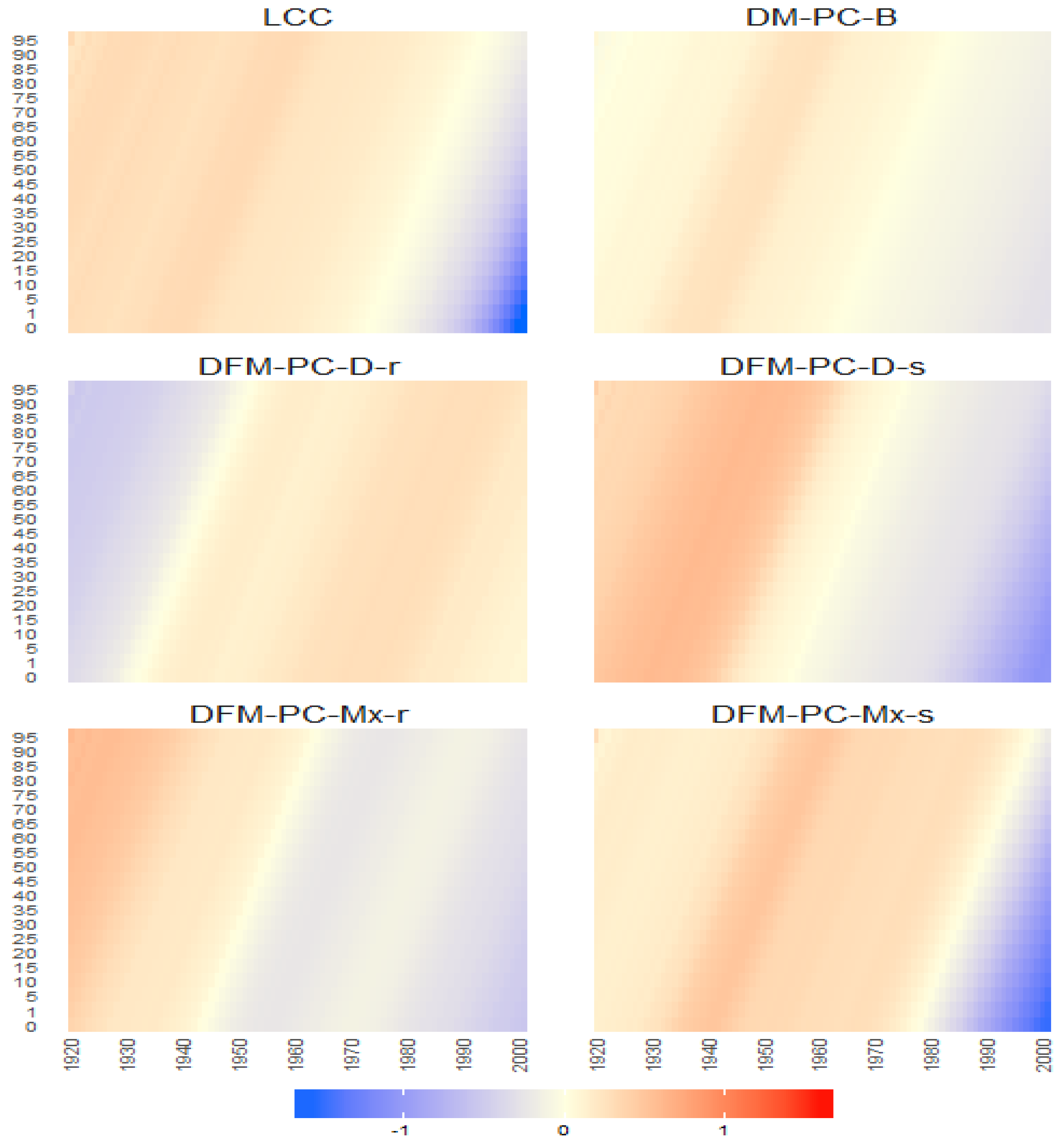
The Bayesian posterior mean estimates for the cohort effect latent processes vector across age groups (y axis) over time (x axis) under different models for British female log death rates during 1922–2002.
Figure 34.
The Bayesian posterior mean estimates for the cohort effect latent processes vector across age groups (y axis) over time (x axis) under different models for British female log death rates during 1922–2002.
Figure 35.
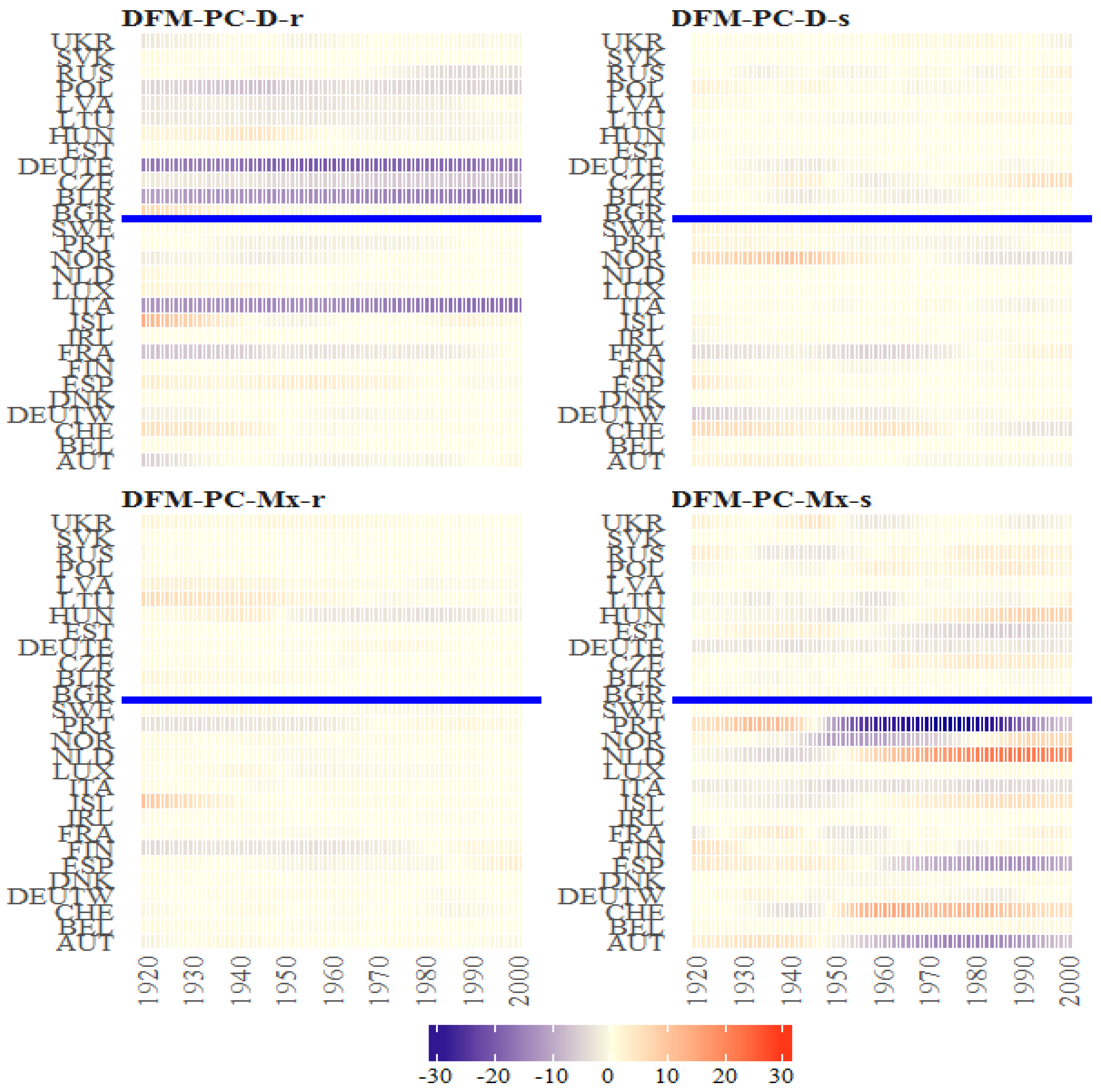
The Bayesian posterior mean estimates for across countries (y axis) over time (x axis) under the models from the classes DFM-PC-D and DFM-PC-Mx for British female log death rates during 1922–2002. The vertical blue line divides sets into developed (on the left side) and developing (on the right sie) European countries.
Figure 36.
The Bayesian posterior mean estimates with 95% posterior credible intervals for across countries (different panels) overtime (x axis) under the models from the classes DFM-PC-D and DFM-PC-Mx (colours of lines) for British female log death rates during 1922–2002.
Figure 36.
The Bayesian posterior mean estimates with 95% posterior credible intervals for across countries (different panels) overtime (x axis) under the models from the classes DFM-PC-D and DFM-PC-Mx (colours of lines) for British female log death rates during 1922–2002.
Figure 37.
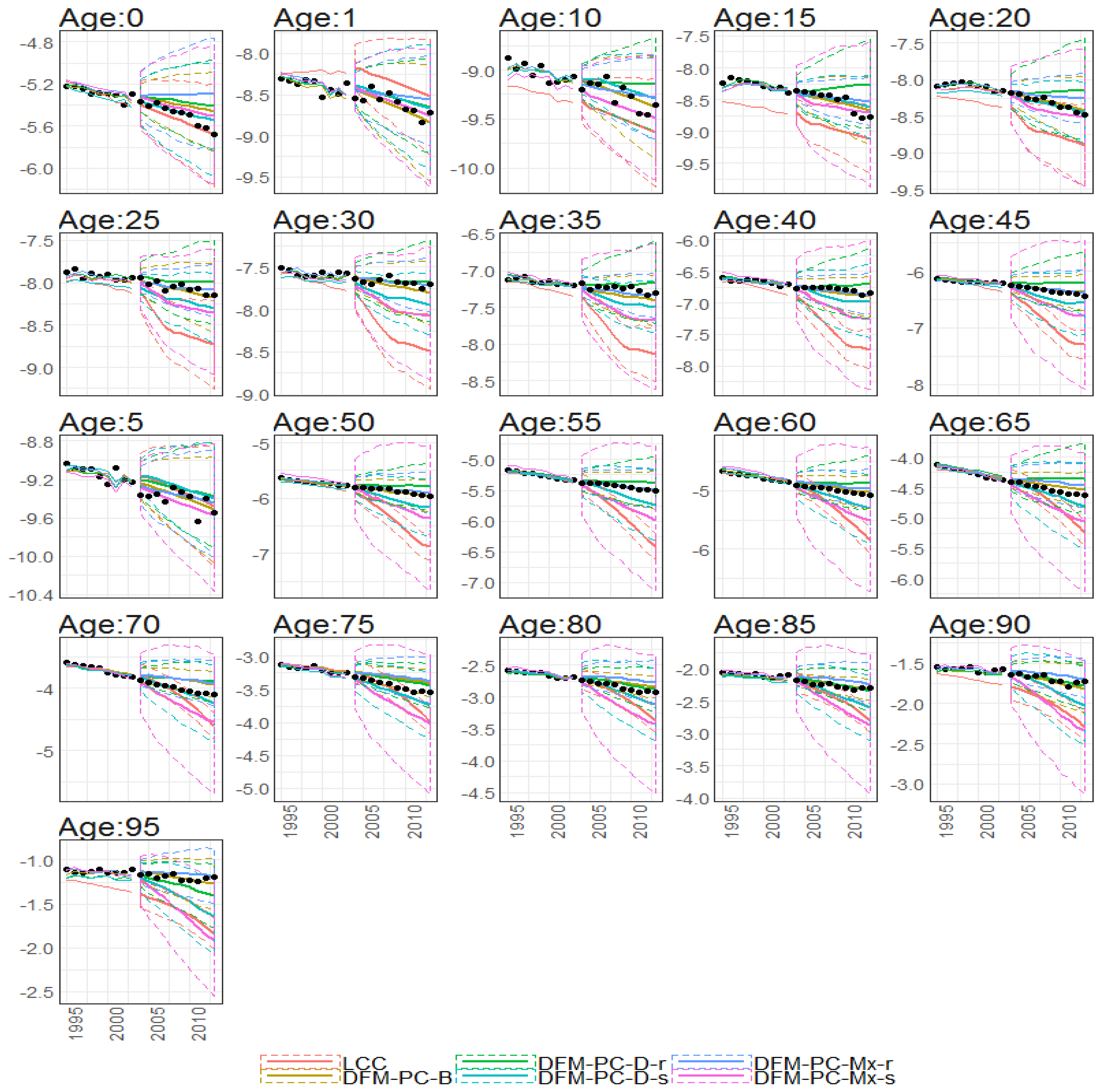
10-year out-of-sample forecasted log death (y axis) rates of different age groups (different subplots) under different models (colours of lines) with corresponding prediction intervals. Calibration period: 1922–2002
Figure 37.
10-year out-of-sample forecasted log death (y axis) rates of different age groups (different subplots) under different models (colours of lines) with corresponding prediction intervals. Calibration period: 1922–2002
Figure 38.
Bayesian posterior estimators with 95% posterior credible intervals for the estimation of and under different models (colours of lines) for British female mortality data (1922–2002).
Figure 38.
Bayesian posterior estimators with 95% posterior credible intervals for the estimation of and under different models (colours of lines) for British female mortality data (1922–2002).
Figure 39.
The Bayesian posterior mean estimates with 95% posterior credible intervals for (upper panel) and cohort effect state process (lower panel) under different models (colours of lines) for British female log death rates during 1922–2002.
Figure 39.
The Bayesian posterior mean estimates with 95% posterior credible intervals for (upper panel) and cohort effect state process (lower panel) under different models (colours of lines) for British female log death rates during 1922–2002.
Figure 40.
The Bayesian posterior mean estimates with 95% posterior credible intervals average over time for for DFM-PC-D-r.
Figure 40.
The Bayesian posterior mean estimates with 95% posterior credible intervals average over time for for DFM-PC-D-r.
Figure 41.
The Bayesian posterior mean estimates of over time for DFM-PC-D-r. Colours of lines are related to the age groups (the elements of the vector .
Figure 41.
The Bayesian posterior mean estimates of over time for DFM-PC-D-r. Colours of lines are related to the age groups (the elements of the vector .
Table 1.
The availability of the demographic data per country (Human Mortality Database).
Table 1.
The availability of the demographic data per country (Human Mortality Database).
| Country | | Life Expectancy () | No. Births | Death Rate () | No. Deaths |
|---|
| Austria | | 1947–2014 | 1871–2014 | 1947–2014 | 1947–2014 |
| Belarus | | 1959–2014 | 1959–2014 | 1959–2014 | 1959–2014 |
| Belgium | | 1841–2015 | 1840–2015 | 1841–2015 | 1841–2015 |
| Czech Republic | | 1950–2010 | 1947–2014 | 1950–2014 | 1950–2014 |
| Denmark | | 1835–2014 | 1835–2014 | 1835–2014 | 1835–2014 |
| Estonia | | 1959–2013 | 1959–2013 | 1959–2013 | 1959–2013 |
| Finland | | 1878–2012 | 1865–2012 | 1878–2012 | 1878–2012 |
| France | | 1816–2014 | 1806–2014 | 1816–2014 | 1816–2014 |
| East Germany | | 1956–2013 | 1946–2013 | 1956–2013 | 1956–2013 |
| West Germany | | 1956–2013 | 1946–2013 | 1956–2013 | 1956–2013 |
| Greece | | 1981–2013 | 1981–2013 | 1981–2013 | 1981–2013 |
| Estonia | | 1959–2013 | 1959–2013 | 1959–2013 | 1959–2013 |
| Hungary | | 1950–2014 | 1950–2014 | 1950–2014 | 1950–2014 |
| Iceland | | 1838–2013 | 1838–2013 | 1838–2013 | 1838–2013 |
| Ireland | | 1950–2014 | 1950–2014 | 1950–2014 | 1950–2014 |
| Italy | | 1872–2012 | 1862–2012 | 1872–2012 | 1872–2012 |
| Latvia | | 1959–2013 | 1959–2013 | 1959–2013 | 1959–2013 |
| Lithuania | | 1959–2013 | 1959–2013 | 1959–2013 | 1959–2013 |
| Luxembourg | | 1960–2014 | 1950–2014 | 1960–2014 | 1960–2014 |
| Netherlands | | 1850–2012 | 1850–2012 | 1850–2012 | 1850–2012 |
| Norway | | 1846–2014 | 1846–2014 | 1846–2014 | 1846–2014 |
| Poland | | 1958–2014 | 1958–2014 | 1958–2014 | 1958–2014 |
| Portugal | | 1940–2012 | 1886–2012 | 1940–2012 | 1940–2012 |
| Russia | | 1959–2014 | 1959–2014 | 1959–2014 | 1959–2014 |
| Slovakia | | 1950–2014 | 1950–2014 | 1950–2014 | 1950–2014 |
| Slovenia | | 1983–2014 | 1983–2014 | 1983–2014 | 1983–2014 |
| Spain | | 1908–2014 | 1908–2014 | 1908–2014 | 1908–2014 |
| Sweden | | 1751–2014 | 1747–2014 | 1751–2014 | 1751–2014 |
| Switzerland | | 1876–2014 | 1871–2014 | 1876–2014 | 1876–2014 |
| United Kingdom | | 1922–2013 | 1922–2013 | 1922–2013 | 1922–2013 |
| Ukraine | | 1959–2013 | 1946–2013 | 1959–2013 | 1959–2013 |
Table 2.
Bayesian posterior mean estimators with 95% posterior credible intervals for the estimation of the static parameters of .
Table 2.
Bayesian posterior mean estimators with 95% posterior credible intervals for the estimation of the static parameters of .
| Model | | | | | | | |
|---|
| LCC | 0.998 (0.994; 1) | (; 0.026) | (; ) | 6.4×10 | 2×10 | 0.663 (0.449; 0.96) | |
| (6×10; 6.9×10) | (1.4×10; 2.8×10) | |
| DFM-PC-B | 0.991 (0.968; 1) | (; ) | (; 0.002) | 8×10 | 5×10 | 0.753 (0.537; 1.055) | 0.049 (0.042; 0.057) |
| (6×10; 9×10) | (4×10; 7×10) | | |
| DFM-PC-D-r | 0.949 (0.913; 0.992) | (; ) | 0.011 (; 0.021) | 1×10 | 5×10 | 0.39 (0.227; 0.739) | 0.092 (0.074; 0.113) |
| (9×10; 1.1×10) | (4×10; 8×10) | | |
| DFM-PC-D-s | 0.998 (0.993; 1) | (; 0.029) | (; ) | 1.3×10 | 8×10 | 0.324 (0.152; 0.616) | 0.144 (0.114; 0.178) |
| (1.1×10; 1.4×10) | (5×10; 1.1×10) | | |
| DFM-PC-Mx-r | 0.985 (0.959; 0.999) | (; 0) | (; ) | 8×10 | 6×10 | 0.044 (0.002; 0.116) | 0.08 (0.066; 0.094) |
| (7×10; 1×10) | (4×10; 8×10) | | |
| DFM-PC-Mx-s | 0.999 (0.995; 1) | (; 0.044) | (; ) | 1.2×10 | 1.7×10 | 0.036 (0.001; 0.137) | 0.834 (0.594; 0.994) |
| (8×10; 2.1×10) | (1.2×10; 2.3×10) | | |
Table 3.
The MAP estimates of the static parameters of .
Table 3.
The MAP estimates of the static parameters of .
| Model | | | | | | | |
|---|
| LCC | | | | | | | – |
| DFM-PC-B | 0.998 | | | 8.00×10 | 5.00×10 | 0.7279 | 0.0487 |
| DFM-PC-D-r | 0.948 | | 0.012 | 0.001 | 5.00×10 | 0.3234 | 0.0895 |
| DFM-PC-D-s | 0.999 | | | 0.0013 | 7.00×10 | 0.3005 | 0.1416 |
| DFM-PC-Mx-r | 0.995 | | | 7.00×10 | 6.00×10 | 0.029 | 0.0818 |
| DFM-PC-Mx-s | 1 | | | 9.00×10 | 0.0016 | 0.0088 | 0.8583 |
Table 4.
Mean square error of the fit of the models to the data (MSE), deviance information criterion (DIC) and mean square errors of predictions using forecasting distributions given by MCMC samples () and Kalman Filter ().
Table 4.
Mean square error of the fit of the models to the data (MSE), deviance information criterion (DIC) and mean square errors of predictions using forecasting distributions given by MCMC samples () and Kalman Filter ().
| Model | MSE | DIC | MSEP | MSEP |
|---|
| LCC | 0.0097 | | 0.1778 | 0.1774 |
| DFM-PC-B | 0.0072 | | 0.0057 | 0.0062 |
| DFM-PC-D-r | 0.0182 | | 0.0177 | 0.0251 |
| DFM-PC-D-s | 0.0065 | | 0.0185 | 0.0156 |
| DFM-PC-Mx-r | 0.0081 | | 0.0111 | 0.0129 |
| DFM-PC-Mx-s | 0.0174 | | 0.0692 | 0.0285 |
Table 5.
Mean square error of the fit of the models to the data (MSE) and mean square errors of predictions using forecasting distributions given by MCMC samples () and Kalman Filter (). The models highlated by bold font exhibit significant levels of over-fitting.
Table 5.
Mean square error of the fit of the models to the data (MSE) and mean square errors of predictions using forecasting distributions given by MCMC samples () and Kalman Filter (). The models highlated by bold font exhibit significant levels of over-fitting.
| Model | MSE | | |
|---|
| LC | 0.0128 | 0.0577 | 0.0568 |
| LC | 0.0113 | 0.0457 | 0.0457 |
| LC | 0.0116 | 0.0512 | 0.0516 |
| LCC | 0.0079 | 0.0249 | 0.0243 |
| LCC | 0.0097 | 0.1778 | 0.1774 |
| LCC | 0.0099 | 0.1664 | 0.1625 |
| LCCF | 0.2588 | 0.4735 | 0.6150 |
| LCCF | 0.0107 | 0.0458 | 0.0464 |
| LCCF | 0.0131 | 0.0481 | 0.0508 |
