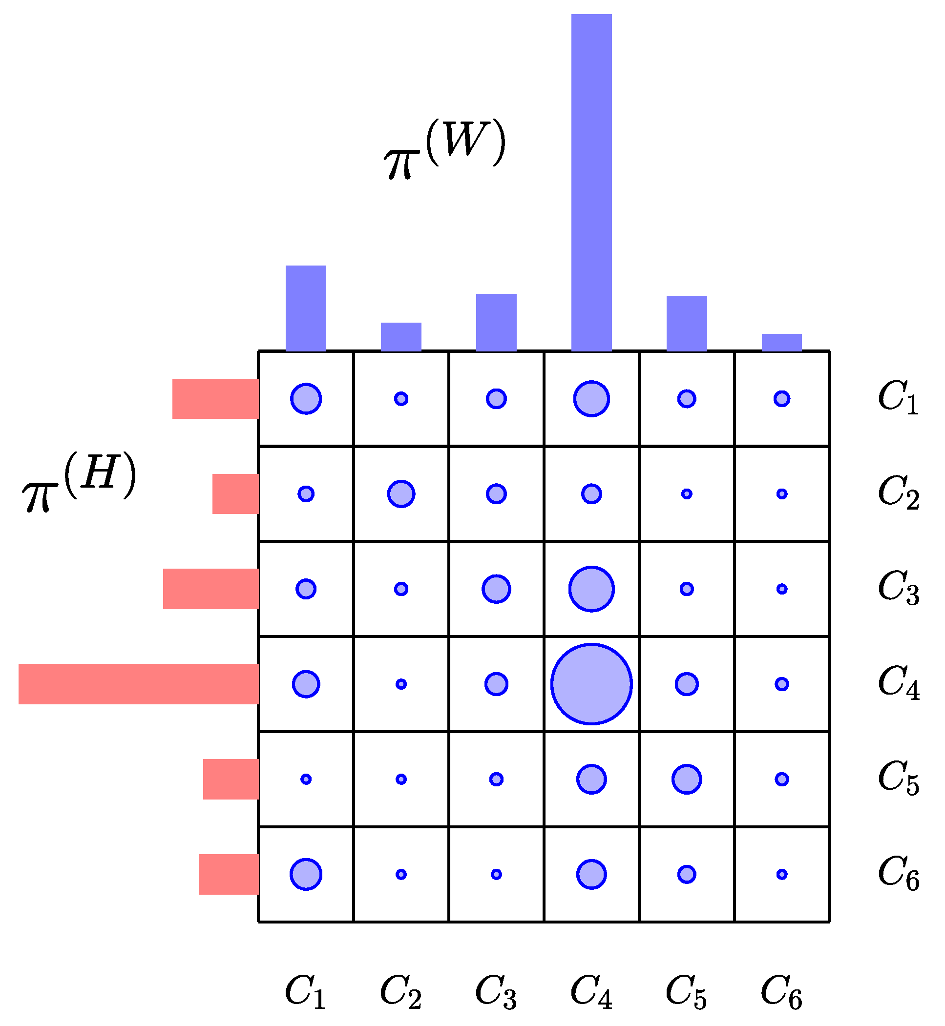
Figure 1.
Schematic representation of the transport scheme across six communities. In this cartoon, the dots represent entries of the matrix of the transport scheme, with the size proportional to the radius of the dot. The red histogram , which is the marginal distribution of the contact matrix with respect to the row index, represents the distribution of the population according to the census definition of usual residence, and the blue histogram , the marginal with respect to the row index, is the population density during the work hours. Here, is an example of a center attracting population from other communities, while, for instance, is a bedroom community with low work place density, the principal work places being in and .
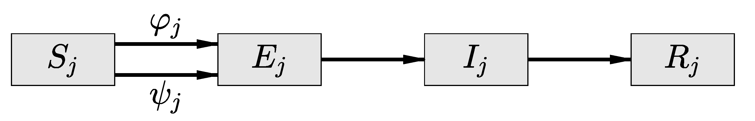
Figure 2.
Susceptible resident of the community in the cohort may be exposed and infected either in the work environment (flux ) or off work in the home community (flux ). The total transmission flux out of the susceptible population is a convex combination of these two fluxes, with coefficients that depend on the number of hours spent at work. In this diagram, the flux corresponding to a positive death rate is omitted.
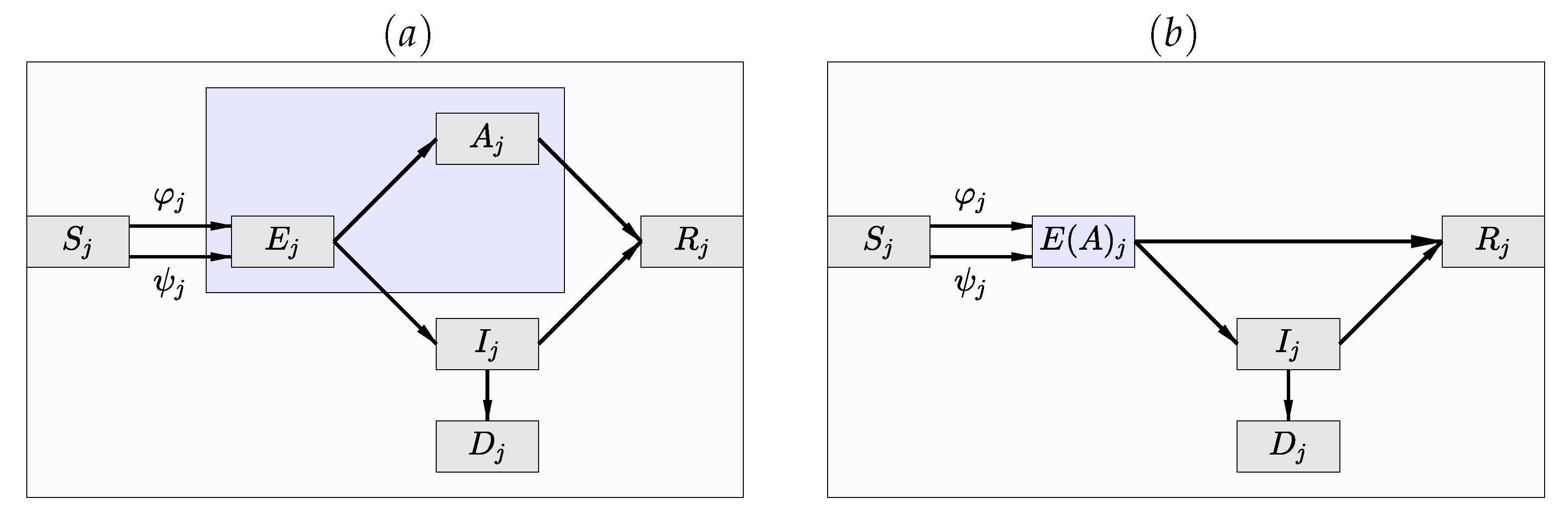
Figure 3.
(a) The compartment diagram of the SEAIR model in which the infected and infectious compartment has been split into the asymptomatic () and symptomatic () compartments. (b) The SE(A)IR compartment diagram in which the exposed non-infective cohort and the infective, infectious and asymptomatic compartments are merged into a hidden compartment of which only indirect inference is available, as long as the data consist of daily numbers of newly infected lab-confirmed cases.
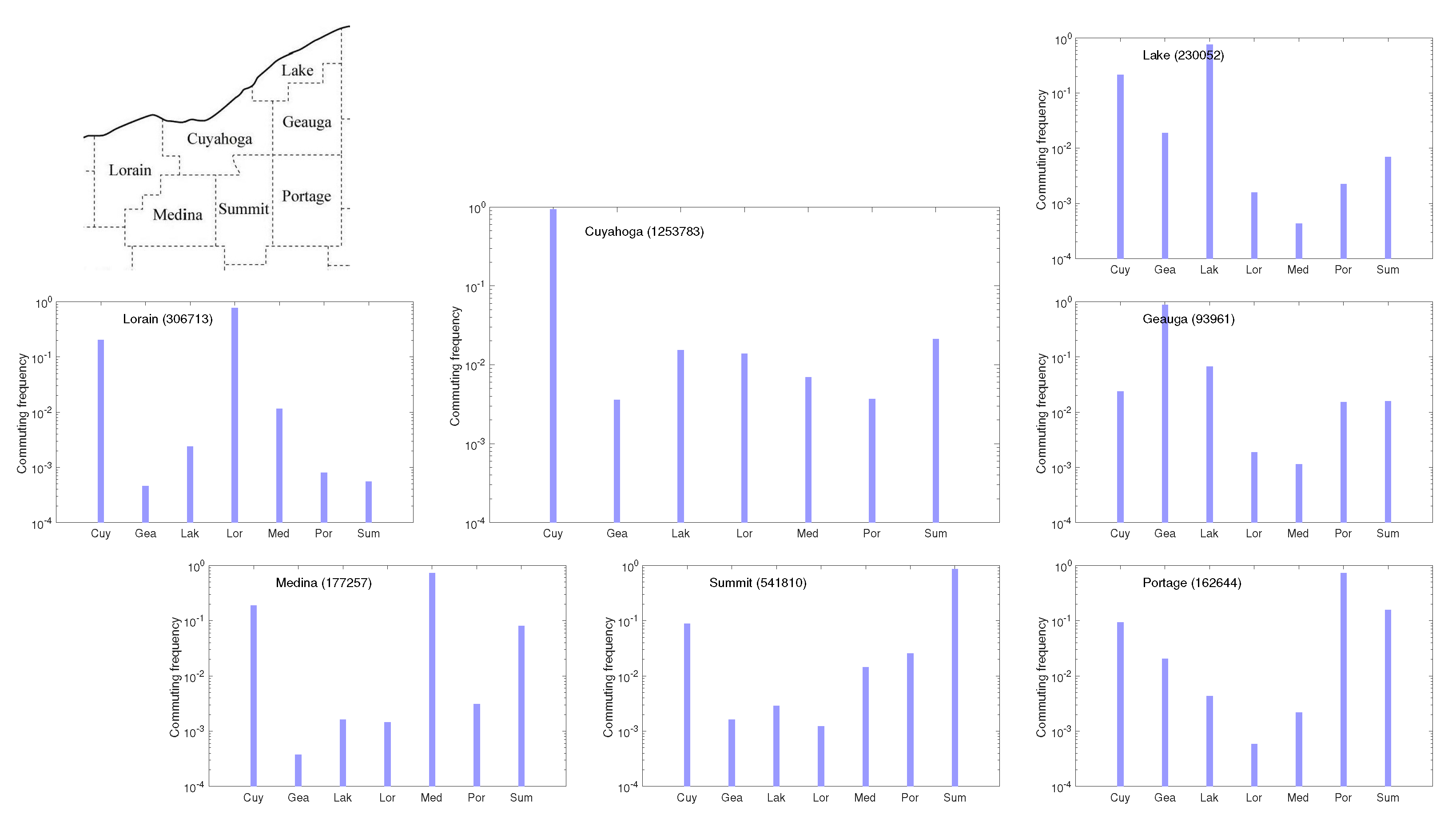
Figure 4.
The conditional densities county by county in the northeast Ohio network comprising the seven counties shown in the map. The plots are on a logarithmic scale, and the total population of each county is indicated in parenthesis.
Figure 4.
The conditional densities county by county in the northeast Ohio network comprising the seven counties shown in the map. The plots are on a logarithmic scale, and the total population of each county is indicated in parenthesis.
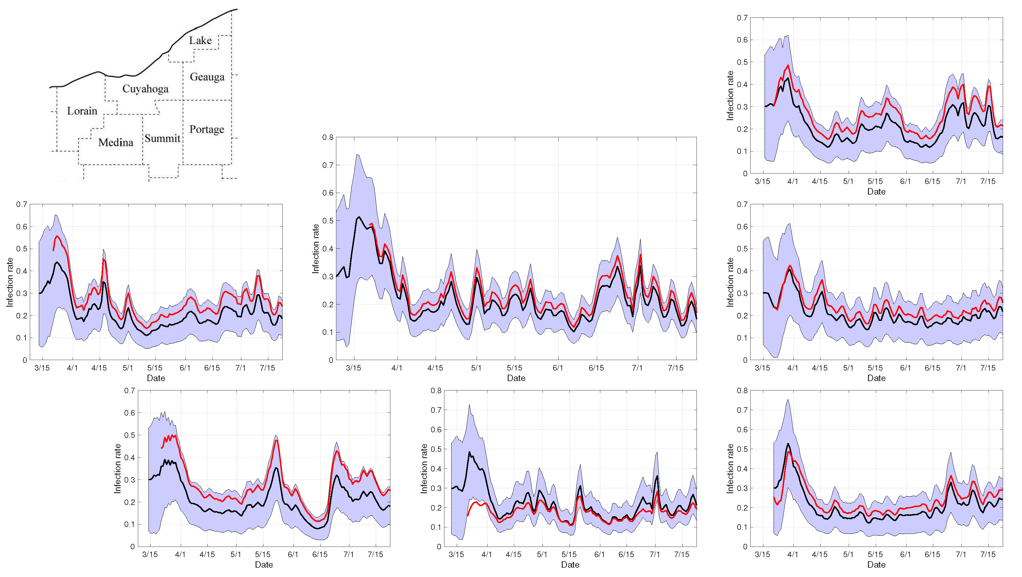
Figure 5.
Infection rates in the seven-county network during the first 100 days after the first recorded case in Cuyahoga county. The panels show the ensemble average (black curve) and the envelopes of two standard deviations of the independent county-by-county estimates computed by the PF algorithm, and the weighted least squares estimates (red curve) corresponding to the value of that minimizes the residual over the diagonal entries. Observe that the estimation process of (red curve) starts as soon as each of the seven counties has had at least one COVID-19 case (Portage county was the last one) to guarantee that the vector of individual county estimates for the infection rate is defined.
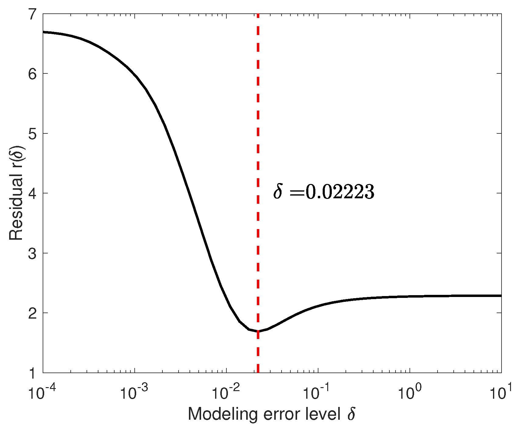
Figure 6.
The residual
defined by the Formula (
55), plotted over the interval
. The minimizer is indicated by the dashed line.
Figure 6.
The residual
defined by the Formula (
55), plotted over the interval
. The minimizer is indicated by the dashed line.
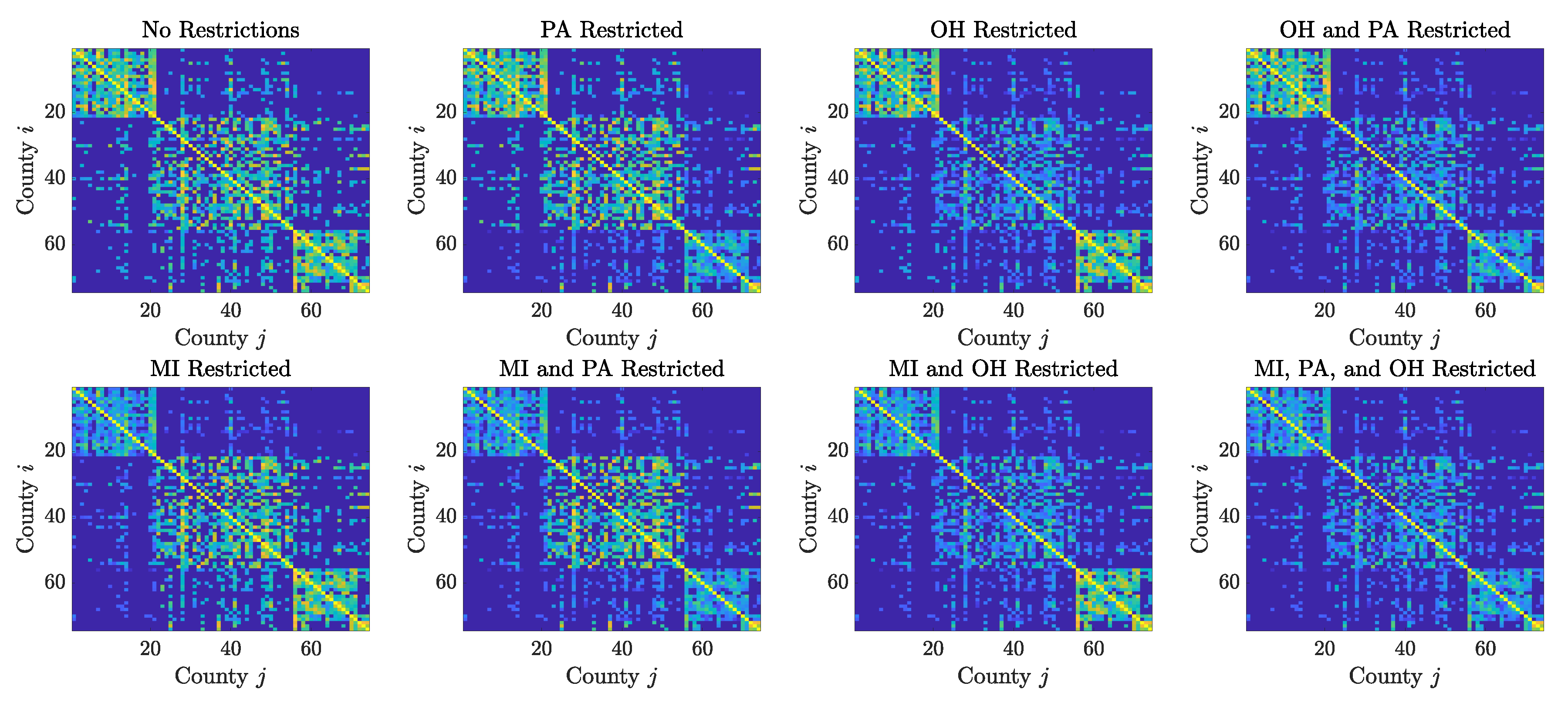
Figure 7.
Contact matrices for the 74 counties in the Cleveland–Detroit–Pittsburgh corridor, plotted in a logarithmic scale. Each county corresponds to a row/column of the matrix, with the counties grouped by state, in the order: Michigan, Ohio, Pennsylvania and West Virginia, the latter being represented by only a few counties in the northern panhandle. The intensity of th pixel is proportional to the number of individuals commuting from the jth country to the ith county. The top left panel shows the commuting patterns prior to the pandemic: the counties in the states of Michigan and Pennsylvania are more tightly internally connected than those in Ohio, as indicated by the intensity of the pixels in the first and third diagonal blocks, and it is clear that there is substantial commute among the three larger metropolitan areas. The remaining panels show how the communication network changes when the mobility to/from counties in specific states is reduced by 95%.
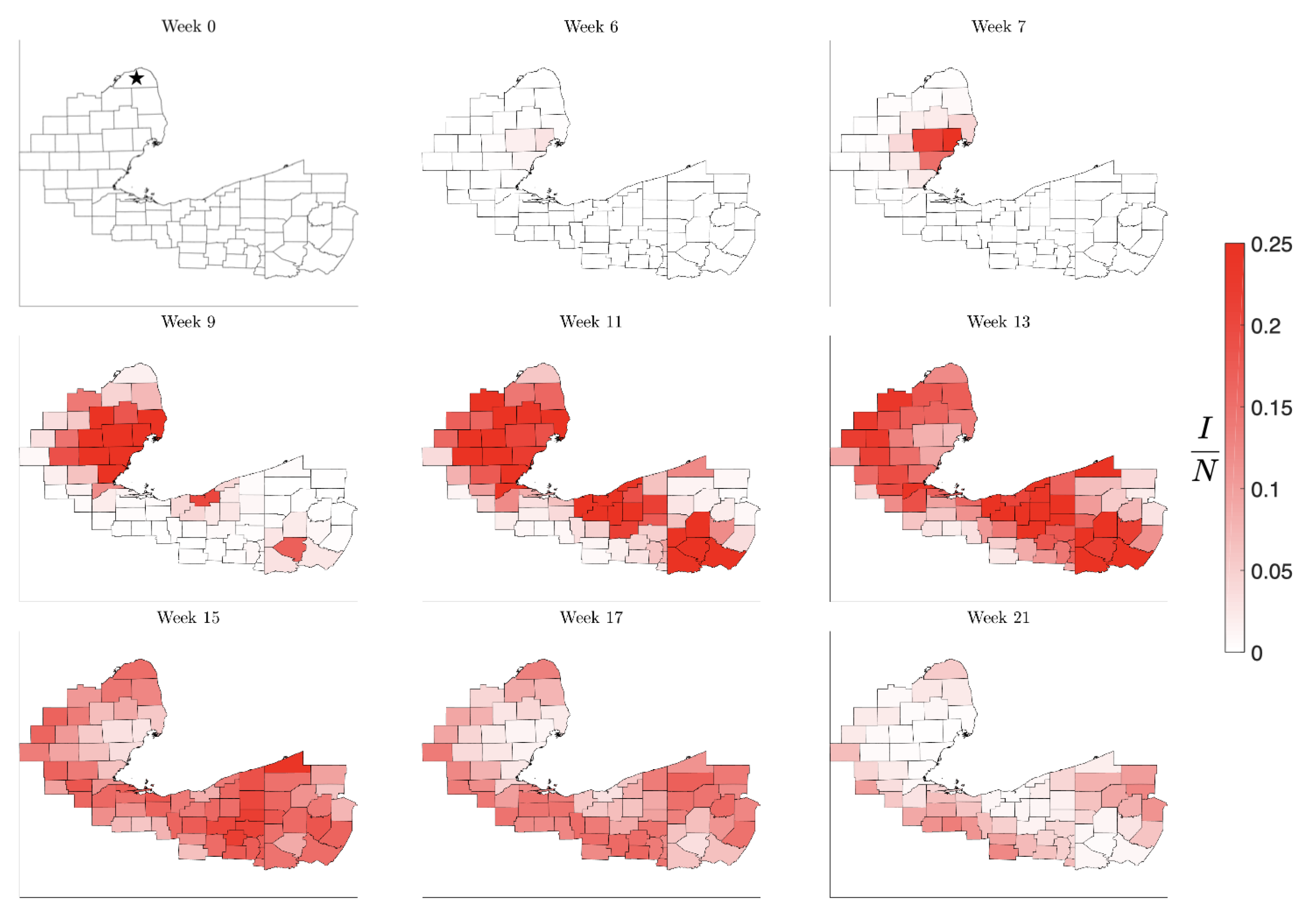
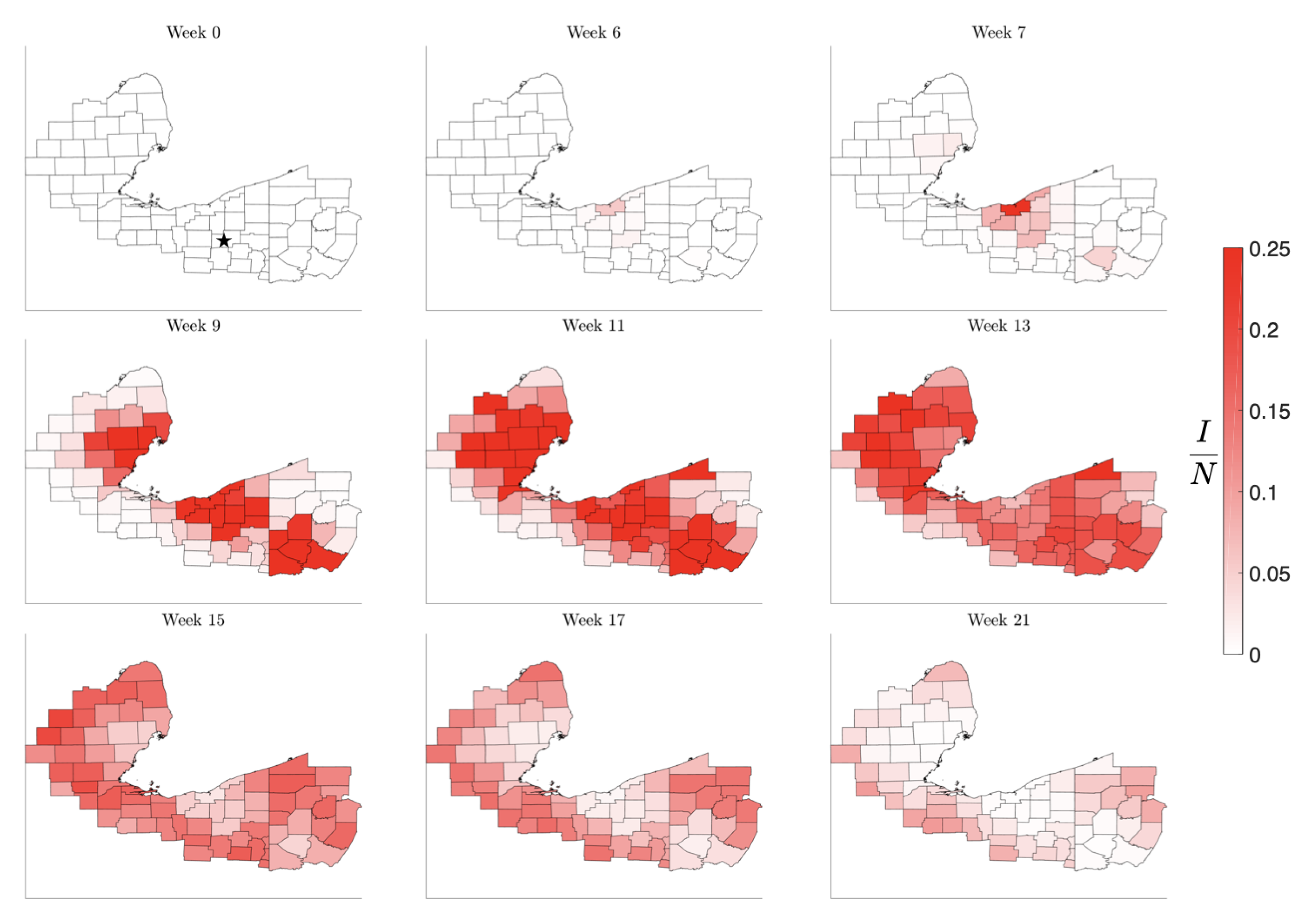
Figure 8.
Simulation of the spread of the infection starting in the low-density Huron County, MI, marked by a star in Week 0. The color code indicates the number of infected individuals per 100,000 inhabitants. Observe that the infection level remains low until it reaches the nearest high density metropolitan area, but afterwards propagating quickly to the other centers. The pattern of the evolution of the infection shows that metropolitan areas work as amplifiers, rendering the second wave in the surrounding areas much stronger than the initial infection. The rural areas experience the second wave when the metropolitan areas are already recovering, in agreement with what was observed in the United States in the late summer of 2020.
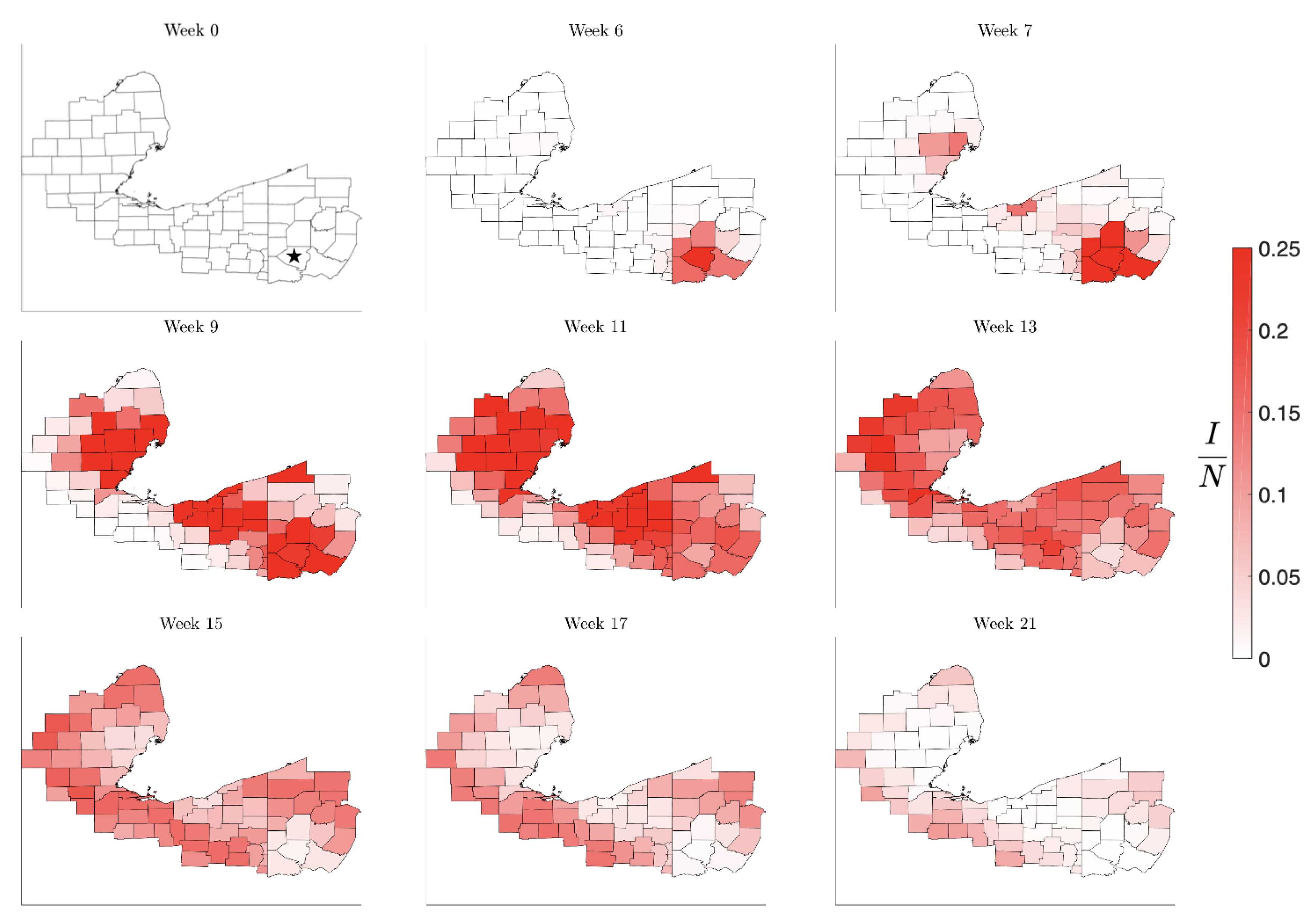
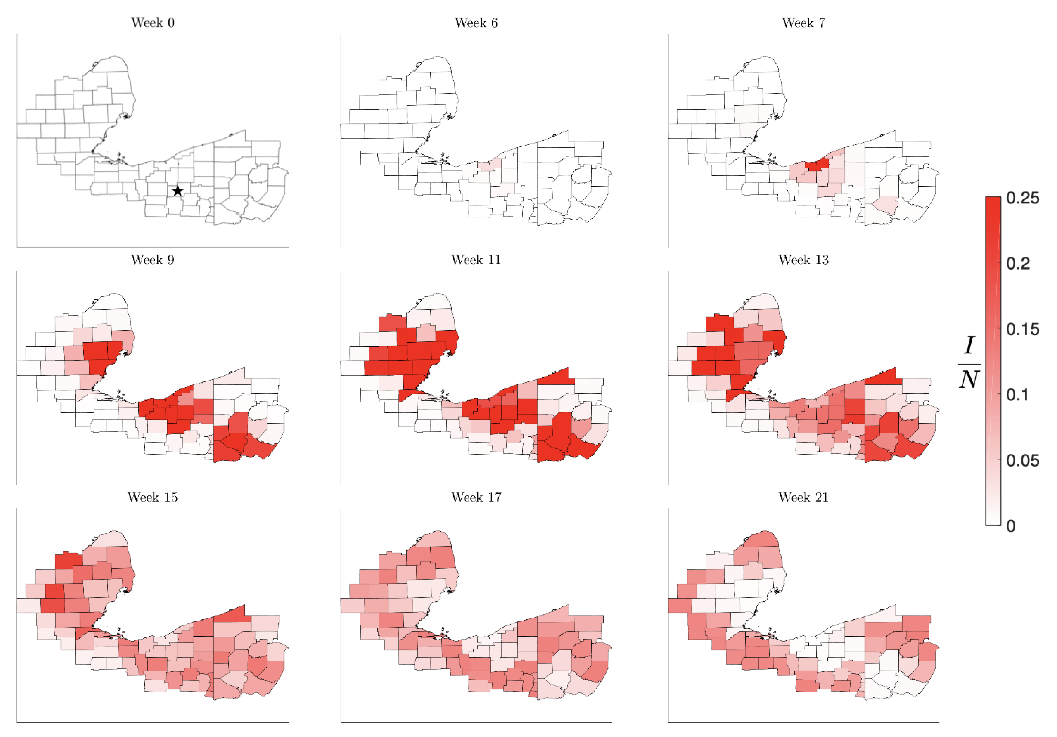
Figure 9.
Simulation starting spread beginning in the medium population Stark County, OH, marked by a star in Week 0. As in the previous simulation, the initial infection remains almost unnoticed until it reaches the nearest metropolitan area, from which it quickly spreads to the other high density communities. Again, the metropolitan centers act like amplifiers, rendering the second wave in the initial point more intense than the initial infection. The timeline is similar to the previous simulation.
Figure 10.
Simulation of the spatial pattern of the spread when starting with a single infected individual in the large population Allegheny County, PA (Pittsburgh area). The infection quickly spreads to the neighboring communities, which concurrently reaches the other two metropolitan areas. While the geographic pattern is similar to the two previous simulations, the timeline for the spread of the infection is faster.
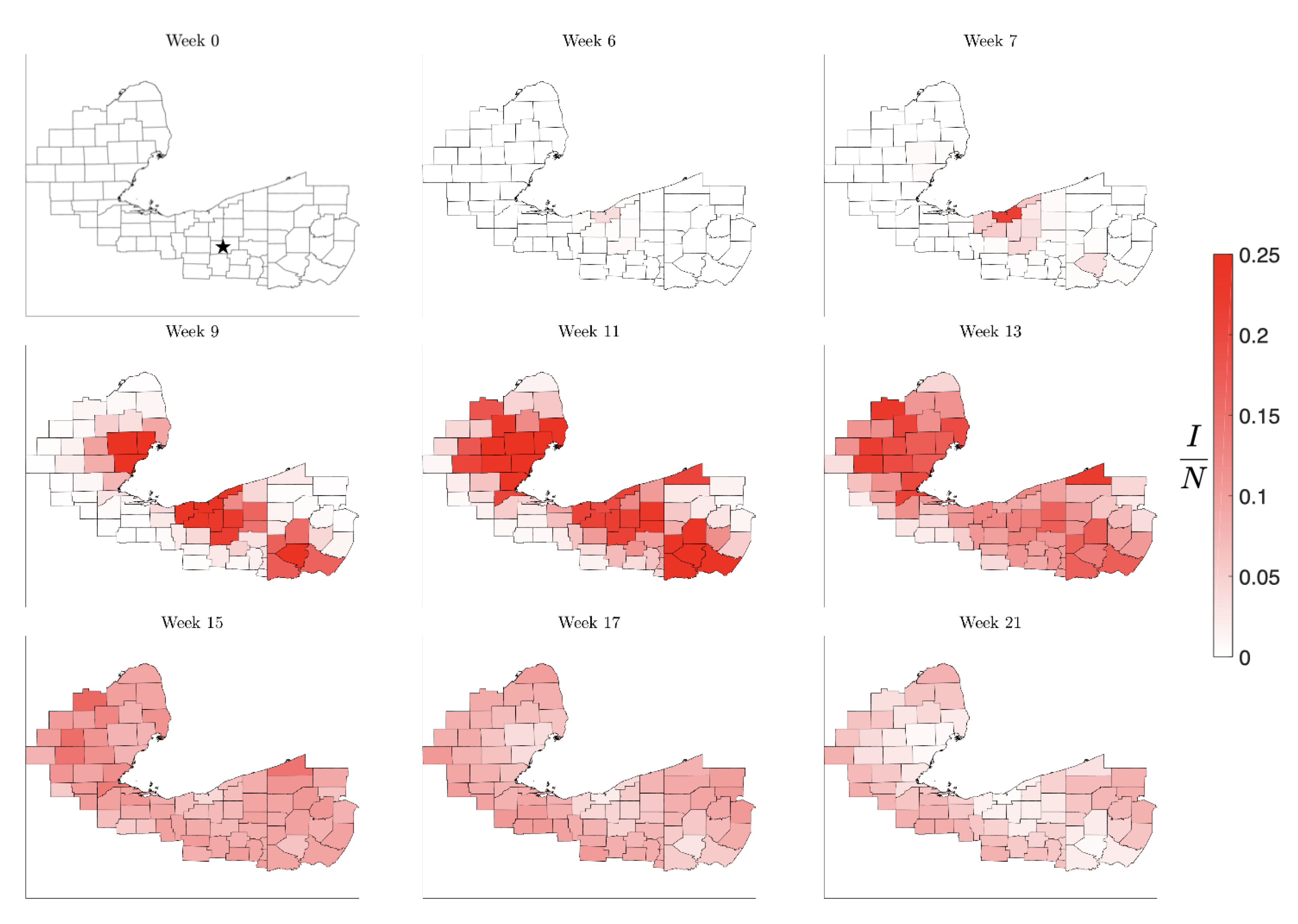
Figure 11.
Time course of the spread of the infection under mitigation by drastically reducing traffic to and from the counties in a state with 10% prevalence. This simulation was started with a single infected individual in Stark County, OH (marked with a star in the first panel).
Figure 11.
Time course of the spread of the infection under mitigation by drastically reducing traffic to and from the counties in a state with 10% prevalence. This simulation was started with a single infected individual in Stark County, OH (marked with a star in the first panel).
Figure 12.
Time course of the spread of the infection under mitigation by triggered contact reduction in counties as soon as the prevalence reaches 15% of the county population. This simulation was started with a single infected individual in Stark County, OH (marked with a star in the first panel).
Figure 13.
Time course of the spread of the infection under combined mitigation by triggered contact reduction in individual counties as soon as the prevalence reaches 15% of the county population accompanied by reduction in traffic to and from the affected states. This simulation was started with a single infected individual in Stark County, OH (marked with a star in the first panel).
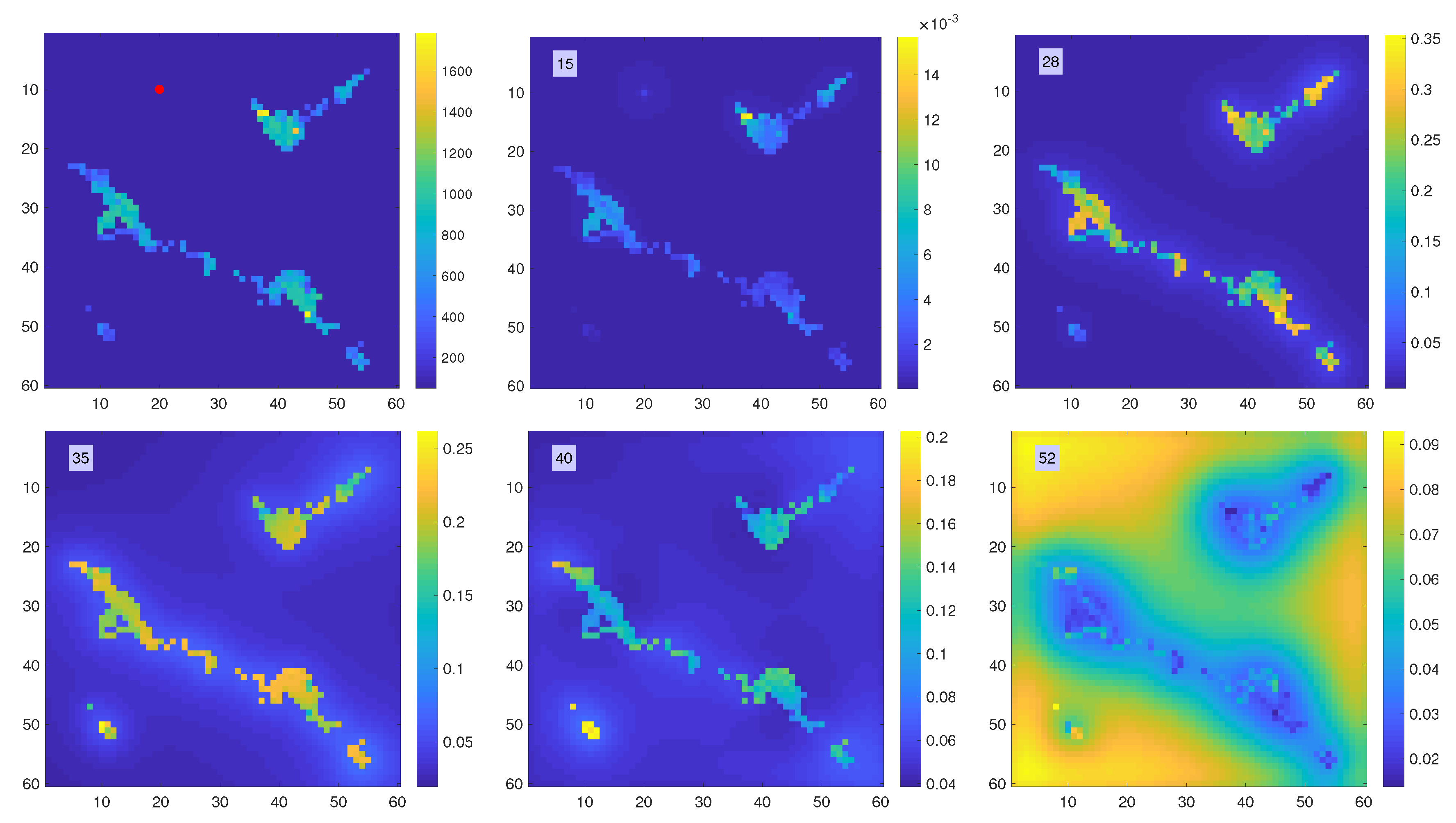
Figure 14.
Propagation of the infection. The top left panel shows the population density, in arbitrary units, with the location of the first infection marked by a red dot. Snapshots of the time history of the function are shown in lexicographical order. Observe the different color scale in the pictures. At , the infection has reached the nearby urban area, and at it peaks in all densely populated centers. At , the small center located in bottom left of the map reaches its peak, and at , when the infection in the urban areas has already passed, the rural areas peak.
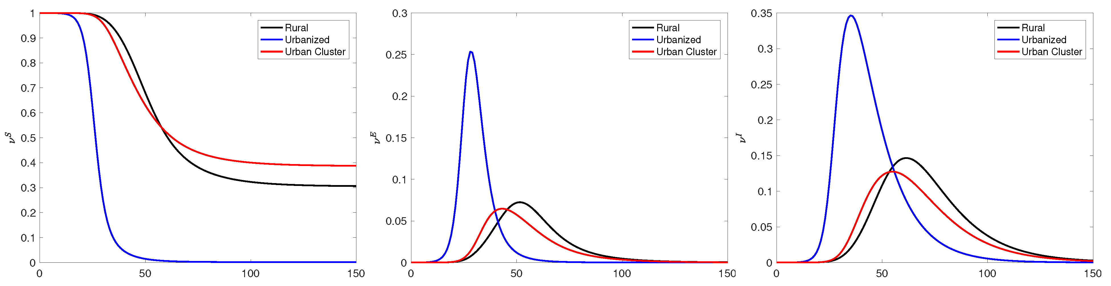
Figure 15.
Time traces of the frequencies
(left),
(middle) and
(right) at three selected locations: Referring to the coordinates in
Figure 14 as matrix entries with row and column indices
, the point labeled as “Rural” is at
, the point labeled as “Urbanized” is at
, and the point “Urban Cluster” is at
. We observe that the infection peak times increase as the local population density decreases. Interestingly, in the urban cluster, the percentage of eventually infected individuals is lower than in the rural community, indicating that the dynamics depends on the connectivity and not only on the local density.
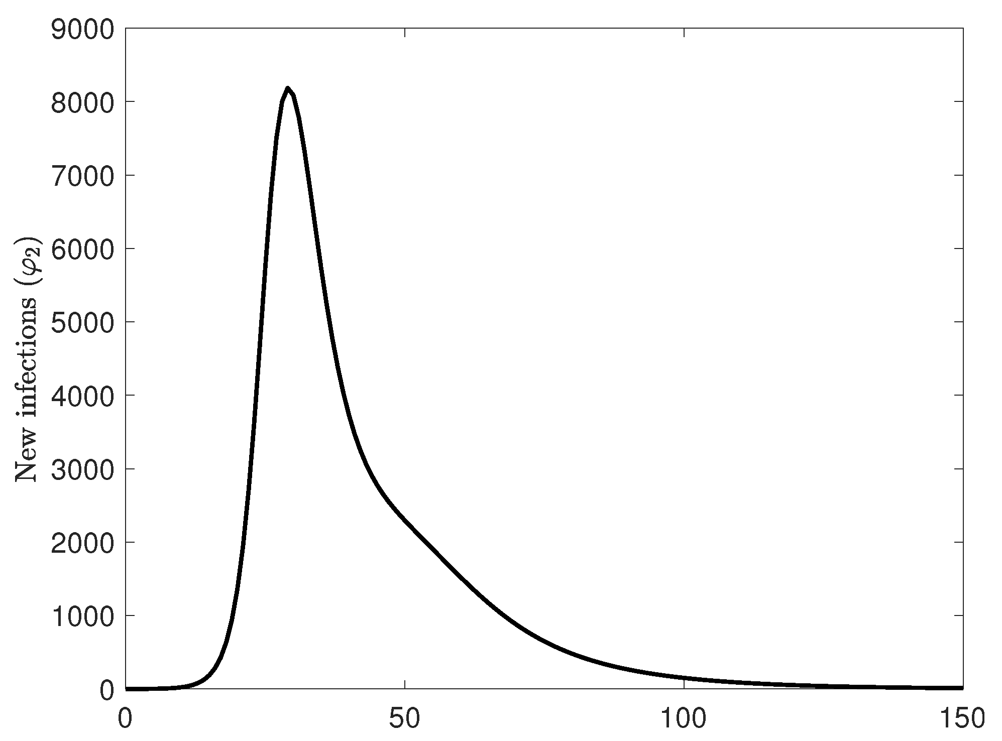
Figure 16.
New case count over the entire area. Observe that the new case count increases exponentially, but the decay rate of new cases is lower, with an almost linear segment which is well in line with the observed case count curves, in disagreement with the classical Farr’s law stating that the rise and fall behavior is symmetric. The different behavior of the rise and the fall comes from the spatial component of the model and the fact that the population is not well-mixed.
Table 1.
Parameter settings in the network simulation.
Table 1.
Parameter settings in the network simulation.
| Parameter | Symbol | Value |
|---|
| infection rate | | |
| daily contacts | r | |
| incubation rate | | |
| recovery rate | | |
| death rate | | |


