4.2.3. Fitting and Testing the Stock Return Distribution Model
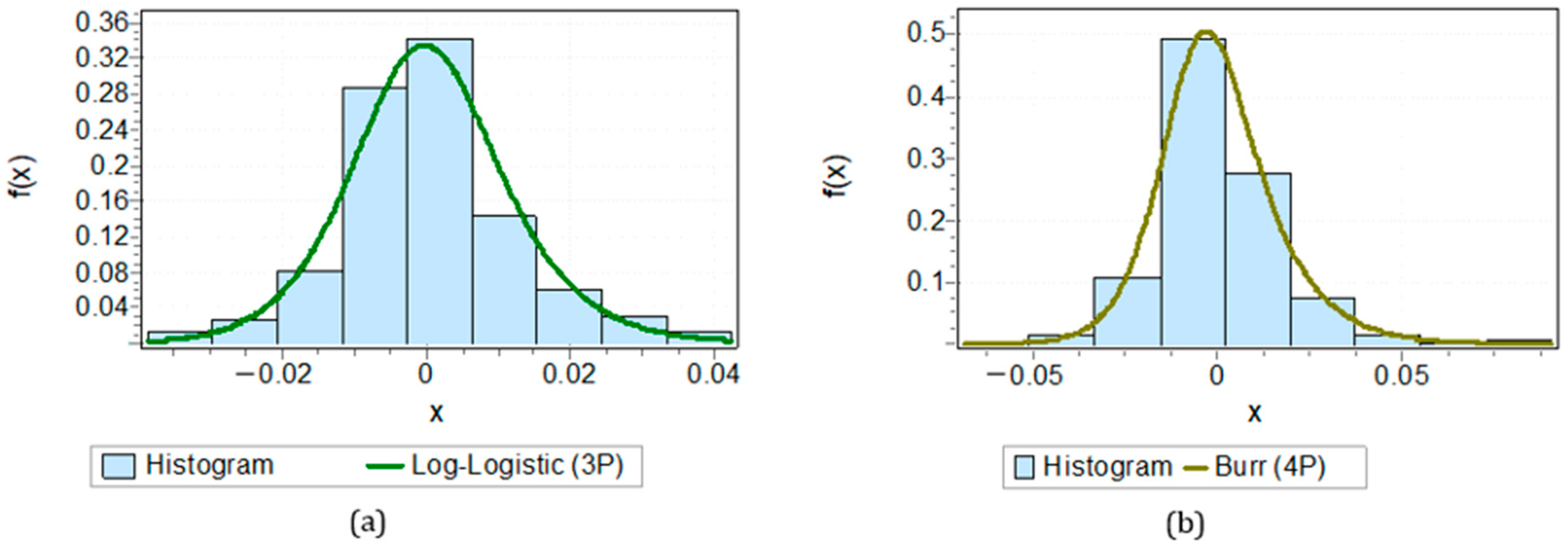
Next, by using histogram charts of the daily return data for each banking stock, we can determine the distribution model assumption for each stock.
Based on the histogram visualization results, each daily stock return data point approximates a specific distribution model. For example, in
Figure 4a, the histogram of BBCA’s stock return chart displays a symmetrical pattern, with most data concentrated around the central value and long tails on both sides, characteristic of the log-logistic distribution.
Meanwhile, in
Figure 4b, the histogram of BBTN’s daily return chart shows a symmetric distribution pattern around zero, with most observations concentrated at the center value. This aligns with the characteristics of the Burr distribution, which can model data with a sharp peak and broader tails.
Next, the parameter estimation process for maximizing the values for each stock’s distribution model is performed using the maximum likelihood estimation (MLE) by substituting the probability density function of each distribution model into the likelihood function. For the log-logistic distribution model, the parameter estimation is conducted using the maximum likelihood estimation (MLE). For example, the parameter estimation for BBCA stock is carried out by substituting the log-logistic distribution’s probability density function in Equation (16) into the likelihood function, resulting in:
To ensure the results of each maximum parameter, the first derivative of the log-likelihood function must equal zero for each parameter. The first derivatives concerning each parameter are provided as follows:
Meanwhile, for the parameter estimation in the Burr (4P) distribution model for BBTN stock, the probability density function of the Burr distribution is substituted into Equation (12) for the likelihood function, yielding:
To ensure the maximum result for each parameter, the first derivative of the log-likelihood function must be equal to zero for each parameter. The first derivatives concerning each parameter are given as follows:
The first derivatives for
,
,
, and
do not yield direct values for the parameter estimation. Therefore, the parameter estimation is performed using EasyFit 5.6 software. The estimated parameter values are shown in
Appendix B.
After obtaining the parameter values, the next step is to conduct a distribution test using the Anderson–Darling (AD) method. The hypotheses used for distribution testing are as follows:
H0. Stock returns follow the assumed distribution model.
H1. Stock returns do not follow the assumed distribution model.
The criteria for the hypothesis testing state that is accepted if a stock meets the requirement, i.e., the test statistic value the critical table value . Conversely, if none of the distribution tests meet this requirement (test statistic > table value), for example, using EasyFit, the following test results were obtained for BBCA stock: an AD test statistic of 0.93494 with a table value of 3.9074 at a significance level . Based on these results, it can be seen that for all three distribution tests, BBCA stock meets the requirement test statistic table value, confirming that BBCA stock follows a log-logistic distribution.
From the distribution model testing results, 14 out of 33 stocks met the test criteria, i.e., test statistic table value, so is accepted. These 14 stocks are thus candidates for inclusion in the stock portfolio selection, as they have been verified to follow a specific distribution, either the Burr (4P) or log-logistic distribution.
4.2.5. Determining the Optimal Portfolio Weight Proportion Based on the Mean-VaR Model
The PSO algorithm is simulated for several values
, starting from zero and incrementally increasing until the algorithm stops at the last iteration when at least one stock weight is harmful to a particular value
. This simulation aims to find the optimal portfolio with positive stock weights, ensuring the portfolio is feasible for implementation. Furthermore, several calculations are performed to support the evaluation of the portfolio performance. The portfolio’s expected return
is calculated using Equation (22), which measures the portfolio’s average return. Next, the portfolio volatility
is calculated using Equation (23), which represents the total risk associated with the portfolio. The portfolio risk is also assessed using the value at risk (
), calculated using Equation (28), which estimates the maximum loss that may occur at a certain confidence level. Lastly, the portfolio performance is evaluated using the Sharpe ratio, derived from Equation (31), to assess the portfolio’s efficiency in generating returns relative to the risk taken. The complete results of the simulation and calculations can be found in
Appendix D, which shows how variations
affect the stock weights and overall portfolio performance. The optimal portfolio weights calculation results using the mean-VaR model and PSO can be found in
Appendix D.
Appendix D presents the results of the portfolio stock weight optimization using the PSO method for various values
, representing different calculation scenarios in the optimization process. The first column displays the values of
and the number of iterations, where each value of τ corresponds to a different iteration count in the PSO. In this study, the first simulation selected
values in the range
with an increment of 0.1, and it stopped when at least one weight became negative for a specific value
. In this simulation, a negative weight for BBTN stock was found at
. The
scale was then refined to determine the optimal solution. The second simulation was conducted with
values in the range of
, with an increment of 0.01. The trials continued this way until a precise value
was obtained with four decimal places.
Based on the results in
Appendix D, it can be seen that for a risk tolerance value of
, the portfolio’s average return
is 0.00063, and the risk level
is 0.01447, as achieved after 331 iterations in the PSO algorithm. These values represent the minimum average return and
of the portfolio. For a risk tolerance value of
, the portfolio’s average return is 0.00074, with a risk level of 0.01463. These values correspond to the maximum average return and VaR of the portfolio.
Negative weights were found for the values of BBTN stock, such as the weight for BBTN stock is
at
, rendering it unsuitable for portfolio selection.
Overall, the values provided in
Appendix D indicate that an increase in the risk tolerance value leads to an increase in the portfolio’s average return, accompanied by a rise in the risk level.
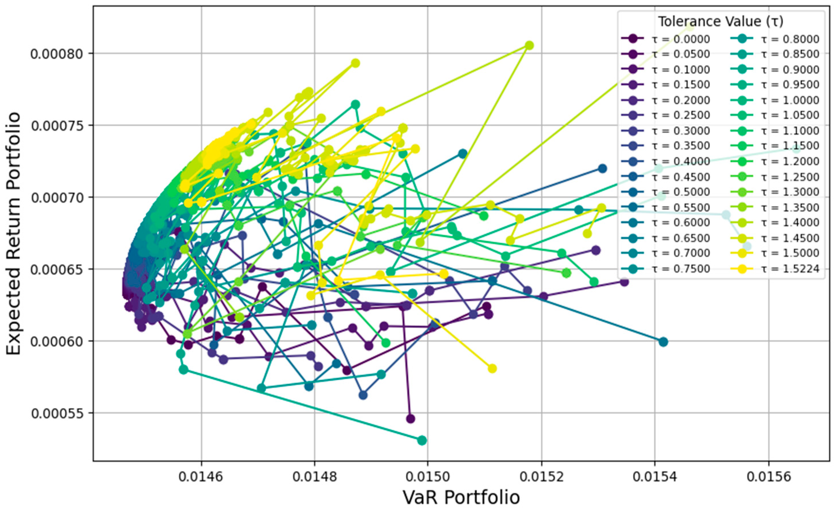
Figure 5 displays the iteration plot for each value
in the portfolio optimization process using the PSO method. The horizontal axis represents the VaR of the portfolio, which measures the maximum risk that the portfolio might incur, while the vertical axis shows the portfolio’s expected return
. Each point on the plot corresponds to the portfolio outcome at a specific iteration for each value
. The colors in the plot indicate the risk tolerance values
, ranging from
(purple) to
(yellow).
Based on the plot in
Figure 5, the evolution pattern of the portfolio is observed as
changes. As
increases, the portfolio moves toward the upper right, indicating an increase in the expected return and an increase in the risk (VaR) simultaneously. Iterations for lower values
(from purple to green) are spread out toward the lower part of the graph, showing portfolios with lower returns and relatively controlled risk. In contrast, iterations for higher values of
(yellow) tend to result in higher returns but with a significant increase in risk. This plot shows how the PSO method iterates and balances the two main factors in portfolio decision-making: the expected return and the risk, as measured through the VaR.
This graph reveals the evolutionary pattern of the portfolio as the risk tolerance parameter changes. Investors can observe that portfolios with lower values (represented by purple to green colors) tend to offer lower risks but also lower expected returns, while portfolios with higher values (yellow colors) achieve higher returns but with significantly greater risks. Understanding this pattern allows investors to determine their portfolio preferences based on their risk tolerance levels.
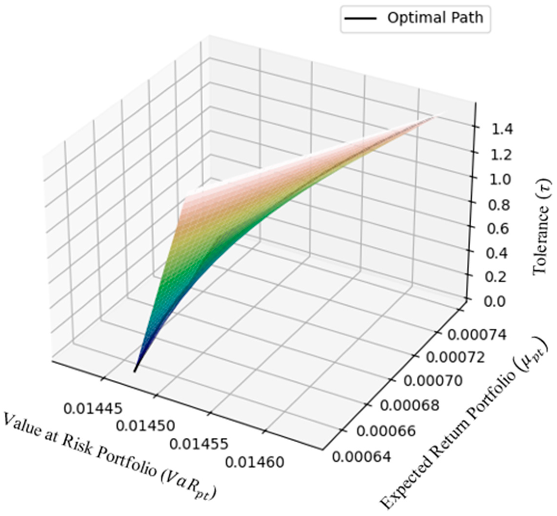
Figure 6 represents the efficient portfolio surface in the three-dimensional space, with three main axes: portfolio value at risk
, expected return portfolio
, and tolerance
. This surface illustrates the optimal path of the portfolio generated through the particle swarm optimization (PSO) algorithm for various risk tolerance values
within the range
. Each point on this surface represents a combination of the expected return
and risk
associated with a specific risk tolerance value. The optimal path displayed shows the points of efficient solutions, where each portfolio offers the best combination of return and risk according to the investor’s preferences.
Investors can select the optimal portfolio that provides the highest ratio between the expected return and risk, often referred to as the Sharpe ratio, which is the main target of the optimization strategy. Once a set of efficient portfolios has been identified, the next crucial step is determining which portfolio composition will yield the highest benefit. Investors typically seek a portfolio that can offer the highest average return while minimizing the level of risk as much as possible. For decision-making, the optimal portfolio is identified as the one that delivers the best trade-off, particularly the portfolio with the highest Sharpe ratio.
This efficient frontier chart further aids in simplifying the process of portfolio selection. It visually guides investors by highlighting the efficient portfolios across various risk tolerance levels. To identify the optimal portfolio, investors can focus on points along the frontier with the maximum Sharpe ratio, representing the most favorable combination of return and risk. For instance, in this study, the optimal portfolio achieves the highest Sharpe ratio at , offering a balance between acceptable risk levels and attractive returns. This visualization underscores the effectiveness of PSO in addressing portfolio optimization challenges.
The Sharpe ratio is a widely recognized metric that evaluates the efficiency of a portfolio by measuring its ability to generate a return relative to the amount of risk taken. The ratio considers volatility as a proxy for risk, with higher values of the Sharpe ratio indicating a more efficient portfolio in terms of return generation. Portfolios with higher Sharpe ratios are better at rewarding investors for the level of risk they assume. Therefore, the portfolio with the highest Sharpe ratio is deemed optimal, as it offers the most favorable trade-off between the expected return and the risk investors are willing to undertake. This selection method ensures that investors choose a portfolio that not only maximizes the return potential but also minimizes the volatility or uncertainty associated with that return. The results of the Sharpe ratio calculations can be seen in
Appendix D, and a visual representation of these ratios is provided in
Figure 7, allowing for a comprehensive understanding of how the portfolios compare in terms of the risk-adjusted returns.
Based on
Figure 7 and
Appendix D, the analysis reveals that the optimal portfolio achieves the highest performance relative to the risk with a ratio of average return
to risk
of 0.050378, which occurs at a risk tolerance value of
. This optimal portfolio composition results from carefully balancing the return expectations and the risk using the mean-VaR optimization approach.
The optimal portfolio comprises nine banking stocks: BBCA, BBNI, BBRI, BBTN, BDMN, BMRI, BNGA, BRIS, and NISP. The corresponding stock weight vector, which represents the proportion of each stock in the portfolio, is as follows: and . This distribution of weights indicates that BBCA has the most significant weight in the portfolio at 33.14%, followed by BNGA and NISP with 23.2% and 18.91%, respectively. The remaining stocks, such as BBNI, BBRI, and BDMN, contribute smaller portions to the portfolio.
This optimal portfolio composition yields an average return of 0.00074, representing the expected return over the given investment horizon. Additionally, the portfolio’s risk level, as measured by the value at risk (VaR), is 0.01463. This means that the maximum potential loss in the portfolio, at a specified confidence level, is approximately 1.463% of the portfolio’s value.
A VaR of 1.463% indicates that, under normal market conditions, the likelihood of experiencing losses beyond this percentage is minimal. This risk level is particularly appealing to risk-averse investors, as it signifies that the portfolio exhibits stability and limited exposure to extreme market fluctuations. In practical terms, such a VaR aligns well with investors aiming for predictable returns without significant deviations from the expected performance.
The combination of a relatively high return and manageable risk level makes this portfolio a strong candidate for investors seeking an efficient balance between return and risk. However, it is important to note that the VaR does not account for extreme or rare market conditions, which could result in losses exceeding the estimated threshold.
The results of this optimization process suggest that the chosen portfolio strikes a favorable balance, offering the potential for steady returns while maintaining a level of risk that is within acceptable limits. The analysis further demonstrates the effectiveness of the PSO-based optimization method in selecting an optimal portfolio that meets the investor’s objectives in the context of banking sector stocks.


