Abstract
Reading comprehension is an essential skill. It is unclear whether and to what degree typography and font personalization may impact reading comprehension in younger readers. With advancements in technology, it is now feasible to personalize digital reading formats in general technology tools, but this feature is not yet available for many educational tools. The current study aimed to investigate the effect of character width and inter-letter spacing on reading speed and comprehension. We enrolled 94 children (kindergarten–8th grade) and compared performance with six font variations on a word-level semantic decision task (Experiment 1) and a passage-level comprehension task (Experiment 2). Reading speed and comprehension were analyzed using generalized linear mixed-effects regression models. Independent samples t-tests compared speed and comprehension accuracy on personal best vs. worst font variation. A stability analysis was conducted to determine if participants had a stable personal best font variation within Experiment 1. The Experiment 1 stability analysis was statistically significant, and 58% of participants had a stable personal best font variation. Personal best font variations yielded significantly higher comprehension accuracy in both Experiments 1 and 2 and faster reading in Experiment 2. Using digital technology to personalize font may have important implications for school-aged readers.
1. Introduction
Reading comprehension, the ability to successfully extract information from text, is a critical skill, yet many students struggle to learn to read across many countries [1]. In the United States, only 35% of 4th graders and 34% of 8th graders read at or above a grade-proficient level [2]. Reading comprehension is vital, complex, and difficult for many students. It is therefore important to gain a fundamental understanding of the factors that influence how well individual students can comprehend the material they read.
Children are growing up in a digital world and are often introduced to electronic books via computers and/or tablets when they are developing literacy skills [3]. Compared to print books, ebooks often provide additional features such as hyperlinks and video clips, which can provide a great benefit to students but can also sometimes be distracting to young readers [4]. However, one unique advantage of ebooks is the opportunity to support students who are learning to read by personalizing their learning experiences. User interfaces can be customized to meet the individual needs of students [5,6] by customizing content, resources, and visual displays [7]. One important element that can potentially be personalized is the visual features of a font by changing the font family (e.g., Arial vs. Times New Roman) or specific features such as letter height or width, inter-letter spacing, or stroke weight. If font personalization can improve reading speed and/or comprehension in young readers, it will be important for education technology companies to develop technology that will allow readers to customize fonts across all of their devices.
1.1. Reading Comprehension Steps
Reading and comprehending even a single word is a complex multi-step process. According to most current theories, word recognition involves prelexical processes as well as lexical and sublexical processes (Figure 1). For example, Caramazza and Hillis describe a process involving a progression from the generation of a feature map representing low-level visual features to a stimulus-centered letter shape map to word-centered abstract letter identities. Letter identification occurs when transitioning from the character shape level to abstract letter identities. These prelexical processes feed into a dual-route mechanism consisting of a lexical route where skilled readers recognize words by sight and subsequently access word meaning and a sublexical route where the reader uses decoding to sound out the word [8,9,10].
Figure 1.
Single-word Reading Model.
Reading comprehension at the sentence and paragraph levels is even more complex. In addition to recognizing letters and decoding or recognizing words and mapping those words onto the correct semantic object at the word level, at the paragraph level, readers must also comprehend syntax, infer information using appropriate background knowledge, and integrate information from the text with background knowledge to fully comprehend the intended meaning [11,12].
1.2. Factors That Influence Reading
A wide variety of student factors influence reading skill development, including executive functions such as working memory [13,14,15,16,17], linguistic factors such as vocabulary knowledge [18,19,20,21,22], as well as socioeconomic factors such as parent education [23,24].
Some student factors are amenable to intervention. For example, interventions that improve working memory [25,26] and phonological awareness [27] have been associated with improved reading comprehension for some students. However, training specific skills (e.g., morphological processing, phonological processing) does not always result in improved reading comprehension [28,29].
Personal student factors are critical but can be quite difficult to change. Therefore, it is important to study more readily malleable factors to understand if they have a positive impact on reading comprehension. Typographical properties, such as the size, character width, inter-letter spacing, and stroke weight of font, are such possible factors; they can be changed with relative ease when reading on a digital device or computer. However, it is unclear to what extent typography can directly impact reading comprehension.
1.3. Typography Research in Adults
If we ultimately find that typographical factors do influence reading comprehension, it is likely that they primarily influence pre-lexical processes (Figure 1), which make decoding and sight recognition less demanding. Emerging research has shown that typographic factors such as inter-letter spacing and character width can influence reading, particularly letter recognition [30], decoding, speed [31,32,33], and fluency [34]. For example, Sawyer et al. [35] found that performance on a lexical decision task improved with wider compared to narrower letters. Similarly, Oderkerk and Beier [30] compared the speed of letter recognition in three variations (narrow, standard, and wide letters) of the font family Helvetica Neue in a group of healthy adults with normal vision. They found that the speed of recognition was fastest with wide letters and slowest with narrow letters both when letters were presented in the parafoveal and peripheral regions. Wider letters, as well as increased inter-letter spacing, have further been demonstrated to improve reading acuity for individuals with low vision due to age-related macular degeneration [31].
Increased inter-letter spacing also appears to improve reading speed in adults, but only up to a point as reading speed either plateaus or declines when too much spacing is introduced [33,36,37]. It is possible that both wider letters and greater inter-letter spacing are helpful for reducing crowding effects. Visual crowding refers to difficulty viewing a target when it is presented with neighboring objects. For example, a participant may have no difficulty recognizing the letter ‘N’ in isolation but may have more difficulty recognizing the same letter when presented with neighboring letters (e.g., “XNB”) [38,39]. While increased spacing can reduce crowding effects, it also inherently results in text being presented away from central vision (midline), where visual letter recognition is most accurate, which likely explains why additional spacing is not helpful after it has reached a critical point [33]. Van Overschelde and Healy [40] also found that when comparing standard vs. extreme letter spacing, both word identification and reading speed declined with the extreme letter spacing. Comprehension was not impacted. It is likely that making subtle changes to font formats improves reading speed and fluency in adults by simplifying prelexical processes (Figure 1). However, it is unclear whether changing font format can have the added benefit of improving reading comprehension in readers of any age.
1.4. Typography Research in Children
Children’s books and other forms of written content tend to use larger fonts with more spacing for younger readers to improve legibility for children learning to read, which gradually decreases in size in texts for older children [41,42]. While this is common practice in children’s books, it is not based on empirical research. Research findings, conducted predominantly with adult participants, will not necessarily be replicated in younger readers as the development of the visual perceptual system typically peaks in late adolescence [43]. Also, as children develop reading skills, they transition from “learning to read” to “reading to learn” [44]; thus, font format may have a different effect on younger children compared to older children and adolescents.
Some studies have investigated the effect of font format on reading speed and fluency in children. For example, Perea and colleagues [45] investigated whether adding slight inter-letter spacing improved word identification on a lexical decision task and a continuous reading task. They enrolled a group of typical adult readers, a group of typically developing 2nd and 4th graders, and a group of children with developmental dyslexia. A small increase in inter-letter spacing yielded faster word identification in all three groups of participants. The group of children with dyslexia also showed significantly faster reading times in a continuous reading task.
Hughes and Wilkins [41] investigated inter-word spacing and font size (x-height) in a group of children 5–10 years of age. They found that reading speed was decreased in younger children (ages 5–7 years) as font size and inter-word spacing decreased, but font size did not impact reading speed in older children (8–11 years). These results demonstrate that typographic features may have a different influence on younger vs. older children. Fewer studies have investigated the impact of typography on reading comprehension in children. However, Wilkins et al. [42] investigated how letter shape impacted reading speed and comprehension by comparing text set in the Sassoon Primary font to text set in the traditional sans serif Verdana font. Reading speed was significantly faster in Verdana than in the script Sassoon Primary font and comprehension was unaffected. Similarly, Łuniewska and colleagues [46] found that inter-letter spacing did not impact comprehension in typically developing children or children with dyslexia on a sentence comprehension task. However, for a passage-reading task, Katzir and colleagues [47] found that decreasing font size yielded lower reading comprehension scores in 2nd graders but higher scores in 5th graders. Letter shape may also play a role as a recent study [48] found that rounder letters yielded better reading fluency and were rated as more pleasant than angular letters by a group of children (4th–6th grade); however, comprehension was not impacted.
Task differences may explain some of these contrasting findings. Together, these combined results demonstrate that similar to adults, typographic features can impact reading speed and possibly reading comprehension in young readers. Furthermore, they demonstrate that font recommendations should likely change as children grow and develop.
1.5. Font Format Personalization
A number of studies have found that inter-letter spacing much larger than standard spacing often hinders reading speed in adults [33,36,37]; however, this is not the case for all readers. Evidence suggests that increasing inter-letter spacing beyond standard spacing improves the speed of word identification [45] as well as reading accuracy and reading speed [49,50] in children with developmental dyslexia. People with dyslexia may be more prone to crowding effects than people without dyslexia [51,52,53,54], which may explain why individuals with dyslexia often benefit from additional spacing. However, Spinelli et al. [49] noted that while analyses indicated a crowding effect at the group level in participants with dyslexia, when examining individual data, only a minority of participants with dyslexia showed marked crowding effects compared to the group of controls. This suggests that specific typographic features, such as increased inter-letter spacing, may benefit some individuals but not others.
Additionally, recent emerging research has demonstrated that even individuals with typical reading skills may benefit from personalized typographic features. For example, Wallace et al. [55] compared reading speed in 16 different fonts (e.g., Times New Roman, Arial, Montserrat) and found that by simply changing the font, the average adult reader read an additional 30 words per minute, equivalent to three to four pages of text per hour. Participants with the largest difference between fonts improved by an average of 93 words per minute, which is the equivalent of reading an additional eight pages per hour. In a follow-up study, Wallace et al. [56] investigated the effect of font personalization in adult readers (18–71 years of age, mean age = 33 years) on both reading speed and comprehension. Participants read 300- to 500-word passages at the 8th-grade level, which were split into two screens. There were ceiling effects on the reading comprehension task (70–100% accuracy range, median = 90% accuracy); thus, they focused their analyses on reading speed. The personal best font was defined as the one that yielded the fastest reading time and not necessarily the best comprehension. Similar to their previous study, reading speed significantly increased between individual participants’ personal best and worst fonts. Both studies revealed that no single font improved reading speed across all participants; rather, different fonts were effective for different people [55,56], which suggests that personalizing fonts could serve to optimize reading outcomes even in unimpaired, typical readers.
There is a dearth of research investigating whether children will benefit from font personalization with regard to reading speed or comprehension. The Wallace et al. [56] study did test comprehension in adults but had ceiling effects likely due to the use of 8th-grade-level passages when almost all participants (over 99%) had at least a high school education, and many (~50%) had a bachelor’s or graduate degree. Font personalization may be more likely to impact comprehension in more complex grade-level material compared to simpler material well below grade level. It is important to consider both reading speed and comprehension as faster reading speeds can sometimes be associated with poorer reading comprehension due to a trade-off between speed and accuracy [57]. Since the ultimate goal of reading is to accurately comprehend material, we were particularly interested in determining whether font personalization could yield a better comprehension of reading material.
1.6. Current Study
In the current study, we investigated the effect of character width and inter-letter spacing on reading speed and comprehension in developing readers (kindergarten–2nd grade) and more established readers (3rd–8th grades). Character width and inter-letter spacing were chosen because research has demonstrated that both of these features can affect reading. We conducted two experiments to investigate the effect of typography on comprehension and reading speed with a word-level, speeded, semantic categorization task (Experiment 1) and a passage-level reading task (Experiment 2). Many previous studies investigating the effect of typography on reading have compared reading speed across different available fonts (e.g., Arial, Times New Roman) [42,55,58]. However, different fonts can vary on a number of features including letter shape, inter-letter spacing, x-height, character width, stroke weight, and presence of serifs. Thus, even if a study finds that one particular font improves reading speed or comprehension, it is difficult to determine what specific feature (e.g., inter-letter spacing, stroke weight, character width) drove the differences between conditions. In order to specifically investigate how different features impact reading, we used a variable font (Roboto Flex). A variable font allows for the manipulation of specific features such as character width, inter-letter spacing, and stroke weight to create many different variations of a typeface. Using Roboto Flex allowed us to carefully control all aspects of the font format while manipulating only the typographic feature of interest (inter-letter spacing and/or character width). Also, due to the potential trade-off between speed and accuracy [57], it was vital to study both reading speed and comprehension accuracy.
Our study had two aims: (1) to investigate the impact of character width and inter-letter spacing on reading speed and comprehension at the group level and (2) to examine whether font format personalization could significantly improve speed and/or comprehension at the individual reader level. We had several hypotheses at the group level. First, we hypothesized that wider letters and standard inter-letter spacing would yield faster reading speeds and better comprehension at the group level for both word- (Experiment 1) and passage-level (Experiment 2) tasks. We also hypothesized that participants with dyslexia would benefit most from increased inter-letter spacing. Additionally, we were interested in determining whether younger readers would benefit more from different typographic features than older readers at the group level. At the individual reader level, we hypothesized that individuals would benefit from font format personalization and have significantly better comprehension and faster speeds in their personal “best” compared to personal “worst” font formats in both the word and passage tasks. Finally, we were interested in investigating whether some participants (e.g., younger participants vs. older participants, participants with weak vs. strong reading skills) would benefit more from personalizing font formats.
2. Experiment 1
2.1. Experiment 1 Materials and Methods
2.1.1. Participants
We enrolled 94 participants (43 girls and 51 boys) spanning kindergarten–8th grades. They had a mean age of 9.25 years (SD = 2.55). Participant demographics by grade are in Table 1. All participants were native speakers of English; 77 were monolingual English speakers, 16 were bilingual, and 1 participant was trilingual. As per parent reports, all participants were able to independently read grade-level sentences. Parent reports also indicated that four participants had dyslexia, seven participants had another learning and/or developmental disorder (e.g., autism, attention deficit hyperactivity disorder), and one participant had both dyslexia and developmental language disorder. Participants were recruited by emailing the parents of students who used the ReadWorks platform. The study was completed remotely, and all procedures were approved by the Chapman University Institutional Review Board. Parents initiated the online study and provided informed consent. Students provided their assent to indicate their willingness to participate in the study. All participants received a USD $15 Amazon gift card upon the completion of Experiments 1 and 2.

Table 1.
Participant Demographics by Grade.
2.1.2. Materials
For participants in the 3rd–8th grades, the materials in Experiment 1 consisted of 90 target words (45 animals and 45 inanimate nouns) that were presented individually in a semantic categorization task. Each word was presented in six different font variations of the variable font Roboto Flex (Figure 2), creating a total of 540 items. All 90 words were selected from words available from the English Lexicon Project [59] and had an age of acquisition below the age of 7 (mean = 5.30 years, standard deviation (SD) = 1.09; range = 2.9–6.90 years). The mean length was 5.17 letters (SD = 1.31; range 3–7 letters). Two lists of 270 items each were created where all 90 words were presented three times each. Each list contained three blocks of 90 words, and every word was presented once per block. Participants were presented with one block at a time and were given a break between the blocks to rest their eyes. Every participant was presented with one list; thus, they saw each of the 90 words three times in three different font formats. Lists were pseudorandomized to ensure that the same word was never presented in consecutive trials and that the same font variation was never presented in more than two consecutive trials. For participants in kindergarten–2nd grade, 60 words from the larger list of 90 words were selected that all had an age of acquisition at or below the age of 6 (mean = 4.77, SD = 0.85, range = 2.90–6.0). The mean length was 4.94 letters (SD = 1.17). An independent samples t-test indicated that the mean number of letters per word did not significantly differ between the list of 60 words for kindergarten–2nd-grade participants and the list of 90 words for 3rd–8th-grade participants (p = 0.25). The 60 words were presented in six different font variations (Figure 1), creating a total of 360 items. Two pseudorandomized lists consisting of 180 items per list were created, with each word presented three times within each list. Each list contained three blocks where every word was presented once per block. Participants were given breaks between blocks. Participants were presented with one list.
Figure 2.
Six Font Variations. Roboto Flex variable font was used to manipulate inter-letter spacing and character width. The base font variation with no modifications was used as well as two conditions with varied spacing (medium spacing, Med_Space; wide spacing, Wide_Space) and two conditions with varied width (narrow width, Nar_Width; wide width, Wide_Width). An extreme condition with wide inter-letter spacing and wide width was also used.
2.1.3. Font Variations
Since the release of variable font specification in 2016, a font is no longer necessarily a single design but a parametric design of numerically defined parameters such as letter width, spacing, boldness, and x-height, all of which can be interpolated in any given way [60]. Using a variable font, Roboto Flex, we generated six font variations by manipulating inter-letter spacing and character width while keeping all other typographic parameters constant (Figure 2). Specifically, Adobe Illustrator was used to manipulate inter-letter spacing using the tracking feature and character width using the variable font width axis. With the six variations used in the current study, Roboto Flex is a low-stroke contrast sans serif font, with a notably generous x-height within the standard range [61,62]. The six font variations included (1) the base Roboto Flex font format with default spacing and letter width (Base: space 0, width 100), (2) a medium inter-letter spacing format (Med_Space: space 50, width 100), (3) a wide inter-letter spacing format (Wide_Space: space 100, width 100), (4) a narrow letter format (Nar_Width: space 0, width 50), (5) a wide letter format (Wide_Width: space 0, width 150), and an extreme letter format with wide inter-letter spacing and wide letters (Extreme: space 135, width 150).
2.1.4. Procedure
The study was presented remotely using Gorilla experiment builder software [63]. Parents initiated the study and provided informed consent and then answered a parent questionnaire, which is described in the next section. The parent was then asked to put their browser in full-screen mode. Instructions to put the browser in full-screen mode were provided for several different types of computers (e.g., Mac, Chromebook, Windows PC). They were instructed to mute the volume on their computer to prevent auditory notifications from distracting participants during the study. Next, parents were asked to calibrate their monitors and measure screen size by adjusting the size of a rectangle on the screen to match the size of a credit card. The parent was then instructed to allow their child to begin participating in the study while providing support as needed to answer questions and follow experimental protocols. The children were instructed to sit comfortably in front of their monitor, approximately 24 inches from the screen. The child was asked to provide their assent to participate in the study. Next, they completed a short questionnaire about their reading habits, described below. Following the short questionnaire, they were advanced to a short practice session consisting of three practice trials. In cases where the parent had indicated that the child required glasses to properly read experimental stimuli presented on the computer, the child was asked to put on their glasses and confirm that they were wearing them prior to advancing to the practice trials. Participants were able to repeat the practice session as needed. Following the practice trials, participants initiated the masked semantic categorization task.
2.1.5. Questionnaires
The parent questionnaire asked parents about their own educational background and the educational background of a second parent/caregiver if one was present in the child’s life. In cases where two parents/caregivers were raising the child, their educational average education score was created for use in data analyses. They were also asked to provide their child’s age, grade, sex, language background (e.g., whether the child was bilingual), whether the child required eyeglasses for reading, and whether the child had been diagnosed with dyslexia, developmental disorders, or learning disorders. The child questionnaire asked children to rate how much they enjoy reading both for school and for pleasure on a Likert scale: (1) greatly dislikes, (2) slightly dislikes, (3) neither likes nor dislikes, (4) slightly enjoys, or (5) greatly enjoys. Their ratings were averaged together to create a reading enjoyment score.
2.1.6. Masked Semantic Categorization Task
Masking was used in the semantic categorization task to increase the perceptual difficulty of the target as this has been shown to maximize reaction time differences between conditions [64]. An example of one trial is presented in Figure 3. Participants were presented with a forward mask for 500 ms and then the target word (either an animal or an inanimate object) was presented in the center of the screen. Target words were presented in 24-point font, which was adjusted to be the same size for all participants regardless of monitor size. The target word was presented for a duration of 85 ms for 3rd–8th-grade students and 140 ms for students in kindergarten–2nd grade. The target word was followed by a backward mask presented for 50 ms. A screen showing “Is it an Animal?” with Yes/No options was presented below with left/right arrows. The participant selected whether the target was an animal or not via a button press. The button press advanced the participant to the next trial. The experiment would not advance unless the participant responded. The experiment was counterbalanced so that half of the participants indicated that the target was an animal by pressing the left arrow button on their keyboard or that it was not an animal by pressing the right arrow; the other half indicated that the target was an animal using the right arrow button or that it was not an animal using the left arrow button. Participants were instructed to respond as quickly and accurately as possible. Different target display durations (140 ms for kindergarten–2nd grade; 85 ms for 3rd–8th grade) were chosen based on our pilot study results to ensure that the task was challenging for all ages of participants and would thus yield maximum differences between conditions while also reducing significant feelings of frustration. The target durations were on par with previous studies using similar paradigms [65,66].
Figure 3.
Schematic of One Trial. Participants were presented with a forward mask for 500 ms. The target word (either an animal or an inanimate object) was presented. The target was presented for a duration of 85 ms for 3rd–8th-grade students and 140 ms for students in kindergarten–2nd grade. The target was followed by a backward mask presented for 50 ms. A screen showing “Is it an animal?” was presented, at which point the participant could select whether the target was an animal or not via a button press. The button press advanced the participant to the next trial.
2.1.7. Data Analysis
We examined the effect of font variation on reaction time (reading speed) and response accuracy (reading comprehension) by fitting mixed-effects linear models using the lme4 package [67] in R software [68]. The first model regressed reaction time as the dependent variable on font variation as the main predictor, controlling for grade, average parent education (as a marker of socioeconomic status), accuracy, presence of dyslexia, and presence of another learning disorder or developmental disability, and there was a random intercept for participants to account for repeated measures. A second model had accuracy as the dependent variable with the same covariates as the first model, but reaction time was a covariate rather than accuracy. Reaction times longer than 3000 ms or shorter than 100 ms were considered invalid test results and excluded from the analysis, which resulted in the discarding of 3.4% of reaction times from the dataset.
The results from these initial analyses revealed no universally optimal font variation; thus, we conducted follow-up analyses to assess whether individual participants significantly benefited in reading speed or comprehension from reading words presented in their personal best font variation vs. their personal worst font variation. As the ultimate goal of reading is to successfully comprehend text, the personal best font variation was defined as the format with the highest reading comprehension accuracy and, in cases where there was an accuracy tie, the variation with the fastest reaction time was selected as the best variation. The personal worst font variation was defined as the format with the lowest reading comprehension accuracy and, in cases of an accuracy tie, the variation with the slowest reaction time was selected as the worst format. To test whether any particular font variation was more likely to be a best font variation, a chi-square goodness of fit test was conducted on proportions of participants with each format as their best font variation. The equivalent test was conducted to determine whether any font format was more likely to be participants’ worst variation. To investigate whether personal best font variations yielded faster and more accurate reading comprehension, we conducted independent samples t-tests comparing personal best vs. worst accuracy and reaction times.
Additionally, we were interested in investigating whether specific factors predicted which participants benefited the most from font variation changes. We conducted multivariable regression to assess predictors of the accuracy difference between personal best and worst font variation. Grade, average parent education, the rating of how much the child enjoys reading, presence of dyslexia, presence of another learning disorder or developmental disability, mean accuracy across all conditions, and mean reaction times across all conditions were entered as independent variables. Mean reading comprehension accuracy and mean reaction time across all conditions were added to determine whether participants who struggled with the task would be more likely to benefit from personalizing the font variation. A multivariable regression to assess predictors of the reading speed (reaction time) difference between personal best and worst font variation was also conducted using the same independent variables.
To assess the stability of font variation personalization we determined the best font variation for every participant for each of the three blocks. Next, we calculated the proportion of participants who had the same best font variation in all three blocks, the same best font variation in two blocks, or a different best font variation in all three blocks. A chi-square goodness of fit test with a Monte Carlo simulation was conducted to determine if the proportion of participants within each of the three categories (three blocks with the same personal best, two blocks with the same personal best, no blocks with the same personal best) were different from chance (2.8%, 41.7%, and 55.6%, respectively). An identical analysis was conducted for personal worst font variations. Finally, we assessed predictors of whether someone had a stable best variation, which was defined as having the same personal best font variation in at least two of the three blocks or not (different personal best font variations in all three blocks) using logistic regression. Grade, average parent education, the rating of how much the child enjoys reading, presence of dyslexia, presence of another learning disorder or developmental disability, mean accuracy across all conditions, and mean reaction times across all conditions were entered as independent variables. Mean accuracy and mean reaction time across all conditions were added to determine whether participants who struggled with the task would be more likely to benefit from personalizing the font variation.
2.2. Experiment 1 Results
2.2.1. Group-Level Results
Reading Speed (Reaction Time)
The mean reaction times by grade are presented in Table 2. The complete results for the mixed-effects linear model of reading speed are presented in Table 3 (Figure 4A). No single font variation was a significant predictor of reaction time. Students in higher grades had significantly faster reaction times (t(102.30) = −3.14, p = 0.002), with an estimated 37 ms decrease in reaction time per one grade level increase. Students whose parents had more education had significantly slower reaction times (t(93.25) = 4.20, p < 0.001) and students with a learning or developmental disorder other than dyslexia also had significantly slower reaction times (t(93.17) = 2.70, p = 0.008). A significant interaction between the Wide_Space font format and a dyslexia diagnosis (t(16730) = −1.98, p = 0.048) indicated that the Wide_Space format yielded an estimated 74 ms faster reaction time compared to the base font in students with dyslexia.
Table 2.
Experiment 1 Performance by Grade.
Table 3.
Mixed-Effect Linear Models of Reaction Time and Reading Comprehension Accuracy for Speeded Semantic Categorization Task.
Figure 4.
Reading performance for each font variation for speeded semantic categorization task (Experiment 1). Differences in (A) reading speed and (B) reading comprehension accuracy are depicted.
Reading Comprehension Accuracy
The mean reading comprehension accuracy scores by grade are in Table 2. The results for the reading comprehension accuracy model are in Table 3 (Figure 4B). The accuracy model revealed that students whose parents had more education (t(92.55) = 6.00, p < 0.001) had significantly higher accuracy. The presence of a learning or developmental disorder other than dyslexia predicted significantly higher accuracy (t(92.22) = 2.76, p = 0.007). A significant interaction between the Wide_Space format and grade (t(16740) = −2.10, p = 0.036) indicated that students in lower grades benefited more than older students from the Wide_Space format.
2.2.2. Individual Level Results (Font Format Personalization)
Chi-square goodness of fit tests indicated that no particular font variation was more likely to be the best or worst font variation for individual readers (both p-values > 0.30) (Figure 5). Reading speed did not differ significantly between best and worst font variations (Figure 6A). Reading comprehension was significantly more accurate (t(165.57) = 5.73, p < 0.001) in the personal best variation (mean reading comprehension accuracy = 80.5% (SD = 17.7%)) vs. personal worst variation (mean reading comprehension accuracy = 62.1% (SD = 25.6%)) (Figure 6B). The multivariable linear regression model evaluating predictors of reading speed improvement between best and worst font variations was not significant. The multivariable linear regression model evaluating predictors of reading comprehension accuracy improvement on best vs. worst font variations was significant (F7, 86 = 12.00, p < 0.001) (Table 4). This model accounted for approximately 45% of the variance (r2 = 0.49, adjusted r2 = 0.45). Grade (p = 0.030) and mean accuracy across all font variations (p < 0.001) were independent significant predictors. Students in lower grades and students with lower overall reading comprehension accuracy benefited the most from font variation changes.
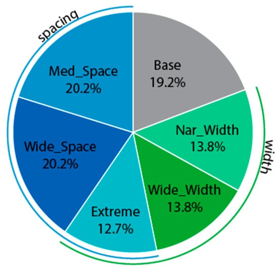
Figure 5.
Best font variation proportions for semantic categorization task (Experiment 1). No single font variation was more likely to be the personal best font variation.
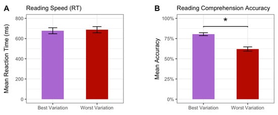
Figure 6.
Reading performance for personal best and worst font variations in speeded semantic categorization task. (A) Reading speed was not significantly different between personal best and worst font variations and (B) reading comprehension accuracy was significantly higher in the personal best variation. * denotes a significant difference at p ≤ 0.05.
Table 4.
Linear Regression for Reading Comprehension Accuracy Difference Between Personal Best vs. Worst Font Format.
The stability analysis indicated that 58% of participants had a stable personal best font variation, which was significantly more than that predicted by chance (χ2 = 7.5, p = 0.023). Analyses indicated that the personal worst font variation was not stable. The analyses investigating stability predictors were not significant. Thus, no factors were found that predicted whether a participant would have a stable personal best font variation.
2.3. Experiment 1 Discussion
2.3.1. Group Level
At the group level, we hypothesized that wider letters and standard inter-letter spacing would yield faster reading speeds and better reading comprehension accuracy, but group-level analyses did not indicate that any particular font variation was read faster or slower. We also hypothesized that children with dyslexia would benefit from increased inter-letter spacing, and this hypothesis was supported as children with dyslexia had significantly faster reaction times with the Wide_Space variation, even when controlling for comprehension accuracy. This replicates previous findings as several studies have found that increasing inter-letter spacing can improve reading speed and reading comprehension accuracy in children with developmental dyslexia [49,50]. There is evidence suggesting that some children with dyslexia are more vulnerable to visual crowding effects [51,52,53,54] and that increased inter-letter spacing can increase reading speed in this population [45,49,50]. Our results align with these previous findings; however, due to the small sample size of the dyslexia group (N = 5), these results should be interpreted with caution.
Additionally, we hypothesized that younger children would benefit from different typographic features compared to older children. We did not find a significant interaction between age and any font variation with regard to reading speed, even though some studies have found that younger students may benefit from increased inter-letter spacing [41,45]. For reading comprehension accuracy, we did find that younger children benefited more from increased inter-letter spacing (Wide_Space format) than older children. This could suggest that younger children are more affected by visual crowding than older children. Individuals with a learning or developmental disorder other than dyslexia had slower reaction times overall, but they also had higher reading comprehension accuracy, even when controlling for reaction time. It is possible that participants with a learning disorder or developmental disability took the task more seriously or perhaps had experience participating in previous research studies and thus were more familiar with research protocols. Overall, we found that increased inter-letter spacing (Wide_Space) was beneficial for individuals with dyslexia and younger children in particular, but letter width did not appear to affect reading speed or comprehension at the group level. Thus, our hypothesis that both wider letters and increased inter-letter spacing would benefit participants at the group level was only partially supported.
2.3.2. Individual Reader Font Format Personalization
The stability analysis indicated that the personal best font variation remained stable throughout the task for 58% of participants. It is possible that the participants who did not have a stable best font variation in this experiment may benefit from typographical features that we did not manipulate in the current study, such as font size and stroke weight. Or, alternatively, they may have shown a stable best font variation with the features manipulated in this study (inter-letter spacing and/or character width) if we had included more extreme spacing or width differences between variations. Previous studies have demonstrated the influence of serifs and stroke contrast on individuals with both normal and low vision [69,70]. A future larger study will investigate the impact of personalizing additional font features such as serifs and stroke weight to determine their effect on both reading speed and comprehension.
For our analyses investigating the impact of font personalization, we hypothesized that children would experience faster speed and better reading comprehension accuracy in their personal best vs. worst font variation. Reading speed was not significantly different between personal best and worst variations, but participants achieved significantly higher accuracy, with a mean comprehension accuracy difference of 18.4%. These results differ from findings regarding font personalization in adults [55,56], where reading speed, but not reading comprehension, benefited from font personalization. Our findings likely differ from the findings of previous studies in adults partially due to differences in experimental design. Both Wallace et al. studies [55,56] investigated font personalization in a passage-reading task using 16 different fonts. However, in Experiment 1, we used a speeded word-level comprehension task where we presented the same words in different font variations. This experimental design allowed us to control for important factors like word length, age of acquisition, word frequency, and neighborhood density. We also carefully controlled specific typographic features of a font (inter-letter spacing and character width) by manipulating a single variable font rather than presenting a variety of font families. Thus, we were able to precisely investigate how these isolated typographic features impacted reading outcomes. Our findings indicate that font personalization is vital as no single font format benefited a large majority of participants.
Students in lower grades benefited more than older students from a personalized font variation. Thus far, research on the impact of personalizing font has primarily focused on reading speed in adult readers [55,56]. Yet, our results demonstrate that not only do younger children who are still developing reading skills benefit even more than older children from offering personalized font formats, but reading comprehension is improved. Additionally, the readers who struggled the most with the task, as evidenced by their low overall reading comprehension accuracy, experienced the greatest boost in accuracy from font format personalization. This is likely partially due to having a greater potential for accuracy improvement.
The ultimate goal of reading is reading comprehension; thus, our results indicating that personalizing font formats can improve comprehension are important. As many children struggle to develop reading comprehension skills [2], our study demonstrates that we may be able to improve reading comprehension by offering personalized font variations across all readers. They also suggest that younger and struggling readers stand to benefit the most from personalization. Through simple font format changes to text, we may be able to improve reading development outcomes for many children.
3. Experiment 2
3.1. Experiment 2 Materials and Methods
3.1.1. Participants
Experiment 2 includes the same participants from Experiment 1. Both experiments were completed within the same session.
3.1.2. Materials
The materials for this experiment consisted of two reading passages for each grade (kindergarten–8th grade) for a total of 18 reading passages. Reading passages were selected from those available on the ReadWorks platform (readworks.org) as appropriate for the grade level of each participant. All passages were non-fiction, with either science or social studies topics. See Table 5 for passage characteristics for each grade. Six versions of each reading passage were created in the six different font variations used in Experiment 1 (see Figure 2). Participants saw both passages for their grade level once each, and each passage was presented in a different font variation. Thus, each participant was presented with two of the six font variations. Passage presentation was pseudorandomized so that each passage/font variation combination was presented an equal number of times across participants. The order in which passages were presented was counterbalanced.
Table 5.
Passage Characteristics by Grade.
Reading comprehension was assessed using three multiple-choice questions testing different levels of comprehension. The first multiple-choice question asked about explicit information presented in the passage (e.g., “Which river runs through Florence, Italy?”). The second question asked about where information could be found in the text (e.g., “The Ponte Vecchio has never broken since it was built. What part of the text tells us this is true?”). The third question asked about the main idea of the passage (e.g., “What is the passage mostly about?”). Each question for kindergarten and 1st graders was followed by two multiple-choice answers to choose from while questions for 2nd–3rd-grade passages were followed by three possible multiple-choice answers, and each question for 4th–8th graders was followed by four possible multiple-choice answers.
3.1.3. Procedure
Participants completed Experiments 1 and 2 in the same session. Experiment 2 was presented remotely to participants on their computer screens. Participants were shown a practice passage on their computer screen with practice questions and were able to complete the practice session multiple times until they indicated that they were ready to begin the experimental task. They were instructed to read passages silently and answer comprehension questions. Then, the participant moved to the next page containing the first passage presented in one of the six font variations. Next, they moved to the subsequent page, which contained the first of three multiple-choice questions. Participants were able to toggle back and forth between each of the questions and the passage. Passages were always shown on one page; participants never had to scroll to see any part of the passage. They selected answers for each of the three questions and moved to the next page, which contained the second passage, and repeated the same procedure. Once the participants confirmed their answer to the third question, they could not return to change their answers. Participants were required to choose an answer for each question before they could advance. Since participants could toggle between the passage and the questions, WPM was calculated using the total amount of time spent reading the passage. Time spent reading the questions was not included in the WPM calculation.
3.1.4. Font Variations
Font variations were identical to those used in Experiment 1 (Figure 2). The default parameters for spacing between lines of text (leading), were used. The default auto-leading option sets the leading to 120% of the typeface size. A 24-point font size was used for kindergarten–3rd grade passages and a 21-point font size was used for 4th–8th grade passages. Font size was automatically adjusted to the correct font size regardless of the participant’s screen size.
3.1.5. Data Analysis
We aimed to examine the effect of font variation on words read per minute (WPM; reading speed) and accuracy (reading comprehension) in an ecologically valid passage task that was similar to reading tasks that students complete in the classroom. Mixed-effects linear models were computed using the lme4 package [65] in R software [66]. The first model had WPM as the dependent variable with font format as the main predictor and grade, average parent education, the rating of how much the child enjoys reading, accuracy, presence of dyslexia, presence of another learning disorder or developmental disability, and passage Lexile level (level of passage difficulty where more difficult passages have higher Lexile levels) were entered as covariates. The interactions between (1) a dyslexia diagnosis and font variation and (2) age and font variation were also entered into the model. Participants were entered as a random effect. A second model with accuracy as the dependent variable contained the same covariates as the first model; however, WPM was a covariate rather than accuracy. Accuracy was entered as percentages in the models.
Similar to Experiment 1, we additionally aimed to determine if individual participants would significantly benefit in reading speed or comprehension from reading words presented in their personal best font variation vs. their personal worst font variation. Because we completed data collection during the global COVID-19 pandemic, data collection was conducted completely online and we therefore limited data collection to one session as we were concerned about attrition, particularly since the participants in the current study were young. Due to attrition concerns, we were not able to present participants with a large number of passages; thus, our analyses of individual reader font format personalization effects are exploratory in nature.
We used the same definition of personal best variation that was used in Experiment 1. The personal best font variation was defined as the font variation with the highest accuracy on the passage task and, in cases where there was an accuracy tie, the variation with the highest WPM was selected as the best variation. The personal worst font variation was defined as the variation with the lowest accuracy and, in cases of an accuracy tie, the variation with the lowest WPM was selected as the worst variation. A chi-square goodness of fit test was used to determine whether any font variation was more likely to be a best font variation. The same test was conducted to determine if any of the six font variations were more likely to be the worst variation. Independent samples t-tests comparing personal best and worst font variations were conducted to determine whether personal best font variations yielded more accurate and faster reading comprehension.
We were also interested in investigating whether some participants were more likely to benefit from font variation changes. We assessed predictors of the accuracy difference between personal best and worst font variations using multivariable regression. While controlling for grade, average parent education, the rating of how much the child enjoys reading, presence of dyslexia, presence of another learning disorder or developmental disability (besides dyslexia), mean accuracy across all conditions, and mean WPM across all conditions were entered as independent variables. Mean accuracy and mean WPM across all conditions were added to determine whether participants who had difficulty with the reading task would be more likely to benefit from personalizing the font variation. An additional multivariable regression was used to assess predictors of the reading speed (WPM) difference between personal best and worst font variations using the same independent variables.
Finally, because, due to time constraints, participants only read two passages (and thus only 2/6 font variations), we could not conduct identical stability analyses to Experiment 1. However, in order to investigate the stability of the personal best font variation across Experiments 1 and 2, we used Cohen’s kappa for test–retest reliability of categorical variables. The Experiment 1 rank (from best to worst) of the six font variations was determined for each individual participant. Next, the two Experiment 2 font variations were ranked for each individual participant. Cohen’s kappa for test–retest reliability was calculated to determine whether in Experiment 1, the personal best font variation from Experiment 2 was consistently rated higher than the personal worst font variation from Experiment 2.
3.2. Experiment 2 Results
3.2.1. Group-Level Results
Reading Speed (WPM)
Mean WPM scores by grade are shown in Table 6. The results from the mixed-effects linear model are presented in Table 7 (Figure 7A). Overall, when controlling for accuracy and Lexile level, the Wide_Space (t(504.33) = −3.51, p < 0.001) and Extreme (t(501.52) = −6.83, p < 0.001) font variations yielded the lowest WPM values. Specifically, the Wide_Space variation resulted in a substantial decrease of ~41 WPM and the Extreme variation resulted in a ~72 WPM decrease relative to the Base format. A significant Extreme*Grade interaction (t(505.40) = 6.37, p < 0.001) indicated that as children grow older, they suffer less from the detrimental slowing effects of the Extreme variation. A significant Med_Space*Grade interaction (t(511.99) = 4.14, p < 0.001) indicated that children in older grades benefited most from medium inter-letter spacing. Significant interactions of Med_Space*Dyslexia (t(527.16) = −3.14, p = 0.002) and Extreme*Dyslexia (t(531.21) = −3.21, p = 0.001) indicated that children with dyslexia had lower WPM when reading the Med_Space and Extreme font variations. Finally, a main effect of parental education level (t(94.06) = −2.54, p = 0.013) demonstrated that children whose parents had higher education read slower overall.
Table 6.
Experiment 2 Performance by Grade.
Table 7.
Mixed-Effect Linear Models of Words Read Per Minute and Reading Comprehension Accuracy for Passage Reading task.
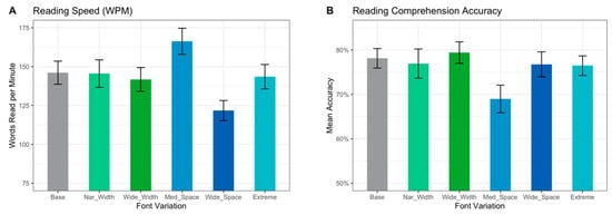
Figure 7.
Reading performance for each font variation for passage task (Experiment 2). Differences in (A) reading speed (WPM) and (B) reading comprehension accuracy are depicted.
Reading Comprehension Accuracy
Mean reading comprehension accuracy results by grade are in Table 6. The mixed-effects linear model results are presented in Table 7 (Figure 7B). When controlling for reading speed (WPM) and Lexile level, children whose parents had higher education had significantly higher accuracy (t(97.56) = 2.57, p = 0.012). Also, a significant Nar_Width*Dyslexia interaction (t(552.16) = −2.25, p = 0.025) demonstrated that children with dyslexia had significantly lower accuracy when reading in Nar_Width vs. the Base font variation.
3.2.2. Individual-Level Results (Personal Best vs. Worst Font Variation)—Exploratory Analyses
Chi-square goodness of fit tests demonstrated that none of the six font variations was more likely to be personal best or worst font variations (both p-values ≥ 0.30) (Figure 8). Reading speed was significantly faster (t(556.5) = 4.20, p < 0.001) in the best personal variation (mean = 157 WPM (SD = 78 WPM)) vs. worst personal font variation (mean = 130 WPM (SD = 71 WPM)) (Figure 9A). Reading comprehension accuracy was also significantly higher (t(507.2) = 6.12, p < 0.001) in the personal best font variation (mean accuracy = 86.9% (SD = 33.8%)) vs. personal worst variation (mean accuracy = 65.6% (SD = 47.6%)) (Figure 9B). The multivariable linear regression model evaluating predictors of accuracy improvement on personal best vs. worst font variations was significant (F7, 86 = 2.78, p = 0.012) (Table 8). This model accounted for approximately 12% of the variance (r2 = 0.19, adjusted r2 = 0.12). Dyslexia (p = 0.046) and mean overall accuracy (p = 0.006) were both independent significant predictors in the model. Specifically, participants with dyslexia and participants with lower overall mean accuracy were more likely to benefit from font personalization. The multivariable linear regression model predicting WPM improvement was not significant.
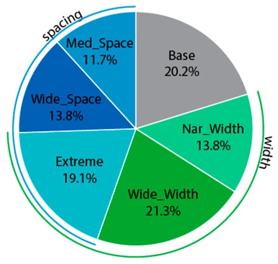
Figure 8.
Experiment 2 personal best font variation proportions for passage task (Experiment 2). No single font variation was more likely to be the personal best font variation.
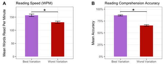
Figure 9.
Reading performance for personal best and worst font variations on passage task. (A) Reading speed was significantly faster in the personal best variation and (B) reading comprehension accuracy was significantly higher in the personal best variation. * denotes a significant difference at p ≤ 0.05.
Table 8.
Multivariable Model for Experiment 2 Reading Comprehension Accuracy Difference Between Personal Best vs. Worst Font Variations.
We also conducted a stability analysis using Cohen’s kappa to investigate whether the personal best of the two font variations presented in Experiment 2 was consistently ranked better than the Experiment 2 personal worst font format among the six font formats presented in Experiment 1. The results indicated that the stability analysis was not significant.
3.3. Experiment 2 Discussion
3.3.1. Group Level
We hypothesized that at the group level, wider letters with standard inter-letter spacing (Wide_Width) would yield the fastest reading times (WPM) and highest accuracy. Our hypothesis was not supported. Instead, we found that the Wide_Space and Extreme variations yielded the slowest reading times overall when controlling for accuracy and passage difficulty (Lexile level). We also hypothesized that individuals with dyslexia would benefit from increased inter-letter spacing. Our hypothesis was not supported. Rather, individuals with dyslexia benefited the least from the Med_Space and Extreme variations in terms of reading speed and the least from the Nar_Width variation for reading comprehension. No font variation appeared to have a significant benefit for individuals with dyslexia. However, the dyslexia group was small (N = 5); thus, our results should be interpreted with this in mind.
We also found that younger readers benefited more from different typographic features than older readers. For reading speed, the Med_Space and Extreme font variations benefited older children more than younger children. As greater spacing and wider letters are typical characteristics of font formats in reading materials for younger children [41,42], it is surprising that older children benefited more than younger children from the Extreme variation. There was no significant interaction between age and font variation in our reading comprehension model.
3.3.2. Individual Reader Personal Best vs. Worst Font Variation (Exploratory Analyses)
Our analyses investigating personal best vs. worst font variations at the passage level were considered exploratory as we only assessed two font variations per participant. Thus, our results should be interpreted with caution. We hypothesized that children would have faster and more accurate reading in their personal best vs. worse font variation, and our results did support our hypothesis. Children read significantly faster and more accurately in their personal best font variation. These results differ from findings in adults [55,56] who read faster, but not more accurately, in their personal best font. There are several reasons why our findings may differ from Wallace et al.’s (2020, 2022) studies in adults. First, Wallace et al. [56] used 8th-grade-level passages for a group of adults who had a much higher education level (over 99% with at least a high school degree and ~ 50% with at least a bachelor’s degree). However, we used grade-level passages that were designed to be challenging for participants as this is similar to classroom reading tasks and has high ecological validity. We did not achieve comprehension ceiling effects, as observed in Wallace et al. [56] and thus were better able to evaluate the effect of typography on comprehension. It is possible that presenting text in a personal best font is particularly beneficial in cases where the reading material is more difficult. This conclusion is further supported by our finding that children with low overall accuracy were also more likely to benefit from personalizing font variation. Second, we studied subtle font variation differences by manipulating character width and inter-letter spacing applied to the same variable font (Roboto Flex), whereas Wallace et al. [55,56] compared performance across 16 different fonts. Thus, it is impossible to determine from the Wallace et al. [55,56] studies what specific font typographical features contributed to their findings. Our use of subtle manipulations to the same variable font (Roboto Flex) allowed us to more precisely assess the specific effects of inter-letter spacing and character width as many typographical features differ when comparing different fonts, including letter shape, size, x-height, weight, and inherent inter-letter spacing. Third, in our study, participants could freely navigate between the passage and the questions before answering the questions in order to mimic a scenario similar to a classroom assignment. Whereas in the Wallace et al. [55,56] studies, passages were split into two screens followed by a screen with multiple choice questions, and they could not return to a previous screen once they had advanced. Thus, they could see the first half of the passage once they advanced to the second half of the passage. The results may have been influenced by the design, which taxed memory resources, particularly while reading the second half of the passage and answering questions.
Presenting text in the personal best font variation in our study was also more likely to improve reading comprehension accuracy in children with dyslexia and children who struggled with the passage task. No particular variation was more or less likely to be a personal best or worst font variation. It is likely that making font recommendations based on group-level findings will disadvantage many readers. Future research will investigate how additional font characteristics, including size and stroke weight, affect reading comprehension in children of all ages.
The stability analysis to determine whether individual participants benefited from specific font variations across both Experiments 1 and 2 was not significant. This was not surprising as reading speed and accuracy were evaluated across all six variations in Experiment 1, but individual participants only saw two of the six variations in Experiment 2. Thus, very few participants read passages in their Experiment 1 personal best and worst font variations.
4. General Discussion
We aimed to determine the impact of subtle changes to inter-letter spacing and character width on reading speed and comprehension at the group level in a group of children in kindergarten–8th grade. We also aimed to explore whether font format personalization would significantly improve reading speed and/or comprehension for an individual. We conducted two experiments to investigate these effects in different contexts. The first experiment was a word-level, speeded, semantic categorization task and the second was a passage-level reading comprehension task. Our group-level results varied with each experiment. In Experiment 1, the Wide_Space font variation was associated with a faster reading speed in children with dyslexia and higher accuracy in older children. However, in Experiment 2, the Wide_Space font variation was associated with slower reading times at the group level, while both the Med_Space and the Extreme font variation increased the WPM in older children. The differences between the Experiment 1 and Experiment 2 group-level results demonstrate the importance of investigating reading processes in different types of tasks. In Experiment 1, we were able to tightly control stimuli presentation, and some of the more complex aspects of reading comprehension, such as the incorporation of morphosyntactic processing, were not required to successfully complete the task. Experiment 2 had greater ecological validity because it was more similar to tasks that children are asked to complete in school: reading a passage and answering questions about the passage. Since our group-level findings differed between Experiments 1 and 2, future research focused on developing a digital tool to determine an individual’s best font or font variation should consider using passage-level tasks if the goal is to improve reading comprehension for daily tasks at the sentence or passage level.
To our knowledge, this is one of the only studies investigating how personalizing font format can affect both reading speed and comprehension in school-aged children. We found that participants benefited similarly from reading text in their personal best font variation in terms of reading accuracy across both Experiments 1 and 2. Mean reading accuracy improved by 18.4% in Experiment 1 and by 21.3% in Experiment 2. If this level of improvement was seen in the classroom, it could translate to the difference between earning a C vs. an A on a reading assignment. Reading speed did not significantly improve in Experiment 1, but improved by 27 WPM in Experiment 2, which was the equivalent of 20.8% more WPM. This speed improvement is equivalent to reading an additional 3.24 single-spaced pages in an hour. Our results suggest that personalizing font format may have significant benefits for improving reading comprehension and speed in children of all ages, with a particular benefit for younger children. Our study is also the first of which we are aware to assess the stability of a personal best font variation during a task of interest. The finding that the Experiment 1 personal best font variation was stable in 58% of participants suggests that font personalization may have the potential to improve comprehension in many students. Future research will investigate how stability and personal best fonts change as children develop to help determine how often children’s font personalization should be reassessed.
Our findings ultimately support the continued development of technology that will determine the best font or font variation and automatically adjust across devices. Additionally, we found that the least accurate readers benefited the most from font format personalization in both experiments, which demonstrates that font format personalization can improve reading comprehension accuracy even in children who struggle with reading. Future research will investigate how additional font characteristics, including size, stroke weight, and serifs, impact reading speed and comprehension in children across multiple grades.
This study had several limitations. Our experiment was conducted completely online, which allowed us to obtain a larger sample from across the United States but prevented us from controlling certain aspects of the study such as the specific distance between participants and their monitors. Nonetheless, the final sample size of n = 94 participants was limited and may have had limited power to detect significant differences in outcomes between fonts. There is also the possibility that timing is not as accurate in an online study compared to one conducted in a more controlled laboratory environment. However, crowdsourcing studies are increasingly becoming more popular [71], and a recent study found that Gorilla, the software used in the current study, was one of the best-performing software packages, with close to millisecond precision [72]. We had concerns about attrition as we completed data collection completely online during the global COVID-19 pandemic. Due to attrition concerns, we only collected data at one time point, which limited our ability to assess more font variations in Experiment 2. As a result, we were unable to conduct stability analyses in Experiment 2 to determine whether a participant’s personal best font variation remained stable across multiple passages (across multiple sessions). We plan for future research to include multiple data collection sessions to assess the stability of font variation personalization across time. Additionally, our Experiment 1 stability analysis indicated that 58% of participants had a stable personal best font variation, which was significantly higher than that indicated by chance, but we did not find a stable font variation in 42% of participants. Future research will investigate whether manipulating additional features (e.g., stroke weight, size) will result in a stable personal best font variation across a larger portion of participants. Finally, we did not collect standardized reading and language assessments of individual participants. Future research will collect these data to be analyzed in conjunction with font personalization data.
Educational Impact and Implications—The Promise of Digital Technology
Our results indicate that personalizing font format can significantly improve reading speed and comprehension in K-8 students. Given these findings, educational technology and publishing companies should consider the development of font personalization tools. The power of technology in education is its ability to provide impactful teaching and learning tools to educators and students. Personalized digital text is just such an opportunity. It is possible that offering font format personalization across multiple technologies (e.g., e-readers, PDFs) could significantly improve reading outcomes in students across multiple grades. Additionally, assessment tool companies should consider the possibility of delivering more equitable testing by incorporating font variation personalization. Together, we may be able to greatly increase the number of students who read at or above grade level simply by offering font personalization options. In a world where reading comprehension is an essential skill, font personalization has the power to affect many students’ lives when they are in school and beyond.
5. Conclusions
Our results demonstrate that subtle typographic changes to font format can significantly impact reading speed and comprehension. At the group level, inter-letter spacing is particularly important to consider for both reading speed and comprehension. Additionally, personalizing font variation significantly improves comprehension at the word level, and exploratory analyses indicate that this may be true at the passage level as well. Younger readers and children who struggled with the reading task especially benefited from font variation personalization at the word and passage levels.
Educational technology, publishing, and assessment tool companies should consider the development of font personalization features, which are currently unavailable for many educational tools, to improve reading outcomes in children. Additional research is required to fully understand the implications of font personalization in young readers. Additional typographic features including font size, stroke weight, and serifs should be investigated. Future research directions should also include developing rapid assessments to identify personal best fonts and determining the stability of a personal best font as children grow and develop more advanced reading skills. Supporting students with personalized font recommendations has the potential to improve reading outcomes across all students, including those who are just learning to read.
Author Contributions
Conceptualization, S.M.S., S.L.N., M.J., K.C. and S.B.; methodology, S.M.S., S.L.N., M.J., K.C. and S.B.; software, S.K.; formal analysis, S.M.S. and A.P.; investigation, S.M.S. and S.K.; resources, S.M.S. and S.L.N., data curation, S.M.S. and S.K.; writing—original draft preparation, S.M.S.; writing—review and editing, S.M.S., S.L.N., A.P., M.J., K.C. and S.B.; visualization, S.M.S., S.K. and A.P.; supervision, S.M.S. and S.L.N.; project administration, S.M.S. and S.L.N., funding acquisition, S.M.S. All authors have read and agreed to the published version of the manuscript.
Funding
This work was supported by a grant from a non-profit organization, Readability Matters, awarded to Dr. Shannon Sheppard. Publishing costs were supported by The Readability Consortium.
Institutional Review Board Statement
This study was conducted in accordance with the Declaration of Helsinki and approved by the Institutional Review Board of Chapman University (protocol code IRB-21-6 16 October 2020).
Informed Consent Statement
Parents initiated the online study and provided informed consent. Students provided their assent to indicate their willingness to participate in the study.
Data Availability Statement
Analysis code and research materials are available upon request by contacting the corresponding author.
Conflicts of Interest
Two authors, Kathy Crowley and Marjorie Jordan, are co-founders of Readability Matters, which is a nonprofit dedicated to expanding research and the development of evidence-based solutions. Kathy Crowley and Marjorie Jordan raised funds to support the study and the funds were awarded to Shannon Sheppard to design and conduct the study.
References
- Gaab, N. How Can We Ensure That Every Child Will Learn to Read? The Need for a Global, Neurodevelopmental Perspective; International Dyslexia Association: Pikesville, MD, USA, 2019; Available online: https://dyslexiaida.org/how-can-we-ensure-that-every-child-will-learn-to-read-the-need-for-a-global-neurodevelopmental-perspective/ (accessed on 19 March 2020).
- Bandeira de Mello, V.; Rahman, T.; Fox, M.A.; Ji, C.S. Mapping State Proficiency Standards Onto the NAEP Scales: Results From the 2017 NAEP Reading and Mathematics Assessments (NCES 2019-040); U.S. Department of Education. Institute of Education Sciences, National Center for Education Statistics: Washington, DC, USA, 2019.
- Harrison, E.; McTavish, M. ‘I’Babies: Infants’ and Toddlers’ Emergent Language and Literacy in a Digital Culture of IDevices. J. Early Child. Lit. 2018, 18, 163–188. [Google Scholar] [CrossRef]
- Dobler, E. E-textbooks: A Personalized Learning Experience or a Digital Distraction? J. Adolesc. Adult Lit. 2015, 58, 482–491. [Google Scholar] [CrossRef]
- Hourcade, J.P.; Bederson, B.B.; Druin, A.; Rose, A.; Farber, A.; Takayama, Y. The International Children’s Digital Library: Viewing Digital Books Online. Interact. Comput. 2003, 15, 151–167. [Google Scholar] [CrossRef][Green Version]
- Markopoulos, P.; Read, J.C.; Giannakos, M. Design of Digital Technologies for Children. In Handbook of Human Factors and Ergonomics, 5th ed.; Salvendy, G., Karwowski, W., Eds.; Wiley: New York, NY, USA, 2021; pp. 1287–1304. [Google Scholar]
- Beier, S.; Berlow, S.; Boucaud, E.; Bylinskii, Z.; Cai, T.; Cohn, J.; Crowley, K.; Day, S.L.; Dingler, T.; Dobres, J. Readability Research: An Interdisciplinary Approach. Found. Trends®® Hum.–Comput. Interact. 2022, 16, 214–324. [Google Scholar] [CrossRef]
- Coltheart, M. Lexical acces in simple reading tasks. In Strategies of Information Processing; Underwood, G., Ed.; Academic Press: San Diego, CA, USA, 1978; pp. 11–21. [Google Scholar]
- Coltheart, M.; Rastle, K.; Perry, C.; Langdon, R.; Ziegler, J. DRC: A Dual Route Cascaded Model of Visual Word Recognition and Reading Aloud. Psychol. Rev. 2001, 108, 204. [Google Scholar] [CrossRef] [PubMed]
- Coltheart, M.; Rastle, K. Serial Processing in Reading Aloud: Evidence for Dual-Route Models of Reading. J. Exp. Psychol. Hum. Percept. Perform. 1994, 20, 1197. [Google Scholar] [CrossRef]
- Cain, K.; Oakhill, J.V.; Barnes, M.A.; Bryant, P.E. Comprehension Skill, Inference-Making Ability, and Their Relation to Knowledge. Mem. Cogn. 2001, 29, 850–859. [Google Scholar] [CrossRef]
- Scarborough, H.S.; Neuman, S.; Dickinson, D. Connecting Early Language and Literacy to Later Reading (Dis) Abilities: Evidence, Theory, and Practice. Approaching Difficulties Lit. Dev. Assess. Pedagog. Programmes 2009, 10, 23–38. [Google Scholar]
- Butterfuss, R.; Kendeou, P. The Role of Executive Functions in Reading Comprehension. Educ. Psychol. Rev. 2018, 30, 801–826. [Google Scholar] [CrossRef]
- Cain, K.; Oakhill, J.; Bryant, P. Children’s Reading Comprehension Ability: Concurrent Prediction by Working Memory, Verbal Ability, and Component Skills. J. Educ. Psychol. 2004, 96, 31. [Google Scholar] [CrossRef]
- Corso, H.V.; Cromley, J.G.; Sperb, T.; Salles, J.F. Modeling the Relationship among Reading Comprehension, Intelligence, Socioeconomic Status, and Neuropsychological Functions: The Mediating Role of Executive Functions. Psychol. Neurosci. 2016, 9, 32. [Google Scholar] [CrossRef]
- Nouwens, S.; Groen, M.A.; Kleemans, T.; Verhoeven, L. How Executive Functions Contribute to Reading Comprehension. Br. J. Educ. Psychol. 2021, 91, 169–192. [Google Scholar] [CrossRef] [PubMed]
- Seigneuric, A.; Ehrlich, M.-F.; Oakhill, J.V.; Yuill, N.M. Working Memory Resources and Children’s Reading Comprehension. Read. Writ. 2000, 13, 81–103. [Google Scholar] [CrossRef]
- Carroll, J.B. Human Cognitive Abilities: A Survey of Factor-Analytic Studies; Cambridge University Press: New York, NY, USA, 1993. [Google Scholar]
- Oakhill, J.; Cain, K.; Elbro, C. Reading Comprehension and Reading Comprehension Difficulties. In Reading Development and Difficulties; Springer: Berlin/Heidelberg, Germany, 2019; pp. 83–115. [Google Scholar]
- Ouellette, G.P. What’s Meaning Got to Do with It: The Role of Vocabulary in Word Reading and Reading Comprehension. J. Educ. Psychol. 2006, 98, 554. [Google Scholar] [CrossRef]
- Seigneuric, A.; Ehrlich, M.-F. Contribution of Working Memory Capacity to Children’s Reading Comprehension: A Longitudinal Investigation. Read. Writ. 2005, 18, 617–656. [Google Scholar] [CrossRef]
- Van Dyke, J.A.; Johns, C.L.; Kukona, A. Low Working Memory Capacity Is Only Spuriously Related to Poor Reading Comprehension. Cognition 2014, 131, 373–403. [Google Scholar] [CrossRef] [PubMed]
- Kieffer, M.J. Socioeconomic Status, English Proficiency, and Late-Emerging Reading Difficulties. Educ. Res. 2010, 39, 484–486. [Google Scholar] [CrossRef]
- Lervåg, A.; Dolean, D.; Tincas, I.; Melby-Lervåg, M. Socioeconomic Background, Nonverbal IQ and School Absence Affects the Development of Vocabulary and Reading Comprehension in Children Living in Severe Poverty. Dev. Sci. 2019, 22, e12858. [Google Scholar] [CrossRef]
- Dahlin, K.I. Effects of Working Memory Training on Reading in Children with Special Needs. Read. Writ. 2011, 24, 479–491. [Google Scholar] [CrossRef]
- Novaes, C.B.; Zuanetti, P.A.; Fukuda, M.T.H. Effects of Working Memory Intervention on Students with Reading Comprehension Difficulties. Revista CEFAC 2019, 21, 4. [Google Scholar] [CrossRef]
- Kjeldsen, A.-C.; Kärnä, A.; Niemi, P.; Olofsson, Å.; Witting, K. Gains from Training in Phonological Awareness in Kindergarten Predict Reading Comprehension in Grade 9. Sci. Stud. Read. 2014, 18, 452–467. [Google Scholar] [CrossRef]
- Gellert, A.S.; Arnbak, E.; Wischmann, S.; Elbro, C. Morphological Intervention for Students With Limited Vocabulary Knowledge: Short-and Long-Term Transfer Effects. Read. Res. Q. 2021, 56, 583–601. [Google Scholar] [CrossRef]
- Pfost, M.; Blatter, K.; Artelt, C.; Stanat, P.; Schneider, W. Effects of Training Phonological Awareness on Children’s Reading Skills. J. Appl. Dev. Psychol. 2019, 65, 101067. [Google Scholar] [CrossRef]
- Oderkerk, C.A.; Beier, S. Fonts of Wider Letter Shapes Improve Letter Recognition in Parafovea and Periphery. Ergonomics 2021, 65, 753–761. [Google Scholar] [CrossRef] [PubMed]
- Beier, S.; Oderkerk, C.A.; Bay, B.; Larsen, M. Increased Letter Spacing and Greater Letter Width Improve Reading Acuity in Low Vision Readers. Inf. Des. J. 2021, 26, 73–88. [Google Scholar] [CrossRef]
- McLeish, E. A Study of the Effect of Letter Spacing on the Reading Speed of Young Readers with Low Vision. Br. J. Vis. Impair. 2007, 25, 133–143. [Google Scholar] [CrossRef]
- Yu, D.; Cheung, S.-H.; Legge, G.E.; Chung, S.T. Effect of Letter Spacing on Visual Span and Reading Speed. J. Vis. 2007, 7, 2. [Google Scholar] [CrossRef] [PubMed]
- Minakata, K.; Beier, S. The Effect of Font Width on Eye Movements during Reading. Appl. Ergon. 2021, 97, 103523. [Google Scholar] [CrossRef]
- Sawyer, B.D.; Dobres, J.; Chahine, N.; Reimer, B. The Cost of Cool: Typographic Style Legibility in Reading at a Glance. In Proceedings of the Human Factors and Ergonomics Society Annual Meeting; SAGE Publications Sage: Los Angeles, CA, USA, 2017; Volume 61, pp. 833–837. [Google Scholar]
- Chung, S.T.L. The Effect of Letter Spacing on Reading Speed in Central and Peripheral Vision. Investig. Ophthalmol. Vis. Sci. 2002, 43, 1270–1276. [Google Scholar]
- Legge, G.E.; Rubin, G.S.; Pelli, D.G.; Schleske, M.M. Psychophysics of Reading—II. Low Vision. Vis. Res. 1985, 25, 253–265. [Google Scholar] [CrossRef]
- Bouma, H. Interaction Effects in Parafoveal Letter Recognition. Nature 1970, 226, 177–178. [Google Scholar] [CrossRef] [PubMed]
- Coates, D.R.; Levi, D.M.; Touch, P.; Sabesan, R. Foveal Crowding Resolved. Sci. Rep. 2018, 8, 1–12. [Google Scholar] [CrossRef] [PubMed]
- Van Overschelde, J.P.; Healy, A.F. A Blank Look in Reading: The Effect of Blank Space on the Identification of Letters and Words during Reading. Exp. Psychol. 2005, 52, 213–223. [Google Scholar] [CrossRef] [PubMed]
- Hughes, L.; Wilkins, A. Reading at a Distance: Implications for the Design of Text in Children’s Big Books. Br. J. Educ. Psychol. 2002, 72, 213–226. [Google Scholar] [CrossRef] [PubMed]
- Wilkins, A.; Cleave, R.; Grayson, N.; Wilson, L. Typography for Children May Be Inappropriately Designed. J. Res. Read. 2009, 32, 402–412. [Google Scholar] [CrossRef]
- Siu, C.R.; Murphy, K.M. The Development of Human Visual Cortex and Clinical Implications. Eye Brain 2018, 10, 25. [Google Scholar] [CrossRef] [PubMed]
- Chall, J.S. Stages of Reading Development; McGraw-Hill: New York, NY, USA, 1983. [Google Scholar]
- Perea, M.; Panadero, V.; Moret-Tatay, C.; Gómez, P. The Effects of Inter-Letter Spacing in Visual-Word Recognition: Evidence with Young Normal Readers and Developmental Dyslexics. Learn. Instr. 2012, 22, 420–430. [Google Scholar] [CrossRef]
- Łuniewska, M.; Wójcik, M.; Jednoróg, K. The Effect of Inter-Letter Spacing on Reading Performance and Eye Movements in Typically Reading and Dyslexic Children. Learn. Instr. 2022, 80, 101576. [Google Scholar] [CrossRef]
- Katzir, T.; Hershko, S.; Halamish, V. The Effect of Font Size on Reading Comprehension on Second and Fifth Grade Children: Bigger Is Not Always Better. PLoS ONE 2013, 8, e74061. [Google Scholar] [CrossRef]
- Medved, T.; Podlesek, A.; Možina, K. Influence of letter shape on readers’ emotional experience, reading fluency, and text comprehension and memorisation. Front. Psychol. 2023, 14, 457. [Google Scholar] [CrossRef]
- Spinelli, D.; De Luca, M.; Judica, A.; Zoccolotti, P. Crowding Effects on Word Identification in Developmental Dyslexia. Cortex 2002, 38, 179–200. [Google Scholar] [CrossRef] [PubMed]
- Zorzi, M.; Barbiero, C.; Facoetti, A.; Lonciari, I.; Carrozzi, M.; Montico, M.; Bravar, L.; George, F.; Pech-Georgel, C.; Ziegler, J.C. Extra-Large Letter Spacing Improves Reading in Dyslexia. Proc. Natl. Acad. Sci. USA 2012, 109, 11455–11459. [Google Scholar] [CrossRef] [PubMed]
- Callens, M.; Whitney, C.; Tops, W.; Brysbaert, M. No Deficiency in Left-to-Right Processing of Words in Dyslexia but Evidence for Enhanced Visual Crowding. Q. J. Exp. Psychol. 2013, 66, 1803–1817. [Google Scholar] [CrossRef] [PubMed]
- Gori, S.; Facoetti, A. How the Visual Aspects Can Be Crucial in Reading Acquisition: The Intriguing Case of Crowding and Developmental Dyslexia. J. Vis. 2015, 15, 8. [Google Scholar] [CrossRef] [PubMed]
- Martelli, M.; Di Filippo, G.; Spinelli, D.; Zoccolotti, P. Crowding, Reading, and Developmental Dyslexia. J. Vis. 2009, 9, 14. [Google Scholar] [CrossRef] [PubMed]
- Moll, K.; Jones, M. Naming Fluency in Dyslexic and Nondyslexic Readers: Differential Effects of Visual Crowding in Foveal, Parafoveal, and Peripheral Vision; SAGE Publications Sage: London, UK, 2013. [Google Scholar]
- Wallace, S.; Treitman, R.; Kumawat, N.; Arpin, K.; Huang, J.; Sawyer, B.; Bylinskii, Z. Towards Readability Individuation: The Right Changes to Text Format Make Large Impacts on Reading Speed. J. Vis. 2020, 20, 17. [Google Scholar]
- Wallace, S.; Bylinskii, Z.; Dobres, J.; Kerr, B.; Berlow, S.; Treitman, R.; Kumawat, N.; Arpin, K.; Miller, D.B.; Huang, J. Towards Individuated Reading Experiences: Different Fonts Increase Reading Speed for Different Individuals. ACM Trans. Comput.-Hum. Interact. (TOCHI) 2022, 29, 1–56. [Google Scholar] [CrossRef]
- Rayner, K.; Schotter, E.R.; Masson, M.E.; Potter, M.C.; Treiman, R. So Much to Read, so Little Time: How Do We Read, and Can Speed Reading Help? Psychol. Sci. Public Interest 2016, 17, 4–34. [Google Scholar] [CrossRef]
- Bernard, M.L.; Chaparro, B.S.; Mills, M.M.; Halcomb, C.G. Examining Children’s Reading Performance and Preference for Different Computer-Displayed Text. Behav. Inf. Technol. 2002, 21, 87–96. [Google Scholar] [CrossRef]
- Balota, D.A.; Yap, M.J.; Hutchison, K.A.; Cortese, M.J.; Kessler, B.; Loftis, B.; Neely, J.H.; Nelson, D.L.; Simpson, G.B.; Treiman, R. The English Lexicon Project. Behav. Res. Methods 2007, 39, 445–459. [Google Scholar] [CrossRef]
- Bredikhina, L. Variable Fonts from Pioneer Perspectives. In Handbook of Research on User Experience in Web 2.0 Technologies and Its Impact on Universities and Businesses; IGI Global: Hershey, PA, USA, 2021; pp. 55–72. [Google Scholar]
- Karow, P. Typeface Statistics; URW: Hamburg, Germany, 1993. [Google Scholar]
- Legge, G.E.; Bigelow, C.A. Does print size matter for reading? A review of findings from vision science and typography. J. Vis. 2011, 11, 8. [Google Scholar] [CrossRef] [PubMed]
- Anwyl-Irvine, A.L.; Massonnié, J.; Flitton, A.; Kirkham, N.; Evershed, J.K. Gorilla in Our Midst: An Online Behavioral Experiment Builder. Behav. Res. Methods 2020, 52, 388–407. [Google Scholar] [CrossRef] [PubMed]
- Frankish, C.; Turner, E. SIHGT and SUNOD: The Role of Orthography and Phonology in the Perception of Transposed Letter Anagrams. J. Mem. Lang. 2007, 56, 189–211. [Google Scholar] [CrossRef]
- Lee, B.; Martinez, P.M.; Midgley, K.J.; Holcomb, P.J.; Emmorey, K. Sensitivity to orthogrphic vs. phonological constraints on word recognition: An ERP study with deaf and hearing readers. Neuropsychologia 2022, 177, 108420. [Google Scholar] [CrossRef] [PubMed]
- Fleischhauer, E.; Bruns, G.; Grosche, M. Morphological decomposition supports word recognition in primary school children learning to read. Evidence from masked priming of German derived words. J. Res. Read. 2021, 44, 90–109. [Google Scholar] [CrossRef]
- Bates, D.; Mächler, M.; Bolker, B.; Walker, S. Fitting Linear Mixed-Effects Models Using Lme4. J. Stat. Softw. 2015, 67, 1–48. [Google Scholar] [CrossRef]
- R Core Team. R: A Language and Environment for Statistical Computing. 2020. Available online: https://www.R-project.org/ (accessed on 19 March 2020).
- Minakata, K.; Eckmann-Hansen, C.; Larsen, M.; Bek, T.; Beier, S. The effect of serifs and stroke contrast on low vision readers with autosomal dominant optic atrophy. Acta Psychol. 2023, 232, 103810. [Google Scholar] [CrossRef]
- Minakata, K.; Beier, S. The dispute about sans serif versus serif fonts: An interaction between the variables of serif and stroke contrast. Acta Psychol. 2022, 228, 103623. [Google Scholar] [CrossRef]
- Adjerid, I.; Kelley, K. Big Data in Psychology: A Framework for Research Advancement. Am. Psychol. 2018, 73, 899. [Google Scholar] [CrossRef]
- Bridges, D.; Pitiot, A.; MacAskill, M.R.; Peirce, J.W. The Timing Mega-Study: Comparing a Range of Experiment Generators, Both Lab-Based and Online. PeerJ 2020, 8, e9414. [Google Scholar] [CrossRef]


Disclaimer/Publisher’s Note: The statements, opinions and data contained in all publications are solely those of the individual author(s) and contributor(s) and not of MDPI and/or the editor(s). MDPI and/or the editor(s) disclaim responsibility for any injury to people or property resulting from any ideas, methods, instructions or products referred to in the content. |
© 2023 by the authors. Licensee MDPI, Basel, Switzerland. This article is an open access article distributed under the terms and conditions of the Creative Commons Attribution (CC BY) license (https://creativecommons.org/licenses/by/4.0/).