Author Contributions
Conceptualization, L.S.; methodology, L.S.; validation, L.S.; formal analysis, L.S.; investigation, L.S.; resources, L.S.; data curation, L.S.; writing—original draft preparation, L.S.; writing—review and editing, L.S. and J.P.; visualization, L.S.; supervision, J.P.; project administration, L.S.; funding acquisition, L.S. All authors have read and agreed to the published version of the manuscript.
Figure 1.
Three different outcomes emerge from clustering highly similar trajectory data. Different clusters are indicated by different colors. Statistical models may yield divergent results on similar data sets due to the non-deterministic nature of clustering algorithms. In this example, similar data lead to widely different clustering.
Figure 2.
An anonymized example showing a set of trajectories for an electrical parameter. Electrical parameter values are on the y-axis, with time in hours on the x-axis. In this case, the electrical parameter values remain relatively consistent across the four readings and show low variability.
Figure 2.
An anonymized example showing a set of trajectories for an electrical parameter. Electrical parameter values are on the y-axis, with time in hours on the x-axis. In this case, the electrical parameter values remain relatively consistent across the four readings and show low variability.
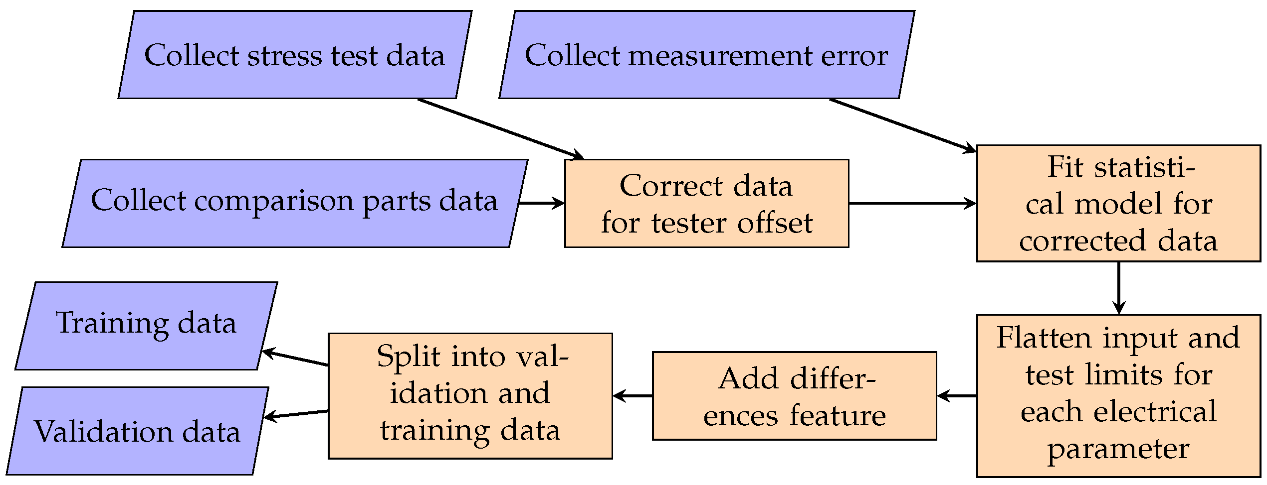
Figure 3.
A flowchart showing the data preparation pipeline used to generate training and validation data. Feature engineering and train/test splitting plus pre-processing are included.
Figure 3.
A flowchart showing the data preparation pipeline used to generate training and validation data. Feature engineering and train/test splitting plus pre-processing are included.
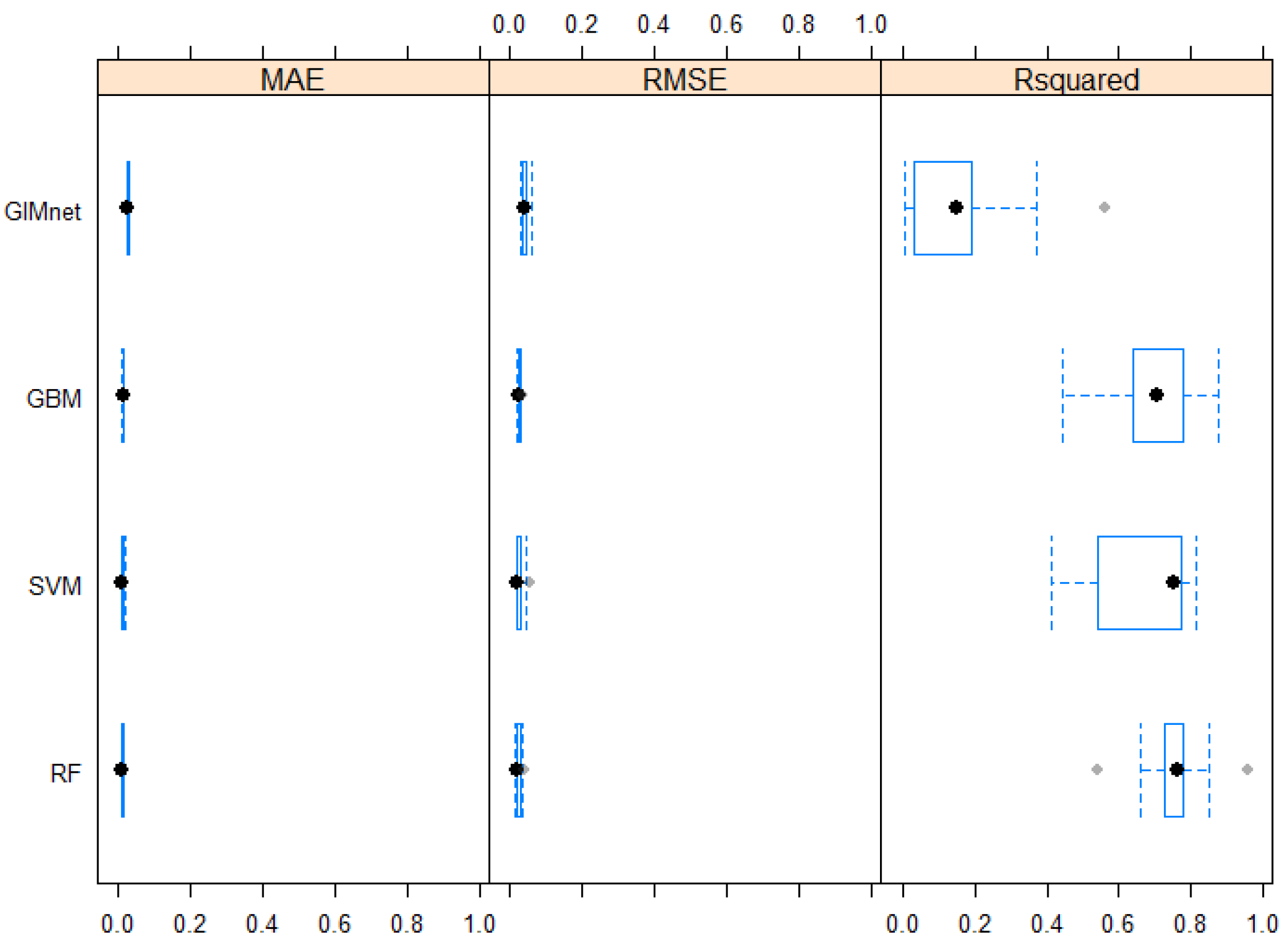
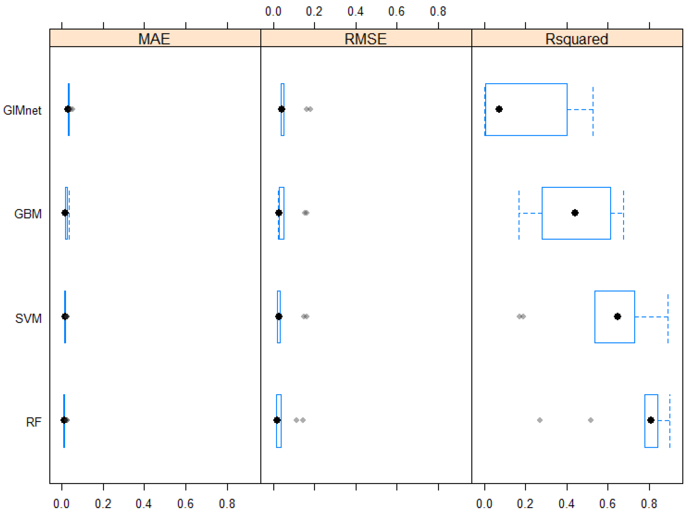
Figure 4.
A comparison of MAE, RMSE and for the different candidate models. Lower is better for MAE and RMSE; higher is better for . The random forest model shows the best results on real data. Standard Boxplot, black dot as Median, blue frame as Box.
Figure 4.
A comparison of MAE, RMSE and for the different candidate models. Lower is better for MAE and RMSE; higher is better for . The random forest model shows the best results on real data. Standard Boxplot, black dot as Median, blue frame as Box.
Figure 5.
A comparison of RMSE confidence intervals for the different models. Lower is better. Again, random forest shows the best results.
Figure 5.
A comparison of RMSE confidence intervals for the different models. Lower is better. Again, random forest shows the best results.
Figure 6.
Plot of cross-validation results with varying parameters. Lower is better. The extratrees splitrule wins out with increasing number of predictors.
Figure 6.
Plot of cross-validation results with varying parameters. Lower is better. The extratrees splitrule wins out with increasing number of predictors.
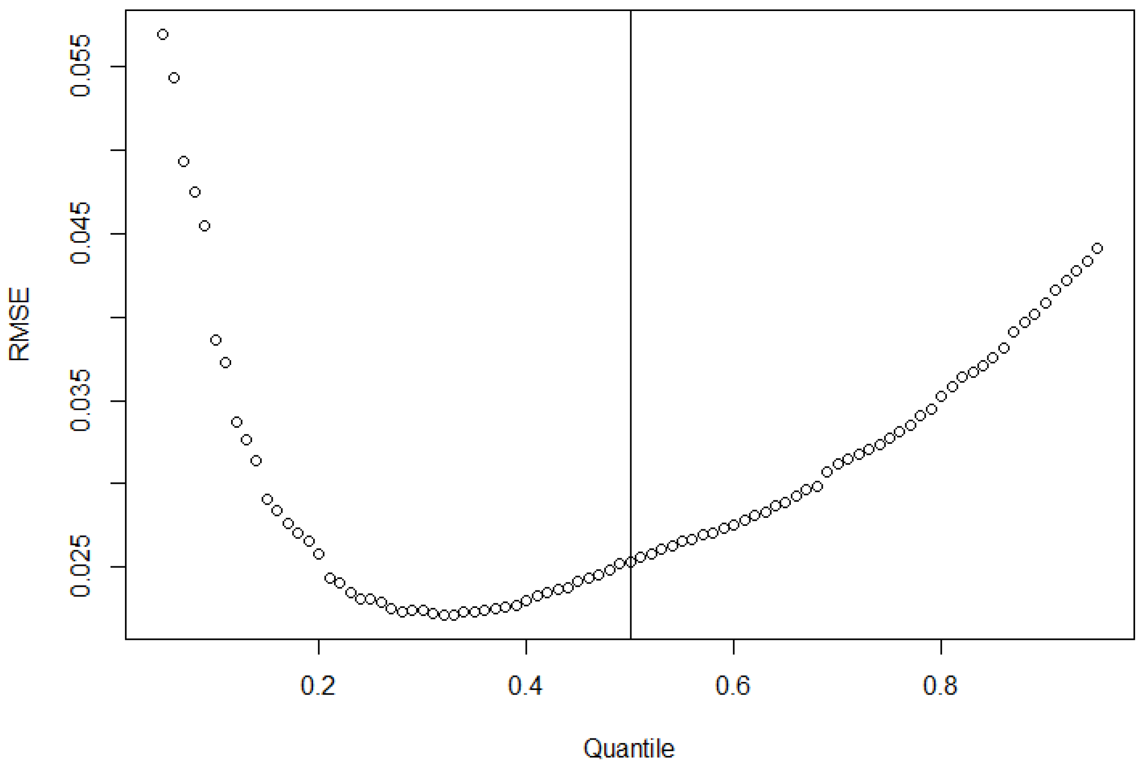
Figure 7.
Quantile forest regression predictions of lower test limit RMSE vs. quantiles. Lower is better. Some improvement with better quantile choice is possible. The black line denotes the 0.5-quantile. Dots are prediction results.
Figure 7.
Quantile forest regression predictions of lower test limit RMSE vs. quantiles. Lower is better. Some improvement with better quantile choice is possible. The black line denotes the 0.5-quantile. Dots are prediction results.
Figure 8.
Quantile forest regression predictions of upper test limit RMSE vs. quantiles. Lower is better. The median prediction can again be improved via smart quantile choice. The black line denotes the 0.5-quantile. Dots are prediction results.
Figure 8.
Quantile forest regression predictions of upper test limit RMSE vs. quantiles. Lower is better. The median prediction can again be improved via smart quantile choice. The black line denotes the 0.5-quantile. Dots are prediction results.
Figure 9.
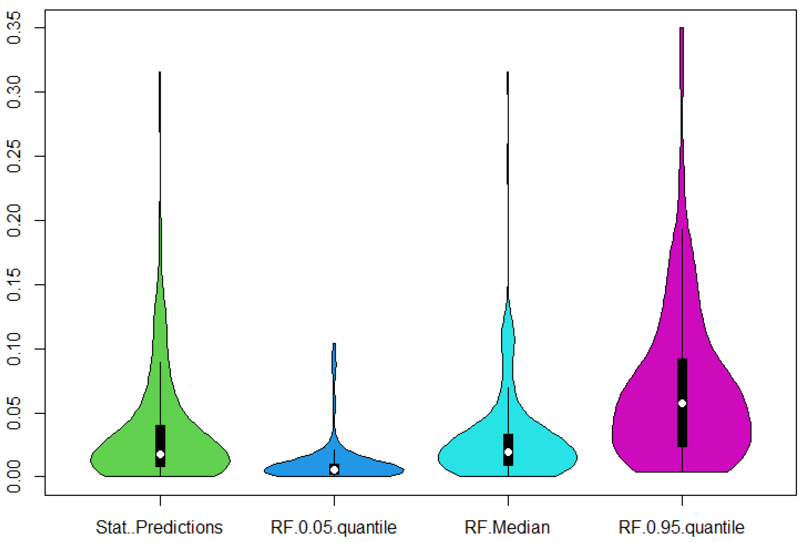
Violin plots of the calculated statistical lower test limits (Stat. Predictions) and the quantiles of the random forest regression. Higher means more conservative, and closer to the statistical predictions is better. Visually, slightly above the median seems to capture the predictions best.
Figure 10.
Violin plots of the calculated statistical upper test limits (Stat. Predictions) and the quantiles of the random forest regression. Lower means more conservative, and closer to the statistical predictions is better. Visually, a quantile slightly below the median should capture the predictions best.
Figure 11.
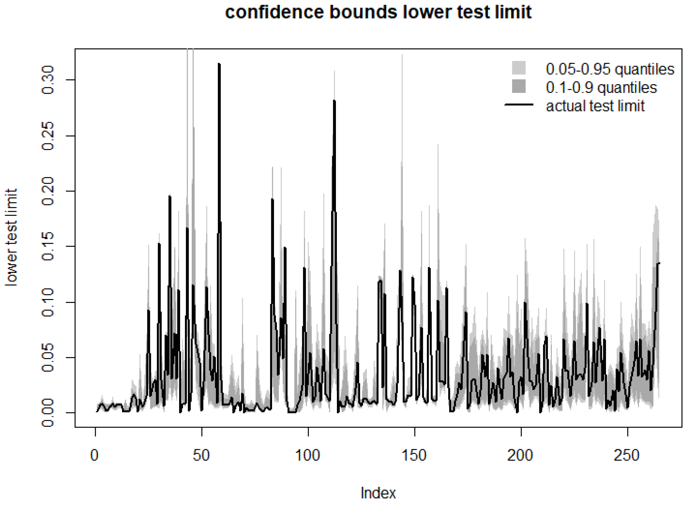
Visualizing regularization: quantile predictions of lower test limit vs. actual statistical predictions on the validation set. The confidence bound tends to overlap the calculated limit.
Figure 11.
Visualizing regularization: quantile predictions of lower test limit vs. actual statistical predictions on the validation set. The confidence bound tends to overlap the calculated limit.
Figure 12.
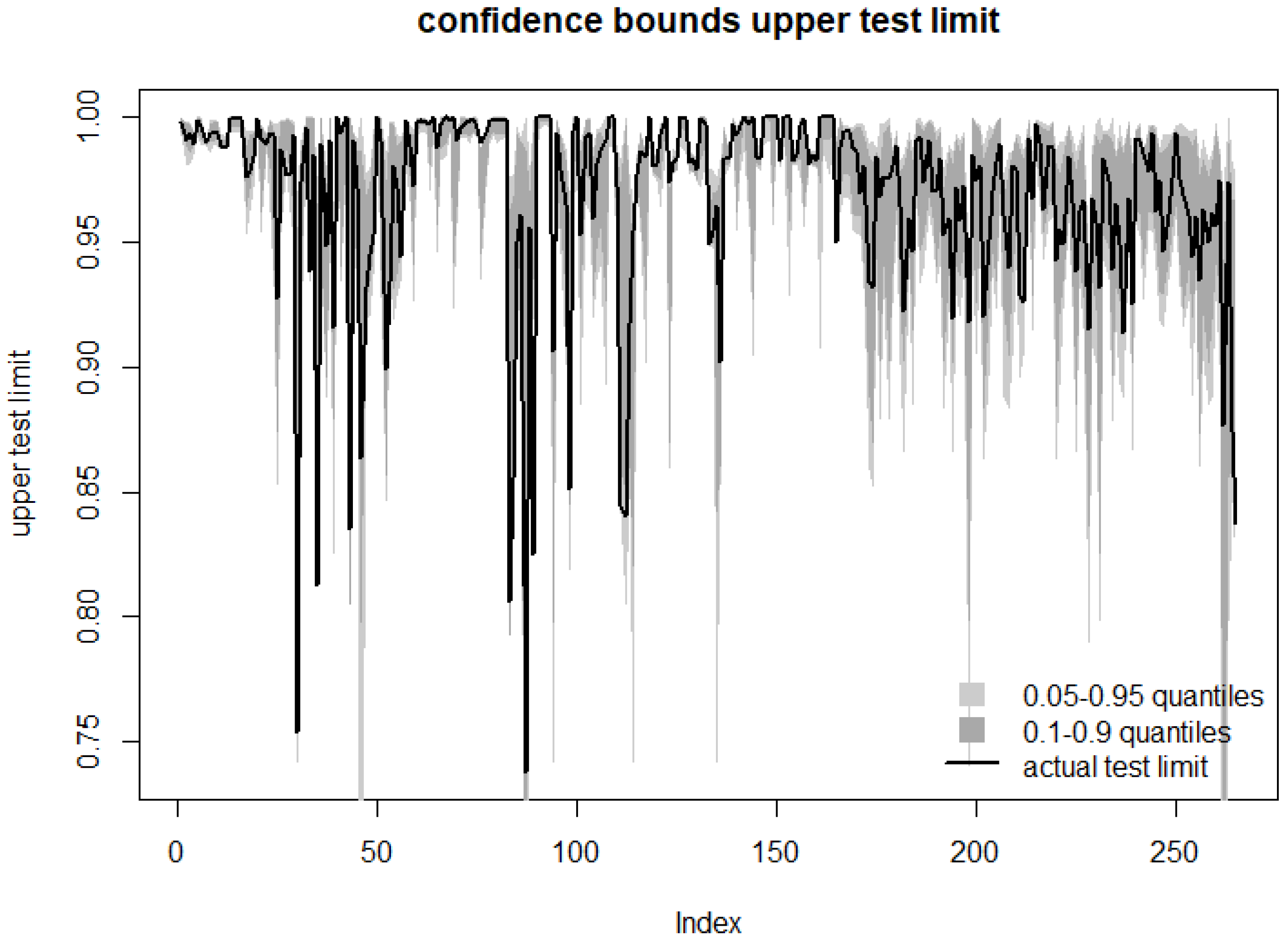
Visualizing regularization: Quantile predictions of upper test limit vs. actual statistical predictions on validation set. The confidence bound tends to overlap the calculated limit.
Figure 12.
Visualizing regularization: Quantile predictions of upper test limit vs. actual statistical predictions on validation set. The confidence bound tends to overlap the calculated limit.
Table 1.
Mean absolute error resampling confidence quantiles comparison between candidate models. Lower is better. RF has the edge over the other candidate models.
Table 1.
Mean absolute error resampling confidence quantiles comparison between candidate models. Lower is better. RF has the edge over the other candidate models.
| MAE | Min | 1st Quantile | Median | Mean | 3rd Quantile | Max |
|---|
| GLM | 0.0276 | 0.0290 | 0.0300 | 0.0335 | 0.0330 | 0.0509 |
| GBM | 0.0164 | 0.0171 | 0.0185 | 0.0218 | 0.0262 | 0.0322 |
| SVM | 0.0109 | 0.0121 | 0.0145 | 0.0160 | 0.0154 | 0.0271 |
| RF | 0.0085 | 0.0093 | 0.0106 | 0.0131 | 0.0133 | 0.0243 |
Table 2.
Root mean square error resampling confidence quantiles for different candidate models. Lower is better. Of the chosen models, random forest shows the best results.
Table 2.
Root mean square error resampling confidence quantiles for different candidate models. Lower is better. Of the chosen models, random forest shows the best results.
| RMSE | Min | 1st Quantile | Median | Mean | 3rd Quantile | Max |
|---|
| GLM | 0.0381 | 0.0397 | 0.0410 | 0.0682 | 0.0507 | 0.1796 |
| GBM | 0.0257 | 0.0276 | 0.0307 | 0.0581 | 0.0499 | 0.1620 |
| SVM | 0.0179 | 0.0209 | 0.0277 | 0.0515 | 0.0339 | 0.1636 |
| RF | 0.0152 | 0.0173 | 0.0214 | 0.0430 | 0.0329 | 0.1450 |
Table 3.
R-squared confidence quantiles for different candidate models. Higher is better. Again, random forest shows the best results.
Table 3.
R-squared confidence quantiles for different candidate models. Higher is better. Again, random forest shows the best results.
| Min | 1st Quantile | Median | Mean | 3rd Quantile | Max |
|---|
| GLM | 0.0012 | 0.0063 | 0.0739 | 0.1731 | 0.3369 | 0.5251 |
| GBM | 0.1650 | 0.2923 | 0.4399 | 0.4420 | 0.5941 | 0.6728 |
| SVM | 0.1729 | 0.5401 | 0.6462 | 0.5877 | 0.7281 | 0.8894 |
| RF | 0.2717 | 0.7830 | 0.8094 | 0.7391 | 0.8334 | 0.9002 |
Table 4.
Goodness-of-fit measures for best fit of median of quantile regression forest.
Table 4.
Goodness-of-fit measures for best fit of median of quantile regression forest.
| Limit | RMSE | MAE |
|---|
| lower | 0.0482 | 0.0138 |
| upper | 0.0237 | 0.0112 |
Table 5.
Goodness-of-fit measures for best fit of best quantile parameter in quantile regression forest. The results outperform pure median predictions in
Table 4.
Table 5.
Goodness-of-fit measures for best fit of best quantile parameter in quantile regression forest. The results outperform pure median predictions in
Table 4.
| Limit | RMSE | MAE |
|---|
| lower | 0.0208 | 0.0100 |
| upper | 0.0218 | 0.0114 |
Table 6.
Mean of predicted standardized test limits and validation set true mean for upper and lower test limits. Closer to the edges of the interval means less conservative. On average, the proposed model errs on the side of conservative predictions.
Table 6.
Mean of predicted standardized test limits and validation set true mean for upper and lower test limits. Closer to the edges of the interval means less conservative. On average, the proposed model errs on the side of conservative predictions.
| Limit | RF Prediction Mean | True Test Data Mean | Best Prediction Mean |
|---|
| lower | 0.0297 | 0.0345 | 0.0309 |
| upper | 0.9741 | 0.9687 | 0.9653 |

