Diverse Visualization Techniques and Methods of Moving-Object-Trajectory Data: A Review


Abstract
1. Introduction
2. Universal Multivariate Visualization
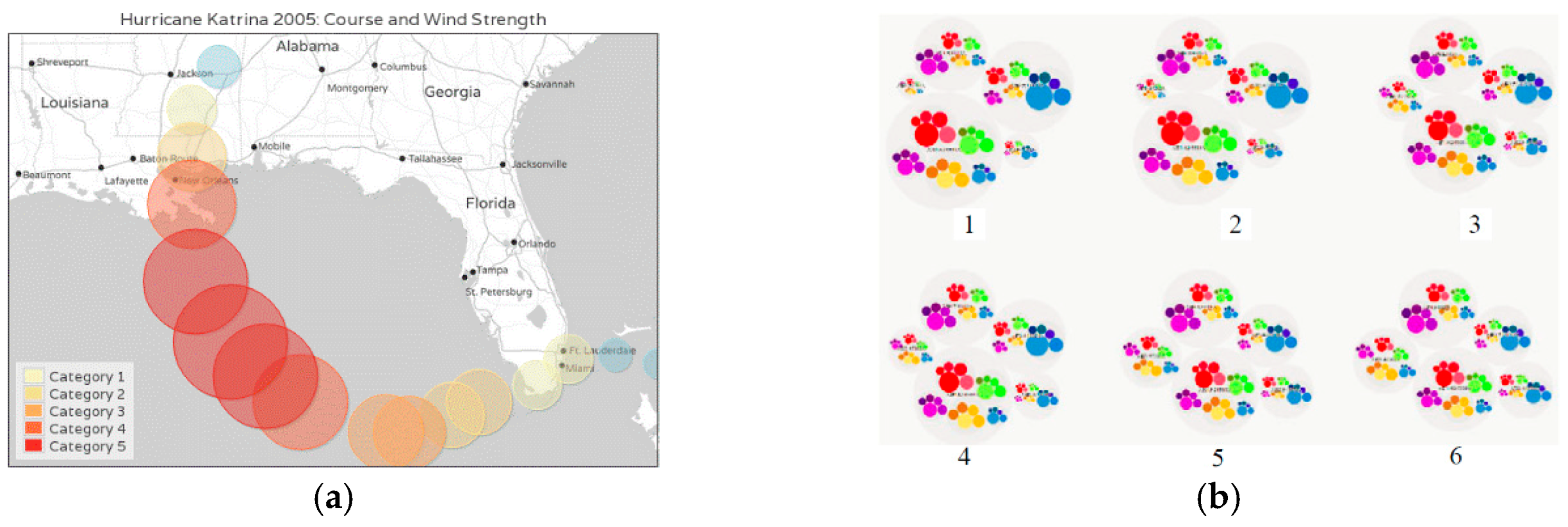
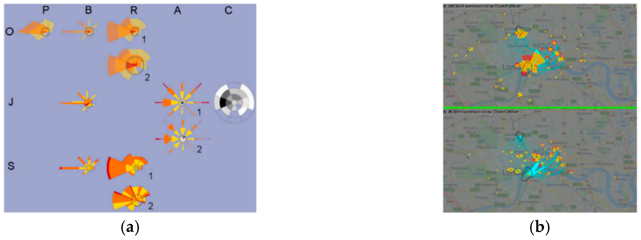
2.1. Icons
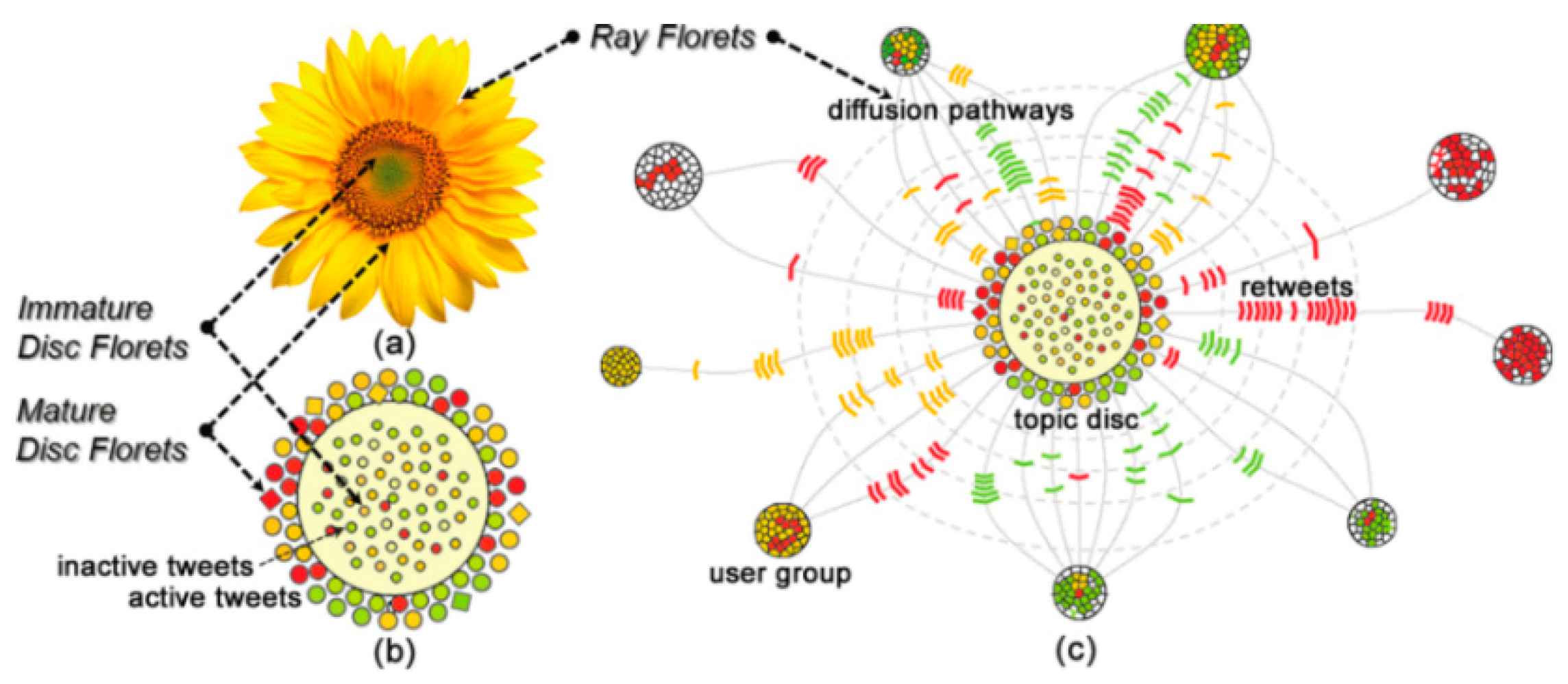
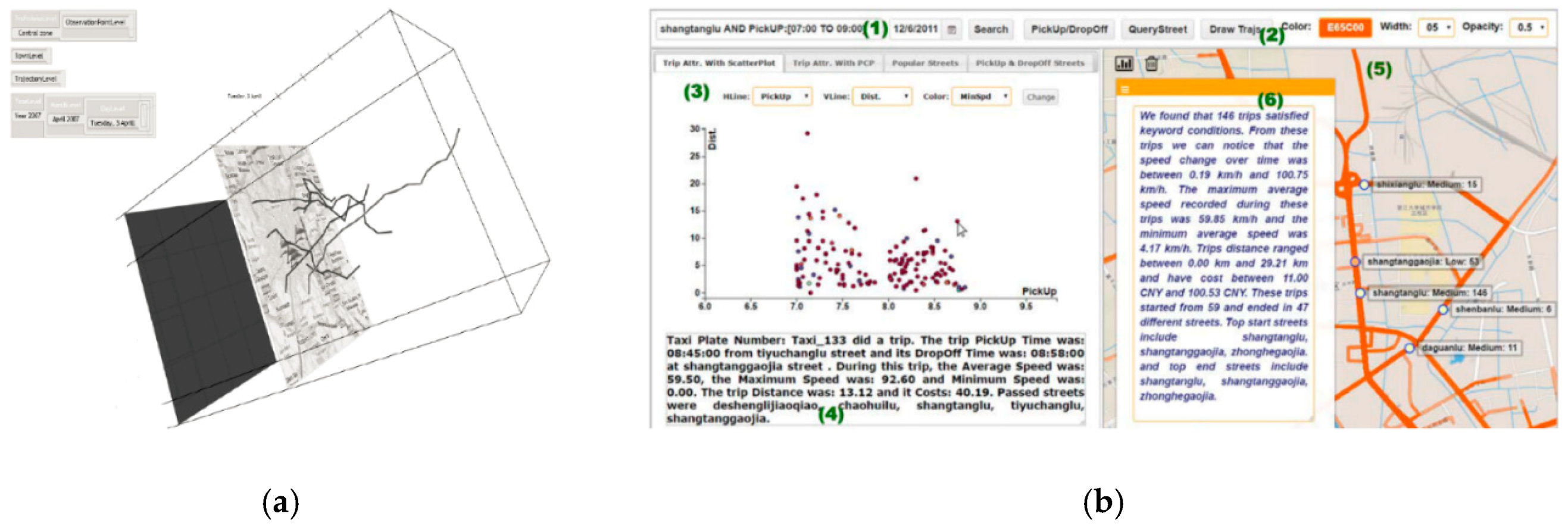
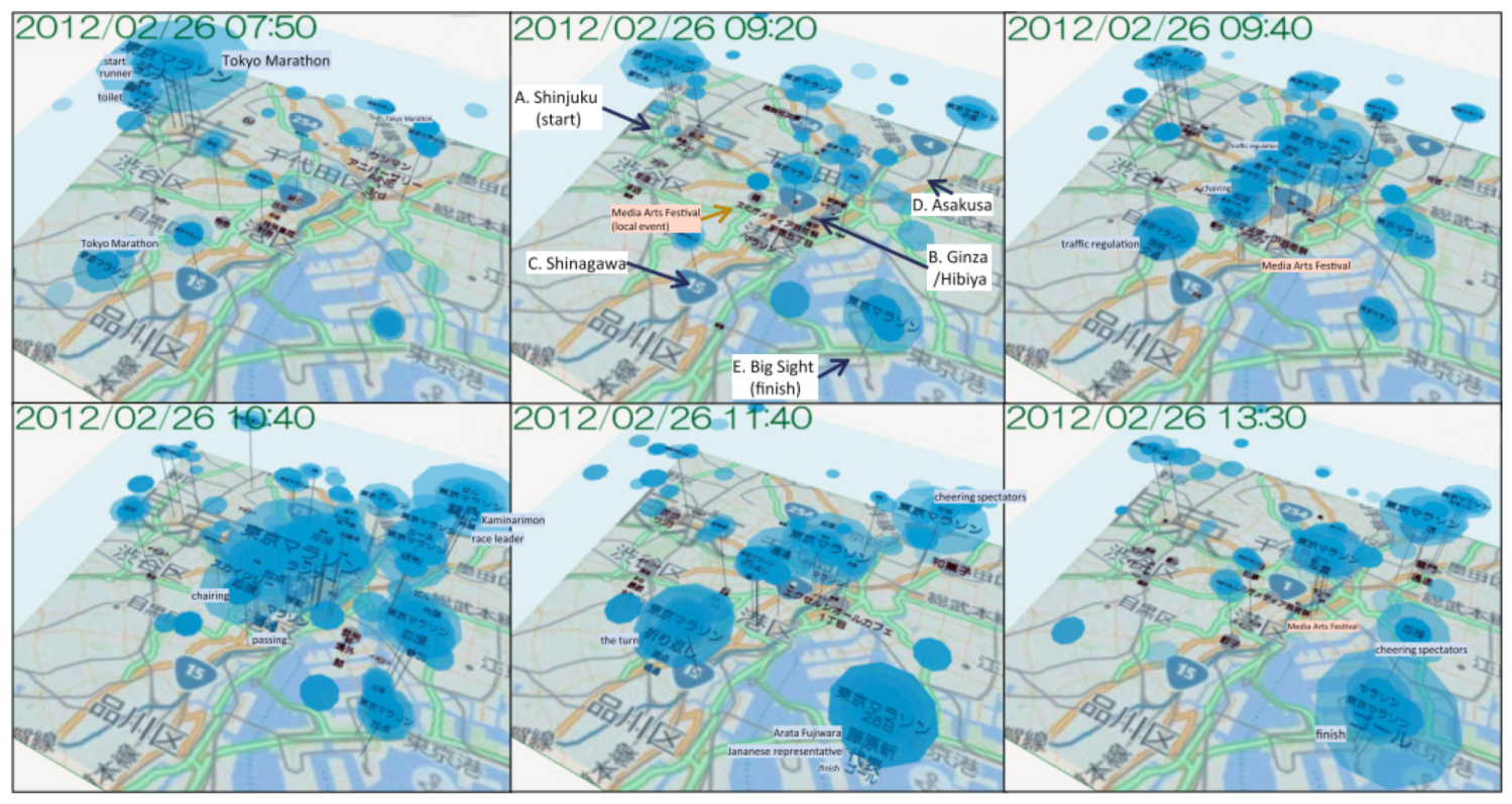
2.2. Semantics
2.3. Word Clouds
3. Visualization Targeting Low-Dimensional Data
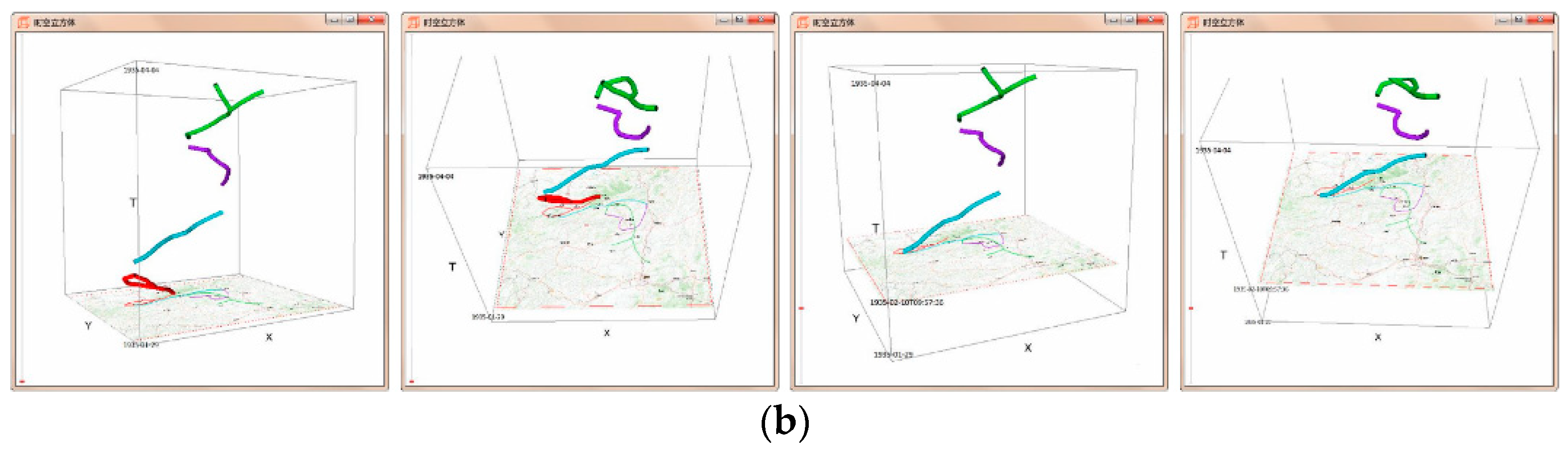
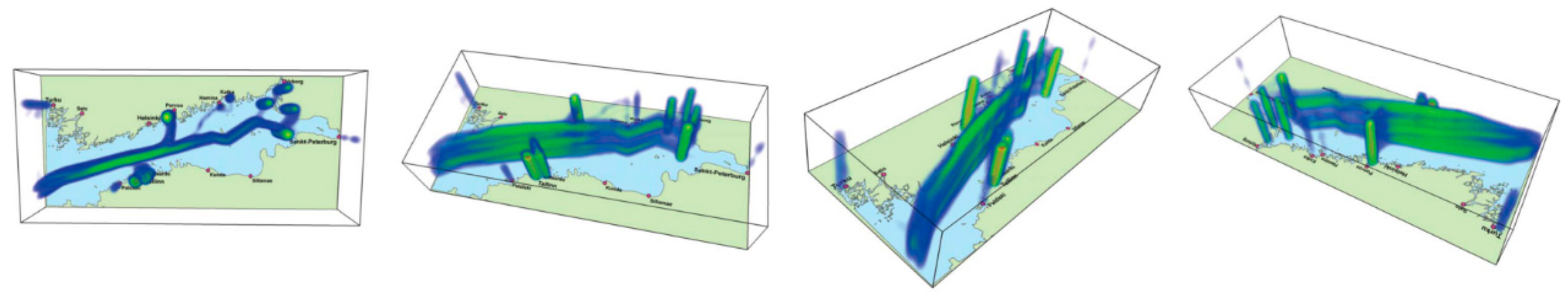
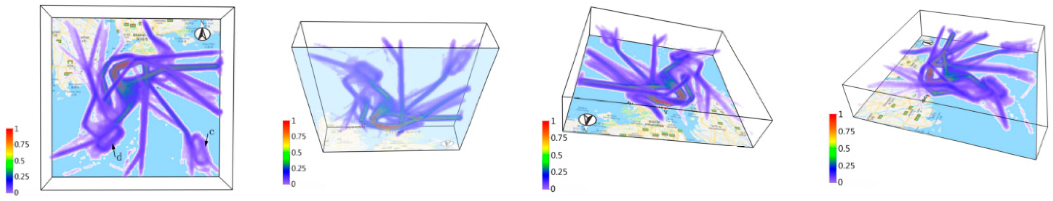
3.1. Space–Time Cube (STC)
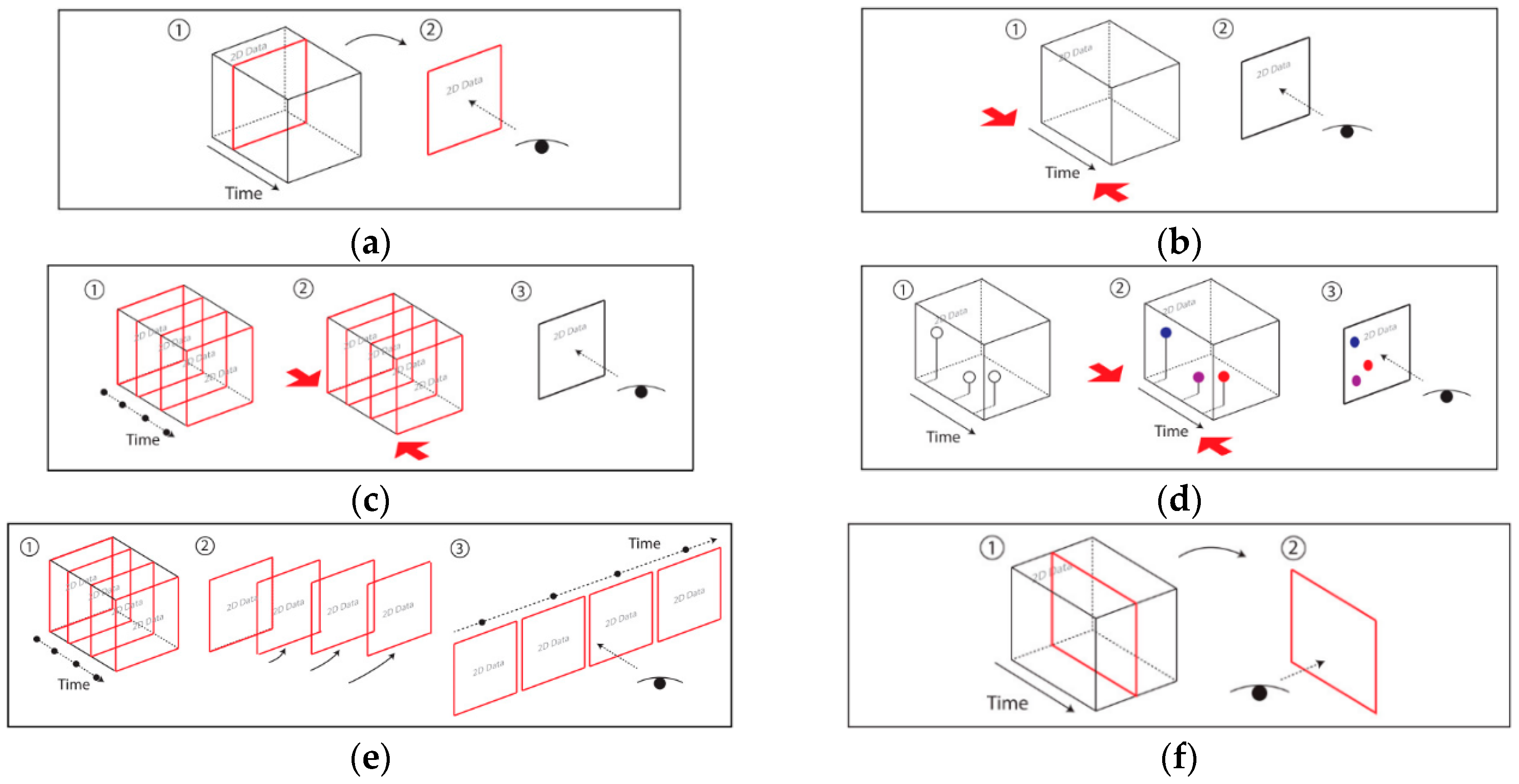
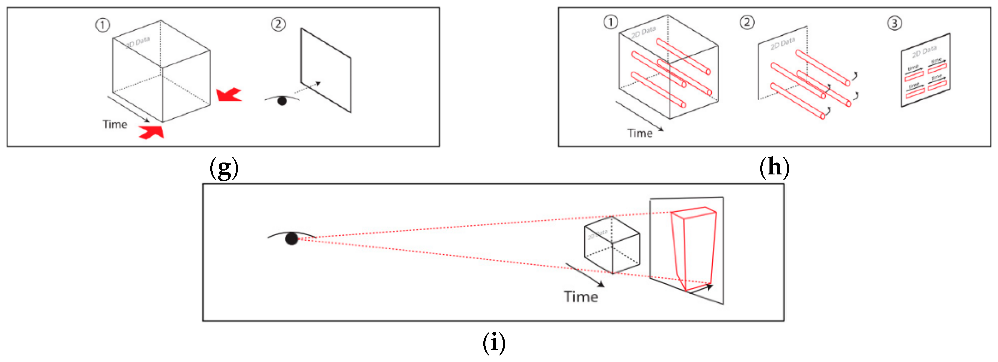
- Static Visualization: Static interactions of generalized STCs (basic and composite) are used to depict various operations of spatiotemporal data [27], including time cutting (extracting a particular temporal snapshot from the cube), time flattening (collapsing the cube along its time axis by merging all time slices into a single view), discrete time flattening (similar to time flattening but selecting target time slices before flattening instead of merging them all), colored time flattening (similar to time flattening but the time slices are colored before combination), time juxtaposing (cutting multiple time slices and placing these slices side by side or on a grid), space cutting (extracting a planar slice that is perpendicular to the data plane), space flattening (similar to space cutting but consists in flattening the cube in a particular direction on the data plane instead of extracting a space cut), repeated drilling (extracting drilling cores at several locations on the visualization plane and rotating these cores in-place) and 3D rendering (projecting 3D objects onto a 2D plane). Figure 8 presents schematics that focus on static-visualization operations.
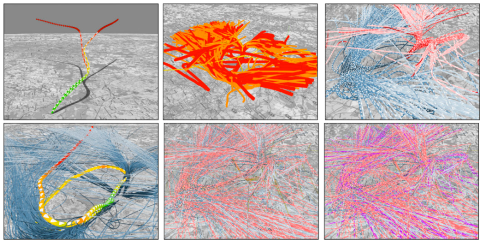
- Dynamic Visualization: Animation is the process of applying different operations on a space–time cube over time, or similarly, varying the operation parameters over time. The most common forms of animation involve changing the position of the cutting operation over time (i.e., animated time cutting). Spatial padding can be performed accordingly before the operation, producing smooth animated transitions. Animated time cutting can also be combined with other STC operations, such as time flattening. Although many animation techniques can be described as animated time cutting and its variants on a static space–time cube, other animation operations also exist. For example, Bach et al. [28] proposed animated 3D rendering, which interprets the transition between two space–time cube operations by smoothly rotating the space–time cube representation.
3.2. Stacking
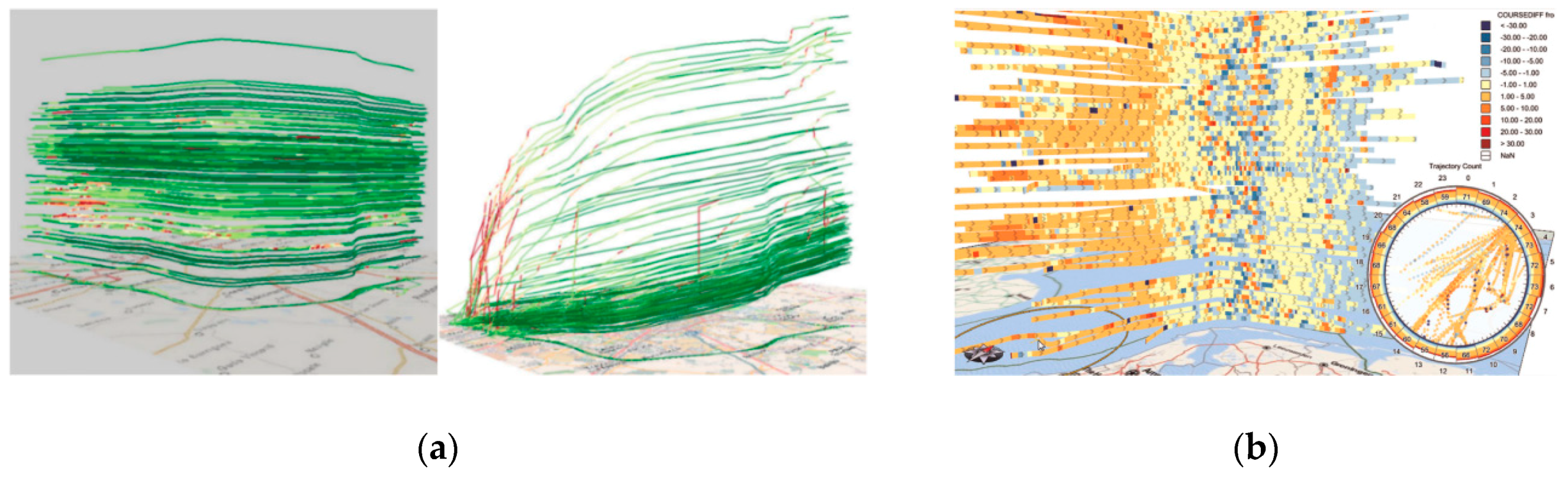
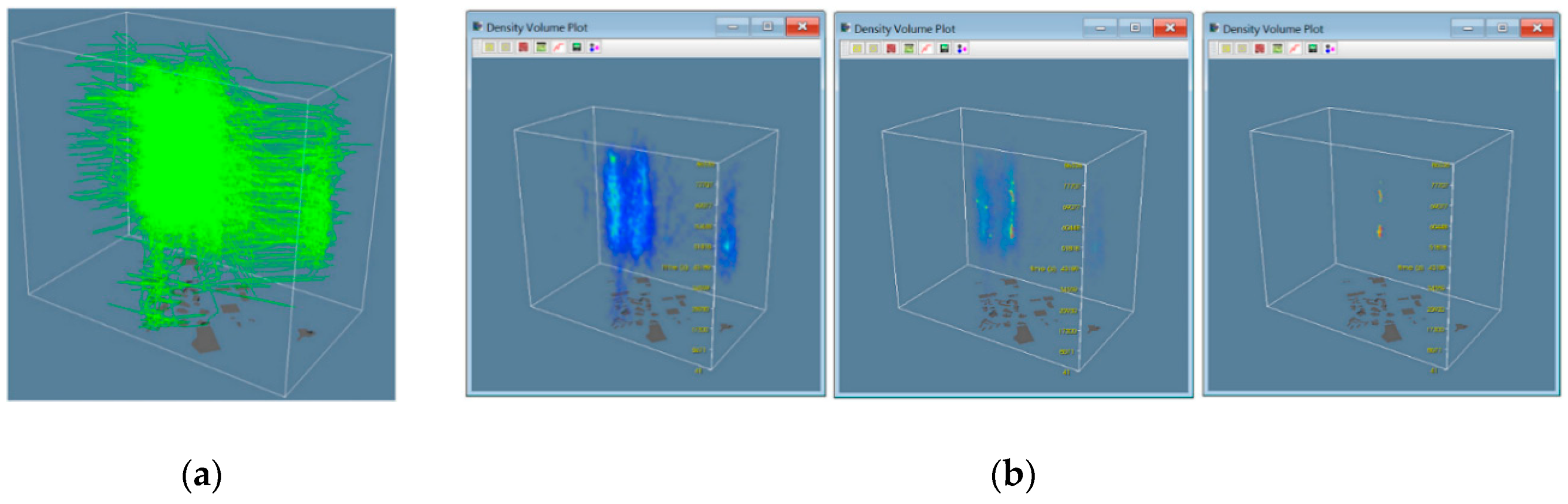
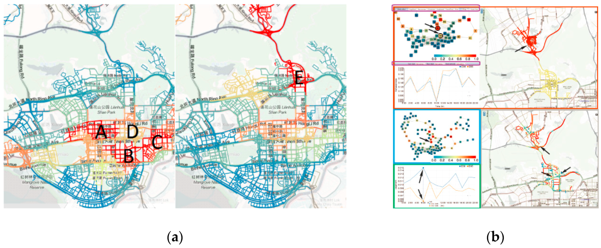
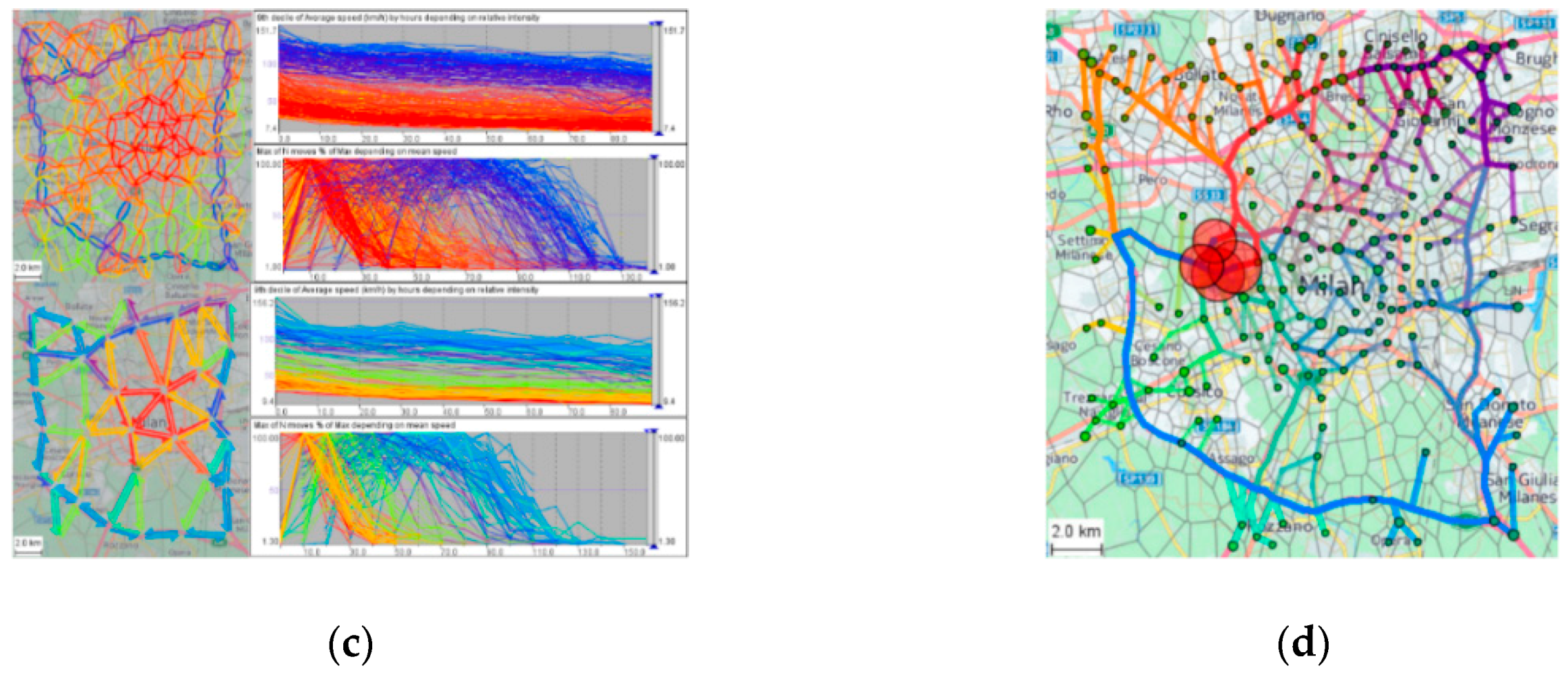
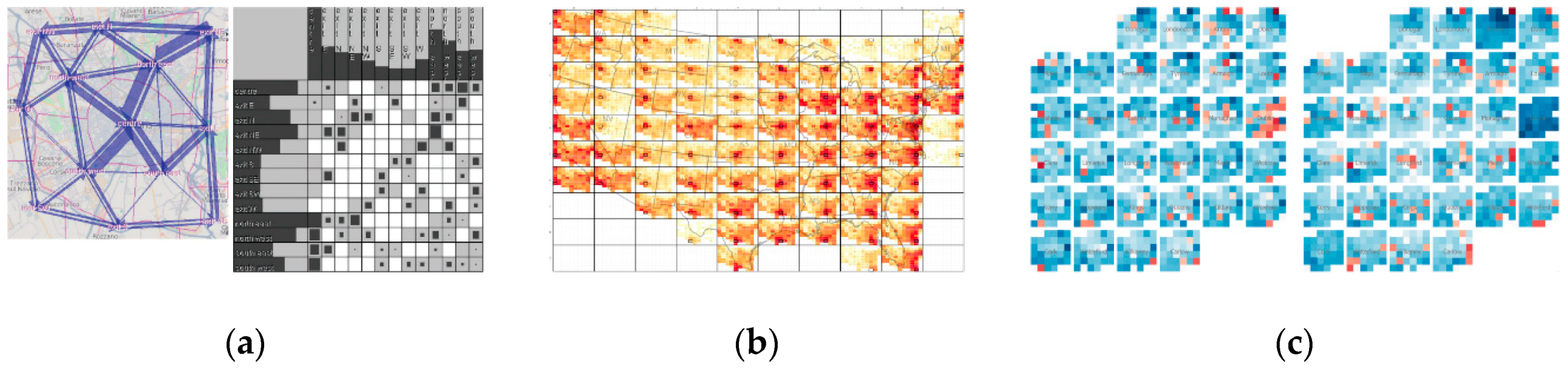
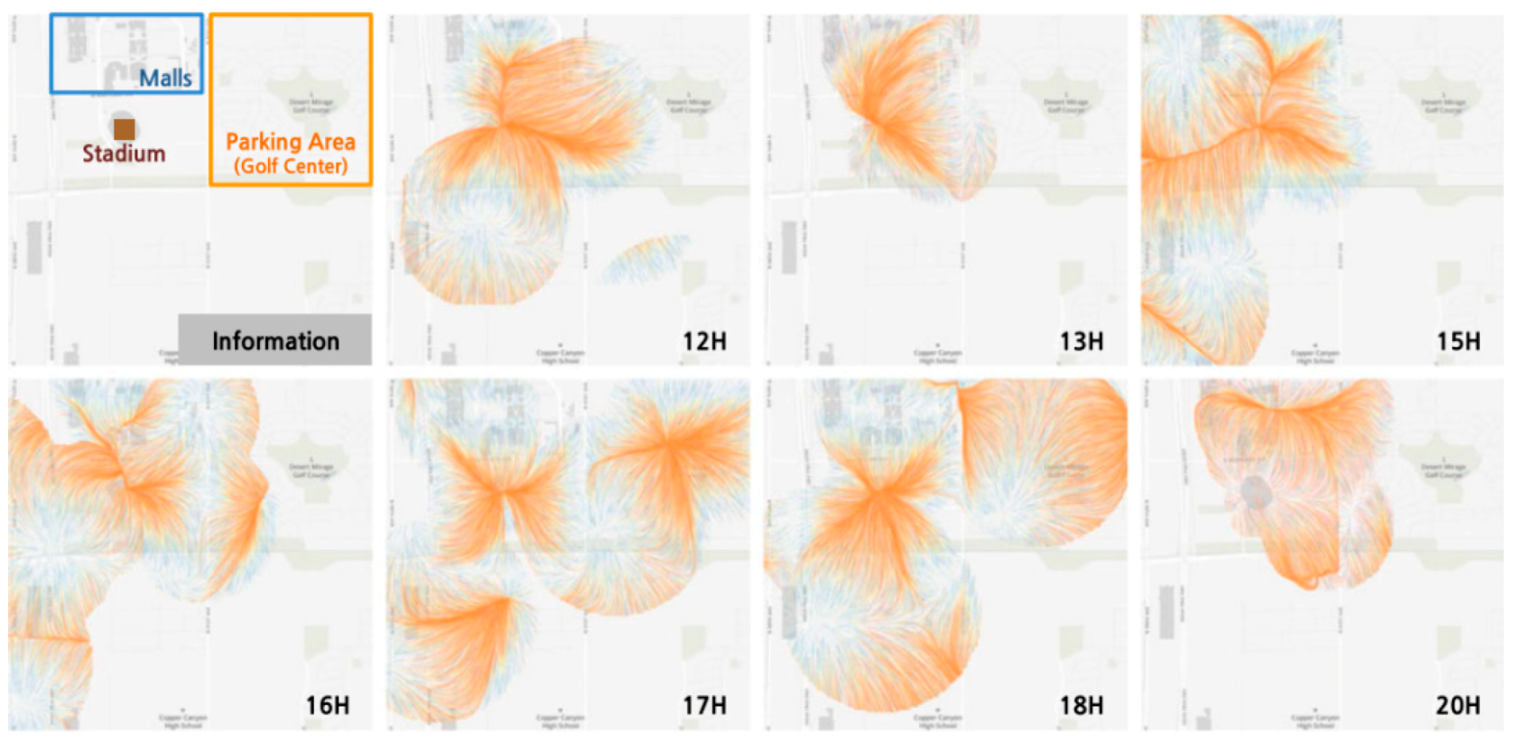
3.3. Density Map
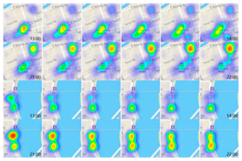
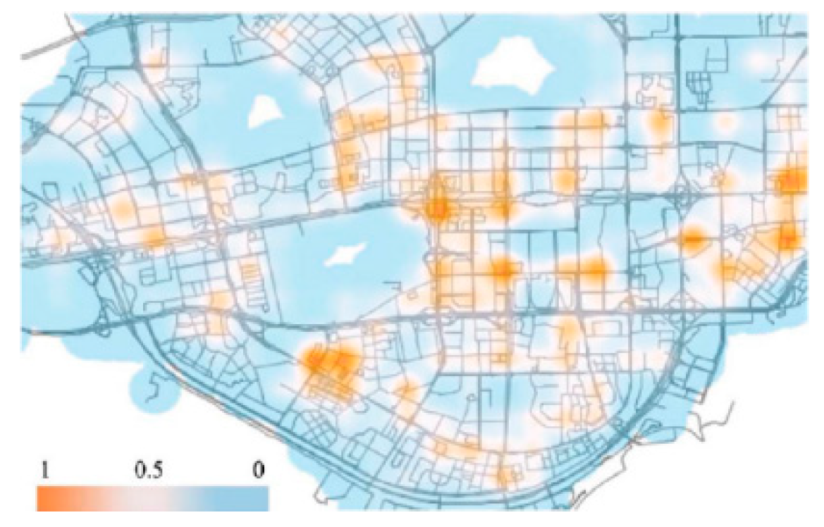
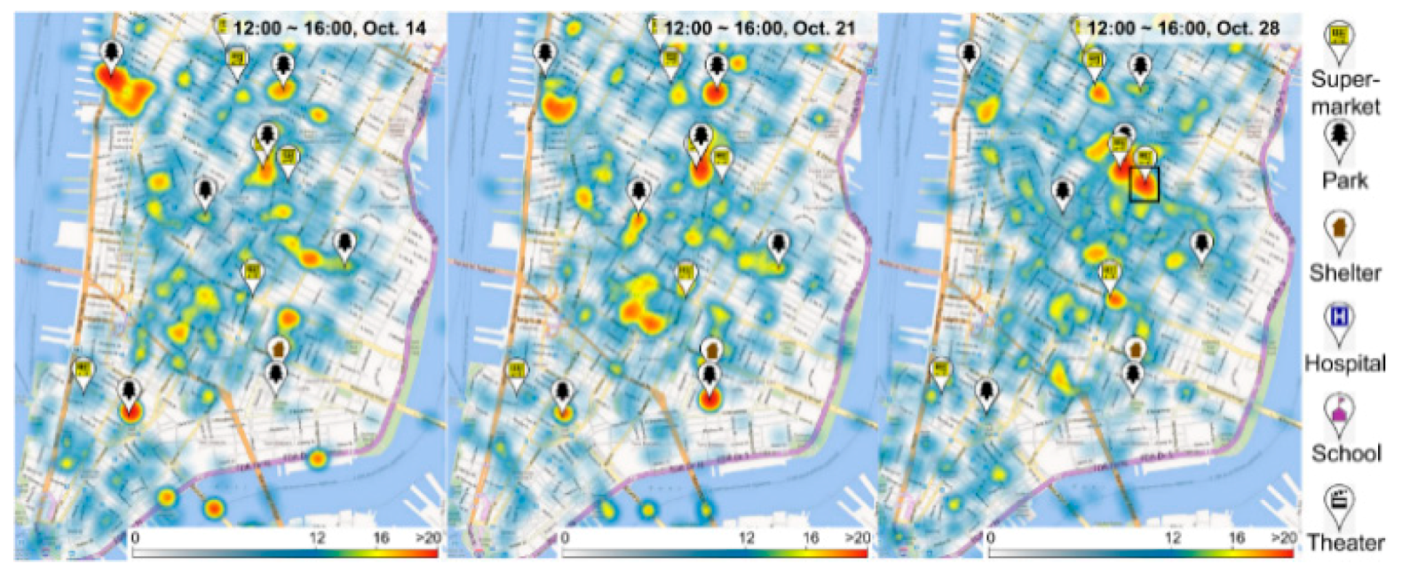
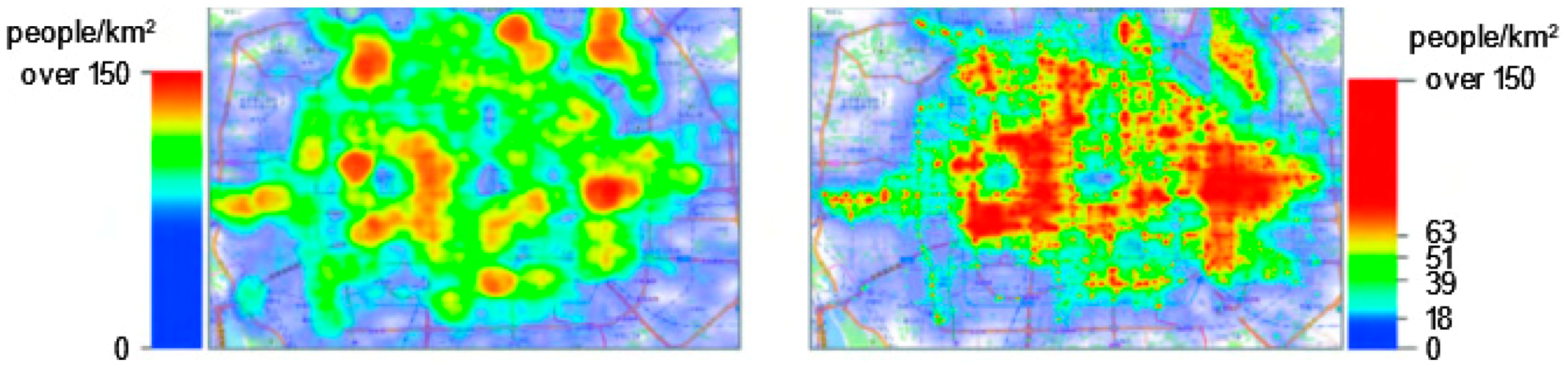
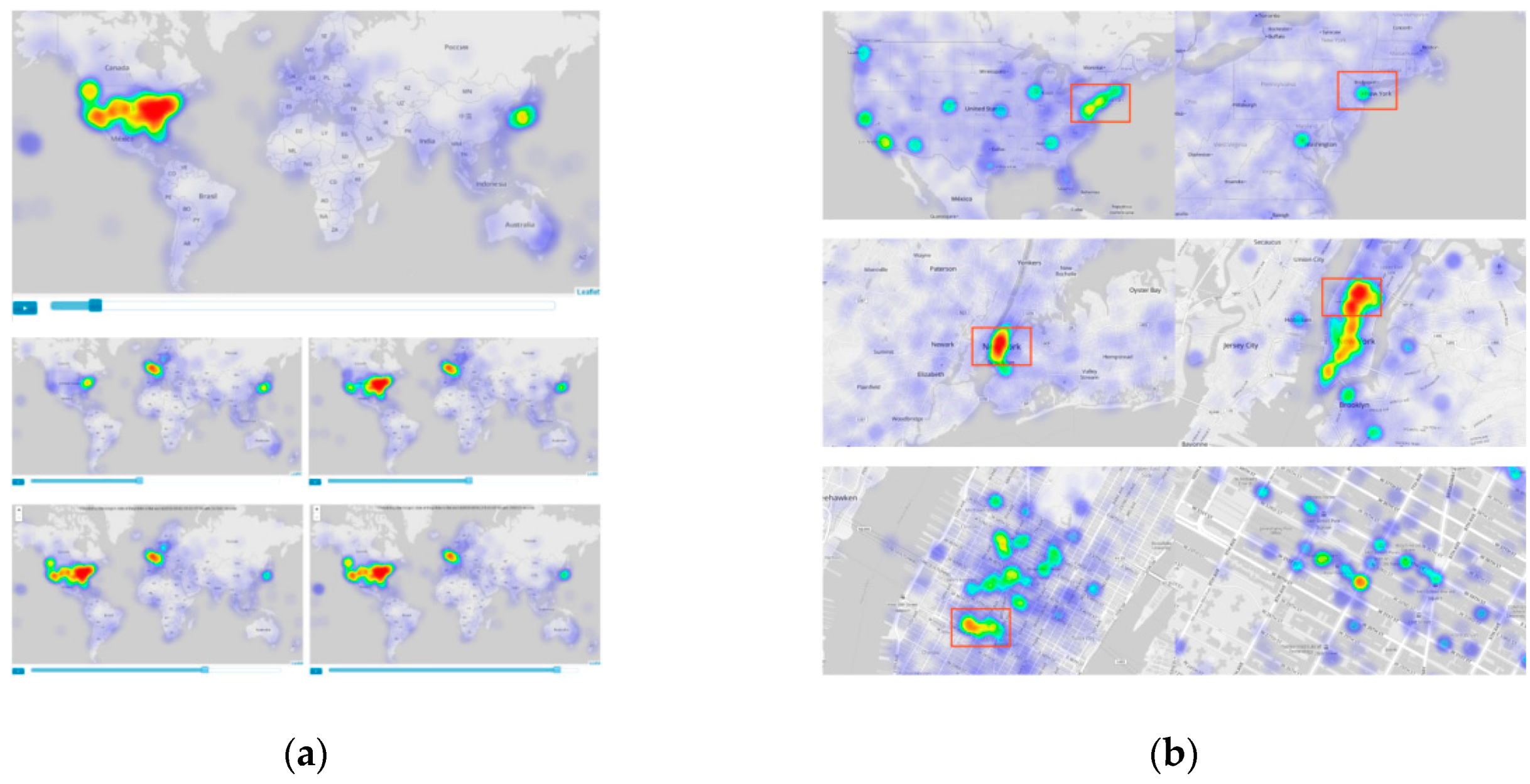
3.4. Heatmap
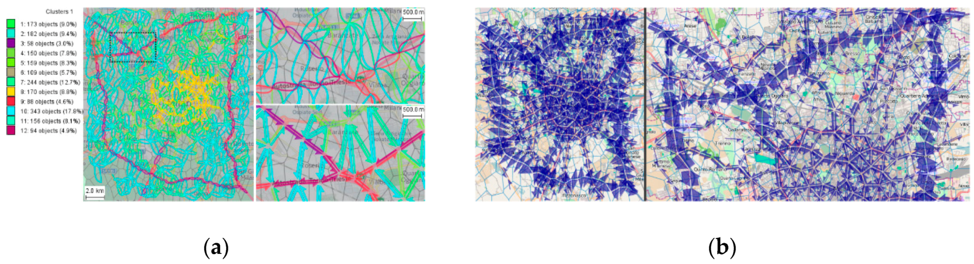
3.5. Meshing
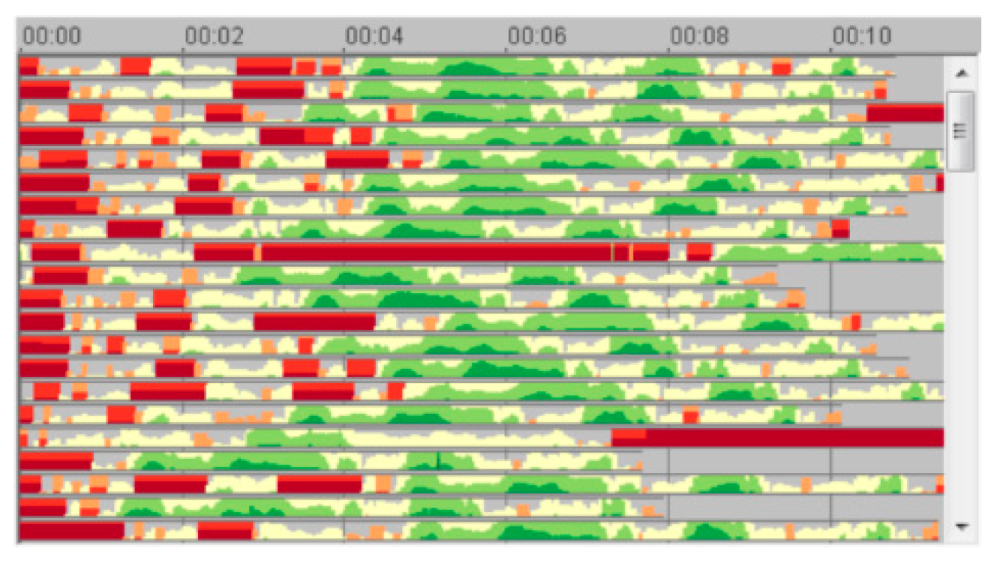
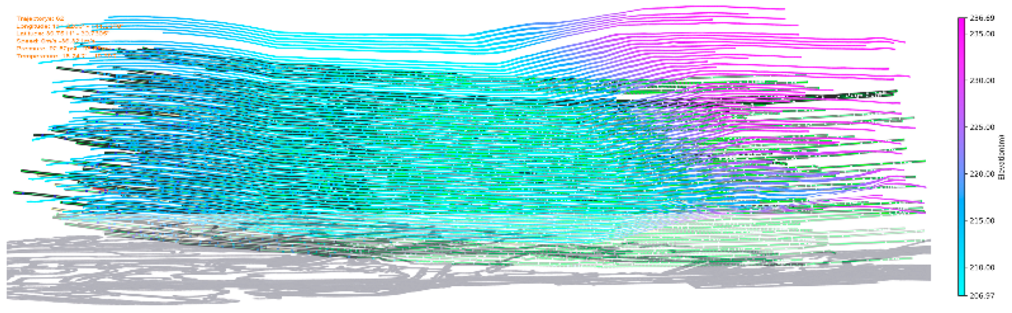
3.6. Time Series
- Linear graphs: Linear graphs are simple to implement. When displaying time-series data by this graph, one of the coordinate axes is fixed as the temporal axis to indicate continuous time, while the other axis is used to represent the data value that corresponds to the time of the data point.
- Stacking maps: A stacking map shows the cumulative variations for different categories of data. However, it exhibits a poor ability to compare different types of data and poor performance when processing data with negative values.
- Animations: The strength of animation is that it enables users’ perception of data changes in the temporal dimension. However, in a dynamic case, users have worse memory in an overview, which is not conducive to data comparisons. Therefore, we do not recommend animations in general time-series data visualization.
- Horizon graphs: As first proposed by Saito et al. [57], horizon graphs solve the problem regarding how some visualization methods cannot indicate negative values.
- Timelines: A timeline represents changing time by a horizontal time axis within the time range of the described data and is typically used to indicate narrative trajectory data. However, for a long temporal span and dense data points, the overall layout becomes confusing, thus affecting the visualization performance.
3.7. Transformation
4. Visualization Targeting High-Dimensional Data
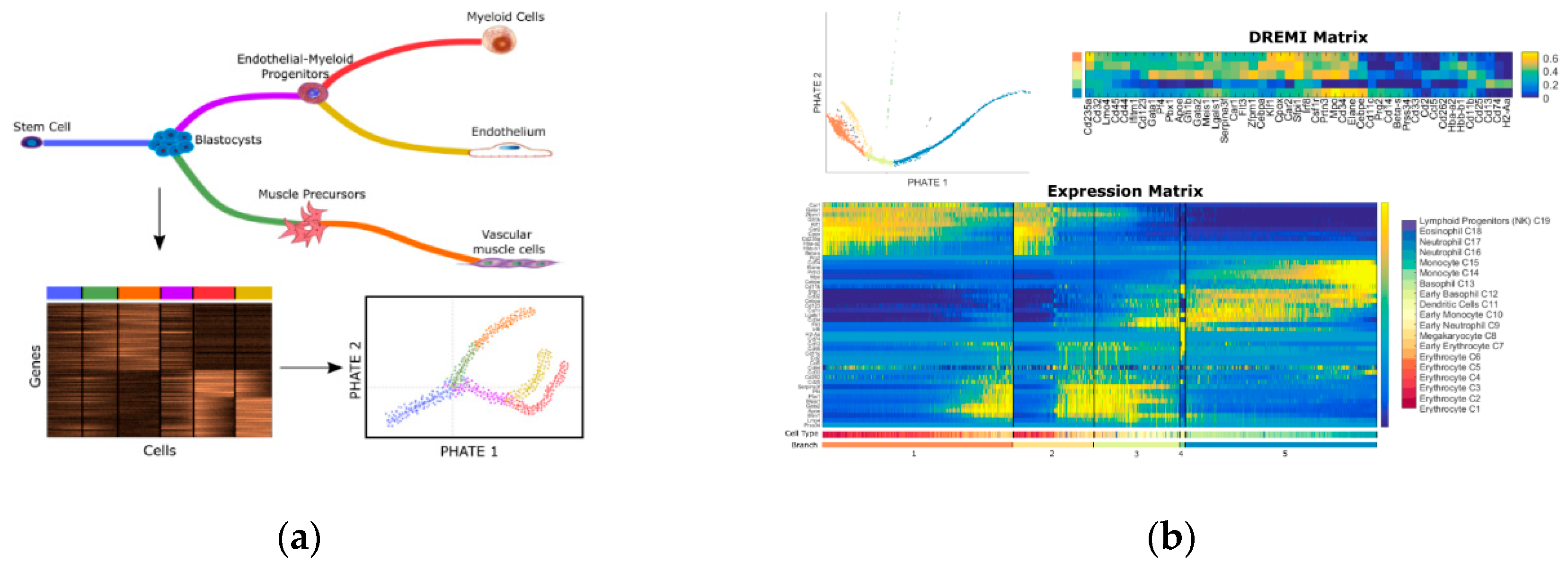
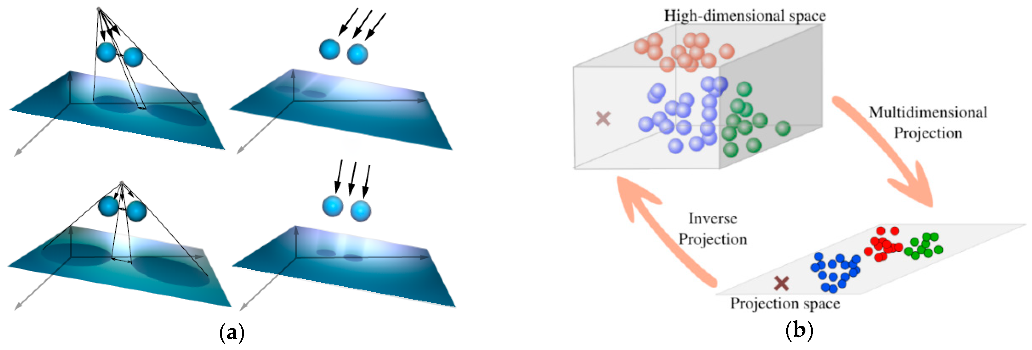
4.1. Dimensionality Reduction
4.2. Projection
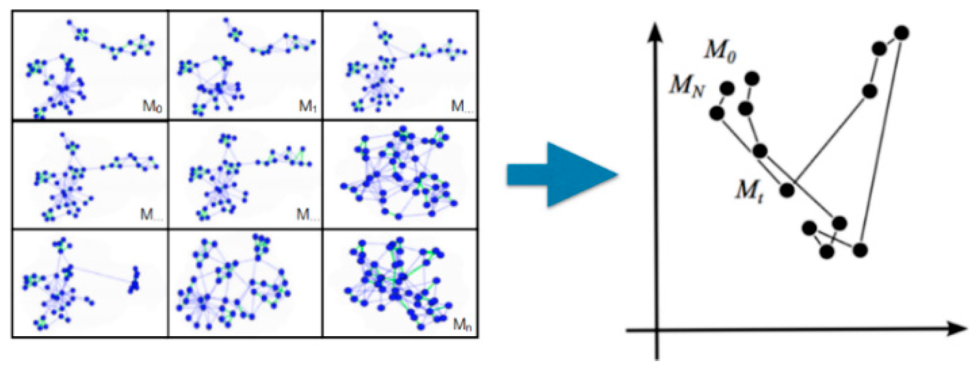
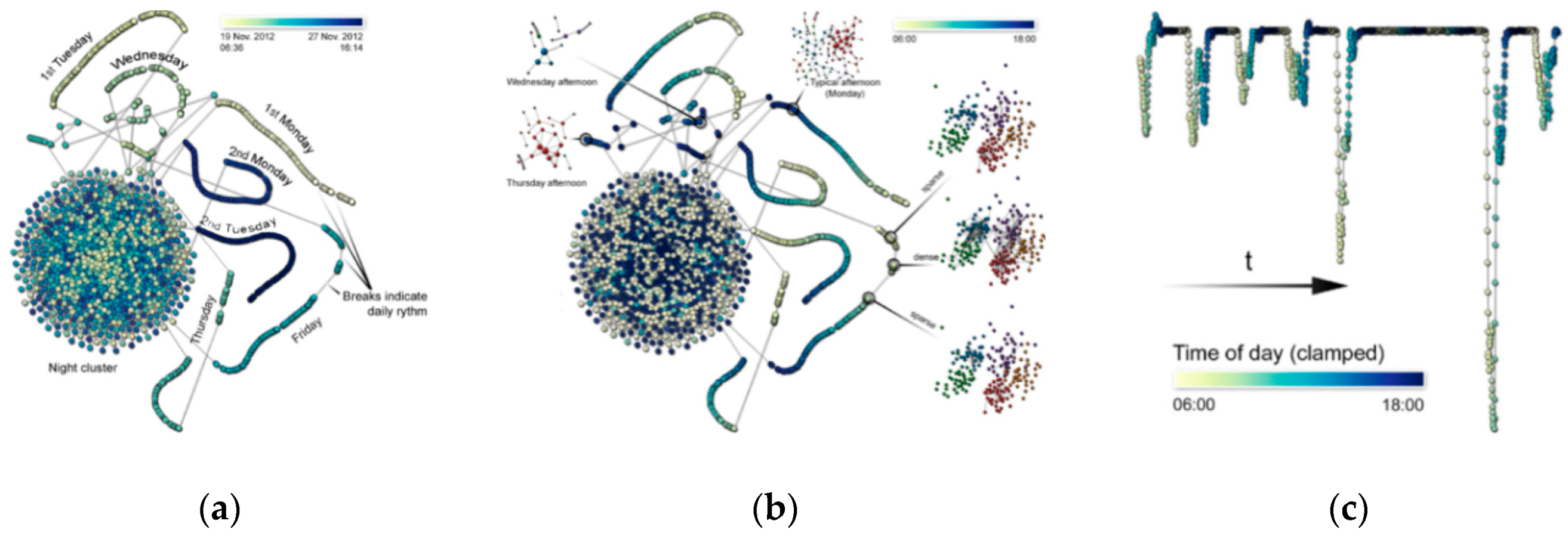
4.3. Hierarchy
4.4. Pixmaps
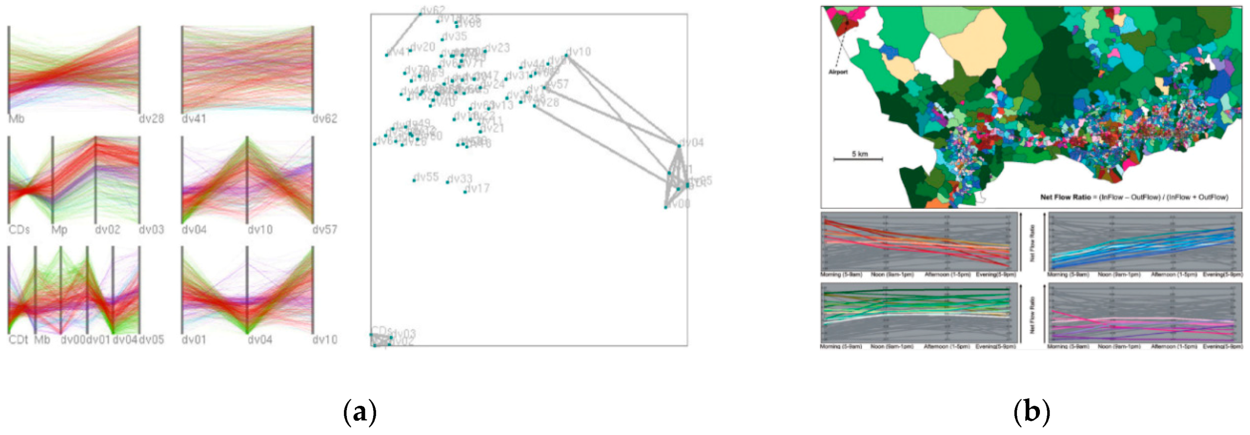
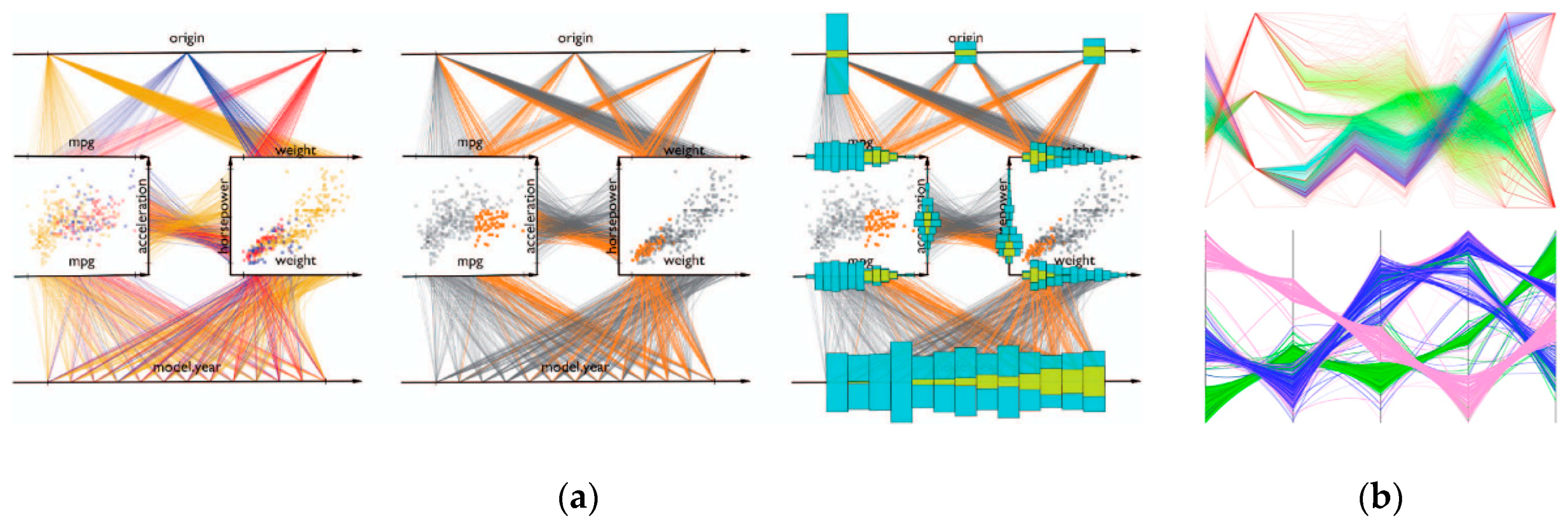
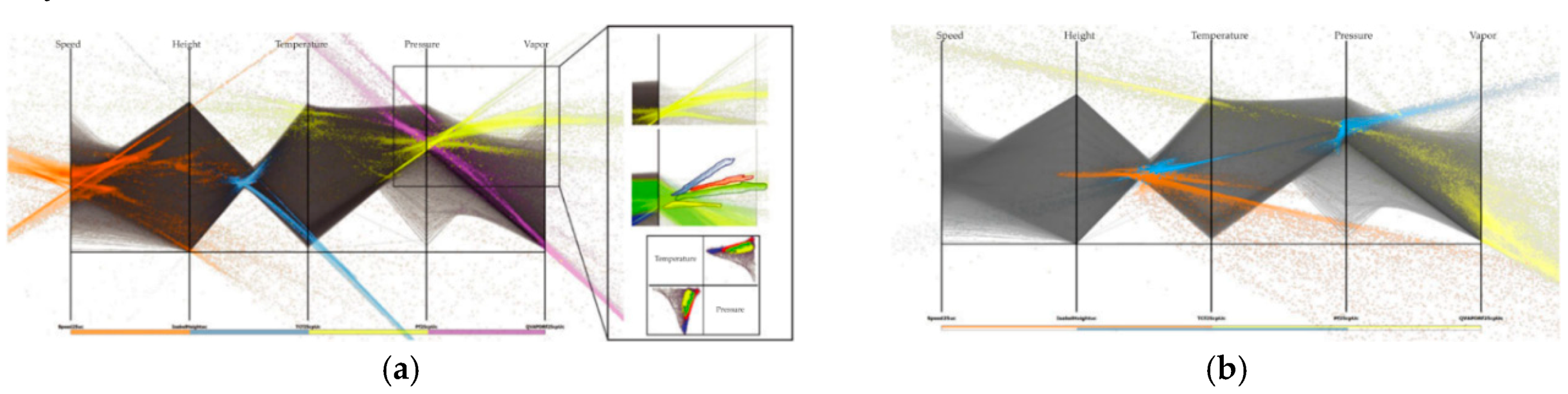
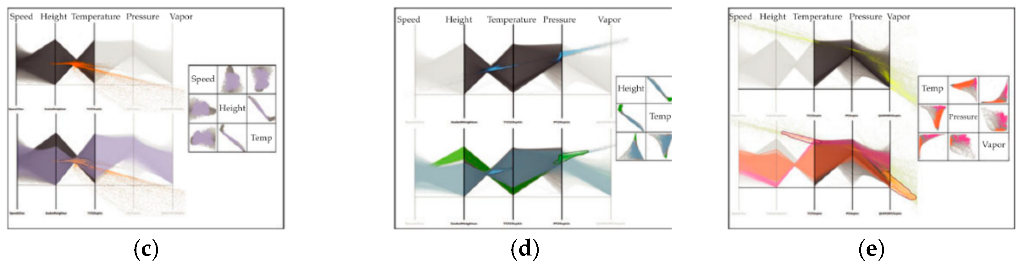
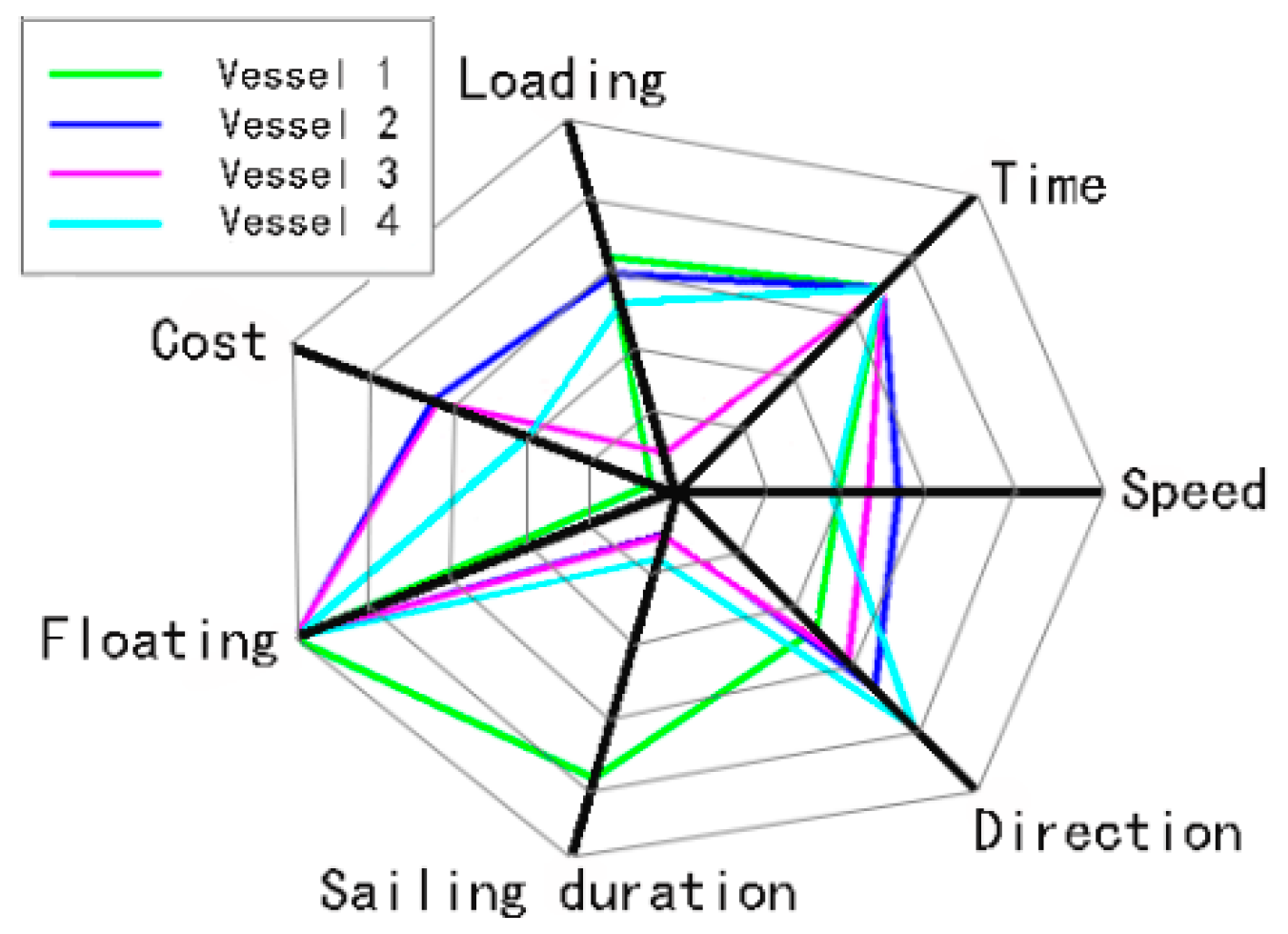
4.5. Parallel Coordinates
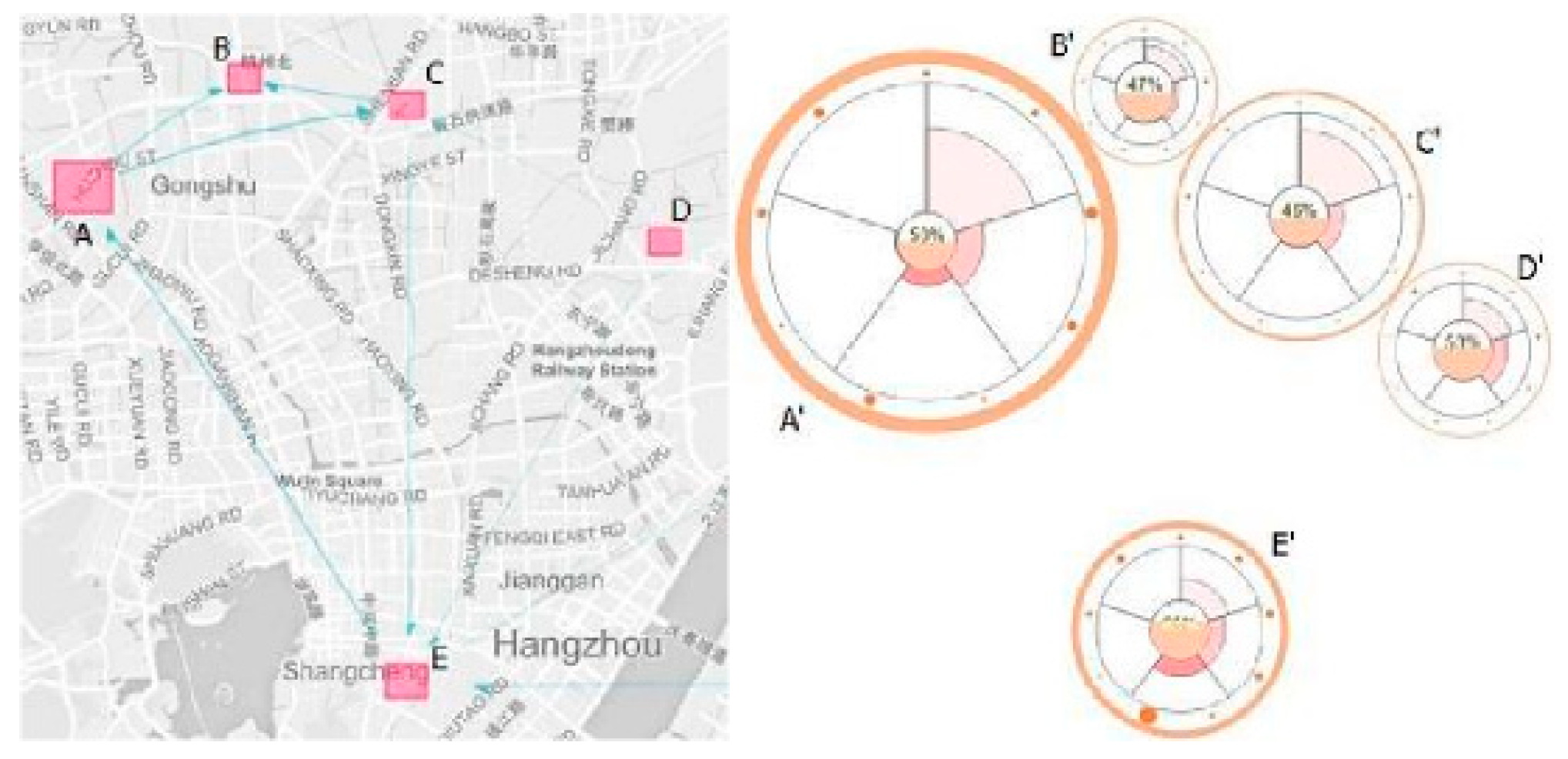
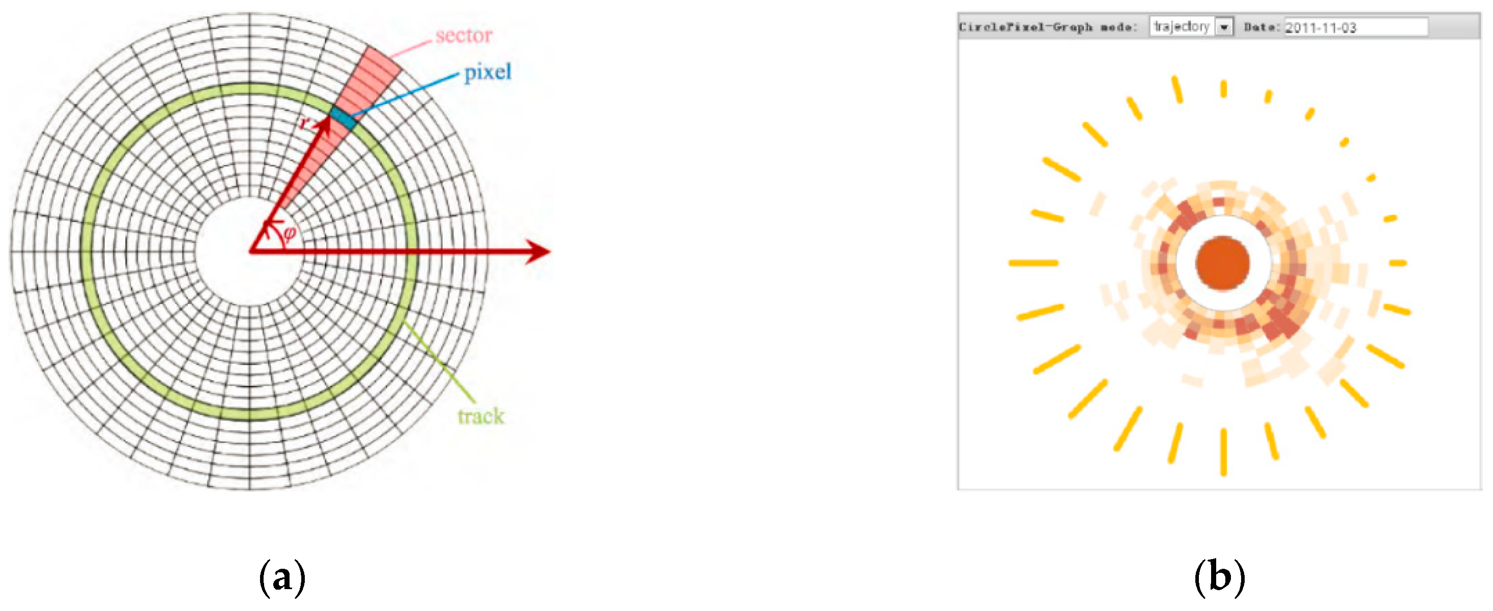
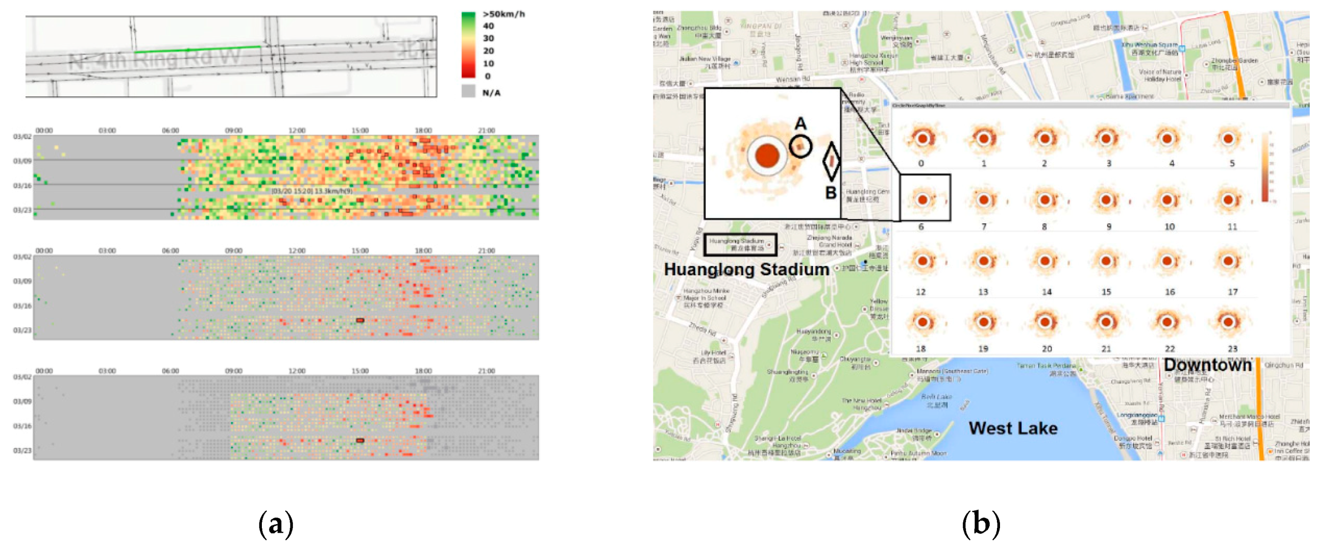
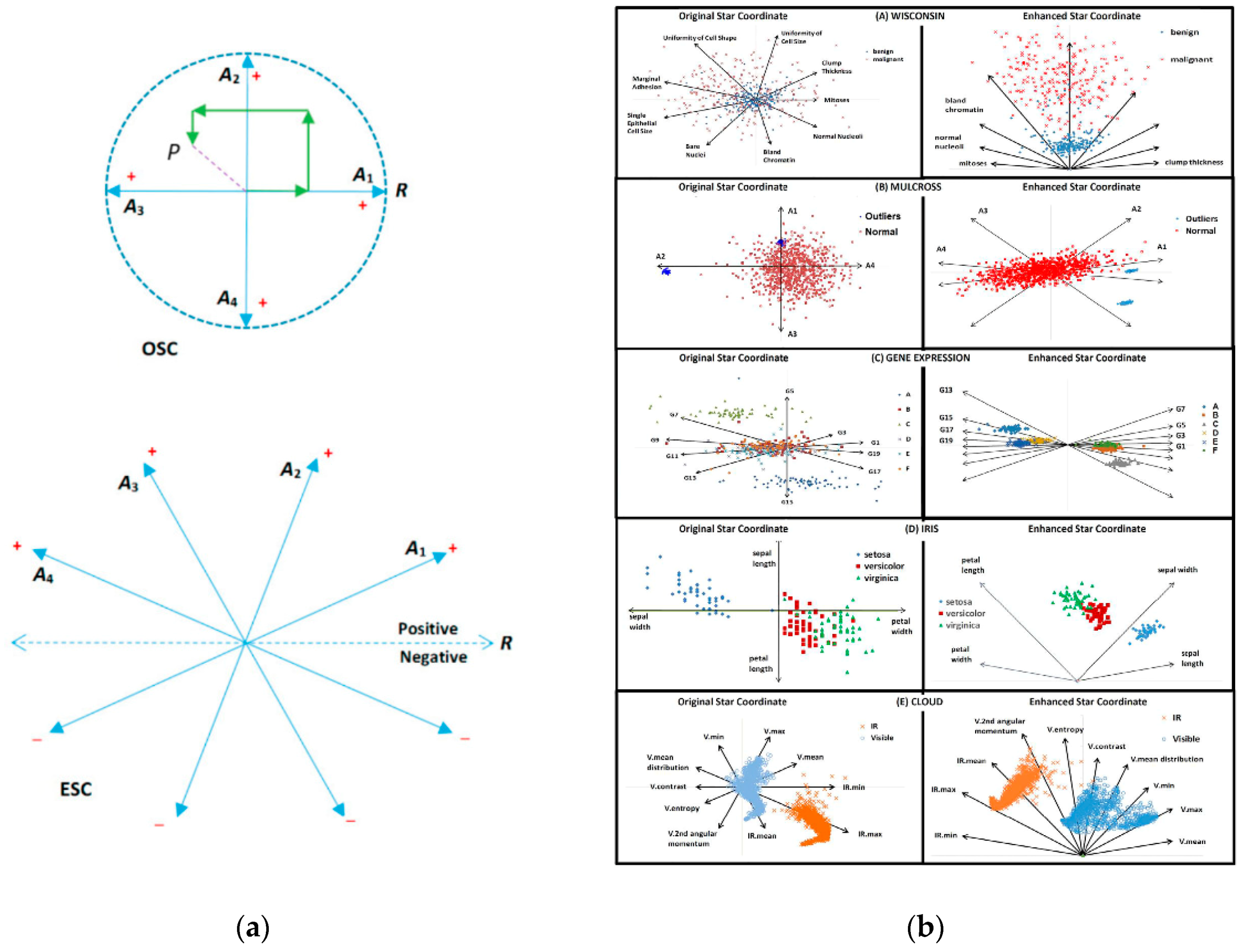
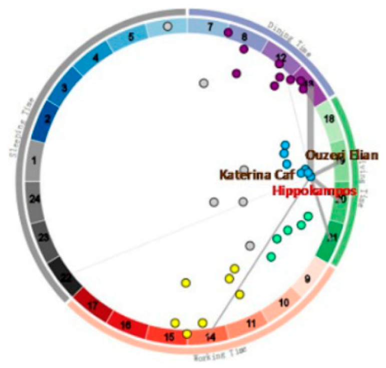
4.6. Radial Graph
5. Universal Multidimensional Visualization
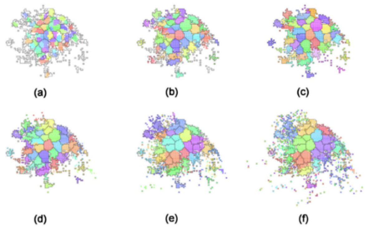
5.1. Clustering
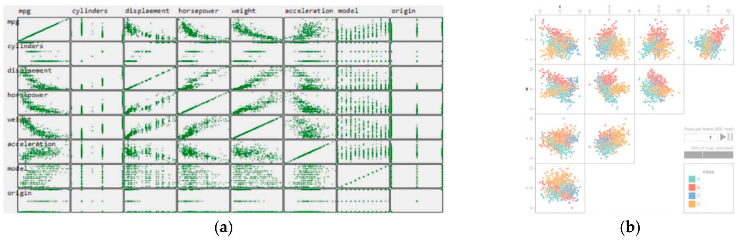
5.2. Scatter Plots
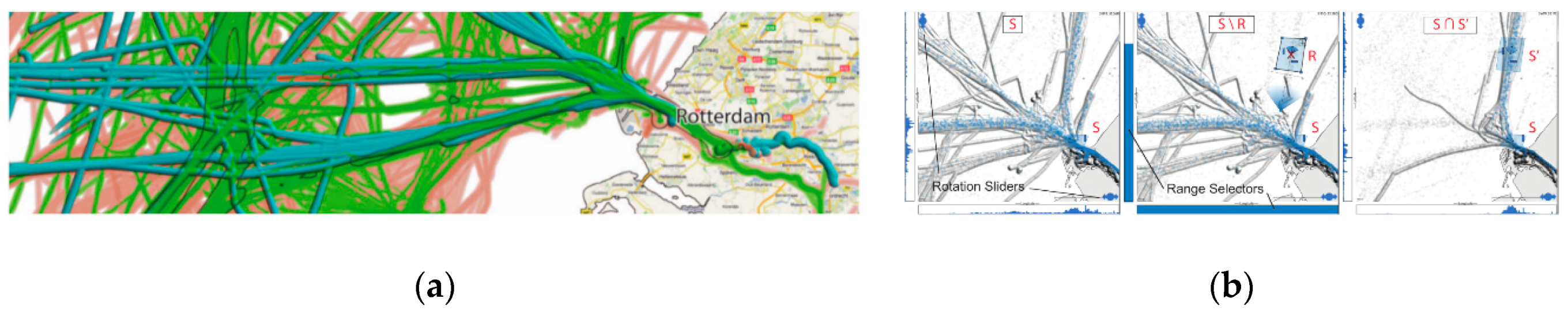
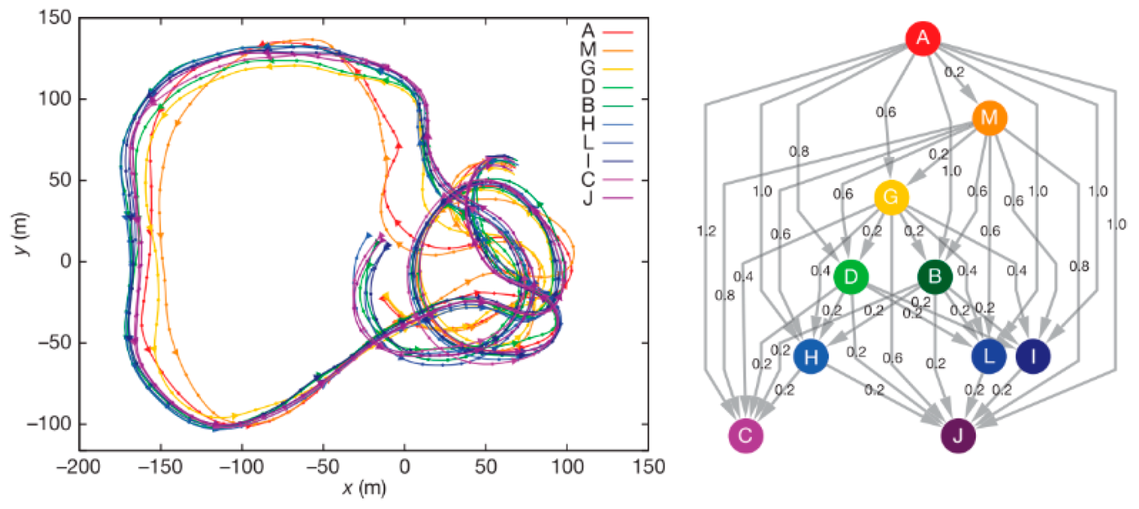
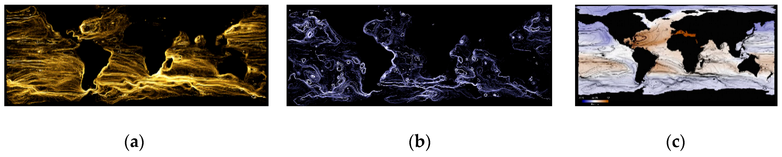
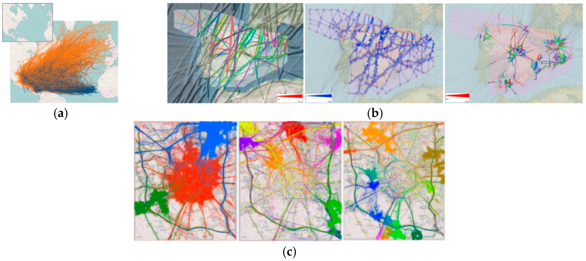
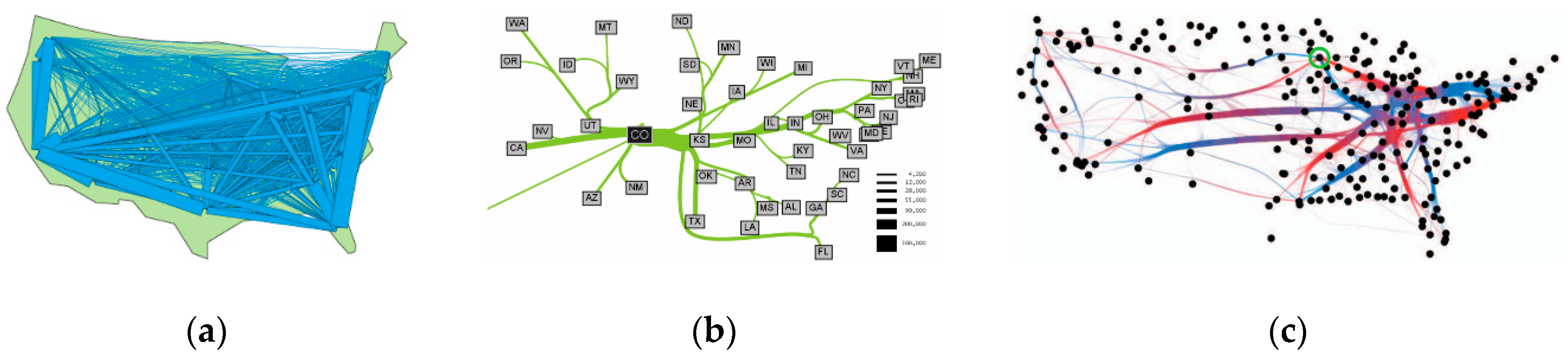
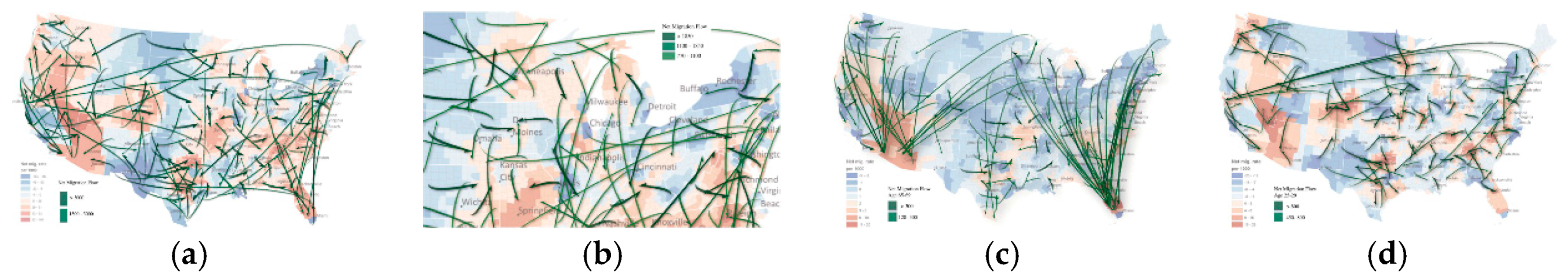
5.3. Flow and Stream
6. Comparative Analysis of Visualization Techniques
6.1. Universal Multivariate Visualization Techniques
6.2. Low-Dimensional Data-Targeted Visualization Techniques
6.3. High-Dimensional Data-Targeted Visualization Techniques
6.4. Universal Multidimensional Visualization Techniques
7. General Discussions
- Data issues. The basis on which the big-data visualization relies is data. Trajectory data have numerous sources derived from heterogeneous environments; the integrity, consistency, and accuracy of the data sources in this case are hard to guarantee. Although preprocessing addresses numerous data-quality problems, uncertainties still exist. Massive trajectory data could potentially expose private information such as behavioral characteristics, hobbies, and social relationships that are generally concerned with fundamental interests of the users. Moreover, clarifying sampling errors or ambiguity due to increased focus on privacy protection or producing an appropriate visual design unsusceptible to data-quality issues have become particularly importance. With the advancing data-acquisition technology, explosively increasing data dimensionalities and emerging high-dimensional data types, sometimes data analysis with existing visualization methods can suffer heavier detail loss, or even cannot be directly performed. Additionally, most people can hardly perceive and comprehend spaces above four dimensions because of human-brain limitations, thus maximizing the amount of details becomes more difficult. Therefore, we should design a big-data visual analytics system whose perceptual scalability and interactive scalability depends on the visualization accuracy and computer processing power rather than the data scale.
- Analysis issues. Big-data visual analytics is a process of human–machine interaction. However, there is a vacancy for recognized scientific evaluation mechanism to design and evaluate visual representations for matching mental images, because multifaceted cognitive divergence has existed between users and experts in the application field. Therefore, the multilevel and multi-granular task distribution of human–machine interactions and fulfillment of user-centered system frameworks should be further studied and verified, since ordinary individuals in any field will require trajectory analysis in the big-data era of the future. In current visualization systems, data analysis is essentially limited to descriptive or exploratory analysis, while practical problems require answers with clarity, predictability, and causality. Current visual analytics typically only support a single data type, which does not facilitate the investigation of implicit relationships between multiple data sources. Furthermore, the increasing complexity of analytical tasks requires synthesizing heterogeneous types of information in trajectory big-data analysis [154]. It turns out that visualizing all aspects of trajectory data in a single static view is unacceptable; such attempts often trigger information overload and visual clutter. Conversely, multiple coordinated views require explorations back and forth between these views when simultaneously analyzing spatiotemporal data and other attributes of trajectory data, because of the views’ multiple foci. Integrating multiple attributes into one view to reveal the interlinkages between attributes and avoid over-plotting is a challenge for trajectory-data visualization.
8. Conclusions
Author Contributions
Funding
Acknowledgments
Conflicts of Interest
References
- Keim, D.; Andrienko, G.; Fekete, J.D. Visual analytics: Definition, process, and challenges. In Information Visualization; Springer: Berlin/Heidelberg, Germany, 2008; pp. 154–175. [Google Scholar]
- Cao, N.; Lin, Y.; Sun, X.; Lazer, D.; Liu, S.; Qu, H. Whisper: Tracing the spatiotemporal process of information diffusion in real time. IEEE Trans. Vis. Comput. Graph. 2012, 18, 2649–2658. [Google Scholar] [PubMed]
- Buschmann, S.; Trapp, M.; Döllner, J. Animated visualization of spatial–temporal trajectory data for air-traffic analysis. Vis. Comput. 2016, 32, 371–381. [Google Scholar] [CrossRef]
- Möller, T.; Haines, E.; Hoffman, N. Real-Time Rendering, 3rd ed.; A.K. Peters: Natick, MA, USA, 2008; p. xviii. 1027p. [Google Scholar]
- Sheng, F. The Visual Analysis of Traffic Data Based on Semantic Extraction. Master’s Thesis, Zhejiang University of Technology, Hangzhou, China, 2017. [Google Scholar]
- Spaccapietra, S.; Parent, C.; Damiani, M.L.; de Macedo, J.A.; Porto, F.; Vangenot, C. A conceptual view on trajectories. Data Knowl. Eng. 2008, 65, 126–146. [Google Scholar] [CrossRef]
- Zhong, C.; Zaki, C.; Tourre, V.; Moreau, G. Event-based semantic visualization of trajectory data in urban city with a space-time cube. In Proceedings of the 3rd WSEAS International Conference on Visualization, Imaging and Simulation; World Scientific and Engineering Academy and Society (WSEAS): Faro, Portugal, 2010; pp. 99–105. [Google Scholar]
- Ratcliffe, J.H.; Chainey, S. Gis and Crime Mapping; John Wiley & Sons Ltd (10.1111): Malden, MA, USA, 2005. [Google Scholar]
- Mburu, L.; Helbich, M. Evaluating the accuracy and effectiveness of criminal geographic profiling methods: The case of dandora, kenya. Prof. Geogr. 2015, 67, 110–120. [Google Scholar] [CrossRef]
- Liao, Z.-F.; Li, Y.; Peng, Y.; Zhao, Y.; Zhou, F.-F.; Liao, Z.-N.; Dudley, S.; Ghavami, M. A semantic-enhanced trajectory visual analytics for digital forensic. J. Vis. 2015, 18, 173–184. [Google Scholar] [CrossRef]
- Le, T.M.V.; Lauw, H.W. Semvis: Semantic visualization for interactive topical analysis. In Proceedings of the 2017 ACM on Conference on Information and Knowledge Management; ACM: Singapore, 2017; pp. 2487–2490. [Google Scholar]
- Al-Dohuki, S.; Wu, Y.; Kamw, F.; Yang, J.; Li, X.; Zhao, Y.; Ye, X.; Chen, W.; Ma, C.; Wang, F. Semantictraj: A new approach to interacting with massive taxi trajectories. IEEE Trans. Vis. Comput. Graph. 2017, 23, 11–20. [Google Scholar] [CrossRef] [PubMed]
- Bogorny, V.; Avancini, H.; de Paula, B.C.; Kuplich, C.R.; Alvares, L.O. Weka-stpm: A software architecture and prototype for semantic trajectory data mining and visualization. Trans. GIS 2011, 15, 227–248. [Google Scholar] [CrossRef]
- Chen, S.; Yuan, X.; Wang, Z.; Guo, C.; Liang, J.; Wang, Z.; Zhang, X.L.; Zhang, J. Interactive visual discovering of movement patterns from sparsely sampled geo-tagged social media data. IEEE Trans. Vis. Comput. Graph. 2016, 22, 270–279. [Google Scholar] [CrossRef]
- Seifert, C.; Kump, B.; Kienreich, W.; Granitzer, G.; Granitzer, M. On the beauty and usability of tag clouds. In Proceedings of the 2008 12th International Conference Information Visualisation, London, UK, 9–11 July 2008; pp. 17–25. [Google Scholar]
- Cui, W.; Wu, Y.; Liu, S.; Wei, F.; Zhou, M.X.; Qu, H. Context-preserving, dynamic word cloud visualization. IEEE Comput. Graph. Appl. 2010, 30, 42–53. [Google Scholar] [CrossRef]
- Leginus, M.; Zhai, C.; Dolog, P. Personalized generation of word clouds from tweets. J. Assoc. Inf. Sci. Technol. 2016, 67, 1021–1032. [Google Scholar] [CrossRef]
- Ertl, T.; Chae, J.; Maciejewski, R.; Bosch, H.; Thom, D.; Jang, Y.; Ebert, D.S. Spatiotemporal social media analytics for abnormal event detection and examination using seasonal-trend decomposition. In Proceedings of the 2012 IEEE Conference on Visual Analytics Science and Technology (VAST), Seattle, WA, USA, 14–19 October 2012; pp. 143–152. [Google Scholar]
- MacEachren, A.M.; Jaiswal, A.; Robinson, A.C.; Pezanowski, S.; Savelyev, A.; Mitra, P.; Zhang, X.; Blanford, J. Senseplace2: Geotwitter analytics support for situational awareness. In Proceedings of the 2011 IEEE Conference on Visual Analytics Science and Technology (VAST), Providence, RI, USA, 23–28 October 2011; pp. 181–190. [Google Scholar]
- Thom, D.; Bosch, H.; Koch, S.; Wörner, M.; Ertl, T. Spatiotemporal anomaly detection through visual analysis of geolocated twitter messages. In Proceedings of the 2012 IEEE Pacific Visualization Symposium, Songdo, Korea, 28 February–2 March 2012; pp. 41–48. [Google Scholar]
- Bosch, H.; Thom, D.; Heimerl, F.; Püttmann, E.; Koch, S.; Krüger, R.; Wörner, M.; Ertl, T. Scatterblogs2: Real-time monitoring of microblog messages through user-guided filtering. IEEE Trans. Vis. Comput. Graph. 2013, 19, 2022–2031. [Google Scholar] [CrossRef] [PubMed]
- Chu, D.; Sheets, D.A.; Zhao, Y.; Wu, Y.; Yang, J.; Zheng, M.; Chen, G. Visualizing hidden themes of taxi movement with semantic transformation. In Proceedings of the 2014 IEEE Pacific Visualization Symposium, Yokohama, Japan, 4–7 March 2014; pp. 137–144. [Google Scholar]
- Wang, R. The Visualization and Analysis of Traffic Data Stream Based on Topic Modeling. Master’s Thesis, Master, Hangzhou Dianzi University, Hangzhou, China, 2016. [Google Scholar]
- Itoh, M.; Yoshinaga, N.; Toyoda, M. Word-clouds in the sky: Multi-layer spatio-temporal event visualization from a geo-parsed microblog stream. In Proceedings of the 2016 20th International Conference Information Visualisation (IV), Lisbon, Portugal, 19–22 July 2016; pp. 282–289. [Google Scholar]
- Hägerstrand, T. What about people in regional science? Pap. Reg. Sci. Assoc. 1970, 24, 6–21. [Google Scholar] [CrossRef]
- Andrienko, G.; Andrienko, N.; Chen, W.; Maciejewski, R.; Zhao, Y. Visual analytics of mobility and transportation: State of the art and further research directions. IEEE Trans. Intell. Transp. Syst. 2017, 18, 2232–2249. [Google Scholar] [CrossRef]
- Bach, B.; Dragicevic, P.; Archambault, D.; Hurter, C.; Carpendale, S. A descriptive framework for temporal data visualizations based on generalized space-time cubes. Comput. Graph. Forum 2016, 36, 36–61. [Google Scholar] [CrossRef]
- Bach, B.; Pietriga, E.; Fekete, J.-D. Visualizing dynamic networks with matrix cubes. In Proceedings of the SIGCHI Conference on Human Factors in Computing Systems, Toronto, ON, Canada, 26 April–1 May 2014; pp. 877–886. [Google Scholar]
- Kapler, T.; Wright, W. Geotime information visualization. In Proceedings of the IEEE Symposium on Information Visualization, Austin, TX, USA, 10–12 October 2004; pp. 25–32. [Google Scholar]
- Mayr, E.; Windhager, F. Once upon a spacetime: Visual storytelling in cognitive and geotemporal information spaces. ISPRS Int. J. Geo-Inf. 2018, 7, 96. [Google Scholar] [CrossRef]
- Carpendale, M.S.T.; Cowperthwaite, D.J.; Tigges, M.; Fall, A.J.; Fracchia, F.D. Tardis: A visual exploration environment for landscape dynamics. In Proceedings of the Electronic Imaging ’99, San Jose, CA, USA, 25 March 1999; p. 10. [Google Scholar]
- Vrotsou, K.; Forsell, C.; Cooper, M. 2d and 3d representations for feature recognition in time geographical diary data. Inf. Vis. 2009, 9, 263–276. [Google Scholar] [CrossRef]
- Forlines, C.; Wittenburg, K. Wakame: Sense making of multi-dimensional spatial-temporal data. In Proceedings of the International Conference on Advanced Visual Interfaces, Roma, Italy, 26–28 May 2010; pp. 33–40. [Google Scholar]
- Wang, S. Research on Theories and Methods of Spatial-Temporal Narrative Visualization. Ph.D. Thesis, PLA Information Engineering University, Zhengzhou, China, 2017. [Google Scholar]
- Havre, S.; Hetzler, E.; Whitney, P.; Nowell, L. Themeriver: Visualizing thematic changes in large document collections. IEEE Trans. Vis. Comput. Graph. 2002, 8, 9–20. [Google Scholar] [CrossRef]
- Wu, T.; Wu, Y.; Shi, C.; Qu, H.; Cui, W. Piecestack: Toward better understanding of stacked graphs. IEEE Trans. Vis. Comput. Graph. 2016, 22, 1640–1651. [Google Scholar] [CrossRef]
- Dang, T.N.; Wilkinson, L.; Anand, A. Stacking graphic elements to avoid over-plotting. IEEE Trans. Vis. Comput. Graph. 2010, 16, 1044–1052. [Google Scholar] [CrossRef]
- Tominski, C.; Andrienko, N.; Andrienko, N.; Andrienko, N. Stacking-based visualization of trajectory attribute data. IEEE Trans. Vis. Comput. Graph. 2012, 18, 2565–2574. [Google Scholar] [CrossRef]
- Andrienko, G.; Andrienko, N.; Schumann, H.; Tominski, C. Visualization of trajectory attributes in space-time cube and trajectory wall. In Cartography from Pole to Pole: Selected Contributions to the xxvith International Conference of the Ica, Dresden 2013; Buchroithner, M., Prechtel, N., Burghardt, D., Eds.; Springer: Berlin/Heidelberg, Germany, 2014; pp. 157–163. [Google Scholar]
- Andrienko, N.; Andrienko, G. Visual analytics of movement: An overview of methods, tools and procedures. Inf. Vis. 2013, 12, 3–24. [Google Scholar] [CrossRef]
- Du, F.; Zhu, A.X.; Qi, F. Interactive visual cluster detection in large geospatial datasets based on dynamic density volume visualization. Geocarto Int. 2016, 31, 597–611. [Google Scholar] [CrossRef]
- Scheepens, R.; Willems, N.; Wetering, H.V.D.; Andrienko, G.; Andrienko, N.; Wijk, J.J.V. Composite density maps for multivariate trajectories. IEEE Trans. Vis. Comput. Graph. 2011, 17, 2518–2527. [Google Scholar] [CrossRef] [PubMed]
- Scheepens, R.; Hurter, C.; Wetering, H.V.D.; Wijk, J.J.V. Visualization, selection, and analysis of traffic flows. IEEE Trans. Vis. Comput. Graph. 2016, 22, 379–388. [Google Scholar] [CrossRef] [PubMed]
- Demšar, U.; Virrantaus, K. Space–time density of trajectories: Exploring spatio-temporal patterns in movement data. Int. J. Geogr. Inf. Sci. 2010, 24, 1527–1542. [Google Scholar] [CrossRef]
- Li, C.; Baciu, G.; Han, Y. Streammap: Smooth dynamic visualization of high-density streaming points. IEEE Trans. Vis. Comput. Graph. 2018, 24, 1381–1393. [Google Scholar] [CrossRef]
- Rothlisberger, D.; Nierstrasz, O.; Ducasse, S.; Pollet, D.; Robbes, R. Supporting task-oriented navigation in ides with configurable heatmaps. In Proceedings of the IEEE International Conference on Program Comprehension, Vancouver, BC, Canada, 17–19 May 2009; pp. 253–257. [Google Scholar]
- Liu, S.; Pu, J.; Luo, Q.; Qu, H.; Ni, L.M.; Krishnan, R. Vait: A visual analytics system for metropolitan transportation. IEEE Trans. Intell. Transp. Syst. 2013, 14, 1586–1596. [Google Scholar] [CrossRef]
- Chen, Y.; Tu, L. Density-based clustering for real-time stream data. In Proceedings of the 13th ACM SIGKDD International Conference on Knowledge Discovery and Data Mining, San Jose, CA, USA, 12–15 August 2007; pp. 133–142. [Google Scholar]
- Babcock, B.; Datar, M.; Motwani, R.; O’Callaghan, L. Maintaining variance and k-medians over data stream windows. In Proceedings of the Twenty-Second ACM SIGMOD-SIGACT-SIGART Symposium on Principles of Database Systems, San Diego, CA, USA, 9–12 June 2003; pp. 234–243. [Google Scholar]
- Chae, J.; Thom, D.; Jang, Y.; Kim, S.; Ertl, T.; Ebert, D.S. Public behavior response analysis in disaster events utilizing visual analytics of microblog data. Comput. Graph. 2014, 38, 51–60. [Google Scholar] [CrossRef]
- Wang, S.; Xu, Z.; Zhang, J.; Du, M. A reverse rendering method of heatmap. J. Geo-Inf. Sci. 2018, 20, 515–522. [Google Scholar]
- Li, C.; Baciu, G.; Han, Y. Interactive visualization of high density streaming points with heat-map. In Proceedings of the 2014 International Conference on Smart Computing, Hong Kong, China, 3–5 November 2014; pp. 145–149. [Google Scholar]
- Huang, X.; Zhao, Y.; Ma, C.; Yang, J.; Ye, X.; Zhang, C. Trajgraph: A graph-based visual analytics approach to studying urban network centralities using taxi trajectory data. IEEE Trans. Vis. Comput. Graph. 2016, 22, 160–169. [Google Scholar] [CrossRef]
- Andrienko, N.; Andrienko, G. Spatial generalization and aggregation of massive movement data. IEEE Trans. Vis. Comput. Graph. 2011, 17, 205–219. [Google Scholar] [CrossRef] [PubMed]
- Andrienko, N.; Andrienko, G.; Rinzivillo, S. Exploiting spatial abstraction in predictive analytics of vehicle traffic. Isprs Int. J. Geo-Inf. 2015, 4, 591–606. [Google Scholar] [CrossRef]
- Andrienko, N.; Andrienko, G. A visual analytics framework for spatio-temporal analysis and modelling. Data Min. Knowl. Discov. 2013, 27, 55–83. [Google Scholar] [CrossRef]
- Saito, T.; Miyamura, H.N.; Yamamoto, M.; Saito, H.; Hoshiya, Y.; Kaseda, T. Two-tone pseudo coloring: Compact visualization for one-dimensional data. In Proceedings of the IEEE Symposium on Information Visualization, 2005, INFOVIS 2005, Minneapolis, MN, USA, 23–25 October 2005; pp. 173–180. [Google Scholar]
- Wood, Z.; Galton, A. A taxonomy of collective phenomena. Appl. Ontol. 2009, 4, 267–292. [Google Scholar]
- Wood, Z.; Galton, A. Classifying collective motion. In The Behaviour Monitoring and Interpretation—BMI; Gottfried, B., Aghajan, H., Eds.; IOS press: Amsterdam, The Netherlands, 2009; Volume 3, pp. 129–155. [Google Scholar]
- Galton, A. Zooming in on collective motion. Pharmacol. Res. 2001, 43, 241–244. [Google Scholar]
- Wood, Z.M. Detecting and Identifying Collective Phenomena within Movement Data. Ph.D. Thesis, University of Exeter, Exeter, UK, 2011. [Google Scholar]
- Giardina, I. Collective behavior in animal groups: theoretical models and empirical studies. HFSP J. 2008, 2, 205–219. [Google Scholar] [CrossRef] [PubMed]
- Nagy, M.; Ákos, Z.; Biro, D.; Vicsek, T. Hierarchical group dynamics in pigeon flocks. Nature 2010, 464, 890–893. [Google Scholar] [CrossRef] [PubMed]
- Laube, P.; Imfeld, S.; Weibel, R. Discovering relative motion patterns in groups of moving point objects. Int. J. Geogr. Inf. Sci. 2005, 19, 639–668. [Google Scholar] [CrossRef]
- Andrienko, N.; Andrienko, G.; Barrett, L.; Dostie, M.; Henzi, P. Space transformation for understanding group movement. IEEE Trans. Vis. Comput. Graph. 2013, 19, 2169–2178. [Google Scholar] [CrossRef]
- Laney, D. 3-D Data Management: Controlling Data Volume, Velocity, and Variety; META Group: Terni, Italy, 2001. [Google Scholar]
- Sagiroglu, S.; Sinanc, D. Big data: A review. In Proceedings of the 2013 International Conference on Collaboration Technologies and Systems (CTS), San Diego, CA, USA, 20–24 May 2013; pp. 42–47. [Google Scholar]
- Figueroa, A. Exploring effective features for recognizing the user intent behind web queries. Comput. Ind. 2015, 68, 162–169. [Google Scholar] [CrossRef]
- Alpaydin, E. Introduction to Machine Learning; The MIT Press: Cambridge, MA, USA, 2010; p. 584. [Google Scholar]
- Cunningham, J.P.; Ghahramani, Z. Linear dimensionality reduction: Survey, insights, and generalizations. J. Mach. Learn. Res. 2015, 16, 2859–2900. [Google Scholar]
- Pawliczek, P.; Dzwinel, W. Interactive data mining by using multidimensional scaling. Procedia Comput. Sci. 2013, 18, 40–49. [Google Scholar] [CrossRef]
- Moon, K.R.; van Dijk, D.; Wang, Z.; Gigante, S.; Burkhardt, D.; Chen, W.; van den Elzen, A.; Hirn, M.J.; Coifman, R.R.; Ivanova, N.B.; et al. Visualizing transitions and structure for biological data exploration. bioRxiv 2018. [Google Scholar]
- Elisa, P.D.S.A. Multidimensional Projection Visualization: Control-points Selection and Inverse Projection Exploration. Ph.D. Thesis, University of Calgary, Calgary, AB, Canada, 2016. [Google Scholar]
- Lehmann, D.J.; Theisel, H. Orthographic star coordinates. IEEE Trans. Vis. Comput. Graph. 2013, 19, 2615–2624. [Google Scholar] [CrossRef] [PubMed]
- Kuhn, A.; Lindow, N.; Günther, T.; Wiebel, A.; Theisel, H.; Hege, H.-C. Trajectory density projection for vector field visualization. In Proceedings of the EuroVis 2013, Leipzig, Germany, 17 June 2013; pp. 31–35. [Google Scholar]
- Van den Elzen, S.; Holten, D.; Blaas, J.; van Wijk, J.J. Reducing snapshots to points: A visual analytics approach to dynamic network exploration. IEEE Trans. Vis. Comput. Graph. 2016, 22, 1–10. [Google Scholar] [CrossRef] [PubMed]
- Liu, X.; Gong, L.; Gong, Y.; Liu, Y. Revealing travel patterns and city structure with taxi trip data. J. Transp. Geogr. 2015, 43, 78–90. [Google Scholar] [CrossRef]
- Lou, X.; Liu, S.; Wang, T. Fanlens: A visual toolkit for dynamically exploring the distribution of hierarchical attributes. In Proceedings of the 2008 IEEE Pacific Visualization Symposium, Kyoto, Japan, 5–7 March 2008; pp. 151–158. [Google Scholar]
- Shneiderman, B. Tree visualization with tree-maps: A 2-d space-filling approach. ACM Trans. Graph. 1991, 11, 92–99. [Google Scholar] [CrossRef]
- Wood, J.; Dykes, J. Spatially ordered treemaps. IEEE Trans. Vis. Comput. Graph. 2008, 14, 1348–1355. [Google Scholar] [CrossRef]
- Stasko, J.; Zhang, E. Focus+context display and navigation techniques for enhancing radial, space-filling hierarchy visualizations. In Proceedings of the IEEE Symposium on Information Visualization 2000. INFOVIS 2000. Proceedings, Salt Lake City, UT, USA, 9–10 October 2000; pp. 57–65. [Google Scholar]
- Wu, W.; Xu, J.; Zeng, H.; Zheng, Y.; Qu, H.; Ni, B.; Yuan, M.; Ni, L.M. Telcovis: Visual exploration of co-occurrence in urban human mobility based on telco data. IEEE Trans. Vis. Comput. Graph. 2016, 22, 935–944. [Google Scholar] [CrossRef]
- Bernard, J.; Wilhelm, N.; Krüger, B.; May, T.; Schreck, T.; Kohlhammer, J. Motionexplorer: Exploratory search in human motion capture data based on hierarchical aggregation. IEEE Trans. Vis. Comput. Graph. 2013, 19, 2257–2266. [Google Scholar] [CrossRef]
- Zheng, C. A Visual Analysis System with Large Scale Taxi Origin Destination Data. Master’s Thesis, Zhejiang University of Technology, Hangzhou, China, 2015. [Google Scholar]
- Wang, Z.; Lu, M.; Yuan, X.; Zhang, J.; Wetering, H.V.D. Visual traffic jam analysis based on trajectory data. IEEE Trans. Vis. Comput. Graph. 2013, 19, 2159–2168. [Google Scholar] [CrossRef] [PubMed]
- Inselberg, A. The plane with parallel coordinates. Vis. Comput. 1985, 1, 69–91. [Google Scholar] [CrossRef]
- Wegman, E.J. Hyperdimensional data analysis using parallel coordinates. J. Am. Stat. Assoc. 1990, 85, 664–675. [Google Scholar] [CrossRef]
- Inselberg, A. Parallel Coordinates: Visual Multidimensional Geometry and Its Applications; Springer-Verlag: New York, NY, USA, 2009; p. 554. [Google Scholar]
- Itoh, T.; Kumar, A.; Klein, K.; Kim, J. High-dimensional data visualization by interactive construction of low-dimensional parallel coordinate plots. J. Vis. Lang. Comput. 2017, 43, 1–13. [Google Scholar] [CrossRef]
- Guo, D.; Zhu, X.; Jin, H.; Gao, P.; Andris, C. Discovering spatial patterns in origin-destination mobility data. Trans. GIS 2012, 16, 411–429. [Google Scholar] [CrossRef]
- Holten, D.; van Wijk, J.J. Evaluation of cluster identification performance for different pcp variants. In Proceedings of the 12th Eurographics/IEEE - VGTC Conference on Visualization, Bordeaux, France, 9–11 June 2010; pp. 793–802. [Google Scholar]
- Yuan, X.; Guo, P.; Xiao, H.; Zhou, H.; Qu, H. Scattering points in parallel coordinates. IEEE Trans. Vis. Comput. Graph. 2009, 15, 1001–1008. [Google Scholar] [CrossRef]
- Claessen, J.H.; van Wijk, J.J. Flexible linked axes for multivariate data visualization. IEEE Trans. Vis. Comput. Graph. 2011, 17, 2310–2316. [Google Scholar] [CrossRef]
- Elmqvist, N.; Fekete, J.D. Hierarchical aggregation for information visualization: Overview, techniques, and design guidelines. IEEE Trans. Vis. Comput. Graph. 2010, 16, 439–454. [Google Scholar] [CrossRef]
- Zhou, H.; Yuan, X.; Qu, H.; Cui, W.; Chen, B. Visual clustering in parallel coordinates. Comput. Graph. Forum 2010, 27, 1047–1054. [Google Scholar] [CrossRef]
- Zhou, L.; Weiskopf, D. Indexed-points parallel coordinates visualization of multivariate correlations. IEEE Trans. Vis. Comput. Graph. 2018, 24, 1997–2010. [Google Scholar] [CrossRef]
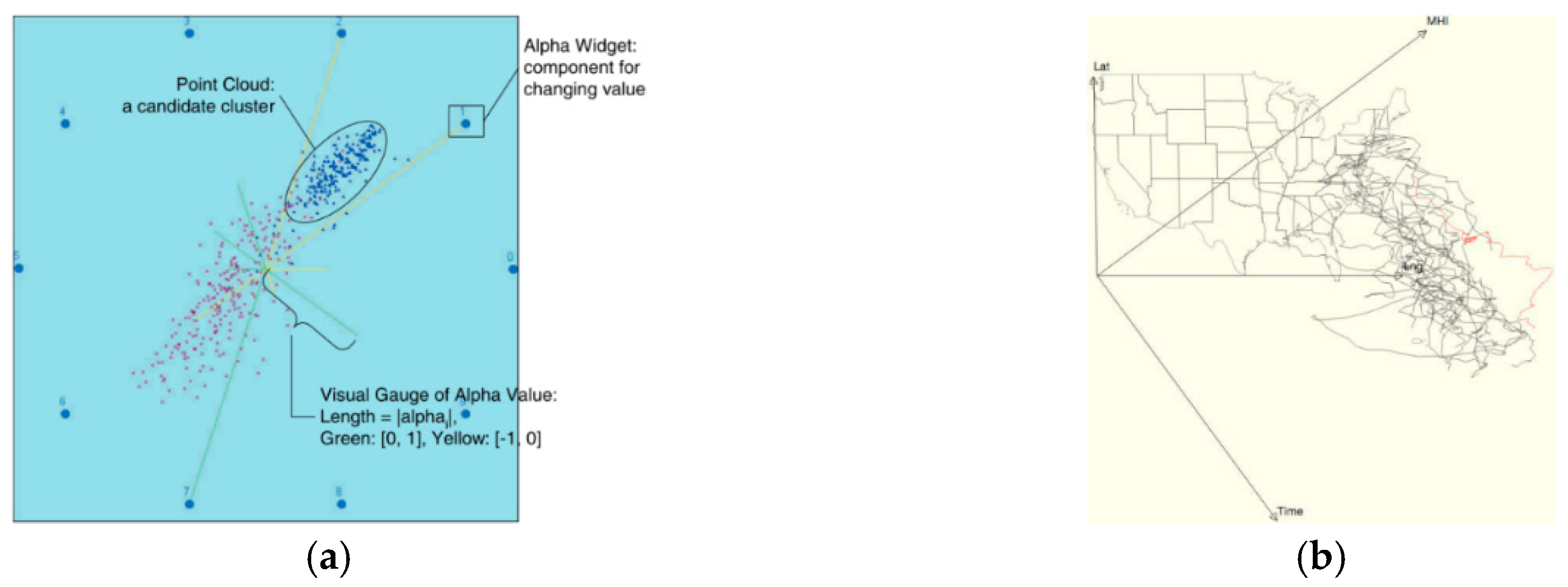
- Kandogan, E. Star coordinates: A multi-dimensional visualization technique with uniform treatment of dimensions. In Proceedings of the IEEE Information Visualization Symposium, Late Breaking Hot Topics, Durham, NC, USA, 19 October 1998; pp. 9–12. [Google Scholar]
- Cooprider, N.D.; Burton, R.P. Extension of star coordinates into three dimensions. In Proceedings of the Electronic Imaging 2007, San Jose, CA, USA, 29 January 2007; p. 10. [Google Scholar]
- Tan, S.C.; Tan, J. Lost in translation: The fundamental flaws in star coordinate visualizations. Procedia Comput. Sci. 2017, 108, 2308–2312. [Google Scholar] [CrossRef]
- Tan, S.C.; Tan, J. Blind spots in star coordinate visualization: Analysis and correction. Pattern Recognit. Lett. 2018, 106, 7–12. [Google Scholar] [CrossRef]
- Chen, K.; Liu, L. Vista: Validating and refining clusters via visualization. Inf. Vis. 2004, 3, 257–270. [Google Scholar] [CrossRef]
- Murray, P.; Forbes, A. Stretchplot: Interactive visualization of multi-dimensional trajectory data. In Proceedings of the 2014 IEEE Conference on Visual Analytics Science and Technology (VAST), Paris, France, 25–31 October 2014; pp. 261–262. [Google Scholar]
- Chen, K. Optimizing star-coordinate visualization models for effective interactive cluster exploration on big data. Intell. Data Anal. 2014, 18, 117–136. [Google Scholar] [CrossRef]
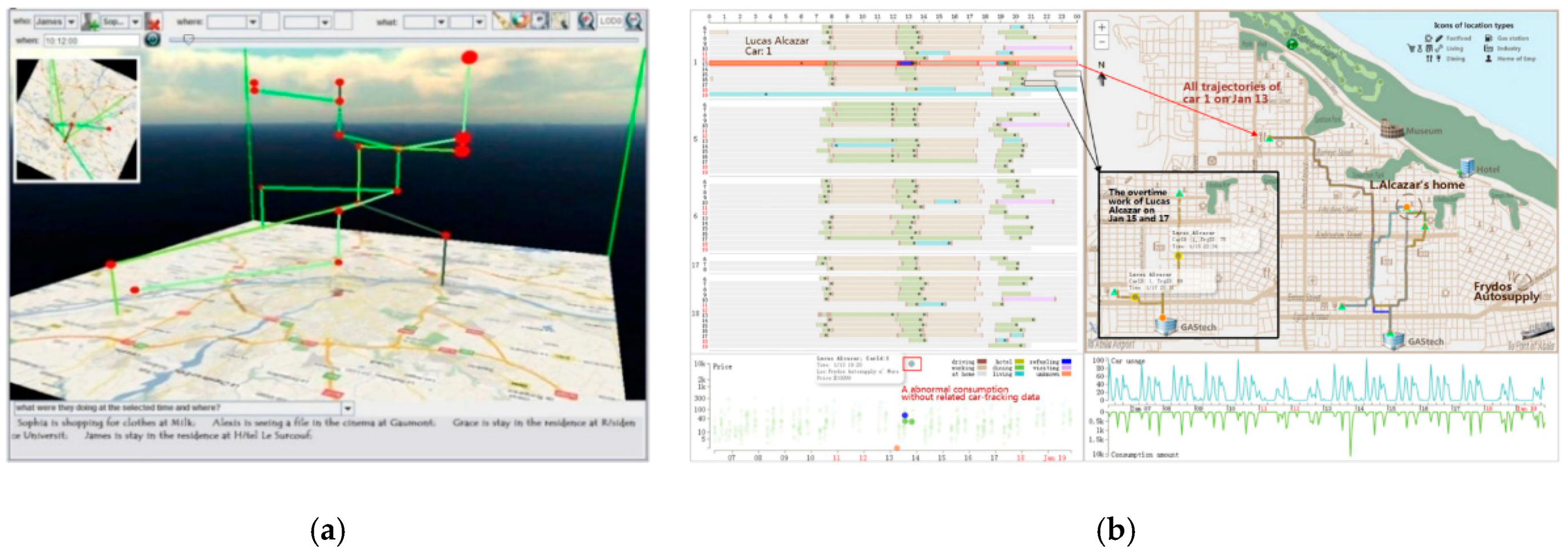
- Zhao, Y.; Peng, Y.; Huang, W.; Li, Y.; Zhou, F.; Liao, Z.; Zhang, K. A collaborative visual analytics of trajectory and transaction data for digital forensics: Vast 2014 mini-challenge 2: Award for outstanding visualization and analysis. In Proceedings of the 2014 IEEE Conference on Visual Analytics Science and Technology (VAST), Paris, France, 25–31 October 2014; pp. 371–372. [Google Scholar]
- Ferreira, N.; Klosowski, J.T.; Scheidegger, C.E.; Silva, C.T. Vector field k-means: Clustering trajectories by fitting multiple vector fields. In Proceedings of the 15th Eurographics Conference on Visualization, Leipzig, Germany, 17–21 June 2013; pp. 201–210. [Google Scholar]
- Enriquez, M.; Kurcz, C. A simple and robust flow detection algorithm based on spectral clustering. In Proceedings of the International Conference on Research in Air Transportation, Berkeley, CA, USA, 22–25 May 2012. [Google Scholar]
- Salaun, E.; Gariel, M.; Vela, A.E.; Feron, E. Aircraft proximity maps based on data-driven flow modeling. J. Guid. Control. Dyn. 2012, 35, 563–577. [Google Scholar] [CrossRef]
- Andrienko, G.; Andrienko, N.; Fuchs, G.; Garcia, J.M.C. Clustering trajectories by relevant parts for air traffic analysis. IEEE Trans. Vis. Comput. Graph. 2018, 24, 34–44. [Google Scholar] [CrossRef]
- Rinzivillo, S.; Pedreschi, D.; Nanni, M.; Giannotti, F.; Andrienko, N.; Andrienko, G. Visually driven analysis of movement data by progressive clustering. Inf. Vis. 2008, 7, 225–239. [Google Scholar] [CrossRef]
- Ramos, A.M.; Sprenger, M.; Wernli, H.; Durán-Quesada, A.M.; Lorenzo, M.N.; Gimeno, L. A new circulation type classification based upon lagrangian air trajectories. Front. Earth Sci. 2014, 2. [Google Scholar] [CrossRef]
- Wu, X. Marker Clusterer. Available online: https://github.com/googlemaps/js-marker-clusterer (accessed on 25 October 2018).
- Hurter, C.; Ersoy, O.; Telea, A. Graph bundling by kernel density estimation. Comput. Graph. Forum 2012, 31, 865–874. [Google Scholar] [CrossRef]
- Holten, D.; Van Wijk, J.J. Force-directed edge bundling for graph visualization. Comput. Graph. Forum 2009, 28, 983–990. [Google Scholar] [CrossRef]
- Ersoy, O.; Hurter, C.; Paulovich, F.; Cantareiro, G.; Telea, A. Skeleton-based edge bundling for graph visualization. IEEE Trans. Vis. Comput. Graph. 2011, 17, 2364–2373. [Google Scholar] [CrossRef] [PubMed]
- Lambert, A.; Bourqui, R.; Auber, D. Winding roads: Routing edges into bundles. Comput. Graph. Forum 2010, 29, 853–862. [Google Scholar] [CrossRef]
- Cui, W.; Zhou, H.; Qu, H.; Wong, P.C.; Li, X. Geometry-based edge clustering for graph visualization. IEEE Trans. Vis. Comput. Graph. 2008, 14, 1277–1284. [Google Scholar] [CrossRef] [PubMed]
- Hurter, C.; Ersoy, O.; Telea, A. Smooth bundling of large streaming and sequence graphs. In Proceedings of the 2013 IEEE Pacific Visualization Symposium (PacificVis), Sydney, Australia, 27 February–1 March 2013; pp. 41–48. [Google Scholar]
- Klein, T.; van der Zwan, M.; Telea, A. Dynamic multiscale visualization of flight data. In Proceedings of the 2014 International Conference on Computer Vision Theory and Applications (VISAPP), Lisbon, Portugal, 5–8 January 2014; pp. 104–114. [Google Scholar]
- Hurter, C.; Conversy, S.; Gianazza, D.; Telea, A.C. Interactive image-based information visualization for aircraft trajectory analysis. Transp. Res. Part C 2014, 47, 207–227. [Google Scholar] [CrossRef]
- Landesberger, T.V.; Brodkorb, F.; Roskosch, P.; Andrienko, N.; Andrienko, G.; Kerren, A. Mobilitygraphs: Visual analysis of mass mobility dynamics via spatio-temporal graphs and clustering. IEEE Trans. Vis. Comput. Graph. 2016, 22, 11–20. [Google Scholar] [CrossRef] [PubMed]
- Jarrell, S.B. Basic Statistics (Special pre-publication ed.); Wm. C. Brown Pub: Dubuque, Iowa, 1994. [Google Scholar]
- Elmqvist, N.; Dragicevic, P.; Fekete, J.D. Rolling the dice: Multidimensional visual exploration using scatterplot matrix navigation. IEEE Trans. Vis. Comput. Graph. 2008, 14, 1148–1539. [Google Scholar] [CrossRef] [PubMed]
- Ahlberg, C.; Shneiderman, B. Visual information seeking: Tight coupling of dynamic query filters with starfield displays. In Proceedings of the SIGCHI Conference on Human Factors in Computing Systems, Boston, MA, USA, 24–28 April 1994; pp. 313–317. [Google Scholar]
- Microsoft Office Online: Present Your Data in a Bubble Chart. Available online: https://support.office.com/en-us/article/present-your-data-in-a-bubble-chart-424d7bda-93e8-4983-9b51-c766f3e330d9 (accessed on 16 August 2015).
- Zhang, H.-X.; Sheng, F.-F.; Xu, P.-Y.; Tang, Y. Visualizing user characteristics based on mobile device log data. Ruan Jian Xue Bao/J. Softw. 2016, 27, 1174–1187. [Google Scholar]
- Wang, W.B.; Huang, M.L.; Nguyen, Q.V.; Huang, W.; Zhang, K.; Huang, T.-H. Enabling decision trend analysis with interactive scatter plot matrices visualization. J. Vis. Lang. Comput. 2016, 33, 13–23. [Google Scholar] [CrossRef]
- Chen, H.; Engle, S.; Joshi, A.; Ragan, E.D.; Yuksel, B.F.; Harrison, L. Using animation to alleviate overdraw in multiclass scatterplot matrices. In Proceedings of the 2018 CHI Conference on Human Factors in Computing Systems, Montreal, QC, Canada, 21–26 April 2018; pp. 1–12. [Google Scholar]
- Tobler, W.R. A model of geographical movement. Geogr. Anal. 1981, 13, 1–20. [Google Scholar] [CrossRef]
- Doantam, P.; Ling, X.; Yeh, R.; Hanrahan, P. Flow map layout. In Proceedings of the IEEE Symposium on Information Visualization (INFOVIS 2005), Minneapolis, MN, USA, 23–25 October 2005; pp. 219–224. [Google Scholar]
- Selassie, D.; Heller, B.; Heer, J. Divided edge bundling for directional network data. IEEE Trans. Vis. Comput. Graph. 2011, 17, 2354–2363. [Google Scholar] [CrossRef] [PubMed]
- Guo, D.; Zhu, X. Origin-destination flow data smoothing and mapping. IEEE Trans. Vis. Comput. Graph. 2014, 20, 2043–2052. [Google Scholar] [CrossRef] [PubMed]
- Andrienko, G.; Andrienko, N.; Fuchs, G.; Wood, J. Revealing patterns and trends of mass mobility through spatial and temporal abstraction of origin-destination movement data. IEEE Trans. Vis. Comput. Graph. 2017, 23, 2120–2136. [Google Scholar] [CrossRef] [PubMed]
- Guo, D. Visual analytics of spatial interaction patterns for pandemic decision support. Int. J. Geogr. Inf. Sci. 2007, 21, 859–877. [Google Scholar] [CrossRef]
- Wood, J.; Dykes, J.; Slingsby, A. Visualisation of origins, destinations and flows with od maps. Cartogr. J. 2010, 47, 117–129. [Google Scholar] [CrossRef]
- Yan, J.; Thill, J.-C. Visual data mining in spatial interaction analysis with self-organizing maps. Environ. Plan. B Plan. Des. 2009, 36, 466–486. [Google Scholar] [CrossRef]
- Voorhees, A.M. A general theory of traffic movement. Transportation 2013, 40, 1105–1116. [Google Scholar] [CrossRef]
- Zeng, W.; Fu, C.W.; Müller Arisona, S.; Erath, A.; Qu, H. Visualizing waypoints-constrained origin-destination patterns for massive transportation data. Comput. Graph. Forum 2015, 35, 95–107. [Google Scholar] [CrossRef]
- Lu, M.; Liang, J.; Wang, Z.; Yuan, X. Exploring od patterns of interested region based on taxi trajectories. J. Vis. 2016, 19, 811–821. [Google Scholar] [CrossRef]
- Andrienko, G.; Andrienko, N. Spatio-temporal aggregation for visual analysis of movements. In Proceedings of the 2008 IEEE Symposium on Visual Analytics Science and Technology, Columbus, OH, USA, 19–24 October 2008; pp. 51–58. [Google Scholar]
- Wilkinson, L.; Friendly, M. The history of the cluster heat map. Am. Stat. 2009, 63, 179–184. [Google Scholar] [CrossRef]
- Slingsby, A.; Kelly, M.; Dykes, J.; Wood, J. Od maps for studying historical internal migration in ireland. In Proceedings of the IEEE Conference on Information Visualization (InfoVis), Seattle, WA, USA, 14–19 October 2012. [Google Scholar]
- Kim, S.; Jeong, S.; Woo, I.; Jang, Y.; Maciejewski, R.; Ebert, D.S. Data flow analysis and visualization for spatiotemporal statistical data without trajectory information. IEEE Trans. Vis. Comput. Graph. 2018, 24, 1287–1300. [Google Scholar] [CrossRef]
- Fuchs, R.; Hauser, H. Visualization of multi-variate scientific data. Comput. Graph. Forum 2009, 28, 1670–1690. [Google Scholar] [CrossRef]
- Post, F.H.; Vrolijk, B.; Hauser, H.; Laramee, R.S.; Doleisch, H. The state of the art in flow visualisation: Feature extraction and tracking. Comput. Graph. Forum 2010, 22, 775–792. [Google Scholar] [CrossRef]
- Zou, Y.; Chen, Y.; He, J.; Pang, G.; Zhang, K. 4d time density of trajectories: Discovering spatiotemporal patterns in movement data. Int. J. Geo-Inf. 2018, 7, 212. [Google Scholar] [CrossRef]
- Kjellin, A.; Pettersson, L.W.; Seipel, S.; Lind, M. Evaluating 2d and 3d visualizations of spatiotemporal information. ACM Trans. Appl. Percept. 2008, 7, 1–23. [Google Scholar] [CrossRef]
- Yang, J.; Ward, M.O.; Rundensteiner, E.A. Interring: An interactive tool for visually navigating and manipulating hierarchical structures. In Proceedings of the IEEE Symposium on Information Visualization (InfoVis’02); IEEE Computer Society: Washington, DC, USA, 2002; p. 77. [Google Scholar]
- Theisel, H. Higher order parallel coordinates. In Proceedings of the 2000 Conference on Vision Modeling and Visualization, Saarbrücken, Germany, 22–24 November 2000; pp. 415–420. [Google Scholar]
- Li, J.; Martens, J.-B.; van Wijk, J.J. Judging correlation from scatterplots and parallel coordinate plots. Inf. Vis. 2010, 9, 13–30. [Google Scholar] [CrossRef]
- Hoffman, P.; Grinstein, G.; Marx, K.; Grosse, I.; Stanley, E. DNA visual and analytic data mining. In Proceedings of the 8th conference on Visualization ’97, Phoenix, AZ, USA, 24 October 1997; pp. 437–441. [Google Scholar]
- Hoffman, P.E. Table Visualizations: A Formal Model and its Applications. Ph.D. Thesis, University of Massachusetts Lowell, Lowell, MA, USA, 2000. [Google Scholar]
- Kandogan, E. Visualizing multi-dimensional clusters, trends, and outliers using star coordinates. In Proceedings of the ACM SIGKDD International Conference on Knowledge Discovery and Data Mining, San Francisco, CA, USA, 26–29 August 2001; pp. 107–116. [Google Scholar]
- Chen, K.; Liu, L. Ivibrate: Interactive visualization-based framework for clustering large datasets. ACM Trans. Inf. Syst. 2006, 24, 245–294. [Google Scholar] [CrossRef]
- Zheng, Y. Methodologies for cross-domain data fusion: An overview. IEEE Trans. Big Data 2015, 1, 16–34. [Google Scholar] [CrossRef]
- Labrinidis, A.; Jagadish, H.V. Challenges and opportunities with big data. Proc. VLDB Endow 2012, 5, 2032–2033. [Google Scholar] [CrossRef]


| Icons | Semantics | Word Clouds | |
|---|---|---|---|
| Strengths | Intuitive; Special-dimensional attributes; Rich configuration | Detailed display; No occlusions; Legibility | Strong highlighting; Stylish and novel; Enrichment |
| Weaknesses | High occlusion probability; Inadequate adaptability; Implicit deviation | Multiple implementations; Memory dependency; Combined implementations | Low resolution; More display space occupied; Inherent deviation |
| Space–time Cube | Stacking | Density Map | Heatmap | Meshing | Time Series | Transformation | |
|---|---|---|---|---|---|---|---|
| Strengths | Match the temporal information; 3D rendering; Query and integration | Attribute extension; 3D rendering; Avoid cluttering | Broad visual space; Cluster detection; Avoid overlapping | Broad visual space; Cluster detection; Avoid overlapping | Structural features; Privacy protection; Highlighted correlation | Intuitive results; Quick interpretation; Striking contrast | Trajectory-set behaviors; Individual trajectory behaviors; Behavior comparison |
| Weaknesses | Ignored branch time; Spatial limitation; Combined implementation | Comparative issue; Poor temporal scalability; Object constraint | Separate rendering; Comparative issue; Cannot interpret the exact values | Separate rendering; Comparative issue; Over-binning | Complex algorithm; Poor data persuasiveness; Attribute constraint | More display space occupied; Strict data limitation; Comparative issue | Combined implementation; Poor scalability; Insufficient information |
| Dimensionality Reduction | Projection | Hierarchy | Pixmaps | Parallel Coordinates | Radial Graph | |
|---|---|---|---|---|---|---|
| Strengths | Algorithms of simplicity and diversity; Excellent perceptible effect; Revivable | Intuitive; No occlusions; Good rendering performance | Continuity; Spatial efficiency; Anomaly detection | Correlation mining; Comparison and extraction; Healthy scalability | Flexible configuration; Scalability; Unlimited variables | Periodic; Distributional-balance detection; Scalability |
| Weaknesses | Poor semantics; Weakened user contexts; Information loss | Combined implementation; Distortion; Discrete | Cluttering risks; Obscure to understand; Strict data limitation | Dense visual display; Over-plotting risks; Subject to resolution | Restricted correlation display; No spatial patterns involved; Upper dimensionality limit | Low spatial efficiency; Poor decision making; Combined implementation |
| Clustering | Scatter Plot | Spatial View-based Flow Visualization | Non-spatial View-based Flow Visualization | |
|---|---|---|---|---|
| Strengths | Quantitative analysis; Massive data supported; Global statistics and display | Selecting behaviors; Filtering behaviors; Cluster detection | Clear spatiotemporal features; Intuitive results; Quick interpretation | Avoid occlusion; No deviation; Privacy protection |
| Weaknesses | Combined implementation; Restricted attributes; Individual rendering | Non-progressive process; Visual cluttering; Individual rendering | More display space occupied; Visual burden; Comparative issue | Complicated perception; Poor overview; Combined rendering |
© 2019 by the authors. Licensee MDPI, Basel, Switzerland. This article is an open access article distributed under the terms and conditions of the Creative Commons Attribution (CC BY) license (http://creativecommons.org/licenses/by/4.0/).
Share and Cite
He, J.; Chen, H.; Chen, Y.; Tang, X.; Zou, Y. Diverse Visualization Techniques and Methods of Moving-Object-Trajectory Data: A Review. ISPRS Int. J. Geo-Inf. 2019, 8, 63. https://doi.org/10.3390/ijgi8020063
He J, Chen H, Chen Y, Tang X, Zou Y. Diverse Visualization Techniques and Methods of Moving-Object-Trajectory Data: A Review. ISPRS International Journal of Geo-Information. 2019; 8(2):63. https://doi.org/10.3390/ijgi8020063
Chicago/Turabian StyleHe, Jing, Haonan Chen, Yijin Chen, Xinming Tang, and Yebin Zou. 2019. "Diverse Visualization Techniques and Methods of Moving-Object-Trajectory Data: A Review" ISPRS International Journal of Geo-Information 8, no. 2: 63. https://doi.org/10.3390/ijgi8020063
APA StyleHe, J., Chen, H., Chen, Y., Tang, X., & Zou, Y. (2019). Diverse Visualization Techniques and Methods of Moving-Object-Trajectory Data: A Review. ISPRS International Journal of Geo-Information, 8(2), 63. https://doi.org/10.3390/ijgi8020063