Article

Climate Change Maps for the Atlas of Switzerland

by
Luca Gaia
*,
Andreas Neumann
and
Lorenz Hurni
Institute of Cartography and Geoinformation, Swiss Federal Institute of Technology Zurich (ETH), 8093 Zurich, Switzerland
*
Author to whom correspondence should be addressed.
ISPRS Int. J. Geo-Inf. 2025, 14(3), 99; https://doi.org/10.3390/ijgi14030099
Submission received: 27 December 2024 / Revised: 17 February 2025 / Accepted: 20 February 2025 / Published: 22 February 2025

Abstract

:
Climate change has global consequences, and Switzerland is no exception. The communication of climate change poses various challenges, and maps are often part of this process. This work presents three maps illustrating the impacts of climate change, developed for the Atlas of Switzerland (AoS), an interactive digital national atlas. The aim is to make climate change impacts understandable and visible. Three different indicators of climate change were visualized: the rise of the zero degree line, the evolution of glacial lakes, and changes in the flowering dates of plants. Various approaches were employed that leverage the strengths of the AoS, including temporal navigation, interactivity, 3D data visualizations, and map combinations. The feasibility of these visualizations are demonstrated through the presented maps and analysis of key considerations for their creation. We believe these map types should be included in national atlases and can contribute to the achievement of Sustainable Development Goal 13: “Climate Action”. Further research is needed to assess the effectiveness and user understandability of the proposed maps.

1. Introduction

1.1. Climate Change

Global surface temperature in the period 2011–2020 has risen by approximately 1.1 °C compared to the pre-industrial period of 1850–1900, driven primarily by greenhouse gas emissions from human activities, and has shown a notable acceleration since 1970, as was reported by the IPCC [1]. Climate change impacts natural systems and human societies, as evidenced, for example, by a rise in global mean sea level, an increased frequency of extreme events such as heatwaves and droughts, or adverse effects on food security. In the future, a continued increase in greenhouse gas emissions will drive further global warming. In accordance with IPCC projections based on different emission scenarios, compared to the pre-industrial period, global temperatures are expected to increase by 1.4 °C until the period 2081–2100 under an optimistic very low greenhouse gas emissions scenario and could rise as much as 4.4 °C under a scenario with very high emissions. Urgent action is required to limit the impacts of climate change.
Switzerland is experiencing significant impacts from climate change, including a 1.5 °C increase in average temperature between the periods 1864–1900 and 1981–2010, a 60% loss in glacier volume relative to the 1850s, a 50% reduction in snowfall days at elevations below 800 m since the 1970s, and an extension of the vegetation period by two to four weeks since the 1960s [2].

1.2. Maps and Climate Change

The communication of climate change presents several significant challenges. These include the extreme complexity of the topic itself, the invisibility of the primary cause of climate change—greenhouse gas emissions—the temporal and geographical distance of the consequences of climate change, and the difficulty in perceiving the benefits of taking action to mitigate climate change [3]. For a layperson, climate change can be particularly challenging to comprehend, making it essential to use simple and clear communication [3]. Visual communication plays an important role in this process [4], graphics are also used [5], and maps are considered a key communication tool [6,7]. Climate change has a geographical component, which makes this topic particularly well-suited to be represented on maps [6,8]. In the climate change discussion, maps are employed to enhance awareness among the general public, communicate research findings by the scientific community, and support policymakers in making decisions on climate action [7].
Various aspects of the use of maps in climate change communication have already been investigated. Given the importance of the topic and the need for effective communication, the quality of climate change maps has been assessed based, i.e., on a map from the 2007 IPCC report [7]. Considering the maps in media, the content of maps used in American media during the climate change debate was investigated by Fish, focusing on cartographic design decisions and the elements that make a vivid map [6,9]. She also highlighted the importance of making climate change more tangible through maps [6]. Fish and Kreitzberg [10] analyzed the role of maps in conservative media in the United States, with a focus on the misuse of maps. They give guidelines for map creation to reduce the risk of such misuse and demonstrate that conservative media utilize maps significantly less than other media. Tsang [11] examined the impact of cartographic representation on the perception of media bias in climate change communication: he compared the effects of animated versus static maps and single versus double maps. Becsi et al. [12] examine the design principles of climate change impact maps for policymakers in Austria, drawing on participatory studies. Their findings highlight the importance of avoiding an excessive amount of information in map design and of visualizing uncertainties, despite the fact that the audience may not always understand the information correctly. Continuing with the topic of uncertainties, Kaye et al. [13] provide an overview of various techniques for visualizing climate variables and their associated uncertainties on maps. They place particular emphasis on the use of color and provide general guidelines. Maps related to climate change can also be found on social media. Liu et al. [14] conducted a user study to investigate the role of maps in social media posts, demonstrating that the inclusion of maps enhances the credibility of the posts. Considering 3D visualizations more specifically, there are already examples of 3D landscape visualizations showing the effects of climate change [15]. One such example is a visualization that illustrates areas above and below an altitude with reliable snow coverage in the future and the ski slopes in the region of Entlebuch (Switzerland) [16]. Furthermore, other forms of climate change data visualization are available online. For example, in the IPCC’s interactive data viewer [17], users can visualize past values of various climate variables and projected future values based on different models and scenarios, or the Climate Atlas of Canada [18], which employs an interactive map and multimedia elements to illustrate the impacts of climate change across Canada.

1.3. Atlases, Sustainable Development Goals, and Climate Change

The Atlas of Switzerland (AoS), the official national atlas of Switzerland, was initiated in 1961 by a resolution of the Federal Council. The Institute of Cartography and Geoinformation at ETH Zurich is responsible for the publication. The printed version of the atlas was released in 13 separate deliveries between 1965 and 1997, comprising more than 600 maps [19]. In 2000, the first version of a digital and interactive atlas was launched, offering 2D and 3D visualizations. Over the following years, new versions were developed. The current version is a desktop application [20] based on an interactive virtual 3D globe, allowing for the visualization of interactive 2D and 3D maps. Currently, the atlas includes over 400 maps covering various topics. The Atlas is intended for a broad audience, and the topics should also be easily understandable by non-experts.
The focus of national atlases, which was initially to highlight the strengths and splendor of a nation, has now shifted to also visualizing various socio-cultural phenomena [21] by focusing on the needs of humans rather than those of the country [19]. In the printed version of the Atlas of Switzerland, the subject of climate was represented with four pages and 18 visualizations. These visualizations focused solely on describing various characteristics of Switzerland’s climate, with no connection to climate change or its impacts.
A parallel publication, the printed Climatological Atlas of Switzerland [22] (not directly related to the AoS), contains maps and diagrams describing the climate in Switzerland. This atlas explains the limited number of climate maps in the printed AoS. The Climatological Atlas presents factual data, with some comparisons (not in map form) of past climate conditions. However, it does not include any future projected values. This atlas was published between 1982 and 2000 [23].
Nowadays, with climate change becoming an increasingly important topic, maps addressing this issue are also featured in national atlases. For example, the National Atlas of Hungary [24], a print publication, includes visualizations related to climate change, such as projections of expected temperature and precipitation changes. These maps incorporate historical data and future projections, aiming to raise awareness of the impacts of climate change within the country.
In 2015, the United Nations established 17 Sustainable Development Goals (SDGs) to enhance global well-being by 2030, with goal 13 (Climate Action) specifically focused on addressing climate change [25]. As highlighted by Kent et al. [26], cartography can contribute to achieving these goals by using maps to raise awareness of the issues and effectively communicate spatial information. The important role of cartography in advancing the SDGs is also highlighted by a joint publication [8] by the International Cartography Association (ICA) and the United Nations, which outlines key considerations for the maps creation that support sustainable development goals.

1.4. Goal

The goal of this work is to present three maps developed for the Atlas of Switzerland, aiming to make the effects of climate change more comprehensible and visible. We visualized three different indicators of climate change (zero degree line, glacial lakes, and flowering dates) using various approaches, leveraging the strengths of the Atlas of Switzerland, such as temporal navigation, interactivity, 3D data visualizations, and map combinations.
The focus of this paper is mainly on the map of the zero degree line; for this map, the methodology, the results, and the discussion are particularly in-depth. The remaining two maps, glacial lakes and plant phenology, merely scratch the surface of the subject matter, offering only a few general considerations to illustrate alternative approaches. In the discussion, key aspects are presented that should be considered when working with maps that show the effects of climate change.
This article is a revised and expanded version of a paper entitled Cartographic visualization of the effects of climate change: a practical application for the Atlas of Switzerland [27], which was presented at the EuroCarto conference in Vienna in September 2024. The final maps can be found in the current version of the AoS [20].

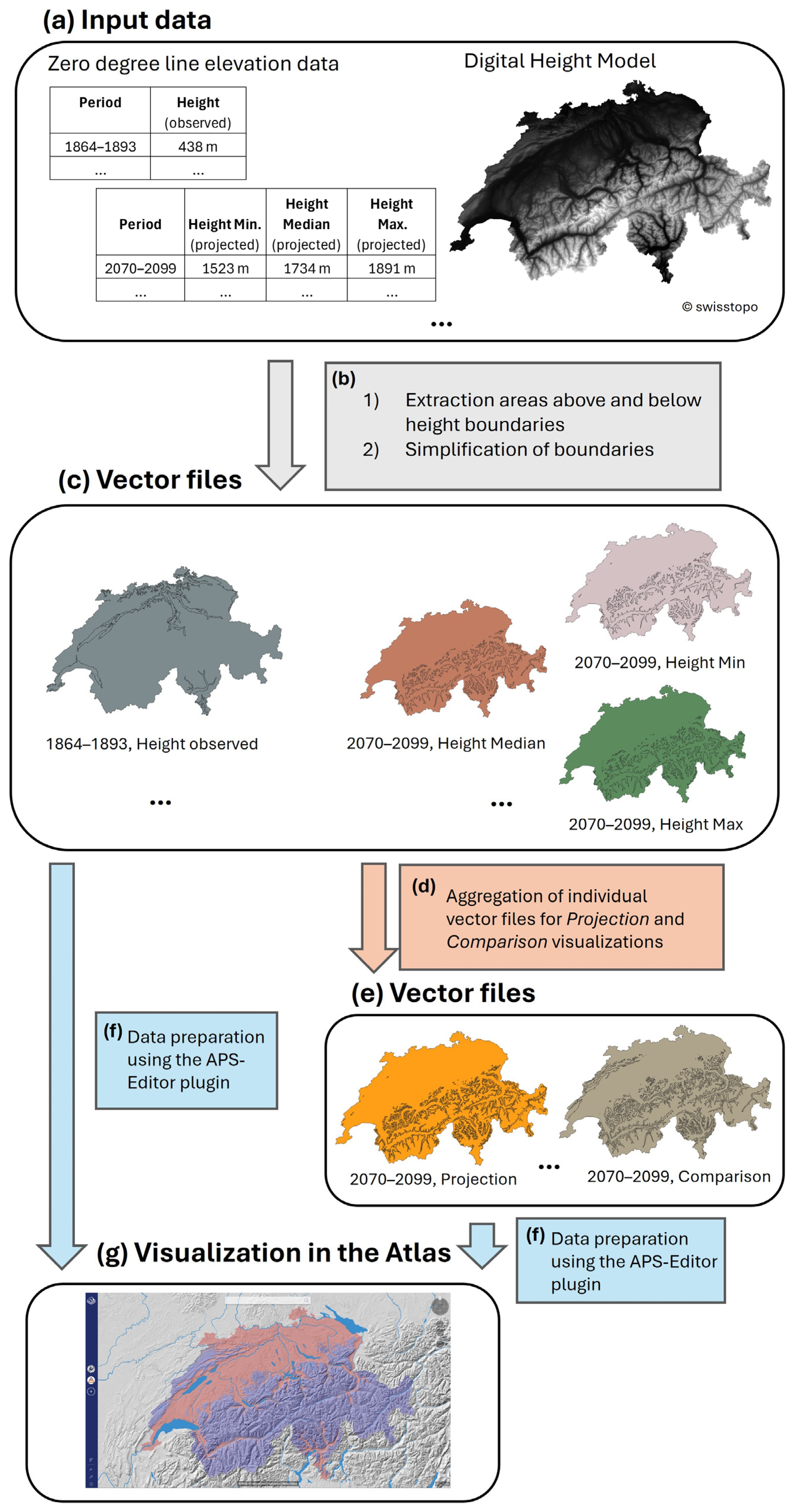
2. Materials and Methods

2.1. Zero Degree Line Map

This map is based on two primary datasets: elevation data for Switzerland and data on the altitude of the zero degree line at different time stamps. The height data are represented by a Digital Height Model (DHM) provided by Swisstopo [28] with a spatial resolution of 25 m, whereas MeteoSwiss (the Swiss meteorological and climatological national service) provides zero degree line data. The zero degree line is an isotherm connecting points with a temperature of 0°C and can also be interpreted as the elevation above sea level where this temperature occurs [29]. The zero degree line data include values based on historical observations and future climate projections. Each value consists of an elevation (e.g., 1525 m above sea level) representing the altitude at which the average temperature is expected to be 0°C in winter (considering the months December, January, and February) or in summer (considering the months June, July, and August).
The historical values of the zero degree line provided for this work were calculated based on past temperature values derived from observations taken at measurement stations. Based on these values, 30-year average values of the zero degree line from 1864 to 2017, considering the entire of Switzerland, were computed [30] and provided for this work by MeteoSwiss.
The projected future values of the zero degree line are based on simulations considering the period from 1981 to 2099, for the details, see [30]. These projections have been calculated using climate models that simulate temperature changes under two distinct greenhouse gas emissions scenarios [30]. The low emissions scenario assumes that substantial mitigation efforts will be made to limit greenhouse gas emissions. In contrast, the high emissions scenario assumes that there will be continued increases in greenhouse gas emissions and no mitigation efforts [2].
For each scenario, a median value is calculated, representing the central estimate, as well as an uncertainty range defined by an upper and lower boundary [2,30]. The upper boundary is defined as the second highest value of the models’ simulations, and the lower boundary as the second lowest value of the models’ simulations [2,30]. Based on the projected temperature values, the elevation of the zero degree line is calculated as described in [30]. The resulting data are averages over 30-year periods across the entire country of Switzerland for the median value, the upper boundary, and the lower boundary of the elevation of the zero degree line. MeteoSwiss provided these data. The boundaries give a range within which the zero degree line may vary, reflecting model uncertainty in future temperature trends. For the sake of simplicity, the upper boundary will be referred to as the maximum throughout this work, and the lower boundary as the minimum. Table 1 presents an example of the data provided for this work.
The data processing consists of basics GIS operations conducted using Python (version 3.9.13), GDAL (version 3.0.2) [31] and Mapshaper (version 0.6.59) [32]. Vector files are generated for each period of interest, containing polygons representing areas below or above specified elevation boundaries.
The process begins with the DHM in raster format, whereby regions that meet the defined elevation constraints are vectorized into polygons. In the case of observed data, the value of the zero degree line serves as the elevation boundary, resulting in the generation of one vector file for each time period. In the case of projected data, three vector files are created for each time period. One with the minimum value as a height boundary, one with the median value as a boundary, and one with the maximum value as a boundary. The process is repeated independently for each period of interest, for summer and winter, and (for the projections) for each scenario. The results are vector files comprising two polygon classes: those below the elevation boundary and those above it. In order to enhance map readability, areas below a defined size threshold are assigned to the other class to eliminate regions too small for effective visualization. Furthermore, Mapshaper [32] is applied to simplify the polygons. This tool enables the simplification of geometries by preventing polygons from disappearing. The Visvalingam algorithm [32,33] is used and 30% of the removable vertices are retained. See steps a, b and c in Figure 1.
For the projections, the individual vector files are aggregated into a single vector file containing three distinct areas: regions that fall below the minimum height value, regions that fall between the minimum and maximum height values, and regions that fall above the maximum value. This aggregation is conducted separately for each period, for both scenarios, and for the winter and summer datasets. See steps d and e in Figure 1.
To create specific visualizations (the so-called Comparisons), the individual vector files of the projections with the median height as the height boundary and considering the two different scenarios within the same period are combined in a single file. This approach is applied for the periods 2040–2069 and 2070–2099, separately for winter and summer. See steps d and e in Figure 1.
Once the steps mentioned above have been completed, vector files comprising polygons that represent areas situated above or below the specified elevation boundaries are prepared for visualization in the Atlas of Switzerland. This is done using the APS-Editor plugin [34], a Python QGIS plugin that serves as an editorial system. It enables the conversion of common geodata files into formats compatible with the AoS, as well as the definition of map and layer structures, associated styles, and additional parameters such as tiling settings for each layer. The plugin was developed specifically for the AoS and is not publicly available. See steps f in Figure 1.
The map is composed of 28 layers. For observed data from the past, the layers display areas below and above the zero degree line for both winter and summer across the following periods: 1864–1893, 1885–1914, 1910–1939, 1935–1964, 1960–1989, and 1985–2014 (defined as Observations). For projected future values, the layers illustrate areas below the minimal projected height, areas between the minimal and maximal projected heights (which is an uncertainty range), and areas above the maximal projected height for both summer and winter. The periods 2010–2039, 2040–2069, and 2070–2099 are covered, and the two distinct scenarios are considered separately (these data are defined as Projections).
For the comparison of future consequences of the two different scenarios, the layer illustrates areas below the median value based on a high emission scenario, areas between this median value and the median value for a low emission scenario, and areas above the latter value. These comparisons are made for the periods 2040–2069 and 2070–2099, considering both summer and winter (these data are defined as Comparisons).
The layers are organized into six thematic groups: observations, projections, and comparisons for both summer and winter. The areas situated above the zero degree line, which indicate temperatures below 0 °C, are colored in a bluish color, which is associated with colder temperatures. Conversely, the areas situated below the zero degree line, where temperatures are above 0 °C, are colored reddish, which corresponds to warmer temperatures. More neutral yellows are chosen for other aspects, like the areas showing uncertainties. An explanatory text accompanies the map, facilitating comprehension of the topic and map structure.
The temporal periods were selected to provide sufficient data to observe trends. In addition, the periods chosen should ideally cover the range from the beginning of the measurements to the last years of projected values, and the periods should be approximately equally distributed. Six periods are chosen for the observations. Three periods are selected for the projections, and two of the future periods are used for comparison. The period 2010–2039 is excluded from the comparison because, in this period, the median zero degree line elevation is higher in the high emissions scenario than in the low emissions scenario.

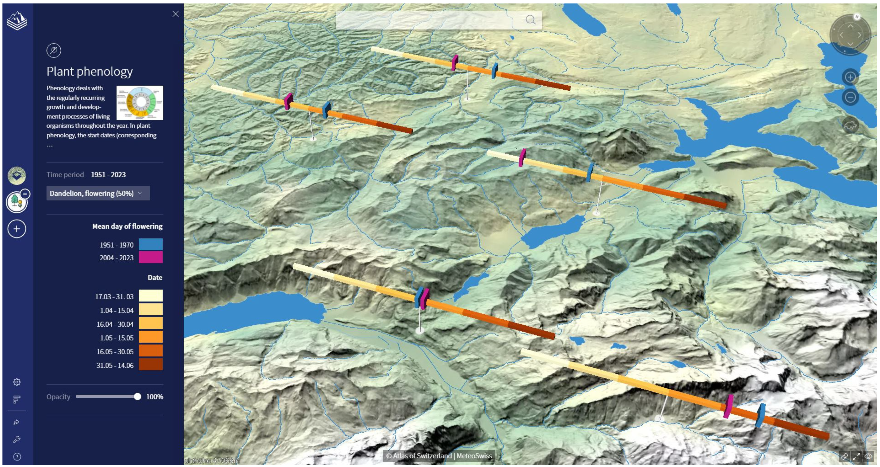
2.2. Plant Phenology Map

Phenology deals with recurring stages in the life cycles of plants and animals, influenced by environmental factors [35,36]. Plant phenology focuses on tracking specific growth stages of plants and documenting when these occur each year [37]. Phenology is affected by climate change [38]. For example, Meier et al. [39] indicated an advance in the date of the leaf unfolding for trees in Switzerland quantifiable in up to 3 days earlier per decade since 1985.
MeteoSwiss also provides data [40] for the map about plant phenology. These data consist of information about the measurement stations (i.e., altitude and coordinates) and phenological observations, namely the day of the year (DOY) when a phenological phase (i.e., the start of flowering) begins for different plant species. The observations cover the period 1951–2023. The following approach is applied to prepare the data for visualization: The dandelion is chosen because it occurs at all altitudes. The phenological observation used is the DOY for flowering, defined as the time when 50% of the flowers have bloomed. The selection of measurement stations is based on the following criteria: stations must have a sufficient number of observations for the periods 1951–1970 and 2004–2023, they should be well distributed over Switzerland, and stations that are too close to each other should be avoided, as this could create issues with the symbolization. The mean DOY for flowering in the two periods is computed for each selected station. The resulting dataset is prepared using the APS-Editor. We want to visualize changes in flowering dates between the two time periods at the same locations, working with a timeline representation. A custom-designed timeline was created since the APS-Editor has limited visualization capabilities and does not provide a default timeline option. This custom symbol resulted in a 3D representation of a timeline with the mean DOY for the two periods marked. On the map, the timelines are placed above the location of the measurement stations. The same procedure is also applied to the flower field daisy. The resulting map consists of two layers, allowing the user to choose whether to view the DOYs of the dandelion or the field daisy.

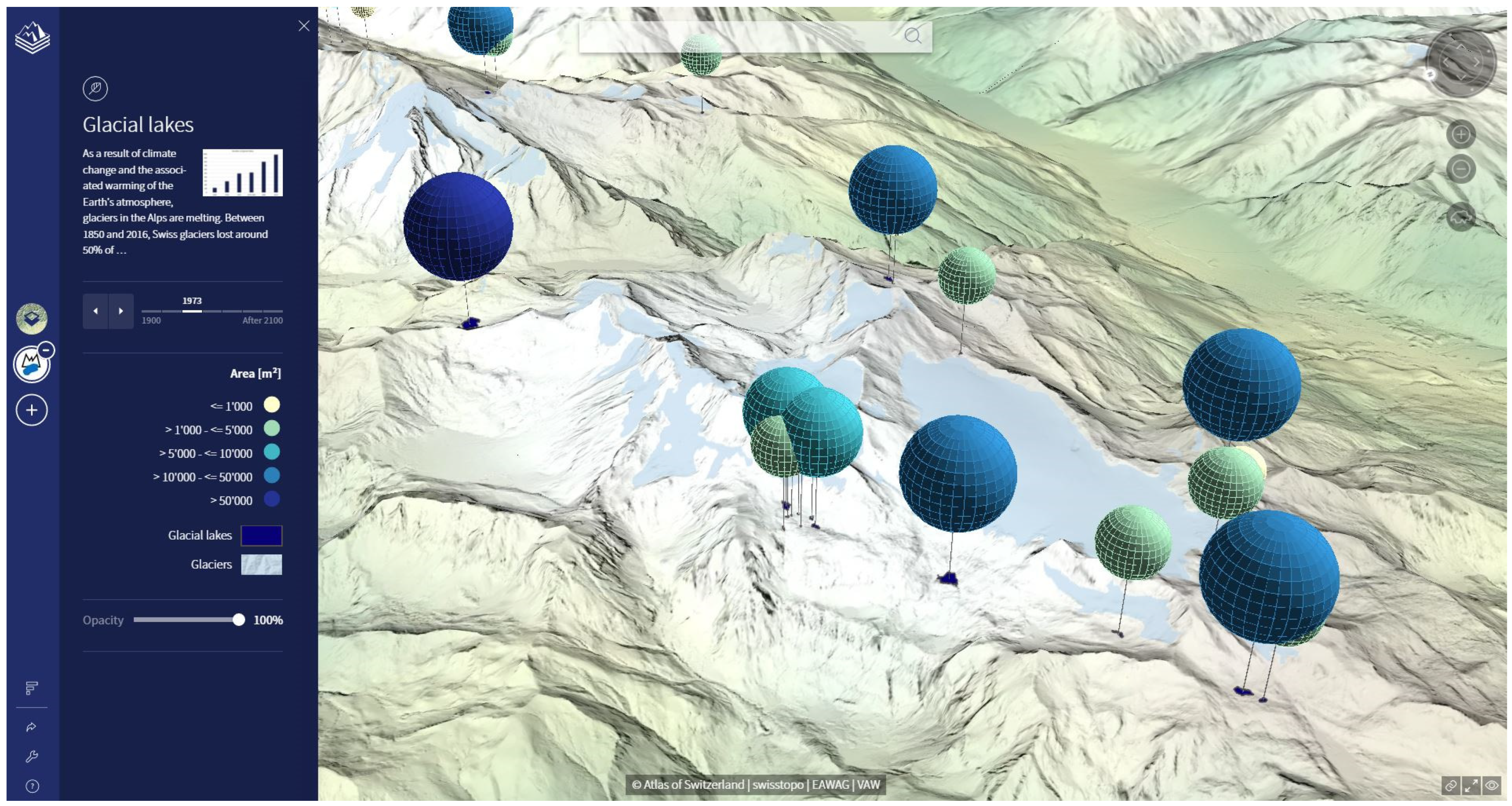
2.3. Glacial Lakes Map

Glaciers are also strongly affected by climate change. Glacial lakes, which are formed by melting glaciers, are used as an indicator of climate change. Agarwal et al. [41] reported an increase in the number and area of glacial lakes in the Himalayas between 1975 and 2017, while Zhang et al. [42] documented this trend on a global scale between 1990 and 2020. To illustrate the changes in Switzerland, the data used for the glacial lake map are based on the work of Mölg et al. [43] and Steffen et al. [44]. The first study provides data on the past development of glacial lakes at six different points in time (1900, 1946, 1973, 1979–1985, 2006, and 2016), while the second study provides data on possible future glacial lakes, which may appear if all glaciers in the Swiss Alps completely melt. For the visualization on the map, the shapes of the lakes are displayed on the terrain model. As many lakes are small and can be difficult to see from a distance, a 3D sphere is added above each lake to improve visibility, in addition to the shape on the terrain. The map consists of seven layers: six representing past periods and one showing the future situation. The user can select the desired layer using the temporal slider bar. To facilitate better comparison and understanding of the lake dimensions, the lakes are divided into five categories. The spheres are colored and scaled according to their category. A yellow-blue color palette is used for past observations, while an orange-red color palette is used for future data. In addition, the glaciers that existed in the first decade of the 2000s are also visualized on the map.

3. Results

3.1. Zero Degree Map

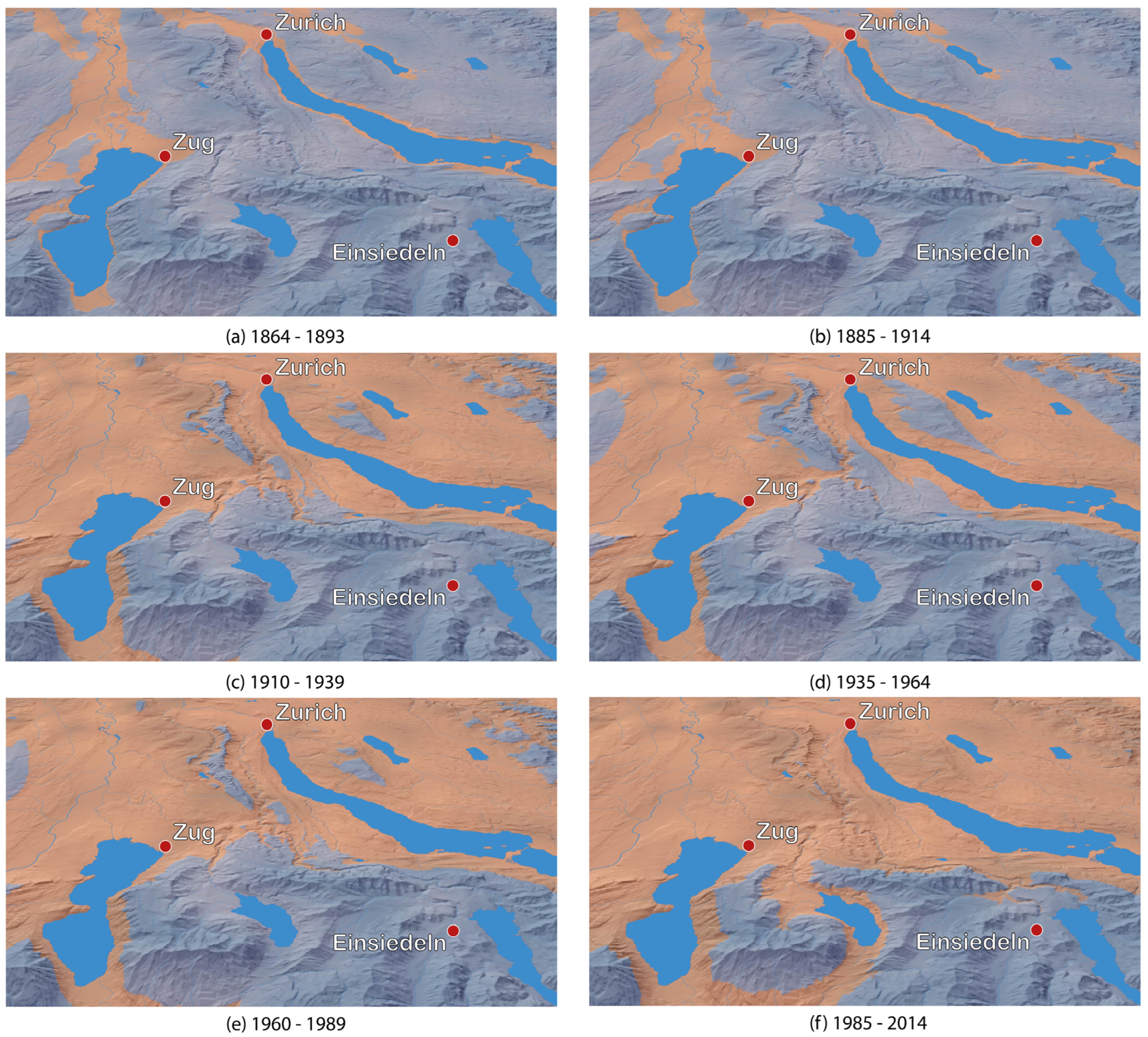
3.1.1. General Overview

Figure 2 shows one layer of the resulting map, presented as a view from above (2D map) of the whole of Switzerland. The map divides the country into two types of polygons: regions below the altitude of the zero degree line (colored red) and regions above the zero degree line (colored blue). The transition in color marks the altitude corresponding to the zero degree line. The displayed data are based on observations from winter months during the period 1985–2014. The map clearly shows that the Swiss plateau (Mitteland), valley floors in the Alps (e.g., in Valais and Grisons), and large parts of Ticino are exposed to a winter temperature above 0°C, in contrast to alpine regions with a temperature below 0°C. This visualization does not rely on 3D symbols but uses the ability of the AoS to display the terrain in a 3D perspective when the globe is tilted. In addition to the map itself, Figure 2 shows the graphical user interface elements of the AoS. The digital map is interactive, enabling users to explore it in various ways, such as navigating, tilting, or zooming using the keyboard, mouse, or on-screen buttons. Users can select other data for visualization variants, such as projected future values, via a dropdown menu or change the time period by interacting with the temporal selection bar. Base maps and their elements can also be customized interactively. Explanatory text, accompanied by images, is available in the upper-left part of the interface. In addition, clicking on specific points on the map opens a pop-up window with additional information, such as the value of the altitude of the zero degree line. The interactive map allows users to freely explore the content. There are 28 different layers available for exploration. While the map in Figure 2 provides a static snapshot of the situation at a particular time period, one of the key strengths of the AoS is its ability to incorporate temporal dimensions.

3.1.2. Temporal Control

Figure 3 illustrates the zero degree line in winter, based on observations, across six distinct time periods in the region, including Zurich, Zug, and Einsiedeln. Blue areas represent regions above the zero degree line, red areas denote regions below it, and lakes and rivers are also included for spatial context. City labels are manually added for better orientation. This visualization enables a clear understanding of how the altitude of the zero degree line has changed over time. The figure highlights a clear trend from 1864–1893 to 1985–2014: the altitude of the zero degree line has risen. Consequently, regions situated below the zero degree line (red areas) have expanded, while areas situated above the zero degree line (blue areas) have diminished. Notably, the zero degree line shows no change between the periods 1864–1893 and 1885–1914. Furthermore, for the period 1935–1964, a temporary drop of the zero degree line altitude is observed. However, the upward trend in the zero degree line is evident when examining the entire timeline. This type of visualization is particularly effective for comparing the altitude of the zero degree line across different time periods, providing insights into climatic changes in the region.

3.1.3. Future Scenario and Uncertainties

Figure 4 illustrates the projected future altitudes of the zero degree line in winter under a high emissions scenario across three periods: 2010–2039, 2040–2069, and 2070–2099. The red areas indicate regions that were consistently simulated to be below the zero degree line by the majority of the models. The boundary of this area is defined by the minimum value of the elevation of the zero degree line projections. The blue areas represent regions that were simulated to be above the zero degree line by the majority of the models. The boundary of this area is defined by the maximum value of the elevation of the zero degree line projections. The yellow areas indicate areas of uncertainty. The exact altitude of the future zero degree line remains uncertain. Based on the model projections, this line is expected to fall within the range defined by the maximum and minimum values of the projections, with the yellow areas on the map highlighting this uncertainty. These zones represent the regions where the future zero degree line is most likely to occur, reflecting the range of variability across the different model projections (see [2]). When the three time periods are considered, it is evident that the red areas (below the zero degree line) are increasing in extent, while the blue areas (above the zero degree line) are decreasing. This reflects an overall climb of the altitude of the zero degree line. Furthermore, a comparison of the first period (2010–2039) and the last period (2070–2099) periods reveals that the uncertainty range (yellow areas) increases over time, indicating a growing variability in future projections. Analogous visualizations have been produced for a low-emission scenario, although these are not displayed in the results presented here.

3.1.4. Comparison of the Effects of the Two Emission Scenarios

It can be challenging to compare the effects of the two different emissions scenarios on the zero degree line when the information is presented across separate layers [12]. To facilitate an easier comparison, additional layers have been created that combine the results of both scenarios into a single layer. Figure 5 illustrates an example of this combined result. It shows a comparison of the altitude of the future zero degree line during the 2070–2099 period for the winter months, based on projections considering two distinct scenarios. The red areas represent regions situated below the median altitude of the zero degree line under the scenario with climate change mitigation efforts (low emissions). In contrast, the blue areas indicate regions situated above the median altitude of the zero degree line under the scenario with high emissions. The gray areas indicate regions that may be preserved through climate change mitigation efforts. In the absence of sufficient climate protection measures, the high emissions scenario will be reached, and these gray areas would belong to the red areas, indicating they would fall below the zero degree line, with temperatures above 0°C. Conversely, if emissions are reduced and the low emissions scenario is achieved, these gray areas would lie above the zero degree line, with temperatures below 0°C, and will belong to the blue areas. This visualization demonstrates how the altitude of the zero degree line differs between the two scenarios and, importantly, which areas could be preserved through climate change mitigation efforts. It effectively highlights the positive impact of climate protection measures, as limiting greenhouse gas emissions would also limit the surge of the altitude of the zero degree line, as visible on the map. It is important to note that this visualization shows only the median value of the zero degree line, excluding the range of uncertainties.

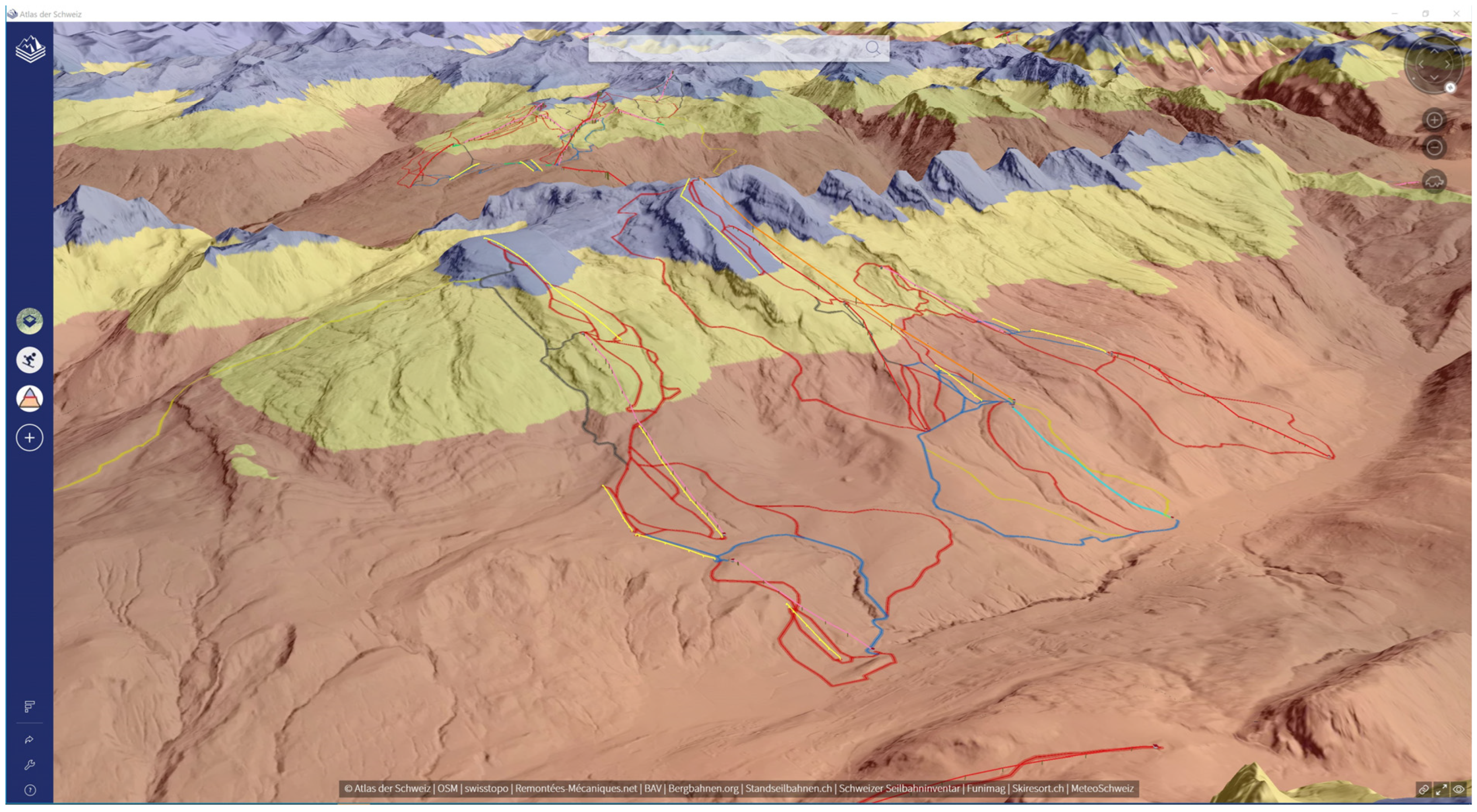
3.1.5. Combination with Other Topics

Figure 6 illustrates one of the strengths of the AoS: the possibility to combine different maps. In this case, the map of the zero degree line is combined with the map of the ski resorts and ski slopes. The resulting visualization shows the projected values of the height of the zero degree line in winter, considering a high emissions scenario for 2070–2090. Red areas represent regions below the zero degree line, blue areas represent regions above it, and yellow areas indicate uncertain regions where it is unclear whether they will be above or below the zero degree line. Additionally, cable cars are represented by yellow lines, and colored lines show the tracks of the different ski slopes. The resulting visualization reveals that a large portion of the ski resort will be situated below the zero degree line in the future, which could present considerable challenges for maintaining adequate snow coverage for skiing. This type of visualization effectively links an indicator of climate change, the altitude of the zero degree line, with another topic, in this case, skiing, by clearly illustrating the potential impacts of climate change on this activity. While uncertainty remains regarding the future height of the zero degree line (shown in yellow), it is evident that a substantial part of the ski resort will be below the zero degree line. This raises concerns about the possibility economic and ecologic viability of skiing in these areas.

3.2. Plant Phenology

Figure 7 shows a detail of the plant phenology map showing data for dandelion. A 3D timeline is shown above the location of each station. To aid interpretation, the timeline is divided into six parts, each representing 15 days. The timeline starts on 17 March and ends on 14 June. The coloration of the bars visually indicates temporal changes. Two markers are placed on each timeline: a blue marker indicates the mean DOY for 1951–1970, while a pink marker represents the mean DOY for 2004–2023. This allows for an immediate comparison of how the mean DOY has shifted between the two periods. Considering the general trend, it is possible to see that the DOY has shifted earlier, even though there are some exceptions in the data.

3.3. Glacial Lakes

Figure 8 displays the map of the glacial lakes, showing the glacial lakes in 1973 and the glacier extent in the first decade of the 2000s. The shape of the glacial lakes is visible on the terrain, colored in dark blue. The lakes are subdivided into five categories based on surface area. A sphere is displayed above each lake, varying in color and size according to the category. The user interface also includes a temporal bar that allows the user to select different time periods to visualize the data.

4. Discussion

This section discusses important aspects to consider when dealing with maps that show the effects of climate change. The schema in Figure 9 summarizes the key aspects of the discussion in three categories: the first covers map design choices, addressing the question of how to visualize the topic, the second focuses on the map content, including what should be shown on the maps, and the third category discusses how the maps can be used, interpreted, and perceived. For each key point, the corresponding subsection is indicated.

4.1. Exploration of Map Content and Visualization of Local Phenomena

As illustrated in Figure 2, users can interact with the zero degree line map in various ways, exploring its content thematically, spatially, and temporally. They can select specific themes, navigate in the map, or choose a period of interest. Regarding the maps about the glacial lakes and plant phenology two of the three exploration options are available. Providing users with these navigation options gives them the means to gain a comprehensive overview of the topic.
Climate change is inherently tied to the spatial [6,45] and temporal dimensions [45]. Showing changes over time is particularly important in climate change maps [9].
Furthermore, allowing users to explore regions they are familiar with, through spatial navigation and by observing a phenomenon that can directly affect these areas can also help raise awareness of the issue [4,46]. Indeed, previous research about climate change communication has highlighted the importance of not communicating the topic too distantly. For example, Sheppard [4] affirms the importance of localizing the topic at the local community level to make it more concrete and better understandable. Based on a user study, Johannsen [46] also confirmed the importance of presenting local and familiar phenomena—those that can be directly observed in the user’s region—rather than distant or remote events to effectively raise concerns about climate change.

4.2. Visualization of Other Topics Related to Climate Change

Lorenzoni et al. [45] define engagement with climate change as encompassing three essential aspects: cognitive, affective and behavioral. It means that the individual must be concerned about the topic, must feel motivated and must be able to act [45].
It is assumed that combining the maps about climate change with other maps of concern to the user available in the AoS could help to increase the motivational aspect of user engagement [45]. Figure 6 shows a combined visualization of the zero degree and ski resort maps. Linking the impacts of climate change to a topic that users may feel more emotionally connected to or interested in—such as skiing—can help raise awareness of the issue and foster greater user engagement [15,45].
This assumption is supported by the example of a successful application of this type of visualization described in the work of Schroth et al. [16]. In a participatory planning process in the Entlebuch region, a 3D landscape visualization, including mountains and ski slopes, was used to depict areas expected to have good snow conditions in 50 years. The resulting visualization was similar to our result in Figure 6. Most participants in the planning process were highly impressed by the visualization. Therefore, we believe that having such combined visualizations in the AoS would impact the users [15].
Sheppard [4] also illustrated the importance of making the maps personal and connecting the issue of climate change to individuals, locations and context.

4.3. Positive Feedback

As stated by Chess and Johnson [47], it is important in climate change communication to highlight the effects of climate change mitigation efforts. Moser [3] also notes that one of the challenges in climate change communication is the difficulty people have in perceiving the positive effects of mitigation efforts on the climate.
Our approach of comparing the altitude of the zero degree line under two different scenarios on the same layer (see Figure 5) addresses this limitation. By presenting the regions that are expected to remain below the zero degree line under a low-emission scenario and contrasting them with the much larger regions that will fall below the zero degree line under a high-emission scenario, we highlight the potential impact of climate change mitigation efforts. This approach emphasizes the areas that can be preserved through effective climate action.

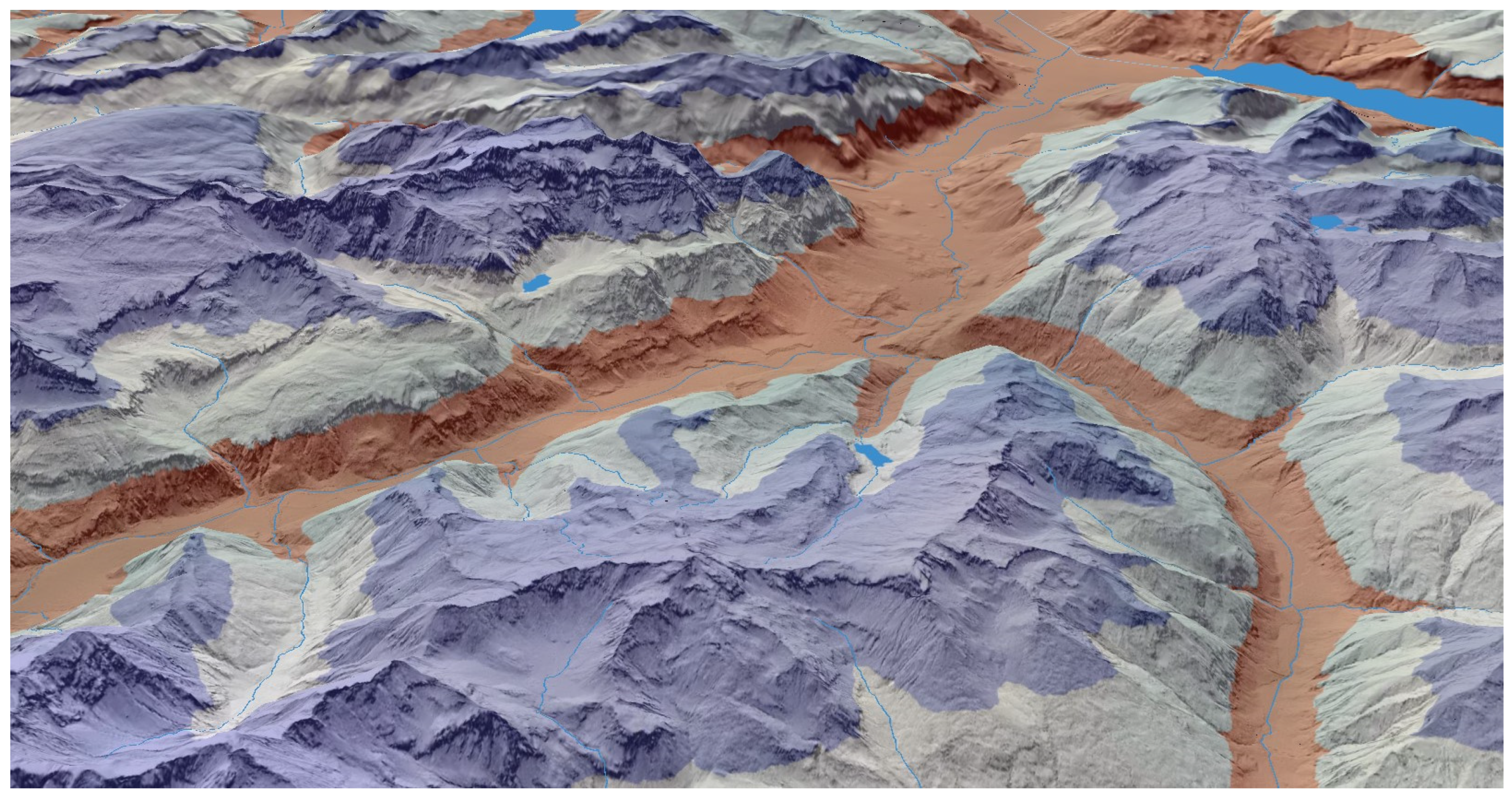
4.4. 3D Data Visualization

The important role of 3D visualizations in the context of climate change communication is discussed by Sheppard [4]. In another work, he also investigated the use of landscape visualizations for improving climate change communication, highlighting both their potential and their limitations or risks [15]. Schroth et al. [48] conducted a small user test to investigate the effects of visualizing the local impacts of climate change using an interactive 3D game environment. Their findings indicate that this approach has a positive effect on climate change communication.
The elevation of the zero degree line is inherently linked to altitude. The AoS, based on a globe and digital terrain models, allows users to have a 2D view from above for an overview (see Figure 2) or to tilt the view to reveal 3D topography (Figure 3 and Figure 4). Also based on the literature mentioned above, it can be supposed that this AoS feature is particularly valuable for visualizing the zero degree line in Switzerland, as the 3D terrain could allow for a more effective visualization of the phenomenon, especially in a mountainous country like Switzerland.
Additionally, the map of the plant phenology utilizes three-dimensional symbols to illustrate the timeline, while the map of the glacial lakes also incorporates three-dimensional symbols to enhance the visibility of the lakes’ locations and dimensions.
However, it is important always to consider the limitations of 3D visualization. Compared to 2D maps, 3D maps present additional challenges, including the difficulty of comparing objects at different distances due to variations of the scale across a 3D scene or the risk of some objects being occluded and, consequently, not visible from the user’s viewpoint [49]. Navigation in 3D visualization can also create problems for users, i.e., when the mouse is used both for navigation and additional tasks such as object selection [50]. According to Niedomysl et al. [51], the advantages and disadvantages of 2D and 3D maps depend on their purpose. Therefore, it is important to always consider whether the use of 3D could provide an advantage in the communication process [52]. 3D is not always the most effective choice for data visualization [49], for instance, a study by Niedomysl et al. [51] in another context has shown that a 3D map is not always more helpful or effective in improving learning outcomes than a 2D map. However, 3D visualizations are better suited for creating a more immersive experience in a scene [52]. Additionally, since 3D maps are less common than traditional 2D maps, they still have a fascinating effect on users [53]. These factors can serve as further motivations for using 3D visualizations to illustrate the effects of climate change.

4.5. Color Selection

To facilitate the interpretation of the zero degree line map, colors commonly associated with temperature values were employed on the map of the zero degree line. Areas with temperatures below 0°C (above the zero degree line) were represented by a bluish tone, while a reddish tone was used to indicate areas with temperatures above 0°C (below the zero degree line). This decision is consistent with Fish’s considerations [9] regarding the use of color in vivid maps. She emphasizes that colors should, among other factors, be associated with common experiences. In addition, yellow is used for uncertain areas, while a gray tone is used for the areas that could be preserved. Green was specifically avoided for these areas because the map already has a reddish color. This decision was made to prevent difficulties for individuals with color vision deficiencies, as the combination of red and green can be problematic.

4.6. Visualization of Uncertainties

For some visualizations, such as those shown in Figure 3 and Figure 6, an uncertainty range is visualized in relation to the projected future values. This range is shown as a yellow-shaded area, representing the zone between the maximum and the minimum projected value of the zero degree line. Aitken et al. [54] investigated different approaches to visualizing uncertainty in projected climate change-induced flood hazards in New Zealand, including a the use of a fog layer in a virtual reality environments with 3D visualizations. Becsi et al. [12], emphasized the importance of showing uncertainties when communicating climate change through maps; however, the audience does not always correctly understand such information. For the visualization in the map about the zero degree line, we worked with a simple visualization of the uncertainty. For the other layers, i.e., the layer enabling the comparison of the effects of the two scenarios (see Figure 5 ), and for the other two maps, we did not work with the uncertainties. However, showing uncertainties increases the reliability of the map [12], so it would be important to take uncertainties into account when possible.

4.7. Combination of Past Observations and Future Projections

As shown in the results, the maps about the zero degree line and glacial lakes include two types of data: values based on past observations and values based on future projections. It is useful to visualize both, providing users with comprehensive information about past conditions and possible future outcomes, when possible, based on different scenarios [4,9]. This approach enables users to understand how the situation has evolved and what might happen in the future. Therefore, we emphasize the importance of not limiting the analysis to historical data alone, but of incorporating future projections whenever possible to provide a more complete and insightful perspective. The importance of visualizing changes over time and the consideration of using projections for future values are thematized in Fish’s work [9].

4.8. Interpretation of Climate Change Maps

When interpreting the maps, it is important to remember that the visualized data should be regarded as approximations. Observations inherently have uncertainties; the methods used to combine past observations introduce additional uncertainties, and projections of future values carry uncertainties. Even the vector data preparation process can introduce some additional approximations. In some cases (see Figure 4 and Figure 6), the uncertainty of the projected zero degree line is explicitly shown on the map. However, no uncertainty is shown for the other layers and maps.
Considering the map about the zero degree line, the values presented are averages calculated over a period of three months (either summer or winter) across 30 years. Furthermore, it is important to note that Switzerland has diverse regions, but the data used in this work represent nationwide averages. As a consequence, the regional variations, such as those highlighted by Scherrer et al. [29], are not accounted for in the visualization. For these reasons, it is essential to consider the visualized data on the final map as approximations. It is not correct to extract specific values at precise locations; instead, general trends should be considered. Also if the user can zoom to the extent that their own residence is visible (a concept frequently referred to as “endless zoom” [7]), the visualized data always represents an average value. The level of detail of community proposed by Sheppard [4] is, at this time, not feasible within our own visualizations.
Similar considerations apply when analyzing maps of plant phenology and glacial lakes, as these also have limitations. For example, the glacial lake map displays all lakes that could potentially form in the future, even though not all of them will appear simultaneously, and almost half will disappear [44]. Even for these maps, it is particularly important to focus on the general trends when interpreting them.
As stated, for example, by McKendry and Machlis [7], the potential of misuse exists when dealing with maps. Therefore, it is of particular importance to inform the user also about the map’s limitations. Indeed, transparency is important in communicating climate change [4]. In the case of the AoS, the limitations are provided in the accompanying text of the maps. Furthermore, when preparing these types of visualizations, it is important to consider the risks and ethical points raised by Sheppard [15], despite some of them being more specifically applicable to landscape visualizations. The objective is to convey the information as correctly as possible [4].
However, also considering the above-mentioned limitations, we think that these types of climate change maps can still contribute to better understanding the problematic and the negative impacts of climate change.

4.9. Complete Overview of the Climate Change Effects

As illustrated in Figure 3, an examination of the general trends reveals a discernible increase in the altitude of the zero degree line over approximately 150 years. That shows the importance of considering the general trend when interpreting climate data. A closer analysis of the maps reveals that there were no observable changes in the altitude of the zero degree line between the periods 1864–1893 and 1885–1914. Furthermore, a decrease in the altitude of the zero degree line is evident during the period 1935–1964. These observations might seem counterintuitive but reflect the complex nature of climate patterns, which are not always linear and often exhibit oscillations. However, the overall trend across the entire measurement period remains clear. Additionally, it is important to present results even when they do not align with expected outcomes [4]. Those who deny the existence of climate change frequently concentrate on specific years with anomalies [10], such as unusually low temperatures, to dispute broader climate change trends. By providing a comprehensive overview and a complete picture, we aim to avoid this problem.
Similar considerations can also be made for the map of plant phenology. In this map, for some stations, the DOY of dandelion flowering during the period 1950–1970 is earlier than in the period 2004–2023, which is not what it is expected because of climate change [38]. However, when considering the overall trend across all stations, the DOY of flowering in the 2004–2023 period is, in general, earlier than in the 1951–1970 period. This is in line with expectations based on the effects of climate change [38].

4.10. Social Media and Climate Change Maps

The map of the zero degree line was employed in external contexts, namely in a blog article [55] and an Instagram post [56]. The latter comprised eight maps of Switzerland, showcasing regions situated above and below the zero degree line across past time periods and projections for a future time period under two emission scenarios, accompanied by brief explanatory text. By scrolling, users could follow the story of the zero degree line’s evolution. The map in the post exhibited certain limitations compared to the version in the AoS, and a few adjustments were necessary. The post was successful, reaching over 45,000 accounts and generating more than 2100 interactions [56]. This result suggests that these types of maps engage the public and can be effectively used outside of a national atlas to reach a broader audience, which might be more challenging to engage through traditional atlas formats alone. This experience highlights the important role of maps on social media, a point also observed in the work of Liu et al. [14].

4.11. User Feedback

A user study was not conducted with the three maps, but a user survey would help assess whether these visualization types are comprehensible and beneficial for the broader public of the AoS, and if they meet their intended objectives. This is an aspect that should be considered in future work. The creation of effective maps about climate change requires the active involvement of users in a co-design process and the implementation of empirical testing, as emphasized i.e., by Lorenz et al. [57] and Becsi et al. [12]. For the map about the zero degree line, the only feedback we received was in the form of comments on Instagram, where users could comment on the post. It is important to note that, on Instagram, users do not have access to all the information provided in the full map available in the AoS. Furthermore, it is likely that users spent less time engaging with the social media post than they would have done with the map in the AoS. Nevertheless, we believe that the comments can still provide a preliminary idea of potential issues. One critical point that emerged from the comments was the use of the terms areas below the zero degree line and areas above the zero degree line, which some users found confusing. The first term refers to areas with temperatures above 0°C, while the second refers to areas below 0°C. To address this issue in future map versions, it might be more effective to directly label areas using the temperature. This approach could make the visualization more straightforward to understand, particularly for audiences lacking familiarity with concepts such as the zero degree line.

4.12. Role of Climate Change Maps in National Atlases

National atlases were initially developed as tools to showcase and describe a country’s strengths, however over time, their focus shifted towards visualizing more socio-economic indicators [21]. The digital version of the AoS now contains six maps that are directly related to climate change. We believe that maps addressing climate change should be an integral part of a national atlas, given the importance and timeliness of this issue and its concrete, local impacts. It is important that the public be made aware of these issues and encouraged to develop an informed opinion [6]. Furthermore, as future projections become increasingly accessible and the quality of such data improves, it is important to integrate this type of information into a national atlas. Maps should also illustrate future conditions, rather than limiting their scope to describing the current or historical situation.

5. Conclusions

This paper presents three maps for a national atlas, which illustrate the impacts of climate change. These maps have been developed for an interactive atlas that supports 3D visualizations. The focus is on Switzerland, and the three key climate change indicators that are shown are the rising elevation of the zero degree line, the evolution of glacial lakes in the Alps, and changes in the flowering dates of plants.
The main goal of these maps is to make the effects of climate change more visible and concrete. This paper demonstrates that it is feasible to create these types of visualizations for a national atlas. Three distinct visualization approaches were presented: a surface visualization for the map depicting changes in the zero degree line, a 3D timeline symbolization for the plant phenology map, and a combination of surface visualization and 3D symbols for the glacial lakes map. All these visualizations leverage the capabilities of 3D representation within the AoS. Our maps use several key features to visualize the effects of climate change. These include the use of 3D visualizations, the possibility for the user to explore the map content both temporally and spatially, the focus on regions familiar to the user, the emphasis on the positive impacts of climate change mitigation, the integration of past observations and future projections, the consideration of uncertainties and the possibility to combine the maps with other topics of personal relevance and interest to the user. We apply these important principles to our maps for effective visualization of the effects of climate change in an understandable way. We recognize that not all these features can be incorporated into every type of map or topic. However, we encourage cartographers to consider integrating at least some of these elements when designing maps related to climate change.
When interpreting these maps, it is important to consider their limitations. Climate change data are derived from observations and projections based on simulations that include uncertainties. Therefore, the visualized values should be regarded as approximations, and it is not appropriate to attempt to extract a single, precise value for a specific location. However, despite these limitations, we believe these maps can be helpful in visualizing the effects of climate change and better understanding its impacts.
We think that these map types should be part of a national atlas because of the topic’s relevance and importance, with its broad implications on society, economy, biodiversity, and environment, from which no one is excluded.
With these maps, we are making a small contribution to achieving SDG 13, on climate action, and we encourage other cartographers to work on visualizing the effects of climate change in order to raise awareness and clearly illustrate its impact.
The map of the zero degree line was successfully employed outside the atlas in an Instagram post. This suggests that this type of visualization can be effective in social media and beyond the atlas. However, not all maps are equally suited to this purpose, and further investigation is needed.
In future work, it will be important to test through user surveys whether the visualizations in the AoS are truly effective and understandable, and to further improve our maps considering the guidelines that can be found in the literature. In addition, other types of visualization, such as storytelling approaches, may be considered to better connect the themes and provide more impactful information to the user.

Author Contributions

Conceptualization, Luca Gaia, Andreas Neumann and Lorenz Hurni; data curation, Luca Gaia; formal analysis, Luca Gaia; investigation, Luca Gaia; methodology, Luca Gaia and Andreas Neumann; resources, Luca Gaia; software, Luca Gaia; supervision, Luca Gaia, Andreas Neumann and Lorenz Hurni; validation, Luca Gaia; visualization, Luca Gaia; writing—original draft preparation, Luca Gaia; writing—review & editing, Luca Gaia, Andreas Neumann and Lorenz Hurni. All authors have read and agreed to the published version of the manuscript.

Funding

This research received no external funding.

Data Availability Statement

The raw data for the map about the glacial lakes can be accessed through the works of Mölg et al. (https://doi.pangaea.de/10.1594/PANGAEA.934190, accessed on 11 February 2025) and Steffen et al. (https://doi.org/10.3929/ethz-b-000554650). The raw data for the map about the plant phenology can be accessed at https://opendata.swiss/en/dataset/phanologische-beobachtungen (accessed on 11 February 2025). The DHM provided by Swisstopo can be accessed at https://www.swisstopo.admin.ch/de/hoehenmodell-dhm25 (accessed on 27 December 2024). The raw data for the zero degree line, as well as the code, will be made available by the authors on request. The final maps can be found in the AoS https://www.atlasderschweiz.ch/downloads/ (accessed on 11 February 2025).

Acknowledgments

We thank Simon Scherrer, Thomas Schlegel, Francesco Isotta, and Sven Kotlarski from MeteoSwiss for providing the data for the zero degree line and for their valuable inputs about the topic and during map creation. Special thanks go to Regula Gehrig from MeteoSwiss for supplying the data for the phenological map and offering her expertise on phenology. We also thank Yann Vitasse from WSL for his valuable insights into phenology. Our appreciation goes to Nico Mölg and Elias Hodel for providing the data on glacial lakes. Additionally, we are grateful to René Sieber and Christian Wohlert for their constructive feedback and thorough review of the manuscript. Finally, we express our sincere thanks to the entire AoS team for their technical support in producing the maps.

Conflicts of Interest

The authors declare no conflicts of interest.

References

  1. IPCC. Summary for Policymakers. In Climate Change 2023: Synthesis Report.Contribution of Working Groups I, II and III to the Sixth Assessment Report of the Intergovernmental Panel on Climate Change; Lee, H., Romero, J., Eds.; IPCC: Geneva, Switzerland, 2023; pp. 1–34. [Google Scholar]
  2. NCCS (Pub.). CH2018—Climate Scenarios for Switzerland; National Centre for Climate Services: Zurich, Switzerland, 2018; p. 24. [Google Scholar]
  3. Moser, S.C. Communicating climate change: History, challenges, process and future directions. WIREs Clim. Change 2009, 1, 31–53. [Google Scholar] [CrossRef]
  4. Sheppard, S.R.J. Visualizing Climate Change: A Guide to Visual Communication of Climate Change and Developing Local Solutions, 1st ed.; Routledge: London, UK, 2012. [Google Scholar]
  5. Courtney, S.L.; McNeal, K.S. Seeing is believing: Climate change graph design and user judgments of credibility, usability, and risk. Geosphere 2023, 19, 1508–1527. [Google Scholar] [CrossRef]
  6. Fish, C.S. Cartographic content analysis of compelling climate change communication. Cartogr. Geogr. Inf. Sci. 2020, 47, 492–507. [Google Scholar] [CrossRef]
  7. McKendry, J.E.; Machlis, G.E. Cartographic design and the quality of climate change maps. Clim. Change 2008, 95, 219–230. [Google Scholar] [CrossRef]
  8. Kraak, M.-J.; Roth, R.E.; Ricker, B.; Kagawa, A.; Sourd, G.L. Mapping for a Sustainable World; United Nations: New York, NY, USA, 2020. [Google Scholar]
  9. Fish, C.S. Elements of Vivid Cartography. Cartogr. J. 2021, 58, 150–166. [Google Scholar] [CrossRef]
  10. Fish, C.S.; Kreitzberg, K.Q. Mapping in an Echo Chamber: How Cartographic Silence Frames Conservative Media’s Climate Change Denial. Ann. Am. Assoc. Geogr. 2023, 113, 2480–2496. [Google Scholar] [CrossRef]
  11. Tsang, S.J. Communicating Climate Change: The Impact of Animated Data Visualizations on Perceptions of Journalistic Motive and Media Bias. J. Broadcast. Electron. Media 2023, 67, 161–182. [Google Scholar] [CrossRef]
  12. Becsi, B.; Hohenwallner-Ries, D.; Grothmann, T.; Prutsch, A.; Huber, T.; Formayer, H. Towards better informed adaptation strategies: Co-designing climate change impact maps for Austrian regions. Clim. Change 2019, 158, 393–411. [Google Scholar] [CrossRef]
  13. Kaye, N.R.; Hartley, A.; Hemming, D. Mapping the climate: Guidance on appropriate techniques to map climate variables and their uncertainty. Geosci. Model Dev. 2012, 5, 245–256. [Google Scholar] [CrossRef]
  14. Liu, N.; Feng, Y.; Wang, S.; Meng, L. The Impact of Maps on Climate Information Communication: An Empirical User Study on Social Media Trustworthiness. Abstr. ICA 2024, 7, 1–2. [Google Scholar] [CrossRef]
  15. Sheppard, S.R.J. Landscape visualisation and climate change: The potential for influencing perceptions and behaviour. Environ. Sci. Policy 2005, 8, 637–654. [Google Scholar] [CrossRef]
  16. Schrot, O. From Information to Participation. Interactive Landscape Visualization as a Tool for Collaborative Planning. Ph.D. Thesis, ETH, Zürich, Switzerland, 2007. [Google Scholar] [CrossRef]
  17. IPCC. IPCC WGI Interactive Atlas. Available online: https://interactive-atlas.ipcc.ch (accessed on 23 December 2024).
  18. Prairie Climate Center. Clima Atlas of Canada. Available online: https://climateatlas.ca/ (accessed on 23 December 2024).
  19. Gasser, M.; Hotea, M.D. Landschaften des Wissens—50 Jahre Kartensammlung an der ETH-Bibliothek; Michael Imhof Verlag: Petersberg, Germany, 2022. [Google Scholar]
  20. Atlas of Switzerland. Atlas of Switzerland—Download. Available online: https://www.atlasderschweiz.ch/downloads/ (accessed on 23 December 2024).
  21. Sieber, R.; Hurni, L. Future National Atlases—Strategies for Tearing Down the User’s Firewall. Abstr. Int. Cartogr. Assoc. 2022, 5, 11. [Google Scholar] [CrossRef]
  22. Klimaatlas der Schweiz; Schweizerische Meteorologische Anstalt: Wabern, Switzerland, 2000.
  23. SCNAT. Klimaatlas der Schweiz. Available online: https://scnat.ch/de/uuid/i/e6fddc02-4ac3-5066-a264-8110c8262321-Klimaatlas_der_Schweiz (accessed on 23 December 2024).
  24. Bihari, Z.; Babolcsai, G.; Bartholy, J.; Ferenczi, Z.; Gerhat-Kerenyi, J.; Haszpra, L.; Homoki-Ujvary, K.; Kovacs, T.; Lakatos, M.; Nemeth, A.; et al. Climate—National Atlas of Hungary—Natural Environment; Kocsis, K.E.-i.-C., Ed.; MTA CSFK Geographical Institute: Budapest, Hungary, 2018. [Google Scholar]
  25. United Nations General Assembly. Resolution adopted by the General Assembly on 25 September 2015: Transforming our world: The 2030 Agenda for Sustainable Development (A/RES/70/1); United Nations: New York, NY, USA, 2015. [Google Scholar]
  26. Kent, A.J.; Vujakovic, P.; Eades, G.; Davis, M. Putting the UN SDGs on the Map: The Role of Cartography in Sustainability Education. Cartogr. J. 2020, 57, 93–96. [Google Scholar] [CrossRef]
  27. Gaia, L.; Neumann, A.; Sieber, R.; Hurni, L. Cartographic visualization of the effects of climate change: A practical application for the Atlas of Switzerland. Abstr. Int. Cartogr. Assoc. 2024, 7, 42. [Google Scholar] [CrossRef]
  28. Swisstopo. DHM25. Available online: https://www.swisstopo.admin.ch/de/hoehenmodell-dhm25 (accessed on 23 December 2024).
  29. Scherrer, S.C.; Gubler, S.; Wehrli, K.; Fischer, A.M.; Kotlarski, S. The Swiss Alpine zero degree line: Methods, past evolution and sensitivities. Int. J. Climatol. 2021, 41, 6785–6804. [Google Scholar] [CrossRef]
  30. CH2018. CH2018—Climate Scenarios for Switzerland, Technical Report; National Centre for Climate Services: Zurich, Hungary, 2018; p. 271. [Google Scholar]
  31. Rouault, E.; Warmerdam, F.; Schwehr, K.; Kiselev, A.; Butler, H.; Łoskot, M.; Szekeres, T.; Tourigny, E.; Landa, M.; Miara, I.; et al. GDAL. Available online: https://zenodo.org/records/14046734 (accessed on 27 December 2024).
  32. Bloch, M. Mapshaper. Available online: https://github.com/mbloch/mapshaper (accessed on 23 December 2024).
  33. Visvalingam, M.; Whyatt, J.D. Line Generalization by Repeated Elimination of Points. Cartogr. J. 1993, 30, 46–51. [Google Scholar] [CrossRef]
  34. Sieber, R.; Serebryakova, M.; Schnürrer, R.; Hurni, L. Atlas of Switzerland Goes Online and 3D—Concept, Architecture and Visualization Methods. In Progress in Cartography: EuroCarto 2015; Gartner, G., Jobst, M., Huang, H., Eds.; Springer International Publishing: Cham, Switzerland, 2016; pp. 171–184. [Google Scholar]
  35. Cleland, E.E.; Chuine, I.; Menzel, A.; Mooney, H.A.; Schwartz, M.D. Shifting plant phenology in response to global change. Trends Ecol. Evol. 2007, 22, 357–365. [Google Scholar] [CrossRef] [PubMed]
  36. Schwartz, M.D. Phenology: An Integrative Environmental Science, 2nd ed.; Springer: Dordrecht, The Netherlands, 2013. [Google Scholar]
  37. MeteoSwiss. Plant Phenology. Available online: https://www.meteoswiss.admin.ch/weather/weather-and-climate-from-a-to-z/phenology.html (accessed on 23 December 2024).
  38. Menzel, A.; Sparks, T.H.; Estrella, N.; Koch, E.; Aasa, A.; Ahas, R.; Alm-Kübler, K.; Bissolli, P.; Braslavská, O.G.; Briede, A.; et al. European phenological response to climate change matches the warming pattern. Glob. Change Biol. 2006, 12, 1969–1976. [Google Scholar] [CrossRef]
  39. Meier, M.; Vitasse, Y.; Bugmann, H.; Bigler, C. Phenological shifts induced by climate change amplify drought for broad-leaved trees at low elevations in Switzerland. Agric. For. Meteorol. 2021, 307, 108485. [Google Scholar] [CrossRef]
  40. MeteoSwiss. Phenological Observations. Available online: https://opendata.swiss/en/dataset/phanologische-beobachtungen (accessed on 23 December 2024).
  41. Agarwal, V.; Van Wyk de Vries, M.; Haritashya, U.K.; Garg, S.; Kargel, J.S.; Chen, Y.J.; Shugar, D.H. Long-term analysis of glaciers and glacier lakes in the Central and Eastern Himalaya. Sci. Total Environ. 2023, 898, 165598. [Google Scholar] [CrossRef] [PubMed]
  42. Zhang, T.; Wang, W.; An, B. Heterogeneous changes in global glacial lakes under coupled climate warming and glacier thinning. Commun. Earth Environ. 2024, 5, 374. [Google Scholar] [CrossRef]
  43. Mölg, N.; Huggel, C.; Herold, T.; Storck, F.; Allen, S.; Haeberli, W.; Schaub, Y.; Odermatt, D. Inventory and evolution of glacial lakes since the Little Ice Age: Lessons from the case of Switzerland. Earth Surf. Process. Landf. 2021, 46, 2551–2564. [Google Scholar] [CrossRef]
  44. Steffen, T.; Huss, M.; Estermann, R.; Hodel, E.; Farinotti, D. Volume, evolution, and sedimentation of future glacier lakes in Switzerland over the 21st century. Earth Surf. Dyn. 2022, 10, 723–741. [Google Scholar] [CrossRef]
  45. Lorenzoni, I.; Nicholson-Cole, S.; Whitmarsh, L. Barriers perceived to engaging with climate change among the UK public and their policy implications. Glob. Environ. Change 2007, 17, 445–459. [Google Scholar] [CrossRef]
  46. Johannsen, I.M.; Lassonde, K.A.; Wilkerson, F.; Schaab, G. Communicating Climate Change: Reinforcing Comprehension and Personal Ties to Climate Change Through Maps. Cartogr. J. 2017, 55, 85–100. [Google Scholar] [CrossRef]
  47. Chess, C.; Johnson, B.B. Information is not enough. In Creating a Climate for Change: Communicating Climate Change and Facilitating Social Change; Moser, S.C., Dilling, L., Eds.; Cambridge University Press: Cambridge, UK, 2007; pp. 223–234. [Google Scholar]
  48. Schroth, O.; Angel, J.; Sheppard, S.; Dulic, A. Visual Climate Change Communication: From Iconography to Locally Framed 3D Visualization. Environ. Commun. 2014, 8, 413–432. [Google Scholar] [CrossRef]
  49. Shepherd, I.D.H. Travails in the Third Dimension: A Critical Evaluation of Three-Dimensional Geographical Visualization. In Geographic Visualization; John Wiley & Sons: Chichester, UK, 2008; pp. 199–222. [Google Scholar]
  50. Brath, R. 3D InfoVis is Here to Stay: Deal with It. In Proceedings of the 2014 Ieee Vis International Workshop on 3dvis (3dvis), Paris, France, 9 November 2014; pp. 25–31. [Google Scholar] [CrossRef]
  51. Niedomysl, T.; Elldér, E.; Larsson, A.; Thelin, M.; Jansund, B. Learning Benefits of Using 2D Versus 3D Maps: Evidence from a Randomized Controlled Experiment. J. Geogr. 2013, 112, 87–96. [Google Scholar] [CrossRef]
  52. Lai, P.C.; Kwong, K.-H.; Mak, A.S.H. Assessing the Applicability and Effectiveness of 3D Visualisation in Environmental Impact Assessment. Environ. Plan. B Plan. Des. 2010, 37, 221–233. [Google Scholar] [CrossRef]
  53. Häberling, C.; Bär, H.; Hurni, L. Proposed Cartographic Design Principles for 3D Maps: A Contribution to an Extended Cartographic Theory. Cartogr. Int. J. Geogr. Inf. Geovisualiza. 2008, 43, 175–188. [Google Scholar] [CrossRef]
  54. Aitken, O.; Moore, A.; Diaz-Rainey, I.; Nguyen, Q.; Cox, S.; Bodeker, G. Geospatial Metaphors in the Communication of Climate Change-Related Flooding Uncertainty. Abstr. Int. Cartogr. Assoc. 2024, 7, 4. [Google Scholar] [CrossRef]
  55. MeteoSchweiz. Nullgradgrenze im Atlas der Schweiz. Available online: https://www.meteoschweiz.admin.ch/ueber-uns/meteoschweiz-blog/de/2024/06/nullgradgrenze-im-atlas-der-schweiz.html (accessed on 23 December 2024).
  56. ETH. Atlas of Switzerland. Climate Change in Switzerland: 1864–2099 in Fast Motion. Available online: https://www.instagram.com/p/C9heidQKddP/?utm_source=ig_web_button_share_sheet&igsh=M2M0Y2JmOTAyOA (accessed on 27 December 2024).
  57. Lorenz, S.; Dessai, S.; Forster, P.M.; Paavola, J. Tailoring the visual communication of climate projections for local adaptation practitioners in Germany and the UK. Philos. Trans A Math. Phys. Eng. Sci. 2015, 373, 20140457. [Google Scholar] [CrossRef] [PubMed]
Figure 1. Workflow for the zero degree line map preparation. (a) Starting with zero degree line elevation data and a digital height model as input data. (b) Regions meeting the defined elevation constraints are vectorized into polygons, and their boundaries are simplified. (c) This results in vector files with two polygon classes: areas below and above the elevation boundary. (d) For projection and comparison visualizations, individual vector files are aggregated—considering minimum and maximum heights for projections and median heights for comparisons. (e) This process generates two types of vector files. (f) The vector files are then prepared for visualization using the APS-Editor plugin. (g) Finally, they are displayed in the Atlas of Switzerland. The process is repeated for different time periods, two scenarios, and both summer and winter data.
Ijgi 14 00099 g001
Figure 2. Visualization of observed winter data for the period 1985–2014: red areas lie below the zero degree line (temperatures above 0 °C), blue regions lie above the zero degree line (temperatures below 0 °C). The figure also showcases additional elements from the Atlas of Switzerland, i.e., navigation buttons, legend, or accompanying text.
Ijgi 14 00099 g002
Figure 3. Details of the map showing the zero degree line in winter based on observations. The blue areas represent regions situated above the zero degree line, while the red areas denote regions situated below. The figure illustrates the situation at six different periods: (a) 1864–1893, (b) 1885–1914, (c) 1910–1939, (d) 1935–1964, (e) 1960–1989, and (f) 1985–2014, revealing a clear trend of increasing elevation of the zero degree line from the late 19th century to the early 21st century.
Ijgi 14 00099 g003
Figure 4. Projected future values of the zero degree line in winter considered in the context of a high-emission scenario for three time periods: (a) 2010–2039, (b) 2040–2069, and (c) 2070–2099. The red areas represent regions that, according to the climate models, will be below the zero degree line, whereas the blue areas denote regions above it. The yellow areas indicate the range of uncertainty, highlighting where the zero degree line is expected to occur in the future.
Ijgi 14 00099 g004
Figure 5. A comparison of the altitude of the zero degree line for the time period 2070–2099 is presented, combining the projections considering two different scenarios in a single layer. The red areas represent regions situated below the median altitude of the zero degree line under the low emissions scenario, while the blue areas indicate regions situated above the median altitude under the high emissions scenario. The gray areas indicate regions that could potentially be preserved through climate change mitigation efforts.
Ijgi 14 00099 g005
Figure 6. A combination of two maps: the map showing the zero degree line and the map showing the ski resorts. For the zero degree line, the projected values during the winter months in the period 2070–2090 are shown considering a scenario with high gas emissions. Red areas represent regions below the zero degree line, blue areas represent regions above it, and yellow areas indicate uncertain regions where the exact classification (above or below the zero degree line) is unclear. The yellow lines indicate the locations of cable cars, while the colored lines show the different ski slopes.
Ijgi 14 00099 g006
Figure 7. The figure displays a detail of the plant phenology map. A 3D timeline from mid-March to mid-June is shown above each measurement station. The mean flowering DOY for the dandelion for 1951–1970 is marked in blue, while the mean flowering day for 2004–2023 is marked in pink.
Ijgi 14 00099 g007
Figure 8. The figure displays the map of glacial lakes, showing the glacial lakes in 1973 and the glacier extent in the first decade of the 2000s. The shape of the glacial lakes is visible, colored dark blue. Above each lake, a sphere is visualized, with its color and size corresponding to the lake’s category.
Ijgi 14 00099 g008
Figure 9. Schema summarizing the key points to consider when dealing with maps that show the effects of climate change: individual points are presented as subsections of the discussion.
Ijgi 14 00099 g009
Table 1. The table presents the average altitude of the zero degree line across Switzerland, calculated as a 30-year average for both summer and winter. The data presented here are derived from observations (1864–2017) and simulations (1981–2099). The simulations are based on two climate scenarios: one with low greenhouse gas emissions and another with high greenhouse gas emissions. The table also includes the range of uncertainties for each scenario, showing an upper and a lower boundary for the estimated values. The table presents data for selected periods as an example.
Time PeriodSaisonType of DataHeight
(Observed)
Height Min.
(Projected)
Height Median
(Projected)
Height Max.
(Projected)
1864–1893WinterObservations438 m---
1864–1893SummerObservations3253 m---
2070–2099WinterScenario Low Emissions-989 m1073 m1208 m
2070–2099WinterScenario High Emissions-1523 m1734 m1891 m
2070–2099SummerScenario Low Emissions-3865 m4044 m4325 m
2070–2099SummerScenario High Emissions-4464 m4892 m5628 m
Disclaimer/Publisher’s Note: The statements, opinions and data contained in all publications are solely those of the individual author(s) and contributor(s) and not of MDPI and/or the editor(s). MDPI and/or the editor(s) disclaim responsibility for any injury to people or property resulting from any ideas, methods, instructions or products referred to in the content.

