Abstract
The advancement of computational tools for cartometric analysis has opened new avenues for the identification and understanding of stemmatic relationships between historical maps through the analysis of their planimetric distortions. The 19th-century Western cartographic depiction of Jerusalem serves as an ideal case study in this context. The challenges of conducting comprehensive onsite surveys—due to limited time and local knowledge—combined with the fascination surrounding the area’s representation, resulted in a proliferation of maps marked by frequent errors, distortions, and extensive copying. How can planimetric similarities and differences between maps be measured, and what insights can be derived from these comparisons? This paper introduces a methodology aimed at detecting and segmenting regions of local planimetric similarity across maps, corresponding to the portions that were either copied between them or derived from a common source. To detect these areas, the ground control points from the georeferencing process are employed to deform a common lattice grid for each map. These grids, triangulated to maintain shape rigidity, can be partitioned under conditions of geometric similarity, allowing for the segmentation and clustering of locally similar regions that represent shared areas between the maps. By integrating this segmentation with a filter on the intensity of distortion, the areas of the grid that are almost non-deformed, and thus not relevant for the study, can be excluded. To showcase the support this methodology offers for close reading, it is applied to the maps in the dataset depicting the Russian Compound. The methodology serves as a tool to assist in constructing the genealogy of the area’s representation and uncovering new historical insights. A larger dataset of 50 maps from the 19th century is then used to identify all the local predecessors of a given map, showcasing another application of the methodology, particularly when working with extensive collections of maps. These findings highlight the potential of computational cartometry to uncover hidden layers of cartographic knowledge and to advance the digital genealogy of map collections.
1. Introduction
In the 19th century, Jerusalem became the subject of many Western maps. Early in the century, maps of the Holy Land were predominantly produced by individuals or small groups, mainly Christians driven by religious motivations [1] (p. 1).However, in the case of Jerusalem’s representation, the challenges of conducting comprehensive surveys were significant. Travelers faced limited local knowledge, short time frames for onsite measurements, and limited accessibility to some parts of the city. These factors resulted in inaccuracies, fabrications, and a heavy reliance on partially or fully copying earlier maps [2] (p. 55). As the century progressed, the mapping efforts became more organized, with a subsequent improvement in their quality [3] (p. 2). As such, the abundant Western cartographic production on Jerusalem, particularly in the first half of the century, serves as an ideal case for analyzing inaccuracies as sources of hidden historical insights and to derive information on copying practices by studying their propagation.
This contribution introduces a novel methodology to segment and cluster areas with similar local planimetric distortions across maps. In this context, planimetric distortions refer to discrepancies in the “distances and bearings between identifiable objects,“ as adapted from Laxton’s definition of planimetric accuracy [4] (p. 40). This methodology has been fully implemented in Python, ensuring that the only manual task required is the selection and georeferencing of the maps to be analyzed. The complete code is made available for reuse. This methodology is then applied to derive historical insights into the cartographic depiction of one of the first quarters built outside the walls of the Old City, the Russian Compound. By selecting the seven maps (from 1859 to 1872) in our dataset that depict the area and analyzing the distortions in their representations, it is possible to identify clusters of similar depictions. This analysis enables the formulation of a hypothesis about the genealogical tree of the selected maps (or stemmata, borrowing a term from philology) and helps clarify dating uncertainties. In addition, the results will also be used to investigate the predecessors of a map and to make a hypothesis of the combination of sources (detected from a selection of fifty maps of the nineteenth century) used in its overall compilation.
The proposed novel methodology is based on the analysis and comparison of the deformed lattice grids obtained from the ground control points (GCPs) created for georeferencing the maps. The GCPs from the georeferencing constitute the core input of the code developed for the distortion comparison. The objective is to use these grids to detect local deformative similarities between maps, even when limited in extension or when a map combines information from multiple sources. In these cases, a global alignment, such as the one employed for our previous study on global similarity [5], would not be suitable as it may be influenced by the dominant source, resulting in the misalignment of smaller similar regions or an overall misalignment if the combined sources are comparable in size. Consequently, it is necessary to avoid relying on the global alignment of the deformed grids being compared, as such alignment may be skewed by outliers and incorrectly discard areas of limited local similarity.
Therefore, the methodology relies exclusively on local geometrical properties. Specifically, it leverages the property of geometrically similar rigid shapes to maintain a constant ratio between corresponding sides. After triangulating the deformed lattice grids to ensure the rigidity of the shapes, the geometrical configuration of every square subset of 3 × 3 nodes, referred to as a token, is encoded. The encoded nine-point configurations are then used to perform a hierarchical clustering based on the similarity of corresponding tokens across the compared grids. The result of this clustering can then be used to segment regions of shared similarities across maps.
These segmented regions represent areas that, across two or more maps, exhibit the same planimetric distortion, suggesting a copying relationship among the maps, either directly or through intermediary sources. By discretizing these copied elements through segmentation, a parallel can be drawn with the field of stemmatology: just as stemmatology traces the copying and transformation of texts through manuscripts to reconstruct the genealogical tree of information flow, this methodology tracks the copying and transformation of cartographic elements through maps to hypothesize their genealogical connections. This approach opens the door to applying the analytical tools of stemmatology to study the propagation of planimetric distortions in maps.
The following sections present the case study, the methodology developed for its analysis, and the corresponding results. Section 2.1 examines the unique characteristics of 19th-century cartographic depictions of Jerusalem and the rationale for focusing on the representation of the Russian Compound. Section 2.3 provides background on studies that used distortion analysis as a tool to gain insight into cartographic production. Section 2.4 details the methodology for encoding local distortions and comparing them across maps. This methodology is then applied to derive the stemmata of the representation of the Russian Compound and to extract all the predecessors of a selected map from a larger dataset of 50 maps of Jerusalem in the 19th century (Section 3). Finally, Section 4 and Section 5 discuss and summarize the findings and implications of this study, respectively.
2. Materials and Methods
2.1. Case Study: 19th-Century Maps of Jerusalem and the Russian Compound
In the 19th century, Jerusalem became a focal point of cartographic interest, particularly among Western travelers driven by religious and historical motivations. However, there were limitations in accessibility, partly due to frictions with the local population. The travelogues accompanying the maps provide evidence of this. For instance, F.W. Sieber, the cartographer behind one of the most influential maps in the collection [6], described in his travelogue how he disguised himself as a botanist to avoid conflicts with locals: “But I had to forget my life-threatening situation. Surveying the city itself, identifying key points, and determining them geometrically required careful preparation. Despite numerous side tasks and obstacles, I remained focused on this goal. Through my botanical excursions, I gained the necessary local knowledge and dispelled any suspicion among the inhabitants, especially since I presented myself as a doctor and, in this role, endeared myself to the people” [7] (p. 5). He further explained: “I descended towards the Valley of Hinnom, [...] when we saw from afar a young Arab boy approaching us with a firearm [...] he aimed at me, [...] I therefore always had plants with me, and this protected me from any suspicion from the Turks” [7] (p. 5). (Translation from German).This element, as well as constraints in surveying time and insufficient local knowledge (such as unfamiliarity with languages), often resulted in misrepresentations and planimetric distortions. Additionally, maps produced through individual efforts, frequently by travelers without formal training as surveyors or cartographers, tended to lack a focused intent on achieving geodetic and planimetric accuracy, further contributing to the significant distortions observed in these maps.
These factors, combined with the reliance on copying existing sources either partially or entirely, led to a proliferation of inaccuracies. This makes the dataset particularly valuable for analyzing these distortions and the copying processes behind them. Instead of dismissing these misrepresentations or correcting distortions, as one might when seeking accurate topographical information, it is instead possible to study these inaccuracies to uncover additional historical insights.
Following this peculiarity, Rubin [8] introduced the idea of analyzing the maps of Jerusalem using a “cartogenealogic” method thanks to the large number of copies among them. He observed that “sometimes the similarity in marginal details, in distortions, in mistakes and errors, could prove the connection of imitation and copying more than the central details”, which underlines the importance of even limited partial similarities. This “cartogenalogic” method was applied by Rubin through visual inspection to maps of Jerusalem from the 15th to the 19th century [9], distinguishing between original maps (i.e., those based on a visit to Jerusalem, providing firsthand information) and copied maps (those created in Europe without the use of firsthand information). Through genealogic research, the author identified families of maps, pinpointed the original map in each family, and reconstructed the chain of copies in the right order.
The Russian Compound
The Russian Compound, designed by the Russian architect Martin Ivanovich Eppinger in collaboration with his brother Fyodor Ivanovich [10] (p. 46), was built between 1860 and 1864 as part of a broader effort by the Russian Empire to establish its presence in the Holy Land [11,12]. Intended to host Russian Orthodox pilgrims, it is among the first neighborhoods of Jerusalem built outside the city walls [13]. Among the selected maps, some depict the Russian Compound as early as 1859 and 1860, which is respectively before construction had even begun and when construction had just started. Moreover, some of these maps display a configuration of the compound that is inconsistent with the actual shape and number of its buildings (Figure 1).
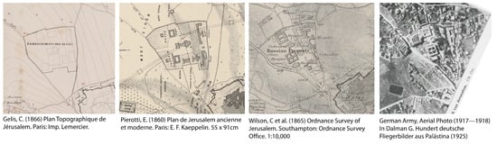
Figure 1.
The first two maps by Pierotti and Gelis depict a configuration of the Russian Compound that is incompatible with the real one in terms of shape and number of buildings. The third representation, from the Ordnance Survey, is the most accurate, as evidenced by the 1917 aerial photo on the right [14] (p. 19).
For this reason, the case of the Russian Compound is particularly interesting to study in the context of the cartographic representation of Jerusalem. These discrepancies raise questions about the dating of the sources and whether the incorrect representations might depict project plans for the area before construction. Using the proposed methodology to identify families in the reproduction of this area opens up the possibility of analyzing the reasons behind these inaccuracies and the involvement of mapmakers in the construction of the area.
2.2. The Subject: Planimetric Distortion
Our focus on the planimetric aspect of cartography is grounded in the framework proposed by Blakemore and Harley [15], who developed the theoretical discourse around the concepts of accuracy and error, categorizing cartographic accuracy into three interdependent layers: (a) Chronometric accuracy, concerning temporal precision; (b) Geodetic and planimetric accuracy, involving spatial relationships and positioning; (c) Topographical accuracy, addressing the representation of physical features.
Our analysis thus focuses on the second element, specifically its planimetric aspects. Geodetic accuracy—defined by Laxton as “the quantification of errors in [the map’s] astronomically-based graticule” [4] (p. 38)—is not considered in this study. This is because maps of Jerusalem, typically large-scale and often devoid of coordinate references, are examined primarily in terms of relative distances between features. The focus is therefore on the internal coherence of each map rather than its alignment with an external geodetic framework.
In this study, planimetric distortion refers to local discrepancies in distances and bearings between identifiable objects, following Laxton’s definition of planimetric accuracy as “the extent to which distances and bearings between identifiable objects coincide with their true values” [4] (p. 40). However, our primary interest lies not in identifying discrepancies between represented and true values but in analyzing similarities and divergences in corresponding distances across maps.
When examining planimetric distortions, it is important to clarify that our analysis does not account for physical degradation of the map medium, such as warping or paper damage. However, we acknowledge that these factors can contribute to overall planimetric inaccuracies, making it challenging to disentangle physical alterations from cartographic misrepresentation. However, since these physical deformations typically occur later in the map’s lifecycle, they would not propagate through subsequent copies. Consequently, they could primarily obscure local correspondences in our similarity analysis, leading to false negatives by concealing genuine matches. At the same time, such deformations could introduce false positives when analyzing local distortion intensity, particularly in studies identifying areas of greater inaccuracy. However, in this study, distortion intensity is used solely to exclude areas with minimal deformation from the comparison and is therefore unaffected by false positives of this nature.
2.3. Background: Cartometric Analysis of Planimetric Accuracy and Comparison
In the 1970s, numerous studies on planimetric accuracy were conducted, mainly to determine a score of accuracy for old maps [4,16,17]. The seminal works by Murphy [18] and Blakemore and Harley [15] then analyzed these efforts, laying the theoretical foundations of the discipline and highlighting the potential of accuracy analysis in understanding the origins of maps and the lineages of copies. Murphy [18] conducted a comparative review of existing methodologies, emphasizing the challenges posed by methodological heterogeneity in such studies. Forstner and Oehrli [19] provided an overview of late 20th-century cartometric techniques for computing and visualizing distortion. Despite sustained interest in the subject, no unified school of thought emerged, even with advancements in GIS [20].
The introduction of MapAnalyst, a dedicated tool for analyzing and visualizing distortions in historical maps [21,22], facilitated the emergence of various studies, particularly those focusing on accuracy assessment for land use and geomorphological change detection [23,24], as well as local cartometric analysis to investigate mapmaking processes [25,26]. Among the latter, Perthus and Faehndrich [26] employed MapAnalyst to assess the accuracy of two maps of the Holy Land, aiming to understand their production process and revealing hidden layers of information through distortion analysis. Boùùaert et al. later introduced differential distortion analysis, a technique designed to produce local, continuous, fine-grained distortion measures [27]. This method was then applied to a map composed of 275 sheets and with a high number of GCPs from georeferencing, linking its local distortion patterns to historical insights into the production process [28].
The analysis of local distortion, in addition to providing insights into production processes, can also sometimes reveal the mapmaker’s biases and intentions. Distortions may be introduced involuntarily, yet their underlying causes can still be interpreted. Conversely, they can be deliberately embedded, as in what Tyner defines as persuasive maps (i.e., cartographic representations that intentionally distort elements to support a particular narrative [29]). Yabe employed geographically weighted bidimensional regression to visualize local distortions, particularly local scaling heterogeneities, studying the upscaling of certain specific elements in a Japanese Castle Map as a hint of the mapmakers’ intentions [30]. In our preliminary study, we used distortion grids to identify recurring patterns in local scaling deviations across multiple maps of Jerusalem to highlight recurring representation biases [31]. This approach is particularly relevant in regions historically shaped by a colonial gaze, where intentional and unintentional distortions can be critically examined, as in the present case.
The idea that distortion analysis could serve as more than a metric of reliability or an investigative tool for a single map—potentially unlocking the assessment of copying relationships [15,18,22,32]—has been explored in several studies that used accuracy analysis to trace the origins of maps [33,34,35]. However, existing approaches have either compared the positional accuracy of corresponding homologous points or, when employing displacement vectors and deformed lattice grids generated with MapAnalyst, relied on visual comparison. Both methods present limitations for scaling up comparative analysis.
On the one hand, visual comparison becomes impractical when working with a large number of maps. On the other, identifying a consistent set of homologous points across all maps is often infeasible due to variations in scale and topographical content, making it challenging to perform the comparison over a large collection of maps.
Goel [36] proposed a method to compare the distortion of different map projections based on the creation of distortion matrices and using Euclidean distance for comparison. Although designed to assess distortions resulting from map projections and without addressing the selection of a scalar distortion metric at each grid point, it underscores the potential of distortion lattice grid analysis for automating and scaling up map comparisons. In our previous study [5], we developed and evaluated a methodology for the automatic comparison of map distortion lattice grids to identify global similarities, incorporating both intensity and direction of deformation. We selected Cosine Similarity as the most effective metric for detecting copies. However, while effective in detecting complete reproductions, this approach fails in cases where only a limited portion of a map was replicated or when multiple sources were combined, a challenge analogous to horizontal transmission in stemmatology.
2.4. Methodology: Encoding and Comparing Local Distortions Across Maps
The main objective of this section is to present a methodology for (1) processing local planimetric distortions of maps—represented by their deformed lattice grids—to encode them in a comparable format, and (2) using this transformed data for the local comparison of maps. The entire methodology has been implemented in Python, ensuring that once the maps have been manually georeferenced, all subsequent steps are fully automated.
This novel methodology is designed to detect local deformative similarities between two or more georeferenced maps, represented through their deformed lattice grids, even when limited to a small area. This is achieved by avoiding the step of global alignment between the deformed lattice grids and instead relying solely on the local geometric configuration of the nodes. While global alignment is effective for detecting complete copies (i.e., maps whose planimetric information completely matches that of another), it can fail when the information of a derivative map comes from multiple sources or when the copied portion is limited. In these cases, global alignment, such as with an affine transformation, would find the best overall match across the grids, potentially placing small corresponding areas at a high distance from each other.
To rely exclusively on the local geometric distortion of the lattice grid, the geometric configuration of each 3 × 3 grid section, referred to as a token, is encoded. Specifically, a token captures the geometric arrangement of a central point relative to its eight surrounding points, represented by their mutual distances. This method exploits the property of rigid geometric shapes, which preserve constant ratios between the corresponding edges. By incorporating diagonal lengths, the rigidity of the shape is reinforced, ensuring that only truly geometrically similar configurations are classified as such (Figure 2).
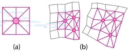
Figure 2.
(a) The 9-point portion of the grid (called “token”) with the considered edges in pink and (b) how similar tokens look like when comparing two deformed grids.
Section 2.4.1 details the encoding of distortion tokens from the deformed lattice grid, creating the basis for the comparison. Section 2.4.2 presents how to exclude from further analysis the parts of the grid that are almost non-deformed and the ones that are outside of the alpha shape (i.e., the bounding polygon of a set of points, which constitutes a generalization of the convex hull that can also capture concave structures, with a level of detail controlled by the parameter ) defined by the ground control points (GCPs). Finally, Section 2.4.3 illustrates the use of the prepared and filtered tokens to compare and cluster local distortions.
2.4.1. Encoding Local Distortions
This section outlines the process of using ground control points (GCPs), i.e., pairs of corresponding points between each map and a reference map used for georeferencing, to generate a deformed lattice grid for each map (In our case, we used as a reference OpenStreetMap data in the local EPSG 28193). Then, it explains how to use this grid to create a token that represents the geometric configuration of each node. The result of this step is a matrix with the same shape as the initial grid, where each node contains a vector with the relevant edge lengths (i.e., the token). The steps needed to perform this part of the methodology are the following.
- Creation of the regular grid: the process begins by identifying Ground Control Points (GCPs) on the map through georeferencing. These points are essential as they establish a correspondence between specific locations on the map’s pixel space and their real-world coordinates in the local reference system (CRS). Next, these correlated points are used to construct a rectangular bounding box in the local CRS of the area depicted in the maps. This bounding box serves as a reference framework for creating a regular grid within the local CRS. To enable future comparisons, the grid is created with a constant distance between neighboring nodes and from a shared starting point, to ensure alignment between the grids (Figure 3). The grid spacing is fully customizable and should be chosen case by case, depending on the overall level of detail and scale of the maps that are analyzed. In our case, this value has been set to 20 m.
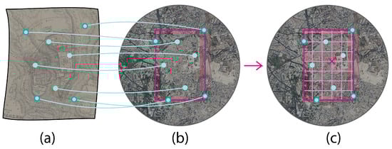 Figure 3. The ground control points (light-blue dots) and the creation of the aligned, regular grid inside the bounding box. (a) Represents the map’s image and the points that were found to perform the georeferencing. (b) Shows the location of these points in real-world coordinates with a bounding box around them (in pink). (c) Displays the creation of a regular grid (in pink) in the local CRS, starting with a common fixed point (indicated with an x) and using the extent of the GCPs as a bounding box for its extent.
 - Deformation of the grid with the ground control points (GCPs): The second step involves applying a Thin Plate Spline (TPS) transformation to the regular grid using the GCPs. These points provide vectors that map real-world coordinates to pixel points. By using these vectors to define a TPS transformation, the regular grid in the local CRS can be transformed into a deformed lattice grid in the pixel space of the map. The choice of Thin Plate Spline interpolation is deliberate, as it allows the grid to elastically adapt to local distortions (Figure 4).
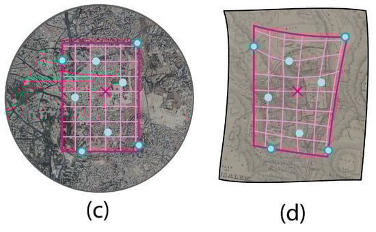 Figure 4. By using the vectors defined by the transformation from the real-world coordinates to the pixel space of the map’s image, the regular grid (c) can be deformed using a Thin Plate Spline interpolation (d). Light-blue dots represent GCPs, the x indicates the common fixed point used to generate the regular grid.
 - Encoding the tokens: to detect areas of nearly perfect geometric similarity, the property of similar geometries to maintain a constant ratio between corresponding sides is used. To effectively employ this method, it is essential to first define the specific geometric shapes to be compared and to ensure their rigidity.In quadrilateral geometries (the edges of the grid), a constant ratio does not necessarily imply geometric similarity, as a shape with varying internal angles (e.g., a rhomboid) can lead to the same ratios between corresponding edges. To address this, we collect the distances between each node and its surrounding eight points (including diagonals), as well as the mutual distances between these eight points and their direct neighbors among the eight points (Figure 5). The collection of these edges, thanks to the diagonals, forms a rigid shape, as needed.
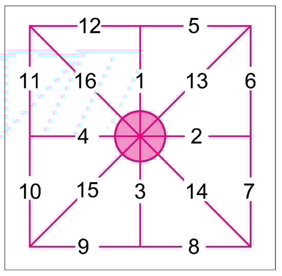 Figure 5. The figure represents the order imposed on the edges of each token. This order is strictly applied when collecting the lengths of its edges in a vector.
These distances are gathered in a vector for each node, always following the same consistent order of 16 elements. This vector represents our token, which can be used in subsequent analyses and comparisons. The matrix containing the tokens is now suitable for assessing similarity directly through local geometric properties, without requiring any alignment. The next two parts of the methodology will detail how to filter out portions of the grid that should be excluded from the comparison and how to identify clusters of similar distortions across the filtered grids.
2.4.2. Filtering out the Areas with Low Distortion
For the comparison of the deformed grids, we are interested in using only the points of the grids that are relevant for studying local distortions. This involves excluding points that are part of the grid uniquely due to its rectangular shape, specifically those at the corners defined by the rectangular bounding box of the ground control points (GCPs). This preliminary filtering can be achieved by drawing the alpha shape (i.e., a concave hull with a desired level of complexity) around the GCPs and using it to filter out these points.
The second filtering step addresses the hypothesis that a common lack of deformation does not necessarily indicate correlation. Therefore, the analysis should include only tokens with a sufficient level of distortion. This filtering is achieved by comparing the tokens to a reference undeformed token, which is the edge lengths vector obtained from an undeformed square of 3 × 3 points. Tokens that closely resemble the undeformed configuration in terms of geometric similarity can be filtered out as non-deformed. One limitation of this approach is that it relies only on geometric similarity as a constraint for filtering. Consequently, a token that is scaled up or down but remains geometrically undeformed will still be classified as undeformed. The combination of these two filters results in the set of relevant tokens that will be used for further analysis (Figure 6).
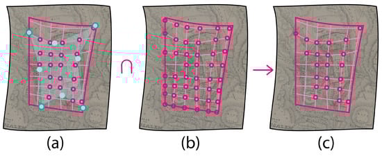
Figure 6.
Pink dots represent candidate relevant tokens. Using an alpha shape (a), it is possible to exclude the points of the grid that are outside the actual bounds of the ground control points (indicated as light-blue dots) and that were just included because of the rectangular shape of the bounding box. By intersecting this filtering with the one on the intensity of distortion (b), it is possible to select only the relevant points (c).
2.4.3. Clustering Similar Distortions
The third and crucial step consists of comparing the filtered tokens from the deformed grids of the maps under analysis. The goal in this step is to cluster the 9-point square subgrids that exhibit almost perfect similarity across maps. In particular, this analysis is carried out across the entire dataset of fifty maps. Therefore, a preliminary step of padding is necessary: while the grids are aligned with one another, they still have different extents. To standardize their dimensions, the maximum extent found across all fifty maps is used to pad them to the same size with NaN (Not a Number) values, which indicate absence of data.
Now that all matrices of tokens have the same extent and are perfectly aligned, the value of non-NaN tokens across all maps can be analyzed. To do so, each point of the padded matrix with at least two comparable tokens is considered, and the pairwise ratio of the vectors is computed. (The ratio is computed after normalizing the token vectors, using the vector with the highest maximum as the denominator.). For each pair of compared tokens, the ratio of corresponding elements is calculated, resulting in a vector of the same length as the tokens, containing the ratios. Since a constant ratio corresponds to perfect geometric similarity, the difference between the maximum and minimum values in this ratio vector is used as a distance measure between the tokens. The closer this value is to 0, the closer the tokens are to perfect geometric similarity (Figure 7).
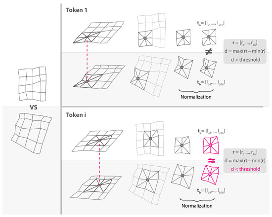
Figure 7.
The figure shows the comparison of two grids at two different tokens. The first token is not detected as similar, as the distance is higher than the threshold, while the second (token i) shows a case of similarity (highlighted in pink).
Pairwise distances are then fed to a complete-linkage hierarchical clustering, where a threshold distance of 0.2 is used to determine the maximum distance between any two points in different clusters for merging them into the same cluster. By collecting the results at each point, we can create a new matrix that contains the clustering of maps at the token level (Figure 8).

Figure 8.
For every node of the deformed grid, we cluster together the tokens that are similar to one another by using complete linkage. In the figure, a possible situation is shown, where among all compared tokens, three clusters were found. The tokens that are too distant to be clustered with another one are recorded as outliers, meaning that their information is not repeated in any other map.
This matrix can now be employed to study local similarities between maps. One useful derivative is represented by the regions of adjacent nodes shared by the same common maps, which can be derived using the tokens’ adjacency. In the next section, the clustering results will be used to gain insight into a specific case study.
3. Results
The regions of local similarity obtained with the proposed methodology can be used to visualize the clusters of maps sharing the same deformation at a specific point or the regions of similarity shared by a selected subset of maps. These two filtered visualizations are useful for understanding the results in cases where a relatively high number of maps leads to a complex overall interpretation, such as in the present study.
This section presents the application of the methodology to a specific area of interest: the Russian Compound. By focusing on the maps representing this site and selecting a point within it, historical and stemmatic insights into the cartographic representation of the area can be deduced.
As anticipated in Section 2.1, this area represents a particularly interesting case study. On the one hand, some of the maps depict it in a way that is not compatible with the actual shape and number of buildings. On the other, some of these maps represent the area before the date reported in historical sources for the completion of its construction.
By setting the query point within the Russian Compound and selecting the maps depicting it from the dataset, our methodology identified and clustered together maps with similar local distortions. This process revealed two distinct clusters at the queried point (Figure 9), which can now be used to identify the predecessor within each cluster, i.e., the earliest map from which that particular representation was copied. The clustering results will be analyzed to identify the predecessor, also considering the maps that were clustered with no other maps.
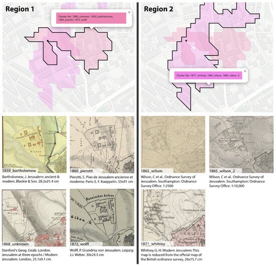
Figure 9.
The two regions of similar maps obtained for the queried point (represented as a black dot) and the corresponding maps below them. The regions are represented as colored areas with transparency over a contemporary OpenStreetMap image of the area.
The cluster on the bottom, composed of Wilson’s Ordnance Survey maps (in both scales) and Whitney’s map, consists of maps in which the area is represented correctly in terms of building number and shape. The predecessor in this case is represented by the Ordnance Survey map, as also declared in the title of Whitney’s map, which represents its reduction. The cluster on top is composed of earlier maps, some predating the area’s completion, and needs a more thorough analysis to understand the origins of its content. This cluster differs from the second in the outer shape of the compound, which is slightly deformed, and more noticeably in the number and shape of the buildings, which are not compatible with the actual configuration of the compound. A possible explanation is that the initial author depicted either a project or the ongoing construction, likely having direct access to or connection with the site. Given this information, the most likely predecessor within the cluster is Pierotti’s 1860 map, as he was directly involved in the creation of the Russian Compound. In fact, recent research indicates that Ermete Pierotti, an Italian architect and engineer, acquired several key lots in Jerusalem between 1857 and 1859 for the Russian Consulate [37]. This is supported by his mention in Boris Mansurov’s letters; Mansurov was appointed by Grand Duke Konstantin Nikolaevich, with the support of the Tsar, to look for building sites for the Russian Empire in the fall of 1858 [12]. Moreover, Pierotti referred to himself as “Ispettore delle fabbriche russe” in an 1864 letter reported by [38], implying his official role. However, his involvement in the project is not explicitly mentioned in official documents but can be inferred from “mere scraps of information” [37] (p. 201), such as the ones mentioned or his appearance in a photograph labeled “the builders of the Russian Compound in Jerusalem”, dated 1858 [10,37] (p. 195), unlike John Bartholomew. Therefore, Bartholomew’s map must be a copy, indicating a potential dating error in one or both maps, as neither provides a date. The existence of a manuscript map from Pierotti dated 1 June 1860, held in the National Library of Spain [39], closely resembling this map suggests that Pierotti’s map could indeed be from around 1860, while Bartholomew’s map should be a later copy. Notably, Pierotti’s misrepresentation continued to be reproduced in maps for several years after the site’s completion. This indicates that later authors copied from Pierotti or a derivative without taking ground measurements or even accessing the area, as the error is particularly evident.
The origins of the content of John Bartholomew’s map can be further investigated by plotting all its detected predecessors among the fifty maps employed as a dataset (Figure 10). This represents an additional way in which the results of our methodology can be analyzed. Specifically, we select a single map as a query—in this case, Bartholomew’s map—and identify the regions where local distortions match among all maps that have a declared production year prior to that of the query map. This approach allows us to explore potential sources and influences for different regions of the map.
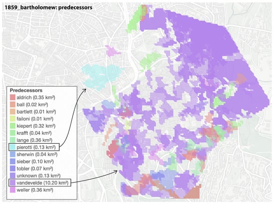
Figure 10.
The authors of the possible predecessors of Bartholomew’s map are listed, along with their extent in square kilometers. This type of analysis retrieves the regions of each antecedent map that exhibit strong similarities with the query map. To facilitate interpretation, we have grouped the results by author, highlighting the contributions of different sources to the final composition of Bartholomew’s map.
A distinct pattern emerges from the predecessor analysis, revealing a divergence in the sources used for different areas of the map. Notably, the Russian Compound area exhibits strong similarities with the work of Ermete Pierotti, whereas the rest of the map aligns more closely with another series of maps, particularly those produced by C.W.M. Van de Velde. To further investigate this finding, we plot the tokens that are shared between Bartholomew’s map and one of its primary predecessors, Van de Velde’s 1846 map (Figure 11).
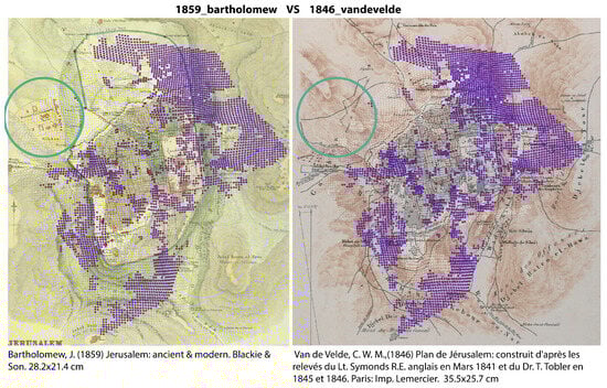
Figure 11.
The results are further explored by mapping the tokens that are shared between Bartholomew’s map and one of its main predecessors, Van de Velde’s 1846 map. The tokens identified as highly similar are plotted in purple, while a blue circle highlights the Russian Compound area, which was later incorporated into Bartholomew’s map.
The results suggest that Bartholomew’s map was constructed using two primary sources: C.W.M. Van de Velde’s 1846 map, which predates the construction of the Russian Compound by fourteen years and therefore does not depict it for the majority of the map, and Ermete Pierotti’s circa 1860 representation, which inaccurately portrays the site.
Now that Pierotti’s map has been identified as the predecessor, how can the difference in the number and shape of the buildings in the area be explained? Vakh [37] suggested that Pierotti may have played a role in convincing Surayya-Pasha, his patron and friend (and consequently Sultan Abdulmecid), to gift the neighboring lot for the Russian Compound with the hope of participating in its construction as an architect. However, Vakh concluded that Pierotti no longer received a salary from the Russian Consulate by the end of 1859, which indicates that he was likely not successful in his endeavor. In another article [10], three projects for the area were reported. Despite an initial overall rotation of the area, the buildings in these projects resemble those that were eventually constructed and not the ones drawn by Pierotti. It is therefore possible that in his map, Pierotti tried to propose a variation to the initial plans by slightly modifying the number of buildings, perhaps hoping to secure a role as an architect in the project.
Four maps among the ones representing the area were not clustered with any other at the queried point: Weller (1860), Pierotti (1864), Gelis (1866), and Pierotti (1869). It is possible to explore their connections to other maps by plotting all their predecessors (Figure 12).
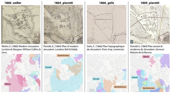
Figure 12.
Theregions of similarity shared with any previous map for the four unclustered maps.
Weller’s map, dated 1860 according to the online archive of the National Library of Israel, shows a region of similarity with Wilson’s map. However, its reduced size, simplified information, and intended publication (Collins’ Pocket Atlas of Scripture Geography) make it unlikely to have been the predecessor of a highly influential map like the Ordnance Survey maps by Wilson. The latter are most likely the predecessors of Weller’s map, which must necessarily be dated after them. The reason why the region of similarity does not cover the entire area can be explained by distortions resulting from the simplification of the map.
In his 1864 map, Pierotti seems to have corrected the outer shape of two buildings, which are now correctly squared and not rectangular. However, the number of buildings and the overall shape of the lot remain the same, and when looking for its predecessors, his previous maps emerge as sources.
In the case of Gelis’ 1866 map, there is no detected similarity even in the outer shape of the area. Visually, it is noticeable that the representation and disposition of the buildings differ from both previous clusters and are not compatible with the actual configuration, raising questions about the reasons behind this misrepresentation, especially considering that the area was completed by this point.
Pierotti’s 1869 map, on the other hand, maintains similarity in the outer shape with his earlier maps (as indicated by the colored regions on the sides) but depicts the shape and number of the buildings correctly. The fact that the similarities with Wilson’s map are extremely limited in extent could indicate either a new independent ground measurement by the author or a deliberate slight modification of the building proportions.
From the results of this analysis, we can derive a stemmatic schema illustrating how this area’s representation was likely copied and modified over time (Figure 13).
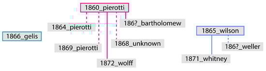
Figure 13.
Stemmatic schema representing how the area’s representation was introduced, copied, or modified based on the deformative analysis paired with information from secondary sources. The dashed line indicates a map that shares similarities with the original map but presents some modifications from it.
Gelis’ incorrect representation of the area could not be related to any other source among the considered ones and therefore stands isolated. The first family is represented by Pierotti’s 1860 map, from which several other maps stem. His map from 1864 has a first partial correction of two buildings’ shapes, and the one from 1869 finally corrects their number while maintaining the old shape of the area. The 1868 map appears as a reduction of Pierotti’s 1860 map, but with a removal of some of the non-realized buildings (while keeping the wrong shape of the others). The second family stems instead from Wilson’s Ordnance Survey maps.
4. Discussion and Limitations
This analysis helped shed light on dating errors in both clusters, provided clues for assumptions about Pierotti’s representation, and offered further proof of his involvement in the project, consistent with previous studies based on literary sources. Ultimately, the methodology’s results enabled the formulation of a hypothesis for the stemmata of the representation. However, while it is possible to identify the original or archetype among a cluster of similar representations, the identification of the precise flow of information through the maps is not as easy.
It is worth noting that the insights provided by the presented methodology act as a magnifying glass, offering valuable support for forming and motivating hypotheses in combination with traditional historiography tools. However, in the application of our methodology for detecting and segmenting regions of local similarity across historical maps, several factors introduce inherent variability and potential limitations and should be considered when interpreting the results.
First, the choice of thresholds for filtering out non-deformed areas and for defining similarity in the clustering process determines the sensitivity of the methodology in detecting relevant distortions and similarities. Then, the scale of the maps and the level of detail in the depicted information also play a critical role. Maps at different scales might exhibit different levels of distortion, and simplifying information to fit a particular scale can alter the representation of local features. Such simplifications might smooth out distortions or exaggerate them, affecting the detectability of local similarities. In maps where detailed features are generalized, small but significant distortions might be lost, impacting the methodology’s ability to detect copying relationships accurately. Moreover, the distortions introduced by the map medium or by the digitization process can introduce another layer of variability where some similarities may go undetected. Additionally, this methodology relies on ground control points (GCPs) as input, which, in our case, were manually identified. Achieving accurate results requires a high density of GCPs to ensure comprehensive coverage of the maps. However, the manual identification process is time-intensive, posing a challenge to scalability. To address this limitation, we are currently developing a module to automate the identification of GCPs.
5. Conclusions
The digital analysis of planimetric distortions in maps constitutes a promising methodology for identifying copying relationships, especially when used across many maps. The novel methodology introduced in this study has proven effective in identifying regions of local distortion that are similar across maps, clustering together the sources that represent an area with similar deformations. The deformed lattice grids obtained from georeferencing, padded and aligned across maps, constitute the object used for the comparison. By leveraging the properties of geometric similarity of 9-point squares of the grid, the methodology successfully worked also in cases of limited, partial similarity.
A selection of fifty 19th-century maps of Jerusalem, created between 1810 and 1872, was used to analyze the history of the cartographic representation of the Russian Compound, one of the first quarters built outside the walls of the Old City. The clusters of similarity obtained from their comparison revealed the presence of two clusters of similarity among the maps representing the area within the dataset. The clustering results, combined with historical insights, made it possible to advance new hypotheses for the dating correction of some of the maps and the lineages of copies between them. Moreover, the propagation of an evident error in the representation, stemming from Pierotti’s 1860 map, can also provide information on the authors who most likely did not take ground measurements or access the site.
By providing clusters of local similarities, this methodology supports the study of map distortion propagation, especially in cases where cross-influences are largely present. Moreover, the possibility of querying a specific point or filtering the regions based on a selection of maps allows for easier interpretation of the results in large collections.
In conclusion, integrating computational cartometry with traditional historiography tools can uncover hidden historical insights and support the creation of genealogies of map collections, even when the collections are large and when differences may be slightly visible.
Author Contributions
Conceptualization, Beatrice Vaienti; methodology, Beatrice Vaienti; software, Beatrice Vaienti; validation, Beatrice Vaienti, Frédéric Kaplan, and Isabella di Lenardo; formal analysis, Beatrice Vaienti; investigation, Beatrice Vaienti; resources, Beatrice Vaienti, Frédéric Kaplan, and Isabella di Lenardo; data curation, Beatrice Vaienti; writing—original draft preparation, Beatrice Vaienti; writing—review and editing, Beatrice Vaienti, Frédéric Kaplan, and Isabella di Lenardo; visualization, Beatrice Vaienti; supervision, Frédéric Kaplan and Isabella di Lenardo; project administration, Frédéric Kaplan and Isabella di Lenardo; funding acquisition, Frédéric Kaplan and Isabella di Lenardo. All authors have read and agreed to the published version of the manuscript.
Funding
This project has received funding from the European Union’s Horizon 2020 research and innovation programme under the Marie Skłodowska-Curie grant agreement No 945363.
Data Availability Statement
The code presented in the study is openly available in GitHub at https://github.com/BeatriceVaienti/local-distortion-similarity(accessed on 1 March 2025).
Conflicts of Interest
The authors declare no conflicts of interest.
References
- Levy-Rubin, M.; Rubin, R. The Image of the Holy City in Maps and Mapping. In City of the Great King; Rosovsky, N., Ed.; Harvard University Press: Cambridge, MA, USA; London, UK, 1996; pp. 352–379. [Google Scholar] [CrossRef]
- Rubin, R. Image and Reality: Jerusalem in Maps and Views; Magnes Press: Jerusalem, Israel, 1999. [Google Scholar]
- Goren, H.; Faehndrich, J.; Schelhaas, B.; Weigel, P. Mapping the Holy Land: The Foundation of a Scientific Cartography of Palestine; Tauris Historical Geography Series; I.B. Tauris: London, UK, 2017; Volume 11. [Google Scholar]
- Laxton, P. The Geodetic and Topographical Evaluation of English County Maps, 1740–1840. Cartogr. J. 1976, 13, 37–54. [Google Scholar] [CrossRef]
- Vaienti, B.; di Lenardo, I.; Kaplan, F. Exploring cartographic genealogies through deformation analysis: Case studies on ancient maps and synthetic data. Cartogr. Geogr. Inf. Sci. 2024, 1–21. [Google Scholar] [CrossRef]
- Sieber, F.W. Karte von Jerusalem und Seiner Naechsten Umgebungen; Martin Neureutter: Prague, Czech Republic, 1818. [Google Scholar]
- Sieber, F.B. Reise von Cairo Nach Jerusalem und Wieder Zurück; Martin Neureutter: Prague, Czech Republic, 1823. [Google Scholar]
- Rubin, R. The map of Jerusalem (1538) by Hermanus Borculus and its copies—A carto-genealogical study. Cartogr. J. 1990, 27, 31–39. [Google Scholar] [CrossRef]
- Rubin, R. Original maps and their copies: Carto-genealogy of the early printed maps of Jerusalem. Eretz Isr. 1991, 22, 166–183. (In Hebrew) [Google Scholar]
- Vakh, K.A. Velikii kniaz’ Konstantin Nikolaevich i Russkoe Palomnichestvo v Sviatuiu Zemliu. K 150-letiiu Osnovaniia Russkoi Palestiny. 1860–1864; Indrik: Moscow, Russia, 2011. (In Russian) [Google Scholar]
- Gerd, L.; Potin, Y. Chapter 5 Foreign Affairs Through Private Papers: Bishop Porfirii Uspenskii and His Jerusalem Archives, 1842–1860; Brill: Leiden, The Netherlands, 2018; pp. 100–117. [Google Scholar] [CrossRef]
- von Winning, A. Jerusalem: The Russian Compound. In Intimate Empire: The Mansurov Family in Russia and the Orthodox East, 1855–1936; Oxford University Press: Oxford, UK, 2022. [Google Scholar] [CrossRef]
- Ben-Arieh, Y. The Growth of Jerusalem in the Nineteenth Century. Ann. Assoc. Am. Geogr. 1975, 65, 252–269. [Google Scholar] [CrossRef]
- Dalman, G. Hundert Deutsche Fliegerbilder aus Palästina; Bertelsmann: Gütersloh, Germany, 1925. [Google Scholar]
- Blakemore, M.; Harley, J. The Search For Accuracy. Cartographica 1980, 17, 54–75. [Google Scholar] [CrossRef]
- Ravenhill, W.; Gilg, A. The Accuracy of Early Maps? Towards a Computer Aided Method. Cartogr. J. 1974, 11, 48–52. [Google Scholar] [CrossRef]
- Stone, J.C.; Gemmell, A.M.D. An Experiment in the Comparative Analysis of Distortion on Historical Maps. Cartogr. J. 1977, 14, 7–11. [Google Scholar] [CrossRef]
- Murphy, J. Measures of map accuracy assessment and some early Ulster maps. Ir. Geogr. 1978, 11, 88–101. [Google Scholar] [CrossRef]
- Forstner, G.; Oehrli, M. Graphische Darstellungen der Untersuchungsergebnisse alter Karten und die Entwicklung der Verzerrungsgitter. Cartogr. Helv. 1998, 17, 35–43. [Google Scholar]
- Livieratos, E. On the Study of the Geometric Properties of Historical Cartographic Representations. Cartographica 2006, 41, 165–176. [Google Scholar] [CrossRef]
- Jenny, B.; Weber, A.; Hurni, L. Visualizing the Planimetric Accuracy of Historical Maps with MapAnalyst. Cartographica 2007, 42, 89–94. [Google Scholar] [CrossRef]
- Jenny, B.; Hurni, L. Cultural Heritage: Studying cartographic heritage: Analysis and visualization of geometric distortions. Comput. Graph. 2011, 35, 402–411. [Google Scholar] [CrossRef]
- Tucci, M.; Giordano, A. Positional accuracy, positional uncertainty, and feature change detection in historical maps: Results of an experiment. Comput. Environ. Urban Syst. 2011, 35, 452–463. [Google Scholar] [CrossRef]
- Christin Loran, S.H.; Ginzler, C. Comparing historical and contemporary maps—A methodological framework for a cartographic map comparison applied to Swiss maps. Int. J. Geogr. Inf. Sci. 2018, 32, 2123–2139. [Google Scholar] [CrossRef]
- Bayer, T.; Potůčková, M.; Čábelka, M. Cartometric Analysis of Old Maps on the Example of Vogt’s Map. In Cartography in Central and Eastern Europe: CEE 2009; Gartner, G., Ortag, F., Eds.; Springer: Berlin/Heidelberg, Germany, 2010; pp. 509–524. [Google Scholar] [CrossRef]
- Perthus, S.; Faehndrich, J. Visualizing the map-making process: Studying 19th century Holy Land cartography with MapAnalyst. e-Perimetron 2013, 8, 60–84. [Google Scholar]
- Boùùaert, M.; De Baets, B.; Vervust, S.; Neutens, T.; De Maeyer, P.; Van de Weghe, N. Computation and visualisation of the accuracy of old maps using differential distortion analysis. Int. J. Geogr. Inf. Sci. 2016, 30, 1255–1280. [Google Scholar] [CrossRef]
- Vervust, S.; Boùùaert, M.C.; Baets, B.D.; de Weghe, N.V.; Maeyer, P.D. A Study of the Local Geometric Accuracy of Count de Ferraris’s Carte de cabinet (1770s) Using Differential Distortion Analysis. Cartogr. J. 2018, 55, 16–35. [Google Scholar] [CrossRef]
- Tyner, J.A. Persuasive cartography. J. Geogr. 1982, 81, 140–144. [Google Scholar] [CrossRef]
- Yabe, N. Mapmaking Process Reading from Local Distortions in Historical Maps: A Geographically Weighted Bidimensional Regression Analysis of a Japanese Castle Map. ISPRS Int. J. Geo-Inf. 2024, 13, 124. [Google Scholar] [CrossRef]
- Vaienti, B.; Di Lenardo, I.; Kaplan, F. Tracing Cartographic Errors in the Western Representation of 19th Century Jerusalem; Digital Humanities 2024: Reinvention & Responsibility; Digital Humanities 2024: Book of abstracts; EPFL (Swiss Federal Technology Institute of Lausanne): Lausanne, Switzerland, 2024. [Google Scholar]
- Jongepier, I.; Soens, T.; Temmerman, S.; Missiaen, T. Assessing the Planimetric Accuracy of Historical Maps (Sixteenth to Nineteenth Centuries): New Methods and Potential for Coastal Landscape Reconstruction. Cartogr. J. 2016, 53, 114–132. [Google Scholar] [CrossRef]
- Bower, D.I. Saxton’s Maps of England and Wales: The Accuracy of Anglia and Britannia and Their Relationship to Each Other and to the County Maps. Imago Mundi 2011, 63, 180–200. [Google Scholar] [CrossRef]
- Solchenbach, K. Comparing old maps with cartometric methods. e-Perimetron 2021, 16, 55–62. [Google Scholar]
- Bartos-Elekes, Z. Behind the first Habsburg map of Transylvania—Comparative analysis of contemporary manuscript maps. Int. J. Cartogr. 2023, 9, 507–524. [Google Scholar] [CrossRef]
- Goel, A. An Exploration in Mathematical Cartography: Comparative Distortion. Deep Blue 2022. [Google Scholar] [CrossRef]
- Vakh, K.A. Ermete Pierotti in the Russian service: New biographical discoveries. Z. Dtsch.-PaläStina 2014, 130, 194–204. Available online: http://www.jstor.org/stable/43664933 (accessed on 19 March 2025).
- Legouas, J.Y. Saving captain pierotti? Palest. Explor. Q. 2013, 145, 231–250. [Google Scholar] [CrossRef]
- Pierotti, E. Plan de Jérusalem Ancienne et Moderne: Primo Studio di Ermete Pierotti, Fatto su la Località [Manuscript Map], 1860. Scale [ca. 1:12,333]. 26.5 × 29.5 cm. Biblioteca Nacional de España, MR/42/494. Available online: http://bdh-rd.bne.es/viewer.vm?id=0000069851&page=1 (accessed on 19 March 2025).
Disclaimer/Publisher’s Note: The statements, opinions and data contained in all publications are solely those of the individual author(s) and contributor(s) and not of MDPI and/or the editor(s). MDPI and/or the editor(s) disclaim responsibility for any injury to people or property resulting from any ideas, methods, instructions or products referred to in the content. |
© 2025 by the authors. Published by MDPI on behalf of the International Society for Photogrammetry and Remote Sensing. Licensee MDPI, Basel, Switzerland. This article is an open access article distributed under the terms and conditions of the Creative Commons Attribution (CC BY) license (https://creativecommons.org/licenses/by/4.0/).