

Enhancing the Understanding of the EU Gender Equality Index through Spatiotemporal Visualizations


Abstract
:1. Introduction
2. Related Work
3. Data Processing
3.1. Gender Equality Index
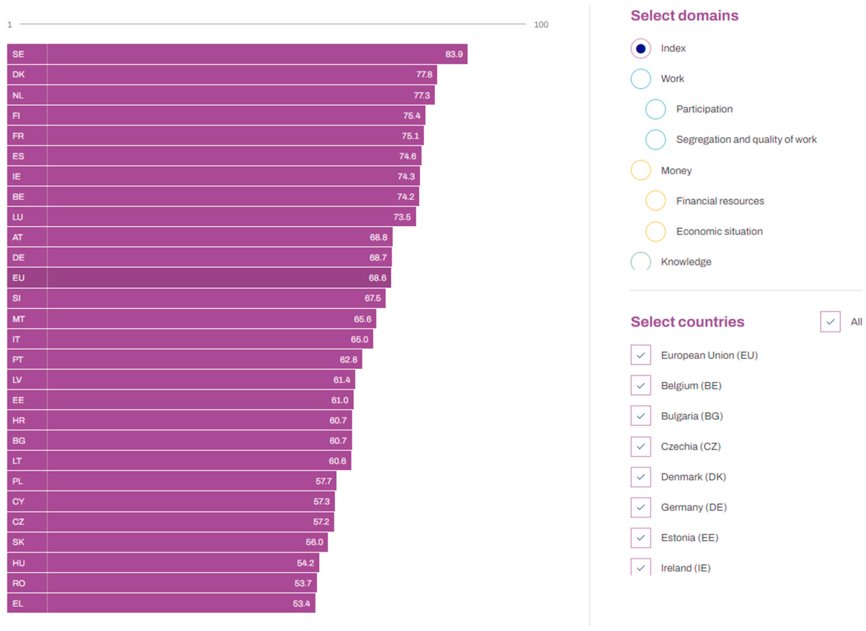
3.2. Interactive Visualizations Proposed by EIGE
3.3. Enhanced Proposed Visualizations
3.3.1. Types of Graphs
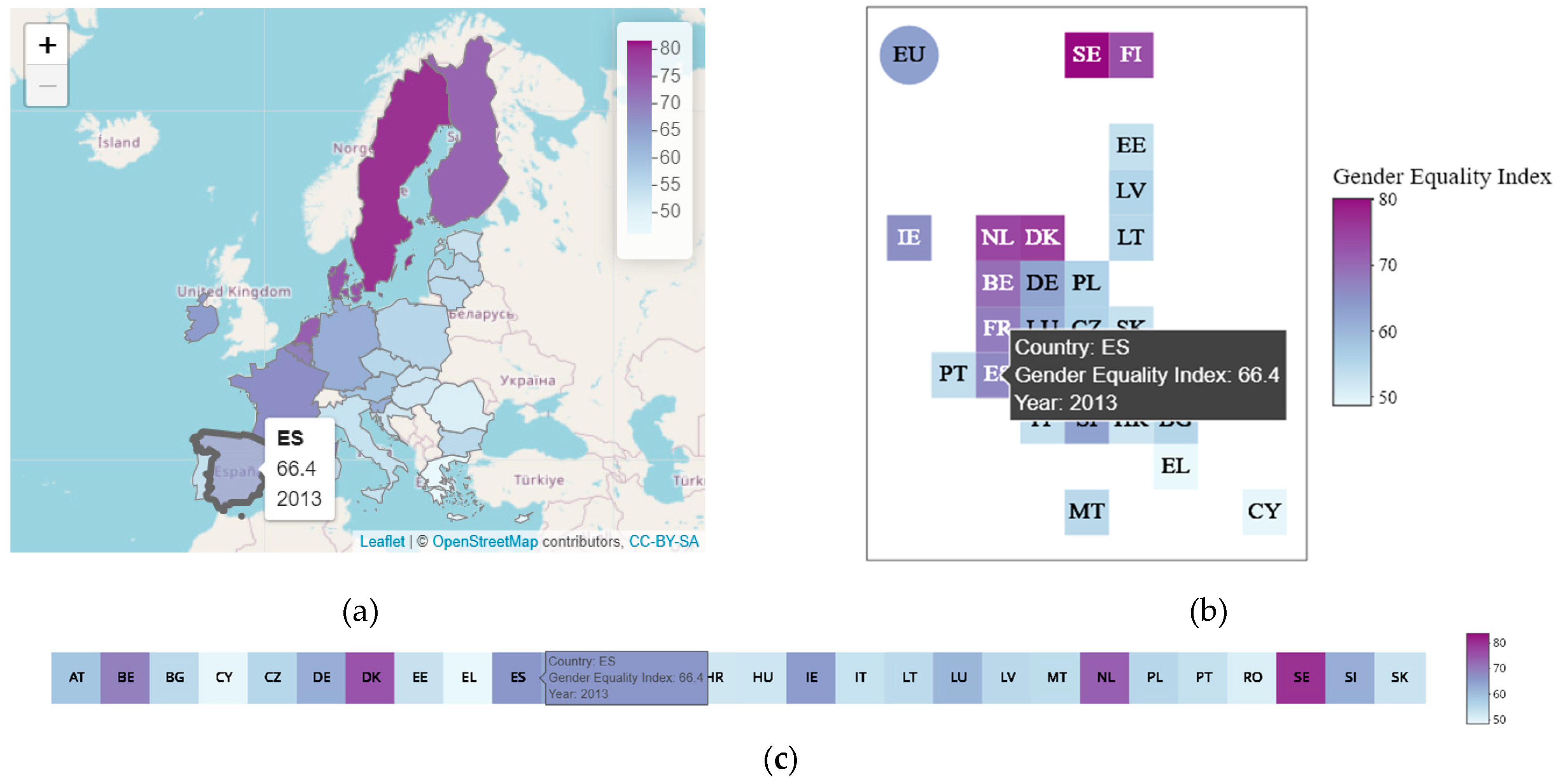
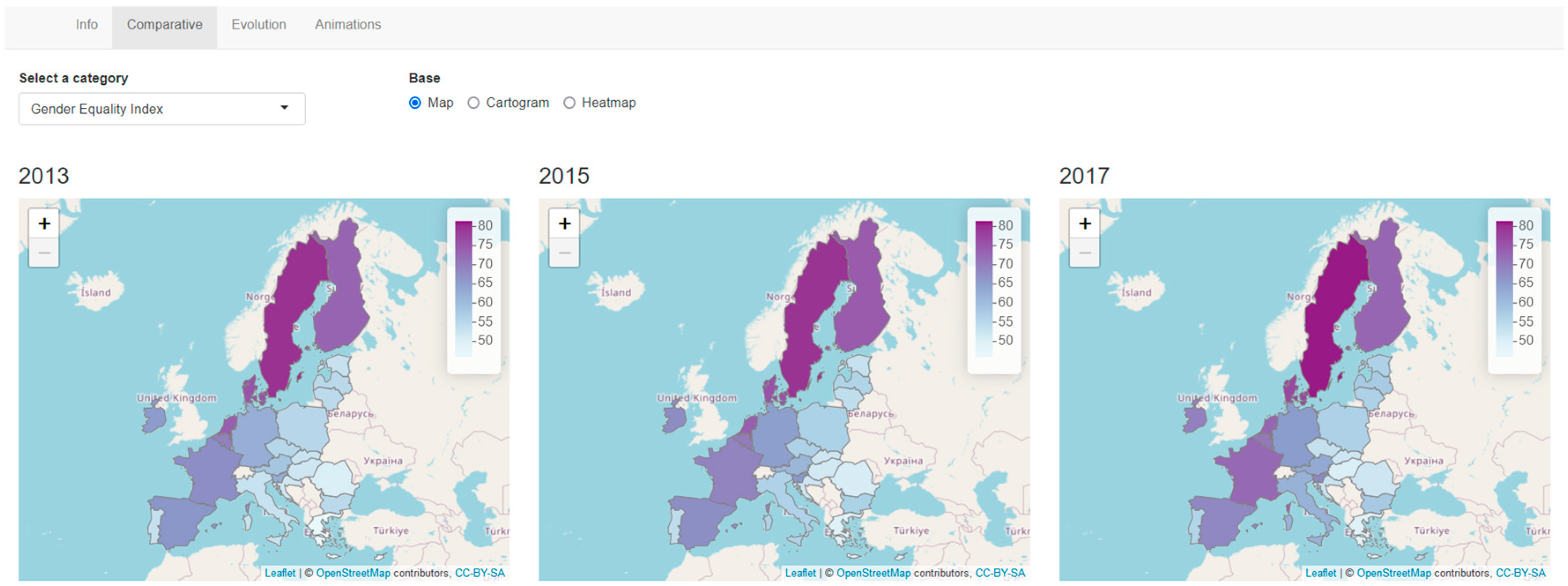
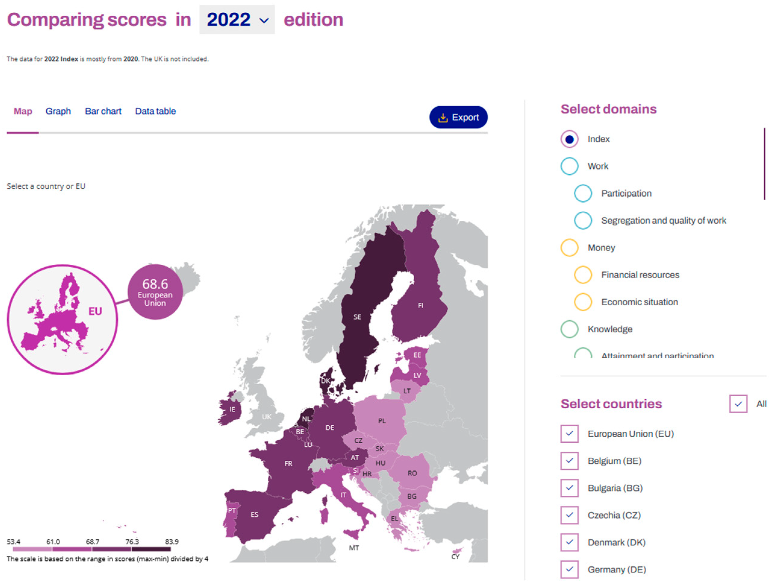
- Maps: Maps are the most used visualizations when dealing with geographic data. Sometimes those maps have as background base maps from providers, such as OpenStreetMap, Carto or Esri, and other times there is only a shapefile that shows the state or country borders. Using the aesthetic color to map a certain variable on a given country leads to choropleth maps, which is the proposal of this work. Using this type of visualization ensures that the topological relations of the countries (e.g., what countries are to the west of a given one) and their sizes are maintained. It also helps in easily identifying patterns by looking at the colors that are filling the surface of each country. However, from merely looking at the color, it is not straightforward to determine the exact value. Therefore, we have added interactivity to the maps, so the numerical value is displayed when a user clicks on one of the countries. An example of this graph is shown in Figure 4a, where the label for Spain is seen.
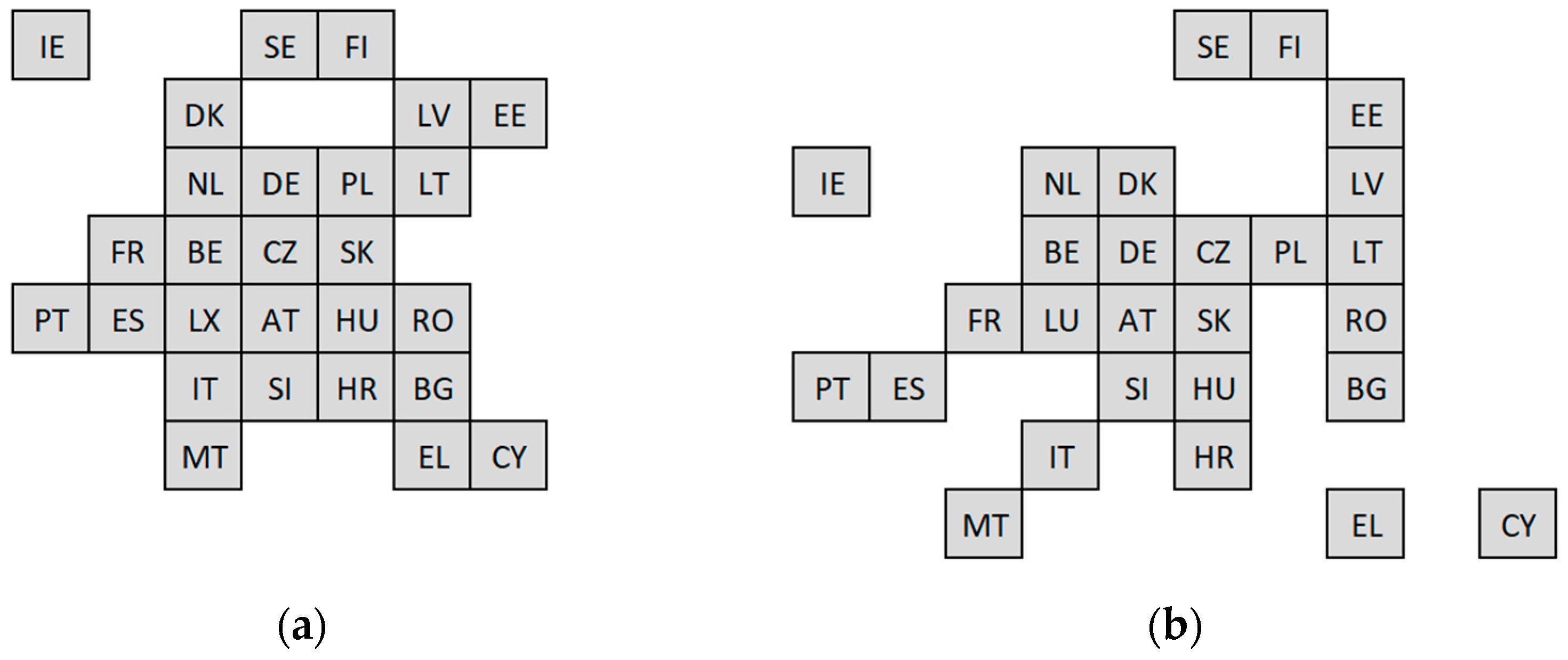
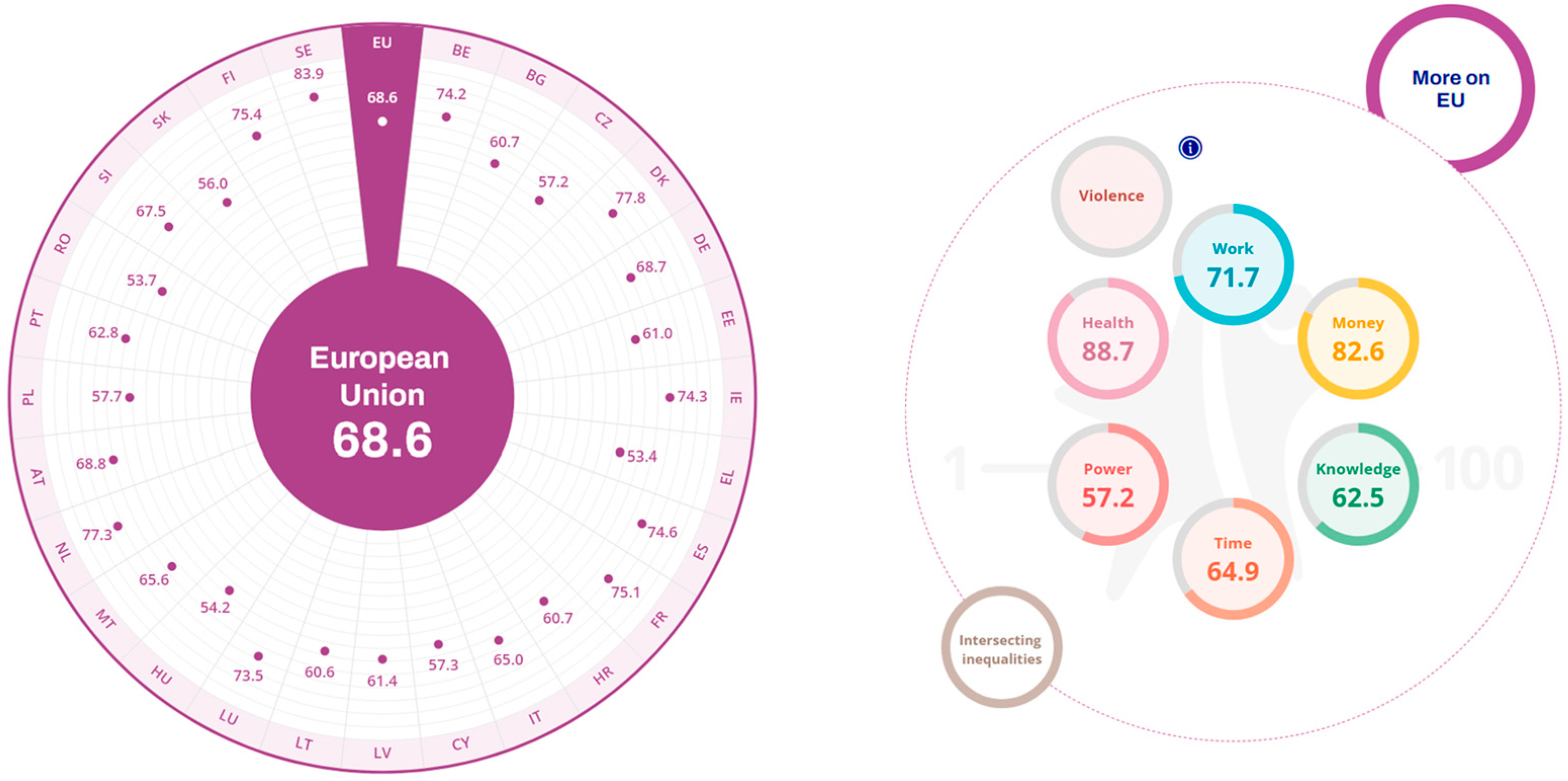
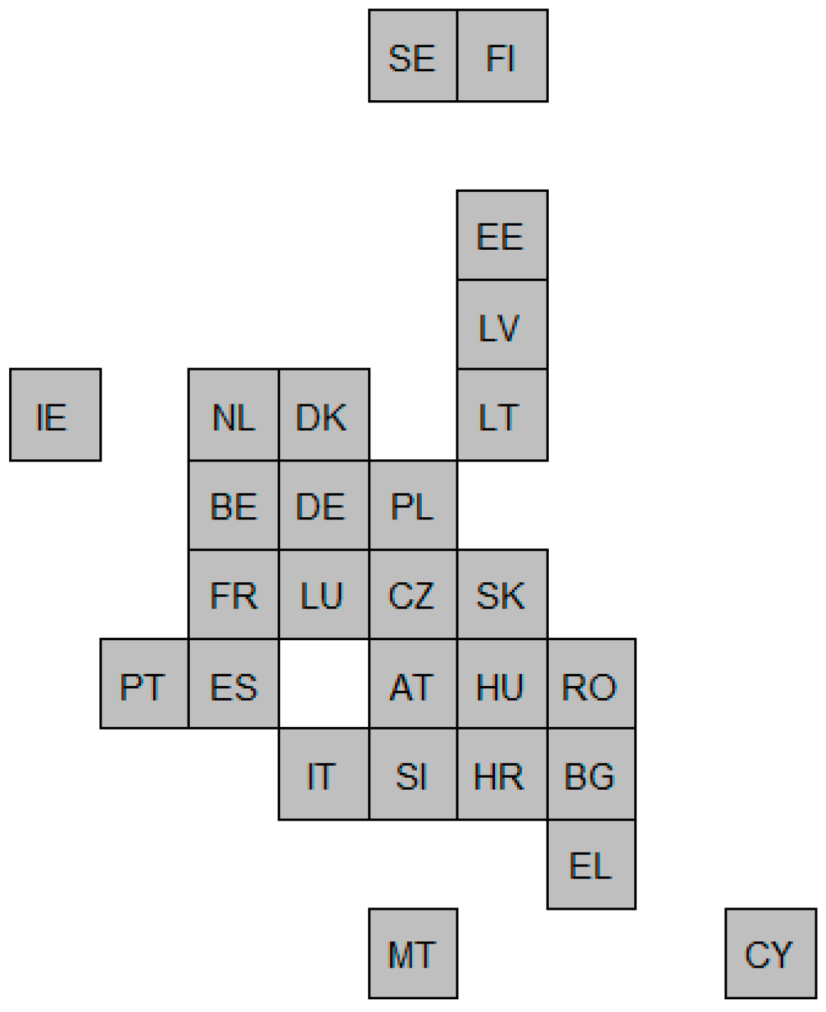
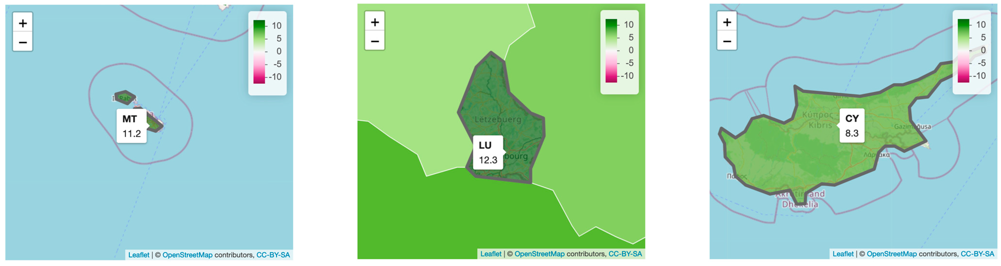
- Cartograms: Cartograms are types of maps in which the size of the regions has been altered or modified according to the value of a variable. Since we wanted to avoid huge distortion of the regions, while compensating for the different sizes of the countries (e.g., Malta has 316 km2, Spain has 506,030 km2), we have used a specific type of cartogram, which is usually referred to as “cartogram heatmap” [43], “tile maps” [54] or “equal area unit map” [55]. In this type of graph, all the countries are represented by the same shape (usually rectangles, squares, triangles or hexagons), and a color ramp is used to map a certain variable to the shape. An example of this graph is shown in Figure 4b, where the countries are displayed; the label of Spain is shown, as well as the value of GEI and the corresponding year.
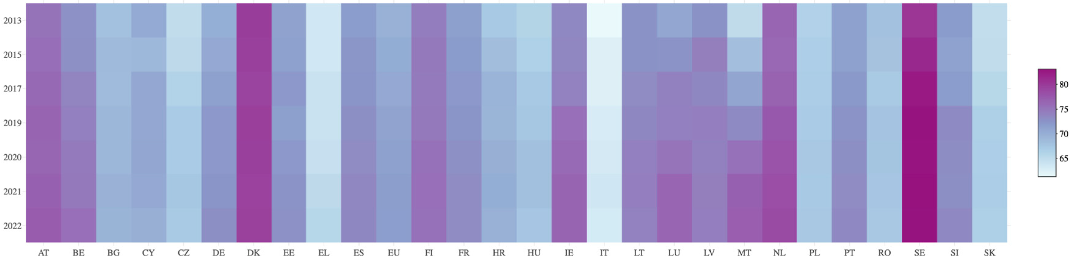
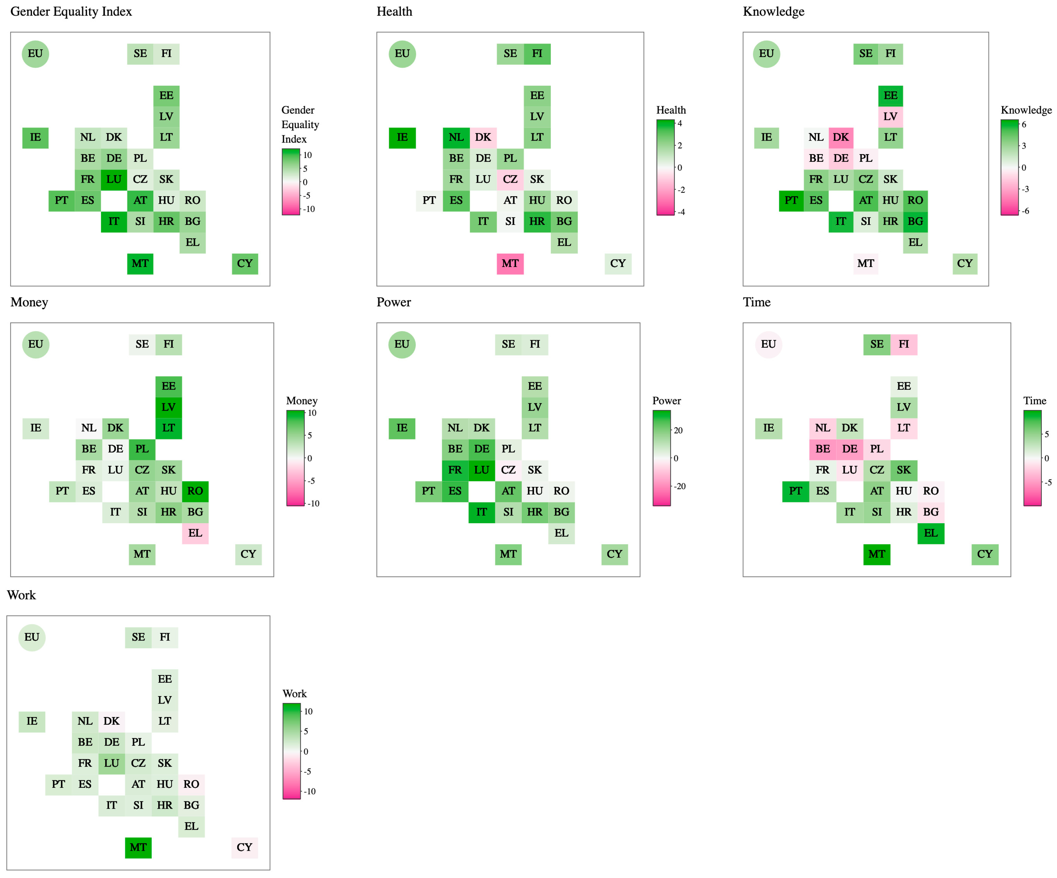
- Heatmap: The heatmap is a visualization that represents the values in a matrix, typically on a square matrix, but not necessarily, and an aesthetic color to show the range values. Using this graph empowers the detection of patterns across the countries and, also, makes it easy to see the time evolution. That way, an effective vision is created by having the countries on the x axis and the index year on the y axis. An example of this graph is shown in Figure 4c, where the countries are ordered alphabetically in the same line and with the same size.
3.3.2. Strategies
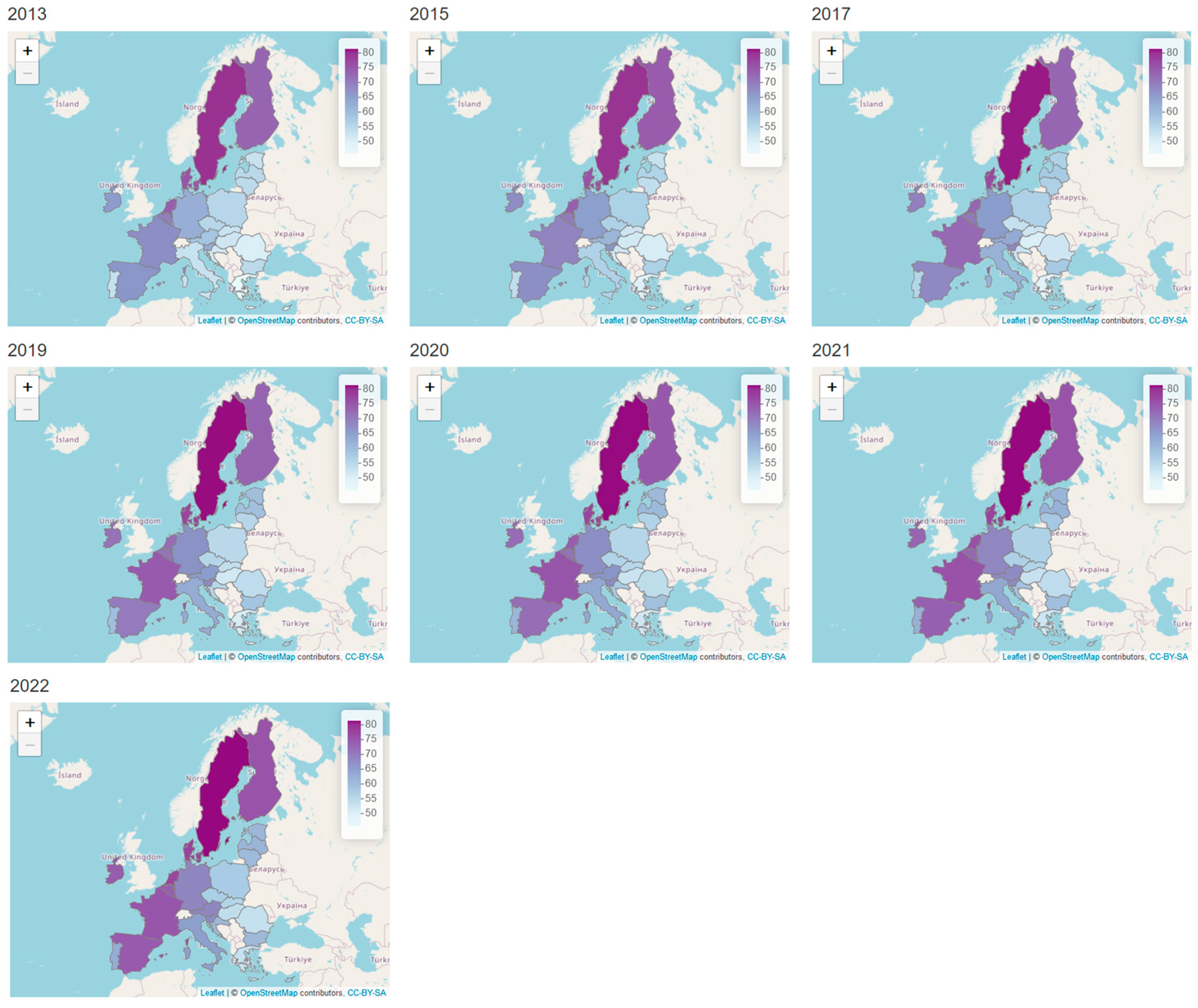
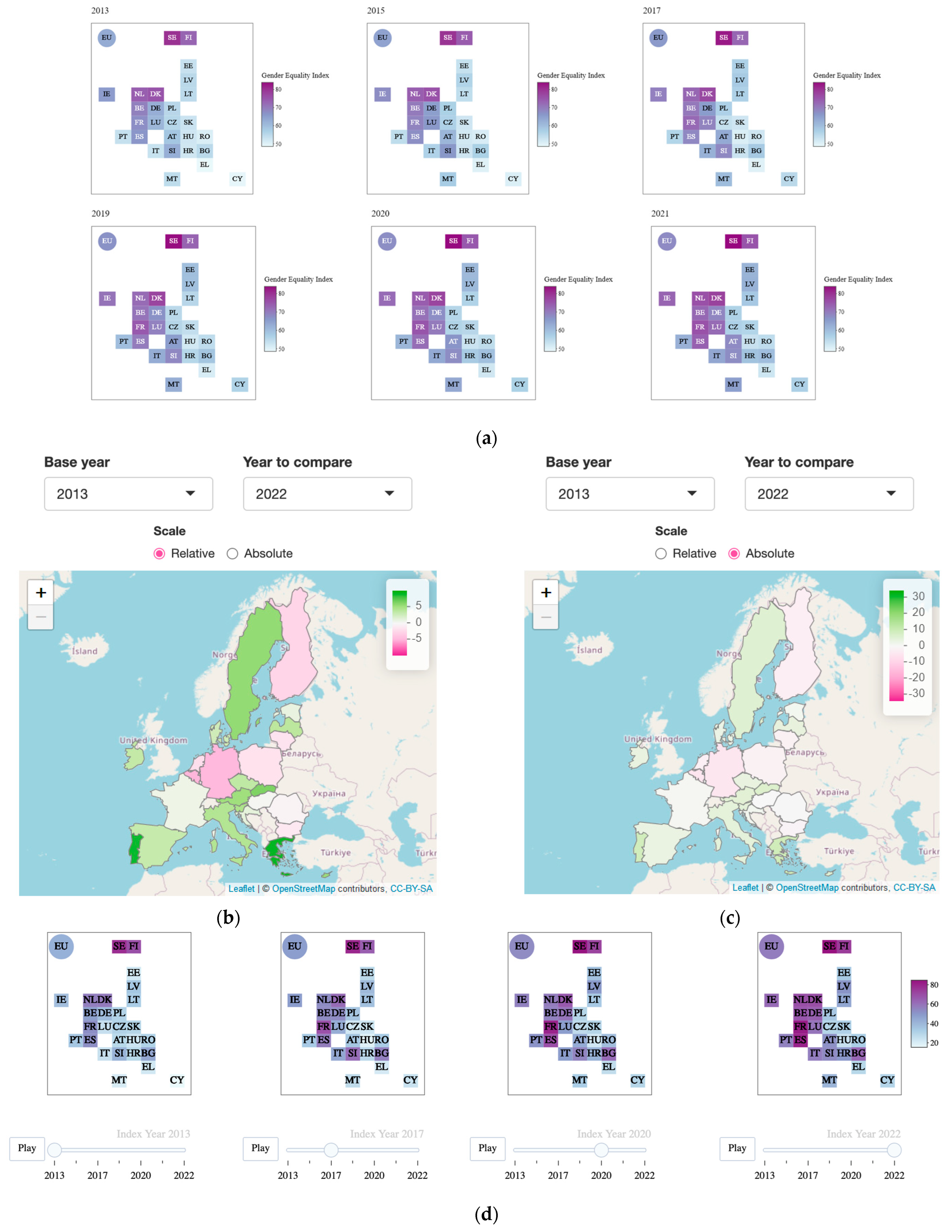
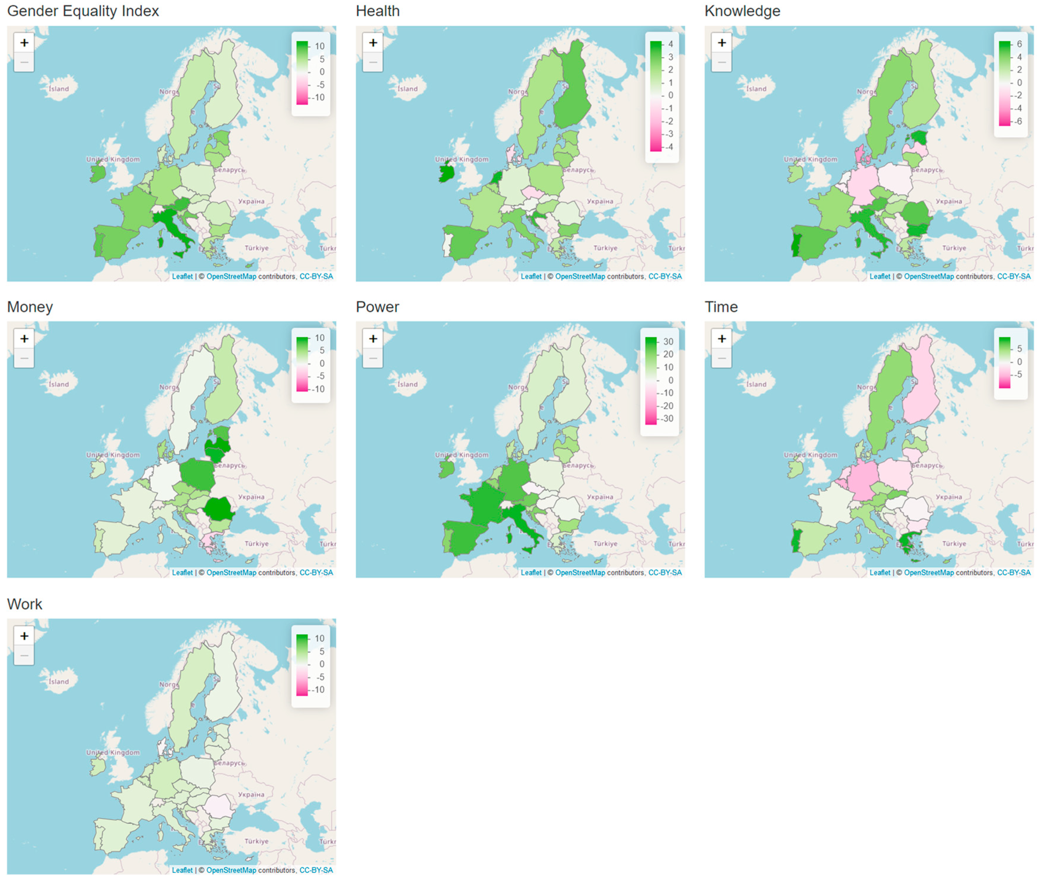
- Grids to compare all the years simultaneously or all the domains simultaneously: One of the essential problems of the EIGE visualizations is the lack of the possibility to compare the countries’ changes over time side by side. By creating a 3 × 3 grid where each cell represents a year, it can be seen how the countries’ indices have changed over time. As an example, Figure 5a shows a snapshot with a 3 × 2 grid, composed of the cartograms depicting the GEI in different years, from 2013 to 2021.
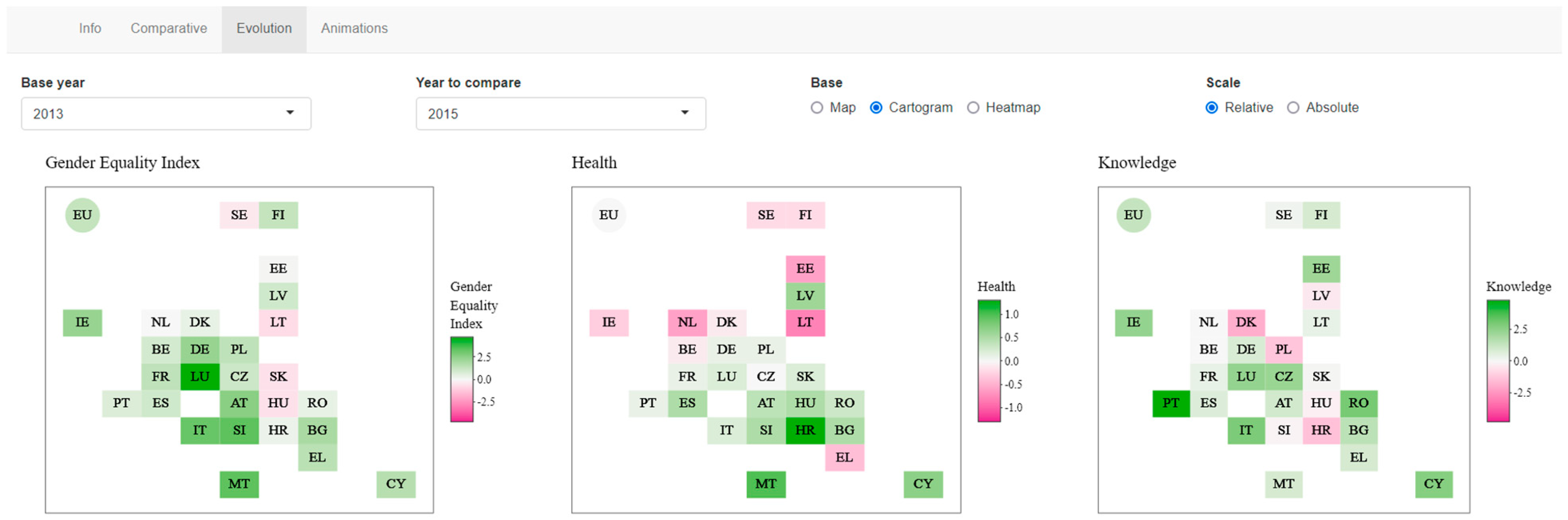
- Selection of two specific years, on dropdowns: Another potential way to compare different time periods is selecting a baseline year and another one to compare how much the countries have improved or become worse. This allows the user to determine which years to compare (consecutive years, first and last year, etc.) and identify patterns in the data. Figure 5b,c show the dropdowns to select the years (2013–2022) to calculate the differences, and the results are displayed in the form of a map.
- Relative vs absolute values for the color scale: To improve even further the last strategy, the scale is a key item. Since each domain has its own minimum and maximum values, different scales can be applied to the color ramp (min, max values) to better see the changes. We call this option the “relative” scale. On the other hand, if the purpose is comparing the changes between different domains (i.e., which domain has changed the most or the least, for two selected years), the same color ramp needs to be applied for all domains. We call this option the “absolute” scale. As an example, Figure 5b,c show the changes between 2013 and 2022 for the domain Time, depicted in form of a map. It can be seen that Figure 5b shows more variation in color; this is due to the fact that the Time domain between the selected years is the one with the least variations, which is evidenced when depicted as an absolute scale.
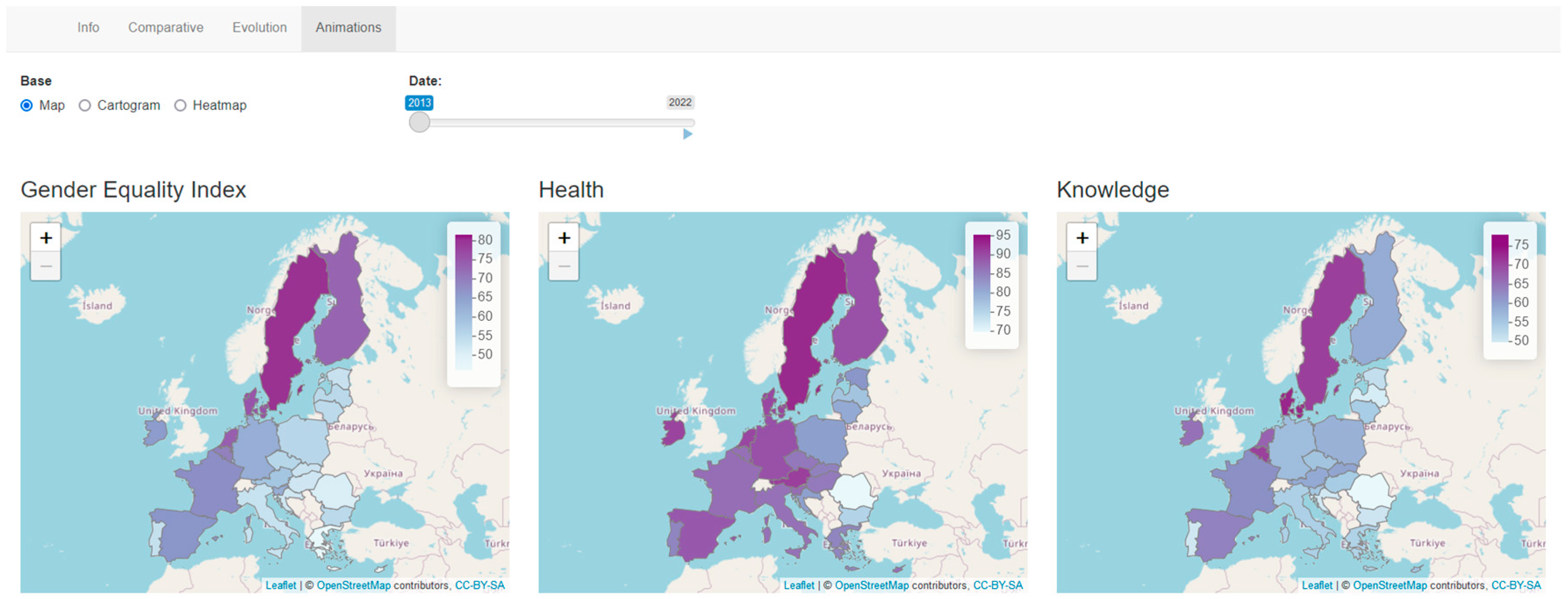
- Animated graphs: To understand better how the countries’ GEI or domains vary over time, we think it is interesting to offer the users the ability to see how the values change in a sequential way by adding some animations. Thus, if the value changes, the color will change too, and users can identify them quickly. An example is displayed in Figure 5d, where the values for four years are shown on a cartogram, with a slider to see the evolution.
4. Design and Implementation
4.1. Design of the Graphical User Interface
4.2. Implementation of the Visualizations
4.2.1. Maps
4.2.2. Cartograms
4.2.3. Heatmaps
5. Results
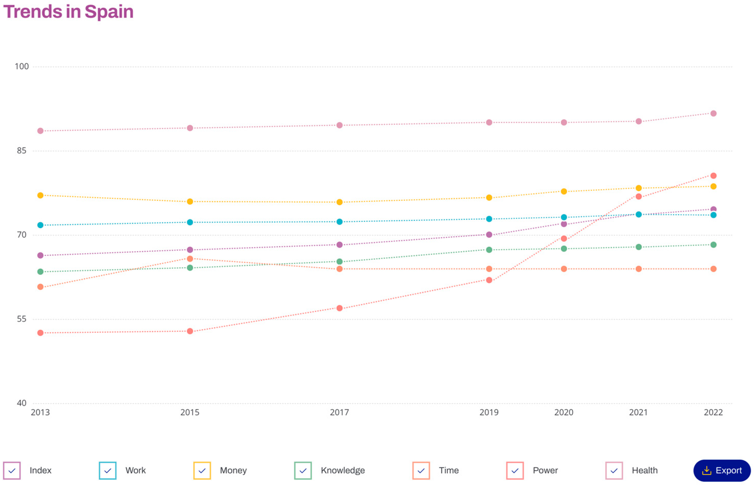
5.1. Spain Evolution
5.2. Smallest Countries in Europe
6. Discussion and Conclusions
Author Contributions
Funding
Data Availability Statement
Conflicts of Interest
References
- European Commission. Directorate General for Research and Innovation. European Research Area Policy Agenda: Overview of Actions for the Period 2022–2024; Publications Office: Luxembourg, 2022. [Google Scholar]
- Regulation (Ec) No 1922/2006 of the European Parliament and of the Council of 20 December 2006 on Establishing a European Institute for Gender Equality. Off. J. Eur. Union 2006, 9–17.
- Hausmann, R.; Tyson, L.D.; Zahidi, S. The Global Gender Gap Report 2009; World Economic Forum: Geneva, Switzerland, 2009. [Google Scholar]
- Plantenga, J.; Remery, C.; Figueiredo, H.; Smith, M. Towards a European Union Gender Equality Index. J. Eur. Soc. Policy 2009, 19, 19–33. [Google Scholar] [CrossRef]
- Ng, E.S.; Stamper, C.L.; Klarsfeld, A.; Han, Y.J. Handbook on Diversity and Inclusion Indices: A Research Compendium; Edward Elgar Publishing: Cheltenham, UK, 2021; ISBN 978-1-78897-572-8. [Google Scholar]
- Di Bella, E.; Leporatti, L.; Gandullia, L.; Maggino, F. Proposing a Regional Gender Equality Index (R-GEI) with an Application to Italy. Reg. Stud. 2021, 55, 962–973. [Google Scholar] [CrossRef]
- Schmid, C.B.; Cook, R.; Jones, L. Measuring Gender Inequality in Great Britain: Proposal for a Subnational Gender Inequality Index. Soc. Polit. Int. Stud. Gend. State Soc. 2023, 30, 580–606. [Google Scholar] [CrossRef]
- Fraile, M.; Gomez, R. Bridging the Enduring Gender Gap in Political Interest in Europe: The Relevance of Promoting Gender Equality. Eur. J. Polit. Res. 2017, 56, 601–618. [Google Scholar] [CrossRef]
- Permanyer, I. Why Call It ‘Equality’ When It Should Be ‘Achievement’? A Proposal to Un-Correct the ‘Corrected Gender Gaps’ in the EU Gender Equality Index. J. Eur. Soc. Policy 2015, 25, 414–430. [Google Scholar] [CrossRef]
- Schmid, C.B.; Elliot, M. “Why Call It Equality?” Revisited: An Extended Critique of the EIGE Gender Equality Index. Soc. Indic. Res. 2023, 168, 389–408. [Google Scholar] [CrossRef]
- Heikkilä, J.; Laukkanen, I. Gender-Specific Call of Duty: A Note on the Neglect of Conscription in Gender Equality Indices. Def. Peace Econ. 2022, 33, 603–615. [Google Scholar] [CrossRef]
- Gender Equality Inde. 2022. Available online: https://eige.europa.eu/gender-equality-index/2022 (accessed on 18 July 2023).
- Portalés, C. Identifying the Gender Gap through Data Visualization. In Empowering Women in Place; Universitat de València: Valencia, Spain, 2023; pp. 58–76. ISBN 978-84-9133-589-4. [Google Scholar]
- European Open Science Cloud (EOSC). Available online: https://research-and-innovation.ec.europa.eu/strategy/strategy-2020-2024/our-digital-future/open-science/european-open-science-cloud-eosc_en (accessed on 25 July 2023).
- Tovanich, N.; Dragicevic, P.; Isenberg, P. Gender in 30 Years of IEEE Visualization. IEEE Trans. Vis. Comput. Graph. 2022, 28, 497–507. [Google Scholar] [CrossRef] [PubMed]
- Cole, S.; Balcetis, E. Chapter Three—Motivated Perception for Self-Regulation: How Visual Experience Serves and Is Served by Goals. In Advances in Experimental Social Psychology; Gawronski, B., Ed.; Academic Press: Cambridge, MA, USA, 2021; Volume 64, pp. 129–186. [Google Scholar]
- Franconeri, S.L.; Padilla, L.M.; Shah, P.; Zacks, J.M.; Hullman, J. The Science of Visual Data Communication: What Works. Psychol. Sci. Public Interest 2021, 22, 110–161. [Google Scholar] [CrossRef]
- Kim, S.-H. Understanding the Role of Visualizations on Decision Making: A Study on Working Memory. Informatics 2020, 7, 53. [Google Scholar] [CrossRef]
- Bikakis, N. Big Data Visualization Tools. arXiv 2018, arXiv:1801.08336. [Google Scholar]
- Chan, W.W.-Y. A Survey on Multivariate Data Visualization; Hong Kong University of Science and Technology: Hong Kong, China, 2006. [Google Scholar]
- Protopsaltis, A.; Sarigiannidis, P.; Margounakis, D.; Lytos, A. Data Visualization in Internet of Things: Tools, Methodologies, and Challenges. In Proceedings of the 15th International Conference on Availability, Reliability and Security, Association for Computing Machinery, New York, NY, USA, 25 August 2020; pp. 1–11. [Google Scholar]
- Zinovyev, A. Data Visualization in Political and Social Sciences. arXiv 2010, arXiv:1008.1188. [Google Scholar]
- Andrienko, G.; Andrienko, N.; Drucker, S.; Fekete, J.-D.; Fisher, D.; Idreos, S.; Kraska, T.; Li, G.; Ma, K.-L.; Mackinlay, J.; et al. Big Data Visualization and Analytics: Future Research Challenges and Emerging Applications; CEUR Workshop Proceedings. In Proceedings of the 3rd International Workshop on Big Data Visual Exploration & Analytics (BigVis February 2020), Copenhagen, Denmark, 30 March–2 April 2020. [Google Scholar]
- Lewandowska-Gwarda, K.; Antczak, E. Urban Ageing in Europe—Spatiotemporal Analysis of Determinants. ISPRS Int. J. Geo-Inf. 2020, 9, 413. [Google Scholar] [CrossRef]
- D’Ignazio, C.; Klein, L.F. Feminist Data Visualization; The MIT Press: Cambridge, MA, USA, 2016. [Google Scholar]
- Burnay, C.; Dargam, F.; Zarate, P. Special Issue: Data Visualization for Decision-Making: An Important Issue. Open Res. Int. J. 2019, 19, 853–855. [Google Scholar] [CrossRef]
- Kohlhammer, J.; Nazemi, K.; Ruppert, T.; Burkhardt, D. Toward Visualization in Policy Modeling. IEEE Comput. Graph. Appl. 2012, 32, 84–89. [Google Scholar] [CrossRef]
- Wang, H.; Xu, Z.; Fujita, H.; Liu, S. Towrds Felicitous Decision Making: An Overview on Challenges and Trends of Big Data. Inf. Sci. 2016, 367–368, 747–765. [Google Scholar] [CrossRef]
- Moore, J. Data Visualization in Support of Executive Decision Making. Interdiscip. J. Inf. Knowl. Manag. 2017, 12, 125–138. [Google Scholar] [CrossRef]
- Park, S.; Bekemeier, B.; Flaxman, A.; Schultz, M. Impact of Data Visualization on Decision-Making and Its Implications for Public Health Practice: A Systematic Literature Review. Inform. Health Soc. Care 2022, 47, 175–193. [Google Scholar] [CrossRef]
- Dodds, K. Maps and Geopolitics. In Geopolitics: A Very Short Introduction; Dodds, K., Ed.; Oxford University Press: Oxford, UK, 2007; ISBN 978-0-19-920658-2. [Google Scholar]
- Ruppert, T.; Bannach, A.; Bernard, J.; Lücke-Tieke, H.; Ulmer, A.; Kohlhammer, J. Supporting Collaborative Political Decision Making: An Interactive Policy Process Visualization System. In Proceedings of the 9th International Symposium on Visual Information Communication and Interaction, Association for Computing Machinery, New York, NY, USA, 24 September 2016; pp. 104–111. [Google Scholar]
- Comba, J.L.D. Data Visualization for the Understanding of COVID-19. Comput. Sci. Eng. 2020, 22, 81–86. [Google Scholar] [CrossRef]
- Lasater, R.S.; Joseph, A.-C.; Cummiskey, K. Exploring a Complex Gender Wage Gap Dataset: An Introductory Activity in Identifying Issues and Data Visualization. Teach. Stat. 2023, 45, 14–21. [Google Scholar] [CrossRef]
- Rao, P.; Taboada, M. Gender Bias in the News: A Scalable Topic Modelling and Visualization Framework. Front. Artif. Intell. 2021, 4, 664737. [Google Scholar] [CrossRef]
- Mathur, A.; Cano, A.; Kohl, M.; Muthunayake, N.S.; Vaidyanathan, P.; Wood, M.E.; Ziyad, M. Visualization of Gender, Race, Citizenship and Academic Performance in Association with Career Outcomes of 15-Year Biomedical Doctoral Alumni at a Public Research University. PLoS ONE 2018, 13, e0197473. [Google Scholar] [CrossRef]
- Reinholz, D.; Shah, N. Equity and equality: How data visualizations mediate teacher sensemaking about racial and gender inequity. Contemp. Issues Technol. Teach. Educ. 2021, 21. Available online: https://citejournal.org/volume-21/issue-3-21/mathematics/equity-and-equality-how-data-visualizations-mediate-teacher-sensemaking-about-racial-and-gender-inequity (accessed on 15 September 2023).
- Yau, N. FlowingData. Data Visualization and Statistics. Available online: https://flowingdata.com/ (accessed on 18 July 2022).
- Yau, N. Gender. FlowingData. Available online: https://flowingdata.com/tag/gender/ (accessed on 18 July 2022).
- Yau, N. Decline of Women in Computer Science. FlowingData. Available online: https://flowingdata.com/2014/10/30/decline-of-women-in-computer-science/ (accessed on 18 July 2022).
- Yau, N. PhD Gender Gaps around the World. FlowingData. Available online: https://flowingdata.com/2014/09/18/phd-gender-gaps-around-the-world/ (accessed on 18 July 2022).
- How Data Can Accelerate Equality. Available online: https://blogs.worldbank.org/opendata/how-data-can-accelerate-equality (accessed on 18 July 2022).
- Wilke, C.O. Fundamentals of Data Visualization; O’Reilly Media, Inc.: Sebastopol, CA, USA, 2019. [Google Scholar]
- Data to Viz. A Collection of Graphic Pitfalls. Available online: https://www.data-to-viz.com/caveats.html (accessed on 28 July 2023).
- Gender Equality Index 2017: Methodological Report. Available online: https://eige.europa.eu/publications/gender-equality-index-2017-methodological-report (accessed on 22 July 2022).
- Gender Equality Index—Dataset. Available online: https://eige.europa.eu/modules/custom/eige_gei/app/content/downloads/gender-equality-index-2013-2015-2017-2019-2020-2021-2022.xlsx (accessed on 18 July 2023).
- Shrestha, G. Radar Charts: A Tool to Demonstrate Gendered Share of Resources. Gend. Technol. Dev. 2002, 6, 197–213. [Google Scholar] [CrossRef]
- Nurhaeni, I.D.A.; Sugiarti, R. Gender Disparity in Tourism Management: Evidence from Indonesia. In Research for Social Justice; Routledge: Oxfordshire, UK, 2019; ISBN 978-0-429-42847-0. [Google Scholar]
- Jeganathan, A.; Andimuthu, R.; Kandasamy, P. Climate Risks and Socio-Economic Vulnerability in Tamil Nadu, India. Theor. Appl. Clim. 2021, 145, 121–135. [Google Scholar] [CrossRef]
- A Critique of Radar Charts. Available online: https://blog.scottlogic.com/2011/09/23/a-critique-of-radar-charts.html (accessed on 24 July 2023).
- Few, S. Keep Radar Graphs Below the Radar—Far Below. Perceptual Edge. 2005, pp. 1–5. Available online: https://www.perceptualedge.com/articles/dmreview/radar_graphs.pdf (accessed on 15 September 2023).
- Healy, Y. The Radar Chart and Its Caveats. Available online: https://www.data-to-viz.com/caveat/www.data-to-viz.com/caveat/spider.html (accessed on 22 July 2022).
- Healy, Y. The Spaghetti Plot. Available online: https://www.data-to-viz.com/caveat/spaghetti.html (accessed on 24 July 2023).
- McNeill, G.; Hale, S.A. Generating Tile Maps. Comput. Graph. Forum 2017, 36, 435–445. [Google Scholar] [CrossRef]
- Schiewe, J. Distortion Effects in Equal Area Unit Maps. KN J. Cartogr. Geogr. Inf. 2021, 71, 71–82. [Google Scholar] [CrossRef]
- Gender Equality Index—Extended Visualizations. Available online: https://server1.uv.es/GenderEquallyIndex/ (accessed on 24 July 2023).
- DINAResearchTeam European-Gender-Equality-Index. Available online: https://github.com/DINAResearchTeam/European-Gender-Equality-Index (accessed on 4 October 2023).
- ColorBrewer: Color Advice for Maps. Available online: https://colorbrewer2.org/#type=sequential&scheme=BuGn&n=3 (accessed on 28 July 2023).
- NUTS—GISCO—Eurostat. Available online: https://ec.europa.eu/eurostat/web/gisco/geodata/reference-data/administrative-units-statistical-units/nuts (accessed on 22 July 2022).


Disclaimer/Publisher’s Note: The statements, opinions and data contained in all publications are solely those of the individual author(s) and contributor(s) and not of MDPI and/or the editor(s). MDPI and/or the editor(s) disclaim responsibility for any injury to people or property resulting from any ideas, methods, instructions or products referred to in the content. |
© 2023 by the authors. Licensee MDPI, Basel, Switzerland. This article is an open access article distributed under the terms and conditions of the Creative Commons Attribution (CC BY) license (https://creativecommons.org/licenses/by/4.0/).
Share and Cite
Targa, L.; Rueda, S.; Riera, J.V.; Casas, S.; Portalés, C. Enhancing the Understanding of the EU Gender Equality Index through Spatiotemporal Visualizations. ISPRS Int. J. Geo-Inf. 2023, 12, 421. https://doi.org/10.3390/ijgi12100421
Targa L, Rueda S, Riera JV, Casas S, Portalés C. Enhancing the Understanding of the EU Gender Equality Index through Spatiotemporal Visualizations. ISPRS International Journal of Geo-Information. 2023; 12(10):421. https://doi.org/10.3390/ijgi12100421
Chicago/Turabian StyleTarga, Laya, Silvia Rueda, Jose Vicente Riera, Sergio Casas, and Cristina Portalés. 2023. "Enhancing the Understanding of the EU Gender Equality Index through Spatiotemporal Visualizations" ISPRS International Journal of Geo-Information 12, no. 10: 421. https://doi.org/10.3390/ijgi12100421
APA StyleTarga, L., Rueda, S., Riera, J. V., Casas, S., & Portalés, C. (2023). Enhancing the Understanding of the EU Gender Equality Index through Spatiotemporal Visualizations. ISPRS International Journal of Geo-Information, 12(10), 421. https://doi.org/10.3390/ijgi12100421