1. Introduction
Over the past few decades, the racial composition of large U.S. cities has undergone significant changes due to population dynamics. In particular, the late twentieth century witnessed substantial migration of Hispanic and Asian people into the U.S., transforming large cities from being biracial to multiracial [
1]. This trend has continued and is projected to persist in the future. As a result of these shifts in the overall racial makeup of cities, the racial character of residential neighborhoods has also undergone transformation. Previously, neighborhoods were predominantly either white or black, but with the increased influx of Hispanic and Asian residents, a greater variety of neighborhood types has emerged and can be observed. It is important to note that in this paper, we define “neighborhood” as a population residing in a small area unit, and “neighborhood change” refers to the alteration of racial composition within that particular area unit. One noteworthy observation is that despite the increased racial diversity resulting from the influx of Hispanic and Asian people into U.S. metropolises, residential racial segregation has persisted [
2,
3,
4].
Geovisualization of the evolution of racial neighborhoods (neighborhoods defined by their racial compositions) serves two important purposes. Firstly, it lays the foundation for empirical models that aim to forecast the future spatial distribution of different neighborhood types. In recent years, several such models have been developed [
5,
6,
7,
8]. These models provide valuable insights into the potential trajectories of neighborhood change. Secondly, geovisualization can also pave the way for process-based models that seek to explain the underlying dynamics driving neighborhood change. In the field of sociology, various process-based models have been developed (e.g., [
9]) and extensively reviewed (e.g., [
4]). Many of these models are built upon Schelling’s seminal model [
10], which links the emergence of racial patterns in neighborhoods to individual choices of neighbors. However, due to the unavailability of census data in a format conducive to testing spatially explicit dynamic models, the rigorous testing of such models was not conducted.
The objective of this paper is to propose a method for converting original census racial data into a practical image format. Specifically, the racial data for a given city are transformed into an image representation using the CMYK color space. These transformed objects are referred to as racial images. By constructing a time series of racial images from multiple past censuses, we can create a geovisualization that effectively constrains process-based models of racial segregation. While visualizations of the spatial distribution of multiracial populations have been previously proposed, none of them highlight the essential aspects of spatio-temporal racial change as clearly as the method presented in this paper.
Three distinct approaches to visualizing multiracial spatial distribution are prominent in the recent literature. The first approach involves classifying neighborhoods based on their racial diversity and the dominant race within them [
11,
12]. The second approach utilizes dot maps [
13,
14,
15]. The third approach uses the race-specific high-resolution grids to create a visualization called a “racial landscape” [
16].
The classification method categorizes neighborhoods into a limited number of groups based on diversity and the dominant racial composition of the local population. While this method provides a representation of the pattern of neighborhood types, it does not directly visualize the spatial distribution of racial sub-populations. Therefore, it cannot effectively serve as a constraint for models of racial dynamics.
A dot map represents individuals as dots positioned approximately at their place of residence, with each dot colored to indicate the person’s race. These maps are sometimes referred to as “one dot per person” maps, although a single dot may represent more than one person. Dot maps offer the advantage of conveying comprehensive information, including location, race, and population density. However, the abundance of information presented in dot maps also makes them challenging to utilize for quantitative analysis, as they are in point data format rather than grid format. Consequently, dot maps are not well-suited as constraints for dynamical racial models.
Lastly, Dmowska et al. [
16] proposed a visualization called the “racial landscape”, which represents the spatial distribution of a multiracial population. Similar to a dot map, the racial landscape encapsulates all pertinent information, but it is presented as a raster map. While the racial landscape can be utilized as a constraint for racial models, its construction necessitates a small spatial resolution (30 m) and is computationally demanding. The racial landscape serves as a valuable dataset for assessing levels of diversity and racial segregation, although it may not be the optimal geovisualization for examining racial dynamics.
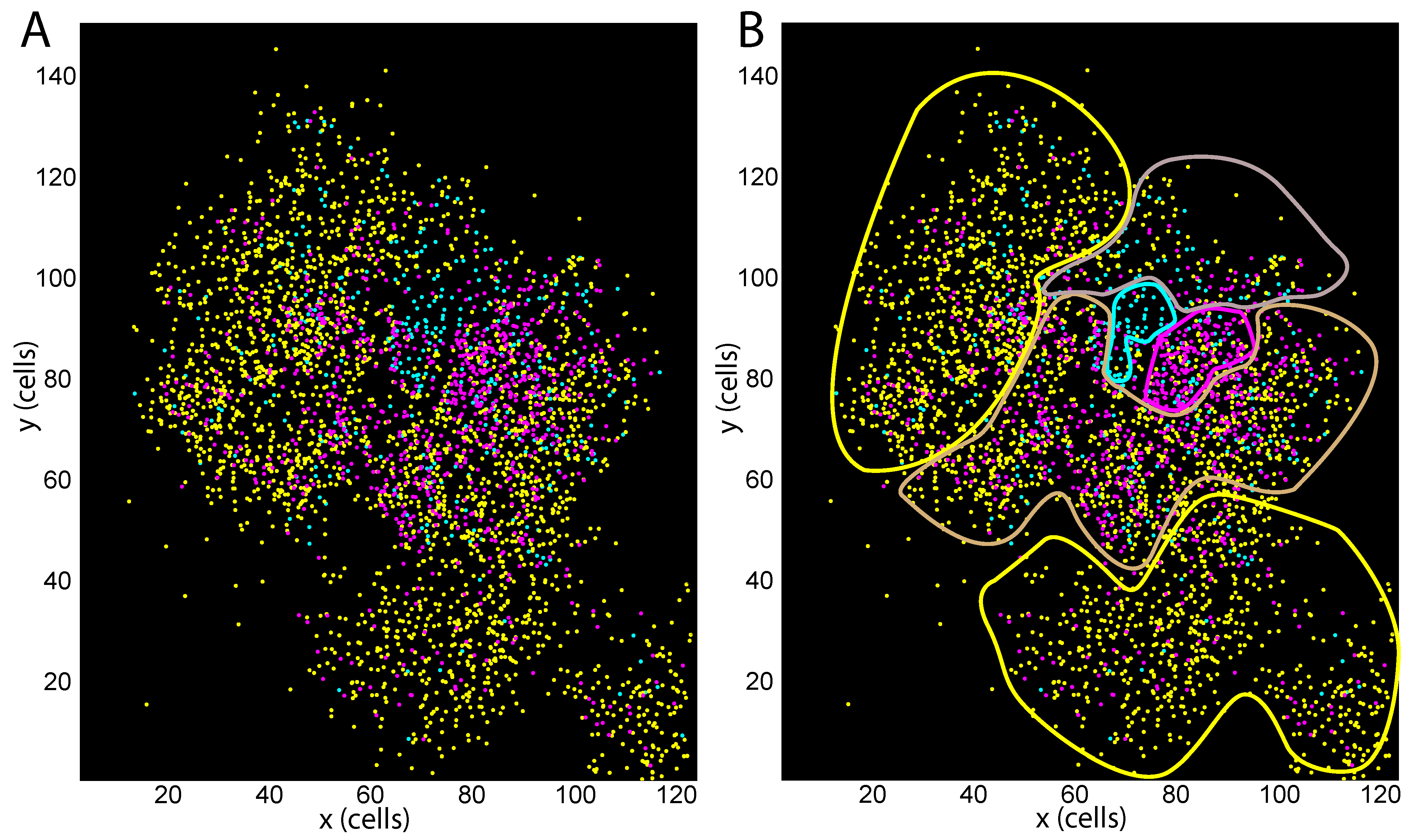
Figure 1 serves as a motivation for the proposed geovisualization method in this paper. Panel A displays a dot map representing the population of Las Vegas, NV, in 2000. To simplify the visualization, only three subpopulations are depicted: White people (yellow), Hispanic people (magenta), and Black people (cyan). It can be observed that the inhabited region of Las Vegas can be delineated into zones based on the similarity of normalized compositions of the local population, denoted as
, representing White people, Hispanic people, and Black people, respectively, with the constraint
. Panel B presents the same map with manually drawn boundaries that approximate five distinct zones of population composition. These zones include predominantly White areas (indicated by yellow boundaries), Hispanic areas (magenta boundary), Black areas (cyan boundary), areas with a mixture of White people and Hispanic people (light brown boundary), and areas with a mixture of White people, Hispanic people, and Black people (pale indigo boundary).
Figure 1 serves as evidence that zones with similar local racial compositions can be identified in Las Vegas in 2000, and this observation holds true for other cities as well. Building upon this insight, our proposed geovisualization method formalizes and extends the demonstration seen in
Figure 1. To implement this method, we gather racial compositions of all grid cells for a given city across four census periods: 1990, 2000, 2010, and 2020. Subsequently, we employ clustering techniques to group these cells based on their racial compositions, resulting in
k clusters. Utilizing the outcomes of this multi-year clustering, we establish a Nearest Neighbor classifier that assigns one of
k compositional labels to any local racial composition at any point in time.
Our proposed method can be considered a form of classification. However, it distinguishes itself from earlier classifications that were primarily based on diversity and the dominance of a particular race [
11,
12]. Instead, our method utilizes the complete racial composition, providing a more detailed and specific framework for constraining models of racial dynamics. Additionally, unlike previous classifications where neighborhood type definitions remained fixed and uniform across cities, our data-driven classification allows for adjustments based on the unique racial compositions observed in different US cities. This flexibility enables a more nuanced understanding of racial dynamics at the local level.
Previous approaches such as Kirkley’s network-based method [
17] and Chodrow’s approach [
18] have also focused on data-driven division of cities into zones based on similar local compositions. These methods utilize graph-based optimization techniques to identify zones with coherent racial compositions. Kirkley’s approach employs the Jensen–Shannon divergence to measure dissimilarity between tract compositions, while Chodrow uses mutual information. Both methods aim to optimize the modularity of the resulting graph. However, a limitation of these approaches is that they are focused on optimizing the division of neighborhoods based on a single census year, resulting in temporally incomparable neighborhood types. This restricts their applicability as constraints on dynamical racial models that require consistent neighborhood definitions across multiple years.
2. Materials and Methods
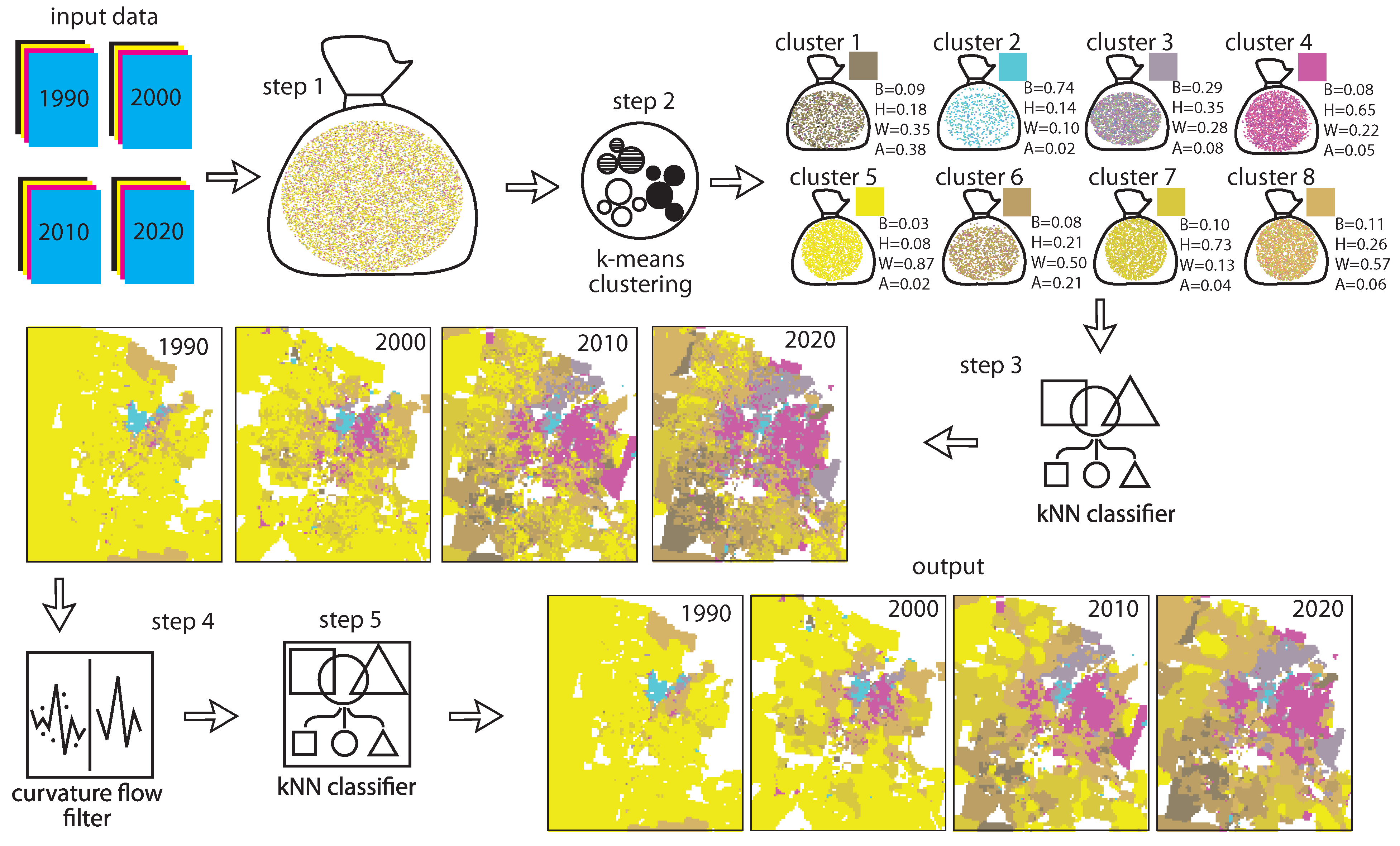
Figure 2 provides a visual overview of our proposed method; data for Las Vegas are used to construct elements of the figure. Our starting point is the SocScape gridded population data (
http://socscape.edu.pl, accessed on 16 June 2023), which is derived from dasymetric modeling of the US Census decennial census data at the block-level granularity [
19]. The SocScape data covers the contiguous United States at a resolution of 30 m for the years 1990, 2000, 2010, and 2020. However, for our specific analysis, we have regridded the SocScape data to a resolution of 300 m. We note that one-person-per-dot data, also accessible at
http://socscape.edu.pl (accessed on 16 June 2023), can serve as an alternative input when aggregated into a grid. Since both data formats originate from the same census data transformation, our results remain unaffected by the choice between gridded or one-person-per-dot data as input.
The graphic representation of the input data in the upper-left corner of
Figure 2 displays four layers of cell-level population counts for the major subpopulations: Black people, Hispanic people, White people, and Asian people, for each of the four census years. For the sake of brevity, we refer to these subpopulations as “races”, although we acknowledge that Hispanic is an ethnic designation. Each 300 × 300 m cell serves as a “small areal unit” over which we calculate the local racial composition. These cells are clustered, based on their racial compositions, and ultimately are classified into eight different types.
Each cell contains a list of the shares of Black people, Hispanic people, White people, and Asian people. By interpreting these shares as magnitudes of four colors in the CMYK color model, we transform the racial grid into a false color image (racial image); the color of a cell codes (without a loss of information) the racial composition of a cell. Repeating this transformation for each census year, we get the time series of racial images from which the racial change could be assessed either visually or quantitatively. However, analyzing this time series would be challenging because such racial images contains “millions” of colors due to the unique composition of each cell at each time. We solve this problem by means of cell clustering.
In step 1 of our method, we gather all the quadruplets of shares from the four years of input data, resulting in a total of four × the number of cells in the raster quadruplets. In
Figure 2, this set of quadruplets is represented as a bag of dots, with each dot colored according to the CMYK encoding its racial composition. The mixture of different colored dots in the collection reflects the diversity of compositions present among the cells and through the years.
In step 2, we employ the
k-means clustering algorithm to group the quadruplets into a smaller number of clusters. Each cluster consists of quadruplets that have similar values and, consequently, similar CMYK colors. In
Figure 2, we set
k to be 8, and the clusters are visualized as bags of dots, with each bag representing the quadruplets assigned to that cluster. Notably, the relative consistency of colors within each bag indicates that the clustering process has identified distinct composition types that were prevalent in Las Vegas during the 1990–2020 period. For each cluster, we calculate the mean composition and its corresponding CMYK color, which together form a concise and time-invariant legend of race-based neighborhood types in Las Vegas. This legend provides information about the typical racial compositions associated with each cluster, and the corresponding colors serve as visual representations of these compositions.
In step 3 of our method, we create a classifier, denoted as
, using the
k-nearest neighbors (kNN) algorithm. This classifier assigns one of
k neighborhood types (eight in the example depicted in
Figure 2) to any given racial composition. By applying this classifier, we generate a temporal series of images showing the evolution of eight neighborhood types in Las Vegas during the 1990–2020 period.
The subsequent task is to smooth these images while preserving boundaries and the legend. This is accomplished in the last two steps. In step 4, we apply a curvature flow filter [
20] to the images obtained in the previous step. The curvature flow filter is an anisotropic diffusion method used to smooth images while retaining edges and boundaries. However, it is important to note that the smoothed images may contain colors that are not among the
k colors present in our legend. To address this issue, in step 5, we utilize our classifier
on the cells within the smoothed images. This final step enables us to restore the legend by assigning the appropriate neighborhood type to each cell based on its racial composition.
3. Results
We applied the method described in the previous section to analyze seven cities: Atlanta, GA; Orlando, FL; Houston, TX; Las Vegas, NV; Chicago, IL; Dallas, TX; and Los Angeles, CA. We obtained gridded SocScape data for these cities, which correspond to the spatial extent of their respective Metropolitan Statistical Areas (MSAs) as defined in the 2020 boundaries. An MSA represents a geographic region centered around a core area that includes a significant population nucleus. Since the core areas typically experience the most rapid changes in racial compositions, we focused our analysis on these areas. To achieve this, we cropped the MSA data to approximate the extent of the core by either selecting a single county or defining an arbitrary bounding box. We demonstrated our method using two cities, Chicago and Atlanta, and the geovisualizations for the remaining five cities can be found in the
Supplementary Material. Through experimental evaluation, we determined that employing
in the
k-means clustering step of our procedure was sufficient to capture the evolution of neighborhood in the seven cities included in our sample.
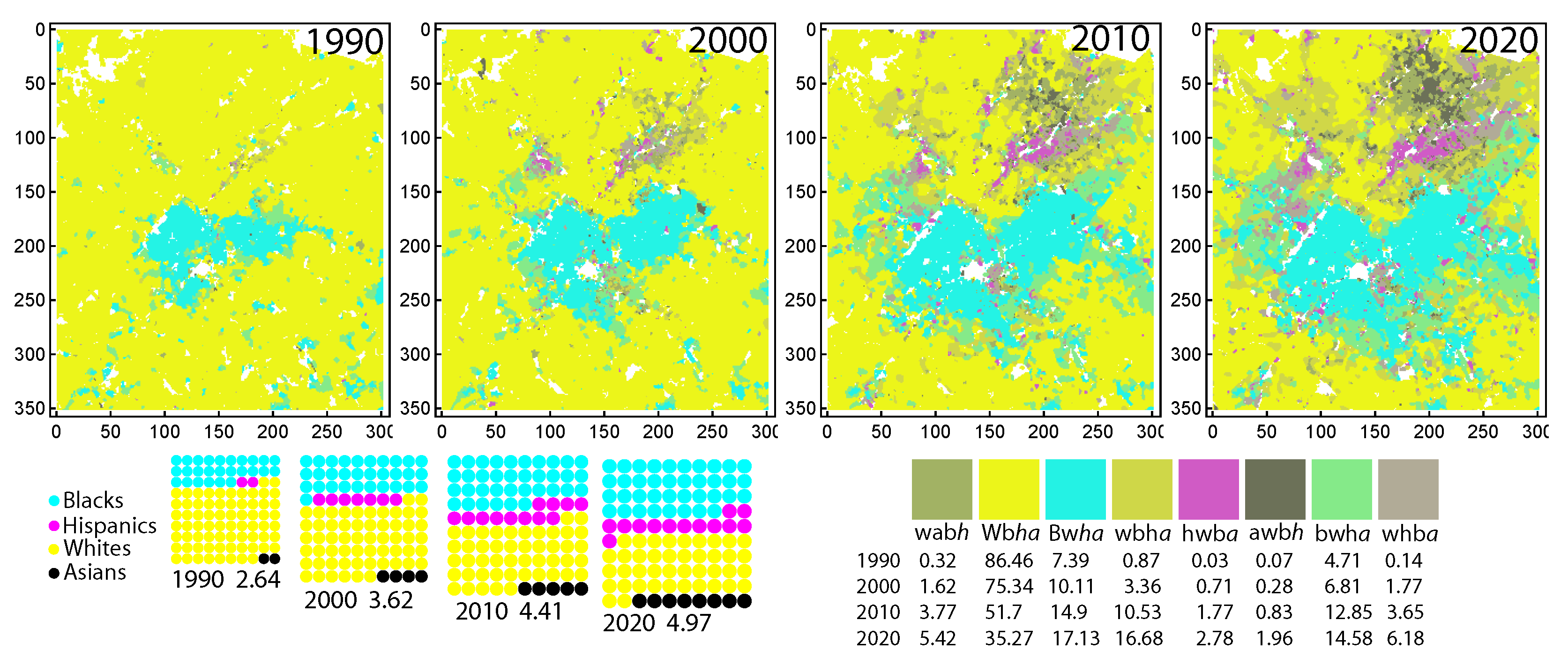
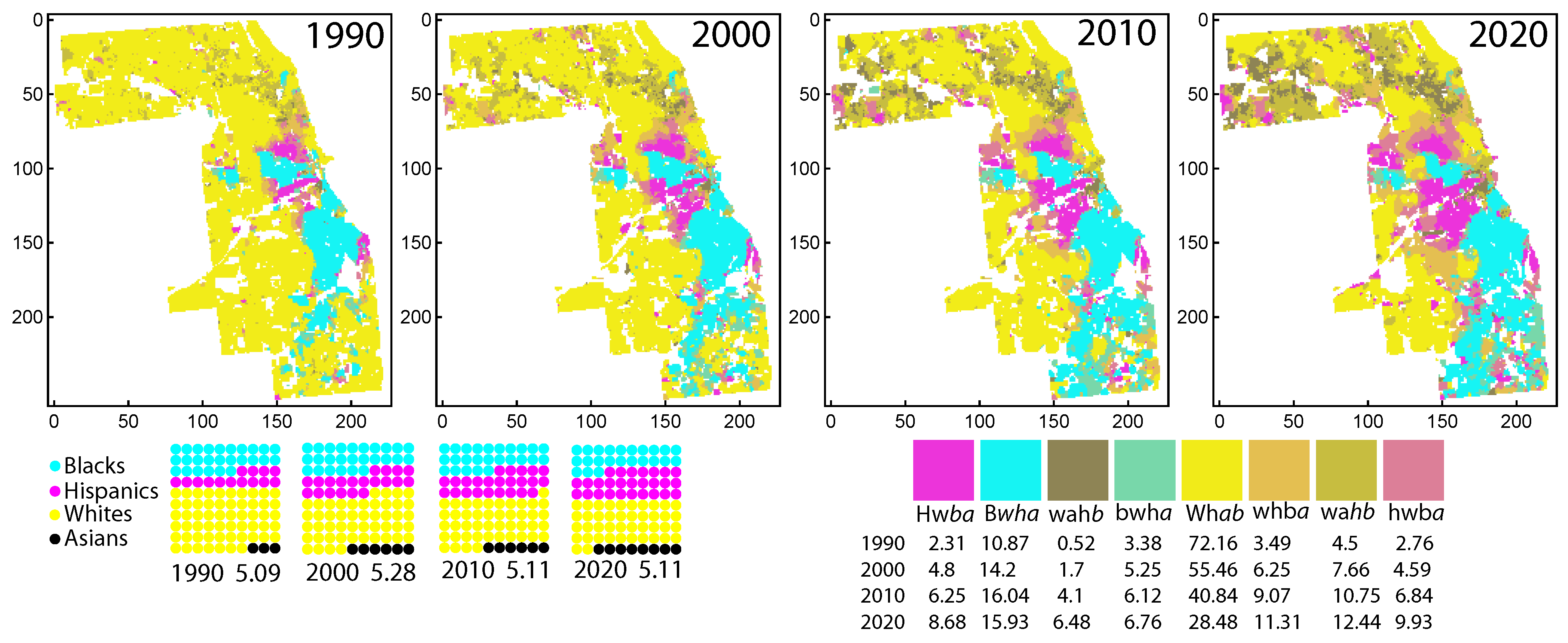
3.1. Chicago
Figure 3 is presented in two rows: the top row displays a temporal series of racial images spanning from 1990 to 2020, while the bottom row illustrates the temporal change in the overall composition of Cook County, which encompasses the core area of the Chicago Metropolitan Statistical Area (MSA). Additionally, the legend of neighborhood types is shown on the right side of the bottom row.
The changes in the bulk composition of Cook County are effectively visualized using a series of waffle charts. Each waffle chart’s size is proportional to the total population of the county, and the corresponding total population (in millions) is indicated below each chart. The total population of Cook County remained relatively stable throughout the 1990–2020 period. The distribution of racial and ethnic groups within the county is represented by the cyan, magenta, yellow, and black colors of dots within each chart. Each dot within the waffle chart represents 1% of the total population. Upon observing the waffle charts, it becomes apparent that the Hispanic and Asian subpopulations experienced growth at the expense of the White subpopulation. Meanwhile, the Black subpopulation remained stable over the 1990–2020 period.
In addition to colors, the legend in
Figure 3 provides short descriptions of each neighborhood type’s racial composition using strings of four letters. These letters are arranged in decreasing order of their respective shares within the neighborhood type. If the share of the largest subpopulation exceeds 75%, it is considered the dominant subpopulation, and the leftmost letter is capitalized. On the other hand, if a subpopulation’s contribution is deemed insignificant, the corresponding letter is italicized. The determination of whether a subpopulation’s share is significant or not is based on Hill’s number [
21], which identifies the number of subpopulations that make a significant contribution to the total population.
To illustrate this, let us consider the neighborhood type B
wha in the legend of
Figure 3. The shares of the subpopulations in this neighborhood type are B = 91%, H = 4%, W = 4%, and A = 1%. The calculated value of the Hill’s number is 1.44, which, when rounded to the nearest integer, is 1. Thus, only the share of subpopulation B is significant, and this is also the dominant subpopulation. Therefore, this neighborhood type is described as B
wha in the legend.
Examining the series of racial images in the top row of
Figure 3 provides insights into the changes and territorial expansions of neighborhoods associated with the presence of Hispanic people (Hw
ba, hwb
a, and whb
a) and Asian people (wah
b, wa
hb) during the 1990–2020 period. Notably, these neighborhood types have undergone significant territorial expansions. To gain a deeper understanding of the nature of these expansions, it is necessary to zoom in on the specific areas within Cook County in which these changes have occurred. This closer examination will allow us to analyze the dynamics of these neighborhoods.
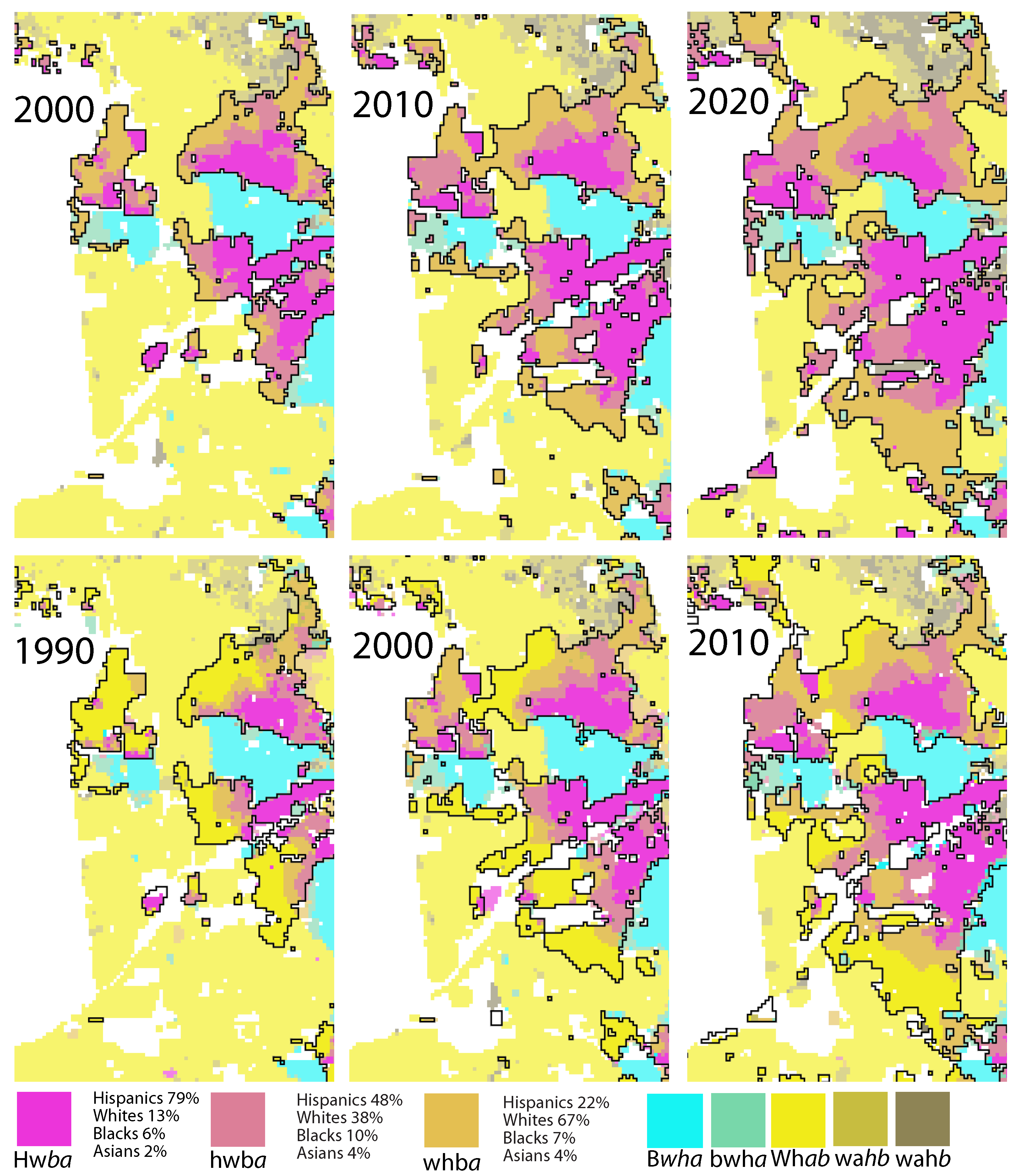
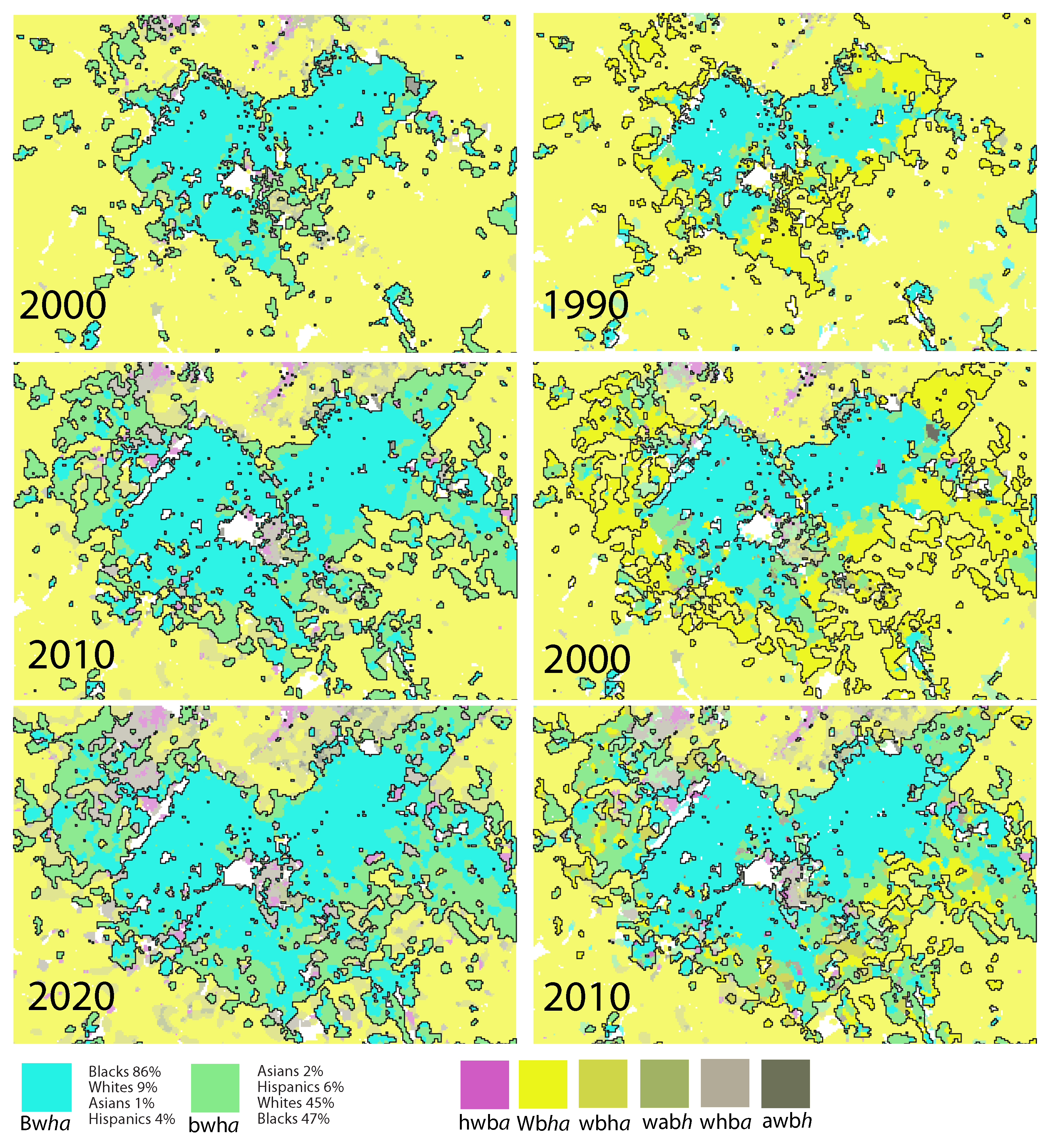
Figure 4 presents a detailed view of the central part of Cook County, focusing on the significant spatial expansion of the Hispanic subpopulation. This zoomed-in map series corresponds to the same temporal sequence as the top row of
Figure 3. Specifically, it highlights three neighborhood types associated with the expansion of Hispanic people: Hw
ba (depicted in pink), hwb
a (depicted in blush), and whb
a (depicted in ronchi). To emphasize the zone of interest and its boundaries, the spatial extents of these three neighborhood types are combined, and the boundary of the combined zone is marked by black contours. Additionally, the colors of the remaining five neighborhood types are lightened by 35% to provide visual contrast and highlight the zone of interest.
In the bottom row of racial images, the temporal sequence is shifted to a previous census year while maintaining the calculated zone of interest from the corresponding top row. This arrangement facilitates the examination of the transitions and changes in neighborhood types over a decade of interest by comparing the top and bottom panels side by side.
The expansion of the Hispanic subpopulation exhibits a distinct pattern within the highlighted zone. The initial nuclei of Hispanic expansion in 1990 are primarily located in the Hwba neighborhoods. Subsequent expansions from these nuclei demonstrate an anisotropic nature, where the edges expand exclusively into the Whab neighborhoods while the boundaries with the Bwhc neighborhoods remain unchanged. It is noteworthy that the zone displays a layered structure, characterized by a spatial progression from Hwba to hwba, and further into whba. In other words, there is a gradual decrease in the share of Hispanic people from the Hwba neighborhood to the Whab neighborhood.
As the zone expands over time, the Hw
ba neighborhood expands into the hwb
a neighborhood, which in turn expands into the whb
a neighborhood, ultimately reaching the Wh
ab neighborhood. This dynamic spatial progression resembles an anisotropic diffusion originating from the source located in the Hw
ba neighborhood. A similar spatial pattern is also observed in the northern part of Cook County, albeit on a smaller scale (refer to
Figure 3 for details).
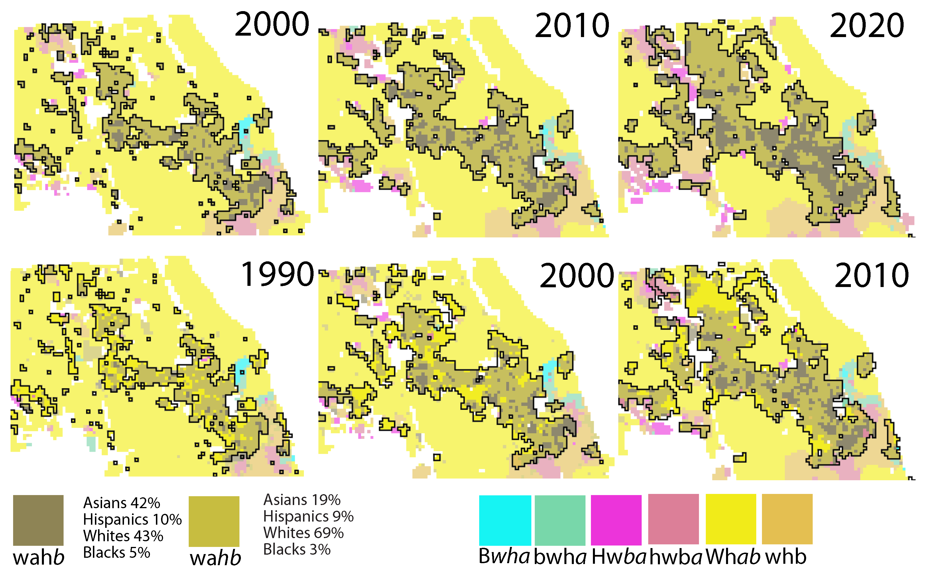
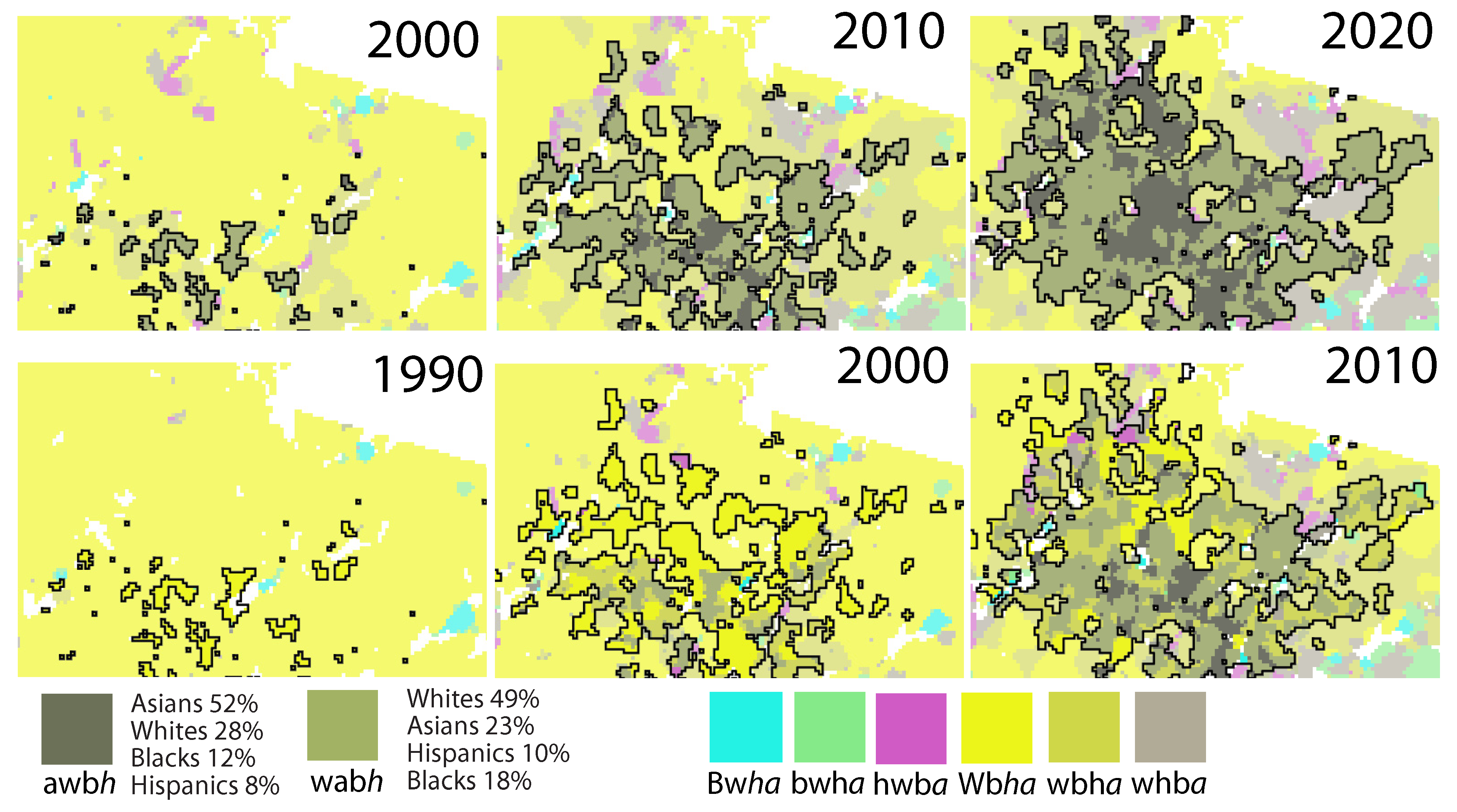
Figure 5 showcases a sequence of racial images that zoom into the northeastern part of Cook County, which experienced significant spatial expansion of the Asian subpopulation. The layout and arrangement of this figure follow the same structure as
Figure 4. We direct our attention to two specific neighborhood types associated with Asian people: wah
b (depicted in avocado color) and wa
ha (illustrated in earls green color). The fundamental nature of the spatial racial dynamics observed for Asian people shares similarities with that of Hispanic people. It exhibits characteristics reminiscent of an anisotropic diffusion, wherein the Asian zone expands into the Wh
ab neighborhood while avoiding expansion into the bwha neighborhood. However, a notable distinction in the spatial dynamics of Hispanic people and Asian people lies in the absence of clearly defined nuclei of Asian people in 1990. These nuclei, represented by patches of the wah
b type, emerge in 2000 and experience growth in subsequent years.
3.2. Atlanta
Figure 6 follows the same structure and organization as
Figure 3, focusing on a specific region within the Atlanta Metropolitan Statistical Area (MSA) defined by a bounding box of 300 × 350 raster cells. The temporal series of waffle diagrams presented in
Figure 6 provides insights into the population dynamics of this Atlanta region, distinguishing it from Chicago. The waffle diagrams reveal that the region depicted in
Figure 6 experienced a substantial population growth of 88% during the 1990–2020 period, in contrast to the stable population of Chicago. Furthermore, the charts highlight the increase in shares of the Black, Hispanic, and Asian subpopulations at the expense of the White subpopulation. Notably, Atlanta stands out among other cities, as its share of the Black subpopulation witnessed significant growth throughout the 1990–2020 period.
In Atlanta, the neighborhood types exhibit slight variations compared to those observed in Chicago. Neighborhoods characterized by a predominant concentration of a single race, such as Bwha, hwba, and Wbha, showcase slightly higher diversity compared to their analogous types in Chicago. Additionally, Atlanta introduces a unique neighborhood type, awbh, where Asian people constitute the largest share of the local population.
The top row of
Figure 6 provides a visualization of the temporal evolution of spatial zones associated with the eight neighborhood types in Atlanta. Notably, all zones with substantial shares of non-white subpopulations exhibited expansion during the 1990–2020 period. However, it is important to note that zones characterized by significant shares of Hispanic people or Asian people only began to emerge in 2000, indicating that their expansions are lagging behind the zones in which Black people represent the largest share of the local population. To gain a deeper understanding of the nature of these expansions in Atlanta, it is essential to zoom in on the specific areas in which these neighborhood types have undergone growth.
Figure 7 presents a series of racial images that correspond to the spatial expansion of the Black subpopulation in Atlanta, focusing on the specific region where this expansion occurred. The figure follows an organizational structure similar to those of
Figure 4 and
Figure 5, except that it is the left column of racial images that shows a temporal sequence shifted to a previous census year to facilitate the side-by-side examination of images from two consecutive census years.
Upon examining
Figure 7, it becomes evident that the spatial expansion of the Black subpopulation in Atlanta shares similar characteristics to the expansion of Hispanic people in Chicago. The expansion is anisotropic, occurring primarily at the expense of Wb
ha (dominant White neighborhoods). Furthermore, the expansion displays a layered nature, wherein Wb
ha neighborhoods initially convert into bwh
a neighborhoods (comprising 47% of Black neighborhoods), followed by the conversion of these bwh
a neighborhoods into Bw
ha neighborhoods (accounting for 86% of Black neighborhoods) in a subsequent census year. In contrast to the Hispanic expansion in Chicago, Atlanta’s 1990 racial geography features only one prominent Wb
ha nucleus that continues to expand in the following years.
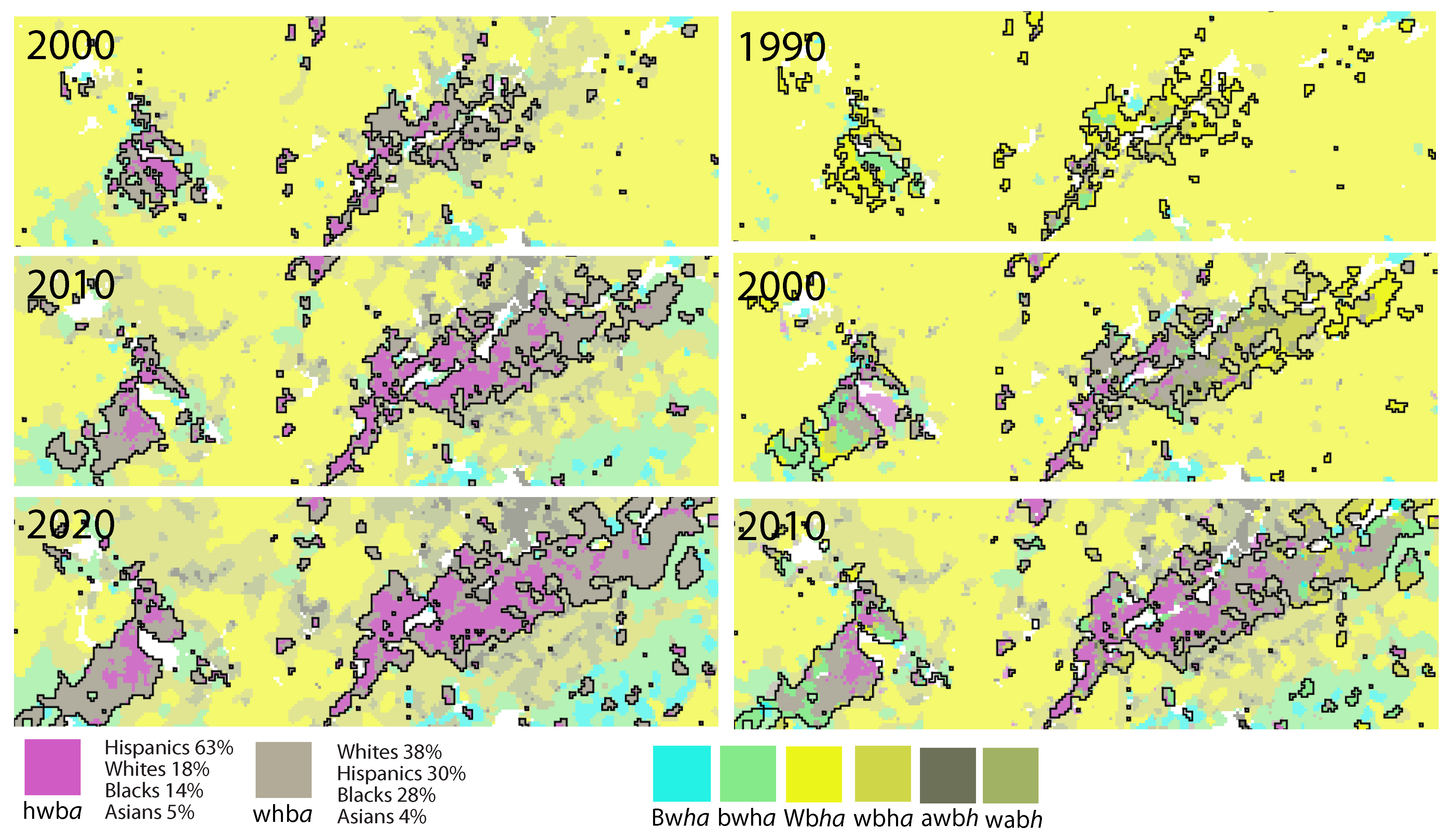
Figure 8 and
Figure 9 provide insight into the spatio-temporal expansion of the Asian and Hispanic populations, respectively, by zooming in on the northeastern corner of the Atlanta site depicted in
Figure 6. In
Figure 8, the expanding zone encompasses the union of awb
h (kokoda color) and wab
h (olive color) neighborhood types, which are notable for their significant shares of the Asian subpopulation. Asian neighborhoods began to emerge on the Atlanta map in 2000, and during the 2000–2020 period, they expanded at the expense of White (Wb
ha) neighborhoods in a layered manner. Similar to the Asian expansion in Chicago, nuclei of the Asian population are observed, albeit not as distinctly as those of Hispanic people.
In
Figure 9, the expanding zone encompasses the union of hwb
a (fuchsia color) and whb
a (taupe gray) neighborhood types, both characterized by significant shares of the Hispanic population. Like Asian people, Hispanic neighborhoods became noticeable on the Atlanta map in 2000. From 2000 to 2020, they expanded from two well-defined nuclei into the surrounding neighborhoods. Initially, this expansion occurred primarily at the expense of Wb
ha and bwh
a neighborhoods, but later, it also affected wab
h neighborhoods.
4. Conclusions and Discussion
The objective of this work was to present a method that converts census tabular race data into a false colors, multi-channel image—the racial image—that depicts racial geography of an urban area. The main motivation behind this research was to offer a geovisualization tool for examining racial segregation and its temporal changes. The resulting racial images can serve as valuable observational constraints for spatially explicit models of racial dynamics.
This was made possible by the dominance of four subpopulations (Black people, Hispanic people, White people, and Asian people) in urban areas, which allowed us to represent the racial image using a four-channel CMYK color model without any loss of information. In order to enhance the readability of the racial images, we applied a smoothing technique that preserved the edges and the legend. The difference between the original and smoothed maps can be observed in
Figure 2, clearly demonstrating that smoothed racial images are more conducive to analysis.
We have demonstrated the effectiveness of our method in observing temporal changes in racial geography using Chicago and Atlanta as case studies. Despite the relatively stable total population of Chicago during the 1990–2020 period, there have been significant shifts in its racial composition and spatial patterns. In particular, we focused on the expansion of Hispanic and Asian neighborhoods (
Figure 4 and
Figure 5). The geovisualizations presented in these figures reveal that the spatio-temporal changes observed are not consistent with the underlying process described by Schelling’s model. Schelling’s model suggests that racially mixed neighborhoods tend to become more segregated over time. However, our visualizations (
Figure 5) show that Hispanic people were already segregated from other subpopulations in 1990, and if anything, their segregation has slightly decreased in subsequent decades due to the significant enlargement of mixed neighborhoods of whb
a and hwb
a types (see
Figure 4). A similar trend is observed for Asian neighborhoods (see
Figure 5).
In contrast to Chicago, the city of Atlanta experienced a substantial 88% increase in its total population from 1990 to 2020, accompanied by a shift towards a larger proportion of non-White subpopulations. This demographic change in Atlanta resulted in significant alterations to its racial composition and the overall configuration of racial patterns (see
Figure 6). In our analysis of Atlanta, we focused on the expansion of Black, Hispanic, and Asian neighborhoods (
Figure 7,
Figure 8 and
Figure 9). Similar to our findings in Chicago, the observed spatio-temporal changes in these neighborhoods in Atlanta are inconsistent with the predictions of Schelling’s model. Schelling’s model assumes that racially mixed neighborhoods tend to become more segregated over time, but our analysis reveals a different pattern. This discrepancy highlights the limitations of Schelling’s model in capturing the complexity of real-world racial dynamics.
Our analysis extends beyond Chicago and Atlanta to include six additional cities in our dataset (see
Supplementary Material), and we consistently draw the same conclusion: the observed spatio-temporal changes in neighborhood racial composition across these cities are incompatible with Schelling’s model. These findings emphasize the importance of considering alternative approaches, such as geovisualization techniques, to gain a more comprehensive understanding of the dynamics of racial patterns in urban areas.
Hypothesizing the precise process that aligns with our geovisualizations and exploring methods for simulating such a process on a computer fall beyond the scope of this paper. However, we can provide a preliminary hypothesis regarding the nature of the process that could explain the observed patterns. The spatial distributions of various subpopulations are influenced by demographic factors, including birth and death rates, migration rates between different subpopulations, as well as the prevailing conditions within the urban environment such as housing availability and economic factors. Behavioral traits also play a role in shaping these distributions.
According to a report by the Brookings Institution [
22] that covers the entire United States during the 2010–2019 period, there are significant variations in natural population growth (births minus deaths) and immigration population growth among different subpopulations (refer to
Table 1). Among the non-White subpopulations, Hispanic people, Asian people, and Black people, the contributions to population growth decrease in that order. All of the population growth in these subpopulations can be attributed to these three groups. While the growth in the Hispanic and Black populations is primarily driven by natural growth (births exceeding deaths), the growth in the Asian population is primarily driven by immigration. For the purposes of this discussion, let us assume that the trends outlined in
Table 1 hold for Chicago from 1990 to 2020.
Let us consider the evolution of the Hispanic population in Chicago as depicted in
Figure 4. According to the data presented in
Table 1, the growth of the Hispanic population is primarily driven by natural growth, which means that the local growth rates of Hispanic people are proportional to their density. Specifically, the growth rates are highest in the Hw
ba neighborhood and progressively lower in hwb
a, whb
a, and Wh
ab neighborhoods. It is worth noting that even when considering immigration, this argument remains valid, as Hispanic immigrants tend to prefer living in neighborhoods with a large Hispanic population, as these areas provide them with more opportunities [
23].
Therefore, without spreading out to other subpopulations, the evolution of the Hispanic population would follow a process known as preferential attachment [
24,
25]. This means that by 2020, the density distribution of Hispanic people would exhibit a power-law form, with the majority of Hispanic people residing in a few neighborhoods within the 1990 extent of the Hw
ba zone. However, this scenario is neither observed nor physically possible, as housing capacity is limited at any given location. Thus, the spreading out of the Hispanic subpopulation must occur, and indeed, this is precisely what is observed in
Figure 4.
In principle, one could reduce the excess of Hispanic people within the Hwba zone by continuously relocating a fraction of the population to nonadjacent neighborhoods in Chicago. However, empirical observations indicate that the process of relocation occurs through diffusion, which involves a net transfer of people from locations with higher concentrations of Hispanic people to adjacent areas with lower concentrations. Specifically, we observe the following patterns: Hwba → hwba, hwba→ whba, and whba→ Whab, where → means “expands to”. Throughout the entire 1990–2020 period, the gradient showing the concentration of Hispanic people is maintained due to a continuous influx of inhabitants into the Hwba neighborhood, resulting from natural growth and immigration.
Thus, according to this hypothesis, if the influx of population were to cease (resulting in a zero growth rate), the spread of Hispanic people would still continue until an equilibrium was reached, which would be characterized by a zero concentration gradient. Therefore, according to this hypothesis, the existence of the Hw
ba neighborhood is dependent on the growth of the Hispanic population. Overall, it can be postulated that the evolution of Asian neighborhoods in Chicago (
Figure 5), as well as Black, Asian, and Hispanic neighborhoods in Atlanta (
Figure 7,
Figure 8 and
Figure 9), is driven by a combination of diffusion and preferential attachment processes.
It is important to note that our hypothesis is neutral in nature, drawing inspiration from neutral models in landscape ecology [
26]. The term “neutral” in this context signifies that our hypothesis aims to capture the observed spatio-temporal patterns of neighborhoods without explicitly identifying causal relationships between specific economic conditions, behavioral traits, and the observed patterns. For instance, it does not explain why a particular subpopulation expands into nearby areas instead of moving to nonadjacent locations, or why Hispanic people in Chicago do not spread to adjacent B
wha zones.
Before incorporating our hypothesis into a computational model, further investigation and consideration are required in future research. As the spread of subpopulations in our visualization shares similarities with the changes in species ranges in natural environments, future models could be inspired by the extensive ecological literature on modeling species spread [
27,
28].


