Article

Spatiotemporal Evolution Patterns of the COVID-19 Pandemic Using Space-Time Aggregation and Spatial Statistics: A Global Perspective

Faculty of Geosciences and Environmental Engineering, Southwest Jiaotong University, Chengdu 611756, China
ISPRS Int. J. Geo-Inf. 2021, 10(8), 519; https://doi.org/10.3390/ijgi10080519
Submission received: 22 May 2021 / Revised: 26 July 2021 / Accepted: 29 July 2021 / Published: 31 July 2021

Abstract

:
Unlike previous regionalized studies on a worldwide crisis, this study aims to analyze spatial distribution patterns and evolution characteristics of the COVID-19 pandemic, using space-time aggregation and spatial statistics from a global perspective. Hence, various spatial statistical methods, such as the heat map, global Moran’s I, geographic mean center, and emerging hot spot analysis were utilized comprehensively to mine and analyze spatiotemporal evolution patterns. The main findings were as follows: Overall, the spatial autocorrelation of confirmed cases gradually increased from the initial outbreak until September 2020 and then decreased slightly. The geographic centroid migration ranges of the pandemic in Asia, Europe, and Africa are wider than those in South America, Oceania, and North America. The spatiotemporal evolution pattern of the global pandemic mainly consisted of oscillating hot spots, intensifying cold spots, persistent cold spots, and diminishing cold spots. This study provides auxiliary decision-making information for pandemic prevention and control.

1. Introduction

The COVID-19 pandemic has caused an unprecedented crisis worldwide, which has seriously affected economic development, social function, and the lives and health of people globally [1]. Moreover, the spatiotemporal variability of the outbreak led to great challenges in the prevention and control of the pandemic. The timely aggregation of time series data related to the pandemic, statistical analysis of the pandemic’s spatiotemporal distribution pattern and its changes in characteristics over time, and rapid visualization of pandemic information, can provide effective information support for decision-making, the formulation of measures, and evaluation of its effects. This assists COVID-19 pandemic prevention and control [2]. However, the complexity of COVID-19 makes it difficult to analyze the spatiotemporal distribution characteristics of infected people globally. One of the major challenges is determining how to use geographic information system (GIS) visualization technology and spatiotemporal statistical analysis methods to quickly and accurately obtain spatiotemporal information about the COVID-19 pandemic, to aid decision-making for social management, and pandemic prevention and control. Most previous research on the spatiotemporal analysis of the pandemic is limited to specific countries or regions, and Asia and the Americas are the geographic regions where the most included studies have been carried out [3]. Although some researchers have studied the global overview offered by climatic models [4] and ecological niche models [5] that indicated the possible fostering of the virus expansion due to climatic conditions at the earliest stage of the COVID-19 pandemic, a global overview of the pandemic’s spatiotemporal distribution characteristics is lacking [6]. Thus, an investigation of the spatiotemporal evolution of the pandemic that involves mining and analyzing the spatiotemporal variation characteristics of COVID-19 infections from a global perspective is warranted.
One of the most important characteristics of the pandemic is the spatiotemporal uncertainty of its spread. Understanding the spatiotemporal dynamics of COVID-19 is critical to reducing its impact, as this would help clarify the scope of the pandemic and facilitate decision-making and community action [7]. Thus, we used geographic information technology and various spatial statistical methods to determine the spatiotemporal dynamics of the pandemic’s spread. In this way, we obtained scientific information to help mitigate the outbreak. Spatiotemporal analysis of the pandemic is reflected in the analysis of the geographical distribution characteristics and impact factors related to persons infected with COVID-19 using classical statistical and spatial statistical methods. The classical statistical methods used mainly include statistical description [8], regression analysis [1,6,9], and correlation analysis [8,10], and the spatial statistical methods used mainly include density analysis [9], spatial autocorrelation [10,11,12,13], and hot spot analysis [14]. Meanwhile, classical statistical and spatial statistical methods are often combined to analyze the spatiotemporal distribution characteristics of the pandemic in practical research work.
Classical statistical methods are more frequently used to analyze the correlations between the COVID-19 pandemic and socioeconomic factors. The risk of the impact of the pandemic on each country has been assessed on a global scale, and the correlation between its rating on the vulnerability index of infectious diseases and the number of elderly people in the population has been analyzed based on multiple regression models [1,6]. Researchers have investigated whether the prevalence of COVID-19 in Spain has shown seasonal changes due to changes in temperature, humidity, and daylight hours by spatiotemporal analysis of environment-related factors [15]. Moreover, spatiotemporal analysis technology was used to explore the effect of the daily mean temperature on the cumulative number of COVID-19 cases in Spanish provinces [16]. The spatial scan statistics method was used to identify the clustering characteristics of COVID-19 cases in New York City, and Box plot and Pearson correlation measure models were used to determine the degree of association between the clustering results and environmental factors [8]. In addition, spatial autocorrelation and Spearman rank correlation were used to study the spatiotemporal patterns of the COVID-19 pandemic and the factors impacting them [10]. The spatiotemporal variations of country-specific COVID-19 doubling time and effective reproduction number were examined to provide real time pandemic progression [17]. The diffusion-based cartograms for visualization of the COVID-19 pandemic were proposed according to the country-level statistical data of the first 150 days of the outbreak [18].
Spatial statistical methods mainly involve analysis of the spatial distribution characteristics of the COVID-19 pandemic. Getis-Ord G i * statistics were used to conduct a hotspot analysis of the pandemic in Bangladesh, and the vulnerability zones of COVID-19 were analyzed in combination with the hierarchical model to assess and analyze its spatial and temporal transmission dynamics [14]. Based on geotagged data, the spatial and temporal distributions of COVID-19 cases in Wuhan, China were analyzed using kernel density analysis and ordinary least-squares’ regression methods [9]. The spatial heterogeneity of the epidemic in Kenya was analyzed by constructing an epidemic vulnerability index based on geospatial analysis [19]. The spatial prevalence dynamics of COVID-19 in China were explored with the Moran index [12]. A spatiotemporal risk source model was developed to predict the geographical distribution of confirmed cases and the areas of high transmission risk in the early stages of the epidemic in China using mobile phone data to measure people’s movement [20]. Combined with the Moran index and logical model, the spatial and temporal distribution characteristics of COVID-19 in China were analyzed [13]. A spatiotemporal simulation of the COVID-19 outbreak was conducted using an agent-based modelling method to evaluate the impact of the adopted epidemic control strategy on the prevention and control of the outbreak [21].
The above-mentioned studies on the spatiotemporal analysis of the COVID-19 pandemic have used GIS thematic maps, such as classification, proportion, and density maps, and line charts to visually present the analysis results. However, effective integration of infected persons’ spatial location and time information and a time series analysis has not been sufficiently considered. Due to the large number of COVID-19 cases, the visual effect expressed by scatter diagrams and scale thematic diagrams is not intuitive. Although thematic maps can express the spatial distribution of the pandemic, they are all mapped for large administrative divisions, such as countries, provinces or states, and the granularity of visual expression is relatively coarse. Moreover, it is not easy to analyze the spatiotemporal variation characteristics and patterns of the pandemic from dual dimensions of time and space. Furthermore, line charts can only express the temporal dimension information of pandemic time series data simply, without considering spatial location information. Using the above visualization methods, it is difficult to effectively aggregate spatiotemporal series data to analyze the changes in characteristics of the spatiotemporal distribution pattern of the COVID-19 pandemic over time. Meanwhile, a single statistical analysis method cannot be used to fully analyze the spatiotemporal pattern of the pandemic and its evolution.
In summary, previous studies that have analyzed the spatiotemporal distribution characteristics of the COVID-19 pandemic have mainly focused on local or regional epidemic situations, and the depiction of the spatiotemporal evolution from a global perspective is lacking. The problem brought by data gaps and heterogeneous reporting has been the principal hindrances of the spatiotemporal analysis model of the COVID-19 pandemic, especially the global-scale model. Meanwhile, spatiotemporal analysis research has failed to fully aggregate the time series data of the spatial, temporal, and attributes of the pandemic. Hence, it is difficult to effectively explore the trends in the evolution of the pandemic over time by using the conventional single information visualization method. In response to these limitations, the purpose of this study is to mine the spatial distribution pattern and evolution characteristics of the COVID-19 pandemic on a global scale by using space-time aggregation and spatial statistics methods. This study uses worldwide data on the COVID-19 pandemic, to create a multidimensional data model with a space-time cube and spatial database to obtain time series data for time slices on different time scales. To analyze the spatiotemporal evolution process of the pandemic from a global perspective, spatiotemporal statistical methods, such as the heat map, geographic mean center, spatial autocorrelation, and emerging spatiotemporal hot spot analysis were comprehensively used to mine and analyze the spatiotemporal distribution characteristics and variation pattern of the pandemic. Such analysis of the COVID-19 pandemic based on spatiotemporal statistics could help countries or regions worldwide to understand the spatiotemporal distribution pattern of the pandemic, allowing for dynamic improved supervision of pandemic prevention and important decision-making support for pandemic prevention and control.

2. Materials and Methods

2.1. Data Collection and Preprocessing

2.1.1. Data Collection

All data used in this study were obtained from the internet. The COVID-19 outbreak data which came from nearly 4000 sampling locations around the world were obtained from the COVID-19 data repository at the Johns Hopkins Center for Systems Science and Engineering (CSSE) [22]. These sampling locations could be in the capital of a relatively small country or the administrative center of a province or state of a large country. Time series data of global confirmed cases from 22 January 2020 to 22 January 2021 were obtained from this repository to analyze the spatiotemporal variation characteristics of the COVID-19 pandemic. In addition, visualization of the spatial distribution of the COVID-19 pandemic necessitates the support of geographic information. This study used the global administrative regions as the basic geographic information, and the map data were obtained from the China National Geographic Information Public Service Platform (www.tianditu.gov.cn, accessed on 23 January 2021).

2.1.2. Data Preprocessing

The data preprocessing mainly included data cleaning, database construction, data extraction, and data aggregation. As the collected COVID-19 pandemic data are in html format, it is not easy to analyze and calculate the data. Therefore, this study used Python to write a data cleaning script to clear the contents of the html tags and other information unrelated to the pandemic data and converted html into a plain text format. Thereafter, the database storage structure was designed according to the data requirements of the spatio-temporal change analysis of the pandemic situation. After cleaning and format conversion, the global pandemic data were stored in the PostgreSQL spatial database to obtain the data according to the spatiotemporal analysis requirements. When analyzing the spatiotemporal changes of a pandemic, we need to extract slice data of different time scales. Using database query technology, the data were sliced according to different time scales to form a time series data set to analyze spatial and temporal distribution characteristics of the pandemic qualitatively and quantitatively. Simultaneously, data on the spatial, attribute, and time characteristics of the confirmed cases were extracted from the database, and a space-time multi-dimensional data model was constructed using the spatiotemporal cube function module by ArcGIS software. The global pandemic data were aggregated into spatiotemporal bins, and several spatiotemporal bins form a three-dimensional spatiotemporal cube. The spatiotemporal cube dataset was stored in the network common data format (NetCDF) to realize the spatiotemporal aggregation of pandemic data to mine and analyze the spatiotemporal variation patterns of the COVID-19 pandemic.

2.2. Methods

2.2.1. The Method to Present the Spatial Distribution of COVID-19 Cases by Heat Maps

Due to the huge number of COVID-19 cases, it is difficult to express the spatial distribution characteristics of the pandemic intuitively with a scatter plot. As an intuitive data visualization technology, heat maps use color to convey the relationships among data values. Heat maps show the spatial distribution density of geographical phenomena through color variations, so they can be used to visualize the spatial aggregation of COVID-19 cases.
The method of drawing COVID-19 heat maps using two-dimensional histogram technology [23] mainly includes three steps: First, according to the given time interval parameters, the cumulative data of newly confirmed cases in different countries were extracted from the COVID-19 pandemic database to form the time slice data of the global pandemic situation. Then, to utilize a histogram to count the number of newly confirmed cases from sampling locations in a given time interval, two-dimensional histogram technology was used to construct statistical blocks of global histogram. The number of bins in a histogram is 64, which was determined by taking the square root of the maximum number of sampling locations and rounded up. The sum aggregate function was used to calculate the number of confirmed cases in each statistical block. Meanwhile, a logarithm transform was used for the aggregate data inside the blocks to facilitate the coloring of the heat maps. Finally, the two-dimensional histogram blocks were rendered, using the color gradient ribbon to draw the COVID-19 pandemic heat map.
In this study, the Matplotlib software package in the Python environment was used to draw a COVID-19 pandemic heat map. This tool is commonly used for data visualization, and uses the imshow function to create a heat map [24]. To analyze the evolution trend of the COVID-19 heat map on a global scale, it is necessary to ensure that the newly confirmed cases within a given date interval can cover most regions of the world. Due to the uneven spatial distribution of the new confirmed cases reported by different sampling locations worldwide, some sampling locations got a lot of cases, while some sampling locations didn’t even get one case. Therefore, it is necessary to select an appropriate date interval to aggregate the epidemic data to meet the basic requirements of drawing the COVID-19 heat map globally. When the sampling data is sparse, it is not easy to draw a heat map. Through the exploratory experimental analysis of data aggregation, the newly confirmed cases aggregated according to 60-day intervals were more suitable for the evolution analysis of the global COVID-19 heat map. Finally, 60-day time slices of the global pandemic data were made, and heat maps were created based on the time series data of these slices to analyze the spatial distribution characteristics of the COVID-19 pandemic over time on a global scale.

2.2.2. Analysis Method to Determine the Geographic Barycenter Shift of the COVID-19 Pandemic

To determine the changes in the geographic center of the pandemic, the mean center index, which measures the geographical distribution, was used to analyze the geographic center migration characteristics of the pandemic. The mean center is a type of central trend index of point features, which can be calculated using the arithmetic mean and weighted mean. In this study, the weighted average algorithm was used to calculate the mean center of the confirmed cases. Its calculation formula [25] is shown in Equation (1), where n denotes the number of sampling locations, x i , y i are the coordinates of the ith sampling location of the confirmed cases, p i is the cumulative number of confirmed cases at the ith sampling location, and X ¯ ,     Y ¯ are the weighted mean center coordinates of the COVID-19 pandemic.
X ¯ = i = 1 n p i x i i = 1 n p i ,   Y ¯ = i = 1 n p i y i i = 1 n p i
The mean center is a statistic that describes the spatial locations of the samples. Therefore, it can be used to reflect the general location variation of the COVID-19 pandemic during different time slices. As the land area only accounts for 29% of the total global area, this study calculated the geographic mean centers of the COVID-19 pandemic in different time slices by grouping countries into Asia, Europe, Africa, South America, North America, and Oceania. Selecting the appropriate number of geographic mean centers can better depict the change trend and mapping effect of the geographic mean center migration of the pandemic. Nevertheless, the appropriate number depends on the time interval of the pandemic data. In this study, the results of the visualization effect of geographic mean center migration with different time intervals were compared through exploratory experiments, and 30 days were selected as the time interval, which can better track the geographic mean center shift of the COVID-19 pandemic. Finally, global pandemic data were split into 30-day time slices.

2.2.3. Measurement Method to Determine the Spatial Clustering Intensity of the COVID-19 Pandemic

To quantitatively analyze the spatial distribution characteristics of the COVID-19 pandemic, the global Moran index was used to measure the spatial clustering intensity of the pandemic. The global Moran index measures spatial autocorrelation according to the location and attribute values of the geographical features. Given geographical phenomena and their related attributes, it can be used to evaluate whether the expressed pattern is a clustering, discrete, or random pattern.
I = n i = 1 n j = 1 n W i j ( Z i Z ¯ ) ( Z j Z ¯ ) i = 1 n j = 1 n W i j i = 1 n ( Z i Z ¯ ) 2
Z ( I ) = I E ( I ) V a r ( I )
The statistical model to measure the spatial autocorrelation of the COVID-19 pandemic with the global Moran index is shown in Equation (2) [26], where I denotes the global Moran index, and its value range is [−1,1]. n denotes the number of sampling locations in confirmed cases. Z i and Z j are the numbers of confirmed cases at sampling locations i and j , respectively. Z ¯ denotes the mean value of confirmed cases at all sampling locations. W i j is the spatial weight between i and j , which can be determined by the conceptualization of the spatial relationship. Here, the spatial weight is constructed according to the inverse distance weighting method, namely, W i j = 1 d i j , where d i j is the Euclidean distance between i and j . The significance of the global spatial correlation can be tested using the Z value and its calculation formula, as shown in Equation (3) [27]. At a given significance level, if Z is positive, and the larger the value is, the greater the clustering intensity is; if Z is negative, and the smaller the value is, the greater the discrete is. Furthermore, because of the uneven spatial distribution of the new confirmed cases reported daily by different sampling locations worldwide, if the time interval is too small, the confirmed cases will be concentrated in some local areas, which cannot be suitable to analyze the spatial clustering intensity of the pandemic from a global perspective. The results of the global Moran index under different time intervals were compared through exploratory experiments, and the aggregations of the pandemic data with 30-day intervals were suitable to analyze the spatial clustering intensity of the COVID-19 pandemic from a global scale. Finally, the pandemic data were generated in time slices at 30-day intervals. The Moran index tool module in ArcGIS software was used to calculate Moran’s I of the cumulative confirmed cases in each time slice.

2.2.4. Methods to Mine the Spatiotemporal Cold and Hot Change Pattern of the COVID-19 Pandemic

The spatiotemporal evolution analysis is based on the confirmed cases obtained from the results of nucleic acid tests. Due to the high infectivity of COVID-19, these confirmed cases have strong temporal and spatial correlations in each country or region. Thus, the spatiotemporal cube can be used to aggregate the confirmed cases to mine the spatiotemporal cold and hot spot change pattern of the COVID-19 using the emerging spatiotemporal hot spot analysis method which follows the basic principle that neighboring objects are more closely related than distant objects are [28]. It defines the spatiotemporal relationships among geographical phenomena according to their spatiotemporal neighborhood. Based on the constructed spatiotemporal cube, the spatiotemporal variation pattern was excavated using the spatiotemporal statistics method.
The Getis–Ord G i * statistical model is commonly used to analyse emerging spatiotemporal hotspots to explore the local spatial autocorrelation of sample sets to identify the spatial clustering patterns of hot and cold spots with statistical significance. For the G i * statistic, a positive value suggests a spatial clustering of high values, and a negative value indicates a spatial clustering of low values [26]. The G i * statistical model [29] for COVID-19 is illustrated in Equation (4), where C j is the number of confirmed cases at sampling location j , and ω i , j represents the space-time weights between sampling locations i and j , as shown in Equation (5). Here, the spatiotemporal weight is constructed according to the neighborhood relationship determined by the neighborhood distance and neighborhood time step which can be determined through exploratory experiments based on the spatial-temporal distribution of sampling points. C ¯ denotes the mean number of confirmed cases, as in Equation (6). S is the standard deviation of the sample of confirmed cases, as in Equation (7). Where n denotes the number of sampling locations.
G i * = j = 1 n ω i , j C j X ¯ j = 1 n ω i , j S n j = 1 n ω i , j 2 ( j = 1 n ω i , j ) 2 n 1
ω i , j = { 1 ,             j   i s   w i t h i n   t h e   n e i g h b o u r h o o d   o f     i 0 ,       o t h e r                                                                  
C ¯ = j = 1 n C j n
S = j = 1 n C j 2 n ( C ¯ ) 2
Each space-time bin aggregating COVID-19 epidemic data in the space-time cube was associated with the Z-score, p-value, and hot (cold) spot category information obtained by the G i * statistical test. The p-value represents the probability that the observed spatial pattern was created by a random process. A very small p-value indicates that the confirmed cases of COVID-19 showed a statistically significant cluster or discrete pattern. The Z-score represents a multiple of the standard deviation, which was used to measure the intensity of the COVID-19 pandemic cluster. The Mann–Kendall trend analysis method [30] can be used to analyze the variation trends for the Z-score, p-value, and the number of confirmed cases of each spatiotemporal bin in the cube. A sequence of p-values at a location can be used to determine whether there is a statistically significant agglomeration trend at that location, and a symbol associated with a Z-score can be used to determine whether the trend is upward (positive Z-score) or downward (negative Z-score). Based on the statistical characteristics of hot (cold) spots, eight types of hot (cold) spots can be identified, including new, consecutive, intensifying, persistent, diminishing, sporadic, oscillating, and historical hot (cold) spots [31]. The definitions of the eight cold and hot spot patterns [32] are listed in Table 1.
In this study, a spatiotemporal cube was first constructed according to the data collected on the COVID-19 pandemic. Thereafter, the spatial distribution of the hot (cold) spots of confirmed cases in different time slices was determined using an emerging spatiotemporal hot spot analysis using ArcGIS software. Finally, the Mann–Kendall trend analysis was used to explore the evolution patterns of hot (cold) spots over time.

3. Results

3.1. Evolution Characteristics of the Heat Map of the Global COVID-19 Pandemic

Heat maps were used to analyze the spatial distribution and concentration trends for the COVID-19 pandemic to show the overall state of the global pandemic. The heat map variation for the global pandemic over the six periods is shown in Figure 1. From 22 January to 22 March 2020, the high-density shadows were concentrated in Europe and Asia, with Italy, France, Germany, and China being among the most affected areas. From 23 March to 22 May 2020, the high-density shadows were mainly concentrated in Europe and the Americas, with Europe, the eastern United States, Brazil, the Arabian Peninsula, and India being the most severely affected areas. From 23 May to 22 July 2020, high-density shadows were concentrated in the United States, Brazil, the Arabian Peninsula, India, and Russia. From 23 July to 21 September 2020, high-density shadows were concentrated in the United States, Brazil, the Arabian Peninsula, India, and Europe. From 22 September to 21 November 2020, high-density shadows were mainly concentrated in Europe and the eastern United States. High-density shadows were concentrated in Europe and the United States from 22 November 2020 to 22 January 2021.

3.2. Global Spatial Autocorrelations of the COVID-19 Pandemic over Time

The global Moran index was used to analyze the spatial autocorrelations of cumulative confirmed cases for the global COVID-19 pandemic to show the change in the concentration intensity of the pandemic over time. Figure 2 shows the changes in the global Moran’s I and Z-scores for the global pandemic in 30-day slices. The cumulative number of confirmed COVID-19 cases in all time slices showed a significant global spatial autocorrelation ( p < 0.05 ,   Z s c o r e > 1.96 ). Overall, the trend of the Moran Index shows a gradual increase in the spatial autocorrelation of confirmed cases from the start of the outbreak until September 2020, followed by a slight decline. It is worth noting that, except for an absolute Moran’s I index value of less than 0.04 in the initial two months of the outbreak, the Moran’s I index values of confirmed cases in the subsequent time slices were positive, and all were greater than 0.13, with the maximum value reaching 0.31, indicating a strong global spatial autocorrelation for confirmed cases. Z-scores are all positive, and their change trend is consistent with the change trend of Moran’s I index values, indicating that the confirmed COVID-19 cases had significant spatial agglomeration characteristics.

3.3. Geographical Mean Center Migration of Global COVID-19 Pandemic

The geographical mean center was used to analyze the shift in the location of the concentration of cases in the COVID-19 pandemic. The spatiotemporal dynamics of the pandemic in Europe, North America, South America, Africa, Asia, and Oceania are illustrated. Figure 3 shows the changes in the geographic mean center of confirmed COVID-19 cases per 30-day slice across six continents.
Figure 3a describes the geographic mean center shift for confirmed COVID-19 cases in Asia. The geographic mean center of the outbreak moved from east to west, from China to India. Except for the initial three months of the outbreak, the geographical mean center of the pandemic was predominantly in India. Figure 3b shows the geographic mean center shift for confirmed COVID-19 cases in Europe. At the beginning of the outbreak, the geographical mean center of the pandemic shifted southwest, from France to Spain. Subsequently, the geographical mean center of the pandemic shifted to the northeast and became concentrated in eastern Europe. Figure 3c shows the geographic mean center shift for confirmed cases of COVID-19 in North America. The geographical mean center of the pandemic first migrated from the west to the east and then to the southwest in the United States. Figure 3d shows the geographic mean center shift for confirmed COVID-19 cases in South America. The geographical mean center of the pandemic generally migrated from west to east, mostly to locations in Brazil. Figure 3e shows the geographic mean center shift of the COVID-19 pandemic in Africa. The geographical mean center of the pandemic originally moved to the southwest area from Egypt in northern Africa and then moved southward to western Africa. Figure 3f shows the geographic mean center shift for confirmed COVID-19 cases in Oceania. The geographical mean center of the pandemic migrated from north to south and became densely distributed in the southeast coastal area of Australia.
Table 2 shows the migration distance of the geographic mean center of the COVID-19 pandemic in six continents. The smaller the migration distance of the geographical mean center, the more concentrated the outbreak. Otherwise, the scope of the outbreak was wider. In terms of the migration distances of the geographic mean center, Asia, Europe, and Africa show relatively long migration distances for the geographic mean center, indicating that their outbreak scopes are wider. South America, Oceania, and North America have relatively short migration distances for the geographical mean center, indicating that their pandemic outbreaks are more concentrated. According to the ratio of migration distance to the continent area, it can be seen that the continents of migration distance per unit area from small to large are South America, North America, Asia, Africa, Oceania, and Europe. From the perspective of migration direction, the geographical mean center of Asian epidemic moved 4553.78 km from east to west, from China to India, and then moved 1334.872 km to the southeast; The geographic mean center of the epidemic in Europe first moved 1232.307 km from northwest France to northern Portugal, and then moved 4428.343 km to northeast; The geographic mean center of the epidemic in North America first moved 2186.728 km eastward from the central part of the United States, and then moved 842.772 km to the southwest; The geographic mean center of the epidemic in South America first moved 738.202 km eastward from northern Bolivia, and then 636.328 km southward; The geographic mean center of the epidemic in Africa first moved 3229.465 km from the east of Egypt to the southwest, and then moved 3850.305 km to the south to West Africa; The geographic mean center of the epidemic in Oceania first moved 1783.294 km southward from the northeast of Australia, then 389.166 km southward, and finally 171.610 km westward.

3.4. Hot Spot Change Pattern for the Global COVID-19 Pandemic

Based on the space-time cube aggregated pandemic data, the global evolution patterns for the cold and hot spots of confirmed COVID-19 cases were excavated using the emerging spatiotemporal hot spot analysis. The results show the spatiotemporal variation characteristics of the global COVID-19 pandemic.
Table 3 shows the global proportions of cold and hot patterns for confirmed COVID-19 cases. From the statistical data in the table, we observe that there are many more regions with a cold spot pattern than with a hot spot pattern. The range ratio of the cold spot pattern was 65.6%, while that of the hot spot pattern was 26.8%. The main types of cold spot evolution patterns are intensifying cold spots, persistent cold spots, and diminishing cold spots, which account for 61.7% of the regions where cold and hot spot patterns were identified. Sporadic cold spots, historical cold spots, consecutive cold spots, and oscillating cold spot patterns were rare, accounting for only 3.9% of all patterns. No new cold spots were detected. The main evolution pattern identified for hot spots was oscillating hot spots, accounting for 26.3% of all patterns. The number of new hot spots identified was very small, accounting for only 0.5% of all patterns. No other hot spot pattern categories were identified.
Figure 4 shows the spatial distribution of the hot and cold evolution patterns for confirmed COVID-19 cases globally. The oscillating hot spots are mainly distributed in the United States, Mexico, Central America, most parts of South America, Europe, the Middle East, Western Asia, north-eastern Arabian Peninsula, Indian peninsula, Indonesia and Malaysia. The new hot spots are mainly distributed in the border area between the United States and Canada, parts of northern and southern Africa, parts of northern and eastern Europe, parts of Indonesia and Malaysia, the border area between Korea and Japan. The intensifying cold spots are mainly distributed in parts of Central Africa, parts of Southwest Arabian Peninsula, parts of China, eastern coastal areas of Vietnam, parts of northern Russia, parts of Australia, parts of New Zealand, parts of Sweden, parts of Norway, most of Canada, and Alaska in the United States. Persistent cold spots are mainly distributed in southern Russia, Mongolia, Kazakhstan, Thailand, Laos, Cambodia, parts of China, parts of Japan, most of Iceland, Finland, Norway and Sweden, some islands in Oceania, parts of West Africa, parts of East Africa, parts of southwest Africa, and parts of Canada. The diminishing cold spots are mainly distributed in the transition area between Russia and Kazakhstan, the Korean Peninsula, and parts of northern and southern Africa. The sporadic cold spots are mainly distributed in the northwest of Brazil, southern Chile, parts of China, parts of the Arabian Peninsula, Kenya, and other parts of Africa. The oscillating cold spots are mainly distributed in the central part of China and the central part of the Arabian Peninsula. The historical cold spots are mainly distributed in parts of western Russia, parts of central Japan, parts of New Zealand, and parts of Australia.

4. Discussion and Conclusions

4.1. Temporal and Spatial Changes in the Global COVID-19 Pandemic

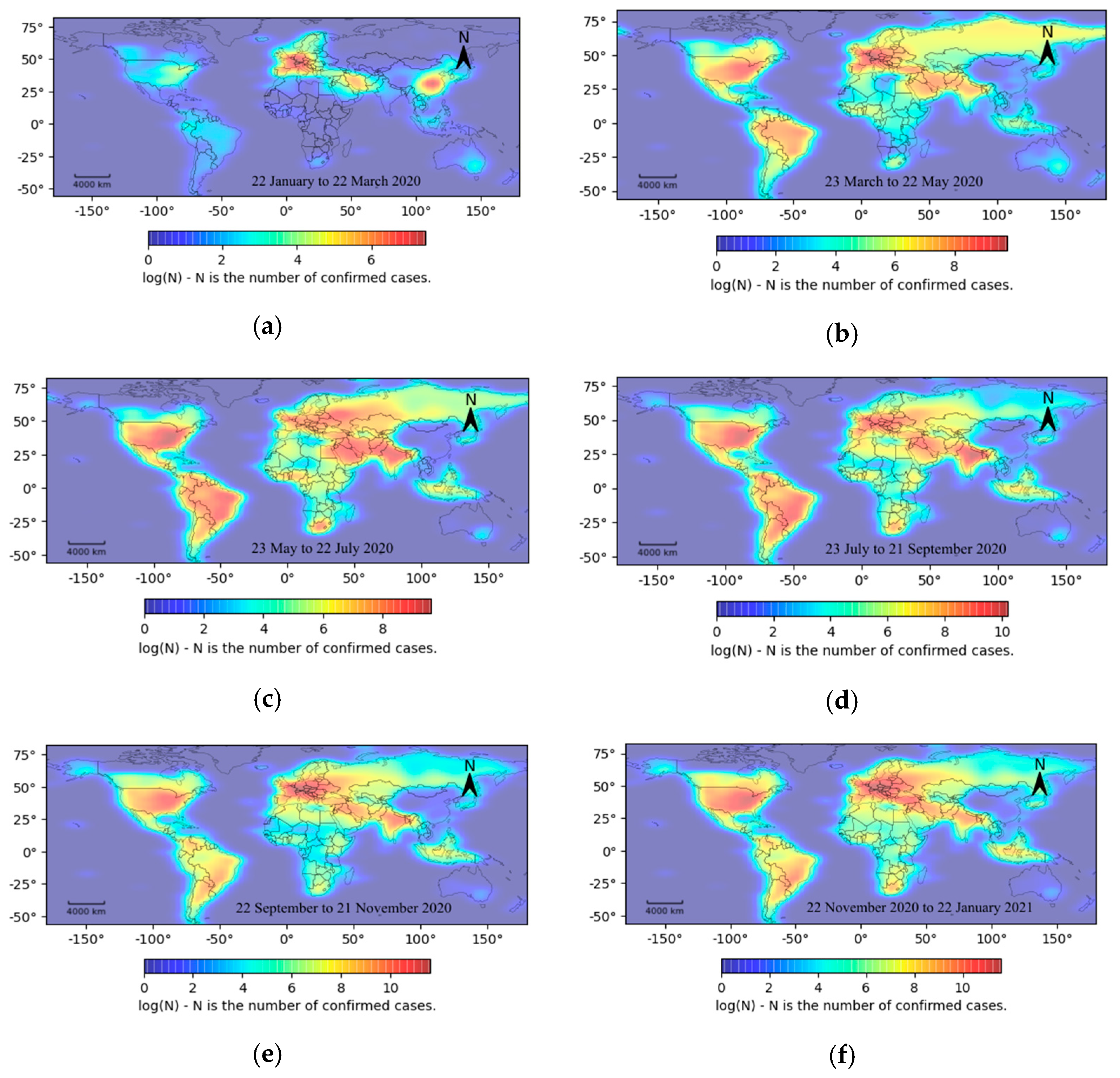
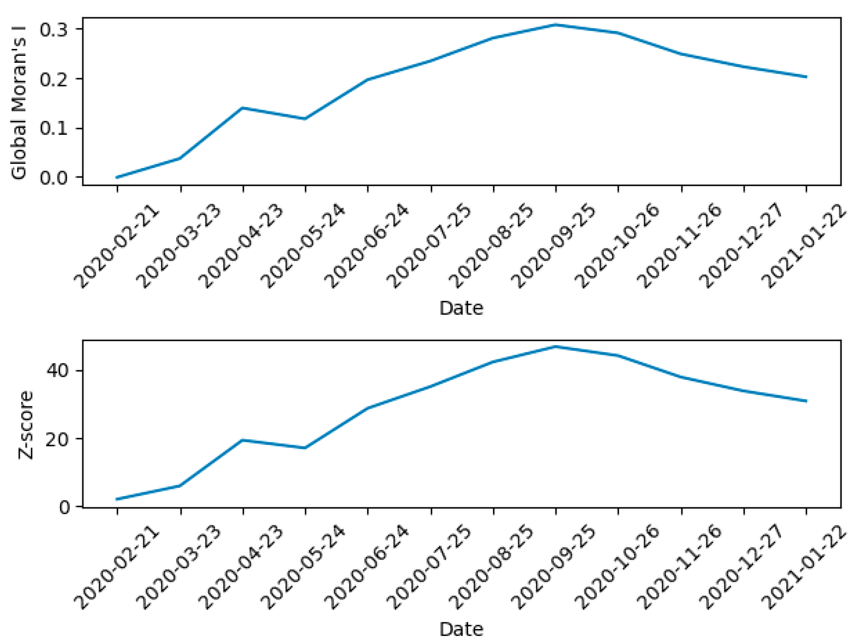
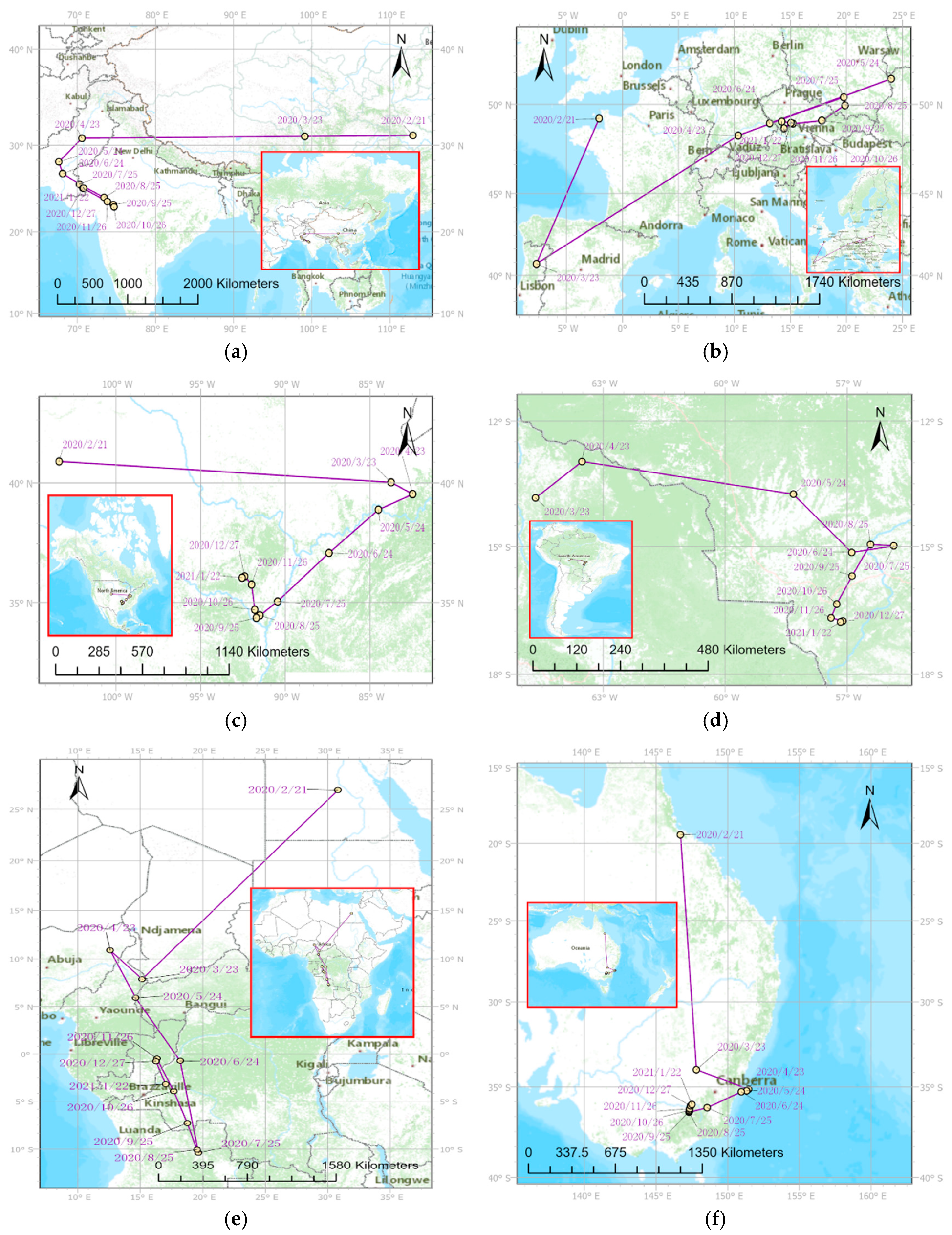
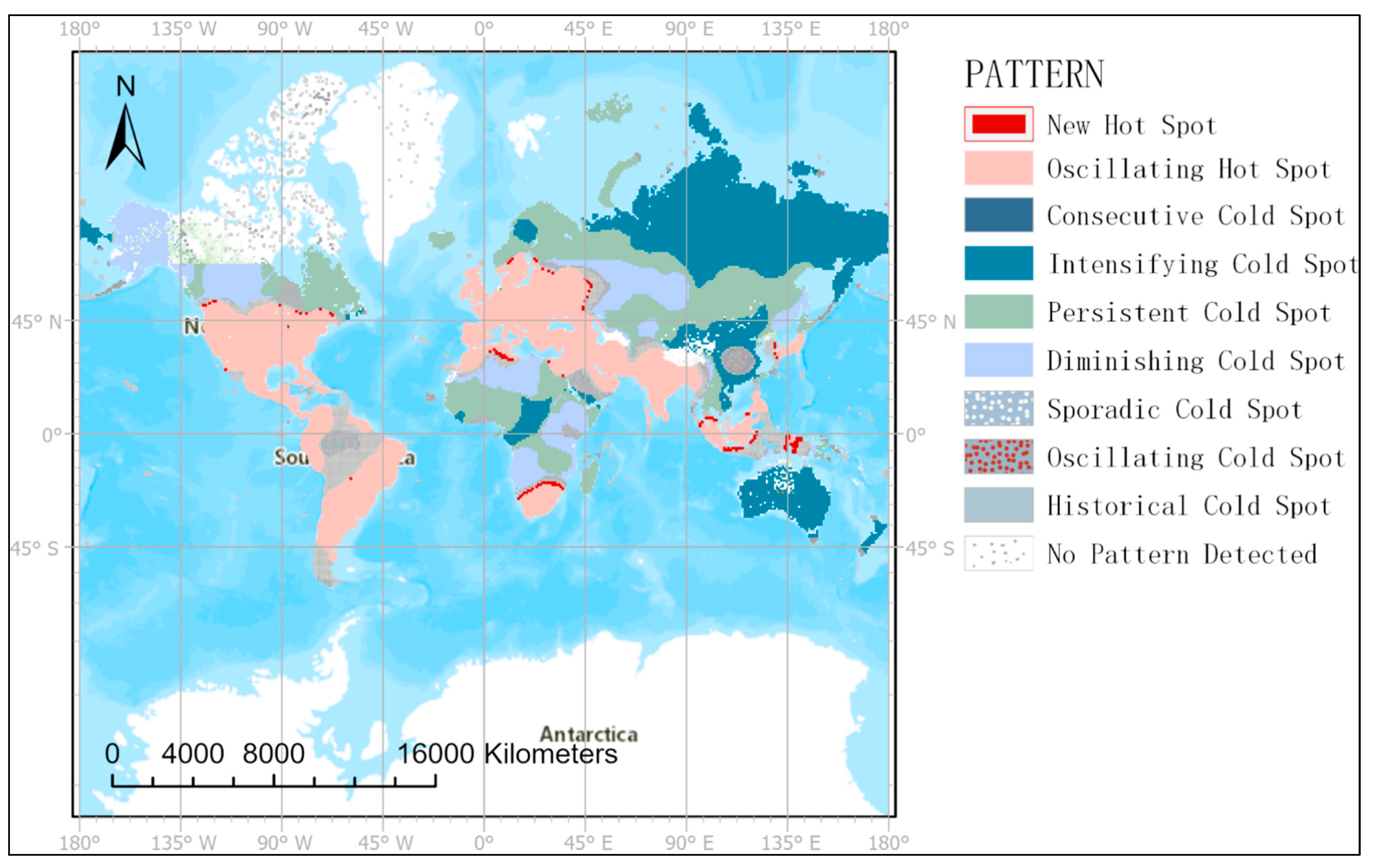
To excavate and analyze the spatiotemporal variation trends in the COVID-19 pandemic from a global perspective, based on global pandemic time series data, we comprehensively analyzed the spatial distribution pattern and its evolution for confirmed cases from multiple dimensions by using a heat map, spatial autocorrelation, geographic mean center, and emerging spatiotemporal hot spot analysis methods. The main findings are as follows: The global spatial and temporal distribution of the confirmed cases is uneven over time and space. The high-density area observed in the heat map of the outbreak, spread from Asia and Europe to North America and South America, while Africa and Oceania were always low-density areas. Asia, Europe, and Africa have had wider geographical centroid migration, while South America, Oceania, and North America have had relatively concentrated geographical centroid migration. There is a significant global spatial autocorrelation of the confirmed cases. Overall, the spatial autocorrelation of confirmed cases gradually increased from the outbreak until September 2020 and then decreased slightly. The spatiotemporal patterns of cold and hot spots of the global pandemic are mainly characterized by oscillating hot spots, intensifying cold spots, persistent cold spots, and diminishing cold spots. Moreover, the spatial distribution range of the cold spot variation pattern is much larger than that of the hot spot variation pattern.
Based on epidemic time series data, heat maps can be used to qualitatively display the spatial distribution density of confirmed cases in different time slices. The heat map aggregates a large amount of discrete pandemic data in a two-dimensional histogram, and it uses a progressive color band to represent the analysis results [24]. This type of display can intuitively show the density or frequency of confirmed cases, which is better than the display effect of scatter diagrams and proportional bubble diagrams. Therefore, through analyzing the change of heat maps over time, the information of the spatiotemporal distribution characteristics of the COVID-19 outbreak worldwide has been provided from a global perspective. The global Moran index uses spatial location and attribute information of confirmed cases to build a statistical model [26], and it can be used to quantitatively measure the spatial clustering intensity of confirmed cases globally. Therefore, it can be used to analyze changes in the clustering intensity over time based on the time series data of the confirmed cases, thus making up for the fact that the heat map cannot quantitatively express the spatial distribution density of the pandemic. Thus, the information of the change trend of clustering intensity of the COVID-19 pandemic has been provided by using the global Moran index from a global scale. A quantitative analysis of the geographic mean center migration of outbreaks across six continents was conducted because the index of the geographic mean center considers both spatial locations and the number of confirmed cases at each location. Consequently, the shift range and concentration of the pandemic can be determined by the direction and distance of the migration path of the geographic mean center. Hence, the results of geographic barycenter shift analysis can provide information on the migration path, migration range, and migration direction of the COVID-19 pandemic from a regional scale.
The three abovementioned methods can be used to analyze the spatial distribution characteristics of the pandemic to a certain extent, but the statistical model has some limitations in dealing with time dimension information. It is difficult to analyze spatiotemporal information synchronously and comprehensively using conventional statistical analysis methods. The emerging spatiotemporal hot spot analysis method can be used as a new approach to analyze the spatiotemporal change pattern for the global COVID-19 pandemic, because it can aggregate spatiotemporal information in a multidimensional data model and meet the requirements of time and space continuity [31]. Meanwhile, the Mann–Kendall method is useful to analyze time series data for the global pandemic, because the test range and effect of this method are not affected by outliers, and the data are not required to follow a certain distribution trend. This method is more suitable for time series analysis without the distribution law [30]. Therefore, combined with the time series data for the COVID-19 pandemic, the emerging spatiotemporal hot spot analysis method can effectively identify spatiotemporal change patterns of cold and hot spots during the pandemic according to the spatiotemporal data aggregation model, making up for the inability of the conventional hot spot analysis method to fully reveal the evolution pattern of the spatial distribution of the pandemic over time. Thus, through mining and analyzing of the cold and hot spots of the pandemic, the information of the cold and hot spot change patterns of the COVID-19 pandemic worldwide has been provided from a local or regional scale.
When only one conventional statistical method is used, only certain aspects of the spatiotemporal variation characteristics of the COVID-19 pandemic can be analyzed. Therefore, based on global COVID-19 pandemic time series data, the integrated use of a variety of spatiotemporal statistical analysis methods can be more comprehensive, allowing better analysis of the spatiotemporal patterns and trends of confirmed cases from a global perspective [33]. This avoids the limitation of conventional visualization methods, such as line charts, which cannot consider the shortage of spatial location information for confirmed cases when analyzing pandemic time series data. The World Health Organization believes that the timely use of mathematical models plays an important role in assessing pandemics, making health decisions, and assessing the effectiveness of interventions [34]. Timely access to the spatial patterns and trends of global pandemics can help governments in various countries or regions to develop control measures based on regional classifications. More so, it can promote precise prevention and control and the overall healthy functioning of society. In the present study, the spatiotemporal patterns and trends of global pandemic spread were explored in a multi-dimensional manner using a variety of spatiotemporal statistical methods. Our results provide information about the spatiotemporal variation of the COVID-19 pandemic from a global perspective that can aid in decision-making and provide a scientific basis to prevent pandemic spread and making pandemic prevention decisions. Therefore, it is of great global significance to continue to strengthen strategies to prevent new cases, control the pandemic and respond to possible changes.

4.2. Influences of the Accuracy and Granularity of COVID-19 Data on Analysis Results

The accuracy of data reporting and the difference in data granularity are the common limitations in the COVID-19 spatiotemporal analysis, and this study is no exception. Because this is a difficult problem to solve, it has become a major obstacle to analyze the spatiotemporal evolution of the COVID-19 pandemic on a global scale. Due to the different methods and standards for nucleic acid testing, and the different epidemic prevention policies in each country or region, the COVID-19 cases reported by each country worldwide may not represent the actual number of infected people. The experimental data used in this study came from the COVID-19 database of Hopkins University, which has collected, processed, and updated the pandemic data reported by various countries or regions worldwide. Although these data are constantly updated, there may be data differences due to different nucleic acid test standards. Because of the above reasons, there may be some differences between the spatiotemporal analysis results based on the reported cases and the spatiotemporal evolution of the COVID-19 pandemic in reality.
In addition, the COVID-19 data used in this study came from nearly 4000 sampling locations around the world. These sampling locations could be in the capital of a relatively small country or the administrative center of a province or state of a large country. As a result, the data used in this study have different spatial scales. For example, in the United States, the COVID-19 data is collected by county-level sampling locations, while in some African countries, there is only one sampling location, namely, the capital of the country. We know that the cold and hot spots, geographic mean centers, and heat maps were calculated according to the samples of the sampling locations. Hence, the spatiotemporal analysis results of countries like the United States with county-level data will be more accurate than those of African countries, because the data granularity is higher. Due to the uncertainty of the spatial location of the COVID-19 pandemic, the spatial resolution of these data obtained by taking the national capital or the administrative center of provinces and states as the sampling location is still low. If we can get higher granularity data, the analysis results of the spatiotemporal evolution characteristics of COVID-19 will be more accurate.

4.3. Limitations and Future Work

Due to differences in data collection procedures or health policies, there is considerable uncertainty about the data available on the COVID-19 pandemic. Except for the United States, spatial information on confirmed cases is only accurate at the national or provincial level. This could have caused a significant amount of spatial information to be ignored. Although this would have affected the accuracy of the spatial analysis to some extent, its influence on the analysis of the spatiotemporal variation characteristics of the pandemic would be relatively small from the perspective of a global scale. It should be noted that this study did not consider the relationships between the spatiotemporal variation characteristics of the pandemic and other impact factors, such as changes in the mobility of people, population density, and temperature. Correlations between the spatiotemporal evolution patterns of the global pandemic and human and natural environmental impact factors could be further explored based on the time series data of the COVID-19 pandemic in future work. In addition, the experimental analysis results for the present study were generated by desktop software, which is inconvenient for global real-time sharing of spatiotemporal variation trends of the COVID-19 pandemic. Hence, it is necessary to further study the use of Web online visualization technology based on time series data for heat map visualization, geographic mean center migration, and the change patterns of cold and hot spots during the COVID-19 pandemic. In the future, an information-sharing service platform could be built to provide timely visual information services to show the spatiotemporal process evolution characteristics of the global COVID-19 pandemic.

4.4. Conclusions

Research on the spatiotemporal analysis of the COVID-19 pandemic has mainly focused on local regions, and analysis from a global perspective is lacking. Furthermore, the use of only one statistical analysis method to analyze spatiotemporal change trends for the global situation is difficult. Thus, based on slice data of the global pandemic on different time scales, this study analyzed the spatiotemporal distribution patterns and evolution from a global perspective using spatiotemporal statistical methods such as heat maps, geographic mean centers, spatial autocorrelations, and an emerging spatiotemporal hot spot analysis.
The experimental analysis results show the following: First, the time sequence analysis of the heat map of the pandemic shows that the high-density area of the outbreak gradually spread from Asia and Europe to North America and South America; Africa and Oceania have consistently been classified as low-density outbreak zones. In terms of the geographical center migration distance of the global pandemic, Asia, Europe, and Africa had relatively wider outbreak ranges, while South America, Oceania, and North America had relatively concentrated outbreak ranges. The analysis of the spatial autocorrelation time series showed significant global spatial autocorrelation for the confirmed cases. Overall, the spatial autocorrelation of the confirmed cases gradually increased from the outbreak until September 2020 and then decreased slightly. The main evolution patterns of the global COVID-19 pandemic were oscillating hot spots, intensifying cold spots, persistent cold spots, and diminishing cold spots. Oscillating hot spots were identified as the main hot spot pattern, mainly distributed in the Americas, Europe, the Middle East, and some parts of southern Asia. The spatial distribution of the cold spot patterns of the confirmed cases was found to be much wider than that of the hot spot patterns. The identified evolution patterns of cold spots mainly included intensifying cold spots, persistent cold spots, and diminishing cold spots, which were mainly found to be distributed in Oceania, most of Asia and Africa, and very small parts of both the Americas and Northern Europe.
Compared with a single statistical analysis method, the comprehensive application of multiple spatial statistical methods can be used to more intuitively and effectively analyze the evolution trends of the spatial and temporal distribution patterns of global confirmed COVID-19 cases from multiple perspectives. The results of this study can provide the following auxiliary decision-making information for the COVID-19 pandemic prevention and control: (1) the information of the spatiotemporal distribution characteristics and clustering intensity of the COVID-19 outbreak worldwide has been provided from a global scale; (2) the migration paths, migration scopes, and migration directions of the COVID-19 pandemic in each continent have been supplied from a continent scale; (3) the cold and hot spot change patterns of the COVID-19 pandemic in different regions or countries worldwide have been mined from a local or regional scale. Relevant research results can provide a scientific basis for the precise prevention and control of the global pandemic and help governments of various regions formulate preventative and control measures tailored to local conditions. In view of the fact that the factors affecting the spatiotemporal dynamics of the pandemic are not considered, and the experimental results are not easy to share in real time. Therefore, in the future, correlations between the spatiotemporal evolution pattern of the global pandemic and human and natural environmental factors should be explored further based on COVID-19 pandemic time series data, and online visualization information service technology should be used to study the spatiotemporal variation characteristics of the global COVID-19 pandemic.

Funding

This research received no external funding.

Data Availability Statement

The data that support the findings of this study are available in the COVID-19 data repository at the Johns Hopkins Center for Systems Science and Engineering (CSSE) (https://github.com/CSSEGISandData/COVID-19, accessed on 23 January 2021). The map data are available from the China National Geographic Information Public Service Platform (http://www.tianditu.gov.cn, accessed on 23 January 2021).

Acknowledgments

The author would like to thank the Surveying and Mapping Science and Technology Experimental Center of Southwest Jiaotong University for providing high-performance computing equipment and network services. The author is sincerely grateful for the comments of the anonymous reviewers and members of the editorial team.

Conflicts of Interest

The author declare no conflict of interest.

References

  1. Arsalan, M.; Mubin, O.; Alnajjar, F.; Alsinglawi, B.; Zaki, N. Global and Temporal COVID-19 Risk Evaluation. Front. Public Health 2020, 8, 1–7. [Google Scholar] [CrossRef] [PubMed]
  2. Zhou, C.; Su, F.; Pei, T.; Zhang, A.; Du, Y.; Luo, B.; Cao, Z.; Wang, J.; Yuan, W.; Zhu, Y.; et al. COVID-19: Challenges to GIS with Big Data. Geogr. Sustain. 2020, 1, 77–87. [Google Scholar] [CrossRef]
  3. Fatima, M.; O’Keefe, K.J.; Wei, W.; Arshad, S.; Gruebner, O. Geospatial Analysis of COVID-19: A Scoping Review. Int. J. Environ. Res. Public Health 2021, 18, 2336. [Google Scholar] [CrossRef] [PubMed]
  4. Araújo, M.B.; Naimi, B. Spread of SARS-CoV-2 Coronavirus likely constrained by climate. medRxiv 2020. [CrossRef] [Green Version]
  5. Coro, G. A global-scale ecological niche model to predict SARS-CoV-2 coronavirus infection rate. Ecol. Model. 2020, 431, 109187. [Google Scholar] [CrossRef]
  6. Arsalan, M.; Mubin, O.; Alnajjar, F.; Alsinglawi, B. COVID-19 Global Risk: Expectation vs. Reality. Int. J. Environ. Res. Public Health 2020, 17, 5592. [Google Scholar] [CrossRef]
  7. Franch-Pardo, I.; Napoletano, B.M.; Rosete-Verges, F.; Billa, L. Spatial analysis and GIS in the study of COVID-19. A review. Sci. Total Environ. 2020, 739, 140033. [Google Scholar] [CrossRef] [PubMed]
  8. Cordes, J.; Castro, M.C. Spatial analysis of COVID-19 clusters and contextual factors in New York City. Spat. Spatio-Temporal Epidemiol. 2020, 34, 100355. [Google Scholar] [CrossRef] [PubMed]
  9. Peng, Z.; Wang, R.; Liu, L.; Wu, H. Exploring Urban Spatial Features of COVID-19 Transmission in Wuhan Based on Social Media Data. ISPRS Int. J. Geo-Inf. 2020, 9, 402. [Google Scholar] [CrossRef]
  10. Xiong, Y.; Wang, Y.; Chen, F.; Zhu, M. Spatial Statistics and Influencing Factors of the COVID-19 Epidemic at Both Prefecture and County Levels in Hubei Province, China. Int. J. Environ. Res. Public Health 2020, 17, 3903. [Google Scholar] [CrossRef]
  11. Li, H.; Li, H.; Ding, Z.; Hu, Z.; Chen, F.; Wang, K.; Peng, Z.; Shen, H. Spatial statistical analysis of Coronavirus Disease 2019 (Covid-19) in China. Geospat Health 2020, 15. [Google Scholar] [CrossRef] [PubMed]
  12. Kang, D.; Choi, H.; Kim, J.-H.; Choi, J. Spatial epidemic dynamics of the COVID-19 outbreak in China. Int. J. Infect. Dis. 2020, 94, 96–102. [Google Scholar] [CrossRef] [PubMed]
  13. Huang, R.; Liu, M.; Ding, Y. Spatial-temporal distribution of COVID-19 in China and its prediction: A data-driven modeling analysis. J. Infect. Dev. Ctries. 2020, 14, 246–253. [Google Scholar] [CrossRef] [Green Version]
  14. Rahman, M.R.; Islam, A.H.M.H.; Islam, M.N. Geospatial modelling on the spread and dynamics of 154 day outbreak of the novel coronavirus (COVID-19) pandemic in Bangladesh towards vulnerability zoning and management approaches. Modeling Earth Syst. Environ. 2020, 0, 1–29. [Google Scholar] [CrossRef] [PubMed]
  15. Paez, A.; Lopez, F.A.; Menezes, T.; Cavalcanti, R.; Pitta, M.G.D.R. A Spatio-Temporal Analysis of the Environmental Correlates of COVID-19 Incidence in Spain. Geogr. Anal. 2020. [CrossRef]
  16. Briz-Redón, Á.; Serrano-Aroca, Á. A spatio-temporal analysis for exploring the effect of temperature on COVID-19 early evolution in Spain. Sci. Total Environ. 2020, 728, 138811. [Google Scholar] [CrossRef]
  17. Zhang, T.; Lin, G. Spatiotemporal Analysis for the Outbreak of COVID-19 in the World. SSRN J. 2020. [CrossRef]
  18. Yalcin, M. Mapping the global spatio-temporal dynamics of COVID-19 outbreak using cartograms during the first 150 days of the pandemic. Geocarto Int. 2020, 1–10. [Google Scholar] [CrossRef]
  19. Macharia, P.M.; Joseph, N.K.; Okiro, E.A. A vulnerability index for COVID-19: Spatial analysis at the subnational level in Kenya. BMJ Glob. Health 2020, 5, e003014. [Google Scholar] [CrossRef] [PubMed]
  20. Jia, J.S.; Lu, X.; Yuan, Y.; Xu, G.; Jia, J.; Christakis, N.A. Population flow drives spatio-temporal distribution of COVID-19 in China. Nature 2020, 582, 389–394. [Google Scholar] [CrossRef]
  21. Gharakhanlou, N.M.; Hooshangi, N. Spatio-temporal simulation of the novel coronavirus (COVID-19) outbreak using the agent-based modeling approach (Case study: Urmia, Iran). Inform. Med. Unlocked 2020, 20, 1–12. [Google Scholar] [CrossRef]
  22. Dong, E.; Du, H.; Gardner, L. An interactive web-based dashboard to track COVID-19 in real time. Lancet Infect. Dis. 2020, 20, 533–534. [Google Scholar] [CrossRef]
  23. Shin, H.-O.; King, B.; Galanski, M.; Matthies, H.K. Use of 2d histograms for volume rendering of multidetector CT data. Acad. Radiol. 2004, 11, 544–550. [Google Scholar] [CrossRef] [PubMed]
  24. Netek, R.; Pour, T.; Slezakova, R. Implementation of Heat Maps in Geographical Information System–Exploratory Study on Traffic Accident Data. Open Geosci. 2018, 10, 367–384. [Google Scholar] [CrossRef]
  25. Mitchell, A. The ESRI Guide to GIS Analysis; ESRI Press: Redlands, CA, USA, 2005; Volume 2. [Google Scholar]
  26. Anselin, L. Local Indicators of Spatial Association-LISA. Geogr. Anal. 1995, 27, 93–115. [Google Scholar] [CrossRef]
  27. Bivand, R.S.; Wong, D.W.S. Comparing implementations of global and local indicators of spatial association. TEST 2018, 27, 716–748. [Google Scholar] [CrossRef]
  28. Miller, H.J. Tobler’s First Law and Spatial Analysis. Ann. Assoc. Am. Geogr. 2004, 94, 284–289. [Google Scholar] [CrossRef]
  29. Ord, J.K.; Getis, A. Local Spatial Autocorrelation Statistics: Distributional Issues and an Application. Geogr. Anal. 1995, 27, 286–306. [Google Scholar] [CrossRef]
  30. Hamed, K.H.; Ramachandra Rao, A. A modified Mann-Kendall trend test for autocorrelated data. J. Hydrol. 1998, 204, 182–196. [Google Scholar] [CrossRef]
  31. Mo, C.; Tan, D.; Mai, T.; Bei, C.; Qin, J.; Pang, W.; Zhang, Z. An analysis of spatiotemporal pattern for COIVD-19 in China based on space-time cube. J. Med Virol. 2020, 92, 1587–1595. [Google Scholar] [CrossRef] [Green Version]
  32. Esri. How Emerging Hot Spot Analysis Works. Available online: https://desktop.arcgis.com/en/arcmap/10.7/tools/space-time-pattern-mining-toolbox/learnmoreemerging.htm (accessed on 20 April 2021).
  33. Getis, A. The Analysis of Spatial Association by Use of Distance Statistics. Geogr. Anal. 1992, 24, 189–206. [Google Scholar] [CrossRef]
  34. Tang, B.; Bragazzi, N.L.; Li, Q.; Tang, S.; Xiao, Y.; Wu, J. An updated estimation of the risk of transmission of the novel coronavirus (2019-nCov). Infect. Dis. Model. 2020, 5, 248–255. [Google Scholar] [CrossRef]
Figure 1. Evolution characteristics in heat maps of the COVID-19 pandemic: (a) the heat map of the global pandemic from 22 January to 22 March 2020; (b) the heat map of the global pandemic from 23 March to 22 May 2020; (c) the heat map of the global pandemic from 23 May to 22 July 2020; (d) the heat map of the global pandemic from 23 July to 21 September 2020; (e) the heat map of the global pandemic from 22 September to 21 November 2020; (f) the heat map of the global pandemic from 22 November 2020 to 22 January 2021.
Ijgi 10 00519 g001
Figure 2. Global spatial autocorrelation of the global COVID-19 pandemic over time.
Ijgi 10 00519 g002
Figure 3. Geographical centroid migration of the COVID-19 pandemic in six continents: (a) the geographic mean center migration of the pandemic in Asia; (b) the geographic mean center migration of the pandemic in Europe; (c) the geographic mean center migration of the pandemic in North America; (d) the geographic mean center migration of the pandemic in South America; (e) the geographic mean center migration of the pandemic in Africa; (f) the geographic mean center migration of the pandemic in Oceania.
Ijgi 10 00519 g003
Figure 4. Cold and hot spot patterns of confirmed COVID-19 cases.
Ijgi 10 00519 g004
Table 1. The definitions of eight hot (cold) spot patterns.
PatternDefinition
New Hot (Cold) SpotA location that is a hot (cold) spot for the final time step and never was a hot (cold) spot before.
Consecutive Hot (Cold) SpotA location with a single uninterrupted series of hot (cold) spot bins in the final time-step intervals.
Intensifying Hot (Cold) SpotA location that has been a hot (cold) spot for 90% of the time-step intervals. In addition, the intensity of clustering high values in each time step signifies an overall increase.
Persistent Hot (Cold) SpotA location that has been a hot (cold) spot for 90% of the time-step intervals with no discernible trend to indicate an increase or decrease in the intensity of clustering over time.
Diminishing Hot (Cold) SpotA location that has been a hot (cold) spot for 90% of the time-step intervals. In addition, the intensity of clustering in each time step is decreasing overall.
Sporadic Hot (Cold) SpotA location that is sometimes hot (cold) and sometimes cold (hot). Less than 90% of the time-step intervals have been statistically significant hot (cold) spots and none of the time-step intervals have been statistically significant cold (hot) spots.
Oscillating Hot (Cold) SpotA hot (cold) spot for the final time-step interval that was a cold (hot) spot during a prior time step.
Historical Hot (Cold) SpotThe most recent period is not hot (cold) but has been a hot (cold) spot for at least 90% of the time-step intervals.
Table 2. Geographic centroid migration distance for the COVID-19 pandemic on six continents.
ContinentsDistance (km)Area (km2)
Asia5888.65044,579,000
Europe5660.65010,180,000
North America3029.50024,709,000
South America1374.53017,840,000
Africa7079.77030,370,000
Oceania2433.0708,600,000
Table 3. Proportions of cold and hot spot patterns globally for confirmed COVID-19 cases.
PatternHot Spot (%)Cold Spot (%)
New0.5/
Consecutive/0.8
Intensifying/27.2
Persistent/21.4
Diminishing/13.1
Sporadic/1.6
Oscillating26.30.4
Historical/1.0
Note: / indicates no instances of this pattern were detected.
Publisher’s Note: MDPI stays neutral with regard to jurisdictional claims in published maps and institutional affiliations.

