1. Introduction
In recent years, the continuous and rapid development of China’s rail transit has greatly increased the convenience of residents’ journeys. Urban rail transit stations provide services such as transferring, parking, distribution and guidance, which is closely related to economy, politics, culture and society. The construction of urban rail transit is difficult, risky and costly. With its advantages of fast speed, rail transit greatly improves the accessibility of the areas around the station, optimizes the urban traffic structure, promotes the optimal utilization of the land around the station, improves the development intensity of the land, and promotes the prosperity and development of the economy along the line [
1,
2]. The planning and construction of urban rail transit are affected by many factors such as urban development, economic level and geographical conditions. The site selection of rail transit stations will affect the efficiency of rail transit operation, the stability of passenger flow, the urban layout and even social and economic benefits. Therefore, a reasonable site selection scheme of urban rail transit station can better coordinate the station layout and the overall planning of the line.
The key factors affecting the station planning of urban rail transit line can be summarized in two points: (1) The current traffic situation and future traffic demand; (2) The urban land use structure [
3]. Among them, land use structure represents the focus and goal of urban planning and development, so it is closely related to the planning goal of rail transit. The change of the current situation and future traffic demand depends on the change of urban population spatial distribution caused by the change of land use structure. Therefore, the key factors affecting the planning of urban rail transit routes and stations can be attributed to the characteristics of urban population spatial distribution in the planning period.
Due to the difficulty in obtaining census data [
4], most of the existing studies usually use land as research subjects [
5]. However, the land area is only a two-dimensional plane space, which cannot reflect the spatial distribution of the urban population. Therefore, it is necessary to select the subjects that can represent the spatial distribution of population for research.
With the continuous development of modern network technology, AP (Access Point of WiFi) plays an increasingly important role in people’s life. The distribution of WiFi is related to the population density in the city, since WiFi is deployed in close to every household, offices, shops or public places [
6,
7]. Therefore, the number of AP in a certain area reflects the population in a certain period of time to a certain extent, which has great value for the study of urban development planning. Accordingly, we propose a dynamic grid generation algorithm, and utilizes spatial distribution of AP instead of population distribution to visualize its density and predict the location of rail transit stations, so as to put forward reasonable suggestions for urban traffic planning.
Our main contributions are summarized as follows.
We proposed a dynamic grid generation algorithm which can adapt to different scenes and regions. It can dynamically determine the focus and step size of the grid according to the spatial distribution of the research object, and avoid human intervention;
We implemented the visualization of spatial data, which can provide the global display of spatial data and allow detailed data analysis according to the user’s request;
We employed a clustering method based on the spatial distribution of AP to predict the location of rail transit stations. The experimental results show that our method is helpful to determine the location of rail transit stations.
The rest of the paper is organized as follows. In
Section 2, we review some works about spatial data visualization, clustering based on grid division and station location selection. In
Section 3, we give some basic definitions that are used in the proposed methods. In
Section 4, we introduce the dynamic grid generation method in detail. In
Section 5, we introduce how to obtain the covered and uncovered grids of rail transit stations. In
Section 6, we describe how to predict the location of urban rail transit stations. In
Section 7, we illustrate the experimental results and evaluations. In
Section 8, we conclude this paper and propose future work.
2. Related Work
The research of this paper mainly includes spatial data visualization, clustering based on grid division and station location selection. The work related to the above three aspects will be introduced in this section.
2.1. Spatial Data Visualization
With the improvement of the availability of location acquisition technology, a large number of urban spatial data can be collected, such as traffic data [
8], commuting data [
9], mobile phone data [
10] and geo-tagged social media data [
11,
12]. Data visualization performs a key function in addressing the problems arising from large-scale, multi-modal, and unstructured spatial data [
13].
Liu et al. integrated visual analysis with the spatiotemporal trajectory data of buses, and designed an interactive visualization system. The system provided multi-dimensional display to explore the bus data so that the complicated data can be shown in easy-to-understand charts [
14]. To enhance the readability of sampled OD flows, Zhou et al. designed a set of meaningful visual encodings to present the interactions of OD flows. They implemented a visual exploration system that supports visual inspection and quantitative evaluation from a variety of perspectives [
15]. Slingsby et al. utilized treemaps to represent multivariable data as nested rectangular hierarchies. Each level of the hierarchy was used to carry information about a variable. The size, arrangement and color of the rectangle reflected the attributes of the data [
16]. Based on smart card data on the Tokyo Metro and social media data on Twitter, Itoh et al. proposed a visualization method to explore changes in flows of passengers and their causes and effects. Their visualization components include: (1) HeatMap view provided a temporal overview of unusual phenomena in passenger flows, (2) AnimatedRibbon view visualized temporal changes in passenger flows with spatial contexts, and (3) TweetBubble view provided an overview of trends of keywords explaining the situation during the unusual phenomena [
17]. Based on color-coded trajectory bands and on stacking the bands, Tominski et al. presented a novel visualization approach that facilitates gaining trajectory attribute data and support exploratory spatio-temporal analysis [
18].
2.2. Clustering Based on Grid Division
The grid based clustering method discretizes the object space into finite grid cells, and uses the grid to express the data distribution. Grid based clustering methods are usually combined with other clustering methods, especially with density based clustering methods.
Tareq et al. proposed a CEDGM algorithm to enhance the clustering evolution data stream [
19]. The main idea of CEDGM algorithm is to cluster evolutionary data streams based on density grid and improve the clustering quality. Brown et al. presented the Fast Density-Grid Based clustering algorithm [
20]. It works by dividing the data space and data points into a series of grid spaces. The density of these spaces is then calculated, and spaces are merged according to their densest neighbors in order to get clusters. To get an accurate description of the cluster, they used uneven-partitioned grid on the border of the cluster and inside the cluster. Edla et al. presented a grid-based clustering method by finding density peaks [
21]. It can easily scale up to cluster datasets with different sizes of dimensions. They defined the term of the standard grid as the grid with segments in it with the length of 1. Then tested the standard grid with different sizes. They discovered that for the clustering results, a larger size of grid is more capable but will cost more time, on the other hand, a standard grid with a too small size may fail to cluster.
For traffic data, based on a large number of taxi location tracking, Pang et al. proposed a method to explore and extract abnormal traffic patterns in the traffic system. They applied the road network of Beijing and partition it into grid to find outliers [
22]. To simplify spatial problems, Irrevaldy et al. divided Bandung City into several grid m x n sizes, same size for each block of grids. Then, they used the DBSCAN algorithm at different time intervals to detect potential traffic congestion [
23].
However, most of the researches adopted fixed grid step width and artificial grid focus to divide the space, which cannot determine the appropriate step size and focus according to the density and distribution of the research object.
2.3. Station Location Selection
Station location selection has always been the concern of scholars. Many cities invest a lot of energy in the construction and planning of rail transit. Traditional location methods need a lot of manpower and time costs. Many scholars use mathematical modeling methods to study the location problem at this stage.
In order to solve the facility location problem, Albareda Sambola et al. established a hierarchical p-center problem (SPCP) model. For this model, a heuristic method based on sample average approximation (SAA) is proposed to extend the p-center problem [
24]. Sun et al. proposed the concept of optimizing the transmission time [
25]. Based on the social force model, the artificial system of the metro station was built, two metro lines were used as optimization variables to reduce the average transmission time, and the arrival interval can be optimized with the change of pedestrian density. This method can effectively alleviate traffic congestion and optimize the urban rail transit lines. Yao et al. proposed a method of utility combined analysis to determine the attraction of the subway station [
26]. This method evaluated the existing stations through the mathematical model, forecasts the traffic volume of the station and analyzed the factors affecting the station, including the traffic cost, the time to arrive at the transfer station, etc., and verifies the accuracy of the model through an example, which provides an effective method for the station adjustment and planning. Wang et al. employed a method of comparing closeness coefficient to sort out the alternatives in the transportation construction project [
27]. They selected the coverage number of traffic demand point, passenger traffic volume, the total distance of the subway station from each traffic demand point, engineering cost, management cost, construction difficulty degree and installment adaptability as the evaluation index. However, this paper only evaluated the planned rail transit stations and cannot predict the location of new rail transit stations.
3. Definitions
In this section, we will briefly describe some concepts and definitions of the proposed methods.
Definition 1. (Rail transit line) Given a city’s rail transit station collection = {, ,…, , …, }, and is a city’s rail transit line collection. It can be expressed as follows. = {,…,}, where ={,…,}, is the station of the line.
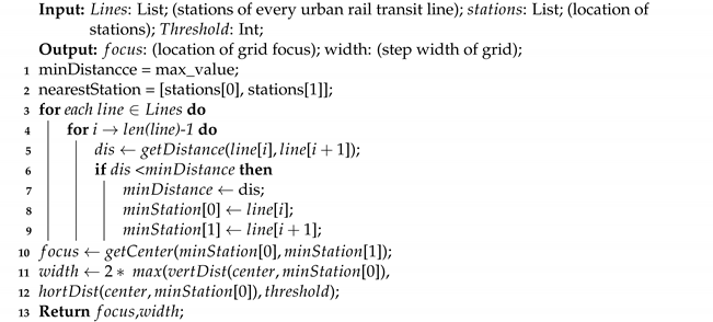
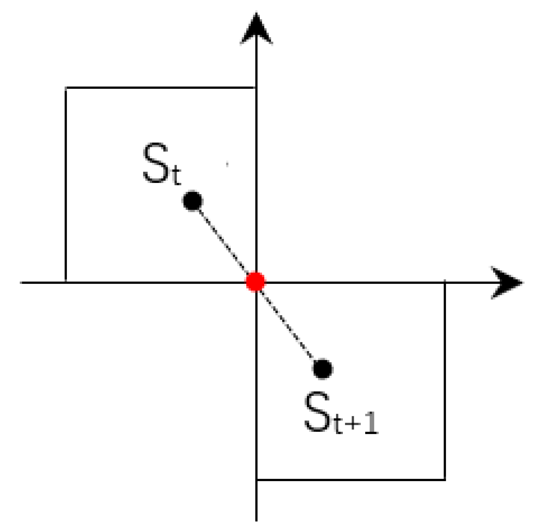
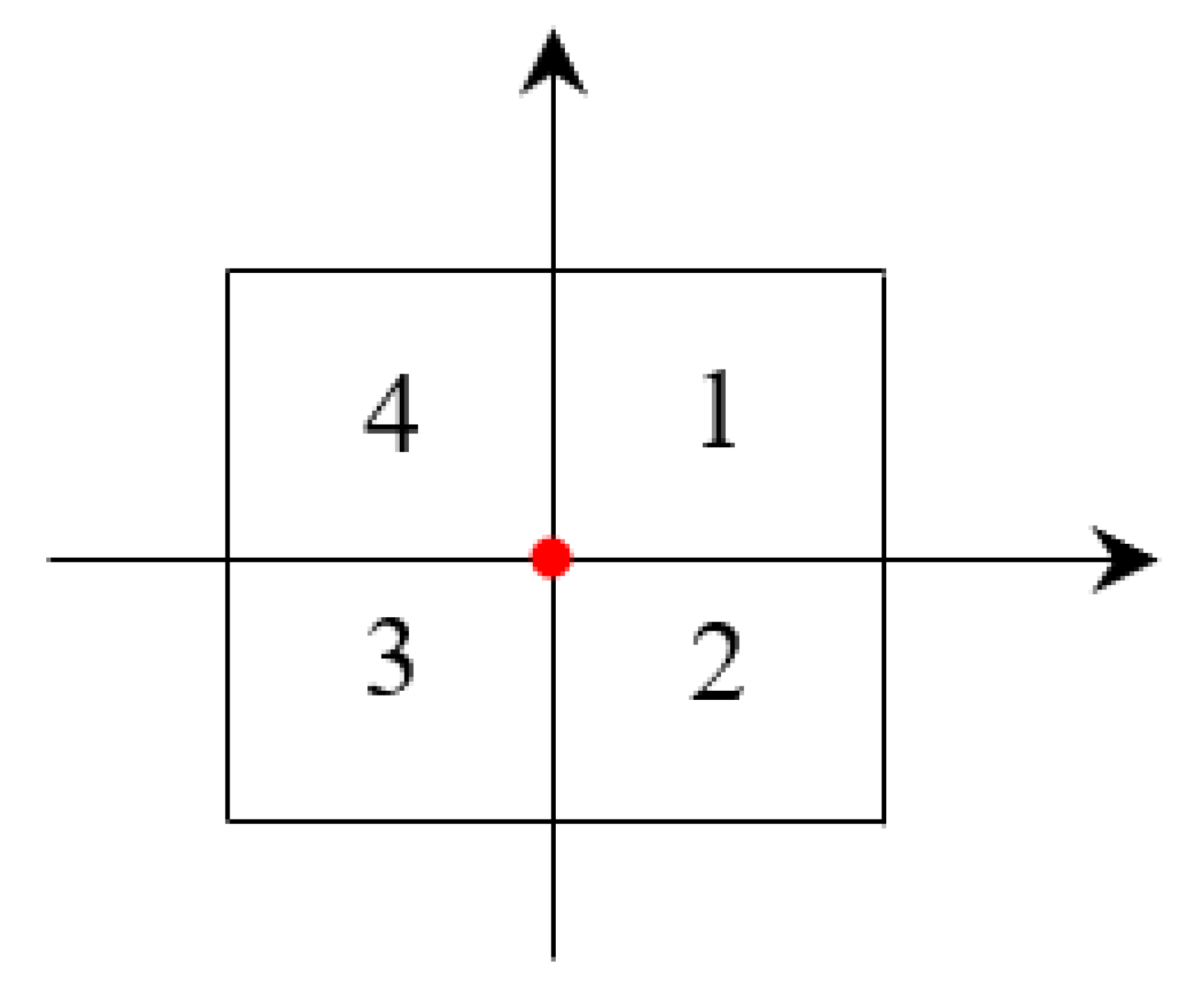
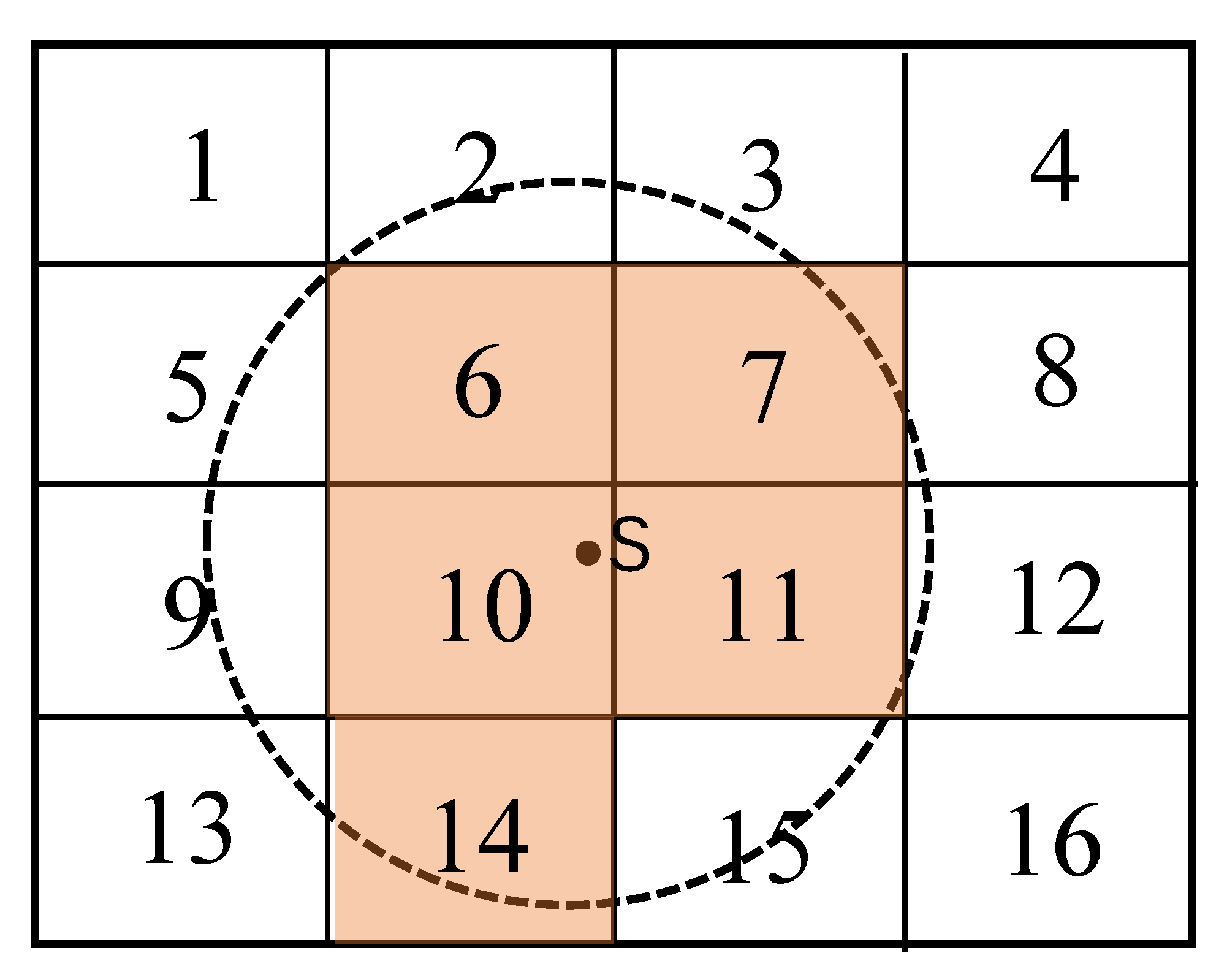
Definition 2. (the grid number) indicates the relative position of each grid to the grid focus. and represent the longitude and latitude of the upper right corner of the grid. After determining the longitude () and latitude () of the grid focus, and step size () of the grid, the grid number can be expressed as follows, = (, ), where = ( − )/, = ( − )/. Take Figure 1, for example, the red dot represents the grid focus. The grid number of Grid 1–4 are = (1, 1), = (1, 0), = (0, 0), = (0, 1), respectively. In Section 5, we will introduce the method of obtaining the coverage grid of traffic stations, the covered grids of an urban rail transit station () can be expressed as follows. Cov() = {, ,…,}, where is the grid of the covered grids of . 4. Dynamic Grid Generation
The disadvantages of grid generation are as follows: (1) The boundary of the grid is not clearly defined. Generally, the upper left corner or the center point of the region is selected, which is highly subjective; (2) It is not easy to determine the step size of the grid, but the step size determines the number of grids. The number of grids directly affects the accuracy of calculation results and the size of calculation scale. With the increase of the number of grids, the calculation accuracy will be improved, but at the same time, the calculation scale will also be increased. Therefore, in order to improve the calculation accuracy of rail transit station coverage area and reduce the amount of calculation as much as possible, a dynamic grid generation method is proposed, which can dynamically determine the focus and step size of the grid based on the spatial distribution of the research objects.
The process of dynamic grid generation based on the current urban rail transit condition is shown in Algorithm 1.
| Algorithm 1: Dynamic grid generation. |
![Ijgi 10 00804 i001]() |
Firstly, the minimum distance between adjacent stations of each rail transit line is calculated, = , Where i is the ith rail transit line, j is the jth station of the ith rail transit line, j 0. Then the minimum distance between adjacent stations in all lines is obtained by comparison, = , and the corresponding adjacent stations are , . Finally, taking the midpoint of the nearest neighbor station , as the focus of the grid, and the step width of grid can be expressed as follows: = 2 * max{ , }, where is the vertical distance from the focus to station or , and is the horizontal distance. In order to avoid too small a grid step size causing too much calculation in subsequent research, we set 200 m as the minimum step size of the grid. If the calculated gird step is smaller than the threshold, we set the grid step to 200 m.
Take
Figure 2 for example, according to Definition 2 in
Section 3, the number of the grids where station
and
are located are (0, 1), (1, 0) respectively.
Based on Algorithm 1, the nearest adjacent rail transit stations in Beijing Rail Transit Line are Nanlishi Lu Station and Fuxing Men Station, with a distance of 445 m. After calculation, the grid focus is the center of the two stations (116.355188, 39.907204), and the step width of grid is 445 m. This method is also applicable for bus stops.
Due to the continuity between the stations, this paper selects the neighboring stations with the smallest distance on the same rail transit line. If changing the study subjects, such as the location of convenience facilities and chain stores, the nearest distance can be calculated directly from all the subjects.
The usage of the proposed dynamic grid method to partition geographic space not only improves the efficiency of the algorithm but also facilitates subsequent experiments for visualization of spatial data density.
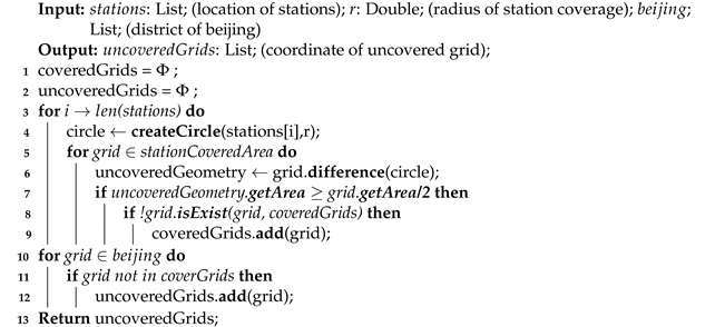
5. Uncovered Grids Extraction
In the Code for transport planning on urban road [
28], the coverage radius of traffic stations is divided into 300 m, 500 m and 800 m, of which the service radius of 300 m and 500 m is more suitable for the research of ground traffic, and the radiation radius of 800 m is more suitable for the analysis of public transport with large traffic volume such as subway [
29]. Therefore, this paper chooses 800 m as the service radius of the rail transit station. After determining the service radius of rail transit station, a method to determine whether the grid is covered by the station is proposed in this paper. If the grid is within the service radius of the station and the covered area is greater than or equal to half of the grid area, the grid is covered, otherwise it is uncovered. Take
Figure 3 for example, Grid 1–16 indicates that the geographical space is divided into 16 grids, and the service scope of station
s is the circular area.
Figure 3 shows that Grid 6, 7, 10, 11 and 14 are covered by more than half of each grid area, so they belong to the covered grid, while the remaining grids belong to the uncovered grid because the covered area is less than half.
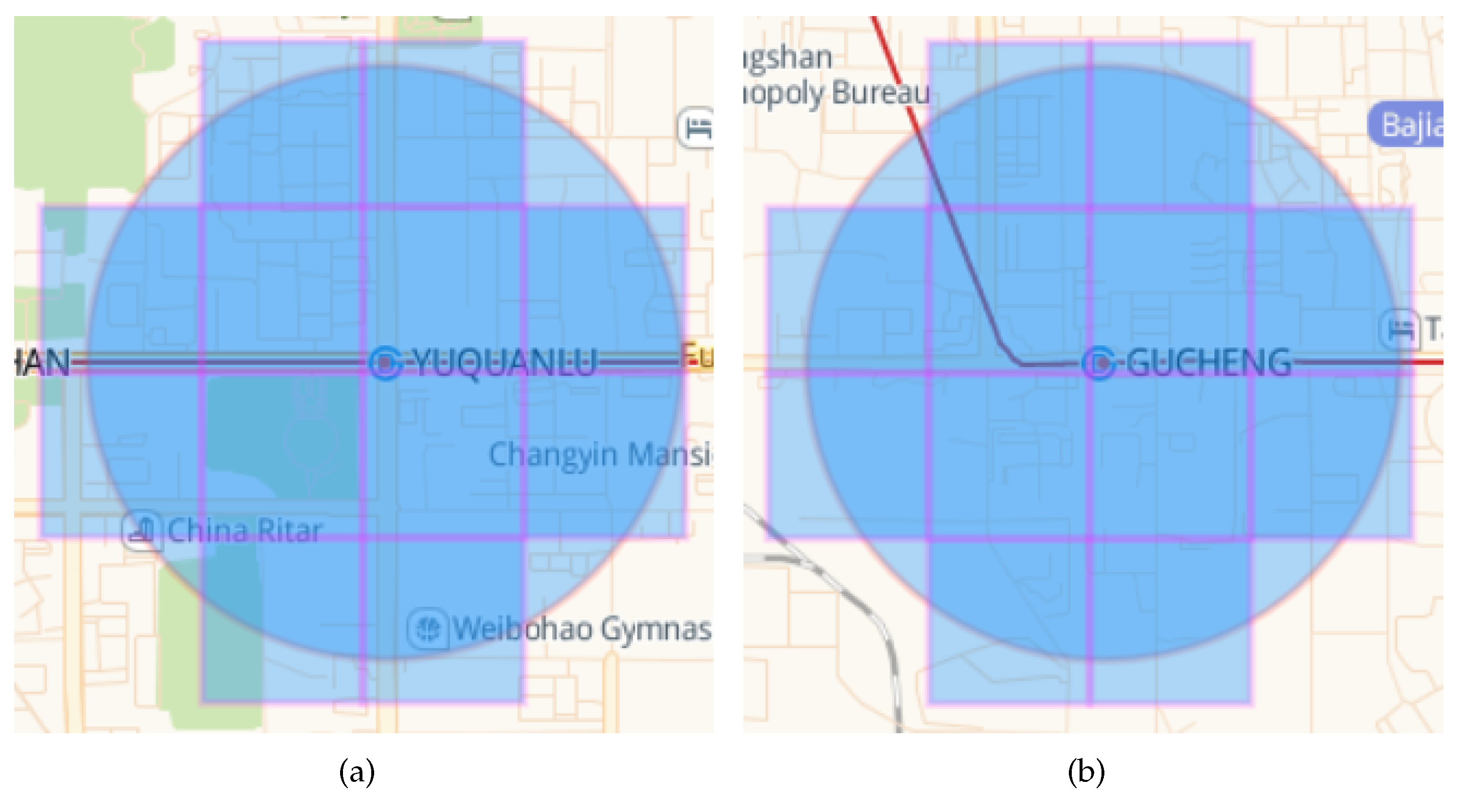
Figure 4 shows the covered grids by the Yuquanlu Station and Gucheng Station.
After getting the covered grids by all the rail transit stations, the outer rectangle of Beijing is selected as the grid boundary, all the grids are traversed, and the uncovered grids in Beijing are selected for the study of
Section 6.
Algorithm 2 describes the process of obtaining the uncovered grids of the rail transit stations.
| Algorithm 2: The Uncovered Grids Extraction. |
![Ijgi 10 00804 i002]() |
After getting the uncovered grids of the traffic station, we query the AP in the uncovered grid through PostgreSQL to get the number of AP in each grid. We construct a map through Amap to visualize AP density in 2D and 3D modes.
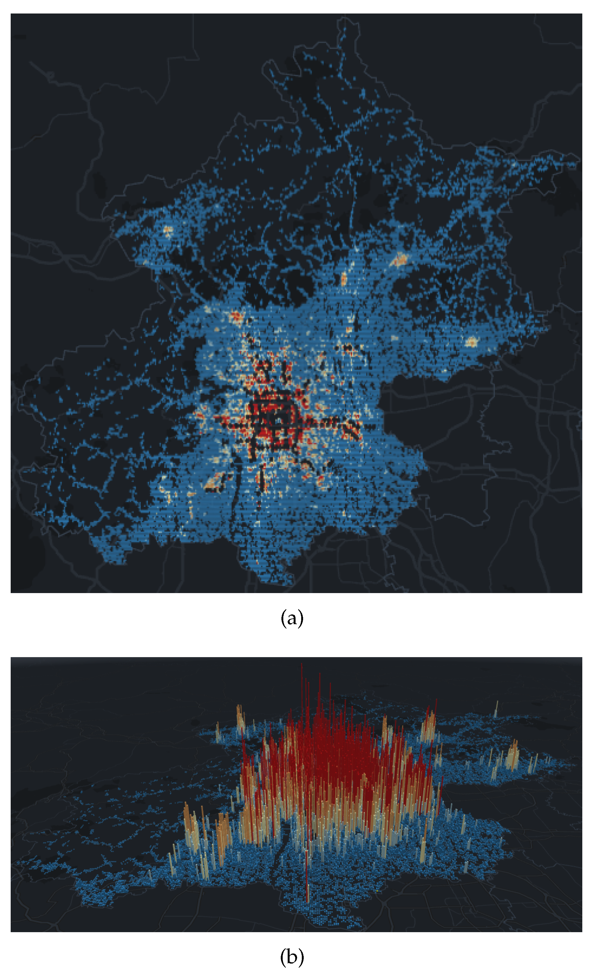
Figure 4a is a visualization of the AP density in the uncovered grid of a Beijing rail transit station in 2D mode. In order to visually compare the size of the AP density in the grid, we have added a color characteristics to the grid. The color from warm to cool indicates that the AP density in the grid is from high to low.
Figure 4b is a visualization of the AP density in the uncovered grid of a Beijing rail transit station in 3D mode. On the basis of 2D, height characteristics are added to the grid. The grid changes from a two-dimensional plane to a three-dimensional prism. The height of the grid represents the density of AP in the grid.
As we have seen in
Figure 5, although rail transit stations are mainly built in urban centers, there are still many densely populated places that are not covered. In contrast, although there are few rail transit stations in the surrounding areas of Beijing, the AP density is also lower compared to the central area. Besides, there are many places where AP density is 0, most of which are green space and mountains. However, as we have seen, there are still very few places where AP density is high. It has been verified that these places are mostly tourist attractions, such as wetland parks, ski resorts, and resort hotels.
The map can interact with the users, which can provide a global display of spatial data at every angle, or click a certain prism with the mouse to obtain the AP density and the coordinates of the center of the grid where the prism is located. Unlike the Heat Map, when the user zooms on the map to view the global or local situation, the prism shape always remains the same, and will not change with the change of the visible area.
6. Rail Transit Station Prediction Based on Uncovered Grids
In
Section 5, we have extracted the AP data in the grid that is not covered by the rail transit station. These data are the basis for our rail transit station prediction. In this section, we will explain how to predict the location of rail transit stations using cluster method.
In order to predict the location of new rail transit stations, GMM (Gaussian Mixed Model) clustering algorithm [
30] is selected to cluster the geographical location of AP in the center area after obtaining the uncovered AP in the city center in
Section 5. GMM is a combination of multiple single Gaussian distribution functions, each single Gaussian distribution is a component. In theory, GMM can fit any type of distribution, which is usually used to solve the situation that the data in the same set contains many different distributions. Gaussian mixture model is trained by expectation maximization (EM) algorithm [
31]. We assume that the closer to the traffic station, the greater the population density, so the distribution is similar to the Gaussian distribution, and DBSCAN and K-means cannot reflect this distribution.
The DBSCAN algorithm requires two input parameters which are a radius and the minimum point number of samples within the radius, respectively. However, the DBSCAN algorithm is sensitive to input parameters. Compared with DBSCAN, GMM only needs one input parameter k which is the number of components to be generated. The probability of samples belonging to different components can be expressed as , which is the probability that the ith sample belongs to the jth component, and . GMM does not explicitly classify all samples into a certain component, but only gives the probability distribution that they belong to each component.
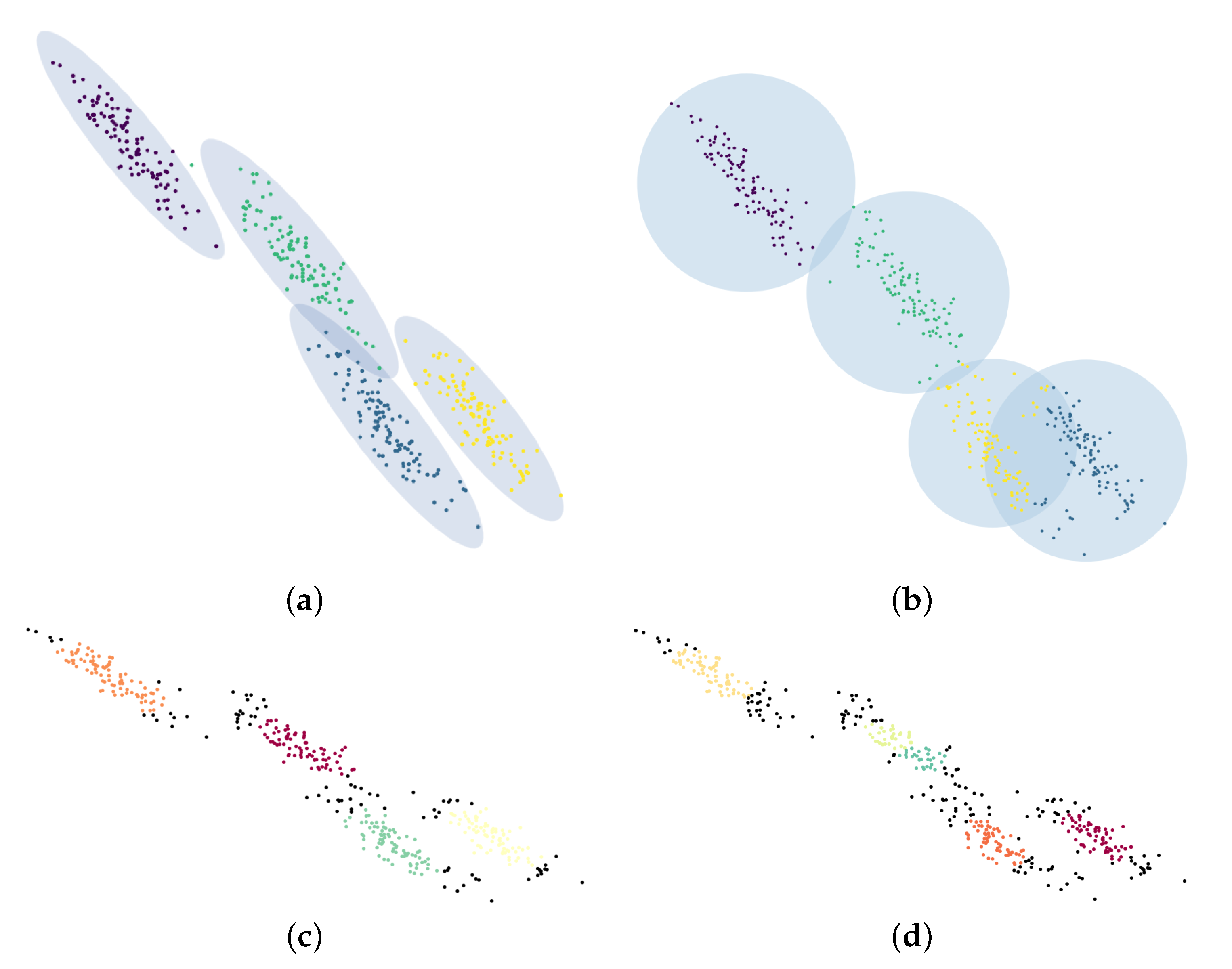
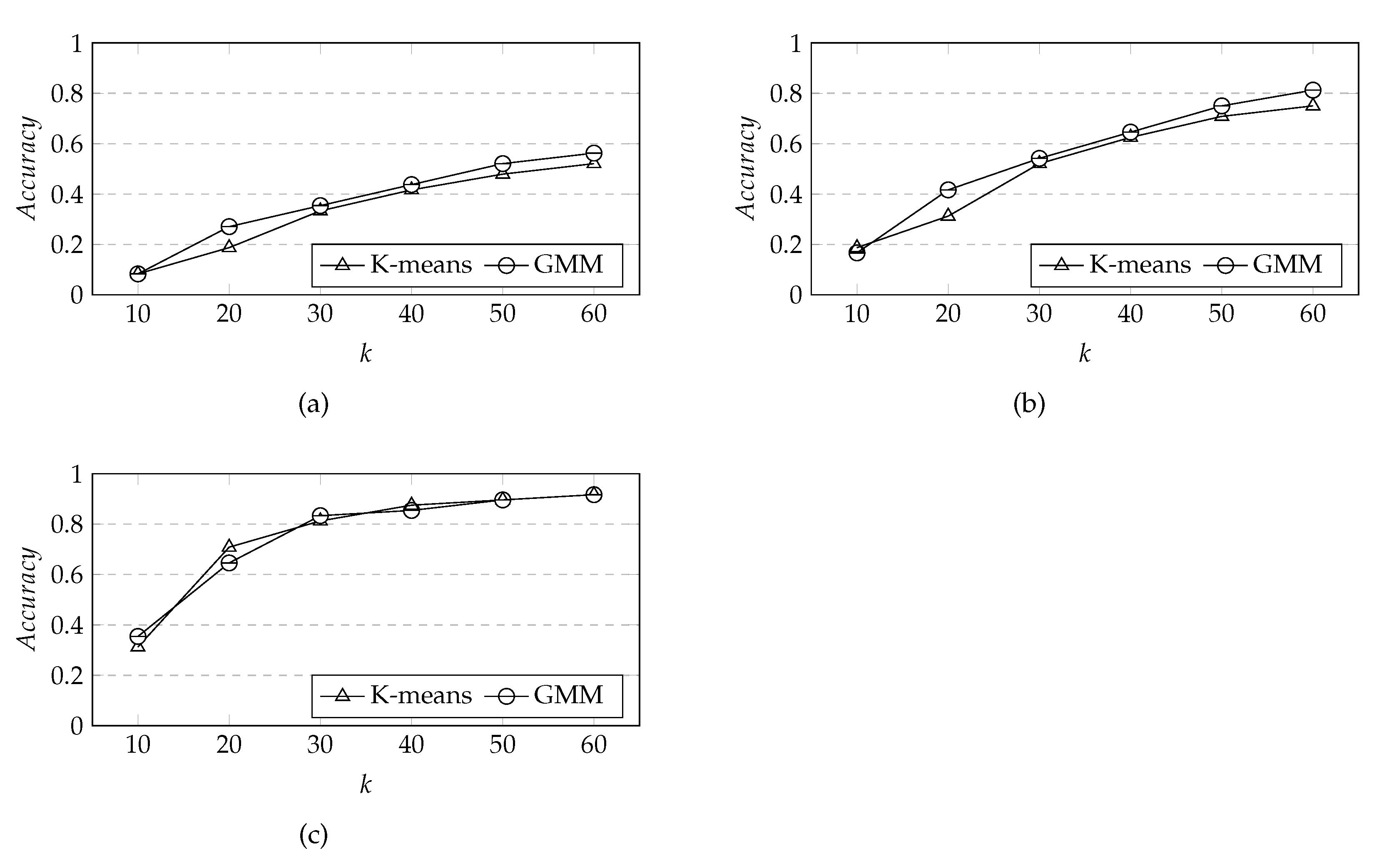
Based on 400 randomly generated two-dimensional data, the clustering results of GMM, K-means and DBSCAN are compared. We set the number of components for both GMM and K-means algorithms to be 4. For DBSCAN algorithm, we use two different sets of input parameters:
= 0.3,
= 20 and
= 0.25, and
= 20.
Figure 6 shows the clustering results of GMM, K-means and DBSCAN, where different colors represent different components, and black point represents the noise point.
It can be seen from
Figure 6 that compared to K-means and DBSCAN algorithm, GMM algorithm can better fit the distribution of the data. It is due to the non-probabilistic nature of K-means and the method of using only the distance to the cluster center to allocate the cluster members, which leads to the poor performance of K-means in real applications. According to
Figure 6c,d, it can be seen from the number of clusters and clustering effect that even if the change of
is very small, the clustering results will be very different. This is because DBSCAN is an input parameter sensitive algorithm.
So far, we have found all clusters based on AP data that is not covered by rail transit stations. The clustering results under different values of k will be discussed in the next section.
7. Experimental Evaluation
7.1. Experimental Datasets and Environment
The experimental datasets: There are more than 20 million AP data in Beijing. Each AP data has six attributes: id, mac, bssid, latitude, longitude, acc and address. In order to facilitate the subsequent query, PostgreSQL is adopted to store the AP data of Beijing. Since the AP dataset was in 2013, this paper uses the urban rail transit data of Beijing in 2013. By the end of 2013, there were 17 rail transit lines and 246 rail transit stations in Beijing.
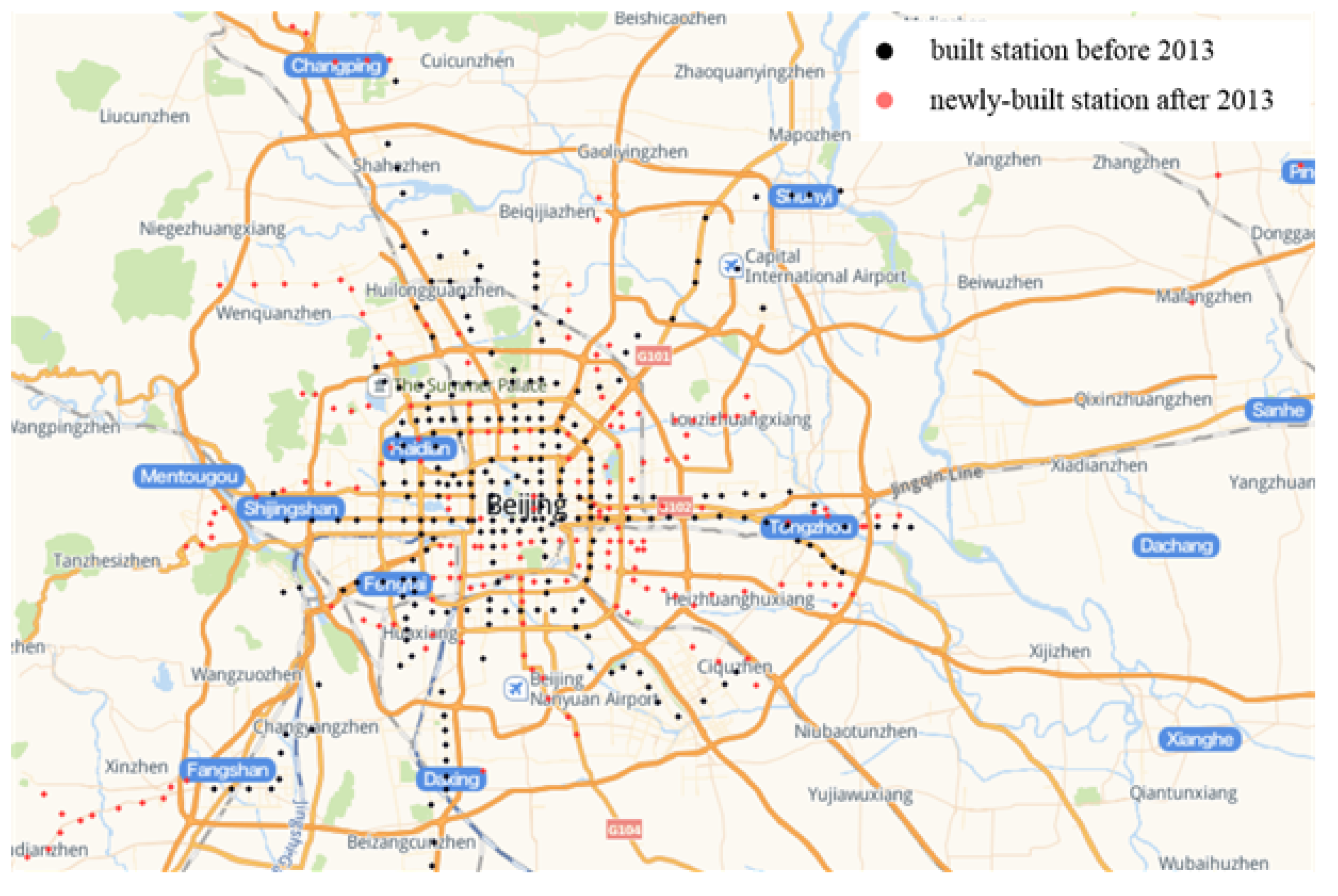
Figure 7 shows the distribution of rail transit stations in Beijing. The black dots represent 247 rail transit stations in Beijing in 2013, and the red dots represent 180 newly-built rail transit stations since 2013, of which 89 rail transit stations are still under construction. The Automatic Fare Collection system (AFC) of Beijing rail transit system from June 2013 to July 2013 are used in the experiments to verify the effectiveness of the proposed methods. There are a total of 483,614,919 records of 15,081,258 distinct riders (AFC cards), which can be used to calculate the inbound and outbound passenger flow of 227 stations in Beijing rail transit system.
The experimental environment: All of our experiments are implemented in Java JDK 1.8 on an Intel Core i5-4590 3.30 GHz computer with 8GB of memory running Microsoft Windows 10.
7.2. Comparison with Heat Map
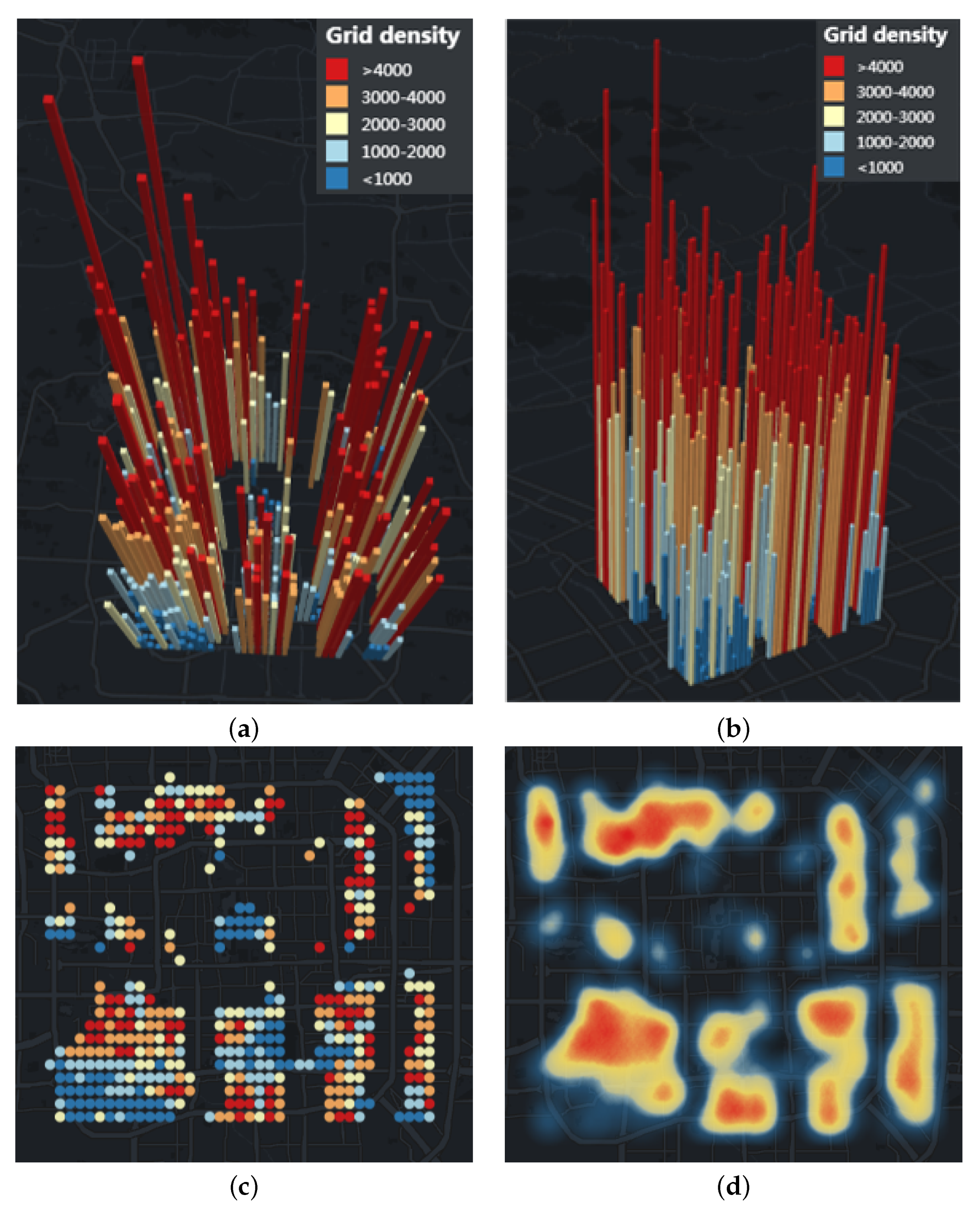
In order to verify the accuracy of the site selection of rail transit stations, this paper selects the central area of Beijing ([116.306238, 39.853762], [116.483442, 39.974105]) to predict the location of rail transit stations and compares them with the actual new rail transit stations since 2013. After inquiries, the number of AP in the selected central urban area is 1,660,664.
Figure 8a,b show the density visualization of uncovered APs in the central city at different angles in 3D mode respectively.
Figure 8c shows the density visualization of uncovered APs in the central city in 2D mode.
Figure 8d shows the uncovered APs in the central city through the Heat Map. The interpretation of the density visualization is summarized as follows.
The height of the grid represents the density of AP in the grid. The color from warm to cool indicates that the density of AP in the grid is from high to low. Until 2013, there are 455 uncovered grids of rail transit stations in the central area.
Users can zoom and switch different angles to view the map. By clicking a certain prism with the mouse, users can obtain the density of AP in the grid and the location of the grid.
The higher the height of the grid, the warmer the color, indicating that the population density in this area is large, which means that the travel demand in this area is high. Therefore, the density visualization can provide a reference for the location of rail transit stations.
Comparing
Figure 8c,d, we can see that our density visualization can show the density of different areas more accurately than the Heat Map. When we zoom the Heat Map, it will change greatly due to changes in the visible area, and will automatically ignore areas with lower density.
In order to get an objective evaluation, we interviewed six volunteers to obtain their feedbacks of our proposed density visualization. We have briefly introduced the relevant contents of our density visualization, and everyone has a basic understanding of the Heat Map.
Table 1 shows the scoring of six volunteers on the two visualizations based on different criteria, on a scale of 1 to 10. The higher the score, the higher the volunteer’s evaluation.
It can be seen from
Table 1 that the scores of the two are similar on the horizontal scale. However, the grid visualization has vertical scale and can provide users with specific grid density, so the score is high. Compared with the Heat Map, the grid density visualization will not change with the change of the visible area, and can more accurately determine the area with high density, which can be used as a spatial reference for the location of public transport stations. Therefore, the value level of grid density visualization is higher.
7.3. Varying k
In order to determine the optimal number of rail transit stations, we select the predicted number of stations k = {10, 20, 30, 40, 50, 60, 70, 80} as the input parameters of GMM clustering algorithm to cluster the uncovered AP in the central area of Beijing.
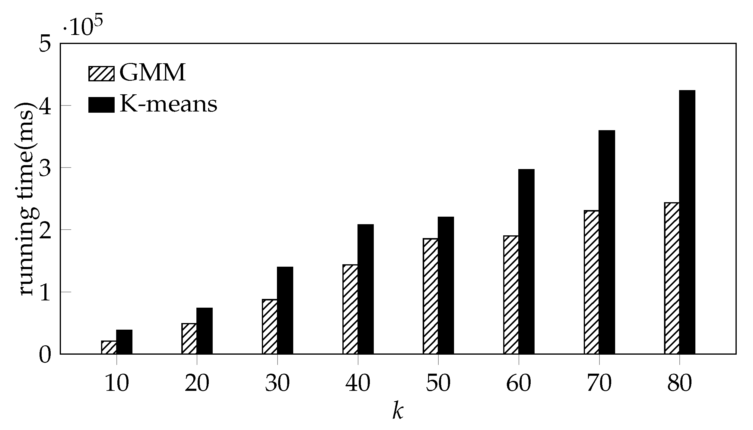
To compare the efficiency of the DBSCAN algorithm, K-means algorithm and the GMM algorithm on the rail transit station prediction, we still use the AP in the uncovered grid in the central area of Beijing ([116.306238, 39.853762], [116.483442, 39.974105]) and compare the running time of the three algorithms with different
K. We set the
radius and
of DBSCAN algorithms to 445 m and 2000 respectively. Due to the large size of the AP data, the memory usage is too high when using DBSCAN for clustering, which leads to memory error and the process to be killed. Therefore,
Figure 9 only shows the running time of the K-means algorithm and the GMM algorithm.
Due to the large size of the AP data, the memory usage is too high when using DBSCAN for clustering, which leads to memory error and the process to be killed. From
Figure 9, it can be seen that although the running time of the two algorithms increase with
k, the running time of GMM is obviously less than the time consumed by K-means with the same
k.
However, the number of rail transit stations in a city is not as many as possible. The more rail transit stations, the higher the investment cost and the more supporting facilities required, which will increase the pressure on urban traffic. Therefore, it is necessary to evaluate the clustering effect under different
k, and there are many indexes to evaluate the clustering effect, such as, Silhouette Coefficient index, Calinski Harabasz index, Davies Bouldin index, etc. [
32]. The CH index [
33] is the most commonly used method to calculate the clustering effect, which is simple and fast. CH(
k) is the ratio of inter-cluster separation to intra-cluster compactness. Therefore, larger CH(
k) means better clustering results. CH(
k) can be defined in Equation (
1), where
k is the number of clusters and
n is the total number of samples,
is the intra-cluster covariance matrix,
is the inter-cluster covariance matrix, and
is the trace of the matrix (the sum of elements on the matrix’s main diagonal). In Equations (
2) and (
3),
is the set of samples in cluster
q,
is the center of cluster
q,
c is the center of all samples, and
is the number of samples in cluster
q.
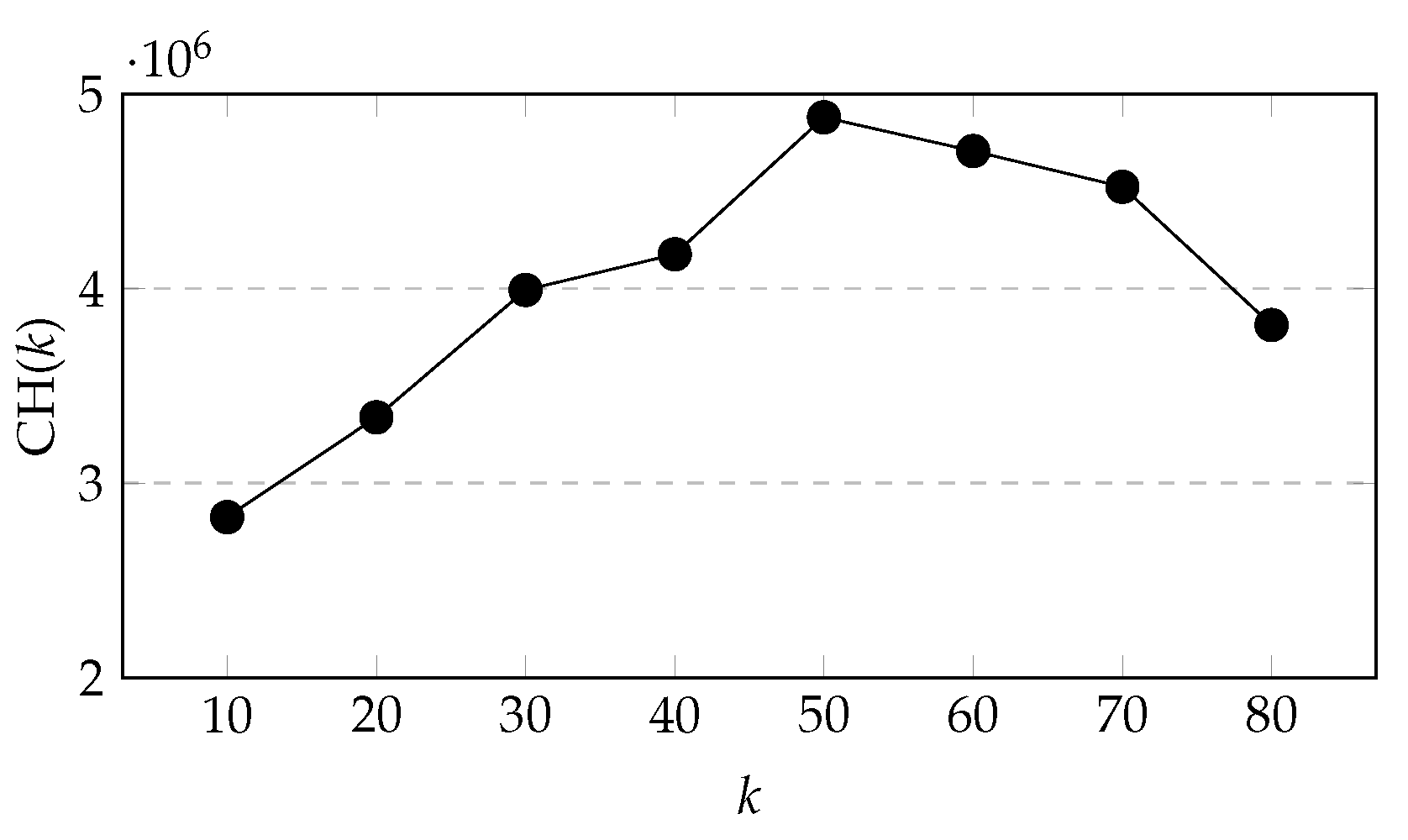
It can be seen from
Figure 10 that when
k increases from 10 to 50, CH(
k) keeps increasing, and during the period
k from 40 to 50, the growth rate of CH(
k) is higher, and then CH(
k) starts to decrease with
k increasing. Therefore, we chose
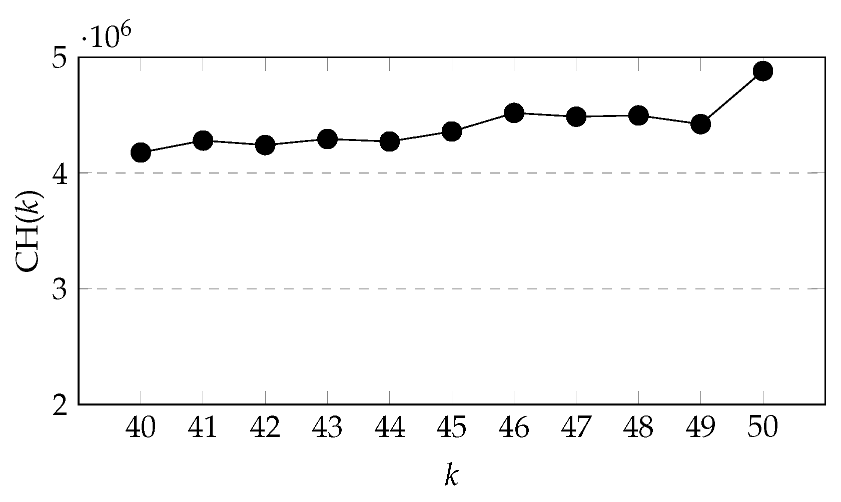
k = {40, 41, 42, 43, 44, 45, 46, 47, 48, 49, 50} for further comparison.
From
Figure 11, we can see that when
k increases from 40 to 45, CH(
k) fluctuates continuously, but the overall change is not significant, but when
k is greater than 45, CH(
k) rises in fluctuation.
7.4. Varying Fault-Tolerant Radius, k
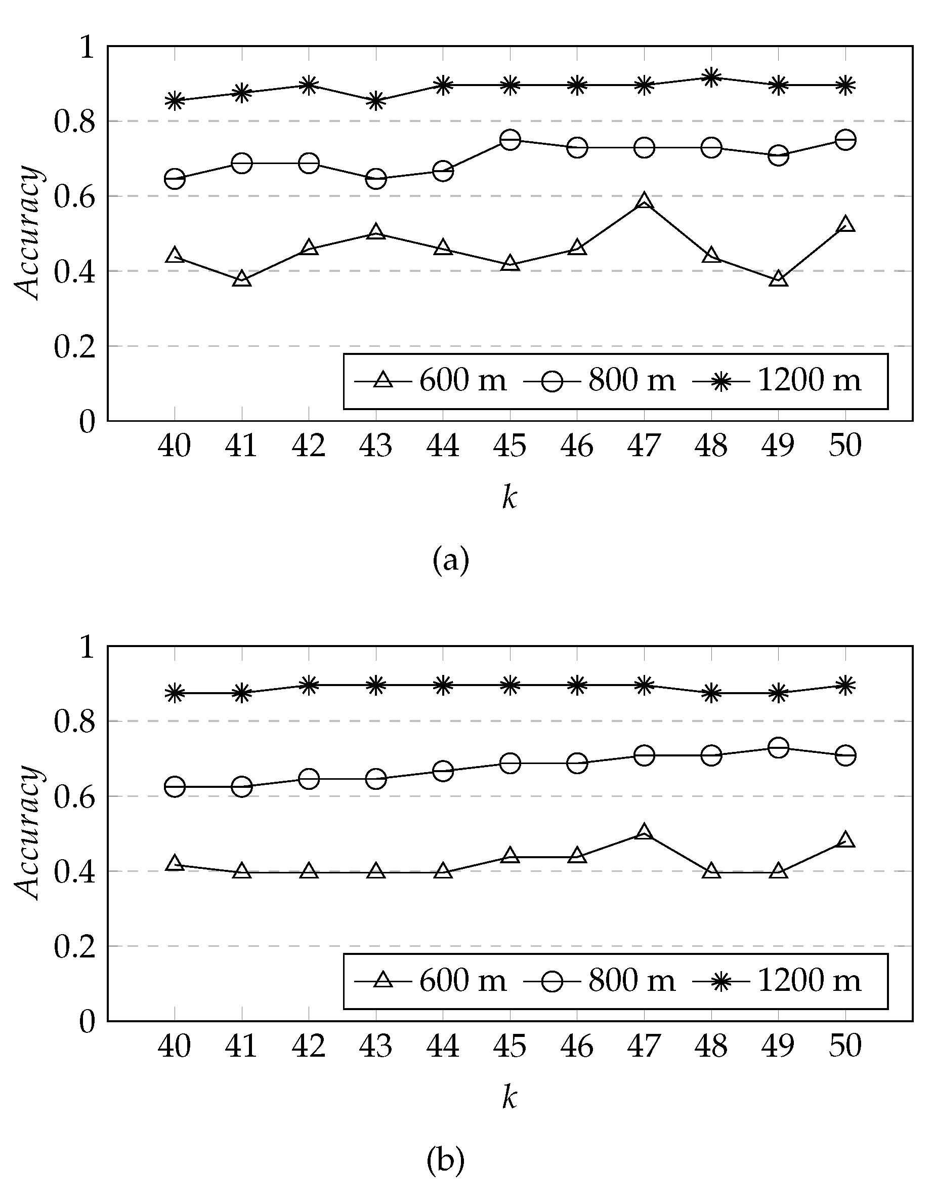
The experiment uses AP data to predict the location of rail transit stations, while different evaluation dataset have different properties, restrictions, i.e., sampling frequencies. Therefore, this paper selects the location comparison with the actual new rail transit stations in Beijing after 2013 to evaluate our proposed prediction method. In order to evaluate the clustering effect based on the actual newly-built stations, the following method was proposed.
As the site selection should consider the realizability of engineering construction technology, such as the line type and slope of the original line, urban roads and buildings, it is necessary to adjust the station location in time. Therefore, we take the predicted station location as the center, and choose 600 m, 800 m, and 1200 m as the fault-tolerance radius. If the actual newly-built rail transit station is within the fault-tolerance radius of the predicted station, it means that the station has been correctly predicted. The final prediction accuracy rate
= the number of actual newly-built rail transit station within the fault tolerance radius/the number of actual newly added rail transit station. Based on the results in
Figure 10, we choose
k = {10, 20, 30, 40, 50, 60} to analyze the changes of prediction accuracy rate.
From
Figure 12, we can see that although K-means has a higher prediction accuracy rate than GMM at
k = 20 and fault-tolerant radius is 1200 m, overall, the prediction accuracy rate of GMM algorithm is higher than that of K-means algorithm. The prediction accuracy rate increases with the increase of
k when the fault tolerant radius is the same, and when the fault tolerant radius is 1200 m, the growth of prediction accuracy rate increase slightly after
k is greater than 30; when
k is the same, the prediction accuracy rate increases with the increase of the fault tolerant radius, and with the increase of
k, the prediction accuracy rate with the fault tolerant radius of 800 m increases rapidly. When
k is 60, the number of predicted rail transit stations increases by 10 when compared with
k = 50, but the prediction accuracy rate increases slightly when compared with
k = 50 under the same fault-tolerance radius. Therefore, in order to further determine the appropriate
k, we choose
k = {40, 41, 42, 43, 44, 45, 46, 47, 48, 49, 50} for further comparison.
From
Figure 13, it can be seen that the overall prediction accuracy of GMM algorithm is higher than K-means algorithm, but when
k is 47, the prediction accuracy rate of both GMM and K-means is the highest. From
Figure 13a, we can see that when the fault-tolerant radius is 600 m, the prediction accuracy rate fluctuates greatly with the increase of
k, when the fault-tolerant radius is 800 m and 1200 m, the prediction accuracy rate fluctuates slightly, but the overall prediction accuracy rate does not change significantly with the increase of
k, so we set
k to 47. This is very close to the number of actual newly-built stations, 48, which shows that our method works well.
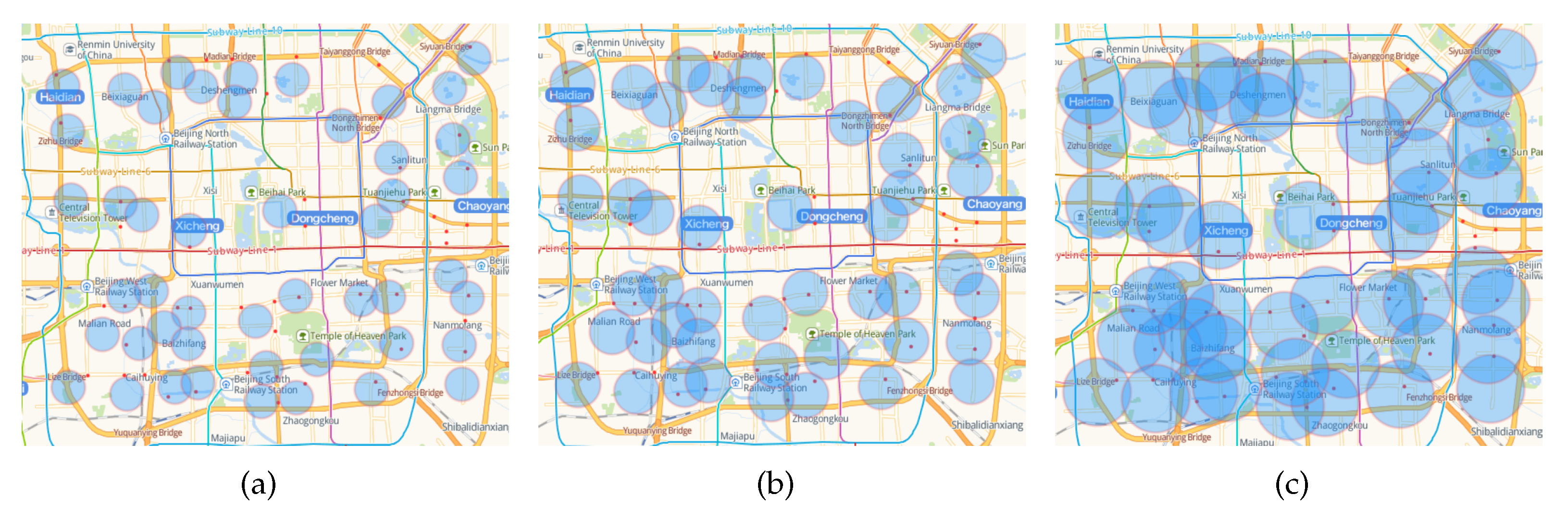
Figure 14 shows the relationship between the fault-tolerant area of the predicted stations and the actual newly-built stations when
k is 48 and the fault-tolerant radius is 600 m, 800 m, and 1200 m, respectively. The red dot indicates the location of the actual new station, and the blue circular area indicates the fault-tolerant area of the predicted station. It can be seen that even if the fault tolerance radius is increased to 1200 m, there are still four stations that were not predicted, namely Xibahe Station, Hongmiao Station, Guanghualu Station and Jingguangqiao Station. We speculate that this may be due to the large passenger flow around these stations in order to share the passenger pressure of the surrounding built stations or to coordinate with the rail transit branch lines.
7.5. Analysis
To evaluate our hypothesis, we cross-validated the average daily inbound and outbound passenger flow at each urban rail transit station from June to July 2013.
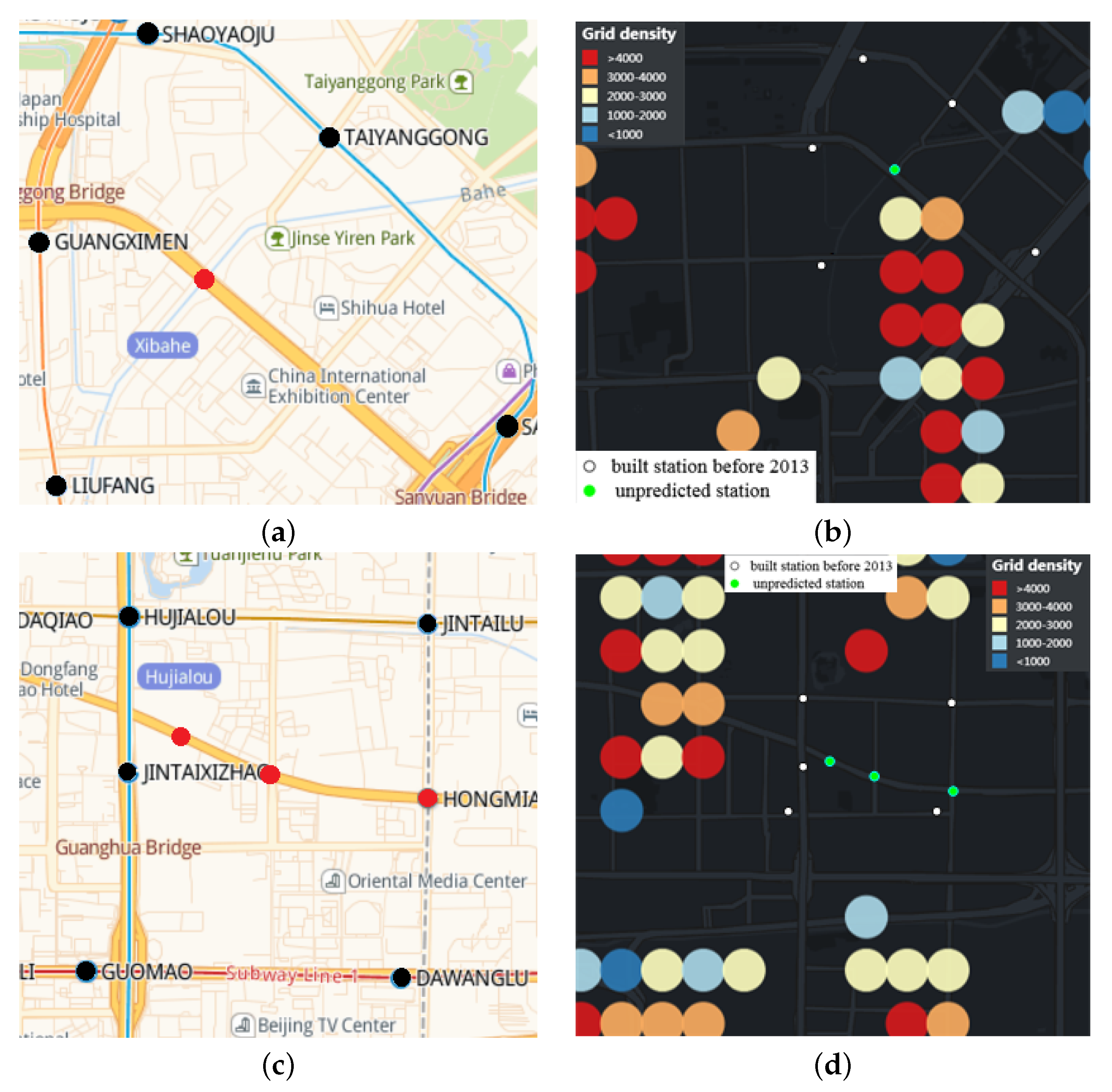
Figure 15a,c show the distribution of built stations around unpredicted stations. The red dot indicates the location of the unpredicted station, and the black dot indicates the built station around the unpredicted station.
Figure 15b,d show the spatial location between built stations, unpredicted stations and part of
Figure 8c. The green dot indicates the location of the unpredicted station, and the white dot indicates the built station around the unpredicted station. As can be seen from
Figure 15b,d, because the unpredicted stations are close to the built stations, they are located in the covered grids. Therefore, after clustering the uncovered APs, these four stations cannot be predicted. The average daily inbound and outbound passenger flow of rail transit stations in Beijing from June to July 2013 was 36,976, with a median of 28,451.
Table 2 shows the distance between unpredicted station and its adjacent stations, passenger flow and passenger flow ranking of adjacent stations. From
Table 2, it can be seen that the passenger flow rankings of the built stations around the unpredicted stations are relatively high. Since the closest distance to Jingguangqiao Station is 280 m, we harbor the idea that Jingguangqiao Station was built to coordinate the Pinggu Line.
The results show that this method can effectively predict the location of new rail transit stations. The location of the newly-built rail transit station is similar to our experimental results, which shows that our method is suitable for practical application scenarios.
8. Conclusions
This paper presents a novel method of spatial density visualization and rail transit station prediction based on dynamic grid generation. At present, most researches based on grid generation adopt fixed grid step size and artificially selected grid focus [
34,
35], which can not be adjusted according to the distribution of research objects. Therefore, the dynamic grid method is proposed to determine the appropriate focus and step width of the grid based on the rail transit situation in Beijing in 2013. Then the coverage radius of the rail transit station is used to determine the covered and uncovered grids by the stations, and we construct a map to visualize AP density in 2D and 3D modes. Compared with the Heat Map, the grid density visualization we proposed added the vertical scale, can provide users with specific grid density and will not change with the change of the visible area. Many scholars study the location of rail transit stations by determining the optimal transmission time or distance of transportation stations [
25,
27], without considering the main factor of population. This study used the spatial distribution of AP instead of population distribution to predict the location of rail transit stations. Finally, the location of the predicted stations is obtained by GMM clustering of AP in the uncovered grids. Due to the particularity of AP dataset, this paper selects the location comparison with the actual new rail transit stations in Beijing after 2013 to evaluate our proposed prediction method. In order to verify the effectiveness of our proposed method, we also compare it with K-means and DBSCAN algorithm. Through the experimental research and analysis in
Section 7, we can see that the effect of GMM is better than K-means and DBSCAN in terms of running time and prediction accuracy. This is because the clustering of the GMM algorithm used in this paper can better fit the object distribution, and the clustering result is calculated by probability, not simply calculating the mean value of the distance within the cluster. Results show that our method has certain effect.
Our novel approach enables us to determine the appropriate grid focus and step size. The density visualization proposed in this study can intuitively show the size of population density in different areas to decision makers, and the prediction results of rail transit stations can provide a reference for decision makers when making reasonable site selection to alleviate traffic pressure. Meanwhile, this method can be applied to different scenarios, such as the location selection of chain stores or public facilities. Since the grid division is space sensitive rather than density sensitive, and the AP data is static data, we will choose the density sensitive spatial division method to divide the city, and select trajectory data and OD data for further research.
Author Contributions
Conceptualization, Zhi Cai; methodology, Zhi Cai; resources, Zhi Cai; validation, Zhi Cai and Limin Guo; software, Meilin Ji; visualization, Meilin Ji; writing—original draft preparation, Meilin Ji; formal analysis, Meilin Ji and Qing Mi; data curation, Qing Mi; writing—review and editing, Qing Mi and Bowen Yang; investigation, Xing Su; supervision, Limin Guo; project administration, Zhiming Ding; funding acquisition, Zhiming Ding. All authors have read and agreed to the published version of the manuscript.
Funding
This research was funded by Zhi Cai.
Institutional Review Board Statement
Not applicable.
Informed Consent Statement
Not applicable.
Data Availability Statement
Acknowledgments
This work is supported by the National Science of Foundation of China (No. 620 72016), the Beijing Natural Science Foundation (No. 4212016,4192004).
Conflicts of Interest
The authors declare no conflict of interest.
References
- Efthymiou, D.; Antoniou, C. How do transport infrastructure and policies affect house prices and rents? Evidence from Athens, Greece. Transp. Res. Part A Policy Pract. 2013, 52, 1–22. [Google Scholar] [CrossRef]
- Pagliara, F.; Papa, E. Urban rail systems investments: An analysis of the impacts on property values and residents’ location. J. Transp. Geogr. 2011, 19, 200–211. [Google Scholar] [CrossRef]
- Zhang, C.; Xia, H.; Song, Y. Rail Transportation Lead Urban Form Change: A Case Study of Beijing. Urban Rail Transit 2017, 3, 15–22. [Google Scholar] [CrossRef] [Green Version]
- Barbosa, H.; Barthelemy, M.; Ghoshal, G.; James, C.R.; Lenormand, M.; Louail, T.; Menezes, R.; Ramasco, J.J.; Simini, F.; Tomasini, M. Human mobility: Models and applications. Phys. Rep. 2018, 734, 1–74. [Google Scholar] [CrossRef] [Green Version]
- Hurst, N.B.; West, S.E. Public transit and urban redevelopment: The effect of light rail transit on land use in Minneapolis, Minnesota. Reg. Sci. Urban Econ. 2014, 46, 57–72. [Google Scholar] [CrossRef]
- Michalopoulou, M.; Riihijärvi, J.; Mähönen, P. Studying the Relationships between Spatial Structures of Wireless Networks and Population Densities. In Proceedings of the 2010 IEEE Global Telecommunications Conference GLOBECOM 2010, Miami, FL, USA, 6–10 December 2010; pp. 1–6. [Google Scholar] [CrossRef]
- Seufert, M.; Griepentrog, T.; Burger, V.; Hoßfeld, T. A Simple WiFi Hotspot Model for Cities. IEEE Commun. Lett. 2016, 20, 384–387. [Google Scholar] [CrossRef]
- Wang, Z.; Lu, M.; Yuan, X.; Zhang, J.; Van De Wetering, H. Visual Traffic Jam Analysis Based on Trajectory Data. IEEE Trans. Vis. Comput. Graph. 2013, 19, 2159–2168. [Google Scholar] [CrossRef] [PubMed] [Green Version]
- Zeng, W.; Fu, C.; Arisona, S.M.; Erath, A.; Qu, H. Visualizing Mobility of Public Transportation System. IEEE Trans. Vis. Comput. Graph. 2014, 20, 1833–1842. [Google Scholar] [CrossRef] [PubMed]
- Di Lorenzo, G.; Sbodio, M.; Calabrese, F.; Berlingerio, M.; Pinelli, F.; Nair, R. AllAboard: Visual Exploration of Cellphone Mobility Data to Optimise Public Transport. IEEE Trans. Vis. Comput. Graph. 2016, 22, 1036–1050. [Google Scholar] [CrossRef]
- Chen, S.; Yuan, X.; Wang, Z.; Guo, C.; Liang, J.; Wang, Z.; Zhang, X.; Zhang, J. Interactive Visual Discovering of Movement Patterns from Sparsely Sampled Geo-tagged Social Media Data. IEEE Trans. Vis. Comput. Graph. 2016, 22, 270–279. [Google Scholar] [CrossRef]
- Zheng, Y.; Wu, W.; Chen, Y.; Qu, H.; Ni, L.M. Visual Analytics in Urban Computing: An Overview. IEEE Trans. Big Data 2016, 2, 276–296. [Google Scholar] [CrossRef]
- Chen, W.; Guo, F.; Wang, F. A Survey of Traffic Data Visualization. IEEE Trans. Intell. Transp. Syst. 2015, 16, 2970–2984. [Google Scholar] [CrossRef]
- Liu, L.; Wang, S.; Cai, T.; Zhao, W. VABD: Visual Analysis of Spatio-temporal Trajectory Based on Urban Bus Data. In Proceedings of the 2020 IEEE 6th International Conference on Computer and Communications (ICCC), Chengdu, China, 11–14 December 2020; pp. 2018–2022. [Google Scholar] [CrossRef]
- Zhou, Z.; Meng, L.; Tang, C.; Zhao, Y.; Guo, Z.; Hu, M.; Chen, W. Visual Abstraction of Large Scale Geospatial Origin-Destination Movement Data. IEEE Trans. Vis. Comput. Graph. 2019, 25, 43–53. [Google Scholar] [CrossRef] [PubMed]
- Slingsby, A.; Wood, J.; Dykes, J. Treemap Cartography for showing Spatial and Temporal Traffic Patterns. J. Maps 2012, 6, 135–146. [Google Scholar] [CrossRef] [Green Version]
- Itoh, M.; Yokoyama, D.; Toyoda, M.; Tomita, Y.; Kawamura, S.; Kitsuregawa, M. Visual Exploration of Changes in Passenger Flows and Tweets on Mega-City Metro Network. IEEE Trans. Big Data 2016, 2, 85–99. [Google Scholar] [CrossRef]
- Tominski, C.; Schumann, H.; Andrienko, G.; Andrienko, N. Stacking-Based Visualization of Trajectory Attribute Data. IEEE Trans. Vis. Comput. Graph. 2012, 18, 2565–2574. [Google Scholar] [CrossRef] [Green Version]
- Tareq, M.; Sundararajan, E.A.; Mohd, M.; Sani, N.S. Online Clustering of Evolving Data Streams Using a Density Grid-Based Method. IEEE Access 2020, 8, 166472–166490. [Google Scholar] [CrossRef]
- Brown, D.; Japa, A.; Shi, Y. A Fast Density-Grid Based Clustering Method. In Proceedings of the 2019 IEEE 9th Annual Computing and Communication Workshop and Conference (CCWC), Las Vegas, NV, USA, 7–9 January 2019; pp. 48–54. [Google Scholar]
- Edla, D.R.; Jana, P.K. A grid clustering algorithm using cluster boundaries. In Proceedings of the 2012 World Congress on Information and Communication Technologies, Trivandrum, India, 30 October–2 November 2012; pp. 254–259. [Google Scholar] [CrossRef]
- Pang, L.X.; Chawla, S.; Liu, W.; Zheng, Y. On detection of emerging anomalous traffic patterns using GPS data. Data Knowl. Eng. 2013, 87, 357–373. [Google Scholar] [CrossRef]
- Irrevaldy; Saptawati, G.A.P. Spatio-temporal Mining to Identify Potential Traffic Congestion Based on Transportation Mode. In Proceedings of the 2017 International Conference on Data and Software Engineering (ICoDSE), Palembang, Indonesia, 1–2 November 2017; pp. 1–6. [Google Scholar] [CrossRef]
- Albareda-Sambola, M.; Martínez-Merino, L.I.; Rodríguez-Chía, A.M. The stratified p-center problem. Comput. Oper. Res. 2019, 108, 213–225. [Google Scholar] [CrossRef] [Green Version]
- Sun, X.; Zhang, Y.; Qin, G.; Dong, H.; Guan, F. Pedestrian transfer time optimization of urban rail transit based on ACP approach. In Proceedings of the 2012 IEEE International Conference on Automation and Logistics, Zhengzhou, China, 15–17 August 2012; pp. 90–95. [Google Scholar] [CrossRef]
- Yao, L.; Sun, L.; Wang, W. Subway Station Selection Model Based on Utility Combined Analysis. In Proceedings of the Tenth International Conference of Chinese Transportation Professionals, Beijing, China, 4–8 August 2010. [Google Scholar]
- Wang, Q.; Sun, H. A Decision Method for Subway Station Selection Based on the Optimal Closeness Coefficient. In Proceedings of the 2018 3rd IEEE International Conference on Intelligent Transportation Engineering (ICITE), Singapore, 3–5 September 2018; pp. 63–67. [Google Scholar] [CrossRef]
- Huang, J.; Cai, J.; Li, C. Review and Thinking on Code for Transport Planning on Urban Road: Importance of Traffic Organization in Road Network Planning. City Plan. Rev. 2017, 41, 49–58. [Google Scholar]
- Li, M.; Long, Y. The Coverage Ratio of Bus Stations and an Evaluation of Spatial Patterns of Major Chinese Cities. Urban Plan. Forum 2015, 226, 38–45. [Google Scholar]
- Bishop, C. Pattern Recognition and Machine Learning; Springer: Berlin/Heidelberg, Germany, 2006. [Google Scholar]
- Dempster, A.P. Maximum likelihood from incomplete data via the EM algorithm. J. R. Stat. Soc. 1977, 39, 1–22. [Google Scholar]
- Liu, Y.; Li, Z.; Xiong, H.; Gao, X.; Wu, J. Understanding of Internal Clustering Validation Measures; IEEE Computer Society: Washington, DC, USA, 2010; pp. 911–916. [Google Scholar]
- Caliński, T.; Harabasz, J. A dendrite method for cluster analysis. Commun. Stat. 1974, 3, 1–27. [Google Scholar] [CrossRef]
- Jenelius, E.; Mattsson, L.G. Road network vulnerability analysis of area-covering disruptions: A grid-based approach with case study. Transp. Res. Part A Policy Pract. 2012, 46, 746–760. [Google Scholar] [CrossRef]
- Zhang, W.; Xu, J.M.; Lin, M.F. Map Matching Algorithm of Large Scale Probe Vehicle Data. J. Transp. Syst. Eng. Inf. Technol. 1992, 7, 39–45. [Google Scholar]
Figure 1.
Example of the grids.
Figure 1.
Example of the grids.
Figure 2.
Example of dynamic grid generation.
Figure 2.
Example of dynamic grid generation.
Figure 3.
Example of uncovered grids extraction.
Figure 3.
Example of uncovered grids extraction.
Figure 4.
Covered grids by the Pingguo Yuan Station and Gucheng Station. (a) Yuquanlu Station; (b) Gucheng Station.
Figure 4.
Covered grids by the Pingguo Yuan Station and Gucheng Station. (a) Yuquanlu Station; (b) Gucheng Station.
Figure 5.
Density visualization of uncovered AP in Beijing. (a) 2D density visualization; (b) 3D density visualization.
Figure 5.
Density visualization of uncovered AP in Beijing. (a) 2D density visualization; (b) 3D density visualization.
Figure 6.
Comparison of clustering results between GMM, K-means and DBSCAN. (a) GMM; (b) K-means; (c) DBSCAN, eps = 0.3, = 20; (d) DBSCAN, eps = 0.25, = 20.
Figure 6.
Comparison of clustering results between GMM, K-means and DBSCAN. (a) GMM; (b) K-means; (c) DBSCAN, eps = 0.3, = 20; (d) DBSCAN, eps = 0.25, = 20.
Figure 7.
Comparison of Rail Transit Stations 2013 vs. 2020.
Figure 7.
Comparison of Rail Transit Stations 2013 vs. 2020.
Figure 8.
Density visualization of uncovered AP in central Beijing. (a) 3D density visualization; (b) 3D density visualization at 45 degrees; (c) 2D density visualization; (d) Heat Map.
Figure 8.
Density visualization of uncovered AP in central Beijing. (a) 3D density visualization; (b) 3D density visualization at 45 degrees; (c) 2D density visualization; (d) Heat Map.
Figure 9.
Efficiency comparison between K-means and GMM ().
Figure 9.
Efficiency comparison between K-means and GMM ().
Figure 10.
Varying k for CH(k) ().
Figure 10.
Varying k for CH(k) ().
Figure 11.
Varying k for CH(k) ().
Figure 11.
Varying k for CH(k) ().
Figure 12.
Varying fault-tolerant radius for prediction accuracy (). (a) fault-tolerant radius = 600 m; (b) fault-tolerant radius = 800 m; (c) fault-tolerant radius = 1200 m.
Figure 12.
Varying fault-tolerant radius for prediction accuracy (). (a) fault-tolerant radius = 600 m; (b) fault-tolerant radius = 800 m; (c) fault-tolerant radius = 1200 m.
Figure 13.
Varying fault-tolerant radius for prediction accuracy (). (a) GMM algorithm; (b) K-means algorithm.
Figure 13.
Varying fault-tolerant radius for prediction accuracy (). (a) GMM algorithm; (b) K-means algorithm.
Figure 14.
Varying fault-tolerant radius for predicted stations with . (a) fault-tolerant radius = 600 m; (b) fault-tolerant radius = 800 m; (c) fault-tolerant radius = 1200 m.
Figure 14.
Varying fault-tolerant radius for predicted stations with . (a) fault-tolerant radius = 600 m; (b) fault-tolerant radius = 800 m; (c) fault-tolerant radius = 1200 m.
Figure 15.
Distribution of built stations around unpredicted stations. (a) Xibahe Station; (b) Relationship between density visualization and Xibahe Station; (c) Relationship between density visualization and Xibahe Station; (d) Relationship between density visualization and Hongmiao Station, Guanghualu Station and Jingguangqiao Station.
Table 1.
Comparison between Grid density visualization and Heat Map.
Table 1.
Comparison between Grid density visualization and Heat Map.
| Scoring Criteria | Grid Density Visualization | Heat Map |
|---|
| Lowest Score | Highest Score | Average Score | Lowest Score | Highest Score | Average Score |
|---|
| horizontal scale | 6 | 9 | 8 | 5 | 9 | 7.8 |
| vertical scale | 7 | 9 | 8 | 0 | 0 | 0 |
| spatial reference of public transport stations | 5 | 8 | 7 | 4 | 6 | 5 |
| value level | 6 | 9 | 7 | 4 | 7 | 5.6 |
Table 2.
Relationship between unpredicted stations and its adjacent stations.
Table 2.
Relationship between unpredicted stations and its adjacent stations.
| Unpredicted Stations | Adjacent Stations | Distance | Passenger Flow | Passenger Flow Ranking |
|---|
| Jingguangqiao Station | Jintaixizhao Staion | 280 m | 53,546 | 51 |
| Hongmiao Station | Dawanglu Staion | 637 m | 128,145 | 4 |
| Hongmiao Station | Jintailu Staion | 785 m | 33,773 | 103 |
| Guanghualu Station | Guomao Staion | 600 m | 149,217 | 1 |
| Guanghualu Station | Jintaixizhao Staion | 280 m | 53,546 | 51 |
| Xibahe Station | Sanyuanqiao Staion | 1370 m | 95,813 | 8 |
| Xibahe Station | Taiyanggong Staion | 846 m | 50,236 | 58 |
| Xibahe Station | Shaoyaoju Staion | 1362 m | 48,102 | 61 |
| Xibahe Station | Liufang Staion | 1210 m | 32,976 | 107 |
| Xibahe Station | Guangximen Staion | 860 m | 23,583 | 145 |
| Publisher’s Note: MDPI stays neutral with regard to jurisdictional claims in published maps and institutional affiliations. |
© 2021 by the authors. Licensee MDPI, Basel, Switzerland. This article is an open access article distributed under the terms and conditions of the Creative Commons Attribution (CC BY) license (https://creativecommons.org/licenses/by/4.0/).


