Article

Re-Usable Workflow for Collecting and Analyzing Open Data of Valenbisi

Faculty of Informatics, University of Debrecen, Kassai 26, 4028 Debrecen, Hungary
*
Author to whom correspondence should be addressed.
Electronics 2025, 14(13), 2720; https://doi.org/10.3390/electronics14132720
Submission received: 22 May 2025 / Revised: 27 June 2025 / Accepted: 3 July 2025 / Published: 5 July 2025

Abstract

This paper proposes a general workflow for collecting and analyzing open data from Bicycle Sharing Systems (BSSs) that was developed using data from the Valenbisi system, operated in Valencia by the French company JCDecaux; however, the stages of the proposed workflow are service-independent and can be applied broadly. Cycling has become an increasingly popular mode of transportation, leading to the emergence of BSSs in modern cities. Parallel to this, Smart City solutions have been implemented using Internet of Things (IoT) technologies, such as embedded sensors and GPS-based communication systems, which have become essential to everyday life. When public transportation services or bicycle sharing systems are used, real-time information about the services is provided to customers, including vehicle tracking based on GPS technology and the availability of bikes via sensors installed at bike rental stations. The bike stations were examined from two different perspectives: first, their daily usage, and second, the types of facilities located in their surroundings. Based on these two approaches, the overlap between the clustering results was analyzed—specifically, the similarity in how stations could be grouped and the correlation between their usage and locations. To enhance the raw data retrieved from the service provider’s official API, the stations were annotated based on OpenStreetMap and Overpass API data. Data visualization was created using Tableau from Salesforce. Based on the results, an agreement of 62% was found between the results of the two different clustering approaches.

1. Introduction

1.1. Sustainable Mobility

As an important step in the fight against global climate change, sustainable urban mobility issues are receiving increasing attention nowadays. Car-centered transportation is not only responsible for air pollution but also has numerous adverse effects on our cities. These include noise pollution, traffic jams, and the problem of occupying valuable urban spaces, all of which affect the quality of urban life [1,2].
To address these challenges, various green transportation developments are flourishing worldwide. Cities are being transformed in a pedestrian- and cyclist-friendly manner, converting areas previously dedicated to car traffic, and more and more people are using environmentally friendly modes of transport. However, public transportation does not always represent a perfect alternative to car use, since traffic jams also affect buses and trolleybuses, and rail-based transport modes can be more sensitive to disruptions. Due to the design of urban public transport networks, commuters often have to make extra transfers during their journeys or reach their destinations only after a long walk [3].
Cycling is a perfect alternative mode of transport to this problem, being one of the most efficient tools for micromobility within the city. It is perhaps the most sustainable and cheapest mode of transport, and it positively affects our health; therefore, its popularity is continuously increasing. More and more large cities are establishing community bicycle sharing systems (BSSs) to promote cycling, thereby motivating residents to adopt healthier and more sustainable transportation [4,5].
BSSs are usually operated by the municipalities themselves or by companies commissioned by them. An example of the latter is the French company JCDecaux, which operates such systems in 27 major cities worldwide, such as Brussels, Toyama, and Brisbane. JCDecaux primarily deals with outdoor advertising, and BSSs effectively support this activity through advertisements placed on the bikes or around the docking stations. With the spread of digitalization, BSSs can now also be used via mobile applications. More importantly for operators or researchers, there is an opportunity to collect real-time data, which allows operators to make data-driven decisions through analysis, while opening new horizons for researchers in conducting their research activities. JCDecaux provides an API for this purpose, through which data can be collected from the BSSs of all the cities in which they operate [6]. In the case of BSSs, the location of docking stations and their integration into the city’s transportation system is a key issue, and numerous studies deal with this topic [7,8,9,10].
Our research aimed to examine bike racks from two different approaches: first, based on their daily usage, and second, considering what facilities could be found in their surroundings. Grouping the data according to these two approaches, we sought to answer what relationship could be found between the results: how similarly the individual racks could be classified, and what correlation existed between the usage of the racks and their installation locations. We applied data-mining solutions for data processing and classification into categories during the analysis. We used cluster analysis within this framework. Our results highlight that analyzing the racks’ environment is advisable before installing future racks.
Valencia is—according to a recent survey—among the three most bicycle-friendly cities in Spain. The Valenbisi community bike-sharing system located in Valencia has nearly 170 km of bike path network, which is growing year by year [11,12]. The city conditions are also ideal for cycling: its flat terrain and Mediterranean climate make daily cycling favorable, and most of the city can be traversed by bike in 15 min even at a slow pace. Only 15% of residents choose cars for daily transportation, while the most common mode is walking, which is preferred by 50% of the population. The proportion of cyclists is 6%, but their number is continuously increasing, with a 21% growth measured in 2022 compared to the previous year [13]. At the time of writing this paper, the Valenbisi system had 276 bike racks, covering almost the entire city of Valencia [14].

1.2. Mobility and Open Data

Modern cities install various sensors in the city centers or metropolitan areas to monitor different values, such as air pollution, traffic, etc. The Open Data portal of Valencia (accessed on 2 July 2025) offered 284 different datasets when writing this paper, organized in multiple categories, such as Environment and Transportation. Many datasets are directly served based on sensor networks:
  • An electromagnetic loop system having 135 measurement points is installed to count the number of bicyclists across the city.
  • Hybrid and electric buses are monitored with sensors to detect power consumption and passenger comfort.
  • The data collected by noise sensors from multiple streets is published daily.
  • The Universitat Politècnica de València (UPV) used Witeklab sensors in a study to evaluate the impact of tourism in the historic center of Valencia [15].
Focusing on transport data, various navigation applications serve live data on the arrival and departure times of the available public transport routes, such as trams, buses, trolleybuses, etc. These systems mainly implement the General Transit Feed Specification (GTFS) format to provide static (planned) timetables that can change due to various disruptions and circumstances. Thus, up to three GTFS Real-Time (GTFS-RT) feeds can be used to provide live GPS positions of vehicles, updated arrival and departure times, and service alerts [16].
In addition to public transportation, public BSSs are becoming increasingly widespread across the globe. These systems provide users with enhanced support to streamline the bike rental process. The General Bikeshare Feed Specification (GBFS) [17] serves as the foundation for standardized data flow; however, different service providers often offer their own APIs to facilitate research and development. For instance, Valencia’s Valenbisi service, managed by JCDecaux, offers a custom API and complies with the GBFS specification. Users can access information about available bikes at each station, including their unique IDs, and they have the ability to read or submit reviews directly on the bike-sharing device itself.
Similar to Valenbisi, the bike-sharing system in Budapest, called Bubi, offers similar endpoints as part of the BKK OpenData Portal (accessed on 2 July 2025). Users can also end their trips at any non-station location, albeit for an additional fee. Other users can then pick up these available bikes. The identifiers and locations of these bicycles can be accessed, and they are also displayed on the BudapestGO (accessed on 2 July 2025) application.
Emerging technologies have also enhanced public transport use in recent decades. For example, Frankfurt Airport offers Bluetooth-based navigation for its passengers in terminal buildings, since GPS-based navigation is inaccurate for indoor navigation, due to the building structure [18,19]. The Public Transport Company of Debrecen Hungary (DKV) has also established an innovative ticket-validating system on its vehicles, based on Bluetooth technology [20].
Live tracker applications are not exclusive for land: the popular Flightradar24 (accessed on 2 July 2025) and Vesselfinder (accessed on 2 July 2025) applications provide live tracking for flights and cruises. The Flightradar24 application uses ADBS-B receivers that volunteer users can operate [21].

1.3. Workflow for Analyzing BSSs

This paper aims to present a city-independent workflow that is applicable for performing various analyses on the station data of BSSs. The workflow consists of three stages:
  • Collecting data: First, the open data must be collected from the service providers’ API in the available format, using a chosen sampling period.
  • Pre-processing data: Second, the static and dynamic features of the data must be identified and yielded to optimize the representation of the data and to choose a suitable compressed format. The data can be partitioned to cover shorter periods, such as weekly or monthly usages. In parallel, noises such as temporary-operated or dummy stations must be removed from the dataset, while the service data can be extended by other features, such as weather and geospatial information, that can affect the usage of the service.
  • Analyzing data: Based on the actual research goal, a multidisciplinary analysis can be performed on the pre-processed data. For example, the usage of stations can be predicted using stochastic or statistical models, as well as data-mining methods.
To serve as a proof of concept, our research aimed to examine bike stations from two different approaches: first, based on their daily usage, and second, considering the facilities available in their surroundings. Grouping the data according to these two approaches, we sought to answer the following: what relationship could be found between the results; specifically, how similarly could the individual stations be classified and what correlation existed between the usage of the stations and their installation locations? Cluster analysis was applied for data processing and classification into categories within this framework. Our results highlight that analyzing the stations’ environment is advisable before installing future stations. After storing both the static and dynamical features of the stations, cluster analysis was used in two different approaches:
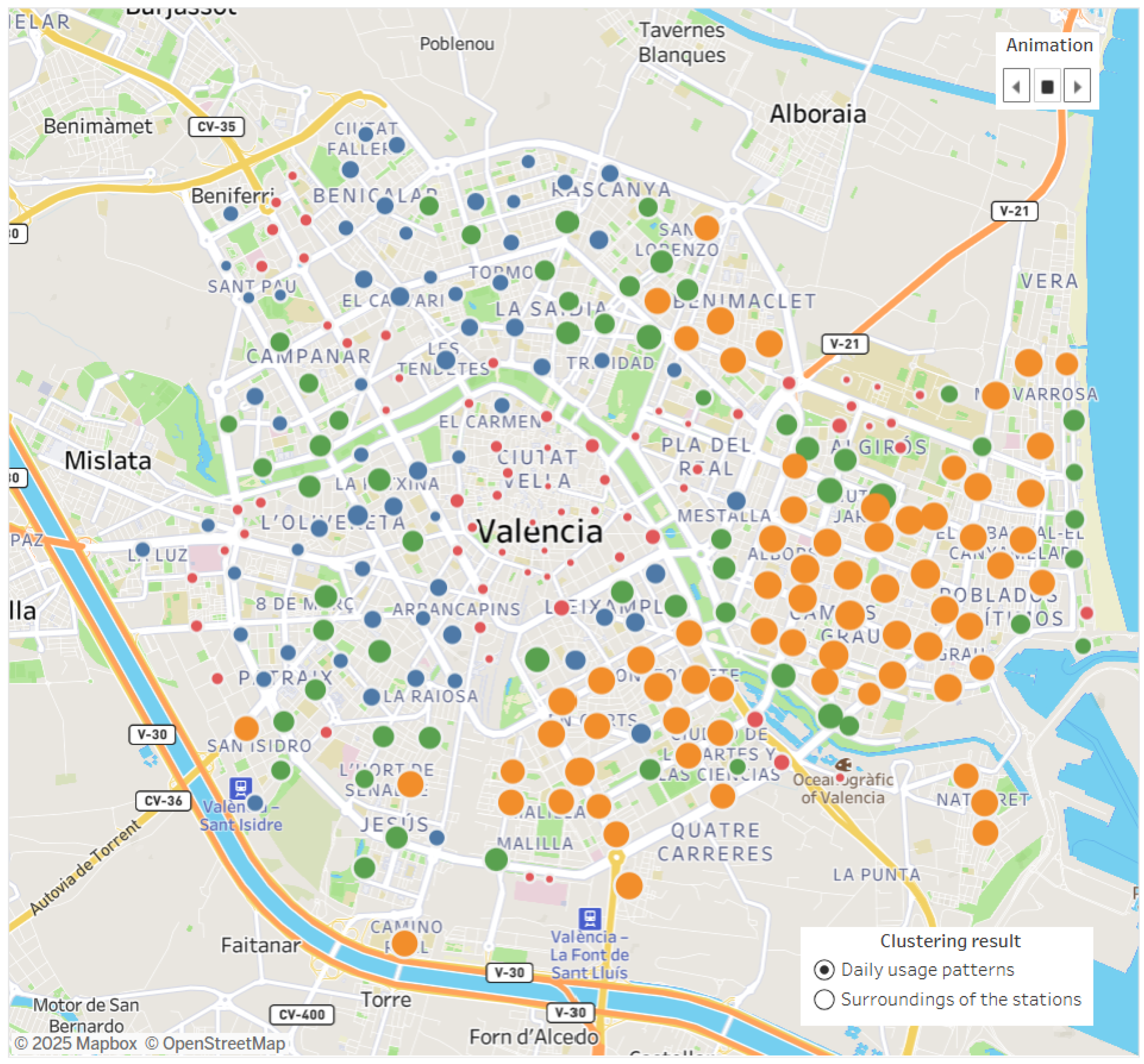
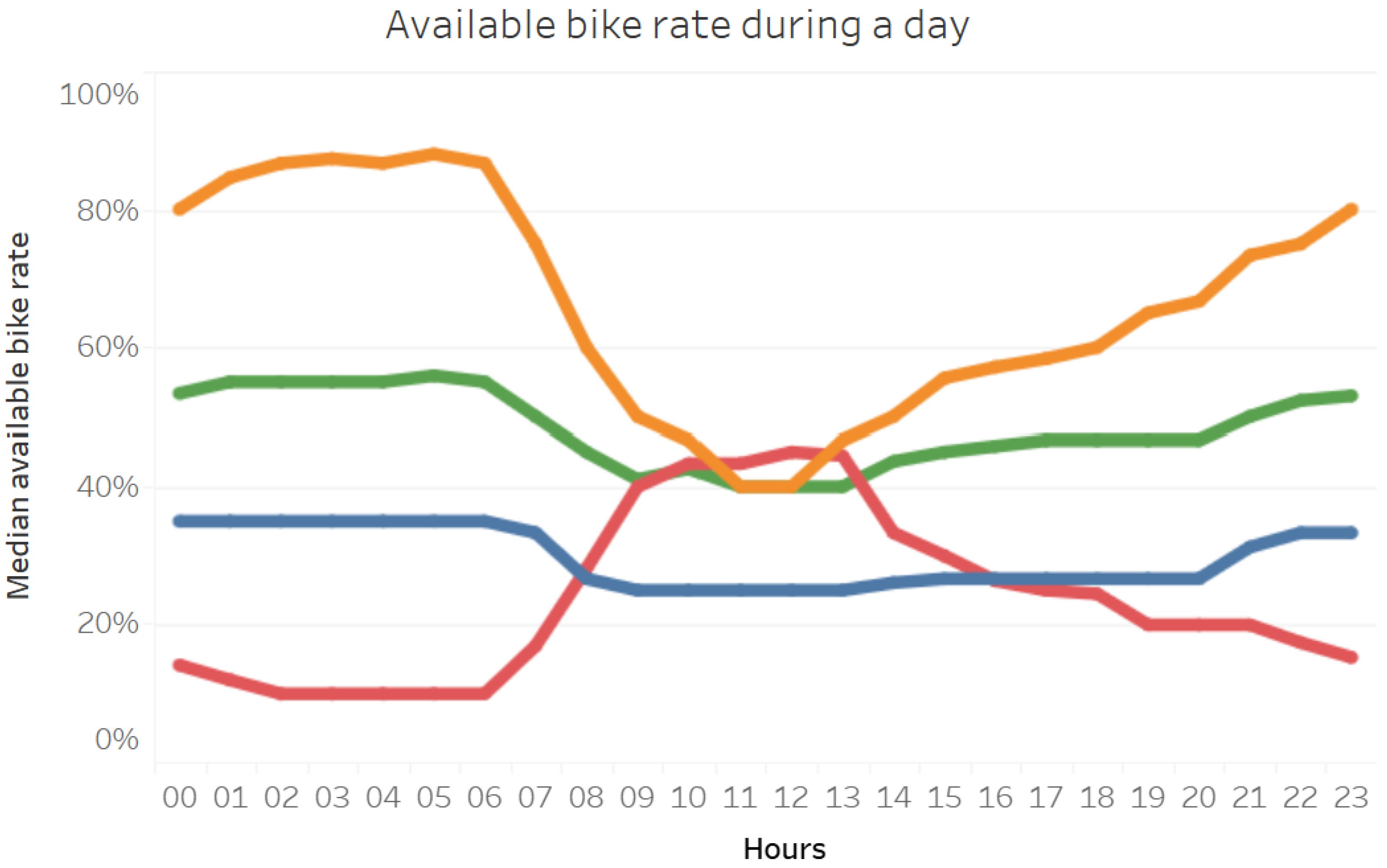
  • The stations were clustered based on their hourly usage data to detect patterns.
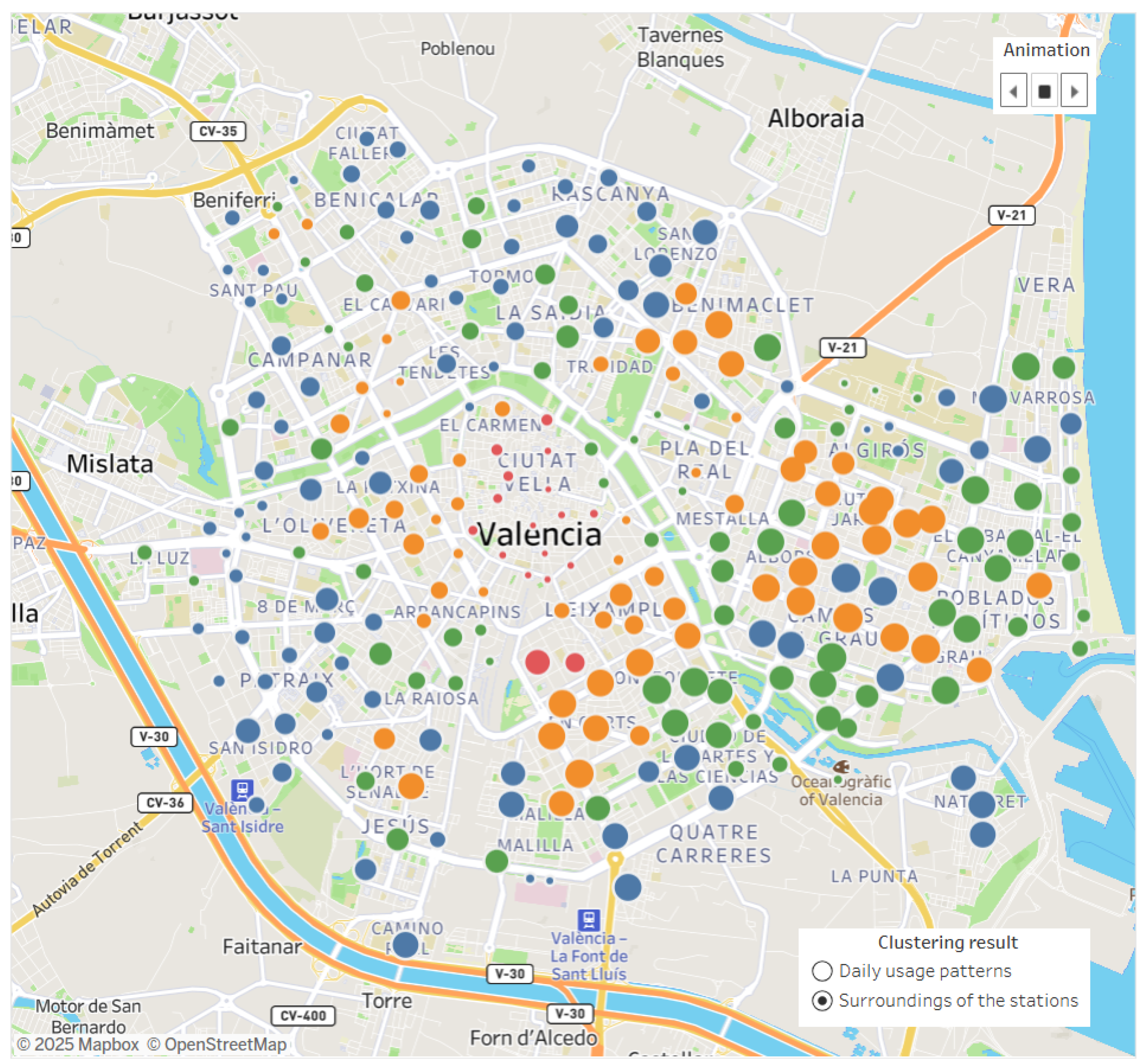
  • The stations were clustered based on their vicinity’s geospatial data.
As per our expectation, the outputs of the two clusterings produced similar clusters, since the usage of a station depends on the location; neighborhoods and busy areas—having educational facilities, commercial buildings, etc.—must have different features according to the daily mobility of the people.

1.4. Structure of the Paper

This paper presents the design and implementation experience of the proposed workflow, in the form of a Python 3.12 package that implemented all the stages:
  • Data was collected from the JCDecaux developer website representing the usage data of the Valenbisi system’s stations.
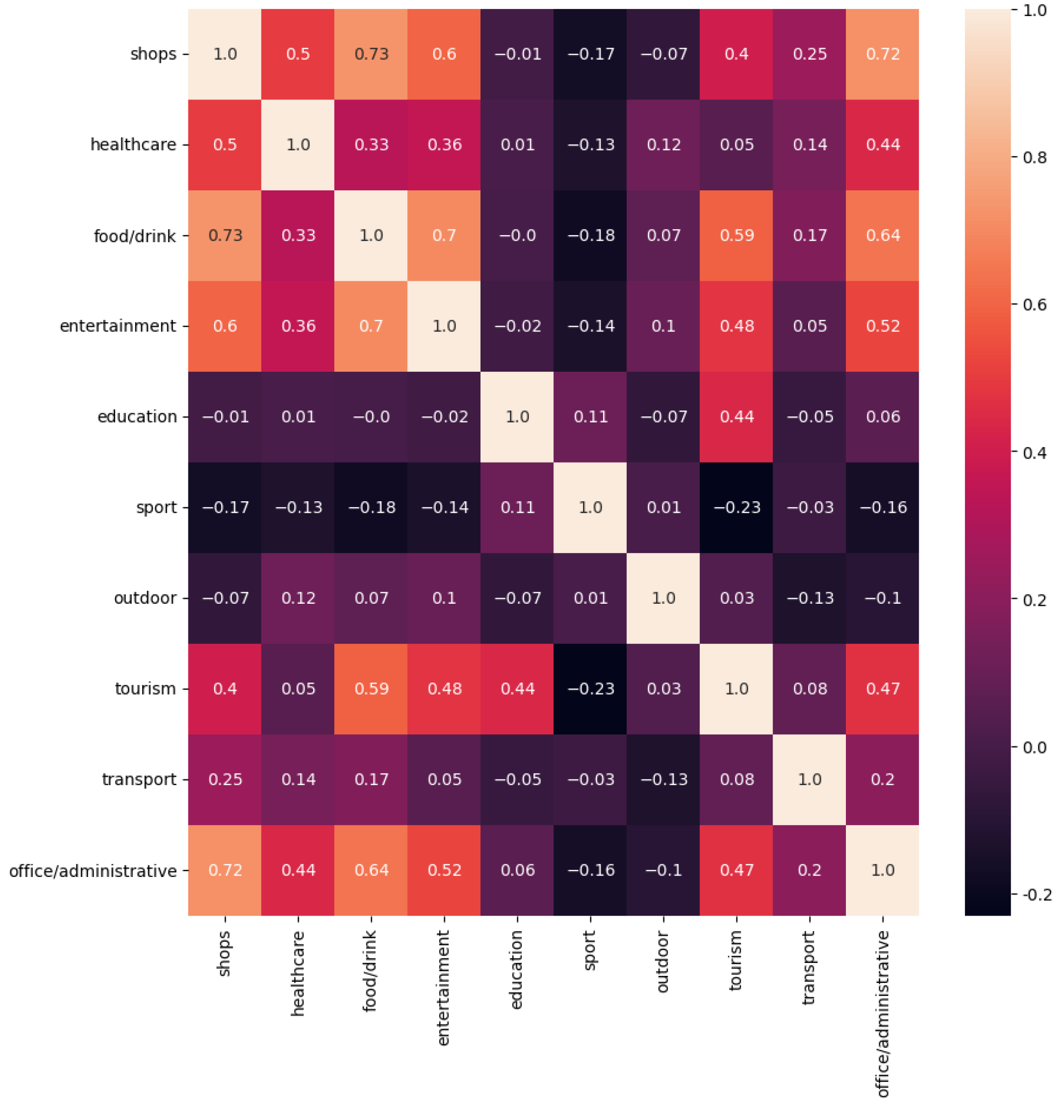
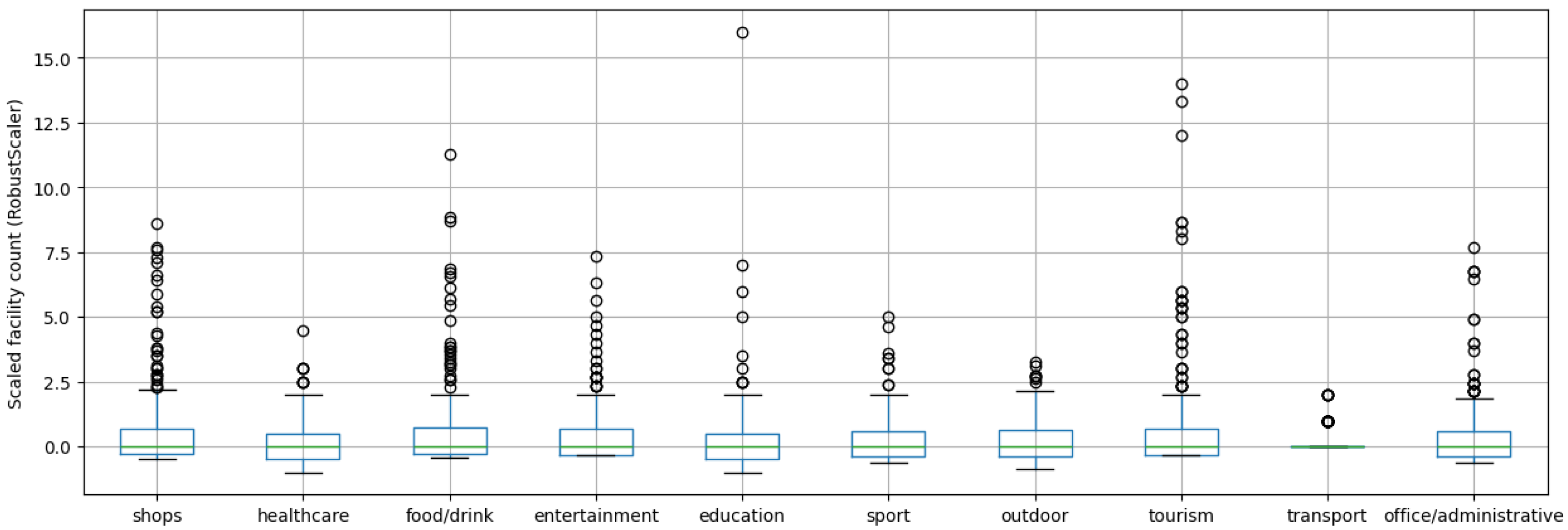
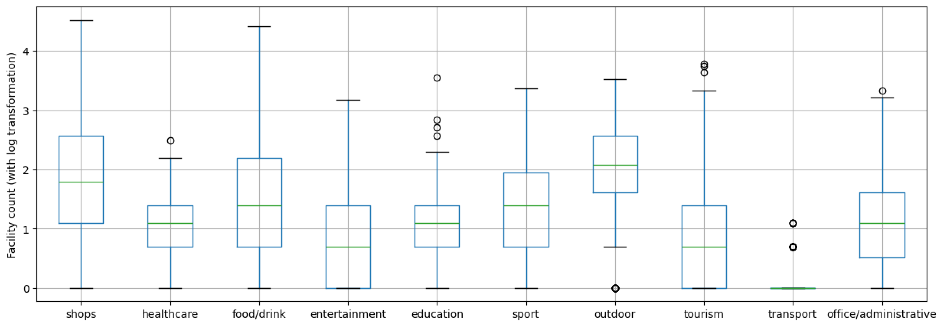
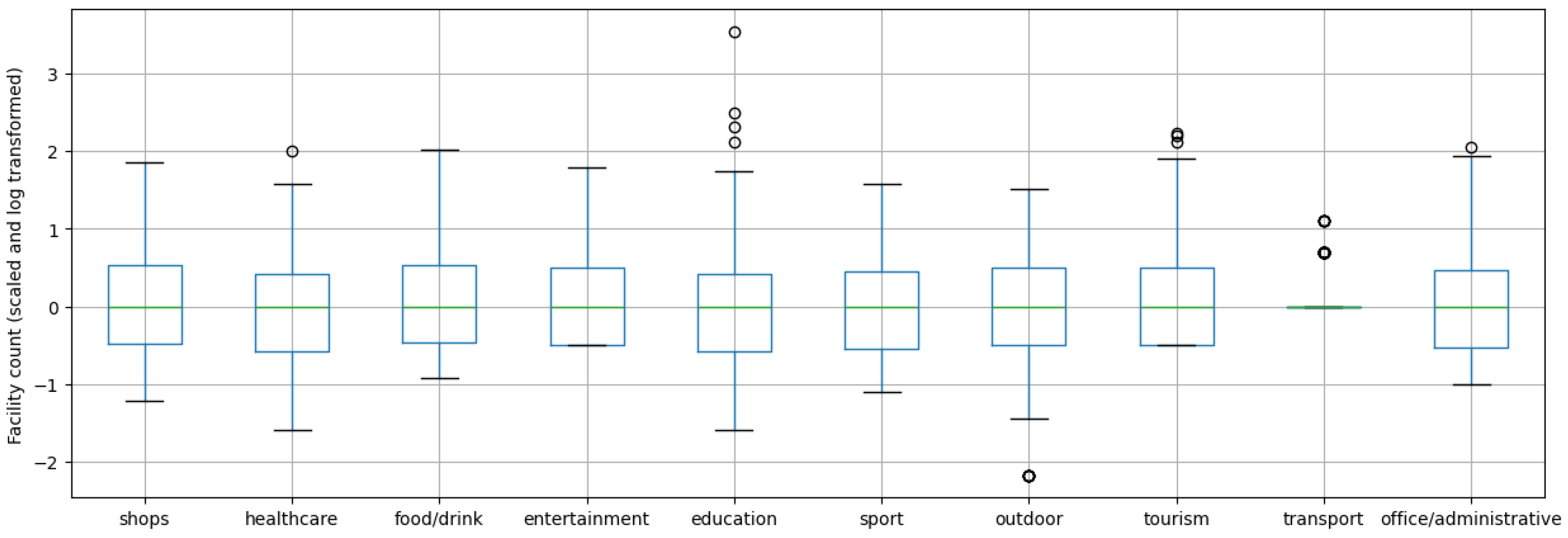
  • The raw dataset collected from the JCDecaux developer website was filtered, and geospatial features were retrieved from OpenStreetMap (OSM). For the analysis of the stations’ surroundings, OSM data was classified into 10 major groups based on different attributes. Based on the groups created, the number of facilities within a 200 m radius of the stations was determined according to the categories, using the OverPass API (accessed on 2 July 2025).
  • Experimental analysis was performed on the dataset:
    (a)
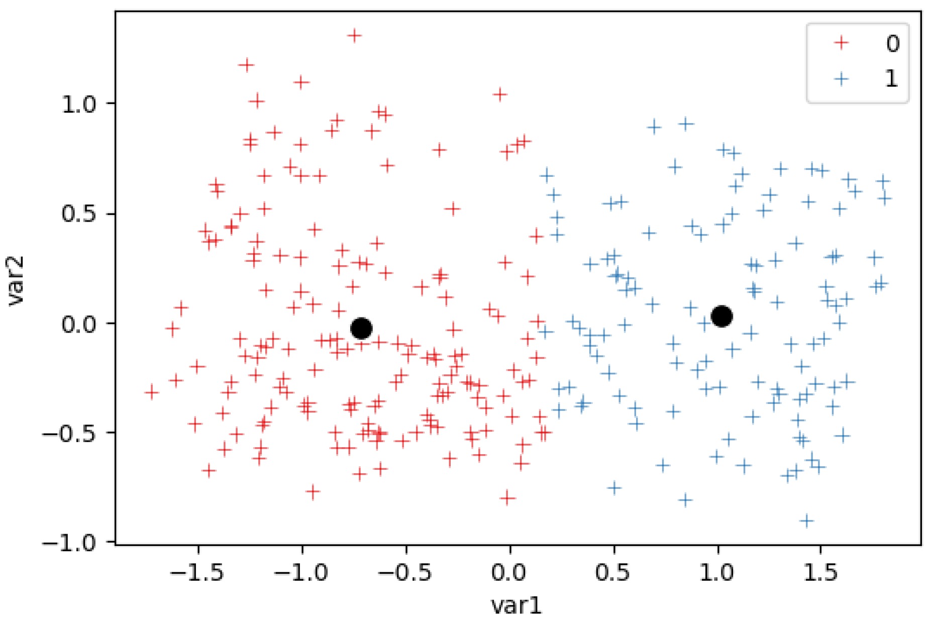
    We performed a cluster analysis of the stations’ daily usage and their environments, using the k-means method. We analyzed the results of clustering performed under various pre-processing steps, and the uses of various k values were compared using the Silhouette Coefficient (SE). The cluster analysis was carried out on the two datasets to select the most suitable method.
    (b)
    We compared the clustering results, using the Rand Index (RI). This allowed us to answer the research question of whether there was a correlation between the usage of the stations and their installation locations.
    (c)
    We present the visualization-driven analysis of the clusters and all the relevant pieces of information in the form of an interactive Tableau Dashboard, developed on the Tableau platform.

2. Materials and Methods

2.1. Service Data of Stations

The raw dataset was obtained from the REST API of the company JCDecaux (Paris, France) [6] between August 2023 and April 2024. During this period, the data and real-time occupancy of each station were sampled at a frequency of 60 s. Due to the nature of the data, the JSON responses contained many redundant, frequent character sequences; therefore, the 7z format was chosen as an efficient, compressed storage method. The dataset was partitioned by months, resulting in twelve individual archives. The data collection was performed on a self-hosted virtual machine, so the continuity of sampling depended on both the availability of the API and the local infrastructure. Apart from sampling errors, 1440 JSON files were generated daily; Figure 1 shows that this method resulted in acceptable sampling reliability.
Both static and dynamic features were available for each station. Static features do not change over time and contain predefined information, such as the station’s name, identifier, address, or GPS coordinates. However, dynamic features are continuously updated or modified and can take on different values in each response, requiring ongoing sampling. In the case of bicycle stations, such data includes the number of available docks and bicycles or the timestamp of the last update; thus, it is possible that the state of a station is retrained in the consecutive queries. By separating these two subsets of features, the data volume can be reduced significantly, and data processing can be optimized by storing the static features standalone and excluding them from the handling of dynamic features.
Verifying whether the stations are physically operational is advisable, as some may serve as test locations and may not exist in the real world. In the investigated period, the station with identifier 300 was identified, which is used exclusively for testing; this can be derived from its name (TEST VAL) or from its coordinates, which do not correspond to a location within Valencia. After filtering out potential test stations as noise, the CSV format was selected for the representation of the pre-processed static features, supporting the optimal processing as DataFrame objects in our Python codebase [22].
Another filtering step was performed on the dynamic features, since storing the originally included static information for every single record was redundant. The occupancy of the stations could be represented by the number of available bicycles and the number of free docks. Since the total number of docks was already saved separately in the static features’ file, it was sufficient to retain only one of the two aforementioned metrics; the other could be derived using the static number of docks. Due to the future clustering stage, it is advisable to work with normalized values to ensure station size does not influence the process; thus, the ratio of available bicycles was calculated using the number of available bikes and the total number of docks. During filtering, each station was associated with the proportion of available bikes and the timestamp of the last update, while other attributes were removed.
The filtering was carried out by excluding stations that were test stations or had zero docks. Each station was also assigned a status attribute, which indicated whether the station was currently operational. If only operational stations within a given time period are to be analyzed, this condition can be included as an additional filter in the function. Several approaches were tested for processing the compressed folders:
  • The most straightforward solution extracts the compressed dataset before applying the filtering function. The downside of this approach is that it generates unnecessary temporary files, and a single month’s data can take up about 30 GB of storage. These files should be deleted after filtering and writing the results to CSV.
  • The second approach uses the SevenZipFile class from the py7zr module, which allows reading and filtering the contents of compressed folders without extracting them. This method optimizes disk space usage, but—based on our experience—takes longer to process and filter compared to the first solution.
  • The third version aims to improve the non-extraction approach using the Pool class from the multiprocessing module, enabling parallel processing. However, this solution does not significantly speed up processing compared to the single-threaded version, primarily due to limitations imposed by Python’s Global Interpreter Lock (GIL) [23].
Based on our experience, the first method—extracting the compressed folders—was chosen for the implementation. However, memory-based buffering techniques, other ZIP formats, or database models can be tested. Before dumping the results to CSV files, an additional filtering step is recommended, considering the timestamp of the last update. Since station data is usually updated less frequently than once per minute, managing these values can further reduce storage and memory requirements and speed up later analyses. One way to do this is to save unique (number, last_update) pairs, avoiding redundant entries. After filtering and exporting more than eight months of data, the total storage size was reduced to just 430 MB.

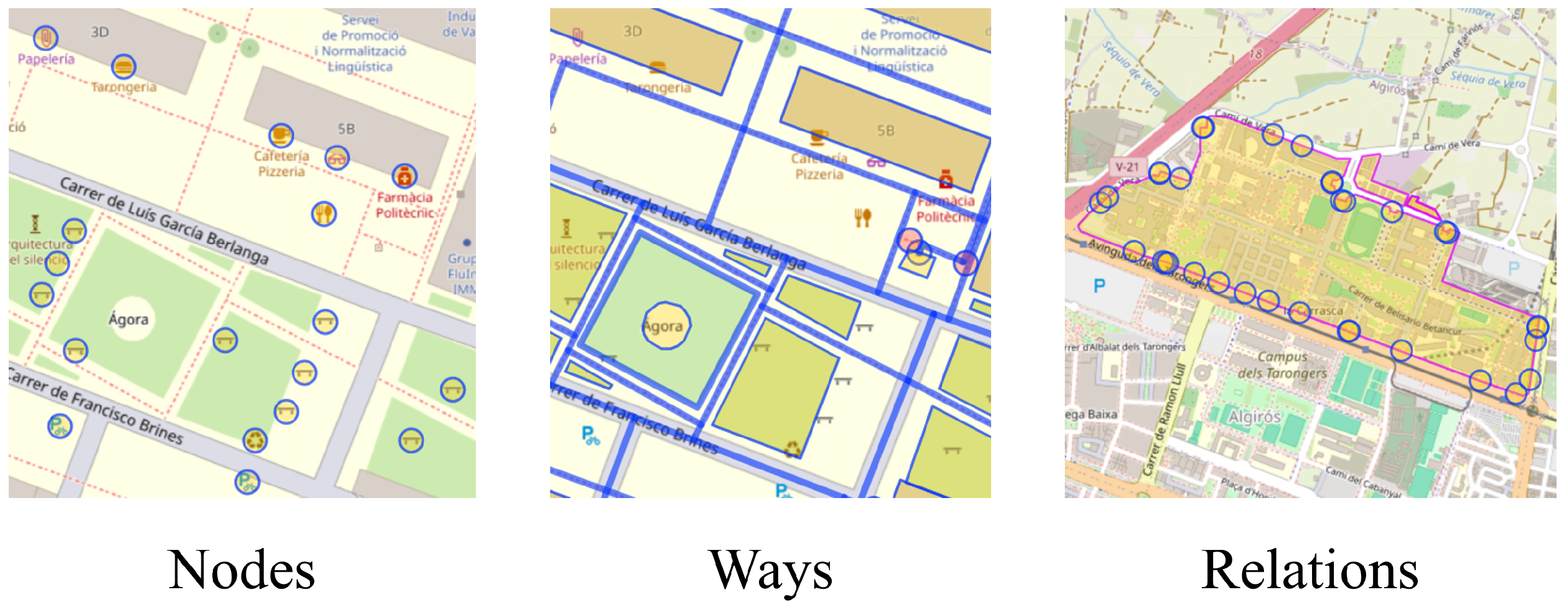
2.2. Geospatial Data of Stations

In the analysis of the stations’ surroundings, our goal was to determine the types and number of facilities located within a 200 m radius of each station. Different stations may serve different purposes depending on the types of facilities and objects located nearby [24]. The OpenStreetMap (accessed on 2 July 2025) database served as an excellent resource for this phase of the research, as it provides detailed geographic data on the locations and characteristics of various facilities. With geospatial features, not only can the exact location of individual facilities be determined, but their categorization is also possible. The database consists of three main map elements:
  • Nodes represent a single geographic location, defined by latitude and longitude coordinates and a unique identifier.
  • Ways are linear elements made up of multiple nodes. These can be opened (e.g., roads) or closed to form complex shapes (e.g., parks).
  • Relations are structured collections of nodes, ways, or even other relations, allowing for logical or geographic relationships to be established between various objects.
Additionally, tags play a crucial role in interpreting other elements as providing metadata. Tags consist of key–value pairs and can describe features such as function, category, or other characteristics. Figure 2 shows the difference between the three map element types.
The classification of objects located in the vicinity of the bike stations can be carried out using the tags associated with map elements. OpenStreetMap provides extensive documentation, in which the tags associated with elements are listed as key–value pairs along with short descriptions [25]. This documentation offers guidance for OpenStreetMap users on how to correctly label map elements, and during this research it served as a basis for categorizing map element tags. Ten main categories were defined, which were as follows: Shopping and services; Healthcare; Food and drink; Entertainment, arts, and culture; Education; Sports and wellness; Outdoors; Tourism; Transportation; and Office and administrative.
During the categorization of objects, the values associated with the amenity key were primarily considered, as they denoted locations and facilities specifically valuable for the community or the general public. The values of the leisure key were also frequently used, referring to locations related to recreation or leisure activities, often situated in outdoor areas. There were also keys for which specifying key–value pairs was not necessary, since the key itself allowed for unambiguous classification of objects. For example, the shop key could be classified entirely under the category Shopping and services, so referencing only the key name was sufficient. Similarly, the Healthcare category corresponded to the healthcare key, and Tourism corresponded to the tourism key.
After each tag’s key and any associated key–value pair were assigned to the categories that had been defined, their number of occurrences (frequency) was counted. This step was carried out using the Overpass API v0.7.61 (accessed on 2 July 2025) tool.

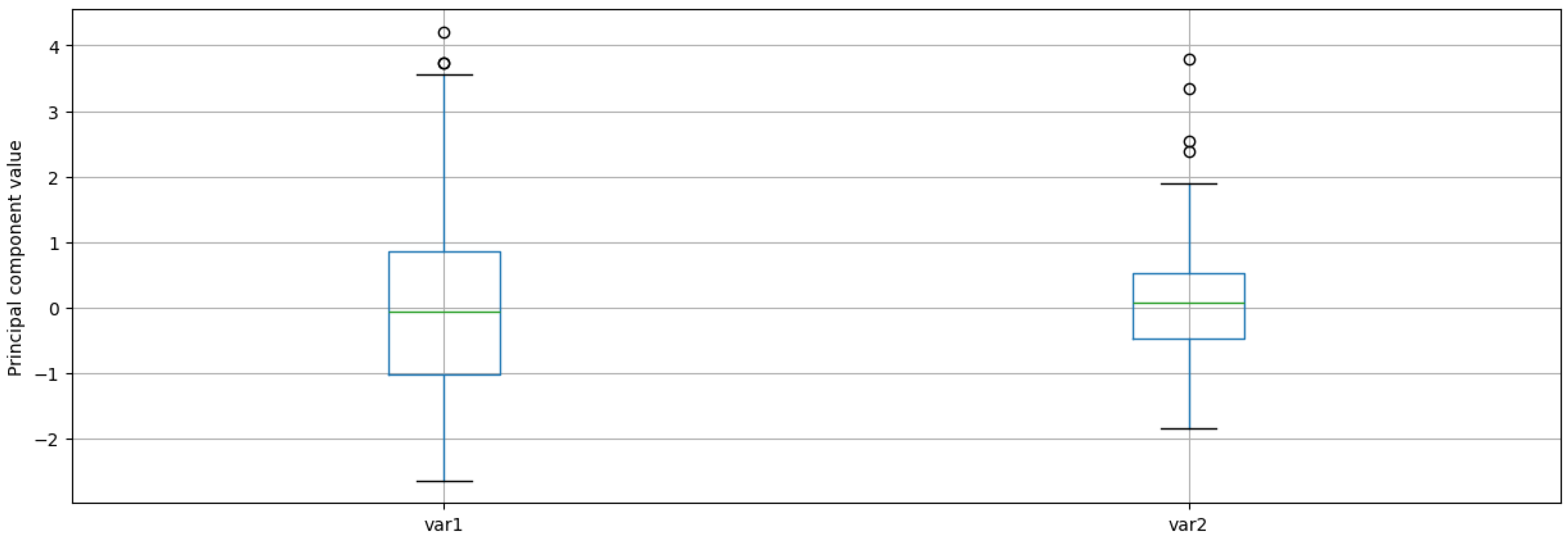
2.3. Analyzing Dataset

Numerous algorithms have been developed for cluster analysis; in this paper, the k-means method was applied, in which a predefined number of clusters is created [26,27]. Euclidean distance was used for assigning points to their nearest centroid. The accuracy of the algorithm is significantly affected by the selection of initial centroids, as varying results can be produced when centroids are selected randomly. Another algorithm, the bisecting k-means method, was also examined. In this approach, all data points are initially placed into a single cluster, and the k-means procedure is repeatedly applied to identify additional clusters until the desired number of clusters is reached [28]. This method is considered a divisive hierarchical clustering technique, as the process begins with one cluster and then repeatedly splits it into two. The use of the k-means method is considered ideal when clusters are similar in size and density, the data is low-dimensional, and the presence of outliers is minimal. A possible method for dimensionality reduction is Principal Component Analysis (PCA), which is intended to create a new set of dimensions that preserve most of the data’s variability. During PCA, the data is transformed to have zero mean. The new attributes are formed as linear combinations of the original ones, they are orthogonal to each other, and they are constructed to maximize the variance expressed in the dataset. To handle potential outliers, various pre-processing methods can be applied prior to clustering. In this paper, three pre-processing techniques were applied both individually and in combination to evaluate their impact on the clustering results.
To evaluate the clustering results, the SE was used, which measures both the internal cohesion of clusters and their separation. The overall quality of the clustering could be assessed by averaging the Silhouette Coefficients of all points [29]. To determine the optimal number of clusters, i.e., the value of k, techniques such as the Elbow Method (EM) could be used. This method identifies the optimal number of clusters at the point where increasing k further no longer significantly improves the result based on the Sum of Squared Errors (SSE) [30].

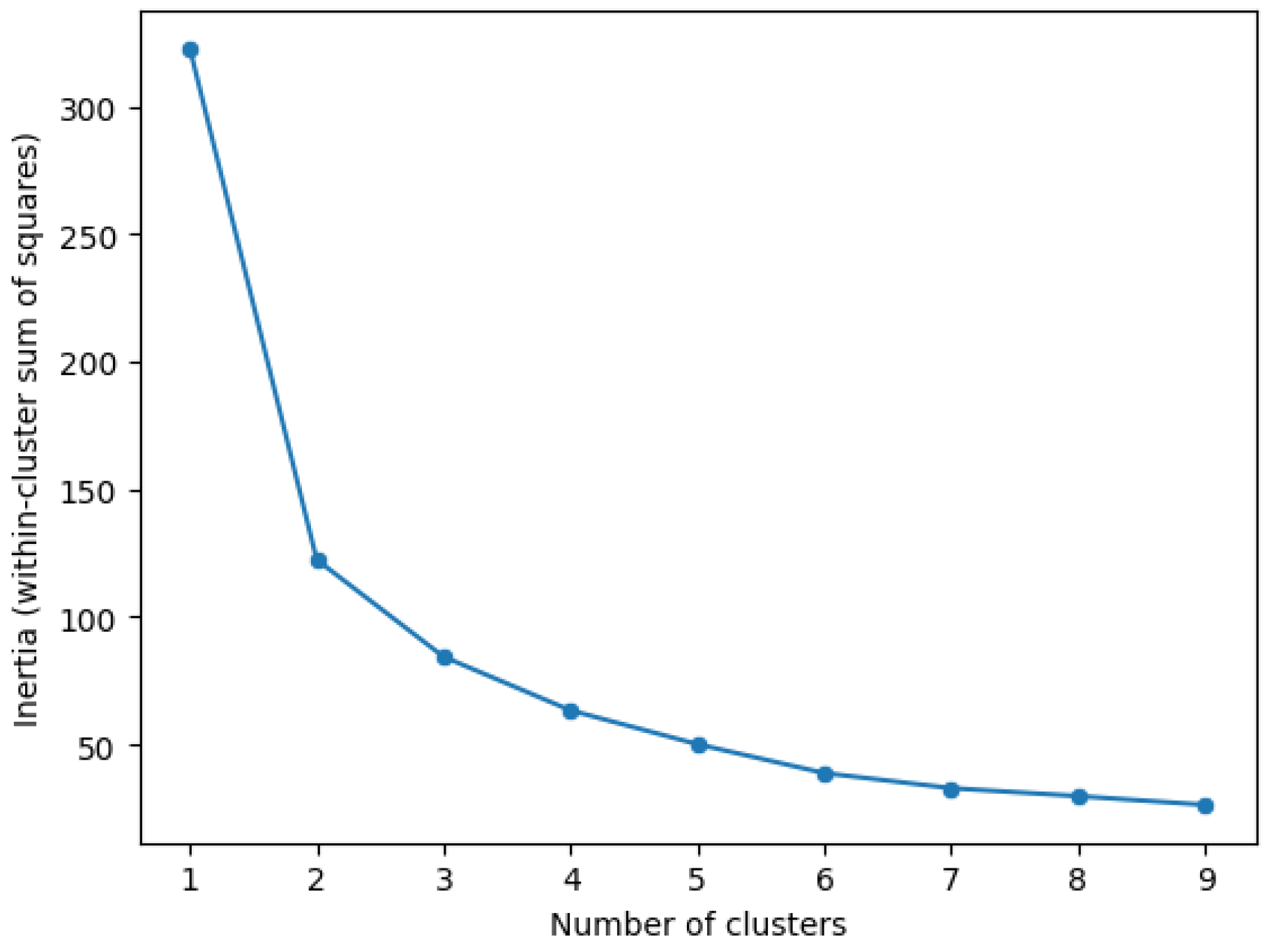
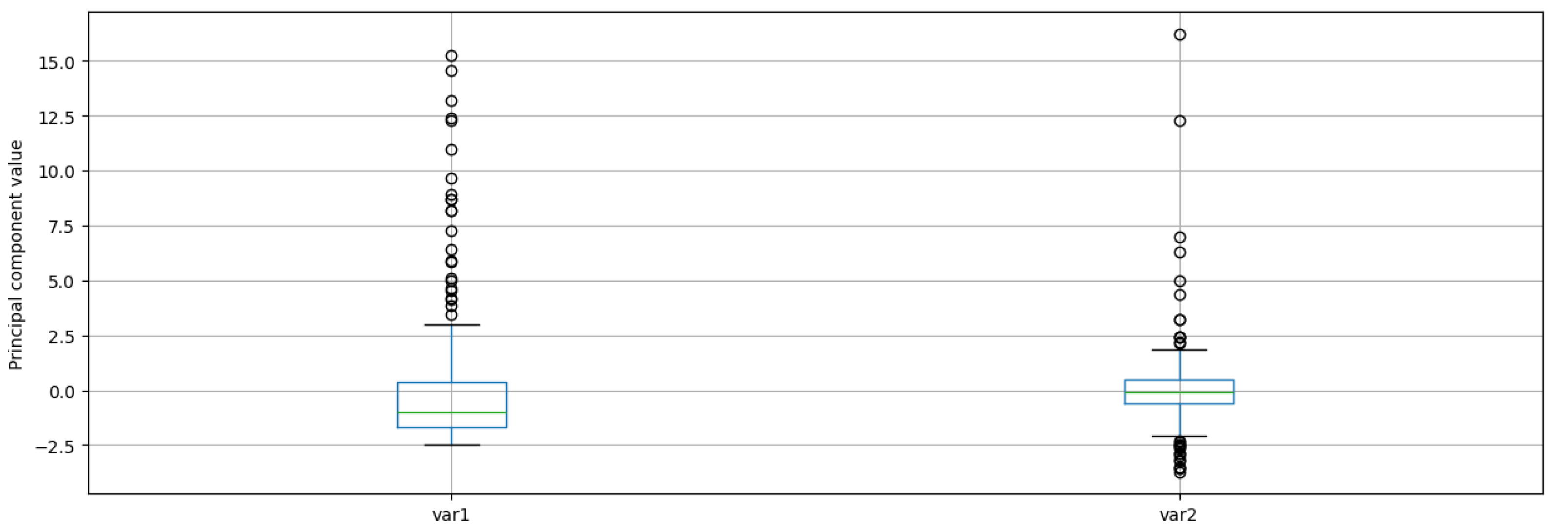
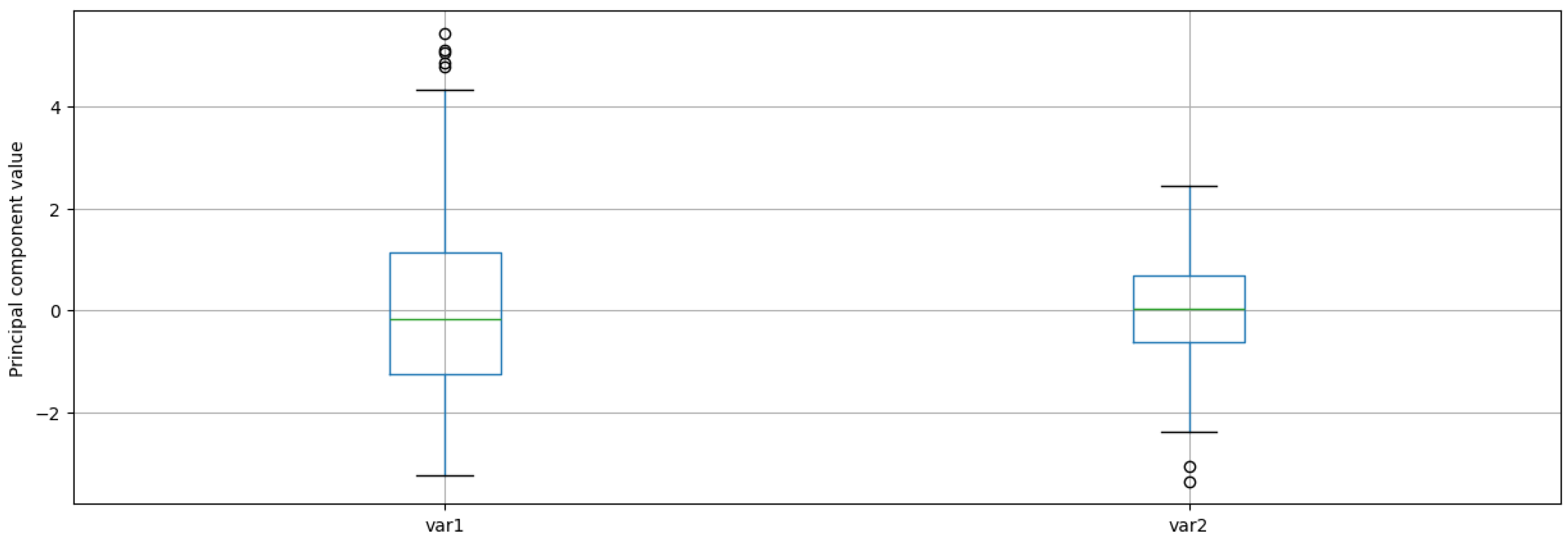
2.3.1. Clustering Stations by Their Usage

The data of the stations was saved into nine separate CSV files during the filtering process. For clustering, the files were read into memory, merged, and either the average or the median of their features was calculated, based on a selected sampling method. For practical reasons, an hourly sampling method was selected, and the median of the corresponding values was used. Moreover, additional filtering was applied to remove records containing null values, as such records would cause errors during the clustering process.
Using the aggregated features of the stations, clustering was performed based on the first analytical approach, in which the data was categorized according to daily usage levels. Since the k-means algorithm is sensitive to outliers, it is advisable for such values to be identified beforehand. This can be done through boxplot-based visualization, by which the medians, spreads, and any potential outliers of the features can be observed. As shown in the boxplot of Figure 3, outliers were present in only one variable; however, the distributions and median values of the variables differed, making it advisable for the previously mentioned pre-processing steps to be applied.
We tested different pre-processing steps by executing the clustering methods on four different inputs:
  • Using the raw features without additional pre-processing;
  • Using the scaled features without additional pre-processing;
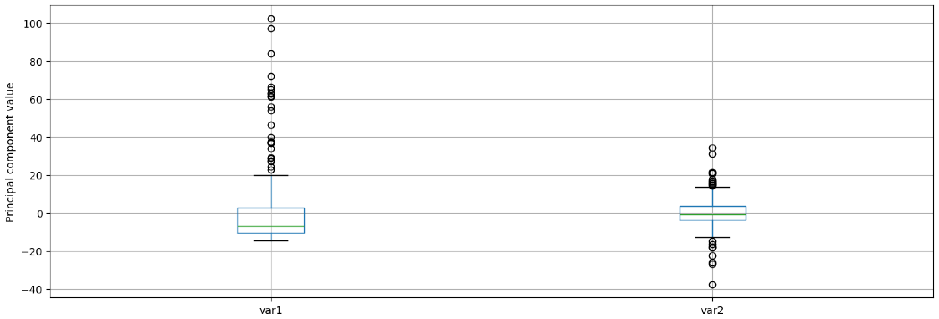
  • Using the dimension-reduced features;
  • Using the scaled features, applying dimension reduction, too.
Clustering was performed ten times for each version, and in each iteration the SE was calculated. Subsequently, the median and average values were also computed. Using the dataset on daily usage of the docking stations, several clusterings were carried out, after which the results were saved and compared, in order to select the optimal number of clusters, the pre-processing step, and the clustering methods. The k-means and bisecting k-means methods were executed for two, three, and four clusters. The individual results are shown in Table 1 and Table 2.
The best SE was achieved using k-means clustering with k = 2, applying only PCA as a pre-processing step. Using the dimensionality reduction function, it was possible to determine what percentage of the variance was explained by the selected principal components. The first two principal components explained 91.49% of the variance, indicating that a significant portion of the dataset could be well represented using these two dimensions, while preserving the most important information content. Based on this result, clustering was performed on the daily usage dataset. The created clusters could be visualized based on the two principal components, as Figure 4 shows. However, it is important to consider the limitations of the SE, as it may produce misleading results when clusters do not follow regular shapes [31]. Therefore, the optimal number of clusters was also determined using the EM on the dataset pre-processed with Principal Component Analysis. As shown in Figure 5, creating four clusters instead of two was more appropriate, as it resulted in a further reduction of the SSE value.

2.3.2. Clustering Stations by Their Environment

According to the second clustering approach, using the dataset categorized by OpenStreetMap tags, the storage locations could be grouped based on the number of objects belonging to each category. The relationships between the different categories were examined using correlation analysis, and the results were visualized in a heatmap. Figure 6 illustrates the correlations between the categories, where lighter colors indicate positive correlations, while darker colors denote negative correlations. For example, there is a strong positive correlation between the Food and drink and Shopping and services categories. This suggests that locations categorized under Shopping and services are often found in areas where many Food and drink objects are also present, indicating a close spatial relationship between these categories.
Figure 7 shows that the dataset contains many outliers; these features were also addressed using the previously mentioned pre-processing steps. During the first clustering experiment, the best result was achieved by classifying the stations into four clusters. Therefore, k = 4 was used again during the second approach. The pre-processing step was selected based on the most effective handling of outliers. The effects of the individual transformations were visualized using boxplots, shown in Figure 8, Figure 9 and Figure 10.
Despite applying different transformations, no significant decrease in the number of outliers was observed; therefore, a logarithmic transformation was performed on the original dataset. Figure 11 shows the boxplot after the logarithmic transformation of the original data, clearly illustrating the reduction in the number of outliers. The previously examined pre-processing steps were also performed on the logarithmically transformed dataset. The results from these are visualized by the boxplots shown in Figure 12, Figure 13 and Figure 14.

3. Results and Discussion

To compare the clustering results, the RI was applied, which can determine the degree of similarity between two different clusterings by examining data points in pairs and is used to show how much they agree in the two clusterings; that is, to what extent they belong to the same or different clusters. The algorithm also takes into account the agreement of clusters with different values but similar structure [32]. According to the RI, nearly 62% agreement was observed between the results of the two different clustering approaches.
To better understand the relationships, a visualization-driven analysis was performed. The stations were plotted on a map, where each point represents a station, colored differently according to clusters. By comparing Figure 15 and Figure 16, it can be observed that the downtown stations were clearly grouped together, and the categorization of the stations along the coastline was also matched.
By creating a Tableau Dashboard, the results of the two clusterings can be compared on a single map, the environment of the stations can be analyzed and the daily variation in the proportion of available bicycles can be observed by cluster on a line chart (see Figure 17) that shows the median rate of available bikes per cluster during a day. With the help of the line chart and the coloring of the map, it is clearly visible why the stations were grouped separately when clustering the dataset according to their daily usage. In the environment of the stations marked in red, a large number of offices and educational institutions can typically be observed. As can also be seen on the line chart, in the stations belonging to this group the proportion of available bicycles increased with the start of education or working hours, due to the arriving people. However, at the end of the working day or teaching period, this proportion decreased as many people traveled home. For the stations marked in orange, the opposite process occurred: here, the proportion of available bicycles started off very high at night, decreased in the morning and during the day, and then began to rise again in the second half of the day. For the stations belonging to the groups marked in blue and green, a similar fluctuation can be observed as in the orange-marked stations; however, the magnitude of the fluctuation was significantly lower, and these stations were grouped separately, mainly due to the level of the proportion.
Using the filter Clustering result, the points on the map can be colored according to the selected result. Technically, this is created as a parameter, and the selected value is then used in the formula of a calculated field. The individual points are colored by the calculated field based on the clustering result chosen in the parameter. For a more detailed analysis of the dataset, additional information is made accessible through every visualization. When the mouse is hovered over different elements, a tooltip containing additional details and comments related to the given element appears. By clicking on a selected storage location, the proportion of available bicycles for that location is shown in the line chart on the right, and the visualization below it displays the number of facilities in the vicinity of the storage location by category.
On the Play card, clicking the right-pointing arrow starts an animation that displays the change in the proportion of available bicycles on the map throughout the day with a ten-minute resolution. Extracting the hour and the ten-minute time intervals can be achieved by creating a calculated column.
The dashboard is publicly accessible on the Tableau Public (accessed on 2 July 2025) platform, allowing for visual exploration of the data.

4. Conclusions

In this paper, a general workflow is presented, which aims to support the multidisciplinary analysis of bike-sharing systems. The study was carried out using the open data of the Valenbisi BSS, consumed from the service provider JCDecaux company’s API. We used visualization-driven analysis on the generated clusters for performing exploratory data analysis.
As part of the process, data-mining solutions were applied, with a particular emphasis on cluster analysis. The aim of the research was to cluster our data based on the environmental characteristics of the stations and their daily usage patterns, enabling the examination of overlaps between their usage and the buildings and facilities located around them. The workflow was implemented as a Python package, using the scikit-learn library. The geospatial data of the stations’ environments played an important role during the analysis; thus, the geospatial features from the OpenStreetMap database were yielded and processed the tags using the OverPass API.
The clustering allowed for the evaluation and comparison of the clustering results based on the different pre-processing steps and selected numbers of clusters. This could be applied to any other clustering task, helping to determine the most optimal pre-processing step and number of clusters for the k-means or bisecting k-means methods. Clustering performed according to the daily usage and environmental characteristics of the stations was compared for different numbers of clusters. When classifying the stations into four clusters, nearly 62% agreement was found between the clustering results based on the two datasets. Almost all downtown stations were placed in the same group in both cases, and agreement was also found for the coastal stations.
We made the data visually explorable for anyone using a Tableau Dashboard. After the visual analysis of the clustering results based on hourly usage, it can be stated that the stations belonging to the four created categories had different usage patterns. One category, typically containing stations located near educational institutions and workplaces, had a low ratio of available bikes at night, which then started to increase in the morning and began to decrease in the afternoon. The other category worked in the opposite way: the ratio of available bikes decreased during the day and increased again in the evening. The other two categories did not show such fluctuations, but the bike ratios were well separated from each other.
The presented workflow was validated using Valencia’s data; however, data from any other bike-sharing system could also have been analyzed, since all the stages of the method are generic and city-independent.

Author Contributions

Conceptualization, R.T. and M.Z.; methodology, R.T., Á.M. and M.Z.; software, Á.M.; validation, R.T., Á.M. and M.Z.; formal analysis, R.T., Á.M. and M.Z.; data curation, R.T.; writing—original draft preparation, R.T. and Á.M.; writing—review and editing, R.T. and M.Z.; visualization, Á.M.; supervision, R.T. and M.Z.; project administration, R.T. and M.Z. All authors have read and agreed to the published version of the manuscript.

Funding

Róbert Tóth was supported by the EKÖP-24-4 University Research Scholarship Program of the Ministry for Culture and Innovation from the source of the National Research, Development, and Innovation Fund.

Data Availability Statement

The raw data supporting the conclusions of this article will be made available by the authors on request.

Acknowledgments

We would like to thank JCDecaux for publishing and maintaining their JCDecaux developer site, and also for making this research possible with their license (accessed on 2 July 2025).

Conflicts of Interest

The funders had no role in the design of the study; in the collection, analyses, or interpretation of data; in the writing of the manuscript; or in the decision to publish the results.

Abbreviations

The following abbreviations are used in this manuscript:
APIApplication Programming Interface
BSSBicycle Sharing Systems
EMElbow Method
GBFSGeneral Bikeshare Feed Specification
RIRand Index
SCSilhouette Coefficient
SSESum of Squared Errors

References

  1. Nieuwenhuijsen, M.J.; Khreis, H.; Verlinghieri, E.; Rojas-Rueda, D. Transport and Health: A Marriage of Convenience or an Absolute Necessity. Environ. Int. 2016, 88, 150–152. [Google Scholar] [CrossRef]
  2. Vázquez-Paja, B.; Feo-Valero, M.; del Saz-Salazar, S. Environmental awareness and transportation choices: A case study in Valencia, Spain. Transp. Res. Part Transp. Environ. 2024, 137, 104487. [Google Scholar] [CrossRef]
  3. Kåresdotter, E.; Page, J.; Mörtberg, U.; Näsström, H.; Kalantari, Z. First Mile/Last Mile Problems in Smart and Sustainable Cities: A Case Study in Stockholm County. J. Urban Technol. 2022, 29, 115–137. [Google Scholar] [CrossRef]
  4. Qin, J.; Lee, S.; Yan, X.; Tan, Y. Beyond solving the last mile problem: The substitution effects of bike-sharing on a ride-sharing platform. J. Bus. Anal. 2018, 1, 13–28. [Google Scholar] [CrossRef]
  5. Villarasa-Sapiña, I.; Pans, M.; Antón-González, L. Public transport, social environment, and Bike Sharing System use to high school: A case study in València (Spain). J. Urban Mobil. 2025, 7, 100101. [Google Scholar] [CrossRef]
  6. JCDecaux Developer—developer.jcdecaux.com. Available online: https://developer.jcdecaux.com/#/home (accessed on 17 May 2025).
  7. Mix, R.; Hurtubia, R.; Raveau, S. Optimal location of bike-sharing stations: A built environment and accessibility approach. Transp. Res. Part A Policy Pract. 2022, 160, 126–142. [Google Scholar] [CrossRef]
  8. Fontes, T.; Arantes, M.; Figueiredo, P.; Novais, P. Bike-sharing docking stations identification using clustering methods in Lisbon city. In Distributed Computing and Artificial Intelligence, Volume 1: 18th International Conference 18, Proceedings of the DCAI 2021, Salamanca, Spain, 6–8 October 2021; Springer: Cham, Switzerland, 2022; pp. 200–209. [Google Scholar]
  9. Fazio, M.; Giuffrida, N.; Le Pira, M.; Inturri, G.; Ignaccolo, M. Bike oriented development: Selecting locations for cycle stations through a spatial approach. Res. Transp. Bus. Manag. 2021, 40, 100576. [Google Scholar] [CrossRef]
  10. Chen, W.; Chen, X.; Cheng, L.; Chen, J.; Tao, S. Locating new docked bike sharing stations considering demand suitability and spatial accessibility. Travel Behav. Soc. 2024, 34, 100675. [Google Scholar] [CrossRef]
  11. Spain’s Most Bike-Friendly Cities in 2024—idealista.com. Available online: https://www.idealista.com/en/news/lifestyle-in-spain/2024/03/18/815948-spain-s-most-bike-friendly-cities-in-2024 (accessed on 22 May 2025).
  12. i Díaz, F.G. The bicycle: Mass urban transportation—A paradigm shift. Case study: The City of Valencia. WIT Transactions on the Built Environment 2015, 146, 27–37. [Google Scholar]
  13. Valencia Walks Towards the Future: The Cycling Revolution in Valencia—Transformative Cities—transformativecities.org. Available online: https://transformativecities.org/atlas/energy11 (accessed on 17 May 2025).
  14. Agencia Municipal de la Bicicleta | Ajuntament de Valencia—valencia.es. Available online: https://www.valencia.es/agenciabici/ (accessed on 18 May 2025).
  15. Teruel, M.D.; Viñals, M.; Orozco Carpio, P. Analysis of tourist flows and the comfort of guided tours in the Seu-Cathedral district of Valencia using participant observation and digital itinerary monitoring tools. In Proceedings of the International Congress for Heritage Digital Technologies and Tourism Management (HEDIT 2024), Valencia, Spain, 20–21 June 2024; Editorial Universitat Politècnica de València: Valencia, Spain, 2024. [Google Scholar]
  16. What Is GTFS?—General Transit Feed Specification—gtfs.org. Available online: https://gtfs.org/getting-started/what-is-GTFS/ (accessed on 22 May 2025).
  17. Home—General Bikeshare Feed Specification—gbfs.org. Available online: https://gbfs.org/ (accessed on 17 May 2025).
  18. Elevating the Airport Experience with IoT | IoT For All—iotforall.com. Available online: https://www.iotforall.com/elevating-the-airport-experience-with-iot (accessed on 22 May 2025).
  19. Wayfinding and Proximity Marketing at Fraport | Favendo—favendo.com. Available online: https://www.favendo.com/case_studies/fraport/ (accessed on 22 May 2025).
  20. Passengers Can Validate Their Mobile Transportation Tickets in a New Way—debrecen.hu. Available online: https://www.debrecen.hu/en/local/news/passengers-can-validate-their-mobile-transportation-tickets-in-a-new-way-1 (accessed on 22 May 2025).
  21. An Introduction into ADS-B—Flightradar24.com. Available online: https://www.flightradar24.com/blog/ads-b/ (accessed on 22 May 2025).
  22. Temiz, H. Recording Performances of Some File Types for Pandas Data. Avrupa Bilim Teknol. Derg. 2022, 36, 55–60. [Google Scholar] [CrossRef]
  23. Meier, R.; Rigo, A. A way forward in parallelising dynamic languages. In Proceedings of the 9th International Workshop on Implementation, Compilation, Optimization of Object-Oriented Languages, Programs and Systems PLE, ICOOOLPS ’14, Uppsala, Sweden, 28 July 2014; ACM: New York, NY, USA, 2014. [Google Scholar] [CrossRef]
  24. Tran, T.D.; Ovtracht, N.; d’Arcier, B.F. Modeling Bike Sharing System using Built Environment Factors. Procedia CIRP 2015, 30, 293–298. [Google Scholar] [CrossRef]
  25. Map Features—OpenStreetMap Wiki—wiki.openstreetmap.org. Available online: https://wiki.openstreetmap.org/wiki/Map_features (accessed on 17 May 2025).
  26. Tan, P.; Steinbach, M.; Kumar, V. Introduction to Data Mining: Pearson New International Edition PDF eBook; Pearson Education: London, UK, 2013. [Google Scholar]
  27. He, X.; He, F.; Fan, Y.; Jiang, L.; Liu, R.; Maalla, A. An effective clustering scheme for high-dimensional data. Multimed. Tools Appl. 2023, 83, 45001–45045. [Google Scholar] [CrossRef]
  28. Banerjee, S.; Choudhary, A.; Pal, S. Empirical evaluation of K-Means, Bisecting K-Means, Fuzzy C-Means and Genetic K-Means clustering algorithms. In Proceedings of the 2015 IEEE International WIE Conference on Electrical and Computer Engineering (WIECON-ECE), Dhaka, Bangladesh, 19–20 December 2015; IEEE: Piscataway, NJ, USA, 2015; pp. 168–172. [Google Scholar] [CrossRef]
  29. Dudek, A. Silhouette Index as Clustering Evaluation Tool. In Classification and Data Analysis, Proceedings of the SKAD 2019, Szczecin, Poland, 18–20 September 2019; Jajuga, K., Batóg, J., Walesiak, M., Eds.; Springer: Cham, Switzerland, 2020; pp. 19–33. [Google Scholar]
  30. Marutho, D.; Hendra Handaka, S.; Wijaya, E.; Muljono. The Determination of Cluster Number at k-Mean Using Elbow Method and Purity Evaluation on Headline News. In Proceedings of the 2018 International Seminar on Application for Technology of Information and Communication, Semarang, Indonesia, 21–22 September 2018; IEEE: Piscataway, NJ, USA, 2018; pp. 533–538. [Google Scholar] [CrossRef]
  31. Thinsungnoen, T.; Kaoungku, N.; Durongdumronchai, P.; Kerdprasop, K.; Kerdprasop, N. The Clustering Validity with Silhouette and Sum of Squared Errors. In Proceedings of the 2nd International Conference on Industrial Application Engineering 2015, ICIAE2015, Singapore, 20–22 May 2015; The Institute of Industrial Applications Engineers: Kitakyushu, Japan, 2015. [Google Scholar] [CrossRef]
  32. Warrens, M.J.; van der Hoef, H. Understanding the Rand Index. In Advanced Studies in Classification and Data Science; Springer: Singapore, 2020; pp. 301–313. [Google Scholar] [CrossRef]
Figure 1. Histogram of missing samples over the period: 175 out of 189 days had at most 50 missing samples; in other words, 92.5% of the days could be tracked with more than 96% of availability.
Electronics 14 02720 g001
Figure 2. OpenStreetMap has three main map elements: Nodes, Ways, and Relations.
Electronics 14 02720 g002
Figure 3. The hourly usage of stations. Only the entry of 10 AM contains outliers (marked by a single circle); however, the usage of stations visibly differed, serving as a base for further analysis.
Electronics 14 02720 g003
Figure 4. Visualization of the clusters according to the two principal components. Cluster centroids are marked with black circles; data points are marked with plus signs.
Electronics 14 02720 g004
Figure 5. Visualization of the EM’s output.
Electronics 14 02720 g005
Figure 6. Correlations between the ten different categories. Categories such as Tourism and Office/administration have visible correlation with other categories; however, other categories, such as Education and Sport, do not have this feature.
Electronics 14 02720 g006
Figure 7. Frequency (count) of categorized facilities located around the stations.
Electronics 14 02720 g007
Figure 8. Frequency (count) of categorized facilities found in the vicinity of the stations after applying the scaling pre-processing method.
Electronics 14 02720 g008
Figure 9. Frequency (count) of categorized facilities found in the vicinity of the stations after applying PCA. The first two principal components explain 80.26% of the variance.
Electronics 14 02720 g009
Figure 10. Frequency (count) of categorized facilities found in the vicinity of the stations after applying PCA and scaling. The first two principal components explain 69.58% of the variance.
Electronics 14 02720 g010
Figure 11. Frequency (count) of categorized facilities found in the vicinity of the stations after applying logarithmic transformation.
Electronics 14 02720 g011
Figure 12. Frequency (count) of categorized facilities found in the vicinity of the stations after applying scaling on the logarithmically transformed dataset.
Electronics 14 02720 g012
Figure 13. Frequency (count) of categorized facilities found in the vicinity of the stations after applying PCA on the logarithmically transformed dataset. The first two principal components explain 60.82% of the variance.
Electronics 14 02720 g013
Figure 14. Frequency (count) of categorized facilities found in the vicinity of the stations after applying PCA and scaling on the logarithmically transformed dataset. The first two principal components explain 54.02% of the variance.
Electronics 14 02720 g014
Figure 15. Clusters of stations based on their daily usage. Based on the background information about Valencia, downtown and university-related stations belong to the red cluster, while neighborhoods belong to the remaining blue, green, and orange clusters.
Electronics 14 02720 g015
Figure 16. Clusters of stations based on their geospatial information. Similar to the first approach, the downtown area forms a clearly visible cluster; however, other clusters are noisier, based on the available geospatial information.
Electronics 14 02720 g016
Figure 17. The line chart shows the ratio of available bicycles during a workday. The green and blue clusters can be considered constant, but the orange and red clusters predict a huge number of trips between the corresponding neighborhoods and downtown areas.
Electronics 14 02720 g017
Table 1. Averages and medians of the SE for the k-means method, using k = 2, k = 3, and k = 4.
Methodk = 2k = 3k = 4
Scaling PCA Average Median Average Median Average Median
nono0.46190.46100.33580.33350.26800.2678
yesno0.44290.44290.34540.33850.28200.2818
noyes0.51020.50910.39120.39270.33650.3365
yesyes0.49360.49360.42520.42580.35930.3582
Table 2. Averages and medians of the SE for the bisecting k-means method, using k = 2, k = 3, and k = 4.
Methodk = 2k = 3k = 4
Scaling PCA Average Median Average Median Average Median
nono0.46220.46100.34150.34100.30690.3033
yesno0.44290.44290.32610.31640.30580.3138
noyes0.51120.51210.40840.40570.38890.3867
yesyes0.49360.49360.38380.37810.37920.3932
Disclaimer/Publisher’s Note: The statements, opinions and data contained in all publications are solely those of the individual author(s) and contributor(s) and not of MDPI and/or the editor(s). MDPI and/or the editor(s) disclaim responsibility for any injury to people or property resulting from any ideas, methods, instructions or products referred to in the content.

