Article

Random Forest Similarity Maps: A Scalable Visual Representation for Global and Local Interpretation

by
Dipankar Mazumdar
1,
Mário Popolin Neto
2,3 and
Fernando V. Paulovich
1,*
1
Faculty of Computer Science, Dalhousie University, 6050 University Avenue, Halifax, NS B3H 4R2, Canada
2
Institute of Mathematics and Computer Sciences, University of São Paulo, São Carlos 13566-590, Brazil
3
Federal Institute of São Paulo, Araquara 14804-296, Brazil
*
Author to whom correspondence should be addressed.
Electronics 2021, 10(22), 2862; https://doi.org/10.3390/electronics10222862
Submission received: 8 October 2021 / Revised: 17 November 2021 / Accepted: 18 November 2021 / Published: 20 November 2021

Abstract

:
Machine Learning prediction algorithms have made significant contributions in today’s world, leading to increased usage in various domains. However, as ML algorithms surge, the need for transparent and interpretable models becomes essential. Visual representations have shown to be instrumental in addressing such an issue, allowing users to grasp models’ inner workings. Despite their popularity, visualization techniques still present visual scalability limitations, mainly when applied to analyze popular and complex models, such as Random Forests (RF). In this work, we propose Random Forest Similarity Map (RFMap), a scalable interactive visual analytics tool designed to analyze RF ensemble models. RFMap focuses on explaining the inner working mechanism of models through different views describing individual data instance predictions, providing an overview of the entire forest of trees, and highlighting instance input feature values. The interactive nature of RFMap allows users to visually interpret model errors and decisions, establishing the necessary confidence and user trust in RF models and improving performance.

1. Introduction

Machine Learning (ML) algorithms have seen widespread usage in numerous fields over the past few years. From music recommendations [1] to understanding whether or not a patient has a severe infectious disease [2], ML has become a part of our day-to-day life. ML algorithms’ strong predictive capability has triggered many organizations to rely on these techniques for effective data-driven decision-making. Specifically, in ML, the demand for solving classification problems has been significant, usually involving assigning appropriate class labels to new and unseen instances [3]. For instance, typical classification problems would be the identification of fault or non-fault power equipment [4,5] or the real-time anomaly classification in IoT-based systems [6].
However, with the increase in the complexity of problems and dataset features, better algorithms are necessary to derive accurate models. The need to have better predictive performance in real-life use cases often leads to an intrinsic problem: interpreting the produced results [7]. For instance, COMPAS (Correctional Offender Management Profiling for Alternative Sanctions), a software for judging the likelihood of a criminal defendant becoming a recidivist, has been widely criticized for its biased racial decisions [8]. It was observed from the algorithm results that people of color were at greater risk of recidivism than white defendants, and the reasons are not clear since race is not used for prediction. Since ML techniques have become ubiquitous, especially in crucial decision-making involving humans, there is a considerable demand to explain the complex algorithm workability and help decision-makers gain confidence and trust in the algorithm [9].
Visualization has been a natural choice for users to understand the black-box nature of complex ML algorithms [10]. In recent times, visual metaphors such as Node-Link diagrams [11], Decision Tables [12], and Matrix views [13,14] have been widely used to interpret models. However, these techniques are prone to scalability issues and can often not capture an algorithm’s overall working mechanisms since they are usually designed to inform particular predictions. This hinders the user from acquiring a holistic picture of the model and can lead to misinterpretations. The issue is particularly seen with ensemble models such as Random Forests (RF) [14,15], which is a collection of decision trees, and visualizing every tree in a human interpretable form is complex. Another issue happens when auditing results. With the current existing approaches [14,15], the local interpretability focus on presenting only the decision paths (or logic rules) used to classify an instance, which is not helpful enough for most of the ML models, specifically for those based on multiple trees such as RF [16]. The problem, in this case, is losing the context, which is deemed one of the essential aspects of visual analytics tasks.
To address these issues, we propose Random Forest Similarity Map (RFMap), a scalable and interactive visual analytics tool to represent the knowledge learned (rules) by an RF model and allow for result interpretation. Our visual representations are based on dimensionality-reduction techniques [17,18], enabling users to analyze entire models globally and allowing auditing of individual instances or a cluster of instances locally to explain how a specific decision was made without losing the forest’s global context. A similar approach has been widely used to understand certain aspects of Deep Neural Networks (DNNs), for example, projecting data using network activations to calculate similarity [19,20]. Our work takes inspiration from these applications and uses DR techniques to display relationships among instances (and rules) from the perspective of a particular RF model.
The remainder of the paper is organized as follows: in Section 2, we present the literature review of ML model explainability strategies, general visualization techniques used in model interpretation, and visualizations of RF models. Section 3 presents background information on RF, design goals, and analytical tasks supported by our solution. Additionally, RFMap is introduced in detail. In Section 4, we explain the workability of our technique using two different user scenarios and show how our system helps in the interpretation of entire RF models and local instances while maintaining the global context. Finally, we discuss and present our technique’s limitations and draw conclusions in Section 5.

2. Related Work

As ML algorithms garner more attention with time, the need for Explainable AI (XAI) has also increased substantially. There has been vast progress in the research of explaining the black-box nature of algorithms using visual representations [13,14,15], knowledge extraction methods [13,14,21,22] and influence-based techniques [23,24]. In this work, we focus on visual representations as the primary medium to interpret ML algorithms.

2.1. General Explainability Strategies

In the literature survey of existing explainability strategies, Adadi et al. [25] categorize the methods primarily into: (i) complexity-based (ii) scope-based (iii) model-based. The complexity of a model tends to be directly proportional to its interpretation. Hence, the nature of a model in terms of its complexion is non-trivial in explaining it. Various knowledge extraction techniques with an intuition of reducing complexity in models, specifically in black-box algorithms such as Artificial Neural Networks (ANN), have proven efficient. In this regard, rule-based knowledge extraction methods have leaped toward approximating complex models using simpler, interpretable ones. Humbird et al. [26], presents a technique to build deep feed-forward neural networks based on decision trees, thus allowing the construction of model surrogates that are easy to understand. Letham et al. [27] proposed an explainable method (Bayesian rule lists) based on decision lists (consisting of if-then statements), making predictive models more interpretable to humans. Mashayekhi et al. [28] present another way of extracting rules specifically from Random Forest (RF) models. They employ optimization strategies, specifically ‘hill climbing algorithm’ to select valuable rules instead of all the rules, thus allowing them to deal with scalability issues. In our work, we use rule-based extraction techniques to interpret black-box models, but our main focus lies on being able to represent the rules using visual metaphors and not on the knowledge extraction part.
Another strategy takes into consideration the global or local scope of models. In general, a model’s global scope targets explaining the entire model logic [27,29,30,31] to help a human understand models’ internal behavior. Global explanations touch on the factors such as understanding how a model makes judgments, what features were involved in the decision-making process, and knowledge (decision paths, weights, etc.) learned by the model. On the other hand, local interpretation is about explaining a particular instance and its resulting predictions [32]. Taking inspiration from these techniques, we present a system that explains the local instances and preserves the overall global structure, helping users keep a perspective of how a complex model has learned knowledge, therefore reducing the cognitive load on users.
The third strategy touches upon a model’s nature, i.e., it is being agnostic or specific. Model-agnostic explanation techniques apply to all models irrespective of their nature [25,33]. In contrast, model-specific strategies are limited to a particular model and generally apply to simpler models in structure, such as Decision Trees or linear models. However, recent research has allowed for the distillation of complex models so they can be converted into simpler forms and hence be transparent [34]. This enables explanations from a particular model perspective, which helps in touching upon that model’s specifics. For this research, our target is aiding users in understanding the black-box nature of ‘RF models’.

2.2. Visualization for Interpreting Models

Visual metaphors have been seen to address the problem of interpreting ML algorithms for quite some time. In recent years, numerous visual analytics systems have been developed to explain the inner workings of a model [35,36], extracting information from a model for post hoc interpretability [13,15,25] or enabling performance diagnosis for building more accurate models [37,38,39]. Naturally, visual representations have been an optimal choice when explaining complex ML models.
Fred Hohman et al. [20] propose a visual analytics system for deep neural networks (DNN) that summarizes the activation aggregations from all classes to help to understand the critical neurons contributing to a particular classification using dimensionality-reduction techniques. They also provide a graph representation of the ’neuron-influenced’ aggregations to show the relationship between different neurons that finally leads to a prediction [20]. In another line of work, Zahavy et al. [40] use a 3D t-SNE to visualize the state transitions of the learned policies from a Deep-Q network used in reinforcement learning. ActiVis [19] is another system deployed across Facebook to interpret the black-box nature of deep neural networks. They use a 2D projection to explain instance activation using t-SNE and place instances with similar activation values together. Cantareira et al. [41] introduce an approach to exploring a neural network’s hidden layer activities and simplifying the inner working mechanism of such complex networks. Their novel technique focuses on comparing projections derived from multiple stages in a neural network and visualizing the differences in perception. Taking a similar approach to ours, Rauber et al. [42] focus on improving classification systems. They present projection-based visualizations that help developers interpret interesting insights in a classification model and improve these systems through feature selection.
In general, these point-based visualization techniques have been focused on explaining deep neural networks. On the other hand, RFMap is specific to RF models. It allows users to understand the data instances and the decision paths of a forest using 2D dimensionality-reduction techniques, making RFMap easily interpretable and scalable.

2.3. Random Forest Visualization

An RF model consists of many decision trees that function together as an ensemble. Each tree model makes its predictions (vote), and the class with the greatest number of votes is considered to be the final predicted class [43]. Such a massive collection of decision trees and their underlying working mechanism makes the model black box in nature. Hence, visualizing the entire forest of trees to make it interpretable for users is an ongoing research problem. The ability to represent a forest of decision trees to explain each tree’s structure and properties is daunting. Hansch et al. [44] propose an interactive visualization system based on a botanical approach to interpret and improve RF models. They emphasize that the factors that lead to an increase or decrease in an RF model performance are not easy to express as scalars. Hence, visualizing the entire RF model with all the decision trees can help in better interpretation. However, their work applies only to RF models based on binary trees. Moreover, the scalability of the forest visualization is a concern when thousands of decision trees are used.
To show the correlation between the decision trees in an RF model and data instances, Breiman and Wald [45] presented a multidimensional scaling (MDS)-based projection strategy. They use proximity measure, which is inherent to the RF algorithm, to display the clusters formed among the trained instances and allow for outlier identification. In our technique, we use their ‘proximity measure’ as a distance metric to project our instances. However, we extend their method to build a visual representation that allows for the explanation of class separability and enables local inspection of the instances by preserving the context of the forest. Lau et al. [46] uses a method of aggregation for the collection of trees based on the number of appearances of a feature at node positions. They focus on feature importance and interaction to derive information on variables applied at each tree node. However, these tasks become challenging as they increase the number of feature variables. Additionally, their system cannot handle tree depths greater than 8, which makes it practically non-usable.
Popolin Neto et al. [14] present a matrix-based visual metaphor, named ExMatrix, to aid in the global and local interpretation of RF models. They propose a method to extract each tree’s decision path as rules and use the matrix visualization together with properties such as certainty of rules, coverage, voting committee decision to make interpretation easy for users. Although ExMatrix presents a single view of decision paths and their associated properties, they do not allow users to compare and see similarities or differences (i.e., proximity) between the various decision paths. Ming et al. [13] introduces a model-agnostic, rule-based visual analytics system, named RuleMatrix that targets the explanation of black-box models using model induction techniques and presents a matrix-based visual metaphor. However, RuleMatrix is not scalable when it comes to visualizing thousands of rules.
Closely related to our work is iForest [15]. iForest incorporates different visual representations into a platform that aims at explaining an RF model. Although iForest visualizes decision paths for a specific prediction, they fail to preserve the global context among the entire forest of trees when supporting analysis of local predictions. This is critical in the case of RF models since it allows users to gain insights into the knowledge learned in different parts of the forest, giving a holistic picture of the entire decision-making process. Our work specifically focuses on this aspect and allows users to understand the decision paths used by an instance while keeping the entire forest of trees in context. Our technique can also handle models with thousands of decision trees, thus addressing visual scalability issues, which is observed in techniques such as iForest [15], ExMatrix [14] and RuleMatrix [13].

3. Random Forest Similarity Map

3.1. Background

A classification process involves developing a model, i.e., function F by taking a dataset X = {x1,…,xN} of size N and their labeled classes Y = {y1,…,yN} along with their features F = {f1,…,fM} to predict the class yn for new unseen instances xn. As part of the classification process, the dataset X is divided into two subsets, Xtrain and Xtest. The function F is trained on Xtrain and the trained function is then applied to Xtest [14] for valiadation. A Random Forest (RF) classification model consists of individual decision trees DT1,…,DTk as ensembles [43]. Each decision tree is trained on a random subset of samples with replacements derived from the training data along with a randomly selected sets of features. The resulting predictions from individual decision trees are then put through a voting process and the class receiving highest votes is considered to be the final predicted class [43,47].
To aid in the interpretation of RF models, our technique uses rule-based knowledge extraction procedures [14], transforming ‘decision paths’ of a tree into logic rules R = {r1,…,rz}. A decision path is a path starting from the root node to the leaf node in a single decision tree, and the outcome from the leaf node determines the predicted class C after it goes through the voting process. A logic rule is extracted from a decision path (root to a leaf node) combining the conjunction of the logical test (feature ≤ value) from each node in the path [14,15,48]. Each leaf node generates a unique decision path and leads to different logic rules. Along with the extracted logical rules R, we also derive two other important properties using Popolin Neto et al.’s [14] vector extraction technique for supporting the interpretation of the rules—rule coverage and certainty. Rule coverage (r z c o v ) is defined as the value obtained after dividing the number of instances in Xtrain that belongs to the rule class r z c l a s s by the total number of instances of r z c l a s s in the set Xtrain. Rule certainty (r z c e r t ) is the vector of each class probabilities that is derived from the decision path, i.e., the leaf. Since an RF model usually comprises many decision trees, using the decision path, as a rule, comes as an effective choice when visualizing the entire forest of trees, therefore allowing us to design scalable and easy-to-interpret visual metaphors.

3.2. Design Goals

After reviewing the literature in RF models visualization and dimensionality-reduction-based classification model analysis, we present our system’s design goals. These goals are listed below
G1
Global interpretation. An RF model is a collection of trees. One of the best ways to interpret the ensemble model’s inner working mechanism is to allow users to understand what knowledge the overall model has learned [15]. After the RF model training, the model presents an overview of the relationships between the data instances and the various decision paths, given a target class label. These relationships between decision paths and data instances mirror the RF model’s working mechanism at a granular level and help users comprehend the generic knowledge (valid for most of the instances) or specific knowledge (valid for only a few instances) learned by the model. Therefore, it simplifies the model’s complex nature and presents the knowledge learned (whether generic or specific), helping to understand how the overall RF models decisions. By enabling the interpretation of the knowledge learned by an RF model, we aim to explain the model globally.
G2
Local interpretation by preserving the global context. Local interpretation describes the reasons behind a specific decision for a particular instance [25]. In most RF models, local interpretation usually involves presenting the decision paths used to classify an instance [14]. However, to perform better local interpretation, preservation of the global context of the forest is essential so users can compare the used logic rules in the forest and answer questions such as—‘Are the decisions made from the most certain logic rules?’, ‘Does these rules have a good amount of data support (coverage) as compared to others?’. Being able to answer these questions not only helps users develop trust in their local explanation but also allows them to retain the local faithfulness [49] on unseen instances. Local interpretation also means allowing users to find out hidden patterns from the dataset or a specific set of examples and deduce further explanations based on them [15].
G3
Comparative analysis of RF models. Another design goal is the ability to have a comparative analysis between two or more RF models to assist model developers in selecting reliable models [50]. An RF model is built using various parameters such as the number of trees, splitting criteria, maximum depth of a tree, and the maximum number of features to be considered during a split. These factors are very imperative and influence the overall prediction capability of a model [42]. By visualizing and comparing RF models built using different properties, we can interpret their functioning and shed light on hidden patterns. For example, enabling the analysis of what happens to a model when we do not limit the tree depth.

3.3. Analytical Tasks

Based on the related work discussed in Section 2 and to fulfill our design goals, we have developed the following analytical tasks.
T1
Analyzing structure and properties of decision paths. The decision path in every RF model tree provides a way to understand the final predicted class. Hence, the analysis of the structural differences between various logic rules is imperative to uncover the black-box nature of an ensemble model (G1). For instance, how do we know which group of rules among the forest classifies samples as a particular class? Have they learned anything generic from the training data? We aim to provide users with an answer to these questions through our technique. Besides analyzing structural similarities between logic rules, it is also essential to know about the properties such as a rule’s class probabilities (certainty) and how much training data support a decision path has concerning its predicted class (rule coverage). High coverage and certain logic rules are the important ones in the model as they are valid for most of the instances (generic knowledge) and essential to the RF committee [14].
T2
Visualizing the forest. Visualizing an entire forest of trees is a challenging task, and its complexity increases with the number of trees used in an RF model. To support the case of understanding the working mechanism of complex ensemble models with certain number of trees (G1), it is essential to provide a way to visualize the entire forest. Visualizing the forest also helps users understand where a decision path is located within the forest and how these decision paths are related to one another [44]. Hence, to summarize the structure and understand various decision paths that form an RF model, visualizing the entire forest is non-trivial.
T3
Interpreting class separation among instances. The primary goal of any ML classification problem is to separate the data instances into their respective classes. By establishing a clear decision boundary between the classes, we can validate the model’s accuracy, understand its inner working mechanism (G1), and allow for the improvement of models through comparative analysis (G3) [42]. Thus, providing a visual metaphor to understand the class separation between the instances in a dataset is crucial.
T4
Knowledge used by the model to make a prediction. To understand the prediction of a single instance or a group of instances, it is necessary to know what knowledge was used by the model [13], i.e., which logic rules were used to classify an instance. Although local interpretation methods allow users to know what rules (decision path) were applied to a sample [14,15], there is a lack in interpreting the knowledge learned from the entire forest of logic rules visually, preserving the global context (G2). The ability to inspect local instances while having a visual cue of the used rules from the forest allows users to perform in-depth interpretation, and it provides insights on the voting process for that instance.
T5
Understanding the instances. Analyzing the structure of instances in a dataset helps provide intuition into specific hidden patterns that can, in turn, assist in understanding the way an RF model works on similar types of instances (G3). For example, by analyzing the within-class overlaps among samples in a dataset, we can interpret class errors made by the model in a classification problem and build user trust in the model. Additionally, understanding similarities or differences between a group of instances can help the user develop reasoning on how the RF model sees every instance and how it differentiates them.
T6
Performing model diagnosis. To develop an understanding of RF model performance, i.e., how properly the model can separate the classes, ML model experts and developers often need to drill down and analyze specific aspects, such as detecting the mistakes made by a model using confusion matrices [51] and visually comparing multiple confusion matrices [52]. Although confusion matrices are easy to use, they become challenging to interpret when the number of classes increases in a multi-class classification problem [42]. By having the ability to visualize the patterns formed among the logic rules in a model and compare it with other models (G3), users can develop their confidence in the models’ overall functioning and select the model that produces the desired result.

3.4. Overview

This section discusses RFMap based on the design goals mentioned in Section 3.2. RFMap comprised visual representations and steps involved in interpreting RF model is presented in Figure 1. Primarily, in our technique, we focus on three visualizations: Instance view, Forest view and Feature View. To fulfill our design goals, we have amalgamated the three views into a cohesive and scalable system. The integration of all the three views into one interactive system (Figure 1) allows us to target both global (G1) and local (G2) interpretability perspectives [53]. We emphasize that to clearly understand the knowledge learned from a vast forest of trees, presenting only the decision paths when explaining the results of classification is not very beneficial [16]. Therefore, preserving the forest’s global context is imperative for local interpretation so users can understand from which part of the forest an instance is using the logic rules. Our method also enables users to further drill down into analyzing the used rules contextually with the other forest rules to help them answer some of the crucial questions discussed in (G2). The global preservation approach can also help shed some light on one of the essential components of RF models, i.e., the voting committee.
In our approach, the logic rules are first extracted from an RF model Figure 1A and the necessary instance-rule and rule-instance mappings are derived using the ExMatrix package [14]. Using RFMap, the user first explores the Instance View Figure 1B to understand how the RF model sees all the data instances and analyzes the separation of classes among instances (1) of the dataset. This view also helps a user to understand the similar and differing instances from RF models’ perspective and enables interpretation of misclassified instances (2). Users can click on any particular instance (3) to perform local interpretation to understand which logic rules were used to classify the instance while having the global context of the forest (Figure 1C) preserved. The preserved forest view helps the user perform contextual analysis of the used logic rules with other forest rules. The highlighted rules (4) in the Forest View (Figure 1C) displays the used logic rules. The Forest View also allows users to derive an understanding of the structure of various logic rules and the certainty of their predictions, as shown in (5). To understand the classification of instances from a global perspective, users can lasso-select a rule or cluster of rules (6) from the Forest View and the instances being classified would be highlighted as in (7). The lasso-selection of rules also intuitively presents the feature values of instances using those rules in the Feature View (Figure 1D).
RFMap is a web-based tool developed using D3.js [54], Plotly [55] and Bootstrap for the front-end, and Python for the back end. The motivations and visualizations for understanding instances and logic rules are further discussed in the following sections.

3.5. Visualization Design Preliminaries

Based on the effective results achieved using Dimensionality-Reduction (DR) techniques in the interpretation of neural networks [19,35], we adopt a similar strategy to build both Instance and Forest views. DR techniques often take a distance matrix for projecting the data instances (points) into a 2D layout [18]. The DR layout for the Instance View uses the distance matrix for instances defined by [43,56], observing leaf nodes from decision trees. In this way, instances are similar by sharing the same leaf nodes, and such instances tend to be close in the DR layout. For the Forest View, the DR layout is created using a distance matrix calculated from a binary matrix that indicates the instances for which a particular rule is valid. Thus, rules are alike by covering the same instances, favoring to be close in the layout.
We also incorporate a third view to visualize the feature values of instances used by a rule or group of rules, called Feature View. An inherent problem with using DR methods for visualization is that they can result in cluttered representations with occlusion issues. This issue particularly applies to our research work since we build our visual representations based on whether an instance uses a logic rule to be classified or not. Hence it is expected that many instances might end up being in the same projection position if they use the same rules. To remove the projection overlaps and meet our design goals, we employ the DGrid algorithm [57]. DGrid uses a binary space partitioning technique together with the projections to completely remove overlaps while preserving the original layouts as much as possible.
One of the critical goals of our work is to be able to interpret what knowledge an RF model has learned (G1) and understand the knowledge learning process for a data instance while preserving the global context of the forest (G2). However, our focus lies on the principle that interpreting the overall RF model should not be mentally overwhelming for the user. It should be easy to understand from an explainability perspective. By taking motivation from these goals, we decide on visualizing just the decision paths (logic rules) instead of individual decision trees to represent an entire forest of trees.

3.6. Instances View

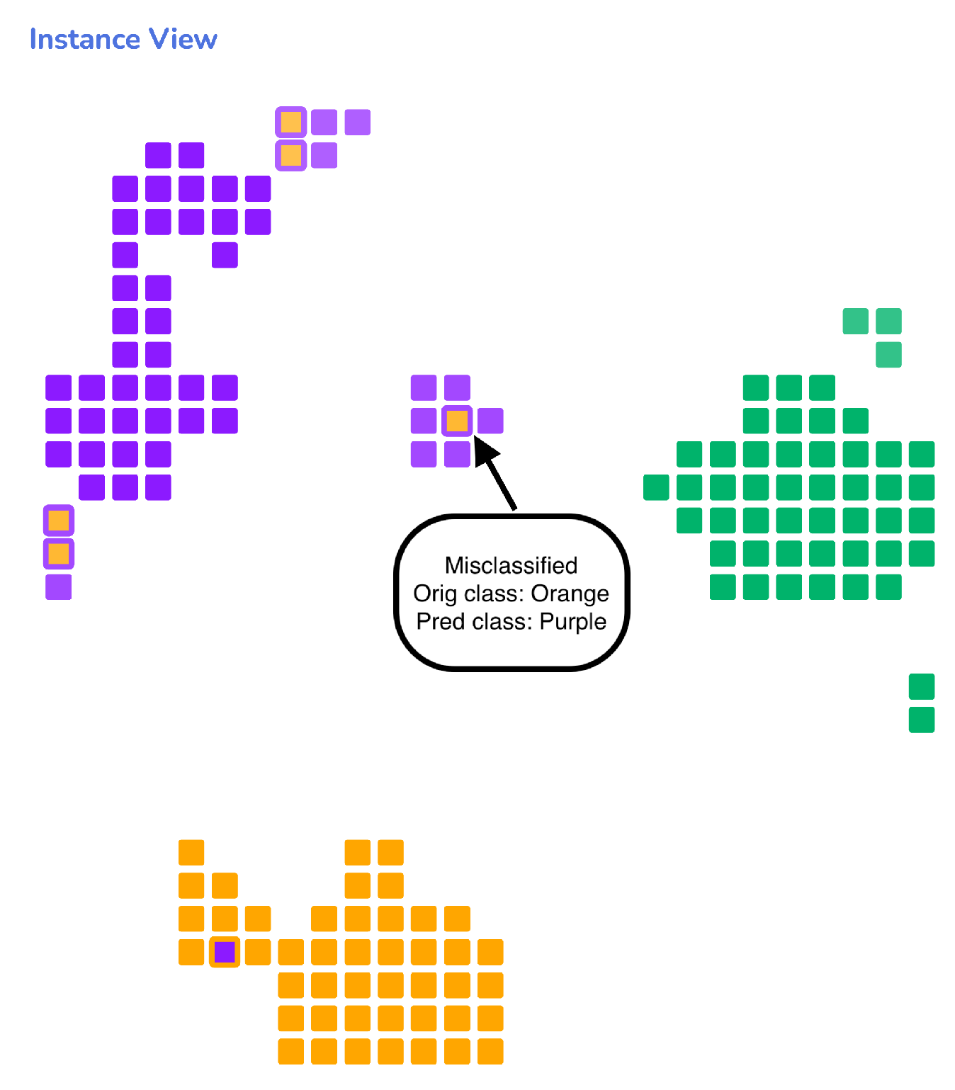
The first visual representation, Instance View (Figure 2), is a 2D DR layout of the instances in a dataset from the perspective of an RF model. The key idea is to allow users to understand the structural similarities or dissimilarities (T5) between the data instances considering what has been learned by the RF model. We intend to give users an idea of how similar the instances are in the RF model’s eyes irrespective of whether the data are high-dimensional [58]. Therefore, the instance similarity will vary based on a model to model. Using our technique, we visualize the class separability among the instances (T3) and allow model developers to visualize their model’s performance and detect outliers and wrongly classified instances. A near-to-accurate RF model will present a visualization with clear decision boundaries between the classes with very few within-class overlaps [42]. This serves as an initial guide for developers in building effective and robust RF models.
We start with building an RF model based on several parameters, such as the total number of trees, maximum depth, split criteria, and others. In any projection-based technique, the distance metric choice is critical, and its performance relies on the metric used. Hence, an ideal alternative to aligning with our design goals is the Proximity measure suggested in [43,56]. This measures for two instances x i and x j the number of times the same leaf node (decision path) classifies both instances within each decision tree, normalized by the total number of trees in the entire forest. Based on this concept, we derived the following dissimilarity measure
d ( x i , x j ) = 1 1 M m = 1 M r D T m 1 If x i and x j are both valid for r 0 Otherwise
where r D T m is a decision rule derived from the mth tree and M is the number of trees in the forest [43]. This dissimilarity range in [ 0 , 1 ] with values closer to 0 indicating instances reaching the same leaf, thus representing the instances from a model perspective [59].
To project our dataset using this dissimilarity, we use the Multidimensional Scaling (MDS) technique [60]. We use MDS based on Breiman et al.’s adoption [43,56] of MDS for visualizing training data to understand clusters and outliers from an RF model perspective. Additionally, MDS is a global technique, and since, in our case, it is vital to enable interpretation of groups of instances (Figure 1A) based on the class labels (T3) rather than preserving local neighborhood, it is a reliable alternative.
Projection-based techniques represent data instances with high dimensions into more human interpretable forms, such as 2D. However, it is also critical to understand how well the data are represented in a lower dimension to avoid presenting a wrong representation. In the case of our MDS projection, we measure the effectiveness of projected points using a metric called Stress [61]. As per the definition, Stress of an entire projection is measured as the difference between the actual distance of all points and their projected values. For this work, we adapt Kruskal’s formula [61] to compute the stress value per point approximately ( x i ) using the below formula.
s t r e s s ( x i ) = j N ( d ( x i , x j ) d ^ ( x ^ i , x ^ j ) ) 2 i N j N d ( x i , x j ) 2
where x i is the original point, d ( x i , x j ) is the distance between original points and d ^ ( x ^ i , x ^ j ) is the distance between projected points. We focus on displaying Stress per point to bring out the projection method’s effectiveness and allow users to build up their trust on the projected points.
Each instance in the Instance View is drawn as a rounded rectangle filled with the color of their original labeled class. In the case of misclassified instances, the outside stroke color surrounding the rectangle represents the model’s predicted class, and the fill color inside represents their original class (Figure 2). To represent the Stress value s, computed for individual data instances, we use opacity O as another variable in our proposed visualization. Since we derive the stress-per-point formula from the Kruskal’s stress, we use the goodness-of-fit table [61] to form five brackets to control the transparency of the data instances using
O = 1 , if   0 s 0.025 0.8 , if   0.025 s 0.05 0.7 , if   0.05 s 0.1 0.6 , if   0.1 s 0.2 0.5 if   s > 0.2
Therefore, data instances whose projected representation is almost equal to their original high-dimensional representation will visually be much brighter. Our primary focus is to present a visual metaphor to help the user understand how the RF model sees every instance after being trained. This way, we can establish a hypothesis regarding the instance structure and derive further explanation on new and unseen data (T5). By analyzing the various cluster of instances formed, a user can acquire an idea of the generic knowledge learned by an RF model and explore how a particular group is different from others in terms of their prediction or feature values. This is very helpful for users who need to derive case-based reasoning based on these instance interpretation.
Another critical element that users can gain insight into using the Instance View is detecting the within-class outliers [59]. By computing the average proximity value of an instance with respect to all other instances in a dataset, we can show the instances that have high overlaps with other class instances and affirm that these samples are the ones that the RF fails to classify correctly. Thus, the Instance view serves as an effective solution for users to interpret the classification errors, detect outliers and understand decision boundaries.

3.7. Forest View

The second visualization, Forest View (Figure 3), was designed to allow users to analyze every decision path (logic rules) in the forest and therefore gain an understanding of what the RF model has learned (G1). To derive insights into the structure of various logic rules, it is essential to identify the similarities or differences between them. In our technique, two or more rules are considered to be identical if they are valid for the same instances. A near-to-similar set of rules will have an intersection of instances and will be closer to proximity. These similar rules form distinct sets of high certainty clusters, which we refer to as a ‘strong knowledge cluster’. A ‘strong knowledge cluster’ suggests that the model has learned strong (high-coverage) relations between training instances given a target class. The ‘knowledge clusters’ represents a very well-defined piece of knowledge learned by the RF model since these clusters are valid for most of the data instances and, therefore, more generic. To our knowledge, this is the first time an RF model’s learning is visualized this way. Other than interpreting generic ‘knowledge clusters’, analyzing the instance classification from the point of view of a set of rules can also provide insights into understanding the patterns defined by these set of logic rules, i.e., what kind of instances a set of rules classify as a particular class. We enable users to answer questions such as these by selecting a set of logic rules and visualizing the various hidden patterns.
The view for visualizing the logic rules is also based upon the same underlying principle of DR techniques. However, the choice of distance metric used, and the DR technique applied varies here. To do the projection, we use an instance-rule matrix derived from the ExMatrix package [14], Imn, imn [ 0 , 1 ] (#instances x #rules) that gives a binary value of 0 or 1 based on whether an instance uses a rule or not and then apply a transpose on it. The result is a rule-instance matrix (#rules x #instances), Rij, rij [ 0 , 1 ] , where 0 represents a rule not valid for an instance and 1 the opposite. Since the value of the matrix elements is binary, we use the Jaccard distance [62]. Then, the non-linear dimensionality-reduction algorithm UMAP [63] is used to project the rules into a 2D space. UMAP performs well in preserving both local and global distances. Since our focus is to maintain the balance between similar logic rules (local) and the overall rules based on class labels (global) to make explanations on the model workings (G1), we choose UMAP as the most suitable projection technique.
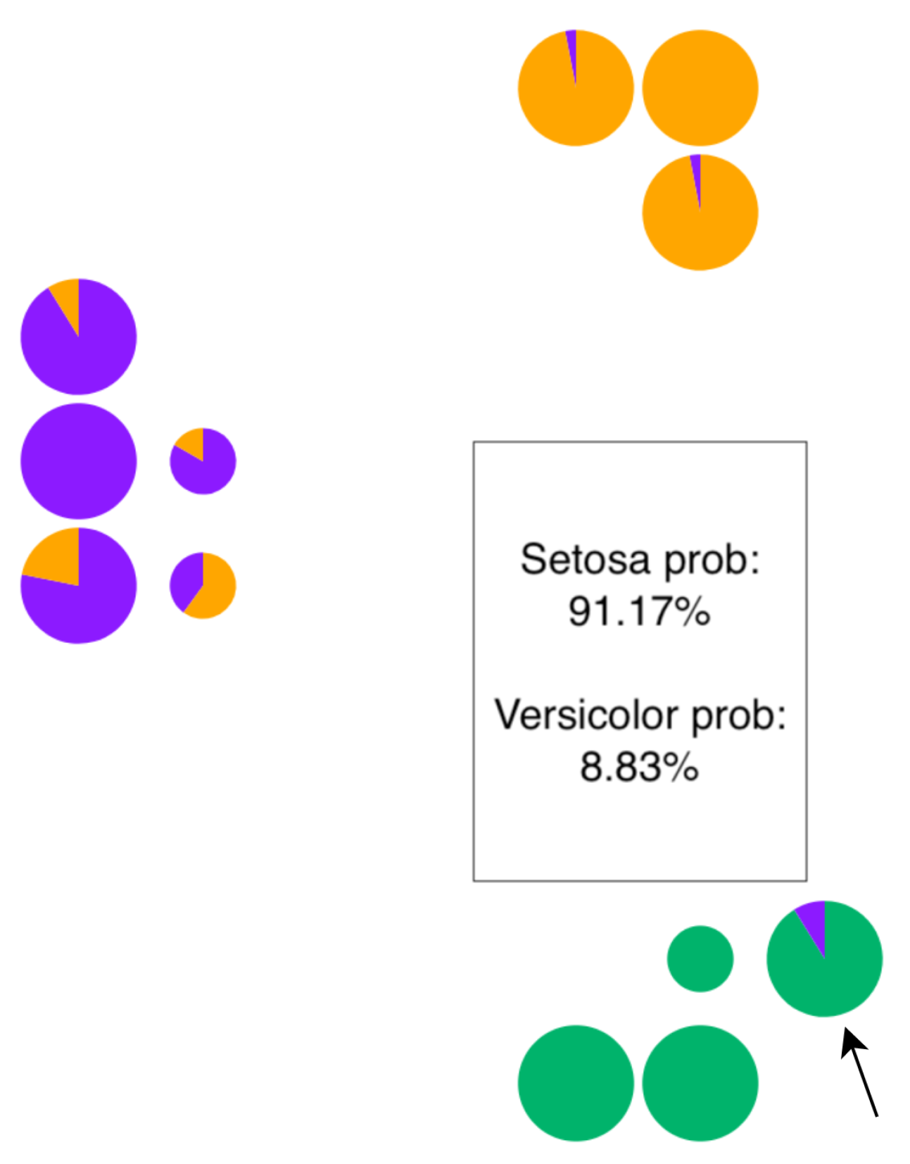
Each pie-chart in the Forest view represents one single rule (i.e., the decision path from top to the leaf node in a decision tree). We draw each decision path as a pie chart to understand each leaf node’s resulting class probabilities. Therefore, each slice in a pie chart represents the classification probability for that specific class. Visually, when the certainty of classification in a leaf node is 100%, the pie charts will present themselves as just a circle filled with the color of the predicted class. However, when the classification probabilities at the leaf node are not 100%, it will be presented as a pie. Users can also hover over individual pie charts to gain relevant information on the decision path, such as the rule coverage percentage, rule certainty probability, and final predicted class (T1). A forest of trees will generally have a set of high and low-coverage decision paths. Since it is critical for users to interpret which rules are important from the RF model perspective, we control the size (radius r) of each pie chart based on the coverage value, c. The outer radius r of the pie charts are defined using
r = 11 , if   c 70 9 , if   30 c 70 6 if   c < 30
Hence, high-coverage decision paths will be comparatively bigger than the low-coverage ones. We allow users to compare multiple (G3) RF models by placing Forest Views side-by-side in our system.

3.8. Feature View

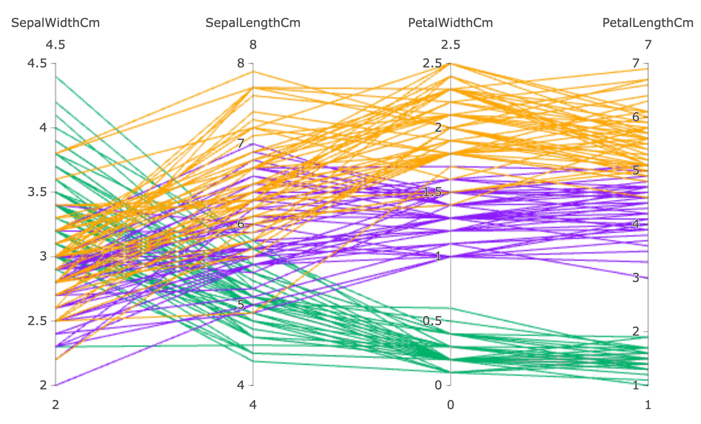
The Feature view (Figure 4) is designed as a combination of Parallel coordinate plot (PCP) and a bar chart to help support analysis of the instance feature values from both global (G1) and local (G2) perspectives. From a global point of view, we focus on understanding the patterns defined by the logic rules through this visualization displaying the valid instances with their feature value ranges so users can effectively compare them and derive particular insights, such as how a set of rules is different from others in terms of the instances they classify. Locally, we enable users to analyze the input feature values of the selected data instances to understand the differences or similarities between them from not the perspective of the RF model but the actual dataset.
Each feature in a PCP is represented as a vertical bar, and the advantage of using this plot is that these bars can have different ranges and units. It has also proved to be beneficial in representing high-dimensional data [64]. The lines in the PCP are colored as per the original class label for each instance, and features order is set by the user, selecting and moving any feature to the left or right. To locally inspect differences among features, users can select a group of instances in the Instance View, and the PCP will present their feature values. For global analysis, we allow users to lasso select a cluster of logic rules from the Forest View, and the PCP will display all the valid instances for the cluster in this view. To support the analysis of the logic rules using the PCP, a bar chart is incorporated into the Feature View that displays a count per class for instances using the set of logic rules.

4. Results and Evaluation

In this section, we present two usage scenarios to evaluate the effectiveness of RFMap in interpreting and visualizing Random Forest (RF) models. We leverage the ExMatrix [14] package to perform rule extraction as discussed in Section 3.1.

4.1. Usage Scenario 1: Breast Cancer Diagnostic

In this usage scenario, we describe Karen, a data scientist working with a healthcare company who needs to understand the overall working mechanism of an RF classification model to align it to her understanding. Interpreting the classification model is imperative for her company so the decisions can be trusted and put to real-time use by medical experts. To do that, Karen uses our RFMap system to visualize and interpret an RF model she has developed to classify breast cancer diagnosis. The dataset she uses to train the RF model is from the University of Wisconsin (Wisconsin Breast Cancer Diagnostic [65]), and it contains samples of solid breast masses collected from 569 patients, out of which 357 were labeled as Benign (B) and 212 as Malignant (M). The total number of features in the dataset is 30. Karen develops the classification model by randomly selecting 70 % of the dataset as training and the remaining 30 % as testing. To build the model, she sets the total number of trees as 10 and max depth as ‘none,’ which allows her model to learn more information from the data. For evaluating the quality of a split, she uses ‘gini’ as criteria. The resulting model comprises 184 decision paths (rules), and the accuracy on testing data is 98.8 % .
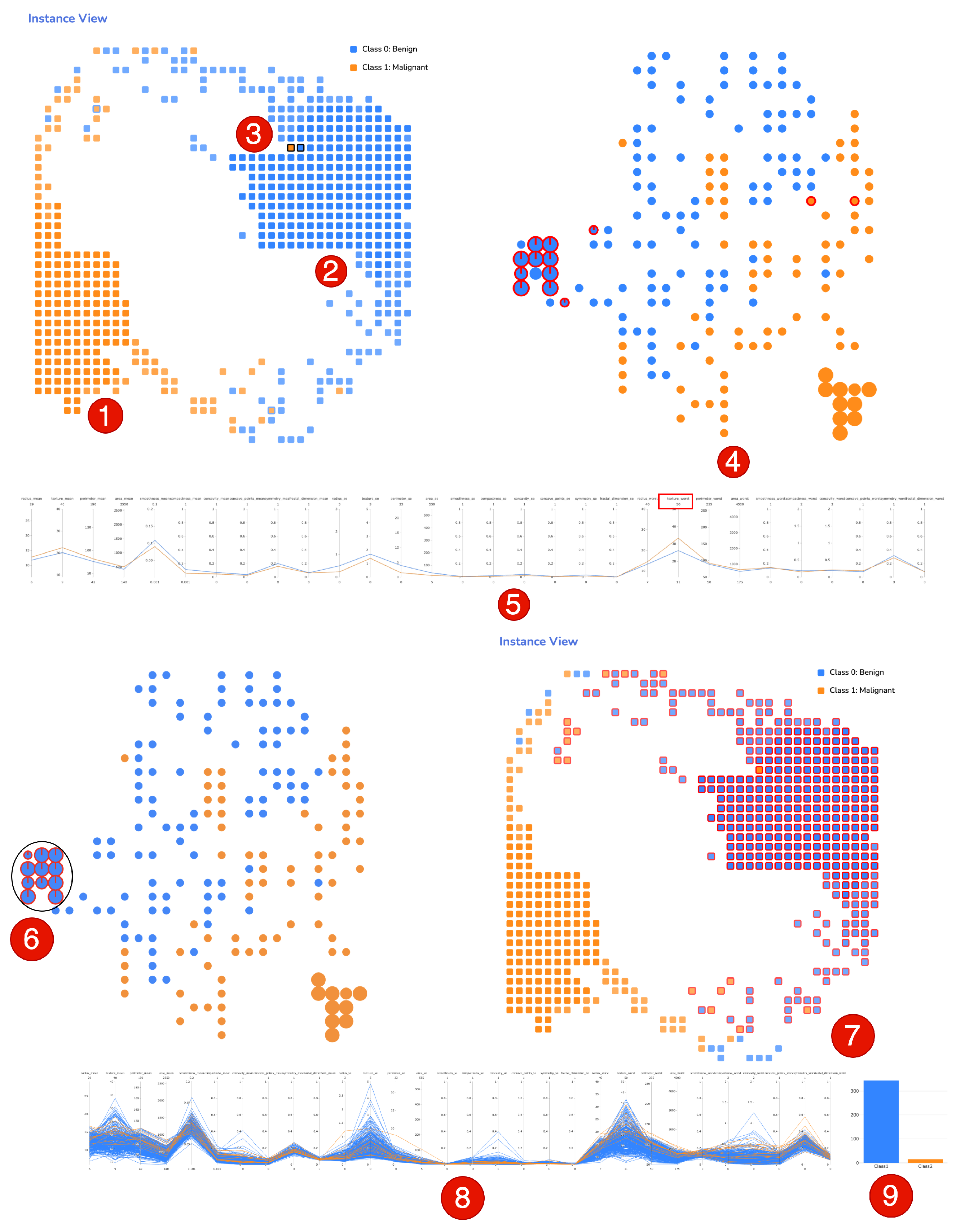
Karen loads the RF model in the RFMap system and is presented with the Instance, Forest, and Feature Views. She first inspects the Instance View and notices two significant clusters of classes, orange (Malignant) and blue (Benign) as seen in Figure 5 (1&2). The clusters have a clear visible separation between them, with only a few instances from both classes mixed on the layout’s top and bottom center parts. Seeing the clear separation between the two classes visually allows her to affirm to the understanding that the model’s performance is good, and it is confused only about a few instances (T3). She also observes that the not properly separated instances are less bright than the clearly separated ones. This means their position cannot be fully trusted, which matches the model’s perception in these instances. She quickly notices three instances that have outer stroke color ‘blue’ and the inside circles are filled with ‘orange’, giving her an indication that the model has wrongly classified these three instances as ‘Benign’ (T5). Identifying false negatives is very important, especially for her organization, which deals with cancer diagnoses. Therefore, she hovers over these three data points to know which specific patient IDs were wrongly classified so they can be investigated in depth.
Karen then focuses her analysis on the specific misclassified instance 136. She understands from the bright transparency that its position in the view can be relied upon, and it definitely belongs there. The instance lies at a close proximity to the other ‘benign’ instances, which means the RF model sees these instances as similar. She wants to drill down more to understand if the model is confused and wrongly predicts or if the instance has similar feature value ranges with the neighboring instances. The RFMap system allows her to click on an individual instance or a group of instances to analyze their feature values in the Feature View (T5). Therefore, she clicks on instance 136 and its immediate neighbor 161 (Figure 5 (3)), and goes to the Feature View. She realizes that other than ‘texture_worst’, the rest of the features have almost similar values for both the samples (Figure 5 (5)).
Karen then moves to the Forest View to analyze the knowledge (T4) used from the forest to classify these two instances. From the highlighted red rules, she acquires a clear picture of the decision paths used by both instances. Karen notes that the rules used to classify instance 136 and neighboring ones have differences. She also does a contextual analysis of the rules used by instance 136 in terms of the other forest rules to understand their certainty and coverage. Karen notices that eight of the rules are from the blue ‘knowledge cluster’ and two are ‘orange’ rules from the middle of the forest. She notes that although the two ‘orange’ rules are certain in their predictions, they have little coverage since they are smaller in size. She hovers over these two ‘orange’ rules to obtain the actual coverage value and sees that they are 0.6 % and 5 % . These values are significantly less than the other ‘blue’ rules from the strong cluster of knowledge, which suggests that these have learned considerably less from the training data. This contextual analysis level in terms of the entire forest helps Karen develop trust in her local explanations. Karen thinks instance 136 might be a rare case since position wise it belongs to the ‘blue’ cluster and has similarities with other blue instances, but its ground truth label is ‘orange’. She decides to bring it to an oncologist’s attention so they can investigate the case in detail. Being able to perform this kind of interpretation is very beneficial for her as this way, she can increase her trust in the model to be used in practice.
After developing her understanding of the instances, Karen decides to gain insights on the predictions from the forest of trees’ perspective (T2). Her objective is to look into the inner working mechanisms of the RF model to make it transparent. She observes two ‘strong knowledge clusters’. One with ‘blue’ rules and other with ‘orange’ rules as represented in Figure 5 (4). Karen understands the significance of these strong clusters of knowledge and wants to gain more insights, specifically on the ‘blue benign cluster. She draws a lasso around this cluster Figure 5 (6) and the Instance View highlights all the instances using this set of rules Figure 5 (7). The first thing she spots is that this ‘knowledge cluster’ covers all the perfectly classified benign instances, which means that this cluster has learned a very well-defined piece of knowledge from these instances and is very generic. To further understand the pattern between all the rules in this cluster, she scrolls down to the Feature View and sees from the bar chart Figure 5 (9) that 344 instances are from the ‘blue’ class and 16 are from the ‘orange’ class. Karen observes the pattern among the ‘blue’ cluster rules in terms of the instance features Figure 5 (8). This helps her make hypotheses on any unseen instance (patient) as they will probably be classified as ‘benign’ if they have similar features. She notes the features that are too low or high in values so domain experts can develop a clear understanding of ‘benign’ class cells.
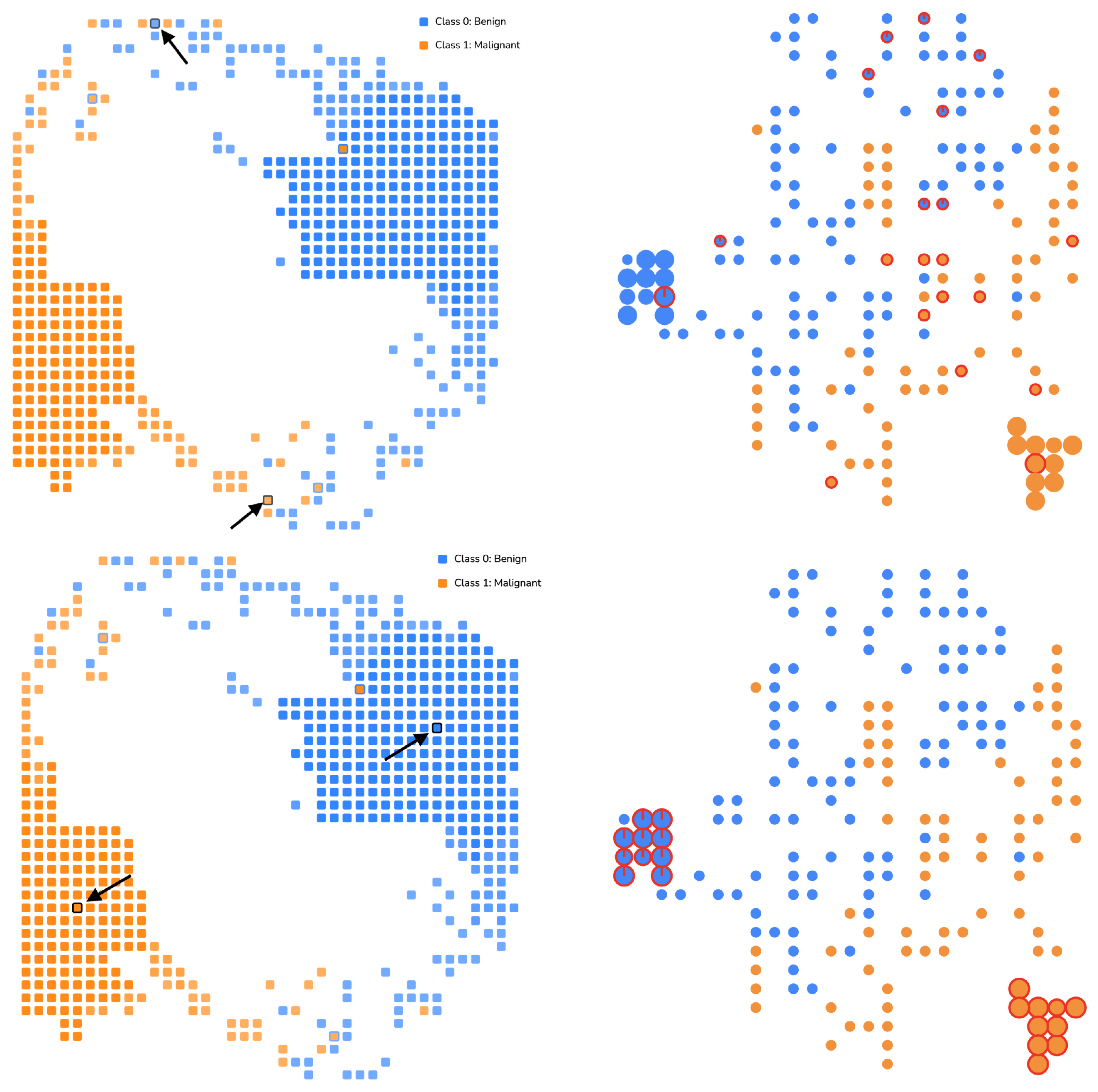
Karen also grabs the attention of the low-coverage decision paths in the middle of the forest (Figure 5 (4)) that have not formed strong clusters. These rules have internally developed some homogeneous groups but have no class-level separation. She assumes that using these rules might lead to instances not being separable in their true classes and decides to analyze if her hypothesis is true. Therefore, she clicks on one ‘blue’ and one ‘orange’ instance (T4) from the top and below portion of the Instance View which are not clearly separated by the model as shown in Figure 6 (Top-Left). She notices that these instances primarily use the low-coverage decision paths (Figure 6 (Top-Right)). She also selects two perfectly classified instances (Figure 6 (Bottom-Left)) and spots the high-coverage decision path clusters in the Forest View. These explanations help her validate that the initial understanding was correct, and the model might have confusion when using the low-coverage rules for classifying the instances (that are not part of the clearly separated clusters in the Instance View). The ability to learn these insights from using the RFMap system makes Karen’s model transparent and gives her the confidence to put it into real-time practice.

4.2. Usage Scenario 2: Election Votes

The second usage scenario presents John, a Machine Learning Engineer, working with a Strategy & Analytics team that develops ML models to predict the potential tendency of voting for US presidential elections given user preferences. He receives two RF models that a team member has developed. As part of his role, John needs to evaluate various ML models to be deployed to the production systems. In the past, John has seen models performing very well with high accuracy on training and testing data, but when it comes to using them in real time on new and unseen data, the models have failed to generalize at times. This has led to wrong predictions, and the trust in such types of applications is impaired. Therefore, John’s goal is to select a robust and generic model from among the two, so it works well on unseen samples in the future. The first model (Model 1) is built using 20 decision trees with a depth limit of 7, reaching an accuracy of 94.48 % . The second model (Model 2) has 30 decision trees with a depth limit of 2 and accuracy of 94.3 % . Although both models’ accuracy does not significantly differ, he would like to analyze the models in detail, so he does not just select a model based on ‘high accuracy’. John learns about the ability to do comparative analysis among various RF models using the RFMap system and starts his analysis.
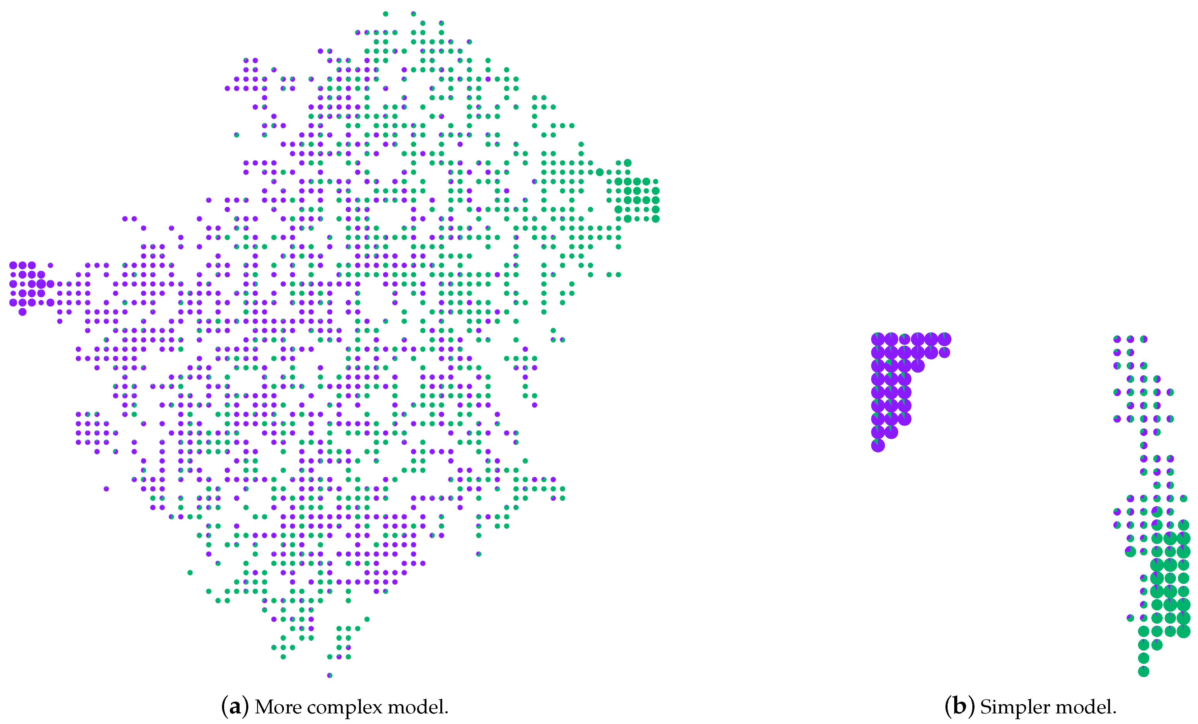
He first loads Model 1 into the system as shown in Figure 7a. This model is large, comprising 1596 rules (decision paths). His previous experience with visualizing bigger models, such as this, has been overwhelming because the systems were either unable to visualize the entire model or the complexity in interpretation was very high. The scalable nature of RFMap helps him visualize the whole model with various logic rules. He notices two knowledge clusters in this model, but most of the rules are very specific (low coverage), with some being certain and some not. More specific low-coverage rules imply that they have not learned much from the training data and are not very generic. John then loads up Model 2 (Figure 7b), and from the Forest View he sees that this is a considerably less complex model, with only 120 rules, containing two strong knowledge clusters with only a few specific (low-coverage) rules. This model’s strong knowledge clusters are mostly very high in coverage, meaning they have learned good relationships from the training data samples and, therefore, are more generic. He inspects the rule certainty in the two strong knowledge clusters and is satisfied that they have a high inclination towards their respective classes.
John concludes from his comparative analysis (T6) that a balance between coverage and certainty is a critical criterion in the case of evaluating RF models, i.e., a model comprising of rules that are high on certainty but low on coverage (like Model 1) will lead to specific knowledge learning. However, a model with higher coverage and lower certainty rules will mean the model has not learned any robust knowledge and results in lower prediction capabilities. Therefore, in this case, Model 2 might be the ideal one for John to select as they have more generic rules which are also highly certain, thus establishing a proper balance between certainty and coverage. The ability to derive insights about the knowledge clusters (generic rules), specific rules, and certainty-coverage balance is not available in traditional model evaluation techniques, and being able to compare multiple RF models using the RFMap system helps John in assessing the model not just from the perspective of ‘accuracy’, thus giving him a much effective model. He is also convinced that the marginal loss in accuracy by selecting Model 2 (94.3%) instead of Model 1 (94.48%) is acceptable as long as he has a generic model that can predict well on unseen data.

4.3. User Study

Study Design and Tasks. A quantitative and qualitative study was conducted to evaluate the effectiveness and ease-of-use of RFMap in interpreting RF models. Our primary goal is to understand whether users can derive general insights about an RF classification model by interacting with the system and explaining their predictions so they can build up trust in the model. The total number of participants recruited for the study was 15. Out of them, 8 were from a pool of graduate students with good knowledge of ML and specifically RF models. Four were working as data scientists or ML engineers in the software industry, and the remaining 3 had other roles (software engineer, data engineer, etc.). Each participant was initially presented with a tutorial on RF models and logic rules extraction, followed by a tutorial on using the RFMap system. Participants were then asked to perform ‘nine’ tasks on the system and answer the questions using RFMap. A couple of questions also had a qualitative assessment immediately after performing a task to judge their experience. We also added two sets of Likert-scale-based statements to understand how much the users agreed or disagreed with the overall interface and system’s experience. Finally, two open-ended questions were presented to obtain user feedback on the system and suggestions for future improvements.
Results and Feedback. The average time taken by all the participants to complete the tasks and qualitative questions was 35 03 (including two tutorial videos). Users were able to obtain the correct answer for most of the tasks with accuracy ranging from (86–100%), which suggests that they could use the RFMap as expected. Majority of the participants (85.7%) ‘Strongly agreed’ that the graphs were easy to interpret and would like to use the system frequently. The feedback on the system was also collected from the subjective questions. Two of the ML Engineers mentioned—‘they would like to use the tool in their day-to-day job’ and ‘a very good system to understand RF models’. Another two participants recommended having a feature to understand ‘feature importance’.

5. Conclusions

In this paper, we present Random Forest Similarity Map (RFMap), an interactive visualization tool that supports the explanation of RF models globally and locally by preserving the forest context. RFMap uses dimensionality-reduction techniques to visualize the forest of decision paths and explain the structural relationships between the data instances from the model’s perspective. It also helps users visualize RF models with thousands of logic rules, one of the most scalable visualization solutions for RF analysis. To prove the effectiveness of our technique, we present two user scenarios and the results from a user study that summarizes the practical applications of RFMap in various domains. The results show that the tool can help understand RF models from the multiple perspectives discussed in this work.
RFMap also has a couple of interesting avenues for future research. Incorporating feature importance and splitting criteria is something we plan to be working on in the future to broaden the perspectives of explaining RF models.

Author Contributions

Conceptualization, D.M., M.P.N., and F.V.P.; data curation, D.M.; investigation, D.M.; methodology, D.M.; supervision, F.V.P.; validation, M.P.N.; visualization, D.M.; writing—original draft, D.M.; writing—review & editing, M.P.N. and F.V.P. All authors have read and agreed to the published version of the manuscript.

Funding

This research received no external funding.

Acknowledgments

We acknowledge the support of the Natural Sciences and Engineering Research Council of Canada (NSERC).

Conflicts of Interest

The authors declare no conflict of interest.

References

  1. McInerney, J.; Lacker, B.; Hansen, S.; Higley, K.; Bouchard, H.; Gruson, A.; Mehrotra, R. Explore, exploit, and explain: Personalizing explainable recommendations with bandits. In Proceedings of the RecSys 2018—12th ACM Conference on Recommender Systems, Vancouver, BC, Canada, 2 October 2018; pp. 31–39. [Google Scholar] [CrossRef]
  2. Luz, C.F.; Vollmer, M.; Decruyenaere, J.; Nijsten, M.W.; Glasner, C.; Sinha, B. Machine learning in infection management using routine electronic health records: Tools, techniques, and reporting of future technologies. Clin. Microbiol. Infect. 2020, 26, 1291–1299. [Google Scholar] [CrossRef] [PubMed] [Green Version]
  3. Kotsiantis, S.B.; Zaharakis, I.D.; Pintelas, P.E. Machine learning: A review of classification and combining techniques. Artif. Intell. Rev. 2006, 26, 159–190. [Google Scholar] [CrossRef]
  4. Yang, B.S.; Di, X.; Han, T. Random forests classifier for machine fault diagnosis. J. Mech. Sci. Technol. 2008, 22, 1716–1725. [Google Scholar] [CrossRef]
  5. Cai, J.D.; Yan, R.W. Fault Diagnosis of Power Electronic Circuit Based on Random Forests Algorithm. In Proceedings of the 2009 Fifth International Conference on Natural Computation, Tianjin, China, 14–16 August 2009; Volume 2, pp. 214–217. [Google Scholar] [CrossRef]
  6. Domb, M.; Bonchek-Dokow, E.; Leshem, G. Lightweight adaptive Random-Forest for IoT rule generation and execution. J. Inf. Secur. Appl. 2017, 34, 218–224. [Google Scholar] [CrossRef]
  7. Caruana, R.; Lou, Y.; Gehrke, J.; Koch, P.; Sturm, M.; Elhadad, N. Intelligible Models for HealthCare; Association for Computing Machinery: Sydney, Australia, 2015; pp. 1721–1730. [Google Scholar] [CrossRef]
  8. Angwin, J.; Larson, J.; Mattu, S.; Kirchner, L. Machine Bias, 23 May 2016. Available online: https://www.propublica.org/article/machine-bias-risk-assessments-in-criminal-sentencing (accessed on 1 November 2021).
  9. Goodman, B.; Flaxman, S. European union regulations on algorithmic decision making and a “right to explanation”. AI Mag. 2017, 38, 50–57. [Google Scholar] [CrossRef] [Green Version]
  10. Chatzimparmpas, A.; Martins, R.M.; Jusufi, I.; Kerren, A. A survey of surveys on the use of visualization for interpreting machine learning models. Inf. Vis. 2020, 19, 207–233. [Google Scholar] [CrossRef] [Green Version]
  11. Nguyen, T.D.; Ho, T.B.; Shimodaira, H. A visualization tool for interactive learning of large decision trees. In Proceedings of the International Conference on Tools with Artificial Intelligence, ICTAI, Vancouver, BC, Canada, 5 November 2000; pp. 28–35. [Google Scholar] [CrossRef]
  12. Kohavi, R. The power of decision tables. In Machine Learning: ECML-95; Lavrac, N., Wrobel, S., Eds.; Springer: Berlin/Heidelberg, Germany, 1995; pp. 174–189. [Google Scholar]
  13. Ming, Y.; Qu, H.; Bertini, E. RuleMatrix: Visualizing and Understanding Classifiers with Rules. IEEE Trans. Vis. Comput. Graph. 2019, 25, 342–352. [Google Scholar] [CrossRef] [PubMed] [Green Version]
  14. Popolin Neto, M.; Paulovich, F.V. Explainable Matrix—Visualization for Global and Local Interpretability of Random Forest Classification Ensembles. IEEE Trans. Vis. Comput. Graph. 2020, 27, 1427–1437. [Google Scholar] [CrossRef] [PubMed]
  15. Zhao, X.; Wu, Y.; Lee, D.L.; Cui, W. IForest: Interpreting Random Forests via Visual Analytics. IEEE Trans. Vis. Comput. Graph. 2019, 25, 407–416. [Google Scholar] [CrossRef]
  16. Lundberg, S.M.; Erion, G.; Chen, H.; DeGrave, A.; Prutkin, J.M.; Nair, B.; Katz, R.; Himmelfarb, J.; Bansal, N.; Lee, S.I. From local explanations to global understanding with explainable AI for trees. Nat. Mach. Intell. 2020, 2, 56–67. [Google Scholar] [CrossRef]
  17. Espadoto, M.; Martins, R.M.; Kerren, A.; Hirata, N.S.T.; Telea, A.C. Toward a Quantitative Survey of Dimension Reduction Techniques. IEEE Trans. Vis. Comput. Graph. 2021, 27, 2153–2173. [Google Scholar] [CrossRef] [PubMed]
  18. Nonato, L.G.; Aupetit, M. Multidimensional Projection for Visual Analytics: Linking Techniques with Distortions, Tasks, and Layout Enrichment. IEEE Trans. Vis. Comput. Graph. 2019, 25, 2650–2673. [Google Scholar] [CrossRef] [PubMed]
  19. Kahng, M.; Andrews, P.Y.; Kalro, A.; Chau, D.H.P. ActiVis: Visual Exploration of Industry-Scale Deep Neural Network Models. IEEE Trans. Vis. Comput. Graph. 2018, 24, 88–97. [Google Scholar] [CrossRef] [PubMed] [Green Version]
  20. Hohman, F.; Park, H.; Robinson, C.; Polo Chau, D.H. Summit: Scaling Deep Learning Interpretability by Visualizing Activation and Attribution Summarizations. IEEE Trans. Vis. Comput. Graph. 2020, 26, 1096–1106. [Google Scholar] [CrossRef] [PubMed] [Green Version]
  21. Martens, D.; Baesens, B.B.; Van Gestel, T. Decompositional Rule Extraction from Support Vector Machines by Active Learning. IEEE Trans. Knowl. Data Eng. 2009, 21, 178–191. [Google Scholar] [CrossRef]
  22. Quinlan, J.R. Generating Production Rules from Decision Trees. In Proceedings of the 10th International Joint Conference on Artificial Intelligence, Milan, Italy, 23–28 August 1987; Morgan Kaufmann Publishers Inc.: San Francisco, CA, USA, 1987. IJCAI’87. Volume 1, pp. 304–307. [Google Scholar]
  23. Zhang, Y.; Wallace, B. A Sensitivity Analysis of (and Practitioners’ Guide to) Convolutional Neural Networks for Sentence Classification. arXiv 2015, arXiv:1510.03820. [Google Scholar]
  24. Cortez, P.; Embrechts, M.J. Opening black box Data Mining models using Sensitivity Analysis. In Proceedings of the IEEE SSCI 2011: Symposium Series on Computational Intelligence—CIDM 2011: 2011 IEEE Symposium on Computational Intelligence and Data Mining, Paris, France, 11–15 April 2011; pp. 341–348. [Google Scholar] [CrossRef] [Green Version]
  25. Adadi, A.; Berrada, M. Peeking Inside the Black-Box: A Survey on Explainable Artificial Intelligence (XAI). IEEE Access 2018, 6, 52138–52160. [Google Scholar] [CrossRef]
  26. Humbird, K.D.; Peterson, J.L.; Mcclarren, R.G. Deep Neural Network Initialization With Decision Trees. IEEE Trans. Neural Netw. Learn. Syst. 2019, 30, 1286–1295. [Google Scholar] [CrossRef] [Green Version]
  27. Letham, B.; Rudin, C.; McCormick, T.H.; Madigan, D. Interpretable classifiers using rules and bayesian analysis: Building a better stroke prediction model. Ann. Appl. Stat. 2015, 9, 1350–1371. [Google Scholar] [CrossRef]
  28. Mashayekhi, M.; Gras, R. Rule Extraction from Random Forest: The RF+HC Methods. In Advances in Artificial Intelligence; Barbosa, D., Milios, E., Eds.; Springer International Publishing: Cham, Switzerland, 2015; pp. 223–237. [Google Scholar]
  29. Valenzuela-Escárcega, M.A.; Nagesh, A.; Surdeanu, M. Lightly-supervised Representation Learning with Global Interpretability. arXiv 2018, arXiv:1805.11545. [Google Scholar]
  30. Yang, C.; Rangarajan, A.; Ranka, S. Global Model Interpretation Via Recursive Partitioning. In Proceedings of the 20th International Conference on High Performance Computing and Communications, IEEE 16th International Conference on Smart City and IEEE 4th International Conference on Data Science and Systems, HPCC/SmartCity/DSS 2018, Exeter, UK, 28–30 June 2018; pp. 1563–1570. [Google Scholar] [CrossRef] [Green Version]
  31. Linsley, D.; Shiebler, D.; Eberhardt, S.; Serre, T. Learning what and where to attend. In Proceedings of the 7th International Conference on Learning Representations, New Orleans, LA, USA, 6–9 May 2019. [Google Scholar]
  32. Ribeiro, M.T.; Singh, S.; Guestrin, C. “Why should i trust you?” Explaining the predictions of any classifier. In Proceedings of the ACM SIGKDD International Conference on Knowledge Discovery and Data Mining, San Francisco, CA, USA, 13–17 August 2016; pp. 1135–1144. [Google Scholar] [CrossRef]
  33. Ribeiro, M.T.; Singh, S.; Guestrin, C. Model-Agnostic Interpretability of Machine Learning. arXiv 2016, arXiv:1606.05386. [Google Scholar]
  34. Tan, S.; Caruana, R.; Hooker, G.; Lou, Y. Distill-and-Compare: Auditing Black-Box Models Using Transparent Model Distillation. In Proceedings of the AIES 2018—2018 AAAI/ACM Conference on AI, Ethics, and Society, Orleans, LA, USA, 2–3 February 2018; pp. 303–310. [Google Scholar] [CrossRef] [Green Version]
  35. Rauber, P.E.; Fadel, S.G.; Falcão, A.X.; Telea, A.C. Visualizing the Hidden Activity of Artificial Neural Networks. IEEE Trans. Vis. Comput. Graph. 2017, 23, 101–110. [Google Scholar] [CrossRef]
  36. Di Castro, F.; Bertini, E. Surrogate decision tree visualization interpreting and visualizing black-box classification models with surrogate decision tree. CEUR Workshop Proc. 2019, 2327. Available online: http://ceur-ws.org/Vol-2327/IUI19WS-ExSS2019-15.pdf (accessed on 1 November 2021).
  37. Alsallakh, B.; Hanbury, A.; Hauser, H.; Miksch, S.; Rauber, A. Visual methods for analyzing probabilistic classification data. IEEE Trans. Vis. Comput. Graph. 2014, 20, 1703–1712. [Google Scholar] [CrossRef]
  38. Ren, D.; Amershi, S.; Lee, B.; Suh, J.; Williams, J.D. Squares: Supporting Interactive Performance Analysis for Multiclass Classifiers. IEEE Trans. Vis. Comput. Graph. 2017, 23, 61–70. [Google Scholar] [CrossRef] [PubMed]
  39. Amershi, S.; Chickering, M.; Drucker, S.M.; Lee, B.; Simard, P.; Suh, J. Modeltracker: Redesigning performance analysis tools for machine learning. In Proceedings of the Conference on Human Factors in Computing Systems—Proceedings, Seoul, Korea, 18–23 April 2015; pp. 337–346. [Google Scholar] [CrossRef]
  40. Zahavy, T.; Zrihem, N.B.; Mannor, S. Graying the black box: Understanding DQNs. In Proceedings of the International Conference on Machine Learning, New York, NY, USA, 19–24 June 2016; Volume 4, pp. 2809–2822. [Google Scholar]
  41. Cantareira, G.D.; Etemad, E.; Paulovich, F.V. Exploring neural network hidden layer activity using vector fields†. Information 2020, 11, 426. [Google Scholar] [CrossRef]
  42. Rauber, P.E.; Falcaõ, A.X.; Telea, A.C. Projections as visual aids for classification system design. Inf. Vis. 2018, 17, 282–305. [Google Scholar] [CrossRef] [PubMed]
  43. Breiman, L. Random Forests. Mach. Learn. 2001, 45, 5–32. [Google Scholar] [CrossRef] [Green Version]
  44. Hänsch, R.; Wiesner, P.; Wendler, S.; Hellwich, O. Colorful trees: Visualizing random forests for analysis and interpretation. In Proceedings of the 2019 IEEE Winter Conference on Applications of Computer Vision, WACV 2019, Waikoloa, HI, USA, 7 March 2019; pp. 294–302. [Google Scholar] [CrossRef]
  45. Breiman, L. WALD Lecture II. Looking Inside the Black Box. 2002, p. 34. Available online: https://www.stat.berkeley.edu/users/breiman/wald2002-2.pdf (accessed on 1 November 2021).
  46. Lau, K. Random Forest Ensemble Visualization. 2014. Available online: https://www.cs.ubc.ca/~tmm/courses/547-14/projects/ken/report.pdf (accessed on 1 November 2021).
  47. Biau, G.; Scornet, E. A random forest guided tour. Test 2016, 25, 197–227. [Google Scholar] [CrossRef] [Green Version]
  48. Loyola-González, O.; Medina-Pérez, M.A.; Choo, K.K.R. A Review of Supervised Classification based on Contrast Patterns: Applications, Trends, and Challenges. J. Grid Comput. 2020, 18, 797–845. [Google Scholar] [CrossRef]
  49. Ribeiro, M.T.; Singh, S.; Guestrin, C. Anchors: High-Precision Model-Agnostic Explanations. In Proceedings of the Thirty-Second AAAI Conference on Artificial Intelligence, (AAAI-18), the 30th innovative Applications of Artificial Intelligence (IAAI-18), and the 8th AAAI Symposium on Educational Advances in Artificial Intelligence (EAAI-18), New Orleans, LA, USA, 2–7 February 2018; McIlraith, S.A., Weinberger, K.Q., Eds.; AAAI Press: Palo Alto, CA, USA, 2018; pp. 1527–1535. [Google Scholar]
  50. Li, Y.; Fujiwara, T.; Choi, Y.K.; Kim, K.K.; Ma, K.L. A visual analytics system for multi-model comparison on clinical data predictions. Vis. Inform. 2020, 4, 122–131. [Google Scholar] [CrossRef]
  51. Fawcett, T. An introduction to ROC analysis. Pattern Recognit. Lett. 2006, 27, 861–874. [Google Scholar] [CrossRef]
  52. Talbot, J.; Lee, B.; Kapoor, A.; Tan, D.S. EnsembleMatrix: Interactive Visualization to Support Machine Learning with Multiple Classifiers. In Proceedings of the SIGCHI Conference on Human Factors in Computing Systems, Boston, MA, USA, 4–9 April 2009; Association for Computing Machinery: New York, NY, USA, 2009. CHI ’09. pp. 1283–1292. [Google Scholar] [CrossRef]
  53. Liao, Q.V.; Gruen, D.; Miller, S. Questioning the AI: Informing Design Practices for Explainable AI User Experiences. In Proceedings of the 2020 CHI Conference on Human Factors in Computing Systems, Honolulu, HI, USA, 25–30 April 2020; Association for Computing Machinery: New York, NY, USA, 2020. CHI ’20. pp. 1–15. [Google Scholar] [CrossRef]
  54. Bostock, M.; Ogievetsky, V.H.J. D3: Data-Driven Documents. IEEE Trans. Vis. Comput. Graph. 1997, 7, 2–3. [Google Scholar] [CrossRef]
  55. Plotly. Plotly Parallel Coordinate. Available online: https://plotly.com/javascript/parallel-coordinates-plot/ (accessed on 1 November 2021).
  56. Breiman, L.; Cutler, A. Manual–Setting Up, Using, and Understanding Random Forests V4.0 2003. Available online: https://www.stat.berkeley.edu/~breiman/Using_random_forests_V3.1.pdf (accessed on 1 November 2021).
  57. Hilasaca, G.M.; Marcílio, W.E., Jr.; Eler, D.M.; Martins, R.M.; Paulovich, F.V. Overlap Removal in Dimensionality Reduction Scatterplot Layouts. arXiv 2021, arXiv:1903.06262. [Google Scholar]
  58. Hastie, T.; Tibshirani, R.; Friedman, J. The Elements of Statistical Learning; Springer Series in Statistics; Springer: New York, NY, USA, 2001. [Google Scholar]
  59. Louppe, G. Understanding Random Forests: From Theory to Practice. arXiv 2014, arXiv:1407.7502. [Google Scholar]
  60. Torgerson, W.S. Multidimensional scaling: I. Theory and method. Psychometrika 1952, 17, 401–419. [Google Scholar] [CrossRef]
  61. Kruskal, J.B. Multidimensional scaling by optimizing goodness of fit to a nonmetric hypothesis. Psychometrika 1964, 29, 1–27. [Google Scholar] [CrossRef]
  62. Choi, S.S.; Cha, S.H.; Tappert, C.C. A survey of binary similarity and distance measures. J. Syst. Cybern. Inform. 2010, 8, 43–48. [Google Scholar]
  63. McInnes, L.; Healy, J.; Melville, J. UMAP: Uniform Manifold Approximation and Projection for Dimension Reduction. arXiv 2020, arXiv:1802.03426. [Google Scholar]
  64. Inselberg, A. The plane with parallel coordinates. Vis. Comput. 1985, 1, 69–91. [Google Scholar] [CrossRef]
  65. Wolberg, W.; Street, W.; Mangasarian, O. Nuclear feature extraction for breast tumor diagnosis. Int. Soc. Opt. Photonics 1993, 1905, 861–870. [Google Scholar]
Figure 1. RFMap system with Iris dataset. The letters indicate the system’s different modules. (A) is the Logic rule extraction part, after which we derive the instance-rule and rule-instance matrices for our projections; (B) is the Instance View; (C) is the Forest View; (D) is the Feature View. The user first explores the Instance View and notices the three separated clusters of classes by color. One of the clusters (1) is shown in dotted circles. They take note of some misclassified instances (2) from the view. They then click on an instance (3) to understand the knowledge learned by the instance from the forest. The highlighted rules in (4) show the logic rules being used by the particular instance. The user analyzes the structural differences (similar or not similar rules) and certainty, coverage of the various logic rules as shown in (5). To understand a ‘knowledge cluster’, the user draws a lasso around the certain cluster of rules (6), and the instances covered by the rules are highlighted in (7). For enabling further interpretation and analysis, the knowledge contents are shown in (D).
Electronics 10 02862 g001
Figure 2. Instance View: Represents misclassified instances, decision boundary between the two classes and outliers.
Electronics 10 02862 g002
Figure 3. Forest View: visualizing the forest of logic rules (decision paths) in the Random Forest model. Shows high (big circles) and low (small circles) coverage paths. Strong knowledge clusters are seen to be formed inside the model. Individual class probabilities can be seen when hovered over a rule, as shown by the arrow.
Electronics 10 02862 g003
Figure 4. Feature View: PCP showing the relationship among various features of instances in the Iris dataset.
Electronics 10 02862 g004
Figure 5. RFMap system with Breast Cancer dataset. (1 and 2) RF model clearly separates most of the instances based on predicted classes and forms two clusters. (3) Misclassified instance 136 and its neighbor 161 selected. (4) Rules used by the instances highlighted in the Forest View. (5) Parallel coordinate shows the difference between the two selected instances. (6) A lasso-drawn to understand a ‘knowledge cluster’. (7) Instances using the ‘knowledge cluster’ highlighted in the Instance View. (8) PCP shows the knowledge content defined by the cluster. (9) Bar chart displays the count per class for all instances using the ‘knowledge cluster’.
Electronics 10 02862 g005
Figure 6. (Top) Left: Instance View where instances selected are marked by an arrow. These instances are not clearly separated, and hence Karen wants to investigate if they use the rules from the center part in Forest View. Right: Forest View shows the used decision paths highlighted in red. The majority of the rules belong to the center part, which has all the low-coverage rules. (Bottom) Left: Instance View with two perfectly classified instances selected. Right: These instances use high-coverage decision paths from the two blue and orange clusters.
Electronics 10 02862 g006
Figure 7. Comparative Analysis of the two RF models (a) Model 1 with 20 Trees, max_depth:7, Accuracy: 94.48%. (b) Model 2 with 30 Trees, max_depth:2, Accuracy: 94.3%. The visual comparison using RFMap shows the effectiveness of models from a variety of perspectives.
Electronics 10 02862 g007
Publisher’s Note: MDPI stays neutral with regard to jurisdictional claims in published maps and institutional affiliations.