3.1. Modes of Vulnerability
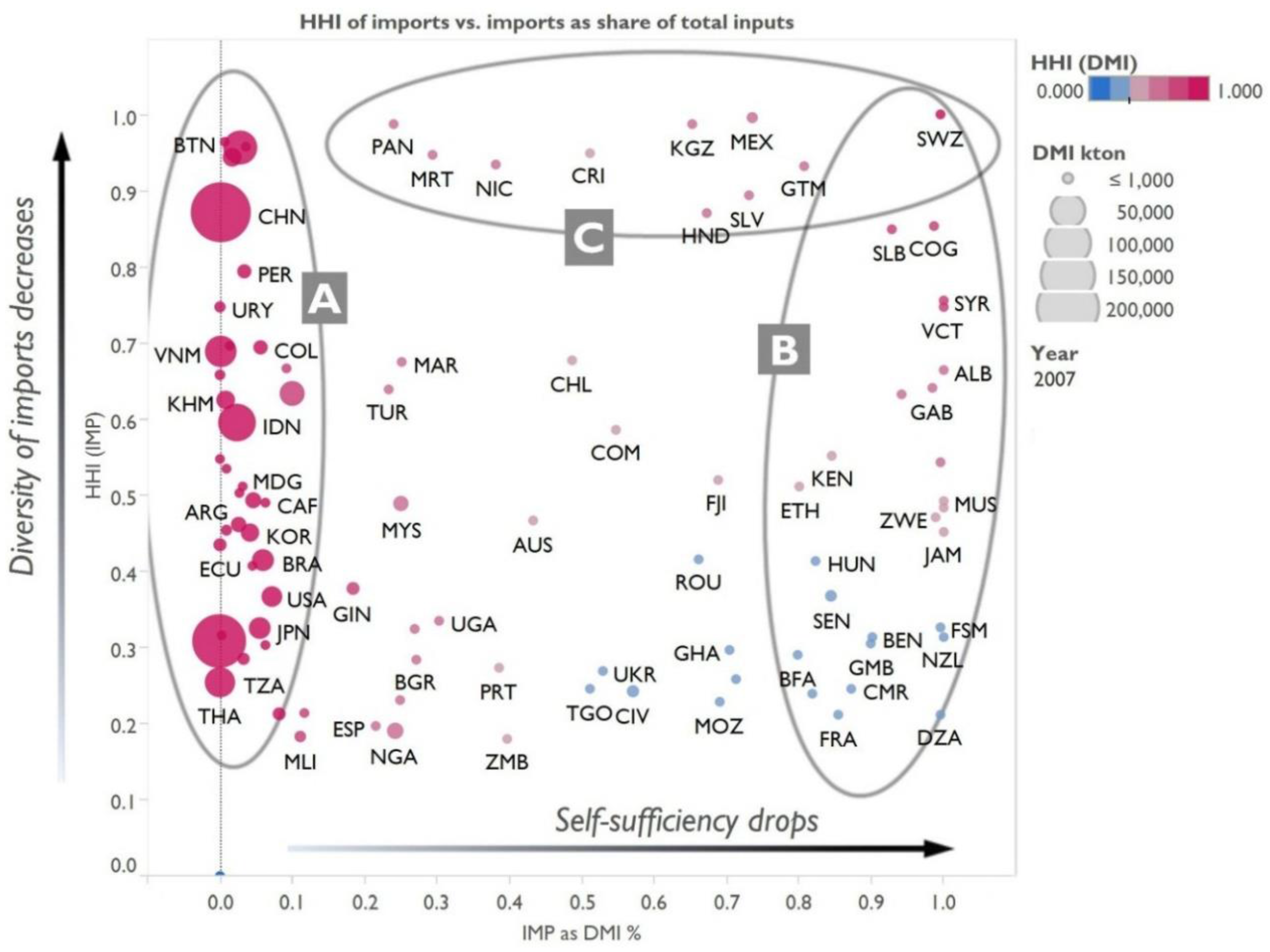
The trade flows of countries can be broken down into a number of different groups, based on the level of diversification of their rice imports (expressed as HHI of imports) and level of self-sufficiency of their own production (share of imports and HHI of DMI). One such breakdown, which could be useful for screening for vulnerabilities, is represented graphically in the following diagram (
Figure 5).
Figure 5.
Grouping countries according to self-sufficiency (DE/DMI) and diversification of imports [HHI(IMP)] reveals potential vulnerability modes. (A) Major producers and consumers, which may not be able to cover potential shortages from the global trade market; (B) countries completely reliant on imports of rice; (C) countries reliant on a single importer, providing various shares of overall rice inputs (DMI).
Virtually all major players have high self-sufficiency (A), with varying levels of diversification of imports, which in their case constitute only a minor share of overall inputs (DMI). On the opposite side (B) are the countries which rely almost entirely on imports for provision of rice. There are also a few countries which have basically a single source of rice imports (C). All of those groups have different problems related to the resilience of their supply of rice. Group A is self-reliant, however, taking into account the sheer size of consumption in this group, any country-level poor harvest can result in shortages exceedingly difficult to cover with international trade (which is very small compared with global consumption). Group C is vulnerable, because it is virtually completely reliant on a single provider for all of their imports (of rice), whereas in the group B this type of risk is distributed among a varying number of trade partners.
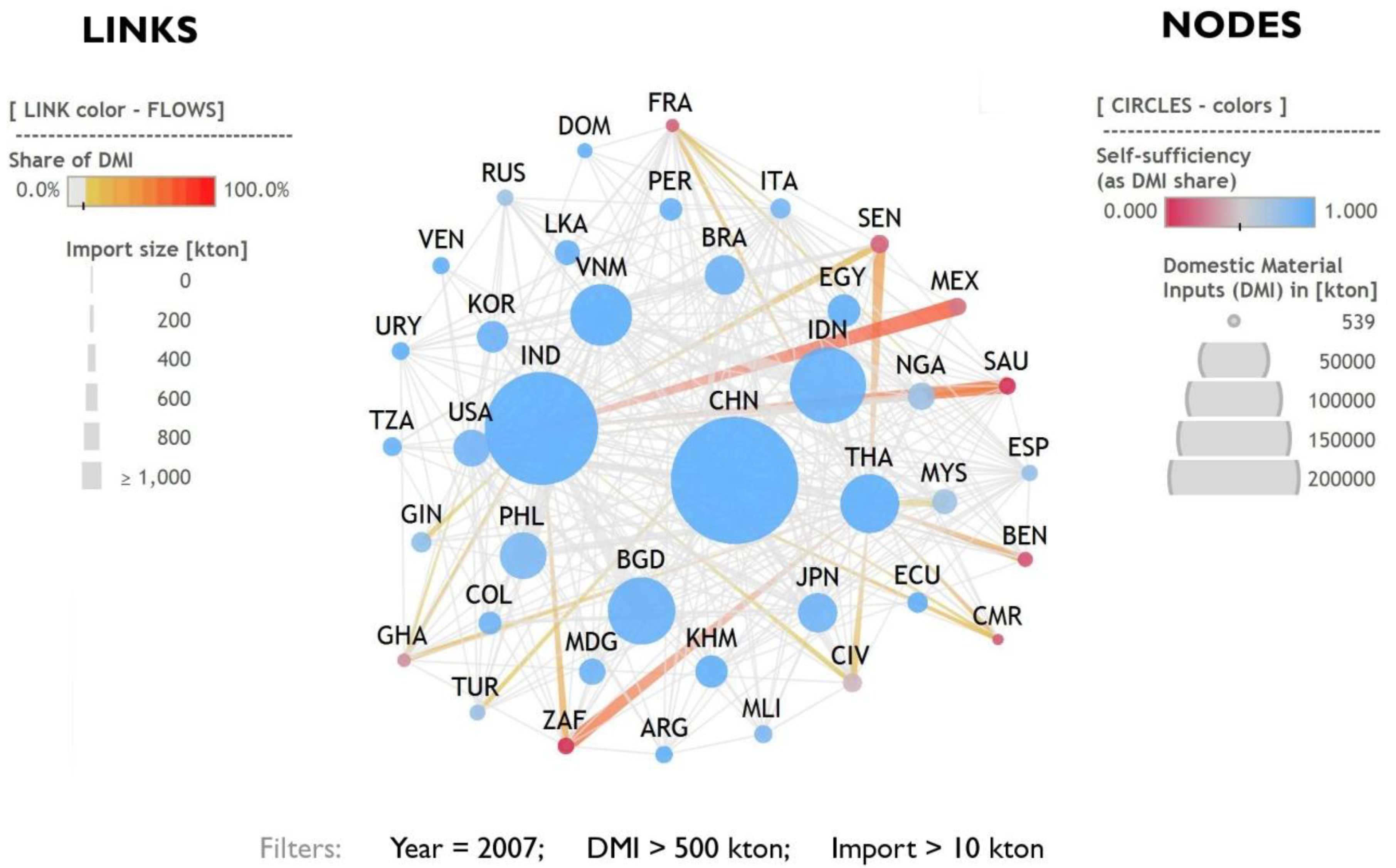
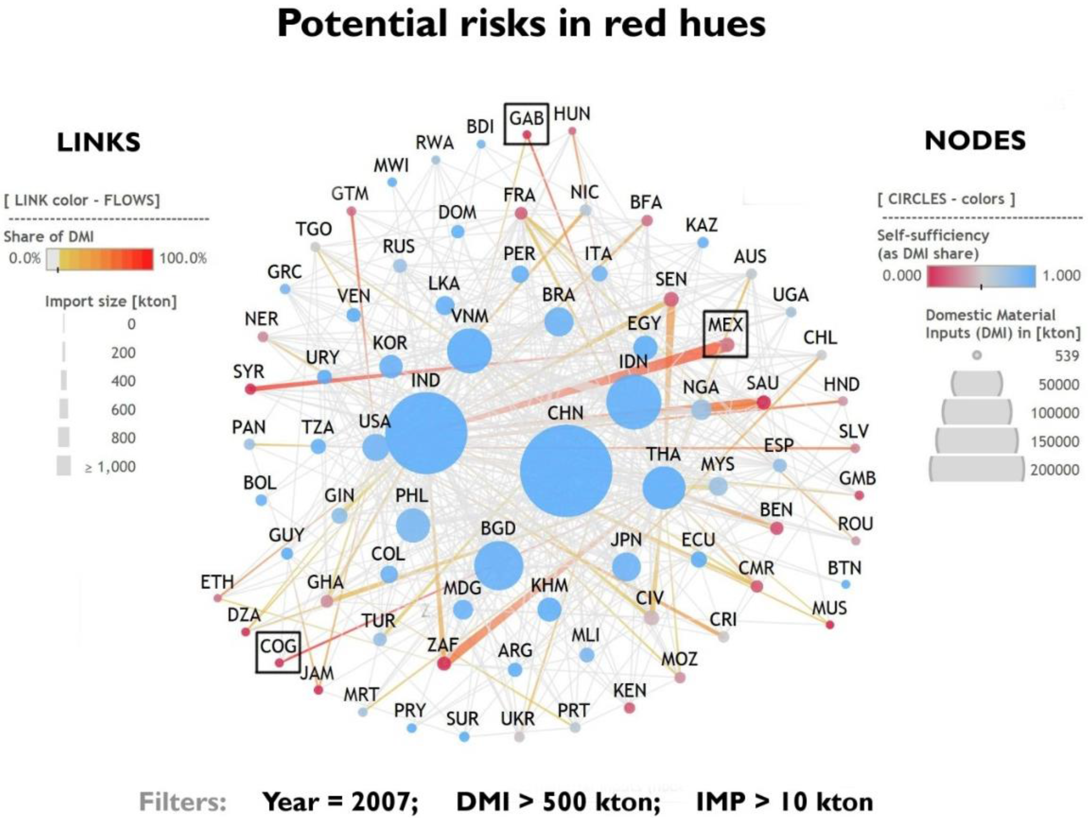
The next, node-link diagram (see
Appendix D) (
Figure 6) illustrates how to easily identify potential hotspots in the rice consumption and trade network. In 2007, Congo (COG) imported all of its rice from basically a single source and produced close to none. The trade partner was Thailand. For Gabon (GAB) the situation was similar, but a significant share of imports came from Vietnam. In 2008, both rice exporters introduced export restrictions. Both countries importing rice (GAB, COG) were left with their main supply lines suddenly cut, aggravated by the fact that their purchasing power and ability to tolerate high prices was low due to low income. Mexico (MEX) was in a different situation; it relies almost completely on the US for provision of rice. Were rice production in the US to collapse, it would be almost a surefire sign of a major trouble for the Mexican food market.
Figure 6.
Using node-link representation to simultaneously visualize both production and trade of rice around the world. Nodes are color-coded according to their level of self-sufficiency and sized according to overall inputs (DMI). Each link represents a bilateral trade relationship between the countries. Ends of the lines are sized according to the size of import and colored according to how big a share this trade flow constitutes (IMPi/DMI).
3.2. Shock, Resilience, and Adaptation Strategies
Graphical methods offer simple heuristics to identify crises, such as the 2007–2008 rice price crisis.
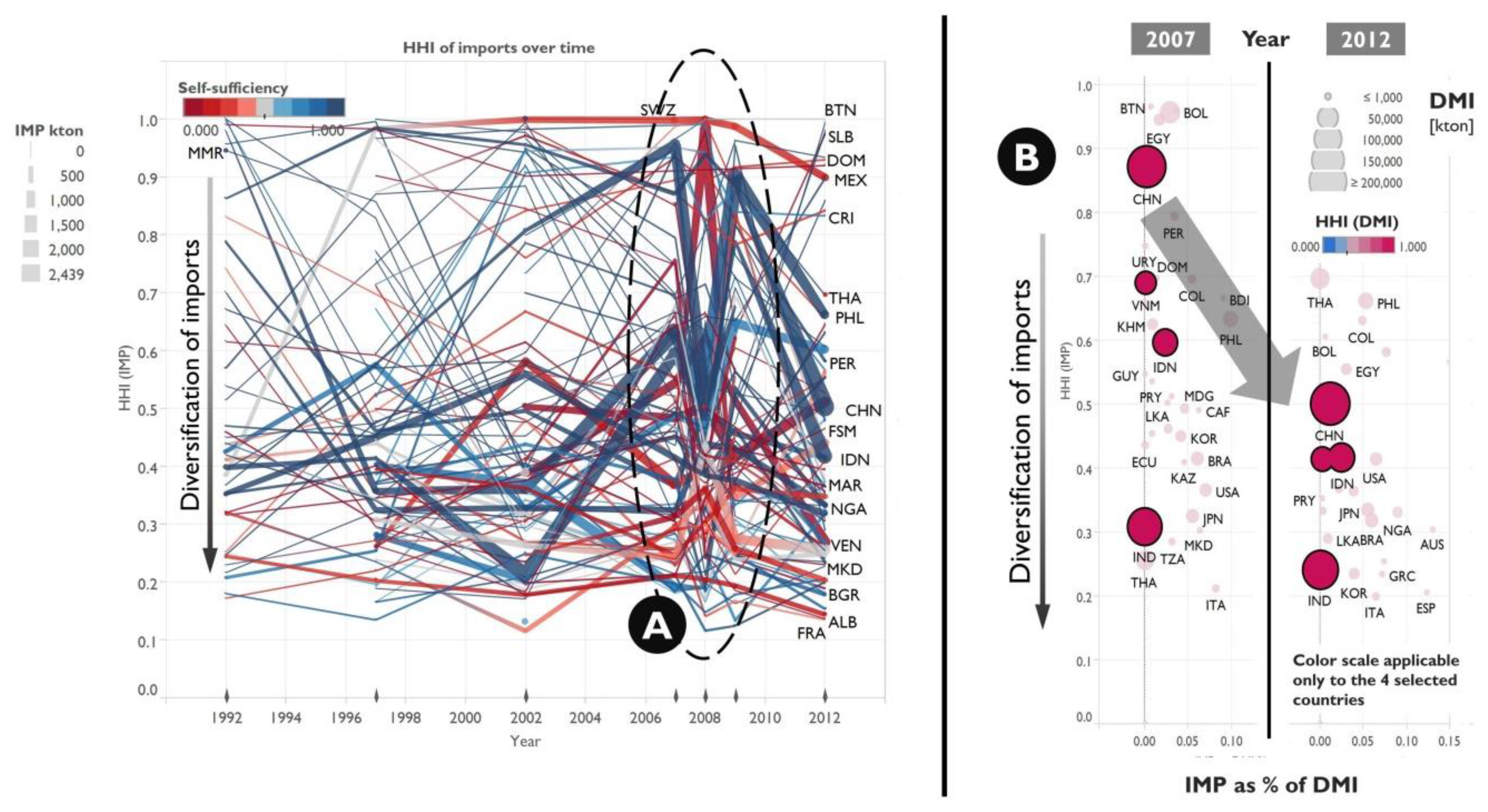
Figure 7A shows diversification of rice imports—HHI(IMP)—over time and features major reshuffling of time series in 2008—suggesting occurrence of a sudden, impactful event. Historically, major importers (depicted with thicker lines) seemed to consolidate their imports between 2002 and 2007 (HHI going up). Then, in 2008, a major disruption occurred, followed by data rebounding in 2009 to values similar to 2007. After that, major importers followed a fairly uniform trend towards diversification of their imports (HHI going down by 2012). The last bit of information—most countries with major rice imports trying to split their imports among more countries (see
Figure 7B)—is even more interesting, considering that all four of the biggest producers decrease their HHI, despite the fact the imports are only a minor fraction of their overall demand for rice and are more of an option rather than necessity.
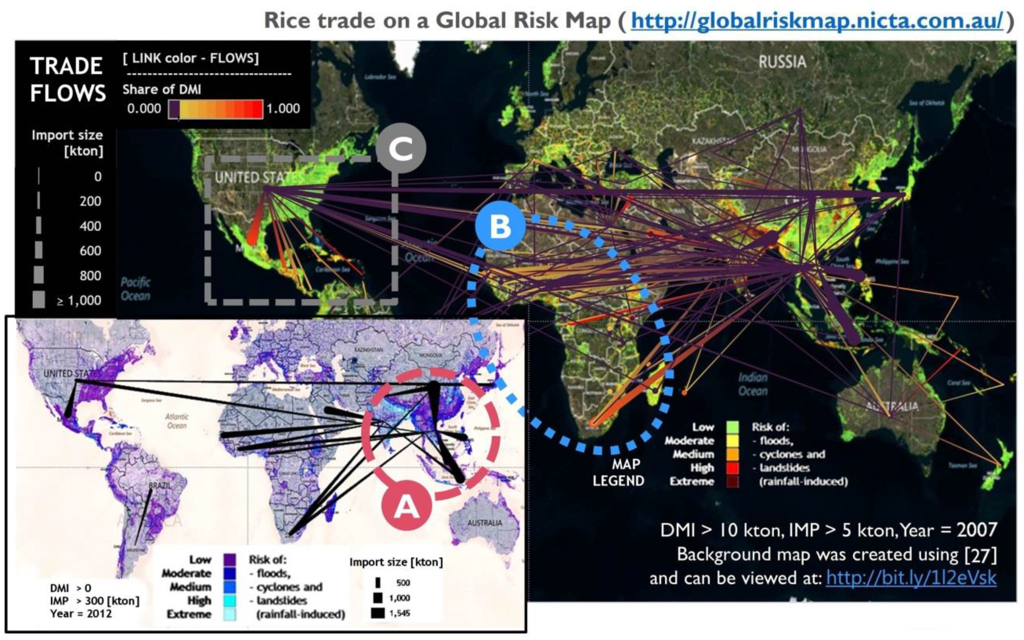
In the face of the crisis, not all countries were affected equally. That can also be interpreted using graphical explanations. First, it is important to note that most rice trade originates and occurs in South-East Asia (
Figure 8A). It is the region where majority of rice is produced and traded. Because the rice crisis originated and escalated there, it was the Western African countries, which suffered most collateral damage. In large part, it was a result of heavy reliance on rice imports from that region shown through prevalence of red- and orange-colored trade links between Africa and Asia (
Figure 8B).
Figure 7.
Changes in diversification of rice imports (HHI(DMI)) over time: (A) Around 2008, a sudden disruption and rebound of time series occurs, coinciding with the 2007–2008 rice price crisis; (B) Between 2007 and 2012, the four biggest rice producers uniformly increased the diversification of their rice imports. That occurs notwithstanding their share of imports is very small (IMP as % of DMI) compared with the overall productive capacity.
Figure 8.
Trade relationships in rice overlaid over a world map. (A) The biggest trade volumes occur in Southeast Asia. That is also the region responsible for majority of exports; (B) Most of Africa, in particular the western part, has a high share of their rice inputs fulfilled by imports from SE Asia; (C) The US is a major rice producer in its region of the world. Most neighboring countries had been heavily reliant on imports from the US (trade links in orange and red, in 2007).
A focus on a different part of the global map of rice trade (
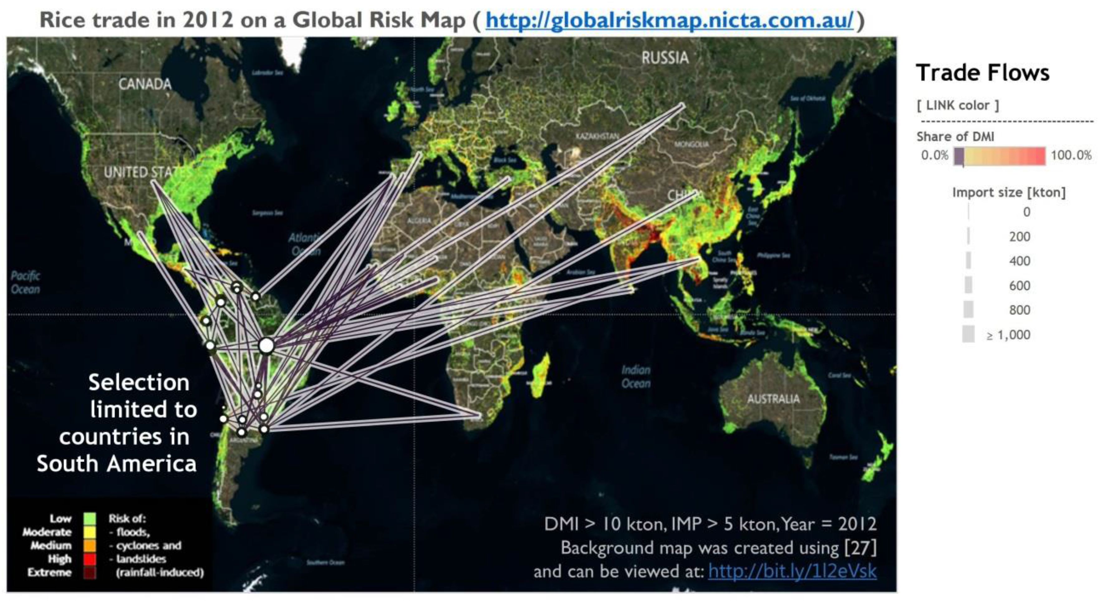
Figure 9) can explain why American nations did not suffer that badly through the 2007–2008 rice crisis. The US has completely dominated rice production in its region (
Figure 8C). South American nations have been largely cut off from the crisis because of little need for imports and dominance of within-region rice trade (
Figure 9). Therefore, because of their structure of rice trade and production, the American rice markets were buffered from the short-term price fluctuation originating in Asia. Hence, the resulting lack of effective price transmission mechanism [
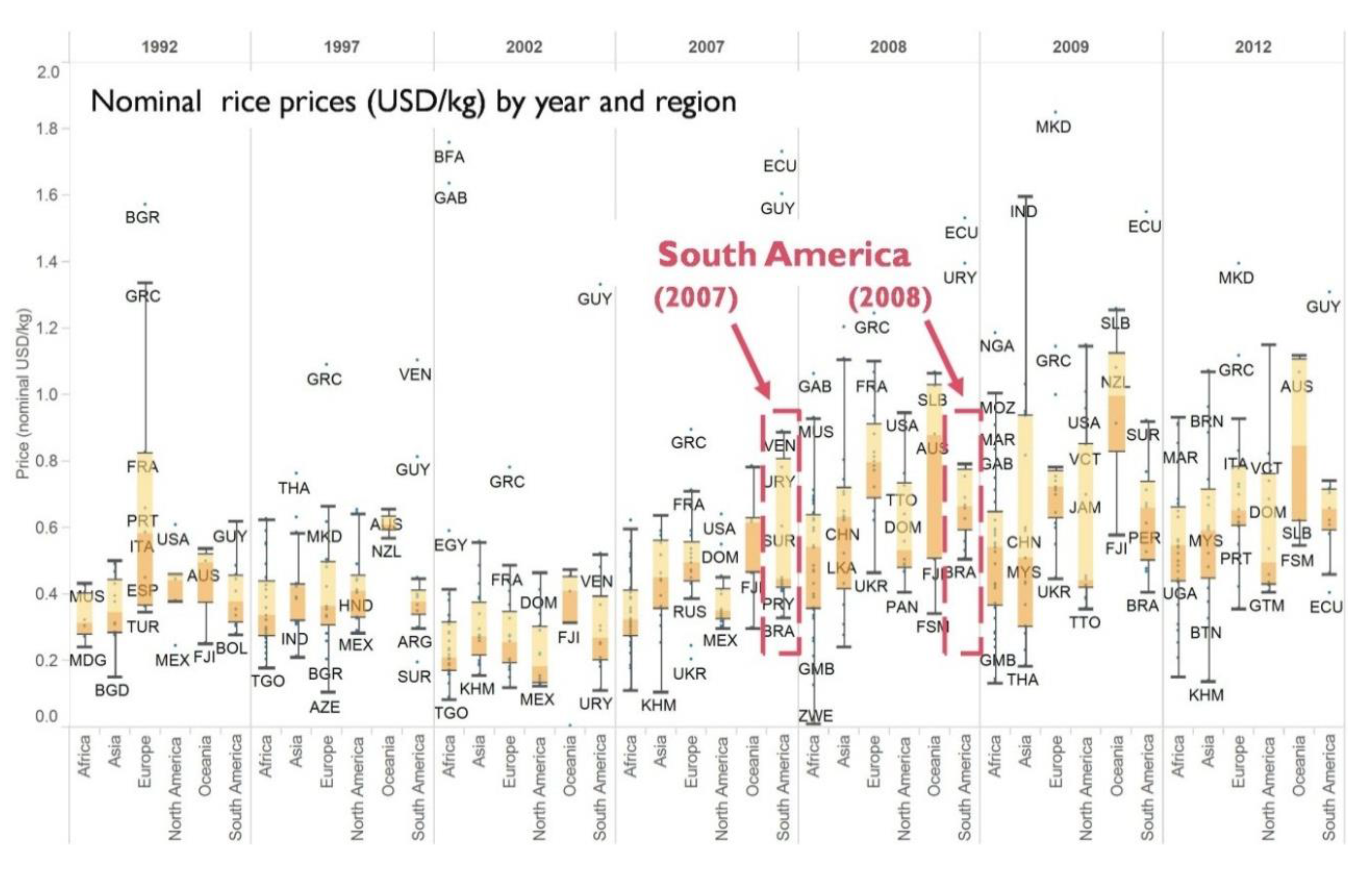
2] can be attributed with comparatively low impact on import prices, at least in South America (
Figure 10).
Figure 9.
The South American rice market is fairly isolated. Most countries are self-sufficient (trade links in purple) and majority of trade occurs within the region. Background map created using [
27].
Figure 9.
The South American rice market is fairly isolated. Most countries are self-sufficient (trade links in purple) and majority of trade occurs within the region. Background map created using [
27].
Figure 10.
Nominal rice prices (USD/kg) of imports disaggregated by year and region. The changes in prices of South American imports (marked in carmine) were not as pronounced as that of other regions. Data: Own calculations based on UN Comtrade.
Figure 10.
Nominal rice prices (USD/kg) of imports disaggregated by year and region. The changes in prices of South American imports (marked in carmine) were not as pronounced as that of other regions. Data: Own calculations based on UN Comtrade.
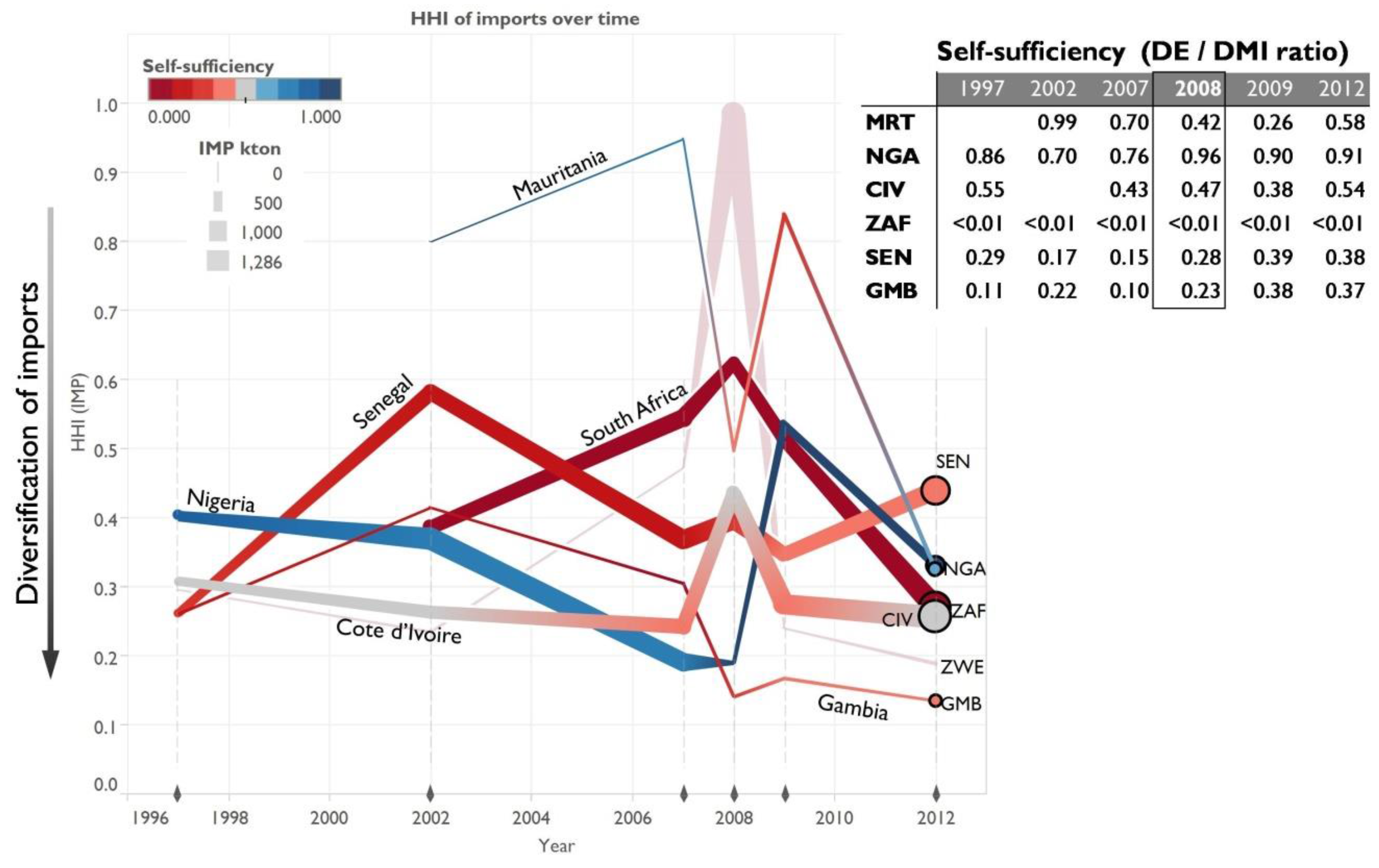
On the other side of the impact spectrum of the rice crisis were most of the African nations—heavily reliant on imports, with diets featuring lots of rice and with little economic power to burden sudden price fluctuations. Still, even in this group there is no single story. First, it seems that the level of diversification has some impact on the type of reaction resulting from the crisis (
Figure 11): highly diversified countries often increase HHI temporarily (most likely filling the gaps from a single, reliable source), whereas countries with high HHI often do the opposite (decrease HHI, because they need to find new partners which can fill in the demand when the major source of imports stumbles).
Mauritania (MRT) seems to belong to the latter group. Either because of conscious decisions or poor harvest it decreased its self-sufficiency around the time the crisis struck. The shock has been followed by rapid diversification of imports and buildup of national production. Senegal (SEN) and Gambia (GMB) reacted in a similar way—by increasing self-sufficiency. South Africa (ZAF) and Cote d’Ivoire (CIV) behaved in a different fashion—both to keep on increasing the volume of imports and try to keep HHI of imports at a level lower than in 2008. Finally, Nigeria (NGA) could be considered a success story—the rice crisis of 2007–2008 either coincided with or became the reason for permanently reduced volume of imports along with a ~20% increase in self-sufficiency which consistently exceeds 90%, post-2008. The situation is depicted in the following diagram (
Figure 11). The semi-transparent line showing a major increase in 2008 (ZWE, Zimbabwe) is an example of erroneous data entries (
cf.
Appendix C).
Figure 11.
Diversification of imports of selected African nations illustrating different responses to and circumstances regarding the 2007–2008 rice price crisis.
Figure 11.
Diversification of imports of selected African nations illustrating different responses to and circumstances regarding the 2007–2008 rice price crisis.
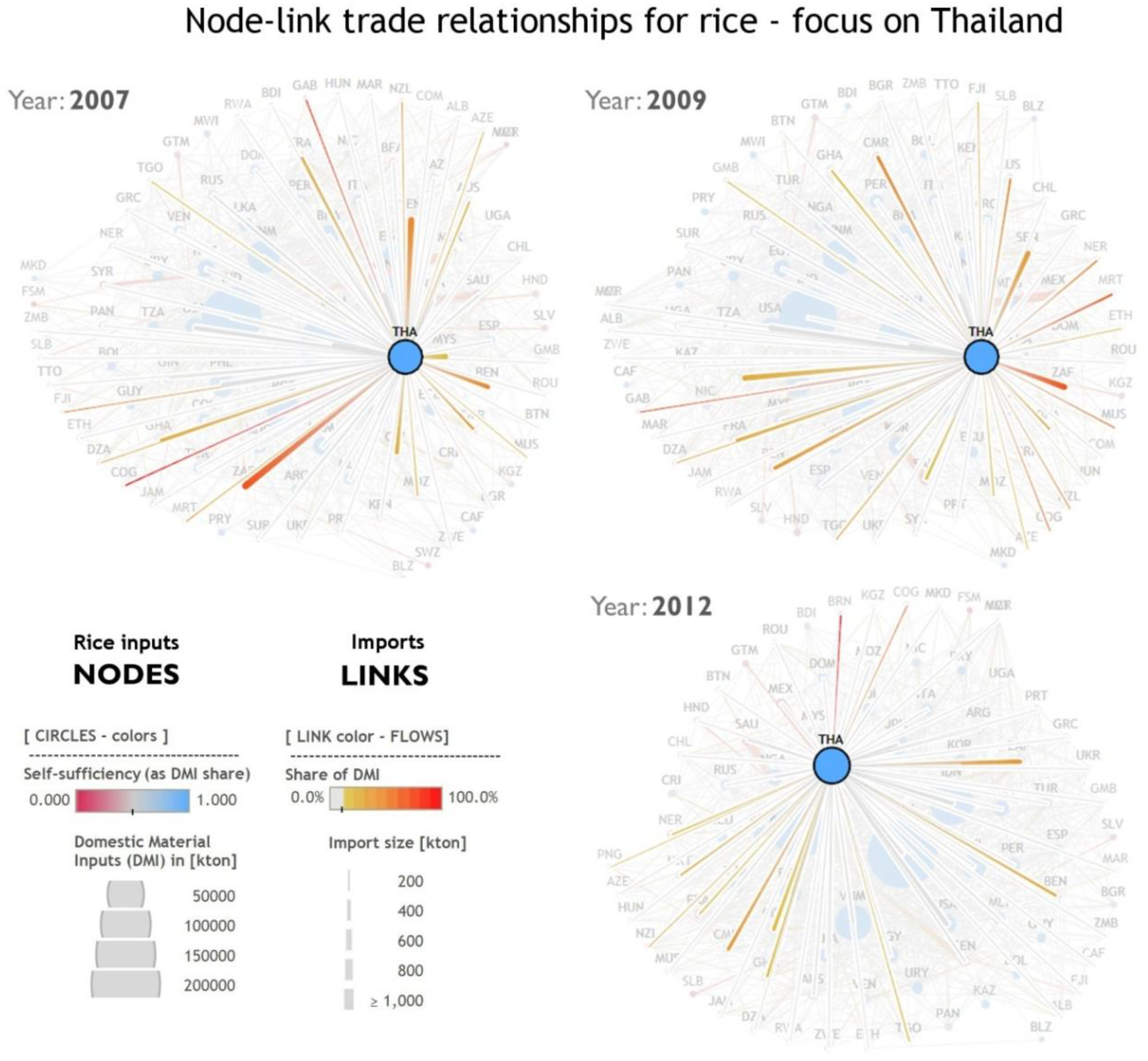
Lastly, the relational approach to extraction and trade data can show us that not only the importers of rice have been affected. Post-2008, Thai rice exports became significantly smaller shares of rice imports of their partners, illustrated in the
Figure 12, by decreasing amount of red hues between 2007 and 2012. This could be explained by the global market losing confidence in Thailand as it contributed to the rice crisis, but more importantly, featured a prominent politician mentioning in public that Thailand could initiate creation of a rice cartel, fixing prices, following the example of the oil-exporting countries [
1].
Figure 12.
Rice trade and production focused around Thailand—highlights from 2007, 2009, and 2012. The trade relationships originating from Thailand have less red hues over time implying that Thai rice exports became significantly smaller shares of rice imports of their partners between 2007 and 2012.
3.3. Future Prospects
A report by International Institute for Sustainable Development on resilience and security of food networks [
28] points out that resilience can be a property difficult to capture and assess in advance. This article shows that a combination of MFA data and visualization can in the least pinpoint potential hotspots vulnerable to export restrictions and show how the system responds to, recovers from and adapts to a disruption. However, the type of approach presented in this article can extend to a number of other adjacent interest areas.
First, the methodology can be readily applied to other products. Rice has been used as the case study due to its global importance as a staple food and a major disruption to its supply conveniently occurring in recent years. However, FAO keeps an extensive database of extraction (and consumption) of food items around the world. Most of the latter can be linked directly to traded goods monitored by the UN Comtrade, which started releasing data in three-month intervals, instead of yearly aggregates, enabling more timely analyses. Moreover, a more sophisticated approach could extend the scope to other material categories of MFA, such as fossil fuels, phosphate ores, or metals or more complex products; after accounting for the different stages of production and consumption.
Secondly, the data on production and trade of goods can be combined and remixed further with other resilience-relevant data, such as anticipated regional impacts of climate change or potential scenarios of major catastrophic events, whether it be droughts or pandemics wiping out a certain breed or variety of an agricultural product.
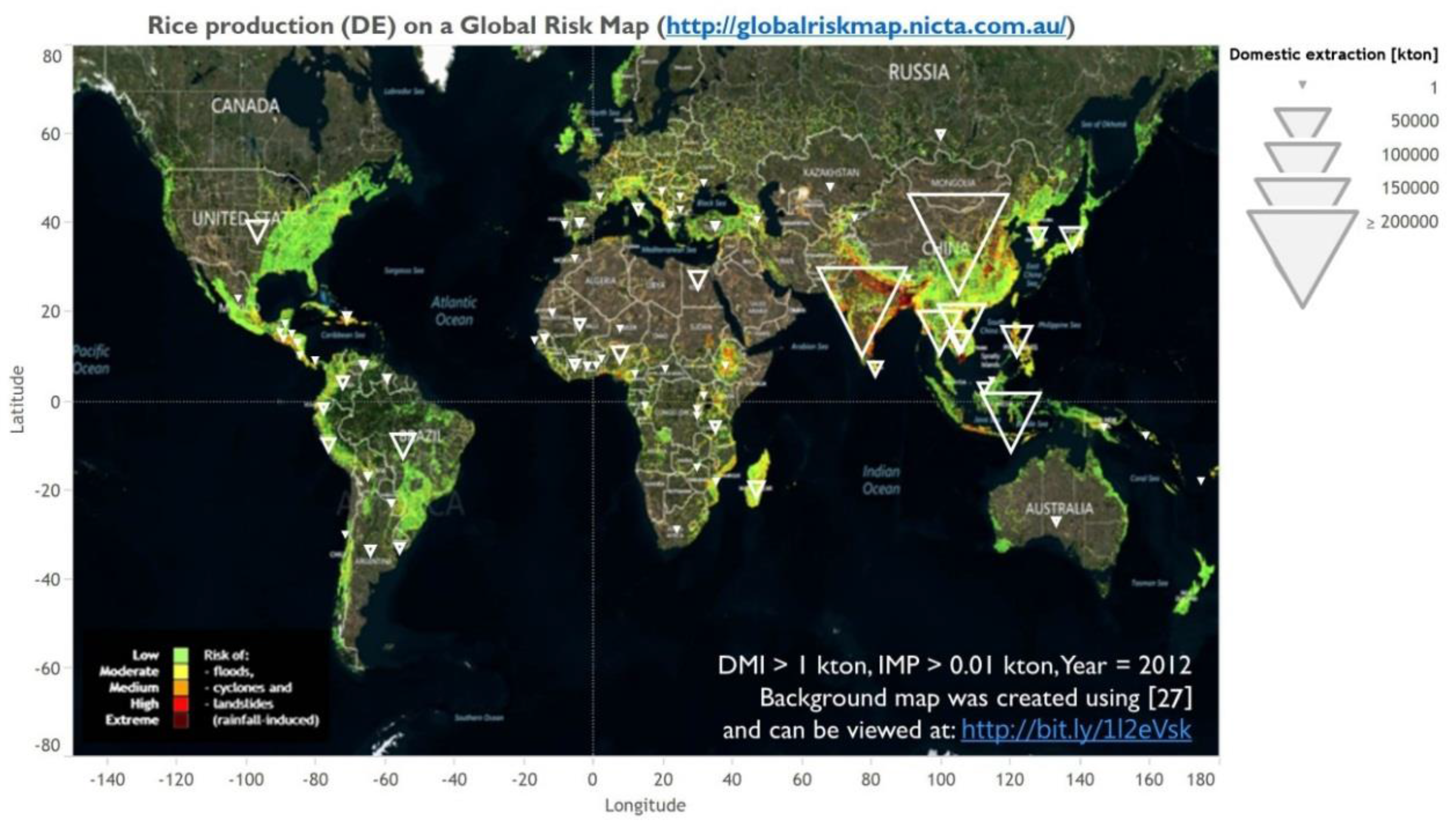
Figure 13 offers an example of combining weather hazard with agricultural production data. Vast majority of rice production is concentrated in areas with significant risk of weather-induced damages. As the potential for climate change increases, so does the risk of another rice crisis—this time initiated by production shortage caused by a catastrophic climate event.
Figure 13.
Rice production (FAO data) overlaid over a global risk map [
27].
Figure 13.
Rice production (FAO data) overlaid over a global risk map [
27].
Finally, one can try to investigate the evolution of the networks (or price data) of actual, real-life systems instead of simulated models, using the data obtained from MFA or resilience studies such as this one. The focus on this article was on showing the benefits of visual explorations rather than generating new analytical results, but considering the success of the Observatory of Economic Complexity [
29] in leveraging network science to both uncover new insights into development of economic structure and spark public interest in the topic, there is still much to be learned from all the information contained in the flows of materials.
The fact that visual communication elicits “more and better factual communication” [
30] is by no means new—it can be dated back to the work of William Playfair in the 18th century. The difference nowadays lies in the ease with which one can transform large amounts of open access data into captivating visuals. Modern journalism and media have already started tapping into the potential of interactive, “data-driven stories”, but science can also grow through delivering “explorable explanations” [
31].
