1. Introduction
Questionnaire data analysis plays a central role in quantitative research across disciplines like psychology, marketing, and the social sciences. In the context of the social sciences, analyzing questionnaire data is essential for understanding patterns of human behavior, social attitudes, and demographic trends [
1]. Surveys provide standardized and scalable methods for collecting data from large populations, making them ideal for studying and capturing individuals’ perceptions, beliefs, and attitudes, making them especially useful for investigating complex and intangible social phenomena such as quality of life, well-being, and public opinion on various aspects of everyday life [
2,
3]. Surveys are also important for understanding long-term societal changes and evaluating the effectiveness of programs designed to improve people’s lives. By quantifying responses, researchers can identify correlations, test hypotheses, and draw evidence-based conclusions that support policy development [
4]. Likert-scale items are commonly used to measure attitudes, perceptions, or evaluations in surveys [
5,
6]. For individual questions, basic descriptive statistics—such as medians, means, standard deviations, and response frequencies—are often reported. Visual tools such as bar charts or diverging stacked bar plots are typically used to effectively present response distributions.
These responses often emerge due to various cognitive, motivational, or contextual factors and may reflect uncertainty, lack of knowledge, disengagement, or discomfort with the question. The treatment of such responses requires particular attention. “Don’t Know” may indicate genuine uncertainty, low involvement with the topic, or overly complex or poorly worded questions [
7]. “Refused” responses tend to occur in sensitive topics—e.g., income, politics, or personal behavior—where social desirability bias or privacy concerns lead respondents to withhold answers [
8,
9]. “No Answer” may result from skipped items, fatigue, or disengagement, particularly in longer surveys [
10]. These responses may be excluded as missing values, retained as a separate analytical category (especially when meaningful for interpretation), or imputed using statistical methods when the data are assumed to be missing at random [
11,
12,
13]. In most conventional analyses, such responses are either excluded or ignored altogether, leading to information loss and potential bias. While this may be convenient, such simplifications risk oversimplifying the interpretation of data, particularly when analyzing complex societal issues.
To address this gap, we propose a novel method, BS-TOSIE (Belief Structure-Based TOPSIS for Survey Item Evaluation), for the analysis of individual survey questions based on an ordinal scale that explicitly incorporates the “Don’t Know/No Answer/Refused” response category. To analyze such data, we apply the Belief Structure (BS) framework in combination with the TOPSIS (Technique for Order Preference by Similarity to Ideal Solution) method, which allows us to effectively handle the full distribution of responses by replacing it with a single aggregated value. This approach enables comparisons with both ideal and anti-ideal distributions, facilitating interpretable rankings. Moreover, it supports temporal analysis, allowing researchers to track changes in perceptions over time and compare responses across different periods.
To implement the BS-TOSIE method, we follow a structured, multi-step procedure to ensure each survey response is accurately represented. First, ordinal responses and non-responses are encoded into belief structures, capturing the certainty or ambiguity of each answer. Next, these belief structures are combined across all respondents for each survey item, reflecting the collective perception. The resulting belief structure models are then analyzed using a TOPSIS procedure adapted to operate within the belief framework, enabling the calculation of distances from both the ideal and anti-ideal solutions. Finally, individual items are ranked according to their relative proximity to these benchmarks.
We demonstrate BS-TOSIE by assessing the quality of life in European cities, specifically examining citizens’ perceptions of local public administration. Using data from the Quality of Life in European Cities survey [
14,
15,
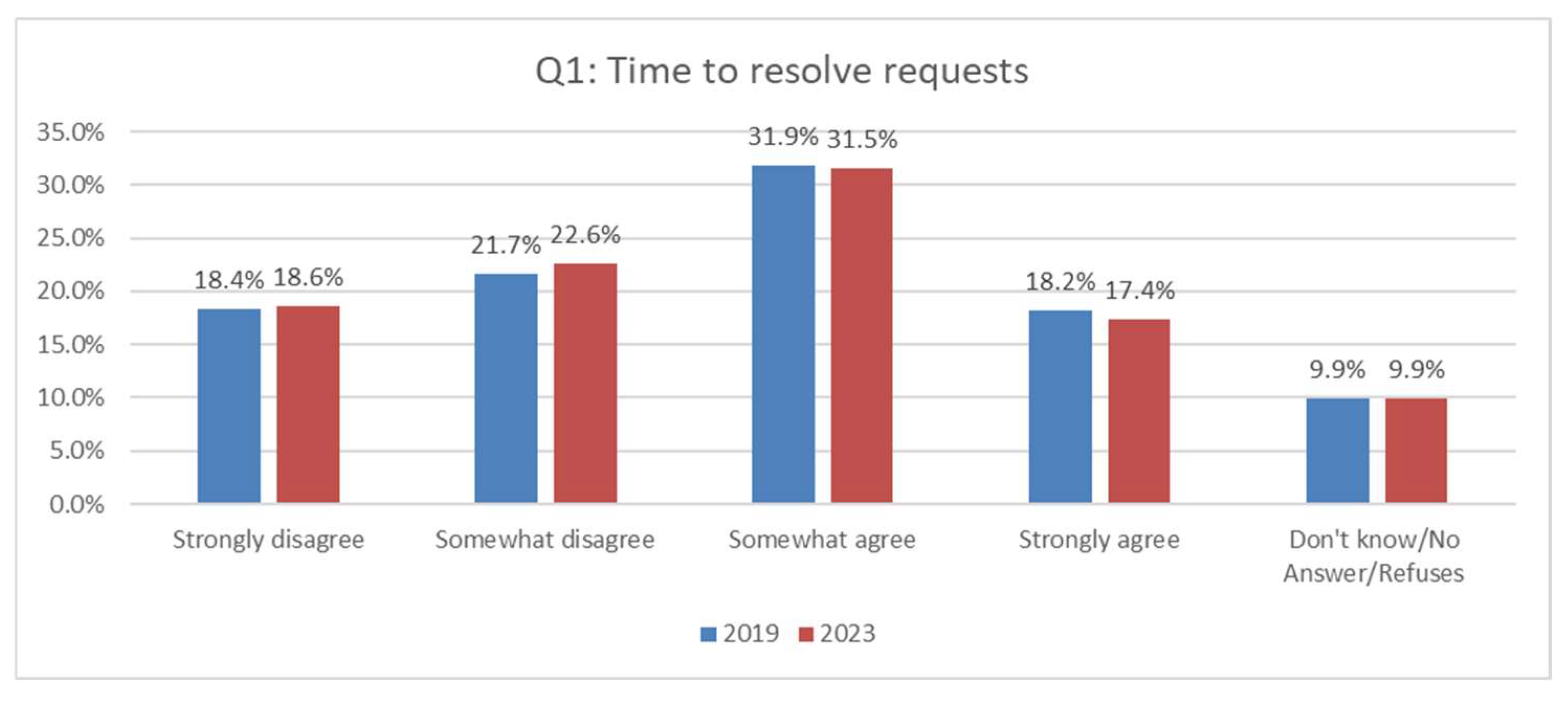
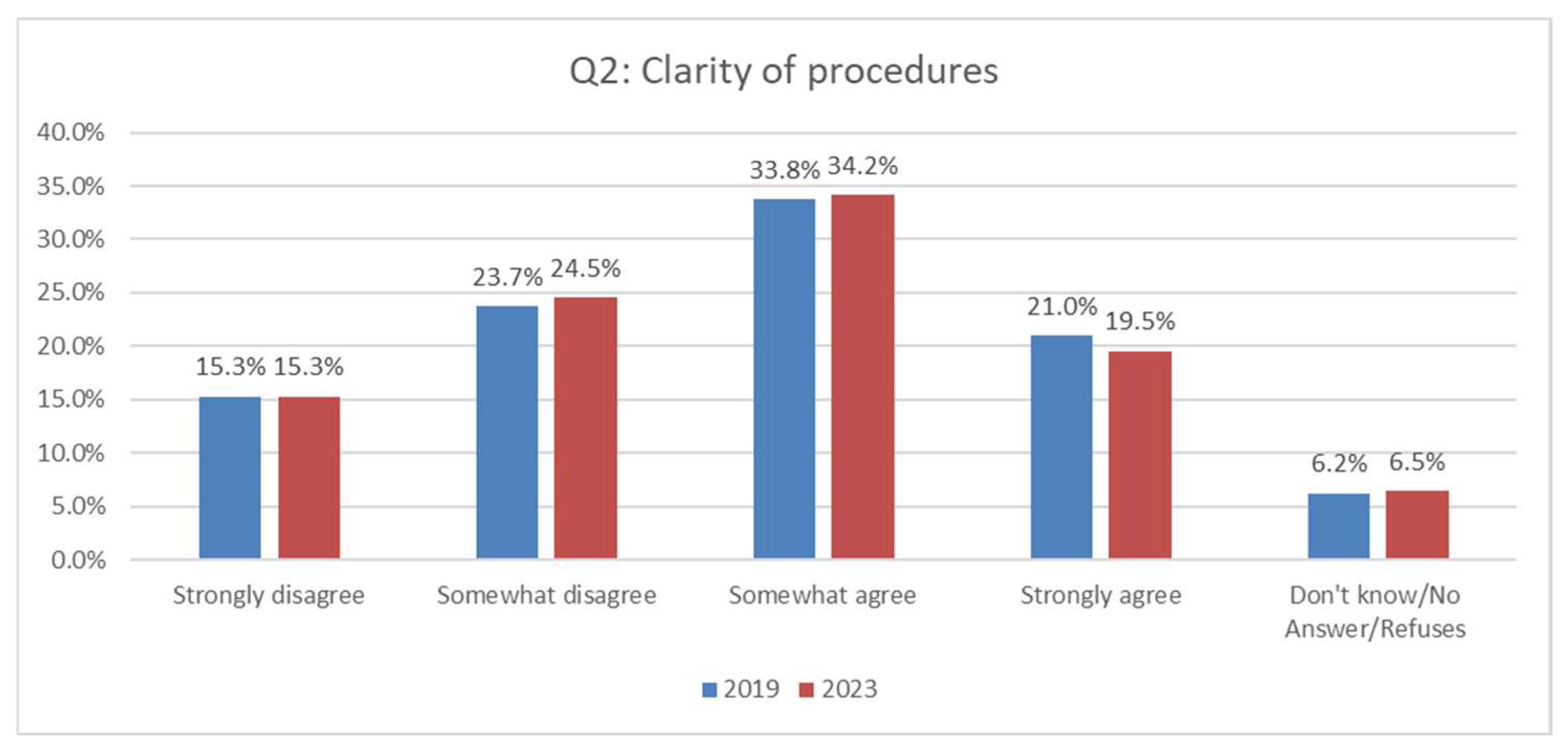
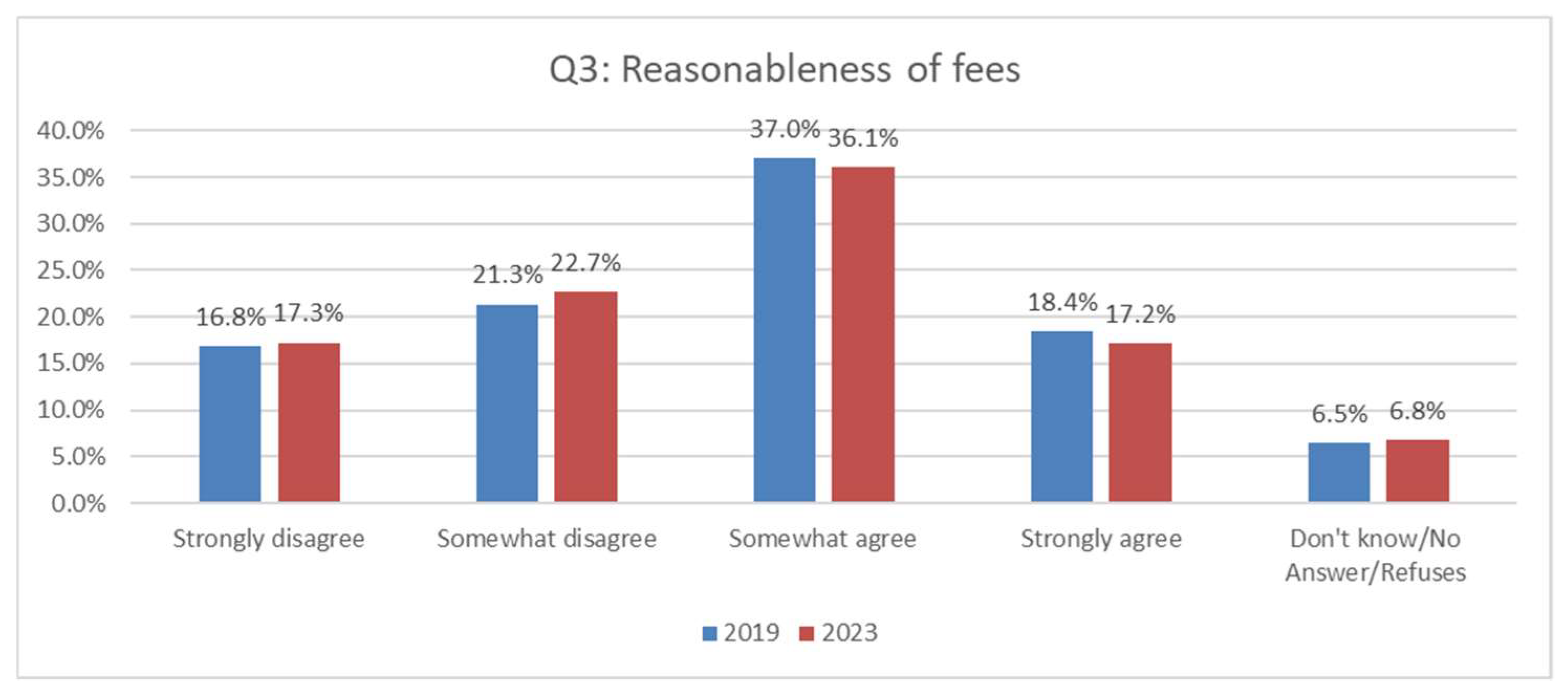
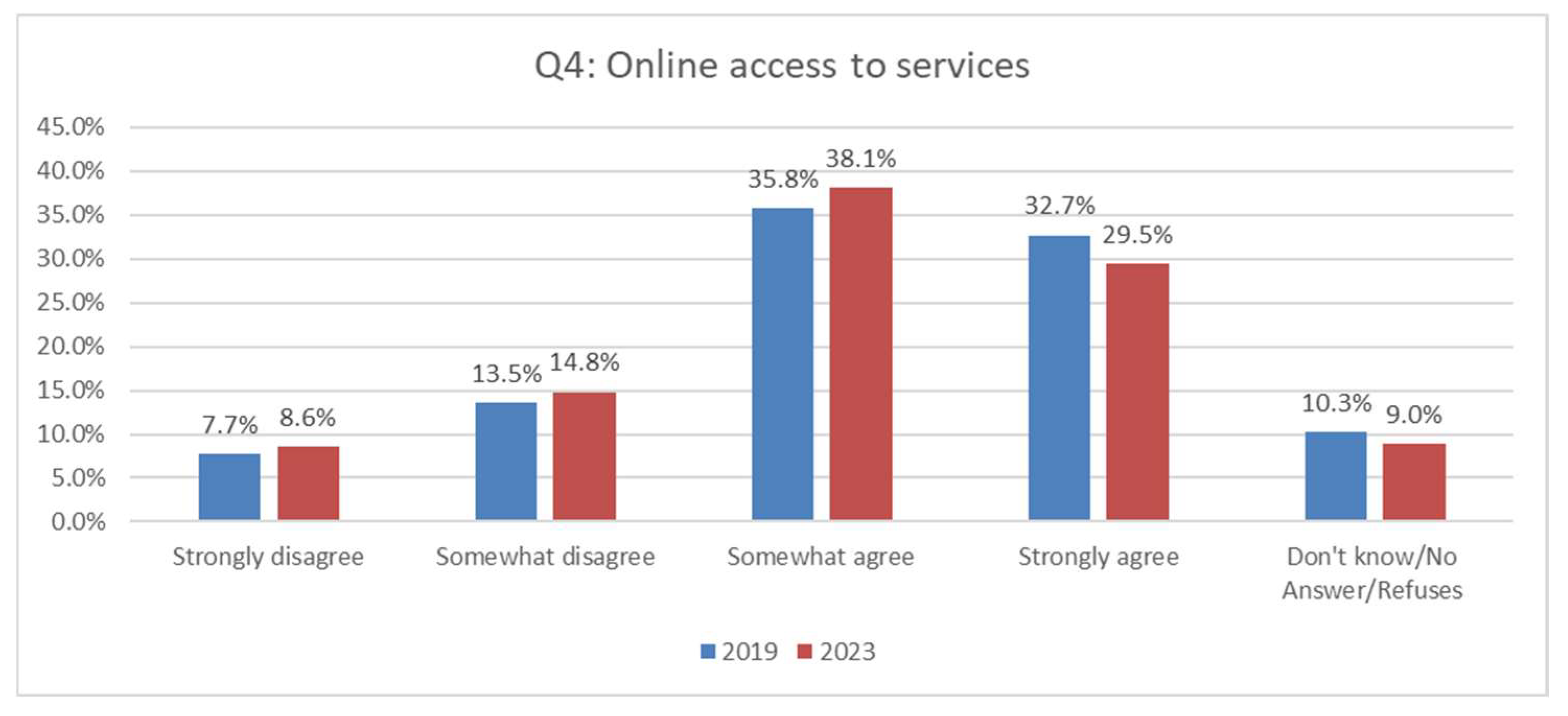
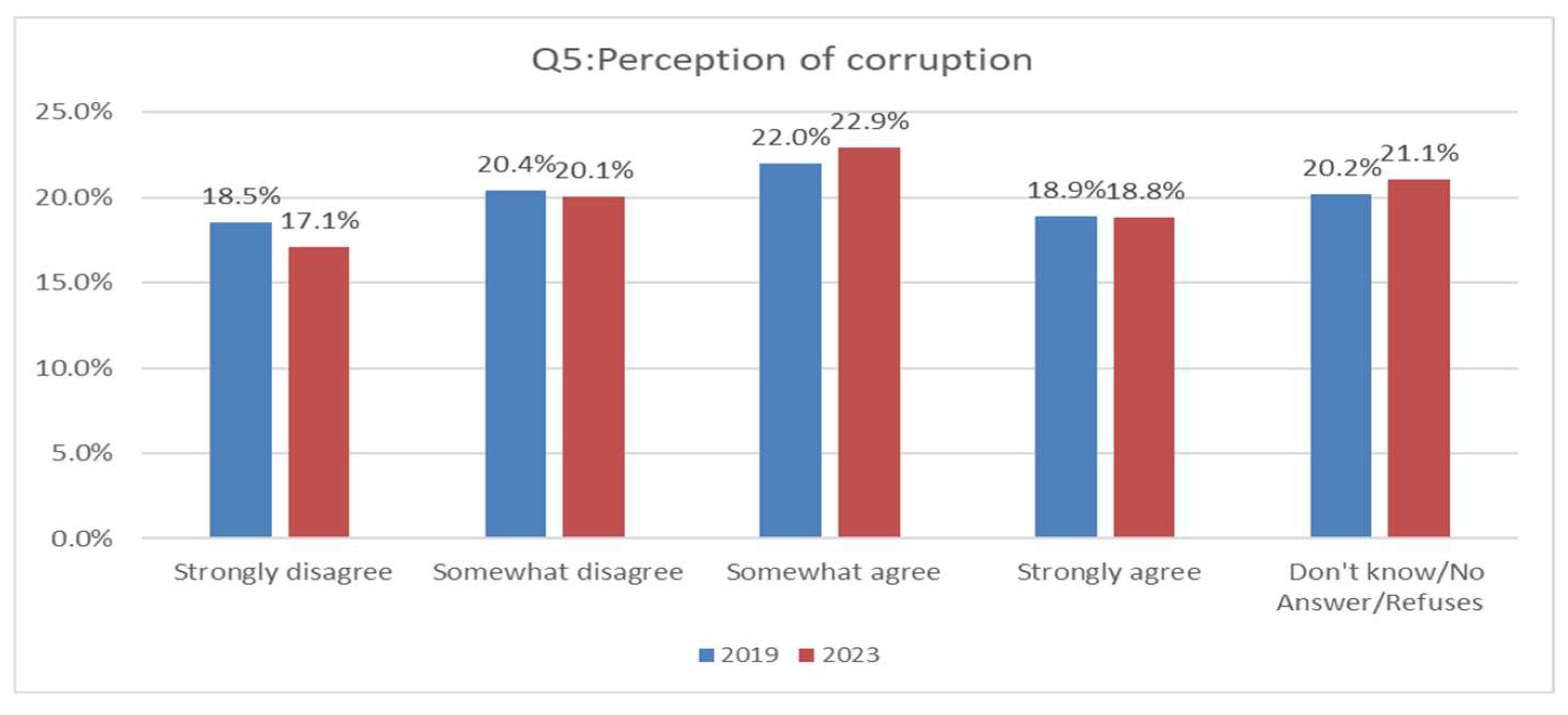
16], we analyze five performance dimensions: time required to resolve requests; clarity and simplicity of administrative procedures; perceived fairness of fees; ease of online access to services and information; and perceptions of local corruption. The respondent scale ranged from 1 (Strongly Disagree) through 4 (Strongly Agree), with a 99 category reserved for Don’t Know, No Answer, or Refused responses.
We compare our method with the original percentage of positive opinion approach used in the Quality of Life in European Cities reports [
14,
15,
16], where individual responses were simplified by merging “Very Satisfied” and “Rather Satisfied” categories, and responses marked as “Don’t Know/No Answer/Refused” were excluded. We demonstrate that BS structure yields a more nuanced representation of the data, minimizing information loss and preserving the variability inherent in the original responses. The percentage of positive opinion approach offers a simplified, quick, and easily communicable overview of satisfaction, making it particularly useful for dashboards or contexts with limited analytical resources. In contrast, the BS-TOSIE approach delivers a more detailed and accurate insight, suitable for in-depth evaluations, comparative studies, and long-term monitoring.
Unlike earlier studies that applied the belief structure and TOPSIS method to analyze aggregated survey data [
17], our study focuses explicitly on the evaluation of individual questionnaire items, offering a more fine-grained and interpretable perspective. This disaggregated view enables more targeted insights into specific components of public service delivery and enhances the diagnostic value of the results for local policymakers. This individual-level perspective offers important complementary insights to aggregate-level analyses [
17] and helps minimize information loss inherent in traditional data aggregation.
Our empirical study is guided by the following research questions:
RQ1: How do European cities rank in terms of perceived satisfaction with local public administration across the five dimensions derived from individual survey items?
RQ2: What are the key differences in perceived satisfaction across European cities regarding these dimensions?
RQ3: How has satisfaction with local public administration changed between 2019 and 2023 when analyzing each dimension separately?
This study contributes to the literature by demonstrating how belief structure and TOPSIS methods can be effectively applied to evaluate individual ordinal survey questions. Our approach preserves the granularity of original responses, supports meaningful comparisons over time, and provides richer, more actionable insights for local policymakers. It serves as a methodological and empirical complement to earlier studies based on aggregated data, highlighting the potential of disaggregated ordinal analysis in survey-based social research. Summing up, this study makes several key contributions:
It introduces a novel methodological framework for analyzing individual ordinal survey responses with uncertain or ambiguous answer categories.
It enhances the interpretability of survey results through rankings relative to ideal and anti-ideal benchmarks.
It demonstrates the empirical value of the approach using real-world survey data from European cities, providing practical insights for local administration evaluation.
The remainder of the paper is structured as follows:
Section 2 presents the materials and methods, including a description of the survey data and empirical setting as well as the theoretical background and BS-TOSIE approach.
Section 3 provides the results of their interpretation in the context of local public administration performance, and
Section 4 discusses the analytical findings.
Section 5 concludes the paper by summarizing the key findings and outlining directions for future research.
3. Results
In this section, we apply the BS-TOSIE method to rank cities based on residents’ satisfaction with local public administration. Drawing on survey data from the 2019 and 2023 editions of the Quality of Life in European Cities survey [
15], we examine five key dimensions of satisfaction: Q1—time taken to resolve requests; Q2—clarity of procedures; Q3—reasonableness of fees; Q4—accessibility of online services; and Q5—perception of corruption. The five indicators TQ1–TQ5, derived through the BS-TOSIE approach for each item calculated by Equation (13), enable us to track and compare public opinion on local administration across cities and over time.
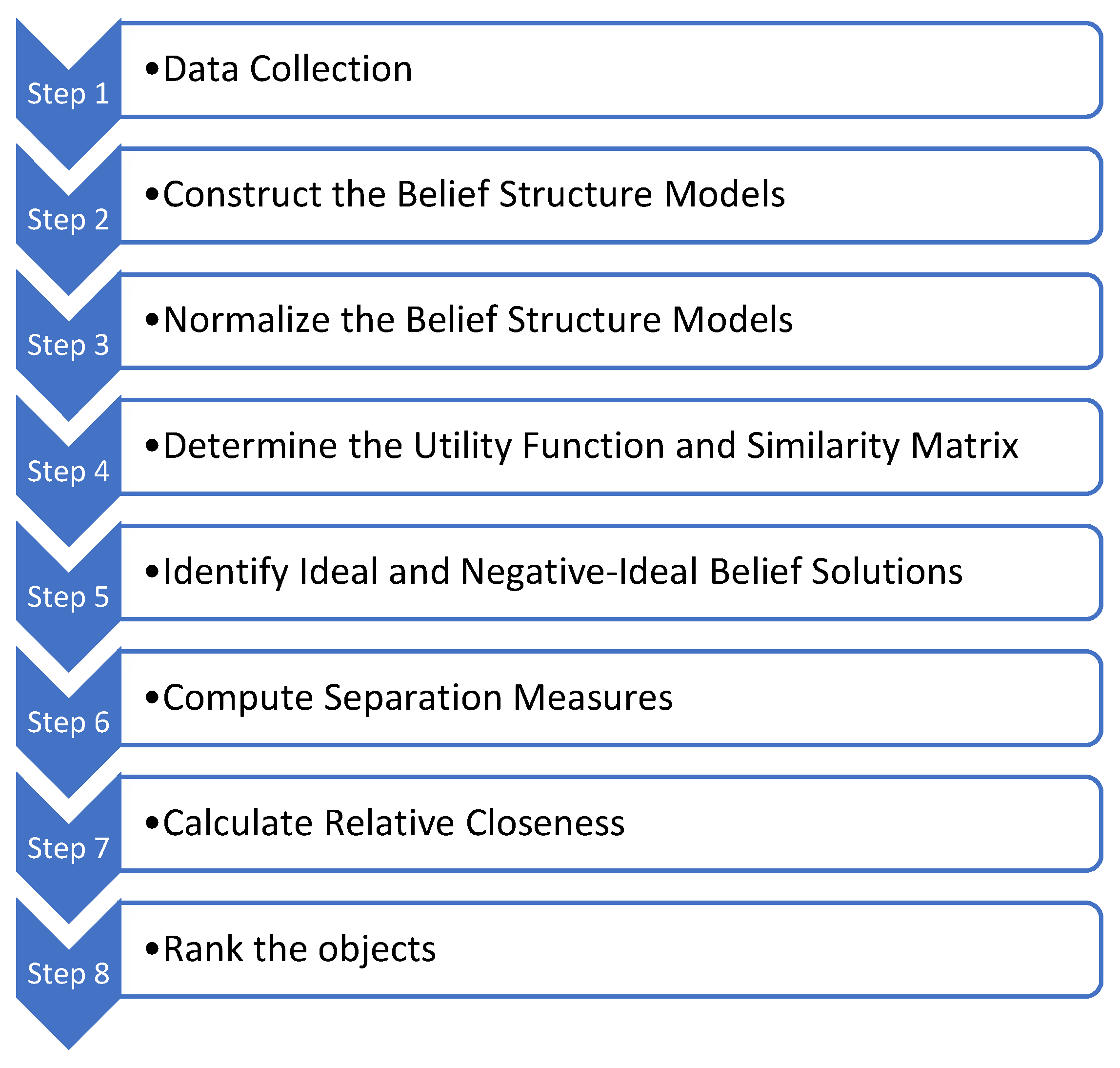
The BS-TOSIE method is implemented through a step-by-step procedure described in
Section 2.1., as outlined below:
Step 1: Data Collection.
Responses to individual items (Q1–Q5) are categorized according to an ordinal satisfaction scale. For questions Q1–Q4, the scale ranges from very satisfied () to very unsatisfied (), corresponding to values 4 to 1 from the ordinal scale. For question Q5, the scale is reversed (from 1 to 4). Additionally, non-responses—including “Don’t know,” “No answer,” and “Refused”—are recorded as a separate category 99 and correspond to a degree of ignorance. The analysis includes 83 cities as evaluation objects. Due to the lack of data in 2023 regarding responses to question Q5, the TQ5 indicator for Tirana were omitted.
Step 2: Construct the Belief Structure Models.
Respondents’ evaluations are transformed into belief distributions for each city, item, and year (see
Table A1). For example, for Aalborg in 2019 (Q1), the belief structure is: BS = {(very satisfied, 0.247), (rather satisfied, 0.423), (rather unsatisfied, 0.111), (very unsatisfied, 0.053)}, with the degree of ignorance 1 − (0.247 + 0.423 + 0.111 + 0.053) = 0.166. This is represented as a belief vector: S1 = [0.247, 0.423, 0.111, 0.053]. Similarly, for Aalborg in 2019 and question Q5 (see
Table A5) the vector is S2 = [0.616, 0.173, 0.133, 0.033], with degree of ignorance 0.045.
Step 3: Normalize the Belief Structure Models.
All belief vectors obtained in Step 2 are normalized using Formula (5). For example, the normalized vector for Aalborg (Q1, 2019) is: = [0.289, 0.464, 0.153, 0.095]. Consequently, the normalized vector for Aalborg (Q5, 2019) becomes = [0.627, 0.184, 0.144, 0.044].
Step 4: Determine the Utility Function and Similarity Matrix.
Each satisfaction level is assigned a utility value (Formula (6)). We adopt the utility function [
17,
39] as follows:
These value, by using Formula (7), form the basis for constructing the similarity matrix
, which quantifies the perceived closeness between satisfaction levels using the formula as follows:
Step 5: Identify Ideal and Negative Ideal Belief Solutions.
The Positive Ideal Belief Solution (PIBS) represents full satisfaction:, while the Negative Ideal Belief Solution (NIBS) represents full dissatisfaction: = [0, 0, 0, 1]. Full satisfaction refers to a situation in which all respondents (100%) select the rating category corresponding to “very satisfied”, while full dissatisfaction occurs when all (100%) respondents choose the category “very dissatisfied”.
Step 6: Compute Separation Measures.
Distances from each city’s belief vector to PIBS and NIBS are computed using belief-based distance measures (Formulas (11) and (12)). For example, for Aalborg (Q1, 2019), the distance to PIBS is 0.417 and to NIBS is 0.723. For Aalborg (Q5, 2019), the respective distances are 0.231 and 0.825.
Step 7: Calculate Relative Closeness.
Relative closeness to the ideal solution is calculated using the standard TOPSIS closeness coefficient (Formula (13)). For Aalborg in 2019, the values are 0.634 for Q1 and 0.781 for Q5. The results for all cities, questionnaire items, and years are presented in
Table 1 for the 2019 year and
Table 2 for the 2023 year. Higher closeness values indicate greater satisfaction.
Step 8: Rank the objects.
Finally, cities are ranked according to their relative closeness scores across all five dimensions of local administration satisfaction. For each dimension (Q1–Q5), both the satisfaction levels (TQ1–TQ5), measured using the BS-TOSIE approach, and the rankings of European cities are presented for the years 2019 and 2023. These results are shown in
Table 1 and
Table 2, respectively.
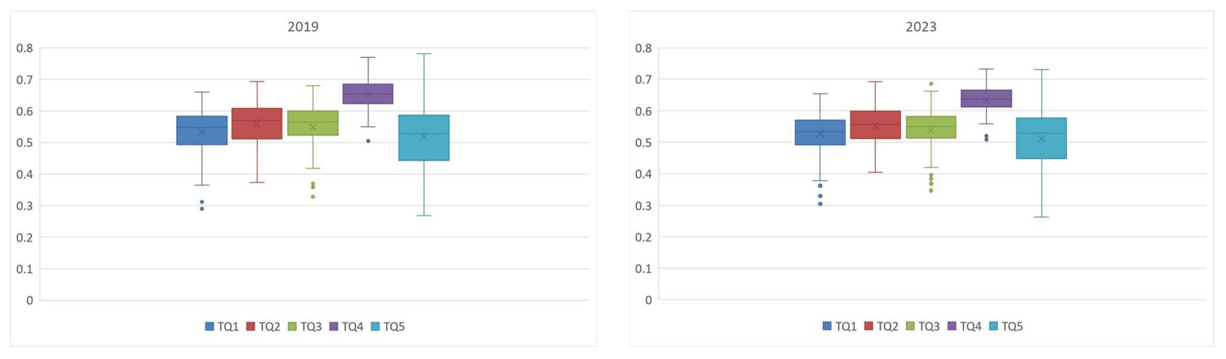
Descriptive statistics for the values of TQ1–TQ5 for 2019 and 2023 are presented in
Table 1 and
Table 2 and box plots in
Figure 7.
The analysis addresses the three research questions (RQ1–RQ3) presented in the introduction. It is conducted separately for each of the five dimensions of satisfaction with local administration in European cities, evaluated through questions Q1–Q5 using the corresponding measures TQ1–TQ5.
The satisfaction indicator TQ1 reflects how citizens perceive the efficiency of local administrations in resolving requests. In 2019 (
Table 1), scores ranged from 0.290 in Rome to 0.660 in Zurich, with an average of 0.533 and a standard deviation of 0.075. Zurich (0.660), Luxembourg (0.657), Geneva (0.648), Aalborg (0.634), and Groningen (0.634) ranked highest, reflecting strong institutional capacity in Western and Northern Europe. In contrast, Rome (0.290), Palermo (0.311), Naples (0.364), Heraklion (0.364), and Skopje (0.370) showed the lowest satisfaction, highlighting persistent issues such as bureaucracy and delays. A clear North–South divide was evident, with higher satisfaction in Northern and Western cities.
By 2023 (
Table 2), the average dropped slightly to 0.528 and a standard deviation of 0.072, indicating stable perceptions with a minor decline. Zurich (0.654), Genève (0.645), Luxembourg (0.645), and Antalya (0.632) remained top performers, while Rome (0.304), Palermo (0.313), Skopje (0.329), and Naples (0.362) stayed among the lowest. However, cities like Ankara and Antalya improved notably, suggesting successful reforms.
Overall, the average change of −0.005 reflects a minor drop in satisfaction. While top cities maintained their position, gains in parts of Turkey and Eastern Europe contrast with slight declines in some UK cities (e.g., Glasgow, Cardiff, Manchester) and Northern Europe (e.g., Copenhagen), possibly linked to rising expectations or service strain. Despite ongoing regional disparities, improvements in several cities suggest the potential for wider progress.
The satisfaction indicator TQ2 reflects citizens’ satisfaction with how straightforward and easy to understand the procedures used by local public administrations are. In 2019 (
Table 1), TQ2 ranged from a low of Rome (0.373) to a high of Brussels (0.693), with average satisfaction at 0.559 and a standard deviation of 0.068. In 2019, satisfaction with the clarity of administrative procedures varied widely. Cities such as Brussels (0.693), Lefkosia (0.679), Liège (0.678), Antalya (0.673), and Antwerpen (0.665) reported the highest levels of agreement, suggesting well-designed and accessible administrative systems. In contrast, cities like Rome (0.373), Belgrade (0.405), Palermo (0.414), and Zagreb (0.426), recorded low satisfaction, indicating administrative complexity and limited citizen engagement.
By 2023 (
Table 2), the average satisfaction with procedures decreased to 0.553, with a standard deviation of 0.063, indicating a slight drop in satisfaction with the clarity of local public administration procedures. By 2023, the overall landscape showed continuity with notable regional shifts. Antalya (0.692), Ankara (0.680), Liège (0.678), and Brussels (0.674) remained among the top performers. Ankara showed the most improvement of 0.082, whereas Podgorica experienced a decline of −0.055.
The satisfaction indicator TQ3 reflects citizens’ agreement with the reasonableness of the fees charged by their local public administration. In 2019 (
Table 1), TQ3 ranged from a low of Heraklion (0.328) to a high of Luxembourg (0.679), with average satisfaction at 0.547 and a standard deviation of 0.075. Satisfaction varied considerably across cities. The highest scores were observed in Luxembourg (0.679), Cluj-Napoca (0.662), and Zurich (0.648) indicating widespread satisfaction with fee fairness in well-funded, efficient systems. Cities such as Graz (0.639), Stockholm (0.633), and Vien (0.626) also performed well. In contrast, cities like Heraklion (0.328), Athina (0.332), Rome (0.358), Palermo (0.369). Riga (0.372) and Naples (0.373) ranked low, suggesting concerns over cost transparency and fairness. Central and Eastern Europe showed mixed results: Cluj-Napoca (0.662) and Košice (0.608) performed strongly, while Belgrade (0.419), Zagreb (0.417), and Sofia (0.514) lagged.
By 2023 (
Table 2), the average satisfaction decreased slightly to 0.538, with a standard deviation of 0.068, reflecting a slight increase in the perception of unreasonable fees in some cities. In 2023, cities such as Luxembourg (0.686), Cluj-Napoca (0.662), Zurich (0.646) Valletta (0.627) continued to rank highly. Notably, Ankara showed a significant improvement of 0.068. Elsewhere, changes were more modest. Aalborg saw a small decline from 0.590 to 0.583, and Bratislava dropped slightly from 0.601 to 0.582. Rome, Palermo, and Athina remained among the lowest-scoring cities, though Athina improved modestly from 0.332 to 0.378, while Skopjee had a decline of −0.075.
The average difference of −0.027 indicates a moderate decrease in satisfaction regarding the reasonableness of fees over the four years. While average satisfaction with administrative fees slightly declined between 2019 and 2023, Northern and Western European cities continued to perform well, benefiting from transparent governance. Southeastern Europe showed some positive movement, particularly in Turkish cities. Eastern Europe exhibited mixed dynamics, with leaders like Cluj-Napoca and Tallinn maintaining high scores, while others stagnated. The overall picture remains marked by persistent regional disparities, though gradual progress is evident in some areas.
The satisfaction indicator TQ4 reflects citizens’ satisfaction with the accessibility of information and services provided by local public administrations online. In 2019 (
Table 1), TQ4 ranged from a low of Naples (0.505) to a high of Aalborg (0.770), with an average satisfaction score of 0.651 and a standard deviation of 0.055, suggesting a moderate variation in access to services online across European cities. Top performers in 2019 included Aalborg (0.770), Groningen (0.761), Graz (0.755), Antalya (0.745), and Zurich (0.741) indicating robust digital infrastructure and user-friendly platforms. Scandinavian cities, such as Copenhagen (0.717) and Malmö (0.707), also scored highly in terms of accessibility. In contrast, cities like Naples (0.505), Rome (0.510), and Palermo (0.515) lagged significantly, showing challenges in providing effective digital services. The overall average satisfaction remained relatively stable at 0.634 by 2023, with a standard deviation of 0.047. Top-performing cities in 2023 (
Table 2) included Zurich (0.732), Antalya (0.728), Groningen (0.719), Graz (0.712), Ankara (0.711), Burgas (0.711), and Aalborg (0.710). Cities showing improvements from 2019 to 2023 included Ankara (from 0.673 to 0.711) and Cluj-Napoca (from 0.650 to 0.683). On the other hand, London (from 0.722 to 0.641) and Miskolc (from 0.707 to 0.662) experienced slight declines. The average difference of −0.017 indicates a moderate decline in satisfaction regarding online access to services from 2019 to 2023.
The satisfaction indicator TQ5 addresses the perception of corruption, where higher scores indicate a lower perceived level of corruption and greater satisfaction with local public administration. In 2019 (
Table 1), TQ5 ranged from a low of Skopje (0.267) to a high of Aalborg (0.781), with an average satisfaction score of 0.518 and a standard deviation of 0.105. In 2019, cities such as Skopje (0.267), Tirana (0.265), Belgrade (0.299), and Zagreb (0.305), had the lowest scores, reflecting high levels of perceived corruption. In contrast, cities like Aalborg (0.781), Copenhagen (0.768), Groningen (0.687), Malmö (0.674), and Zurich (0.667) scored highest, indicating strong public trust and perceived integrity in administration. In 2023 (
Table 2), the average satisfaction decreased slightly to 0.511, with a standard deviation of 0.090, indicating that the perception of corruption across the cities remained relatively unchanged, despite small fluctuations. In 2023, this pattern remained broadly consistent, with Copenhagen (0.730), Aalborg (0.695), and Zurich (0.659) continuing to lead, although their scores declined slightly—Copenhagen by 0.038 and Aalborg by 0.086—suggesting a marginal increase in perceived corruption. Istanbul saw high improvements in their scores of 0.08.
In summary, perceptions of corruption remained relatively stable across Europe. Northern European cities maintained leadership in public trust, while cities in Southern and Eastern Europe continued to struggle, albeit with modest improvements.
The overall analysis of changes between 2019 and 2023 reveals a stable, though regionally uneven, trajectory of satisfaction with local public administration across Europe. The Pearson correlation coefficients between the TQ measures for 2019 and 2023 are as follows: 0.958 for TQ1, 0.945 for TQ2, 0.950 for TQ3, 0.946 for TQ4, and 0.974 for TQ5. Northern and Western European cities continue to lead in most indicators, with Zurich, consistently ranking among the top performers, while Rome and Palermo are among the bottom. Several cities in Turkey and Eastern Europe have demonstrated notable progress, highlighting that reforms can lead to positive outcomes. In contrast, many cities in Southeastern Europe show persistent underperformance, particularly in transparency, procedural clarity, and digital services. Broader systemic challenges remain across Southern and Southeastern Europe, underscoring the need for sustained investment and reform.
4. Discussion
In this chapter, we compare the results obtained using the BS-TOSIE method, presented earlier in
Section 3, with the methodology used in the Reports on the Quality of Life in European Cities [
14,
16] to assess satisfaction with local administration in each domain. The percentage of respondents with a positive opinion (i.e., “rather satisfied” and “very satisfied”) is aggregated, with the percentages calculated based on all respondents, excluding those who selected “don’t know” or did not answer. The measures denoted as PQ1 to PQ5, allow us to rank cities according to satisfaction levels for each item separately. The results of the PQ1–PQ5 measure calculations are presented in
Table 3 for the year 2019 and in
Table 4 for the year 2023. Due to the lack of data in 2023 regarding responses to question Q5, the PQ5 indicator for Tirana was omitted.
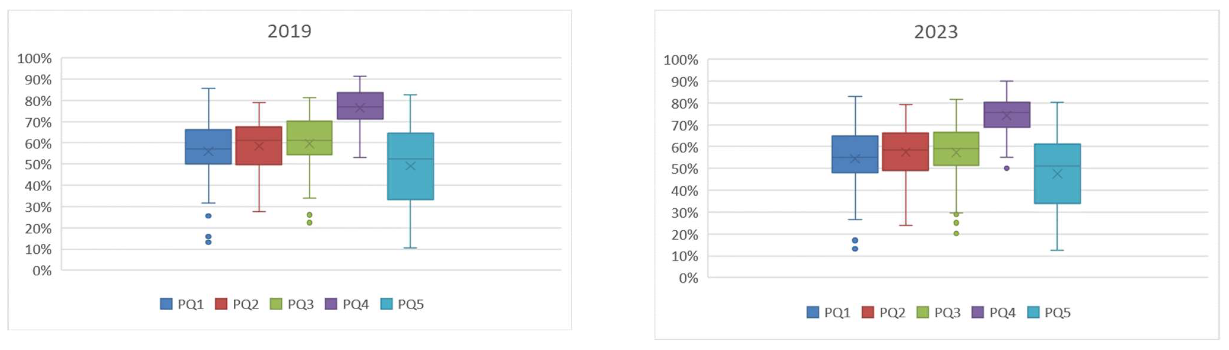
Descriptive statistics for the values of PQ1–PQ5 for 2019 and 2023 are presented in
Table 3 and
Table 4, and box plots in
Figure 8.
In 2019 (
Table 3), satisfaction with the time taken to resolve requests (PQ1) ranged from a low of 13.3% in Palermo to a high of 85.6% in Zurich. The average satisfaction was 55.9%, with a standard deviation of 14.2%, showing significant variation across cities. Cities like Zurich (85.6%), Geneve (81.8%), and Aalborg (80.3%), reported high satisfaction, while Palermo (13.3%), Naples (25.5%), and Turinn (31.8%) struggled with slower responses. By 2023 (
Table 4), Zurich (82.9%) remained at the top, while Palermo (13.1%) again ranked at the bottom. The average increased slightly to 54.5%, with a standard deviation of 13.1%, suggesting some improvement but continued disparities. Top cities in 2023 again included Zurich (82.9%), Geneve (80.5%), and Aalborg (74.2%) while Palermo (13.1%), Rome (17.1%), and Naples (26.6%) remained among the worst. An average decline of −1.4 percentage points (p.p) indicates a slight reduction in administrative responsiveness, with Northern and Western cities still leading and those in Southern Europe trailing.
In 2019 (
Table 3), satisfaction with the clarity of procedures (PQ2) ranged from 15.8% in Rome to 78.9% in Lefkosia, with an average of 58.4% and a standard deviation of 12.6%. The best cities were Lefkosia (78.9%), Geneve (78.9%), and Bruxelles (78.9%), while the worst performers included Rome (15.8%), Palermo (28.8%), Naples (36.1%). In 2023 (
Table 4), Geneve led first with 79.1%, and Palermo remained last at 23.9%. In 2023, the top-performing cities included Geneva (79.1%), Liège (78.2%), Antalya (77.9%), and Luxembourg (77.6%), whereas Palermo (13.1%), Rome (31.3%), Belgrade (35.7%), and Naples (36.1%) ranked among the lowest The average satisfaction declined to o 57.4%, with a slightly reduced standard deviation of 11.8%, indicating marginal overall improvement. The average decrease of −1 p.p reflects some overall regress in the clarity of procedures across the cities. Some cities, particularly in Southern and Eastern Europe, still faced difficulties in simplifying their processes, also regional disparities remain significant.
In 2019 (
Table 3), satisfaction with the reasonableness of public service fees (PQ3) ranged from just 22.4% in Palermo to 81.1% in Tallinn, with an average of 59.6% and a standard deviation of 13.45%, reflecting strong disparities across cities. Leading cities included Tallinn (81.1%), Zurich (80.4%), Luxembourg (78.5%), and Praha (78.3%), while the lowest ratings came from Palermo (22.4%), Riga (26.1%), Rome (26.6%), and Athina (26.7%).
By 2023 (
Table 4), Luxembourg (81.5%) and Zurich (79.9%) remained at the top, but the average dropped slightly to 57.34%, with a standard deviation of 12.46%, suggesting a mild convergence in perceptions but not a clear improvement. The overall change of −2.22 p.p signals stagnation or even decline.
In 2019 (
Table 3), satisfaction with online access to public services (PQ4) ranged from 53.1% in Palermo to 91.2% in Groningen, with an average of 76.4% and a standard deviation of 8.7%. The best cities were Groningen (91.2%), Zurich (90.6%), Micolic (89.4%), and Copenhagen (89.3%). The lowest scores came from Palermo (53.1%), Naples (55%), and Rome (56.6%). By 2023 (
Table 4), little had changed at the top or bottom: Zurich (89.8%) led first, and Palermo (50.0%) remained last. The average decreased slightly to 74.2%, with a small drop in deviation to 7.9% showing a modest regression in digital transformation, with persistent regional gaps.
In 2019 (
Table 3), satisfaction with the perception of corruption (Q5) ranged from a low of 10.5% in Belgrade to a high of 82.6% in Aalborg, with an average of 49.1% and a high standard deviation of 19.1%. The best cities were Aalborg (82.6%), Copenhagen (82.5%), and Zurich (80.4%), and the worst included Belgrade (10.5%), Zagreb (10.9%), and Skopje (12.4%). In 2023 (
Table 4), top rankings held: Copenhagen (80.4%), Zurich (79.9%), Rennes (76.1%), Belgrade (12.5%), Zagreb (12.7%), and Skopje (15.6%), and stayed at the bottom. The average rose slightly to 47.5%, with a standard deviation of 17.0% reflecting again regression. Corruption remains a serious issue in Southern and Eastern Europe, despite high-performing cities maintaining solid scores.
The comparison between the two aggregate indicators, PQ and TQ, reveals key methodological differences in how citizen satisfaction with local public administrations is measured. While both indicators aim to capture citizen perception, TQ offers a more refined and informative measure. PQ aggregates only the share of positive responses (“rather satisfied” and “very satisfied”), ignoring the intensity of opinion as well as negative and neutral responses. As a result, different distributions of responses can yield identical PQ values, potentially masking dissatisfaction or differences in satisfaction strength. TQ, in contrast, incorporates all response categories and reflects response intensity. This provides a more nuanced view of public perception by capturing the full spectrum of opinion. A crucial methodological distinction between the two measures, PQ and TQ, lies in how they treat missing or undefined responses—specifically, those categorized as 99, representing “Don’t Know,” “No Answer,” or “Refused” answers. In the PQ method, these responses are completely excluded from the calculation. PQ is derived as the percentage of respondents selecting “rather satisfied” or “very satisfied” among only those who provided a valid ordinal answer. This approach assumes that non-responses offer no informational value. However, by excluding them, the method can inadvertently overestimate satisfaction levels—particularly in cities with high rates of non-response—since it only considers respondents who expressed a clear opinion. In contrast, the TQ method includes these ambiguous responses by redistributing them proportionally across the full range of satisfaction categories (1 to 4). This approach assumes that even non-committal answers reflect an underlying distribution of satisfaction and thus contribute meaningfully to the overall result. By doing so, TQ avoids the bias introduced by excluding uncertain respondents, offering a more cautious and balanced estimate. This distinction becomes especially significant in contexts with large shares of category 99 responses, as it determines whether these inputs are integrated into the overall picture or ignored.
To illustrate the implications of these differing methodologies,
Table 5 presents examples of cities with identical PQ1 scores but diverging TQ1 scores—and vice versa—highlighting how the two indicators can tell different stories depending on how satisfaction is measured.
We begin by examining cities that report the same PQ1 scores but show differences in their TQ1 values. These examples demonstrate how TQ can capture meaningful nuances that PQ overlooks:
Helsinki and Prague: Both cities report a PQ1 of 51.2%, indicating a similar proportion of satisfied residents. However, Helsinki’s TQ1 is slightly lower (0.512 vs. 0.525), reflecting its higher share of non-responses (23.6% compared to 19.0%). This suggests greater uncertainty among Helsinki residents, which is captured by TQ but not PQ.
Dortmund and Istanbul: While both cities share a PQ1 of 52.3%, their TQ1 scores diverge significantly: 0.535 for Dortmund and 0.492 for Istanbul. The difference is not driven by uncertainty—since Istanbul has a low non-response rate (2.9%)—but by a more polarized satisfaction pattern, with stronger responses at both ends of the scale. TQ reflects this imbalance, whereas PQ does not.
Lefkosia and Vilnius: Both cities show a PQ1 of 53.5%, yet Lefkosia’s TQ1 is slightly lower (0.531 vs. 0.538). The difference stems from Lefkosia’s more polarized responses, whereas Vilnius exhibits a more moderate and balanced distribution of satisfaction. Again, TQ identifies differences that PQ misses.
Budapest and Stockholm: Although both report a PQ1 of 53.7%, Budapest’s TQ1 (0.547) is significantly higher than Stockholm’s (0.526). This gap is largely due to Stockholm’s higher non-response rate (20.6% vs. 14.6%), which, when redistributed in the TQ calculation, lowers its score. This indicates that satisfaction in Budapest is more widespread and less uncertain—something only TQ captures.
Conversely, there are cases where cities have identical TQ1 scores but varying PQ1 values. These examples reveal how TQ can identify underlying similarities that PQ conceals:
Heraklion and Naples: Both cities have a TQ1 of 0.364, but Heraklion has a higher PQ1 (33.2%) than Naples (25.5%). Despite the lower satisfaction share in Naples, the distribution of responses across the spectrum results in a comparable TQ1, indicating a similar overall balance of satisfaction.
Berlin and Bucharest: With a shared TQ1 of 0.468, Berlin reports a PQ1 of 36.0%, while Bucharest stands at 50.0%. The explanation lies in Bucharest’s more polarized responses compared to Berlin’s even spread. TQ reflects that the overall satisfaction balance between the two cities is more alike than PQ suggests.
Ankara and Braga: Both cities report a TQ1 of 0.521, yet Ankara’s PQ1 is higher at 57.9% compared to Braga’s 51.5%. Ankara’s responses are more concentrated in strong agreement, while Braga’s are more moderate. TQ equalizes these differences, showing that the overall balance of satisfaction is similar.
Prague and Bologna: Despite a TQ1 of 0.525 in both cities, Bologna has a slightly higher PQ1 (54.0%) than Prague (51.2%). Bologna’s satisfaction responses are more strongly skewed toward agreement, whereas Prague’s are more evenly distributed. TQ reflects this similarity in overall balance, despite PQ’s divergence.
The city-by-city comparisons underscore the value of TQ1 as a more nuanced and comprehensive measure of public satisfaction. While PQ1 offers a simple and intuitive metric of how many people are satisfied, it can overlook critical factors such as satisfaction intensity, distributional balance, and response uncertainty. This is particularly problematic in cities with high non-response rates or sharply divided opinions. By incorporating all responses—including those typically dismissed as “uninformative”—and reflecting their satisfaction distribution, TQ avoids the distortions inherent in PQ. It avoids the upward bias that can arise when non-responses are excluded and accounts for differences in response behavior that can meaningfully shape perception outcomes. It reveals hidden differences masked by similar satisfaction shares, highlights underlying similarities in seemingly divergent cities, and supports fairer comparisons across diverse urban contexts.
Table 6 provides a structured comparison between the PQ and TQ satisfaction measures. It highlights key differences in methodology, interpretation, and use cases.
In summary, TQ stands out as a more robust, equitable, and methodologically sound tool for measuring public satisfaction. Its capacity to incorporate uncertainty, reflect satisfaction intensity and enable fairer cross-city comparisons makes it particularly valuable for policy evaluation, service benchmarking, and longitudinal monitoring. In complex and diverse urban contexts, TQ provides a deeper and more reliable foundation for understanding citizen perspectives. It should be preferred in policy evaluation, service benchmarking, and longitudinal analysis.
It is worth noting that, despite methodological differences, both the PQ1–PQ5 and TQ1–TQ5 indicators provide highly consistent results when compared pairwise. Pearson correlation coefficients for 2019 reveal strong alignment between the two measures PQ and TQ for each pair: 0.959 for Q1, 0.957 for Q2, 0.948 for Q3, 0.883 for Q4, and 0.961 for Q5. In the same way, Spearman rank correlation coefficients indicate a strong relationship between PQ and TQ for each question, with values of 0.955 for Q1, 0.933 for Q2, 0.930 for Q3, 0.847 for Q4, and 0.974 for Q5.
A similar pattern is observed in 2023, with correlations of 0.964 for Q1, 0.967 for Q2, 0.965 for Q3, 0.897 for Q4, and 0.964 for Q5. In the same way, Spearman rank correlation coefficients indicate a strong relationship between PQ and TQ for each question, with values of 0.973 for Q1, 0.962 for Q2, 0.954 for Q3, 0.884 for Q4, and 0.977 for Q5.
Rankings of top and low-performing cities are also largely consistent across both sets of indicators. Western and Northern Europe maintain high satisfaction levels, particularly in digital accessibility and low corruption perceptions. Central and Eastern Europe show notable improvements in online services and procedural clarity. In contrast, the Balkans continue to face significant challenges across most dimensions of administrative quality.


