


Justification vs. Transparency: Why and How Visual Explanations in a Scientific Literature Recommender System

 , , , , ,
Abstract
1. Introduction
2. Related Work
2.1. Justification vs. Transparency
2.2. Why and How Explanations
3. RIMA Application
4. Designing Why and How Explanations in RIMA
4.1. First Iteration
4.1.1. Observation
4.1.2. Ideation
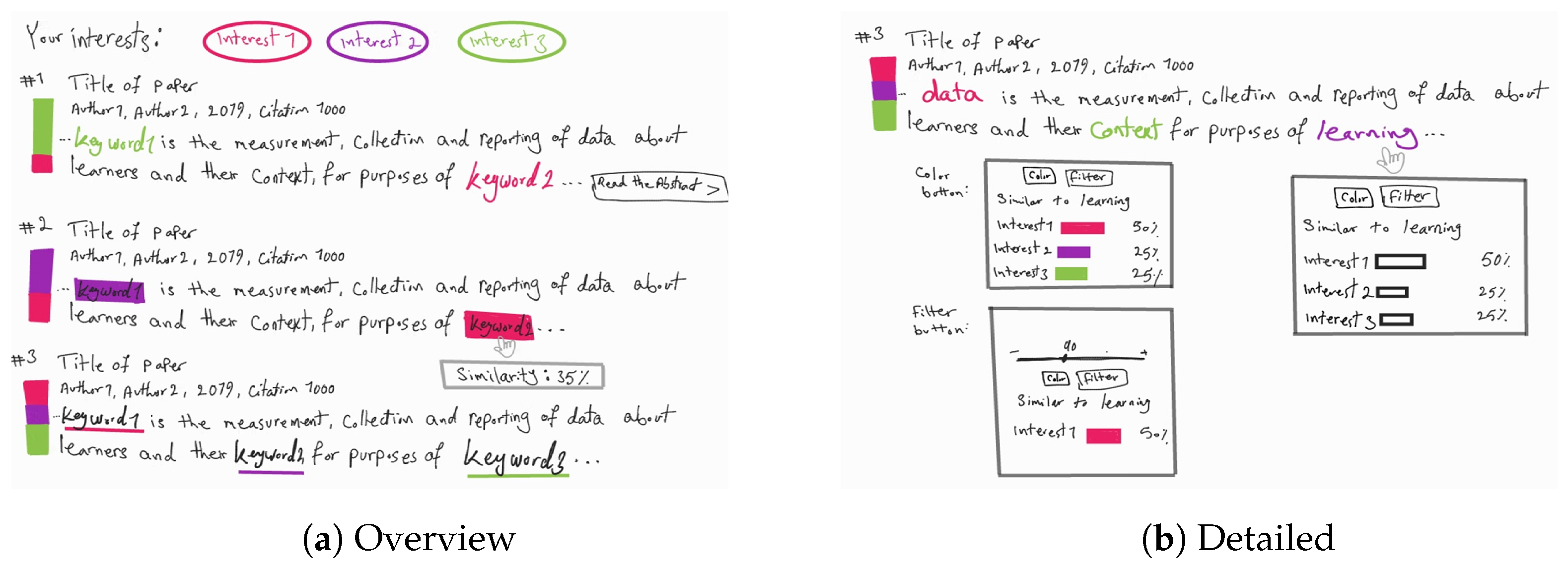
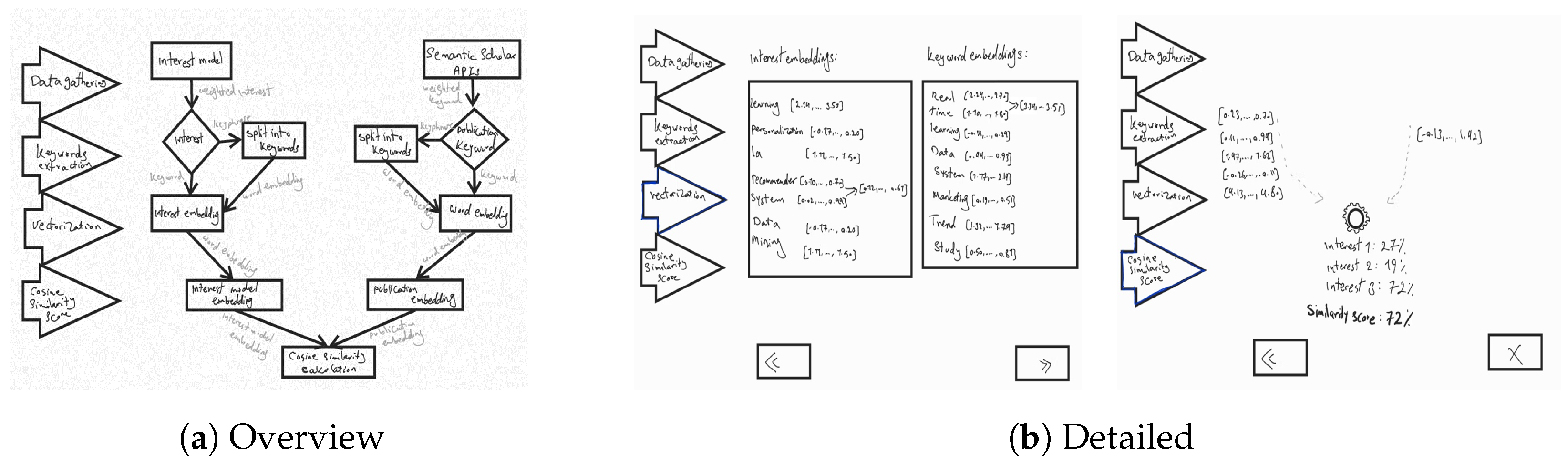
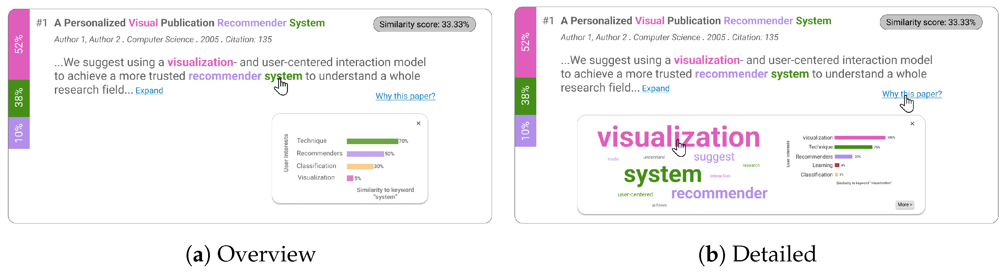
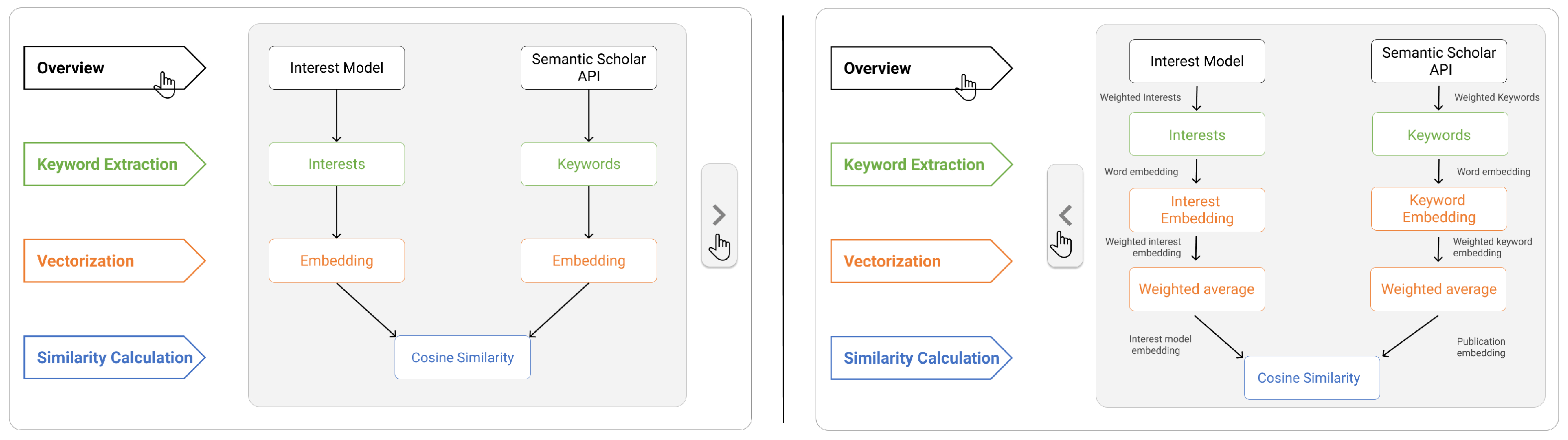
4.1.3. Prototyping
4.1.4. Testing
4.2. Second Iteration
4.2.1. Prototyping
4.2.2. Testing
4.3. Third Iteration
4.4. Implementation
5. Evaluation
5.1. Study Design
5.2. Analysis and Results
5.2.1. Transparency
5.2.2. Trust
5.2.3. Satisfaction
6. Discussion
7. Limitations
8. Conclusions and Future Work
Author Contributions
Funding
Institutional Review Board Statement
Informed Consent Statement
Data Availability Statement
Conflicts of Interest
References
- Tintarev, N.; Masthoff, J. Explaining recommendations: Design and evaluation. In Recommender Systems Handbook; Springer: Berlin/Heidelberg, Germany, 2015; pp. 353–382. [Google Scholar]
- Nunes, I.; Jannach, D. A systematic review and taxonomy of explanations in decision support and recommender systems. User Model. User-Adapt. Interact. 2017, 27, 393–444. [Google Scholar]
- Zhang, Y.; Chen, X. Explainable recommendation: A survey and new perspectives. Found. Trends Inf. Retr. 2020, 14, 1–101. [Google Scholar] [CrossRef]
- Kunkel, J.; Donkers, T.; Michael, L.; Barbu, C.M.; Ziegler, J. Let me explain: Impact of personal and impersonal explanations on trust in recommender systems. In Proceedings of the 2019 CHI Conference on Human Factors in Computing Systems, Glasgow, UK, 4–9 May 2019; pp. 1–12. [Google Scholar]
- Pu, P.; Chen, L.; Hu, R. Evaluating recommender systems from the user’s perspective: Survey of the state of the art. User Model. User-Adapt. Interact. 2012, 22, 317–355. [Google Scholar] [CrossRef]
- Knijnenburg, B.P.; Willemsen, M.C.; Gantner, Z.; Soncu, H.; Newell, C. Explaining the user experience of recommender systems. User Model. User-Adapt. Interact. 2012, 22, 441–504. [Google Scholar]
- Konstan, J.A.; Riedl, J. Recommender systems: From algorithms to user experience. User Model. User-Adapt. Interact. 2012, 22, 101–123. [Google Scholar] [CrossRef]
- Siepmann, C.; Chatti, M.A. Trust and Transparency in Recommender Systems. arXiv 2023, arXiv:2304.08094. [Google Scholar]
- Lim, B.Y.; Dey, A.K. Assessing demand for intelligibility in context-aware applications. In Proceedings of the 11th International Conference on Ubiquitous Computing, Orlando, FL, USA, 30 September–3 October 2009; pp. 195–204. [Google Scholar]
- Lim, B.Y.; Dey, A.K. Evaluating intelligibility usage and usefulness in a context-aware application. In Human-Computer Interaction. Towards Intelligent and Implicit Interaction: Proceedings of the 15th International Conference, HCI International 2013, Las Vegas, NV, USA, 21–26 July 2013; Proceedings, Part V 15; Springer: Berlin/Heidelberg, Germany, 2013; pp. 92–101. [Google Scholar]
- Tintarev, N.; Masthoff, J. A survey of explanations in recommender systems. In Proceedings of the 2007 IEEE 23rd International Conference on Data Engineering Workshop, Istanbul, Turkey, 17–20 April 2007; pp. 801–810. [Google Scholar]
- Jannach, D.; Jugovac, M.; Nunes, I. Explanations and user control in recommender systems. In Proceedings of the 23rd International Workshop on Personalization and Recommendation on the Web and Beyond, Hof, Germany, 17 September 2019; p. 31. [Google Scholar]
- Ain, Q.U.; Chatti, M.A.; Guesmi, M.; Joarder, S. A Multi-Dimensional Conceptualization Framework for Personalized Explanations in Recommender Systems. In Proceedings of the Joint 27th International Conference on Intelligent User Interfaces, Helsinki, Finland, 1–25 March 2022; pp. 22–25. [Google Scholar]
- Tintarev, N.; Masthoff, J. Evaluating the effectiveness of explanations for recommender systems: Methodological issues and empirical studies on the impact of personalization. User Model. User-Adapt. Interact. 2012, 22, 399–439. [Google Scholar] [CrossRef]
- Balog, K.; Radlinski, F.; Arakelyan, S. Transparent, scrutable and explainable user models for personalized recommendation. In Proceedings of the 42nd International ACM SIGIR Conference on Research and Development in Information Retrieval, Paris, France, 21–25 July 2019; pp. 265–274. [Google Scholar]
- Vig, J.; Sen, S.; Riedl, J. Tagsplanations: Explaining recommendations using tags. In Proceedings of the 14th International Conference on Intelligent User Interfaces, Sanibel Island, FL, USA, 8–11 February 2009; pp. 47–56. [Google Scholar]
- Munzner, T. Visualization Analysis and Design; CRC Press: Boca Raton, FL, USA, 2014. [Google Scholar]
- Spinner, T.; Schlegel, U.; Schäfer, H.; El-Assady, M. explAIner: A visual analytics framework for interactive and explainable machine learning. IEEE Trans. Vis. Comput. Graph. 2019, 26, 1064–1074. [Google Scholar] [CrossRef]
- Lim, B.Y.; Dey, A.K.; Avrahami, D. Why and why not explanations improve the intelligibility of context-aware intelligent systems. In Proceedings of the SIGCHI Conference on Human Factors in Computing Systems, Boston, MA, USA, 4–9 April 2009; pp. 2119–2128. [Google Scholar]
- Chatti, M.A.; Guesmi, M.; Muslim, A. Visualization for Recommendation Explainability: A Survey and New Perspectives. arXiv 2023, arXiv:2305.11755. [Google Scholar]
- Herlocker, J.L.; Konstan, J.A.; Riedl, J. Explaining collaborative filtering recommendations. In Proceedings of the 2000 ACM Conference on Computer Supported Cooperative Work, Philadelphia, PA, USA, 2–6 December 2000; pp. 241–250. [Google Scholar]
- Gedikli, F.; Jannach, D.; Ge, M. How should I explain? A comparison of different explanation types for recommender systems. Int. J. Hum.-Comput. Stud. 2014, 72, 367–382. [Google Scholar] [CrossRef]
- Guesmi, M.; Chatti, M.A.; Vorgerd, L.; Joarder, S.; Zumor, S.; Sun, Y.; Ji, F.; Muslim, A. On-demand personalized explanation for transparent recommendation. In Proceedings of the Adjunct 29th ACM Conference on User Modeling, Adaptation and Personalization, Utrecht, The Netherlands, 21–25 June 2021; pp. 246–252. [Google Scholar]
- Norman, D. The Design of Everyday Things: Revised and Expanded Edition; Basic Books: New York, NY, USA, 2013. [Google Scholar]
- Hosseini, M.; Shahri, A.; Phalp, K.; Ali, R. Four reference models for transparency requirements in information systems. Requir. Eng. 2018, 23, 251–275. [Google Scholar]
- Zhao, R.; Benbasat, I.; Cavusoglu, H. Do users always want to know more? Investigating the relationship between system transparency and users’ trust in advice-giving systems. In Proceedings of the 27th European Conference on Information Systems, Stockholm and Uppsala, Sweden, 8–14 June 2019. [Google Scholar]
- Cramer, H.; Evers, V.; Ramlal, S.; Van Someren, M.; Rutledge, L.; Stash, N.; Aroyo, L.; Wielinga, B. The effects of transparency on trust in and acceptance of a content-based art recommender. User Model. User-Adapt. Interact. 2008, 18, 455–496. [Google Scholar] [CrossRef]
- Diakopoulos, N.; Koliska, M. Algorithmic transparency in the news media. Digit. J. 2017, 5, 809–828. [Google Scholar] [CrossRef]
- Harman, J.L.; O’Donovan, J.; Abdelzaher, T.; Gonzalez, C. Dynamics of human trust in recommender systems. In Proceedings of the 8th ACM Conference on Recommender systems, Silicon Valley, CA, USA, 6–10 October 2014; pp. 305–308. [Google Scholar]
- Ananny, M.; Crawford, K. Seeing without knowing: Limitations of the transparency ideal and its application to algorithmic accountability. New Media Soc. 2018, 20, 973–989. [Google Scholar] [CrossRef]
- Arrieta, A.B.; Díaz-Rodríguez, N.; Del Ser, J.; Bennetot, A.; Tabik, S.; Barbado, A.; García, S.; Gil-López, S.; Molina, D.; Benjamins, R.; et al. Explainable Artificial Intelligence (XAI): Concepts, taxonomies, opportunities and challenges toward responsible AI. Inf. Fusion 2020, 58, 82–115. [Google Scholar]
- Afchar, D.; Melchiorre, A.B.; Schedl, M.; Hennequin, R.; Epure, E.V.; Moussallam, M. Explainability in Music Recommender Systems. arXiv 2022, arXiv:2201.10528. [Google Scholar] [CrossRef]
- Miller, T. Explanation in artificial intelligence: Insights from the social sciences. Artif. Intell. 2019, 267, 1–38. [Google Scholar]
- Liao, Q.V.; Gruen, D.; Miller, S. Questioning the AI: Informing design practices for explainable AI user experiences. In Proceedings of the 2020 CHI Conference on Human Factors in Computing Systems, Honolulu, HI, USA, 25–30 April 2020; pp. 1–15. [Google Scholar]
- Lim, B.Y.; Yang, Q.; Abdul, A.M.; Wang, D. Why these explanations? Selecting intelligibility types for explanation goals. In Proceedings of the IUI Workshops, Los Angeles, CA, USA, 16–20 March 2019. [Google Scholar]
- Kouki, P.; Schaffer, J.; Pujara, J.; O’Donovan, J.; Getoor, L. Personalized explanations for hybrid recommender systems. In Proceedings of the 24th International Conference on Intelligent User Interfaces, Marina del Ray, CA, USA, 17–20 March 2019; pp. 379–390. [Google Scholar]
- Tsai, C.H.; Brusilovsky, P. Explaining recommendations in an interactive hybrid social recommender. In Proceedings of the 24th International Conference on Intelligent User Interfaces, Marina del Ray, CA, USA, 17–20 March 2019; pp. 391–396. [Google Scholar]
- O’Donovan, J.; Smyth, B.; Gretarsson, B.; Bostandjiev, S.; Höllerer, T. PeerChooser: Visual interactive recommendation. In Proceedings of the SIGCHI Conference on Human Factors in Computing Systems, Florence, Italy, 5–10 April 2008; pp. 1085–1088. [Google Scholar]
- Gretarsson, B.; O’Donovan, J.; Bostandjiev, S.; Hall, C.; Höllerer, T. Smallworlds: Visualizing social recommendations. In Proceedings of the Computer Graphics Forum, Park City, UT, USA, 11–14 April 2010; Wiley Online Library, 2010; Volume 29, pp. 833–842. [Google Scholar]
- Bostandjiev, S.; O’Donovan, J.; Höllerer, T. TasteWeights: A visual interactive hybrid recommender system. In Proceedings of the Sixth ACM Conference on Recommender Systems, Dublin, Ireland, 9–13 September 2012; pp. 35–42. [Google Scholar]
- Bostandjiev, S.; O’Donovan, J.; Höllerer, T. LinkedVis: Exploring social and semantic career recommendations. In Proceedings of the 2013 International Conference on Intelligent User Interfaces, Monica, CA, USA, 19–22 March 2013; pp. 107–116. [Google Scholar]
- Alshammari, M.; Nasraoui, O.; Sanders, S. Mining semantic knowledge graphs to add explainability to black box recommender systems. IEEE Access 2019, 7, 110563–110579. [Google Scholar] [CrossRef]
- Ma, B.; Lu, M.; Taniguchi, Y.; Konomi, S. CourseQ: The impact of visual and interactive course recommendation in university environments. Res. Pract. Technol. Enhanc. Learn. 2021, 16, 18. [Google Scholar] [CrossRef]
- Jin, Y.; Seipp, K.; Duval, E.; Verbert, K. Go with the flow: Effects of transparency and user control on targeted advertising using flow charts. In Proceedings of the International Working Conference on Advanced Visual Interfaces, Bari, Italy, 7–10 June 2016; pp. 68–75. [Google Scholar]
- Parra, D.; Brusilovsky, P.; Trattner, C. See what you want to see: Visual user-driven approach for hybrid recommendation. In Proceedings of the 19th International Conference on Intelligent User Interfaces, Haifa, Israel, 24–27 February 2014; pp. 235–240. [Google Scholar]
- Chatti, M.A.; Guesmi, M.; Vorgerd, L.; Ngo, T.; Joarder, S.; Ain, Q.U.; Muslim, A. Is More Always Better? The Effects of Personal Characteristics and Level of Detail on the Perception of Explanations in a Recommender System. In Proceedings of the 30th ACM Conference on User Modeling, Adaptation and Personalization, Barcelona, Spain, 4–7 July 2022; pp. 254–264. [Google Scholar]
- Guesmi, M.; Chatti, M.A.; Vorgerd, L.; Joarder, S.A.; Ain, Q.U.; Ngo, T.; Zumor, S.; Sun, Y.; Ji, F.; Muslim, A. Input or Output: Effects of Explanation Focus on the Perception of Explainable Recommendation with Varying Level of Details. In Proceedings of the 8th Joint Workshop on Interfaces and Human Decision Making for Recommender Systems (IntRS’21), Amsterdam, The Netherlands, 27 September–1 October 2021; pp. 55–72. [Google Scholar]
- Guesmi, M.; Chatti, M.A.; Ghorbani-Bavani, J.; Joarder, S.; Ain, Q.U.; Alatrash, R. What if Interactive Explanation in a Scientific Literature Recommender System. In Proceedings of the IntRS’22: Joint Workshop on Interfaces and Human Decision Making for Recommender Systems (IntRS’22), Seattle, WA, USA, 18–23 September 2022. [Google Scholar]
- Guesmi, M.; Chatti, M.A.; Tayyar, A.; Ain, Q.U.; Joarder, S. Interactive visualizations of transparent user models for self-actualization: A human-centered design approach. Multimodal Technol. Interact. 2022, 6, 42. [Google Scholar] [CrossRef]
- Mohseni, S.; Zarei, N.; Ragan, E.D. A multidisciplinary survey and framework for design and evaluation of explainable AI systems. ACM Trans. Interact. Intell. Syst. (TiiS) 2021, 11, 1–45. [Google Scholar]
- Nielsen, J. Why You Only Need to Test with 5 Users. Available online: https://www.nngroup.com/articles/why-you-only-need-to-test-with-5-users/ (accessed on 20 May 2022).
- Pu, P.; Chen, L.; Hu, R. A user-centric evaluation framework for recommender systems. In Proceedings of the Fifth ACM Conference on Recommender Systems, Chicago, IL, USA, 23–27 October 2011; pp. 157–164. [Google Scholar]
- Braun, V.; Clarke, V. Using thematic analysis in psychology. Qual. Res. Psychol. 2006, 3, 77–101. [Google Scholar] [CrossRef]
- Hellmann, M.; Hernandez-Bocanegra, D.C.; Ziegler, J. Development of an Instrument for Measuring Users’ Perception of Transparency in Recommender Systems. In Proceedings of the Joint Proceedings of the ACM IUI Workshops, Helsinki, Finland, 21–25 March 2022. [Google Scholar]
- Guesmi, M.; Chatti, M.A.; Vorgerd, L.; Ngo, T.; Joarder, S.; Ain, Q.U.; Muslim, A. Explaining User Models with Different Levels of Detail for Transparent Recommendation: A User Study. In Proceedings of the Adjunct Proceedings of the 30th ACM Conference on User Modeling, Adaptation and Personalization, Barcelona, Spain, 4–7 July 2022; pp. 175–183. [Google Scholar]
- Millecamp, M.; Htun, N.N.; Conati, C.; Verbert, K. To explain or not to explain: The effects of personal characteristics when explaining music recommendations. In Proceedings of the 24th International Conference on Intelligent User Interfaces, Marina del Ray, CA, USA, 16–20 March 2019; pp. 397–407. [Google Scholar]
- Szymanski, M.; Millecamp, M.; Verbert, K. Visual, textual or hybrid: The effect of user expertise on different explanations. In Proceedings of the 26th International Conference on Intelligent User Interfaces, College Station, TX, USA, 14–17 April 2021; pp. 109–119. [Google Scholar]
- Martijn, M.; Conati, C.; Verbert, K. “Knowing me, knowing you”: Personalized explanations for a music recommender system. User Model. User-Adapt. Interact. 2022, 32, 215–252. [Google Scholar]
- Kulesza, T.; Burnett, M.; Wong, W.K.; Stumpf, S. Principles of explanatory debugging to personalize interactive machine learning. In Proceedings of the 20th International Conference on Intelligent User Interfaces, Atlanta, GA, USA, 29 March–1 April 2015; pp. 126–137. [Google Scholar]
- Kulesza, T.; Stumpf, S.; Burnett, M.; Yang, S.; Kwan, I.; Wong, W.K. Too much, too little, or just right? Ways explanations impact end users’ mental models. In Proceedings of the 2013 IEEE Symposium on Visual Languages and Human Centric Computing, San Jose, CA, USA, 15–19 September 2013; pp. 3–10. [Google Scholar]
- Yang, F.; Huang, Z.; Scholtz, J.; Arendt, D.L. How do visual explanations foster end users’ appropriate trust in machine learning? In Proceedings of the 25th International Conference on Intelligent User Interfaces, Cagliari, Italy, 13–17 March 2020; pp. 189–201. [Google Scholar]
- Kizilcec, R.F. How much information? Effects of transparency on trust in an algorithmic interface. In Proceedings of the 2016 CHI Conference on Human Factors in Computing Systems, San Jose, CA, USA, 7–12 May 2016; pp. 2390–2395. [Google Scholar]
- Balog, K.; Radlinski, F. Measuring recommendation explanation quality: The conflicting goals of explanations. In Proceedings of the 43rd International ACM SIGIR Conference on Research and Development in Information Retrieval, Virtual Event, 25–30 July 2020; pp. 329–338. [Google Scholar]
- Putnam, V.; Conati, C. Exploring the Need for Explainable Artificial Intelligence (XAI) in Intelligent Tutoring Systems (ITS). In Proceedings of the Joint Proceedings of the ACM IUI 2019 Workshops, Los Angeles, CA, USA, 20 March 2019; p. 7. [Google Scholar]
- Conati, C.; Barral, O.; Putnam, V.; Rieger, L. Toward personalized XAI: A case study in intelligent tutoring systems. Artif. Intell. 2021, 298, 103503. [Google Scholar]


Disclaimer/Publisher’s Note: The statements, opinions and data contained in all publications are solely those of the individual author(s) and contributor(s) and not of MDPI and/or the editor(s). MDPI and/or the editor(s) disclaim responsibility for any injury to people or property resulting from any ideas, methods, instructions or products referred to in the content. |
© 2023 by the authors. Licensee MDPI, Basel, Switzerland. This article is an open access article distributed under the terms and conditions of the Creative Commons Attribution (CC BY) license (https://creativecommons.org/licenses/by/4.0/).
Share and Cite
Guesmi, M.; Chatti, M.A.; Joarder, S.; Ain, Q.U.; Siepmann, C.; Ghanbarzadeh, H.; Alatrash, R. Justification vs. Transparency: Why and How Visual Explanations in a Scientific Literature Recommender System. Information 2023, 14, 401. https://doi.org/10.3390/info14070401
Guesmi M, Chatti MA, Joarder S, Ain QU, Siepmann C, Ghanbarzadeh H, Alatrash R. Justification vs. Transparency: Why and How Visual Explanations in a Scientific Literature Recommender System. Information. 2023; 14(7):401. https://doi.org/10.3390/info14070401
Chicago/Turabian StyleGuesmi, Mouadh, Mohamed Amine Chatti, Shoeb Joarder, Qurat Ul Ain, Clara Siepmann, Hoda Ghanbarzadeh, and Rawaa Alatrash. 2023. "Justification vs. Transparency: Why and How Visual Explanations in a Scientific Literature Recommender System" Information 14, no. 7: 401. https://doi.org/10.3390/info14070401
APA StyleGuesmi, M., Chatti, M. A., Joarder, S., Ain, Q. U., Siepmann, C., Ghanbarzadeh, H., & Alatrash, R. (2023). Justification vs. Transparency: Why and How Visual Explanations in a Scientific Literature Recommender System. Information, 14(7), 401. https://doi.org/10.3390/info14070401